HTML Techniques for Web Content Accessibility Guidelines 1.0
Upload
khangminh22Category
view
1download
0
Copyright 2017 Cengage Learning. All Rights Reserved. May not be copied, scanned, or duplicated, in whole or in part. WCN 02-200-203

This is an electronic version of the print textbook. Due to electronic rights restrictions, some third party content may be suppressed. Editorial review has deemed that any suppressed
content does not materially affect the overall learning experience. The publisher reserves the right to remove content from this title at any time if subsequent rights restrictions require it. For
valuable information on pricing, previous editions, changes to current editions, and alternate formats, please visit www.cengage.com/highered to search by ISBN, author, title, or keyword for
materials in your areas of interest.
Important notice: Media content referenced within the product description or the product text may not be available in the eBook version.
Copyright 2017 Cengage Learning. All Rights Reserved. May not be copied, scanned, or duplicated, in whole or in part. WCN 02-200-203

A u s t r a l i a • B r a z i l • M e x i c o • S i n g a p o r e • U n i t e d K i n g d o m • U n i t e d S t a t e s
MINNICK
COMPREHENSIVE
Web Design with
HTML5 & CSS3
Eighth Edition
Copyright 2017 Cengage Learning. All Rights Reserved. May not be copied, scanned, or duplicated, in whole or in part. WCN 02-200-203
Printed in the United States of America Print Number: 01 Print Year: 2016
© 2017, 2013 Cengage Learning
ALL RIGHTS RESERVED. No part of this work covered by the copyright herein may be reproduced or distributed in any form or by any means, except as permitted by U.S. copyright law, without the prior written permission of the copyright owner.
Library of Congress Control Number: 2015958528
Student Edition: ISBN: 978-1-305-57816-6
Cengage Learning20 Channel Center StreetBoston, MA 02210USA
Cengage Learning is a leading provider of customized learning solutions with employees residing in nearly 40 different countries and sales in more than 125 countries around the world. Find your local representative at www.cengage.com.
Cengage Learning products are represented in Canada by Nelson Education, Ltd.
For your course and learning solutions, visit www.cengage.com
Purchase any of our products at your local college store or at our preferred online store www.cengagebrain.com
Trademarks:Some of the product names and company names used in this book have been used for identification purposes only and may be trademarks or registered trademarks of their respective manufacturers and sellers.
Web Design with HTML5 and CSS3, Comprehensive, Eighth EditionJessica Minnick
Product Director: Kathleen McMahon
Product Team Manager: Kristin McNary
Senior Content Developers: Kate Mason and Marjorie Hunt
Marketing Director: Michelle McTighe
Senior Content Project Manager: Matthew Hutchinson
Art Director: Heather Marshall, Lumina Datamatics, Inc.
Manufacturing Planner: Julio Esperas
IP Analyst: Amber Hill
Senior IP Project Manager: Kathryn Kucharek
Production Service: Lumina Datamatics, Inc.
Compositor: Lumina Datamatics, Inc.
Cover Images: Background image: iStockPhoto.com/
virusowyComputers: iStockPhoto.com/scyther5
Unless otherwise stated, all screenshots courtesy of Microsoft Corporation. Microsoft is either a registered trademark or a trademark of Microsoft Corporation in the United States and/or other countries. Cengage Learning is an independent entity from the Microsoft Corporation, and not affiliated with Microsoft in any manner.
For product information and technology assistance, contact us at Cengage Learning Customer & Sales Support, 1-800-354-9706
For permission to use material from this text or product, submit all requests online at cengage.com/permissions
Further permissions questions can be emailed [email protected]
Copyright 2017 Cengage Learning. All Rights Reserved. May not be copied, scanned, or duplicated, in whole or in part. WCN 02-200-203

Preface ix
Web Design with HTML5 and CSS3
CHAPTER ONEIntroduction to the Internet and Web DesignObjectives HTML 1Introduction HTML 2Project — Create a Basic Webpage HTML 2
Roadmap HTML 3Exploring the Internet HTML 3
World Wide Web HTML 4Protocols HTML 6Web Browsers HTML 7Types of Websites HTML 9
Planning a Website HTML 11Purpose of the Website HTML 11Target Audience HTML 12Multiplatform Display HTML 13Wireframe HTML 14Site Map HTML 14Graphics HTML 17Navigation HTML 17Typography HTML 18Color HTML 19Accessibility HTML 20Planning Checklist HTML 20
Understanding the Basics of HTML HTML 21HTML Elements and Attributes HTML 21Technologies Related to HTML HTML 23HTML5 HTML 23
Understanding the Role of Other Web Programming Languages HTML 23
JavaScript HTML 23jQuery HTML 24PHP HTML 24ASP HTML 24
Using Web Authoring Tools HTML 24Text Editors HTML 24WYSIWYG Editors HTML 27
Creating a Basic Webpage HTML 29To Start Notepad++ and Create a Blank Document HTML 30To Add Basic HTML Tags to a Document HTML 31To Add a Title and Text to a Webpage HTML 32To Save a Webpage HTML 33To View a Webpage in a Browser HTML 34Using a Different Text Editor HTML 34
Chapter Summary HTML 35Apply Your Knowledge HTML 36
Extend Your Knowledge HTML 40Analyze, Correct, Improve HTML 41In the Labs HTML 43Consider This: Your Turn HTML 47
CHAPTER TWOBuilding a Webpage Template with HTML5Objectives HTML 49Introduction HTML 50Project — Plan and Build a Website HTML 50
Roadmap HTML 51Designing a Website HTML 52
Site Map HTML 52Wireframe HTML 53File Management HTML 54To Create a Website Folder and Subfolders HTML 55
Using HTML5 Semantic Elements HTML 56Header Element HTML 57Nav Element HTML 57Main Element HTML 57Footer Element HTML 57
Creating a Webpage Template HTML 58To Create a Webpage Template Document HTML 59To Add HTML5 Semantic Elements
to a Webpage Template HTML 60To Add a Title to a Webpage Template HTML 61Comments HTML 61To Add Comments to a Webpage Template HTML 62Webpage Content HTML 63To Add Content to the Header Section HTML 63
Using Symbol Entities HTML 64To Add Text and Nonbreaking
Spaces to the Nav Section HTML 65To Add Content and a Symbol
to the Footer Section HTML 66Validating HTML Documents HTML 67
To Validate the Webpage Template HTML 67To Validate an HTML Document with Errors HTML 68
Creating a Home Page Using a Webpage Template HTML 69
To Create a Home Page Using a Webpage Template and Add Content HTML 70
To Display a Home Page in the Default Browser HTML 71Chapter Summary HTML 72Apply Your Knowledge HTML 73Extend Your Knowledge HTML 75Analyze, Correct, Improve HTML 76In the Labs HTML 78Consider This: Your Turn HTML 81
iii
Contents
COMPREHENSIVE
Web Design with
HTML5 & CSS3Eighth Edition
Copyright 2017 Cengage Learning. All Rights Reserved. May not be copied, scanned, or duplicated, in whole or in part. WCN 02-200-203

iv Contents Web Design with HTML5 and CSS3 Comprehensive
CHAPTER THREEEnhancing a Website with Links and ImagesObjectives HTML 83Introduction HTML 84Project — Add Links and Images to a Website HTML 84
Roadmap HTML 85Adding Links to a Webpage HTML 86
Anchor Element HTML 86Relative Links HTML 87Absolute Links HTML 87Image Links HTML 87Email Links HTML 88Telephone Links HTML 88To Add Relative Links in a Website Template HTML 89To Add an Email Link in a Website Template HTML 91To Add Relative Links in the Home Page HTML 92To Add an Email Link in the Home Page HTML 94
Adding Images to a Website HTML 94Image File Formats HTML 95Image Dimensions and File Size HTML 99Image Tag and Its Attributes HTML 101To Copy Files into the Images Folder HTML 104To Add an Image to a Website Template HTML 105To Add an Image to the Home Page HTML 106
Exploring Div Elements HTML 107Div Element HTML 107Div Attributes HTML 108To Add a Div Element to a Website Template HTML 109To Add a Div Element to the Home Page HTML 110Class Attributes HTML 110
Adding Headings and Lists HTML 111Heading Elements HTML 111Lists HTML 112To Create the About Us Webpage
and Add a Heading and Image HTML 114To Add Unordered Lists to the
About Us Webpage HTML 116To Add a Description List and Absolute
Link to the About Us Webpage HTML 118To Create the Contact Us Webpage
and Add a Heading and Links HTML 120To Preview a Website in a Browser
and Test Page Links HTML 122Chapter Summary HTML 124Apply Your Knowledge HTML 125Extend Your Knowledge HTML 127Analyze, Correct, Improve HTML 129In the Labs HTML 130Consider This: Your Turn HTML 135
CHAPTER FOURApplying CSS Styles to WebpagesObjectives HTML 139Introduction HTML 140Project — Format Webpages with CSS HTML 140
Roadmap HTML 141Using Cascading Style Sheets HTML 141
Inline Styles HTML 143Embedded Style Sheets HTML 143External Style Sheets HTML 144Style Sheet Precedence HTML 144CSS Basics HTML 145CSS Text Properties HTML 146CSS Colors HTML 147
Understanding Inline Elements and Block Elements HTML 149
CSS Box Model HTML 150
Creating an External Style Sheet HTML 152Selectors HTML 152To Create a CSS File and a Style Rule
for the Body Element HTML 153Linking an HTML Document to a CSS File HTML 155
To Link HTML Pages to the CSS File HTML 155Aligning Webpage Content HTML 157
To Center Content HTML 157Creating Style Rules for Structural
Elements HTML 159To Create a Style Rule for the Header
Element HTML 159To Create a Style Rule for the
Nav Element HTML 161To Create a Style Rule for the Main
Element HTML 162To Create a Style Rule for the Footer
Element HTML 164Creating Style Rules for Classes HTML 165
To Create a Style Rule for the equip Class HTML 166Using CSS List Properties HTML 167
To Create Styles for List Elements HTML 168To View the Website in a Browser HTML 170
Adding Comments to CSS Files HTML 171To Add Comments to a CSS File HTML 171
Validating CSS Files HTML 173To Validate the CSS File HTML 173To Validate a CSS File with Errors HTML 174
Chapter Summary HTML 175Apply Your Knowledge HTML 176Extend Your Knowledge HTML 179Analyze, Correct, Improve HTML 182In the Labs HTML 183Consider This: Your Turn HTML 195
CHAPTER FIVEResponsive Design Part 1: Designing for Mobile Devices Objectives HTML 201Introduction HTML 202Project — Redesign a Website for
Mobile Devices HTML 202Roadmap HTML 203
Exploring Responsive Design HTML 204Designing for Mobile Devices HTML 205Using Fluid Layouts HTML 208Creating a Fluid Layout HTML 210
Navigation Elements in Fluid Layouts HTML 212To Code the Navigation Links as an HTML 212
Unordered ListMaking Images Flexible HTML 214
To Add Flexible Images HTML 215Following a Mobile-First Strategy HTML 217
Styles for Content on Mobile Devices HTML 218Steps in a Mobile-First Strategy HTML 220Analyze the Home Page for Mobile-First Design HTML 227To Modify the Home Page HTML 227To Modify the Style Rule for the mobile Class HTML 229To Add a Style Rule for the desktop Class HTML 229Analyze the About Us Page for HTML 232
Mobile-First DesignTo Modify the About Us Page HTML 233To Add a Style Rule for the tablet Class HTML 234To Modify the .equip, ul, dt, and dd Style Rules HTML 235Analyze the Contact Us Page for HTML 236
Mobile-First DesignUsing the Span Element HTML 237
To Add a Span Element to the Contact Us Page HTML 237
Copyright 2017 Cengage Learning. All Rights Reserved. May not be copied, scanned, or duplicated, in whole or in part. WCN 02-200-203

Web Design with HTML5 and CSS3 Comprehensive Contents v
Adding Meta Tags HTML 238To Add the Meta Tag for Responsive Design HTML 238
Testing Webpages in Viewports ofDifferent Sizes HTML 239
To Preview a Mobile Website in the Google Chrome Emulator HTML 240
Chapter Summary HTML 242Apply Your Knowledge HTML 243Extend Your Knowledge HTML 244Analyze, Correct, Improve HTML 245In the Labs HTML 246Consider This: Your Turn HTML 251
CHAPTER SIXResponsive Design Part 2: Designing for Tablet and Desktop Devices Objectives HTML 255Introduction HTML 256Project — Use Media Queries to Design
for Tablet and Desktop Viewports HTML 256Roadmap HTML 257
Using Media Queries HTML 257Breakpoints HTML 258Media Query Expressions HTML 259Adding Media Queries to an External Style Sheet HTML 261
Designing for Tablet Viewports HTML 261To Create a Media Query for a Tablet Viewport HTML 262Page Design for a Tablet Viewport HTML 262Navigation Design for a Tablet Viewport HTML 263To Style the Navigation Area for a Tablet Viewport HTML 264To Style the Main Element for a Tablet Viewport HTML 266To Show and Hide Content for a Tablet Viewport HTML 267About Us Page Design for a Tablet Viewport HTML 268To Display and Style the equip Class HTML 269To Create and Style the items
Class for a Tablet Viewport HTML 270Designing for Desktop Viewports HTML 274
To Create a Media Query for a Desktop Viewport HTML 274About Us Page Design for a Desktop Viewport HTML 281
Modifying Breakpoints HTML 283To Determine the Viewport Width for Tablet
and Desktop Viewports HTML 283To Set the New Viewport Widths for the Tablet
and Desktop Media Queries HTML 286Using Pseudo-Classes HTML 287
To Add Pseudo-Classes to a Style Sheet HTML 288Using Gradients HTML 291
To Add a Linear Gradient HTML 293Chapter Summary HTML 295Apply Your Knowledge HTML 296Extend Your Knowledge HTML 297Analyze, Correct, Improve HTML 299In the Labs HTML 300Consider This: Your Turn HTML 308
CHAPTER SEVENImproving Web Design with New Page Layouts Objectives HTML 311Introduction HTML 312Project — Use HTML5 Structural Elements to
Redesign a Website HTML 312Roadmap HTML 314
Using HTML5 Semantic Elements HTML 315Article Element HTML 315Aside Element HTML 317Section Element HTML 319Figure and Figure Caption Elements HTML 320Website Layout HTML 322
Redesigning the Home Page HTML 323To Add a �gure Element to the Home Page HTML 326To Update the Style Sheet for the
New Design in a Mobile Viewport HTML 327To Add New Style Rules for Anchor
Elements in a Mobile Viewport HTML 329To Update the Style Sheet for
the New Design in a Tablet Viewport HTML 330To Add New Style Rules to the Tablet Viewport HTML 332To Update the Style Sheet for the
New Design in a Desktop Viewport HTML 334To Add New Style Rules to the Desktop
Viewport HTML 336Updating the About Us Page HTML 340
To Add Section Elements to the About Us Page HTML 340To Style the About Us Page for a Tablet
Viewport HTML 342To Style the About Us Page for a Desktop
Viewport HTML 344Updating the Contact Us Page HTML 345
To Modify the Contact Us Page HTML 346To Style the Contact Us Page HTML 346
Creating the Nutrition Page HTML 349To Add article and aside Elements to the
Nutrition Page HTML 350To Style the Nutrition Page for a Mobile
Viewport HTML 353To Create a Three-Column Layout for
the Nutrition Page in a Tablet Viewport HTML 353To Apply the Over�ow Property
to the main Element Style Rule HTML 354To Style the article Element for the Nutrition Page HTML 355To Style the aside Element for the Nutrition Page HTML 357To Style the article h2 Element for the
Nutrition Page in a Desktop Viewport HTML 358Chapter Summary HTML 360Apply Your Knowledge HTML 361Extend Your Knowledge HTML 363Analyze, Correct, Improve HTML 363In the Labs HTML 365Consider This: Your Turn HTML 372
CHAPTER EIGHTCreating Tables and Forms Objectives HTML 375Introduction HTML 376Project — Create a Table and a Form HTML 376
Roadmap HTML 378Discovering Tables HTML 378
Creating a Table with HTML Elements HTML 379Table Borders, Headers, and Captions HTML 380Table Tag Attributes HTML 382Use of Tables HTML 382Planning the Table HTML 382To Add a Table Element to the Classes Page HTML 385
Styling Table Elements HTML 390Styling Tables for Responsive Web Design HTML 391To Style a Table for a Tablet Viewport HTML 391To Style a Table for a Desktop Viewport HTML 394
Creating Webpage Forms HTML 396Form Controls HTML 396Form Labels HTML 400Attributes of HTML Tags Used to Create Forms HTML 400Form Processing HTML 402To Add a Form, Labels, and Text Input Controls
to the Contact Us Page HTML 402To Add email and tel Input Controls to a Form HTML 404To Add Check Boxes to a Form HTML 404To Add a select Element to a Form HTML 405To Add a textarea Element to a Form HTML 407To Add Submit and Reset Buttons to a Form HTML 407
Copyright 2017 Cengage Learning. All Rights Reserved. May not be copied, scanned, or duplicated, in whole or in part. WCN 02-200-203

vi Contents Web Design with HTML5 and CSS3 Comprehensive
Styling Forms HTML 408To Style a Form for a Mobile ViewportTo Style a Form for a Mobile ViewportT HTML 408To Style a Form for a Tablet ViewportTo Style a Form for a Tablet ViewportT HTML 410To Style a Form for a Desktop ViewportTo Style a Form for a Desktop ViewportT HTML 412
Chapter Summary HTML 414Apply Your KnowledgeApply Your KnowledgeApply Y HTML 415Extend Your KnowledgeExtend Your KnowledgeExtend Y HTML 417Analyze, Correct, Improve HTML 418In the Labs HTML 420Consider This: Your TurnConsider This: Your TurnConsider This: Y HTML 430
CHAPTER NINEIntegrating Audio and Video Objectives HTML 433Introduction HTML 434Project — Add Audio and Video to a Webpage HTML 434
Roadmap HTML 436Using Multimedia HTML 436
Creating Multimedia Files HTML 437Embedded vs. External Multimedia HTML 439Media Players and Plug-Ins HTML 440HTML5 and Multimedia HTML 441Flash HTML 441Java Applets HTML 441Object Element HTML 442
Integrating Audio HTML 442Audio File Formats HTML 443File Compression and Codecs HTML 444HMTL5 audio Element HTML 444To Add Audio to the Home PageTo Add Audio to the Home PageT HTML 446
Integrating Video HTML 448Video File Formats HTML 448HTML5 video Element HTML 449Using the video Element HTML 449To Add Video to the About Us PageTo Add Video to the About Us PageT HTML 451To Style the VideoTo Style the VideoT HTML 452To Validate the Style SheetTo Validate the Style SheetT HTML 455To Validate the HTML FilesTo Validate the HTML FilesT HTML 455
Chapter Summary HTML 456Apply Your KnowledgeApply Your KnowledgeApply Y HTML 457Extend Your KnowledgeExtend Your KnowledgeExtend Y HTML 458Analyze, Correct, Improve HTML 458In the Labs HTML 460Consider This: Your TurnConsider This: Your TurnConsider This: Y HTML 463
CHAPTER TENCreating Interactivity with Social Media and JavaScript Objectives HTML 465Introduction HTML 466Project — Add Social Media and JavaScript
to a Webpage HTML 466Roadmap HTML 468
Using Social Media HTML 469Facebook HTML 469TwitterTwitterT HTML 470Google+ HTML 472YouTubeYouTubeY HTML 472Instagram HTML 474Pinterest HTML 475Other Social Media Options HTML 476Blogs HTML 476Adding Facebook and Twitter Links to a Adding Facebook and Twitter Links to a Adding Facebook and T
Website HTML 477To Add Social Media Icons and Links to the To Add Social Media Icons and Links to the T
Home Page HTML 478To Add Social Media Icons and Links to WebpagesTo Add Social Media Icons and Links to WebpagesT HTML 480To Style the Copyright div Element HTML 481To Style the Social div Element To Style the Social div Element T
and Social Media Icons HTML 481
Incorporating JavaScript HTML 484JavaScript TerminologyJavaScript TerminologyJavaScript T HTML 485Writing JavaScript Code HTML 487Pop-up Windows HTML 488To Add a Pop-up Window to the Home Page To Add a Pop-up Window to the Home Page T HTML 488To Create a Function in an External JavaScript File To Create a Function in an External JavaScript File T HTML 489To Call a JavaScript Function To Call a JavaScript Function T HTML 490The open() Method HTML 491To Add More Functions to a JavaScript File To Add More Functions to a JavaScript File T HTML 492To Call the New FunctionsTo Call the New FunctionsT HTML 493To Validate the Style SheetTo Validate the Style SheetT HTML 495To Validate the HTML FilesTo Validate the HTML FilesT HTML 495
Chapter Summary HTML 496Apply Your KnowledgeApply Your KnowledgeApply Y HTML 497Extend Your KnowledgeExtend Your KnowledgeExtend Y HTML 498Analyze, Correct, Improve HTML 498In the Labs HTML 500Consider This: Your TurnConsider This: Your TurnConsider This: Y HTML 503
CHAPTER ELEVENPublish and Promote a Website Objectives HTML 505Introduction HTML 506Project — Publish a Website HTML 506
Roadmap HTML 507Finding a Website HTML 508
Search Engines HTML 508Search Engine Optimization HTML 509Meta TagsMeta TagsMeta T HTML 509To Add a Description Meta Tag to a WebpageTo Add a Description Meta Tag to a WebpageT HTML 511To Modify Alt Text on a WebpageTo Modify Alt Text on a WebpageT HTML 512
Publishing a Website HTML 513Domain Name HTML 513Website Hosting HTML 514Publishing a Website HTML 515FTP Clients HTML 516Transferring FilesTransferring FilesT HTML 517To Start FileZilla and Connect to a Remote To Start FileZilla and Connect to a Remote T
Server HTML 518To Upload Folders and Files to a Remote ServerTo Upload Folders and Files to a Remote ServerT HTML 519To View and Test a Published WebsiteTo View and Test a Published WebsiteT HTML 520
Marketing a Website HTML 520Registering with Search Engines HTML 521To Validate the HTML FilesTo Validate the HTML FilesT HTML 521
Chapter Summary HTML 522Apply Your KnowledgeApply Your KnowledgeApply Y HTML 523Extend Your KnowledgeExtend Your KnowledgeExtend Y HTML 524Analyze, Correct, Improve HTML 524In the Labs HTML 525Consider This: Your TurnConsider This: Your TurnConsider This: Y HTML 527
CHAPTER TWELVEMaintaining a Website Objectives HTML 529Introduction HTML 530Project — Performing Website Maintenance HTML 530
Roadmap HTML 532Website Development Life Cycle HTML 532
Website Planning HTML 534Website Analysis HTML 534Website Design and Development HTML 534Website Testing HTML 536Website Implementation HTML 538Website Maintenance HTML 538Reviewing Websites HTML 539Updating Websites HTML 540To Update the Home PageTo Update the Home PageT HTML 540To Update the About Us PageTo Update the About Us PageT HTML 541To Update the Classes PageTo Update the Classes PageT HTML 541To Improve the Contact Us PageTo Improve the Contact Us PageT HTML 542
Copyright 2017 Cengage Learning. All Rights Reserved. May not be copied, scanned, or duplicated, in whole or in part. WCN 02-200-203

Web Design with HTML5 and CSS3 Comprehensive Contents vii
Project Management HTML 543Content Updates HTML 545Copyright Law HTML 545Content Management Systems HTML 545Web Frameworks HTML 548
E-Commerce HTML 549To Validate the Style SheetTo Validate the Style SheetT HTML 550To Validate the HTML FilesTo Validate the HTML FilesT HTML 551
Chapter Summary HTML 551Apply Your KnowledgeApply Your KnowledgeApply Y HTML 552Extend Your KnowledgeExtend Your KnowledgeExtend Y HTML 553Analyze, Correct, Improve HTML 554In the Labs HTML 555Consider This: Your TurnConsider This: Your TurnConsider This: Y HTML 559
Appendices
APPENDIX AHTML Quick ReferenceCommon HTML Elements APP 1
APPENDIX BCSS Quick ReferenceCSS Properties APP 17
APPENDIX CColor Reference Palette Color Reference APP 29
APPENDIX DAccessibility Standards for Webpage Developers Making the Web Accessible APP 31Section 508 Guidelines APP 31Web Content Accessibility Guidelines APP 32
APPENDIX ESymbols and Characters Quick ReferenceUsing Symbols and Special Characters APP 37
Index IND 1
Copyright 2017 Cengage Learning. All Rights Reserved. May not be copied, scanned, or duplicated, in whole or in part. WCN 02-200-203

Copyright 2017 Cengage Learning. All Rights Reserved. May not be copied, scanned, or duplicated, in whole or in part. WCN 02-200-203

ix
Preface
Web Design with HTML5 and CSS3, Eighth Edition, is intended for a �rst course that offers an introduction to HTML, CSS, and responsive web design techniques. No experience with webpage develop-ment or computer programming is required. The objectives of this book are:
•To teach the fundamentals of how to plan and organize the webpages for a new website
•To thoroughly apply two fundamental webpage technologies to realistic case studies: HTML for structure and CSS for style and layout
•To provide an exercise-oriented approach that reinforces learning by doing
•To introduce students to new web technologies and trends, including responsive web design and mobile-�rst design strategies
•To demonstrate current techniques for incorporating audio and video and for encouraging interactivity through social media and JavaScript
•To promote curiosity and independent exploration of web resources
•To support current, professional webpage development best practices
•To encourage independent study and support distance learners
Objectives of This Textbook
The Shelly Cashman Series® offers the �nest textbooks in computer education. We are proud that our previous web design and development books have been so well received. With each new edition of our HTML and CSS books, we make signi�cant improvements based on web technology and comments made by instructors and students. For Web Design with HTML5 and CSS3, Eighth Edition, the Shelly Cashman Series development team carefully reviewed our pedagogy and analyzed its effectiveness in teaching today’s student. Contemporary students read less, but need to retain more. As they develop and perform skills, students must know how to apply the skills to different settings. Today’s students need to be continually engaged and challenged to retain what they’re learning.
With this web design book, we continue our commitment to focusing on the user and how they learn best.
Copyright 2017 Cengage Learning. All Rights Reserved. May not be copied, scanned, or duplicated, in whole or in part. WCN 02-200-203

x Preface Web Design with HTML5 and CSS3 Comprehensive
The Shelly Cashman Approach
Proven Pedagogy with an Emphasis on Project Planning
Each chapter presents a practical problem to be solved, within a project planning framework. The project orientation is strengthened by the use of the Roadmap, which provides a visual guide for the project. Step-by-step instructions with supporting screens guide students through the steps. Instructional steps are supported by the Q&A, Other Ways, Experimental Steps, and BTW features.
Visually Engaging Book That Maintains Student Interest
The step-by-step tasks with supporting �gures create a rich visual experience for the student. Callouts on the screens that present both explanatory and navigational information provide students with information they need when they need to know it.
Supporting Reference Materials (Appendices)
The appendices provide additional information about the details of HTML and CSS so that students can quickly look up information about web design terms, HTML elements, attributes, and valid values as well as CSS properties and values.
End-of-Chapter Student Activities
Extensive end-of-chapter activities provide a variety of reinforcement opportunities for students where they can apply and expand their skills. To complete some of these assignments, you will be required to use the Data Files for Students. Visit www .cengagebrain.com for detailed access instructions or contact your instructor for information about accessing the required �les.
New to This Edition
Fresh, Industry-Leading Website Design Practices
For this edition, the development team made a huge leap forward in bringing up-to-date, forward-thinking website development practices into focus and application.
Semantic Wireframe
The webpage development process starts with a semantic wireframe, which uses the structural elements new to HTML5 to ef�ciently organize the regions of a webpage.
Focus on Responsive Design, Fluid Layouts, and Mobile-First Web Development
Design a single website that responds to the screen displays of desktop and laptop computers, tablets, smartphones, and other mobile devices.
HTML5 and CSS3 Features
The chapter project and exercises incorporate the latest additions to HTML and CSS, including new HTML5 elements, CSS3 properties, and syntax recommended by the World Wide Web Consortium (W3C). Every chapter validates documents using online tools for HTML5 and CSS3.
All New Projects
This edition contains a wealth of contemporary projects that logically build in complexity and probe for understanding. Our goal is not only to help you teach valid HTML and CSS, but to reveal deeper conceptual issues essential to the �eld of web development. Using the technologies of today’s web developers results in websites that are worthy candidates for an electronic portfolio.
Professional Best Practices
With the advent of today’s powerful content management systems and website builder tools, do you still need to learn how to create HTML and CSS �les from scratch in a text editor? Professionals in the �eld answer that question with a united, enthusiastic yes! Mastering these technologies is essential to all web-related careers.
Copyright 2017 Cengage Learning. All Rights Reserved. May not be copied, scanned, or duplicated, in whole or in part. WCN 02-200-203
Instructor ResourcesThe Instructor Resources include both teaching and testing aids and can be accessed via www.cengage.com/login.
Instructor’s Manual Includes lecture notes summarizing the chapter sections, �gures, and boxed elements found in every chapter, teacher tips, classroom activities, lab activities, and quick quizzes in Microsoft®quizzes in Microsoft®quizzes in Microsoft Word® �les.
Syllabus Easily customizable sample syllabus covers policies, assignments, exams, and other course information.
Figure Files Illustrations for every �gure in the textbook in electronic form.
PowerPoint Presentations A multimedia lecture presentation system that provides slides for each chapter. Presentations are based on chapter objectives.
Data Files for Students Includes all the �les that are required by students to complete the exercises.
Solutions to Exercises Includes solutions for all end-of-chapter exercises and chapter reinforce-ment exercises.
Test Bank & Test Engine Test banks include questions for every chapter, featuring objective-based and critical thinking question types. Cengage Learning Testing Powered by Cognero is a �exible, online system that allows you to:
• author, edit, and manage test bank content from multiple Cengage Learning solutions• create multiple test versions in an instant• deliver tests from your LMS, your classroom, or wherever you want
Learn OnlineCengageBrain.com is the premier destination for purchasing or renting Cengage Learning textbooks, eBooks, eChapters, and study tools at a signi�cant discount (eBooks up to 50% off Print). In addition, CengageBrain.com provides direct access to all digital products including eBooks, eChapters, and digital solutions, regardless of where purchased.
CourseNotesCourseNotes are six-panel quick reference cards that reinforce the most important and widely used features of a software
application in a visual and user-friendly format. CourseNotes serve as a great reference tool during and after the student completes the course. CourseNotes are available for software applications such as Microsoft Of�ce 2013, Windows 8, and HTML. Topic-based CourseNotes, including Best Practices in Social Networking, Hot Topics in Technology, and Leverage the Internet for Your Career Search, are also available. Visit www.cengagebrain.com to learn more!
Web Design with HTML5 and CSS3 Comprehensive Preface xi
Copyright 2017 Cengage Learning. All Rights Reserved. May not be copied, scanned, or duplicated, in whole or in part. WCN 02-200-203

HTML 392 HTML Chapter 8 Creating Tables and Forms
2•Save your changes and refresh
classes.html in your browser (Figure 8–23).
Why does the border appear only around the sides of the table?The style rule you created applies to the table only. You will style the th and td elements in subsequent steps.
Q&
A
3 •In the styles.css �le, tap or click
at the end of Line 276, if necessary, and then press the enter key twice to insert new Lines 277 and 278.
•On Line 278, type /* Style specifies border and padding for th and td elements */ to insert a new comment.
•Press the enter key to insert a new Line 279, and then type th, td { to insert a new selector.
•Press the enter key to insert a new Line 280, increase the indent, and then type border: 0.1em solid #000000; to insert a new property and value.
•Press the enter key to insert a new Line 281, and then type padding: 1em; to insert a new property and value.
•Press the enter key to insert a new Line 282, decrease the indent, and then type } to insert a closing brace (Figure 8–24).
What is the result of the new style?The style applies a thin (0.1em) solid black (#000000) border and 1em of padding to all sides of the table header and the table data elements.
Q&
A
Figure 8–24
table border
table is centered on the page
table width is 100% within the main element
comment
Line 278
style rule for th and td elements
© R
ob
Mar
mio
n/S
hu
tter
sto
ck.c
om
© R
ob
Mar
mio
n/S
hu
tter
sto
ck.c
om
Figure 8–23
Q&A boxes anticipate questions students may have when working through the steps and provide additional information about what they are doing right where they need it.
Explanatory callouts summarize what is happening on screen.
Navigational callouts in red show students where to tap or click.
Textbook Walk-Through The Shelly Cashman Series Pedagogy: Project-Based — Step-by-Step — Variety of Assessments
Step-by-step instructions now provide a context beyond point-and-click. Each step provides information on why students are performing each task, or what will occur as a result.
Roadmaps provide a visual guide to each project, showing the students where they are in the process of creating each project.
HTML 468 HTML Chapter 10 Creating Interactivity with Social Media and JavaScript
RoadmapIn this chapter, you will learn how to create the webpages shown in Figures 10–1,
10–2, 10–3, and 10–4. The following roadmap identi�es general activities you will perform as you progress through this chapter:
1. insert social media icons and links.
2. style social media icons.3. create javascript alert message.
4. create external javascript file.
5. call javascript functions.
At the beginning of step instructions throughout the chapter, you will see an abbreviated form of this roadmap. The abbreviated roadmap uses colors to indicate chapter progress: gray means the chapter is beyond that activity, blue means the task being shown is covered in that activity, and black means that activity is yet to be covered. For example, the following abbreviated roadmap indicates the chapter would be showing a task in the 2 STYLE SOCIAL MEDIA ICONS activity.
Sou
rce:
Fac
ebo
ok,
so
urc
e: T
wit
ter
Sou
rce:
Fac
ebo
ok,
so
urc
e: T
wit
ter
© M
urp
hym
edia
/Sh
utt
erst
ock
.co
m, s
ou
rce:
Fac
ebo
ok,
so
urc
e: T
wit
ter
© M
urp
hym
edia
/Sh
utt
erst
ock
.co
m, s
ou
rce:
Fac
ebo
ok,
so
urc
e: T
wit
ter
Figure 10–4
Figure 10–3
Copyright 2017 Cengage Learning. All Rights Reserved. May not be copied, scanned, or duplicated, in whole or in part. WCN 02-200-203

HTML 14 HTML Chapter 1 Introduction to the Internet and Web Design
WireframeBefore web designers actually start creating the �rst webpage for a website,
they sketch the design using a wireframe. A clearly identi�es the location of main webpage elements, such as the navigation area, organization logo, content areas, and images. When you create a wireframe sketch for your webpages, use lines and boxes as shown in Figure 1–12. Also be sure to incorporate plenty of white space within your design to improve readability and to clearly distinguish among the areas on the webpage. You can use two types of white space: active white space and passive white space. Active white spacethat is intentionally left blank. Typically, the goal of active white space is to help balance the design of an asymmetrical page. Passive white spaceareas. Passive white space helps a user focus on one part of the page. Proper use of white space makes webpage content easy to read and brings focus to page elements.
Can I redesign a desktop-only website for multiplatform display?Yes. If your audience is accustomed to the desktop-only website, retro�tting the website for tablet and mobile display screens makes sense because the site remains familiar to users. You also avoid building a new site from scratch and you can take ad-vantage of design decisions such as color scheme and use media you have already acquired. However, depending on the site content and number of pages, redesigning may be a time-consuming process.
CO
NS
IDE
R T
HIS
Site MapA site map is a planning tool that lists or displays all the pages on a website
and indicates how they are related to each other. In other words, a site map shows the structure of a website. Begin de�ning the structure of a website by identifying the information to provide and then organize that information into divisions using the organizing method that makes the most sense for the content. For example, if the website offers three types of products for sale, organize the site by product category. If the website provides training, organize the site in a step-by-step sequence.
Next, arrange the webpages according to a logical structure. A website can use several types of structures, including linear, hierarchical, and webbed. Each structure connects the webpages in a different way to de�ne how users navigate the site and view
Logo Navigation
Banner
Footer
Image Article
Image
Text area
Figure 1–12
appealing graphic or text
passive white space
passive white space
headings and main written content
legal matter and contact details
heading or advertisement
tabs or buttons with short text links for navigating site
content related to main content
active white space
© 2
016
Cen
gag
e Le
arn
ing
®
Before web designers actually start creating the �rst webpage for a website, wireframe
clearly identi�es the location of main webpage elements, such as the navigation area, organization logo, content areas, and images. When you create a wireframe sketch for your webpages, use lines and boxes as shown in Figure 1–12. Also be sure to incorporate plenty of white space within your design to improve readability and to clearly distinguish among the areas on the webpage. You can use two types of white space:
Active white spacethat is intentionally left blank. Typically, the goal of active white space is to help balance
Passive white spaceareas. Passive white space helps a user focus on one part of the page. Proper use of white space makes webpage content easy to read and brings focus to page elements.
Can I redesign a desktop-only website for multiplatform display?Yes. If your audience is accustomed to the desktop-only website, retro�tting the website for tablet and mobile display screens makes sense because the site remains familiar to users. You also avoid building a new site from scratch and you can take ad-vantage of design decisions such as color scheme and use media you have already acquired. However, depending on the site content and number of pages, redesigning may be a time-consuming process.
Integrating Audio and Video HTML Chapter 9 HTML 447
HTM
L C
hap
ter
9
2 •Press the enter key to
insert a new Line 71, and then type <source src="media/ffc_aud.ogg" type="audio/ogg">to insert a source element.
•Press the enter key to insert a new Line 72, and then type <source src=" media/ffc_aud.wav" type="audio/wav"> to insert a source element.
•Press the enter key to insert a new Line 73, and then type <p>Your browser does not support the audio tag.</p> to insert a paragraph element.
•Press the enter key to insert a new Line 74, decrease the indent, and then type </audio> to insert a closing audio tag (Figure 9–14).
Why do I need to include three source elements?To accommodate all major browsers, you specify three audio source �les, MP3, Ogg, and WAV. These are the three �le formats supported by the audio element.
Will the webpage display the paragraph element?The webpage displays the paragraph element only if the browser does not support the audio element.
3
•Save your change, open index.html in your browser, adjust the window to the size of a desktop viewport, and then scroll down to view the audio controls (Figure 9–15).
Experiment•The loop attribute
automatically replays the audio �le after it is �nished. To see how this works, add the loop attribute to the audio tag, save your changes, and then refresh index.html in your browser.
•Remove the controls attribute from the audio element to view the page without controls, save your changes, and then refresh index.html in your browser.
•Remove the loop attribute, add the controls attribute to the audio tag, and then save your changes.
A message appears at the bottom of my window, “Internet Explorer restricted this webpage from running scripts or ActiveX controls.” How should I proceed?Tap or click the Allow blocked content button to play the audio �le and display the audio controls.
My controls do not look like the controls in Figure 9–15. Why?Figure 9–15 shows the controls in Internet Explorer 11. If you are using a different browser, your controls will look different.
Q&
AQ
&A
Figure 9–15
© R
ob
Mar
mio
n/S
hu
tter
sto
ck.c
om
, ©
Ro
b M
arm
ion
/Sh
utt
erst
ock
.co
m,
© f
aysa
l/Sh
utt
erst
ock
.co
m, ©
Mill
e�o
re
Imag
es/S
hu
tter
sto
ck.c
om
index.html page in desktop viewport
controls
HTM
L C
hap
ter
9
Figure 9–14Figure 9–14
Line 71
paragraph element
closing audio tag
source elements
audio element
Break Point: If you want to take a break, this is a good place to do so. You can exit the text editor now. To resume at a later time, run your text editor, open the �le called about.html, and continue following the steps from this location forward.
Before web designers actually start creating the �rst webpage for a website, wireframe
clearly identi�es the location of main webpage elements, such as the navigation area, organization logo, content areas, and images. When you create a wireframe sketch for your webpages, use lines and boxes as shown in Figure 1–12. Also be sure to incorporate plenty of white space within your design to improve readability and to clearly distinguish among the areas on the webpage. You can use two types of white space:
Active white spacethat is intentionally left blank. Typically, the goal of active white space is to help balance
Passive white spaceareas. Passive white space helps a user focus on one part of the page. Proper use of white
Can I redesign a desktop-only website for multiplatform display?Yes. If your audience is accustomed to the desktop-only website, retro�tting the website for tablet and mobile display screens makes sense because the site remains familiar to users. You also avoid building a new site from scratch and you can take ad-vantage of design decisions such as color scheme and use media you have already acquired. However, depending on the site content and number of pages, redesigning may be a time-consuming process.
Experiment Steps within the step-by-step instructions encourage students to explore, experiment, and take advantage of web technologies. These steps are not necessary to complete the projects, but are designed to increase con�dence and problem-solving skills.
Consider This boxes pose thought-provoking questions with answers throughout each chapter, promoting critical thought along with immediate feedback.
tag, save your changes, and then refresh index.html in your browser.
Copyright 2017 Cengage Learning. All Rights Reserved. May not be copied, scanned, or duplicated, in whole or in part. WCN 02-200-203

Responsive Design Part 1: Designing for Mobile Devices HTML Chapter 5
HTM
L C
hap
ter
5S
TU
DE
NT
AS
SIG
NM
EN
TS
Apply Your KnowledgeReinforce the skills and apply the concepts you learned in this chapter.
Styling for Responsive DesignInstructions: In this exercise, you will use your text editor to apply responsive design principles to an existing webpage. You will make all images �exible, change the layout to a �uid layout, and add a viewport meta tag. The completed webpage is shown in Figure 5–55. You will also use professional web development practices to indent, space, comment, and validate your code.
Perform the following tasks:1. Open apply05.html in your browser to view the webpage. Adjust
the browser window to view the �xed layout.
2. Open apply05.html in your text editor and modify the comment at the top of the page to include your name and today’s date.
3. Remove the width and height attributes from the image elements and save your changes.
4. Open the styles05.css �le from the apply\css folder. Modify the comment at the top of the styles05.css page to include your name and today’s date.
5. In the styles05.css �le, add a max-width property with a value of 100% to the img selector.
6. Locate the #container selector and change the width value to use a relative measurement and take up the full width of the page.
7. Save the styles05.css �le and refresh the apply05.html �le in your browser. Resize the browser to make sure that a �uid layout has been applied and that the images are �exible.
8. In apply05.html, add the following meta tag within the head section of the document:
<meta name="viewport" content="width=device-width, initial-scale=1">
9. Save your changes to apply05.html and open the �le in Google Chrome.
10. Use the developer tools in Google Chrome to view the page in an emulator.
11. Select a device and refresh the page. The page should look similar to Figure 5–55.
12. Validate your HTML document using the W3C validator found at validator.w3.org and �x any errors that are identi�ed.
13. Validate your CSS �le using the W3C validator found at http://jigsaw.w3.org/css-validator/ and �x any errors that are identi�ed.
14. Submit the apply05.html and styles05.css �les in a format speci�ed by your instructor. Your instructor may also ask you to submit the images folder used with apply05.html.
15. In step 5, you changed the value to use a percentage (%) measurement. Explain how the In step 5, you changed the value to use a percentage (%) measurement. Explain how the percentage unit of measurement makes a �uid layout more �exible as compared to px.
Figure 5–55
Pho
tos
cou
rtes
y o
f Je
ssic
a M
inn
ick
Pho
tos
cou
rtes
y o
f Je
ssic
a M
inn
ick
How should you submit solutions to questions in the assignments identi�ed with a Every assignment in this book contains one or more questions identi�ed with a require you to think beyond the assigned presentation. Present your solutions to the questions in the format required by your instructor. Possible formats may include one or more of these options: create a document that contains the answer; present your answer to the class; discuss your answer in a group; record the answer as audio or video using a webcam, smartphone, or portable media player; or post answers on a blog, wiki, or website.
CO
NS
IDE
R T
HIS
Responsive Design Part 1: Designing for Mobile Devices
Reinforce the skills and apply the concepts you learned in this chapter.
In this exercise, you will use your text editor to apply responsive design principles to an existing webpage. You will make all images �exible, change the layout to a �uid layout, and add a viewport meta tag. The completed webpage is shown in Figure 5–55. You will also use professional web development practices to indent, space,
How should you submit solutions to questions in the assignments identi�ed with a Every assignment in this book contains one or more questions identi�ed with a require you to think beyond the assigned presentation. Present your solutions to the questions in the format required by your instructor. Possible formats may include one or more of these options: create a document that contains the answer; present your answer to the class; discuss your answer in a group; record the answer as audio or video using a webcam, smartphone, or portable media player; or post answers on a blog, wiki, or website.
Introduction to the Internet and Web Design HTML Chapter 1 HTML 35
HTM
L C
hap
ter
1
Chapter SummaryIn this chapter, you learned about the Internet, the web, and associated technologies, including web servers and web browsers. You learned the essential role of HTML in creating webpages and reviewed tools used to create HTML documents. You also learned how to create a basic HTML webpage. The items listed below include all the new concepts and skills you have learned in this chapter, with the tasks grouped by activity.
Creating a Basic WebpageStart Notepad++ and Create a Blank Document
(HTML 30)Add Basic HTML Tags to a Document
(HTML 31)Add a Title and Text to a Webpage (HTML 32)Save a Webpage (HTML 33)View a Webpage in a Browser (HTML 34)
Exploring the InternetDescribe the Internet (HTML 3)Describe the World Wide Web (HTML 4)De�ne Protocols (HTML 6)Discuss Web Browsers (HTML 7)Identify Types of Websites (HTML 9)
Planning a WebsiteIdentify the Purpose and Audience of the Website
(HTML 11–12)
Design for Multiplatform Display (HTML 13)Describe a Wireframe and a Site Map (HTML 14)Consider Graphics, Navigation, Typography, and
Color (HTML 17–19)Design for Accessibility (HTML 20)
Understanding the Basics of HTMLDe�ne Hypertext Markup Language (HTML 21)Describe HTML Elements (HTML 21)List Useful HTML Practices (HTML 22)Identify Technologies Related to HTML
(HTML 23)Explain the Role of Other Web Programming
Languages (HTML 23)
Using Web Authoring ToolsIdentify Text Editors (HTML 24)Download and Install a Text Editor (HTML 27)Describe WYSIWYG Editors (HTML 27)
What decisions will you need to make when creating your next webpage?Use these guidelines as you complete the assignments in this chapter and create your own webpages outside of this class.
1. Plan the website.
a. Identify the purpose of the website.
b. Identify the users of the website.
c. Recognize the computing environments of the users.
d. Design a wireframe and a site map.
2. Choose the design components.
a. Identify possible graphics for the website.
b. Determine the types of navigation tools and typography to use.
c. Select a color scheme.
d. Consider accessibility.
CO
NS
IDE
R T
HIS
Sou
rce:
Tex
tWra
ng
ler
TextWrangler
Figure 1–43
Sou
rce:
Tex
tWra
ng
ler
Continued >
Responsive Design Part 1: Designing for Mobile Devices
Reinforce the skills and apply the concepts you learned in this chapter.
In this exercise, you will use your text editor to apply responsive design principles to an existing webpage. You will make all images �exible, change the layout to a �uid layout, and add a viewport meta tag. The completed webpage is shown in Figure 5–55. You will also use professional web development practices to indent, space,
How should you submit solutions to questions in the assignments identi�ed with a Every assignment in this book contains one or more questions identi�ed with a require you to think beyond the assigned presentation. Present your solutions to the questions in the format required by your instructor. Possible formats may include one or more of these options: create a document that contains the answer; present your answer to the class; discuss your answer in a group; record the answer as audio or video using a webcam, smartphone, or portable media player; or post answers on a blog, wiki, or website.
Chapter Summary lists the tasks completed in the chapter, grouped into major task categories in an outline format.
Consider This: Plan Ahead box presents a single master planning guide that students can use as they create webpages on their own.
Apply Your Knowledge exercise usually requires students to open and manipulate a �le to practice the activities learned in the chapter.
Textbook Walk-Through
Copyright 2017 Cengage Learning. All Rights Reserved. May not be copied, scanned, or duplicated, in whole or in part. WCN 02-200-203

Extend Your Knowledge projects at the end of each chapter allow students to extend and expand on the skills learned within the chapter. Students use critical thinking to experiment with new skills to complete each project.
STU
DE
NT
AS
SIG
NM
EN
TS HTML 524 HTML Chapter 11 Publish and Promote a Website
Extend Your KnowledgeExtend the skills you learned in this chapter and experiment with new skills. You may need to use additional resources to complete the assignment.
Learning More About Google Webmaster GuidelinesInstructions: In this exercise, you research information about Google webmaster guidelines and summarize your �ndings.
Perform the following tasks:1. Use your browser to search for Google Webmaster Guidelines.
2. Read the information and use your word processor to summarize your �ndings.
3. Include the following information in your response.
a. Identify at least three design guidelines.
b. Identify at least three technical guidelines.
c. Identify at least �ve things to avoid.
4. Name your �le extend_11 and submit it in a format speci�ed by your instructor.
5. In this exercise, you learned more about Google webmaster guidelines. Research Bing In this exercise, you learned more about Google webmaster guidelines. Research Bing webmaster guidelines and identify three of its guidelines that coincide with the Google guidelines.
Analyze, Correct, ImproveAnalyze a website, correct all errors, and improve it.
Improving SEO for a WebpageInstructions: Work with the analyze11.html �le in the analyze folder and the analyze11styles.css �le from analyze/css folder from the Data Files for Students. The analyze11.html webpage needs a page title, a meta description, and an h1 tag. The alt text on the page also needs to be improved. Use Figure 11–24 as a guide to correct these �les.
Figure 11–24
Responsive Design Part 1: Designing for Mobile Devices HTML Chapter 5 HTML 245
HTM
L C
hap
ter
5S
TU
DE
NT
AS
SIG
NM
EN
TS
Analyze, Correct, ImproveAnalyze an external style sheet, correct all errors, and improve it.
Changing a Nonresponsive Page into a Responsive PageInstructions: Work with the responsive05.html �le in the analyze folder and the responsivestyles05 .css �le in the analyze\css folder from the Data Files for Students. Several responsive web design resources are listed on the responsive05 webpage, but the HTML document and the style sheet are not coded for responsive design as shown in Figure 5–57. Use Figure 5–58 as a guide to correct these �les. You will also use professional web development best practices to comment, indent, space, and validate your work.
Figure 5–57 Figure 5–58
© m
adp
ixb
lue/
Shu
tter
sto
ck.c
om
© m
adp
ixb
lue/
Shu
tter
sto
ck.c
om
© m
adp
ixb
lue/
Shu
tter
sto
ck.c
om
© m
adp
ixb
lue/
Shu
tter
sto
ck.c
om
1. Correcta. Open the responsive05.html �le in your editor from the Data Files for Students and then
modify the comment at the top of the page to include your name and today’s date.
b. Open the responsivestyles05.css �le in your editor from the Data Files for Students and then modify and correct the comment at the top of the document to include your name and today’s date.
c. View responsive05.html in your browser and resize the page to recreate the problems with a nonresponsive webpage as shown in Figure 5–56. The content and images are cut off as the browser width decreases.
d. In the responsive05.html �le, add the viewport meta tag right above the closing </head> tag:
<meta name="viewport" content="width=device-width, initial-scale=1">
Continued >
Analyze, Correct, Improve projects call on students to analyze a �le, discover errors in it, �x the errors, and then improve the �le using the skills they learned in the chapter.
Responsive Design Part 1: Designing for Mobile Devices
Copyright 2017 Cengage Learning. All Rights Reserved. May not be copied, scanned, or duplicated, in whole or in part. WCN 02-200-203

STU
DE
NT
AS
SIG
NM
EN
TS HTML 460 HTML Chapter 9 Integrating Audio and Video
In the LabsLabs 1 and 2, which increase in dif�culty, require you to create webpages based on what you learned in the chapter; Lab 3 requires you to dive deeper into a topic covered in the chapter.
Lab 1: Adding Video to the New Harvest Food Bank WebsiteProblem: You volunteer at a local food bank called New Harvest Food Bank that collects community food donations and provides food and other services to those in need. You have already created a responsive website but now need to add a video to the home page to attract volunteers. You also need to format the video on the page. Create and style the video as shown in Figure 9–27.
Figure 9–27
© w
aveb
reak
med
ia/S
hu
tter
sto
ck.c
om
Instructions: Perform the following tasks:Save the lab1\media folder from the Data Files for Students to your lab1 folder.
Open your text editor and then open the index.html document in the lab1 folder and update the comment at the top of the page to include today’s date.
element of the index.html document, insert a video element with controls attributes.
Specify the following three source �les within the video element and insert the appropriate attribute and value for each source.
src="media/volunteer.mp4"src="media/volunteer.ogg"src="media/volunteer.webm"
Create a paragraph element below the source elements with text that states Your browser does not support the video element.
Wrap the video element in a div element and include a class="video" attribute and
Instructions: Perform the following tasks:Save the lab1\media folder from the Data Files for Students to your lab1 folder.
Open your text editor and then open the index.html document in the lab1 folder and update the comment at the top of the page to include today’s date.
element of the index.html document, insert a controls
Specify the following three source �les within the attribute and value for each source.
src="media/volunteer.mp4"src="media/volunteer.ogg"src="media/volunteer.webm"
Create a paragraph element below the source elements with text that states does not support the video element.
Wrap the video element in a
HTM
L C
hap
ter
1S
TU
DE
NT
AS
SIG
NM
EN
TS
Introduction to the Internet and Web Design HTML Chapter 1 HTML 47
3. Using the web server documentation provided by your instructor or school, �ll out the right column of the table to identify the pieces of information needed to publish your webpages. A sample solution is provided in webpublishing.docx that applies to students at Johnson County Community College in Overland Park, Kansas.
4. Use the web to research three inexpensive web server alternatives.
5. Open the webserveralternatives.docx document from the Data Files for Students.
6. Using the information you found in Step 4, complete the table in the webserveralternatives.docx document to compare three web server alternatives. You may be asked to share and compare this information with the rest of the class.
7. Con�rm if and how your instructor wants you to publish your webpages, as well as how your work will be submitted for grading purposes.
8. Some web hosting companies offer free web hosting services. However, all businesses need to generate revenue in order to survive. Using your favorite search engine, identify three ways free web hosting companies generate revenue.
Consider This: Your TurnApply your creative thinking and problem-solving skills to design and implement a solution.
Note: To complete this assignment, you will be required to use the Data Files for Students. Visit www.cengage.com/ct/studentdownload for detailed instructions or contact your instructor for information about accessing the required �les.
1. Design and Create a Personal Portfolio Website
PersonalPart 1: As in almost every �eld, the job market for the best jobs in web development are competitive. One way to give yourself a big edge in a job search is to create an appropriate personal portfolio website to showcase your skills. Plan the website by completing the table in the portfolio.docx document in the Data Files for Students. Answer the questions with thoughtful, realistic responses. Be sure to sketch the wireframe for your home page on the last page. Submit your assignment in the format speci�ed by your instructor.
Part 2: What do you want this website to accomplish?
2. Design and Create a Website for a Web Development and Consulting Business
ProfessionalPart 1: When you are �nished with college, you plan to join a web development and consulting �rm to gain experience in the �eld. Your long-term goal is to start and own a web development and consulting �rm. You decide to begin by designing a website you would eventually like to build for the �rm. Start planning the website by completing the table in the webdevelopment.docx document in the Data Files for Students. Answer the questions with thoughtful, realistic responses. Be sure to sketch the wireframe for your home page on the last page. Submit your assignment in the format speci�ed by your instructor.
Part 2: What are some general characteristics of any successful small business that you want this website to portray? What are some characteristics of a successful web development consulting �rm that you want this website to portray?
Continued >
Instructions: Perform the following tasks:Save the lab1\media folder from the Data Files for Students to your lab1 folder.
Open your text editor and then open the index.html document in the lab1 folder and update the comment at the top of the page to include today’s date.
element of the index.html document, insert a controls
Specify the following three source �les within the attribute and value for each source.
src="media/volunteer.mp4"src="media/volunteer.ogg"src="media/volunteer.webm"
Create a paragraph element below the source elements with text that states does not support the video element.
Wrap the video element in a
In the Lab Three in-depth assignments in each chapter require students to apply the chapter concepts and techniques to solve problems. One Lab is devoted to special topics in web development.
Consider This: Your Turn exercises call on students to apply creative-thinking and problem-solving skills to design and implement a solution.
As in almost every �eld, the job market for the best jobs in web development are competitive.
Textbook Walk-Through
Copyright 2017 Cengage Learning. All Rights Reserved. May not be copied, scanned, or duplicated, in whole or in part. WCN 02-200-203
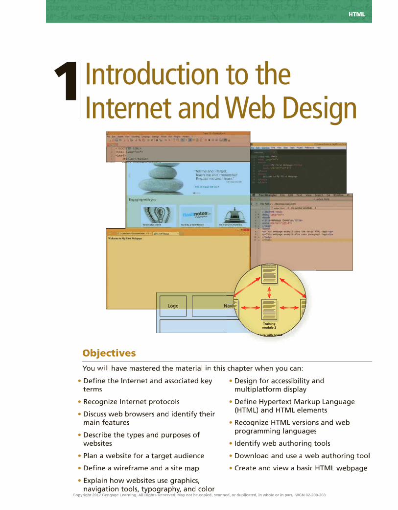
1Introduction to the Internet and Web Design
•
•
•
•
•
•
•
•
•
•
•
•
•
Objectives
Logo NavigationLogo N
Linear structure with home page links
Home Page
Trainingmodule 2
N
Linear structure with home page links
aviigg
ome p
g
re with home p
NavigationNavigation
Linear structure with home page linksLinear structure with home page linksomeme
g
re with hore with hoLinear structure with home page linksmeLinear structure with home page linksmeucture with home
Home Page
Trainingmodule 2
ucture with home p
gg
ucture with home p
HTML
Copyright 2017 Cengage Learning. All Rights Reserved. May not be copied, scanned, or duplicated, in whole or in part. WCN 02-200-203

HTML
IntroductionToday, millions of people worldwide have access to the Internet, the world’s largest network. Billions of webpages providing information on any subject you can imagine are currently available on the web. People use the Internet to search for information, to communicate with others around the world, and to seek entertainment. Students use the Internet to register for classes, pay tuition, and �nd out �nal grades. Businesses and other organizations rely on the Internet and the web to sell products and services. Hypertext Markup Language (HTML) and Cascading Style Sheets (CSS) are two of the technologies that make this possible.
The most recent version of HTML is called HTML5. Before exploring the details of creating webpages with HTML5 and CSS, it is useful to look at how these technologies relate to the development of the Internet and the web. In this chapter, you learn some basics about the Internet and the web, and the rules both follow to allow computers to communicate with each other. You review types of websites and learn how to properly plan a website so that it is appealing and useful to your target audience. You also explore web browsers, HTML, and its associated key terms. Lastly, you create a basic webpage using a text editor.
Project — Create a Basic WebpagePeople and organizations create webpages to attract attention to information such as products, services, multimedia, news, and research. Although webpages display content including text, drawings, photos, animations, videos, and links to other webpages, they are created as documents containing only text.
The project in this chapter follows general guidelines and uses a text editor to create the webpage shown in Figure 1–1. Figure 1–1a shows the code, meaningful combinations of text and symbols that a web browser interprets to display the webpage shown in Figure 1–1b. The content includes two lines of text. Other parts of the code indicate that one line of text should be displayed as the webpage title, which appears in the browser on a webpage tab. Code also speci�es that the other line of text should appear as a paragraph of body text.
Introduction to the Internet and Web Design1
Copyright 2017 Cengage Learning. All Rights Reserved. May not be copied, scanned, or duplicated, in whole or in part. WCN 02-200-203

HTML
Figure 1–1
(a) HTML code in index.html(a) HTML code in index.html
(b) Webpage in Internet Explorer(b) Webpage in Internet Explorer
RoadmapIn this chapter, you learn how to create the webpage shown in Figure 1–1. The
following roadmap identi�es general activities you perform as you progress through this chapter:
1. run a text editor and create a Blank document.
2. enter Html tags in the document.3. add text to the webpage.4. save the WeBpage as an HTML document.5. vieW the WeBpage in a browser.
At the beginning of step instructions throughout the chapter, you see an abbreviated form of this roadmap. The abbreviated roadmap uses colors to indicate chapter progress: gray means the chapter is beyond that activity; blue means the task being shown is covered in that activity; and black means that activity is yet to be covered. For example, the following abbreviated roadmap indicates the chapter would be showing a task in the 4 SAVE WEBPAGE activity.
1 RUN TEXT EDITOR & CREATE BLANK DOCUMENT | 2 ENTER HTML TAGS
3 ADD TEXT | 4 SAVE WEBPAGE | 5 VIEW WEBPAGE
Use the abbreviated roadmap as a progress guide while you read or step through the instructions in this chapter.
Exploring the InternetEvery day, millions of people use a computer to connect to the Internet. The Internet is a worldwide collection of computers linked together for use by businesses, Internet is a worldwide collection of computers linked together for use by businesses, Internetgovernments, educational institutions, other organizations, and individuals using
Copyright 2017 Cengage Learning. All Rights Reserved. May not be copied, scanned, or duplicated, in whole or in part. WCN 02-200-203

HTML HTML Chapter 1
modems, phone lines, television cables, satellite links, �ber-optic connections, radio waves, and other communications devices and media (Figure 1–2).
Figure 1–2
The Internet was developed in the 1960s by the Department of Defense Advanced Research Projects Agency (ARPA). ARPANET (as the Internet was originally called) had only four nodes and sent its �rst message in 1969. A nodeis any device, such as a computer, tablet, or smartphone, connected to a network, which is a collection of two or more computers linked together to share resources and information. The Internet has billions of nodes on millions of networks. The Internet of Things is a term used to describe the ever-growing number of devices connecting to a network, including televisions and appliances. Today, high-, medium-, and low-speed data lines connect networks. These data lines allow data (including text, graphical images, audio, and video) to move from one computer to another. The Internet backbone is a collection of high-speed data lines that link major computer systems located around the world. An Internet service provider (ISP) is a company that has a permanent connection to the Internet backbone. ISPs use high- or medium-speed data lines to allow personal and business computer users to connect to the backbone for access to the Internet. A home Internet connection is generally provided through a cable or �ber-optic line that connects to an ISP.
Billions of people in most countries around the world connect to the Internet using computers in their homes, of�ces, schools, and public locations such as libraries. In fact, the Internet was designed to be a place in which people could share information and collaborate. Users with computers connected to the Internet can access a variety of popular services, including email, social networking, and the web.
World Wide WebMany people use the terms Internet and World Wide Web interchangeably, but
these terms have different meanings. The Internet is the infrastructure, or the physical networks of computers. The World Wide Web, also called the web, is the service that provides access to information stored on web servers, the high-capacity, high-performance
Copyright 2017 Cengage Learning. All Rights Reserved. May not be copied, scanned, or duplicated, in whole or in part. WCN 02-200-203

HTML Chapter 1 HTML
HTM
L C
hap
ter
1
computers that power the web. The web consists of a collection of linked �les known as webpages, or pages for short. Because the web supports text, graphics, audio, and video, a webpage can display any of these multimedia elements in a browser.
A website, or site for short, is a related collection of webpages created and maintained by a person, company, educational institution, or other organization, such as the U.S. Department of Education (Figure 1–3). Each website contains a home page, which is the main page and the �rst document users see when they access the website. The home page typically provides information about the website’s purpose and content, often by including a list of links to other webpages on the website.
Figure 1–3
Figure 1–4
Hyperlinks are an essential part of the web. A hyperlink, more commonly called a link, is an element that connects one webpage to another webpage on the same server or to any other web server in the world. Tapping or clicking a link allows you to move quickly from one webpage to another without being concerned about where the webpages reside. You can also tap or click links to move to a different section of the same webpage.
With hyperlinks, you do not necessarily have to view information in a linear way. Instead, you can tap or click the available links to view the information in a variety of ways, as described later in this chapter. Many webpage components, including text, graphics, and animations, can serve as links. Figure 1–4 shows examples of several webpage components used as hyperlinks.
Copyright 2017 Cengage Learning. All Rights Reserved. May not be copied, scanned, or duplicated, in whole or in part. WCN 02-200-203

HTML HTML Chapter 1
ProtocolsA computer is also referred to as a client workstation. Client workstations
connect to the Internet through the use of a protocol. A protocol is a set of rules that de�nes how a client workstation can communicate with a server. A client workstation uses a protocol to request a connection to a server. The server is the host computer server is the host computer serverthat stores resources and �les for websites (Figure 1–5).
Figure 1–5
Hypertext Transfer Protocol (HTTP) is the fundamental protocol used on the web to exchange and transfer webpages. HTTP is a set of rules for exchanging text, graphics, audio, video, and other multimedia �les on the web. When you tap or click a link on a webpage, your computer uses HTTP to connect to the server containing the page you want to view, and then to request and display the appropriate page.
File Transfer Protocol (FTP) is used to exchange �les from one computer to another over the Internet (not the web). The sole purpose of FTP is to exchange �les; this protocol does not provide a way to view a webpage. Businesses commonly use FTP to exchange �les with vendors and suppliers. Web designers often use FTP to transfer updated website content to a web hosting server, the computer that stores webpages and other related content for a website.
Transmission Control Protocol/Internet Protocol (TCP/IP) is a pair of protocols used to transfer data ef�ciently over the Internet by properly routing it to its destination. TCP oversees the network connection between the data source and destination and micromanages the data. When data is sent over the Internet, TCP breaks the data into packets. Each packet contains addressing information, which the IP manages. One way to better understand TCP/IP is through an analogy of the postal system. The tasks TCP performs are similar to those workers or machines perform
Copyright 2017 Cengage Learning. All Rights Reserved. May not be copied, scanned, or duplicated, in whole or in part. WCN 02-200-203
HTML Chapter 1 HTML
HTM
L C
hap
ter
1
when handling a bundle of packages in a post of�ce. In this analogy, the packages are addressed to one destination, but are too large to send as a single bundle. TCP breaks up the bundle into manageable pieces and then sends them out for delivery. When each piece arrives at the destination, TCP reassembles the bundle of packages.
Internet Protocol (IP) ensures data is sent to the correct location. In the postal system analogy, the IP part of TCP/IP refers to the street address and zip code to route a piece of mail. Just as people have a unique mailing address, every client workstation and server on the Internet has a unique IP address. An example of an IP address is 192.168.1.5. Every website has a unique IP address, which makes it easy for computers to �nd websites. However, most people have dif�culty remembering and using IP addresses to access websites. The Domain Name System (DNS) was created to resolve this issue. The DNS associates an IP address with a domain name. For example, the DNS associates the IP address 204.79.197.200 with the domain name bing.com.
Web BrowsersTo access a website and display a webpage, a computer, tablet, or mobile device must
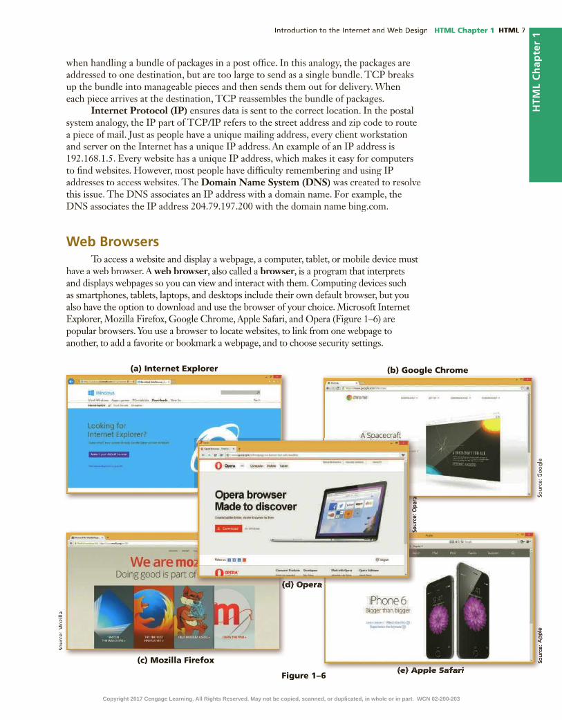
have a web browser. A web browser, also called a browser, is a program that interprets and displays webpages so you can view and interact with them. Computing devices such as smartphones, tablets, laptops, and desktops include their own default browser, but you also have the option to download and use the browser of your choice. Microsoft Internet Explorer, Mozilla Firefox, Google Chrome, Apple Safari, and Opera (Figure 1–6) are popular browsers. You use a browser to locate websites, to link from one webpage to another, to add a favorite or bookmark a webpage, and to choose security settings.
(a) Internet Explorer(a) Internet Explorer (b) Google Chrome(b) Google Chrome
(c) Mozilla Firefox(c) Mozilla Firefox
(d) Opera(d) Opera(d) Opera(d) Opera(d) Opera(d) Opera
(e) Apple Safari(e) Apple SafariFigure 1–6
Copyright 2017 Cengage Learning. All Rights Reserved. May not be copied, scanned, or duplicated, in whole or in part. WCN 02-200-203

HTML HTML Chapter 1
Besides varying by publisher, browsers vary by version. Most browsers do not display webpages identically. In fact, older versions of some browsers do not support the most recent HTML5 standards. As you are designing your website, you must view it using various browsers to ensure that it looks and functions as you intended.
Internet Explorer (Figure 1-7) is the default browser provided with the Windows 8.1 operating system and provides tools for visiting webpages and an array of options to customize settings. As with all browsers, you can use Internet Explorer to enter a website address in the address bar to display a particular webpage, designate a speci�c webpage or set of webpage tabs to display when you run the browser, and bookmark frequently visited websites as favorites for easy access. Important features of Internet Explorer are summarized in Table 1–1.
Feature Description
Address bar Displays the website address of the webpage you are viewing
Webpage tab Displays the title of the webpage; you can open multiple tabs to view multiple webpages
Home button Opens the browser’s designated home page or default webpage, which can be customized on the General tab of the Internet Options dialog box
Favorites button Allows you to save and view your favorite webpages
Tools button Provides access to print, zoom, and safety features and lets you view downloads and manage add-ons
Document window Displays the current webpage content
Figure 1–7
What is the difference between a website’s home page and a web browser’s home page?A website’s home page is the default page displayed when you enter a web address such as www.cengage.com into the address bar of a browser. As mentioned earlier, this type of home page is the introductory page of a website and provides links to access other parts of the site. A browser also has a home page, which appears when you open a browser or tap or click the Home button in the browser window. You can specify any webpage as the default home page of a browser.
CO
NS
IDE
R T
HIS
®
Table 1–1 Features of Internet Explorer 11
Copyright 2017 Cengage Learning. All Rights Reserved. May not be copied, scanned, or duplicated, in whole or in part. WCN 02-200-203
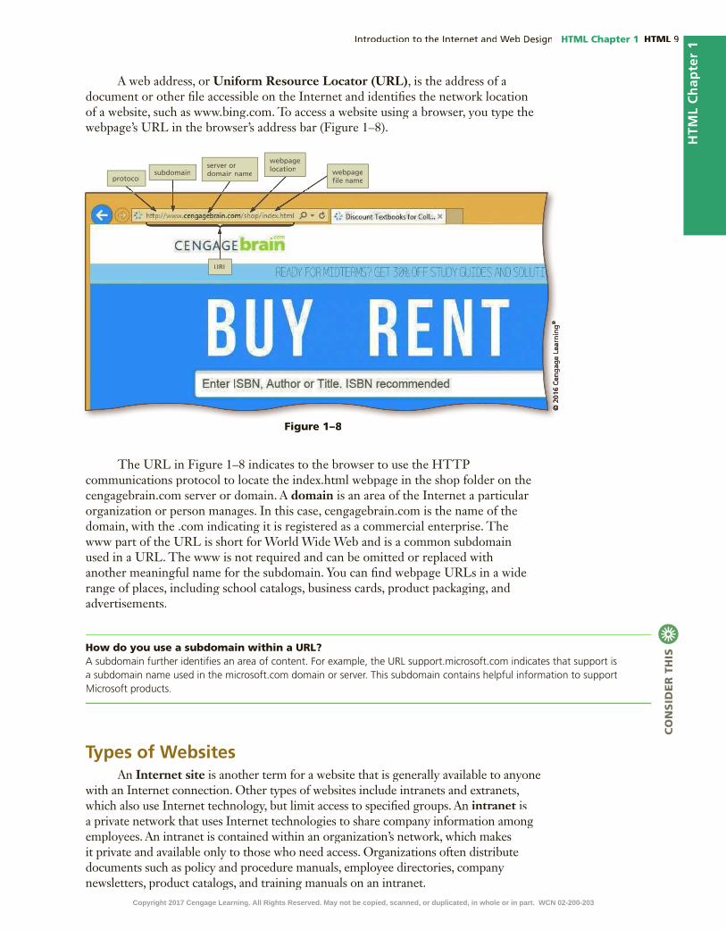
HTML Chapter 1 HTML
HTM
L C
hap
ter
1
Figure 1–8
A web address, or Uniform Resource Locator (URL), is the address of a document or other �le accessible on the Internet and identi�es the network location of a website, such as www.bing.com. To access a website using a browser, you type the webpage’s URL in the browser’s address bar (Figure 1–8).
How do you use a subdomain within a URL?A subdomain further identi�es an area of content. For example, the URL support.microsoft.com indicates that support is a subdomain name used in the microsoft.com domain or server. This subdomain contains helpful information to support Microsoft products.
CO
NS
IDE
R T
HIS
The URL in Figure 1–8 indicates to the browser to use the HTTP communications protocol to locate the index.html webpage in the shop folder on the cengagebrain.com server or domain. A domain is an area of the Internet a particular organization or person manages. In this case, cengagebrain.com is the name of the domain, with the .com indicating it is registered as a commercial enterprise. The www part of the URL is short for World Wide Web and is a common subdomain used in a URL. The www is not required and can be omitted or replaced with another meaningful name for the subdomain. You can �nd webpage URLs in a wide range of places, including school catalogs, business cards, product packaging, and advertisements.
Types of WebsitesAn Internet site is another term for a website that is generally available to anyone
with an Internet connection. Other types of websites include intranets and extranets, which also use Internet technology, but limit access to speci�ed groups. An intranet is intranet is intraneta private network that uses Internet technologies to share company information among employees. An intranet is contained within an organization’s network, which makes it private and available only to those who need access. Organizations often distribute documents such as policy and procedure manuals, employee directories, company newsletters, product catalogs, and training manuals on an intranet.
®
Copyright 2017 Cengage Learning. All Rights Reserved. May not be copied, scanned, or duplicated, in whole or in part. WCN 02-200-203

HTML HTML Chapter 1
An extranet is a private network that uses Internet technologies to share extranet is a private network that uses Internet technologies to share extranetbusiness information with select corporate partners or key customers. Companies and other organizations can use an extranet to share product manuals, training modules, inventory status, and order information. An extranet might also allow retailers to purchase inventory directly from their suppliers or to pay bills online.
Companies use websites to advertise or sell their products and services worldwide, as well as to provide technical and product support for their customers. Many company websites also support electronic commerce (e-commerce), which is the buying and selling of goods and services on the Internet. Using e-commerce technologies, these websites allow customers to browse product catalogs, compare products and services, and order goods online. Figure 1–9a shows wayfair.com, a company that uses an e-commerce website to sell and distribute home furnishings. Many e-commerce websites also provide links to order status information, customer service, news releases, and customer feedback tools to solicit comments from their customers.
(a) Wayfair(a) Wayfair (b) LMS(b) LMS
(c) Facebook(c) Facebook (c) Blog(c) Blog
Colleges, universities, and other schools use websites to distribute information about areas of study, provide course information, and register students for classes online. Many educational institutions use a Learning Management System (LMS)to simplify course management. An LMS is a web-based software application designed to facilitate online learning. Instructors use the LMS to communicate announcements, post questions on reading material, list contact information, and provide access to
Figure 1–9
®
Copyright 2017 Cengage Learning. All Rights Reserved. May not be copied, scanned, or duplicated, in whole or in part. WCN 02-200-203

HTML Chapter 1 HTML
HTM
L C
hap
ter
1
lecture slides and videos. Students use the LMS to �nd information related to their courses, including project instructions and grades. Many LMS tools allow instructors to write their own webpage content that provides further information for their students. For example, the LMS webpage in Figure 1–9b is an HTML page written by an instructor to provide an assignment schedule to students.
While organizations create commercial and academic websites, individuals might create personal websites to share information with family and friends. Families and other groups can exchange photographs, video and audio clips, stories, schedules, or other information through websites. Many individual websites allow password protection, which creates a safer environment for sharing information. Another popular type of website is a social media site, such as Facebook, Twitter, or LinkedIn (Figure 1–9c). These websites encourage their users to share information, pictures, videos, and job-related skills. Many business websites also include links to their social media pages.
People use search engine websites to research topics. Popular search engine sites include Google, Bing, and Yahoo!. A news website provides information about current events. Another type of common website is a blog, which is short for weblog. A single person or small group creates and oversees a blog, which typically re�ects the author’s point of view on a particular topic (Figure 1–9d).
Planning a WebsiteWhen visiting a physical retail store, visitors are more likely to make a purchase if the store is clean and well organized and offers quality products and services. Likewise, computer users have several expectations when visiting a website. They expect the website to load quickly in the browser. If a website takes more than a few seconds to load, a visitor is likely to leave and �nd another site, possibly belonging to a competitor. Website visitors also expect an attractive design and color scheme that enhances the experience of visiting the site and makes it easy to read and view information. They expect a clear navigation system that helps them quickly �nd the products, services, or information they are seeking. A poor design, distracting color scheme, or confusing website navigation tools also prompt visitors to switch to another website. An attractive, useful, and well-organized website is not created by accident. Building a successful website starts with a solid strategic plan.
Web designers begin planning activities by meeting with key business personnel to ask several important questions to understand the purpose of the website and the goals of the business. If you are a web designer working as a consultant or contractor, you meet with your clients to plan the website. If you are a web designer providing services within an organization, you meet with decision makers and others who are sponsoring the web design project. In either case, you begin by identifying the purpose of the website and goals of the business to help shape the design and type of website you are developing.
Purpose of the WebsiteThe purpose of a commercial business website is related to the goal of selling
products or services. A business can take a direct approach and use a website to sell products and services through e-commerce or through information that prompts website users to visit a physical location such as a store or restaurant. As an alternative, a business can take an indirect approach and use a website to generate leads to potential customers, promote the expertise of the business, raise the public pro�le of the business, or inform and educate its customers. Each purpose demands a different type of website and design. For example, if the purpose of a website is to serve as an
Copyright 2017 Cengage Learning. All Rights Reserved. May not be copied, scanned, or duplicated, in whole or in part. WCN 02-200-203

HTML HTML Chapter 1
online store, the website should allow easy access to product information, reviews, and e-commerce tools. If the purpose of the website is to build a company’s reputation, the website should feature articles about the company, its employees, and its products and integrate with social media sites such as Facebook.
Every business needs to have a mission statement that clearly addresses the purpose and goal of the business. For example, the mission statement of a bank might be “Our mission is to provide world-class service while helping our customers achieve their �nancial goals.” The business website should promote the mission statement. Web designers often ask their clients for a copy of the mission statement and use it as the foundation for the website plan. The more you know about the purpose of the website, the more likely you are to be successful with a web development project.
Target AudienceIn addition to understanding the website’s purpose, you should understand
the people who will use the website, also known as the target audience. Knowing the makeup of your target audience — including age, gender, general demographic background, and level of computer literacy — helps you design a website appropriate for them. Figure 1–10 shows the website for Michaels, an arts and crafts store. Its target audience includes creative people who enjoy making decorations and other items. The home page displays an image customized for the year-end holiday season and offers special savings to further entice its target audience to make a purchase. The simple navigation bar near the top of the page makes it easy for a customer to shop, discover a new project, or �nd inspiration. A search tool above the navigation bar provides quick access to products. Knowing the information that your target audience is searching for means you can design the site to focus on that information, which enhances the shopping and purchasing experience of your audience.
Figure 1–10
Copyright 2017 Cengage Learning. All Rights Reserved. May not be copied, scanned, or duplicated, in whole or in part. WCN 02-200-203

HTML Chapter 1 HTML
HTM
L C
hap
ter
1
Multiplatform DisplayToday, users can access a website with computing devices ranging from desktop
computers to laptops, tablets, and smartphones. In fact, people are rapidly increasing their use of a tablet or smartphone to access websites. According to Pew Research, the number of mobile (or smartphone) Internet users increased by 100 percent from 2009 to 2014. Today, more than 55 percent of Americans own a smartphone, and more than 50 percent of smartphone owners use their phone to access the Internet. In addition, more than 30 percent of those who access the Internet do so exclusively with their smartphones. These trends are only expected to increase. Yet most webpages are designed for a large display screen on a desktop or laptop and do not translate well to the smaller screen of a tablet or smartphone. This problem leads to another question web developers must ask: “How do I consistently reach the people in my target audience when they are using so many difference devices?” The solution is to use responsive design, which allows you to create one website that provides an optimal viewing experience across a range of devices. The website itself responds and adapts to the size of screen on the visitor’s device. For example, Figure 1–11 shows the responsive design of angieslist.com in desktop, tablet, and mobile screen sizes. Chapter 5 provides much more information about responsive design.
Figure 1–11
(a) Desktop Display(a) Desktop Display
(b) Tablet Display(b) Tablet Display
(c) Mobile Display(c) Mobile Display
Copyright 2017 Cengage Learning. All Rights Reserved. May not be copied, scanned, or duplicated, in whole or in part. WCN 02-200-203
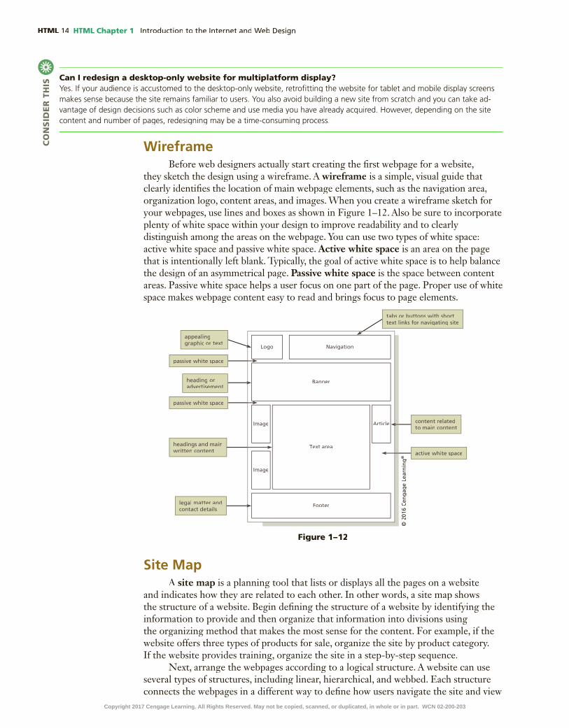
HTML HTML Chapter 1
WireframeBefore web designers actually start creating the �rst webpage for a website,
they sketch the design using a wireframe. A wireframe is a simple, visual guide that clearly identi�es the location of main webpage elements, such as the navigation area, organization logo, content areas, and images. When you create a wireframe sketch for your webpages, use lines and boxes as shown in Figure 1–12. Also be sure to incorporate plenty of white space within your design to improve readability and to clearly distinguish among the areas on the webpage. You can use two types of white space: active white space and passive white space. Active white space is an area on the page that is intentionally left blank. Typically, the goal of active white space is to help balance the design of an asymmetrical page. Passive white space is the space between content areas. Passive white space helps a user focus on one part of the page. Proper use of white space makes webpage content easy to read and brings focus to page elements.
Can I redesign a desktop-only website for multiplatform display?Yes. If your audience is accustomed to the desktop-only website, retro�tting the website for tablet and mobile display screens makes sense because the site remains familiar to users. You also avoid building a new site from scratch and you can take ad-vantage of design decisions such as color scheme and use media you have already acquired. However, depending on the site content and number of pages, redesigning may be a time-consuming process.
CO
NS
IDE
R T
HIS
Site MapA site map is a planning tool that lists or displays all the pages on a website
and indicates how they are related to each other. In other words, a site map shows the structure of a website. Begin de�ning the structure of a website by identifying the information to provide and then organize that information into divisions using the organizing method that makes the most sense for the content. For example, if the website offers three types of products for sale, organize the site by product category. If the website provides training, organize the site in a step-by-step sequence.
Next, arrange the webpages according to a logical structure. A website can use several types of structures, including linear, hierarchical, and webbed. Each structure connects the webpages in a different way to de�ne how users navigate the site and view
Logo Navigation
Banner
Footer
Image Article
Image
Text area
Figure 1–12
®
Copyright 2017 Cengage Learning. All Rights Reserved. May not be copied, scanned, or duplicated, in whole or in part. WCN 02-200-203

HTML Chapter 1 HTML
HTM
L C
hap
ter
1
the webpages. You should select a structure for the website based on how you want users to navigate the site and view the content.
A linear website structure connects webpages in a straight line, as shown in linear website structure connects webpages in a straight line, as shown in linearFigure 1–13. Each page includes a link to the next webpage and another link to the previous webpage. A linear website structure is appropriate if visitors should view the webpages in a speci�c order, as in the case of training material in which users need to complete Training module 1 before attempting Training module 2. If the information on the �rst webpage is necessary for understanding information on the second webpage, you should use a linear structure.
In a variation of a linear website structure, each page can include a link to the home page of the website, as shown in Figure 1–14. For some websites, moving from one page to the next page is still important, but you also want to provide users with easy access to the home page at any time. To meet these goals, you provide links from each page to the previous, next, and home pages. In this way, users do not have to tap or click the previous link multiple times to get back to the home page. The home page also includes links to all the pages in the site so users can quickly return to a page.
A hierarchical website connects webpages in a treelike structure, as shown in Figure 1–15. This structure works well on a site with a main index or table of contents page that links to all other webpages. With this structure, the main index page displays general information and secondary pages include more detailed information. Notice how logically the information in Figure 1–15 is organized. A webpage visitor can go from the home page to any of the three modules. In addition, the visitor can easily �nd the �rst page of Training module 3 by way of the Training module 3 link. One of the inherent problems with this structure and the two linear structures, however, is the inability to move easily from one section of pages to another. As an example, to move from Training module 1, page 2, to Training module 3, visitors must tap or click a link to return to Training module 1, introduction, tap or click another link to return to the home page, and then tap or click the Training module 3 link. This is moderately annoying for a site with two webpages, but think what it would be like if Training module 1 had 100 webpages.
Figure 1–13
Linear structure
Trainingmodule 1
Trainingmodule 2
Trainingmodule 3
Home Page
®
Figure 1–14
Linear structure with home page links
Home Page
Trainingmodule 1
Trainingmodule 2
Trainingmodule 3
®
Copyright 2017 Cengage Learning. All Rights Reserved. May not be copied, scanned, or duplicated, in whole or in part. WCN 02-200-203

HTML HTML Chapter 1
To circumvent the problems with the hierarchical model, you can use a webbed model. A webbed website structure has no set organization, as shown in Figure 1–16. webbed website structure has no set organization, as shown in Figure 1–16. webbedVisitors can move easily between pages, even if the pages are located in different sections of the website. A webbed structure works best on sites with information that does not need to be read in a speci�c order and pages that provide many navigation options. The web itself uses a webbed structure, so users can navigate among webpages in any order they choose. With this model, you most often provide a link to the home page from each page. Many websites use a graphical image (usually the organization’s logo) in the upper-left corner of each webpage as the home page link. You will use that technique later in the book.
Hierarchical structure
Training module1 page 1
Training module2 page 1
Training module3 page 1
Training module1 page 2
Training module2 page 2
Training module3 page 2
Training module1 introducion
Training module2 introducion
Training module3 introducion
Home Page
Figure 1–15
®
Figure 1–16
Webbed structure
Trainingmodule 3
page 1
Trainingmodule 1
page 1
Home Page
Trainingmodule 3
page 2
Trainingmodule 1
page 2
Trainingmodule 1
introduction
Trainingmodule 3
introduction
Trainingmodule 2
introduction
®
Copyright 2017 Cengage Learning. All Rights Reserved. May not be copied, scanned, or duplicated, in whole or in part. WCN 02-200-203

HTML Chapter 1 HTML
HTM
L C
hap
ter
1
Most websites use a combination of linear, hierarchical, and webbed structures. Some information on the website might be organized hierarchically from an index page, other information might be accessible from all areas of the site, and still other information might be organized in a linear structure to be read in a speci�c order. Using a combination of the three structures is appropriate if it helps users navigate the site easily. The goal is to get the right information to the users in the most ef�cient way possible.
GraphicsGraphics add visual appeal to a webpage and enhance the visitor’s perception of
your products and services. Be sure to use appropriate graphics on your site, those that communicate your brand, products, and services. For example, the website for Pret A Manger shown in Figure 1–17 displays a new product that serves as the focal point on the website. The graphic communicates to the user that the new dish is fresh and hot, right out of the oven. The smaller graphics below the primary graphic offer additional visual stimulation and provide an aesthetically pleasing balance to the page. These graphics are simple, yet effective in catching the user’s attention.
Figure 1–17
NavigationAs mentioned previously, the navigation of your website should be clear and
concise. Each webpage should have a designated navigation area with links to other pages in the site, as shown in Figure 1–18. The navigation area should be prominent and easy to use. Incorporating a search box near the navigation area provides another avenue for customers to �nd the item they want.
Copyright 2017 Cengage Learning. All Rights Reserved. May not be copied, scanned, or duplicated, in whole or in part. WCN 02-200-203

HTML HTML Chapter 1
TypographyThe use of effective typography, or fonts and font styles, enhances the visual
appeal of a website. Above all, the text must be legible or the website is useless. Typography also should promote the purpose and goal of the website. For example, review the wedding photography website shown in Figure 1–19. The style of the text conveys an attitude of practical elegance mixed with fun. The typography of the title at the top of the page is elegant and whimsical, while the typography of the navigation links is uncluttered and easy to read.
Figure 1–18Figure 1–18
Figure 1–19
Copyright 2017 Cengage Learning. All Rights Reserved. May not be copied, scanned, or duplicated, in whole or in part. WCN 02-200-203

HTML Chapter 1 HTML
HTM
L C
hap
ter
1
Figure 1–20
ColorAll websites use color, even if the colors are black and white. Select a limited
number of coordinated colors that help promote your purpose and brand. The combination of colors, also called a color scheme, contributes to the appeal and legibility of the website. Font and background colors must provide high color contrast for readability, so use dark text on a light background or light text on a dark background. Likewise, avoid a color combination such as a primary red background with yellow text, which is hard on the eyes. Aim to strike a balance among the background color, text color, and the color that represents your brand. Many successful color schemes have one main color, such as medium blue, and add at least one lighter and darker shade of the same color, such as sky blue and navy. Even a single shade can serve as a color scheme. Figure 1–20 displays the home page for the grocery store Publix. The store’s logo is green. The site reinforces its brand by integrating the same shade of green throughout the site.
Colors convey meanings. For example, green is associated with things that are friendly, fresh, and healthy. Table 1–2 lists colors and their common meanings.
Table 1–2 Common Color Meanings
Color Common Meaning
Red Love, romance, anger, energy
Blue Trust, loyalty, integrity, honesty, dependability
Green Freshness, friendliness, health, safety, strength
Yellow Warmth, cheer, joy, excitement, humor
Orange Energy, warmth, health
Brown Nature, wholesomeness, simplicity, friendliness
Black Elegance, tradition, sophistication, formality
White Purity, honesty, sincerity, cleanliness
Copyright 2017 Cengage Learning. All Rights Reserved. May not be copied, scanned, or duplicated, in whole or in part. WCN 02-200-203

HTML HTML Chapter 1
AccessibilityFinally, address accessibility and localization issues. A web designer should create
pages for viewing by a diverse audience, including people with physical impairments and global users. Consider the software used by those with physical impairments to work with some web features. For instance, for each graphic you include on the website, always include alternative text so people with sight limitations can use screen-reading software to identify the visual content. To support an international audience, use generic icons that can be understood globally, avoid slang expressions in the content, and build simple pages that load quickly over low-speed connections.
In 1998, the Rehabilitation Act was amended with Section 508, which requires that any information technology created or bought by a government agency be accessible to persons with disabilities. Information technology includes websites, which means web designers must consider users with visual, auditory, motor, and cognitive disabilities in their website designs. Visit www.section508.gov for more information.
The World Wide Web Consortium (W3C) develops and maintains web standards, language speci�cations, and accessibility recommendations. Several companies that use web technologies participate in work groups with the W3C to develop standards and guidelines for the web. The website for W3C is www.w3.org.
Planning ChecklistThe planning items just discussed are only a few of the basic webpage design
issues that you need to consider when developing a website. A more sophisticated website requires additional design considerations and research of the business, its competition, and a complete business analysis. Throughout this book, design issues will be addressed as they relate to the chapter project.
The rest of the chapters in this book employ professional web design practices in addition to the development of webpages. You will learn many design and development techniques, including how to add links, styles, layout, graphics, tables, forms, and multimedia to your webpages.
Table 1–3 serves as a checklist of items to consider when planning a website.
W3CThe mission of the W3C is “to lead the World Wide Web to its full potential by developing protocols and guidelines that ensure the long-term growth of the Web.” Information about the membership process is available at www.w3.org /consortium/membership.
Break Point: If you want to take a break, this is a good place to do so. To resume at a later time, continue reading the text from this location forward.
Topic Web Designer Questions
Purpose of the website What is the purpose and goal of the website? What is the organization’s mission statement?
Target audience Describe the target audience (age, gender, demographics).What information is most pertinent to the users?
Multiplatform display Will you design for display on multiple platforms or focus only on a desktop or mobile design?
Site map How many webpages will be included in the website? How will the webpages be organized? What type of website structure is appropriate for the content?
Wireframe What features will be displayed on each webpage?
Graphics What graphics will you use on the website?
Color What colors will you use within the site to enhance the purpose and brand?
Typography What font styles will you use within the website?
Accessibility How will the website accommodate people with disabilities?
Table 1–3 Checklist for Planning a Website
Copyright 2017 Cengage Learning. All Rights Reserved. May not be copied, scanned, or duplicated, in whole or in part. WCN 02-200-203

HTML Chapter 1 HTML
HTM
L C
hap
ter
1
Understanding the Basics of HTMLWebpages are created using Hypertext Markup Language (HTML), which is an authoring language used to create documents for the web. HTML consists of a set of special instructions called tags to de�ne the structure and layout of content in a webpage. A browser reads the HTML tags to determine how to display the webpage content on a screen. Because the HTML tags de�ne or “mark up” the content on the webpage, HTML is considered a markup language rather than a traditional programming language. HTML has evolved through several versions from the initial public release of HTML 1.0 in 1989 to the current version, HTML5. Each version has expanded the capabilities of the language.
HTML Elements and AttributesA webpage is a text �le that contains both content and HTML tags and is saved as an
HTML document. HTML tags mark the text to de�ne how it should appear when viewed in a browser. HTML includes dozens of tags that describe the structure of webpages and create links to other content. For instance, the HTML tags <nav> and </nav> mark the start and end of a navigation area, while <html> and </html> indicate the start and end of a webpage. An HTML element consists of everything from the start tag to the end HTML element consists of everything from the start tag to the end HTML elementtag, including content, and represents a distinct part of a webpage such as a paragraph or heading. For example, <title> Webpage Example </title> is an HTML element that sets the title of a webpage. In common usage, when web designers say “Use a p element to de�ne a paragraph,” or something similar, they mean to use a starting <p> tag to mark the beginning of the paragraph and an ending </p> tag to mark the end of the paragraph.
You can enhance HTML elements by using attributes, which de�ne additional characteristics, or properties, of the element such as the width and height of an image. An attribute includes a name, such as width, and can also include a value, such as 300px, which sets the width of an element in pixels. Attributes are included within the element’s, start tag. Figure 1–21 shows the anatomy of HTML elements in Notepad++, which uses color coding to distinguish parts of the code. For example, Notepad++ displays tags in blue, attribute names in red, attribute values in purple, and content in black.
Lowercase HTML TagsAlthough most browsers interpret a tag such as <nav> the same way it interprets <NAV>, the convention for HTML5 is to use all lowercase tags. Using lowercase tags means your HTML documents conform to the current W3C standard.
HTML combines tags and descriptive attributes that de�ne how a document should appear in a web browser. HTML elements include headings, paragraphs, hyperlinks, lists, and images. Most HTML elements have a start tag and an end tag and
Figure 1–21
Copyright 2017 Cengage Learning. All Rights Reserved. May not be copied, scanned, or duplicated, in whole or in part. WCN 02-200-203

HTML HTML Chapter 1
follow the same rules, or syntax, which determine how the elements should be written so they are interpreted correctly by the browser. These HTML elements are called pairedtags and use the syntax <start tag> content </end tag>, which has the following meaning:
•HTML elements begin with a start tag, or opening tag, such as <title>.•HTML elements �nish with an end tag, or closing tag, such as </title>.•Content is inserted between the start and end tags. In Figure 1–21, the content
for the title tags is Webpage Example.
Some HTML elements are void of content. They are called empty, or void, tags. Examples of empty tags are <br> for a line break and <hr> for a horizontal line, or rule. The syntax for empty tags is <tag>.
Figure 1–22 shows the HTML code and content needed to create the webpage shown in Figure 1–23.
Figure 1–22Figure 1–22
Figure 1–23
Copyright 2017 Cengage Learning. All Rights Reserved. May not be copied, scanned, or duplicated, in whole or in part. WCN 02-200-203
HTML Chapter 1 HTML
HTM
L C
hap
ter
1
Technologies Related to HTMLSeveral technologies, listed as follows, have been developed since the
introduction of HTML to extend its capabilities. These technologies also use tags to mark up content in a text document.
•XML — The W3C introduced XML (Extensible Markup Language) in 1998 to exchange and transport data. It does not replace HTML, but rather, can work with HTML by transporting web data obtained through an HTML webpage.
•XHTML — XHTML (Extensible Hypertext Markup Language) is a rewritten version of HTML using XML and was developed in 2000. Its primary bene�t is that it is more widely accepted on mobile device platforms.
•DHTML — DHTML (Dynamic Hypertext Markup Language) is a term that refers to a combination of web technologies, such as HTML, CSS, and JavaScript to create interactive and dynamic webpage content. DHTML was introduced in the mid-1990s.
HTML5With its debut in 2008, HTML5 is the most recent version of HTML. HTML5
introduces several new elements such as header, nav, main, and footer to better de�ne the areas of a webpage. They are classi�ed as structural elements because they de�ne the structure of a webpage. These new elements also are considered semantic HTML elements because they provide meaning about the content of the tags. (The term semantic refers to the meaning of words or ideas.) For example, <header> is a semantic semantic refers to the meaning of words or ideas.) For example, <header> is a semantic semantictag because it de�nes content that appears at the top of a webpage. The name and purpose of the <header> tag re�ect its meaning. On the other hand, <b>, for bold, is not a semantic tag because it de�nes only how content should look, not what it means.
HTML5 also provides a more �exible approach to web development. For instance, with HTML5, you can incorporate audio and video with the use of <audio> and <video> tags. These new features reduce the need for browser plugins, which are small programs that let webpages play sounds or videos, for example. This book shows HTML5 tags and attributes that are currently supported by modern browsers.
Understanding the Role of Other Web Programming LanguagesIn addition to HTML, web developers use other web programming languages such as JavaScript and PHP to add interactivity and functionality. Although you can create websites without these languages, they are useful when you need to include features beyond the scope of HTML. You should be aware of these languages as you begin learning about web development.
JavaScriptJavaScript is a popular scripting language used to create interactivity within JavaScript is a popular scripting language used to create interactivity within JavaScript
a web browser. Common uses for JavaScript include creating popup windows and alert messages, displaying the current date, and validating form data. JavaScript is a client-side scripting language, which means that the browser processes it on the
Copyright 2017 Cengage Learning. All Rights Reserved. May not be copied, scanned, or duplicated, in whole or in part. WCN 02-200-203

HTML HTML Chapter 1
client computer. Webpages that contain JavaScript are named with an .htm or .html extension, just like a webpage without JavaScript.
jQueryjQuery is a library of JavaScript programs designed for easy integration onto jQuery is a library of JavaScript programs designed for easy integration onto jQuery
a webpage. jQuery makes it easy for web developers to add JavaScript to a webpage. The jQuery Foundation (https://jquery.org) is a group of web developers that work together to create open-source projects. Their mission is to “improve the open web, making it accessible for everyone, through the development and support of open-source software, and collaboration with the development community.”
PHPPHP (Hypertext Preprocessor) is an open-source scripting language often
used for common tasks such as writing to or querying a database located on a central server. PHP is a server-side scripting language, which means that the PHP script is processed at the server. The result of the PHP script is often an HTML webpage that is sent back to the client. Pages that contain PHP scripts must have �le names that end with the �le extension .php.
ASPASP (Active Server Pages) is a server-side scripting technology from Microsoft
used to accomplish many of the same server-side processing tasks as PHP. Pages that contain ASP scripts must have �le names that end with the �le extension .asp.
Using Web Authoring ToolsYou can create webpages using HTML with a simple text editor, such as Notepad, Notepad++, Sublime, Programmer’s Notepad, TextEdit, and TextWrangler. Notepad comes installed with the Windows operating system, and TextEdit comes installed with the Mac OS X operating system. TextWrangler also runs only on Mac OS X, while the other text editors run on Windows. A text editor is a program that allows you to enter, text editor is a program that allows you to enter, text editorchange, save, and print text, which includes HTML tags. Text editors do not typically have many advanced features, but they do allow you to develop HTML documents easily. An HTML editor or code editor is a program that provides basic text-editing functions, as well as more advanced features such as color-coding for various HTML tags, menus to insert HTML tags, and a spelling checker. HTML is platform independent, meaning you can create, or code, an HTML �le in Windows or Mac and then view it on any browser.
Text EditorsNotepad++ is a free, open-source text editor. You can use it to create �les in
several markup, scripting, and programming languages, including HTML, CSS, JavaScript, PHP, Java, C#, and Visual Basic. Notepad++ runs on Windows computers; go to http://notepad-plus-plus.org to download the program. Figure 1–24 displays the Notepad++ user interface.
Copyright 2017 Cengage Learning. All Rights Reserved. May not be copied, scanned, or duplicated, in whole or in part. WCN 02-200-203

HTML Chapter 1 HTML
HTM
L C
hap
ter
1
Programmer’s Notepad is another free, open-source text editor you can use to create webpages. Like Notepad++, you can use Programmer’s Notepad to create �les in several markup, scripting, and programming languages as well. Programmer’s Notepad runs on Windows; go to www.pnotepad.org to download the program. Figure 1–25 displays the Programmer’s Notepad user interface.
Figure 1–24
Figure 1–25
Copyright 2017 Cengage Learning. All Rights Reserved. May not be copied, scanned, or duplicated, in whole or in part. WCN 02-200-203

HTML HTML Chapter 1
Sublime is a cross-platform text editor you can use on the Windows, Mac OS X, or Linux operating system. With Sublime, you can create �les in several formats, including HTML and CSS. Go to www.sublimetext.com to �nd a free trial version of the software and one with a license for purchase. Figure 1–26 displays the Sublime user interface.
Figure 1–26
Figure 1–27
TextWrangler is a free, open-source text editor available for Mac OS X 10.6.8 TextWrangler is a free, open-source text editor available for Mac OS X 10.6.8 TextWrangleror a later version. You can use it to create �les in many formats, including HTML and CSS. Go to www.barebones.com/products/textwrangler to download TextWrangler. Figure 1–27 displays the TextWrangler user interface.
Copyright 2017 Cengage Learning. All Rights Reserved. May not be copied, scanned, or duplicated, in whole or in part. WCN 02-200-203

HTML Chapter 1 HTML
HTM
L C
hap
ter
1
to doWnload and install a text editor
Before you can create your �rst webpage, you must select a text editor that you will use to create your webpages. Begin by asking whether your instructor has a preferred text editor to use in the course. If not, use a text editor provided by your operating system (such as Notepad or TextEdit) or download one of the HTML text editors previously discussed. If you want to download and install an HTML text editor, you would perform the following steps.
1. Use your browser to access the website for Notepad++, Programmer’s Notepad, Sublime, or TextWrangler.
• Notepad++: http://notepad-plus-plus.org• Programmer’s Notepad: www.pnotepad.org• Sublime: www.sublimetext.com• TextWrangler (Mac OS X only): www.barebones.com/products
/textwrangler
2. Navigate the text editor’s website to locate the download link.3. Tap or click the link to download the software.4. When the download is complete, open the downloaded �le to begin the
installation.5. Follow the instructions in the setup wizard to complete the installation.6. Run the text editor when �nished.
WYSIWYG EditorsMany popular software applications also provide features that enable you to
develop webpages easily. Microsoft Word and Excel, for example, have a Save As Web Page option that converts a document into an HTML �le by automatically adding HTML tags to the document. Using Microsoft Access, you can create a webpage that allows you to view data from a database. Adobe Acrobat also has an export feature that creates HTML �les. While these programs provide the capability to save as a webpage, they do not substitute the use of a text editor or a WYSIWYG editor. WYSIWYGstands for What You See Is What You Get. WYSIWYG editors provide a graphical user interface to design a webpage, as opposed to the blank page provided in a text editor used to write code. The WYSIWYG editor allows you to drag HTML elements onto the page while the editor writes the code for you. While these editors can be useful in developing webpages, understanding the code means you have the control and �exibility to create webpages that meet your needs.
Adobe Dreamweaver is a popular WYSIWYG editor used by many people Adobe Dreamweaver is a popular WYSIWYG editor used by many people Adobe Dreamweaverand businesses around the world for web development. Several types of web �le formats can be developed with Dreamweaver, including HTML, CSS, JavaScript, and PHP. Dreamweaver can be installed on a computer running Windows or Mac OS X. Dreamweaver provides several views for working with a webpage �le, including Design view, Code view, Split view, and Live view. Design view shows the design of the webpage, while Code view is similar to a text editor. Split view provides a side-by-side view of the webpage design and code. Live view mimics a browser display. Figure 1–28 shows an example of Dreamweaver in Split view. Dreamweaver is part of Adobe Creative Cloud and is available for purchase as a monthly or annual subscription. Visit www.adobe.com for more information about Adobe Dreamweaver Creative Cloud.
Copyright 2017 Cengage Learning. All Rights Reserved. May not be copied, scanned, or duplicated, in whole or in part. WCN 02-200-203

HTML HTML Chapter 1
Microsoft Expression Web 4 is a WYSIWYG webpage editor from Microsoft. Expression Web 4 is the �nal version of the software and is shown in Figure 1–29. Expression Web is available as a free download on the Microsoft website. To replace Expression Web, Microsoft is currently directing customers to use its Visual Studio Express 2013 for Web; however, this is a text editor and not a WYSIWYG editor. Visual Studio Express 2013 for Web is shown in Figure 1–30.
Figure 1–28
Figure 1–29
Figure 1–30Copyright 2017 Cengage Learning. All Rights Reserved. May not be copied, scanned, or duplicated, in whole or in part. WCN 02-200-203

HTML Chapter 1 HTML
HTM
L C
hap
ter
1
Figure 1–31
Creating a Basic WebpageEvery HTML webpage includes the basic HTML tags shown in Figure 1–31.
The numbers on the left represent line numbers for each line of HTML code. Line 1 shows the tag for declaring an HTML5 webpage. All HTML5 webpages must begin with the HTML element <!DOCTYPE html>. This is the �rst line of HTML code for all of your HTML webpages.
Line 2 shows the HTML tag needed to begin an HTML document. The basic opening tag is <html> and the closing tag is </html>, which always appears on the last line of the webpage. The lang="en" contained within the opening html tag is an attribute that de�nes the type of language used (English).
Line 3 shows the head tag, which contains the webpage title and other information about the webpage. The opening head tag is <head> and the closing tag is </head>.
Line 4 shows the webpage title tags, <title> and </title>. The text contained between these tags is displayed within the web browser tab. The title tags belong within the opening and closing head tags. To make the head section easier to read, web developers customarily indent the tags in the head section, such as the title and meta tags.
Line 5 shows the meta tag. A meta tag contains information about the data on the webpage. In this instance, the meta tag designates the type of character set the browser should use, charset="utf-8". The charset is an attribute within the meta tag that speci�es the character encoding to be used for the webpage. The Unicode Transformation Format (UTF) is a compressed format that allows computers to display and manipulate text. When the browser encounters this meta tag, it displays the webpage properly. UTF-8 is standard for HTML5 pages and is the preferred encoding standard for email and other applications. The encoding chosen is also important when validating the webpage, which you will do in Chapter 2. Note that the meta tag is a single tag element without opening and closing tags making it an empty element. The meta tag belongs within the opening and closing head tags.
Lines 7 and 8 show the <body> and </body> tags. All text, images, links, and other content displayed on the webpage are included within the <body> and </body> tags.
<!DOCTYPE> StatementBecause the web includes billions of documents, a browser refers to the HTML version and type in the <!DOCTYPE> statement to display a webpage correctly. Previous versions of HTML had complicated <!DOCTYPE> statements.
Do I have to indent certain lines of HTML code?Indenting lines of code is not required, but it helps improve the readability of the webpage. In Figure 1–31, Lines 4 and 5 are indented to clearly show the tags contained in the <head> and </head> tags. If the code included elements between the <body> and </body> tags, those lines could also be indented to make them easier to read. Using indents is a good web design practice.
CO
NS
IDE
R T
HIS
®
Copyright 2017 Cengage Learning. All Rights Reserved. May not be copied, scanned, or duplicated, in whole or in part. WCN 02-200-203

HTML HTML Chapter 1
To Start Notepad++ and Create a Blank Document
The following steps start Notepad++ based on a typical installation in Windows 8.1. Why? Before you can create a webpage, you must open a text editor. You may need to ask your instructor how to download, install, and start Notepad++ for your computer.
Figure 1–32
Other Ways
Figure 1–33
Note:
1 RUN TEXT EDITOR & CREATE BLANK DOCUMENT | 2 ENTER HTML TAGS
3 ADD TEXT | 4 SAVE WEBPAGE | 5 VIEW WEBPAGE
1•
• Notepad++
2•
•
Now that you have learned the basic HTML tag elements, it is time to create your �rst webpage. The following steps use Notepad++ to create an HTML document. You may complete these steps using a text editor other than Notepad++, but your screens will not match those in the book and your line numbers may vary slightly.
Copyright 2017 Cengage Learning. All Rights Reserved. May not be copied, scanned, or duplicated, in whole or in part. WCN 02-200-203

HTML Chapter 1 HTML
HTM
L C
hap
ter
1
To Add Basic HTML Tags to a Document
Create your �rst webpage beginning with the required minimum HTML tags. Why? An HTML webpage requires several basic HTML tags so it can be displayed properly on a web browser. The following steps add the required HTML tags to a document.
• <!DOCTYPE html>
• enter
<html lang="en">
• enter
<head>
1
Q&
AHow do I use the touch keyboard with a touch screen?To display the on-screen touch keyboard, tap the Touch Keyboard button on the Windows taskbar. When �nished using the touch keyboard, tap the X button on the touch keyboard to close the keyboard.
CO
NS
IDE
R T
HIS
Figure 1–34
Figure 1–35
•• enter
enter
tAB SHIFt+tAB
2
Q&
A
1 RUN TEXT EDITOR & CREATE BLANK DOCUMENT | 2 ENTER HTML TAGS
3 ADD TEXT | 4 SAVE WEBPAGE | 5 VIEW WEBPAGE
Copyright 2017 Cengage Learning. All Rights Reserved. May not be copied, scanned, or duplicated, in whole or in part. WCN 02-200-203

HTML HTML Chapter 1
To Add a Title and Text to a Webpage
Now that you have added required HTML tags, you are ready to designate a title and add content to the page. Why? A webpage title appears on the browser tab and usually displays the name of the webpage. After titling a webpage, you add content to the body section. The following steps add a title and content to the webpage.
1•
• My First Webpage
Figure 1–36
Figure 1–37
2•
enter
• tAB
• Welcome to My First Webpage
Line Number HTML Tag
4 <title></title>
5 <meta charset=”utf-8”>
6 </head>
7 <body>
8 </body>
9 </html>
Table 1–4 HTML Tags
1 RUN TEXT EDITOR & CREATE BLANK DOCUMENT | 2 ENTER HTML TAGS
3 ADD TEXT | 4 SAVE WEBPAGE | 5 VIEW WEBPAGE
Copyright 2017 Cengage Learning. All Rights Reserved. May not be copied, scanned, or duplicated, in whole or in part. WCN 02-200-203

HTML Chapter 1 HTML
HTM
L C
hap
ter
1
To Save a Webpage
After creating a webpage, you must save it as an HTML �le. Why? A text editor can be used to create many types of �les; therefore, you must specify that this is an HTML �le so a browser can display it as a webpage. The following steps save the document as an HTML �le.
Figure 1–38
1•
•
2•
•
index
index
•
•
Q&
AQ
&A
3
Figure 1–39
Other Ways
CtrL S
1 RUN TEXT EDITOR & CREATE BLANK DOCUMENT | 2 ENTER HTML TAGS
3 ADD TEXT | 4 SAVE WEBPAGE | 5 VIEW WEBPAGE
Copyright 2017 Cengage Learning. All Rights Reserved. May not be copied, scanned, or duplicated, in whole or in part. WCN 02-200-203

HTML HTML Chapter 1
To View a Webpage in a Browser
After saving an HTML document, you can view it as a webpage in a web browser. Why? A web browser reads the HTML code and displays the webpage content. The following steps display a webpage in a browser.
1•
•
Q&
A
Figure 1–40
Using a Different Text EditorIf you completed the previous steps with a text editor other than Notepad++,
your screen will look similar to Figure 1–41 for Programmer’s Notepad, to Figure 1–42 for Sublime, and to Figure 1–43 for TextWrangler.
Figure 1–41
Figure 1–42Figure 1–42
1 RUN TEXT EDITOR & CREATE BLANK DOCUMENT | 2 ENTER HTML TAGS
3 ADD TEXT | 4 SAVE WEBPAGE | 5 VIEW WEBPAGE
Copyright 2017 Cengage Learning. All Rights Reserved. May not be copied, scanned, or duplicated, in whole or in part. WCN 02-200-203

HTML Chapter 1 HTML
HTM
L C
hap
ter
1
Chapter SummaryIn this chapter, you learned about the Internet, the web, and associated technologies, including web servers and web browsers. You learned the essential role of HTML in creating webpages and reviewed tools used to create HTML documents. You also learned how to create a basic HTML webpage. The items listed below include all the new concepts and skills you have learned in this chapter, with the tasks grouped by activity.
Creating a Basic WebpageStart Notepad++ and Create a Blank Document
(HTML 30)Add Basic HTML Tags to a Document
(HTML 31)Add a Title and Text to a Webpage (HTML 32)Save a Webpage (HTML 33)View a Webpage in a Browser (HTML 34)
Exploring the InternetDescribe the Internet (HTML 3)Describe the World Wide Web (HTML 4)De�ne Protocols (HTML 6)Discuss Web Browsers (HTML 7)Identify Types of Websites (HTML 9)
Planning a WebsiteIdentify the Purpose and Audience of the Website
(HTML 11–12)
Design for Multiplatform Display (HTML 13)Describe a Wireframe and a Site Map (HTML 14)Consider Graphics, Navigation, Typography, and
Color (HTML 17–19)Design for Accessibility (HTML 20)
Understanding the Basics of HTMLDe�ne Hypertext Markup Language (HTML 21)Describe HTML Elements (HTML 21)List Useful HTML Practices (HTML 22)Identify Technologies Related to HTML
(HTML 23)Explain the Role of Other Web Programming
Languages (HTML 23)
Using Web Authoring ToolsIdentify Text Editors (HTML 24)Download and Install a Text Editor (HTML 27)Describe WYSIWYG Editors (HTML 27)
What decisions will you need to make when creating your next webpage?Use these guidelines as you complete the assignments in this chapter and create your own webpages outside of this class.
1. Plan the website.
a. Identify the purpose of the website.
b. Identify the users of the website.
c. Recognize the computing environments of the users.
d. Design a wireframe and a site map.
2. Choose the design components.
a. Identify possible graphics for the website.
b. Determine the types of navigation tools and typography to use.
c. Select a color scheme.
d. Consider accessibility.
CO
NS
IDE
R T
HIS
Figure 1–43
Continued >Copyright 2017 Cengage Learning. All Rights Reserved. May not be copied, scanned, or duplicated, in whole or in part. WCN 02-200-203

STU
DE
NT
AS
SIG
NM
EN
TS HTML HTML Chapter 1
Apply Your Knowledge
Creating a Basic HTML WebpageInstructions: The page shown in Figure 1–44 contains the required HTML5 tags for all webpages. In your HTML editor, you will enter these required HTML tags and save the �le as an HTML document that can serve as the model, or template, for other HTML documents. You will make a copy of the HTML template and insert the paragraph content to create and personalize a page to introduce yourself, your major, and your goals for the class. The �gures in this exercise use Notepad++ (Windows) and TextWrangler (Mac) as HTML editors, but you can complete the exercises in this book using any HTML editor such as Sublime, Programmer’s Notepad, KompZer, HTML Kit, CoffeeCup, Aptana, UltraEdit, or Microsoft WebMatrix, to mention a few.
Perform the following tasks:1. Open your HTML editor, and enter the required HTML tags as shown in Figure 1–44. In this
�gure, the tags within the <head> section are indented to visually separate the <head> section from the <body> section. Adding spaces, indents, or extra blank lines to an HTML document does not change the way the page looks in the browser. Professional webpage developers use indents and blank space to make the code easier to read and maintain.
How should you submit solutions to questions in the assignments identi�ed with a symbol?Every assignment in this book contains one or more questions identi�ed with a symbol. These questions require you to think symbol. These questions require you to think beyond the assigned presentation. Present your solutions to the questions in the format required by your instructor. Possible formats may include one or more of these options: write the answer; create a document that contains the answer; present your answer to the class; discuss your answer in a group; record the answer as audio or video using a webcam, smartphone, or portable media player; or post answers on a blog, wiki, or website.
CO
NS
IDE
R T
HIS
Figure 1–44
3. Select a webpage authoring tool.
a. Review available authoring tools.
b. Determine an authoring tool to use to create the webpages.
4. Create a basic HTML webpage.
a. Insert the basic HTML tags.
b. Indent some elements to improve readability.
c. Add content to the webpage.
d. Save the �le as an HTML document.
e. Display the webpage in a browser.
CONSIDER THIS continued
Copyright 2017 Cengage Learning. All Rights Reserved. May not be copied, scanned, or duplicated, in whole or in part. WCN 02-200-203

HTM
L C
hap
ter
1S
TU
DE
NT
AS
SIG
NM
EN
TS
HTML Chapter 1 HTML
2. Save the �le as a Hyper Text Markup Language �le with the name template01 in the chapter01\apply folder provided with the Data Files for Students. (Hintchapter01\apply folder provided with the Data Files for Students. (Hintchapter01\apply folder provided with the Data Files for Students. ( : If you are using TextWrangler, enter the entire �le name and extension of template01.html to save the �le as an HTML �le). Both Notepad++ and TextWrangler save HTML �les with an html �le name extension and apply color coding.
3. Tap or click the opening <html> tag. Examine the HTML document shown in Figure 1–45, which displays the code in Notepad++. In a Word document, answer the following questions:
a. In what color does Notepad++ display HTML tags?
b. What color are HTML attributes?
c. What color are HTML attribute values?
d. When you tap or click the start or end tag of a set of paired tags, what background color is used to highlight the pair?
Figure 1–45
4. Examine the HTML document shown in Figure 1–46, which displays the code in TextWrangler. In a Word document, answer the following questions:
a. In what color does TextWrangler display HTML tags?
b. What color are HTML attributes?
c. What color are HTML attribute values?
d. In what background color is the current line highlighted?
Figure 1–46Figure 1–46Continued >Copyright 2017 Cengage Learning. All Rights Reserved. May not be copied, scanned, or duplicated, in whole or in part. WCN 02-200-203

STU
DE
NT
AS
SIG
NM
EN
TS HTML HTML Chapter 1
If you are using a plain text editor such as Notepad (Windows) or TextEdit (Mac), all of the code and content is black, as shown in Figure 1–47.
Apply Your Knowledge continued
Figure 1–47
5. Delete the closing quotation mark in the <meta charset="utf-8"> tag and observe how the colors change on the screen. In a Word document, explain how the colors changed on the screen. Replace the missing quotation mark. Observing how the colors work in your HTML editor helps you productively �nd and correct errors.
6. Save the template01.html �le with the name intro.html in the chapter01\apply folder provided with the Data Files for Students. Given all HTML5 pages start with the same required tags, a productive way to create a new �le is to open the template01.html �le and then save it with a new name as a starting point for the new page.
7. Enter the paragraph tags, horizontal rule tags, and content as shown in Figure 1–48 (Notepad++) and Figure 1–49 (TextWrangler). Modify the content within the paragraph <p> … </p> tags to introduce yourself in this page. Use indents as desired to make the page easy to read.
Figure 1–48Copyright 2017 Cengage Learning. All Rights Reserved. May not be copied, scanned, or duplicated, in whole or in part. WCN 02-200-203

HTM
L C
hap
ter
1S
TU
DE
NT
AS
SIG
NM
EN
TS
HTML Chapter 1 HTML
Figure 1–50Figure 1–50
Figure 1–49
8. Save intro.html and then open the �le in a current browser. A sample solution is shown in Figure 1–50.
9. Submit the �les you created in this exercise in a format speci�ed by your instructor. You may be asked to electronically submit the �les as an email attachment or drop-box attachment. You may be asked to publish the pages to a web server. See Lab 3 in this chapter and Chapter 12 for more information on publishing pages to web servers.
10. In Step 2, you saved a text �le as an HTML �le. At that point, an HTML editor will provide color-coded visual support. Identify three different ways that the color supports productive web development skills. Also, identify the HTML editor you are using, and note three different color codes applied by that editor.
Copyright 2017 Cengage Learning. All Rights Reserved. May not be copied, scanned, or duplicated, in whole or in part. WCN 02-200-203

STU
DE
NT
AS
SIG
NM
EN
TS HTML HTML Chapter 1
Extend Your Knowledge
Adding Comments to an HTML DocumentNote: To complete this assignment, you will be required to use the Data Files for Students. Visit www.cengage.com/ct/studentdownload for detailed instructions or contact your instructor for information about accessing the required �les.
Instructions: Open your HTML editor and then open the extend01.html �le provided in the Data Files for Students. Add the HTML tags, text, indents, blank lines, and comments as instructed. Save the page as ski01.html in the same location and view it in a browser. Figure 1–51a shows the completed HTML document in Notepad++ and Figure 1–51b shows the completed webpage in a browser.
Figure 1–51
(a) ski01.html in Notepad++(a) ski01.html in Notepad++
(b) ski01.html in a browser(b) ski01.html in a browser
Copyright 2017 Cengage Learning. All Rights Reserved. May not be copied, scanned, or duplicated, in whole or in part. WCN 02-200-203

HTM
L C
hap
ter
1S
TU
DE
NT
AS
SIG
NM
EN
TS
Introduction to the Internet and Web Design HTML Chapter 1 HTML 41
Perform the following tasks:1. HTML comments are inserted into a webpage using special tags with the following syntax:
<!-- comment goes here -->
A comment may be placed anywhere in the HTML document after the opening <!DOCTYPE html> statement and may be one or more lines long as needed. The only requirement is that the comment opens with the same four characters <!--, and ends with the same three characters, -->. In ski01.html, enter a comment after the opening <!DOCTYPE html> declaration statement that includes your name and the current date as shown in Figure 1–51a.
2. Enter the remaining tags and text shown in Figure 1–51a without any indents or blank lines.Save the �le and open it in a browser. In a Word document named ski01.docx, answer these questions:
a. How do HTML comments appear on the webpage when it is opened in a browser?
b. How does the content within the <p> … </p> tags appear in a browser?
3. Return to your HTML editor and add blank lines and indents as shown in Figure 1–51a. Save the HTML �le and refresh it in your browser to see the changes. In your Word document, answer these questions:
a. What is the purpose of adding extra lines and indents in the HTML editor?
b. How do the extra lines and indents change the way the webpage appears in the browser?
4. Add <p>, </p>, and <br> tags as shown in Figure 1–51a so that the content is rendered in the browser on multiple lines. In your Word document, answer these questions:
a. What is the purpose of adding the <p> and </p> tags?
b. What is the purpose of adding the <br> tags?
5. Save the HTML �le and refresh it in your browser to see the changes. Compare Figure 1–51a and Figure 1–51b. In your Word document, identify how the following two lines use white space in the HTML editor and compare that to how the browser reads and displays the same line.
a. “Our ski and snowboard…”
b. “Phone: 1-800…”
6. Submit your assignment in the format speci�ed by your instructor.
7. What would happen if webpage developers did not use comments, indents, and white space? Identify a potential problem associated with each.
Analyze, Correct, ImproveAnalyze a webpage, correct all errors, and improve it.
Correcting HTML ErrorsNote: To complete this assignment, you will be required to use the Data Files for Students. To complete this assignment, you will be required to use the Data Files for Students. TVisit www.cengage.com/ct/studentdownload for detailed instructions or contact your instructor for information about accessing the required �les.
Instructions: Open your HTML editor and then open the analyze01.html �le provided in the DataFiles for Students. This document lists 10 HTML5 best practices in its body section. You will follow these 10 guidelines to correct the webpage as instructed. Save the page as practices01.html in the same location and view it in a browser. Figure 1–52a shows the completed HTML document in Notepad++ and Figure 1–52b shows the completed webpage in a browser.
Continued >
Copyright 2017 Cengage Learning. All Rights Reserved. May not be copied, scanned, or duplicated, in whole or in part. WCN 02-200-203

STU
DE
NT
AS
SIG
NM
EN
TS HTML HTML Chapter 1
1. Correct
a. Replace the existing HTML4 DOCTYPE statement with the correct DOCTYPE statement for an HTML5 webpage.
b. Go through the page and change all uppercase element and attribute names in the tags to lowercase.
c. Go through the page and make sure all paired elements end with a closing slash ( / ) such as </title> or </head>.
d. Go through the page and make sure all attribute values are surrounded by “quotation marks”.
e. Go through the page and add indents and extra lines for readability.
f. Check the comments to make sure they start with <!-- and end with -->. Change the generic text in the comment to include your name and the current date.your name and the current date.your
g. Select the content within the <body> . . . </body> tags and then check the spelling. Your HTML editor may have a spelling checker, or you may need to copy and paste the content into another program with a spelling checker such as Word. Fix any spelling errors you �nd.
h. By completing Steps a–g, you have followed HTML5 best practices 1–7. You will learn about styles and validation in future chapters. Skip ahead to best practice 10 to save and view your webpage in a browser.
Figure 1–52
(a) practices01.html in (a) practices01.html in Notepad++
(b) practices01.html in a browser
Analyze, Correct, and Improve continued
Copyright 2017 Cengage Learning. All Rights Reserved. May not be copied, scanned, or duplicated, in whole or in part. WCN 02-200-203

HTM
L C
hap
ter
1S
TU
DE
NT
AS
SIG
NM
EN
TS
HTML Chapter 1 HTML
2. Improve
a. In future chapters you will learn how to create an ordered list that automatically numbers each item in the list. For now, add a <br> tag after “HTML5 best practices” and after each item in the list to place the title and each item on the list on its own line.
b. Save and preview the webpage.
c. Submit your assignment in the format speci�ed by your instructor.
3. Which error identi�ed in Steps 1a–1g was the most dif�cult to �nd and correct? Use speci�c HTML terminology in your answer.
In the Labs
Lab 1: Creating a Webpage from a Template and Using Placeholder TextProblem: You work for a local but rapidly growing gardening supply company that specializes in products to support food self-suf�ciency. The company has identi�ed a small number of extremely successful products that they want to market through a website and have hired you to get started. Cre-ate the webpage shown in Figure 1–53b that identi�es the type of content you want to include on the company’s home page. In later chapters, you will replace the placeholders with actual text and images.
Figure 1–53
(a) cityfarmer.html in Notepad++(a) cityfarmer.html in Notepad++
(b) cityfarmer.html in a browser
Continued >Copyright 2017 Cengage Learning. All Rights Reserved. May not be copied, scanned, or duplicated, in whole or in part. WCN 02-200-203

STU
DE
NT
AS
SIG
NM
EN
TS HTML HTML Chapter 1
Instructions: Perform the following tasks:1. If you created the template01.html �le in the Apply Your Knowledge exercise in this chapter,
open template01.html and then save it with the name cityfarmer.html in the chapter01\lab1 folder provided with the Data Files for Students.
If you did not create the template01.html �le, enter the required HTML tags as shown in Figure 1–53a and then save the �le with the name cityfarmer.html in the chapter01\lab1 folder provided with the Data Files for Students.
2. Enter the text City Farmer Home Page within the <title> … </title> tags.
3. Within the body section, add the following content using six sets of paragraph tags. At this point, the content consists of six placeholder paragraphs that you will replace with actual webpage content in a later chapter.
<p>Clear Navigation Bar</p>
<p>Company Description and Featured Products</p>
<p>How to Contact Us</p>
<p>News and Events</p>
<p>Customer Interaction – Call to Action</p>
<p>Home Page Images</p>
4. Add an <hr> tag after each of the closing paragraph tags to insert a horizontal line after each paragraph.
5. Indent the code and content within the head and body sections to make each section distinct and readable.
6. Add a comment after the opening <!DOCTYPE html> statement that contains your name and the current date.
7. Check the spelling of the text within the title and body tags, as shown in Figure 1–53a.
8. Save the page and then open it in a browser, as shown in Figure 1–53b.
9. Submit your assignment in the format speci�ed by your instructor.
10. The term placeholder refers to any area of a webpage that you want to reserve for a particular placeholder refers to any area of a webpage that you want to reserve for a particular placeholderpurpose. A webpage developer will often use text or image placeholders when designing webpages, especially if actual content is not yet available. Using your favorite search engine, search to �nd three different reasons to use webpage placeholders.
Lab 2: Creating a Webpage from a TemplateProblem: You are part of a philanthropic group of motorcyclists who participate in community events and parades to raise cancer awareness. Your group is called Cycle Out Cancer, and the director has asked you to help create a website for the group. Create the webpage shown in Figure 1–54b, which identi�es the type of content to include on the organization’s home page. In later chapters, you will replace the placeholders with actual text and images.
In the Labs continued
Copyright 2017 Cengage Learning. All Rights Reserved. May not be copied, scanned, or duplicated, in whole or in part. WCN 02-200-203

HTM
L C
hap
ter
1S
TU
DE
NT
AS
SIG
NM
EN
TS
HTML Chapter 1 HTML
Figure 1–54
(a) cycle.html in Notepad++(a) cycle.html in Notepad++
(b) cycle.html in (b) cycle.html in a browsera browser
Instructions: Perform the following tasks:1. If you created the template01.html �le in the Apply Your Knowledge exercise in this chapter,
open template01.html and then save it with the name cycle.html in the chapter01\lab2 folder provided with the Data Files for Students.
If you did not create the template01.html �le, enter the required HTML tags as shown in Figure 1–54a and then save the �le with the name cycle.html in the chapter01\lab2 folder provided with the Data Files for Students.
2. Enter the text Cycle Out Cancer Home Page within the <title> … </title> tags.
3. Within the body section, add the following content using 10 sets of paragraph tags. At this point, the content consists of 10 placeholder paragraphs that you will replace with actual webpage content in later chapters.
<p>1 Headline: Cycle Out Cancer</p>
<p>2 Sub-headline: We Ride So Others May Live</p>
<p>3 Benefits: Explain how we make a difference to this world.</p>
<p>4 Call-to-Action: Links to email, Facebook, Twitter, and other ways to contact us.</p>
<p>5 Features: Include pictures, maps, and descriptions of planned rides.</p>
Figure 1–54
Continued >
Copyright 2017 Cengage Learning. All Rights Reserved. May not be copied, scanned, or duplicated, in whole or in part. WCN 02-200-203

STU
DE
NT
AS
SIG
NM
EN
TS HTML HTML Chapter 1
<p>6 Cancer Survivors: Include quotes from lives we’ve touched.</p>
<p>7 Website Navigation System</p>
<p>8 Images</p>
<p>9 Resources</p>
<p>10 Address</p>
4. Replace the “10 Address” placeholder text with your name and the address of your school. your name and the address of your school. yourInclude a <br> tag at the end of each line so that each line of the address appears on its own line as shown in Figure 1–54a. The entire address should be surrounded by only one set of <p> … </p> tags.
5. Indent the code and content within the head and body sections to make each section distinct and readable.
6. Check the spelling of the text within the title and body tags.
7. Save the page and then open it in a browser as shown in Figure 1–54b.
8. Submit your assignment in the format speci�ed by your instructor.
9. The term Call to Action (CTA) refers to anything that urges the reader of a webpage to take an immediate action. The CTA on a webpage is often a button or hyperlink. Using your favorite search engine, identify �ve reasons you might use a CTA and then provide �ve techniques for drawing attention to your CTAs.
Lab 3: Expand Your WorldPublishing to a WebsiteNote: To complete this assignment, you will be required to use the Data Files for Students. Visit www.cengage.com/ct/studentdownload for detailed instructions or contact your instructor for information about accessing the required �les.
Problem: If you want your webpages to be viewed by anyone connected to the Internet, you must store the pages on a web server. Transferring webpage �les from your local computer to a web server is called publishing. Once your webpages are published on the web server, the server creates an http:// address that allows others to �nd and view your pages using any browser connected to the Internet.
Several key pieces of information and permissions need to be in place before you can successfully publish your webpages to a web server. This exercise will help you �nd and record the information you need to publish your webpages to your school’s web server. If your school does not provide free web server space to students, this exercise will help you �nd free or inexpensive web server space where you can publish your webpages. (Note:where you can publish your webpages. (Note:where you can publish your webpages. ( Always check with your instructor regarding whether your webpages are to be published. Each school is set up differently, but this exercise helps you collect the necessary information.)
Instructions:1. Ask your instructor if you are going to publish your webpages to a school web server and if any
supporting documentation is available.
2. Open the webpublishing.docx document from the Data Files for Students.
In the Labs continued
Copyright 2017 Cengage Learning. All Rights Reserved. May not be copied, scanned, or duplicated, in whole or in part. WCN 02-200-203

HTM
L C
hap
ter
1S
TU
DE
NT
AS
SIG
NM
EN
TS
HTML Chapter 1 HTML
3. Using the web server documentation provided by your instructor or school, �ll out the right column of the table to identify the pieces of information needed to publish your webpages. A sample solution is provided in webpublishing.docx that applies to students at Johnson County Community College in Overland Park, Kansas.
4. Use the web to research three inexpensive web server alternatives.
5. Open the webserveralternatives.docx document from the Data Files for Students.
6. Using the information you found in Step 4, complete the table in the webserveralternatives.docx document to compare three web server alternatives. You may be asked to share and compare this information with the rest of the class.
7. Con�rm if and how your instructor wants you to publish your webpages, as well as how your work will be submitted for grading purposes.
8. Some web hosting companies offer free web hosting services. However, all businesses need to generate revenue in order to survive. Using your favorite search engine, identify three ways free web hosting companies generate revenue.
Consider This: Your Turn
Note: To complete this assignment, you will be required to use the Data Files for Students. Visit www.cengage.com/ct/studentdownload for detailed instructions or contact your instructor for information about accessing the required �les.
1. Design and Create a Personal Portfolio Website
PersonalPart 1: As in almost every �eld, the job market for the best jobs in web development are competitive. One way to give yourself a big edge in a job search is to create an appropriate personal portfolio website to showcase your skills. Plan the website by completing the table in the portfolio.docx document in the Data Files for Students. Answer the questions with thoughtful, realistic responses. Be sure to sketch the wireframe for your home page on the last page. Submit your assignment in the format speci�ed by your instructor.
Part 2: What do you want this website to accomplish?
2. Design and Create a Website for a Web Development and Consulting Business
ProfessionalPart 1: When you are �nished with college, you plan to join a web development and consulting �rm to gain experience in the �eld. Your long-term goal is to start and own a web development and consulting �rm. You decide to begin by designing a website you would eventually like to build for the �rm. Start planning the website by completing the table in the webdevelopment.docx document in the Data Files for Students. Answer the questions with thoughtful, realistic responses. Be sure to sketch the wireframe for your home page on the last page. Submit your assignment in the format speci�ed by your instructor.
Part 2: What are some general characteristics of any successful small business that you want this website to portray? What are some characteristics of a successful web development consulting �rm that you want this website to portray?
Continued >
Copyright 2017 Cengage Learning. All Rights Reserved. May not be copied, scanned, or duplicated, in whole or in part. WCN 02-200-203

STU
DE
NT
AS
SIG
NM
EN
TS HTML HTML Chapter 1
3. Design and Create a Website for the Dog Hall of Fame
Research and CollaborationPart 1: Dogs add an enormous amount of joy and happiness to a family. Some dogs guard and protect. Others fetch, herd, search, or hunt. Almost all pets provide loving companionship and unconditional acceptance. Because dogs play such a major role in the lives of their owners, your class has been approached by a retired veterinarian to help him build a website, the “Dog Hall of Fame,” that honors three special dogs each year. The three award categories will include working dog, hero dog, and companion dog.
Your �rst order of business is to organize a group of three or four peers in your class to plan the website by completing the table in the doghalloffame.docx document in the Data Files for Students. Answer the questions with thoughtful, realistic responses. Be sure to sketch the wireframe for your home page on the last page. Submit your assignment in the format speci�ed by your instructor.
Part 2: You made several decisions while planning the website for this assignment. Which two or three of the questions did you �nd the most dif�cult to answer and why? What additional information would be helpful in planning this website?
Consider This: Your Turn continued
Copyright 2017 Cengage Learning. All Rights Reserved. May not be copied, scanned, or duplicated, in whole or in part. WCN 02-200-203

2 Building a Webpage Template with HTML5
•
•
•
•
•
•
•
•
•
•
•
•
Objectives
HTML
css
images
csscss
imaimaimagesges
Classes NutritionClasses Nutrition
Copyright 2017 Cengage Learning. All Rights Reserved. May not be copied, scanned, or duplicated, in whole or in part. WCN 02-200-203

HTML
IntroductionBuilding a website from scratch involves a lot of time and planning, which is one reason that professional web design services are in high demand. Some web designers have their own business and provide their services on contract to clients, who are people or other businesses that want to build or redesign a website. Other web designers work in larger organizations and provide their services to people within the organization, who are called stakeholders. As an introduction to basic website design and development, this book provides a foundation on which to build your web design skills.
As discussed in Chapter 1, before you start building a website, you must plan it, which includes meeting with the clients or stakeholders to discover their needs, the purpose of the website, and their target audience. After developing a plan, you can start constructing the website by creating an HTML document and then adding the required basic HTML elements so visitors can display the webpage in a browser. Next, include HTML5 elements to de�ne the speci�c sections or areas of the webpage. This initial HTML document can serve as the template for the site. A template is a prede�ned webpage that contains a speci�c HTML structure to be used by all pages within the website. This chapter focuses on how to build a webpage template with HTML5 elements and then use that template to create a home page.
Project — Plan and Build a WebsiteA local �tness center called Forward Fitness Club opened recently and needs a website to help promote its business. The business owner wants the website to showcase the club’s equipment, group �tness classes, nutrition information, and contact information. The owner hired you to plan and design the Forward Fitness Club website.
The project in this chapter follows generally accepted guidelines for planning and building the webpage template shown in Figure 2–1a to produce the home page shown in Figure 2–1b. The template contains code and text including the document title, header, navigation area, and footer, which is repeated on each page of the Forward Fitness Club website. The template also includes comments to remind the web designer about the purpose of each section.
Building a Webpage Template with HTML52
Copyright 2017 Cengage Learning. All Rights Reserved. May not be copied, scanned, or duplicated, in whole or in part. WCN 02-200-203

RoadmapIn this chapter, you will learn how to create the webpage shown in Figure 2–1.
The following roadmap identi�es general activities you will perform as you progress through this chapter:
1. create WeBsite folders to organize �les.2. create a template.3. enter Html5 semantic elements in the document.
4. add comments and content to the document.
5. validate the document.
6. create and vieW the Home page.
At the beginning of step instructions throughout the chapter, you will see an abbreviated form of this roadmap. The abbreviated roadmap uses colors to indicate chapter progress: gray means the chapter is beyond that activity; blue means the task being shown is covered in that activity, and black means that activity is yet to be covered. For example, the following abbreviated roadmap indicates the chapter would be showing a task in the 4 ADD COMMENTS & CONTENT activity.
1 CREATE WEBSITE FOLDERS | 2 CREATE TEMPLATE | 3 ENTER HTML5 SEMANTIC ELEMENTS
4 ADD COMMENTS & CONTENT | 5 VALIDATE DOCUMENT | 6 CREATE & VIEW HOME PAGE
Use this abbreviated roadmap as a progress guide while you read or step through the instructions in this chapter.
Figure 2–1
HTML
(a) Website template
(b) Home page(b) Home page
(a) Website template
Copyright 2017 Cengage Learning. All Rights Reserved. May not be copied, scanned, or duplicated, in whole or in part. WCN 02-200-203

HTML HTML Chapter 2
Designing a WebsiteBefore you begin creating webpages for a website, you must have a solid web design plan. Designing a website includes planning, articulating the website’s purpose, identifying the target audience, creating a site map and wireframe, selecting graphics and colors to use in the site, and determining whether to design for an optimal viewing experience across a range of devices. Completing these activities helps ensure an effective design for your website.
After Forward Fitness Club contacted you to develop its website, you scheduled time to meet with the owner and asked several questions to plan and design the website. During the meeting, you learned the needs of the business and website, as outlined in Table 2–1.
Purpose of the Website
To promote �tness services and gain new clients. The Forward Fitness Club mission: to facilitate a healthy lifestyle and help our clients meet their �tness and nutrition goals.
Target Audience
Forward Fitness Club customers are adults between the ages of 18 and 50 within the local community.
Multiplatform Display
Forward Fitness Club recognizes the growth in smartphone and tablet usage and wants a single website that provides an optimal viewing experience regardless of whether visitors are using a desktop, laptop, tablet, or smartphone.
Wireframe and Site Map
The initial website will consist of �ve webpages arranged in a hierarchal structure with links to the home page on every page. Each webpage will include a header area, navigation area, main content area, and footer area.
Graphics Forward Fitness Club wants to display its �tness equipment and logo to help with local branding. Photos of the facility, members, and staff will increase visual appeal.
Color Forward Fitness Club wants to use its logo colors, green and yellow, to promote health, strength, and a bright future.
Typography To make the content easy to read, the website will use a serif font style for paragraphs, lists, and other body content, while providing contrast by using a sans serif font style for headings.
Accessibility Standard accessibility attributes, such as alternative text for graphics, will be used to address accessibility. See Appendix D for an accessibility reference list.
Table 2–1 Forward Fitness Club Website Plan
Site MapRecall that a site map indicates how the pages in a website relate to each other.
To create a site map, you �rst need to know how many pages to include in the website. The owner of Forward Fitness Club has many ideas for the website, including some ambitious ones. To keep the website simple for now while allowing room for growth, you and the owner agree that the initial website will have a total of �ve webpages titled Home, About Us, Classes, Nutrition, and Contact Us. Because each page will contain links to all pages and accommodate future growth, the website will use a modi�ed hierarchal structure. The webpages will include the following content:
•Home page: Introduces the �tness center and its mission statement•About Us page: Showcases the facility’s equipment and services•Classes page: Includes a schedule of available group training and �tness classes•Nutrition page: Provides nutrition tips and simple meal plans•Contact Us page: Provides a phone number, email address, physical address, and
form for potential clients to request additional information about the �tness center’s servicesFigure 2–2 depicts the site map for the Forward Fitness Club website.
Copyright 2017 Cengage Learning. All Rights Reserved. May not be copied, scanned, or duplicated, in whole or in part. WCN 02-200-203

HTML Chapter 2 HTML
HTM
L C
hap
ter
2
WireframeIn addition to the site map for the Forward Fitness Club website, you have
sketched out a webpage wireframe. Recall that a wireframe depicts the layout of a webpage, including its major content areas. Forward Fitness Club wants to promote its brand by including its logo, so each page will contain a designated area called the header for the logo. The header is located at the top of a webpage and identi�es the site, often by displaying the business name or logo. For easy navigation, each page also will have a horizontal list of links to the other pages in the site. These page links will appear below the header in the navigation area. The primary page content, or the main content area, will follow the navigation area and will contain information that applies to the page, including headings, paragraphs of text, and images. Lastly, the footer will be located below the primary page content and will contain copyright and contact information. Figure 2–3 shows the proposed wireframe with these major content areas.
Home
About Us Classes Nutrition Contact Us
Futuresuccessstories
Futureclass
descriptions
Futurenutrition
plans
Figure 2–2
Figure 2–3
Header
Navigation
••
Main
Footer
Copyright 2017 Cengage Learning. All Rights Reserved. May not be copied, scanned, or duplicated, in whole or in part. WCN 02-200-203

HTML HTML Chapter 2
Recall from Chapter 1 that a semantic element provides meaning about the content of the element. For example, you use the nav element to de�ne the navigation area. It is a semantic element because its name re�ects the purpose of its content, which is to display links to other pages so visitors can navigate the website. Semantic elements reinforce the meaning of the information provided on the webpage. A semantic wireframe uses semantic elements to de�ne the structure of a webpage. The wireframe shown in Figure 2–3 uses four semantic elements to de�ne the structure of the Forward Fitness Club webpages: header, nav, main, and footer.
File ManagementWebsites use several types of �les, including HTML �les, image �les, media
such as audio and video �les, and CSS �les, which you learn about in Chapter 4. Even a simple website might use hundreds of �les. Therefore, each site must follow a systematic method to organize its �les. Before you begin to create your �rst HTML page, start by creating a folder and subfolders to contain and organize your website �les as shown in Figure 2–4.
What is the difference between a site map and a wireframe?A site map lists all the webpages in a website that a user can access. It clearly identi�es the number of pages in the website and shows how each page is linked to other pages. You can create a site map as an outline in a word processing document or as an image using �owcharting or graphics software.
In contrast, a wireframe shows the visual layout of the webpage to indicate where elements should appear such as the logo, search box, navigation bar, main content, and footer. You typically use graphics software to create a wireframe.
CO
NS
IDE
R T
HIS
�tness
css
images
media
template
Figure 2–4
The main folder (also called the root folder) for the Forward Fitness Club root folder) for the Forward Fitness Club root folderwebsite is the �tness folder. It contains all of the �les and other folders for the website. The css folder will contain CSS �les, which you create in Chapter 4 to format a webpage and its elements. The images folder will contain the Forward Fitness Club logo, photos, and other images to display on the webpages. The media folder will
Copyright 2017 Cengage Learning. All Rights Reserved. May not be copied, scanned, or duplicated, in whole or in part. WCN 02-200-203

HTML Chapter 2 HTML
HTM
L C
hap
ter
2
contain audio and video �les, which you add in Chapter 9. The template folder contains the template document for the site’s webpages, which you create in this chapter.
1 CREATE WEBSITE FOLDERS | 2 CREATE TEMPLATE | 3 ENTER HTML5 SEMANTIC ELEMENTS |
4 ADD COMMENTS & CONTENT | 5 VALIDATE DOCUMENT | 6 CREATE & VIEW HOME PAGE
1•
•
•
•
• fitnessenter
Figure 2–5
Figure 2–6
2•
•
• css•
• images•
• media
•
• template
Other Ways
CtrL+SHIFt+n
Note:
To Create a Website Folder and Subfolders
The following steps, which assume Windows 8.1 is running, create a folder and subfolders for the �tness website. Why? Before you can create a website, you should create a folder for the website �les. You may need to ask your instructor whether you should create the website folder on a portable storage device, such as a USB �ash drive.
Copyright 2017 Cengage Learning. All Rights Reserved. May not be copied, scanned, or duplicated, in whole or in part. WCN 02-200-203

HTML HTML Chapter 2
Using HTML5 Semantic ElementsAs you learned in Chapter 1, you begin a new HTML document by adding the basic required HTML elements to it, such as the html, head, and body elements. Within the body element, you next add HTML elements that de�ne the structure of the page. HTML 4.01 introduced the div element (with the <div> and </div> tags) to divide a page into separate sections. Each div element has a unique name to distinguish it from other div elements on the page. For example, you might use a div element named header for the header area and another div element named nav for the navigation area. However, webpage authors can use any name they like to de�ne a div element, leading to inconsistency among naming conventions for websites.
HTML5 has transformed and improved website development with the introduction of several new semantic elements with standardized names. Table 2–2 provides a list of common HTML5 semantic elements. The name of each tag re�ects the purpose of the element. For instance, you use the footer element to display content at the bottom (or footer) of the webpage. You use the nav element to identify the navigation area of a webpage. Because many of the semantic elements help to structure the layout of the page, they are also called structural elements or layout elements.
Element Description
<header>…</header> Indicates the header information on the webpage. Header content typically consists of a business name or logo and is commonly positioned immediately after the opening <body> tag.
<nav>…</nav> Indicates the start and end of a navigation area within the webpage. The nav element contains hyperlinks to other webpages within a website and is commonly positioned immediately after the closing </header> tag.
<main>…</main> Indicates the start and end of the main content area of a webpage. Contains the primary content of the webpage. Only one main element can appear on a page.
<footer>…</footer> Indicates the start and end of the footer area of a webpage. Contains the footer content of the webpage.
<section>…</section> Indicates the start and end of a section area of a webpage. Contains a speci�c grouping of content on the webpage.
<article>…</article> Indicates the start and end of an article area of a webpage. Contains content such as forum or blog posts.
<aside>…</aside> Indicates the start and end of an aside area of a webpage. Contains information about nearby content and is typically displayed as a sidebar.
Table 2–2 HTML5 Semantic Elements
Professional web designers debate whether to use the div element or the main element to de�ne the main content area of a webpage. Those who favor the div element argue that it has widespread browser support. The W3C introduced the main element after other semantic elements, and not all browsers or text editors recognize it yet.
Web designers who favor the main element do so because main is a semantic element while div is not. In other words, the name of the main element describes its purpose and function. The div element relies on its id attribute to provide meaning.
After discussing the pros and cons of the main and div elements with the owner of the Forward Fitness Club, you decide to use the main element for the �tness website. Because it is a new site that does not have to incorporate webpages created with earlier versions of HTML, it will use the new HTML5
Copyright 2017 Cengage Learning. All Rights Reserved. May not be copied, scanned, or duplicated, in whole or in part. WCN 02-200-203

HTML Chapter 2 HTML
HTM
L C
hap
ter
2
structural elements, including header, nav, main, and footer, to lay out the webpages. Although the div element achieves the same results in layout, the future of web development includes using the new HTML5 layout tags, and Forward Fitness wants to create a foundation for this future. Using the semantic HTML5 elements standardizes naming conventions, making webpages more universal, accessible, and meaningful to search engines.
How can I �nd out whether my browser supports the new HTML5 elements?Most major browsers have embraced several of the new HTML5 semantic tags. To know whether your preferred browser supports speci�c tags, visit caniuse.com and enter the name of the semantic element. The site lists the browsers and versions that support the element you entered. This site also provides information about the global usage of major browsers and their share of the market. Currently, the main element is not fully supported by Internet Explorer 11 or earlier.
Another good resource for up-to-date information on HTML5 is html5rocks.com. This site provides links to several HTML5 resources, including a timeline of HTML5 browser support of speci�c elements. C
ON
SID
ER
TH
IS
Header ElementThe header element structurally de�nes the header area of a webpage.
The header element starts with a <header> tag and ends with a </header> tag. Content placed between these tags appears on the webpage as part of the header element. Web designers often place a business name or logo within the header element.
Nav ElementThe nav element structurally de�nes the navigation area of a webpage. The
nav element starts with a <nav> tag and ends with a </nav> tag. The nav element usually includes links to other pages within the website.
Main ElementThe main element structurally de�nes the main content area of a webpage.
The main element starts with a <main> tag and ends with a </main> tag. Each page can have only one main element because its content should be unique to each page. At the time this book was written, all major browsers supported the main element, with the exception of Internet Explorer 11 and earlier versions. While Internet Explorer 11 will display content within the main element, it does not fully support the element. For example, Internet Explorer 11 might not correctly display formatting applied to the main element.
Footer ElementThe footer element structurally de�nes the bottom, or footer area, of a
webpage. The footer element starts with a <footer> tag and ends with a </footer> tag. Common content found within a webpage footer includes copyright information, contact information, and page links.
Copyright 2017 Cengage Learning. All Rights Reserved. May not be copied, scanned, or duplicated, in whole or in part. WCN 02-200-203

HTML HTML Chapter 2
Creating a Webpage TemplateA hallmark of a well-designed website is that its webpages have the same look and feel. In other words, most pages have the same layout and all the pages share the same color scheme, typography, and style of graphics. In addition, elements work the same way on each page. For example, the navigation bar appears in the same position on each page and uses the same colors, fonts, and font styles. Visitors select a link on the navigation bar the same way, such as by tapping or clicking a page name. The selected link then appears in a contrasting color.
To make sure the webpages in a site share a standard layout, you can create a template, an HTML document that contains elements that should appear on each page. Instead of creating a webpage from scratch, open the template document in a text editor and save it using the name of the new webpage. You can then concentrate on adding content for that particular page rather than re-creating the basic required HTML elements and the structural elements.
For the �tness website, you can create a template that includes the basic required HTML elements (the DOCTYPE declaration and the html, head, title, meta, and body elements) and the four HTML structural semantic elements identi�ed in the webpage wireframe shown in Figure 2–3: header, nav, main,and footer.
Header
Nav
Main
Footer
Figure 2–7
Figure 2–7 identi�es the relationship between a coded webpage template with header, nav, main, and footer elements and the conceptual wireframe design of a webpage.
(a) HTML template
(b) Wireframe
Saving Your WorkIt is a good idea to save your HTML �le periodically as you are working to avoid the risk of losing your work.
Copyright 2017 Cengage Learning. All Rights Reserved. May not be copied, scanned, or duplicated, in whole or in part. WCN 02-200-203
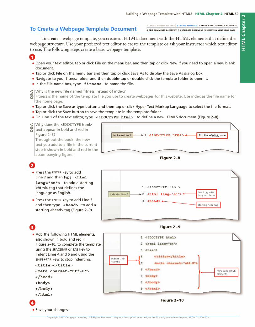
HTML Chapter 2 HTML
HTM
L C
hap
ter
2
To Create a Webpage Template Document
To create a webpage template, you create an HTML document with the HTML elements that de�ne the webpage structure. Use your preferred text editor to create the template or ask your instructor which text editor to use. The following steps create a basic webpage template.
1 CREATE WEBSITE FOLDERS | 2 CREATE TEMPLATE | 3 ENTER HTML5 SEMANTIC ELEMENTS
4 ADD COMMENTS & CONTENT | 5 VALIDATE DOCUMENT | 6 CREATE & VIEW HOME PAGE
•
••• fitness
••• <!DOCTYPE html>
1
Q&
AQ
&A
2• enter
<html lang="en">
• enter
<head>
2
2•
SPACeBAr tAB
SHIFt+tAB
<title></title>
<meta charset="utf-8">
</head>
<body>
</body>
</html>
2•
3
4
Figure 2–9
Figure 2–8
Figure 2–10
Copyright 2017 Cengage Learning. All Rights Reserved. May not be copied, scanned, or duplicated, in whole or in part. WCN 02-200-203

HTML HTML Chapter 2
To Add HTML5 Semantic Elements to a Webpage Template
The wireframe in Figure 2–3 de�nes four areas to display content for the website. To de�ne these content areas, insert the following HTML5 tags between the <body> and </body> tags: <header> </header>, <nav> </nav>, <main> </main>, and <footer> </footer>. Recall that the HTML5 header element de�nes the header area of the webpage. The nav element de�nes the navigation area of the webpage. The main element de�nes the primary content area of the webpage. The footer element de�nes the footer area of the webpage. The following steps insert HTML5 structural elements within the body tags.
1 CREATE WEBSITE FOLDERS | 2 CREATE TEMPLATE | 3 ENTER HTML5 SEMANTIC ELEMENTS
4 ADD COMMENTS & CONTENT | 5 VALIDATE DOCUMENT | 6 CREATE & VIEW HOME PAGE
1•
enter
• tAB
<header>
• enter
</header>
Q&
A
2•
<nav>
</nav> (blank line)
<main>
</main> (blank line)
<footer>
</footer>
3•
main header, nav, footer main main
Q&
A
Figure 2–11
Figure 2–12
Copyright 2017 Cengage Learning. All Rights Reserved. May not be copied, scanned, or duplicated, in whole or in part. WCN 02-200-203

HTML Chapter 2 HTML
HTM
L C
hap
ter
2
To Add a Title to a Webpage Template
Recall that when a webpage is displayed in a browser, the browser tab displays the document title. To add a document title, type the title text between the starting and ending title tags. The following steps add a webpage title to a template.
Auto-Fill and Highlighting FeaturesIf you are using Notepad++ or Sublime, you can use the auto-�ll feature by starting to type the name of a tag and letting the text editor complete the tag for you. If you are using Notepad++, tap or click the starting <body> tag to highlight the starting and ending tags so you can easily identify them.
Turning on Word WrapTo turn on word wrap in Notepad++, select View on the menu bar and then select Word wrap.
1•
Forward FitnessClub
2•
Q&
A
Figure 2–13Figure 2–13
CommentsAs you create a webpage template, include comments about the HTML
elements you use to de�ne the areas within the webpage. Comments can provide additional information about these areas and the type of information they include, which is especially helpful if you stop working on a partially completed page and then return to it later. Add a comment before a tag using the following syntax:
<!-- Place your comment here -->The comment syntax uses the angle brackets, similar to the HTML tags. The
next character is an exclamation mark followed by two dashes (--). Add the comment text after the �rst set of dashes. For example, you use comments to give instructions on how to use the template or to identify the author of the website. Close the comment by adding two dashes, followed by a closing angle bracket.
If you are using Notepad++, the text you enter scrolls continuously to the right unless you turn on the word wrap feature. Word wrap causes text lines to break at the right edge of the window and appear on a new line, so all entered text is visible in the Notepad++ window. When word wrap is enabled, a paragraph of text is assigned a single logical line number even though it may be displayed on multiple physical lines in Notepad++. Word wrap does not affect the way text prints.
Copyright 2017 Cengage Learning. All Rights Reserved. May not be copied, scanned, or duplicated, in whole or in part. WCN 02-200-203

HTML HTML Chapter 2
To Add Comments to a Webpage Template
When you create a webpage template, including comments provides additional information about how to use the sections of the webpage. You can also use a comment to identify that you are the author of the webpage.Why? When creating a new webpage from a template, comments provide insight on the type of information to include.The following steps add comments to a webpage template.
1 CREATE WEBSITE FOLDERS | 2 CREATE TEMPLATE | 3 ENTER HTML5 SEMANTIC ELEMENTS
4 ADD COMMENTS & CONTENT | 5 VALIDATE DOCUMENT | 6 CREATE & VIEW HOME PAGE
•
enter
• <!-- This website template was created by: Student’s First Name Student’s Last Name -->
1
Q&
A
•enter
• tAB
<!-- Use the header area for the website name or logo -->
2
Q&
A
•enter
• <!-- Use the nav area to add hyperlinks to other pages within the website -->
3
Figure 2–14
Figure 2–15
Figure 2–16Copyright 2017 Cengage Learning. All Rights Reserved. May not be copied, scanned, or duplicated, in whole or in part. WCN 02-200-203

HTML Chapter 2 HTML
HTM
L C
hap
ter
2
•enter
• <!-- Use the main area to add the main content of the webpage -->
•enter
• <!-- Use the footer area to add webpage footer content -->
•
4
5
HTM
L C
hap
ter
2
Figure 2–17
Break Point: If you want to take a break, this is a good place to do so. You can exit the text editor now. To resume at a later time, run your text editor, open the �le called �tness.html, and continue following the steps from this location forward.
Webpage ContentAfter inserting the HTML tags and comments for a webpage template, add
static content or content that will appear on every webpage, such as the business name or logo, the webpage links, and the footer information. Content is the text or other item that is displayed in a browser. Place content between the starting and ending tags. Following is an example of content added between header tags:
<header>Forward Fitness Club</header>For the Forward Fitness Club website, the header area contains the business
name, which will appear at the top of every page. (In Chapter 3, you replace the text with a graphic logo.) Other tags that contain static content include the nav area, which contains links to all pages within the website and will remain the same on each page. In addition, the footer area, which contains the copyright notice and an email address, will remain the same throughout the website.
Adding static content to a template saves time. Remember that the template will be used to create the webpages for the website. Because this content is meant to be displayed on each page, add it to the template once rather than to each page many times.
To Add Content to the Header Section
Now that the webpage template structure is complete, you can add static content that will appear on each webpage within the website. The header of each webpage in the �tness website should display the name of the business, Forward Fitness Club. For now, you enter the business name as text. In Chapter 3, you insert an image that displays the business logo, including a graphic and the business name. The following steps add content to the header area of a webpage template.
Copyright 2017 Cengage Learning. All Rights Reserved. May not be copied, scanned, or duplicated, in whole or in part. WCN 02-200-203

HTML HTML Chapter 2
•
enter
• tAB
Forward Fitness Club
1
2
Q&
A
Figure 2–18
Using Symbol EntitiesWhen adding content to a webpage, you often need to insert symbols, such as a copyright symbol, ©. Some symbols such as less than (<) or greater than (>) are reserved for other uses, such as signifying the start and end of HTML tags. Other symbols such as © or € are not included on standard keyboards. Rather than inserting reserved symbols directly or avoiding other special symbols, you can insert a symbol on an HTML webpage by typing its HTML entity name or entity number. Inserting an HTML character entity in the code displays a reserved HTML character on the HTML character entity in the code displays a reserved HTML character on the HTML character entitywebpage. All character entities start with an ampersand (&) and end with a semicolon (;) to signal to the browser that everything in between is an entity representing a symbol. An entity name is an abbreviated name, and an entity number is a entity number is a entity numbercombination of the pound sign (#) and a numeric code. For example, the entity name for the copyright symbol is © and the entity number for the copyright symbol is ©. You can use either an entity’s name or number in your HTML code. An entity name is easier to remember than an entity number, though more browsers support entity numbers than names.
Table 2–3 lists common symbols along with their entity names and numbers.
Character Description Entity Name Entity Number
© Copyright symbol © ©
® Registered trademark ® ®
€ Euro € €
& Ampersand & &
< Less than < <
> Greater than > >
Nonbreaking space  
Table 2–3 Common Symbol Entities
A commonly used character is a nonbreaking space , which forces browsers to display a blank space. You can insert indents, extra spaces, and paragraph breaks to make HTML code easier to read and maintain. When a browser displays the webpage, however, it ignores this extra white space, treating multiple spaces, indents, and paragraph breaks as a single space. For example, when you press the tab
Copyright 2017 Cengage Learning. All Rights Reserved. May not be copied, scanned, or duplicated, in whole or in part. WCN 02-200-203

HTML Chapter 2 HTML
HTM
L C
hap
ter
2
key or use the spacebar to indent header tags and content in the HTML code, a browser displays the header content on the left margin of the webpage with no indent. Likewise, if you insert two spaces between the page names in the nav area, a browser removes the extra spaces when it displays the webpage so only one space appears between the page names. What can you do if you want to display the extra spaces in a browser? You use the nonbreaking space character entity as in the following code:
Home About Us
What is the purpose of the UTF-8 character set?Computers can read many types of character sets. The Unicode Consortium developed Unicode Transformation Format (UTF)-8 to create a standard character set. The UTF-8 has been widely accepted and is the preferred character set for several types of web programming languages, such as HTML, JavaScript, and XML.
CO
NS
IDE
R T
HIS
To Add Text and Nonbreaking Spaces to the Nav Section
Next, between the beginning and ending nav tags, add the name of the links to the other pages. Why? The nav area is designed to contain hyperlinks to other pages within the website. To insert two spaces between each page name, use the nonbreaking space character entityname, use the nonbreaking space character entity . The following steps add content to the nav area of a webpage template.
1 CREATE WEBSITE FOLDERS | 2 CREATE TEMPLATE | 3 ENTER HTML5 SEMANTIC ELEMENTS
4 ADD COMMENTS & CONTENT | 5 VALIDATE DOCUMENT | 6 CREATE & VIEW HOME PAGE
•
enter
• tAB
Home
• SPACeBAr
<nav>Home </nav>
1
Q&
A
Figure 2–19
Figure 2–20
• enter
• About Us
• SPACeBAr
2
Copyright 2017 Cengage Learning. All Rights Reserved. May not be copied, scanned, or duplicated, in whole or in part. WCN 02-200-203

HTML HTML Chapter 2
• enter
Classes
SPACeBAr
• enter
Nutrition
SPACeBAr
• enter
Contact Us
•
To Add Content and a Symbol to the Footer Section
The footer section of the website contains a copyright symbol and an email address. Why? Legal notices and contact information usually appear in the footer of a webpage. You add this content to the footer in the template �le so that the content appears on all webpages in the website. The following steps add content to the footer area of a webpage template.
3
4
Figure 2–21
1 CREATE WEBSITE FOLDERS | 2 CREATE TEMPLATE | 3 ENTER HTML5 SEMANTIC ELEMENTS
4 ADD COMMENTS & CONTENT | 5 VALIDATE DOCUMENT | 6 CREATE & VIEW HOME PAGE
•
enter
• tAB
© Copyright 2015. All Rights Reserved.
• <br>
• enter [email protected]
•
1
2
Q&
A
Figure 2–22
Figure 2–23
Copyright 2017 Cengage Learning. All Rights Reserved. May not be copied, scanned, or duplicated, in whole or in part. WCN 02-200-203

HTML Chapter 2 HTML
HTM
L C
hap
ter
2
Validating HTML DocumentsAfter creating an HTML �le, you validate the document to verify the validity of the HTML code. When you validate an HTML document, you con�rm that all of the code is correct and follows the established rules set by the W3C, the organization that sets the standards for HTML. The W3C recommends validating all HTML documents and making validation part of your webpage testing.
Many validation services are available on the web; you can use any of them to make sure that your HTML code follows standards and is free of errors. Some check only for errors, while others �ag errors and suggest how to correct them. The W3C has a free online validator that checks for errors, indicates where they are located, and suggests corrections. Keep in mind that a validator looks for coding errors; it cannot make sure that browsers will display the webpage as you intend. To test the design of a webpage, you must display it in all of the popular browsers.
This book uses the online W3C Markup Validation Service (validator.w3.org). This validator checks the markup validity of web documents in HTML and XHTML, along with some other markup languages. The validator scans the DOCTYPE statement to see which version of HTML or XHTML you are using, and then checks to see if the code is valid for that version. You upload your HTML �le to the validator, which means you transfer a copy of the document to the validation website. The validator reviews each line of code and locates any errors.
If the validator detects an error in your HTML code, it displays a warning such as “Errors found while checking this document as HTML5!” The W3C validator displays this warning in red in the header bar. A Result line below the header bar shows the number of errors in the document. You can scroll down the page or tap or click the Jump To: Validation Output link to see detailed comments on each error.
1 CREATE WEBSITE FOLDERS | 2 CREATE TEMPLATE | 3 ENTER HTML5 SEMANTIC ELEMENTS
4 ADD COMMENTS & CONTENT | 5 VALIDATE DOCUMENT | 6 CREATE & VIEW HOME PAGETo Validate the Webpage Template
Before you use the webpage template to create the necessary webpages for the �tness website, run the template through the W3C validator to check the document for errors. Why? If the document has any errors, validating gives you a chance to identify and correct them before using the template to create a webpage. The following steps validate an HTML document.
•http://validator.w3.org/
•
•
•
1
Q&
A
Figure 2–24
Common Validation ErrorsCommon validation errors include not spelling tags or attributes correctly and using uppercase letters (except for DOCTYPE). A single coding error can cause many lines of errors during validation.
Byte-Order Mark (BOM) WarningIn a common result, the validator �nds a BOM in a �le encoded for UTF-8. This is a warning rather than an error and does not need to be corrected. However, you can adjust the preferences in your text editor to use UTF-8 without BOM to avoid this warning.
Copyright 2017 Cengage Learning. All Rights Reserved. May not be copied, scanned, or duplicated, in whole or in part. WCN 02-200-203

HTML HTML Chapter 2
•
•
•
To Validate an HTML Document with Errors
If the webpage template was created successfully, you should not receive any errors, but you can review what the validator provides when a document with errors is uploaded to the validator. Why? When errors are detected on a webpage, the validator provides information about the location of the error so you can identify and correct them. The following steps insert an error in the �tness document and then validate the document with the W3C validator.
•
•
•
•
•
•
2
Q&
A
1
Figure 2–26
Figure 2–25Figure 2–25
1 CREATE WEBSITE FOLDERS | 2 CREATE TEMPLATE | 3 ENTER HTML5 SEMANTIC ELEMENTS
4 ADD COMMENTS & CONTENT | 5 VALIDATE DOCUMENT | 6 CREATE & VIEW HOME PAGE
Copyright 2017 Cengage Learning. All Rights Reserved. May not be copied, scanned, or duplicated, in whole or in part. WCN 02-200-203

HTML Chapter 2 HTML
HTM
L C
hap
ter
2
•2
Figure 2–27
Figure 2–28
HTM
L C
hap
ter
2
•
•
•html
•
3
4
Creating a Home Page Using a Webpage TemplateAfter creating a template for a website, you can save time by using the template to create the webpages in the site. The advantage of starting with a template is that it includes content and HTML elements that appear on every page. By opening the template and then saving it with a new name that corresponds to a page on the site, you save time, ensure consistency across the website, and avoid having to re-create repeating elements such as navigation bars. In the new webpage document, you can focus on developing the parts that are unique to that page.
Now that you have created a template for the Forward Fitness Club website, use it to create the website home page. Recall from Chapter 1 that the home page of a website is usually named index.html. Website home pages use this name for a practical reason. If someone uses a browser to enter a URL that includes the site’s domain but does not end with a �le name, the browser looks for and displays the index.html page automatically.
Copyright 2017 Cengage Learning. All Rights Reserved. May not be copied, scanned, or duplicated, in whole or in part. WCN 02-200-203

HTML HTML Chapter 2
When you create the Forward Fitness Club home page from a template, the page includes a document title, HTML structural elements to organize the page, the business name in the header, navigation text, and a copyright notice and business email address in the footer. To complete the home page, you add three paragraphs to the main area. The �rst paragraph welcomes visitors to Forward Fitness Club and restates the business mission. The second paragraph describes the facility and the bene�ts of becoming a member. The third paragraph provides a strong call to action, which is an offer or instruction to visitors to contact the business to take advantage of a free one-week trial membership.
To create the paragraphs in the main area, you use the paragraph (<p>) element, which has the following syntax:
<p>content</p>Everything between the <p> and </p> tags is a single paragraph. Browsers add
space before and after each paragraph element to separate paragraphs. In contrast, for a line break, browsers do not add space before and after the <br> tag.
1 CREATE WEBSITE FOLDERS | 2 CREATE TEMPLATE | 3 ENTER HTML5 SEMANTIC ELEMENTS
4 ADD COMMENTS & CONTENT | 5 VALIDATE DOCUMENT | 6 CREATE & VIEW HOME PAGE
To Create a Home Page Using a Webpage Template and Add Content
Create the Forward Fitness Club home page by opening the webpage template and then saving the page with a new name in the root �tness folder. Why? Using a template saves time in coding because the basic wireframe for the page is already established in the template. As a document for one of the main pages of the site, the home page belongs in the root folder. You use the �tness template to create all the webpages for the website. The following steps create the home page for the �tness website using the webpage template.
•
•
• index
•
•
enter
• tAB
<p>Welcome to Forward Fitness Club. Our mission is to help our clients meet their fitness and nutrition goals.</p>
1
Figure 2–29
Copyright 2017 Cengage Learning. All Rights Reserved. May not be copied, scanned, or duplicated, in whole or in part. WCN 02-200-203

HTML Chapter 2 HTML
HTM
L C
hap
ter
2
• enter
<p>If you have struggled with getting healthy and need the motivation and resources to make a healthy lifestyle change, contact us today. Our facility includes state-of-the-art equipment, convenient group training classes, and nutrition tips and information to keep you healthy.</p>
• enter
<p>We provide a FREE one-week membership so you can experience the benefits of our equipment and facility. This one-week trial gives you complete access to our equipment, training classes, and nutrition planning. Contact us today to start your free trial!</p>
• enter
•
To Display a Home Page in the Default Browser
After creating the home page or any other page of the website and adding content to it, display it in a browser to view the completed page. Why? You should view every page you create in a browser. Besides using a command in an HTML editor, such as the Launch in IE command on the Run menu in Notepad++, you can open an HTML �le from a �le viewer such as File Explorer or Finder. When you double-tap or double-click an HTML �le, it opens in the default browser on your computer. If you want to open the �le in a different browser, you can press and hold or right-click the HTML �le, tap or click Open with, and then tap or click an alternate browser. The following steps display the Forward Fitness Club home page in the default browser.
2
3
HTM
L C
hap
ter
2
Figure 2–30
1 CREATE WEBSITE FOLDERS | 2 CREATE TEMPLATE | 3 ENTER HTML5 SEMANTIC ELEMENTS
4 ADD COMMENTS & CONTENT | 5 VALIDATE DOCUMENT | 6 CREATE & VIEW HOME PAGE
•
•
1
Figure 2–31Copyright 2017 Cengage Learning. All Rights Reserved. May not be copied, scanned, or duplicated, in whole or in part. WCN 02-200-203

HTML HTML Chapter 2
•
•
•
•
Q&
A2
Default BrowsersYou can make any browser your default browser by adjusting your browser settings. For example, in Google Chrome, tap or click the Customize button and then tap or click Settings. Tap or click Make Google Chrome the default browser.
Other Ways
Chapter SummaryIn this chapter, you learned how to prepare a website by organizing folders for the webpage �les, using HTML5 structural elements to create a webpage template, validating the template, and then creating the home page. The items listed below include all the new concepts and skills you have learned in this chapter, with the tasks grouped by activity.
Designing a WebsiteExamine the Site Map (HTML 53)Review the Wireframe (HTML 53)Create a Website Folder and Subfolders
(HTML 55)
Using HTML5 Semantic ElementsUse the Header Element (HTML 57)Include the Nav Element (HTML 57)Use the Main Element (HTML 57)Insert the Footer Element (HTML 57)
Creating a Webpage TemplateCreate a Webpage Template Document
(HTML 59)Add HTML5 Semantic Elements to a Webpage
Template (HTML 60)Add Comments to a Webpage Template
(HTML 62)
Using Symbol EntitiesAdd Text and Nonbreaking Spaces to the Nav
Section (HTML 65)Add Content and a Symbol to the Footer Section
(HTML 66)
Validating HTML DocumentsValidate the Webpage Template (HTML 67)Validate an HTML Document with Errors
(HTML 68)
Creating a Home PageCreate a Home Page Using a Webpage Template
and Add Content (HTML 70)Display a Home Page in the Default Browser
(HTML 71)
What decisions will you need to make when creating your next webpage template?Use these guidelines as you complete the assignments in this chapter and create your own websites outside of this class.
1. Build a wireframe for your website.
a. Use the wireframe to design an HTML5 template.
b. Determine which HTML5 elements to use in the template.
c. Identify where static content belongs in the wireframe.
2. Create a template.
a. Create an HTML document with the required elements and the structural elements.
b. Add comments to the template.
c. Add static content to the template.
d. Validate your template and correct any errors.
CO
NS
IDE
R T
HIS
Copyright 2017 Cengage Learning. All Rights Reserved. May not be copied, scanned, or duplicated, in whole or in part. WCN 02-200-203

HTM
L C
hap
ter
2HTML Chapter 2 HTML
STU
DE
NT
AS
SIG
NM
EN
TS
Apply Your Knowledge
Creating a Template with a Semantic WireframeInstructions: The page shown in Figure 2–31 contains the required HTML5 tags for all webpages as well as HTML5 structural tags for a basic, semantic wireframe. As you add content to your webpages, you should understand what each area of the wireframe represents and what type of content each sec-tion contains. In this exercise, you will use your HTML editor to enter the required HTML tags and semantic HTML5 structural tags to create a webpage template with a standard webpage wireframe. You will also use HTML comments to document where each section of the wireframe will appear on the webpage, as well as the type of content that is added to each section.
Perform the following tasks:1. Open your HTML editor and enter the required HTML tags as shown in Lines 1–8 and Lines
25–26 in Figure 2–32. (Do not enter the comments.) Be sure to add indents as shown to make your code easy to read.
3. Use the template to create the home page for your website.
a. Add content to the main area and other areas that do not contain static content.
b. Validate the home page to con�rm that it does not contain any errors.
c. View the home page in more than one browser.
d. Identify any changes you need to make.
4. Depending on the structure of your website, determine whether you need to create additional templates to accommodate multiple wireframes.
How should you submit solutions to questions in the assignments identi�ed with a symbol? Every assignment in this book con symbol? Every assignment in this book con-tains one or more questions identi�ed with a symbol. These questions require you to think beyond the assigned presentation. symbol. These questions require you to think beyond the assigned presentation. Present your solutions to the questions in the format required by your instructor. Possible formats may include one or more of these options: create a document that contains the answer; present your answer to the class; discuss your answer in a group; record the answer as audio or video using a webcam, smartphone, or portable media player; or post answers on a blog, wiki, or website.
CO
NS
IDE
R T
HIS
Figure 2–32Figure 2–32Continued >Copyright 2017 Cengage Learning. All Rights Reserved. May not be copied, scanned, or duplicated, in whole or in part. WCN 02-200-203

STU
DE
NT
AS
SIG
NM
EN
TS HTML HTML Chapter 2
2. Save the �le as a Hyper Text Markup Language �le with the name template02.html.
3. Using your favorite search engine, research the title element to answer the questions posed as a comment between the <title>…</title> tags shown in Figure 2–32.
4. Replace the comment between the <title>…</title> tags in the template02.html �le with the answer to those two questions. Enter the answer as an HTML comment. A sample answer for the <title>…</title> tags is shown in Figure 2–33. Use or modify that answer for your page.
Apply Your Knowledge continued
Figure 2–33
5. Open the apply02.docx Word document from the Data Files for Students, copy the address of the webpage you used to research the title element, and then paste it into the table. (A sample answer is already provided for the title element in the apply02 document as a guide. Replace it with the address you used.)
6. Repeat Steps 3, 4, and 5 to research the header, nav, main,and footer elements, the elements used to de�ne the semantic wireframe.
a. In the template02.html document, replace the questions posed as comments for the header, nav, main, and footer elements with answers to the questions. Be sure that your answers are also coded as comments.
b. In the apply02.docx document, save the website address links used to answer each question.
7. In the template02.html document, review and check the spelling of your comments. Note that two questions are posed for each set of tags, so make sure that you have answered both questions. Also make sure that all of your answers are coded as HTML comments.
8. Validate the template02.html document using the W3C validator at validator.w3.org and �x any errors the validator identi�es. Validation is complete when the validator returns the message “This document was successfully checked as HTML5!” in a green bar near the top of the webpage.
9. Submit the template02.html �le in a format speci�ed by your instructor.
10. In Steps 3, 4, 5, and 6, you researched the requiredtitleelement as well as the semantic wireframe header, nav, main,and footerelements. Using your favorite search engine, research these questions that further explore the new semantic HTML5 elements:
a. What is the de�nition of “semantic html?”
b. What are the bene�ts of “semantic html?”
c. What are the new, HTML5 semantic elements?
d. What is the primary advantage and the primary disadvantage of using the <main> element vs. <div id="main">?Copyright 2017 Cengage Learning. All Rights Reserved. May not be copied, scanned, or duplicated, in whole or in part. WCN 02-200-203

HTM
L C
hap
ter
2S
TU
DE
NT
AS
SIG
NM
EN
TS
HTML Chapter 2 HTML
Extend Your Knowledge
Converting an Old Template to a Semantic WireframeInstructions: Open your HTML editor and create the webpage with the wireframe and content shown in Figure 2–34. The starting data �le contains many div tags that you will replace with more meaningful, semantic HTML5 elements.
Perform the following tasks:1. Open the ski02.html �le from the Data Files for Students and then modify the HTML
code to update it to semantic HTML5 as shown in Figure 2–34. Be sure to make the following updates:
a. Change the DOCTYPE statement. The HTML5 DOCTYPE statement is different and greatly simpli�ed from any version of the HTML4 DOCTYPE statement.
b. Replace the <div id="name">…</div> tags with their semantic HTML5 counterparts.
c. Add all of the content including two headings in the <header>…</header> section and the <p>…</p> paragraph content in the <nav>, <main>, and <footer> sections. The company name in the <header> section should be marked up with <h1> tags. The tagline “Let it snow, let it snow, let it snow” should be marked up with <h2> tags.
d. To mark up and duplicate the line spacing in the <main> section, insert a beginning paragraph tag before the “Ski Instructor:” text and insert an ending paragraph tag after the zip code. insert line break tags after the instructor’s name and the street address. Mark up the phone and email lines each as their own paragraph. Enter a line break tag after the phone number.
Figure 2–34
Continued >
Copyright 2017 Cengage Learning. All Rights Reserved. May not be copied, scanned, or duplicated, in whole or in part. WCN 02-200-203

STU
DE
NT
AS
SIG
NM
EN
TS HTML HTML Chapter 2
2. Save and review your work. Check the spelling of the content on the webpage.
3. Validate your webpage using the W3C validator at validator.w3.org and �x any errors that it identi�es. Validation is complete when the validator returns the message “This document was successfully checked as HTML5!” in a green bar near the top of the webpage.
4. Submit the ski02.html �le in a format speci�ed by your instructor.
5. After re�ecting on this exercise and using outside resources if needed, answer the following questions that further explore the appropriate use of the div element.
a. What does the div element represent?
b. What is the div element used for?
c. Why do HTML5 webpages use fewer div tags than HTML4 pages?
d. Why is the div element still used in HTML5?
e. Why is the id attribute almost always used with the div element?
Analyze, Correct, Improve
Correcting HTML ErrorsNote to instructors and students: From this point forward, the exercises at the end of the chapter use <div id="main"> to identify the main content in the wireframe instead of <main> tag. Using <div id="main"> accommodates browsers that may not yet support the semantic <main> tag.
Instructions: Open your HTML editor and then open the analyze02.html �le from the Data Files for Students. Ten HTML5 best practices are listed in the body section of this webpage, but the page contains many errors identi�ed with callouts in Figure 2–35. You will use the W3C validator at validator.w3.org to �nd and correct the HTML errors on the webpage as instructed.
Extend Your Knowledge continued
Figure 2–35Figure 2–35
Copyright 2017 Cengage Learning. All Rights Reserved. May not be copied, scanned, or duplicated, in whole or in part. WCN 02-200-203

HTM
L C
hap
ter
2S
TU
DE
NT
AS
SIG
NM
EN
TS
HTML Chapter 2 HTML
1. Correct
a. Open the analyze02.html �le in your HTML editor.
b. Open a browser and go to the W3C validator at http://validator.w3.org.
c. Using either the Validate by File Upload or Validate by Direct Input method, validate the analyze02.html �le. (Hintanalyze02.html �le. (Hintanalyze02.html �le. ( : To use the Validate by Direct Input method, tap or click that tab and then copy and paste the code from analyze02.html directly into the ‘Validate by direct input’ box.)
The validator returns a message that it found several errors and warnings.
d. Scroll down the validation webpage to the “Validation Output” section. The �rst two errors refer to Line 1, the DOCTYPE statement. Correct the DOCTYPE statement in your analyze02.html �le. It should include a leading exclamation point character, as in <!DOCTYPE html>.
e. Save and revalidate the updated page. The validator returns a message that it found several errors and warnings. Fixing the DOCTYPE error allowed the validator to successfully read other parts of the webpage where it found more errors.
f. Scroll down the validation webpage to the “Validation Output” section. The �rst error identi�ed refers to Line 2, the comment. Correct the comment statement in your analyze02 .html �le. Both the opening and closing tags should include two dashes instead of one, as follows:
<!-- Enter your name
Enter the current date -->
g. Save and revalidate analyze02.html. Scroll down the validation webpage to the “Validation Output” section. The �rst error identi�ed refers to Line 7, the meta tag. Notice that the attribute value is not properly surrounded with quotation marks on each side. Correct the attribute and value to charset="utf-8"
h. Save and revalidate analyze02.html. Scroll down the validation webpage to the “Validation Output” section and then read each of these errors. You will �x each of these errors in this pass.
•Delete the <font color="red"> and </font> tags. The <font> tag has been deprecated (removed) from the HTML5 standard. You will style your content with Cascading Style Sheets (CSS) in upcoming chapters.
•On Lines 16 and 17, change the <body> and <html> tags into closing </body> and </html> tags.
i. Save and revalidate analyze02.html. Your validation process is complete when you see the green message “This document was successfully checked as HTML5!”
2. Improve
a. Although the webpage has been successfully validated, the HTML validator only checks Although the webpage has been successfully validated, the HTML validator only checks for HTML issues: correct elements, attributes, and syntax. The validator does not check for readability such as white space and indents, whether tags are semantically correct, or the whether the content is spelled correctly. You will work on readability �rst. To make the webpage more readable in the HTML editor, press the enter key after every closing </p> tag to move each numbered item to its own line.
b. Indent every line within the <head>…</head> and <body>…</body> sections to make them easier to read.
Continued >
Copyright 2017 Cengage Learning. All Rights Reserved. May not be copied, scanned, or duplicated, in whole or in part. WCN 02-200-203

STU
DE
NT
AS
SIG
NM
EN
TS HTML HTML Chapter 2
c. Change the <p>…</p> tags that surround the HTML5 best practices title to <h1>…</h1> tags. The <h1> (heading level 1) tag is more meaningful (semantic) for this content than the <p> (paragraph) tag.
d. Find and correct the two spelling errors. (HintFind and correct the two spelling errors. (HintFind and correct the two spelling errors. ( : The word lowercase and inline are spelled correctly in this context.)
e. Replace the placeholder text in the comment with your own name and the current date.
3. Submit the analyze02.html �le in a format speci�ed by your instructor.
4. After re�ecting on this exercise and using outside resources if needed, answer these questions.a. Identify three types of errors the W3C validator helps you �nd and correct.b. Identify three types of errors that the W3C validator will not help you �nd and correct.not help you �nd and correct.notc. Identify three reasons it is a good practice to validate all webpages.
In the Lab
Lab 1: Creating a Home Page for City FarmerProblem: You work for a local but rapidly growing gardening supply company called City Farmer that specializes in products that support food self-suf�ciency. The company has identi�ed a small number of extremely successful products that they want to market through a website and have hired you to get started. Create the webpage shown in Figure 2–36 that contains the textual content that City Farmer wants on their home page.
Instructions: Perform the following tasks:1. If you created the cityfarmer.html �le in the Lab 1 exercise from Chapter 1, open the �le and
then save it with the name cityfarmer02.html.If you did not create the cityfarmer.html �le, enter the required HTML tags as shown in Figure 2–36 and save the �le with the name cityfarmer02.html.
2. Make sure the <title>…</title> tags contain the textMake sure the <title>…</title> tags contain the text City Farmer Home Page.
3. Delete the existing content in the body section, and add the content in the <header>, <nav>, <div id="main">, and <footer> sections as shown in Figure 2–36a.
4. Indent the code and content within the head and bodysections to make each section distinct and readable.
5. Add or modify the comment after the opening <!DOCTYPE html> statement to contain your name and the current date.
6. Validate your code and �x any errors.
7. Check the spelling of the text so it matches the code in Figure 2–36a, which shows the �le in Notepad++ (the appearance varies if you are using a different HTML editor).
8. Save and open the page within a browser as shown in Figure 2–36b.
9. Submit your assignment in the format speci�ed by your instructor.
Analyze, Correct, Improve continued
Copyright 2017 Cengage Learning. All Rights Reserved. May not be copied, scanned, or duplicated, in whole or in part. WCN 02-200-203

HTM
L C
hap
ter
2S
TU
DE
NT
AS
SIG
NM
EN
TS
HTML Chapter 2 HTML
10. What are the bene�ts of entering the wireframe HTML elements such as header, nav, <div id="main">, and footer before entering the textual content for the webpage?
Lab 2: Creating a Home Page for Cycle Out CancerProblem: You are part of a philanthropic group of motorcyclists who participate in community events and parades to distribute cancer awareness information. Your group is called Cycle Out Cancer and the director has asked you to help create a website for them. Create the webpage shown in Figure 2–37 that better de�nes the wireframe and content desired on the organization’s home page. In later chapters, you’ll replace the placeholders with actual text and images.
Instructions: Perform the following tasks:1. If you created the cycle.html �le in the Lab 2 exercise from Chapter 1, open the �le and then
save it with the name cycle02.html. If you did not create the cycle.html �le, enter the required HTML tags as show in Figure 2–37a and save the �le with the name cycle02.html. Be sure to modify the <main> tag as <div id="main">. Be sure to change the closing </main> tag to </div>. Given the </div> tag is not semantic, add the comment <!--end main--> after the closing </div> tag.
2. Make sure the <title>…</title> tags contain the text Cycle Out Cancer Home Page.
3. Modify the body element by adding the content in the <header>, <nav>, <div id="main">, and <footer> sections in Figure 2–37a, which shows the �le in Notepad++ (the appearance varies if you are using a different HTML editor).
4. Indent the code and content within the head and body elements to make each section distinct and readable.
5. Add or modify the comment after the opening <!DOCTYPE html> statement to contain your name and the current date.
a) cityfarmer02.html in HTML editor
b) cityfarmer02.html inbrowser
Figure 2–36
Continued >
a) cityfarmer02.html in HTML editor
b) cityfarmer02.html inbrowserbrowserbrowser
Copyright 2017 Cengage Learning. All Rights Reserved. May not be copied, scanned, or duplicated, in whole or in part. WCN 02-200-203

STU
DE
NT
AS
SIG
NM
EN
TS HTML HTML Chapter 2
6. Validate your code and �x any errors.
7. Check the spelling of the text so it matches the code shown in Figure 2–37a.
8. Save and open the page within a browser as shown in Figure 2–37b.
9. Submit your assignment in the format speci�ed by your instructor.
a) cycle02.html in HTML editora) cycle02.html in HTML editor
b) cycle02.html inb) cycle02.html inbrowserbrowserbrowserbrowser
Figure 2–37
10. It is easy to forget to check the spelling and grammar of your webpage content. But incorrectly spelled words as well as poor grammar can lead to negative impressions. What negative impressions might be created if you forget to check the spelling and grammar of the content on the webpages that you create or maintain?
Lab 3: Expand Your WorldFile and Folder Best PracticesProblem: Websites consist of many �les such as webpages, images, and other �les used to complete the website. In this chapter you were introduced to a folder organization that encouraged the use of �ve folders for a single website to keep the �les well organized. In this exercise you’ll expand your knowledge of �le and folder management best practices.
Instructions:1. Open the filefolderbestpractices.docx document from the Data Files for Students.
2. Using the information in this chapter as well as the web, complete the two tables by answering the questions posed in each. The �rst table, File and Folder Organization, asks questions about the types of �les and the �le name extensions of the �les stored in the folders presented in Figure 2–4. The second table, File and Folder Naming Conventions, asks questions about best practices associated with �le and folder names.
In the Lab continued
Copyright 2017 Cengage Learning. All Rights Reserved. May not be copied, scanned, or duplicated, in whole or in part. WCN 02-200-203

HTM
L C
hap
ter
2S
TU
DE
NT
AS
SIG
NM
EN
TS
HTML Chapter 2 HTML
3. Identify three potential problems that could occur if you stored all of the �les for an entire website in one folder. Identify three potential problems that could occur if you did not follow “best practice” �le and folder naming conventions.
Consider This: Your Turn
1. Create the Home Page for Your Personal Portfolio Website
PersonalPart 1: In Chapter 1, you completed the personal portfolio website planning document to help think through the purpose, content, and organization of your personal portfolio website. In this exercise, you’ll create the initial html semantic wireframe for your home page and add some content. Start by entering the basic required HTML tags in a new HTML document in your HTML editor. Include a title for the webpage that includes your name, such as Kris Lee Portfolio. Next, enter the four pairs of HTML tags to de�ne the <header>, <nav>, <div id="main">, and <footer> sections according to your wireframe. Add a <!--end main> comment immediately after the closing </div> tag to better identify the end of the main content. Insert content in each section using the planning document you created in Chapter 1 as a guide. Customize the webpage with as much personal in-formation for your own electronic portfolio as possible. Below the DOCTYPE declaration, insert a comment with your �rst and last names and the current date. Use other comments as placeholders for content that you will add in later chapters. Name the webpage portfolio02.html. Submit your assignment in the format speci�ed by your instructor.
Part 2: Use your favorite search engine to �nd articles and images for electronic portfolios. What new ideas did you �nd that you want to incorporate into your own personal electronic portfolio? Include at least three links to sites that you like and your reasons for choosing those sites in your answer.
2. Create the Home Page for a Web Development and Consulting Business
ProfessionalPart 1: In Chapter 1, you completed the professional web consulting �rm website planning document to help think through the purpose, content, and organization of your web consult-ing �rm website. In this exercise, you’ll create the initial html semantic wireframe for your home page and add some of the initial content. Start by entering the basic required HTML tags in a new HTML document in your HTML editor. Include an appropriate title for the webpage, such as the name of your business. Next, enter the four pairs of HTML tags to de�ne the <header>, <nav>, <div id="main">, and <footer> sections according to your wireframe. Add a <!--end main> comment immediately after the closing </div> tag to better identify the end of the main con-tent. Insert content in the header and nav sections using the planning document you created in Chapter 1 as a guide. Below the DOCTYPE declaration, insert a comment with your �rst and last names and the current date. Use other comments as placeholders for content that you will add in later chapters. Name the webpage webdev02.html. Submit your assignment in the format speci�ed by your instructor.
Part 2: Your website will feature testimonials from satis�ed customers. Contact a web development consulting �rm in your area, introduce yourself as a student at your college, and ask to make an appointment to speak to a web developer in that �rm. Once connected, explain that you are a student learning about web development, and ask the web developer if they could share a recent success story with you. Ask them to describe the project, the technologies and software they used to complete the project, and any other “keys to success.” Substituting �ctitious names, use this information to write an article on this success story to showcase it in your website.
Continued >Copyright 2017 Cengage Learning. All Rights Reserved. May not be copied, scanned, or duplicated, in whole or in part. WCN 02-200-203

STU
DE
NT
AS
SIG
NM
EN
TS HTML HTML Chapter 2
3. Create the Home Page for the Dog Hall of Fame
Research and CollaborationPart 1: In Chapter 1, you completed the dog hall of fame website planning document to craft the purpose, content, and organization of the website. In this exercise, each member of your team will create the initial html semantic wireframe for the home page and add some content. Start by entering the basic required HTML tags in a new HTML document in your HTML editor. Include an appropriate title for the webpage. Next, enter the four pairs of HTML tags to de�ne the <header>, <nav>, <div id="main">, and <footer> sections according to your wireframe. Add a <!--end main> comment immediately after the closing </div> tag to better identify the end of the main content. Insert content in the header and nav sections using the planning document you cre-ated in Chapter 1 as a guide. Below the DOCTYPE declaration, insert a comment with your �rst and last names and the current date. Use other comments as placeholders for content that you will add in later chapters. Name the webpage dogfame02.html.
Part 2: Your team will require content in several areas. Assign one or more content areas to each team member to research. Ask each member to gather or create sample content to use in the web-site to represent the three different awards of Hero, Working, and Companion dog as described below.
•Hero dog: Find articles and pictures of dogs that have heroic stories. Hero dogs are ordinary dogs with extraordinary stories.
•Working dog: Find articles and pictures of dogs with astonishing stories in the “working dog” category. Examples include dogs who work to protect people, livestock, and property as well as dogs who hunt or track. Identify the common breeds of working dogs.
•Companion dog: Find articles and pictures of dogs that have amazing stories in the area of human companionship. Any dog can be a “companion” dog but examples often include dogs who provide an extraordinary bene�t to someone who is suffering from health issues or other hardships.
Collect your research in a document in Word named dogfame02.docx. Submit your assignment in the format speci�ed by your instructor.
Consider This: Your Turn continued
Copyright 2017 Cengage Learning. All Rights Reserved. May not be copied, scanned, or duplicated, in whole or in part. WCN 02-200-203

3 Enhancing a Website with Links and Images
•
•
•
•
•
•
•
•
•
•
•
•
Objectives
HTML
Copyright 2017 Cengage Learning. All Rights Reserved. May not be copied, scanned, or duplicated, in whole or in part. WCN 02-200-203

HTML
IntroductionOne of the most useful and important aspects of the web is the ability to connect (link) one webpage to other webpages — on the same server or on different web servers — located anywhere in the world. Using hyperlinks, a website visitor can move from one page to another, view a page on another website, start a new email message, download a �le, or make a phone call from a mobile device. Many types of webpage content, including text, graphics, and animations, can serve as hyperlinks.
Adding images to a website enhances visual appeal and provides visitors with additional information about a product or service. Other images, such as a business logo, promote the company’s presence and brand. Almost all modern webpages contain images, whether they are photos, drawings, logos, or other types of graphics.
Project — Add Links and Images to a WebsiteBecause a website consists of many webpages of content, visitors need a way to open one webpage while they are viewing another, or navigate the site. As you know, visitors can navigate a website using hyperlinks, which can link the current page to other pages in the website. Hyperlinks can also link to any other page on the web, to a �le other than a webpage, to an email address, to a phone number, or to a network server. A well-designed website includes a list of navigation links speci�cally designed to let visitors easily access the main pages on the site. Some websites arrange the navigation links in a horizontal list, similar to the one the Forward Fitness Club website uses. Other websites use a vertical list of navigation links. In either case, the navigation links should appear in a location visitors can �nd easily. Using a nav element directly below the header element and then inserting the navigation links in the nav element ensures that the links appear near the header, where visitors can access them easily. To create a link to a webpage, you insert code in an HTML document that references the webpage by its name and location. When a visitor taps or clicks the link, the browser retrieves the webpage identi�ed in the code.
Most websites also use images to enhance the look and feel of their webpages. In fact, one reason the web is so popular is that its images create immediate visual appeal. However, recall that HTML �les are simple text �les. To display an image on a webpage, you insert code in an HTML document that references the name and location of the image �le, similar to the way you create a hyperlink. When a visitor opens the webpage, the browser retrieves the image �le identi�ed in the code and displays it on the webpage.
In Chapter 2, you created a website template for the Forward Fitness Club. You then used the template to create the home page for the website. For this project, you edit the template to add hyperlinks to the text in the navigation area and add an image in the header area that displays the club’s logo. You use the template to create two
Enhancing a Website with Links and Images3
Copyright 2017 Cengage Learning. All Rights Reserved. May not be copied, scanned, or duplicated, in whole or in part. WCN 02-200-203

HTML
pages for the site: the About Us and Contact Us pages. Finally, you add content to the new pages, including headings, images, and links. Figure 3–1a shows the home page of the �tness site; Figure 3–1b shows the About Us page, which contains text and images; and Figure 3–1c shows the Contact Us page with the �tness club’s contact information and contact links.
(a) Home page(a) Home page
(b) About Us page(b) About Us page
(c) Contact Us page(c) Contact Us page
RoadmapIn this chapter, you will learn how to create the webpages shown in Figure 3-1.
The following roadmap identi�es general activities you will perform as you progress through this chapter:
1. add Hyperlinks to a template and to webpages.2. add images to a template and to webpages.3. add div elements to a template.4. add Headings and lists to webpages.5. vieW the WeBsite in a BroWser and test the webpage links.
6. validate the new pages.
At the beginning of step instructions throughout the chapter, you will see an abbreviated form of this roadmap. The abbreviated roadmap uses colors to indicate chapter progress: gray means the chapter is beyond that activity; blue means the task being shown is covered in that activity; and black means that activity is yet to be
Figure 3–1
Copyright 2017 Cengage Learning. All Rights Reserved. May not be copied, scanned, or duplicated, in whole or in part. WCN 02-200-203

HTML HTML Chapter 3
Use the abbreviated roadmap as a progress guide while you read or step through the instructions in this chapter.
Adding Links to a WebpageTo allow a user to navigate a website and move from one page to another, web designers must add hyperlinks, or links, to a webpage. A link is text, an image, or link is text, an image, or linkother webpage content that visitors tap or click to instruct the browser to go to a location in a �le or to request a �le from a server. On the web, links are the primary way to navigate among webpages and websites. Links can reference webpages and other content, including graphics, sound, video, and program �les; email addresses; and parts of the same webpage. Text links, also called hypertext links, are the most common type of hyperlink. For example, the text “About Us” in Figure 3–1 links to the About Us page in the Forward Fitness Club website.
When you code text as a hyperlink, it usually appears as underlined text in a color different from the rest of the webpage text. The default hyperlink color is blue. By default, the font color of link text changes to purple when a visitor taps or clicks the link. Most webpages also include image links. For example, the Forward Fitness Club logo in Figure 3–1 links to the home page. When a user taps or clicks the logo image, the browser displays the home page. A business logo often serves as an image link to the home page of a website. Although a hyperlinked image looks the same as other images on the page, some websites display a border around an image to indicate it is a link. As with hyperlink text, the image border is blue by default for unvisited image links and purple for image links visitors have selected.
Anchor ElementYou use an anchor element to create a hyperlink on a webpage. An anchor element anchor element to create a hyperlink on a webpage. An anchor element anchor element
begins with an <a> tag and ends with an </a> tag. Insert the text, image, or other webpage content you want to mark as a hyperlink between the starting and ending anchor tags. Include the href attribute (short for “hypertext reference”) in the starting anchor tag to href attribute (short for “hypertext reference”) in the starting anchor tag to hrefidentify the webpage, email address, �le, telephone number, or other content to access. Recall from Chapter 1 that when you use attributes in HTML code, you insert the attribute name followed by an equal sign and then insert the attribute value between quotation marks, as in name="value" where name="value" where name="value" name is an attribute name such as href. The value of the name is an attribute name such as href. The value of the namehref attribute is the content to link to, such as a �le or a URL. Figure 3–2 shows an example of an anchor (a) element with an href attribute that links to a home page.
1 ADD HYPERLINKS | 2 ADD IMAGES | 3 ADD DIV ELEMENTS | 4 ADD HEADINGS & LISTS
5 VIEW WEBSITE IN BROWSER & TEST LINKS | 6 VALIDATE PAGES
Anchor ElementAn anchor element without an href attribute does not create a hyperlink. The element is called an anchor because you use it to anchor content to text or an object on a webpage.
Link ColorsYou can change the link colors in popular browsers. For example, in Internet Explorer, tap or click the Tools button on the Command bar, tap or click Internet Options, General tab, and the Colors button under Appearance. You can then change colors by selecting a color from a color palette.
Figure 3–2
covered. For example, the following abbreviated roadmap indicates the chapter would be showing a task in the 4 ADD HEADINGS & LISTS activity.
Copyright 2017 Cengage Learning. All Rights Reserved. May not be copied, scanned, or duplicated, in whole or in part. WCN 02-200-203

HTML Chapter 3 HTML
HTM
L C
hap
ter
3
Relative LinksHyperlinks that link to other webpages within the same website are known as
relative links. To create a relative link, use an anchor tag with an href attribute that designates the �le name of the webpage or the path and the �le name of the webpage. Figure 3–2 shows an example of a relative link to the home page named index.html.
Depending on the location of the page or �le to be displayed, a relative link may include a �le path. Recall that your root �tness folder contains four subfolders: css, images, media, and template. To reference a �le in one of the subfolders, you must include the path to the subfolder along with the �le name. For example, you would use the following code to create a link to the �tness template:
<a href="template/fitness.html">Fitness Template</a>
This code means the browser should create a link to the �tness.html �le in the template folder using Fitness Template as the link text. To link to the template in this example, you must include the �le path because the template �le is not stored in the �tness root folder.
Absolute LinksHyperlinks that link to other webpages outside of your website are known as
absolute links. To create an absolute link, use an anchor element with an hrefattribute that designates a website URL. When assigning the attribute for the absolute link, begin with the http:// text, which references the HTTP protocol and indicates the webpage or other resource is located somewhere on the Internet. Next, include the website domain name such as www.cengage.com to link to that domain’s home page. Figure 3–3 shows an example of an absolute link to the home page on the Cengage Learning website. This code means the browser should create a link to www.cengage .com using Cengage as the link text.
Figure 3–3
Image LinksIn addition to text, images can also link to another page within the site, another
website, an email address, or a telephone number. To con�gure an image with a link, place the starting anchor tag before the image element and place the ending anchor tag after the image element. Figure 3–4 shows an example of an image with a relative link to the website’s home page. This code means the browser should create a link to the index.html �le for the website using the image �le named image.png as the link object.
Link TextWhen determining the text to use in a link, insert or use text that concisely indicates what appears when visitors tap or click the link. For example, text such as “tap or click here” invites the appropriate action but does not identify what the link is connected to.
Nesting ElementsTo follow proper syntax with nested elements, close each tag in the reverse order as you opened them.
Copyright 2017 Cengage Learning. All Rights Reserved. May not be copied, scanned, or duplicated, in whole or in part. WCN 02-200-203

HTML HTML Chapter 3
Email LinksHyperlinks that link to an email address are called email links. Use anchor
elements to link to an email address by including the href attribute followed by "mailto:" and then the email address. When a user taps or clicks an email link, their default email program runs and opens a new message with the designated email address in the To text box. Figure 3–5 shows an example of an email link. This code means the browser should create an email message addressed to forward�[email protected] when someone taps or clicks the “forward�[email protected]” link text. Figure 3–6 shows the result of a user tapping or clicking the email link shown in Figure 3–5.
Figure 3–4
Figure 3–5
Figure 3–6
forward�[email protected]"
Telephone LinksHyperlinks that link to a telephone number are called telephone links and
work primarily on smartphones. Use an anchor element to link to a telephone number by including the href attribute, followed by "tel:+1number" where +1 is the international dialing pre�x (in this case, for the United States) and number is the phone number is the phone numbernumber, including the area code. Including the international dialing pre�x makes
Email LinksYou can assign more than one email address to a mailto: tag. Use the form mailto:�[email protected], [email protected] in the <a href=> tag. Some older browsers may not support this format.
Copyright 2017 Cengage Learning. All Rights Reserved. May not be copied, scanned, or duplicated, in whole or in part. WCN 02-200-203

HTML Chapter 3 HTML
HTM
L C
hap
ter
3
the link accurate in any location. When a user taps or clicks a telephone link from a mobile device, a dialog box is displayed, asking whether the user wants to call the phone number. Figure 3–7 shows an example of a telephone link. This code means the browser should dial the phone number 1-800-555-2356 when someone taps or clicks the “Call us today at 800-555-2356” link text.
Figure 3–7
Figure 3–8
To Add Relative Links in a Website Template
The nav section of the Forward Fitness Club website template and the home page currently contain text, but do not yet contain links to the pages in the website. Start by adding relative links to the navigation area of the website template to link to the home, About Us, Classes, Nutrition, and Contact Us pages. Why? If you edit the template to include relative links, future pages created from the template will already have these links established.The following steps add page links to a website template.
1 ADD HYPERLINKS | 2 ADD IMAGES | 3 ADD DIV ELEMENTS | 4 ADD HEADINGS & LISTS
5 VIEW WEBSITE IN BROWSER & TEST LINKS | 6 VALIDATE PAGES
1•
•
•
Note:
Other LinksYou also can create links to other locations on the Internet (that is, non-http) such as FTP sites and newsgroups. To link to an FTP site, type ftp://URL rather than http://URL. For a newsgroup, type news:newsgroup name, and for any particular article within the newsgroup, type news:article name as the entry.
Copyright 2017 Cengage Learning. All Rights Reserved. May not be copied, scanned, or duplicated, in whole or in part. WCN 02-200-203
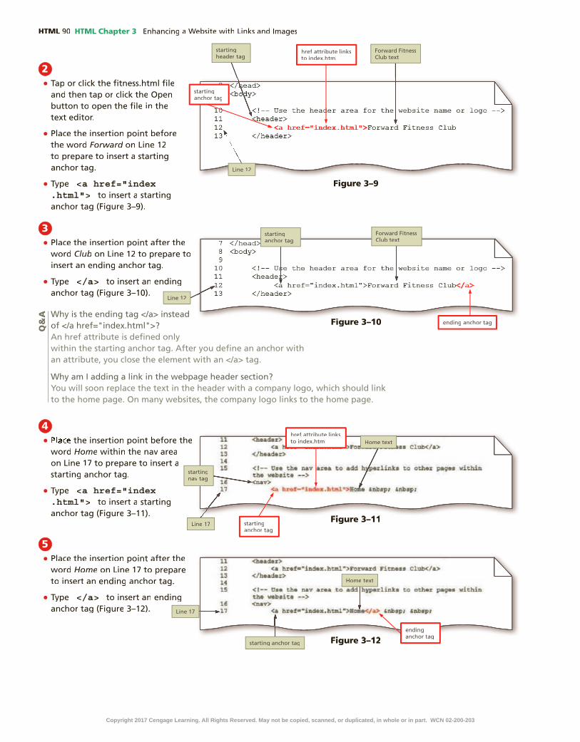
HTML HTML Chapter 3
2•
•Forward
• <a href="index .html">
3•
Club
• </a>
4•
Home
• <a href="index .html">
5•
Home
• </a>
Q&
A
Figure 3–9
Figure 3–10Figure 3–10
Figure 3–11Figure 3–11
Figure 3–12Figure 3–12
Copyright 2017 Cengage Learning. All Rights Reserved. May not be copied, scanned, or duplicated, in whole or in part. WCN 02-200-203

HTML Chapter 3 HTML
HTM
L C
hap
ter
3
6•
About
• <a href="about .html">
•Us
• </a>
7•
Q&
A
HTM
L C
hap
ter
3
Figure 3–13
Figure 3–14Figure 3–14
To Add an Email Link in a Website Template
Next, add an email link to the email address in the footer area of the template. Why? Visitors can tap or click the link in the footer to quickly send an email message to the Forward Fitness Club. The following steps insert an email link in a website template.
1•
• <a href="mailto:[email protected]">
Table 3-1 Navigation Anchor Tags
Webpage Link Anchor Tags
Classes <a href="class.html">Classes</a>
Nutrition <a href="nutrition.html">Nutrition</a>
Contact Us <a href="contact.html">Contact Us</a>
1 ADD HYPERLINKS | 2 ADD IMAGES | 3 ADD DIV ELEMENTS | 4 ADD HEADINGS & LISTS
5 VIEW WEBSITE IN BROWSER & TEST LINKS | 6 VALIDATE PAGES
Figure 3–15Figure 3–15
Copyright 2017 Cengage Learning. All Rights Reserved. May not be copied, scanned, or duplicated, in whole or in part. WCN 02-200-203

HTML HTML Chapter 3
2•
• </a>
3•
To Add Relative Links in the Home Page
Add relative links to the navigation area of the home page to link to the home, About Us, Classes, Nutrition, and Contact Us pages. Why? You have already created the home page, so it cannot bene�t from the links you added to the template. The home page needs hyperlinks so visitors can navigate from the home page to other pages within the website. The following steps add relative links to the home page.
1•
•
Q&
A
Figure 3–16Figure 3–16
Figure 3–18
1 ADD HYPERLINKS | 2 ADD IMAGES | 3 ADD DIV ELEMENTS | 4 ADD HEADINGS & LISTS
5 VIEW WEBSITE IN BROWSER & TEST LINKS | 6 VALIDATE PAGES
Figure 3–172•
•Forward
• <a href="index .html">
Copyright 2017 Cengage Learning. All Rights Reserved. May not be copied, scanned, or duplicated, in whole or in part. WCN 02-200-203

HTML Chapter 3 HTML
HTM
L C
hap
ter
3
3•
Club
• </a>
HTM
L C
hap
ter
3
Figure 3–19
Figure 3–20
Figure 3–21
Figure 3–22
4•
Home
• <a href="index .html">
5•
Home
• </a>
6•
Table 3-2 Navigation Anchor Tags
Webpage Link Anchor Tags
About Us <a href="about.html">About Us</a>
Classes <a href="class.html">Classes</a>
Nutrition <a href="nutrition.html">Nutrition</a>
Contact Us <a href="contact.html">Contact Us</a>
Copyright 2017 Cengage Learning. All Rights Reserved. May not be copied, scanned, or duplicated, in whole or in part. WCN 02-200-203

HTML HTML Chapter 3
To Add an Email Link in the Home Page
Next, add an email link to the email address in the footer area of the home page. Why? Although you added an email link in the footer of the template, you still need to add an email link to the home page to match the website template. The following steps add an email link to the home page.
1•
• <a href="mailto: [email protected]">
•
• </a>
2•
•
1 ADD HYPERLINKS | 2 ADD IMAGES | 3 ADD DIV ELEMENTS | 4 ADD HEADINGS & LISTS
5 VIEW WEBSITE IN BROWSER & TEST LINKS | 6 VALIDATE PAGES
Figure 3–23
Figure 3–24
Adding Images to a WebsiteImages include photos, drawings, diagrams, charts, and other graphics that convey visual information. On a webpage, they help break up text and contribute to the design and aesthetics of a website. However, rather than merely decorate a webpage, images should support the purpose of the page or illustrate content. Images can also provide visual representations of a company’s products and services. When determining what images to use within your website, choose those that relate directly to the content. Images that do not support the content can be distracting or confusing. For
Experiment•
Overusing Images Be cautious about overusing images on a webpage. Using too many images may give your webpage a cluttered look or distract the visitor from the purpose of the webpage. An image should have a purpose, such as to convey content, visually organize a page, provide a hyperlink, or serve another function.
Copyright 2017 Cengage Learning. All Rights Reserved. May not be copied, scanned, or duplicated, in whole or in part. WCN 02-200-203

HTML Chapter 3 HTML
HTM
L C
hap
ter
3
example, using images on a business website that do not pertain to the business may be perceived as unprofessional or may leave the user wondering what the business is actually selling. Figure 3–25 shows the website for Let’s Move, an educational website created by the U.S. government to promote healthy eating. Note the use of the site’s logo and photo to demonstrate a healthy lifestyle.
Figure 3–25
Image File FormatsWhen incorporating images into a website, web designers need to consider the
�le format, image dimensions, and �le size. These factors affect the appearance of an image on a webpage and how long it takes the browser to display the image.
Image �les are created in several formats; however, when adding images to a webpage, you must use image �les in the GIF, PNG, JPG, or SVG format.
GIF stands for Graphics Interchange Format and is pronounced “jiff.” GIF GIF stands for Graphics Interchange Format and is pronounced “jiff.” GIF GIFis the oldest web �le format and supports transparency and frame animation. To create images that do not display a background color but have a transparent, or clear, background instead, you use a �le format that supports transparency, such as GIF. Figure 3–26 shows an example of an image with and without transparency. GIF �les can also be images that use frame animation, which is a series of drawings quickly displayed in a sequence to give the illusion of movement. To compress an image, or reduce its �le size, the GIF format uses a technique called lossless compression that maintains the �le’s color information. GIF �les are 8-bit images that can display up to 256 colors, making the �le sizes relatively small. Because of the small color palette in GIF �les, they are suitable for icons and line drawings, but not high-quality pictures or photos.
Copyright 2017 Cengage Learning. All Rights Reserved. May not be copied, scanned, or duplicated, in whole or in part. WCN 02-200-203

HTML HTML Chapter 3
PNG stands for Portable Network Graphics and is pronounced as “ping.” The PNG �le format was designed to replace the GIF �le format for web graphics. PNG also uses lossless compression and supports 8-bit color images, 16-bit grayscale images, and 24-bit true-color images. PNG8 �les are 8-bit images with 256 colors. PNG24 �les are 24-bit images that can contain millions of colors. This is one advantage to using PNG compared to GIF: PNG24 can support over 16 million colors, whereas GIF supports only 256 colors. PNG also supports transparency, but not animation. In addition, PNG is not ideal for photographic images, as its lossless compression is not as ef�cient as that of the JPG format. Figure 3–27 shows an example of a website (usa.gov) that contains both GIF and PNG �les.
Figure 3–26
Animated GIFTo see an example of an animated GIF �le, visit en.wikipedia.org/wiki/GIF.
Figure 3–27
Copyright 2017 Cengage Learning. All Rights Reserved. May not be copied, scanned, or duplicated, in whole or in part. WCN 02-200-203

HTML Chapter 3 HTML
HTM
L C
hap
ter
3
JPG or JPEG stands for Joint Photographic Experts Group and is pronounced “jay-peg.” This is the standard �le format for a digital photo, such as one taken with a digital camera. The JPG format is a 24-bit image that supports 16.7 million colors, which is why it is used for digital photos and other pictures with a high level of detail or color complexity, such as shadows. JPG uses a lossy compression made exclusively for digital photos. To reduce �le size, a lossy compression discards some of the color information in the image, which reduces its original quality. If you include a digital photo in your website, use a JPG or JPEG �le format. Figure 3–28 shows a page from the National Park Service website that contains several JPG image �les.
Figure 3–28
SVG stands for Scalable Vector Graphics, a format that uses markup language to create two-dimensional graphics, images, and animations. It is a royalty-free graphic format developed by the SVG working group at the W3C. The latest edition of SVG recommended by the W3C is version 1.1, second edition. Use SVG to create shapes such as circles, squares, rectangles, and lines. Only modern browsers can display SVG graphics, though no browser supports all SVG elements, so you must test for browser compatibility, which you can do at caniuse.com/svg. Currently, SVG is not a common image format on the web. Figure 3–29a shows an example of the SVG code required to create the circle shown on the webpage displayed in Figure 3–29b. An example of an SVG animation game is shown in Figure 3–30.
Copyright 2017 Cengage Learning. All Rights Reserved. May not be copied, scanned, or duplicated, in whole or in part. WCN 02-200-203

HTML HTML Chapter 3
(a) SVG code in Notepad++
(b) Shape in browser
Figure 3–29
Figure 3–30
Copyright 2017 Cengage Learning. All Rights Reserved. May not be copied, scanned, or duplicated, in whole or in part. WCN 02-200-203

HTML Chapter 3 HTML
HTM
L C
hap
ter
3
Image Dimensions and File SizeTo display content, monitors and other screen devices use pixels. A pixel, a term
coined from “picture element,” is the smallest element of light or color on a device displaying images. Pixels are arranged in rows and columns to compose an image, but are usually so small that you cannot see them, making the image appear smooth and �uid. Webpage images can be measured in pixels. For example, an image may be 200 3200 pixels, which means it has a height of 200 pixels and a width of 200 pixels.
Monitors and other screen devices have a default resolution, which determines the clarity of the content displayed on the screen. The higher the screen resolution, the sharper text and images appear. A common resolution for today’s laptops is 1366 3 768 pixels. The resolution of a device’s screen dictates the number of pixels that can appear in an image. The higher the resolution, the greater the number of pixels in the image, resulting in a sharp, clear image.
File size is the number of bytes a �le contains, though the size of an image �le is usually expressed as kilobytes (KB), thousands of bytes; megabytes (MB), millions of bytes; or gigabytes (GB), billions of bytes. The disadvantage of an image with a high resolution is that it also has a large �le size. If a webpage contains an image, the �le size of the image can determine how long it takes for the webpage to load in a browser. If a webpage contains several large image �les, the page might be slow to load, especially on a mobile device. Today’s users expect pages to load as soon as they tap or click a link. The key to reducing page load time is keeping the webpage �le small. Though a webpage itself may load quickly, large images on the webpage can take longer to appear.
When you choose a �le format for an image, �le size is a major factor. For example, JPG �les can be large �les; a detailed digital photo contains much more data than a simple line drawing in a GIF format. If you are using images with large �le sizes, use a photo or graphics editor, such as Adobe Photoshop, to optimizethe graphic for web use. Optimizing an image reduces its �le size and load time. To optimize an image �le for web use, you can crop the image, modify its dimensions to make it smaller, adjust the quality, or convert the image �le format. When preparing an image �le for web use, keep in mind that reducing the �le size can also decrease the quality of the image. To retain the original high-quality image, make a copy of the original �le and optimize the copy. Figure 3–31 shows the same image at various levels of compression that reduced �le size. As the �gure shows, too much compression can degrade the quality of the image.
Format Pros Cons Use for
GIF Small �le size; supports transparency and animation
Limited to 256 colors Line drawings; replaced by PNG �le format
PNG Small �le size; supports transparency and more than a million colors
Does not support animation Images that are not digital photos
JPG Supports more than a million colors Larger �le size Digital photos
SVG Flexible; scalable; no �les needed because graphics are created with code
Not supported by older browsers and not all modern browsers support it 100 percent
Shapes, lines, text, and gradients
Table 3-3 Choosing an Image File Format
Table 3–3 summarizes the pros and cons of each image �le format for the web.
Copyright 2017 Cengage Learning. All Rights Reserved. May not be copied, scanned, or duplicated, in whole or in part. WCN 02-200-203

HTML HTML Chapter 3
In Adobe Photoshop, you use the Save for Web dialog box to adjust the �le format, �le quality, and size of an image �le to optimize the image for web use. The dialog box displays the same image at different quality settings along with the corresponding �le size and load time. For example, Figure 3–32 shows the same image as in Figure 3–31, with the �le size of 549 K for the original image. Changing the Quality setting to 100 reduces the �le size to 142 K and estimates a load time of 7 seconds without a noticeable change in quality. Changing the Quality setting to 10 further reduces the �le size to 13.26 K and the load time to 1 second, but also degrades the image quality.
Figure 3–32
Figure 3–31
Copyright 2017 Cengage Learning. All Rights Reserved. May not be copied, scanned, or duplicated, in whole or in part. WCN 02-200-203

HTML Chapter 3 HTML
HTM
L C
hap
ter
3
to optimiZe an image for WeB use WitH adoBe pHotosHop
Before you use a digital photo on a webpage, you should optimize the photo for web use to reduce its �le size. If you want to optimize an image using Photoshop, you would complete the following steps.
1. Open the digital photo in Adobe Photoshop.2. Tap or click File on the application bar to display the File menu.3. Tap or click Save for Web to display the Save for Web dialog box.4. Tap or click the 4-up tab to display the different load times and �le sizes of
the image.5. Select the JPEG �le format setting, and then adjust the photo quality and the
image size.6. Tap or click the image you want to save, and then tap or click the Save button to
save the image �le.
Image Tag and Its AttributesThe image tag, <img>, is an empty HTML tag used to add an image to a webpage. As an empty tag, the image tag does not have an ending tag. It includes many attributes, such as the required �le source attribute, src, which identi�es the image �le being inserted. An example of an image element with a source attribute is <img src="logo .png">. This code tells the browser to display the image �le named logo.png. Table 3–4 shows a list of common attributes used with the image element.
Attribute Function
src Identi�es the �le name of the image to display
alt Speci�es alternate text to display when an image is being loaded
Especially useful for screen readers, which translate information on a computer screen into audio output
Should brie�y describe the purpose of the image in 50 characters or less
height De�nes the height of the image in pixels, which improves loading time
width De�nes the width of the image in pixels, which improves loading time
Table 3-4 Image Element Attributes
You should always use the alt attribute in an image tag to specify alternate text in case the image cannot be displayed in a browser. The alternate text brie�y describes the image. Screen readers recite alternate text to address accessibility. An example of an image tag with src and alt attributes is <img src= "logo.png"alt ="Company logo">. This code means the browser should retrieve and display the image �le named logo.png and provide “Company logo” as the alternate text. Figure 3–33 shows an example of alternative text displayed in a browser that is unable to display an image.
Copyright 2017 Cengage Learning. All Rights Reserved. May not be copied, scanned, or duplicated, in whole or in part. WCN 02-200-203

HTML HTML Chapter 3
A browser interprets the code in Figure 3–34 as follows:1. First, the browser reads the starting image tag, which indicates the browser
should display an image on the webpage.2. The src="logo.png" attribute and value identify the name of the image to display.3. The alt="Company logo" attribute and value identify the alternate text to display
if the browser cannot display the image.4. The height="125" attribute and value reserve the height needed to display the
image in a browser.5. The width="200" attribute and value reserve the width needed to display the
image in a browser, and the right angle bracket (>) closes the image element.
When specifying values for the height and width attributes of an image, use the actual dimensions of the image. For example, the code shown in Figure 3–34 is appropriate for an image with a height of 125 pixels and a width of 200 pixels. (You can �nd the dimensions of an image �le by opening it in a graphics editor such as Photoshop or Paint or by displaying the �le’s properties using File Explorer or Finder.) If you make the dimensions larger than the actual image, you reduce the quality, which can result in a blurry or distorted image. Making the dimensions smaller than the actual image does not improve the browser’s page load time because
Figure 3–34
When you add an image to a webpage, you can also de�ne the image’s height and width. A browser uses these attributes to reserve the amount of space needed for the image. An example of an image tag with attributes is shown in Figure 3–34.
Figure 3–33
Copyright 2017 Cengage Learning. All Rights Reserved. May not be copied, scanned, or duplicated, in whole or in part. WCN 02-200-203

HTML Chapter 3 HTML
HTM
L C
hap
ter
3
Using the height and width attributes in an image element establishes a �xed size for the image, which can affect the webpage layout. A webpage can have a �xed layout or a �uid layout (also called a �exible or a responsive layout). A webpage with a �xed layout does not change when the browser window is resized or the page is displayed at varying resolutions. In a �xed layout, every element has a prede�ned height and width. However, as you progress further into this book and begin to design responsively for mobile, tablet, and desktop devices, you will learn how to create �uid layouts and images with CSS. Fluid images adjust their size for optimal display on a desktop, tablet, and mobile device.
Figure 3–35
the image �le size remains the same. If you need to use a smaller image, adjust its dimensions in a graphics editor �rst. Many graphics editors, including Photoshop, let you change the width and height of an image. Be sure to use an option such as “Constrain proportions” or “Maintain aspect ratio” to change each dimension in proportion to the other, which is called maintaining the aspect ratio. Otherwise, you are likely to distort the image. Figure 3–35 shows an example of an image displayed in a browser with its original dimensions and with larger dimensions. The bottom image uses dimensions larger than the �le size and does not maintain the aspect ratio, which distorts the image.
Copyright 2017 Cengage Learning. All Rights Reserved. May not be copied, scanned, or duplicated, in whole or in part. WCN 02-200-203

HTML HTML Chapter 3
1 ADD HYPERLINKS | 2 ADD IMAGES | 3 ADD DIV ELEMENTS | 4 ADD HEADINGS & LISTS
5 VIEW WEBSITE IN BROWSER & TEST LINKS | 6 VALIDATE PAGESTo Copy Files into the Images Folder
Before you can add an image to a site, you need to acquire the images and store them in the folder designated for images on your website. Why? You need to have image �les and know where they are stored before you can add them to a webpage. In the following steps, you copy image �les to your images folder. The following steps copy four images �les from the Data Files for Students to the images folder for the �tness site.
1•
•
•
• SHIFt
Q&
A
Figure 3–36
Copyright 2017 Cengage Learning. All Rights Reserved. May not be copied, scanned, or duplicated, in whole or in part. WCN 02-200-203

HTML Chapter 3 HTML
HTM
L C
hap
ter
3
2•
•
•
Figure 3–37Other Ways
CtrL+C,
CtrL+V COMMAnD+C COMMAnD+V
1 ADD HYPERLINKS | 2 ADD IMAGES | 3 ADD DIV ELEMENTS | 4 ADD HEADINGS & LISTS
5 VIEW WEBSITE IN BROWSER & TEST LINKS | 6 VALIDATE PAGESTo Add an Image to a Website Template
In the template, the current content in the header area is the name of the business, Forward Fitness Club. Replace this text with an image displaying the business logo. Why? Most businesses use a logo on their webpages to promote their business and brand. The following steps add a logo image to a website template.
1•
•
• <img src="images/ffc_logo.png" alt="Forward Fitness Club logo" height="275" width="845">
2•
Q&
AQ
&A
Figure 3–38
Copyright 2017 Cengage Learning. All Rights Reserved. May not be copied, scanned, or duplicated, in whole or in part. WCN 02-200-203

HTML HTML Chapter 3
To Add an Image to the Home Page
Like the template, the current content in the header area of the home page is the name of the business, Forward Fitness Club. Replace this text with an image displaying the business logo. Why? All of the pages in the �tness website will have a logo in the header. You replaced the text with an image in the template �le, but still need to replace it in the index.html document. The following steps add a logo image to the home page.
1•
•
• <img src="images/ffc_logo.png" alt="Forward Fitness Club logo" height="275" width="845">
2•
•
ffc_logo.png" alt="Forward
Figure 3–39
1 ADD HYPERLINKS | 2 ADD IMAGES | 3 ADD DIV ELEMENTS | 4 ADD HEADINGS & LISTS
5 VIEW WEBSITE IN BROWSER & TEST LINKS | 6 VALIDATE PAGES
Figure 3–40
Copyright 2017 Cengage Learning. All Rights Reserved. May not be copied, scanned, or duplicated, in whole or in part. WCN 02-200-203

HTML Chapter 3 HTML
HTM
L C
hap
ter
3
Exploring Div ElementsAs you have learned, every webpage consists of several essential lines of HTML code used to display and support content in a browser. In addition, you use HTML5 tags to identify speci�c areas on a webpage, such as the header, navigation area, main content area, and the footer. These are just a few of the basic HTML tags used to display a webpage. You can use other types of HTML tags to organize and display content on a webpage.
Div ElementUse a div element to de�ne an area or a division in a webpage. You insert div element to de�ne an area or a division in a webpage. You insert div element
div elements with the <div> and </div> tags. Prior to HTML5, div elements de�ned speci�c areas on a webpage, such as the header, navigation area, main content area, and footer. The HTML5 semantic elements replace the div elements for these areas because the new, more meaningful HTML5 elements better re�ect their purpose. However, web designers still use the div element on their websites; it is not an obsolete element. One reason is that many well-established websites still have webpages that were created using div elements where more semantic HTML5 elements would now apply. Some people and organizations use older browsers that can read div elements but not HTML5 elements. More commonly, web designers use div elements to structure parts of a webpage to which an HTML5 element does not apply. For example, recall that the main element identi�es the primary content for the page and that you can have only one main element on a webpage. You can also use div elements within the main element to further divide the primary content area into separate sections, such as the introduction, a long quotation, a list of “See Also” links, and a conclusion. Figure 3–41 shows a wireframe with four divelements inside the main element.
div div
div
div
Header
Footer
Nav
Main
Figure 3–41
Break Point: If you want to take a break, this is a good place to do so. You can exit the text editor now. To resume at a later time, run your text editor, open the �le called �tness.html, and continue following the steps from this location forward.
Copyright 2017 Cengage Learning. All Rights Reserved. May not be copied, scanned, or duplicated, in whole or in part. WCN 02-200-203

HTML HTML Chapter 3
Div AttributesLike other elements, div elements have attributes that provide more
meaningful information about the element. One div attribute is id, which identi�es a unique area on a webpage and distinguishes it from other page divisions. For example, <div id="menu"> is a starting div tag with an id attribute that has a value of menu. You might use this element to identify a menu of options on the webpage. The idattribute value must be unique — no other div element on the webpage can have an id attribute value of menu. Figure 3–42 shows an example of div elements used in lieu of HTML5 semantic elements. Because each div element has a different id attribute value, browsers interpret the content in those elements as belonging to different areas of the webpage.
Figure 3–42
To gain �exibility in formatting the webpages on the Forward Fitness Club website, you can add a div element to the wireframe and template of the website. The purpose of the new div element is to contain all of the other webpage elements, including header, nav, main, and footer. Containing these HTML5 elements within a single div element prepares the template and future pages for CSS styles, such as one that centers the webpage in a browser window. Figure 3–43 shows the revised wireframe with the div element and id attribute value de�ned as container.
Figure 3–43
Header
Footer
Nav
Main
div id="container"
Copyright 2017 Cengage Learning. All Rights Reserved. May not be copied, scanned, or duplicated, in whole or in part. WCN 02-200-203

HTML Chapter 3 HTML
HTM
L C
hap
ter
3
To Add a Div Element to a Website Template
Apply the changes from the Forward Fitness website wireframe to the template. Add a div element with an id attribute and an attribute value ofattribute and an attribute value of container to contain all of the HTML5 webpage elements in the �tness template, includingin the �tness template, includingin the �tness template, including header, nav, main,andfooter. Why? Because the template will be used to create future pages for the website, edit the template so that all pages use the same layout. The following steps add adiv element with an id attribute value ofattribute value of container to the website template.
1•
•
enter
• tAB
• <div id="container">
2•
enter
• tAB
• </div>
3•
Q&
A
1 ADD HYPERLINKS | 2 ADD IMAGES | 3 ADD DIV ELEMENTS | 4 ADD HEADINGS & LISTS
5 VIEW WEBSITE IN BROWSER & TEST LINKS | 6 VALIDATE PAGES
Figure 3–44
Figure 3–45
Why is “container” the value of the id attribute?Because this div element will contain all of the webpage elements, it is commonly referred to as the container or the wrapper because it contains or wraps around all of the webpage elements, similar to how a fence wraps around a physical piece of property to contain things on the property.
CO
NS
IDE
R T
HIS
Copyright 2017 Cengage Learning. All Rights Reserved. May not be copied, scanned, or duplicated, in whole or in part. WCN 02-200-203

HTML HTML Chapter 3
To Add a Div Element to the Home Page
You must also edit the home page of the website by adding a div element with an id attribute and value ofvalue of container to make it consistent with the website template. Why? All of the pages within the website should use the same general template layout. The following steps add a div element with an id attribute and value to the home page.
1•
•
enter
• tAB
• <div id="container">
2•
enter
• tAB
• </div>
3•
Figure 3–46
Figure 3–47
1 ADD HYPERLINKS | 2 ADD IMAGES | 3 ADD DIV ELEMENTS | 4 ADD HEADINGS & LISTS
5 VIEW WEBSITE IN BROWSER & TEST LINKS | 6 VALIDATE PAGES
Class AttributesThe class attribute is also commonly used in HTML. Unlike the id attribute,
a class attribute name can be applied to more than one div or other HTML element on a webpage. Classes provide another level of control over the styling or formatting of speci�c elements on a webpage. For example, rather than having all paragraphs of text appear with the same formatting, you might want to format the �rst paragraph after a heading to be different from other paragraphs of text. You can de�ne the �rst paragraph after a heading with a class attribute and name, such as <p class="�rst">. This makes it easier to format every paragraph after a heading the same way. In another example, <img class="product"> is an image tag with a class
Copyright 2017 Cengage Learning. All Rights Reserved. May not be copied, scanned, or duplicated, in whole or in part. WCN 02-200-203

HTML Chapter 3 HTML
HTM
L C
hap
ter
3
Figure 3–48
To mark an element as belonging to a class, add the class attribute and name to the element. In Figure 3–48, equip is the name of the class. Any word can be used as a class name, as long as it does not contain spaces. In general, however, you should use descriptive names that illustrate the purpose of a class (for example, beginning, legallanguage, or copyrighttext), rather than names that describe the appearance of the class (for example, bluetext, largeritalic,or boldsmallarial). Using names that describe the purpose of the class makes the code more �exible and easier to read. In Chapter 4, you will apply styles to classes to format more than one element at a time.
Adding Headings and ListsSome HTML elements are designed to group information on a webpage. For example, the p element groups text into a paragraph and the div element groups elements into an area or section. Two other grouping elements are heading elements and lists. Headings indicate that a new topic is starting and typically identify or summarize the topic. Lists group related items together in a sequence or collection.
Heading ElementsYou use heading elements to provide a title or heading before a paragraph
of text or section of a page. On a webpage, headings appear in a larger font size than normal text, making it easy for users to quickly scan the page and identify its sections. Heading levels run from 1 (the most important) to 6 (the least important). Heading level 1 is designed to mark major headings, while heading levels 2–6 are for subheadings. The start tag for heading level 1 is <h1> and the end tag is </h1>. The start tag for heading level 2 is <h2> and the end tag is </h2>, and so on. Figure 3–49 displays the default formatting for heading levels 1 through 6. In the upcoming steps, you insert headings in the About Us and Contact Us pages for the �tness website.
attribute that has a value of product. You might use this element to collect all product photos in a single category and then format those images to have a border or to position them in a speci�c area on a webpage. Figure 3–48 shows an example of a class attribute used within an image tag.
Copyright 2017 Cengage Learning. All Rights Reserved. May not be copied, scanned, or duplicated, in whole or in part. WCN 02-200-203

HTML HTML Chapter 3
ListsLists structure text into an itemized format. An unordered list, also called a
bulleted list, displays a small graphic called a bullet before each item of information. In an unordered list, the bulleted items can appear in any sequence. To mark an unordered list, insert the <ul> tag at the start of the list and the </ul> tag at the end of the list. Mark each item in an unordered list with a set of list item tags (<li> and </li>). The following code creates a bulleted list of two items:
<ul> <li>First item</li> <li>Second item</li></ul>
An ordered list, also called a numbered list, displays information in a series using numbers or letters. An ordered list works well to organize items where sequence matters, such as in a series of steps. To mark an ordered list, insert the <ol> and </ol> tags at the start and end of the list. As with unordered lists, you mark each item in an ordered list with a set of <li> and </li> tags. The following code creates a numbered list of two items:
<ol> <li>First item</li> <li>Second item</li></ol>
What is the difference between a head element, a header element, and a heading element, and how do I know when to use them?Recall from Chapter 1 that the head element is a required element for an HTML webpage and belongs near the top of the head element is a required element for an HTML webpage and belongs near the top of the head elementpage. A head element is de�ned by <head> and </head> tags and contains information about the webpage, such as the webpage title and the de�ned character set, not website content. A header element is a set of HTML5 tags (<header> and header element is a set of HTML5 tags (<header> and header element</header>) that de�ne the header area of a webpage and generally come after the starting <body> tag. Header elements contain webpage content, such as a business name or logo. A heading element, h1, h2, h3, h4, h5, or h6, de�nes a heading in a webpage and is generally placed above other webpage content. Heading elements also contain webpage content. A head-ing element can appear in a header element, a main element, or other HTML elements. A heading level 1 element is de�ned by <h1> and </h1> tags.
CO
NS
IDE
R T
HIS
Figure 3–49
Copyright 2017 Cengage Learning. All Rights Reserved. May not be copied, scanned, or duplicated, in whole or in part. WCN 02-200-203

HTML Chapter 3 HTML
HTM
L C
hap
ter
3
Unordered Lists
Value Example
disc (default) •square j
circle 0
Ordered Lists
11.2.3.
AA.B.C.
aa.b.c.
II.II.III.
ii.ii.iii.
Table 3-5 List Type Attributes
Figure 3–50
Unordered and ordered lists have optional bullet and number types. An unordered list can use one of three bullet options: disc, square, or circle. If no type is identi�ed, the browser displays the default type, a disc. You can also specify an image to use as a bullet. An ordered list can use numbers, letters, or Roman numerals. The default option is to use Arabic numbers, such as 1, 2, and 3. Table 3–5 shows the different values and examples of unordered and ordered list options. Although you can use the style attribute to specify the style of bullets and numbers, the recommended method for changing bullet list and number styles is with CSS, which is covered in Chapter 4.
Figure 3–50 shows a webpage with an unordered and an ordered list.
Copyright 2017 Cengage Learning. All Rights Reserved. May not be copied, scanned, or duplicated, in whole or in part. WCN 02-200-203

HTML HTML Chapter 3
Figure 3–51
A description list contains terms and descriptions. Use a description list to description list contains terms and descriptions. Use a description list to description listcreate a glossary or to list questions and answers, for example. A description list includes terms and descriptions or de�nitions. De�ne a description list between a pair of <dl> and </dl> tags. Mark each term within a pair of <dt> and </dt> tags. Mark each description or de�nition between a pair of <dd> and </dd> tags. For each item, the dt element must come before the dd element. More than one dd element can follow a dt element. The following code creates a description list of two terms and de�nitions:
<dl> <dt>First term</dt> <dd>First definition</dd>
<dt>Second term</dt> <dd>Second definition – part 1</dd> <dd>Second definition – part 2</dd></dl>
Figure 3–51 shows an example of a description list.
To Create the About Us Webpage and Add a Heading and Image
The About Us page provides additional information about the Forward Fitness Club, including pictures of its facility. It also includes headings to identify the topics on the page. Use the website template to create the About Us page. Why? The website template already contains the basic HTML code for the website. Using the template saves time coding. The following steps create the About Us page for the �tness website using the website template.
1 ADD HYPERLINKS | 2 ADD IMAGES | 3 ADD DIV ELEMENTS | 4 ADD HEADING ELEMENTS & LISTS
5 VIEW WEBSITE IN BROWSER & TEST LINKS | 6 VALIDATE PAGES
Copyright 2017 Cengage Learning. All Rights Reserved. May not be copied, scanned, or duplicated, in whole or in part. WCN 02-200-203

HTML Chapter 3 HTML
HTM
L C
hap
ter
3
1•
•
•
• about
Figure 3–52
2•
•
enter
• tAB
<h1>Weights</h1>Figure 3–53
Figure 3–54
3• enter
• <img class="equip" src="images/equipment1 .jpg" alt="Weight Equipment" height="195" width="260">
Copyright 2017 Cengage Learning. All Rights Reserved. May not be copied, scanned, or duplicated, in whole or in part. WCN 02-200-203

HTML HTML Chapter 3
4• enter
• <p>Our facility includes a weight training area with several weight options. Build lean muscle with weights and improve your core with weight training.</p>
To Add Unordered Lists to the About Us Webpage
The About Us page should list the types of equipment the Forward Fitness Club provides to its members. You can include these items using unordered lists. Why? The types of equipment can appear in any order in the lists, so the items are appropriate for unordered lists. The following steps add headings and unordered lists to the About Us page.
1•
enter
• <ul>
• enter
<li>Dumbbells</li>
• enter <li>Kettle bells</li>
• enter <li>Barbells</li>
• enter SHIFt+tAB
</ul><br>
Q&
A
Figure 3–55
Figure 3–56
1 ADD HYPERLINKS | 2 ADD IMAGES | 3 ADD DIV ELEMENTS | 4 ADD HEADING ELEMENTS & LISTS
5 VIEW WEBSITE IN BROWSER & TEST LINKS | 6 VALIDATE PAGES
Copyright 2017 Cengage Learning. All Rights Reserved. May not be copied, scanned, or duplicated, in whole or in part. WCN 02-200-203

HTML Chapter 3 HTML
HTM
L C
hap
ter
3
2• enter
•
Figure 3–57
HTM
L C
hap
ter
3
Table 3-6 About Us Code for Lines 38–54
Line Number Code to Insert
38 <h1>Cardio</h1>
39 <img class="equip" src="images/equipment2.jpg" alt="Cardio Equipment" height="195" width="260">
40 <p>Burn fat through cardio workouts. If you need to lose 20 lbs or more, include at least 30 minutes of cardio each day. We have several equipment choices for your workout.</p>
41 <ul>
42 <li>Treadmills</li>
43 <li>Elliptical Machines</li>
44 <li>Exercise Bikes</li>
45 </ul><br>
46
47 <h1>Personal Training</h1>
48 <img class="equip" src="images/equipment3.jpg" alt="Personal Training" height="195" width="260">
49 <p>Our certi�ed personal trainers work with you one on one to help you obtain your �tness goals. Our personal trainers keep you motivated and push you farther than you would push yourself. When you feel like you cannot do one more rep, they tell you that you can. Personal training has many bene�ts.</p>
50 <ul>
51 <li>Accountability</li>
52 <li>Personalized Program</li>
53 <li>Consistent Support and Motivation</li>
54 </ul><br>
Copyright 2017 Cengage Learning. All Rights Reserved. May not be copied, scanned, or duplicated, in whole or in part. WCN 02-200-203

HTML HTML Chapter 3
To Add a Description List and Absolute Link to the About Us Webpage
The About Us page should also describe the types of exercises the Forward Fitness Club recommends for its members. You can include these descriptions using a description list. Below the description list, include an absolute link to �tness.gov with more information about being active. Why? The webpage can list the exercises by name followed by a description, which is appropriate for a description list. The following step adds a description list to the About Us page.
1•
enter
•
1 ADD HYPERLINKS | 2 ADD IMAGES | 3 ADD DIV ELEMENTS | 4 ADD HEADING ELEMENTS & LISTS
5 VIEW WEBSITE IN BROWSER & TEST LINKS | 6 VALIDATE PAGES
Figure 3–58
Table 3-7 About Us Code for Lines 56–73
Line Number Code to Insert
56 <h1>Common Exercises</h1>
57 <p>The following are common exercises that we encourage our clients to do as part of their daily exercise routine.</p>
58 <dl>
59 <dt>Burpee</dt>
60 <dd>Burpees are a great, full body exercise to increase your strength and endurance. Begin in a standing position, drop into a squat and extend your hands forward, kick your feet back and then forward again quickly, and then jump up from a squatted position.
61 <br></dd>
62
63 <dt>Plank</dt>
64 <dd>Planks build your core strength. To perform a plank, get in a push up position and rest your forearms on the �oor. Hold the position as long as you can.
65 <br></dd>
66
67 <dt>Mountain Climber</dt>
68 <dd>Mountain climbers are a good cardio exercise. Place your hands on the �oor in a push up position, then bring one knee up to your chest and then switch as quickly as you can (as though you are climbing a mountain).
69 <br></dd>
70 </dl>
71
72 <p>For more information about how to stay active, visit <a href=”http://www.�tness.gov/be-active/ways-to-be -active/”>�tness.gov</a>.</p>
73
Copyright 2017 Cengage Learning. All Rights Reserved. May not be copied, scanned, or duplicated, in whole or in part. WCN 02-200-203

HTML Chapter 3 HTML
HTM
L C
hap
ter
3
To Save the About Us Webpage and View It in a Browser
The About Us page is �nished for now. The following steps save the webpage and view it in your default browser.
1
2
3
Figure 3–59
Figure 3–60
4
Copyright 2017 Cengage Learning. All Rights Reserved. May not be copied, scanned, or duplicated, in whole or in part. WCN 02-200-203

HTML HTML Chapter 3
5
Figure 3–61
To Create the Contact Us Webpage and Add a Heading and Links
The Contact Us page provides an address, a phone number, and an email address for the Forward Fitness Club. Insert a heading to identify the new information, and then add the phone number and email address to the webpage as link text. Why? If you mark the text as links, visitors can select the links to make a phone call or send an email message directly to the Forward Fitness Club. The following steps create the Contact Us page for the �tness website using the website template.
1•
•
•
• contact
•
• enter
• <h2>Ready to get started? Contact us today. </h2>
1 ADD HYPERLINKS | 2 ADD IMAGES | 3 ADD DIV ELEMENTS | 4 ADD HEADING ELEMENTS & LISTS
5 VIEW WEBSITE IN BROWSER & TEST LINKS | 6 VALIDATE PAGES
Figure 3–62
Copyright 2017 Cengage Learning. All Rights Reserved. May not be copied, scanned, or duplicated, in whole or in part. WCN 02-200-203

HTML Chapter 3 HTML
HTM
L C
hap
ter
3
2• enter
•
Q&
A
HTM
L C
hap
ter
3
Figure 3–63
To Save the Contact Us Webpage and View It in a Browser
The Contact Us page is �nished for now. The following steps save the webpage and view it in your default browser.
1
2
3
Q&
A
Figure 3–64
Table 3-8 Contact Us Code for Lines 30–40
Line Number Code to Add
30 <p>We are located at:<br>
31 25743 Bloom Court<br>
32 Locket, GA 85524</p>
33
34 <p>Phone Number<br>
35 <a class="mobile" href="tel:8145559608">(814) 555-9608</a>(814) 555-9608</p>
36
37 <p>Email Address<br>
38 <a href="mailto:forward�[email protected]">forward�[email protected]</a></p>
39 <br><br>
40
Copyright 2017 Cengage Learning. All Rights Reserved. May not be copied, scanned, or duplicated, in whole or in part. WCN 02-200-203

HTML HTML Chapter 3
To Preview a Website in a Browser and Test Page Links
Now that you have created three webpages, it is time to test the hyperlinks in a browser. Why? You need to You need to Ytest your hyperlinks to con�rm that your page links work correctly. The following step displays a webpage in a browser and test hyperlinks.
1•
•
•
Q&
A
1 ADD HYPERLINKS | 2 ADD IMAGES | 3 ADD DIV ELEMENTS | 4 ADD HEADING ELEMENTS & LISTS
5 VIEW WEBSITE IN BROWSER & TEST LINKS | 6 VALIDATE PAGES
Figure 3–65
Copyright 2017 Cengage Learning. All Rights Reserved. May not be copied, scanned, or duplicated, in whole or in part. WCN 02-200-203

HTML Chapter 3 HTML
HTM
L C
hap
ter
3
1 http://validator .w3.org/
2
3
4
5
6
1 ADD HYPERLINKS | 2 ADD IMAGES | 3 ADD DIV ELEMENTS | 4 ADD HEADING ELEMENTS & LISTS
5 VIEW WEBSITE IN BROWSER & TEST LINKS | 6 VALIDATE PAGES
Figure 3–66
To Validate the About Us and Contact Us Pages
Every time you create a new webpage, run it through the W3C validator to check the document for errors and correct them. The following steps validate an HTML document.
Copyright 2017 Cengage Learning. All Rights Reserved. May not be copied, scanned, or duplicated, in whole or in part. WCN 02-200-203

HTML HTML Chapter 3
Chapter SummaryIn this chapter, you have learned how to create many types of hyperlinks. You also inserted new HTML elements, including div elements, image elements, headings, and lists. The items listed below include all the new concepts and skills you have learned in this chapter, with the tasks grouped by activity.
Adding Links to a WebpageAdd Relative Links to a Webpage (HTML 114)Add an Email Link to a Webpage
(HTML 89, HTML 92)Add Absolute Links to a Webpage (HTML 87)Add Image Links to a Webpage (HTML 88)Add Telephone Links to a Webpage (HTML 88)
Adding Images to a WebsiteCopy Files into the Images Folder (HTML 104)Add an Image to a Webpage (HTML 105,
HTML 106)
Exploring Div ElementsAdd a Div Element to a Webpage (HTML 109)
Adding Headings and ListsCreate the About Us Webpage and Add a Heading
(HTML 114)Add Unordered Lists to the About Us Webpage
(HTML 116)Add a Description List to the About Us Webpage
(HTML 118)Test Page Links (HTML 122)
What images will you use within your website?Use these guidelines as you complete the assignments in this chapter and as you create your own webpages outside of this class.
1. Find appropriate images for the website.
a. Choose images that relate to the website.
b. For a business website, choose images that illustrate products or services.
c. Use a logo or other identifying graphic on all pages.
2. Use the correct �le format.
a. Use PNG, GIF, JPG, or SVG images.
b. Convert all other image �les to an appropriate format suitable for web use.
3. Optimize images for web use.
a. Reduce �le size, when necessary, before adding an image to a website.
b. Use photo-editing software to optimize images for web use.
4. Save all images in the images folder for �le organization.
CO
NS
IDE
R T
HIS
How should you submit solutions to questions in the assignments identi�ed with a symbol?Every assignment in this book contains one or more questions identi�ed with a symbol. These symbol. These questions require you to think beyond the assigned presentation. Present your solutions to the questions in the format required by your instructor. Possible formats may include one or more of these options: create a document that contains the answer; present your answer to the class; discuss your answer in a group; record the answer as audio or video using a webcam, smartphone, or portable media player; or post answers on a blog, wiki, or website.
CO
NS
IDE
R T
HIS
Copyright 2017 Cengage Learning. All Rights Reserved. May not be copied, scanned, or duplicated, in whole or in part. WCN 02-200-203

HTM
L C
hap
ter
3S
TU
DE
NT
AS
SIG
NM
EN
TS
HTML Chapter 3 HTML
Apply Your Knowledge
Creating a Page with Links, Images, Lists, and HeadingsInstructions: In this exercise, you will use your HTML editor to enter the needed tags and content to create a template for the pages for a new website as well as the home page for the Durango Jewelry and Gem Shop. The completed home page is shown in Figure 3–67. It contains the content as well as the HTML5 tags required to insert an image, headings, links, lists, and paragraphs of information for this page. You will also use professional web development best practices to indent, space, validate, and check the spelling of your work.
Figure 3–67
Perform the following tasks:1. Open your HTML editor and then open the apply03.html �le from the Data Files for
Students. Use the File Save As feature to save the webpage in the chapter03\apply folder with the name index.html to create the home page.
2. Modify the comment at the top of the page to include your name and today’s date.
3. Enter Durango Jewelry Pendant Gem in the <title> tags. Recall that content in the title Durango Jewelry Pendant Gem in the <title> tags. Recall that content in the title Durango Jewelry Pendant Gemtags appears in the tab at the top of the browser and is also used by search engines.
4. In the header section, enter the following content, each on its own line in the HTML editor.
a. An image element coded as follows:
<img src="wirewrap01.jpg" alt="smoky quartz pendant" width="171" height="171">
Continued >Copyright 2017 Cengage Learning. All Rights Reserved. May not be copied, scanned, or duplicated, in whole or in part. WCN 02-200-203

STU
DE
NT
AS
SIG
NM
EN
TS HTML HTML Chapter 3
b. The text Durango Jewelry and Gem Shop in <h1> tags to insert the name of the store.
c. The text Distinguished wire-wrapped jewelry, pendants, and gems in <h2> tags to serve as the tagline.
5. In the nav section, enter the following links, each on its own line in the HTML editor.
<a href="classics.html">Classics</a>
<a href="specials.html">Specials</a>
<a href="gems.html">Gems</a>
<a href="contact.html">Contact Me</a>
6. In the footer section, enter the following content, each on its own line in the HTML editor.
a. The text Durango Jewelry and Gem Shop, 10101 Main Street, Durango, COin paragraph tags.
b. The text Established 1979 in paragraph tags.
c. The text Contact us through email coded as a link to [email protected]
7. The content added to the <div id="main"> section for each page will differ, but the content you just added to the header, nav, and footer sections for the index.html home page will be the same for all pages in the website. Therefore, use the Save As feature to create the four other pages for this website: classics.html, specials.html, gems.html, and contact.html. You will �ll in the content for the main section for these pages in later tutorials, so close these pages and then reopen index.html.
8. In the <div id="main"> section, enter the following content.
a. First paragraph:
<p>Durango Jewelry and Gem Shop pampers you with one-of-a-kind, high-quality wire wrapped pendants and gems. Our works of art are inspired by natural geometries and the vast beauty of mother nature.</p>
b. Second paragraph:<p>The featured pendant provides these characteristics:</p>
c. Unordered list:
<ul><li>gemstone is "Smoky quartz" also called a "Soulmate Crystal"</li>
<li>gemstone is over two carats</li>
<li>wire is a mixture of antique colored copper and .930 pure silver</li>
<li>high-quality silver alloy requires very little polishing</li>
<li>pendant is approximately 4cm × 3cm</li>
</ul>
d. Final paragraph:
<p>Come to Durango Jewelry and Gem Shop to make your stay in Durango a life-time treasure.</p>
9. Review and check the spelling of your textual content.
10. Validate your webpage using the W3C validator found at validator.w3.org and �x any errors that are identi�ed. Validation is complete when the validator returns the message “This document was successfully checked as HTML5!” in a green bar near the top of the webpage.document was successfully checked as HTML5!” in a green bar near the top of the webpage.document was successfully checked as HTML5!”
Apply Your Knowledge continued
Copyright 2017 Cengage Learning. All Rights Reserved. May not be copied, scanned, or duplicated, in whole or in part. WCN 02-200-203

HTM
L C
hap
ter
3S
TU
DE
NT
AS
SIG
NM
EN
TS
HTML Chapter 3 HTML
11. Submit the index.html �le in a format speci�ed by your instructor.
12. In this exercise, you were instructed to use the <div id="main"> tag instead of the HTML5 <main> tag to mark up the main content in the body of the webpage. Because browsers are constantly changing and improving, it’s important to make sure that the audience you are trying to reach supports the HTML5 elements and attributes you are using on your website. Find two websites that address the issue of HTML5 browser compatibility. Paste those links and a screenshot of the webpage into a document. (Hint:and a screenshot of the webpage into a document. (Hint:and a screenshot of the webpage into a document. ( To take a screenshot of the webpage, press the PrtSc or Print Screen key on your keyboard, tap or click your document, and then tap or click the Paste button.)
Use your research to answer these questions:
a. When is the div element used within a webpage written with HTML5 tags?
b. What are the HTML5 semantic tags?
c. What is the primary advantage and the primary disadvantage of using the <main> tag versus <div id="main">?
Extend Your Knowledge
Inserting LinksInstructions: In this exercise, you will use your HTML editor to enter the needed tags and content to create several different types of links. The completed page is shown in Figure 3–68. The starting �le contains comments to note the location of links you will add to the page. You will also use professional web development best practices to indent, space, validate, and check the spelling of your work.
Perform the following tasks:1. Open the ski03.html �le from the Data Files for Students and then modify the comment
at the top of the page to include your name and today’s date.
2. After the <!--Insert an image with a link--> comment, insert an <img> tag as follows:
<img src="ski.jpg" alt="happy skiers" height="343" width="514">3. Make the image a link to http://www.breckenridge.com
4. Make each word in the <nav> section a link to another page on the website. Put each link on its own line for readability as follows:
<a href="events.html">Events</a> |<a href="lessons.html">Lessons</a> |<a href="snowreports.html">Snow Reports</a> |<a href="employment.html">Employment</a>
5. In the <div id="content"> section, make the phone number, 1-800-555-4SKI, a telephone link to that number. (Hint: The letters SKI translate to the numbers 754 on a phone keypad.)
6. Make the text "Write to Kent" an email link to [email protected]
7. In the footer, make the text “snow.com” a link to http://www.snow.com
8. To make it easier for users to navigate the home page, add two links in the footer section that will quickly take the user back to the top and main areas of the webpage.
Continued >
Copyright 2017 Cengage Learning. All Rights Reserved. May not be copied, scanned, or duplicated, in whole or in part. WCN 02-200-203

STU
DE
NT
AS
SIG
NM
EN
TS HTML HTML Chapter 3
Figure 3–68
In the footer section, make Lessons link to the id="content" location on same page. When a link goes to a location on the same page, the href attribute value starts with a # (pound sign or hash tag) followed by the id value of the target location as follows: <a href="#content">Lessons</a>
9. In the footer, make Top link to the top of the page. Because the location for this link is not yet identi�ed, you need to insert an appropriate attribute value pair to the opening <header> tag as follows to mark this location: <header id="top">
With the location identi�ed, go back to the footer and mark up the Top text with a link as follows: <a href="#top">Top</a>
Extend Your Knowledge continued
Copyright 2017 Cengage Learning. All Rights Reserved. May not be copied, scanned, or duplicated, in whole or in part. WCN 02-200-203

HTM
L C
hap
ter
3S
TU
DE
NT
AS
SIG
NM
EN
TS
HTML Chapter 3 HTML
Navigational links at the bottom of the webpage are especially useful to those who are viewing the page on a small device because they help minimize excessive scrolling.
10. In the footer section, make Rental Agreement link to a document named legal.pdf as follows: <a href="legal.pdf">Rental Agreement</a>
11. Save and view your work in a browser. Tap or click each of the 11 links you inserted starting with the image link to make sure they work as desired. Note that the links in the nav section currently point to pages you have not created yet. Also, depending on the device you are using to check your work, the telephone and email links may not work.
12. Check the spelling of the content on the page.
13. Validate your webpage using the W3C validator found at validator.w3.org and �x any errors that are identi�ed. Validation is complete when the validator returns the message “This document was successfully checked as HTML5!” in a green bar near the top of the webpage.document was successfully checked as HTML5!” in a green bar near the top of the webpage.document was successfully checked as HTML5!”
14. Submit the ski03.html �le in a format speci�ed by your instructor.
15. The html validator at http://validator.w3.org allows you to validate a webpage by entering a URL, uploading a �le, or directly inputting the code into the validation window. Which method(s) does the link checker at http://validator.w3.org/checklink use? (Hint:method(s) does the link checker at http://validator.w3.org/checklink use? (Hint:method(s) does the link checker at http://validator.w3.org/checklink use? ( A URL is created by software on the web server when you publish a webpage. See your instructor to determine if a web server is available for student use at your school.)
Analyze, Correct, Improve
Correcting Image, Link, Heading, and List ErrorsInstructions: Open your HTML editor and then open the resources03.html �le from the Data Files for Students. Eight HTML5 resource URLs are listed in the body section of this webpage, but the addresses are not con�gured as links. Refer to Figure 3–69 to create an unordered list of HTML5 resources using these URLs. You will also use professional web development best prac-tices to indent, space, validate, and check the spelling of your work.
Figure 3–69
Continued >
Copyright 2017 Cengage Learning. All Rights Reserved. May not be copied, scanned, or duplicated, in whole or in part. WCN 02-200-203

STU
DE
NT
AS
SIG
NM
EN
TS HTML HTML Chapter 3
1. Correct
a. With the resources03.html �le open in your HTML editor, modify the comment at the top of the page to include your name and today’s date.
b. Enter HTML5 resources in the <title> tags.
c. Several URLs are listed in the <div id="main"> section of this webpage. Each is a reference to an HTML5 resource. Convert each URL to a link by using the URL as the value for the href attribute value and adding text for the link as shown in Figure 3–69.
d. Save the page, and then view it in a browser. Notice that all of the links are positioned on the same line.
e. Tap or click each of the eight links to test them.
2. Improve
a. The anchor element is an inline element, meaning that the content within the opening and closing <a> tags are displayed in the same line rather than on a new line. Most other paired elements such as all of the heading tags, h1 through h6, p, div, ul, ol, dl, and li are block elements, meaning that the content within the opening and closing tags creates its own block by starting on a new line. Because this list of links would look better if each item were on its own line, mark up the links as an unordered list. Insert the opening <ul> tag on a new line after the <h1> content and before the �rst link. Add the closing </ul> tag after the last link and just before the closing </div> tag.
b. Indent and surround each link with an opening and closing list item tag <li> and </li>For example, the opening <ul> tag and �rst link would be coded as:<ul><li><a href="http://www.w3schools.com/">w3schools</a></li>
(Hint:(Hint:( Note that tags must be nested properly. For example, content marked by <li><a> tags must be closed as </a></li>. Improperly nested tags will cause validation errors.)
c. Save the page and view it in a browser. Because the <li> tags are block elements, each link creates its own block by starting on a new line.
d. Check the spelling of the content on the page.e. Validate your webpage using the W3C validator found at validator.w3.org and �x any errors
that are identi�ed.
4. After reviewing the webpages documented by each of these links, provide a brief description of each website.
In the Lab
Lab 1: Marking Up Content and Links for City FarmerProblem: You work for a local but rapidly growing gardening supply company called City Farmer that specializes in products that support food self-suf�ciency. The company has hired you to add content in the form of images, headings, paragraphs, and lists to the home page. You will also identify several links. Create the webpage shown in Figure 3–70 that contains the textual content that City Farmer wants on their home page.
Analyze, Correct, Improve continued
Copyright 2017 Cengage Learning. All Rights Reserved. May not be copied, scanned, or duplicated, in whole or in part. WCN 02-200-203

HTM
L C
hap
ter
3S
TU
DE
NT
AS
SIG
NM
EN
TS
HTML Chapter 3 HTML
Instructions: Perform the following tasks:1. Open the cityfarmer03.html �le in your HTML editor and then modify the comment
at the top of the page to include your name and today’s date. Make sure the <title>…</title> tags contain the text City Farmer Home Page.
2. Delete the �rst comment in the header section and add an img element to insert the cityfarmer.jpg �le as follows:
<img src="cityfarmer.jpg" alt="City Farmer logo" width="303" height="252">
3. Change the <p>…</p> tags that mark up "City Farmer" in the header section to <h1>… </h1> tags.
4. Change the <p>…</p> tags that mark up "…today's urban cowboy" in the header section to <h2>…</h2> tags.
5. Modify the content in the nav section to create an unordered list of links to each of the future pages of the website as follows:
<ul><li><a href="products.html">Products</a> </li>
<li><a href="order.html">Order</a> </li>
<li><a href="news.html">News</a> </li>
<li><a href="events.html">Events</a> </li>
</ul>
(Hint:(Hint:( Note that the ending anchor tag, </a>, is positioned immediately after the word that becomes the link such as Products or Order. The ending anchor tag, </a>, does not include the nonbreaking space, . This results in a clean link such as Products or Order instead of a link that adds a space on the end such as Products or Order .a link that adds a space on the end such as Products or Order .a link that adds a space on the end such as Products or Order .
Figure 3–70
Continued >
Copyright 2017 Cengage Learning. All Rights Reserved. May not be copied, scanned, or duplicated, in whole or in part. WCN 02-200-203

STU
DE
NT
AS
SIG
NM
EN
TS HTML HTML Chapter 3
Figure 3–71
Also note that the closing list item tag, </li>, includes the nonbreaking space . The HTML validator will not allow any text, even a nonbreaking space, inside an unordered list <ul> that is not surrounded by list item <li>….</li> tags.)
6. In the footer section, modify the email address to be a hyperlink as follows:
<a href="mailto:[email protected]">Send us an email</a>
7. Validate your code and �x any errors.
8. Check the spelling of the text.
9. Save and open the page within a browser as shown in Figure 3–70.
10. Submit your assignment in the format speci�ed by your instructor.
11. Current best practices are to code the links in the <nav> section as list items using <li>…</li>tags within an unordered list created with <ul>…</ul> tags. Why are these best practices recommended instead of coding the links as paragraph content using <p>…</p> tags or as heading content using <h1>…</h1> through <h6>…</h6> tags?
Lab 2: Creating a Home Page for Cycle Out CancerProblem: You are part of a philanthropic group of motorcyclists, Cycle Out Cancer, who participate in community events and parades to distribute cancer awareness information. Create the webpage shown in Figure 3–71 that marks up the content on the organization’s home page.
In the Lab continued
Copyright 2017 Cengage Learning. All Rights Reserved. May not be copied, scanned, or duplicated, in whole or in part. WCN 02-200-203

HTM
L C
hap
ter
3S
TU
DE
NT
AS
SIG
NM
EN
TS
HTML Chapter 3 HTML
Instructions: Perform the following tasks:1. Open the cycle03.html in your HTML editor and then modify the comment at the top of
the page to include your name and today’s date. Make sure the <title>…</title> tags contain the text Cycle Out Cancer Home Page.
2. Change the <p>…</p> tags that mark up “Cycle Out Cancer” in the header section to <h1>…</h1> tags.
3. Change the <p>…</p> tags that mark up “We Ride So Others May Live” in the headersection to <h2>…</h2> tags.
4. Delete the <!-- add photo--> comment in the header section and add an img tag with the following attributes and values:
src="cycle.jpg"
alt="Woman saluting riders"
width="385"
height="578"
5. Modify the content in the nav section to create links to each of the future pages of the website with the href attribute values as follows:
<a href="about.html">About Us</a>
<a href="events.html">Events</a>
<a href="faq.html">Cancer FAQs</a>
<a href="contact.html">Contact Us</a>
6. Modify the list of links in the nav section to be indented list items using <li>…</li> tags within an unordered list created with <ul>…</ul> tags. The two nonbreaking space codes should be positioned after the closing </a> tag but before the closing </li> tag for each item.
7. In the <div id="main"> section, mark up the following headings with <h3>…</h3> tags:
Rides and ActivitiesBlood and Organ DonationSurvivor Stories7 Steps Every Cancer Patient Should TakeKey Terminology
8. Below the “Rides and Activities” heading in the <div id="main"> section, mark up the �rst line (“Rides and activities are…”) with <p>…</p> tags. Mark up the list of four hospitals as an unordered list.
9. Below the “Blood and Organ Donation” heading in the <div id="main"> section, use the �rst URL as the href attribute value to create a link with the text Information on donating blood from the American Red Cross.
Use the second URL as the href attribute value to create a link with the text Information on donating organs from WebMD.
10. Below the “Survivor Stories” heading in the <div id="main"> section, mark up the four testimonials using <p>…</p> tags. (Hint:testimonials using <p>…</p> tags. (Hint:testimonials using <p>…</p> tags. ( Each paragraph ends with the name of a person.)
11. Below the “7 Steps Every Cancer Patient Should Take” heading in the <div id="main"> section, delete numbers 1 through 7, and then mark up and indent the seven steps as list items using <li>…</li> tags within an ordered list created with <ol>…</ol> tags.
12. Below the “Key Terminology” heading in the <div id="main"> section, mark up the entire section as a description list using <dl>…</dl> tags. Mark up each term as a de�nition term with <dt>…</dt> tags and each de�nition with <dd>…</dd> tags.
Continued >Copyright 2017 Cengage Learning. All Rights Reserved. May not be copied, scanned, or duplicated, in whole or in part. WCN 02-200-203

STU
DE
NT
AS
SIG
NM
EN
TS HTML HTML Chapter 3
13. Validate your code and �x any errors.
14. Check the spelling of the text.
15. Save and open the page within a browser as shown in Figure 3–71.
16. Submit your assignment in the format speci�ed by your instructor.
17. It’s easy to confuse head, header, and heading HTML elements. Describe the purpose for each.
Lab 3: Expand Your WorldHTML Terminology and SyntaxProblem: Every programming language has its own body of terminology needed to describe the components and capabilities of the language. In addition, every programming language has unique syntax, or rules, by which the code must be authored. In this exercise, you will create a large HTML description list to mark up some of the key terms and de�nitions for html. The �nal webpage is shown in Figure 3–72.
Figure 3–72
In the Lab continued
Copyright 2017 Cengage Learning. All Rights Reserved. May not be copied, scanned, or duplicated, in whole or in part. WCN 02-200-203

HTM
L C
hap
ter
3S
TU
DE
NT
AS
SIG
NM
EN
TS
HTML Chapter 3 HTML
Instructions:1. Open terminology03.html in your HTML editor and then modify the comment at the
top of the page to include your name and today’s date. Enter HTML5 terminology and syntax within the <title> tags.
2. Using the information in this chapter as well as the web, mark up the entire content in the <div id="terminology"> section as a description list using <dl>…</dl> tags. Mark up each term as a term using <dt>…</dt> tags.
3. After each term, research and enter a de�nition for that term using <dd>…</dd> tags. Indent the de�nition under the term it de�nes as shown in Figure 3–72.
4. Validate your code and �x any errors.
5. Check the spelling of the text.
6. Save and open the page within a browser as shown in Figure 3–72.
7. Submit your assignment in the format speci�ed by your instructor.
8. Identify three problems that might occur for a web developer if the terminology and syntax discussed in this exercise are not understood.
Consider This: Your Turn
1. Create the Home Page for Your Personal Portfolio Website
PersonalPart 1: In Chapter 2, you completed a wireframe and site map for your personal portfolio website in the portfolio.html webpage. In this exercise, you will update that page with content and HTML tags. Include the following updates:
1. Add an img tag as the �rst line in the header section with a professional picture of yourself. Be sure to include appropriate values for the alt, width, and height attributes. (Hint:attributes. (Hint:attributes. ( To determine the actual width and height measurements of any image, open it in an image-editing program such as Paint or Photoshop. Information about the �le’s width and height measurements is usually presented in the status bar of the program. If your image is larger than 500 3 500 pixels, use the image-editing program to resize the image to make it as small and ef�cient for the web as possible. As you resize the image, be careful to maintain the current width/height ratio so that you do not skew or distort the image.)
2. In the nav section, create an unordered list of links to future pages that link to education.html, experience.html, samples.html, and contact.html.
3. To make sure the webpage will render successfully in all browsers, identify the main section using the <div id="main"> and </div> tags versus <main> and </main>, and include three <h2> headings in that section that mark up the headings of Strengths, Technologies, and Other.
4. Include paragraph content listing your strengths, technologies, and other applicable business your strengths, technologies, and other applicable business yourskills below each <h2> heading.
5. Add an email hyperlink and a telephone hyperlink to the email and telephone content in the header section.
6. Validate and correct your webpage, spell check the content, and submit your assignment in the format speci�ed by your instructor.
Part 2: Use your favorite search engine to �nd articles on search engine optimization (SEO). Identify three tips that you can add to your webpage to improve its SEO performance.
Continued >Copyright 2017 Cengage Learning. All Rights Reserved. May not be copied, scanned, or duplicated, in whole or in part. WCN 02-200-203

STU
DE
NT
AS
SIG
NM
EN
TS HTML HTML Chapter 3
2. Create the Home Page for a Web Development and Consulting Business
ProfessionalPart 1: In Chapter 2, you completed a wireframe and site map for the web development �rm website in the webdev.html webpage. In this exercise, you will update that page with content and HTML tags. Submit your assignment in the format speci�ed by your instructor.
Validate and correct your webpage, spell check the content, and submit your assignment in the format speci�ed by your instructor.
1. Save the webdev.html page as index.html because it will serve as your home page for this site.
2. Add an img tag as the �rst line in the header section using the company logo stored in the Data Files for Students as webdevpros.jpg with the following attribute values:
alt="WebDevPros logo"height="260"width="389"
3. In the nav section, create an unordered list of links to future pages that link to index .html, services.html, testimonials.html, aboutus.html, and contactus.html.
4. To make sure the webpage will render successfully in all browsers, identify the main section using the <div id="main"> and </div> tags versus <main> and </main>.
5. Save the page and then save it with the name services.html.
6. In the services.html page, create content in the <div id="main"> section using this text within <p>...</p> tags:
WebDevPros offers a full stack of web development services from front-end webpage design and development through back-end e-commerce solutions. Our development principles consider these web development strategies:
7. In the services.html page, below the paragraph in the <div id="main"> section, create a description list of �ve principles of web development that start with these three terms. Code the phrases as data terms using <dt>...</dt> tags and their de�nitions using <dd>...</dd> tags.
Term: Separation of presentation, content, and behavior where prudentDe�nition: Striving to use html to describe the structure of content, external css style sheets to style and position the content, and external JavaScript files to create interactions between the webpage and the user.
Term: Responsive Web DesignDe�nition: Building websites to provide an optimal viewing experience across a wide range of devices.
Term: Progressive EnhancementDe�nition: Designing websites using a layered approach that provides basic content and functionality to all users while providing enhanced functionality to those using advanced technology.
(Add two more terms and de�nitions that relate to web development.)
Part 2: In Chapter 2, you contacted a web development consulting �rm to interview them about a successful project to showcase as content on your home page. Open the index.html page and save it as testimonials.html. Delete the existing content in the <div id="main"> section. Using information from your interview, create a three- or four-sentence testimonial from a satis�ed customer and enter it within paragraph tags within the <div id="main"> section. The testimonial will be �ctitious, but strive to make it professional and realistic.
Consider This: Your Turn continued
Copyright 2017 Cengage Learning. All Rights Reserved. May not be copied, scanned, or duplicated, in whole or in part. WCN 02-200-203

HTM
L C
hap
ter
3S
TU
DE
NT
AS
SIG
NM
EN
TS
HTML Chapter 3 HTML
Validate and correct your webpages, spell check the content, and check the links between the index.html, testimonial.html, and services.html pages. Submit your assignment in the format speci�ed by your instructor.
3. Create the Home Page for the Dog Hall of Fame
Research and CollaborationPart 1: In Chapter 2, you completed a wireframe and site map for the Dog Hall of Fame website in the dogfame.html webpage. In this exercise, you’ll update that page with content and HTML tags. Submit your assignment in the format speci�ed by your instructor.
1. Save the dogfame.html page as index.html because it will serve as your home page for this site.
2. Add the banner.jpg image as the �rst line of content in the <header> section with the following attribute values:
alt="banner logo for Dog Hall of Fame"height="300"
width="720"
3. Create an unordered list of links to future pages that link to index.html, winners.html, and nominations.html in the nav section.
4. In Chapter 2, your team collected content, images, and stories to add to the Dog Hall of Fame website in these three areas: Hero dog, Working dog, and Companion dog. Add that content to the <div id="main"> section of the index.html page using heading, paragraph, and list tags as appropriate. Four dog images are provided in the Data Files for Students if needed for this project.
5. Validate and correct your webpage, spell check the content, and check the links between the index.html page and the services.html page. Submit your assignment in the format speci�ed by your instructor.
Part 2: Anytime you gather information or images from the web, copyright laws and academic fair use policies and ethics come into play. Work with your instructor to identify and apply the fair use and copyright policies that apply to the content you gather on the Internet as applied to the exercises for this class.
Copyright 2017 Cengage Learning. All Rights Reserved. May not be copied, scanned, or duplicated, in whole or in part. WCN 02-200-203

Copyright 2017 Cengage Learning. All Rights Reserved. May not be copied, scanned, or duplicated, in whole or in part. WCN 02-200-203

4Applying CSS Styles to Webpages
•
•
•
•
•
•
•
•
•
•
•
•
•
•
Objectives
HTML
CONTENBorder
Padding
Copyright 2017 Cengage Learning. All Rights Reserved. May not be copied, scanned, or duplicated, in whole or in part. WCN 02-200-203

HTML
IntroductionCreating a well-designed website that captures your audience’s attention is vital in attracting and obtaining new customers. To do so, a web developer can use formatting such as font styles, font colors, white space, and background colors or images to increase the visual appeal of the webpages. Websites developed with HTML5 alone can be functional, but they lack this important element of visual appeal. To improve the appearance of a website by including color, formatting text, and adding margins, borders, and shadows, for example, you need to apply styles created with Cascading Style Sheets (CSS), a language you use to describe the formatting of a document written in a markup language such as HTML5. While HTML provides the structural foundation of a webpage, you use CSS styles to determine the formatting for a webpage. By de�ning CSS styles in a style sheet separate from the HTML code, you can format a webpage in an unlimited number of ways, such as changing the background color of the webpage, increasing the size of text or bolding it, applying margins to a section, and adding borders to elements.
Project — Format Webpages with CSSIn previous chapters, you created a website template and three webpages for the Forward Fitness Club website. You also added content and links to the home page, the About Us page, and the Contact Us page. However, these pages lack formatting to enhance their appearance.
In Chapter 2, you created a website plan to guide the design and development of the Forward Fitness Club website. The plan provides information about the desired typography and colors to enhance the business brand and logo. The plan includes a wireframe, which speci�es passive white space between HTML elements. To add these design elements according to your plan, you create and apply CSS styles in an external style sheet, a separate �le that contains the styles for the website.
The project in this chapter enhances a website with CSS. You apply styles to the HTML5 elements on each page to give the site a certain look and feel. After creating a style sheet, you link it to all of the pages in the website, including the template. As you add styles to the style sheet, they immediately format the attached webpages when you open or refresh the pages in a browser. Figure 4–1 shows the home page after it has been enhanced by CSS.
Applying CSS Styles to Webpages4
Copyright 2017 Cengage Learning. All Rights Reserved. May not be copied, scanned, or duplicated, in whole or in part. WCN 02-200-203

HTML
RoadmapIn this chapter, you will learn how to create the webpage shown in Figure 4–1.
The following roadmap identi�es general activities you will perform as you progress through this chapter:
1. create a css file.
2. link HTML pages to a css file.3. create style rules.
4. add comments to the CSS �le.
5. validate the css file.
At the beginning of step instructions throughout the chapter, you will see an abbreviated form of this roadmap. The abbreviated roadmap uses colors to indicate chapter progress: gray means the chapter is beyond that activity; blue means the task being shown is covered in that activity; and black means that activity is yet to be covered. For example, the following abbreviated roadmap indicates the chapter would be showing a task in the 4 ADD COMMENTS activity.
Figure 4–1
1 CREATE CSS FILE | 2 LINK PAGES TO CSS FILE | 3 CREATE STYLE RULES
4 ADD COMMENTS | 5 VALIDATE CSS FILE
Use the abbreviated roadmap as a progress guide while you read or step through the instructions in this chapter.
Using Cascading Style SheetsAlthough HTML allows web developers to make changes to the structure and content of a webpage, HTML is limited in its ability to de�ne the appearance of one or more webpages. Instead, you use CSS styles to position and format elements on a webpage.
Copyright 2017 Cengage Learning. All Rights Reserved. May not be copied, scanned, or duplicated, in whole or in part. WCN 02-200-203

HTML HTML Chapter 4
A style is a rule that de�nes the appearance of an element on a webpage. You can include CSS styles in a section of an HTML document or in a separate �le. In either case, the set of CSS style rules is called a style sheet.
Style sheets provide a means to separate style from content. This is ideal for you as a web designer because it gives you the �exibility to easily redesign or rebrand a website. For example, visit the CSS Zen Garden at www.csszengarden.com (Figure 4–2). This website displays an array of styles, all applied to the same HTML page. Review the styles to see how each one changes the webpage. Note that the text content does not change, only the graphics and the styles as de�ned in the style sheet. If you want the ability to easily redesign a website, keep your content separate from the style.
Figure 4–2
Separating content from style is even more important when you are maintaining a large website. You can de�ne styles in a single CSS style sheet �le, and then attach the single �le to several webpages to apply the styles to all the attached pages. If you decide to use a different background color on all the webpages in the site, for example, you can make one change to the CSS style sheet to automatically update every page. Not only does this save a lot of time, it also means less maintenance for you or another web developer. If the site contained styles in the HTML code, locating those styles and removing them could be a time-consuming process.
CSS was developed by the W3C and is still evolving. The �rst version of CSS, CSS 1, was released in 1996. This version of CSS included styles for text, color, alignment, borders, padding, and margins. The second version of CSS, CSS 2, was released two years later in 1998 and included new styles to control the positioning of elements. The latest version of CSS is CSS3, which adds many new style features, including shadows, rounded borders, and enhanced text effects. CSS3 is currently still
Copyright 2017 Cengage Learning. All Rights Reserved. May not be copied, scanned, or duplicated, in whole or in part. WCN 02-200-203

HTML Chapter 4 HTML
HTM
L C
hap
ter
4
Figure 4–3
in working draft status at the W3C, which means W3C members, the public, and other technical organizations are reviewing it and might change its details. For a full list of CSS3 styles, visit w3.org. To work with an excellent tutorial for HTML5 elements and CSS3 properties, visit w3schools.com.
Modern browsers support CSS 1 and 2 and many of the new CSS3 features. However, browsers may vary in how they apply CSS styles, so be sure to test and view your site in all the major browsers. Visit www.quirksmode.org to learn which browsers support each CSS style.
The W3C developed CSS as the primary way to format webpages, so you should not use HTML tags to style page content. Tags, such as the <font> tag, have been deemed as obsolete by W3C and should not be used.
Inline StylesCSS supports inline, embedded (or internal), and external styles. With an inline
style, you add a style to the start tag for an element, such as a heading or paragraph, using the style attribute. The style changes the content marked up by a speci�c pair of tags, but does not affect other content in the document. Because inline styles take precedence over other types of styles and affect the style for individual pieces of content, they are helpful when you need to format only one section of a webpage in a unique way. However, inline styles defeat the purpose and advantages of separating style from content, so they should be used sparingly. An example of an inline style is shown in Figure 4–3. The style rule applies only to the content in this h1 element, the “Special Note” text. In the starting <h1> tag, you begin writing an inline style using the style attribute. The inline style shown in Figure 4–3 de�nes the font color of the “Special Note” text as navy blue.
Deprecated and Unsupported ElementsA deprecated element or attribute is one that is outdated. Deprecated elements may become obsolete in the future, though most browsers continue to support deprecated elements for backward compatibility. In addition, many tags and attributes are not supported by HTML5, as noted in Appendix A. You can also visit w3c.org to �nd a list of deprecated HTML tags.
Embedded Style SheetsAn embedded style sheet, also called an internal style sheet, includes the style
sheet within the opening <head> and closing </head> tags of the HTML document. Use an embedded style sheet when you want to create styles for a single webpage that are different from the rest of the website. An embedded style sheet takes precedence over an external style sheet. An example of an embedded style sheet is shown in Figure 4–4. In embedded style sheets, you place the style rules between the opening <style> and closing </style> tags. The style rule shown in Figure 4–4 sets the background color for the body section to green for the current webpage only.
Copyright 2017 Cengage Learning. All Rights Reserved. May not be copied, scanned, or duplicated, in whole or in part. WCN 02-200-203

HTML HTML Chapter 4
Figure 4–4Figure 4–4
External Style SheetsAn external style sheet, also called a linked style sheet, is a CSS �le that
contains all of the styles you want to apply to more than one page in the website. An external style sheet is a text �le with the .css �le extension. To apply an external style sheet, you link it (or attach it) to a webpage using a link tag in the head section of the webpage. External style sheets give you the most �exibility to quickly change webpage formats because the styles in an external style sheet are applied to every page linked to that style sheet. Changing the look of an entire website is sometimes called reskinning the website. You will create an external style sheet for the Forward Fitness reskinning the website. You will create an external style sheet for the Forward Fitness reskinningClub’s website to enhance the styles of the body, the div id="container", header, nav, main, and footer sections, lists, and classes. An example of a style rule for an external style sheet is shown in Figure 4–5. Like the style rule shown in Figure 4–4, this one sets the background color for the body section to green. Note that external style sheets do not contain any HTML tags.
Figure 4–5
Style Sheet PrecedenceStyle sheets are said to “cascade” because each type of style has a speci�ed level
of precedence (or priority) in relationship to the others. For example, suppose you create an inline style to change the text color of an h1 heading to red. In the headsection of a webpage, you also create a style in an embedded style sheet to change h1 headings to blue, and in an external style sheet, you create a style to change h1headings to green. What color would h1 headings be in the webpage with the inline style? They would be red because the style closest to the content takes precedence. In other words, inline styles beat embedded styles, and embedded styles beat external styles.
Copyright 2017 Cengage Learning. All Rights Reserved. May not be copied, scanned, or duplicated, in whole or in part. WCN 02-200-203

HTML Chapter 4 HTML
HTM
L C
hap
ter
4
Figure 4–6
CSS properties can be inherited from a parent element. This principle is called inheritance. For example, paragraphs and headings inherit the font and color rules for the body selector. If a selector has more than one CSS rule, speci�city determines speci�city determines speci�citywhich CSS rule to apply. The more speci�c selector is applied. For example, if the value of the background-color property for the body selector is green but the one for p is blue, the p elements will have a blue background because the p selector is more speci�c than the body selector.
The best practice is to apply inline styles when you want to control the style of content within one pair of HTML tags, an embedded style sheet when you want to change the style of one page, and external or linked style sheets for the styles that apply to many or all pages in the website.
Web designers use external style sheets for most of their styles for many reasons. First, they can create or modify all of the styles in one style sheet �le and then link the �le to all of the HTML documents. This provides consistency throughout the website and lessens the need for coding beyond the single style sheet. Second, when an HTML document is linked to a CSS �le, the page can load in a browser quickly. Third, if web designers need to change the appearance of a particular HTML element, they can do so in one �le. The browser applies the change to all of the linked pages, reducing errors and redundancies.
CSS BasicsTo write an inline CSS style, you use a style attribute within the HTML
element, as shown in Figure 4–3. To write a CSS style, or rule, for an embedded or external style sheet, you write a statement that follows the CSS syntax. Each CSS rule consists of a selector and a declaration. See Figure 4–6.
The selector is the part of the statement that identi�es what to style. Any selector is the part of the statement that identi�es what to style. Any selectorHTML5 element such as body, header, nav, main, or footer may be a selector. For example, if you want to format the content in the body section of a webpage, use body as the selector in the style statement. A selector may also be the value of an id or class attribute. For example, if you want to format the content in the div id="container" section, use #container as the selector. (You will learn about including a # sign with selectors shortly.)
The declaration de�nes the exact formatting of the style. A declaration consists of a property and a value, separated by a colon and followed by a semicolon (;). The property identi�es the style quality or characteristic to apply, such as color (text color), property identi�es the style quality or characteristic to apply, such as color (text color), propertybackground-color, text-indent, border-width, or font-style. A declaration includes at least one property to apply to the selected element.
For each property, the declaration includes a related value that identi�es the particular property value to apply, such as green for color or 150% for font-size. You can use only certain values with each property based on the styles that property can de�ne. The font-color property, for example, can accept navy as a value, but cannot
Style Rule SyntaxThe correct syntax for styles is to use all lowercase letters for the property name without any spaces. The same is true for values: use all lowercase characters and no spaces.
Copyright 2017 Cengage Learning. All Rights Reserved. May not be copied, scanned, or duplicated, in whole or in part. WCN 02-200-203

HTML HTML Chapter 4
accept 150% because that is not a valid value for the color property. See Appendix B for a list of properties and valid values.
Figure 4–7 shows the correct syntax for the style rule shown in Figure 4–4 and Figure 4–5. To create a style for an embedded or external style sheet, you �rst identify the selector, followed by a space and an opening brace. Next, you specify the property, followed by a colon, and then provide a value for the property, followed by a semicolon. Close the rule with a closing brace.
Figure 4–7
CSS Syntax Color Coding in Notepad++Notepad++ and other text editors use color coding to help you write style rules using the correct syntax. For example, when a declaration is written with correct syntax, the value is displayed in black and the property is displayed in a contrasting color by default.
What is the difference between HTML attributes and CSS properties?You use attributes in HTML elements to de�ne more information for an element. Enter an attribute in an element’s start tag as a name=”value” pair. For example, in an img element, you include an attribute such as src="logo.png" to specify the source of the image. In this example, “src” is the attribute name and “logo.png” is the value. In a similar way, a CSS style de�nes the formatting for one or more elements. A style rule includes a selector and a declaration that consists of a property: value; pair. For example, h1 {color: blue;} formats h1 elements using blue text. Enter a declaration for a selector in a style sheet. C
ON
SID
ER
TH
IS
CSS Text PropertiesYou can use CSS styles to format webpage text in a variety of ways. For example,
use the font-family property to de�ne a speci�c font. Use the font-size property to de�ne a speci�c font size.
Table 4–1 lists common text properties and values.
Property Description Common Values
font-family Speci�c and general font names font-family: Cambria, “Times New Roman”, serif;font-family: Verdana, Arial, sans-serif;font-family: Georgia, “Times New Roman”, serif;
font-size Absolute or relative size of a font font-size: 1.5em;font-size: 50%;font-size: x-large;font-size: 14pt;
font-weight Weight of a font font-weight: bold;font-weight: bolder;font-weight: lighter;
font-style Style of a font font-style: normal;font-style: italic;font-style: oblique;
text-align Alignment of text text-align: center;text-align: right;text-align: justify;
color Color of text color: red;color: blue;color: green;
Table 4–1 Common Text Properties and Values
Copyright 2017 Cengage Learning. All Rights Reserved. May not be copied, scanned, or duplicated, in whole or in part. WCN 02-200-203

HTML Chapter 4 HTML
HTM
L C
hap
ter
4
Notice that the font-family property may include multiple values. In fact, you should provide more than one value for this property in case the browser does not support the primary font. The additional values are called fallback values. If the browser does not support the primary font, it displays the second font family indicated and if the browser does not support the second font family value, the browser uses the next font family. Commas separate each value. The desired value is listed �rst and the value of serif or sans-serif is listed last. For example, the declaration font-family: Cambria, "Times New Roman", serif; means that the browser should use the Cambria font; if the browser cannot use Cambria, it should use Times New Roman, which is listed in quotation marks because the font family name contains more than one word. Finally, if the browser does not support Cambria or Times New Roman, it should use its default serif font.
Font NamesThe W3C recommends quoting font family names that contain spaces, digits, or punctuation characters other than hyphens.
Why would a browser not support certain fonts?Fonts are installed on a computer, so a computer must have the font installed before a browser can display it. For a list of common web fonts, visit www.w3schools.com/cssref/css_websafe_fonts.asp.
CO
NS
IDE
R T
HIS
CSS measures font size using many measurement units, including pixels, points, and ems, and by keyword or percentage. Table 4–2 lists units for measuring font size.
Table 4 – 2 Font Size Measurement Units
Unit De�nition Example Comments
em Relative to the default font size of the element
font-size: 1.25em; Recommended by W3C; sizes are relative to the browser’s default font size
% Relative to the default font size of the element
font-size: 50%; Recommended by W3C; sizes are relative to the browser’s default font size
px Number of pixels font-size: 25px; Depends on screen resolution
pt Number of points font-size: 12pt; Use for printing webpages
keyword Relative to a limited range of sizes
font-size: xx-small; Sizes are relative to the browser’s default font size, but size options are limited
The em is a relative measurement unit that the W3C recommends for values of the font-size property. The size of an em is relative to the current font size of the element. For example, 1.25em means 1.25 times the size of the current font. If a browser displays paragraphs using 16-point text by default, a font-size property value of 1em is 16 points and 1.25em is 20 points.
Percentage measurements work in a similar way. A font-size property value of 2em and of 200% appear the same when displayed in a browser. Note that no spaces appear in the font-size property value, so 1.25em and 50% are correct, but 1.25 em is not correct.
CSS ColorsOne way to help capture a webpage visitor’s attention is to use color as a
webpage background or for text, borders, or links. HTML uses color names or codes to designate color values. When using a color name, you specify a word such as aqua or black as a value. Following are 16 basic color names. For more color names, visit www.w3schools.com/htmL/html_colornames.asp.
Copyright 2017 Cengage Learning. All Rights Reserved. May not be copied, scanned, or duplicated, in whole or in part. WCN 02-200-203

HTML HTML Chapter 4
aquablackbluefuchsiagraygreenlimemaroon
navyolivepurpleredsilvertealwhiteyellow
Color codes are more commonly used in web design. You can use two types of color codes with CSS: hexadecimal and RGB.
Hexadecimal values consist of a six-digit number code that corresponds to RGB (Red, Green, Blue) color values. When noting color values in CSS, include a number sign (#) before the code. Hexadecimal is a combination of the base-16 numbering system, which includes letters A through F. An example of a hexadecimal color value is 0000FF, which is blue. The �rst two digits (00) indicate the red value, which is none in this case. The next two digits (00) indicate the green value, which is also none in this case. The last two digits (FF) indicate the blue value. Because FF is the highest two-digit hexadecimal number, 0000FF speci�es a pure blue.
RGB notation is used to display colors on a screen, though not in print. RGB blends red, green, and blue color channels to create a color. (A channel contains the number of red, green, or blue pixels necessary to create a speci�ed color.) Each color channel is expressed as a number, 0 through 255. For example, the color blue is expressed as rgb(0,0,255). The �rst number represents the red color channel. The zero represents no pixels from a color channel; in the example, color channels red and green contribute no pixels to the color. The last channel represents the blue color channel; the number 255 represents the truest form of the color channel, in this case, blue. Hexadecimal 0000FF and rgb(0,0,255) are two ways of expressing the same color, pure blue.
Table 4–3 shows a common list of colors, with the corresponding hexadecimal and RGB color codes.
Table 4 – 3 Color Values
Color Hexadecimal RGB
Black #000000 rgb(0,0,0)
White #FFFFFF rgb(255,255,255)
Red #FF0000 rgb(255,0,0)
Green #008000 rgb(0,128,0)
Blue #0000FF rgb(0,0,255)
Yellow #FFFF00 rgb(255,255,0)
Orange #FFA500 rgb(255,165,0)
Gray #808080 rgb(128,128,128)
ColorsFor more information about webpage colors, see Appendix C, which includes a list of websites that can help you determine the name, hexadecimal number, and RGB value for colors.
Quick Color PickerW3 Schools provides a quick color picker reference at www.w3schools.com/tags/ref_colorpicker.asp. Here, you can select a color, view various shades of the color, and �nd the hexadecimal color value.
To use a color in a style rule declaration, use the color value as the property value. For example, to style a background color as gray, you use the background-color property with a value of #808080, as shown in the following example:
background-color: #808080;
Copyright 2017 Cengage Learning. All Rights Reserved. May not be copied, scanned, or duplicated, in whole or in part. WCN 02-200-203

HTML Chapter 4 HTML
HTM
L C
hap
ter
4
Understanding Inline Elements and Block ElementsWhen you format webpages with CSS, you set rules that describe how the HTML elements should appear in a browser. As you create rules for the elements, review the structure of the HTML document because it plays a part in how a browser displays the element on a webpage.
HTML elements are positioned on the webpage as a block or as inline content. A block element appears as a block because it starts and ends with a new line, such block element appears as a block because it starts and ends with a new line, such block elementas the main element or a paragraph element. Block elements can contain content, other block elements, and inline elements. Inline elements are displayed without line breaks so they �ow within the same line. Inline content always appears within block elements. Examples of inline elements are the span tag (<span>) and the anchor tag (<a>). You use the span element to group inline elements. To format one or more words in a paragraph, for example, include an inline style in the opening span tag that groups the words, as in the following example, which formats only “Warning” in red text.
<span style="color: red;">"Warning"</span>
An img element is also an inline element because it �ows in the same line, although it has natural height and width properties unlike other inline elements. Figure 4–8 shows an example of an inline element in a block element.
<p>Lorem ipsum dolor sit amet, consectetur adipiscing elit. Morbi odio nisl, facilisis non egestas a, tris que vitae neque. Aliquam ac lorem non massa commodo gravida. Suspendisse dictum sagi s dui a lobor s. Vivamus <a href=h p://www.w3.org>W3C</a> aliquet ut lacus non vulputate. Nunc risus lorem, commodo sit amet turpis id, euismod ves bulum enim. Nam lacinia tris que eros ac luctus. Quisque pharetra ultricies convallis. Sed quis gravida nibh, non malesuada lorem. Nulla ncidunt finibus tellus ut porta.</p>
Figure 4–8
Header, nav, main, and footer are all examples of block elements. When you apply CSS styles to these block elements in the website you created for the Forward Fitness Club, you must consider their hierarchical structure to produce the visual effect you intend. Styles applied to elements below or above another element can affect their placement on a webpage. For example, as a block element, the header element normally starts on a new line and spans the width of the webpage. A new line also appears after the header element. If you want the nav element to appear to the right of the header, apply styles to both the header element and the nav element to accomplish this effect.
em ipsum dolor sit amet, consectetur adipiscingacilisis non eges
ae neque. Aliquam ac lorvida. Suspendisse dictum sagivida. Suspendisse dictum sagivida. Suspendisse dictum sagi
Copyright 2017 Cengage Learning. All Rights Reserved. May not be copied, scanned, or duplicated, in whole or in part. WCN 02-200-203

HTML HTML Chapter 4
CSS Box ModelEach block element such as a header, nav, main, and footer element has a top,
right, bottom, and left side. In other words, the element is displayed in a browser as a box with content. The CSS box model describes these boxes of content on a webpage. Each content box can have margins, borders, and padding, as shown in Figure 4–9. You refer to the sides of a box in clockwise order: top, right, bottom, and left.
CONTENT
Margin Border
Padding
Bo om
Top Top T
Right Le
Figure 4–9
The margin provides passive white space between block elements or between the top or bottom of a webpage. You can de�ne margins at the top, right, bottom, and left of a block element. Margins are transparent and are measured in pixels (px), ems (em), or percentages (%).
The border separates the padding and the margin of the block element. A border can vary in thickness and color and can be de�ned at the top, right, bottom, and left sides of a block element. A border can also have a style such as solid, dashed, or dotted.
Padding is the passive white space between the content and the border of a block Padding is the passive white space between the content and the border of a block Paddingelement. Padding is typically measured in pixels (px), ems (em), or percentages (%). By default, padding is set to 0px, so paragraph text, for example, appears at the edges of the block element. You can increase the padding to improve legibility. The box model shown in Figure 4–9 includes more than the default amount of padding. The background color for the padding and content is always the same.
Using CSS, you can set the margin, border, or padding properties for all four sides of a block element using a single declaration. For example, the following declaration sets the top, right, bottom, and left margins of a block element to 2em:
margin: 2em;
You can use a similar shorthand notation to set the style, width, and color for all four sides of a block element’s border. The property values can appear in any order. The following declaration sets the top, right, bottom, and left borders of a block element to a solid line using a width of 1 pixel and a color of black:
border: solid 1px #000000;
Copyright 2017 Cengage Learning. All Rights Reserved. May not be copied, scanned, or duplicated, in whole or in part. WCN 02-200-203

HTML Chapter 4 HTML
HTM
L C
hap
ter
4
Writing the declaration using shorthand notation is helpful when all four sides of the block element use the same property values. If you want to use different property values on one or more sides of the block element, include a declaration for each side of the block element. For example, you can use the following declarations to set the padding for each side of a block element:
padding-top: 5px;
padding-right: 15px;
padding-bottom: 12px;
padding-left: 10px;
You can set even more speci�c property options for the border, such as border-top-width and border-right-color. For example, the following declaration sets only the left border of the block element to a width of 2 pixels:
border-left-width: 2px;
Table 4–4 lists common CSS box model properties used to style block elements.
Table 4 – 4 Common CSS Box Model Properties
Property Description Examples
margin Sets the amount of space around the block element (top, right, bottom, left)
margin: 20px;margin-top: 2em;margin-bottom: 150%;
padding Sets the amount of space between content and the border of its block element
padding: 10px;padding-left: 1.5em;padding-right: 125%;
border Sets the format of the block element’s border border: solid 1px #000000;
border-style Designates the style of a border border-top-style: solid;border-top-style: dotted;
border-width Designates the width of a border border-top-width: 1px;border-bottom-width: thick;
border-color Designates the border color border-top-color: #000000;border-bottom-color: gray;
border-radius Rounds the corners of a block element’s border border-radius: 10px;
box-shadow Adds a shadow to a block element’s border box-shadow: 8px 8px 8px #000000;
To have a border appear around the content in a block element, you must specify a border style in a CSS statement. You can include the style value with the border property or use the border-style property with an assigned value.
The border-radius and box-shadow properties are new to CSS3. As with the other border properties, you can list more than one value to set the top, right, bottom, and left radius values for the border. For the box-shadow property, you must specify the horizontal and vertical offset measurements. In addition, you can set the distance of the shadow’s blur, the size of the shadow, and its color. The default color is black.
CSS Box PropertiesAppendix B contains a comprehensive list of the CSS box properties and their acceptable values.
Copyright 2017 Cengage Learning. All Rights Reserved. May not be copied, scanned, or duplicated, in whole or in part. WCN 02-200-203

HTML HTML Chapter 4
Creating an External Style SheetTo create styles that apply to more than one webpage in a website, use an external style sheet. Recall that an external style sheet is a text �le that contains the style rules (selectors and declarations) you want to apply to more than one page in the website.
Using an external style sheet involves two steps. First, use a text editor to create and save a document with a .css extension. In the CSS document, create style rules for elements such as body, header, nav, main, and footer to improve the visual appeal of the website. Use styles to add color and borders, apply text properties, align items, and increase white space for padding and margins. Next, link the CSS �le to the webpages that should be formatted using the styles de�ned in the external style sheet.
SelectorsRecall that a style rule begins with a selector, which speci�es the element to
style. A selector can be an HTML element name, an id attribute value, or a class attribute value. If the selector is an HTML element, you use the element name for the selector. Figure 4–10 shows how a selector in a CSS �le selects the content to be styled for an HTML element, an id attribute, and a class attribute for HTML elements in an HTML �le.
Figure 4–10
CSS �le HTML �le
For example, to style the header element, use header as the name of the selector. To de�ne the style of all p elements so they display white text on a black background, use the following style rule:
p {
color: white;
background-color: black;
}
Copyright 2017 Cengage Learning. All Rights Reserved. May not be copied, scanned, or duplicated, in whole or in part. WCN 02-200-203

HTML Chapter 4 HTML
HTM
L C
hap
ter
4
If you want to apply styles to some p elements but not others, for example, you can create an id or a class selector. An id selector uses the id attribute value of an id selector uses the id attribute value of an id selectorHTML element to select a single element. To create an id selector, you begin the style rule with a number sign (#) followed by the id attribute value. For example, to style the div id="container" element, use #container as the selector. The following style rule applies a solid 2-pixel border to only the div id="container" element:
#container {
border: solid 2px;
}
Use a class selector to select elements that include a certain class attribute. To class selector to select elements that include a certain class attribute. To class selectorcreate a class selector, you begin the style rule with a period (.) followed by the class attribute value. For example, to style class="mobile", use .mobile as the selector. The following style rule sets the font size to 10 points for all elements that use mobile as their class attribute value:
.mobile {
font-size: 10pt;
}
If you want to create a style that applies to more than one element, you can list more than one selector in the style rule. For example, the following style rule sets the same font family property and values for the header, nav, and footer elements:
header, nav, footer {
font-family: Calibri, Arial, sans-serif;
}
If you want to create a style that applies to an element contained within another element, you list the elements in the order they appear to create the selector in the style rule. This type of selector is called a descendant selector. For example, the following style rule sets the list-style property to none for list items in an unordered list included in the navigation area:
nav ul li {
list-style: none;
}
1 CREATE CSS FILE | 2 LINK PAGES TO CSS FILE | 3 CREATE STYLE RULES
4 ADD COMMENTS | 5 VALIDATE CSS FILE
To Create a CSS File and a Style Rule for the Body Element
To apply styles to the Forward Fitness Club website, you can create them in an external style sheet. Why? The styles de�ned in the external style sheet will apply to all the webpages in the website. To create a CSS �le, you use your preferred text editor to create a �le and save it as a CSS document. Next, include one or more style rules that apply to all the webpages linked to the CSS document. The �rst style rule you add sets the background color of the webpages. This rule uses “body” as the selector and the background-color property in the declaration. Because the body element contains all of the content displayed on a webpage, using “body” as the selector sets the background color of the entire webpage. The following steps create a CSS �le and a style rule.
Copyright 2017 Cengage Learning. All Rights Reserved. May not be copied, scanned, or duplicated, in whole or in part. WCN 02-200-203

HTML HTML Chapter 4
1•
•
•
•styles
•
•
• body {
2• enter
tAB
background-color: #FFFF99;
• enter
SHIFt+tAB
}
3•
Q&
AQ
&A
Q&
A
Figure 4–11
Note:
Figure 4–12
Copyright 2017 Cengage Learning. All Rights Reserved. May not be copied, scanned, or duplicated, in whole or in part. WCN 02-200-203

HTML Chapter 4 HTML
HTM
L C
hap
ter
4
Linking an HTML Document to a CSS FileAfter creating a CSS �le, link it to all the webpages that will use its styles. Otherwise, the browser will not �nd and apply the styles in the external style sheet. Insert a linkelement on the HTML page within the <head> and </head> tags, which is the section of an HTML document that provides information to browsers and search engines but is not displayed on the webpage itself.
The link element uses two attributes, rel and href. The relattribute uses the stylesheet value to indicate that the document is linked to a style sheet. The href attribute value speci�es the �le path or �le name of the CSS �le. Following is an example of a link to a style sheet named styles.css and stored in the css folder:
<link rel="stylesheet" href="css/styles.css">
The type="text/css" attribute and value is also commonly used within a link element to reference a CSS �le. However, with HTML5, the type attribute is not necessary. The W3C says that the use of the type attribute within the linkelement is “purely advisory.”
1 CREATE CSS FILE | 2 LINK PAGES TO CSS FILE | 3 CREATE STYLE RULES
| 4 ADD COMMENTS | 5 VALIDATE CSS FILETo Link HTML Pages to the CSS File
To link the styles.css �le to an HTML page, you include a link to the style sheet within the head section of the document. Next, view the changes to the webpage in a browser. Why? To apply the CSS style rules to a webpage, you must link the webpage to the CSS �le. To view the applied styles, open the home page in a browser. If you link the website template to the style sheet �le, any new pages created from the template will already be linked to the style sheet. The following steps link the home, about, contact, and template HTML documents to the external style sheet �le and then view one page in a browser.
1•
•
enter
• tAB
<link rel="stylesheet" href="css/styles.css">
href
Q&
A
Figure 4–13
Copyright 2017 Cengage Learning. All Rights Reserved. May not be copied, scanned, or duplicated, in whole or in part. WCN 02-200-203

HTML HTML Chapter 4
2•
•
• enter
• tAB <link rel="stylesheet" href="css/styles.css">
•
•enter
• tAB <link rel="stylesheet" href="css/styles.css">
•
•enter
• tAB <link rel="stylesheet" href="css/styles.css">
•
•
Figure 4–14
How can I con�rm that my styles have been correctly applied to a webpage?After creating a CSS �le, link it to one of your webpages. Include a complete style rule or add a declaration to a selector, save your changes, and then view the webpage in a browser to view the effects of the new or modi�ed style. If the style is not applied as you intended, return to your CSS �le to check for syntax errors, con�rm that you saved the CSS �le, and check for value errors. It is much easier to �nd mistakes when you code and test each new style or declaration.
CO
NS
IDE
R T
HIS
Copyright 2017 Cengage Learning. All Rights Reserved. May not be copied, scanned, or duplicated, in whole or in part. WCN 02-200-203

HTML Chapter 4 HTML
HTM
L C
hap
ter
4
Aligning Webpage ContentOne way to align webpage content is to use the text-align property, which applies to block elements. Use the text-align property to set the horizontal alignment for the lines of text in an element. The text-align property can use one of four values: left (the default), center, right, or justify. Use the justify value to align text on the left and right margins by adding white space to the lines of text. Use the center value to center content within an element. For example, the following rule centers an h1 element:
h1 {
text-align: center;
}
Another way to center webpage content is to use the margin property. To center all of the elements so that the page appears centered within a browser window, you create styles to set the left and right margins to auto. You also set the width property to a percentage to specify how much of the page to use for content. For example, if you set the width to 80%, you leave 20 percent of the page for margins. Using “auto” as the property value means that the left and right margins split the available 20 percent equally, leaving 10 percent of the page for the left margin and 10 percent of the page for the right margin. The following declaration speci�es the width of the div id="container" section as 80 percent of the page and sets the left and right margins to “auto,” centering all of the content in that section:
container {
width: 80%;
margin-left: auto;
margin-right: auto;
}
1 CREATE CSS FILE | 2 LINK PAGES TO CSS FILE | 3 CREATE STYLE RULES
4 ADD COMMENTS | 5 VALIDATE CSS FILETo Center Content
Now that you have created a style for the body element, return to your CSS �le to create style rules for the body element, return to your CSS �le to create style rules for the bodydiv id="container" section. Recall that this section contains all of the other structural areas of the webpage, including the header, nav, main, and footer elements. Currently, these elements are not centered on the page when displayed in a browser. To center all of these elements using a single style rule, you set the left and right margins to auto for the div id="container" element. In addition, set the width to 80% so that the elements do not span 100 percent of the browser window. Because “container” is an id value, use #container as the selector. The following steps center the contents of an element using margin and width properties.
1•
•
enter
• #container {
Q&
A Figure 4–15
Copyright 2017 Cengage Learning. All Rights Reserved. May not be copied, scanned, or duplicated, in whole or in part. WCN 02-200-203

HTML HTML Chapter 4
2• enter
tAB
width: 80%;
• enter
margin-left: auto;
• enter
margin-right: auto;
• enter SHIFt+tAB }
3•
•
Q&
A
Figure 4–17
Figure 4–16
Copyright 2017 Cengage Learning. All Rights Reserved. May not be copied, scanned, or duplicated, in whole or in part. WCN 02-200-203

HTML Chapter 4 HTML
HTM
L C
hap
ter
4
Creating Style Rules for Structural ElementsThe next formatting task is to create style rules for the HTML5 structural elements used in the Forward Fitness Center website. Because the header section appears at the top of the webpage, it needs formatting that makes the header contents stand out and attract visitors to the page. To achieve this effect, you can use CSS text properties and box model properties to adjust the margins, add a border and background color, and center the contents of the header section.
The nav section should also be prominent and easy to �nd on the webpage, so you should format it differently from the other structural elements. Because the nav section contains only text, use CSS text properties to determine the text’s appearance. Use CSS box model properties to specify the padding, margins, and borders of the nav element.
Unlike the other structural sections, the main section should be formatted using the display property. Internet Explorer versions 9 through 11 treat the mainelement as an inline element rather than a block element. To apply text and box model properties to the main section and have them appear as you intend in Internet Explorer, use the display property, which determines how the browser displays an element. Including the display property with a value of “block” in the declaration list of the main selector means that all browsers will display the main section as a block element.
Finally, create a style rule that formats the footer section by de�ning the font size, text alignment, and top margin of the footer element.
CSS Style Rule OrderAlthough the styles in a style sheet are not required to follow a speci�c order, most designers list the styles in the same general order that they will be used on a webpage. In other words, styles that apply to the body, outer container, and sections of the wireframe are typically listed �rst. Styles that apply to more speci�c areas of content such as headings, lists, and links are generally listed next.
1 CREATE CSS FILE | 2 LINK PAGES TO CSS FILE | 3 CREATE STYLE RULES
4 ADD COMMENTS | 5 VALIDATE CSS FILETo Create a Style Rule for the Header Element
Next, you will create a style rule for the header, which is located at the top of the HTML page and currently contains the Forward Fitness Center logo. The rule will use “header” as the selector and list a few declarations to format the header element. To separate the header from the rest of the webpage, add declarations to apply top and bottom margins and a background color. To create a more distinctive design for the header element, apply a rounded border and a shadow. Finally, to improve the appearance of the logo within the header, use the text-align property to center the header element’s contents. The following steps create a style rule for the header element.
1•
enter
• header{
Figure 4–18
Copyright 2017 Cengage Learning. All Rights Reserved. May not be copied, scanned, or duplicated, in whole or in part. WCN 02-200-203

HTML HTML Chapter 4
2• enter
tAB
margin-top: 10px;
• enter
margin-bottom: 20px;
• enter
background-color: #FFFFFF;
• enter border-radius: 10px;
• enter box-shadow: 12px 12px 12px #404040;
• enter text-align: center;
• enter SHIFt+tAB }
3••
Q&
AQ
&A
Figure 4–19Figure 4–19
Figure 4–20Copyright 2017 Cengage Learning. All Rights Reserved. May not be copied, scanned, or duplicated, in whole or in part. WCN 02-200-203

HTML Chapter 4 HTML
HTM
L C
hap
ter
4
To Create a Style Rule for the Nav Element
Next, you will create a style rule for the nav element. The nav area is located below the header on the webpage nav area is located below the header on the webpage navand currently contains links to all pages in the website. As with the header style rule, the one for the nav element will nav element will navinclude “nav” as the selector and many declarations to format the element’s contents. First, you add declarations to format the text, including font-family, font-size, font-weight, and text-align properties and values. You also add declarations to specify the padding, margins, and rounded borders for the nav element. Why? Applying these properties and values sets the Why? Applying these properties and values sets the Why?nav element apart from other elements on the webpage. The following steps create a style rule for the nav element.
1•
enter
• navnav {
• enter tAB font-family: Georgia,"Times New Roman",serif;
• enter font-size: 1.25em;
• enter font-weight: bold;
• enter text-align: center;
2• enter
padding: 15px;
• enter
margin-top: 10px;
• enter
margin-bottom: 10px;
• enter border-radius: 20px;
• enter border-top: 5px solid #FFFFFF;
• enter border-bottom: 5px solid #FFFFFF;
• enter SHIFt+tAB }
Q&
AQ
&A
Figure 4–21
Figure 4–22
1 CREATE CSS FILE | 2 LINK PAGES TO CSS FILE | 3 CREATE STYLE RULES
4 ADD COMMENTS | 5 VALIDATE CSS FILE
Copyright 2017 Cengage Learning. All Rights Reserved. May not be copied, scanned, or duplicated, in whole or in part. WCN 02-200-203

HTML HTML Chapter 4
3•
•
Figure 4–23
1 CREATE CSS FILE | 2 LINK PAGES TO CSS FILE | 3 CREATE STYLE RULES
4 ADD COMMENTS | 5 VALIDATE CSS FILETo Create a Style Rule for the Main Element
The main area is located below the nav element and contains the primary content of the webpage. The �rst declaration to add to the style rule for the main element sets the display property to “block.” Why? At the time of this writing, Internet Explorer versions 9 through 11 treat the semantic HTML5 time of this writing, Internet Explorer versions 9 through 11 treat the semantic HTML5 time of this writing, Internet Explorer versions 9 through 11 treat the semantic HTML5 main element as an inline element, not a block element. Using the display property with a value of “block” ensures the main element will be displayed consistently as a block. Next, add text and box model properties to specify the font family, font size, padding, margins, and rounded borders. The following steps create a style rule for the main element.
1•
enter
• main {
• enter
tAB
display: block;
• enter font-family: Verdana, Arial, sans-serif;
• enter font-size: 1em;
• enter margin-top: 20px;
• enter margin-bottom: 10px;
Q&
A
Figure 4–24
Copyright 2017 Cengage Learning. All Rights Reserved. May not be copied, scanned, or duplicated, in whole or in part. WCN 02-200-203

HTML Chapter 4 HTML
HTM
L C
hap
ter
4
2• enter
padding: 20px;
• enter
border-radius: 10px;
• enter
background-color: #FFFFFF;
• enter box-shadow: 12px 12px 12px #404040;
• enter SHIFt+tAB }
3•
•
Figure 4–25
HTM
L C
hap
ter
4
Figure 4–26
Copyright 2017 Cengage Learning. All Rights Reserved. May not be copied, scanned, or duplicated, in whole or in part. WCN 02-200-203

HTML HTML Chapter 4
To Create a Style Rule for the Footer Element
The footer is located at the bottom of the webpage below the main area and contains copyright information and an email address. Add text and box model properties to specify the font size, text alignment, and top margin of this element. Why? The footer section provides supplemental information, so its text should be smaller than the other text on the page. It should also be centered and have a top margin to improve its appearance. The following steps create styles for the footer element.
1•
enter
• footer{
• enter
tAB
font-size: .70em;
• enter text-align: center;
• enter margin-top: 20px;
• enter SHIFt+tAB }
2•
•
Q&
A
1 CREATE CSS FILE | 2 LINK PAGES TO CSS FILE | 3 CREATE STYLE RULES
4 ADD COMMENTS | 5 VALIDATE CSS FILE
Figure 4–27
Figure 4–28
Break Point: If you want to take a break, this is a good place to do so. You can exit the text editor now. To resume at a later time, run your text editor, open the �le called styles.css, and continue following the steps from this location forward.
Copyright 2017 Cengage Learning. All Rights Reserved. May not be copied, scanned, or duplicated, in whole or in part. WCN 02-200-203

HTML Chapter 4 HTML
HTM
L C
hap
ter
4
Creating Style Rules for ClassesIn Chapter 3, you added a class attribute to the img elements specifying the images displayed on the About Us page. For example, you added the following img element after the Weights heading on the About Us page:
<img class="equip" src="images/equipment1.jpg" alt="Weight
Equipment" height="195" width="260">
This element displays the equipment1.jpg image. The �rst attribute and value, class="equip", assigns this element to the equip class. The img elements that display the equipment2.jpg and equipment3.jpg images also include the class="equip" attribute and value to assign them to the equip class. Including the class="equip" attribute and value in each img element means you can format all the elements assigned to the equip class with a single style rule. For example, the following style rule adds 20 pixels of padding to the right side of elements in the equip class:
.equip {
padding-right: 20px;
}
To indicate you are using a class name as a selector, include a period (.) before the class name, similar to the way you include a number sign (#) with an id selector. The effect of this style rule is to add 20 pixels of padding to the right of the three images on the About Us page. However, the three images do not actually need the additional padding as they are currently positioned (Figure 4–29).
Figure 4–29
Copyright 2017 Cengage Learning. All Rights Reserved. May not be copied, scanned, or duplicated, in whole or in part. WCN 02-200-203

HTML HTML Chapter 4
The About Us page would look more professional if the paragraph and list currently displayed below each image were displayed to the right of each image instead. To achieve this effect, you use the �oat property, which lets you position an element to the right or left of other elements. The valid values for the �oat property are right and left, indicating where to display (or �oat) the element. Figure 4–30 shows the image �oating to the left of the text on the About Us page.
Figure 4–30
To have all three images on the About Us page �oat to the left of the text, add a float: left; declaration to the style rule for the equip class as follows:
.equip {
float: left;
padding-right: 20px;
}
Now the style rule �oats all elements in the equip class (the three images) to the left of other elements and adds 20 pixels of padding to the right of the elements in the equip class. The padding creates white space between the images and the text.
If you �oat an image to the right or left of elements containing text content, the effect is to wrap the text around the image. If you do not want text, such as headings, to wrap around the image, use the clear property to remove the �oat effect. The valid clear property to remove the �oat effect. The valid clear propertyvalues for the clear property are right, left, and both. To clear an element that is �oating left, use the clear: left; declaration. Likewise, to clear an element that is �oating right, use the clear: right; declaration. Use the bothvalue if elements are �oating on both the right and left sides of the text. Add the clear property to the style rule that affects the element you do not want to wrap around the �oating element. For example, if you want all h1 elements to appear on a new line below an image, create a style rule using h1 as the selector and use the clear property in one of its declarations.
To Create a Style Rule for the equip Class
The images on the About Us page should appear on the left and the text should appear on the right side of each image. To accomplish this task, you use the �oat property to �oat the images left and then apply padding to the right side of the images to provide white space between each image and the text on the page. Add declarations including the �oat and padding properties to a style rule that uses the .equip class selector. Why?Using the .equip class selector will apply the style rule to all elements in the equip class. The following steps create a style rule for the equip class.
1 CREATE CSS FILE | 2 LINK PAGES TO CSS FILE | 3 CREATE STYLE RULES
4 ADD COMMENTS | 5 VALIDATE CSS FILE
Copyright 2017 Cengage Learning. All Rights Reserved. May not be copied, scanned, or duplicated, in whole or in part. WCN 02-200-203

HTML Chapter 4 HTML
HTM
L C
hap
ter
4
1•
enter
• .equip {
• enter
tAB
float: left;
• enter padding-right: 20px;
• enter SHIFt+tAB }
float: left;
clear: left; clear: right; clear: both;
Q&
A
Figure 4–31
HTM
L C
hap
ter
4
Using CSS List PropertiesTo control the appearance of numbered and bulleted lists, you use the CSS list-style properties. By default, lists marked with the <ul> and </ul> tags display a solid bullet before each list item. Lists marked with the <ol> and </ol> tags display Arabic numerals (1, 2, 3, and so on) before the list items. You use the list-style-type property to specify a different type of bullet or a different numbering style to use in a list. For example, the following style rule de�nes a �lled square bullet for an unordered list:
ul {
list-style-type: square;
}
The following style rule de�nes lowercase Roman numerals for an ordered list:
ol {
list-style-type: lower-roman;
}
If you want to display an image instead of a bullet, use the list-style-image property. To indicate the �le name of the image �le, begin the value with “url” followed by the �le name or path in parentheses. For example, the following style rule de�nes the image in the arrow.png �le as the bullet for unordered lists:
ul {
list-style-image: url(arrow.png);
}Copyright 2017 Cengage Learning. All Rights Reserved. May not be copied, scanned, or duplicated, in whole or in part. WCN 02-200-203

HTML HTML Chapter 4
To specify the position of the bullet or number in a list, use the list-style-position property. The default value for this property is outside, which displays the list item with a bullet or number outside of the list’s content block as in the following text:
1. Lorem ipsum dolor sit amet,consectetur adipiscing elit.
2. Morbi odio nisl, facilisis nonegestas a, tristique vitae neque.Using inside as the value displays the bullet or number inside the list’s
content block, as in the following text:1. Lorem ipsum dolor sit amet, consectetur adipiscing elit.2. Morbi odio nisl, facilisis nonegestas a, tristique vitae neque.
For example, in the bulleted lists on the About Us page, the bullets appear outside the content block for each list by default. After �oating the images on the About Us page, the images overlap the bullets in the lists, as shown in Figure 4–30 on page 166. To �x this problem, create a style rule for the lists and use inside as the value for the list-style-position property to display the bullets.
Lorem IpsumWeb and print designers often use Latin text that begins with “Lorem ipsum” as �ller text when they want to focus on design or formatting rather than content.
List PropertiesAppendix B provides a full description of the list properties and their valid values.
To Create Styles for List Elements
Next, you style the bulleted lists and the description list that appear on the About Us page. The HTML elements in this case are the unordered list ( ul element) and the description list ( dt and dd elements). First, apply a large bottom margin to the unordered list to separate subsequent text from the list. Next, set the position of the bullets so they appear inside the list’s content block. Why? The current position of the bullets is outside, the default, where they are hidden by the �oating images. Setting the position to inside makes the bullets visible. To format the de�nition list at the bottom of the About Us page, create a style rule that bolds the terms (the dt element) and another rule that adds padding below each de�nition (the dd element). The following steps create styles for the ul, dt, and dd elements.
1•
enter
• ul {
• enter
tAB
margin-bottom: 50px;
• enter list-style-position: inside;
• enter SHIFt+tAB }
list-style-position: inside;
Q&
A
1 CREATE CSS FILE | 2 LINK PAGES TO CSS FILE | 3 CREATE STYLE RULES
4 ADD COMMENTS | 5 VALIDATE CSS FILE
Figure 4–32
Copyright 2017 Cengage Learning. All Rights Reserved. May not be copied, scanned, or duplicated, in whole or in part. WCN 02-200-203

HTML Chapter 4 HTML
HTM
L C
hap
ter
4
2•
enter
• dt {
• enter
tAB
font-weight: bold;
• enter
SHIFt+tAB
}
3•
enter
• dd {
• enter
tAB
padding-bottom: 20px;
• enter
SHIFt+tAB
}
Figure 4–33
Figure 4–34
Copyright 2017 Cengage Learning. All Rights Reserved. May not be copied, scanned, or duplicated, in whole or in part. WCN 02-200-203

HTML HTML Chapter 4
To View the Website in a Browser
Now that the CSS �le is complete and all pages are linked to the �le, view the current webpages in a browser to see the styles applied across all of the HTML pages. The Contact Us page now displays only one phone number, not two, because the linked phone number is hidden. The following steps view a website in a browser.
1
2
Figure 4–35
Figure 4–36
3
4 Copyright 2017 Cengage Learning. All Rights Reserved. May not be copied, scanned, or duplicated, in whole or in part. WCN 02-200-203

HTML Chapter 4 HTML
HTM
L C
hap
ter
4
Adding Comments to CSS FilesAs you create a CSS �le, include comments about each rule to identify its purpose. Comments can provide additional information about the area where the styles are applied or other helpful explanations, such as what the styles do. Add a comment above a selector using the following syntax:
/* Place your comment here */
CSS comment syntax speci�es a forward slash at the beginning and at the end of the comment. After the �rst forward slash, insert an asterisk (*) followed by the comment text. For example, the comment text might identify the group of styles or the author of the style sheet. Close the comment by adding another asterisk, followed by a forward slash.
CSS Comments in Notepad++When you correctly add comments to a CSS �le using Notepad++, the comments appear in green.
To Add Comments to a CSS File
When you create a CSS �le, including comments provides additional information about each style rule. You can also use a comment to identify that you are the author of the webpage. Why? When you or another web designer are editing a CSS �le, comments provide insight on the purpose of the style or its declarations. The following steps add comments to a CSS �le.
1•
enter
• /* Style sheet created by: Student’s First Name Student’s Last Name, Today’s Date */
2•
enter
• /* Style for body specifies a background color */
Q&
A
1 CREATE CSS FILE | 2 LINK PAGES TO CSS FILE | 3 CREATE STYLE RULES
4 ADD COMMENTS | 5 VALIDATE CSS FILE
Figure 4–37
Figure 4–38
Copyright 2017 Cengage Learning. All Rights Reserved. May not be copied, scanned, or duplicated, in whole or in part. WCN 02-200-203

HTML HTML Chapter 4
3•
enter
• /* Style for container centers the page and sets the element width */
•
enter
• /* Style for header specifies top and bottom margins, background color, rounded border, shadow, and alignment */
• enter
• /* Style for nav specifies text properties, padding, margins, and borders */
centers centers
4•
enter
• /* Style for main specifies a block display, text properties, margins, padding, rounded border, and shadow */
•
enter
• /* Style for footer specifies font size, text alignment, and top margin */
5•
Q&
A
Figure 4–39
Figure 4–40
Copyright 2017 Cengage Learning. All Rights Reserved. May not be copied, scanned, or duplicated, in whole or in part. WCN 02-200-203

HTML Chapter 4 HTML
HTM
L C
hap
ter
4
Validating CSS FilesOnce you have created a CSS �le, you validate it to verify the validity of the CSS code, similar to how you validate an HTML document to make sure it uses proper HTML syntax. When you validate a CSS document, you con�rm that all of the code is correct and follows the established rules for CSS. You can use many online validation services to assure that your CSS code follows standards. Validation should always be a part of your web development testing. The validation service used in this book is the W3C Markup Validation Service (jigsaw.w3.org/css-validator/). You start by uploading your CSS �le to the validator, which means you copy the �le from your computer to the website. The validator reviews each line of code and locates any errors.
If validation detects an error in your CSS code, a warning such as “Sorry! We found the following error(s)!” appears in the header bar. The results also indicate the number of errors and detailed comments regarding each error.
To Validate the CSS File
After making changes to a CSS �le, run the �le through W3C’s validator to check the document for errors. Why? If the document has any errors, validating gives you a chance to identify and correct them. The following steps validate a CSS �le.
1• http://jigsaw.w3.org/css-validator/
•
•
•
1 CREATE CSS FILE | 2 LINK PAGES TO CSS FILE | 3 CREATE STYLE RULES
4 ADD COMMENTS | 5 VALIDATE CSS FILE
Figure 4–41
Copyright 2017 Cengage Learning. All Rights Reserved. May not be copied, scanned, or duplicated, in whole or in part. WCN 02-200-203

HTML HTML Chapter 4
2•
•
•
Q&
A
Figure 4–42
To Validate a CSS File with Errors
If you created the CSS �le correctly, you should not receive any errors, but you can look at what the validator provides when you upload a style sheet �le with errors. Why? When errors are detected in a CSS �le, the validator provides information about the location of each error so you can identify and correct them. The following steps insert an error in the styles CSS �le and then validate the document with the W3C CSS validator.
1•
•
•••
••
2• : ;
•
1 CREATE CSS FILE | 2 LINK PAGES TO CSS FILE | 3 CREATE STYLE RULES
4 ADD COMMENTS | 5 VALIDATE CSS FILE
Figure 4–43
Copyright 2017 Cengage Learning. All Rights Reserved. May not be copied, scanned, or duplicated, in whole or in part. WCN 02-200-203

HTML Chapter 4 HTML
HTM
L C
hap
ter
4
Chapter SummaryIn this chapter, you learned how to create a CSS �le with rules to style HTML elements on a webpage. You linked the CSS �le to all of the webpages for the �tness website. The items listed below include all the new concepts and skills you have learned in this chapter, with the tasks grouped by activity.
Using Cascading Style Sheets Inline, Embedded, and External Style Sheets
(HTML 143)CSS Basics (HTML 145)CSS Text Properties (HTML 146)CSS Colors (HTML 147)
Understanding Inline Elements and Block Elements
CSS Box Model (HTML 150)
Creating an External Style SheetCreate a CSS File (HTML 153)Create a Style Rule for the Body Element
(HTML 153)
Linking an HTML Document to a CSS FileLink HTML Pages to the CSS File (HTML 155)
Aligning Webpage ContentCenter Content (HTML 157)
Creating Style Rules for Structural ElementsCreate Style Rules for the Header, Nav, Main, and
Footer Elements (HTML 159–HTML 164)
Creating Style Rules for ClassesCreate a Style Rule for the equip Class
(HTML 166)
Using CSS List PropertiesCreate a Style Rule for List Elements (HTML 168)
Adding Comments to CSS FilesAdd Comments to a CSS File (HTML 171)
Validating CSS FilesValidate the CSS File (HTML 173)
What decisions will you need to make when creating your next CSS �le?Use these guidelines as you complete the assignments in this chapter and create your own websites outside of this class.
1. Determine properties for your HTML elements (such as header, nav, main, and footer).
a. Set webpage width and centering characteristics.
b. Decide on any necessary text properties to use for font face, size, and style.
c. Set text and background colors.
d. Decide if you need borders, and then set the style, size, and color of the border.
e. Float any content that needs to appear on the same line.
f. Determine the amount of margins and padding to use.
2. Link the CSS �le to your HTML pages and website template.
a. Add comments to your CSS �le, noting the declarations for each selector.
b. Validate your CSS �le to con�rm that it does not contain any errors.
c. View your website in a browser to see the applied styles throughout the development process.
d. Determine any changes that need to be made and revalidate.
3. Depending on the structure of your website, determine if you should create additional CSS �les to accommodate multiple wireframes or different media such as mobile or print. Styling for multiple devices will be covered in later chapters.
CO
NS
IDE
R T
HIS
How should you submit solutions to questions in the assignments identi�ed with a symbol? Every assignment in this symbol? Every assignment in this book contains one or more questions identi�ed with a symbol. These questions require you to think beyond the assigned symbol. These questions require you to think beyond the assigned presentation. Present your solutions to the questions in the format required by your instructor. Possible formats may include one or more of these options: create a document that contains the answer; present your answer to the class; discuss your answer in a group; record the answer as audio or video using a webcam, smartphone, or portable media player; or post answers on a blog, wiki, or website.
CO
NS
IDE
R T
HIS
Copyright 2017 Cengage Learning. All Rights Reserved. May not be copied, scanned, or duplicated, in whole or in part. WCN 02-200-203

STU
DE
NT
AS
SIG
NM
EN
TS HTML HTML Chapter 4
Apply Your Knowledge
Styling a WebpageInstructions: In this exercise, you will use your text editor to create external, embedded, and inline styles for the Durango Jewelry and Gem Shop home page. You will style the sections of the semantic wireframe ( header, nav, main, and footer ) and a div element that surrounds all of the content to center the content on the page. You will also �oat an image to the left so that some of the content can �ll the empty space to the right of the image. Finally, you will clear the �oat and add margins and borders to give your page a professional touch. The completed home page is shown in Figure 4–44. You will also use professional web development practices to indent, space, comment, and validate your code.
Perform the following tasks:1. Open your text editor, and then open the apply04.html �le from the Data Files for Students.
Use the File Save As feature to save the webpage in the chapter04\apply folder with the name index04.html to create the home page.
2. Modify the comment at the top of the index.html page to include your name and today’s date.
3. Start a new �le in your text editor, and save it in the chapter04\apply folder with the name styles04.css to create a style sheet.
4. Enter a CSS comment as the �rst line of the external style sheet with your name and today’s your name and today’s yourdate. Recall that CSS comments are entered within /* and */ characters.
5. Style the body element with a uniform black text color and light-green background color:
body { color: #000000;
background-color: #D9F1C1;
}
Figure 4–44
Copyright 2017 Cengage Learning. All Rights Reserved. May not be copied, scanned, or duplicated, in whole or in part. WCN 02-200-203

HTM
L C
hap
ter
4S
TU
DE
NT
AS
SIG
NM
EN
TS
HTML Chapter 4 HTML
6. In the head section of the index04.html �le, enter an element to connect the page to the external style sheet:
<link rel="stylesheet" href="styles04.css">
Save your changes. Open or refresh index04.html in a browser to make sure that the style sheet is correctly connected to the HTML �le.
7. Your next task is to center the content on the webpage. To do this, add <div> tags to surround the content in the wireframe, and then apply a style to center the content within the <div> tags as follows:
a. In index04.html, insert the <div id="outerwrapper"> opening tag just after the opening <body> tag.
b. In index04.html, insert the </div> <!--close the outerwrapper--> closing tag and comment just before the closing </body> tag.
c. In styles04.css, insert the following declarations to constrain the outerwrapper to 80% of the width of the screen and to center the content within the outerwrapper:
#outerwrapper { width: 80%;
margin: 0 auto 0 auto;
}d. Save your changes to both �les, and then open or refresh index04.html in a browser to make
sure that the content is centered within 80% of the browser window.
8. Apply common sans-serif fonts to the header, nav, and footer sections, and common serif fonts to the div id="main" section by adding the following style to the external stylesheet:
header, nav, footer { font-family: Calibri, Arial, sans-serif;
}
#main { font-family: Garamond, "Times New Roman", serif; }
(Hint(Hint( : After each step, save index04.html and styles04.css and then refresh index04.html in the browser to make sure that each style is applied successfully.)
9. Style the text in the footer section to be 0.75em and centered by adding the following styles to the external stylesheet:
footer { font-size: 0.75em;
text-align: center; }
10. Style the content within the div id="main" section to have a lighter background and 10px of padding on all four sides by adding the following declarations to the existing #main selector:
background-color: #F0F9E6;
padding: 10px;
11. Float the image to the left with the following style so that the existingFloat the image to the left with the following style so that the existing h1 and h2 content moves to the right of the image:
img { float: left;
}
Copyright 2017 Cengage Learning. All Rights Reserved. May not be copied, scanned, or duplicated, in whole or in part. WCN 02-200-203

STU
DE
NT
AS
SIG
NM
EN
TS HTML HTML Chapter 4
12. Clear the �oat for the nav section with the following style:
nav { clear: both;
}
13. Add a margin to the left of the h1 and h2 content in the nav section to insert white space between the headings and the image. Given you want to apply the same rule to two speci�c headings (but not other h1 and h2 content on the website), you will �rst give the tags the same class attribute value and then apply the style to that class as follows:
a. In index04.html, insert class="addrightmargin" to the opening <img> tag in theheader section.
b. In styles04.css, insert the following style to increase the size of the right margin for content tagged with class="addrightmargin"
.addrightmargin { margin-right: 2%; }
14. In index04.html, insert an embedded style sheet just below the link tag in the head section to apply a rounded border to the div id="main" section:
<style>
#main { border-radius: 2em; }
</style>
15. In index04.html, insert <span> and </span> tags around “Smoky quartz” and “Soulmate Crystal” in the �rst list item in the unordered list in the div id="main" section. Use the style attribute to give each opening <span> tag an inline style that bolds the font of the content within the <span> tags as follows:
<span style="font-weight:bold;">"Smoky quartz"</span><span style="font-weight:bold;">"Soulmate Crystal"</span>
16. Validate your HTML document using the W3C validator at validator.w3.org and �x any errors that are identi�ed. Validation is complete when the validator returns the message “This document was successfully checked as HTML5!” in a green bar near the top of the webpage.
17. Add indents, spaces, and extra lines to your external style sheet to make it as professional and easy to read as possible. Employ these conventions:
• Put the selector and opening brace on the �rst line. Alternatively, put the selector, opening brace, and �rst declaration on the �rst line.
• Add second and subsequent declarations on their own lines.
• Make sure that each property is separated from its value with a colon (:)
• Make sure that there are no spaces in values such as 10px or 20%.
• Make sure that each declaration ends with a semicolon (;)
• For each set of styles, position the closing brace on its own line
• Add a blank line before each new selector line.
18. Validate your CSS �le using the W3C validator at http://jigsaw.w3.org/css-validator/ and �x any errors that are identi�ed. Validation is complete with the validator returns the message “Congratulations! No Error Found.”
19. Submit the index04.html and styles04.css �les in a format speci�ed by your instructor. Your instructor may also ask you to submit the wirewrap01.jpg �le used with index04.html.
Copyright 2017 Cengage Learning. All Rights Reserved. May not be copied, scanned, or duplicated, in whole or in part. WCN 02-200-203

HTM
L C
hap
ter
4S
TU
DE
NT
AS
SIG
NM
EN
TS
HTML Chapter 4 HTML
20. In this exercise you applied linked, embedded, and inline styles to style a home page. Use your experiences and research the web to answer these questions:
a. In step 7, you entered a comment <!--close the outerwrapper--> after the closing </div> tag. Why is a comment especially useful after a closing </div> tag?
b. What is the primary advantage of using an external versus embedded style sheet for the majority of your website styles?
c. In step 15, two <span> tags were given the same inline style. Why would you use inline styles versus embedded or external styles?
Extend Your Knowledge
Styling Paragraphs, Headings, Lists, and ImagesInstructions: In this exercise, you will use your text editor to create an external style sheet to extend your knowledge of CSS as applied to the home page for Snow Fever Ski and Board School. You will apply new styles to headings, lists, and links. You will use CSS to format an unordered list within the <nav> tags as a horizontal navigation bar. You will also add comments to an existing style sheet. The completed webpage is shown in Figure 4–45. You will also use professional web development practices to indent, space, and validate your code.
Figure 4–45Copyright 2017 Cengage Learning. All Rights Reserved. May not be copied, scanned, or duplicated, in whole or in part. WCN 02-200-203
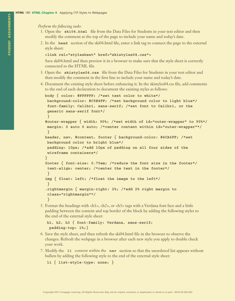
STU
DE
NT
AS
SIG
NM
EN
TS HTML HTML Chapter 4
Perform the following tasks:1. Open the ski04.html �le from the Data Files for Students in your text editor and then
modify the comment at the top of the page to include your name and today’s date.
2. In the head section of the ski04.html �le, enter a link tag to connect the page to the external style sheet:
<link rel="stylesheet" href="skistyles04.css">
Save ski04.html and then preview it in a browser to make sure that the style sheet is correctly connected to the HTML �le.
3. Open the skistyles04.css �le from the Data Files for Students in your text editor and then modify the comment in the �rst line to include your name and today’s date.
4. Document the existing style sheet before enhancing it. In the skistyles04.css �le, add comments to the end of each declaration to document the existing styles as follows:
body { color: #FFFFFF; /*set text color to white*/ background-color: #C9E4FF; /*set background color to light blue*/ font-family: Calibri, sans-serif; /*set font to Calibri, or the generic sans-serif font*/ }#outer-wrapper { width: 90%; /*set width of id="outer-wrapper" to 90%*/ margin: 0 auto 0 auto; /*center content within id="outer-wrapper"*/ }header, nav, #content, footer { background-color: #4CA6FF; /*set background color to bright blue*/ padding: 10px; /*add 10px of padding on all four sides of the wireframe containers*/}footer { font-size: 0.75em; /*reduce the font size in the footer*/ text-align: center; /*center the text in the footer*/ }img { float: left; /*float the image to the left*/ }.rightmargin { margin-right: 2%; /*add 2% right margin to class="rightmargin"*/ }
5. Format the headings with <h1>, <h2>, or <h3> tags with a Verdana font face and a little padding between the content and top border of the block by adding the following styles to the end of the external style sheet:
h1, h2, h3 { font-family: Verdana, sans-serif; padding-top: 1%;}
6. Save the style sheet, and then refresh the ski04.html �le in the browser to observe the changes. Refresh the webpage in a browser after each new style you apply to double check your work.
7. Modify the li content within the nav section so that the unordered list appears without bullets by adding the following style to the end of the external style sheet:
li { list-style-type: none; }
Copyright 2017 Cengage Learning. All Rights Reserved. May not be copied, scanned, or duplicated, in whole or in part. WCN 02-200-203

HTM
L C
hap
ter
4S
TU
DE
NT
AS
SIG
NM
EN
TS
HTML Chapter 4 HTML
8. Modify the li content within the nav section so that the items appear on the same line instead of as new blocks of content by inserting the following declaration for the li selector. (Hint(Hint( : Make sure you insert the declaration before the } closing brace.)
display: inline;
9. Save the stylesheet and refresh the ski04.html �le in the browser to observe the changes.
10. Modify the nav section to have a light-blue background by inserting the following style at the end of the external style sheet:
nav { background-color: #C9E4FF; }
11. Make sure that the heading that starts with “Children’s Lessons” does not �oat to the right of the image by clearing the �oat at that element. In the ski04.html �le, add the following attribute/value pair to the opening <h3> tag that marks the Children’s Lessons heading: class="clearfloat"
12. In the skistyles04.css external style sheet, add a style to the end of the style sheet to clear the �oat for content marked class="clear�oat" as follows:
.clearfloat { clear: both; }
13. Add padding to the header section that contains the image, headings, and nav by styling the header section separately from the rest of the wireframe elements as follows:
a. Delete header in the header, nav, #content, footer selector.
b. Immediately below the nav, #content, footer selector, create a style for the header section to apply the desired background color and to change the padding on the header section to 0 top, 2% right, 2% bottom, and 0 left.
header { background-color: #4CA6FF; padding: 0 2% 2% 0; }
14. Add tabs, spaces, and extra lines to your external style sheet to make it easy to read.
15. Add comments at the end of the new styles to document their application.
16. Validate your CSS �le using the W3C validator at http://jigsaw.w3.org/css-validator/ and �x any errors that are identi�ed. Validation is complete when the validator returns the message “Congratulations! No Error Found.”
17. Validate your HTML webpage using the W3C validator at validator.w3.org and �x any errors that are identi�ed. Validation is complete when the validator returns the message “This document was successfully checked as HTML5!” in a green bar near the top of the webpage.
18. Submit the ski04.html and skistyles04.css �les in a format speci�ed by your instructor. Your instructor may also ask you to submit the ski.jpg and legal.pdf �les that are referenced by the webpage.
19. In step 10 you modi�ed the rules for the header as follows:
nav, #content, footer { background-color: #4CA6FF; padding: 10px; }header { background-color: #4CA6FF; padding: 0 2% 2% 0; }
Given that the same background-color rule is found in two areas, rewrite these rules so that the background-color property is referenced only once. (Hintthe background-color property is referenced only once. (Hintthe background-color property is referenced only once. ( : You will need to create three selectors to do this.) What is the bene�t of listing the same declaration only once?
Copyright 2017 Cengage Learning. All Rights Reserved. May not be copied, scanned, or duplicated, in whole or in part. WCN 02-200-203

STU
DE
NT
AS
SIG
NM
EN
TS HTML HTML Chapter 4
Analyze, Correct, Improve
Correcting CSS ErrorsInstructions: Open your text editor and then open the cssbest04.html and cssbeststyles04.css �les from the Data Files for Students. Several CSS “best practices” are listed on this webpage, but there are errors in both the HTML and CSS �les that you will need to �nd and correct. Use Figure 4–46 as a guide to correct these �les. You will also use professional web development best practices to comment, indent, space, and validate your work.
Figure 4–46
1. Correct
a. Open the cssbest04.html �le in your editor and then modify the comment at the top of the document to include your name and today’s date.
b. Open the cssbeststyles04.css �le in your editor and then modify and correct the comment at the top of the style sheet to include your name and today’s date. Correct the problem with the h1 style.
c. Enter a tag in the <head> section of the cssbest04.html �le just below the <meta> tag to connect the webpage to the external style sheet.
<link rel="stylesheet" href="cssbeststyles04.css">
Open the webpage in a browser to make sure it is properly connected to the style sheet.
d. The current colors of the webpage are not a pleasing combination. Furthermore, the content goes “wall-to-wall” in your browser, meaning it spans the width of the browser window with no left or right margin. To �x this, add a div element to surround the content, and then resize and center it with CSS by completing the following:
• In the cssbest04.html document, after the opening <body> tag, add a <div id="main"> tag.
• Just before the closing </body> tag, add a </div><!--close main--> tag and comment.Copyright 2017 Cengage Learning. All Rights Reserved. May not be copied, scanned, or duplicated, in whole or in part. WCN 02-200-203

HTM
L C
hap
ter
4S
TU
DE
NT
AS
SIG
NM
EN
TS
HTML Chapter 4 HTML
• In the cssbeststyles04.css �le, add the following style between the body and h1 selectors to constrain the content within the <div id=”main”> and </div> tags to 70% of the width of the screen and to center it.
#main { width: 70%; margin: 0 auto 0 auto; }
e. Save both �les, then preview the webpage in a browser to observe the changes. Next, you will work on the colors. Go to www.coolors.co or any color scheme generation site and pick three complimentary colors for the body text, body background, and h1 text. Apply the colors in your style sheet. The color declarations used in Figure 4–46 are:
color: #895D88; (for the body selector)background-color: #F8F991; (for the body selector)color: #3D315B; (for the h1 selector)
f. To improve the spacing between the list items, add the following rule to the end of your style To improve the spacing between the list items, add the following rule to the end of your style sheet to add a half a line of space between list items:
li { line-height: 150%; }
2. Improve
a. Use http://validator.w3.org to validate your cssbest04.html page. The page �ags an error at Line 34. In your cssbest04.html page, notice that the “Never stop learning” list item contains an unordered list starting on Line 34. Often, the validator �ags the line after the actual error occurs. In this case, the closing </li> tag on Line 33 is in the wrong position. Move the </li> tag to below the closing </ul> tag on Line 42. In other words, the “Never stop learning” list item includes not only those three words, but the entire unordered list of links as well.
b. Save and revalidate the cssbest04.html page. Fix any errors and revalidate until you get the message “This document was successfully checked as HTML5!” A �rst step in creating clean CSS code is to validate your HTML code.
c. Use http://jigsaw.w3.org/css-validator/ to validate your CSS code. Unless you’ve already �xed it, you should see an error on Line 12 because the �nal brace } was not included for the h1 selector. Add that character and revalidate your CSS code. Fix any errors and revalidate until you get the message “Congratulations! No Error Found.”
3. After reviewing the 20 “best practices,” comment on which of these practices you would like to understand better and why.
After reviewing the links in the “Never stop learning” list item, comment on which of these sites you would like to explore further and why.
In the Labs
Lab 1: Creating an External Style Sheet for City FarmerProblem: You work for a local but rapidly growing gardening supply company called City Farmer that specializes in products that support food self-suf�ciency. The company has hired you to help create the home page. The content for the home page is in place, but it needs to be styled. Style the webpage shown in Figure 4–47 with an external style sheet.
Copyright 2017 Cengage Learning. All Rights Reserved. May not be copied, scanned, or duplicated, in whole or in part. WCN 02-200-203

STU
DE
NT
AS
SIG
NM
EN
TS HTML HTML Chapter 4
Instructions: Perform the following tasks:1. Open cityfarmer04.html in your HTML editor from the Data Files for Students and
then modify the comment at the top of the page to include your name and today’s date. Make sure the <title>…</title> tags contain the text City Farmer Home Page.
2. Start a new �le in your text editor, and save it in the lab1\styles folder with the name farmerstyles04.css
3. Enter a CSS comment as the �rst line of the external style sheet with your name and today’s your name and today’s yourdate. Recall that CSS comments are entered within /* and */ characters.
4. Enter a style to apply a uniform black text color, a uniform serif font, and light-blue background color to the body:
body { color: #000000; background-color: #B8D1EB; font-family: "Times New Roman", serif; }
5. In the head section of the cityfarmer04.html �le, enter an element to connect the page to the external style sheet:
<link rel="stylesheet" href="styles/farmerstyles04.css">
Save your changes, and then open or refresh cityfarmer04.html in a browser to make sure that the style sheet is correctly connected to the HTML �le. Note that in this exercise, the style sheet is saved in the styles folder, so that path needs to be included in the href value.
6. Center the content by adding <div> and </div> tags to surround the content in the wireframe, and then applying styles to center the content within the <div> and </div> tags as follows:
a. In cityfarmer04.html, insert the <div id="outerwrapper"> opening tag just after the opening <body> tag.
b. In cityfarmer04.html, insert the </div> <!-- close the outerwrapper--> closing tag and comment just before the closing </body> tag. Save your changes to cityfarmer04.html.
Figure 4–47
Copyright 2017 Cengage Learning. All Rights Reserved. May not be copied, scanned, or duplicated, in whole or in part. WCN 02-200-203

HTM
L C
hap
ter
4S
TU
DE
NT
AS
SIG
NM
EN
TS
HTML Chapter 4 HTML
c. In farmerstyles04.css, insert the following style to constrain the outerwrapper to 70% of the width of the screen and to center the content within the outerwrapper:
#outerwrapper { width: 70%; margin: 0 auto 0 auto; }
Save your changes to farmerstyles04.css, and then open or refresh cityfarmer04.html in a browser to make sure that the content is centered within 70% of the browser window.
7. Style the text in the footer section to have a font size of 0.75em and appear centered by adding the following styles to the external stylesheet:
footer { font-size: 0.75em; text-align: center; }
(Hint(Hint( : Save and refresh the cityfarmer04.html �le in your browser after every step to observe and study the impact of each style.)
8. Style the content within the div id="main" section to have a light-brown background and 10px of padding on the top by adding the following style:
#main { background-color: #C5A98B; padding: 10px; }
9. Float the image in the header to the left with the following style so that the <h1>, <h2>, and <nav> content moves to the right of the image:
img { float: left; }
10. Remove the bullets from the list items in the nav section by adding the following style:
ul { list-style-type: none; }
11. Push the content away from the image by adding a right margin to the img selector with the following declaration:
margin-right: 3%;
12. Clear the �oat so that the content for the div id="main" section starts on its own line by adding a second style rule with a #main selector:
#main { clear: both;
}
13. You decide to �oat the second image right instead of left. Right now, your �oat rule is written using the img selector so all img content is affected. To change the �oat value for the second image, complete the following:
a. Add a Add a class="floatleft" attribute value pair to the �rst <img> tag (the logo) in the cityfarmer04.html �le. (Hintcityfarmer04.html �le. (Hintcityfarmer04.html �le. ( : The order of attribute value pairs in the opening html tag do not affect how the code works in the browser, but typically the most important attributes are listed �rst so the class="�oatleft" attribute would often be listed second or third.)
b. Add a Add a class="floatright" attribute value pair to the second <img> tag (tomatoes in pots) in the cityfarmer04.html �le.
c. In the farmerstyles04.css �le, change the img selector to .floatleft
Copyright 2017 Cengage Learning. All Rights Reserved. May not be copied, scanned, or duplicated, in whole or in part. WCN 02-200-203

STU
DE
NT
AS
SIG
NM
EN
TS HTML HTML Chapter 4
d. Just below the .�oatleft style in the CSS �le, add the following style to �oat the second image to the right:
.floatright { float: right; margin-left: 3%; }
Save both �les and then refresh cityfarmer04.html in your browser.
14. To make sure the footer also starts on its own line, modify the selector for the rule that clears all �oat to include both the #main and footer areas as follows:
#main, footer { clear: both; }
15. Validate your HTML code and �x any errors.
16. Validate your CSS code and �x any errors.
17. Save and open the cityfarmer04.html page within a browser as shown in Figure 4–47.
18. Submit your assignment in the format speci�ed by your instructor.
19. In step 13, you inserted class="�oatleft" and class="�oatright" attributes in your HTML page instead of id="�oatleft" and id="�oatright". Why?
Lab 2: Creating an External Style Sheet for Cycle Out CancerProblem: You are part of a philanthropic group of motorcyclists, Cycle Out Cancer, who participate in community events and parades to distribute cancer awareness information. You have created content for the �rst four webpages of their website and updated the links in the navsection for each page. In this exercise you will create an external style sheet and link it to the four pages as shown in Figures 4–48 through 4–51.
Figure 4–48
Copyright 2017 Cengage Learning. All Rights Reserved. May not be copied, scanned, or duplicated, in whole or in part. WCN 02-200-203

HTM
L C
hap
ter
4S
TU
DE
NT
AS
SIG
NM
EN
TS
HTML Chapter 4 HTML
Figure 4–49
Figure 4–50
Copyright 2017 Cengage Learning. All Rights Reserved. May not be copied, scanned, or duplicated, in whole or in part. WCN 02-200-203

STU
DE
NT
AS
SIG
NM
EN
TS HTML HTML Chapter 4
Instructions: Perform the following tasks:1. Open the cyclehome04.html, cycleabout04.html, cycleevents04.html, and cyclefaq04.html �les in your HTML editor from the Data Files for Students and then modify the comment at the top of each page to include your name and today’s date.
2. Start a new �le in your text editor, and save it in the lab2\styles folder with the name cyclestyles04.css
3. Enter a CSS comment as the �rst line of the external style sheet with your name and today’s your name and today’s yourdate.
4. Enter the styles to apply a uniform black text color, Calibri and sans-serif font, and an orange (#FF9900) background color to the body.
5. In the head section of each of the four cycle HTML documents, enter an element to connect the page to the external style sheet.
Save and then open or refresh each page in a browser to make sure that the stylesheet is correctly connected to the HTML �les. Note that in this exercise, the style sheet is saved in the styles folder, so that path needs to be included in the href value.
Figure 4–51
Copyright 2017 Cengage Learning. All Rights Reserved. May not be copied, scanned, or duplicated, in whole or in part. WCN 02-200-203

HTM
L C
hap
ter
4S
TU
DE
NT
AS
SIG
NM
EN
TS
HTML Chapter 4 HTML
6. Center the content by adding <div> and </div> tags to surround the content in the wireframe, and then apply styles to center the content within the <div> and </div> tags as follows:
a. In each HTML page, insert the <div id="wrapper"> opening tag just after the opening <body> tag.
b. In each HTML page, insert the </div> <!--close the wrapper--> closing tag and comment just before the closing </body> tag.
c. In cyclestyles04.css, add the styles to constrain the wrapper to 80% of the width of the window and to center the content within the wrapper.
Save all �les and then open or refresh the pages in a browser to make sure that the content is centered within 80% of the browser window. (Hintis centered within 80% of the browser window. (Hintis centered within 80% of the browser window. ( : Note that a nav section to link to each of the four pages follows the image on each page.)
9. On the cyclehome04.html and cyclefaq04.html pages, you want to �oat the image in the header to the right. On the cycleevents04.html and cycleabout04.html pages, you want to �oat the image in the header to the left. Complete these tasks as follows:
a. Create styles in your style sheet with a selector that addresses the class names of �oatleft and �oatright. (Hint�oatright. (Hint�oatright. ( : A : A : A class="floatleft" attribute and value in the HTML document is referenced by a .floatleft selector in the CSS �le.)
b. Add two declarations to both the selectors. The �rst will �oat the content either left or right. The second will add a 2% margin to the inside edge of the content. For example, the declarations for the .�oatleft selector would be:
.floatleft { float: left; margin-right: 2%; }
Complete the declarations for the .�oatright selector to make the image �oat right and add a 2% margin to the left side.
c. Add class="floatleft" to the opening img tag in the cycleevents04.html and cycleabout04.html pages.
d. Add class="floatright" to the opening img tag in the cyclehome04.html and cyclefaq04.html pages.
e. Save all �les and refresh them in your browser.
11. Remove the bullets from the list items only in the nav section by adding the following style:
nav ul { list-style-type: none; }
(Hint(Hint( : In this example, you are using a descendant selector. Only the ul content within the nav content will be affected.) Save and refresh �les and review them in your browser to make sure that only the bullets for the ul content within the nav section were removed.)
12. Create one more class named boldtext for the questions on the cyclefaq04.html page as follows so that you can style the questions in bold:
a. Add class="boldtext" to the opening <p> tag for the �ve questions immediately below the <h3>Frequently Asked Questions and Answers </h3> heading in the cyclefaq04.html �le.
b. Add a style in the cyclestyles04.css �le to apply bold to the content that is identi�ed by the boldtext class as follows:
.boldtext { font-weight: bold; }
Copyright 2017 Cengage Learning. All Rights Reserved. May not be copied, scanned, or duplicated, in whole or in part. WCN 02-200-203

STU
DE
NT
AS
SIG
NM
EN
TS HTML HTML Chapter 4
13. You also decide to bold the dt (de�nition term) content on the cyclefaq04.html page. Given you already have a declaration to apply bold, change the selector to include both the content identi�ed by the boldtext class as well as the content marked up by the dt tag as follows:
.boldtext, dt { font-weight: bold; }
14. Validate your four HTML pages and �x any errors.
15. Validate your CSS code and �x any errors.
16. Save and open the pages within a browser as shown in Figures 4–48, 4–49, 4–50, and 4–51.
17. Submit your assignment in the format speci�ed by your instructor.
18. Compare the selector of nav ul (step 11) to the selector of .boldtext, dt(step 13). One contains a comma and one does not. What is the signi�cance of the comma? (Hint:(Hint:( Search for information on CSS grouping selectors and descendant selectors.)
Lab 3: Expand Your WorldStyling Inline versus Block ContentProblem: CSS has its own terminology, syntax, and concepts such as the box model, �oat, and inline versus block content, all of which is critical to your ability to successfully apply styles and position content on your webpages. In this exercise you will create an external style sheet to experiment with styles as they relate to inline and block content. The webpages that you are styling summarize CSS terminology, syntax, and tips. The �nal, styled webpages are shown in Figures 4–52, 4–53, 4–54, and 4–55.
Figure 4–52
Copyright 2017 Cengage Learning. All Rights Reserved. May not be copied, scanned, or duplicated, in whole or in part. WCN 02-200-203

HTM
L C
hap
ter
4S
TU
DE
NT
AS
SIG
NM
EN
TS
HTML Chapter 4 HTML
Figure 4–53
Figure 4–54
Copyright 2017 Cengage Learning. All Rights Reserved. May not be copied, scanned, or duplicated, in whole or in part. WCN 02-200-203

STU
DE
NT
AS
SIG
NM
EN
TS HTML HTML Chapter 4
Figure 4–55
Copyright 2017 Cengage Learning. All Rights Reserved. May not be copied, scanned, or duplicated, in whole or in part. WCN 02-200-203

HTM
L C
hap
ter
4S
TU
DE
NT
AS
SIG
NM
EN
TS
HTML Chapter 4 HTML
Instructions:1. Open the cssterminology04.html, csssyntax04.html, cssdeclarations04.html,
and cssblock04.html �les in your HTML editor from the Data Files for Students and then modify the comment at the top of each of the four pages to include your name and today’s date.
2. Enter CSS terminology within the <title> tags of cssterminology04.html, CSS syntaxwithin the <title> tags of csssyntax04.html, CSS declarations within the <title> tags of the cssdeclarations04.html page, and CSS block styles within the <title> tags of the cssblock04.html page.
3. Open the cssterminology04.html page in the browser and read the page. Tap or click the links for the three other pages and read them as well. Note that the content goes “wall-to-wall” in your browser. To center the content within a small left and right margin, add padding between the content and border, and then change the background color to light gray. To do so, create an external style sheet with the following rules for the content marked up between <div id="main"> and </div> tags:
#main { width: 90%; margin: 0 auto 0 auto; padding: 2%; background-color: #D7D7D7; }
4. Save the �le as css04.css in the same folder as the HTML webpages and then add a comment as the �rst line of the �le with your name and the current date.
5. Link the css04.css stylesheet to each page by entering the following element to the <head> section in each page.
<link rel="stylesheet" href="css04.css">
6. Save and refresh your webpages after every step and tap or click each link to see the impact of each new set of rules on the four pages. Style <h1> content with a dark red text color by adding the following style to the external style sheet:
h1 { color: #CF0000; }
7. To study how borders are applied to block paragraph content, add the following rule to apply a blue, 1px, solid border to all sides of every paragraph:
p { border: blue 1px solid; }
Save your changes and then refresh your webpages and view the borders around the paragraphs.
8. To study how �oat is applied, you will work with the cssblock04.html page. Read the paragraphs that surround each example. Example 1 proves that when an image is followed by another image, they arrange themselves in a line, as inline content. Example 2 shows how a single image “appears” to be block content, but only because the content that follows the image is a block and thus starts on its own line.
You will modify the image after the Example 3 paragraph to �oat left. To do this, add class="floatleft" to the <img> tag that follows the Example 3paragraph. (Hint to the <img> tag that follows the Example 3paragraph. (Hint to the <img> tag that follows the Example 3paragraph. ( : The order of attribute value pairs in an HTML tag is not technically signi�cant, but it is common to put the most important attributes �rst. Typically class and id attribute values are listed early in the tag.)
Add the following rule to the external style sheet:
.floatleft { float: left; }
Copyright 2017 Cengage Learning. All Rights Reserved. May not be copied, scanned, or duplicated, in whole or in part. WCN 02-200-203

STU
DE
NT
AS
SIG
NM
EN
TS HTML HTML Chapter 4
Save css04.css and cssblock04.html and then refresh the cssblock04.html page in the browser to observe how the image after the Example 3 paragraph �oats left. Content that follows the �oated image �lls the space to the right of the �oated image.
9. You want the Example 4 paragraph to start on its own line, so you need to clear the �oat at that point. To study how �oat is cleared, add class="clearfloat" to the opening <p> tag for the Example 4 paragraph. Add the following rule to the external style sheet:
.clearfloat { clear: both; }
Save the �les and refresh the cssblock04.html page in the browser to observe how the Example 4 paragraph is “cleared of the �oat” and acts as normal block content again, starting on its own line.
10. You want the image after the Example 4 paragraph to �oat right. To do this, add class="floatright" to the <img> tag that follows the Example 4 paragraph. Add the following rule to the embedded style sheet:
.floatright { float: right; }
Save the �les and refresh the cssblock04.html page in the browser to observe how the image following the Example 4 paragraph �oats right. Floating content right can be tricky considering that people read English from left to right. Content that �oats right is positioned before the content that �ows next to it in the HTML �le.
11. Change the existing navigation content into a horizontal navigation bar. To do this, �rst remove the bullets from the list items in the nav area. List item content naturally �ows as block content, with each list item on its own line. To create a horizontal navigation system with each of the links on the same line, you also must add a rule to change the list item content from block to inline. To do this, add the following rules to the style sheet:
nav li { list-style-type: none;
display: inline;
}
Save the �les and refresh the pages in the browser to observe the new horizontal navigation system.
12. Tap or click the CSS Terminology link to open the cssterminology.html page in the browser. This page lists several key CSS terms. You want to style the terms in bold. To do this, you will mark up the CSS key terms using the <span>…</span> tags. (The span element is an inline element that allows you to mark up and style content within a paragraph without creating a new line.) Mark up the following CSS terms using both the <span> tag and a class="cssterm" attribute in the opening <span> tag as follows: (Hint attribute in the opening <span> tag as follows: (Hint attribute in the opening <span> tag as follows: ( : Be careful to add only the opening and closing <span> tags and not change or delete any of the existing content or HTML code.)
<span class="cssterm">External styles</span> (�rst paragraph)
<span class="cssterm">Embedded styles</span> (second paragraph)
<span class="cssterm">Inline styles</span> (third paragraph)
<span class="cssterm">Rules</span> (fourth paragraph)
<span class="cssterm">selector</span> (�fth paragraph)
<span class="cssterm">declaration</span> (sixth paragraph)
<span class="cssterm">Inheritance</span> (seventh paragraph)
<span class="cssterm">Speci�city</span> (eighth paragraph)
Copyright 2017 Cengage Learning. All Rights Reserved. May not be copied, scanned, or duplicated, in whole or in part. WCN 02-200-203

HTM
L C
hap
ter
4S
TU
DE
NT
AS
SIG
NM
EN
TS
HTML Chapter 4 HTML
Add the following rule to the external style sheet to style the terms marked up by the class="cssterm" attribute value:
.cssterm { font-weight: bold;}
Save the �les and refresh the pages in the browser to observe the new bold terms on the cssterminology04.html page.
13. Validate your HTML and CSS pages and �x any errors.
14. Submit your assignment in the format speci�ed by your instructor.
15. Create a document with these four headings: Terminology, Syntax, Declarations, and Block Versus Inline. Reread cssterminology04.html webpage in your browser. After the Terminology heading in your document, write a sentence or two about something that you want to learn more about or still have questions about in regard to CSS terminology. Repeat this process for the other three pages in this exercise that discuss CSS syntax, CSS declarations, and CSS block versus inline styles. Your answers should prove that you have read the webpages. Save the �le with the name Chapter4Lab3CSS.
Consider This: Your Turn
1. Style Your Personal Portfolio Website
PersonalPart 1: In Chapter 3, you added content for your personal portfolio website on the portfolio .html webpage. In this exercise, you will update the page with an external style sheet that includes the following updates: (Note: includes the following updates: (Note: includes the following updates: ( Your instructor may want you to use the Data Files for Students provided for this exercise instead.)
1. Create an external style sheet with the name portfoliostyles04.css and save it in the styles folder within the your_turn_1 folder.
2. Add your name and the current date as a comment to the �rst line of the portfoliostyles04.css �le.
3. Open your portfolio.html �le in your HTML editor and �oat the image in the header section to the left by adding the attribute of class="float-left" to the <img> tag and a corresponding .float-left {float: left;} rule to the external style sheet.
4. Add a tag to the <head> section of the portfolio.html �le to link the external style sheet to the portfolio.html page as follows:
<link rel="stylesheet" href="styles/portfoliostyles04.css">
Save both the CSS and HTML �les, and open the portfolio.html �le in your browser to make sure the style sheet is linked and the image is �oating properly.
5. Add some space between the image and the content that is �oated to the right by adding the following rule to the style sheet:
img { margin-right: 3%; }
Also remove the bullets on the list items within the nav section by adding the following rule to the style sheet:nav li { list-style-type: none; }
6. Center the content on the page by containing all of the content within the body by surrounding it with <div id="outerwrapper"> … </div> tags.
Copyright 2017 Cengage Learning. All Rights Reserved. May not be copied, scanned, or duplicated, in whole or in part. WCN 02-200-203

STU
DE
NT
AS
SIG
NM
EN
TS HTML HTML Chapter 4
Add a comment after the closing </div> tag to identify that section as follows:
<!--end outerwrapper-->
Style the outerwrapper in the external style sheet to take up 70% of the available space on the screen and to center it within that space as follows:
#outerwrapper { width: 70%; margin: 0 auto 0 auto; }
7. To make sure the webpage will render successfully in all browsers, identify the main section using the <div id="main"> and </div> tags versus <main> and </main>, and include three pairs of <h2> tags in that section that mark up the headings of Strengths, Technologies, and Other.
8. Clear the �oat with the main content by adding the following style to the style sheet:
#main { clear: both; }
9. Push the content below the image by adding the following declaration to the img selector in the style sheet:
margin-bottom: 2%;
10. Style your name at the top of the webpage with a large Futura then Calibri then generic sans-serif font by adding the following class to the opening <p> tag that contains your name. class="myname" and by adding the following corresponding styles to the stylesheet:
.myname { font-family: Futura, Calibri, sans-serif;
font-size: 2em;
}
11. Add a light background color to the #main selector that goes well with the colors in your image.
12. Add styles for padding and a border with rounded corners to the #main selector as follows:
padding: 3%;
border: 2px black solid;
border-radius: 25px;
13. Link your style sheet to any other pages you have created in your portfolio website.
14. Add any other styles that you think would improve your portfolio webpages.
15. Validate and correct your HTML and CSS �les, and then submit your assignment in the format speci�ed by your instructor.
Part 2: Go to www.csszengarden.com and tap or click the style links to see how the single HTML �le appears with different styles. The featured styles change, but at the time of this writing, the featured eight styles were named “Mid Century Modern,” “Garments,” “Steel,” “Apothecary,” “Screen Filler,” “Fountain Kiss,” “A Robot Named Jimmy,” and “Verde Moderna.” Be careful to tap or click the style names rather than the “by author’s name” links to apply the new style to the web-page. Tapping or clicking the author’s name links takes you to the home page for that author.
Explore the site to see how the location and appearance of the content changes from style to style. Locate the links to download the HTML �le and CSS �le. Download both �les and open them in your HTML editor. After reviewing the code in each �le, comment on what you learned or want to know more about.
Copyright 2017 Cengage Learning. All Rights Reserved. May not be copied, scanned, or duplicated, in whole or in part. WCN 02-200-203

HTM
L C
hap
ter
4S
TU
DE
NT
AS
SIG
NM
EN
TS
HTML Chapter 4 HTML
2. Style the WebDevPros Webpages
ProfessionalPart 1: In Chapter 3, you added content within a wireframe and site map for the WebDevPros website. In this exercise, you will update the pages for that website with an external style sheet that includes the following updates: (Note: includes the following updates: (Note: includes the following updates: ( Your instructor may want you to use the Data Files for Stu-dents provided for this exercise instead.)
1. Create an external style sheet with the name webdevstyles04.css and save it in the styles folder within the your_turn_2 folder.
2. Add your name and the current date as a comment to the �rst line of the webdevstyles04.css �le.
3. Open index.html and other �les you created for WebDevPros in Chapter 3 in your HTML editor and �oat the images in the header section to the left or right by adding the attribute of class="float-right" or class="float-left" to the <img> tag and the corresponding .float-right { float: right; } or .float-left { float: left; } rules to the external style sheet. Make your decision on whether the image should �oat left or right based on how it looks best on the page.
4. Add a tag to the <head> section of the index.html �le to link the external style sheet to the index.html page as follows:
<link rel="stylesheet" href="styles/webdevstyles04.css">
Save both the CSS and HTML �le, and open the index.html �le in your browser to make sure the style sheet is linked and the image is �oating properly.
5. Add some space between the image and the content that is �oated to the right by adding the following declaration and comment to the .float-right selector:
margin: 0 0 3% 3%; /* 0 top 0 right 3% bottom 3% left */
Add the following declaration and comment to the .float-left selector:
margin: 0 3% 3% 0; /* 0 top 3% right 3% bottom 0 left */
6. Center the content on all of the pages by containing all of the content within the body by surrounding it with <div id="outer-wrapper"> … </div> tags.
Add a comment after the closing </div> tag to identify that section as follows:
<!--end outer-wrapper-->
Then style the outer-wrapper section in the external style sheet to take up 80% of the available space on the screen and to center within that space as follows:
#outer-wrapper { width: 80%; margin: 0 auto 0 auto; }
7. Add a style to clear the �oat as follows:
.clear-float { clear: both; }
8. Add class="clear-float" to the �rst content tag following the <nav> section, which is probably the <div id="main"> tag unless you have modi�ed your site beyond the previous chapter’s instructions.
9. Add class="webdev" to the “WebDevPros” paragraph content at the top of each page. Style the class with a font face, font size, and font color as follows:
.webdev { font-family: "Mission Gothic", "Times New Roman", serif; font-size: 3em; color: #0033CC; }
Copyright 2017 Cengage Learning. All Rights Reserved. May not be copied, scanned, or duplicated, in whole or in part. WCN 02-200-203

STU
DE
NT
AS
SIG
NM
EN
TS HTML HTML Chapter 4
10. Add a style to the style sheet to bold and change the font color of the <dt> content using the following style:
dt { font-weight: bold; color: #0033CC; }
11. Link your style sheet to any other pages you have created in your WebDevPros website.
12. Add any other styles that you think would improve your WebDevPros webpages.
13. Validate and correct your HTML and CSS �les, and submit your assignment in the format speci�ed by your instructor.
Part 2: You decide to add a horizontal navigation bar to the bottom of each page. Copy the <ul> content from the <nav> section and paste it inside <footer>…</footer> tags just before the closing </div> that closes the outer-wrapper section.
Add a style to your style sheet to remove the bullets from the <li> content in the <footer> section. (Hintsection. (Hintsection. ( : Use a footer li selector.) Also add a style to your style sheet to set the <li> con-tent in the <footer> section inline.
Save and refresh all of your �les. Why is it considered a good practice to add some sort of navigation bar to the bottom of webpages?
3. Styling the Dog Hall of Fame Webpages
Research and CollaborationPart 1: In Chapter 3, you added content to the Dog Hall of Fame webpages. In this exercise, you will update those pages with an external style sheet that includes the following updates: (Note: will update those pages with an external style sheet that includes the following updates: (Note: will update those pages with an external style sheet that includes the following updates: ( Your instructor may want you to use the Data Files for Students provided for this exercise instead.)
1. Create an external style sheet with the name dogstyles04.css and save it in the stylesfolder within the your_turn_3 folder.
2. Add your name and the current date as a comment to the �rst line of the dogstyles04.css �le.
3. Open the �les you created for the Dog Hall of Fame in Chapter 3 in your HTML editor and �oat the images that do not span the page to the left or right by adding the attribute of class="float-right" or class="float-left" to the <img> tag and the corresponding .float-right {float:right;} or .float-left {float:left;} rules to the external style sheet. Make your decision on whether the image should �oat left or right based on what looks best on the page.
4. Add a 2% left and bottom margin style to the .float-right selector using the following declaration:
margin: 0 0 2% 2%;
Add a 2% right and bottom margin style to the .float-left selector using the following declaration:
margin: 0 2% 2% 0;
5. Add a tag to the <head> section of each page in the website to link the external style sheet to the dogfame04.html page as follows:
<link rel="stylesheet" href="styles/dogstyles04.css">
Save both the CSS and HTML �les, and open the dogfame04.html �le in your browser to make sure the style sheet is linked and the image is �oating properly.
Copyright 2017 Cengage Learning. All Rights Reserved. May not be copied, scanned, or duplicated, in whole or in part. WCN 02-200-203

HTM
L C
hap
ter
4S
TU
DE
NT
AS
SIG
NM
EN
TS
HTML Chapter 4 HTML
6. After viewing your pages, determine appropriate places for the �oat to be cleared. (For example, you probably want to clear the �oat when the new headings of “Working Dog” and “Companion Dog” are introduced.) Add a class="clear-float" to those tags in the HTML document and a corresponding .clear-float { clear: both; } rule to the CSS �le.
7. Constrain the content to take 70% of the width of the page by inserting <div id="page-wrapper"> after the opening <body> tag and closing the div with </div> <!--close page-wrapper--> before the closing </body> tag on each page.
Then add a corresponding rule to set the page-wrapper content to 70% and centered in the page as follows:
#page-wrapper { width: 70%; margin: 0 auto; /* 0 top and bottom, auto left and right */ }
8. Save and refresh your �les.
9. Have each team member �nish the style sheet using their own style decisions. Include styles for these elements:
• Font color and font face for the body• Background color for the main content• Any other styles you deem important or appropriate to best display the content on the pages
Use comments in your CSS �le to document these styles.
10. Validate and correct your HTML and CSS �les, and submit your assignment in the format speci�ed by your instructor.
Part 2: As a group, share and compare how each of you styled the webpages. Discuss which features of each style sheet you liked the best. Together, build a �nal external style sheet that includes the best features from each member of your team. Note the features you chose from each member.
Copyright 2017 Cengage Learning. All Rights Reserved. May not be copied, scanned, or duplicated, in whole or in part. WCN 02-200-203

Copyright 2017 Cengage Learning. All Rights Reserved. May not be copied, scanned, or duplicated, in whole or in part. WCN 02-200-203

5 Responsive Design Part 1: Designing for Mobile Devices
•
•
•
•
•
•
•
•
•
•
•
Objectives
HTML
Copyright 2017 Cengage Learning. All Rights Reserved. May not be copied, scanned, or duplicated, in whole or in part. WCN 02-200-203

IntroductionAccording to searchenginewatch.com, the number of mobile devices browsing the Internet surpassed the number of desktop browsers in 2014. However, have you used a phone to visit a website that does not work well on a small screen? Webpages that require users to zoom and scroll to read and navigate the website drive visitors away.
The good news is that with a web development approach called responsive design, you have the power to create one website that works well with various screen sizes and browsers on devices ranging from phones and tablets through laptops and traditional desktop displays. Responsive design is a website development strategy that strives to provide an optimal user experience of a website regardless of the device or browser used. By applying responsive design principles, the webpage and content respond to the screen size of the user’s device to minimize unnecessary scrolling and zooming, making reading and interacting with the site as convenient and intuitive as possible.
Project — Redesign a Website for Mobile DevicesIn Chapter 4, you created an external CSS �le for the Forward Fitness Club and linked it to each page in the �tness website. For this project, you apply responsive web design principles to the �tness website by editing the CSS and HTML �les to use a �uid layout, styles appropriate for a mobile device, and �exible images. These enhancements will result in a better experience for users of mobile devices. You will continue to enhance the site with responsive design for tablet and desktop viewports in Chapter 6.
First, you will modify the template, home page, About Us page, and Contact Us page to prepare them for a �uid layout. You will make sure the wireframe and content are styled with proportional measurement units to create a �uid layout that automatically shrinks and grows with the viewport. Next, you will add new styles to format the content when it appears in a mobile device. You will also modify the CSS code to create �exible images. Finally, you will view, validate, and test the website. Figure 5–1 shows the home page, the About Us page, and the Contact Us page of Forward Fitness Club sized for a mobile viewport. Figure 5–1a shows the home page, Figure 5–1b shows the About Us page, and Figure 5–1c shows the Contact Us page.
Responsive Design Part 1: Designing for Mobile Devices5
HTML
Copyright 2017 Cengage Learning. All Rights Reserved. May not be copied, scanned, or duplicated, in whole or in part. WCN 02-200-203

RoadmapIn this chapter, you will learn how to create the webpages shown in Figure 5–1.
The following roadmap identi�es general activities you will perform as you progress through this chapter:
1. code the webpage navigation links as an unordered list.2. make webpage images flexiBle.3. add styles for a moBile viewport.4. insert and style a span element.5. add a meta tag to each HTML document.6. test the WeBpages in a mobile emulator.
At the beginning of step instructions throughout the chapter, you will see an abbreviated form of this roadmap. The abbreviated roadmap uses colors to indicate chapter progress: gray means the chapter is beyond that activity; blue means the task being shown is covered in that activity, and black means that activity is yet to be covered. For example, the following abbreviated roadmap indicates the chapter would be showing a task in the 5 ADD META TAG activity.
1 CODE NAVIGATION LINKS | 2 MAKE IMAGES FLEXIBLE | 3 ADD STYLES FOR MOBILE
4 INSERT & STYLE SPAN ELEMENT | 5 ADD META TAG | 6 TEST WEBPAGES
Use the abbreviated roadmap as a progress guide while you read or step through the instructions in this chapter.
HTML
Figure 5–1
(a) Home page (b) About Us page (c) Contact Us page
Copyright 2017 Cengage Learning. All Rights Reserved. May not be copied, scanned, or duplicated, in whole or in part. WCN 02-200-203

HTML HTML Chapter 5
Exploring Responsive DesignFigure 5–2 shows an example of a website developed using responsive design principles, www.authenticjobs.com. The content appears easy to read and navigate on devices of three sizes: desktop browser, tablet, and phone. If you are working on a desktop computer, you can quickly experience how the webpage responds to different browser sizes by simply resizing your browser window.
Figure 5–2
(a) Desktop
(b) Tablet(b) Tablet(c) Phone(c) Phone
Ethan Marcotte is credited with coining the phrase “responsive web design” in a 2010 article he wrote for the web developer community in a magazine called A List Apart, alistapart.com. Responsive web design is not a speci�c set of rules, but is better characterized as a philosophy that is constantly re�ned as HTML and CSS
Copyright 2017 Cengage Learning. All Rights Reserved. May not be copied, scanned, or duplicated, in whole or in part. WCN 02-200-203

HTML Chapter 5 HTML
HTM
L C
hap
ter
5
standards, browsers, and technology evolve and improve. However, most discussions of responsive design highlight the following three concepts:
•Fluid layout: A �uid layout applies proportional size measurements to the �uid layout applies proportional size measurements to the �uid layoutwebpage wireframe and content so that the content stretches, shrinks, and grows as the size of the viewport changes. The viewport is the viewing area for the viewport is the viewing area for the viewportwebpage, which is much smaller on a phone than on a traditional desktop. On a traditional Windows desktop computer, the viewport is usually the window itself, but the term “viewport” is preferred over “window” because windows are generally not displayed in the browsers of mobile devices. Furthermore, a window on a traditional desktop display might not be maximized to �ll the entire screen. Just keep in mind that the viewport refers to the portion of the webpage that a user sees at any one time, regardless of device, browser, screen size, screen resolution, window size, or orientation.
•Media queries: Media queries allow the webpage developer to detect the approximate pixel size of the current viewport. This detection allows the developer to selectively apply CSS rules that work best for that viewport size. CSS3 standards expanded the capabilities of media queries. Media queries will be further discussed in Chapter 6.
•Flexible images: Flexible images shrink and grow based on the size of the viewport. Flexible images do not have height and width attributes or values in the HTML document. Rather, �exible images use CSS rules to resize the image relative to the wireframe and viewport.
Designing for Mobile DevicesThe explosive growth of mobile browsers including those on phones and tablets quickly created serious problems for webpage developers because smaller viewports often required excessive zooming and scrolling. Different techniques emerged to address this problem, one of which was to build a completely separate, parallel website optimized for mobile users called a mobile website. Mobile websites are often identi�ed with an m. or mo. pre�x in the URL such as http://m.phsc.edu/, Pasco-Hernando State College’s mobile website. Although the word “mobile” applies to any portable device connected to the Internet such as lightweight laptops, tablets, and phones, in this context, mobile websites are generally focused on providing support for browsers on smartphones.
The mobile website approach helps companies that have large existing websites provide a quick solution for mobile users. A large organization’s current website may contain a massive number of pages that were developed long ago using unresponsive designs built for traditional desktop browsers. Modifying each of those pages to incorporate responsive techniques is often such a large effort that it is eliminated as a viable solution. The mobile website approach means that developers build a new, parallel website from scratch, speci�cally designing it for small mobile viewports. This approach can be much faster than converting a large website of existing nonresponsive pages to modern responsive designs.
The major downside of creating a mobile website is that it multiplies the work required to maintain what becomes two separate websites for the same organization. In contrast, responsive design seeks to optimize the viewing experience for a wide range of devices using one website. Therefore, a website developed with responsive design principles from the very beginning is less work to maintain down the road.
Copyright 2017 Cengage Learning. All Rights Reserved. May not be copied, scanned, or duplicated, in whole or in part. WCN 02-200-203

HTML HTML Chapter 5
What is a mobile web application?A mobile web application is an application accessed through a smartphone browser. It is created with a combination of HTML, CSS, and JavaScript programming languages. Unlike a native mobile application, a mobile web application does not reside on the smartphone itself and is only accessible through a browser. In contrast, a native mobile application is downloaded onto a smartphone from an app store, such as Google Play or Apple’s App store, and resides on the device itself. A popular tool for creating mobile web applications is jQuery Mobile. jQuery Mobile provides a library of JavaScript resources that you can use to create a mobile web application. For more information about jQuery Mobile, visit jquerymobile.com.C
ON
SID
ER
TH
IS
A mobile-�rst strategy employs responsive design principles, but with an interesting twist. Following a mobile-�rst strategy, a web developer designs the �exible wireframe and essential content for the smallest viewport �rst, progressively adding more content as the viewport grows. A web developer then uses media queries to add styles for progressively larger viewports, progressing from tablet to laptop and desktop. See Figure 5–3a. A mobile-�rst strategy is considered by some to be a more productive and effective way to build a website from scratch because it forces the web developer to focus on the core, essential content �rst for the smallest viewport. Compare this to Figure 5–3b, the traditional approach, where developers start with a traditional webpage, and then remove or modify nonessential content as the viewport gets smaller. The mobile-�rst strategy makes the most sense when mobile users are a very high priority for your website and when you have the luxury of building the website from scratch.
Figure 5–3
(a) Mobile-�rst approach(a) Mobile-�rst approach
(b) Traditional approach
Copyright 2017 Cengage Learning. All Rights Reserved. May not be copied, scanned, or duplicated, in whole or in part. WCN 02-200-203

HTML Chapter 5 HTML
HTM
L C
hap
ter
5
The website development approach you implement depends on many factors including the current environment, your target audience, available resources, and the time available to tackle the project. Given you are still in the initial stages of developing the Forward Fitness Club website, you will be able to apply a responsive design. Although you already created desktop-sized webpages, you are still in the initial stages of building the Forward Fitness Club website so you can incorporate the mobile-�rst strategy, which develops an optimum design for a mobile display and focuses on the most essential content.
The following websites provide examples of responsive design. View them using a desktop, tablet, and mobile device to see how they provide an excellent user experience in each environment. You can also create different viewport sizes by opening the website in a desktop browser and then resizing the browser to smaller sizes to simulate the viewports found on tablet and phone devices.
•The Boston Globe: www.bostonglobe.com•Microsoft: www.microsoft.com•Engadget: www.engadget.com•World Wildlife Fund: www.worldwildlife.org•Awwwards: www.awwwards.com•Museum of Fine Arts: www.mfa.com•Silverton Health: www.silvertonhealth.org
Figure 5–4 shows how the Silverton Health (www.silvertonhealth.org) website would look on a desktop, tablet, and phone. Notice how the text, pictures, and content are resized and repositioned to work well in all three environments.
Figure 5–4
(a) Desktop(a) Desktop
(b) Tablet(b) Tablet (c) Phone(c) Phone
Copyright 2017 Cengage Learning. All Rights Reserved. May not be copied, scanned, or duplicated, in whole or in part. WCN 02-200-203

HTML HTML Chapter 5
Using Fluid LayoutsA webpage with a liquid layout, also called a �uid layout, changes in width based on the size of the viewport. Responsive designs are based on �uid layouts. Before you create a �uid layout for Forward Fitness Club, however, it is helpful to study �xed layouts. Fixed layouts do not change in width based on the size of the viewport. Fixed layouts use �xed measurement units such as pixels to de�ne the width of the areas of the wireframe that “�x” the width of the content regardless of the size of the viewport. The noaa.gov website for the National Oceanic and Atmospheric Administration shown in Figure 5–5 is based on a �xed layout. Note how the text does not wrap and how the images do not resize based on the size of the viewport. Fixed layouts can involve a tremendous amount of horizontal scrolling and require much zooming on small viewports.
What is the Internet of Things?The term Internet of Things (IoT) refers to the ever-expanding number of devices that connect to the Internet to share information. The IoT includes traditional computers and mobile devices as well as Internet-ready appliances, thermostats, bio-chips, TVs, and any other device that connects to the Internet to retrieve or send information.
CO
NS
IDE
R T
HIS
Figure 5–5
BTWWeb AnalyticsWeb analytics is the study of how users interact with a website. Web analytics provide statistics on how many people visit a website as well as what browsers, devices, and choices the user made while at a website. This data helps a web developer design a site to meet the needs of their desired audience.
Copyright 2017 Cengage Learning. All Rights Reserved. May not be copied, scanned, or duplicated, in whole or in part. WCN 02-200-203

HTML Chapter 5 HTML
HTM
L C
hap
ter
5
Because so many older websites were built for a single, traditional screen resolution such as 1024 by 768 pixels, the Internet is full of webpages with �xed layouts. In fact, it was not uncommon a few years ago to start your wireframe design based on a viewport width of 960 pixels, which generally �lled a traditional desktop browser yet allowed for a few pixels of margin on the left and right. Although �xed layouts do not work well for smaller viewports, they are still appropriate for webpages used in controlled environments such as those created for a speci�c purpose within an internal company intranet. Information-intensive sites such as noaa.gov may also be satis�ed with their current �xed layout if their primary audience uses traditional desktop computers to access their site.
You implement �uid layouts by measuring the widths of the wireframe elements and content in relative units such as percentages and ems. Table 5-1 lists the units of measurement you can use in CSS property values as well as the common uses for each. Responsive sites use relative units of measurement.
What other types of layouts can I use besides �uid and �xed layouts?In addition to �uid (also called liquid) and �xed layouts, you can use two other types of layouts. Elastic layouts are measured in ems. Elastic layouts also respond to the size of the viewport. Hybrid layouts combine aspects of �xed and �uid layouts. For example, you may want to “�x” the size of one column but allow another to be �exible.
CO
NS
IDE
R T
HIS
BTWStyles and Units of MeasurementRemember that when creating styles that include units of measurement, do not put a space between the value and the unit of measure.
font-size: 2em; /* correct */font-size: 2 em; /* incorrect */
Table 5–1 Common CSS Units of Measurement
Unit DescriptionRelative or Fixed? Common Uses CSS Examples
em An em is historically based on the height of the capital letter M of the default font. 1em is typically larger on a desktop browser than on a tablet browser. For example, 1em is usually about 16pt in a desktop browser and about 12pt in a tablet browser.
Relative Em may be used to scale anything related to textual content such as font size, line sizes, margins, padding. Em sizes are relative to each other. For example, 2em = twice as large as 1em. 0.5em = half as large as 1em.
p {font-size: 1.0em; line-height: 2.0em; text-indent: 1.8em;}
h1 {font-size: 3.0em; margin: 1.0em; padding: 1.5em;}
% Percentage. The default font size measurement for most browsers on most devices is 100%.
Relative Developers use % to measure the widths of the wireframe elements and �exible images. Some use % to measure textual content, too.
#container {width: 80%;}
img {width: 100%;}
px One pixel is equal to one dot on the screen. Different screens have different pixel densities.
Pixels on a device are �xed in size, but the number of pixels varies by device
Pixels are commonly used for textual measurements including padding, borders, and margins. Do not use the px measurement for width measurements, as this creates a �xed, unresponsive layout.
.advertise {border: 1px solid red;}
pt points (1pt = 1/72 inch) Fixed Points are used to measure font and line sizes in print media.
Because these measurements are �xed and do not scale based on the size of the viewport, they should not be used within a responsive design.
cmmmin
centimetersmillimetersinches
Fixed These measurements are not commonly used for webpage development.
pc picas (1pc = 12pt) Fixed The pica measurement harkens back to the “pica typewriter,” which produced a Courier fixed-width font, 12pts tall.
Copyright 2017 Cengage Learning. All Rights Reserved. May not be copied, scanned, or duplicated, in whole or in part. WCN 02-200-203
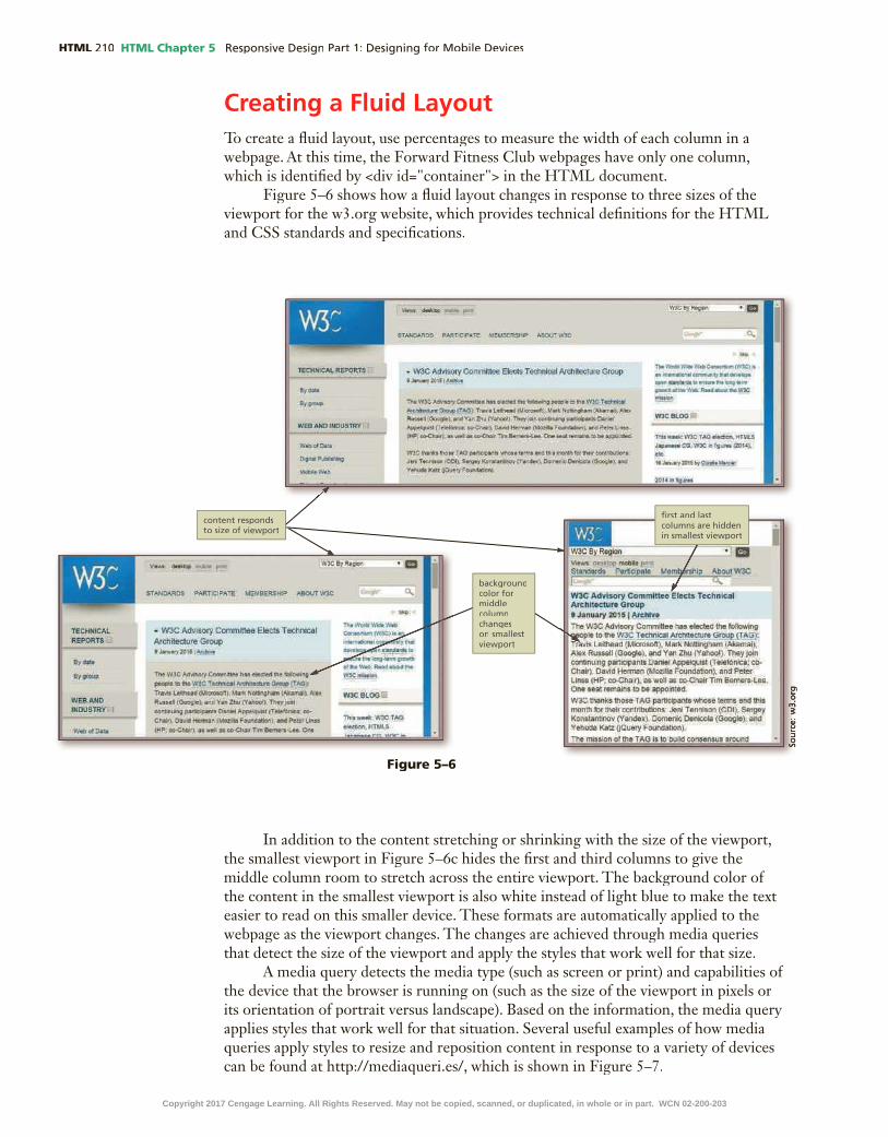
HTML HTML Chapter 5
Creating a Fluid LayoutTo create a �uid layout, use percentages to measure the width of each column in a webpage. At this time, the Forward Fitness Club webpages have only one column, which is identi�ed by <div id="container"> in the HTML document.
Figure 5–6 shows how a �uid layout changes in response to three sizes of the viewport for the w3.org website, which provides technical de�nitions for the HTML and CSS standards and speci�cations.
Figure 5–6
In addition to the content stretching or shrinking with the size of the viewport, the smallest viewport in Figure 5–6c hides the �rst and third columns to give the middle column room to stretch across the entire viewport. The background color of the content in the smallest viewport is also white instead of light blue to make the text easier to read on this smaller device. These formats are automatically applied to the webpage as the viewport changes. The changes are achieved through media queries that detect the size of the viewport and apply the styles that work well for that size.
A media query detects the media type (such as screen or print) and capabilities of the device that the browser is running on (such as the size of the viewport in pixels or its orientation of portrait versus landscape). Based on the information, the media query applies styles that work well for that situation. Several useful examples of how media queries apply styles to resize and reposition content in response to a variety of devices can be found at http://mediaqueri.es/, which is shown in Figure 5–7.
Copyright 2017 Cengage Learning. All Rights Reserved. May not be copied, scanned, or duplicated, in whole or in part. WCN 02-200-203

HTML Chapter 5 HTML
HTM
L C
hap
ter
5
Figure 5–7
Beginning web developers may confuse the capabilities of media queries with the behavior of a liquid layout, but a webpage can have a liquid layout without using media queries. For example, Figure 5–8 shows a webpage with a liquid layout in two widths.
Figure 5–8
No matter how small your browser becomes, the content placeholder boxes on the page shrink and grow in response to the size of the viewport. They resize automatically because the width measurements for the content and placeholders use percentages, which are proportional units of measure, as shown in the CSS code revealed in the lower portion of the webpage.
Copyright 2017 Cengage Learning. All Rights Reserved. May not be copied, scanned, or duplicated, in whole or in part. WCN 02-200-203

HTML HTML Chapter 5
Navigation Elements in Fluid LayoutsTo make the navigation links more appealing and easy to �nd on the webpage,
you can format them so they look more like buttons rather than text links. For the Forward Fitness Club website, you will code the navigation links as an unordered list in the HTML document to better display and position the navigation system as appropriate for your design. For the desktop and tablet viewports, the navigation links can appear as green buttons with white text to match the color scheme of the Forward Fitness Club website. Each button should also have extra space to display the link text clearly and to separate it from adjacent buttons. The navigation system in the phone viewport can use the same color scheme, but each button should be larger so users can �nd and select each one easily on the small screen of a phone.
To accomplish this design, �rst code the navigation links as an unordered list. This is a common web design technique that semantically describes the content and lets you format each link using CSS styles. Once the navigation is coded as an unordered list, you can add styles to the style sheet to format the navigation list items without displaying a bullet. You will also apply a background color, text color, and rounded border to make each link look like a button. You will then remove the underlining that appears with links by default.
1 CODE NAVIGATION LINKS | 2 MAKE IMAGES FLEXIBLE | 3 ADD STYLES FOR MOBILE
4 INSERT & STYLE SPAN ELEMENT | 5 ADD META TAG | 6 TEST WEBPAGES
To Code the Navigation Links as an Unordered List
Code the navigation links on the home, About Us, Contact Us, and template pages as list items in an unordered list. Why? Coding links in a navigation system as an unordered list is a common way to semantically describe the content because a list of links is truly an unordered list. This technique also provides the structure, or “box,” around each link, which is required to style the links for different viewport sizes later. The following steps add the HTML code to mark up the links in the nav section as list items in an unordered list.
1•
•
enter
•
Q&
A
Figure 5–9
Note:
Copyright 2017 Cengage Learning. All Rights Reserved. May not be copied, scanned, or duplicated, in whole or in part. WCN 02-200-203

HTML Chapter 5 HTML
HTM
L C
hap
ter
5
2•
Q&
A
3•
•
•
4•
•
HTM
L C
hap
ter
5
Figure 5–10
Figure 5–11
Figure 5–12
Copyright 2017 Cengage Learning. All Rights Reserved. May not be copied, scanned, or duplicated, in whole or in part. WCN 02-200-203

HTML HTML Chapter 5
5•
•
6•
Q&
A
Figure 5–14
Making Images FlexibleIf you reduce the width of the browser window, the Forward Fitness Club logo is cut off because it is not resizing with respect to the viewport. You can tackle that problem next by adding �exible images to your design, another major component of a responsive design strategy. A �exible image resizes itself to accommodate the size of the viewport. Flexible images are fairly easy to implement. To create �exible images:
1. Delete the height and width attribute values for the img tags in the HTML �les.
2. Add styles for the images in the CSS �le to provide the desired �exibility such as the following style:max-width: 100%;
By setting the width of the image to 100%, the image automatically stretches to �ll 100% of the width of the container element. The height automatically grows in proportion to the width. Use themax-widthproperty instead of thewidthproperty to constrain the image to 100% of its actual size in case the viewport grows actual size in case the viewport grows actualeven larger. For example, you probably do not want the image to stretch beyond its actual size because that degrades the quality of the image even if the webpage is viewed on a very large widescreen TV.
Figure 5–13
Copyright 2017 Cengage Learning. All Rights Reserved. May not be copied, scanned, or duplicated, in whole or in part. WCN 02-200-203

HTML Chapter 5 HTML
HTM
L C
hap
ter
5
To Add Flexible Images
Add �exible images to the home, About Us, Contact Us, and template pages. Why? Flexible images shrink and grow in proportion to the viewport, providing a better viewing experience across multiple devices. The following steps delete the height and width attributes from theimgtags in the HTML �les and add a style using the max-width property to the style sheet �le.
1•
•
Figure 5–15
1 CODE NAVIGATION LINKS | 2 MAKE IMAGES FLEXIBLE | 3 ADD STYLES FOR MOBILE
4 INSERT & STYLE SPAN ELEMENT | 5 ADD META TAG | 6 TEST WEBPAGES
Most of the responsive websites that you have been visiting in the examples in this chapter have employed �exible images. A good example of �exible images along with a deeper discussion of how they support responsive design can be found at http://demosthenes.info/blog/586/CSS-Fluid-Image-Techniques-for-Responsive-Site-Design shown in Figure 5–15.
Figure 5–16
Copyright 2017 Cengage Learning. All Rights Reserved. May not be copied, scanned, or duplicated, in whole or in part. WCN 02-200-203

HTML HTML Chapter 5
2•
•
Q&
A
Figure 5–17
Figure 5–18
Figure 5–19
3•
•
4•
•
Copyright 2017 Cengage Learning. All Rights Reserved. May not be copied, scanned, or duplicated, in whole or in part. WCN 02-200-203

HTML Chapter 5 HTML
HTM
L C
hap
ter
5
5•
•
enter
• /* Style to create a fluid image */
• enter img {
• enter max-width: 100%;
• enter }
6•
•
Q&
A
HTM
L C
hap
ter
5
Figure 5–20
Figure 5–21
Break Point: If you want to take a break, this is a good place to do so. To resume at a later time, continue reading the text from this location forward.
Following a Mobile-First StrategyThe responsive web design approach styles content differently depending on the type of device used to view the site. The mobile-�rst approach focuses on styling content as appropriate for smaller mobile devices. One goal in designing for mobile devices is
Copyright 2017 Cengage Learning. All Rights Reserved. May not be copied, scanned, or duplicated, in whole or in part. WCN 02-200-203

HTML HTML Chapter 5
to prominently display the content accessed most by users. It is also a best practice to use a single-column layout for a mobile display, as this prevents scrolling horizontally. Displaying what mobile device users need and want on a single screen with minimal scrolling creates a more enjoyable experience.
Styles for Content on Mobile DevicesStyling content for mobile devices is different from styling content for a desktop
display. Because the screen size is smaller, you must analyze each page to determine the most important content on the page, and then style that content to attract users of mobile devices. If you do not have an existing website, begin by �rst determining the most essential content for your site.
If you already have page content, you may need to remove some content for a mobile viewport. Think of this approach as similar to moving from a large home to a small condominium. Before the move can take place, you must determine the essential items you want to take with you to the new home and then downsize.
Figure 5–22a depicts a wireframe example for a traditional desktop viewport. Note the multiple column layout and different areas of content. If you were to use all these same areas of content for a mobile design, the wireframe would look like Figure 5-22b.
Figure 5–22
Copyright 2017 Cengage Learning. All Rights Reserved. May not be copied, scanned, or duplicated, in whole or in part. WCN 02-200-203

HTML Chapter 5 HTML
HTM
L C
hap
ter
5
The mobile layout shown in Figure 5–22b is too long and would require a lot of extra scrolling for a mobile user. An ideal webpage in a mobile viewport requires little or no scrolling. In this example, you need to analyze the page and determine the areas with the most essential content. You then hide the nonessential content areas for a mobile viewport. Figure 5–23 shows how to hide some webpage areas to create a revised mobile wireframe.
Figure 5–23
Optimize the interface to maximize the mobile user experience. The following are some key best practices when designing for mobile viewports.
1. Make use of 100% of the screen space.2. Design the navigation to be easy and intuitive.3. Keep load times minimal. Enhance load times by removing bandwidth-intensive
content and streamlining your HTML code.4. Display essential page content and hide nonessential page content.5. Make the content easy to access and read. 6. Design a simple layout.
Copyright 2017 Cengage Learning. All Rights Reserved. May not be copied, scanned, or duplicated, in whole or in part. WCN 02-200-203

HTML HTML Chapter 5
Steps in a Mobile-First StrategyWhen you want to implement a mobile-�rst strategy with an existing website,
you must �rst analyze each page to determine the most essential content and whether to hide some of the content on a mobile device.
The �tness website already has page content, so you need to analyze each page to select the most essential content and then design the content for a mobile viewport.
To apply a mobile-�rst strategy, open your CSS �le and modify the existing style rules so they apply to a mobile viewport. You will also add new style rules to further improve the site to create an enjoyable experience for mobile device users. When implementing a mobile-�rst strategy, list styles for the mobile viewport �rst in the style sheet. You will then create a media query with styles for tablet, followed by a media query with styles for desktop. The media queries will include styles that apply only to tablet and desktop viewports, respectively. (You create media queries in Chapter 6.) An important best practice is to list your viewport styles and media queries in order from the smallest to the largest device.
To Add a Comment for Mobile Styles
Before you designate mobile styles in your CSS �le, begin with a comment to signify where the styles begin. This is a good coding practice and gives a future developer working on the site clear insight about the location of the mobile styles. The following steps add a new comment to note mobile styles in a CSS �le.
1 enter
2 /* Styles for Mobile Layout */
Figure 5–24
To Edit the #container Style for Mobile Viewports
When a user views a website from a mobile viewport, the webpage should take up all available screen space because the screen is smaller. The style for the #container selector currently has a width of 80%, which is best for a desktop view. Change the width value to 100% so the page uses all of the screen width in a mobile viewport. The following steps change the width for the #container selector in a CSS �le.
1 100%
Copyright 2017 Cengage Learning. All Rights Reserved. May not be copied, scanned, or duplicated, in whole or in part. WCN 02-200-203

HTML Chapter 5 HTML
HTM
L C
hap
ter
5
2
Q&
A
Figure 5–25
To Edit the header Style for Mobile Viewports
Update the header style for a mobile viewport by using an em unit of measurement for the margin-top and border-radius properties so the margin and border radius are relative to the page. Remove the box-shadow property to create more room for content in the mobile viewport. The following steps edit the styles for the header selector in a CSS �le.
1 Style for the header specifies top margin, background color, rounded corners, and center-aligns content
2 0.2em0.2em
3
4 0.5em0.5em
5
6
7
Q&
AQ
&A
Copyright 2017 Cengage Learning. All Rights Reserved. May not be copied, scanned, or duplicated, in whole or in part. WCN 02-200-203

HTML HTML Chapter 5
To Edit the nav Style for Mobile Viewports
Next, modify the style rule for the nav element to only include text properties. You will create a new style rule to style the unordered list in future steps, however, you must �rst modify the style rule for the nav selector to use only properties related to text, which are appropriate for list items. The following steps edit the styles for the nav selector in a CSS �le.
1 Style for the nav specifies text properties
2
3
Q&
A
Figure 5–26
Figure 5–27
Copyright 2017 Cengage Learning. All Rights Reserved. May not be copied, scanned, or duplicated, in whole or in part. WCN 02-200-203

HTML Chapter 5 HTML
HTM
L C
hap
ter
5
To Add a nav ul Style for Mobile Viewports
Recall that you inserted an unordered list within the navigation area. Add a nav ul selector to style the unordered list. The style should include a padding property with a value of 0 to allow the links in the list to expand the full width of the mobile viewport. To include some margin before and after the unordered list, add top-margin and bottom-margin properties to the style. The following steps add a nav ul selector and declarations in a CSS �le.
1 enter
2 /* Style specifies padding and margins for unordered list */
3 enter
4 nav ul {
5 enter
6 padding: 0;
7 enter margin-top: 0.5em;
8 enter margin-bottom: 0.5em;
9 enter }
10
Q&
A
Figure 5–28
Copyright 2017 Cengage Learning. All Rights Reserved. May not be copied, scanned, or duplicated, in whole or in part. WCN 02-200-203

HTML HTML Chapter 5
To Add a nav li Style for Mobile Viewports
The default marker for each <li> item in an unordered list is a bullet. Add a style for the list items in the navigation area to display the items inline. Also remove the bullets to prepare for displaying the links as a vertical column of buttons. Add declarations to apply a background color to the list items, add padding and margin space, and apply a rounded border to make the list items look like buttons. The following steps add a style rule to the style sheet to format the unordered list as buttons for mobile displays.
1 enter
2 /* Style for nav li specifies the background color, rounded corners, removes bullet style, and applies margins and padding for list items within the navigation */
3 enter
4 nav li {
5 enter , background-color: #009933;
6 enter border-radius: 2em;
7 enter list-style-type: none;
8 enter margin: 0.3em;
9 enter padding: 0.4em;
10 enter }
Q&
AQ
&A
Q&
A
Figure 5–29Copyright 2017 Cengage Learning. All Rights Reserved. May not be copied, scanned, or duplicated, in whole or in part. WCN 02-200-203

HTML Chapter 5 HTML
HTM
L C
hap
ter
5
11
Figure 5–30
To Add a nav li a Style for Mobile Viewports
Create a new selector in your CSS �le, nav li a. This selector applies to the list item anchors, or the page links, in the navigation area. Include the color property to de�ne the color of the link as white (#FFFFFF) so the link text is clear against the dark green background. Set the text-decoration property to none to remove the underlining that appears by default for links. The following steps add a style using the nav li a selector in a CSS �le.
1 enter
2 /* Style changes navigation link text color to white and removes the underline */
3 enter
4 nav li a {
5 enter
6 color: #FFFFFF;
7 enter text-decoration: none;
Copyright 2017 Cengage Learning. All Rights Reserved. May not be copied, scanned, or duplicated, in whole or in part. WCN 02-200-203

HTML HTML Chapter 5
8 enter }
Q&
A
Figure 5–31
9
Figure 5–32
Copyright 2017 Cengage Learning. All Rights Reserved. May not be copied, scanned, or duplicated, in whole or in part. WCN 02-200-203

HTML Chapter 5 HTML
HTM
L C
hap
ter
5
Analyze the Home Page for Mobile-First DesignThe content on the home page is now styled for a productive viewing experience
on a mobile device, but the page content is still best suited to a desktop user. Instead of providing an introductory welcome message, use content a mobile device user wants to �nd quickly, such as the �tness club’s hours and phone number with a telephone link.
You can add this essential content to the home page without removing the content for webpage visitors with a desktop device. To accomplish this task, use a divelement to contain the content for mobile devices and another div element to contain the content for desktop displays. You then add a class attribute to eachdivelement; add a class="mobile" attribute and value to the div element for the mobile content and add a class="desktop" attribute and value for the div element for the desktop content. You will then de�ne styles to display the mobile class and hide the desktop class. You create a .tablet class in later steps.
To Modify the Home Page
Modify the home page to add essential content for a mobile user. First, create a newModify the home page to add essential content for a mobile user. First, create a new div element with a class="mobile" attribute and value, and then add the mobile content within this newclass="mobile" attribute and value, and then add the mobile content within this new div element. Next, place the desktop paragraph elements within a div element and add a class="desktop" attribute and value. Why? When following a mobile-�rst strategy, provide the mobile user with the most important, essential page content and remove or hide the desktop content. The following steps modify the home page content to follow a mobile-�rst strategy.
1•
•
enter
•<div class= "mobile">
• enter
• <h3>FREE One-Week Trial Membership!</h3>
• enter <p><a href="tel:8145559608">Call Us Today to Get Started</a></p>
1 CODE NAVIGATION LINKS | 2 MAKE IMAGES FLEXIBLE | 3 ADD STYLES FOR MOBILE
4 INSERT & STYLE SPAN ELEMENT | 5 ADD META TAG | 6 TEST WEBPAGES
Figure 5–33
Copyright 2017 Cengage Learning. All Rights Reserved. May not be copied, scanned, or duplicated, in whole or in part. WCN 02-200-203

HTML HTML Chapter 5
2• enter
<h4>Fitness Club Hours:</h4>
• enter
<p>Monday - Thursday: 6:00am - 6:00pm<br>
• enter
Friday: 6:00am - 4:00pm<br>
• enter Saturday: 8:00am - 6:00pm<br>
• enter Sunday: Closed</p>
• enter </div>
Figure 5–34
3• enter
•<div class= "desktop">
•
•
enter
•</div>
4•
Figure 5–35
Copyright 2017 Cengage Learning. All Rights Reserved. May not be copied, scanned, or duplicated, in whole or in part. WCN 02-200-203

HTML Chapter 5 HTML
HTM
L C
hap
ter
5
To Modify the Style Rule for the mobile Class
Your CSS �le contains a style rule for the mobile class, which sets the display to none. When you created this style, it was originally meant to hide the content in the mobile class when the page was displayed in a desktop viewport. You now need to modify the style rule to display the mobile class for the mobile viewport. Modify the style rule for the .mobile selector so it displays content inline. Why? In the mobile viewport, show the phone number with the link to make it easy for a mobile user to call the business. Use the inline value with the display property to display the phone number as an inline element instead of adding extra space as it would for a block element. The following steps modify the style rule for the .mobile selector.
1•
•
enter
• /* Style displays the mobile class */
• CtrL+X
• enter CtrL+V
• inline
2•
1 CODE NAVIGATION LINKS | 2 MAKE IMAGES FLEXIBLE | 3 ADD STYLES FOR MOBILE
4 INSERT & STYLE SPAN ELEMENT | 5 ADD META TAG | 6 TEST WEBPAGES
Figure 5–36
To Add a Style Rule for the desktop Class
Create a style rule to hide content in the desktop class. First, insert a .desktop selector and then set thedisplay property to none. Why? You do not want to display desktop content in the mobile viewport. Later in this chapter, you add a class="desktop" attribute and value to an element that de�nes desktop-only content. The following steps add the style rule for the .desktop selector.
1•
enter
•/* Style hides the desktop class */
• enter .desktop {
• enter display: none;
• enter }
1 CODE NAVIGATION LINKS | 2 MAKE IMAGES FLEXIBLE | 3 ADD STYLES FOR MOBILE
4 INSERT & STYLE SPAN ELEMENT | 5 ADD META TAG | 6 TEST WEBPAGES
Figure 5–37
Copyright 2017 Cengage Learning. All Rights Reserved. May not be copied, scanned, or duplicated, in whole or in part. WCN 02-200-203

HTML HTML Chapter 5
2•
Figure 5–38
To Modify the Style Rule for the main Element
The styles.css �le contains a style rule for the main element. Modify the style rule to adjust the padding and margins to display more content in the mobile viewport and change absolute units of measurement to relative units of measurement used for �uid and responsive design layouts. The following steps modify the style rule for main element.
1 Style for the main element specifies a block display, text properties, margins, padding, rounded corners, and border properties
2 0.5em
3
4 1em
5 1em
6 border-top: solid 0.2em #009933;
7 enter border-bottom: solid 0.2em #009933;
Copyright 2017 Cengage Learning. All Rights Reserved. May not be copied, scanned, or duplicated, in whole or in part. WCN 02-200-203

HTML Chapter 5 HTML
HTM
L C
hap
ter
5
8
Figure 5–39
Figure 5–40Figure 5–40
Copyright 2017 Cengage Learning. All Rights Reserved. May not be copied, scanned, or duplicated, in whole or in part. WCN 02-200-203

HTML HTML Chapter 5
Figure 5–41
To Modify the Style Rule for the footer Element
The styles.css �le contains a style rule for the footer element. Modify the style rule to adjust the top margin and apply a relative unit of measurement as appropriate for responsive design. The following steps modify the style rule for footer.
1 2em
2
Analyze the About Us Page for Mobile-First DesignThe content on the home page is now styled for an optimum mobile viewing
experience, but take a look at the About Us page. Figure 5–42 shows the areas that can be adjusted to better style the content for a mobile viewport.
Figure 5–42
Copyright 2017 Cengage Learning. All Rights Reserved. May not be copied, scanned, or duplicated, in whole or in part. WCN 02-200-203

HTML Chapter 5 HTML
HTM
L C
hap
ter
5
The About Us page has more content than the home page. To minimize scrolling, review the page content and determine the most essential information, which describes the equipment and services. In this case, to use as much of the available space as possible, you can hide the pictures, remove the line breaks, and remove the style rules for the ul selector, which set a large bottom margin and position the bullets for the list. (Recall that you set the position of the bullets to inline so they are not covered by the �oating pictures. If you hide the pictures, you do not need to set the position of the bullets.) Additionally, you can hide other content in the main element, including the common exercise information and the paragraph with the external link. This content is not essential to mobile users, who want to know the basics about the club’s equipment and services.
To take a mobile-�rst approach with the About Us page, you can open the about .html document and delete all the line breaks, which removes extra space below the lists. Next, add a new div element with a class named tablet, which will contain the common exercises content and the paragraph with the external link, as the external website is not optimized for mobile display. Then, open the styles.css �le and modify the .equip selector to set the display property to none. Because the equip class includes the images, setting the display property to none hides the images in the mobile viewport. Delete the ul style rule to remove the rest of the extra space below the bulleted lists and use the default position for bullets in an unordered list. Because the dt and dl style rules format the common exercise content, and this content is being hidden, you can remove the dt and dl style rules. Finally, create a new style rule that does not display the tablet class.
1 CODE NAVIGATION LINKS | 2 MAKE IMAGES FLEXIBLE | 3 ADD STYLES FOR MOBILE
4 INSERT & STYLE SPAN ELEMENT | 5 ADD META TAG | 6 TEST WEBPAGESTo Modify the About Us Page
Modify the HTML code on the About Us page before you modify the styles.css �le so you can see how the changes you make to the styles affect the content on the webpage. In about.html, remove all line breaks and add a div element with a class named tablet. Why? Removing the line breaks removes extra space below the lists. You will add a .tablet selector to the style sheet in later steps to set the display property value to none so that this class does not appear in a mobile viewport. The following steps modify the About Us page.
1•
•
Figure 5–43
Copyright 2017 Cengage Learning. All Rights Reserved. May not be copied, scanned, or duplicated, in whole or in part. WCN 02-200-203

HTML HTML Chapter 5
To Add a Style Rule for the tablet Class
In the previous steps, you added a class named tablet to a div element on the About Us page. Now you can insert a style rule with a new selector named .tablet that applies to content in the tablet class. In the style rule, insert a declaration that sets the display property to none for the mobile viewport. Why? Hiding nonessential content in the mobile viewport minimizes scrolling. The following steps create a style rule for the tablet class.
1•
•
enter
• /* Style hides the tablet class */
• enter .tablet {
• enter display: none;
• enter }
2•
enter
•<div class= "tablet">
•
enter
•</div>
3•
Figure 5–44
Figure 5–45
1 CODE NAVIGATION LINKS | 2 MAKE IMAGES FLEXIBLE | 3 ADD STYLES FOR MOBILE
4 INSERT & STYLE SPAN ELEMENT | 5 ADD META TAG | 6 TEST WEBPAGES
Copyright 2017 Cengage Learning. All Rights Reserved. May not be copied, scanned, or duplicated, in whole or in part. WCN 02-200-203

HTML Chapter 5 HTML
HTM
L C
hap
ter
5
2•
To Modify the .equip, ul, dt, and dd Style Rules
The styles.css �le contains style rules for the equip class and the ul, dt, and dd elements. Modify the .equip style rule by replacing the current properties and values with the display property with a value of display property with a value of display none. Then remove the ul, dt, and dd style rules. Why? Setting the display property to none for the equip class hides the pictures on the About Us page to allow more content on the page. The styles for the ul, dt, and dd elements are not needed for the mobile viewport. The following steps modify the style rule for the equip class and remove the style rules for the ul, dt, and dd elements.
1•
enter
•/* Style rule specifies to not display the equip class */
• display: none;
•
• DeLete
1 CODE NAVIGATION LINKS | 2 MAKE IMAGES FLEXIBLE | 3 ADD STYLES FOR MOBILE
4 INSERT & STYLE SPAN ELEMENT | 5 ADD META TAG | 6 TEST WEBPAGES
Figure 5–46
Figure 5–47
Copyright 2017 Cengage Learning. All Rights Reserved. May not be copied, scanned, or duplicated, in whole or in part. WCN 02-200-203

HTML HTML Chapter 5
Analyze the Contact Us Page for Mobile-First DesignReview the Contact Us page to determine how to best style the content for
mobile displays. Recall that the Contact Us page includes two telephone numbers; one with a telephone link and one without. The Contact Us page should display the telephone number with the link and hide the telephone number without the link in the mobile viewport. Currently, both telephone numbers are displayed, as shown in Figure 5–49. You will �x this problem using the span element.
2•
Figure 5–48
Figure 5–49Copyright 2017 Cengage Learning. All Rights Reserved. May not be copied, scanned, or duplicated, in whole or in part. WCN 02-200-203

HTML Chapter 5 HTML
HTM
L C
hap
ter
5
Using the Span ElementTo hide the telephone number that does not include a link, create a span element with the class= "desktop" attribute and value. This code adds the span element to the desktop class. Because the style sheet sets the display property of the desktop class to none, the span element is not displayed in the mobile viewport.
The span element allows you to use CSS to format a span of text separately from its surrounding text. The span element begins with a <span> tag and ends with a </span> tag. As an inline element, it can be applied to text within a block. A class can be added to a span element to style its text. For example, the following code shows a phone number wrapped in span element.
<span class="desktop">(814) 555-9608</span>
This code de�nes the telephone number as part of the span element and assigns the span element to the desktop class. Now the style rule for the desktop class will apply to the phone number. In this case, the phone number will be hidden on a mobile viewport. Later, you create style rules to display the phone number on tablet and desktop viewports.
To Add a Span Element to the Contact Us Page
The Contact Us page contains two phone numbers. One of the phone numbers includes a telephone link, which is only helpful to users viewing the page from a mobile device. The telephone number with the link should be displayed only on a mobile device. Likewise, the other telephone number without the link should be displayed only on nonmobile devices. To accommodate this feature, you add a span element to the telephone number without a link and include a class named desktop. Why? A new rule will be added to the CSS �le to display the telephone number without the link for nonmobile devices. The following steps add a span element with a class named desktop to the Contact Us page.
1•
•
<span class="desktop">
• </span>
1 CODE NAVIGATION LINKS | 2 MAKE IMAGES FLEXIBLE | 3 ADD STYLES FOR MOBILE
4 INSERT & STYLE SPAN ELEMENT | 5 ADD META TAG | 6 TEST WEBPAGES
Figure 5–50
Copyright 2017 Cengage Learning. All Rights Reserved. May not be copied, scanned, or duplicated, in whole or in part. WCN 02-200-203

HTML HTML Chapter 5
Adding Meta TagsFor responsive sites, add the following meta tag to the head section of each webpage. This code makes sure that the page initially loads in a layout width that initially loads in a layout width that initially loadsmatches the viewport of the device. Initially loading the correct layout for each device is particularly helpful for mobile devices because it eliminates extra zooming.
<meta name="viewport" content="width=device-width, initial-scale=1">
2•
To Add the Meta Tag for Responsive Design
Add the viewport meta tag to the head section of the home, About Us, Contact Us, and template pages. Why? The appropriate meta tag helps the webpage initially load in a size that matches the viewport size. The following steps add the viewport meta tag to the home, About Us, Contact, and template pages.
1 CODE NAVIGATION LINKS | 2 MAKE IMAGES FLEXIBLE | 3 ADD STYLES FOR MOBILE
4 INSERT & STYLE SPAN ELEMENT | 5 ADD META TAG | 6 TEST WEBPAGES
Figure 5–51
Copyright 2017 Cengage Learning. All Rights Reserved. May not be copied, scanned, or duplicated, in whole or in part. WCN 02-200-203
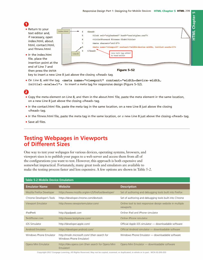
HTML Chapter 5 HTML
HTM
L C
hap
ter
5
1•
•
enter
• <meta name="viewport" content="width=device-width, initial-scale=1">
2•
•
•
•
Testing Webpages in Viewports of Different SizesOne way to test your webpages for various devices, operating systems, browsers, and viewport sizes is to publish your pages to a web server and access them from all of the con�gurations you want to test. However, this approach is both expensive and somewhat impractical. Fortunately, many great tools and emulators are available to make the testing process faster and less expensive. A few options are shown in Table 5-2.
Table 5-2 Mobile Device Emulators
Emulator Name Website Description
Mozilla Firefox Developer https://www.mozilla.org/en-US/�refox/developer/ Set of authoring and debugging tools built into Firefox
Chrome Developer’s Tools https://developer.chrome.com/devtools Set of authoring and debugging tools built into Chrome
Viewport Emulator http://www.viewportemulator.com/ Online tool to test responsive design website in multiple viewports
iPadPeek http://ipadpeek.com Online iPad and iPhone simulator
TestiPhone.com http://www.testiphone.com/ Online iPhone simulator
iOS Simulator http://developer.apple.com/ Of�cial Apple iOS simulator — downloadable software
Android Emulator https://developer.android.com/ Of�cial Android simulator — downloadable software
Windows Phone Emulator http://msdn.microsoft.com/ (then search for Windows Phone Emulator)
Windows Phone Emulator — downloadable software
Opera Mini Emulator https://dev.opera.com (then search for Opera Mini Emulator)
Opera Mini Emulator — downloadable software
Figure 5–52
HTM
L C
hap
ter
5
Copyright 2017 Cengage Learning. All Rights Reserved. May not be copied, scanned, or duplicated, in whole or in part. WCN 02-200-203

HTML HTML Chapter 5
2•
•
•F5
•
•
•
Q&
A
To Preview a Mobile Website in the Google Chrome Emulator
To test your mobile site design, use an emulator to view the site. Why? Before you publish a website, you should test with as many variable factors as possible. An emulator lets you test across multiple types of devices. The following steps display the home page in Chrome’s emulator.
1•
•
Q&
A
1 CODE NAVIGATION LINKS | 2 MAKE IMAGES FLEXIBLE | 3 ADD STYLES FOR MOBILE
4 INSERT & STYLE SPAN ELEMENT | 5 ADD META TAG | 6 TEST WEBPAGES
Figure 5–53
Figure 5–54
Copyright 2017 Cengage Learning. All Rights Reserved. May not be copied, scanned, or duplicated, in whole or in part. WCN 02-200-203

HTML Chapter 5 HTML
HTM
L C
hap
ter
5
To Validate the Style Sheet
Always run your �les through W3C’s validator to check the document for errors. If the document has any errors, validating gives you a chance to identify and correct them. Validation is also an effective troubleshooting tool during the development process and adds a valuable level of professionalism to your work. The following steps validate a CSS document.
1 http://jigsaw.w3.org/css-validator/
2
3
4
5
6
7
To Validate the HTML Files
Every time you create a new webpage, run it through W3C’s validator to check the document for errors. If any errors exist, you need to correct them. Validation is also an effective troubleshooting tool during the development process and adds a valuable level of professionalism to your work. The following steps validate an HTML document.
1 http://validator.w3.org/
2
3
4
5
6
7
8
9
Copyright 2017 Cengage Learning. All Rights Reserved. May not be copied, scanned, or duplicated, in whole or in part. WCN 02-200-203

HTML HTML Chapter 5
Chapter SummaryIn this chapter, you learned how to apply responsive design principles to a website. You modi�ed the �tness website to use a �uid layout, coded images to be �exible, and followed a mobile-�rst strategy to analyze and modify the webpages in the �tness website. Finally, you added meta tags for responsive design. The items listed below include all the new skills you have learned in this chapter, with the tasks grouped by activity.
Creating a Fluid LayoutCode the Navigation Links as an Unordered List
(HTML 212)
Making Images FlexibleAdd Flexible Images (HTML 215)
Following a Mobile-First StrategyModify the Home Page (HTML 227)Modify the Style Rule for the mobile Class
(HTML 229)Add a Style Rule for the desktop Class
(HTML 229)Modify the About Us Page (HTML 233)
Add a Style Rule for the tablet Class (HTML 234)Modify the .equip, ul, dt, and dd Style Rules
(HTML 235)
Using the Span ElementAdd a Span Element to the Contact Us Page
(HTML 237)
Adding Meta TagsAdd the Meta Tag for Responsive Design
(HTML 238)
Testing Webpages in Viewports of Different SizesPreview a Mobile Website in the Google Chrome
Emulator (HTML 242)
How will you apply the principles of responsive web design to your website?Use these guidelines as you complete the assignments in this chapter and create your own webpages outside of this class.
1. Analyze how the principles of responsive design might be applied to your website.
a. Determine the importance of mobile traf�c.
b. Consider the pros and cons of responsive design versus a mobile website strategy.
c. Consider mobile-�rst principles such as focusing on essential content �rst.
2. Use a �uid layout.
a. Width measurements should be in �exible units such as % or ems.
b. Textual content can be measured in px, but consider ems for maximum �exibility.
3. Apply �exible images.
a. Remove �xed height and width measurements from the HTML documents.
b. Size images with CSS percentages.
4. Test and validate your responsive design.
a. Use emulators to test on multiple devices.
b. Validate both the HTML and CSS.
CO
NS
IDE
R T
HIS
Copyright 2017 Cengage Learning. All Rights Reserved. May not be copied, scanned, or duplicated, in whole or in part. WCN 02-200-203

HTML Chapter 5 HTML
HTM
L C
hap
ter
5S
TU
DE
NT
AS
SIG
NM
EN
TS
Apply Your Knowledge
Styling for Responsive DesignInstructions: In this exercise, you will use your text editor to apply responsive design principles to an existing webpage. You will make all images �exible, change the layout to a �uid layout, and add a viewport meta tag. The completed webpage is shown in Figure 5–55. You will also use professional web development practices to indent, space, comment, and validate your code.
Perform the following tasks:1. Open apply05.html in your browser to view the webpage. Adjust
the browser window to view the �xed layout.
2. Open apply05.html in your text editor and modify the comment at the top of the page to include your name and today’s date.
3. Remove the width and height attributes from the image elements and save your changes.
4. Open the styles05.css �le from the apply\css folder. Modify the comment at the top of the styles05.css page to include your name and today’s date.
5. In the styles05.css �le, add a max-width property with a value of 100% to the img selector.
6. Locate the #container selector and change the width value to use a relative measurement and take up the full width of the page.
7. Save the styles05.css �le and refresh the apply05.html �le in your browser. Resize the browser to make sure that a �uid layout has been applied and that the images are �exible.
8. In apply05.html, add the following meta tag within the head section of the document:
<meta name="viewport" content="width=device-width, initial-scale=1">
9. Save your changes to apply05.html and open the �le in Google Chrome.
10. Use the developer tools in Google Chrome to view the page in an emulator.
11. Select a device and refresh the page. The page should look similar to Figure 5–55.
12. Validate your HTML document using the W3C validator found at validator.w3.org and �x any errors that are identi�ed.
13. Validate your CSS �le using the W3C validator found at http://jigsaw.w3.org/css-validator/ and http://jigsaw.w3.org/css-validator/ and http://jigsaw.w3.org/css-validator/�x any errors that are identi�ed.
14. Submit the apply05.html and styles05.css �les in a format speci�ed by your instructor. Your instructor may also ask you to submit the images folder used with apply05.html.
15. In step 5, you changed the value to use a percentage (%) measurement. Explain how the In step 5, you changed the value to use a percentage (%) measurement. Explain how the percentage unit of measurement makes a �uid layout more �exible as compared to px.
Figure 5–55
How should you submit solutions to questions in the assignments identi�ed with a symbol? symbol?Every assignment in this book contains one or more questions identi�ed with a symbol. These questions symbol. These questions require you to think beyond the assigned presentation. Present your solutions to the questions in the format required by your instructor. Possible formats may include one or more of these options: create a document that contains the answer; present your answer to the class; discuss your answer in a group; record the answer as au-dio or video using a webcam, smartphone, or portable media player; or post answers on a blog, wiki, or website.
CO
NS
IDE
R T
HIS
Copyright 2017 Cengage Learning. All Rights Reserved. May not be copied, scanned, or duplicated, in whole or in part. WCN 02-200-203
HTML HTML Chapter 5S
TU
DE
NT
AS
SIG
NM
EN
TS
Extend Your Knowledge
Learning More About jQuery MobileInstructions: In this exercise, you will use your browser to research jQuery Mobile. You will review the information you discover and then answer the following questions. Figure 5–56 shows the �ip switch demo page from the jQuery Mobile website.
Figure 5–56
Perform the following tasks:1. Open your browser and go to jquerymobile.com.
2. Review the information on the site.
3. Open your word processor. In your own words, what is jQuery Mobile and how is it used?
4. Tap or click the Demos link and test the demos on the page to view how they work.
5. List and describe three of the demos that you tested. Provide an example of the code required for two of the demos that you tested.
6. Use your browser and visit w3schools.com to research more about jquery mobile.
7. Provide an example of the code needed to create a basic jquery mobile page.
8. Save your �le as extend05 and submit it in a format speci�ed by your instructor.
9. Research mobile web applications and native apps. Identify how they are similar and how Research mobile web applications and native apps. Identify how they are similar and how they are different.
Copyright 2017 Cengage Learning. All Rights Reserved. May not be copied, scanned, or duplicated, in whole or in part. WCN 02-200-203

HTML Chapter 5 HTML
HTM
L C
hap
ter
5S
TU
DE
NT
AS
SIG
NM
EN
TS
Analyze, Correct, Improve
Changing a Nonresponsive Page into a Responsive PageInstructions: Work with the responsive05.html �le in the analyze folder and the responsivestyles05 .css �le in the analyze\css folder from the Data Files for Students. Several responsive web design resources are listed on the responsive05 webpage, but the HTML document and the style sheet are not coded for responsive design as shown in Figure 5–57. Use Figure 5–58 as a guide to correct these �les. You will also use professional web development best practices to comment, indent, space, and validate your work.
Figure 5–57 Figure 5–58
1. Correcta. Open the responsive05.html �le in your editor from the Data Files for Students and then
modify the comment at the top of the page to include your name and today’s date.
b. Open the responsivestyles05.css �le in your editor from the Data Files for Students and then modify and correct the comment at the top of the document to include your name and today’s date.
c. View responsive05.html in your browser and resize the page to recreate the problems with a nonresponsive webpage as shown in Figure 5–56. The content and images are cut off as the browser width decreases.
d. In the responsive05.html �le, add the viewport meta tag right above the closing </head> tag:
<meta name="viewport" content="width=device-width, initial-scale=1">
Continued >Copyright 2017 Cengage Learning. All Rights Reserved. May not be copied, scanned, or duplicated, in whole or in part. WCN 02-200-203

HTML HTML Chapter 5S
TU
DE
NT
AS
SIG
NM
EN
TS
e. In the responsive05.html �le, delete the height and width attributes from the img element.
f. In the responsivestyles05.css �le, make the following property value changes: main selector, width property, change from 960px to 100%
g. In the responsivestyles05.css �le, create a style that has an img selector with a max-widthproperty and a value of 100%.
2. Improvea. In the responsive05.html �le, add indents and spacing for improved readability.
b. In the responsivestyles05.css �le, create a style that has an ul selector with a paddingproperty and a value of 0.
c. In the responsivestyles05.css �le, create a style that has an li selector with the following properties and values:
list-style-type property and a value of none
padding property and a value of 1%
margin property and a value of 1%
d. In the responsivestyles05.css �le, create a style that has an li a selector with the following properties and values:
color property and a value of #FFFFFF
text-decoration property and a value of none
list-style-type property and a value of none
e. Save your changes and test your webpage. It should look like Figure 5–58.
f. Validate your CSS �le using the W3C validator found at http://jigsaw.w3.org/css-validator/ and �x any errors that are identi�ed.
g. Validate your HTML webpage using the W3C validator found at validator.w3.org and �x any errors that are identi�ed.
h. Review some of the resources listed on the Responsive Web Design Best Practices page, Review some of the resources listed on the Responsive Web Design Best Practices page, and then comment on which of these practices you would like to understand better and why.
In the Labs
Lab 1: Creating a Mobile Design for the New Harvest Food BankProblem: You volunteer at a local food bank called New Harvest Food Bank that collects com-munity food donations and provides food and other services to those in need. The organization has asked you to create a responsive website. With a growing mobile market, you decide to implement a mobile-�rst strategy. Style the webpage shown in Figure 5–59 with an external style sheet.
Instructions: Perform the following tasks:1. Open your text editor and then open the index.html �le in the lab1 folder and the fbstyles.css
�le in the lab1\css folder from the Data Files for Students.
2. In the index.html document, modify the comment at the top of the page to include your name and today’s date. Make sure the<title>…</title> tags contain the text New Harvest Food Bank.
Analyze, Correct, Improve continued
Copyright 2017 Cengage Learning. All Rights Reserved. May not be copied, scanned, or duplicated, in whole or in part. WCN 02-200-203

HTML Chapter 5 HTML
HTM
L C
hap
ter
5S
TU
DE
NT
AS
SIG
NM
EN
TS
3. In the fbstyles.css �le, modify the comment at the top of the page to include your name and today’s date.
4. In the index.html �le, modify the link to the external style sheet to reference fbstyles.css.
5. Add the following viewport meta tag to the <head> section of the index.html �le:
<meta name="viewport" content="width=device-width, initial-scale=1">
6. Delete the width and height attributes from all img elements.
7. In the main element, create a new div element with a class= "mobile" attribute and value. Add the following content to the new div element:
<p>New Harvest is proud to help and support our local community</p>
<h3>Volunteer Opportunities Available</h3>
<p>Call Us Today to Inquire, <a href="tel:5558235555">(555) 823-5555</a></p>
8. In the fbstyles.css �le, add the following comment and style after the style for the body element to help create �exible images:
/* Style to create a fluid image */img {
max-width: 100%;
}
9. In the fbstyles.css �le, add the following comment and style after the style for the navelement to style the unordered list in the nav:
/* Style specifies padding and margins for unordered list */
nav ul {
padding: 0;
margin-top: 0.5em;
margin-bottom: 0.5em;
}
10. In the fbstyles.css �le, add the following comment and style after the one you added for the nav ul selector to style list items within the nav:
/* Style for nav li specifies the background color, rounded corners, removes bullet style, and applies margins and padding for list items within the navigation */
nav li {
background-color: #FF6600;
border-radius: 1em;
list-style-type: none;
margin: 0.3em;
padding: 0.4em;
}
Figure 5–59
Continued >
Copyright 2017 Cengage Learning. All Rights Reserved. May not be copied, scanned, or duplicated, in whole or in part. WCN 02-200-203

HTML HTML Chapter 5S
TU
DE
NT
AS
SIG
NM
EN
TS
11. In the fbstyles.css �le, add the following comment and style after the one you added for the nav li selector to style the nav links:/* Style changes navigation link text color to white and removes the underline */
nav li a {
color: #FFFFFF;
text-decoration: none;
}
12. In the fbstyles.css �le, add the following comment and style to the end of the style sheet to style the mobile class:
/* Style displays the mobile class */
.mobile {
display: inline;
}
13. Validate your HTML code and �x any errors.
14. Validate your CSS code and �x any errors.
15. Save all �les and open the index.html page within a browser as shown in Figure 5–59.
16. Submit your assignment in the format speci�ed by your instructor.
17. In step 12, you created a class named mobile. Use your favorite search engine to �nd an In step 12, you created a class named mobile. Use your favorite search engine to �nd an article that discusses popular or appropriate class and id names. Document the website and be prepared to explain or write a short paragraph on what you learned.
Lab 2: Creating a Responsive Website for Steve’s Screen ServicesProblem: You work for a screening company called Steve’s Screen Services that specializes in screening, cleaning, and repairing screened patios, decks, and porches. The company has asked you to create a responsive website. Style the webpage shown in Figure 5–60 with an external style sheet.
Instructions: Perform the following tasks:1. Open your text editor and then open the index.html �le in the lab2 folder and the screenstyles.
css �le in the lab2\css folder from the Data Files for Students.
2. In the index.html �le, modify the comment at the top of the page to include your name and today’s date. Make sure the<title>…</title> tags contain the text Steve’s Screen Services. Add this title to the template �le as well.
3. In screenstyles.css, modify the comment at the top of the page to include your name and today’s date.
4. In the index.html �le, create a link to the external style sheet screenstyles.css. Add this link to the template �le as well.
5. Add the following viewport meta tag to the <head> section of the index.html �le and the template �le:
<meta name="viewport" content="width=device-width, initial-scale=1">
6. Delete the width and height attributes from all image elements in the index.html �le and the template �le.
In the Labs continued
Copyright 2017 Cengage Learning. All Rights Reserved. May not be copied, scanned, or duplicated, in whole or in part. WCN 02-200-203

HTML Chapter 5 HTML
HTM
L C
hap
ter
5S
TU
DE
NT
AS
SIG
NM
EN
TS
7. In the index.html and template �les, code each set of navigation links as an unordered list.
8. In the index.html �le, in the main element, create a new div element with a class="mobile" attribute and value. Add the following content to the new div element:
<h3>Need your patio screened or just a small repair?</h3>
<p><a href="tel:5558235555">Call us today</a> for a FREE estimate and use the reference code Mobile Offer to receive a 10% discount</p>
9. In the screenstyles.css �le, add the following style after the style for the body element to help create �exible images:
img {
max-width: 100%;
}
10. In the screenstyles.css �le, add the following comment and style after the style for the nav element to style the unordered list in the nav:
/* Style specifies padding and margins for unor-dered list */
nav ul {
padding: 0;
margin-top: 0.5em;
margin-bottom: 0.5em;
}
11. In the screenstyles.css �le, add the following comment and style after the one you added for the nav ul selector to style list items within the nav:
/* Style for nav li specifies the background color, rounded corners, removes bullet style, and applies margins and pad-ding for list items within the navigation */
nav li {
background-color: #000066;
list-style-type: none;
margin: 0.4em;
padding: 0.5em;
}
12. In the screenstyles.css �le, add the following comment and style after the style for nav li to style the nav links:
/* Style changes navigation link text color to white and removes the underline */
nav li a {
color: #FFFFFF;
text-decoration: none;
}
Figure 5–60
Continued >
Copyright 2017 Cengage Learning. All Rights Reserved. May not be copied, scanned, or duplicated, in whole or in part. WCN 02-200-203

HTML HTML Chapter 5S
TU
DE
NT
AS
SIG
NM
EN
TS
13. In the screenstyles.css �le, add the following comment and style to the end of the style sheet to style the mobile class:
/* Style displays the mobile class */
.mobile {
display: inline;
}
14. Validate your HTML code and �x any errors.
15. Validate your CSS code and �x any errors.
16. Save all �les and open the index.html page within a browser as shown in Figure 5–59.
17. Submit your assignment in the format speci�ed by your instructor.
18. In steps 7 and 11, you created and styled the navigation element to use an unordered list. In steps 7 and 11, you created and styled the navigation element to use an unordered list. Use your browser to research trends in navigation design for responsive web design. Document the website and be prepared to explain or write a short paragraph on what you learned.
Lab 3: Expand Your WorldYou Be the JudgeProblem: Responsive web design involves a number of technical and artistic elements. In this exercise you will review and document your thoughts on several responsive websites that have been judged by professional web developers to be excellent examples of responsive web design.
Instructions:1. Go to http://www.awwwards.com/50-examples-of-responsive-web-design.html.
This link takes you to the awwwards.com site that provides 50 excellent examples of responsive web design. If this site is not available, use your favorite search engine to �nd a site that highlights excellent examples of responsive web design.
2. Spend some time browsing through the site and reviewing the examples. Responsive web design best practices principles are in constant �ux. Review at least three sites and provide your own answers to the following questions in the format speci�ed by your instructor.
a. Identify three common characteristics you observe for the responsive design winning websites.
b. Identify three areas that you would like to learn more about.
3. Images are an important part of the content for any website. Using your favorite search Images are an important part of the content for any website. Using your favorite search engine, research three articles that provide tips on how to optimize images for the web. Identify the three URLs that you used for your research and provide a list of bullet points (2–5 per article) of tips on how to optimize images for webpages.
In the Labs continued
Copyright 2017 Cengage Learning. All Rights Reserved. May not be copied, scanned, or duplicated, in whole or in part. WCN 02-200-203

HTML Chapter 5 HTML
HTM
L C
hap
ter
5S
TU
DE
NT
AS
SIG
NM
EN
TS
Consider This: Your Turn
1. Applying Responsive Design to Your Personal Portfolio Website
Personal
Part 1: In Chapter 4, you styled your personal portfolio website in the portfolio.htmlwebpage. In this exercise, you update that page to use responsive design as follows:
1. Open the external style sheet you created in Chapter 4 and save it with the name portfoliostyles05.css in the styles folder within the your_turn_1 folder.
2. Add your name and the current date as a comment to the �rst line of the portfoliostyles05.css �le.
3. In your HTML editor, open the �les you created for your portfolio website in Chapter 4 and make sure your name and the current date are added as a comment to the �rst line of all �les.
4. Update the HTML �les to do the following:
a. Modify the link to the external style sheet to reference portfoliostyles05.css.
b. Add the viewport meta tag to the head section.
c. Delete the height and width attributes from all img tags.
5. Update the CSS �le to do the following:
a. Measure all width properties in percentages (%).
b. Add styles to create �exible images.
c. Determine the most essential content on each page and style the HTML elements for a mobile viewport.
d. Remove the markers (bullets) from the list items in the nav area.
e. Re�ne your style sheet as desired to add margins and padding using em units of measure.em units of measure.em
f. Add a comment to note where the mobile styles begin.
6. Save and test your �les.
7. Validate and correct your HTML and CSS �les, and submit your assignment in the format speci�ed by your instructor.
Part 2:
Add the following paragraph and unordered list to an appropriate location on one of your personal portfolio webpages:
<p>Have worked with the principles of responsive web design including:</p>
<ul>
<li>fluid layouts</li>
<li>flexible images</li>
<li>media queries</li>
</ul>
Why might it be helpful to identify these types of terms on a personal portfolio webpage? Is there any risk in adding this to a personal portfolio?
Continued >
Copyright 2017 Cengage Learning. All Rights Reserved. May not be copied, scanned, or duplicated, in whole or in part. WCN 02-200-203

HTML HTML Chapter 5S
TU
DE
NT
AS
SIG
NM
EN
TS
2. Applying Responsive Design to the WebDevPros Webpages
ProfessionalPart 1: In Chapter 4, you created an external style sheet for WebDevPros website. In this exercise, you will update site to respect the principles of responsive design.
1. Open the external style sheet you created in Chapter 4 and save it with the name webdevstyles05.css in the styles folder within the your_turn_2 folder.
2. Add your name and the current date as a comment to the �rst line of the webdevstyles05.css �le.
3. Open the �les you created for WebDevPros in Chapter 4 in your HTML editor and make sure your name and the current date are added as a comment to the �rst line of all �les.
4. Update the HTML �les to do the following:
a. Modify the link to the external style sheet to reference webdevstyles05.css.
b. Add the viewport meta tag.
c. Delete the height and width attributes from all img tags.
5. You will use a mobile-�rst strategy that hides images and the top navigation system by default. To do this, add a class="desktop" attribute and value to all images on your pages and to the top navigation system. Review the content on each page and apply the desktop class to nonessential content for a mobile viewport.
6. If you have not already done so, add an unordered list within the <footer> section of each webpage to provide a navigation system at the bottom of each page.
7. Update the CSS �le to do the following:
a. Measure all width properties in %.
b. Change the measurements of all textual styles to ems or %.
c. Create �exible images.
d. Add the following style for the desktop class to remove the images and upper navigation system for mobile users:
.desktop { display: none; }
e. Set the width of the #outer-wrapper to 100% for mobile users. (HintSet the width of the #outer-wrapper to 100% for mobile users. (HintSet the width of the #outer-wrapper to 100% for mobile users. ( : You may have a different class name for the <div> that surrounds the entire webpage.)
f. Determine the essential content for each page to be displayed for a mobile viewport.
g. Style the navigation links within the footer and remove the default padding from unordered list within the footer.
8. Re�ne your style sheet as needed to add margins and padding using �exible units of measure.
9. Save and test your �les.
10. Validate and correct your HTML and CSS �les, and submit your assignment in the format speci�ed by your instructor.
Part 2: In step 6, you added a navigation system to the bottom of each page and in step 7d, you removed images and the upper navigation system for a mobile-�rst strategy. Why is a navigation system at the bottom of each page a good consideration for a mobile-�rst strategy?
Consider This: Your TurnConsider This: Your TurnConsider This: Your T continued
Copyright 2017 Cengage Learning. All Rights Reserved. May not be copied, scanned, or duplicated, in whole or in part. WCN 02-200-203

HTML Chapter 5 HTML
HTM
L C
hap
ter
5S
TU
DE
NT
AS
SIG
NM
EN
TS
3. Applying Responsive Design and Mobile-First Strategies to the Dog Hall of Fame Webpages
Research and CollaborationPart 1: In Chapter 4, you styled the Dog Hall of Fame webpages. In this exercise, you will update those pages to apply the principles of responsive design. Do the following activities as a group:
1. Open the external style sheet you created in Chapter 4 and save it with the name dogstyles05.css in the styles folder within the your_turn_3 folder.
2. Add your name and the current date as a comment to the �rst line of the dogstyles05.css �le.
3. Open the �les you created for the Dog Hall of Fame in Chapter 4 in your HTML editor and make sure your name and the current date are added as a comment to the �rst line of all �les.
4. Modify the link to the external style sheet to reference dogstyles05.css.
5. Decide what responsive design principles you want to employ. At a minimum, update the HTML and CSS �les to do the following:
a. Add the viewport meta tag.
b. Create �exible images.
c. Create a �uid layout.
d. Determine the essential content for each page to be displayed for a mobile viewport.
e. Design a navigation system suitable for a mobile viewport.
f. Re�ne your style sheet as needed to add margins and padding using em units of measure.
6. Save and test your �les.
7. Validate and correct your HTML and CSS �les, and submit your assignment in the format speci�ed by your instructor.
Part 2: Each person in the group should research a current article on responsive web design and bring it to a group discussion. In the discussion, each person should share their article as well as something they learned from it. Secondly, each person should share something that is not com-pletely clear to them or something they want to learn more about. Organize your group’s �ndings as requested by your instructor.
Copyright 2017 Cengage Learning. All Rights Reserved. May not be copied, scanned, or duplicated, in whole or in part. WCN 02-200-203

Copyright 2017 Cengage Learning. All Rights Reserved. May not be copied, scanned, or duplicated, in whole or in part. WCN 02-200-203

6 Responsive Design Part 2: Designing for Tablet and Desktop Devices
•
•
•
•
•
•
•
•
•
•
•
•
Objectives
HTML
Copyright 2017 Cengage Learning. All Rights Reserved. May not be copied, scanned, or duplicated, in whole or in part. WCN 02-200-203

IntroductionAs you learned in Chapter 5, the responsive web design approach styles content differently depending upon the type of device used to view the site. The mobile-�rst approach focuses on styling content appropriately for smaller, mobile devices. It also uses a single-column layout to prevent horizontal scrolling and minimize vertical scrolling. This layout creates a more enjoyable experience for users of mobile devices.
The design process for tablet and desktop displays allows more �exibility with the webpage layout. A tablet design can use a two-column layout, while a desktop design can use a multicolumn layout. Designing layouts for tablet and desktop displays is simpli�ed through the use of media queries. Media queries are essential to responsive web design because they let you customize layouts for various viewport sizes. If you take a mobile-�rst approach, use media queries to create the desired look for tablet and desktop viewports, keeping in mind that desktop viewports include laptop displays.
Project — Use Media Queries to Design for Tablet and Desktop ViewportsIn Chapter 5, you began to create a responsive design website by styling the Forward Fitness Club website for a mobile viewport. For the Chapter 6 project, you apply responsive web design principles to the Forward Fitness Club website by editing the site’s style sheet to include media queries that will apply styles speci�c to tablet and desktop viewports. These enhancements will result in a better experience for users of tablet and laptop or desktop devices.
First, you will insert a media query to detect a tablet-sized viewport and then add new styles as appropriate for content displayed in that viewport. Next, you will insert a media query to detect a desktop-sized viewport and then add new styles as appropriate for content displayed in that viewport. To add interactivity and visual appeal to webpages displayed in the desktop viewport, you will add pseudo-classes to the style sheet to further style links within the navigation area. You will also add a linear gradient, which is a CSS3 property style, to the background of webpages displayed in the desktop viewport. Finally, you will validate the website and display all viewports in a browser. Figure 6–1 shows the home page of Forward Fitness Club sized for tablet and desktop viewports. Figure 6–1a shows the home page as it appears on a tablet; Figure 6–1b shows the same page as it appears in a desktop browser.
Responsive Design Part 2: Designing for Tablet and Desktop Devices
6
HTML
Copyright 2017 Cengage Learning. All Rights Reserved. May not be copied, scanned, or duplicated, in whole or in part. WCN 02-200-203

RoadmapIn this chapter, you will learn how to create the webpages shown in Figure 6–1.
The following roadmap identi�es general activities you will perform as you progress through this chapter:
1. ADD TABLET MEDIA QUERY AND STYLES.2. ADD DESKTOP MEDIA QUERY AND STYLES.3. MODIFY VIEWPORT BREAKPOINTS.4. INSERT AND STYLE PSEUDO-CLASSES.5. ADD a LINEAR GRADIENT.
At the beginning of step instructions throughout the chapter, you will see an abbreviated form of this roadmap. The abbreviated roadmap uses colors to indicate chapter progress: gray means the chapter is beyond that activity; blue means the task being shown is covered in that activity, and black means that activity is yet to be covered. For example, the following abbreviated roadmap indicates the chapter would be showing a task in the 4 INSERT & STYLE PSEUDO-CLASSES activity.
HTML
(a) Home page in tablet (a) Home page in tablet viewport
(b) Home page in desktop viewport
Figure 6–1
1 ADD TABLET MEDIA QUERY & STYLES | 2 ADD DESKTOP MEDIA QUERY & STYLES | 3 MODIFY VIEWPORT BREAKPOINTS
4 INSERT & STYLE PSEUDO-CLASSES | 5 ADD LINEAR GRADIENT
Use the abbreviated roadmap as a progress guide while you read or step through the instructions in this chapter.
Using Media QueriesRecall from Chapter 5 that a media query detects the media type (such as screen or media query detects the media type (such as screen or media queryprint) and the capabilities of the device that the browser is running on (such as the size of the viewport in pixels or its orientation of portrait versus landscape). Based on the information, the media query applies styles that work well for that situation.
Copyright 2017 Cengage Learning. All Rights Reserved. May not be copied, scanned, or duplicated, in whole or in part. WCN 02-200-203

HTML HTML Chapter 6
In Chapter 5, you created a �uid layout and added style rules for a mobile viewport. These styles were not included within a media query so that tablet and desktop viewports will use them by default. To add style rules that target tablet or desktop viewports in particular, create a media query for each viewport.
Media queries take responsiveness to an entirely new level. They allow you to apply different CSS styles in response to the environment, such as the media on which different CSS styles in response to the environment, such as the media on which differentthe webpage is being viewed (screen or print) or the size of the viewport.
Media queries can apply styles to move, hide, or display content on the page, change text or colors, or add any other styles to make the page easier to read in a particular situation. If you resize a webpage and see the navigation system change or see a multicolumn layout reduce to one column as the viewport narrows to the size of a phone, you know that media queries are working behind the scenes to restyle the webpage in response to the viewport size.
Media queries can be embedded in the link tag that connects an external style sheet to an HTML �le, or they can be inserted in the external style sheet itself. The following code provides a basic example of a media query inserted into the linktag of an HTML page:
<link rel="stylesheet" href="css/styles.css" media="screen">
<link rel="stylesheet" href="css/stylesprint.css" media="print">
The media attribute is used to determine which stylesheet should be applied. In this example, the styles.css style sheet found in the css folder will be applied if the webpage is displayed on the screen. The stylesprint.cssstylesheet will be applied if the webpage is printed. This is a common technique to allow developers to style with rich colors and colorful images on the screen, but style with black text on a white background when the same webpage is printed.
BreakpointsMedia queries can do more than detect the current media type. They can also
determine the size of the viewport, the viewable portion of the webpage.To understand the code and syntax of how a media query detects viewport size,
you set a breakpoint (sometimes called threshold), the point at which you want the breakpoint (sometimes called threshold), the point at which you want the breakpointwebpage to change. The breakpoint is where you apply different styles to the webpage to cause it to change in a way that makes it easier to read and navigate for a particular situation, such as a user viewing the webpage on a phone.
For the Forward Fitness Club website, the media queries should detect and apply styles based on the three common viewport sizes listed in Table 6–1.
Device Minimum Viewport Width Maximum Viewport Width
Small smartphones 320px 480px
Tablets and larger smartphones 481px 768px
Tablets in landscape orientation, laptops, and small desktop monitors
769px 1279px
Large desktop monitors 1280px NA
Table 6–1 Common Viewport Breakpoints
Copyright 2017 Cengage Learning. All Rights Reserved. May not be copied, scanned, or duplicated, in whole or in part. WCN 02-200-203

HTML Chapter 6 HTML
HTM
L C
hap
ter
6
Figure 6–2 shows how the NASA website uses responsive design with �ve customized layouts. It uses several breakpoints to determine the layout for various viewports. The designs are similar for the two smartphone viewports, which have maximum widths of 320px and 480px. Viewport widths of 768px and up can use multiple columns.
(a) 320px (b) 480px (c) 768px
(d) 1000px (e) 1280px
Figure 6–2
Media Query ExpressionsA media query can use a logical expression to test whether a viewport has
reached a particular breakpoint. The logical expression includes the name of a media query feature, a characteristic of the environment, and a breakpoint value to be tested. If the logical expression evaluates to “true,” the media query applies the styles that follow. Following is an example of a media query that includes a media type and a logical expression:
<link rel="stylesheet" href="css/styles-mobile.css" media="screen and (max-width: 480px)">
This code directs browsers to use the styles-mobile.css stylesheet in the css folder when screens have a viewport width smaller than or equal to 480px (which is a common maximum viewport size for a phone and thus a common breakpoint for changing styles). In this case, max-width is the feature and 480px is the breakpoint value being tested in the logical condition. A media query can also test for both minimum and maximum breakpoints, as in the following example:
<link rel="stylesheet" href="css/styles-tablet.css" media="screen and (min-width: 481px) and (max-width: 768px)">
Copyright 2017 Cengage Learning. All Rights Reserved. May not be copied, scanned, or duplicated, in whole or in part. WCN 02-200-203

HTML HTML Chapter 6
In this case, the code directs browsers to apply the styles-tablet.css stylesheet in the css folder when screens have a viewport width between 481px and 768px (common breakpoint sizes for tablet devices). When testing for minimum and maximum widths, the word “and” separates each part of the media attribute value. This means that each part must be true to apply the associated styles. The syntax also requires you to surround the logical expression with parentheses and use a colon to separate the media query feature from the value being tested. When writing the CSS code, follow the requirements of the syntax carefully to make sure the media query works correctly.
At this point, you may be wondering how to select the values to use for breakpoint values, especially when so many new mobile devices of all sizes are constantly being introduced. Table 6–1 shows some common viewport breakpoint values as a starting point. After you understand the overall concept of media queries and how to code them, you can always de�ne new breakpoints and add new media queries to re�ne your webpage design to look better when new devices hit the market.
A second way to implement media queries is to code them directly into a single CSS �le using the @media rule. An example of a media query added to an external CSS �le might be:
@media screen {
body { width: 80%; }
}
In this case, @media screen identi�es the media to which the styles will be applied. Although the example shows only one style, a width measurement applied to the body, you could list many styles within the outer set of curly braces that surround the styles for that media query. Another application of a media query in a CSS �le to apply styles to a printed webpage might look like this:
@media print {
body {
width: 100%;
color: #000000;
background-color: #FFFFFF;
}
}
In this case, three styles are applied to body content when the webpage is printed to allow the content to �ll 100% of the printable width of the page, change the text color to black (#000000), and change the background color of the page to white (#FFFFFF).
Add logical expressions to media queries in an external CSS �le as follows:
@media screen and (min-width: 481px) {
.mobile { display: none; }
}
In this case, min-width is the feature of the screen that is tested. If the width is at least 481px, the style will be applied. The .mobile selector means that the following styles will be applied to content identi�ed with class="mobile" in the HTML document. The style declaration display: none; removes the content from the display. This example would hide content meant only for mobile display.
An example with two logical expressions might be:
@media all and (min-width: 481px) and (max-width: 768px) {
body { color: #000000; }
}Copyright 2017 Cengage Learning. All Rights Reserved. May not be copied, scanned, or duplicated, in whole or in part. WCN 02-200-203

HTML Chapter 6 HTML
HTM
L C
hap
ter
6
This media query applies to all types of media when both features are true. The viewport width must be at least 481px but cannot exceed 768px. The three most common types of media are screen, print, and all. Table 6–2 lists common media query features that can be used in a logical expression. For a full explanation of media query syntax, media types, and features, see the w3.org website.
Feature Description
max-device-heightmin-device-height
Height of the screen in pixels
max-device-widthmin-device-width
Width of the screen in pixels
max-heightmin-height
Height of the viewport in pixels
max-widthmin-width
Width of the viewport in pixels
orientation Orientation of the device (landscape or portrait)
Table 6–2 Common Media Query Features
Adding Media Queries to an External Style SheetThe style sheet for the Forward Fitness Club website, styles.css, contains several
style rules for a mobile display. In a mobile-�rst strategy, you list the mobile styles �rst, because these are the default styles. Next, you use media queries to add styles for larger viewports, progressing from tablet to desktop (which includes laptops). Styles created for the smaller viewports apply to larger viewports by default. To modify the appearance of an element for a larger viewport, create a media query for the larger viewport, and then create a new style.
For example, the mobile navigation links in the Forward Fitness Club website appear as a column of vertical buttons. To change this appearance for a tablet viewport, create a new style rule for the navigation list items and use the display property with a value of inline to display the links in a single line, as shown in the following example:
@media only screen and (min-width: 481px) {
nav li { display: inline; }
}
This new style rule applies only to viewports with a minimum screen width of 481 pixels. As you continue the responsive design process and create media queries for progressively larger viewports, review the existing style rules for small viewports to know the default settings.
Designing for Tablet ViewportsThe growth of the tablet market continues to rise. Tablet devices vary by operating system, manufacturer, and screen size. With so many tablet sizes, it can seem dif�cult to design a “one size �ts all” layout for a tablet device. Luckily, when you use responsive web design and media queries, you do not need to design multiple tablet layouts to accommodate the growing tablet market. Instead, create one layout to target tablet viewports. If a particular tablet device has a viewport smaller than the minimum size speci�ed in the media query, the layout will default to the mobile viewport layout.
BTWUsing the Keyword “only”When you write a media query that speci�es @media only screen, the onlykeyword indicates that older browsers should ignore the media query’s style rules.
Copyright 2017 Cengage Learning. All Rights Reserved. May not be copied, scanned, or duplicated, in whole or in part. WCN 02-200-203

HTML HTML Chapter 6
To Create a Media Query for a Tablet Viewport
You have already completed the mobile styles and now need to create a media query to target tablet devices. Why? The media query will change the style of the content to better display content when viewed on tablet device. The following steps add a media query to target tablet devices.
1•
•
•enter
• /* Media query for tablet viewport targets screen size with a minimum width of 481px. */
• enter
• @media only screen and (min-width: 481px) {
• enter
• }
only screen and min-width 481px?
Q&
A
1 ADD TABLET MEDIA QUERY & STYLES | 2 ADD DESKTOP MEDIA QUERY & STYLES | 3 MODIFY VIEWPORT BREAKPOINTS
4 INSERT & STYLE PSEUDO-CLASSES | 5 ADD LINEAR GRADIENT
Figure 6–3
Page Design for a Tablet ViewportA tablet viewport is larger than a mobile viewport but smaller than a desktop
viewport. The larger screen provides an opportunity for websites to display more content and use a multicolumn layout. Although tablet users expect to see more content than mobile user, they still expect the website to be touch-friendly, which means links and other touch spots that are easy to tap and text that is large enough to read without zooming.
When designing for a tablet viewport, maintain the same color scheme, typography, and general look of the website. The appearance of the website should look the same from viewport to viewport. The only thing that should change is layout and placement of content.
To determine the ideal layout for a website’s tablet viewport, �rst review the mobile site to determine where content should be added and whether any content should be hidden. Figure 6–4 shows tablet viewport design suggestions for the home page of the Forward Fitness Center website.
Note:
Copyright 2017 Cengage Learning. All Rights Reserved. May not be copied, scanned, or duplicated, in whole or in part. WCN 02-200-203

HTML Chapter 6 HTML
HTM
L C
hap
ter
6
Navigation Design for a Tablet ViewportRecall that clear, simple, and easy website navigation is vital in attracting new
visitors and keeping current customers. If users have a hard time navigating through a website in any viewport, they are likely to become frustrated and leave the site.
The navigation links in the Forward Fitness website currently appear as a vertical list or column of buttons. This design is tailored to the navigation needs of a smartphone user. Because a tablet screen is generally larger than a smartphone screen, maintaining a vertical list of navigation buttons is not necessary. Instead, take advantage of the screen width and align the navigation buttons in one horizontal line. This frees space for the main content below the navigation area, improving its visibility by displaying it in the middle of the screen.
To accomplish this design, create a style rule to display the navigation list items as a single horizontal line when displayed in a tablet viewport. Add other properties and values that override the defaults already set for the mobile viewport.
Figure 6–4Figure 6–4
BTWTablet Navigation TipsAs with pages designed for mobile devices, tablet users want to navigate the site easily. Format the navigation area so it is prominent and attractive, design each link so its meaning is clear, and make it easy to return to the home page. To increase accuracy for touchscreen navigation, create large buttons with extra space between each button.
Copyright 2017 Cengage Learning. All Rights Reserved. May not be copied, scanned, or duplicated, in whole or in part. WCN 02-200-203

HTML HTML Chapter 6
To Style the Navigation Area for a Tablet Viewport
The default style for the navigation list items displays them as buttons with a green background, a design you do not need to change. Add a new style rule to display the list items in a single horizontal line and �oat each list item to the left. Why? Floating the list items to the left within the speci�ed width has the effect of centering the group of navigation buttons on the page. Include margin and padding properties and values that override those set for the mobile viewport. Set the width to equally distribute the buttons horizontally. The following steps add a style rule to the style sheet to format the list items for a tablet viewport.
1 •
enter
• /* Style specifies a horizontal display for navigation links */
• enter
nav li {
• enter
display: inline;
• enter
float: left;
• enter margin-left: 1%;
• enter margin-right: 1%;
• enter padding-left: 0;
• enter padding-right: 0;
• enter width: 18%;
• enter }
float: left;
Q&
A
1 ADD TABLET MEDIA QUERY & STYLES | 2 ADD DESKTOP MEDIA QUERY & STYLES | 3 MODIFY VIEWPORT BREAKPOINTS
4 INSERT & STYLE PSEUDO-CLASSES | 5 ADD LINEAR GRADIENT
Figure 6–5
Copyright 2017 Cengage Learning. All Rights Reserved. May not be copied, scanned, or duplicated, in whole or in part. WCN 02-200-203

HTML Chapter 6 HTML
HTM
L C
hap
ter
6
2•
Q&
A
HTM
L C
hap
ter
6
Figure 6–6
3•
Figure 6–7
Copyright 2017 Cengage Learning. All Rights Reserved. May not be copied, scanned, or duplicated, in whole or in part. WCN 02-200-203

HTML HTML Chapter 6
To Style the Main Element for a Tablet Viewport
As shown in Figure 6–6, the navigation links now appear within the main area in the tablet viewport. To correct this problem, create a new style rule to clear the �oat to the left of the main element. Why? You need to correct the appearance of the navigation links so that they do not appear within the main element. Additionally, apply a top margin to create more white space between the navigation area and the main area. The following steps add a style rule to the style sheet to format the main element as desired for a tablet viewport.
1 •
enter
• /* Style specifies clear and top margin properties for the main element */
• enter
main {
• enter
clear: left;
• enter margin-top: 4em;
• enter }
clear: left;
2 •
Q&
A
1 ADD TABLET MEDIA QUERY & STYLES | 2 ADD DESKTOP MEDIA QUERY & STYLES | 3 MODIFY VIEWPORT BREAKPOINTS
4 INSERT & STYLE PSEUDO-CLASSES | 5 ADD LINEAR GRADIENT
Figure 6–8
Figure 6–9
Copyright 2017 Cengage Learning. All Rights Reserved. May not be copied, scanned, or duplicated, in whole or in part. WCN 02-200-203

Responsive Design Part 2: Designing for Tablet and Desktop Devices HTML Chapter 6 HTML 267
HTM
L C
hap
ter
6
To Show and Hide Content for a Tablet Viewport
The content within the main area of the Forward Fitness Club webpages is ideal for a mobile user. In the HTML documents, this content appears in a div element with an attribute and value of class="mobile". Create a new style rule to hide the mobile class in the tablet viewport with a displayproperty and value of none. Because a tablet screen is larger than a mobile screen, it can display more content. The home page already includes additional content that describes the Forward Fitness Club’s equipment and services and provides details about the trial membership. This content appears within a div element that contains the attribute class="desktop". To display this content in a tablet viewport, create a new style rule to show the desktop class with a display property and value of inline. Why? Change the content to better suit the needs of a tablet device user. The following steps add style rules to hide the mobile class and to display the desktop class for a tablet viewport.
1 •Place the insertion
point at the end of Line 119 and press the enter key twice to insert new Lines 120 and 121.
•On Line 121, type /* Style specifies to hide the mobile class */ to insert a comment.
•Press the enter key to insert a new Line 122 and type .mobile {to add a new selector.
•Press the enter key to insert a new Line 123, increase the indent, and then type display: none; to add a property and value.
•Press the enter key to insert a new Line 124, decrease the indent, and then type } to insert a closing brace.
•Press the enter key twice to insert new Lines 125 and 126.
•On Line 126, type /* Style specifies to display the desktop class */ to insert a comment.
•Press the enter key to insert a new Line 127 and type .desktop { to add a new selector.
•Press the enter key to insert a new Line 128, increase the indent, and then type display: inline; to add a property and value.
•Press the enter key to insert a new Line 129, decrease the indent, and then type enter key to insert a new Line 129, decrease the indent, and then type enter } to insert a closing brace (Figure 6–10).
1 ADD TABLET MEDIA QUERY & STYLES | 2 ADD DESKTOP MEDIA QUERY & STYLES | 3 MODIFY VIEWPORT BREAKPOINTS
4 INSERT & STYLE PSEUDO-CLASSES | 5 ADD LINEAR GRADIENT
Figure 6–10
Line 121
comment
style rule for mobile class
style rule for desktop class
Copyright 2017 Cengage Learning. All Rights Reserved. May not be copied, scanned, or duplicated, in whole or in part. WCN 02-200-203

HTML HTML Chapter 6
2•
Figure 6–11Figure 6–11
About Us Page Design for a Tablet ViewportThe About Us page is currently optimized to display content most pertinent to a
mobile user. Figure 6–12 shows the content displayed for both a mobile and tablet device.
Figure 6–12Copyright 2017 Cengage Learning. All Rights Reserved. May not be copied, scanned, or duplicated, in whole or in part. WCN 02-200-203

HTML Chapter 6 HTML
HTM
L C
hap
ter
6
The About Us page contains several images that are not displayed in the mobile viewport. These image elements include a class="equip" attribute and value. To display the images on this page, edit the style sheet to add a style rule to display and format the equip class. If you create a new class named items in the unordered list elements, you can create a new style rule to format the items class so the lists appear with bullets next to the images.
The about.html document also contains descriptions of common exercises within a div element with a class="tablet" attribute and value, but this content is styled so it is not displayed. To display this additional content in the tablet viewport, edit the style sheet to create a new rule to display the tablet class. This content includes a description list, so you should also create new style rules to format the description list terms and de�nitions.
To Display and Style the equip Class
The About Us page contains image elements within the main content area. The image elements include a class named equip. Create a new selector for the equip class and then add a style rule to display the equipment pictures on the left of the page. Why? Show the images in the additional space of a tablet viewport to enhance the user experience. The following steps add a new style rule to display and format the equip class for a tablet viewport.
1 •
enter
• /* Style specifies a display, float, and padding for the equip class */
• enter
.equip {
• enter
display: inline;
• enter float: left;
• enter margin-right: 1.5em;
• enter }
Q&
A
Figure 6–13
1 ADD TABLET MEDIA QUERY & STYLES | 2 ADD DESKTOP MEDIA QUERY & STYLES | 3 MODIFY VIEWPORT BREAKPOINTS
4 INSERT & STYLE PSEUDO-CLASSES | 5 ADD LINEAR GRADIENT
Copyright 2017 Cengage Learning. All Rights Reserved. May not be copied, scanned, or duplicated, in whole or in part. WCN 02-200-203

HTML HTML Chapter 6
2•
Q&
A
To Create and Style the items Class for a Tablet Viewport
The About Us page now displays images for the tablet viewport; however, depending on your browser, the placement of the Cardio and Personal Training headings are not correct. In addition, again depending on your browser, the bullets for the unordered list are not displayed. To correct this problem, insert a new class="items"attribute and value within each unordered list element in the about.html document, and then create a new style rule for the items class within the styles.css �le. Why? Correct how the text is displayed by de�ning and then styling the items Why? Correct how the text is displayed by de�ning and then styling the items Why?class. The following steps insert a class and add a new style rule to format list items class in a tablet viewport.
1 •class="items"
•
Figure 6–14
Figure 6–15
1 ADD TABLET MEDIA QUERY & STYLES | 2 ADD DESKTOP MEDIA QUERY & STYLES | 3 MODIFY VIEWPORT BREAKPOINTS
4 INSERT & STYLE PSEUDO-CLASSES | 5 ADD LINEAR GRADIENT
Copyright 2017 Cengage Learning. All Rights Reserved. May not be copied, scanned, or duplicated, in whole or in part. WCN 02-200-203

HTML Chapter 6 HTML
HTM
L C
hap
ter
6
2•
enter
• /* Style specifies a display, list-style-position, and bottom margin for the items class */
• enter .items {
• enter display: block;
• enter list-style-position: inside;
• enter margin-bottom: 5em;
• enter }
display block inline?block
inside
3•
•
Q&
A
HTM
L C
hap
ter
6
Figure 6–16
Figure 6–17
Copyright 2017 Cengage Learning. All Rights Reserved. May not be copied, scanned, or duplicated, in whole or in part. WCN 02-200-203

HTML HTML Chapter 6
To Display the tablet Class
A div element with a class="tablet" attribute and value is located below the last unordered list in the about.html document. This element includes descriptions of common exercises. The mobile styles created in Chapter 5 include a style rule to hide the tablet class. Create a new style rule to display the content in the tablet class as a block. The following steps add a style rule to display the tablet class in the tablet viewport.
1 enter
2 /* Style specifies to display the tablet class */
3 enter .tablet {
4 enter
display: block;
5 enter }
Figure 6–18
6
Figure 6–19
Copyright 2017 Cengage Learning. All Rights Reserved. May not be copied, scanned, or duplicated, in whole or in part. WCN 02-200-203

HTML Chapter 6 HTML
HTM
L C
hap
ter
6
To Style the Description List Terms
The Common Exercises information is now displayed, but the description list terms below the Common Exercises heading need to be formatted. Bold the terms to emphasize them and add white space between each term and de�nition to improve readability. The following steps create a new style rule for description list terms within a tablet viewport.
1 enter
2 /* Style specifies a font weight and top margin for description list terms */
3 enter dt {
4 enter
font-weight: bold;
5 enter margin-top: 0.7em;
6 enter }enter
Figure 6–20
Figure 6–21Figure 6–21
7
Copyright 2017 Cengage Learning. All Rights Reserved. May not be copied, scanned, or duplicated, in whole or in part. WCN 02-200-203
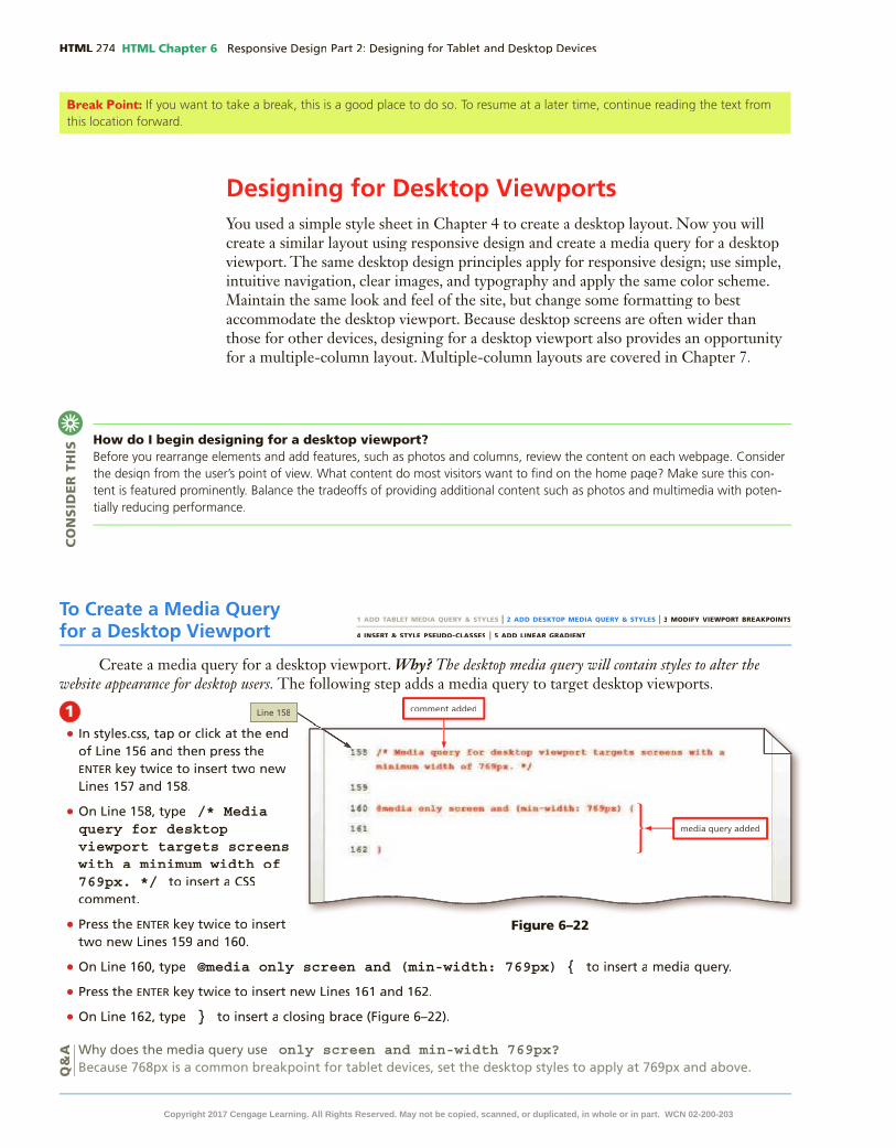
HTML HTML Chapter 6
Designing for Desktop ViewportsYou used a simple style sheet in Chapter 4 to create a desktop layout. Now you will create a similar layout using responsive design and create a media query for a desktop viewport. The same desktop design principles apply for responsive design; use simple, intuitive navigation, clear images, and typography and apply the same color scheme. Maintain the same look and feel of the site, but change some formatting to best accommodate the desktop viewport. Because desktop screens are often wider than those for other devices, designing for a desktop viewport also provides an opportunity for a multiple-column layout. Multiple-column layouts are covered in Chapter 7.
Break Point: If you want to take a break, this is a good place to do so. To resume at a later time, continue reading the text from this location forward.
How do I begin designing for a desktop viewport?Before you rearrange elements and add features, such as photos and columns, review the content on each webpage. Consider the design from the user’s point of view. What content do most visitors want to �nd on the home page? Make sure this con-tent is featured prominently. Balance the tradeoffs of providing additional content such as photos and multimedia with poten-tially reducing performance.
CO
NS
IDE
R T
HIS
To Create a Media Query for a Desktop Viewport
Create a media query for a desktop viewport. Why? The desktop media query will contain styles to alter the website appearance for desktop users. The following step adds a media query to target desktop viewports.
1•
enter
• /* Media query for desktop viewport targets screens with a minimum width of 769px. */
• enter
• @media only screen and (min-width: 769px) {
• enter
• }
only screen and min-width 769px? Q
&A
1 ADD TABLET MEDIA QUERY & STYLES | 2 ADD DESKTOP MEDIA QUERY & STYLES | 3 MODIFY VIEWPORT BREAKPOINTS
4 INSERT & STYLE PSEUDO-CLASSES | 5 ADD LINEAR GRADIENT
Figure 6–22
Copyright 2017 Cengage Learning. All Rights Reserved. May not be copied, scanned, or duplicated, in whole or in part. WCN 02-200-203

HTML Chapter 6 HTML
HTM
L C
hap
ter
6
To Create a Style Rule for #container in the Desktop Media Query
There is no need to use 100% of the screen width to display a website for a desktop viewport. Create a new style rule to set the width for the container to 80%. This allows 10% of the screen for the left margin and 10% for the right margin, which is common in a desktop viewport. The following steps create a style rule for #container as desired for a desktop viewport.
1 enter
2 /* Style specifies a width for container */
3 enter #container {
4 enter
width: 80%;
5 enter }
Figure 6–23
Figure 6–24
6
Copyright 2017 Cengage Learning. All Rights Reserved. May not be copied, scanned, or duplicated, in whole or in part. WCN 02-200-203

HTML HTML Chapter 6
To Style the Unordered List in the Navigation Area for a Desktop Viewport
Style the navigation area to appear as a single uni�ed element with navigation links evenly distributed within the area. The �rst step to create this effect is to create a new style rule for the unordered list in the navigation area to remove the existing margin and apply a small amount of left and right padding. The following steps create a style rule for the unordered list within the navigation area as desired for a desktop viewport.
1 enter
2 /* Style specifies margin and padding for the unordered list within the nav */
3 enter nav ul {
4 enter
margin: 0;
5 enter padding-left: 0.50%;
6 enter padding-right: 0.50%;
7 enter }
Figure 6–25
To Style the List Items in the Navigation Area for a Desktop Viewport
The next step to create a single uni�ed navigation area is to create a new style rule for the list items. Remove the rounded borders, create a top and bottom border, remove the left and right margins, adjust the width, and remove padding. The following steps add a style rule for the list items in the navigation area as desired for a desktop viewport.
1 enter
Copyright 2017 Cengage Learning. All Rights Reserved. May not be copied, scanned, or duplicated, in whole or in part. WCN 02-200-203

HTML Chapter 6 HTML
HTM
L C
hap
ter
6
2 /* Style for navigation list items specifies a border radius, border, margin, width, and padding */
3 enter nav li {
4 enter
border-radius: 0;
5 enter border-top: solid # ;
6 enter border-bottom: solid #000000;
7 enter margin-left: 0;
8 enter margin-right: 0;
9 enter padding: 0;
10 enter width: 20%;
11 enter }
Q&
A
Figure 6–26
Copyright 2017 Cengage Learning. All Rights Reserved. May not be copied, scanned, or duplicated, in whole or in part. WCN 02-200-203

HTML HTML Chapter 6
12
Figure 6–27
To Style the List Item Links in the Navigation Area for a Desktop Viewport
The navigation area now appears as a single uni�ed line, though the border is too close to the link text. The �nal step in styling the navigation area is to create a new style rule for the list item links. Display the links as inline block elements so that each list item link appears in the same line, but acts as a block element and expands to the available width. Next, apply a small amount of padding to increase the amount of space between each link and between the links and the borders. The following steps create a new style rule for the list item links within the navigation area as desired for a desktop viewport.
1 enter
2 /* Style for navigation links specifies display and padding */
3 enter nav li a {
4 enter
display: inline-block;
5 enter padding: 0.7em;
6 enter }
Figure 6–28Copyright 2017 Cengage Learning. All Rights Reserved. May not be copied, scanned, or duplicated, in whole or in part. WCN 02-200-203

HTML Chapter 6 HTML
HTM
L C
hap
ter
6
7
Figure 6–29
To Style the Main Element for a Desktop Viewport
The appearance of the main content area is simpli�ed for tablet and mobile viewports. Recall from Chapter 4 that the main element previously included a box shadow and no border. Apply those styles for the desktop viewport. Remove the border, add a box shadow effect, and apply a small amount of top and bottom margin. The following steps create a new style rule for the main element as desired for a desktop viewport.
1 enter
2 /* Style specifies border, shadow, margin, and padding for main element */
3 enter main {
4 enter border-style: none;
5 enter box-shadow: 0.5em 0.5em 0.5em #404040;
6 enter margin-bottom: 1em;
7 enter margin-top: 1em;
8 enter }
Figure 6–30Copyright 2017 Cengage Learning. All Rights Reserved. May not be copied, scanned, or duplicated, in whole or in part. WCN 02-200-203

HTML HTML Chapter 6
9
Figure 6–31
To Style Paragraph Elements Within the Main Element for a Desktop Viewport
Apply left and right padding to the paragraph elements in the main element to add more white space. The following steps create a new style rule for paragraphs within the main element as desired for a desktop viewport.
1 enter
2 /* Style specifies left and right padding for paragraph elements within the main element */
3 enter main p {
4 enter
padding-left: 0.5em;
5 enter padding-right: 0.5em;
6 enter }
Figure 6–32
Copyright 2017 Cengage Learning. All Rights Reserved. May not be copied, scanned, or duplicated, in whole or in part. WCN 02-200-203

HTML Chapter 6 HTML
HTM
L C
hap
ter
6
7
Figure 6–33
About Us Page Design for a Desktop ViewportWhen the About Us page is displayed in a desktop viewport, the Cardio and
Personal Training headings appear below the list items for the previous heading instead of above the associated picture. Figure 6–34 shows the About Us page displayed in a desktop viewport.
Figure 6–34Figure 6–34
Correct the placement of the headings on the About Us page by creating a new style rule to format the items class and add more bottom margin.
Copyright 2017 Cengage Learning. All Rights Reserved. May not be copied, scanned, or duplicated, in whole or in part. WCN 02-200-203

HTML HTML Chapter 6
To Style the items Class for a Desktop Viewport
Correct the placement of the headings on the About Us page by creating a new style rule to apply more bottom margin to the items class. The following steps create a new style rule for the items class as desired for a desktop viewport.
1 enter
2 /* Style specifies a bottom margin for the items class */
3 enter .items {
4 enter
margin-bottom: 6em;
5 enter }
Figure 6–35
6
Figure 6–36Figure 6–36
Copyright 2017 Cengage Learning. All Rights Reserved. May not be copied, scanned, or duplicated, in whole or in part. WCN 02-200-203

HTML Chapter 6 HTML
HTM
L C
hap
ter
6
Modifying BreakpointsRecall that a breakpoint is the point at which you want to apply different styles to the webpage, usually depending on the viewport. Set breakpoints as determined by the content on the page. For example, if the navigation area displays link text in buttons for the tablet viewport, as it does for the Forward Fitness Club website, and the link text extends beyond the button’s border at a certain page width, modify a breakpoint so the page applies the styles set for the desktop viewport at that point. For the Forward Fitness Club website, the navigation area in the desktop viewport uses a solid bar rather than buttons as the background for the link text, which means the link text will not extend beyond a button’s border.
BTWBrowser Developer ToolsEvery modern browser provides developer tools that display element dimensions, for example, which are useful when setting breakpoints. You can also use the tools to inspect the HTML, CSS, and other types of code as you view a webpage. For example, you can temporarily remove a CSS declaration to determine its effects on the webpage.
To Determine the Viewport Width for Tablet and Desktop Viewports
You have used the standard breakpoints for the tablet and desktop media queries; however, as you resize your browser to view the pages as they appear on a tablet or desktop device, the Contact Us and About Us link text wraps to two lines. To keep the links on one line, modify the style sheet and adjust the min-widthsize for the desktop and tablet media queries. Why? Currently, the breakpoint value is too small for both desktop and tablet viewports. Using the correct breakpoint value will �x the problem of two-line navigation links. Increase the breakpoint values for the tablet and desktop media queries so that the style of the nav element switches to accommodate the viewport. Use a browser developer tool to help �gure out a better value. The following steps modify the style sheet and open the home page in Google Chrome to determine a better breakpoint value for the smallest viewport.
1•
enter
• white-space: nowrap;
•
Q&
A
1 ADD TABLET MEDIA QUERY & STYLES | 2 ADD DESKTOP MEDIA QUERY & STYLES | 3 MODIFY VIEWPORT BREAKPOINTS
4 INSERT & STYLE PSEUDO-CLASSES | 5 ADD LINEAR GRADIENT
Figure 6–37
Copyright 2017 Cengage Learning. All Rights Reserved. May not be copied, scanned, or duplicated, in whole or in part. WCN 02-200-203

HTML HTML Chapter 6
2•
•
3•
•
•
•
•
COMMAnD+OPtIOn+I
Q&
AQ
&A
Figure 6–38
Figure 6–39
pane
Copyright 2017 Cengage Learning. All Rights Reserved. May not be copied, scanned, or duplicated, in whole or in part. WCN 02-200-203

HTML Chapter 6 HTML
HTM
L C
hap
ter
6
4•
•
Figure 6–40
5•
•
Figure 6–41
Copyright 2017 Cengage Learning. All Rights Reserved. May not be copied, scanned, or duplicated, in whole or in part. WCN 02-200-203

HTML HTML Chapter 6
To Set the New Viewport Widths for the Tablet and Desktop Media Queries
Now that you have determined the minimum widths at which the page displays the link text correctly, you change the viewport widths in the desktop and tablet media queries. Why? For each viewport, you will make that number the new breakpoint value, which triggers the style that changes the display of the navigation area from inline to block. Based on your inspection, the width for the desktop viewport is about 825 pixels and the width for the tablet viewport is about 655 pixels. Trigger the change in the appearance of the navigation links to slightly larger than 655px for the tablet viewport and slightly larger than 825px for the desktop viewport. The following steps modify the breakpoint value for the tablet media query from 481px to 660px and modify the breakpoint value for the desktop media query from 769px to 830px.
1•
•
•
•
•
2•
•
Figure 6–42
Figure 6–43
Copyright 2017 Cengage Learning. All Rights Reserved. May not be copied, scanned, or duplicated, in whole or in part. WCN 02-200-203

HTML Chapter 6 HTML
HTM
L C
hap
ter
6
3•
Break Point: If you want to take a break, this is a good place to do so. To resume at a later time, continue reading the text from this location forward.
Using Pseudo-ClassesHave you ever visited a website where the links changed colors when you pointed to (hovered over) them or clicked a link? The link color changes due to the use of pseudo-classes in the style sheet. Pseudo-classes allow you to change the style of a link based on four link states: link, visited, hover, and active. Table 6–3 describes each link state.
Pseudo-class Used to Style
:link Unvisited link
:visited Link that has been clicked
:hover Link when the mouse is hovering over it
:active Link at the moment it is clicked
Table 6–3 Pseudo-Classes
You can de�ne a unique style for normal, visited, hover, and active links by creating four separate style rules with a:link, a:visited, a:hover, and a:active as the selectors. A pseudo-class is attached to a selector with a colon to specify a state or relation to the selector to give the web developer more control over that selector. Use the following format to construct a pseudo-class:
selector:pseudo-class {
property: value;
}
Figure 6–44
Copyright 2017 Cengage Learning. All Rights Reserved. May not be copied, scanned, or duplicated, in whole or in part. WCN 02-200-203

HTML HTML Chapter 6
The colon (:) is part of the pseudo-class and is placed between the selector and the pseudo-class. The following is an example of a navigation :link pseudo-class:
nav a:link {
color: #FFFFFF;
}
The selector nav a:link identi�es the color to apply to a navigation link that has not yet been visited or clicked. In this case, the initial link color is white.
The following is an example of a navigation :visited pseudo-class:
nav a:visited {
color: #000000;
}
The selector nav a:visited identi�es the color to apply to a navigation link that has been visited or clicked. In this case, the link color is black.
The following is an example of a navigation :hover pseudo-class:
nav a:hover {
color: #FFFF00;
}
The selector nav a:hover identi�es the color to apply to a navigation link while the pointer is hovering over the link. In this case, the link color is yellow. The :hover pseudo-class enhances the interactivity between the user and the webpage.
The following is an example of a navigation :active pseudo-class:
nav a:active {
color: #0066CC;
}
The selector nav a:active identi�es the color to apply to a navigation link when the link is being clicked or when it gains focus. In this case, the link color is blue.
Pseudo-classes must be used in the following order: link, visited, hover, active. You do not need to use all of the pseudo-classes; however, if you choose to omit a pseudo-class from your design, be sure to maintain the same order of the pseudo-class styles in the CSS code.
Pseudo-classes are more often used in a desktop viewport because mobile and tablet devices are touch devices and do not have a hover option nor an option to click.
BTWOther Pseudo-ClassesThe most common pseudo-classes are those used to change the style of links. You can also use them to apply style rules to the �rst letter (:�rst-letter) or �rst line (:�rst-line) of a paragraph to create a drop cap or line of text in small capitals.
To Add Pseudo-Classes to a Style Sheet
Add new style rules for pseudo-classes to style the links within the navigation area for the desktop viewport. Why? Pseudo-classes enhance the experience for the desktop user. First add link, visited, hover, and active pseudo-classes. Save and view your changes, and then remove the visited pseudo-class to maintain the original link color. The following steps add style rules for link, visited, hover, and active pseudo-classes to the desktop media query.
1 ADD TABLET MEDIA QUERY & STYLES | 2 ADD DESKTOP MEDIA QUERY & STYLES | 3 MODIFY VIEWPORT BREAKPOINTS
4 INSERT & STYLE PSEUDO-CLASSES | 5 ADD LINEAR GRADIENT
Copyright 2017 Cengage Learning. All Rights Reserved. May not be copied, scanned, or duplicated, in whole or in part. WCN 02-200-203

HTML Chapter 6 HTML
HTM
L C
hap
ter
6
1•
enter
• /* Style rules for pseudo-classes */
• enter
nav li a:link {
• enter
color: #FFFFFF;
• enter }
• enter
• nav li a:visited {
• enter color: #FFFF99;
• enter }
2• enter
• nav li a:hover {
• enter
color: #FFFF00;
• enter
font-style: italic;
• enter
}
• enter
• nav li a:active {
• enter color: #6600CC;
• enter }
HTM
L C
hap
ter
6
Figure 6–45Figure 6–45
Figure 6–46Figure 6–46
Copyright 2017 Cengage Learning. All Rights Reserved. May not be copied, scanned, or duplicated, in whole or in part. WCN 02-200-203

HTML HTML Chapter 6
3•
•
4•
Q&
A
5•
Q&
A
Figure 6–47
Figure 6–48
Figure 6–49Figure 6–49
Copyright 2017 Cengage Learning. All Rights Reserved. May not be copied, scanned, or duplicated, in whole or in part. WCN 02-200-203

HTML Chapter 6 HTML
HTM
L C
hap
ter
6
6 •
•DeLete
• DeLete
Using GradientsRecall that the latest version of CSS is CSS3, which introduced several new properties to further enhance a webpage. You have already integrated some CSS3 properties into the Forward Fitness site, such as rounded corners and a box shadow, but CSS3 offers many other formatting options.
One of the new properties introduced with CSS3 is a gradient, which is a gradual transition from one color to another. CSS3 has two types of gradients: linear and radial.
Linear gradients can transition from several different angles. The default transition is from the top to the bottom. Linear gradients can also transition up, left, right, or diagonally.
To create a linear gradient, use the linear-gradient property. The following is an example of how to apply a linear gradient:
body {
background: linear-gradient(white, blue);
}
This example applies a linear gradient that transitions from white at the top to blue at the bottom. To provide support for major browsers, use the following pre�xes:
-moz- for Mozilla Firefox
-o- for Opera
-webkit- for Google Chrome and Safari
The following example of a linear gradient includes all browser support pre�xes. When using the pre�xes, list the standard syntax last.
body {
background: -moz-linear-gradient(white, blue);
background: -o-linear-gradient(white, blue);
background: -webkit-linear-gradient(white, blue);
background: linear-gradient(white, blue);
}
BTWCSS3 GradientsBefore CSS3, web designers created background gradients by tiling gradient images across a page or element. CSS3 gradients offer two signi�cant advantages over this technique: they use fewer resources, meaning they appear more quickly, and remain sharp and clear when users increase or decrease the webpage zoom setting.
HTM
L C
hap
ter
6
Figure 6–50
Copyright 2017 Cengage Learning. All Rights Reserved. May not be copied, scanned, or duplicated, in whole or in part. WCN 02-200-203

HTML HTML Chapter 6
Table 6–4 provides an overview of linear gradients.
Direction Examples
top to bottom (default) body {background: -moz-linear-gradient: (white, blue);background: -o-linear-gradient: (white, blue);background: -webkit-linear-gradient: (white, blue);background: linear-gradient: (white, blue);}
left to right body {background: -moz-linear-gradient: (right, white, blue);background: -o-linear-gradient: (right, white, blue);background: -webkit-linear-gradient: (left, white, blue);background: linear-gradient: (to right, white, blue);}
diagonal body {background: -moz-linear-gradient: (bottom right, white, blue);background: -o-linear-gradient: (bottom right, white, blue);background: -webkit-linear-gradient: (left top, white, blue);background: linear-gradient: (to bottom right, white, blue);}
speci�ed angle body {background: -moz-linear-gradient: (180deg, white, blue);background: -o-linear-gradient: (180deg, white, blue);background: -webkit-linear-gradient: (180deg, white, blue);background: linear-gradient: (180deg, white, blue);}
Table 6–4 Linear Gradients
As shown in these examples, only the standard syntax for left to right and diagonal requires the word “to,” as in “to bottom right.”
Radial gradients are speci�ed by their center. The color begins in the center and transitions in a radial direction to another color or colors. To create a radial gradient, you must specify at least two colors. The following is an example of a radial gradient:
body {
background: -moz-radial-gradient(red, white, blue);
background: -o-radial-gradient(red, white, blue);
background: -webkit-radial-gradient(red, white, blue);
background: radial-gradient(red, white, blue);
}
Gradients create interest on a webpage, especially when used as a background. To complete the project for this chapter, add a linear gradient to the body for the desktop viewport.
Can multiple colors be used within a gradient?Yes. You can add as many colors as desired to the gradient.
CO
NS
IDE
R T
HIS
Copyright 2017 Cengage Learning. All Rights Reserved. May not be copied, scanned, or duplicated, in whole or in part. WCN 02-200-203

HTML Chapter 6 HTML
HTM
L C
hap
ter
6
To Add a Linear Gradient
Add a linear gradient to the body element for the desktop viewport. Why? A gradient background enhances the appearance of the webpage for a desktop display. The following steps create a new style rule to apply a linear gradient to the body element as desired for a desktop viewport.
1•
enter
• /* Style specifies a gradient for the body element */
• enter
body {
• enter background: -moz-linear-gradient(#FFFFFF, #FFFF99); /* Firefox */
• enter background: -o-linear-gradient(#FFFFFF, #FFFF99); /* Opera */
• enter background: -webkit-linear-gradient(#FFFFFF, #FFFF99); /* Chrome, Safari */
• enter background: linear-gradient(#FFFFFF, #FFFF99);
• enter background-attachment: fixed
• enter }
2•
Experiment•
•
Q&
A1 ADD TABLET MEDIA QUERY & STYLES | 2 ADD DESKTOP MEDIA QUERY & STYLES | 3 MODIFY VIEWPORT BREAKPOINTS
4 INSERT & STYLE PSEUDO-CLASSES | 5 ADD LINEAR GRADIENT
Figure 6–51
Figure 6–52Figure 6–52
Figure 6–51
Copyright 2017 Cengage Learning. All Rights Reserved. May not be copied, scanned, or duplicated, in whole or in part. WCN 02-200-203

HTML HTML Chapter 6
To Validate the Style Sheet
Always run your �les through W3C’s validator to check the document for errors. If the document has any errors, validating gives you a chance to identify and correct them. Validation is also an effective troubleshooting tool during the development process and adds a valuable level of professionalism to your work. The following steps validate a CSS document.
1 http://jigsaw.w3.org/css-validator/
2
3
4
5
6
7
To Validate the HTML Files
Every time you create a new webpage, run it through W3C’s validator to check the document for errors. If any errors exist, you need to correct them. Validation is also an effective troubleshooting tool during the development process and adds a valuable level of professionalism to your work. The following steps validate an HTML document.
1 http://validator.w3.org/
2
3
4
5
6
7
8
9
Copyright 2017 Cengage Learning. All Rights Reserved. May not be copied, scanned, or duplicated, in whole or in part. WCN 02-200-203

HTML Chapter 6 HTML
HTM
L C
hap
ter
6
Chapter SummaryIn this chapter, you learned how to create media queries to target tablet and desktop viewports. You created style rules to format web content displayed on tablet and desktop devices. You modi�ed the media query breakpoints to maintain the integrity of the navigation design. You enhanced the navigation links with pseudo-classes. Finally, you added a linear gradient to the body of the website. The items listed below include all the new skills you have learned in this chapter, with the tasks grouped by activity.
Using Media QueriesAdding Media Queries to an External Style Sheet
(HTML 261)
Designing for Tablet ViewportsCreate a Media Query for a Tablet Viewport
(HTML 262)Style the Navigation Area for a Tablet Viewport
(HTML 264)Style the Main Element for a Tablet Viewport
(HTML 266)Show and Hide Content for a Tablet Viewport
(HTML 267)Display and Style the equip Class (HTML 269)Create and Style the items Class for a Tablet
Viewport (HTML 270)
Designing for Desktop ViewportsCreate a Media Query for a Desktop Viewport
(HTML 274)Style the items Class for a Desktop Viewport
(HTML 282)
Modifying BreakpointsDetermine the Viewport Width for Tablet and
Desktop Viewports (HTML 283)Set the New Viewport Widths for the Tablet and
Desktop Media Queries (HTML 286)
Using Pseudo-ClassesAdd Pseudo-Classes to a Style Sheet (HTML 288)
Using GradientsAdd a Linear Gradient (HTML 293)
How will you design your tablet and desktop layouts?Use these guidelines as you complete the assignments in this chapter and create your own webpages outside of this class.
1. Determine the layout of the tablet display.
a. Restrict the design to one or two columns.
b. Determine the best navigation design for your audience.
c. Consider a strategy to focus on essential content.
2. Determine the layout of the desktop display.
a. Determine number of columns for your layout.
b. Incorporate active white space between content areas.
3. Test media query viewports.
a. Use browser inspection tools to help determine viewport width.
b. Modify breakpoints to maintain the tablet design, if necessary.
c. Modify breakpoints to maintain the desktop design, if necessary.
4. Enhance links with pseudo-classes.
a. Use a high color contrast between the link color and background color.
b. Determine which pseudo-classes to use.
5. Evaluate the use of a gradient.
a. Determine the best location for a gradient.
b. Determine the type of gradient to use, its direction, and the gradient colors.
CO
NS
IDE
R T
HIS
Copyright 2017 Cengage Learning. All Rights Reserved. May not be copied, scanned, or duplicated, in whole or in part. WCN 02-200-203

STU
DE
NT
AS
SIG
NM
EN
TS HTML HTML Chapter 6
How should you submit solutions to questions in the assignments identi�ed with a symbol? symbol? Every assignment in this book contains one or more questions identi�ed with a symbol. These questions require symbol. These questions require you to think beyond the assigned presentation. Present your solutions to the questions in the format required by your instructor. Possible formats may include one or more of these options: create a document that contains the answer; present your answer to the class; discuss your answer in a group; record the answer as audio or video using a webcam, smartphone, or portable media player; or post answers on a blog, wiki, or website.
CO
NS
IDE
R T
HIS
Apply Your Knowledge
Creating Media QueriesInstructions: In this exercise, you will use your text editor to add tablet and desktop media queries to a style sheet. You will create style rules for a tablet viewport and a desktop viewport. You then add a style rule for an image element to style the pictures in two columns for a tablet viewport and three columns for a desktop viewport. The completed webpage is shown in Figure 6–53 for a tablet viewport and Figure 6–54 for a desktop viewport. You will also use professional web development practices to indent, space, comment, and validate your code.
Figure 6–53
Figure 6–54Figure 6–54Copyright 2017 Cengage Learning. All Rights Reserved. May not be copied, scanned, or duplicated, in whole or in part. WCN 02-200-203

HTM
L C
hap
ter
6S
TU
DE
NT
AS
SIG
NM
EN
TS
HTML Chapter 6 HTML
Perform the following tasks:1. Open apply06.html in your browser to view the webpage.
2. Open apply06.html in your text editor, review the page, and modify the comment at the top of the page to include your name and today’s date.
3. Open the applystyles06.css �le from the apply\css folder. Modify the comment at the top of the style sheet to include your name and today’s date.
4. In the applystyles06.css �le, add a media query to target a tablet viewport. Use min-width: 481px and include the following comment, Styles for tablet layout.
5. Create a new style rule for the img element to set the width to 45% within the tablet media query.
6. In the applystyles06.css �le, add a media query to target a desktop viewport. Use min-width: 769px and include the following comment, Styles for desktop layout.
7. Create a new style rule for the img element to set the img element to set the img width to width to width 30% within the desktop media query.
8. Save all of your changes and open the apply06.html in Google Chrome.
9. Use the developer tools in Google Chrome to view each viewport’s dimensions and determine a better viewport size for the desktop viewport.
10. Modify the desktop media query with the new value in the applystyles06.css �le.
11. Validate your HTML document using the W3C validator found at validator.w3.org and �x any errors that are identi�ed.
12. Validate your CSS �le using the W3C validator found at http://jigsaw.w3.org/css-validator/ and �x any errors that are identi�ed.
13. Submit the �les in a format speci�ed by your instructor.
14. In steps 4 and 6, you created media queries to target tablet and desktop viewports by using In steps 4 and 6, you created media queries to target tablet and desktop viewports by using min-width and a value. Describe how you could use max-width and provide the value you would use for each media query.
Extend Your Knowledge
Exploring GradientsInstructions: In this exercise, you will explore how to work with different kinds of gradients. You will discover how to modify linear gradients and how to create angled gradients, diagonal gradients, radial gradients, and gradients with multiple colors. The completed webpage is shown in Figure 6–55.
Figure 6–55 Continued >Copyright 2017 Cengage Learning. All Rights Reserved. May not be copied, scanned, or duplicated, in whole or in part. WCN 02-200-203

STU
DE
NT
AS
SIG
NM
EN
TS HTML HTML Chapter 6
Perform the following tasks:1. Open extend06.html in your browser to view the webpage. Adjust the browser window to a
desktop viewport.
2. Open extend06.html in your text editor and modify the comment at the top of the page to include your name and today’s date.
3. Open the styles06.css �le from the extend\css folder. Modify the comment at the top of the style sheet to include your name and today’s date.
4. In the styles.css �le, add a linear gradient to the background for the #gradient1 selector. Include comments to note which pre�x is needed for each browser:background: -moz-linear-gradient(to right, #000066, #99FF99 25%);
background: -o-linear-gradient(to right, #000066, #99FF99 25%);
background: -webkit-linear-gradient(to right, #000066, #99FF99 25%);
background: linear-gradient(to right, #000066, #99FF99 25%); /* List the standard syntax last */
5. Save your changes and view extend06.html in your browser to view the changes.
6. In the styles.css �le, add a linear gradient to the #gradient2 selector, but style it to the left, using the same colors, and 10% as the color stop. Add the same linear gradient with a pre�x for all major browsers and include comments to note the pre�x needed for each browser.
7. Save your changes and view extend06.html in your browser to view the changes.
8. In the styles.css �le, add the following radial gradient to the background for the #gradient3 selector. Include comments to note which pre�x is needed for each browser:background: -webkit-radial-gradient(#006699, #00CC00, #FF0000); background: -o-radial-gradient(#006699, #00CC00, #FF0000); background: -moz-radial-gradient(#006699, #00CC00, #FF0000); background: radial-gradient(#006699, #00CC00, #FF0000); /* List the standard syntax last */
9. Save your changes and view extend06.html in your browser to view the changes.
10. In the styles.css �le, add the following repeating radial gradient to the background for the #gradient4 selector. Add the same repeating radial gradient with a pre�x for all major browsers above the standard syntax and include comments to note the pre�x needed for each browser:background: repeating-radial-gradient(#006699, #00CC00 10%, #FF0000) 15%; /* List the standard syntax last */
11. Save your changes and view extend06.html in your browser to view the changes.
12. In the styles.css �le, add the following linear gradient to the background for the #gradient5 selector. Add the same linear gradient with a pre�x for all major browsers above the standard syntax and include comments to note the pre�x needed for each browser:
background: linear-gradient(to top left, #FFFF00, #FF6600, #006699, #3333FF); /* List the standard syntax last */
13. Save your changes and view extend06.html in your browser to view the changes.
14. In the extend06.html �le, add a heading three element with title above each div gradient element.
15. Save your �les and submit them in a format speci�ed by your instructor.
16. In this exercise, you explored more about gradients and used percentages to set color stops. In this exercise, you explored more about gradients and used percentages to set color stops. Use your browser to research how to set gradient color stops using percentages. Include a description of your �ndings.
Extend Your Knowledge continued
Copyright 2017 Cengage Learning. All Rights Reserved. May not be copied, scanned, or duplicated, in whole or in part. WCN 02-200-203

HTM
L C
hap
ter
6S
TU
DE
NT
AS
SIG
NM
EN
TS
HTML Chapter 6 HTML
Analyze, Correct, Improve
Modifying Media QueriesInstructions: Work with the analyze06.html �le in the analyze folder and the analyzestyles06.css �le in the analyze\css folder from the Data Files for Students. The analyze06.html webpage is a draft template, but must be corrected and improved for responsive design before presenting it to the client. Use Figure 6–56 and Figure 6–57 as a guide to correct these �les.
Figure 6–57
Figure 6–56
Continued >
Copyright 2017 Cengage Learning. All Rights Reserved. May not be copied, scanned, or duplicated, in whole or in part. WCN 02-200-203

STU
DE
NT
AS
SIG
NM
EN
TS HTML HTML Chapter 6
1. Correcta. Open the analyze06.html �le in your editor from the Data Files for Students and then modify
the comment at the top of the page to include your name and today’s date.
b. Open the analyzestyles06.css �le in your editor from the Data Files for Students and then modify and correct the comment at the top of the document to include your name and today’s date.
c. View analyze06.html in your browser and resize the page to display mobile, tablet, and View analyze06.html in your browser and resize the page to display mobile, tablet, and desktop viewports. The navigation links for the tablet viewport extend beyond their boundary at the current breakpoint.
d. Open analyze06.html in Google Chrome and use the developer tools to determine the dimensions for a tablet viewport.
e. In the analyzestyles06.css �le, modify the tablet media query with a suitable breakpoint value.
f. In the analyzestyles06.css �le, modify the #container width within the desktop media query with a suitable value for a desktop viewport.
2. Improvea. In the analyzestyles06.css �le, pseudo-class properties are included within the desktop
media query, but they all use the same value. Use #FFCCFF for the hover color value and #9900FF for the active color value.
b. In the analyzestyles06.css �le, add a font-size property with value of 1.05em for the 1.05em for the 1.05em:hover pseudo-class.
c. In the analyzestyles06.css �le, create new style rule for the body selector within the desktop media query that uses a background property with a value of linear-gradient(#FFFFFF, #336699); and then add the properties and values needed to accommodate the major browsers. Place the standard syntax at the bottom.
d. In the analyzestyles06.css �le, add the property background-attachment with a value of fixed to the style rule for the body selector.
e. Save your changes and test your webpage. It should look like Figure 6–56 for the tablet viewport and Figure 6–57 for the desktop viewport.
f. Validate your CSS �le using the W3C validator found at http://jigsaw.w3.org/css-validator/ and �x any errors that are identi�ed.
g. Validate your HTML webpage using the W3C validator found at validator.w3.org and �x any errors that are identi�ed.
h. Identify other ways to style a pseudo-class and provide an example. Identify other ways to style a pseudo-class and provide an example.
In the Labs
Lab 1: Designing for Tablet and Desktop Viewports for the New Harvest Food BankProblem: You volunteer at a local food bank called New Harvest Food Bank that collects commu-nity food donations and provides food and other services to those in need. The company has asked you to create a responsive website. Start with the fbstyles.css and index.html �les you completed in Chapter 5. You have already created the mobile layout, but now need to design a tablet and desktop layout. Style the webpage shown in Figure 6–58 for the tablet viewport and shown in Figure 6–59 for the desktop viewport.
Analyze, Correct, Improve continued
Copyright 2017 Cengage Learning. All Rights Reserved. May not be copied, scanned, or duplicated, in whole or in part. WCN 02-200-203

HTM
L C
hap
ter
6S
TU
DE
NT
AS
SIG
NM
EN
TS
HTML Chapter 6 HTML
Instructions: Perform the following tasks:1. Open your text editor and then open the index.html �le in the lab1 folder and the fbstyles.css
�le in the lab1\css folder.
2. In the index.html document, modify the comment at the top of the page to include today’s date.
3. In the index.html document, insert a div element, div class="desktop" below the div class=“mobile” element.
4. In the index.html document, insert the following paragraph elements in the new div class="desktop" element.<p>Too many people in our local community go to bed hungry, many of whom are children. We can reduce that number, but we need your help.</p>
Figure 6–58
Figure 6–59
Continued >Copyright 2017 Cengage Learning. All Rights Reserved. May not be copied, scanned, or duplicated, in whole or in part. WCN 02-200-203

STU
DE
NT
AS
SIG
NM
EN
TS HTML HTML Chapter 6
<p>New Harvest Food Bank is proud to help and support our local commu-nity. Through your donations, we are able to help feed those in need. Please partner with us and help those in your local community with food donations, clothing donations, or by volunteering your time.</p>
5. In the fbstyles.css �le, modify the comment at the top of the page to include today’s date.
6. In the fbstyles.css �le, create a media query for a tablet viewport and use min-width: 481px.
7. Add the following style rules to the tablet media query and include comments for each.img {
width: 25%;
float: left;
}
header p {
margin-bottom: 4em;
padding-top: 1.5em;
}
nav li {
display: inline;
float: left;
margin-left: 1%;
margin-right: 1%;
padding-left: 0;
padding-right: 0;
width: 23%;
}
main {
clear: left;
margin-top: 12em;
}
.mobile {
display: none;
}
.desktop {
display: inline;
}
8. In the fbstyles.css �le, create a media query for a desktop viewport and use min-width: 769px.
9. Add the following styles to the desktop media query and include comments for each.
#container {
width: 80%;
}
In the Labs continued
Copyright 2017 Cengage Learning. All Rights Reserved. May not be copied, scanned, or duplicated, in whole or in part. WCN 02-200-203

HTM
L C
hap
ter
6S
TU
DE
NT
AS
SIG
NM
EN
TS
HTML Chapter 6 HTML
nav {
margin-top: -5em;
}
nav ul {
margin: 0;
padding-left: 0.50%;
padding-right: 0.50%;
}
nav li {
background-color: #FFFFFF;
border-radius: 0;
margin-left: 0;
margin-right: 0;
padding: 0;
width: 18%;
}
nav li a {
color: #FF6600;
display: inline-block;
padding: 0.7em;
font-size: 1.25em;
}
nav li a:link {
color: #FF6600;
}
nav li a:hover {
color: #4C1F00;
font-style: italic;
}
main {
border: none;
border-radius: 1em;
box-shadow: 1em 1em 1em #331400;
margin-top: 1em;
}
10. In the fbstyles.css �le, add a style rule to hide the desktop class for the mobile layout and include a comment.
11. Validate your HTML code and �x any errors.
12. Validate your CSS code and �x any errors.
13. Save all �les and open the index.html page within a browser as shown in Figure 6–58 for a tablet viewport and Figure 6–59 for a desktop viewport.
Continued >Copyright 2017 Cengage Learning. All Rights Reserved. May not be copied, scanned, or duplicated, in whole or in part. WCN 02-200-203

STU
DE
NT
AS
SIG
NM
EN
TS HTML HTML Chapter 6
14. Submit your assignment in the format speci�ed by your instructor.
15. In step 9, you created a style rule for the nav element and used a negative number for the In step 9, you created a style rule for the nav element and used a negative number for the top margin value. Discuss the effect of this property and value on the nav element.
Lab 2: Designing for Tablet and Desktop Viewports for Steve’s Screen ServicesProblem: You work for a screening company called Steve’s Screen Services that specializes in screening, cleaning, and repairing screened patios. The company has asked you to create a respon-sive website. Start with the screenstyles.css and index.html �les you completed in Chapter 5. You have already created the mobile layout, but now need to design a tablet and desktop layout. Style the webpage shown in Figure 6–60 for a tablet viewport and Figure 6–61 for a desktop viewport.
Figure 6–60
In the Labs continued
Copyright 2017 Cengage Learning. All Rights Reserved. May not be copied, scanned, or duplicated, in whole or in part. WCN 02-200-203

HTM
L C
hap
ter
6S
TU
DE
NT
AS
SIG
NM
EN
TS
HTML Chapter 6 HTML
Instructions: Perform the following tasks:1. Open your text editor and then open the index.html �le in the lab2 folder and the screenstyles.
css �le in the lab2\css folder.
2. In the index.html document, modify the comment at the top of the page to include today’s date.
3. In the index.html document, insert a div element, div class="desktop" below the div class="mobile" element.
4. In the index.html document, insert the following paragraph elements in the new div class="desktop" element.<p>Steve’s Screen Services specializes in screening new patios, screen repairs, and screen cleaning. Our professional and courteous staff uses only the best products to service your screen needs.</p>
<p>Are your children or pets ruining your screen? Let us install a du-rable, tough screen that can handle your pet’s claws and your child’s outdoor activities. Our tough screen is guaranteed not to tear.</p>
<p>Contact us today for a free estimate, (555) 654-5555.</p>
5. In the screenstyles.css �le, modify the comment at the top of the page to include today’s date.
6. In the screenstyles.css �le, create a media query for a tablet viewport and use min-width: 481px.
7. Add the following style rules to the tablet media query and include comments for each.
img {
width: 80%;
}
nav li {
display: inline;
float: left;
margin-left: 1%;
margin-right: 1%;
padding-left: 0;
padding-right: 0;
width: 18%;
}
Figure 6–61
Continued >Copyright 2017 Cengage Learning. All Rights Reserved. May not be copied, scanned, or duplicated, in whole or in part. WCN 02-200-203

STU
DE
NT
AS
SIG
NM
EN
TS HTML HTML Chapter 6
main {
clear: left;
}
.mobile {
display: none;
}
.desktop {
display: inline;
}
8. In the screenstyles.css �le, create a media query for a desktop viewport and use min-width: 769px.
9. Add the following styles to the desktop media query and include comments for each.
#container {
width: 80%;
}
img {
width: 60%;
}
nav ul {
margin: 0;
padding-left: 0.50%;
padding-right: 0.50%;
}
nav li {
border-radius: 0;
margin-left: 0;
margin-right: 0;
padding: 0;
width: 20%;
white-space: nowrap;
}
nav li a {
display: inline-block;
padding: 0.7em;
font-size: 1.25em;
}
In the Labs continued
Copyright 2017 Cengage Learning. All Rights Reserved. May not be copied, scanned, or duplicated, in whole or in part. WCN 02-200-203

HTM
L C
hap
ter
6S
TU
DE
NT
AS
SIG
NM
EN
TS
HTML Chapter 6 HTML
main {
border: none;
border-radius: 1em;
box-shadow: 1em 1em 1em #331400;
margin-top: 1em;
}
10. In the screenstyles.css �le, add the following pseudo-classes:
nav li a:link {
color: #FFFFFF;
}
nav li a:hover {
color: #CCFFCC;
font-size: 1.5em;
}
11. In the screenstyles.css �le, add a style rule to the desktop viewport to apply the following linear gradient to the background. Insert additional properties and values required to accommodate all major browsers. Include comments for all.background: linear-gradient(#FFFFFF, #3366CC);
12. In the screenstyles.css �le, add a style rule to hide the desktop class for the mobile layout and include a comment.
13. Open index.html in Google Chrome and use the developer tools to determine a suitable breakpoint value for the desktop media query and modify the desktop media query.
14. Validate your HTML code and �x any errors.
15. Validate your CSS code and �x any errors.
16. Save all �les and open the index.html page within a browser as shown in Figure 6–60 and Figure 6–61.
17. Submit your assignment in the format speci�ed by your instructor.
18. In step 11, you created a style rule for a gradient. Discuss at least three different ways this In step 11, you created a style rule for a gradient. Discuss at least three different ways this gradient could be applied.
Lab 3: Expand Your WorldDiscovering More About CSS3 PropertiesProblem: In this chapter, you applied a gradient to a webpage; a gradient is a CSS3 property. In this exercise, you will explore other CSS3 properties that you have not yet used in this book.
Instructions:1. Use your browser to research CSS3 properties and read the information you �nd.
2. Spend some time browsing through examples. Locate at least three CSS3 properties that you have not yet used and answer the following questions for each property.
a. Describe the purpose of the property.
b. Provide an example of the code and include a list of possible property values and what each means.
c. Identify where you might apply this property within a webpage.
d. Include a link to your resource. Continued >Copyright 2017 Cengage Learning. All Rights Reserved. May not be copied, scanned, or duplicated, in whole or in part. WCN 02-200-203

STU
DE
NT
AS
SIG
NM
EN
TS HTML HTML Chapter 6
3. Submit your answers in the format speci�ed by your instructor.
4. CSS is an integral part of the web design process. Use your browser to research the latest CSS is an integral part of the web design process. Use your browser to research the latest CSS trends and tips for today’s websites. Identify at least three trends or tips and include the URL for each.
Consider This: Your Turn
1. Applying Additional Responsive Design Techniques to Your Personal Portfolio Website
Personal
Part 1: In Chapter 5, you styled your personal portfolio website for a mobile layout. In this exercise, you update that page to use responsive design as follows:
1. Open the external style sheet you created in Chapter 5 and save it with the name portfoliostyles06.css in the styles folder within the your_turn_1 folder.
2. Add your name and the current date as a comment to the �rst line of the portfoliostyles06.css �le.
3. In your HTML editor, open the �les you created for your portfolio website in Chapter 5 and make sure your name and the current date are added as a comment to the �rst line of all �les.
a. Update the HTML �les to modify the link to the external style sheet to reference portfoliostyles06.css.
b. Apply a class named mobile to elements that should only be displayed on a mobile viewport, such as the telephone link.
c. Apply a class named desktop to elements that should only be displayed on a tablet or desktop viewport.
4. Update the CSS �le to:
a. Create a media query for tablet and desktop viewports.
b. Create style rules for tablet and desktop viewports.
c. Hide the desktop class for the mobile layout.
d. Hide the mobile class for the desktop layout.
e. Re�ne your style sheet as desired.
f. Adjust viewport widths if necessary.
g. Add comments to note all changes and updates.
5. Save and test your �les.
6. Validate and correct your HTML and CSS �les, and submit your assignment in the format speci�ed by your instructor.
Part 2:
Use your browser to research responsive storytelling and discuss how this web design process could be helpful to your portfolio site.
2. Applying Additional Responsive Design Techniques to the WebDevPros Webpages
ProfessionalPart 1: In Chapter 5, you created a mobile layout for WebDevPros. In this exercise, you will update the site to include media queries for tablet and desktop viewports.
In the Labs continued
Copyright 2017 Cengage Learning. All Rights Reserved. May not be copied, scanned, or duplicated, in whole or in part. WCN 02-200-203

HTM
L C
hap
ter
6S
TU
DE
NT
AS
SIG
NM
EN
TS
HTML Chapter 6 HTML
1. Open the external style sheet you created in Chapter 5 and save it with the name webdevstyles06.css in the styles folder within the your_turn_2 folder.
2. Add your name and the current date as a comment to the �rst line of the webdevstyles06.css �le.
3. Open the �les you created for WebDevPros in Chapter 5 in your HTML editor and make sure your name and the current date are added as a comment to the �rst line of all �les.
4. Update the HTML �les to:
a. Apply a class named mobile to elements that should only be displayed on a mobile viewport, such as the telephone link.
b. Apply a class named desktop to elements that should only be displayed on a tablet or desktop viewport.
5. Update the CSS �le to:
a. Create a media query for tablet and desktop viewports.
b. Create style rules for tablet and desktop viewports.
c. Create style rules for pseudo-classes within the desktop media query.
d. Hide the mobile class for the tablet and desktop viewports.
e. Display the desktop class for tablet and desktop viewports.
f. Re�ne your style sheet as desired.
g. Adjust viewport widths if necessary.
h. Add comments to note all changes and updates.
6. Save and test your �les.
7. Validate and correct your HTML and CSS �les, and submit your assignment in the format speci�ed by your instructor.
Part 2: In step 5c, you added style rules for pseudo-classes. Use your browser to research pseudo- In step 5c, you added style rules for pseudo-classes. Use your browser to research pseudo-classes. Identify two other types of pseudo-classes not covered in this chapter and provide an ex-ample of each.
3. Applying Additional Responsive Design Strategies to the Dog Hall of Fame Webpages
Research and CollaborationPart 1: In Chapter 5, you styled the Dog Hall of Fame webpages for a mobile viewport. In this ex-ercise, you will update those pages to apply media queries for tablet and desktop viewports. Do the following activities as a group:
1. Open the external style sheet you created in Chapter 5 and save it with the name dogstyles06.css in the styles folder within the your_turn_3 folder.
2. Add your name and the current date as a comment to the �rst line of the dogstyles06.css �le.
3. Open the �les you created for the Dog Hall of Fame in Chapter 5 in your HTML editor and make sure your name and the current date are added as a comment to the �rst line of all �les.
4. Modify the link to the external style sheet to reference dogstyles06.css.
5. Decide how you will design the tablet and desktop viewports. At a minimum, update the HTML and CSS �les to do the following:
a. Create a media query for tablet and desktop viewports.
b. Create style rules for tablet and desktop viewports.
c. Create style rules for pseudo-classes within the desktop viewport.
d. Apply a gradient to the webpages in the tablet and desktop viewports.Continued >Copyright 2017 Cengage Learning. All Rights Reserved. May not be copied, scanned, or duplicated, in whole or in part. WCN 02-200-203
STU
DE
NT
AS
SIG
NM
EN
TS HTML HTML Chapter 6
e. Hide the mobile class for the tablet and desktop viewports.
f. Display the desktop class for the tablet and desktop viewports.
g. Re�ne your style sheet as desired.
h. Adjust viewport widths where necessary.
i. Add comments to note all changes and updates.
6. Save and test your �les.
7. Validate and correct your HTML and CSS �les, and submit your assignment in the format speci�ed by your instructor.
Part 2: Each person in the group should research web design trends for tablet and desktop Each person in the group should research web design trends for tablet and desktop viewports and bring it to a group discussion. In the discussion, each person should share at least three trends for each viewport. Secondly, each person should share an example of a website using the current trends. Organize your group’s �ndings as requested by your instructor.
Consider This: Your TurnConsider This: Your TurnConsider This: Your T continued
Copyright 2017 Cengage Learning. All Rights Reserved. May not be copied, scanned, or duplicated, in whole or in part. WCN 02-200-203

7 Improving Web Design with New Page Layouts
•
•
•
•
•
•
•
•
•
•
•
•
Objectives
HTML
Copyright 2017 Cengage Learning. All Rights Reserved. May not be copied, scanned, or duplicated, in whole or in part. WCN 02-200-203

IntroductionWeb design involves a daily pursuit of perfection in layout, function, and ef�ciency. Every site you create expresses your personal creativity while balancing your customers’ demands with content and design that captures and holds the attention of your dynamic audience. To meet these requirements, you must constantly reevaluate your content and design and apply new technologies and innovations to keep your audience engaged and your customers elated.
As you have learned, HTML5 provides new tools for improving webpage design, including semantic elements for speci�c types of content. You have already integrated four semantic elements in a website: header, nav, main, and footer. In this chapter, you will discover other HTML5 semantic elements and learn how to integrate them into webpages. You will also learn how to improve your current design for mobile, tablet, and desktop viewports.
Project — Use HTML5 Structural Elements to Redesign a WebsiteIn Chapters 5 and 6, you discovered how to create a responsive-design website. In Chapter 7, you continue to improve the website design by modifying page layout and learning how to use additional HTML5 semantic elements.
The owners of the Forward Fitness Club are rebranding their image and plan to launch a strategic marketing campaign to gain new clients. As part of the rebranding process, they updated their logo and created a new look. They ask you to apply the new look to the website. Because the website is not yet complete, this is a good time to improve and redesign the site to �t the updated brand.
The project in this chapter enhances a website with HTML5 semantic elements to structure added content. To complete this task, you create a new wireframe for the home and About Us pages. Next, you integrate additional HTML5 semantic elements within the home, About Us, and Contact Us pages. You also update and create style rules for the new and existing elements. Next, you create a wireframe for the Nutrition page, a new webpage in the site. After creating the Nutrition page using HTML5 semantic elements, add style rules for these elements to the style sheet. You apply styles to the HTML5 elements on each page to give the site an enhanced look and feel. As you add styles to the style sheet, they immediately format the attached webpages when you open or refresh the pages in a browser. Figure 7–1 shows the home page, Figure 7–2 shows the About Us page, and Figure 7–3 shows the Nutrition page, each for the mobile, tablet, and desktop viewports after the improvements are applied.
Improving Web Design with New Page Layouts7
HTML
Copyright 2017 Cengage Learning. All Rights Reserved. May not be copied, scanned, or duplicated, in whole or in part. WCN 02-200-203

Microsoft HTML5 & CSS3 2015 HTML
Figure 7–1
(a) Home page in mobile viewport
(b) Home page in tablet viewport
(c) Home page in desktop viewport
Figure 7–2
(a) About Us page in mobile viewport
(b) About Us page in tablet viewport
(c) About Us page in desktop viewport
Copyright 2017 Cengage Learning. All Rights Reserved. May not be copied, scanned, or duplicated, in whole or in part. WCN 02-200-203

HTML HTML Chapter 7
Figure 7–3
(a) Nutrition page in mobile viewport
(b) Nutrition page in tablet viewport
(c) Nutrition page in desktop viewport
(b) Nutrition
RoadmapIn this chapter, you will learn how to create the webpage shown in Figure 7–1.
The following roadmap identi�es general activities you will perform as you progress through this chapter:
1. modify the Home page.
2. style the Home page elements.3. modify the aBout us page.
4. style the aBout us page elements.5. modify and style the contact us page elements.6. create and style the nurtition page elements.
At the beginning of step instructions throughout the chapter, you will see an abbreviated form of this roadmap. The abbreviated roadmap uses colors to indicate chapter progress: gray means the chapter is beyond that activity; blue means the task being shown is covered in that activity, and black means that activity is yet to be covered. For example, the following abbreviated roadmap indicates the chapter would be showing a task in the 5 MODIFY & STYLE CONTACT US PAGE activity.
1 MODIFY HOME PAGE | 2 STYLE HOME PAGE | 3 MODIFY ABOUT US PAGE | 4 STYLE ABOUT US PAGE
5 MODIFY & STYLE CONTACT US PAGE | 6 CREATE & STYLE NUTRITION PAGE
Use the abbreviated roadmap as a progress guide while you read or step through the instructions in this chapter.
Copyright 2017 Cengage Learning. All Rights Reserved. May not be copied, scanned, or duplicated, in whole or in part. WCN 02-200-203

HTML Chapter 7 HTML
HTM
L C
hap
ter
7
Using HTML5 Semantic ElementsRecall from Chapter 2 that HTML5 semantic elements are sets of starting and ending HTML tags that provide meaning about the content of the tags. For example, the navigation system is contained within the <nav> and </nav> tags; likewise, footer content is contained within the <footer> and </footer> tags.
Use HTML5 semantic elements for speci�c types of content within a webpage. The name of the tag re�ects its purpose. Using semantic HTML5 elements provides a standard naming convention for webpage content, making webpages more universal, accessible, and meaningful to search engines.
The Forward Fitness Club website contains the header, nav, main, and footer semantic elements. HTML5 includes several other semantic elements, some of which you will learn about and use to complete this project. Table 7–1 lists other HTML5 semantic elements.
Element Description
<article> … </article> Indicates the start and end of an article area of a webpage. Contains content such as forum or blog posts.
<aside> … </aside> Indicates the start and end of an aside area of a webpage. Contains information about nearby content and is typically displayed as a sidebar.
<details> … </details> Indicates the start and end of a details area of a webpage. Contains additional information that the user can display or hide. Note that this element is not supported by all major browsers at the time of this publication.
<�gure> … </�gure> Indicates the start and end of a �gure area of a webpage. Contains pictures and images.
<�gcaption> … </�gcaption> Indicates the start and end of a �gure caption area of a webpage. De�nes a caption for a �gure element.
<section> … </section> Indicates the start and end of a section area of a webpage. Contains a speci�c grouping of content on a webpage.
<summary> … </summary> Indicates the start and end of a summary area of a webpage. Contains a visible heading for the details element on a webpage. Note that this element is not supported by all major browsers at the time of this publication.
<time> … </time> Indicates the start and end of a time area of a webpage. Contains a date/time on a webpage.
Table 7–1 HTML5 Semantic Elements
Article ElementThe article element, as described by the W3C, is “a complete, self-contained
composition in a document, page, application, or site and that is, in principle, independently distributable or reusable, e.g. in syndication. This could be a forum post, a magazine or newspaper article, a blog entry, a user-submitted comment, an interactive widget or gadget, or any other independent item of content.” The article element starts with an <article> tag and ends with an </article> tag. Content placed between these tags will appear on a webpage as part of the article element. Articles may be nested within other HTML elements, such as the main element, the section element, or other article elements. Articles are commonly used to contain news articles, blog and forum posts, or comments. The article element
Copyright 2017 Cengage Learning. All Rights Reserved. May not be copied, scanned, or duplicated, in whole or in part. WCN 02-200-203

HTML HTML Chapter 7
is supported by the major modern browsers. The following is an example of three article elements nested within a main element.
<main>
<article><h1>Article 1 Title</h1><p>Information about article 1</p>
</article>
<article><h1>Article 2 Title</h1>
<p>Information about article 2</p></article>
<article><h1>Article 3 Title</h1><p>Information about article 3</p>
</article>
</main>
An example wireframe that uses the article element is shown in Figure 7–4. An example of a webpage that uses an article element is shown in Figure 7–5.
Header Navigation
Main
Footer
Article
Article
Article
Figure 7–4
Copyright 2017 Cengage Learning. All Rights Reserved. May not be copied, scanned, or duplicated, in whole or in part. WCN 02-200-203

HTML Chapter 7 HTML
HTM
L C
hap
ter
7
Figure 7–5
Aside ElementThe aside element, as described by the W3C, is an element that “represents
a section of a page that consists of content that is tangentially related to the content around the aside element, and which could be considered separate from that content.” The aside element is used as a sidebar and contains additional information about a particular item mentioned within another element, such as an article or sectionelement. For example, if an article on a webpage contains a recipe and a list of ingredients, you could include an aside element with more information about one of the key ingredients, such as its origin or where to purchase it. Aside elements can be nested within article elements or within main or section elements. Aside elements are commonly used for pull-out quotes, glossary terms, or related links. The following is an example of an aside element nested within an article element.
<article><h1>Recipe</h1><p>Recipe ingredients and instructions</p>
<aside> <p>More information about a specific ingredient</p>
</aside></article>
An example wireframe that uses the aside element is shown in Figure 7–6. An example of a webpage that uses an aside element is shown in Figure 7–7.
Copyright 2017 Cengage Learning. All Rights Reserved. May not be copied, scanned, or duplicated, in whole or in part. WCN 02-200-203

HTML HTML Chapter 7
Header Navigation
Main
Footer
Article
Article
Aside
Aside
Figure 7–6
Figure 7–7
Copyright 2017 Cengage Learning. All Rights Reserved. May not be copied, scanned, or duplicated, in whole or in part. WCN 02-200-203

HTML Chapter 7 HTML
HTM
L C
hap
ter
7
Section ElementThe section element, as described by the W3C, is an element that “represents
a generic section of a document or application. A section, in this context, is a thematic grouping of content. The theme of each section should be identi�ed, typically by including a heading (h1-h6 element) as a child of the section element.” The section element de�nes different parts of a webpage document, such as chapters. For example, in a webpage that contains a list of tutorials, Tutorials 1-3, each tutorial can be placed within a section and include a heading element with an appropriate title, Tutorial 1, Tutorial 2, Tutorial 3, followed by the tutorial content. Be sure to include a heading element within a section element or the page will receive a warning from the W3C HTML validator. Use a section element for content that naturally contains a heading. The W3C encourages designers to use article elements for other types of subdivided content. The W3C also states that the section element “is not a generic container element. When an element is needed only for styling purposes or as a convenience for scripting, authors are encouraged to use the div element instead. A general rule is that the section element is appropriate only if the element’s contents would be listed explicitly in the document’s outline.” The following is an example of a several section elements nested within an article element.
<article>
<h1>Tutorials: Cooking Basics</h1><p>Watch our tutorials to learn the basics of
good cooking.</p>
<section><h1>Tutorial 1</h1><p>Assembling basic kitchen tools.</p>
</section>
<section><h1>Tutorial 2</h1><p>Cooking with essential spices.</p>
</section>
<section><h1>Tutorial 3</h1><p>Following food prep basics.</p>
</section>
</article>
An example wireframe that uses the section element is shown in Figure 7–8. An example of a webpage that uses a section element is shown in Figure 7–9.
Copyright 2017 Cengage Learning. All Rights Reserved. May not be copied, scanned, or duplicated, in whole or in part. WCN 02-200-203

HTML HTML Chapter 7
Figure 7–9
Header Navigation
Article
Footer
Section
Section
Section
Figure 7–8
Figure and Figure Caption ElementsThe �gure element is used to group content, such as illustrations, diagrams, �gure element is used to group content, such as illustrations, diagrams, �gure element
and photos. According to the W3C, the �gure element “represents some �ow con-tent, optionally with a caption, that is self-contained (like a complete sentence) and is typically referenced as a single unit from the main �ow of the document.” Though the figure element is commonly used to contain images, it can also display a chart, graph, or table. Do not confuse the figure element with the img element.
Copyright 2017 Cengage Learning. All Rights Reserved. May not be copied, scanned, or duplicated, in whole or in part. WCN 02-200-203

HTML Chapter 7 HTML
HTM
L C
hap
ter
7
The figure element is a semantic element with self-contained content. A figureelement can contain one or more img elements.
The figure element may contain an optional �gure caption element, which is �gure caption element, which is �gure captionused to provide a caption for the �gure element. The figure caption element uses a <�gcaption> tag as the starting tag and a </�gcaption> tag as the ending tag. The following is an example of the figure element and the figure caption element.
<figure> <figcaption>New York City Highlights</figcaption> <img src="ny1.jpg" alt="Statue of Liberty">
<img src="ny2.jpg" alt="Central Park"><img src="ny3.jpg" alt="New York at Night">
</figure>
An example wireframe that uses the figure and figure captionelements is shown in Figure 7–10. An example of a webpage that uses the elements is shown in Figure 7–11.
Header Navigation
Figure
Footer
Figure Caption
Image ImageImage
Figure 7–10
Figure 7–11Copyright 2017 Cengage Learning. All Rights Reserved. May not be copied, scanned, or duplicated, in whole or in part. WCN 02-200-203

HTML HTML Chapter 7
Figure 7–13
Can I use �gure and �gure caption elements to wrap image elements separately?Yes. You can wrap each image element within separate �gure and �gure caption elements.
CO
NS
IDE
R T
HIS
Website LayoutMany of today’s modern websites use one or more images that consume most of
the browser window for desktop viewports. Many of these websites display little text on the home page and use key words or phrases, or call-to-action items, to entice the user to further explore the website. Figures 7–12 and 7–13 show two websites that have been recognized by the web design community for their modern designs.
Figure 7–12
Copyright 2017 Cengage Learning. All Rights Reserved. May not be copied, scanned, or duplicated, in whole or in part. WCN 02-200-203

HTML Chapter 7 HTML
HTM
L C
hap
ter
7
In both examples, the logos appear in the upper-left corner and the navigation appears to the right of the logo. The large banner image is shown below the navigation area and takes up a majority of the screen. (A banner is a graphic that spans the banner is a graphic that spans the bannerwidth of a webpage and usually brands a website, often by displaying its name or an identifying image.) Textual content is kept to a minimum. Each website also takes up the entire screen. Both sites use HTML, CSS, and other web technologies to accomplish their modern look and interaction.
Banner ImagesMany businesses use banner images to promote new products and promotions. Some websites use sliding banners to showcase several products or promotions.
What is the difference between a logo and a banner?A logo is a graphical representation of a business, used to promote the business brand and market presence. A banner image is used as a focal point on a webpage to capture the user’s attention.
CO
NS
IDE
R T
HIS
Figure 7–13 also demonstrates the use of the CSS3 opacity property, which opacity property, which opacityspeci�es the transparency of an element. The default value of the opacity property is 1, which does not make the element transparent. An opacity property value of 0.50 makes an element 50 percent transparent and a value of 0 makes an element completely transparent. Major modern browsers support this CSS3 property.
The text-shadow property is another CSS3 property that applies a shadow text-shadow property is another CSS3 property that applies a shadow text-shadowto text. This property requires a minimum of two values: the h-shadow value, which designates the horizontal position of the shadow, and the v-shadow value, which designates the vertical position of the shadow. Optional values include a blur radius and a color. Below is an example of a style rule that applies a text shadow to an element.
h1 {text-shadow: 0.2em 0.1em #292933;
}
In this example, a text shadow with a horizontal position of 0.2em, a vertical position of 0.1em, and a dark gray color is applied to an h1 element.
Redesigning the Home PageOwners of the Forward Fitness Club have provided you with their new logo and other marketing materials to show you how they have rebranded the business. The marketing materials use dark gray to emphasize a re�ned and contemporary look. The new logo is light gray. You can incorporate these colors and updated design features in the Forward Fitness Club website.
Start by reviewing the existing wireframe for each viewport to determine how to improve it. You can keep the same wireframe for the home page mobile viewport because it is basic, adaptable, and works well in limited space. However, you can modify the wireframes for tablet and desktop viewports because the additional space allows you to include extra content, such as images in a �gure element. New wireframes for the tablet and desktop viewports, which integrate a div for a banner image and a �gure element, are shown in Figures 7–14 and 7–15.
Modern Website DesignMany of today’s modern websites use a combination of HTML, CSS, and JavaScript. JavaScript is commonly used to create a sliding banner, which consists of three or more images that display new products, promotions, or other new content to stimulate user interest.
Web Content StrategistA web content strategist is responsible for developing strategies for displaying content on a webpage. A web content strategist analyzes current content, performs in-depth research, and then drafts recommendations for content to attract new clients.
Copyright 2017 Cengage Learning. All Rights Reserved. May not be copied, scanned, or duplicated, in whole or in part. WCN 02-200-203

HTML HTML Chapter 7
Header
Navigation
Banner Div
Main
Div
Div
Figure
Footer
Image Image Image
Figure 7–14
NavigationHeader
Banner Div
Main
Div
Div
Figure
Footer
Image Image Image
Figure 7–15
To Add a New div Element to the Home Page
Modify the home page by adding a new div element to contain the banner image. To begin, download the new images and save them in your images folder. Next, open the index.html �le in your text editor and insert a div element for the banner image and add the banner image. The following steps add a div id="banner" element to the home page.
1
2 enter
3 <!-- Home Page Banner -->
4 enter <div id="banner" class="desktop">
5 enter <img src="images/homeBanner.jpg" alt="home banner image">
6 enter
</div>
Home page wireframe for tablet viewport Home page wireframe for desktop viewport
Copyright 2017 Cengage Learning. All Rights Reserved. May not be copied, scanned, or duplicated, in whole or in part. WCN 02-200-203

HTML Chapter 7 HTML
HTM
L C
hap
ter
7
Figure 7–16
Figure 7–17
7
Q&
A
Note:
Copyright 2017 Cengage Learning. All Rights Reserved. May not be copied, scanned, or duplicated, in whole or in part. WCN 02-200-203

HTML HTML Chapter 7
To Add a �gure Element to the Home Page
Insert a figure element within the div class="desktop" element to contain three new images and links. Why? Use a �gure element to group the new images together. First, insert a new heading element with call-to-action text. Next, insert a figure element with three image elements that link to the Classes, Nutrition, and Contact Us pages. The following steps add a heading and figure element to the home page.
1 •
enter
•<h1>Start Today! </h1>
• enter
<figure>
• enter <a href="classes.html"><img src="images/group.jpg" alt="group fitness"></a>
• enter <a href="nutrition.html"><img src="images/nutrition.jpg" alt="good nutrition"></a>
• enter <a href="contact.html"><img src="images/signup.jpg" alt="sign up icon"></a>
• enter </figure>
2•
Figure 7–18
1 MODIFY HOME PAGE | 2 STYLE HOME PAGE | 3 MODIFY ABOUT US PAGE | 4 STYLE ABOUT US PAGE
5 MODIFY & STYLE CONTACT US PAGE | 6 CREATE & STYLE NUTRITION PAGE
Figure 7–19
Copyright 2017 Cengage Learning. All Rights Reserved. May not be copied, scanned, or duplicated, in whole or in part. WCN 02-200-203

HTML Chapter 7 HTML
HTM
L C
hap
ter
7
3•
enter
• margin-top: -1.5em;
4 •
9D9D93
Q&
AQ
&A
To Update the Style Sheet for the New Design in a Mobile Viewport
Update the style sheet for the mobile viewport. Why? The new and modi�ed styles update the body background color and styles for the structural elements in the mobile viewport to re�ect the rebranding of the Forward Fitness Club.The following steps modify the style rules for the mobile viewport.
1 •
•
1D1D1C
2•
• DeLete
Q&
A
Figure 7–20
Figure 7–21
Figure 7–22
Figure 7–23
1 MODIFY HOME PAGE | 2 STYLE HOME PAGE | 3 MODIFY ABOUT US PAGE | 4 STYLE ABOUT US PAGE
5 MODIFY & STYLE CONTACT US PAGE | 6 CREATE & STYLE NUTRITION PAGE
Copyright 2017 Cengage Learning. All Rights Reserved. May not be copied, scanned, or duplicated, in whole or in part. WCN 02-200-203

HTML HTML Chapter 7
5•
2em 0 2em 0
•
• opacity: 0.85;
Q&
A
Figure 7–24
Figure 7–25
Figure 7–26
6•
enter
• color: #FFFFFF;
7•
Copyright 2017 Cengage Learning. All Rights Reserved. May not be copied, scanned, or duplicated, in whole or in part. WCN 02-200-203

HTML Chapter 7 HTML
HTM
L C
hap
ter
7
To Add New Style Rules for Anchor Elements in a Mobile Viewport
Create two new style rules for the �tness website when displayed in a mobile viewport. The �rst rule styles anchor elements within the main element and the second rule styles anchor elements within the footer. Why?Update the style of the anchor elements to be consistent with the new look of the website. The following steps create style rules for the mobile viewport.
1 •
enter
• /* Style for anchor elements within the main element*/
• enter
main a {
• enter
background-color: #9D9D93;
• enter border-radius: 1em;
• enter color: #FFFFFF;
• enter font-weight: bold;
• enter padding: 0.5em;
• enter text-decoration: none;
• enter }
Q&
A
Figure 7–27
1 MODIFY HOME PAGE | 2 STYLE HOME PAGE | 3 MODIFY ABOUT US PAGE | 4 STYLE ABOUT US PAGE
5 MODIFY & STYLE CONTACT US PAGE | 6 CREATE & STYLE NUTRITION PAGE
Copyright 2017 Cengage Learning. All Rights Reserved. May not be copied, scanned, or duplicated, in whole or in part. WCN 02-200-203

HTML HTML Chapter 7
2•
enter
• /* Style for anchor elements within the footer element */
• enter
footer a {
• enter color: #FFFFFF;
• enter text-decoration: none;
• enter }
3•
Figure 7–28
Figure 7–29Figure 7–29
To Update the Style Sheet for the New Design in a Tablet Viewport
Update the style sheet for the tablet viewport. Why? The new and modi�ed styles update the list items in the navigation element and re�ne the styles for the main element in the tablet viewport to re�ect the rebranding of the Forward Fitness Club. First, add new properties to the navigation list item style rule to remove the background color and rounded corners. Then, modify the styles for the main element to apply a top margin and to remove the margin and rounded corners. The following steps modify the style rules for the tablet viewport.
1 MODIFY HOME PAGE | 2 STYLE HOME PAGE | 3 MODIFY ABOUT US PAGE | 4 STYLE ABOUT US PAGE
5 MODIFY & STYLE CONTACT US PAGE | 6 CREATE & STYLE NUTRITION PAGE
Copyright 2017 Cengage Learning. All Rights Reserved. May not be copied, scanned, or duplicated, in whole or in part. WCN 02-200-203

HTML Chapter 7 HTML
HTM
L C
hap
ter
7
1 •
enter
• border-radius: 0;
• enter
background-color: transparent;
HTM
L C
hap
ter
7
Figure 7–30
Figure 7–31
2•
-0.3em-0.3em
• enter
border-radius: 0;
3•
Figure 7–32
Copyright 2017 Cengage Learning. All Rights Reserved. May not be copied, scanned, or duplicated, in whole or in part. WCN 02-200-203

HTML HTML Chapter 7
To Add New Style Rules to the Tablet Viewport
You added heading and �gure elements to the home page and now need to create style rules to format the elements. Create three new style rules: one for the heading element and two for the �gure element. Why? Create the style rules for the new elements to format them to suit the updated design. First, create a new style rule for the heading one element to center-align its content. Next, create a new style rule for the images within the �gure element to specify a background color, display setting, height, width, margin, and padding. Finally, create a new style rule to style the anchor elements in the �gure element. The following steps create new style rules for the tablet viewport.
1 •
enter
• /* Style for h1 element */
• enter
h1 {
• enter text-align: center;
• enter }
2• enter
• /* Style for images within the figure element */
• enter
figure img {
• enter
background-color: #1D1D1C;
• enter display: inline;
• enter height: 8em;
• enter width: 28%;
• enter margin: 1%;
• enter padding: 1%;
• enter }
Figure 7–33
Figure 7–34
1 MODIFY HOME PAGE | 2 STYLE HOME PAGE | 3 MODIFY ABOUT US PAGE | 4 STYLE ABOUT US PAGE
5 MODIFY & STYLE CONTACT US PAGE | 6 CREATE & STYLE NUTRITION PAGE
Copyright 2017 Cengage Learning. All Rights Reserved. May not be copied, scanned, or duplicated, in whole or in part. WCN 02-200-203
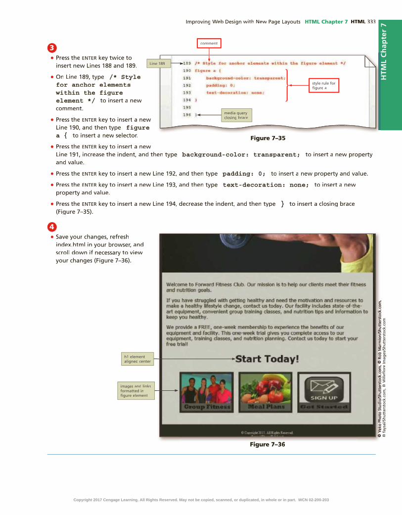
HTML Chapter 7 HTML
HTM
L C
hap
ter
7
3 • enter
• /* Style for anchor elements within the figure element */
• enter
figure a {
• enter
background-color: transparent;
• enter padding: 0;
• enter text-decoration: none;
• enter }
4•
Figure 7–35
HTM
L C
hap
ter
7
Figure 7–36Figure 7–36
Copyright 2017 Cengage Learning. All Rights Reserved. May not be copied, scanned, or duplicated, in whole or in part. WCN 02-200-203

HTML HTML Chapter 7
To Update the Style Sheet for the New Design in a Desktop Viewport
Update the style sheet for the desktop viewport to apply the new theme colors and desired layout for the Forward Fitness Club. Why? The new and modi�ed styles re�ect the rebranding of the Forward Fitness Club.First, modify the style rule for the #container element to remove the width and to apply a background color. Next, modify the style rule for the navigation list item elements to remove the borders. Then, modify the style rule for the navigation anchor elements to apply a text shadow. Modify the style rules for the active and hover pseudo-classes by changing their color values, and then modify the style rule for the main element by removing the currently properties and values and adding a background property and value. Also modify the style rule for paragraph elements within the main element by removing the current properties and values and adding a color, width, and margins. Finally, modify the style rule for the body element by removing the gradient background and applying a solid background color. The following steps modify the style rules for the desktop viewport.
1 •
background-color: #1D1D1C;
2•
•
Figure 7–37
Figure 7–38
3 •
enter
• text-shadow: 0.2em 0.1em #3D3D35;
Q&
A Figure 7–39
1 MODIFY HOME PAGE | 2 STYLE HOME PAGE | 3 MODIFY ABOUT US PAGE | 4 STYLE ABOUT US PAGE
5 MODIFY & STYLE CONTACT US PAGE | 6 CREATE & STYLE NUTRITION PAGE
Copyright 2017 Cengage Learning. All Rights Reserved. May not be copied, scanned, or duplicated, in whole or in part. WCN 02-200-203

HTML Chapter 7 HTML
HTM
L C
hap
ter
7
6•
• color: #FFFFFF;
• enter
margin-left: auto;
• enter margin-right: auto;
• enter width: 90%;
7•
•background-color: #FFFFFF;
4•
#CCCCFF;
•#9D9D93;
Q&
A
Figure 7–40
HTM
L C
hap
ter
7
Figure 7–41
Figure 7–42
5•
•background-color: #1D1D1C;
Figure 7–43
Copyright 2017 Cengage Learning. All Rights Reserved. May not be copied, scanned, or duplicated, in whole or in part. WCN 02-200-203

HTML HTML Chapter 7
8•
Figure 7–44
How big should I make my banner image?The size of a banner image should be at least 1940 pixels wide to cover a large desktop screen. If you are using a digital photo-graph, select a high-resolution photograph, and then use a photo editor, such as Adobe Photoshop, to optimize the image for web use, as this will reduce the �le size and reduce the time it takes to load the image on a page.
CO
NS
IDE
R T
HIS
To Add New Style Rules to the Desktop Viewport
Create style rules to format the header and navigation elements so that both appear side-by-side, as indicated in the new wireframe. Create other style rules to apply opacity to the �gure element to give it a rich, interactive look. In addition, create style rules to format the heading one element and the footer element. Why?The new style rules format the pages according to the design speci�ed in the wireframe and for optimum desktop display.First, create a new style rule for the header element to align the content to the left. Then, create a new style rule for the nav element to specify a �oat, margins, and width. Next, create two new style rules for the image elements contained within the �gure element to apply and remove opacity and to adjust the height of the image elements. Create a style rule for the heading one element to format its color. Finally, style the footer element to apply a background color, margin, and padding. The following steps create new style rules for the desktop viewport.
1 •
enter
• /* Style to left align header */
• enter header {
• enter text-align: left;
• enter }
Figure 7–45
1 MODIFY HOME PAGE | 2 STYLE HOME PAGE | 3 MODIFY ABOUT US PAGE | 4 STYLE ABOUT US PAGE
5 MODIFY & STYLE CONTACT US PAGE | 6 CREATE & STYLE NUTRITION PAGE
Copyright 2017 Cengage Learning. All Rights Reserved. May not be copied, scanned, or duplicated, in whole or in part. WCN 02-200-203

HTML Chapter 7 HTML
HTM
L C
hap
ter
7
2• enter
• /* Style for nav specifies a float, margin, and width */
• enter
nav {
• enter
float: right;
• enter margin-top: -7em;
• enter margin-right: 3em;
• enter margin-bottom: 0;
• enter width: 65%;
• enter }
3•
Q&
A
Figure 7–46
HTM
L C
hap
ter
7
Figure 7–47
Copyright 2017 Cengage Learning. All Rights Reserved. May not be copied, scanned, or duplicated, in whole or in part. WCN 02-200-203

HTML HTML Chapter 7
4 •
enter
• /* Style applies height and opacity to images within figure element */
• enter
figure img {
• enter height: 15em;
• enter opacity: 0.7;
• enter }
5• enter
• /* Style removes transparency on hover */
• enter
figure img: hover {
• enter opacity: 1;
• enter }
6 •
enter
• /* Style applies color to h1 element */
• enter
h1 {
• enter color: #FFFFFF;
• enter }
Q&
AQ
&A
Figure 7–48
Figure 7–49
Figure 7–50
Copyright 2017 Cengage Learning. All Rights Reserved. May not be copied, scanned, or duplicated, in whole or in part. WCN 02-200-203

HTML Chapter 7 HTML
HTM
L C
hap
ter
7
7 •
enter
• /* Style specifies a background color, margin, and padding for footer element */
• enter
footer {
• enter background-color: #2A2A2A;
• enter margin-top: -0.2em;
• enter padding: 2em;
• enter }
8•
Q&
A
Figure 7–51
HTM
L C
hap
ter
7Figure 7–52Figure 7–52
9 •
Figure 7–53
Copyright 2017 Cengage Learning. All Rights Reserved. May not be copied, scanned, or duplicated, in whole or in part. WCN 02-200-203

HTML HTML Chapter 7
Updating the About Us PageThe home page now displays the new look and design for the Forward Fitness Club. Next, revise the About Us page to integrate additional HTML5 semantic elements and then style the page according to the new design.
The About Us page contains groups of content that are not currently wrapped within a semantic element. These groups of content include the Weights group, the Cardio group, and the Personal Training group. Use a section element to group each of these areas together. The Common Exercises group is contained within a divelement; however, change this from a div to a section element to integrate a semantic element. Once you have modi�ed the About Us page, update the style sheet for tablet and desktop viewports.
Break Point: If you want to take a break, this is a good place to do so. You can exit the text editor now. To resume at a later time, run your text editor, open the �le called styles.css, and continue following the steps from this location forward.
To Add Section Elements to the About Us Page
Add section elements to the About Us page to group content. Why? Group content to improve semantic design and search engine results. Wrap each group of content on the page within a section element. These include the Weights group, the Cardio group, the Personal Training group, and the Common Exercises group. The following steps add section elements to the About Us page.
1 •
•enter
•<section>
•enter
• </section>
Figure 7–54
1 MODIFY HOME PAGE | 2 STYLE HOME PAGE | 3 MODIFY ABOUT US PAGE | 4 STYLE ABOUT US PAGE
5 MODIFY & STYLE CONTACT US PAGE | 6 CREATE & STYLE NUTRITION PAGE
Copyright 2017 Cengage Learning. All Rights Reserved. May not be copied, scanned, or duplicated, in whole or in part. WCN 02-200-203

HTML Chapter 7 HTML
HTM
L C
hap
ter
7
2•
enter
•<section>
•enter
• </section>
3•
enter
•<section>
•enter
• </section>
4•
section
•section
•
HTM
L C
hap
ter
7
Figure 7–55
Figure 7–56
Figure 7–57
Copyright 2017 Cengage Learning. All Rights Reserved. May not be copied, scanned, or duplicated, in whole or in part. WCN 02-200-203
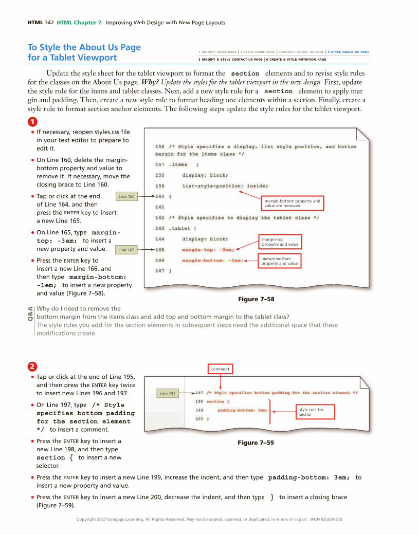
HTML HTML Chapter 7
To Style the About Us Page for a Tablet Viewport
Update the style sheet for the tablet viewport to format the section elements and to revise style rules for the classes on the About Us page. Why? Update the styles for the tablet viewport in the new design. First, update the style rule for the items and tablet classes. Next, add a new style rule for a section element to apply mar-gin and padding. Then, create a new style rule to format heading one elements within a section. Finally, create a style rule to format section anchor elements. The following steps update the style rules for the tablet viewport.
1 •
•
•
enter
• margin-top: -3em;
• enter
margin-bottom: -1em;
Q&
A
2•
enter
• /* Style specifies bottom padding for the section element */
• enter
section {
• enter padding-bottom: 3em;
• enter }
Figure 7–58
Figure 7–59
1 MODIFY HOME PAGE | 2 STYLE HOME PAGE | 3 MODIFY ABOUT US PAGE | 4 STYLE ABOUT US PAGE
5 MODIFY & STYLE CONTACT US PAGE | 6 CREATE & STYLE NUTRITION PAGE
Copyright 2017 Cengage Learning. All Rights Reserved. May not be copied, scanned, or duplicated, in whole or in part. WCN 02-200-203

HTML Chapter 7 HTML
HTM
L C
hap
ter
7
3• enter
• /* Style for h1 element within the section element */
• enter
section h1 {
• enter
text-align: left;
• enter
}
• enter
• /* Style for anchor element within the section element */
• enter section a {
• enter background-color: transparent;
• enter color: #1D1D1C;
• enter font-weight: normal;
• enter padding: 0;
• enter text-decoration: underline;
• enter }
HTM
L C
hap
ter
7
Figure 7–60
Copyright 2017 Cengage Learning. All Rights Reserved. May not be copied, scanned, or duplicated, in whole or in part. WCN 02-200-203

HTML HTML Chapter 7
1 •
•enter
• /* Style specifies color and left margin for the section element */
• enter
section {
• enter color: #FFFFFF;
• enter margin-left: 1em;
• enter padding-bottom: 5em;
• enter }
4 •
•
Figure 7–61Figure 7–61
To Style the About Us Page for a Desktop Viewport
Update the style sheet for the desktop viewport to format the section elements and to revise style rules for the classes on the About Us page. Why? Update the styles for the desktop viewport in the new design. First, remove the style rule for the items class. Next, add a new style rule for a section element to apply color and margin properties. Then, create a new style rule to specify the color of anchor elements within a section. The following steps update the style rules for the desktop viewport.
1 MODIFY HOME PAGE | 2 STYLE HOME PAGE | 3 MODIFY ABOUT US PAGE | 4 STYLE ABOUT US PAGE
5 MODIFY & STYLE CONTACT US PAGE | 6 CREATE & STYLE NUTRITION PAGE
Figure 7–62
Copyright 2017 Cengage Learning. All Rights Reserved. May not be copied, scanned, or duplicated, in whole or in part. WCN 02-200-203

HTML Chapter 7 HTML
HTM
L C
hap
ter
7
2• enter
• /* Style for anchor element within the section element */
• enter
section a {
• enter
color: #FFFFFF;
• enter }
• enter
• /* Style for paragraph element within the section element */
• enter section p {
• enter margin-left: 0;
• enter }
3 •
•
Updating the Contact Us PageThe home page and About Us pages now display the new look and design for the Forward Fitness Club. Next, revise the Contact Us page elements and style the page according to the new design.
HTM
L C
hap
ter
7
Figure 7–63
Figure 7–64
Copyright 2017 Cengage Learning. All Rights Reserved. May not be copied, scanned, or duplicated, in whole or in part. WCN 02-200-203

HTML HTML Chapter 7
To Style the Contact Us Page
Update the style sheet for the tablet viewport to format heading two elements and the email link on the Contact Us page. Why? Change the text color of the heading two element and remove the button appearance of the email link, as this style is for the mobile viewport. Create a new style rule within the tablet media query to style the heading two element within the main element. Then create a new style rule within the tablet media query to style the contact class. Specify a background color, color, and text decoration. The following steps update the style rules for the tablet desktop viewports.
To Modify the Contact Us Page
Wrap the telephone link and email link within separate paragraph elements on the Contact Us page. Why? Wrapping these elements within a paragraph element places each element within its own paragraph and subsequently unblocks its surrounding content. The following steps add paragraphs elements, add a class attribute and value, and delete line breaks in the Contact Us page.
1 •
•
</p>
•
<p>
• </p>
• <p>
• class="contact"
•
2•
Q&
A
The Contact Us page contains a telephone link and an email link; however, these links cover surrounding content. Wrap the telephone link and email link within paragraph elements, and then create a new style rule for tablet and desktop viewports to remove the button look of these elements.
1 MODIFY HOME PAGE | 2 STYLE HOME PAGE | 3 MODIFY ABOUT US PAGE | 4 STYLE ABOUT US PAGE
5 MODIFY & STYLE CONTACT US PAGE | 6 CREATE & STYLE NUTRITION PAGE
1 MODIFY HOME PAGE | 2 STYLE HOME PAGE | 3 MODIFY ABOUT US PAGE | 4 STYLE ABOUT US PAGE
5 MODIFY & STYLE CONTACT US PAGE | 6 CREATE & STYLE NUTRITION PAGE
Figure 7–65
Copyright 2017 Cengage Learning. All Rights Reserved. May not be copied, scanned, or duplicated, in whole or in part. WCN 02-200-203

HTML Chapter 7 HTML
HTM
L C
hap
ter
7
1 •
•
enter
• /* Style for contact class */
• enter
.contact {
• enter background-color: transparent;
• enter color: #1D1D1C;
• enter padding: 0;
• enter text-decoration: underline;
• enter }
2•
HTM
L C
hap
ter
7
Figure 7–66
Figure 7–67
Copyright 2017 Cengage Learning. All Rights Reserved. May not be copied, scanned, or duplicated, in whole or in part. WCN 02-200-203

HTML HTML Chapter 7
3•
enter
• /* Style for main h2 element */
• enter
main h2 {
• enter
color: #FFFFFF;
• enter }
• enter
• /* Style for contact class */
• enter .contact {
• enter color: #FFFFFF;
• enter }
4•
Break Point: If you want to take a break, this is a good place to do so. You can exit the text editor now. To resume at a later time, run your text editor, open the �le called styles.css, and continue following the steps from this location forward.
Figure 7–68
Figure 7–69
Copyright 2017 Cengage Learning. All Rights Reserved. May not be copied, scanned, or duplicated, in whole or in part. WCN 02-200-203

HTML Chapter 7 HTML
HTM
L C
hap
ter
7
Creating the Nutrition PageThe home, About Us, and Contact Us pages now display the new look and
design for the Forward Fitness Club. Next, you create the Nutrition page, which provides tips for good nutrition, guidelines for a healthy diet, and a featured recipe of the week. To have the new page follow the same design as the other pages in the site, use the �tness template to create the page and then add HTML5 semantic elements. Style the page to be consistent with the other pages.
You drafted a wireframe for the Nutrition page in tablet and desktop viewports, which uses article and aside elements, as shown in Figures 7–70 and 7–71. This page uses a three-column layout for tablet and desktop viewports. The mobile layout will remain the same as the other pages, a one-column layout. Create the nutrition page and then update the style sheet.
Header
Navigation
Banner Div
Main
Footer
Article
Image
Aside
Article
Image
Aside
Article
Image
Aside
Figure 7–70
NavigationHeader
Banner Div
Footer
Main
Article
Image
Aside
Article
Image
Aside
Article
Image
Aside
Figure 7–71
To create the three-column layout, modify existing style rules and create new style rules for tablet and desktop viewports. Use the over�ow property to specify how to over�ow property to specify how to over�ow propertymanage content when it “spills over” into another element. Similar to the clear property, the over�ow property can help resolve display issues related to a nearby �oating element.
To Create the Nutrition Page
Use the template, �tness.html, to create the Nutrition page. After creating the page, insert a banner image. The following step creates the Nutrition page.
1
2 enter
3 <!-- Nutrition Page Banner -->
4 enter <div id="banner" class="desktop">
Multiple Columns Using CSS3You can create columns using the CSS3 property called column-count. The value used for this property indicates the desired number of columns. Several other properties can be used with the column-count property, such as column-gap, column-width, and column-rule.
Nutrition page wireframe for tablet viewport
Nutrition page wireframe for desktop viewport
Copyright 2017 Cengage Learning. All Rights Reserved. May not be copied, scanned, or duplicated, in whole or in part. WCN 02-200-203

HTML HTML Chapter 7
5 enter <img src="images/nutritionBanner.jpg" alt="nutrition banner image">
6 enter
</div>
To Add article and aside Elements to the Nutrition Page
Insert three article elements within the main element and add content to each. Near the bottom of each article, insert an aside element with additional content. Why? The article elements will contain new page content, including tips, guidelines, and recipes. Inside each article element, add a heading element, an image element, paragraph elements, unordered list elements, and an aside element. The following steps add article elements to the Nutrition page.
1 •
enter
• <article>
• enter
<h2>Food for Thought</h2>
• enter
<img src="images/nutrition1.jpg" alt="food for thought image" class="desktop">
•
CtrL+C
• enter CtrL+V
•
Figure 7–72
Figure 7–73
1 MODIFY HOME PAGE | 2 STYLE HOME PAGE | 3 MODIFY ABOUT US PAGE | 4 STYLE ABOUT US PAGE
5 MODIFY & STYLE CONTACT US PAGE | 6 CREATE & STYLE NUTRITION PAGE
Copyright 2017 Cengage Learning. All Rights Reserved. May not be copied, scanned, or duplicated, in whole or in part. WCN 02-200-203

HTML Chapter 7 HTML
HTM
L C
hap
ter
7
2•
enter
<aside>Did you know the average American consumes 3 lbs of sugar each week?</aside>
• enter
</article>
3• enter
• <article>
• enter
<h2>What to Eat</h2>
• enter
<img src="images/nutrition2.jpg" alt="food image" class="desktop">
•
CtrL+C
•enter
CtrL+V
•
4•
enter
<aside>Did you know that avocados are a good source of Vitamin B?</aside>
• enter
</article>
Figure 7–76
Figure 7–75
HTM
L C
hap
ter
7
Figure 7–74
Copyright 2017 Cengage Learning. All Rights Reserved. May not be copied, scanned, or duplicated, in whole or in part. WCN 02-200-203

HTML HTML Chapter 7
7• enter
•
5• enter
• <article>
• enter
<h2>Meal of the Week</h2>
• enter
<img src="images/nutrition3.jpg" alt=" herb roasted chicken image" class="desktop">
•CtrL+C
• enter CtrL+V
•
Q
&A
6•
enter
<aside>Did you know the average active adult should consume 2,000 calories a day?</aside>
• enter </article>
Figure 7–77
Figure 7–78
Figure 7–79
Copyright 2017 Cengage Learning. All Rights Reserved. May not be copied, scanned, or duplicated, in whole or in part. WCN 02-200-203

HTML Chapter 7 HTML
HTM
L C
hap
ter
7
To Style the Nutrition Page for a Mobile Viewport
Create a new style rule to format the aside elements with an italic font style. Why? Format the aside element differently from the rest of the article so it stands out. The following steps create a style rule for the aside element.
1 •
•enter
• /* Style for aside element */
• enter aside {
• enter font-style: italic;
• enter }
Figure 7–80
2 •
•
To Create a Three-Column Layout for the Nutrition Page in a Tablet Viewport
The wireframe for the Nutrition page uses a three-column layout. Create a new style rule to �oat each article element to the left. Why? This style rule formats each article element so it appears in its own column. Update the style sheet for the tablet viewport to format other aspects of the new article elements added to the Nutrition page. The following steps add a style rule for the tablet viewport.
1 MODIFY HOME PAGE | 2 STYLE HOME PAGE | 3 MODIFY ABOUT US PAGE | 4 STYLE ABOUT US PAGE
5 MODIFY & STYLE CONTACT US PAGE | 6 CREATE & STYLE NUTRITION PAGE
1 MODIFY HOME PAGE | 2 STYLE HOME PAGE | 3 MODIFY ABOUT US PAGE | 4 STYLE ABOUT US PAGE
5 MODIFY & STYLE CONTACT US PAGE | 6 CREATE & STYLE NUTRITION PAGE
Figure 7–81
Copyright 2017 Cengage Learning. All Rights Reserved. May not be copied, scanned, or duplicated, in whole or in part. WCN 02-200-203

HTML HTML Chapter 7
To Apply the Over�ow Property to the main Element Style Rule
As shown in Figure 7–83, the main element is not in the correct area. The float property used within the article style rule displaces the main element to the banner image area. To correct this issue, apply an overflow property with a value of overflow property with a value of overflow auto to the main style rule contained within the tablet media query. Why? Apply the over�ow property to the main element so it is displayed below the banner image. The following step updates the main style rule for the tablet viewport.
1 •
enter
• /* Style for article element */
• enter
article {
• enter
background-color: #C1D9CA;
• enter float: left;
• enter margin: 0.5%;
• enter padding: 0.5%;
• enter text-align: center;
• enter width: 31%;
• enter }
Figure 7–82
Figure 7–83
2•
1 MODIFY HOME PAGE | 2 STYLE HOME PAGE | 3 MODIFY ABOUT US PAGE | 4 STYLE ABOUT US PAGE
5 MODIFY & STYLE CONTACT US PAGE | 6 CREATE & STYLE NUTRITION PAGE
Copyright 2017 Cengage Learning. All Rights Reserved. May not be copied, scanned, or duplicated, in whole or in part. WCN 02-200-203

HTML Chapter 7 HTML
HTM
L C
hap
ter
7
1 •
enter
• /* Style for image element contained within the main article element */
• enter
main article img {
• enter border: solid 0.1em #1D1D1C;
• enter margin-left: auto;
• enter margin-right: auto;
• enter }
1•
enter
•overflow: auto;
•
To Style the article Element for the Nutrition Page
The Nutrition page now uses a three-column layout; however, the content within each article needs to be formatted. Center-align the image elements and apply a border around image. Left-align the paragraph and unordered list elements and change the font color. Why? Applying these changes improves readability. First, create a new style rule for the main article img element. Next, create a new style rule for the main article paragraph element. Next, create a new style rule for the main article unordered list element. The following steps update the style rules for the tablet viewport.
1 MODIFY HOME PAGE | 2 STYLE HOME PAGE | 3 MODIFY ABOUT US PAGE | 4 STYLE ABOUT US PAGE
5 MODIFY & STYLE CONTACT US PAGE | 6 CREATE & STYLE NUTRITION PAGE
Figure 7–85
Figure 7–84
Copyright 2017 Cengage Learning. All Rights Reserved. May not be copied, scanned, or duplicated, in whole or in part. WCN 02-200-203

HTML HTML Chapter 7
2 • enter
• /* Style for paragraph element contained within the main article element */
• enter
main article p {
• enter color: #000000;
• enter margin-top: 2%;
• enter padding: 1%;
• enter text-align: left;
• enter }
3 • enter
• /* Style for unordered list element contained within the main article element */
• enter
main article ul {
• enter text-align: left;
• enter }
Figure 7–87
Figure 7–86
Copyright 2017 Cengage Learning. All Rights Reserved. May not be copied, scanned, or duplicated, in whole or in part. WCN 02-200-203

HTML Chapter 7 HTML
HTM
L C
hap
ter
7
1 •
enter
• /* Style for aside element */
• enter
aside {
• enter background-color: #FFFFFF;
• enter border-radius: 0 5em 5em 5em;
• enter box-shadow: 1em 1em 1em #4C4F4D;
• enter padding: 1.5em;
• enter margin: 1em;
• enter }
4•
To Style the aside Element for the Nutrition Page
An aside element is contained at the bottom of each article element. The content provided in the aside element gives more information pertaining to that particular article. Format this element to stand out and improve its visibility. Why? The format of an aside element should distinguish it from other elements on the webpage. Create a style rule for the aside element and apply a rounded border, a background color, box-shadow effect, padding, and margin. The following steps create a new style rule for the tablet viewport.
Figure 7–89
1 MODIFY HOME PAGE | 2 STYLE HOME PAGE | 3 MODIFY ABOUT US PAGE | 4 STYLE ABOUT US PAGE
5 MODIFY & STYLE CONTACT US PAGE | 6 CREATE & STYLE NUTRITION PAGE
Figure 7–88
Copyright 2017 Cengage Learning. All Rights Reserved. May not be copied, scanned, or duplicated, in whole or in part. WCN 02-200-203

HTML HTML Chapter 7
1 •
enter
• /* Style for main article h2 element */
• enter main article h2 {
• enter color: #000000;
• enter }
2•
To Style the article h2 Element for the Nutrition Page in a Desktop Viewport
The h2 element in a desktop viewport is the last element that needs to be formatted. Create a style rule to apply a different font color. Why? The font color is too light to read the text easily in a desktop viewport. Create a new style rule for the main article h2 element to apply a font color. The following steps update the style rules for the desktop viewport.
2•
1 MODIFY HOME PAGE | 2 STYLE HOME PAGE | 3 MODIFY ABOUT US PAGE | 4 STYLE ABOUT US PAGE
5 MODIFY & STYLE CONTACT US PAGE | 6 CREATE & STYLE NUTRITION PAGE
Figure 7–92
Figure 7–91
Figure 7–90
Copyright 2017 Cengage Learning. All Rights Reserved. May not be copied, scanned, or duplicated, in whole or in part. WCN 02-200-203

HTML Chapter 7 HTML
HTM
L C
hap
ter
7
To Validate the Style Sheet
Always run your �les through W3C’s validator to check the document for errors. If the document has any errors, validating gives you a chance to identify and correct them. Validation is also an effective troubleshooting tool during the development process and adds a valuable level of professionalism to your work. The following steps validate a CSS document.
1 http://jigsaw.w3.org/css-validator/
2
3
4
5
6
7
To Validate the HTML Files
Every time you create a new webpage, run it through W3C’s validator to check the document for errors. If any errors exist, you need to correct them. Validation is also an effective troubleshooting tool during the development process and adds a valuable level of professionalism to your work. The following steps validate an HTML document.
1 http://validator.w3.org/
2
3
4
5
6
7
8
9
Copyright 2017 Cengage Learning. All Rights Reserved. May not be copied, scanned, or duplicated, in whole or in part. WCN 02-200-203

HTML HTML Chapter 7
Chapter SummaryIn this chapter, you learned how to use the HTML5 �gure, section, article, and aside semantic elements. You added these elements to the webpages in the website and then created and modi�ed style rules in the style sheet to format the new elements and adapt to a new design. Finally, you added a new page to the website and formatted some of its contents in three columns.
Redesigning the Home PageAdd a �gure Element to the Home Page
(HTML 326)Update the Style Sheet for the New Design in a
Mobile Viewport (HTML 327)Add New Style Rules for Anchor Elements in a
Mobile Viewport (HTML 329)Update the Style Sheet for the New Design in a
Tablet Viewport (HTML 330)Add New Style Rules to the Tablet Viewport
(HTML 332)Update the Style Sheet for the New Design in a
Desktop Viewport (HTML 334)Add New Style Rules to the Desktop Viewport
(HTML 336)
Updating the About Us PageAdd Section Elements to the About Us Page
(HTML 340)Style the About Us Page for a Tablet Viewport
(HTML 342)Style the About Us Page for a Desktop Viewport
(HTML 344)
Updating the Contact Us PageModify the Contact Us Page (HTML 346)Style the Contact Us Page (HTML 346)
Creating the Nutrition PageCreate the Nutrition Page (HTML 349)Add article and aside Elements to the Nutrition
Page (HTML 350)Style the Nutrition Page for a Mobile Viewport
(HTML 353)Create a Three-Column Layout for the
Nutrition Page in a Tablet Viewport (HTML 353)
Apply the Over�ow Property to the main Element Style Rule (HTML 354)
Style the article Element for the Nutrition Page (HTML 355)
Style the aside Element for the Nutrition Page (HTML 357)
Style the article h2 Element for the Nutrition Page in a Desktop Viewport (HTML 358)
How will you improve the design of your website?Use these guidelines as you complete the assignments in this chapter and create your own webpages outside of this class.
1. Determine a new look and layout for each viewport.
a. Review color meanings and the best colors to capture your audience’s attention.
b. Design a wireframe for mobile, tablet, and desktop viewports.
c. Determine what images you will use and whether to display them on a mobile viewport.
2. Determine the layout for tablet and desktop viewports.
a. Determine the semantic elements needed for your design.
b. Determine how to style each element.
3. Determine the use of a banner image.
a. Find banner images appropriate to your site.
b. Modify the size of the images to use a minimum width of 1,940 pixels.
c. Optimize the images for web use.
4. Enhance site design with CSS3 properties.
a. Determine the best use of the opacity property.
b. Determine the best use of the text-shadow property.
5. Revise media query style rules.
a. Determine which style rules need to be modi�ed.
b. Add new style rules as needed to suit your design.
CO
NS
IDE
R T
HIS
Copyright 2017 Cengage Learning. All Rights Reserved. May not be copied, scanned, or duplicated, in whole or in part. WCN 02-200-203

HTM
L C
hap
ter
7S
TU
DE
NT
AS
SIG
NM
EN
TS
HTML Chapter 7 HTML
Apply Your Knowledge
Using HTML5 Semantic ElementsInstructions: In this exercise, you will use your text editor to add and style HTML5 semantic elements. You insert section, article, and aside elements in an HTML document. You then add a style rule to format each element. Work with the apply07.html �le in the apply folder and the applystyles07.css �le in the apply\css folder from the Data Files for Students. The completed webpage is shown in Figure 7–93. You will also use professional web development practices to indent, space, comment, and validate your code.
How should you submit solutions to questions in the assignments identi�ed with a symbol?Every assignment in this book contains one or more questions identi�ed with a symbol. These questions require symbol. These questions require you to think beyond the assigned presentation. Present your solutions to the questions in the format required by your instructor. Possible formats may include one or more of these options: create a document that contains the answer; present your answer to the class; discuss your answer in a group; record the answer as audio or video using a webcam, smartphone, or portable media player; or post answers on a blog, wiki, or website.
CO
NS
IDE
R T
HIS
Figure 7–93Figure 7–93
Perform the following tasks:1. Open apply07.html in your browser to view the webpage.
2. Open apply07.html in your text editor, review the page, add a title, modify the comment at the top of the page to include your name and today’s date, and replace “Student’s Name” with your name in the footer element.
3. Open the applystyles07.css �le from the apply\css folder. Modify the comment at the top of the style sheet to include your name and today’s date.
4. In the apply07.html �le, add a section element within the main element.
5. Add the following heading within the section element:
<h2>HTML Basics</h2>
Continued >
Copyright 2017 Cengage Learning. All Rights Reserved. May not be copied, scanned, or duplicated, in whole or in part. WCN 02-200-203

STU
DE
NT
AS
SIG
NM
EN
TS HTML HTML Chapter 7
6. Add the following two article elements within the section element:
<article>
<h3>What is HTML?</h3>
<p>In this tutorial, you will learn about Hypertext Markup Language, or HTML.</p>
<p>Webpages are created using HTML, which is an authoring language used to create documents for the web. HTML consists of a set of spe-cial instructions called tags to define the structure and layout of content in a webpage. A browser reads the HTML tags to determine how to display the webpage content on a screen.</p>
</article>
<article>
<h3>Your First Webpage</h3>
<p>In this tutorial, you will learn how to create your first web-page.</p>
<p>You can create webpages using HTML with a simple text editor, such as Notepad, Notepad++, Sublime, Programmer’s Notepad, TextEdit, and TextWrangler. Notepad comes preinstalled with the Windows oper-ating system and TextEdit comes preinstalled with the Mac OS X op-erating system. TextWrangler also runs only on Mac OS X, while the other text editors run on Windows. A text editor is a program that allows you to enter, change, save, and print text, which includes HTML tags.</p>
</article>
7. In the apply07.html �le, add the following aside element below the main element:
<aside>
<h2>Practice Makes Perfect</h2>
<p>Webpage design is a skill learned over time. You must practice to improve.</p>
</aside>
8. In the applystyles07.css �le, create the following style rules:
section {
background-color: #183440;
color: #FFFFFF;
margin-top: 4%;
padding: 1%;
}
article {
background-color: white;
border-radius: 3em;
color: #000000;
margin-top: 1%;
padding: 2%;
}
Apply Your Knowledge continued
Copyright 2017 Cengage Learning. All Rights Reserved. May not be copied, scanned, or duplicated, in whole or in part. WCN 02-200-203

HTM
L C
hap
ter
7S
TU
DE
NT
AS
SIG
NM
EN
TS
HTML Chapter 7 HTML
aside {
background-color: #183440;
border-radius: 3em;
width: 25%;
float: right;
padding: 2%;
margin-top: 1%;
color: #FFFFFF;
}
9. Add appropriate comments above each style rule.
10. Save all of your changes and open the apply07.html in your browser.
11. Validate your HTML document using the W3C validator found at validator.w3.org and �x any errors that are identi�ed.
12. Validate your CSS �le using the W3C validator found at http://jigsaw.w3.org/css-validator/ and �x any errors that are identi�ed.
13. Submit the �les in a format speci�ed by your instructor.
14. In step 8, you applied a �oat property to the aside element. Describe the purpose of the �oat In step 8, you applied a �oat property to the aside element. Describe the purpose of the �oat property and discuss another way to achieve similar results.
Extend Your Knowledge
Exploring Column LayoutsInstructions: In this exercise, you research other ways to create a column layout for a webpage.
Perform the following tasks:1. Use your browser to research different ways to create a multiple-column layout for webpage
design.
2. Find at least two different ways to create a column layout and describe the process to create the column layout for each. Include a link to your resources.
3. Provide an example of the code needed to create the column layout.
4. Using what you have learned, create an example HTML webpage and CSS �le that uses one of the methods described.
5. Submit your answers in the format speci�ed by your instructor.
6. In this exercise, you discovered other ways to create a column layout. Use your browser to In this exercise, you discovered other ways to create a column layout. Use your browser to research grid layouts. Include a description of your �ndings and a link to your resource(s).
Analyze, Correct, Improve
Improving an HTML Document with Semantic MarkupInstructions: Work with the analyze07.html �le in the analyze folder and the analyzestyles07.css �le in the analyze\css folder from the Data Files for Students. The analyze07.html webpage contains generic div elements for content and needs to be revised to use HTML5 semantic elements. You then create div elements for content and needs to be revised to use HTML5 semantic elements. You then create divnew style rules to format the semantic elements. Use Figure 9-94 as a guide to correct these �les.
Continued >Copyright 2017 Cengage Learning. All Rights Reserved. May not be copied, scanned, or duplicated, in whole or in part. WCN 02-200-203

STU
DE
NT
AS
SIG
NM
EN
TS HTML HTML Chapter 7
Figure 7–94Figure 7–94
1. Correcta. Open the analyze07.html �le in your editor from the Data Files for Students and then modify
the comment at the top of the page to include your name and today’s date.
b. Open the analyzestyles07.css �le in your editor from the Data Files for Students and then modify and correct the comment at the top of the document to include your name and today’s date.
c. In analyze07.html, insert a title. Review the current div elements used to structure content and replace them with header, nav, main, section, article, aside, and footer HTML5 semantic elements. Do not replace the div id="container" tag.
2. Improvea. Open the analyzestyles07.css �le in your text editor. Create new style rules to format the
main, section, article, and aside elements and include comments for each style rule.
b. Display the main element as a block with 1em of padding and a background color of 1em of padding and a background color of 1em#4E9657.
c. Apply a white background color to the Apply a white background color to the section element, use #4E9657 for the color property, and apply a small amount of padding and top margin.
d. Use black as the font color for the article element, add a thin border on the top of the element, and apply a small amount of padding and top margin.
e. Apply a border-radius property to the Apply a border-radius property to the aside element, use a background color of #4E9657, align the text center, increase the font size, use white as the font color, and apply a small amount of padding and top margin.
f. Validate your CSS �le using the W3C validator found at http://jigsaw.w3.org/css-validator/ and �x any errors that are identi�ed.
g. Validate your HTML webpage using the W3C validator found at validator.w3.org and �x any errors that are identi�ed.
h. Identify another way to modify the HTML structure of the page using the Identify another way to modify the HTML structure of the page using the div elements instead of the HTML5 semantic elements and provide an example.
Analyze, Correct, Improve continued
Copyright 2017 Cengage Learning. All Rights Reserved. May not be copied, scanned, or duplicated, in whole or in part. WCN 02-200-203

HTM
L C
hap
ter
7S
TU
DE
NT
AS
SIG
NM
EN
TS
HTML Chapter 7 HTML
In the Labs
Lab 1: Integrating HTML5 Semantic Elements for the New Harvest Food Bank WebsiteProblem: You volunteer at a local food bank called New Harvest Food Bank that collects community food donations and provides food and other services to those in need. The company has asked you to create a responsive website. You have already created the website but now need to add section, article, and aside elements to the About page and then format them. Create and style the webpage shown in Figure 7–95 for the mobile, tablet, and desktop viewports.
Figure 7–95
Continued >
(a) Mobile viewport (b) Tablet viewport
(c) Desktop viewport
Copyright 2017 Cengage Learning. All Rights Reserved. May not be copied, scanned, or duplicated, in whole or in part. WCN 02-200-203

STU
DE
NT
AS
SIG
NM
EN
TS HTML HTML Chapter 7
Instructions: Perform the following tasks:1. Copy the foodbank.html template �le in the lab1\template folder from the Data Files for
Students to your lab1\template folder.
2. Open your text editor and then open the foodbank.html template �le in the lab1 folder and use it to create the about.html �le.
3. In the about.html document, add a section element within the main element. Create an h2 element within the section element, <h2>We Need Your Donations</h2>.
4. Add an article element within the section element and then add the following elements within the article element:
<h4>Items We Need</h4>
<p>Our pantry is in need of the following items:</p>
<ul>
<li>Canned chicken or tuna</li>
<li>Canned Vegetables</li>
<li>Oatmeal</li>
<li>Pasta</li>
<li>Peanut butter</li>
<li>Rice</li>
</ul>
5. Add another article element after the �rst article element, but within the section element, and then add the following elements within the second article element:
<h4>Food Drive</h4>
<p>If you would like to host a food drive, we will provide everything you need to get started. Food drives are a great way for employees to help their local community. Employees can donate food items or make monetary donations.</p>
6. Add the following aside element after the section element:
<aside>Note that we cannot accept perishable goods, opened food containers, or home made goods.</aside>
7. In the fbstyles.css �le, modify the comment at the top of the page to include today’s date.
8. In the fbstyles.css �le, create a new style rule above the media queries for div p and add padding-left: 1em; and padding-right: 1em; to the style rule. Include a comment for this new style rule.
9. Add the following style rules to apply to the mobile viewport and include comments for each:
section {
padding: 1%;
text-align: center;
}
article {
border-top: solid 0.2em #FF6600;
padding: 2%;
margin: 0.5%;
text-align: left;
}
In the Labs continued
Copyright 2017 Cengage Learning. All Rights Reserved. May not be copied, scanned, or duplicated, in whole or in part. WCN 02-200-203

HTM
L C
hap
ter
7S
TU
DE
NT
AS
SIG
NM
EN
TS
HTML Chapter 7 HTML
aside {
text-align: center;
color: #FFFFFF;
background-color: #FF6600;
font-size: 1.25em;
margin: 1em;
padding: 1em;
}
10. Add the following style rules to apply to the tablet viewport and include comments for each:
section {
background-color: #FF6600;
}
article {
background-color: #FFFFFF;
border-top: 0;
border-radius: 0 3em 3em 3em;
margin-bottom: 1em;
}
aside {
text-align: center;
color: #FF6600;
background-color: #FFFFFF;
box-shadow: 1em 1em 1em #000000;
border-radius: 8em;
}
11. In the fbstyles.css �le, add overflow: auto; to the main style rule for the desktop viewport.
12. Add the following style rules to apply to the desktop viewport and include comments for each:
section {
float: left;
width: 60%;
}
aside {
float: right;
width: 25%;
background-color: #FF6600;
color: #FFFFFF;
}
13. Validate your HTML code and �x any errors.
14. Validate your CSS code and �x any errors.
15. Save all �les and open the about.html page within a browser and view the page in all three viewports, as shown in Figure 7–95.
Continued >Copyright 2017 Cengage Learning. All Rights Reserved. May not be copied, scanned, or duplicated, in whole or in part. WCN 02-200-203

STU
DE
NT
AS
SIG
NM
EN
TS HTML HTML Chapter 7
16. Submit your assignment in the format speci�ed by your instructor.
17. In this assignment, you created several HTML5 semantic elements. Research the In this assignment, you created several HTML5 semantic elements. Research the timesemantic element, identify its use, and then discuss its attribute and the different ways in which time can be displayed.
Lab 2: Designing for Tablet and Desktop Viewports for Steve’s Screen ServicesProblem: You work for a screening company called Steve’s Screen Services that specializes in screening, cleaning, and repairing screened patios. The company has asked you to create a responsive website. You have already created the website, but now need to create the Services and Gallery page. You add and style semantic elements for both pages. Style the webpages as shown in Figure 7–96 and Figure 7–97 for mobile, tablet, and desktop viewports.
In the Labs continued
Figure 7–96
(a) Mobile viewport (b) Tablet viewport
(c) (c) Desktop viewportesktop viewport
Copyright 2017 Cengage Learning. All Rights Reserved. May not be copied, scanned, or duplicated, in whole or in part. WCN 02-200-203

HTM
L C
hap
ter
7S
TU
DE
NT
AS
SIG
NM
EN
TS
HTML Chapter 7 HTML
Figure 7–97
Instructions: Perform the following tasks:1. Copy the image �les in the lab2\images folder from the Data Files for Students to your lab2\
images folder and replace the old screen1.jpg �le with the new screen1.jpg �le.
2. Open your text editor and then open the stevescreen.html template �le in the template folder and use it to create the services.html �le.
3. In the services.html document, add a section element within the main element. Create an h2 element within the section, <h2>Patio Screen Services</h2>.
4. Add an article element within the section element and then add the following elements within the article element:
<article>
<h4>New Screen Patios</h4>
<p>Let our professional staff design your backyard escape. With over 20 years of experience, we have the tools and skills needed to cre-ate the perfect patio for your home.</p>
</article>
Continued >
(a) Mobile viewport (b) Tablet viewport
(c) (c) Desktop viewportesktop viewport
Copyright 2017 Cengage Learning. All Rights Reserved. May not be copied, scanned, or duplicated, in whole or in part. WCN 02-200-203

STU
DE
NT
AS
SIG
NM
EN
TS HTML HTML Chapter 7
5. Add a second article element after the �rst article element, but within the section element, and then add the following elements within the second article element.
<article>
<h4>Screen Repairs</h4>
<p>Are bugs enjoying your patio too? We can replace torn screens and repair door fixtures. No job is too small!</p>
</article>
6. Add a third article element after the second article element, but within the section element, and then add the following elements within the third article element:
<article>
<h4>Screen Cleaning</h4>
<p>Is your patio looking less than pretty? Our environment-friendly cleaning products will have your patio looking brand new in no time. We offer a 100% satisfaction guarantee.</p>
</article>
7. Open your text editor and then open the stevescreen.html template �le in the template folder and use it to create the gallery.html �le.
8. In the gallery.html document, replace the image �le name on Line 22, screen1.jpg, with galleryBanner.jpg.
9. In the gallery.html document, add an article element within the main element. Create an h3 element within the section, <h3>Big or Small, We Do It All</h3>.
10. In the gallery.html document, add the following �gure element within the article element, below the h3 element:
<figure>
<img src="images/screen2.jpg" alt="Gallery picture 1">
<img src="images/screen3.jpg" alt="Gallery picture 2">
<img src="images/screen4.jpg" alt="Gallery picture 3">
<figcaption>Small patios, large patios, pool enclosures</figcaption>
</figure>
11. In the screenstyles.css �le, modify the comment at the top of the page to include today’s date.
12. In the screenstyles.css �le, add the following style rules to apply to the mobile viewport and include comments for each:
article h3 {
text-align: center;
}
figure {
text-align: center;
}
figcaption {
color: #000066;
}
In the Labs continued
Copyright 2017 Cengage Learning. All Rights Reserved. May not be copied, scanned, or duplicated, in whole or in part. WCN 02-200-203

HTM
L C
hap
ter
7S
TU
DE
NT
AS
SIG
NM
EN
TS
HTML Chapter 7 HTML
section {
padding: 1em;
}
article {
margin: 1em;
padding: 1em;
background-color: #ACB7E6;
}
13. In the screenstyles.css �le, remove the img style rule from the tablet and desktop media queries.
14. Add the following style rules to the desktop media query and include a comment for the style rule:
section article {
width: 22%;
float: left;
height: 15em;
}
15. Save your changes for all �les and open the Services page in your browser, and the page in a mobile, tablet, and desktop viewports, as shown in Figure 7–96.
16. Open the Gallery page in your browser in mobile, tablet, and desktop viewports, as shown in Figure 7–97.
17. Validate your HTML code and �x any errors.
18. Validate your CSS code and �x any errors.
19. Submit your assignment in the format speci�ed by your instructor.
20. In step 12, you created a style rule for a �gcaption element. Discuss at least three different In step 12, you created a style rule for a �gcaption element. Discuss at least three different properties you would use to improve the appearance of this element.
Lab 3: Expand Your WorldWorking with Full Image Backgrounds and OpacityProblem: In this chapter, you worked with banner images and the CSS3 opacity property. Work with the index07.html �le in the lab3 folder and the lab3styles07.css �le in the lab3\css folder from
Figure 7–98
Continued >Copyright 2017 Cengage Learning. All Rights Reserved. May not be copied, scanned, or duplicated, in whole or in part. WCN 02-200-203

STU
DE
NT
AS
SIG
NM
EN
TS HTML HTML Chapter 7
the Data Files for Students. In this exercise, you will explore ways to apply a background image and to work the opacity property. The complete webpage is shown in Figure 7–98.Instructions:
1. Open index07.html in your text editor, review the page, add a title, modify the comment at the top of the page to include your name and today’s date, and replace “Student’s Name” with your name in the footer element.
2. Open the lab3styles07.css �le from the lab3\css folder. Modify the comment at the top of the style sheet to include your name and today’s date.
3. In the lab3styles07.css �le, add the following properties and values to the body style rule to apply a background image to an entire webpage:
background: url(beach.jpg) no-repeat center center fixed;
-webkit-background-size: cover;
-moz-background-size: cover;
-o-background-size: cover;
background-size: cover;
4. In the lab3styles07.css �le, add an opacity property and value to the header, nav, main, and footer elements. Use a different value for each element to view the changes in transparency.
5. Submit your answers in the format speci�ed by your instructor.
6. In step 3, you applied a background image to the body element so that it would consume In step 3, you applied a background image to the body element so that it would consume the entire webpage. Use your browser to research the background-size property and discuss other areas where this property could be applied.
Consider This: Your Turn
1. Improving Your Personal Portfolio Website Design
Personal
Part 1: In Chapter 6, you completed your personal portfolio website for a responsive design. In this exercise, you update the page as follows:
1. Open the external style sheet you created in Chapter 6 and save it with the name portfoliostyles07.css in the styles folder within the your_turn_1 folder.
2. Add your name and the current date as a comment to the �rst line of the portfoliostyles07.css �le.
3. In your HTML editor, open the �les you created for your portfolio website in Chapter 6 and make sure your name and the current date are added as a comment to the �rst line of all �les.
a. Update the HTML �les to modify the link to the external style sheet to reference portfoliostyles07.css.
b. Wrap your picture in a �gure element.
c. Integrate an article element on the portfolio page.
d. Integrate a section element on the education page.
4. Update the CSS �le to:
a. Style the �gure element for mobile, tablet, and desktop viewports.
b. Style the article element for mobile, tablet, and desktop viewports.
c. Style the section element for mobile, tablet, and desktop viewports.
d. Apply a text-shadow property to your name.
In the Labs continued
Copyright 2017 Cengage Learning. All Rights Reserved. May not be copied, scanned, or duplicated, in whole or in part. WCN 02-200-203

HTM
L C
hap
ter
7S
TU
DE
NT
AS
SIG
NM
EN
TS
HTML Chapter 7 HTML
e. Re�ne your style sheet as desired.
f. Adjust viewport widths if necessary. Adjust viewport widths if necessary.
g. Add comments to note all changes and updates.
5. Save and test your �les.
6. Validate and correct your HTML and CSS �les, and submit your assignment in the format speci�ed by your instructor.
Part 2:
Use your browser to research the HTML5 details and summary semantic elements. Discuss where you could integrate these elements with your site and why.
2. Improving the Design of the WebDevPros Website
ProfessionalPart 1: In Chapter 6, you completed a responsive design website for WebDevPros. In this exercise, you update the site as follows:
1. Open the external style sheet you created in Chapter 6 and save it with the name webdevstyles07.css in the styles folder within the your_turn_2 folder.
2. Add your name and the current date as a comment to the �rst line of the webdevstyles07.css �le.
3. Open the �les you created for WebDevPros in Chapter 6 in your HTML editor and make sure your name and the current date are added as a comment to the �rst line of all �les.
4. Update the HTML �les to:
a. Integrate �gure and �gcaption elements.
b. Integrate a section element.
c. Integrate an article element.
d. Integrate an aside element.
5. Update the CSS �le to:
a. Style the �gure element for mobile, tablet, and desktop viewports.
b. Style the article element for mobile, tablet, and desktop viewports.
c. Style the section element for mobile, tablet, and desktop viewports.
d. Style the aside element for mobile, tablet, and desktop viewports.
e. Apply an opacity property to an element.
f. Re�ne your style sheet as desired.
g. Adjust viewport widths if necessary.
h. Add comments to note all changes and updates.
6. Save and test your �les.
7. Validate and correct your HTML and CSS �les, and submit your assignment in the format speci�ed by your instructor.
Part 2: In step 5d, you added a style rule for the aside element. Use your browser to research dif- In step 5d, you added a style rule for the aside element. Use your browser to research dif-ferent ideas for styling the aside element. Provide a screen shot of the designs you found and a link to each resource.
Continued >Copyright 2017 Cengage Learning. All Rights Reserved. May not be copied, scanned, or duplicated, in whole or in part. WCN 02-200-203

STU
DE
NT
AS
SIG
NM
EN
TS HTML HTML Chapter 7
3. Improving the Design of the Dog Hall of Fame Website
Research and CollaborationPart 1: In Chapter 6, you completed the responsive design website for the Dog Hall of Fame. In this exercise, you will update those pages to apply new HTML5 semantic elements and then style those element. Do the following activities as a group:
1. Open the external style sheet you created in Chapter 6 and save it with the name dogstyles07.css in the styles folder within the your_turn_3 folder.
2. Add your name and the current date as a comment to the �rst line of the dogstyles07.css �le.
3. Open the �les you created for the Dog Hall of Fame in Chapter 6 in your HTML editor and make sure your name and the current date are added as a comment to the �rst line of all �les.
4. Modify the link to the external style sheet to reference dogstyles07.css.
5. Decide how you will integrate new HTML5 semantic elements. At a minimum, update the HTML and CSS �les to do the following:
a. Update the winner.html document content and integrate �gure and �gcaption elements. Three dog images are provided in the Data Files for Students if needed for this project.
b. Integrate a section element.
c. Integrate an article element.
d. Integrate an aside element.
e. Style the �gure element.
f . Style a section element.
g. Style an article element.
h. Style an aside element.
i. Apply a multiple-column layout.
j. Use the opacity and text-shadow properties.
k. Re�ne your style sheet as desired.
l. Adjust viewport widths where necessary.
m. Add comments to note all changes and updates.
6. Save and test your �les.
7. Validate and correct your HTML and CSS �les, and submit your assignment in the format speci�ed by your instructor.
Part 2: Each person in the group should research different layout design strategies for the Each person in the group should research different layout design strategies for the website and present to the group for a discussion. In the discussion, the group should review each strategy and make a decision to apply the most popular layout strategy. Organize your group’s �ndings as requested by your instructor.
Consider This: Your TurnConsider This: Your TurnConsider This: Your T continued
Copyright 2017 Cengage Learning. All Rights Reserved. May not be copied, scanned, or duplicated, in whole or in part. WCN 02-200-203

8Creating Tables and Forms
•
•
•
•
•
•
•
•
•
•
•
•
Objectives
HTML
Copyright 2017 Cengage Learning. All Rights Reserved. May not be copied, scanned, or duplicated, in whole or in part. WCN 02-200-203

IntroductionContent you can organize into categories and items is often best presented in a table format. A table presents related information in rows and columns, and is especially useful when comparing types of data or listing topics and details. Tables can use column headings or row headings to identify categories or topics. Tables are also helpful when you need to provide a lot of content in a compact form.
Many businesses use forms to collect information about their customers. Common information to collect includes a customer’s �rst and last names, address, email address, and phone number. Websites provide forms so visitors can create an account, register for an event, or make a purchase, for example.
In this chapter, you will learn how to use HTML to create a table and a form on separate webpages. After creating the table using several HTML elements, you format the table using CSS styles. To create the form, you will include several controls on a webpage, including check boxes, a drop-down menu, and text boxes. You will also learn to add Submit and Reset buttons that customers can use to submit the completed form or clear the information previously entered into the form. Finally, you will learn to style the form elements using CSS styles.
Project — Create a Table and a FormIn Chapter 8, you create the Classes page, which contains information about the classes offered at the Forward Fitness Club. The classes are offered on various days and times during the week, led by an instructor, and held in a room at the club. You create and style a table to display a class schedule in a compact format for tablet and desktop viewports. You display a brief version of the class schedule as a list for the mobile viewport because the table cannot be adapted to �t on the screens of mobile devices.
In addition, you add a form to the Contact Us page. The goal of the projects completed thus far has been to present content to website visitors. In this chapter, you will learn how to get information from website visitors by adding a form for user input. The form collects information about potential new clients and provides the information to the Forward Fitness Club owners for follow-up. You then style the form for mobile, tablet, and desktop viewports.
The project in this chapter improves a website by including a table and a form. To perform these tasks, you �rst create the Classes page and insert a table. Next, you complete the table by adding a table caption, table headings, table rows, and table data. In the style sheet, you add style rules for the table elements for tablet and desktop viewports. For the mobile viewport, you add a short version of the class information to the new Classes page. Next, you create a form on the Contact Us page, and then apply styles to the form for mobile, tablet, and desktop viewports. Figure 8–1 shows the new Classes page for mobile, tablet, and desktop viewports. Figure 8–2 shows the form on the Contact Us page for mobile, tablet, and desktop viewports.
Creating Tables and Forms8
HTML
Copyright 2017 Cengage Learning. All Rights Reserved. May not be copied, scanned, or duplicated, in whole or in part. WCN 02-200-203

Microsoft HTML5 & CSS3 2015 HTML
Figure 8–1
(a) Classes page in mobile viewport
(b) Classes page in tablet viewport
(c) Classes page in desktop viewport
Figure 8–2
(a) Contact Us page in mobile viewport
(b) Contact Us page in tablet viewport
(c) Contact Us page in desktop viewport
Copyright 2017 Cengage Learning. All Rights Reserved. May not be copied, scanned, or duplicated, in whole or in part. WCN 02-200-203
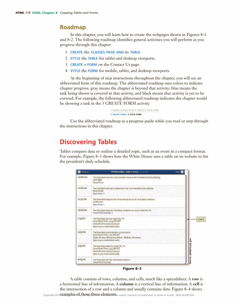
HTML HTML Chapter 8
RoadmapIn this chapter, you will learn how to create the webpages shown in Figures 8-1
and 8-2. The following roadmap identi�es general activities you will perform as you progress through this chapter:
1. create the classes page and its taBle.2. style the taBle for tablet and desktop viewports.3. create a form on the Contact Us page.4. style the form for mobile, tablet, and desktop viewports.
At the beginning of step instructions throughout the chapter, you will see an abbreviated form of this roadmap. The abbreviated roadmap uses colors to indicate chapter progress: gray means the chapter is beyond that activity; blue means the task being shown is covered in that activity, and black means that activity is yet to be covered. For example, the following abbreviated roadmap indicates the chapter would be showing a task in the 3 CREATE FORM activity.
Use the abbreviated roadmap as a progress guide while you read or step through the instructions in this chapter.
Discovering TablesTables compare data or outline a detailed topic, such as an event in a compact format. For example, Figure 8–3 shows how the White House uses a table on its website to list the president’s daily schedule.
1 CREATE CLASSES PAGE & TABLE | 2 STYLE TABLE
3 CREATE FORM | 4 STYLE FORM
A table consists of rows, columns, and cells, much like a spreadsheet. A row is row is rowa horizontal line of information. A column is a vertical line of information. A cell is the intersection of a row and a column and usually contains data. Figure 8–4 shows examples of these three elements.
Figure 8–3
Copyright 2017 Cengage Learning. All Rights Reserved. May not be copied, scanned, or duplicated, in whole or in part. WCN 02-200-203

HTML Chapter 8 HTML
HTM
L C
hap
ter
8
A cell can be one of two types: a heading cell or a data cell. A heading celldisplays text as bold and center-aligned. For example, you use heading cells to display column headings that identify the information in each column. A data cell displays normal, left-aligned text and contains information appropriate for the column and row. You should understand the differences among table row, heading cell, and data cell elements so you can use HTML to create a table that matches your design.
Creating a Table with HTML ElementsTable 8–1 lists the HTML elements you use to create a table.
Element Indicates the start and end of: Contains:
<table> … </table> Table within a webpage All related table elements
<tr> … </tr> Table row within a table Table data cells
<th> … </th> Table header cell Table header content
<td> … </td> Table data Table cell content
<caption> … </caption> Table caption Table caption or title
<thead> … </thead > Table header area Grouped header content
<tbody> … </tbody > Table body area Grouped body content
<tfooter> … </tfooter > Table footer area Grouped footer content
Table 8–1 HTML Table Elements
To create a table on a webpage, start with the <table> and </table> tags and then add table rows and table data within those tags. The following is an example of code used to create the table shown in Figure 8–5, which consists of four rows and four columns.
<table><tr>
<td>Semester 1</td><td>Semester 2</td><td>Semester 3</td><td>Semester 4</td>
</tr><tr>
<td>English I</td><td>English II</td><td>Spanish I</td><td>Spanish II</td>
</tr>
cell cell cell cell
cell cell cell cell
cell cell cell cell
cell cell cell cell
Figure 8–4
Copyright 2017 Cengage Learning. All Rights Reserved. May not be copied, scanned, or duplicated, in whole or in part. WCN 02-200-203

HTML HTML Chapter 8
<tr><td>College Algebra</td>
<td>College Geometry</td><td>Calculus</td><td>Trigonometry</td>
</tr><tr>
<td>Physical Science</td><td>Biology</td><td>Humanities</td><td>World History</td>
</tr></table>
The <table> tag indicates the beginning of the table. Likewise, the </table> tag indicates the end of a table. Each table row is indicated by a starting <tr> tag and an ending </tr> tag. The table shown in Figure 8–5 has four table row elements. Each table row element contains table data elements, indicated by a starting <td> tag and an ending </td> tag. The number of table data elements in each table row element determines the number of columns in the table. In this example, four table data elements are used within each table row element, which means this table consists of four columns.
The table shown in Figure 8–5 does not have any applied style rules, so typical table formatting, such as borders and spacing, is not included by default. You specify properties, such as borders, margins, and padding in a style sheet.
Table Borders, Headers, and CaptionsIn addition to columns and rows, tables also include features such as borders,
headers, and captions. A table border is the line that de�nes the perimeter of the table. You display table borders using a style rule in a style sheet. A table header is a heading cell, which is formatted with bold, centered text that indicates the purpose of the row or column. Headers are typically used to identify row or column content. Nonvisual browsers also use headers to identify table content. (See the guidelines in Appendix D for speci�c information about making your webpages accessible to those with disabili-ties.) De�ne a table header with a starting <th> tag and an ending </th> tag. A table caption is descriptive text that serves as a title or identi�es the table’s purpose. The table caption text appears above a table, spans its length, and is center-aligned by default. De�ne a table caption with a starting <caption> tag and an ending </caption> tag. When using a table caption, insert it after the starting <table> tag. A table can have only one caption.
Figure 8–5
Copyright 2017 Cengage Learning. All Rights Reserved. May not be copied, scanned, or duplicated, in whole or in part. WCN 02-200-203

HTML Chapter 8 HTML
HTM
L C
hap
ter
8
Tables can include headers and captions individually or in combination. The purpose for the table dictates which of these features you use. Figure 8–6 shows a table created with the following code, which includes a table caption and table headers. The �gure also shows a table border as de�ned by an external style sheet.
<table><caption>College Course Recommendations by Semester</caption><tr>
<th>Semester 1</th><th>Semester 2</th><th>Semester 3</th><th>Semester 4</th>
</tr><tr>
<td>English I</td><td>English II</td>
<td>Spanish I</td><td>Spanish II</td>
</tr><tr>
<td>College Algebra</td><td>College Geometry</td><td>Calculus</td><td>Trigonometry</td>
</tr><tr>
<td>Physical Science</td><td>Biology</td><td>Humanities</td><td>World History</td>
</tr></table>
What is the difference between the <th> and the <thead> tags?The table header element uses the <th> and </th> tags to create table header cells. A header cell contains a header title, such as a column or row title, which describes the column or row content. The table head element uses the <thead> and </thead> tags to group table header content within a table and is used with the table body and table footer elements to identify each part of a table. When you use the table head, table body, and table footer elements, users can scroll the table body content separate from the table head and table footer. For a large table that spans more than one page, users can also print the table head at the top of the page and the table footer at the bottom. C
ON
SID
ER
TH
IS
Figure 8–6
Copyright 2017 Cengage Learning. All Rights Reserved. May not be copied, scanned, or duplicated, in whole or in part. WCN 02-200-203

HTML HTML Chapter 8
Table Tag AttributesPrior to HTML5, the table tags had many attributes that could be used to
format tables. However, HTML5 does not support the majority of those attributes. Instead of using table tag attributes, use CSS to style tables on a webpage. You will learn more about how to style a table later in this chapter.
Use of TablesUsing tables for web design and page layout was quite popular in the late 1990s;
however, this was a misuse of the table elements. Tables are meant to display data in rows and columns and should not be used to design a layout for a webpage.
Before you add a table, you must �rst determine whether it is necessary on the webpage. As general rule, use a table when it will help organize information so that that it is easier for the user to read. Tables are also useful if the webpage needs to display a structured, organized list of information. Figures 8–7a and 8-7b show examples of information displayed as text in a bulleted list and a table. The bulleted list (Figure 8–7a) provides the schedule information, but the table (Figure 8–7b) presents the same information more clearly.
BTWAvoid Using Tables for LayoutMany legacy webpages use tables to lay out content in columns or sections. If you assume the responsibility of such a website, analyze the site, draft a wireframe, and then redesign the site using HTML5 semantic elements. Create the site in a test environment before you publish it.
(b) (b) Schedule as table chedule as table
Figure 8–7
(a) Schedule as bulleted list
Planning the TableTo create effective tables, you must plan the information that will appear in col-
umns and rows and then create a design that presents the information clearly. Before writing any HTML code, sketch the table on paper or in an electronic document to see how many rows and columns to create and determine whether the table needs headers or a caption. Conceptualizing the table �rst saves time when you are deter-mining which HTML table elements to use to create the table. Because you enter the content of a table row by row in an HTML document, you also need a sketch of the �nished table to create the table accurately as you are coding.
Copyright 2017 Cengage Learning. All Rights Reserved. May not be copied, scanned, or duplicated, in whole or in part. WCN 02-200-203

HTML Chapter 8 HTML
HTM
L C
hap
ter
8
When planning a table for responsive web design, give careful consideration to the mobile viewport. Because the screen on a mobile viewport is much smaller than a tablet or desktop viewport, tables with several columns are not conducive for mobile viewports. You might need to display only the most important table content in another form, such as a list.
Before adding a table to the Forward Fitness Club website, create the webpage that will contain the table, a schedule for the group classes the club offers.
BTWHTML Entities in TablesYou often use symbols, such as dollar signs ($) and ampersands (&) in tables to save space. To create these symbols on a webpage, use HTML entities, such as $ for a dollar sign and & for an ampersand.
To Create the Classes Page
Use the template, �tness.html, to create the Classes page, and then insert a ban-ner image to match the other pages on the site. The following steps create the Classes page.
1
2
3 enter
4 <!-- Classes Page Banner -->
5 enter <div id="banner" class="desktop"
6 enter <img src="images/classesBanner.jpg" alt="classes banner image">
7 enter
</div>
Figure 8–8
Note:
Copyright 2017 Cengage Learning. All Rights Reserved. May not be copied, scanned, or duplicated, in whole or in part. WCN 02-200-203

HTML HTML Chapter 8
To Add a div Element to the Classes Page
Create a div element on the Classes page to provide separate content for a mobile user. The following step adds a div element to the Classes page.
1 enter
2 <div class="mobile">
3 enter
4 <h3>Group Fitness Classes </h3>
5 enter <p>Boot Camp: TR 5am & 5pm</p>
6 enter <p>Cardio: MWF 6am & 6pm</p>
7 enter <p>Kickboxing: MWF 8am & 7:15pm</p>
8 enter <p>Spinning: TR 6am & 6pm</p>
9 enter <p>Yoga: TR 6am & 6pm</p>
10 enter <p>Zumba: MWF 7am & 6pm</p>
11 enter
</div>
Q
&A
Figure 8–9
Copyright 2017 Cengage Learning. All Rights Reserved. May not be copied, scanned, or duplicated, in whole or in part. WCN 02-200-203

HTML Chapter 8 HTML
HTM
L C
hap
ter
8
12
To Add a Table Element to the Classes Page
Next, insert a table element within a new div class="desktop" element and then insert a table to display information about the classes offered at the Forward Fitness Club. Although the class is named desktop, the table will appear in tablet and desktop viewports. Why? Only the elements speci�ed as belonging to the mobile class will appear in a mobile viewport. After inserting a new div element to contain the table, insert a starting table tag and a caption element. Insert table rows, table headings, and table data elements followed by an ending table tag. The following steps add a div and table element to the Classes page.
1 •
enter
• <div class="desktop">
• enter
<table><!-- Start Table -->
• enter <caption>Group Fitness Class Schedule</caption>
• enter <tr><!-- Row 1 -->
• enter <th>Class</th>
th
Q&
A
1 CREATE CLASSES PAGE & TABLE | 2 STYLE TABLE
3 CREATE FORM | 4 STYLE FORM
HTM
L C
hap
ter
8
Figure 8–10Figure 8–10
Figure 8–11
Copyright 2017 Cengage Learning. All Rights Reserved. May not be copied, scanned, or duplicated, in whole or in part. WCN 02-200-203

HTML HTML Chapter 8
2• enter
<th>Days</th>
• enter
<th>Times</th>
• enter
<th>Instructor </th>
• enter
<th>Room</th>
• enter </tr>
3• enter
<tr><!-- Row 2 -->
• enter
<td>Cardio</td>
• enter
<td>Mon, Wed, Fri</td>
• enter <td>6:00am, 6:00pm</td>
• enter <td>Schultz</td>
• enter <td>B</td>
• enter </tr>
Q&
AQ
&A
Figure 8–12
Figure 8–13Figure 8–13
Copyright 2017 Cengage Learning. All Rights Reserved. May not be copied, scanned, or duplicated, in whole or in part. WCN 02-200-203

HTML Chapter 8 HTML
HTM
L C
hap
ter
8
4• enter
<tr><!-- Row 3 -->
• enter
<td>Boot Camp </td>
• enter
<td>Tue, Thu</td>
• enter <td>5:00am, 5:00pm</td>
• enter <td>Taylor</td>
• enter <td>B</td>
• enter </tr>
5• enter
<tr><!-- Row 4 -->
• enter
<td>Spinning</td>
• enter
<td>Tue, Thu</td>
• enter <td>6:00am, 6:00pm</td>
• enter <td>Roberts</td>
• enter <td>A</td>
• enter </tr>
Q&
AQ
&A
HTM
L C
hap
ter
8
Figure 8–14
Figure 8–15
Copyright 2017 Cengage Learning. All Rights Reserved. May not be copied, scanned, or duplicated, in whole or in part. WCN 02-200-203

HTML HTML Chapter 8
6• enter
<tr><!-- Row 5 -->
• enter
<td>Kickboxing</td>
• enter
<td>Mon, Wed, Fri</td>
• enter <td>8:00am, 7:15pm</td>
• enter <td>Lawrence</td>
• enter <td>A</td>
• enter </tr>
7• enter
<tr><!-- Row 6 -->
• enter
<td>Yoga</td>
• enter
<td>Tue, Thu</td>
• enter <td>6:00am, 6:00pm</td>
• enter <td>Schultz</td>
• enter <td>B</td>
• enter </tr>
Figure 8–16
Figure 8–17
Copyright 2017 Cengage Learning. All Rights Reserved. May not be copied, scanned, or duplicated, in whole or in part. WCN 02-200-203

HTML Chapter 8 HTML
HTM
L C
hap
ter
8
8• enter
<tr><!-- Row 7 -->
• enter
<td>Zumba </td>
• enter
<td>Mon, Wed, Fri </td>
• enter <td>7:00am, 6:00pm</td>
• enter <td>Roberts</td>
• enter <td>A</td>
• enter </tr>
• enter </table> <!-- End Table-->
9• enter
</div>
•
div class="desktop"
Q&
AQ
&A
HTM
L C
hap
ter
8
Figure 8–18
Figure 8–19
Copyright 2017 Cengage Learning. All Rights Reserved. May not be copied, scanned, or duplicated, in whole or in part. WCN 02-200-203

HTML HTML Chapter 8
Styling Table ElementsAfter creating a table, style it by adding new style rules to the style sheet for the website. You can specify style rules for each table element. Table 8–2 lists common CSS properties and examples for styling tables.
If you want to display a table with single, consolidated borders as shown in Figure 8–21, use the border-collapse property with a value of collapse. This type of border is called a collapsed border.
Property Example Explanation
background-color th {background-color: #F5F5F0;
}
Displays the table header with a light gray background
border table, th, td {border: 0.1em solid #000000;
}
Displays the table, table header, and data cells with a thin solid black border
border-collapse table {border-collapse: collapse;
}
Collapses borders in the table so that adjacent cells share borders
color caption {color: #003300;
}
Displays the table caption in dark green text
height td {height: 2em;
}
Sets the height of a table data cell to 2em
margin table {margin-top: 2em;
}
Applies a 2em top margin to the table
padding caption, th, td {padding: 1em;
}
Applies 1em of padding to the table caption, header, and data cells
text-align td {text-align: center;
}
Aligns the table data in the center of the cell
vertical-align td {vertical-align: center;
}
Aligns the table data vertically in the middle of the cell
width table {width: 80%;
}
Sets the width of the table to 80% of the page width
Table 8–2 Common CSS Table Properties
When a border is applied to table elements, by default, each cell has its own border, making the table appear to use double lines between each table data cell. This type of border is called a separated border. Figure 8–20 shows a table with the default border applied.
Figure 8–20
Copyright 2017 Cengage Learning. All Rights Reserved. May not be copied, scanned, or duplicated, in whole or in part. WCN 02-200-203

HTML Chapter 8 HTML
HTM
L C
hap
ter
8
Styling Tables for Responsive Web DesignIt is often dif�cult to style a table for a mobile viewport, especially when the
table consists of several columns. Many times, viewing a table requires extra horizontal and vertical scrolling by the user. Other times, the table is so small that it is dif�cult to read. Determine whether you can format the table so it is still easy to read in a mobile viewport. If the table is too large or complex to format, you can display the content in a different format such as a list or a chart in a mobile viewport.
BTWConverting a Table to a ChartIf your table contains numeric information, such as �nancial data or compares information among categories, consider converting your table to a chart for the mobile viewport.
To Style a Table for a Tablet Viewport
Create new style rules to style the table for the tablet viewport. Why? Format the table to clearly present its information in a tablet viewport. First, create a style rule for the table element to specify borders, including collapsed borders, to center the table on the page, and to set a width. Next, create a style rule for th and tdelements to specify borders and padding for the table header and data cells. Create a separate style rule for the th element to format the table header with a dark background color and light font color. Finally, create a style rule to specify the font size, font color, and bottom padding of the table caption.
Add these new style rules to the end of the media query for the tablet layout so the rules will apply to webpages displayed in a tablet viewport. The following steps create style rules for table elements in the tablet viewport.
1 •
•enter
• /* Style for table element */
• enter
table {
• enter border: 0.1em solid #000000;
• enter border-collapse: collapse;
• enter margin-left: auto;
• enter margin-right: auto;
• enter width: 100%;
• enter }
Q
&A
1 CREATE CLASSES PAGE & TABLE | 2 STYLE TABLE
3 CREATE FORM | 4 STYLE FORM
Figure 8–21
Figure 8–22
Copyright 2017 Cengage Learning. All Rights Reserved. May not be copied, scanned, or duplicated, in whole or in part. WCN 02-200-203

HTML HTML Chapter 8
2•
th td
Q&
A
3 •
enter
• /* Style specifies border and padding for th and td elements */
• enter
th, td {
• enter border: 0.1em solid #000000;
• enter padding: 1em;
• enter }
Q&
A
Figure 8–24
Figure 8–23
Copyright 2017 Cengage Learning. All Rights Reserved. May not be copied, scanned, or duplicated, in whole or in part. WCN 02-200-203

HTML Chapter 8 HTML
HTM
L C
hap
ter
8
4•
5 •
enter
• /* Style for th element */
• enter
th {
• enter background-color: #1D1D1C;
• enter color: #FFFFFF;
• enter }
th th td
th
6 •
Q&
A
HTM
L C
hap
ter
8
Figure 8–25
Figure 8–26
Figure 8–27Copyright 2017 Cengage Learning. All Rights Reserved. May not be copied, scanned, or duplicated, in whole or in part. WCN 02-200-203

HTML HTML Chapter 8
7 •
enter
• /* Style for caption element */
• enter
caption {
• enter
font-size: 1.5em;
• enter font-weight: bold;
• enter padding-bottom: 0.5em;
• enter }
8 •
To Style a Table for a Desktop Viewport
Create new style rules to style the table for the desktop viewport. Why? Format the table to use a different background color and format the caption to use a different font color so that users can read them easily in a desktop view-port. First, add a new style rule to the end of the desktop media query to format the table with a white back-ground and a width of 85 percent. Next, create a style rule to format the caption text with a white font color. The following steps create new style rules for the desktop viewport.
1 CREATE CLASSES PAGE & TABLE | 2 STYLE TABLE
3 CREATE FORM | 4 STYLE FORM
Figure 8–28
Figure 8–29
Copyright 2017 Cengage Learning. All Rights Reserved. May not be copied, scanned, or duplicated, in whole or in part. WCN 02-200-203

HTML Chapter 8 HTML
HTM
L C
hap
ter
8
1 •
enter
• /* Style for table element */
• enter
table {
• enter background-color: #FFFFFF;
• enter width: 85%;
• enter }
2 • enter
• /* Style for caption element */
• enter
caption {
• enter
color: #FFFFFF;
• enter }
3
Experiment•
•
Q&
A
HTM
L C
hap
ter
8
Figure 8–30Figure 8–30
Figure 8–31Figure 8–31
Figure 8–32Figure 8–32
Copyright 2017 Cengage Learning. All Rights Reserved. May not be copied, scanned, or duplicated, in whole or in part. WCN 02-200-203

HTML HTML Chapter 8
Creating Webpage FormsForms provide a structured way to collect information from webpage visitors, such as a visitor’s �rst name, last name, address, email, and telephone number. Visitors often complete webpage forms to register for an account or to make a purchase. Businesses use forms to gather visitor or customer information and store it in a database for future use. Figure 8–33 shows the Sign Up form on Facebook.com. Visitors complete the form to create a new Facebook account.
Break Point: If you want to take a break, this is a good place to do so. You can exit the text editor now. To resume at a later time, run your text editor, open the �le called styles.css, and continue following the steps from this location forward.
Form ControlsA form consists of a starting <form> tag and an ending </form> tag. All form ele-
ments are contained with the <form> and </form> tags. Input controls are used within the form element to collect visitor information. An input control is an interactive mechanism in which users enter text or make selections on a form. For example, on the Facebook Sign Up form, the text boxes requesting a visitor’s �rst name and last name are input controls. A label is text describing the type of information to enter with an input control. On the Facebook Sign Up form, “Birthday” is a label.
You de�ne most controls in an HTML form by using the type attribute of the input element. For example, to add a text box to a form, you include an input element beginning with input type="text" in the form element in form element in formthe HTML document. You de�ne a few other controls using separate elements, such as the textarea and select elements.
Input controls can be classi�ed as data or text input controls. A webpage visitor uses a data input control to make a selection or perform a command. A data input control can be a radio button (input type="radio"), a check box (input type="checkbox"), a Submit button (input type="submit"), a Reset button (input type="reset"), or a selection menu (select element). A text input control accepts text, such as names, dates, and passwords, and is often called an input �eld. Table 8–3 lists input types for an input control.
BTWHTML Forms and JavaScriptA script is a program that runs in a browser to add functionality to a webpage. You can use JavaScript to write scripts commonly used with HTML forms. Because JavaScript runs on the user’s computer, it is a client-side scripting language. Using JavaScript, you can create pop-up messages and alerts, validate a form, and perform other bene�cial tasks within a webpage.
Figure 8–33
Copyright 2017 Cengage Learning. All Rights Reserved. May not be copied, scanned, or duplicated, in whole or in part. WCN 02-200-203

HTML Chapter 8 HTML
HTM
L C
hap
ter
8Regardless of the speci�c type, each input control has attributes that are used
more frequently than the others:
•name, which identi�es the speci�c information that is being sent when the form is submitted for processing. All controls have a name.
•id, which provides a unique ID for the element. Use the id attribute with input controls.
•value, which speci�es the value of an input element and varies depending on input type. For text, password, and hidden controls, the value attribute de�nes the default value. For checkbox, radio, and image controls, it speci�es the data submitted with the form when the control is selected. For button, reset, and submit controls, the value attribute de�nes the text on the button. All controls except textarea also have a value attribute. For a textarea �eld, no valueattribute is possible because of the variability of the input.
Input Type Description Code Example
button Creates a button; typically used to run a script when clicked <input type="button" onclick="alert(‘Good Morning!’)" value="My Button")
checkbox Creates a single item or a list of items <input type="checkbox" name="fruit" value="banana">
date Creates an input �eld used to contain a date; the �eld may appear as a date picker, depending on the browser
<input type="date" name="birthday">
datetime Creates an input �eld for a date and time with a time zone <input type="datetime" name="bdaydatetime">
datetime-local Creates an input �eld for a date and time without a time zone <input type="datetime-local" name="bddatetime">
email Creates an input �eld for an email address <input type="email" name="email" id="email">
�le Creates a �le-select �eld and a Browse button <input type="�le" name="doc">
hidden Creates a control that is hidden from the user but contains information to process the form
<input type="hidden" name="ship">
image Creates a graphical button instead of the default button <input type="image" name="reset" src="reset.png" alt="Reset">
month Creates an input �eld for a month and year; the �eld may appear as a date picker, depending on the browser
<input type="month" name="bdaymth">
number Creates an input �eld for a numeric value <input type="number" name="cost">
password Creates a single-line �eld for a relatively small amount of text and masks the entered text as asterisks or bullets
<input type="password" name="pw" id="pw">
radio Creates a list item <input type="radio" name="state" value="AL"><input type="radio" name="state" value="AK"><input type="radio" name="state" value="AZ">
range Creates an input �eld for a value within a range; the �eld may appear as a slider control, depending on the browser
<input type="range" name="survey" min="0" max="10">
reset Resets the form <input type="reset" value="Reset Form">
search Creates an input �eld used as a search �eld <input type="search" name="search">
submit Submits a form for processing <input type="submit" value="Submit Form">
tel Creates an input �eld for a telephone number <input type="tel" name="phone" id="phone">
text Creates a single-line �eld for text <input type="text" name="fName" id="fName">
time Creates an input �eld for a time without a time zone; the �eld may appear as a time picker, depending on the browser
<input type="time" name="time">
url Creates an input �eld for a URL <input type="url" name="page">
week Creates an input �eld for a week and year; the �eld may appear as a date picker, depending on the browser
<input type="week" name="week">
Table 8–3 Input Types
Copyright 2017 Cengage Learning. All Rights Reserved. May not be copied, scanned, or duplicated, in whole or in part. WCN 02-200-203

HTML HTML Chapter 8
Common input controls used with a form include text, password, email, tel, date, textarea, checkbox, radio, select, submit, and reset. Text input controls include the following types:
•text box (text control), for small amounts of texttext box (text control), for small amounts of texttext box•password text box (password control), for entering a passwordpassword text box (password control), for entering a passwordpassword text box•email text box (email control), for entering an email addressemail text box (email control), for entering an email addressemail text box•telephone text box (tel control), for entering a telephone numbertelephone text box (tel control), for entering a telephone numbertelephone text box•date text box (date control), for entering a datedate text box (date control), for entering a datedate text box•text area box (textarea control), for larger amounts of texttext area box (textarea control), for larger amounts of texttext area box
Text, password, email, tel, and date controls accept a single line of text, such as a name or password. These text input controls have two frequently used attributes:
•size, which determines the width of the control in characters•maxlength, which speci�es the maximum number of characters accepted
For example, the �rst line of the following code creates a 25-character text box for the user’s last name and the second line creates an eight-character text box for the user’s password:
<p>Last Name: <input name="lastname" type="text" size="25"></p>
<p>Password: <input name="password" type="password" size="8"></p>
Because each input element uses the size attribute, a user can enter a last name longer than 25 characters and a password longer than eight characters. If the input elements used the maxlength attribute instead of size, a user could only enter up to 25 characters for the last name and up to eight characters for the password.
The maximum length of the text box may exceed the size of the text box that appears on the form. For example, consider a size of three characters and a maximum length of nine characters. If a webpage visitor enters more than three characters, the characters scroll to the left, allowing the visitor to enter a maximum of nine characters.
A password control is like a text control because it provides a text box for a single line of input—the password a visitor enters. However, as the visitor enters the password, the characters appear as asterisks or bullets, one per character. This feature helps protect the visitor’s password from being observed by others as it is entered.
An email control is a text box where visitors enter an email address. Some browsers validate that the email address is in the proper format before submitting the form for processing. If the email address is not in the proper format, the browser displays a message asking the user to correct the data. A tel control is a text box where visitors enter a telephone number. A date control is a text box that accepts a date. Some browsers display a calendar when a visitor taps or clicks a date control.
A textarea control creates a text box that allows multiple lines of input. Textarea controls are useful to collect more than a single line of text from a webpage visitor, such as a product review. To create a textarea control, you use the textareaelement instead of the input element. The textarea element has two primary attributes, which set the size of the textarea control:
rows, which speci�es the number of rows, or lines, in the textarea controlcols, which sets the width of the textarea control as the number of columns, with
each column containing one character.
The following is an example of HTML code de�ning a textarea control:
<label>What products would you like to see us offer?</label>
<textarea name="feedback" rows="3" cols="100"></textarea>Copyright 2017 Cengage Learning. All Rights Reserved. May not be copied, scanned, or duplicated, in whole or in part. WCN 02-200-203

Creating Tables and Forms HTML Chapter 8 HTML 399
HTM
L C
hap
ter
8
This textarea control provides three lines of 100 characters each to let visitors describe the products they want the website to offer.
A checkbox control allows a webpage visitor to select items from a list of one or more choices. Each choice appears with a graphical box, which can be checked (selected or on) or unchecked (deselected or off). By default, all check boxes are deselected. To set a particular check box to be preselected as the default, use the checked attribute and value (checked="checked") within the <input> tag. The following is sample code for two checkbox controls that might appear on a form for a grocery store website where visitors select the kind of fruit they want to buy. The �rst line creates a check box for the Apple choice, which is selected (or checked) when the webpage opens. The second line shows the Peach choice.
<input name="fruit" type="checkbox" value="apple" checked="checked">Apple
<input name="fruit" type="checkbox" value="peach">Peach
Users can select more than one item in a check box list. For example, a user could select both apple and peach when selecting fruit on the grocery store website form.
A radio control limits the webpage visitor to only one choice from a list of choices. Each choice has a radio button, or option button, which typically appears as an open circle. When the visitor selects one of the radio buttons, all other radio buttons in the list are automatically deselected. By default, all radio buttons are deselected. To set a particular button as the default, you use the checked attribute and value within the <input> tag as you do with the checkbox control. The following is sample code to create two radio controls that might appear in a rental car website form:
<input name="car" type="radio" checked="checked" value="car">Car
<input name="truck" type="radio" value="truck">Truck
A visitor can choose to rent a car or a truck, with the Car radio button already selected when the form opens.
A select control creates a selection menu from which the visitor makes one or more choices. This prevents the visitor from having to type information into a text or textarea control. A select control is suitable when a limited number of choices are available. It appears on a form as a text box with a list arrow. The user taps or clicks the list arrow to view all the choices in the menu. The default choice appears �rst in the menu and is highlighted to indicate that it is selected.
Instead of using the type attribute of the input element, you de�ne a select control using the select and option elements. The following is sample code for a select control:
<select name="station">
<option>Pandora</option>
<option>Internet Radio</option>
<option>Live365</option>
<option>Jango</option>
</select>
This selection menu contains four options—Pandora, Internet Radio, Live365, and Jango—with “Pandora” appearing as the selected option.
The submit control and the reset control create the Submit and Reset buttons. The Submit button sends the form information to the appropriate location for processing. When a webpage visitor taps or clicks the Submit button on the form, the name of each control and the value of its data are sent to the server to be processed.
BTWRadio ButtonsAntique car radios were operated by a row of large black plastic buttons. Push one button, and you would get one preset radio station. You could push only one button at a time. Radio buttons on forms work the same way as the antique radio buttons—one button at a time. With check boxes, more than one option can be selected at a time.
Copyright 2017 Cengage Learning. All Rights Reserved. May not be copied, scanned, or duplicated, in whole or in part. WCN 02-200-203

HTML HTML Chapter 8
The Reset button clears any input entered in the form, resetting the input controls to their defaults. A webpage form must include a submit control, and must also include a reset control. You use the value attribute to specify the text that appears on the button. The submit and reset controls are created with the following code:
<input type="submit" value="Submit">
<input type="reset" value="Reset">
Figure 8–34 shows an example of a form with several input controls, including text, email, tel, date, select, and textarea.
BTWCustomer FeedbackOne way to use forms is to request and receive feed-back from your visitors. Suggestions from visitors can help improve the web-site and give your visitors the sense that you care about their opinions. Tak-ing visitor feedback into account leads to greater customer satisfaction.
Figure 8–34
Form LabelsForm labels identify the type of information to enter into or select from an input
control. You add a label to a form using the label element. To connect a label to its control, include the for attribute with the same value as the input control’s idvalue. The following code creates a label and a text box for a visitor’s �rst name:
<label for="fName">First Name:</label>
<input type="text" name="fName" id="fName">
Attributes of HTML Tags Used to Create FormsMany of the HTML tags used to create forms have several attributes. Table 8–4
lists common form attributes, including several new HTML5 attributes for the input elements. However, many of the new attributes are not yet supported by all major browsers, so be sure to test them �rst.
Attribute Description Code Example
accept-charset Speci�es the character set used for the form submission <form accept-charset="UTF-8">
action Speci�es where to submit the form data (a URL) <form method="POST" action="form.php">
autocomplete Speci�es whether a form or input �eld should use autocomplete; when enabled, the browser can complete input �elds based on information entered in previous input �elds
<form autocomplete="on">
Table 8–4 Common Form Attributes
Copyright 2017 Cengage Learning. All Rights Reserved. May not be copied, scanned, or duplicated, in whole or in part. WCN 02-200-203

HTML Chapter 8 HTML
HTM
L C
hap
ter
8
Table 8–4 (continued)
Attribute Description Code Example
autofocus Speci�es that an input �eld should have focus when the page is displayed, which places the insertion point within a speci�c input �eld
<input type="text" name="fName" id="fName" autofocus>
disabled Speci�es that the input �eld is disabled and not available for user input
<input type="radio" name="terms" value="Accept" disabled>
enctype Speci�es the encoding of the form for submitting data. <form enctype="app/urlencoded">
form Speci�es which form an input �eld belongs to when multiple forms are used within a website
<input type="text" name="fName" id="fName" form="form1">
formaction Speci�es the URL of a �le that will process the input control when the form is submitted, overriding the form action attribute; use the formaction attribute with type="submit" and type="image" input types
<input type="submit" value="Submit" formaction="process.asp">
formenctype Speci�es how to encode form data during form submission; use the formenctype attribute with type="submit" and type="image" input types
<input type="submit" formenctype="multipart/form-data">
formmethod Speci�es the HTTP method used to transfer the form data, overriding the method attribute
<input type="submit" value="Submit" formmethod="post">
formnovalidate Speci�es to not validate an input element <input type="submit" value="Submit" formnovalidate>
formtarget Speci�es a keyword that determines how to display a response when the form is submitted, such as a new, blank window
<input type="submit" value="Submit" formtaget="_blank">
height and width Speci�es the height and width for an image input type; always specify a height and width for the image input type
<input type="image" src="btn1" alt="button 1" height="25" width="30">
list Used with the datalist element to specify prede�ned options for an input element
<input list="music"><datalist id="music"><option value="Country"><option value="Classical"><option value="Hip Hop"><option value="Rock"></datalist>
max and min Speci�es the maximum and minimum values for an input element
<input type="number" name="survey" min="1" max="10">
maxlength Speci�es the maximum number of characters allowed within the input �eld
<input type="text" name="fName" id="fName" maxlength="15">
method Speci�es the HTTP method used to submit the form data <form method="POST">
multiple Speci�es that user may input more than one value within an input element; used with email and �le input types
<input type="email" name="email" id="email" multiple>
novalidate A form attribute that speci�es not to validate form data when the submit button is clicked
<form novalidate>
pattern Speci�es a regular expression for checking an input element value; used with text, search, url, tel, email, and password input types
<input type="password" name="pw" id="pw" pattern=" [A-Za-z]{8}">
placeholder Speci�es a hint of the type of information expected within an input �eld
<input type="email" name="email" id="email" placeholder="[email protected]">
readonly Speci�es that the input �eld is a read-only �eld and cannot be modi�ed
<input type="text" name="ssn" id="ssn" value="555123654" readonly>
required Speci�es that an input �eld is required <input type="text" name="fName" id="fName" required>
size Speci�es the size (length) of an input �eld <input type="text" name="fName" id="fName" size="20">
step Speci�es the legal number intervals for an <input> element
<input type="number" name="math" step="5">
target Speci�es the target address in the action attribute <form target="_blank">
value Speci�es the value for an input �eld. <input type="text" name="fName" id="fName" value="Kate">
Copyright 2017 Cengage Learning. All Rights Reserved. May not be copied, scanned, or duplicated, in whole or in part. WCN 02-200-203

HTML HTML Chapter 8
Form ProcessingAfter creating a form on a webpage, you need to identify how to process the
form and when to submit it. Use the action attribute of the <form> tag to specify the action the browser takes when submitting the form. Browsers can send information entered in forms to a database on a web server or sent by email to an email address. Many websites use form processing software tools available from the web server. Another common way to transfer form information is through a Common Gateway Interface (CGI) script, a program written in a programming language (such as PHP or Perl) that communicates with the web server. The CGI script sends the information on the webpage form to the server for processing.
The method attribute of the <form> tag speci�es how to send the data entered in the form to the server to be processed. HTML provides two primary ways to send form data: the get method and the post method. The get method appends the name-value pairs to the URL indicated in the action attribute. You need to be cautious when using the get method. Some web servers limit the size of a URL, so you run the risk of truncating relevant information when using the get method. The following is an example of a form tag with the get method and speci�ed action:
<form method="GET" action="formInfo.php">
The post method sends a separate data �le with the name-value pairs to the URL (or email address) indicated in the action attribute. The post method is the more common method because it can be used to send sensitive form data and does not have a size limitation. The following is an example of a form tag with the post method and speci�ed action:
<form method="POST" action="formInfo.php">
Because using CGI scripts to process form data involves programming tasks that are beyond the scope of this book, the information entered in the form created in this chapter will not contain a method or an action attribute, and therefore, no data will be submitted to a web server or email address.
Can I group certain types of form data?Yes. You can use the �eldset element to group form elements. Use the legend element to provide a caption for the �eldset element.
CO
NS
IDE
R T
HIS
How do I send the form data to my email address?To send form data to an email address, use the action attribute with a value of mailto: followed by your email address within the form tag. Also include the method attribute with a value of post. An example is <form action=”mailto:[email protected]” method=”POST”>
CO
NS
IDE
R T
HIS
BTWSecuritySecurity is an important consideration when us-ing web forms, especially when you are collecting credit card information. Search the web for speci�c information concerning the usage of the SSL-encrypted HTTPS protocol versus the unencrypted HTTP protocol.
To Add a Form, Labels, and Text Input Controls to the Contact Us Page
Insert a form on the Contact Us page to collect information from prospective clients. Why? The Forward Fitness Club wants to create a database of prospective clients and use it to market their services. Most of this client data can come from the form on the Contact Us page. Start by including a heading that alerts visitors to the form. Add the starting <form> tag to the page, and then insert label elements and input text controls. Finally, insert the ending </form> tag to complete the form. The following steps add a form to the Contact Us page.
1 CREATE CLASSES PAGE & TABLE | 2 STYLE TABLE
3 CREATE FORM | 4 STYLE FORM
Copyright 2017 Cengage Learning. All Rights Reserved. May not be copied, scanned, or duplicated, in whole or in part. WCN 02-200-203

HTML Chapter 8 HTML
HTM
L C
hap
ter
8
1 •
•
•enter
• <h2>Complete the form below to begin your free trial.</h2>
• enter <form><!-- Start Form -->
• enter <label for="fName">First Name:</label>
• enter <input type="text" name="fName" id="fName">
fName for label
fName id input
2• enter
<label for="lName">Last Name:</label>
• enter
<input type="text" name="lName" id="lName">
• enter </form>
name idname id
3•
Q&
AQ
&A
Q&
A
HTM
L C
hap
ter
8
Figure 8–35Figure 8–35
Figure 8–36
Figure 8–37
Copyright 2017 Cengage Learning. All Rights Reserved. May not be copied, scanned, or duplicated, in whole or in part. WCN 02-200-203

HTML HTML Chapter 8
To Add email and tel Input Controls to a Form
Add email and tel input controls to collect the customer’s email address and telephone number. Why?Using these input controls instead of text controls makes it easier for visitors to enter the appropriate information. First, add a new label and an input element with an email type. Then, add a new label and an input element with a tel type. The following steps add email and tel input controls to the form on the Contact Us page.
1 •
enter
• <label for="email">Email:</label>
• enter
<input type="email" name="email" id="email">
1 CREATE CLASSES PAGE & TABLE | 2 STYLE TABLE
3 CREATE FORM | 4 STYLE FORM
Figure 8–38
2• enter
<label for="phone">Phone: </label>
• enter
<input type="tel" id="phone" name="phone">
Figure 8–39
3•
Q&
A
Figure 8–40
To Add Check Boxes to a Form
Add check boxes to collect information from customers about their primary interest in the �tness club. Why? Using check boxes lets customers select more than one interest. First, add a new paragraph element to introduce the check boxes. Next, insert checkbox input elements as list items in an unordered list. The following steps add check boxes to the form on the Contact Us page.
1 CREATE CLASSES PAGE & TABLE | 2 STYLE TABLE
3 CREATE FORM | 4 STYLE FORM
Copyright 2017 Cengage Learning. All Rights Reserved. May not be copied, scanned, or duplicated, in whole or in part. WCN 02-200-203

HTML Chapter 8 HTML
HTM
L C
hap
ter
8
1 •
enter
• <p>I would like more information about:</p>
• enter
<ul>
• enter <li><input type="checkbox" name="grpfit" id="grpfit" value="grpfit" class="chkbx">Group Fitness</li>
• enter <li><input type="checkbox" name="prtrain" id="prtrain" value="prtrain" class="chkbx">Personal Training</li>
• enter <li><input type="checkbox" name="nutr" id="nutr" value="nutr" class="chkbx">Nutrition</li>
• enter </ul>
Q&
A
Figure 8–41
2•
Q&
A
Figure 8–42
To Add a select Element to a Form
Add a select element to learn how customers discovered the Forward Fitness Club. Why? A select element lets users select from a list of options, restricting them to a valid option. First, add a new label element for the referral source. Then, create a select element with �ve option elements. The following steps add a select element to the form on the Contact Us page.
1 CREATE CLASSES PAGE & TABLE | 2 STYLE TABLE
3 CREATE FORM | 4 STYLE FORM
Copyright 2017 Cengage Learning. All Rights Reserved. May not be copied, scanned, or duplicated, in whole or in part. WCN 02-200-203

HTML HTML Chapter 8
1 •
enter
• <label for="reference">Referral Source:</label>
• enter
<select name="reference" id="reference">
• enter <option value="ad">Advertisement</option>
• enter <option value="friend">Friend</option>
2• enter
<option value="google">Google</option>
• enter
<option value="social">Social Media</option>
• enter <option value="other">Other</option>
• enter </select>
3•
Q&
AQ
&A
Figure 8–43Figure 8–43
Figure 8–44Figure 8–44
Figure 8–45
Copyright 2017 Cengage Learning. All Rights Reserved. May not be copied, scanned, or duplicated, in whole or in part. WCN 02-200-203

HTML Chapter 8 HTML
HTM
L C
hap
ter
8
To Add a textarea Element to a Form
Add a textarea element to the form to provide an opportunity for customers to ask questions. Why?Customers can enter more than one line of text in a textarea control. The following steps add a label and a textareaelement to the form on the Contact Us page.
1 •
enter
• <label for="questions"> Questions?</label>
• enter <textarea id="questions" name="questions" rows="3" cols="25"></textarea>
Q&
A
Figure 8–46
2 •
Q&
A
Figure 8–47
1 CREATE CLASSES PAGE & TABLE | 2 STYLE TABLE
3 CREATE FORM | 4 STYLE FORM
To Add Submit and Reset Buttons to a Form
After adding text input controls and other form elements to a form, insert a submit control so that visitors can submit the form with their responses. Also include a button to reset the form in case a customer wants to clear the responses and enter new ones. Why? Every form requires a submit control to send the information to a web server for processing if speci�ed. Provide a reset control as a courtesy to users so they can remove all responses easily. The following steps add submit and reset controls to the form on the Contact Us page.
1 •
enter
• <input type="submit" id="submit" value ="Submit" class="btn">
• enter <input type="reset" id="reset" value="Reset Form" class="btn">
Q&
A
1 CREATE CLASSES PAGE & TABLE | 2 STYLE TABLE
3 CREATE FORM | 4 STYLE FORM
Figure 8–48Figure 8–48
Copyright 2017 Cengage Learning. All Rights Reserved. May not be copied, scanned, or duplicated, in whole or in part. WCN 02-200-203

HTML HTML Chapter 8
2•
Q&
A
Figure 8–49
Styling FormsYou apply CSS styles to forms for the same reason you style other webpage elements: to improve the appeal and usefulness of the form and its controls. For example, you position labels and form controls so users can quickly and clearly understand what type of information to provide in each control. As with tables, consider forms in the context of responsive design. Start with a simple, basic form for the mobile viewport. This form requests only the most essential information. You can modify the appearance and the content of the form for the tablet and desktop viewports. For example, you can change a form that is long and narrow in a mobile viewport so it is wider and arranges controls in columns in a desktop viewport. You can also include controls to collect optional information, such as product feedback, in tablet and desktop viewports.
To Style a Form for a Mobile Viewport
Now that the form is complete, you can style the form for a mobile viewport. Start with a style rule that sets the display and bottom margin for the controls. Why? To avoid horizontal scrolling, display the form elements as blocks so that each element appears on its own line. Create another style rule to specify a block display for label elements. Create two other style rules: one to remove the bullet from the checkbox input elements, and another to format the chkbx class. The following steps create style rules for form elements in a mobile viewport.
1 •
•enter
• /* Style rule for input, select, and textarea form elements */
• enter input, select, textarea {
• enter display: block;
• enter margin-bottom: 1em;
• enter }
enter enter
Q&
A
Figure 8–50
1 CREATE CLASSES PAGE & TABLE | 2 STYLE TABLE
3 CREATE FORM | 4 STYLE FORM
Copyright 2017 Cengage Learning. All Rights Reserved. May not be copied, scanned, or duplicated, in whole or in part. WCN 02-200-203

HTML Chapter 8 HTML
HTM
L C
hap
ter
8
2• enter
• /* Style rule for label element */
• enter
label {
• enter display: block;
• enter }
3• enter
• /* Style rule for unordered list within a form */
• enter
form ul {
• enter list-style-type: none;
• enter }
4• enter
• /* Style rule for chkbx class */
• enter
.chkbx {
• enter display: inline-block;
• enter }
Q&
AQ
&A
Q&
A
HTM
L C
hap
ter
8
Figure 8–51
Figure 8–52
Figure 8–53
Copyright 2017 Cengage Learning. All Rights Reserved. May not be copied, scanned, or duplicated, in whole or in part. WCN 02-200-203

HTML HTML Chapter 8
5•
Figure 8–54
To Style a Form for a Tablet Viewport
Now that you have styled the form for a mobile viewport, you can also style the form for a tablet viewport. Why? The current styles work best for the form in a mobile viewport. Optimize the form for the best viewing experience by a tablet user. In the tablet media query, change the format of the label elements so they appear to the left of each input element. Also create a style rule to format the btn class, which includes the submit and reset controls. Move the buttons to the right to take advantage of increased screen space by setting a wide left margin. The fol-lowing steps create new style rules for form elements within the tablet media query of the styles.css �le:
1•
enter
• /* Style rule label element */
• enter
label {
• enter
float: left;
• enter padding-right: 0.5em;
• enter text-align: right;
• enter width: 10em;
• enter }
Figure 8–55
1 CREATE CLASSES PAGE & TABLE | 2 STYLE TABLE
3 CREATE FORM | 4 STYLE FORM
Copyright 2017 Cengage Learning. All Rights Reserved. May not be copied, scanned, or duplicated, in whole or in part. WCN 02-200-203

HTML Chapter 8 HTML
HTM
L C
hap
ter
8
2• enter
• /* Style rule for btn class */
• enter
.btn {
• enter
margin-left: 12em;
• enter }
3•
Q&
A
Figure 8–56
Figure 8–57
Copyright 2017 Cengage Learning. All Rights Reserved. May not be copied, scanned, or duplicated, in whole or in part. WCN 02-200-203

HTML HTML Chapter 8
To Style a Form for a Desktop Viewport
Now that you have styled the form for a mobile and tablet viewports, you can also style the form for a desktop viewport. Why? The main area of the webpage in a desktop viewport has a dark gray background. Use a light background color for the form to make it readable in a desktop viewport. The paragraph introducing the form also appears in white text, so you should change its color to a darker one that is easy to read against a light background. In the desktop media query, create a new style rule to apply a background color and padding to the form element. Then, create a new style rule to apply color to the paragraph within the form element. The following steps create style rules for a form element and form paragraph element within the desktop media query of the styles.css �le.
1 •
enter
• /* Style rule for form element */
• enter
formform {
• enter
background-color: #FFFFFF;
• enter padding: 1em;
• enter }
• enter
• /* Style rule for paragraph with form element */
• enter form p {
• enter color: #000000;
• enter }
2•
Q&
A
Figure 8–58
Figure 8–59
1 CREATE CLASSES PAGE & TABLE | 2 STYLE TABLE
3 CREATE FORM | 4 STYLE FORM
Copyright 2017 Cengage Learning. All Rights Reserved. May not be copied, scanned, or duplicated, in whole or in part. WCN 02-200-203

HTML Chapter 8 HTML
HTM
L C
hap
ter
8
To Validate the Style Sheet
Always run your �les through W3C’s validator to check the document for errors. If the document has any errors, validating gives you a chance to identify and correct them. Validation is also an effective troubleshooting tool during the development process and adds a valuable level of professionalism to your work. The following steps validate a CSS document:
1 http://jigsaw.w3.org/css-validator/
2
3
4
5
6
7
8
To Validate the HTML Files
Every time you create a new webpage or modify an existing webpage, run it through W3C’s validator to check the document for errors. If any errors exist, you need to correct them. Validation is also an effective troubleshooting tool during the development process and adds a valuable level of professionalism to your work. The following steps validate an HTML document.
1 http://validator.w3.org/
2
3
4
5
6
7
8
9
Copyright 2017 Cengage Learning. All Rights Reserved. May not be copied, scanned, or duplicated, in whole or in part. WCN 02-200-203

HTML HTML Chapter 8
Chapter SummaryIn this chapter, you learned how to include tables and forms on webpages. You created a table that displays related information and then formatted it using CSS properties you have used before and one new property speci�c to tables. You also learned about webpage forms and form controls, including the HTML elements, attributes, and values for creating the controls you need. Finally, you used CSS styles to format a form for mobile, tablet, and desktop viewports. The items listed below include all the new skills you have learned in this chapter, with the tasks grouped by activity.
Discovering TablesAdd a Table Element to the Classes Page
(HTML 385)
Styling Table ElementsStyle a Table for a Tablet Viewport (HTML 391)Style a Table for a Desktop Viewport
(HTML 394)
Creating Webpage FormsAdd a Form, Labels, and Text Input Controls to the
Contact Us Page (HTML 402)
Add email and tel Input Controls to a Form (HTML 404)
Add Check Boxes to a Form (HTML 404)Add a select Element to a Form (HTML 405)Add a textarea Element to a Form (HTML 407)Add Submit and Reset Buttons to a Form
(HTML 407)
Styling FormsStyle a Form for a Mobile Viewport (HTML 408)Style a Form for a Tablet Viewport (HTML 410)Style a Form for a Desktop Viewport (HTML 412)
How will you improve the design of your website?Use these guidelines as you complete the assignments in this chapter and create your own webpages outside of this class.
1. Determine if a table is right for your webpage.
a) Determine if the information is best presented in a tabular format.
b) Determine the number of rows and columns needed for the table.
c) Determine whether or not the table can be easily displayed within a mobile viewport of if another format is needed to summarize the content for a mobile viewport.
2. Determine how to style the table elements.
a) Determine how to style the table caption to make it stand out.
b) Determine how to style each table element for mobile, tablet, and desktop viewports.
3. Determine the type of information your form should collect.
a) Identify the different input types needed within your form.
b) Determine the attributes needed for each input element.
c) Determine what other form elements to use within your form.
4. Style the form for mobile, tablet, and desktop viewports.
a) Determine the alignment and look of the form elements for a mobile viewport and then style.
b) Determine the alignment and look of the form elements for a tablet viewport and then style.
c) Determine the alignment and look of the form elements for a desktop viewport and then style.
5. Determine the action and method used to submit the form.
a) Evaluate web server software capabilities to determine the best action and method for the form submission.
b) Determine security measures needed to encode con�dential data.
CO
NS
IDE
R T
HIS
Copyright 2017 Cengage Learning. All Rights Reserved. May not be copied, scanned, or duplicated, in whole or in part. WCN 02-200-203

HTM
L C
hap
ter
8S
TU
DE
NT
AS
SIG
NM
EN
TS
HTML Chapter 8 HTML
Perform the following tasks:1. Open apply08.html in your text editor, review the page, add a title, modify the comment at the
top of the page to include your name and today’s date, and replace “Student’s Name” with your name in the footer element.
2. Open the applystyles08.css �le from the apply\css folder. Modify the comment at the top of the style sheet to include your name and today’s date.
3. In the apply08.html �le, add a table element within the main element.
4. In the apply08.html �le, add the following caption to the table element:
<caption>2017 Sales by Quarter</caption>
5. In the apply08.html �le, add the following elements within the table element:
<tr>
<th>Product</th>
<th>Quarter 1</th>
Apply Your Knowledge
Using TablesInstructions: In this exercise, you will use your text editor to create a table and apply table styles. First, you insert a table element. Next, you add a table caption, table rows, table headers, and table data. Then, you create style rules to format the table. Work with the apply08.html �le in the apply folder and the applystyles08.css �le in the apply\css folder from the Data Files for Students. The completed webpage is shown in Figure 8–60. You will also use professional web development practices to indent, space, comment, and validate your code.
How should you submit solutions to questions in the assignments identi�ed with a symbol? symbol?Every assignment in this book contains one or more questions identi�ed with a symbol. These questions require symbol. These questions require you to think beyond the assigned presentation. Present your solutions to the questions in the format required by your instructor. Possible formats may include one or more of these options: create a document that contains the answer; present your answer to the class; discuss your answer in a group; record the answer as audio or video using a webcam, smartphone, or portable media player; or post answers on a blog, wiki, or website.
CO
NS
IDE
R T
HIS
Figure 8–60Figure 8–60
Continued >
Copyright 2017 Cengage Learning. All Rights Reserved. May not be copied, scanned, or duplicated, in whole or in part. WCN 02-200-203

STU
DE
NT
AS
SIG
NM
EN
TS HTML HTML Chapter 8
<th>Quarter 2</th>
<th>Quarter 3</th>
<th>Quarter 4</th>
</tr>
<tr>
<th>Tablets</th>
<td>$24,500</td>
<td>$21,525</td>
<td>$20,217</td>
<td>$28,575</td>
</tr>
<tr>
<th>Monitors</th>
<td>$12,825</td>
<td>$12,400</td>
<td>$11,900</td>
<td>$14,233</td>
</tr>
<tr>
<th>Laptops</th>
<td>$33,000</td>
<td>$32,750</td>
<td>$31,595</td>
<td>$32,465</td>
</tr>
<tr>
<th>Desktops</th>
<td>$21,478</td>
<td>$20,895</td>
<td>$18,200</td>
<td>$21,625</td>
</tr>
6. In the applystyles08.css �le, create the following style rules:
table {
width: 80%;
margin-left: auto;
margin-right: auto;
}
Apply Your Knowledge continued
Copyright 2017 Cengage Learning. All Rights Reserved. May not be copied, scanned, or duplicated, in whole or in part. WCN 02-200-203

HTM
L C
hap
ter
8S
TU
DE
NT
AS
SIG
NM
EN
TS
HTML Chapter 8 HTML
table, tr, th, td {
border-collapse: collapse;
border: solid 0.1em #000000;
padding: 1em;
}
td {
text-align: center;
}
caption {
font-size: 2em;
padding: 1em;
margin-top: 1em;
}
7. Add appropriate comments above each style rule.
8. Save all of your changes and open the apply08.html in your browser.
9. Validate your HTML document using the W3C validator found at validator.w3.org and �x any errors that are identi�ed.
10. Validate your CSS �le using the W3C validator found at http://jigsaw.w3.org/css-validator/ and �x any errors that are identi�ed.
11. Submit the �les in a format speci�ed by your instructor.
12. In step 5, you coded a table header as the �rst element within rows two through �ve. What In step 5, you coded a table header as the �rst element within rows two through �ve. What was the purpose of using the table header elements here? What steps would you take to style these table header elements to left-align the text?
Extend Your Knowledge
Discovering HTML5 Input Types and Browser SupportInstructions: In this exercise, you research HTML5 form input types, discover which input types are supported by each browser, and then create a table using HTML that displays your �ndings. Work with the extend08.html �le in the extend folder and the extendstyles08.css �le in the extend\css folder from the Data Files for Students. An example of the table is shown in Figure 8–61. You will also use professional web development practices to indent, space, comment, and validate your code.
Perform the following tasks:1. Use your browser to research HTML5 form input types.
2. Find at least 10 HTML5 input types and note which input types are supported by each major browser.
3. Open extend08.html in your text editor, review the page, add a title, modify the comment at the top of the page to include your name and today’s date, link the �le to extendstyles08.css, and replace “Student’s Name” with your name in the footer element.
Continued >Copyright 2017 Cengage Learning. All Rights Reserved. May not be copied, scanned, or duplicated, in whole or in part. WCN 02-200-203

STU
DE
NT
AS
SIG
NM
EN
TS HTML HTML Chapter 8
4. Open the extendstyles08.css �le from the extend\css folder. Modify the comment at the top of the style sheet to include your name and today’s date.
5. In the extend08.html �le, create a table element to summarize your �ndings and use the following as column headers for the �rst row: Input Type, IE, Chrome, Firefox, Safari, Opera.
6. Include a table caption.
7. Apply table styles and use Figure 8–61 as a reference.
8. Add appropriate comments above each style rule.
9. Save all of your changes and open extend08.html in your browser.
10. Validate your HTML document using the W3C validator found at validator.w3.org and �x any errors that are identi�ed.
11. Validate your CSS �le using the W3C validator found at http://jigsaw.w3.org/css-validator/ and �x any errors that are identi�ed.
12. Submit the �les in a format speci�ed by your instructor.
13. In this exercise, you discovered which HTML5 input types were supported by each major In this exercise, you discovered which HTML5 input types were supported by each major browser. Provide an example of code for two of the input types you listed in your table and include at least three attributes for the input element.
Extend Your Knowledge continued
Figure 8–61
Analyze, Correct, Improve
Improving an HTML FormInstructions: Work with the analyze08.html �le in the analyze folder and the analyzestyles08.css �le in the analyze\css folder from the Data Files for Students. The analyze08.html webpage contains a form with various input controls. Analyze the page to determine the type of information
Copyright 2017 Cengage Learning. All Rights Reserved. May not be copied, scanned, or duplicated, in whole or in part. WCN 02-200-203

HTM
L C
hap
ter
8S
TU
DE
NT
AS
SIG
NM
EN
TS
HTML Chapter 8 HTML
being collected by the form and add labels for each input control. Next, create submit and reset buttons, and then style the form for mobile and tablet viewports. Use Figures 8-62 and 8-63 as a guide to correct these �les.
1. Correcta. Open the analyze08.html �le in your text editor from the Data Files for Students. Modify the
comment at the top of the page to include your name and today’s date and then link the �le to analyzestyles08.css.
b. Open the analyzestyles08.css �le in your text editor from the Data Files for Students and then modify and correct the comment at the top of the document to include your name and today’s date.
c. Review the form elements within the analyze08.html �le and add labels to all input controls. Be sure to include the for attribute.
2. Improvea. In the analyze08.html �le, add submit and reset buttons.
b. Create style rules in the analyzestyles08.css �le to style the form elements for a mobile viewport. Display input controls and label elements as block elements. Apply 1em of 1em of 1embottom margin to input controls.
c. Create style rules in the analyzestyles08.css �le to style the form elements for a tablet viewport. Float the label elements left, apply 0.5em of right padding, align the text 0.5em of right padding, align the text 0.5emright, and apply a width of 7em. Apply 1em of bottom margin to input controls.1em of bottom margin to input controls.1em
d. Save all of your changes and open the analyze08.html in your browser.
e. Validate your CSS �le using the W3C validator found at http://jigsaw.w3.org/css-validator/ and �x any errors that are identi�ed.
f. Validate your HTML webpage using the W3C validator found at validator.w3.org and �x any errors that are identi�ed.
g. Identify at least three steps you would take to further improve this form. Identify at least three steps you would take to further improve this form.
Continued >
Figure 8–62Figure 8–62 Figure 8–63
Copyright 2017 Cengage Learning. All Rights Reserved. May not be copied, scanned, or duplicated, in whole or in part. WCN 02-200-203

STU
DE
NT
AS
SIG
NM
EN
TS HTML HTML Chapter 8
In the Labs
Lab 1: Creating a Table and a Form for the New Harvest Food Bank WebsiteProblem: You volunteer at a local food bank called New Harvest Food Bank that collects community food donations and provides food and other services to those in need. The company has asked you to create a responsive website. You have already created the website but now need to create the Volunteer page and insert a table. You also need to create the Contact Us page and insert a form. Create and style the table on the Volunteer page as shown in Figure 8–64 for the mobile, tablet, and desktop viewports. Create and style the form on the Contact Us page as shown in Figure 8–65 for the mobile, tablet, and desktop viewports.
Figure 8–64
(a) Mobile viewport (b) Tablet viewport
(c) Desktop viewport
Copyright 2017 Cengage Learning. All Rights Reserved. May not be copied, scanned, or duplicated, in whole or in part. WCN 02-200-203

HTM
L C
hap
ter
8S
TU
DE
NT
AS
SIG
NM
EN
TS
HTML Chapter 8 HTML
Instructions: Perform the following tasks:1. Open your text editor and then open the foodbank.html template �le in the lab1 folder and use
it to create the volunteer.html �le.
2. In the volunteer.html document, update the comment at the top of the page to include today’s date, then create an h2 element within the main element: <h2>We have several opportunities for you to help your fellow community members.</h2>.
3. Create the following div element below the h2 element.
<div class="mobile">
<p>Our Volunteer Opportunities include:</p>
<ul>
<li>Pantry Organizer</li>
<li>Food Package Assembly</li>
<li>Food Transporter</li>
<li>Food Server</li>
</ul>
Figure 8–65
(a) Mobile viewport (b) Tablet viewport
(c) Desktop viewport
Continued >Copyright 2017 Cengage Learning. All Rights Reserved. May not be copied, scanned, or duplicated, in whole or in part. WCN 02-200-203

STU
DE
NT
AS
SIG
NM
EN
TS HTML HTML Chapter 8
<p>Please contact us at <a href="tel:5559987">(555) 555-9987</a> for more details.</p>
</div>
4. Create a div element with a class=”desktop” after the mobile class div and then add the following table:
<table>
<caption>Volunteer Opportunities</caption>
<tr>
<th>Position</th>
<th>Date</th>
<th>Time</th>
<th>Location</th>
</tr>
<tr>
<td>Pantry Organizer</td>
<td>Every Friday</td>
<td>9:00am - 12:00pm</td>
<td>Main Warehouse</td>
</tr>
<tr>
<td>Food Package Assembly</td>
<td>Every Monday</td>
<td>9:00am - 12:00pm</td>
<td>Main Warehouse</td>
</tr>
<tr>
<td>Food Transporter</td>
<td>Every day</td>
<td>12:00pm - 4:00pm</td>
<td>Various locations</td>
</tr>
<tr>
<td>Food Server</td>
<td>Every Tuesday, Wednesday, and Thursday</td>
<td>12:00pm - 2:00pm</td>
<td>Various locations</td>
</tr>
</table>
In the Labs continued
Copyright 2017 Cengage Learning. All Rights Reserved. May not be copied, scanned, or duplicated, in whole or in part. WCN 02-200-203

HTM
L C
hap
ter
8S
TU
DE
NT
AS
SIG
NM
EN
TS
HTML Chapter 8 HTML
5. In the fbstyles.css �le, modify the comment at the top of the page to include today’s date.
6. In the fbstyles.css �le, create the following new style rules within the tablet media query and include comments for each:
table, th, td {
border: solid 0.1em #FF6600;
border-collapse: collapse;
padding: 1em;
}
caption {
font-size: 1.5em;
padding-bottom: 1em;
}7. In the fbstyles.css �le, create the following new style rules within the desktop
media query and include a comment:
table {
width: 80%;
margin-left: auto;
margin-right: auto;
margin-bottom: 1em;
}
8. Save all �les and open the volunteer.html page within a browser and view the page in all three viewports, as shown in Figure 8–64.
9. Open your text editor and then open the foodbank.html template �le in the lab1 folder. Use the template to create the contact.html �le.
10. In the contact.html document, update the comment at the top of the page to include today’s date, and then create an h4 element within the main element: <h4>Please complete the form below for more information about our volunteer opportunities.</h4>.
11. Create the following form below the h4 element within the main element:
<form>
<label for="fName">First Name:</label>
<input type="text" name="fName" id="fName">
<label for="lName">Last Name:</label>
<input type="text" name="lName" id="lName">
<label for="email">Email Address:</label>
<input type="email" name="email" id="email">
<label for="phone">Phone Number:</label>
<input type="tel" name="phone" id="phone">
Continued >Copyright 2017 Cengage Learning. All Rights Reserved. May not be copied, scanned, or duplicated, in whole or in part. WCN 02-200-203

STU
DE
NT
AS
SIG
NM
EN
TS HTML HTML Chapter 8
<label for="comments">Comments:</label>
<textarea id="comments" name="comments" rows="3" cols="25"></textarea>
<input type="submit" value="Submit">
<input type="reset" value="Reset">
</form>
12. In the fbstyles.css �le, create the following new style rules above the media queries and include comments for each:
input, textarea {
display: block;
margin-bottom: 1em;
}
label {
display: block;
}
13. In the fbstyles.css �le, create the following new style rules within the tablet media query and include a comment:
label {
float: left;
padding-right: 0.5em;
text-align: right;
width: 8em;
}
14. Save all �les, open the contact.html page within a browser, and view the page in all three viewports, as shown in Figure 8–65.
15. Validate your HTML code and �x any errors.
16. Validate your CSS code and �x any errors.
17. Submit your assignment in the format speci�ed by your instructor.
18. In this assignment, you created a form on the Contact Us page. Research the radio button, In this assignment, you created a form on the Contact Us page. Research the radio button, describe how you could add it to this form, and provide an example of the HTML code required.
Lab 2: Creating Two Forms for Steve’s Screen ServicesProblem: You work for a screening company called Steve’s Screen Services that specializes in screening, cleaning, and repairing screened patios. The company has asked you to create a responsive website. You have already created the website, but now need to create the Quote and Contact Us pages. You add and style a form for both pages. Style the webpages as shown in Figure 8–66 and Figure 8–67 for mobile, tablet, and desktop viewports.
In the Labs continued
Copyright 2017 Cengage Learning. All Rights Reserved. May not be copied, scanned, or duplicated, in whole or in part. WCN 02-200-203

HTM
L C
hap
ter
8S
TU
DE
NT
AS
SIG
NM
EN
TS
HTML Chapter 8 HTML
Figure 8–66
(a) Mobile viewport(a) Mobile viewport(b) Tablet viewport
(c) Desktop viewport
Instructions: Perform the following tasks:1. Open your text editor, open the stevescreen.html template �le in the lab2 folder, and then use
it to create the contact.html �le.
2. In the contact.html document, update the comment at the top of the page to include today’s date, and then create an paragraph element within the main element: <p>For more information about our services, please complete the form below.</p>.
3. Create the following form below the paragraph element within the main element:
<form>
<label for="fName">First Name:</label>
<input type="text" name="fName" id="fName">
<label for="lName">Last Name:</label>
<input type="text" name="lName" id="lName">
Continued >Copyright 2017 Cengage Learning. All Rights Reserved. May not be copied, scanned, or duplicated, in whole or in part. WCN 02-200-203

STU
DE
NT
AS
SIG
NM
EN
TS HTML HTML Chapter 8
<label for="email">Email Address:</label>
<input type="email" name="email" id="email">
<label for="phone">Phone Number:</label>
<input type="tel" name="phone" id="phone">
<label for="reference">Referral Source:</label>
<select name="reference" id="reference">
<option value="ad">Coupon</option>
<option value="friend">Friend</option>
<option value="google">Google</option>
<option value="social">Social Media</option>
<option value="other">Other</option>
</select>
In the Labs continued
Figure 8–67
(a) Mobile viewport(a) Mobile viewport (b) Tablet viewport(b) Tablet viewport
(c) (c) Desktop viewportesktop viewport
Copyright 2017 Cengage Learning. All Rights Reserved. May not be copied, scanned, or duplicated, in whole or in part. WCN 02-200-203

HTM
L C
hap
ter
8S
TU
DE
NT
AS
SIG
NM
EN
TS
HTML Chapter 8 HTML
<label for="questions">Questions:</label>
<textarea id="questions" name="questions" rows="3" cols="25"></tex-tarea>
<input type="submit" value="Submit">
<input type="reset" value="Reset">
</form>
4. Create a new paragraph element below the form element, <p>Our office number is (555)555-2564 and our email address is [email protected]</p>.
5. In the screenstyles.css �le, modify the comment at the top of the page to include today’s date.
6. In the screenstyles.css �le, create the following new style rules above the media queries and include comments for each:
input, select, textarea {
display: block;
margin-bottom: 1em;
}
label {
display: block;
}
7. In the screenstyles.css �le, create the following new style rules within the tablet the media query and include a comment:
label {
float: left;
padding-right: 0.5em;
text-align: right;
width: 8em;
}
8. Save all �les and open the contact.html page within a browser and view the page in all three viewports, as shown in Figure 8–66.
9. Open your text editor, open the stevescreen.html template �le in the lab2 folder, and then use it to create the quote.html �le.
10. In the quote.html document, update the comment at the top of the page to include today’s date, and then create an paragraph element within the main element: <h3>We provide free, no-obligation quotes. Complete the form below and we will contact you within 24 hours with your free quote.</h3>.
11. Create the following form below the paragraph element within the main element.
<form>
<label for="fName">First Name:</label>
<input type="text" name="fName" id="fName">
<label for="lName">Last Name:</label>
<input type="text" name="lName" id="lName">
Continued >Copyright 2017 Cengage Learning. All Rights Reserved. May not be copied, scanned, or duplicated, in whole or in part. WCN 02-200-203
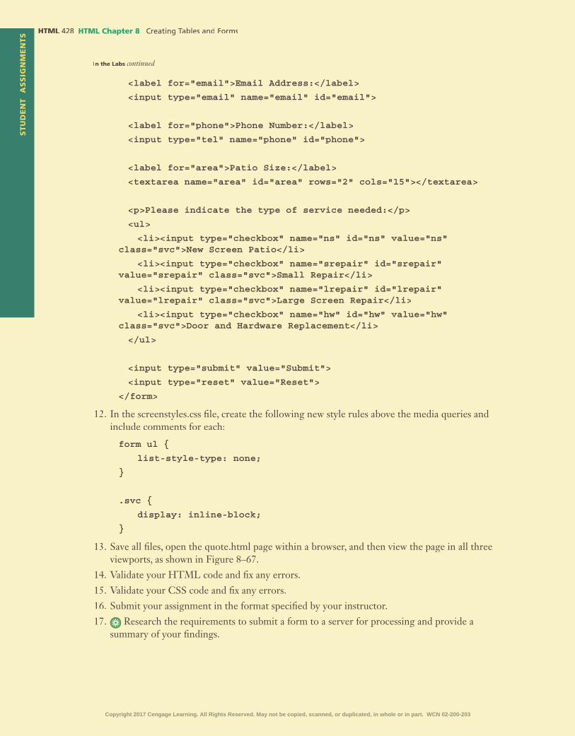
STU
DE
NT
AS
SIG
NM
EN
TS HTML HTML Chapter 8
In the Labs continued
<label for="email">Email Address:</label>
<input type="email" name="email" id="email">
<label for="phone">Phone Number:</label>
<input type="tel" name="phone" id="phone">
<label for="area">Patio Size:</label>
<textarea name="area" id="area" rows="2" cols="15"></textarea>
<p>Please indicate the type of service needed:</p>
<ul>
<li><input type="checkbox" name="ns" id="ns" value="ns" class="svc">New Screen Patio</li>
<li><input type="checkbox" name="srepair" id="srepair" value="srepair" class="svc">Small Repair</li>
<li><input type="checkbox" name="lrepair" id="lrepair" value="lrepair" class="svc">Large Screen Repair</li>
<li><input type="checkbox" name="hw" id="hw" value="hw" class="svc">Door and Hardware Replacement</li>
</ul>
<input type="submit" value="Submit">
<input type="reset" value="Reset">
</form>
12. In the screenstyles.css �le, create the following new style rules above the media queries and include comments for each:
form ul {
list-style-type: none;
}
.svc {
display: inline-block;
}
13. Save all �les, open the quote.html page within a browser, and then view the page in all three viewports, as shown in Figure 8–67.
14. Validate your HTML code and �x any errors.
15. Validate your CSS code and �x any errors.
16. Submit your assignment in the format speci�ed by your instructor.
17. Research the requirements to submit a form to a server for processing and provide a Research the requirements to submit a form to a server for processing and provide a summary of your �ndings.
Copyright 2017 Cengage Learning. All Rights Reserved. May not be copied, scanned, or duplicated, in whole or in part. WCN 02-200-203

HTM
L C
hap
ter
8S
TU
DE
NT
AS
SIG
NM
EN
TS
HTML Chapter 8 HTML
Lab 3: Expand Your WorldWorking with Form ElementsProblem: In this chapter, you worked with many types of input controls. In this exercise, you will explore input controls that were not used in this chapter to gain more insight on how to use and code other types of form elements. Work with the form08.html �le in the lab3 folder and the lab3styles08.css �le in the lab\css folder from the Data Files for Students. The complete webpage is shown in Figure 8–68.
Figure 8–68
Instructions:1. Open form08.html in your text editor, review the page, add a title, link the �le to lab3styles08.css,
modify the comment at the top of the page to include your name and today’s date, and replace “Student’s Name” with your name in the footer element.
2. Open the lab3styles08.css �le from the lab3\css folder. Modify the comment at the top of the style sheet to include your name and today's date.
3. In form08.html, create a new form within the main element.
4. Create a new label and text input element for Username. Include all appropriate attributes.
5. Create a new label and password type input element for Password. Include all appropriate attributes.
6. Create a new label and date type input element for Date of Birth. Include all appropriate attributes.
7. Add a �le type input control to the form with an attribute of size="20".
8. Create a new paragraph element for a �le type input control with the content, Upload your file here.
9. Create three radio buttons and include a new paragraph element with the content, Example of Radio Buttons.
10. In the lab3styles08.css �le, create style rules for these form elements. Use Figure 8–68 as a guide. Include comments for each.
11. Submit your answers in the format speci�ed by your instructor.
12. In step 7, you inserted a date type input control. Describe the difference in how this �eld In step 7, you inserted a date type input control. Describe the difference in how this �eld displays in Internet Explorer and Google Chrome.
Copyright 2017 Cengage Learning. All Rights Reserved. May not be copied, scanned, or duplicated, in whole or in part. WCN 02-200-203

STU
DE
NT
AS
SIG
NM
EN
TS HTML HTML Chapter 8
Consider This: Your Turn
1. Improving Your Personal Portfolio Website Design
Personal
Part 1: In Chapter 7, you integrated additional HTML5 semantic elements. In this exercise, you up-date the page as follows:
1. Open the external style sheet you created in Chapter 7 and save it with the name portfoliostyles08.css in the styles folder within the your_turn_1 folder.
2. Add your name and the current date as a comment to the �rst line of the portfoliostyles08.css �le.
3. In your HTML editor, open the �les you created for your portfolio website in Chapter 7 and make sure your name and the current date are added as a comment to the �rst line of all �les.
a. Update the HTML �les to modify the link to the external style sheet to reference portfoliostyles08.css.
b. Use a table to list your technologies on the portfolio page. Keep the table within the semantic element created in Chapter 7.
c. Determine whether to show or hide the table for a mobile viewport. If you hide the table from the mobile viewport, keep the current technologies area as is for a mobile viewport.
4. Update the CSS �le to:
a. Style the table element for mobile, tablet, and desktop viewports.
b. Re�ne your style sheet as desired.
c. Adjust viewport widths if necessary.
d. Add comments to note all changes and updates.
5. Save and test your �les.
6. Validate and correct your HTML and CSS �les, and submit your assignment in the format speci�ed by your instructor.
Part 2:
List at least three pros and three cons of using a table.
2. Improving the Design of the WebDevPros Website
ProfessionalPart 1: In Chapter 7, you integrated additional HTML5 semantic elements for WebDevPros. In this exercise, you update the site as follows:
1. Open the external style sheet you created in Chapter 7 and save it with the name webdevstyles08.css in the styles folder within the your_turn_2 folder.
2. Add your name and the current date as a comment to the �rst line of the webdevstyles08.css �le.
3. Open the �les you created for WebDevPros in Chapter 7 in your HTML editor and make sure your name and the current date are added as a comment to the �rst line of all �les.
4. Update the HTML �les to:
a. Integrate a table element.
b. Create a form.
c. Use appropriate labels and input types.
d. Use the required attribute for at least two input �elds.Copyright 2017 Cengage Learning. All Rights Reserved. May not be copied, scanned, or duplicated, in whole or in part. WCN 02-200-203

HTM
L C
hap
ter
8S
TU
DE
NT
AS
SIG
NM
EN
TS
HTML Chapter 8 HTML
5. Update the CSS �le to:
a. Style the table elements for mobile, tablet, and desktop viewports.
b. Style the form elements for mobile, tablet, and desktop viewports.
c. Re�ne your style sheet as desired.
d. Adjust viewport widths if necessary.
e. Add a comments to note all changes and updates.
6. Save and test your �les.
7. Validate and correct your HTML and CSS �les, and submit your assignment in the format speci�ed by your instructor.
Part 2: Research SSL (Secure Socket Layer) and then provide a summary of your �ndings and a Research SSL (Secure Socket Layer) and then provide a summary of your �ndings and a link to your resource.
3. Improving the Design of the Dog Hall of Fame Website
Research and CollaborationPart 1: In Chapter 7, integrated additional HTML5 semantic elements for the Dog Hall of Fame. In this exercise, you create and style a form to accept dog nominations. Do the following activities as a group:
1. Open the external style sheet you created in Chapter 7 and save it with the name dogstyles08.css in the styles folder within the your_turn_3 folder.
2. Add your names and the current date as a comment to the �rst line of the dogstyles08.css �le.
3. Open the �les you created for the Dog Hall of Fame in Chapter 7 in your HTML editor and make sure your names and the current date are added as a comment to the �rst line of all �les.
4. Modify the link to the external style sheet to reference dogstyles08.css.
5. Create a form on the nominations page. Decide what input controls you will use and how you will style the form elements for mobile, tablet, and desktop viewports. At a minimum, update the HTML and CSS �les to do the following:
a. Update the nominations.html document to include a form.
b. Integrate text input controls, include appropriate attributes and determine which �elds should be required.
c. Integrate a select and textarea element.
d. Integrate a form element not used within the chapter project.
e. Integrate submit and reset buttons.
f. Style the form elements for mobile, tablet, and desktop viewports.
6. Save and test your �les.
7. Validate and correct your HTML and CSS �les, and submit your assignment in the format speci�ed by your instructor.
Part 2: Research the mailto action and discuss the pros and cons of using the mailto action. Research the mailto action and discuss the pros and cons of using the mailto action.
Copyright 2017 Cengage Learning. All Rights Reserved. May not be copied, scanned, or duplicated, in whole or in part. WCN 02-200-203

Copyright 2017 Cengage Learning. All Rights Reserved. May not be copied, scanned, or duplicated, in whole or in part. WCN 02-200-203

9 Integrating Audio and Video
•
•
•
•
•
•
•
•
•
•
•
•
Objectives
HTML
Copyright 2017 Cengage Learning. All Rights Reserved. May not be copied, scanned, or duplicated, in whole or in part. WCN 02-200-203
IntroductionA website provides several creative opportunities to capture the attention of your audience. Many websites use multimedia (digital media such as audio, video, and animation) to enrich the user experience and provide interactivity. For example, websites include videos to share news updates, promote products and services, or demonstrate how to use a product. Videos add visual appeal and can pack a huge amount of information into a few seconds. According to a recent study by Forrester Research, consumers prefer videos to text, �nd them more memorable, and stay on websites that include videos longer than websites that do not.
Audio on webpages can set a mood or tone and further entice a user to make a purchase. Audio can also provide information more quickly or effectively than text, such as a guided tour that describes the features of a product or testimonials from customers that support a product or service.
In this chapter, you will learn how to use HTML5 to embed audio and video on an HTML webpage. You will learn how to use the audio element and its attributes to add audio to a webpage. Similarly, you will learn how to use the video element and its attributes to add a video to webpage. You will also learn about the various audio and video �le formats and which formats to use for the web. Finally, you will learn how to style the video using CSS.
Project — Add Audio and Video to a WebpageIn Chapter 9, you enhance the Forward Fitness Club website by adding audio to the home page to improve the user experience. Additionally, you insert a video in the About Us page to engage the user and promote the club.
This chapter provides an introduction to using multimedia in web development, focusing on two forms of multimedia: audio and video. The �nished webpages contain relevant audio and video clips that provide valuable multimedia content for visitors of the Forward Fitness Club website.
The project in this chapter improves a website by integrating HTML5 audio and video elements. To perform these tasks, you �rst copy the media �les to your media folder. Next, you add an audio element to a webpage. Then, you add a video element to a webpage. In the style sheet, you add style rules for the videoelement for tablet and desktop viewports. Figure 9–1 shows the home page with the embedded audio and controls. Figure 9–2 shows the video on the About Us page.
Integrating Audio and Video9
HTML
Copyright 2017 Cengage Learning. All Rights Reserved. May not be copied, scanned, or duplicated, in whole or in part. WCN 02-200-203

Microsoft HTML5 & CSS3 2015 HTML
Figure 9–1
Figure 9–2
Copyright 2017 Cengage Learning. All Rights Reserved. May not be copied, scanned, or duplicated, in whole or in part. WCN 02-200-203

HTML HTML Chapter 9
RoadmapIn this chapter, you will learn how to create the webpages shown in
Figures 9–1 and 9–2. The following roadmap identi�es general activities you will perform as you progress through this chapter:
1. insert the audio element.
2. insert the video element.3. style the video element.
At the beginning of step instructions throughout the chapter, you will see an abbreviated form of this roadmap. The abbreviated roadmap uses colors to indicate chapter progress: gray means the chapter is beyond that activity; blue means the task being shown is covered in that activity; and black means that activity is yet to be covered. For example, the following abbreviated roadmap indicates the chapter would be showing a task in the 2 INSERT VIDEO ELEMENT activity.
1 INSERT AUDIO ELEMENT | 2 INSERT VIDEO ELEMENT
3 STYLE VIDEO ELEMENT
Use the abbreviated roadmap as a progress guide while you read or step through the instructions in this chapter.
Using MultimediaThe popularity of the web is due in part to its ability to display webpages that include graphic images, audio, and video. These additions can boost the visual appeal of a website and make the browsing experience more enjoyable and interactive. Sometimes, however, multimedia can distract from the website message. When deciding whether to include multimedia, remember the purpose of the website. If the multimedia content enhances that purpose, it should be included. If the multimedia content distracts from the purpose of the website, then you should reconsider using it.
Multimedia is the combination of text, images, sound, and video to express an idea Multimedia is the combination of text, images, sound, and video to express an idea Multimediaor convey a message. Because most people have broadband Internet connections that can transfer data quickly, multimedia webpages that include large graphics, audio, and video are common. Figure 9–3 shows an example of multimedia used on the PBS website.
Figure 9–3Copyright 2017 Cengage Learning. All Rights Reserved. May not be copied, scanned, or duplicated, in whole or in part. WCN 02-200-203

HTML Chapter 9 HTML
HTM
L C
hap
ter
9
Many websites use videos to advertise products, to entertain visitors, or to provide instruction. For example, you may be able to review a medical procedure online before having the procedure done yourself. You can view clips of movies or hear segments of audio recordings from webpages that provide content in those formats. Podcasts, a series of audio or video clips that are released in a sequence, are popular in home, academic, and corporate settings. Figure 9–4 shows an example of a website, Podcast Alley, with several podcasts on current technology topics.
Creating Multimedia FilesYou can obtain multimedia �les by creating them yourself or by �nding �les that
are already available. If you create your own multimedia �les, you do not have to be concerned with copyright or licensing agreements. On the other hand, the multimedia �les might not have the same quality and effectiveness as professional content. You can create your own audio �les using a microphone and software designed to edit digital �les, such as Audacity, a free, open-source audio editor, and Adobe Audition, which can be purchased as part of the Adobe Creative Cloud. If you do use any portion of �les that have been professionally developed, such as those from an online multimedia provider, be certain that you understand and follow the copyright and licensing requirements.
For video �les, you can use a digital camcorder, a digital camera, or even a smartphone to create clips that can be included on a webpage. For the Windows operating system, a popular, free video editing application is Windows Movie Maker (Figure 9–5). This application is available for download from the Microsoft website as part of the Windows Live Essentials software package. MAGIX Movie Edit Pro software and training is available for a fee, with an active online community for additional support. Corel VideoStudio Pro has simple and more advanced menu system options that novice movie editors and professionals alike can use comfortably. CyberLink PowerDirector is another software option that allows you to create professional-quality videos.
Figure 9–4
Copyright 2017 Cengage Learning. All Rights Reserved. May not be copied, scanned, or duplicated, in whole or in part. WCN 02-200-203

HTML HTML Chapter 9
For Mac users, iMovie, part of the iLife software suite, is a low-cost option. The iMovie app is also available for download to the iPad from the App Store. Final Cut Pro X is a video editor for the Mac that offers professional-level editing.
Adobe Premiere Pro is another highly rated application for movie editing that can be used on either the Mac or Windows operating systems. As with many multimedia software products, Adobe Premiere Pro lets novice users create professional-quality video. Figure 9–6 shows the Adobe Premiere Pro Creative Cloud application.
Figure 9–5
Many audio- and video-editing applications offer a free trial period. You might try downloading a free trial of the software, if available, and using it to create or edit a movie. You could also try a few different programs to see how they work. Most multimedia software operates in a similar fashion and has a user-friendly help utility that guides you through the process of editing. Most products also provide templates and effects that enhance the creative aspects of presenting multimedia.
Figure 9–6
Copyright 2017 Cengage Learning. All Rights Reserved. May not be copied, scanned, or duplicated, in whole or in part. WCN 02-200-203

HTML Chapter 9 HTML
HTM
L C
hap
ter
9
To �nd multimedia resources on the web, search for “public domain audio or video.” These resources are available free of copyright restrictions. Websites that provide stock photos often provide music, sound, and video �les for a fee. Before using any content, be sure to understand and follow the copyright license agreements that accompany any multimedia content that you �nd on the web.
Can I use any images, audio, or video I �nd on the Internet to create a multimedia �le?In general, no, you cannot use any �le you �nd. However, as a student, you are permitted to use some for academic purposes. This is known as Fair Use. For more information about copyright laws, visit copyright.gov.
CO
NS
IDE
R T
HIS
Embedded vs. External MultimediaEmbedding media is similar to inserting inline images. The embedded media
�les appear within the webpage along with the audio or video player controls. Visitors use the controls to play or stop the media. Because the media �le is embedded directly into the webpage, you can complement the audio or video clip resource with surrounding text or graphical images. Before HTML5, the object element was used to insert embedded content, including multimedia. HTML5 introduces two new elements, audio and video, to use as an alternative to the object element. Figure 9–7 shows an example of how the U.S. Department of Defense uses the videoelement on its webpage.
To access external media �les, website visitors click a link. They can then decide whether to link directly to the external source or download the �le. Unlike embedded media, the external media is displayed out of context with the webpage that contains the link. Using external links is a common web development practice. For example, sites that provide many video resources, such as YouTube, use external media �les and the embed element, which de�nes a container for an external application or interactive content (also called a plug-in). Figure 9–8 shows an example of a White House video provided on YouTube through an external link.
Figure 9–7
Copyright 2017 Cengage Learning. All Rights Reserved. May not be copied, scanned, or duplicated, in whole or in part. WCN 02-200-203

HTML HTML Chapter 9
Media Players and Plug-Ins As you know, browsers can display text and the graphics formats discussed
in earlier chapters without using external software. To play an audio or video �le, however, some browsers need the help of an application called a media player or a plug-in. A media player is computer software that plays multimedia �les. Most media player is computer software that plays multimedia �les. Most media playersoftware media players support an array of media formats, including audio and video �les. This chapter uses an .mp3 audio �le and an .mp4 video �le. The Internet Explorer browser can play �les in both formats. Windows Media Player, included as part of Windows, also plays both audio and video. The Mac operating system comes with QuickTime Player for playing movies, while iTunes can be downloaded for Windows or Mac OS to play a variety of media formats.
A plug-in (also called an add-in or add-on) is extra software added to the browser (or other program) to provide a capability that is not inherent to the browser. In other words, for an embedded media �le to work in a browser, the website visitor needs to have the correct plug-in. Most browsers have a variety of plug-ins installed, but website visitors can also download and install necessary plug-ins from the browser manufacturers. Common plug-ins are Windows Media Player, Apple QuickTime Player, Adobe Flash, Microsoft Silverlight, and Adobe Acrobat. Figure 9–9 shows an example of plug-ins installed on the Internet Explorer 11 browser.
Figure 9–8
Figure 9–9Copyright 2017 Cengage Learning. All Rights Reserved. May not be copied, scanned, or duplicated, in whole or in part. WCN 02-200-203

HTML Chapter 9 HTML
HTM
L C
hap
ter
9
Internet Explorer uses proprietary ActiveX controls. When Internet Explorer encounters a multimedia �le, it searches for the appropriate ActiveX control to play the �le. If Internet Explorer cannot �nd the control, users are usually asked if they want to install it. Some browsers direct users to the website from which they can download the required plug-in. A suggestion to web developers is to use media �les in common formats, such as .wmv, .mp4, .�v, and .mp3, so users can access the plug-ins easily. It is also a good idea to let your users know what format is being used. If the plug-in is not installed, Internet Explorer generally provides the capability to install it. Many websites also provide a link to the appropriate manufacturer for an ActiveX control needed to play the �le.
As you will see in the following section, the various audio and video formats can be played on a variety of players. For embedded multimedia, use a format supported by multiple players.
HTML5 and MultimediaHTML5 introduces built-in media support via the audio and video
elements. Using these elements, web developers can easily embed media into HTML documents. This chapter teaches you how to use the new HTML5 audio and video elements. Additional multimedia types discussed in this chapter include Flash, Java applets, and the HTML object element.
BTWPlug-ins and Add-onsInvestigate the plug-ins available for the version of browser that you use. (In Internet Explorer, display the Command bar, click Tools on the Command bar, and then select Manage add-ons.) Search the web for information about the listed add-ons and determine if you can download other add-ons that you might need.
Will the ActiveX controls and security noti�cation appear if I use a browser other than Internet Explorer?No. ActiveX controls are displayed only in the Internet Explorer web browser.
CO
NS
IDE
R T
HIS
FlashFlash, or Adobe Flash, has been used within websites for nearly 20 years. Using
Flash, you can create animations or movie �les. Flash �les have the .swf �le extension and require the browser to have a Flash plug-in. Incorporating Flash animation was popular on websites before using smartphones and tablets became widespread. Some websites were developed exclusively with Flash. However, many of today’s websites use Flash sparingly, if at all, partly because the iPhone and iPad, which run the iOS operating system, do not support Flash. Instead, many web developers have embraced JavaScript to incorporate additional interactivity within their websites. Figure 9–10 shows an example of an interactive Flash video used on the National Parks Service website.
Java AppletsA Java applet is a small program created with Java, a programming language. Java applet is a small program created with Java, a programming language. Java applet
A Java applet can be embedded within a webpage, though the browser must have Java installed and enabled. Java applets were very popular in the late 1990s; however, their use in today’s modern websites is in decline.
Copyright 2017 Cengage Learning. All Rights Reserved. May not be copied, scanned, or duplicated, in whole or in part. WCN 02-200-203

HTML HTML Chapter 9
Object ElementYou use the HTML object element to embed multimedia objects such as Flash �les, Java applets, PDF �les, and ActiveX controls. Use the param element to de�ne param element to de�ne paramparameters for plug-ins embedded with an object element. The following is an example of the object element.
<object data="audio.wav">
<param name="autoplay" value="true">
</object>
In this example, an audio �le named audio.wav is embedded on the webpage. The autoplay parameter is set to true, meaning the audio starts playing when the webpage opens.
Integrating AudioAdding audio to a webpage can help set a desired mood or tone. It can also be a distraction to some users, so you must �rst determine if the audio is appropriate for the webpage and its audience. Audio integrated within a webpage should have a distinct purpose and should provide added value or instruction. You should also consider the time it takes for the browser to load the audio �le. If your audience includes users with dial-up connections rather than broadband access, they will likely experience a delay, especially if the audio �les are large. Keep in mind that using audio or video on a mobile device requires a data plan if the device is not connected to a wireless network. One popular way that websites use audio is to provide links to music �les that visitors can play or download. Figure 9–11 shows list of music �les to listen to on the Noisetrade.com website.
BTWParametersMany other object parameters are available that are not discussed in this chapter. Each ActiveX control has particular parameters. Review online other parameters that might be effective for you to use in your web development.
Figure 9–10
Copyright 2017 Cengage Learning. All Rights Reserved. May not be copied, scanned, or duplicated, in whole or in part. WCN 02-200-203

HTML Chapter 9 HTML
HTM
L C
hap
ter
9
Audio File FormatsTable 9–1 lists the most common audio �le formats for webpages. The HTML5
audio element supports only three audio �le formats: .mp3, .ogg, and .wav. These supported formats are indicated with an asterisk in Table 9–1. However, you can use audio converter software to convert �les from one audio format to a supported format. Audio �les for the web often use �le compression techniques to reduce the size of the �le, though they can also diminish the sound quality. Uncompressed audio formats listed in Table 9–1 include .aiff, .au, and .wav.
Figure 9–11
Table 9–1 Common Audio File Formats
File Format File Extension Description
AIFF .aiff Standard audio �le format developed by AppleAs an uncompressed and lossless format, it uses more disk space than the MP3 format
AU .au Standard audio �le format used by Sun, Unix, and Java Can be compressed
MIDI .mid.rmi
Musical Instrument Digital Interface (MIDI)Limited to electronic musical instruments (such as synthesizers) and other electronic equipmentFiles can be much smaller than in other formats
MP3* .mp3 One of the most popular formats for music storageCompresses �les to approximately one-tenth the size of uncompressed �les
MP4 .mp4 Based on the QuickTime format; used for audio and videoCreates quicker, faster, high-quality mediaNot supported by Windows Media Player
Ogg* .ogg Maintained by Xiph.Org Foundation Designed to provide for ef�cient streaming and high-quality digital multimedia Can be used with audio element
RealAudio .ra.ram
Designed for streaming audio over the Internet; declining useSound quality not as good as other formats
WAV* .wav Standard audio format for WindowsCommonly used for storing uncompressed CD-quality sound �lesCompression is available to reduce �le sizeCopyright 2017 Cengage Learning. All Rights Reserved. May not be copied, scanned, or duplicated, in whole or in part. WCN 02-200-203

HTML HTML Chapter 9
File Compression and CodecsWhen embedding an audio or video �le onto a webpage, you should keep the �le
size small and compress the �le when necessary. A codec is a compression technology used to compress images, audio, and video �les. The word codec is short for code/decode because it consists of an encoder, which compresses the �le, and a decoder, which decompresses the �le. An audio editor uses a codec to reduce the size of an audio �le, while maintaining enough quality to play the audio �le on a computer. Although codecs improve the page load time, compressing a media �le too much results in a loss of sound quality. On the other hand, if you do not compress a media �le enough, the �le may take too long to download into a browser. Figure 9–12 shows an example of audio converter software that uses a codec to compress �les.
HMTL5 audio ElementOne of the most long-awaited features in HTML5 is the audio element,
which you use to de�ne sound, such as music or other audio streams. Table 9–2 shows the attributes and values that can be used with the audio element.
The following sample code shows how to use the audio element to insert an audio �le named music.mp3. Because browsers that do not support the audioelement ignore the <audio> tag, you should insert text content between the <audio> and </audio> tags to alert users, as the paragraph element does in the following code.
<audio controls="controls" autoplay="autoplay">
<source src="music.mp3" type="audio/mp3">
<p>Your browser does not support the HTML5 audio element.</p>
</audio>
In this example, an audio �le named music.mp3 is embedded on the webpage. The �rst line shows the beginning audio tag and includes two attributes: controls and autoplay. The controls attribute speci�es to display the audio controls, such
Figure 9–12
Copyright 2017 Cengage Learning. All Rights Reserved. May not be copied, scanned, or duplicated, in whole or in part. WCN 02-200-203

HTML Chapter 9 HTML
HTM
L C
hap
ter
9
as play/pause and volume control. The autoplay attribute speci�es to start playing the audio �le once the page is loaded in the browser. The second line uses the source tag with two attributes, src and type. The src attribute speci�es the location of the audio �le. The type attribute speci�es the type of audio �le, in this instance, MP3. The third line is a paragraph element with fallback text to let the user know that their browser does not support the audio element. The sentence, “Your browser does not support the HTML5 audio element” appears in a legacy browser that does not support HTML5. The fourth line includes the ending audio tag.
If you use the object element instead of the audio element, you must include the data attribute to specify the source �le. Only one data attribute can be speci�ed within one object element. In addition, you need to include the param element in the param element in the param object element to specify additional parameters, such as autoplay. However, many of the attributes for the object element and the parameter element are not supported in HTML5.
The controls attribute adds audio controls, such as play, pause, and volume. It can be set up in any of the three following ways:
<audio controls="controls">
<audio controls>
<audio controls="">
Similarly, the autoplay attribute can be set up in any of these ways:
<audio autoplay>
<audio autoplay="autoplay">
<audio autoplay="">
To enable the audio element to work in all browsers, use source elements inside the audio element. The source elements can link to the same or different audio �les as appropriate. Including the source elements accommodates visitors who use any of the �ve major browsers. The browser will use the �rst recognized format. The following is an example of an audio element with multiple source elements:
<audio controls="controls" autoplay="autoplay">
<source src="music.mp3" type="audio/mp3">
<source src="music.ogg" type="audio/ogg">
<source src="music.wav" type="audio/wav">
<p>Your browser does not support the HTML5 audio element.</p>
</audio>
Table 9–2 Audio Element Attributes
Attribute Value Description
autoplay autoplay Speci�es that the audio will automatically start playing
controls controls Speci�es that audio controls should be displayed (such as a play/pause button)
loop loop Speci�es that the audio will start playing every time it is �nished
muted muted Speci�es that the audio should be muted
preload auto metadata none
Speci�es whether and how the audio should be loaded when the page loads
src URL Speci�es the URL of the audio �le
Copyright 2017 Cengage Learning. All Rights Reserved. May not be copied, scanned, or duplicated, in whole or in part. WCN 02-200-203

HTML HTML Chapter 9
In this example, if the browser cannot play MP3 �les, it checks to determine whether it can play Ogg �les. If it can, it plays the music.ogg �le. If it cannot play Ogg �les, it checks to determine whether it can play WAV �les. If it can, it plays the music.wav �le. Otherwise, it does not play any audio. If the browser cannot play the audio, then it does not support HTML5. Table 9–3 lists the three audio �le formats supported by the audio element and identi�es whether each �le format is also supported by the �ve major browsers. While most of these browsers support more than the audio �le formats listed in Table 9–3, at this time, the audio element only supports three.
Other attributes include the preload attribute, which tells the browser to begin downloading the audio �le immediately when it encounters the audioelement. However, if you use the autoplay attribute, which also begins downloading immediately, you do not need to also use the preload attribute. The loop attribute restarts the audio immediately once it has �nished playing.
Table 9–3 Audio File Browser Support
Audio File Format
Internet Explorer
Google Chrome
Mozilla Firefox
Apple Safari
Opera
MP3 • • • • •Ogg • • •Wav • • • •
BTWAudio ClipMany web design sites discuss the use of audio clips in web development. Search for ideas of how you can most effectively use an audio clip.
1 INSERT AUDIO ELEMENT | 2 INSERT VIDEO ELEMENT
3 STYLE VIDEO ELEMENTTo Add Audio to the Home Page
Insert an audio element on the home page of the Forward Fitness Center website to add sound to the page. Why? Set an energetic tone with a short audio �le to further enhance the user’s interest. Include three �le sources to accommodate all browsers and include attributes to autoplay the audio �le and to display controls on the webpage. The following steps add audio to the home page.
1 •
•
•enter
• <audio autoplay controls>
• enter <source src="media/ ffc_aud.mp3" type="audio/mp3">
autoplay controlsautoplay controls
Q&
A
Figure 9–13Figure 9–13
Note:
Copyright 2017 Cengage Learning. All Rights Reserved. May not be copied, scanned, or duplicated, in whole or in part. WCN 02-200-203

HTML Chapter 9 HTML
HTM
L C
hap
ter
9
2 • enter
<source src="media/ffc_aud.ogg" type="audio/ogg">
• enter
<source src=" media/ffc_aud.wav" type="audio/wav">
• enter <p>Your browser does not support the audio tag.</p>
• enter </audio>
audio
3
•
Experiment•
•
•
Q&
AQ
&A
Figure 9–15
HTM
L C
hap
ter
9
Figure 9–14Figure 9–14
Break Point: If you want to take a break, this is a good place to do so. You can exit the text editor now. To resume at a later time, run your text editor, open the �le called about.html, and continue following the steps from this location forward.
Copyright 2017 Cengage Learning. All Rights Reserved. May not be copied, scanned, or duplicated, in whole or in part. WCN 02-200-203

HTML HTML Chapter 9
Integrating VideoAdding video to a webpage can increase traf�c to your website if the video is informative and meaningful. As with audio �les, consider the time it takes for the browser to load the video �le. Non-broadband users will likely experience a delay, especially if the video �les are large, and mobile device users might incur costs on a data plan. For these reasons, include only those videos that create a rich experience for the user.
Video File FormatsTable 9–4 lists the most commonly used video �le formats for the web. The
HTML5 video element supports only three of these video �le formats: .mp4, .ogg, and .webm. The supported formats are indicated with an asterisk in Table 9–4. If you want to use an unsupported video �le format with the video element, use video converter software to convert the �le to a supported format. The video element does not work in legacy browsers, so consider your audience before using the video element. Most video �le formats for the web use codec compression techniques to reduce the �le size.
Table 9–4 Common Video File Formats
File Format File Extension Description
AVI .avi Audio / Video InterleavedDeveloped by Microsoft to use with WindowsCan contain both audio and video data
Flash .swf Small Web FormatCan contain audio, video, or animationsRequires Adobe Flash Player
Flash Video .�v.f4v
Developed by AdobeFormat of choice for embedded video on the webUsed by YouTube and Hulu
MPEG .mpg.mpeg.mp3
Moving Picture Experts GroupCan be highly compressed, resulting in small �le sizeSupported by most major browsers
MP4* .mp4 Based on QuickTime format; used for audio and videoCreates quicker, faster, high-quality mediaNot supported by Windows Media Player
Ogg* .ogg Maintained by Xiph.org Foundation Designed for ef�cient streaming and high-quality digital multimedia Can be used with HTML5 video element
QuickTime .mov Developed by Apple for both Windows and Mac operating systemsFile compression can result in smaller �le sizeRequires QuickTime Player or Adobe Flash Player, which are easily downloaded
RealVideo .rm.rv
Proprietary video format developed by RealNetworksRequires RealPlayer
WebM* .webm Developed by GoogleRoyalty-free, open formatCan be used with HTML5 <video> tag
Windows Media .wmv Developed by MicrosoftOriginally designed for Internet streaming applicationsRequires Windows Media Player or RealPlayer
Copyright 2017 Cengage Learning. All Rights Reserved. May not be copied, scanned, or duplicated, in whole or in part. WCN 02-200-203
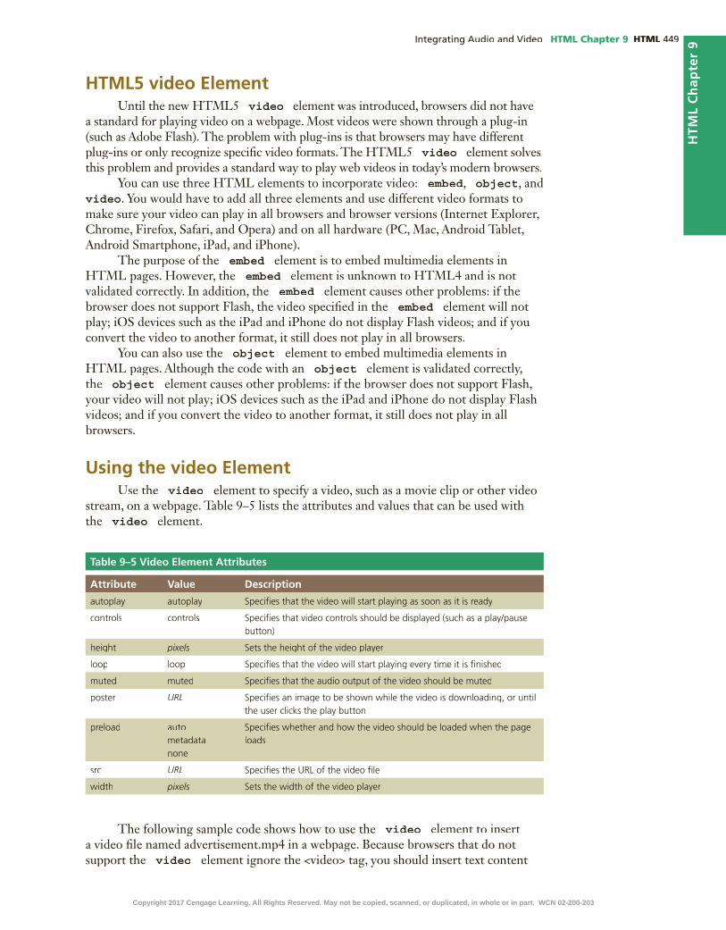
HTML Chapter 9 HTML
HTM
L C
hap
ter
9
HTML5 video ElementUntil the new HTML5 video element was introduced, browsers did not have
a standard for playing video on a webpage. Most videos were shown through a plug-in (such as Adobe Flash). The problem with plug-ins is that browsers may have different plug-ins or only recognize speci�c video formats. The HTML5 video element solves this problem and provides a standard way to play web videos in today’s modern browsers.
You can use three HTML elements to incorporate video: embed, object, and video. You would have to add all three elements and use different video formats to make sure your video can play in all browsers and browser versions (Internet Explorer, Chrome, Firefox, Safari, and Opera) and on all hardware (PC, Mac, Android Tablet, Android Smartphone, iPad, and iPhone).
The purpose of the embed element is to embed multimedia elements in HTML pages. However, the embed element is unknown to HTML4 and is not validated correctly. In addition, the embed element causes other problems: if the browser does not support Flash, the video speci�ed in the embed element will not play; iOS devices such as the iPad and iPhone do not display Flash videos; and if you convert the video to another format, it still does not play in all browsers.
You can also use the object element to embed multimedia elements in HTML pages. Although the code with an object element is validated correctly, the object element causes other problems: if the browser does not support Flash, your video will not play; iOS devices such as the iPad and iPhone do not display Flash videos; and if you convert the video to another format, it still does not play in all browsers.
Using the video ElementUse the video element to specify a video, such as a movie clip or other video
stream, on a webpage. Table 9–5 lists the attributes and values that can be used with the video element.
Table 9–5 Video Element Attributes
Attribute Value Description
autoplay autoplay Speci�es that the video will start playing as soon as it is ready
controls controls Speci�es that video controls should be displayed (such as a play/pause button)
height pixels Sets the height of the video player
loop loop Speci�es that the video will start playing every time it is �nished
muted muted Speci�es that the audio output of the video should be muted
poster URL Speci�es an image to be shown while the video is downloading, or until the user clicks the play button
preload auto metadata none
Speci�es whether and how the video should be loaded when the page loads
src URL Speci�es the URL of the video �le
width pixels Sets the width of the video player
The following sample code shows how to use the video element to insert a video �le named advertisement.mp4 in a webpage. Because browsers that do not support the video element ignore the <video> tag, you should insert text content
Copyright 2017 Cengage Learning. All Rights Reserved. May not be copied, scanned, or duplicated, in whole or in part. WCN 02-200-203

HTML HTML Chapter 9
between the <video> and </video> tags to alert users, as the paragraph element does in the following code.
<video width="320" height="240" controls="controls">
<source src="advertisement.mp4" type="video/mp4">
<p>Your browser does not support the HTML5 video element.</p>
</video>
In this example, the code sets the dimensions of the video (320 pixels by 240 pixels) and displays the playback controls. The browser plays the advertisement.mp4 �le, which is an MP4 video �le. If the browser does not support the video element, the user is alerted.
It is a good idea to include width and height attributes when you are not designing a responsive website. If you set the width and height, the space required for the video is reserved when the page is loaded. However, without these attributes, the browser does not know the size of the video and cannot reserve the appropriate space for it. The effect is that the page layout will change when the video loads. If you are designing a responsive website, do not include width and height attributes. Instead, use CSS to set the height to auto and the max-width attribute to 100%, as this will allow the video to automatically resize to �t the user’s viewport.
As with the audio element, the controls attribute adds video controls including play, pause, and volume. It can be set up in any of the three following ways:
<video controls="controls">
<video controls>
<video controls="">
You can use the src attribute in the video element itself, as shown in the sample below:
<video controls autoplay src="advertisement.mp4">
<p>Your browser does not support the HTML5 video element.</p>
</video>
Also, as you did with the audio element, you should use the sourceelements inside the video element. The video element allows multiple source elements, which can link to different video �les. Including the sourceelements accommodates visitors who use any of the �ve major browsers. The browser will use the �rst recognized format. The following is an example of a video element with multiple source elements:
<video controls="controls" autoplay="autoplay">
<source src="advertisement.mp4" type="video/mp4">
<source src="advertisement.ogg" type="video/ogg">
<source src="advertisement.webm" type="video/webm">
<p>Your browser does not support the HTML5 video element.</p>
</video>
In this example, if the browser cannot play MP4 �les, it checks to determine whether it can play Ogg �les. If it cannot play the advertisement.ogg �le, it checks to determine whether it can play WebM �les. If it cannot play MP4, Ogg, or WebM �les, then the browser does not support the HTML5 video element. Table 9–6 lists the three video �le formats supported by the video element and identi�es whether or not each �le format is supported by the �ve major browsers. While most of these browsers support more than the video �le formats listed in Table 9–6, at this time, the video element only supports three.
BTWAligning Videos on a WebpageThe video element is merely a container to hold a video. To center a video on a page, wrap the video element within a div element and then style the div element.
Copyright 2017 Cengage Learning. All Rights Reserved. May not be copied, scanned, or duplicated, in whole or in part. WCN 02-200-203

HTML Chapter 9 HTML
HTM
L C
hap
ter
9
Table 9–6 Video File Browser Support
Video File Format
Internet Explorer
Google Chrome
Mozilla Firefox
Apple Safari Opera
MP4 · · · · ·Ogg · · ·WebM · · ·
BTWVideo ClipsVideo clips can have a large �le size depending on the length and the quality of the clip. Search for rules- of-thumb for �le sizes when video clips are incorporated into a website.
1 INSERT AUDIO ELEMENT | 2 INSERT VIDEO ELEMENT
3 STYLE VIDEO ELEMENTTo Add Video to the About Us Page
Next, insert a video on the About Us page to highlight its services. Why? You can use a video to promote the bene�ts of joining the Forward Fitness Club. Include three �le sources to accommodate all browsers. Also include attributes to automatically play the video �le and to display controls on the webpage. The following steps add video to the About Us page.
1 •
•enter
•<div
class="video">
• enter <video autoplay controls>
• enter <source src="media/ffc_vid.mp4" type="video/mp4">
2 • enter
<source src="media/ffc_vid.ogg" type="video/ogg">
• enter
<source src="media/ffc_vid.webm" type="video/webm">
• enter <p>Your browser does not support the video tag.</p>
• enter </video>
• enter </div>
Q&
A
Figure 9–16Figure 9–16
Figure 9–17
Copyright 2017 Cengage Learning. All Rights Reserved. May not be copied, scanned, or duplicated, in whole or in part. WCN 02-200-203

HTML HTML Chapter 9
Q&
A
Figure 9–18
3 •
Q&
A
To Style the Video
You have added a video to the About Us page, but need to format the video so it is appealing on the webpage. Start by centering the video, and then apply borders and padding to further improve the video’s appearance on the page. Why? Formatting videos enhances their visual appeal to the user. Also create a style rule for the video element to accommodate responsive design by specifying height and max-width attribute values. The following steps format the video by adding styles to the styles.css �le.
1 •
•enter
• /* Style rule for the video class */
• enter .video {
• enter padding: 1em;
• enter text-align: center;
• enter }
1 INSERT AUDIO ELEMENT | 2 INSERT VIDEO ELEMENT
3 STYLE VIDEO ELEMENT
Figure 9–19Figure 9–19
Copyright 2017 Cengage Learning. All Rights Reserved. May not be copied, scanned, or duplicated, in whole or in part. WCN 02-200-203

HTML Chapter 9 HTML
HTM
L C
hap
ter
9H
TML
Ch
apte
r 9
Figure 9–20
2 •
3 •
enter
• /* Style rule for video element */
• enter
video {
• enter border: 0.5em ridge #FFFFFF;
• enter height: auto;
• enter max-width: 100%;
• enter }
Q
&A
Figure 9–21Figure 9–21
Copyright 2017 Cengage Learning. All Rights Reserved. May not be copied, scanned, or duplicated, in whole or in part. WCN 02-200-203
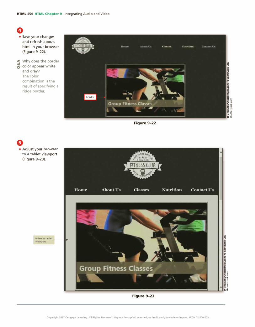
HTML HTML Chapter 9
4 •
Q&
A
5 •
Figure 9–22
Figure 9–23
Copyright 2017 Cengage Learning. All Rights Reserved. May not be copied, scanned, or duplicated, in whole or in part. WCN 02-200-203

HTML Chapter 9 HTML
HTM
L C
hap
ter
9
To Validate the Style Sheet
Always run your �les through W3C’s validator to check the document for errors. If the document has any errors, validating gives you a chance to identify and correct them. Validation is also an effective troubleshooting tool during the development process and adds a valuable level of professionalism to your work. The following steps validate a CSS document.
1 http://jigsaw.w3.org/css-validator/
2
3
4
5
6
7
8
To Validate the HTML Files
Every time you create a new webpage or modify an existing webpage, run it through W3C’s validator to check the document for errors. If any errors exist, you need to correct them. Validation is also an effective troubleshooting tool during the development process and adds a valuable level of professionalism to your work. The following steps validate an HTML document.
Figure 9–24
6 •
Copyright 2017 Cengage Learning. All Rights Reserved. May not be copied, scanned, or duplicated, in whole or in part. WCN 02-200-203

HTML HTML Chapter 9
1 http://validator.w3.org/
2
3
4
5
6
7
8
9
Integrating AudioAdd Audio to the Home Page
(HTML 456)
Integrating VideoAdd Video to the About Us Page (HTML 451)Style the Video (HTML 452)
How will you use multimedia?Use these guidelines as you complete the assignments in this chapter and create your own webpages outside of this class.
1. Determine if audio has a de�ned purpose for your website.
a) Determine if the audio should automatically play when the page loads.
b) Determine whether to show or hide the audio controls.
2. Determine if a video can enhance your website.
a) Determine the ideal placement of your video to make it stand out.
b) Determine how to style the video for mobile, tablet, and desktop viewports.
3. Determine how to best obtain multimedia for your website.
a) Identify tools and software necessary to create your own video.
b) Identify public domain content available for use.
c) Learn how to use multimedia and converter software.
4. Determine if other forms of multimedia are appropriate for your website.
a) Identify the pros and cons of using Adobe Flash.
b) Determine which HTML elements are best for including your multimedia.
CO
NS
IDE
R T
HIS
Chapter SummaryIn this chapter, you learned how to integrate audio and video elements within a website. You used HTML5 audio element to insert three audio source elements and speci�ed that it automatically play and display controls. You also learned how to use the HTML5 video element and insert a video onto a webpage and coded for cross-browser compatibility. Finally, you used CSS styles to format a video for all viewports. The items listed below include all the new skills you have learned in this chapter, with the tasks grouped by activity.
Copyright 2017 Cengage Learning. All Rights Reserved. May not be copied, scanned, or duplicated, in whole or in part. WCN 02-200-203

HTM
L C
hap
ter
9S
TU
DE
NT
AS
SIG
NM
EN
TS
HTML Chapter 9 HTML
Apply Your Knowledge
Adding Audio to a WebpageInstructions: In this exercise, you will use your text editor to add audio to a webpage. Insert an audio element and three source elements. Work with the apply09.html �le in the apply folder and audio �les in the apply\media folder from the Data Files for Students. The completed webpage is shown in Figure 9–25. You will also use professional web development practices to indent, space, comment, and validate your code.
How should you submit solutions to questions in the assignments identi�ed with a symbol? symbol?Every assignment in this book contains one or more questions identi�ed with a symbol. These questions require symbol. These questions require you to think beyond the assigned presentation. Present your solutions to the questions in the format required by your instructor. Possible formats may include one or more of these options: create a document that contains the answer; present your answer to the class; discuss your answer in a group; record the answer as audio or video using a webcam, smartphone, or portable media player; or post answers on a blog, wiki, or website.
CO
NS
IDE
R T
HIS
Perform the following tasks:1. Open apply09.html in your text editor, review the page, add a title, modify the comment at the
top of the page to include your name and today’s date, and replace “Student’s Name” with your name in the footer element.
2. Insert an audio element below the figure element.
3. Set the audio element to play automatically and to repeat continuously.
4. Insert three source elements within the audio element and use the three audio �les contained within the apply\media folder.
5. Include a paragraph element within the audio element that advises legacy browser users that their browser does not support the audio element.
6. Save all of your changes and open the apply09.html in your browser.
7. Validate your HTML document using the W3C validator found at validator.w3.org and �x any errors that are identi�ed.
Figure 9–25
Continued >Copyright 2017 Cengage Learning. All Rights Reserved. May not be copied, scanned, or duplicated, in whole or in part. WCN 02-200-203

STU
DE
NT
AS
SIG
NM
EN
TS HTML HTML Chapter 9
8. Submit the �les in a format speci�ed by your instructor.
9. In this exercise, you speci�ed three source �les, one of which was an Ogg �le. Use your In this exercise, you speci�ed three source �les, one of which was an Ogg �le. Use your browser to research free resources available to convert an audio �le to the Ogg format. Summarize your �ndings and provide a link to at least three different resources.
Extend Your Knowledge
Using Multimedia SoftwareInstructions: In this exercise, you download and use multimedia software. If you use a Windows PC, download Windows Movie Maker. Use multimedia software to create a short video. If you use a Mac and have iMovie on your system, use iMovie to complete this project.
Perform the following tasks:1. If you use a Windows PC, download and install Windows Movie Maker at windows.microsoft.
com/en-us/windows-live/movie-maker.
2. Research how to use the software you installed.
3. Use the software to create a short video (30 seconds or less).
4. Your video should include, at a minimum, images, sound, and captions or titles.
5. Save the movie in the MP4 �le format.
6. View your video in your preferred video player.
7. Submit the video in a format speci�ed by your instructor.
8. In this exercise, you learned how to use multimedia software. Describe the next steps you In this exercise, you learned how to use multimedia software. Describe the next steps you would take to convert the video �le you created to accommodate all major browsers.
Analyze, Correct, Improve
Improving a Webpage with Video and AudioInstructions: Work with the analyze09.html �le in the analyze folder, the analyzestyles09.css �le in the analyze\css folder, and the media �les in the analyze\media folder from the Data Files for Students. The analyze09.html webpage needs multimedia to advertise its services. Insert a video element with appropriate source �les to accommodate all major browsers. Set the video to play automatically, continuously, display controls, and specify width and height. Next, insert an audio element that continuously plays and does not display controls. Finally, style the video element. Use Figure 9–26 as a guide to correct these �les.
1. Correcta. Open the analyze09.html �le in your text editor from the Data Files for Students. Modify the
comment at the top of the page to include your name and today’s date and then link the �le to analyzestyles09.css.
b. Open the analyzestyles09.css �le in your text editor from the Data Files for Students and then modify and correct the comment at the top of the document to include your name and today’s date.
c. Review the video element within the analyze09.html �le and add appropriate attributes to specify that the video plays automatically when the page loads, displays controls, and plays continuously. Also specify a width and height for the video. (Hintcontinuously. Also specify a width and height for the video. (Hintcontinuously. Also specify a width and height for the video. ( : Review the video’s properties.)
Apply Your Knowledge continued
Copyright 2017 Cengage Learning. All Rights Reserved. May not be copied, scanned, or duplicated, in whole or in part. WCN 02-200-203

HTM
L C
hap
ter
9S
TU
DE
NT
AS
SIG
NM
EN
TS
HTML Chapter 9 HTML
d. Modify the video element to enable the video to play with all major, modern browsers and provide fallback text for legacy browsers that do not support the video element.
e. Wrap the video element in a div element with a class value of video.
2. Improvea. In the analyze09.html �le, add an audio element below the div element you just
created.
b. Specify three audio source �les and provide fallback text for legacy browsers that do not support the audio element.
c. Set the audio to play automatically and continuously.
d. In the analyzestyles09.css �le, create a style rule for the video class to center the divelement and to apply 1em of padding. Include a comment for the style rule.
e. Create a style rule for the video element and specify a border with rounded corners. Include a comment for the style rule.
f. Save all of your changes and open the analyze09.html in your browser.
g. Validate your CSS �le using the W3C validator found at http://jigsaw.w3.org/css-validator/ and �x any errors that are identi�ed.
h. Validate your HTML webpage using the W3C validator found at validator.w3.org and �x any errors that are identi�ed.
i. Identify the steps you would take to accommodate legacy browsers when including a Flash Identify the steps you would take to accommodate legacy browsers when including a Flash video on a webpage.
Figure 9–26
Copyright 2017 Cengage Learning. All Rights Reserved. May not be copied, scanned, or duplicated, in whole or in part. WCN 02-200-203

STU
DE
NT
AS
SIG
NM
EN
TS HTML HTML Chapter 9
In the Labs
Lab 1: Adding Video to the New Harvest Food Bank WebsiteProblem: You volunteer at a local food bank called New Harvest Food Bank that collects community food donations and provides food and other services to those in need. You have already created a responsive website but now need to add a video to the home page to attract volunteers. You also need to format the video on the page. Create and style the video as shown in Figure 9–27.
Figure 9–27
Instructions: Perform the following tasks:1. Save the lab1\media folder from the Data Files for Students to your lab1 folder.
2. Open your text editor and then open the index.html document in the lab1 folder and update the comment at the top of the page to include today’s date.
3. In the main element of the index.html document, insert a video element with autoplay and controls attributes.
4. Specify the following three source �les within the video element and insert the appropriate type attribute and value for each source.src="media/volunteer.mp4"src="media/volunteer.ogg"src="media/volunteer.webm"
5. Create a paragraph element below the source elements with text that states Your browser does not support the video element.
6. Wrap the video element in a div element and include a class="video" attribute and value.
Copyright 2017 Cengage Learning. All Rights Reserved. May not be copied, scanned, or duplicated, in whole or in part. WCN 02-200-203

HTM
L C
hap
ter
9S
TU
DE
NT
AS
SIG
NM
EN
TS
HTML Chapter 9 HTML
7. In the fbstyles.css �le, update the comment with today’s date, and then create the following new style rules above the media queries and include comments for each:.video {text-align: center;
padding: 1em;
}
video {
border: 0.2em solid #FF6600;
height: auto;
max-width: 100%;
}
8. Save all �les, open the index.html page within a browser, and then view the page, as shown in Figure 9–27.
9. Validate your HTML code and �x any errors.
10. Validate your CSS code and �x any errors.
11. Submit your assignment in the format speci�ed by your instructor.
12. In this assignment, you wrapped a In this assignment, you wrapped a video element within a div element. Could the video element be wrapped within an HTML5 semantic element, such as an article, aside, or a section? Why or why not?
Lab 2: Adding Audio to the Website for Steve’s Screen ServicesProblem: You work for a screening company called Steve’s Screen Services that specializes in screening, cleaning, and repairing screened patios. You have already created a responsive website, but now need to enhance the Gallery page with audio. You add and style an audio element for the Gallery page. The webpage with the audio element is shown in Figure 9–28.
Figure 9–28
Continued >Copyright 2017 Cengage Learning. All Rights Reserved. May not be copied, scanned, or duplicated, in whole or in part. WCN 02-200-203

STU
DE
NT
AS
SIG
NM
EN
TS HTML HTML Chapter 9
Instructions: Perform the following tasks:1. Save the lab2\media folder from the Data Files for Students to your lab2 folder.
2. Open the gallery.html document and update the comment at the top of the page to include today’s date.
3. Insert an audio element below the figure element (within the article element) and set the element to automatically play the sound and to display the controls.
4. Insert three source elements and reference each audio �le within the media folder. Insert the appropriate type attribute and value for each source.
5. Create a paragraph element with a fallback message to legacy browser users, notifying them that their browser does not support the audio element.
6. Wrap the audio element within a div element with the attribute and value class=”sound”.
7. In the screenstyles.css �le, modify the comment at the top of the page to include today’s date.
8. In the screenstyles.css �le, create a new style rule for the sound class above the media queries that speci�es a center alignment. Include a comment for this new style rule.
9. Save all �les and open the gallery.html page within a browser to view the page, as shown in Figure 9–28.
10. Validate your HTML code and �x any errors.
11. Validate your CSS code and �x any errors.
12. Submit your assignment in the format speci�ed by your instructor.
13. Research the Internet to locate free resources for audio �les and provide a summary of your Research the Internet to locate free resources for audio �les and provide a summary of your �ndings. Include at least three resource links.
Lab 3: Expand Your WorldExploring Multimedia File Formats and Plug-insProblem: In this chapter you worked with many types of �le formats and learned about different kinds of multimedia. In this exercise, you will research to learn more about plug-ins.
Instructions:1. Search the Internet for information about plug-ins.
2. Identify why plug-ins were created and how they are used by a browser.
3. Why are plug-ins losing their popularity?
4. What plug-ins are installed on your desktop browser?
5. What is Microsoft Silverlight?
6. Submit your answers in the format speci�ed by your instructor.
7. Use your browser to research how to update the Adobe Flash Player plugin for your Use your browser to research how to update the Adobe Flash Player plugin for your browser. Summarize your �ndings.
In the Labs continued
Copyright 2017 Cengage Learning. All Rights Reserved. May not be copied, scanned, or duplicated, in whole or in part. WCN 02-200-203

HTM
L C
hap
ter
9S
TU
DE
NT
AS
SIG
NM
EN
TS
HTML Chapter 9 HTML
Consider This: Your Turn
1. Improving Your Personal Portfolio Website Design
Personal
Part 1: In Chapter 8, you added a table to your portfolio page. In this exercise, you update the page as follows:
1. Open the external style sheet you created in Chapter 8 and save it with the name portfoliostyles09.css in the styles folder within the your_turn_1 folder.
2. Add your name and the current date as a comment to the �rst line of the portfoliostyles09.css �le.
3. In your HTML editor, open the �les you created for your portfolio website in Chapter 8 and make sure your name and the current date are added as a comment to the �rst line of all �les.
a. Update the HTML �les to modify the link to the external style sheet to reference portfoliostyles09.css.
b. Insert an audio element on the portfolio page.
c. Determine which attributes to include for the audio element.
d. Include at least two source �les. Audio �les for this exercise are available in the your_turn_1\media folder in the Data Files for Students.
4. Save and test your �les.
5. Validate and correct your HTML and CSS �les, and submit your assignment in the format speci�ed by your instructor.
Part 2:
Discuss the reasons you should or should not include audio on your portfolio webpage.
2. Improving the WebDevPros Website
Professional
Part 1: In Chapter 8, you added a table and a form for webDevPros. In this exercise, you update the site as follows:
1. Open the external style sheet you created in Chapter 8 and save it with the name webdevstyles09.css in the styles folder within the your_turn_2 folder.
2. Add your name and the current date as a comment to the �rst line of the webdevstyles09.css �le.
3. Open the �les you created for webDevPros in Chapter 8 in your HTML editor and make sure your name and the current date are added as a comment to the �rst line of all �les.
4. Update the HTML �les to:
a. Integrate a video element on the home page.
b. Set the video to play automatically and to display controls.
c. Set a width and height for the video element.
d. Specify two source elements. Video �les are provided for this exercise in the your_turn_2\media folder in the Data Files for Students.
e. Include fallback text in case the user’s browser does not support the video element.
f. Wrap the video element within a div element with a class named ad.
Continued >Copyright 2017 Cengage Learning. All Rights Reserved. May not be copied, scanned, or duplicated, in whole or in part. WCN 02-200-203

STU
DE
NT
AS
SIG
NM
EN
TS HTML HTML Chapter 9
5. Update the CSS �le to:
a. Style the div element to center the video on the page and to apply a small amount of padding.
b. Style the video element for responsive design and include a border, and rounded corners.
c. Add comments to note all changes and updates.
6. Save and test your �les.
7. Validate and correct your HTML and CSS �les, and submit your assignment in the format speci�ed by your instructor.
Part 2: In this exercise, you integrated two video �le formats, MP4 and WebM. Search the In this exercise, you integrated two video �le formats, MP4 and WebM. Search the Internet for an Ogg converter, create an Ogg �le format, and add it as a third source �le to the video element. Identify the website source that you used to create the Ogg �le.
3. Improving the Dog Hall of Fame Website
Research and Collaboration
Part 1: In Chapter 8, you added a form to the Dog Hall of Fame website. In this exercise, you create and style a video for the website. Do the following activities as a group:
1. Open the external style sheet you created in Chapter 8 and save it with the name dogstyles09.css in the styles folder within the your_turn_3 folder.
2. Add your names and the current date as a comment to the �rst line of the dogstyles09.css �le.
3. Open the �les you created for the Dog Hall of Fame in Chapter 8 in your HTML editor and make sure your names and the current date are added as a comment to the �rst line of all �les.
4. Modify the link to the external style sheet to reference dogstyles09.css.
5. Insert a video element on the nominations page. At a minimum, update the HTML page to do the following:
a. Integrate a video element on the page.
b. Set the video to play automatically and to display controls.
c. Set a width and height for the video element.
d. Specify three source elements. Video �les are provided for this exercise in the your_turn_3\media folder in the Data Files for Students.
e. Include fallback text in case the user’s browser does not support the video element.
f. Wrap the video element within a div element with a class named dog.
6. Update the CSS �le to:
a. Style the div element to center the video on the page and to apply a small amount of padding.
b. Style the video element for responsive design and include a border, rounded corners, and a box shadow effect.
c. Add comments to note all changes and updates.
7. Save and test your �les.
8. Validate and correct your HTML and CSS �les, and submit your assignment in the format speci�ed by your instructor.
Part 2: As a group, discuss the bene�ts of uploading a video �le to YouTube and then linking the As a group, discuss the bene�ts of uploading a video �le to YouTube and then linking the YouTube video to a website. List the steps you would take to accomplish this task.
Consider This: Your Turn continued
Copyright 2017 Cengage Learning. All Rights Reserved. May not be copied, scanned, or duplicated, in whole or in part. WCN 02-200-203

Microsoft HTML5 & CSS3 2015
10 Creating Interactivity with Social Media and JavaScript
•
•
•
•
•
•
•
•
•
•
•
•
•
Objectives
HTML
Copyright 2017 Cengage Learning. All Rights Reserved. May not be copied, scanned, or duplicated, in whole or in part. WCN 02-200-203
IntroductionMany individuals, organizations, and companies rely on their websites as a key vehicle to communicate with friends, members, and current and future customers. Webpages often announce upcoming events, provide updated information, or act as a sales tool or product catalog. Regardless of the content, webpage features should spark visitors’ interests and entice them to return to the website. As with an advertisement, a webpage has six to seven seconds to attract and retain a visitor’s attention.
Word of mouth is one of the best forms of advertisement, and happens when a friend or family member recommends a speci�c product, service, or business to you. This form of advertisement is powerful because most people trust the word of a friend or family member more than a magazine advertisement or commercial. With the use of social media, word-of-mouth advertising spreads quickly, which is why businesses use social media to interact and engage with customers.
Besides including social media links, many of today’s websites use a combination of HTML5, CSS3, and JavaScript. JavaScript is a web programming language used to enhance a website and create interactivity. An effective way to create interesting and useful webpages is to include dynamic content to make the webpage interactive. To engage and interact with customers on a webpage is to use JavaScript code to display messages.
In this chapter, you will learn about the different forms of social media. You will learn how to use Facebook, Twitter, Google+, YouTube, Instagram, and Pinterest and how to link your social media pages to your website. You will also insert social media icons onto a webpage and link them to a social media page. Next, you will explore JavaScript and use the script element and its attributes to add JavaScript to a webpage. You will also learn how to create an external JavaScript �le and create several functions. Finally, you will learn how to reference the external JavaScript �le within an HTML webpage.
Project — Add Social Media and JavaScript to a WebpageIn Chapter 10, you make the Forward Fitness Club website more engaging by adding social media icons and links to every page within the website. You also add interactivity to the home page, the About Us page, and the Contact Us page using JavaScript.
This chapter provides an overview of the popular social media sources available today. The chapter focuses on Facebook, Twitter, Google+, YouTube, Instagram, and Pinterest and details how businesses use these social media outlets to interact and engage with their customers.
This chapter also provides a basic introduction to JavaScript and discusses how to use JavaScript to enhance a webpage through interactivity.
The project in this chapter improves a website by adding social media icons and links to all pages within the website. To perform these tasks, you �rst copy the image �les to your image folder. Next, you add social media images and links within the footer
Creating Interactivity with Social Media and JavaScript10
HTML
Copyright 2017 Cengage Learning. All Rights Reserved. May not be copied, scanned, or duplicated, in whole or in part. WCN 02-200-203

element on each webpage and style the social media icons to improve their appearance. Next, you create your �rst JavaScript code to create a pop-up message on the home page. After copying the script folder to your �tness folder, you create an external JavaScript �le that contains four functions. Finally, you reference the external JavaScript �le within the Contact Us and the About Us pages. Figure 10–1 shows the Classes page with the social media icons at the bottom of the page. Figure 10–2 shows the pop-up message on the home page. Figure 10–3 shows the pop-up message on the Contact Us page. Figure 10–4 shows the new window that opens as a result of a JavaScript function.
HTML
Figure 10–2
Figure 10–1
Copyright 2017 Cengage Learning. All Rights Reserved. May not be copied, scanned, or duplicated, in whole or in part. WCN 02-200-203

HTML HTML Chapter 10
RoadmapIn this chapter, you will learn how to create the webpages shown in Figures 10–1,
10–2, 10–3, and 10–4. The following roadmap identi�es general activities you will perform as you progress through this chapter:
1. insert social media icons and links.
2. style social media icons.3. create javascript alert message.
4. create external javascript file.
5. call javascript functions.
At the beginning of step instructions throughout the chapter, you will see an abbreviated form of this roadmap. The abbreviated roadmap uses colors to indicate chapter progress: gray means the chapter is beyond that activity, blue means the task being shown is covered in that activity, and black means that activity is yet to be covered. For example, the following abbreviated roadmap indicates the chapter would be showing a task in the 2 STYLE SOCIAL MEDIA ICONS activity.
Figure 10–4
Figure 10–3
Copyright 2017 Cengage Learning. All Rights Reserved. May not be copied, scanned, or duplicated, in whole or in part. WCN 02-200-203

HTML Chapter 10 HTML
HTM
L C
hap
ter
10
Use the abbreviated roadmap as a progress guide while you read or step through the instructions in this chapter.
Using Social MediaA social network is an online community where members post and exchangesocial media content, such as pictures, videos, and music. A social social media content, such as pictures, videos, and music. A social social medianetworking site allows members to share information and ideas with fellow online community members, who can view and comment on the shared social media. Social networking is a very popular and powerful medium for advertising your brand and product. As shown in Figure 10–5, the web has many social networking sites, such as Facebook, Twitter, Google+, YouTube, Instagram, Vine, and Pinterest.
Social media can be a signi�cant opportunity to market your product to potential customers because it encourages word-of-mouth advertising. Social networking sites allow businesses to immediately connect with their customers and potential customers and instantly engage them with new product information.
FacebookFacebook is a social networking site with more than one billion users, most users Facebook is a social networking site with more than one billion users, most users Facebook
of any social networking site. Users include individuals and businesses. Individuals can exchange comments, share personal updates, and post pictures and video. With so many users Facebook provides another medium for advertising. A business can create a Facebook page and use it to advertise its products and services. Individuals can “like” a business by clicking a button to indicate that they use or approve of a produce. Businesses can engage with people who have “liked” their page by posting a picture of their latest work, create community events, or provide new product updates. Individuals who like the business’s page see the new posts made by the business within their home page feed. Obtaining “likes” is a goal for most businesses, as this increases its presence and positive perception. As shown in Figure 10–6, you can create several types of Facebook pages, including a local business page, a company page, a brand or product page, a public �gure page, an entertainment page, or a community page.
1 INSERT SOCIAL MEDIA ICONS & LINKS | 2 STYLE SOCIAL MEDIA ICONS | 3 CREATE JAVASCRIPT ALERT MESSAGE
4 CREATE EXTERNAL JAVASCRIPT FILE MESSAGE | 5 CALL JAVASCRIPT FUNCTIONS
Figure 10–5
Figure 10–6Copyright 2017 Cengage Learning. All Rights Reserved. May not be copied, scanned, or duplicated, in whole or in part. WCN 02-200-203

HTML HTML Chapter 10
There is no cost to create a business Facebook page, and the page allows businesses to instantly connect and engage with customers. Businesses leverage Facebook to increase traf�c to their website and increase sales. For a fee, businesses can also create an ad on Facebook to further drive potential customers to its website. Facebook matches a target audience with a company’s ad and displays the ad on potential customers’ news feeds, located on their home pages. Facebook provides several tools to measure the success of your ad and your Facebook page.
The following are several key items to consider when creating a Facebook post.
1. Set a positive tone within the �rst sentence of the status update, which yields interest and engagement.
2. Announce a special offer with a link for more information to drive traf�c to your website.
3. Include an image with your posts, as this helps to further engage potential customers.
4. Keep your images mobile-friendly, as many Facebook users use the Facebook app on their mobile device.
5. Positively respond to customer comments to help build relationships.6. Create a schedule for posts and post consistently.
to create a local Business faceBook page
As shown in Figure 10–6, you can create several types of pages within Facebook. If you choose to create a Facebook page for your local business, you would use the following steps.
1 Open your browser and type www.facebook.com/business within your address bar.
2 Tap or click the CREATE PAGE link at the top of the page.3 Tap or click the Local Business or Place icon. 4 You will then be prompted to login to Facebook or to sign up for Facebook.5 If necessary, tap or click the Sign up for Facebook link and follow the steps to
create a new account. Otherwise, enter your email and password and then tap or click the Log In button to login.
6 Tap or click the Local Business or Place icon again, complete the form, and then tap or click the Get Started button.
7 Read and follow steps on subsequent pages to complete the creation of your Facebook business page.
Who can view my business Facebook page?Once you create a Facebook page for your business, you can control who sees the content on your page.
CO
NS
IDE
R T
HIS
TwitterTwitter is another social networking site used to post short comments or updates. Twitter is another social networking site used to post short comments or updates. Twitter
Each post, known as a tweet, is limited to 140 characters. Customers have the option to follow a business on Twitter. Businesses can tweet about special offers or new products to its customers. Twitter’s home page is shown in Figure 10–7.
Copyright 2017 Cengage Learning. All Rights Reserved. May not be copied, scanned, or duplicated, in whole or in part. WCN 02-200-203

HTML Chapter 10 HTML
HTM
L C
hap
ter
10
Figure 10–7
Creating a business Twitter account is free and allows businesses to instantly connect and engage with its customers. Businesses can follow their competition and learn about special offers made by their competitors. Businesses can also display ads on Twitter for a fee. Twitter provides many marketing opportunities for business to help with a content strategy, to engage and obtain more customers, and to measure marketing results in real time. Figure 10–8 shows the Twitter business page (business.twitter.com).
Figure 10–8
The following are several key items to consider when creating a tweet.
1. Include a clear call to action.2. Avoid using abbreviations and all caps.3. Use links with short URLs. Copyright 2017 Cengage Learning. All Rights Reserved. May not be copied, scanned, or duplicated, in whole or in part. WCN 02-200-203

HTML HTML Chapter 10
Google+Google+ joined the social media phenomenon in 2011 but has quickly gained
in popularity among individuals and especially businesses. To use Google+, you must have a Google account, which you can create for free at plus.google.com. Once you have established your account, you add people to your circles. Circles are groups or categories, such as friends, family, and acquaintances. You can share content within all your circles or only select circles.
Like Facebook and Twitter, businesses using Google+ can post special offers and pictures of new products to share with their customers. These businesses have an added bene�t because Google+ works with Google’s search engine, increasing the probability of a potential customer �nding the business through Google’s search engine. An example of a Google+ page is shown in Figure 10–9.
4. Use facts, images, and questions to drive engagement.5. Retweet relative content.6. Use Twitter’s tools to schedule tweets and tweet campaigns.
to create a Business tWitter account
If you choose to create a Twitter presence for your local business, you would use the following steps.
1. Open your browser and type twitter.com/signup within your address bar.2. Complete the form and then tap or click the Sign up button.3. Complete the phone veri�cation form by entering your mobile phone
number to receive a text message with a veri�cation code. 4. Enter the veri�cation code on the next screen to verify the code.5. Follow the remaining steps to set-up your account and preferences to
complete your Twitter account.
BTWBit.lyBit.ly is a good resource used to shorten URLs. Twitter statistics show that bit.ly URLs help generate more retweets.
Do I need to have followers before potential customers can see my tweets?No. If you use Twitter ads, your tweets or ad will be displayed on pages of potential customers. You can set a budget for Twitter ads and view ad results in real-time.
CO
NS
IDE
R T
HIS
BTWGoogle +1 ButtonMany businesses include the Google +1 button on their webpages. Users click the +1 button to indicate that they like or agree with a post and to share the business brand with other Google+ members. According to Hubspot, businesses that use the +1 button are more than twice as likely to get visits on Google+.
YouTubeYouTube is a social media website where members can upload and share
original videos. YouTube was founded in 2005 and has grown to over one billion users.
Figure 10–9
Copyright 2017 Cengage Learning. All Rights Reserved. May not be copied, scanned, or duplicated, in whole or in part. WCN 02-200-203

HTML Chapter 10 HTML
HTM
L C
hap
ter
10
Every day, YouTube’s visitors watch several hundred hours of video and generate billions of views. This provides businesses a good opportunity to advertise and market their products. More than a million people advertise on YouTube, and the bulk of the advertisers are small businesses. YouTube also has a Facebook and Twitter presence.
Businesses can purchase ad space on YouTube to attract its target audience. Business ads can be a banner image that is displayed on the lower part of a video or a full-length commercial that plays before the selected video. Figure 10–10 shows an example of banner ad. Figure 10–11 shows an example of commercial ad that plays before a video.
Businesses can create their own channel on YouTube and upload videos to their channel. Users can subscribe to a channel and view the business’ latest video. The Cengage Learning channel video page is shown in Figure 10–12.
Figure 10–10
Figure 10–11
ad
Copyright 2017 Cengage Learning. All Rights Reserved. May not be copied, scanned, or duplicated, in whole or in part. WCN 02-200-203

HTML HTML Chapter 10
The following are several key items to consider when creating and uploading a video to YouTube for your business.
1. Use a clever title to attract your target audience.2. Use a meaningful name for the video �le.3. Describe your video using keywords to help your customers �nd your video. 4. Include a call to action and a link to your website.
to create a youtuBe cHannel
If you want to create a YouTube channel for your business, use the following steps. 1. Establish a Google account at accounts.google.com.2. Sign in to YouTube at youtube.com.3. Tap or click All my channels and then select Create a new channel. 4. Follow the remaining steps to create your YouTube channel.
BTWYouTube FoundersYouTube was created in 2005 by Steve Chen, Chad Hurley, and Jawed Karim. Jawed posted the �rst YouTube video, titled “Me at the zoo,” on April 23, 2005. It is just 18 seconds long. Google purchased YouTube in 2006.
What �le format do I need to use for my YouTube video?YouTube accepts the following �le formats: .mov, .mpeg4, .mp4, .avi, .wmv, .mpegps, .�v, and .webm.
CO
NS
IDE
R T
HIS
InstagramInstagram is a social networking site where members can upload and share photographs,
images, and video. Most users view and use Instagram from a mobile device. Instagram is also a free app available at the Apple app store and Google Play. The creators of Instagram wanted to provide users a unique way to connect and express ideas with captivating visual photography. The app allows users to apply various �lters that enhance photographs, images, and video to make them look more professional. Many businesses also use Instagram to promote brand awareness. Figure 10–13 shows how McDonald’s uses images and video on Instagram to promote its brand.
Figure 10–12
Copyright 2017 Cengage Learning. All Rights Reserved. May not be copied, scanned, or duplicated, in whole or in part. WCN 02-200-203

HTML Chapter 10 HTML
HTM
L C
hap
ter
10
PinterestOn Pinterest, members browse and “pin” ideas found on the web. Pinterest users
search for ideas for just about anything, including recipes, crafts, photography, and do-it-yourself (DIY) projects. Users can follow boards that interest them most and “pin” photos, links, and comments to their own board for future use. Figure 10–14 shows the Pinterest board for Lowe’s, which contains several home improvement ideas. Users with an interest in Lowe’s content can follow the board and see any new pins made by Lowe’s.
How do I post a photograph or video to Instagram?You must �rst download the Instagram app to your mobile device, create an account, and then use the tools within the app to edit and post a photograph or video on your mobile device.
CO
NS
IDE
R T
HIS
BTWPrivacy PolicyEach social networking site has a privacy policy. Be sure to read and review the policy to inform yourself on how each company uses the information you provide on their website.
Figure 10–13
Figure 10–14
Copyright 2017 Cengage Learning. All Rights Reserved. May not be copied, scanned, or duplicated, in whole or in part. WCN 02-200-203

HTML HTML Chapter 10
Other Social Media OptionsOther social media options for your business to explore include LinkedIn,
Quora, Tumblr, StumbleUpon, Flickr, Delicious, Digg, Vimeo, Vine, Foursquare, and many more. The key is to determine which social media outlets are best for your business in attracting new customers. As a business owner, you must also consider the time involved with keeping your social media current and relevant.
BlogsMany businesses use blogs to promote their business. A blog is an online journal, blog is an online journal, blog
maintained by an individual, group, or a business. The term “blog” is short for a combination of the words web and log. Businesses use a blog to share new information and to keep their customers engaged. Businesses can also use their blog to discuss current trends or changes in the market. Customers can respond to each journal entry to ask questions or provide feedback. Business owners who maintain a blog should respond to customer comments in a timely manner and keep their blog content fresh. The Rocketology blog, one of the many blogs available from NASA, is shown in Figure 10–15.
BTWSocial Media Banned in Certain CountriesAlthough Facebook has more than one billion users, did you know that Facebook and other forms of social media are banned in six countries? These countries are China, Iran, North Korea, Pakistan, Turkey, and Vietnam.
Are photographs required for Pinterest?To place a pin on a Pinterest board, it must include an image or photograph.
CO
NS
IDE
R T
HIS
How can I start my own blog?You can use one of many free resources available to start your own blog. If you have a Google account, you can use Google Blogger to create a blog at www.blogger.com. Blog.com and WordPress.com are other popular sources for blogs.
CO
NS
IDE
R T
HIS
Figure 10–15
Copyright 2017 Cengage Learning. All Rights Reserved. May not be copied, scanned, or duplicated, in whole or in part. WCN 02-200-203

HTML Chapter 10 HTML
HTM
L C
hap
ter
10
Adding Facebook and Twitter Links to a WebsiteBusinesses that use social media display social media icons and links on their
website. The icons let their customers know how to connect with the business on social media. When users click a social media icon, they are redirected to the social media page for the business. Social media links are typically included near the top or bottom of a webpage. Figure 10–16 shows the various social media links near the bottom of the page at Cengage.com.
The owners of the Forward Fitness Club have decided to promote their business using social media site and created a Facebook page, as shown in Figure 10–17, and a Twitter presence, as shown in Figure 10–18.
Figure 10–17
Figure 10–16
Copyright 2017 Cengage Learning. All Rights Reserved. May not be copied, scanned, or duplicated, in whole or in part. WCN 02-200-203

HTML HTML Chapter 10
Figure 10–18
Where do I obtain social media icons to use on my website?Each social media source has a brand or brand assets page, which contains information and guidelines for the use of their icons. Most of these pages include logos available for download.
CO
NS
IDE
R T
HIS
1 INSERT SOCIAL MEDIA ICONS & LINKS | 2 STYLE SOCIAL MEDIA ICONS | 3 CREATE JAVASCRIPT ALERT MESSAGE
4 CREATE EXTERNAL JAVASCRIPT FILE MESSAGE | 5 CALL JAVASCRIPT FUNCTIONS
To Add Social Media Icons and Links to the Home Page
Add Facebook and Twitter icons to the home page for the Forward Fitness Club website. Include a link for the Facebook icon that links to the Forward Fitness Club’s Facebook page and include a link for the Twitter icon that links to the Forward Fitness Club’s Twitter page. Why? Connecting with customers on social media allows you to connect and engage with your customers. The following steps add social media icons and links to the home page.
1•
•
•enter
• <div id="copyright">
• <p>
•
• </p>
• enter </div>
Q
&A
Figure 10–19
Note:
Copyright 2017 Cengage Learning. All Rights Reserved. May not be copied, scanned, or duplicated, in whole or in part. WCN 02-200-203

HTML Chapter 10 HTML
HTM
L C
hap
ter
10
3•
4•
2• enter
•<div
id="social">
• enter
<p>Connect with us:</p>
• enter <p><a href="https://www.facebook.com/fwdfitclub"><img src="images/fblogo.png" alt="Facebook logo"></a>
• enter <a href="https://twitter.com/fwdfitclub"><img src="images/twitterlogo.png" alt="Twitter logo"></a></p>
• enter </div>
Q
&A
Figure 10–22
Figure 10–20
HTM
L C
hap
ter
10
Figure 10–21
Copyright 2017 Cengage Learning. All Rights Reserved. May not be copied, scanned, or duplicated, in whole or in part. WCN 02-200-203

HTML HTML Chapter 10
5•
•
Figure 10–23
To Add Social Media Icons and Links to Webpages
Add Facebook and Twitter icons to all the remaining webpages for the Forward Fitness Club website, including the template. This gives customers access to the social media links from all pages. The following steps add social media icons and links to the About, Classes, Contact, Nutrition, and Fitness template webpages for the Forward Fitness Club.
1 CtrL+C
2 CtrL+V
3 CtrL+V
4 CtrL+V
5 CtrL+V
6 CtrL+V
7
Figure 10–24
Copyright 2017 Cengage Learning. All Rights Reserved. May not be copied, scanned, or duplicated, in whole or in part. WCN 02-200-203

HTML Chapter 10 HTML
HTM
L C
hap
ter
10
To Style the Copyright div Element
You created a copyright div element within the footer, which contains the copyright information and the email address and link. Now you must format this div to improve its appearance on the webpage. Why?Style the copyright div to appear to the left of the social div. Create a new style rule above the media queries to format the copyright div to �oat left, specify a top margin, and specify its width. The following steps add a new style rule for the copyright div in the styles.css �le.
1•
•enter
• /* Style rule for the copyright div */
• enter #copyright {
• enter float: left;
• enter margin-top: 2em;
• enter width: 80%;
• enter }
2•
1 INSERT SOCIAL MEDIA ICONS & LINKS | 2 STYLE SOCIAL MEDIA ICONS | 3 CREATE JAVASCRIPT ALERT MESSAGE
4 CREATE EXTERNAL JAVASCRIPT FILE MESSAGE | 5 CALL JAVASCRIPT FUNCTIONS
Figure 10–25
Figure 10–26
To Style the Social div Element and Social Media Icons
You created a social div element within the footer, which contains the Facebook and Twitter icons and links to social media pages for the Forward Fitness Club. Style the social div element to �oat right and specify a width. Style the images within the social div element by applying padding around the images. Why?Format the div element and its images to improve their appearance on the webpage. Once you style the social divelement and specify a �oat property, some of the content within the footer area will not be visible. To correct this issue, specify an over�ow property with a value of auto for the footer element within the desktop media query, as this will prevent the content within the social div element from over�owing. The following steps create two new style rules for within the styles.css �le.
1 INSERT SOCIAL MEDIA ICONS & LINKS | 2 STYLE SOCIAL MEDIA ICONS | 3 CREATE JAVASCRIPT ALERT MESSAGE
4 CREATE EXTERNAL JAVASCRIPT FILE MESSAGE | 5 CALL JAVASCRIPT FUNCTIONS
Copyright 2017 Cengage Learning. All Rights Reserved. May not be copied, scanned, or duplicated, in whole or in part. WCN 02-200-203

HTML HTML Chapter 10
1•
enter
• /* Style rule for social div */
• enter
#social {
• enter float: right;
• enter width: 20%;
• enter }
2•
enter
• /* Style rule for social media icons */
• enter #social img {
• enter padding: 0.5em;
• enter }
3•
4•
enter
• overflow: auto;
•
Q&
A
Figure 10–27
Figure 10–28
Figure 10–29
Figure 10–30
Copyright 2017 Cengage Learning. All Rights Reserved. May not be copied, scanned, or duplicated, in whole or in part. WCN 02-200-203
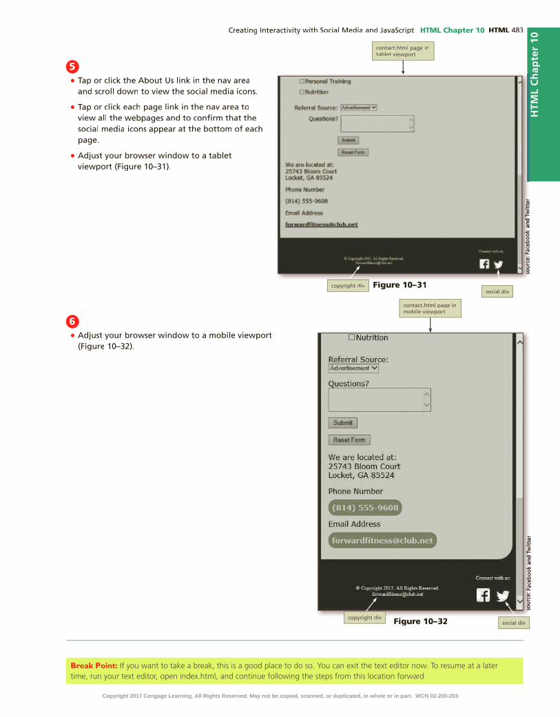
HTML Chapter 10 HTML
HTM
L C
hap
ter
10
5•
•
•
Figure 10–31
Figure 10–32
6•
Break Point: If you want to take a break, this is a good place to do so. You can exit the text editor now. To resume at a later time, run your text editor, open index.html, and continue following the steps from this location forward.
Copyright 2017 Cengage Learning. All Rights Reserved. May not be copied, scanned, or duplicated, in whole or in part. WCN 02-200-203
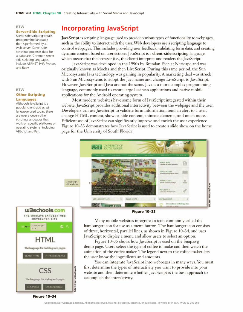
HTML HTML Chapter 10
Incorporating JavaScriptJavaScript is scripting language used to provide various types of functionality to webpages, JavaScript is scripting language used to provide various types of functionality to webpages, JavaScriptsuch as the ability to interact with the user. Web developers use a scripting language to control webpages. This includes providing user feedback, validating form data, and creating dynamic content based on user actions. JavaScript is a client-side scripting language, client-side scripting language, client-side scriptingwhich means that the browser (i.e., the client) interprets and renders the JavaScript.
JavaScript was developed in the 1990s by Brendan Eich at Netscape and was originally known as Mocha and then LiveScript. During this same period, the Sun Microsystems Java technology was gaining in popularity. A marketing deal was struck with Sun Microsystems to adopt the Java name and change LiveScript to JavaScript. However, JavaScript and Java are not the same. Java is a more complex programming language, commonly used to create large business applications and native mobile applications for the Android operating system.
Most modern websites have some form of JavaScript integrated within their website. JavaScript provides additional interactivity between the webpage and the user. Developers can use JavaScript to validate form information, send an alert to a user, change HTML content, show or hide content, animate elements, and much more. Ef�cient use of JavaScript can signi�cantly improve and enrich the user experience. Figure 10–33 demonstrates how JavaScript is used to create a slide show on the home page for the University of South Florida.
BTWServer-Side ScriptingServer-side scripting entails programming language that is performed by a web server. Server-side scripting processes data for a database. Common server-side scripting languages include ASP.NET, PHP, Python, and Ruby.
BTWOther Scripting LanguagesAlthough JavaScript is a popular client-side script language used today, there are over a dozen other scripting languages that work on speci�c platforms or operating systems, including VBScript and Perl.
Figure 10–33
Figure 10–34
Many mobile websites integrate an icon commonly called the hamburger icon for use as a menu button. The hamburger icon consists of three, horizontal, parallel lines, as shown in Figure 10–34, and uses JavaScript to display a menu and allow users to select an option.
Figure 10–35 shows how JavaScript is used on the Snap.svg demo page. Users select the type of coffee to make and then watch the animation of the coffee maker. The legend next to the coffee maker lets the user know the ingredients and amounts.
You can integrate JavaScript into webpages in many ways. You must �rst determine the types of interactivity you want to provide into your website and then determine whether JavaScript is the best approach to accomplish the interactivity.
Copyright 2017 Cengage Learning. All Rights Reserved. May not be copied, scanned, or duplicated, in whole or in part. WCN 02-200-203

HTML Chapter 10 HTML
HTM
L C
hap
ter
10
Figure 10–35
JavaScript TerminologyTo use JavaScript effectively, you be familiar with its basic terminology, including
objects, properties, methods, arguments, functions, and variables.An object in JavaScript is programming code and data that can be treated as object in JavaScript is programming code and data that can be treated as object
its own entity. For example, a developer might create a validateCard object, used to determine if a credit card number entered by the user is valid. Built-in objects are values that are common to a browser (arrays, dates, and strings, for example) that neither depend on nor belong to another object. Table 10–1 contains a general list of the built-in JavaScript objects common to many browsers. JavaScript developers can create new objects based on the built-in objects, and the new objects inherit properties from the original objects.
Table 10–1 JavaScript Objects
Object Description
Array Returns an ordered set of values
Boolean Converts objects to Boolean values
Date Accesses the system time and date
Document Represents the content of a browser’s window
DOM Includes all elements related to the Document Object Model
Function Accesses information about speci�c functions
History Keeps track of webpages visited
Location Switches to a new webpage
Math Performs calculations
Navigator Obtains information about the current web browser
Number Supports special constants
Object Creates an Object wrapper
RegExp Describes patterns of characters
Screen Gives platform-speci�c information about the user’s screen
String Represents a set of characters
Window Represents a browser window
Copyright 2017 Cengage Learning. All Rights Reserved. May not be copied, scanned, or duplicated, in whole or in part. WCN 02-200-203

HTML HTML Chapter 10
JavaScript objects have properties and methods. Properties are attributes that describe an object’s characteristics. As shown in the following example, an object name and its property are separated by a period.
myForm.fname.style.backgroundColor="#ff0000" browser=chrome.appName
In this example, the object is stated �rst followed by a period and then the descriptive property. A value can be assigned to the property, or the property can return a value, as shown in the following examples. In some cases, an object can be a property of a superior object, such as a text �eld that belongs to a form.
A speci�c value can be assigned to a property:
person.name="Seth"
In this example, person is the object, name is the property, and Seth is the value assigned to the property.
Methods are actions that an object can perform. For example, methods associated with the document object might be write and open. An object and one of its methods would be written as follows:
document.write()
Where document is the object and write is a method of the documentobject. Methods are followed by parentheses, which may be empty, or may contain an argument.
An argument is a value given to a method. Some methods require arguments, argument is a value given to a method. Some methods require arguments, argumentand others do not. For example, given a document object and the write()method, the argument “Good Morning” describes the content to display for the document would be written as:
document.write(“Good Morning”)
In this case, the argument “Good Morning” describes the text content to display on the document.
A function is a set of JavaScript statements that perform a speci�c task. For example, you could create a function that calculates the sales tax for items purchased. A function must include a name and statements that specify a task to be performed. An example of a function is shown below.
function myFunction () {
statement 1;
statement 2;
statement 3;
}
A variable is a container that holds a value. JavaScript uses variables to store values temporarily in internal memory. A variable’s value can change, depending on the results of an expression or data entered by a user in a form. Variables must have a unique name and must follow the same naming conventions as user-de�ned functions.
Most JavaScript user-de�ned functions are called or invoked using event handlers. An event is the result of an action, such as a mouse click or a webpage loading into the browser. An event handler is how JavaScript associates an action with a event handler is how JavaScript associates an action with a event handlerfunction. JavaScript event handlers make webpages more dynamic and interactive by allowing JavaScript code to execute only in response to a user action, such as a mouse click. Table 10–2 lists common event handlers.
Copyright 2017 Cengage Learning. All Rights Reserved. May not be copied, scanned, or duplicated, in whole or in part. WCN 02-200-203

HTML Chapter 10 HTML
HTM
L C
hap
ter
10
Table 10–2 Event Handlers
Event Handler Description
onabort User stopped loading the page
onblur User left the object
onchange User changed the object
onclick User clicked the object
onerror Script encountered an error
onfocus User made an object active
onload Object �nished loading
onmouseover Mouse moved over an object
onmouseout Mouse moved off an object
onselect User selected contents of an object
onsubmit User submitted a form
onunload User left the page
Writing JavaScript CodeKeep the following syntax rules and guidelines in mind when writing JavaScript
code. First, JavaScript is case sensitive, which means that it distinguishes between upper- and lowercase letters. If you create a variable named foodGroup, JavaScript will not recognize this variable if it is written as FoodGroup.
Like HTML and CSS, you can incorporate comments in JavaScript code. Use two slashes for a one-line comment and use the slash and asterisk for multiline comments, as follows:
// Single line comment syntax
/* Multiple line
comment syntax */
Using semicolons to end JavaScript statements is a common practice by programmers. Though it is not always necessary, it is a good best practice. The only time the semicolon is necessary is when multiple statements appear on the same line. The semicolon is used to separate each statement, similar to how a period separates one sentence from another. The following statements are all valid:
foodOne = squash
foodTwo = pepper;
foodOne = squash; foodTwo = pepper;
You can write JavaScript within an HTML page or as a separate JavaScript �le with the �lename extension .js. When JavaScript is written within an HTML page, the code may be within the head element or the body element, depending upon the developer and the task at hand. The following is an example of how to write a JavaScript statement within an HTML document using the script tags.
<script>
JavaScript statement;
</script>
When you create JavaScript as an external .js �le, place a script element in the head element of the HTML �le and specify the external .js �le as the �le source, as follows:
<script src="scripts/myfunction.js"></script>
BTWJavaScript HelpMany websites provide help for JavaScript developers. To �nd such websites, search using keywords such as “JavaScript Tutorials” or “JavaScript Help” in your search engine.
BTWJavaScript Advantages and DisadvantagesJavaScript allows for faster response to requests such as form validation. JavaScript code downloads faster than other kinds of applets, such as Flash, and no extra plug-in is needed to execute the JavaScript code. The main disadvantage with JavaScript is that some older browser versions may not execute JavaScript code as intended.
Copyright 2017 Cengage Learning. All Rights Reserved. May not be copied, scanned, or duplicated, in whole or in part. WCN 02-200-203

HTML HTML Chapter 10
Pop-up WindowsOne common and basic use of JavaScript is to create a pop-up window. Pop-up
windows are a quick and simple way to add interactivity and capture your user’s attention. To add a pop-up window to an HTML page, use the script tags and place your JavaScript code within the script element.
You can incorporate three types of pop-up windows in a webpage: an alert box, a con�rmation box, and a prompt box. Use an alert box to display a message. This alert box to display a message. This alert boxcan be useful if you want to grab the user’s attention with information about a special promotion. To create an alert box, use the alert() method. Following is an example of an alert box code:
<script>
alert("Receive a 20% discount today!");
</script>
Use a con�rmation box to con�rm the user’s action, such as to accept changes con�rmation box to con�rm the user’s action, such as to accept changes con�rmation boxor to proceed to another page. To create a con�rmation box, use the con�rm() method. Following is an example of a con�rmation box code:
<script>
if (confirm("Do you wish to proceed?")) {
alert("You selected OK");
}
else {
alert("You chose to Cancel");
}
</script>
Use a prompt box to capture information from a user, such as a name, and then prompt box to capture information from a user, such as a name, and then prompt boxperform an action with the information. To create a prompt box, use the prompt() method. Following is an example of a prompt box code:
<script>
var name = prompt("What is your name?");
if (name != null) {
alert("Hello " + name);
}
else {
alert("You did not tell me your name. ");
}
</script>
1 INSERT SOCIAL MEDIA ICONS & LINKS | 2 STYLE SOCIAL MEDIA ICONS | 3 CREATE JAVASCRIPT ALERT MESSAGE
4 CREATE EXTERNAL JAVASCRIPT FILE MESSAGE | 5 CALL JAVASCRIPT FUNCTIONS
To Add a Pop-up Window to the Home Page
The Forward Fitness Club offers a free one-week trial membership. To ensure that potential customers are aware of this special offer, create an alert box pop-up window with information about the promotion. Why?A pop-up window will grab the user’s attention. Create a function that displays an alert box on the home page two seconds after the page has loaded. Use the setTimeout() method to delay the alert box. The following steps create an alert box in the index.html �le.
Copyright 2017 Cengage Learning. All Rights Reserved. May not be copied, scanned, or duplicated, in whole or in part. WCN 02-200-203

HTML Chapter 10 HTML
HTM
L C
hap
ter
10
1•
enter
•<script>
• enter
//Function displays alert box after two seconds
• enter setTimeout (function delay() {
• enter alert("Begin your FREE one-week trial membership today!")
• enter }, 2000);
• enter </script>
Q&
A
Figure 10–36Figure 10–36
2•
•
3•
•
Figure 10–37
To Create a Function in an External JavaScript File
Create an external JavaScript �le and then create a function that displays an alert box. To keep the JavaScript separate from the HTML, create an external JavaScript �le and then use script tags within the head of the contact.html page to reference the JavaScript �le. Why? When scripts are created as an external �le, they can be accessed from any page. Create a function that displays an alert box to thank the customer for their interest. The following steps create an external JavaScript �le and a new function.
1 INSERT SOCIAL MEDIA ICONS & LINKS | 2 STYLE SOCIAL MEDIA ICONS | 3 CREATE JAVASCRIPT ALERT MESSAGE
4 CREATE EXTERNAL JAVASCRIPT FILE MESSAGE | 5 CALL JAVASCRIPT FUNCTIONS
Copyright 2017 Cengage Learning. All Rights Reserved. May not be copied, scanned, or duplicated, in whole or in part. WCN 02-200-203

HTML HTML Chapter 10
1•
•
•myFunctions
• /* Student’s First and Last Name
• enter
• enter My Function List
• enter */
2• enter
//Thank you alert
• enter
function tyAlert() {
• enter alert("Thank you for your interest in our fitness club. We will contact you soon.");
• enter }
To Call a JavaScript Function
Use an event handler to call the tyAlert() function when a user taps or clicks the Submit button on the Contact Us page. Why? Using a JavaScript event handler adds Why? Using a JavaScript event handler adds Why? interactivity to the page.interactivity to the page.interactivity To keep the JavaScript separate from the HTML, continue using an external JavaScript �le and then add script tags within the head element of the contact.html page to head element of the contact.html page to headreference the JavaScript �le. The following steps call the tyAlert() function you created in the previous steps.
1•
•enter
• <script src="scripts/myFunctions.js" type="text/javascript"></script>
Q&
AQ
&A
Figure 10–38
1 INSERT SOCIAL MEDIA ICONS & LINKS | 2 STYLE SOCIAL MEDIA ICONS | 3 CREATE JAVASCRIPT ALERT MESSAGE
4 CREATE EXTERNAL JAVASCRIPT FILE MESSAGE | 5 CALL JAVASCRIPT FUNCTIONS
Figure 10–39
Figure 10–40Figure 10–40
Copyright 2017 Cengage Learning. All Rights Reserved. May not be copied, scanned, or duplicated, in whole or in part. WCN 02-200-203

HTML Chapter 10 HTML
HTM
L C
hap
ter
10
2•
• SPACeBAr onclick="tyAlert()" •
3•
•
4•
•
Q&
A
HTM
L C
hap
ter
10
Figure 10–41Figure 10–41
Figure 10–42
The open() MethodYou can use the open() method to open a new browser window. This is
helpful when you want to provide customers additional information about a product or service. You can specify parameters for the new window, such as the width and height. An example of the open() method is shown below.
window.open("http://www.cengage.com", "_blank", "width=400, height=400");
In this example, a new window opens to the Cengage.com home page. The _blank speci�es to open the webpage in a new window. The width and height of the new window are set to 400 pixels. The minimum value for a width and height value is 100 pixels.
Table 10–3 lists commonly used attributes of the open() method, which are used to de�ne pop-up window features.
Table 10–3 open() Method Attributes
Attribute Description Example
height States height in pixels “height=450”
location Includes address bar “location=yes”
menubar Includes menu bar “menubar=yes”
resize Allows user to resize “resizeable=yes”
scrollbars Includes scroll bars “scrollbars=yes”
status Includes status bar “status=yes”
titlebar Removes title bar “titlebar=yes”
toolbar Includes toolbar “toolbar=yes”
width States width in pixels “width=220”
height States height in pixels “height=450”Copyright 2017 Cengage Learning. All Rights Reserved. May not be copied, scanned, or duplicated, in whole or in part. WCN 02-200-203

HTML HTML Chapter 10
To Add More Functions to a JavaScript File
Create three more functions in the external myFunctions.js �le. Create a function to use the open() method to display examples of the exercises in the description list on the About Us page. Why? Using the window open() method to display additional content about how to perform an exercise adds value to your website. First, create a function that opens a window with a video that demonstrates how to perform a burpee. Next, create a function that opens a window with a video that demonstrates how to perform a plank. Finally, create a function that opens a window with a video that demonstrates how to perform a mountain climber. The following steps create three functions within an external JavaScript �le.
1•
•enter
• //Burpees video window//Burpees video window
• enter function burpees() {
• enter window.open("scripts/burpees.html", "_blank", "width=610, height=360");
• enter }
3
2•
enter
• //Plank video windowvideo window
• enter
function plank() {
• enter window.open("scripts/plank.html", "_blank", "width=610, height=360");
• enter }
Q&
AQ
&A
1 INSERT SOCIAL MEDIA ICONS & LINKS | 2 STYLE SOCIAL MEDIA ICONS | 3 CREATE JAVASCRIPT ALERT MESSAGE
4 CREATE EXTERNAL JAVASCRIPT FILE MESSAGE | 5 CALL JAVASCRIPT FUNCTIONS
Figure 10–43
Figure 10–44
Copyright 2017 Cengage Learning. All Rights Reserved. May not be copied, scanned, or duplicated, in whole or in part. WCN 02-200-203

HTML Chapter 10 HTML
HTM
L C
hap
ter
10
3•
enter
• //Mountain climber video windowclimber video window
• enter
function mtnClimber() {
• enter window.open("scripts/mtn.html", "_blank", "width=610, height=360");
• enter }
3
4•
Q&
A
HTM
L C
hap
ter
10
Figure 10–45
To Call the New Functions
Create buttons on the About Us page that, once clicked, each display a window with a video that demonstrates an exercise. Why? The video demonstration helps the user understand how to perform the exercise.Why? The video demonstration helps the user understand how to perform the exercise.Why? First, add a script element within the head element of the about.html �le to reference the myFunctions.js �le. Next, create a button that uses the onclick event handler to call the burpees() function. Then, create a button that uses the onclick event handler to call the plank() function. Finally, create a button that uses the onclick event handler to call the mtnClimber() function. The following steps create buttons with onclick event handlers on the About Us page.
1•
•enter
• <script src="scripts/myFunctions.js" type="text/javascript"></script>
2•
<br>
• enter
<button onclick="burpees()">See example</button>
Q&
A
1 INSERT SOCIAL MEDIA ICONS & LINKS | 2 STYLE SOCIAL MEDIA ICONS | 3 CREATE JAVASCRIPT ALERT MESSAGE
| 4 CREATE EXTERNAL JAVASCRIPT FILE MESSAGE | 5 CALL JAVASCRIPT FUNCTIONS
Figure 10–46
Figure 10–47
Copyright 2017 Cengage Learning. All Rights Reserved. May not be copied, scanned, or duplicated, in whole or in part. WCN 02-200-203

HTML HTML Chapter 10
5•
•
•
6•
•
3•
<br>
• enter
<button onclick="plank()">See example</button>
Q&
A
Figure 10–48
Figure 10–49
Figure 10–50
4•
<br>
• enter
<button onclick="mtnClimber()"> See example</button>
Q&
A
Figure 10–51Copyright 2017 Cengage Learning. All Rights Reserved. May not be copied, scanned, or duplicated, in whole or in part. WCN 02-200-203

HTML Chapter 10 HTML
HTM
L C
hap
ter
10
7•
•
8•
Figure 10–52
To Validate the Style Sheet
Always run your �les through W3C’s validator to check the document for errors. If the document has any errors, validating gives you a chance to identify and correct them. Validation is also an effective troubleshooting tool during the development process and adds a valuable level of professionalism to your work. The following steps validate a CSS document.
1 http://jigsaw.w3.org/css-validator/
2
3
4
5
6
7
8
To Validate the HTML Files
Every time you create a new webpage or modify an existing webpage, run it through W3C’s validator to check the document for errors. If any errors exist, you need to correct them. Validation is also an effective troubleshooting tool during the development process and adds a valuable level of professionalism to your work. The following steps validate an HTML document.
1 http://validator.w3.org/
2
Copyright 2017 Cengage Learning. All Rights Reserved. May not be copied, scanned, or duplicated, in whole or in part. WCN 02-200-203

HTML HTML Chapter 10
3
4
5
6
7
8
9
Chapter SummaryIn this chapter, you learned about the various social media options for a business. You learned how to add social media icons and links to a website. You styled social media icons with CSS. You also learned how to create pop-up windows using JavaScript. You learned how to write JavaScript code within an HTML document. You also learned how to write JavaScript functions in an external JavaScript �le and reference the �le within an HTML page. The items listed below include all the new skills you have learned in this chapter, with the tasks grouped by activity.
Using Social MediaAdd Social Media Icons and Links to the Home
Page (HTML 478)Style Copyright div Element (HTML 481)Style the Social div Element and Social Media
Icons (HTML 481)
Incorporating JavaScriptAdd a Pop-up Window to the Home Page
(HTML 488)
Create a Function in an External JavaScript File (HTML 489)
Call a JavaScript Function (HTML 490)Add More Functions to a JavaScript File
(HTML 492)Call the New Functions (HTML 493)
How will you infuse interactivity within your website?Use these guidelines as you complete the assignments in this chapter and create your own webpages outside of this class.
1. Determine if social media is ideal to promote your business.
a) Review the various social media options.
b) Determine which social media options to implement.
2. Decide how to best integrate JavaScript.
a) Determine the types of interactivity you wish to use within your website.
b) Determine what code is needed to accomplish your goal.
3. Decide what pages will use JavaScript.
a) Determine the whether or not to write the JavaScript code within an HTML page.
b) Determine if an external JavaScript �le is best for your website.
4. Determine other forms of interactivity that JavaScript can provide.
a) Research how to use JavaScript to validate form information.
b) Decide if pop-up messages are appropriate for your site.
CO
NS
IDE
R T
HIS
Copyright 2017 Cengage Learning. All Rights Reserved. May not be copied, scanned, or duplicated, in whole or in part. WCN 02-200-203

HTML Chapter 10 HTML
HTM
L C
hap
ter
10S
TU
DE
NT
AS
SIG
NM
EN
TS
Apply Your Knowledge
Using Social Media and JavaScriptInstructions: In this exercise, you will use your text editor to add social media icons to a webpage. You will also add a pop-up message to the webpage. First, you add Facebook and Twitter icons and include a link to each social media website. Next, use JavaScript to create a pop-up message using the alert() method. Work with the apply10.html �le in the apply folder and images �les in the apply\images folder from the Data Files for Students. The completed webpage is shown in Figure 10–53. You will also use professional web development practices to indent, space, comment, and validate your code.
Perform the following tasks:1. Open apply10.html in your text editor, review the page, add a title, modify the comment at the
top of the page to include your name and today’s date.
2. Update the CSS link within the head element to use the CSS �le located within the apply\css folder.
3. Insert a paragraph element within the footer element that includes the text, Connect with us at:.
4. Insert an img element to display the Facebook icon contained within the apply\images folder. Include appropriate alt text.
5. Insert an anchor element to link the Facebook icon to facebook.com.
6. Insert an img element to display the Twitter icon contained within the apply\images folder. Include appropriate alt text.
How should you submit solutions to questions in the assignments identi�ed with a symbol? symbol?Every assignment in this book contains one or more questions identi�ed with a symbol. These questions require you to think beyond the assigned presentation. Present your solutions to the questions in the format required by your instructor. Possible formats may include one or more of these options: create a document that contains the answer; present your answer to the class; discuss your answer in a group; record the answer as audio or video using a webcam, smartphone, or portable media player; or post answers on a blog, wiki, or website.
CO
NS
IDE
R T
HIS
Figure 10–53
Continued >Copyright 2017 Cengage Learning. All Rights Reserved. May not be copied, scanned, or duplicated, in whole or in part. WCN 02-200-203

HTML HTML Chapter 10S
TU
DE
NT
AS
SIG
NM
EN
TS
7. Insert an anchor element to link the Twitter icon to twitter.com.
8. Insert a script element within the head element.
9. Insert a JavaScript comment within the script element that includes the text, Function displays alert box.
10. Insert the following JavaScript code below the comment:setTimeout (function message() {
alert("Use JavaScript to create pop-up messages to capture the user’s attention.")
}, 3000);
11. Save all of your changes and open the apply10.html in your browser.
12. Validate your HTML document using the W3C validator found at validator.w3.org and �x any errors that are identi�ed.
13. Submit the �les in a format speci�ed by your instructor.
14. In this exercise, you created absolute links to facebook.com and twitter.com. Explain how to update these links so that when selected, they open in a new tab rather than the current window.
Extend Your Knowledge
Researching Social Media Brand InformationInstructions: In this exercise, you research brand information for popular social media outlets. You will summarize your �ndings and provide examples of the available social media logos speci�ed for use by the social media outlet.
Perform the following tasks:1. Select three social media options and research the brand assets for each. Use the name of the
social media and “brand” or “brand assets” or “brand resources” in your search.
2. Summarize the brand asset guidelines for each social media option.
3. Include one approved social media icon or logo provided by the social media website.
4. Include a link for each resource.
5. Submit the document in a format speci�ed by your instructor.
6. In this exercise, you researched how to use social media brand information. Many social media sites highlight how some select businesses have used the social media site to increase brand awareness. Read one of these business highlights and summarize your �ndings.
Analyze, Correct, Improve
Improving a Webpage with JavaScriptInstructions: Work with the analyze10.html �le in the analyze folder from the Data Files for Students. The analyze10.html webpage needs pop-up windows to display larger pictures. First, correct the JavaScript syntax errors on the page. Next, use the open() method to display a new window with a picture for the �rst thumbnail. Then, use the open() method to display a new window with a picture for the second thumbnail and a new window with a picture for the third thumbnail. Finally, create new style rules for the �gure and img elements. Use Figure 10–54 as a guide to correct these �les.
Apply Your Knowledge continued
Copyright 2017 Cengage Learning. All Rights Reserved. May not be copied, scanned, or duplicated, in whole or in part. WCN 02-200-203

HTML Chapter 10 HTML
HTM
L C
hap
ter
10S
TU
DE
NT
AS
SIG
NM
EN
TS
1. Correcta. Open the analyze10.html �le in your text editor from the Data Files for Students. Modify the
comment at the top of the page to include your name and today’s date and then link the �le to analyzestyles10.css. Add a title to the page and add your name to the footer element.
b. Review the JavaScript functions contained within the body element and wrap them in a script element.
c. Move the script element to the head element.
d. Open the analyzestyles10.css �le in your text editor from the Data Files for Students and then modify and correct the comment at the top of the document to include your name and today’s date.
2. Improvea. In the analyze10.html �le, add an onclick event handler to the �rst img element that calls the
function, cb1.
b. In the analyze10.html �le, add an onclick event handler to the second img element that calls the function, cb2.
c. In the analyze10.html �le, add an onclick event handler to the third img element that calls the function, cb3.
d. In the analyzestyles10.css �le, create a style rule for the �gure element to align it center. Include a comment for the style rule.
e. In the analyzstyles10.css �le, create a style rule for the img element and specify 1em of 1em of 1em
padding. Include a comment for the style rule.
f. Save all of your changes and open the analyze10.html in your browser.
g. Validate your CSS �le using the W3C validator found at http://jigsaw.w3.org/css-validator/ and �x any errors that are identi�ed.
h. Validate your HTML webpage using the W3C validator found at validator.w3.org and �x any errors that are identi�ed.
i. In this exercise, you used JavaScript to view larger images. Use your browser to research how to use JavaScript to create an image gallery and write a summary of your �ndings.
Figure 10–54
Copyright 2017 Cengage Learning. All Rights Reserved. May not be copied, scanned, or duplicated, in whole or in part. WCN 02-200-203

HTML HTML Chapter 10S
TU
DE
NT
AS
SIG
NM
EN
TS
In the Labs
Lab 1: Determining the Best Social Media Outlets for the New Harvest Food Bank WebsiteProblem: You volunteer at a local food bank called New Harvest Food Bank that collects commu-nity food donations and provides food and other services to those in need. The company has asked you to create a responsive website. You have already created the website but now need to research how to promote the food bank using social media.
Instructions: Perform the following tasks:1. Research information about the best social media options for a food bank.
2. Determine the top three social media options.
3. Explain why the food bank should use your recommended social media options.
4. Provide a list of pros and cons for each social media site that you recommend.
5. Submit your recommendations in the format speci�ed by your instructor.
6. In this assignment, you recommended social media options for the food bank. Extend your research to learn more best practices and tips for non-pro�ts to maximize results. Provide a list of the top ten best practices.
Lab 2: Adding Social Media and a Pop-up Message to Steve’s Screen ServicesProblem: You work for a screening company called Steve’s Screen Services that specializes in screening, cleaning, and repairing screened patios. The company has asked you to create a respon-sive website. You have already created the website, but now need to add social media icons and links. You then need to style the icons and links. Finally, you need to add a pop-up message to the quote.html page. The home page with the social media icons is shown in Figure 10–55. The Quote page with the pop-up message is shown in Figure 10–56.
Instructions: Perform the following tasks:1. Save the images within the lab2\images folder from the Data Files for Students to your lab2\
images folder.
2. Open the index.html document and update the comment at the top of the page to include today’s date.
3. Wrap the content in the footer element within a paragraph element.
4. Wrap the paragraph element you created in the previous step within a div element and assign an id value of copyright.
5. Create a new div element below the div you created in the previous step and assign an id value of social.
6. Create a new paragraph element within the social div and include the text, Follow us at:.
Copyright 2017 Cengage Learning. All Rights Reserved. May not be copied, scanned, or duplicated, in whole or in part. WCN 02-200-203

HTML Chapter 10 HTML
HTM
L C
hap
ter
10S
TU
DE
NT
AS
SIG
NM
EN
TS
7. Insert an img element below the new paragraph and insert the Facebook icon. Include appropriate alt text. Link the img element to facebook.com.
8. Insert an image element below the new paragraph and insert the Twitter icon. Include appropriate alt text. Link the img element to twitter.com.
9. Save your changes, copy the footer element, and then paste it over the footer element on the contact.html page, the gallery.html page, the quote.html page, and the services.html page. Save all of your changes.
10. In the screenstyles.css �le, create a new style rule above the media queries for the #copyright selector, specify a �oat property with a value of left and then specify a width property with a value of 80%. Include an appropriate comment for the new style rule.
Figure 10–55
Figure 10–56
Continued >Copyright 2017 Cengage Learning. All Rights Reserved. May not be copied, scanned, or duplicated, in whole or in part. WCN 02-200-203

HTML HTML Chapter 10S
TU
DE
NT
AS
SIG
NM
EN
TS
11. In the screenstyles.css �le, create another new style rule above the media queries for the #social selector, specify a �oat property with a value of right and then specify a width property with a value of 20%. Include an appropriate comment for the new style rule.
12. In the screenstyles.css �le, in the desktop media query, add the over�ow property with a value of auto to the existing style rule for the body element.
13. In the screenstyles.css �le, in the desktop media query, create a new style rule for anchor elements within the footer element that speci�es a color property and a white value. Include an appropriate comment for the new style rule.
14. Save your changes, open the home page in your browser, and compare it to Figure 10–55.
15. Open quote.html in your text editor and update the comment with today’s date.
16. Create a script element within the head element.
17. Create a function named thanks within the script element that creates an alert message with the text, Thank you for your interest. We will contact you very soon.
18. Add an onclick event handler to the submit button that calls the thanks function.
19. Save your changes, open quote.html in your browser, and then click the Submit button to display the alert message, as shown in Figure 10–56.
20. Validate your HTML code and �x any errors.
21. Validate your CSS code and �x any errors.
22. Submit your assignment in the format speci�ed by your instructor.
23. Use your browser to research the term, Social Media Marketing Expert. Explain the responsibilities for this job.
Lab 3: Expand Your WorldCreating a Hamburger IconProblem: In this chapter you explored JavaScript and how it is used to create interaction within a website. As noted in the chapter, JavaScript is used to create the familiar hamburger icon, com-monly found near the top of mobile websites to serve as a menu button. In this exercise, you will explore how to create the hamburger icon with JavaScript.
Instructions:1. Use your browser to search for more information about the hamburger icon and discuss how it
is used.
2. Discuss the various ways to create a hamburger icon.
3. Identify three resources that demonstrate how to create a functional hamburger icon and include an example of the code required from at least one resource. Include links to all of your resources.
4. Should mobile websites embrace the hamburger icon? Why or why not? Discuss your �ndings.
5. Submit your answers in the format speci�ed by your instructor.
6. In this exercise, you discovered various ways to create a functional hamburger icon. Research and discuss the JavaScript Sidr plugin.
In the Labs continued
Copyright 2017 Cengage Learning. All Rights Reserved. May not be copied, scanned, or duplicated, in whole or in part. WCN 02-200-203

HTML Chapter 10 HTML
HTM
L C
hap
ter
10S
TU
DE
NT
AS
SIG
NM
EN
TS
Consider This: Your Turn
1. Using Social Media and Your Personal Portfolio Website
Personal
Part 1: Employers routinely research potential employees. Sometimes, part of the research process involves social media. Potential employers may review the social media page(s) to learn more about the candidate. In this exercise, you research best practices when it comes to using social media and its relationship to gainful employment.
1. Use your browser to research how you can use social media to improve your chances for future employment. Discuss your �ndings.
2. Use your browser to research things to avoid when it comes to social media and future employment. Discuss your �ndings.
3. Submit your assignment in the format speci�ed by your instructor.
Part 2:
Discuss the reasons why you should or should not include social media links on your portfolio page.
2. Adding Social Media and JavaScript to the WebDevPros Website
Professional
Part 1: In Chapter 9, you added a video to the WebDevPros website. In this exercise, you update the site to include social media and JavaScript. Update the site as follows:
1. Open the external style sheet you created in Chapter 9 and save it with the name webdevstyles10.css in the styles folder within the your_turn_2 folder.
2. Add your name and the current date as a comment to the �rst line of the webdevstyles10.css �le.
3. Open the �les you created for WebDevPros in Chapter 9 in your HTML editor and make sure your name and the current date are added as a comment to the �rst line of all �les.
4. Update the HTML �les to:
a. Insert at least two social media icons on all pages.
b. Include links to the social media home page.
c. Create an alert message.
5. Update the CSS �le to:
a. Style the social media icons.
b. Add comments to note all changes and updates.6. Save and test your �les.
7. Validate and correct your HTML and CSS �les, and submit your assignment in the format speci�ed by your instructor.
Part 2: In this exercise, you integrated two social media icons. Identify three other social media resources that you believe would also be good to promote your website.
3. Improving the Design of the Dog Hall of Fame Website
Research and Collaboration
Part 1: In Chapter 9, you added a video to the Dog Hall of Fame website. In this exercise, you update the site to include social media and JavaScript. Do the following activities as a group:
1. Open the external style sheet you created in Chapter 9 and save it with the name dogstyles10.css in the styles folder within the your_turn_3 folder.
Continued >Copyright 2017 Cengage Learning. All Rights Reserved. May not be copied, scanned, or duplicated, in whole or in part. WCN 02-200-203

HTML HTML Chapter 10S
TU
DE
NT
AS
SIG
NM
EN
TS
2. Add your names and the current date as a comment to the �rst line of the dogstyles10.css �le.
3. Open the �les you created for the Dog Hall of Fame in Chapter 9 in your HTML editor and make sure your names and the current date are added as a comment to the �rst line of all �les.
4. Modify the link to the external style sheet to reference dogstyles10.css.
5. Discuss the best social media options for your website and integrate at least two. At a minimum, update the HTML page to do the following:
a. Add social media icons to every page.
b. Include links to the social media home page.
6. Update the CSS �le to:
a. Style the social media icons.
b. Add comments to note all changes and updates.
7. Create an external JavaScript �le and do the following:
a. Create at least two functions on the page.
b. Link the page to the appropriate HTML webpage(s).
c. Call each function from an HTML webpage.
d. Add comments to note all functions and team members.
8. Save and test your �les.
9. Validate and correct your HTML and CSS �les, and submit your assignment in the format speci�ed by your instructor.
Part 2: As a group, research other ways to use JavaScript within your website and summarize your �ndings.
Consider This: Your Turn continued
Copyright 2017 Cengage Learning. All Rights Reserved. May not be copied, scanned, or duplicated, in whole or in part. WCN 02-200-203
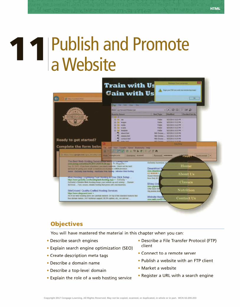
Microsoft HTML5 & CSS3 2015
11 Publish and Promote a Website
•
•
•
•
•
•
•
•
•
•
•
Objectives
HTML
Copyright 2017 Cengage Learning. All Rights Reserved. May not be copied, scanned, or duplicated, in whole or in part. WCN 02-200-203

IntroductionOnce a website has been created, validated, and tested, the next step is to publish it on a web server to make it accessible online for customers to access. You can then take appropriate steps to promote your website so potential customers can �nd it. In this chapter, you will learn how to publish and promote your website. You will learn how to use the meta tag to add a description to a webpage, and how to connect to a remote server and publish your website. You will also learn about the many ways to promote and market your website.
Project — Publish a WebsiteIn Chapter 11, you publish and promote the Forward Fitness Club website to establish an online presence for the business. This chapter provides information for publishing webpages and how to promote a website after it is published.
The project in this chapter adds a description meta tag to the Forward Fitness Club webpages and then publishes the Forward Fitness Club website. To perform these tasks, you �rst add meta tags to each webpage. Next, you connect to a remote server, and then you use an FTP client to publish your website. Figure 11–1 shows the
Publish and Promote a Website11
HTML
(a) index.html
(b) about.html
Figure 11–1
(c) contact.html
Copyright 2017 Cengage Learning. All Rights Reserved. May not be copied, scanned, or duplicated, in whole or in part. WCN 02-200-203

Microsoft HTML5 & CSS3 2015 HTML
description meta tags added to the home page, the About Us page, and the Contact Us page. Figure 11–2a shows the published home page as displayed on a desktop browser. Figure 11–2b shows the published home page as displayed on an iPad. Figure 11-2c shows the published home page as displayed on an iPhone.
RoadmapIn this chapter, you will learn how to create and publish the webpages shown in
Figures 11–1 and 11–2. The following roadmap identi�es general activities you will perform as you progress through this chapter:
1. insert a description meta tag.2. modify alt tags.3. connect to a remote server.
4. upload files to a remote server.5. vieW and test WeBsite pages.
At the beginning of step instructions throughout the chapter, you will see an abbreviated form of this roadmap. The abbreviated roadmap uses colors to indicate chapter progress: gray means the chapter is beyond that activity; blue means the task being shown is covered in that activity; and black means that activity is yet to be covered. For example, the following abbreviated roadmap indicates the chapter would be showing a task in the 4 UPLOAD FILES TO REMOTE SERVER activity.
Figure 11–2
(c) Mobile Viewport
(a) Desktop Viewport
(b) Tablet Viewport
1 INSERT META TAG | 2 MODIFY ALT TAGS | 3 CONNECT TO REMOTE SERVER
4 UPLOAD FILES TO REMOTE SERVER | 5 VIEW & TEST WEBSITE PAGES
Use the abbreviated roadmap as a progress guide while you read or step through the instructions in this chapter.
Copyright 2017 Cengage Learning. All Rights Reserved. May not be copied, scanned, or duplicated, in whole or in part. WCN 02-200-203

HTML HTML Chapter 11
Finding a WebsiteFinding a website is easy when you know the website address. But how do you locate a website when you do not know the URL? The answer is a search engine.
Search Engines Many people use a search engine to �nd speci�c businesses or content on the
web. A search engine is an online tool that searches for websites based on keywords entered by a user. Search engines provide a search form where users type keywords to use in the search. Search engines use robots (also known as bots or spiders), which are programs that run automated tasks on the Internet, to traverse the web in search of the keywords entered by users. As the robots browse the web, they index and organize their �ndings, which are stored in a database. The robots view and may store webpage titles, meta tag keywords and descriptions, and h1 or other heading element content. Popular search engines include Google.com, Bing.com, Ask.com, and Yahoo.com, as shown in Figure 11–3.
(a) Google
(b) Bing
(c) Ask
(d) Yahoo!
Figure 11–3
Copyright 2017 Cengage Learning. All Rights Reserved. May not be copied, scanned, or duplicated, in whole or in part. WCN 02-200-203

HTML Chapter 11 HTML
HTM
L C
hap
ter
11
Google is the most popular search engine in the world. In fact, according to NetMarketShare, Google has over 67 percent market share when it comes to search engines. Yahoo! is in second place with just over 10 percent market share.
Search Engine OptimizationSearch engine optimization (SEO) is the process of improving the amount of
traf�c to your website by improving the ranking of your site in search engine results pages (SERPs). Your rank is the position of your webpage link, as displayed on the rank is the position of your webpage link, as displayed on the rankSERP. Each time your webpage link appears in a SERP of a related query, it creates what is called an impression. The more impressions you have in a SERP, the higher the chances of a user visiting your website. Many business have learned the art of effective SEO and have signi�cantly boosted the amount of traf�c to their websites.
Optimizing a website involves editing the content and HTML code in the webpage to increase its relevant keywords and to remove barriers to the page indexing functions of search engines.
Effective SEO involves several key tasks. First, brainstorm keywords that describe your business and write them down. Use these keywords within your domain name, page titles, heading elements, and meta tags. Research your competitors and note their keywords. For example, Forward Fitness Club might brainstorm the keywords �tness, gym, nutrition, �tness equipment, personal training, free trial, and �tness classes. The business should then examine its page titles, heading elements, and meta tags and add these keywords throughout the website pages.
Use the company name within the title element, up to 70 characters. This helps identify the business and is commonly displayed in the SERP. Give focus to two keywords within your meta description and consistently use these keywords within a description meta tag across your webpages. Your description meta tag should not exceed 160 characters. For example, the Forward Fitness Club might use �tness and nutrition as its two keywords and consistently use these words in the meta tags and heading elements throughout the website.
Optimize your images. Because robots cannot read text on images, be sure to use keywords within the alt text of your images. For example, the Forward Fitness Club uses the �tness and nutrition keywords in some alt text, but you can review the current alt text to add more keywords as appropriate.
Baidu Search EngineBaidu is a popular search engine in China with over 8 percent market share. Baidu is often referred to as “China’s Google.”
Search EnginesBoth Google and Yahoo! provide information about optimizing your websites. Review their webmaster guidelines and resources for ideas on registering with their search engines.
How does Google generate its results page?Google uses an algorithm to generate its search results page. These algorithms are known as Panda, Penguin, and Hummingbird.
CO
NS
IDE
R T
HIS
Meta TagsThe meta tag name derives from the word, metadata, which is information
about data. You already included the following meta tag in the initial HTML code that you inserted into every webpage:
<meta charset=”utf-8”>
You included this element in all webpages throughout the book. As mentioned earlier, this statement declares the character encoding as UTF-8. The Unicode Transformation Format (UTF) is a compressed format that allows computers to display and manipulate text. When the browser encounters this meta tag, it displays the webpage properly, based on the particular UTF-8 encoding embedded in the tag. UTF-8 is the preferred encoding standard for webpages, email, and other applications.
Copyright 2017 Cengage Learning. All Rights Reserved. May not be copied, scanned, or duplicated, in whole or in part. WCN 02-200-203

HTML HTML Chapter 11
Besides specifying the character encoding, the meta tag also allows you to specify the author, a description, and keywords for the webpage through the use of the name and content attributes. The name attribute identi�es the type of information in the content attribute, and the content attribute identi�es the speci�c phrases or words that you want to appear as metadata. You must use these two attributes together; the content attribute cannot be de�ned if the name attribute is not de�ned. The following is an example of an author meta tag:
<meta name="author" content="Jordan Wells">
In this meta tag example, author is the value for the name attribute. The content attribute speci�es the name of the author, in this case, Jordan Wells. The following is an example of a description meta tag:
<meta name="description" content="Forward Fitness Club is an elite fitness center dedicated to helping our clients achieve their fitness and nutrition goals.">
The description is what some search engines add below your webpage URL in the search results to describe the content of the webpage, as shown in a Google search results list in Figure 11–4. Visitors often read the description to determine whether they want to click that particular link (or URL) in the list of URLs in the search engine results. In the description meta tag example, description is the value for the name attribute. The value of the content attribute is a descriptive sentence about the Forward Fitness Club.
Figure 11–4
Google Search EngineIf you use Google to search for the phrase “search engine,” Google does not list itself in the results.
The following is an example of a keywords meta tag:
<meta name="keywords" content="fitness, gym, group fitness, nutrition">
In this meta tag example, keywords is the value for the name attribute. The content attribute speci�es keywords that describe the website content, in this case, �tness, gym, group �tness, and nutrition. The keywords meta tag used to be a common standard, but it is not heavily used today. Search engine companies discovered that many websites used keywords that did not pertain to its websites. As a result, many search engines, including Google, have stopped using the keywords meta tag in their search algorithms.
In this project, you will use the description meta tag to provide search engines information about the content of the Forward Fitness Club website.
Copyright 2017 Cengage Learning. All Rights Reserved. May not be copied, scanned, or duplicated, in whole or in part. WCN 02-200-203

HTML Chapter 11 HTML
HTM
L C
hap
ter
11
To Add a Description Meta Tag to a Webpage
To help search engines �nd and index the Forward Fitness Club website, add a description meta tag to the home, About Us, Classes, Nutrition, and Contact Us pages. You place the description meta tag within the head element and should include several keywords to improve SEO. Each description meta tag describes the purpose of a particular page for the Forward Fitness Club website. When description meta tags are used on pages throughout a website and contain consistent keywords, it helps to improve SERP. Why? Most search engines display the description of a website in its search results. The following steps add a description meta tag to the Forward Fitness Club webpages.
1•
•
enter
• <meta name="description" content="Forward Fitness Club is an elite fitness center dedicated to helping our clients achieve their fitness and nutrition goals. We provide state-of-the-art fitness equipment, group fitness classes, and nutrition planning."> –
2•
•
•enter
• <meta name="description" content="Forward Fitness Club has state-of-the-art fitness equipment and provides personal training.">
3•
•
•enter
• <meta name="description" content="Forward Fitness Club has many fitness classes to meet your needs, including boot camp, cardio, kickboxing, spinning, yoga, and zumba.">
1 INSERT META TAG | 2 MODIFY ALT TAGS | 3 CONNECT TO REMOTE SERVER
4 UPLOAD FILES TO REMOTE SERVER | 5 VIEW & TEST WEBSITE PAGES
Figure 11–5
Figure 11–6
Figure 11–7
Note:
Copyright 2017 Cengage Learning. All Rights Reserved. May not be copied, scanned, or duplicated, in whole or in part. WCN 02-200-203

HTML HTML Chapter 11
4•
•
•enter
• <meta name="description" content="Forward Fitness Club provides nutrition guides and meal planning to help you meet your nutrition goals.">
•
•
• enter
• <meta name="description" content="Forward Fitness Club provides a complimentary one-week trial membership. Contact us today to learn more.">
•
Figure 11–8
To Modify Alt Text on a Webpage
Now that you have identi�ed keywords for the Forward Fitness website, review the alt text in the img elements on each page and modify the text as necessary for improved SEO. Why? Consistent use of keywords throughout a website improves SERP. The following steps modify img alt text on the Forward Fitness Club webpages.
1•
•
fitness
2•
•
•Weight Fitness Equipment
•Cardio Fitness Equipment
1 INSERT META TAG | 2 MODIFY ALT TAGS | 3 CONNECT TO REMOTE SERVER
4 UPLOAD FILES TO REMOTE SERVER | 5 VIEW & TEST WEBSITE PAGES
Figure 11–9
Figure 11–10
Copyright 2017 Cengage Learning. All Rights Reserved. May not be copied, scanned, or duplicated, in whole or in part. WCN 02-200-203

HTML Chapter 11 HTML
HTM
L C
hap
ter
11
3•
•
•group fitness classes banner image
4•
•
•good nutrition
•healthy
food
• healthy nutrition meal
•
Figure 11–11
Figure 11–12
Publishing a WebsiteWhen you �nish developing your website, the next steps are to register a domain name, determine a web hosting strategy, and then publish the website to make it accessible to everyone with an Internet connection. To complete these steps, you need to select and register a domain name, select a web hosting service, and then transfer the website �les to the host’s server.
Domain NameA domain name is the server name portion of a URL. You can use the domain
name of the server on which you publish your webpages together with a path to your speci�c pages for your webpage address. However, this webpage address option can result in a URL that is long, hard to remember, and not representative of your website or business.
As an alternative, you can register your own domain name on the Internet for minimal cost per year. A unique domain name can make it easier for visitors to �nd your webpages. The Forward Fitness Club wants to register a unique domain name for their website, as long as you can �nd a name that is both suitable and available.
When selecting and registering a domain name, make sure it represents your business. Brainstorm and make a list of the top �ve keywords or phrases that best describe your business. For example, “forward” or “�tness” would be an ideal domain name for the Forward Fitness Club. A short and concise domain name makes it more
Copyright 2017 Cengage Learning. All Rights Reserved. May not be copied, scanned, or duplicated, in whole or in part. WCN 02-200-203

HTML HTML Chapter 11
memorable. Long domain names are more dif�cult to remember. Avoid the use of hyphens within a domain name, as this make the domain name harder to pronounce and less memorable.
The .com top-level domain (TLD) name is preferred for businesses. Many users assume that business websites end with .com, so using that TLD makes it easier for visitors to �nd your website. However, you might �nd that the .com TLD you want has already been taken. In this instance, you could consider several open, top-level domain names. An open TLD means that any person or entity can register with the domain name. Furthermore, the .com TLD is not always the best option for every website. For example, most non-pro�t organizations use the .org TLD. Likewise, most educational institutions use the .edu TLD. Table 11–1 lists common TLDs and their original purpose.
Name Original Purpose
.com Commercial
.biz Business or commercial
.net Network-related domains
.co Business or commercial
.org Non-pro�t organizations
.edu Educational institutions
.gov Restricted use by the United States government
.mil Restricted use by the United States military
.me Personal website
Table 11–1 Common Top-Level Domains
InterNICInterNIC contains trusted public information regarding Internet domain name registration services. The InterNIC website includes an FAQ area with information about domain name registrars, as well as links for domain name disputes.
Top-Level DomainsMany companies have applied for generic top-level domains. For example, Google has applied for the .google and .youtube domain names. The list of requests for new TLDs is very long and can be accessed at https://gtldresult.icann.org. Select Program Status from the top navigation area and then select Current Application Status to view the list.
Do domain names expire?Yes. Once you purchase a domain name, note the expiration date. If you do not renew the domain name, it may go to an auc-tion to be sold.
CO
NS
IDE
R T
HIS
Website HostingThe next step in publishing your website is to �nd a hosting service. One
popular option is to use a company that charges for website hosting services. Of the thousands of companies that provide web hosting services, most charge a monthly fee, but some offer free web hosting in exchange for advertising on your website. Bluehost.com, as shown in Figure 11–13, is one of many web hosting companies.
To determine if the domain name you are considering is available, you can start your search at InterNIC, www.internic.net. InterNIC is a registered service mark of the U.S. Department of Commerce. The InterNIC website is operated by the Internet Corporation for Assigned Names and Numbers (ICANN) to provide information to the public regarding Internet domain name registration services. ICANN is responsible for managing and coordinating the Domain Name System (DNS) so that every Internet address is unique, and so that all users of the Internet can �nd valid addresses.
Copyright 2017 Cengage Learning. All Rights Reserved. May not be copied, scanned, or duplicated, in whole or in part. WCN 02-200-203

HTML Chapter 11 HTML
HTM
L C
hap
ter
11
Another option is to use the Internet service provider (ISP) that you use to connect to the Internet as your website host. ISPs sometimes provide space for their clients to host a website. If you registered your own domain name, you can have your ISP set up a virtual domain, or shared web hosting, on their server with your new domain name. Your ISP’s server may be set up to allocate hosting services and bandwidth to more than one website by using a virtual domain. In other words, although you register the domain name, your ISP would host the website on its own web server. Virtual web hosting is a less expensive option because you do not have to pay for a dedicated server to host only your website. You can check with your ISP for details.
A �nal option is for you to set up and maintain your own web server. You would have to know enough about the technology to set it up and keep it running.
Whether you choose to use your ISP to host your website, to use a web hosting service, or to set up your own web server, you need to answer the following questions:
•What is the total cost? Compare monthly or annual costs; the highest cost may not always provide the best service.
•How much space is available to you? Assess your current needs (i.e., �le sizes, number of graphics and other media) and your future needs (i.e., how much more information you will create).
•How fast is the connection speed? The speed of the connection to the Internet determines how ef�ciently you can serve your visitors.
•How much total bandwidth transfer is available? The number and size of webpages in your website together with the number and size of graphical images is important to consider. Lack of ef�cient bandwidth can delay the time it takes for a page to load. Pages must load quickly in order to maintain user interest.
•Is technical support provided? You may occasionally need help, especially when you �rst publish the site.
•Are tracking services provided? Many hosting companies allow you to see how visitors use your website by viewing a tracking log.
After you have selected a web hosting service, you need to transfer your �les to the host’s server.
Publishing a WebsiteOnce you register a domain name and secure a web hosting strategy, the next
step is to publish your website so that it is accessible to the world. When you publishyour website, you transfer your website �les to a web server. After transferring, or
Figure 11–13
Copyright 2017 Cengage Learning. All Rights Reserved. May not be copied, scanned, or duplicated, in whole or in part. WCN 02-200-203

HTML HTML Chapter 11
uploading, the �les, users can access the website by typing the domain name into the Address bar on a browser. One way to upload �les to a web server is to use a File Transfer Protocol (FTP) client program. An FTP client is software you use to transfer FTP client is software you use to transfer FTP client�les from your computer to a server over the Internet. This is the most common method used to transfer website �les and folders to a web server. FTP uses one port to communicate over a network, typically port 20, and another port, typically 21, for control commands. For a list of port numbers used on the Internet, visit http://iana .org/assignments/port-numbers.
FTP ClientsLike other types of software, some FTP clients are free and some are for
purchase. FileZilla is a free FTP option, available for download at �lezilla-project .org. The FileZilla FTP client software is available for several OS platforms, including Windows, Mac, and Linux. Figure 11–14 shows the FileZilla FTP client software. Use the Quickconnect bar, located near the top of the FileZilla window, to type the name of the host (your domain name), your username and password, as well as the port number. If you paid for a web hosting service, you establish an FTP username and password through your web hosting service provider. Use the local site directory window, located on the left, to navigate folders and �les on your local computer. When you navigate to your website folder, its contents are displayed in the lower-left window, called the local site �le list window. The remote site directory window, located on the right, displays the root folder for the website on the remote web server. After you publish the website to a remote web server, its folders and �les are displayed in the lower-right window. To publish local �les to the remote server, select the local folders and �les in the local site �le list and then drag them to the remote site �le list window or select Transfer on the menu bar.
Figure 11–14
Another popular free FTP client is SmartFTP, available for download at smartftp.com. SmartFTP is for the Windows platform. CuteFTP, available at cuteftp .com, provides a free trial of its software, with an option to purchase after the trial has expired. CuteFTP is available for both Windows and Mac platforms.
Copyright 2017 Cengage Learning. All Rights Reserved. May not be copied, scanned, or duplicated, in whole or in part. WCN 02-200-203

HTML Chapter 11 HTML
HTM
L C
hap
ter
11
Many webpage editors also provide publishing features. Figure 11–15 shows the built-in FTP tools of Adobe Dreamweaver CC. In Figure 11–15, the remote server �les are displayed in the left window and the local site �les are displayed in the right window. To publish new or revised content, you select the folders or �les from the local site window to publish and then tap or click the up arrow button to transfer the local �les to the remote server.
Figure 11–15
to doWnload and install an ftp client
Unless you have direct access to the web hosting server, you will need an FTP client to upload and publish your website �les and folders. Ask your instructor if there is a preferred FTP client to use for this course. If no preference is speci�ed, download one of the FTP clients previously discussed. If you wanted to download and install the FileZilla FTP client, you would perform the following steps.
1. Use your browser to access the website for FileZilla at https://�lezilla-project .org/.
2. Tap or click the link to download the FileZilla client. 3. Locate the option to install the client for your operating system and then tap
or click the appropriate link to download the installation package.4. When the download is complete, open the downloaded package to begin the
install.5. Follow the instructions within the wizard window to complete the
installation.6. Run FileZilla when �nished.
Transferring FilesYou need several pieces of information to publish your website, including a URL
or domain name, an FTP username and password, and a port number. If you secured a web hosting service provider, contact your provider to obtain this information. Many times you can establish your own FTP username and password by signing into your web hosting service provider’s website. Your institution may have web server space available to you as a student. Contact your instructor to request this information. Some web hosting service providers offer free web hosting services. Ask your instructor if there is a preferred, free web hosting service to use.
Copyright 2017 Cengage Learning. All Rights Reserved. May not be copied, scanned, or duplicated, in whole or in part. WCN 02-200-203

HTML HTML Chapter 11
To Start FileZilla and Connect to a Remote Server
Before you can publish the Forward Fitness Club website, you must use an FTP client to connect to a remote web server. Why? You need access to a remote server to publish a website. Before you begin the following steps, ask your instructor if there is a preferred web host for your school and request the login information. The following steps start FileZilla, based on a typical installation in Windows 8.1, and connect to a remote web server.
1 •
• FileZilla
1 INSERT META TAG | 2 MODIFY ALT TAGS | 3 CONNECT TO REMOTE SERVER
4 UPLOAD FILES TO REMOTE SERVER | 5 VIEW & TEST WEBSITE PAGES
Figure 11–16
Figure 11–17
2 •
•
•
•
• 21
Q&
A
Copyright 2017 Cengage Learning. All Rights Reserved. May not be copied, scanned, or duplicated, in whole or in part. WCN 02-200-203

HTML Chapter 11 HTML
HTM
L C
hap
ter
11
3•
•
Figure 11–18
To Upload Folders and Files to a Remote Server
Once you have connected to a remote server, upload your website folders and �les to publish your website. Why? You transfer your website �les to a remote server to make it accessible to everyone with an Internet connection. The following steps upload your website folders and �les to a remote web server.
1•
•
• CtrL+A
1 INSERT META TAG | 2 MODIFY ALT TAGS | 3 CONNECT TO REMOTE SERVER
4 UPLOAD FILES TO REMOTE SERVER | 5 VIEW & TEST WEBSITE PAGES
Figure 11–19
Figure 11–20
2 •
Copyright 2017 Cengage Learning. All Rights Reserved. May not be copied, scanned, or duplicated, in whole or in part. WCN 02-200-203

HTML HTML Chapter 11
2 •
•
•
•
Q&
A
To View and Test a Published Website
After successfully publishing your website, view the website on your browser and test all the links. Why?Verify that the website works as designed and con�rm that all pages and content are accessible. The following steps view the published website in a browser.
1 •
Q&
A
1 INSERT META TAG | 2 MODIFY ALT TAGS | 3 CONNECT TO REMOTE SERVER
4 UPLOAD FILES TO REMOTE SERVER | 5 VIEW & TEST WEBSITE PAGES
Figure 11–21
Figure 11–22
Marketing a WebsiteAfter testing your webpages and correcting any errors, the last step is to market the website location to attract visitors. Develop a comprehensive marketing plan. A website is a passive marketing tool; it serves no purpose if no one knows it is available on the web. To attract customers to your website, take appropriate steps to promote
Copyright 2017 Cengage Learning. All Rights Reserved. May not be copied, scanned, or duplicated, in whole or in part. WCN 02-200-203

HTML Chapter 11 HTML
HTM
L C
hap
ter
11
and market your site. You can promote and market your website to reach your target audience in the following ways:
•Add your URL to your business cards, company brochures, stationery, and email signature.
•Advertise your URL in newsletters and print articles.•Tell people you meet about your website.•Find and get listed on targeted directories and search engines speci�c to your
industry.•Buy banner ads.•Negotiate reciprocal links in which you agree to link to a website if they agree to
link to your website.•Use newsgroups speci�c to your industry.
Registering with Search EnginesYou are �nished entering the meta tags, publishing, and marketing your website.
The next step is to register your website with the two most popular search engines, Google and Yahoo! It is also a good idea to register your site with search engines that specialize in subject matter related to your website. To register your website with Google, you could perform the following steps.
1. Open your browser, enter www.google.com/webmasters/tools, and then sign into your Google account. If you do not have a Google account, create one, and then sign in.
2. Enter your URL in the search console text box provided.
After registering your URL with Google, you can use several tools from Google to learn more about user activity on your website. You can review an analysis of user clicks from a Google search. You can request to receive alerts for major errors. You can also verify if Google successfully accessed your content with its robots.
Website Marketing ServicesMany businesses handle all marketing aspects of a website, including social media. Use your favorite search engine to research more about website marketing services.
What tool does Google use to test a successful access of website content?Google provides a tool called Fetch, which is available from their webmaster site. Fetch lets a web developer know how well a Google robot can access a webpage.
CO
NS
IDE
R T
HIS
To Validate the HTML Files
Every time you create a new webpage or modify an existing webpage, run it through W3C’s validator to check the document for errors. If any errors exist, you need to correct them. Validation is also an effective troubleshooting tool during the development process and adds a valuable level of professionalism to your work. The following steps validate an HTML document.
1 http://validator.w3.org/
2
3
Copyright 2017 Cengage Learning. All Rights Reserved. May not be copied, scanned, or duplicated, in whole or in part. WCN 02-200-203

HTML HTML Chapter 11
4
5
6
7
8
9
Chapter SummaryIn this chapter, you learned how to add a description meta tag to a webpage. You also learned how to publish and promote a website. You used the meta tag to create a description for a website. You learned how to publish your website with an FTP client. You also learned how to market and promote a website. The items listed below include all the new skills you have learned in this chapter, with the tasks grouped by activity.
Using the Description Meta TagAdd a Description Meta Tag to a Webpage
(HTML 511)Modify Alt Text on a Webpage (HTML 512)
Publishing a WebsiteStart FileZilla and Connect to a Remote Server
(HTML 518)Upload Folders and Files to a Remote Server
(HTML 519)View and Test a Published Website (HTML 520)
How will you promote your website?Use these guidelines as you complete the assignments in this chapter and create your own webpages outside of this class.
1. Determine a domain name.
a) Keep the domain name short and memorable.
b) Check the domain name availability.
2. Outline a marketing plan for your website.
a) Make a list of keywords.
b) Determine your SEO strategy.
3. Determine a web hosting service.
a) Research and compare web hosting service providers.
b) Determine the best method for accessing and publishing to your remote site.
CO
NS
IDE
R T
HIS
How should you submit solutions to questions in the assignments identi�ed with a symbol? symbol?Every assignment in this book contains one or more questions identi�ed with a symbol. These questions require you to symbol. These questions require you to think beyond the assigned presentation. Present your solutions to the questions in the format required by your instructor. Possible formats may include one or more of these options: create a document that contains the answer; present your answer to the class; discuss your answer in a group; record the answer as audio or video using a webcam, smartphone, or portable media player; or post answers on a blog, wiki, or website.
CO
NS
IDE
R T
HIS
Copyright 2017 Cengage Learning. All Rights Reserved. May not be copied, scanned, or duplicated, in whole or in part. WCN 02-200-203

HTM
L C
hap
ter
11S
TU
DE
NT
AS
SIG
NM
EN
TS
HTML Chapter 11 HTML
Apply Your Knowledge
Adding Meta Tags and Publishing a WebpageInstructions: In this exercise, you will use your text editor to create a webpage. Add a description meta tag to the webpage and then publish the webpage. Work with the apply11styles.css �le in the apply\css folder from the Data Files for Students. The completed webpage is shown in Figure 11–23. You will also use professional web development practices to indent, space, comment, and validate your code.
Figure 11–23
Perform the following tasks:1. Use your text editor to create a new HTML �le named apply11.html. Include a comment with
your name and today’s date.
2. Include all necessary HTML5 elements for a webpage.
3. Create a title for the page and use Credit as the webpage title.
4. Insert a description meta tag with a content attribute and use This website provides helpful information about how to build good credit. as the value.
5. Create a header element.
6. Create an h1 element within the header element and include the text How to Build Good Credit as the heading text.
7. Create a main element.
8. Use your browser to research ways to build good credit. Summarize your �ndings within a paragraph element within the main element.
9. Create an unordered list of at least three steps one should take to build credit. Place the unordered list below the paragraph element, but within the main element.
10. Create a footer element that contains your name.
11. Save your changes.
12. Publish the website �les to a remote server.
13. View your published website in your browser.
14. Submit the project in a format speci�ed by your instructor.
15. In this exercise, you researched information about how to build good credit. Return to one In this exercise, you researched information about how to build good credit. Return to one of the websites you used to conduct your research and view the page’s source �le. View the source �le and identify the meta tags used for the webpage.
Copyright 2017 Cengage Learning. All Rights Reserved. May not be copied, scanned, or duplicated, in whole or in part. WCN 02-200-203

STU
DE
NT
AS
SIG
NM
EN
TS HTML HTML Chapter 11
Extend Your Knowledge
Learning More About Google Webmaster GuidelinesInstructions: In this exercise, you research information about Google webmaster guidelines and summarize your �ndings.
Perform the following tasks:1. Use your browser to search for Google Webmaster Guidelines.
2. Read the information and use your word processor to summarize your �ndings.
3. Include the following information in your response.
a. Identify at least three design guidelines.
b. Identify at least three technical guidelines.
c. Identify at least �ve things to avoid.
4. Name your �le extend_11 and submit it in a format speci�ed by your instructor.
5. In this exercise, you learned more about Google webmaster guidelines. Research Bing In this exercise, you learned more about Google webmaster guidelines. Research Bing webmaster guidelines and identify three of its guidelines that coincide with the Google guidelines.
Analyze, Correct, Improve
Improving SEO for a WebpageInstructions: Work with the analyze11.html �le in the analyze folder and the analyze11styles.css �le from analyze/css folder from the Data Files for Students. The analyze11.html webpage needs a page title, a meta description, and an h1 tag. The alt text on the page also needs to be improved. Use Figure 11–24 as a guide to correct these �les.
Figure 11–24
Copyright 2017 Cengage Learning. All Rights Reserved. May not be copied, scanned, or duplicated, in whole or in part. WCN 02-200-203

HTM
L C
hap
ter
11S
TU
DE
NT
AS
SIG
NM
EN
TS
HTML Chapter 11 HTML
1. Correcta. Open the analyze11.html �le in your text editor from the Data Files for Students. Modify the
comment at the top of the page to include your name and today’s date and then link the �le to analyze11styles.css.
b. Review the webpage content and insert an appropriate title for this page.
2. Improvea. In the analyze11.html �le, wrap the header element content within an h1 element.
b. Review the img tag alt text and modify it for SEO.
c. Save all of your changes and open the analyze11.html in your browser.
d. Create a style rule for the h1 element you added and specify a color. Include a comment for the new style rule.
e. Specify a color for the footer style rule.
f. Save all of your changes and refresh analyze11.html in your browser.
g. Validate your HTML webpage using the W3C validator found at validator.w3.org and �x any errors that are identi�ed.
h. Research why Google no longer supports the keywords meta tag and summarize your �ndings. Research why Google no longer supports the keywords meta tag and summarize your �ndings.
In the Labs
Lab 1: Publishing the New Harvest Food Bank WebsiteProblem: You volunteer at a local food bank called New Harvest Food Bank that collects community food donations and provides food and other services to those in need. You have created a website for the food bank and now need to add a description meta tag and publish it. Figure 11–25 shows the published website, as displayed in a desktop browser.
Figure 11–25Continued >
Copyright 2017 Cengage Learning. All Rights Reserved. May not be copied, scanned, or duplicated, in whole or in part. WCN 02-200-203
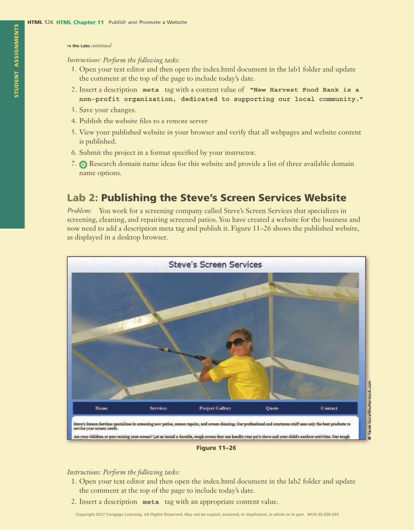
STU
DE
NT
AS
SIG
NM
EN
TS HTML HTML Chapter 11
Instructions: Perform the following tasks:1. Open your text editor and then open the index.html document in the lab1 folder and update
the comment at the top of the page to include today’s date.
2. Insert a description meta tag with a content value of “New Harvest Food Bank is a non-profit organization, dedicated to supporting our local community.”
3. Save your changes.
4. Publish the website �les to a remote server.
5. View your published website in your browser and verify that all webpages and website content is published.
6. Submit the project in a format speci�ed by your instructor.
7. Research domain name ideas for this website and provide a list of three available domain Research domain name ideas for this website and provide a list of three available domain name options.
Lab 2: Publishing the Steve’s Screen Services WebsiteProblem: You work for a screening company called Steve’s Screen Services that specializes in screening, cleaning, and repairing screened patios. You have created a website for the business and now need to add a description meta tag and publish it. Figure 11–26 shows the published website, as displayed in a desktop browser.
In the Labs continued
Figure 11–26
Instructions: Perform the following tasks:1. Open your text editor and then open the index.html document in the lab2 folder and update
the comment at the top of the page to include today’s date.
2. Insert a description meta tag with an appropriate content value.
Copyright 2017 Cengage Learning. All Rights Reserved. May not be copied, scanned, or duplicated, in whole or in part. WCN 02-200-203

HTM
L C
hap
ter
11S
TU
DE
NT
AS
SIG
NM
EN
TS
HTML Chapter 11 HTML
3. Insert another meta tag that identi�es the author.
4. Save your changes.
5. Publish the website �les to a remote server.
6. View your published website in your browser and verify that all webpages and website content is published.
7. Submit the project in a format speci�ed by your instructor.
8. Research how you can stop a robot from indexing a page. Discuss how and why you would Research how you can stop a robot from indexing a page. Discuss how and why you would do this.
Lab 3: Expand Your WorldExploring Web Hosting ProvidersProblem: In this chapter you learned that you have many options for hosting a website. In this exercise, you will research web hosting service providers and list your �ndings.
Instructions:1. Search the Internet for web hosting service providers.
2. Select three providers and compare their services and costs.
3. Identify which provider you would select and why.
4. Submit your answers in the format speci�ed by your instructor.
5. Use your browser to research an SEO company and provide a list of their services and costs. Use your browser to research an SEO company and provide a list of their services and costs.
Consider This: Your Turn
1. Publishing Your Personal Portfolio Website Design
Personal
Part 1: You have completed your portfolio website. In this exercise, you update the page as follows:
1. Open the external style sheet you created in Chapter 10 and save it with the name portfoliostyles11.css in the styles folder within the your_turn_1 folder.
2. Add your name and the current date as a comment to the �rst line of the portfoliostyles11.css �le.
3. In your HTML editor, open the �les you created for your portfolio website in Chapter 10 and make sure your name and the current date are added as a comment to the �rst line of all �les.
a. Update the HTML �les to modify the link to the external style sheet to reference portfoliostyles11.css.
b. Create a description meta tag for the home page.
4. Save your �les.
5. Publish your website.
6. Test your website to verify that all pages and content are published.
7. Submit your assignment in the format speci�ed by your instructor.
Part 2: Use your browser to research the software needed to host your own web server and sum- Use your browser to research the software needed to host your own web server and sum-marize your �ndings.
Continued >Copyright 2017 Cengage Learning. All Rights Reserved. May not be copied, scanned, or duplicated, in whole or in part. WCN 02-200-203
STU
DE
NT
AS
SIG
NM
EN
TS HTML HTML Chapter 11
2. Publishing the WebDevPros Website
Professional
Part 1: You have completed the website for WebDevPros. In this exercise, you update the site as follows:
1. Open the external style sheet you created in Chapter 10 and save it with the name webdevstyles11.css in the styles folder within the your_turn_2 folder.
2. Add your name and the current date as a comment to the �rst line of the webdevstyles11.css �le.
3. Open the �les you created for WebDevPros in Chapter 10 in your HTML editor and make sure your name and the current date are added as a comment to the �rst line of all �les.
4. Update the HTML �les to:
a. Modify the link to the external style sheet to reference webdevstyles11.css.
b. Create a description meta tag for the home page.
c. Create an author meta tag.
5. Save your �les.
6. Publish your website.
7. Test your website to verify that all pages and content are published.
8. Submit your assignment in the format speci�ed by your instructor.
Part 2: Create a marketing plan with at least �ve steps you can take to market this website. Create a marketing plan with at least �ve steps you can take to market this website.
3. Publishing the Dog Hall of Fame Website
Research and Collaboration
Part 1: You have completed the Dog Hall of Fame website. Do the following activities as a group:
1. Open the external style sheet you created in Chapter 10 and save it with the name dogstyles11.css in the styles folder within the your_turn_3 folder.
2. Add your names and the current date as a comment to the �rst line of the dogstyles11.css �le.
3. Open the �les you created for the Dog Hall of Fame in Chapter 10 in your HTML editor and make sure your names and the current date are added as a comment to the �rst line of all �les.
4. Modify the link to the external style sheet to reference dogstyles11.css.
5. Insert a description meta tag on the home page.
6. Insert an author meta tag on all pages.
7. Save your �les.
8. Publish your website.
9. Test your website to verify that all pages and content are published.
10. Submit your assignment in the format speci�ed by your instructor.
Part 2: As a group, research how to create an HTML site map for Google. Use your �ndings to As a group, research how to create an HTML site map for Google. Use your �ndings to create a site map.
Consider This: Your Turn continued
Copyright 2017 Cengage Learning. All Rights Reserved. May not be copied, scanned, or duplicated, in whole or in part. WCN 02-200-203

12Maintaining a Website
•
•
•
•
•
•
•
Objectives
HTML
Copyright 2017 Cengage Learning. All Rights Reserved. May not be copied, scanned, or duplicated, in whole or in part. WCN 02-200-203

IntroductionAfter a website is designed, developed, and launched, the next phase of the website development begins: maintenance. A well-polished website demands continuous maintenance. As changes take place within a company and within an industry, a web developer must work closely with a project team to ensure that a business website stays fresh and stands out from its competition. Likewise, a web developer must keep up with emerging trends in technology and new ways to reach a target audience.
In this chapter, you will learn about the development life cycle of a website. To keep a website current, you will examine the steps in project management, including content and design updates, and develop a maintenance plan for a business website. You will also learn about copyright law as it pertains to text and media. After reviewing several content management systems, you will explore frameworks within a website. Finally, you will learn more about electronic commerce (e-commerce) websites.
Project — Performing Website MaintenanceIn Chapter 12, you review webpage content for the Forward Fitness Club website and make improvements or update the content to keep it fresh. You will also consider each page to determine whether it needs design improvements.
This chapter provides an overview of the website development life cycle, as well as website project management, which should be ongoing when working with very large websites. This chapter also provides a basic introduction to content management systems, frameworks, and e-commerce.
The project in this chapter improves a website by updating content on the home page, the About Us page, and the Classes page. You also update the CSS �le. To perform these tasks, you �rst make content adjustments and add new content to the home page. Next, you modify the video element on the About Us page and update content on the Classes page. In the style sheet, you add a style rule to format the checkbox elements within the form for tablet and desktop viewports. Figure 12–1 shows the home page with the updated content. Figure 12–2 shows the updated video on the About Us page. Figure 12–3 shows the updated table content on the Classes page. Figure 12–4 shows the style updates to the checkbox elements on the Contact Us page.
Maintaining a Website12
HTML
Copyright 2017 Cengage Learning. All Rights Reserved. May not be copied, scanned, or duplicated, in whole or in part. WCN 02-200-203

HTML
Figure 12–1
Figure 12–2
Figure 12–3
Copyright 2017 Cengage Learning. All Rights Reserved. May not be copied, scanned, or duplicated, in whole or in part. WCN 02-200-203
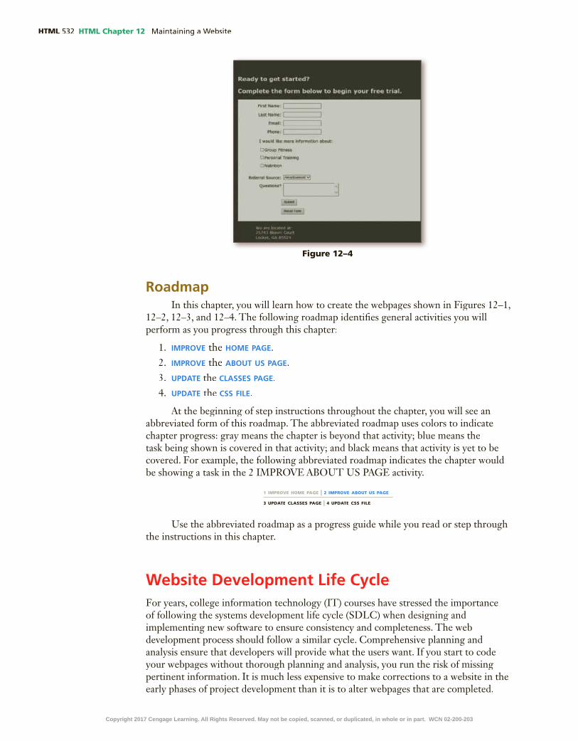
HTML HTML Chapter 12
RoadmapIn this chapter, you will learn how to create the webpages shown in Figures 12–1,
12–2, 12–3, and 12–4. The following roadmap identi�es general activities you will perform as you progress through this chapter:
1. improve the Home page.
2. improve the aBout us page.3. update the classes page.
4. update the css file.
At the beginning of step instructions throughout the chapter, you will see an abbreviated form of this roadmap. The abbreviated roadmap uses colors to indicate chapter progress: gray means the chapter is beyond that activity; blue means the task being shown is covered in that activity; and black means that activity is yet to be covered. For example, the following abbreviated roadmap indicates the chapter would be showing a task in the 2 IMPROVE ABOUT US PAGE activity.
Figure 12–4
1 IMPROVE HOME PAGE | 2 IMPROVE ABOUT US PAGE
3 UPDATE CLASSES PAGE | 4 UPDATE CSS FILE
Use the abbreviated roadmap as a progress guide while you read or step through the instructions in this chapter.
Website Development Life CycleFor years, college information technology (IT) courses have stressed the importance of following the systems development life cycle (SDLC) when designing and implementing new software to ensure consistency and completeness. The web development process should follow a similar cycle. Comprehensive planning and analysis ensure that developers will provide what the users want. If you start to code your webpages without thorough planning and analysis, you run the risk of missing pertinent information. It is much less expensive to make corrections to a website in the early phases of project development than it is to alter webpages that are completed.
Copyright 2017 Cengage Learning. All Rights Reserved. May not be copied, scanned, or duplicated, in whole or in part. WCN 02-200-203

HTML Chapter 12 HTML
HTM
L C
hap
ter
12
The web development life cycle outlined in this section is one that can be used for any type or size of web development project. The web development life cycle is a process that can be used for developing webpages at any level of complexity. As shown in Figure 12–5, the web development life cycle includes the following phases: planning, analysis, design and development, testing, implementation, and maintenance. Table 12–1 lists several questions that should be asked during each phase in the web development life cycle.
Table 12–1 Web Development Life Cycle
Web Development Phase Questions to Ask
Planning What is the purpose of this website?
Who will use this website?
What are the users’ computing environments?
Who owns and authors the information on the website?
Who decides if and where the information belongs on the website?
Analysis What tasks do the users need to perform?
What information is useful to the users?
What process considerations must be made?
Design and Development How many webpages will be included in the website?
How will the webpages be organized?
What type of website structure is appropriate for the content?
How can I best present the content for ease of use?
What �le naming convention will be employed for this website?
What folder structure will be used for the webpage �les?
How do I apply standards throughout the development process?
What forms of multimedia contribute positively to the website?
How can accessibility issues be addressed without limiting usability?
Does the website have an international audience?
Testing Do the webpages pass the World Wide Web Consortium (W3C) validation process as HTML5 compliant?
Is the website content correct?
Does the website function correctly?
Are users able to �nd the information they need to complete desired tasks?
Is navigation clear and easy to use?
Implementation How is the website published?
How can users be attracted to visit and revisit the website?
Maintenance How is the website updated?
Who is responsible for content updates?
Who is responsible for structure updates?
How will users be noti�ed about updates to the website?
Will the website be monitored?
Planning
Analysis
Design &Development
Testing
Implementation
Maintenance
Figure 12–5 Web Development Life Cycle
Copyright 2017 Cengage Learning. All Rights Reserved. May not be copied, scanned, or duplicated, in whole or in part. WCN 02-200-203

HTML HTML Chapter 12
Website PlanningWebsite planning is the �rst phase of the web development life cycle. As you
learned in Chapter 1, it involves identifying the goals or purpose of the website. The �rst step in the website planning phase is to answer the question “What is the purpose of this website?” As you have learned, individuals and groups design and publish websites for a variety of purposes. People develop websites to share their hobbies, to post résumés, or to share ideas on personal interests. Organizations create websites to keep members informed of upcoming events or to recruit new members. Businesses create websites to advertise and sell products and services or to give their customers 24-hour online support. Instructors publish websites or add information to their courses using a school’s online learning management system to inform students of course policies, assignments, due dates, and course requirements. Until you can adequately identify the intended purpose of the website, you should not proceed with the web development project.
In addition to understanding the website’s purpose, you should also analyze who will use the website and identify the computing environments of most of the users. Knowing the makeup of your target audience, including age, gender, general demographic background, and level of computer literacy, will help you design a website appropriate for likely visitors. Understanding users’ computing environments will determine what types of web technologies to use. For example, if most users have low-speed Internet connections, you would not want to create pages with large graphics or multimedia elements.
A �nal aspect to the website planning phase is to identify the content owners and authors. To determine this, you need to ask the following questions:
•Who owns and authors the information on the website?•Who decides content placement on the website?
After you identify who will provide and authorize the website content, you can include those stakeholders in all aspects of the web development project.
Website AnalysisDuring the analysis phase, you make decisions about the website content and
functionality. To help de�ne the appropriate website content and functionality, you should �rst identify the tasks that users need to perform. Identifying the tasks allows you to de�ne the controls users need to perform the tasks and determine useful information for the users. Extraneous content that does not serve any purpose should be eliminated from the website.
In the analysis phase, also consider the procedures required to support website features. For example, if you determine that users should be able to order products through the website, then you also need to de�ne the actions to perform each time an order is submitted. For instance, how will an order travel from one back-of�ce business application to another such as inventory control and accounts payable? Will users receive email con�rmations with details about their orders? Clearly understanding and de�ning the desired content and functionality of the website will direct the type of website that you design and reduce changes during website development.
Website Design and DevelopmentAfter determining the purpose of the website and de�ning the content and
functionality, you need to consider the website’s design. Some key considerations
Copyright 2017 Cengage Learning. All Rights Reserved. May not be copied, scanned, or duplicated, in whole or in part. WCN 02-200-203

HTML Chapter 12 HTML
HTM
L C
hap
ter
12
in website design are de�ning the organization for webpage content, selecting the appropriate website structure, determining how to use multimedia, addressing accessibility issues, and designing pages for an international audience. During this phase, you also determine the best way to provide navigation on the website. Recall that the navigation design can make or break a website. If users cannot easily �nd the information they are seeking, they will not return to your website.
You can organize a webpage in many ways. Choose an organization that makes sense for the purpose and audience of the website. Table 12–2 lists some organizational standards for creating a webpage that is easy to read and navigate.
Table 12–2 Webpage Organizational Standards
Element Organizational Standard Reason
Titles Use simple titles that clearly explain the purpose of the page.
Titles help users understand the purpose of the page; a good title explains the page in the search engine results lists.
Headings Use headings to separate main topics. Headings make a webpage easier to read; simple headings clearly explain the purpose of the page.
Paragraphs Use paragraphs to help divide large amounts of text.
Paragraphs provide shorter, more readable sections of text.
Lists Use bulleted or numbered lists when appropriate.
Lists provide organized, easy-to-read text that readers can scan.
Page length Maintain suitable webpage lengths. Web users do not always scroll to view information on longer pages; appropriate page lengths increase the likelihood that users will view key information.
Content Emphasize the most important information by placing it at the top of a webpage.
Web users are quick to peruse a page; placing critical information at the top of the page increases the likelihood that users will view key information.
Contact information Provide contact information such as an email address on the home page.
Email addresses give users a way to contact a business with questions.
As discussed in Chapter 1, websites can use several types of structures, including linear, hierarchical, and webbed. Each structure connects the webpages in a different way to de�ne how users navigate the site and view the webpages. You should select a structure for the website based on how users will navigate the site and view the website content.
As a web developer, you must select an appropriate structure for the website and work to balance breadth and depth. Users go to a website looking for information to complete a task. Good design provides ease of navigation, allowing users to �nd content quickly and easily. In addition to planning the design of the website itself, a web developer should plan the speci�cs of the �le naming and storage conventions early on in the design phase. For instance, saving your webpages with names such as page1.html and page2.html does not indicate the purpose of those webpages, making them dif�cult to maintain. A better option would be to use �le names that re�ect the webpage content such as about.html, contact.html, and services.html. These �le names tell the developer, as well as future developers maintaining the website, the purpose of the webpages.
The same principle applies to the folder structure that you use in your web development. It is a best practice to place images in an images folder, audio/video in a media folder, css in a css folder, and so on. Larger, more complex websites might also require a folder for webpages pertaining to speci�c departments. Where you store the �les will affect how you access those �les in your HTML code. Determining a logical
Copyright 2017 Cengage Learning. All Rights Reserved. May not be copied, scanned, or duplicated, in whole or in part. WCN 02-200-203

HTML HTML Chapter 12
folder structure in the planning phase of the web development life cycle simpli�es creating and updating the pages.
During the design and development phase, consider what, if any, types of multimedia could contribute positively to the website experience. For instance, adding a video message from the company CEO might be useful, but if the computing environment of your users cannot accommodate video playback, then the video serves no purpose. In general, do not use advanced multimedia technologies in a website unless they make a positive contribution to the website experience. Today, websites increasingly are using audio and video content. Adding multimedia can enhance the overall purpose of the website, but it sometimes detracts from the message.
Finally, consider accessibility issues and localization, adapting a website to meet the needs of a particular language or culture. A practical approach is to design for viewing by a diverse audience, including physically impaired and global users. Consider the software that physically impaired people use when visiting websites. For instance, if you use graphics on the website, include alternative text for each graphic so that screen readers can recite the alternative text to people with low vision. To support an international audience, use generic icons that can be understood globally, avoid slang expressions in the content, and build simple pages that load quickly over lower-speed connections.
Website TestingTest your website at various stages of the web design and development processes.
The testing process should be comprehensive and include a review of webpage content, functionality, and usability. Websites with broken links, missing graphics, and incorrect content create a poor impression on visitors. You want to attract users to your website and maintain their interest. If visitors �nd that features of your website do not work as intended, they will be less likely to return. Having people return to your website determines whether it is successful. After all, you cannot get your message out if users do not frequently visit the website. The following are basic steps to test content and functionality:
•Validate each webpage by running it through the W3C markup validation service.•Proofread webpage content and titles for accurate spelling and grammar.•Check links to make sure they are not broken and use the correct targets.•Review graphics to con�rm they are displayed properly and are linked correctly.•Ensure that accessibility and internationalization issues are addressed.•Fill out forms and use other interactive page elements the way that visitors will
use them.•Test pages to make sure they load quickly, even over low-speed connections.•Print each page to check its printed appearance.
Usability is the measure of how well a product, such as a website, allows a user Usability is the measure of how well a product, such as a website, allows a user Usabilityto accomplish his or her goals. Usability testing is a method by which users of a Usability testing is a method by which users of a Usability testingwebsite or other product are asked to perform certain tasks in an effort to measure the product’s ease of use and the user’s perception of the experience. Usability testing for a website should focus on three parts of the site: content, navigation, and presentation.
Copyright 2017 Cengage Learning. All Rights Reserved. May not be copied, scanned, or duplicated, in whole or in part. WCN 02-200-203

HTML Chapter 12 HTML
HTM
L C
hap
ter
12
One effective way to conduct usability testing is to directly observe users interacting with the website. As you observe users, you can track the links they click and record their actions and comments. Ask the users to explain what tasks they were trying to accomplish while navigating the site and whether they succeeded or failed. The information gained by observing users can help you identify potential problem areas in the website and then resolve them. For example, if you observe that users have dif�culty �nding the webpage that lists store locations and hours of operation, you may want to clarify the link descriptions or make the links more prominent on the home page.
Another way to conduct usability testing is to give users a speci�c task to complete, such as �nding a product price list, and then observe how they navigate the site to complete the task. If possible, ask them to explain why they selected certain links. Direct observation reveals valuable information, but does require access to users.
If you cannot work directly with users, you can perform usability testing with a questionnaire or survey. Be sure to write open-ended or scaled survey questions to elicit information. For instance, asking the yes or no question, “Is the website visually appealing?” will not gather especially useful information. If a user answers no to that question, you do not know how to improve the site to make it more appealing. Even if a user answers yes, you do not know how much appeal the website has. If you change that question to use a scaled response, such as “Rate the visual appeal of this website, using a scale of 1 for low and 5 for high,” you can get more valuable input from the users. Make sure, however, that the scale itself is clear and understandable to the users. If you intend that a selection of 1 equates to a “low” rating, but the users think 1 means “high,” then your survey results are questionable. Another way to ask for design feedback is to list parts of the site, such as graphics, sidebars, and navigation, and ask users to select the parts that are appealing to them. In addition, provide space on the usability testing questionnaire where users can write comments.
Table 12–3 provides an example of a usability testing questionnaire.
Table 12–3 Usability Testing Questionnaire
StatementStrongly Agree Agree Neutral Disagree
Strongly Disagree
The website is easy to navigate.
The graphics on the website are visually appealing.
I would recommend this website to family and friends.
I was able to �nd what I was looking for.
The website is intuitive and user-friendly.
The information on the website is clearly organized.
The following are additional examples of the types of open-ended questions to include in a website usability testing questionnaire.
•If you could change one thing about the website, what would it be?•What do you like best about the website?•What do you like least about the website?
Copyright 2017 Cengage Learning. All Rights Reserved. May not be copied, scanned, or duplicated, in whole or in part. WCN 02-200-203

HTML HTML Chapter 12
In addition to content, functionality, and usability testing, you can conduct other types of testing. For a newly implemented or maintained website, use two other types of tests: compatibility testing and stress testing. Compatibility testing veri�es Compatibility testing veri�es Compatibility testingthat the website works with a variety of browsers and browser versions. Initially, test using the browsers that your audience is most likely to use. Each browser displays some aspects of webpages differently, so you must test webpages in several browsers to verify the pages appear correctly. If you have used technologies that are not supported by older browsers or that require plug-ins, consider changing the content or providing alternative webpages for viewing in older browsers. If your audience uses Windows, Mac, and Android devices, you need to test the webpages using browsers on all platforms. You may also want to test the webpages in several versions of the same browser (usually the two most recent versions), in case users have not upgraded to the most recent version.
Stress testing determines what happens on your website when many users Stress testing determines what happens on your website when many users Stress testingaccess the site. When 120 users access a website simultaneously, for example, the performance might not suffer. However, when thousands of users access the website at the same time, it may respond at an unacceptably slow speed. Stress testing veri�es that a website runs at an acceptable speed with many users. For websites published without effective stress testing, the results have been disastrous, with websites locking up when too many users tried to access the same website function. Websites used for e-commerce must stay online to sell products or services; otherwise, the company stands to suffer a loss of reputation and pro�t.
How can I test my website on multiple browsers?You can download and install multiple browsers to view and test your website. Several resources also are available online to test websites across multiple browsers, such as browsershots.org.
CO
NS
IDE
R T
HIS
Website ImplementationImplement, or publish, a website after completing the testing phase and making
any required changes. Implementing a website involves the actual publishing of the webpages to a web server. As discussed in Chapter 11, many HTML editors and WYSIWYG editors provide publishing capabilities. You can also use FTP software, such as FileZilla, to publish your webpages to a web server. After you publish a website, you should test the webpages again to con�rm no obvious errors have been introduced such as broken links or missing graphics.
Website MaintenanceBefore you publish your website, develop a process to maintain the website.
Maintenance begins the day you publish the site. Employees within the business will undoubtedly request changes and timely content will require updates. If it is a large website, the webmaster should meet with webpage content authors to discuss ongoing updates and circulate the maintenance plan for the website. A maintenance plan includes refreshing content, updating the design, adding marketing promotions, and checking links. As you make these updates, test again to avoid compromising the site’s integrity and consistency. For example, if several people are updating various webpages on a large website, they need guidance to maintain a consistent look on pages across
Copyright 2017 Cengage Learning. All Rights Reserved. May not be copied, scanned, or duplicated, in whole or in part. WCN 02-200-203

HTML Chapter 12 HTML
HTM
L C
hap
ter
12
the website. Update the site maps, wireframes, and templates and provide them to everyone working on the website.
Plan to update your website on a regular basis to keep content up-to-date. This could mean hourly, daily, weekly, or less often, depending on the site’s purpose. Do not allow your content to become stale, outdated, or include broken links to webpages that no longer exist.
To help manage the task of website maintenance, �rst determine who is responsible for updates to content, structure, functionality, and other elements. Limit update responsibilities to speci�c users. Be sure the implementation is controlled by one or more web developers who can verify that the webpages are tested thoroughly before they are published.
Depending on how large the website is, you may need to create a form for employees to complete when requesting a change to the website. Figure 12–6 shows an example of a website maintenance request form.
Figure 12–6
Website Maintenance Request Form
Employee Name:
Employee Email:
Today’s Date:
Priority Level: High Medium Low
Date Needed by:
Detailed Change Requested:
As updates and changes are made to a website, consider notifying users through social media and an announcement on the home page, explaining any new features and how the features will bene�t them. This technique not only keeps users informed but also encourages them to come back to the website to see what is new.
Finally, monitor the website and its visitors. Usually, the web servers that host websites keep logs of information about website usage. A log is the �le that lists log is the �le that lists logall of the webpages that have been requested from the website. Analyze the logs to determine the number of visitors, browser types and versions, connection speeds, pages most commonly requested, and usage patterns. With this information, you can design a website that is effective for your target audience, providing visitors with a rich and rewarding experience.
Reviewing WebsitesAs you embark on your web development career, one useful practice is to
be an observant web user. You probably use the web several times a day (or more often) to complete your daily tasks. As you do, review the webpages that you access with an eye on functionality and design. You can bookmark websites you �nd effective or ineffective, appealing or unappealing, and use them as references for your own web development efforts. Watch for trends on the web as you search for information or make online purchases. For example, blinking text and patterned backgrounds were once popular on websites, but were replaced by other design techniques. Being an observant web user can help you become a more effective web developer.
Copyright 2017 Cengage Learning. All Rights Reserved. May not be copied, scanned, or duplicated, in whole or in part. WCN 02-200-203

HTML HTML Chapter 12
Updating WebsitesAfter publishing the website for the Forward Fitness Club, you conducted a
survey to solicit user feedback. Most users found the audio and the alert message on the home page to be distracting. Additionally, most users commented that they would prefer to start the video on the About Us page rather than have the video play automatically when the page loads. After reviewing the user feedback, you have decided to implement these changes. Owners of the Forward Fitness Club also informed you that a new instructor is teaching the Boot Camp class. Besides making this change, you also want to format the check boxes on the Contact Us page by increasing the left margin for an improved appearance.
To Update the Home Page
Update the home page by removing the audio element and JavaScript alert message. In a recent survey, users commented that both of these items were distracting. After removing these items, insert an h1 element to highlight the free trial membership. The following steps remove the script element and audio element on the home page and add an h1 element.
1 DeLete
2 DeLete
3 DeLete
4 DeLete
5 enter
6 FREE Trial Membership
7
1 IMPROVE HOME PAGE | 2 IMPROVE ABOUT US PAGE
3 UPDATE CLASSES PAGE | 4 UPDATE CSS FILE
Note:
Figure 12–7
Copyright 2017 Cengage Learning. All Rights Reserved. May not be copied, scanned, or duplicated, in whole or in part. WCN 02-200-203

HTML Chapter 12 HTML
HTM
L C
hap
ter
12
To Update the About Us Page
Update the About Us page by removing the autoplay attribute from the video element and add a poster attribute that displays an image before the video is played. In a recent survey, users commented that they wanted control over whether to play the video. Because the video will not play automatically when the page opens, use a poster attribute to display an image for the video element rather than displaying a blank frame. The following steps remove the autoplay attribute from the video element and add a poster attribute to the video element on the About Us page.
1
2
3poster="images/homeBanner.jpg"
4
1 IMPROVE HOME PAGE | 2 IMPROVE ABOUT US PAGE
3 UPDATE CLASSES PAGE | 4 UPDATE CSS FILE
To Update the Classes Page
Update the Classes page by modifying the class information. List the Boot Camp class in the second row and list the Cardio class in the third row. The Boot Camp class instructor recently moved out of the area, so you need to update the instructor information. The following steps update the table information on the Classes page.
1CtrL+X
2 enter
3 CtrL+V
1 IMPROVE HOME PAGE | 2 IMPROVE ABOUT US PAGE
3 UPDATE CLASSES PAGE | 4 UPDATE CSS FILE
Figure 12–8
Copyright 2017 Cengage Learning. All Rights Reserved. May not be copied, scanned, or duplicated, in whole or in part. WCN 02-200-203

HTML HTML Chapter 12
4 CtrL+X
5 CtrL+V
6 BACKSPACe
7 Lawrence
8
Figure 12–9
To Improve the Contact Us Page
Improve the Contact Us page by applying a left margin to the check boxes within the form. The check boxes are contained within an unordered list element. You create a new style rule in the tablet media query that applies a left margin to the unordered list within the form. The following steps create a new style rule within the tablet media query.
1enter
2 /* Style rule for form unordered list element */
3 enter form ul {
4 enter
margin-left: 2em;
5 enter }
1 IMPROVE HOME PAGE | 2 IMPROVE ABOUT US PAGE
3 UPDATE CLASSES PAGE | 4 UPDATE CSS FILE
Copyright 2017 Cengage Learning. All Rights Reserved. May not be copied, scanned, or duplicated, in whole or in part. WCN 02-200-203

HTML Chapter 12 HTML
HTM
L C
hap
ter
12
6
7
Figure 12–10
Figure 12–11
Project ManagementIf you are working with a large website, such as the National Park Service website at nps.gov, you must manage website updates ef�ciently to keep the site current and working online. Figure 12–12 shows a site map for the National Park Service website.
This website contains numerous pages and information about parks all around the United States. One person alone could not design, develop, monitor, and update this website. A project team must manage a large website such as the National Park Service website. Project team members include a project manager, website strategist,
Copyright 2017 Cengage Learning. All Rights Reserved. May not be copied, scanned, or duplicated, in whole or in part. WCN 02-200-203

HTML HTML Chapter 12
content specialist, graphic designer, website designer, website developer, marketing professional, and a network administrator. Project management of a website involves Project management of a website involves Project managementdelegating and supervising website development activities, including the planning, design, development, content, testing, and publishing of the site.
A project manager oversees the entire project management and maintains project manager oversees the entire project management and maintains project managera timeline of project tasks and goals. The project manager creates a project plan, which includes a schedule and project deliverables, and then tracks all aspects of the project, delegates tasks, and evaluates the website against high standards to make sure it meets its goals and serves its audience. The project manager must have exceptional communication and managerial skills.
The website strategist, also known as a user interface (UI) or user experience (UX) architect, creates the strategy for the web design, including completing the planning phase of the web design process. The web strategist is responsible for researching competitors’ websites, analyzing the organization’s current website, identifying the target audience, and creating a sitemap and wireframe for the new website.
The content specialist develops webpage content to attract the target audience content specialist develops webpage content to attract the target audience content specialistthrough creative use of written messages. The person in this role needs experience in persuasive writing. The content specialist is also responsible for keeping content fresh and writing and editing content.
The graphic designer creates graphics and images for the website, including graphic designer creates graphics and images for the website, including graphic designerbusiness logos, digital photography and enhancement, design elements, and other graphic images. The graphic designer should be well-versed in graphics-editing software and optimizing graphics for web use.
The website designer takes the wireframes created by the website strategist and website designer takes the wireframes created by the website strategist and website designercreates mock-up webpages. The designer’s role is to create site concepts for the team to review. After a concept is approved, it is given to the website developer.
The website developer develops the webpages for the website. This project website developer develops the webpages for the website. This project website developerteam member uses the mock-up webpage concepts to create the actual webpages. The website developer uses HTML, CSS, and other web programming languages to develop the desired webpages. The website developer works closely with the website designer, the content specialist, and the graphic designer.
The marketing professional designs a market campaign to drive traf�c to the website. This person may be someone within the organization’s marketing department or a consultant hired to provide marketing services. The marketing professional works closely with the content specialist.
The network administrator sets up and maintains the web server that will house network administrator sets up and maintains the web server that will house network administratorthe website. The network administrator may be someone within the organization’s IT
Figure 12–12
Copyright 2017 Cengage Learning. All Rights Reserved. May not be copied, scanned, or duplicated, in whole or in part. WCN 02-200-203

HTML Chapter 12 HTML
HTM
L C
hap
ter
12
department or a member of a different company. The person in this role ensures that the website is accessible via the Internet. The network administrator is also responsible for the hardware, software, and security needed to keep the website running smoothly.
Who puts a website project team together?The project manager is typically the person in charge of delegating website tasks. The project manager should use experienced team members and carefully review each team member’s portfolio, education, and past experience.
CO
NS
IDE
R T
HIS
Content UpdatesUpdating website content is an ongoing process. When a business launches a
new product or service, its website content must be updated to re�ect the changes. Updating a website regularly can help increase search engine results and improve SEO. The following is a list of tips to keep your content updated and fresh.
•When you have a new product or service, add an image or video to your website to showcase it.
•If your company submits press releases on a regular basis, create a page for press releases, as this shows that your business is active and busy.
•Consider a page for client testimonials to spur potential sales.•Update your social media on regular basis.
Copyright LawYou may �nd images, audio, and video online that �t the needs of your website,
but think twice before downloading media to use on your website. The person or business who created the media is the owner of the media. You cannot legally use media content created by someone else without permission. You must be granted permission to use the media on your website. This includes photographs, illustrations, audio, video, and other webpage content.
At times, it is acceptable to use media created by another source on your website. Students and educators may use online media for educational purposes, such as an academic project. This is known as fair use. To qualify for fair use, the media must not be used for any type of commercial business.
Use of a Creative Commons license lets media content authors share their work with others, while maintaining ownership of their work. The Creative Commons license speci�es appropriate use of the media. For more information about the Creative Commons license, visit creativecommons.org.
U.S. Copyright LawFor more information about U.S. copyright law, visit copyright.gov.
Can I purchase media for use on my website?Yes. Several online resources provide images, audio, and video for a fee. Some examples of online media resources include gettyimages.com, istockphoto.com, and shutterstock.com.
CO
NS
IDE
R T
HIS
Content Management SystemsContent management systems (CMSs) have become increasingly popular with
many online businesses. A CMS is an online system used to manage website content. A typical CMS consists of a content management application (CMA) and a content delivery application (CDA). Using a CMA, a webpage author can add, remove, and update content without knowing HTML. After the author makes the necessary
Copyright 2017 Cengage Learning. All Rights Reserved. May not be copied, scanned, or duplicated, in whole or in part. WCN 02-200-203

HTML HTML Chapter 12
modi�cations, the CDA compiles the changes and writes the underlying code “behind the scenes.” With a CMS, a web developer can create and preserve, or lock, a design so that webpage authors can only update content and not the design. Locking a design is especially helpful when novice users are updating webpage content. A CMS also allows multiple authors to update their pages as necessary. It also provides peace of mind to the webmaster, knowing that the website design cannot be undone by an inexperienced webpage author. Popular CMSs include WordPress, Joomla, and Drupal.
Figure 12–13 shows the home page for WordPress. Several businesses use WordPress for their websites and blogs. Nearly 25 percent of all websites use WordPress, making it one of the top-ranked CMSs with over 50 percent market share, according to w3techs.com.
Figure 12–13
WordPress offers web developers many tools for building a website. They also provide support and functionality for high-traf�c e-commerce websites. Forbes is a Forbes is a Forbespopular source for business news and �nancial information and uses WordPress for its website. The Forbes home page is shown in Figure 12–14.Forbes home page is shown in Figure 12–14.Forbes
Figure 12–14
Forbes
Copyright 2017 Cengage Learning. All Rights Reserved. May not be copied, scanned, or duplicated, in whole or in part. WCN 02-200-203

HTML Chapter 12 HTML
HTM
L C
hap
ter
12
Joomla offers many of the same tools as WordPress for developing a website. E-commerce, nonpro�t, and government websites are some of those using Joomla for their CMS. For example, Outdoor Photographer uses Joomla for its online magazine. The home page for Outdoor Photographer is shown in Figure 12–16.
Figure 12–15 shows the home page for Joomla. Joomla is an open-source CMS, ideal for experienced web developers who enjoy coding.
Figure 12–15
Figure 12–16
Figure 12–17 shows the home page for Drupal, another open-source CMS, distributed under the GNU General Public License.
Copyright 2017 Cengage Learning. All Rights Reserved. May not be copied, scanned, or duplicated, in whole or in part. WCN 02-200-203

HTML HTML Chapter 12
Georgia.gov is a government agency that uses Drupal for its website. Its home page is shown in Figure 12–18.
Figure 12–17
Figure 12–18
Web FrameworksA web framework is software that allows a web developer to use a collection web framework is software that allows a web developer to use a collection web framework
of tools to build a web application, which simpli�es the website building process. Web frameworks provide a website additional functionality, such as a database, session management, and cookies. Using a web framework can save web developers a signi�cant amount of time coding a website. Popular frameworks include Django, Bootstrap, Ruby on Rails, CakePHP, and Fusebox. Django is shown in Figure 12–19 and Bootstrap is shown in Figure 12–20.
Copyright 2017 Cengage Learning. All Rights Reserved. May not be copied, scanned, or duplicated, in whole or in part. WCN 02-200-203

HTML Chapter 12 HTML
HTM
L C
hap
ter
12
E-CommerceThe term electronic commerce, or e-commerce, refers to businesses that conduct transactions online, including large retail websites that sell products to consumers. Amazon, shown in Figure 12–21, is a popular e-commerce website that sells an array of products to consumers.
Figure 12–20
Figure 12–19
Figure 12–21
Copyright 2017 Cengage Learning. All Rights Reserved. May not be copied, scanned, or duplicated, in whole or in part. WCN 02-200-203

HTML HTML Chapter 12
E-commerce is a booming business. Having an online store open around the clock allows businesses to sell products anytime. Online customers enjoy the convenience of �nding, reviewing, and purchasing products at e-commerce sites.
E-commerce also has drawbacks. With the rise in identity theft and fraud, some consumers hesitate to make purchases online. An e-commerce business must invest time and money into securing their systems. For enhanced security, an e-commerce site should implement secure socket layer (SSL) technology to encrypt sensitive customer information.
E-commerce websites must also consider what happens if a server fails and the site is not accessible to customers. These websites must ensure their connections, create and maintain several backups, and have a plan in place to deal with potential technology issues that may arise.
E-commerce websites must also have a proven and tested interface to handle orders, which usually takes the form of electronic shopping carts. Website developers can use one of many online tools to create and maintain shopping carts. E-commerce website must also be able to ef�ciently handle payments. Common payment methods include a major credit card, PayPal, Bill Me Later, and Google Wallet.
E-commerce websites use four common business models: business-to-consumer, business-to-business, consumer-to-consumer, and business-to-government. The business-to-consumer (B2C) model is the most common business model. Examples of B2C e-commerce websites include Amazon and Wayfair.
The business-to-business (B2B) business model is used when businesses make purchases from other businesses, such as supplies required by a business. An example of a B2B business model is a wholesale glass manufacturer that supplies glass for a window company.
The consumer-to-consumer (C2C) business model is for websites that let consumers buy from and sell to each other. Examples of C2C e-commerce websites include eBay and Etsy.
The business-to-government (B2G) business model occurs when government makes online purchases from a business. An example of a B2G business model may include a government agency purchasing software from an online vendor.
To Validate the Style Sheet
Always run your �les through W3C’s validator to check the document for errors. If the document has any errors, validating gives you a chance to identify and correct them. Validation is also an effective troubleshooting tool during the development process and adds a valuable level of professionalism to your work. The following steps validate a CSS document.
1 http://jigsaw.w3.org/css-validator/
2
3
4
5
6
Transport Layer SecurityTransport Layer Security (TLS) was created to replace SSL. It blocks any third party from capturing data as it is transferred from one machine to another, such as a client device to a server.
Copyright 2017 Cengage Learning. All Rights Reserved. May not be copied, scanned, or duplicated, in whole or in part. WCN 02-200-203

HTML Chapter 12 HTML
HTM
L C
hap
ter
12
Chapter SummaryIn this chapter, you learned about the website development life cycle. You learned about website project management and the team members needed to support the website project. You learned about website maintenance and content updates. You also learned about content management systems. You also learned about e-commerce and frameworks. The items listed below include all the new skills you have learned in this chapter, with the tasks grouped by activity.
To Validate the HTML Files
Every time you create a new webpage or modify an existing webpage, run it through W3C’s validator to check the document for errors. If any errors exist, you need to correct them. Validation is also an effective troubleshooting tool during the development process and adds a valuable level of professionalism to your work. The following steps validate an HTML document.
1 validator.w3.org
2
3
4
5
6
7
Website Development Life CycleWebsite Planning (HTML 534)Website Analysis (HTML 534)Website Design and Development (HTML 534)Website Testing (HTML 536)Website Implementation (HTML 538)Website Maintenance (HTML 538)
Reviewing Websites (HTML 539)Updating Websites (HTML 540)
Project ManagementContent Updates (HTML 545)Copyright Law (HTML 545)Content Management Systems (HTML 545)Web Frameworks (HTML 548)
How will you develop your project team and maintenance plan?Use these guidelines as you complete the assignments in this chapter and create your own webpages outside of this class.
1. Determine project team members.
a) Conduct internal interviews for potential team members.
b) Externally advertise positions.
2. Decide how to handle maintenance and update requests.
a) Determine who will have access to update website content.
b) Determine how you will manage content update requests.
CO
NS
IDE
R T
HIS
Copyright 2017 Cengage Learning. All Rights Reserved. May not be copied, scanned, or duplicated, in whole or in part. WCN 02-200-203

HTML HTML Chapter 12S
TU
DE
NT
AS
SIG
NM
EN
TS
Apply Your Knowledge
Updating a WebpageInstructions: In this exercise, you review a webpage, update its content, and improve its appearance. Work with the apply12.html �le in the apply folder, image �les in the apply\images folder, and applystyles12.css �le in the apply\css folder from the Data Files for Students. The completed webpage is shown in Figure 12–22. You will also use professional web development practices to indent, space, comment, and validate your code.
3. Decide if you should use a content management system.
a) Determine if a content management system is best for your business.
b) Determine which content management system to use.
4. Determine if you should use web frameworks.
a) Review web framework options.
b) Learn how to develop a website using web frameworks.
How should you submit solutions to questions in the assignments identi�ed with a symbol? symbol?Every assignment in this book contains one or more questions identi�ed with a symbol. These questions require symbol. These questions require you to think beyond the assigned presentation. Present your solutions to the questions in the format required by your instructor. Possible formats may include one or more of these options: create a document that contains the answer; present your answer to the class; discuss your answer in a group; record the answer as audio or video using a webcam, smartphone, or portable media player; or post answers on a blog, wiki, or website.
CO
NS
IDE
R T
HIS
Figure 12–22
Perform the following tasks:1. Create a new folder named apply12 and copy the apply12.html �le and the css and images
folders from the Data Files for Students to the apply12 folder.
2. Open apply12.html in your text editor, review the page, add a title, modify the comment at the top of the page to include your name and today’s date, and a paragraph element with your name in the footer element.
Copyright 2017 Cengage Learning. All Rights Reserved. May not be copied, scanned, or duplicated, in whole or in part. WCN 02-200-203
HTML Chapter 12 HTML
HTM
L C
hap
ter
12S
TU
DE
NT
AS
SIG
NM
EN
TS
3. Insert a paragraph element below each h3 element and include one to two sentences about each content management system.
4. Insert an img element after each paragraph element that uses the appropriate image from the apply\images folder. Include appropriate alt text, a width attribute, and a height attribute.
5. Link each image to the respective website (WordPress, Joomla, and Drupal).
6. Rename the CSS �le within the css folder to applystyles12.css and update the CSS �le link in the apply12.html �le.
7. Open applystyles12.css in your text editor and add the following properties and values to the header style rule:
background-color: #1427A6;
color: #FFFFFF;
8. Create a new style rule for the h1 element that center aligns text. Include a comment above the new style rule.
9. Update the main style rule to specify a white background color.
10. Create a new style rule for the article element that speci�es the following properties:
column-count: 3;
-webkit-column-count: 3; /* Chrome, Safari, Opera */
-moz-column-count: 3; /* Firefox */
column-gap: 3em;
-webkit-column-gap: 3em; /* Chrome, Safari, Opera */
-moz-column-gap: 3em; /* Firefox */
column-rule-style: solid;
-webkit-column-rule-style: solid; /* Chrome, Safari, Opera */
-moz-column-rule-style: solid; /* Firefox */
11. Add a comment to the article style rule.
12. Update the footer style rule to specify top margin with a value of 3em.
13. Save all of your changes and open the apply12.html in your browser.
14. Validate your HTML document and CSS �le and �x any errors that are identi�ed.
15. Submit the �les in a format speci�ed by your instructor.
16. Research an online ticketing system to handle website maintenance requests and discuss Research an online ticketing system to handle website maintenance requests and discuss how you could implement this type of system for your website.
Extend Your Knowledge
Copyright LawInstructions: In this exercise, you research more information about copyright law as it pertains to websites. You will summarize your �ndings and provide examples of what you may do and what you may not do when it comes to copyright law and website media content.
Perform the following tasks:1. Use your browser to research copyright law as it pertains to the Internet.
2. Create a webpage with a summary of your �ndings and include at least three links to helpful resources.
Continued >Copyright 2017 Cengage Learning. All Rights Reserved. May not be copied, scanned, or duplicated, in whole or in part. WCN 02-200-203

HTML HTML Chapter 12S
TU
DE
NT
AS
SIG
NM
EN
TS
3. Find and list at least two resources for media options with a Creative Commons license.
4. Submit the document in a format speci�ed by your instructor.
5. Research more information about fair use and discuss how a student should document their Research more information about fair use and discuss how a student should document their media sources within a website.
Analyze, Correct, Improve
Correcting and Improving Website ContentInstructions: Review the analyze12.html �le in the analyze folder from the Data Files for Students. Display the page in a web browser and note the improvements you would make for this webpage. First, correct the hyperlinks. Next, update the webpage content. Then, improve the appearance of the webpage by updating the CSS �le. Finally, review your changes and validate your �les. Use Figure 12–23 as a guide to correct these �les.
Extend Your Knowledge continued
Figure 12–23
1. Correcta. Open the analyze12.html �le in your text editor from the Data Files for Students. Modify the
comment at the top of the page to include your name and today’s date and then link the �le to analyzestyles12.css.
b. Open the analyzestyles12.css �le in your text editor from the Data Files for Students and then modify and correct the comment at the top of the document to include your name and today’s date.
c. Open analyze12.html in your web browser and test the hyperlinks. Note the hyperlinks to be corrected.
d. Return to analyze12.html in your text editor and correct the hyperlinks.
e. Add a paragraph element to the footer element that contains your �rst and last name.
2. Improvea. Add three more HTML5 resources to the unordered list and include links for each.
b. Update the analyzestyles12.css �le to be consistent with Figure 12–23.
c. Save all of your changes and open the analyze12.html in your browser.
Copyright 2017 Cengage Learning. All Rights Reserved. May not be copied, scanned, or duplicated, in whole or in part. WCN 02-200-203

HTML Chapter 12 HTML
HTM
L C
hap
ter
12S
TU
DE
NT
AS
SIG
NM
EN
TS
d. Validate your CSS �le using the W3C validator found at http://jigsaw.w3.org/css-validator/ and �x any errors that are identi�ed.
e. Validate your HTML webpage using the W3C validator found at validator.w3.org and �x any errors that are identi�ed.
f. Research content strategy ideas and discuss your �ndings. Research content strategy ideas and discuss your �ndings.
In the Labs
Lab 1: Updating and Improving the New Harvest Food Bank WebsiteProblem: You volunteer at a local food bank called New Harvest Food Bank that collects community food donations and provides food and other services to those in need. You have already created a responsive website and recently conducted a user survey. The survey results indicate that users would prefer to start the video located on the home page instead of having the video play automatically. Mobile users note that they prefer to see a list of immediate needs instead of the video. In addition, you also reviewed the website and determined a number of improvements to make to the style sheet to improve the appearance of the website. The updated mobile home page is shown in Figure 12–24. The updated desktop home page is shown in Figure 12–25. The updated desktop About page is shown in Figure 12–26. The updated desktop Volunteer page is shown in Figure 12–27.
Figure 12–24Continued >Copyright 2017 Cengage Learning. All Rights Reserved. May not be copied, scanned, or duplicated, in whole or in part. WCN 02-200-203

HTML HTML Chapter 12S
TU
DE
NT
AS
SIG
NM
EN
TS
Instructions: Perform the following tasks:1. Open your text editor and then open the index.html document in the lab1 folder and update
the comment at the top of the page to include today’s date.
2. Remove the autoplay attribute from the video element.
In the Labs continued
Figure 12–25
Figure 12–26
Figure 12–27
Copyright 2017 Cengage Learning. All Rights Reserved. May not be copied, scanned, or duplicated, in whole or in part. WCN 02-200-203

HTML Chapter 12 HTML
HTM
L C
hap
ter
12S
TU
DE
NT
AS
SIG
NM
EN
TS
3. Add the poster attribute to the video element and use images/logo.jpg as the value.
4. Move the div class=“video” element to the div class=“desktop” element and place it above the �rst paragraph element within the div desktop class.
5. Add an h3 element below the �rst paragraph element within the div class=“mobile” element and add Immediate Pantry Needs: as the text.
6. Create an unordered list below the h3 element with the following four list items: Canned vegetables, Stuffing mix, Instant potatoes, Cereal.
7. Open fbstyles.css in your text editor and create the following new comment and style rule above the media queries.
/* Style rule for h2 and h3 elements */
h2, h3 {
text-align: center;
}
8. Update the main style rule within the desktop media query by adding a background color property with #FAE5A0 as the value.
9. Update the section style rule within the desktop media query by adding a background color property with transparent as the value.
10. Update the table style rule within the desktop media query by adding a background color property with #FFFFFF as the value.
11. Save all of your changes and review each page within the website in all three viewports.
12. Validate your HTML code and �x any errors.
13. Validate your CSS code and �x any errors.
14. Submit your assignment in the format speci�ed by your instructor.
15. In this chapter, you learned about the various team members needed to create a website. Select In this chapter, you learned about the various team members needed to create a website. Select one of the roles for a team member, research more about the role, and summarize your �ndings.
Lab 2: Updating and Improving the Steve’s Screen Services WebsiteProblem: You work for a screening company called Steve’s Screen Services that specializes in screening, cleaning, and repairing screened patios. You have created a responsive website for the business, but now need to update and improve the website. You update content on the home page. Then you update the style sheet to improve the website. The updated home page is shown in Figure 12–28. The updated services page is shown in Figure 12–29. The updated desktop gallery page is shown in Figure 12–30.
Figure 12–28Continued >Copyright 2017 Cengage Learning. All Rights Reserved. May not be copied, scanned, or duplicated, in whole or in part. WCN 02-200-203

HTML HTML Chapter 12S
TU
DE
NT
AS
SIG
NM
EN
TS
Instructions: Perform the following tasks:1. Open the index.html document and update the comment at the top of the page to include
today’s date.
2. Insert an h2 element below the last paragraph element within the desktop div class and include the text, Special 15% Discount This Month, within the h2 element.
3. Open gallery.html in your text editor and remove the autoplay attribute from the audio tag.
4. Open screenstyles.css in your text editor and create a new style rule for the h2 element that centers text within the tablet media query.
5. Create a new style rule for main paragraph elements that speci�es left and right padding of 1em within the tablet media query.1em within the tablet media query.1em
6. Locate the style rule for the hover pseudo class within the desktop media query and remove the font size property and style and change the color property value to #9DBDF5.
7. Locate the style rule for the section element within the desktop media query and update the width property value to 25%.
8. Update the desktop media query minimum width to 1050px.
9. Save your changes and review the home page, services page, and the gallery page in a desktop viewport.
In the Labs continued
Figure 12–29
Figure 12–30
Copyright 2017 Cengage Learning. All Rights Reserved. May not be copied, scanned, or duplicated, in whole or in part. WCN 02-200-203

HTML Chapter 12 HTML
HTM
L C
hap
ter
12S
TU
DE
NT
AS
SIG
NM
EN
TS
10. Validate your HTML code and �x any errors.
11. Validate your CSS code and �x any errors.
12. Submit your assignment in the format speci�ed by your instructor.
13. In this chapter, you learned about browser compatibility testing. Research the web for an In this chapter, you learned about browser compatibility testing. Research the web for an online resource that can test a webpage in multiple browsers and summarize your �ndings.
Lab 3: Expand Your WorldGetting Started with BootstrapProblem: In this chapter you learned about website frameworks. In this exercise, you will research more about Bootstrap to learn more about how to use it.
Instructions:1. Use your browser to visit getbootstrap.com and review the information on the website.
2. Summarize your �ndings.
3. Outline the steps to download and use Bootstrap.
4. Identify hardware and software requirements for Bootstrap.
5. Submit your answers in the format speci�ed by your instructor.
6. In this exercise, you discovered more about Bootstrap, a web framework. Research other In this exercise, you discovered more about Bootstrap, a web framework. Research other web frameworks and list at least three others that you found and the URL for each.
Consider This: Your Turn
1. Improving and Updating Your Personal Portfolio Website
Personal
Part 1: As you have learned in Chapter 12, updating and maintaining a website is a continuous process. In this exercise, you review your personal portfolio website and determine ways to improve its design and update its content.
1. Review each page and determine ways to improve the website.
2. Review the content on each page and update it as necessary.
3. Update your CSS �le and include comments for all changes.
4. Update your HTML pages and include comments for all changes.
5. Submit your assignment in the format speci�ed by your instructor.
Part 2: Discuss how you would create a webpage that showcases examples of your website design skills.
2. Improving and Updating the WebDevPros Website
ProfessionalPart 1: In this exercise, you review the WebDevPros website and determine ways to improve the site’s appearance and update its content. Update the site as follows:
1. Review each webpage and determine how you will improve the website.
2. Review each webpage and determine content updates.
3. Update your CSS �le name to webdevstyles12.css in the styles folder within the your_turn_2 folder.
Continued >Copyright 2017 Cengage Learning. All Rights Reserved. May not be copied, scanned, or duplicated, in whole or in part. WCN 02-200-203

HTML HTML Chapter 12S
TU
DE
NT
AS
SIG
NM
EN
TS
4. Update the current date within the comment area at the top of the webdevstyles12.css �le.
5. Open the HTML �les from Chapter 11 in your HTML editor and add the current date to the comment near the top of the page.
6. Modify the link to the external style sheet to reference webdevstyles12.css.
7. Determine the content updates for each page. At a minimum, update the HTML page to do the following:
a. Update content on at least two pages.
b. Include comments to note all changes.
8. Update the CSS �le to:
a. Implement desired changes and improvements.
b. Add comments to note all changes and updates.
9. Save and test your �les.
10. Validate and correct your HTML and CSS �les, and submit your assignment in the format speci�ed by your instructor.
Part 2: Research more information about web frameworks and determine which framework you Research more information about web frameworks and determine which framework you would consider implementing for the WebDevPros website.
3. Improving and Updating the Design of the Dog Hall of Fame Website
Research and CollaborationPart 1: In this exercise, you review the website as a team and decide how you will improve the website and update the website content. Do the following activities as a group:
1. Review each webpage and discuss ways to improve the website.
2. Review each webpage and discuss content updates.
3. Create a user survey and obtain feedback from at least ten users.
4. Review the user feedback and note other areas of improvement.
5. Update your CSS �le name to dogstyles12.css in the styles folder within the your_turn_3 folder.
6. Add your names and the current date as a comment to the �rst line of the dogstyles12.css �le.
7. Open the �les you created for the Dog Hall of Fame in Chapter 11 in your HTML editor and make sure your names and the current date are added as a comment to the �rst line of all �les.
8. Modify the link to the external style sheet to reference dogstyles12.css.
9. Discuss the content updates for each page. At a minimum, update the HTML page to do the following:
a. Update content on each page.
b. Include comments to note all changes.
10. Update the CSS �le to:
a. Implement the discussed changes.
b. Add comments to note all changes and updates.
11. Save and test your �les.
12. Validate and correct your HTML and CSS �les, and submit your assignment in the format speci�ed by your instructor.
Part 2: As a group, discuss ideas to expand the website and note a new webpage that could be As a group, discuss ideas to expand the website and note a new webpage that could be added to the website.
Consider This: Your TurnConsider This: Your TurnConsider This: Your T continued
Copyright 2017 Cengage Learning. All Rights Reserved. May not be copied, scanned, or duplicated, in whole or in part. WCN 02-200-203

Appendix A
HTML Quick Reference
HTML
Common HTML ElementsHTML uses tags such as <h1> and <p> to structure content into headings, paragraphs, lists, hypertext links, and so on. Many HTML tags have attributes that further structure and describe the content of the element. For example, the height and width attributes in the <img> tag describe the size of the image.
The W3C continually updates the HTML speci�cations by adding, deleting, and replacing HTML tags and attributes. Table A–1 lists HTML tags and their associated attributes. The default value for each attribute is indicated by bold text in the Description column. The icon indicates tags or attributes that are new with HTML5.
Global attributes can be used with most HTML tags. Table A–2 lists global attributes for HTML, including those new to HTML5.
As a web developer, you will most likely inherit a website developed by someone else. Carefully view the code to �nd deprecated elements, elements that are no longer supported in HTML5. Table A–3 lists deprecated elements. Attribute values in italic are value placeholders.
For a comprehensive list of HTML tags and attributes, more thorough descriptions, examples of HTML tags, and coding standards, visit the W3C website at w3.org.
Table A–1 Common HTML Elements and Attributes
New to HTML5 HTML Tags
Common Attributes Values Description
<!DOCTYPE> None Indicates the version of HTML used
<!-- Comments here -->
None Inserts comments that are ignored by browsers
<a> ... </a> Global attributes Anchor; creates a hyperlink or fragment identi�er
download �lename Sets the target to be downloaded
href URL Hyperlink reference that speci�es the target URL
hre�ang language_code Speci�es the language of the linked document
media media_query Speci�es the media or device the target URL is optimized for
id text Speci�es an id for enclosed text, allowing it to be the target of a hyperlink
HTML5 icon courtesy of W3.org
Copyright 2017 Cengage Learning. All Rights Reserved. May not be copied, scanned, or duplicated, in whole or in part. WCN 02-200-203

APP 2 HTML Appendix A HTML Quick Reference
Table A–1 Common HTML Elements and Attributes (continued)
New to HTML5 HTML Tags
Common Attributes Values Description
rel alternateauthorbookmarkhelplicensenextnofollownoreferrerprefetchprevsearchtag
Indicates the relationship from the current page to the target
target _blank_self_parent_topframename
De�nes the name of the window or frame in which the linked resource will appear
type media_type Speci�es the media type of the target URL
<abbr> …. </abbr>
Global attributes Speci�es an abbreviation or acronym
<address> ... </address>
Global attributes Used for information such as author name, email address, or street address; enclosed text appears italicized and indented in some browsers
<area> ... </area>
Global attributes Creates a hotspot (an area that can be tapped or clicked) on a client-side image map
alt text Speci�es alternate text for the area
coords coordinates Speci�es the coordinates that de�ne the edges of the hotspot; a comma-delimited list of values
download �lename Sets the target to be downloaded
href URL Hyperlink reference that speci�es the target URL
hre�ang language_code Speci�es the language of the target URL
media media query Speci�es the media or device the target URL is optimized for
rel alternateauthorbookmarkhelplicensenextnofollownoreferrerprefetchprevsearchtag
Speci�es the relationship between the current page and the target URL
Copyright 2017 Cengage Learning. All Rights Reserved. May not be copied, scanned, or duplicated, in whole or in part. WCN 02-200-203

Common HTML Elements APP 3
HTM
L A
pp
end
ix A
Table A–1 Common HTML Elements and Attributes (continued)
New to HTML5 HTML Tags
Common Attributes Values Description
shape defaultrectcirclepoly
Identi�es the shape of the area
target _blank_self_parent_topframename
De�nes the name of the window or frame in which the linked resource will appear
type media_type Speci�es the media type of the target URL
<article> ... </article>
Global attributes De�nes an article
<aside> ... </aside>
Global attributes De�nes content aside from the main page content
<audio> ... </audio>
De�nes sound content
autoplay autoplay Speci�es that the audio should start playing as soon as it is ready
controls controls Speci�es that playback controls should be displayed
loop loop Speci�es that the audio should start over when it is �nished
muted muted Speci�es that the audio output should be muted
preload autometadatanone
Speci�es whether the audio should be loaded when the page loads
src URL Speci�es the URL of the audio to play
<b> ... </b> Global attributes Speci�es text to appear in boldHowever, W3C recommends using CSS to bold text rather than using the <b> element
<base> Global attributes Identi�es the base in all relative URLs in the documentEmpty tag
href URL Speci�es the absolute URL used to resolve all relative URLs in the document
target _blank_self_parent_topframename
De�nes the name for the default window (or frame*) in which the hyperlinked pages are displayed
<blockquote> ... </blockquote>
Global attributes Sets enclosed text to appear as a quotation, indented on the right and left
cite URL Speci�es the source of the quotation
<body> ... </body>
Global attributes De�nes the start and end of the webpage content
Copyright 2017 Cengage Learning. All Rights Reserved. May not be copied, scanned, or duplicated, in whole or in part. WCN 02-200-203

APP 4 HTML Appendix A HTML Quick Reference
Table A–1 Common HTML Elements and Attributes (continued)
New to HTML5 HTML Tags
Common Attributes Values Description
<br> Global attributes Inserts a line breakEmpty tag
<canvas> ... </canvas>
Global attributes De�nes graphics
height pixels Speci�es the height of the canvas
width pixels Speci�es the width of the canvas
<caption> ... </caption>
Global attributes Creates a caption for a table
<cite> ... </cite>
Global attributes Indicates that the enclosed text is a citation; text is usually displayed in italics
<code> ... </code>
Global attributes Indicates that the enclosed text is a code sample from a program; text is usually displayed in �xed-width font such as Courier
<col> ... </col> Global attributes Organizes columns in a table into column groups to share attribute values
span number Sets the number of columns that span the <col> element
<colgroup> ... </colgroup>
Global attributes Encloses a group of <col> tags and groups the columns to set properties
span number Sets the number of columns the <col> element spans
<datalist> ... </datalist>
Global attributes De�nes a drop-down list
<dd> ... </dd> Global attributes Indicates that the enclosed text is a de�nition in the de�nition list
<details> ... </details>
Global attributes De�nes details of an element
open open Speci�es that the details should be visible (open) to the user
<dialog> …. </dialog>
Global attributes Speci�es a dialog box
open open Speci�es that the dialog element is active and that the user can interact with it
<div> ... </div> Global attributes De�nes a block-level structure or division in the HTML document
<dl> ... </dl> Global attributes Creates a de�nition list
<dt> ... </dt> Global attributes Indicates that the enclosed text is a term in the de�nition list
<em> ... </em> Global attributes Indicates that the enclosed text should be emphasized; usually appears in italics
<embed> ... </embed>
Global attributes De�nes external interactive content or plug-in
height pixels Speci�es the height of the embedded content
src URL Speci�es the URL of the embedded content
Copyright 2017 Cengage Learning. All Rights Reserved. May not be copied, scanned, or duplicated, in whole or in part. WCN 02-200-203

Common HTML Elements APP 5
HTM
L A
pp
end
ix A
Table A–1 Common HTML Elements and Attributes (continued)
New to HTML5 HTML Tags
Common Attributes Values Description
type media_type Speci�es the media type of the embedded content
width pixels Speci�es the width of the embedded content
<�eldset> ... </�eldset>
Global attributes Groups related form controls and labels
disabled disabled Speci�es that a �eldset should be disabled
form form_id Speci�es one or more forms that a �eldset belongs to
name text Speci�es the name of the �eldset
<�gcaption> ... </�gcaption>
Global attributes De�nes the caption of a �gure element
<�gure> ... </�gure>
Global attributes De�nes a group of media content and its caption
<footer> ... </footer>
Global attributes De�nes a footer for a section or page
<form> ... </form>
Global attributes Marks the start and end of a webpage form
action URL Speci�es the URL of the application that will process the form; required attribute
autocomplete onoff
Speci�es whether the form should have autocomplete enabled
enctype encoding Speci�es how the form element values will be encoded
method getpost
Speci�es the method used to pass form parameters (data) to the server
name= ”form_name”
Speci�es the name for a form
novalidate novalidate Indicates the form should not be validated when submitted
target _blank_self_parent_topframename
Speci�es the frame or window that displays the form’s results
<head> ... </head>
Global attributes Delimits the start and end of the HTML document’s head
<header> ... </header>
Global attributes De�nes a header for a section or page
<hgroup> ... </hgroup>
Global attributes De�nes information about a section in a document
<hn> … </hn> Global attributes De�nes a header level n, ranging from the largest (h1) to the smallest (h6)
<hr> Global attributes Inserts a horizontal rule
<html> … </html>
Global attributes Indicates the start and the end of the HTML document
manifest URL Speci�es the URL of the document‘s cache manifest
Copyright 2017 Cengage Learning. All Rights Reserved. May not be copied, scanned, or duplicated, in whole or in part. WCN 02-200-203

APP 6 HTML Appendix A HTML Quick Reference
Table A–1 Common HTML Elements and Attributes (continued)
New to HTML5 HTML Tags
Common Attributes Values Description
<i> … </i> Global attributes Sets enclosed text to appear in italics; W3C recommends using CSS to apply italic to text rather than using the <i> element
<iframe> … </iframe>
Global attributes Creates an inline frame, also called a �oating frame or subwindow, within an HTML document
height pixels Sets the frame height to a value in pixels
name text Speci�es the name of the iframe
sandbox allow-option Speci�es restrictions to the iframe content
seamless seamless Speci�es that the iframe should be seamlessly integrated
src URL De�nes the URL of the source document displayed in the frame
srcdoc HTML_code Speci�es the HTML code of the source document
width pixels Sets the frame width to a value in pixels
<img> … </img>
Global attributes Inserts an image into the current webpage
alt text Provides a text description of an image if the browser cannot display the image; should always be used
height pixels Sets the height of the image to a value in pixels (not percentages); should always be used
src URL Speci�es the URL of the image to be displayed; required
usemap #mapname Speci�es the map of coordinates and links that de�nes the href within this image
width pixels Sets the width of the image to a value in pixels (not percentages); should always be used
<input> … </input>
Global attributes De�nes controls used in forms
alt text Provides a short description of the control or image button
autocomplete onoff
Speci�es whether the input �eld should display autocompletion options when a user starts to type in the �eld
autofocus autofocus Speci�es that the input �eld should have focus on page load
checked checked Sets option buttons and check boxes to the checked state
disabled disabled Disables the control
form form_id Speci�es one or more forms the input element belongs to
Copyright 2017 Cengage Learning. All Rights Reserved. May not be copied, scanned, or duplicated, in whole or in part. WCN 02-200-203

Common HTML Elements APP 7
HTM
L A
pp
end
ix A
Table A–1 Common HTML Elements and Attributes (continued)
New to HTML5 HTML Tags
Common Attributes Values Description
formaction URL Overrides the form’s action attribute; de�nes where to send the data when the form is submitted (for type=”submit” and type=”image”)
formenctype encoding Overrides the form’s enctype attribute; de�nes how form data should be encoded before sending it to the server (for type=”submit” and type=”image”)
formmethod getpost
Overrides the form’s method attribute; de�nes the HTTP method for sending data to the action URL (for type=”submit” and type=”image”)
formnovalidate formnovalidate Overrides the form’s novalidate attribute; de�nes that the input element should not be validated when submitted
formtarget _blank_self_parent_topframename
Overrides the form’s target attribute; de�nes the target window to use when the form is submitted (for type=”submit” and type=”image”)
height pixels Sets the height of an input element (for type=”image”)
list datalist_id Refers to a datalist that contains prede�ned options for the input element
max numberdate
Speci�es a maximum value for an input �eld
maxlength number Sets a value for the maximum number of characters allowed as input for a text or password control
multiple multiple Allows the user to enter more than one value
name text Assigns a name to the control
pattern regexp Speci�es a pattern or format for the input �eld’s value
placeholder text Speci�es a hint to help users �ll out the input �eld
readonly readonly Prevents changes to the control
required required Indicates that the input �eld’s value is required in order to submit the form
size number Sets the initial size of the control to a value in characters
step number Speci�es the legal number of intervals for the input �eld
src URL Identi�es the location of the image if the control is set to an image
type type De�nes the type of control
value value Sets the initial value of the control
Copyright 2017 Cengage Learning. All Rights Reserved. May not be copied, scanned, or duplicated, in whole or in part. WCN 02-200-203

APP 8 HTML Appendix A HTML Quick Reference
Table A–1 Common HTML Elements and Attributes (continued)
New to HTML5 HTML Tags
Common Attributes Values Description
<ins> … </ins> Global attributes Identi�es and displays text as having been inserted in the document in relation to a previous version
cite URL Speci�es the URL of a document that has more information on the inserted text
datetime datetime Indicates the date and time of a change
<kbd> … </kbd>
Global attributes Displays enclosed text as keyboard-like input
<keygen> ... </keygen>
Global attributes De�nes a generated key in a form
autofocus autofocus Sets the focus on the input �eld on page load
challenge challenge Speci�es that the value of the keygen is set to be challenged when submitted
disabled disabled Disables the keygen �eld
form form_id De�nes one or more forms the input �eld belongs to
keytype rsadsaec
Speci�es the security algorithm of the key (for example, rsa generates an RSA key)
name text De�nes a unique name for the input element; the name attribute is used to collect the �eld’s value when submitted
<label> … </label>
Global attributes Creates a label for a form control
for element_id Indicates the name or ID of the element to which the label is applied
form form_id Speci�es one or more forms the label �eld belongs to
<legend> … </legend>
Global attributes Assigns a caption to a �eldset element, as de�ned by the <�eldset> tags
<li> … </li> Global attributes De�nes the enclosed text as a list item in a list
value value Inserts or restarts counting with value
<link> Global attributes Establishes a link between the HTML document and another document, such as an external style sheet
href URL De�nes the URL of the linked document
name text Names the current anchor so that it can be the destination for other links
rel relationship Indicates the relationship from the current page to the target
sizes anyheightxwidth
Speci�es sizes (height and width) of the linked resource
type media_type Indicates the data or media type of the linked document
<main> … </main>
Global attributes Speci�es the main content area of the page
Copyright 2017 Cengage Learning. All Rights Reserved. May not be copied, scanned, or duplicated, in whole or in part. WCN 02-200-203

Common HTML Elements APP 9
HTM
L A
pp
end
ix A
Table A–1 Common HTML Elements and Attributes (continued)
New to HTML5 HTML Tags
Common Attributes Values Description
<map> … </map>
Global attributes Speci�es a client-side image map; must enclose <area> tags
name text Assigns a name to the image map
<mark> ... </mark>
Global attributes De�nes marked text
<meta> Provides additional data (metadata) about an HTML documentEmpty tag
charset character_set Speci�es the character encoding for the HTML document
content text Speci�es the value for the <meta> information; required
http-equiv content-typedefault-stylerefresh
Speci�es the HTTP-equivalent name for metadata; tells the server to include that name and content in the HTTP header when the HTML document is sent to the client
name text Assigns a name to metadata
<meter> ... </meter>
Global attributes De�nes measurement within a prede�ned range
form form_id Speci�es which form this meter belongs to
high number Speci�es at which point the measurement’s value is considered a high value
low number Speci�es at which point the measurement’s value is considered a low value
max number Speci�es the maximum value; default value is 1.0
min number Speci�es the minimum value; default value is 0
optimum number Speci�es which measurement’s value is the best value
value number Required; speci�es the measurement’s current or “measured” value
<nav> ... </nav>
Global attributes De�nes area for navigation links
<object> ... </object>
Global attributes Includes an external object in the HTML document such as an image, a Java applet, or other external object
data URL Identi�es the location of the object’s data
form form_id Speci�es one or more forms the object belongs to
height pixels Sets the height of the object to a value in pixels
name text Assigns a control name to the object for use in forms
type media_type Speci�es the content or media type of the object
Copyright 2017 Cengage Learning. All Rights Reserved. May not be copied, scanned, or duplicated, in whole or in part. WCN 02-200-203

APP 10 HTML Appendix A HTML Quick Reference
Table A–1 Common HTML Elements and Attributes (continued)
New to HTML5 HTML Tags
Common Attributes Values Description
usemap #mapname Associates an image map as de�ned by the <map> element
width pixels Sets the width of the object to a value in pixels
<ol> ... </ol> Global attributes De�nes an ordered list that contains numbered list item elements (<li>)
reversed reversed Speci�es that the list order should be descending
start start Speci�es the start value of an ordered list
type option Sets or resets the numbering format for the list
<optgroup> ... </optgroup>
Global attributes De�nes an option group
disabled disabled Speci�es that an option group should be disabled
label text Speci�es a label for the option group
<option> ... </option>
Global attributes De�nes individual options in a selection list, as de�ned by the <select> element
disabled disabled Disables the option items
label text Provides a shorter label for the option than that speci�ed in its content
selected selected Sets the option to be the default or the selected option in a list
value text Sets a value returned to the server when the user selects the option
<output> ... </output>
Global attributes De�nes some types of output
for element_id Speci�es one or more elements the output �eld relates to
form form_id Speci�es one or more forms the output �eld belongs to
name text Speci�es a name for the object (to use when a form is submitted)
<p> ... </p> Global attributes Delimits a paragraph; automatically inserts a blank line between text
<param> ... </param>
Global attributes Passes a parameter to an object or applet, as de�ned by the <object>
name text De�nes the name of the parameter required by an object
value value Sets the value of the parameter
<pre> ... </pre> Global attributes Preserves the original format of the enclosed text; keeps line breaks and spacing the same as the original
<progress> ... </progress>
Global attributes De�nes progress of a task of any kind
max number De�nes the value of completion
Copyright 2017 Cengage Learning. All Rights Reserved. May not be copied, scanned, or duplicated, in whole or in part. WCN 02-200-203

Common HTML Elements APP 11
HTM
L A
pp
end
ix A
Table A–1 Common HTML Elements and Attributes (continued)
New to HTML5 HTML Tags
Common Attributes Values Description
value number De�nes the current value of the progress
<q> ... </q> Global attributes Sets enclosed text as a short quotation
cite URL Speci�es the source URL of the quotation
<rp> ... </rp> Global attributes Used in ruby annotations to de�ne what to show if a browser does not support the ruby element
<rt> ... </rt> Global attributes De�nes explanation to ruby annotations
<ruby> ... </ruby>
Global attributes De�nes ruby annotations, which are used for East Asian typography
<s> ... </s> Global attributes De�nes text that is no longer correct, accurate, or relevant
<samp> ... </samp>
Global attributes Sets enclosed text to appear as sample output from a computer program or script; usually appears in a monospace font
<script> ... </script>
Global attributes Inserts a client-side script into an HTML document
async async De�nes whether the script should be executed asynchronously
charset charset Speci�es the character encoding used in an external script �le
defer defer Indicates that the browser should defer executing the script
src URL Identi�es the location of an external script
type media_type Speci�es the media type of the script
<section> ... </section>
Global attributes De�nes a section
<select> ... </select>
Global attributes De�nes a form control to create a multiple-choice menu or scrolling list; encloses a set of <option> tags to de�ne one or more options
autofocus autofocus Sets the focus on the select �eld on page load
disabled disabled Disables the selection list
form form_id De�nes one or more forms the select �eld belongs to
multiple multiple Sets the list to allow multiple selections
name text Assigns a name to the selection list
size number Sets the number of visible options in the list
<small> ... </small>
Global attributes Sets enclosed text to appear in a smaller typeface
<source> ... </source>
Global attributes De�nes media resources
media media_queryall
Speci�es the media or device the media resource is optimized for; default value: all
Copyright 2017 Cengage Learning. All Rights Reserved. May not be copied, scanned, or duplicated, in whole or in part. WCN 02-200-203

APP 12 HTML Appendix A HTML Quick Reference
Table A–1 Common HTML Elements and Attributes (continued)
New to HTML5 HTML Tags
Common Attributes Values Description
src URL Speci�es the URL of the media
type media_type Speci�es the media type of the media resource
<span> ... </span>
Global attributes Creates a user-de�ned container to add inline structure to the HTML document
<strong> ... </strong>
Global attributes Sets enclosed text to appear with strong emphasis; usually displayed as bold textW3C recommends using CSS instead of the <strong> element
<style> ... </style>
Global attributes Encloses embedded style sheet rules for use in the HTML document
media media_query Identi�es the intended medium of the style
scoped scoped Indicates the styles should only apply to this element’s parent element and its child elements
type text/css Speci�es the media type of the style sheet
<sub> ... </sub>
Global attributes Sets enclosed text to appear in subscript
<summary> ... </summary>
Global attributes De�nes the header of a “detail” element
<sup> ... </sup>
Global attributes Sets enclosed text to appear in superscript
<table> ... </table>
Global attributes Marks the start and end of a data table
sortable sortable Speci�es that the table can be sorted
<tbody> ... </tbody>
Global attributes De�nes a group of rows in a table body
<td> ... </td> Global attributes De�nes a data cell in a table; contents are left-aligned and normal text by default
colspan number De�nes the number of adjacent columns spanned by the cell
headers header_id De�nes the list of header cells for the current cell
rowspan number De�nes the number of adjacent rows spanned by the cell
<textarea> ... </textarea>
Global attributes Creates a multiline text input area within a form
autofocus autofocus Speci�es that the text area �eld should have focus on page load
cols number De�nes the number of columns in the text input area
disabled disabled Disables the element
form form_id Speci�es one or more forms the text area belongs to
maxlength number Speci�es the maximum number of characters allowed in the text area
name text Assigns a name to the text area
Copyright 2017 Cengage Learning. All Rights Reserved. May not be copied, scanned, or duplicated, in whole or in part. WCN 02-200-203

Common HTML Elements APP 13
HTM
L A
pp
end
ix A
Table A–1 Common HTML Elements and Attributes (continued)
New to HTML5 HTML Tags
Common Attributes Values Description
placeholder text Speci�es a hint to help users �ll out the input �eld
readonly readonly Prevents the user from editing content in the text area
required required Indicates that the input �eld’s value is required in order to submit the form
rows number De�nes the number of rows in the text input area
wrap hardsoft
Speci�es how the text in the text area is wrapped, and if it should be wrapped when submitted in a form
<tfoot> ... </tfoot>
Global attributes Identi�es and groups rows into a table footer
<th> ... </th> Global attributes De�nes a table header cell; contents are bold and center-aligned by default
abbr text Speci�es an abbreviated version of the content in a header cell
colspan number De�nes the number of adjacent columns spanned by the cell
headers header_id Speci�es one or more header cells a cell is related to
rowspan number De�nes the number of adjacent rows spanned by the cell
scope colcolgrouprowrowgroup
Speci�es whether a header cell is a header for a column, row, or group of columns or rows
<thead> ... </thead>
Global attributes Identi�es and groups rows into a table header
<time> ... </time>
Global attributes De�nes a date or time
datetime datetime Speci�es the date or time for the <time> element; this attribute is used if no date or time is speci�ed in the element’s content
<title> ... </title>
Global attributes De�nes the title for the HTML document; should always be used
<tr> ... </tr> Global attributes De�nes a row of cells within a table
<ul> ... </ul> Global attributes De�nes an unordered list that contains bulleted list item elements (<li>)
<var> ... </var> Global attributes Indicates the enclosed text is a variable’s name; used to mark up variables or program arguments
<video> ... </video>
Global attributes De�nes a video
autoplay autoplay Sets the video to start playing as soon as it is ready
controls controls Displays controls such as a play button
height pixels Sets the height of the video player in pixels
Copyright 2017 Cengage Learning. All Rights Reserved. May not be copied, scanned, or duplicated, in whole or in part. WCN 02-200-203

APP 14 HTML Appendix A HTML Quick Reference
Table A–1 Common HTML Elements and Attributes (continued)
New to HTML5 HTML Tags
Common Attributes Values Description
loop loop Starts playing the video every time it is �nished
muted muted Speci�es the default state of the audio; currently, only “muted” is allowed
poster URL Speci�es the URL of an image representing the video
preload autometadatanone
Speci�es whether the video should be loaded when the page loads
src URL Provides the URL of the video to play
width pixels Sets the width of the video player in pixels
<wbr> ... </wbr>
Global attributes De�nes a possible line break
Table A–2 Global Attributes
New to HTML5 Attribute Values Example Description
accesskey character accesskey=”s” Speci�es a shortcut key to access an element
class classname class=”intro” Refers to a class speci�ed in a style sheet
contenteditable truefalseinherit
contenteditable= ”false”
Speci�es whether a user can edit the content of an element
contextmenu menu_id contextmenu= ”mymenu”
Speci�es a context menu for an element; the value must be the id of a <menu> element
dir ltrrtlauto
dir=”rtl” Speci�es the text direction for the content in an element
draggable truefalseauto
draggable=”true” Speci�es whether a user is allowed to drag an element
dropzone copymovelink
dropzone=”move” Speci�es what happens when dragged items/data are dropped in the element
hidden hidden hidden=”hidden” Speci�es that an element should be hidden
id id id=”hoursOpen” Speci�es a unique id for an element
lang language_code lang=”en” Speci�es the language of the element’s content
spellcheck truefalse
spellcheck=”false” Speci�es if the element must have its spelling and grammar checked
style style_de�nitions style=”color: red;” Speci�es an inline style for an element
tabindex number tabindex=”2” Speci�es the tab order of an element
title text title=”Product Information”
Speci�es extra information about an element
translate yesno
translate=”no” Speci�es whether content should be translated
Copyright 2017 Cengage Learning. All Rights Reserved. May not be copied, scanned, or duplicated, in whole or in part. WCN 02-200-203

Common HTML Elements APP 15
HTM
L A
pp
end
ix A
Table A–3 Deprecated Elements
Element Replace with
<acronym> <abbr>
<applet> <object>
<basefront> CSS style
<big> CSS style
<center> CSS style
<dir> <ul>
<font> CSS style
<frame> no replacement
<frameset> no replacement
<noframes> no replacement
<s> CSS style
<strike> CSS style
<tt> CSS style
<u> CSS style
<xmp> <pre>
Copyright 2017 Cengage Learning. All Rights Reserved. May not be copied, scanned, or duplicated, in whole or in part. WCN 02-200-203

Copyright 2017 Cengage Learning. All Rights Reserved. May not be copied, scanned, or duplicated, in whole or in part. WCN 02-200-203
Appendix B
CSS Quick Reference
HTML
This appendix provides a brief review of Cascading Style Sheets (CSS) concepts and terminology, and lists CSS level 1, 2, and 3 properties and values. CSS3 uses a modularized approach to style sheets, which allows CSS to be updated in a more timely and �exible manner. Many of the new properties are not supported by all modern browsers as of yet. Like HTML5, CSS3 is a moving target. Browsers adapt new properties on an ongoing basis and will continue to do so.
For a more comprehensive list of CSS properties and values, visit the World Wide Web Consortium at www.w3.org. In addition to an abundance of information about CSS levels 1 and 2, the W3C site also has extensive information about CSS3, from its history to its use with browsers today. The website also includes many online tutorials for learning CSS levels 1 and 2 as well as CSS3.
CSS PropertiesTable B–1 shows units of measurement for web development. Tables B–2 through B–16 show the property names, descriptions, and valid values for various categories of CSS properties. Values listed in bold are the defaults.
Property Name Description Values
color Keyword or a numerical hexadecimal, RGB, RGBA, HSL, or HSLA color speci�cation
[keyword][#rrggbb][rgb(r,g,b)]
length Indicates both relative (em, ex, px) and absolute (in, cm, mm, pt, pc) lengths
em — relative to size of capital M of browser default fontex — relative to small x of browser default fontpx — represents 1 pixel, smallest unit of measurein — 1 inchcm — 1 centimetermm — 1 millimeterpt — 1/72 of an inchpc — 1/12 of an inch
percentage Values are always relative to another value
percentage of width or height of parent element; if only one value is given, the second is set to “auto”
Table B–1 Units of Measurement
Copyright 2017 Cengage Learning. All Rights Reserved. May not be copied, scanned, or duplicated, in whole or in part. WCN 02-200-203

APP 18 HTML Appendix B CSS Quick Reference
Table B–2 Animation Properties
Table B–3 Background Properties
Property Name Description Values CSS
background Shorthand property for setting the individual background properties
1
background-attachment
Sets the background image to be �xed or to scroll with the page
scroll�xed
1
background-clip Speci�es the painting area of the background border-boxcontent-boxpadding-box
3
background-color Sets the background color of an element transparent[color]
1
background-image Sets an image as the background none[URL]
1
background-origin Speci�es the positioning area of the background images
border-boxcontent-boxpadding-box
3
Property Name Description Values CSS
@keyframes Speci�es the animation [animationname] [keyframes-selector][css-styles]
3
animation Shorthand property for all the other animation properties, except the animation-play-state property
3
animation-delay Speci�es when the animation starts [time]initialinherit
3
animation-direction Speci�es whether the animation should play in reverse on alternate cycles
normalalternate
3
animation-duration Speci�es how many seconds or milliseconds an animation takes to complete one cycle
[time] 3
animation-�ll-mode Speci�es values applied by the animation separate from the time it is executing
noneforwardsbackwardsbothinitialinherit
3
animation-iteration-count
Speci�es the number of times an animation should be played
[n]in�nite
3
animation-name Speci�es a name for the @keyframes animation [keyframename]none
3
animation-play-state Speci�es whether the animation is running or paused pausedrunning
3
animation-timing-function
Speci�es the speed curve of the animation easeease-inease-outease-in-outcubic-bezierlinear
3
Copyright 2017 Cengage Learning. All Rights Reserved. May not be copied, scanned, or duplicated, in whole or in part. WCN 02-200-203

CSS Properties APP 19
HTM
L A
pp
end
ix B
Property Name Description Values CSS
background-position Sets the starting position of a background image [length][percentage]bottomcenterleftrighttop
1
background-repeat Sets whether or how a background image is repeated
repeatrepeat-xrepeat-yno-repeatinherit
1
background-size Speci�es the size of the background images autocontaincoverlengthpercentage
3
Table B–4 Border Properties
Property Name Description Values CSS
border Sets all the border properties in one declaration 1
border-color Shorthand property for setting the color of the four borders in one declaration; can have from one to four colors
[color]transparent
1
border-top-colorborder-right-colorborder-bottom-colorborder-left-color
Sets the respective color of the top, right, bottom, and left borders individually
[color] 1
border-image Shorthand property for setting all the border-image-nproperties
3
border-image-outset Speci�es the amount by which the border image area extends beyond the border box
[length][number]
3
border-image-repeat Speci�es whether the image-border should be repeated, rounded, or stretched
stretchrepeatround
3
border-image-slice Speci�es the inward offsets of the image-border [number][percentage]�ll
3
border-image-source Speci�es an image to be used as a border none[image]
3
border-image-width Speci�es the widths of the image-border [number][percentage]auto
3
border-radius Shorthand property for setting all the four border-n-radius properties
3
border-bottom-left-radiusborder-bottom-right-radiusborder-top-left-radiusborder-top-right-radius
Sets the shape of the border of the bottom-left, bottom-right, top-left, and top-right corners individually
[percentage][length]
3
Table B–3 Background Properties (continued)
Copyright 2017 Cengage Learning. All Rights Reserved. May not be copied, scanned, or duplicated, in whole or in part. WCN 02-200-203

APP 20 HTML Appendix B CSS Quick Reference
Property Name Description Values CSS
border-style Shorthand property for setting the style of the four borders in one declaration; can have from one to four styles
nonedasheddotteddoublegrooveinsetoutsetridgesolid
1
border-top-styleborder-right-styleborder-bottom-styleborder-left-style
Sets the respective style of the top, right, bottom, and left borders individually
nonedasheddotteddoublegrooveinsetoutsetridgesolid
1
border-width Shorthand property for setting the width of the four borders in one declaration; can have from one to four values
medium[length]thickthin
1
border-top-widthborder-right-widthborder-bottom-widthborder-left-width
Sets the respective width of the top, right, bottom, and left borders individually
medium[length]thickthin
1
Table B–5 Basic Box Properties
Property Name Description Values CSS
box-decoration-break
Sets the behavior of the background and border of an element at page-break, or at line-break for inline elements
3
box-shadow Attaches one or more drop-shadows to the box [h-shadow][v-shadow][blur][spread][color]insetnone
3
over�ow Speci�es what happens if content over�ows into a box element’s area
autohiddenscrollvisible
2
over�ow-x Speci�es whether to clip the left or right edges of the content, if it over�ows the element’s content area
visiblehiddenscrollautono-displayno-content
3
over�ow-y Speci�es whether to clip the top or bottom edges of the content, if it over�ows the element’s content area
visiblehiddenscrollautono-displayno-content
3
Table B–4 Border Properties (continued)
Copyright 2017 Cengage Learning. All Rights Reserved. May not be copied, scanned, or duplicated, in whole or in part. WCN 02-200-203

CSS Properties APP 21
HTM
L A
pp
end
ix B
Table B–6 Classi�cation Properties
Property Name Description Values CSS
display Describes whether or how an element is displayed on the canvas, which may be on a printed page or a computer monitor, for example
blockinlinelist-itemnone
1
white-space Declares how white-space inside the element is handled: the ‘normal’ way (where white-space is collapsed), as pre (which behaves like the <pre> element in HTML) or as nowrap (where wrapping is done only through <br> elements)
normalprenowrap
1
Table B–7 Color Properties
Property Name Description Values CSS
color Sets the color of text [value] 1
opacity Sets the opacity level for an element [value]inherit
3
Table B–8 Dimension Properties
Property Name Description Values CSS
height Sets the height of an element auto[length][percentage]inherit
1
max-height Sets the maximum height of an element none[length][percentage]inherit
2
max-width Sets the maximum width of an element none[length][percentage]inherit
2
min-height Sets the minimum height of an element [length][percentage]inherit
2
min-width Sets the minimum width of an element [length][percentage]inherit
2
width Sets the width of an element auto[length][percentage]inherit
1
Copyright 2017 Cengage Learning. All Rights Reserved. May not be copied, scanned, or duplicated, in whole or in part. WCN 02-200-203

APP 22 HTML Appendix B CSS Quick Reference
Table B–9 Flexible Box Properties
Property Name Description Values CSS
align-content Speci�es alignment between lines inside �exible container when items do not use all available space
center�ex-end�ex-startspace-aroundspace-betweenstretch
3
align-items Speci�es alignment for items inside �exible container baselinecenter�ex-end�ex-startstretch
3
align-self Speci�es alignment for speci�c elements inside �exible container
autobaselinecenter�ex-end�ex-start
3
�ex Speci�es the length of an element, relative to the other elements
autonone
3
�ex-basis Speci�es initial length of a �exible element auto 3
�ex-direction Speci�es direction of the �exible elements columncolumn-reverserowrow-reverse
3
�ex-�ow Shorthand property of �ex-direction and �ex-wrap properties 3
�ex-grow Speci�es how much an element can grow relative to the other elements
[number] 3
�ex-shrink Speci�es how much an element can shrink relative to the other elements
[number] 3
�ex-wrap Speci�es whether �exible elements can wrap nowrapwrapwrap-reverse
3
justify-content Speci�es the alignment between elements inside a �exible container when the elements do not use all available space
center�ex-end�ex-startspace-aroundspace-between
3
order Sets the order of the �exible element, relative to the other elements
[number] 3
Table B–10 Font Properties
Property Name Description Values CSS
font Shorthand property for setting font properties 1
@font-face Rule that allows websites to download and use fonts other than the “web-safe” fonts
3
font-family Prioritized list of font-family names and/or generic family names for an element
[family-name]cursivefantasymonospacesans-serifserif
1
Copyright 2017 Cengage Learning. All Rights Reserved. May not be copied, scanned, or duplicated, in whole or in part. WCN 02-200-203

CSS Properties APP 23
HTM
L A
pp
end
ix B
Property Name Description Values CSS
font-size Sets the size of a font [length][percentage]largelargermediumsmallsmallerx-largex-smallxx-largexx-smallinherit
1
font-size-adjust Preserves the readability of text when font fallback occurs [number]noneinherit
3
font-stretch Selects a normal, condensed, or expanded face from a font family
3
font-style Sets the style of a font normalitalicoblique
1
font-variant Displays text in a small-caps font or a normal font normalsmall-caps
1
font-weight Sets the weight of a font normalboldbolderlighter
1
Table B–11 List Properties
Property Name Description Values CSS
list-style Shorthand property for setting list-style-image, list-style-position, and list-style-type in one declaration
1
list-style-image Sets an image as the list-item marker none[URL]
1
list-style-position
Indents or extends a list-item marker with respect to the item’s content
outsideinside
1
list-style-type Sets the type of list-item marker disccirclesquaredecimallower-alphalower-romanupper-alphaupper-roman
1
Table B–10 Font Properties (continued)
Copyright 2017 Cengage Learning. All Rights Reserved. May not be copied, scanned, or duplicated, in whole or in part. WCN 02-200-203

APP 24 HTML Appendix B CSS Quick Reference
Table B–12 Margin and Padding Properties
Property Name Description Values CSS
margin Shorthand property for setting margin properties 1
margin-topmargin-rightmargin-bottommargin-left
Sets the top, right, bottom, and left margin of an element individually
[length][percentage]autoinherit
1
padding Shorthand property for setting padding properties in one declaration
1
padding-toppadding-rightpadding-bottompadding-left
Sets the top, right, bottom, and left padding of an element individually
[length][percentage]inherit
1
Table B–13 Positioning Properties
Property Name Description Values CSS
bottom Speci�es the bottom position of a positioned element auto[length][percentage]inherit
2
clear Speci�es the sides of an element where other �oating elements are not allowed
leftrightbothnoneinherit
1
clip Clips an absolutely positioned element [shape]autoinherit
2
cursor Speci�es the type of cursor to display [URL]autocrosshairdefaulte-resizehelpmoven-resizene-resizenw-resizepointerprogresss-resizese-resizesw-resizetextw-resizewaitinherit
2
Copyright 2017 Cengage Learning. All Rights Reserved. May not be copied, scanned, or duplicated, in whole or in part. WCN 02-200-203

CSS Properties APP 25
HTM
L A
pp
end
ix B
Property Name Description Values CSS
display Speci�es the type of box an element should generate
noneblockinlineinline-blockinline-tablelist-itemrun-intabletable-captiontable-celltable-columntable-column-grouptable-footer-grouptable-header-grouptable-rowtable-row-groupinherit
1
�oat Speci�es whether a box should �oat leftrightnoneinherit
1
left Speci�es the left position of a positioned element auto[length][percentage]inherit
2
over�ow Speci�es what happens if content over�ows an element’s box
visiblehiddenscrollautoinherit
2
position Speci�es the type of positioning method used for an element (static, relative, absolute, or �xed)
staticabsolute�xedrelativeinherit
2
right Speci�es the right position of a positioned element auto[length][percentage]inherit
2
top Speci�es the top position of a positioned element auto[length][percentage]inherit
2
visibility Speci�es whether an element is visible visiblehiddencollapseinherit
2
z-index Sets the stack order of a positioned element auto[number]inherit
2
Table B–13 Positioning Properties (continued)
Copyright 2017 Cengage Learning. All Rights Reserved. May not be copied, scanned, or duplicated, in whole or in part. WCN 02-200-203

APP 26 HTML Appendix B CSS Quick Reference
Table B–14 Table Properties
Property Name Description Values CSS
border-collapse
Speci�es whether table borders should be collapsed collapseseparateinherit
2
border-spacing
Speci�es the distance between the borders of adjacent cells
[length]inherit
2
caption-side Speci�es the placement of a table caption topbottominherit
2
empty-cells Speci�es whether to display borders and background on empty cells in a table
hideshowinherit
2
table-layout Sets the layout algorithm to be used for a table auto�xedinherit
2
Table B–15 Text Properties
Property Name Description Values CSScolor Sets the color of text [color]
inherit1
direction Speci�es the text or writing direction ltrrtlinherit
2
hanging-punctuation
Speci�es whether a punctuation character may be placed outside the line box
none�rstlastallow-endforce-end
3
letter-spacing Increases or decreases the space between characters normal[length]inherit
1
line-height Sets the line height normal[length][number][percentage]inherit
1
punctuation-trim
Speci�es whether a punctuation character should be trimmed
nonestartendallow-endadjacent
3
text-align Speci�es the horizontal alignment of text leftrightcenterjustifyinherit
1
text-align-last Describes how the last line of a block or a line right before a forced line break is aligned when text-align is “justify”
3
text-decoration Adds decoration to text noneblinkline-throughoverlineunderlineinherit
1
Copyright 2017 Cengage Learning. All Rights Reserved. May not be copied, scanned, or duplicated, in whole or in part. WCN 02-200-203

CSS Properties APP 27
HTM
L A
pp
end
ix B
Property Name Description Values CSStext-indent Indents the �rst line of text in an element [length]
[percentage]inherit
1
text-justify Speci�es the justi�cation method used when text-align is “justify”
autointerwordinterideographinterclusterdistributekashidanone
3
text-over�ow Speci�es what should happen when text over�ows the containing element
clipellipsis[string]
3
text-shadow Adds shadow to text [h-shadow][v-shadow][blur][color]
3
text-transform Controls text capitalization nonecapitalizelowercaseuppercaseinherit
1
text-wrap Speci�es line breaking rules for text normalnoneunrestrictedsuppress
3
vertical-align Sets the vertical positioning of text baseline[length][percentage]bottommiddlesubsupertext-bottomtext-toptopinherit
1
white-space Speci�es how white-space inside an element is handled normalnowrappreprelineprewrapinherit
1
word-break Speci�es the line breaking rules for non-CJK scripts normalbreak-allhyphenate
3
word-spacing Increases or decreases the space between words normal[length]inherit
1
word-wrap Allows long, unbreakable words to be broken and wrap to the next line
normalbreak-word
3
Table B–15 Text Properties (continued)
Copyright 2017 Cengage Learning. All Rights Reserved. May not be copied, scanned, or duplicated, in whole or in part. WCN 02-200-203

APP 28 HTML Appendix B CSS Quick Reference
Table B–16 Transition Properties
Property Name Description Values CSS
transition Shorthand property for setting the four transition properties 3
transition-delay Speci�es when the transition effect starts [time] 3
transition-duration
Speci�es how many seconds or milliseconds a transition effect takes to complete
[time] 3
transition-property
Speci�es the name of the CSS property the transition effect is for
noneallproperty
3
transition-timing-function
Speci�es the speed curve of the transition effect lineareaseease-inease-in-outease-outcubic-bezier
3
Copyright 2017 Cengage Learning. All Rights Reserved. May not be copied, scanned, or duplicated, in whole or in part. WCN 02-200-203

Appendix C
Color Reference Palette
HTML
Color ReferenceThree hardware components help deliver color to a computer user: the processor, the video card, and the monitor. Because these components vary widely, the color quality that users see can vary. The software on a user’s computer, speci�cally the web browser, also affects the way that color is displayed on a screen. It is very dif�cult, if not impossible, to plan for all possible color variations created by a web browser. In the past, web developers had to make sure that they used browser-safe colors. These browser-safe colors restricted the number of colors used on a webpage and minimized the impact of color variations. The trend for screens today is to display “true color,” which means that any of 16 million colors can be displayed on the monitor. Few people use 8-bit monitors anymore, so you generally do not have to limit yourself to browser-safe colors.
A total of 216 browser-safe colors appear the same on different monitors, operating systems, and browsers — including Windows and Macintosh operating systems and Internet Explorer, Apple Safari, Google Chrome, and Mozilla Firefox browsers. When using color on your website, keep in mind that using only the 216 browser-safe colors can be very restrictive. On 8-bit monitors, only the browser-safe colors will be displayed. If you decide to use a non-browser-safe color, the browser will try to create the color by combining (a process called dithering) any number of the 216 acceptable colors. The resulting color could be slightly different from the color you had intended. Figure C–1 shows the original 216 browser-safe colors.
Copyright 2017 Cengage Learning. All Rights Reserved. May not be copied, scanned, or duplicated, in whole or in part. WCN 02-200-203

APP 30 HTML Appendix C Color Reference Palette
Figure C–1
With today’s displays, you are not limited to these colors. To view additional color options, visit any of the following websites:
1. W3Schools: www.w3schools.com/tags/ref_colorpicker.asp2. CSS Portal: www.cssportal.com/css3-color-names/ 3. Color Picker: www.colorpicker.com/4. HTML Color Codes: http://html-color-codes.info/
© 2
016
Cen
gag
e Le
arn
ing
Copyright 2017 Cengage Learning. All Rights Reserved. May not be copied, scanned, or duplicated, in whole or in part. WCN 02-200-203

Appendix D
HTML
Making the Web AccessibleAccording to the W3C, the goal of the web is to be accessible to all people, including those with a disability that limits their ability to perform computer tasks. The U.S. Congress passed the Rehabilitation Act in 1973, which prohibits discrimination for those with disabilities. In 1998, Congress amended this Act to re�ect the latest changes in information technology. Section 508 requires that any electronic information developed, procured, maintained, or used by the federal government be accessible to people with disabilities. Disabilities that inhibit a person’s ability to use the web fall into four main categories: visual, hearing, motor, and cognitive. This amendment has had a profound effect on how webpages are designed and developed.
The summary of Section 508 §1194.22 states, “The criteria for web-based technology and information are based on access guidelines developed by the Web Accessibility Initiative of the World Wide Web Consortium.” The guidelines help to include everyone as a —potential user of your website, including those with disabilities. The Web Accessibility Initiative (WAI) develops guidelines and support materials for accessibility standards. These guidelines are known as the Web Content Accessibility Guidelines (WCAG) 2.0.
Section 508 GuidelinesEvery federal government website must follow the Section 508 guidelines. Section 508 § 1194.22 refers to web-based intranet and internet information and applications and includes the following 16 rules.
(a) A text equivalent for every non-text element shall be provided (e.g., via “alt,” “longdesc,” or in element content).
(b) Equivalent alternatives for any multimedia presentation shall be synchronized with the presentation.
(c) Web pages shall be designed so that all information conveyed with color is also available without color, for example from context or markup.
(d) Documents shall be organized so they are readable without requiring an associated style sheet.
(e) Redundant text links shall be provided for each active region of a server-side image map.
(f) Client-side image maps shall be provided instead of server-side image maps except where the regions cannot be de�ned with an available geometric shape.
(g) Row and column headers shall be identi�ed for data tables.
Accessibility Standards for Webpage Developers
Copyright 2017 Cengage Learning. All Rights Reserved. May not be copied, scanned, or duplicated, in whole or in part. WCN 02-200-203

APP 32 HTML Appendix D Accessibility Standards for Webpage Developers
(h) Markup shall be used to associate data cells and header cells for data tables that Markup shall be used to associate data cells and header cells for data tables that have two or more logical levels of row or column headers.
(i) Frames shall be titled with text that facilitates frame identi�cation and navigation.
(j) Pages shall be designed to avoid causing the screen to �icker with a frequency greater than 2 Hz and lower than 55 Hz.
(k) A text-only page, with equivalent information or functionality, shall be A text-only page, with equivalent information or functionality, shall be provided to make a web site comply with the provisions of this part, when compliance cannot be accomplished in any other way. The content of the text-only page shall be updated whenever the primary page changes.
(l) When pages utilize scripting languages to display content, or to create When pages utilize scripting languages to display content, or to create interface elements, the information provided by the script shall be identi�ed with functional text that can be read by assistive technology.
(m) When a web page requires that an applet, plug-in or other application be When a web page requires that an applet, plug-in or other application be present on the client system to interpret page content, the page must provide a link to a plug-in or applet that complies with §1194.21(a) through (l).
(n) When electronic forms are designed to be completed on-line, the form When electronic forms are designed to be completed on-line, the form shall allow people using assistive technology to access the information, �eld elements, and functionality required for completion and submission of the form, including all directions and cues.
(o) A method shall be provided that permits users to skip repetitive navigation A method shall be provided that permits users to skip repetitive navigation links.
(p) When a timed response is required, the user shall be alerted and given When a timed response is required, the user shall be alerted and given suf�cient time to indicate more time is required.
For more detailed information about these rules, please visit www.section508.gov.
Web Content Accessibility GuidelinesThe WAI identi�es 12 guidelines for web developers, known as Web Content Accessibility Guidelines (WCAG) 2.0. The WCAG speci�es how to make web content more accessible to people with disabilities. Web content generally refers to the information in a web. Page or web application, including text, images, forms, and sounds. All web developers should review the information at the of�cial website at w3.org/WAI/intro/wcag.php for complete information on these guidelines, and should apply the guidelines to their webpage development.
The 12 WCAG 2.0 guidelines are organized under four principles: perceivable, operable, understandable, and robust. Anyone who wants to use the web must have content that is:
Perceivable: Information and user interface components must be presentable to users in ways they can perceive. Users must be able to perceive the information being presented (it can’t be invisible to all of their senses).
Operable: User interface components and navigation must be operable. Users must be able to operate the interface (the interface cannot require interaction that a user cannot perform).
Understandable: Information and the operation of the user interface must be understandable. Users must be able to understand the information as well as the operation of the user interface (the content or operation cannot be beyond their understanding).
Copyright 2017 Cengage Learning. All Rights Reserved. May not be copied, scanned, or duplicated, in whole or in part. WCN 02-200-203

HTM
L A
pp
end
ix D
Web Content Accessibility Guidelines APP 33
Robust: Content must be robust enough that it can be interpreted reliably by a wide variety of user agents, including assistive technologies. Users must be able to access the content as technologies advance (as technologies and user agents evolve, the content should remain accessible).
If any of these are not true, users with disabilities will not be able to use the web. For each guideline, there are testable success criteria, which are at three levels: A,
AA, and AAA. In order for a web page to conform to WCAG 2.0, all of the following conformance requirements must be satis�ed:
•Level A: For Level A conformance (the minimum level of conformance), the web page satis�es all the Level A Success Criteria, or a conforming alternate version is provided.
•Level AA: For Level AA conformance, the web page satis�es all the Level A and Level AA Success Criteria, or a Level AA conforming alternate version is provided.
•Level AAA: For Level AAA conformance, the web page satis�es all the Level A, Level AA, and Level AAA Success Criteria, or a Level AAA conforming alternate version is provided.
Table D–1 contains a summary of the WCAG 2.0 guidelines and the corresponding level of conformance.
Item Level
Principle 1: Perceivable — Information and user interface components must be presentable to users in ways they can perceive.
Guideline 1.1 Text Alternatives: Provide text alternatives for any non-text content so that it can be changed into other forms people need, such as large print, braille, speech, symbols or simpler language.
1.1.1 Nontext Content: All nontext content that is presented to the user has a text alternative that serves the equivalent purpose.
A
Guideline 1.2 Time Based Media: Provide alternatives for time-based media.
1.2.1 Audio-only and Video-only (Prerecorded): An alternative for time-based media is provided that presents equivalent information for prerecorded audio-only or video-only content.
A
1.2.2 Captions (Prerecorded): Captions are provided for all prerecorded audio content in synchronized media, except when the media is a media alternative for text and is clearly labeled as such.
A
1.2.3 Audio Description or Media Alternative (Prerecorded): An alternative for time-based media or audio description of the prerecorded video content is provided for synchronized media, except when the media is a media alternative for text and is clearly labeled as such.
A
1.2.4 Captions (Live): Captions are provided for all live audio content in synchronized media. AA
1.2.5 Audio Description (Prerecorded): Audio description is provided for all prerecorded video content in synchronized media.
AA
1.2.6 Sign Language (Prerecorded): Sign language interpretation is provided for all prerecorded audio content in synchronized media.
AAA
1.2.7 Extended Audio Description (Prerecorded): Where pauses in foreground audio are insuf�cient to allow audio descriptions to convey the sense of the video, extended audio description is provided for all prerecorded video content in synchronized media.
AAA
Table D–1 WCAG 2.0 Guidelines
Copyright 2017 Cengage Learning. All Rights Reserved. May not be copied, scanned, or duplicated, in whole or in part. WCN 02-200-203

APP 34 HTML Appendix D Accessibility Standards for Webpage Developers
Item Level
1.2.8 Media Alternative (Prerecorded): An alternative for time-based media is provided for all prerecorded synchronized media and for all prerecorded video-only media.
AAA
1.2.9 Audio-only (Live): An alternative for time-based media that presents equivalent information for live audio-only content is provided.
AAA
Guideline 1.3 Adaptable: Create content that can be presented in different ways (for example simpler layout) without losing information or structure.
1.3.1 Info and Relationships: Information, structure, and relationships conveyed through presentation can be programmatically determined or are available in text.
A
1.3.2 Meaningful Sequence: When the sequence in which content is presented affects its meaning, a correct reading sequence can be programmatically determined.
A
1.3.3 Sensory Characteristics: Instructions provided for understanding and operating content do not rely solely on sensory characteristics of components such as shape, size, visual location, orientation, or sound.
A
Guideline 1.4 Distinguishable: Make it easier for users to see and hear content including separating foreground from background.
1.4.1 Use of Color: Color is not used as the only visual means of conveying information, indicating an action, prompting a response, or distinguishing a visual element.
A
1.4.2 Audio Control: If any audio on a web page plays automatically for more than 3 seconds, either a mechanism is available to pause or stop the audio, or a mechanism is available to control the audio volume independently from the overall system volume level.
A
1.4.3 Contrast (Minimum): The visual presentation of text and images of text has a contrast ratio of at least 4.5:1 (for speci�c exceptions, refer to w3.org/TR/WCAG).
AA
1.4.4 Resize text: Except for captions and images of text, text can be resized without assistive technology up to 200 percent without loss of content or functionality.
AA
1.4.5 Images of Text: If the technologies being used can achieve the visual presentation, text is used to convey information rather than images of (for speci�c exceptions, refer to w3.org/TR/WCAG).
AA
1.4.6 Contrast (Enhanced): The visual presentation of text and images of text has a contrast ratio of at least 7:1 (for speci�c exceptions, refer to w3.org/TR/WCAG).
AAA
1.4.7 Low or No Background Audio: For prerecorded audio-only content in which 1) the audio does not contain background sounds, 2) the background sounds can be turned off, or 3) the background sounds are at least 20 decibels lower than the foreground speech content.
AAA
1.4.8 Visual Presentation: For the visual presentation of blocks of text, a mechanism is available to manipulate the look of the page (e.g., background colors, text size) easily.
AAA
1.4.9 Images of Text (No Exception): Images of text are only used for pure decoration or where a particular presentation of text is essential to the information being conveyed.
AAA
Principle 2: Operable — User interface components and navigation must be operable.
Guideline 2.1 Keyboard Accessible: Make all functionality available from the keyboard.
2.1.1 Keyboard: All functionality of the content is operable through a keyboard interface without requiring speci�c timings for individual keystrokes, except where the underlying function requires input that depends on the path of the user’s movement and not just the endpoints.
A
2.1.2 No Keyboard Trap: If keyboard focus can be moved to a component of the page using a keyboard interface, then focus can be moved away from that component using only a keyboard interface, and, if it requires more than unmodi�ed arrow or tab keys or other standard exit methods, the user is advised of the method for moving focus away.
A
2.1.3 Keyboard (No Exception): All functionality of the content is operable through a keyboard interface without requiring speci�c timings for individual keystrokes.
AAA
Guideline 2.2 Enough Time: Provide users enough time to read and use content.
2.2.1 Timing Adjustable: The user should be able to easily change each time limit that is set by the content.
A
Table D–1 WCAG 2.0 Guidelines (continued)
Copyright 2017 Cengage Learning. All Rights Reserved. May not be copied, scanned, or duplicated, in whole or in part. WCN 02-200-203

HTM
L A
pp
end
ix D
Web Content Accessibility Guidelines APP 35
Item Level
2.2.2 Pause, Stop, Hide: The user should be able to pause, stop, or hide moving, blinking, scrolling, or auto-updating information.
A
2.2.3 No Timing: Timing is not an essential part of the event or activity presented by the content, except for noninteractive synchronized media and real-time events.
AAA
2.2.4 Interruptions: Interruptions can be postponed or suppressed by the user, except interruptions involving an emergency.
AAA
2.2.5 Re-authenticating: When an authenticated session expires, the user can continue the activity without loss of data after re-authenticating.
AAA
Guideline 2.3 Seizures: Do not design content in a way that is known to cause seizures.
2.3.1 Three Flashes or Below Threshold: web pages do not contain anything that �ashes more than three times in any one second period, or the �ash is below the general �ash and red �ash thresholds.
A
2.3.2 Three Flashes: web pages do not contain anything that �ashes more than three times in any one second period.
AAA
Guideline 2.4 Navigable: Provide ways to help users navigate, �nd content, and determine where they are.
2.4.1 Bypass Blocks: A mechanism is available to bypass blocks of content that are repeated on multiple web pages.
A
2.4.2 Page Titled: web pages have titles that describe topic or purpose. A
2.4.3 Focus Order: If a web page can be navigated sequentially and the navigation sequences affect meaning or operation, focusable components receive focus in an order that preserves meaning and operability.
A
2.4.4 Link Purpose (In Context): The purpose of each link can be determined from the link text alone or from the link text together with its programmatically determined link context, except where the purpose of the link would be ambiguous to users in general.
A
2.4.5 Multiple Ways: More than one way is available to locate a web page within a set of web pages except where the web Page is the result of, or a step in, a process.
AA
2.4.6 Headings and Labels: Headings and labels describe topic or purpose. AA
2.4.7 Focus Visible: Any keyboard operable user interface has a mode of operation where the keyboard focus indicator is visible.
AA
2.4.8 Location: Information about the user’s location within a set of web pages is available. AAA
2.4.9 Link Purpose (Link Only): A mechanism is available to allow the purpose of each link to be identi�ed from link text alone, except where the purpose of the link would be ambiguous to users in general.
AAA
2.4.10 Section Headings: Section headings are used to organize the content. AAA
Principle 3: Understandable—Information and the operation of user interface must be understandable.
Guideline 3.1 Readable: Make text content readable and understandable.
3.1.1 Language of Page: The default human language of each web page can be programmatically determined.
A
3.1.2 Language of Parts: The human language of each passage or phrase in the content can be programmatically determined except for proper names, technical terms, words of indeterminate language, and words or phrases that have become part of the vernacular of the immediately surrounding text.
AA
3.1.3 Unusual Words: A mechanism is available for identifying speci�c de�nitions of words or phrases used in an unusual or restricted way, including idioms and jargon.
AAA
3.1.4 Abbreviations: A mechanism for identifying the expanded form or meaning of abbreviations is available.
AAA
Table D–1 WCAG 2.0 Guidelines (continued)
Copyright 2017 Cengage Learning. All Rights Reserved. May not be copied, scanned, or duplicated, in whole or in part. WCN 02-200-203

APP 36 HTML Appendix D Accessibility Standards for Webpage Developers
Item Level
3.1.5 Reading Level: When text requires reading ability more advanced than the lower secondary education level after removal of proper names and titles, supplemental content, or a version that does not require reading ability more advanced than the lower secondary education level, is available.
AAA
3.1.6 Pronunciation: A mechanism is available for identifying speci�c pronunciation of words where the meaning of the words, in context, is ambiguous without knowing the pronunciation.
AAA
Guideline 3.2 Predictable: Make web pages appear and operate in predictable ways.
3.2.1 On Focus: When any component receives focus, it does not initiate a change of context. A
3.2.2 On Input: Changing the setting of any user interface component does not automatically cause a change of context unless the user has been advised of the behavior before using the component.
A
3.2.3 Consistent Navigation: Navigational mechanisms that are repeated on multiple web pages within a set of web pages occur in the same relative order each time they are repeated, unless a change is initiated by the user.
AA
3.2.4 Consistent Identi�cation: Components that have the same functionality within a set of web pages are identi�ed consistently.
AA
3.2.5 Change on Request: Changes of context are initiated only by user request or a mechanism is available to turn off such changes.
AAA
Guideline 3.3 Input Assistance: Help users avoid and correct mistakes.
3.3.1 Error Identi�cation: If an input error is automatically detected, the item that is in error is identi�ed and the error is described to the user in text.
A
3.3.2 Labels or Instructions: Labels or instructions are provided when content requires user input. A
3.3.3 Error Suggestion: If an input error is automatically detected and suggestions for its correction are known, then the suggestions are provided to the user, unless it would jeopardize the security or purpose of the content.
AA
3.3.4 Error Prevention (Legal, Financial, Data): For web pages that cause legal commitments or �nancial transactions for the user to occur, that modify or delete user-controllable data in data storage systems, or that submit user test responses, a mechanism is available for reviewing, con�rming, and correcting information before �nalizing the submission.
AA
3.3.5 Help: Context-sensitive help is available. AAA
3.3.6 Error Prevention (All): For web pages that require the user to submit information, a mechanism is available for reviewing, con�rming, and correcting information before �nalizing the submission.
AAA
Principle 4: Robust — Content must be robust enough that it can be interpreted reliably by a wide variety of user agents, including assistive technologies.
Guideline 4.1 Compatible: Maximize compatibility with current and future user agents, including assistive technologies.
4.1.1 Parsing: In content implemented using markup languages, elements have complete start and end tags, elements are nested according to their speci�cations, elements do not contain duplicate attributes, and any IDs are unique, except where the speci�cations allow these features.
A
4.1.2 Name, Role, Value: For all user interface components (including but not limited to: form elements, links, and components generated by scripts), the name and role can be programmatically determined; states, properties, and values that can be set by the user can be programmatically set; and noti�cation of changes to these items is available to user agents, including assistive technologies.
A
Source of data: w3.org
Table D–1 WCAG 2.0 Guidelines (continued)
Copyright 2017 Cengage Learning. All Rights Reserved. May not be copied, scanned, or duplicated, in whole or in part. WCN 02-200-203

Appendix E
HTML
Using Symbols and Special CharactersAt times you may want to insert a symbol such as an arrow or other symbol such as a copyright symbol — a character not found on most keyboards — on a webpage. These characters are called character references or symbol entities and are summarized in Tables E–1 through E–3.
The table references below are for English characters. If you need characters for other languages, visit the Unicode Consortium at unicode.org. The Unicode Consortium allows everyone around the world to use computers in their native language. You can visit their website to �nd characters for many languages. You can also search the web for many other Unicode character map resources.
Symbols and Characters Quick Reference
Symbol Character Reference Description
& & Ampersand
¦ ¦ Broken vertical bar
¢ ¢ Cent sign
© © Copyright sign
¤ ¤ Currency sign
† † Dagger
‡ ‡ Double dagger
€ € Euro
> > Greater-than sign
« « Left-pointing double angle quotation mark
< < Less-than sign
— — Em dash
Nonbreaking space
– – En dash
¬ ¬ Not sign
¶ ¶ Paragraph sign
£ £ Pound
" " Quotation mark = APL quote
® ® Registered mark sign
» » Right-pointing double angle quotation mark
§ § Section sign
™ ™ Trademark sign
¥ ¥ Yen
Table E–1 Commonly Used Characters
Copyright 2017 Cengage Learning. All Rights Reserved. May not be copied, scanned, or duplicated, in whole or in part. WCN 02-200-203

APP 38 HTML Appendix E Symbols and Characters Quick Reference
Symbol Character Reference Description
` ∧ Logical and
/ ∠ Angle
≈ ≈ Almost equal to
d ∩ Intersection
c ∪ Union
° ° Degree sign
÷ ÷ Division sign
; ≡ Identical to
" ∃ There exists
ƒ ƒ Function
5 ∀ For all
½ ½ Fraction one half
¼ ¼ Fraction one quarter
¾ ¾ Fraction three quarters
≥ ≥ Greater-than or equal to
∞ &in�n; In�nity
∫ ∫ Integral
H ∈ Element of
≤ ≤ Less-than or equal to
µ µ Micro sign
= ∇ Backward difference
≠ ≠ Not equal to
I ∋ Contains as a member
∂ ∂ Partial differential
' ⊥ Perpendicular
; ± Plus-minus sign
∏ ∏ n-ary product
P ∝ Proportional to
√ √ Square root
~ ∼ Tilde
∑ ∑ n-ary summation
[ ∴ Therefore
Table E–2 Mathematical and Technical Characters
Copyright 2017 Cengage Learning. All Rights Reserved. May not be copied, scanned, or duplicated, in whole or in part. WCN 02-200-203

Using Symbols and Special Characters APP 39
HTM
L A
pp
end
ix E
Symbol Character Reference Description
T ↓ Downward arrow
4 ↔ Left right arrow
d ← Leftward arrow
S → Rightward arrow
c ↑ Upward arrow
Table E–3 Arrow Characters
Copyright 2017 Cengage Learning. All Rights Reserved. May not be copied, scanned, or duplicated, in whole or in part. WCN 02-200-203

Copyright 2017 Cengage Learning. All Rights Reserved. May not be copied, scanned, or duplicated, in whole or in part. WCN 02-200-203

Inde
x In
dex
Note:•
•
•
•
Symbols
HTML
HTML HTML HTML HTML HTMLHTML HTML
AAPPAPP
HTML 287APPAPP
HTML
HTMLHTML
HTML
HTMLHTML
HTML
HTMLHTML
HTMLHTML
HTML
HTMLHTML
HTMLHTML
HTMLHTML
HTML
HTMLHTML
HTMLHTML
HTMLHTML
HTML
APPAPP
APPAPP
HTMLSee
HTML 14APPAPP
HTMLHTML
HTMLHTML 27
HTMLHTMLHTML 287
HTML 488HTML 287
HTML
HTML
HTMLHTML
APPAPP
APPHTML 486
HTMLAPP
HTML 315
HTML
HTMLHTML
HTMLHTML
HTMLHTML
APPHTML 317
HTMLHTML
HTML
HTMLHTML
APPHTML 24
HTMLHTML
HTMLHTML
HTML
HTMLHTML
HTMLHTML
HTMLHTML
HTML
HTMLHTML
HTMLHTML
APPHTML
HTML446
HTML 287
BAPPAPP
HTMLHTML
HTML 323HTML
HTMLHTML
APPAPP
APPHTML
HTML 149HTML
APPHTML 476
HTMLAPP
HTML
HTML 150HTML APP
HTML
HTMLHTML
HTMLHTML
Index
IND 1Copyright 2017 Cengage Learning. All Rights Reserved. May not be copied, scanned, or duplicated, in whole or in part. WCN 02-200-203

IND 2 Index
HTMLAPP
HTML 258HTML
HTMLHTML 7
HTML
HTMLHTML
HTMLHTML
APPHTML
HTML
HTML
HTML
HTML
CAPPAPPHTML APPHTML APP
HTMLHTML
HTMLHTML
HTML 140HTML
HTMLHTML
HTMLHTML
HTMLHTML
HTMLsee
APPHTMLHTML
HTMLHTML
HTML 378APP
HTML 148APP
HTMLHTML 399
HTMLHTML
HTMLHTML
HTML
HTMLHTML
HTMLAPPAPP
HTML
HTMLHTML
HTML APP
HTML
HTMLHTML
HTMLHTML
HTMLHTML
HTMLAPP
HTML
HTML 166HTML
484
HTML
HTML 545HTML 2
APPAPP
HTML 444
HTML
HTML
APPAPP
APPAPPHTML
HTMLHTMLHTMLHTMLHTML
HTMLHTML
HTML APPAPP
HTML 398HTML 378
HTMLHTML
HTML
HTMLHTML
HTMLHTML
HTML
HTML 10
HTML 402HTML
HTML 538HTML
HTML 488
APP
HTMLHTML
HTMLHTML
HTML
HTML
HTMLHTML
HTMLHTML
HTMLHTML
HTML
HTMLHTML
HTMLHTML
HTMLHTML
HTMLHTML
HTMLHTML
HTMLHTML
HTMLHTMLHTML
HTMLHTML
HTML
HTML
Copyright 2017 Cengage Learning. All Rights Reserved. May not be copied, scanned, or duplicated, in whole or in part. WCN 02-200-203

Inde
x In
dex
Index IND 3
HTMLHTML 544
HTMLAPP
APPHTML
446HTML
HTMLHTML
HTML 545See
HTML 144HTML
HTMLHTML
HTMLHTML
HTML
HTML 146BTWHTML
HTMLHTML
HTML
HTML
DHTML
HTML 379HTML 396
HTML 4APPAPP
HTML 398HTML 398
APPAPP
HTML 145HTML 143BTW
APP
HTMLHTMLHTMLHTML
HTMLHTML
HTMLHTML
HTML
HTML
HTMLHTML
HTMLHTML
HTML
HTML
HTML
HTMLHTML
HTMLHTML
HTML
HTMLHTML
HTML
HTMLHTML
HTML
HTMLHTML
HTML
HTML
HTML
HTML
HTMLAPPAPP
HTML 23APPAPP
APPAPP
APPHTML 159
HTMLHTML
HTML
HTML
HTMLAPPAPP
APPAPP
HTML
See
HTMLAPP
HTMLHTML
HTMLHTML
HTMLHTML
HTML
HTMLHTML
HTML 9HTML 513
HTML 7APPAPP
APPAPP
See
EHTML 10 549
HTMLHTML 209
HTML 10 549HTML
209APPAPP
HTML 398HTML
HTMLHTML
HTML
HTML 398HTML
APPAPP
HTML 143
vs.HTML
HTML 64HTML 64
HTMLHTML
HTMLHTML 486
See
See
Copyright 2017 Cengage Learning. All Rights Reserved. May not be copied, scanned, or duplicated, in whole or in part. WCN 02-200-203

IND 4 Index
HTMLHTML
HTMLHTML
HTML 144HTML
HTML 10
FHTML 469
HTMLHTML
HTMLHTML 545
HTMLAPPAPP
APPAPP
HTML 321HTML 320
HTMLHTML
HTMLHTML
HTMLHTML
HTMLAPPAPP
HTMLHTML
HTMLHTML
See
HTMLHTML
HTMLHTML
HTMLHTML
HTML 208HTML
APPHTML 205 214
HTMLHTML
HTML 166HTML
HTML 205 208HTML
HTMLHTML
HTMLAPP
HTMLAPP
HTML
HTMLHTML
HTMLHTML
HTMLHTML 57HTML
APPAPP
HTML APPHTML APP
HTML
HTMLHTML
HTML 376HTML
HTMLHTML
HTMLHTMLHTML
HTMLHTML
HTMLHTMLHTML
HTMLHTML
HTMLHTML
HTMLHTMLHTMLHTML
HTML
HTMLHTML
HTML
HTML
HTML
HTML
HTML
See also
HTMLAPP
APPHTML 6
HTML 516HTML
HTML 486
GHTML 402
HTMLHTML
APPHTML 472
HTMLHTML
HTML
HTML 291HTML
HTMLHTML
HTML 291HTML 292HTML
HTMLHTML 544
HTML
HTMLHTML
HHTML
HTMLAPPAPP
HTML
HTMLAPP
APPHTML 379
HTMLHTML
HTMLHTML
HTMLHTML
HTMLHTML 148
APPAPP
HTML
HTMLAPPAPP
Copyright 2017 Cengage Learning. All Rights Reserved. May not be copied, scanned, or duplicated, in whole or in part. WCN 02-200-203

Inde
x In
dex
Index IND 5
HTML 5 APPHTML
HTML
HTMLHTML
HTMLHTML
HTMLHTML
HTML
HTMLHTML
HTML
HTMLHTML
HTMLHTML
HTML
HTMLForbes, HTML
HTML
HTMLHTML
HTMLHTML
HTML
HTMLHTML
HTMLHTML
HTML
HTML
HTMLHTML
HTMLAPP
HTML 21HTML
HTMLAPP
HTMLHTML
APPHTML 23
APPHTML
HTML 21. See also speci�c tag attributes
APP
HTMLHTML
HTML
HTMLHTML
HTMLHTML
HTMLHTML
HTMLHTML
HTML
HTMLHTML APP
HTML 22HTML 22
HTMLHTML
HTML
HTMLHTML
HTMLHTML
HTMLHTMLHTMLHTML
HTMLHTML
HTMLHTML
HTMLHTML
APPAPP
HTML 6HTMLHTML 209
SeeSee
See
HTML 6
IAPPAPP
HTML 397 APPHTML
APPAPP
HTML
HTMLHTML
HTMLHTML
HTMLHTML
HTMLHTML
HTMLHTML
HTML
HTMLHTML
HTMLAPPAPPHTML 509
HTMLHTML 145
HTML 149HTML 143
vs. HTMLHTML 396
HTMLHTML
HTMLHTML
HTMLAPPAPP
APPAPPHTML 474
HTML 143HTML 3–4
HTML 4HTML
HTMLSee
See also
HTML
HTML 4 208HTML 7
HTMLHTML 9
HTML
SeeHTML
4
Copyright 2017 Cengage Learning. All Rights Reserved. May not be copied, scanned, or duplicated, in whole or in part. WCN 02-200-203

IND 6 Index
JHTML 441
HTML 23 484
HTMLHTML
HTML
HTML
HTMLHTML
HTML
HTMLHTML
HTMLHTMLHTML
HTMLHTML
HTML
HTMLHTML 24
HTML 206
KHTML
APPAPP
APPAPP
HTML
LHTML 396
HTMLHTML
APPAPP
APP
HTML
HTML 209HTML
HTML 208See
HTML 209
HTMLHTML
HTML
HTML 10APPAPP
APP
APPHTML 291
HTMLHTML
HTML 15APP
HTML 144HTML 5
HTMLHTML
HTML
HTML
HTMLHTML
HTML
HTMLHTML
HTMLHTML
HTMLHTML
HTMLHTML
HTMLHTML
HTML
HTMLSee
A List Apart, HTMLHTML
APP
HTML
HTMLHTML
HTMLSee also
HTML 167HTML
HTML
HTML 536HTML 539
HTMLHTMLHTML
M
HTMLHTML
HTMLHTML
HTML
HTML
HTML
HTMLHTML
HTML
HTMLHTML
APPAPP
HTMLAPPAPP
HTML
HTML 150HTML APP
HTMLAPPAPP
HTML
HTML 544
APPHTML
398APP
HTML 440HTMLHTML 205 257
HTML
HTMLHTML
HTMLHTML
HTMLHTML
HTML261BTW
HTMLHTML
HTMLHTML
HTML 259APP
HTMLHTML
HTMLHTML 509
APPAPP
HTMLHTML 486
HTML 28
Copyright 2017 Cengage Learning. All Rights Reserved. May not be copied, scanned, or duplicated, in whole or in part. WCN 02-200-203

Inde
x In
dex
Index IND 7
HTML
HTML
HTMLHTML
HTML
HTMLHTML
HTML
HTML
HTMLHTML
HTMLHTMLHTML
HTML
HTMLHTML
HTMLHTML
HTMLHTML
HTMLHTML
HTML
HTML
HTMLHTML 206
HTML 205HTML
HTML
HTML 206HTML
HTML
HTMLHTML
HTMLHTML
HTMLHTML
HTML
HTML 436HTML
vs. HTMLHTML
HTMLHTML
HTMLHTML
HTMLHTMLHTML
HTMLHTML
HTML
NHTML 397
HTMLHTML
HTMLHTML
HTML
HTML
HTMLHTML
APPAPP
HTMLHTML
HTMLHTML
HTML
HTMLHTML
HTMLHTML
HTMLHTML
HTML 544HTML 4
HTML 9 10See also
HTMLHTML
HTML
HTMLHTML
HTMLHTMLHTML
HTML 4APP
HTML
HTMLHTML
HTMLHTML
HTML
HTMLHTML
HTMLHTML
HTMLHTML
HTMLHTML
HTMLHTML
HTMLHTML
OHTML 485
HTMLAPPAPP
APPAPP
HTML 261BTWHTML 323
HTMLHTML
HTMLHTML
HTMLHTML
HTML
HTML 514APP
APPAPP
APPAPP
HTMLAPPAPP
HTML 349HTML
Copyright 2017 Cengage Learning. All Rights Reserved. May not be copied, scanned, or duplicated, in whole or in part. WCN 02-200-203

IND 8 Index
PAPPAPP
HTML 150HTML APP
HTML
HTMLHTML
HTML
HTMLHTML
HTMLAPPAPP
HTMLHTML 14
HTML 398HTML 398
HTML
APPSee
HTML 24
HTML 475HTML 99 209t
HTML 440HTML
HTMLHTML
HTML
HTMLHTML 437
HTMLHTML
HTML
HTMLHTML
HTMLHTML
HTMLAPP
HTML 402APPAPP
HTMLHTML 209t
HTMLHTML 25
APPAPP
HTML544
HTMLHTML
HTMLHTML
HTML 544HTML 488
HTML 145APP
APPAPP
APPAPP
APPAPPAPP
APPAPP
APPAPP
APPHTML APP
HTML APPAPP
APPHTML 6
HTML 287HTML
HTMLHTML
HTML
HTMLHTML 515HTML
See
QAPPAPP
HTML
RHTML 292
HTML 399HTML 399
HTML 509APP
See alsoHTML
HTMLHTML
HTML
HTML
HTML 400HTML
HTML 399HTML 144
HTML 13 202HTMLHTML
HTMLHTML
HTMLHTML
HTMLHTML
HTML
HTMLHTML
HTML
HTML 148HTML
HTML 508APP
HTMLHTML 378
HTML398
APPAPP
APPAPP
APPAPP
SAPPAPP
APPAPP
HTMLHTML 396BTW
HTMLAPPAPP
HTMLSee also
HTML 508HTML
HTMLHTML
HTML 509HTML
HTMLAPP
APPHTML 319
HTML
Copyright 2017 Cengage Learning. All Rights Reserved. May not be copied, scanned, or duplicated, in whole or in part. WCN 02-200-203

Inde
x In
dex
Index IND 9
HTML
HTMLHTML
APPAPP
HTMLHTMLHTML 399
HTML
APPAPP
HTML
HTMLHTML 54
HTML 24
HTMLHTML
HTML 14HTML 398
APPAPP
HTMLHTML
HTMLHTML 469
HTML
HTML
HTMLHTML
HTMLHTML
HTMLHTML
HTMLHTML
HTML
HTMLHTML
HTML
HTMLHTML
HTMLHTML
HTMLHTML 469HTMLHTML
APPAPPHTML 236
HTML
APPAPP
APPHTML 145
APPHTML
HTMLHTML
HTML
HTMLHTML
HTMLHTML
HTMLHTML
HTML 538APP
APPAPP
HTML 142HTML 143 APP
HTML
HTMLHTML
HTMLHTML
HTMLHTML
HTML 145BTWHTML
HTML
HTMLHTML
HTMLHTML
HTMLHTML
HTML
HTML
HTMLHTML
HTMLHTML
HTMLHTML
HTML
HTMLHTML
HTMLHTML
HTMLHTML
HTMLHTML
HTMLHTML
HTML
HTMLHTML
HTML
HTMLHTML
HTMLHTML
HTMLHTML
HTMLHTML
HTML
HTMLHTML
HTMLHTML 142
HTMLHTMLAPPAPP
HTMLAPPAPP
HTMLHTML 26
HTML 399HTML
HTML 399APPAPP
HTMLAPPAPP
HTMLAPP
HTMLHTML
HTML
Copyright 2017 Cengage Learning. All Rights Reserved. May not be copied, scanned, or duplicated, in whole or in part. WCN 02-200-203

IND 10 Index
TAPP
HTML
HTMLHTML APPHTML APP
HTML 376HTML
HTML 380HTML 380HTML
HTMLHTML
HTMLHTML
APPHTML
HTMLHTML 380
HTML
HTML
HTMLHTML
HTML
HTML
HTMLHTML
HTMLHTML
HTML
HTMLHTML
HTML
HTML
HTMLHTML
HTMLHTML
HTMLHTML
HTMLHTML
HTMLHTML
HTML
HTMLHTML
HTMLHTML
HTML
HTMLHTML
HTMLHTML
HTMLHTML
HTMLHTML
HTML
HTML
HTML
HTML
HTMLHTML
APPAPP
See
HTML APPHTML APP
APPHTML 398
HTMLHTML
HTML 398HTML 50
HTMLHTML
HTML 398HTML 398
HTMLHTML
HTML 396HTML
HTMLHTML
HTMLAPP
HTMLHTML 398
HTMLAPPAPP
HTML
HTML 323HTML 26
APPAPP
HTML APPHTML APP
HTML APPAPP
HTMLAPPAPP
APPAPPAPP
HTMLHTML
HTML APPHTML APP
HTMLAPP
APP
HTML 6
HTMLAPP
HTMLHTML 470
HTML
HTMLHTML
HTMLHTML
HTMLHTML
HTMLHTMLHTML
HTML
UAPP
HTMLAPPAPP
APP
HTML 29
HTML 9HTML
HTMLAPP
HTML 112HTML
HTMLCopyright 2017 Cengage Learning. All Rights Reserved. May not be copied, scanned, or duplicated, in whole or in part. WCN 02-200-203

Inde
x In
dex
Index IND 11
HTML
HTML
HTML 9HTML
HTML 536HTML 536
HTMLHTML
HTML
HTML 29
V
HTMLHTML
HTMLHTML
HTML 145HTML 397
APPAPP
HTML 486HTML
HTMLHTML
APPAPP
HTMLHTML
HTMLHTML
HTMLHTML
HTML
HTML
HTMLHTMLHTML 205
HTMLHTML
See also speci�c viewports
HTML
HTML
W
APPAPPAPP
HTMLHTML
APPAPP
HTML 4
APPHTML 208BTWSee
APP 32HTML
HTML
HTML
HTMLHTML
533HTML
HTML
HTMLHTML
HTMLHTML
HTMLHTML
HTML 548HTML
HTMLHTML
HTML
HTMLHTML
HTMLHTML
HTML
HTML
HTML
HTML
HTMLHTML
HTML
HTMLHTML
HTML
HTMLHTML
HTMLHTML
HTML
HTMLHTMLHTML
vs. HTMLHTML 5
HTML
HTML
HTML
HTMLHTML
HTMLHTML
HTMLHTMLHTML
HTMLHTML
HTML
HTML
HTMLHTML
HTMLHTML
HTMLHTML
HTML
HTMLHTML
HTML 544
HTMLHTML
HTMLHTML 544
HTML
HTML
HTMLHTML 544
HTMLHTML
HTMLHTML
Copyright 2017 Cengage Learning. All Rights Reserved. May not be copied, scanned, or duplicated, in whole or in part. WCN 02-200-203

IND 12 Index
HTML 5
HTML
HTMLHTML
HTMLHTML
HTMLHTML
HTMLHTML
HTMLHTML
HTMLHTML
HTML
HTMLHTML
HTMLHTML
HTMLHTML
HTMLHTML
HTMLHTML 14
HTMLHTML
HTMLHTML
HTML
HTML
HTMLHTML
HTML 14
HTMLHTML
HTML 14HTML
HTML
HTMLHTML
HTMLHTML
HTMLHTML
HTMLHTML
HTMLHTMLHTML
See
See
HTML 27
X
HTML 23
HTML 23APP
YHTML 472
HTMLHTML
HTMLHTML
HTML
Copyright 2017 Cengage Learning. All Rights Reserved. May not be copied, scanned, or duplicated, in whole or in part. WCN 02-200-203
Copyright © 2022 FDOKUMEN