Visual Communication in Large-Circulation U.S. Newspapers Before and After September 11, 2001
19
-
Upload
canterbury-nz -
Category
Documents
-
view
0 -
download
0
Transcript of Visual Communication in Large-Circulation U.S. Newspapers Before and After September 11, 2001


Through an examination of 590 front pages from 10 large-circulation U.S.newspapers during the 6 months before and after 9/11, this research foundan increase in the size and use of photographs, and a decrease in textcontent and graphics. Further, this research found an increased reliance onvisual techniques and principles of composition in the 1,693 photographsand 222 graphics examined. Thus, this preliminary study finds thatnewspaper coverage of the 9/11 terrorist attacks may have signaled a shift inthe use and application of visual imagery within the daily large-circulationnewspapers examined for this study.
Visual Communication Quarterly 20 Volume 12 Winter/Spring
By Linda Jean Kenix
T he preponderance of scholarly work examining magazines andnewspapers has evaluated the meanings and effects of writtentext but has bypassed related visuals. Prevailing wisdom sug-
gests that the primary impact of text-laden print media derives from thetext. Yet visual communication is a vital component of modern story-telling. And on 9/11 the world watched visual images of violent death and destruction broadcast live on its television sets. On September 12,
2001, newspapers across the globe attempted tocommunicate this destruction—as well as theshock, the fear, and the horror of the attacks—ontheir front pages, primarily via large-scale visuals.Whereas an enlarged headline reflected nationaltragedies in the past, newspapers on September12, 2001, ran full-color, full-bleed images thatfolded out into double-truck spreads. Newspapersthat seldom, if ever, reversed white type out of ablack background did so on the front page.
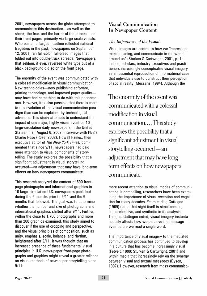
The enormity of the event was communicated witha colossal modification in visual communication.New technologies—new publishing software, printing technology, and improved paper quality—may have had something to do with this phenome-non. However, it is also possible that there is moreto this evolution of the visual communication para-digm than can be explained by technologicaladvances. This study attempts to understand theimpact of one major, highly visual event on 10large-circulation daily newspapers in the UnitedStates. In an August 6, 2002, interview with PBS’sCharlie Rose (Rose, 2002), Howell Raines, thenexecutive editor of The New York Times, com-mented that since 9/11, newspapers had paid more attention to visual components of story-telling. The study explores the possibility that a significant adjustment in visual storytellingoccurred—an adjustment that may have long-termeffects on how newspapers communicate.
This research analyzed the content of 590 front-page photographs and informational graphics in 10 large-circulation U.S. newspapers published during the 6 months prior to 9/11 and the 6 months that followed. The goal was to determinewhether the number and size of photographs andinformational graphics shifted after 9/11. Further,within the close to 1,700 photographs and morethan 200 graphics examined, this study aimed todiscover if the use of cropping and perspective,and the visual principles of composition, such asunity, emphasis, scale, balance, and rhythm,heightened after 9/11. It was thought that anincreased presence of these fundamental visualprinciples in U.S. news-paper front-page photo-graphs and graphics might reveal a greater relianceon visual methods of newspaper storytelling since9/11.
Visual Communication In Newspaper Content
The Importance of the Visual
Visual images are central to how we “represent,make meaning, and communicate in the worldaround us” (Sturken & Cartwright, 2001, p. 1).Indeed, scholars, industry executives and practi-tioners increasingly conceptualize visual imageryas an essential reproduction of informational cuesthat individuals use to construct their perception of social reality (Messaris, 1994). Although the
more recent attention to visual modes of communi-cation is compelling, researchers have been exam-ining the importance of visual reception and cogni-tion for many decades. Years earlier, Gattegno(1969) noted that sight itself is simultaneous, comprehensive, and synthetic in its analysis. Thus, as Gattegno noted, visual imagery instanta-neously affects how we perceive the message—even before we read a single word.
The importance of visual imagery to the mediatedcommunication process has continued to develop in a culture that has become increasingly visual(Fetveit, 1999; Sturken & Cartwright, 2001) andwithin media that increasingly rely on the synergybetween visual and textual messages (Dyson,1997). However, research from mass communica-
Pages 20–37 21 Visual Communication Quarterly
The enormity of the event wascommunicated with a colossalmodification in visualcommunication.…This studyexplores the possibility that asignificant adjustment in visualstorytelling occurred—anadjustment that may have long!term effects on how newspaperscommunicate.

Visual Communication Quarterly 22 Volume 12 Winter/Spring
> Before: ChicagoTribune, June 20,
2001. Copyright ©2001 Chicago
Tribune. Reprintedwith permission.

Pages 20–37 23 Visual Communication Quarterly
After: Chicago Tri-bune, January 16,2002. Copyright ©2002 Chicago Tribune. Reprintedwith permission.

Visual Communication Quarterly 24 Volume 12 Winter/Spring
tion scholars has not followed the trends in cultureand media (Bissell, 2002). The enormous strengthof visual communication, coupled with an increasing reliance on audiences to construct their own realities through visual cues that arereadily supplied via mass media, calls for a deeperexamination of imagery used in different mediatedcontexts.
Communicating Tragedy
Visual forms of communication, as well as writtentexts, typically shift immediately following nationaltragedies. For example, to reflect the enormity ofsuch events as the assassination of President John F. Kennedy and the bombing of Pearl Harbor,newspapers enlarged photographs and type. Theday after the Kennedy assassination, The EveningStar ran a two-line headline, and The New York
Times ran an even larger three-line headlineannouncing Kennedy’s death. Yet, like most large-circulation newspapers at the time, the images ofPresidents Kennedy and Lyndon B. Johnson wereboth no larger than two columns wide.
The bombing of Pearl Harbor saw similar coveragethat shifted the standard daily news routine but did not appear to fundamentally challenge the
use of design principles. The Baltimore News-Postran a two-line headline with a small image,whereas the Honolulu Star-Bulletin printed the boldheadline “WAR!” with no images. Theseapproaches diverged from daily coverage in termsof font size, but at no time in history prior to 9/11did newspapers significantly alter their fundamentaluse of design principles and approach to visualcommunication through imagery. By the next day,most newspapers had returned to their typical,smaller font sizes.
After 9/11, U.S. newspapers followed historicalpatterns of coverage in times of crisis in thatnewspapers across the country ran exceptionallylarge headlines. Unlike previous national tragedies, however, newspapers also ran largerphotos than normally found in front-page news. Itshould be noted that although technologicaladvances have made the use of photography tocommunicate a story easier, such advances alonedo not appear to explain this shift. In a review ofnewspaper front pages over the past 100 years,large photos can be found as far back as 1906,when The Boston Post ran a six-column-wideimage displaying damage from the major San Francisco earthquake. In 1934 the Herald Examiner ran a four-column spread showing a fleet of onlookers examining the body of PublicEnemy No. 1, John Dillinger. Newspapers have had the ability to reproduce images at relativelylarge sizes for nearly a century, (albeit not alwayswith high quality), yet they have rarely relied on this technique. Perhaps in the case of 9/11, thisreliance on visuals was because, as Raines said, itwas “a highly visual story” (Auletta, 2002).
A deeper examination of front-page content across a variety of newspapers (Poynter Institute,2001) from September 12, 2001, reveals coverageof tragedy that has not been found throughoutmass-mediated history. As noted previously, in thepast, one media response to a large-scale tragedywas to increase the size of text for the event itselfand then immediately return to smaller, typical fontsizes. However, even immediately followingnational tragedies, newspapers maintained a
On September 12, 2001, designguidelines that had rarely been
broken were completely ignored.Such newspapers as The
Washington Times, the VenturaCounty Star, the Wyoming
Tribune!Eagle, USA Today,and the San Francisco Chronicle
ran images across the entire front page.

Pages 20–37 25 Visual Communication Quarterly
strong emphasis on front-page text and continuedadherence to traditional visual principles such assymmetrical alignment and vertical image place-ment. September 12 found newspapers across thecountry presenting the terrorist attacks in a decid-edly different manner than before. The use of newtechnology explains how it was done, but not whyit was done.
Although some papers did set out to record historyimmediately after the terrorist attacks, the visualcoverage of other newspapers appeared to be“reaching out more than documenting” (Moses,September 25, 2001, p. 1). Certainly some newspa-pers, such as The Star-Ledger, The Philadelphia Inquirer, and The New York Times, took a moreconventional approach in their reporting of 9/11.However, perhaps acknowledging that most read-ers were inundated with repeated images throughout the day after the attack, many newspa-pers took a strikingly different visual approach in
the following day’s coverage. Moses (September25, 2001) suggested that this shift, unlike anynewspaper content to date, was more “reader-cen-tric than journalist-centric” (p. 1).
On September 12, 2001, design guidelines that hadrarely been broken were completely ignored. Suchnewspapers as The Washington Times, theVentura County Star, the Wyoming Tribune-Eagle,USA Today, and the San Francisco Chronicle ranimages across the entire front page. The WinnipegSun rotated the front page to a horizontal format to better display an elongated image. The AsburyPark Press, the Boston Herald, and Chicago Sun-Times each ran a full-bleed horizontal image thatfolded out to a double-truck spread—a move thatrequired removal of the back page ad and the 1-in.strip advertisement that normally ran at the base of their covers. The Austin American-Statesmanran a six-column black-and-white image. TheDiamondback (College Park, Maryland), The South
> Figure 1. Number of articles, photographs and informational graphics in large!circulation U.S. newspapers (March 10,2001–March 11, 2002).

Visual Communication Quarterly 26 Volume 12 Winter/Spring
Florida Sun-Sentinel, and the Milwaukee Journal Sentinel used extra white space around the textand images—a look that more resembled tradi-tional magazine design than a newspaper layout.Finally, Florida Today and The Virginian-Pilot bothran black behind the images with reversed type.
It should be noted that newspapers have movedtoward a more visual presentation with less text inthe past few decades (García, 1997). In the 1980sand 1990s, newspapers began to rely more on photographs, illustrations, infographic items (Utt &Pasternack, 1993), and spot color, such as tintblocks and borders (Click & Stempel, 1982).Although there was a rash of redesigns throughoutthe 1980s and early 1990s, the overwhelmingmajority of newspapers—particularly large-circulation dailies—have held on to their traditionaldesign styles and have stagnated in their use ofgraphics and visual information (García, 1997).Mario Garcia, a leader in newspaper design, was
quoted in 1996 as saying that newspapers—particularly U.S. newspapers—had fallen into alethargy that has made them appear “homogenized,sanitized and decaffeinated” (Shepard, 1996). Yet, in explaining the visual nature of September 12th coverage, Jeff Glick of the SouthFlorida Sun-Sentinel said that “even the mostdiehard ‘word’ people felt that pictures, graphics,and display typography could tell the story withmore impact than a lot of narrative” (Moses, Sep-tember 18, 2001, p. 1).
Hypotheses
News media have received well publicized criticismin recent years for publishing digitally altered photographs without appropriate labeling (Foss,1992; Hundertmark, 1991). Widespread knowledgethat images can be manipulated easily (Fetveit,1999; Huang, 2001) may have resulted in an envi-
> Figure 2. Size of front!page photographs in large!circulation U.S. newspapers (March 10, 2001–March 11, 2002).

Pages 20–37 27 Visual Communication Quarterly
ronment in which photographs are increasinglydevalued in storytelling. Yet research suggests that visual imagery—photographs in particular—provides more credibility than text alone (Huxford,2001). In reference to news photographs, Goldmanand Beeker (1985) wrote that the mere proliferationof photography in our culture has resulted in an atmosphere in which the image itself is notchallenged and its presence is accepted as neces-sary. Indeed, photographs have historically been construed as solidifying the objectivity of themessenger (Hall, 1973). In an environment in which the manipulation of imagery is infinitely possible, the photograph may have recently wit-nessed a lack of oppositional reading because ofthis increased credibility and objectivity. Some suggest that newspapers are using photographsmore than in the past in an effort to increase theirown credibility in a confusing media environment.It may also be that photographs are increasinglybeing used after 9/11 to satisfy audiences thathave come to doubt their own surroundings afterwhat most Americans felt were “unbelievable” terrorist attacks.
If newspapers did become more visual after 9/11,then we would expect that the use of imageryother than photographs, such as informationalgraphics, would presumably also increase. For thepurposes of this study, graphics are definedaccording to Harris and Lester (2002), who statedthat news graphics can be categorized as eitherstatistical, such as charts or data maps (e.g.,weather maps), or nonstatistical, which includesfact boxes, tables, and nondata maps (such as alocator map with no statistical information).
Hypothesis 1: The quantity and size of photo!graphs and informational graphics increased innewspapers after 9/11, regardless of story type.
In accordance with recent research examiningvisual journalism (Harris & Lester, 2002), photo-graphs are divided generally into spot and generalphotographs. Spot news photographs are definedas images that are unplanned and cannot bereshot, such as a photograph of a woman jumpingfrom a burning building or of a car caught in flight
as it flipped. In contrast, general news photo-graphs record unstaged “ordinary, general, oftenunspectacular events in the world community”(Harris & Lester, 2002, p. 96). Spot news photo-
graphs depend on actual news events occurring in the presence of a news photographer. If visualstorytelling increased after 9/11, one would expectspot news photographs to increase.
Hypothesis 2: Spot news photographs increasedin newspapers after 9/11, regardless of story type.
Effective visual communication relies heavily onbasic principles used both to construct entirepages as well as individual images (Lauer &Pentak, 2002). If indeed newspapers have become
The increase in size ofphotographs after 9/11, coupledwith the decrease in article lengthand size and number ofinformational graphics, wouldpresumably be barely noticeableto readers, given the subtlety ofthe shift and the relatively smalltime frame measured. Yet, minorvariations in media can eventuallyevolve into a completetransformation in approach andexecution. In this case, theseslight alterations continuedthroughout the 6 monthsmeasured and warrant futurescholarly attention.

more “visual,” effective use of visual principles ofcomposition—such as unity, emphasis, scale, bal-ance, and rhythm—would increase. Just as sea-soned word journalists come to depend on essen-tial journalistic norms and structures learned overyears of experience, designers and photographersrely on fundamental visual principles to help com-municate a story.
These five principles of composition—unity,emphasis, scale, balance, and rhythm—are essen-tial in effective visual communication. Given the assumption that a visual mode of storytelling inthe news has increased after the attacks, it ishypothesized that newspaper designers and pho-tographers would rely on these principles moreafter 9/11.
Cropping, apparent position of the photographer,and perspective are additional components ofvisual communication that can enhance visual storytelling. Thus it would be expected that appar-ent cropping (loose or tight), apparent position of
the photographer (above, to the side, or below),and perspective (amplified, one point, and twopoint) would be used more effectively in photo-graphs and graphics within a more visual newspa-per industry.
Hypothesis 3: Effective use of cropping, perspective, unity, emphasis, scale, balance,and rhythm in photographs and informationalgraphics increased in newspapers after 9/11,regardless of story type.
Method
To test these hypotheses, a content analysis wasconducted of 10 large-circulation newspapers chosen randomly from a comprehensive list created by first compiling an index of all news-papers from a major research university newspapersubscription list. From this list, only newspaperswith circulations over 200,000 were included forconsideration, as the goal was to examine major,large-circulation newspaper dailies in the UnitedStates. This resulted in 21 newspapers, whichwere further reduced to the final sample size of 10.The final sample size was created by selectingevery second newspaper from the list of 21 major,large-circulation newspaper dailies. Front pageswere coded from The New York Times, The Washington Post, Los Angeles Times,Chicago Tribune, The Boston Globe, San FranciscoChronicle, The Seattle Times, Star Tribune, TheDetroit News, and The Atlanta Journal-Constitution newspapers published during the 6months preceding and the 6 months following 9/11.
Front pages from these large-circulation dailieswere selected every 6 calendar days (starting witha randomly selected day) within the 1-year periodof study. Selecting every 6th day was a simple,direct and randomized method of obtaining at least one date from each week without being confined to the same day of the week throughout.
Coding
Two graduate students who specialized in visualcommunication were separately trained in the
Visual Communication Quarterly 28 Volume 12 Winter/Spring
The minor, yet statisticallysignificant, modifications in visual
communication found in thisresearch could be representative
of a latent or very purposefulresponse on the part of
newspapers to the gravity of 9/11.Future research that examines
this trend over a longer period oftime will be better able to
ascertain any permanent shifts inthe visual communication of
large!circulation newspapers.

Pages 20–37 29 Visual Communication Quarterly
coding procedure but were not informed as to thescope of the project. Both coders were givenexamples of different value selections within eachof the possible variables. Each photograph wascoded along 12 variables, where-as each informa-tional graphic was coded along 10 variables. It waspossible to code up to five photographs and up tothree graphics for each date.
Images and graphics were categorized according to the type of accompanying article, the content ofthe photograph itself, and the type of photograph or graphic. To ensure objectivity within the contentanalysis of photographic and graphic material, acoding method was derived from previous visualcommunication research (see Gattegno, 1969; Harris & Lester, 2002; Lauer & Pentak, 2002; Messaris, 1994). Each photograph and informa-tional graphic was examined and coded accordingto apparent cropping, the perceptible position ofthe photographer, the perspective of the photo-graph or graphic, and visual principles of composition.
Because visual principles are not always immedi-ately transparent to the viewer, these techniqueswere thoroughly reviewed with coders throughexamples and discussion. Visual principles of composition were defined according to Lauer andPentak (2002). Unity could be determined within aphotograph or graphic through proximity, repetition,or continuation. These forms of unity can communicate specific associations to the reader—whether ideological, geographical or symbolic. Thisconcept is closely related to Gestalt theory, which states that various forms of unification result in viewer perception that a whole visualimage is substantively different than the sum of itsindividual elements. For the purposes of thisresearch, if an element was grouped within a pre-determined space with another element, those elements were coded as unified by proximity. If anelement recurred in a specific space, then thoseelements were coded as unified through repetition.Images grouped through a visually continuous line or by their directional unanimity were coded as unified through continuation. It also was possible that no unification was present in photo-graphic or graphic content.
Emphasis within visual elements could occurthrough isolation or through placement. An elementwas emphasized, or given importance, through isolation when no other elements surrounded it in the graphic or photograph. Conversely, an element was emphasized throughplacement when it was positioned in a specific and purposeful manner to draw attention. No evi-dence of emphasis was also a possibility withinthe coding scheme.
Obvious use of scale and scale confusion were two components of the scale design principle thatcould be coded for each photograph and graphic.Scale can communicate subservience or signifi-cance when large elements appear heavier andmore powerful than smaller ones (Lester, 2000).
The fourth visual principle, balance, can demon-strate strength or isolation. Accordingly, theseemotions are found in symmetrical balance andasymmetrical balance. Radial balance and crystal-lographic balance are often used to denote a sense of overwhelming emotion or chaos. Radialbalance exists when all of the elements radiate orcircle out from a common central point, whereascrystallographic balance exists when all elementswithin a photo or graphic carry equal emphasisover the whole format.
Rhythm was categorized as either progressive oralternating. Progressive rhythm was detected when elements gradually shifted in shape, color,value, or texture within the frame. Alternatingrhythm was present when elements interchangedwith one another in a consistent and regulated pattern.
Cropping was classified as either loose or tight. Itis important to note that cropping is a techniquedone after the shooting by the photographer, theeditor, or the designer, whereas the photographerdoes framing in camera before a shot is taken.Clearly, it is impossible to determine whethersomething had been framed tightly in camera orhad been cropped by the photographer or someoneelse for a specific layout design. Given this uncer-tainty and given the many definitional applicationsof the term frame in journalism, the term cropping

Visual Communication Quarterly 30 Volume 12 Winter/Spring
is used here loosely to describe the resulting imageon the page for simplicity.
Tight cropping of an individual or object maydenote magnitude, whereas extremely loose crop-ping can suggest a sense of weakened power.Closely related to these power constructions, astrong perspective looking upward can relay asense of authority and strength, whereas a down-ward perspective can indicate insignificance (Zettl, 1998). Perspective was defined as amplified,one point, or two point. The amplified perspectiveintroduces a dramatic, dynamic quality in photo-graphs, whereas one-point perspective presents a“very organized and unified spatial image” (Lauer Pentak, 2002, p. 188). Two-point perspectivemore nearly approximates our visual experienceand is easier to attain.
Coding these visual principles of composition, aswell as the other visual techniques such as crop-ping, the apparent position of the photographer,and perspective, helped determine whether thepresentation of photographs and graphics used innewspaper content has become more skilled since 9/11 rather than simply more or less plentiful.
Analysis Techniques
The study used descriptive statistics to describevariables. Interobserver reliability coefficients pro-vided an indication of the reliability of the codingscheme. Correlation coefficients, coupled withother measures of associations, simple percent-ages, and frequencies, were used to analyze thedata.
Results
In total, 608 front pages were found, although 18were removed due to poor reproduction quality.Thus, 590 front pages were available over the 1-year period of study. Due to microfilm availability,290 newspapers were from dates before 9/11, and300 from after 9/11. These front pages resulted in1,693 photographs and 222 graphics that werecoded.
Interobserver agreement between the two codersranged from 92% to 100% on the number of arti-cles, photographs, and graphics.1 Not surprisingly,war coverage was higher after 9/11, whereascrime, government, and human-interest storiesdecreased (p < .0005).2
All of the types of articles coded for this studywere cross-tabulated with the different visual principles of composition to test whether storytype had any effect on visual principles used. Thiswas necessary, as each hypothesis, at least par-tially, asked whether story type had an effect onvisual principles of composition. In every case, theassociation was found to be statistically significant(all ps < .005), suggesting that there was an association between the type of article and thecamera position, perspective, unity, emphasis,scale, balance, or rhythm. Yet, on closer inspection,directional measures that better denote importance when large sample sizes are presentproved that the associations were inconsequential.Thus, story type did not appear to play a role indictating visual principles of composition. In each case, when the type of article was used topredict a variable, the reduction in error was non-existent (0.0%).
The examination of 590 front pages resulted in3,079 articles. In examining the Pearson chi-square association between date and the numberof articles, there was a significant decrease (p <.0005) after 9/11 from an average of 5.63 articlesper front page prior to 9/11 to an average of 5.21afterward (Table 1). When examined in shortertime increments throughout the 1-year period ofstudy, the association between time of release and number of articles was statistically significant(p < .0005), meaning that in addition to examiningcontent before and after 9/11, all of the dates sam-pled for this study were grouped in twos through-out the 1-year period, beginning with the first twodates sampled. This was done to search for trendsoccurring over time in relation to 9/11, rather thanexamining only two points in time (pre- and post-9/11). Grouping individual dates in twos allowed for discovery of detailed yet subtle trend informa-tion over time that might not be discovered in onlytwo large blocks of data (Norman & Streiner,

Pages 20–37 31 Visual Communication Quarterly
1997). After examining the information at this level,it was found that the largest average number ofarticles during publication prior to 9/11 was 6.13(between April 27, 2001, and May 3, 2001); how-ever, 5.5 was the largest average number of articles after 9/11. After 9/11, there was a continuous decline in the number of front-page articles, whereas a steadyfluctuation in the number ofarticles before 9/11 wasfound (Figure 1).
Hypothesis 1: TheQuantity and Size ofPhotographs andInformational GraphicsIncreased in NewspapersAfter 9/11, Regardless ofStory Type
Of the 1,693 photographs,842 photographs from 290newspapers were fromfront pages of newspapersbefore 9/11 and 851 photo-graphs from 300 newspa-pers were from after thisdate, resulting in a slightdecrease in the averagenumber of photographs.However, the associationbetween the size of a pho-tograph and whether theimage ran before 9/11 orafterward was highly signif-icant (p < .0005). Therealso was a statistically sig-nificant relationship (p <.0005) between the size ofa photograph and its publi-cation within smaller two-date time periods through-out the 1-year study. Atthis level, the smallestaverage number of photo-graphs running before 9/11was 2.35, whereas thesmallest average afterwardwas 2.94 photographs
(Figure 1). Although small, there was a consistent,and statistically significant (p < .05) increase in image size after 9/11. It should be noted that it ispossible to achieve statistical significance withsuch a small increase in image size due to thelarge sample size.
Table 1Average number of articles, photographs, and informationalgraphics on front pages of large-circulation U.S. newspapers
(March 10, 2001–March 11, 2002)
Number Number Numberof of of
Date Articles Photographs Graphics
3/10/01 & 3/16/01 5.71 3.18 0.473/22/01 & 3/28/01 6.00 2.35 0.624/3/01 & 4/9/01 5.61 2.67 0.444/15/01 & 4/21/01 5.38 3.00 0.504/27/01 & 5/3/01 6.13 2.87 0.405/9/01 & 5/15/01 5.89 2.89 0.945/21/01 & 6/8/01 5.38 3.37 0.136/2/01 & 6/8/01 5.32 3.25 0.196/14/01 & 6/20/01 5.84 3.00 0.506/26/01 & 7/2/01 5.45 2.70 0.207/8/01 & 7/14/01 5.45 3.35 0.307/20/01 & 7/26/01 5.90 3.30 0.308/1/01 & 8/7/01 5.61 2.92 0.618/13/01 & 8/19/01 5.32 3.24 0.378/25/01 & 8/31/01 5.50 3.39 0.509/6/01 5.61 3.00 0.40Average pre-9/11 5.63 3.03 0.43
9/18/01 & 9/24/01 5.05 3.12 0.539/30/01 & 10/6/01 5.28 3.24 0.2310/12/01 & 10/18/01 5.04 3.11 0.3210/24/01 & 10/30/01 5.22 3.16 0.2911/5/01 & 11/11/01 5.33 3.24 0.3011/17/01 & 11/23/01 5.50 3.10 0.3211/29/01 & 12/5/01 5.00 3.30 0.6012/11/01 & 12/17/01 5.30 2.94 0.4012/23/01 & 12/29/01 5.21 3.16 0.531/4/02 & 1/10/02 5.20 3.00 0.581/16/02 & 1/22/02 5.35 3.42 0.401/28/02 & 2/3/02 5.18 3.05 0.322/9/02 & 2/15/02 5.30 3.14 0.252/21/02 & 2/27/02 5.20 3.10 0.383/5/02 & 3/11/02 5.10 2.94 0.69Average post-9/11 5.21 3.13 0.41

Visual Communication Quarterly 32 Volume 12 Winter/Spring
Further, the average size of a photograph in squareinches was 6.415 before 9/11 and 7.64 after 9/11(Table 2), a 19% increase. The relationship betweenthe size of a photograph and whether the image ranbefore 9/11 or after 9/11 was significant (p <.0005). When the date of the photograph’s publica-tion was used to predict the photograph’s size, Etaindicated an 11.3% reduction in error, suggesting animportant and strong level of significance.
Phi and Cramer’s V, other nonparametric measuresof association that are helpful with extreme quanti-ties (Norman & Streiner, 1997), resulted in a weak,but positive, relation between the two variables(.202). This degree of association ranges from 0 to1. If there were no association at all, this measurewould equal zero. This finding reconfirms a positiveand relatively strong relation between the size ofthe photograph and date of publication.
There also was a significant relation (p < .0005)between the size of the photograph and time meas-ured in two-date increments throughout the 1-yearperiod. When examined graphically (Figure 2), onecan see that the average size of photographs con-tinued to rise after 9/11. Before 9/11, the smallestphotograph averaged 4.94 square inches (Table 2),whereas the smallest photograph average after9/11 was 6.22 square inches, resulting in a signifi-cant difference (p < .0005).
Front-page newspaper graphics decreased from118 before 9/11 to 104 after 9/11, translating to analmost 15% decrease. Although the decrease wasnot significant when measuring the differencebetween the number of graphics published beforeor after 9/11 (p = .348), the decrease was signifi-cant when measured against smaller time intervalsthroughout the period studied (p < .0005). Thus,when measuring time in smaller increments, ratherthan two large time blocks of pre- and post-9/11,there was a significant decrease in graphics overthe entire time period sampled.
Graphics showed a decline in size as well as inquantity. The average size of an informationalgraphic before 9/11 was 1.43 square inches, com-pared with 1.23 square inches afterward, a 14%
decrease in size. Again, this relation was not signif-icant (p = .029) when evaluated as two periods oftime (pre- and post-9/11), but was found to be sig-nificant (p < .0005) when evaluated in two-dateincrements throughout the 1-year study.
Table 2Average size of photographs on front pages of large-circulation
U.S. newspapers (March 10, 2001–March 11, 2002)
Date Size of Photo
3/10/01 & 3/16/01 5.843/22/01 & 3/28/01 6.954/3/01 & 4/9/01 6.204/15/01 & 4/21/01 7.104/27/01 & 5/3/01 6.655/9/01 & 5/15/01 6.205/21/01 & 6/8/01 5.726/2/01 & 6/8/01 4.946/14/01 & 6/20/01 6.236/26/01 & 7/2/01 6.307/8/01 & 7/14/01 6.577/20/01 & 7/26/01 6.898/1/01 & 8/7/01 6.468/13/01 & 8/19/01 7.318/25/01 & 8/31/01 6.859/6/01 6.43Average pre-9/11 6.42
9/18/01 & 9/24/01 8.749/30/01 & 10/6/01 10.1610/12/01 & 10/18/01 7.1210/24/01 & 10/30/01 7.4611/5/01 & 11/11/01 7.2811/17/01 & 11/23/01 7.3111/29/01 & 12/5/01 6.8712/11/01 & 12/17/01 8.6012/23/01 & 12/29/01 7.001/4/02 & 1/10/02 6.951/16/02 & 1/22/02 6.221/28/02 & 2/3/02 6.912/9/02 & 2/15/02 8.102/21/02 & 2/27/02 8.133/5/02 & 3/11/02 7.80Average post-9/11 7.64

Pages 20–37 33 Visual Communication Quarterly
In sum, the quantity of photographs decreasedafter 9/11. However, this decrease was probablydue to the large increase in photographic size after9/11. On the other hand, there was a significantdecrease in the size of informational graphics whenmeasured in smaller intervals over the entire year-long study. Hypothesis 1 was partially supported,given the conflicting findings.
Hypothesis 2: Spot News Photographs Increasedin Newspapers After 9/11, Regardless of StoryType
The type of photographs used in newspaper con-tent shifted after 9/11. The most dramatic shiftwas within spot news photographs, with a positive8.5% post-9/11 increase (p < .0005). Generalhuman-interest photographs decreased almost 6%after 9/11. The remaining four categories (generalnews, general sports, spot sports, spot humaninterest) were generally stable across time.Hypothesis 2 was supported.
Hypothesis 3: Effective Use of Cropping,Perspective, Unity, Emphasis, Scale, Balance,and Rhythm in Photographs and InformationalGraphics Increased in Newspapers After 9/11,Regardless of Story Type
Evidence of unity in photographic contentincreased 3.7% after 9/11, emphasis increased6.4%, scale 3.2%, and rhythm 6% (Table 3). Balancedecreased by 1.7%. All of these shifts were signifi-cant (ranging from p = .001 to p < .0005). Thestrengths of these associations were weak, but allremained positive. Although unity and emphasis inphotographs were dropped from this study due tolow intercoder reliability scores, it is interesting tonote that unity through proximity in photographswas most frequently used (13%), with unitythrough repetition used in 5.1% of photographs, fol-lowed by unity through continuation (1.82%).Emphasis by placement was the predominant modeof accentuating a subject (61%). Photographs wereover 5 times more likely to show an obviousdemonstration of scale, and scale confusion wasnot found. Asymmetrical balance was used in pho-tographic content more than the radial, symmetri-
cal, and crystallographic balance techniques com-bined. Finally, progressive rhythm was used 4%more than alternating rhythm.
Unlike unity in photographic content, unity ingraphic content produced an ample intercoder relia-bility score and was included for study. Unity ingraphic content increased 1.5% after 9/11, empha-sis increased 2%, scale 2%, balance 7.4%, andrhythm 13.6%. The association between the date ofpublication and both balance (p < .002) andrhythm (p < .003) were significant. However,associations between the other three visual princi-ples and date of publication were not significant(ranging from p = .067–.205). The strength of thesignificant balance and rhythm associationsremained positive (phi values of .02 and .163,respectively).
The increase in graphic unity before and after 9/11was wholly due to an increase in unity through rep-etition. Emphasis by isolation was the predominantmode of accentuating a subject. Obvious demon-stration of scale was the only scaling methodfound, and scale confusion was never found.Asymmetrical balance was the most commonlyfound balance technique (38%), and progressiverhythm was used 19% more than alternatingrhythm.
There was an increase after 9/11 in the number ofphotographic images where tight cropping was evi-dent (1.3%); however, subjects in photographicimages were still more likely to be loosely croppedthan to be tightly cropped in the frame. Obviouscamera placement increased 7.1%, and apparentperspective alterations increased 2.1% over thesame time period. All of these shifts were signifi-cant (ranging from p = .001 to p < .0005). Thestrength of these associations was weak, but allremained positive (phi ranging from .056 to .087).The camera was placed below and above the sub-ject almost equally (12.1% and 11.2%, respec-tively). Finally, one-point perspective was most evi-dent in photographic content.
There was a decrease after 9/11 in the number of graphic images in which tight cropping was

Visual Communication Quarterly 34 Volume 12 Winter/Spring
evident (11.2%). Evidence of perspective in graphics increased 3.7% during the same timeperiod. However, the relation between the dateof publication and cropping and perspective was not significant (p = .055 and .426, respectively).
In sum, of the 15 variables related to visual princi-ples and techniques of composition (8 pertaining tophotographs and 7 related to informational graph-ics), only 2 showed a decrease in presence after9/11. Eleven of the 15 relations between the princi-ples used in visual composition and the date ofpublication were significant, with all significantrelations showing a positive strength in associa-tion. Of the 4 remaining relations not found to besignificant, 3 pertained to informational graphics(crop, perspective, and scale of graphic). Therefore,even barring the exclusion of unity and emphasisfor photographic images, Hypothesis 3 was sup-ported for photographs but not for informationalgraphics.
Discussion
For the 1-year period of study examined here, thedata support the overall hypothesis that 9/11 mayindeed have signaled a shift in the use and appli-cation of photographs and informational graphicswithin the daily large-circulation newspapersexamined. The number of articles on the frontpages of the newspapers studied declined duringthe period of examination. This may be due to thefact that an increased reliance on pictorial informa-tion took up available column space. This researchfound a significant increase in the size of photo-graphs after 9/11. Although there was a slightdecline in the number of photographs after 9/11,this was likely due to the significant increase inthe size of photographs during the same timeperiod. It should be noted that the size of the textalone in articles was not directly measured. There-fore, the smaller number of stories could haveresulted from more in-depth writing and longertext. Yet it is typical that articles on the front pagecarry no more than one accompanying photographeach, if any. Given that the change in the number
of photographs was slight, whereas the shift insize of photographs was larger, a reasonableexplanation is that photographic size wasincreased at the expense of article length. Futurestudies, including content analysis of articles andmeasurements of article length, would offer per-spective on this point.
The increase in size of photographs could also beinterpreted as a reflection of the increased avail-ability and use of digital cameras. Yet evaluation oftechnical trade documents such as Shutterbug,PhotoZone, British Journal of Photography, Photo-graphic, and Popular Photography, revealed no sig-nificant developments during the second 6 monthsof this study that might have explained increaseduse of cameras.
Another possible interpretation of the increase inphotographic size relates to the presence of moreimages found in general throughout newspapercontent. Barnhurst and Nerone (1991) found thatnewspapers have progressively used larger photo-graphs on front pages from 1885 to 1985. Yet intheir more recent work (Barnhurst & Nerone,2001), they argued that newspapers have not nec-essarily seen a continual increase in imagerythroughout history but, rather, that newspaperdesign has reflected the public role that journalismhas sought to exert, giving newspapers a distinc-tive look at specific historical moments. García(2002, March 7) argued that newspapers havemore recently ignored the importance of a centralvisual impact on their front pages, suggesting thatat least one large photograph is not the norm inmodern newspaper design. Certainly, if photo-graphic image size had been increasing continuallyover the past 100 years, newspapers would lookvery different than what is seen today. However,future research examining imagery over time, aswell as specifically in relation to 9/11, is needed to determine definitive interpretations of thisinformation.
The increase in photographic size may also be due to a growing acknowledgment that largerimages simply attract attention much more thansmaller images (Bignell, 1997). Editors and busi-

ness managers struggling for higher circulationnumbers could be facing an economic incentive toincrease photographic size to increase viewingattention in the hopes of subsequently increasingreadership.
A further alternative explanation of the increasedreliance on photography could be simply that theevents after 9/11 were so vivid that they compelledand even required more emphasis on photographicimages. For example, the ensuing war inAfghanistan may have created such dramatic visu-als that editors decided they warranted larger playon front pages. This possibility can be disputedonly through a broader longitudinal study examin-ing content.
This research also found a decrease in the numberand size of informational graphics after 9/11. Thesefindings may suggest that the newspaper industryresponded to the public’s need for verifiable infor-mation—and the credibility of photographs contin-
ued to reassure a society wary of an uncertainworld after the terrorist attacks. Although thisstudy did not provide conclusive data to substanti-ate such a correlation, in-depth interviews withnewspaper designers and editors would be particu-larly illuminating in unveiling any latent or manifestassociations between photographic credibility andthe public’s need for verifiable information.
The increase in the size of photographs after 9/11,coupled with the decrease in article length and sizeand number of informational graphics, would pre-sumably be barely noticeable to readers, given thesubtlety of the shift and the relatively small timeframe measured. Yet minor variations in media caneventually evolve into a complete transformation inapproach and execution. In this case, these slightalterations continued throughout the 6 monthsmeasured and warrant future scholarly attention.The minor, yet statistically significant, modifica-tions in visual communication found in thisresearch could be representative of a latent or verypurposeful response on the part of newspapers tothe gravity of 9/11. Future research that examinesthis trend over a longer period of time will be betterable to ascertain any permanent shifts in the visualcommunication of large-circulation newspapers.
Although not examined for this research effort, fur-ther research might also examine the placement ofphotographs on the front page of newspapers, bothbefore and after 9/11, given that studies haveshown readers move from left to right and from thetop to the bottom (Lester, 2000). Althoughinevitably linked to the type of content that sup-ports these images, changes in placement mightsuggest varying levels of importance given to pho-tographs and informational graphics in and ofthemselves.
Visual principles of composition, progressiverhythm, asymmetrical balance, and an obviousdemonstration of scale were most commonly used for both photographs and graphics. However,photographs achieved unity primarily through proximity, whereas graphics did the same throughrepetition. Photographs also achieved emphasisthrough placement, whereas graphics emphasized
Table 3Percentage change pre/post-9/11 in
visual principles of composition withinphotographs and informational graphics
Type of Image/ %Variable Change
PhotographsUnity 3.7Emphasis 6.4Scale 3.2Rhythm 6.0Balance –1.7Cropping 1.4Camera placement 7.3Perspective 2.3
Informational graphicsUnity 1.5Emphasis 2.0Scale 2.0Rhythm 13.6Balance 7.4Cropping –11.2Perspective 3.7
Pages 20–37 35 Visual Communication Quarterly

Visual Communication Quarterly 36 Volume 12 Winter/Spring
elements by isolation. This finding seems to sug-gest that there are inherent differences in howinformation is unified and emphasized for an infor-mational graphic as opposed to a photograph.These differences could be helpful in better concep-tualizing how visual communicators transmit infor-mation and how the public receives this information.
There was a statistically significant relation foundbetween the utilization of visual principles of com-position for communication and the date of publica-tion. This suggests stronger reliance on visual prin-ciples within storytelling after 9/11 in thelarge-circulation newspapers examined for thisstudy. It is possible that with a greater emphasison visual imagery in newspapers, visual communi-cators themselves became more skilled at theircraft simply because more was demanded of them.Certainly it is doubtful that most newspaperdesigners and photographers are immediatelyaware of terminology as obtuse as “crystallo-graphic” rhythm. However, the increase in rhythmicapproaches to storytelling through photographs and informational graphics, for example, suggeststhat more care and skill might be at work in thecomposition of these elements. Again, in-depthinterviews with visual communicators would behelpful to further detect personal reflections of theimpact 9/11 may have had on their craft in thenewsroom.
Notes1The coefficient of agreement (i.e., total
number of agreements divided by the totalnumber of coding decisions both had observed)for the two observers averaged .87 for allpossible variables (3 newspaper variables; 12photographic variables, for up to 5 photographsper date; and 10 graphic variables, for up to 3graphics per date). In adherence to standardmeasures of reliability (Riffe, Lacy, & Fico, 1998),two variables with interobserver agreementvalues below .75 were excluded from this study.Excluded variables were unity of photographs(.647) and emphasis of photographs (.621).
2Further, when the type of accompanyingarticle was used to predict whether the date of
publication was before 9/11 or afterward, therewas a 33.8% reduction in error, meaning thatthere is a 33.8% gain in predicting onecategorical table factor when the value of thesecond factor is known, relative to when it is notknown. Using the Eta directional measure, whichis a cross-tabulated statistic that is useful whenone variable (type of article) is nominal and theother variable (date of publication) is interval,the reduction in error increased to 43.0 %. ThisEta measure can be interpreted as the“proportion of the variability of the dependentvariable that is explained by knowing the valuesof the independent variable” (SPSS, 1999, p. 87).Therefore, the significance value translated to ahigh level of practical importance as well,meaning that it was possible for the independentvariable to clearly identify the categories of thedependent variable.
Front-page industrial articles, political stories,and articles focused on sports remainedrelatively stable both before and after 9/11. Noneof these three topic categories varied by morethan 2% during the time studied.
References
Auletta, K. (2002, June 10). The Howell doctrine.The New Yorker, XX, XX–XX. Retrieved June6, 2005, from http://www.newyorker.com/archive/content/?030616fr_archive05
Barnhurst, K., & Nerone, J. C. (1991). Designtrends in U.S. front-pages, 1885–1985. Jour-nalism Quarterly, 68, 796–804.
Barnhurst, K., & Nerone, J. C. (2001). The formof news: A history. New York: Guilford.
Bignell, J. (1997). Media semiotics: An introduc-tion. Manchester, England: Manchester Uni-versity Press.
Bissell, K. (2002, August). Where we’ve been—Where we’re going: An analysis of visualcommunication research in communicationjournals. Paper presented at the meeting ofthe Association for Education in Journalismand Mass Communication, Miami, FL.
Click, J. W., & Stempel, G. H., III. (1982, July 29).Reader response to front-pages with modu-lar format and color. ANPA News Research,35, 1–5.
Dyson, E. (1997). Release 2.0: A design for livingin the digital age. New York: BroadwayBooks.

Pages 20–37 37 Visual Communication Quarterly
Fetveit, A. (1999). Reality TV in the digital era: Aparadox in visual culture? Media, Culture &Society, 21, 787–804.
Foss, K. (1992, April). Digital dilemma: Enhance-ment or manipulation? Photo ElectronicImaging, XX, 21–23.
García, M. R. (1997). Newspaper evolutions. St.Petersburg, FL: Poynter Institute for MediaStudies.
García, M. R. (2002, March 7). The center ofvisual impact. Retrieved May 15, 2003, fromhttp://www.poynter.org/column.asp?id=33&aid=3251
Gattegno, C. (1969). Towards a visual culture:Educating through television. New York:Outerbridge & Dienstfrey.
Goldman, R., & Beeker, G. (1985). Decodingnewsphotos: An analysis of embedded ide-ological values. Humanity and Society, 9,351–361.
Hall, S. (1973). The determinations of news pho-tographs. In S. Cohen & J. Young (Eds.), Themanufacture of news: Deviance, socialproblems and the mass media (pp.176–190). London: Constable.
Harris, C. R., & Lester, P. M. (2002). Visual jour-nalism: A guide for new media profession-als. Boston: Allyn & Bacon.
Huang, E. (2001). Readers’ perception of digitalalteration in photojournalism. Journalism &Communication Monographs, 3, 147–182.
Hundertmark, J. (1991, October). When enhance-ment is deception: The ethics of photomanipulation. Publish, 51–55.
Huxford, J. (2001). Beyond the referential: Usesof visual symbolism in the press. Journal-ism: Theory, Practice and Criticism, 2,45–71.
Lauer, D., & Pentak, S. (2002). Design basics (5thed.). Belmont, CA: Wadsworth/ThomsonLearning.
Lester, P. (2000). Visual communication: Imageswith messages (2nd ed.). Belmont, CA:Wadsworth/Thomson Learning.
Messaris, P. (1994). Visual “literacy”: Image,mind and reality. Boulder, CO: Westview.
Moses, M. (2001, September 18). Debatingdesign. Retrieved July 15, 2002, from http://www.poynter.org/terrorism/monica3.htm
Moses, M. (2001, September 25). Covering theattack: Day Two, Ms. Future and the cave-man: A civilized debate on the design of
Wednesday’s front-pages. Retrieved June 3,2005, from http://www.themorningnews.org./archives/editorial/investi-gating_tragedy.php
Norman, G. R., & Streiner, D. L. (1997). PDQ sta-tistics (2nd ed.). London: Mosby.
Poynter Institute. (2001). Covering the attack:Front-page galleries. Retrieved June 3,2005, from http://www.poynterextra.org/extra/ gallery/Wednesday1.htm
Riffe, D., Lacy, S., & Fico, F. G. (1998). Analyzingmedia messages: Using quantitative con-tent analysis in research. Mahwah: NJ:Lawrence Erlbaum Associates, Inc.
Rose, C. (Executive Producer). (2002, August 6).The Charlie Rose Show. Available fromhttp://www.charlierose.com/archives/archive.shtm
Shepard, A. (1996). Designer papers. AmericanJournalism Review, 18(10), 30–36.
SPSS base 9.0 applications guide. (1999).Chicago: SPSS.
Sturken, M., & Cartwright, L. (2001). Practices oflooking: An introduction to visual culture.Oxford, England: Oxford University Press.
Utt, S. H., & Pasternack, S. (1963). Front pages ofU.S. daily newspapers. Journalism & MassCommunication Quarterly, 61, 879–884.
Zettl, H. (1998). Sight, sound, motion: Appliedmedia aesthetics (3rd ed.). New York:Wadsworth.
Linda Jean Kenix is a lecturer in theSchool of Political Science andCommunication at the University ofCanterbury in New Zealand. She teachescourses on media and politics, the culturalconsumption of media, and visualcommunication. Her research hastraditionally focused on the representationof marginalized groups in media.
Correspondence should be addressed toLinda Jean Kenix, School of PoliticalScience and Communication, Journalismand Mass Communication Programme,University of Canterbury, Private Bag 4800Christchurch, New Zealand 8020, NewZealand. E-mail: [email protected]