Usability in a car pooling web application - DiVA Portal
103
Linköpings universitet SE– Linköping + , www.liu.se Linköping University | Department of Management and Engineering Bachelor’s thesis, 18 ECTS | Datavetenskap 22 | LIU-IDA/LITH-EX-G--22/009--SE Usability in a car pooling web ap- plication – In a carpooling application, how should information be dis- played to improve usability with focus on eectiveness and atti- tude? Användbarhet på en bilpools webbapplikation Wilma Adelsköld Ossian Anderson Emilia Bylund Månsson Martin Forsberg Oskar Gunnarsson Ludvig Hedlund Olivia Jacobsson William Rimton William Wallstedt Supervisor : Edvin Ljungstrand Examiner : Martin Sjölund
-
Upload
khangminh22 -
Category
Documents
-
view
4 -
download
0
Transcript of Usability in a car pooling web application - DiVA Portal

Linköpings universitetSE–581 83 Linköping
+46 13 28 10 00 , www.liu.se
Linköping University | Department of Management and EngineeringBachelor’s thesis, 18 ECTS | Datavetenskap
22 | LIU-IDA/LITH-EX-G--22/009--SE
Usability in a car pooling web ap-plication– In a carpooling application, how should information be dis-played to improve usability with focus on effectiveness and atti-tude?Användbarhet på en bilpools webbapplikation
Wilma AdelsköldOssian AndersonEmilia Bylund MånssonMartin ForsbergOskar GunnarssonLudvig HedlundOlivia JacobssonWilliam RimtonWilliam Wallstedt
Supervisor : Edvin LjungstrandExaminer : Martin Sjölund
Upphovsrätt
Detta dokument hålls tillgängligt på Internet - eller dess framtida ersättare - under 25 år från publicer-ingsdatum under förutsättning att inga extraordinära omständigheter uppstår.
Tillgång till dokumentet innebär tillstånd för var och en att läsa, ladda ner, skriva ut enstaka ko-pior för enskilt bruk och att använda det oförändrat för ickekommersiell forskning och för undervis-ning. Överföring av upphovsrätten vid en senare tidpunkt kan inte upphäva detta tillstånd. All annananvändning av dokumentet kräver upphovsmannens medgivande. För att garantera äktheten, säker-heten och tillgängligheten finns lösningar av teknisk och administrativ art.
Upphovsmannens ideella rätt innefattar rätt att bli nämnd som upphovsman i den omfattning somgod sed kräver vid användning av dokumentet på ovan beskrivna sätt samt skydd mot att dokumentetändras eller presenteras i sådan form eller i sådant sammanhang som är kränkande för upphovsman-nens litterära eller konstnärliga anseende eller egenart.
För ytterligare information om Linköping University Electronic Press se förlagets hemsidahttp://www.ep.liu.se/.
Copyright
The publishers will keep this document online on the Internet - or its possible replacement - for aperiod of 25 years starting from the date of publication barring exceptional circumstances.
The online availability of the document implies permanent permission for anyone to read, to down-load, or to print out single copies for his/hers own use and to use it unchanged for non-commercialresearch and educational purpose. Subsequent transfers of copyright cannot revoke this permission.All other uses of the document are conditional upon the consent of the copyright owner. The publisherhas taken technical and administrative measures to assure authenticity, security and accessibility.
According to intellectual property law the author has the right to bementionedwhen his/her workis accessed as described above and to be protected against infringement.
For additional information about the Linköping University Electronic Press and its proceduresfor publication and for assurance of document integrity, please refer to its www home page:http://www.ep.liu.se/.
©
Wilma AdelsköldOssian AndersonEmilia Bylund MånssonMartin ForsbergOskar GunnarssonLudvig HedlundOlivia JacobssonWilliam RimtonWilliam Wallstedt

Abstract
Usability is one important factor for customers to reach satisfaction. The purpose of thisreport was to investigate how information should be displayed on a carpooling web appli-cation to increase usability, focusing on the aspects of effectiveness and attitude. A marketsurvey indicated that young adults were especially interested in carpooling services, theage group of 18-31 therefore became the target group of this study. After studying existingliterature relevant to the research question and creating a prototype, a functional web appli-cation was created in two different versions. User tests were then conducted on the differ-ent versions to compare how the design aspects of detailed descriptions on buttons, bread-crumbs and different sign-in and register buttons affected usability. The methods used tomeasure usability were SUS-questionnaires, CTA and Smith’s lostness formula. The resultsshowed that the usability score was higher for the version with less detailed description onbuttons, single sign-in and register buttons (instead of multiple), with breadcrumbs. Thoseresults aligned with the time taken by test users to execute each task, as well as the overallcomments from the test users. In conclusion, the results from this report confirms that theimplemented design aspects improved effectiveness and attitude in regards to usability.
Sammanfattning
Användbarhet kan bedömas vara en viktig faktor för kundnöjdhet. Syftet med dennarapport var att undersöka hur information ska visas på en webbapplikation för samåkn-ingstjänster för att öka användbarheten, med fokus på aspekterna effektivitet och atti-tyd. En marknadsundersökning visade att det fanns ett särskilt stort intresse för samåkn-ingstjänster hos unga vuxna – användare i åldern 18-31 år blev därmed målgruppen fördenna studie. Efter studerande av relevant forskning och framställning av en prototyp,skapades en funktionell webbapplikation i två olika versioner. Användartester genom-fördes på de olika versionerna för att jämföra hur detaljerade beskrivningar på knap-par, breadcrumbs samt olika inlogg- och registrerar-knappar påverkar användbarheten.Metoderna som användes för att mäta användbarhet var SUS-frågeformulär, CTA ochSmith’s “lostness”-formel. Det sammanställda resultatet visade att testpersonerna gav etthögre betyg till versionen med mindre detaljerade beskrivningar på knapparna, en knappför inloggning och en för registrering samt breadcrumbs. Dessa resultat stämde överensmed tiden det tog för testpersonerna att utföra de olika uppgifterna samt kommentarernafrån dem. Slutsatsen är att resultaten av denna rapport bekräftar att de implementeradedesignaspekterna ledde till förbättrad effektivitet och attityd kopplat till användbarhet.


Contents
Abstract iii
Contents v
List of Figures vii
List of Tables ix
1 Introduction 11.1 Motivation . . . . . . . . . . . . . . . . . . . . . . . . . . . . . . . . . . . . . . . . 11.2 Definition of carpool . . . . . . . . . . . . . . . . . . . . . . . . . . . . . . . . . . 21.3 Purpose . . . . . . . . . . . . . . . . . . . . . . . . . . . . . . . . . . . . . . . . . . 21.4 Research question . . . . . . . . . . . . . . . . . . . . . . . . . . . . . . . . . . . . 21.5 Delimitations . . . . . . . . . . . . . . . . . . . . . . . . . . . . . . . . . . . . . . 2
2 Theory 32.1 Usability . . . . . . . . . . . . . . . . . . . . . . . . . . . . . . . . . . . . . . . . . 32.2 Designing Web Applications with High Usability . . . . . . . . . . . . . . . . . 32.3 System Requirements and Usability in Carpooling Applications . . . . . . . . . 62.4 Usability Evaluation Methods . . . . . . . . . . . . . . . . . . . . . . . . . . . . . 72.5 Number of Test Participants . . . . . . . . . . . . . . . . . . . . . . . . . . . . . . 102.6 Sampling . . . . . . . . . . . . . . . . . . . . . . . . . . . . . . . . . . . . . . . . . 102.7 Prototype . . . . . . . . . . . . . . . . . . . . . . . . . . . . . . . . . . . . . . . . . 10
3 Method 133.1 Prestudy . . . . . . . . . . . . . . . . . . . . . . . . . . . . . . . . . . . . . . . . . 133.2 Implementation . . . . . . . . . . . . . . . . . . . . . . . . . . . . . . . . . . . . . 153.3 User Tests . . . . . . . . . . . . . . . . . . . . . . . . . . . . . . . . . . . . . . . . 16
4 Results 194.1 Prestudy . . . . . . . . . . . . . . . . . . . . . . . . . . . . . . . . . . . . . . . . . 194.2 Implementation . . . . . . . . . . . . . . . . . . . . . . . . . . . . . . . . . . . . . 214.3 User Tests . . . . . . . . . . . . . . . . . . . . . . . . . . . . . . . . . . . . . . . . 24
5 Discussion 315.1 Results . . . . . . . . . . . . . . . . . . . . . . . . . . . . . . . . . . . . . . . . . . 315.2 Method . . . . . . . . . . . . . . . . . . . . . . . . . . . . . . . . . . . . . . . . . . 375.3 Future Outlook . . . . . . . . . . . . . . . . . . . . . . . . . . . . . . . . . . . . . 40
6 Conclusion 43
v

Bibliography 45
A Appendix A 49
A Appendix B 83
A Appendix C 89
vi
List of Figures
2.1 Depicting two parts of the Shackel definition of usability – effectiveness and atti-tude, which are operationalized in order to allow measurement of web applicationusability [2]. . . . . . . . . . . . . . . . . . . . . . . . . . . . . . . . . . . . . . . . . . 4
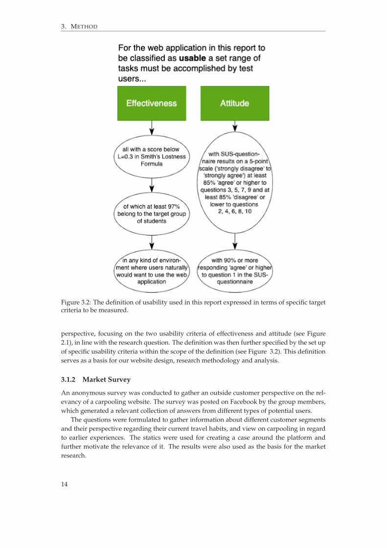
3.1 Prestudy, implementation and evaluation . . . . . . . . . . . . . . . . . . . . . . . . 133.2 The definition of usability used in this report expressed in terms of specific target
criteria to be measured. . . . . . . . . . . . . . . . . . . . . . . . . . . . . . . . . . . . 143.3 The user tests minimum node path. . . . . . . . . . . . . . . . . . . . . . . . . . . . . 18
4.1 Prototype Home page . . . . . . . . . . . . . . . . . . . . . . . . . . . . . . . . . . . 204.2 Prototype Register new account page . . . . . . . . . . . . . . . . . . . . . . . . . . 204.3 Prototype Showing car rides page . . . . . . . . . . . . . . . . . . . . . . . . . . . . 214.4 Home page version 1 . . . . . . . . . . . . . . . . . . . . . . . . . . . . . . . . . . . . 224.5 Home page version 2 . . . . . . . . . . . . . . . . . . . . . . . . . . . . . . . . . . . . 224.6 Navbar version 1 . . . . . . . . . . . . . . . . . . . . . . . . . . . . . . . . . . . . . . 224.7 Navbar version 2 . . . . . . . . . . . . . . . . . . . . . . . . . . . . . . . . . . . . . . 224.8 Book a trip version 1 . . . . . . . . . . . . . . . . . . . . . . . . . . . . . . . . . . . . 234.9 Book a trip version 2 . . . . . . . . . . . . . . . . . . . . . . . . . . . . . . . . . . . . 234.10 FAQ version 1 . . . . . . . . . . . . . . . . . . . . . . . . . . . . . . . . . . . . . . . . 244.11 FAQ version 2 . . . . . . . . . . . . . . . . . . . . . . . . . . . . . . . . . . . . . . . . 244.12 Breadcurmbs version 1 . . . . . . . . . . . . . . . . . . . . . . . . . . . . . . . . . . . 24
vii

List of Tables
2.1 What procedure best fits Likert-type and Likert scale [38]. . . . . . . . . . . . . . . . 9
4.1 CTA results . . . . . . . . . . . . . . . . . . . . . . . . . . . . . . . . . . . . . . . . . 264.2 CTA continued . . . . . . . . . . . . . . . . . . . . . . . . . . . . . . . . . . . . . . . 264.3 Lostness for users using version 1 . . . . . . . . . . . . . . . . . . . . . . . . . . . . . 274.4 Lostness for users using version 2 . . . . . . . . . . . . . . . . . . . . . . . . . . . . . 274.5 Difference between version 1 and version 2 . . . . . . . . . . . . . . . . . . . . . . . 274.6 Average additional nodes . . . . . . . . . . . . . . . . . . . . . . . . . . . . . . . . . 284.7 Time results for task 1-8. . . . . . . . . . . . . . . . . . . . . . . . . . . . . . . . . . . 284.8 Target criteria regarding effectiveness compared to actual results in version 1 and
version 2. . . . . . . . . . . . . . . . . . . . . . . . . . . . . . . . . . . . . . . . . . . . 284.9 Results from the SUS-test from version 1. . . . . . . . . . . . . . . . . . . . . . . . . 294.10 Results from the SUS-test from version 2. . . . . . . . . . . . . . . . . . . . . . . . . 294.11 Percentage of user ratings from the SUS-tests in version 1 and 2 . . . . . . . . . . . 304.12 Target criteria regarding attitude compared to actual results in version 1 and ver-
sion 2. . . . . . . . . . . . . . . . . . . . . . . . . . . . . . . . . . . . . . . . . . . . . . 30
ix


1 Introduction
The following chapter describes the motivation and purpose of the report, a formulated re-search question as well as delimitations. The aim of the chapter is to provide an introductionto the report and the researched topic.
1.1 Motivation
Research states that the usefulness of a product lies in the user being able to efficiently use it[1]. It can be assumed that companies and consumers alike benefit from a focus on usability[1]. Companies’ interest in usability lies in potential financial gain, whereas consumers’ in-terest lies in enjoying a well developed, easily consumed product [1]. This makes usability agreat concept to research when developing a product or service [1].
Why carpooling was chosen as the field of study for usability in this report is the potentialof a relatively new market of ridesharing and the concept of “shared economy” being appliedin other markets with great success. Companies like BlaBlaCar, AirBnb and Uber are exam-ples of established users of the shared economy concept with over 100 million users each 1,
2, 3. According to a market research done as a pre-study to this report with 300 respondents,50% of people answering the survey said that they would consider carpooling as an option ifit was easier than commuting (see Appendix A). Analyzing the usability of how informationshould be displayed could provide insight on how to make this market continue to emerge.
A way to measure usability is to see how effective the users perform the specified task [2].If the task is performed effectively or not can be decided by the terms of speed or errors [2].Another factor that affects usability is attitude [2]. These two measurements are interestingto analyze in terms of how information should be displayed to improve usability [2].
Finally, with support from the previous discussion, it is of interest to explore the possi-bility of developing a carpooling application with focus on how information should be dis-played to improve usability regarding effectiveness and attitude.
1https://blog.blablacar.com/about-us2https://www.thezebra.com/resources/home/airbnb-statistics/3https://www.businessofapps.com/data/uber-statistics/
1
1. INTRODUCTION
1.2 Definition of carpool
According to Olsson et.al, a carpooling application is defined as “an arrangement where twoor more people [ . . . ] share the use of a privately owned car for a trip (or part of a trip), andthe passengers contribute to the driver’s expenses” [3]. Gheorfhui distinguishes betweencasual carpooling and dynamic carpooling [4]. Casual carpooling, Gherorfhui explains, iswhen the ride sharing part is not predefined, but the driver and passenger coordinate onthe spot [4]. Dynamic carpooling is described as a driver, passenger and trip information ismatched from a database so that the complete trip is already defined [4]. This paper primarilyfocuses on dynamic carpooling, referred to as carpool or carpooling.
1.3 Purpose
With a background in an interest in the potential of a carpooling application in Sweden, thepurpose of this report is to investigate how information should be displayed to improve us-ability in a carpooling application. The concept of usability focuses on the attributes effec-tiveness and attitude.
1.4 Research question
In a carpooling application, how should information be displayed to improve usability withfocus on effectiveness and attitude?
1.5 Delimitations
This report answers a research question regarding usability with a primary focus on effective-ness and attitude. Effectiveness and attitude are chosen by the team members because theyare perceived to be the most relevant factors for the carpooling application developed in thisstudy. The developed web application targets two types of users: drivers and passengers.However, the user tests are only conducted from the perspective of passengers.
The target group of this study is young adults aged 18-31, commonly known as Gener-ation Y and Z. In the market research study performed in conjunction to this report, theseare deemed to be the main customer base (see Appendix A). The usability design aspect istargeted towards the selected age group, as different age groups have different challenges indesign (see theory section 2.2).
2
2 Theory
The theory will introduce the definition of usability used to answer the research question,aswell as the concepts and features used to design a site with high usability. Further, theusability evaluation methods that were used in testing are explained in detail.
2.1 Usability
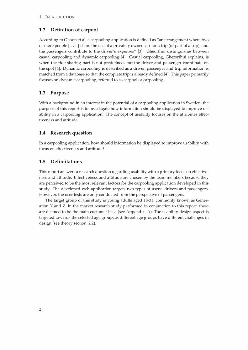
First defined in 1971 by Miller, the term usability is recognized by the ISO/IEC 9126-1 stan-dard as one of six attributes that determine software quality [5]. However, a consensusaround the definition of the term does not exist in literature [6]. Usability can be definedas to what extent a user can utilize a web site’s functions “easily and appropriately” [7]. An-other study defines it as an attribute of quality that evaluates how easy it is to use an interface[8]. Other examples of definitions exist. One study explains that the ISO 9241-11 standard de-fines usability from different aspects, namely “efficiency, effectiveness, user satisfaction andwhether specific goals can be achieved in a specified context of use” [6]. Shackel states thatusability should encompass both efficiency (how effectively a user can perform a specific taskin the system) and easiness (how easy the system is to use) [2]. The main problem with mostusability definitions that exist today is that they do not specify terms with which usabilitycan be quantified. Therefore Shackel proposes a definition of usability which can be quanti-fied using four main criteria: effectiveness, learnability, flexibility and attitude. The Shackeldefinition of these criteria, effectiveness and attitude, are illustrated in Figure 2.1 [2].
The higher the usability, the higher the quality of a website [9]. High usability is linkedwith an increased tendency for users to use the website, along with a greater intention to buythings off the website [9]. When users perceive a website to have high usability, they are moreinclined to develop a positive attitude toward, and continue to use, that website [10].
2.2 Designing Web Applications with High Usability
One of the main difficulties of system design is to write a single software so that each individ-ual user will feel like it is designed for them [11]. Universal design can be defined as design
3

2. THEORY
Figure 2.1: Depicting two parts of the Shackel definition of usability – effectiveness and atti-tude, which are operationalized in order to allow measurement of web application usability[2].
that, to the greatest possible extent, can be accessed, used, and experienced by all people re-gardless of age and abilities [12] [13]. While depending on the end-product, universal designshould be the ultimate goal, to make the design as inclusive as possible [13].
Several research studies have shown that design and usability are linked [14]. Similarly,Djamasbi et al. describe that a user’s perception of the usability of a website is determinedby whether the user finds the website “visually appealing” or not [15]. A research studyinvestigated users’ attitudes to different web sites in terms of credibility, a word they defineas a concept very similar, but not identical, to trust [16]. The results of their study showedthat “the design look of the site”, i.e. different elements such as “layout, typography, whitespace, images, color schemes”, was the most prominent factor when users made up theirminds about the credibility of a site [16].
4
2.2. Designing Web Applications with High Usability
2.2.1 Principles of Design
Numerous design principles and theories which try to give an answer to that question exist.Four design principles which link a web page with high usability: good navigation (easy-to-use), short response times, high credibility and high-quality content [17]. There are sevenprinciples of universal design [12]. Some of these principles are listed down below. Mean-while, Wobbrock et al. suggest that an advantageous alternative to universal design, whichcan be seen as having a “one size fits all” ring, could be ability-based design [18]. They discussthat there may come a time when all software, and perhaps even hardware, will be perfectlytailored to the user and his or her abilities [18].
• The design should allow for the product to be marketed and sold to people with diverseabilities [12]. This entails that the product should make provisions for privacy, security,and safety equally available to all users [12]. One example of this is the main entrancesin buildings. Every visitor in the building should be able to use the same entrances.Meanwhile, Stephanidis points out that even though accessibility of physical spacescan be addressed through existing knowledge, universal design is still a major chal-lenge with information society technologies [19]. Universal access to computer-basedapplications emphasizes the principle that accessibility should be a design concern [19].Therefore, it is recommended that the end-user population is as broad as possible in theearly design stages of new products or services [19].
• The product is easy to understand in regards to the design, no matter what the expe-rience, prior knowledge, language, skills or current concentration level of the user are[12]. Guidelines to achieve this are to eliminate unnecessary complexity, to be consis-tent with user expectations as well as using a wide range of language and literacy skills[12]. This, for example, could be using images instead of text in instructions of how toassemble certain furniture [12].
• The design minimizes hazards and the adverse consequences of accidental or unin-tended actions [12]. This can be done by using elements like mostly used products,hiding or eliminating hazardous elements, providing warnings of hazards and errorsor discouraging unconscious action when executing tasks that require vigilance [12].
2.2.2 Usability Design Features
Design principles and concepts can be further narrowed down into features [17]. These in-clude: greater information content, customization possibilities, interactivity, opportunity forfeedback including an FAQ page, layout that increases navigability, product information andproduct presentations [17]. Another study recognized three features that promote usabilityin web design [20]. These features are breadcrumb trail, site search capability and FAQ [20].
2.2.2.1 Breadcrumb Trail
A breadcrumb trail is a visual guide that shows where on the website the user is located, andhow to get back to the homepage [20]. A breadcrumb trail is especially useful for users after asearch is made and it is no longer clear where the user is located in relation to the homepage[21]. A breadcrumb trail is shown to the user by visually representing each page that the userhas visited, creating a breadcrumb trail to use when finding their way back [21].
5

2. THEORY
2.2.2.2 Site Search Capability
About half of web users are search dominant [20]. The first action these users will make whenentering a website is to look for a search box [20]. The other half of users will stay away fromthe search box until they are frustrated and use it as a last resort [20]. By not including a sitesearch the application runs the risk of alienating half of potential users [20]. The site searchshould be limited to the site and not have any web search functionality as the user rather usetheir own personal favorite search engine for web searches [20].
2.2.2.3 FAQ and Help Option
The third usability design feature is an option for the user to find out answers to frequentlyasked questions (FAQ) or to seek help [20]. A link to this page on multiple locations canhelp the user when they get lost or don’t understand a feature of the website [20]. This isfurther explored in Tobias’ case study from 2016 which found that even prominent featuresof a website, like opening hours, were one of the most frequently asked questions [22]. Thisindicates that an FAQ site is a valuable usability tool [22].
2.2.3 Designing for Younger Generations
Millennials, being used to technology, expect usability and aesthetics from a website, ratherthan regarding it as a bonus [15]. Website design preferences for millenials were investigated[15]. The test users were at the time of the study aged 18-31 and numerous were students.By using the method of eye tracking the researchers concluded that users in that age spanpreferred web pages containing large images, celebrity pictures and a search bar [15]. Largemenu bars and large chunks of text, on the other hand, received less attention from the eyesof the young users, suggesting that less text was preferable [15]. Web design is a key factor inmillenials determining their attitude toward a website [9].
2.3 System Requirements and Usability in Carpooling Applications
The most impactful usability factor when using a carpooling service was navigational disori-entation [23]. This means that the users could not remember the location of functions and lostthemselves in the structure of the website [23]. To solve this problem a carpooling platformneeds transparent search schematics and structures [23].
Another usability factor is verbal labeling [23]. By using clear labels for each step ofthe booking process the navigational disorientation can be mitigated by promoting a highertransparency of which step the user is performing [23]. This is backed up by Perdomos et al.paper that puts labeling as the fourth step when evaluating usability of a website, with thefirst 3 steps being: General features, Identity and information, Language and writing [24].
2.3.1 Carpooling Application Requirements
Using a requirement analysis Arning et al. presents requirements for a carpooling application[23]. The following requirements were defined and recommended to be included:
• Cost: The users want high transparency regarding cost to prevent bargaining [23]. Usersalso reported wanting a centrally organized invoice service to enable monthly payments[23].
6

2.4. Usability Evaluation Methods
• Information: The trip should have detailed information on how the price is calculatedand how taxes are added [23]. There should also be etiquette guidelines and informa-tion on liability in case of an accident [23].
• Service: The user should be able to download a document containing some sort ofconsent information, informing the user that he/she is using the product at their ownrisk [23]. The user should be able to be directed to a route planner application [23].Frequent users of the platform should get bonuses [23]. The driver should have a formof rating system [23]. Drivers should be able to partake in road safety training [23].
• Security: Personal data has to be stored safely [23]. There should be some type of pre-requisite to be able to register [23]. Each user profile should have an evaluation page[23].
2.4 Usability Evaluation Methods
The usability of a website’s interface is a key factor in order for the website to be successful,therefore Usability Evaluation Methods (UEM) has become a pivotal part of software engi-neering [25]. Working with UEMs at each stage of the development of a web application iscrucial in order for the end product to be considered usable [26]. A UEM is defined as a set oftasks that are used to collect data that is related to the end-users interaction with the softwareinterface [26].
2.4.1 Concurrent Thinking-Aloud
Concurrent thinking-aloud method (CTA), analyzes a real interaction between a user and theuser interface [27]. This UEM involves asking one test participant at a time to use the systemand perform a given set of tasks while thinking out loud [28]. During the test session, theverbalization, keystrokes and a screen capture is recorded using video and audio tape [29].
The usability test involves the following four main steps [30].
• Instructions and tasks: A set of instructions are brought by the evaluator and given tothe user [30]. The instructions inform the user of how to execute the test, includinghow to think aloud [30]. The instructions can be presented in two ways [30]. Oneway is to explicitly instruct the user on exactly what to do [31]. One example of thisis “Please, save the phone number 6496 7721 on the mobile phone being evaluated”[30]. The other way is to explain a specific context to the user and him/her base his/herdecisions on this context [1]. “You’ve just got a new mobile phone. The number ofyour best friend, Chris, is 6496 7721. Please, save Chris’ number on your new mobilephone” is an example of this [30]. To give a context or not may turn out differentlydepending on if the users are Easterners or Westerners [30]. This is told to be becauseEasterners, in general, are more field dependent while Westerners pay more attention tofocal information [30]. Easterners are defined as people from China or countries heavilyinfluenced by China [30].
• Verbalization: During the test, the user verbalizes his/her thoughts [30]. The verbaliza-tion should include what they are attempting to do, why they do it, the problems theyencounter and any other task-related thoughts [28]. If the user becomes quiet for sometime, he/she is made to continue verbalizing, either by reminding or by another ques-tion [30]. The verbalization relies on two vital parts, which are that the performance
7

2. THEORY
of the user should not be affected by him/her thinking aloud and that the verbal com-munication by the user should be representative for his/her thoughts [30]. If these twocriterias are not met, the output of the test does not reflect the usability of the productthat is being examined [30].
• Reading the user: The evaluator observes the user and listens to his/her observations,comments and thoughts in general [30]. The evaluator reports the usability problems[30]. The evaluators performing thinking-aloud tests tend to ask questions regardingproblems that the user expects rather than problems that the user actually experiences[32].
• Overall relationship between user and evaluator: To make the user feel free to expressboth positive and negative comments should be a goal for the evaluator [30]. Thus, it isimportant that the evaluator tries to build a constructive relationship with the user sothat this aim is achieved [30].
The results from the CTA can then be summarized in a table with columns for the activescreen, problem description, and the frequency of how many times the problem gotbrought up [27].
2.4.2 Smith’s Lostness Formula
When searching for information on a website, a user’s “lostness” is defined as the totalamount of information items examined by the user compared to the amount of informationitems required to find the requested information [33]. The measurement of lostness can beused as a benchmark of usability [34]. Early iterations of the website design can be com-pared with later ones in order to determine the influence changes of the design has had onthe usability [34].
L =
c
(NS
´ 1)2 + (RN
´ 1)2
• L is the measurement of lostness [35]
• R is the minimum number of nodes that are required to complete the given task [35]
• S is the total number of nodes visited, revisiting the same node will increase the S-value[35]
• N is the number of unique nodes visited [35]
When performing a task perfectly, the values of R, N and S will all be equal which willresult in L=0. The results of a study conducted by M. Otter and H. Johnsson suggested thatthe value L=0.41 represents a user being lost and a study by P. A. Smith showed that forusers with L=0.42 or more there was evidence of lostness [34]. However, Otter and Johnssonpropose that a value of L between 0.4 and 0.5 would make more sense to use as a benchmarkwhen determining whether or not a user is lost [34].
2.4.3 Likert Scale Questionnaire
A common way to structure a questionnaire is to use Likert scale. The Likert scale presentsa statement and five levels of agreement to it [36]. The responses are weighted such thatthe middle response is neutral. To the left and right options for strongly disagree, disagree,
8

2.4. Usability Evaluation Methods
agree and strongly agree can be found [36]. This set up is refered to as bipolar response op-tions [37]. The Likert bipolar responses are well suited for measuring attitudes and opinions,while unipolar options that do not have any neutral middle point, can be used for measuringquantities and frequencies [37].
For the Likert scale to work the questions have to be carefully worded and tested [37]. Thequestion has to focus on a single topic for the answer to be analyzable [37]. Otherwise therespondent will answer two questions with a single answer, making it impossible to knowwhich one he/she actually answers [37].
A problematic aspect that comes with the use of Likert scale is the neutral option [37].There is no consensus on what that option represents [37]. Three different scenarios wereidentified: the respondent is truly neutral, the respondent does not know enough about thesubject or the respondent does not want to give a socially undesirable response [37].
The Likert questions can generate two different types of responses: Likert-type data andLikert scale data [38]. The Likert-type data is the case when a single question is used to drawconclusions from [38]. If, on the other hand, the combined responses are what generates apersonality or attitude it can be described as a Likert scale [38]. The Likert-type and Likertscale responses have to be analyzed in different ways, as shown in table 2.1 [38]. Whentranslating the ordinal response options from text to a numerical value it is important toremember that the numerical value does not have equal-interval characteristics [37]. Thismeans that t-test and analysis of variance is not applicable for likert type responses [37].
Table 2.1: What procedure best fits Likert-type and Likert scale [38].
Likert-type Likert Scale
Central Tendency Median or mode MeanVariability Frequencies Standard deviation
Associations Kendall tau B or C Pearson’s rOther statistics Chi-square ANOVA, t-test, regression
2.4.4 System Usability Scale
The System Usability Scale was developed by Brooke to easily and effectively assess the us-ability of a system [5]. A user ranks 10 predefined statements, according to a Likert scale,with a 5 response options from “Strongly disagree” to “Strongly agree”, with one “Neutral”option in the middle [39]. The following statements are used for the measurement [39]:
1. I think that I would like to use this system frequently.
2. I found the system unnecessarily complex.
3. I thought the system was easy to use.
4. I think that I would need the support of a technical person to be able to use this system.
5. I found that the various functions in this system were well integrated.
6. I thought that there was too much inconsistency in this system.
7. I would imaging that most people would learn to use this system very quickly.
8. I found the system very cumbersome/complicated to use.
9
2. THEORY
9. I felt very confident using the system.
10. I needed to learn a lot of things before I could get going with this system.
The statements are alternating between positive and negative feedback on the system,which needs to be considered when calculating the level of usability [5]. Each score from theodd statement numbers 1, 3, 5, 7 and 9 are subtracted with 1 and each score from the evenstatement numbers 2, 4, 6, 8 and 10 are subtracted from 5 [5]. This will result in a number from0 to 4 from each statement [5]. All results are summarized and multiplied by 2.5 which willend up in a System Usability value between 0 and 100 [40]. From 2324 surveys conducted byBangor et al. the median was 75 and the mean of the SUS value was 70.14 [5]. Furthermore,the studies from Bangor et al. didn’t ensure, but indicated that a score between 70 and 80indicates good usability [40].
2.5 Number of Test Participants
When conducting a usability evaluation with the thinking-aloud method, a study by Virzishows that five test participants will on average discover 80% of all usability problems [41].This is further backed up by another study that concluded that five test participants willdiscover 85% of all problems on an average, and at least 55% of the problems [42]. An averagediscovery rate of 95% and a minimum of 82% will be achieved at 10 test participants [42].However, another study used the data from 27 different usability experiments and concludedthat nine test participants would be needed to achieve an 80% discovery rate for a CTA testand suggested that 10±2 users should be used when conducting a usability test [43].
2.6 Sampling
Sampling can be classified into probability sampling and non-probability sampling [44].Probability sampling uses a random procedure for selection and in non-probability samplingsubjective methods are used for the sample selection [44]. These two selection methods havetheir different strengths and weaknesses when selecting elements for inclusion in a sample[45]. The authors explain that non-probability sampling is cheaper and quicker to imple-ment compared to using difficult probability methods [45]. Convenience sampling is a wayto use non-probability sampling when it is not possible to include the entire population inthe research [45]. The method uses practicality, such as easy accessibility, for cheap and easysampling [45]. Purposive sampling methods on the other hand uses a non-random selectionwhere the researchers deliberately choose the elements of the sample and the technique doesnot require a set number of people [45].
2.7 Prototype
In web and software development, a prototype is used to test design ideas using a modelof the unfinished product [46]. By gathering data on user mistakes, it can be applied to testusability aspects and find usability problems early on in the development stage [46]. Whendeveloping a prototype, the developer can choose to create a low fidelity or a high fidelityprototype, where the grade of fidelity implies how close the prototype relates to the finalproduct [46]. Rudd, Stern and Isensee argue that both methods of developing a prototype hasits place in the development [47]. The authors state that a low fidelity prototype can be used
10

2.7. Prototype
in early product development to gather user requirements, without wasting resources onheavy programming [47]. High fidelity on the other hand, the authors claim, is useful for theuser to get a feel for the user interface and give informed recommendations for improvements[47]. Walker, Takayama and Landay second this by concluding that developers can choosethe most appropriate fidelity to test their product since the user feedback turned out to beequally useful for both low and high fidelity [46].
11


3 Method
This chapter will describe the work procedure, including prestudies with a market researchand prototype, the implementation phase and evaluation including user tests as described inFigure 3.1.
Figure 3.1: Prestudy, implementation and evaluation
3.1 Prestudy
A prestudy was made to create the underlying conditions for answering the earlier presentedresearch question. The prestudy contained literature studies, a market research, developmentof a prototype and specified requirements of the carpooling platform.
3.1.1 Literature Studies
In the initial stage of the prestudy, several literatures were gathered to create a solid groundfor the research question and to the report. To gather knowledge, every group member sharedtheir insight which was concluded into short and concise summaries. The literature thatwas studied was for instance previous reports on the topic, market analyzes and studies onusability.
Based on the literature study several definitions of usability were defined. The authorsthen chose to use the Shackel definition and thereby define usability from an operational
13
3. METHOD
Figure 3.2: The definition of usability used in this report expressed in terms of specific targetcriteria to be measured.
perspective, focusing on the two usability criteria of effectiveness and attitude (see Figure2.1), in line with the research question. The definition was then further specified by the set upof specific usability criteria within the scope of the definition (see Figure 3.2). This definitionserves as a basis for our website design, research methodology and analysis.
3.1.2 Market Survey
An anonymous survey was conducted to gather an outside customer perspective on the rel-evancy of a carpooling website. The survey was posted on Facebook by the group members,which generated a relevant collection of answers from different types of potential users.
The questions were formulated to gather information about different customer segmentsand their perspective regarding their current travel habits, and view on carpooling in regardto earlier experiences. The statics were used for creating a case around the platform andfurther motivate the relevance of it. The results were also used as the basis for the marketresearch.
14
3.2. Implementation
3.1.3 Marketing Plan
In addition to a market survey a marketing study was also carried out. The data from the sur-vey was analyzed together with additional information to examine the supply and demandas well as to determine how the carpooling web application should position itself relative toits identified competitors. The marketing plan consisted of NABC, PESTEL, Porter’s 5 Forces,SWOT, STP and market mix 4p.
3.1.4 Prototype
During the pre-study phase, a low fidelity prototype was developed to create a frameworkfor the implementation phase. Low fidelity was chosen due to its cheap implementation costand ease of use in testing design elements. Several prototypes were produced and discusseduntil a final one was chosen.
3.2 Implementation
The following segment will describe which tools were used to develop the website, how thewebsite applies the theory of usability in its design, and the user test procedure.
3.2.1 Building a Functional Site
During the phase of implementation, it was firstly focused to create and access the databasewhich was created to be able to store and access information. Python (3.9.10), SQLAlchemy(1.4.31) and Flask (2.0.2) was used to create the database.
Subsequently, the front-end of the website was implemented with the programming lan-guage HTML5, CSS3 and JavaScript (ES6). The plug-in Bootstrap (4.4.1) was used to moreeasily improve the appearance of the website on multiple devices.
The architecture of the website, connecting the front-end and back-end, were made withJquery (3.6.0) written in the JavaScript files, and handling of the back-end were edited in thePython-files. JSON was used to send information between the front-end and back-end.
During the implementation phase, there was a high focus on developing the website toensure that it correlated well to the tests that were to be carried out later in the process.
3.2.2 Adjusting the Site to Evaluate the Usability
To test the principles in section 2.2 two versions of the website will be created. The firstversion, from here on referred to as version 1, will be aligned with the theory while the secondversion, referred to as version 2, will deviate from the theory to some extent. To what degreeversion 2 will deviate from the theory is explained in this section.
In regards to the first principle of section 2.2, version 1 will have the same register buttonno matter if you are signing up to become a driver or a passenger. The same goes for signingin. The sign-in button in version 1 will be the same regardless of if the user is a passenger,a driver or an admin. Version 2, however, will have two different register buttons. One forsigning up as a passenger and one for signing up as a driver. Version 2 will also have threedifferent sign-in buttons. One for signing in as a passenger, one for signing in as a driver andone for signing in as an admin. The evaluation will show if this principle applies to the testusers in regards to usability.
15

3. METHOD
Two buttons in version 2 will have a more detailed description compared to the samebuttons of version 1. The buttons are the one that sends the user to the checkout and paymentsite and the one that shows the user more information about the trip. In version 1, the buttonswill have the descriptions "Book" and "More information" while the buttons in version 2 willhave the descriptions "Click here to pay and thereby book the trip" and "Click here if you wantto see more information about this trip". The longer descriptions in version 2 are meant to bemore extensive than those in version 1 which makes it possible to evaluate the importance ofthe second attribute of usability, attitude.
Regarding the third principle, version 1 will minimize the consequences of an error byimplementing breadcrumbs. When a user navigates through the website and understandsthat he/she has gone to the wrong part of the site and wants to reverse a few steps, it’s easy todo so by pressing one of the breadcrumbs displayed. Version 2 will not contain breadcrumbs,which makes the consequences of the user unsuccessfully navigating himself/herself throughthe page more severe.
3.3 User Tests
During the this phase, different user tests were performed to measure the usability of theapplication by different types of user tests.
3.3.1 User Test Instruction
Two user tests were conducted, in accordance with Usability Evaluation Methods (UEM). Thetwo tests were performed separately on two different groups of test users, each consisting of9 persons based on the theory in section 2.5. Convenience sampling was also applied withinour target group, with the argument of simplicity and ease of access, as described in section2.6.
The difference between the user tests was the design of the website. User test 1 wasperformed on a web application designed in accordance with the theory mentioned in section2.2. User test 2 was applied on an application where usability theory was not applied to thesame extent. The user tests had the same structure consisting of the same questions and tasks.The user tests were divided into three phases.
Every team member was responsible for performing one test with version 1 and one withversion 2, this person was referred to as the evaluator. The main role for the evaluator was topresent the tasks for the test user, answer eventual questions and remind the person to talkduring the CTA-phase. The evaluator also made sure that the test user answered the SUS-form correctly and made any other uncertainty clear. One other member from the group alsoparticipated during the test, as the observer, whose main task was to take notes and observethe test user’s reactions to the statements.
3.3.1.1 CTA-Phase
To analyze the interaction between the user and the interface, the first phase of the user testswas the method of CTA (Concurrent Thinking-Aloud) described in section 2.4.1. The CTA-phase consisted of four main steps; Instrustructions and tasks, Verbalization, Reading theuser and Overall relationship between user and evaluator. After the test person had beenintroduced and informed about how to execute the task and think aloud by the evaluator, ascreen and audio recording started. The recordings were used to be able to analyze effective-ness in terms of execution time for different tasks afterwards. During the test, an observer
16

3.3. User Tests
took notes on how the user behaved, both in terms of emotional reactions and how the per-son navigated on the website. The role of the evaluator was to present new tasks and answerquestions.
The user performed the following tasks:
1. Create a user profile.
2. Log in on your user profile.
3. Find all trips from Örebro to Mariestad the 28th of april 2022.
4. Find more information about the driver "Helen Kantzow" that drives from Örebro toMariestad.
5. Book and pay for a trip with the driver Helen Kantzow that drives from Örebro toMariestad 20:45.
6. Change your phone number.
7. You have now arrived in Mariestad. Rate your driver and return to the Home page.
8. Find the answer to how Min Bilpoolare prevents the driver to earn money throughcommercial purpose.
3.3.1.2 Lostness-Phase
The next phase of the user tests were the Lostness-phase, which was performed during theCTA-phase. This phase measured usability in terms of lostness by Smith’s Lostness Formula,as described in section 2.4.2. This phase consisted of 3 steps:
1. The first step was to calculate the minimum number of node visits to complete the seventasks in the CTA-phase, which became the R-value in the formula. Every step a personhad to go through to complete the task was defined as a node.
2. During the performance of CTA-tasks, the number of visited nodes were noted by theobserver, which gave the S-value.
3. Smith’s Lostness Formula, described in section 2.4.2, was used to calculate the amountof lostness the test person experienced.
As seen in Figure 3.3, when following the optimal path, the user will visit 17 nodes, 13 ofwhich are unique. Meaning that the optimal values of R and N in Smith’s lostness formulaare 17 and 13 respectively.
3.3.1.3 SUS-Phase
After the CTA-phase, the test person answered 10 predefined statements pursuant to theSystem Usability Scale (SUS), described in section 2.4.4. These will be answered in a googleforms questionnaire. The statements were asked in accordance with the Likert scale in section2.4.3. The test person ranked each SUS-statement on a scale from 1 to 5, where 1 correspondsto “Strongly disagree” and 5 to “Strongly agree”.
The following SUS-statements were asked:
17

3. METHOD
Figure 3.3: The user tests minimum node path.
1. I think that I would like to use this system frequently.
2. I found the system unnecessarily complex.
3. I thought the system was easy to use.
4. I think that I would need the support of a technical person to be able to use this system.
5. I found that the various functions in this system were well integrated.
6. I thought that there was too much inconsistency in this system.
7. I would imagine that most people would learn to use this system very quickly.
8. I found the system very cumbersome/complicated to use.
9. I felt very confident using the system.
10. I needed to learn a lot of things before I could get going with this system.
3.3.2 Compilation of the User Tests
For each test an evaluator and an observer will be present. The evaluator, which is the personresponsible to present and answer any questions that the test person has, will read throughthe observer’s notes and calculate the lostness through Smith’s Lostness Formula. The ob-server, who took notes during the CTA-phase, will summarize the most important findingsand calculates the number of nodes that the test person visited.
The most important feedback and comments from the CTA-phase was compiled and an-alyzed. After the CTA-tasks were performed, the level of lostness was calculated by Smith’slostness formula, in 2.4.2. From the SUS-phase, the level of usability was calculated accordingto the steps in section 2.4.4. The answers on the SUS-statements together with the CTA-tasksand level of lostness were compiled and analyzed. The analyzed compilation was then usedto give an answer to the question at issue.
18

4 Results
The results of the prestudy, implementation and evaluation are presented below. Firstly, theprestudy was conducted before the implementation started, to get knowledge about theo-ries, the market and to create a prototype of how the web application should be designed.Secondly, the web application was developed and implemented with two different versions.Finally, the evaluation of the web application was done with user tests focused on CTA, SUSand lostness.
4.1 Prestudy
This section presents the results of the prestudy where literature studies, market research anda prototype is being presented.
4.1.1 Literature Studies
Literature was studied in order to create a theoretical foundation and framework of howimplementation, user tests, CTA, SUS should be conducted in order to answer the researchquestion. Further litterature on usability design was studied and implemented on version 1of the application.
4.1.2 Market Survey
The purpose of the survey was to evaluate the market for carpooling services. The surveyhad 300 answers. Out of 300 surveyees, 67% were between the ages of 21 and 25, 65.7% werestudents and 44% lived in a larger, non-capital, city. 43.3% of the respondents used a carwhen traveling for more than one hour. 44.3% then responded that they sometimes, often,or always traveled alone for longer trips by car and 50% would consider traveling with astranger. For the full survey, see Appendix A.
19

4. RESULTS
4.1.3 Marketing Plan
Based on the marketing plan, seen in Appendix A, students and young adults were the maindemographic for the service. Due to the service’s dependency on the network effect, usergrowth is crucial. To ease the conversion of users and to increase user growth the only costwhen using the service is the trip fee. The service will be available at a price that is lower thanother transport alternatives in the majority of cases. Other costs, such as a membership fee,could be implemented at a later stage if priority shifts away from user growth. Effective earlyadvertising is a big part in being able to fully utilize the positive impact of the network effect.In Sweden there is regulation surrounding driving for a fee which limits the opportunity fordrivers to make a profit. When using Min Bilpoolare, the fee is supposed to cover gas andother costs associated with the trip.
4.1.4 Prototype
A prototype was created in powerpoint before the implementation of the website began. InFigure 4.1 the prototype home page is seen. On this page the users is able to log-in at thetop right and search for a trip between two cities on a specific date. The company slogan isdisplayed over the search bar. In Figure 4.2 shows the registration page where the user fillsin their name, phone number, email, and allergies to create an account. After searching for atrip the different choices are displayed as seen in Figure 4.3.
Figure 4.1: Prototype Home page
Figure 4.2: Prototype Register new account page
20

4.2. Implementation
Figure 4.3: Prototype Showing car rides page
4.2 Implementation
Below, the result of the implementation phase is presented. It covers the basics regardinghow the site was built as well as the differences between version 1 and version 2.
4.2.1 Building the Functional Site
As presented in the method, the web application was developed using Flask, SQLAlchemy,Python, HTML5, CSS3, JavaScript, Bootstrap, Jquery and JSON.
The first view of the page is where trips are searched. The search view contains threeinput fields to be filled by the user: the start destination, the end destination and the date ofthe trip. For each view on the website, the navbar only contains the buttons that currentlyare useful for the user. Because of this, and since the user is not signed in the first time thewebpage is opened, the navbar only contains the buttons to go to Home, FAQ, registrationand signing in the first time the user opens the webpage.
To register, the user presses the button for registration in the navbar and is taken fromthe register form that contains the input fields first name, last name, social security number,email, phone number, sex and password. In version 2, there is also a checkbox for implyingif the user is a driver or not. Lastly, there is a button to execute the registration. To sign in,the user is taken to a similar form as when registering but with only two input fields: one forsubmitting the email and one for the password. There is a button at the bottom to execute thesigning in. In neither of the forms the user is shown feedback if the input fields are filled inincorrectly or if the email does not match the given password when signing in.
If the user is signed in as a passenger, the navbar will have buttons to go to home, showtrips of the user, log out, and edit the user’s account. If the user is signed in as a driver, thenavbar contains two additional buttons. However, they are not important for the user testsof this report since all test users only registered and signed in as a passenger. When the userpresses the navbar button to see the trips of the user, she/he is shown a button to show thetrips that the user has booked as well as a button to show the history of passed trips that theuser has been a passenger on.
In the view where the user can edit her/his account, there are two forms next to eachother. One is for editing the profile and contains input fields to edit first name, last name,country, city, sex, phone number, email, and address. The other form, for editing preferences,has input fields for editing allergies and for writing a message that will be shown to the futuredrivers of the user. It also contains a checkbox for implying or not implying to a future driverthat the user wants it quiet. Lastly, in the FAQ view, the user is shown four frequently askedquestions and can click on each question to see its answer.
21

4. RESULTS
4.2.2 Adjusting the Site to Evaluate the Usability
Two different sites were created with different design aspects. Changes were made to thesite’s buttons, breadcrumbs were removed and several sign-up and register buttons wereadded. Below are the differences described more thoroughly.
Figure 4.4: Home page version 1
Figure 4.5: Home page version 2
Figure 4.6: Navbar version 1
Figure 4.7: Navbar version 2
22

4.2. Implementation
One of the differences between the two versions is the log-in and register buttons in thenavbar. There are two register buttons in version 2, one to register as a driver and the otherone to register as a passenger as opposed to one register button in version 1. There is, as pre-viously mentioned, a checkbox for drivers in the sign-up page in version 1. Lastly, there arethree log-in buttons. One for the drivers, one for the passengers and one for the administrator.
Figure 4.8: Book a trip version 1
Figure 4.9: Book a trip version 2
Another design aspect that was implemented was the button descriptions. In version 2the buttons had a more detailed description.
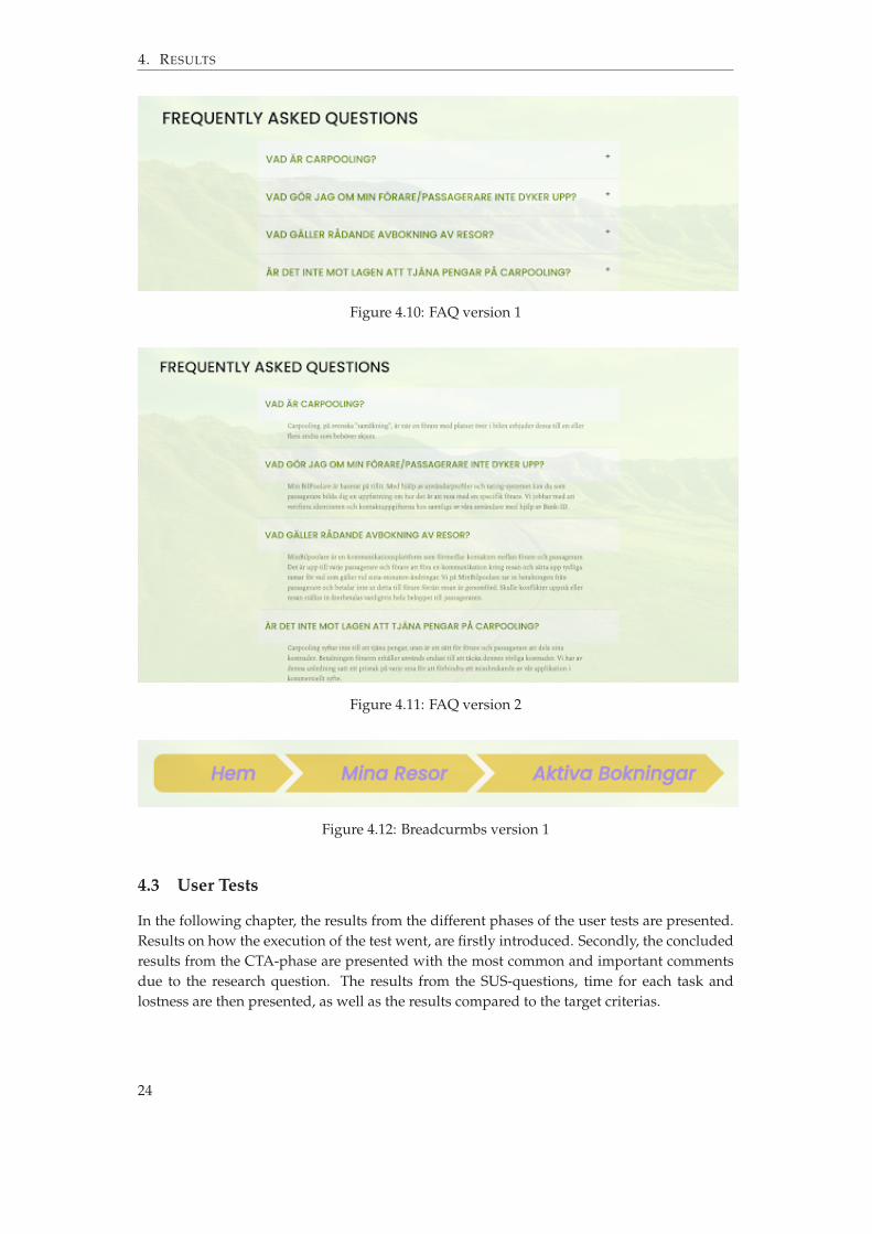
On our FAQ-page the difference is that in version 1, you have to press on the question tobe able to see the answer while in version 2 they are directly visible.
The final difference between the sites is that in version 1 there were breadcrumbs in “Minaresor”. With them you could follow your breadcrumb trail from the home page to your activebookings.
23
4. RESULTS
Figure 4.10: FAQ version 1
Figure 4.11: FAQ version 2
Figure 4.12: Breadcurmbs version 1
4.3 User Tests
In the following chapter, the results from the different phases of the user tests are presented.Results on how the execution of the test went, are firstly introduced. Secondly, the concludedresults from the CTA-phase are presented with the most common and important commentsdue to the research question. The results from the SUS-questions, time for each task andlostness are then presented, as well as the results compared to the target criterias.
24

4.3. User Tests
4.3.1 User Test Instruction
The user tests were performed on 18 different test users, nine of them completed the test withversion 1 and the other half did perform the test with version 2. The user tests were executedin accordance with the method and the evaluator and observer followed the instructions inAppendix C.
4.3.2 CTA Results
During the eight different tasks that were performed during a user test, the test participants’views and opinions were collected through thinking out loud. The results from tests withversion 1 and version 2 can be seen in Tables 4.1 and 4.2 below. The table shows some of themost common and, for the discussion and conclusion, interessting comments from the usertests.
For task 1 in version 1 five out of nine test participants reported that they felt that theregistration step was easy and clear. When compared to version 2, only two out of nine testparticipants said that it was clear. The most reported comment for version 2 was that theywere confused about whether to choose driver or passenger when creating an account.
When the test participant got into the register page users of version 1 mostly found it easyand liked that there were examples on screen. While most users of version also found it easyto register, some users still commented on the colors or were still unsure if they should pickdriver or passenger.
In task 2 the results were quite similar between the two versions. Only one user of ver-sion 2 commented on the fact that there were two different buttons for the different types ofaccounts.
Task 3 all users of version 1 and most users of version 2 were confused between the twobuttons “Find Trip” and “Show all trips”.
When the users of version 1 were asked to find more information about the driver in test4 all of the users managed to do it without any problems. In version 2 most found it easy butsome users tried pressing the name of the driver instead. There were also more commentsabout the design of the page regarding how the trips were presented.
The checkout process in task 5 was completed by the users of version 1 without any majorissues or thoughts. One user would have liked the implementation of a verification step toincrease security. One user of version 2 commented that they would have liked the buttons“more info” and “Purchase” to be in different colors.
As for task 6, the pattern continues with more comments from the users of V2 compared toversion 1. The people testing version 2 were somewhat confused about where to go, whereassome people testing version 1 commented on design and information aspects of the page.
The same goes for task 8 where most participants found it easy to find the correct infor-mation. Only one person commented on the amount of text, but still found the answer prettyeasily.
25

4. RESULTS
Table 4.1: CTA resultsComments version 1 Tot. Comments version 2 Tot.
1 Clear where you register 5 Unsure whether to choose passenger ordriver when selecting button 3
Unsure how to type p-nr 2 Clear where you register 2No Password check 2 Colors has bad contrast 1Unsure whether to choose passenger ordriver when signing up 2 Visited sign in instead 1
Unsure how to type p-nr 1A lot of text in header 1
2 Easily finds sign in 9 Easily finds sign in 6Would be nice to be automatically signed in 2 Would be nice to be automatically signed in 2Should be able to use enter-button 2 Weird with two buttons 1
3 Unsure about "Find all trips" and "Find trip" 9 Unsure about "Find all trips" and "Find trip" 7Find trip immediatly 2
4 Easily finds "More info" button 9 Easily finds "More info" button 5Presses the name 3Did not like one trip per row 2
5 Easy checkout 9 Easy checkout 8
No bank id 1 Would be more clear with different colors onbuttons 1
Not clear what the country choice did 16 Easy to find "edit user" and change number 8 Easy to find "edit user" and change number 5
Notices that the original phone number is notsaved 1 Notices that the original phone number is not
saved 2
Notices that there is no confirmation that thechanges are saved 1 Looks for "My profile" before finding the cor-
rect button 1
First goes into "My trips" 1Unsure where to go 1Unsure is you have to fill in all the informa-tion again 1
7 Goes into my previous trips and gives ratingwithout problems 9 Goes into my previous trips and gives rating
without problems 9
Unsure whether to choose "My trips" or "Myprevious trips" 1
Did not like one trip per row 28 Easily finds FAQ and the answer 9 Easily finds FAQ and the answer 8
First tries to use the logo button 1Thinks their is a lot of text 1
Table 4.2: CTA continuedVersion 1 Tot. version 2 Tot.
Navigation Very clear where on the site you are 7 No mention of it 4No mention of it 2 Very clear where on the site you are 3
A bit unclear where on the site youare 2
26
4.3. User Tests
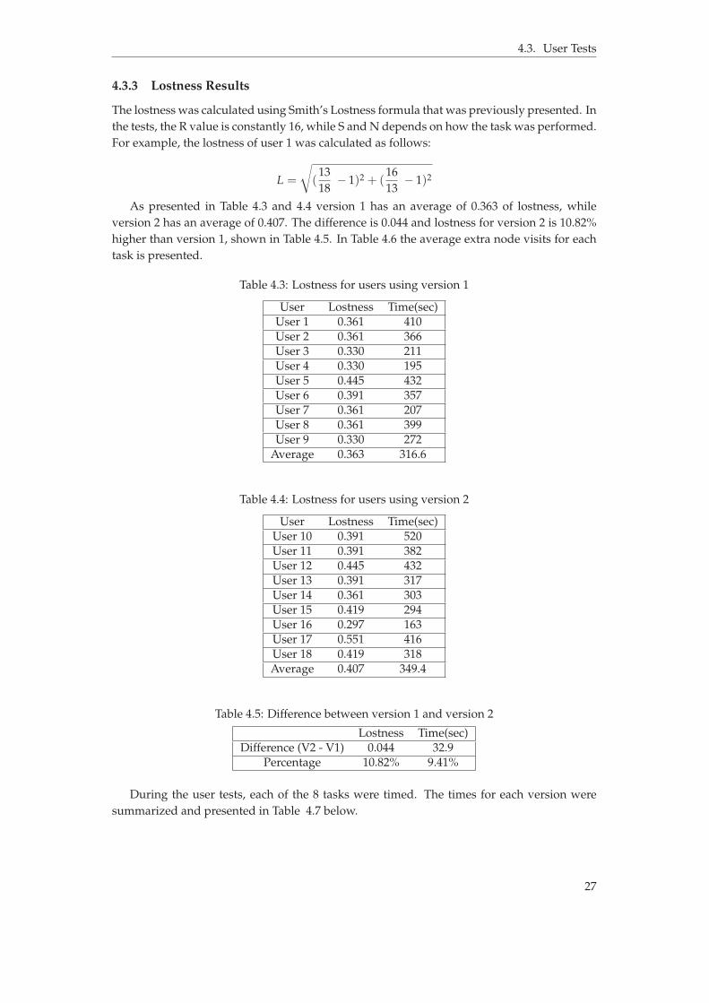
4.3.3 Lostness Results
The lostness was calculated using Smith’s Lostness formula that was previously presented. Inthe tests, the R value is constantly 16, while S and N depends on how the task was performed.For example, the lostness of user 1 was calculated as follows:
L =
c
(1318
´ 1)2 + (1613
´ 1)2
As presented in Table 4.3 and 4.4 version 1 has an average of 0.363 of lostness, whileversion 2 has an average of 0.407. The difference is 0.044 and lostness for version 2 is 10.82%higher than version 1, shown in Table 4.5. In Table 4.6 the average extra node visits for eachtask is presented.
Table 4.3: Lostness for users using version 1
User Lostness Time(sec)User 1 0.361 410User 2 0.361 366User 3 0.330 211User 4 0.330 195User 5 0.445 432User 6 0.391 357User 7 0.361 207User 8 0.361 399User 9 0.330 272
Average 0.363 316.6
Table 4.4: Lostness for users using version 2
User Lostness Time(sec)User 10 0.391 520User 11 0.391 382User 12 0.445 432User 13 0.391 317User 14 0.361 303User 15 0.419 294User 16 0.297 163User 17 0.551 416User 18 0.419 318Average 0.407 349.4
Table 4.5: Difference between version 1 and version 2
Lostness Time(sec)Difference (V2 - V1) 0.044 32.9
Percentage 10.82% 9.41%
During the user tests, each of the 8 tasks were timed. The times for each version weresummarized and presented in Table 4.7 below.
27

4. RESULTS
Table 4.6: Average additional nodes
Task Version 1 Avg. version 2 Avg.1 0.0 0.112 0.22 0.563 1.11 1.334 0.11 0.005 0.11 0.336 0.11 1.117 0.33 0.338 0.11 0.00
Table 4.7: Time results for task 1-8.
Task Version 1 Version 2 Diff (v2 - v1) Percentage (%)1 68.11 72.56 4.44 6.132 30.11 29.00 -1.11 -3.833 52.22 63.89 11.67 18.264 20.78 29.22 8.44 28.905 52.00 46.33 -5.67 -12.236 35.33 40.78 5.44 13.357 30.67 37.67 7.00 18.588 27.33 30.00 2.67 8.89
Total 316.56 349.44 32.89 9.41
Table 4.8: Target criteria regarding effectiveness compared to actual results in version 1 andversion 2.
Effectiveness, target criteria Effectiveness, results V1 Effectiveness, results V2all with a score below L=0.3 inSmith’s Lostness formula L=0.363 L=0.407
of which at least 97% belong tothe target group of students
89% of participants belonged tothe target group of students (1out of 9 was not a student)
89% of participants belonged tothe target group of students (1out of 9 was not a student)
in any kind of environmentwhere users naturally wouldwant to use the web application
tests were conducted in a homeor school environment
tests were conducted in a homeor school environment
4.3.4 SUS results
During the second part of the user tests, the test participants answered 10 questions in accor-dance with the theory of SUS presented earlier in the report. The answers can be seen in theTables 4.9 and 4.10 below. The SUS value of each statement was calculated and later com-bined to calculate the SUS value for each version of the website Min BilPoolare. The valuethat was obtained for version 1 was 85 and for version 2 was 82.5.
28

4.3. User Tests
Table 4.9: Results from the SUS-test from version 1.
Test user 1 2 3 4 5 6 7 8 9 SUSvalue
1. I think that I would like to use thissystem frequently 4 4 4 5 3 4 5 4 2 2.89
2. I found the system unnecessarilycomplex 1 1 2 2 2 1 2 2 1 3.44
3. I thought the system was easy to use 4 5 4 5 4 5 4 1 5 3.114. I think that I would need the supportof a technical person to be able to usethis system
1 1 2 1 1 1 1 1 1 3.89
5. I found that the various functions inthis system were well integrated 5 5 4 5 3 3 5 4 4 3.22
6. I thought that there was too muchinconsistency in this system 1 1 1 1 2 2 1 3 4 3.22
7. I would imagine that most peoplewould learn to use this system veryquickly
5 5 4 4 5 4 4 5 5 3.56
8. I found the system very cumber-some/complicated to use 1 1 2 1 2 1 1 1 2 3.67
9. I felt very confident using the system 4 5 5 5 3 2 4 5 5 3.2210. I needed to learn a lot of things be-fore I could get going with this system 1 1 1 1 2 1 2 1 1 3.78
Result 85
Table 4.10: Results from the SUS-test from version 2.
Test user 1 2 3 4 5 6 7 8 9 SUSvalue
1. I think that I would like to use thissystem frequently 1 1 2 2 2 1 2 1 4 3
2. I found the system unnecessarilycomplex 4 4 4 3 5 4 4 5 3 3.22
3. I thought the system was easy to use 4 5 4 5 4 5 4 1 5 34. I think that I would need the supportof a technical person to be able to usethis system
1 1 1 1 1 1 1 1 1 4
5. I found that the various functions inthis system were well integrated 4 4 4 2 5 5 3 5 3 2.88
6. I thought that there was too muchinconsistency in this system 1 5 2 3 1 1 1 1 2 3.11
7. I would imagine that most peoplewould learn to use this system veryquickly
5 4 5 2 5 5 5 5 4 3.44
8. I found the system very cumber-some/complicated to use 1 2 1 3 2 1 1 1 4 3.22
9. I felt very confident using the system 4 4 5 2 5 5 5 4 4 3.2210. I needed to learn a lot of things be-fore I could get going with this system 1 1 1 2 1 1 1 1 1 3.88
Result 82.5
29

4. RESULTS
Table 4.11: Percentage of user ratings from the SUS-tests in version 1 and 2
Version 1 Version 2Percentage of users who ratedquestion 1 with 4 or 5 in the SUS-questionnaire
77.78% 77.78%
Average percentage of userswho rated question 2, 4, 6, 8,10 with 1 or 2 in the SUS-questionnaire
95.56% 88.89%
Average percentage of userswho rated question 3, 5, 7,9 with 4 or 5 in the SUS-questionnaire
86.11% 80.56%
Table 4.12: Target criteria regarding attitude compared to actual results in version 1 and ver-sion 2.
Attitude, target criteria Attitude, results V1 Attitude, results V2with SUS-questionnaire resultson a 5-point scale (‘strongly dis-agree’ to ‘strongly agree’) atleast 85% ‘agree’ or higher 1
to questions 3, 5, 7, 9 and atleast 85% ‘disagree’ or lower 2 toquestions 2, 4, 6, 8, 10
86.11% ‘agree’ or higher to ques-tions 3, 5, 7, 9
80.56% ‘agree’ or higher to ques-tions 3, 5, 7, 9
95.56% ‘disagree’ or lower toquestions 2, 4, 6, 8, 10
88.89% ‘disagree’ or lower toquestions 2, 4, 6, 8, 10
with 90% or more responding‘agree’ or higher to question 1 inthe SUS-questionnaire
L=0.363 L=0.407
Average percentage of userswho rated question 2, 4, 6, 8,10 with 1 or 2 in the SUS-questionnaire
77.78% 77.78%
1‘Agree’ or higher is in this report regarded as 4 or 5 on the 5-point-scale of the SUS-questionnaire2‘Disagree’ or lower is in this report regarded as 1 or 2 on the 5-point-scale of the SUS-questionnaire
30
5 Discussion
This chapter will analyze the results obtained from the usability evaluation methods as wellas the method itself.
5.1 Results
The following sections will discuss and analyze the results which were obtained from thedifferent usability evaluation methods mentioned in section 2.4. The discussion will be basedon the usability theory from sections 2.1, 2.2 and 2.3.
5.1.1 CTA Results
A possible explanation to why the registration was easier and more clear for the test users inversion 1 than it was in version 2 could be that there were different buttons for each kind ofregistration and log-in in version 2. This agrees with Story [12] who claims that usability isdecreased when different entrances are applied to different kinds of users. Another possibleexplanation could be the fact that users of a digital product often do as they are used to. Iftest users are used to a single form for all types of registration they may have been confusedwhen they saw different buttons for different types of registrations.
The difference between the two buttons “Find trip” and “Show all trips” were not in-tended to be tested but resulted in confusion in user tests for both versions as the usersthought they searched for a specific trip on a specific date and then pressed “show all trips”,thinking it meant “show all trips for my search”. This instead resulted in the website dis-playing all trips in the database. This could have been mitigated by changing the wording ofthe buttons, changing the placement of the buttons, or removing the "show all trips"-buttonaltogether.
That the test users of version 2 had a harder time finding more information about thedriver suggests that the users were not reading the full description but rather pressed whatfelt right. This result aligns well with previous research that has found that unnecessary com-plexity should be eliminated to increase usability [12]. However, the result also suggests that
31
5. DISCUSSION
the button in version 2 for checking out and seeing more information about the trip, whichhad a more excessive description compared to the buttons in version 1, did not bother thetest users since it was not brought up by the users as a problem. This result disagrees withthe complexity-principle mentioned above since it indicates that a more extensive and unnec-essarily complex description does not decrease the usability [12]. One possible explanationcould be that the test users had read both buttons during the previous user task.
The design elements associated with task 6 were identical for both versions of the website.Nevertheless, the test users on version 2 had significantly more comments on their strugglesregarding finding the profile page, when performing the task. One could argue that this wasbecause their overall attitude towards the website was worse in comparison to users testingversion 1 due to usability issues on previous tasks. This might have resulted in test users forversion 2 being more observant on design issues of the website.
In task 7 test users in both versions found it easy to find their completed trip and rate theirdriver. This is not very surprising as the process is identical in both version 1 and version 2.The only difference was the navbar, which in previous tasks already had been commentedon by the users in version 2. Regarding both task 7 and task 8, most users did not experiencefinding the correct information to be very hard or confusing.
Most of the test users of version 1 felt like they had a good understanding of where theywere on the website. In contrast, users of version 2 either did not mention it or at some pointstated that they felt a bit lost. Although the breadcrumb trails were never explicitly pointedout by test users, the inclusion of them could have increased the usability of the site sincethe test users on average were more efficient and scored higher on the SUS-questionnaire inversion 1 [20], [21].
In conclusion, the test users of version 2 were more often than those of version 1 unsure ofwhat to do in order to complete a task and expressed more design concerns, even for pagesthat were identical between the versions. This indicates that the users’ attitudes towards thesite were affected by the design changes made between the two versions. It is probable thatthe main concern for users of version 2 was the navbar and the buttons. The amount of infor-mation on the buttons and the more cluttered navbar made it so that the users had to activelythink about where to go next instead of doing so by instinct. Moreover, the breadcrumbs trailsare likely to have had a positive effect since users of version 1 expressed more confidence inregards to where they were on the website compared to users of version 2. How this affectedthe effectiveness of the users is explored later in the report.
5.1.2 Smith’s Lostness Results
As shown in Table 4.5 the average lostness increased by 10.8%, or 0.044 points, in version 2compared to version 1. In version 2, the average test user had a lostness value of 0.41, justabove the threshold of what is defined as being lost [34]. The average lostness value for testusers in was 0.36, below what earlier studies have defined as being lost. However, the valueis still above the desired value in the definition of usability used in this report, see Figure 3.2.
One reason as to why the users reached this value of lostness during tests may be thepreviously mentioned button-confusion at task 3 during the CTA-phase, which was wordedas “Find all trips between Örebro and Mariestad”. There was a button for “show all trips”and another one for “find trip”, the latter being the correct one to use when searching fora specific trip. As shown in Table 4.6, task 3 presented the most additional, non-necessarynodes, which is likely a result of the way the task was worded in comparison to the text on thebuttons. Another potential reason for the obtained lostness values, however out of control for
32

5.1. Results
the test users, is the design of the web application. After the completion of certain tasks, theuser would automatically be sent back to the home page. This resulted in an increase of theS value and ultimately the lostness value, making the user unable to score a lostness value ofzero even if they had conducted all tasks perfectly.
As shown in Table 4.6, two other tasks which test users struggled with on version 2 weretask 2 and task 6. These two tasks might therefore have caused users to feel lost. Task 2 was tolog in to one’s profile. According to previous research every user should have the same wayof accessing the web application [19]. To test this the application in version 2 had differentregister and login pages for drivers and passengers. This appears to have increased users’lostness during the testing of said version. Task 6 was to change one’s phone number onone’s profile page. The web application gave no feedback as to the user as to whether theyhad successfully edited or registered a profile. The lostness-values of version 2 thereby alignwith previous research that states that feedback is important in order for the user to perceivehigh usability [17].
It was more common that test users required an additional node when rating their driverand returning to the homepage (task 7) during the tests of version 2 compared to the testsof version 1. As there was no difference in the rating functionality itself and no difference inthe navbar text between versions, it is reasonable to assume that the reason for the increasedlostness is the lack of breadcrumbs. Previous studies claim that breadcrumbs are useful afterthe user has performed a search and wants to be able to see where they are located on theweb application in relation to the homepage [21]. During this task, the search corresponds tofinding the previous trip in order to rate the driver. As proven by the time taken for task 7, inTable 4.7, the test users struggled to find the home button in the navbar, something that wasnecessary in order to return to the homepage on version 2 where there were no breadcrumbs.
As mentioned previously, the design of the web application caused the S value to increaseby default as the user would be redirected to the homepage after the completion of certaintasks. Thus, the R value also had to be increased accordingly. As a result of this, the R and Svalues would always be higher than the unique nodes visited (the N value) even if the taskwas executed perfectly. Therefore a test user was not able to achieve the lostness value of zeroand it is likely that they would have had a lower lostness value if it was not for the automaticredirection to the homepage. However, this was decided to be adequate as the calculation ofthe lostness value was consistent throughout all tests on version 1 and version 2 – allowingfor appropriate comparisons of usability between the two versions. Another issue with thecalculation of the lostness was that all 13 unique nodes were included in the tasks whichmeant that a user could not visit unique pages that were not included in the tasks. Thereforethe N value would always be 13.
In summary, the average lostness value was lower for user tests conducted on version 1compred to version 2, indicating that version 1 is more effective. The main reasons as to whycould be the breadcrumb trails implemented in version 1 as well as the single entry point forthe log in-function.
5.1.3 SUS Results
The SUS results from both version 1 and version 2 were above 80, which is defined as above“good” usability [5]. Version 1 scored slightly better than version 2, indicating that the overallusability of version 1 is better, but not significantly better, than that of version 2. The differ-ence between every SUS question except one in version 1 and version 2 equals to 0.34 or lessout of 5.0 units.
33

5. DISCUSSION
As shown in Table 4.9 and Table 4.10, question eight shows a difference of 0.45 betweenversion 1 and version 2, which suggests that version 1 was more complicated to use thanversion 2. This is contradictory to existing research. For example, the less extensive descrip-tions of the buttons to checkout and to show more information about the trip in version 1were supposed to make it less complicated for the user to understand and use them. Exist-ing research states that unnecessary information should be erased to increase usability [12].However, one possible explanation for this contradiction could be that the description on thebuttons in version 2 was not as unnecessarily extensive as the researchers thought. Anotherpossible reason for the better score for version 2 in question eight could be the different useof buttons for registration and log in. If this is the case, it indicates that it can be better tohave different forms for different kinds of users, e.g. one form for a driver and one form fora passenger when registering an account or logging in. This would also contradict existingresearch as it states that the same entrance should be applied for different kinds of users [12].
In Table 4.10 it is shown that test user 2 rated the highest possible score on question6, which indicates that the test user thought that there was too much inconsistency in thesystem. Due to how the test user answered the other questions, this is protruding and doesnot align with the test user’s other answers. This could of course mean that the test userthought that there was too much inconsistency in the system, but there is also a possibilitythat the test user clicked the wrong number or perceived the question incorrectly.
Test user 6 in Table 4.3 gave question 9 a low score. This indicates that the test userdid not feel confident in using the system. According to the test user, this was because thepayment-site looked less serious compared to other payment solutions the person had used.
A SUS score between 70 and 80 indicates that a website has high usability, and evidentlya score above 80 would indicate the same [5]. Both version 1 and version 2 had SUS scoresabove 80, which one could argue is too high of a score for this web application. The reason forthis being that the website is an unfinished product due to lack of time, additionally this wasthe first website development for all team members. However, the SUS questionnaires wereanswered by test users who have a relation to the team members. This may have resultedin slightly positively biased answers even though test users were instructed to answer thequestion as if this was any web application they could come across on the world wide web.
Overall, version 1 scored higher on the SUS questionnaire compared to version 2. Apartfrom question 6 discussed above version 1 also scored higher than version 2 on all individualquestions of the SUS-questionnaire. These results indicate that test users deemed version 1 tohave higher usability.
5.1.4 Time Results
As shown in Table 4.7, task 4 had the largest percentage increase in time taken to completetask from version 1 to version 2, 28.90%. In task 4 the study aimed to investigate the designprinciple which states that usability is influenced by the quality of the content on the site [5].This appears to have had a rather large influence on the effectiveness of the web application.The buttons in version 2 that the test user had to click in task 4 did not contain high qualitycontent, but rather a longer descriptive text, see Figure 4.9. However, task 5 which alsoinvolved reading information on the buttons that were not considered high quality contenthad a time decrease by 12.23% from version 1 to version 2. One reason for this may be thatthe test user had read both buttons while performing task 4 and therefore could click on thecorrect one without any additional effort during the task itself.
34
5.1. Results
Other noticeable time increases are task 3 and 7, both being completed around 18%quicker by test users in version 1 compared to version 2. As mentioned previously, mosttest users who struggled with task 3 did so because of the confusion that the two differentsearch buttons generated. There was no difference between the two versions when it came tothe search functionality or appearance. As stated in section 5.1.2 it is likely that the increasein time between versions for task 7 was due to the lack of breadcrumbs which made it moredifficult for the test users to return to the homepage after they had given their drivers a rating.
Changing the FAQ from being one large site of text on version 2 to the dropdown ap-proach on version 1, see Figures 4.10 and 4.11, was another attempt at measuring the ef-fectiveness in regards to high quality content, this task (8) had a time increase of 8.89% fromversion 1 to version 2. It is reasonable to assume that the increase was due to the layout ofthe text on version 2, which made it slightly more difficult to find the question that the userwas looking for.
In summary, minimizing information by only including high quality content as well asincluding breadcrumb trails on the web application reduced the time taken for test users tocomplete tasks, thereby increasing the effectiveness of the web application.
5.1.5 Usability
The definition of usability used in this report is a quantifiable one, and consists of four cri-teria [2]. Two of these criteria, effectiveness and attitude, have been the focus of this report.Figure 2.1 in the theory states the effectiveness and attitude criteria of a usable system. Thesegeneral criteria were turned into specific targets to be measured in the user tests of this study,displayed in Figure 3.2. These targets were set based on previous research. However, an ul-timate website design should also involve users in developing specifications for the website[2]. In the consecutive two sections the results are compared to the target criteria and furtherdiscussed.
5.1.5.1 Effectiveness
In Table 4.8 in the results section, results of the user tests are stated and compared to thetarget criteria regarding effectiveness. Only one out of three pre-specified targets were metfor version 1 as well as version 2 of the website. Regarding the first target, “all with a scorebelow L = 0.3 in Smith’s Lostness formula”, the results of the user tests for neither version1 nor version 2 met the criteria. The average lostness value (L) was, however, lower forversion 1 users than for version 2 users indicating that the effectiveness, and thereby usability,of version 1 was higher than for version 2 [34]. The two other targets, “of which at least97% belong to the target group of students” and “in any kind of environment where usersnaturally would want to use the web application”, were equal in both versions of the website.No effort was made to differentiate user tests between version 1 and 2 in regards to these twotargets which were related to the general effectiveness and reliability of the user tests.
5.1.5.2 Attitude
In Table 4.12 in the results section, the results of the user tests are stated and compared to thetarget criteria regarding attitude. From here on the first criteria regarding SUS-questionnaireresults in Table 4.12 will be discussed as two seperate ones, the percentage of users ‘agreeing’or higher to questions 3, 5, 7, 9 being regarded as one criterion and the percentage of users‘disagreeing’ or lower to questions 2, 4, 6, 8, 10 as another criterion. Hence there were three
35
5. DISCUSSION
criteria in total regarding attitude. Two out of these three criteria were met for version 1 ofthe website whereas only one out of the three criteria were met for version 2.
Regarding the first target criterion “with SUS-questionnaire results on a 5-point scale(‘strongly disagree’ to ‘strongly agree’) at least 85% ‘agree’ or higher to questions 3, 5, 7,9” the version 1 results reach the target. The SUS-results from user tests for version 2, on thecontrary, failed to reach the target by five percentage points. Questions 3, 5, 7, 9 were all re-lated to the system’s ease-of-use, integration of parts, learnability and reliability. In summary,version 1 reached the predetermined attitude-targets related to usability to a greater extentthan version 2. The results of the user tests in this report thereby align well with previousresearch [15], [20], [23].
Results of user tests from both versions met the requirements of the second target cri-terion, “with SUS-questionnaire results on a 5-point scale (‘strongly disagree’ to ‘stronglyagree’) at least 85% ‘disagree’ or lower to questions 2, 4, 6, 8, 10”. The percentage of userswho responded negatively to those SUS-questions were however higher in version 1 com-pared to version 2. Questions 2, 4, 6, 8, 10 were all related to the system’s complexity, level ofdifficulty, inconsistency and cumbersomeness. Test users for version 1 thereby, on average,deemed the website to be less complex, difficult, inconsistent and cumbersome compared toversion 2. These results align well with earlier research [15], [20], [23]. Version 2 did howeverstill meet the usability requirements specified in Figure 3.2.
Both version 1 and 2 failed to meet the third target criterion “with 90% or more responding‘agree’ or higher to question 1 in the SUS-questionnaire”. Question 1 of the SUS-questionnaireasked users whether they thought that they would like to use the system regularly. The exactsame percentage of users responded ‘agree’ or higher to this question in both versions. Thelack of difference in user responses could be due to a number of different reasons. Test usersmight have interpreted the question as asking whether they would like to use the providedcarpooling application regularly, thereby shifting focus from the usability of the website tothe purpose of the website, negatively affecting the validity of the question. The purpose andfeatures of the two versions are equal since both provide a carpooling service, which wouldexplain the results. Since the attractiveness of carpooling applications as such is not the focusof this report this is a potential source of error. Another potential reason for the user testresults of SUS-question 1 could be that the users felt that the system was not reliable enoughfor them to want to use regularly. Nonetheless, further tests of both versions would havebeen necessary in order to investigate this further.
Despite sources of error such as the potential bias of test users discussed in section 5.1.3,the results of the SUS-questionnaires are comparable between version 1 and 2 since testswere conducted in a consistent way between versions. Overall, for the usability criterion ofattitude, version 1 results showed higher rates of user satisfaction and lower rates of userfrustration compared to version 2. Additionally version 1 met all but one target criteria setup to determine the test to be usable in regards to user attitude.
5.1.6 Comparing Results
As seen in the results, task 1, 3, 4, 6, 7, 8 had a CTA- and time-result where there was a cleardifference between version 1 and version 2. This shows that test users commenting on thedesign of the page that they did not like were also less efficient in completing the tasks. Someof the tasks that were identical between the two versions still proved to take longer time tocomplete and users had more negative comments on them.
36

5.2. Method
Task 3 was identical between the versions, except for the navigation bar, but users of ver-sion 2 on average took 18.30% longer to complete the task. This could be a sign that thesetest users were negatively affected (e.g. confused) by previous tasks and had already devel-oped a worsened attitude towards the site. This is supported by existing research that statesthat large chunks of text cause descreased usability, which in turn could lead to a worsenedattitude towards the site among users [15].
Task 4 stood out as it, on average, took test users of version 2, 28.9% longer to complete.About 33% of version 2 test users pressed the name of the driver instead of the button. Onthe other hand, none of the test users commented explicitly on the amount of text on thebuttons. One can argue that the users of version 2 pressed what instinctively felt right ratherthan reading the text describing what the buttons did. This also aligns with existing researchas buttons with large amounts of text received less attention [15].
Similarly to task 4, task 6 presented some intentional design differences when the usersof both test user groups had to use the navigation bar. In the CTA test the users of version 2had more issues with regards to where to go to complete the task. This can be explained by alowered usability as a result of the increased complexity of the design [12].
Regarding task 2 and 5, the results are contradictory. The time taken to complete thesetasks were lower in version 2 compared to version 1, but comments made by test userspointed to them being more confused as they did not generally believe the site was asstraightforward as the test users in version 1. For task 2 however, the time taken on version2 was only 3.83% shorter. This could be due to chance and thereby decreases the replicabil-ity and validity of the test. The perceived usability in terms of attitude may still have beenaffected by the amount of text on the buttons, whereas the effectiveness was not worse onversion 2 in regards to this particular change [15]. Task 5 on the other hand, took on aver-age 12.23% less time on version 2 compared to version 1. This suggests that the test usershad already read both buttons when completing the task prior to this one. Here the addi-tional information on the buttons was not reflected in the time taken, contradicting previousresearch.
5.2 Method
This chapter discusses the shortcoming of the method used in this report, ranging from theprestudy to the evaluation of user tests, and the effects of the method used on the replicability,reliability and validity of the study.
5.2.1 Prestudy
The following sections will discuss the method used in order to conduct a prestudy. Thisinvolves a market survey and marketing plan, as well as discussing the development of thewebsite applications prototype.
5.2.1.1 Market Survey
Having access to more answers, and therefore more information, would be beneficial to theresult of the survey. More answers would have increased the confidence in conclusions be-ing drawn from the result of the survey. The questions didn’t have theoretical backing andweren’t actively created in line with existing theory, this is a point where improvement ispossible.
37

5. DISCUSSION
5.2.1.2 Marketing Plan
With the site being orientated towards students and young adults, other design decisionswere made than if the site was aimed at a different demographic. A site aimed at elderlymight have used a larger font for the text and would have explicitly displayed “frequentlyasked questions” instead of using the abbreviation “FAQ” when labeling the button in thenavigation bar. Swedish regulation limiting the possibility to make money chauffeuring with-out a taxi license prompted the group to include a section about profiting off carpooling inthe frequently asked questions page.
5.2.1.3 Prototype
In the development phase only a low fidelity prototype was created in order to gather theuser requirements. The prototype was however not tested by users in any way, but merelyused as a benchmark for the developers in the implementation phase of the website. To avoidsome of the issues that later occurred in the testing phase of the website, the prototype couldhave been tested and/or reviewed with real users to gather valuable user feedback aboutpotential usability problems [47]. If the prototype would have been tested in that way, thevalidity of the results of the final user tests would have improved. However, putting moretime into creating a high fidelity prototype would not necessarily have produced more usefuluser feedback [46].
5.2.2 Implementation
In this section, the implementation of the website is discussed and its effect related to theresearch question.
5.2.2.1 Building the Functional Site
The correlation between the implementation of the website and the research question meantthat there was a large focus on implementing the necessary functionalities to complete theuser tests. These necessary functions were discussed and decided by the group before imple-mentation, with the user tests in mind. This might have caused a skewed priority since thefunctionalities were not properly tested with potential users before deciding. This also meantthat some of the less prioritized functionalities were not implemented due to lack of time.
5.2.2.2 Functionality and Design
A search functionality was not implemented due to it having a lower priority in implemen-tation and a lack of time, which might lead to alienating half the potential users [20]. Thisdecision was based upon the website application having a limited depth and therefore almostall pages were accessible through the navigation bar. However there was an apparent searchfield on the homepage to allow for users to easily search for trips, this was prioritized as itseemed more useful in regards to what a user would use the website application for.
The breadcrumbs were implemented to the pages for “My trips” from where the usercould select a few options such as “Previously booked trips” and “Currently created trips”. Itwas also implemented to the payment page in order for the user to be able to return to his orher previous search of trips. Breadcrumbs are most important after the user has performeda search [21]. However a search functionality was never implemented on the website, asmentioned previously, and therefore the decision of where to add breadcrumbs was based on
38

5.2. Method
the depth of the website. Thus only adding breadcrumbs when the user was more than onepage away from the homepage. It may have been more appropriate to add breadcrumbs toall pages for a more accurate result even though their impact on most pages may have feltinsignificant.
5.2.2.3 Adjusting for User Tests
Version 2 of the website was created to test the significance of the different usability factorsmentioned in section 2.2. In this version the breadcrumbs were not used on any of the pages.
To test the importance of high quality content, excessive information was added to thebuttons on the cards that display bookable trips. Again, one could consider to add exces-sive information on all buttons, however in accordance to theory, product presentation isimportant when designing a high usability application [17]. Therefore only the buttons onthe products had the excessive information.
The theory in section 2.2.1 was tested by adding more register and login options depend-ing on what the user intended to use the website for. However when performing the usertests, the user was only asked to create a profile for booking trips. Therefore the register andlogin pages for drivers may not have had much impact on how the test user perceived theapplications usability.
The significance of a visually appealing website, layout and navigability, and a FAQ page,mentioned in sections 2.2, 2.2.2 and 2.2.3 respectively was also tested by changing the FAQfunctionality and thus its layout. Both versions did however have a rather clear distinctionfrom questions and answers. It is likely that the navigability did not feel different but theoverall impression of the website may have decreased as the layout looks less professionaland the page has less functionality.
5.2.3 Evaluation
In this section, the result of the evaluation phase is discussed in order to answer the questionat issue.
5.2.3.1 User Tests
During the evaluation phase, an instruction on how to execute the user tests was made, whichcan be seen in Appendix C. The purpose of the instruction was to reduce the potential risk ofperforming the user tests differently depending on who acts as the evaluator and who acts asthe observer. The instruction explained stepwise how the evaluator and observer should pre-pare for the test, act and say during the test and lastly compile the results from the performedtest. This provided a more equal and fair result and ensured that the level of replicabilitycould be increased. The instruction also clarified the difference between the two roles, eval-uator and observer, and allocated different responsibilities between them. Furthermore, byhaving all the team members acting as both the observer and evaluator, the workload couldbe evenly distributed over the team.
Preparation before the tests included planning a date and a time for when the tests shouldbe executed. This method of time planning enabled the team to be flexible and also madeit easy to book suitable test participants from the selected target group. By using the sametemplates among the group for noticing time and nodes, replicability is further increased.
During the test, the evaluator followed a manuscript with the 8 tasks that the participantperformed. Task number 3 asked the participant to “Find all trips from Örebro to Mariestad
39
5. DISCUSSION
the 28th of April 2022”. By using the expression “Find all trips” instead of for instance “Finda trip”, a majority of the participants found it confusing to know which of the buttons “Findtrip” and “Show all trip” that should be used. This was not supposed to be something thataffected the result because the buttons were the same in both versions, but due to the factthat some of the participants chose the “Show all trips”-button instead of “Find trip” theirLostness increased. A change of the expression in the instruction could therefore be seen as ashortcoming and something that could be changed to make the result more accurate.
Another shortcoming during the user tests was the team members’ limitation of knowl-edge of how thoroughly the members should instruct each participant to complete the tasks.Some of the team members gave a nudge in the right direction directly when the participantseemed lost, while others let the participant remain lost until the participant asked an actualquestion. This might affect the time result and level of Lostness. Different test persons askeda different amount of questions, which gave them information that other participants maynot have had access to. This could further influence the result not dependent on whether thetest person executed the tasks on version 1 or 2.
After the execution of the tasks, the test person was asked to answer the SUS-questionsthrough a Google Form. By having all questions set as compulsory and only accepting oneanswer on a linear scale, the risk of answers not aligned with the desired result were reduced.
5.2.4 Source Criticism
In the report, the sources used were academic papers that have been peer reviewed. Lookingfor sources was made through Google Scholar and the liu-library which is a database from theLinköping University where you can search for articles, books and journals. Google scholarranks the academic papers based on how many that have cited that paper, where the liu-library is based on relevance.
Some papers used in this report are old where, for example, a report from 1996 is pre-senting consumer reactions to electronic shopping. The field of electronic shopping has sig-nificantly evolved the past 15 years so it might be argued that this is an outdated report.However, the paper focuses on human behavior and is used in the context of this report tolink human attitude to usability, so it can be argued that it is still relevant today. The paper isalso highly cited in more modern papers as a basis for more modern findings, which meansit is still relevant today.
It is also understood that some sources need a higher level of understanding to be able tocomprehend the information presented in the specific paper. This is handled through discus-sion with co-writers to be able to make sense of the information.
Three other sources were used with the purpose to portray other carpooling applicationsand how many users they had. It is information from their own websites and it has not beenpublished in an academic paper. It is believed that these sources are trustworthy even thoughthe companies could potentially lie. This is because it is the official website of big corporatecompanies who are in the public eye and where the users presented are plausible looking atthe number of users of the whole market.
5.3 Future Outlook
This section contains a discussion about ideas and possible improvements as well as the so-cietal and ethical aspects relating to the project.
40
5.3. Future Outlook
5.3.1 Ideas and Improvement for Future Work
A website with more depth will be more appropriate when testing navigability and the ef-fectiveness of the design than a website with less depth. More depth will give the test usera higher chance of getting lost during the tasks and increase the amount of unique nodesavailable to be visited.
Future studies should avoid unwanted feedback that is unrelated to what is being tested.The unwanted feedback can be a result of the application not meeting the desired standard.In order to reduce the amount of unwanted feedback, testing of the functionality of the ap-plication as a whole earlier in the implementation phase should be conducted.
To reduce sources of errors and variance during the user tests, it is preferable to have aclear idea of how to deal with unexpected issues. This can be done by conducting mock teststo give the evaluators experience with the specific test. Doing this can also reveal possibleissues with the test instructions, which can then be altered before the actual user tests. Thiscan, yet again, make it so that the feedback from test users focuses on what is being tested.
5.3.2 Society & Ethics
Based on the results of the market survey and the marketing plan, presented in AppendixA, we can see that if the service were to have the necessary breakthrough and become fullyestablished it would entail a big societal shift in peoples’ view on transport and people’stransportation habits. In order for this to happen the companies providing a carpooling ser-vice have to develop applications that have a high usability as to not lose any potential newusers. By increasing the usability of the application there is a higher chance of users actuallyusing the web application as well as increasing their intention of buying a product from it [9].The increased intention to purchase a trip from the website might lead to customers choos-ing this service instead of a more environmentally friendly option, such as train. Therefore,achieving a high usability in a carpooling application might lead to an increase in car usageoverall which will be damaging to both society on an environmental level. This report willplay a role in helping future research and developers create carpooling applications with highusability. This will be beneficial from an economical perspective as people pay less for fuel,and from an environmental perspective as carpooling can decrease the number of cars on ourroads.
There has been little to no consideration given to how the service abides by current leg-islation. Not legislation surrounding taxi services1 nor the storage of user information anddata2. A critical part of making sure that the application feels safe to use is making the driverssubmit their driver’s license before being registered. The survey that was conducted in thepre-study didn’t take regard to current GDPR rules. Having registering users accept terms ofservice agreement would be a requirement if the service would be launched. Before the usertests the subjects should have been informed who would watch the recording and for whatpurposes.
1https://www.skatteverket.se/privat/skatter/bilochtrafik/korapersonermotbetalningiprivatbil.4.361dc8c15312eff6fd813b.html
2https://www.riksdagen.se/sv/dokument-lagar/dokument/svensk-forfattningssamling/lag-2018218-med-kompletterande-bestammelser_sfs-2018-218
41


6 Conclusion
The purpose of this study has been to investigate how information should be displayed in acarpooling application, and answer the following research question: “In a carpooling appli-cation, how should information be displayed to improve usability with focus on effectivenessand attitude?”.
Displaying information in a more complex format affects effectiveness negatively sincethe time taken to complete tasks in user tests increased. The result shows that breadcrumbshad a positive effect regarding both the lostness and the time taken. It appears that mak-ing navigation and visibility easier improves effectiveness since the user is more aware oftheir location and their next decision to complete a task. However, this result might be in-conclusive since the shallow depth of the site tested in this report combined with the limitedimplementation of the breadcrumbs lowers the value of the functionality therefore making itharder to measure and analyze.
The results from the part of the questionnaire targeting ease-of-use, integration of parts,learnability and reliability suggested that the changes made in version 1, compared to version2, did in fact improve the previously mentioned targets. The conclusion drawn from the CTA-phase is that the test users expressed less concern when dealing with the version designedfor usability purposes. This provides a higher user satisfaction, in alignment with the resultsfrom the SUS-questionnaire.
In conclusion, the results from this report confirms that the functionalities implementedto test usability improved effectiveness and attitude. Better times and lostness values forversion 1 showed that it had better effectiveness than version 2. The comments and scoresfrom the CTA and SUS testing showed that users had a better attitude toward version 1 thanversion 2. Breadcrumbs was found to be a way to improve both lostness and time taken,meaning that a good implementation improves the user’s effectiveness. For more accurateresults, the depth of the website should be adequate enough to make the breadcrumbs evenmore valuable to improve effectiveness.
To increase usability on a webapplication, the results suggest that information should bedisplayed short, concise and provide the user with the necessary information in a subjectivemanner, without long text descriptions. Finding information on the FAQ page was an exam-
43
6. CONCLUSION
ple that indicated this. When using clickable drop-down buttons, containing the informationinstead of every question being presented at once decreased the time it took to complete thetask, which can be seen as an improvement of efficiency.
Having a website with fewer buttons overall, was also shown to make the website morenavigable, which improves both effectiveness and attitude. The expression of confusion anduncertainty was less on a webpage with fewer log-in and register options, which could beconsidered as an improvement of both effectiveness and attitude. This was further evidencedby the faster completion time.
44

Bibliography
[1] Joseph S Dumas, Joseph S Dumas, and Janice Redish. A practical guide to usability testing.Intellect books, 1999. DOI: 10.5555/600280.
[2] Brian Shackel. “Usability–Context, framework, definition, design and evaluation”. In:Interacting with computers 21.5-6 (2009), pp. 339–346. DOI: 10.1016/j.intcom.2009.04.007.
[3] Lars E. Olsson, Raphaela Maier, and Margareta Friman. “Why Do They Ride with Oth-ers? Meta-Analysis of Factors Influencing Travelers to Carpool”. In: Sustainability 11.8(2019). ISSN: 2071-1050. DOI: 10.3390/su11082414.
[4] Alexandra Gheorghiu and Patricia Delhomme. “For which types of trips do Frenchdrivers carpool? Motivations underlying carpooling for different types of trips”. In:Transportation Research Part A: Policy and Practice 113 (2018), pp. 460–475. ISSN: 0965-8564. DOI: 10.1016/j.tra.2018.05.002.
[5] Aaron Bangor, Philip T Kortum, and James T Miller. “An empirical evaluation ofthe system usability scale”. In: Intl. Journal of Human–Computer Interaction 24.6 (2008),pp. 574–594. DOI: 10.1080/10447310802205776.
[6] Ahmed Seffah, Mohammad Donyaee, Rex B Kline, and Harkirat K Padda. “Usabil-ity measurement and metrics: A consolidated model”. In: Software quality journal 14.2(2006), pp. 159–178. DOI: 10.1007/s11219-006-7600-8.
[7] Fethi Calisir, A Elvan Bayraktaroglu, Cigdem Altin Gumussoy, Y Ilker Topcu, and Tez-can Mutlu. “The relative importance of usability and functionality factors for onlineauction and shopping web sites”. In: Online Information Review (2010). DOI: 10.1108/14684521011037025.
[8] James J Cappel and Zhenyu Huang. “A usability analysis of company websites”.In: Journal of Computer Information Systems 48.1 (2007), pp. 117–123. DOI: 10.1080/08874417.2007.11646000.
[9] Rafael Anaya-Sánchez, Juan Marcos Castro-Bonaño, and Eloy González-Badía. “Mil-lennial consumer preferences in social commerce web design”. In: Revista Brasileira deGestão de Negócios 22 (2020), pp. 123–139. DOI: 10.7819/rbgn.v22i1.4038.
45

BIBLIOGRAPHY
[10] Sirrka L Jarvenpaa and Peter A Todd. “Consumer reactions to electronic shopping onthe World Wide Web”. In: International Journal of electronic commerce 1.2 (1996), pp. 59–88. DOI: 10.1080/10864415.1996.11518283.
[11] Gerhard Fischer. “User modeling in human–computer interaction”. In: User modelingand user-adapted interaction 11.1 (2001), pp. 65–86. DOI: 10.1023/A:1011145532042.
[12] Molly Follette Story. “Maximizing usability: the principles of universal design”. In: As-sistive technology 10.1 (1998), pp. 4–12. DOI: 10.1080/10400435.1998.10131955.
[13] Carolyn J Deardorff and Craig Birdsong. “Universal design: Clarifying a common vo-cabulary”. In: Housing and Society 30.2 (2003), pp. 119–138. DOI: 10.1080/08882746.2003.11430488.
[14] Alicia David and Peyton Glore. “The impact of design and aesthetics on usability, cred-ibility, and learning in an online environment”. In: Online Journal of Distance LearningAdministration 13.4 (2010).
[15] Soussan Djamasbi, Marisa Siegel, and Tom Tullis. “Generation Y, web design, and eyetracking”. In: International journal of human-computer studies 68.5 (2010), pp. 307–323.DOI: 10.1016/j.ijhcs.2009.12.006.
[16] Brian J Fogg, Cathy Soohoo, David R Danielson, Leslie Marable, Julianne Stanford, andEllen R Tauber. “How do users evaluate the credibility of Web sites? A study with over2,500 participants”. In: Proceedings of the 2003 conference on Designing for user experiences.2003, pp. 1–15. DOI: 10.1145/997078.997097.
[17] Jonathan W Palmer. “Web site usability, design, and performance metrics”. In: Informa-tion systems research 13.2 (2002), pp. 151–167. DOI: 10.1287/isre.13.2.151.88.
[18] Jacob O Wobbrock, Shaun K Kane, Krzysztof Z Gajos, Susumu Harada, and JonFroehlich. “Ability-based design: Concept, principles and examples”. In: ACM Transac-tions on Accessible Computing (TACCESS) 3.3 (2011), pp. 1–27. DOI: 10.1145/1952383.1952384.
[19] Constantine Stephanidis. “User interfaces for all: New perspectives into human-computer interaction”. In: User Interfaces for All-Concepts, Methods, and Tools 1 (2001),pp. 3–17. DOI: 10.1.1.98.4790.
[20] James J. Cappel and Zhenyu Huang. “A Usability Analysis of Company Websites”.In: Journal of Computer Information Systems 48.1 (2007), pp. 117–123. DOI: 10.1080/08874417.2007.11646000.
[21] Zhenyu Huang and James J. Cappel. “A Comparative Study of Web Site Usability Prac-tices of Fortune 500 Versus INC. 500 Companies”. In: Information Systems Management29.2 (2012), pp. 112–122. DOI: 10.1080/10580530.2012.661633.
[22] Christine Tobias. “A Case of TMI (Too Much Information): Improving the Usabilityof the Library’s Website through the Implementation of LibAnswers and the A–ZDatabase List (LibGuides v2)”. In: Journal of Library & Information Services in DistanceLearning 11.1-2 (2017), pp. 175–182. DOI: 10.1080/1533290X.2016.1229430.
[23] Katrin Arning, Martina Ziefle, and Heike Muehlhans. “Join the Ride! User Require-ments and Interface Design Guidelines for a Commuter Carpooling Platform”. In: De-sign, User Experience, and Usability. User Experience in Novel Technological Environments.Ed. by Aaron Marcus. Berlin, Heidelberg: Springer Berlin Heidelberg, 2013, pp. 10–19.ISBN: 978-3-642-39238-2. DOI: 10.1007/978-3-642-39238-2_2.
46

Bibliography
[24] E García Perdomo, MA Tovar Cardozo, CA Cuellar Perdomo, and R Rodriguez Ser-rezuela. “A review of the user based web design: usability and information architec-ture”. In: International Journal of Applied Engineering Research 12.21 (2017), pp. 11685–11690.
[25] Rosanna Cassino, Maurizio Tucci, Giuliana Vitiello, and Rita Francese. “Empirical val-idation of an automatic usability evaluation method”. In: Journal of Visual Languages &Computing 28 (2015), pp. 1–22. DOI: 10.1016/j.jvlc.2014.12.002.
[26] Adrian Fernandez, Emilio Insfran, and Silvia Abrahão. “Usability evaluation methodsfor the web: A systematic mapping study”. In: Information and software Technology 53.8(2011), pp. 789–817. DOI: 10.1016/j.infsof.2011.02.007.
[27] Raquel Benbunan-Fich. “Using protocol analysis to evaluate the usability of a commer-cial web site”. In: Information & management 39.2 (2001), pp. 151–163. DOI: 10.1016/S0378-7206(01)00085-4.
[28] Maaike Van Den Haak, Menno De Jong, and Peter Jan Schellens. “Retrospectivevs. concurrent think-aloud protocols: testing the usability of an online library cata-logue”. In: Behaviour & information technology 22.5 (2003), pp. 339–351. DOI: 10.1080/0044929031000.
[29] John M Carroll, Robert L Mack, Clayton H Lewis, Nancy L Grischkowsky, and Scott RRobertson. “Exploring exploring a word processor”. In: Human-computer interaction 1.3(1985), pp. 283–307. DOI: 10.1207/s15327051hci0103_3.
[30] Torkil Clemmensen, Morten Hertzum, Kasper Hornbæk, Qingxin Shi, and PradeepYammiyavar. “Cultural cognition in usability evaluation”. In: Interacting with computers21.3 (2009), pp. 212–220. DOI: 10.1016/j.intcom.2009.05.003.
[31] Sri Kurniawan. Interaction design: Beyond human–computer interaction by Preece, Sharp andRogers (2001), ISBN 0471492787. 2004. DOI: 10.1007/s10209-004-0102-1.
[32] Mie Nørgaard and Kasper Hornbæk. “What do usability evaluators do in practice? Anexplorative study of think-aloud testing”. In: Proceedings of the 6th conference on Design-ing Interactive systems. 2006, pp. 209–218. DOI: 10.1145/1142405.1142439.
[33] Chris Ferguson and Herre Van Oostendorp. “Lost in Learning: Hypertext NavigationalEfficiency Measures Are Valid for Predicting Learning in Virtual Reality EducationalGames”. In: Frontiers in psychology (2020), p. 3264. DOI: 10.3389/fpsyg.2020.578154.
[34] Malcolm Otter and Hilary Johnson. “Lost in hyperspace: metrics and mental models”.In: Interacting with computers 13.1 (2000), pp. 1–40. DOI: 10.1016/S0953-5438(00)00030-8.
[35] Emiel Krahmer and Nicole Ummelen. “Thinking about thinking aloud: A comparisonof two verbal protocols for usability testing”. In: IEEE transactions on professional com-munication 47.2 (2004), pp. 105–117. DOI: 10.1109/TPC.2004.828205.
[36] Gerald Albaum. “The Likert Scale Revisited”. In: Market Research Society. Journal. 39.2(1997), pp. 1–21. DOI: 10.1177/147078539703900202.
[37] I Diane Cooper and Timothy P Johnson. “How to use survey results”. In: Journal of theMedical Library Association: JMLA 104.2 (2016), p. 174. DOI: 10.5195/JMLA.2016.69.
[38] Harry N Boone and Deborah A Boone. “Analyzing likert data”. In: Journal of extension50.2 (2012), pp. 1–5.
47

BIBLIOGRAPHY
[39] Sam McLellan, Andrew Muddimer, and S Camille Peres. “The effect of experience onsystem usability scale ratings”. In: Journal of usability studies 7.2 (2012), pp. 56–67. DOI:10.5555/2835476.2835478.
[40] John Brooke. “Sus: a “quick and dirty’usability”. In: Usability evaluation in industry 189.3(1996). DOI: 10.1201/9781498710411-35.
[41] Robert A Virzi. “Refining the test phase of usability evaluation: How many sub-jects is enough?” In: Human factors 34.4 (1992), pp. 457–468. DOI: 10 . 1177 /
001872089203400407.
[42] Roobaea Alroobaea and Pam J Mayhew. “How many participants are really enoughfor usability studies?” In: 2014 Science and Information Conference. IEEE. 2014, pp. 48–56.DOI: 10.1109/SAI.2014.6918171.
[43] Wonil Hwang and Gavriel Salvendy. “Number of people required for usability eval-uation: the 10˘2 rule”. In: Communications of the ACM 53.5 (2010), pp. 130–133. DOI:10.1145/1735223.1735255.
[44] Anita S Acharya, Anupam Prakash, Pikee Saxena, and Aruna Nigam. “Sampling: Whyand how of it”. In: Indian Journal of Medical Specialties 4.2 (2013), pp. 330–333. DOI: 10.7713/ijms.2013.0032.
[45] Ilker Etikan, Sulaiman Abubakar Musa, Rukayya Sunusi Alkassim, et al. “Comparisonof convenience sampling and purposive sampling”. In: American journal of theoreticaland applied statistics 5.1 (2016), pp. 1–4. DOI: 10.11648/j.ajtas.20160501.11.
[46] Miriam Walker, Leila Takayama, and James A Landay. “High-fidelity or low-fidelity,paper or computer? Choosing attributes when testing web prototypes”. In: Proceedingsof the human factors and ergonomics society annual meeting. Vol. 46. 5. Sage PublicationsSage CA: Los Angeles, CA. 2002, pp. 661–665. DOI: 10.1177/154193120204600513.
[47] Jim Rudd, Ken Stern, and Scott Isensee. “Low vs. high-fidelity prototyping debate”. In:interactions 3.1 (1996), pp. 76–85. DOI: 10.1145/223500.223514.
48

A Appendix A
49

Marketing plan, Min BilPoolare
Wilma AdelsköldOssian AndersonEmilia Bylund MånssonMartin ForsbergOskar GunnarssonLudvig HedlundOlivia JacobssonWilliam RimtonWilliam Wallstedt
June 14, 2022
50
Contents
Abstract
Contents
1 Introduction
2 NABC - Analysis2.1 Need . . . . . . . . . . . . . . . . . . . . . . . . . . . . . . . . . . . . . . . . . . .2.2 Approach . . . . . . . . . . . . . . . . . . . . . . . . . . . . . . . . . . . . . . . . .2.3 Benefit . . . . . . . . . . . . . . . . . . . . . . . . . . . . . . . . . . . . . . . . . .2.4 Competition . . . . . . . . . . . . . . . . . . . . . . . . . . . . . . . . . . . . . . .
3 PESTEL3.1 Political . . . . . . . . . . . . . . . . . . . . . . . . . . . . . . . . . . . . . . . . . .3.2 Economical . . . . . . . . . . . . . . . . . . . . . . . . . . . . . . . . . . . . . . . .3.3 Social . . . . . . . . . . . . . . . . . . . . . . . . . . . . . . . . . . . . . . . . . . .3.4 Technological . . . . . . . . . . . . . . . . . . . . . . . . . . . . . . . . . . . . . .3.5 Environmental . . . . . . . . . . . . . . . . . . . . . . . . . . . . . . . . . . . . . .3.6 Legal . . . . . . . . . . . . . . . . . . . . . . . . . . . . . . . . . . . . . . . . . . .
4 Porter’s 5 Forces4.1 Bargaining Power of Buyers . . . . . . . . . . . . . . . . . . . . . . . . . . . . . .4.2 Bargaining Power of Supplier . . . . . . . . . . . . . . . . . . . . . . . . . . . . .4.3 Threat of New Entrants . . . . . . . . . . . . . . . . . . . . . . . . . . . . . . . . .4.4 The Threat of Substitute . . . . . . . . . . . . . . . . . . . . . . . . . . . . . . . .
5 Internal analysis
6 SWOT - analysis6.1 Strengths . . . . . . . . . . . . . . . . . . . . . . . . . . . . . . . . . . . . . . . . .6.2 Weaknesses . . . . . . . . . . . . . . . . . . . . . . . . . . . . . . . . . . . . . . .6.3 Opportunities . . . . . . . . . . . . . . . . . . . . . . . . . . . . . . . . . . . . . .
7 Market goals
8 Market strategy
9 STP9.1 Segmentation . . . . . . . . . . . . . . . . . . . . . . . . . . . . . . . . . . . . . .9.2 Targeting . . . . . . . . . . . . . . . . . . . . . . . . . . . . . . . . . . . . . . . . .9.3 Positioning . . . . . . . . . . . . . . . . . . . . . . . . . . . . . . . . . . . . . . . .
10 Market mix 4p10.1 Product . . . . . . . . . . . . . . . . . . . . . . . . . . . . . . . . . . . . . . . . . .
51

10.2 Promotion . . . . . . . . . . . . . . . . . . . . . . . . . . . . . . . . . . . . . . . .10.3 Place . . . . . . . . . . . . . . . . . . . . . . . . . . . . . . . . . . . . . . . . . . .
Bibliography
A Appendix Market Survey
52

1 Introduction
Min BilPoolare is a carpooling service that offers a cheaper and a more social alternative totraveling within Sweden. The service is web-based and will be available for both driversand riders to open an account where they can book and create different trips. The marketingplan aims to analyze Min BilPoolare’s external factors and describe the need for this webapplication.
53
2 NABC - Analysis
To get a clearer definition of our idea and to further develop our value proposition we havemade use of an NABC-analysis.
2.1 Need
When driving everywhere leaves too big of an environmental footprint. When commutingis too crowded, impractical or just takes too long. When this is the case, an alternative isneeded. Based on the market research that we have conducted, there exists a need for cheapand flexible transport and a willingness to try car sharing. This is also one of the conclusionsthat the Swedish energy departement reached in their market analysis of carpooling. Theyderive that there is a clear curiosity and interest in carpooling services, while, at the sametime, relatively few people are using them [1]. The main reasons for this interest are lower-ing transport costs, carpooling being considered more practical than the alternatives and thepossibility to reduce emissions [1].
Two of these factors are of extra importance to the youth, transport cost and reducingglobal emissions. Out of the United Nations 17 sustainable development goals climate actionwas considered the most important by 82% of subjects when surveying the Swedish youth[2]. Young people generally live on a tighter budget than other groups which make themmore cost-conscious and transport costs are no exception. Cost is one of the deciding factorsin young peoples choice of mode of transportation [3].
2.2 Approach
To meet the aforementioned need, we plan to create a carpooling platform with an extrafocus on students and young adults, especially in our early stages. The success of carpoolingapps can often be decided at launch, without users the service falls apart. Therefore creatingearly engagement and enthusiasm is crucial [1]. This means that having focus on an intuitivedesign will be a big part of the development process. The goal is to have the web-site makefinding the ride which interests you an easy task and then booking said ride having as lowof a barrier as possible. In essence giving the user the ability to find and book the ride theyare after in as few clicks as possible. To make sure there is a large variety of rides available
54

2.3. Benefit
a large user base is needed. Another part of lowering the barrier and converting users ismaking payment simple and not including any extra fees other than the ride cost, for examplea membership fee [1].
2.3 Benefit
Carpooling might have a positive benefit on the environment. Studies have shown that car-pooling can have a significant effect on multiple factors regarding CO2 emissions. Thesefactors include saving fuel consumption, reducing greenhouse gas emissions and reducingemissions related to traffic congestion [4].
The cost of transport for Swedish households is 15% of the total expenditure for low in-come households, and 12% for higher income households [5]. One solution to decrease thiscost burden is to utilize the full potential of existing cars. In 2020 there were 4,9 million pas-senger cars in Sweden [6], and with a total population of 10,4 million that is almost half a carper person today in Sweden. The idea of carpooling tries to utilize the full potential of a carby filling the empty seats, and dividing the travel cost between the passengers. The fact issome people, for whatever reason, need to drive their own car. These people are not excludedin our service and can still lower their travel cost and help the environment. They can do itby registering their trip and allowing others to travel with them. Which, for all intents andpurposes, is just as important.
The need that exists is based on the benefits of the service. So these consist of very simi-lar elements. The base benefits are cheaper transportation, practicality and the reduction ofemission. With these factors being the benefit of the service you can see that the benefit isrelative to the current alternatives. Although these vary depending on the available alterna-tive modes of transportation. For example carpooling will never be more environmentall.yfriendly than taking the train but depending on the route it can be more practical and cheaper.This balancing act can be done for all alternative modes of transportation. Compared to mostother modes of transportation carpooling is a much more flexible solution and has the advan-tage of not being restrained to specific routes.
2.4 Competition
Our largest competitors are alternative modes of transportation, trains and buses. Althoughthere exists a handful of small carpooling services none of them has become properly es-tablished on the market. Because of the fact that no other carpooling service has had a realbreakthrough into the Swedish market other carpooling services are not huge competition.Other competitors are traditional taxis and web-based taxi services such as Uber and Bolt,as well as the web-based car sharing service M - Volvo Car Mobility. M, previously calledSunfleet, is a car sharing service where users have access to a collection of Volvos in Swe-den’s major cities [7]. Although M is an established service it has some attributes that aredifferent to Min BilPoolare, making M differently niched than Min BilPoolare. The main usefor M is most effective for shorter trips, no longer than a day. For example when shoppingfor something that requires a car. Min BilPoolare is mainly used for getting from point A topoint B. When using M for longer periods of time it is just a car rental service, with the limi-tation of having to leave the car where you picked it up. Although some aspects of car rentalare in competition with Min BilPoolare, car rental is not a market in which Min BilPoolare iscurrently trying to compete.
55

3 PESTEL
A Pestel analysis is necessary to establish the external factors of the company that couldimpact the decision making inside the company.
3.1 Political
To be able to create or book carpooling trips through Min BilPoolare you need to create anaccount. When creating an account the website will store relevant customer information.As of 2018 is the GDPR (General Data Protection Regulation) applicable in Europe [8]. It istherefore important to follow The Data Protection Regulation rules that all companies needto know to ensure that they store their data correctly. It is required by the website to explicitlyask for permission for the storage of personal information of the user. When the informationis stored the personal data controllers must:
• Be supported by the Data Protection Regulation in order to process personal data.
• Shall ensure that the given data is correct.
• Shall delete the given data when it is no longer needed.
• Shall protect the personal data. This means that unauthorized persons should not beable to gain access to them [9].
Min BilPoolare is a web service that will handle a lot of personal information. Therefore itwill be necessary for the safety and security of the customers to follow the current laws andregulations about GDPR.
3.2 Economical
The Swedish GDP has in the third quarter of 2021 increased by 2.0%, a number that hasbeen seasonally adjusted and which is being compared with the previous quarter. Whencomparing the GDP with the third quarter of 2020, GDP has increased by 4.7% [10]. Theinflation in Sweden has increased and in December 2021 it was measured to 4.1% [11]. Theunemployment rate was in 2021 measured at 8.8% [12].
56

3.3. Social
The results indicate a stable economy. However it is unsure whether and how these trendswill affect Min BilPoolare considering that many of the target customers are students. Thismeans that their main income is student funding which is less affected by the changes in theeconomy.
3.3 Social
The number of passenger cars in Sweden increased from 5 138 140 in 2015 to 5 497 615 in2021, which is an increase of almost 400 000 cars [13]. In 2021 4 419 517 were active in trafficand 1 078 098 were decommissioned [13]. As a result of the Corona pandemic, the Swedishpopulation have traveled less abroad in their work and for pleasure [2]. The Swedes hardlyflew abroad, very rarely within Sweden and used transport means such as cruise ship, train,taxi, public transport and bus noticeably less [2]. Another effect of the pandemic is that theSwedes are having a greener mindset and continued focus on sustainability issues [2].
3.4 Technological
The carpooling service Min BilPoolare will be a web based application. Thus, access to theinternet will be needed to be able to use the service.
In 2021, 94% of the population of Sweden used the internet and 90% used it daily. Age isa big factor when it comes to the usage of the internet. Over 95% of the people born in the 50sor later use the internet and the internet use goes down for the people born before the 50s.83% for the people born in the 40s and 57% for the people born in the 30s and 20s [14]. Thismeans that Min BilPoolare has a great potential to reach out and acquire a large customerbase for its e-commerce platform.
3.5 Environmental
One of the milestones of Sweden’s environmental objectives is that the greenhouse gas emis-sions from domestic transport must be reduced by at least 70% by 2030 compared to 2010[15]. Emissions that come from domestic transport account for a third of Sweden’s totalgreenhouse gas emissions and in 2019 the emissions amounted to just over 16 million tonsof carbon dioxide equivalents. The majority of the emissions comes from heavy vehicles andpassenger cars. One of the measures recommended by the website of Sveriges miljömål is touse carpooling as a form of transportation to reduce society’s climate impact [15].
Today there is an aspiration to reduce our greenhouse gas emissions and increased aware-ness of the environmental impact. A solution to reduce the emissions is to increase the uti-lization rate of passengers in a car by carpooling.
3.6 Legal
In Sweden the rules and laws for carpooling services are not well-defined. However thereare regulations for driving people for a fee in a private car. The rules for when ridesharingstates that if you are traveling with a friend or stranger and only share the cost of petrol thisshould not be compensated in the declaration. The maximum compensation permitted to bereceived without needing to report the compensation in your tax return is 18.50 kr per mile[16].
This mostly applies for people who do not carpool through a service such as MinBilPoolare however it is important for a carpooling service to be aware of the declarationrules.
Carpooling services have a much higher VAT taxation than other transportation services.Public transport, taxi and other transportations have a VAT percent of 6% while carpooling
57

3.6. Legal
services have a VAT percent of 25% [17]. This is an enormous difference in percent and there-fore has a great impact on the final price of the trip, making carpooling trips more expensive.[16].
This mostly applies for people who do not carpool through a service such as MinBilPoolare however it is important for a carpooling service to be aware of the declarationrules.
58

4 Porter’s 5 Forces
The Porter’s 5 Forces model assesses the attractiveness of an industry and is an important toolto help understand the main competitive forces for a company. With help of the analysis,areasof improvement can be adjusted to increase profitability.
4.1 Bargaining Power of Buyers
The bargaining power of the purchaser is thought about to be moderate. The reason behindthe moderate bargaining power comes from that there are several drivers offering the sameservice which makes the price sensitive riders more likely to choose the driver who is of-fering lower prices. However, Min BilPoolare is new to the market which means that thereis a risk that the demand of drivers will not meet the number of riders. This will put thedriver in a higher price position. Therefore the bargaining power is assumed to be moderate.Additionally is the switching cost low or zero.
4.2 Bargaining Power of Supplier
The bargaining power of the supplier is high hence Min BilPoolare are depending excessivelyupon them. In Min BilPoolare, the supplier is the car driver who provides a car seat in theircar from destination A to destination B for the fixed price X. Since Min BilPoolare does notown their cars, the business model largely depends on the drivers who own their own carto keep the business running. Therefore, the availability and concentration of drivers willheavily affect the income and the number of buyers.
The supplier can decide to set the price at any rate they wish. Factors that could affecttheir setting of the price are the cost of fuel and gas, state of the car and distance of the trip.Since the drivers are not hired by Min BilPoolare they do not receive an hourly salary, theyonly receive a part of the price of the trip they chose. That means that if nobody chooses toride with that driver, the driver will not receive any money.
59

4.3. Threat of New Entrants
4.3 Threat of New Entrants
The threat of new entrants is high. Firstly because the entry barrier to establish oneself in thecarpooling market is low because the service has low resource requirements, few economiesof scale and a simple process that is easy to copy. Secondly the Swedish carpooling marketis fairly untapped, there are no well established carpooling companies in Sweden. Thirdlybecause of the simplicity of the business model. The business model is very accessible andsimplistic and there is no necessity of advanced knowledge. Hence the model is very easy tocopy for competitors.
4.4 The Threat of Substitute
The threat of substitutes is high. The means of transportation within Sweden are many andwell established. These include railway companies, bus companies and car retailers. Addi-tionally the switching cost is low or zero switching costs.
Industry rivalry
The industry rivalry is low in Sweden. There are big foreign carpooling companies such asBlablacar that are well-known and have a strong brand however that are not yet establishedin Sweden. In Sweden there are only a few companies that provide a carpooling service.Additionally there is the competitor M - Volvo Car Mobily that offers a web-based car shar-ing service, but as argued above Min Bilpoolare is very differentiated from M. Therefore thecarpooling industry rivalry is considered to be low and yet fairly untapped.
60

5 Internal analysis
A big part of carpooling is the social aspect from it and the attitude towards it. From oursurvey 84.3% have never used a carpooling service before and 50% could consider travelingwith a stranger. Further the survey showed that 63.7% have never considered carpooling asan option before where the reason to why varied. The most common answer of 48.1% saidit was because they were not aware of any carpooling services, 21.4% stated that it was toomuch trouble, 12.6% for safety reasons and 11.2% thought commuting was easier. Some of theremaining answers said that they would not carpool because of social anxiety, the freedom ofhaving your own car and that you do not want to readjust after someone else (see AppendixMarket Survey).
Reasons someone would be persuaded to start carpooling according to the survey wereyou could give multiple answers: 52% answered if it was cheaper, of which most were stu-dents. 50% answered if it was easier than commuting, of which many were employees frombig cities. 24.7% answered if it was faster. 29.7% answered because of the lower environmen-tal impact. 14% answered that the company (see Appendix Market Survey).
From the survey three groups could be identified. Students, employees from small citiesand employees from big cities. Where students were the most price sensitive (see AppendixMarket Survey).
To conclude, a lot of people are not aware of any carpooling services, yet many peoplewould consider it if there would be a known carpooling service that would offer better prices,be more convenient and faster than public transportation and driving in your own car. Car-pooling might not be more favorable than driving in your own car when it comes to time andthe comfort, however it will lower your environmental impact and be cheaper.
When advertising a carpooling service research suggests that using specific adverts thatfocuses on people’s prefered role. Meaning that potential drivers and passengers should beactively advertised with role specific ads. This increases the effectiveness of the ads which ispreferred when on a limited budget. [18]
61
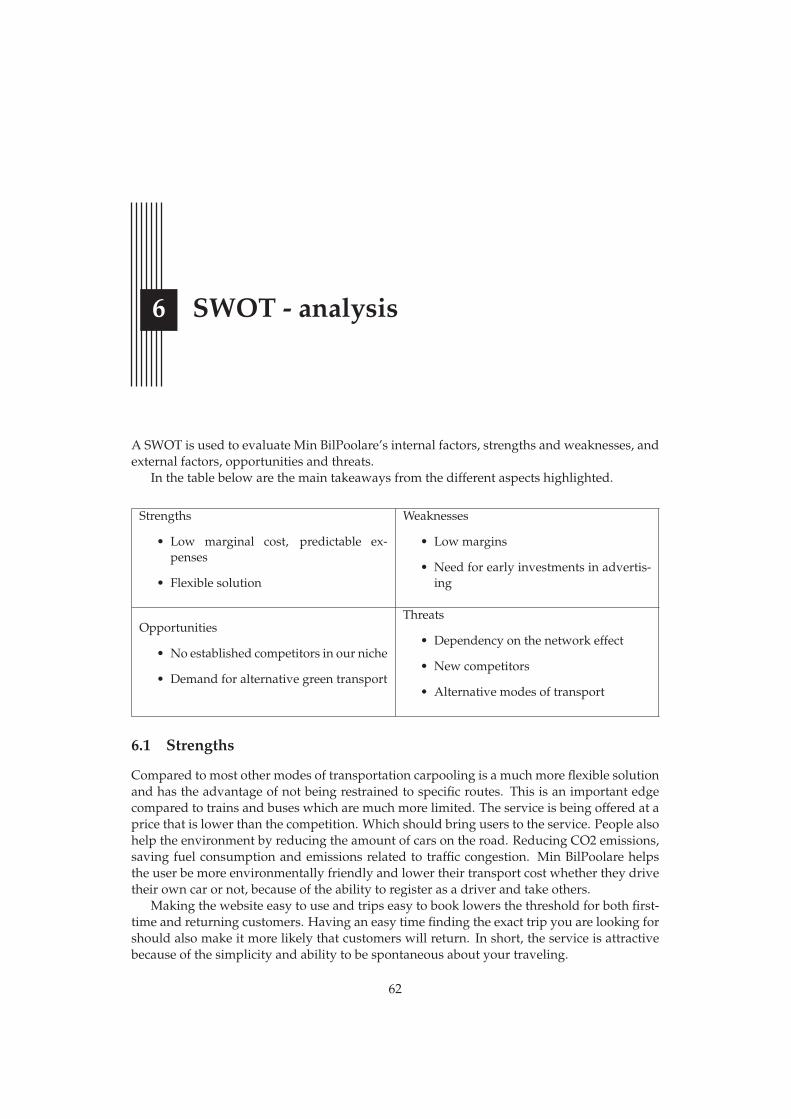
6 SWOT - analysis
A SWOT is used to evaluate Min BilPoolare’s internal factors, strengths and weaknesses, andexternal factors, opportunities and threats.
In the table below are the main takeaways from the different aspects highlighted.
Strengths
• Low marginal cost, predictable ex-penses
• Flexible solution
Weaknesses
• Low margins
• Need for early investments in advertis-ing
Opportunities
• No established competitors in our niche
• Demand for alternative green transport
Threats
• Dependency on the network effect
• New competitors
• Alternative modes of transport
6.1 Strengths
Compared to most other modes of transportation carpooling is a much more flexible solutionand has the advantage of not being restrained to specific routes. This is an important edgecompared to trains and buses which are much more limited. The service is being offered at aprice that is lower than the competition. Which should bring users to the service. People alsohelp the environment by reducing the amount of cars on the road. Reducing CO2 emissions,saving fuel consumption and emissions related to traffic congestion. Min BilPoolare helpsthe user be more environmentally friendly and lower their transport cost whether they drivetheir own car or not, because of the ability to register as a driver and take others.
Making the website easy to use and trips easy to book lowers the threshold for both first-time and returning customers. Having an easy time finding the exact trip you are looking forshould also make it more likely that customers will return. In short, the service is attractivebecause of the simplicity and ability to be spontaneous about your traveling.
62
6.2. Weaknesses
Our main cost being fixed and not increasing from additional customers is another reasonto reach a large user base. Being a web-based service Min BilPoolare will have high fixedcosts but marginal costs close to zero.
6.2 Weaknesses
The rides being offered at a low price makes the margin for us to profit off of the rides verysmall. To compensate for this another way of making profit might need to be used, for exam-ple ads. This would make the user experience worse but there might not be another choicebecause of the need to turn a profit. The need for large early investments in advertising takesaway capital from furthering the service. It is also spending on something that can’t be soldto manage losses at a later time, it isn’t an asset that increases the value of the business. Fre-quent driver-passenger combinations might stop using the platform. After establishing thedriver-passenger relation person to person the need to create the trips through Min BilPoolaremight be gone.
6.3 Opportunities
No carpooling service has had a real breakthrough into the Swedish market. According tothe market research, 50 % of the people answering say that they haven’t used a carpoolingservice because they are not aware of any. This makes the potential of a carpooling platform inSweden further interesting to investigate. To say that there is a huge demand for carpoolingspecifically might be an exaggeration. But, if not a demand then at least a willingness totry a mode of transportation that could be considered better than the existing alternatives,especially green alternatives. This is something we are going to try to capitalize on.
Threats
If the service does not gain traction and breakthrough initially it might be difficult to retainusers. The nature of the service makes it so, the more active users the better the service is.More users means more passengers and drivers, more drivers means more trips which prob-ably means more diverse trips and so more people get their demand met. We are dependenton the network effect.
The risk of new competitors is very high. New companies entering the market because ofthe ease to establish oneself and the simplicity of the business model. Aswell as establishedcarpooling brands who can enter the Swedish market with an already working concept anda known brand. Although most of our competitors, not the other carpooling services, offera different kind of transportation, we are all still in the transportation business. Them beingfar more established makes it difficult to change the behavior of our potential customers.
63

7 Market goals
Since our service lives and dies by the network effect our main metric to evaluate success willbe user count. Thus, we aim to have a strong launch. An early foundation of users which wethen can build upon is the goal at launch. After the first six months our goal is to have 100000 registered users and an average of 200 rides per day. A year later, 18 months after launch,we aim for 250 000 registered users and 400 rides per day.
64

8 Market strategy
Our market coverage will be done using a differentiated marketing strategy. As our com-pany is dependent on the network effect we need to grow a user base. This means reachingconsumers, having low prices and favorable terms. When we have built a large enough ac-tive user base we can start to shift our focus to profit. Some of the ways we might increaseprofitability are membership fees or ads. The market strategy should be reevaluated basedon the user base sometime after launch, it would be apt to do it 18 months after launch inconjunction with establishing new market goals.
65

9 STP
To create a service as appealing as possible some key factors need to be addressed. This willbe done through the three step model STP, that will do a segmentation of the market, targetthe selected customers and then adjust the positioning. The different segments are supportedby the conducted market research done as a pre-study with 300 respondents (see AppendixMarket Survey).
9.1 Segmentation
The following segments have been divided by different segment criteria. The focus will beon variables regarding occupation, geographical location, economical status and age.
Segment 1 Student
• Occupation: Student
• Geographical location: Student town
• Age: 18 - 30
• Economical status: Low
Segment 1 is a young student that is financially supported by student funding. The studentlives in a capital city or a bigger city with good connections. The student is very price sensi-tive and could consider carpooling as an option of transport if it was cheaper. The majorityof the student’s time is being spent on campus and online. Advertising should therefore befocused on social media and posters around universities.
Segment 2 Employee who lives in a smaller city or the countryside
• Occupation: Employed
• Geographical location: Smaller city or the countryside
• Age: 30 - 50
66

9.2. Targeting
• Economical status: Medium-high
Segment 2 is an adult employee who earns a good living and lives in a smaller city or thecountryside where the connections are bad. Since the employee is used to the bad connec-tions, he/she travels mostly by car. The employee travels more than one hour once a month.The employee has never used a carpooling service before because it would cause them toomuch trouble. Since a lot of time is spent in the car when traveling, a lot of information isbeing accessed from the radio.
Segment 3 Employee who lives in a capital city or a big town
• Occupation: Employed
• Geographical location: Capital city or big city
• Age: 30 - 50
• Economical status: Medium-high
Segment 3 is an adult employee who earns a good living and lives in a capital city or a bigtown where the connections are good. He/she travels by car or train when traveling andcould consider ride sharing, however it has never been done. The reason is because he/sheis not aware of any carpooling services. Segment 3 would be persuaded to start carpooling ifit would be cheaper and easier. Considering that the employee probably spends a lot of timein public transport, information is being accessed near subways and train stations.
9.2 Targeting
The market research shows that the parameter regarding price is highly valued when choos-ing transportation, however it varies between segments. It is noteworthy that the price de-creases in importance for those who have work as their main occupation, while other factorssuch as freedom and convenience are becoming more important. The first factor fits betterinto the business concept of Min BilPoolare and therefore does the first segment, the studentcorrespond better to be the potential target group.
The target customer of Min BilPoolare is segment 1. Which is a student who has a good at-titude towards carpooling and who does mind socializing with strangers. Their main sourceof income is student funding and therefore values the price of transportation high.
9.3 Positioning
Our positioning is based upon the needs of the customers and to differentiate ourselvesfrom our competitors. Our target customer is a student who is very price sensitive and MinBilPoolare should therefore make sure that they offer a service that is more economically ad-vantageous than traveling in your own car or using public transportation. Min BilPoolareshould also demonstrate the advantage of the service of how convenient it is to use. Theflexibility of the service comes from letting the passenger choose its own parameters for thetrip, adapting the trip after their own preferences. Parameters such as time, place, number ofseats and amount of baggage. Other parameters regarding socializing could also be addedfor the ones with social anxiety or for the social butterfly who wants to meet new people. MinBilPoolare should be affordable and convenient, choosing a time and place that best suits thepassenger. This creates value for the customer making them loyal customers.
All three segments have a lot in common, which means that when positioning MinBilPoolare towards students it will be favorable for the other segments as well.
67

Cheap
Expensive
Environmentally Friendly
NonEnvironmentally
Friendly
Train
Bus
MinBilPoolare
Taxi
M
DrivingAlone
Car Rental
Positioning Map 1
NonFlexible
Flexible
FastSlow
Train
Bus
MinBilPoolare
Taxi
M
DrivingAlone
Car Rental
Positioning Map 2
The diagrams above are positioning map of the Min BilPolareand its identified competitors.
68

9.3. Positioning
The positioning of Min BilPoolare relative to its competitors in terms of price, is placed asmore expensive than buss but cheaper than the other options. This is because Min BilPoolareoffers a cheaper transportation option between cities. The driver does not make a profit, butonly gets a part of their car and gasoline cost covered, which results in low prices.
Min BilPoolare is more environmentally friendly than the other options involving a carconsidering how much of the car’s capacity is being used. The other transportation optionsusing a car can also have a high capacity use but it is not given that it always is the case.WithMin BilPoolare people that usually would have traveled alone are now offering a seat in theircar to increase the cars capacity which is better for the environment, meaning that the capacityuse always is equal to or higher than 2.
When observing position map 2, Min BilPoolare is positioned as flexible and with a lowtraveling time as are the other car options. This is motivated by the fact that using a car asa means of transportation allows freedom and is a fast way of traveling. It is considered tobe more flexible than M and car rentals since you do not need to go and pick up and dropoff a car at the station. Instead with Min BilPoolare you choose a place to be picked up anddropped off at.
69

10 Market mix 4p
The four Ps of marketing. Evaluating Min BilPoolare.
10.1 Product
The base product of Min BilPoolare is a web-based carpooling platform. Users can registeras both drivers and passengers. When traveling the driver can post their trip to the websitewhere others can ask to join the trip, in exchange for a payment. The idea is that the paymentshould help the driver cover gas and other costs associated with the trip and in doing so maketransport cost and environmental impact lower, for all parties, than if everyone was to driveinstead.
The goal is to have a large variety of different trips available and for the passenger touse the service without worrying about whether or not the trip they are interested in willexist. To ensure that this is the case we need a large number of drivers. We also want thedriver to expect that if they post a trip that someone will want to join them. This will help increating a good customer experience and keep people using the service. In order to increasecustomer conversion the website is made to be intuitive and easy to use. There will be aninitial focus on growing a student and young adult customer base. This is due to that groupbeing prone to prioritize transport cost and the environment, as well as young people beingtoday’s trendsetters and often more willing to try new things.
Price
The service will be available at a price that is lower than our competitors in the majority ofcases. Because of the nature of the service the total price will of course vary, but the priceper kilometer will remain the same. The recommended price will alway be under 18.5 sekper kilometer to make it as easy as possible for the driver. The passenger then pays an extra10% which is our fee and margin. In the future there is the possibility of having other feesthan just the trips, a membership fee for example. Implementing this in an early stage wouldlikely hinder growth. Since growth is our main focus we won’t have a membership fee atlaunch. Although this could be implemented in order to reach profitability when sufficientgrowth has been achieved. In case Min BilPoolare is not as huge as we envision it to be, other
70

10.2. Promotion
revenue streams such as selling ads could be used in order to reach profitability. The 10% feecould also be assessed and changed if need be.
Reaching our 18 month goal of 400 trips per day would have us making about 3 millionsek in fees in a year, assuming an average ride costs the passenger 200 sek and we take 10% ofthat. How much of those 3 million that are profit will vary largely depending on the numberof employees, the terms of potential loans and need for additional advertising.
10.2 Promotion
To focus our promotion on students and young adults we will make use of the followingmarketing tools. We will use poster ads in subway and bus stations near universities toreach commuting students. We will be promoting Min BilPoolare in person at universityevents. Social media marketing, through instagram, facebook, tiktok and podcasts will beused in different capacities for example collaborating with creators and influencers in ourtarget audience. Seeing your favorite influencer have a good experience using our service isexpected to effectively generate users. Even though radio marketing might not reach youngpeople it certainly reaches people who drive and so we will also make use of radio marketing.The radio advertising will be specifically aimed at drivers. Good promotion and marketingis a high priority in having a successful launch and not becoming another small carpoolingservice that people aren’t aware of. Although this will be expensive, we are expecting resultswhich will make the cost justifiable.
10.3 Place
With Min BilPoolare being a web-based service the only physical interaction available to cus-tomers is through marketing and on digital the interaction is the web-site. The domain namewill be minbilpoolare.se.
71
Bibliography
[1] “Karoline Alvånger”. “Marknadsanalys samåkningssystem”. https : / / samakning .files.wordpress.com/2013/06/rapport-samc3a5kningssystem_130604.pdf. “2013”.
[2] “Trafikanalys”. “Bekvämt och effektivt - om de unga får välja”. https://www.trafa.se/globalassets/rapporter/underlagsrapporter/2011- 2015/2012/trafikanalys_bekvaemt_och_effektivt_om_de_unga_faar_vaelja.pdf.“2012”.
[3] “Svenska FN-förbundet”. “Höj rösten för hållbar utveckling!” https://fn.se/wp-content / uploads / 2021 / 06 / Hoj - rosten - for - hallbar - utveckling -slutlig-210429.pdf/. “2021”.
[4] S Shaheen. The Benefits of Carpooling. 2018.
[5] “SCB”. “Hushållsgrupp – utgifter i kronor per hushåll år 2012”. https://www.scb.se/hitta- statistik/statistik- efter- amne/hushallens- ekonomi/hushallens-utgifter/hushallens-utgifter-hut/pong/tabell-och-diagram/2012/hushallsgrupp--utgifter-i-kronor-per-hushall-ar-2012. “2013”.
[6] “Trafikanalys”. “Fordon 2020”. https : / / www . trafa . se / globalassets /statistik/vagtrafik/fordon/2021/fordon_2020.pdf. “2021”.
[7] “VolvoCarMobility”. “VolvoCarMobility-M”. https://m.co/se/sv-SE/. ”2022”.
[8] “GDPR info eu”. “General Data Protection Regulation (GDPR) – Official Legal Text0".https://gdpr-info.eu/. “2022”.
[9] “Integritetsskyddsmyndigheten”. “Grundläggande principer”. https://www.imy.se/verksamhet/dataskydd/det-har-galler-enligt-gdpr/grundlaggande-principer/. “2021".
[10] “Statistikmyndigheten”. “Uppgång i BNP tredje kvartalet 2021”. https://www.scb.se/hitta- statistik/statistik- efter- amne/nationalrakenskaper/nationalrakenskaper / nationalrakenskaper - kvartals - och -arsberakningar/pong/statistiknyhet/namnlos2/. “2021”.
72
Bibliography
[11] “Statistikmyndigheten”. “Inflationstakten 4,1 procent i december 2021”. https : / /www . scb . se / hitta - statistik / statistik - efter - amne / priser -och-konsumtion/konsumentprisindex/konsumentprisindex-kpi/pong/statistiknyhet/konsumentprisindex-kpi-december-2021/. “2022”.
[12] “Statistikmyndigheten”. “Arbetslöshet i Sverige”. https://www.scb.se/hitta-statistik/sverige-i-siffror/samhallets-ekonomi/arbetsloshet-i-sverige/. “2022”.
[13] “Statistikmyntigheten”. “Personbilar i trafik efter region, status och år”. https://www.statistikdatabasen . scb . se / pxweb / sv / ssd / START _ _TK _ _TK1001 __TK1001Z/PersBilarDeso/table/tableViewLayout1/. “2021”.
[14] “Statistikmyntigheten”. “Arbetslöshet i Sverige”. https : / / www . scb . se /contentassets/a3faa0cdf5c44382a8343eb4a2e3df04/le0108_2020a01_br_lebr2001.pdf. “2022”.
[15] “Sveriges miljömål”. “Utsläpp av växthusgaser från inrikes transporter”. https://www.sverigesmiljomal.se/etappmalen/utslapp- av- vaxthusgaser- fran-inrikes-transporter/. “2021”.
[16] “Skatteverket”. “Köra personer mot betalning i privat bil”. https : / / www . scb .se / hitta - statistik / sverige - i - siffror / samhallets - ekonomi /arbetsloshet-i-sverige/. “2022”.
[17] O” “Zander S & Johansson. “Definition av bilpool och utredning om momsskattesats”.https://www.riksdagen.se/sv/dokument- lagar/dokument/motion/definition - av - bilpool - och - utredning - om _ H4023052 ? fbclid =IwAR0HDD _ X1Y71aYxbhvVn7JZ9G52ks9zlF5POsCGl1SMMVKQxyYIDx5E1njQ.”2016”.
[18] Puthipong Julagasigorn, Ruth Banomyong, David B. Grant, and Paitoon Varadejsatit-wong. “What encourages people to carpool? A conceptual framework of carpoolingpsychological factors and research propositions”. In: Transportation Research Interdisci-plinary Perspectives 12 (2021), p. 100493.
73

A Appendix Market Survey
74
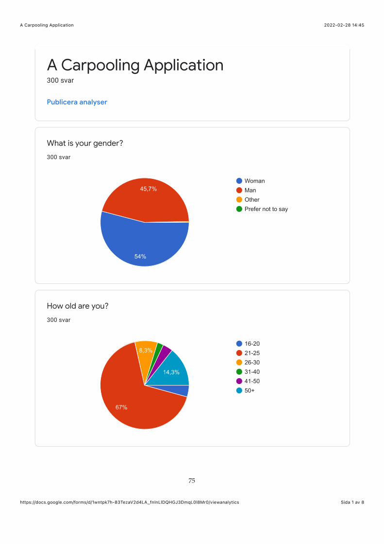
2022-02-28 14:45A Carpooling Application
Sida 1 av 8https://docs.google.com/forms/d/1wntpk7h-83TezaV2d4LA_fnlnLlDQHGJ3DmqL0l8Mr0/viewanalytics
What is your gender?
300 svar
How old are you?
300 svar
A Carpooling Application300 svar
Publicera analyser
WomanManOtherPrefer not to say
45,7%
54%
16-2021-2526-3031-4041-5050+
14,3%
8,3%
67%
75

2022-02-28 14:45A Carpooling Application
Sida 2 av 8https://docs.google.com/forms/d/1wntpk7h-83TezaV2d4LA_fnlnLlDQHGJ3DmqL0l8Mr0/viewanalytics
Main occupation
300 svar
Where do you live?
300 svar
StudentEmployedUnemployed
31,3%
65,7%
In a capital cityIn a larger cityIn a smaller cityIn the countryside
27,7%
44%
25,3%
76

2022-02-28 14:45A Carpooling Application
Sida 3 av 8https://docs.google.com/forms/d/1wntpk7h-83TezaV2d4LA_fnlnLlDQHGJ3DmqL0l8Mr0/viewanalytics
How often do you travel for more than one hour?
300 svar
What form of transportation do you mainly use when traveling for morethan one hour?
300 svar
Once a weekOnce a monthFour times a yearOnce a year
19%
21,7%
58,3%
TrainCarBusCarpoolingPlaneCommuter trainsFlightRullskidor
43,3%
48%
77
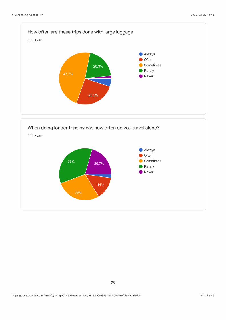
2022-02-28 14:45A Carpooling Application
Sida 4 av 8https://docs.google.com/forms/d/1wntpk7h-83TezaV2d4LA_fnlnLlDQHGJ3DmqL0l8Mr0/viewanalytics
How often are these trips done with large luggage
300 svar
When doing longer trips by car, how often do you travel alone?
300 svar
AlwaysOftenSometimesRarelyNever
20,3%
47,7%
25,3%
AlwaysOftenSometimesRarelyNever
14%
20,7%35%
28%
78

2022-02-28 14:45A Carpooling Application
Sida 5 av 8https://docs.google.com/forms/d/1wntpk7h-83TezaV2d4LA_fnlnLlDQHGJ3DmqL0l8Mr0/viewanalytics
Would you consider traveling with a stranger?
300 svar
Have you ever used a carpooling service?
300 svar
YesNo50%
50%
YesNo
15,7%
84,3%
79

2022-02-28 14:45A Carpooling Application
Sida 6 av 8https://docs.google.com/forms/d/1wntpk7h-83TezaV2d4LA_fnlnLlDQHGJ3DmqL0l8Mr0/viewanalytics
Have you considered carpooling as an option?
300 svar
If no, why is that?
206 svar
YesNo63,7%
36,3%
I am not aware of any carpool…For safetyCommuting is easierToo much troubleDont have the need for itVill ha min egen bilFreedom to decide when to g…Enkelt och van med egen bil
1/3
21,4%11,2%
12,6%
48,1%
80
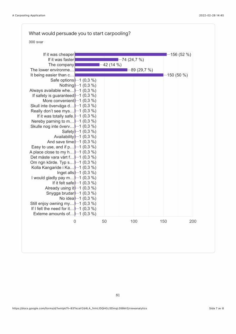
2022-02-28 14:45A Carpooling Application
Sida 7 av 8https://docs.google.com/forms/d/1wntpk7h-83TezaV2d4LA_fnlnLlDQHGJ3DmqL0l8Mr0/viewanalytics
What would persuade you to start carpooling?
300 svar
0 50 100 150 200
If it was cheaperIf it was fasterThe company
The lower environme…It being easier than c…
Safe optionsNothing
Always available whe…If safety is guaranteed
More convenientSkull inte överväga d…Really don’t see mys…
If it was totally safe.Nereby parning to m…Skulle nog inte överv…
SafetyAvailability
And save timeEasy to use, and if p…
A place close to my h…Det måste vara värt f…Om ngn körde. Typ s…Kolla Kangaride i Ka…
Inget allsI would gladly pay m…
If it felt safeAlready using itSnygga brudar
No ideaStill enjoy owning my…If I felt the need for it…Exteme amounts of…
156 (52 %)156 (52 %)156 (52 %)74 (24,7 %)74 (24,7 %)74 (24,7 %)
42 (14 %)42 (14 %)42 (14 %)89 (29,7 %)89 (29,7 %)89 (29,7 %)
150 (50 %)150 (50 %)150 (50 %)1 (0,3 %)1 (0,3 %)1 (0,3 %)1 (0,3 %)1 (0,3 %)1 (0,3 %)1 (0,3 %)1 (0,3 %)1 (0,3 %)1 (0,3 %)1 (0,3 %)1 (0,3 %)1 (0,3 %)1 (0,3 %)1 (0,3 %)1 (0,3 %)1 (0,3 %)1 (0,3 %)1 (0,3 %)1 (0,3 %)1 (0,3 %)1 (0,3 %)1 (0,3 %)1 (0,3 %)1 (0,3 %)1 (0,3 %)1 (0,3 %)1 (0,3 %)1 (0,3 %)1 (0,3 %)1 (0,3 %)1 (0,3 %)1 (0,3 %)1 (0,3 %)1 (0,3 %)1 (0,3 %)1 (0,3 %)1 (0,3 %)1 (0,3 %)1 (0,3 %)1 (0,3 %)1 (0,3 %)1 (0,3 %)1 (0,3 %)1 (0,3 %)1 (0,3 %)1 (0,3 %)1 (0,3 %)1 (0,3 %)1 (0,3 %)1 (0,3 %)1 (0,3 %)1 (0,3 %)1 (0,3 %)1 (0,3 %)1 (0,3 %)1 (0,3 %)1 (0,3 %)1 (0,3 %)1 (0,3 %)1 (0,3 %)1 (0,3 %)1 (0,3 %)1 (0,3 %)1 (0,3 %)1 (0,3 %)1 (0,3 %)1 (0,3 %)1 (0,3 %)1 (0,3 %)1 (0,3 %)1 (0,3 %)1 (0,3 %)1 (0,3 %)1 (0,3 %)1 (0,3 %)1 (0,3 %)1 (0,3 %)1 (0,3 %)1 (0,3 %)1 (0,3 %)
81
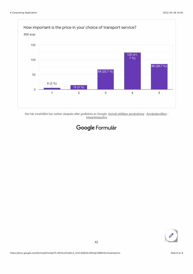
2022-02-28 14:45A Carpooling Application
Sida 8 av 8https://docs.google.com/forms/d/1wntpk7h-83TezaV2d4LA_fnlnLlDQHGJ3DmqL0l8Mr0/viewanalytics
How important is the price in your choice of transport service?
300 svar
Det här innehållet har varken skapats eller godkänts av Google. Anmäl otillåten användning - Användarvillkor -Integritetspolicy
1 2 3 4 50
50
100
150
6 (2 %)6 (2 %)6 (2 %)15 (5 %)
68 (22,7 %)
125 (41,7 %)
86 (28,7 %)
Formulär
82

A Appendix B
83

84
85

86
87


A Appendix C
89

Instruktioner över användartester
Allmän info2 identiska användartester kommer utföras:
Test 1: Utförs på den sidan som går “enligt” den design-teorin vi har hittat. VERSION 1Test 2: Utförs på den sidan som inte går enligt teorin. VERSION 2
Instruktionerna som följer under avsnittet Under testtillfället kommer alltså gälla och vara densammaför Test 1 och Test 2.Testerna kommer utföras på 2 olika testgrupper om 9 personer vardera, vilket betyder att vi totaltbehöver 18 testpersoner.Testtillfällena utförs under perioden: 11042022 - 24042022
Planering inför testtillfällenaVarje person i kandidatgruppen kommer vara med på totalt 4 användartester där man själv ansvararför 2 st. Det kommer alltså på varje testtillfälle vara med 2 personer från kandidatgruppen. Allapersoner ansvarar för ett Test 1 och ett Test 2.
● I Excelarket Datumplanering Användartester kommer varje person fylla i information så somtid, datum och ansvarig person över de 2 testtillfällena som personen ansvarar över.
● Utöver det här fyller även varje person i kandidatgruppen i ytterligare 2 tillfällen man kanmedverka som hjälpperson. Här finns det alltså möjlighet att välja de datum och tider sompassar. Självklart hjälps vi åt inom gruppen så alla kan medverka under tider som passar.
I mappen som heter sitt eget namn:● Evaluator skapar en duplicering av excel-arket Tider användartester och döper filen till
TestPersonsNamn_DDMMÅÅ.● Evaluator skapar en fil för Observer att anteckna i med namnet
TestPersonsNamn_DDMMÅÅ.
Roller under testtillfälletVIKTIGT: Under testtillfället ansvarar båda personerna över att skärminspelning och ljudinspelningfungerar.
Ansvarig person under testtillfället: Den ansvariga personen kommer under testtillfället varaEvaluator, vilket innebär att den kommer ansvara över att presentera uppgiften och svara påeventuella frågor. I fortsättningen refereras den ansvariga personen som Evaluator.
Hjälpperson under testtillfället: Hjälppersonen kommer under testtillfället vara Observer, vilketinnebär att personen kommer ansvara över att anteckna kommentarer och hur testpersonen reagerartill olika uppgifter. I fortsättningen refereras hjälppersonen som Observer.
Det är okej att Observer är med på distans, men Evaluator bör vara i samma rum som testpersonen.Testen utförs på evaluators dator. 90
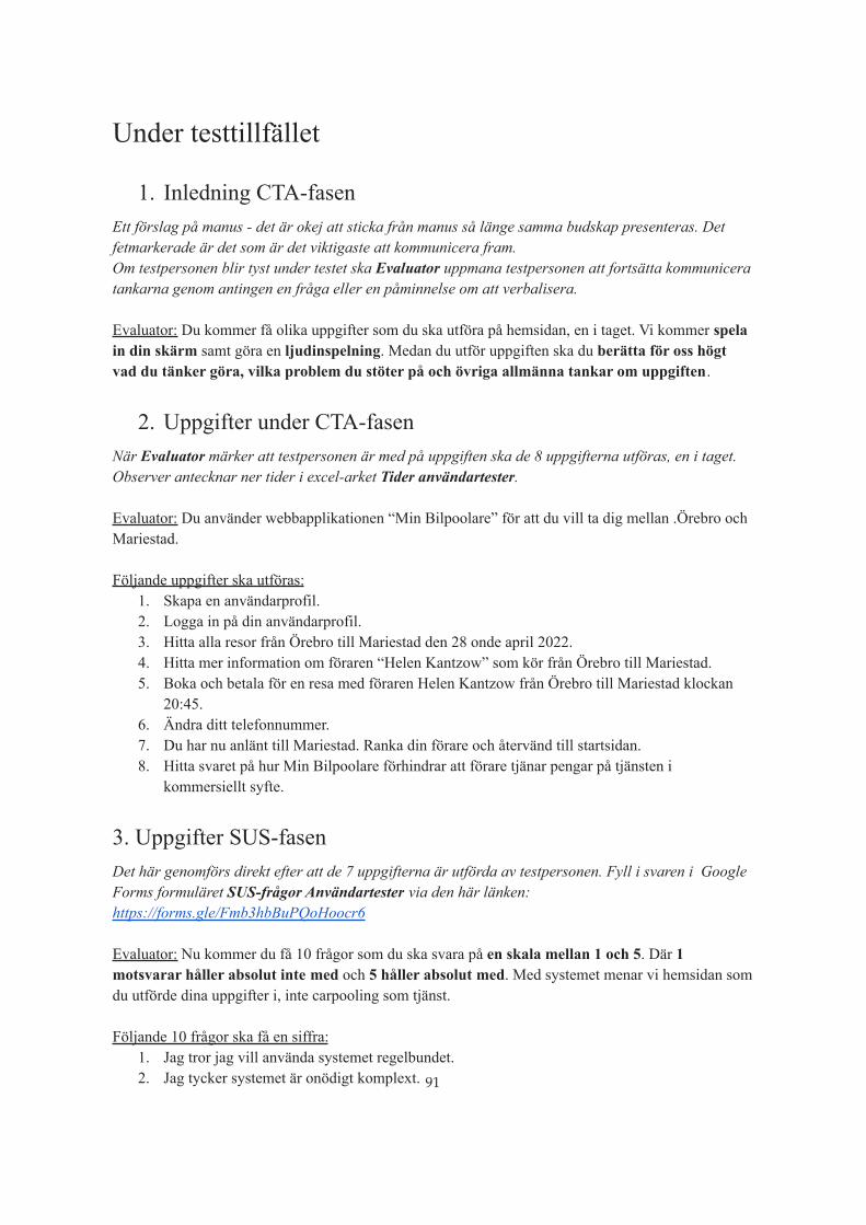
Under testtillfället
1. Inledning CTA-fasenEtt förslag på manus - det är okej att sticka från manus så länge samma budskap presenteras. Detfetmarkerade är det som är det viktigaste att kommunicera fram.Om testpersonen blir tyst under testet ska Evaluator uppmana testpersonen att fortsätta kommuniceratankarna genom antingen en fråga eller en påminnelse om att verbalisera.
Evaluator: Du kommer få olika uppgifter som du ska utföra på hemsidan, en i taget. Vi kommer spelain din skärm samt göra en ljudinspelning. Medan du utför uppgiften ska du berätta för oss högtvad du tänker göra, vilka problem du stöter på och övriga allmänna tankar om uppgiften.
2. Uppgifter under CTA-fasenNär Evaluator märker att testpersonen är med på uppgiften ska de 8 uppgifterna utföras, en i taget.Observer antecknar ner tider i excel-arket Tider användartester.
Evaluator: Du använder webbapplikationen “Min Bilpoolare” för att du vill ta dig mellan .Örebro ochMariestad.
Följande uppgifter ska utföras:1. Skapa en användarprofil.2. Logga in på din användarprofil.3. Hitta alla resor från Örebro till Mariestad den 28 onde april 2022.4. Hitta mer information om föraren “Helen Kantzow” som kör från Örebro till Mariestad.5. Boka och betala för en resa med föraren Helen Kantzow från Örebro till Mariestad klockan
20:45.6. Ändra ditt telefonnummer.7. Du har nu anlänt till Mariestad. Ranka din förare och återvänd till startsidan.8. Hitta svaret på hur Min Bilpoolare förhindrar att förare tjänar pengar på tjänsten i
kommersiellt syfte.
3. Uppgifter SUS-fasenDet här genomförs direkt efter att de 7 uppgifterna är utförda av testpersonen. Fyll i svaren i GoogleForms formuläret SUS-frågor Användartester via den här länken:https://forms.gle/Fmb3hbBuPQoHoocr6
Evaluator: Nu kommer du få 10 frågor som du ska svara på en skala mellan 1 och 5. Där 1motsvarar håller absolut inte med och 5 håller absolut med. Med systemet menar vi hemsidan somdu utförde dina uppgifter i, inte carpooling som tjänst.
Följande 10 frågor ska få en siffra:1. Jag tror jag vill använda systemet regelbundet.2. Jag tycker systemet är onödigt komplext. 91

3. Jag tycker systemet var enkelt att använda.4. Jag tror jag behöver stöd av någon teknisk kunnig person för att kunna använda systemet.5. Jag tycker att de olika delarna i systemet är välintegrerade.6. Jag tycker att det är för mycket inkonsekvens i systemet.7. Jag tror att de flesta personerna snabbt skulle lära sig det här systemet.8. Jag tycker att systemet är besvärligt att använda.9. Jag känner mig trygg i att använda systemet.10. Jag behöver lära mig många nya saker innan jag blir produktiv med systemet.
Efter testtillfälletObserver:
● Sammanställer och tydliggör om något är otydligt i anteckningarna.● Sammanställer i punktform det viktigaste som framkom under testtillfället.● Räknar igenom hur många noder som besöks under varje uppgift i CTA-fasen.
Evaluator:● Läsa igenom Observers anteckningar och se till att anteckningarna stämmer överens med
testet.● Räkna ut “Lostness” genom Smith’s Lostness Formula, se nedan.● Räkna ut “Usability-nivå”, se nedan.
Smith’s Lostness Formula:
𝐿 = ( 𝑁𝑆 − 1)2+ ( 𝑅𝑁 − 1)
2
● L är mätvärdet för lostness
● R = 16, är minimum antal noder för att genomföra den givna uppgiften
● S är totala antalet noder, att besöka samma nod mer än en gång ökar S-värdet
● N är antalet unika noder som besöktes
92

Minimum antal noder.
Beräkning av SUS, Usability-nivå:Frågorna alternerar mellan positiv och negativ feedback där de udda numret representerar positiv ochde jämna negativ.
Udda frågor (1, 3, 5, 7, 9): Numret testpersonen satte subtraheras med 1 (svaret - 1).Jämna frågor (2, 4, 6, 10): Numret testpersonen satte subtraheras från 5 (5 - svaret).
Resultatet från varje fråga kommer bli ett nummer mellan 0 och 4.Alla resultat summeras och multipliceras med 2,5.Detta resulterar slutgiltigen i ett värde mellan 0 och 100 vilket är “System Usability Value”.
Median från tidigare studier är 75 och medelvärdet är 70,14.Bra Usability är ett värde mellan 70 och 80.
93