
Untitled - 24 Ways
300
-
Upload
khangminh22 -
Category
Documents
-
view
0 -
download
0
Transcript of Untitled - 24 Ways


Credits
24 ways is the advent calendar for webgeeks. For twenty-four days each Decemberwe publish a daily dose of web design anddevelopment goodness to bring you all alittle Christmas cheer.
▪ 24 ways is brought to you by Perch CMS
▪ Produced by Drew McLellan, Brian Suda, Anna
Debenham and Owen Gregory.
▪ Designed by Paul Robert Lloyd.
▪ eBook published by edgeofmyseat.com and produced
by Rachel Andrew.
▪ Possible only with the help and dedication of our
authors.
2 24 ways 2010 edition

2010
In April, the iPad; in May, Ethan Marcotte’s“Responsive Web Design” was published byA List Apart, and A Book Apart publishedHTML5 for Web Designers by Jeremy Keith;and then in June, the iPhone 4’s Retinascreen changed the web developmentlandscape. 24 ways sprinkled its Christmaspudding with CSS3, including animationsand transforms, a little light contentstrategy, and some thoughts about the webdesigner of tomorrow.
Finding Your Way with Static Maps ........................................... 5
Using the WebFont Loader to Make Browsers Behave the
Same .....................................................................................................15
My CSS Wish List.............................................................................23
Go Forth and Make Awesomeness...........................................41
Beyond Web Mechanics – Creating Meaningful Web
Design ..................................................................................................53
2010
24 ways 2010 edition 3

Wrapping Things Nicely with HTML5 Local Storage ........59
Golden Spirals...................................................................................71
“Probably, Maybe, No”: The State of HTML5 Audio..........83
Extreme Design................................................................................96
Optimize Your Web Design Workflow ................................108
Documentation-Driven Design for APIs.............................126
The Great Unveiling ....................................................................134
Good Ideas Grow on Paper.......................................................140
An Introduction to CSS 3-D Transforms .............................152
Real Animation Using JavaScript, CSS3, and HTML5
Video .................................................................................................185
The Articulate Web Designer of Tomorrow ......................197
Designing for iOS: Life Beyond Media Queries................207
Speed Up Your Site with Delayed Content ........................215
Sketching to Communicate ......................................................224
Put Yourself in a Corner.............................................................235
A Contentmas Epiphany............................................................246
Everything You Wanted To Know About Gradients (And a
Few Things You Didn’t)...............................................................270
Circles of Confusion ....................................................................286
Calculating Color Contrast.......................................................292
4 24 ways 2010 edition

Drew McLellan 24ways.org/201001
1. Finding Your Way withStatic Maps
Since the introduction of the Google Mapsservice in 2005, online maps have taken offin a way not really possible before theinvention of slippy map interaction.Although quickly followed by a plethora ofsimilar services from both commercial andnon-commercial parties, Google’s first-mover advantage, and easy-to-usedeveloper API saw Google Maps becomepretty much the de facto mapping service.
Finding Your Way with Static Maps
24 ways 2010 edition 5

It’s now so easy to add a map to a web page, there’s no
reason not to. Dropping an iframe map into your page is
as simple as embedding a YouTube video.
But there’s one crucial drawback to both the solution
Google provides for you to drop into your page and the
code developers typically implement themselves – they
don’t work without JavaScript.
A BIT ABOUT JAVASCRIPT
Back in October of this year, The Yahoo! Developer
Network blog ran some tests to measure how many
visitors to the Yahoo! home page didn’t have JavaScript
available or enabled in their browser. It’s an interesting
test when you consider that the audience for the Yahoo!
home page (one of the most visited pages on the web)
6 24 ways 2010 edition

represents about as mainstream a sample as you’ll find. If
there’s any such thing as an ‘average Web user’ then this is
them.
The results surprised me. It varied from region to region,
but at most just two per cent of visitors didn’t have
JavaScript running. To be honest, I was expecting it to be
higher, but this quote from the article caught my
attention:
While the percentage of visitors with JavaScriptdisabled seems like a low number, keep inmind that small percentages of big numbersare also big numbers.
That’s right, of course, and it got me thinking about what
that two per cent means. For many sites, two per cent is
the number of visitors using the Opera web browser,
using IE6, or using Mobile Safari.
So, although a small percentage of the total, users without
JavaScript can’t just be forgotten about, and catering for
them is at the very heart of how the web is supposed to
work.
Starting with content in HTML, we layer on presentation
with CSS and then enhance interactivity with JavaScript.
If anything fails along the way or the network craps out, or
a browser just doesn’t support one of the technologies,
the user still gets something they can work with.
Finding Your Way with Static Maps
24 ways 2010 edition 7

It’s progressive enhancement – also known as doing our
jobs properly.
SORRY, WASN’T THIS ABOUT MAPS?
As I was saying, the default code Google provides, and the
example code it gives to developers (which typically just
gets followed ‘as is’) doesn’t account for users without
JavaScript. No JavaScript, no content.
When adding the ability to publish maps to our small
content management system Perch, I didn’t want to
provide a solution that only worked with JavaScript. I had
to go looking for a way to provide maps without
JavaScript, too.
There’s a simple solution, fortunately, in the form of static
map tiles. All the various slippy map services use a
JavaScript interface on top of what are basically rendered
map image tiles. Dragging the map loads in more image
tiles in the direction you want to view. If you’ve used a
slippy map on a slow connection, you’ll be familiar with
seeing these tiles load in one by one.
THE STATIC MAP API
The good news is that these tiles (or tiles just like them)
can be used as regular images on your site. Google has a
Static Map API which not only gives you a handy interface
8 24 ways 2010 edition

to retrieve a tile for the exact area you need, but also
allows you to place pins, and zoom and centre the tile so
that the image looks just so.
This means that you can create a static, non-JavaScript
version of your slippy map’s initial (or ideal) state to load
into your page as a regular image, and then have the
JavaScript map hijack the image and make it slippy.
Clearly, that’s not going to be a perfect solution for every
map’s requirements. It doesn’t allow for panning, zooming
or interrogation without JavaScript. However, for the
majority of straightforward map uses online, a static map
makes a great alternative for those visitors without
JavaScript.
Finding Your Way with Static Maps
24 ways 2010 edition 9

HERE’S THE HOW
Retrieving a static map tile is staggeringly easy – it’s just a
case of forming a URL with the correct arguments and
then using that as the src of an image tag.
<img src="http://maps.google.com/maps/api/staticmap
?center=Bethlehem+Israel
&zoom=5
&size=540x280
&maptype=satellite
&markers=color:red|31.4211,35.1144
&sensor=false"
width="540" height="280" alt="Map of Bethlehem,
Israel" />
As you can see, there are a few key options that we pass
along to the base URL. All of these should be familiar to
anyone who’s worked with the JavaScript API.
▪ center determines the point on which the map is
centred. This can be latitude and longitude values, or
simply an address which is then geocoded.
▪ zoom sets the zoom level.
▪ size is the pixel dimensions of the image you require.
▪ maptype can be roadmap, satellite, terrain or hybrid.
▪ markers sets one or more pin locations. Markers can be
labelled, have different colours, and so on – there’s quite a
lot of control available.
10 24 ways 2010 edition

▪ sensor states whether you are using a sensor to
determine the user’s location. When just embedding a
map in a web page, set this to false.
There are many options, including plotting paths and
setting the image format, which can all be found in the
straightforward documentation.
ADDING TO YOUR PAGE
If you’ve worked with the JavaScript API, you’ll know that
it needs a container element which you inject the map
into:
<div id="map"></div>
All you need to do is put your static image inside that
container:
<div id="map">
<img src="http://maps.google.com/maps/api/
staticmap[...]" />
</div>
And then, in your JavaScript, find the image and remove it.
For example, with jQuery you’d simply use:
$('#map img').remove();
Why not use a <noscript> element around the image?
You could, and that would certainly work fine for
browsers that do not support JavaScript. What that won’t
Finding Your Way with Static Maps
24 ways 2010 edition 11

cover, however, is the situation where the browser has
JavaScript support but, for whatever reason, the
JavaScript doesn’t run. This could be due to network
issues, an aggressive corporate firewall, or even just a bug
in your code. So for that reason, we put the image in for all
browsers that show images, and then remove it when the
JavaScript is successfully running.
See an example in action
ABOUT RATE LIMITS
The Google Static Map API limits the requests per site
viewer – currently at one thousand distinct maps per day
per viewer. So, for most sites you really don’t need to
worry about the rate limit. Requests for the same tile
aren’t normally counted, as the tile has already been
generated and is cached. You can embed the images direct
from Google and let it worry about the distribution and
caching.
IN CONCLUSION
As you can see, adding a static map alongside your
dynamic map for those users without JavaScript is very
easy indeed. There may not be a huge percentage of web
visitors browsing without JavaScript but, as we’ve seen, a
12 24 ways 2010 edition

small percentage of a big number is still a big number.
When it’s so easy to add a static map, can you really justify
not doing it?
ABOUT THE AUTHOR
Drew McLellan is lead developer on your favourite small CMS,
Perch. He is Director and Senior Developer at UK-based web
development agency edgeofmyseat.com, and formerly Group
Finding Your Way with Static Maps
24 ways 2010 edition 13

Lead at the Web Standards Project. When not publishing 24
ways, Drew keeps a personal site covering web development
issues and themes, takes photos and tweets a lot.
14 24 ways 2010 edition

Richard Rutter 24ways.org/201002
2. Using the WebFontLoader to Make BrowsersBehave the Same
Web fonts give us designers a whole newtypographic palette with which to work.However, browsers handle the loading ofweb fonts in different ways, and this canlead to inconsistent user experiences.
Safari, Chrome and Internet Explorer leave a blank space
in place of the styled text while the web font is loading.
Opera and Firefox show text with the default font which
switches over when the web font has loaded, resulting in
the so-called Flash of Unstyled Text (aka FOUT). Some
people prefer Safari’s approach as it eliminates FOUT,
others think the Firefox way is more appropriate as
content can be read whilst fonts download. Whatever
your preference, the WebFont Loader can make all
browsers behave the same way.
Using the WebFont Loader to Make Browsers Behave theSame
24 ways 2010 edition 15

The WebFont Loader is a JavaScript library that gives you
extra control over font loading. It was co-developed by
Google and Typekit, and released as open source. The
WebFont Loader works with most web font services as
well as with self-hosted fonts.
The WebFont Loader tells you when the following events
happen as a browser downloads web fonts (or loads them
from cache):
▪ when fonts start to download (‘loading’)
▪ when fonts finish loading (‘active’)
▪ if fonts fail to load (‘inactive’)
If your web page requires more than one font, the
WebFont Loader will trigger events for individual fonts,
and for all the fonts as a whole. This means you can find
out when any single font has loaded, and when all the
fonts have loaded (or failed to do so).
The WebFont Loader notifies you of these events in two
ways: by applying special CSS classes when each event
happens; and by firing JavaScript events. For our
purposes, we’ll be using just the CSS classes.
IMPLEMENTING THE WEBFONT LOADER
As stated above, the WebFont Loader works with most
web font services as well as with self-hosted fonts.
16 24 ways 2010 edition

Self-hosted fonts
To use the WebFont Loader when you are hosting the font
files on your own server, paste the following code into
your web page:
<script type="text/javascript">
WebFontConfig = {
custom: { families: ['Font Family Name', 'Another Font
Family'],
urls: [ 'http://yourwebsite.com/styles.css' ] }
};
(function() { var wf = document.createElement(‘script’);
wf.src = (‘https:’ == document.location.protocol ? ‘https’ :
‘http’) + ‘://ajax.googleapis.com/ajax/libs/webfont/1/
webfont.js’; wf.type = ‘text/javascript’; wf.async = ‘true’;
var s = document.getElementsByTagName(‘script’)0;
s.parentNode.insertBefore(wf, s);
})();
Replace Font Family Name and Another Font Family
with a comma-separated list of the font families you want
to check against, and replace http://yourwebsite.com/
styles.css with the URL of the style sheet where your
@font-face rules reside.
Using the WebFont Loader to Make Browsers Behave theSame
24 ways 2010 edition 17

Fontdeck
Assuming you have added some fonts to a website project
in Fontdeck, use the afore-mentioned code for self-hosted
solutions and replace http://yourwebsite.com/
styles.css with the URL of the <link> tag in your
Fontdeck website settings page. It will look something like
http://f.fontdeck.com/s/css/xxxx/domain/nnnn.css.
Typekit
Typekit’s JavaScript-based implementation incorporates
the WebFont Loader events by default, so you won’t need
to include any WebFont Loader code.
MAKING ALL BROWSERS BEHAVE LIKE SAFARI
To make Firefox and Opera work in the same way as
WebKit browsers (Safari, Chrome, etc.) and Internet
Explorer, and thus minimise FOUT, you need to hide the
text while the fonts are loading.
While fonts are loading, the WebFont Loader adds a class
of wf-loading to the <html> element. Once the fonts have
loaded, the wf-loading class is removed and replaced
with a class of wf-active (or wf-inactive if all of the fonts
failed to load). This means you can style elements on the
page while the fonts are loading and then style them
differently when the fonts have finished loading.
18 24 ways 2010 edition

So, let’s say the text you need to hide while fonts are
loading is contained in all paragraphs and top-level
headings. By writing the following style rule into your
CSS, you can hide the text while the fonts are loading:
.wf-loading h1, .wf-loading p {
visibility:hidden;
}
Because the wf-loading class is removed once the the
fonts have loaded, the visibility:hidden rule will stop
being applied, and the text revealed. You can see this in
action on this simple example page.
That works nicely across the board, but the situation is
slightly more complicated. WebKit doesn’t wait for all
fonts to load before displaying text: it displays text
elements as soon as the relevant font is loaded.
To emulate WebKit more accurately, we need to know
when individual fonts have loaded, and apply styles
accordingly. Fortunately, as mentioned earlier, the
WebFont Loader has events for individual fonts too.
When a specific font is loading, a class of the form wf-
fontfamilyname-n4-loading is applied. Assuming
headings and paragraphs are styled in different fonts, we
can make our CSS more specific as follows:
Using the WebFont Loader to Make Browsers Behave theSame
24 ways 2010 edition 19

.wf-fontfamilyname-n4-loading h1,
.wf-anotherfontfamily-n4-loading p {
visibility:hidden;
}
Note that the font family name is transformed to lower
case, with all spaces removed. The n4 is a shorthand for
the weight and style of the font family. In most
circumstances you’ll use n4 but refer to the WebFont
Loader documentation for exceptions.
You can see it in action on this Safari example page (you’ll
probably need to disable your cache to see any change
occur).
MAKING ALL BROWSERS BEHAVE LIKEFIREFOX
To make WebKit browsers and Internet Explorer work
like Firefox and Opera, you need to explicitly show text
while the fonts are loading. In order to make this happen,
you need to specify a font family which is not a web font
while the fonts load, like this:
.wf-fontfamilyname-n4-loading h1 {
font-family: 'arial narrow', sans-serif;
}
.wf-anotherfontfamily-n4-loading p {
font-family: arial, sans-serif;
}
20 24 ways 2010 edition

You can see this in action on the Firefox example page
(again you’ll probably need to disable your cache to see
any change occur).
AND THERE’S MORE
That’s just the start of what can be done with the
WebFont Loader. More areas to explore would be
tweaking font sizes to reduce the impact of reflowing text
and to better cater for very narrow fonts. By using the
JavaScript events much more can be achieved too, such as
fading in text as the fonts load.
ABOUT THE AUTHOR
Using the WebFont Loader to Make Browsers Behave theSame
24 ways 2010 edition 21

Richard Rutter is a user experience consultant and director of
Clearleft. In 2009 he cofounded the webfont service, Fontdeck.
He runs an ongoing project called The Elements of Typographic
Style Applied to the Web, where he extols the virtues of good
web typography. Richard occasionally blogs at Clagnut, where
he writes about design, accessibility and web standards issues,
as well as his passion for music and mountain biking.
22 24 ways 2010 edition

Inayaili de León Persson 24ways.org/201003
3. My CSS Wish List
I love Christmas. I love walking around thestreets of London, looking at the beautifullydecorated windows, seeing the shiny lightsthat hang above Oxford Street and listeningto Christmas songs.
I’m not going to lie though. Not only do I like buying
presents, I love receiving them too. I remember making
long lists that I would send to Father Christmas with all of
the Lego sets I wanted to get. I knew I could only get one a
year, but I would spend days writing the perfect list.
The years have gone by, but I still enjoy making wish lists.
And I’ll tell you a little secret: my mum still asks me to
send her my Christmas list every year.
This time I’ve made my CSS wish list. As before, I’d be
happy with just one present.
BEFORE I BEGIN…
… this list includes:
My CSS Wish List
24 ways 2010 edition 23

▪ things that don’t exist in the CSS specification (if they
do, please let me know in the comments – I may have
missed them);
▪ others that are in the spec, but it’s incomplete or lacks
use cases and examples (which usually means that
properties haven’t been implemented by even the most
recent browsers).
Like with any other wish list, the further down I go, the
more unrealistic my expectations – but that doesn’t mean
I can’t wish. Some of the things we wouldn’t have thought
possible a few years ago have been implemented and our
wishes fulfilled (think multiple backgrounds, gradients
and transformations, for example).
THE LIST
Cross-browser implementation of font-size-adjust
When one of the fall-back fonts from your font stack is
used, rather than the preferred (first) one, you can retain
the aspect ratio by using this very useful property. It is
incredibly helpful when the fall-back fonts are smaller or
larger than the initial one, which can make layouts look
less polished.
24 24 ways 2010 edition

What font-size-adjust does is divide the original font-
size of the fall-back fonts by the font-size-adjust value.
This preserves the x-height of the preferred font in the
fall-back fonts. Here’s a simple example:
p {
font-family: Calibri, "Lucida Sans", Verdana,
sans-serif;
font-size-adjust: 0.47;
}
In this case, if the user doesn’t have Calibri installed, both
Lucida Sans and Verdana will keep Calibri’s aspect ratio,
based on the font’s x-height. This property is a personal
favourite and one I keep pointing to.
Firefox supported this property from version three. So far,
it’s the only browser that does. Fontdeck provides the
font-size-adjust value along with its fonts, and has a
handy tool for calculating it.
More control over overflowing text
The text-overflow property lets you control text that
overflows its container. The most common use for it is to
show an ellipsis to indicate that there is more text than
what is shown. To be able to use it, the container should
have overflow set to something other than visible, and
white-space: nowrap:
My CSS Wish List
24 ways 2010 edition 25

div {
white-space: nowrap;
width: 100%;
overflow: hidden;
text-overflow: ellipsis;
}
This, however, only works for blocks of text on a single
line. In the wish list of many CSS authors (and in mine) is a
way of defining text-overflow: ellipsis on a block of
multiple text lines. Opera has taken the first step and
added support for the -o-ellipsis-lastline property,
which can be used instead of ellipsis. This property is
not part of the CSS3 spec, but we could certainly make
good use of it if it were…
WebKit has -webkit-line-clamp to specify how many
lines to show before cutting with an ellipsis, but support is
patchy at best and there is no control over where the
ellipsis shows in the text. Many people have spent time
wrangling JavaScript to do this for us, but the methods
used are very processor intensive, and introduce a
JavaScript dependency.
26 24 ways 2010 edition

Indentation and hanging punctuation properties
You might notice a trend here: almost half of the items in
this list relate to typography. The lack of fine-grained
control over typographical detail is a general concern
among designers and CSS authors. Indentation and
hanging punctuation fall into this category.
The CSS3 specification introduces two new possible
values for the text-indent property: each-line; and
hanging. each-line would indent the first line of the block
container and each line after a forced line break; hanging
would invert which lines are affected by the indentation.
The proposed hanging-punctuation property would
allow us to specify whether opening and closing brackets
and quotes should hang outside the edge of the first and
last lines. The specification is still incomplete, though, and
asks for more examples and use cases.
Text alignment and hyphenation properties
Following the typographic trend of this list, I’d like to add
better control over text alignment and hyphenation
properties. The CSS3 module on Generated Content for
Paged Media already specifies five new hyphenation-
related properties (namely: hyphenate-dictionary;
hyphenate-before and hyphenate-after; hyphenate-
lines; and hyphenate-character), but it is still being
developed and lacks examples.
My CSS Wish List
24 ways 2010 edition 27

In the text alignment realm, the new text-align-last
property allows you to define how the last line of a block
(or a line just before a forced break) is aligned, if your text
is set to justify. Its value can be: start; end; left; right;
center; and justify. The text-justify property should
also allow you to have more control over text set to text-
align: justify but, for now, only Internet Explorer
supports this.
calc()
This is probably my favourite item in the list: the calc()
function. This function is part of the CSS3 Values and
Units module, but it has only been implemented by
Firefox (4.0). To take advantage of it now you need to use
the Mozilla vendor code, -moz-calc().
Imagine you have a fluid two-column layout where the
sidebar column has a fixed width of 240 pixels, and the
main content area fills the rest of the width available. This
is how you could create that using -moz-calc():
#main {
width: -moz-calc(100% - 240px);
}
Can you imagine how many hacks and headaches we
could avoid were this function available in more
browsers? Transitions and animations are really nice and
28 24 ways 2010 edition

lovely but, for me, it’s the ability to do the things that
calc() allows you to that deserves the spotlight and to be
pushed for implementation.
Selector grouping with -moz-any()
The -moz-any() selector grouping has been introduced by
Mozilla but it’s not part of any CSS specification (yet?); it’s
currently only available on Firefox 4.
This would be especially useful with the way HTML5
outlines documents, where we can have any number of
variations of several levels of headings within numerous
types of containers (think sections within articles within
sections…).
Here is a quick example (copied from the Mozilla blog post
about the article) of how -moz-any() works. Instead of
writing:
section section h1, section article h1, section aside h1,
section nav h1, article section h1, article article h1,
article aside h1, article nav h1, aside section h1,
aside article h1, aside aside h1, aside nav h1, nav
section h1,
nav article h1, nav aside h1, nav nav h1, {
font-size: 24px;
}
You could simply write:
My CSS Wish List
24 ways 2010 edition 29

-moz-any(section, article, aside, nav)
-moz-any(section, article, aside, nav) h1 {
font-size: 24px;
}
Nice, huh?
More control over styling form elements
Some are of the opinion that form elements shouldn’t be
styled at all, since a user might not recognise them as such
if they don’t match the operating system’s controls. I
partially agree: I’d rather put the choice in the hands of
designers and expect them to be capable of deciding
whether their particular design hampers or improves
usability.
I would say the same idea applies to font-face: while
some fear designers might go crazy and litter their web
pages with dozens of different fonts, most welcome the
freedom to use something other than Arial or Verdana.
There will always be someone who will take this freedom
too far, but it would be useful if we could, for example,
style the default Opera date picker:
<input type="date" />
30 24 ways 2010 edition

or Safari’s slider control (think star movie ratings, for
example):
<input type="range" min="0" max="5" step="1"
value="3" />
Parent selector
I don’t think there is one CSS author out there who has
never come across a case where he or she wished there
was a parent selector. There have been many suggestions
as to how this could work, but a variation of the child
selector is usually the most popular:
article < h1 {
…
}
One can dream…
My CSS Wish List
24 ways 2010 edition 31

Flexible box layout
The Flexible Box Layout Module sounds a bit like magic: it
introduces a new box model to CSS, allowing you to
distribute and order boxes inside other boxes, and
determine how the available space is shared.
Two of my favourite features of this new box model are:
▪ the ability to redistribute boxes in a different order
from the markup
▪ the ability to create flexible layouts, where boxes shrink
(or expand) to fill the available space
Let’s take a quick look at the second case. Imagine you
have a three-column layout, where the first column takes
up twice as much horizontal space as the other two:
<body>
<section id="main">
</section>
<section id="links">
</section>
<aside>
</aside>
</body>
With the flexible box model, you could specify it like this:
body {
display: box;
box-orient: horizontal;
}
32 24 ways 2010 edition

#main {
box-flex: 2;
}
#links {
box-flex: 1;
}
aside {
box-flex: 1;
}
If you decide to add a fourth column to this layout, there is
no need to recalculate units or percentages, it’s as easy as
that.
Browser support for this property is still in its early stages
(Firefox and WebKit need their vendor prefixes), but we
should start to see it being gradually introduced as more
attention is drawn to it (I’m looking at you…). You can read
a more comprehensive write-up about this property on
the Mozilla developer blog.
It’s easy to understand why it’s harder to start playing
with this module than with things like animations or other
more decorative properties, which don’t really break your
layouts when users don’t see them. But it’s important that
we do, even if only in very experimental projects.
Nested selectors
Anyone who has never wished they could do something
like the following in CSS, cast the first stone:
My CSS Wish List
24 ways 2010 edition 33

article {
h1 { font-size: 1.2em; }
ul { margin-bottom: 1.2em; }
}
Even though it can easily turn into a specificity nightmare
and promote redundancy in your style sheets (if you
abuse it), it’s easy to see how nested selectors could be
useful. CSS compilers such as Less or Sass let you do this
already, but not everyone wants or can use these
compilers in their projects.
Every wish list has an item that could easily be dropped. In
my case, I would say this is one that I would ditch first –
it’s the least useful, and also the one that could cause
more maintenance problems. But it could be nice.
Implementation of the ::marker pseudo-element
The CSS Lists module introduces the ::marker pseudo-
element, that allows you to create custom list item
markers. When an element’s display property is set to
list-item, this pseudo-element is created.
Using the ::marker pseudo-element you could create
something like the following:
Footnote 1: Both John Locke and his father, Anthony
Cooper, are
named after 17th- and 18th-century English philosophers;
the real
34 24 ways 2010 edition

Anthony Cooper was educated as a boy by the real John
Locke.
Footnote 2: Parts of the plane were used as percussion
instruments
and can be heard in the soundtrack.
where the footnote marker is generated by the following
CSS:
li::marker {
content: "Footnote " counter(notes) ":";
text-align: left;
width: 12em;
}
li {
counter-increment: notes;
}
You can read more about how to use counters in CSS in
my article from last year.
Bear in mind that the CSS Lists module is still a Working
Draft and is listed as “Low priority”. I did say this wish list
would start to grow more unrealistic closer to the end…
Variables
The sight of the word ‘variables’ may make some web
designers shy away, but when you think of them applied to
things such as repeated colours in your stylesheets, it’s
easy to see how having variables available in CSS could be
useful.
My CSS Wish List
24 ways 2010 edition 35

Think of a website where the main brand colour is applied
to elements like the main text, headings, section
backgrounds, borders, and so on. In a particularly large
website, where the colour is repeated countless times in
the CSS and where it’s important to keep the colour
consistent, using variables would be ideal (some big
websites are already doing this by using server-side
technology).
Again, Less and Sass allow you to use variables in your
CSS but, again, not everyone can (or wants to) use these.
If you are using Less, you could, for instance, set the font-
family value in one variable, and simply call that variable
later in the code, instead of repeating the complete font
stack, like so:
@fontFamily: Calibri, "Lucida Grande", "Lucida Sans
Unicode", Helvetica, Arial, sans-serif;
body {
font-family: @fontFamily;
}
Other features of these CSS compilers might also be
useful, like the ability to ‘call’ a property value from
another selector (accessors):
header {
background: #000000;
}
36 24 ways 2010 edition
footer {
background: header['background'];
}
or the ability to define functions (with arguments), saving
you from writing large blocks of code when you need to
write something like, for example, a CSS gradient:
.gradient (@start:"", @end:"") {
background: -webkit-gradient(linear, left top, left
bottom, from(@start), to(@end));
background: -moz-linear-gradient(-90deg,@start,@end);
}
button {
.gradient(#D0D0D0,#9F9F9F);
}
Standardised comments
Each CSS author has his or her own style for commenting
their style sheets. While this isn’t a massive problem on
smaller projects, where maybe only one person will edit
the CSS, in larger scale projects, where dozens of hands
touch the code, it would be nice to start seeing a more
standardised way of commenting.
One attempt at creating a standard for CSS comments is
CSSDOC, an adaptation of Javadoc (a documentation
generator that extracts comments from Java source code
into HTML). CSSDOC uses ‘DocBlocks’, a term borrowed
My CSS Wish List
24 ways 2010 edition 37

from the phpDocumentor Project. A DocBlock is a
human- and machine-readable block of data which has the
following structure:
/**
* Short description
*
* Long description (this can have multiple lines and
contain <p> tags
*
* @tags (optional)
*/
CSSDOC includes a standard for documenting bug fixes
and hacks, colours, versioning and copyright information,
amongst other important bits of data.
I know this isn’t a CSS feature request per se; rather, it’s
just me pointing you at something that is usually
overlooked but that could contribute towards keeping
style sheets easier to maintain and to hand over to new
developers.
FINAL NOTES
I understand that if even some of these were
implemented in browsers now, it would be a long time
until all vendors were up to speed. But if we don’t talk
about them and experiment with what’s available, then it
will definitely never happen.
38 24 ways 2010 edition

Why haven’t I mentioned better browser support for
existing CSS3 properties? Because that would be the
same as adding chocolate to your Christmas wish list –
you don’t need to ask, everyone knows you want it.
The list could go on. There are dozens of other things I
would love to see integrated in CSS or further developed.
These are my personal favourites: some might be less
useful than others, but I’ve wished for all of them at some
point.
Part of the research I did while writing this article was
asking some friends what they would add to their lists;
other than a couple of items I already had in mine,
everything else was different. I’m sure your list would be
different too. So tell me, what’s on your CSS wish list?
My CSS Wish List
24 ways 2010 edition 39

ABOUT THE AUTHOR
Inayaili de León Persson (or just Yaili) is a web designer and
author. She’s Lead Web Designer at Canonical, the company
that delivers Ubuntu. She’s Panamanian Portuguese, born in the
USSR, and has been living in London since 2008 — her favourite
city in the world. She loves cats and naps.
40 24 ways 2010 edition

Leslie Jensen-Inman 24ways.org/201004
4. Go Forth and MakeAwesomeness
We’ve all dreamed of being a superhero:maybe that’s why we’ve ended up on theweb—a place where we can do good deedsand celebrate them on a daily basis.
WEAR YOUR DREAMS
At age four, I wore my Wonder Woman Underoos around
my house, my grandparents’ house, our neighbor’s house,
and even around the yard. I wanted to be a superhero
when I grew up. I was crushed to learn that there is no
school for superheroes—no place to earn a degree in how
to save the world from looming evil. Instead, I—like
everyone else—was destined to go to ordinary school to
focus on ABCs and 123s. Even still, I want to save the
world.
Go Forth and Make Awesomeness
24 ways 2010 edition 41

INTEND YOUR GOODNESS
Random acts of kindness make a difference. Books, films,
and advertising campaigns tout random acts of kindness
and the positive influence they can have on the world. But
why do acts of kindness have to be so random? Why can’t
we intend to be kind? A true superhero wakes each
morning intending to perform selfless acts for the
community. Why can’t we do the same thing?
As a child, my mother taught me to plan to do at least
three good deeds each day. And even now, years later, I
put on my invisible cape looking for ways to do good.
Here are some examples:
▪ slowing down to allow another driver in before me
from the highway on-ramp
▪ bringing a co-worker their favorite kind of coffee or tea
▪ sharing my umbrella on a rainy day
▪ holding a door open for someone with full hands
▪ listening intently when someone shares a story
▪ complimenting someone on a job well done
▪ thanking someone for a job well done
▪ leaving a constructive, or even supportive comment on
someone’s blog
42 24 ways 2010 edition

As you can see, these acts are simple. Doing good and
being kind is partially about being aware—aware of the
words we speak and the actions we take. Like
superheroes, we create our own code of conduct to live
by. Hopefully, we choose to put the community before
ourselves (within reason) and to do our best not to
damage it as we move through our lives.
Take a bite out of the Apple
With some thought, we can weave this type of thinking
and action into our business choices. We can take the
simple acts of kindness concept and amplify it a bit. With
this amplification, we can be a new kind of superhero.
In 1997, during a presentation, Steve Jobs stated Apple’s
core value in a simple, yet powerful, sentence:
We believe that people with passion canchange the world for the better.
Apple fan or not, those are powerful words.
DEFINE YOUR CORE
Every organization must define its core values. Core
values help us to frame, recognize, and understand the
principles our organization embodies and practices. It
doesn’t matter if you’re starting a new organization or you
Go Forth and Make Awesomeness
24 ways 2010 edition 43

want to define values within an existing organization.
Even if you’re a freelancer, defining core values will help
guide your decisions and actions.
If you can, work as a team to define core values. Gather
the people who are your support system—your business
partners, your colleagues, and maybe even a trusted
client—this is now your core value creation team. Have a
brainstorming session with your team. Let ideas flow. Give
equal weight to the things people say. You may not hear
everything you thought you might hear—that’s OK. You
want the session to be free-flowing and honest. Ask
yourself and your team questions like:
▪ What do you think my/our/your core values are?
▪ What do you think my/our/your priorities are?
▪ What do you think my/our/your core values should be?
▪ What do you think my/our/your priorities should be?
▪ How do you think I/we should treat customers, clients,
and each other?
▪ How do we want others to treat us?
▪ What are my/our/your success stories?
▪ What has defined these experiences as successful?
From this brainstorming session, you will craft your
superhero code of conduct. You will decide what you will
and will not do. You will determine how you will and will
not act. You’re setting the standards that you will live and
work by—so don’t take this exercise lightly. Take your
44 24 ways 2010 edition

time. Use the exercise as a way to open a discussion about
values. Find out what you and your team believe in. Set
these values and keep them in place. Write them down
and share these with your team and with the world. By
sharing your core values, you hold yourself more
accountable to them. You also send a strong message to
the rest of the world about what type of organization you
are and what you believe in. Other organizations and
people may decide to align or not to align themselves with
you because of your core values. This is good. Chances
are, you’ll be happier and more profitable if you work with
other organizations and people who share similar core
values.
Photo: Laura Winn
Go Forth and Make Awesomeness
24 ways 2010 edition 45

During your brainstorming session, list keywords. Don’t
edit. Allow things to take their course. Some examples of
keywords might be:
Ability · Achievement · Adventure · Ambition · Altruism ·
Awareness · Balance · Caring · Charity · Citizenship ·
Collaboration · Commitment · Community · Compassion ·
Consideration · Cooperation · Courage · Courtesy ·
Creativity · Democracy · Dignity · Diplomacy · Discipline ·
Diversity · Education · Efficiency · Energy · Equality ·
Excellence · Excitement · Fairness · Family · Freedom · Fun
· Goodness · Gratefulness · Growth · Happiness · Harmony
· Helping · Honor · Hope · Humility · Humor · Imagination ·
Individuality · Innovation · Integrity · Intelligence · Joy ·
Justice · Kindness · Knowledge · Leadership · Learning ·
Loyalty · Meaning · Mindfulness · Moderation · Modesty ·
Nurture · Openness · Organization · Passion · Patience ·
Peace · Planning · Principles · Productivity · Purpose ·
Quality · Reliability · Respectfulness · Responsibility ·
Security · Sensitivity · Service · Sharing · Simplicity ·
Stability · Tolerance · Transparency · Trust · Truthfulness ·
Understanding · Unity · Variety · Vision · Wisdom
After you have a list of keywords, create your core values
statement using the themes from your brainstorming
session. There are no rules: while above, Steve Jobs
summed up Apple’s core values in one sentence, Zappos
has ten core values:
46 24 ways 2010 edition
1. Deliver WOW Through Service
2. Embrace and Drive Change
3. Create Fun and A Little Weirdness
4. Be Adventurous, Creative, and Open-Minded
5. Pursue Growth and Learning
6. Build Open and Honest Relationships With
Communication
7. Build a Positive Team and Family Spirit
8. Do More With Less
9. Be Passionate and Determined
10. Be Humble
To see how Zappos’ employees embrace these core
values, watch the video they created and posted on their
website.
DOG FOOD IS YUMMY
Although I find merit in every keyword listed, I’ve distilled
my core values to their simplest form:
Make awesomeness. Do good.
How do you make awesomeness and do good? You need
ambition, balance, collaboration, commitment, fun, and
you need every keyword listed to support these actions.
Again, there are no rules: your core values can be one
sentence or a bulleted list. What matters is being true to
yourself and creating core values that others can
understand. Before I start any project I ask myself: is
Go Forth and Make Awesomeness
24 ways 2010 edition 47
there a way to make awesomeness and to do good? If the
answer is “yes,” I embrace the endeavor because it aligns
with my core values. If the answer is “no,” I move on to a
project that supports my core values.
UNLEASH YOUR POWERS
Although every organization will craft different core
values, I imagine that you want to be a superhero and that
you will define “doing good” (or something similar) as one
of your core values. Whether you work by yourself or
with a team, you can use the web as a tool to help do good.
It can be as simple as giving a free hug, or something a
little more complex to help others and help your
organization meet the bottom line. Some interesting
initiatives that use the web to do good are:
▪ Yahoo!: How Good Grows
▪ Desigual: Happy Hunters
▪ Edge Shave Gel: Anti-irritation campaign
48 24 ways 2010 edition
Knowing your underlying desire to return to your
Underoos-and-cape-sporting childhood and knowing that
you don’t always have the opportunity to develop an
entire initiative to “do good,” remember that as writers,
designers, and developers, we can perform superhero acts
on a daily basis by making content, design, and
development accessible to the greatest number of people.
By considering other people’s needs, we are intentionally
performing acts of kindness—we’re doing good. There are
many ways to write, design, and develop websites—many
of which will be discussed in other 24ways.org articles. As
we make content, design, and development decisions—as
we develop campaigns and initiatives—we need to keep
Go Forth and Make Awesomeness
24 ways 2010 edition 49

our core values in mind. It’s easy to make a positive
difference in the world. Just be the superhero you’ve
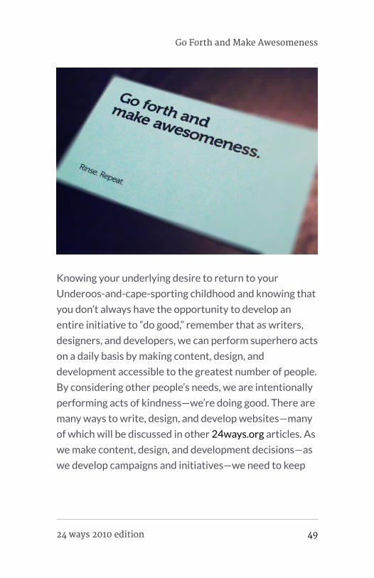
always wanted to be. Go forth and make awesomeness.
If you would like to do good today, support The United
Nations Children’s Fund, an organization that works for
children’s rights, their survival, development and
protection, by purchasing this year’s 24 ways Annual
2010 created by Five Simple Steps. All proceeds go to
UNICEF.
50 24 ways 2010 edition

ABOUT THE AUTHOR
Dr. Leslie Jensen-Inman is co-founder of Centre Centre, a
school creating industry-ready user experience designers.
Leslie combines her 19 years of design practice and eight years
of instructional background to make Center Centre an
extraordinary learning environment.
Leslie creative directed and co-authored the book, InterACT
with Web Standards: A holistic approach to web design. She writes
articles for publications such as A List Apart, The Pastry Box,
Go Forth and Make Awesomeness
24 ways 2010 edition 51

Ladies in Tech, and .net Magazine. She speaks at and keynotes
conferences including Build, Converge, and SXSW. You can
reach Leslie at jenseninman.com and on Twitter @jenseninman.
52 24 ways 2010 edition

Mike Kus 24ways.org/201005
5. Beyond WebMechanics – CreatingMeaningful Web Design
It was just over three years ago when Iembarked on becoming a web designer, andthe first opinion piece about the state of webdesign I came across was a conference talkby Elliot Jay Stocks called ‘Destroy the Web2.0 Look’. Elliot’s presentation was a call toarms, a plea to web designers the world overto stop the endless reproductions of the socalled ‘Web 2.0 look’.
Three and a half years on from Elliot’s talk, what has
changed? Well, from an aesthetic standpoint, not a whole
lot. The Web 2.0 look has evolved, but it’s still with us and
much of the web remains filled with cookie cutter
websites that bear a striking resemblance to one another.
This wouldn’t matter so much if these websites were
selling comparable services or products, but they’re not.
Beyond Web Mechanics – Creating Meaningful Web Design
24 ways 2010 edition 53

They look similar, they follow the same web design trends;
their aesthetic style sends out a very similar message, yet
they’re selling completely different services or products.
How can you be communicating effectively with your
users when your online book store is visually
indistinguishable from an online cosmetic store? This just
doesn’t make sense.
I don’t want to belittle the current version of the Web 2.0
look for the sake of it. I want to talk about the opportunity
we have as web designers to create more meaningful
experiences for the people using our websites. Using
design wisely gives us the ability to communicate
messages, ideas and attitudes that our users will
understand and connect with.
BEING HUMAN
As human beings we respond emotionally to everything
around us – people, objects, posters, packaging or
websites. We also respond in different ways to different
kinds of aesthetic design and style. We care about style
and aesthetics deeply, whether we realise it or not.
Aesthetic design has the power to attract or repel. We
often make decisions based purely on aesthetics and style
– and don’t retailers the world over know it! We connect
attitudes and strongly held beliefs to style. Individuals will
proudly associate themselves with a certain style or
aesthetic because it’s an expression of who they are. You
54 24 ways 2010 edition
know that old phrase, ‘Don’t judge a book by its cover’?
Well, the problem is that people do, so it’s important we
get the cover right.
Much is made of how to structure web pages, how to
create a logical information hierarchy, how to use layout
and typography to clearly communicate with your users.
It’s important, however, not to mistake clarity of
information or legibility with getting your message across.
Few users actually read websites word by word: it’s far
more likely they’ll just scan the page. If the page is copy-
heavy and nothing grabs their attention, they may well
just move on. This is why it’s so important to create a
visual experience that actually means something to the
user.
MEANINGFUL DESIGN
When we view a poster or website, we make split-second
assessments and judgements of what is in front of us. Our
first impressions of what a website does or who it is aimed
at are provoked by the style and aesthetic of the website.
For example, with clever use of colour, typography,
graphic design and imagery we can communicate to users
that an organisation is friendly, edgy, compassionate, fun
or environmentally conscious.
Beyond Web Mechanics – Creating Meaningful Web Design
24 ways 2010 edition 55

Using a certain aesthetic we can convey the personality of
that organisation, target age ranges, different sexes or
cultural groups, communicate brand attributes, and more.
We can make our users feel like they’re part of something
and, perhaps even more importantly, we can make new
users want to be a part of something. And we can achieve
all this before the user has read a single word.
By establishing a website’s aesthetic and creating a
meaningful visual language, a design is no longer just a
random collection of pretty gradients that have been
plucked out of thin air. There can be a logic behind the
design decisions we make. So, before you slap another
generic piece of ribbon or an ultra shiny icon into the top-
left corner of your website, think about why you are doing
it. If you can’t come up with a reason better than “I saw it
on another website”, it’s probably a poor application of
style.
DESIGN AND STYLE
There are a number of reasons why the web suffers from
a lack meaningful design. Firstly, there are too many
preconceptions of what a website should look like. It’s too
easy for designers to borrow styles from other websites,
thereby limiting the range of website designs we see on
the web. Secondly, many web designers think of aesthetic
design as of secondary importance, which shouldn’t be the
case. Designing websites that are accessible and easy to
56 24 ways 2010 edition

use is, of course, very important but this is the very least a
web designer should be delivering. Easy to use websites
should come as standard – it’s equally important to create
meaningful, compelling and beautiful experiences for
everyone who uses our websites. The aesthetics of your
site are part of the design, and to ignore this and play
down the role of aesthetic design is just a wasted
opportunity.
NO COMPROMISE NECESSARY
Easy to use, accessible websites and beautiful, meaningful
aesthetics are not mutually exclusive. The key is to apply
style and aesthetic design appropriately. We need to think
about who and what we’re designing for and ask ourselves
why we’re applying a certain kind of aesthetic style to our
design. If you do this, there’s no reason why effective,
functional design should come at the expense of jaw-
dropping, meaningful aesthetics.
Web designers need to understand the differences
between functional design and aesthetic design but, even
more importantly, they need to know how to make them
work together. It’s combining these elements of design
successfully that makes for the best web design in the
world.
Beyond Web Mechanics – Creating Meaningful Web Design
24 ways 2010 edition 57

ABOUT THE AUTHOR
Mike Kus is a web/graphic designer & illustrator. He’s based in
UK and works for clients worldwide. You can see his work at
mikekus.com.
58 24 ways 2010 edition

Christian Heilmann 24ways.org/201006
6. Wrapping ThingsNicely with HTML5 LocalStorage
HTML5 is here to turn the web from a web ofhacks into a web of applications – and weare well on the way to this goal. The comingyear will be totally and utterly awesome ifyou are excited about web technologies.
This year the HTML5 revolution started and there is no
stopping it. For the first time all the browser vendors are
rallying together to make a technology work. The new
browser war is fought over implementation of the HTML5
standard and not over random additions. We live in
exciting times.
Wrapping Things Nicely with HTML5 Local Storage
24 ways 2010 edition 59

STARTING WITH A BANG
As with every revolution there is a lot of noise with bangs
and explosions, and that’s the stage we’re at right now.
HTML5 showcases are often CSS3 showcases, web font
playgrounds, or video and canvas examples.
This is great, as it gets people excited and it gives the
media something to show. There is much more to HTML5,
though. Let’s take a look at one of the less sexy, but
amazingly useful features of HTML5 (it was in the HTML5
specs, but grew at such an alarming rate that it warranted
its own spec): storing information on the client-side.
WHY STORE DATA ON THE CLIENT-SIDE?
Storing information in people’s browsers affords us a few
options that every application should have:
▪ You can retain the state of an application – when the
user comes back after closing the browser, everything will
be as she left it. That’s how ‘real’ applications work and
this is how the web ones should, too.
▪ You can cache data – if something doesn’t change then
there is no point in loading it over the Internet if local
access is so much faster
▪ You can store user preferences – without needing to
keep that data on your server at all.
In the past, storing local data wasn’t much fun.
60 24 ways 2010 edition
THE PAIN OF HACKY BROWSER SOLUTIONS
In the past, all we had were cookies. I don’t mean the
yummy things you get with your coffee, endorsed by the
blue, furry junkie in Sesame Street, but the other, digital
ones. Cookies suck – it isn’t fun to have an unencrypted
HTTP overhead on every server request for storing four
kilobytes of data in a cryptic format. It was OK for 1994,
but really neither an easy nor a beautiful solution for the
task of storing data on the client.
Then came a plethora of solutions by different vendors –
from Microsoft’s userdata to Flash’s LSO, and from
Silverlight isolated storage to Google’s Gears. If you want
to know just how many crazy and convoluted ways there
are to store a bit of information, check out Samy’s
evercookie.
Clearly, we needed an easier and standardised way of
storing local data.
KEEPING IT SIMPLE – LOCAL STORAGE
And, lo and behold, we have one. The local storage API (or
session storage, with the only difference being that
session data is lost when the window is closed) is
ridiculously easy to use. All you do is call a few methods
on the window.localStorage object – or even just set the
properties directly using the square bracket notation:
Wrapping Things Nicely with HTML5 Local Storage
24 ways 2010 edition 61

if('localStorage' in window && window['localStorage']
!== null){
var store = window.localStorage;
// valid, API way
store.setItem('cow','moo');
console.log(
store.getItem('cow')
); // => 'moo'
// shorthand, breaks at keys with spaces
store.sheep = 'baa'
console.log(
store.sheep
); // 'baa'
// shorthand for all
store['dog'] = 'bark'
console.log(
store['dog']
); // => 'bark'
}
Browser support is actually pretty good: Chrome 4+;
Firefox 3.5+; IE8+; Opera 10.5+; Safari 4+; plus iPhone
2.0+; and Android 2.0+. That should cover most of your
needs. Of course, you should check for support first (or
use a wrapper library like YUI Storage Utility or YUI
Storage Lite).
The data is stored on a per domain basis and you can store
up to five megabytes of data in localStorage for each
domain.
62 24 ways 2010 edition

STRINGS ATTACHED
By default, localStorage only supports strings as storage
formats. You can’t store results of JavaScript
computations that are arrays or objects, and every
number is stored as a string. This means that long, floating
point numbers eat into the available memory much more
quickly than if they were stored as numbers.
var cowdesc = "the cow is of the bovine ilk, "+
"one end is for the moo, the "+
"other for the milk";
var cowdef = {
"ilk":"bovine",
"legs":4,
"udders":4,
"purposes":{
"front":"moo",
"end":"milk"
}
};
window.localStorage.setItem('describecow',cowdesc);
console.log(
window.localStorage.getItem('describecow')
); // => the cow is of the bovine...
window.localStorage.setItem('definecow',cowdef);
console.log(
window.localStorage.getItem('definecow')
); // => [object Object] = bad!
This limits what you can store quite heavily, which is why
it makes sense to use JSON to encode and decode the
data you store:
Wrapping Things Nicely with HTML5 Local Storage
24 ways 2010 edition 63

var cowdef = {
"ilk":"bovine",
"legs":4,
"udders":4,
"purposes":{
"front":"moo",
"end":"milk"
}
};
window.localStorage.setItem('describecow',JSON.stringify(cowdef));
console.log(
JSON.parse(
window.localStorage.getItem('describecow')
)
); // => Object { ilk="bovine", more...}
You can also come up with your own formatting solutions
like CSV, or pipe | or tilde ~ separated formats, but JSON
is very terse and has native browser support.
SOME USE CASE EXAMPLES
The simplest use of localStorage is, of course, storing
some data: the current state of a game; how far through a
multi-form sign-up process a user is; and other things we
traditionally stored in cookies. Using JSON, though, we
can do cooler things.
64 24 ways 2010 edition

Speeding up web service use and avoiding exceeding thequota
A lot of web services only allow you a certain amount of
hits per hour or day, and can be very slow. By using
localStorage with a time stamp, you can cache results of
web services locally and only access them after a certain
time to refresh the data.
I used this technique in my An Event Apart 10K entry,
World Info, to only load the massive dataset of all the
world information once, and allow for much faster
subsequent visits to the site. The following screencast
shows the difference:
For use with YQL (remember last year’s 24 ways entry?),
I’ve built a small script called YQL localcache that wraps
localStorage around the YQL data call. An example
would be the following:
yqlcache.get({
yql: 'select * from flickr.photos.search where
text="santa"',
id: 'myphotos',
cacheage: ( 60*60*1000 ),
callback: function(data) {
console.log(data);
}
});
Wrapping Things Nicely with HTML5 Local Storage
24 ways 2010 edition 65

This loads photos of Santa from Flickr and stores them for
an hour in the key myphotos of localStorage. If you call
the function at various times, you receive an object back
with the YQL results in a data property and a type
property which defines where the data came from – live
is live data, cached means it comes from cache, and
freshcache indicates that it was called for the first time
and a new cache was primed. The cache will work for an
hour (60×60×1,000 milliseconds) and then be refreshed.
So, instead of hitting the YQL endpoint over and over
again, you hit it once per hour.
Caching a full interface
Another use case I found was to retain the state of a
whole interface of an application by caching the
innerHTML once it has been rendered. I use this in the
Yahoo Firehose search interface, and you can get the full
story about local storage and how it is used in this
screencast:
The stripped down code is incredibly simple (JavaScript
with PHP embed):
// test for localStorage support
if(('localStorage' in window) && window['localStorage']
!== null){
var f = document.getElementById('mainform');
// test with PHP if the form was sent (the submit button
has the name "sent")
66 24 ways 2010 edition

<?php if(isset($_POST['sent']))){?>
// get the HTML of the form and cache it in the
property "state"
localStorage.setItem('state',f.innerHTML);
// if the form hasn't been sent...
<?php }else{ ?>
// check if a state property exists and write back the
HTML cache
if('state' in localStorage){
f.innerHTML = localStorage.getItem('state');
}
<?php } ?>
}
Other ideas
In essence, you can use local storage every time you need
to speed up access. For example, you could store image
sprites in base-64 encoded datasets instead of loading
them from a server. Or you could store CSS and
JavaScript libraries on the client. Anything goes – have a
play.
ISSUES WITH LOCAL AND SESSION STORAGE
Of course, not all is rainbows and unicorns with the
localStorage API. There are a few niggles that need
ironing out. As with anything, this needs people to use the
technology and raise issues. Here are some of the
problems:
Wrapping Things Nicely with HTML5 Local Storage
24 ways 2010 edition 67

▪ Inadequate information about storage quota – if you
try to add more content to an already full store, you get a
QUOTA_EXCEEDED_ERR and that’s it. There’s a great
explanation and test suite for localStorage quota
available.
▪ Lack of automatically expiring storage – a feature that
cookies came with. Pamela Fox has a solution (also
available as a demo and source code)
▪ Lack of encrypted storage – right now, everything is
stored in readable strings in the browser.
BIGGER, BETTER, FASTER, MORE!
As cool as the local and session storage APIs are, they are
not quite ready for extensive adoption – the storage limits
might get in your way, and if you really want to go to town
with accessing, filtering and sorting data, real databases
are what you’ll need. And, as we live in a world of client-
side development, people are moving from heavy server-
side databases like MySQL to NoSQL environments.
On the web, there is also a lot of work going on, with Ian
Hickson of Google proposing the Web SQL database, and
Nikunj Mehta, Jonas Sicking (Mozilla), Eliot Graff
(Microsoft) and Andrei Popescu (Google) taking the idea
beyond simply replicating MySQL and instead offering
Indexed DB as an even faster alternative.
68 24 ways 2010 edition

On the mobile front, a really important feature is to be
able to store data to use when you are offline (mobile
coverage and roaming data plans anybody?) and you can
use the Offline Webapps API for that.
As I mentioned at the beginning, we have a very exciting
time ahead – let’s make this web work faster and more
reliably by using what browsers offer us. For more on
local storage, check out the chapter on Dive into HTML5.
ABOUT THE AUTHOR
Wrapping Things Nicely with HTML5 Local Storage
24 ways 2010 edition 69

Christian Heilmann grew up in Germany and, after a year
working for the red cross, spent a year as a radio producer.
From 1997 onwards he worked for several agencies in Munich
as a web developer. In 2000 he moved to the States to work for
Etoys and, after the .com crash, he moved to the UK where he
lead the web development department at Agilisys. In April 2006
he joined Yahoo! UK as a web developer and moved on to be the
Lead Developer Evangelist for the Yahoo Developer Network.
In December 2010 he moved on to Mozilla as Principal
Developer Evangelist for HTML5 and the Open Web. He
publishes an almost daily blog at http://wait-till-i.com and runs
an article repository at http://icant.co.uk. He also authored
Beginning JavaScript with DOM Scripting and Ajax: From
Novice to Professional.
70 24 ways 2010 edition

Drew Neil 24ways.org/201007
7. Golden Spirals
As building blocks go, the rectangle is notone to overwhelm the designer withdecisions. On the face of it, you have twooptions: you can set the width, and theheight. But despite this apparent simplicity,there are combinations of width and heightthat can look unbalanced. If a rectangle istoo tall and slim, it might appear precarious.If it is not tall enough, it may simply lookflat. But like a guitar string that’s out oftune, you can tweak the proportions little bylittle until a rectangle feels, as Goldilockssaid, just right.
A golden rectangle has its height and width in the golden
ratio, which is approximately 1:1.618. These proportions
have long been recognised as being aesthetically
harmonious. Whether through instruction or by intuition,
artists have understood how to exploit these proportions
Golden Spirals
24 ways 2010 edition 71

over the centuries. Examples can be found in classical
architecture, medieval book construction, and even in the
recent #newtwitter redesign.
A MATHEMATICAL CURIOSITY
The golden rectangle is unique, in that if you remove a
square section from it, what is left behind is itself a golden
rectangle. The removal of a square can be repeated on the
rectangle that is left behind, and then repeated again, as
many times as you like. This means that the golden
rectangle can be treated as a building block for recursive
patterns. In this article, we will exploit this property to
build a golden spiral, using only HTML and CSS.
72 24 ways 2010 edition

THE MARKUP
The HTML we’ll use for this study is simply a series of
nested <div>s.
<body>
<div id="container">
<div class="cycle">
<div>
<div>
<div>
<div class="cycle">
<div>
<div>
<div>
<div class="cycle">
<div>
<div>
<div>
<div class="cycle"></div>
</div>
</div>
</div>
</div>
</div>
</div>
</div>
</div>
</div>
</div>
</div>
</div>
</div>
</body>
Golden Spirals
24 ways 2010 edition 73

The first of these has the class cycle, and so does every
fourth ancestor thereafter. The spiral completes a cycle
every four steps, so this class allows styles to be reused on
<div>s that appear at the same position in each cycle.
GOLDEN PROPORTIONS
To create our spiral we are going to exploit the unique
properties of the golden rectangle, so our first priority is
to ensure that we have a golden rectangle to begin with. If
we pick a length for the short edge – say, 288 pixels – we
can then calculate the length of the long edge by
multiplying this value by 1.618. In this case,
288 × 1.618 = 466, so our starting point will be a <div>
with these properties:
#container > div {
width: 466px;
height: 288px;
}
The greater than symbol is used here to single out the
immediate child of the #container element, without
affecting the grandchild or any of the more distant
descendants.
We could go on to specify the precise pixel dimensions of
every child element, but that means doing a lot of sums. It
would be much easier if we just specified the dimensions
for each element as a percentage of the width and height
74 24 ways 2010 edition

of its parent. This also has the advantage that if you
change the size of the outermost container, all nested
elements would be resized automatically – something
that we shall exploit later.
The approximate value of 38.2% can be derived from
(100 × 1 − phi) ÷ phi, where the Greek letter phi (ϕ) stands
for the golden ratio. The value of phi can be expressed as
phi = (1 + √5 ) ÷ 2, which is approximately 1.618. You don’t
have to understand the derivation to use it. Just
remember that if you start with a golden rectangle, you
can slice 38.2% from it to create a new golden rectangle.
This can be expressed in CSS quite simply:
Golden Spirals
24 ways 2010 edition 75

.cycle,
.cycle > div > div {
height: 38.2%;
width: 100%;
}
.cycle > div,
.cycle > div > div > div {
width: 38.2%;
height: 100%;
}
You can see the result so far by visiting Demo One. With
no borders or shading, there is nothing to see yet, so let’s
address that next.
SHADING WITH TRANSPARENCY
We’ll need to apply some shading to distinguish each
segment of the spiral from its neighbours. We could start
with a white background, then progress through shades of
grey: #eee, #ddd, #ccc and so on, but this means hard-
coding the background-color for every element. A more
elegant solution would be to use the same colour for
every element, but to make each one slightly transparent.
The nested <div>s that we are working with could be
compared to layers in Photoshop. By applying a semi-
transparent shade of grey, each successive layer can build
on top of the darker layers beneath it. The effect
accumulates, causing each successive layer to appear
slightly darker than the last. In his 2009 article for 24
76 24 ways 2010 edition

ways, Drew McLellan showed how to create a semi-
transparent effect by working with RGBA colour. Here,
we’ll use the colour black with an alpha value of 0.07.
#container div { background-color: rgba(0,0,0,0.07) }
Note that I haven’t used the immediate child selector
here, which means that this rule will apply to all <div>
elements inside the #container, no matter how deeply
nested they are. You can view the result in Demo Two. As
you can see, the golden rectangles alternate between
landscape and portrait orientation.
Demo Three).
CSS3 specification indicates that a percentage can be
used to set the border-radius property, but using
percentages does not achieve consistent results in
browsers today. Luckily, if you specify a border-radius in
pixels using a value that is greater than the width and
height of the element, then the resulting curve will use the
shorter length side as its radius. This produces exactly the
effect that we want, so we’ll use an arbitrarily high value
of 10,000 pixels for each border-radius:
.cycle {
border-radius: 0px;
border-bottom-left-radius: 10000px;
}
.cycle > div {
Golden Spirals
24 ways 2010 edition 77
border-radius: 0px;
border-bottom-right-radius: 10000px;
}
.cycle > div > div {
border-radius: 0px;
border-top-right-radius: 10000px;
}
.cycle > div > div > div {
border-radius: 0px;
border-top-left-radius: 10000px;
}
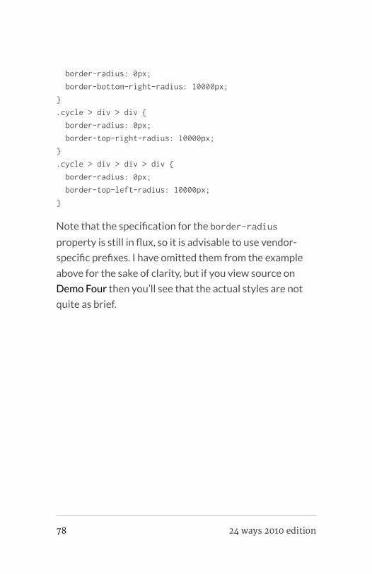
Note that the specification for the border-radius
property is still in flux, so it is advisable to use vendor-
specific prefixes. I have omitted them from the example
above for the sake of clarity, but if you view source on
Demo Four then you’ll see that the actual styles are not
quite as brief.
78 24 ways 2010 edition

FILLING THE AVAILABLE SPACE
We have created an approximation of the Golden Spiral
using only HTML and CSS. Neat! It’s a shame that it
occupies just a fraction of the available space. As a
finishing touch, let’s make the golden spiral expand or
contract to use the full space available to it.
Ideally, the outermost container should use the full
available width or height that could accomodate a
rectangle of golden proportions. This behaviour is
available for background images using the “ background-
size: contain; property, but I know of no way to make
block level HTML elements behave in this fashion (if I’m
Golden Spirals
24 ways 2010 edition 79

missing something, please enlighten me). Where CSS fails
to deliver, JavaScript can usually provide a workaround.
This snippet requires jQuery:
$(document).ready(function() {
var phi = (1 + Math.sqrt(5))/2;
$(window).resize(function() { var goldenWidth =
windowWidth = $(this).width(), goldenHeight =
windowHeight = $(this).height();
if (windowWidth/windowHeight > phi) { // panoramic
viewport – use full height goldenWidth = windowHeight *
phi; } else { // portrait viewport – use full width
goldenHeight = windowWidth / phi; };
$("#container > div.cycle") .width(goldenWidth)
.height(goldenHeight);
}).resize();
});
You can view the result by visiting Demo Five.
80 24 ways 2010 edition

Is it just me, or can you see an elephant in there?
You can probably think of many ways to enhance this
further, but for this study we’ll leave it there. It has been a
good excuse to play with proportions, positioning and the
immediate child selector, as well as new CSS3 features
such as border-radius and RGBA colours. If you are not
already designing with golden proportions, then perhaps
this will inspire you to begin.
Golden Spirals
24 ways 2010 edition 81

ABOUT THE AUTHOR
Drew Neil is an independent web developer and screencast
producer. As well as loving all things web, he is totally nerdy
about his text editor. He runs the Vimcasts podcast, where he
publishes free instructional videos about Vim, and he is
currently writing a title for the Pragmatic Programmers,
Practical Vim, which will be published in 2011. He says that
“Vim’s documentation reads like a dictionary; I propose to write
a phrasebook.”
Drew calls Edinburgh home, but is currently working abroad.
He enjoys speaking in public, and would love to talk at your local
conference, user group or ignite session if you’ll have him. You
can follow him on his travels on Twitter under his moniker
@nelstrom. If you share in his fascination for collective nouns,
then you should check out his collection at All-Sorts.org.
82 24 ways 2010 edition

Scott Schiller 24ways.org/201008
8. “Probably, Maybe, No”:The State of HTML5Audio
With the hype
around HTML5 and
CSS3 exceeding
levels not seen
since 2005’s Ajax
era, it’s worth
noting that the
excitement comes
with good reason:
the two
specifications
render many years of feature hacks redundant by
replacing them with native features. For fun, consider
how many CSS2-based rounded corners hacks you’ve
“Probably, Maybe, No”: The State of HTML5 Audio
24 ways 2010 edition 83

probably glossed over, looking for a magic solution. These
days, with CSS3, the magic is border-radius (and perhaps
some vendor prefixes) followed by a coffee break.
CSS3’s border-radius, box-shadow, text-shadow and
gradients, and HTML5’s <canvas>, <audio> and <video>
are some of the most anticipated features we’ll see put to
creative (ab)use as adoption of the ‘new shiny’ grows.
Developers jumping on the cutting edge are using subsets
of these features to little detriment, in most cases. The
more popular CSS features are design flourishes that can
degrade nicely, but the current audio and video
implementations in particular suffer from a number of
annoyances.
THE NEW SHINY: HOW WE GOT HERE
Sound involves one of the five senses, a key part of daily
life for most – and yet it has been strangely absent from
HTML and much of the web by default. From a simplistic
perspective, it seems odd that HTML did not include
support for the full multimedia experience earlier, despite
the CD-ROM-based craze of the early 1990s. In truth,
standards like HTML can take much longer to bake, but
eventually deliver the promise of a lowered barrier to
entry, consistent implementations and shiny new features
now possible ‘for free’ just about everywhere.
84 24 ways 2010 edition

<img> was introduced early and naturally to HTML,
despite having some opponents at the time. Perhaps
<audio> and <video> were avoided, given the added
technical complexity of decoding various multi-frame
formats, plus the hardware and bandwidth limitations of
the era. Perhaps there were quarrels about choosing a
standard format or – more simply – maybe these
elements just weren’t considered to be applicable to the
HTML-based web at the time. In any event, browser
plugins from programs like RealPlayer and QuickTime
eventually helped to fill the in-page audio/video gap,
handling <object> and <embed> markup which pointed to
.wav, .avi, .rm or .mov files. Suffice it to say, the experience
was inconsistent at best and, on the standards side of the
fence right now, so is HTML5 in terms of audio and video.
As far as HTML goes, the code for <audio> is simple and
logical. Just as with <img>, a src attribute specifies the file
to load. Pretty straightforward – sounds easy, right?
<audio src="mysong.ogg" controls>
<!-- alternate content for unsupported case -->
Download <a href="mysong.ogg">mysong.ogg</a>;
</audio>
Ah, if only it were that simple. The first problem is that the
OGG audio format, while ‘free’, is not supported by some
browsers. Conversely, nor is MP3, despite being a de facto
standard used in all kinds of desktop software (and
“Probably, Maybe, No”: The State of HTML5 Audio
24 ways 2010 edition 85
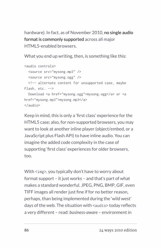
hardware). In fact, as of November 2010, no single audio
format is commonly supported across all major
HTML5-enabled browsers.
What you end up writing, then, is something like this:
<audio controls>
<source src="mysong.mp3" />
<source src="mysong.ogg" />
<!-- alternate content for unsupported case, maybe
Flash, etc. -->
Download <a href="mysong.ogg">mysong.ogg</a> or <a
href="mysong.mp3">mysong.mp3</a>
</audio>
Keep in mind, this is only a ‘first class’ experience for the
HTML5 case; also, for non-supported browsers, you may
want to look at another inline player (object/embed, or a
JavaScript plus Flash API) to have inline audio. You can
imagine the added code complexity in the case of
supporting ‘first class’ experiences for older browsers,
too.
With <img>, you typically don’t have to worry about
format support – it just works – and that’s part of what
makes a standard wonderful. JPEG, PNG, BMP, GIF, even
TIFF images all render just fine if for no better reason,
perhaps, than being implemented during the ‘wild west’
days of the web. The situation with <audio> today reflects
a very different – read: business-aware – environment in
86 24 ways 2010 edition

2010. (Further subtext: There’s a lot of [potential] money
involved.) Regrettably, this is a collision of free and
commercial interests, where the casualty is ultimately the
user. Second up in the casualty list is you, the developer,
who has to write additional code around this fragmented
support.
The HTML5 audio API as implemented in JavaScript has
one of the most un-computer-like responses I’ve ever
seen, and inspired the title of this post. Calling new
Audio().canPlayType('audio/mp3'), which queries the
system for format support according to a MIME type, is
supposed to return one of “probably”, “maybe”, or “no”.
Sometimes, you’ll just get a null or empty string, which is
also fun. A “maybe” response does not guarantee that a
format will be supported; sometimes audio/mp3 gives
“maybe,” but then audio/mpeg; codecs="mp3" will give a
more-solid “probably” response. This can vary by browser
or platform, too, depending on native support – and
finally, the user may also be able to install codecs,
extending support to include other formats. (Are you
excited yet?)
DAMN YOU, WARRING FORMATS!
New market and business opportunities go hand-in-hand
with technology developments. What we have here is
certainly not failure to communicate; rather, we have
competing parties shouting loudly in public in attempts to
“Probably, Maybe, No”: The State of HTML5 Audio
24 ways 2010 edition 87

influence mindshare towards a de facto standard for
audio and video. Unfortunately, the current situation
means that at least two formats are effectively required
to serve the majority of users correctly.
As it currently stands, we have the free and open source
software camp of OGG Vorbis/WebM and its proponents
(notably, Mozilla, Google and Opera in terms of browser
makers), up against the non-free, proprietary and ‘closed’
camp of MP3 and MPEG4/HE-AAC/H.264 – which is
where you’ll find commitments from Apple and Microsoft,
among others. Apple is likely in with H.264 for the long
haul, given its use of the format for its iTunes music store
and video offerings.
It is generally held that H.264 is a technically superior
format in terms of file size versus quality, but it involves
intellectual property and, in many use cases, requires
licensing fees. To be fair, there is a business model with
H.264 and much has been invested in its development,
but this approach is not often the kind that wins over the
web. On that front, OGG/WebM may eventually win for
being a ‘free’ format that does not involve a licensing
scheme.
Closed software and tools ideologically clash with the
open nature of the web, which exists largely thanks to
free and open technology. Because of philosophical and
business reasons, support for audio and video is
88 24 ways 2010 edition

fragmented across browsers adopting HTML5 features. It
does not help that a large amount of audio and video
currently exists in non-free MP3 and MPEG-4 formats.
Adoption of <audio> and <video> may be slowed, since it
is more complex than <img> and may feel ‘broken’ to
developers when edge cases are encountered.
Furthermore, the HTML5 spec does not mandate a single
required format. The end result is that, as a developer, you
must currently provide at least both MP3 and OGG, for
example, to serve most existing HTML5-based user
agents.
TRANSITIONING TO
There will be some growing pains as
developers start to pick up the new
HTML5 shiny, while balancing the needs of current and
older agents that don’t support either <audio> or the
preferred format you may choose (for example, MP3). In
either event, Flash or other plugins can be used as done
traditionally within HTML4 documents to embed and play
the relevant audio.
Ideally,
HTML5 audio should be used whenever possible with
Flash as the backup option. A few JavaScript/Flash-based
audio player projects exist which balance the two; in
“Probably, Maybe, No”: The State of HTML5 Audio
24 ways 2010 edition 89

attempting to tackle this problem, I develop and maintain
SoundManager 2, a JavaScript sound API which
transparently uses HTML5 Audio() and, if needed, Flash
for playing audio files. The internals can get somewhat
ugly, but the transition between HTML4 and HTML5 is
going to be just that – and even with HTML5, you will
need some form of format fall-back in addition to graceful
degradation.
It may be safest to fall back to MP3/MP4 formats for
inline playback at this time, given wide support via Flash,
some HTML5-based browsers and mobile devices.
Considering the amount of MP3/MP4 media currently
available, it is wiser to try these before falling through to a
traditional file download process.
EARLY FINDINGS
Here is a brief list of behavioural notes, annoyances, bugs,
quirks and general weirdness I have found while playing
with HTML5-based audio at time of writing (November
2010):
Apple iPad/iPhone (iOS 4, iPad 3.2+)
▪ Only one sound can be played at a time. If a second
sound starts, the first is stopped.
90 24 ways 2010 edition

▪ No auto-play allowed. Sounds follow the pop-up
window security model and can only be started from
within a user event handler such as onclick/touch, and so
on. Otherwise, playback attempts silently fail.
▪ Once started, a sequence of sounds can be created or
played via the ‘finish’ event of the previous sound (for
example, advancing through a playlist without interaction
after first track starts).
▪ iPad, iOS 3.2: Occasional ‘infinite loop’ bug seen where
audio does not complete and stop at a sound’s logical end
– instead, it plays again from the beginning. Might be
specific to example file format (HE-AAC) encoded from
iTunes.
Apple Safari, OS X Snow Leopard 10.6.5
▪ Critical bug: Safari 4 and 5 intermittently fail to load or
play HTML5 audio on Snow Leopard due to bug(s) in
QuickTime X and/or other underlying frameworks.
Known Apple ‘radar’ bug: bugs.webkit.org #32159 (see
also, test case.) Amusing side note: Safari on Windows is
fine.
Apple Safari, Windows
▪ Food for thought: if you download “Safari” alone on
Windows, you will not get HTML5 audio/video support
(tested in WinXP). You need to download “Safari +
“Probably, Maybe, No”: The State of HTML5 Audio
24 ways 2010 edition 91

QuickTime” to get HTML5 audio/video support within
Safari. (As far as I’m aware, Chrome, Firefox and Opera
either include decoders or use system libraries
accordingly. Presumably IE 9 will use OS-level APIs.)
General Quirks
▪ Seeking and loading, ‘progress’ events, and calculating
bytes loaded versus bytes total should not be expected to
be linear, as users can arbitrarily seek within a sound. It
appears that some support for HTTP ranges exists, which
adds a bit of logic to UI code. Browsers seem to vary
slightly in their current implementations of these
features.
▪ The onload event of a sound may be of little relevance,
if non-linear loading is involved (see above note re:
seeking).
▪ Interestingly (perhaps I missed it), the current spec
does not seem to specify a panning or left/right channel
mix option.
▪ The preload attribute values may vary slightly between
browsers at this time.
UPCOMING SHINY: HTML5 AUDIO DATA API
The HTML5 audio spec does a good job covering the
basics of playback, but did not initially get into
manipulation or generation of audio on-the-fly, something
92 24 ways 2010 edition

Flash has had for a number of years now. What if
JavaScript could create, monitor and change audio
dynamically, like a sort of audio <canvas> element? With
that kind of capability, many dynamic audio processing
features become feasible and, when combined with other
media, can make for some impressive demos.
What started as a small idea among a small group of audio
and programming enthusiasts grew to inspire a W3C
audio incubator group, and continued to establish the
Mozilla Audio Data API. Contributors wrote a patch for
Firefox which was reviewed and revised, and is now slated
to be in the public release of Firefox 4. Some background
and demos are also detailed in an article from the BBC
R&D blog.
There are plenty of live demos to see, which give an
impression of the new creative ideas this API enables.
Many concepts are not new in themselves, but it is
exciting to see this sort of thing happening within the
native browser context.
Mozilla is not alone in this effort; the WebKit folks are
also working on a JavaScriptAudioNode interface, which
implements similar audio buffering and sample elements.
“Probably, Maybe, No”: The State of HTML5 Audio
24 ways 2010 edition 93

THE FUTURE?
It is my hope that we’ll see a common format emerge in
terms of support across the major browsers for both
audio and video; otherwise, support will continue to be
fragmented and mildly frustrating to develop for, and that
can impede growth of the feature. It’s a big call, but if
<img> had lacked a common format back in the wild west
era, I doubt the web would have grown to where it is
today.
Complaints and nitpicks aside, HTML5 brings excellent
progress on the browser multimedia front, and the first
signs of native support are a welcome improvement given
all audio and video previously relied on plugins. There is
good reason to be excited. While there is room for more,
support could certainly be much worse – and as tends to
happen with specifications, the implementations
targeting them should improve over time.
Note: Thanks to Nate Koechley, who suggested the
Audio().canPlayType() response be part of the article title.
94 24 ways 2010 edition

ABOUT THE AUTHOR
Scott Schiller has been enjoying building web things since 1995.
He also has a fondness for Creedence and the occasional White
Russian.
Scott’s personal site is probably best known for its DHTML
Arkanoid remake (2002), Snowstorm and holiday christmas
light-smashing distractions and other random JavaScript + CSS-
based experiments.
In his spare time, Scott tinkers with side projects like
SoundManager 2, a JavaScript sound API used by some nifty
sites to drive audio features. By day, he works for Yahoo!
building shiny things at Flickr.
“Probably, Maybe, No”: The State of HTML5 Audio
24 ways 2010 edition 95

Hannah Donovan 24ways.org/201009
9. Extreme Design
Recently, I set out with twelve otherdesigners and developers for a 19th centuryfortress on the Channel Island of Alderney.We were going to /dev/fort, a sort of bandcamp for geeks. Our cohort’s mission: tothink up, build and finish something –without readily available internet access.
Alderney runway, photo by Chris Govias
96 24 ways 2010 edition

Wait, no internet?
Well, pretty much. As the creators of /dev/fort James
Aylett and Mark Norman Francis put it: “Imagine a place
with no distractions – no IM, no Twitter”. But also no way
to quickly look up a design pattern, code sample or source
material. Like packing for camping, /dev/fort means
bringing everything you’ll need on your back or your hard
drive: from long johns to your favourite icon set.
We got to work the first night discussing ideas for what
we wanted to build. By the time breakfast was cleared up
the next morning, we’d settled on Russ’s idea to make the
Apollo 13 (PDF) transcript accessible. Days two and three
were spent collaboratively planning (KJ style) what
features we wanted to build, and unravelling the larger
UX challenges of the project. The next five days were
spent building it. Within 36 hours of touchdown at
Southampton Airport, we launched our creation:
spacelog.org
The weather was cold, the coal fire less than ideal, food
and supplies a hike away, and the process lightning-fast. A
week of designing under extreme circumstances called for
an extreme process. Some of this was driven by James’s
and Norm’s experience running these things, but a lot of it
materialised while we were there – especially for our
Extreme Design
24 ways 2010 edition 97

three-strong design team (myself, Gavin O’ Carroll and
Chris Govias) who, though we knew each other, had never
worked together as a group in this kind of scenario before.
The outcome was a pretty spectacular process, with a
some key takeaways useful for any small group trying to
build something quickly.
What it’s like inside the fort
/dev/fort has the pressure and pace of a hack day without
being a hack day – primarily, no workshops or
interruptions‚ but also a different mentality. While hack
days are typically developer-driven with a ‘hack first,
design later (if at all)’ attitude, James was quick to tell the
team to hold off from writing any code until we had a plan.
This put a healthy pressure on the design and product
folks to slash through the UX problems before we started
building.
While the fort had definitely more of a hack day feel, all of
us were familiar with Agile methods, so we borrowed a
few useful techniques such as morning stand-ups and an
emphasis on teamwork. We cut some really good features
to make our launch date, and chunked the work based on
user goals, iterating as we went.
98 24 ways 2010 edition

What made this design process work?
A GOLDEN RATIO OF TEAMS
My personal experience both professionally and in free-
form situations like this, is a tendency to get/hire a
designer. Leaders of businesses, founders of start-ups,
organisers of events: one designer is not enough! Finding
one ace-blooded designer who can ‘do everything’ will
always result in bottleneck and burnout. Like the nuances
between different development languages, design is a
multifaceted discipline, and very few can claim to be
equally strong in every aspect. Overlap in skill set will
result in a stronger, more robust interface.
More importantly, however, having lots of designers to go
around meant that we all had the opportunity to pair with
developers, polishing the details that don’t usually get
polished. As soon as we launched, the public reception of
the design and UX was overwhelmingly positive (proof!).
But also, a lot of people asked us who the designer was,
attributing it to one person.
While it’s important to note that everyone in our team
was multitalented (and could easily shift between roles,
helping us all stay unblocked), the golden ratio James and
Norm devised was two product/developer folks, three
interaction designers and eight developers.
Extreme Design
24 ways 2010 edition 99

photo by Ben Firshman
EQUALITY INSIDE THE FORTRESS WALLS
Something magical about the fort is how everyone leaves
the outside world on the drawbridge. Job titles,
professional status, Twitter followers, and so on. Like
scout camp, a mutual respect and trust is expected of all
the participants. Like extreme programming, extreme
design requires us all to be equal partners in a
collaborative team. I think this is especially worth noting
for designers; our past is filled with the clear hierarchy of
the traditional studio system which, however important
for taste and style, seems less compatible with modern
web/software development methods.
100 24 ways 2010 edition

Being equal doesn’t mean being the same, however. We
established clear roles and teams for ourselves on the
second day, deferring to that person when a decision
needed to be made. As the interface coalesced, the
designers and developers took ownership over certain
parts to ensure the details got looked after, while staying
open to ideas and revisions from the rest of the cohort.
Create a space where everyone who enters is equal, but
be sure to establish clear roles. Even if it’s just for a short
while, the environment will be beneficial.
photo by Ben Firshman
Extreme Design
24 ways 2010 edition 101

HANG YOUR HERALDRY FROM THE RAFTERS
Forts and castles are full of lore: coats of arms; paintings
of battles; suits of armour. It’s impossible not to be
surrounded by these stories, words and ways of thinking.
Like the whiteboards on the walls, putting organisational
lore in your physical surroundings makes it impossible not
to see.
Ryan Alexander brought some of those static-cling
whiteboard sheets which were quickly filled with use
cases; IA; team roles; and, most importantly, a glossary. As
soon as we started working on the project, we realised we
needed to get clear on what certain words meant: what
was a logline, a range, a phase, a key moment? Were the
back-end people using these words in the same way
design and product was? Quickly writing up a glossary of
terms meant everyone was instantly speaking the same
language. There was no “Ah, I misunderstood because in
the data structure x means y” or, even worse, accidental
seepage of technical language into the user interface
copy.
Put a glossary of your internal terminology somewhere
big and fat on the wall. Stand around it and argue until you
agree on what it says. Leave it up; don’t underestimate the
power of ambient communication and physical reference.
102 24 ways 2010 edition

PLAN MORE, DOWNLOAD LESS
While internet is forbidden inside the fort, we did go on
downloading expeditions: NASA photography; code
documentation; and so on. The project wouldn’t have
been possible without a few trips to the web. We had two
lists on the wall: groceries and supplies; internets – “loo
roll; Tom Stafford photo“.
This changed our usual design process, forcing us to plan
carefully and think of what we needed ahead of time.
Getting to the internet was a thirty-minute hike up a snow
covered cliff to the town airport, so you really had to need
it, too.
Extreme Design
24 ways 2010 edition 103

The path to the internet
For the visual design, especially, this resulted in more
focus up front, and communication between the designers
on what assets we required. It made us make decisions
earlier and stick with them, creating less distraction and
churn later in the process.
Try it at home: unplug once you’ve got the things you
need. As an artist, it’s easier to let your inner voice shine
through if you’re not looking at other people’s work while
creating.
SOCIAL DESIGN
Finally, our design team experimented with a
collaborative approach to wireframing. Once we had
collectively nailed down use cases, IA, user journeys and
other critical artefacts, we tried a pairing approach. One
person drew in Illustrator in real time as the other two
articulated what to draw. (This would work equally well
with two people, but with three it meant that one of us
could jump up and consult the lore on the walls or clarify a
technical detail.) The result: we ended up considering
more alternatives and quickly rallying around one
solution, and resolved difficult problems more quickly.
104 24 ways 2010 edition

At a certain stage we discovered it was more efficient for
one person to take over – this happened around the time
when the basic wireframes existed in Illustrator and we’d
collectively run through the use cases, making sure that
everything was accounted for in a broad sense. At this
point, take a break, go have a beer, and give yourself a pat
on the back.
Put the files somewhere accessible so everyone can use
them as their base, and divide up the more detailed UI
problems, screens or journeys. At this level of detail it’s
better to have your personal headspace.
Gavin called this ‘social design’. Chatting and drawing in
real time turned what was normally a rather solitary act
into a very social process, with some really promising
results. I’d tried something like this before with product or
developer folks, and it can work – but there’s something
really beautiful about switching places and everyone
involved being equally quick at drawing. That’s not
something you get with non-designers, and frequent
swapping of the ‘driver’ and ‘observer’ roles is a key aspect
to pairing.
Tackle the forest collectively and the trees individually – it
will make your framework more robust and your details
more polished. Win/win.
Extreme Design
24 ways 2010 edition 105

The return home
Grateful to see a 3G signal on our phones again, our flight
off the island was delayed, allowing for a flurry of domain
name look-ups, Twitter catch-up, and e-mails to loved
ones. A week in an isolated fort really made me appreciate
continuous connectivity, but also just how unique some of
these processes might be.
You just never know what crazy place you might be
designing from next.
ABOUT THE AUTHOR
106 24 ways 2010 edition

Originally from Canada’s icy north, Hannah Donovan is creative
director at Last.fm, where she’s worked for the last four years.
Before moving to London to work at Last.HQ, she designed
websites with Canada’s largest youth-focused agency working
on brands such as Hershey, Heineken and Bic. Previous to that,
Hannah designed for Street Print, a Canada Research Council
funded, open source web app for sharing and archiving printed
ephemera. Hannah also plays the cello with an orchestra and
draws monsters.
Extreme Design
24 ways 2010 edition 107

Veerle Pieters 24ways.org/201010
10. Optimize Your WebDesign Workflow
I’m not sure about you, but I still favourusing Photoshop to create my designs forthe web. I agree that this application, evenwith its never-ending feature set, is not theperfect environment to design websites in.The ideal application doesn’t exist yet,however, so until it does it’s maybe not sucha bad idea to investigate ways to optimizeour workflow.
WHY USE PHOTOSHOP?
It will probably not come as a surprise if I say that
Photoshop and Illustrator are the applications that I know
best and feel most comfortable and creative in. Some
people prefer Fireworks for web design. Even though I
understand people’s motivations, I still prefer Photoshop
personally. On the occasions that I gave Fireworks a try, I
ended up just using the application to export my images as
slices, or to prepare a dummy for the client. For some
reason, I’ve never been able to find my way in that app.
108 24 ways 2010 edition

There were always certain things missing that could only
be done in either Photoshop or Illustrator, which
bothered me.
WHY NOT START IN THE BROWSER?
These days, with CSS3 styling emerging, there are people
who find it more efficient to design in the browser. I agree
that at a certain point, once the basic design is all set and
defined, you can jump right into the code and go from
there. But the actual creative part, at least for me, needs
to be done in an application such as Photoshop.
As a designer I need to be able to create and experiment
with shapes on the fly, draw things, move them around,
change colours, gradients, effects, and so on. I can’t see
me doing this with code. I’m sure if I switch to markup too
quickly, I might end up with a rather boxy and less
interesting design. Once I start playing with markup, I
leave my typical ‘design zone’. My brain starts thinking
differently – more rational and practical, if you know what
I mean; I start to structure and analyse how to mark up my
design in the most efficient semantic way. When I design, I
tend to let that go for a bit. I think more freely and not so
much about the limitations, as it might hinder my
creativity. Now that you know my motivations to stick
with Photoshop for the time being, let’s see how we can
optimize this beast.
Optimize Your Web Design Workflow
24 ways 2010 edition 109

OPTIMIZE YOUR PHOTOSHOP WORKSPACE
In Photoshop CS5 you have a few default workspace
options to choose from which can be found at the top
right in the Application Bar (Window > Application Bar).
You can set up your panels and palettes the way you want,
starting from the ‘Design’ workspace option, and save this
workspace for future web work. Here is how I have set up
things for when I work on a website design:
110 24 ways 2010 edition

I have the layers palette open, and I keep the other
palettes collapsed. Sometimes, when space permits, I
open them all. For designers who work both on print and
web, I think it’s worthwhile to save a workspace for both,
or for when you’re doing photo retouching.
SET UP A GRID
When you work a lot with Shape Layers like I do, it’s really
helpful to enable the Grid (View > Show > Grid) in
combination with Snap to Grid (View > Snap To > Grid).
This way, your vector-based work will be pixel-sharp, as it
will always snap to the grid, and so you don’t end up with
blurry borders.
Optimize Your Web Design Workflow
24 ways 2010 edition 111

To set up your preferred grid, go to Preferences > Guides,
Grids and Slices. A good setting is to use ‘Gridline Every
10 pixels’ and ‘Subdivision 10’. You can switch it on and off
at any time using the shortcut Cmd/Ctrl + ’.
It might also help to turn on Smart Guides
(View > Show > Smart Guides).
Another important tip for making sure your Shape Layer
boxes and other shapes are perfectly aligned to the pixel
grid when you draw them is to enable Snap to Pixels. This
option can be enabled in the Application bar in the
Geometry options dropdown menu when you select one
of the shape tools from the toolbox.
112 24 ways 2010 edition

USE SHAPE LAYERS
To keep your design as flexible as possible, it’s a good
thing to use Shape Layers wherever you can as they are
scalable. I use them when I design for the iPhone. All my
icons, buttons, backgrounds, illustrative graphics – they
are all either Smart Objects placed from Illustrator, or
Shape Layers. This way, the design is scalable for the
retina display.
Optimize Your Web Design Workflow
24 ways 2010 edition 113

USE SMART OBJECTS
Among the things I like a lot in Photoshop are Smart
Objects. Smart Objects preserve an image’s source
content with all its original characteristics, enabling you
to perform non-destructive editing to the layer. For me,
this is the ideal way of making my design flexible.
For example, a lot of elements are created in Illustrator
and are purely vector-based. Placing these elements in
Photoshop as Smart Objects (via copy and paste, or
114 24 ways 2010 edition

dragging from Illustrator into Photoshop) will keep them
vector-based and scalable at all times without loss of
quality.
Another way you could use Smart Objects is whenever
you have repeating elements; for example, if you have a
stream or list of repeating items. You could, for instance,
create one, two or three different items (for the sake of
randomness), make each one a Smart Object, and repeat
them to create the list. Then, when you have to update,
you need only change the Smart Object, and the update
will be automatically applied in all its linked instances.
Optimize Your Web Design Workflow
24 ways 2010 edition 115

Turning photos into Smart Objects before you resize them
is also worth considering – you never know when you’ll
need that same photo just a bit bigger. It keeps things
more flexible, as you leave room to resize the image at a
later stage. I use this in combination with the Smart Filters
a lot, as it gives me such great flexibility.
I usually use Smart Objects as well for the main sections
of a web page, which are repeated across different pages
of a site. So, for elements such as the header, footer and
sidebar, it can be handy for bigger projects that are
constantly evolving, where you have to create a lot of
different pages in Photoshop.
116 24 ways 2010 edition

You could save a template page that has the main sections
set up as Smart Objects, always in their latest version.
Each time you need to create new page, you can start
from that template file. If you need to update an existing
page because the footer (or sidebar, or header) has been
updated, you can drag the updated Smart Object into this
page. Although, do I wish Photoshop made it possible to
have Smart Objects live as separate files, which are then
linked to my different pages. Then, whenever I update the
Smart Object, the pages are automatically updated next
time I open the file. This is how linked files work in
InDesign and Illustrator when you place a external image.
USE LAYER COMPS
In some situations, using Layer Comps can come in handy.
I try to use them when the design consists of different
states; for example, if there are hidden and show states of
certain content, such as when content is shown after
clicking a certain button. It can be useful to create a Layer
Comp for each state. So, when you switch between the
two Layer Comps, you’re switching between the two
states.
Optimize Your Web Design Workflow
24 ways 2010 edition 117

It’s OK to move or hide content in each of these states, as
well as apply different layer styles. I find this particularly
useful when I need to save separate JPEG versions of each
state to show to the client, instead of going over all the
eye icons in the layers palette to turn the layers’ visibility
on or off.
118 24 ways 2010 edition

CREATE A SET OF CUSTOM COLOUR SWATCHES
I tend to use a distinct colour Swatches palette for each
project I work on, by saving a separate Swatches palette
in project’s folder (as an .ase file). You can do this through
the palette’s dropdown menu, choosing Save Swatches for
Exchange.
Optimize Your Web Design Workflow
24 ways 2010 edition 119

Selecting this option gives you the flexibility to load this
palette in other Adobe applications like Illustrator,
InDesign or Fireworks. This way, you have the colours of
any particular project at hand. I name each colour, using
the hexadecimal values.
120 24 ways 2010 edition

Loading, saving or changing the view of the Swatches
palette can be done via the palette’s dropdown menu. My
preferred view is ‘Small List’ so I can see the hexadecimal
values or other info I have added in the description.
I do wish Photoshop had the option of loading several
different Styles palettes, so I could have two or more of
them open at the same time, but each as a separate
palette. This would be handy whenever I switch to
another project, as I’m usually working on more than one
project in a day. At the moment, you can only add a set of
Optimize Your Web Design Workflow
24 ways 2010 edition 121

colours to the palette that is already open, which is
frustrating and inefficient if you need to update the
palette of a project separately.
CREATE A SET OF CUSTOM STYLES
Just like saving a Swatches palette, I also always save the
styles I apply in the Styles palette as a separate Styles file
in the project’s folder when I work on a website design or
design for iPhone/iPad. During the design process, I can
save it each time styles are added. Again, though, it would
be great if we could have different Styles palettes open at
the same time.
122 24 ways 2010 edition

USE A SCRATCH FILE
What I also find particularly timesaving, when working on
a large project, is using some kind of scratch file. By that, I
mean a file that has elements in place that you reuse a lot
in the general design. Think of buttons, icons and so on,
that you need in every page or screen design. This is great
for both web design work and iPad/iPhone work.
USE THE SLICE TOOL
This might not be something you think of at first, because
you probably associate this way of working with ‘old-
school’ table-based techniques. Still, you can apply your
slice any way you want, keeping your way of working in
mind. Just think about it for a second. If you use the slice
tool, and you give each slice its proper filename, you don’t
have to worry about it when you need to do updates on
the slice or image. Photoshop will remember what the
Optimize Your Web Design Workflow
24 ways 2010 edition 123

image of that slice is called and which ‘Save for Web’
export settings you’ve used for it. You can also export
multiple slices all at once, or export only the ones you
need using ‘Save selected slices’.
I hope this list of optimization tips was useful, and that
they will help you improve and enjoy your time in
Photoshop. That is, until the ultimate web design
application makes its appearance. Somebody is building
this as we speak, right?
124 24 ways 2010 edition

ABOUT THE AUTHOR
Veerle Pieters is a graphic/web designer based in Deinze,
Belgium. Starting in ’92 as a freelance graphic designer, Veerle
worked on print design before focussing more on webdesign
and GUI (since ’96). She runs her own design studio Duoh!
together with Geert Leyseele. Veerle has been blogging since
2003 and is considered number 39 on the list of “NxE’s Fifty
Most Influential ‘Female’ Bloggers“.
Optimize Your Web Design Workflow
24 ways 2010 edition 125

Frances Berriman 24ways.org/201011
11. Documentation-Driven Design for APIs
Documentation is like gift wrapping. Itseems like superfluous fluff, but your familytends to be rather disappointed when theirpresents arrive in supermarket carrier bags,so you have to feign some sort of attempt atmaking your gift look enticing.Documentation doesn’t have to be all hardwork and sellotaping yourself to a table –you can make it useful and relevant.
Documentation gets a pretty rough deal. It tends to get
left until the end of a project, when some poor developer
is assigned the ‘document project’ ticket and wades
through each feature of Whizzy New API 3.0 and needs to
recall exactly what each method is meant to do. That’s
assuming any time is left for documentation at all. The
more common outcome resembles last minute homework
scribbled on a post-it note, where just the bare bones of
what’s available are put out for your users, and you hope
that you’ll spot the inconsistencies and mistakes before
they do.
126 24 ways 2010 edition

Wouldn’t it be nicer for everyone if you could make
documentation not only outstanding for your users, but
also a valuable tool for your development team – so much
so that you couldn’t imagine writing a line of code before
you’d documented it?
Documentation needs to have three main features:
▪ It should have total coverage and document all the
features of your project. Private methods should be
documented for your developers, and public features
need to be available to your users.
▪ It should be consistent – a user should know what to
expect from your documentation, and terminology should
be accurate to your language.
▪ It should be current – and that means staying accurate
as new versions of your code base are released.
But you can also get these bonuses:
▪ Act as a suggested specification – a guide that will aid a
developer in making something consistent and usable.
▪ It can test your API quality.
▪ It can enhance the communication skills within your
development team.
So how do we get our documentation to be rich and full of
features, instead of a little worn out like Boxing Day
leftovers?
Documentation-Driven Design for APIs
24 ways 2010 edition 127

WRITE YOUR DOCUMENTATION FIRST
When I say first, I mean first. Not after you’ve started
writing the code. Not even after you’ve started writing
your unit tests. First. You may or may not have been
provided with a decent specification, but the first job
should be to turn your requirements for a feature into
documentation.
It works best when it takes the form of in-code comments.
It works even better when your in-code comments take a
standard documentation format that you can later use to
generate published documentation for your users. This
has the benefit of immediately making your docs as
version controlled as your code-base, and it saves having
to rewrite, copy or otherwise harass your docs into
something legible later on.
Almost all languages have a self-documentation format
these days. My choice of format for JavaScript is
JSDocToolkit, and the sort of things I look for are the
ability to specify private and public methods, full options
object statements (opts as Opts only is a no-no), and the
ability to include good examples.
So, our example for today will be a new festive feature for
a JavaScript API. We’ve been asked to specify a sled for
Santa to get around the world to give out toys:
128 24 ways 2010 edition

Santa needs to be able to travel around theworld in one night to deliver toys to children,and he’ll need some reindeer to pull his sled.
As documentation, it would look like:
/**
@name Sled
@extends Vehicle
@constructor
@description Create a new sled to send Santa around the
world to deliver toys to good kids.
@param {Object} [opts] Options
@param {number} [opts.capacity='50'] Set the capacity
of the sled
@param {string} [opts.pilot='santa'] The pilot of the
sled.
@example
// Create a sled and specify some reindeer.
new Sled().reindeer(['Dasher', 'Dancer', 'Prancer',
'Vixen', 'Comet', 'Cupid']);
*/
By breaking it down as documentation, you can, for
example, hand this over to another developer without the
need to explain the feature in much depth, and they’ll
develop something that has to match this piece of
documentation. It specifies everything that is important
to this feature – its default values and types, and where it
inherits other features from.
Documentation-Driven Design for APIs
24 ways 2010 edition 129

We know that we need to specify some way of setting
reindeer to pull the sled and also some toys to give, and so
we can quickly specify extra methods for the sled:
/*
@name vehicle.Sled#reindeer
@function
@description Set the reindeer that will pull Santa's
sled.
@param {string[]} reindeer A list of the reindeer.
@example
// specifying some reindeer
Sled().reindeer(['Dasher', 'Dancer', 'Rudolph',
'Vixen']);
*/
/*
@name vehicle.Sled#toys
@function
@description Add a list of toys and recipients to the
Sled.
@param {Object[]} toys A list of toys and who will
receive them.
@example
// Adding toys to the sled
Sled().toys([
{name:'Brian', toy:'Fire Engine'},
{name:'Drew', toy:'Roller-skates'},
{name:'Anna', toy:'Play-doh'},
...
]);
*/
130 24 ways 2010 edition

Job done! You’ve got a specification to share with your
team and something useful for your users in the form of
full examples, and you didn’t even have to open another
text editor.
USE YOUR DOCUMENTATION TO SHAREKNOWLEDGE
Documentation isn’t just for users. It’s also used by
internal developers to explain what they’ve written and
how it works. This is especially valuable where the team is
large or the code-base sprawling.
So, returning to our example, the next step would be to
share with the rest of the team (or at least a selection of
the team if yours is large) what the documentation looks
like. This is useful for two main reasons:
▪ They can see if they understand what the
documentation says the feature will do. It’s best if they
haven’t seen the requirement before. If your fellow
developers can’t work out what ‘MagicMethodX’ is going
to return from the docs, neither can your users.
▪ They can check that the feature accomplishes
everything that they expect to, and that it’s consistent
with the rest of the functionality.
On previous projects, we’ve taken to referring to this
stage of the development process as the ‘bun fight’. It’s a
chance for everyone to have an honest say and throw a
Documentation-Driven Design for APIs
24 ways 2010 edition 131

few pies without actually causing anyone to have to
rewrite any code. If you can identify at this stage that a
feature is over-complicated, lacking or just plain useless,
you’ll all be much happier to throw out a few lines of
documentation than you may have been to throw out a
partial, or even complete, piece of functionality.
DOCUMENTATION HAS YOUR BACK
The final benefit to working in this way is that your
documentation not only remains accurate, it’s always as
accurate as your latest release. It can’t fall behind. You
can increase the likelihood that your docs will remain up
to date by unit testing your examples.
Returning to the previous example, we can add a QUnit
unit test to the expected output with ease during the
build process – we know exactly how the code will look
and, with the @example tag, we can identify easily where
to find the bits that need testing. If it’s tested it’ll
definitely work as you expect it to when a user copy and
pastes it. You’re ensuring quality from idea to
implementation.
As an extra bauble, the best thing about a system like
JSDocToolkit is that it’ll take your inline comments and
turn them into beautiful sites, as good systems will allow
132 24 ways 2010 edition

for customised output templates. You’ll be producing full-
featured sites for your projects and plugins with almost
no extra effort, but all the benefits.
ABOUT THE AUTHOR
Frances Berriman is a London based front end web developer
for Nature Publishing Group, a microformats.org busy-body
and can usually be found muttering about the state of the web
on her blog at fberriman.com
Documentation-Driven Design for APIs
24 ways 2010 edition 133

Cennydd Bowles 24ways.org/201012
12. The Great Unveiling
The moment of unveiling our designs shouldbe among our proudest, but it never seemsto work out that way. Instead of a chance toshow how we can bring our clients’ visionsto life, critique can be a tense, worryingordeal. And yes, the stakes are high: asuperb design is only superb if it goes live.Mismanage the feedback process and yourresearch, creativity and hard work can bewasted, and your client may wonderwhether you’ve been worth the investment.
The great unveiling is a pivotal part of the design process,
but it needn’t be a negative one. Just as usability testing
teaches us whether our designs meet user needs,
presenting our work to clients tells us whether we’ve met
important business goals. So how can we turn the tide to
make presenting designs a constructive experience, and
to give good designs a chance to shine through?
134 24 ways 2010 edition

TIMING IS EVERYTHING
First, consider when you should seek others’ opinions.
Your personal style will influence whether you show early
sketches or wait to demonstrate something more
complete. Some designers thrive at low fidelity, sketching
out ideas that, despite their rudimentary nature, easily
spark debate. Other designers take time to create more
fully-realised versions. Some even argue that the great
unveiling should be eliminated altogether by working
directly alongside the client throughout, collaborating on
the design to reach its full potential.
Whatever your individual preference, you’ll rarely have
the chance to do it entirely your own way. Contracts,
clients, and deadlines will affect how early and often you
share your work. However, try to avoid the trap of
presenting too late and at too high fidelity. My experience
has taught me that skilled designers tend to present their
work earlier and allow longer for iteration than novices
do. More aware of the potential flaws in their solutions,
these designers cling less tightly to their initial efforts.
Working roughly and seeking early feedback gives you
the flexibility to respond more fully to nuances you may
have missed until now.
The Great Unveiling
24 ways 2010 edition 135

PLANNING DESIGN REVIEWS
Present design ideas face-to-face, or at least via video
conference. Asynchronous methods like e-mail and
Basecamp are slow, easily ignored, and deny you the
opportunity to guide your colleagues through your work.
In person, you profit from both the well-known benefits of
non-verbal communication, and the chance to
immediately respond to questions and elaborate on
rationale.
Be sure to watch the numbers at your design review
sessions, however. Any more than a handful of attendees
and the meeting could quickly spiral into fruitless debate.
Ask your project sponsor to appoint a representative to
speak on behalf of each business function, rather than
inviting too many cooks.
Where possible, show your work in its native format.
Photocopy hand-drawn sketches to reinforce their
disposability (the defining quality of a sketch) and
encourage others to scribble their own thoughts on top.
Show digital deliverables – wireframes, design concepts,
rich interactions – on screen. The experience of a design is
very different on screen than on paper. A monitor has
appropriate dimensions and viewport size, presenting an
accurate picture of the design’s visual hierarchy, and
putting interactive elements in the right context. On
paper, a link is merely underlined text. On screen, it is
another step along the user’s journey.
136 24 ways 2010 edition

Don’t waste time presenting multiple concepts. Not only
is it costly to work up multiple concepts to the level
required for fair appraisal, but the practice demonstrates
a sorry abdication of responsibility. Designers should be
custodians of design. Asking for feedback on multiple
designs turns the critique process into a beauty pageant,
relinquishing a designer’s authority. Instead of rational
choices that meet genuine user and business needs, you
may be stuck with a Frankensteinian monstrosity,
assembled from incompatible parts: “This header plus the
whizzy bit from Version C”.
This isn’t to say that you shouldn’t explore lots of ideas
yourself. Divergent thinking early in the design process is
the only way to break free of the clichéd patterns and fads
that so often litter mediocre sites. But you must act as a
design curator, choosing the best of your work and
explaining its rationale clearly and succinctly. Attitude,
then, is central to successful critique. It can be difficult to
tread the fine line between the harmful extremes of
doormat passivity and prima donna arrogance. Remember
that you are the professional, but be mindful that even
experts make mistakes, particularly when – as with all
design projects – they don’t possess all the relevant
information in advance. Present your case with open-
minded confidence, while accepting that positive critique
will make your design (and ultimately your skills) stronger.
The Great Unveiling
24 ways 2010 edition 137

THE COURAGE OF YOUR CONVICTIONS
Ultimately, your success in the feedback process, and
indeed in the entire design process, hinges upon the
rationale you provide for your work. Ideally, you should be
able to refer to your research – personas, usability test
findings, analytics – to support your decisions. To keep
this evidence in mind, print it out to share at the design
review, or include it in your presentation. Explain the
rationale behind the most important decisions before
showing the design, so that you can be sure of the full
attention of your audience.
Once you’ve covered these points, display your design
and walk through the specific features of the page. A little
honesty goes a long way here: state your case as strongly
as your rationale demands. Sure of your reasoning? Be
strong. Speculating an approach based on a hunch? Say so,
and encourage your colleagues to explore the idea with
you and see where it leads.
Of course, none of these approaches should be
sacrosanct. A proficient designer must be able to bend his
or her way of working to suit the situation at hand. So
sometimes you’ll want to ignore these rules of thumb and
explore your own hunches as required. More power to
you. As long as you think as clearly about the feedback
process as you have about the design itself, you’ll be able
to enjoy the great unveiling as a moment to be savoured,
not feared.
138 24 ways 2010 edition

ABOUT THE AUTHOR
Cennydd Bowles is a user experience designer and writer. He
works for Clearleft, speaks at design events across the world,
and wrote a book called Undercover User Experience Design.
He blogs at www.cennydd.co.uk and tweets @cennydd.
The Great Unveiling
24 ways 2010 edition 139

The Standardistas 24ways.org/201013
13. Good Ideas Grow onPaper
Great designers have one thing in common:their design process is centred on ideas;ideas that are more often than notdeveloped on paper. Though it’s oftentempting to take the path of leastresistance, turning to the computer in theheadlong rush to complete a project (oftenin the face of formidable client pressure),resist the urge and – for a truly great idea –start first on paper.
The path of least resistance is often characterised by
cliché and overused techniques – one per cent noise,
border-radius, text-shadow – the usual suspects –
techniques that are ten-a-penny at the gallery sites.
Whilst all are useful, and technique and craft are
important, great design isn’t about technique alone – it’s
about technique in the service of good ideas.
But how do we generate those ideas?
140 24 ways 2010 edition
Inspiration can certainly come to you out of the blue.
When working as a designer in a role which often consists
of incubating good ideas, however, idly waiting for the
time-honoured lightbulb to appear above your head just
isn’t good enough. We need to establish an environment
where we tip the odds of getting good ideas in our favour.
So, when faced with the blank canvas, what do we do to
unlock the proverbial tidal wave of creativity? Fear not.
We’re about to share with you a couple of stalwart
techniques that will stand you in good stead when you
need that good idea, in the face of the pressure of yet
another looming deadline.
GET THE PROCESS RIGHT
Where do ideas come from? In many cases they come
from anywhere but the screen. Hence, our first
commandment is to close the lid of your computer and,
for a change, work on paper. It might seem strange, it
might also seem like a distraction, but – trust us – the time
invested here will more than pay off.
Idea generation should be a process of rapid iteration,
sketching and thinking aloud, all processes best
undertaken in more fast paced, analogue media. Our tool
of choice is the Sharpie and Flip Chart Combo©,
intentionally low resolution to encourage lo-fi idea
generation. In short, your tools should be designed not to
Good Ideas Grow on Paper
24 ways 2010 edition 141

be precious, but to quickly process your thoughts. Ideas
can be expressed with a thick line marker or by drawing
with a stick in the sand; it’s the ideas that matter, not the
medium.
Input > Synthesise > Output
Ideas don’t materialise in a vacuum. Without constant
input, the outputs will inevitably remain the same. As
such, it’s essential to maintain an inquisitive mind,
ensuring a steady flow of new triggers and stimuli that
enable your thinking to evolve.
What every designer brings to the table is their prior
experience and unique knowledge. It should come as no
surprise to discover that a tried and tested method of
increasing that knowledge is, believe it or not, to read –
often and widely. The best and most nuanced ideas come
after many years of priming the brain with an array of
diverse material, a point made recently in Jessica Hische’s
aptly named Why You Should Know Your Shit.
One of the best ways of synthesising the knowledge you
accumulate is to write. The act of writing facilitates your
thinking and stores the pieces of the jigsaw you’ll one day
return to. You don’t have to write a book or a well-
articulated article; a scribbled note in the margin will
suffice in facilitating the process of digestion.
142 24 ways 2010 edition

As with writing, we implore you to make sketching an
essential part of your digestion process. More immediate
than writing, sketching has the power to put yet unformed
ideas down on paper, giving you an insight into the
fantastic conceptions you’re more often than not still
incubating.
Our second commandment is a practical one: always carry
a sketchbook and a pen. Although it seems that the very
best ideas are scribbled on the back of a beer mat or a
wine-stained napkin, always carrying your ‘thinking
utensils’ should be as natural as not leaving the house
without your phone, wallet, keys or pants.
Further, the more you use your sketchbook, the less
precious you’ll find yourself becoming. Sketching isn’t
about being an excellent draughtsman, it’s about
synthesising and processing your thoughts and ideas, as
Jason Santa Maria summarises nicely in his article Pretty
Sketchy:
Sketchbooks are not about being a good artist,they’re about being a good thinker.
Jason Santa Maria
Good Ideas Grow on Paper
24 ways 2010 edition 143

The sketchbook and pen should become your trusted
tools in your task to constantly survey the world around
you. As Paul Smith says, You Can Find Inspiration in
Anything; close the lid, look beyond the computer; there’s
a whole world of inspiration out there.
Learn to love old dusty buildings
So, how do you learn? How do you push beyond the
predictable world pre-filtered by Mr Google? The answer
lies in establishing a habit of exploring the wonderful
worlds of museums and libraries, dusty old buildings that
repay repeated visits.
Once the primary repositories of thought and endless
sources of inspiration, these institutions are now often
passed over for the quick fix of a Google search or
Wikipedia by you, the designer, chained to a desk and
manacled to a MacBook. Whilst others might frown, we
urge you to get away from your desk and take an eye-
opening stroll through the knowledge-filled corridors of
yore (and don’t forget to bring your sketchbook).
Here you’ll find ideas aplenty, ideas that will set you apart
from your peers, who remain ever-reliant on the same old
digital sources.
144 24 ways 2010 edition

THE IDEA GENERATION TOOLBOX
Now that we’ve established the importance of getting the
process and the context right, it’s time to meet the idea
generation toolbox: a series of tools and techniques that
can be applied singularly or in combination to solve the
perennial problem of the blank canvas.
The clean sheet of paper, numbing in its emptiness, can
prove an insurmountable barrier to many a project, but
the route beyond it involves just a few, well-considered
steps. The route to a good idea lies in widening your pool
of inspiration at the project outset. Let go and generate
ideas quickly; it’s critical to diverge before you converge –
but how do we do this and what exactly do we mean by
this?
The temptation is to pull something out of your well-worn
box of tricks, something that you know from experience
will do the job. We urge you, however, not to fall prey to
this desire. You can do better; better still, a few of you
putting your minds together can do a lot better. By
avoiding the path of least resistance, you can create
something extraordinary.
Culturally, we value logical, linear thinking. Since the days
of Plato and Aristotle, critical thinking, deduction and the
pursuit of truth have been rewarded. To generate creative
ideas, however, we need to start thinking sideways,
Good Ideas Grow on Paper
24 ways 2010 edition 145
making connections that don’t necessarily follow logically.
Lateral thinking, a phrase coined by Edward de Bono in
1967, aptly describes this very process:
With logic you start out with certainingredients, just as in playing chess you startout with given pieces – lateral thinking isconcerned not with playing with the existingpieces but with seeking to change those verypieces.
Edward de Bono
One of the easiest ways to start thinking laterally is to
start with a mind map, a perfect tool for widening the
scope of a project beyond the predictable and an ideal one
for getting the context right for discovery.
Making connections
Mind maps can be used to generate, visualise and
structure ideas. Arranged intuitively and classified around
groupings, mind maps allow chance connections to be
drawn across related groups of information, and are
perfect for exposing alogical associations and unexpected
relationships.
Get a number of people together in a room, equipped with
the Sharpie and Flip Chart Combo©. Give yourself a
limited amount of time – half an hour should prove more
146 24 ways 2010 edition

than enough – and you’ll be surprised at the results a few
well-chosen people can generate in a very short space of
time. The key is to work fast, diverge and not inhibit
thinking.
We’ve been embracing Tony Buzan’s methods in our
teaching for over a decade. His ideas on the power of
radiant thinking and how this can be applied to mind
maps, uncover the real power which lies in the human
brain’s ability to spot connections across a mapped out
body of diverse knowledge.
Frank Chimero wrote about this recently in How to Have
an Idea, which beautifully illustrates Mr Buzan’s theories,
articulating the importance of the brain’s ability to make
abstract connections, finding unexpected pairings when a
concept is mapped out on paper.
Once a topic is surveyed and a rich set of stimuli
articulated, the next stage is to draw connections, pulling
from opposite sides of the mind map. It’s at this point,
when defining alogical connections, that the truly
interesting and unexpected ideas are often uncovered.
The curve ball
If you’ve followed our instructions so far, all being well,
you should have a number of ideas. Good news: we have
one last technique to throw into the mix. We like to call it
Good Ideas Grow on Paper
24 ways 2010 edition 147

‘the curve ball’, that last minute ‘something’ that forces
you to rethink and encourages you to address a problem
from a different direction.
There are a number of ways of throwing in a curve ball – a
short, sharp, unexpected impetus – but we have a firm
favourite we think you’ll appreciate. Brian Eno and Peter
Schmidt’s Oblique Strategies – subtitled ‘Over One
Hundred Worthwhile Dilemmas’ – are the perfect
creative tool for throwing in a spot of unpredictability. As
Eno and Schmidt put it:
The Oblique Strategies can be used as a pack (aset of possibilities being continuously reviewedin the mind) or by drawing a single card fromthe shuffled pack when a dilemma occurs in aworking situation. In this case the card istrusted even if its appropriateness is quiteunclear. They are not final, as new ideas willpresent themselves, and others will becomeself-evident.
Brian Eno and Peter Schmidt
Simply pick a card and apply the strategy to the problem
at hand. The key here, as with de Bono’s techniques, is to
embrace randomness and provocation to inspire lateral
creative approaches.
148 24 ways 2010 edition

To assist this process, you might wish to consult one of the
many virtual decks of Oblique Strategies online.
WRAPPING UP
To summarise, it’s tempting to see the route to the fastest
satisfactory conclusion in a computer when, in reality,
that’s the last place you should start. The tools we’ve
introduced, far from time-consuming, are hyper-efficient,
always at hand and, if you factor them into your workflow,
the key to unlocking the ideas that set the great designers
apart.
We wish you well on your quest in search of the perfect
idea, now armed with the knowledge that the quest
begins on paper.
Good Ideas Grow on Paper
24 ways 2010 edition 149

ABOUT THE AUTHOR
In addition to their role as The Standardistas, Christopher
Murphy and Nicklas Persson teach interactive design at the
University of Ulster at Belfast, where they have been active in
promoting a web standards-based curriculum.
As tweed-clad duo The Standardistas, they write regularly on
standards-based web design and the importance of improving
web design education. Their first book, which extols the virtues
of A Web Standardistas’ Approach, has received widespread
praise for its practical and hands-on modus operandi.
In addition to speaking regularly at conferences worldwide,
they run workshops and masterclasses, teaching the principles
of design, both on and off the screen.
150 24 ways 2010 edition

You might wish to follow @standardistas on Twitter for a daily
dose of design inspiration.
Good Ideas Grow on Paper
24 ways 2010 edition 151

David DeSandro 24ways.org/201014
14. An Introduction toCSS 3-D Transforms
Ladies and gentlemen, it is the seconddecade of the third millennium and we arestill kicking around the same 2-D interfacewe got three decades ago. Sure, Appledebuted a few apps for OSX 10.7 that have acouple more 3-D flourishes, and Microsofthas had that Flip 3D for a while. But c’mon –2011 is right around the corner. That’sTwenty Eleven, folks. Where is our 3-Dvirtual reality? By now, we should be zippingaround the Metaverse on super-sonicmotorbikes.
Granted, the capability of rendering complex 3-D
environments has been present for years. On the web,
there are already several solutions: Flash; three.js in
<canvas>; and, eventually, WebGL. Finally, we meagre
front-end developers have our own three-dimensional
jewel: CSS 3-D transforms!
152 24 ways 2010 edition
RATIONALE
Like a beautiful jewel, 3-D transforms can be dazzling, a
true spectacle to behold. But before we start tacking 3-D
diamonds and rubies to our compositions like Liberace‘s
tailor, we owe it to our users to ask how they can benefit
from this awesome feature.
An entire application should not take advantage of 3-D
transforms. CSS was built to style documents, not
generate explorable environments. I fail to find a benefit
to completing a web form that can be accessed by
swivelling my viewport to the Sign-Up Room (although
there have been proposals to make the web just that).
Nevertheless, there are plenty of opportunities to use 3-D
transforms in between interactions with the interface, via
transitions.
Take, for instance, the Weather App on the iPhone. The
application uses two views: a details view; and an options
view. Switching between these two views is done with a
3-D flip transition. This informs the user that the interface
has two – and only two – views, as they can exist only on
either side of the same plane.
An Introduction to CSS 3-D Transforms
24 ways 2010 edition 153

Flipping from details view to options view via a 3-D transition
Also, consider slide shows. When you’re looking at the
last slide, what cues tip you off that advancing will restart
the cycle at the first slide? A better paradigm might be
achieved with a 3-D transform, placing the slides side-by-
side in a circle (carousel) in three-dimensional space; in
that arrangement, the last slide obviously comes before
the first.
3-D transforms are more than just eye candy. We can also
use them to solve dilemmas and make our applications
more intuitive.
CURRENT SUPPORT
The CSS 3D Transforms module has been out in the wild
for over a year now. Currently, only Safari supports the
specification – which includes Safari on Mac OS X and
Mobile Safari on iOS.
154 24 ways 2010 edition

The support roadmap for other browsers varies. The
Mozilla team has taken some initial steps towards
implementing the module. Mike Taylor tells me that the
Opera team is keeping a close eye on CSS transforms, and
is waiting until the specification is fleshed out. And our
best friend Internet Explorer still needs to catch up to 2-D
transforms before we can talk about the 3-D variety.
To make matters more perplexing, Safari’s WebKit cousin
Chrome currently accepts 3-D transform declarations,
but renders them in 2-D space. Chrome team member
Paul Irish, says that 3-D transforms are on the horizon,
perhaps in one of the next 8.0 releases.
This all adds up to a bit of a challenge for those of us
excited by 3-D transforms. I’ll give it to you straight:
missing the dimension of depth can make degradation a
bit ungraceful. Unless the transform is relatively simple
and holds up in non-3D-supporting browsers, you’ll most
likely have to design another solution. But what’s another
hurdle in a steeplechase? We web folk have had our
mettle tested for years. We’re prepared to devise multiple
solutions.
Here’s the part of the article where I mention Modernizr,
and you brush over it because you’ve read this part of an
article hundreds of times before. But seriously, it’s the
best way to test for CSS 3-D transform support. Use it.
An Introduction to CSS 3-D Transforms
24 ways 2010 edition 155

Even with these difficulties mounting up, trying out 3-D
transforms today is the right move. The CSS 3-D
transforms module was developed by the same team at
Apple that produced the CSS 2D Transforms and
Animation modules. Both specifications have since been
adopted by Mozilla and Opera. Transforming in three-
dimensions now will guarantee you’ll be ahead of the
game when the other browsers catch up.
The choice is yours. You can make excuses and pooh-pooh
3-D transforms because they’re too hard and only snobby
Apple fans will see them today. Or, with a tip of the fedora
to Mr Andy Clarke, you can get hard-boiled and start
designing with the best features out there right this
instant.
So, I bid you, in the words of the eternal Optimus Prime…
Transform and roll out.
Let’s get coding.
PERSPECTIVE
To activate 3-D space, an element needs perspective. This
can be applied in two ways: using the transform property,
with the perspective as a functional notation:
-webkit-transform: perspective(600);
or using the perspective property:
156 24 ways 2010 edition

-webkit-perspective: 600;
See example: Perspective 1.
The red element on the left uses transform: perspective()functional notation; the blue element on the right uses theperspective property
These two formats both trigger a 3-D space, but there is a
difference. The first, functional notation is convenient for
directly applying a 3-D transform on a single element (in
the previous example, I use it in conjunction with a
rotateY transform). But when used on multiple elements,
the transformed elements don’t line up as expected. If you
use the same transform across elements with different
positions, each element will have its own vanishing point.
To remedy this, use the perspective property on a parent
element, so each child shares the same 3-D space.
See Example: Perspective 2.
An Introduction to CSS 3-D Transforms
24 ways 2010 edition 157

Each red box on the left has its own vanishing point within theparent container; the blue boxes on the right share thevanishing point of the parent container
The value of perspective determines the intensity of the
3-D effect. Think of it as a distance from the viewer to the
object. The greater the value, the further the distance, so
the less intense the visual effect. perspective: 2000;
yields a subtle 3-D effect, as if we were viewing an object
from far away. perspective: 100; produces a
tremendous 3-D effect, like a tiny insect viewing a
massive object.
By default, the vanishing point for a 3-D space is
positioned at its centre. You can change the position of
the vanishing point with perspective-origin property.
-webkit-perspective-origin: 25% 75%;
See Example: Perspective 3.
158 24 ways 2010 edition

3-D TRANSFORM FUNCTIONS
As a web designer, you’re probably well acquainted with
working in two dimensions, X and Y, positioning items
horizontally and vertically. With a 3-D space initialised
with perspective, we can now transform elements in all
three glorious spatial dimensions, including the third Z
dimension, depth.
3-D transforms use the same transform property used for
2-D transforms. If you’re familiar with 2-D transforms,
you’ll find the basic 3D transform functions fairly similar.
▪ rotateX(angle)
▪ rotateY(angle)
▪ rotateZ(angle)
An Introduction to CSS 3-D Transforms
24 ways 2010 edition 159

▪ translateZ(tz)
▪ scaleZ(sz)
Whereas translateX() positions an element along the
horizontal X-axis, translateZ() positions it along the Z-
axis, which runs front to back in 3-D space. Positive values
position the element closer to the viewer, negative values
further away.
The rotate functions rotate the element around the
corresponding axis. This is somewhat counter-intuitive at
first, as you might imagine that rotateX will spin an object
left to right. Instead, using rotateX(45deg) rotates an
element around the horizontal X-axis, so the top of the
element angles back and away, and the bottom gets closer
to the viewer.
See Example: Transforms 1.
160 24 ways 2010 edition

3-D rotate() and translate() functions around each axis
There are also several shorthand transform functions
that require values for all three dimensions:
▪ translate3d(tx,ty,tz)
▪ scale3d(sx,sy,sz)
▪ rotate3d(rx,ry,rz,angle)
Pro-tip: These foo3d() transform functions also have the
benefit of triggering hardware acceleration in Safari.
Dean Jackson, CSS 3-D transform spec author and main
WebKit dude, writes (to Thomas Fuchs):
In essence, any transform that has a 3Doperation as one of its functions will triggerhardware compositing, even when the actualtransform is 2D, or not doing anything at all(such as translate3d(0,0,0)). Note this is justcurrent behaviour, and could change in thefuture (which is why we don’t document orencourage it). But it is very helpful in somesituations and can significantly improveredraw performance.
An Introduction to CSS 3-D Transforms
24 ways 2010 edition 161

For the sake of simplicity, my demos will use the basic
transform functions, but if you’re writing production-
ready CSS for iOS or Safari-only, make sure to use the
foo3d()foo3d() functions to get the best rendering
performance.
CARD FLIP
We now have all the tools to start making 3-D objects.
Let’s get started with something simple: flipping a card.
Here’s the basic markup we’ll need:
<section class="container">
<div id="card">
<figure class="front">1</figure>
<figure class="back">2</figure>
</div>
</section>
The .container will house the 3-D space. The #card acts
as a wrapper for the 3-D object. Each face of the card has
a separate element: .front; and .back. Even for such a
simple object, I recommend using this same pattern for
any 3-D transform. Keeping the 3-D space element and
the object element(s) separate establishes a pattern that
is simple to understand and easier to style.
We’re ready for some 3-D stylin’. First, apply the
necessary perspective to the parent 3-D space, along
with any size or positioning styles.
162 24 ways 2010 edition

.container {
width: 200px;
height: 260px;
position: relative;
-webkit-perspective: 800;
}
Now the #card element can be transformed in its parent’s
3-D space. We’re combining absolute and relative
positioning so the 3-D object is removed from the flow of
the document. We’ll also add width: 100%; and height:
100%;. This ensures the object’s transform-origin will
occur in the centre of .container. More on transform-
origin later.
Let’s add a CSS3 transition so users can see the transform
take effect.
#card {
width: 100%;
height: 100%;
position: absolute;
-webkit-transform-style: preserve-3d;
-webkit-transition: -webkit-transform 1s;
}
The .container’s perspective only applies to direct
descendant children, in this case #card. In order for
subsequent children to inherit a parent’s perspective, and
live in the same 3-D space, the parent can pass along its
perspective with transform-style: preserve-3d.
An Introduction to CSS 3-D Transforms
24 ways 2010 edition 163

Without 3-D transform-style, the faces of the card
would be flattened with its parents and the back face’s
rotation would be nullified.
To position the faces in 3-D space, we’ll need to reset their
positions in 2-D with position: absolute. In order to
hide the reverse sides of the faces when they are faced
away from the viewer, we use backface-visibility:
hidden.
#card figure {
display: block;
position: absolute;
width: 100%;
height: 100%;
-webkit-backface-visibility: hidden;
}
To flip the .back face, we add a basic 3-D transform of
rotateY(180deg).
#card .front {
background: red;
}
#card .back {
background: blue;
-webkit-transform: rotateY(180deg);
}
With the faces in place, the #card requires a
corresponding style for when it is flipped.
164 24 ways 2010 edition

#card.flipped {
-webkit-transform: rotateY(180deg);
}
Now we have a working 3-D object. To flip the card, we
can toggle the flipped class. When .flipped, the #card
will rotate 180 degrees, thus exposing the .back face.
See Example: Card 1.
Flipping a card in three dimensions
SLIDE-FLIP
Take another look at the Weather App 3-D transition.
You’ll notice that it’s not quite the same effect as our
previous demo. If you follow the right edge of the card,
you’ll find that its corners stay within the container.
Instead of pivoting from the horizontal centre, it pivots on
that right edge. But the transition is not just a rotation –
the edge moves horizontally from right to left. We can
reproduce this transition just by modifying a couple of
lines of CSS from our original card flip demo.
An Introduction to CSS 3-D Transforms
24 ways 2010 edition 165

The pivot point for the rotation occurs at the right side of
the card. By default, the transform-origin of an element
is at its horizontal and vertical centre (50% 50% or center
center). Let’s change it to the right side:
#card { -webkit-transform-origin: right center; }
That flip now needs some horizontal movement with
translateX. We’ll set the rotation to -180deg so it flips
right side out.
#card.flipped {
-webkit-transform: translateX(-100%) rotateY(-180deg);
}
See Example: Card 2.
Creating a slide-flip from the right edge of the card
166 24 ways 2010 edition

CUBE
Creating 3-D card objects is a good way to get started
with 3-D transforms. But once you’ve mastered them,
you’ll be hungry to push it further and create some true
3-D objects: prisms. We’ll start out by making a cube.
The markup for the cube is similar to the card. This time,
however, we need six child elements for all six faces of the
cube:
<section class="container">
<div id="cube">
<figure class="front">1</figure>
<figure class="back">2</figure>
<figure class="right">3</figure>
<figure class="left">4</figure>
<figure class="top">5</figure>
<figure class="bottom">6</figure>
</div>
</section>
Basic position and size styles set the six faces on top of
one another in the container.
.container {
width: 200px;
height: 200px;
position: relative;
-webkit-perspective: 1000;
}
#cube {
width: 100%;
An Introduction to CSS 3-D Transforms
24 ways 2010 edition 167

height: 100%;
position: absolute;
-webkit-transform-style: preserve-3d;
}
#cube figure {
width: 196px;
height: 196px;
display: block;
position: absolute;
border: 2px solid black;
}
With the card, we only had to rotate its back face. The
cube, however, requires that five of the six faces to be
rotated. Faces 1 and 2 will be the front and back. Faces 3
and 4 will be the sides. Faces 5 and 6 will be the top and
bottom.
#cube .front { -webkit-transform: rotateY(0deg); }
#cube .back { -webkit-transform: rotateX(180deg); }
#cube .right { -webkit-transform: rotateY(90deg); }
#cube .left { -webkit-transform: rotateY(-90deg); }
#cube .top { -webkit-transform: rotateX(90deg); }
#cube .bottom { -webkit-transform: rotateX(-90deg); }
We could remove the first #cube .front style declaration,
as this transform has no effect, but let’s leave it in to keep
our code consistent.
Now each face is rotated, and only the front face is visible.
The four side faces are all perpendicular to the viewer, so
they appear invisible. To push them out to their
168 24 ways 2010 edition
appropriate sides, they need to be translated out from the
centre of their positions. Each side of the cube is 200
pixels wide. From the cube’s centre they’ll need to be
translated out half that distance, 100px.
#cube .front { -webkit-transform: rotateY(0deg)
translateZ(100px); }
#cube .back { -webkit-transform: rotateX(180deg)
translateZ(100px); }
#cube .right { -webkit-transform: rotateY(90deg)
translateZ(100px); }
#cube .left { -webkit-transform: rotateY(-90deg)
translateZ(100px); }
#cube .top { -webkit-transform: rotateX(90deg)
translateZ(100px); }
#cube .bottom { -webkit-transform: rotateX(-90deg)
translateZ(100px); }
Note here that the translateZ function comes after the
rotate. The order of transform functions is important.
Take a moment and soak this up. Each face is first rotated
towards its position, then translated outward in a
separate vector.
We have a working cube, but we’re not done yet.
An Introduction to CSS 3-D Transforms
24 ways 2010 edition 169

Returning to the Z-axis origin
For the sake of our users, our 3-D transforms should not
distort the interface when the active panel is at its resting
position. But once we start pushing elements off their Z-
axis origin, distortion is inevitable.
In order to keep 3-D transforms snappy, Safari composites
the element, then applies the transform. Consequently,
anti-aliasing on text will remain whatever it was before the
transform was applied. When transformed forward in 3-D
space, significant pixelation can occur.
See Example: Transforms 2.
Looking back at the Perspective 3 demo, note that no
matter how small the perspective value is, or wherever
the transform-origin may be, the panel number 1 always
returns to its original position, as if all those funky 3-D
transforms didn’t even matter.
170 24 ways 2010 edition

To resolve the distortion and restore pixel perfection to
our #cube, we can push the 3-D object back, so that the
front face will be positioned back to the Z-axis origin.
#cube { -webkit-transform: translateZ(-100px); }
See Example: Cube 1.
Restoring the front face to the original position on the Z-axis
Rotating the cube
To expose any face of the cube, we’ll need a style that
rotates the cube to expose any face. The transform values
are the opposite of those for the corresponding face. We
toggle the necessary class on the #box to apply the
appropriate transform.
An Introduction to CSS 3-D Transforms
24 ways 2010 edition 171

#cube.show-front { -webkit-transform: translateZ(-100px)
rotateY(0deg); }
#cube.show-back { -webkit-transform: translateZ(-100px)
rotateX(-180deg); }
#cube.show-right { -webkit-transform: translateZ(-100px)
rotateY(-90deg); }
#cube.show-left { -webkit-transform: translateZ(-100px)
rotateY(90deg); }
#cube.show-top { -webkit-transform: translateZ(-100px)
rotateX(-90deg); }
#cube.show-bottom { -webkit-transform:
translateZ(-100px) rotateX(90deg); }
Notice how the order of the transform functions has
reversed. First, we push the object back with translateZ,
then we rotate it.
Finishing up, we can add a transition to animate the
rotation between states.
#cube { -webkit-transition: -webkit-transform 1s; }
See Example: Cube 2.
Rotating the cube with a CSS transition
172 24 ways 2010 edition

RECTANGULAR PRISM
Cubes are easy enough to generate, as we only have to
worry about one measurement. But how would we handle
a non-regular rectangular prism? Let’s try to make one
that’s 300 pixels wide, 200 pixels high, and 100 pixels
deep.
The markup remains the same as the #cube, but we’ll
switch the cube id for #box. The container styles remain
mostly the same:
.container {
width: 300px;
height: 200px;
position: relative;
-webkit-perspective: 1000;
}
#box {
width: 100%;
height: 100%;
position: absolute;
-webkit-transform-style: preserve-3d;
}
Now to position the faces. Each set of faces will need their
own sizes. The smaller faces (left, right, top and bottom)
need to be positioned in the centre of the container,
where they can be easily rotated and then shifted
outward. The thinner left and right faces get positioned
left: 100px ((300 − 100) ÷ 2), The stouter top and
bottom faces get positioned top: 50px ((200 − 100) ÷ 2).
An Introduction to CSS 3-D Transforms
24 ways 2010 edition 173

#box figure {
display: block;
position: absolute;
border: 2px solid black;
}
#box .front,
#box .back {
width: 296px;
height: 196px;
}
#box .right,
#box .left {
width: 96px;
height: 196px;
left: 100px;
}
#box .top,
#box .bottom {
width: 296px;
height: 96px;
top: 50px;
}
The rotate values can all remain the same as the cube
example, but for this rectangular prism, the translate
values do differ. The front and back faces are each shifted
out 50 pixels since the #box is 100 pixels deep. The
translate value for the left and right faces is 150 pixels for
their 300 pixels width. Top and bottom panels take 100
pixels for their 200 pixels height:
174 24 ways 2010 edition

#box .front { -webkit-transform: rotateY(0deg)
translateZ(50px); }
#box .back { -webkit-transform: rotateX(180deg)
translateZ(50px); }
#box .right { -webkit-transform: rotateY(90deg)
translateZ(150px); }
#box .left { -webkit-transform: rotateY(-90deg)
translateZ(150px); }
#box .top { -webkit-transform: rotateX(90deg)
translateZ(100px); }
#box .bottom { -webkit-transform: rotateX(-90deg)
translateZ(100px); }
See Example: Box 1.
Just like the cube example, to expose a face, the #box
needs to have a style to reverse that face’s transform.
Both the translateZ and rotate values are the opposites
of the corresponding face.
An Introduction to CSS 3-D Transforms
24 ways 2010 edition 175

#box.show-front { -webkit-transform: translateZ(-50px)
rotateY(0deg); }
#box.show-back { -webkit-transform: translateZ(-50px)
rotateX(-180deg); }
#box.show-right { -webkit-transform: translateZ(-150px)
rotateY(-90deg); }
#box.show-left { -webkit-transform: translateZ(-150px)
rotateY(90deg); }
#box.show-top { -webkit-transform: translateZ(-100px)
rotateX(-90deg); }
#box.show-bottom { -webkit-transform: translateZ(-100px)
rotateX(90deg); }
See Example: Box 2.
Rotating the rectangular box with a CSS transition
CAROUSEL
Front-end developers have a myriad of choices when it
comes to content carousels. Now that we have 3-D
capabilities in our browsers, why not take a shot at
creating an actual 3-D carousel?
The markup for this demo takes the same form as the box,
cube and card. Let’s make it interesting and have a
carousel with nine panels.
176 24 ways 2010 edition

<div class="container">
<div id="carousel">
<figure>1</figure>
<figure>2</figure>
<figure>3</figure>
<figure>4</figure>
<figure>5</figure>
<figure>6</figure>
<figure>7</figure>
<figure>8</figure>
<figure>9</figure>
</div>
</div>
Now, apply basic layout styles. Let’s give each panel of the
#carousel 20 pixel gaps between one another, done here
with left: 10px; and top: 10px;. The effective width of
each panel is 210 pixels.
.container {
width: 210px;
height: 140px;
position: relative;
-webkit-perspective: 1000;
}
#carousel {
width: 100%;
height: 100%;
position: absolute;
-webkit-transform-style: preserve-3d;
}
#carousel figure {
display: block;
An Introduction to CSS 3-D Transforms
24 ways 2010 edition 177

position: absolute;
width: 186px;
height: 116px;
left: 10px;
top: 10px;
border: 2px solid black;
}
Next up: rotating the faces. This #carousel has nine
panels. If each panel gets an equal distribution on the
carousel, each panel would be rotated forty degrees from
its neighbour (360 ÷ 9).
#carousel figure:nth-child(1) { -webkit-transform:
rotateY(0deg); }
#carousel figure:nth-child(2) { -webkit-transform:
rotateY(40deg); }
#carousel figure:nth-child(3) { -webkit-transform:
rotateY(80deg); }
#carousel figure:nth-child(4) { -webkit-transform:
rotateY(120deg); }
#carousel figure:nth-child(5) { -webkit-transform:
rotateY(160deg); }
#carousel figure:nth-child(6) { -webkit-transform:
rotateY(200deg); }
#carousel figure:nth-child(7) { -webkit-transform:
rotateY(240deg); }
#carousel figure:nth-child(8) { -webkit-transform:
rotateY(280deg); }
#carousel figure:nth-child(9) { -webkit-transform:
rotateY(320deg); }
178 24 ways 2010 edition

Now, the outward shift. Back when we were creating the
cube and box, the translate value was simple to
calculate, as it was equal to one half the width, height or
depth of the object. With this carousel, there is no size we
can automatically use as a reference. We’ll have to
calculate the distance of the shift by other means.
Drawing a diagram of the carousel, we can see that we
know only two things: the width of each panel is 210
pixels; and the each panel is rotated forty degrees from
the next. If we split one of these segments down its
centre, we get a right-angled triangle, perfect for some
trigonometry.
An Introduction to CSS 3-D Transforms
24 ways 2010 edition 179

We can determine the length of r in this diagram with a
basic tangent equation:
There you have it: the panels need to be translated 288
pixels in 3-D space.
#carousel figure:nth-child(1) { -webkit-transform:
rotateY(0deg) translateZ(288px); }
#carousel figure:nth-child(2) { -webkit-transform:
rotateY(40deg) translateZ(288px); }
#carousel figure:nth-child(3) { -webkit-transform:
180 24 ways 2010 edition

rotateY(80deg) translateZ(288px); }
#carousel figure:nth-child(4) { -webkit-transform:
rotateY(120deg) translateZ(288px); }
#carousel figure:nth-child(5) { -webkit-transform:
rotateY(160deg) translateZ(288px); }
#carousel figure:nth-child(6) { -webkit-transform:
rotateY(200deg) translateZ(288px); }
#carousel figure:nth-child(7) { -webkit-transform:
rotateY(240deg) translateZ(288px); }
#carousel figure:nth-child(8) { -webkit-transform:
rotateY(280deg) translateZ(288px); }
#carousel figure:nth-child(9) { -webkit-transform:
rotateY(320deg) translateZ(288px); }
If we decide to change the width of the panel or the
number of panels, we only need to plug in those two
variables into our equation to get the appropriate
translateZ value. In JavaScript terms, that equation
would be:
var tz = Math.round( ( panelSize / 2 ) /
Math.tan( ( ( Math.PI * 2 ) / numberOfPanels ) / 2 ) );
// or simplified to
var tz = Math.round( ( panelSize / 2 ) /
Math.tan( Math.PI / numberOfPanels ) );
Just like our previous 3-D objects, to show any one panel
we need only apply the reverse transform on the carousel.
Here’s the style to show the fifth panel:
-webkit-transform: translateZ(-288px) rotateY(-160deg);
See Example: Carousel 1.
An Introduction to CSS 3-D Transforms
24 ways 2010 edition 181

By now, you probably have two thoughts:
1. Rewriting transform styles for each panel looks
tedious.
2. Why bother doing high school maths? Aren’t robots
supposed to be doing all this work for us?
And you’re absolutely right. The repetitive nature of 3-D
objects lends itself to scripting. We can offload all the
monotonous transform styles to our dynamic script,
which, if done correctly, will be more flexible than the
hard-coded version.
See Example: Carousel 2.
CONCLUSION
3-D transforms change the way we think about the blank
canvas of web design. Better yet, they change the canvas
itself, trading in the flat surface for voluminous depth.
182 24 ways 2010 edition

My hope is that you took at least one peak at a demo and
were intrigued. We web designers, who have rejoiced for
border-radius, box-shadow and background gradients,
now have an incredible tool at our disposal in 3-D
transforms. They deserve just the same enthusiasm,
research and experimentation we have seen on other
CSS3 features. Now is the perfect time to take the plunge
and start thinking about how to use three dimensions to
elevate our craft. I’m breathless waiting for what’s to
come.
See you on the flip side.
ABOUT THE AUTHOR
An Introduction to CSS 3-D Transforms
24 ways 2010 edition 183

If the Web were a coloring book, David DeSandro would be the
kid manically scribbling outside the lines of every page,
whittling away his front-end development crayons to wee nubs.
Lucky for him, he’s paid to do the thing he loves, creating
engaging, innovative interfaces at nclud. Come nightfall, he
dons a cape, develops resources, journals his discoveries, and
fights crime around Washington DC.
184 24 ways 2010 edition

Dan Mall 24ways.org/201015
15. Real Animation UsingJavaScript, CSS3, andHTML5 Video
When I was in school to be a 3-D animator, Iread a book called Timing for Animation.Though only 152 pages long, it’s essentiallythe bible for anyone looking to be a greatanimator. In fact, Pixar chief creative officerJohn Lasseter used the first edition as areference when he was an animator at WaltDisney Studios in the early 1980s.
In the book, authors John Halas and Harold Whitaker
advise:
Real Animation Using JavaScript, CSS3, and HTML5 Video
24 ways 2010 edition 185

Timing is the part of animation which givesmeaning to movement. Movement can easilybe achieved by drawing the same thing in twodifferent positions and inserting a number ofother drawings between the two. The result onthe screen will be movement; but it will not beanimation.
But that’s exactly what we’re doing with CSS3 and
JavaScript: we’re moving elements, not animating them.
We’re constantly specifying beginning and end states and
allowing the technology to interpolate between the two.
And yet, it’s the nuances within those middle frames that
create the sense of life we’re looking for.
As bandwidth increases and browser rendering grows
more consistent, we can create interactions in different
ways than we’ve been able to before. We’re encountering
motion more and more on sites we’d generally label
‘static.’ However, this motion is mostly just movement, not
animation. It’s the manipulation of an element’s
properties, most commonly width, height, x- and y-
coordinates, and opacity.
So how do we create real animation?
186 24 ways 2010 edition

THE METAPHOR
In my experience, animation is most believable when it
simulates, exaggerates, or defies the real world. A bowling
ball falls differently than a racquetball. They each have
different weights and sizes, which affect the way they
land, bounce, and impact other objects.
This is a major reason that JavaScript animation
frequently feels mechanical; it doesn’t complete a
metaphor. Expanding and collapsing a <div> feels very
different than a opening a door or unfolding a piece of
paper, but it often shouldn’t. The interaction itself should
tie directly to the art direction of a page.
PHYSICS
Understanding the physics of a situation is key to creating
convincing animation, even if your animation seeks to
defy conventional physics. Isaac Newton’s first law of
motion’s_laws_of_motion states, “Every body remains in a
state of rest or uniform motion (constant velocity) unless
it is acted upon by an external unbalanced force.” Once a
force acts upon an object, the object’s shape can change
accordingly, depending on the strength of the force and
the mass of the object. Another nugget of wisdom from
Halas and Whitaker:
Real Animation Using JavaScript, CSS3, and HTML5 Video
24 ways 2010 edition 187

All objects in nature have their own weight,construction, and degree of flexibility, andtherefore each behaves in its own individualway when a force acts upon it. This behavior, acombination of position and timing, is thebasis of animation. The basic question whichan animator is continually asking himself isthis: “What will happen to this object when aforce acts upon it?” And the success of hisanimation largely depends on how well heanswers this question.
In animating with CSS3 and JavaScript, keep physics in
mind. How ‘heavy’ is the element you’re interacting with?
What kind of force created the action? A gentle nudge? A
forceful shove? These subtleties will add a sense of
realism to your animations and make them much more
believable to your users.
MISDIRECTION
Magicians often use misdirection to get their audience to
focus on one thing rather than another. They fool us into
thinking something happened that actually didn’t.
Animation is the same, especially on a screen. By changing
the arrangement of pixels on screen at a fast enough rate,
your eyes fool your mind into thinking an object is actually
in motion.
188 24 ways 2010 edition

Another important component of misdirecting in
animation is the use of multiple objects. Try to recall a
cartoon where a character vanishes. More often, the
character makes some sort of exaggerated motion (this is
called anticipation) then disappears, and a puff a smoke
follows. That smoke is an extra element, but it goes a long
way into make you believe that character actually
disappeared.
Very rarely does a vanishing character’s opacity simply go
from one hundred per cent to zero. That’s not believable.
So why do we do it with <div>s?
Armed with the ammunition of metaphors and
misdirection, let’s code an example.
SHAKE, RATTLE, AND ROLL
(These demos require at least a basic understanding of
jQuery and CSS3. Run away if your’re afraid, or brush up
on CSS animation and resources for learning jQuery. Also,
these demos use WebKit-specific features and are best
viewed in the latest version of Safari, so performance in
other browsers may vary.)
We often see the design pattern of clicking a link to reveal
content. Our “first demo”:”/examples/2010/real-
animation/demo1/ shows us exactly that. It uses jQuery’s
“ slideDown()”:http://api.jquery.com/slideDown/ method,
as many instances do.
Real Animation Using JavaScript, CSS3, and HTML5 Video
24 ways 2010 edition 189

But what force acted on the <div> that caused it to open?
Did pressing the button unlatch some imaginary hook?
Did it activate an unlocking sequence with some gears?
Take 2
Our second demo is more explicit about what happens:
the button fell on the <div> and shook its content loose.
Here’s how it’s done.
function clickHandler(){
$('#button').addClass('animate');
return false;
}
Clicking the link adds a class of animate to our button.
That class has the following CSS associated with it:
<style>
.animate {
-webkit-animation-name: ANIMATE;
-webkit-animation-duration: 0.25s;
-webkit-animation-iteration-count: 1;
-webkit-animation-timing-function: ease-in;
}
@-webkit-keyframes ANIMATE {
from {
top: 72px;
}
to {
top: 112px;
190 24 ways 2010 edition

}
}
</style>
In our keyframe definition, we’ve specified from and to
states. This is great, because we can be explicit about how
an object starts and finishes moving.
What’s also extra handy is that these CSS keyframes
broadcast events that you can react to with JavaScript. In
this example, we’re listening to the webkitAnimationEnd
event and opening the <div> only when the sequence is
complete. Here’s that code.
function attachAnimationEventHandlers(){
var wrap = document.getElementById('wrap');
wrap.addEventListener('webkitAnimationEnd',
function($e) {
switch($e.animationName){
case "ANIMATE" :
openMain();
break;
default:
}
}, false);
}
function openMain(){
$('#main .inner').slideDown('slow');
}
(For more info on handling animation events, check out
the documentation at the Safari Reference Library.)
Real Animation Using JavaScript, CSS3, and HTML5 Video
24 ways 2010 edition 191

Take 3
The problem with the previous demo is that the subtleties
of timing aren’t evident. It still feels a bit choppy.
For our third demo, we’ll use percentages instead of
keywords so that we can insert as many points as we need
to communicate more realistic timing. The percentages
allow us to add the keys to well-timed animation:
anticipation, hold, release, and reaction.
<style>
@-webkit-keyframes ANIMATE {
0% {
top: 72px;
}
40% { /* anticipation */
top: 57px;
}
70% { /* hold */
top: 56px;
}
80% { /* release */
top: 112px;
}
100% { /* return */
top: 72px;
}
}
</style>
192 24 ways 2010 edition

Take 4
The button animation is starting to feel much better, but
the reaction of the <div> opening seems a bit slow.
This fourth demo uses jQuery’s delay() method to time
the opening precisely when we want it. Since we know the
button’s animation is one second long and its reaction
starts at eighty per cent of that, that puts our delay at
800ms (eighty per cent of one second). However, here’s a
little pro tip: let’s start the opening at 750ms instead. The
extra fifty milliseconds makes it feel more like the opening
is a reaction to the exact hit of the button. Instead of
listening for the webkitAnimationEnd event, we can start
the opening as soon as the button is clicked, and the
movement plays on the specified delay.
function clickHandler(){
$('#button').addClass('animate');
openMain();
return false;
}
function openMain(){
$('#main .inner').delay(750).slideDown('slow');
}
Take 5
We can tweak the timing of that previous animation
forever, but that’s probably as close as we’re going to get
to realistic animation with CSS and JavaScript. However,
Real Animation Using JavaScript, CSS3, and HTML5 Video
24 ways 2010 edition 193
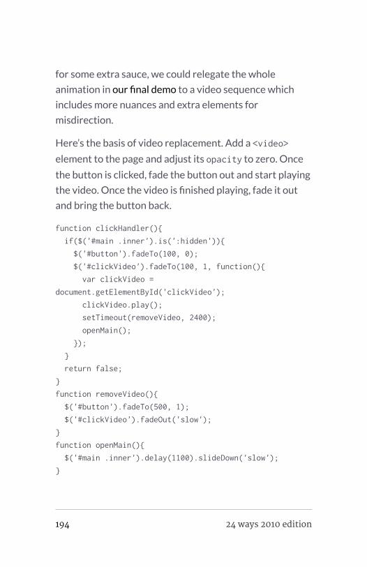
for some extra sauce, we could relegate the whole
animation in our final demo to a video sequence which
includes more nuances and extra elements for
misdirection.
Here’s the basis of video replacement. Add a <video>
element to the page and adjust its opacity to zero. Once
the button is clicked, fade the button out and start playing
the video. Once the video is finished playing, fade it out
and bring the button back.
function clickHandler(){
if($('#main .inner').is(':hidden')){
$('#button').fadeTo(100, 0);
$('#clickVideo').fadeTo(100, 1, function(){
var clickVideo =
document.getElementById('clickVideo');
clickVideo.play();
setTimeout(removeVideo, 2400);
openMain();
});
}
return false;
}
function removeVideo(){
$('#button').fadeTo(500, 1);
$('#clickVideo').fadeOut('slow');
}
function openMain(){
$('#main .inner').delay(1100).slideDown('slow');
}
194 24 ways 2010 edition

WRAPPING UP
I’m no JavaScript expert by any stretch. I’m sure a lot of
you scripting wizards out there could write much cleaner
and more efficient code, but I hope this gives you an idea
of the theory behind more realistic motion with the
technology we’re using most. This is just one model of
creating more convincing animation, but you can create
countless variations of this, including…
▪ Exporting <video> animations in 3-D animation tools or
2-D animation tools like Flash or After Effects
▪ Using <canvas> or SVG instead of <video>
▪ Employing specific JavaScript animation frameworks
▪ Making use of all the powerful properties of CSS
Transforms and CSS Animation
▪ Trying out emerging CSS3 animation tools like Sencha
Animator
If it wasn’t already apparent, these demos show an
exaggerated example and probably aren’t practical in a lot
of environments. However, there are a handful of great
sites out there that honor animation
techniques—metaphor, physics, and misdirection, among
others—like Benjamin De Cock’s vCard, 20 Things I
Learned About Browsers and the Web by Fantasy
Interactive, and the Nike Snowboarding site by Ian Coyle
and HEGA. They’re wonderful testaments to what you
can do to aid interaction for users.
Real Animation Using JavaScript, CSS3, and HTML5 Video
24 ways 2010 edition 195

My goal was to show you the ‘why’ and the ‘how.’ Your
charge is to discern the ‘where’ and the ‘when.’ Happy
animating!
ABOUT THE AUTHOR
Dan Mall is an award-winning interactive art director and
designer. He is an enthralled husband, Senior Designer at Big
Spaceship, former Interactive Director at Happy Cog, technical
editor for A List Apart, co-founder of Typedia, and singer/
keyboard player for contemporary-Christian band Four24. Dan
writes about design and other issues on Twitter and his
industry-recognized site, danielmall.com.
196 24 ways 2010 edition

Simon Collison 24ways.org/201016
16. The Articulate WebDesigner of Tomorrow
You could say that we design tocommunicate, and that we seek emotiveresponses. It sounds straightforward, and itcan be, but leaving it to chance isn’t wise.Many wander into web design withoutformal training, and whilst that certainlyisn’t essential, we owe it to ourselves todraw on wider influences, learn from thepast, and think smarter.
What knowledge can we ourselves explore in order to
become better designers? In addition, how can we take
this knowledge, investigate it through our unique
discipline, and in turn speak more eloquently about what
we do on the web? Below, I outline a number of things
that I personally believe all designers should be using and
exploring collectively.
The Articulate Web Designer of Tomorrow
24 ways 2010 edition 197

TAKING STOCK
Where we’re at is good. Finding clarity through web
standards, we’ve ended up quite modernist in our
approach, pursuing function, elegance and reduction.
However, we’re not great at articulating our own design
processes and principles to outsiders. Equally, we rely
heavily on our instincts when deciding if something is or
isn’t good. That’s fine, but we can better understand why
things are the way they are by looking a little deeper,
thereby helping us articulate what goes on in our design
brains to our peers, our clients and to normal humans.
As designers we use ideas, concepts, text and images. We
apply our ideas and experience, imposing order and
structure to content, hoping to ease the communication
of an idea to the largest possible audience or to a specific
audience. We consciously manipulate most of what is
available to us, but not all. There is something else we can
use. I often think that brilliant work demands a keen
understanding of the magical visual language that informs
design.
EMBRACING AN ESTABLISHED VISUALLANGUAGE
This is a language whose alphabet is shapes, structures,
colours, lines and rhythms. When effective, it is somewhat
invisible, subliminally enforcing messages and evoking
meaning, using methods solidly rooted in a grammar
198 24 ways 2010 edition

perceptible in virtually all extraordinary creative work.
The syntax for art, architecture, film, and furniture,
industrial and graphic design (think Bauhaus and the
Swiss style perhaps), this language urges us to become
fluent if we aim for a more powerful dialogue with our
audience.
Figure 1: Structures (clockwise from top-left): Informal; Formal;Active; Visible.
The greatest creative minds our world has produced
could understand some or all of this language. Line and
point, form and shape. Abstract objects. Formal and
informal structures. Visual distribution. Balance,
composition and the multitudinous approaches to
The Articulate Web Designer of Tomorrow
24 ways 2010 edition 199

symmetry. Patterns and texture. Movement and paths.
Repetition, rhythm and frequency. Colour theory.
Whitespace and the pause. The list goes on.
The genius we perceive in our creative heroes is often a
composite of experience, trial and error, conviction,
intuition – even accident – but rarely does great work
arise without an initial understanding of the nuts and
bolts that help communicate an idea or emotion.
OUR WORLD OF INTERACTIVITY
As web designers, our connection with this language is
most evident in graphic design. With more technological
ease and power comes the responsibility to understand,
wisely use, and be able to justify many of our decisions.
We have moved beyond the scope of print into a world of
interactivity, but we shouldn’t let go of any established
principles without good reason.
Figure 2: Understanding movement of objects in any directionalong a defined path.
200 24 ways 2010 edition

For example, immersion in this visual language can
improve our implementation of CSS3 and JavaScript
behaviour. With CSS3, we’ve seen a resurgence in CSS
experimentation, some of which has been wonderful, but
much of it has appeared clumsy. In the race to make
something spin, twist, flip or fly from one corner to
another, the designer sometimes fails to think about the
true movement they seek to emulate. What forces are
supposedly affecting this movement? What is the
expected path of this transition and is it being respected?
Stopping to think about what is really supposed to be
happening on the page compels us to use complex
animations, diagrams and rotations more carefully. It
helps us to better understand paths and movement.
Figure 3: Repetition can occur through variations in colour,shape, direction, and so on.
It can only be of greater benefit to be mindful of
symmetries, depth, affordance, juxtaposition, balance,
economy and reduction. A deeper understanding of basic
structures can help us to say more with sketches,
wireframes, layouts and composition. We’ve all
The Articulate Web Designer of Tomorrow
24 ways 2010 edition 201

experimented with grids and rhythm but, to truly benefit
from these long-established principles, we are duty-
bound to understand their possibilities more than we will
by simply leveraging a free framework or borrowing some
CSS.
DESIGN IS NOT A SCIENCE, BUT…
Threading through all of this is what we have learned from
science, and what it teaches us of the human brain. This
visual language matters because technology changes but,
for the most part, people don’t. For centuries, we humans
have received and interpreted information in much the
same way. Understanding more of how we perceive
meaning can help designers make smarter decisions, and
call on visual language to underpin these decisions. It is
our responsibility as designers to be aware of mental
models, mapping, semiotics, sensory experience and
human emotion.
Design itself is not a science, but the appropriate use of
visual language and scientific understanding exposes the
line between effective and awkward, between
communicative and mute. By strengthening our mental
and analytical approach to what is often done arbitrarily
or “because it feels right”, we simply become better
designers.
202 24 ways 2010 edition

A VISUAL LANGUAGE FOR THE WEB
So, I’ve outlined numerous starting points and areas
worthy of deeper investigation, and hopefully you’re
eager to do some research. However, I’ve mostly
discussed established ideas and principles that we as web
designers can learn from. It’s my belief that our
community has a shared responsibility to expand this
visual language as it applies to the ebb and flow of the
web. Indulge me as I conclude with a related tangent.
In defining a visual language specifically for the web, we
must continue to mature. The old powerfully influences
the new, but we must intelligently expand the visual
language of masterful work and articulate what is
uniquely ours.
For example, phrases like Ethan Marcotte’s Responsive
Web Design aren’t merely elegant, they describe a new
way of thinking and working, of communicating about
designs and interaction patterns. These phrases broaden
our vocabulary and are immediately adopted by designers
worldwide, in both conversation and execution.
The Articulate Web Designer of Tomorrow
24 ways 2010 edition 203
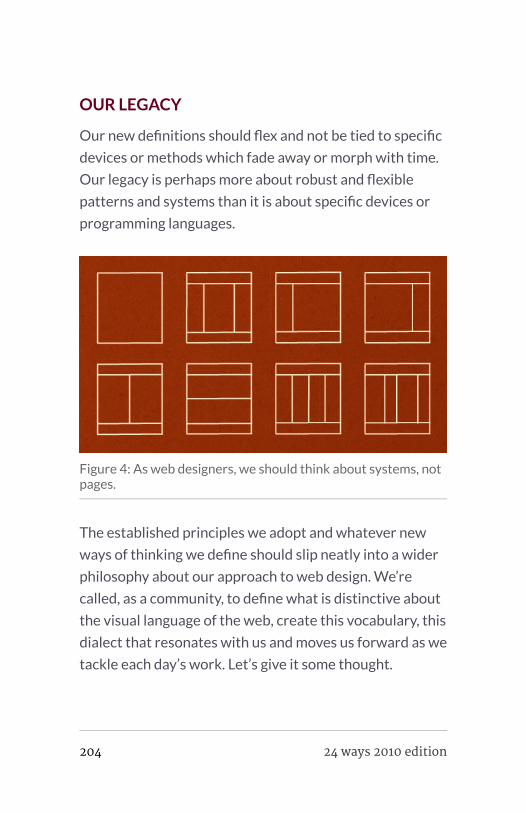
OUR LEGACY
Our new definitions should flex and not be tied to specific
devices or methods which fade away or morph with time.
Our legacy is perhaps more about robust and flexible
patterns and systems than it is about specific devices or
programming languages.
Figure 4: As web designers, we should think about systems, notpages.
The established principles we adopt and whatever new
ways of thinking we define should slip neatly into a wider
philosophy about our approach to web design. We’re
called, as a community, to define what is distinctive about
the visual language of the web, create this vocabulary, this
dialect that resonates with us and moves us forward as we
tackle each day’s work. Let’s give it some thought.
204 24 ways 2010 edition

FURTHER READING
This is my immediate “go-to” list of books that I bullishly
believe all web designers should own, but there is so much
more out there to read. Sadly, many great texts relating to
this stuff are often out of print. Feel free to share your
recommendations.
▪ Don Norman, The Design of Everyday Things
▪ Christian Leborg, Visual Grammar
▪ Scott McCloud, Understanding Comics
▪ David Crow, Visible Signs
▪ William Lidwell and Katrina Holden, Universal Principles
of Design
ABOUT THE AUTHOR
The Articulate Web Designer of Tomorrow
24 ways 2010 edition 205

Simon Collison is a designer, author and speaker with a decade
of experience at the sharp end. He co-founded Erskine Design
back in 2006, but left in early 2010 to pursue new and exciting
challenges, including writing an ambitious new book, and
organising the New Adventures in Web Design event. Simon
has lived in London and Reykjavik, but now lives back in his
hometown of Nottingham, where he is owned by a cat.
Photo: Lachlan Hardy
206 24 ways 2010 edition
Sarah Parmenter 24ways.org/201017
17. Designing for iOS: LifeBeyond Media Queries
Although not a new phenomenon, mediaqueries seem to be getting a lot attentiononline recently and for the right reasons too– it’s great to be able to adapt a design withjust a few lines of CSS – but many people arerelying only on them to create an iPhone-specific version of their website.
I was pleased to hear at FOWD NYC a few weeks ago that
both myself and Aral Balkan share the same views on why
media queries aren’t always going to be the best solution
for mobile. Both of us specialise in iPhone design
ourselves and we opt for a different approach to media
queries. The trouble is, regardless of what you have
carefully selected to be display:none; in your CSS, the
iPhone still loads everything in the background; all that
large imagery for your full scale website also takes up
valuable mobile bandwidth and time.
Designing for iOS: Life Beyond Media Queries
24 ways 2010 edition 207

You can greatly increase the speed of your website by
creating a specific site tailored to mobile users with just a
few handy pointers – media queries, in some instances,
might be perfectly suitable but, in others, here’s what you
can do.
Redirect your iPhone/iPod Touch users
To detect whether someone is viewing your site on an
iPhone or iPod Touch, you can either use JavaScript or
PHP.
THE JAVASCRIPT
if((navigator.userAgent.match(/iPhone/i)) ||
(navigator.userAgent.match(/iPod/i))) {
if (document.cookie.indexOf("iphone_redirect=false")
== -1) window.location =
"http://mobile.yoursitehere.com";
}
THE PHP
if(strstr($_SERVER['HTTP_USER_AGENT'],'iPhone') ||
strstr($_SERVER['HTTP_USER_AGENT'],'iPod'))
{
header('Location: http://mobile.yoursitehere.com');
exit();
}
208 24 ways 2010 edition
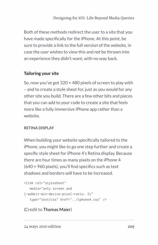
Both of these methods redirect the user to a site that you
have made specifically for the iPhone. At this point, be
sure to provide a link to the full version of the website, in
case the user wishes to view this and not be thrown into
an experience they didn’t want, with no way back.
Tailoring your site
So, now you’ve got 320 × 480 pixels of screen to play with
– and to create a style sheet for, just as you would for any
other site you build. There are a few other bits and pieces
that you can add to your code to create a site that feels
more like a fully immersive iPhone app rather than a
website.
RETINA DISPLAY
When building your website specifically tailored to the
iPhone, you might like to go one step further and create a
specific style sheet for iPhone 4’s Retina display. Because
there are four times as many pixels on the iPhone 4
(640 × 960 pixels), you’ll find specifics such as text
shadows and borders will have to be increased.
<link rel="stylesheet"
media="only screen and
(-webkit-min-device-pixel-ratio: 2)"
type="text/css" href="../iphone4.css" />
(Credit to Thomas Maier)
Designing for iOS: Life Beyond Media Queries
24 ways 2010 edition 209

PREVENT USER SCALING
This declaration, added into the <head>, stops the user
being able to pinch-zoom in and out of your design, which
is perfect if you are designing to the exact pixel
measurements of the iPhone screen.
<meta name="viewport"
content="width=device-width; initial-scale=1.0;
maximum-scale=1.0;">
DESIGNING FOR ORIENTATION
As iPhones aren’t static devices, you’ll also need to
provide a style sheet for horizontal orientation. We can
do this by inserting some JavaScript into the <head> as
follows:
<script type="text/javascript">
function orient() {
switch(window.orientation) {
case 0:
document.getElementById("orient_css").href =
"css/iphone_portrait.css";
break;
case -90:
document.getElementById("orient_css").href =
"css/iphone_landscape.css";
break;
case 90:
document.getElementById("orient_css").href =
"css/iphone_landscape.css";
210 24 ways 2010 edition
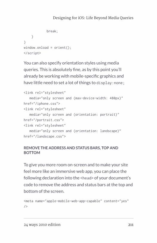
break;
}
}
window.onload = orient();
</script>
You can also specify orientation styles using media
queries. This is absolutely fine, as by this point you’ll
already be working with mobile-specific graphics and
have little need to set a lot of things to display:none;
<link rel="stylesheet"
media="only screen and (max-device-width: 480px)"
href="/iphone.css">
<link rel="stylesheet"
media="only screen and (orientation: portrait)"
href="/portrait.css">
<link rel="stylesheet"
media="only screen and (orientation: landscape)”
href="/landscape.css">
REMOVE THE ADDRESS AND STATUS BARS, TOP ANDBOTTOM
To give you more room on-screen and to make your site
feel more like an immersive web app, you can place the
following declaration into the <head> of your document’s
code to remove the address and status bars at the top and
bottom of the screen.
<meta name="apple-mobile-web-app-capable" content="yes"
/>
Designing for iOS: Life Beyond Media Queries
24 ways 2010 edition 211

MAKING THE MOST OF INBUILT FUNCTIONS
Similar to mailto: e-mail links, the iPhone also supports
another two handy URI schemes which are great for
enhancing contact details. When tapped, the following
links will automatically bring up the appropriate call or
text interface:
<a href="tel:01234567890">Call us</a>
<a href="sms:01234567890">Text us</a>
IPHONE-SPECIFIC WEB CLIP ICON
Although I believe them to be fundamentally flawed, since
they rely on the user bookmarking your site, iPhone Web
Clip icons are still a nice touch. You need just two
declarations, again in the <head> of your document:
<link rel="apple-touch-icon" href="icons/
regular_icon.png" />
<link rel="apple-touch-icon" sizes="114x114" href="icons/
retina_icon.png" />
For iPhone 4 you’ll need to create a 114 × 114 pixels icon;
for a non-Retina display, a 57 × 57 pixels icon will do the
trick.
212 24 ways 2010 edition
Precomposed
Apple adds its standard gloss ‘moon’ over the top of any
icon. If you feel this might be too much for your particular
icon and would prefer a matte finish, you can add
precomposed to the end of the apple-touch-icon
declaration to remove the standard gloss.
<link rel="apple-touch-icon-precomposed" href="/images/
touch-icon.png" />
Wrapping up
Media queries definitely have their uses. They make it
easy to build a custom experience for your visitor,
regardless of their browser’s size. For more complex sites,
however, or where you have lots of imagery and other
content that isn’t necessary on the mobile version, you
can now use these other methods to help you out.
Remember, they are purely for presentation and not
optimisation; for busy people on the go, optimisation and
faster-running mobile experiences can only be a good
thing.
Have a wonderful Christmas fellow Webbies!
Designing for iOS: Life Beyond Media Queries
24 ways 2010 edition 213

ABOUT THE AUTHOR
Sarah Parmenter specialises in User Interface Design for iOS
devices and the web, she regularly makes contributions to
online web design related websites and written features to
various magazines. Sarah also speaks at web design
conferences around the world and is lucky to consult, and work
for, many companies that we all know and love.
214 24 ways 2010 edition

Paul Hammond 24ways.org/201018
18. Speed Up Your Sitewith Delayed Content
Speed remains one of the most importantfactors influencing the success of anywebsite, and the first rule of performance(according to Yahoo!) is reducing thenumber of HTTP requests. Over the last fewyears we’ve seen techniques like sprites andcombo CSS/JavaScript files used to reducethe number of HTTP requests. But there’sone area where large numbers of HTTPrequests are still a fact of life: the smallavatars attached to the comments onarticles like this one.
AVATARS
Many sites like 24 ways use a fantastic service called
Gravatar to provide user images. As a user, you can sign
up to Gravatar, give them your e-mail address, and upload
an image to represent you. Sites can then include your
Speed Up Your Site with Delayed Content
24 ways 2010 edition 215

image by generating a one way hash of your e-mail
address and using that to build an image URL. For
example, the markup for the comments on this page looks
something like this:
<div>
<h4><a href="http://allinthehead.com/">
<img src="http://www.gravatar.com/
avatar.php?gravatar_id=13734b0cb20708f79e730809c29c3c48&size=100"
class="gravatar" alt="" height="100" width="100" />
Drew McLellan
</a></h4>
<p>This is a great article!</p>
</div>
The Gravatar URL contains two parts. 100 is the size in
pixels of the image we want.
13734b0cb20708f79e730809c29c3c48 is an MD5 digest of
Drew’s e-mail address. Using MD5 means we can request
an image for a user without sharing their e-mail address
with anyone who views the source of the page.
SO WHAT’S WRONG WITH AVATARS?
The problem is that a popular article can easily get
hundreds of comments, and every one of them means
another image has to be individually requested from
Gravatar’s servers. Each request is small and the Gravatar
servers are fast but, when you add them up, it can easily
216 24 ways 2010 edition

add seconds to the rendering time of a page. Worse, they
can delay the loading of more important assets like the
CSS required to render the main content of the page.
These images aren’t critical to the page, and don’t need to
be loaded up front. Let’s see if we can delay loading them
until everything else is done. That way we can give the
impression that our site has loaded quickly even if some
requests are still happening in the background.
DELAYING IMAGE LOADING
The first problem we find is that there’s no way to prevent
Internet Explorer, Chrome or Safari from loading an image
without removing it from the HTML itself. Tricks like
removing the images on the fly with JavaScript don’t
work, as the browser has usually started requesting the
images before we get a chance to stop it.
Removing the images from the HTML means that people
without JavaScript enabled in their browser won’t see
avatars. As Drew mentioned at the start of the month, this
can affect a large number of people, and we can’t
completely ignore them. But most sites already have a
textual name attached to each comment and the avatars
are just a visual enhancement. In most cases it’s OK if
some of our users don’t see them, especially if it speeds up
the experience for the other 98%.
Speed Up Your Site with Delayed Content
24 ways 2010 edition 217

Removing the images from the source of our page also
means we’ll need to put them back at some point, so we
need to keep a record of which images need to be
requested. All Gravatar images have the same URL
format; the only thing that changes is the e-mail hash.
Storing this is a great use of HTML5 data attributes.
HTML5 DATA WHAT?
Data attributes are a new feature in HTML5. The latest
version of the spec says:
A custom data attribute is an attribute in nonamespace whose name starts with the string“data-”, has at least one character after thehyphen, is XML-compatible, and contains nocharacters in the range U+0041 to U+005A(LATIN CAPITAL LETTER A to LATIN CAPITALLETTER Z).[…]Custom data attributes are intended to storecustom data private to the page or application,for which there are no more appropriateattributes or elements. These attributes are notintended for use by software that isindependent of the site that uses theattributes.
218 24 ways 2010 edition
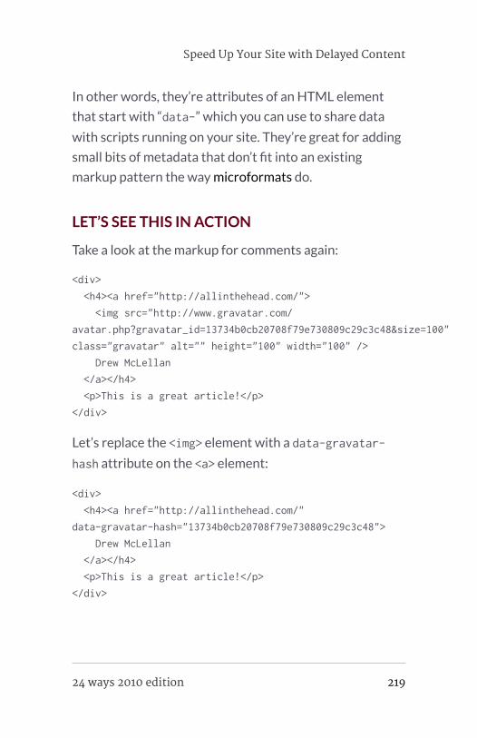
In other words, they’re attributes of an HTML element
that start with “data-” which you can use to share data
with scripts running on your site. They’re great for adding
small bits of metadata that don’t fit into an existing
markup pattern the way microformats do.
LET’S SEE THIS IN ACTION
Take a look at the markup for comments again:
<div>
<h4><a href="http://allinthehead.com/">
<img src="http://www.gravatar.com/
avatar.php?gravatar_id=13734b0cb20708f79e730809c29c3c48&size=100"
class="gravatar" alt="" height="100" width="100" />
Drew McLellan
</a></h4>
<p>This is a great article!</p>
</div>
Let’s replace the <img> element with a data-gravatar-
hash attribute on the <a> element:
<div>
<h4><a href="http://allinthehead.com/"
data-gravatar-hash="13734b0cb20708f79e730809c29c3c48">
Drew McLellan
</a></h4>
<p>This is a great article!</p>
</div>
Speed Up Your Site with Delayed Content
24 ways 2010 edition 219

Once we’ve done this, we’ll need a small bit of JavaScript
to find all these attributes, and replace them with images
after the page has loaded. Here’s an example using
jQuery:
$(window).load(function() {
$('a[data-gravatar-hash]').prepend(function(index){
var hash = $(this).attr('data-gravatar-hash')
return '<img width="100" height="100" alt=""
src="http://www.gravatar.com/
avatar.php?size=100&gravatar_id=' + hash + '">'
})
})
This code waits until everything on the page is loaded,
then uses jQuery.prepend to insert an image into every
link containing a data-gravatar-hash attribute. It’s short
and relatively simple, but in tests it reduced the rendering
time of a sample page from over three seconds to well
under one.
FINISHING TOUCHES
We still need to consider the appearance of the page
before the avatars have loaded. When our script adds
extra content to the page it will cause a browser reflow,
which is visually annoying. We can avoid this by using CSS
to reserve some space for each image before it’s inserted
into the HTML:
220 24 ways 2010 edition

#comments div {
padding-left: 110px;
min-height: 100px;
position: relative;
}
#comments div h4 img {
display: block;
position: absolute;
top: 0;
left: 0;
}
In a real world example, we’ll also find that the HTML for a
comment is more varied as many users don’t provide a
web page link. We can make small changes to our
JavaScript and CSS to handle this case.
Put this all together and you get this example.
TAKING THIS IDEA FURTHER
There’s no reason to limit this technique to sites using
Gravatar; we can use similar code to delay loading any
images that don’t need to be present immediately. For
example, this year’s redesigned Flickr photo page uses a
“data-defer-src” attribute to describe any image that
doesn’t need to be loaded straight away, including avatars
and map tiles.
Speed Up Your Site with Delayed Content
24 ways 2010 edition 221

You also don’t have to limit yourself to loading the extra
resources once the page loads. You can get further
bandwidth savings by waiting until the user takes an
action before downloading extra assets. Amazon has
taken this tactic to the extreme on its product pages –
extra content is loaded as you scroll down the page.
So next time you’re building a page, take a few minutes to
think about which elements are peripheral and could be
delayed to allow more important content to appear as
quickly as possible.
ABOUT THE AUTHOR
222 24 ways 2010 edition

Paul Hammond makes things on the internet. He’s currently
working on Typekit, a cloud based font subscription service for
web designers. Previously he managed a group of hard working
supernerds at Flickr. He was involved in early versions of Yahoo
Fire Eagle and Yahoo Pipes, and has helped build infrastructure
for the BBC, Yahoo Bookmarks and Delicious.
Paul has spoken at conferences on subjects ranging from the
future of broadcasting to how to win at Monopoly. He lives in
San Francisco with 2 kids and no dog, and keeps an irregularly
updated technical weblog at paulhammond.org
Photo: Cal Henderson
Speed Up Your Site with Delayed Content
24 ways 2010 edition 223

Paul Annett 24ways.org/201019
19. Sketching toCommunicate
As a web designer I’ve always felt that I’dsomehow cheated the system, having beenabsent on the day God handed out the abilityto draw. I didn’t study fine art, I don’t have anatural talent to effortlessly knock out arealistic bowl of fruit beside a water jug, andyet somehow I’ve still managed to blag myway this far. I’m sure many of you may feelthe same.
I had no intention of becoming an artist, but to have
enough skill to convey an idea in a drawing would be
useful. Instead, my inadequate instrument would doodle
drunkenly across the page leaving a web of unintelligible
paths instead of the refined illustration I’d seen in my
mind’s eye. This – and the natural scrawl of my
handwriting – is fine (if somewhat frustrating) when it’s
for my eyes only but, when sketching to communicate a
concept to a client, such amateur art would be offered
224 24 ways 2010 edition

with a sense of embarrassment. So when I had the
opportunity to take part in some sketching classes whilst
at Clearleft I jumped at the chance.
WHY SKETCH?
In UX workshops early on in a project’s life, sketching is a
useful and efficient way to convey and record ideas. It’s
disposable and inexpensive, but needn’t look amateur. A
picture may be worth a thousand words, but a well
executed sketch of how you’ll combine funny YouTube
videos with elephants to make Lolephants.com could be
worth millions in venture capital. Actually, that’s not bad…
;-)
Although (as you will see) the basics of sketching are easy
to master, the kudos you will receive from clients for
being a ‘proper designer’ makes it worthwhile!
WHERE TO BEGIN?
Start by not buying yourself a sketch pad. If you were the
type of child who ripped the first page out of a school
exercise book and started again if you made even a tiny
mistake (you’re not alone!), Wreck This Journal may offer a
helping hand. Practicing on plain A4 paper instead of any
‘special’ notepad will make the process a whole lot easier,
no matter how deliciously edible those Moleskines look.
Sketching to Communicate
24 ways 2010 edition 225

Do buy yourself a black fine-liner pen and a set of grey Pro
Markers for shading. These pens are unlike any you will
have used before, and look like blended watercolours
once the ink is dry. Although multiple strokes won’t create
unsightly blotches of heavy ink on the page, they will go
right through your top sheet so always remember to keep
a rough sheet in the second position as an ink blotter.
photo by Tom Harrison
Don’t buy pencils to sketch with, as they lack the
confidence afforded by the heavy black ink strokes of
marker pens and fine-liners.
If you’re going to be sketching with clients then invest in
some black markers and larger sheets of paper. At the risk
of sounding like a stationery brand whore, Sharpies are
226 24 ways 2010 edition

ideal, and these comedy-sized Post-Its do the job far
better than cheaper, less sticky alternatives. Although
they’re thicker than most standard paper, be sure to
double-layer them if you’re writing on them on a wall,
unless you fancy a weekend redecorating your client’s
swanky boardroom.
The best way to build confidence and improve your
sketching technique is, obviously, to practise. Reading this
article will be of no help unless you repeat the following
examples several times each. Go grab a pen and some
paper now, and notice how you improve within even a
short period of time.
SKETCHING WEB UI
Most elements of any website can be drawn as a
combination of geometric shapes.
Sketching to Communicate
24 ways 2010 edition 227

photo by Nathanael Boehm
Circles
To draw a circle, get in position and start by resting your
hand on the page and making the circular motion a few
times without putting pen to paper. As you lower your pen
whilst continuing the motion, you should notice the
resulting shape is more regular than it otherwise would
have been.
Squares and rectangles
Draw one pair of parallel lines first, followed by the others
to complete the shapes. Slightly overlap the ends of the
lines to make corners feel more solid than if you were to
228 24 ways 2010 edition

leave gaps. If you’re drawing a container, always draw the
contents first, that way it won’t be a squash to fit them in.
If you’re drawing a grid (of thumbnails, for instance), draw
all parallel lines first as a series of long dashes to help keep
line lengths and angles consistent.
Shadows
To lift elements from the page for emphasis, add a subtle
shadow with a grey marker. For the most convincing look,
assume the light source to be at the top left of the page –
the shadow should simply be a thick grey line along the
bottom and up the right edge of your shape. If the shape is
irregular, the shadow should follow its outline. This is a
good way to emphasise featured items, speech bubbles,
form buttons, and so on.
Sketching to Communicate
24 ways 2010 edition 229

SKETCHING IDEAS
Arrows
Use arrows to show steps in a process or direction of
movement. Giving shadows a 3-D feel, or adding a single
colour, will help separate them from the rest of the sketch.
Faces
Start by drawing the circle. The direction of the nose
(merely a point) indicates the direction of the person’s
gaze. The eyes and mouth show emotion: more open and
curvy for happy thoughts; more closed and jagged for
angry thoughts. Try out a few shapes and see what
emotions they convey.
230 24 ways 2010 edition

People
Remember, we’re aiming for communication rather than
realism here. A stick man would be fine. Give him a solid
body, as shown in this example, and it becomes easier to
pose him.
I know you think hands are hard, but they’re quite
important to convey some ideas, and for our purposes we
don’t need to draw hands with any detail. An oval with a
stick does the job of a pointing hand. Close-ups might
need more fingers showing, but still don’t require any
degree of realism.
Sketching to Communicate
24 ways 2010 edition 231

Signage
Don’t be afraid to use words. We’re sketching to
communicate, so if the easiest way to show an office block
is a building with a big ‘office’ sign on the roof, that’s fine!
Labels
Likewise, feel free to label interactions. Use upper-case
letters for legibility and slightly angle the horizontal bars
upwards to create a more positive feel.
Clichés
Clichés are your friend! Someone’s having an idea? Light
bulb above the head. Computer’s crashed? Cloud of
smoke with “$£%*!”
232 24 ways 2010 edition

It’s good to practise regularly. Try applying these
principles to still life, too. Look around you now and draw
the cup on the table, or the books on the shelf. Think of it
as a combination of shapes and aim for symbolism rather
than realism, and it’s not as hard as you’d think.
I hope this has given you the confidence to give it a shot,
and the ability to at least not be mortified with the
results!
Tip: If you’re involving clients in design games like Leisa
Reichelt’s ‘Design Consequences’ it may be wise to tone
down the quality of your drawings at that point so they
Sketching to Communicate
24 ways 2010 edition 233

don’t feel intimidated. Remember, it’s important for them
to feel at ease with the idea of wireframing in front of you
and their colleagues, no matter how bad their line work.
For more information see davegrayinfo.com – Dave Gray
taught me everything I know :-)
ABOUT THE AUTHOR
Paul Annett has over 10 years’ interaction design experience,
with the last five spent as a Senior Designer at award-winning
UX agency, Clearleft. In June 2010 he left and has established
his own little design studio, Supernice Studio Ltd. He and his
wife, Relly Annett-Baker, live in the home counties with their
two little boys and two cats.
234 24 ways 2010 edition

Meagan Fisher 24ways.org/201020
20. Put Yourself in aCorner
SOMEBACKSTORY, AND A SHAMEFUL CONFESSION
For the first couple years of high school Iwas one of those jerks who made only theminimal required effort in school. Strangelyenough, how badly I behaved in a class wasalways in direct proportion to how skilled Iwas in the subject matter. In the subjectswhere I was confident that I could passwithout trying too hard, I would give myselfadded freedom to goof off in class.
Because I was a closeted lit-nerd, I was most skilled in
English class. I’d devour and annotate required reading
over the weekend, I knew my biblical and mythological
allusions up and down, and I could give you a postmodern
interpretation of a text like nobody’s business. But in
class, I’d sit in the back and gossip with my friends, nap, or
scribble patterns in the margins of my textbooks. I was
Put Yourself in a Corner
24 ways 2010 edition 235

nonchalant during discussion, I pretended not to listen
during lectures. I secretly knew my stuff, so I did well
enough on tests, quizzes, and essays. But I acted like an
ass, and wasn’t getting the most I could out of my
education.
The day of humiliation, but also epiphany
One day in Ms. Kaney’s AP English Lit class, I was sitting in
the back doodling. An earbud was dangling under my
sweater hood, attached to the CD player (remember
those?) sitting in my desk. Because of this auditory
distraction, the first time Ms. Kaney called my name, I
barely noticed. I definitely heard her the second time,
when she didn’t call my name so much as roar it. I can still
remember her five feet frame stomping across the room
and grabbing an empty desk. It screamed across the worn
tile as she slammed it next to hers. She said, “This is where
you sit now.” My face gets hot just thinking about it.
I gathered my things, including the CD player (which was
now impossible to conceal), and made my way up to the
newly appointed Seat of Shame. There I sat, with my back
to the class, eye-to-eye with Ms. Kaney. From my new
vantage point I couldn’t see my friends, or the clock, or the
window. All I saw were Ms. Kaney’s eyes, peering at me
over her reading glasses while I worked. In addition to this
punishment, I was told that from now on, not only would I
236 24 ways 2010 edition

participate in class discussions, but I would serve
detention with her once a week until an undetermined
point in the future.
During these detentions, Ms. Kaney would give me new
books to read, outside the curriculum, and added on to my
normal homework. They ranged from classics to modern
novels, and she read over my notes on each book. We’d
discuss them at length after class, and I grew to value not
only our private discussions, but the ones in class as well.
After a few weeks, there wasn’t even a question of this
being punishment. It was heaven, and I was more
productive than ever.
TO THE POINT
Please excuse this sentimental story. It’s not just about
honoring a teacher who cared enough to change my life,
it’s really about sharing a lesson. The most valuable
education Ms. Kaney gave me had nothing to do with
literature. She taught me that I (and perhaps other people
who share my special brand of crazy) need to be put in a
corner to flourish. When we have physical and mental
constraints applied, we accomplish our best work.
For those of you still reading, now seems like a good time
to insert a pre-emptive word of mediation. Many of you,
maybe all of you, are self-disciplined enough that you
don’t require the rigorous restrictions I use to maximize
Put Yourself in a Corner
24 ways 2010 edition 237

productivity. Also, I know many people who operate best
in a stimulating and open environment. I would advise
everyone to seek and execute techniques that work best
for them. But, for those of you who share my inclination
towards daydreams and digressions, perhaps you’ll find
something useful in the advice to follow.
IN WHICH I PRETEND TO BE SPECIAL AGENTOLIVIA DUNHAM
Now that I’m an adult, and no longer have Ms. Kaney to
reign me in, I have to find ways to put myself in the corner.
By rejecting distraction and shaping an environment
designed for intense focus, I’m able to achieve improved
productivity.
Lately I’ve been obsessed with the TV show Fringe, a sci-fi
series about an FBI agent and her team of genius
scientists who save the world (no, YOU’RE a nerd). There’s
a scene in the show where the primary character has to
delve into her subconscious to do extraordinary things,
and she accomplishes this by immersing herself in a
sensory deprivation tank. The premise is this: when
enclosed in a space devoid of sound, smell, or light, she
will enter a new plane of consciousness wherein she can
tap into new levels of perception.
238 24 ways 2010 edition

This might sound a little nuts, but to me this premise has
some real-world application. When I am isolated from
distraction, and limited to only the task at hand, I’m able
to be productive on a whole new level. Since I can’t
actually work in an airtight iron enclosure devoid of input,
I find practical ways to create an interruption-free
environment.
Since I work from home, many of my methods for coping
with distractions wouldn’t be necessary for my office-
bound counterpart. However for some of you 9-to-5-ers,
the principles will still apply.
Consider your visual input
First, I have to limit my scope to the world I can (and need
to) affect. In the largest sense, this means closing my
curtains to the chaotic scene of traffic, birds, the post
office, a convenience store, and generally lovely weather
that waits outside my window. When the curtains are
drawn and I’m no longer surrounded by this view, my
sphere is reduced to my desk, my TV, and my cat.
Sometimes this step alone is enough to allow me to focus.
But, my visual input can be whittled down further still. For
example, the desk where I usually keep my laptop is
littered with twelve owl figurines, a globe, four books, a
three-pound weight, and various nerdy paraphernalia
(hard drives, Wacom tablets, unnecessary bluetooth
Put Yourself in a Corner
24 ways 2010 edition 239

accessories, and so on). It’s not so much a desk as a
dumping ground for wacky flea market finds and impulse
technology buys. Therefore, in addition to this Official
Desk, I have an adult version of Ms. Kaney’s Seat of
Shame. It’s a rusty old student’s desk I picked up at the
Salvation Army, almost an exact replica of the model Ms.
Kaney dragged across the classroom all those years ago.
This tiny reproduction Seat of Shame is literally in a
corner, where my only view is a blank wall. When I truly
need to focus, this is where I take refuge, with only a
notebook and a pencil (and occasionally an iPad).
Find out what works for your ears
Even from my limited sample size of two people, I know
there are lots of different ways to cope with auditory
distraction. I prefer silence when focused on independent
work, and usually employ some form of a white noise
generator. I’ve yet to opt for the fancy ‘real’ white noise
machines; instead, I use a desktop fan or our allergy filter
machine. This is usually sufficient to block out the sounds
of the dishwasher and the cat, which allows me to think
only about the task of hand.
My boyfriend, the other half of my extensive survey,
swears by another method. He calls it The Wall of Sound,
and it’s basically an intense blast of raucous music
streamed directly into his head. The outcome of his
technique is really the same as mine; he’s blocking out
240 24 ways 2010 edition

unexpected auditory input. If you can handle the grating
sounds of noisy music while working, I suggest you give
The Wall of Sound a try.
Don’t count the minutes
When I sat in the original Seat of Shame in lit class, I could
no longer see the big classroom clock slowly ticking away
the seconds until lunch. Without the marker of time, the
class period often flew by. The same is true now when I
work; the less aware of time I am, the less it feels like time
is passing too quickly or slowly, and the more I can focus
on the task (not how long it takes).
Nowadays, to assist in my effort to forget the passing of
time, I sometimes put a sticky note over the clock on my
monitor. If I’m writing, I’ll use an app like WriteRoom,
which blocks out everything but a simple text editor.
There are situations when it’s not advisable to completely
lose track of time. If I’m working on a project with an
hourly rate and a tight scope, or if I need to be on time to a
meeting or call, I don’t want to lose myself in the expanse
of the day. In these cases, I’ll set an alarm that lets me
know it’s time to reign myself back in (or on some days,
take a shower).
Put Yourself in a Corner
24 ways 2010 edition 241

PUT YOURSELF IN A MENTAL CORNER, TOO
When Ms. Kaney took action and forced me to step up my
game, she had the insight to not just change things
physically, but to challenge me mentally as well. She
assigned me reading material outside the normal
coursework, then upped the pressure by requiring
detailed reports of the material. While this additional
stress was sometimes uncomfortable, it pushed me to
work harder than I would have had there been less of a
demand. Just as there can be freedom in the limitations of
a distraction-free environment, I’d argue there is liberty in
added mental constraints as well.
Deadlines as a constraint
Much has been written about the role of deadlines in the
creative process, and they seem to serve different
functions in different cases. I find that deadlines usually
act as an important constraint and, without them, it would
be nearly impossible for me to ever consider a project
finished. There are usually limitless ways to improve upon
the work I do and, if there’s no imperative for me to be
done at a certain point, I will revise ad infinitum. (Hence,
the personal site redesign that will never end – Coming
Soon, Forever!). But if I have a clear deadline in mind,
there’s a point when the obsessive tweaking has to stop. I
reach a stage where I have to gather up the nerve to
launch the thing.
242 24 ways 2010 edition

Putting the pro in procrastination
Sometimes I’ve found that my tendency to procrastinate
can help my productivity. (Ducks, as half the internet throws
things at her.) I understand the reasons why
procrastination can be harmful, and why it’s usually a
good idea to work diligently and evenly towards a goal. I
try to divide my projects up in a practical way, and
sometimes I even pull it off. But for those tasks where you
work aimlessly and no focus comes, or you find that every
other to-do item is more appealing, sometimes you’re
forced to bring it together at the last moment. And
sometimes, this environment of stress is a formula for
magic. Often when I’m down to the wire and have no
choice but to produce, my mind shifts towards a new level
of clarity. There’s no time to endlessly browse for
inspiration, or experiment with convoluted solutions that
lead nowhere.
Obviously a life lived perpetually on the edge of a
deadline would be a rather stressful one, so it’s not a state
of being I’d advocate for everyone, all the time. But every
now and then, the work done when I’m down to the wire is
my best.
Put Yourself in a Corner
24 ways 2010 edition 243

Keep one toe outside your comfort zone
When I’m choosing new projects to take on, I often seek
out work that involves an element of challenge. Whether
it’s a design problem that will require some creative
thinking, or a coding project that lends itself to using new
technology like HTML5, I find a manageable level of
difficulty to be an added bonus. The tension that comes
from learning a new skill or rethinking an old standby is a
useful constraint, as it keeps the work interesting, and
ensures that I continue learning.
THERE YOU HAVE IT
Well, I think I’ve spilled most of my crazy secrets for
forcing my easily distracted brain to focus. As with
everything we web workers do, there are an infinite
number of ways to encourage productivity. I hope you’ve
found a few of these to be helpful, and please share your
personal techniques in the comments. Have a happy and
productive new year!
244 24 ways 2010 edition

ABOUT THE AUTHOR
Meagan Fisher is passionate about owls, coffee, and web
design. In her ongoing mission to make the web a better place,
she’s partnered with some of the best designers in the industry,
such as SimpleBits, Happy Cog, and Crush + Lovely. When she’s
not creating interfaces, she’s speaking, tweeting, writing on
Owltastic, or posting coffee art photography to Art in my
Coffee.
Put Yourself in a Corner
24 ways 2010 edition 245

Relly Annett-Baker 24ways.org/201021
21. A ContentmasEpiphany
The twelve days of Christmas fall between25 December, Christmas Day, and 6 January,the Epiphany of the Kings. Traditionally,these have been holidays and a lot of us stilltake a good proportion of these days off.Equally, a lot of us have a got a personal sitekicking around somewhere that we sigh overand think, “One day I’ll sort you out!” Whynot take this downtime to give it a big ol’refresh? I know, good idea, huh?
HEY WAIT! WOAH! NO-ONE’S TOUCHING
PHOTOSHOP OR DOING ANY CSS FANCYWORK
UNTIL I’M DONE WITH YOU!
Be honest, did you immediately think of a sketch or
mockup you have tucked away? Or some clever little piece
of code you want to fiddle with? Now ask yourself, why
would you start designing the container if you haven’t
worked out what you need to put inside?
246 24 ways 2010 edition

Anyway, forget the content strategy lecture; I haven’t
given you your gifts yet.
I present The Twelve Days of Contentmas!
This is a simple little plan to make sure that your personal
site, blog or portfolio is not just looking good at the end of
these twelve days, but is also a really useful repository of
really useful content.
WARNING KLAXON: There are twelve parts, one for
each day of Christmas, so this is a lengthy article. I’m not
expecting anyone to absorb this in one go. Add to
Instapaper. There is no TL;DR for this because it’s a
multipart process, m’kay? Even so, this plan of mine cuts
corners on a proper applied strategy for content. You
might find some aspects take longer than the arbitrary
day I’ve assigned. And if you apply this to your company-
wide intranet, I won’t be held responsible for the mess.
That said, I encourage you to play along and sample some
of the practical aspects of organising existing content and
planning new content because it is, honestly, an inspiring
and liberating process. For one thing, you get to review all
the stuff you have put out for the world to look at and see
what you could do next. This always leaves me full of ideas
on how to plug the gaps I’ve found, so I hope you are
similarly motivated come day twelve.
Let’s get to it then, shall we?
A Contentmas Epiphany
24 ways 2010 edition 247

ON THE FIRST DAY OF CONTENTMAS, RELLYGAVE TO ME:
1. A (partial) content inventory
I’m afraid being a site owner isn’t without its chores. With
great power comes great responsibility and all that. There
are the domain renewing, hosting helpline calls and, of
course, keeping on top of all the content that you have
published.
If you just frowned a little and thought, “Well, there’s
articles and images and… stuff”, then I’d like to introduce
you to the idea of a content inventory.
A content inventory is a list of all your content, in a simple
spreadsheet, that allows you to see at a glance what is
currently on your site: articles; about me page; contact
form, and so on.
You add the full URL so that you can click directly to any
page listed. You add a brief description of what it is and
what tags it has. In fact, I’ll show you. I’ve made a Google
Docs template for you. Sorry, it isn’t wrapped.
Does it seem like a mammoth task? Don’t feel you have to
do this all in one day. But do do it. For one thing, looking
back at all the stuff you’ve pushed out into the world gives
you a warm fuzzy feeling which keeps the heating bill
down.
248 24 ways 2010 edition

Grab a glass of mulled cider and try going month-by-
month through your blog archives, or project-by-project
through your portfolio. Do a little bit each day for the next
twelve days and you’ll have done something awesome.
The best bit is that this exploration of your current
content helps you with the next day’s task.
Bonus gift: for more on content auditing and inventory,
check out Jeff Veen’s article on just this topic, which is
also suitable for bigger business sites too.
ON THE SECOND DAY OF CONTENTMAS, RELLYGAVE TO ME:
2. Website loves
Remember when you were a kid, you’d write to Santa with
a wish list that would make your parents squirm, because
your biggest hope for your stocking would be either
impossible or impossibly expensive. Do you ever get the
same thing now as a grown-up where you think, “Wouldn’t
it be great if I could make a video blog every week”, or “I
could podcast once a month about this”, and then you
push it to the back of your mind, assuming that you won’t
have time or you wouldn’t know what to talk about
anyway?
A Contentmas Epiphany
24 ways 2010 edition 249

True fact: content doesn’t just have to be produced when
we are so incensed that we absolutely must blog about a
topic. Neither does it have to be a drain to a demanding
schedule. You can plan for it. In fact, you’re about to.
So, today, get a pen and a notebook. Move away from your
computer. My gift to you is to grab a quiet ten minutes
between turkey sandwiches and relatives visiting and give
your site some of the attention it deserves for 2011.
What would you do with your site if you could? I don’t
mean what would you do purely visually – although by all
means note those things down too – but to your site as a
whole. Here are some jumping off points:
▪ Would you like to individually illustrate and design
some of your articles?
▪ What about a monthly exploration of your favourite
topic through video or audio?
▪ Who would you like to collaborate with?
▪ What do you want your site to be like for a user?
▪ What tone of voice would you like to use?
▪ How could you use imagery and typography to support
your content?
▪ What would you like to create content about in the new
year?
250 24 ways 2010 edition

It’s okay if you can’t do these things yet. It’s okay to scrub
out anything where you think, “Nah, never gonna happen.”
But do give some thought to what you might want to do
next. The best inspiration for this comes from what you’ve
already done, so keep on with that inventory.
Bonus gift: a Think Vitamin article on podcasting using
Skype, so you can rope in a few friends to join in, too.
ON THE THIRD DAY OF CONTENTMAS, RELLYGAVE TO ME:
3. Red pens
Shock news, just in: the web is not print!
One of the hardest things as a writer is to reach the point
where you say, “Yeah, okay, that’s it. I’m done” and send off
your beloved manuscript or article to print. I’m convinced
that if deadlines didn’t exist, nothing would get finished.
Why? Well, at the point you hand it over to the publishing
presses, you can make no more changes. At best, you can
print an erratum or produce an updated second edition at
a later date. And writers love to – no, they live to – tweak
their creations, so handing them over is quite a struggle.
Just one more comma and…
Online, we have no such constraints. We can edit, correct,
test, tweak, twiddle until we’re blooming sick of it. Our
red pens never run out of ink. It is time for you to run a
A Contentmas Epiphany
24 ways 2010 edition 251

more critical eye over your content, especially the stuff
already published. Relish in the opportunity to change
stuff on the fly. I am not so concerned by blog articles and
such (although feel free to apply this concept to those,
too), but mainly by your more concrete content: about
pages; contact pages; home page navigation; portfolio
pages; 404 pages.
Now, don’t go running amok with the cut function yet.
First, put all these evergreen pages into your inventory. In
the notes section, write a quick analysis of how useful this
copy is. Example questions:
▪ Is your contact page up-to-date?
▪ Does your about page link to the right places?
▪ Is your portfolio current?
▪ Does your 404 page give people a way to find what they
were looking for?
We’ll come back to this in a few days once we have a
clearer idea of how to improve our content.
Bonus gift: the audio and slides of a talk I gave on
microcopy and 404 pages at @media WebDirections last
year.
252 24 ways 2010 edition

ON THE FOURTH DAY OF CONTENTMAS, RELLYGAVE TO ME:
4. Stalling nerds
Actually, I guess more accurately this is something I get
given a lot. Designers and developers particularly can find
a million ways to extract themselves from the content of a
site but, as the site owner, and this being your personal
playground and all, you mustn’t. You actually can’t, sorry.
But I do understand that at this point, ‘sorting out your
site’ suddenly seems a lot less exciting, especially if you
are a visually-minded person and words and lists aren’t
really your thing. So far, there has been a lot of not-very-
exciting exercises in planning, and there’s probably a nice
pile of DVDs and video games that you got from Santa
worth investigating.
Stay strong my friend. By now, you have probably hit upon
an idea of some sort you are itching to start on, so for
every half-hour you spend doing inventory, gift yourself
another thirty minutes to play with that idea.
Bonus gift: the Pomodoro Technique. Take one kitchen
timer and a to-do list and see how far you can go.
A Contentmas Epiphany
24 ways 2010 edition 253

ON THE FIFTH DAY OF CONTENTMAS, RELLYGAVE TO ME:
5. Golden rules
Here are some guidelines for writing online:
▪ Make headlines for tutorials and similar content useful
and descriptive; use a subheading for any terrible pun you
want to work in.
▪ Create a broad opening paragraph that addresses what
your article is about. Part of the creative skill in writing is
to do this in a way that both informs the reader and
captures their attention. If you struggle with this, consider
a boxout giving a summary of the article.
▪ Use headings to break up chunks of text and allow
people to scan. Most people will have a scoot about an
article before starting at the beginning to give it a proper
read. These headings should be equal parts informative
and enticing. Try them out as questions that might be
posed by the reader too.
▪ Finish articles by asking your reader to take an
affirmative action: subscribe to your RSS feed; leave a
comment (if comments are your thing – more on that
later); follow you on Twitter; link you to somewhere they
254 24 ways 2010 edition

have used your tutorial or code. The web is about getting
excited, making things and sharing with others, so give
your readers the chance to do that.
▪ For portfolio sites, this call to action is extra important
as you want to pick up new business. Encourage people to
e-mail you or call you – don’t just rely on a number in the
footer or an e-mail link at the top. Think up some
consistent calls-to-action you can use and test them out.
So, my gift to you today is a simplified page table for
planning out your content to make it as useful as possible.
Feel free to write a new article or tutorial, or work on that
great idea from yesterday and try out these guidelines for
yourself.
It’s a simple framework – good headline; broad opening;
headings to break up volume; strong call to action – but it
will help you recognise if what you’ve written is in good
shape to face the world. It doesn’t tell you anything about
how to create it – that’s your endeavour – but it does give
you a start. No more staring at a blank page.
Bonus gift: okay, you have to buy yourself this one, but it is
the gift that keeps on giving: Ginny Reddish’s Letting Go of
the Words – the hands down best guide to web writing
there is, with a ton of illustrative examples.
A Contentmas Epiphany
24 ways 2010 edition 255

ON THE SIXTH DAY OF CONTENTMAS, RELLYGAVE TO ME:
6. Foundation-a-laying
Yesterday, we played with a page table for articles. Today,
we are going to set the foundations for your new, spangly,
spruced up, relaunched site (for when you’re ready, of
course). We’ve checked out what we’ve got, we’ve thought
about what we’d like, we have a wish list for the future.
Now is the time for a small reality check.
Be realistic with yourself. Can you really give your site
some attention every day? Record a short snippet of audio
once a week? A photo diary post once a month? Look back
at the wish list you made.
▪ What can you do?
▪ What can you aim for?
▪ What just isn’t possible right now?
As much as we’d all love to be producing a slick video
podcast and screencast three times a week, it’s better to
set realistic expectations and work your way up.
Where does your site sit in your online world?
▪ Do you want it to be the hub of all your social
interactions, a lifestream, a considered place of
publication or a free for all?
256 24 ways 2010 edition

▪ Do you want to have comments (do you have the
personal resource to monitor comments?) or would you
prefer conversation to happen via Twitter, Facebook or
not at all?
▪ Does this apply to all pages, posts and content types or
just some?
▪ Get these things straight in your head and it’s easier to
know what sort of environment you want to create and
what content you’ll need to sustain it.
Get your notebook again and think about specific topics
you’d like to cover, or aspects of a project you want to go
into more, and how you can go ahead and do just that. A
good motivator is to think what you’ll get out of doing it,
even if that is “And I’ll finally show the poxy
$whatever_community that my $chosen_format is better
than their $other_format.”
What topics have you really wanted to get off your chest?
Look through your inventory again. What gaps are there
in your content just begging to be filled?
Today, you’re going to give everyone the gift of your
opinion. Find one of those things where someone on the
internet is wrong and create a short but snappy piece to
set them straight. Doesn’t that feel good? Soon you’ll be
able to do this in a timely manner every time someone is
wrong on the internet!
A Contentmas Epiphany
24 ways 2010 edition 257

Bonus gift: we’re halfway through, so I think something
fun is in order. How about a man sledding naked down a
hill in Brighton on a tea tray? Sometimes, even with a
whole ton of content planning, it’s the spontaneous stuff
that is still the most fun to share.
ON THE SEVENTH DAY OF CONTENTMAS,RELLY GAVE TO ME:
7. Styles-a-guiding
Not colour style guides or brand style guides or code style
guides. Content style guides. You could go completely to
town and write yourself a full document defining every
aspect of your site’s voice and personality, plus declaring
your view on contracted phrases and the Oxford comma,
but this does seem a tad excessive. Unless you’re writing
an entire site as a fictional character, you probably know
your own voice and vocabulary better than anyone. It’s in
your head, after all.
Instead, equip yourself with a good global style guide (I
like the Chicago Manual of Style because I can access it
fully online, but the Associated Press (AP) Stylebook has a
nifty iPhone app and, if I’m entirely honest, I’ve found a
copy of Eats, Shoots and Leaves has set me right on all but
the most technical aspects of punctuation). Next, pick a
good dictionary and bookmark thesaurus.com. Then have
258 24 ways 2010 edition
a go at Kristina Halvorson’s ‘Voice and Tone’ exercise from
her book Content Strategy for the Web, to nail down what
you’d like your future content to be like:
To introduce the voice and tone qualities you’re[looking to create], a good approach is to offercontrasting values. For example:
▪ Professional, not academic.
▪ Confident, not arrogant.
▪ Clever, not cutesy.
▪ Savvy, not hipster.
▪ Expert, not preachy.
Take a look around some of your favourite sites and
examine the writing and stylistic handling of content.
What do you like? What do you want to emulate? What
matches your values list?
Today’s gift to you is an idea. Create a ‘swipe file’ through
Evernote or Delicious and save all the stuff you come
across that, regardless of topic, makes you think, “That’s
really cool.” This isn’t the same as an Instapaper list you’d
like to read. This is stuff you have read or have seen that is
worth looking at in closer detail.
▪ Why is it so good?
▪ What is the language and style like?
▪ What impact does the typography have?
▪ How does the imagery work to enhance the message?
A Contentmas Epiphany
24 ways 2010 edition 259

This isn’t about creating a personal brand or any such
piffle. It’s about learning to recognise how good content
works and how to create something awesome yourself.
Obviously, your ideas are brilliant, so take the time to
understand how best to spring them on the unsuspecting
public for easier world domination.
Bonus gift: a nifty style guide is a must when you do have
to share content creation duties with others. Here is
Leeds University’s publicly available PDF version for you
to take a gander at. I especially like the Rationale sections
for chopping off dissenters at the knees.
ON THE EIGHTH DAY OF CONTENTMAS, RELLYGAVE TO ME:
8. Times-a-making
You have an actual, real plan for what you’d like to do with
your site and how it is going to sound (and probably some
ideas on how it’s going to look, too). I hope you are full of
enthusiasm and Getting Excited To Make Things. Just
before we get going and do exactly that, we are going to
make sure we have made time for this creative
outpouring.
Have you tried to blog once a week before and found
yourself losing traction after a month or two? Are there a
couple of podcasts lurking neglected in your archives?
260 24 ways 2010 edition

Whereas half of the act of running is showing up for
training, half of creating is making time rather than
waiting for it to become urgent. It’s okay to write
something and set a date to come back to it (which isn’t
the same as leaving it to decompose in your drafts folder).
Putting a date in your calendar to do something for your
site means that you have a forewarning to think of a topic
to write about, and space in your schedule to actually do
it. Crucially, you’ve actually made some time for this
content lark.
To do this, you need to think about how long it takes to get
something out of the door/shipped/published/whatever
you want to call it. It might take you just thirty minutes to
record a podcast, but also a further hour to research the
topic beforehand and another hour to edit and upload the
clips. Suddenly, doing a thirty minute podcast every day
seems a bit unlikely. But, on the flipside, it is easy to see
how you could schedule that in three chunks weekly.
Put it in your calendar. Do it, publish it, book yourself in
for the next week. Keep turning up.
Today my gift to you is the gift of time. Set up your own
small content calendar, using your favourite calendar
system, and schedule time to play with new ways of
creating content, time to get it finished and time to get it
on your site. Don’t let good stuff go to your drafts folder to die
of neglect.
A Contentmas Epiphany
24 ways 2010 edition 261

Bonus gift: lots of writers swear by the concept of ‘daily
pages’. That is, churning out whatever is in your head to
see if there is anything worth building upon, or just to lose
the grocery list getting in the way. 750words.com is a site
built around this concept. Go have a play.
ON THE NINTH DAY OF CONTENTMAS, RELLYGAVE TO ME:
9. Copy enhancing
An incredibly radical idea for day number nine. We are
going to look at that list of permanent pages you made
back on day three and rewrite the words first, before even
looking at a colour palette or picking a font! Crazy as it
sounds, doing it this way round could influence your
design. It could shape the imagery you use. It could affect
your choice of typography. IMAGINE THE POSSIBILITIES!
Look at the page table from day five. Print out one for
each of your homepage, about page, contact page,
portfolio, archive, 404 page or whatever else you have.
Use these as a place to brainstorm your ideas and what
you’d like each page to do for your site. Doodle in the
margin, choose words you think sound fun to say,
daydream about pictures you’d like to use and colours you
think would work, but absolutely, completely and utterly
262 24 ways 2010 edition

fill in those page tables to understand how much (or how
little) content you’re playing with and what you need to do
to get to ‘launch’.
Then, use them for guidance as you start to write. Don’t
skimp. Don’t think that a fancy icon of an envelope
encourages people to e-mail you. Use your words.
People get antsy at this bit. Writing can be hard work and
it’s easy for me to say, “Go on and write it then!” I know
this. I mean, you should see the faces I pull when I have to
do anything related to coding. The closest equivalent
would be when scientists have to stick their hands in big
gloves attached to a glass box to do dangerous
experiments.
Here’s today’s gift, a little something about writing that I
hope brings you comfort:
To write something fantastic you almost alwayshave to write a rubbish draft first.
Now, you might get lucky and write a ‘good enough’ draft
first time and that’s fab – you’ve cut some time getting to
‘fantastic’. If, however, you’ve always looked at your first
attempt to write more than the bare minimum and sighed
in despair, and resigned yourself to adding just a title, date
and a screenshot, be cheered because you have taken the
first step to being able to communicate with clarity, wit
and panache.
A Contentmas Epiphany
24 ways 2010 edition 263

Keep going. Look at writing you admire and emulate it.
Think about how you will lovingly design those words
when they are done. Know that you can go back and
change them. Check back with your page table to keep
you on track. Do that first draft.
Bonus gift: becoming a better writer helps you to explain
design concepts to clients.
ON THE TENTH DAY OF CONTENTMAS, RELLYGAVE TO ME:
10. Ideas for keeping
Hurrah! You have something down on paper, ready to
start evolving your site around it. Here’s where the words
and visuals and interaction start to come together.
Because you have a plan, you can think ahead and do
things you wouldn’t be able to pull together otherwise.
▪ How about finding a fresh-faced stellar illustrator on
Dribbble to create you something perfect to pep up your
contact page or visualize your witty statement on
statements of work. A List Apart has been doing it for
years and it hasn’t worked out too badly for them, has it?
▪ What about spending this month creating a series of
introductory tutorials on a topic, complete with
screencasts and audio and give them a special home on
your site?
264 24 ways 2010 edition

▪ How about putting in some hours creating a glorious
about me page, with a biography, nice picture, and where
you spend your time online?
▪ You could even do the web equivalent of getting up in
the attic and sorting out your site’s search to make it
easier to find things in your archives. Maybe even do some
manual recommendations for relevant content and add
them as calls to action.
▪ How about writing a few awesome case studies with
individual screenshots of your favourite work, and
creating a portfolio that plays to your strengths? Don’t
just rely on the pretty pictures; use your words.
Otherwise no-one understands why things are the way
they are on that screenshot and BAM! you’ll be judged on
someone else’s tastes. (Elliot has a head start on you for
this, so get to it!)
▪ Do you have a serious archive of content? What’s it like
being a first-time visitor to your site? Could you write
them a guide to introduce yourself and some of the most
popular stuff on your site? Ali Edwards is a massively
popular crafter and every day she gets new visitors who
have found her multiple papercraft projects on Flickr,
Vimeo and elsewhere, so she created a welcome guide
just for them.
A Contentmas Epiphany
24 ways 2010 edition 265

▪ What about your microcopy? Can you improve on your
blogging platform’s defaults for search, comment
submission and labels? I’ll bet you can.
▪ Maybe you could plan a collaboration with other like-
minded souls. A week of posts about the more advanced
wonders of HTML5 video. A month-long baton-passing
exercise in extolling the virtues of IE (shut up, it could
happen!). Just spare me any more online advent
calendars.
▪ Watch David McCandless’s TED talk on his
jawdropping infographic work and make something as
awesome as the Billion Dollar O Gram. I dare you.
Bonus gift: Grab a copy of Brian Suda’s Designing with
Data, in print or PDF if Santa didn’t put one in your
stocking, and make that awesome something with some
expert guidance.
ON THE ELEVENTH DAY OF CONTENTMAS,RELLY GAVE TO ME:
11. Pixels pushing
Oh, go on then. Make a gorgeous bespoke velvet-lined
container for all that lovely content. It’s proper informed
design now, not just decoration. Mr. Zeldman says so.
266 24 ways 2010 edition

Bonus gift: I made you a movie! If books were designed
like websites.
ON THE TWELFTH DAY OF CONTENTMAS,RELLY GAVE TO ME:
12. Delighters delighting
The Epiphany is upon us; your site is now well on its way
to being a beautiful, sustainable hub of content and you
have a date in your calendar to help you keep that
resolution of blogging more. What now?
▪ Keep on top of your inventory. One day it will save your
butt, I promise.
▪ Keep making a little bit of time regularly to create
something new: an article; an opinion piece; a small
curation of related links; a photo diary; a new case study.
That’s easier than an annual content bootcamp for sure.
▪ And today’s gift: look for ways to play with that content
and make something a bit special. Stretch yourself a little.
It’ll be worth it.
Bonus gift: Paul Annett’s presentation on Ooh, that’s
clever: Delighters in design from SxSW 09.
All my favourite designers and developers have their own
unique styles and touches. It’s what sets them apart. My
very, very favourites have an eloquence and expression
that they bring to their sites and to their projects. I
A Contentmas Epiphany
24 ways 2010 edition 267

absolutely love to explore a well-crafted, well-written site
– don’t we all? I know the time it takes. I appreciate the
time it takes. But the end results are delicious. Do please
share your spangly, refreshed sites with me in the
comments.
Catch me on Twitter, I’m @RellyAB, and I’ve been your
host for these Twelve Days of Contentmas.
ABOUT THE AUTHOR
Relly Annett-Baker lives in the Home Counties with her
husband, Paul Annett, and their two small sons. As a result, she
thrives on the country air and can be guaranteed to stand on
Lego at least once a day. Her principle employment is as live-in
domestic staff for two cats but when not being purred into
268 24 ways 2010 edition

submission she is a content strategist and writer, runs
dedicated workshops in-house with companies big and small
and continues to procrastinate over the draft of her Five Simple
Steps book ‘Content Creation for the Web’ due out in 2012.
She’ll get right back to it just after she’s had another cup of tea
and checked her RSS feed.
A Contentmas Epiphany
24 ways 2010 edition 269

Ethan Marcotte 24ways.org/201022
22. Everything YouWanted To Know AboutGradients (And a FewThings You Didn’t)
Hello. I am here to discuss CSS3 gradients.Because, let’s face it, what the web reallyneeded was more gradients.
Still, despite their widespread use (or is it overuse?), the
smartly applied gradient can be a valuable contributor to
a designer’s vocabulary. There’s always been a tension
between the inherently two-dimensional nature of our
medium, and our desire for more intensity, more depth in
our designs. And a gradient can evoke so much: the splay
of light across your desk, the slow decrease in volume
toward the end of your favorite song, the sunset after a
long day. When properly applied, graded colors bring a
much needed softness to our work.
Of course, that whole ‘proper application’ thing is the
tricky bit.
270 24 ways 2010 edition

But given their place in our toolkit and their prominence
online, it really is heartening to see we can create
gradients directly with CSS. They’re part of the draft
images module, and implemented in two of the major
rendering engines.
Still, I’ve always found CSS gradients to be one of the
more confusing aspects of CSS3. So if you’ll indulge me,
let’s take a quick look at how to create CSS
gradients—hopefully we can make them seem a bit more
accessible, and bring a bit more art into the browser.
GRADIENT THEORY 101 (I HOPE THAT’S NOTREALLY A THING)
Right. So before we dive into the code, let’s cover a few
basics. Every gradient, no matter how complex, shares a
few common characteristics. Here’s a straightforward
one:
I spent seconds hours designing this gradient. I hope you like it.
Everything You Wanted To Know About Gradients (And a FewThings You Didn’t)
24 ways 2010 edition 271

At either end of our image, we have a final color value, or
color stop: on the left, our stop is white; on the right, black.
And more color-rich gradients are no different:
(Don’t ever really do this. Please. I beg you.)
It’s visually more intricate, sure. But at the heart of it, we
have just seven color stops (red, orange, yellow, and so
on), making for a fantastic gradient all the way.
Now, color stops alone do not a gradient make. Between
each is a transition point, the fail-over point between the
two stops. Now, the transition point doesn’t need to fall
exactly between stops: it can be brought closer to one
stop or the other, influencing the overall shape of the
gradient.
A TALE OF TWO SYNTAXES
Armed with our new vocabulary, let’s look at a CSS
gradient in the wild. Behold, the simple input button:
272 24 ways 2010 edition

There’s a simple linear gradient applied vertically across
the button, moving from a bright sunflowerish hue
(#FAA51A, for you hex nuts in the audience) to a much
richer orange (#F47A20). And here’s the CSS that makes it
happen:
input[type=submit] {
background-color: #F47A20;
background-image: -moz-linear-gradient(
#FAA51A,
#F47A20
);
background-image: -webkit-gradient(linear, 0 0, 0 100%,
color-stop(0, #FAA51A),
Everything You Wanted To Know About Gradients (And a FewThings You Didn’t)
24 ways 2010 edition 273

color-stop(1, #F47A20)
);
}
I’ve borrowed David DeSandro’s most excellent
formatting suggestions for gradients to make this snippet
a bit more legible but, still, the code above might have
turned your stomach a bit. And that’s perfectly
understandable—heck, it sort of turned mine. But let’s
step through the CSS slowly, and see if we can’t make it a
little less terrifying.
Verbose WebKit is verbose
Here’s the syntax for our little gradient on WebKit:
background-image: -webkit-gradient(linear, 0 0, 0 100%,
color-stop(0, #FAA51A),
color-stop(1, #F47A20)
);
Woof. Quite a mouthful, no? Well, here’s what we’re
looking at:
1. WebKit has a single -webkit-gradient property,
which can be used to create either linear or radial
gradients.
274 24 ways 2010 edition

2. The next two values are the starting and ending
positions for our gradient (0 0 and 0 100%, respectively).
Linear gradients are simply drawn along the path between
those two points, which allows us to change the direction
of our gradient simply by altering its start and end points.
3. Afterward, we specify our color stops with the oh-so-
aptly named color-stop parameter, which takes the
stop’s position on the gradient (0 being the beginning, and
100% or 1 being the end) and the color itself.
For a simple two-color gradient like this, -webkit-
gradient has a bit of shorthand notation to offer us:
background-image: -webkit-gradient(linear, 0 0, 0 100%,
from(#FAA51A),
to(#FAA51A)
);
from(#FAA51A) is equivalent to writing color-stop(0,
#FAA51A), and to(#FAA51A) is the same as color-stop(1,
#FAA51A) or color-stop(100%, #FAA51A)—in both cases,
we’re simply declaring the first and last color stops in our
gradient.
Everything You Wanted To Know About Gradients (And a FewThings You Didn’t)
24 ways 2010 edition 275

Terse Gecko is terse
WebKit proposed its syntax back in 2008, heavily inspired
by the way gradients are drawn in the canvas
specification. However, a different, leaner syntax came to
the fore, eventually appearing in a draft module
specification in CSS3.
Naturally, because nothing on the web was meant to be
easy, this is the one that Mozilla has implemented.
Here’s how we get gradient-y in Gecko:
background-image: -moz-linear-gradient(
#FAA51A,
#F47A20
);
Wait, what? Done already? That’s right. By default, -moz-
linear-gradient assumes you’re trying to create a
vertical gradient, starting from the top of your element
and moving to the bottom. And, if that’s the case, then you
simply need to specify your color stops, delimited with a
few commas.
I know: that was almost… painless. But the W3C/Mozilla
syntax also affords us a fair amount of flexibility and
control, by introducing features as we need them.
We can specify an origin point for our gradient:
276 24 ways 2010 edition

background-image: -moz-linear-gradient(50% 100%,
#FAA51A,
#F47A20
);
As well as an angle, to give it a direction:
background-image: -moz-linear-gradient(50% 100%, 45deg,
#FAA51A,
#F47A20
);
And we can specify multiple stops, simply by adding to our
comma-delimited list:
background-image: -moz-linear-gradient(50% 100%, 45deg,
#FAA51A,
#FCC,
#F47A20
);
By adding a percentage after a given color value, we can
determine its position along the gradient path:
background-image: -moz-linear-gradient(50% 100%, 45deg,
#FAA51A,
#FCC 20%,
#F47A20
);
So that’s some of the flexibility implicit in the W3C/
Mozilla-style syntax.
Everything You Wanted To Know About Gradients (And a FewThings You Didn’t)
24 ways 2010 edition 277

Now, I should note that both syntaxes have their
respective fans. I will say that the W3C/Mozilla-style
syntax makes much more sense to me, and lines up with
how I think about creating gradients. But I can totally
understand why some might prefer WebKit’s more
verbose approach to the, well, looseness behind the -moz
syntax. À chacun son gradient syntax.
Still, as the language gets refined by the W3C, I really
hope some consensus is reached by the browser vendors.
And with Opera signaling that it will support the W3C
syntax, I suppose it falls on WebKit to do the same.
REUSING COLOR STOPS FOR FUN AND PROFIT
But CSS gradients aren’t all simple colors and shapes and
whatnot: by getting inventive with individual color stops,
you can create some really complex, compelling effects.
Tim Van Damme, whose brain, I believe, should be
posthumously donated to science, has a particularly
clever application of gradients on The Box, a site
dedicated to his occasional podcast series. Now, there are
a fair number of gradients applied throughout the UI, but
it’s the feature image that really catches the eye.
You see, there’s nothing that says you can’t reuse color
stops. And Tim’s exploited that perfectly.
278 24 ways 2010 edition

He’s created a linear gradient, angled at forty-five degrees
from the top left corner of the photo, starting with a fully
transparent white (rgba(255, 255, 255, 0)). At the
halfway mark, he’s established another color stop at an
only slightly more opaque white (rgba(255, 255, 255,
0.1)), making for that incredibly gradual brightening
toward the middle of the photo.
But then he has set another color stop immediately on top
of it, bringing it back down to rgba(255, 255, 255, 0)
again. This creates that fantastically hard edge that
diagonally bisects the photo, giving the image that subtle
gloss.
Everything You Wanted To Know About Gradients (And a FewThings You Didn’t)
24 ways 2010 edition 279

And his final color stop ends at the same fully transparent
white, completing the effect. Hot? I do believe so.
ROCKING THE RADIALS
We’ve been looking at linear gradients pretty exclusively.
But I’d be remiss if I didn’t at least mention radial
gradients as a viable option, including a modest one as a
link accent on a navigation bar:
And here’s the relevant CSS:
background: -moz-radial-gradient(50% 100%, farthest-side,
rgb(204, 255, 255) 1%,
rgb(85, 85, 85) 15%,
rgba(85, 85, 85, 0)
280 24 ways 2010 edition

);
background: -webkit-gradient(radial, 50% 100%, 0, 50%
100%, 15,
from(rgb(204, 255, 255)),
to(rgba(85, 85, 85, 0))
);
Now, the syntax builds on what we’ve already learned
about linear gradients, so much of it might be familiar to
you, picking out color stops and transition points, as well
as the two syntaxes’ reliance on either a separate
property (-moz-radial-gradient) or parameter (-webkit-
gradient(radial, …)) to shift into circular mode.
Mozilla introduces another stand-alone property (-moz-
radial-gradient), and accepts a starting point (50% 100%)
from which the circle radiates. There’s also a size constant
defined (farthest-side), which determines the reach and
shape of our gradient.
WebKit is again the more verbose of the two syntaxes,
requiring both starting and ending points (50% 100% in
both cases). Each also accepts a radius in pixels, allowing
you to control the skew and breadth of the circle.
Again, this is a fairly modest little radial gradient. Time
and article length (and, let’s be honest, your author’s
completely inadequate grasp of geometry) prevent me
from covering radial gradients in much more detail,
Everything You Wanted To Know About Gradients (And a FewThings You Didn’t)
24 ways 2010 edition 281

because they are incredibly powerful. For those
interested in learning more, I can’t recommend the
references at Mozilla and Apple strongly enough.
LEAVE NO BROWSER BEHIND
But no matter the kind of gradients you’re working with,
there is a large swathe of browsers that simply don’t
support gradients. Thankfully, it’s fairly easy to declare a
sensible fallback—it just depends on the kind of fallback
you’d like. Essentially, gradient-blind browsers will
disregard any properties containing references to either -
moz-linear-gradient, -moz-radial-gradient, or -
webkit-gradient, so you simply need to keep your
fallback isolated from those properties.
For example: if you’d like to fall back to a flat color, simply
declare a separate background-color:
.nav {
background-color: #000;
background-image: -moz-linear-gradient(rgba(0, 0, 0,
0), rgba(255, 255, 255, 0.45));
background-image: -webkit-gradient(linear, 0 0, 0
100%, from(rgba(0, 0, 0, 0)), to(rgba(255, 255, 255,
0.45)));
}
Or perhaps just create three separate background
properties.
282 24 ways 2010 edition

.nav {
background: #000;
background: #000 -moz-linear-gradient(rgba(0, 0, 0,
0), rgba(255, 255, 255, 0.45));
background: #000 -webkit-gradient(linear, 0 0, 0 100%,
from(rgba(0, 0, 0, 0)), to(rgba(255, 255, 255, 0.45)));
}
We can even build on this to fall back to a non-gradient
image:
.nav {
background: #000 <strong>url("faux-gradient-lol.png")
repeat-x</strong>;
background: #000 -moz-linear-gradient(rgba(0, 0, 0,
0), rgba(255, 255, 255, 0.45));
background: #000 -webkit-gradient(linear, 0 0, 0 100%,
from(rgba(0, 0, 0, 0)), to(rgba(255, 255, 255, 0.45)));
}
No matter the approach you feel most appropriate to
your design, it’s really just a matter of keeping your
fallback design quarantined from its CSS3-ified siblings.
(If you’re feeling especially masochistic, there’s even a way
to get simple linear gradients working in IE via Microsoft’s
proprietary filters. Of course, those come with
considerable performance penalties that even Microsoft is
quick to point out, so I’d recommend avoiding those.
And don’t tell Andy Clarke I told you, or he’ll probably unload his
Derringer at me. Or something.)
Everything You Wanted To Know About Gradients (And a FewThings You Didn’t)
24 ways 2010 edition 283

GO FORTH AND, UM, GRADIENTIFY!
It’s entirely possible your head’s spinning. Heck, mine is,
but that might be the effects of the ’nog. But maybe you’re
wondering why you should care about CSS gradients.
After all, images are here right now, and work just fine.
Well, there are some quick benefits that spring to mind:
fewer HTTP requests are needed; CSS3 gradients are
easily made scalable, making them ideal for variable
widths and heights; and finally, they’re easily modifiable
by tweaking a few CSS properties. Because, let’s face it,
less time spent yelling at Photoshop is a very, very good
thing.
Of course, CSS-generated gradients are not without their
drawbacks. The syntax can be confusing, and it’s still
under development at the W3C. As we’ve seen, browser
support is still very much in flux. And it’s possible that
gradients themselves have some real performance
drawbacks—so test thoroughly, and gradient carefully.
But still, as syntaxes converge, and support improves, I
think generated gradients can make a compelling tool in
our collective belts. The tasteful design is, of course,
entirely up to you.
So have fun, and get gradientin’.
284 24 ways 2010 edition

ABOUT THE AUTHOR
Ethan Marcotte is a web designer and developer who cares
about beautiful design, elegant code, and how the two intersect.
He is currently working on a book about responsive web design,
and drinking entirely too much coffee.
He swears profusely on Twitter, and would like to be an
unstoppable robot ninja when he grows up. Beep.
Photo: Brian Warren
Everything You Wanted To Know About Gradients (And a FewThings You Didn’t)
24 ways 2010 edition 285

Andrew Clarke 24ways.org/201023
23. Circles of Confusion
Long before I worked on the web, Ispecialised in training photographers howto use large format, 5×4″ and 10×8″ viewcameras – film cameras with swing and tiltmovements, bellows and upside down, backto front images viewed on dim, ground glassscreens. It’s been fifteen years since Iclicked a shutter on a view camera, but somethings have stayed with me from thoseyears.
In photography, even the best lenses don’t focus light onto
a point (infinitely small in size) but onto ‘spots’ or circles in
the ‘film/image plane’. These circles of light have
dimensions, despite being microscopically small. They’re
known as ‘circles of confusion’.
As circles of light become larger, the more unsharp parts
of a photograph appear. On the flip side, when circles are
smaller, an image looks sharper and more in focus. This is
the basis for photographic depth of field and with that
286 24 ways 2010 edition

comes the knowledge that no photograph can be
perfectly focused, never truly sharp. Instead, photographs
can only be ‘acceptably unsharp’.
Acceptable unsharpness is now a concept that’s relevant
to the work we make for the web, because often – unless
we compromise – websites cannot look or be experienced
exactly the same across browsers, devices or platforms.
Accepting that fact, and learning to look upon these
natural differences as creative opportunities instead of
imperfections, can be tough. Deciding which aspects of a
design must remain consistent and, therefore, possibly
require more time, effort or compromises can be tougher.
Circles of confusion can help us, our bosses and our
customers make better, more informed decisions.
ACCEPTABLE UNSHARPNESS
Many clients still demand that every aspect of a design
should be ‘sharp’ – that every user must see rounded
boxes, gradients and shadows – without regard for the
implications. I believe that this stems largely from the fact
that they have previously been shown designs – and asked
for sign-off – using static images.
Circles of Confusion
24 ways 2010 edition 287

It’s also true that in the past, organisations have invested
heavily in style guides which, while maybe still useful in
offline media, have a strictness that often fails to allow for
the flexibility that we need to create experiences that are
appropriate to a user’s browser or device capabilities.
We live in an era where web browsers and devices have
wide-ranging capabilities, and websites can rarely look or
be experienced exactly the same across them. Is a
particular typeface vital to a user’s experience of a brand?
How important are gradients or shadows? Are rounded
corners really that necessary? These decisions determine
how ‘sharp’ an element should be across browsers with
different capabilities and, therefore, how much time,
effort or extra code and images we devote to achieving
consistency between them. To help our clients make those
decisions, we can use circles of confusion.
CIRCLES OF CONFUSION
Using circles of confusion involves plotting aspects of a
visual design into a series of concentric circles, starting at
the centre with elements that demand the most
consistency. Then, work outwards, placing elements in
order of their priority so that they become progressively
‘softer’, more defocused as they’re plotted into outer
rings.
288 24 ways 2010 edition

If layout and typography must remain consistent, place
them in the centre circle as they’re aspects of a design
that must remain ‘sharp’.
When gradients are important – but not vital – to a user’s
experience of a brand, plot them close to, but not in the
centre. This makes everyone aware that to achieve
consistency, you’ll need to carve out extra images for
browsers that don’t support CSS gradients.
If achieving rounded corners or shadows in all browsers
isn’t important, place them into outer circles, allowing you
to save time by not creating images or employing
JavaScript workarounds.
I’ve found plotting aspects of a visual design into circles of
confusion is a useful technique when explaining the
natural differences between browsers to clients. It sets
more realistic expectations and creates an environment
for more meaningful discussions about progressive and
emerging technologies. Best of all, it enables everyone to
make better and more informed decisions about design
implementation priorities.
Involving clients allows the implications of the decisions
they make more transparent. For me, this has sometimes
meant shifting deadlines or it has allowed me to more
easily justify an increase in fees. Most important of all,
circles of confusion have helped the people that I work
Circles of Confusion
24 ways 2010 edition 289

with move beyond yesterday’s one-size-fits-all thinking
about visual design, towards accepting the rich diversity
of today’s web.
ABOUT THE AUTHOR
Andrew Clarke runs Stuff and Nonsense, a tiny web design
company where they make fashionably flexible websites.
Andrew’s the author of Transcending CSS and Hardboiled Web
Design and hosts the popular weekly podcast Unfinished
290 24 ways 2010 edition

Business where he discusses the business side of web, design
and creative industries with his guests. He tweets as
@malarkey.
Circles of Confusion
24 ways 2010 edition 291

Brian Suda 24ways.org/201024
24. Calculating ColorContrast
Some websites and services allow you tocustomize your profile by uploadingpictures, changing the background color orother aspects of the design. As a customer,this personalization turns a web app intoyour little nest where you store your data. Asa designer, letting your customers have freerein over the layout and design is a scaryprospect. So what happens to all the stocktext and images that are designed to workon nice white backgrounds? Even the Maconly lets you choose between two colors forthe OS, blue or graphite! Opening up theability to customize your site’s color schemecan be a recipe for disaster unless you areflexible and understand how to findmaximum color contrasts.
In this article I will walk you through two simple equations
to determine if you should be using white or black text
depending on the color of the background. The equations
292 24 ways 2010 edition

are both easy to implement and produce similar results. It
isn’t a matter of which is better, but more the fact that you
are using one at all! That way, even with the craziest of
Geocities color schemes that your customers choose, at
least your text will still be readable.
Let’s have a look at a range of various possible colors.
Maybe these are pre-made color schemes, corporate
colors, or plucked from an image.
Now that we have these potential background colors and
their hex values, we need to find out whether the
corresponding text should be in white or black, based on
which has a higher contrast, therefore affording the best
readability. This can be done at runtime with JavaScript or
in the back-end before the HTML is served up.
There are two functions I want to compare. The first, I call
’50%’. It takes the hex value and compares it to the value
halfway between pure black and pure white. If the hex
value is less than half, meaning it is on the darker side of
the spectrum, it returns white as the text color. If the
result is greater than half, it’s on the lighter side of the
spectrum and returns black as the text value.
Calculating Color Contrast
24 ways 2010 edition 293

In PHP:
function getContrast50($hexcolor){
return (hexdec($hexcolor) > 0xffffff/2) ?
'black':'white';
}
In JavaScript:
function getContrast50(hexcolor){
return (parseInt(hexcolor, 16) > 0xffffff/2) ?
'black':'white';
}
It doesn’t get much simpler than that! The function
converts the six-character hex color into an integer and
compares that to one half the integer value of pure white.
The function is easy to remember, but is naive when it
comes to understanding how we perceive parts of the
spectrum. Different wavelengths have greater or lesser
impact on the contrast.
The second equation is called ‘YIQ’ because it converts
the RGB color space into YIQ, which takes into account
the different impacts of its constituent parts. Again, the
equation returns white or black and it’s also very easy to
implement.
In PHP:
function getContrastYIQ($hexcolor){
$r = hexdec(substr($hexcolor,0,2));
$g = hexdec(substr($hexcolor,2,2));
294 24 ways 2010 edition

$b = hexdec(substr($hexcolor,4,2));
$yiq = (($r*299)+($g*587)+($b*114))/1000;
return ($yiq >= 128) ? 'black' : 'white';
}
In JavaScript:
function getContrastYIQ(hexcolor){
var r = parseInt(hexcolor.substr(0,2),16);
var g = parseInt(hexcolor.substr(2,2),16);
var b = parseInt(hexcolor.substr(4,2),16);
var yiq = ((r*299)+(g*587)+(b*114))/1000;
return (yiq >= 128) ? 'black' : 'white';
}
You’ll notice first that we have broken down the hex value
into separate RGB values. This is important because each
of these channels is scaled in accordance to its visual
impact. Once everything is scaled and normalized, it will
be in a range between zero and 255. Much like the
previous ’50%’ function, we now need to check if the input
is above or below halfway. Depending on where that value
is, we’ll return the corresponding highest contrasting
color.
That’s it: two simple contrast equations which work really
well to determine the best readability.
If you are interested in learning more, the W3C has a few
documents about color contrast and how to determine if
there is enough contrast between any two colors. This is
Calculating Color Contrast
24 ways 2010 edition 295

important for accessibility to make sure there is enough
contrast between your text and link colors and the
background.
There is also a great article by Kevin Hale on Particletree
about his experience with choosing light or dark themes.
To round it out, Jonathan Snook created a color contrast
picker which allows you to play with RGB sliders to get
values for YIQ, contrast and others. That way you can
quickly fiddle with the knobs to find the right balance.
Comparing results
Let’s revisit our color schemes and see which text color is
recommended for maximum contrast based on these two
equations.
If we use the simple ’50%’ contrast function, we can see
that it recommends black against all the colors except the
dark green and purple on the second row. In general, the
equation feels the colors are light and that black is a
better choice for the text.
296 24 ways 2010 edition
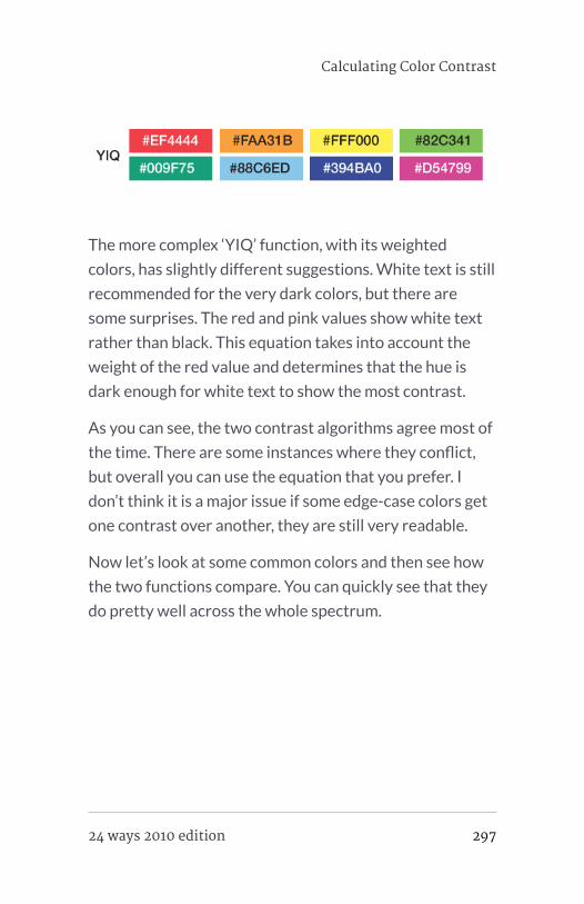
The more complex ‘YIQ’ function, with its weighted
colors, has slightly different suggestions. White text is still
recommended for the very dark colors, but there are
some surprises. The red and pink values show white text
rather than black. This equation takes into account the
weight of the red value and determines that the hue is
dark enough for white text to show the most contrast.
As you can see, the two contrast algorithms agree most of
the time. There are some instances where they conflict,
but overall you can use the equation that you prefer. I
don’t think it is a major issue if some edge-case colors get
one contrast over another, they are still very readable.
Now let’s look at some common colors and then see how
the two functions compare. You can quickly see that they
do pretty well across the whole spectrum.
Calculating Color Contrast
24 ways 2010 edition 297

In the first few shades of grey, the white and black
contrasts make sense, but as we test other colors in the
spectrum, we do get some unexpected deviation. Pure red
#FF0000 has a flip-flop. This is due to how the ‘YIQ’
function weights the RGB parts. While you might have a
personal preference for one style over another, both are
justifiable.
In this second round of colors, we go deeper into the
spectrum, off the beaten track. Again, most of the time
the contrasting algorithms are in sync, but every once in a
while they disagree. You can select which you prefer,
neither of which is unreadable.
298 24 ways 2010 edition

Conclusion
Contrast in color is important, especially if you cede all
control and take a hands-off approach to the design. It is
important to select smart defaults by making the contrast
between colors as high as possible. This makes it easier
for your customers to read, increases accessibility and is
generally just easier on the eyes.
Sure, there are plenty of other equations out there to
determine contrast; what is most important is that you
pick one and implement it into your system.
So, go ahead and experiment with color in your design.
You now know how easy it is to guarantee that your text
will be the most readable in any circumstance.
Calculating Color Contrast
24 ways 2010 edition 299

ABOUT THE AUTHOR
Brian Suda is a master informatician working to make the web a
better place little by little everyday. Since discovering the
Internet in the mid-90s, Brian Suda has spent a good portion of
each day connected to it. His own little patch of Internet is
http://suda.co.uk, where many of his past projects and crazy
ideas can be found.
Photo: Jeremy Keith
300 24 ways 2010 edition