Untitled - 臺北設計獎
106
-
Upload
khangminh22 -
Category
Documents
-
view
0 -
download
0
Transcript of Untitled - 臺北設計獎
2017 TAIPEI INTERNATIONAL DESIGN AWARD
臺北設計獎 成果專刊
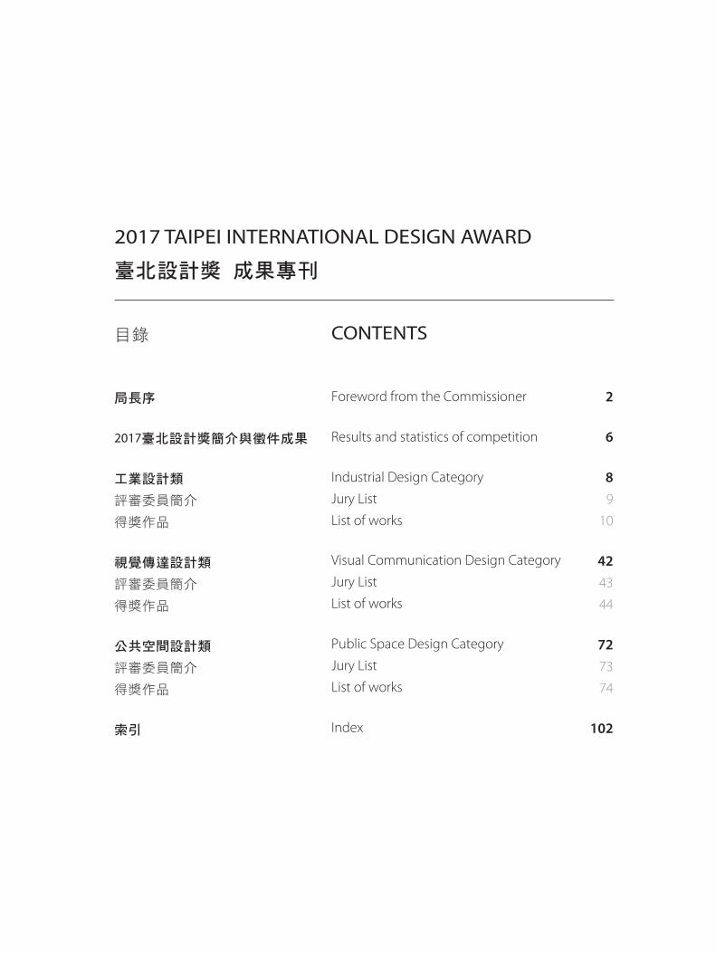
目錄
局長序
2017臺北設計獎簡介與徵件成果
工業設計類
評審委員簡介
得獎作品
視覺傳達設計類
評審委員簡介
得獎作品
公共空間設計類
評審委員簡介
得獎作品
索引
2
6
89
10
4243
44
7273
74
102
CONTENTS
Foreword from the Commissioner
Results and statistics of competition
Industrial Design Category
Jury List
List of works
Visual Communication Design Category
Jury List
List of works
Public Space Design Category
Jury List
List of works
Index
2
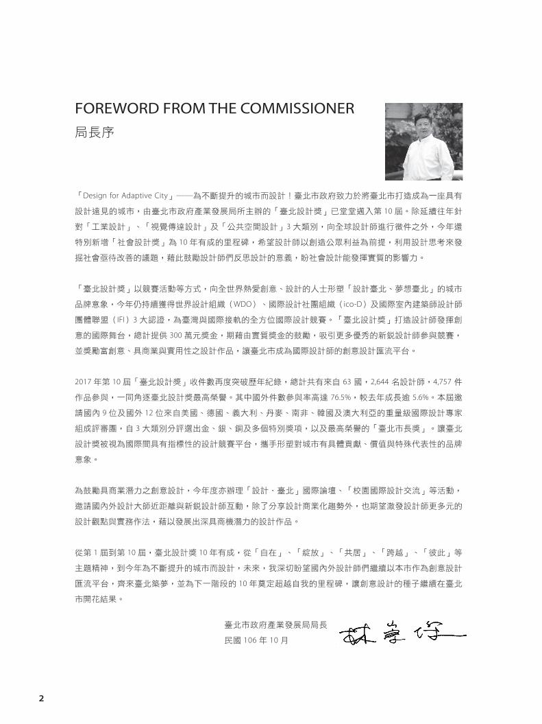
FOREWORD FROM THE COMMISSIONER局長序
「Design for Adaptive City」――為不斷提升的城市而設計!臺北市政府致力於將臺北市打造成為一座具有
設計遠見的城市,由臺北市政府產業發展局所主辦的「臺北設計獎」已堂堂邁入第 10 屆。除延續往年針
對「工業設計」、「視覺傳達設計」及「公共空間設計」3 大類別,向全球設計師進行徵件之外,今年還
特別新增「社會設計獎」為 10 年有成的里程碑,希望設計師以創造公眾利益為前提,利用設計思考來發
掘社會亟待改善的議題,藉此鼓勵設計師們反思設計的意義,盼社會設計能發揮實質的影響力。
「臺北設計獎」以競賽活動等方式,向全世界熱愛創意、設計的人士形塑「設計臺北、夢想臺北」的城市
品牌意象,今年仍持續獲得世界設計組織(WDO)、國際設計社團組織(ico-D)及國際室內建築師設計師
團體聯盟(IFI)3 大認證,為臺灣與國際接軌的全方位國際設計競賽。「臺北設計獎」打造設計師發揮創
意的國際舞台,總計提供 300 萬元獎金,期藉由實質獎金的鼓勵,吸引更多優秀的新銳設計師參與競賽,
並獎勵富創意、具商業與實用性之設計作品,讓臺北市成為國際設計師的創意設計匯流平台。
2017 年第 10 屆「臺北設計獎」收件數再度突破歷年紀錄,總計共有來自 63 國,2,644 名設計師,4,757 件
作品參與,一同角逐臺北設計獎最高榮譽。其中國外件數參與率高達 76.5%,較去年成長逾 5.6%。本屆邀
請國內 9 位及國外 12 位來自美國、德國、義大利、丹麥、南非、韓國及澳大利亞的重量級國際設計專家
組成評審團,自 3 大類別分評選出金、銀、銅及多個特別獎項,以及最高榮譽的「臺北市長獎」。讓臺北
設計獎被視為國際間具有指標性的設計競賽平台,攜手形塑對城市有具體貢獻、價值與特殊代表性的品牌
意象。
為鼓勵具商業潛力之創意設計,今年度亦辦理「設計.臺北」國際論壇、「校園國際設計交流」等活動,
邀請國內外設計大師近距離與新銳設計師互動,除了分享設計商業化趨勢外,也期望激發設計師更多元的
設計觀點與實務作法,藉以發展出深具商機潛力的設計作品。
從第 1 屆到第 10 屆,臺北設計獎 10 年有成,從「自在」、「綻放」、「共居」、「跨越」、「彼此」等
主題精神,到今年為不斷提升的城市而設計,未來,我深切盼望國內外設計師們繼續以本市作為創意設計
匯流平台,齊來臺北築夢,並為下一階段的 10 年奠定超越自我的里程碑,讓創意設計的種子繼續在臺北
市開花結果。
臺北市政府產業發展局局長
民國 106 年 10 月
3
"Design for Adaptive City!"
Taipei City Government is devoted to building Taipei as a city with design foresight. Taipei International Design Award(TIDA)
organized by Department of Economic Development, Taipei City Government is now onto its 10th year. Besides continuing with
the same three award categories as last year: Industrial Design, Visual Communication Design and Public Space Design, which call
for submissions from across the globe, this year, we have the "Social Design" category as a special new addition to mark our work
for the past decade, in hopes that designers will have public interests as the prerequisite in their design practice and utilize design
thinking to uncover social issues pending improvement. With the new category, we wish to encourage designers to re�ect on the
meaning of design and hope that their social designs will deliver substantial impact.
TIDA, in the form of a competition, is meant to present to all those passionate about creativity and designs an urban brand
imagery of "Design in Taipei, Dream in Taipei". This year, we have received recognition from three major design organizations:
World Design Organization (WDO), International Council of Design (ico-D) and International Federation of Interior Architects/
Designers (IFI), and that means TIDA is now an all-rounded international design competition bridging Taiwan and the world. TIDA
has created a platform where designers can exercise their creativity, while competing for a total of NT$3 million award. We hope to
attract more outstanding, emerging designers to the competition, via the substantial cash reward. By rewarding the creative works
full of creativity, practicality and commercial value, we also hope to turn Taipei City into a converging platform where international
designers can showcase their creative designs.
The number of submissions for the 10th TIDA(2017) is unprecedented and breaks all previous records. This year, we have received
4,757 works in total, by 2,644 designers, from 63 countries, all vying for the highest honor in TIDA. Of which, the submissions
from overseas reach up to 76.5%, an increase from last year by 5.6%. This year, we have invited international heavyweight design
specialists from home and overseas to form the judge panel, from countries such as the US, Germany, Italy, Denmark, South
Africa, Korea and Australia. For each of the three design categories, Gold, Silver, Bronze Awards will be presented, plus several
special awards and the highest honor: "Taipei City Mayor Award". We would like TIDA to be seen in the international community
as a landmark design competition platform where designers work in tandem to present city brand imageries with substantial
contribution, value and unique representativeness.
In order to encourage creative designs with commercial potentials, this year we have also organized "Design. Taipei" international
forums and events such as "International Design Exchanges on Campus", where home and overseas design masters are invited for
close-ranged interaction with emerging designers. Besides sharing design commercialization trends, we hope the designers will
be further stimulated with more diverse design perspectives and practical approaches, so as to develop more design works with
profound commercial potentials.
In 2017, TIDA celebrates its 10th anniversary with the spirit ranging from "Unrestraint", "Bloom", "Cohabitation", "Transcendence",
and "Mutuality" to "Design for Adaptive City" this year. In the future, I expect to see designers at home and abroad view Taipei as
a platform where creative design gathers and set a better milestone for the next decade to come, making the seeds of creative
design continue to blossom in Taipei.
Chung-chieh Lin, Commissioner of Department of Economic Development,
Taipei City Government
October 2017
4
INTRODUCTION 簡介
臺北一直是一個充滿活力、不斷提升的城市有機體,臺北市政府為向國際傳達「Design in Taipei 臺北設計」
的優質形象,特舉辦「臺北設計獎」,以「Design for Adaptive City 為不斷提昇的城市而設計」之精神,
廣邀全世界創意設計工作者、設計科系師生,以及熱愛設計的人士,公開徵選傑出國際設計作品,讓臺
北市成為創意設計匯流平台,藉以發掘具商機潛力的創意設計,鼓勵運用設計來改善城市的經濟、社群、
環境和文化的發展,提供全體大眾更和諧、安全與便利的生活品質。
臺北設計獎自 2008 年由臺北市政府主辦,今年為第 10 屆舉辦,原名為「臺北工業設計獎」,於 2012 年
正式更名為「臺北設計獎」,並擴大競賽類別為「工業設計類」、「視覺傳達設計類」與「公共空間設計
類」,同時並於 2014 年正式成為 WDO, ico-D 與 IFI 國際協會認證的國際設計競賽,在國際間的能見度提升,
吸引更多國際好手參加競賽,自 2013 年開始,為了廣徵創意,以不設主題,鼓勵所有國際間的好創意參
加競賽。
Taipei is a lively and advancing city. In order to convey to the world the quality image of “Design in Taipei”, Taipei
City Government organizes the “Taipei International Design Award”. Creative designers, teachers and students
of design schools, and people with design passion from around the global are invited to submit design works,
which publicly selected among international design works. Taipei International Design Award (TIDA) serves as a
creative design exchange platform to discover creative works with commercial potential. Taipei City Government
encourages participants to use universal design to improve the city's economic, social, environmental, and
cultural development by providing its users with a safer, harmonious, and more convenient lifestyle.
TIDA had been held by Taipei City Government since 2008, this year marks the 10th session. Originally named
“Taipei Industrial Design Award”, the name was officially changed to “Taipei International Design Award” in
2012, while competition categories included Industrial Design, Visual Communication Design, and Public Space
Design. In 2014, International Associations WDO, ico-D and IFI further accredited the competition, increasing
international visibility, which attracted competitors from across the world to participate. Starting from 2013, in
order to extensively receive creative designs, no theme is set, encouraging participants worldwide with creative
ideas to enter.
5
BRAND STORY品牌意涵
臺北設計獎品牌意涵:臺北設計獎自2012年開始,將徵件項目改為工業設計類、視覺傳達設計類、公共
空間設計類,在Logo的設計上,透過2D設計手法展現出3度空間的立方體創意形象,藉此代表臺北設計
獎的類別從視覺傳達、工業設計到公共空間,橫跨1D、2D到3D的360度全方位設計視野。並將代表國際
化International的i置放於正中心,呈現臺北設計獎邁入國際化的野心與目標,希望透過臺北設計獎這個競
賽平臺,讓臺灣的創作者能夠與全世界的設計好手,一起互相學習、成長,擁有更寬廣的國際視野,進
而讓創意夢想商品化,並兼具市場與未來性,為臺灣的設計產業帶來新氣象與新展望。
The brand implication of Taipei International Design Award: Since 2012, Taipei International Design Award has
added three new categories: industrial design category, visual communication design category, and public space
design category. Regarding the design of logo, the creative 3D cubic image presented through 2D design technique
indicates that the visual communication design category, industrial design category, and public space design category
respectively demonstrate 1D, 2D and 3D comprehensive design vision. “i”, which represents “international”, is placed at
the center of logo and shows the ambition and goal of Taipei International Design Award to become internationalized.
As a competition, Taipei International Design Award is expected to allow creators in Taiwan and designers around
the world to learn from each other, progress, obtain broader international visions, and further embody creativity and
dreams in their products with marketability and futurity, bringing the design industry in Taiwan new atmosphere and
prospects.

6
SUMMARY OF ENTRY WORKS 收件彙總表
No.Country or Area國家或區域別
Total作品總數
No.Country or Area國家或區域別
Total作品總數
01 中國大陸China 2,463 33 匈牙利Hungary 8
02 台灣Taiwan 1,117 34 西班牙Spain 7
03 日本Japan 132 35 烏克蘭Ukraine 7
04 香港Hong Kong 127 36 比利時Belgium 5
05 德國Germany 92 37 泰國Thailand 5
06 波蘭Poland 86 38 以色列Israel 4
07 美國Usa 64 39 委內瑞拉Venezuela 4
08 伊朗Iran 60 40 約旦Jordan 4
09 澳門Macau 60 41 菲律賓Philippines 4
10 墨西哥Mexico 47 42 馬其頓Macedonia 3
11 法國France 44 43 斯洛伐克Slovak Republic 3
12 馬來西亞Malaysia 31 44 越南Vietnam 3
13 厄瓜多Ecuador 27 45 愛沙尼亞Estonia 3
14 荷蘭Netherlands 27 46 澳大利亞Australia 4
15 俄國Russia 25 47 丹麥Denmark 2
16 瑞士Switzerland 24 48 白俄羅斯Belarus 2
17 斯洛文尼亞Slovenia 23 49 印尼Indonesia 2
18 印度India 21 50 克羅地亞Croatia 2
19 加拿大Canada 17 51 希臘Greece 2
20 多米尼加共和國Dominican republic 16 52 芬蘭Finland 2
21 南斯拉夫Yugoslavia FR 16 53 南非South Africa 2
22 巴西Brazil 15 54 津巴布韋Zimbabwe 2
23 捷克Czech Republic 15 55 尼日利亞Nigeria 1
24 塞爾維亞Serbia 15 56 立陶宛Lithuania 1
25 葡萄牙Portugal 15 57 孟加拉共和國Bangladesh 1
26 土耳其Turkey 14 58 保加利亞Bulgaria 1
27 古巴Cuba 13 59 哥倫比亞Colombia 1
28 英國United Kingdom 13 60 烏拉圭Uruguay 1
29 新加坡Singapore 13 61 愛爾蘭Ireland 1
30 韓國Korea 13 62 摩洛哥Morocco 1
31 意大利Italy 12 63 羅馬尼亞Romania 1
32 阿根廷Argentina 10
Total 4,757

7
作品類別 Category 件數 Number of Works
工業設計類 Industrial Design 1,258
視覺傳達設計類Visual Communication Design 3,191
公共空間設計類 Public Space Design 308
總作品數 Total quantity of works 4,757
NUMBER OF WORKS作品件數
身分
Identity
國籍
Nationality
業界人士 52 %
業界人士 54 %
國際 72 %
國際 77 %
學生 48 %
學生 46 %
臺灣 28 %
臺灣 23 %
2016 2017
STATISTICS OF THE 2016 ENTRIES
2017 年競賽投件統計
2017 臺北設計獎收件時間自 2017 年 04 月 28 日起至 07 月 28 日截止,共計有 4,757 件作品,63 國參
與。相關統計數字如下:
Entries for the 2017 Taipei International Design Award were received from April 28 ~July 28, 2017. A total of
4,757 works were received from 63 countries. Statistics as below:
參賽者身分Participants Analysis
INDUSTRIAL DESIGN工業設計類
9 Industrial Design Category
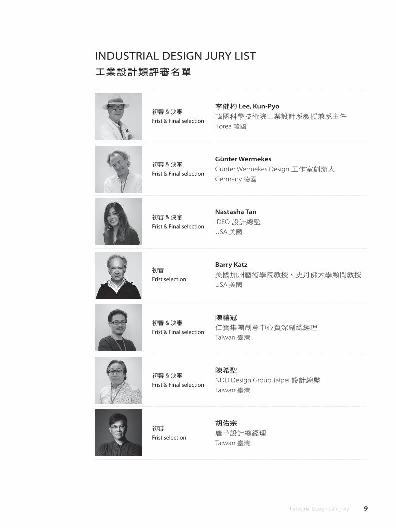
INDUSTRIAL DESIGN JURY LIST工業設計類評審名單
初審 & 決審
Frist & Final selection
李健杓 Lee, Kun-Pyo韓國科學技術院工業設計系教授兼系主任
Korea 韓國
初審 & 決審
Frist & Final selection
Günter WermekesGünter Wermekes Design 工作室創辦人
Germany 德國
初審 & 決審
Frist & Final selection
Nastasha TanIDEO 設計總監
USA 美國
初審
Frist selection
Barry Katz美國加州藝術學院教授、史丹佛大學顧問教授
USA 美國
初審 & 決審
Frist & Final selection
陳禧冠
仁寶集團創意中心資深副總經理
Taiwan 臺灣
初審 & 決審
Frist & Final selection
陳希聖
NDD Design Group Taipei 設計總監
Taiwan 臺灣
初審
Frist selection
胡佑宗
唐草設計總經理
Taiwan 臺灣
10 工業設計類
Silver Award 銀獎
充氣式微型手術室李權恩、陳蓓芸、鐘佳明、郭錦龍
Taiwan 臺灣
Taiwan encounters lots of earthquakes every year. When a big
earthquake hits, buildings often collapsed lots of people might be
covered by bricks and walls. Therefore, rescue teams will have to rush
to the collapsed area to save those people in need and performed
outdoor surgery when necessary. However, most of the time the
collapsed areas are often covered by smog and dust. Those risks both
increase the infection chances of the victims and patients and put
those people lives in a risky situation. What if we can design a product
that could help those rescue crews and provide an outdoor aseptic
surgical area. That will be a great improvement in the rescuing process
and saves people's lives. In�ated surgical shield is a portable, fast and
safe emergency outdoor surgical area. Whenever earthquakes happen,
lots of people would be injured cut by rocks or steels. In�ated surgical
shield could provide an aseptic surgical area by turning on the UV
vacuum then the surgical area will be in�ated and be ready for surgery.
臺灣位在板塊交界上,因此地震頻繁。過去的大地震發生後就伴隨著
大樓倒塌和人員遭壓、埋,遇到此種狀況時醫師、消防人員便要第一
時間進入現場,搶救被樑柱壓住、無法脫困的傷患,但災害過後的環
境經常充滿粉塵及細菌,以致傷患在進行手術時容易發生感染的狀
況,如果能夠提供一個小型無菌的空間,相信會成為急難救助時的一
大福音。 “充氣式微型手術室"是一個輕便攜帶、迅速且安全的緊
急手術室,在地震發生後的緊急救難中使用,主要針對大面積割傷和
異物刺傷所用。“充氣式微型手術室"利用紫外線光對空氣進行消毒
殺菌,使醫生能迅速的製造出無菌空間為患者處理傷口。
陳希聖:1. Innovation & e�cient. 2. Propose a new concept.
陳禧冠:Although the details of the account is not quite clear, the consideration of emergency medical treatment in case of disasters is highly worthy of
attention; the designer has unique insight into the the temporary solution to clean surgery.
Lee, Kun-pyo:Find the critial problem of catastrophic disaster.
Nastasha Tan:The idea or developing a new for emergency services is commendable and beautifully executed.
Günter Wermekes:Simple and practical solution to help injured people to survive.
陳希聖:1. 創新概念及提供方便性。 2. 提供未來新思考方向.
陳禧冠:雖然細節未盡交代清楚,但出發點考慮到災難發生時的救難醫療處置,是高度值得重視的議題,且設計師對於無塵小手術的臨時
solution亦有獨到的見解。
Lee, Kun-pyo:找到重大災難的關鍵問題。
Nastasha Tan:開發新緊急服務的想法是可行且精美執行的。
Günter Wermekes:簡單實用的解決方案,幫助受傷的人們活下來。
Judge's Comment│評審評語

11 Industrial Design Category
12 工業設計類
Silver Award 銀獎
陳希聖:1. HCK (Match the human centric-design) 2. Very compact and easy to use.
陳禧冠:The new understanding of the concept of "lighting" is quite interesting.
The way in which the natural silhouette is reproduced in the room is di�erent from that of the general �xture and quite original.
Lee, Kun-pyo:1. Allow user to create his/her own contents. 2. Change the memory of the lighty.
Nastasha Tan:1. The model mockup is warmed and elegant. 2. The vision around rede�ning the use of light is beautiful envisioned and reimagined.
Günter Wermekes:Perfectly designed product creation not only light but atmosphere too.
陳希聖:1. HCK(符合人性化設計) 2. 非常精巧,易於使用。
陳禧冠:對於「照明」概念的新理解頗有趣,以自然剪影在室內重現的手法有別於一般燈具的角色,頗為原創。
Lee, Kun-pyo:1. 允許使用者建立自己的內容。 2. 改變照明記憶。
Nastasha Tan:1. 模型溫暖且優雅。 2. 建立在美好且重新想像的基礎上重新定義光的使用。
Günter Wermekes:完美設計的產品不僅帶來了光源,更創造了氣氛。
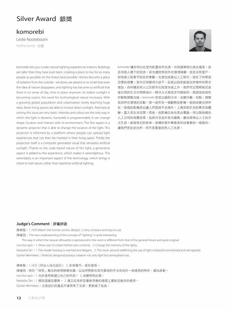
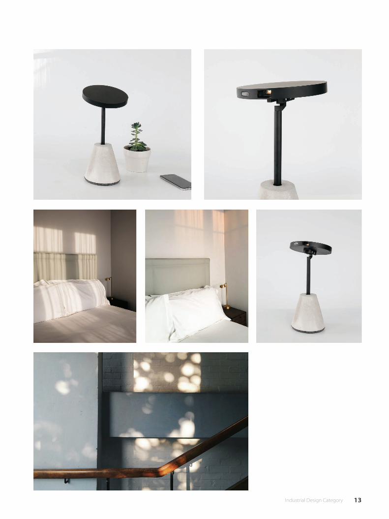
komorebiLeslie NooteboomNetherlands 荷蘭
komorebi lets you curate natural lighting experiences indoors. Buildings
are taller than they have ever been, creating a place to live for as many
people as possible on the tiniest land possible. Homes become a place
of isolation from the outside - windows are absent or so small that even
the idea of nature disappears, and lighting has become so arti�cial that
there is no sense of day, time or place anymore. As indoor sunlight is
becoming scarce, the need for technological nature increases. With
a growing global population and urbanisation levels reaching huge
rates, fewer living spaces are able to receive direct sunlight. Attempts at
solving this issue are very static. Intensity and colour are the only way in
which the light is dynamic. komorebi is programmable, it can change
shape, location and interact with its environment. The �rst aspect is a
dynamic projector that is able to change the location of the light. This
projector is informed by a platform where people can upload light
experiences that can then be inserted in their living space. Thirdly the
projection itself is a computer generated visual that simulates arti�cial
sunlight. Thanks to the code-based nature of the light, a generative
aspect is added to the experience, which makes it serendipitous. This
serendipity is an important aspect of the technology, which brings it
closer to real nature, rather than repetitive arti�cial lighting.
komorebi 讓你得以在室內配置自然光源。目前建築物比過去還高,這
是地狹人稠下的安排。卻也讓居家與外在環境隔離 - 或是沒有窗戶,
抑或是小到看不到自然景觀,光源也逐漸以人工取代,喪失了時間或
空間的感覺。室內日照變得欠缺下,促使以技術創造自然條件的需求
增加,而伴隨全球人口及都市化程度快速上升,我們可以預期接受直
接日照的生活空間將減少。解決方式是固定可模組的,透過強度與色
彩動態調整光線,komorebi 即是以編程方式,改變外觀、地點,調整
其與所在環境的互動。第一組件是一個動態投影機,能夠改變光源所
在,這個投影機得以讓人們透過平台操作,上傳其對於光的需求與體
驗,置入其生活空間。再者,投影機自身也是台電腦,得以製造模仿
人工日照的視覺效果,這部分受益於程式編碼,讓光線得以人工的方
式生成,創造奇幻的效果。這樣的意外驚喜是科技重要的一個面向,
讓我們更貼近自然,而不是重複使用人工光源。
Judge's Comment│評審評語
13 Industrial Design Category

14 工業設計類
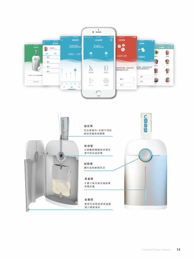
Urinary tract infection(UTI) is the most common disease in the long-
term care institution which up to 50%. Almost every elders who need
Long-Term Care are using Long-term indwelling catheter.Because of
elders have low immune system so they have urinary tract infection
untime. What is more serious is that will lead to septicemia which
causes elders die.Therefore, we design the IoT system, the use of
medical cloud to compare white blood cell volume in the urine, when
the number of white blood cells to determine the need to prevent
medical personnel level immediately inform the family and medical
terminal, and health education, to help the elderly to prevent urinary
tract infection and the maintenance of elderly health save, and due to
urinary tract infection in medical costs.
尿路感染 (UTI) 是長照機構最常見的感染症高達 50%,許多需要長期
照顧的年長者大多有使用長期滯留導尿管,在使用的期間因著老年人
的抵抗力較低使他們不定時的會有尿路感染的問題,更嚴重甚至會引
發敗血症,導致年長者死亡。 因此我們設計 IoT 的系統,利用醫療雲
的方式來比對尿液裡的白血球的量,當白血球的數量達到醫護人員判
定需要預防等級時就立即告知家屬及醫護端,並進行衛教措施,來幫
助老年人預防尿路感染以及維護年長者的健康,並節省因尿路感染而
造成的醫療花費。
uBag智慧樂袋楊育慈、洪博軒、蔡弘仁、王思云、張昕瑀
Taiwan 臺灣
陳希聖:1. Easy to carry & use. 2. Nice shape.
陳禧冠:The designer's idea of psychological care of patients (in addition to physical medical assistance) is worthy of praise. Patients also have psychological
needs of emotional entertainment, which is the subject that designers must pay attention to.
Lee, Kun-pyo:Sophisticated design for sensitive medical care with IoT technology.
Nastasha Tan:1. The product is a nice rede�nition of the existing one to date . 2.Beautifully recreated new solves a real need.
Günter Wermekes:Important healthcare product, designed in a professional way.
陳希聖:1. 容易攜帶及清潔。 2. 簡捷造型美觀脫離醫療冰冷感。
陳禧冠:設計師對於病患心理的照顧(除了身體上的醫療輔助)值得嘉獎.病人亦有情感娛樂的心理需求,是設計師必須重視的課題。
Lee, Kun-pyo:運用 IoT技術,專為敏感的醫療照護打造的精密設計。
Nastasha Tan:1. 此產品對現有產品做出適當的重新定義。 2. 精美的創造解決了真正的需要。
Günter Wermekes:以專業設計出重要的醫療保健產品。
Judge's Comment│評審評語
Bronze Award‧People's Choice Award銅獎‧最佳人氣獎
15 Industrial Design Category
16 工業設計類
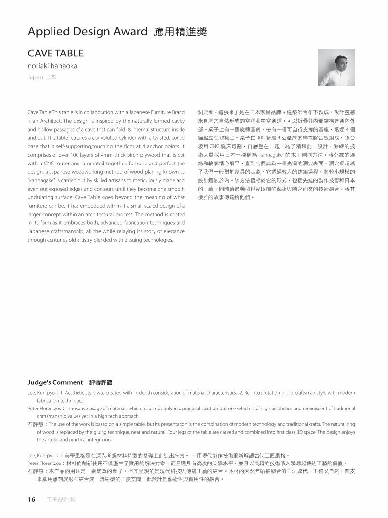
Cave Table This table is in collaboration with a Japanese Furniture Brand
+ an Architect. The design is inspired by the naturally formed cavity
and hollow passages of a cave that can fold its internal structure inside
and out. The table features a convoluted cylinder with a twisted, coiled
base that is self-supporting,touching the floor at 4 anchor points. It
comprises of over 100 layers of 4mm thick birch plywood that is cut
with a CNC router and laminated together. To hone and perfect the
design, a Japanese woodworking method of wood planing known as
"kannagake" is carried out by skilled artisans to meticulously plane and
even out exposed edges and contours until they become one smooth
undulating surface. Cave Table goes beyond the meaning of what
furniture can be, it has embedded within it a small scaled design of a
larger concept within an architectural process. The method is rooted
in its form as it embraces both, advanced fabrication techniques and
Japanese craftsmanship, all the while relaying its story of elegance
through centuries old artistry blended with ensuing technologies.
Applied Design Award 應用精進獎
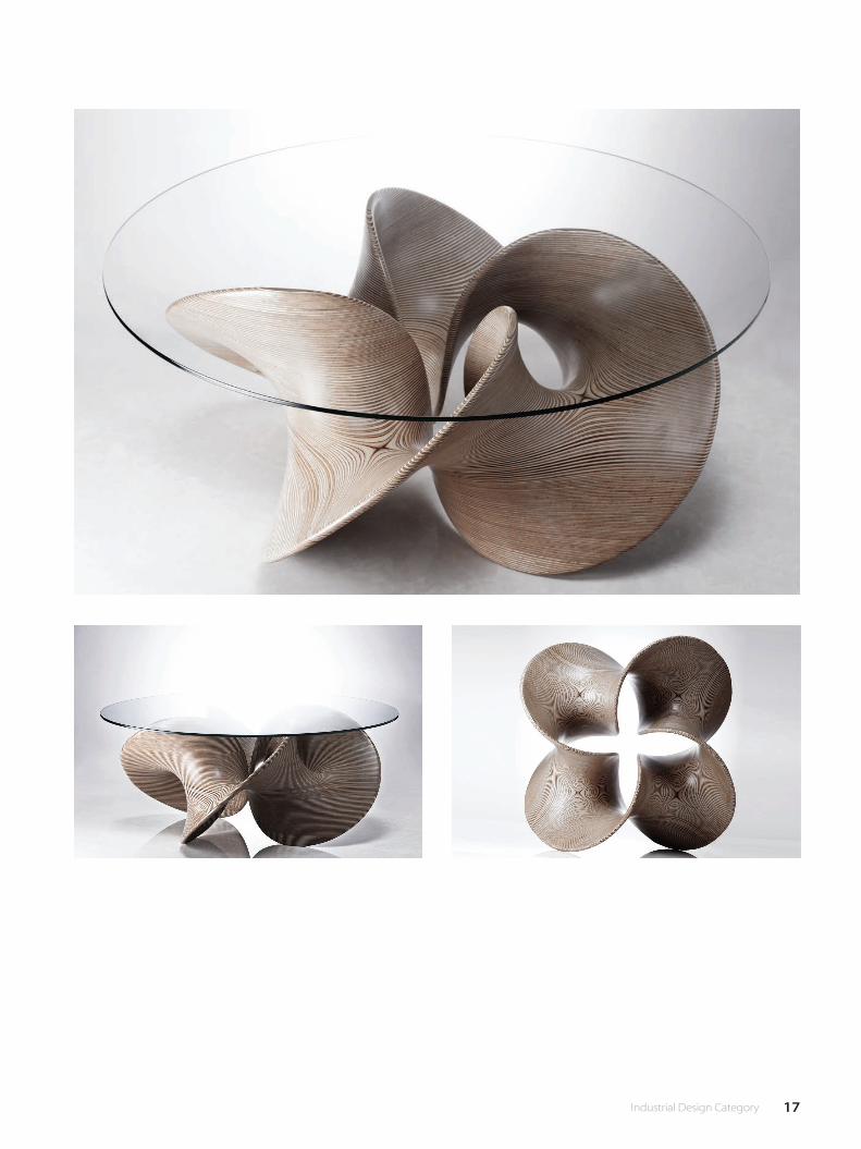
CAVE TABLEnoriaki hanaokaJapan 日本
洞穴桌 - 這張桌子是在日本家具品牌 + 建築師合作下製成。設計靈感
來自洞穴自然形成的空洞和中空通道,可以折疊其內部結構連通內外
部。桌子上有一個旋轉圓筒,帶有一個可自行支撐的基座,透過 4 個
錨點立在地板上。桌子由 100 多層 4 公釐厚的樺木膠合板組成,膠合
板用 CNC 銑床切割,再層壓在一起。為了精鍊此一設計,熟練的技
術人員採用日本一種稱為 "kannagake" 的木工刨削方法,將外露的邊
緣和輪廓精心磨平,直到它們成為一個光滑的洞穴表面。洞穴桌超越
了我們一般對於家具的定義,它透過較大的建築過程,將較小規模的
設計鑲嵌於內。該方法植根於它的形式,包括先進的製作技術和日本
的工藝,同時通過幾個世紀以前的藝術與隨之而來的技術融合,將其
優雅的故事傳達給他們。
Lee, Kun-pyo:1. Aesthetic style was created with in-depth consideration of material characteristics. 2. Re-interpretation of old craftsman style with modern
fabrication techniques.
Peter Florentzos:Innovative usage of materials which result not only in a practical solution but one which is of high aesthetics and reminiscent of traditional
craftsmanship values yet in a high tech approach.
石靜慧:The use of the work is based on a simple table, but its presentation is the combination of modern technology and traditional crafts. The natural ring
of wood is replaced by the gluing technique, neat and natural. Four legs of the table are carved and combined into �rst-class 3D space. The design enjoys
the artistic and practical integration.
Lee, Kun-pyo:1. 美學風格是在深入考慮材料特徵的基礎上創造出來的。 2. 用現代製作技術重新解讀古代工匠風格。
Peter Florentzos:材料的創新使用不僅產生了實用的解決方案,而且還具有高度的美學水平,並且以高超的技術讓人聯想起傳統工藝的價值。
石靜慧:本作品的用途是一張簡單的桌子,但其呈現的是現代科技與傳統工藝的結合。木材的天然年輪被膠合的工法取代,工整又自然,四支
桌腳用雕刻成形並結合成一流線型的三度空間,此設計是藝術性與實用性的融合。
Judge's Comment│評審評語
17 Industrial Design Category
18 工業設計類
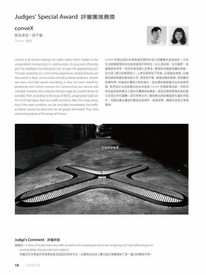
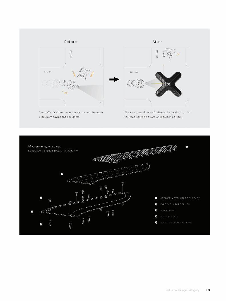
Judges' Special Award 評審團推薦獎
conveX阮呂承安、游子瑩
Taiwan 臺灣
conveX is an facility redesign for traffic safety which relates to the
unsignalized intersections in communities. Its structure efficiently
alter the headlight into directional icon to warn the approaching cars.
Through analyzing our commuting experience, several features are
discovered in Asian communities including dense residence, shared-
use lanes, and high-speed overtaking. In Asia, the lanes shared by
pedestrian and vehicle around the communities are narrow and
crowded. However, this is exactly the best roads for scooter drivers to
overtake. Then, according to the study of MOTC, unsignalized roads are
the third high place that have tra�c accidents. Also, the study shows
that if the road condition can be provided immediately, the traffic
accidents caused by dead end can be greatly decreased. Thus, here
comes the purpose of the design of Convex.
conveX 是個以探討台灣巷道空間特性切入的實驗性設施設計。分析
生活經驗發現在地社區巷道有許多特性,如人車共道、住宅擁擠、巷
道雜物多等等。然而台灣交通人密車多 , 壅塞的交通是普遍的現象。
在社區 , 通行的巷道窄小 , 人車共道增加了危險 , 在夜晚或清晨 , 此種
路段便成為最佳搶快的小徑 , 高速的行駛 , 昏暗混雜的視線 , 短距離的
反應時間 , 均造成此種路口的危險性。因此重新著眼舊式公共設施問
題 , 我們設計出全新概念的安全設施 :conveX 外型輕薄流線,巧妙利
用光反射的特質及三面向立體幾何結構面,反射及限制車燈光源於路
口呈現方向性圖騰,提示來車方向 ! 運用簡化的結構達到生產的可能
性,並藉由產品讓城市變成友善城市、美感空間、機能性使用之理想
環境 !
陳禧冠:In view of the fact that many tra�c accidents in the roadway are due to lack of lighting, such high re�ective ground
warning design does provide more vigilance.
有鑑於許多巷道內交通事故都是起因於照明不足,此類高反光地上警示設計確實提供了多一層次的警惕作用。
Judge's Comment│評審評語
19 Industrial Design Category
20 工業設計類
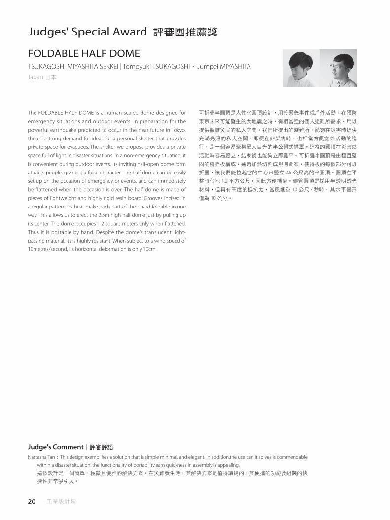
Judges' Special Award 評審團推薦獎
FOLDABLE HALF DOMETSUKAGOSHI MIYASHITA SEKKEI | Tomoyuki TSUKAGOSHI、Jumpei MIYASHITAJapan 日本
The FOLDABLE HALF DOME is a human scaled dome designed for
emergency situations and outdoor events. In preparation for the
powerful earthquake predicted to occur in the near future in Tokyo,
there is strong demand for ideas for a personal shelter that provides
private space for evacuees. The shelter we propose provides a private
space full of light in disaster situations. In a non-emergency situation, it
is convenient during outdoor events. Its inviting half-open dome form
attracts people, giving it a focal character. The half dome can be easily
set up on the occasion of emergency or events, and can immediately
be flattened when the occasion is over. The half dome is made of
pieces of lightweight and highly rigid resin board. Grooves incised in
a regular pattern by heat make each part of the board foldable in one
way. This allows us to erect the 2.5m high half dome just by pulling up
its center. The dome occupies 1.2 square meters only when �attened.
Thus it is portable by hand. Despite the dome's translucent light-
passing material, its is highly resistant. When subject to a wind speed of
10metres/second, its horizontal deformation is only 10cm.
可折疊半圓頂是人性化圓頂設計,用於緊急事件或戶外活動。在預防
東京未來可能發生的大地震之時,有相當強的個人避難所需求,用以
提供撤離災民的私人空間。我們所提出的避難所,能夠在災害時提供
充滿光照的私人空間。即便在非災害時,也相當方便室外活動的進
行,是一個容易聚集眾人目光的半公開式拱罩。這樣的圓頂在災害或
活動時容易豎立,結束後也能夠立即攤平。可折疊半圓頂是由輕且堅
固的樹脂板構成,通過加熱切割成規則圖案,使得板的每個部分可以
折疊,讓我們能拉起它的中心來豎立 2.5 公尺高的半圓頂。圓頂在平
整時佔地 1.2 平方公尺,因此方便攜帶。儘管圓頂是採用半透明透光
材料,但具有高度的抵抗力,當風速為 10 公尺 / 秒時,其水平變形
僅為 10 公分。
Nastasha Tan:This design exempli�es a solution that is simple minimal, and elegant. In addition,the use can it solves is commendable
within a disaster situation. the functionality of portability,earn quickness in assembly is appealing.
這個設計是一個簡單、極微且優雅的解決方案。在災難發生時,其解決方案是值得讚揚的,其便攜的功能及組裝的快
捷性非常吸引人。
Judge's Comment│評審評語

21 Industrial Design Category
22 工業設計類
Judges' Special Award 評審團推薦獎
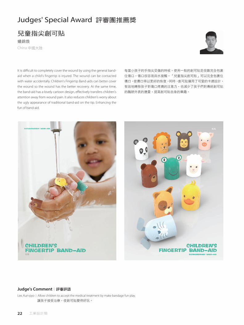
兒童指尖創可貼蟻錦煥
China 中國大陸
It is di�cult to completely cover the wound by using the general band-
aid when a child's fingertip is injured. The wound can be contacted
with water accidentally. Children's Fingertip Band-aids can better cover
the wound so the wound has the better recovery. At the same time,
the band-aid has a lovely cartoon design, e�ectively transfers children's
attention away from wound pain. It also reduces children's worry about
the ugly appearance of traditional band-aid on the tip. Enhancing the
fun of band-aid.
每當小孩子的手指尖受傷的時候,使用一般的創可貼是很難完全包裹
住傷口,傷口很容易與水接觸。「兒童指尖創可貼」可以完全包裹住
傷口,使傷口得以更好的恢復。同時,創可貼運用了可愛的卡通設計,
有效地轉移孩子對傷口疼痛的注意力,也減少了孩子們對傳統創可貼
的醜陋外表的擔憂,提高創可貼自身的樂趣。
Lee, Kun-pyo:Allow children to accept the medical treatment by make bandage fun play.
讓孩子接受治療,使創可貼變得好玩。
Judge's Comment│評審評語

23 Industrial Design Category

24 工業設計類
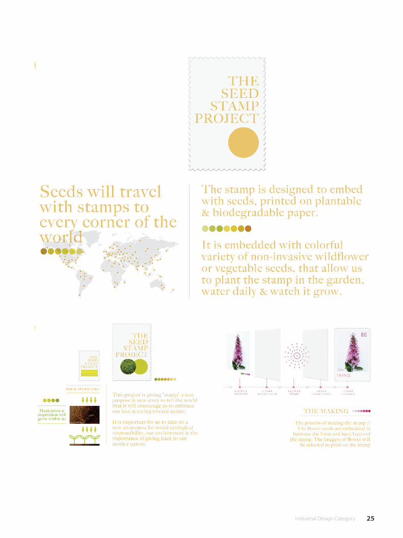
The Seed Stamp project is to bringing our consciousness for our nature
& environment. The stamp is designed to embed with seeds, printed on
plant-able & biodegradable paper It is embedded with colorful variety
of non-invasive wildflower or vegetable seeds, that allow us to plant
the stamp in the garden, water daily & watch it grow. It is important
that to allow us to take on a new awareness for social/ecological
responsibility, our environment & the importance of giving back to
mother nature. The process of making the stamp // The �ower seeds
are embedded in between the front and back layers of the stamp. The
imagery of �ower will be specially selected to print on the stamp for
each country. The seed stamp project is giving us more motivation and
inspiration in life.
Judges' Special Award 評審團推薦獎
The Seed Stamp projectYeoh Guan HongChina 中國大陸
種子郵票計畫 - 帶出我們對於自然與環境的意識。 郵票被設計成將種
子嵌入其中,並印在可栽種和可生物分解的紙上。郵票嵌入豐富多彩
的非侵入性野花或蔬菜種子,這使我們能夠在花園裡種植郵票,並每
天觀看它的生長。 重要的是,讓我們對社會 / 生態責任,環境和回饋
自然有新的認 識。在製作郵票的過程中 // 花卉種子嵌在郵票的前後
層之間,花的圖像有被特別選擇出來,印在每個國家的郵票上。 種
子郵票計畫給我們更多的動力和靈感。
Günter Wermekes:This project brings the world together in analog way.This makes us sensitive for our ecological and social responsibility
nice thought, that plants come out of a stamp on a postcard travelling around the world.
這項設計以模擬方式將世界融合在一起,讓我們對生態和社會責任感到敏感;將植物展示在世界各地的明信片上,這是
很好的想法。
Judge's Comment│評審評語
25 Industrial Design Category

26 工業設計類
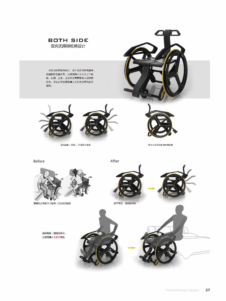
BOTH SIDE Two-way barrier-free wheelchair design, depth analysis of
the lives of leg disabled people, they use the wheelchair process, such
as going to bed, toilet and on the train and other daily life behavior,
upper and lower wheelchairs need someone else to help to complete.
BOTH SIDE Two-way barrier-free wheelchair design, designed for leg-
disabled people, designed bilateral rotatable backrest, both foot and
back, to facilitate people with disabilities without the help of others in
the case of the use of arm power up and down wheelchair. Through
the man-machine analysis, the support of the arm back to move both
effort and safety, the design of both practical and innovative, to the
wheelchair life to bring great convenience.
Judges' Special Award 評審團推薦獎
BOTH SIDE雙向無障礙輪椅設計董世友、丁子晗China 中國大陸
BOTH SIDE 雙向無障礙輪椅設計,深度分析腿部殘疾人士生活問題,
他們在使用輪椅過程中,比如上床、如廁和上車等日常生活行為,上
下輪椅需要其他人幫助來完成。 BOTH SIDE 雙向無障礙輪椅設計,專
為腿部殘疾人士設計,設計雙邊可旋轉靠背,既是腳托也是靠背,方
便殘障人士在不需要他人幫扶的情況下利用手臂的力量自行上下輪
椅。通過人機分析,手臂的支撐向後移動既省力又安全,該設計兼具
實用性與創新性,給輪椅殘障人士的生活帶來極大便利。
陳希聖:1. More convenience, USER friendly 方便,改善操作性。 2. Human centric design 符合人性化設計。
Judge's Comment│評審評語
27 Industrial Design Category

28 工業設計類
Distinction 優選
When outdoor events are held, the traditional trash cans placed
around are bulky and costs a lot to transport. We designed a trash
bin that is light, easy to transport and portable. Upping the fun factor
for disposing trash, at the same time minimises transporting costs,
increasing people's good will to place trash in the correct place.
FUN垃圾–一片式垃圾桶李盈瑩、陳珊珊
Taiwan 臺灣
我們發現在活動場所像是演唱會、展覽等,經常會使用無法收折的大
垃圾桶,不僅運輸成本高、也移動不便,而活動又是臨時性,所以我
們希望能讓垃圾桶變成好攜帶可收納式,降低運輸成本同時提高便利
性。另外我們發現大家在丟垃圾的時候,常常亂丟而且沒丟到也不會
將它撿起,造成垃圾桶周圍髒亂不堪,因此設計了趣味箭靶和標語,
像是:「如果連垃圾都丟不進,你還丟的進什麼」提醒人在亂丟的同
時能夠對準並用激將法來警惕人就算沒丟中也要將垃圾撿起!用一種
趣味的方式引導大家把垃圾丟到對的地方!
29 Industrial Design Category
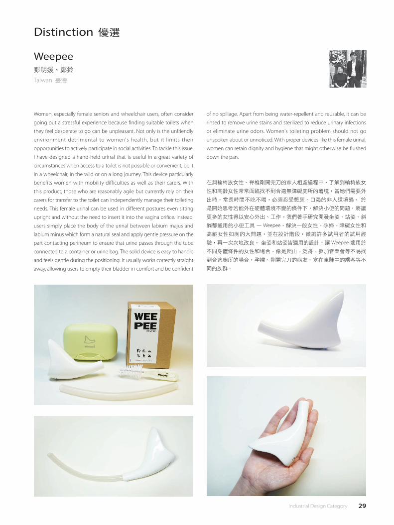
Women, especially female seniors and wheelchair users, often consider
going out a stressful experience because �nding suitable toilets when
they feel desperate to go can be unpleasant. Not only is the unfriendly
environment detrimental to women's health, but it limits their
opportunities to actively participate in social activities. To tackle this issue,
I have designed a hand-held urinal that is useful in a great variety of
circumstances when access to a toilet is not possible or convenient, be it
in a wheelchair, in the wild or on a long journey. This device particularly
benefits women with mobility difficulties as well as their carers. With
this product, those who are reasonably agile but currently rely on their
carers for transfer to the toilet can independently manage their toileting
needs. This female urinal can be used in di�erent postures even sitting
upright and without the need to insert it into the vagina ori�ce. Instead,
users simply place the body of the urinal between labium majus and
labium minus which form a natural seal and apply gentle pressure on the
part contacting perineum to ensure that urine passes through the tube
connected to a container or urine bag. The solid device is easy to handle
and feels gentle during the positioning. It usually works correctly straight
away, allowing users to empty their bladder in comfort and be con�dent
在與輪椅族女性、脊椎剛開完刀的家人相處過程中,了解到輪椅族女
性和高齡女性常常面臨找不到合適無障礙廁所的窘境,當她們需要外
出時,常長時間不吃不喝,必須忍受憋尿、口渴的非人道境遇。 於
是開始思考若能外在硬體環境不變的條件下,解決小便的問題,將讓
更多的女性得以安心外出、工作。我們著手研究開發坐姿、站姿、斜
躺都通用的小便工具 — Weepee,解決一般女性、孕婦、障礙女性和
高齡女性如廁的大問題,並在設計階段,徵詢許多試用者的試用經
驗,再一次次地改良。 坐姿和站姿皆適用的設計,讓 Weepee 適用於
不同身體條件的女性和場合,像是爬山、泛舟、參加音樂會等不易找
到合適廁所的場合,孕婦、剛開完刀的病友、塞在車陣中的乘客等不
同的族群。
Distinction 優選
Weepee彭明媛、鄭鈴
Taiwan 臺灣
of no spillage. Apart from being water-repellent and reusable, it can be
rinsed to remove urine stains and sterilized to reduce urinary infections
or eliminate urine odors. Women's toileting problem should not go
unspoken about or unnoticed. With proper devices like this female urinal,
women can retain dignity and hygiene that might otherwise be �ushed
down the pan.
30 工業設計類
Distinction 優選
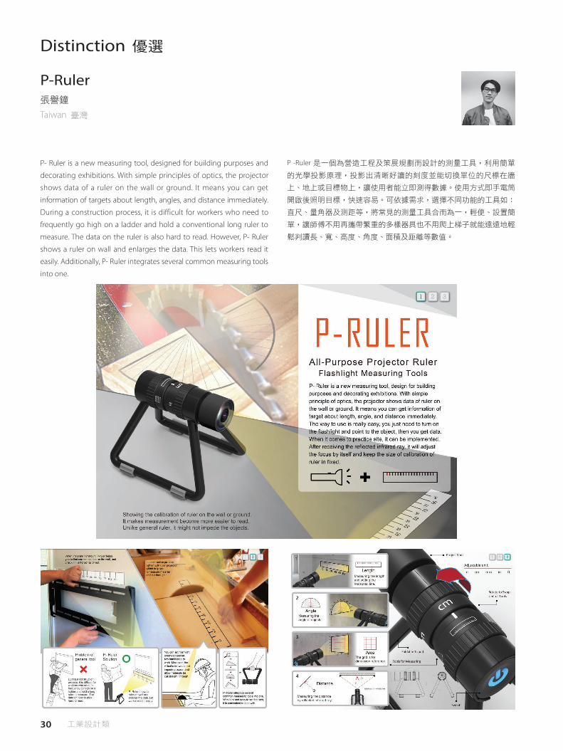
P- Ruler is a new measuring tool, designed for building purposes and
decorating exhibitions. With simple principles of optics, the projector
shows data of a ruler on the wall or ground. It means you can get
information of targets about length, angles, and distance immediately.
During a construction process, it is difficult for workers who need to
frequently go high on a ladder and hold a conventional long ruler to
measure. The data on the ruler is also hard to read. However, P- Ruler
shows a ruler on wall and enlarges the data. This lets workers read it
easily. Additionally, P- Ruler integrates several common measuring tools
into one.
P-Ruler張譽鐘
Taiwan 臺灣
P -Ruler 是一個為營造工程及策展規劃而設計的測量工具,利用簡單
的光學投影原理,投影出清晰好讀的刻度並能切換單位的尺標在牆
上、地上或目標物上,讓使用者能立即測得數據。使用方式即手電筒
開啟後照明目標,快速容易。可依據需求,選擇不同功能的工具如:
直尺、量角器及測距等,將常見的測量工具合而為一,輕便、設置簡
單,讓師傅不用再攜帶繁重的多樣器具也不用爬上梯子就能遠遠地輕
鬆判讀長、寬、高度、角度、面積及距離等數值。
31 Industrial Design Category
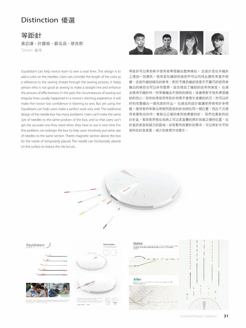
Equidistant can help novice learn to sew a neat lines. This design is to
add a color on the needles. Users can consider the length of the color as
a reference to the sewing thread through the sewing process. It helps
person who is not good at sewing to make a straight line and enhance
the process of effectiveness. In the past, the circumstances of sewing out
irregular lines usually happened in a novice's stitching experience. It will
make the novice lost confidence in learning to sew, But yet using the
Equidistant can help users make a perfect work very well. The traditional
design of the needle box has many problems. Users can’t make the same
size of needles to the same position of the box, and so that users can't
get the accurate one they need when they have to use it next time. For
this problem, we redesign the box to help users intuitively put same size
of needles to the same section. There’s magnetic section above the box
for the needs of temporarily placed. The needle can horizontally adsorb
on the surface to reduce the risk occurs.
Distinction 優選
等距針黃宓謙、許震瑜、鄭名涵、蔡孜群
Taiwan 臺灣
等距針可以幫助新手使用者學習縫出整齊線段。 此設計是在手縫針
上增加一段顏色,使用者在縫紉的過程中可以利用此顏色來當作依
據,去當作縫紉線段的參考,對於不擅長縫紉或是手不靈巧的使用者
縫出的線段也可以非常整齊,這也增加了縫紉的效率與速度。 在過
去使用手縫針時,時常會縫出不規則的線段,這會使新手喪失學習縫
紉的信心;但你如果使用等距針你將不會發生這樣的狀況,你可以好
好的完整縫出一個完美的作品。 在過去的設計會讓使用者有許多問
題。使用者時常無法將相同長度的針收納在同一個位置,因此下次使
用者要取出針時,會無法正確的拿到他需要的針。 我們也重新的設
計針盒,幫助使用者在收納上可以更直覺的將針放進正確的位置,在
針盒的表面有磁力的區域,如有暫時放置針的需求,可以將針水平的
吸附在針盒表面,減少危險意外地發生。
32 工業設計類
Distinction 優選
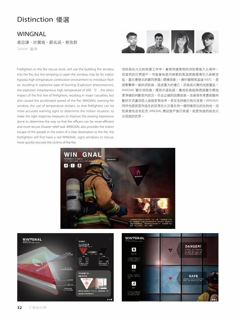
Firefighters in the fire rescue work, will use the building fire window
into the �re, but the tempting to open the window, may be for indoor
hypoxia high temperature combustion environment to introduce fresh
air, resulting in explosive type of burning (Explosion phenomenon),
the explosion instantaneous high temperature of 600 ℃ , the direct
impact of the �rst line of �re�ghters, resulting in major casualties, but
also caused the accelerated spread of the �re. WINGNAL warning �re
window, the use of temperature stickers, so that firefighters can be
more accurate warning signs to determine the indoor situation, to
make the right response measures to improve the existing experience
alone to determine the way so that �re o�cers can be more e�cient
and more secure Disaster relief task. WINGNAL also provides the indoor
escape of the people in the event of a clear destination to the �re, the
firefighters will first have a red WINGNAL signs windows to rescue,
more quickly rescued the victims of the �re.
WINGNAL黃宓謙、許震瑜、鄭名涵、蔡孜群
Taiwan 臺灣
消防員在火災的救援工作中,會使用建築物的消防窗進入火場中,
但冒然的打開窗戶,可能會為室內缺氧的高溫燃燒環境引入新鮮空
氣,產生爆發式的劇烈燃燒 ( 煙爆現象 ),爆炸瞬間高溫達 600℃,直
接衝擊第一線的消防員,造成重大的傷亡,亦造成火勢的加速蔓延。
WINGNAL 警示消防窗,運用示溫貼紙,讓消防員能夠透過警示標誌
更準確的判斷室內狀況,作出正確的因應措施,改善現有單靠經驗判
斷的方式讓消防人員能更有效率,更安全的進行救災任務。WINGNAL
同時也提供室內逃生的民眾在火災發生時一個明確前往的目的地,消
防員會先由有紅色 WINGNAL 標誌窗戶進行救援,能更快速的救出火
災受困的民眾。

33 Industrial Design Category
"FTV" is a new vehicle provides that di�erent riding mode for users.
This vehicle has two riding mode to switch. First, you can ride FTV
with high speed in long distance. The other, you can ride it with high
degree of freedom in crowded areas. FTV let you move more fashion
in di�erent areas.
Distinction 優選
未來分離式載具葉儒勳、吳宗穎
Taiwan 臺灣
「FTV」是一款提供使用者能以兩種騎乘方式移動的載具。 此款載具
有兩種騎乘模式可以切換,一種為騎乘兩輪載具能以高速行駛較長距
離;另一種為騎乘單輪載具能以靈活駕馭方式穿梭於人口密集區,比
現有載具更能自由自在地穿梭在不同的地域之間。

34 工業設計類
Distinction 優選
As modern technology is evolving everyday, more children gain access
to electronic devices from early age, some could even start from 1 year
old. Consequently, the abuse of electronic devices has great impact
on children such as causing lack of self- care ability, social ability and
hampers communication between parents. Especially in a metropolitan
city like Hong Kong with fast paced living rhythm and high living
standards, parents have very limited time to interact with their
children. Therefore, bathing becomes a most intimate quality time for
children and parents. SplashBuddy is a bathing kit that fosters parental
interaction through creating an amusing experience for both parents
and children while acting as an educational toy that encourages
children to build up their self- care ability. The design includes 5
components that encourage bathing procedures: a goggle-like shower
hat, octopus shaped comb, angler�sh container, turtle like sponge and
a whale stool. All of the components can be detached and connected
with other components �exibly to inspire children's creativity. It is also
design for bathrooms with limited space.
SplashBuddyTsang Wai Sum
Hong Kong 香港
隨著現今科技的不斷發展 , 兒童自小已能接觸電子產品 , 有的甚至會
從 1 歲開始使用。據資料顯示 , 香港大多數兒童每天會花超過 30 分鐘
玩電子遊戲 , 然而濫用電子產品對兒童的成長有很大的影響 , 例如阻
礙他們跟家長溝通 , 以致他們缺乏社交能力 , 甚至照顧自己的能力。
一些生活節奏急速和擁有高質素生活水平的城市,如香港,大部分父
母需要長時間工作 , 只有非常有限的時間可以跟孩子進行互動。因此 ,
洗澡變成了孩子和家長之間最親密的時間。 Splashbuddy 是一套洗澡
玩具。透過家長和孩子的互動 , 孩子能寓學習於遊戲 , 建立自理能力。
該設計包括 5 個組成部 分 : 潛水鏡帽子、八爪魚梳子、燈籠魚容器、
烏龜海綿和鯨魚櫈子。所有的部件可以自由組合或拆卸 , 激發孩子的
創造力。此外 , 該設計亦適用於空間有限的浴室 , 迎合各種居住環境。

35 Industrial Design Category
YOYOKE. is a smart electric city bike which can extend unlimited.
YOYOKE. is divided into three parts, its assemble through the general
structure of connecting. The front side ,the middle side and back side
of YOYOKE are equipped with expanded assembly mouth, which is
used for loading the accessories which have a uniform specification.
Although there are all kinds of bicycles in the market,but we always
spend a lot of money to make the bicycles meet our own needs.
Why spend a lot when you can rent what you need? YOYOKE is an
environmentally friendly community bike rental system. Check out a
free bike and then rent bicycle accessories that meet your daily needs
and express your lifestyle and personality. Even the accessories can
be free of charge when the cost of renting the accessory reaches a
certain value. YOYOKE brings sustainability to the experience of using
a bicycle. The user´s daily changing needs are met by this product
concept and the system. YOYOKE also provide an environmentally
friendly community bike rental system on the internet. The users
no need to buy many different accessories, they can all be rented.
It supports a positive attitude to decrease consumption and to
encourage bike sharing.
Distinction 優選
YOYOKE衛炳麟、路放
Hong Kong 香港
YOYOKE 是一款可無限延展的城市電動助力自行車,自行車被分為三
大模組,通過通用的銜接結構進行組合。YOYOKE 自行車的前、中、
後端都有拓展裝配口,可供裝載配件使用。不同配件模組具有不同的
功能,但他們都有著統一的裝配接口。 儘管市場中有著各種各樣的
自行車,但我們常常還需花費很多去改裝自行車來滿足我們自身的特
殊使用需求。為何不可以通過租賃的方式來滿足不同的使用需求呢?
YOYOKE 基於自身的產品使用特徵,打造了一個社區內的自行車生態
系統,來鼓勵更多人加入到自行車出行的隊伍中來。社區內每戶家庭
可以在 YOYOKE 的官網上申請免費使用一輛基礎款的 YOYOKE 自行車,
並且在有需求時可以租賃需要的其他自行車配件,當租賃該配件的費
用達到一定數值時可以免費擁有該配件。對於不常使用的配件也可以
放在 YOYOKE 的平臺上供同一個社區的居民以較低的價格租賃使用。
YOYOKE 提供了一個可持續使用自行車的體驗,通過網絡平台,使用
者可以租賃自行車及各種配件來滿足不同的使用需求,進而減少自行
車生產的浪費,鼓勵使用者共享資源。
36 工業設計類
Distinction 優選
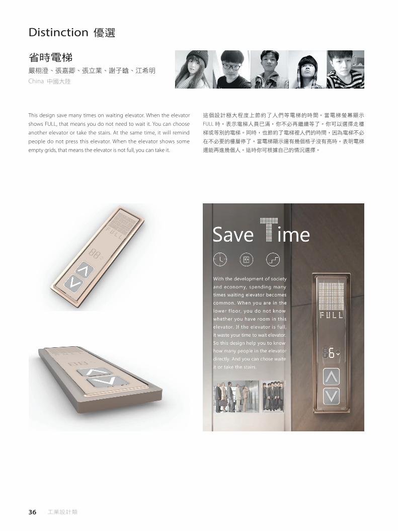
This design save many times on waiting elevator. When the elevator
shows FULL, that means you do not need to wait it. You can choose
another elevator or take the stairs. At the same time, it will remind
people do not press this elevator. When the elevator shows some
empty grids, that means the elevator is not full, you can take it.
省時電梯嚴栩澄、張嘉卿、張立業、謝子晗、江希明
China 中國大陸
這個設計極大程度上節約了人們等電梯的時間。當電梯螢幕顯示
FULL 時,表示電梯人員已滿,你不必再繼續等了。你可以選擇走樓
梯或等別的電梯。同時,也節約了電梯裡人們的時間,因為電梯不必
在不必要的樓層停了。當電梯顯示還有幾個格子沒有亮時,表明電梯
還能再進幾個人。這時你可根據自己的情況選擇。
37 Industrial Design Category
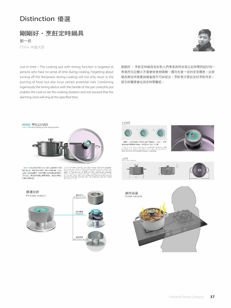
Just-in-time‧The cooking pot with timing function is targeted at
persons who have no sense of time during cooking. Forgetting about
turning off the fire/power during cooking will not only result in the
burning of food, but also incur certain potential risks. Combining
ingeniously the timing device with the handle of the pot cover,this pot
enables the cook to set the cooking duration and rest assured that the
alarming clock will ring at the speci�ed time.
Distinction 優選
剛剛好‧烹飪定時鍋具劉一君
China 中國大陸
剛剛好‧烹飪定時鍋具是針對人們煮東西時容易忘記時間而設計的。
煮東西忘記關火不僅會使食物燒糊,還存在著一定的安全隱患。此款
鍋具將定時裝置與鍋蓋提手巧妙結合,烹飪者只需設定好烹飪時長,
提示鈴聲便會在指定時間響起。
38 工業設計類
Distinction 優選
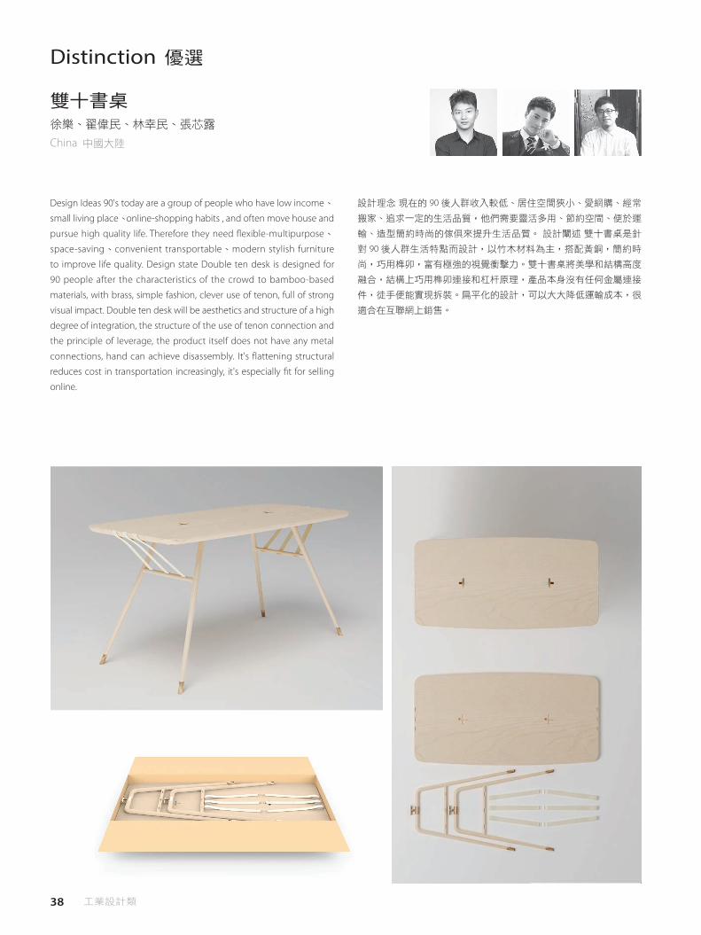
Design Ideas 90's today are a group of people who have low income、
small living place、online-shopping habits , and often move house and
pursue high quality life. Therefore they need �exible-multipurpose、
space-saving、convenient transportable、modern stylish furniture
to improve life quality. Design state Double ten desk is designed for
90 people after the characteristics of the crowd to bamboo-based
materials, with brass, simple fashion, clever use of tenon, full of strong
visual impact. Double ten desk will be aesthetics and structure of a high
degree of integration, the structure of the use of tenon connection and
the principle of leverage, the product itself does not have any metal
connections, hand can achieve disassembly. It's flattening structural
reduces cost in transportation increasingly, it's especially �t for selling
online.
雙十書桌徐樂、翟偉民、林幸民、張芯露
China 中國大陸
設計理念 現在的 90 後人群收入較低、居住空間狹小、愛網購、經常
搬家、追求一定的生活品質,他們需要靈活多用、節約空間、便於運
輸、造型簡約時尚的傢俱來提升生活品質。 設計闡述 雙十書桌是針
對 90 後人群生活特點而設計,以竹木材料為主,搭配黃銅,簡約時
尚,巧用榫卯,富有極強的視覺衝擊力。雙十書桌將美學和結構高度
融合,結構上巧用榫卯連接和杠杆原理,產品本身沒有任何金屬連接
件,徒手便能實現拆裝。扁平化的設計,可以大大降低運輸成本,很
適合在互聯網上銷售。

39 Industrial Design Category
VERMI is a self-sustainable, composting and farming solution
for food waste disposal in urban households. VERMI is built on
the system of vermiculture, meaning red worms take care of
your organic waste. Worms living in the bottom part Vermi will
literally eat your food garbage and turn it into a rich soil which
can be instantly used in the top farming part of the station to
grow vegetables on a small scale right inside your home. The
aim of this solution is to reach as many people as possible and of
all social classes. Compared to existing solutions on the market,
VERMI is low-cost, low-maintenance and has zero to low-energy
consumption (depends on the user). We are currently facing a
global problem of food waste being over 30% of all produced
food. Up to 45% of vegetable & fruits get spoiled even before
they reach customers in retail. This is not only alarming due to the
actual losses but also the contribution that food wastage has to
emissions. Industrialized Asia maintains highest numbers from
all regions in terms of carbon footprint tied to food wastage(2x
higher than Europe) and has one of the highest rates in food
wastage on pre-consumer level in the world. VERMI has built in
IoT system and operates with an app which is able to control the
Distinction 優選
VERMI - Composting and Farming stationNatalia HoosovaSlovak Republic 斯洛伐克
VERMI 是城市家庭廚餘處理的一種堆肥養殖解決方案,能夠自給自
足。 VERMI 建立在蚯蚓的生態系統基礎上,意味著這些蟲能處理您的
這些有機廢物。居住在 VERMI 底部的蟲將會直接吃你的廚餘,並將其
變成一個豐富的土壤,可以立即用於系統的頂端農用部分,在家裡小
規模的種植蔬菜。這個解決方案的目標是盡可能多接觸到各種社會階
層,與市場上現有的解決方案相比,VERMI 是低成本,低維護費用,
零到低度耗能(取決於用戶)。目前,我們正面臨著全球食品有超過
30%的廚餘問題,甚至在零售端到達客戶之前,高達 45%的蔬菜和
水果都會被腐壞。這樣的實際損失不僅令人吃驚,也是食物耗損對於
碳排放的影響也不容忽視。在與食品耗損相關的碳足跡方面,亞洲工
業化國家持續有著相對高數量(比歐洲高出 2 倍),並且是世界上在
消費前食品耗損率最高的國家之一。 VERMI 內置了物聯網系統,可透
過 app 操作,能夠控制溫度,即使在寒冷的冬季也可能讓蚯蚓發揮最
佳功能。用戶也可以將此功能關閉,VERMI 也能完美以相近解決方案
操作,發揮零耗能的作用。
temperature and suggest meal portions for the best possible
functioning of worms even during cold winter months.User can
turn this feature o� and use VERMI �awlessly as an analog solution
with zero energy consumption as well.
40 工業設計類
41 Industrial Design Category

VISUAL COMMUNICATION DESIGN 視覺傳達設計類
43 Visual Communication Design Category
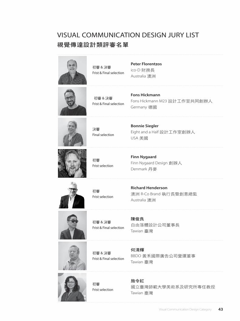
VISUAL COMMUNICATION DESIGN JURY LIST視覺傳達設計類評審名單
初審 & 決審
Frist & Final selection
Peter Florentzosico-D 財務長
Australia 澳洲
初審 & 決審
Frist & Final selection
Fons HickmannFons Hickmann M23 設計工作室共同創辦人
Germany 德國
決審
Final selection
Bonnie SieglerEight and a Half 設計工作室創辦人
USA 美國
初審
Frist selection
Finn NygaardFinn Nygaard Design 創辦人
Denmark 丹麥
初審
Frist selection
Richard Henderson澳洲 R-Co Brand 執行長暨創意總監
Australia 澳洲
初審 & 決審
Frist & Final selection
陳俊良
自由落體設計公司董事長
Tawian 臺灣
初審 & 決審
Frist & Final selection
何清輝
BBDO 黃禾國際廣告公司營運董事
Tawian 臺灣
初審
Frist selection
施令紅
國立臺灣師範大學美術系及研究所專任教授
Tawian 臺灣

44 視覺傳達設計類
Golden Award 金獎
Since 2014, Design 360。 relaunched into a new editorial approach from Designer's perspective. Thematic issues such as "Designer's Archive"(N.49), "Design Manifesto"(N.50), "Designer's Typeface"(N.51), Designer at Work"(N.52), "Designer's Collection"(N.53) and "Designer's Travel"(N.54) successfully attracted the attention in Asian design community. The themes continued in 2015 with recent issues "Designer's Photography"(N.55), "Designer's Music"(N.56), "Designer for Food"(N.57), "Design Academy"(N.58), "Designer's Lookbook"(N.59) and "Design Week"(N.60). The new editorial direction penetrates design and daily lives, acting out with the spirit of "Living with Design", whereas the new features provided an integrated and brand new in-depth angle looking at designs/designers around the world. Design 360。 re-designed format follows the idea and editorial principle of the magazine - structuring the contents di�erent layers and perspective with openness. The three books vary in small, medium and big format, bind together to become the entity of magazine, perceiving the cutting edge in terms of publication format and design. The new editorial design combines both Chinese and English typographic approach, gives a sense of contemporary Asian design in its appearance. Di�erent weights of paper chosen for the new magazine also considered giving a light and relaxing reading experience to the readers, echoes with the "Living with Design" spirit of the magazine. In addition to format, The "Designer's Music"(N.56) issue start inventing multimedia interaction, linking external content through QR-code to di�erent platforms. The is stepping up to bring multi-dimension experience to the readers. Design 360。 has a remarkable increase in circulation after the newly launched content and format, its readers and markets keep expanding from Asia to even Europe. Cities in Asia like Korea and Japan shows an increasing attention to Design 360。 as a navigation for Asian Design through subscription and following its social media, while cities in Western and European countries subscribe the magazine as a window and bridge connects to Asia and appreciate Asian designs. The ever expanding audiences generated a mass circulation.
自 2014 年以來,Design 360°從設計師的角度重新推出了新的編輯
方式,若干雜誌主題像是“設計師檔案"(N.49),“設計宣言"
(N.50),“設計者字體"(N.51),設計師工作“(N.52),"設
計師收藏“(N.53),“設計師之旅"(N.54)等,成功的引起了亞
洲設計社群的注意。雜誌在 2015 年持續推出一些新主題,如“設計
師相片"(N.55),“設計師音樂"(N.56),“食品設計師"(N.57),
“設計學院"(N.58),“設計師外觀"(N.59)和“設計週"(N.60)
等,新的編輯方向貫穿於設計和日常生活,以“生活設計"的精神表
現出來,而此一新主題特性為全球設計 / 設計師提供了完整而全新的
深入視角。Design 360°重新設計雜誌的風格,以不同的層次和視角
開放的內容作為雜誌的思想和編輯原則,以小,中,大格式不同的三
冊組成為雜誌的實體,體現了前衛的出版和設計風格。新的編輯設計
結合了中英文排版方式,給人一種當代亞洲設計風格的感覺。為新雜
誌選擇的不同重量的紙張也考慮到給讀者帶來輕鬆輕鬆的閱讀體驗,
與“生活設計"的雜誌精神相呼應。除了版型外,“設計師音樂"
(N.56)開始採用多媒體互動,通過 QR 碼將外部內容連接到不同的
平台,加強讓讀者有多維度的體驗。Design 360°嶄新的內容和形式,
使得雜誌流通量大幅增加,在亞洲乃至歐洲的讀者群和市場仍在不斷
擴大。像韓國和日本等亞洲城市透過訂閱和追踪其社群媒體,越來越
重視 Design 360°作為亞洲設計的導航,而西方和歐洲國家的城市則
將訂閱這本雜誌作為一個窗口和橋樑,並與亞洲相融合,欣賞亞洲設
計。不斷擴展的讀者群創造可觀的發行量。
Design 360°2015 issuesJavin Mo、Saki HoHong Kong 香港
Bonnie Siegler:Beautiful, surprising, innovative, creative- each issue surpassed the previous one.
何清輝:A excellent work which people can't stop loving.
陳俊良:Complete work with consistent high quality.
Fons Hickmann:A perfect made design magazine designed for designers.
Peter Florentzos:Excellent contemporary publication design utilising many print embellishment techniques and design features,
typography space + shape to create outstanding result.
Bonnie Siegler:美麗、令人驚訝、創新、創意 - 每期雜誌都勝過前一期。
何清輝:一件讓人喜愛想多翻幾次的好作品。
陳俊良:完整的作品,而且始終質感在高水平。
Fons Hickmann:為設計師所設計的完美設計雜誌。
Peter Florentzos:出色的當代出版設計,利用許多印刷裝飾技術及設計功能以及排版空間+形狀,表現優異。
Judge's Comment│評審評語

45 Visual Communication Design Category
46 視覺傳達設計類
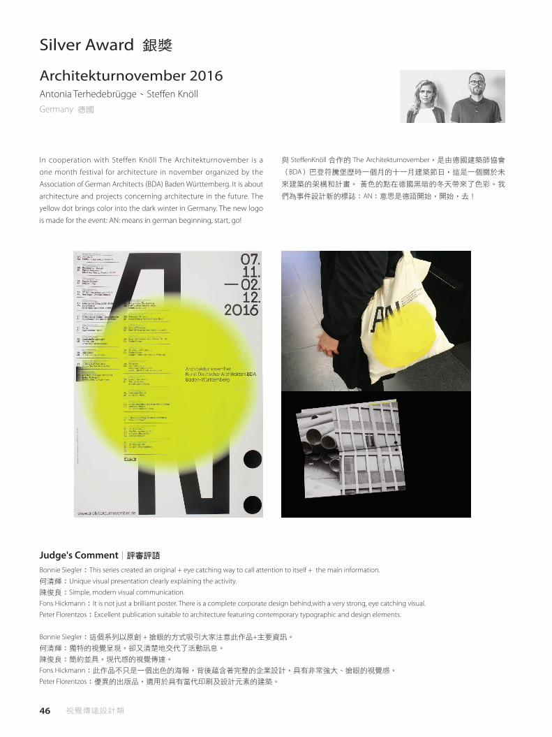
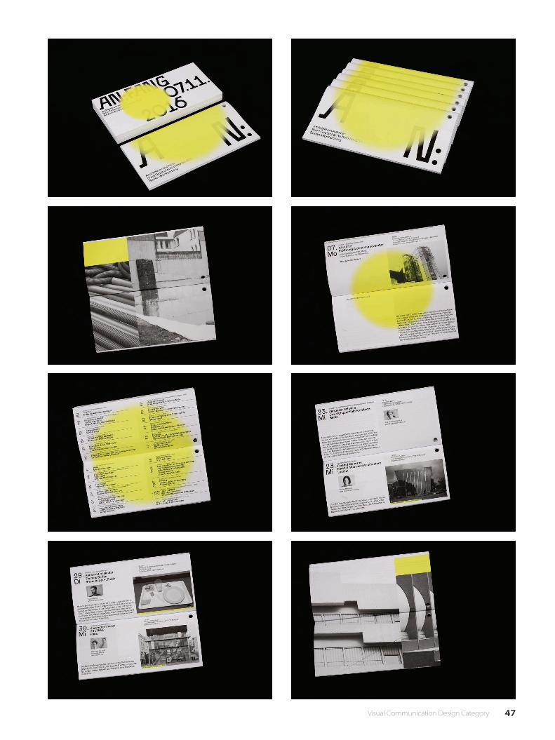
Silver Award 銀獎
In cooperation with Steffen Knöll The Architekturnovember is a
one month festival for architecture in november organized by the
Association of German Architects (BDA) Baden Württemberg. It is about
architecture and projects concerning architecture in the future. The
yellow dot brings color into the dark winter in Germany. The new logo
is made for the event: AN: means in german beginning, start, go!
與 Ste�enKnöll 合作的 The Architekturnovember,是由德國建築師協會
(BDA)巴登符騰堡歷時一個月的十一月建築節日,這是一個關於未
來建築的架構和計畫。 黃色的點在德國黑暗的冬天帶來了色彩。我
們為事件設計新的標誌:AN:意思是德語開始,開始,去!
Architekturnovember 2016Antonia Terhedebrügge、Ste�en KnöllGermany 德國
Bonnie Siegler:This series created an original + eye catching way to call attention to itself + the main information.
何清輝:Unique visual presentation clearly explaining the activity.
陳俊良:Simple, modern visual communication.
Fons Hickmann:It is not just a brilliant poster. There is a complete corporate design behind,with a very strong, eye catching visual.
Peter Florentzos:Excellent publication suitable to architecture featuring contemporary typographic and design elements.
Bonnie Siegler:這個系列以原創 + 搶眼的方式吸引大家注意此作品+主要資訊。
何清輝:獨特的視覺呈現,卻又清楚地交代了活動訊息。
陳俊良:簡約並具,現代感的視覺傳達。
Fons Hickmann:此作品不只是一個出色的海報,背後蘊含著完整的企業設計,具有非常強大、搶眼的視覺感。
Peter Florentzos:優異的出版品,適用於具有當代印刷及設計元素的建築。
Judge's Comment│評審評語
47 Visual Communication Design Category

48 視覺傳達設計類
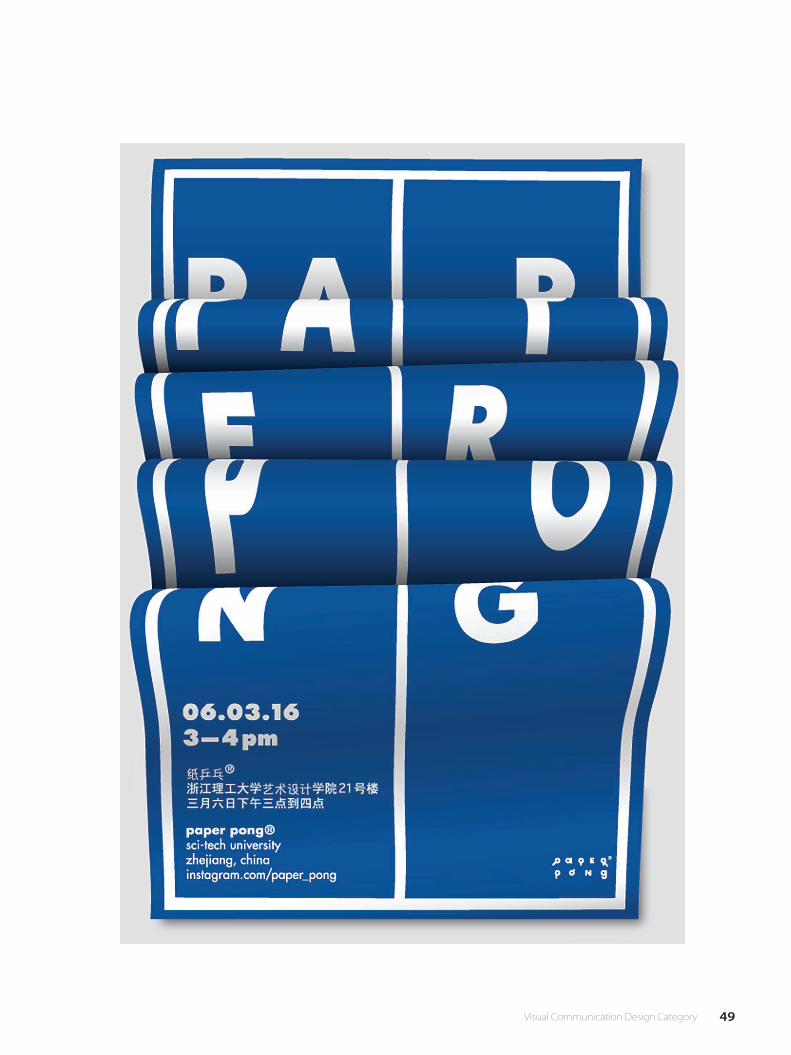
Bronze Award 銅獎
This is a poster I made for a special Ping Pong Tournament. »Paper
Pong« is a variation of round-the-table in which the participants �ght
against each other by building their own table tennis rackets out of
paper.
這是我為特別乒乓球錦標賽製作的海報。 “紙乒乓"一種變化的乒
乓球賽,參賽者要用紙張製作自己的乒乓球拍,並於比賽中使用。
Paper Pong 2016Marvin BoikoGermany 德國
Bonnie Siegler:An swaying poster that suggests the motion of the game with paper + type, Beautiful.
何清輝:Ingenious, e�ective visual communication with a strong image.
陳俊良:Make the plane into a rhythm from the perspective of curvature of the line .
Fons Hickmann:This is the best poster of the show.It contains well made typography, a catchy idea and is ironic.
Peter Florentzos:Excellent idea with quirky result generated through folding of paper with elements of typographic surprise.
Bonnie Siegler:律動的海報,以紙張及樣式表現比賽的動態性,十分漂亮。
何清輝:巧思、有效的視覺溝通,意象強烈。
陳俊良:利用曲度視線讓平面變成律動。
Fons Hickmann:這是本展最棒的海報,具有良好排版、吸引人的想法,且帶有諷刺意味。
Peter Florentzos:出色的想法,透過紙的折疊與令人驚喜的印刷元素展現其多變性。
Judge's Comment│評審評語
49 Visual Communication Design Category

50 視覺傳達設計類
ico-D Special Award & Judges' Special Awardico-D 特別獎.評審團推薦獎
Human beings can survive to the present, are dependent on the nature
of the resources,get this kind of grace and rule the earth we should
drink water thinking source think about where we come from, what
about the feedback?
人類能夠生存到現在,都是仰賴於大自然的資源,得到這樣的恩惠之
下並且主宰了地球的我們,是否應該飲水思源想想我們從何而來,該
回饋什麼 ?
省思陳子捷
Taiwan 台灣
Peter Florentzos:The man is upright, however lonely, yet looking forward, contemplating the future,a future of uncertainty for Taiwan, for the Earth,yet
all of humanity. The work summarises all that is good about the world, and even though a little concerned, the man thinks, contemplates and
looks with hope, anticipate to a bright future for the earth, and humanity. The poster symbolizes all that is good about human collaboration deep
thought and like ico-D, look to a considered and prosperous future ahead.
何清輝:"In recent years, the work presents a strong and simple idea in a wave of environment-based poster creations worldwide.It is everyone's
responsibility to do the right thing for the planet without exception."
Peter Florentzos:這個男人正直卻感到寂寞,但依然對台灣不確定的未來、對地球,還有所有的人感到期待、憧憬。 這項作品總結了對世
界有益的一切,儘管有點擔心,這個男人抱著希望,憧憬、期待著地球和人類的美好未來。此海報象徵所有關於人類合作的好,深
刻思考,如ico-D一般,對深思過的繁榮未來充滿期待。
何清輝:在近年全球一片環保海報創作浪潮中該作品呈現一種強大又簡單的意念。所有為這個星球該做對的事,都是每一個"人"的責任,
沒有人可以例外。
Judge's Comment│評審評語

51 Visual Communication Design Category
52 視覺傳達設計類
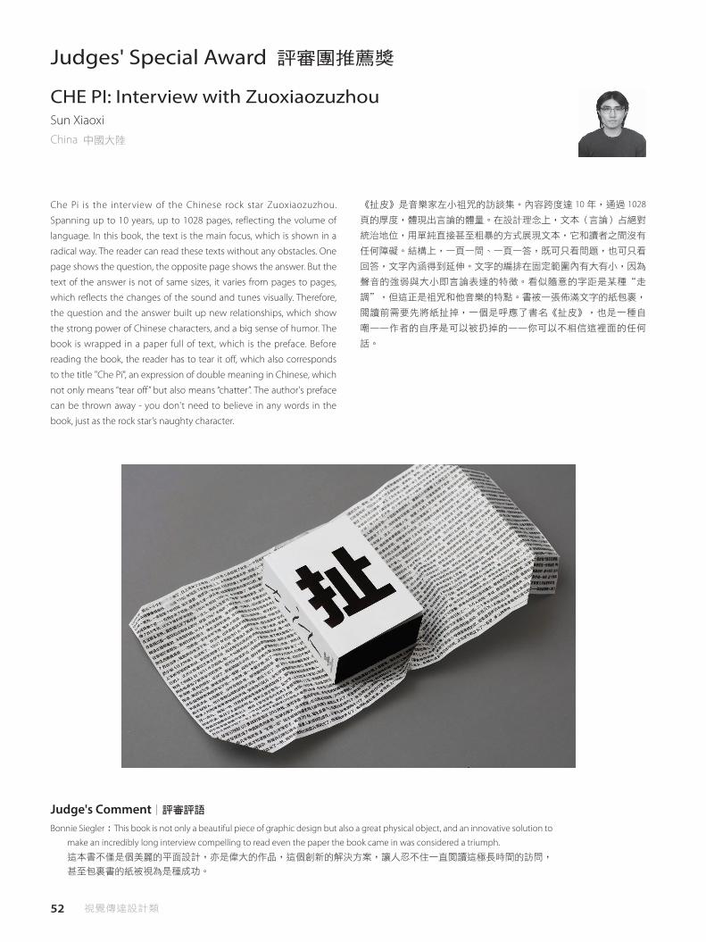
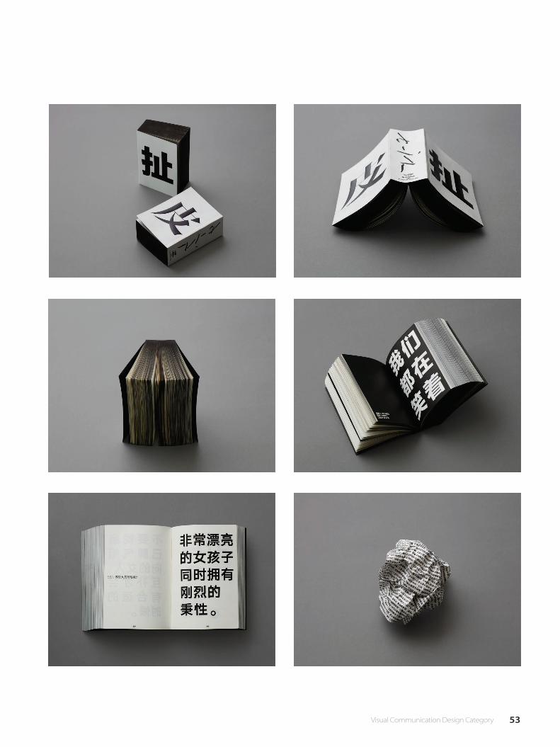
Che Pi is the interview of the Chinese rock star Zuoxiaozuzhou.
Spanning up to 10 years, up to 1028 pages, reflecting the volume of
language. In this book, the text is the main focus, which is shown in a
radical way. The reader can read these texts without any obstacles. One
page shows the question, the opposite page shows the answer. But the
text of the answer is not of same sizes, it varies from pages to pages,
which reflects the changes of the sound and tunes visually. Therefore,
the question and the answer built up new relationships, which show
the strong power of Chinese characters, and a big sense of humor. The
book is wrapped in a paper full of text, which is the preface. Before
reading the book, the reader has to tear it off, which also corresponds
to the title "Che Pi", an expression of double meaning in Chinese, which
not only means “tear off” but also means “chatter”. The author's preface
can be thrown away - you don't need to believe in any words in the
book, just as the rock star’s naughty character.
《扯皮》是音樂家左小祖咒的訪談集。內容跨度達 10 年,通過 1028
頁的厚度,體現出言論的體量。在設計理念上,文本(言論)占絕對
統治地位,用單純直接甚至粗暴的方式展現文本,它和讀者之間沒有
任何障礙。結構上,一頁一問、一頁一答,既可只看問題,也可只看
回答,文字內涵得到延伸。文字的編排在固定範圍內有大有小,因為
聲音的強弱與大小即言論表達的特徵。看似隨意的字距是某種“走
調",但這正是祖咒和他音樂的特點。書被一張佈滿文字的紙包裹,
閱讀前需要先將紙扯掉,一個是呼應了書名《扯皮》,也是一種自
嘲——作者的自序是可以被扔掉的——你可以不相信這裡面的任何
話。
CHE PI: Interview with ZuoxiaozuzhouSun XiaoxiChina 中國大陸
Judges' Special Award 評審團推薦獎
Bonnie Siegler:This book is not only a beautiful piece of graphic design but also a great physical object, and an innovative solution to
make an incredibly long interview compelling to read even the paper the book came in was considered a triumph.
這本書不僅是個美麗的平面設計,亦是偉大的作品,這個創新的解決方案,讓人忍不住一直閱讀這極長時間的訪問,
甚至包裹書的紙被視為是種成功。
Judge's Comment│評審評語
53 Visual Communication Design Category

54 視覺傳達設計類
"Vintage" is an event dedicated to grape harvest in Zielona Gora
(Poland) organized every year in September. The sunlight is a significant
element of the wine-making process. The poster unveils a bottle
created by sunlight / on-stage spotlight giving a celebrational meaning
of the festival.
“Vintage"是在每年 9 月份在 Zielona Gora(波蘭)所舉辦的葡萄收
穫慶典。 陽光是葡萄酒釀造過程的重要組成部分, 海報展出了一個
瓶子,聚集陽光 / 舞台上的聚光燈,傳達出了節日的慶祝意涵。
Vintage 2017 Zielona GoraWojciech JanickiPoland 波蘭
Judges' Special Award 評審團推薦獎
Peter Florentzos:Exceptional simplicity with great meaning expressed through innovative graphic play.
透過創新的圖像表現展現出非凡的簡單。
Judge's Comment│評審評語
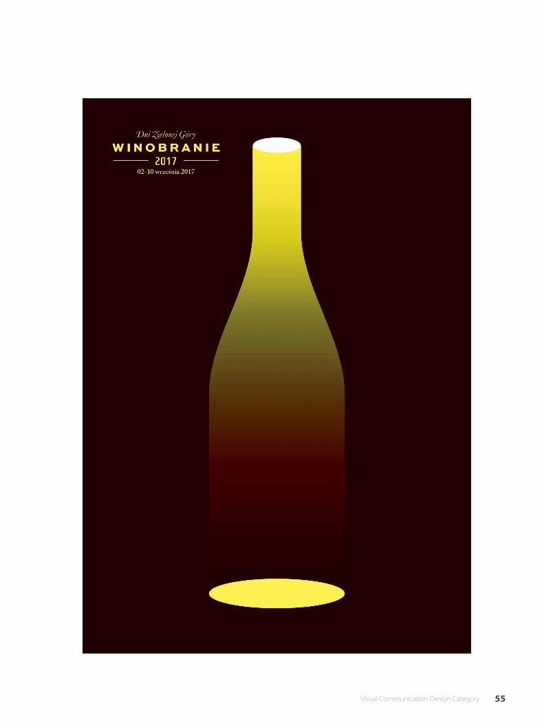
55 Visual Communication Design Category

56 視覺傳達設計類
This is a collection of Portuguese language poetry. The diversity of
authors and styles are unified through the physical characteristics of
the hardcover, varying in color and with a high contrast illustrated
element. The title and author are discreet and constant.
這是葡萄牙語詩歌的集合。 作者和風格的多樣性透過精裝書的特性
統合起來,展現顏色變化和高對比度的元素。 書本標題和作者名稱
設計是慎重而不變的。
Plural book collectionAndré LetriaPortugal 葡萄牙
Judges' Special Award 評審團推薦獎
Fons Hickmann:Print is back! This beautiful book series from Portugal doesn't catch our attention at �rst glance but upon closer
inspection you discover the beauty of what book design can be.
印刷品再現!這本美麗的葡萄牙語系列書籍乍看之下並沒有吸引我們的目光,但細看後,可以發現書籍的設計之美。
Judge's Comment│評審評語

57 Visual Communication Design Category
58 視覺傳達設計類
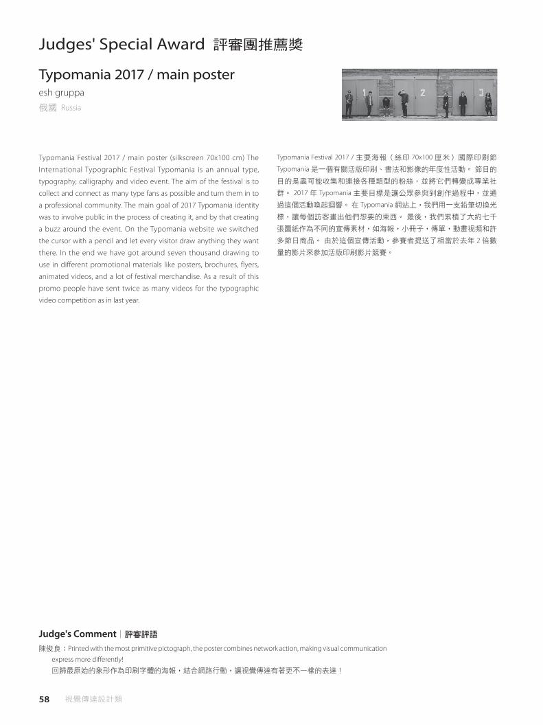
Typomania Festival 2017 / main poster (silkscreen 70x100 cm) The
International Typographic Festival Typomania is an annual type,
typography, calligraphy and video event. The aim of the festival is to
collect and connect as many type fans as possible and turn them in to
a professional community. The main goal of 2017 Typomania identity
was to involve public in the process of creating it, and by that creating
a buzz around the event. On the Typomania website we switched
the cursor with a pencil and let every visitor draw anything they want
there. In the end we have got around seven thousand drawing to
use in different promotional materials like posters, brochures, flyers,
animated videos, and a lot of festival merchandise. As a result of this
promo people have sent twice as many videos for the typographic
video competition as in last year.
Typomania Festival 2017 / 主要海報(絲印 70x100 厘米)國際印刷節
Typomania 是一個有關活版印刷、書法和影像的年度性活動。 節日的
目的是盡可能收集和連接各種類型的粉絲,並將它們轉變成專業社
群。 2017 年 Typomania 主要目標是讓公眾參與到創作過程中,並通
過這個活動喚起迴響。 在 Typomania 網站上,我們用一支鉛筆切換光
標,讓每個訪客畫出他們想要的東西。 最後,我們累積了大約七千
張圖紙作為不同的宣傳素材,如海報,小冊子,傳單,動畫視頻和許
多節日商品。 由於這個宣傳活動,參賽者提送了相當於去年 2 倍數
量的影片來參加活版印刷影片競賽。
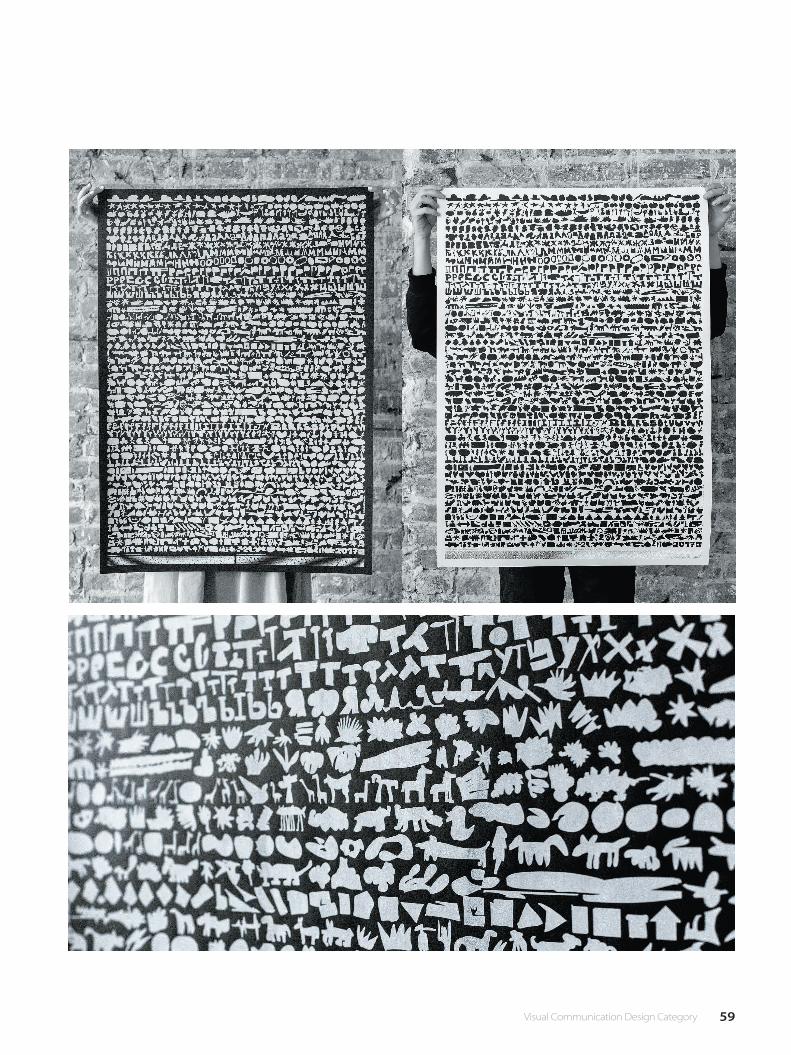
Typomania 2017 / main posteresh gruppa俄國 Russia
Judges' Special Award 評審團推薦獎
陳俊良:Printed with the most primitive pictograph, the poster combines network action, making visual communication
express more di�erently!
回歸最原始的象形作為印刷字體的海報,結合網路行動,讓視覺傳達有著更不一樣的表達!
Judge's Comment│評審評語
59 Visual Communication Design Category
60 視覺傳達設計類
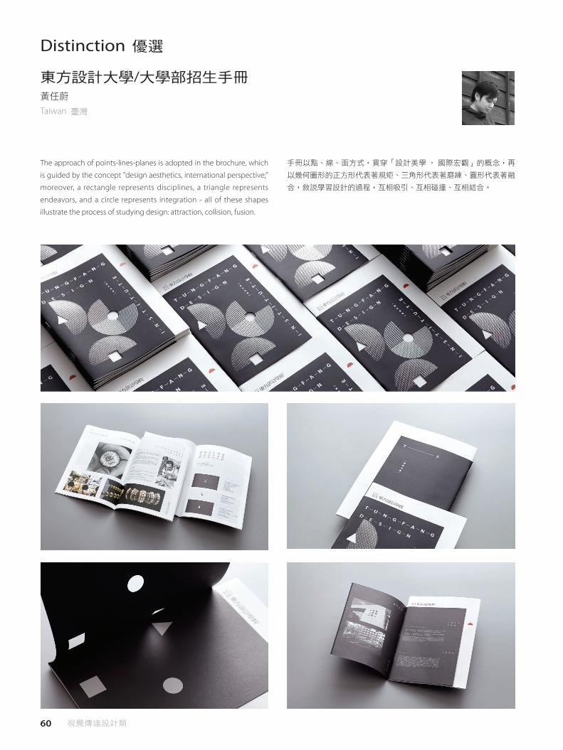
Distinction 優選
The approach of points-lines-planes is adopted in the brochure, which
is guided by the concept "design aesthetics, international perspective;"
moreover, a rectangle represents disciplines, a triangle represents
endeavors, and a circle represents integration - all of these shapes
illustrate the process of studying design: attraction, collision, fusion.
東方設計大學/大學部招生手冊黃任蔚
Taiwan 臺灣
手冊以點、線、面方式,貫穿「設計美學 ‧ 國際宏觀」的概念,再
以幾何圖形的正方形代表著規矩、三角形代表著磨練、圓形代表著融
合,敘說學習設計的過程,互相吸引、互相碰撞、互相結合。
61 Visual Communication Design Category
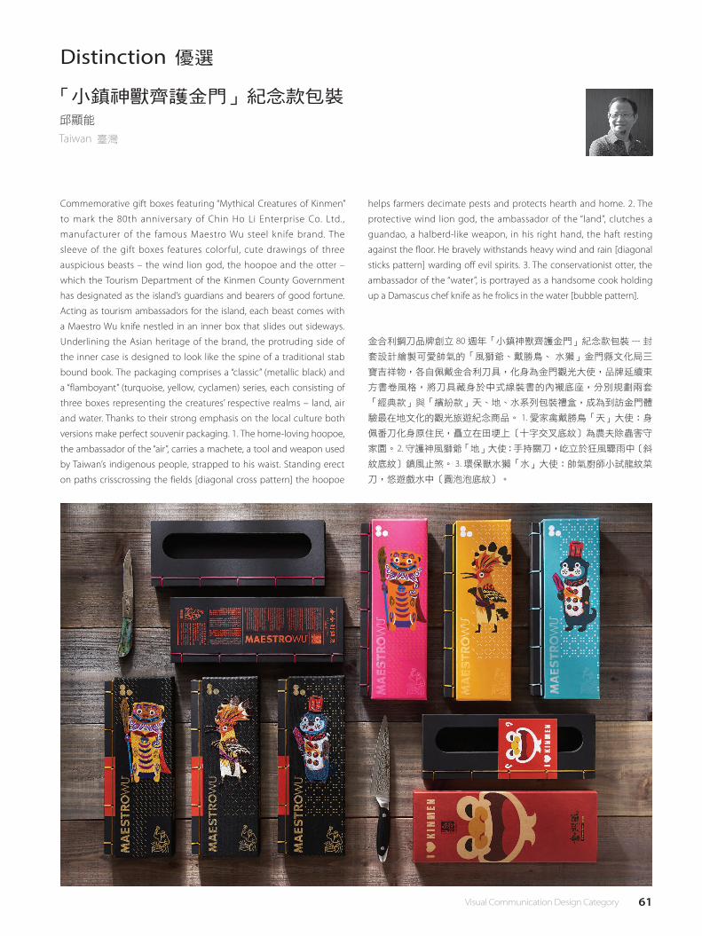
Distinction 優選
Commemorative gift boxes featuring “Mythical Creatures of Kinmen”
to mark the 80th anniversary of Chin Ho Li Enterprise Co. Ltd.,
manufacturer of the famous Maestro Wu steel knife brand. The
sleeve of the gift boxes features colorful, cute drawings of three
auspicious beasts – the wind lion god, the hoopoe and the otter –
which the Tourism Department of the Kinmen County Government
has designated as the island’s guardians and bearers of good fortune.
Acting as tourism ambassadors for the island, each beast comes with
a Maestro Wu knife nestled in an inner box that slides out sideways.
Underlining the Asian heritage of the brand, the protruding side of
the inner case is designed to look like the spine of a traditional stab
bound book. The packaging comprises a “classic” (metallic black) and
a “flamboyant” (turquoise, yellow, cyclamen) series, each consisting of
three boxes representing the creatures’ respective realms – land, air
and water. Thanks to their strong emphasis on the local culture both
versions make perfect souvenir packaging. 1. The home-loving hoopoe,
the ambassador of the “air”, carries a machete, a tool and weapon used
by Taiwan’s indigenous people, strapped to his waist. Standing erect
on paths crisscrossing the fields [diagonal cross pattern] the hoopoe
「小鎮神獸齊護金門」紀念款包裝 邱顯能
Taiwan 臺灣
金合利鋼刀品牌創立 80 週年「小鎮神獸齊護金門」紀念款包裝 --- 封
套設計繪製可愛帥氣的「風獅爺、戴勝鳥、 水獺」金門縣文化局三
寶吉祥物,各自佩戴金合利刀具,化身為金門觀光大使,品牌延續東
方書卷風格,將刀具藏身於中式線裝書的內襯底座,分別規劃兩套
「經典款」與「繽紛款」天、地、水系列包裝禮盒,成為到訪金門體
驗最在地文化的觀光旅遊紀念商品。 1. 愛家禽戴勝鳥「天」大使:身
佩番刀化身原住民,矗立在田埂上[十字交叉底紋]為農夫除蟲害守
家園。 2. 守護神風獅爺「地」大使:手持關刀,屹立於狂風驟雨中[斜
紋底紋]鎮風止煞。 3. 環保獸水獺「水」大使:帥氣廚師小試龍紋菜
刀,悠遊戲水中[圓泡泡底紋]。
helps farmers decimate pests and protects hearth and home. 2. The
protective wind lion god, the ambassador of the “land”, clutches a
guandao, a halberd-like weapon, in his right hand, the haft resting
against the floor. He bravely withstands heavy wind and rain [diagonal
sticks pattern] warding off evil spirits. 3. The conservationist otter, the
ambassador of the “water”, is portrayed as a handsome cook holding
up a Damascus chef knife as he frolics in the water [bubble pattern].

62 視覺傳達設計類
The theme of the goods is interpreted by the form of handed paintings
and its simple and elegant disposal of color delivers the initial intention
and mission of the brand being devoted to the organic cultivation.
The four images: a tree frog moving with the ripples, the trail of a
leopard cat appearing in the forest, a black bear strolling along the
valley, a spotted deer exploring in the raining, are placed in order
from left to right to present a complete map of Taiwan. When they
are separated, each image represents its characteristic of species and
living environment. The two sides of the inner box are the illustrations
of humane industries and landscape sceneries which respond to the
brand´s devotion to cherish the earth and friendly cultivation. The
simple design makes the goods be able to be spread out and placed
慈心淨源茶攜帶盒「臺灣茶保育動物系列」余宥叡、陳立恩、易子齊
Taiwan 臺灣
手繪形式詮釋商品的主題,單色簡樸高雅色彩配置,傳遞品牌從事有
機耕作的初衷與使命。依序並置「樹蛙隨漣漪躍動,石虎於林間現蹤,
黑熊循溪谷漫步,梅花鹿細雨探尋」能呈現完整臺灣地圖,分開時則
代表其物種特徵、生存環境等特色。內盒二側是茶區之產業人文及地
貌景緻,呼應品牌愛護土地與友善耕作。簡約結構設計成型前能攤開
平放,便利運送及倉儲作業。內包裝以能即時品嚐的概念,作為國外
遊客造訪臺灣,以及餽贈伴手禮的新選擇。
flatly before molding, which makes it convenient for transportation
and storage operation. The idea of packages being able tasted instantly
can enable the foreign tourists to choose the goods as one selection of
their souvenirs when visiting to Taiwan.
Distinction‧People's Choice Award優選‧最佳人氣獎
63 Visual Communication Design Category
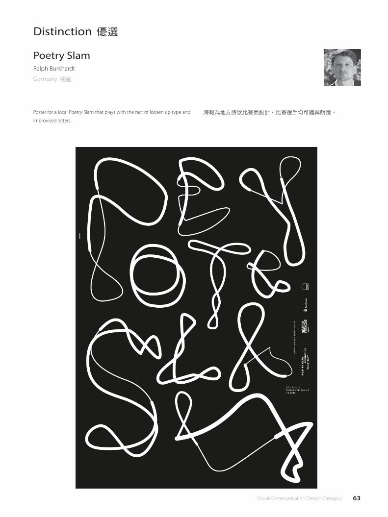
Distinction 優選
海報為地方詩歌比賽而設計,比賽選手均可隨興朗讀。
Poetry SlamRalph Burkhardt
Germany 德國
Poster for a local Poetry Slam that plays with the fact of loosen up type and
improvised letters.

64 視覺傳達設計類
Distinction 優選
Theatre poster for a play by Wolfram Lotz
A few messages to spaceErich BrechbühlSwitzerland 瑞士
Wolfram Lotz 的戲劇海報
65 Visual Communication Design Category
Distinction 優選
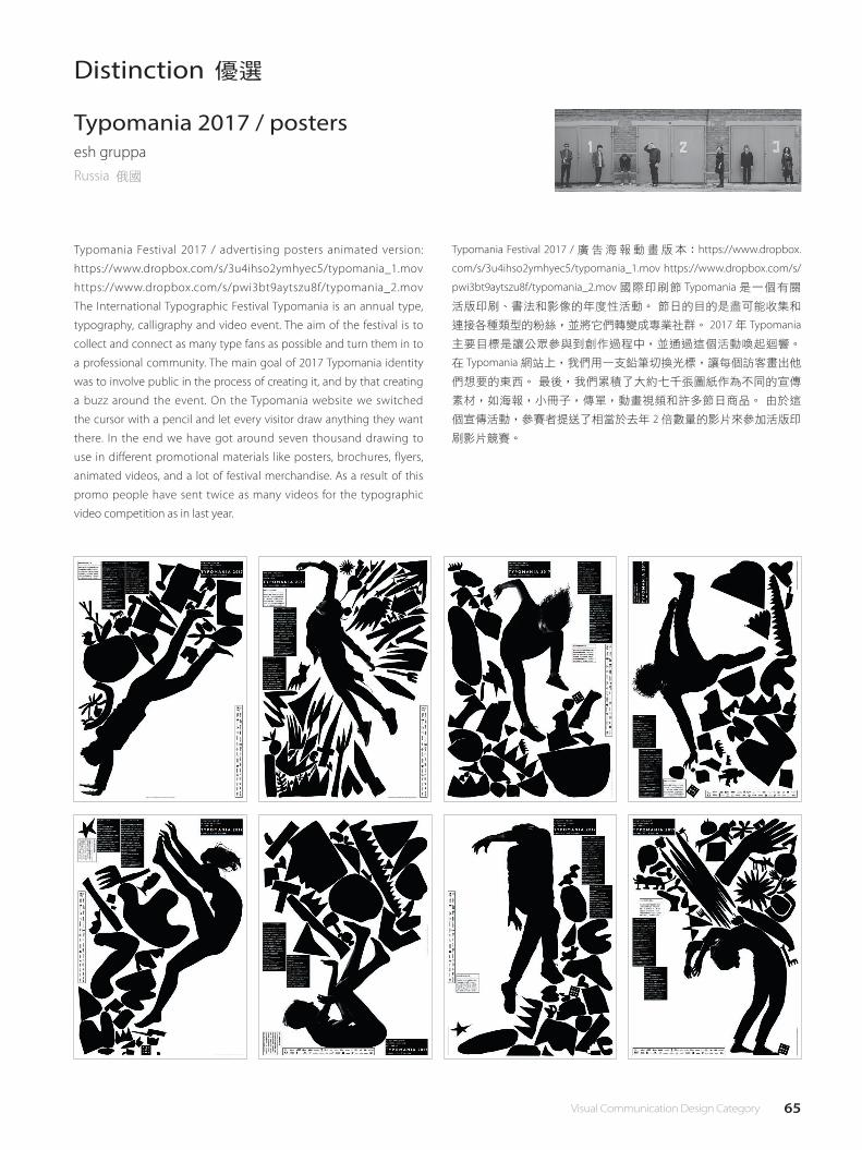
Typomania Festival 2017 / advertising posters animated version:
https://www.dropbox.com/s/3u4ihso2ymhyec5/typomania_1.mov
https://www.dropbox.com/s/pwi3bt9aytszu8f/typomania_2.mov
The International Typographic Festival Typomania is an annual type,
typography, calligraphy and video event. The aim of the festival is to
collect and connect as many type fans as possible and turn them in to
a professional community. The main goal of 2017 Typomania identity
was to involve public in the process of creating it, and by that creating
a buzz around the event. On the Typomania website we switched
the cursor with a pencil and let every visitor draw anything they want
there. In the end we have got around seven thousand drawing to
use in different promotional materials like posters, brochures, flyers,
animated videos, and a lot of festival merchandise. As a result of this
promo people have sent twice as many videos for the typographic
video competition as in last year.
Typomania 2017 / postersesh gruppaRussia 俄國
Typomania Festival 2017 / 廣告海報動畫版本:https://www.dropbox.
com/s/3u4ihso2ymhyec5/typomania_1.mov https://www.dropbox.com/s/
pwi3bt9aytszu8f/typomania_2.mov 國際印刷節 Typomania 是一個有關
活版印刷、書法和影像的年度性活動。 節日的目的是盡可能收集和
連接各種類型的粉絲,並將它們轉變成專業社群。 2017 年 Typomania
主要目標是讓公眾參與到創作過程中,並通過這個活動喚起迴響。
在 Typomania 網站上,我們用一支鉛筆切換光標,讓每個訪客畫出他
們想要的東西。 最後,我們累積了大約七千張圖紙作為不同的宣傳
素材,如海報,小冊子,傳單,動畫視頻和許多節日商品。 由於這
個宣傳活動,參賽者提送了相當於去年 2 倍數量的影片來參加活版印
刷影片競賽。
66 視覺傳達設計類
Distinction 優選
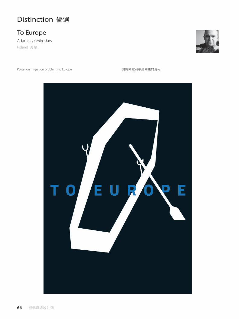
Poster on migration problems to Europe
To EuropeAdamczyk MirosławPoland 波蘭
關於向歐洲移民問題的海報

67 Visual Communication Design Category
Distinction 優選
The book "Mo" is inspired by the Chinese ink, the whole book is divided
into two parts: the �rst part describes what is ink. Why is the ink called
four treasures, as well as what is the four treasures. The second part
introduces the relationship between graphic design and ink, what
similarities and di�erences, how to integrate the two. The combination
of ink and design has become a development trend, for example,
to study the ink art with design together, not only subjecting to the
form, but also creating with property of design. Secondly, drawing on
the artistic language of ink painting, such as the forms by painting,
the beauty of prospect of ink paiting, including "the imaginary and
the real", "black is white" and so on, combine with the basical graphic
design language: text, graphics, color , Composition, to recreate.
墨沙鋒
China 中國大陸
《墨》,書籍設計。靈感來源於中國水墨,整本書的內容分為兩個部
分:第一部分介紹了什麼是墨,什麼是水墨。墨為什麼稱為文房四寶,
以及文房四寶是哪些。第二部分介紹了平面設計與墨之間的關係,有
什麼相似點和區別,如何把兩者進行融合。比如,要把水墨藝術融入
到設計之中去研究,不能只服從於形式,而要結合設計的屬性進行創
作。其次,借鑒水墨的藝術語言,如水墨藝術的筆墨造型、水墨藝術
的意境美、其中包括“虛實相生"、“計白當黑"等,在結合平面設
計的基本設計語言:文字、圖形、色彩、構圖,整合在一起進行在創
造。
68 視覺傳達設計類
Distinction 優選
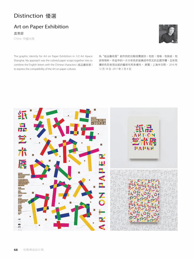
The graphic identity for Art on Paper Exhibition in 1/2 Art Apace
Shanghai. My approach was the colored paper scraps together tries to
combine the English letters with the Chinese characters ( 紙品藝術展 )
to express the compatibility of the Art on paper cultures.
Art on Paper Exhibition虞惠卿
China 中國大陸
為“紙品藝術展"創作的的活動視覺識別。包括:海報、包裝紙、包
袋等物料。作品中的一片片彩色折紙構成中西文的主題字體,五彩斑
斕的色彩表現出紙的藝術性和多樣性。 展覽:上海半空間, 2016 年
12 月 18 日 -2017 年 2 月 8 日
69 Visual Communication Design Category
Distinction 優選
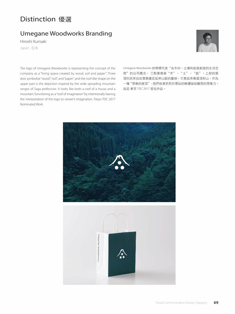
The logo of Umegane Woodworks is representing the concept of the
company as a “living space created by wood, soil and paper”. Three
dots symbolize “wood”, “soil”, and “paper”, and the roof-like shape on the
upper part is the depiction inspired by the wide spreading mountain
ranges of Saga prefecture. It looks like both a roof of a house and a
mountain, functioning as a “roof of imagination” by intentionally leaving
the interpretation of the logo to viewer’s imagination. Tokyo TDC 2017
Nominated Work
Umegane Woodworks BrandingHiroshi KurisakiJapan 日本
Umegane Woodworks 的商標代表“由木材,土壤和紙張創造的生活空
間"的公司概念, 三點像徵著“木",“土",“紙",上部的屋
頂形狀來自佐賀縣廣且延伸山脈的靈感,它看起來像屋頂和山,作為
一種“想像的屋頂",我們故意把對於標誌的解讀留給觀眾的想像力。
這是 東京 TDC 2017 提名作品。
70 視覺傳達設計類
Distinction 優選
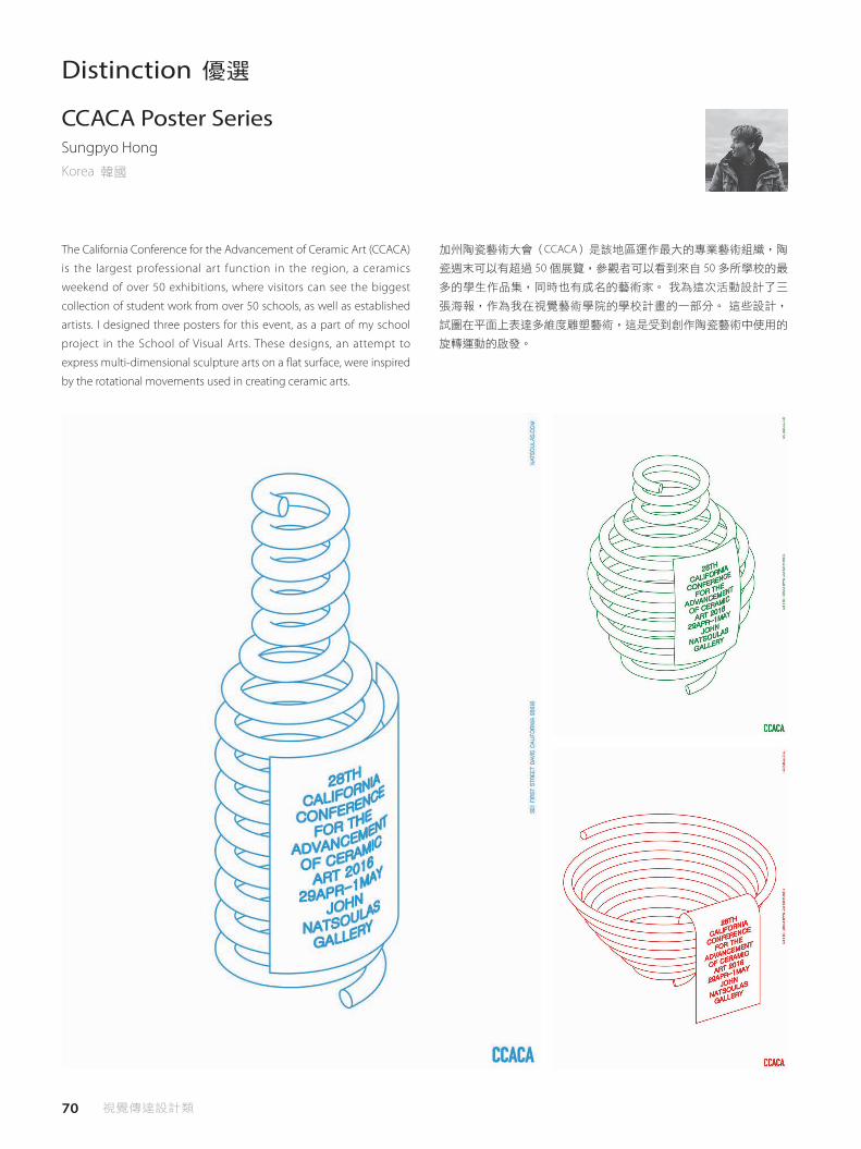
The California Conference for the Advancement of Ceramic Art (CCACA)
is the largest professional art function in the region, a ceramics
weekend of over 50 exhibitions, where visitors can see the biggest
collection of student work from over 50 schools, as well as established
artists. I designed three posters for this event, as a part of my school
project in the School of Visual Arts. These designs, an attempt to
express multi-dimensional sculpture arts on a �at surface, were inspired
by the rotational movements used in creating ceramic arts.
CCACA Poster SeriesSungpyo Hong
Korea 韓國
加州陶瓷藝術大會(CCACA)是該地區運作最大的專業藝術組織,陶
瓷週末可以有超過 50 個展覽,參觀者可以看到來自 50 多所學校的最
多的學生作品集,同時也有成名的藝術家。 我為這次活動設計了三
張海報,作為我在視覺藝術學院的學校計畫的一部分。 這些設計,
試圖在平面上表達多維度雕塑藝術,這是受到創作陶瓷藝術中使用的
旋轉運動的啟發。

PUBLIC SPACE DESIGN公共空間設計類

73 Public Space Design Category
PUBLIC SPACE DESIGN JURY LIST公共空間設計類評審名單
初審 & 決審
Frist & Final selection
Shashi CaanThe Shashi Caan Collective 創辦人
USA 美國
初審
Frist selection
Maria Alessandra SegantiniC+S Architects 創辦人
Italy 義大利
初審 & 決審
Frist & Final selection
Elana Van Der WathProgram Leader at University of Lincoln
USouth Africa 南非
決審
Final selection
Thomas Tsang香港大學建築系建築設計與視覺文化助理教授
USA 美國
初審
Frist selection
Michael SpeaksSyracuse University 建築學院院長
USA 美國
初審 & 決審
Frist & Final selectio
龔書章
中華民國室內設計協會理事長
Taiwan 臺灣
初審 & 決審
Frist & Final selection
石靜慧
金石建築師事務所建築師
Taiwan 臺灣
初審
Frist selection
王玉麟
台灣國際室內建築設計協會執行長
Taiwan 臺灣

74 公共空間設計類
Taipei City Mayor Award 臺北市長獎
ParkUp游適任、張憲文、林家琪
Taiwan 臺灣
ParkUp is the exclusive brand of Plan b's placemaking projects. The primary objective of ParkUp is to renovate idle spaces throughout the city into local-adapted open spaces by 3 principles: 1. Under 165 m2 2. Inclusive Design 3. Localization ParkUp Guting: Located at Guting, Taipei City, the 1st placemaking project of ParkUp is to renovate a 100 m2 state-owned idle land adopted by Plan b. The basic idea is to split the space into three independent but integrated areas. Shaded by trees, the front square provides a playground for kids, while the rear ground, surrounded by vine walls, functions as event space for a variety of activities such as workshop, lectures and outdoor cinemas. On the rear wall, as a collective creative work tributes to gra�eurs in “Sticker Bomb", we paint out a 5.32 m2 rectangular where stickers are used as a communication tool between audience and gra�eurs. As the stickers occupy the whole rectangular, it is implied that our city has an urgent insu�ciency in urban green spaces. In the middle area, 9 white steel structural frames are set up with adequate width and spacing for the passing of wheelchairs. The frames are highly �exible to any outdoor event since they can act as hangers, poles or frames, serving not only for workout but also for practical usage such as swing, drying racks or hammock. In Taiwan, open spaces like parks and playgrounds are usually designed to be the same. This makes them very dull places. In ParkUp Guting, you'll �nd that not only local residents make use of it, but young people are attracted to this old community. We often change decorations on an irregular basis, so people would like to visit ParkUp Guting again and again, taking and sharing instagram photos to their friends. Connection hereby happens.
ParkUp 是 Plan b 實踐空間再造(Placemaking)的品牌。宗旨是透過規
劃與設計,讓都市中的閒置空間成為適應在地的開放空間。對於每一
次的空間營造,我們秉持三個原則: 1_UNDER 165 m2 專注規劃 小型
閒置空間 2_INCLUSIVE DESIGN 規劃按照 共融設計 3_LOCALIZATION 設
計秉持 在地化 都市中難以利用的小型閒置空間,如果規劃得當,必
定可以產生極大的乘數效應。ParkUp 期望建構一套因應都市發展所需
的解決策略,讓空間資源分享在公共與私利交織的默契下達到平衡,
並對我們所居住的城市發揮實質的影響力,以符合聯合國制定永續發
展目標(SDGs)所描述的:讓城市與人類的定居朝共融、安全、具有
韌性並且永續的方向前進。 ParkUp 古亭 為品牌第一件空間改造案。
由 Plan b 認養國有財產署管理的一處 30 坪閒置空地。前庭廣場提供
宜人的綠蔭,給予孩童足夠的活動空間;後方空地由爬藤圍籬形成一
處半隱蔽的場域,能適應多種戶外活動,如工作坊、講座及露天影院
等。 中間區域則由 9 座白色單槓構成,單槓適當的寬度與配置間距,
讓輪椅能在其中自由通行。除了健身外,單槓也能架設鞦韆、吊床等
簡便的休憩裝置,或當作鄰近居民們天晴曬被的鋼架。此外,在舉辦
各種活動展演時,亦能作為展品掛架、頂篷支架,或甚至攤位小屋的
門面使用。ParkUp 古亭 雖然位於老舊社區,但藉由經常性的更換佈
置與舉辦活動,吸引不少年輕人前來拜訪,不同族群間的對話與聯結
便有機會產生。
吳欣珮:The work actively uses urban idle space and introduces the adoption of civil design teams to provide children with space for play, while creating
community space for outdoor interaction. In the experimental stage, the work has feasibility of the application. For idle space in the small corner of Taipei
City, the work provides a thought-provoking design utilization pattern.
何清輝:For the idle space in Taipei City, the work uses clever planning to re-change these spaces into the neighborhood with intimacy and high utilization.
The space planning and design is very simple and e�ective enought to become an idea example for renovation of of other space with the same situation
in Taipei City.
石靜慧:This work provides the solution to reuse and activation and landscaping for various small idle spaces that are di�cult to use in Taipei City. Design
is a simple combination of hanging rods with diverse uses and cultural characteristics, such as quilt drying and swing. This creative design provides an
opportunity for sustainable development in Taipei.
Lee, Kun-pyo:Renovated abandoned place & space by designing local-adapted open space.
Peter Florentzos:Excellent usage of public space for re-use gaining bene�ts to citizens and the public of Taipei. The space oveates engagement opportunities
for communities to snarre otntnerrise unused spaces.
吳欣珮:活化利用都市閒置空間,導入民間設計團隊認養機制,提供孩童玩樂空間。同時也創造社區民眾戶外交流互動場域。在實驗性中具推
廣應用可行性,對於台北市散落於城市角落的小面積閒置空間,提供可引領思考的設計利用模式。
何清輝:針對台北市的閒置空間,以巧妙的規劃重新對這些空間改變成附近居民無距離的親切感,使用率極高、很樸實又有效用的空間規劃設
計,足以成為台北市其他相同狀況的空間一個很理想的範例修改。
石靜慧:此作品將台北市的許多極小且難以有用途的閒置空間,提出如何再利用與活化,進而美化市景,設計雖是簡單吊桿架的排列組合,但
呈現的用途是多元的且具有文化特色如曬棉被及盪鞦韆,實用且好玩!此創意設計提供臺北永續發展一個可能性。
Lee, Kun-pyo:透過設計當地適應的開放空間,改造廢棄的地方和空間。
Peter Florentzos:公共空間的良好重新利用為公民及台北市民帶來利益。空間為社區創造參與機會,減少其他未使用的空間。
Judge's Comment│評審評語

75 Public Space Design Category

76 公共空間設計類
供霧所 Mist Encounter陳冠瑋、曾令理、趙尉翔、蔡旼珊、曹凱瑞
Taiwan 臺灣
A square within a square structure will stand in the large outdoor plaza
in front of the Museum. The summer sun and breeze will drift in and
animate the sca�old and mesh structure. An indistinct mist will arise
from the outer square and draw visitors to come closer. As visitors walk
from the outer to inner square, they will be gradually enveloped by the
mist, and things will appear and disappear as the mist alternately gets
heavier and lighter. The e�ect will be similar to an experience of passing
through a heavy fog in a magical forest. Mist Encounter gives rise to a
microclimate art event. It creates body awareness with mist and creates
awareness of air conditioning. Layers of woven material hanging from
the structure form conical vessels for drifting mist, and create a border
that distinct and blurred, hiding and revealing the world. In the double
square structure, visitors can stand under the cones and breathe the
moist and misty air, gaze out as they sit in swinging chairs, or chat with
one another in the dense fog. The changing appearance of the mist
reveals visible/ invisible, public/ individual, and natural/ man-made
qualities while referring to the theme “In Progress" and renovations
in the Museum. Throughout the exhibition, performances, workshops,
and forums will be held to encourage the public to consider and
experience architecture di�erently.
在偌大無方向性的廣場上,以一個方正回字形的構築體佇立著,於夏
日陽光浮動照射、風動吹拂中,隱約看見霧氣從建築體慢慢溢散出,
吸引並驅使人們走入,置身在逐漸濃烈的霧氣中庭,建築體、民眾都
被包圍、消失不見,又隨著霧氣消退、逐漸顯現,彷彿濃霧森林一般,
經歷了一段充滿時間性的魔幻過程。 《供霧所》,策動一場關於微
氣候的藝術事件,透過水霧使身體知覺展開,賦予不可見的空氣調節
一個可理解的形式。層疊織網構架成為了霧的容器,流動漂移,邊界
清晰而模糊、視界穿透或隱蔽。 在濕潤煙雨的霧堆裏呼吸、在垂懸
飄動的織椅上凝視、在忽而濃霧隱蔽一切的中庭內對話。可見 / 不可
見、公共性 / 個體性、自然 / 人為,空間層次裡霧氣每一瞬間捕捉的
表現與體驗,都指涉了變幻不定的樣貌 -In Progress。展覽期間透過表
演、工作坊和講座,激發民眾對建築有不同思考與經驗方式。
石靜慧:This work is a complete presentation at all levels with the combination of publicity, space and senses.
Shashi Caan:This project is at once artistic / sculptural, as well as, experiential and positively functional. Every discovery of delight, the project inspires and
touches the soul.
Elana Van Der Wath:Innovative addition to the public square -balances function(cooling) + user experience in a highly poetic �nal installation.
Thomas Tsang:Unique collaboration where a gold project like "Mist encounter" to encourage design as process of public trust and articulate various material
from memory and experiences.
石靜慧:此作品是一在各層次都有完整呈現的作品,具有公共性,空間感及肢體感官的參與。
Shashi Caan:這項設計是藝術性/雕塑性、來自經驗的,且具有正面功能。 這項設計帶來欣喜,啟發並觸動著人們的靈魂。
Elana Van Der Wath:在公共廣場,其充滿詩意的創新增建部分平衡了功能(冷卻)+ 使用者體驗。
Thomas Tsang:這是一項獨特的合作專案,供霧所鼓勵設計成為取得公眾信任的過程,並精心製作各種來自記憶和經驗的材料。
Judge's Comment│評審評語
Golden Award‧People's Choice Award金獎‧最佳人氣獎
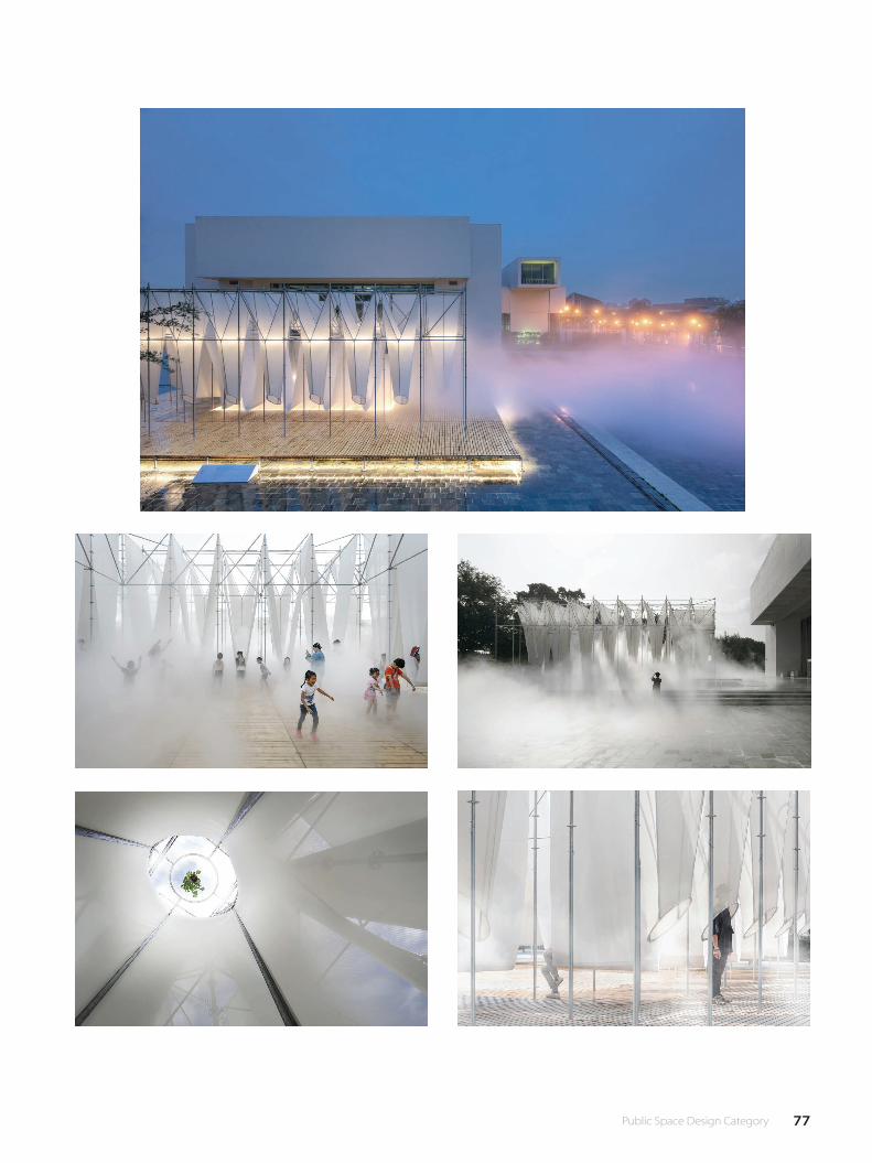
77 Public Space Design Category
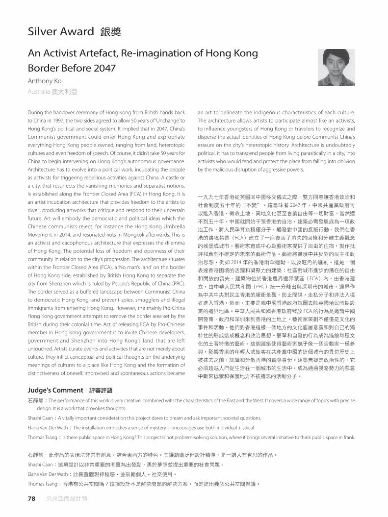
78 公共空間設計類
Silver Award 銀獎
An Activist Artefact, Re-imagination of Hong Kong Border Before 2047 Anthony KoAustralia 澳大利亞
During the handover ceremony of Hong Kong from British hands back to China in 1997, the two sides agreed to allow 50 years of ‘Unchange’ to Hong Kong’s political and social system. It implied that in 2047, China’s Communist government could enter Hong Kong and expropriate everything Hong Kong people owned, ranging from land, heterotopic cultures and even freedom of speech. Of course, it didn’t take 50 years for China to begin intervening on Hong Kong’s autonomous governance. Architecture has to evolve into a political work, incubating the people as activists for triggering rebellious activities against China. A castle or a city, that resurrects the vanishing memories and separatist notions, is established along the Frontier Closed Area (FCA) in Hong Kong. It is an artist incubation architecture that provides freedom to the artists to dwell, producing artworks that critique and respond to their uncertain future. Art will embody the democratic and political ideas which the Chinese communists reject, for instance the Hong Kong Umbrella Movement in 2014, and resonated riots in Mongkok afterwards. This is an activist and cacophonous architecture that expresses the dilemma of Hong Kong: The potential loss of freedom and openness of their community in relation to the city’s progression. The architecture situates within the Frontier Closed Area (FCA), a ‘No man’s land’ on the border of Hong Kong side, established by British Hong Kong to separate the city from Shenzhen which is ruled by People’s Republic of China (PRC). The border served as a buffered landscape between Communist China to democratic Hong Kong, and prevent spies, smugglers and illegal immigrants from entering Hong Kong. However, the mainly Pro-China Hong Kong government attempts to remove the border area set by the British during their colonial time. Act of releasing FCA by Pro-Chinese member in Hong Kong government is to invite Chinese developers, government and Shenzhen into Hong Kong’s land that are left untouched. Artists curate events and activities that are not merely about culture. They inflict conceptual and political thoughts on the underlying meanings of cultures to a place like Hong Kong and the formation of distinctiveness of oneself. Improvised and spontaneous actions became
一九九七年香港從英國回中國移交儀式之際,雙方同意讓香港政治和
社會制度五十年的“不變"。這意味著 2047 年,中國共產黨政府可
以進入香港,徵收土地,異地文化甚至言論自由等一切財富。當然還
不到五十年,中國就開始干預香港的自治,建築必需發展成為一項政
治工作,將人民孕育為積極分子,觸發對中國的反叛行動。我們在香
港的邊境禁區(FCA)建立了一座復活了消失的回憶和分離主義觀念
的城堡或城市。藝術家育成中心為藝術家提供了自由的住宿,製作批
評和應對不確定的未來的藝術作品。藝術將體現中共反對的民主和政
治思想,例如 2014 年的香港雨傘運動,以及旺角的騷亂。這是一個
表達香港困境的活躍和凝聚力的建築:社區對城市進步的潛在的自由
和開放的喪失。建築物位於香港邊界邊界禁區(FCA)內,由香港建
立,由中華人民共和國(PRC)統一分離出與深圳市的城市。邊界作
為中共中央對民主香港的緩衝景觀,防止間諜,走私分子和非法入境
者進入香港。然而,主要是親中國香港政府試圖去除英國殖民時期設
定的邊界地區。中華人民共和國香港政府釋放 FCA 的行為是邀請中國
開發商,政府和深圳來到香港的土地上。藝術家策劃不僅僅是文化的
事件和活動。他們對香港這樣一個地方的文化底層意義和對自己的獨
特性的形成造成概念和政治思想。簡單和自發的行為成為描繪每種文
化的土著特徵的藝術。這個建築使得藝術家幾乎像一個活動家一樣參
與,影響香港的年輕人或旅客在共產黨中國的這個城市的異位歷史上
被抹去之前,認識和分散香港的實際身份。建築無疑是政治性的,它
必須超越人們從生活在一個城市的生活中,成為通過侵略勢力的惡意
中斷來抵禦和保護地方不被遺忘的活動分子。
an art to delineate the indigenous characteristics of each culture. The architecture allows artists to participate almost like an activists, to influence youngsters of Hong Kong or travelers to recognize and disperse the actual identities of Hong Kong before Communist China’s erasure on the city’s heterotopic history. Architecture is undoubtedly political, it has to transcend people from living parasitically in a city, into activists who would fend and protect the place from falling into oblivion by the malicious disruption of aggressive powers.
石靜慧:The performance of this work is very creative, combined with the characteristics of the East and the West. It covers a wide range of topics with precise
design. It is a work that provokes thoughts.
Shashi Caan:A vitally important consideration this project dares to dream and ask important societal questions.
Elana Van Der Wath:The installation embodies a sense of mystery + encourages use both individual + soical.
Thomas Tsang:Is there public space in Hong Kong? This project is not problem-solving solution, where it brings several initiative to think public space in frank.
石靜慧:此作品的表現法非常有創意,結合東西方的特色。其議題廣泛但設計精準,是一讓人有省思的作品。
Shashi Caan:這項設計以非常重要的考量為出發點,勇於夢想並提出重要的社會問題。
Elana Van Der Wath:此裝置體現神秘感,並鼓勵個人 + 社交使用。
Thomas Tsang:香港有公共空間嗎?這項設計不是解決問題的解決方案,而是提出幾個公共空間倡議。
Judge's Comment│評審評語

79 Public Space Design Category
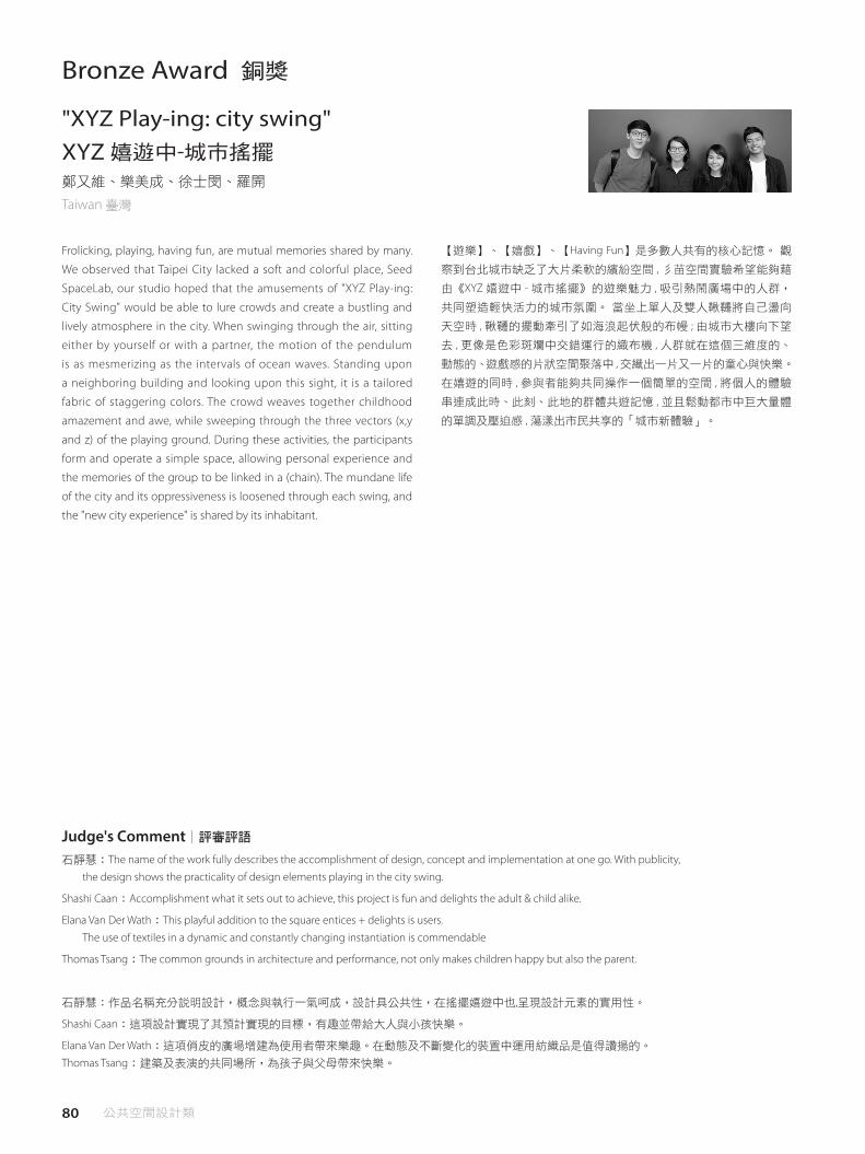
80 公共空間設計類
Bronze Award 銅獎
"XYZ Play-ing: city swing" XYZ 嬉遊中-城市搖擺 鄭又維、樂美成、徐士閔、羅開
Taiwan 臺灣
Frolicking, playing, having fun, are mutual memories shared by many.
We observed that Taipei City lacked a soft and colorful place, Seed
SpaceLab, our studio hoped that the amusements of "XYZ Play-ing:
City Swing" would be able to lure crowds and create a bustling and
lively atmosphere in the city. When swinging through the air, sitting
either by yourself or with a partner, the motion of the pendulum
is as mesmerizing as the intervals of ocean waves. Standing upon
a neighboring building and looking upon this sight, it is a tailored
fabric of staggering colors. The crowd weaves together childhood
amazement and awe, while sweeping through the three vectors (x,y
and z) of the playing ground. During these activities, the participants
form and operate a simple space, allowing personal experience and
the memories of the group to be linked in a (chain). The mundane life
of the city and its oppressiveness is loosened through each swing, and
the "new city experience" is shared by its inhabitant.
【遊樂】、【嬉戲】、【Having Fun】是多數人共有的核心記憶。 觀
察到台北城市缺乏了大片柔軟的繽紛空間 , 彡苗空間實驗希望能夠藉
由《XYZ 嬉遊中 - 城市搖擺》的遊樂魅力 , 吸引熱鬧廣場中的人群,
共同塑造輕快活力的城市氛圍。 當坐上單人及雙人鞦韆將自己盪向
天空時 , 鞦韆的擺動牽引了如海浪起伏般的布幔 ; 由城市大樓向下望
去 , 更像是色彩斑斕中交錯運行的織布機 , 人群就在這個三維度的、
動態的、遊戲感的片狀空間聚落中 ,交織出一片又一片的童心與快樂。
在嬉遊的同時 , 參與者能夠共同操作一個簡單的空間 , 將個人的體驗
串連成此時、此刻、此地的群體共遊記憶 , 並且鬆動都市中巨大量體
的單調及壓迫感 , 蕩漾出市民共享的「城市新體驗」。
石靜慧:The name of the work fully describes the accomplishment of design, concept and implementation at one go. With publicity,
the design shows the practicality of design elements playing in the city swing.
Shashi Caan:Accomplishment what it sets out to achieve, this project is fun and delights the adult & child alike.
Elana Van Der Wath:This playful addition to the square entices + delights is users.
The use of textiles in a dynamic and constantly changing instantiation is commendable
Thomas Tsang:The common grounds in architecture and performance, not only makes children happy but also the parent.
石靜慧:作品名稱充分說明設計,概念與執行一氣呵成,設計具公共性,在搖擺嬉遊中也,呈現設計元素的實用性。
Shashi Caan:這項設計實現了其預計實現的目標,有趣並帶給大人與小孩快樂。
Elana Van Der Wath:這項俏皮的廣場增建為使用者帶來樂趣。在動態及不斷變化的裝置中運用紡織品是值得讚揚的。
Thomas Tsang:建築及表演的共同場所,為孩子與父母帶來快樂。
Judge's Comment│評審評語

81 Public Space Design Category

82 公共空間設計類
Social Design Award‧Judges' Special Award 社會設計獎‧評審團推薦獎
OREC green lab Nagano Masahiro KinoshitaJapan 日本
OREC green lab Nagano is a showroom of the agricultural equipment
manufacturer company that is headquartered in Kyushu, Japan. The
showroom is planned to expand brand image and make a place for
community by composing a display shelf. The showroom is located
along Route 18 that is called “Apple line”. There are 4000 farms included
2000 fruit farmers in this area. The display shelf is set parallel to the
Route 18 and made as scale of agricultural machine, so as to appeals
to farmers who passes this road. The eaves, extended from the shelf,
makes place for event, work, machine maintenance and demonstrating
how to use the machine. Also, the display shelf takes part of important
constructions that is subjected to horizontal forces. This alternative
make it possible to this open-air architecture. Considering materials
relate to brand images. Using the structural plywood is made the
showroom woody and warm space and associated with nature image
of the company’s policy. At a high ceiling showroom, it is need to
think how to prevent from direct sunlight and reduce the cost of air
condition. The extended eaves guard from high sunlight on summer,
whereas deliver the low warm sunlight on winter and using processed
floor with high heat storage. The office space, remote from facade, is
taken in the homogeneous light by providing high side window facing
to north side. This window Also causes stack effect, natural ventilation,
and enable to low cost efficiency. This showroom aim to be nationwide
as the agricultural equipment manufacturer company’s model to
appeal company’s philosophy and products, and place for farmers and
local residents.
OREC 長野綠色實驗室是一個農業設備製造公司的展示廳,總部設在
日本九州。展示廳計劃透過構建展示架,推廣品牌形象,並為社區
做出貢獻。展示廳位於 18 號公路,被稱為“蘋果線",這個地區有
4000 多個農場,包括 2000 個種植水果的農民。展示架平行於 18 號公
路,以相當於農用機械的大小呈現,吸引通過這條道路農民的目光。
從架子延伸出去可以展示事件,工作,機器維護,並展示如何使用機
器。此外,展示架也作為承受水平力重要結構的一部分,因而能夠進
行露天展示。採用的材料與品牌形象有關,我們使用結構膠合板製成
了展示室的木質且溫暖的空間,並與公司的自然形象相互關聯。在一
個擁有高天花板的展示廳,我們需要考慮如何防止陽光直射,進一步
降低空調成本。延伸出去的屋簷可以防護夏季高溫陽光,而冬季則能
提供低溫暖陽光,並使用高儲熱處理的地板。遠離門面的辦公空間則
透過設在北面的高側窗,提供均勻的光線。此窗口還會引起堆棧效
應,自然通風,具備低成本效益。該展示廳旨在在作為全國性農業設
備製造商公司的模範,宣傳公司的理念和產品,並為農民和當地居民
提供場所。
Lee, Kun-pyo:Design solves the critical agricultural community problem of store the farming equipments by provide the stronage storage.
Peter Florentzos:Brilliant execution to an interesting social dilemma, removing the stigma of ten associated with agricultural equipment.
石靜慧:In today's age of network, the virtual and real world can be exchanged and replaced at any time. The work displays agricultural equipment in the
exhibition hall at the scale of the city in the face of the streets, allowing people to have a new understanding and personal sense of the traditional industry.
Facing the streets of the city, the design displays agricultural industrial products in a way of museum exhibition, bringing both the scale of the city and
public space to another cultural level.
Lee, Kun-pyo:此設計透過提供儲存展示廳解決儲存農事設備的關鍵農業社區問題。
Peter Florentzos:出色有趣的社會救助手法,消除與農業設備相關的十個污名。
石靜慧:在現今的網路時代,虛擬與實質的世界隨時可被交換與取代。本作品把人類最古老傳統的農業工作,以城市的尺度為展覽館,將農業
機具用展示形式陳列於面對街面的櫥窗裡,讓人對傳統產業有新的認識與切身感。此設計將農業用的工業產品用博物館展示陳列的方式且
面對城市的街道,因此將城市的尺度帶入另一種文化的尺度,對公共空間帶入另一國度的意義。
Judge's Comment│評審評語

83 Public Space Design Category
84 公共空間設計類
IFI Special Award IFI 特別獎
DNA Habitat Anna EckesPoland 波蘭
Technology expands exponentially. The course of development at first
is very slow but over time, the pace of technological change is rapidly
increasing. The evolution of technology is a reflection of the process
that gave rise to our species. Our ancestors took tens of thousands of
years to discover how to use the simplest stone tools. In the nineteenth
century, the pace of civilization development was already much
faster and its achievements could be compared to the achievements
made by the human species for hundreds of years. However, in the
first decade of the twentieth century, the progress that was made
could be compared the progress of the entire nineteenth century.
Right now, changes are happening so fast that soon we will no longer
be able to predict how the resulting world will operate. After the
reconsideration of many inherited paradigms in architecture, analogy
between buildings and organisms is only becoming more and more
evident. Buildings of XXI century are slowly becoming living beings,
characterized by their own life processes, existing in symbiosis with
its habitants. The notion of home being nothing more but a habitable
building will be soon redefined. The project explores the idea of
architecture without architect and researches possible ways of utilizing
nanotechnology and molecular genetics in building construction.
The resultant is an expandable and programmable structure based on
the usage of carbon nanotubes wrapped with single-stranded DNA
(SWNTs) and DNA computing.
科技呈現指數成長,發展過程起始相當緩慢,但隨著時間的推移,我
們可以發現技術變革的步伐正在加速。技術的演變反映了我們物種起
始的過程,我們的祖先花了數萬年才發現如何使用最簡單的石材工
具,但到十九世紀,文明發展的步伐已快得多,其成就可以與人類成
就幾百年相比。然而,在二十世紀的頭十年,所取得的進步又可與整
個十九世紀的進展相比。現在,變化更為快速發展,很快我們將無法
預測如何產生的世界將如何運作。在重新思考建築學諸多繼承的典
範後,我們發現建築物和生物體之間的可類比性變得越來越明顯。
二十一世紀的建築正在慢慢地化為生命,其特點是有著自己的生命歷
程,與其內居民共生存在。過去將家庭的概念視為不過是一個可居住
的建築物,這樣的概念很快將被重新定義。本計畫探索在沒有建築師
下的建築理念,並研究利用奈米技術和分子遺傳學在建築施工中的可
能途徑。成果將會是使用可擴展和可編程結構的碳奈米管,進行單鏈
DNA(SWNTs)和 DNA 計算如何包裹上去。
Shashi Caan:This multi-layered imaginative project, transcends the common professional carries of interiority trend focused depth address up the global
human condition and need for the consideration of future habit in this project grounds its thinking in the physical environment, new materials and
resource growth, while envisioning an aesthetic unique to the designer.
此多層次、具想像力的作品超越了一般以內部性為主的趨勢特徵,處理全球人類的狀況,並考慮未來的居住需要。此設計理念在於物質環
境、新材料和資源的增長,處於領先地位,同時展現了設計師獨特的審美觀。
Judge's Comment│評審評語
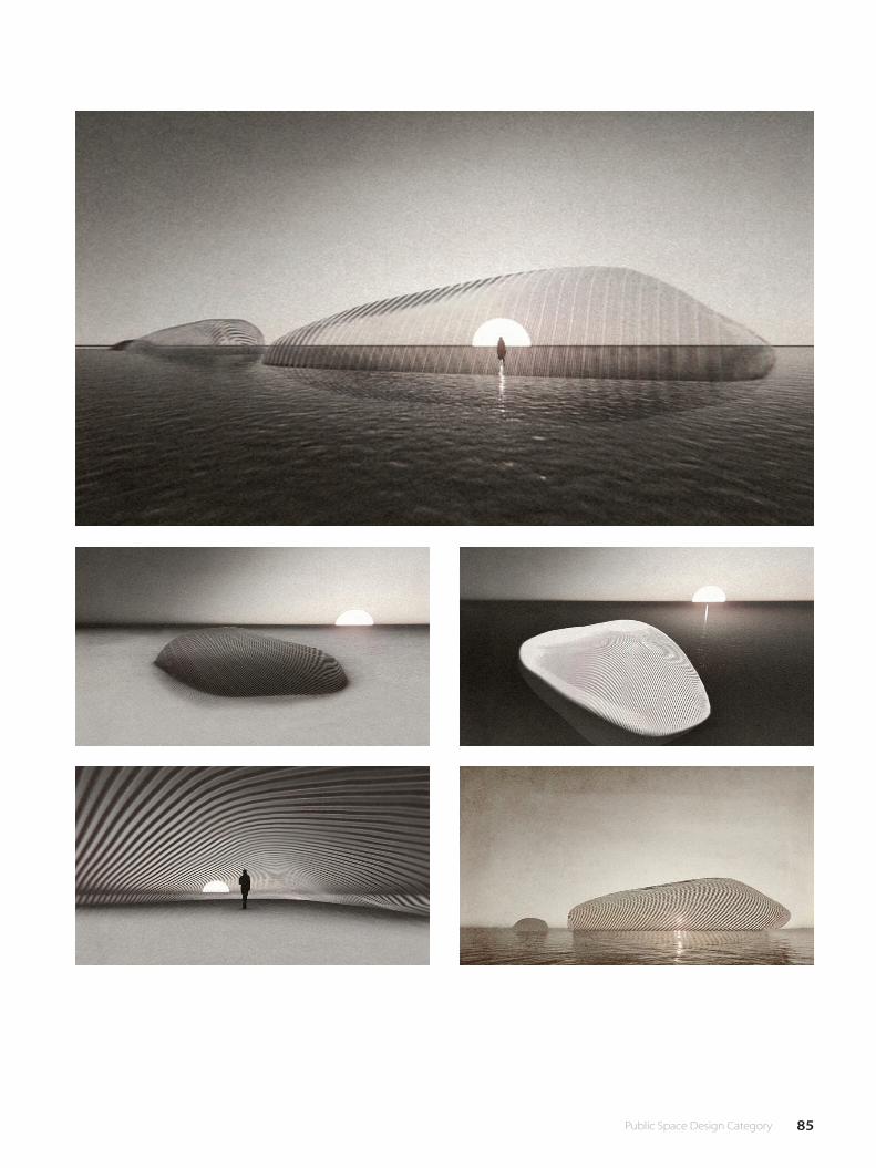
85 Public Space Design Category
86 公共空間設計類
Judges' Special Award 評審團推薦獎
浮光之間
沈庭增
Taiwan 臺灣
“Floating” was a temporal architecture exhibited in the TFAM plaza
which lasted for three months. The plaza is situated on the edge of
urban area and adjacent to the riverbank on its north side, causing
frequent wind across the plaza. Due to the unbearable strong wind
and the subtropical sunlight, visitors to the museum hurry inside
the building for most of the time, leaving the plaza a place lacking
vitality. In response to the natural feature of the site, the concept of
“Floating” was derived from the specific attributes of wind and light.
A kite-canopy and a curved island were joined and interlinked from
above and below, in order to create a pavilion that floats on the plaza,
capturing the breeze and light. Therefore a new way of perceiving the
environments was suggested by revealing the interactions between
the kites and the nature; moreover, the plaza became a place where
visitors were attracted and engaged, being provided intimacy and
publicity at the same time. The kite canopy was consisted of 320 box-
shaped kites. The unique presence of wind was enhanced by the
swaying motion of these kites, encouraging a sense of relaxation for
the place. The kites also performed as an interface that transformed
the sunlight, depicting diverse faces of light and shade, while the
light went through across different time of the day. Beneath the
canopy is a curved island ascending to the centre of the pavilion.
Visitors approached out of curiosity, meandering within the pavilion,
laying under the shades, or sliding down from the curved slopes. A
pink spherical void within the island could be discovered if visitors
wandering towards the centre. When entering into it, a unique sound
effect was revealed by the spherical space, in which the natural
elements were interweaved together, leading visitors’ perception into a
sense of serenity.
「浮光之間」為展期三個月的臨時建築,座落於台北市立美術館館前
廣場。廣場位於都市邊緣,北側緊鄰河畔形成風口,人們總是難忍這
裡的強風與烈日,而快步進到美術館內,空間顯得缺乏活力。 回應
基地自然之力,「浮光之間」概念取自風與光的特殊狀態,將風箏天
棚與曲面島嶼作上下繫結,構築一座漂浮在廣場上,捕捉風與光的亭
子。藉著風箏與自然相互作用,引導人們用新的方式去感覺空間,讓
廣場成為匯聚人的注目與駐足、柔軟而具公共性的場域。 風箏天棚
由 320 顆箱型風箏構成,風箏的擺晃,讓風的獨特存在被突顯,帶出
放鬆的場所感;不同時段的日照,藉著風箏居中作為光色轉換器,創
造光影的多重面貌。 天棚下方是漸漸向中心隆起的曲面島嶼,光自
風箏灑下,帶來曲面的光影流淌,人們好奇地走上前,自在躺臥,溜
滑地順坡而下,或漫步其中。環繞至島嶼中心,一處內凹的桃紅色球
形虛空,人進入後,感受獨特聲響與自然元素碰撞,抵達靜謐。
龔書章:This work creates a very pleasant and interactive publicity in public space in Taipei City in terms of space construction or place development, making it
a positive example of urban space. In terms of its construction system, the work creates a mature and experimental construction site with the light modular
kite and light steel frame structure.
此作品不僅在空間建構上或場所形塑上都為台北市的機構性的開放空間開創了一個非常愉快且互動公共性,成為都市空間的一種積極的典
範。此外,這個作品更在其構築系統上,藉以輕透模組化的風箏和輕鋼架構造,創造了一個成熟且實驗性的建築場域。
Judge's Comment│評審評語
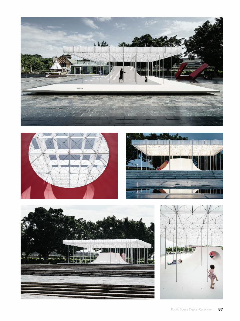
87 Public Space Design Category
88 公共空間設計類
Judges' Special Award 評審團推薦獎
warehouse of time preservation and renovation of the commercial bank of honjoKatsuya FukushimaJapan 日本
architecture as archaeology This architecture is a renovation of a brick warehouse built in 1896. It was designed and built to storage cocoons, which were high-end products and uses the latest technology of 120 years ago. It could be seen in the high-quality bricks and laying of it, the large column-free space of 9m by 36m achieved by a king post truss and the window fittings that could ventilate and control humidity. This was the first time in Japanese history that a brick building achieved the same quality built in the Western countries. Eventually it became a national listed building as a valuable industrial heritage and a preservation and renovation project was planned to transform it to a community center for the city of Honjo. A preliminary research was conducted by a team of various fields, such as history, structure, material, urbanism and disaster management. It became clear that the yield strength on the short side was insufficient and there were no detailed drawings when it was completed existing and several renovations were conducted since it was privately owned. The seismic reinforcement was done by steel structure, in order to clearly distinguish with the existing architecture. The insufficient yield strength of the short side was reinforced with the horizontal elements such as the floor of the upper storey and roof, where it becomes completely unseen when completed. The vertical elements such as columns becomes the minimum size by mutually depending on the existing brick wall and appears as a contrast to the brick space. The existing architecture was built in the eclectic period of the new Western tectonics and the traditional Japanese tectonics, resulting in the mixed use of Japanese and Western order (dimension system). For instance, the beams are built in the Japanese traditional module “Shaku” whereas the columns are built in the Western module “inch”, and other elements are built in different modules, thus a gap occurs between them. The seismic reinforcement is carefully inserted in these gaps of different orders, so it is possible to detach them in the future. The traces of the conversions are the results of the gap between the change of the function and the space. We thought of them not as defects but as the representation of the accumulated events of the past. We removed the unnecessary and repaired the broken parts, but didn’t
建築作為考古學 - 這個建築是 1896 年建造的一個磚倉庫的更新工程。
它被設計和建造來儲存繭,這是高端產品,並使用了 120 年前的最新
技術。透過主桁架構成的 9 米 ×36 米的無柱空間,和可以通風和控
制濕度的窗戶配件,我們可以看到高品質的磚瓦和鋪設方式。這是日
本歷史上第一次採用與西方國家同質量的磚瓦建築,最終成為國家重
點建築,作為寶貴的工業遺產,並計劃將其改建為本庄市的社區中
心。歷史,結構,材料,城市和災害管理等各個領域的團隊共同進行
了初步研究,顯而易見的是,我們發現短邊的降伏強度不足,在民間
私有以來所進行幾次翻新,亦沒有詳細圖紙。建築的抗震加固採用鋼
結構,以便與現有的建築物進行清晰的區分。短邊的降伏強度不足,
我們以水平元件如上層和屋頂的地板加固,在完工後可以完全看不
見。我們採用垂直元件(如柱)做為最小尺寸,通過相互支持用於現
有磚牆,並且展示出來,構成與磚空間的對比。現有建築建是新西部
構造和傳統日本構造的折衷,變成日系和西方秩序(維度體系)的混
合使用。例如,樑是內置在日本傳統的“Shaku"模塊中,而這些列
是以西方模塊“英寸"建立的,而其他元素則內置在不同的模塊中,
因此它們之間會發生間隙。我們小心地將地震加固插入到這些不同次
序的間隙中,將來還可以分離,這樣轉換的痕跡是建築結構功能的變
化和空間之間的差距的結果。我們認為它們不是缺陷,而是過去積累
的事件的代表。我們刪除了不必要的和修復的零件,但沒有嘗試模仿
或恢復原來的狀態。這種巧妙的處理是裝修空間設計中最重要的一
點。這種建築是保存和翻新項目的原型,文件少,建築預算少。它不
是扭轉時間的流逝,而是通過連接剩下的歷史碎片和將它們連接到未
來來重建歷史。這是建築思想的考古方式,這裡是建築師參與歷史建
築革新工程的意義。
try to imitate or restore them to the original. This skillful handling was the most important point in the spatial design of the renovation. This architecture is a prototype for preservation and renovation projects where there is few documents and little construction budget. It is not about reversing the flow of time, but reconstructing its history by connecting the historical fragments left and connecting them to the future. This is an archaeological way of thinking in architecture and here stands the meaning of architects to participate in renovation projects of historical architecture.
Elana Van Der Wath:1.Clear approach to building alteration and its relationship to architectural conservation. The �nal design allows for future insertions to take place through careful space utilisation of the renovated bank. The eastern+western in�uence are well balanced.
2.The seismic protection additions safeguard the heritage value of the building without intruding on the visual experience of the space.
3. The design retains the tacticity of the original structure whilst assuring for future utilisation.
Thomas Tsang:Preservation is a contested topic, when this project recognizes the complexity of history, material, and construction, to shape the knowledge of the leuilsum process.
Elana Van Der Wath:1. 建築改造方法及其與建築保存的關係明確。未來嵌入物的最終設計將會對裝修的銀行進行謹慎的空間利用。東西方影響力
有著良好平衡。 2. 抗震保護措施保護建築物的歷史價值,避免對空間的視覺體驗帶來侵入性。 3. 此設計保留了原始結構的立體規劃,同時
確保未來的利用性。
Thomas Tsang:保存是個具爭議性的話題,當這項設計認識到歷史、材料及建築的複雜性時,發展出建造過程的知識。
Judge's Comment│評審評語
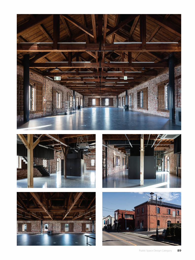
89 Public Space Design Category

90 公共空間設計類
Judges' Special Award 評審團推薦獎
Media Factory | Tropical Co-Working Space
創意媒體共享工作空間
WONG Lee KwanHong Kong 香港
Entrepreneur Cities of Taipei & Singapore
Asian cities have been advocating the idea of entrepreneur city
and creative economy in the recent decade, it is crucial for human
development that while robot is going to take out most of labour-
intensive work, human should transform its effort to be intelligent
and creative-intensive type of works.Therefore, it is essential to build
up the entrepreneur infrastructure for the city, not only mean by
government policy but the space for start-up. Rental price of office in
the top rank cities like Hong Kong, Taipei, Singapore and Tokyo can be
as high as rocket, in that sense, how we could create the entrepreneur
atmosphere for the youth in those first-tier cities?It links up the
common problems of those cities, although the project location of
this Media Co-working Space project which is located in Singapore,
with the rapidly globalization in Asian cities, the youth from this two
cities have the same passion for striving their personal development,
the project is trying to proposal a co-working space for media related
industries, Incorporating with mobile apps check-in, so that user could
monitoring the available seat or workstation. Limited short-term living
is also provided.
Design Aims | Workloft
The Project aims to tackle the questions in three main topics in
Architecture. Firstly, understanding the modern working culture for
exploring a new type of Living Style. Secondly, architecture design
should be able to situate in the unique condition of Tropical Climate.
Lastly, apply the 3D Printing technology into the building construction
and structural design.
Architecture Design | MediaBox
Social Media? Working Media? The modern human working culture has
been tightly connected with internet and digital media, which monitor
is the interface between human and virtual working space. Moreover,
it has been expanded its function into humans’ living, working, playing
and Learning. From giant monitor in the New York time square to the
apple watch you are wearing. You are Online! Therefore, the spatial
planning were determined by the use of media tools and necessity
創業之都 - 台北 新加坡
近十年來,亞洲城市一直主張創意經濟,當機器人正在負起勞動密集
型工作,社會都在討論人類於未來社會之生存方式該如何。 其中一
個方向是應該把過剩勞力轉化為智慧創新,而創新也是人類發展至今
難以被機器取代的能力。因此,建立為城市的創業基礎設施由其重
要,這不僅意味著政府的政策,而且是創業的空間與需求。香港,台
北,新加坡,東京等全球一線城市的辦公樓租金高企,在這種意義上,
我們如何為一線城市的青年創業家營造一個適合的環境?這連接起了
這些城市的共同問題,雖然該項目是位於新加坡,但隨著亞洲城市的
全球化迅速,這兩個城市的青年對於闖事業的意志是相同的。這個媒
體共同工作空間項目正在嘗試為媒體相關行業提供共享空間,並結合
移動應用程序簽到,以便用戶可以瀏覽可用的座位或工作站,並提供
有限的短期住宿。
設計目標 | Workloft
該項目旨在解決建築三個主題中的問題。首先,探索一種新的“共亨
工作住居方式"。其次,建築設計應該能夠處理熱帶氣候的獨特條件。
最後,將 3D 打印技術應用於建築施工和結構設計。
建築設計 |MediaBox
社交媒體? 工作媒體? 現代人類工作文化與互聯網和數字媒體緊密
相連,屏幕成為了人類與虛擬作業空間不可或�之介面。不單是工作,
它的範圍已經擴展到人類的生活,玩耍和學習中各方面。 從紐約時
代廣場的巨型廣告屏幕到你腕上的蘋果手錶。 你在 Online 了!
因此,空間的規劃原理是通過各類媒體工具與自然陽光的必要性來安
排的,MediaBox 位於中心,其中包含大型屏幕工作室,虛擬現實 (VR)
工作站位於下層,而筆記本電腦用戶因自然光的需要靠近外牆。 總
而言之,媒體共享工作空間是為了應對日益增長的多樣化工作方式,
以及提供中小型工作團隊一個可負擔的工作環境。
Shashi Caan:A clever use of revitaliza�on,this project reimagine an interesting work environment carved out of sectional cuts thro the conventional "silo" with
collaboration a requirement for contemporary (decomposed silo) o�ce work,the metaphor is manifest in reality.
這項設計巧妙地利用復興,重新想像出一個有趣的工作環境,透過傳統「筒倉」與當代(分解倉庫)辦公室工作的要求相結合,將隱喻展
現在現實中。
Judge's Comment│評審評語
of natural sunlight, a MediaBox in the centre where contain monitor
panel rooms, Virtual Reality work station located in the lower floor
and seating area for laptop users which closer to the façade. In short,
the Co-working space is trying to tackle growing diversity of working
methods, as well as affordable work environment for Media start-up.
91 Public Space Design Category
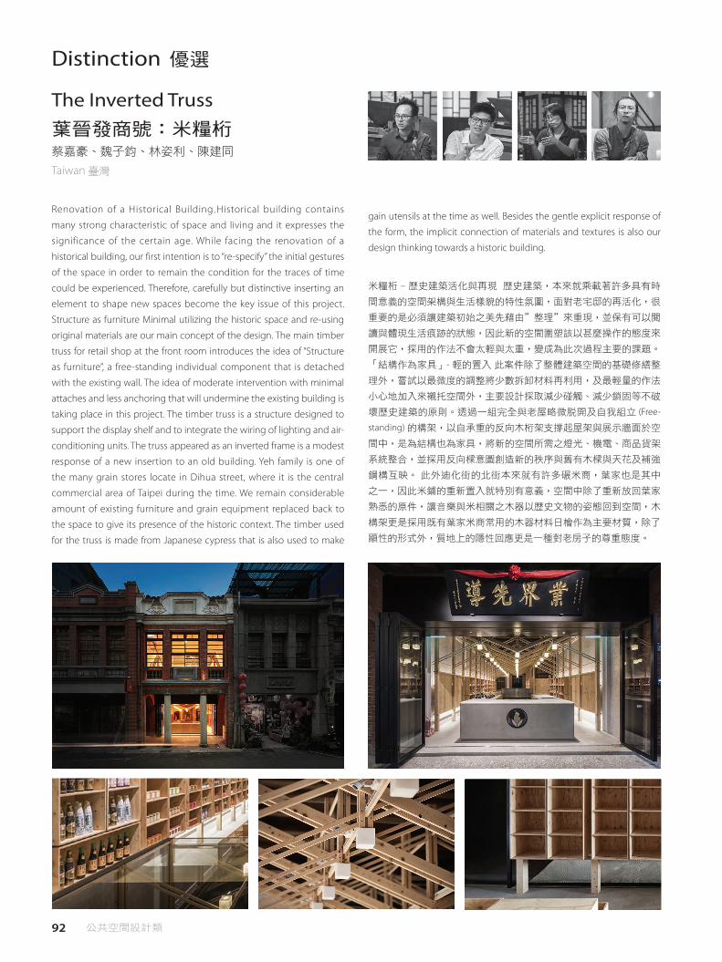
92 公共空間設計類
Distinction 優選
The Inverted Truss 葉晉發商號:米糧桁 蔡嘉豪、魏子鈞、林姿利、陳建同
Taiwan 臺灣
Renovation of a Historical Building.Historical building contains
many strong characteristic of space and living and it expresses the
significance of the certain age. While facing the renovation of a
historical building, our first intention is to “re-specify” the initial gestures
of the space in order to remain the condition for the traces of time
could be experienced. Therefore, carefully but distinctive inserting an
element to shape new spaces become the key issue of this project.
Structure as furniture Minimal utilizing the historic space and re-using
original materials are our main concept of the design. The main timber
truss for retail shop at the front room introduces the idea of “Structure
as furniture”, a free-standing individual component that is detached
with the existing wall. The idea of moderate intervention with minimal
attaches and less anchoring that will undermine the existing building is
taking place in this project. The timber truss is a structure designed to
support the display shelf and to integrate the wiring of lighting and air-
conditioning units. The truss appeared as an inverted frame is a modest
response of a new insertion to an old building. Yeh family is one of
the many grain stores locate in Dihua street, where it is the central
commercial area of Taipei during the time. We remain considerable
amount of existing furniture and grain equipment replaced back to
the space to give its presence of the historic context. The timber used
for the truss is made from Japanese cypress that is also used to make
米糧桁 – 歷史建築活化與再現 歷史建築,本來就乘載著許多具有時
間意義的空間架構與生活樣貌的特性氛圍,面對老宅邸的再活化,很
重要的是必須讓建築初始之美先藉由"整理"來重現,並保有可以閱
讀與體現生活痕跡的狀態,因此新的空間圍塑該以甚麼操作的態度來
開展它,採用的作法不會太輕與太重,變成為此次過程主要的課題。
「結構作為家具」- 輕的置入 此案件除了整體建築空間的基礎修繕整
理外,嘗試以最微度的調整將少數拆卸材料再利用,及最輕量的作法
小心地加入來襯托空間外,主要設計採取減少碰觸、減少鎖固等不破
壞歷史建築的原則。透過一組完全與老屋略微脫開及自我組立 (Free-
standing) 的構架,以自承重的反向木桁架支撐起屋架與展示牆面於空
間中,是為結構也為家具,將新的空間所需之燈光、機電、商品貨架
系統整合,並採用反向樑意圖創造新的秩序與舊有木樑與天花及補強
鋼構互映。 此外迪化街的北街本來就有許多碾米商,葉家也是其中
之一,因此米鋪的重新置入就特別有意義,空間中除了重新放回葉家
熟悉的原件,讓音樂與米相關之木器以歷史文物的姿態回到空間,木
構架更是採用既有葉家米商常用的木器材料日檜作為主要材質,除了
顯性的形式外,質地上的隱性回應更是一種對老房子的尊重態度。
gain utensils at the time as well. Besides the gentle explicit response of
the form, the implicit connection of materials and textures is also our
design thinking towards a historic building.

93 Public Space Design Category
Distinction 優選
BROWNMIST 林幸長、黃馨慧
Taiwan 臺灣
〈The Bodily Sensation〉As Gaston Bachelard mentioned in his book The Poetic of Space, the sense of comfort comes from using the body to create a space, just as a bird using its body to push around a space in the nest. The essence of a nest is the sense of intimacy and security, which we have been yearning to create with tectonic means. How do we translate the endearing quality of a home into the materialization of a building? How do we create the dialogue between the visible and invisible interiority in a house? The owner of the house is an artist. The placement of paintings and potteries, found object and collected items, as well as the senses, visuals, temperatures and sounds of the environments, together they form the beginning of a home. <The Fifth Elevation> The master bedroom hides itself in the center of the 2nd floor, with a large wood door acting as a barrier to privacy. Old furniture, closets and lamps populate the interior of the room. On the side to the bedroom as the center of privacy, there is a backside study, a corner of introspection. From the inside to the outside, there are the restroom, the westward balcony and the pseudo-facade. The interior space is concealed from the outside, except for an exterior staircase passes over the master bedroom. The tightly constructed relationship between the interior and the exterior suggests a self-defense mechanism that is central to the worldview of dwelling. The single surface material of exposed concrete holds complicated internal spaces within the building, as in the traditional idea of a house, the building protects its inner courtyard and gardens from the outside. <Dwelling> Every new home is a search for self-establishment away from the original household. We pursuit an ideal prototype of living in the sense of Heidegger’s dwelling, existing between the earth, the sky, the mortals and the divinities. The “sky” in this project is the external environments on the site, while the “earth” is the complicated spatial condition and the westward exposure of the house. The “divinities” refer to the sense of security for one self while facing the world, and the “mortals” are the requirements to fulfill while holding a public gallery in private residence. <Cognitive Dissonance> How to draw a line between inside and outside? It is a question of self-defense mechanism, as well as a subconscious idea of one’s ego. How does the self-defense mechanism translate to everyday behaviors, and further more materialized into architecture? The concept of the “uncanny valley” is the strangeness from everyday life, when the usual understanding of things becomes alienated. The “pseudo-facade” of the building forms a formal and mental protection as part of the ancient defensive mechanism in dwelling. Baudrillard claimed that the architects operate in the mode of “counterfeit” from renaissance throughout industrial revolution, and in this project we work with
公共藝廊與私密住家的並存 uncanny valley 熟悉的日常生活,熟悉的建築樣貌,
卻是熟悉的似曾相識、自我異化的表現。 < 身體感 > 舒服的身體感,以鳥窩的
形狀為例,是以身體去撞擊調整出最舒服的身體位置,如此形成鳥窩 ( 巴加斯
東 ‧ 巴舍拉在《空間詩學》中論及 )。巢穴建立於身體的親密與安全感,而如
此內在性的私密感如何構築呈現?家,可見的視覺性與不可見的內在性如何回
應;如何將家的迷人生活轉換為建築物質性。〈第五面〉主臥室私密的藏在建
築二樓中心位置,扮演私密通關的防線。在主臥室私密中心的外圍,面對自我
空間的是後側書房,由內往外的是浴廁、西曬陽台及偽立面。 主臥室的上方
有一個第五面向的戶外梯穿過,從外觀建築元素無法窺看出隱藏的內在世界。
如此緊密構成的內在與外在關係,是天地神人的世界觀所需要的心理防衛機制
(Self-defense Mechanism)。清水模的單一材料面對多重內部關係,將消失的
中央內庭與後花園的概念,轉換到私密內部空間的依存關係。〈安居〉天:外
在社會關係;內在個人窩巢。 地:外在環境的莫名雜處關係;內在基地的正面
西曬問題。 神:是面對世界與自我之間的安全感。 人:公共性藝廊與私密性住
家的需求因應。 < 認知失調 > 當面臨外在世界壓力,設計的「偽立面」形成一
種心裡與外表的保護,是原始防禦機制的本質。 在uncanny valley概念下,以「偽
立面」回應「認知失調」與不可思議的矛盾。而正面朝西,大小不一的開口後
方是陽台,陽台連接的是有水氣的浴廁,然後才是房間。陽台是透空的格柵板,
疏散西曬的熱氣。正立面亦是設備的立面,背後不是生活的房間,而是西曬的
調節。正面唯見的建築元素是一個朝天梯,身體感在經歷一個三層高的連續直
梯,重新被塑造家的尺度感。「偽立面」,對外是製造霧裡看花的模糊感,於
內是以窺視模式看世界。
the “uncanny valley” concept to use the pseudo facade to solve the paradox of cognitive dissonance. The facade faces west, with its various openings connecting to the balconies in the back, themselves connecting to bathrooms before opening to bedrooms. The balconies are made of metal grills to dissipate the moist and the heat from the sunlight. The facade therefore becomes an elevation for the equipment, while supporting not directly to the rooms but instead mediating the heat from the western exposure. The only architectural element visible from the outside is an open-air staircase that is three stories high and leads the user to sense the scale of the house by their movements. The “pseudo-facade” creates an ambiguous appearance from the outside, while for the inside it is a wall with windows to peek through to the world.

94 公共空間設計類
Distinction 優選
Living in a sustainable suburban house 可持續性山上住宅曾志偉、陳偉勳、林念儒、康力升
Taiwan 臺灣
An interior design project to a house located in suburban mountain
area of Taipei city. In this case, the space was set for vacation or relaxing
purpose, a shelter for urban escaping. Instead of high complexity to
construct, the design was meant to simplify the plan and material using
for the interior. The future residents can easily add or reduce furniture for
their needs of living, keeping the relaxing and free atmosphere of the
estate is the main goal. The plan aimed to break the traditional function-
setting of a standardized home, by adding the flexibility of changing
the furniture setting and focusing on maximized-spatial experience.
While entering the house, the first glance will be large kitchen island and
tearoom lightening from inside, showing the warmness of living. The
teahouse is the only room of the house, and it can still fit in any function
use: sometimes a room for sleeping, sometimes a room for listening to
music, sometimes the room for guests. Using soft and natural material,
the out shape of teahouse simply organic and was naturally made from
Banana stem by Japanese craftsman. -Choosing the sustainable and
recycled materials Using several organic and sustainable materials in the
interior, such as Paper fiber by banana stem, the mud of dams to make
floor and kitchen sink, the recycled woods of old cabin decks to make
the floor. -Exploring the organic material for lighting system To explore a
一個位於大台北山區的住宅實品屋室內設計案,面對不確定的使用
者,將此空間設定為渡假使用的場所,一個暫時逃離繁忙城市生活的
庇護所。相較於過去高強度的裝修方式,最主要的設計功能是減少裝
修強度,讓未來進駐的人可以依照自己的喜好增加或減少生活物質。
打破傳統住宅的空間定義及機能區分,讓空間因應不同的使用行為能
夠互相結合、彈性運用並產生極大化的效果。到這個家中,迎接使用
者的是偌大的廚房中島,以及發散自然燈光的紙纖維茶室,以此創造
生活情境的更多可能,用很柔軟的、特殊的天然材料,研發製作小至
一盞夜燈、大至可容納數人的茶屋,創造不一樣的生活情境,例如:
茶室可以當客房、音樂廳、接待室、客廳、是一個多用途創造生活情
境的設施。 -選擇永續回收材料 空間內使用數種不同的永續環保材料:
香蕉梗自然纖維作為茶室、水庫淤泥所形成的樂土作為地板、中島、
水槽區的材料、廢棄船艙的回收甲板作為木地板。 - 探索有機照明系
統 提供一個在空間中比較有趣的照明方法—柔和的、質感的、溫潤
的光澤系統,尺寸大為一個空間、小至一個吊燈的可能性,以天然可
自然分解的香蕉梗纖維作為探索材料。
softer, texturized and gentle lighting system in the space, from smallest
stand-lights to a teahouse space, using the single and natural material by
handmade fiber from banana stem.
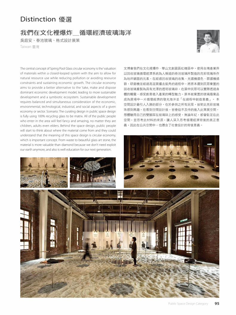
95 Public Space Design Category
Distinction 優選
我們在文化裡爆炸_循環經濟玻璃海洋吳庭安、春池玻璃、格式設計展策
Taiwan 臺灣
The central concept of Spring Pool Glass circular economy is the ‘valuation of materials within a closed-looped system with the aim to allow for natural resource use while reducing pollution or avoiding resource constraints and sustaining economic growth. The circular economy aims to provide a better alternative to the ‘take, make and dispose dominant economic development model, leading to more sustainable development and a symbiotic ecosystem. Sustainable development requires balanced and simultaneous consideration of the economic, environmental, technological, industrial, and social aspects of a given economy or sector. Scenario: The curating design in public space design is fully using 100% recycling glass to be matrix. All of the public people who enter in the area will feel fancy and amazing, no matter they are children, adults even elders. Behind the space design, public people will start to think about where the material come from and they could understand that the meaning of this space design is circular economy, which is important concept. From waste to beautiful glass art stone, the material is more valuable than diamond because we don't need exploit our earth anymore, and also is well education for our next generation.
文博會我們在文化裡爆炸 - 華山文創園區紅磚區中,使用台灣產業界
以回收玻璃循環經濟系統為人稱道的春池玻璃所製造的亮彩琉璃珠作
為地坪鋪面的元素,在經過回收玻璃的收集、光選機選色、篩選機過
篩,研磨機並經過高溫窯爐去銳角的過程中,將原本遭到民眾棄置的
回收玻璃重製為具有光澤的透明玻璃碎,在展中民眾可以實際透過身
體的觸覺,感受創意植入產業的轉型魅力,原本被棄置的玻璃廢棄品
成為展場中一片循環經濟的發光海洋並「在過程中創造意義」。 本
空間設計最引人入勝的部分,在於參與之所有民眾,皆對此亮彩玻璃
珠感到興趣,在看到空間設計後,皆會迫不及待的進入此策展空間,
想體驗用自己的雙腳踩在玻璃碎上的感受,無論年紀,都會駐足在此
空間,並思考此材料的來源,讓人深入思考循環經濟背後的真正意
義,因此在公共空間中,也隱含了社會設計的背後意義。

96 公共空間設計類
Distinction 優選
The Mirrored Sight Shelter 明鏡台Li Hao、Nan Xueqian
China 中國大陸
The Shelter · Mirrored Sight is part of the Shelter Series architectural installation practice. It is set by the north bank of Longxi River outside the old town of Longli in Jinping county, Kaili Area, Southeast Guizhou. 600 years ago, a group of the Ming citizen immigrated to this area from all over the country as a military tillage, which was in fact a form of suppression to the northeast Qian people’s rebellion. Over hundreds of years, people there built their town according to Nanjing’s urban layout and built their houses following the Hui style building. And therefore Longli has gained this unique south Yangtze River region architectural nostalgia different from the surrounding Miao and Dong ethnical form. Yu Qiuyu, the famous writer, once remarked Longli as a lonely islet of the Han culture amidst the minority groups. For the tourists, the islet might be merely a cultural symbol, whereas to the local residents, this islet symbolises their situation in all forms of survival predicaments. Once a strategic frontier town, Longli has gradually become a common town over the years and the Han people have also blended into the locals – they once only marry the Han people within their society and now they intermarry the local Miao and Dong people. The Longli people have been again and again separating from and blending into the neighbourhood and consequently they broke out from the past and created the local diversity. In designing the Shelter, architects articulated the isolation and tension of the Longli people and the vernacular community. They then created this Mirrored Sight of Longli. The shelter itself is now a place for people to rest and have fun, and meanwhile a new regional landmark. Right opposite to the old town by the river, The Mirrored Sight shelter reflects the town’s image. Longli sits within the town whereas the shelter lies outside. There are thousands of residents in Longli and the shelter is just for one person to reside. The town is for daily life and the shelter creates unusual experience for people – in the town of Longli, they belong to a big group, however here in the shelter individual is better appreciated. The shelter is connected to the old town by a stone bridge and the locals would go across it everyday to farm, to fish, to do laundry and to wish dishes. The site itself is a space transition from the man-made old town to the natural landscape. There are two floors in the shelter --- the upper floor for people to overlook the scene and the lower floor for one to stay and rest. The axes formed by the old town and the river defines the relationship between the shelter and the site. The architects used completely different materials to construct and differentiate the northern and southern facades. The northern façade, densely covered by local bamboo wood, parallels with the axis of Longli town, and the southern façade, cladded with Pilkington Mirropane (single-transparent glass), paralles the Longxi River. Therefore, the installation comes into a simple shape narrowing eastward. The entrance of installation faces to the old stone bridge, making a relationship between the ‘Opposite Shelter’ and old town. The glass reflects scene of Longli’s daily life south to the river, and creates a shadow of the reality. The mirror image of the pyramid becomes a shadow of the pyramid itself. The refraction and reflection of the glass would give people who gets inside the installation an experience of an
“明鏡台"裝置,坐落于貴州黔東南自治州凱裡市錦屏縣隆裡古城外的龍溪北
岸。 “明鏡台"裝置與古城遙遙相望,映出了古城的“對面"。隆裡在城“裡",
“明鏡台"在城“外";隆裡極大,容納千人,“明鏡台"極小,僅容一人;隆
裡是平面的城,“明鏡台"是立體的塔;隆裡是日常生活,“明鏡台"是非日常
體驗;隆裡代表群體,而“明鏡台"關注自身。 裝置通過一座古老的石板橋與
古城相連。這座石橋由天然石材隨意鋪就,每天清晨都有當地人洗菜、洗衣、釣
魚、捕魚、經由石橋進入稻田耕作,是由人工的古城向半人工的稻田再向自然的
山水過渡的空間節點。 裝置分為兩層,上層供人眺望賞景,下層則是休憩與停
留的空間。裝置由古城與河流形成的兩道軸線明確了與基地的關係,南北側立面
由完全不同的材料區分開來。北側立面採用當地竹材密佈,軸線與隆裡古城軸線
平行;南側立面採用單透玻璃,軸線與河流平行,因而形成了西寬東窄的夾角;
裝置入口則面向古老的石橋,將裝置與古城聯繫在了一起。 單透玻璃反射出河
南岸紛繁的隆裡古城日常生活場景,成為真實生活的幻象;補足了正面的三角錐
體,又成為三角錐的幻象。玻璃複雜的折射、投射與反射,令三角錐內的個體往
往可以觀察到極其複雜的鏡內影像,虛實難辨。“明鏡台"並非是對隆裡古城
完全的抽離,而是建構在其交疊的多重映射之上。 裝置的西面視窗取龍溪橋為
景——這座橋建于明代的古橋明代與河岸的兩條路共同組成了搭弓射箭的圖形,
被隆裡人視為重要的風水意象;東面視窗取景狀元橋——這座橋既是對當地文化
符號王昌齡的祭奠,更因三個橋洞組成的魚簍圖形,同樣被視為重要的風水意
象。 入夜後的裝置,呈現出與白日全然不同的景象。建築體隱藏於黑暗之中,
純粹的三角錐體經由鏡面補全,視覺上完全懸浮空中、倒映河中。 “明鏡台"
完全孤立於環境中,回應了隆裡初生的狀態——一座河邊的孤島。
integration of a complex mirrored sights, which one can hardly which is real and which is unreal. The Shelter itself is not completely lying out of the Longli town, rather it is an installation built upon the inter-related images of the town of Longli. The shelter’s west window frames a view of the Longxi Bridge, a bridge that was built in Ming dynasty and forms a shape of bow and arrow together with two roads by the river. The east window captures the view of the Scholar Bridge, which is a memorial to the ancient local scholar Wang Changling. The three apertures of the Scholar Bridge forms the shape of a fish creel and the scenes captured in the two windows are both import local Feng Shui (traditional Chines geomancy) imageries. The pyramid shaped inner space would give the wrong impression that the space is rather narrow. However, when going upstairs, visitors would find it in fact much bigger than they thought. In the fake window on the north façade, there cracks a crevice that might give people a fright when going down, which is in fact a delusion given by the closed façade of the fake window. After getting dark, the shelter shows an utterly different presence from the daytime. The overall shape of the structure merges into the darkness and the pyramid emerges together with its mirror images, seemingly floating in the air with its reflection in the water. Hence, an imagery of the Lonely Islet is brought in the air of Longli’s most natural and original scene.
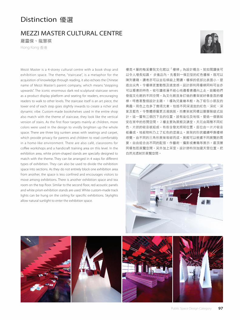
97 Public Space Design Category
Distinction 優選
MEZZI MASTER CULTURAL CENTRE羅靈傑、龍慧祺
Hong Kong 香港
Mezzi Master is a 4-storey cultural centre with a book shop and
exhibition space. The theme, “staircase”, is a metaphor for the
acquisition of knowledge through reading, it also echoes the Chinese
name of Mezzi Master’s parent company, which means “stepping
upwards”. The iconic enormous dark red sculptural staircase serves
as a product display platform and seating for readers, encouraging
readers to walk to other levels. The staircase itself is an art piece, the
lower end of each step goes slightly inwards to create a richer and
dynamic vibe. Custom-made bookshelves used in the entire shop
also match with the theme of staircase, they look like the vertical
version of stairs. As the first floor targets mainly at children, more
colors were used in the design to vividly brighten up the whole
space. There are three big sunken areas with seatings and carpet,
which provide privacy for parents and children to read comfortably
in a home-like environment. There are also café, classrooms for
coffee workshops and a handicraft training area on this level. In the
exhibition area, white prism-shaped stands are specially designed to
match with the theme. They can be arranged in 4 ways for different
types of exhibition. They can also be used to divide the exhibition
space into sections. As they do not entirely block one exhibition area
from another, the space is less confined and encourages visitors to
move among exhibitions. There is another exhibition space and tea
room on the top floor. Similar to the second floor, red acoustic panels
and white prism exhibition stands are used. White custom-made track
lights can be hung on the ceiling for specific exhibitions. Skylights
allow natural sunlight to enter the exhibition space.
樓高 4 層的梅溪書院文化館以「樓梯」為設計概念,就如閱讀後可
以令人增長知識。 步進店內,先看到一條巨型的紅色樓梯,既可以
陳列書籍,讀者亦可以坐在梯級上閱讀。樓梯的低部比表面小,塑
造出尖角,令樓梯更富動態及速度感。設計師利用樓梯同時可坐亦
可以看書的特色,吸引讀者漫不經心地邊看書邊向上走,鼓勵他們
發掘文化館的不同空間。為文化館度身訂造的書架就好像垂直的樓
梯,呼應著整個設計主題。 1 樓為兒童繪本館,為了吸引小朋友的
興趣,用色上也多了幾項元素,包括不同深淺度的紅色、深紅、深
紫及藍色,令整體感覺更活潑跳脫,而書架就同樣以層層階級式設
計。這一層有三個凹下去的位置,設有座位及地毯,營造一個猶如
安在家中的悠閒空間。 2 樓主要為展館及講堂,天花由兩種不同紅
色、片狀的吸音板組成,有些含發光照明位置,座位由一片片吸音
板疊成,地板物料乃上了紅色的混凝土。展架的形狀繼續呼應樓梯
感覺,由不同的三角形展架堆砌而成,展館可以根據不同展覽的需
要,自由組合出不同的配搭,作藝術、攝影或書籍等展示。最頂層
同樣包括展覽空間,另外加上茶室。設計師特別加建天窗位置,把
自然光透射於展覽空間。

98 公共空間設計類
Distinction 優選
OZORA TO DAICHI NO NURSERY SHIMOIGUSAMasahiro Kinoshita
Japan 日本
The enlargement of the nursery school is considered to be urgent business as waiting-list child measures in an inner city. However, it is often objected as a noise source by neighborhood. A child can spend it at ease, and the state that the figure is taken favorably from the neighborhood is most suitable. In urban environment, such a natural state is difficult. It is being question how you enable the most suitable state. I established the foyer which crossed the building because a neighborhood and a nursery school were in most suitable state in a condition called the land of the strange form of a high-density town. A foyer becomes the buffer and makes a neighborhood and a childcare room the most suitable state. Children looked up at sky and did solar light to change every moment with a felt place. It is sometimes difficult to secure a large garden in the nursery school of the inner city. In such a case the park of the neighborhood functions as the garden. In this nursery school, I am studded with small terraces for summer pool play and baby. Children can find a place to stay in a nursery school and can spend it at ease outside while using a park. The neighborhood see such a scene in a living. A nursery school is caught favorably by neighborhood by designing the most suitable state, and the activity of kindergarteners makes a city full of vigor more.
對處於兒童措施候補名單的內城居民而言,托兒所的擴建被視為一
項具有急迫性的任務,然而,它通常被鄰居抗議為噪音來源。若要
讓一個孩子可以安心,就必須在最適合的鄰里條件下,而在城市環
境中,這樣的條件有其難度。就如何實現最合宜的條件而言,我提
出了穿越建築物門廳這樣一個概念,因為就一個最適合鄰里和托兒
所的條件來說,會是一種被稱為高密度城市下的奇特狀態,門廳能
夠成為一種緩衝區,使鄰里和保育室滿足最適合的條件。在一個鋪
滿地毯的地方,孩子們仰望著天空,每天曬在陽光下。在內城的托
兒所有時難以出現一個大花園,在這樣的情況下,我們改將鄰里的
公園作為花園。因而在這個托兒所中,我能安排小露台供夏季游泳
池和嬰兒使用。孩子們可以找到一個適合兒所的地方,並可以在外
面使用公園放鬆身心。托兒所通過設計滿足各項條件,而鄰居在生
活中看到這樣一個場景,更受到鄰里的青睞,托兒所的活動又使城
市充滿活力。
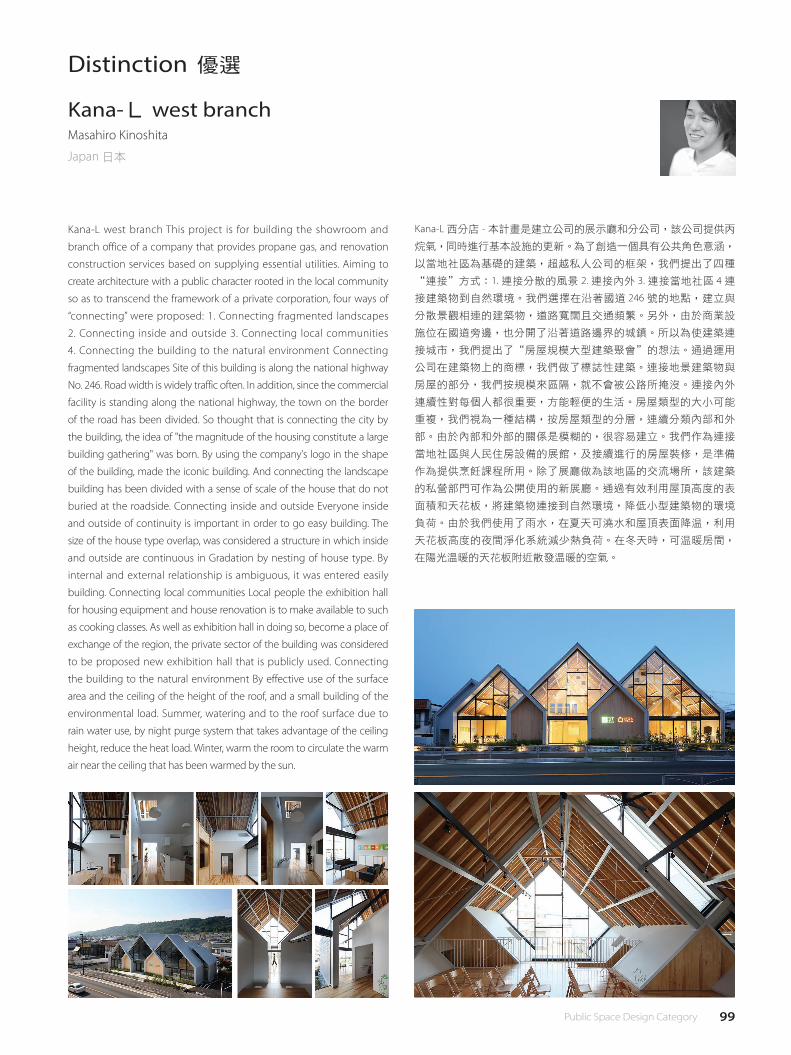
99 Public Space Design Category
Distinction 優選
Kana-L west branchMasahiro Kinoshita
Japan 日本
Kana-L west branch This project is for building the showroom and
branch office of a company that provides propane gas, and renovation
construction services based on supplying essential utilities. Aiming to
create architecture with a public character rooted in the local community
so as to transcend the framework of a private corporation, four ways of
“connecting” were proposed: 1. Connecting fragmented landscapes
2. Connecting inside and outside 3. Connecting local communities
4. Connecting the building to the natural environment Connecting
fragmented landscapes Site of this building is along the national highway
No. 246. Road width is widely traffic often. In addition, since the commercial
facility is standing along the national highway, the town on the border
of the road has been divided. So thought that is connecting the city by
the building, the idea of "the magnitude of the housing constitute a large
building gathering" was born. By using the company's logo in the shape
of the building, made the iconic building. And connecting the landscape
building has been divided with a sense of scale of the house that do not
buried at the roadside. Connecting inside and outside Everyone inside
and outside of continuity is important in order to go easy building. The
size of the house type overlap, was considered a structure in which inside
and outside are continuous in Gradation by nesting of house type. By
internal and external relationship is ambiguous, it was entered easily
building. Connecting local communities Local people the exhibition hall
for housing equipment and house renovation is to make available to such
as cooking classes. As well as exhibition hall in doing so, become a place of
exchange of the region, the private sector of the building was considered
to be proposed new exhibition hall that is publicly used. Connecting
the building to the natural environment By effective use of the surface
area and the ceiling of the height of the roof, and a small building of the
environmental load. Summer, watering and to the roof surface due to
rain water use, by night purge system that takes advantage of the ceiling
height, reduce the heat load. Winter, warm the room to circulate the warm
air near the ceiling that has been warmed by the sun.
Kana-L 西分店 - 本計畫是建立公司的展示廳和分公司,該公司提供丙
烷氣,同時進行基本設施的更新。為了創造一個具有公共角色意涵,
以當地社區為基礎的建築,超越私人公司的框架,我們提出了四種
“連接"方式:1. 連接分散的風景 2. 連接內外 3. 連接當地社區 4 連
接建築物到自然環境。我們選擇在沿著國道 246 號的地點,建立與
分散景觀相連的建築物,道路寬闊且交通頻繁。另外,由於商業設
施位在國道旁邊,也分開了沿著道路邊界的城鎮。所以為使建築連
接城市,我們提出了“房屋規模大型建築聚會"的想法。通過運用
公司在建築物上的商標,我們做了標誌性建築。連接地景建築物與
房屋的部分,我們按規模來區隔,就不會被公路所掩沒。連接內外
連續性對每個人都很重要,方能輕便的生活。房屋類型的大小可能
重複,我們視為一種結構,按房屋類型的分層,連續分類內部和外
部。由於內部和外部的關係是模糊的,很容易建立。我們作為連接
當地社區與人民住房設備的展館,及接續進行的房屋裝修,是準備
作為提供烹飪課程所用。除了展廳做為該地區的交流場所,該建築
的私營部門可作為公開使用的新展廳。通過有效利用屋頂高度的表
面積和天花板,將建築物連接到自然環境,降低小型建築物的環境
負荷。由於我們使用了雨水,在夏天可澆水和屋頂表面降溫,利用
天花板高度的夜間淨化系統減少熱負荷。在冬天時,可溫暖房間,
在陽光溫暖的天花板附近散發溫暖的空氣。

100 公共空間設計類
Distinction 優選
Yokohama Tram Museum SHIDEN HALLToshihiro Banba
Japan 日本
It is a hall adjacent to the museum that preserves the tram that used
to run through the city. We combine four different volumes into one
space so that it will be the size that fits the scale of the residential area.
"Multiple roofs", "planar deviation" and "sectional height difference"
control light, wind and scenery. The L-shaped wall and the cantilever
are connected with a curve corresponding to the stress calculation and
are openings giving softness. We believe that buildings that can enjoy
the change of the appearance of the outside and the inside can be
good by doing a little operation.
它是一個毗鄰博物館的大廳,保留了曾經穿過城市的電車。 我們將
四個不同的量體組合成一個空間,使其符合住宅區規模大小。 透過
“多屋頂",“平面偏差"和“斷面高差"控制燈光,風和景物。
L 形壁和懸臂與對應的曲線連接,經過於應力計算,並且是具有柔軟
度的開口。 我們認為,通過一點操作,建築物可以發生外部和內部
外觀的改變。

101 Public Space Design Category
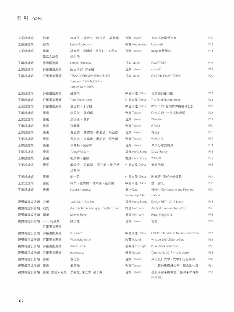
102
工業設計類 銀獎 李權恩、 陳蓓芸、鐘佳明、 郭錦龍 台灣 Taiwan 充氣式微型手術室 P10
工業設計類 銀獎 Leslie Nooteboom 荷蘭 Netherlands komorebi P12
工業設計類 銅獎
最佳人氣獎
楊育慈、洪博軒、蔡弘仁、王思云、
張昕瑀
台灣 Taiwan uBag 智慧樂袋 P14
工業設計類 應用精進獎 Noriaki Hanaoka 日本 Japan CAVE TABLE P16
工業設計類 評審團推薦獎 阮呂承安 , 游子瑩 台灣 Taiwan conveX P18
工業設計類 評審團推薦獎 TSUKAGOSHI MIYASHITA SEKKEI |
Tomoyuki TSUKAGOSHI、
Jumpei MIYASHITA
日本 Japan FOLDABLE HALF DOME P20
工業設計類 評審團推薦獎 蟻錦煥 中國大陸 China 兒童指尖創可貼 P22
工業設計類 評審團推薦獎 Yeoh Guan Hong 中國大陸 China The Seed Stamp project P24
工業設計類 評審團推薦獎 董世友、丁子晗 中國大陸 China BOTH SIDE 雙向無障礙輪椅設計 P26
工業設計類 優選 李盈瑩、 陳珊珊 台灣 Taiwan FUN 垃圾 - 一片式垃圾桶 P28
工業設計類 優選 彭明媛、 鄭鈴 台灣 Taiwan Weepee P29
工業設計類 優選 張譽鐘 台灣 Taiwan P-Ruler P30
工業設計類 優選 黃宓謙 、許震瑜、鄭名涵、蔡孜群 台灣 Taiwan 等距針 P31
工業設計類 優選 黃宓謙 、許震瑜、鄭名涵、蔡孜群 台灣 Taiwan WINGNAL P32
工業設計類 優選 葉儒勳、吳宗穎 台灣 Taiwan 未來分離式載具 P33
工業設計類 優選 Tsang Wai Sum 香港 Hong Kong SplashBuddy P34
工業設計類 優選 衛炳麟、路放 香港 Hong Kong YOYOKE P35
工業設計類 優選 嚴栩澄 、張嘉卿 、張立業 、謝子晗、
江希明
中國大陸 China 省時電梯 P36
工業設計類 優選 劉一君 中國大陸 China 剛剛好 • 烹飪定時鍋具 P37
工業設計類 優選 徐樂、翟偉民、林幸民、張芯露 中國大陸 China 雙十書桌 P38
工業設計類 優選 Natalia Hoosova 斯洛伐克
Slovak Republic
VERMI - Composting and Farming
station
P39
視覺傳達設計類 金獎 Javin Mo、Saki Ho 香港 Hong Kong Design 360° 2015 issues P44
視覺傳達設計類 銀獎 Antonia Terhedebrügge、Ste�en Knöll 德國 Germany Architekturnovember 2016 P46
視覺傳達設計類 銅獎 Marvin Boiko 德國 Germany Paper Pong 2016 P48
視覺傳達設計類 ico-D 特別獎
評審團推薦獎
陳子捷 台灣 Taiwan 省思 P50
視覺傳達設計類 評審團推薦獎 Sun Xiaoxi 中國大陸 China CHE PI: Interview with Zuoxiaozuzhou P52
視覺傳達設計類 評審團推薦獎 Wojciech Janicki 波蘭 Poland Vintage 2017 Zielona Gora P54
視覺傳達設計類 評審團推薦獎 André Letria 葡萄牙 Portugal Plural book collection P56
視覺傳達設計類 評審團推薦獎 esh gruppa 俄國 Russia Typomania 2017 / main poster P58
視覺傳達設計類 優選 黃任蔚 台灣 Taiwan 東方設計大學 / 大學部招生手冊 P60
視覺傳達設計類 優選 邱顯能 台灣 Taiwan 「小鎮神獸齊護金門」紀念款包裝 P61
視覺傳達設計類 優選 , 最佳人氣獎 余宥叡 , 陳立恩 , 易子齊 台灣 Taiwan 慈心淨源茶攜帶盒「臺灣茶保育動
物系列」
P62
索 引 Index
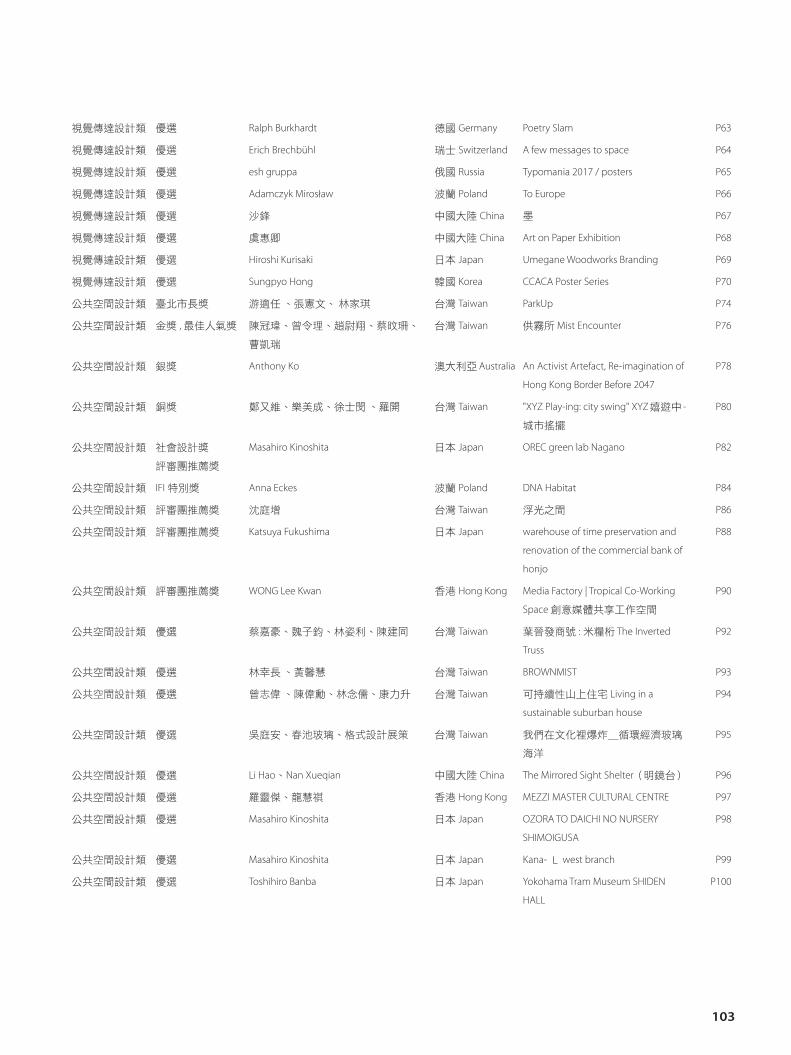
103
視覺傳達設計類 優選 Ralph Burkhardt 德國 Germany Poetry Slam P63
視覺傳達設計類 優選 Erich Brechbühl 瑞士 Switzerland A few messages to space P64
視覺傳達設計類 優選 esh gruppa 俄國 Russia Typomania 2017 / posters P65
視覺傳達設計類 優選 Adamczyk Mirosław 波蘭 Poland To Europe P66
視覺傳達設計類 優選 沙鋒 中國大陸 China 墨 P67
視覺傳達設計類 優選 虞惠卿 中國大陸 China Art on Paper Exhibition P68
視覺傳達設計類 優選 Hiroshi Kurisaki 日本 Japan Umegane Woodworks Branding P69
視覺傳達設計類 優選 Sungpyo Hong 韓國 Korea CCACA Poster Series P70
公共空間設計類 臺北市長獎 游適任 、張憲文、 林家琪 台灣 Taiwan ParkUp P74
公共空間設計類 金獎 , 最佳人氣獎 陳冠瑋、曾令理、趙尉翔、蔡旼珊、
曹凱瑞
台灣 Taiwan 供霧所 Mist Encounter P76
公共空間設計類 銀獎 Anthony Ko 澳大利亞 Australia An Activist Artefact, Re-imagination of
Hong Kong Border Before 2047
P78
公共空間設計類 銅獎 鄭又維、樂美成、徐士閔 、羅開 台灣 Taiwan "XYZ Play-ing: city swing" XYZ嬉遊中 -
城市搖擺
P80
公共空間設計類 社會設計獎
評審團推薦獎
Masahiro Kinoshita 日本 Japan OREC green lab Nagano P82
公共空間設計類 IFI 特別獎 Anna Eckes 波蘭 Poland DNA Habitat P84
公共空間設計類 評審團推薦獎 沈庭增 台灣 Taiwan 浮光之間 P86
公共空間設計類 評審團推薦獎 Katsuya Fukushima 日本 Japan warehouse of time preservation and
renovation of the commercial bank of
honjo
P88
公共空間設計類 評審團推薦獎 WONG Lee Kwan 香港 Hong Kong Media Factory | Tropical Co-Working
Space 創意媒體共享工作空間
P90
公共空間設計類 優選 蔡嘉豪、魏子鈞、林姿利、陳建同 台灣 Taiwan 葉晉發商號 : 米糧桁 The Inverted
Truss
P92
公共空間設計類 優選 林幸長 、黃馨慧 台灣 Taiwan BROWNMIST P93
公共空間設計類 優選 曾志偉 、陳偉勳、林念儒、康力升 台灣 Taiwan 可持續性山上住宅 Living in a
sustainable suburban house
P94
公共空間設計類 優選 吳庭安、春池玻璃、格式設計展策 台灣 Taiwan 我們在文化裡爆炸_循環經濟玻璃
海洋
P95
公共空間設計類 優選 Li Hao、Nan Xueqian 中國大陸 China The Mirrored Sight Shelter(明鏡台) P96
公共空間設計類 優選 羅靈傑、龍慧祺 香港 Hong Kong MEZZI MASTER CULTURAL CENTRE P97
公共空間設計類 優選 Masahiro Kinoshita 日本 Japan OZORA TO DAICHI NO NURSERY
SHIMOIGUSA
P98
公共空間設計類 優選 Masahiro Kinoshita 日本 Japan Kana- L west branch P99
公共空間設計類 優選 Toshihiro Banba 日本 Japan Yokohama Tram Museum SHIDEN
HALL
P100
2017 TAIPEI INTERNATIONAL DESIGN AWARD
臺北設計獎 成果專刊
出版者 臺北市政府產業發展局
地 址 110 臺北市信義區市府路 1 號
電 話 02-2720-8889
出版日 106 年 10 月
臺北市政府產業發展局 廣告
www.doed.taipei.gov.tw
指導單位I Advisor
臺北市政府
Taipei City Government
主辦單位I Organized
臺北市政府產業發展局
Department of Economic Development, Taipei City Government
執行單位I Executed
財團法人中國生產力中心
China Productivity Center
國際認證單位I Endorsed
合作單位I Collaborators
國際設計社團組織
ico-D
三創生活園區 中華平面設計協會
臺灣海報設計協會 高雄市廣告創意協會
中華民國工業設計協會
中華民國室內設計協會 中華民國美術設計協會
世界設計組織
WDO