university of vaasa - Osuva
48
UNIVERSITY OF VAASA FACULTY OF TECHNOLOGY DEPARTMENT OF COMPUTER SCIENCE Lauri Laipio ADJACENCY VISUALIZATION IN MOBILE NETWORKS Masters Thesis in Computer Science Multimedia systems and Technical Communication VAASA 2008
-
Upload
khangminh22 -
Category
Documents
-
view
0 -
download
0
Transcript of university of vaasa - Osuva

UNIVERSITY OF VAASA
FACULTY OF TECHNOLOGY
DEPARTMENT OF COMPUTER SCIENCE
Lauri Laipio
ADJACENCY VISUALIZATION IN MOBILE NETWORKS
Master�s Thesis in
Computer Science
Multimedia systems and
Technical Communication
VAASA 2008

1
INDEX page
1. INTRODUCTION 6
2. RESEARCH PROBLEMS 8
3. BACKGROUND 9
3.1. GSM networks 9
3.2. WCDMA networks 11
3.3. Handover management process 13
3.4. Handovers in GSM networks 14
3.5. Handovers in WCDMA networks 15
4. ADJACENCY MANAGEMENT IN CELLULAR NETWORKS 17
4.1. Adjacency types from network management perspective 17
4.2. Graphical adjacency management 17
5. ADJACENCY VISUALIZATION IN EARLIER NOKIA APPLICATIONS 22
5.1. Nokia Network Planning System for Unix (NPS/X) 22
5.2. Nokia Totem Vantage 23
5.3. Nokia NetAct Planner 24
6. TECHNOLOGIES USED 26
6.1. Java 26
6.2. Ilog 26
6.3. MapComponent 26
7. THE DESIGN FOR THE APPLICATION 27
7.1. User interface design 27
7.2. Object model 28
7.3. Adjacency visualization with Ilog 32

2
7.4. Limitations and problems discovered during the project 34
7.4.1. Bi-directional adjacencies 35
7.4.2. Limitations of Ilog 36
7.4.3. Performance and memory consumption in Ilog 36
7.5. Adjacency visualization with MapComponent 37
7.5.1. Showing performance data on adjacencies 38
7.5.2. Adjacency visualization on cell and dominance colors 39
8. CONCLUSIONS 42
REFERENCES 45

3
ABBREVIATIONS
3GPP 3rd Generation Partnership Project
ADCE Handover in GSM system
ADJG Handover from WCDMA system to GSM system
ADJI Inter-frequency handover in WCDMA system
ADJS Intra-frequency handover in WCDMA system
ADJW Handover from GSM system to WCDMA system
BS Base station
BSS Base station subsystem
BSC Base station controller
BTS Base Transceiver Station
CDMA Code division multiple access
EDGE Enhanced data rate for the GSM evolution
ETSI European telecommunications standard institute
GAM Graphical adjacency management
GERAN GSM/EDGE radio access network
GIS Geographical information system
GPRS General packet radio system
GSM Global system for mobile communications
IMT-2000 International mobile telecommunications 2000
ITU International Telecommunications Union
ME Mobile equipment
MS Mobile station
Node B 3GPP term for a base station
RNC Radio network controller
SIM Subscriber identity module
TRX Transceiver
UE User equipment
UMTS Universal mobile telecommunications system
UTRAN UMTS terrestrial radio access network
WCDMA Wideband code division multiple access

4
UNIVERSITY OF VAASA Faculty of Technology Author: Lauri Laipio Topic of the Thesis: Adjacency visualization in mobile networks Name of the Supervisor: Merja Wanne Degree: Master of Science (Economics) Department: Department of Computer Science Major Subject: Computer Science Degree Programme: Multimedia systems and Technical Communication Year of Entering the University: 1997 Year of Completing the Thesis: 2008 Pages: 47 ABSTRACT: The ever-increasing usage of mobile phones forces the network operators to expand and tune their mobile networks continuously to meet the growing requirements for the quality of service. This is done with the help of optimization tools. One of the network optimization tools used by operators is Nokia Optimizer, whose adjacency management functionality as well as the process for developing the said functionality is described in this thesis. The development of Optimizer started in 2001, at the time as this study began. Several versions of Optimizer were developed during the course of this study. The aim of this thesis is to study the possibilities for managing and visualizing handovers in a mobile network in a graphical user interface. The thesis also covers software architecture and performance related issues as part of the software implementation process. The most important research problem was adjacency visualization on top of a geographical map. More specifically, the aim was to study what kind of icons and color usage were best suited for representing adjacencies and related information on the map, at the same time keeping in mind that the solution would have to work also in cases where a sizeable amount of objects as well as other information was to be shown. During the course of this study it came apparent that performance issues related to adjacency management had to be addressed as well. As a result of this study, useful solutions for adjacency visualization were found for Optimizer. Significant improvements in adjacency management and in performance were achieved as well, as a comparison of Optimizer and earlier Nokia optimization tools demonstrates. KEYWORDS: visualization, handover, adjacency, mobile network

5
VAASAN YLIOPISTO Teknillinen tiedekunta Tekijä: Lauri Laipio Tutkielman nimi: Naapuruuksien visualisointi matkapuhelinverkoissa Ohjaajan nimi: Merja Wanne Tutkinto: Kauppatieteiden maisteri Laitos: Tietotekniikan laitos Oppiaine: Tietotekniikka Koulutusohjelma: Multimediajärjestelmien ja teknisen viestinnän
koulutusohjelma Opintojen aloitusvuosi: 1997 Tutkielman valmistumisvuosi: 2008 Sivumäärä: 47 TIIVISTELMÄ: Maailmassa käytetään koko ajan enemmän ja enemmän matkapuhelimia, mikä luonnollisesti asettaa kovenevia vaatimuksia myös matkapuhelinverkoille. Verkko-operaattorit käyttävät optimointityökaluja matkapuhelinverkkojensa hallintaan sekä palveluidensa laadun ylläpitämiseen ja kehittämiseen. Yksi operaattoreiden käyttämistä optimointityökaluista on Nokian Optimizer, jonka naapuruuksien hallintaan tarkoitettua toiminnallisuutta ja kehitystyötä tässä työssä kuvataan. Optimizerin tuotekehitys alkoi vuonna 2001 jolloin myös tätä tutkimusta alettiin tehdä. Tutkimuksen aikana Optimizerista kehitettiin useita versioita. Tutkimuksen tarkoitus oli paitsi kehittää työkalu naapuruuksien hallintaan myös selvittää naapuruuksien luontiin ja visualisointiin liittyviä seikkoja. Myös verkkoelementtien ja näytettävän tiedon suuri määrä asetti omia vaatimuksia ja rajoituksia suunnittelulle. Tutkimuksen suurimpana haasteena oli naapuruuksien visualisointiin karttanäkymässä liittyvät seikat, erityisesti visualisoinnissa käytettävien ikonien muoto ja värien käyttö. Myös naapuruuksien hallinnan suorituskykyyn liittyvät ongelmat nousivat esiin tutkimusta tehtäessä. Tutkimuksen tuloksena Optimizeriin saatiin kehitettyä toimivat ratkaisut naapuruuksien visuaaliseen hallintaan. Vertailu aikaisempiin Nokian työkaluihin osoittaa, että myös naapuruuksien hallintaan ja suorituskykyyn saatiin selkeitä parannuksia. AVAINSANAT: naapuruus, visualisointi, matkapuhelinverkko

6
1. INTRODUCTION
The work for this master�s thesis started in spring 2001 when I joined Nokia Networks
to work as software engineer in the Network Optimization product line. At that time
Nokia Networks was launching a new software project and product called Optimizer
that I started to develop together with a team of several software engineers. Since the
product was brand new and the programming language in that department had been
changed from C to Java, everything had to be designed and implemented from scratch.
My task in the beginning was to design and implement a graphical handover
management system called GAM (Graphical Adjacency Management) for the first
Optimizer version, Optimizer 1.0.
In the beginning the research problem was related to the implementation of GAM with
the given architecture using Java and third party software called Ilog. After the first
simple prototypes of GAM were ready, it was seen mandatory to research also the
different possibilities of visualizing and managing the handovers on top of a
geographical map.
During the research and development phase for the visualization and the creation of the
use cases for GAM, it was noticed that the software had some performance problems.
For example fulfilling the use cases meant visualizing thousands of adjacencies at the
same time. At this point it was necessary to start researching also software performance
issues together with usability.
In the very end this thesis describes the software development process of the GAM
feature in the Optimizer product and discusses the conclusions and solutions the team
came up with in the latest version of Optimizer.
Since handover management is related to second and third generation mobile networks,
an introduction to GSM and WCDMA networks is given in Chapter 3. The chapter also
covers the main principles of the adjacency management process and introduces
handover techniques in both networks.

7
The basics of adjacency management in mobile networks are handled in Chapter 4,
together with graphical adjacency management principles.
Chapter 5 introduces shortly earlier Nokia products and how adjacencies are visualized
in those products. Some of the good and bad points are from these programs are taken
into account we designing GAM for the Optimizer.
In Chapter 6 all the main software related technologies are listed and this chapter also
introduces the third party software Ilog and its replacement MapComponent, which was
implemented along with the Optimizer product to better serve our needs in the
visualization of adjacencies.
Chapter 7 describes the software design for GAM and introduces multiple ways of
visualizing adjacencies in a graphical user interface, based on different use cases. It also
discusses the problems related to the Ilog visualization component and the reasons
behind the decision to replace it with another visualization component.
In the final chapter, Chapter 8, the visualization possibilities between earlier Nokia
network management products and Optimizer versions are compared and overall
conclusions given.

8
2. RESEARCH PROBLEMS
The research problem consists of three sub-problems: adjacency visualization,
adjacency creation and deletion, and the performance problems of the graphical user
interface.
In adjacency visualization the problem was how to visualize handovers together with
other network elements on top of a geographical map. The different adjacency types,
states, and directions should be visible in the user interface. The amount of visible
objects on top of map is high, which sets some additional requirements for the
visualization, such as coloring, line width and shape, and icon size.
The biggest problem in adjacency management was to find the most feasible ways to
create and delete handovers in a graphical user interface using a geographical map.
Handovers could of course first be listed in a table view and then imported into the
adjacency tool, but that would not resolve the creation and visualization problem in the
graphical interface using a digital map.
In the area of adjacency management performance the research problem was to find the
best performance solutions for the adjacency management and visualization, at the same
time taking into account the software architecture and its limitations. Even a nice
looking user interface is useless if the performance is not on an acceptable level.

9
3. BACKGROUND
This chapter covers the basics of second and third generation mobile networks as well
as the overall handover process in both networks as necessary for the purposes of this
thesis.
3.1. GSM networks
The acronym GSM stands for Global System for Mobile communication. The
development of GSM started in early 1980s in Europe, when it was realized that many
European countries used different incompatible mobile systems. Due to this, a special
group was founded to develop a new mobile system for Western Europe. Later GSM
has been adopted also in many countries outside Europe. In the year 2002
approximately 500 GSM networks were operating in 170 countries. (Huber & Huber
2002: 72.)
Figure 1 depicts the structure of GSM network.
Figure 1. Components of the GSM radio network. (Eberspächer, Vögel & Bettstetter
2001: 37.)

10
Base Station Subsystem (BSS)
A GSM network consists of base stations connected to Base Station Controllers (BSC)
(Webb 2000: 182). The combination of a base station controller and its group of Base
Transceiver Stations (BTS) is known as a Base Station Subsystem (BSS). The BSS
contains all of the radio access devices needed to allow subscribers to make and receive
mobile phone calls within the serving BSC area. (Penttinen 2001: 19.)
Base Station Controller (BSC)
Base Station Controllers are primarily designed to manage the allocation of radio
resources to Mobile Stations (MS). When users make or receive a call the BSC decides
which radio channel and which timeslot to allocate to them. When a call is in progress
the BSC receives regular signal measurement reports from the MS, it uses these reports
to decide when a handover needs to be performed. (Eberspächer et al. 2001: 36 � 37.)
The handover method used in GSM is known as a �Hard Handover� as the Mobile
Station is instructed to stop transmitting on the old timeslot before moving onto the new
one. When the handover takes place the BSC also re-routes the transmission link that
connects the user�s traffic channel to the network so that both the transmit and receive
halves of the duplex call are moved onto the new radio channels. Usually the user does
not notice the handover taking place. (Eberspächer et al. 2001: 36 � 37.)
Base Transceiver Station (BTS)
All communication between the mobile station and the public land mobile network must
go via a BTS. As each BTS serves a cell of limited size, a large number of them has to
be deployed across the area in order to provide seamless coverage. The speech channel
capacity of a GSM network, in any particular area, is determined by the number of
frequency carriers between the cell and the cell density within that area. (Sanders,
Thorens, Reisky, Rulik & Deylitz 2003: 20.)

11
One BTS may cover one or several cells and communicates with the Base Station
Controller using an interface known as the A-bis interface. The Base Station Controller
contains the radio transmitters and receivers (TRX) which provide the radio channels
covering a certain geographical area of the GSM network. (Eberspächer et al. 2001: 36
� 37.)
Mobile Station (MS)
Mobile stations are handsets which are used by mobile service subscribers for accessing
the services via the GSM network. The mobile station consists of two major
components: the Mobile Equipment (ME) (that is, the mobile phone) and the Subscriber
Identity Module (SIM) (Eberspächer et al. 2001: 35). The subscriber identity module is
a removable smart card containing information that is specific to the particular
subscriber (Steele, Lee & Gould 2001: 69).The SIM is inserted in to the phone to allow
communication. A user may thus make telephone calls with a mobile phone that is not
his own, or have several phones but only one subscription contract (Seurre, Savelli &
Pietri 2003: 6). Once the SIM has been removed from the phone, it can only be used for
emergency calls. (Stuckmann 2003: 10).
3.2. WCDMA networks
Third generation (3G) mobile development started in the World Administrative Radio
Conference of the International Telecommunications Union (ITU) in 1992, when new
frequencies around 2 GHz were available and assigned for the use of third generation
mobile systems, both terrestrial and satellite. Within the ITU these third generation
systems are called International Mobile Telephony 2000 (IMT-2000). The original
target of the third generation process was a single common global IMT-2000 air
interface. (Holma & Toskala 2002: 2.)
Global technology fragmentation was an issue when the search for a third generation
solution began in early 1990s. Japan, Europe and the USA had different goals in

12
researching the new technologies. The Japanese started work on 3G very early with a
clear objective of securing a major global role in the research for 3G networks. In
Europe, the GSM community was initially focused on developing the GSM system,
mainly extending it towards the packet switched data systems, such as the General
Packet Radio System (GPRS). In the USA, there was research towards a wider
bandwidth CDMA system since they already had a narrow band 2G system competing
against GSM. Multinational collaboration resulted in a universally accepted Wideband
Code Division Multiple Access (WCDMA) system. (Tanner & Woodard 2004: 3 � 4.)
Figure 2 below depicts the elements of a WCDMA network.
Figure 2. Components of the 3G network. (Kaaranen, Ahtiainen, Laitinen, Naghian &
Niemi 2005: 22.)
UMTS Terrestrial Radio Access Network (UTRAN)
One of the central components in WCDMA is radio access network, called UMTS
Terrestrial RAN (UTRAN). This is the counterpart of the GSM system�s BSS which is
also called GSM/EDGE radio access network (GERAN). UTRAN contains a Radio

13
Network Controller (RNC) and Base Stations (BS), also referred to as Node B elements.
(Lempiäinen & Manninen 2003: 19 � 21.)
Radio Network Controller (RNC)
The RNC controls one or more Node Bs. It also manages and schedules system
information and performs �Soft Handovers�. An RNC is comparable to a BSC in GSM
networks. (Korhonen 2003: 214.)
Base Station (BS) / Node B
The term Node B is generally used as a logical concept. When physical entities are
referred to, then the term base station (BS) is often used instead. Node B is the UMTS
equivalent of a base station transceiver. One Node B may support one or more cells,
although in general the specifications only talk about one cell per Node B. (Korhonen
2003: 215.)
User Equipment (UE)
User Equipment is the 3G counterpart of the mobile station in the GSM system. As in
GSM, user equipment consists of mobile equipment and a subscriber identity module.
3.3. Handover management process
A handover is a process, where a mobile station changes the serving cell to another. The
aim of handovers is to avoid losing a call in progress when the mobile station leaves the
radio coverage area of the cell in charge. Such cut-offs are very badly perceived by the
users, and have an important weight in the overall perception of the quality of service by
the subscribers. The decision to trigger a handover and the choice of the target cell are
based on a number of parameters and various reasons. (Mouly & Pautet 1992: 328.)

14
There are three main reasons why handovers are needed: to ensure call continuity, call
quality and the optimal distribution of traffic. A call has to be maintained when a
mobile moves from one geographical location into another and from the coverage area
of one cell to another. Also when the mobile moves into a poor quality coverage area,
the call can be moved from the serving cell to a neighboring cell with better quality,
without dropping the call. When there is heavy traffic in the network it is important that
the traffic load is optimally distributed between the different layers/bands of the
network. (Mouly et al.1992: 328.)
3.4. Handovers in GSM networks
Handovers in GSM networks can be divided into three categories: rescue, confinement,
and traffic.
1) Rescue handover, where the quality of the transmission is so bad that there is a
high possibility of losing the call if the cell is not changed. The main criterion
for a rescue handover is the quality of the transmission for the ongoing
connection, both uplink and downlink. Both the mobile station and the BTS
measure regularly the transmission quality and the reception level. The mobile
station transmits its measurements to the BTS, at the rate of once to twice per
second. The measured transmission error rate and path loss are good quality
indicators. (Mouly et al. 1992: 328-330.)
2) Confinement handover, where the transmission quality is still adequate, but the
global interference level would be significantly improved if the mobile station
changed the serving cell. Computations and simulations show that there is
usually a best cell from the point of interference. The key criteria for a
confinement handover are the uplink and downlink transmission quality
corresponding to each neighbor cell, where the mobile station is to be in
connection with that cell. (Mouly et al.1992: 328-330.)
3) Traffic handover, where the currently serving cell is congested whereas the
neighbor cells are not. Such a situation happens typically when a specific event
leads to a very local geographical peak: concerts, fairs, sport events, and so on.

15
Because the actual coverage of the neighbor cells often overlaps considerably,
handing some calls from one cell to a less congested one could temporarily
improve congested situations. A handover like this must be handled with great
care, since it is obviously in conflict with the confinement criteria. This kind of
load control decision process for traffic handovers requires information on the
load of each BTS, and this information is known by the BSCs. (Mouly et al.
1992: 328-330.) The aim of load control is to control the load situations, but it
also has the ability to control the load even before the overload situation
happens. This is called preventive load control. (Halonen, Romero & Melero
2003: 112). Traffic handovers differ from the rescue and confinement
handovers, because traffic reasons dictate the number of mobile stations to be
handed over, in a given cell, but do not indicate which of these should be
(Mouly et al. 1992: 330).
3.5. Handovers in WCDMA networks
Handovers in WCDMA networks can be divided into six categories:
1) In a Soft handover the mobile station is connected to more than one base station
simultaneously (Ojanperä 2001: 159). A mobile station which approaches a cell
boundary can pass into a soft handover. This means that it is communicating
simultaneously with up to three base stations. Each base station transmits the
same information on its own physical channel. The mobile station must
therefore be able to decode up to three physical channels of different base
stations and merge the data streams. (Walke, Seidenberg & Althoff 2003: 194 -
195.)
2) In an Idle handover, where the mobile station does not have an active
connection to the network. (Ojanperä 2001: 159).
3) In a Hard handover the mobile stops communicating with its serving cell(s) at a
predefined time and resumes the link with a different set of serving cells. A hard
handover is employed whenever a soft handover is impossible. (Tanner &
Woodard 2004: 103.)

16
4) A Softer handover is a soft handover between sectors in the same site. In other
words, during a softer handover a mobile station is in the overlapping cell
coverage area of two adjacent sectors of a base station. The communication
between the mobile station and the base station take place concurrently via two
air interface channels, one for each sector separately. (Holma & Toskala 2002:
43.)
5) An Inter-frequency handover means a handover between two different
frequencies. It is used to balance the load of the carriers if there are several
carriers in the base station. An inter-frequency handover also enables a handover
between the different cell layers of a multi-layered cellular network, when the
cell layers use different carrier frequencies. This kind of a situation is possible
between micro and macro cells. (Bannister, Mather & Coope 2004: 282 - 284.)
6) An Inter-system handover is a handover between two different radio access
technologies (RATs). 3GPP has specified inter-system handovers between
GSM and UTRAN systems. Inter-system handovers are especially difficult
procedures. A prerequisite for this procedure is that the mobile station supports
3G-GSM configuration and is able to communicate with both systems.
(Korhonen 2003: 45.)

17
4. ADJACENCY MANAGEMENT IN CELLULAR NETWORKS
This chapter describes adjacency management in mobile networks in general and also
explains how adjacencies are handled in Optimizer.
4.1. Adjacency types from network management perspective
There are five different Nokia specific adjacency types depending on the system. The
adjacency type is defined based on the system and frequency of the source and target
cells. The different types are described below.
ADCE From GSM cell into another GSM cell ADJW From GSM cell into WCDMA cell ADJG From WCDMA cell into GSM cell ADJS From WCDMA cell into another WCDMA cell, intra-frequency ADJI From WCDMA cell into another WCDMA cell, inter-frequency
Figure 3. Nokia specific adjacency types.
Adjacency types should be taken into account when visualizing adjacencies on a map,
since the user may want to know what types of adjacencies there are in the cells. In
addition to this, adjacency parameters are usually different with different types of
adjacencies.
4.2. Graphical adjacency management
The basic difference between non-visual adjacency management and graphical
adjacency management is that in the latter the network element locations are shown for
the user on a map. When element visualization is combined with actual digital map data
the user experience and perception of the network is significantly better compared to the

18
hierarchical view used in normal adjacency management. For instance, from the map it
is possible to see all the wrong neighboring cells that one cell may have.
Adjacency visualization
Adjacencies in Optimizer are visualized as lines between cell icons, so that the user can
easily see the adjacent cells for one or several cells. Cell icons are connected into their
parent site objects. The site object contains coordinate information for positioning
objects on top of a geographical information system (GIS).
Figure 4. Visualizing an adjacency with Ilog.
Figure 4 shows two sites, each having three cells. Two cells are neighbors and they are
connected with an adjacency line. The line has small black arrowheads to indicate that
the adjacency is bidirectional. In other words, a handover in both directions is possible.
Visualization issues are handled in more detail in Chapter 7. Design for the application.
Adjacency creation
From the user�s point of view, creating adjacencies manually basically means selecting
cell pairs in the user interface. Way how this can be done varies, but if the selection is
done on top of a geographical map, then there are only two alternatives.

19
One possibility is to draw a line manually between the cells with a special drawing tool.
This is similar to using a photo editing software; select the drawing tool, select the
source cell and draw a line to the target cell with the mouse button pressed down. When
the mouse button is released, the system will try to create a new adjacency between the
two cells. Before the adjacency can be created, the system checks some mandatory
creation rules. If no rules are broken the new adjacency is created and shown for the
user. If there is a rule forbidding the creation, such as cell already having the maximum
amount of adjacencies, an error message is shown to the user and the adjacency is not
created.
The second possibility is to first select a source cell and mark it as the source cell from
popup menu. This means that all new adjacencies to be created will be created for this
particular cell. After this, the user selects as many target cells he wants and activates the
creation from the popup menu. All adjacencies will be created and drawn into the user
interface.
Figure 5. Adjacencies to and from one cell in MultiVendor Optimizer.

20
In both cases new adjacencies are created into an adjacency plan and saved into the
database, together with user definable adjacency templates containing the set of
parameters assigned for the adjacencies. When the operator wants to start using these
new adjacencies, the adjacency plan will be provisioned into the live network. Operators
typically have several different adjacency plans for their network to handle different
amounts of traffic going into different directions. For example, during Monday morning
there is typically more traffic to the city center than in the evening, and operators
naturally want to maximize the service availability accordingly.
Adjacency deletion
Adjacencies in Optimizer can have several different states, or statuses: actual, planned,
modified, and deleted. An adjacency is in actual state if it is in the live network. The
other states are related to the planning of new adjacencies or to the deletion of actual
adjacencies in the network.
There are two different types of adjacency deletion: deleting an actual adjacency from
the network, or deleting a planned adjacency from the plan.
When the user deletes an actual adjacency, the adjacency will change its state to deleted.
This means that the actual adjacency is deleted from the current plan and it will have a
deleted value in the database. When the plan is provisioned into the real network, the
adjacency will be removed from the network.
When a planned adjacency is deleted, the planned status will be removed from the
database. If no actual adjacency exists, then the whole object is removed at once. If
actual adjacency does exist, the only the plan object is deleted. This means that the
adjacency is in actual state.
The deletion in the user interface can be as simple as selecting the adjacencies from the
map and pressing the delete button. Adjacencies with the actual state will change their
21
representation to deleted and planned adjacencies will either disappear from the map or
change their visualization to actual.
Adjacency undeletion
Undeletion is used for reversing deletion to return the previous state. The deleted status
is removed and the previous state is returned. The undeleted adjacency will have either
an actual or planned status, and it will be visualized according to the new state.
Modification of adjacency parameters
Adjacencies have several parameters that the user can edit. Listing all the parameters on
the map is not possible, which is why there is a table view for that purpose. When
parameters are changed, the status of the adjacency is changed to modified.

22
5. ADJACENCY VISUALIZATION IN EARLIER NOKIA APPLICATIONS
This chapter gives a short description of how adjacencies were visualized in earlier
Nokia applications, namely Nokia Network Planning System for Unix, Nokia Totem
Vantage, and Nokia NetAct Planner.
5.1. Nokia Network Planning System for Unix (NPS/X)
In NPS/X there were sites, cells and adjacencies visualized on top of a map as Figure 6
shows.
Figure 6. Adjacency visualization in Nokia Network Planning System for Unix

23
The adjacencies were drawn between the sites. Each cell, represented on the map as a
sector, had its own color. The colored balloons at the end of the adjacency lines
described the cell�s relation to the adjacent cells. This method had the advantage of
having few lines on the map, but on the other hand, the user could not see the cell or
adjacency type directly from the cell or the adjacency icon, only the relation between
the cells.
The adjacent cells could be seen and adjacencies modified only in a separate dialog:
Figure 7. Adjacency modification with NPS/X
In NPS/X the actual creation and deletion are done in a dialog, not on the map. In other
words, there is no graphical adjacency management here, just visualization on the map.
Everything else is done in table views.
5.2. Nokia Totem Vantage
In Nokia Totem Vantage the idea was exactly the same as in NPS/X, only the cell
visualization was different. Cells were colored arrows instead of sectors, and the
adjacent cells were shown as arrows at the end of adjacency lines. In the picture below
cell dominance areas can be seen as colored rasters. This helps to visualize the dominant
cell in a given area.
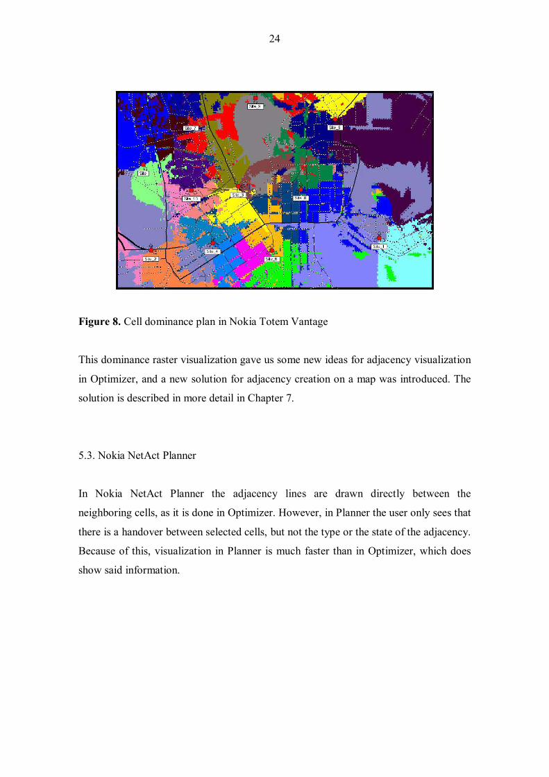
24
Figure 8. Cell dominance plan in Nokia Totem Vantage
This dominance raster visualization gave us some new ideas for adjacency visualization
in Optimizer, and a new solution for adjacency creation on a map was introduced. The
solution is described in more detail in Chapter 7.
5.3. Nokia NetAct Planner
In Nokia NetAct Planner the adjacency lines are drawn directly between the
neighboring cells, as it is done in Optimizer. However, in Planner the user only sees that
there is a handover between selected cells, but not the type or the state of the adjacency.
Because of this, visualization in Planner is much faster than in Optimizer, which does
show said information.

25
Figure 9. Adjacency visualization with Nokia NetAct Planner.
As Figure 9 shows, this kind of presentation does not give the user any visual
information other than show the neighbors.

26
6. TECHNOLOGIES USED
As many of the problems in product development were technology-related, this chapter
gives a short description of the technologies used in Optimizer.
6.1. Java
The official programming language of Optimizer projects is Java. The Optimizer 1.1
and 1.3 releases used the Java version 1.3.1 and Optimizer 1.5 and 1.6 Java version
1.4.2. MultiVendor Optimizer uses the java version 1.5. The most recent version of java
contains improvements to the Swing performance, which shows as an improved
drawing performance in Optimizer.
6.2. Ilog
Ilog is a visualization library built on top of Java. Ilog provides ready-made
visualization libraries with build-in features for object states, zooming and panning. Ilog
also supports the link creation directly between nodes which suites nicely to the
adjacency creation between cells. Optimizer projects use Ilog JViews component for
GIS related implementations, such as support for several map vendors and projections.
Ilog JTGO component is used for network element related visualization.
6.3. MapComponent
MapComponent is an in-house solution designed to replace Ilog. MapComponent uses
Java 1.5 and was implemented solely for the use of Optimizer. MultiVendor Optimizer
was the first Optimizer project to adopt this component. Later it was taken into use in
Optimizer 2.0 as well.
27
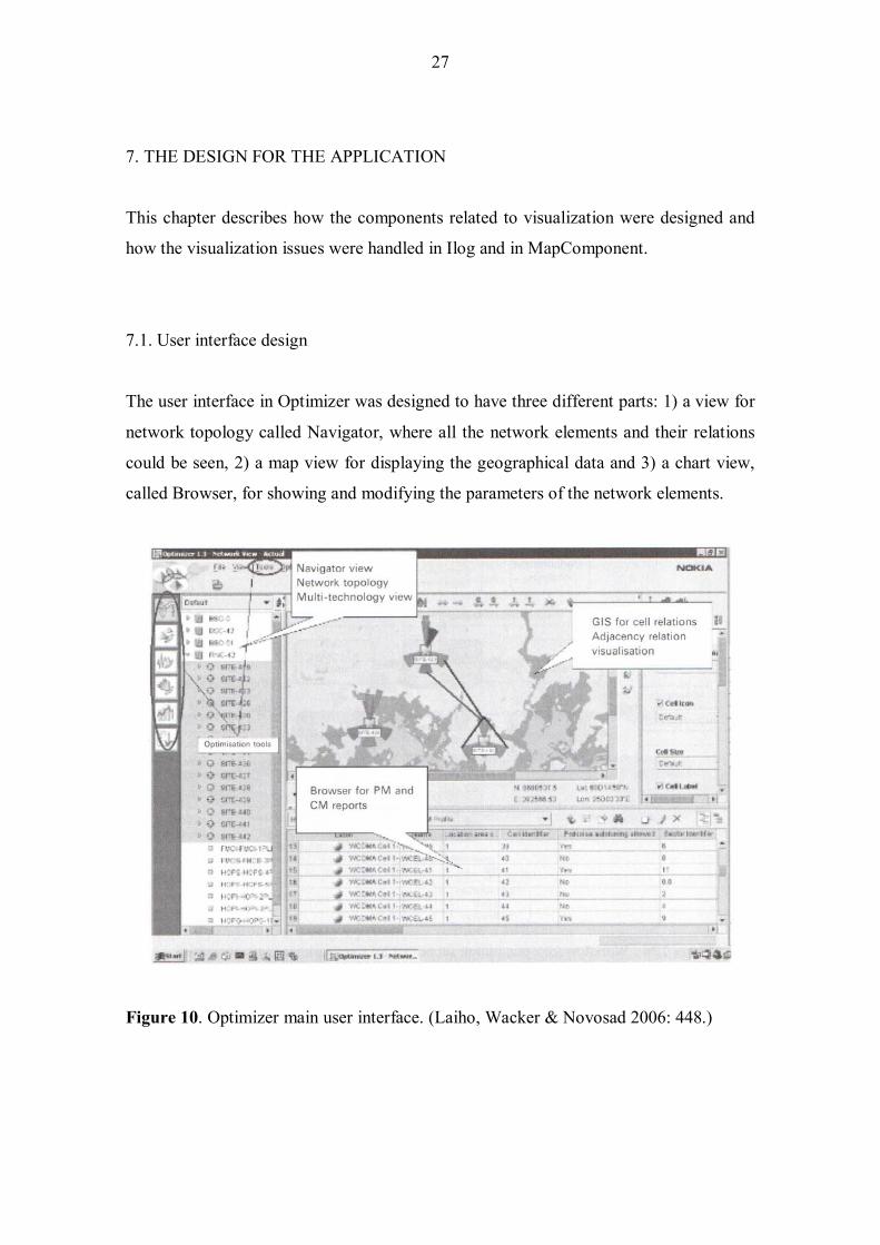
7. THE DESIGN FOR THE APPLICATION
This chapter describes how the components related to visualization were designed and
how the visualization issues were handled in Ilog and in MapComponent.
7.1. User interface design
The user interface in Optimizer was designed to have three different parts: 1) a view for
network topology called Navigator, where all the network elements and their relations
could be seen, 2) a map view for displaying the geographical data and 3) a chart view,
called Browser, for showing and modifying the parameters of the network elements.
Figure 10. Optimizer main user interface. (Laiho, Wacker & Novosad 2006: 448.)

28
For showing network element topology we needed a component that could visualize the
network hierarchy for the user in a simple manner. A tree view was chosen for this
purpose because it fulfilled our hierarchy requirements and it did not need much space
fin the user interface. Also the tree view was easy to combine with a Microsoft Excel -
like table view for parameter editing, which needed more horizontal space in the user
interface. For the GIS we tried to maximize the space in order to be able to have as
much geographical data visible as possible.
For adjacency management purposes, a few toggle buttons were designed for the easy
drawing of adjacencies by using drag-and-drop. A toolbar containing the buttons was
placed on top of the map view.
7.2. Object model
The architecture for the application was designed so that the visualization part could be
separated from the business logic and have the model as flexible and extendable as
possible. In this architecture there are three layers of object models: the Optimizer
object model is used with the core business logic, the MapObject model as an interface
layer and the Ilog object model implements the visualization. The Optimizer object
model consists of network elements such as BTSs, Cells and Adjacencies, with all
related parameters and performance values. The main elements needed for Graphical
Adjacency Management on top of GIS are visualized according to the MapObject
model.
The base class for the MapObject model is MapObject, from which all the other classes
are inherited. MapObject contains only the basic attributes such as identifier and label.
The Node and Link classes are inherited from MapObject. Node is a base class for the
Site and Cell classes, which will have graphical representation in the user interface.
These classes have extra attributes inherited from the Node class, latitude and longitude
for positioning the objects on top of geographical information system. Cell has also a
bearing value to show the direction of the beam and the information of its parent Site

29
object. The Link class is used to show the relation between Node objects. Link is hence
used for visualizing adjacencies and, for example, interference between Cells. The Link
class has source and target node identifiers as extra attributes.
Figure 11. The MapObject model.
Before the instances of the classes, Site (IltNetworkElement), Cell (IltBTSAntenna),
and Link (IltLink) can be visualized, they have to be converted into Ilog objects, shown
in brackets. The MapObject model is designed so that conversion is as simple as
possible, and with this in mind that only the absolutely necessary parameters are
included into the model. This will save memory usage and increase the performance of
the application.

30
IltObject
Link
Cell
SiteIltNetworkEquipment
IltBTS
IltLink
IltBTSAntenna
+2
+0..n
+1
+1
+1
+0..n
Figure 12. Linking the MapObject model to the Ilog object model.
The MapObject model is separated from the Optimizer object model. This means that
the visualization components have their own object models and they have no knowledge
of the Optimizer model. The MapObject model is linked more closely to the Ilog object
model.
The link between MapObject and the corresponding Optimizer object is made by giving
the Optimizer object identifier as an id attribute for MapObject. Avoiding unnecessary
calls between tier 1 and tier 2/3 results in a better performance. This also makes the
software more stabile and allows the server and database resources to be used for other
purposes.

31
Sitecom.nokia.oss.optimizer.model.network.Site
Cellcom.nokia.oss.optimizer.model.network.Cell
Linkcom.nokia.oss.optimizer.model.network.Adjacency
Figure 13. Linking the MapObject model to the Optimizer business object model.
The only link from MapObject to the Optimizer model is one controller class, which
creates MapObjects from the Optimizer objects loaded from the database according to
given coordinate boundaries from GIS. Ilog objects are then again created from
MapObjects to be visualized in the user interface. Keeping the MapObjects separated
from the business model helps the implementation and makes the design more flexible.
If the business model changes, only the controller class has to be re-implemented. This
design also allows several providers to be used if needed. For example, if switching
from the actual network configuration visualization to some other visualization is
needed, it can be done by changing the controller into another. This also makes it
possible to change the Ilog JTGO library to another visualization component if
necessary.
The implementation follows the Model, View, Controller (MVC) design pattern where
functionality is divided into three components. The model describes the business model,
view represents the model and controller controls the business logic and usually also the
model and the view (Gamma, Helm, Johnson & Vlissides 1995: 4-6; Buschmann,
Meunier, Rohnert, Sommerlad & Stal 1996: 3-8). Here model is the MapObject model,
view is the map view created with Ilog and controller is the Controller class.

32
The architecture also follows a Listener pattern where there are registered listeners for
given notifications. The controller is listening to the create, update and delete events
from the application. When for example the create event is received from the
application, the controller creates the corresponding MapObject and a representation
object is created in the Ilog component according to the attributes given in the create
event. This architecture allows the usage of multiple threads in the program.
Representation is done in the swing thread and business logic in multiple worker
threads. This improves the overall performance of the application and avoids hanging
up the user interface for a long time (swing thread) when the business logic is creating,
updating or deleting objects. (Robinson 2003:22-27.)
7.3. Adjacency visualization with Ilog
This section describes how the adjacency visualization is handled with Ilog in different
versions of Optimizer. The main requirement for the visualization was that the
adjacency type, state and direction could be shown to the user.
Shape of the line
In Optimizer 1.1 and 1.3 an obvious solution for visualizing adjacencies was to draw
them as direct lines between the cells. The drawing algorithm in Ilog made it possible to
draw also curved lines if there were a multiple objects in the view, but this caused quite
severe visibility and usability problems. To cut down the number of lines drawn into the
view, a filter was implemented. This enabled the user to choose which types of
adjacencies were visible and which were not.
The state of an adjacency was visualized with solid and dashed lines. If the line was
solid, it meant that the adjacency state was actual. If the line was dashed the adjacency
was planned, in other words, in a new, modified or deleted state.

33
Figure 14. An example of adjacency state visualization with Ilog.
The first implementation of adjacency lines in Optimizer 1.1 showed the state only in
the adjacency line border. The border of the line was dashed if the state was planned.
This solution was seen problematic, since it was almost impossible to notice which
adjacencies were in the actual state and which in the planned state. The implementation
was changed in the next version of Optimizer 1.3 to show the whole line as dashed to
make the difference more visible.
Colors
Originally the plan was to use colors only to show the type of adjacencies. Since
dashing lines caused problems in Optimizer 1.1 it was seen necessary to use colors to
indicate the sate of adjacencies as well. However, this resulted in a multitude of colors
used in visualization.
Figure 15. Adjacency type filtering and mapping colors to adjacency types and states.

34
Later colors were also used to show adjacency related performance data, so called Key
Performance Indicator (KPI) values. Adjacencies have KPI values, which are measured
values describing the quality of the real network. These values can describe, for
example, the handover success from one cell to another. If there are 100 handovers
within a certain time period and there are 5 dropped calls at the same time, then the KPI
value for handover success rate is 95%. That value can be shown as a normalized value
on a scale of 1 to 10. The user can define the colors and thresholds for the values. If for
example the handover success rate is below 95% between a cell pair, the user may want
to choose red color for that adjacency to effectively indicate that there is something
wrong in the network. This kind on visualization is extremely valuable for users since
they can immediately see on the map where the problem is and try to fix the network by
tuning the parameters or using some other method.
Icons
The adjacency line icon consists of a line body and arrow ends. The arrows are used to
show the direction of the adjacency. In the first Optimizer, Optimizer 1.1, the icon sizes
were not fixed. This meant that the icons became very small when the map was zoomed
out too much, making it very difficult to see the adjacency directions. As it was also
impossible for the user to change the size of the lines anywhere from the Optimizer, a
better solution was developed for Optimizer 1.3. In that version the icon size was fixed
so that it did not change when zooming, and the user could freely change the size from
the UI.
7.4. Limitations and problems discovered during the project
During the development of the first Optimizer we realized that the software had some
problems with the visualization that could not be fixed in the way we wanted. Some of
those limitations were discovered when we got a better understanding of the Ilog
visualization library and of all our customer requirements. The limitations and problems
are described in more detail below.

35
7.4.1. Bi-directional adjacencies
One source for problems was the visualization of bi-directional adjacencies. In a normal
mobile network about 99 percent of the adjacencies are bi-directional. In other words,
there are adjacencies in both directions, so that the mobile device can go from given cell
to another and come back. In Optimizer 1.1 the bi-directional adjacencies were
visualized as a single line between the cells. This had the advantage of showing fewer
objects in the view at the same time, thus improving usability and performance.
However, this concept had some problems:
1) Adjacency type visualization was confusing to the user because one bi-
directional adjacency could consist of two different adjacency types, one ADJW
adjacency and one ADJG adjacency. If the colors were configured differently for
the two types, the colors were mixed together since it was not possible to show
two colors in the same line without dashing the line.
2) Also filtering was difficult because the user could switch off all ADJW
adjacencies but not ADJG adjacencies. Later it was decided that in such cases
the ADJG type of adjacencies would be filtered out also.
3) When the user wanted to see the properties for an adjacency, he had to choose
between two adjacency properties without necessarily knowing which was
which.
4) Showing performance data in the icon color or width was impossible because
there were different performance data values for different directions. For
example, the dropped call rate can be different between two cells, depending on
the direction.
5) The icon label contained the parameters of two adjacencies, which made it
difficult to see which parameters belonged to which adjacency. The length of the
label was also problematic because it had twice as many parameters as uni-
directional adjacencies.
Later it was decided that in Optimizer 1.3 the bi-directional adjacencies were to be
drawn with two lines to avoid the above problems. This enabled showing performance

36
data and was less confusing to the user than the implementation in Optimizer 1.1. The
only significant setback with this solution was that the amount of visualized adjacency
lines was doubled, which lowered the usability as in some cases there were hundreds of
lines drawn into the view.
7.4.2. Limitations of Ilog
Another source of problems was Ilog. When Ilog started implementing its first version
of the visualization library, it was first done with C programming language. Later on
they started to support also Java. For the developers of Optimizer it seemed that the
support was based on the rules of the previous programming language and it seemed
that they did not understand how everything should be done with Java. Java is based on
its component libraries, which should be used when building your own applications.
Instead of doing this, Ilog built their own components from scratch. This meant that, for
example, Ilog�s polygons are not inherited from Java�s polygon, but from the base class
java.lang.object. The features that Java has for its polygon object do not necessarily
work with Ilog, and this made the implementation with Ilog much harder as well as
slower. In addition to this all the improvements made into the Java application were
useless because the Ilog functionality was not based on the Java�s corresponding
component.
7.4.3. Performance and memory consumption with Ilog
Since Ilog is a complete solution for visualizing digital maps and several kinds of
business objects and models, it is a very large library. This also meant that Ilog used a
lot of memory, over a 100 megabytes with a thousand objects visualized even without
digital maps. This was a clear problem for Optimizer projects, together with Ilog�s lack
of performance for our needs. For visualizing adjacencies we needed to be able to draw
thousands of objects to the view to show the whole network with its adjacencies if need
and with Ilog this just was not possible.

37
7.5. Adjacency visualization with MapComponent
Ilog�s performance problems lead to the decision to change Ilog to MapComponent. As
the original object model was designed so that it was possible to change the
visualization library without changing the actual MapObject model, only the
visualization part had to be re-implemented when removing the Ilog libraries. The
MapComponent was decided to be implemented after the Optimizer 1.5 release as a
separate project. The design was based on our experience from Ilog and on the
requirements we had for GAM and for the network element visualization.
Based on the knowledge gained from previous Optimizer projects and facts from the
Ilog experience, it was clear that we needed a simple tool that would serve our needs for
visualizing network elements. The idea was to have all the features we needed and used
with Ilog also in the MapComponent, taking into account that the software had to be
much more flexible and faster than Ilog had been. Also all the unnecessary features of
Ilog were not implemented into MapComponent at all.
All the main visualization features that we had with the previous Optimizer versions
were implemented into MapComponent as well. The actual visualization was in some
ways slightly different than before, but it still fulfilled the requirements. Since the
design was simple and we used Java�s native drawing mechanisms the software was
much faster than Ilog. The measured drawing speed was over a 100 times faster than
Ilog when drawing over a thousand objects at the same time. This had a huge impact
also on the usability, since there was no more waiting time when loading and drawing
the objects. The new flexible design also made it possible to develop new possibilities
to visualize adjacencies.

38
Figure 16. Adjacency visualization with MapComponent.
7.5.1. Showing performance data on adjacencies
Normal adjacency visualization with MapComponent was based on the ideas that we
got from Ilog, but there were also some differences. One of the main differences was
that the adjacency lines were split into two parts. This made it possible to always show
bidirectional adjacencies with one single line, as we tried to do in Optimizer 1.1. The
visualization was improved so that the two parts of the line could have completely
different drawing styles to show the possibly different adjacency types. The arrow heads
were also made bigger to better show the adjacency direction. In Ilog this was
impossible and in the visualization the arrows were too small. This made it difficult to

39
see if there were adjacencies to both directions. Separate labels were also implemented
for bidirectional adjacencies in order to help the user to distinguish the different
handovers.
Splitting the adjacency lines also enabled the visualization of performance data (KPIs)
in the line width for the first time. Earlier it was only possible to show this by coloring
the lines in unidirectional adjacencies. This new solution made it very easy to notice at
one glance for example where the most traffic in the network was and where it was
going. This solution also made more visible how the network load should be balanced
and showed potentially wrong adjacency configurations in terms of traffic going into
wrong cells.
Figure 17. Performance values shown in adjacency line width.
7.5.2. Adjacency visualization in cell and dominance colors
As one cell may have over a hundred adjacencies depending on the system, the amount
of lines drawn to the UI may be enormous in some cases. This means that the user is not
able to perceive the information about the adjacencies, nor where the lines are going in
the UI. In most cases it is enough for the user to see which are the adjacent cells for one
particular cell, instead of seeing all parameters and other data. In order to enable this, a
new visualization style was designed into MapComponent.

40
The idea was to show all the adjacent cells for one selected cell by coloring the cell
icons. If cells were only outlined but not colored, it meant that there was no adjacency
between the selected and the blank cells. Those cells which were colored had
adjacencies to the selected cell. The color also indicated whether an adjacency was
bidirectional or not.
Figure 18. Adjacencies visualized with cell icon color. The cells colored with green and
orange have adjacencies to the selected cell, colored with red.
Visualizing adjacency information in cell icon color proved to be very informative, and
it was possible to show precisely which were neighboring cells and which were not.
When a cell has a large number of neighboring cells it is common that some of them are
quite far apart. In order to see them all, the map also needs to be zoomed out quite far.
Zooming out on the other hand results in having dozens of cells on map really close to
each other which has almost the same effect than having too many adjacency lines on
top of each other. In other words, in some cases the user cannot see all the adjacent cells
because there is too much data visible on the UI.

41
Since MapComponent already had support for showing cell dominance areas as a
Voronoi diagram for other Optimizer features like frequency analysis, it was decided to
investigate if Voronoi diagrams could also be used for adjacency visualization. A
Voronoi diagram is a special kind of decomposition of a metric space determined by
distances to a specific discrete set of objects in the space, for example, by a discrete set
of points. In Optimizer the Voronoi diagram was used to show cell dominance areas as
colors. The colors could be selected to show some specific KPI data or, for example,
radio interference coming from a distant cell.
The solution was well suited for adjacency visualization as well since it solved the
existing problems with adjacency visualization with lines or with cell colors. The
solution made more visible which were the adjacent cells, at the same time making
selecting cells much easier since the Voronoi dominance was selectable.
Figure 19. Adjacencies visualized with cell icon and dominance color.
Since the cell dominance areas were selectable, it also became possible to create and
delete adjacencies by selecting the corresponding dominances, in the same way a user
would select the cell icons and create adjacencies via a popup menu.

42
8. CONCLUSIONS
My main task in Optimizer projects was to create Graphical Adjacency Management
(GAM) for the product. As very often happens in software projects, the first versions of
any software product are often far from perfect, and this was the case also with GAM in
the first Optimizer versions. The main reasons for this were the following:
1) The software architecture for the whole product was new � no one knew how it
would work in a real application.
2) Java and the visualization component Ilog were new for all the designers.
3) During the first Optimizer projects it became clear that Ilog was not designed to
visualize as many elements at the same time as we would need to visualize.
4) The visualization library of Ilog was inadequate for our needs in Graphical
Adjacency Management.
5) The performance problems of Ilog resulted in a decision to make our own
component, MapComponent, for visualization purposes
One of the research problems in this thesis was the visualization of adjacencies. During
the course of Optimizer projects many new possibilities were found for this.
Several intuitive methods for adjacency creation and deletion we discovered as well.
The main concept from Ilog of creating adjacencies by using drag-and-drop proved to
work very well. By adding several other possibilities for users to make new adjacencies
we achieved a very flexible solution for adjacency creation. Adjacency deletion was
also made as simple as possible by allowing the user to select either the adjacency line,
or for instance, the cell dominance area and executing the actual deletion with the delete
button in a toolbar or via a popup menu.
To solve the performance problems in the first versions of Optimizer it was necessary to
replace the third party visualization library with our own component. The replacement
was of course a big risk for the projects where the new component was to be
implemented, but the new component proved helpful in solving the performance issues

43
and enabled also the development of new visualization features. The factor for the
successful replacement was the fact that the object model design allowed changing only
the visualization library, without touching other components. This also meant that, in
case the replacement had failed, it would have been possible to switch back to Ilog.
The Figure 20 shows the main differences in handover features between earlier Nokia
products and Optimizer.
NPS/X Vantage Planner Opt1.1 Opt1.3/1.5 Opt2.0 OptMV NETWORK GENERATION SUPPORT
GSM x - x x x x x
WCDMA - x x x x x x
INTERSYSTEM - - x x x x x
MULTIVENDOR - - - - - - x VISUALIZATION SUPPORT ON MAP
Cell type in icon color - - - x x x x
Adjacency type in icon - - - x x x x
Adjacency state in icon - - - x x x x
Adjacency direction in icon - - - x x x x
Selectable adjacency lines - - x x x x x Adjacencies visualized for multiple cells x x x x x x x Bidirectional adjacencies as one line x x x x - x x
KPI in adjacency line width - - - - - x x
KPI in adjacency line color - - - - x x x
Adjacency in Cell icon color - - - - - x Adjacency in Cell dominance color - - - - - - x VISUALIZATION PERFORMANCE
Adjacency drawing speed +++ +++ +++ + + +++ +++
Data loading speed +++ +++ +++ + ++ ++ +++
Figure 20. Nokia product comparison. The number of plus signs (+) indicates whether
the visualization performance level in a given product was poor (+), acceptable (++), or
good (+++).

44
From the product comparison above can be seen that the earlier Nokia products were
lacking the features related to adjacency management. They only offered very basic
visualization and adjacency management features. The first Optimizer versions had
several new visualization features, but the performance was not in an acceptable level.
After taking MapComponent into use, performance was not an issue anymore.

45
REFERENCES
Bannister Jeffrey, Paul Mather & Sebastian Coope (2004). Convergence Technologies
for 3G Networks. IP, UMTS, EGPRS and ATM. England.: John Wiley & Sons.
650 p. ISBN 0-470-86091-X.
Buschmann Frank, Regine Meunier, Hans Rohnert, Peter Sommerlad & Michael Stal
(1996). Pattern-Oriented Software Architecture. A System of Patterns. England.:
John Wiley & Sons. 467 p. ISBN 0-471-95869-7.
Eberspächer Jörg, Hans-Jörg Vögel, Christian Bettstetter (2001). GSM Switching,
Services and Protocols. 2. ed. England.: John Wiley & Sons. 332 p. ISBN 0-471-
49903-X.
Gamma Eric, Richard Helm, Ralph Johnson & John Vlissides (1995). Design Patterns.
Elements of Reusable Object-Oriented Software. Holland.: Addison Wesley
Longman Inc. 395 p. ISBN 0-201-63361-2
Halonen Timo, Javier Romero & Juan Melero (2003). GSM, GPRS and EDGE
Performance. Evolution towards 3G/UMTS. 2. ed. England.: John Wiley & Sons.
615 p. ISBN 0-470-86694-2.
Holma Harri & Antti Toskala (2002). WCDMA for UMTS, Radio Access for Third
Generation Mobile Communications. 2. ed. England.: John Wiley & Sons. 391 p.
ISBN 0-470-84467-1
Huber Alexander Joseph, Josef Franz Huber (2002). UMTS and Mobile Computing.
England.: Atech House Inc. 438 p. ISBN 1-58053-264-0.
Kaaranen Heikki, Ari Ahtiainen, Lauri Laitinen, Siamäk Naghian & Valtteri Niemi
(2005). UMTS Networks. Architecture, Mobility and Services. 2. ed. England.:
John Wiley & Sons. 406 p. ISBN 0-470-01103-3.

46
Korhonen Juha (2003). Introduction to 3G Mobile Communications. 2. ed.
USA/England.: Artech House Inc. 544 p. ISBN 1-58053-507-0.
Laiho Jaana, Achim Wacker & Tomas Novosad (2006). Radio Network Planning and
Optimisation for UMTS. 2. ed. England.: John Wiley & Sons. 629 p. ISBN 0-470-
01575-6.
Lempiäinen Jukka & Matti Manninen (2003). UMTS Radio Network Planning,
Optimization and QoS Management. For Practical Engineering Tasks. USA:
Kluwer Academic Publishers. 342 p. ISBN 1-4020-7640-1.
Mouly Michael & Marie-Bernadette Pautet (1992). The GSM System for Mobile
Communications. France.: Europe Media Duplication S.A. 701 p. ISBN 2-
9507190-0-7.
Ojanperä Tero & Ramjee Prasad (2001). WCDMA: Towards IP Mobility and Mobile
Internet. USA/England.: Artech House Publishers. 477 p. ISBN 1-580-53180-6
Penttinen Jyrki (2001). GPRS-tekniikka. Verkon rakenne, toiminta ja mitoitus. Finland.:
Werner Söderström Ltd. 264 p. ISBN 951-0-26558-6
Robinson Matthew & Pavel Vorobiev (2003). Swing 2nd Edition. USA.: Manning
Publications Co. 912 p. ISBN 1-930-11088-X.
Sanders Geoff, Lionel Thorens, Manfred Reisky, Oliver Rulik & Stefan Deylitz (2003).
GPRS Networks. England.: John Wiley & Sons. 294 p. ISBN 0-470-85317-4.
Seurre Emmanuel, Patrick Savelli & Pierre-Jean Pietri (2003). GPRS for Mobile
Internet. USA.: Artech House. 419 p. ISBN 1-58053-600-X.
Steele Raymond, Chin-Chun Lee & Peter Gould (2001). GSM, cdmaOne and 3G
Systems. England.: John Wiley & Sons. 512 p. ISBN 0-471-49185-3.

47
Stuckmann Peter (2003). The GSM Evolution, Mobile Packet Data Services. England.:
John Wiley & Sons. 241 p. ISBN 0-470-84855-3.
Tanner Rudolf & Jason Woodard (2004). WCDMA Requirements and Practical Design.
England.: John Wiley & Sons. 422 p. ISBN 0-470-86177-0.
Walke B., P. Seidenberg & M. P. Althoff (2003). UMTS, The Fundamentals. England.:
John Wiley & Sons. 312 p. ISBN 0-470-8455-7.
Webb William (2000). Introduction to Wireless Local Loop, Second Edition:
Broadband and Narrowband Systems. England.: Artech House Inc. 403 p. ISBN
1-58053-071-0.