unidades de saúde pública em curitiba: uma análise
71
UNIVERSIDADE TECNOLÓGICA FEDERAL DO PARANÁ PROGRAMA DE PÓS-GRADUAÇÃO EM COMPUTAÇÃO APLICADA TATIANE ARAUJO MUNIZ LAUTERT UNIDADES DE SAÚDE PÚBLICA EM CURITIBA: UMA ANÁLISE EXPLORATÓRIA E UM PROTÓTIPO DE DASHBOARD DE SAÚDE PARA APOIO À DECISÃO NO DOMÍNIO DA GESTÃO EM SAÚDE. DISSERTAÇÃO CURITIBA 2020
-
Upload
khangminh22 -
Category
Documents
-
view
1 -
download
0
Transcript of unidades de saúde pública em curitiba: uma análise

UNIVERSIDADE TECNOLÓGICA FEDERAL DO PARANÁ
PROGRAMA DE PÓS-GRADUAÇÃO EM COMPUTAÇÃO APLICADA
TATIANE ARAUJO MUNIZ LAUTERT
UNIDADES DE SAÚDE PÚBLICA EM CURITIBA: UMA ANÁLISEEXPLORATÓRIA E UM PROTÓTIPO DE DASHBOARD DE SAÚDEPARA APOIO À DECISÃO NO DOMÍNIO DA GESTÃO EM SAÚDE.
DISSERTAÇÃO
CURITIBA
2020

TATIANE ARAUJO MUNIZ LAUTERT
UNIDADES DE SAÚDE PÚBLICA EM CURITIBA: UMA ANÁLISEEXPLORATÓRIA E UM PROTÓTIPO DE DASHBOARD DE SAÚDEPARA APOIO À DECISÃO NO DOMÍNIO DA GESTÃO EM SAÚDE.
Public health units in Curitiba: an exploratory analysis and a healthdashboard prototype for decision support in health management domain.
Dissertação apresentada ao Programa de Pós-Graduação em Computação Aplicada (PPGCA)da Universidade Tecnológica Federal do Paraná(UTFPR) como requisito à obtenção do título de“Mestra em Ciências” - Área de Concentração:Engenharia De Sistemas Computacionais.
Orientador(a): Prof(a). Dr(a). Nádia PuchalskiKozievitchCoorientador(a): Prof(a). Dr(a). Monika Akbar
CURITIBA
2020
4.0 Internacional
Esta licença permite compartilhamento, remixe, adaptação e criação a partir do trabalho,
mesmo para fins comerciais, desde que sejam atribuídos créditos ao(s) autor(es). Con-
teúdos elaborados por terceiros, citados e referenciados nesta sobra não são cobertos
pela licença.

12/01/2021 -
https://utfws.utfpr.edu.br/aluno01/sistema/mpCADEDocsAssinar.pcTelaAssinaturaDoc?p_pesscodnr=202022&p_cadedocpescodnr=3790&p_cadedoc… 1/1
Ministério da Educação
Universidade Tecnológica Federal do Paraná Câmpus Curitiba
TATIANE ARAUJO MUNIZ LAUTERT
UNIDADES DE SAÚDE PÚBLICA EM CURITIBA: UMA ANÁLISE EXPLORATÓRIA E UM PROTÓTIPO DEDASHBOARD DE SAÚDE PARA APOIO À DECISÃO NO DOMÍNIO DA GESTÃO EM SAÚDE.
Trabalho de pesquisa de mestrado apresentado como requisitopara obtenção do título de Mestra Em Computação Aplicada daUniversidade Tecnológica Federal do Paraná (UTFPR). Área deconcentração: Engenharia De Sistemas Computacionais.
Data de aprovação: 17 de Dezembro de 2020
Prof.a Nadia Puchalski Kozievitch, Doutorado - Universidade Tecnológica Federal do Paraná
Prof.a Anelise Munaretto Fonseca, Doutorado - Universidade Tecnológica Federal do Paraná
Prof Artur Ziviani, Doutorado - Laboratório Nacional de Computação Científica
Documento gerado pelo Sistema Acadêmico da UTFPR a partir dos dados da Ata de Defesa em 17/12/2020.

“Dedico este trabalho ao meu pai Israel Araujo
Muniz (in memoriam), que me ensinou que para
aprender é preciso manter-se humilde.”
ACKNOWLEDGEMENTS
Primeiramente agradeço a Deus pela oportunidade em cursar este mestrado.
À minha orientadora, professora Dra. Nádia Puchalski Kozievitch, pelo todo o suporte,
motivação nos momentos difíceis, disponibilidade e incansáveis direcionamentos.
À minha co-orientadora, professora Dra. Monika Akbar, também pelas revisões e
contribuições dadas ao longo deste trabalho.
Aos professores e coordenadores da Pós, por todo o conteúdo ministrado, direciona-
mento e compartilhamento de conhecimento em cada matéria do curso.
Aos demais profissionais da instituição que direta e/ou indiretamente contribuem para
que tenhamos acesso a toda infraestrutura.
Aos meus familiares pela paciência, apoio e compreensão em momentos de ausência
para que este trabalho pudesse ser concluído.
Ao meu esposo, Filipe por suas palavras de ânimo, incentivo e encorajamento mesmo
nos momentos em quais eu mesma não acreditava possível continuar em frente.
Às minhas filhas, Melissa e Sophie pelos inevitáveis momentos de ausência, apoio e
por me fazerem querer ser uma pessoa cada vez melhor.

"There are many hypotheses in science that are
wrong. That’s perfectly alright; it’s the aperture
to finding out what’s right. Science is a
self-correcting process. To be accepted, new
ideas must survive the most rigorous standards
of evidence and scrutiny." Carl Sagan

RESUMO
LAUTERT, Tatiane Araujo Muniz. Unidades de Saúde Pública em Curitiba: Uma análiseexploratória e um protótipo de dashboard de saúde para apoio à decisão no domínio dagestão em saúde.. 2020. 70 f. Dissertação (Mestrado em Computação Aplicada) – UniversidadeTecnológica Federal do Paraná. Curitiba, 2020.
Garantir serviços de saúde adequados à população é um desafio, principalmente em países emdesenvolvimento, onde recursos limitados devem ser otimizados para atingir um percentual maiorda população. Para avaliar adequadamente os serviços de saúde e priorizar novos investimentos,é importante coletar, integrar e analisar grande quantidade de dados relevantes. Esta disser-tação apresenta um estudo agregando dados socioambientais, socioeconômicos, geográficos,de transporte e de saúde disponíveis ao público de diferentes fontes para a cidade de Curitiba,Brasil, com o objetivo de compreender a dinâmica das necessidades atuais de saúde e o uso dosistema de saúde pelos moradores da cidade. Esta dissertação apresenta uma análise detalhadadas consultas médicas, do bairro de procedência dos pacientes, das condições de saúde maisfrequentes relatadas nas fichas de atendimento médico. Também analisamos o aparecimento decertas doenças infecciosas nos bairros da cidade e as correlações entre essas doenças e diversosfatores socioambientais e socioeconômicos. Por fim, o artigo discute os resultados da análiseexploratória, destacando possíveis pontos que merecem atenção especial ou investimentos dagestão municipal para melhor atender o público.
Palavras-chave: Dados Abertos. Dados de Saúde. Análise Exploratória. Visualização de Dados.Dashboard.

ABSTRACT
LAUTERT, Tatiane Araujo Muniz. Unidades de Saúde Pública em Curitiba: Uma análiseexploratória e um protótipo de dashboard de saúde para apoio à decisão no domínio dagestão em saúde.. 2020. 70 p. Dissertation (Master’s Degree in Applied Computing) –Universidade Tecnológica Federal do Paraná. Curitiba, 2020.
Guaranteeing adequate health services to the population is a challenge, especially in developingcountries where limited resources must be optimized in order to reach a larger percentage of thepopulation. To properly assess health services and prioritize new investments, it is importantto collect, integrate, and analyze large amount of relevant data. This dissertation presentsa study aggregating publicly available socio-environmental, socio-economic, geographical,transportation, and health data from different sources for the city of Curitiba in Brazil, tounderstand the dynamics of current healthcare needs and healthcare usage by the city dwellers.This dissertation presents a detailed analyses on medical appointments, the neighborhood wherepatients come from, the most frequent health conditions reported from the medical assistancerecords. We also analyze the onset of certain infectious diseases in the city’s neighborhoodsand correlations between these diseases with various socio-environmental and socio-economicfactors. Finally, the dissertation discusses the findings from our exploratory analysis, highlightingpossible points deserving special attention or investments from the city management to betterserve the public.
Keywords: Open Data. Health Data. Exploratory Data Analysis. Data Visualization. Dashboard.
LIST OF FIGURES
Figure 1 – Research Areas. . . . . . . . . . . . . . . . . . . . . . . . . . . . . . . . . 13Figure 2 – Methodology steps. . . . . . . . . . . . . . . . . . . . . . . . . . . . . . . 15Figure 3 – RDA COVID-19 Guidelines and Recommendations. . . . . . . . . . . . . . 21Figure 4 – Steps for investigating disease outbreaks . . . . . . . . . . . . . . . . . . . 23Figure 5 – Data Visualization and Explanatory Data Analysis (EDA) relationship. . . . 24Figure 6 – Steps taken in preparation for data analysis. . . . . . . . . . . . . . . . . . 28Figure 7 – Number of medical appointments across the years by month. . . . . . . . . 30Figure 8 – Distribution of appointments by age range for each gender. . . . . . . . . . 31Figure 9 – Population + Medical appointments per health units + Income per household. 32Figure 10 – Histogram showing the distance of the HU to the bus stops in meters. . . . . 33Figure 11 – The top 5 Health Units most visited by patients from other neighborhoods. . 34Figure 12 – Time comparison of general medical visits and top 5 health units visited by
patients from other neighborhood. . . . . . . . . . . . . . . . . . . . . . . 36Figure 13 – Number of appointments by hour per day of the week for all health units. . . 36Figure 14 – Number of appointments by hour per day of the week for top 5 health units
visited by patients from other neighborhoods. . . . . . . . . . . . . . . . . 36Figure 15 – Distribution of appointment by gender and age range in the top 5 health units 37Figure 16 – Influenza (Jan-2017 to Dec-2019). . . . . . . . . . . . . . . . . . . . . . . 40Figure 17 – Dengue (Jan-2017 to Dec-2019). . . . . . . . . . . . . . . . . . . . . . . . 40Figure 18 – Escherichia coli (Jan-2017 to Dec-2019). . . . . . . . . . . . . . . . . . . . 41Figure 19 – Hepatitis (Jan-2017 to Dec-2019). . . . . . . . . . . . . . . . . . . . . . . 41Figure 20 – Yellow Fever (Jan-2017 to Dec-2019). . . . . . . . . . . . . . . . . . . . . 41Figure 21 – Measles (Jan-2017 to Dec-2019). . . . . . . . . . . . . . . . . . . . . . . . 41Figure 22 – Meningitis (Jan-2017 to Dec-2019). . . . . . . . . . . . . . . . . . . . . . 42Figure 23 – Health Dashboard Architecture. . . . . . . . . . . . . . . . . . . . . . . . . 45Figure 24 – Health Dashboard database tables and relationship. . . . . . . . . . . . . . 46Figure 25 – Interface of the Health Dashboard Prototype. . . . . . . . . . . . . . . . . . 47Figure 26 – Health Dashboard Filters. . . . . . . . . . . . . . . . . . . . . . . . . . . . 48Figure 27 – Health Dashboard Map Layers. . . . . . . . . . . . . . . . . . . . . . . . . 48Figure 28 – Health Dashboard - Graphs available in the prototype. . . . . . . . . . . . . 49Figure 29 – Heat Map Layer for a given infection disease. . . . . . . . . . . . . . . . . 50Figure 30 – Region Layer. . . . . . . . . . . . . . . . . . . . . . . . . . . . . . . . . . 51Figure 31 – Neighborhood Layer. . . . . . . . . . . . . . . . . . . . . . . . . . . . . . 52Figure 32 – Health Unit Layer. . . . . . . . . . . . . . . . . . . . . . . . . . . . . . . . 52Figure 33 – Health Units and Neighborhood Layers. . . . . . . . . . . . . . . . . . . . 53Figure 34 – Users ability to complete usability testing scenarios. . . . . . . . . . . . . . 55Figure 35 – Evaluation Questionnaire Results - Easiness of Use and Graph Complexity. . 55Figure 36 – Evaluation Questionnaire Results - Relevance of Filters. . . . . . . . . . . . 56

LIST OF TABLES
Table 1 – Summary of challenges, guidelines and recommendations of RDA COVID-19Working Group. . . . . . . . . . . . . . . . . . . . . . . . . . . . . . . . . . 21
Table 2 – Types of Health Units from Curitiba . . . . . . . . . . . . . . . . . . . . . . 27Table 3 – Database table unidade_de_saude . . . . . . . . . . . . . . . . . . . . . . . 28Table 4 – Total of medical appointments over the years. . . . . . . . . . . . . . . . . . 29Table 5 – Quality standards for public transportation by bus in meters. . . . . . . . . . 32Table 6 – Top 5 ICD for medical visits performed outside the patient’s residential neigh-
borhood. . . . . . . . . . . . . . . . . . . . . . . . . . . . . . . . . . . . . 35Table 7 – Top 5 ICD for all the medical visits. . . . . . . . . . . . . . . . . . . . . . . 35Table 8 – Selected Infectious Diseases . . . . . . . . . . . . . . . . . . . . . . . . . . 39Table 9 – Cases of selected diseases over the years. . . . . . . . . . . . . . . . . . . . 39Table 10 – Medical appointments which triggered hospitalization . . . . . . . . . . . . 42Table 11 – Medical appointments which triggered hospitalization by Gender . . . . . . 42Table 12 – Usability testing scenarios . . . . . . . . . . . . . . . . . . . . . . . . . . . 54Table 13 – Evaluation Questionnaire . . . . . . . . . . . . . . . . . . . . . . . . . . . . 54Table 14 – Suggestions for Improvement . . . . . . . . . . . . . . . . . . . . . . . . . 56Table 15 – Medical Records Data Dictionary. . . . . . . . . . . . . . . . . . . . . . . . 66

LIST OF ACRONYMS
ACRONYMS
BHU Basic Health UnitsBSI British Standards InstitutionCIC Cidade Industrial de CuritibaCNES Cadastro Nacional de Estabelecimentos de SaúdeCDC Centers for Disease Control and PreventionDDL Data Definition LanguageDML Data Manipulation LanguageDQL Data Query LanguageECU Emergency Care UnitsEDA Explanatory Data AnalysisESRI Environmental Systems Research InstituteGIS Geographic Information SystemIBGE Brazilian Institute of Geography and StatisticsICD International Classification of DiseasesIPPUC Instituto de Pesquisa e Planejamento de CuritibaISO International Organization for StandardizationITU International Telecommunication UnionNNDSS National Notifiable Diseases Surveillance SystemPSAC Psychosocial Attention CentersRDA Research Data AllianceSARS Severe Acute Respiratory SyndromeSUS Sistema Único de SaúdeUTFPR Universidade Tecnológica Federal do ParanáWHO World Health Organization
CONTENTS
1 INTRODUCTION . . . . . . . . . . . . . . . . . . . . . . . . . . . . . . 121.1 GENERAL OBJECTIVE . . . . . . . . . . . . . . . . . . . . . . . . . . 141.1.1 Specific Objectives . . . . . . . . . . . . . . . . . . . . . . . . . . . . . . . 141.2 METHODOLOGY . . . . . . . . . . . . . . . . . . . . . . . . . . . . . . 151.3 PUBLICATIONS . . . . . . . . . . . . . . . . . . . . . . . . . . . . . . . 161.4 DISSERTATION STRUCTURE . . . . . . . . . . . . . . . . . . . . . . 16
2 BASIC CONCEPTS AND RELATED WORK . . . . . . . . . . . . . . . 172.1 GEOGRAPHIC INFORMATION SYSTEMS . . . . . . . . . . . . . . . 172.2 SMART CITIES . . . . . . . . . . . . . . . . . . . . . . . . . . . . . . . 182.3 OPEN DATA . . . . . . . . . . . . . . . . . . . . . . . . . . . . . . . . . 192.3.1 Public Health Data . . . . . . . . . . . . . . . . . . . . . . . . . . . . . . . 192.3.2 Disease Outbreaks . . . . . . . . . . . . . . . . . . . . . . . . . . . . . . . 222.4 EXPLORATORY DATA ANALYSIS . . . . . . . . . . . . . . . . . . . 232.5 CHALLENGES . . . . . . . . . . . . . . . . . . . . . . . . . . . . . . . 24
3 DATA COLLECTION, PRE-PROCESSING, AND INTEGRATION . . 273.1 PREPARATION FOR EXPLORATORY DATA ANALYSIS . . . . . . 27
4 EXPLORATORY DATA ANALYSIS . . . . . . . . . . . . . . . . . . . . 294.1 MEDICAL APPOINTMENTS ACROSS THE MONTHS AND YEARS 294.2 GENDER AND AGE RANGE . . . . . . . . . . . . . . . . . . . . . . . 304.3 LOCATION ANALYSIS OF THE HEALTH UNITS . . . . . . . . . . . 314.4 PUBLIC TRANSPORT ACCESSIBILITY TO HEALTH UNITS . . . 324.5 DISPLACEMENTS TO ARRIVE AT HEALTH UNITS . . . . . . . . . 334.6 SELECTED INFECTIOUS DISEASES . . . . . . . . . . . . . . . . . . 374.6.1 Distribution of the selected diseases . . . . . . . . . . . . . . . . . . . . . . 394.7 HOSPITALIZATION . . . . . . . . . . . . . . . . . . . . . . . . . . . . 40
5 HEALTH DASHBOARD PROTOTYPE . . . . . . . . . . . . . . . . . . 435.1 ARCHITECTURE . . . . . . . . . . . . . . . . . . . . . . . . . . . . . . 435.1.1 Technologies . . . . . . . . . . . . . . . . . . . . . . . . . . . . . . . . . . 435.1.2 Database . . . . . . . . . . . . . . . . . . . . . . . . . . . . . . . . . . . . 445.2 APPLICATION INTERFACE . . . . . . . . . . . . . . . . . . . . . . . 475.3 USABILITY TEST . . . . . . . . . . . . . . . . . . . . . . . . . . . . . 515.4 LESSONS LEARNT . . . . . . . . . . . . . . . . . . . . . . . . . . . . . 55
6 CONCLUSION . . . . . . . . . . . . . . . . . . . . . . . . . . . . . . . . 59
REFERENCES . . . . . . . . . . . . . . . . . . . . . . . . . . . . . . . . 61
APPENDIX 65

12
1 INTRODUCTION
People are usually attracted to live in cities due to city services (such as health, education,
water), job perspectives, and living conditions (access to transportation, public facilities, etc.)
Cities influence people’s health and well-being through policies and interventions, including
those addressing social inclusion and social support; support for healthy and active lifestyles (for
example, the existence of cycling lanes); safety and environmental issues supporting children
and elderly population; working conditions; climate change preparedness; among others1.
According to the World Health Organization (WHO)2, today’s cities are facing a triple
health burden: infectious diseases (such as pneumonia, dengue, HIV/AIDS, tuberculosis, pneu-
monia); noncommunicable diseases (such as heart disease, stroke, asthma) and other respiratory
illnesses, cancers, diabetes and depression; and violence and injuries, including road traffic
injuries.
On the other hand, the increase in life expectancy and the aging of the world popu-
lation may increase demand in health systems which are already saturated in most countries
(BITTENCOURT; HORTALE, 2009). High population density combined with poverty and the
lack of adequate sanitation, can create conditions where infectious diseases can spread easily.
This increasing demand on the health system directly affects the quality of services provided.
Governments from several countries are taking initiatives to provide open health data,
such as the European Data Portal3 and United States4 to support primary health care and local
services5. In the meantime, since the approval of the Brazilian Law in Information Access in
20116, public agencies are making available their data in a variety of ways to citizens: through
transparency portals (e.g., the government of Paraná7 and API’s (Application Programming
Interface), (e.g., Brazilian Central Bank8). Along the same line, Curitiba, the largest city of the
Brazilian state of Paraná, is the eighth most populous city of Brazil, and has been participating in1 https://www.euro.who.int/en/health-topics/environment-and-health/urban-health/publications/2019/implementation-
framework-for-phase-vii-20192024-of-the-who-european-healthy-cities-network-goals-requirements-and-strategic-approaches-2019, last accessed 22-Jul-2020.
2 https://www.who.int/health-topics/urban-health, last accessed 22-Jul-2020.3 https://www.europeandataportal.eu/en/highlights/open-health-data-european-data-portal, last accessed 22-Feb-
2020.4 https://healthdata.gov/, last accessed 22-Feb-2020.5 https://www.euro.who.int/__data/assets/pdf_file/0003/376833/almaty-acclamation-mayors-eng.pdf, last ac-
cessed 22-Jul-2020.6 http://www.planalto.gov.br/ccivil_03/_ato2011-2014/2011/lei/l12527.htm, last accessed 23-Jul-2020.7 http://www.transparencia.pr.gov.br/, last accessed 22-Jul-2020.8 https://dadosabertos.bcb.gov.br/, last accessed 22-Jul-2020.

13
Figure 1 – Research Areas.
Smart City
GeographicInformation
Systems(GIS)
Exploratory DataAnalysis
Data Analysis
Visualization
Is aggregatedwith
Other SourcesSocio-Economic
DataCensus
DataGeorreferenced
Data
Open DataHealthData
Health DashboardPrototype
Dashboard
Source: The Author.
open data initiatives along with several government stakeholders, such as Instituto de Pesquisa
e Planejamento de Curitiba (IPPUC)9 and the Municipality of Curitiba through its Open Data
Portal10.
Along with the data, the use of technologies, such as Geographic Information Systems
(GIS) assist in the analysis of services within a city. Initiatives such as Open Cities Project11 is
an example of that, where geographic and open data are combined to help urban planner and city
administrators make better informed decisions on natural disaster preparedness.
This dissertation presents a new analysis based on distinct data sources, including:
public health data, health units’ location, patients’ residence location and availability of bus stops
near the health units. Data about medical appointments from public Health Units of Curitiba is
investigated and integrated with the city’s georeferenced data. More specifically, it includes an
analysis of patient residence neighborhood versus the health units, categorizing the most frequent
diseases these patients were diagnosed with when the medical appointment took place, and the
spacial distribution of a group of diseases. The goal is to understand the medical appointments
and the diseases at public health units in Curitiba by doing an exploratory data analysis and relate
this information to other factors and data sources (such as health units location, accessibility of
bus stops).
The research areas of this dissertation is summarized in Figure 1.9 http://ippuc.org.br/, last accessed 22-Feb-2020.10 http://www.curitiba.pr.gov.br/DADOSABERTOS/, last accessed 22-Feb-2020.11 https://www.worldbank.org/en/region/sar/publication/planning-open-cities-mapping-project, last accessed 13-
Sep-2020.

14
1.1 GENERAL OBJECTIVE
The general objective of this dissertation is to understand the medical appointments at
public health units in Curitiba by doing an exploratory data analysis and relating this information
to other factors and data sources, such as health units location, accessibility of bus stops close
to these health units and displacements performed by the citizens to arrive at the health units,
aggregate it with socio-economic data and analyze the geographical distribution of selected
infectious diseases. Upon the exploratory data analysis, the objective is to also create a prototype
of a health data dashboard leveraging the code base developed by (PARCIANELLO, 2019).
1.1.1 Specific Objectives
To achieve the general objective, the following specific objectives are considered:
1. Explore related work on geographic information systems, smart cities, open data with
focus on health data, disease outbreaks and exploratory data analysis.
2. Review challenges of each area in order to understand their context.
3. Collect the raw data required and make it available for future researches.
4. Process, clean and aggregate the data to enable an exploratory data analysis.
5. Report any findings identified as part of the exploratory data analysis that might be useful
for health department to make decisions and hence contribute to public policies that can
be built to design or implement better services.
6. Develop a Health Dashboard prototype with geographic and temporal data leveraging the
code base developed by (PARCIANELLO, 2019).
7. Provide the solution for user testing and evaluation.
8. Analyse the usability testing and evaluation results and identify suggestions for improve-
ments based on the user evaluation.

15
Figure 2 – Methodology steps.
Basic Concepts &Related Work
Geographic information systemsSmart CitiesOpen data
Health dataDisease OutbreaksExploratory data analysis
Collect, Pre-process &Integrate Data
Provide a background on Curitibahealth systemDescribe the process to collect,pre-process and integrate thedata in preparation for theexploratory data analysis
Exploratory DataAnalysisPerform an exploratory data analysis on:
Medical appointments acrossmonths and yearsAge & gender distributionLocation analysis of health unitsPublic transport access to healthUnitsDisplacementsInfeccious diseasesHospitalization
Implement HealthDashboardPrototype
Create data model andconsolidate the dataDevelop a Health DashboardPrototype
Testing &Evaluation
Provide the link of the prototypefor users testing and evaluationIdentify opportunities forenhacements
ConclusionReport any findings identified aspart of the exploratory dataanalysisAnalyze results of testing andevaluation of the HealthDashboard Prototype
Source: The Author.
1.2 METHODOLOGY
The methodology of this dissertation has been divided into 6 steps, as shown in Figure 2.
The first step involved the research of the theoretical concepts related to the objectives intended,
therefore this work presents the basic concepts and related work on Geographic Information
Systems (GIS), Smart Cities, Open data with a focus on Public Health data, Disease Outbreaks,
and Exploratory Data Analysis, also it presents the challenges related to health data management.
The second step consisted of providing background about Curitiba health system, the process to
collect, pre-process, and integrate the data in preparation for the exploratory data analysis. As a
third step, a detailed exploratory data analysis is presented. The fourth step consisted of creating
a health dashboard prototype leveraging the code developed by (PARCIANELLO, 2019). At this
stage, the dashboard has been completely re-designed for the purpose of this work. Also, the
dashboard performance has been enhanced through the use of materialized views. As part of the
fifth step, the dashboard has been made available online and 7 users have been invited to perform
a usability test and evaluation of the dashboard. Also, users were asked to provide inputs for
future enhancements of the dashboard. In this step, the results of the usability test and evaluation
were presented. As a final and sixth step, the conclusion of this work is presented.

16
1.3 PUBLICATIONS
The following publications is directly related to this dissertation:
• LAUTERT, F. ; LAUTERT, T. ; Kozievitch, N. P. ; GOMEZ-JR, L. C. . Is the location of
Public Health Units in Curitiba meeting the citizen’s needs?. In: Workshop on Big Social
Data and Urban Computing, 2018, Rio de Janeiro. Proceedings of the Workshop on Big
Social Data and Urban Computing co-located with 44th International Conference on Very
Large Data Bases (VLDB 2018), 2018.
Additionally, during the Master Degree course the following research work, on distinct
subjects have also been produced and presented. The first has also been published as a book
chapter for the 10th Brazilian Workshop on Agile Methods (WBMA-2019), which is part of
Agile Brazil conference.
• LAUTERT, T. ; NETO, A. G. ; Kozievitch, N. P. A survey on agile practices and challenges
of a global software development team, 2019, Belo Horizonte. 10th Brazilian Workshop
on Agile Methods (WBMA-2019) (Agile Brazil 2019), 2019.
• LAUTERT, T ; How businesses are benefited from crowd source review systems, 2018,
Curitiba. III Workshop de Computação Social (UTFPR), 2018.
1.4 DISSERTATION STRUCTURE
This dissertation is organized as follows: Section 2 presents the concepts and gives an
overview on the related work. The data collection, pre-processing, and integration is presented
in Section 3, followed by the Exploratory Data Analysis on Section 4. Details about the Health
Dashboard prototype and its evaluation are presented in Section 5. Finally, conclusion is presented
at Section 6.
17
2 BASIC CONCEPTS AND RELATED WORK
Several health challenges can be listed as urgent for the next decade: (i) earning public
trust, (ii) harnessing new technologies, (iii) stopping infectious diseases, (iv) elevating health in
the climate debate, (v) delivering health in conflict and crisis, (vi) making healthy care fairer,
(vii) expanding access to medicine, (viii) preparing for epidemics, among others (World Health
Organization, 2020). This dissertation approaches the first three challenges, by using public
data from Curitiba public health system to provide and overview of the health system); by
using techniques such as Geographic Information Systems to better understand the data); and by
understanding the behaviour of infectious diseases in the public health system.
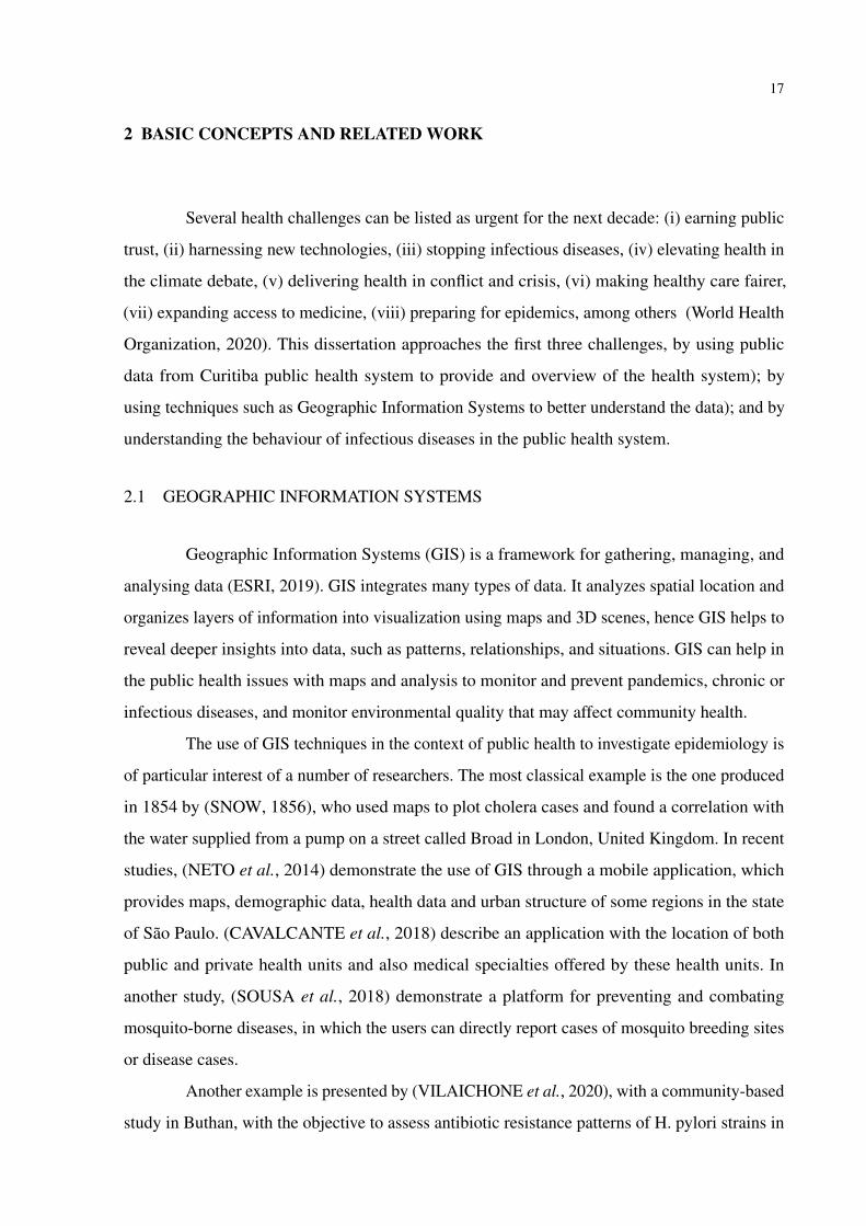
2.1 GEOGRAPHIC INFORMATION SYSTEMS
Geographic Information Systems (GIS) is a framework for gathering, managing, and
analysing data (ESRI, 2019). GIS integrates many types of data. It analyzes spatial location and
organizes layers of information into visualization using maps and 3D scenes, hence GIS helps to
reveal deeper insights into data, such as patterns, relationships, and situations. GIS can help in
the public health issues with maps and analysis to monitor and prevent pandemics, chronic or
infectious diseases, and monitor environmental quality that may affect community health.
The use of GIS techniques in the context of public health to investigate epidemiology is
of particular interest of a number of researchers. The most classical example is the one produced
in 1854 by (SNOW, 1856), who used maps to plot cholera cases and found a correlation with
the water supplied from a pump on a street called Broad in London, United Kingdom. In recent
studies, (NETO et al., 2014) demonstrate the use of GIS through a mobile application, which
provides maps, demographic data, health data and urban structure of some regions in the state
of São Paulo. (CAVALCANTE et al., 2018) describe an application with the location of both
public and private health units and also medical specialties offered by these health units. In
another study, (SOUSA et al., 2018) demonstrate a platform for preventing and combating
mosquito-borne diseases, in which the users can directly report cases of mosquito breeding sites
or disease cases.
Another example is presented by (VILAICHONE et al., 2020), with a community-based
study in Buthan, with the objective to assess antibiotic resistance patterns of H. pylori strains in

18
different geographical locations of the country to guide H. pylori treatment in order to reduce
gastric cancer mortality.
As highlighted by (HINO et al., 2006), analyzing disease distribution and determinants
in populations in space and time is an essential aspect of epidemiology. As per the literature
review of (RUSHTON, 2003), public health is now presented with the opportunity to examine
key relationships between the health characteristics of populations with both human and physical
environmental characteristics.
2.2 SMART CITIES
According to 2018 Revision of World Urbanization Prospects1, 55% of the world’s
population lives in urban areas today, and that is expected to increase to 68% by 2050.
As mentioned by (DAMERI; CAMILLE, 2014), in order to face the increasing problems
of urban areas, local public government, companies, not-for-profit organizations and the citizens
themselves embraced the idea of a smarter city, using more technologies, creating better life
conditions and safeguarding the environment.
As the effort of smart cities become a solution for managing the rapid urban growth
efficiently and effectively, there is a need of certain standardisation, with examples such as
International Organization for Standardization (ISO)2, British Standards Institution (BSI)3,
International Telecommunication Union (ITU)4, and others have published standards focused on
Smart Cities. BSI, for example, defines a smart city as one where there is “effective integration of
physical, digital and human systems in the built environment to deliver a sustainable, prosperous
and inclusive future for its citizens”5. For ISO6, a Smart City is one that dramatically increases
the pace at which it improves its social, economic and environmental (sustainability) outcomes.
In 2009, IBM published the IBM Smarter Cities campaign7, divided into 3 pillars:
planning and management, efficient daily management and infrastructure.
Data is also focused in smart cities (Harrison et al., 2010; BATTY et al., 2012). For
(Harrison et al., 2010) Smart Cities are urban areas that exploit operational data to optimize the1 https://population.un.org/wup/, last accessed 08-Jul-2019.2 https://www.iso.org/, last accessed 22-Feb-2020.3 https://www.bsigroup.com/, last accessed 22-Feb-2020.4 https://www.itu.int/, last accessed 22-Feb-2020.5 https://shop.bsigroup.com/upload/PASs/Free-Download/PAS180.pdf, last accessed 08-Mar-2020.6 https://www.iso.org/obp/ui/#iso:std:iso:37106:ed1:v1:en, last accessed on 08-Mar-2020.7 https://www.ibm.com/smarterplanet/us/en/, last accessed 16-Jun-2019.
19
operation of city services. (BATTY et al., 2012) describe that cities can only be smart if there are
intelligent functions that are able to integrate and synthesize the data to some purpose, in a way
of improving the efficiency, equity, sustainability and quality of life in cities.
2.3 OPEN DATA
As highlighted in (CALEGARI et al., 2016), we live in the age of data and the digitaliza-
tion of cities has led to produce massive data-sets and data streams related to urban environment.
Open data is a concept that governmental data should be available to anyone with a possibility
of redistribution in any form without any copyright restrictions (KASSEN, 2013). The overall
intention of the open data movement is to make local, regional and national data available in
machine readable format or direct processing form that allows for direct manipulation using
software tools for the purposes of cross tabulation, visualization, mapping and among others
(GURSTEIN, 2011).
As an example of data limitation, (SILVEIRA et al., 2015) refers to many mobility
models that are used to describe or predict urban mobility, but most of them are limited to a
single source of data to do such analysis.
Open data has been used in several contexts in the city of Curitiba. (KOZIEVITCH et
al., 2017) evaluate three decades of business activity through open data in the city of Curitiba and
in (VILA et al., 2016) an exploratory analysis was presented analyzing the bus service from the
perspective of pattern discovery, statistical analysis, data integration, and the use of connected
and open data. (NAKONETCHNEL et al., 2017) analyzes the open data of public transportation
in the cities of Curitiba and New York.
2.3.1 Public Health Data
Gathering relevant public health data is a challenge; health data are rarely available
although they are needed to monitor population health, prevent pandemics, chronic diseases, and
monitor environmental quality that may affect population’s health. Modern cities are flooded
with data and new information sources provide opportunities for novel applications that will
improve the citizen’s quality of life (KATAKIS, 2015).
Among the government systems aimed at managing and improving healthcare access to

20
Brazilians citizens (such as Cartão SUS 8, CNES9 and E-Saúde10), most of them do not provide
open data for research purposes. Although Brazil provides universal access to public healthcare
services11, data about specific issues such as immigrants or relation with transportation is rare.
Considering the public health data from Curitiba, several studies can be mentioned.
In the study of (LIMA et al., 2019), open data of Curitiba public health is aggregated with
transportation data, analysing the accessibility to Curitiba public health units via public trans-
portation. The study of (OLIVEIRA et al., 2018) presented a characterization of Paraguay’s
public health data, and using the information about the city of Asuncion a comparison was made
with Curitiba’s public health data. An approach based on evaluation to model the health care for
the elderly population in Curitiba health units is proposed by (SANTIN et al., 2017), segregating
the health data of the elderly population from the non-elderly.
If we consider the last pandemics, (DONG et al., 2019) present an interactive web-
based dashboard to track the novel coronavirus (COVID-19) in real time. In response to the
ongoing public health emergency, the researchers developed an online interactive dashboard12, to visualise and track reported cases of coronavirus. Further more, as a response to the
global COVID-19 Pandemic, the Global Research Data Alliance Community (RDA) (RDA
COVID-19 Working Groups, 2020) created a set of guidelines and recommendations for data
sharing of health data under the present COVID-19 circumstances. The report13 also includes
legal and ethical considerations, research software, community participation and indigenous data
(Figure 3).
Table 1 presents a summary of the challenges, guidelines and recommendations pre-
sented in the report of RDA COVID-19 Working Group.
8 http://portalsaude.saude.gov.br/index.php/oministerio/principal/secretarias/sgep/cartao-nacional-de-saude, lastaccessed 16-Nov-2018.
9 http://datasus.saude.gov.br/sistemas-e-aplicativos/cadastros-nacionais/cnes, last accessed 16-Nov-2018.10 http://esaude.curitiba.pr.gov.br/PortalSaude, last accessed 16-Nov-2018.11 http://portalms.saude.gov.br/index.php/sistema-unico-de-saude/sistema-unico-de-saude, last accessed 16-Nov-
2018.12 https://arcg.is/0fHmTX, last accessed 22-Feb-2020.13 https://www.rd-alliance.org/global-research-data-alliance-community-response-global-covid-19-pandemic, last
accessed on 06-May-2020.

21
Figure 3 – RDA COVID-19 Guidelines and Recommendations.
Source: Global Research Data Alliance(2020).
Table 1 – Summary of challenges, guidelines and recommendations of RDA COVID-19 WorkingGroup.
Summary of challenges, guidelines and recommendations of RDASub-groups /cross cuttingthemes
Challenges Guidelines for researchers Recommendations forfunders / policy makers
Clinical Promotion of clinical datasharing is important dueto many studies and tri-als being performed underenormous time pressure
Standardised clinicalterminologies shouldbe used and a fair bal-ance achieved betweentimely data sharing andprotecting privacy andconfidentiality
Measures should be takenin order to organise thesharing of data and trialdocuments in a suitable,trustworthy and securedata repository
Omics An increased need ofrapid openness for omicsdata to gain early insightsinto molecular biology ofthe processes at cellularlevel
Omics research should bea collaborative effort tolearn the genetic determi-nants of COVID-19 sus-ceptibility, severity andoutcomes
Promote use of domainspecific repositories to en-able standardisation ofterms and enforce meta-data standards
Epidemiology Data and models are fre-quently incomplete, pro-visional, and subject tocorrection under changingconditions
Data models must includeclinical data, disease mile-stones, indicators and re-porting data, contact trac-ing and personal risk fac-tors
Incentivise the publica-tion of situational data, an-alytical models, scientificfindings, and reports usedin decision making

22
Continuation of Table 1Sub-groups /cross cuttingthemes
Challenges Guidelines for researchers Recommendations forfunders / policy makers
Social Sciences Need equal inclusion ofsocial and economic is-sues with medical infor-mation to enable evidence-based decision making
Promote interoperablecross disciplinary andcross-cultural data useand collaboration formanaging social sciencedata during pandemics
Robust funding streamsfor social science researchfor understanding andmanaging the behavioural,and economic aspects
Community Need specific guidelinesfor enabling citizen scien-tists undertaking researchto contribute to a commonbody of knowledge
Encourage public and pa-tient involvement (PPI)throughout the data man-agement lifecycle from re-search question to finaldata sharing and usage
Balance between timelytesting and contact trac-ing, emergency response,community safety and in-dividual privacy concerns
IndigenousData Guide-lines
Indigenous data rights,priorities and interestsmust be recognised inCOVID-19 research activ-ities
Co-determination ofdata collection, owner-ship, sharing and usepriorities is the centralprinciple of Indigenousdata sovereignty
CARE Principles ofIndigenous Data Gov-ernance set minimalguidance for collectors,users and stewards of data
Legal and Eth-ical Considera-tions
Achieve a balance be-tween rights of people andinterests of researchersand policymakers
Ethical instrumentsshould be interpreted withthe law, and can guide theinterpretation of the law ifthe law does not address aparticular issue
During a pandemic, eth-ical review and approvalfor legally sharing datashould be expedited
Research Soft-ware
Need systems in placefor rapid dissemination ofdata and accelerated andreproducible research dur-ing a pandemic
It is critical for softwarethat is used in data analy-sis to produce results thatcan, if necessary, be repro-duced
Funders must allocate fi-nancial resources to sup-port the development andmaintenance of new re-search software
Source: Adapted from RDA (2020).
2.3.2 Disease Outbreaks
A disease outbreak is the occurrence of disease cases in excess of normal expectancy14.
The number of cases varies according to the disease-causing agent, and the size and type of
previous and existing exposure to the agent, and the definition may vary for countries, regions
and even cities.
In Brazil, this information can be found in Epidemiological Bulletins, which contains
detailed data and analysis15. In July, 2000 the Brazilian Ministry of Health implemented Episus-
Advanced, which is a Training Program in Applied Epidemiology. Professionals from this training
program created a Guide for Investigations of Outbreaks or Epidemics16. EpiSUS-Advanced14 https://www.who.int/environmental_health_emergencies/disease_outbreaks/en/, last accessed 19-July-2020.15 https://www.saude.gov.br/boletins-epidemiologicos, last accessed 19-July-2020.16 http://www.saude.gov.br/images/pdf/2018/novembro/21/guia-investigacao-surtos-epidemias-web.pdf, last ac-

23
Figure 4 – Steps for investigating disease outbreaks
Source: (Adapted from Episus-Advanced Guide. (2018))
has become one of the main response strategies to public health emergencies in nationwide.
According to the guide, there are 10 steps for investigation of a disease outbreak, as summarized
in Figure 4.
In USA the information is provided by the Center for Disease Control and Prevention
(CDC)17. The WHO outbreak definition (World Health Organization and others, 1999) states that
for a defined area, the average number of cases from previous years can be taken as a threshold.
All observations above that threshold should be considered as an outbreak. In order to detect the
outbreaks of these diseases, we are using a modified version of the World Health Organization
(WHO) outbreak definition. Instead of using the raw disease count, we set the threshold for
outbreak at two standard deviations in excess of the endemic channel (i.e., average) (BRADY et
al., 2015).
2.4 EXPLORATORY DATA ANALYSIS
Explanatory Data Analysis (EDA) is a branch of statistical analysis (TUKEY, 1977) .
It is an approach for analyzing data-sets in order to summarize the main characteristics of the
cessed 19-July-2020.17 https://wwwnc.cdc.gov/travel/destinations/traveler/none/brazil, last accessed 19-July-2020.

24
Figure 5 – Data Visualization and Explanatory Data Analysis (EDA) relationship.
Source: Schutt and O’Neil (2013).
data, often consisting in visual methods and graphical techniques to explore, insight into or
categorize the data. Figure 5 shows that EDA is a continuous approach in the context of Data
Science process and it is primarily used for seeing what the data can tell.
According to (Ferreira et al., 2013) with the increasing volume of urban data and more
data becoming available, new opportunities arise from data-driven analysis which can reveal
opportunities for improvements in the urban spaces. The data presents many challenges, due to the
fact that data are complex, contain geographical and temporal components in addition to multiple
variables. Similarly, (EDSALL, 2003) presents a system for exploring multidimensional health
statistics. The system makes use of GIS to explore health-statistics data of many dimensions, it
is an interactive system which allows multiple perspectives on complex information.
2.5 CHALLENGES
Several challenges can be listed within health data:
Huge volume of data: Many cities are taking initiatives to provide access to open data. The
challenge is how to make sense of such large amount of data, since the data is complex, and
might contain geographical and temporal components (Ferreira et al., 2013).
Data Integrity and consistency: When correlating multiple data sources, integrity and consis-
tency among the different sources of data is a challenge, specially in terms of inconsistencies
25
in data vocabulary, lack of common identifier across different data bases, missing data and
others(OLIVEIRA et al., 2018).
Prior knowledge required to make use of data: There are several limitations in the use of
open data(JANSSEN et al., 2012), which includes technologies, metadata and standardization.
Health data and privacy concerns: in the recent years health systems are being introduced,
with that patient records are becoming more electronic.Technologies helps improve the quality
of health care(Meingast et al., 2006), but there are still many concerns related to privacy when it
comes to health data. Data access, storage, and integrity are key challenges when it comes to
electronic patient records.
Health data and differences in data definitions and/or measurement methods: Health data
is derived from health information systems, including health-facility records, surveys or vital
statistics, and it may not be representative of the entire population of a country and in some
cases may not even be accurate. Comparisons between populations or over time can also be
complicated by differences in data definitions and/or measurement methods. Although some
countries may have multiple sources of data for the same year, it is more usual for data not to be
available for every population or year18.
The Brazilian Unified Health System (SUS)19 is one of the largest and most complex
public health systems in the world, encompassing individual treatment, ensuring full, universal
and free access for the entire population of the country. SUS was created in 1990, following
the change in the Federal Constitution of 1988 (CF-88), which article 19620 defines that health
is everyone’s right and the duty of the State. It is also presented that before the changes in the
CF-88, the public health system provided assistance only to workers linked to Social Security,
approximately 30 million people had access to hospital services, and philanthropic entities were
responsible for serving other citizens. (CASTRO et al., 2019) present how SUS has contributed
to improving the health and well-being of the Brazilian population since its 30 years of inception,
also shows how it has helped to reduce inequalities in health, however it also brings a study about
how recent political measures may present a threat to future expansion and sustainability of the
SUS.
From a data measurement perspective, there is still lack a fully integrated health system,
for example, when a patient goes to a private hospital his historical medical records are may18 https://www.who.int/gho/publications/world_health_statistics/2018/en/, last accessed 09-Jun-2019.19 http://www.saude.gov.br/sistema-unico-de-saude, last accessed 19-Aug-2019.20 https://www.jusbrasil.com.br/topicos/920107/artigo-196-da-constituicao-federal-de-1988, last accessed 16-May-
2020.

26
not be available in that hospital system, unless the patient has always been treated in that same
hospital. And the same happens when the patient goes to a public hospital, his full medical
records may not be available if the patient has been treated in a private hospital previously.
27
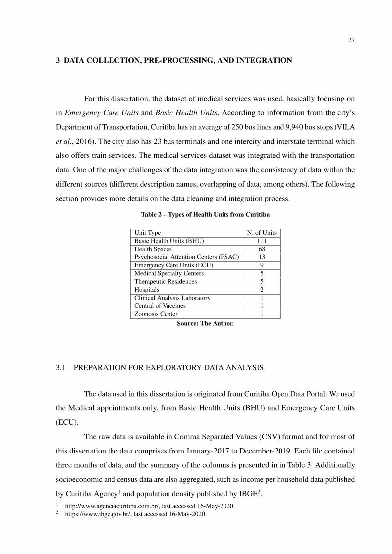
3 DATA COLLECTION, PRE-PROCESSING, AND INTEGRATION
For this dissertation, the dataset of medical services was used, basically focusing on
in Emergency Care Units and Basic Health Units. According to information from the city’s
Department of Transportation, Curitiba has an average of 250 bus lines and 9,940 bus stops (VILA
et al., 2016). The city also has 23 bus terminals and one intercity and interstate terminal which
also offers train services. The medical services dataset was integrated with the transportation
data. One of the major challenges of the data integration was the consistency of data within the
different sources (different description names, overlapping of data, among others). The following
section provides more details on the data cleaning and integration process.
Table 2 – Types of Health Units from Curitiba
Unit Type N. of UnitsBasic Health Units (BHU) 111Health Spaces 68Psychosocial Attention Centers (PSAC) 13Emergency Care Units (ECU) 9Medical Specialty Centers 5Therapeutic Residences 5Hospitals 2Clinical Analysis Laboratory 1Central of Vaccines 1Zoonosis Center 1
Source: The Author.
3.1 PREPARATION FOR EXPLORATORY DATA ANALYSIS
The data used in this dissertation is originated from Curitiba Open Data Portal. We used
the Medical appointments only, from Basic Health Units (BHU) and Emergency Care Units
(ECU).
The raw data is available in Comma Separated Values (CSV) format and for most of
this dissertation the data comprises from January-2017 to December-2019. Each file contained
three months of data, and the summary of the columns is presented in in Table 3. Additionally
socioeconomic and census data are also aggregated, such as income per household data published
by Curitiba Agency1 and population density published by IBGE2.1 http://www.agenciacuritiba.com.br/, last accessed 16-May-2020.2 https://www.ibge.gov.br/, last accessed 16-May-2020.

28
Table 3 – Database table unidade_de_saude
Column Name DescriptionCd_equip Code of the health unitNome_abrev Short name of the health unitNome_mapa Name of the health unit on the mapCd_bairro Code of the neighborhoodBairro NeighborhoodQuadr_equi Block of the health unitCd_regiona Code of the RegionRegional RegionFunc_manha Whether or not it is open in the morningFunc_tarde Whether or not it is open in the afternoonFunc_24hr Whether or not it is open 24 hours a dayDesativado Whether or not it is disabledCoord_e Coordinate eCoord_n Coordinate nGeom Geometry
Source: The Author.
Figure 6 – Steps taken in preparation for data analysis.
Source: The Author.
The following technologies were used: PostgreSQL3, PostGIS4, QGIS5, versions 2.14.11
(Essen) and 2.18.18 (Las Palmas), Gephi6, Tableau Desktop version7 and Microsoft Excel8.
Figure 6 shows the major steps of the data transformation. In the first phase, data from different
sources was collected. In the second phase, the data was cleaned and integrated, followed by the
analysis and visualization.
3 https://www.postgresql.org, last accessed 16-Nov-2018.4 https://postgis.net, last accessed 16-Nov-2018.5 https://www.qgis.org/en/site/, last accessed 16-Nov-2018.6 https://gephi.org/, last accessed 16-Nov-2018.7 https://www.tableau.com/pt-br, last accessed 14-Nov-2020.8 https://www.microsoft.com/pt-br/microsoft-365/excel, last accessed 14-Nov-2020.
29
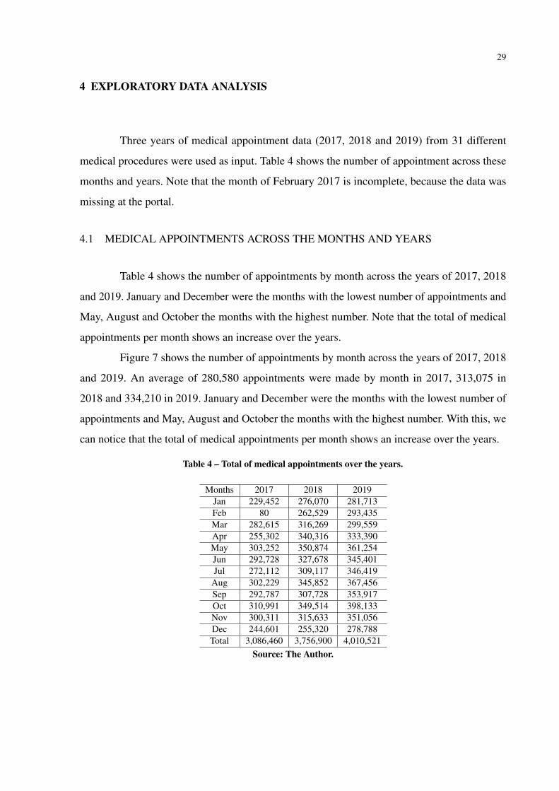
4 EXPLORATORY DATA ANALYSIS
Three years of medical appointment data (2017, 2018 and 2019) from 31 different
medical procedures were used as input. Table 4 shows the number of appointment across these
months and years. Note that the month of February 2017 is incomplete, because the data was
missing at the portal.
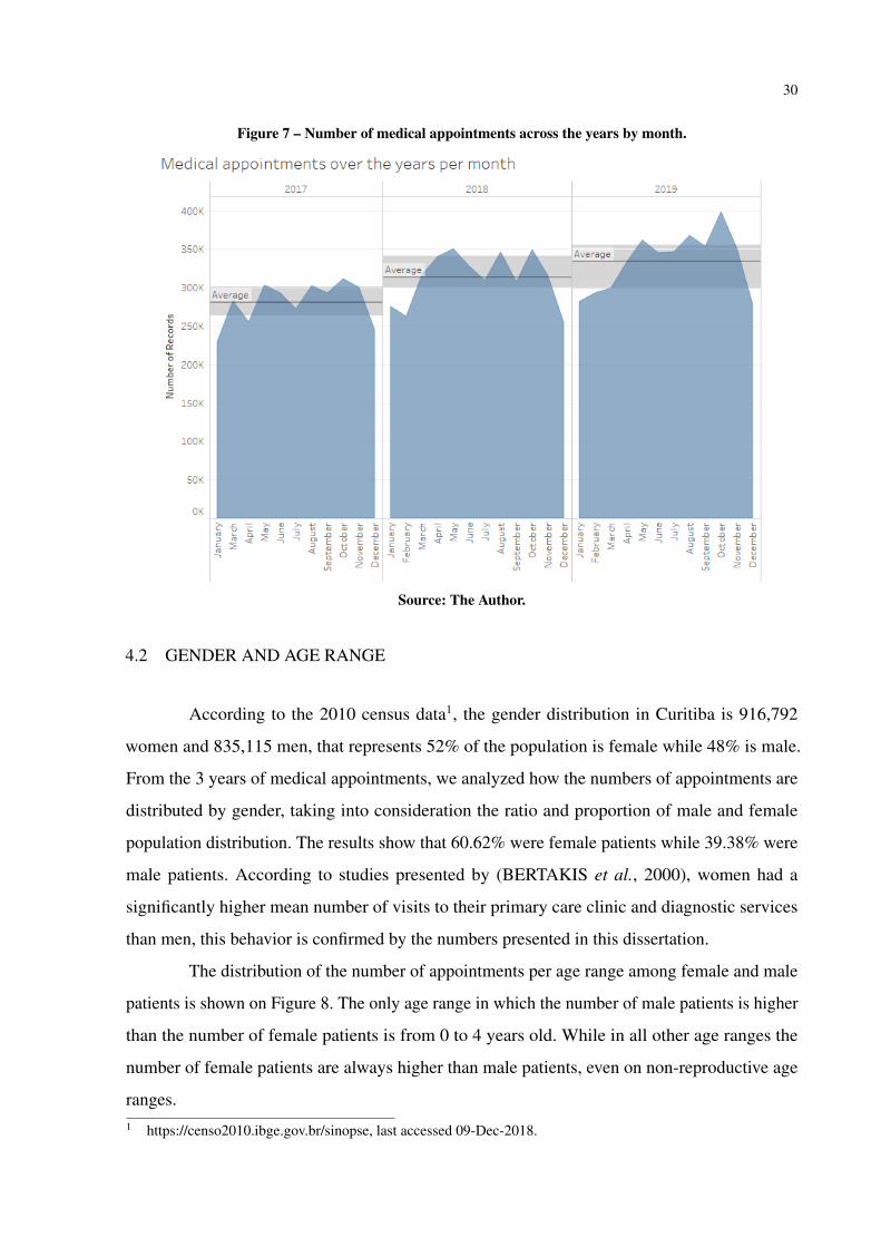
4.1 MEDICAL APPOINTMENTS ACROSS THE MONTHS AND YEARS
Table 4 shows the number of appointments by month across the years of 2017, 2018
and 2019. January and December were the months with the lowest number of appointments and
May, August and October the months with the highest number. Note that the total of medical
appointments per month shows an increase over the years.
Figure 7 shows the number of appointments by month across the years of 2017, 2018
and 2019. An average of 280,580 appointments were made by month in 2017, 313,075 in
2018 and 334,210 in 2019. January and December were the months with the lowest number of
appointments and May, August and October the months with the highest number. With this, we
can notice that the total of medical appointments per month shows an increase over the years.
Table 4 – Total of medical appointments over the years.
Months 2017 2018 2019Jan 229,452 276,070 281,713Feb 80 262,529 293,435Mar 282,615 316,269 299,559Apr 255,302 340,316 333,390May 303,252 350,874 361,254Jun 292,728 327,678 345,401Jul 272,112 309,117 346,419
Aug 302,229 345,852 367,456Sep 292,787 307,728 353,917Oct 310,991 349,514 398,133Nov 300,311 315,633 351,056Dec 244,601 255,320 278,788Total 3,086,460 3,756,900 4,010,521
Source: The Author.
30
Figure 7 – Number of medical appointments across the years by month.
Source: The Author.
4.2 GENDER AND AGE RANGE
According to the 2010 census data1, the gender distribution in Curitiba is 916,792
women and 835,115 men, that represents 52% of the population is female while 48% is male.
From the 3 years of medical appointments, we analyzed how the numbers of appointments are
distributed by gender, taking into consideration the ratio and proportion of male and female
population distribution. The results show that 60.62% were female patients while 39.38% were
male patients. According to studies presented by (BERTAKIS et al., 2000), women had a
significantly higher mean number of visits to their primary care clinic and diagnostic services
than men, this behavior is confirmed by the numbers presented in this dissertation.
The distribution of the number of appointments per age range among female and male
patients is shown on Figure 8. The only age range in which the number of male patients is higher
than the number of female patients is from 0 to 4 years old. While in all other age ranges the
number of female patients are always higher than male patients, even on non-reproductive age
ranges.1 https://censo2010.ibge.gov.br/sinopse, last accessed 09-Dec-2018.

31
Figure 8 – Distribution of appointments by age range for each gender.
Source: The Author.
4.3 LOCATION ANALYSIS OF THE HEALTH UNITS
From the 75 existing neighborhoods in Curitiba, 33 of them do not have a health unit.
Most of these 33 neighborhoods, are those with the highest income per household2. On the other
hand, in 29 neighborhoods there are 2 or more health units, and the Industrial District of Curitiba
(CIC) has the highest number of health units (a total of 16).
Figure 9-left shows a heat map with the distribution of the population according to data
from the 2010 census3. As a comparison, Figure 9-center shows the medical appointments per
health units for the year of 2017, and there is a notable overlap if compared to the heat map
on the left. Additionally, in Figure 9-right, there is an empty space around the downtown area,
which shows a heat map of income per household. Therefore, by looking at those maps it is
confirmed that the appointments at health units and the units themselves are located closer to the
population with the lowest income.2 http://www.agencia.curitiba.pr.gov.br/arquivos/regionais/perfil-economico-regional-matriz.pdf, last accessed
16-Nov-2018.3 http://www.ippuc.org.br/nossobairro/nosso_bairro.htm, last accessed 16-Nov-2018.

32
Figure 9 – Population + Medical appointments per health units + Income per household.
Source: The Author.
4.4 PUBLIC TRANSPORT ACCESSIBILITY TO HEALTH UNITS
According to (FERRAZ; TORRES, 2014) there are twelve main factors that influence
quality of urban public transportation, being them: accessibility, frequency of service, time of
journey, capacity, security, vehicle resources, stop resources, information system, connectivity,
operator behavior and road conditions. In this section, is analyzed the existence of bus stops near
the health units from the perspective of the distance between the health unit to the bus stop or
bus station. Table 5, shows the quality standards defined by (FERRAZ; TORRES, 2014) for the
accessibility factor, considering the walking distance parameter from the start to the end of the
trip.
Considering the quality of standards presented, all the 125 health units considered in
this dissertation have either a bus stop or a bus station well located, within a walking distance
of less than 300 radius in meters. Figure 10 shows a histogram with the number of health units
within each defined bucket of distance from the health units to bus stops or bus stations.
Table 5 – Quality standards for public transportation by bus in meters.
Factor Parameter Good Regular BadAccessibility Walking distance < 300 300-500 > 500
Source: Adapted from Ferraz and Torres (2004).

33
Figure 10 – Histogram showing the distance of the HU to the bus stops inmeters.
Source: The Author.
4.5 DISPLACEMENTS TO ARRIVE AT HEALTH UNITS
In this section, the displacements made by the citizens to arrive at the public health
units is analyzed. For this analysis, only the data from 2017 is used, due to the great amount of
data and computer processing limitation.
The results show that 12.34% of the 3,086,460 medical appointments made in 2017
were performed outside the neighborhood where the patients reside. It means that a daily average
of 1,130 people went to another neighborhood to have a medical appointment. Figure 11
shows the displacement made by the patients from their residential neighborhood to the 5 most
visited health units by patients from outside the neighborhood where the unit is located. These 5
most visited health units are emergency care units (ECU) that provide service 24 hours a day,
being: Cajuru, Boqueirão, Boa Vista, Campo Comprido and Sítio Cercado. Figure11 shows a
network graph which highlights the intensity of the flow for those patients that had their medical
procedures outside their residential neighborhood - thicker lines represent a greater flow of
people. Looking at the numbers of those 5 units, a total of 28.64% of the medical appointments
were performed by people from other neighborhoods in 2017.
Note that ECU Boqueirão is one of the top 5 that most receive people from other neigh-
borhoods but it does not have a bus stop in the 200 meter area. For these medical visits performed
outside the patients’ residential neighborhood in 2017, the top 5 International Classification
of Diseases (ICD) codes are presented in Table 6 and compared to the 5 ICD codes of all the
medical visits of the same period for comparison purposes as shown in Table 7.

34
Figure 11 – The top 5 Health Units most visited by pa-tients from other neighborhoods.
Source: The Author.
35
Table 6 – Top 5 ICD for medical visits performed outside the patient’s residentialneighborhood.
Top 5 outside residential neighborhood TotalAcute upper respiratory infections, unspecified 14512Acute tonsillitis, unspecified 9229Acute nasopharyngitis [common cold] 8969General Medical Examination 8309Other gastroenteritis and colitis of infectious andunspecified origin
8098
Source: The Author.
Table 7 – Top 5 ICD for all the medical visits.
Top 5 ICDs for All Medical Visits TotalGeneral Medical Examination 309366Issue of Repeat Prescription 174749Acute upper respiratory infections , unspecified 124942Essential (primary) hypertension 108797Acute nasopharyngitis [common cold] 95349
Source: The Author.
Based on this information, it is possible to notice that the great majority of the medical
visits made outside the patients’ residential neighborhood consist of complications of the res-
piratory tract, which usually get aggravated at night. To confirm this information, the time of
these medical visits were checked in Figure 12. The numbers on the left represent the number of
medical appointments in general, the blue line shows the number of medical appointments by
hour at the health units and the numbers on the right represent the number of medical appoint-
ments at the top 5 most health units most visited by patients from other neighborhoods, in the
red line it is possible to see the number of medical appointment at the top 5 health units by hour.
In summary, this analysis points out that the number of medical visits is constant from 14:00
to 23:00 in the top 5 health units most visited by patients from other neighborhood, while the
number of general medical appointments drops sharply after this period. Figures 13 shows the
number of appointments by hour per day of the week for all health units while Figure 14 shows
the same view but only for the top 5 health units visited by patients from other neighborhoods.
Figure 13 and Figure 14 also reinforce the finding that when top 5 facilities get more patients,
the number of appointments in the general facilities declines proportionally.
In regards to medical appointments distribution by gender, looking only at the top
5 health units most visited by patients from other neighborhood it was found that female
patients represent 54% while male patients represent 46%. Comparing to the overall distribution

36
Figure 12 – Time comparison of general medical visits and top 5 healthunits visited by patients from other neighborhood.
Source: The Author.
Figure 13 – Number of appointments by hour per day of the week for all health units.
Source: The Author.
Figure 14 – Number of appointments by hour per day of the week for top 5 health units visited by patientsfrom other neighborhoods.
Source: The Author.

37
Figure 15 – Distribution of appointment by gender and age range in the top5 health units
Source: The Author.
mentioned in sub-session 4.1, the distribution is quite different. And finally, on Figure 15, the
gender distribution per age range on these top 5 health units, age ranges 0-4 and 0-14 show the
same pattern as the overall distribution on figure 3, while in all other ranges the differences in
the number of appointments decrease.
4.6 SELECTED INFECTIOUS DISEASES
The diseases were selected based on the following criteria:
1. A list of the most important diseases was ranked, using their symptoms and the TFIDF
(term frequency–inverse document frequency) as a quantifier based on more than 7 million
bibliographic records from PubMed4.
2. Once identified, they were checked against the National Notifiable Diseases Surveillance
System (NNDSS)5.
3. The diseases selected in items 1 and 2, were ranked with the highest occurrence in the
open data of the health units in Curitiba.4 https://pubmed.ncbi.nlm.nih.gov, last accessed 13-Mar-2020.5 https://www.cdc.gov/, last accessed 13-Mar-2020.

38
The occurrences of the selected diseases are shown in Table 8 for the period from
January 2017 to December 2019. The selected ICDs are grouped into 7 categories of infectious
diseases and occurrences by geographical distribution is plotted by neighborhood.
Escherichia coli: Also known as E. coli is a bacteria commonly found in the lower
intestine of humans and warm-blooded animals. Most E. coli strains are harmless, but some can
cause severe diarrhea. E. cole is transmitted by contaminated water or food. The Environmental
Institute of Parana6 performs monitoring of the waters used for recreation, places can be flagged
as appropriate or inappropriate for bathing. The quality of the water indicates the amount of
sewage present in the water. For this, the indicator Escherichia coli is used, the greater the number
of the bacteria in the water, the greater the amount of sewage and, consequently, the greater the
probability of the existence of pathogenic organisms (causing disease).
Dengue and Yellow Fever: are transmitted by a mosquito called Aedes aegypti
mosquito7. The transmission of dengue is done by the female mosquito, because the female
needs a blood protein for the maturation of the eggs. The Municipal Dengue Control Program is
part of the routine of the Environmental Health Center. Dengue manifests in two ways: Classical
Dengue and Hemorrhagic Dengue8. In December 2019, for example, Paraná state had 2,631
dengue cases and 10 municipalities in epidemic9.
Yellow Fever can be divided into wild yellow fever and urban yellow fever, they are
caused by the same virus, but transmitted by different mosquitoes. Wild fever is transmitted by
Haemagogus or Sabethes vectors and the urban fever is transmitted by Aedes aegypti.
Measles: is a highly contagious viral disease, transmitted from person to person through
coughing, sneezing, close personal contact or direct contact with infected secretions10. The most
common complications are otitis, pneumonia, diarrhea, encephalitis and neurological problems.
The disease can, in some cases, lead to death.
Hepatitis: viral hepatitis is a serious public health problem in Brazil and worldwide11.
The most relevant etiological agents in Curitiba are viruses A, virus B and virus C. It is estimated
that 1.9% of the Curitiba population has hepatitis C virus and that 60% of those infected have6 http://www.iap.pr.gov.br/pagina-297.html, last accessed 05-Jul-2020.7 http://www.saude.curitiba.pr.gov.br/orientacao-e-prevencao/dengue.html, last accessed 04-Jul-2020.8 http://www.saude.curitiba.pr.gov.br/images/MS%20Guia-febre-amarela-2018.pdf, last accessed 04-Jul-2020.9 http://www.aen.pr.gov.br/modules/noticias/article.php?storyid=105013&tit=Parana-tem-2.631-casos-de-
dengue-e-10-municipios-em-epidemia, last accessed 19-Jul-2020.10 http://www.saude.curitiba.pr.gov.br/noticias/1169-tire-todas-as-duvidas-sobre-a-vacinacao-contra-o-
sarampo.html, last accessed 05-Jul-2020.11 http://www.saude.curitiba.pr.gov.br/images/PROT.HEPATITES%20VIRAIS%20-2018%201.pdf, last accessed
05-Jul-2020.

39
not yet been diagnosed12.
Meningitis: is an inflammatory process of the meninges, the membranes that surround
the brain and spinal cord13. It can be caused by various infectious agents, such as bacteria, viruses,
parasites and fungi, or also by non-infectious processes. Bacterial and viral meningitis are the
most important from the point of view of public health, due to their magnitude, ability to cause
outbreaks, and in the case of bacterial meningitis, due to the severity of cases.
Influenza: Every year there are vaccination campaigns against influenza promoted
throughout Brazil. The goal of the campaign is focused on groups of people more susceptible to
the disease.
Table 8 – Selected Infectious Diseases
ICD DescriptionA04* Escherichia coliA90 DengueA95* Yellow FeverB05* MeaslesB15* HepatitisB16* HepatitisB17* HepatitisG008, G009 MeningitisJ10* Influenza
Source: The Author.
4.6.1 Distribution of the selected diseases
Table 9 – Cases of selected diseases over the years.
Year Influenza Dengue E. Coli Hepatitis Yellow Fever Measles Meningitis2017 3853 786 100 79 12 2 232018 3886 525 143 117 96 2 212019 3150 737 141 132 108 51 8Total 10889 2048 384 328 216 55 52
Source: The Author.
Table 9 presents the the distribution over the years for the previous selected diseases.
For normalization, the occurrence index for ratio and proportion, as presented in the equation 1,12 https://www.curitiba.pr.gov.br/noticias/centro-de-referencia-tem-97-de-cura-para-casos-de-hepatite-c/51698, last
accessed 05-Jul-2020.13 http://www.saude.curitiba.pr.gov.br/12-vigilancia/460-meningites.html, last accessed 11-Jul-2020.

40
Figure 16 – Influenza (Jan-2017 to Dec-2019). Figure 17 – Dengue (Jan-2017 to Dec-2019).
Source: The Author.
was used, considering the population density by neighborhood (based on census data from 2010).
Figures 12, 13, 14, 15, 16, 17, 18 presents the neighborhoods that have the highest occurrences
of certain infectious diseases, where the darker colors represent the highest number of cases per
neighborhood.
Among the selected diseases, Influenza and Dengue have a greater presence in Curitiba,
in addition it is possible to observe a sign of high correlation in the geographical distribution
of dengue and meningitis cases (52 cases). According to the Human Symptoms and Diseases
Network presented by (ZHOU et al., 2014), Dengue and Meningitis share some symptoms,
meningitis contains 57% of dengue symptoms. There are reports in the literature that indicate
that meningitis is a rare complication of dengue, as reported in (PUCCIONI-SOHLER et al.,
2013).
𝑂𝑐𝑐𝑢𝑟𝑒𝑛𝑐𝑒𝐼𝑛𝑑𝑒𝑥 =𝑇𝑜𝑡𝑎𝑙𝑂𝑓𝑂𝑐𝑐𝑢𝑟𝑟𝑒𝑛𝑐𝑒𝑠
𝑃𝑜𝑝𝑢𝑙𝑎𝑡𝑖𝑜𝑛𝐵𝑦𝑁𝑒𝑖𝑔ℎ𝑏𝑜𝑟ℎ𝑜𝑜𝑑* 1000 (1)
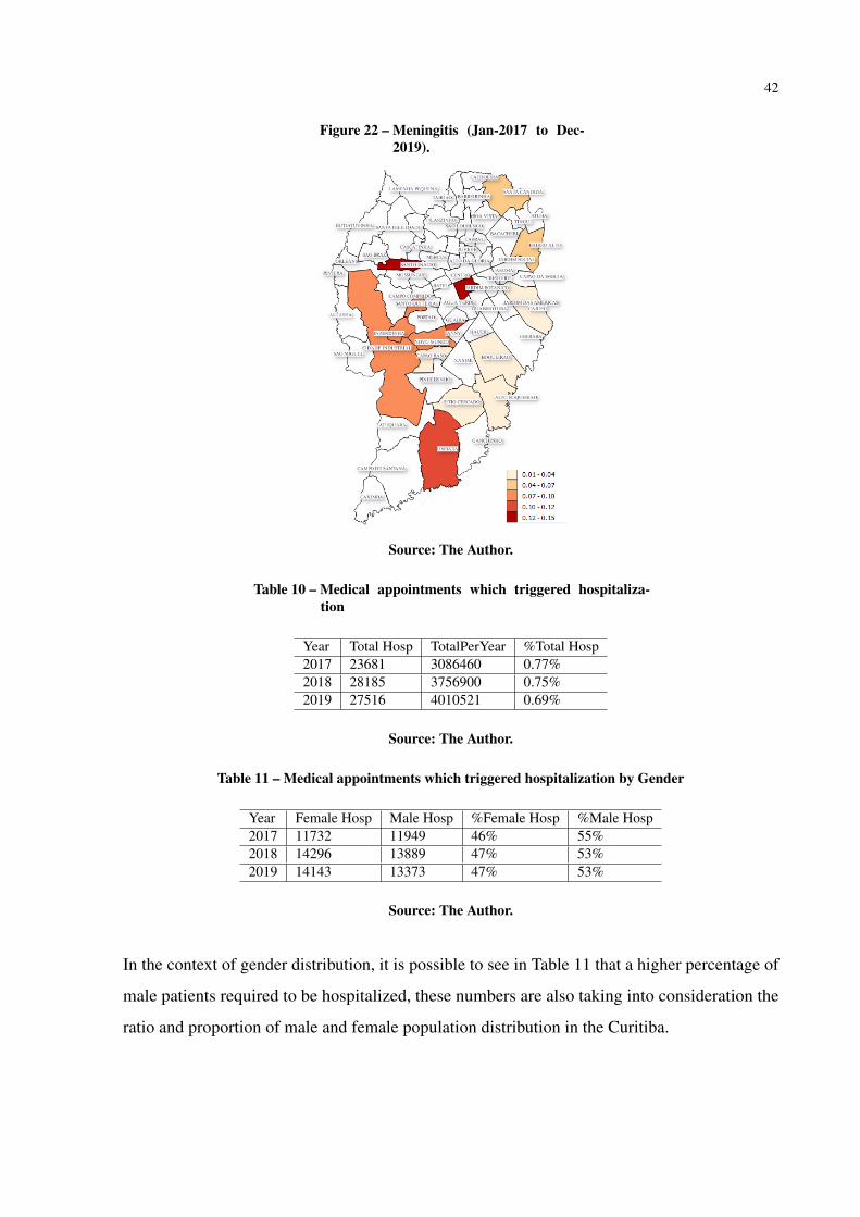
4.7 HOSPITALIZATION
Within the selected data, it is also possible to see how many medical appointment trig-
gered hospitalization. Table 10, shows that about 0.7% of the medical visit require hospitalization.

41
Figure 18 – Escherichia coli (Jan-2017 to Dec-2019). Figure 19 – Hepatitis (Jan-2017 to Dec-2019).
Source: The Author.
Figure 20 – Yellow Fever (Jan-2017 to Dec-2019). Figure 21 – Measles (Jan-2017 to Dec-2019).
Source: The Author.
42
Figure 22 – Meningitis (Jan-2017 to Dec-2019).
Source: The Author.
Table 10 – Medical appointments which triggered hospitaliza-tion
Year Total Hosp TotalPerYear %Total Hosp2017 23681 3086460 0.77%2018 28185 3756900 0.75%2019 27516 4010521 0.69%
Source: The Author.
Table 11 – Medical appointments which triggered hospitalization by Gender
Year Female Hosp Male Hosp %Female Hosp %Male Hosp2017 11732 11949 46% 55%2018 14296 13889 47% 53%2019 14143 13373 47% 53%
Source: The Author.
In the context of gender distribution, it is possible to see in Table 11 that a higher percentage of
male patients required to be hospitalized, these numbers are also taking into consideration the
ratio and proportion of male and female population distribution in the Curitiba.

43
5 HEALTH DASHBOARD PROTOTYPE
The exploratory data analysis presented in session 4 of this dissertation was a manual
process which demanded a great amount of effort and required knowledge in different tools as
shown in Figure 6, previous knowledge in Data Definition Language (DDL), Data Manipulation
Language (DML), Data Query Language (DQL) in order to create the database tables needed,
insert the data into the database tables, read and aggregate the data with different sources,
and show the data in a way that facilitates the visualization of a great amount of data. This
shows that although open data is available for the general public to use, the process of making
use of a great amount of data and transforming data into information is complex. With this
in mind, this session presents a Health Data Dashboard prototype which leverages the code
produced by (PARCIANELLO, 2019). The purpose of (PARCIANELLO, 2019)’s prototype,
named Origin-destination was to understand the patterns of public transportation systems in
Curitiba1, therefore for this dissertation, the code has been redesigned to the purpose of analyzing
Curitiba public health data and enable the analysis of the health data in a dynamic way. From a
Database design point of view, Origin-destination uses indexes and table partitioning in order
to improve performance while the Health Dashboard uses Materialized Views. In regards to
application-database access management, Health Dashboard has been enhanced to use prepared
statements or parameterized statements.
5.1 ARCHITECTURE
This session presents details of the technologies used and presents the database design.
5.1.1 Technologies
The prototype enables end-users to easily access and analyze Curitiba public health
data, without the need for any software installation, data manipulation, or previous knowledge in
the data. Also, the prototype uses only open-source technologies to avoid any kind of spending
on software acquisition and/or contracting.
Database Server: the database server is a Linux server with Debian 9 distribution2 with1 https://github.com/yussefparcianello/OrigemDestinoStpCuritiba, last accessed 18-Oct-2020.2 https://www.debian.org/index.pt.html, last accessed 05-Nov-2020.
44
two cores of AMD EPYC 7401 processors and 1.5G of memory, the database system used was
PostgreSQL 9.5 x643 with PostGIS 2.1.1 extension4.
Application Server: the application server where the online prototype has been made
available for testing and evaluation is a Linux server with 12 Cores, 16GB of RAM and Ubuntu
distribution5 running the following software: Apache Server6 and PHP7, while the development
environment of application is a Intel Core i3-6006U x64 2.0GHz, 8GB RAM with Windows 10
64 bits, running Apache Server and PHP.
Maps and Libraries: Open Street Map8 combined with Leaflet library9 and Heatmap
puglin10 have been used for Mapping and Data visualization
Other Libraries such as: JQuery v. 3.3.111, Bootstrap v. 3.3.712, and Chart.js v. 2.7.313.
Figure 23 shows the technologies used and how they are segregated from Client and
Server side perspectives. The source-code of the prototype is available in GitHub14 and video
showing the prototype usage is available in Youtube15.
5.1.2 Database
To return the database query results in a fast and efficient way, materialized views have
been created. Materialized views are database objects that contain the results of a query, they
are useful to allow faster access to data or for making the data available in a way that facilitates
the displaying of the data in a graph without the need of querying multiple sources of data at
the time of processing. The use of materialized views in this prototype is an enhancement to
(PARCIANELLO, 2019)’s work.
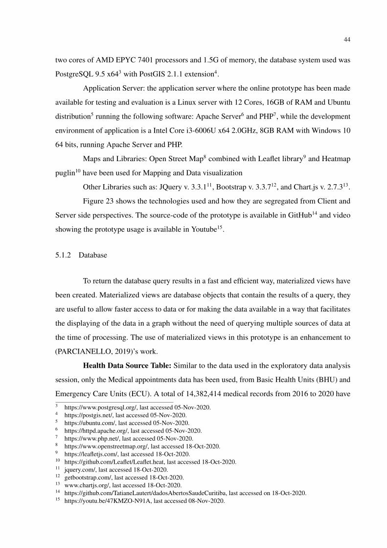
Health Data Source Table: Similar to the data used in the exploratory data analysis
session, only the Medical appointments data has been used, from Basic Health Units (BHU) and
Emergency Care Units (ECU). A total of 14,382,414 medical records from 2016 to 2020 have3 https://www.postgresql.org/, last accessed 05-Nov-2020.4 https://postgis.net/, last accessed 05-Nov-2020.5 https://ubuntu.com/, last accessed 05-Nov-2020.6 https://httpd.apache.org/, last accessed 05-Nov-2020.7 https://www.php.net/, last accessed 05-Nov-2020.8 https://www.openstreetmap.org/, last accessed 18-Oct-2020.9 https://leafletjs.com/, last accessed 18-Oct-2020.10 https://github.com/Leaflet/Leaflet.heat, last accessed 18-Oct-2020.11 jquery.com/, last accessed 18-Oct-2020.12 getbootstrap.com/, last accessed 18-Oct-2020.13 www.chartjs.org/, last accessed 18-Oct-2020.14 https://github.com/TatianeLautert/dadosAbertosSaudeCuritiba, last accessed on 18-Oct-2020.15 https://youtu.be/47KMZO-N91A, last accessed 08-Nov-2020.

45
Figure 23 – Health Dashboard Architecture.
Server-Side Client-Side
Architecture: Health Dashboard - Prototype
Data Visualization
leaflet.js OpenStreetMap
Filter Panel
bootstrap.js
Graphs
jquery.js chart.js
Web Server
Apache HTTP Server PHP
js librariesand
plugins
Database Server
Postgres PostGIS
Source: The Author.
been inserted into this database table. Details of database columns are shown in Figure 24.
Geodata Tables: 3 geo-referenced database tables were used to plot the maps in
the prototype, details of these database table are shown in Figure 24. Database table limites_-
legais.divisa_de_bairros stores the geo-referenced data of Curitiba neighborhoods. Table limites_-
legais.divisa_de_regionais stores the geo-referenced data of Curitiba macro regions. Table
saude.unidade_saude stores the geo-referenced data of Curitiba Health Units.
The purpose of storing consolidated information from Health Data Source table in the 4
Materialized Views was in terms of (i) number of medical appointments by month and year, (ii)
number of medical appointments by age range and gender, (iii) number of medical appointments
by hour and day of the week and (iv) number of medical appointments by selected infectious
disease per week number.

46
Figure 24 – Health Dashboard database tables and relationship.
DatabaseGeodata Tables
limites_legais.divisa_de_regionaisgidcodigonometiposhape_areashape_lengeom
limites_legais.divisa_de_bairrosgidcodigonometiposhape_areashape_lengeom
saude.unidade_saudegidcd_equinomecoord_ecoord_ngeom
Health Data Source Table
saude.tatiane_atendimento_unidade_saudedt_atendimentodt_nascimentosexocod_tipo_unidadetipo_unidadecod_unidadedesc_unidadecod_procedimentodesc_procedimentocod_cbodesc_cbocod_ciddesc_cidsolicitacao_examesqt_prescrita_farmacia_ctbanaqt_dispensada_farmacia_ctbanaqt_medicamento_nao_padronizadoencaminhamento_atendimento_especialistaarea_atuacaodesencadeou_internamentodt_internamentoestab_solicitanteestab_destinoestab_destinoestab_destinotratamento_domicilioabastecimentoenergia_eletricatipo_habitacaodestino_lixofezes_urinacomodosem_casodoencagrupo_comunitariomeio_comunicacaomeio_transportemunicipiobairronacionalidadecod_usuarioorigem_usuarioresidentecod_profissional
Source: The Author.

47
Figure 25 – Interface of the Health Dashboard Prototype.
Source: The Author.
5.2 APPLICATION INTERFACE
In the prototype, all interaction takes place on a single screen. As shown in Figure 25,
the web interface is divided vertically in two: an interactive map with a search panel and map
layer options is available on the right; on the left, the results of the search are available in the
form of dynamic graphs. Through the search panel users can filter the data according to their
needs, and through the map layer option users can select the maps layers they wish to see on the
map.
Figure 26 shows the filter options available in the search panel. The first filter option
allows users to select the data by year, the second filter option allows users to filter the data based
on each Health Unit, the third filter allows users to filter by Month, the fourth option can be used
to filter the day of the week, and the last option allows users to select by a particular Infectious
Disease.
Figure 27 shows the mapping layers available in the prototype. By default, layer options
show Health Units, Disease Outbreak Heat Map, and Neighborhood are selected, Region layer is
not selected by default and this is to make the mapping visualization cleaner. The user can select
the desired mapping layers to be shown by clicking on the icon and then checking or unchecking
each mapping layer checkbox.

48
Figure 26 – Health Dashboard Filters.
Source: The Author.
Figure 27 – Health Dashboard Map Layers.
Source: The Author.
Figure 28 shows the 4 graphs available in the prototype, graph A from Figure 28 shows
the number of medical appointments over the months. Data is displayed according to the filter
criteria selected by the user. In case the user hovers the mouse over the bars of the graphs, a
message is displayed with the exact number of medical appointments for that given month. In
this example, it is possible to see that a filter by year 2020 has been selected by looking at the
title of the graph.
As part of the exploratory data analysis in session 4, the same information was presented
in the form of a table and a graph in Figure 7 for years 2017, 2018, and 2019. In that session, the
data presented was fixed and it was required previous knowledge of the data source, database
queries, visualization tool to display the information. With the prototype, the user can access the

49
Figure 28 – Health Dashboard - Graphs available in the prototype.
Source: The Author.
information without any previous knowledge, and data is dynamically displayed according to the
user’s preference and needs.
Graph B from Figure 28 shows the number of medical appointments by age range and
gender. The data is displayed according to the filter criteria defined by the user. Similarly, the
same information was presented in session 4, Figure 8, however with the prototype, the data can
be dynamically displayed according to the user’s preference and needs.
Graph C from Figure 28 shows the number of medical appointments by hour per day of
week. Data is displayed according to the filter criteria defined by the user. It allows the users
to identify the volume of medical appointment by hour for a given day of the week and it is
also possible to select a specific health unit. This information was also presented in session 4
Figure 13 and Figure 14, however with the prototype, it becomes very easy for the user to apply

50
Figure 29 – Heat Map Layer for a given infection dis-ease.
Source: The Author.
different filters. It is also possible to check the peak times of appointments for a specific health
unit for example.
Graph D from Figure 28 shows number of a given infectious disease by week number.
Data is displayed according to the filter criteria defined by the user. The red bars show that there
has been an outbreak of the given infectious disease in those weeks. In this graph, the modified
WHO definition of disease outbreak described in session 2.3.2 has been used to detect an
outbreak, i.e. the threshold for an outbreak in a given week is defined at two standard deviations
in excess. Also, the heat map outbreak is based on the same method, however, the criteria are
re-applied at each neighborhood level. As an example, Figure 29 shows the heat map where
the outbreak criteria have been applied by neighborhood, areas in red on the heat map means
that there has been a great number of outbreaks for the given period. As opposed to the other
graphs available on the Dashboard, Graph D is a new form of data visualization when compared
to session 4.
The selected infectious diseases available for user selection in Graph D of the prototype
were the same infectious diseases presented in the exploratory data analysis session, being
them Escherichia coli, Dengue, Yellow Fever, Measles, Hepatitis. Additionally considering the
ongoing COVID-19 pandemics the following are also added for use selection: Confirmed-Covid
cases, Suspected-Covid cases, and Severe Acute Respiratory Syndrome (SARS).

51
Figure 30 – Region Layer.
Source: The Author.
Besides the heat map for infectious disease, there are also other options of map layers
available on the prototype. Figure 30 shows the Region Layer, Figure 31 shows the Neighborhood
Layer, Figure 32 shows the Health Units Layer. Users are also able to select and view multiple
layers at the same time, Figure 33 shows a combined view of both the Neighborhood Layer and
the Health Units layer.
5.3 USABILITY TEST
An experiment was conducted between 10-Oct-2020 to 23-Oct-2020 with seven partici-
pants, 1 participant from the Health Science area, 1 from Architecture, and 5 from Computer
Science area (1 IT Architect, 1 IT Quality Engineer, 1 IT Manager, 1 System Analyst, 1 Post
Doctoral Student). It is important to mention that given the current COVID-19 pandemic scenario,
it was not possible to perform the usability test scenario in deeper detail or in person due to the
current social distancing guidelines.
In order to test the usability of the prototype, 3 usability testing scenarios as presented in
Table 12 and an evaluation questionnaire with 4 questions as presented in Table 13 were defined.
The participants were asked to execute 1 low, 1 medium, and 1 high complexity usability testing

52
Figure 31 – Neighborhood Layer.
Source: The Author.
Figure 32 – Health Unit Layer.
Source: The Author.
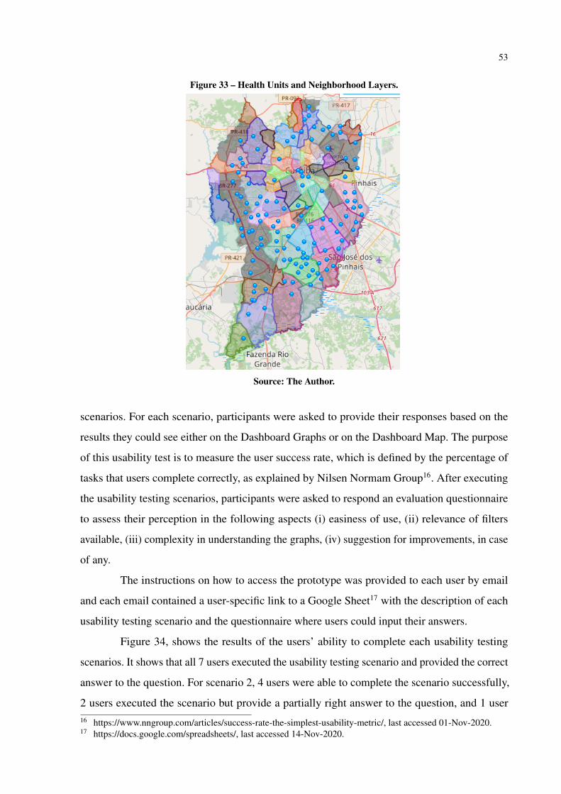
53
Figure 33 – Health Units and Neighborhood Layers.
Source: The Author.
scenarios. For each scenario, participants were asked to provide their responses based on the
results they could see either on the Dashboard Graphs or on the Dashboard Map. The purpose
of this usability test is to measure the user success rate, which is defined by the percentage of
tasks that users complete correctly, as explained by Nilsen Normam Group16. After executing
the usability testing scenarios, participants were asked to respond an evaluation questionnaire
to assess their perception in the following aspects (i) easiness of use, (ii) relevance of filters
available, (iii) complexity in understanding the graphs, (iv) suggestion for improvements, in case
of any.
The instructions on how to access the prototype was provided to each user by email
and each email contained a user-specific link to a Google Sheet17 with the description of each
usability testing scenario and the questionnaire where users could input their answers.
Figure 34, shows the results of the users’ ability to complete each usability testing
scenarios. It shows that all 7 users executed the usability testing scenario and provided the correct
answer to the question. For scenario 2, 4 users were able to complete the scenario successfully,
2 users executed the scenario but provide a partially right answer to the question, and 1 user16 https://www.nngroup.com/articles/success-rate-the-simplest-usability-metric/, last accessed 01-Nov-2020.17 https://docs.google.com/spreadsheets/, last accessed 14-Nov-2020.

54
Table 12 – Usability testing scenarios
Scenario ID Scenario Complexity Usability Testing Scenario1 Low How many medical visits were there
in March 2019?2 Medium In October 2018, was there any age
range in which there was a greaternumber of medical appointments formale patients?
3 High Based on the heat map, using allthe data available, which regionor neighborhood presented a greatnumber of outbreaks for confirmedcases of Covid?
Source: The Author.
Table 13 – Evaluation Questionnaire
Question ID Evaluation Question Options1 Was it easy to use the prototype? Yes / No2 Do you think the filter options were relevant? Yes / No3 How do you assess the complexity in understanding the graphs? Easy / Medium / Difficult4 Do you have any suggestion for improvements? Open-ended Question
Source: The Author.
executed the scenario but provide a wrong answer to the question. For scenario 3, all 7 users
executed the scenario and provided the correct answer to the question. This shows that for the
low complexity usability testing scenario the user success rate of the prototype usability was
at 100%, for the medium complexity scenario the success rate was at 57%, and for the high
complexity scenario, the success rate is at 100%.
Figure 35 shows the results of the users’ evaluation of the prototype in terms of easiness
of use and graph complexity. All 7 users evaluated the prototype as easy to use, 6 uses evaluated
the complexity in understanding the graph as easy and 1 user evaluated as difficult.
Figure 36 shows the results of the users evaluation of the relevance of the filters available
in the prototype. All 7 users evaluated the filter options as relevant.
Table 14 shows the suggestions for improvement for the prototype given by the users.
There were 7 suggestions in total and some of these suggestions can be implemented as a future
work.
Suggestions 1, 2, 4, 5, and 6 can be easily implemented and would bring value to user
experience. Suggestion 3 needs to be further analyzed and tested on what would be the best
approach. Suggestion 7 would require additional data to be aggregated to our existing database.

55
Figure 34 – Users ability to complete usability testing scenarios.
Source: The Author.
Figure 35 – Evaluation Questionnaire Results - Easiness of Use and GraphComplexity.
Source: The Author.
5.4 LESSONS LEARNT
Several factors need to be considered when designing a health dashboard prototype
such as:
1. Analysis of the technology to be used in terms of cost and libraries compatibility. In this
prototype, only open source technologies were used and as mentioned by (PARCIANELLO,
2019) due to libraries incompatibility, many times when you want to add new functionality
it is required to redesign the application to replace conflicting plugins with others.
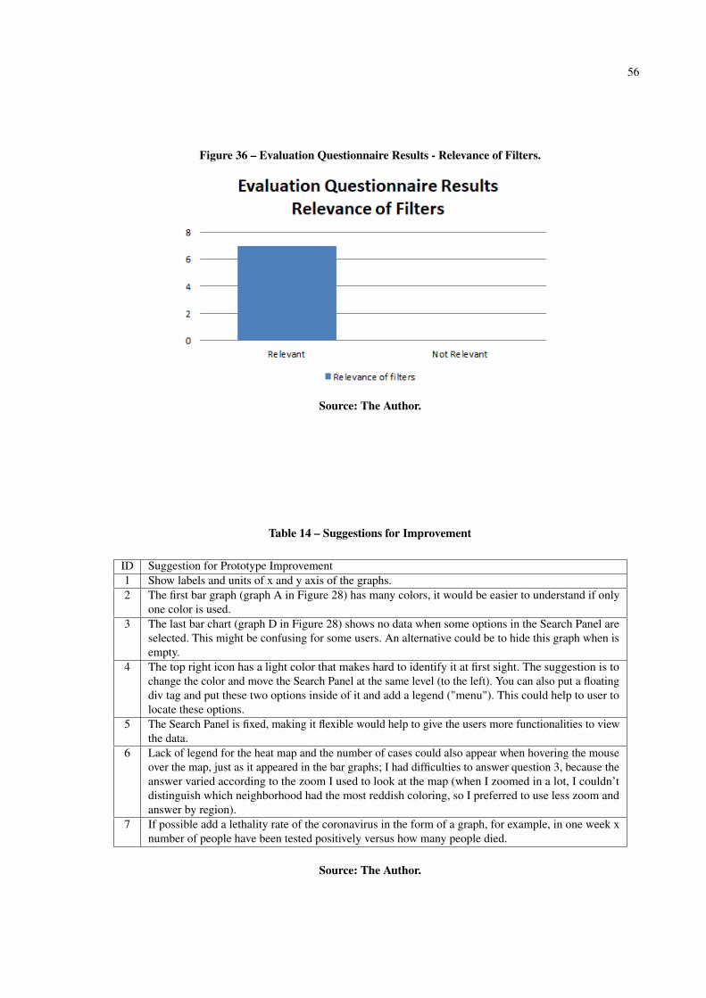
56
Figure 36 – Evaluation Questionnaire Results - Relevance of Filters.
Source: The Author.
Table 14 – Suggestions for Improvement
ID Suggestion for Prototype Improvement1 Show labels and units of x and y axis of the graphs.2 The first bar graph (graph A in Figure 28) has many colors, it would be easier to understand if only
one color is used.3 The last bar chart (graph D in Figure 28) shows no data when some options in the Search Panel are
selected. This might be confusing for some users. An alternative could be to hide this graph when isempty.
4 The top right icon has a light color that makes hard to identify it at first sight. The suggestion is tochange the color and move the Search Panel at the same level (to the left). You can also put a floatingdiv tag and put these two options inside of it and add a legend ("menu"). This could help to user tolocate these options.
5 The Search Panel is fixed, making it flexible would help to give the users more functionalities to viewthe data.
6 Lack of legend for the heat map and the number of cases could also appear when hovering the mouseover the map, just as it appeared in the bar graphs; I had difficulties to answer question 3, because theanswer varied according to the zoom I used to look at the map (when I zoomed in a lot, I couldn’tdistinguish which neighborhood had the most reddish coloring, so I preferred to use less zoom andanswer by region).
7 If possible add a lethality rate of the coronavirus in the form of a graph, for example, in one week xnumber of people have been tested positively versus how many people died.
Source: The Author.

57
2. Previous knowledge of the data is required, therefore an exploratory data analysis is an
important step to understanding what the data can tell and it serves as a basis on what
visual information to show on the prototype.
3. Identification of relevant filters for end-users to explore the data in an efficient manner.
Ideally, before implementing such filters it is important to assess the users’ requirements.
4. Analysis of what are the best ways to display the data and what statistical method to apply.
For example, one of the challenges faced during this research was to find an appropriate
method for identifying disease outbreaks. It has even been found imprecision between
national and international methods for publication of disease outbreaks, while the CDC
presented disease outbreak information easily on their website, in Brazil such information
is published in the Brazilian Epidemiological Bulletins.
5. The prototype must provide a good user experience, functionalities need to be intuitive
and simple.
6. Use of techniques to enhance the system performance in fetching and retrieving the data
from the database.
7. Use of data security measures to avoid malicious SQL injections. In our health dashboard
prototype, the security measure chosen was the use of prepared statements to access the
data from the database server.
8. Public health data must always be anonymized to be displayed in this kind of dashboard.
The public health data available in Curitiba Open Data Portal was already anonymized,
but in scenarios where such type of dashboard accesses the data directly from the health
system, data anonymization is a crucial step to be taken.
9. Consideration of user feedback for prototype enhancement. During the evaluation ques-
tionnaire the users provided good suggestions which can enhance the user experience of
our prototype.
Lastly, it would be helpful if there were standards defined for data sharing and use of
technologies by governing bodies which would allow scaling of Health Dashboards by
any city, in a plug and play mode. For example, the open data could be available via
Application Programming Interfaces (APIs) with appropriate documentation to facilitate

58
interaction between multiple applications, and template applications which any cities could
simply leverage the template code and deploy a new Dashboard instance without the need
to developing it from scratch.

59
6 CONCLUSION
There are several challenges related to health data, mainly faced by large urban centers.
New technologies, infectious diseases, public trust, delivering health in conflict and crisis,
making healthy care fairer, expanding access to medicine are some of the problems that impact
the development and planning of a city (World Health Organization, 2020). Ideally, data must be
accompanied by openly accessible metadata so that it can be discovered, interpreted correctly,
and reused for subsequent research. If crisis such as COVID-19 pandemic are considered,
data combined with context and meaning turns into knowledge for informing public health
response (RDA COVID-19 Working Groups, 2020), and the use of common metadata standards,
as well as vocabularies, are recommended.
In this sense, this dissertation presented an exploratory analysis using sociopolitical,
geographical, transportation and health data in Curitiba, relating this information to other factors,
such as health units locations, bus stops accessibility, displacements performed by the citizens to
arrive at the health units and analysis of selected infectious diseases distribution across the cities’
neighborhoods.
In order to have a better understanding on the context of each related area, this disserta-
tion presented a summary of the basic concepts about GIS, smart cities, open data with focus on
health data, among others. The main challenges of each area have also been presented.
In our preliminary data analysis, the results show that the bus stops are well located and
allow citizens to arrive at the majority of health units without the need of long walks, fulfilling
its function of being located where the population needs. But it is also observed that there is a
relevant amount of displacements from outside the citizens’ neighborhood to arrive at the top 5
ECU, especially looking for treatment of respiratory problems. It is required further research on
related works and with the municipality of Curitiba to understand if those numbers are expected
and why. As future work, it would be useful to analyse if the displacements are caused by
specific demands per regions, so that the results of the analysis could be used for enhancement
of specialty center units redistribution according to the demands. The results also showed some
differences in gender behaviour towards medical visits, with the majority (60.62%) being of
female visits, except in the age range from 0 to 4 years old. Similar behaviour could also be seen
in related work explored.
The initial data analysis also showed that on the 7 categories of selected infectious

60
diseases, influenza and dengue have a greater presence in Curitiba when compared to the other
categories considered in this dissertation, also a sign of correlation in the geographical distribution
of dengue and meningitis could be observed. Further research is needed to confirm this behaviour
in more details.
Our Health Data Prototype showed that it can facilitate the analysis of the health data
aggregated to other sources to either the general public or professionals of the Health Science
departments. It also showed that even with the use of a great amount of data the dashboard
performance to show the graphs and maps is not affected with the appropriate techniques of
data modeling design. And that, from a user point of view no prior knowledge of the data or
technology are required to perform the search and analysis of the data through the dashboard.
As future work, we can mention the enhancement of the Health Data prototype based
on the users’ inputs, the inclusion of other data-sets such as air quality data and how it correlates
with diseases of respiratory tract, enhancement of data visualization and statistical methods to
allow for prediction of health service demands per region.
As the population increases its important to conduct further analysis to identify if
the health services are still adequate to the needs of the population, in this dissertation the
demographic data source is from 2010 census. In Brazil demographic census is conducted every
10 years, in 2020 as a result of the Covid-19 Pandemics, IBGE has decided to postpone the
census to 2021 as per communication published in March 2020 1. With this scenario, as future
work, newer census data can be used as it becomes available to analyse the how the increase
in population affects the quality and demands in health services. Also, other methods such as,
leveraging crowd source data could be used to bring insights on the population’s perception of
quality of the health services, for example by using Google rating and review data of the health
units available on Google Maps.
The Municipal government of Curitiba could use the results of this research to assess
whether the different data sources administered by the city can be normalized in order to facilitate
future research. Other studies using data from different cities could use the numbers from this
dissertation as a baseline for comparison. The results can also be used as a starting point for
professionals in the public health field to obtain insights for a more detailed future research.
1 https://www.ibge.gov.br/novo-portal-destaques/27161-censo-2020-adiado-para-2021.html, last accessed Dec-27-2020.

61
REFERENCES
BATTY, M.; AXHAUSEN, K. W.; GIANNOTTI, F.; POZDNOUKHOV, A.; BAZZANI,A.; WACHOWICZ, M.; OUZOUNIS, G.; PORTUGALI, Y. Smart cities of the future. TheEuropean Physical Journal Special Topics, v. 214, n. 1, p. 481–518, Nov 2012. Available at:https://doi.org/10.1140/epjst/e2012-01703-3.
BERTAKIS, Klea D; AZARI, Rahman; HELMS, L. Jays; CALLAHAN, Edward J; ROBBINS,John A. Gender differences in the utilization of health care services. Journal of FamilyPractice, Appleton-Century-Crofts, v. 49, n. 2, p. 147–152, 2000. ISSN 0094-3509.
BITTENCOURT, Roberto José; HORTALE, Virginia Alonso. Intervenção para solucionara superlotação nos serviços de emergência hospitalar: uma revisão sistemática. Cadernosde Saúde, scielo, v. 25, p. 1439 – 1454, 07 2009. ISSN 0102-311X. Available at: http://www.scielo.br/scielo.php?script=sci\_arttext&pid=S0102-311X2009000700002&nrm=iso.
BRADY, Oliver J; SMITH, David L; SCOTT, Thomas W; HAY, Simon I. Dengue diseaseoutbreak definitions are implicitly variable. Epidemics, Elsevier, v. 11, p. 92–102, 2015.
CALEGARI, G. Re; CELINO, I.; PERONI, D. City data dating: Emerging affinities betweendiverse urban datasets. Information Systems, volume 57, p. 223–240, 2016.
CASTRO, Marcia C; MASSUDA, Adriano; ALMEIDA, Gisele; MENEZES-FILHO,Naercio Aquino; ANDRADE, Monica Viegas; NORONHA], Kenya Valéria Micaela[de Souza; ROCHA, Rudi; MACINKO, James; HONE, Thomas; TASCA, Renato;GIOVANELLA, Ligia; MALIK, Ana Maria; WERNECK, Heitor; FACHINI, Luiz Augusto;ATUN, Rifat. Brazil’s unified health system: the first 30 years and prospects for thefuture. The Lancet, v. 394, n. 10195, p. 345 – 356, 2019. ISSN 0140-6736. Available at:http://www.sciencedirect.com/science/article/pii/S0140673619312437.
CAVALCANTE, J. L. S. B.; NETO, M. S.; KOZIEVITCH, N. P. Utilização e estudo de dados desaúde georreferenciados para desenvolvimento de aplicação móvel. GeoInfo, p. 170–175, 2018.
DAMERI, Renata; CAMILLE, Rosenthal_Sabroux. Smart city and value creation. Springer, p.pp. 1–12, 06 2014.
DONG, Ensheng; DU, Hongru; GARDNER, Lauren. An interactive web-based dashboard totrack covid-19 in real time. Lancet Infect Dis, v. 5, 02 2019.
EDSALL, Robert M. Design and usability of an enhanced geographic information system forexploration of multivariate health statistics. The Professional Geographer, Routledge, v. 55,

62
n. 2, p. 146–160, 2003. Available at: https://www.tandfonline.com/doi/abs/10.1111/0033-0124.5502003.
ESRI. What is gis. Available in https://www.esri.com/en-us/what-is-gis/overview, lastaccessed 17-Jun-2019, 2019.
FERRAZ, A. C. P.; TORRES, I. G. E. Transporte público urbano. Rima, 2014.
Ferreira, N.; Poco, J.; Vo, H. T.; Freire, J.; Silva, C. T. Visual exploration of big spatio-temporalurban data: A study of new york city taxi trips. IEEE Transactions on Visualization andComputer Graphics, v. 19, n. 12, p. 2149–2158, Dec 2013. ISSN 1077-2626.
GURSTEIN, Michael. Open data: Empowering the empowered or effective datause for everyone? First Monday, v. 16, n. 2, 2011. ISSN 13960466. Available at:https://firstmonday.org/ojs/index.php/fm/article/view/3316.
Harrison, C.; Eckman, B.; Hamilton, R.; Hartswick, P.; Kalagnanam, J.; Paraszczak, J.; Williams,P. Foundations for smarter cities. IBM Journal of Research and Development, v. 54, n. 4, p.1–16, July 2010. ISSN 0018-8646.
HINO, P.; VILLA, T. C. S.; SASSAKI, C. M.; NOGUEIRA, J. de A.; SANTOS, C. B. dos. Onthe mode of communication of cholera. Revista Latino-Americana de Enfermagem, v. 14(6),p. 939–943, 2006.
JANSSEN, M.; CHARALABIDIS, Y.; ZUIDERWIJK, A. Benefits, adoption barriers andmyths of open data and open government. Information Systems Management, volume 29, p.258–268, 2012.
KASSEN, Maxat. A promising phenomenon of open data: A case study of the chicago open dataproject. Government Information Quarterly, v. 30, 10 2013.
KATAKIS, I. Mining urban data (part a). Information Systems, volume 54, p. 113–114, 2015.
KOZIEVITCH, N. P.; SILVA, T. H.; ZIVIANI, A.; COSTA, G.; LUGO, G. Three decades ofbusiness activity evolution in curitiba: A case study. Annals of Data Science, v. 4, p. 1–21,2017.
LIMA, C. D.; PEIXOTO, A. M.; GOMES-JR, L. C.; LUDERS, R.; FONSECA, K. V. O.Avaliação da qualidade do transporte público no acesso a unidades de saúde de curitiba. In:Anais do III Workshop de Computação Urbana (COURB 2019). Gramado, RS, Brasil: SBC,2019. v. 1. Available at: http://sbrc2019.sbc.org.br/wp-content/uploads/2019/05/courb2019.pdf.

63
Meingast, M.; Roosta, T.; Sastry, S. Security and privacy issues with health care informationtechnology. 2006 International Conference of the IEEE Engineering in Medicine andBiology Society, p. 5453–5458, Aug 2006. ISSN 1557-170X.
NAKONETCHNEL, E. C.; KOZIEVITCH, N. P.; CAPPIELLO, C.; VITALI, M.; AKBAR, M.Mobility open data: Use case for curitiba and new york. Anais do XIII Escola Regional deBanco de Dados, ERBD, p. 111–114, 2017.
NETO, Virgilio Cavicchioli; CHIARI-CORREIA, Natalia; CARVALHO, Isabelle; PISA,Ivan Torres; ALVES, Domingos. Desenvolvimento e integração de mapas dinâmicosgeorreferenciados para o gerenciamento e vigilância em saúde. Journal of Health Informatics,v. 6, p. 3, 01 2014.
OLIVEIRA, Matheus F. A. de; KOZIEVITCH, Nádia P.; BIM, Silvia A.; LEGAL-AYALA,Horacio. Caracterização dos dados públicos de saúde do paraguai. In: Anais da XIV EscolaRegional de Banco de Dados (ERBD 2018). Porto Alegre, RS, Brasil: SBC, 2018. p. 12–21.ISSN 2595-413X. Available at: https://ojs.sbc.org.br/index.php/erbd/article/view/2825.
PARCIANELLO, Yussef. Análise de origem-destino do uso do sistema de transportecoletivo de curitiba sob o ponto de vista de regions of interest. Master’s Thesis,Universidade Tecnológica Federal do Paraná, Curitiba, 2019. Available at: http://repositorio.utfpr.edu.br/jspui/handle/1/4821.
PUCCIONI-SOHLER, Marzia; ROSADAS, Carolina; CABRAL-CASTRO, Mauro Jorge.Neurological complications in dengue infection: a review for clinical practice. Arquivos deNeuro-Psiquiatria, scielo, v. 71, p. 667 – 671, 09 2013. ISSN 0004-282X. Available at: http://www.scielo.br/scielo.php?script=sci_arttext&pid=S0004-282X2013001000667&nrm=iso.
RDA COVID-19 Working Groups. RDA COVID-19 Working Group Recommendationsand Guidelines, 1st release. Research Data Alliance, 2020. Available at: https://doi.org/10.15497/rda00046.
RUSHTON, Gerard. Public health, gis, and spatial analytic tools. Annual Review of PublicHealth, v. 24, n. 1, p. 43–56, 2003. PMID: 12471269.
SANTIN, Priscila L.L.; MUNARETTO, Anelise; FONSECA, Mauro. Modelagem do perfilde atendimento aos idosos nas unidades de saúde de curitiba. In: Anais do I Workshop deComputação Urbana (COURB 2017). Porto Alegre, RS, Brasil: SBC, 2017. v. 1. ISSN2595-2706. Available at: https://ojs.sbc.org.br/index.php/courb/article/view/2575.
SILVEIRA, L. M.; ALMEIDA, J. M.; MARQUES-NETO, H. T.; ZIVIANI, A. Mobdatu:Um novo modelo de previsão de mobilidade humana para dados heterogêneos. XXXIIISimposio Brasileiro de Redes de Computadores e Sistemas Distribuídos, Vitoria / ES.
64
Anais do XXXIII Simpósio Brasileiro de Redes de Computadores e Sistemas Distribuídos,SBRC’2015, p. 515–528, 2015.
SNOW, John. On the mode of communication of cholera. Edinburgh medical journal, v. 1,7,p. 668–670, 01 1856.
SOUSA, Leonardo; MELLO, Rafael de; CEDRIM, Diego; GARCIA, Alessandro; MISSIER,Paolo; UCHôA, Anderson; OLIVEIRA, Anderson; ROMANOVSKY, Alexander. Vazadengue:An information system for preventing and combating mosquito-borne diseases with socialnetworks. Information Systems, v. 75, p. 26–42, 02 2018.
TUKEY, John W. Exploratory data analysis. Addison-Wesley, 1977.
VILA, J. R.; KOZIEVITCH, N.; FONSECA, K.; GADDA, T.; ROSA, M.; GOMES-JR, L. C.;AKBAR, M. Urban mobility challenges – an exploratory analysis of public transportation data incuritiba. Revista de Informática Aplicada, v. 12, p. 1, 12 2016.
VILAICHONE, Ratha-Korn; AUMPAN, Natsuda; RATANACHU-EK, Thawee; UCHIDA,Tomohisa; TSHERING, Lotay; MAHACHAI, Varocha; YAMAOKA, Yoshio. Population-basedstudy of helicobacter pylori infection and antibiotic resistance in bhutan. International Journalof Infectious Diseases, v. 97, 05 2020.
World Health Organization. Urgent health challenges for the next decade. WHO,2020. Available at: https://www.who.int/news-room/photo-story/photo-story-detail/urgent-health-challenges-for-the-next-decade.
World Health Organization and others. WHO guidelines for epidemic preparedness andresponse to measles outbreaks. WHO, 1999. Available at: https://www.who.int/csr/resources/publications/measles/WHO_CDS_CSR_ISR_99_1/en/.
ZHOU, Xuezhong; MENCHE, Jörg; BARABASI, Albert-Laszlo; SHARMA, Amitabh. Humansymptoms–disease network. Nature communications, v. 5, p. 4212, 06 2014.

APPENDIX

66
APPENDIX A - MEDICAL RECORDS DATA DICTIONARY
Table 15 – Medical Records Data Dictionary.Medical Records Data Dictionary
Column Name Port Column Name Eng Description Type Sizedt_atendimento Date of Appointment Date when the medical ap-
pointment occurredDATE
dt_nascimento Date of Birth Date of birth of the patient DATEsexo Gender Gender of the patient VARCHAR2 1cod_tipo_unidade Code of Unit Type Code of the health unit type NUMBER 5tipo_unidade Type of Unit Type of the health unit type VARCHAR2 50cod_unidade Code of Unit Code of the health unit VARCHAR2 150desc_unidade Description of the
UnitDescription of the health unit VARCHAR2 80
cod_procedimento Code of Procedure Code of procedure per-formed
VARCHAR2 12
desc_procedimento Description of Proce-dure
Description of procedure per-formed
VARCHAR2 255
cod_cbo Code of CBO Code of professional occupa-tion
VARCHAR2 8
desc_cbo Description of CBO Description of professionaloccupation
VARCHAR2 200
cod_cid Code of CID Code of diagnostic VARCHAR2 4desc_cid Description of CID Description of diagnosis VARCHAR2 150solicitacao_exames Request for Exam Indicates whether an exam
request has occurredVARCHAR2 3
qt_presc_farm_ctbana Qty Medicine Pre-scribed
Quantity of medicine pre-scribed at the Curitibanapharmacy
NUMBER 10
qt_disp_farm_ctbana Qty MedicineReleased
Quantity of medicine re-leased from the Curitibanapharmacy
NUMBER 10
qt_med_nao_padron Qty Non-StandardizedMedicine
Quantity of Non-Standardized Medicine
NUMBER 10
enc_atendimento_espec Referral to SpecialistService
Indicates whether referralwas made to Specialist Care
VARCHAR2 3
area_atuacao Practice Area Area of practice VARCHAR2 255desencadeou_intern Triggered Hospital-
izationIndicates whether hospital-ization was triggered
VARCHAR2 3
dt_internamento Date of Hospitaliza-tion
Date of the patient’s hospital-ization
DATE
estab_solicitante Requesting Facility Facility that requested thehospitalization
VARCHAR2 80
estab_destino Targeted Facility Facility in which hospitaliza-tion occurred
VARCHAR2 80
cid_internamento CID of Hospitaliza-tion
Code of the diagnosis of hos-pitalization
VARCHAR2 4
tratamento_domicilio Home Treatment Type of Water Treatment athome
VARCHAR2 30
abastecimento Supply Type of Water Supply athome
VARCHAR2 40
energia_eletrica Electricity Indicates whether there iselectricity in the household
VARCHAR2 3
tipo_habitacao Type of Housing Type of housing VARCHAR2 60destino_lixo Garbage Disposal Waste destination at home VARCHAR2 30
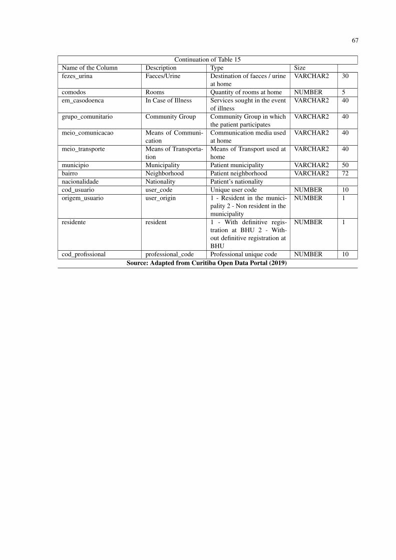
67
Continuation of Table 15Name of the Column Description Type Sizefezes_urina Faeces/Urine Destination of faeces / urine
at homeVARCHAR2 30
comodos Rooms Quantity of rooms at home NUMBER 5em_casodoenca In Case of Illness Services sought in the event
of illnessVARCHAR2 40
grupo_comunitario Community Group Community Group in whichthe patient participates
VARCHAR2 40
meio_comunicacao Means of Communi-cation
Communication media usedat home
VARCHAR2 40
meio_transporte Means of Transporta-tion
Means of Transport used athome
VARCHAR2 40
municipio Municipality Patient municipality VARCHAR2 50bairro Neighborhood Patient neighborhood VARCHAR2 72nacionalidade Nationality Patient’s nationalitycod_usuario user_code Unique user code NUMBER 10origem_usuario user_origin 1 - Resident in the munici-
pality 2 - Non resident in themunicipality
NUMBER 1
residente resident 1 - With definitive regis-tration at BHU 2 - With-out definitive registration atBHU
NUMBER 1
cod_profissional professional_code Professional unique code NUMBER 10Source: Adapted from Curitiba Open Data Portal (2019)
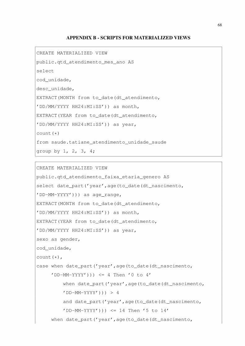
68
APPENDIX B - SCRIPTS FOR MATERIALIZED VIEWS
CREATE MATERIALIZED VIEW
public.qtd_atendimento_mes_ano AS
select
cod_unidade,
desc_unidade,
EXTRACT(MONTH from to_date(dt_atendimento,
’DD/MM/YYYY HH24:MI:SS’)) as month,
EXTRACT(YEAR from to_date(dt_atendimento,
’DD/MM/YYYY HH24:MI:SS’)) as year,
count(*)
from saude.tatiane_atendimento_unidade_saude
group by 1, 2, 3, 4;
CREATE MATERIALIZED VIEW
public.qtd_atendimento_faixa_etaria_genero AS
select date_part(’year’,age(to_date(dt_nascimento,
’DD-MM-YYYY’))) as age_range,
EXTRACT(MONTH from to_date(dt_atendimento,
’DD/MM/YYYY HH24:MI:SS’)) as month,
EXTRACT(YEAR from to_date(dt_atendimento,
’DD/MM/YYYY HH24:MI:SS’)) as year,
sexo as gender,
cod_unidade,
count(*),
case when date_part(’year’,age(to_date(dt_nascimento,
’DD-MM-YYYY’))) <= 4 Then ’0 to 4’
when date_part(’year’,age(to_date(dt_nascimento,
’DD-MM-YYYY’))) > 4
and date_part(’year’,age(to_date(dt_nascimento,
’DD-MM-YYYY’))) <= 14 Then ’5 to 14’
when date_part(’year’,age(to_date(dt_nascimento,

69
’DD-MM-YYYY’))) > 14
and date_part(’year’,age(to_date(dt_nascimento,
’DD-MM-YYYY’))) <= 24 Then ’15 to 24’
when date_part(’year’,age(to_date(dt_nascimento,
’DD-MM-YYYY’))) > 24
and date_part(’year’,age(to_date(dt_nascimento,
’DD-MM-YYYY’))) <= 34 Then ’25 to 34’
when date_part(’year’,age(to_date(dt_nascimento,
’DD-MM-YYYY’))) > 34
and date_part(’year’,age(to_date(dt_nascimento,
’DD-MM-YYYY’))) <= 44 Then ’35 to 44’
when date_part(’year’,age(to_date(dt_nascimento,
’DD-MM-YYYY’))) > 44
and date_part(’year’,age(to_date(dt_nascimento,
’DD-MM-YYYY’))) <= 54 Then ’45 to 54’
when date_part(’year’,age(to_date(dt_nascimento,
’DD-MM-YYYY’))) > 54
and date_part(’year’,age(to_date(dt_nascimento,
’DD-MM-YYYY’))) <= 64 Then ’55 to 64’
when date_part(’year’,age(to_date(dt_nascimento,
’DD-MM-YYYY’))) > 64
and date_part(’year’,age(to_date(dt_nascimento,
’DD-MM-YYYY’))) <= 74 Then ’65 to 74’
when date_part(’year’,age(to_date(dt_nascimento,
’DD-MM-YYYY’))) > 74 Then ’75+’
end
from atendimento_unidade_saude
group by 1,2,3,4,5
CREATE MATERIALIZED VIEW
public.qtd_atendimento_hora_dia_semana AS
SELECT

70
cod_unidade,
desc_unidade,
EXTRACT(HOUR from to_timestamp(dt_atendimento,
’DD/MM/YYYY HH24:MI:SS’)) as hour,
EXTRACT(DOW from to_timestamp(dt_atendimento,
’DD/MM/YYYY HH24:MI:SS’)) as day_of_week,
EXTRACT(YEAR from to_timestamp(dt_atendimento,
’DD/MM/YYYY HH24:MI:SS’)) as year,
EXTRACT(MONTH from to_date(dt_atendimento,
’DD/MM/YYYY HH24:MI:SS’)) as month,
count(*)
FROM saude.tatiane_atendimento_unidade_saude
group by 1, 2, 3, 4, 5, 6;
CREATE MATERIALIZED VIEW
public.qtd_doenca_semana_ano AS
SELECT
cod_cid,
desc_cid,
EXTRACT(YEAR from to_timestamp(dt_atendimento,
’DD/MM/YYYY HH24:MI:SS’)) as year,
EXTRACT(WEEK from to_timestamp(dt_atendimento,
’DD/MM/YYYY HH24:MI:SS’)) as Week_Number,
EXTRACT(MONTH from to_date(dt_atendimento,
’DD/MM/YYYY HH24:MI:SS’)) as month,
bairro,
count(*)
FROM saude.tatiane_atendimento_unidade_saude
group by 1, 2, 3, 4, 5,6;