Title Design in Bollywood Film Posters: A Semiotic Analysis
10
Mohammad Shahid Tel: +91-8011204720 Email: [email protected] Title Design in Bollywood Film Posters: A Semiotic Analysis Mohammad Shahid, Prasad Bokil, Udaya K. Dharmalingam Department of Design, Indian Institute of Technology Guwahati, India Abstract: Indian cinema comprises films produced across India in different languages. Bollywood, a Hindi cinema industry based in Mumbai, is the biggest entertainment industry in India. It shows a diverse and dynamic pattern of visual culture. One can experience this fluid panorama of visual culture through film posters. Over the decades, film posters have been one of the major medium for film publicity. It features images and text to create firsthand visual experience to its audience. As a key element of film poster, title design plays an important role in connoting the theme of the film. It has evolved under influence of various factors like, socio-cultural context, technology and usages. The impact of this development can be seen in terms of technique, composition, color and expressive typography. This paper aims to study and analyze the title design in Bollywood film posters using semiotics framework. Analysis is done based on its structural parameter, relationship with the theme of film, context of use and production technique. Keywords: Bollywood, Film Posters, Semiotics, Title Design 1 Introduction Indian cinema, produced across India, has cinematic culture of different states. It shows a very diverse pattern of visual culture. This could be because of its multilingual and multicultural nature. Bollywood is one of the dominating Indian film industry based in Mumbai [1]. In the history of film production in India, different mediums have been implemented for film advertisement. During early period of the cinema, the mode of publicity has been dominated by print media in the form of newspaper advertisements, handbills, lobby cards, publicity booklets, posters and hoardings. Throughout the timeline film posters have been one of the important medium for film publicity. Like other advertising material, film poster too responds to its environment. From time to time it gets influenced by different art movements and socio-cultural changes [2, 3]. Bollywood film posters also perceived as a public urban icon which offers a visual experience of changing social and emotional standards to its audience [3]. Film posters being the most significant form of publicity is a symbolic visual representation of film in two dimensions where it condenses all the value and theme of a film in a single static plane [4, 5]. It features images and text to create firsthand visual experience to its audience. Keeping the mass audience in mind, the use of textual content is very strategic. Because of the regional language problem and low literacy levels in majority of the audiences, posters show minimum textual content to cater all [3].The textual content generally includes film title, tagline, credit block, and names of leading characters. Title design plays an important role in suggesting the theme of the film. Due
Transcript of Title Design in Bollywood Film Posters: A Semiotic Analysis

Mohammad Shahid Tel: +91-8011204720 Email: [email protected]
Title Design in Bollywood Film Posters: A Semiotic Analysis
Mohammad Shahid, Prasad Bokil, Udaya K. Dharmalingam Department of Design, Indian Institute of Technology Guwahati, India
Abstract: Indian cinema comprises films produced across India in different languages. Bollywood, a Hindi cinema industry based in Mumbai, is the biggest entertainment industry in India. It shows a diverse and dynamic pattern of visual culture. One can experience this fluid panorama of visual culture through film posters. Over the decades, film posters have been one of the major medium for film publicity. It features images and text to create firsthand visual experience to its audience. As a key element of film poster, title design plays an important role in connoting the theme of the film. It has evolved under influence of various factors like, socio-cultural context, technology and usages. The impact of this development can be seen in terms of technique, composition, color and expressive typography. This paper aims to study and analyze the title design in Bollywood film posters using semiotics framework. Analysis is done based on its structural parameter, relationship with the theme of film, context of use and production technique. Keywords: Bollywood, Film Posters, Semiotics, Title Design
1 Introduction Indian cinema, produced across India, has cinematic culture of different states. It shows a very diverse pattern of visual culture. This could be because of its multilingual and multicultural nature. Bollywood is one of the dominating Indian film industry based in Mumbai [1].
In the history of film production in India, different mediums have been implemented for film advertisement. During early period of the cinema, the mode of publicity has been dominated by print media in the form of newspaper advertisements, handbills, lobby cards, publicity booklets, posters and hoardings.
Throughout the timeline film posters have been one of the important medium for film publicity. Like other advertising material, film poster too responds to its environment. From time to time it gets influenced by different art movements and socio-cultural changes [2, 3]. Bollywood film posters also perceived as a public urban icon which offers a visual experience of changing social and emotional standards to its audience [3].
Film posters being the most significant form of publicity is a symbolic visual representation of film in two dimensions where it condenses all the value and theme of a film in a single static plane [4, 5]. It features images and text to create firsthand visual experience to its audience. Keeping the mass audience in mind, the use of textual content is very strategic. Because of the regional language problem and low literacy levels in majority of the audiences, posters show minimum textual content to cater all [3].The textual content generally includes film title, tagline, credit block, and names of leading characters. Title design plays an important role in suggesting the theme of the film. Due
Shahid, Bokil, Dharmalingam
to advancement in the technology and other influential factors, title design has seen gradual changes in terms of form, style, texture, colour, composition, perspective and typeface.
Film posters in India have reflected the diversity of its audiences in terms of culture, religion, class and language. Though the films titles are mostly remains in Hindi across the timeline, one can observe the changes in film title from trilingual script i.e. Latin, Devanagari and Urdu to mainly Latin due to multiplex paradigm [2]. Also the changes in literacy rate can be observed through the changes from decorative lettering to more sophisticated and modern typography.
This paper has aimed to understand the role and development of title design in Bollywood film posters by using semiotic framework. Through this analysis the relation of title with respect to layout of the poster, letterform, film genre, treatments and poster production techniques will be discussed.
2 Methodology Human beings always try to interpret thing as per their understanding and background knowledge. We can’t take reality for granted and define it objectively. Semiotics teaches us that reality is a system of signs [6]. Studying semiotics can help us to be more aware of reality as a construction and of the roles played by everyone in constructing it.
Semiotics is a study of signs and according to Saussurean model; the sign is the whole that results from the association of signifier and the signified. This relationship is called as 'signification' and the value confirmed by a sign depends on its relationship with other sign within the system [6]. The meaning making and persuasion of Bollywood films posters depends on relationship generated by different components of the film posters. Titles design in these posters are analysed separately by syntactic, semantic and pragmatic approach.
For this study 129 posters have been selected based on the popularity of the film at the box office during each decade from 1940s to 2000s. This study covers the analysis of title design considering letterforms, title composition, external typo elements and poster layout. As shown in Table 1 different variables like style (normal / bold / italic), stroke, texture, outline, shadow, perspective and colour are proposed for the analysis of letterform structure across the decades.
Syntactics is a study of relationship among signs in formal structure. It is useful to understand structural relationship among the parts of sign. This section utilizes the syntactic principle to see the relationship of title design with respect to poster layout, letterform structure and kind of treatment.
Semantics is a study of meaning created by signs in a system, where they interact with others signs. This approach has been used to analyze title design to see how effective is the film title in overall meaning in relationship with film story and genre wise type classification.
ICoRD ’15
Pragmatics is study of relationship between signs and sign-using agents. Here context contributes to the meaning and interpretation of particular design. This approach helps to see the effect of poster productions technique, display positions, and display technology on title design in films posters.
3 Syntactic analysis
Poster layout, letterform structure and decorative elements play a key role in the overall title design and its expressiveness. In this section title design is examined based on its structural parameters like layout and typography.
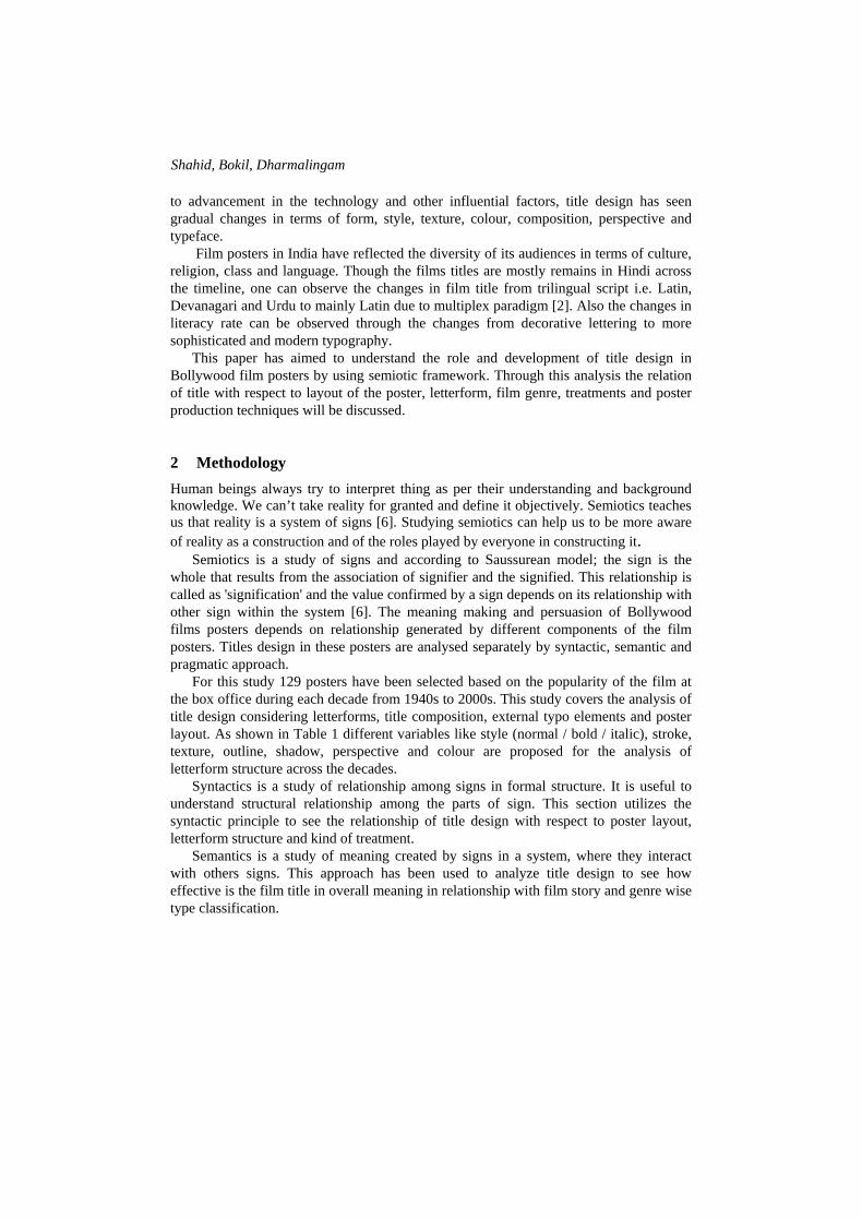
3.1 Poster layout Title has occupied different positions in poster layout. Figure 1 shows three possible
position of title in film posters. Out of 129 posters taken for analysis, 61% shows title at bottom whereas 28% at top and 11% in the middle. Positioning of title was also influenced by the visual hierarchy principles. In maximum cases central characters has been considered as a primary element of the poster [2, 7]. This put title at secondary position in term of importance. So in most of the cases central space is occupied by the leading character’s visuals whereas title comes next to it. When it comes in centre of the poster, in 73% cases it is horizontal whereas 17% shows diagonal orientation.
Figure 1 Title position with respect to poster layout Source: Posters [2, 9]
3.2 Letterform
In a title design, individual letters act as a building block where its structure and style contribute a lot in suggesting the film’s theme. The denotation of individual letters is a straightforward task. Anyone who knows the written language can read and understand the literal meaning of the title but the constructive meaning can only be generated through the understanding of message hidden somewhere in the style and structure of the individual fonts [8]. When we analyses individual letters across the title, it gives an interesting statistics. Approx 63% posters shows title in uppercase whereas 23% in title case, 3% in lowercase and 11% with mix lettering.

Shahid, Bokil, Dharmalingam
Various parameters of letterforms and the values acquired by them over the period of 70 years are tabulated in table 1. Different rends and shifts can be noticed in these tabulated variables. At the beginning of the studio era very little experimentation has been done in terms of texture and colour of lettering. Most of the alphabets are plain and monocoloured, basically bright colours like yellow, green and red has been used. Film distributors always try to make posters for the masses so that it could ensure a sufficient return on investment in film production. As obvious, poster artists have used bright colour and glossiness effect to attract the viewer [7]. Darker tone has been used for outline and shadow purpose. Most of the cases letters are decorated with shadow or outline to create more emphasis. The perspective look dominates in the film produced during 1950-1980.
Table 1 Prominent trends in letterform structure across timeline
Number Variables
1940s 1950s 1960s 1970s 1980s 1990s 2000s
16 18 18 19 18 20 20
Style Bold Sans-serif
Bold mixed Bold Serif
Bold Mixed
Bold Mixed
Bold Serif
Bold Mixed
Strokes Thick Monolinear
Thick Monolinear
Thick Low contrast
Thick Low contrast
Thick Low contrast
Thick Low contrast
Thick Low contrast
Texture No No No No Yes Yes Yes
Outline Yes Yes No Yes Yes Yes No
Shadow No Yes No Yes Yes Yes No
Perspective No No No Yes Yes Mixed No
Colour Black, Red, Yellow, White
Black, Red, Yellow, White
Black, Red, Yellow, Blue White
Black, Red, Yellow, Blue Green White
Black, Red, Yellow, Blue White
Black, Red, Yellow, Blue White
Black, Red, Yellow, Green White
Title design shows variation in individual fonts in term of stroke thickness, size, and
counter spaces up to 1970s. One strong reason behind this trend could be the poster making technique. Section 5.1 has covered the poster making technique and its effect on characteristics of letterform. Use of texture, colour and manipulation of letterform enables the title to convey the meaning more effectively.

ICoRD ’15
3.3 Use of decorative elements Posters are made to attract the viewer at first sight [4]. They are also competing with the other visuals across the city wall to draw attention [2]. This competitive streetscape culture leads designer to give some ornamentation to title so that it can stand out of the poster. Titles in 96% posters show the use of decorative elements to make it more prominent and appealing. Out of 124, 89 (72%) titles show decoration in terms of outline and shadow whereas 35 (28%) titles show decoration by manipulating text and image as shown in figure 2. Films like Anand (1970), Aradhana (1969), Upkar (1967),Ghulami (1985), Dilwale Dulhania Le Jayenge (1995) are some example in second category. Contrast colours are prominent in title design throughout the timeline.
Figure 2 Decorative elements used in letterform design
4 Semantic analysis Semantics is a study of meaning. It deals with the generation of meaning from any sign. This section enquires the relationship of title to the theme or story of the film.
4.1 Title design based on meaning of title Title design in posters in the early period of Bollywood cinema shows very minimal variations in letterforms irrespective of the meaning of the title. Letters have been designed randomly like in Bandhan (1940), Ram Rajya (1943) or Anmol Ghadi (1946) showing individual artistic skill and style. Some of the exceptions from this era were Barassat (1949), Aan (1952), jewel Thief (1967) and Aradhana (1969). Figure 3 shows the title Barasaat in which artist has used rain strokes to give the feeling of rain whereas in Aan poster letterform is in bold, 3D perspective placed in the background in such a way that it reflects the meaning of ‘Aan’ or pride. But this kind of exploration was rare till 1960s where only 13% title designs show relationship with the meaning of the title.
Figure 3 Letterform design reflecting the theme of the film

Shahid, Bokil, Dharmalingam
Beginning of 1970s saw a dramatic increase in the use of expressive typography in the title design. As shown in Figure 4, poster of films like Mera Nam Joker (1970), Bobby (1973), Andhi (1975), Sholay (1975), and Shatranj Ke Khiladi (1977) are some example of this trend. In title Gadar, the letter has been designed in such a way that it reflects the literal meaning of the title whereas in Mera Naam Joker the form of letters has been designed to give a sense of comical and jovial mood. It is interesting to see the letterform in the title Shatranj Ke Khiladi where each later is designed to look like 'Mohra' (64 square pieces in chess), exactly relating with the chess game. In similar way the fluffy form and colour of letters in Bobby, flowing strokes of letters in Aandhi, and flame colour with cracks in Sholay reflect the meaning of the title in first sight.
Figure 4 Film titles where letterforms directly relate with the meaning of the title.
This trend continued during 1980s and 1990s with some prominent example like Disco Dancer (1982), Coolie (1983), Rzia Sultan (1983), Ghulami (1985), Tezaab (1988), Agneepath (1990), 1942 a Love Story (1994), Rangeela (1995) and Satya (1998). Like in Razia Sultan, the title and letterform are made in such a way that it looks like a fort in the background. This goes well with the heroic nature of Razia Sultan and reflects her power in the poster.
By the end of 1990s and beginning of 2000s design studios were taken hold of poster making in the Bollywood film industry. Advancement in technology and availability of different medium gave more opportunities in designing film’s titles. Designers cleverly exploited text-image relationship to make title more attractive and meaningful. When it comes to the whole title composition and its meaning, in most of the cases it succeed in conveying the gist of the film. Looking at the poster of first full length Indian film Raja Harishchandra (1913), by Dadasaheb Phalke, the title itself is giving a sense that the film is all about the legend Raja Harishchandra, a story from Indian epic.
4.2 Title design based on film story It is difficult to relate the letterform with the meaning of the story. Very few movies title has been designed according to the meaning of the story. To reflect the story, exploration was done mainly with letterform structure and colour. Khiladi (1992) is one example where letter ‘A’ is replaced by human figure holding gun in hand to reflect the action in the film irrespective of the literal meaning of the title which is player.

ICoRD ’15
Most of the Indian films are melodramatic with full of emotions, drama, action and more. This makes difficult for an artist to design a film poster which can represent all parameters of the film [2]. So in most of the cases the letterforms depict only a part of the total theme of the film. As shown in Figure 5, letterforms in the title of Disco Dancer (1982) reflect the theme of the film which is musical and romance. The use of led bulb to create type gives a sense that this is a film revolved around a disco dancer but this is one part of the film. The other part is action, revenge, and family drama.
Figure 5 Letterform going with central theme of the film
4.3 Title design with external semantic elements Film posters are meant to invite the viewer to watch the film. Thus it is important that posters should show the highlights of the film into prominence [2]. Till 1960s Bollywood film poster were less explored in terms of use of external typo elements. In most of the cases title designs were plain and variations were limited to orientation, texture and forms of the letters and in some cases with perspective style. From mid 1970s, designers started using some external typo elements or “image as a type" for title design. A symbolic language was developed to communicate with illiterate people [2]. Zanjeer (1973) in Figure 6 is one of the examples which shows use of shackles around letter ‘Z’ to signify sense of tying.
Figure 6 Use of external typo elements in title design
This style comes randomly in many posters throughout the timeline. Images were interestingly used as a type in many movie like Teesari Manzil, Mera Naam Joker, Khiladi, Zanjeer, Coolie, Ghulami, Dilwale Dulhania Le Jayenge, Border, LOC, Iqbal, Raja Hindustani, Rab Ne Bana Di Jodi and many more. This introduction of images as a type plays an important role in making posters more persuasive and powerful in terms of conveying message of the film.

Shahid, Bokil, Dharmalingam
4.4 Letterforms with respect to genre of the film
Having the melodramatic nature, it is hard to categories most of the Bollywood films in to a specific genre. The basic genres in which most of the films fall under are social, romantic, comedy, action and thriller. The industry started with film based on epic story like Raja Harishchandra (1913), Alam Ara (1931) and later dominated by romantic and action films. The "Golden period" of Hindi cinema (1940s to 1960s) gives some of the most critically acclaimed films of all time featuring the social themes mainly dealing with working class urban life in India. Films like Awaara (1951), Naya Daur (1957), Shree 420 (1955), Pyaasa (1957) and Mother India (1957) are few of them. The print technology was limited and result of it, the main emphasis was given to keep titles plain and simple. Some exceptions like Mugha-e-Azam, where artist has used 3D perspective and shadow to create an illusion of fort suggesting a historical genre.
In the 1970s India was going through social and economical changes and this influenced the Bollywood film making significantly [10]. Industry came up with more of action and violent films in terms of commercial cinema. Films like Sholay (1975), Deewar (1975) and Muquaddar Ka Sikandar (1978) is prominent examples of this cinema. In most of the cases letterforms have followed similar pattern, like use of outline, 3D perspective and shadow to create emphasis irrespective of genre of the film. Action films which established the trend of using 3D style decorated with shadow and outline gel well with the film genre. This type of lettering dominated up to 1980s and became a trend throughout the decades independent of film genre.
5 Pragmatic analysis
This section enquires about the title design in relation with the context. It enquires how designing of the title in film poster has been influenced by the techniques of poster productions, display positions or platform, and technology.
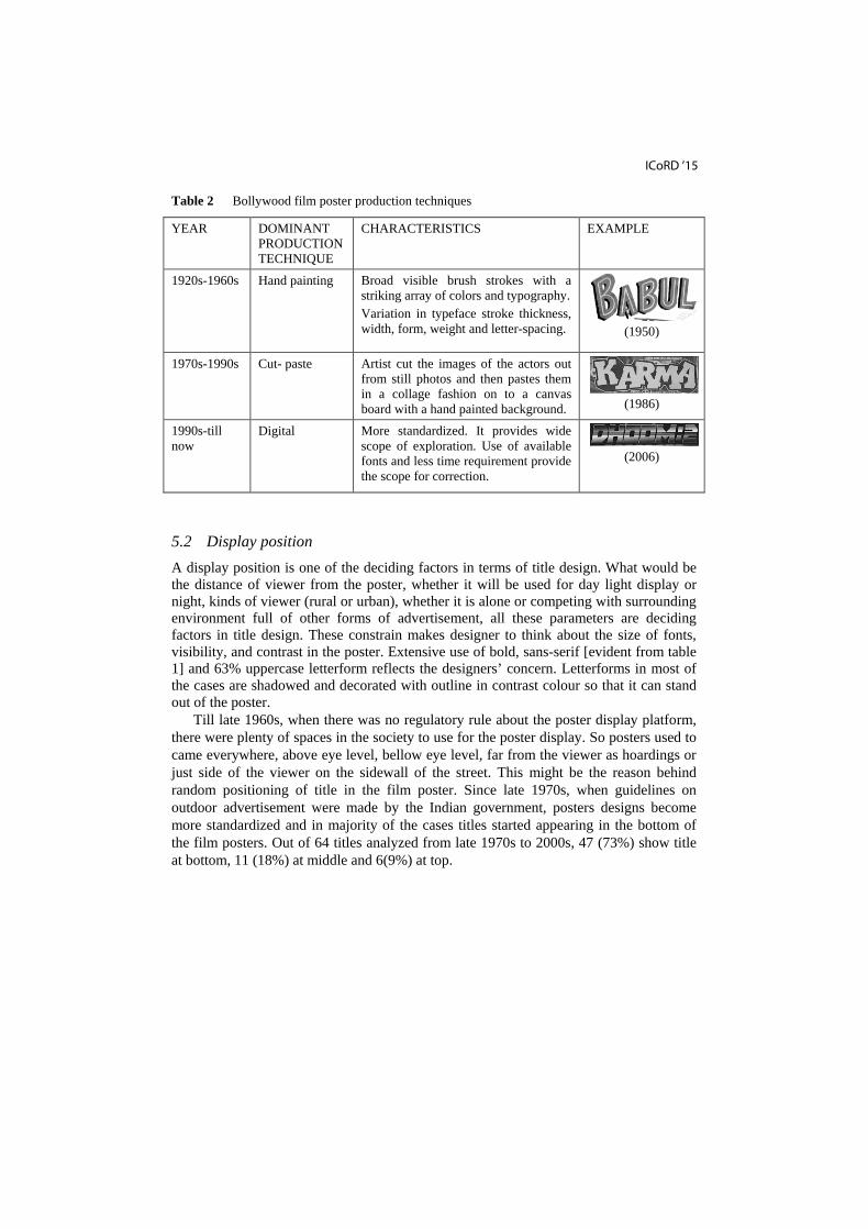
5.1 Poster making techniques In the beginning of Bollywood film industry, only hand painting was in use for making posters and lithography was the only technology for mass production. These limitations in a way restricted the possibilities in terms of font exploration, whereas in other way gave freedom to poster artist to use their style and imagination. Because different hands were involved, no specific pattern has been followed till 1970s. Cut-paste technique was introduced in early 1970s which has been overcome by computer in 1990s. Table 2 summarizes the dominating poster making technique and their characteristics with an example.
ICoRD ’15
Table 2 Bollywood film poster production techniques
YEAR DOMINANT PRODUCTION TECHNIQUE
CHARACTERISTICS EXAMPLE
1920s-1960s Hand painting Broad visible brush strokes with a striking array of colors and typography. Variation in typeface stroke thickness, width, form, weight and letter-spacing.
(1950)
1970s-1990s Cut- paste Artist cut the images of the actors out from still photos and then pastes them in a collage fashion on to a canvas board with a hand painted background.
(1986)
1990s-till now
Digital More standardized. It provides wide scope of exploration. Use of available fonts and less time requirement provide the scope for correction.
(2006)
5.2 Display position A display position is one of the deciding factors in terms of title design. What would be the distance of viewer from the poster, whether it will be used for day light display or night, kinds of viewer (rural or urban), whether it is alone or competing with surrounding environment full of other forms of advertisement, all these parameters are deciding factors in title design. These constrain makes designer to think about the size of fonts, visibility, and contrast in the poster. Extensive use of bold, sans-serif [evident from table 1] and 63% uppercase letterform reflects the designers’ concern. Letterforms in most of the cases are shadowed and decorated with outline in contrast colour so that it can stand out of the poster.
Till late 1960s, when there was no regulatory rule about the poster display platform, there were plenty of spaces in the society to use for the poster display. So posters used to came everywhere, above eye level, bellow eye level, far from the viewer as hoardings or just side of the viewer on the sidewall of the street. This might be the reason behind random positioning of title in the film poster. Since late 1970s, when guidelines on outdoor advertisement were made by the Indian government, posters designs become more standardized and in majority of the cases titles started appearing in the bottom of the film posters. Out of 64 titles analyzed from late 1970s to 2000s, 47 (73%) show title at bottom, 11 (18%) at middle and 6(9%) at top.

Shahid, Bokil, Dharmalingam
6 Conclusion This study deals with title design in the context of Bollywood film posters. Findings reveal that variation in the structural elements in title design has lot of syntactic, semantic and pragmatic influences. Syntactic influences in structural variations include stroke thickness, weight, texture, colour and letter-spacing. In most of the cases (96%), titles are decorated with outline and shadow to create more emphasis. Semantic influence has been adapted by the use of decoration and external semantic elements. A symbolic meaning has been created by manipulating letters and use of colour. It evolved gradually and usage of external typo elements became evident in the later period as out of 35 titles showing image-text manipulation, 31 (89%) are from 1960s onwards. External typo elements like use of Coolie badges in the place of letter ‘O’ in film Coolie (1983,) enhances this ability by making it simpler for common viewer to read and understand the hidden meaning behind the title. Expressive typography maximizes persuading ability of film poster. There are also pragmatics aspects involved in the title design variation like positioning of title in the film poster and context of usage. Advancement of technology has its effect on the title characteristics across the timeline.
The sample size used for this study is not statistically significant to generalize any arguments. But it definitely provides enough qualitative insights to predict few trends and various causes responsible for those trends. For future study it will be interesting to regenerate these patterns by considering more number of posters from each decade. Future study can also explore the relationship of film title with other elements in the film poster.
References 1 Matusitz, J., & Payano, P., “Globalisation of Popular Culture: From Hollywood To
Bollywood”, South Asia Research , 32, 123-138, 2012. 2 Pinto, J., & Sippy, S., “ Bollywood Posters”, New York: Thames & Hudson, 2008. 3 Haggards, S., “Mass Media and the Visual Arts in Twentieth-Century South Asia: indian
Film Posters 1947-Present”, South Asia Research , 71, 1988. 4 Mazumdar, R., “ The Bombay Film poster”, Seminar (525), 33-41, 2003. 5 Uberoi, P., “ The pain of love and the love of pain”, In D. Blamey, & R. D'souza (Eds.),
Living Picture: perspective on film poster in India (pp. 79-88), London: Open Editions, 2005.
6 Chandler, D., “ Semiotics the Basics”, Oxon: Routledge, 2002. 7 Pinney, C., “Notes on the Epidemiology of Allure”, In D. Blamey, & R. D'souza (Eds.),
Living Picture (pp. 45-54), London, 2005. 8 Leeuwen, T. V., “Semiotics and Iconography”, In T. V. Jewitt. Sage Publications, 2001. 9 Ausaja, S M M., “ Bollywood in Posters”, Om Books International, 2009. 10 Kothari, S., “ Prasar Bharati.” http://newsonair.nic.in. http://newsonair.nic.in/100-
YEARS-OF-INDIAN-CINEMA.asp (accessed April 1, 2014).