The whole is “other” than the sum of its parts - DiVA-Portal
30
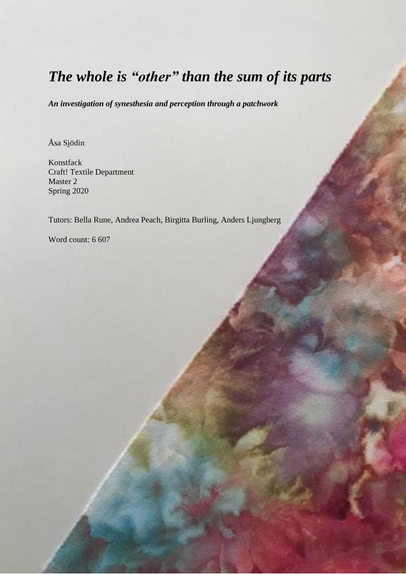
The whole is “other” than the sum of its parts An investigation of synesthesia and perception through a patchwork Åsa Sjödin Konstfack Craft! Textile Department Master 2 Spring 2020 Tutors: Bella Rune, Andrea Peach, Birgitta Burling, Anders Ljungberg Word count: 6 607
-
Upload
khangminh22 -
Category
Documents
-
view
2 -
download
0
Transcript of The whole is “other” than the sum of its parts - DiVA-Portal
The whole is “other” than the sum of its parts
An investigation of synesthesia and perception through a patchwork
Åsa Sjödin
Konstfack
Craft! Textile Department
Master 2
Spring 2020
Tutors: Bella Rune, Andrea Peach, Birgitta Burling, Anders Ljungberg
Word count: 6 607

ABSTRACT
Some people experience music as colourful patterns or feel it as a physical touch, they have
synesthesia. A neurological condition in which a stimulus of one sense automatically and
involuntarily triggers a sensation in another sense. This shows that perception is not normative.
The aim of this work is to try to develop an understanding of this phenomenon by using textile
dyeing and patchwork as a tool for my investigation of it. Another aim is to raise awareness and
try to see if it is possible for a non synesthete to experience something similar to the complex
intersensory connections as those with synesthesia have. The sum of all perceptions of a human,
after it has been processed by their own mind, can result in something that is not just the sum
of each individual perception, but something that can at the end be quite different from what
might be expected. This motivated the title, and furthermore leads naturally into the Gestalt
theory of perception, which is used as the major theoretical framework for this paper.
Keywords: craft, patchwork, textile dyeing, perception, synesthesia, Gestalt theory
Contents 1. Introduction and background ............................................................................................................. 5
1.1 Research question ........................................................................................................................ 6
1.2 My inspiration and intention ........................................................................................................ 6
1.3 Overview of the paper .................................................................................................................. 8
2. Theory and context ............................................................................................................................ 8
2.1 Synesthesia ................................................................................................................................... 8
2.1.1 Synesthesia and art ............................................................................................................... 9
2.2 Gestalt theory ............................................................................................................................. 10
2.3 Brief context of patchworks and quilts ....................................................................................... 11
2.4 Artistic references ...................................................................................................................... 12
3. Methods ........................................................................................................................................... 15
3.1 Establishing rules… ..................................................................................................................... 15
3.2 … and breaking rules .................................................................................................................. 16
3.3 Playing with colours.................................................................................................................... 16
3.4 Principles of Gestalt .................................................................................................................... 16
3.5 Grounded in science ................................................................................................................... 17
4. Discussion ......................................................................................................................................... 18
4.1 Project Liberation ....................................................................................................................... 18
4.2 Who rules who? ......................................................................................................................... 18
4.3 It’s all about the grid .................................................................................................................. 20
4.4 Combining the separate ............................................................................................................. 21
4.5 Presentation ............................................................................................................................... 24
5. Conclusion ........................................................................................................................................ 24
Bibliography ......................................................................................................................................... 25
Webbsites ........................................................................................................................................ 25
Exhibition ......................................................................................................................................... 26
Image References ............................................................................................................................. 26
Appendices .............................................................................................................................................. i
5
1. Introduction and background I might be naive but have always assumed that what I see is what everybody else sees and that
there is only one way to perceive the world with our senses – my way. Of course, with the
exception for those who may be blind, colour-blind, deaf or have a defected sense somehow.
However, I recently became aware of that this is not the case. It turned out that my oldest
daughter has a neurological condition called synesthesia which allows her to experience several
senses at once. In her case she sees music as colours, the alphabet in different hues of red and
each number as a specific colour. I find it very fascinating that for almost 15 years we have
been sharing many experiences but perceived them in different ways. “What synesthesia shows
is that not everyone sees the world as you do”, is a quote from the book Synesthesia by the
American neurologist Richard E. Cytowic which I was very surprised to learn.1 This is
something I want to know more about, not only how my daughter perceives things, but how
differently we all perceive things especially regarding synesthesia. Perception is not normative!
It has been said: The whole is more than the sum of its parts. It is more correct to say that the whole is
something else than the sum of its parts, because summing up is a meaningless procedure, whereas the
whole-part relationship is meaningful.2
These are the words of Kurt Koffka, who alongside with Max Wertheimer and Wolfgang
Köhler in the early 20th century founded Gestalt theory. At that time the dominant theory was
the structuralism who looked at perception “from below up” and claimed that you could
understand complex perceptions by breaking them into atomic parts of experience.3 In contrast
to the structuralism, Gestalt theory mean that perception is a process “from above downward”,
from the whole to the parts, where we perceive entire patterns or configurations rather than
individual elements.
Since there are more than 80 known types of different synesthetic variations, I limit my
discussion to the ones that involve colours since that is my primary interest and can be related
to my textile dyeing.
1 Richard E. Cytowic, Synesthesia, 2018, p. 29. 2 Kurt Koffka, Principles Of Gestalt Psychology, 1935, p. 176. 3 D. Brett King, & Michael Wertheimer, Max Wertheimer and Gestalt theory, Transaction Publisher, New Brunswick, NJ, 2004, p. 154.
6
1.1 Research question In my paper I will discuss the phenomenon of synesthesia. Can I fully understand what it is like
to have this condition and can I incorporate and work with it in an artistic way in the field of
textile craft in order to raise awareness of it? Hence my research question is:
How can I, as a non synesthete, understand and work with the phenomenon of synesthesia
through textile craft?
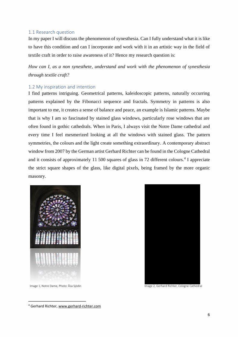
1.2 My inspiration and intention I find patterns intriguing. Geometrical patterns, kaleidoscopic patterns, naturally occurring
patterns explained by the Fibonacci sequence and fractals. Symmetry in patterns is also
important to me, it creates a sense of balance and peace, an example is Islamic patterns. Maybe
that is why I am so fascinated by stained glass windows, particularly rose windows that are
often found in gothic cathedrals. When in Paris, I always visit the Notre Dame cathedral and
every time I feel mesmerized looking at all the windows with stained glass. The pattern
symmetries, the colours and the light create something extraordinary. A contemporary abstract
window from 2007 by the German artist Gerhard Richter can be found in the Cologne Cathedral
and it consists of approximately 11 500 squares of glass in 72 different colours.4 I appreciate
the strict square shapes of the glass, like digital pixels, being framed by the more organic
masonry.
Image 1, Notre Dame, Photo: Åsa Sjödin Image 2, Gerhard Richter, Cologne Cathedral
4 Gerhard Richter, www.gerhard-richter.com
7
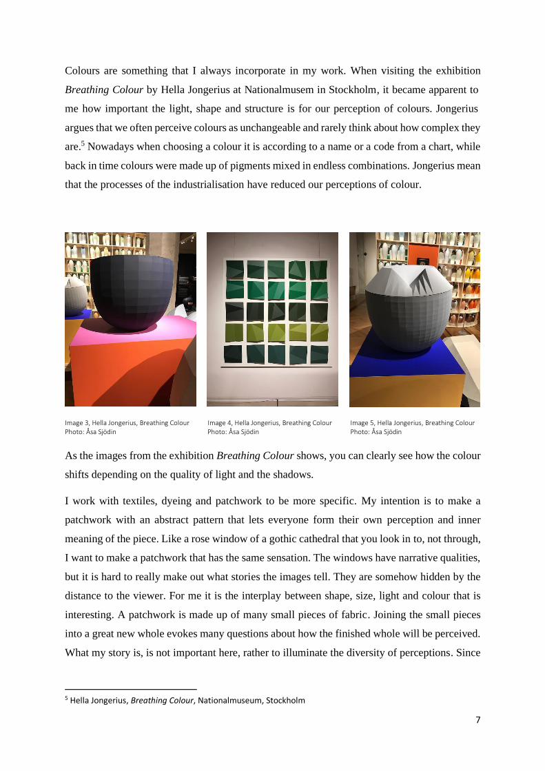
Colours are something that I always incorporate in my work. When visiting the exhibition
Breathing Colour by Hella Jongerius at Nationalmusem in Stockholm, it became apparent to
me how important the light, shape and structure is for our perception of colours. Jongerius
argues that we often perceive colours as unchangeable and rarely think about how complex they
are.5 Nowadays when choosing a colour it is according to a name or a code from a chart, while
back in time colours were made up of pigments mixed in endless combinations. Jongerius mean
that the processes of the industrialisation have reduced our perceptions of colour.
Image 3, Hella Jongerius, Breathing Colour Image 4, Hella Jongerius, Breathing Colour Image 5, Hella Jongerius, Breathing Colour Photo: Åsa Sjödin Photo: Åsa Sjödin Photo: Åsa Sjödin
As the images from the exhibition Breathing Colour shows, you can clearly see how the colour
shifts depending on the quality of light and the shadows.
I work with textiles, dyeing and patchwork to be more specific. My intention is to make a
patchwork with an abstract pattern that lets everyone form their own perception and inner
meaning of the piece. Like a rose window of a gothic cathedral that you look in to, not through,
I want to make a patchwork that has the same sensation. The windows have narrative qualities,
but it is hard to really make out what stories the images tell. They are somehow hidden by the
distance to the viewer. For me it is the interplay between shape, size, light and colour that is
interesting. A patchwork is made up of many small pieces of fabric. Joining the small pieces
into a great new whole evokes many questions about how the finished whole will be perceived.
What my story is, is not important here, rather to illuminate the diversity of perceptions. Since
5 Hella Jongerius, Breathing Colour, Nationalmuseum, Stockholm
8
synesthesia is a condition not visible to others it can be stigmatized to talk about and met by
disbelief. My hope is that this will make people more aware of it.
1.3 Overview of the paper In the second chapter I will look upon theory and context as well as other artistic references that
has been of importance to my work. Theories that will be addressed are synesthesia and Gestalt
theory. In the third chapter I will discuss my methods for this project. The fourth chapter
contains my discussion followed by a conclusion in chapter five. Then there is a bibliography
and a list of image references. Finally, the paper ends with an appendix.
2. Theory and context In this chapter a review of the subjects synesthesia and Gestalt theory will be addressed. These
are the main theories I will support my work upon. Then a brief look at patchwork and quilts
will be done in order to contextualise myself. I will also look at other artists that has been of
significance for me.
2.1 Synesthesia The word synesthesia derives from the words syn (meaning together) and esthesia (meaning
perceive), in other words perceive together.6 So, what is it? Well it is not a disease nor a
disability. By researchers it is often called a “condition” in lack of a more appropriate word.7 It
is a neurological phenomenon in which a stimulus of one sense automatically and involuntarily
triggers a sensation in another sense.8 This is how people with synesthesia, for example, can
hear music and at the same time sense the sound as a pattern or swirls of colours, this type is
called chromesthesia. Since any combination of the senses is possible in synesthesia, over 80
different variations has been reported and it can be triggered by things not only strictly sensory,
like numbers, letters and names.9 According to the Synesthesia research group at the University
of Sussex it is hard to say how many people of the general population that have this condition.
Different studies have been conducted with different outcomes. In one study 4,4% of the
participants were synesthetes, however not all forms were identified in this particular study and
the number would likely be higher if other forms of synesthesia had been considered.10. Recent
6 Campen, Cretien van, The hidden sense: synesthesia in art and science, MIT Press, Cambridge, Mass., 2008, p. 1. 7 Synaesthesia Toolkit MULTISENSE, www.syntoolkit.org 8 Campen, 2008, p. 1. 9 Synaesthesia Toolkit MULTISENSE, www.syntoolkit.org 10 University of Sussex, www.sussex.ac.uk/synaesthesia
9
studies show that about 20% of the population experience days, months, alphabet and numbers
in a spatial form and the most common form including one of our traditional senses is the one
where you experience days and months in colours. Another type of synesthesia is grapheme-
colour where numbers and letters generate specific colours and sometimes even colourful
patterns. It is believed that we are all born with synesthetic abilities which are cut back during
our first years of life, only those intersensory connections that are useful for the child will
survive.11 The Dutch author and researcher Cretien van Campen calls synesthesia “the hidden
sense” in his book with that same title, maybe that is what it really should be referred as. Van
Campen also argues that many people could learn to be aware of their synesthetic potential.
The brain is flexible and has the ability to develop meaningful multisensory connections, though
it requires an active search for it.
To sum it up I will once again quote Richard E. Cytowic. “A synesthete, as we call these
otherwise-normal individuals, might not only hear my voice but also see it, taste it, or feel it as
a physical touch.”.12
2.1.1 Synesthesia and art
It seems like creativity and synesthesia are closely related, especially for those who visualize
music. It is suggested that the motivation to create art comes from the beauty of the experiences,
not that synesthesia is equal to artistic talent.13 In the article Synesthesia and the artistic process
Carol Steen and Greta Berman writes about synesthetic artwork and why it, to the observer,
looks abstract even though it is the reality of the artists perception.14 It seems like the visions
synesthetes experience, by scientists called photisms, typically are of an abstract character
rather than realistic and concrete. There can also be an element of movement in the photisms.
Shapes can for example rotate, morph, radiate, kaleidoscope, spiral and reduplicate and at the
same time magnify, permutate, repeat, dart quickly and change colours.15 And as quickly as the
shapes can appear, they can disappear and be replaced by others. This movement is a reason
why layering is common in synesthetic paintings. Another significance for synesthetic art is the
use of colours which are fresh and can be extraordinarily bright, like “sunlight streaming
through a stained glass window”.16 Unexpected colours and combinations of colours are also
11 Campen, 2008, p. 160. 12 Cytowic, 2018, p. 2. 13 Steen, Carol & Berman, Greta, ”Synesthesia and the Artistic Process” in Simner, Julie & Hubbard, Edward M. (red.), Oxford handbook of synesthesia, Oxford University Press, Oxford, 2013, p. 673. 14 Steen & Berman, 2013, p. 678. 15 Steen & Berman, 2013, p. 677. 16 Steen & Berman, 2013, p. 680.
10
commonly seen. Scientists mean that synesthesia could be a creative tool to explore the human
consciousness because “synesthesia shows new gestalts in the stream of consciousness”.17 Van
Campen describes a way to demonstrate how this could be done by looking at an abstract
painting for the first time. You look at it without any forgone conclusions of what you are about
to see, and you will start to form your own meaning of the piece. This is an automatic act of
perception and a basis for our imagination, van Campen refers to it as “taking a second look”
or “looking at things from a different angle”.
Artists like Wassily Kandinsky and Joan Mitchell were synaesthetes and it is believed that
Vincent van Gogh and August Strindberg also were, however not verified.18
2.2 Gestalt theory I choose the Gestalt theory as a theoretical framework for my work because its ideas are very
relevant and influential according to Cretien van Campen, for contemporary researchers of
synesthesia.19 The reason for this is because synaesthetes tend to visually recognise patterns
more quickly and easily than non-synesthetes.20 The Gestalt theory will also be influential to
my method, but I will get back to that later. Let us first look at the theory.
In the book The hidden sense: synesthesia in art and science, van Campen talks about the nature
of human perception and how we, in order to understand our world, seek out patterns in our
environment.21 In the complex visual world, our mind tries to find the simplest solution to a
problem by grouping items that share some common characteristics. The patterns we perceive
and base our understanding on are a result of our ability to choose the “right” details. We are
exposed to, or presented with, a great amount of sensory impressions and it would be
overwhelming if we did not have a way to select the essentials. A group of psychologists
“recognizing that perception is driven by this need to find order” (in other words, a human
perceiver is an active pattern-seeking person) in contrast to the belief that the human perceiver
was a passive organ compared with a camera in the sense of registering rays of light. Max
Wertheimer, Kurt Koffka and Wolfgang Köhler formed in the early 1900s the theory known as
Gestalt. The word Gestalt is German and can be translated into English as shape, form,
configuration or whole.22
17 Campen, 2008, p. 87. 18 Steen & Berman, 2013, p. 690. 19 Campen, 2008, p. 76. 20 Campen, 2008, p. 78. 21 Campen, 2008, p. 76. 22 Hann M. A. & Moxon, I. S., Patterns: design and composition, Routledge, New York, 2019, p. 66.
11
…human perceivers are searchers for meaning and actively reorganize their impressions until they discover
meaningful figures or objects. In fact, human perception is a creative faculty that tries to understand the
person’s environment by ordering and reordering, looking for meaningful gestalts. This is quite an
automatic act, only partly influenced by the human will.23
So, instead of recognising collections of disconnected shapes, points and lines our brains
operate holistically, and we perceive separate parts as well-organized wholes.24 And this is what
the principles of Gestalt helps us to understand. The principles, sometimes referred to as laws,
will be further discussed in the next chapter that deals with methods.
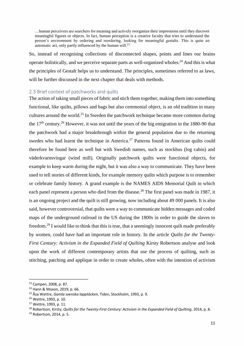
2.3 Brief context of patchworks and quilts The action of taking small pieces of fabric and stich them together, making them into something
functional, like quilts, pillows and bags but also ceremonial object, is an old tradition in many
cultures around the world.25 In Sweden the patchwork technique became more common during
the 17th century.26 However, it was not until the years of the big emigration in the 1880-90 that
the patchwork had a major breakthrough within the general population due to the returning
swedes who had learnt the technique in America.27 Patterns found in American quilts could
therefore be found here as well but with Swedish names, such as stockhus (log cabin) and
väderkvarnsvingar (wind mill). Originally patchwork quilts were functional objects, for
example to keep warm during the night, but it was also a way to communicate. They have been
used to tell stories of different kinds, for example memory quilts which purpose is to remember
or celebrate family history. A grand example is the NAMES AIDS Memorial Quilt in which
each panel represent a person who died from the disease.28 The first panel was made in 1987, it
is an ongoing project and the quilt is still growing, now including about 49 000 panels. It is also
said, however controversial, that quilts were a way to communicate hidden messages and coded
maps of the underground railroad in the US during the 1800s in order to guide the slaves to
freedom.29 I would like to think that this is true, that a seemingly innocent quilt made preferably
by women, could have had an important role in history. In the article Quilts for the Twenty-
First Century: Activism in the Expanded Field of Quilting Kirsty Robertson analyse and look
upon the work of different contemporary artists that use the process of quilting, such as
stitching, patching and applique in order to create wholes, often with the intention of activism
23 Campen, 2008, p. 87. 24 Hann & Moxon, 2019, p. 66. 25 Åsa Wettre, Gamla svenska lapptäcken, Tiden, Stockholm, 1993, p. 9. 26 Wettre, 1993, p. 10. 27 Wettre, 1993, p. 11. 28 Robertson, Kirsty, Quilts for the Twenty-First Century: Activism in the Expanded Field of Quilting, 2014, p. 8. 29 Robertson, 2014, p. 5.
12
or being political.30 She means that the patching and piecing is a way to gather information, “an
act of investigation”.
If crazy quilt for the twenty-first century is a deconstructed entity, a twenty-first century patchwork quilt
might be the opposite – an aggregate of elements built up into a recognizable whole. There is patchwork
here, but it is a working together of information and a search for answers rather than a suturing together of
cloth.31
I have no intention to make a functional object, rather to use the patchwork technique as a tool
for my investigation, as Robertson describes in the quote above the modern application of the
traditional craft.
Image 6, NAMES Aids Memorial Quilt
2.4 Artistic references To contextualise my work, I begin to look upon other artists that has been of importance for the
development of my project. The thing they all have in common is the abstract expression of
their work.
30 Robertson, 2014, pp. 1-2. 31 Robertson, 2014, p. 15.
13
The artist Fahrelnissa Zeid (1901-1991) and her abstract paintings with kaleidoscopic patterns
is a great inspiration to me. In Tate Modern’s catalogue for the retrospective exhibition
Fahrelnissa Zeid, which opened in London 2017, the following can be read:
The influences of nature, patterns from Islamic architecture, Byzantine mosaics and the formal qualities of
stained-glass windows with their heavy leaded lines and iridescent coloured panels can all be discerned.
Seen from a distance, these elements appear to spin, collide, fragment, repeat and ripple out from numerous
centres in ways that are absorbing and mystifying.32
I think it is the perfect description of her work and it captures the very essence of what fascinates
me.
Image 7, Fahrelnissa Zeid, My Hell, 1951
I can only imagine what it would feel like to stand in front of such a painting. I can’t wait for
an opportunity to see Zeid’s art in real life. For my current work it is the large pieces that I find
intriguing and my inspiration for going big. I think the size in my case can add an extra
dimension to the experience of it.
I also find the American artist Melissa McCracken (1990) interesting; she has synesthesia and
visualizes what she sees when listening to music. I think of her art as a window to synesthesia
which let me experience and get a better understanding of the condition. There is something
32 Greenberg, Kerryn (ed.), “The Evolution of an Artist” in Fahrelnissa Zeid, Tate Publishing, London, 2017 p. 22.
14
mysterious about her paintings, and it makes me even more curious about the phenomenon. I
feel that I can support my work against hers as it is grounded in the reality of her synesthesia.
Image 8, Melissa McCracken, Time, 2016 Image 9, Melissa McCracken, Imagine
McCracken says about her work, “I believe that we too often view the world through a singular
and narrow lens, only allowing our habitual and empirical experiences to inform our
perspective”.33 And her hopes is to, through her paintings, widen this lens and transcend
traditional interpretations of experience.
Carol Steen (1943) is a painter and sculptor and her work is based on her synesthetic
experiences. Just like McCracken, Steen invites you to have a glimpse of the phenomenon.
Steen is also a writer, and co-founder of the American Synesthesia Association. I find it
interesting that her work is that she not only paints her experiences but deals with them in the
format of sculptures.
Image 10, Carol Steen, Cyto, 1995 Image 11, Carol Steen, Full View Image 12, Carol Steen, Zigzag, 1995
I have learnt a lot from her writings about synesthesia, foremost in connection to art.
33 Melissa McCracken, www.melissasmccracken.com
15
The Canadian fine arts photographer Seb Duke (1983), creates “colourful bubbly microcosms”.
He uses liquids to create bubbles which he then takes photos of. What I find interesting in his
work, apart from the colourful artwork, is his way of expressing himself in text, even if it is
only in rather short posts on Instagram. Like this one concerning the experience of abstract art.
In order to appreciate abstract art, you need to free your mind of the concepts of form, flow and design as
you know them. Your rational brain will not help you “get it” – you sort of have to let go and take it all in.
You have to allow yourself to become a passenger and travel through the piece, within yourself. “Getting”
the meaning of a piece may bring a temporary feeling of satisfaction or victory… but allowing yourself to
float in its mystery will have a much more enduring effect! What if abstract art was not intended to be
solved, but experienced? 34
Image 13, Seb Duke, Per Aspera
3. Methods My crafting methods are primarily textile dyeing and patchwork. However, there are further
methods of fundamental importance for my project, which I will discuss now.
3.1 Establishing rules… Fluxus was a community of interdisciplinary artists during the 1960s and 1970s with a do-it-
yourself attitude and performative actions.35 A short definition what Fluxus is and is not comes
from the manifesto published by Dick Higgins. “Fluxus is not: - a moment in history, or - an
art movement. Fluxus is: - a way of doing things, - a tradition, and - a way of life and death.”36
The artistic process was emphasized over the finished product and the idea of working without
a conception of the result was important. The work was an interaction between the artist and
the audience. Yoko Ono has been associated with Fluxus and has published two books with
34 Seb Duke, www.instagram.com/thebiginthesmall/ 35 Ken Friedman & Jacquelynn Baas, Fluxus and the essential questions of life, Hood Museum of Art, Dartmouth College, Hanover, NH, 2011, p. 36. 36 Friedman, 2011, p. 36.
16
instructions and drawings, Grapefruit and Acorn. With these books she demonstrates that works
of art can be reduced to a set of rules that anyone can execute.
Establishing rules has been an important method regarding my work in order to make the
decisions smoother, primarily concerning the process of dyeing, which I will come back to. It
might sound strange that rules in an artistic practise can be liberating. For me they work as a
pillar, something I can rely on, at the same time they are my scapegoat. And it doesn’t matter
that I am the one formulating them.
3.2 … and breaking rules As well as establishing and following my own rules, I also break rules. While learning to dye
textiles you are taught to be very accurate, from having the precise weight of the fabric, the
right amount of water to the exact measurements of pigment and other chemicals. In 2016 I did
a field study with the Norwegian textile artist Inger Johanne Rasmussen for two weeks. I had
already begun to be more experimental with my dyeing and she gave me the courage to continue
this path and not be afraid to break the conventional rules. This has been very important for my
artistic development. There is a quote attributed to Pablo Picasso that seems appropriate to end
this section with. “Learn the rules like a pro, so you can break them like an artist”.
3.3 Playing with colours I tend to think too much about what colours to use when dyeing my fabrics, which often leads
to indecisiveness and me being stuck in the process. To prevent myself from overthinking I
have set up some guidelines for the dyeing process. The first one is to decide beforehand how
many colours I will use for the specific piece, then I just pick the number of colours at random
without looking. The second one is to just pick colours until I am satisfied, and a third version
is to decide beforehand some colours I will use and then add some more by chance.
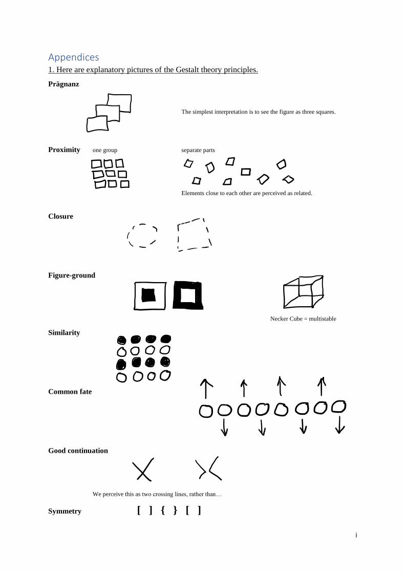
3.4 Principles of Gestalt In order to apply the Gestalt theory practically, several universally valid principles, sometimes
referred to as laws, were formulated. The principles of Gestalt are prägnanz, proximity, closure,
figure-ground, similarity, common fate, good continuation and symmetry.37 Prägnanz is the
fundamental principle, meaning good gestalt or good figure, and the very essence of Gestalt.38
It refers to the fact that humans like to find the simplest, best and most stable interpretation to
an ambiguous or complex visual image. Certain obvious shapes, like squares, circles and
37 See the Appendix 1 for explanatory pictures. 38 Hann & Moxon, 2019, p. 69.
17
triangles hold a strong visual statement and are preferred to stranger shapes. Proximity occurs
when elements that are close to each other are perceived to be more related than elements that
are spaced farther apart.39 Closure is the idea that, when looking at an element that is incomplete
or a space that is not fully enclosed, the viewer tends to first look for a recognizable pattern and
subconsciously fill in the information that is missing. Figure-ground relationship is when two
areas share a common boundary”.40 The figure is the distinct element of focus and the ground
makes up for the rest, forming the background on which the figure rest. When the figure and
ground changes positions from time to time, the relationship between them is multistable.
Examples of this are Rubin’s vase and the Necker cube. Similarity is the notion that we group
objects with similar characteristics together. These characteristics can be colour, shape, size,
texture and so on. We can perceive them as a group or a pattern. The principle of common fate,
states that humans tend to perceive elements moving in the same direction as a unit being more
related than elements that are stationary or that moves in different directions. Good continuation
means that objects arranged on a curve or a line are inclined to be perceived as a unit and as
more related than objects that are not on the curve or line. In the principle of symmetry elements
are perceived as being more related if they share uniform visual characteristics.41 Bi-lateral
symmetry is particularly preferred which means that two components mirror the image of the
other, think of a butterfly and how the wings are reflecting each other.
I relate my work to the principles of Gestalt theory. These will be helpful in my decision making
regarding the design of the patchwork.
3.5 Grounded in science Artists with synesthesia like Melissa McCracken and Carol Steen can paint from their own
experiences. As a non-synesthete I approach this from another point of view. I create in order
to discuss and try to understand the phenomenon. So, another method is to relate my practical
work to synesthesia and ground it in the science connected to the it. In addition, I have the
possibility for a discussion with the only synesthete I know, my daughter. As all synesthetic
experiences are individual there is no key to how my work should be finalized.
39 King & Wertheimer, 2004, p. 155. 40 Foley, Hugh & Matlin, Margaret, Sensation and Perception, Taylor & Francis Group, 2009, p. 121. 41 Hann & Moxon, 2019, p. 69.
18
4. Discussion The first thing I will discuss is more of a starting point for my interest in patchwork, not directly
connected to my master project. However, of importance to include here.
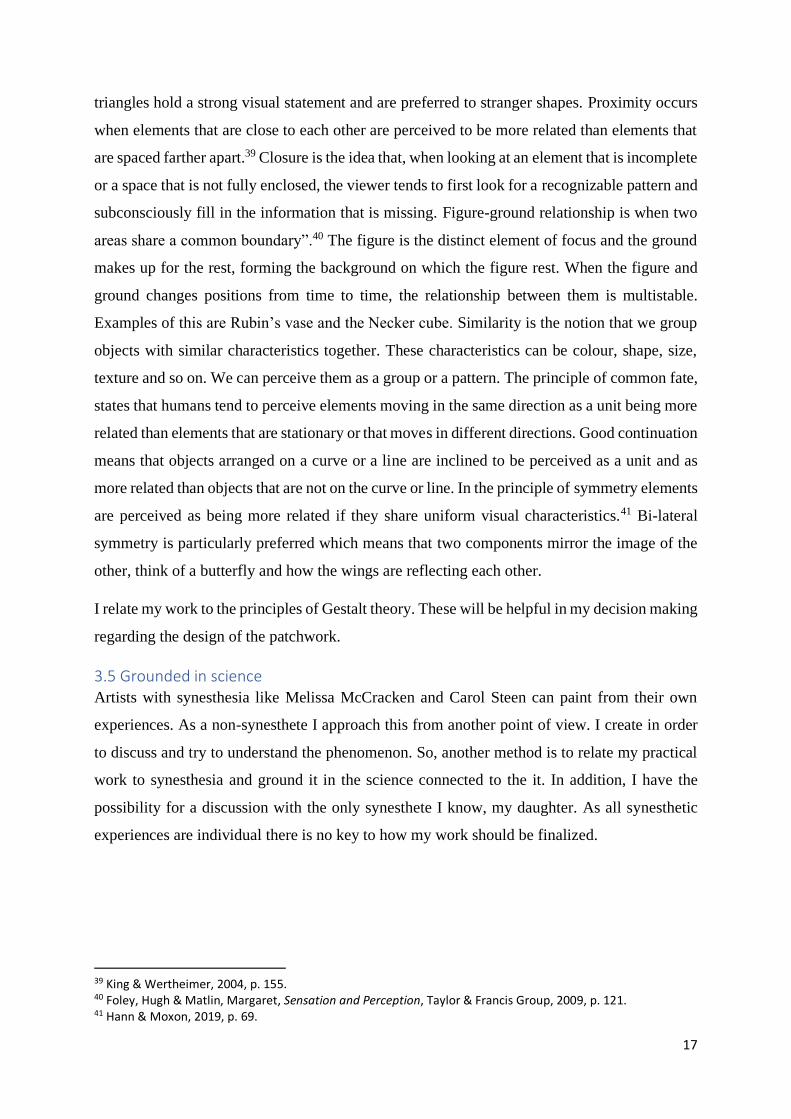
4.1 Project Liberation When dyeing pieces of fabric with no real purpose for the fabric itself, I felt a bit stuck in my
artistic development. My dyed textiles have been precious to me but also a curse in the sense
that I could not seem to continue working with them. I feel hesitant and reluctant when I am
about to cut into a fabric. It doesn’t really matter if it is a fine expensive fabric, a beautiful
patterned one, a piece that I have dyed myself or even an inexpensive one. It always makes me
feel uneasy. I don’t know why. Is it a fear of destroying, fear of breaking a pattern, fear of
failing? Possible explanations could be that it is irreversible and can´t be undone or that I have
so much respect for the material. I needed to do something to free myself from that uneasy
feeling and decided that I would cut some dyed fabric up in pieces and sew it back together
again, in a random way. I commenced with a project, called Project Liberation. The foundation
of the project was the rules and framework that I set up for myself before starting. The goal was
not to make anything beautiful, but rather to liberate myself from restrictions I tend to limit
myself with. This was in a way a starting point for my interest in patchwork.
Image 14, Åsa Sjödin Image 15, Åsa Sjödin Image 16, Åsa Sjödin
The images show different stages of my process with Project Liberation
Looking back at the result of this project I can see that I still did some conscious decisions in
the joining of the patches. All the seams are made on the same side of the fabric, so there is a
front and a backside of the piece, which was not my intention but happened anyway. Most
importantly it made me want to continue working with my dyed textiles.
4.2 Who rules who? Breaking the conventional rules of dyeing and setting up my own has been very influential and
important to me. It has developed my process and I have taken control over it. Like the Fluxus
19
community during the 1960s and 1970s I established rules for my work and emphasized the
process over the finished product. The idea of working without a conception of the result has
been very important to me. Not that I consider my work as Fluxus, but I do see resemblance in
the making of the rules and focus on the process
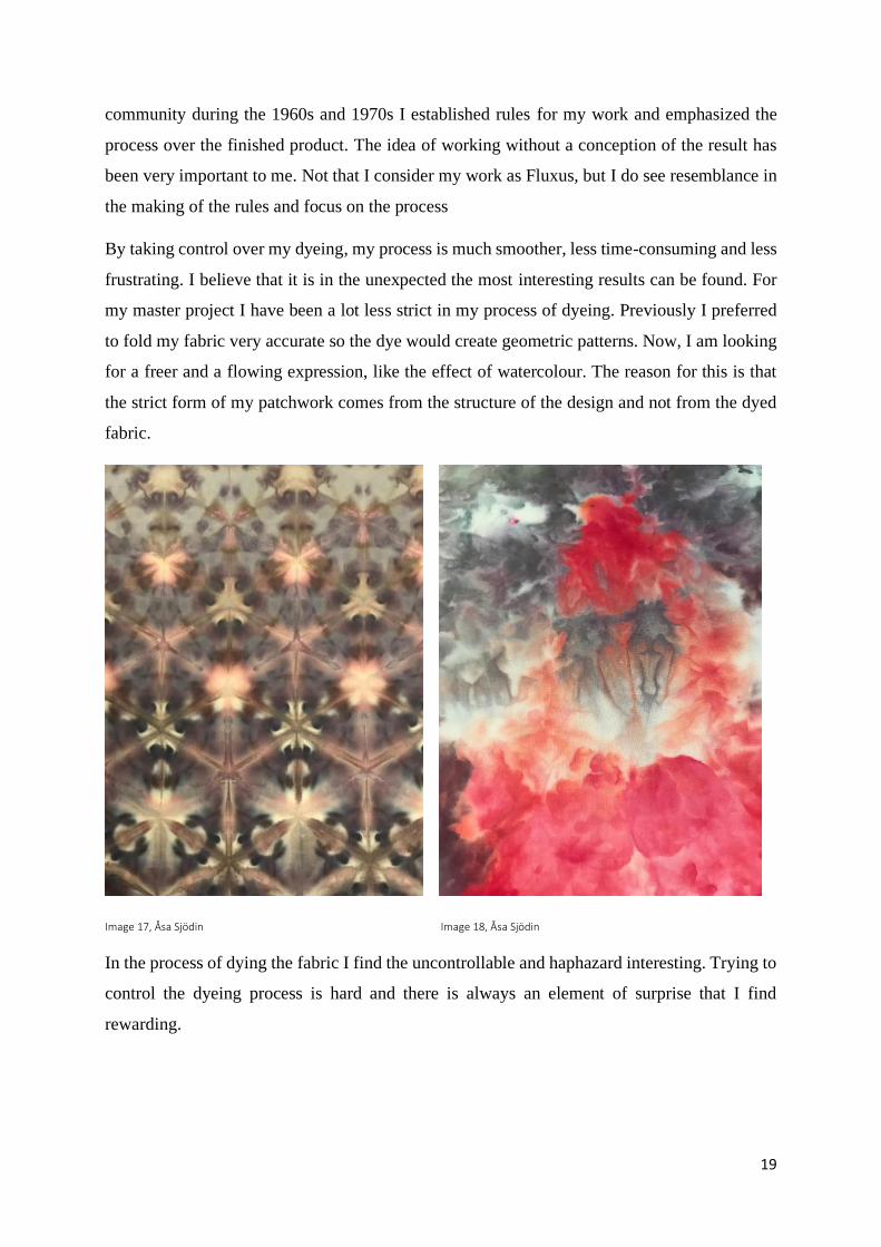
By taking control over my dyeing, my process is much smoother, less time-consuming and less
frustrating. I believe that it is in the unexpected the most interesting results can be found. For
my master project I have been a lot less strict in my process of dyeing. Previously I preferred
to fold my fabric very accurate so the dye would create geometric patterns. Now, I am looking
for a freer and a flowing expression, like the effect of watercolour. The reason for this is that
the strict form of my patchwork comes from the structure of the design and not from the dyed
fabric.
Image 17, Åsa Sjödin Image 18, Åsa Sjödin
In the process of dying the fabric I find the uncontrollable and haphazard interesting. Trying to
control the dyeing process is hard and there is always an element of surprise that I find
rewarding.
20
In the exhibition Breathing Colour Hella Jongerius addresses that back in time colours were
created by mixing pigments in endless combinations.42 My jars of pigment that I use are already
mixed to specific colours. But you can often see in the dyeing process how the different
pigments differentiate from each other and sometimes leave marks on the fabric. These marks
used to annoy me in the beginning of my dyeing adventure. Now I think that the odd spots of
colours add something extra to the fabric, a feeling of imperfection and of human presence,
rather than perfection and automation.
As Steen and Berman writes about synesthetic art and that the use of bright and fresh colours
is significant as well as unexpected colour combinations.43 This has led me to deliberately work
with strong colours and not to think too much about if the colours I use in the dyeing process
goes well together.
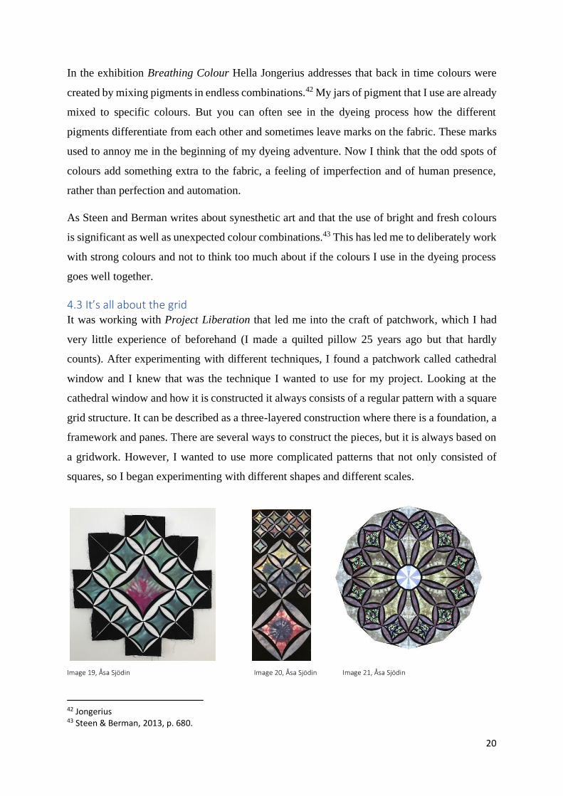
4.3 It’s all about the grid It was working with Project Liberation that led me into the craft of patchwork, which I had
very little experience of beforehand (I made a quilted pillow 25 years ago but that hardly
counts). After experimenting with different techniques, I found a patchwork called cathedral
window and I knew that was the technique I wanted to use for my project. Looking at the
cathedral window and how it is constructed it always consists of a regular pattern with a square
grid structure. It can be described as a three-layered construction where there is a foundation, a
framework and panes. There are several ways to construct the pieces, but it is always based on
a gridwork. However, I wanted to use more complicated patterns that not only consisted of
squares, so I began experimenting with different shapes and different scales.
Image 19, Åsa Sjödin Image 20, Åsa Sjödin Image 21, Åsa Sjödin
42 Jongerius 43 Steen & Berman, 2013, p. 680.
21
After doing some more
research into the technique I
came across the work of an
American textile artist named
Shelley Swanland who has
taken the technique further in
the direction I was interested
in. So, inspired by Swanland’s
way of constructing patters and
her book Machine-Stitched
Cathedral Stars I began to
experiment with her
technique.44 Even after I had
been doing this for a while I
often found myself puzzled and
confused working with the
construction of the grid. It is a
job that demands full focus.
Image 22, the grid structure of the backside, Åsa Sjödin
4.4 Combining the separate My inspiration for the design was a rose window and according to that I wanted to achieve
circular shapes. I used a pattern from Swanland’s book Machine-Stitched Cathedral Stars as a
starting point for my patchwork.45
It is interesting that in my work of combining separate parts into a new whole I work from
below up which is the structuralism viewpoint of perception.46 In contrast to the Gestalt theory
where you perceive entire patterns or configurations, above down, i.e. from the whole to the
parts. Working with the gestalt theory as a part of my method does not mean that I practice the
44 Shelley Swanland, Machine-Stitched Cathedral Stars, Martingale & Company, Woodinville, WA, 2001. 45 Swanland, 2001. 46 King & Wertheimer, 2004, p. 154.
22
“law” of Gestalt, it is more of a foundation for my decisions, although my work is driven by
intuition and desire.
Image 23, Åsa Sjödin Image 24, Åsa Sjödin Image 25, Åsa Sjödin Image 26, Åsa Sjödin
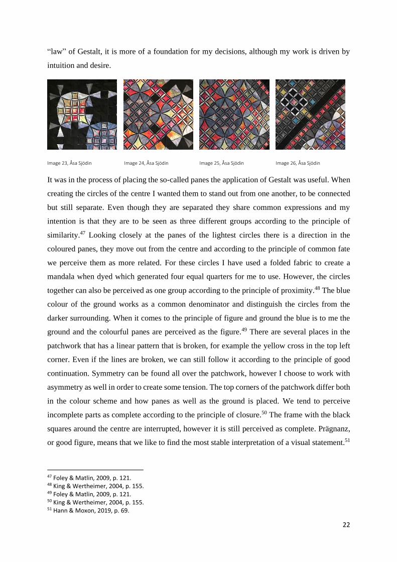
It was in the process of placing the so-called panes the application of Gestalt was useful. When
creating the circles of the centre I wanted them to stand out from one another, to be connected
but still separate. Even though they are separated they share common expressions and my
intention is that they are to be seen as three different groups according to the principle of
similarity.47 Looking closely at the panes of the lightest circles there is a direction in the
coloured panes, they move out from the centre and according to the principle of common fate
we perceive them as more related. For these circles I have used a folded fabric to create a
mandala when dyed which generated four equal quarters for me to use. However, the circles
together can also be perceived as one group according to the principle of proximity.48 The blue
colour of the ground works as a common denominator and distinguish the circles from the
darker surrounding. When it comes to the principle of figure and ground the blue is to me the
ground and the colourful panes are perceived as the figure.49 There are several places in the
patchwork that has a linear pattern that is broken, for example the yellow cross in the top left
corner. Even if the lines are broken, we can still follow it according to the principle of good
continuation. Symmetry can be found all over the patchwork, however I choose to work with
asymmetry as well in order to create some tension. The top corners of the patchwork differ both
in the colour scheme and how panes as well as the ground is placed. We tend to perceive
incomplete parts as complete according to the principle of closure.50 The frame with the black
squares around the centre are interrupted, however it is still perceived as complete. Prägnanz,
or good figure, means that we like to find the most stable interpretation of a visual statement.51
47 Foley & Matlin, 2009, p. 121. 48 King & Wertheimer, 2004, p. 155. 49 Foley & Matlin, 2009, p. 121. 50 King & Wertheimer, 2004, p. 155. 51 Hann & Moxon, 2019, p. 69.
23
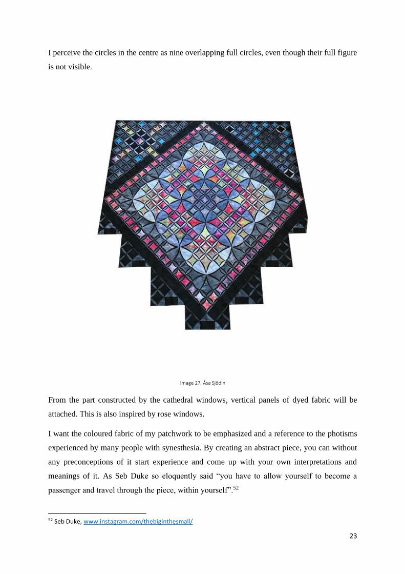
I perceive the circles in the centre as nine overlapping full circles, even though their full figure
is not visible.
Image 27, Åsa Sjödin
From the part constructed by the cathedral windows, vertical panels of dyed fabric will be
attached. This is also inspired by rose windows.
I want the coloured fabric of my patchwork to be emphasized and a reference to the photisms
experienced by many people with synesthesia. By creating an abstract piece, you can without
any preconceptions of it start experience and come up with your own interpretations and
meanings of it. As Seb Duke so eloquently said “you have to allow yourself to become a
passenger and travel through the piece, within yourself”.52
52 Seb Duke, www.instagram.com/thebiginthesmall/
24
4.5 Presentation The patchwork is an approximately 2,2 meters wide and 4,5 meters long wall hanging. My
intention was to paint the wall behind in a dark colour about 0,5 meters lager than the patchwork
to create a framing effect. But the situation due to the corona virus and the school being locked
down this was not possible to achieve.
5. Conclusion In the conclusion of this paper I will first look at my research question, that goes:
How can I, as a non synesthete, understand and work with the phenomenon of synesthesia
through textile craft?
My intention was to make an abstract patchwork as a tool for my investigation of synesthesia
and perception. The abstract pattern will let the viewers form their own meaning of the piece
and with it I want to illuminate the diversity of perceptions and make others aware of
synesthesia. My work is grounded in science regarding synesthesia and related to the principles
of Gestalt theory as well as other artistic references. I find that working with the concept of
synesthesia was both interesting and doable. But to be more trustworthy, maybe you should be
a synesthete yourself. An ambition was to raise awareness of synesthesia and that, I think, is
something my work can do. Since it is a condition not visible to others it can be stigmatized to
talk about and met by disbelief. I hope this will be an eyeopener to others and maybe someone
will be aware of their own synesthesia. Since it is something natural to those who have this trait,
some may not even know they perceive the world in a more complex way than most of us do.
Lastly, I want to reconnect to the title of this paper, the whole is “other” than the sum of its
parts. This, I believe, must be particularly obvious for a person with synesthesia, at least when
looking at it from a non-synesthetic point of view. Maybe not for the synesthetes themselves
whom has always perceived the world with an extra sensation.
25
Bibliography Campen, Cretien van, The hidden sense: synesthesia in art and science, MIT Press,
Cambridge, Mass., 2008
Cytowic, Richard E, Synesthesia [Electronic resource], 2018
Foley, Hugh, & Matlin, Margaret, Sensation and Perception, Taylor & Francis Group, 2009.
ProQuest Ebook Central, Created from Konstfack on 2019-12-27
Friedman, Ken & Baas, Jacquelynn, Fluxus and the essential questions of life, Hood Museum
of Art, Dartmouth College, Hanover, NH, 2011
Greenberg, Kerryn (ed.), “The Evolution of an Artist” in Fahrelnissa Zeid, Tate Publishing,
London, 2017
Hann, M. A. & Moxon, I. S., Patterns: design and composition, Routledge, New York,
2019[2019]
King, D. Brett. & Wertheimer, Michael., Max Wertheimer and Gestalt theory, Transaction
Publisher, New Brunswick, NJ, 2004
Koffka, Kurt, Principles Of Gestalt Psychology, 1935,
http://www.new.dli.ernet.in/handle/2015/7888, (accessed 18 March 2020).
Robertson, Kirsty, Quilts for the Twenty-First Century: Activism in the Expanded Field of
Quilting, https://www.academia.edu/25091763/Quilts_for_the_Twenty-
First_Century_Activism_in_the_Expanded_Field_of_Quilting (accessed 21 January 2020).
Steen, Carol & Berman, Greta, ”Synesthesia and the Artistic Process” in Simner, Julie &
Hubbard, Edward M. (red.), Oxford handbook of synesthesia, Oxford University Press,
Oxford, 2013, pp 671–691.
Swanland, Shelley, Machine-Stitched Cathedral Stars, Martingale & Company, Woodinville,
WA, 2001
Wettre, Åsa, Gamla svenska lapptäcken, Tiden, Stockholm, 1993
Webbsites Duke, Seb, https://www.instagram.com/thebiginthesmall/ (accessed 23 February 2020).
McCracken, Melissa, https://www.melissasmccracken.com/cvstatement (accessed 9 February
2020).
Richter, Gerhard, https://www.gerhard-richter.com/en/art/other/glass-and-mirrors-
105/cologne-cathedral-window-14890 (accessed 21 january 2020).
Synaesthesia Toolkit MULTISENSE research project at the University of Sussex
https://www.syntoolkit.org/faqs (accessed 27 December 2019).
University of Sussex, Synaesthesia research, http://www.sussex.ac.uk/synaesthesia/faq
(accessed 27 December 2019).
26
Exhibition Jongerius, Hella, Breathing Colour at Nationalmuseum Stockholm, (visited 1 December 2019).
Image References Image 1. Åsa Sjödin
Image 2. https://www.gerhard-richter.com/en/art/other/glass-and-mirrors-105/cologne-
cathedral-window-14890/?&referer=search&title=900&keyword=900 2020-02-05 (accessed
5 February 2020).
Image 3. Hella Jongerius, Breathing Colour, Nationalmuseum Stockholm, photo by Åsa
Sjödin 2019-12-01.
Image 4. Hella Jongerius, Breathing Colour, Nationalmuseum Stockholm, photo by Åsa
Sjödin 2019-12-01.
Image 5. Hella Jongerius, Breathing Colour, Nationalmuseum Stockholm, photo by Åsa
Sjödin 2019-12-01.
Image 6. NAMES Aids Memorial Quilt, Logo and Press Image
https://www.dropbox.com/sh/ahssxgzs7jws5aa/AAD45NWTPRG2GtiVDfOvdxaGa?dl=0&pr
eview=DC2_1.bmp (accessed 19 March 2020).
Image 7. Fahrelnissa Zeid, My Hell, oil paint on canvas, 205 x 528, 1951,
https://www.google.com/url?sa=i&url=https%3A%2F%2Fwww.tate.org.uk%2Fpress%2Fpre
ss-releases%2Ffahrelnissa-
zeid&psig=AOvVaw1IB36yxpeIg0R6yAHoR5nx&ust=1581363153822000&source=images
&cd=vfe&ved=2ahUKEwjujdD5msXnAhWQwSoKHSDGACIQr4kDegUIARDPAQ
(accessed 9 February 2020).
Image 8. Melissa McCracken, Time – Pink Floyd, 2016
https://static1.squarespace.com/static/5a540e61a8b2b0b72660438d/t/5c7da400085229ec8369
bbb7/1551737856362/Time.jpeg (accessed 9 February 2020).
Image 9. Melissa McCracken, Imagine – John Lennon,
https://static1.squarespace.com/static/5a540e61a8b2b0b72660438d/t/5c7d99fce79c701d7e56
4315/1551735293457/IMG_1513.JPG (accessed 9 February 2020).
Image 10. Carol Steen, Cyto, 1995, bronze and steel,
https://www.semanticscholar.org/paper/It%27s-a-Colorful-World%3A-Synesthesia-Effect-on-
of-and-Knight/8857f3f176488a96964e38d2b79fd2c9bd75537e/figure/3 (accessed 9 February
2020).
Image 11. Carol Steen, Full View, https://www.thecut.com/2016/07/why-do-so-many-artists-
have-synesthesia.html (accessed 9 February 2020).
Image 12. Carol Steen, Zigzag, 1995, steel, bronze and silver,
http://web.mit.edu/synesthesia/www/zigzag.html (accessed 9 February 2020).
Image 13. Seb Duke, Per Aspera, https://thebiginthesmall.ca/collections/bubble-
art/products/per-aspera?variant=30280955789355 (accessed 23 February 2020).
Image 14–27. Åsa Sjödin
i
Appendices 1. Here are explanatory pictures of the Gestalt theory principles.
Prägnanz
The simplest interpretation is to see the figure as three squares.
Proximity one group separate parts
Elements close to each other are perceived as related.
Closure
Figure-ground
Necker Cube = multistable
Similarity
Common fate
Good continuation
We perceive this as two crossing lines, rather than…
Symmetry [ ] { } [ ]
ii
2. Reflection
One can certainly say that the grand finale of this master education was anything but grand.
Examinations were done online via Zoom, an exhibition were made for no one to see and
Konstfack’s Degree Exhibition being digital. We all must adjust to the current pandemic
situation, the need for social distancing forced us to find other ways to meet and show our work.
I will first talk about my examination. Standing and talking in front of a lot of people is not
something I feel comfortable doing so for me personally, I did not mind sitting in the comfort
of my home talking into the screen of my computer. It was a strange feeling not seeing the
people you were talking to but for me it was not a disadvantage. It would have been nice to
meet my opponent Marcia Harvey Isaksson in person though and not just through a screen. I
thought the discussion with my opponent Marcia was very nice. Her questions were relevant
and not too hard to answer. Although I realised afterwards that I had misunderstood a few of
her questions, maybe I was taken by the moment. I thought about recording the opposition but
completely forgot about it. But maybe that was a good thing, it would have been painful to
listen to afterwards.
A question I got from Marcia was regarding the Gestalt theory and, if I do not remember it
wrong, what its contribution to my work was. When reading about synesthesia, it is often related
to the Gestalt theory. The aspect that perception is a process from above downward, where we
perceive entire patterns or configurations rather than individual elements is relevant for my
work. It is also where the title of my work comes from. However, when looking back at my
process, I really think that my work could have manage just as well without making the
principles of Gestalt a part of my method.
I would like to say something about the exhibition that we built in connection to the
examinations with the purpose to document our work for the opponents and for the CRAFT!
catalogue. I had an intention to paint the wall in a dark colour but with the given timeframe of
2,5 hours for hanging I did not see that it was possible for me to do that. Also, the placement in
Seminariegatan was not the best. There was a bar going across the room in front of my piece
which was not moveable, and the opposite side was not possible for hanging either, we tried.
The bright daylight from the windows above did not benefit my work. I would have liked a
darker setting, like inside of a cathedral which I was inspired by. I think it would have been
more suitable and given me a better chance to illuminate my work. On top of this, the skylift
used for hanging was very dirty and the black fabric attracted dust particles which were very
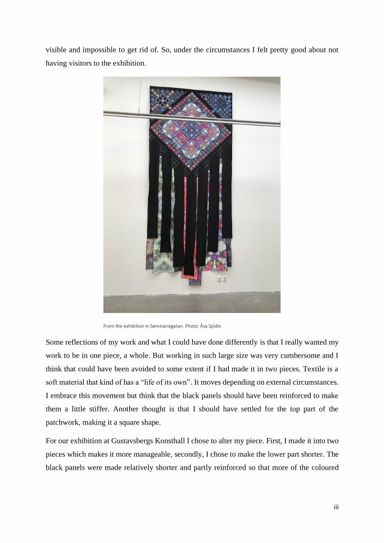
iii
visible and impossible to get rid of. So, under the circumstances I felt pretty good about not
having visitors to the exhibition.
From the exhibition in Seminariegatan. Photo: Åsa Sjödin
Some reflections of my work and what I could have done differently is that I really wanted my
work to be in one piece, a whole. But working in such large size was very cumbersome and I
think that could have been avoided to some extent if I had made it in two pieces. Textile is a
soft material that kind of has a “life of its own”. It moves depending on external circumstances.
I embrace this movement but think that the black panels should have been reinforced to make
them a little stiffer. Another thought is that I should have settled for the top part of the
patchwork, making it a square shape.
For our exhibition at Gustavsbergs Konsthall I chose to alter my piece. First, I made it into two
pieces which makes it more manageable, secondly, I chose to make the lower part shorter. The
black panels were made relatively shorter and partly reinforced so that more of the coloured
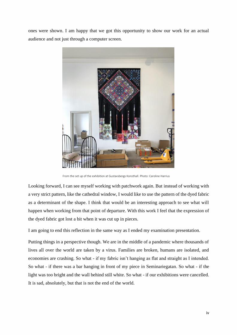
iv
ones were shown. I am happy that we got this opportunity to show our work for an actual
audience and not just through a computer screen.
From the set up of the exhibition at Gustavsbergs Konsthall. Photo: Caroline Harrius
Looking forward, I can see myself working with patchwork again. But instead of working with
a very strict pattern, like the cathedral window, I would like to use the pattern of the dyed fabric
as a determinant of the shape. I think that would be an interesting approach to see what will
happen when working from that point of departure. With this work I feel that the expression of
the dyed fabric got lost a bit when it was cut up in pieces.
I am going to end this reflection in the same way as I ended my examination presentation.
Putting things in a perspective though. We are in the middle of a pandemic where thousands of
lives all over the world are taken by a virus. Families are broken, humans are isolated, and
economies are crashing. So what - if my fabric isn’t hanging as flat and straight as I intended.
So what - if there was a bar hanging in front of my piece in Seminariegatan. So what - if the
light was too bright and the wall behind still white. So what - if our exhibitions were cancelled.
It is sad, absolutely, but that is not the end of the world.