The Standardization of the Nonstandard, or the Depth of the Surface
17
INHALT CONTENTS Editorial AutorInnen/KünstlerInnen Authors/Artists Nonstandard Structures Theory and Debate Mario Carpo Digital, Drifting, and the End of History Das Digitale, „Mouvance“ und das Ende der Geschichte Murturm, Architekten: terrain:loenhart&mayr, Ingenieure: osd Daniel Gethmann Nichtmoderne Objekte Nonmodern Objects Bernard Cache After Parametrics? Nach dem Parametrismus? Interview: Bernard Cache, Urs Hirschberg, Daniel Gethmann On Sollertia and Hyperpragmatism Über Sollertia und Hyperpragmatismus Andreas Lechner Standardisierung des Nonstandards oder die Tiefe der Oberfläche The Standardization of the Nonstandard, or the Depth of the Surface Johan Bettum Architectural Form and Saturated Space Architektonische Form und Saturated Space Process and Performance Harald Kloft Logik oder Form Logic or Form Interview: Harald Kloft, Jan Kokol Mass Customization basierend auf wirtschaftlichen Modellen und die Parallelität zur Kunst als Unikum Mass Customization Based on Economic Models and the Parallels to Unique Works of Art Martin Bechthold More Bang for the Buck? Achim Menges Unkomplizierte Komplexität. Integration von Material, Form, Struktur und Performance im Computational Design Uncomplicated Complexity. Integration of Material, Form, Structure and Performance in Computational Design Daniel Bosia Form and Algorithm Form und Algorithmus Till Lensing Livio Vacchini und „Der Gebrauch der Technik“ Livio Vacchini and the Use of Technology Digital Crafting Tobias Bonwetsch Digitales Handwerk Digital Craft Christoph Schindler Die Standards des Nonstandard The Standard of the Nonstandard Jürgen Mayer H. • Jan-Christoph Stockebrand Von digital zu analog – „Metropol Parasol“, Sevilla From Digital to Analog – “Metropol Parasol”, Seville Interview: Georg Vrachliotis, Fabian Scheurer (designtoproduction) „Was da gefordert wird, sind Kathedralen zum Nulltarif.“ Ein Blick hinter die Kulissen der digitalen Bauproduktion “What is Being Asked for Are Cathedrals for Free.” A Look Behind the Scenes of Digital Building Construction Aus der Fakultät Faculty News Call for Papers GAM.07 2 6 11 12 16 30 42 50 62 70 86 104 108 120 128 140 152 160 168 172 180 194 206 216 264
Transcript of The Standardization of the Nonstandard, or the Depth of the Surface

INHALT CONTENTS
Editorial
AutorInnen/KünstlerInnen Authors/Artists
Nonstandard StructuresTheory and DebateMario Carpo Digital, Drifting, and the End of History Das Digitale, „Mouvance“ und das Ende der Geschichte
Murturm, Architekten: terrain:loenhart&mayr, Ingenieure: osd
Daniel GethmannNichtmoderne Objekte Nonmodern Objects
Bernard CacheAfter Parametrics? Nach dem Parametrismus?
Interview: Bernard Cache, Urs Hirschberg, Daniel GethmannOn Sollertia and Hyperpragmatism Über Sollertia und Hyperpragmatismus
Andreas LechnerStandardisierung des Nonstandards oder die Tiefe der Oberfläche The Standardization of the Nonstandard, or the Depth of the Surface
Johan BettumArchitectural Form and Saturated Space Architektonische Form und Saturated Space
Process and Performance Harald KloftLogik oder Form Logic or Form
Interview: Harald Kloft, Jan KokolMass Customization basierend auf wirtschaftlichen Modellen und die Parallelität zur Kunst als UnikumMass Customization Based on Economic Models and the Parallels to Unique Works of Art
Martin BechtholdMore Bang for the Buck?
Achim MengesUnkomplizierte Komplexität. Integration von Material, Form, Struktur und Performance im Computational DesignUncomplicated Complexity. Integration of Material, Form, Structure and Performance in Computational Design
Daniel BosiaForm and Algorithm Form und Algorithmus
Till LensingLivio Vacchini und „Der Gebrauch der Technik“ Livio Vacchini and the Use of Technology
Digital CraftingTobias BonwetschDigitales Handwerk Digital Craft
Christoph SchindlerDie Standards des Nonstandard The Standard of the Nonstandard
Jürgen Mayer H. • Jan-Christoph StockebrandVon digital zu analog – „Metropol Parasol“, Sevilla From Digital to Analog – “Metropol Parasol”, Seville
Interview: Georg Vrachliotis, Fabian Scheurer (designtoproduction)„Was da gefordert wird, sind Kathedralen zum Nulltarif.“ Ein Blick hinter die Kulissen der digitalen Bauproduktion“What is Being Asked for Are Cathedrals for Free.” A Look Behind the Scenes of Digital Building Construction
Aus der Fakultät Faculty News
Call for Papers GAM.07
26
1112163042506270
86
104108120
128140
152160
168172180194206
216264
gam_06_kern_lay_15.qxd 09.11.2009 21:26 Uhr Seite 1
1
1 Jun Aoki, Louis Vuitton Omotesando (2002), Foto photo: www.flickr.com, © japanese craft construction
gam_06_kern_lay_15.qxd 09.11.2009 21:26 Uhr Seite 70

The sky above the port was the color of television, tuned to a dead channel. William Gibson, Neuromancer (1984)
BUILDING DESIGN CULTURE ART THEORY HISTORY NATURE PRACTICE PLACE PLANNING TECHNOLOGY MEDIA
Standardisie-rung des Non-standards oderdie Tiefe derOberfläche The Standardization of the Nonstandard, or the Depth of the Surface
ANDREAS LECHNER
gam_06_kern_lay_15.qxd 09.11.2009 21:26 Uhr Seite 71

Die Brandstores auf Tokios Omotesando-Dori sind aus Marketingbud-gets finanzierte und auf die aufwändige Gestaltung der Hüll- und Fassaden-zonen konzentrierte, mehrgeschossige Geschäfts- und Bürogebäude, mitdenen die Modeindustrie sich nicht nur mit dem symbolischen Kapital vonSignature-Architektur bzw. handschriftlich/künstlerisch verbrieften Design-Gesten auflädt. Vielmehr lassen sich hier, wo die Architektur eindringlichden Standard-Umstand „Architecture is ‚promotional Architecture‘ or it isnot architecture at all!“1 belegt, auch „Nonstandard“-Qualitäten von Archi-tekturen beschreiben, die sich vornehmlich der Erscheinungsweise ihrerOberflächen – dem Gemacht-Sein ihrer Hülle – widmen.
Anhand von dreien dieser Brandstores gehe ich der Frage nach, ob sichnicht hier – wo die Architektur als luxuriöse Bekleidungskunst ein populä-res Comeback als sinn- und theoriefreie Marken-Epiphanie feiert – Hinwei-se für Gestaltungshaltungen und Design-Politiken finden lassen, die sich(nicht nur) angesichts der massiven, technisch, ökologisch und ökono-misch motivierten, wissenschaftlichen Beforschung von Gebäudehüllennoch als (strikt) architektonische, objektive Argumente denken lassen. Denndem Inszenierungsdruck postmoderner Raum- und Konsumbühnen begeg-nen die Brandstores nicht als Dramaturgie einzigartiger Räume oder spek-
takulärer Geometrien, son-dern als stofflich-materiel-le Konzentration auf ihreRaum begrenzenden Ober-flächen. „NonstandardStructures“ sind die Brand-stores also weniger, weilsich mit ihnen Fragen nachMethoden, Angemessen-heiten und Relevanzenrechner-unterstützter – be-dingter oder – abhängigerFormfindungs- und Her-stellungsweisen architek-tonischer Objekte (vgl.
Mass Customization, File-to-Factory, Nicht-identische Serien, kurvilineareFormen etc.) formulieren lassen, sondern weil sie sich als Standard-Geome-trien darauf beschränken, an ihren Oberflächen in Form eines einzigartigenGebäudekleides auffällig zu werden.2 Als „Haute Couture“-Aufträge ohneökonomische Einschränkung markieren diese Architekturen aber einenweiteren Nonstandard-Aspekt, wenn sie – als über flächenwirtschaftlich/firmenseitig organisierte Kubaturen gestülpte Oberflächen – in der Lagesind, auch weit über jene Standards – Lochfassade und Curtain Wall –hinauszuweisen, die als zentrale Kategorie und Gestaltungsaufgabe die
The brandstores on Tokyo’s Omotesando-Dori are multi-
storey business and office buildings which are financed by
marketing budgets and concentrated on the elaborate design of
the building exterior and facade areas with which the fashion
industry does not just load itself with the symbolic capital of
signature architecture, that is to say, hand-written/artistically
guaranteed design gestures. It is rather the case here, where
architecture clearly proves the standard fact that “Architecture
is promotional architecture or it is not architecture at all!”1,
that “nonstandard” qualities of architecture are also described
which primarily devote themselves to the way their surfaces
appear – to the finish of their exterior.
On the basis of three of these brandstores I will look into
the question of whether here – where architecture as luxurious
art of dressing is celebrating a popular comeback as an epiph-
any of brands which is without meaning or theory – there are
not signs of an attitude in design ad design politics which, in
view of the huge amount of scientific research into building
exteriors which is technically, ecologically and environmen-
tally driven, allow themselves still to be thought of as (strict-
ly) architectonic, objective arguments. Because brandstores
encounter the pressure to stage a production of post-modern
space and consumption not as the dramaturgy of unique spaces
or spectacular geometries, but as a material concentration of
substance on its surfaces which limit space. Brandstores are
thus less “nonstandard structures” because they allow them-
selves to be formulated with their questions about the methods,
appropriateness and relevance of the form finding and manu-
facture process (supported, conditioned by and dependent on
the calculator) of architectonic objects (cf. mass customization,
file-to-factory, non-identical series, curvilinear forms, etc.),
but because they limit themselves as standard geometries to
being striking in their surfaces in the form of a unique item of
clothing for a building.2 But as “haute couture” commissions
without economic constraint, these architectures mark a further
non-standard aspect when they – as surfaces put over the eco-
nomics of square footage and on the side of company-organized
cubatures – are in the position to transcend far beyond these
standards – perforated façade and curtain wall – which, as the
central category and design brief, significantly shape the
appearance and effectiveness of architecture.3 What they
72
Dem Spektakel, der Dauererregung und der fortlaufenden Stimulations-Innovation halten sie eine gelassene Blasiertheit entgegen, die auf die Tiefe ihrer Oberflächen vertraut (…)
1 Dietmar Steiner, „Promotional Architecture“, in: Maggie Toy (Hg.), Fashion+Architecture, ArchitecturalDesign 70/6 (2000), S. 20–23, hier S. 23.
2 Damit illustrieren die Brandstores natürlich auch die fortlaufende Ausdifferenzierung des Berufsfelds –hier in Richtung der berüchtigten „Core & Shell“-Expertise. Vgl. dazu etwa: Sacha Menz, Einführungs-vorlesung „Architektur und Bauprozess“, online: http://www.bauprozess.arch.ethz.ch./ASSETS/pdf/Einfuehrungsvorlesung.pdf, 9. Februar 2009.
1 Dietmar Steiner, “Promotional Architecture”, in: Maggie Toy, ed., Fashion+Architecture, Architectural Design 70/6 (2000), pp. 20–23, here p. 23.
2 In this way the brand stores naturally illustrate the continuing differentiationof their professional field – here in the direction of the infamous “Core &Shell” expertise. See, for instance, Sacha Menz, introductive lecture“Architektur und Bauprozess”, (online: http://www.bauprozess.arch.ethz.ch./ASSETS/pdf/Einfuehrungsvorlesung.pdf) February 9, 2009
3 The more usual standard solutions were described by Rem Koolhaas 14 years ago somewhat controversially: “Buildings that are complex inform depend on the curtain-wall industry, on ever more effective adhesivesand sealants that turn each building into a mixture of straitjacket and oxygen
gam_06_kern_lay_15.qxd 09.11.2009 21:26 Uhr Seite 72
Erscheinungs- und Wirkungsweisen von Architektur maßgeblich prägen3.Was sie mit ihren flachen Raumschichten bewerkstelligen, sind immernoch jene Grundoperationen der Architektur, durch die sie eine Vervielfäl-tigung von Räumen erreichen. Zum einen, weil sich hier die unschlagbaren,jedenfalls durch keine Medientechnik überzeugend emulierbaren Qualitätender Architektur beschreiben lassen: die Verführung durch die List ihrerTechné, ihre Fähigkeit zum Zerschneiden der Augenblicklichkeit ihrerErscheinung, ihre Erkundung von Möglichkeiten zum Experiment mitMaterialien, für die es noch keine Regeln gibt. Zum anderen, weil diesesimplen Ausnahmegebäude durch die Konzentration auf die atmosphäri-sche Ausgestaltung der Fassadenzone etwas erreichen, das durch formaleBeschränkung, Askese, Präzision und perfektes Handwerk eine Tiefe er-zeugt, die weder etwas mit intellektuellen Distinktionsbemühungen nochmit gängigeren Vorstellungen medientechnisch dekorierter Spektakelarchi-tekturen zu tun hat. Im Kontext rein kommerzieller Interessen bewerkstel-ligen es die angeführten Beispiele als nicht-triviale Fassadengestaltung, denAlltag zu unterbrechen, indem sie sich als ebenso abstrakte wie unver-schämte Wandschleier, als ausschließliche Inszenierung ihrer Materialitätder ästhetischen Wahrnehmung anbieten – sich also ganz so verhalten, alsob der Stadtraum ein Ausstellungsraum zur Kunstbetrachtung wäre. Dasist weder einfache Folge der ästhetischen Ökonomie noch eine Erschei-nung auf einem Urban Entertainment Screen. Natürlich hängen sie damitzusammen und schlagen sich, indem sie sich als „Maske aus Silhouet-ten“, als „transluzenter Schleier“ oder als „geheimnisvoll schimmerndeVerpackung“ ganz auf ihre ekstatische Aufgabe – Verführung durch dieErzeugung von Schein – konzentrieren, prominent auf die Seite jener Re-Auratisierungstendenzen der Objektwelt, die ihrer unmittelbaren, materiellerzeugten Präsenz mehr Aufmerksamkeit schenken als der Erzeugungeines diffusen, ikonischen Ausdrucks. Dem Spektakel, der Dauererregungund der fortlaufenden Stimulations-Innovation halten sie eine gelasseneBlasiertheit entgegen, die auf die Tiefe ihrer Oberflächen vertraut; einerTiefe, die sie als ästhetischen Schein ebenso an die Qualitäten ihrer mate-riellen Erscheinungsweisen – objektiv – wie an die nur augenblicklicheMöglichkeit ihrer Gewahrwerdung – subjektiv – gebunden wissen.
„Everyone understands it, and it becomes a pleasant stimulation, if it isdesigned so that it can recall and awaken life because it acts as a symbolthat the average person retains in their memory.“4 Mit dem Fassadenbildder Baumsilhouetten gelingt es Toyo Ito beim Tod’s Omotesando-Gebäude(2003), populäre und akademische Lesarten – durchaus im Sinne derJencks’schen Doppelcodierung postmoderner Architektur – zu ermög-lichen: Es ist unmittelbares Erkennen gegeben, dass sofort affizierendwirkt: „In modern architecture it was forbidden to use visual icons, yet
accomplish with their flat layer of space are still those funda-
mental operations of architecture by which they achieve a
duplication of spaces. On the one hand, because here the
unbeatable qualities of architecture – which, in any case, are
not convincingly imitable by any media technology – are
described: the seduction through the artfulness of their techné,
their ability to carve through the instantaneousness of their
appearance, their exploration of possibilities of experimenting
with materials, for which there are still no rules. On the other
hand, because these simple buildings of exception achieve
something through the concentration of the atmospheric ar-
rangement of the façade area, which generates a depth through
formal limitation, asceticism, precision and perfect handcraft –
a depth which has nothing to do with either intellectual efforts
of distinction or with popular ideas of spectacular architectures
decorated by media design. In the context of purely commercial
interests the examples mentioned, as non-trivial façade design,
manage to interrupt the everyday by offering themselves as
abstract, brazen wall veils, as exclusive staging for their mate-
riality of aesthetic perception; they behave, therefore, as if the
city space were an exhibition space for contemplating art.
That is neither a simple consequence of aesthetic economy
nor an appearance on an urban entertainment screen. They
are, of course, connected with it and – whilst in their capacity
as “mask of silhouettes”, as “translucent veil” or as “secretly
shimmering wrapping” they are concentrating entirely on their
ecstatic task (to seduce by generating an illusion) – they acquit
themselves prominently on the side of those re-auratization
tendencies of the object world, which pay more attention to
their immediate, materially generated presence than to the
generation of a diffuse, iconic expression. Towards spectacle,
constant excitement and the continuous stimulation of innova-
tion they maintain a cool, blasé attitude which relies on the
depth of their surfaces; a depth which they know as aesthetic
illusoriness to be connected as much to the qualities of their
material way of appearing – objective – as to the only momen-
tary possibility of their becoming aware – subjective. “Every-
one understands it, and it becomes a pleasant stimulation, if it
is designed so that it can recall and awaken life because it acts
as a symbol that the average person retains in their memory.”4
With the façade picture of the silhouette of a tree on Tod’s
Omotesando building (2003), Toyo Ito succeeds in offering
73
3 Die üblicheren Standard-Lösungen beschreibt Rem Koolhaas vor 14 Jahren einigermaßen polemisch:„Buildings that are complex in form depend on the curtain-wall industry, on ever more effective adhesivesand sealants that turn each building into a mixture of straitjacket and oxygen tent. The use of silicone – ‚weare stretching the façade as far as it will go‘ – has flattened all facades, glued glass to stone to steel to con-crete in a space-age impurity. These connections give the appearance of intellectual rigor through the liberal application of a transparent spermy compound that keeps everything together by intention ratherthan by design – a triumph of glue over the integrity of materials.“ Rem Koolhaas, „The Generic City“, in: Koolhaas, Bruce Mau, S,M,L,XL. New York: The Monacelli Press, 1995, S. 1238–1264, hier S. 1261.
4 Koji Taki, „A Conversation with Toyo Ito“, in: Toyo Ito 2001–2005 – Beyond Modernism, El Croquis, 123(2005), S. 14f.
tent. The use of silicone – ‘we are stretching the façade as far as it will go’ –has flattened all facades, glued glass to stone to steel to concrete in a space-age impurity. These connections give the appearance of intellectual rigorthrough the liberal application of a transparent spermy compound that keepseverything together by intention rather than by design – a triumph of glueover the integrity of materials.” Rem Koolhaas, “The Generic City”, in:Koolhaas, Bruce Mau, S,M,L,XL. New York: Monacelli Press, 1995, pp. 1238–1264, here p. 1261.
4 Koji Taki, “A Conversation with Toyo Ito”, in: Toyo Ito 2001–2005 –Beyond Modernism, El Croquis, 123 (2005), pp. 14f.
gam_06_kern_lay_15.qxd 09.11.2009 21:26 Uhr Seite 73

here I dared to bring in the comprehensible symbol of pattern of the tree.“5
Was als Reaktion auf den privilegierten Ort – eine in Tokio äußerst selteneAllee aus japanischen Ulmen – beschrieben wird, findet sich als grafischeSilhouette überlagerter Baumkonturen aber nicht in der Verkleidung oderPerforation einer Materialschicht am Gebäude wieder, sondern fällt struk-turell mit der statischen Konstruktion des Wandabschlusses zusammen.Grafisch-dekorative Perforierungen von Materialschichten, aufgeklebt-dekorative Sujets oder auch die Inanspruchnahme ganzer Gebäudefrontenals undurchsichtige Bild- und Werbeträger sind in Tokio Phänomene desstädtischen Alltags. Daher entgegnet der mit dem Werk Itos bestens ver-traute Kunstkritiker Koji Taki auch Toyo Itos Bemerkung, Taki hätte nochvor wenigen Jahren sein Projekt für Tod’s als Kitsch abgetan, damit, dasser hier keine Muster oder Bilder auf die Fassade geklebt oder aufgetragensieht. Das Muster aus abstrahierten Baumsilhouetten umgibt die ganzeArchitektur, es stellt sie innen wie außen zugleich erst her: „When it is surrounding, it becomes a visible structure and one can recognize geomtricdynamism that generates architecture. The pattern stimulates our reasonand at the same time sensitivity pleasantly. Something with such a charactercannot be kitsch.“6 Das Baumdiagramm spricht innen wie außen den Be-
trachter auf der Ebene derVernunft und der Sinnlich-keit an. Das ist nur mög-lich, da die Trennung zwi-schen Innen- und Außen-raum mit einer einzigen,flachen Schicht bzw. „in“einem einzigen Layer er-folgt, der auf beiden Seitendie gleiche Information be-inhaltet – die Silhouettenwerden in Beton gegos-sen, ihre Zwischenräumewerden innen und außenbündig mit rahmenlosemGlas ausgefacht. Durchdieses Ineinanderzwingender grafisch-dekorativen,materiellen und konstruk-tiven Komponenten in eine(tektonisch gesehen) zwei-dimensionale Ebene for-
dert Ito die Vorstellung klassischer Wanddichotomien – eine nach sequen-ziellen Logiken, proportionalen Vorstellungen und/oder aus Organisations-und Funktionsstrukturen des Innenraums komponierten Abfolgen vonWandöffnungen – heraus. Ito betont, dass er ohne den Erfahrungsgewinndurch den Serpentine Gallery Pavilion (London, 2001) nicht auf das Bilddes Baumes beim Tod’s-Projekt gekommen wäre. Im Pavillon für die
popular and academic readings – completely in the sense of
Jencks’ double coding of post-modern architecture: immediate
recognition is given, which has an instant, tantalizing effect.
“In modern architecture it was forbidden to use visual icons,
yet here I dared to bring in the comprehensible symbol of pat-
tern of the tree.”5 What is described as a reaction to the privi-
leged place – an avenue of Japanese elm trees, extremely rare
in Tokyo – is found again as a graphic silhouette of superim-
posed tree outlines but not in the disguise or perforation of a
material layer on the building, but coincides structurally with
the static construction of the connecting walls. Graphic-deco-
rative perforations of material layers, stuck-on, decorative
sujets or also the demand for whole building fronts as opaque
carriers of images and advertising are, in Tokyo, phenomena
of everyday life in the city. As a result of this, the art critic
Koji Taki – who is the most familiar with Ito’s work – responds
to Toyo Ito’s remark that Taki had, even several years ago,
dismissed his project for Tod’s as kitsch by saying that he
does not see here any design or image stuck on or outlined on
the facade. The design of abstract tree silhouettes surrounds the
whole architecture, it fashions it inside and outside at the same
time: “When it is surrounding, it becomes a visible structure
and one can recognize geometric dynamism that generates
architecture. The pattern stimulates our reason and at the same
time sensitivity pleasantly. Something with such a character
cannot be kitsch.”6 The tree diagram talks on the inside as
well as on the outside to the observer on a level of reason and
sensuality. That is only possible because the separation between
the inner and the outer space occurs with one single, flat layer;
that is to say, “in” one single layer, which contains the same
information on both sides – the silhouettes are cast in concrete,
the space in between them is filled in flush with frameless
glass both inside and outside. Through this process of forcing
into each other the graphic-decorative, material and construc-
tive components into one (tectonically speaking) two-dimen-
sional level, Ito challenged the idea of classical wall dichot-
omies – an idea following sequential logic, proportional ideas
and/or sequence of wall openings composed of the organiza-
tional and functions structures of the inner space. Ito stresses
that he would not have come to the image of the tree for the
Tod’s project without the benefit of experience through the
Serpentine Gallery Pavilion (London, 2001). In the Pavilion for
the Serpentine Gallery and together with Cecil Balmond, Ito
in fact allowed a simple algorithm instead of the tree diagram
to function as a pattern generator, but within this layer – just
as with Tod’s – informal pattern, a functional wall dichotomy
and a static system overlap in the same way.7
74
Das Baumdiagramm spricht innen wie außen den Betrachter auf der Ebene der Vernunft und der Sinnlichkeit an. Das ist nur möglich, da die Trennung zwischen Innen-und Außenraum mit einereinzigen, flachen Schichtbzw. „in“ einem einzigenLayer erfolgt, der auf beiden Seiten die gleicheInformation beinhaltet
5 Ebd.
6 Ebd.
5 Ibid.
6 Ibid.
7 Ibid.
gam_06_kern_lay_15.qxd 09.11.2009 21:26 Uhr Seite 74

4
2–6 Toyo Ito, Tod’s Omotesando (2004)Fotos photos: Andreas Lechner6
2
5
2
3
gam_06_kern_lay_15.qxd 09.11.2009 21:26 Uhr Seite 75

Serpentine Gallery lässt Ito zusammen mit Cecil Balmond zwar einen ein-fachen Algorithmus statt des Baumdiagramms als Mustergenerator wirken,innerhalb dieser Schicht fallen aber – ebenso wie bei Tod’s – informalesMuster, funktionelle Dichtomie der Wand und statisches System ebensozusammen.7
Der spanische Architekturtheoretiker Juan Antonio Cortes fasst daskonstruktive Ornament mit Itos Verweis auf die Konsumsphäre zusammen:„[…] the natural element, the tree, appears here as an architectural motifwith its direct symbolism, while on the other, as products wrapped in athin, transparent plastic film on display in a supermarket, these trees ‚losetheir living materiality and become neutral and abstract, like a sign.‘ Thereare several mechanisms for this abstraction. The trees that define the facadesare both resistant structure and decorative elements – once again the inte-gration of structure, space enclosure and decoration –, built from reinforcedconcrete. At the same time, their 30 cm thickness is reduced visually to aflat graphic pattern lacking depth; ultimately a silhouette, as the infill ofglas and aluminium sheets installed in some of the voids are fitted withoutframes, flush with both the outer and the inner faces. […] decoration andflatness.“8
Mit dem „Serpentine Gallery Pavilion“ und dem Tod’s-Gebäude leitetIto seine Rückkehr zur – in seinen Worten – „real world“ ein: „Actually,the sense and meaning of technology in my works is changing. In the pastthe technology was highly visible. It was presented in a visible way. Nowit is different. Technology is now something I hide, you have to look for it,you don’t see it, you can’t see it. It is an element to be used and exploitedin an indirect way. Before, I used to envision an architecture that nobodycould touch, impossible to grasp and hold. Now, again, it is different. Now,I want to do an architecture that you can touch and feel. Now I am workingon the physical reality, on the object, on the real. […] What is importantnow is not technology, but rather dialogue with people. Architecture emergesfrom a dialogue.“9 Re-formuliert Ito damit das anti-elitäre Programm post-moderner Architektur für das digitale Zeitalter? Mit einem erst durch CAADermöglichten Tektonikbegriff – grafische Muster werden zu struktivenMustern der Konstruktion – werden populäre Motive möglich, die sichüber ihre statische Wirksamkeit und tektonische Lesbarkeit Kitsch- undAbziehbild-Vorwürfen entziehen – Pop-Architektur im digitalen Zeitalter.Für Joachim Krausse liegt in der struktiven Dimension jene technische undzugleich symbolische Dimension, entlang derer sich die Architektur mitihrer Oberflächendimension auseinandersetzt: „Mit dieser [struktiven Di-mension] hat man es aber immer wieder zu tun, egal ob es sich um Ober-flächen, Texturen, Textilien, Flechtwerke oder Netzwerke handelt. Es isteine Eigenart der Bedeutungsfamilie der Begriffe Technik, Architektur,Textil und Text, dass sie eine Oszillation zwischen dem Struktiven undeiner zeichenhaften symbolischen Seite erlaubt. Die gegenwärtige Ausein-andersetzung dreht sich genau um diese beiden Pole, und wie sie sich zu-einander verhalten. Wenn die Architektur in einem postmodernistischen
The Spanish architecture theorist Juan Antonio Cortes
sums up the structural ornamentation with Ito’s reference to
the sphere of consumption: “[…] the natural element, the tree,
appears here as an architectural motif with its direct symbol-
ism, while on the other, as products wrapped in a thin, trans-
parent plastic film on display in a supermarket, these trees
‘lose their living materiality and become neutral and abstract,
like a sign.’ There are several mechanisms for this abstraction.
The trees that define the facades are both resistant structure
and decorative elements – once again the integration of struc-
ture, space enclosure and decoration –, built from reinforced
concrete. At the same time, their 30cm thickness is reduced
visually to a flat graphic pattern lacking depth; ultimately a
silhouette, as the infill of glass and aluminium sheets installed
in some of the voids are fitted without frames, flush with both
the outer and the inner faces. […] decoration and flatness.”8
With the “Serpentine Gallery Pavilion” and the Tod’s building
Ito is initiating his return to – in his words – the “real world”:
“Actually, the sense and meaning of technology in my works
is changing. In the past the technology was highly visible. It
was presented in a visible way. Now it is different. Technology
is now something I hide, you have to look for it, you don’t see
it, you can’t see it. It is an element to be used and exploited in
an indirect way. Before, I used to envision an architecture that
nobody could touch, impossible to grasp and hold. Now, again,
it is different. Now, I want to do an architecture that you can
touch and feel. Now I am working on the physical reality, on
the object, on the real. […] What is important now is not tech-
nology, but rather dialogue with people. Architecture emerges
from a dialogue.”9 In saying this is Ito reformulating the anti-
elite program of post-modern architecture for the digital age?
With a concept of tectonics that is only possible through
CAAD – graphic patterns become structural patterns of the
construction – popular motifs become possible that, through
their statical effectiveness and tectonic readability, defy criti-
cisms of being kitsch and like transfer pictures: pop architec-
ture in the digital age. For Joachim Krausse, in the structural
dimension lies that technical and at the same time symbolic
dimension along which lines architecture grapples with, with
its surface dimensions: “With this [structural dimension] one
is always occupied, regardless of whether it concerns surfaces,
textures, textiles, trellis works or networks. It is a quirk of the
family of meaning of the concepts technics, architecture, tex-
tile and text that they allow for an oscillation between the
structural and the emblematic and symbolic. Current debate
revolves around just these two poles, and how they behave
76
7 Ebd.
8 Ebd.
9 Toyo Ito im Interview in Walter Aprile & Stefano Mirti, „Everything goes back to earth. It’s normal“, in:Domus 890 (2006), online: http://my.opera.com/mildz/blog/show.dml/172154, 3. Juli 2007.
8 Ibid.
9 Toyo Ito in an Interview in: Walter Aprile & Stefano Mirti, “Everythinggoes back to earth. It’s normal”, in: Domus 890 (2006), onlinehttp://my.opera.com/mildz/blog/show.dml/172154, July 3, 2007.
gam_06_kern_lay_15.qxd 09.11.2009 21:26 Uhr Seite 76
Tektonikbegriff das Struktive und im engeren Sinne die technologische Di-mension leugnet, ist sie nur noch als rein ästhetisches Objekt tauglich.“10
Genau diesen postmodernistischen Tektonikbegriff überwindet Ito aber mitdem Serpentine Gallery Pavilion, dem Tod’s-Gebäude (und in weitererFolge mit Mikimoto Ginza 2 u. a.), indem er die Wandabschlüsse alsdurchsiebte Körper ausbildet und damit eine Oszillation zwischen sinnli-chen – ein konsistentes Bild durch ein grafisches All-Over-Muster – undsinnhaften – eine erst digital ermöglichte/berechenbare Tektonik statischerWirkung – Aspekten erlaubt. Die ästhetische Nonstandard-Qualität wirddurch diese absichtsvoll-oszillierende Fülle erzeugt, weil sie als intensiveOberfläche ebenso unmittelbar wie reflexiv wirksam wird und sich der Re-duktion auf einen dieser beiden Aspekte widersetzt.
Noch näher am „rein ästhetischem Objekt“ lässt sich der Dior-Omotesando-Store (2004) von Kazuyo Sejima und Ryue Nishizawa (SANAA) beschrei-ben. Im Unterschied zu Toyo Itos Tod’s-Store, der mit seinem strukturellenIneinanderfallen der grafi-schen, konstruktiven undtechnischen Funktionen in einer Wandschicht eineingängiges Bild erzeugt,geht es bei diesem etwa300 Meter entfernten Ge-bäude weniger um ein Wie-dererkennen einer grafi-schen Information alsvielmehr um eine geheim-nisvolle Form des Verhül-lens. Das Raumprogrammforderte von den Archi-tekten die Unterbringungvon Verkaufsflächen vom Keller bis zum dritten Geschoss und einenMehrzweckraum im vierten Geschoss, wobei die gesamte Gestaltung derInnenräume von Diors hauseigener Planungsabteilung übernommen wurde.In Anbetracht dieser Umstände entschieden sich SANAA, das (von derAußenwelt unabhängige) Innenleben nicht hinter einer undurchsichtigenFassade zu verstecken – ein durchaus nicht unübliches Vorgehen in Tokio –sondern versuchten Wege zu erforschen, wie man das Innenleben sichtbarmachen und zugleich ein einheitliches Gebäudebild beibehalten könnte.11
Trotz des eindeutigen Auftrags zur Fassadengestaltung beginnen sie dieInnenräume als Volumen in die gestalterischen Überlegungen und Arbeits-modelle mit einzubeziehen: „Although we only had to make the structureand the façade, we decided to keep some relationship between the insideand the outside. That was one of the most important rules we createdbecause otherwise all we could work with would have been a very opaquevolume. It would have been easy but we didn’t find that interesting at all.That’s why we decided to try a more difficult approach.“12
with each other. When architecture – in a post-modern concept
of tectonics – denies the structural and in a narrower sense the
technological dimension, it is only still qualified as a purely
aesthetic object.”10 But it is precisely this post-modern concept
of tectonics that Ito overcomes with the Serpentine Gallery
Pavilion, the Tod’s building (and in a further series with
Mikimoto Ginza 2, amongst others) when he designs the con-
necting walls as screened bodies and in doing so generates
an oscillation between aspects that are sensual – a consistent
image through a graphic all-over pattern – and those that make
sense – a tectonics that is only digitally possible/calculable.
The aesthetic nonstandard quality is generated by this deliber-
ately oscillating abundance, because it becomes effective as
an intensive surface just as immediately as it does reflexively,
and resists being reduced to one of these two aspects.
The Dior Omotesando Store (2004) by Kazuyo Sejima and
Ryue Nishizawa (SANAA) can be described as being even
closer to the “purely aesthetic object”. In contrast to Toyo
Ito’s Tod’s store – which, with the way its graphic, structural
and technical functions fall into each other in a layer of wall,
generates a plausible image – with this building, which stands
about 300 meters away, it is less about recognition of graphic
information and much more about a mysterious form of en-
shrouding something. The space allocation plan required the
architects to accommodate the sales areas from the basement
to the third floor and a multi-purpose space on the fourth
floor, during which process the entire design of the inner
spaces was taken over by Dior’s in-house planning depart-
ment. In view of these circumstances SANAA decided to hide
the inner life (independent of the outside world) not behind an
opaque facade – a practice not entirely unusual in Tokyo – but
tried to explore ways of making the inner life visible and at the
same time retain a consistent image of the building.11 Despite
the clear brief for designing the façade, they are beginning to
factor in the inner spaces as volumes into the design consider-
ations and work models: “Although we only had to make the
structure and the façade, we decided to keep some relationship
between the inside and the outside. That was one of the most
important rules we created because otherwise all we could
work with would have been a very opaque volume. It would
have been easy but we didn’t find that interesting at all. That’s
why we decided to try a more difficult approach.”12
The inner spaces that were designed by Dior – the ar-
rangements for make-up, cosmetics, accessories and clothing –
clearly stand out from the background of the quiet façade. Here,
the façade acts as draperies which generate distance and which
77
Trotz des eindeutigen Auftrags zur Fassaden-gestaltung beginnen sie
die Innenräume als Volumen in die gestalte-
rischen Überlegungen und Arbeitsmodelle mit
einzubeziehen (…)
10 Joachim Krausse, „Medienarchitektur“, in: Arch+ 149/150 (2000), S. 26.
11 Aus der Projektbeschreibung in: Kazuyo Sejima + Ryue Nishizawa 1998–2004, El Croquis 121/122(2004), S. 175.
12 Ebd., S. 13.
10 Joachim Krausse, “Medienarchitektur”, in: Arch+ 149/150 (2000), p. 26.
11 From the project description in: Kazuyo Sejima + Ryue Nishizawa1998–2004, El Croquis 121/122 (2004), p. 175.
12 Ibid., p. 13.
gam_06_kern_lay_15.qxd 09.11.2009 21:26 Uhr Seite 77

7–9 Kazuyo Sejima + Ryue Nishizawa/SANAA, Dior Omotesando (2004)Fotos photos: Andreas Lechner 9
8
7
gam_06_kern_lay_15.qxd 09.11.2009 21:26 Uhr Seite 78
Die von Dior gestalteten Innenräume – Schmink-, Kosmetik-, Accessoire-und Bekleidungsarrangements – heben sich vor dem Hintergrund der ruhi-gen Fassade deutlich ab. Die Fassade wirkt hier wie ein Distanz erzeugen-der Vorhangstoff, der den Bezug zur Außenwelt leicht verschleiert, abernicht zur Gänze ausblendet; von außen wirkt der milchig-weiße Köper zujeder Tageszeit subtil anders. Bei Sonnenschein strahlt der Körper durchdie Reflexion der semitransparenten Arcylplatten umso mehr, bei diffusemLicht wird auch der Körper opaker und in der Nacht scheint der Innenraumdurch die Beleuchtung – in die Verblendung der Geschossplatten einge-setzte Dioden – förmlich in den Außenraum zu treten. Dieses „Atmen“ derzweischichtigen Fassade aus Klarglas und den gewölbten „Acryl-Vorhän-gen“ (den technischenAbschluss zum Außen-raum bewerkstelligt dasKlarglas, die Fassade istalso konstruktiv und bau-physikalisch gesehen ein-schichtig) verdeckt undverschleiert die Innen-räume, während es siezugleich in unterschied-lichen Nuancen hervortre-ten lässt, da es die Durch-sichtigkeit der Fassade imVerhältnis zu den natür-lichen und künstlichenLichtverhältnissen modu-liert. Vier unterschiedlich gewölbte, vakuumverformte Acrylplatten kom-men in jeweils unterschiedlichen Höhen in den Geschossen zum Einsatz,bleiben jedoch in ihrer Breite immer gleich. Dadurch erhalten die ver-schiedenen Geschosse und Blendgeschosse jeweils subtil unterschiedlichakzentuierte Wölbungsstrukturen, die das Gesamtbild der äußeren Erschei-nung komplexer und detailreicher werden lässt, während es materiell völlighomogen und durch die geringe Anzahl unterschiedlicher Elemente hoch-konsistent bleibt. Ein wesentliches Element, das Sejima in ihren Projektenimmer wieder strategisch bearbeitet, ist die „Pufferzone“ zwischen innenund außen. Obwohl Sejima und Nishizawa bei Interviews immer äußerstzurückhaltend reagieren, wenn sie auf das naheliegende „en“ oder „en-gawa“im traditionellen japanischen Haus13 bzw. auf Fragen nach spezifisch japa-nischen Traditionen angesprochen werden14, ist diese Pufferzone im Falledes Dior Omotesando Buildings aus technischer Sicht Teil des Gebäude-inneren. Bestimmt wird der Charakter dieser Zone jedoch durch den Außen-raum. Dadurch entsteht erst der Eindruck von einem eigentlichen Innen-raum, der von dieser Pufferzone umschlossen wird. Nur die Lichtwechselbewerkstelligen eine Interaktion zwischen innen und außen, lassen Kontu-ren der Innenrichtung verschleiert hervortreten oder im strahlenden Weiß
lightly conceal the relationship to the external world, but which
do not entirely blank it out; from the outside the milky-white
body has a subtly different effect at any time of day. When it
is sunny the body streams through the reflection of the semi-
transparent acrylic panels even more; when the light is more
diffuse, the body also becomes more opaque, and at night time
the inner space appears, through the lighting – in the blending
of the storey panels’ fitted diodes – to step officially into the
outer space. This “breathing” of the two-layered façade of clear
glass and convex “acrylic curtains” (the clear glass accomplishes
the technical completion to the outer space; the façade is thus,
from the point of view of the structure and the physics relat-
ing to construction, a single layer) hides and shrouds the inner
spaces whilst at the same time allowing it to emerge in varying
nuances, since it modulates the transparentness of the façade
in relation to the natural and artificial light relationships. Four
different convex acrylic panels, shaped by vacuum, are used
in different heights in the floors, but always remain the same
width-wise. In that way the different floors and dazzling floors
gain subtly differently accentuated curved structures at any
one time, which allows the general view of the external aspect
to become more complex and richer in detail, while remaining
materially completely homogenous and highly consistent
through the small number of different elements. An important
element which Sejima works on strategically again and again
in her projects is the “buffer zone” between the internal and
the external. Although Sejima and Nishizawa always react in
an extremely reserved way in interviews13 when they are asked
about the manifest “en” or “engawa” in the traditional Japanese
house14 – that is to say, about specifically Japanese traditions
– in the case of the Dior Omotesando buildings this buffer
zone is a part of the building’s interior, from a technical point
of view. The character of this zone is, however, determined by
the external space. In this way the impression first arises of an
actual inner space which is enclosed by this buffer zone. Only
the changes in light achieve an interaction between the inner
and outer and allow the contours of the inner direction to
emerge in a veiled way or to disappear in a dazzling white.
The buffer zone acts as a breathing membrane that reacts to
all weathers, and all times of day and seasons. The unstable
identity of this light and material spectrum results from the
manipulation of transparency, translucence and reflection,
which is as abstract as it is precise. This delicate aesthetic is
by now familiar to us through our daily interaction with the
phenomenon of the screen. The minimalistic structures, the
79
Vier unterschiedlich gewölbte, vakuum-
verformte Acrylplatten kommen in jeweils
unterschiedlichen Höhen in den Geschossen zum Einsatz, bleiben jedoch
in ihrer Breite immer gleich.
13 Vgl. etwa Günther Nitschke, „en – Raum für Interaktionen“, in: Daidalos 33 (1989), S. 64–77.
14 Vgl. „Feeling at home with SANAA – A conversation between Augustín Pérez Rubio and Kazuyo Sejima & Ryue Nishizawa“, in: Houses – Kazuyo Sejima + Ryue Nishizawa/SANAA. Barcelona:Actar/Musac, 2007, S. 12f.
13 See “Feeling at home with SANAA – A conversation between AugustínPérez Rubio and Kazuyo Sejima & Ryue Nishizawa”, in: Houses – KazuyoSejima + Ryue Nishizawa/SANAA. Barcelona: Actar/Musac, 2007, pp. 12f.
14 See for example Günther Nitschke, “en – Raum für Interaktionen”, in:Daidalos 33 (1989), pp. 64–77.
gam_06_kern_lay_15.qxd 09.11.2009 21:26 Uhr Seite 79
verschwinden. Die Pufferzone wirkt wie eine atmende Membran, die aufjedes Wetter, auf jede Tages- und Jahreszeit reagiert. Die instabile Identitätdieses Licht- und Material-Spektrums resultiert aus der ebenso abstraktenwie präzisen Manipulation von Transparenz, Transluzenz und Reflexion.Diese grazile Ästhetik ist uns mittlerweile durch den täglichen Umgangmit Bildschirmphänomenen vertraut. Die minimalistischen Strukturen, diestrikte Planarität und das reduzierte formale Vokabular, das ohne offen-sichtlich dominante Hierarchie „verteilt“ wird, erzeugt eine aseptische,„digitale“ Atmosphäre, die eher an Stoffe, an Gaze, Mull und Schleier, dennan massive Baumaterialien denken lässt. Juan Antonio Cortéz beschreibtdas Kunststück an diesem Projekt: „In a project in which SANAA did notdesign the interior spaces, they manage to produce an effect that seems tobe an interior design component from the outside: delicate curtains thatsieve the transparency of the outer glazing.“15 Was die Architektur hierbewerkstelligt, ist eine ästhetische Ablösung ihres Gegenstands vom Ge-brauch bzw. vom Verbrauch im Sinne der beauftragten Leistung, indem sie sich als Objekt über die Ökonomie hinaus in den Bereich der Poetikabhebt – und zwar als Ekstase der Form, die hier als ästhetischer „Schein“erscheint. Dieser Schein ist aber ebenso architektonisch – also objektiv –
hergestellt, wie er nichtkategorisierbar ist, seineErfahrung weist über dieÖkonomie, als vereinbartesVerhältnis von Zeichen,Repräsentation und Zweckhinaus, gerade weil einetechnischere oder tektoni-sche Lesbarkeit hier aufdas Bild eines von Bän-dern umschnürten Kleidsreduziert bleibt. Und dasist in der knappen Ent-
wurfbeschreibung von Sejima auch als absichtsvolle, atmosphärische Qualität angedeutet – „[to] tenderly exude the elegance of Dior couture“16 –zärtlich die Eleganz einer Modemarke ausstrahlen.
Es sind diese Stimmungsbilder, die die Architektur ab der Moderne vorallem innerhalb des Raums der Fotografie und der Publikation produziert.Die Wechselwirkung dieser (zumeist zweidimensionalen) Bildräume aufEntwurf, materielle Umsetzung, Anmutung und Atmosphäre von Gebäu-den ist nicht nur folgenreich, sondern wird letztlich von ihr ununterscheid-bar.17 Bilder (von Räumen, von Anmutungen, von Stimmungen, von gesell-schaftlichen Deutungen etc.) fallen mit den Gebäuden – wie es etwa WalterBenjamin in seinen Beobachtungen kapitalistischer Konsum- und Waren-räume andeutet – zusammen. Wenn Architektur und Mode bei Benjamin„im Dunkel des Augenblicks [stehen]“ und „zum Traumbewußtsein des
strict planarity and the reduced, formal vocabulary, which is
“dispersed” without any obviously dominant hierarchy, gener-
ates an aseptic, “digital” atmosphere which makes us think of
material, gases, gauze and haze rather than of huge building
materials. Juan Antonio Cortéz describes the sleight of hand
in this project: “In a project in which SANAA did not design
the interior spaces, they manage to produce an effect that seems
to be an interior design component from the outside: delicate
curtains that sieve the transparency of the outer glazing.”15
What architecture accomplishes here is an aesthetic stripping
of the object from its purpose, that is to say, from consumption
in the sense of the activity with which it is charged, while
standing out as an object beyond economics and into the field
of poetry – and indeed as ecstasy of form, which appears here
as aesthetic “illusoriness”. But this illusoriness is produced
just as architectonically – and thus objectively – in the way it
cannot be categorized; its experience transcends economics,
as an agreed relationship of signs, representation and purpose,
exactly because a more technical or tectonic readability remains
reduced here on the image of a dress tied up with ribbons. And
that is implied in Sejima’s succinct description of the design
also as an intentional, atmospheric quality – “[to] tenderly
exude the elegance of Dior couture”.16
It is these images of mood which architecture, since mod-
ern times, produces particularly within the area of photography
and publications. The interaction of this (mostly two dimen-
sional) area of images with the design, material implementa-
tion, impression and atmosphere of buildings is not only
momentous but is ultimately indistinguishable from it.17
Images (of spaces, impressions, moods, social interpretations)
coincide with the buildings – just as, for instance, Walter
Benjamin implies in his observations of the areas of capitalist
consumption and goods. When, for Benjamin, architecture
and fashion “[stand] in the dark of the moment” and “[are
among] the dream consciousness of the collective”18, which
can be awakened for him in advertising, so with the brand-
stores an advanced and forced falling into each other of archi-
tecture, fashion and advertising is created, which reminds us
of the elusive nature of any kind of perception beyond the
projects. May consumers also primarily go around the exclu-
sive brands and shopping experience in the corresponding
atmosphere, to which they pay somewhat more notice in one
moment if anything, so it is for tourists of architecture and
80
Es sind diese Stimmungs-bilder, die die Architektur ab der Moderne vor alleminnerhalb des Raums der Fotografie und der Publikation produziert.
15 Juan Antonio Cortéz, „Architectural Topology – An Inquiry into the Nature of Contemporary Space“, in:SANAA 2004–2008, El Croquis 139 (2008), S. 32–57, hier S. 53.
16 Kazuyo Sejima, in: El Croquis 121/122 (2004), op. cit., S. 122.
17 Vgl. Beatriz Colomina, „Media as Modern Architecture“, in: Anthony Vidler (Hg.), Architecture betweenSpectacle and Use. Williamstown, MA: Sterling and Francine Clark Art Institute, 2008, S. 58–73, 67.
15 Juan Antonio Cortéz, “Architectural Topology – An Inquiry into theNature of Contemporary Space”, in: SANAA 2004–2008, El Croquis 139(2008), pp. 32–57, here p. 53.
16 Kazuyo Sejima, in: El Croqus 121/122 (2004), p. 122.
17 See Beatriz Colomina, “Media as Modern Architecture”, in: AnthonyVidler, ed., Architecture between Spectacle and Use. Williamstown/MA:Sterling and Francine Clark Art Institute, 2008, pp. 58–73, 67.
18 Walter Benjamin, Das Passagenwerk. Frankfurt a. M: Suhrkamp, 1982, p. 479.
gam_06_kern_lay_15.qxd 09.11.2009 21:26 Uhr Seite 80

Kollektivs [zählen]“18, das für ihn in der Werbung erwachen kann, so lässtsich mit den Brandstores ein avanciertes und forciertes Ineinanderfallenvon Architektur, Mode und Werbung ausmachen, das über die Projektehinaus an den flüchtigen Charakter jeglicher Wahrnehmung erinnert. Mages Konsumenten auch vorrangig um die exklusive Marke und das Kaufer-lebnis in entsprechender Atmosphäre gehen, denen sie in einem Augen-blick womöglich auch etwas mehr Aufmerksamkeit schenken, so ist es fürArchitektur- und Designtouristen genau diese Aufmerksamkeit für die Listihrer Techné, mit der sie über den trivialeren Shoppingzusammenhang hin-wegsehen. Mehrwert produziert die Architektur hier nicht als Werbetech-nik – denn sie ist immer noch architektonisch-technischer Raumabschluss,wenn auch hier mit der vorrangigen Motivation, Aufmerksamkeit zu er-zeugen – sondern über den Umstand, dass die Brandstores nicht nur inFachmagazinen, sondern auch in hochglänzenden Lifestyle- und Design-Gazetten ausführlich publiziert werden und in keinem (on- oder offline)Reise- und Shopping-Guide fehlen dürfen. Aus der Sicht der Unternehmensind sie eine Mehrwertstrategie, die sich der strikten Logik des Werbege-schenks verdankt. Ähnlich den aufwändig-kunstvollen Verpackungen derProdukte, den Status signalisierenden Einkaufstaschen und der unter dieLogos gesetzten Allusionen auf stilbildende Monopolstellungen („Paris–New York–Tokyo“), reichern sie die Atmosphäre nicht ästhetisch an, son-dern stellen sie überhaupt erst her. Und damit hat sich hier ein Kreis ausArchitektur-, Medien- und Modeindustrien geschlossen, der die gehobeneShopping-Meile in einen architektur- und design-touristischen „Hot-Spot“verwandelt und das asymmetrische Verhältnis von Waren und ihrer Verpa-ckung bestätigt, um das wir als basalen Hinweis auf unsere konsumkultu-rell geprägten Wahrnehmungsweisen bei der Frage nach gesellschaftlichenRelevanzen von Architektur nicht umhin kommen: als „Styling“ sind sienatürlich „the substance of postmodernity and thus must be accounted forby the authorities. And, of course, celebrity is the main measure of autho-rity in Brandworld.“19 Weswegen die allesamt von bekannten Architektenfür global operierende Luxusgüterkonzerne entworfenen Brand- und Flag-ship-Stores im postmodernen Amalgam aus Stadt und Medien, Moden undMärkten – als mit üppigen (finanziellen) Mitteln und (medialen) Aufmerk-samkeiten ausgestattete Objekte – auch wenig erbauliche Antworten aufdie Frage liefern, wo und wie Kompetenzen für das Design räumlicherErscheinungsweisen heute entsprechend und populär wertgeschätzt wer-den – nämlich als „Nonstandard-Segment“, das einer Elite als Gestaltungs-aufgabe vorbehalten bleibt: „The famous-architect-designed buildings thatline Omotesando are almost all name-brand, upmarket shops and the streetis both a collection of the architecture of boutiques and a boutique forarchitecture. Here the brands gather: Prada, Vuitton, Tod’s, Dior, Chanel,Bulgari, Dolce, MoMA, Lauren, Fendi […] And here, too, the leadingbrands of contemporary architecture: Ando, Ito, Sejima, Kurokawa, Aoki,Maki, Herzog & de Meuron, Kuma, and Tange.“20 Denn eine der unschlag-
design exactly this attention to the artfulness of their techné
with which they ignore the more trivial shopping interrela-
tionship. Added value is produced by architecture here not as
advertising technique – as it is still, architectonically and
technically, brick partition if also to generate attention with an
overriding motivation – but through the fact that brandstores
are published in detail not only in trade magazines but glossy
lifestyle and design publications as well, and must not be
missed out of any (on- or offline) travel and shopping guide.
From the point of view of the business, they are a strategy to
add value, for which the strict logic of the promotional free
gift can be thanked. Similar to the elaborate, artistic product
packaging, the shopping bag signaling status and the allusions
to those monopoly locations that are at the forefront of style,
written under the logos (“Paris–New York–Tokyo”), they do
not enrich the atmosphere aesthetically but actually create it
first. And with this a circle made up of the architecture, media
and fashion industries has closed; a circle which transforms
the upmarket shopping mile into a “hot spot” for architecture
and design tourists and confirms the asymmetrical relation-
ship between goods and their packaging so that we, as a basal
reference to our ways – shaped by the culture of consumption –
of perceiving things, are not bound to the question of the social
relevance of architecture: as “styling” they are, of course, “the
substance of postmodernity and thus must be accounted for by
the authorities. And, of course, celebrity is the main measure
of authority in Brandworld.”19 Why all the brand and flagship
stores that are designed by well-known architects for globally
operating luxury goods companies in a post-modern amalgam
of city and media, fashion and markets – as with lavish (finan-
cial) means and objects that come equipped with (media-related)
attention – also provide few edifying answers to the question
as to where and how skills for the design of spatial appear-
ances are valued today accordingly and popularly – namely as
“nonstandard segment”, that remains reserved for an elite as a
creative challenge: “The famous-architect-designed buildings
that line Omotesando are almost all name-brand, upmarket
shops and the street is both a collection of the architecture of
boutiques and a boutique for architecture. Here the brands
gather: Prada, Vuitton, Tod’s, Dior, Chanel, Bulgari, Dolce,
MoMA, Lauren, Fendi […] And here, too, the leading brands
of contemporary architecture: Ando, Ito, Sejima, Kurokawa,
Aoki, Maki, Herzog & de Meuron, Kuma, and Tange.”20
Because one of the unbeatable qualities of architecture is a
81
18 Walter Benjamin, Das Passagenwerk. Frankfurt a. M.: Suhrkamp 1982, S. 479.
19 Michael Sorkin, „Brand Aid – Or, The Lexus and the Guggenheim (Further Tales of the Notorious B.I.G.ness)“,in: Harvard Design Magazine, Design Inc. (Fall 2002/Winter 2003), online: http://www.gsd.harvard.edu/research/publications/hdm/back/17_sorkin.html, 10. Juli 2007.
20 Michael Sorkin, „Strolling through Tokyo’s hothouse of architectural wonders“, online: http://archrecord.construction.com/features/critique/0805critique-1.asp, 5. Juli 2008.
19 Michael Sorkin, “Brand Aid – Or, The Lexus and the Guggenheim (FurtherTales of the Notorious B.I.G.ness)”, in: Harvard Design Magazine, DesignInc. (Fall 2002/Winter 2003), online: http://www.gsd.harvard.edu/research/publications/hdm/back/17_sorkin.html, July 10, 2007.
20 Michael Sorkin, “Strolling through Tokyo’s hothouse of architectural wonders”, online: http://archrecord.construction.com/features/critique/0805critique-1.asp, July 5, 2008.
gam_06_kern_lay_15.qxd 09.11.2009 21:26 Uhr Seite 81

baren Qualitäten der Architektur ist eine altbekannte Geschäftstechnik:„Endorsement by association […] And this way is one of the things thatarchitecture does best, and also one of the things that fashion, the industry,needs most – the new car parked outside the manor house, the classicalrevival office building, the corporate headquarters campus, the view fromthe castle, the minimalist interior […] All of them can be borrowed for aday or a week to make or remake a reputation […]“.21 Auch die Brandstoresauf der Omotesando sind in diesem Sinn als kalkuliertes Co-Branding zuverstehen, denn selbstverständlich verfügen etwa Toyo Ito, Kazuyo Sejimaet. al. zur Zeit ihrer Beauftragung bereits über beträchtliche nationale und –noch wichtiger – internationale Reputation – „style authority“.22
Wenn mit dem Ende des 20. Jahrhunderts „Shopping“ zur kritischenMetapher für Exzess wird – ob der schieren Größe der Handelsindustrie,der grotesken Obsessionen für Marken und Brands und deren immer auf-wändigere, räumliche Inszenierung und Verschleifung mit Elementen, Sym-bolen und Repräsentationsformen der Kultursphäre –, so führt die Shop-
ping-Meile Omotesandoaber ebenso eindrucksvolleine architektonisch-ex-zessive Palette zur Erzeu-gung atmosphärisch moti-vierter Erscheinungswei-sen von Einzelobjektenvor Augen, die sich imstädtischen Maßstab zueiner „Brandscape“ ver-dichten. Die Grenze dersozialen und gesellschaft-lichen Relevanz ist dabeirelativ eindeutig zu zie-hen, denn auf welches„Außerhalb“ ließen sich
die Architekturen der Brandstores noch beziehen? Die architektonisch ver-antwortete, objektivierte Atmosphäre der Stores hebt sich als Kontrast vordem bunt gemischten, ebenso bewohnten wie dicht belebten öffentlichenRaum mit unzähligen Shops und Lokalen ab. Und schon vor der um dieJahrtausendwende einsetzenden Brandstore-Verdichtung war die Omotesando(bzw. Harajuku) von dieser unangestrengten Leichtigkeit urbaner Dichtegeprägt, einer Urbanität, von der die Stores wohl mehr zehren, als dass siezu ihr beitragen.
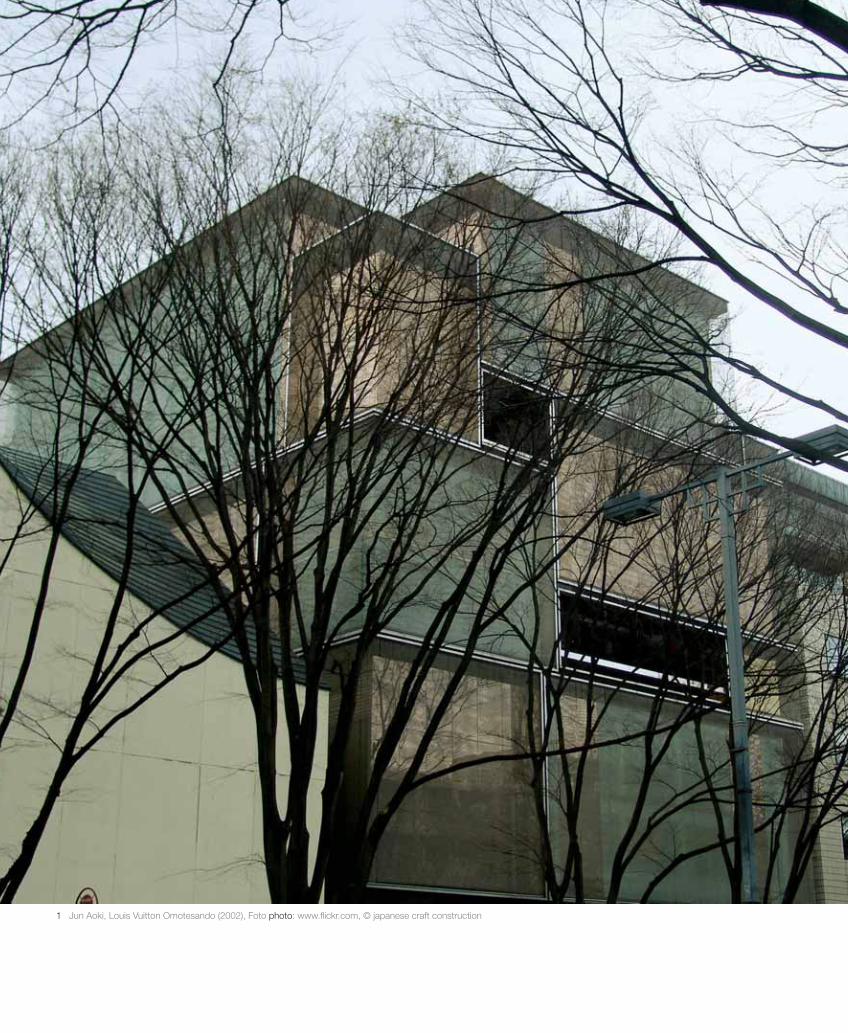
Rund 200 Meter südlich von Tod’s Omotesando errichtet Jun Aoki 2002„Louis Vuitton Omotesando“. Das 32 Meter hohe Geschäfts- und Büroge-bäude ist straßenseitig 25 Meter breit und etwa 20 Meter tief und erscheintals ein Stapel unregelmäßig geschlichteter Quader. Die Fassadenkonstruk-
well-known business technique: “endorsement by association
[…] And this way is one of the things that architecture does
best, and also one of the things that fashion, the industry, needs
most – the new car parked outside the manor house, the clas-
sical revival office building, the corporate headquarters cam-
pus, the view from the castle, the minimalist interior […] All
of them can be borrowed for a day or a week to make or remake
a reputation […]”.21 The brand stores on Omotesando are
also in this sense to be understood as a calculated form of co-
branding because of course Toyo Ito, Kazuyo Sejima et al have,
at the time of being commissioned, a considerable national –
and even more importantly – international reputation at their
disposal – “style authority”.22
When, at the end of the 20th century, “shopping” becomes
a critical metaphor for excess – whether of the sheer size of
the marketing industry, of the grotesque obsession for trade-
marks and brands and their ever more elaborate spatial pro-
ductions and concealing with elements, symbols and forms of
representation of the sphere of culture – then the Omotesando
shopping mile leads an architectonically excessive palette just
as impressively to the generation of atmospherically motivated
appearances of individual objects before eyes which intensify
on an urban scale to a “brandscape”. The limit of social and
corporate relevance is relatively clear to draw in the process,
since to which “outside” do the architectures of the brand-
stores still allow themselves to allude? The atmosphere of the
stores – objectified and accounted for architectonically – stands
out as a contrast to the colorfully mixed, public space – just as
populated as they are densely animated – with countless shops
and places to eat. And even before the intensification of the
brandstores (established around the turn of the millenium),
Omotesando (or rather, Harajuku) was shaped by this effort-
less easiness of urban denseness; an urbanity which the stores
arguably feed on more than they contribute to it.
Around 200 metres south of Tod’s on Omotesando, Jun
Aoki built “Louis Vuitton Omotesando” in 2002. The 32-metre
high shop and office building is, on the street-side, 25 metres
wide and some 20 meters deep, and appears as a pile of irreg-
ularly layered cuboids. The façade construction within this
rectangle is achieved out of four different types of specially
produced high-grade steel netting, in combination with printed,
mirrored glass. In combination with the lighting technique
and the polished, gold-plated steel, continuously changing
82
Die architektonisch verantwortete, objektivierteAtmosphäre der Stores hebtsich als Kontrast vor dem bunt gemischten, ebensobewohnten wie dicht belebten öffentlichen Raum mit unzähligen Shops und Lokalen ab.
21 Vgl. Martin Pawley, „Fashion and Architecture in the 21st Century“, in: Architectural Design 70/6(2000), S. 6–7.
22 Den Co-Branding-Zenit markiert natürlich Miuccia Prada mit ihren Aufträgen an die Pritzker-PreisträgerRem Koolhaas und Herzog & de Meuron. Der Prada Aoyama Store von Herzog & de Meuron liegt ebensoauf der Omotesando, aber etwa 400 m weiter südlich, jenseits der Aoyama Dori-Kreuzung, unmittelbarneben dem von Future Systems und Rei Kawakubo gestalteten Commes des Garçons-Store.
21 See Martin Pawley, “Fashion and Architecture in the 21st Century”, in:Architectural Design 70/6 (2000), pp. 6–7.
22 It is of course Miuccia Prada who marks the co-branding zenith with hercommissions to the Pritzker prizewinners Rem Koolhaas and Herzog & de Meuron. The Prada Aoyama Store by Herzog & de Meuron is also onOmotesando, but c. 400m further south, across the Aoyama Dori crossing,right next to the Comme des Garçons store designed by Future Systemsand Rei Kawakubo.
gam_06_kern_lay_15.qxd 09.11.2009 21:26 Uhr Seite 82

10–13 Jun Aoki, Louis Vuitton Omotesando (2002)10 Foto photo: www.flickr.com, © PurpleCloud11–12 Foto photo: Andreas Lechner13 Foto photo: www.flickr.com, © naoyafujii13
1110
12
gam_06_kern_lay_15.qxd 09.11.2009 21:26 Uhr Seite 83

tion innerhalb dieser Rechtecke ist aus vier verschiedenen Typen speziellgefertigter Edelstahlgewebe ausgeführt, in Kombination mit bedrucktemund verspiegeltem Glas. Zusammen mit der Beleuchtungstechnik und dempolierten sowie vergoldeten Stahl ergeben sich laufend verändernde Muster.Die Assoziation mit einem Stapel aufeinander geschlichteter Reisekoffer istdabei natürlich ein willkommener Hinweis auf die behauste Marke, währenddie in diesen Feldern aus Glas und im Abstand von einem halben Meterdavor gehängten Bahnen aus verschiedenen Edelstahlgeweben dieses Bildwieder entmaterialisieren. Der Stapel scheint sich optisch aufzulösen. Durchdie Überlagerung der verschiedenen Gewebearten erzeugt Aoki eine drittesichtbare Struktur, die selbst nicht stofflich, sondern nur optisch – als Moiré-Muster – existiert. Diese Auflösung von Materialität durch einen nur derunmittelbaren Wahrnehmung vor Ort vorbehaltenen optischen Effekt hatAoki in seinen Arbeiten für Louis Vuitton immer wieder thematisiert undauch theoretisch artikuliert. Wenn er die Fassade als Zwischenraum, alsnicht betretbare Raumschicht ausbildet, der Passanten als „Nebel“ ausMoiré-Mustern erscheint, erzeugt Aoki eine Ästhetik intensiver Oberflä-chen, die auf jeden Schritt des Betrachters reagieren. Wenn er dafür eineäußere Glasschicht mit Louis Vuittons berühmtem Schachbrettmuster be-druckt und in etwa einem halben Meter Abstand vor eine innere, undurch-sichtige Wand mit dem gleichen Muster hängt, erzeugt er eine virtuelleMaterialität, die sich aus der bewegten Sicht des Passanten in ebenso fort-laufend bewegte Moiré-Muster auflöst, sich dematerialisiert. Die Flächenaus verschieden gewebten Edelstahlmatten ergeben beim LV-Omotesando-Store mit den dahinter liegenden Spiegel-, Bronze- und Kupfergläsern undder Beleuchtungstechnik unterschiedlich manipulierbare und zugleichauch – durch jede eigene Bewegung – subjektive Erscheinungsweisen.Durch diese Einbindung des Betrachters bekommt die atmosphärischeQualität des Erscheinungsbildes performativen Charakter. Das materielleZusammenspiel erzeugt eine sinnliche Komplexität, die – obwohl sie sichuns nur über die Oberfläche des Fassadenraums im Stadtraum erschließt –ein Begehren weckt – und sei es nur die Annäherung an diese Neugier er-weckende Erscheinung.
Wenn die besprochenen Objekte mittels flacher, diaphaner, transluzen-ter und transparenter Raumschichten einen umhüllenden Zwischenraumerzeugen, der auf Effekte bzw. Rezeptionsmodi der Bildenden Kunst zwi-schen Abstraktem Expressionismus und Pop Art zielt, so erweitern siederen Repertoire mindestens um die Op Art, die Installation und die Per-formance in Richtung des Theaters. Gerade weil sie ob ihrer werbendenFunktion weder in die platte Promiskuität der High-tech-Medienfassade23 –das wäre das eine Ende des stumpfen Paradigmas urbaner Unterhaltungs-architektur – verfallen, noch das Eintauchen, die Immersion in eine „cine-matic shopping experience“ – das andere Ende mit augmentierten Heritage-Styles oder toll-dynamischen Geometrien – ermöglichen, bleiben sie enig-matisch – auf ästhetischer Distanz. In dieser strikten Oberflächlichkeit liegtihre ästhetische Nonstandard-Qualität. Im Unterschied zu Ralph Laurensschonungslosem Beaux-Arts-Bekenntnis auf der gegenüberliegenden
patterns are created. The association with a pile of suitcases
settled on top of each other is, of course, a welcome reference
to the brand housed there, while the hanging webs made out of
different high-grade steel netting and glass, and at a distance of
a half meter, dematerialize this image again. The pile appears
optically to dissolve. Through the overlapping of different
types of netting Aoki creates a third, visible structure, which
itself exists not materially but only optically – as a Moiré
pattern. In his works for Louis Vuitton, Aoki has again and
again thematized and also articulated theoretically this disso-
lution of materiality by an optical effect that is only reserved
for immediate attention in-situ. When he develops the façade
as an interval, as a layer of space that cannot be entered, which
appears to passers-by as a “mist” of Moiré patterns, Aoki gen-
erates an aesthetic of intensive surfaces which reacts to every
step the observer takes. When he hangs for it an outer glass
layer printed with Louis Vuitton’s famous chess board pattern
and at a distance of approximately half a meter in front of an
inner, opaque wall with the same pattern, he creates a virtual
materiality, which dissolves out of the moved sight of the
passer-by in a Moiré pattern that is also continuously moved,
and becomes dematerialized. With the mirror, bronze and cop-
per glass and the lighting technique lying behind them, the
surfaces of different netted high-grade steel matting produce in
the LV Omotesando appearances which can be manipulated in
different ways and at the same time are – through each single
movement – subjective. By involving the observer, the atmos-
pheric quality of the image that appears gains performative
character. The material interaction generates a sensual com-
plexity which – despite only opening up to us through the sur-
face of the space of the façade in the urban space – awakens a
desire – no matter that it is only the closeness to the appearance
which awakens this curiosity.
When the objects discussed generate an enveloping interval
space by means of flat, diaphanous, translucent and transparent
layers of space, which aim for an effect – or rather, modes of
reception – of the visual arts between Abstract Expressionism
and Pop Art, they thereby broaden the repertoire of the above
at least to Op Art, Installation art and Performance in the
direction of theatre. Exactly because, despite their advertising
function, they lapse neither into the flat promiscuity of the
high-tech media façade23 – that would be one end of the blunt
paradigm of urban entertainment architecture – nor the diving
into, the immersion into a “cinematic shopping experience” –
the other end with augmented heritage styles or fantastic,
84
23 Obwohl natürlich auch auf der zwölfgeschossigen Medienfassade von Peter Marino Architects für „ChanelGinza“ ein eigenes Kuratorenprogramm die einschlägigeren Fashion-Werbeclips mit kritisch-hippenKünstlervideos mischt. Vgl. online: www.chanel-ginza.com, 4. Januar 2009.
23 Although of course there is also on the 12-storey media façade by PeterMarino Architects for “Chanel Ginza” a unique curator’s program whichmixes the most appropriate fashion advertising clips with critically hipartists’ videos. See online: chanel-ginza.com, January 4, 2009.
gam_06_kern_lay_15.qxd 09.11.2009 21:26 Uhr Seite 84

Straßenseite, dessen historisierende Fassadenskulptur den integralen Be-standteil eines sich im Innenraum fortsetzenden Themen-Parcours bildet,der sich des stilversichernden Narrativs imaginierter Wochenenden wohl-habender, amerikanischer Ostküstenbewohner bedient – „It’s not the stylesthat matter so much, it’s the script“24 – bleiben die besprochenen Storesrelativ stumm. Sie sind „nur“ Stil, „nur“ Hülsen, deren „script“, Innenraumoder auch behauste Marke völlig austauschbar ist. Und das könnte im allesabsorbierenden und damit anästhetisierenden Kontext der Brandscapes alskritische Geste gelesen werden, da „[s]ie den Stil selbst zum Gegenstandhaben. Muss man noch darauf hinweisen, dass die Askese, die der Stilbenötigt, im Gegensatz zum Gefallen an der Manier steht, die die heutigeKultur charakterisiert?Das einzige gemeinsameMotiv der beiden ist derNihilismus. Und das Kul-turelle besteht darin, ihnzu verdunkeln, währenddas Künstlerische ihn her-ausarbeit.“25
Dem Vorwurf des Ver-lusts sozialer, politischerund gesellschaftlicherVerantwortung, des Rück-zugs der Architekturpro-duktion in die Verführung– „Seduction, the last re-sort“26 – halten die Storesnur noch jene Abstrakt-heit entgegen „die wir,wie wir heute begreifenmüssen, der Konsumkultur selbst verdanken […] sie wendet sie nachinnen, und die Erscheinung, die die Produktion von Raum und das Nichtsder Verdinglichung ist, nach außen.“27 Sie erscheinen an und als Oberflä-chen, denen weder mit ontologischen/typologischen noch mit semiotischen/repräsentationellen „Hinterfragungen“ beizukommen ist und ähneln damitwohl der Definition und Funktionsweise von technischen Medien, die selbstkeine Bedeutung besitzen, obwohl sie in Abhängigkeit von unserer Auf-merksamkeit für ihre hervorgebrachten Erscheinungen unzählige Bedeu-tungen herstellen können.
dynamic geometries – to enable them to remain enigmatic – at
an aesthetic distance.
Their aesthetic nonstandard quality lies in this strict super-
ficiality. In contrast to Ralph Lauren’s unsparing commitment
to the Beaux Arts on the opposite side of the street, the his-
toricizing façade sculpture of which constitutes the integral
part of the show-jumping themes which continue inside the
building, and which serves the style-affirming narrative of the
imagined weekends of wealthy, American east-coast dwellers –
“It’s not the styles that matter so much, it’s the script”24 – the
stores discussed remain relatively silent. They are “only” style,
“only” husks, the “script” or inner space of which, or the brand
which is housed there, are completely exchangeable. And that
could be read in the context of the brandscapes – which absorb
everything and in doing so anaesthetize everything – as a criti-
cal gesture, as “they have style itself as an object. Do we still
need to refer to the fact that asceticism, which style requires,
stands in contrast to liking the manner which characterizes
today’s culture? The single, common motive of both of them
is nihilism. And the cultural consists in obscuring it, whilst
the artistic draws it out.”25
To the reproach of the loss of social, political and com-
mercial responsibility, of the withdrawal of the production of
architecture into seduction – Seduction, the last resort26 – the
stores still counter with just that abstraction, “that we, as we
have to understand today, owe to consumer culture itself […]
it turns it within, and the appearance, which is the production
of space and the nothingness of reification, outwards.”27 They
appear on and as surfaces, which cannot be negotiated either
with ontological/typological nor with semiotic/representation-
al “scrutiny”, and in the process arguably resemble the defini-
tion and mode of functioning of technical media, which them-
selves have no meaning, although by depending on our atten-
tion for the appearances they generate, they can produce
countless meanings.
85
Sie [die Stores] sind „nur“ Stil, „nur“ Hülsen,
deren „script“, Innenraumoder auch behauste Marke
völlig austauschbar ist. Und das könnte im alles
absorbierenden und damit anästhetisierenden Kontext
der Brandscapes als kritische Geste gelesen
werden (…)
24 Ralph Lauren im Interview: Guy Trebay, „Captain America“, in: New York Times, 26. August 2007, online: http://www.nytimes.com/2007/08/26/style/tmagazine/26america.html, 18. Juli 2008.
25 Jean-François Lyotard, „Anima minima“, in: Lyotard, Postmoderne Moralitäten. Wien: Passagen, 1998, S. 201–213, hier S. 211.
26 Vgl. Neil Leach, The Anaesthetics of Architecture. Cambridge, MA, und London: The MIT Press, 1999.
27 K. Michael Hays, „Die Erscheinung der Abstraktion“, in: Arch+ 143 (1998), S. 28–31, hier S. 30.
24 Ralph Lauren in Interview with Guy Trebay, “Captain America”, in: NewYork Times, August 26, 2007, online http://www.nytimes.com/2007/08/26/style/tmagazine/26america.html, July 18, 2008.
25 Jean-François Lyotard, “Anima minima”, in: Lyotard, Postmoderne Moralitäten. Vienna: Passagen, 1998, pp. 201–213, here p. 211.
26 Cf. Neil Leach, The Anaesthetics of Architecture. Cambridge, MA, andLondon: The MIT Press, 1999.
27 K. Michael Hays, “Die Erscheinung der Abstraktion”, in: Arch+ 143(1998), pp. 28–31, here p.30.
gam_06_kern_lay_15.qxd 09.11.2009 21:26 Uhr Seite 85