The Spatial Aspects of the Foreclosure Crisis: A Look at the New England Region
26
GEORGE MASON UNIVERSITY SCHOOL OF PUBLIC POLICY RESEARCH PAPER NO. 2010-28 THE SPATIAL ASPECTS OF THE FORECLOSURE CRISIS: A LOOK AT THE NEW ENGLAND REGION Laurie Schintler George Mason University - School of Public Policy Emilia Istrate affiliation not provided to SSRN Danilo Pelletiere George Mason University - School of Public Policy; National Low Income Housing Coalition Rajendra Kulkarni George Mason University - School of Public Policy October 15, 2010
-
Upload
independent -
Category
Documents
-
view
0 -
download
0
Transcript of The Spatial Aspects of the Foreclosure Crisis: A Look at the New England Region
GEORGE MASON UNIVERSITY SCHOOL OF PUBLIC POLICY
RESEARCH PAPER NO. 2010-28
THE SPATIAL ASPECTS OF THE FORECLOSURE CRISIS: A LOOK AT THE NEW ENGLAND REGION
Laurie Schintler
George Mason University - School of Public Policy
Emilia Istrate affiliation not provided to SSRN
Danilo Pelletiere
George Mason University - School of Public Policy; National Low Income Housing Coalition
Rajendra Kulkarni George Mason University - School of Public Policy
October 15, 2010
The spatial aspects of the foreclosure crisis:
A look at the New England Region
Laurie Schintler
School of Public Policy, George Mason University,
4400 University Drive – MS 3C6
Fairfax, Virginia 22030
Email: [email protected]
Main: 703-993-2256
Fax: 703-993-0811
Emilia Istrate
School of Public Policy, George Mason University,
3401 Fairfax Drive, MS 3B1
Arlington, VA 22201
Email: [email protected]
Danilo Pelletiere
National Low Income Housing Coalition
727 15th Street, NW, Sixth Floor
Washington, DC 20005
Rajendra Kulkarni
School of Public Policy, George Mason University,
4400 University Drive – MS 3C6
Fairfax, Virginia 22030
Abstract Foreclosures are spatially contagious by nature (Can 1998). Abandoned or vacant properties have
a negative spillover effect, by reducing the expected return on investment on surrounding properties. While
there is a growing body of literature focusing on the latest wave of foreclosures in the US (Foote, Gerardi
and Willen 2008b; Coulton et al. 2008; Lin et al. 2009), the spatial aspect has not been analyzed. We
explore the spatial contagion of foreclosures, at the neighborhood level. Following an epidemiological
*Title Page w/ ALL Author Contact Info.
concept, we define foreclosure contagion as an increase in neighborhood foreclosures that spreads over
time from neighborhood to adjoining neighborhoods. In addition, we define foreclosure hotspots as areas
with high values of foreclosures that are surrounded by areas with high foreclosure levels. The purpose is to
identify the evolution of this spatial phenomenon by structure type (single units versus multi-units) and the
socio-demographic characteristics of the neighborhoods affected by foreclosure. This research employs
data from the Warren Group on nearly 15, 000 residential properties that entered the second stage of the
foreclosure process during 2007 and the first quarter of 2008. The data cover four states: Connecticut,
Massachusetts, New Hampshire, and Rhode Island. Our empirical evidence shows that the foreclosures in
New England during this time period exhibited a spatial contagion pattern and that most troubled
neighborhoods, the foreclosure hotspots, were “infecting” the adjacent neighborhoods. Any foreclosure
mitigation program should include a spatial focus and target the foreclosures in the foreclosure hotspots.
Keywords: foreclosure; spatial association; contagion; residential structure; renters;
New England
1 2 3 4 5 6 7 8 9 10 11 12 13 14 15 16 17 18 19 20 21 22 23 24 25 26 27 28 29 30 31 32 33 34 35 36 37 38 39 40 41 42 43 44 45 46 47 48 49 50 51 52 53 54 55 56 57 58 59 60 61 62 63 64 65
1
The spatial aspects of the foreclosure crisis:
A look at the New England Region
1 Introduction
The United States is currently undergoing the deepest recessions since the Great
Depression of the 1930s. Home foreclosures are an important factor in this
economic crisis. According to one measure, more than 2.3 million properties
faced foreclosure in 2008, an 81 percent increase in total properties from 2007 and
a 225 percent increase in total properties from 2006 (RealtyTrac 2009).
Despite the recent efforts by the federal government to address the housing
crisis, there are scores of households that are on the brink of losing their homes.
Much of this assistance to date has not been geographically targeted, focusing
instead on broad national eligibility and mortgagees and mortgagors opting in to
the programs voluntarily. An exception is the Neighborhood Stabilization
Program (NSP), distributed by competition to specific localities or as a block
grant according to formula, using state and local foreclosures and vacancy rates as
well as economic indicators such as unemployment. But at $5.9 billion in two
separate iterations, this program makes up little of the overall response to the
crisis, which now totals over $3 trillion1 (Trumbull 2009).
To date, there has been some research on the socio-demographic characteristics
of the neighborhoods affected by foreclosures (Wardrip and Pelletiere 2008 a, b)
and the foreclosure spillover price effects (Coulton et al. 2008; Mikelbank 2008;
Lin et al. 2009). There has been no research on the issue of whether foreclosures
disperse and spread across neighborhoods.
This paper presents an exploratory spatial- temporal data analysis of
foreclosures in four New England states (New Hampshire, Massachusetts, Rhode
Island and Connecticut). The time period examined covers five quarters, from
1 It is difficult to tease out exactly how much of this has been for general, geographically untargeted foreclosure prevention and mitigation. For example, $300 billion set aside for the Hope for Homeowners program has gone largely unspent as the program has failed to perform as expected. The Obama administration put forward $75 billion for mortgage modifications with the Home Affordable Modification Program in March 2009. By early August 2009, 400,000 modification offers have been extended and more than 230,000 trial modifications have begun. However, not all servicers signed up to the program have fully engaged in the program (Making Home Affordable 2009).
Manuscript (Author Information Must Not Appear)Click here to view linked References
1 2 3 4 5 6 7 8 9 10 11 12 13 14 15 16 17 18 19 20 21 22 23 24 25 26 27 28 29 30 31 32 33 34 35 36 37 38 39 40 41 42 43 44 45 46 47 48 49 50 51 52 53 54 55 56 57 58 59 60 61 62 63 64 65
2
January 2007 through March 2008. The spatial analysis is done at the level of the
census tract.2
The purpose of this study is to identify the spatial pattern of foreclosures over
time and the socio-demographic characteristics of the neighborhoods affected. In
order to better understand the effect of foreclosure on households and
communities, as opposed to loan portfolios, we conduct the analysis using both
structure and unit level foreclosure indices. In this way, the paper attempts to
better understand where to invest limited resources to most effectively ameliorate
the current foreclosure situation.
We start by providing a literature review of the studies investigating the spatial
aspects of foreclosures. This is followed by a basic, a-spatial descriptive analysis
of the characteristics and trends in foreclosure affected neighborhoods in New
Hampshire, Massachusetts, Rhode Island and Connecticut. We then introduce the
spatial dimension into our analysis, looking at the neighborhood patterns and
trends of foreclosure contagion.
We define foreclosure contagion as an increase in neighborhood foreclosures
that spreads over time from neighborhood to adjoining neighborhoods. More
formally, we measure whether tract-level foreclosures show increasingly positive
spatial association over time. Positive spatial association means that tracts are
surrounded by other tracts with similar characteristics, in this case, levels of
foreclosure.
In the following section, the paper identifies foreclosure “hotspots” and
“coldspots.” Foreclosure hotspots are areas with high values of foreclosures that
are surrounded by areas with high foreclosure levels. Foreclosure coldspots are
areas with low values of foreclosures that are surrounded by areas with low
foreclosure levels. This section also investigates the socio- demographic
characteristics (race and income level) of these spots, and how these attributes
vary by structure type and over time. The effects on the rental market are analyzed
in section six. The last section provides a summary of the results and policy
implications of the results.
2 We use the census tract as the equivalent of neighborhood in this paper.
1 2 3 4 5 6 7 8 9 10 11 12 13 14 15 16 17 18 19 20 21 22 23 24 25 26 27 28 29 30 31 32 33 34 35 36 37 38 39 40 41 42 43 44 45 46 47 48 49 50 51 52 53 54 55 56 57 58 59 60 61 62 63 64 65
3
2 Literature review
The US housing market is seen as the initial and most important catalyst in the
current economic downturn. At the center of the growing economic storm is a
cycle of falling home prices and failing mortgages leading to foreclosures,
tightening credit, job cuts, and lower economic activity, which all leads to further
property price declines. Stopping this cycle and stopping the spread of foreclosure
to new communities has become a policy priority from the federal to the local
level.
Understanding the spatial characteristics of the crisis thus far – e.g. where
foreclosures have been concentrated (and where they are not) and how and where
they spread or recede – would seem essential to an efficient and effective policy
response, one that gets out ahead of the crisis.
It is well understood that foreclosures are highly concentrated in particular
urban areas (Gramlich 2007). In addition, foreclosures have spatial neighborhood
effects. Leonard and Murdoch (2008) used foreclosures as a proxy for changes in
neighborhood quality contributions. Their results show that foreclosures produce
externalities which are capitalized into the prices of other properties in the
neighborhood. Can (1998, p. 68) explains this spatial contagion effect of
foreclosures:
“An abandoned property resulting from foreclosure in a neighborhood acts
as a catalyst by reducing the expected return on investment on surrounding
properties. Homeowners and investors adjacent to abandoned or vacant
properties are less likely to invest because of the anticipated spillover
effects of these properties on the value of their property. This will start the
familiar self fulfilling prophecy of less investment, leading to lower
quality, lower demand, lower price, higher LTV, and finally foreclosure
and abandonment.”
The current crisis makes no exception, with foreclosures concentrated in the
metropolitan areas (Mallach 2009). The “spatial contagion effect” has been
observed across the major metropolitan regions during the recent crisis. Coulton et
al. (2008) found out that an additional foreclosure within 500 feet increased the
hazard of a mortgage to foreclose by 40 percent in Northern Ohio (Cleveland and
Cuyahoga Counties), using data from 2005-2008. Using Columbus as a case,
Mikelbank (2008) found that a foreclosure has a significant impact on a neighbor
1 2 3 4 5 6 7 8 9 10 11 12 13 14 15 16 17 18 19 20 21 22 23 24 25 26 27 28 29 30 31 32 33 34 35 36 37 38 39 40 41 42 43 44 45 46 47 48 49 50 51 52 53 54 55 56 57 58 59 60 61 62 63 64 65
4
house sale up to 1,000 feet. The foreclosures spillover area is three times larger in
the Chicago Primary Metropolitan Statistical Area (Lin et al. 2009).
While foreclosure contagion affects all types of neighborhoods, some socio-
demographic groups and structure types appear to have been particularly affected.
The early evidence from Atlanta (2000-2005) shows that foreclosure filings
concentrate in lower-income, minority communities with older housing stock
(Duda and Apgar 2005). Research on the effect of subprime mortgages on
foreclosures in Northern Ohio found that ethnic minorities have been
disproportionately affected by high cost subprime originated foreclosures
(Coulton et al 2008).
In addition, evidence from Chicago shows that last stage foreclosures affect
increasingly multi-unit properties (Smith and Duda 2008). Foreclosures on multi-
unit structures constrain the rental market supply. This result negatively impacts
renters who are displaced as a result of foreclosures and former homeowners of
foreclosed properties who re-enter the rental market.
The foreclosure crisis in New England has been the focus of a number of
papers recently. The Federal Reserve Bank of Boston has started a research
project on the state of Massachusetts foreclosures in March 2007. Their primary
focus has been on the subprime mortgage outcomes (Foote et al.2008a, Gerardi et
al. 2008), the subprime mortgages and inner city neighborhoods (Gerardi and
Willen 2008) and on the relation between house prices and foreclosures (Foote et
al 2008b). Wardrip and Pelletiere (2008a, b), using New England data, found that
the foreclosure rate is disproportionately high in neighborhoods with high levels
of poverty. All these studies use the Warren Group registry of deeds data.
This study builds on work done previously in this area, with a focus on the
neighborhood level. While the latest study produced by the Federal Reserve Bank
of Boston (Gerardi and Willen 2008) deals with the issue of concentration of
subprime originated foreclosures in urban neighborhoods and the effect on multi-
unit dwellings, it does not employ a spatial analysis model.
This paper presents preliminary and illustrative results. At this stage, we do
not present any causal conclusions concerning the role of house prices in the
foreclosure crisis (Foote et al 2008b), general causes of foreclosures (Gramlich
2007) or the spatial aspects of the housing prices bubble (Schintler et al. 2008).
1 2 3 4 5 6 7 8 9 10 11 12 13 14 15 16 17 18 19 20 21 22 23 24 25 26 27 28 29 30 31 32 33 34 35 36 37 38 39 40 41 42 43 44 45 46 47 48 49 50 51 52 53 54 55 56 57 58 59 60 61 62 63 64 65
5
3 General characteristics of foreclosures
This analysis evaluates data from The Warren Group on nearly 15,000 residential
properties that entered the second stage of the foreclosure process (Bank Owned
and Auction) in the four New England states during 2007 and the first quarter of
2008. The temporal analysis is done by quarter.
We differentiate between “units” and “structures”. As Table 1 indicates, the
analyzed structures represent an estimated 22,942 units. At an average of 1.6 units
per structure, it results that multi-unit buildings are a significant part of the
foreclosure crisis in New England. The purpose of this classification is to identify
the foreclosure impact on units (households) in a neighborhood.
Insert Table 1
The static analysis shows that households living in multi-unit structures have been
the most affected. While the largest share of foreclosures has been in single family
residential structures (59%), when the analysis is done by the number of units, the
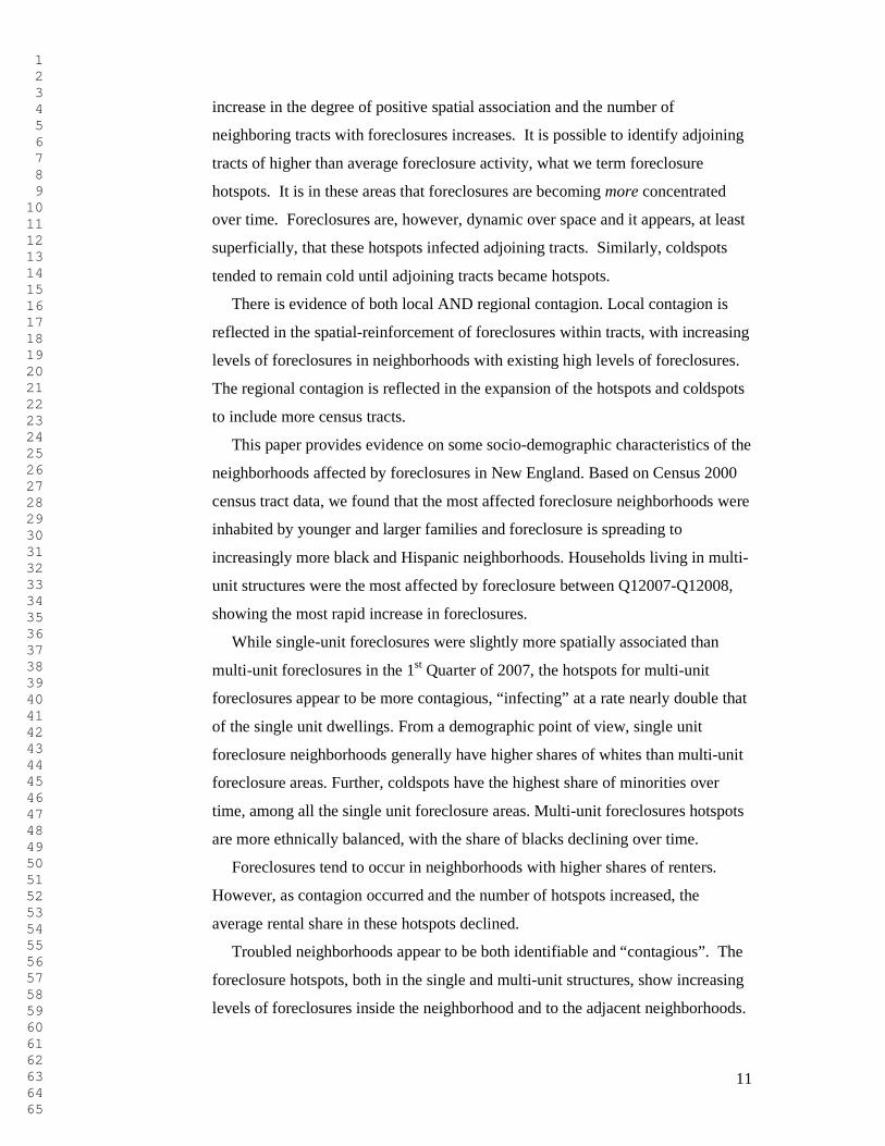
majority of foreclosed units is in multi-unit dwellings (See Figure 1).3
Insert Figure 1
In addition, this analysis identifies the socio-economic characteristics of the
foreclosure affected neighborhoods and how they change over time. While we use
neighborhoods as a unit of analysis, the spatial contiguity aspect is not taken into
account in the results. The variables we investigate are: race (percent white,
percent black, Asian, Hispanic of any race, and “other”), median age and average
family size.4
A series of t-tests comparing the characteristics of the top quartile of
foreclosure neighborhoods with both the non-zero foreclosure census tracts and
the region as a whole provide the results of our analysis. We conducted the tests
for each of the five quarters (See Table 2).
Insert Table 2
Using the Census 2000 demographic data, the most affected foreclosure
neighborhoods are inhabited by younger and larger black and Hispanic families.
Foreclosures do not appear to be a problem in neighborhoods that were
3 We consider the properties distribution between single unit and multi unit as given in New England region during the five quarters analyzed, due the existing constraints on the housing supply (zoning rules and limited availability of greenfield). 4 This is based on the ethnicity of the head of household.
1 2 3 4 5 6 7 8 9 10 11 12 13 14 15 16 17 18 19 20 21 22 23 24 25 26 27 28 29 30 31 32 33 34 35 36 37 38 39 40 41 42 43 44 45 46 47 48 49 50 51 52 53 54 55 56 57 58 59 60 61 62 63 64 65
6
predominantly Asian or white. While these characteristics were not determined
simultaneously, they sketch a portrait of the affected neighborhoods.
The dynamic analysis indicates that the number of foreclosures has increased
dramatically over the time period analyzed (See Figure 1). The highest average
quarterly rate of growth has been in multi-unit dwellings. Single family
foreclosures have increased around 40%. Overtime, the neighborhoods affected by
increasing foreclosures have been more likely to have had higher shares of black
and Hispanic households in 2000.
4 Foreclosure contagion
Foreclosures in the New England region tend to exhibit a high degree of spatial
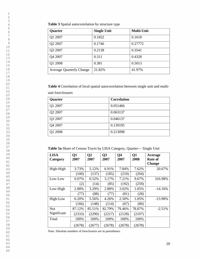
association. Employing a Global Moran’s I Statistic (Moran 1950) by structure
type, we found that the degree of positive spatial association increases over time
for both types of structures (Table 3). We use first-order “rook” contiguity5 to
generate the statistics.
Insert Table 3
A series of correlation analyses indicates that the spatial pattern of foreclosures
is stabilizing in New England over the period analyzed. Overall, the correlation
coefficients between total foreclosure levels in subsequent time periods show that
foreclosures level off (Figure 2). Both the single unit and multi-unit properties
foreclosures levels become increasingly similar over time.
A similar analysis taking into account the spatial aspect depicts an identical
trend (Figure 2). The Local Indicators of Spatial Association (LISA) (Anselin
1995; 2005) of neighborhood foreclosures6 become more alike over time, given
the increasing correlation coefficients between two subsequent periods. This
shows that foreclosures in the New England region tended to reoccur in the same
neighborhoods over time. The spatial reinforcement appears to have increased
over time for both types of structures. This finding may suggest limits to
contagion among like properties or borrowers.
Insert Figure 2
5 Rook contiguity for a geographic unit (e.g., census tract) is defined by neighboring units above, below and to the sides, but not on the diagonal. First-order refers to the immediately adjacent neighbors. 6 Local Moran’s I statistic was used in this case.
1 2 3 4 5 6 7 8 9 10 11 12 13 14 15 16 17 18 19 20 21 22 23 24 25 26 27 28 29 30 31 32 33 34 35 36 37 38 39 40 41 42 43 44 45 46 47 48 49 50 51 52 53 54 55 56 57 58 59 60 61 62 63 64 65
7
The pattern of spatial association of single unit foreclosures is increasingly
similar to that associated with the multi-unit dwellings (see Table 4). The
correlation coefficients between the Local Moran’s I statistics for the two
structure types for ech quarter increase in value from 0.05 to 0.20 over five
quarters. The trend suggest that foreclosures for the two structure types are
increasingly occurring in the same neighborhoods.
Insert Table 4
Our analysis shows that the spatial pattern of foreclosures has increasingly
become more concentrated. Both single unit and multi-unit dwellings foreclosures
experienced this phenomenom, with multi-unit properties reaching the spatial
stabilization faster. There is also a certain degree of spatial homogeneity between
residential structures foreclosures.
5 Foreclosure hotspots
The contagion of foreclosures in New England may be analyzed at the
neighborhood level. Using Anselin’s LISA indicators, we can identify foreclosure
hotspots and coldspots and investigate contagion from these nodes.
Foreclosure hotspots are clusters of neighborhoods with high foreclosure
levels, where a tract with high foreclosures is adjacent to other tracts with high
foreclosures. Foreclosure coldspots are clusters of tracts with low values of
foreclosures, where tracts with low foreclosure levels are adjacent to tracts with
low levels. Tracts with high levels of foreclosures surrounded by tracts with low
levels (high-low) and vice versa (low-high) are transitory hotspots.
For the discussion that follows, it is important to remember several
characteristics of coldspots. While registering low levels of foreclosures,
coldspots do not lack foreclosure activity. In addition, their neighboring tracts
have also low levels of foreclosure activity. There is statistically significant spatial
association between the coldspots’ foreclosure levels and their neighbors’
foreclosure levels. Otherwise, they would be considered “residual”, in our spatial
analysis. In addition, though the level of activity may be relatively low in the
current period in the coldspots, it may be increasing (or decreasing) in the future.
The spatial association between the coldspots’ foreclosures and their neighbors
may change statistically significance over time, with the possibility of the
coldspots turning into “residuals”.
1 2 3 4 5 6 7 8 9 10 11 12 13 14 15 16 17 18 19 20 21 22 23 24 25 26 27 28 29 30 31 32 33 34 35 36 37 38 39 40 41 42 43 44 45 46 47 48 49 50 51 52 53 54 55 56 57 58 59 60 61 62 63 64 65
8
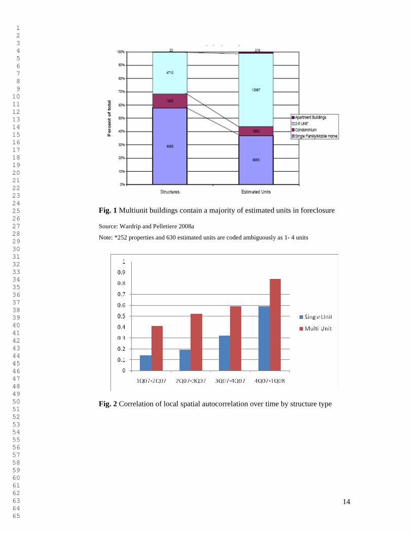
The coding for the LISA categories in the tables and figures in this section is
the following: “1” Hotspots, “2” Coldspots, “3” is Transitory, low to high and
“4” Transitory, high to low. The residual category, “0” tracts, exhibit no
significant spatial association with their neighbors (signicance level greater than
10%).
The emergence of foreclosure hotspots and their changing configuration shows
how foreclosure contagion has advanced during this time period in New England.
We conduct this analysis by residential structure type. Tables 5a and 5b show the
number and share of tracts that fell into each category for each quarter for single
unit and multi unit dwellings.
Insert Table 5a and 5b
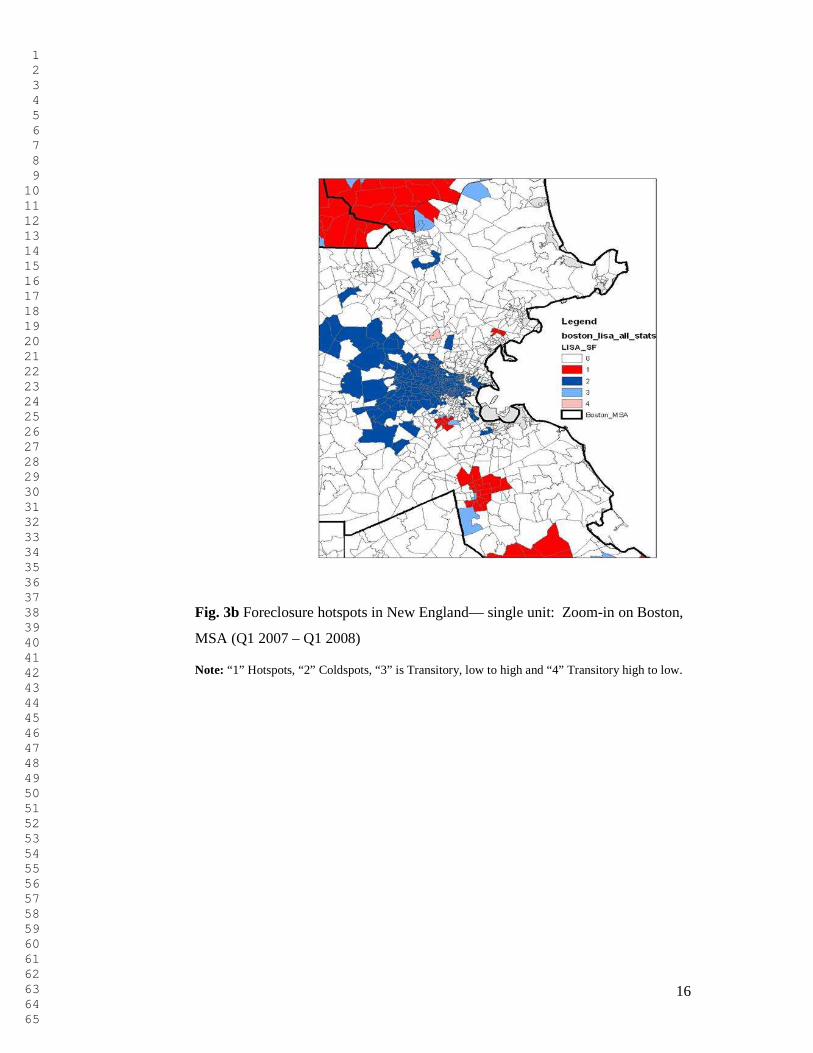
As Tables 5a and 5b show, for single unit structures, new hotspots and coldpots
appeared from transitory neighorhoods (low-high and high-low tracts). Over the
time period examined, single unit foreclosures occur increasingly more in
coldspots than hotspots and they are consistently more prevalent in the coldspots.
This finding could mean that single unit foreclosures are occurring in lower-
density neighborhoods though warrants further investigation. (See Figures 3a and
3b)
Insert Figure 3a and 3b
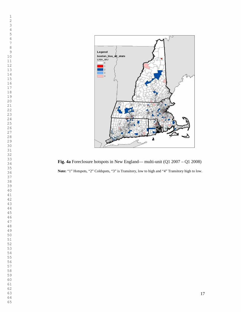
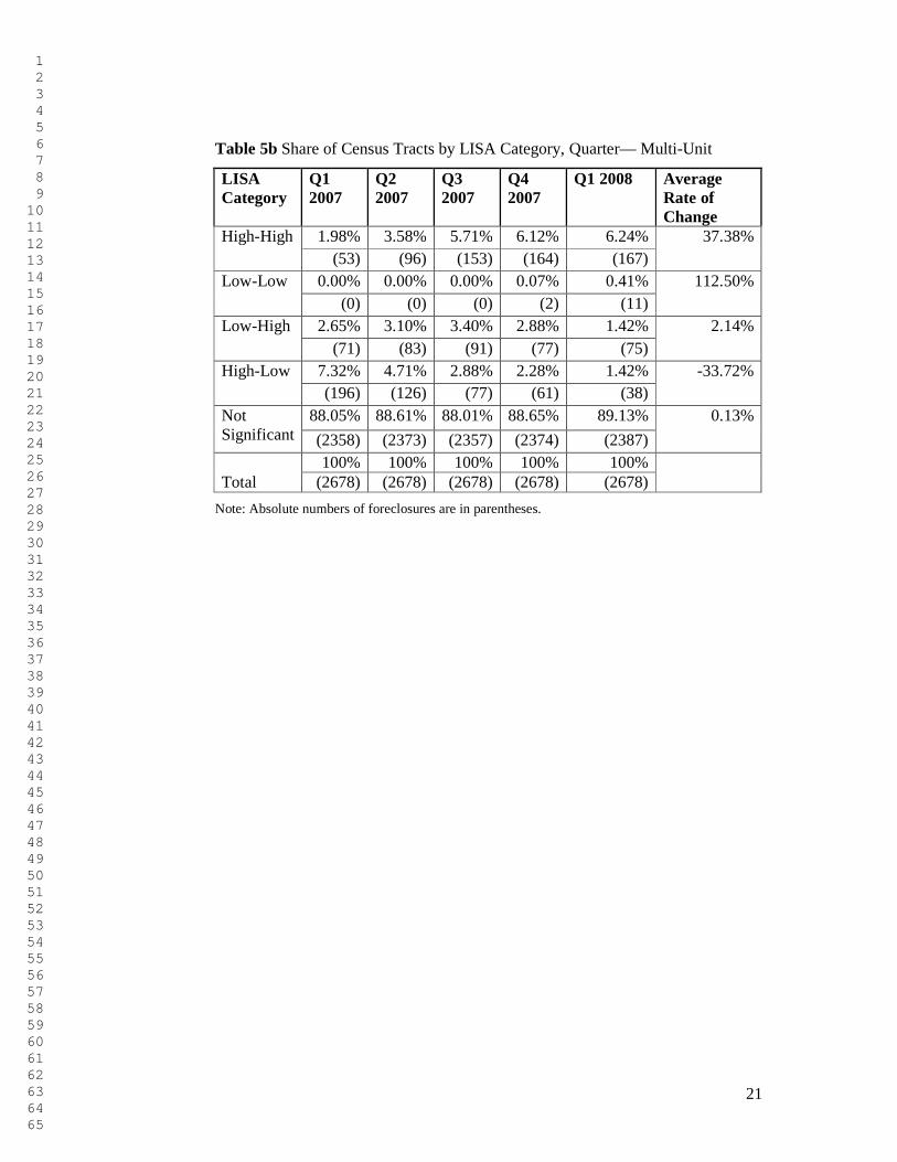
The multi-unit properties show a different pattern of foreclosure contagion
(Figures 4a and 4b). In this time period, areas showing an increase in foreclosures
were already affected by foreclosures in Q1 2007. The number of hotspots,
however, rose three fold over the five quarters, perhaps originating from the
adjancent high- low transitory hotspots. Some of the high- low areas cooled down,
even to the point of having no foreclosures. A small number of high- low
transitory hotspots became low-high, showing a resolution of the foreclosure
problem in one neighboorhood but a deterioration in the contiguous areas. This
result may be explained by the more dense spatial pattern of the multi-unit
properties versus the single- unit structures.
Insert Figure 4a and 4b
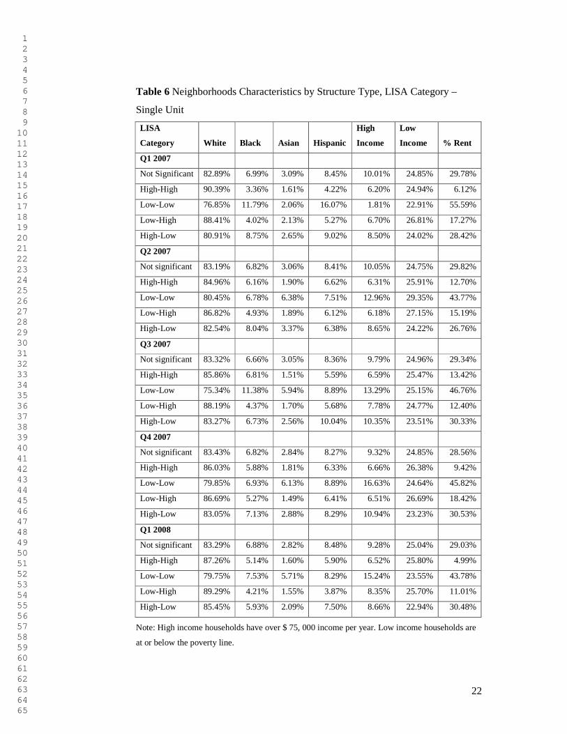
We conduct an analysis of the neighborhood characteristics of foreclosure
hotspots over time by residential structure type. From Table 6, we observe that the
initial single unit foreclosure hotspots are generally white and a quarter of them
are home to low income households (based on Census 2000 data). Over time, as
1 2 3 4 5 6 7 8 9 10 11 12 13 14 15 16 17 18 19 20 21 22 23 24 25 26 27 28 29 30 31 32 33 34 35 36 37 38 39 40 41 42 43 44 45 46 47 48 49 50 51 52 53 54 55 56 57 58 59 60 61 62 63 64 65
9
new hotspots are added and others cool down, the hotspots become less white and
slightly more black and Hispanic. Both the high income and the low income
households grow slightly as a share of the single unit foreclosure hotspots, as
foreclosure moved beyond its origins in lower middle class homeowner
neighborhoods.
Single unit coldspots in the first quarter of 2007 have larger shares of blacks
and Hispanics than the hotspots and lower shares of low income households. By
the end of first quarter of 2008, these neighborhoods with low levels of
foreclosures, surrounded by low foreclosures areas, tend to be more white and
Asian. Blacks and Hispanic neighborhoods were more likely to transition to being
hotspots. Coldspot neighborhoods became increasingly high income, with a seven
fold increase in the average share of high income households in coldspots.
An interesting point in the single unit foreclosure analysis is the case of Asians.
While the average share of Asian households in the hotspots has remained
relatively constant over the five quarters, their share in the coldspot
neighborhoods increased three fold. This may be partly explained by the spread of
the foreclosures to areas not affected previous 2007.
Insert Table 6
The multi- unit foreclosure hotspots present different characteristics and
evolution than the single-units (Table 7). In the initial period, the population of
multi-unit foreclosure hotspots, (based on the 2000 Census), is less than half
white, about a quarter Hispanic and more than a quarter black.7 The hotspot tracts
are less white and more ethnically diverse than the single unit foreclosures
hotspots. On average, one-third of their households are low income, a much
higher percentage than their single unit hotspot counterparts. Over time, however,
the multi-unit hotspots change their configuration to include increasingly white,
slightly more Hispanic and less black tracts. From the income point of view, there
is a slight increase in high income households as a share of the multi-unit
foreclosure hotspots.
Insert Table 7
7 The socio-demographic characteristics of the census tracts are based on the Census 2000 data.
1 2 3 4 5 6 7 8 9 10 11 12 13 14 15 16 17 18 19 20 21 22 23 24 25 26 27 28 29 30 31 32 33 34 35 36 37 38 39 40 41 42 43 44 45 46 47 48 49 50 51 52 53 54 55 56 57 58 59 60 61 62 63 64 65
10
6 The rental market
We investigate the effect of foreclosures on the general tenure, expressed as the
ratio of the rental occupied out of all households. Using a t-test comparing the
tenure of the top quartile of foreclosure neighborhoods with both the non-zero
foreclosure census tracts and the region as a whole, we find that foreclosures tend
to occur in neighborhoods with higher shares of renters. In addition, the level of
statistical significance of the effect increases over time (See Table 2). Our results
confirm previous findings on the New England foreclosures (Wardrip and
Pelletiere 2008b; Gerardi and Willen 2008).
The foreclosure hotspot analysis by structure type presents some interesting
findings (See Tables 6 and 7). As might be expected, multi-unit foreclosures tend
to occur in neighborhoods with high shares of renter households. Of interest
though is that single unit foreclosures coldspots are consistently in neighborhoods
with relatively high shares of renters. In first quarter of 2007, the share of renters
in single unit coldspots was greater than one-half. The share declines slightly to
43% by Q12008.
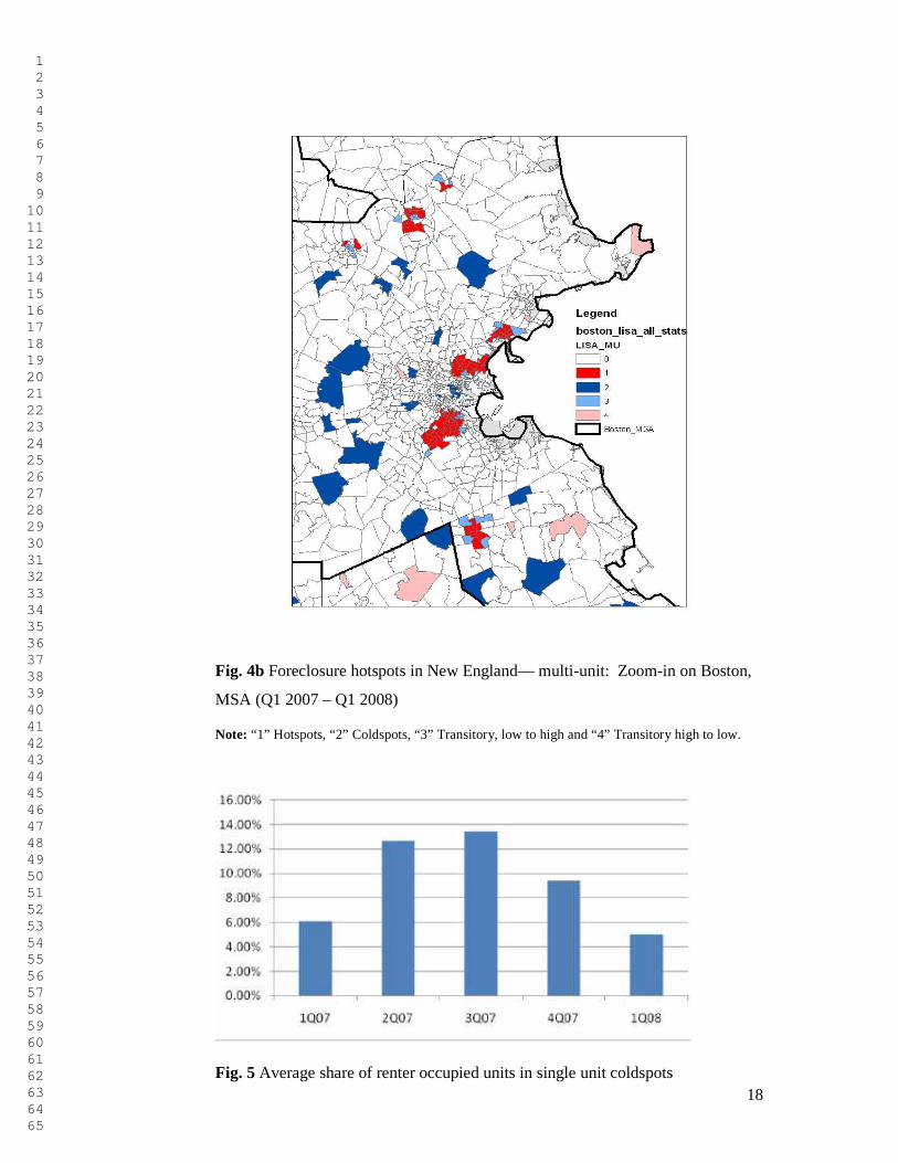
Over the five quarters analyzed, single unit hotspots are initially increasingly
located in rental neighborhoods. However this trend eventually reverses (see
Figure 5). In the third quarter of 2007, single unit foreclosure hotspots were in
neighborhoods with 13.7% renters, on average. The share reduces by more than
half by the end of 2008.
Insert Figure 5
The declining effect on the rental market is observed also in the multi-unit
foreclosures (Table 7). The multi- unit foreclosure hotspots are almost half rental
properties at the beginning of 2007. The average rental share declines slightly by
Q12008. The coldspots have lower shares of rental; coldspots are consistently in
neighborhoods with only about one-third renters on average. The share declines
also somewhat by the end of the analyzed period.
7 Conclusions
This paper provides evidence that the evolution of the foreclosures in New
England showed a spatial contagion pattern over 2007 and the first quarter of
2008. Over the period examined, the spatial contagion effect is shown by an
1 2 3 4 5 6 7 8 9 10 11 12 13 14 15 16 17 18 19 20 21 22 23 24 25 26 27 28 29 30 31 32 33 34 35 36 37 38 39 40 41 42 43 44 45 46 47 48 49 50 51 52 53 54 55 56 57 58 59 60 61 62 63 64 65
11
increase in the degree of positive spatial association and the number of
neighboring tracts with foreclosures increases. It is possible to identify adjoining
tracts of higher than average foreclosure activity, what we term foreclosure
hotspots. It is in these areas that foreclosures are becoming more concentrated
over time. Foreclosures are, however, dynamic over space and it appears, at least
superficially, that these hotspots infected adjoining tracts. Similarly, coldspots
tended to remain cold until adjoining tracts became hotspots.
There is evidence of both local AND regional contagion. Local contagion is
reflected in the spatial-reinforcement of foreclosures within tracts, with increasing
levels of foreclosures in neighborhoods with existing high levels of foreclosures.
The regional contagion is reflected in the expansion of the hotspots and coldspots
to include more census tracts.
This paper provides evidence on some socio-demographic characteristics of the
neighborhoods affected by foreclosures in New England. Based on Census 2000
census tract data, we found that the most affected foreclosure neighborhoods were
inhabited by younger and larger families and foreclosure is spreading to
increasingly more black and Hispanic neighborhoods. Households living in multi-
unit structures were the most affected by foreclosure between Q12007-Q12008,
showing the most rapid increase in foreclosures.
While single-unit foreclosures were slightly more spatially associated than
multi-unit foreclosures in the 1st Quarter of 2007, the hotspots for multi-unit
foreclosures appear to be more contagious, “infecting” at a rate nearly double that
of the single unit dwellings. From a demographic point of view, single unit
foreclosure neighborhoods generally have higher shares of whites than multi-unit
foreclosure areas. Further, coldspots have the highest share of minorities over
time, among all the single unit foreclosure areas. Multi-unit foreclosures hotspots
are more ethnically balanced, with the share of blacks declining over time.
Foreclosures tend to occur in neighborhoods with higher shares of renters.
However, as contagion occurred and the number of hotspots increased, the
average rental share in these hotspots declined.
Troubled neighborhoods appear to be both identifiable and “contagious”. The
foreclosure hotspots, both in the single and multi-unit structures, show increasing
levels of foreclosures inside the neighborhood and to the adjacent neighborhoods.

1 2 3 4 5 6 7 8 9 10 11 12 13 14 15 16 17 18 19 20 21 22 23 24 25 26 27 28 29 30 31 32 33 34 35 36 37 38 39 40 41 42 43 44 45 46 47 48 49 50 51 52 53 54 55 56 57 58 59 60 61 62 63 64 65
12
This evidence suggests that a limited resource policy intervention should be
focused on these neighborhoods.
Though we use the terminology of epidemiology, we limit ourselves here to
measuring the extent and the process of contagion and do not speculate at this
point on the mechanisms by which one tract may infect another. Future research is
needed to investigate the causes and the process of foreclosure contagion.
While this preliminary research cannot speak to the effectiveness of any
specific current policy interventions, it does indicate as necessary a spatially
targeted foreclosure policy. Funds should not be allocated on a formula basis, but
on a damage level basis. We identify as the most harmful the foreclosures in
neighborhoods with high level of foreclosures, which are surrounded by
neighborhoods with high level of foreclosures- the hotspots. Similar with
epidemiological interventions, the most effective way to tackle the current
foreclosure crisis is to focus on the hotspots, at the neighborhood level.
Acknowledgements Earlier versions of this paper were presented at the North American Regional
Conference, New York, November 2008, the American Real Estate and Urban Economics
Conference, June 2009 and at an informal roundtable at Fannie Mae in June 2009. The authors
wish to thank the panelists and audience participants for their useful comments on the earlier
drafts. In addition, they would like to thank Giacomo Galiazzo for research assistance.
References
Anselin L (1995) Local indicators of spatial association – LISA. Geographical Analysis 27: 93-
115
Anselin L (2005) Exploring Spatial Data with GeoDA: A Workbook. Center for Spatially
Integrated Social Science, University of Illinois, Urbana- Champaign
Can A (1998) GIS and Spatial Analysis of Housing and Mortgage Markets. Journal of Housing
Research 9: 61-86
Coulton C, Chan T, Schramm M, Mikelbank K (2008) A Longitudinal Study of Mortgage Loans,
Cleveland and Cuyahoga County, 2005-2008. Center on Urban Poverty and Community
Development, Mandel School of Applied Social Sciences, Case Western Reserve University.
Cleveland OH
Duda M, Apgar WC (2005) Mortgage Foreclosures in Atlanta: Patterns and Policy Issues.
NeighborWorks America, Washington, DC
Foote CL, Gerardi K, Goette L, Willen PS (2008a) Subprime Facts: What (We Think) We Know
About the Subprime Crisis and What We Don’t. Working Paper 08-2, Federal Reserve Bank of
Boston, Boston, MA
1 2 3 4 5 6 7 8 9 10 11 12 13 14 15 16 17 18 19 20 21 22 23 24 25 26 27 28 29 30 31 32 33 34 35 36 37 38 39 40 41 42 43 44 45 46 47 48 49 50 51 52 53 54 55 56 57 58 59 60 61 62 63 64 65
13
Foote CL, Gerardi K, Willen PS (2008b) Negative Equity and Foreclosure: Theory and Evidence.
Journal of Urban Economics 64: 234-245
Gerardi K, Willen PS (2008) Subprime Mortgages, Foreclosures, and Urban Neighborhoods.
Working Paper No 08- 6, Federal Reserve Bank of Boston, Boston, MA
Gerardi K, Shapiro AH, Willen PS (2008). Subprime outcomes: Risky, mortgages,
homeownership experiences, and foreclosures. Working Paper 07-15, Federal Reserve Bank of
Boston, Boston, MA
Gramlich E (2007) Subprime Mortgages America’s Latest Boom and Bust. The Urban Institute
Press, Washington, DC
Leonard T, Murdoch JC (2009) The Neighborhood Effects of Foreclosure. Journal of
Geographical Systems
Lin Z, Rosenblatt E, Yao VW (2009) Spillover Effects of Foreclosures on Neighborhood Property
Values. Journal of Real Estate Finance and Economics 38: 387-407
Mallach A (2009) Stabilizing Communities: A Federal Response to the Secondary Impacts of the
Foreclosure Crisis. The Brookings Institution, Washington, DC
Making Home Affordable (2009) Making Home Affordable Program on Pace to Offer Help to
Millions Of Homeowners. Available at http://makinghomeaffordable.gov/pr_08042009.html
Accessed 6 Aug 2009
Mikelbank B A (2008) Spatial Analysis of the Impact of Vacant, Abandoned and Foreclosed
Properties. Office of Community Affairs, Federal Reserve Bank of Cleveland, Cleveland, OH
Moran P (1950) Notes on Continuous Stochastic Phenomena. Biometrika 37: 17-23
RealtyTrac (2009) Foreclosure Activity Increases 81 Percent in 2008. Available at
http://www.realtytrac.com/ContentManagement/pressrelease.aspx?ChannelID=9&ItemID=5681&
accnt=64847 Accessed on 16 January 2009
Schintler L, Istrate E, Kulkarni R, Stough R (2008) The Spatial-Temporal Complexity of the
Housing Market. Paper presented at the European Regional Science Association Conference, 27-
31 Aug 2008, Liverpool, England
Smith G, Duda S (2008) Foreclosure Fallout: An Analysis of Foreclosure Auctions in the Chicago
Region. Woodstock Institute, Chicago, IL
Trumbull M (2009) Where did all the bailout money go? The Christian Science Monitor. Available
at http://www.csmonitor.com/2009/0429/p19s01-usgn.html. Accessed 27 April 2009
Wardrip KE, Pelletiere D (2008a) Properties, Units, and Tenure in the Foreclosure Crisis: An
Initial Analysis of Properties at the End of the Foreclosure Crisis in New England. Research Note
08-01, National Low Income Housing Coalition, Washington, DC. Available at
www.nlihc.org/doc/RN-08-01-Multi-Unit-Foreclosure-FINAL-05-06-08.pdf.
Wardrip KE, Pelletiere D (2008b) Neighborhood Poverty and Tenure Characteristics and the
Incidence of Foreclosure in New England. Research Note 08-02, National Low Income Housing
Coalition, Washington, DC. Available at https://www2398.ssldomain.com/nlihc/doc/RN-08-02-
Final.pdf
1 2 3 4 5 6 7 8 9 10 11 12 13 14 15 16 17 18 19 20 21 22 23 24 25 26 27 28 29 30 31 32 33 34 35 36 37 38 39 40 41 42 43 44 45 46 47 48 49 50 51 52 53 54 55 56 57 58 59 60 61 62 63 64 65
14
Fig. 1 Multiunit buildings contain a majority of estimated units in foreclosure
Source: Wardrip and Pelletiere 2008a
Note: *252 properties and 630 estimated units are coded ambiguously as 1- 4 units
Fig. 2 Correlation of local spatial autocorrelation over time by structure type
1 2 3 4 5 6 7 8 9 10 11 12 13 14 15 16 17 18 19 20 21 22 23 24 25 26 27 28 29 30 31 32 33 34 35 36 37 38 39 40 41 42 43 44 45 46 47 48 49 50 51 52 53 54 55 56 57 58 59 60 61 62 63 64 65
15
Fig. 3a Foreclosure hotspots in New England— single unit (Q1 2007 – Q1 2008)
Note: “1” Hotspots, “2” Coldspots, “3” is Transitory, low to high and “4” Transitory high to low.
1 2 3 4 5 6 7 8 9 10 11 12 13 14 15 16 17 18 19 20 21 22 23 24 25 26 27 28 29 30 31 32 33 34 35 36 37 38 39 40 41 42 43 44 45 46 47 48 49 50 51 52 53 54 55 56 57 58 59 60 61 62 63 64 65
16
Fig. 3b Foreclosure hotspots in New England— single unit: Zoom-in on Boston,
MSA (Q1 2007 – Q1 2008)
Note: “1” Hotspots, “2” Coldspots, “3” is Transitory, low to high and “4” Transitory high to low.
1 2 3 4 5 6 7 8 9 10 11 12 13 14 15 16 17 18 19 20 21 22 23 24 25 26 27 28 29 30 31 32 33 34 35 36 37 38 39 40 41 42 43 44 45 46 47 48 49 50 51 52 53 54 55 56 57 58 59 60 61 62 63 64 65
17
Fig. 4a Foreclosure hotspots in New England— multi-unit (Q1 2007 – Q1 2008)
Note: “1” Hotspots, “2” Coldspots, “3” is Transitory, low to high and “4” Transitory high to low.
1 2 3 4 5 6 7 8 9 10 11 12 13 14 15 16 17 18 19 20 21 22 23 24 25 26 27 28 29 30 31 32 33 34 35 36 37 38 39 40 41 42 43 44 45 46 47 48 49 50 51 52 53 54 55 56 57 58 59 60 61 62 63 64 65
18
Fig. 4b Foreclosure hotspots in New England— multi-unit: Zoom-in on Boston,
MSA (Q1 2007 – Q1 2008)
Note: “1” Hotspots, “2” Coldspots, “3” Transitory, low to high and “4” Transitory high to low.
Fig. 5 Average share of renter occupied units in single unit coldspots
1 2 3 4 5 6 7 8 9 10 11 12 13 14 15 16 17 18 19 20 21 22 23 24 25 26 27 28 29 30 31 32 33 34 35 36 37 38 39 40 41 42 43 44 45 46 47 48 49 50 51 52 53 54 55 56 57 58 59 60 61 62 63 64 65
19
Table 1 Foreclosures in New England states, Q1 2007 to Q1 2008
Foreclosed properties 14,645
Foreclosed units 22,942
Total households in region (2000) 4,628,280
Source: Wardrip and Pelletiere 2008b
Note: This paper considers the New England states of Connecticut, Massachusetts, New
Hampshire, and Rhode Island.
Table 2 Summary of T-Test results for the socio-demographic variables, Q1
2007- Q1 2008
Variable Q1 2007 Q2 2007 Q3 2007 Q4 2007 Q1 2008
% White -3.47 -4.25 -4.58 -5.93 -8.05
(0.007) (0.002) (0.001) (0) (0)
% Black 2.59 3.03 3.54 5.03 8.42
(0.029) (0.014) (0.006) (0) (0)
% Asian -0.46 -3.01 -2.84 -1.8 -2.21
(0.653) (0.015) (0.019) (0.106) (0.05)
% Hispanic 1.73 3.76 5 4.29 6.98
(0.118) (0.004) (0.001) (0.002) (0)
% Other 2.64 4.45 5.52 5.42 6.47
(0.027) (0.002) (0) (0) (0)
Median Age -3.79 -4.66 -7.09 -5.82 -7.62
(0.004) (0.001) (0) (0) (0)
Average Family size
4.27 6.33 7.84 7.49 7.71
(0.002) (0) (0) (0) (0)
% Renters 1.97 2.55 4.35 3.87 6.27
(0.081) (0.031) (0.002) (0.004) (0) Note: Probability values in parentheses.
1 2 3 4 5 6 7 8 9 10 11 12 13 14 15 16 17 18 19 20 21 22 23 24 25 26 27 28 29 30 31 32 33 34 35 36 37 38 39 40 41 42 43 44 45 46 47 48 49 50 51 52 53 54 55 56 57 58 59 60 61 62 63 64 65
20
Table 3 Spatial autocorrelation by structure type
Quarter Single Unit Multi-Unit
Q1 2007 0.1822 0.1618
Q2 2007 0.1746 0.27772
Q3 2007 0.2138 0.3541
Q4 2007 0.311 0.4328
Q1 2008 0.381 0.5013
Average Quarterly Change 21.82% 41.97%
Table 4 Correlation of local spatial autocorrelation between single unit and multi-
unit foreclosures
Quarter Correlation
Q1 2007 0.051466
Q2 2007 0.063137
Q3 2007 0.046137
Q4 2007 0.139195
Q1 2008 0.213098
Table 5a Share of Census Tracts by LISA Category, Quarter— Single Unit
LISA Category
Q1 2007
Q2 2007
Q3 2007
Q4 2007
Q1 2008
Average Rate of Change
High-High 3.73% 5.12% 6.91% 7.84% 7.62% 20.67% (100) (137) (185) (210) (204)
Low-Low 0.07% 0.52% 3.17% 7.21% 9.67% 316.98% (2) (14) (85) (192) (259)
Low-High 2.88% 3.29% 2.88% 3.02% 1.05% -14.16% (77) (88) (77) (81) (28)
High-Low 6.20% 5.56% 4.26% 2.50% 1.05% -13.98% (166) (148) (114) (67) (80)
Not Significant
87.12% 85.51% 82.79% 79.46% 78.87% -2.51%
(2333) (2290) (2217) (2128) (2107) Total
100% 100% 100% 100% 100%
(2678) (2677) (2678) (2678) (2678)
Note: Absolute numbers of foreclosures are in parentheses.
1 2 3 4 5 6 7 8 9 10 11 12 13 14 15 16 17 18 19 20 21 22 23 24 25 26 27 28 29 30 31 32 33 34 35 36 37 38 39 40 41 42 43 44 45 46 47 48 49 50 51 52 53 54 55 56 57 58 59 60 61 62 63 64 65
21
Table 5b Share of Census Tracts by LISA Category, Quarter— Multi-Unit
LISA Category
Q1 2007
Q2 2007
Q3 2007
Q4 2007
Q1 2008 Average Rate of Change
High-High 1.98% 3.58% 5.71% 6.12% 6.24% 37.38% (53) (96) (153) (164) (167)
Low-Low 0.00% 0.00% 0.00% 0.07% 0.41% 112.50% (0) (0) (0) (2) (11)
Low-High 2.65% 3.10% 3.40% 2.88% 1.42% 2.14% (71) (83) (91) (77) (75)
High-Low 7.32% 4.71% 2.88% 2.28% 1.42% -33.72% (196) (126) (77) (61) (38)
Not Significant
88.05% 88.61% 88.01% 88.65% 89.13% 0.13%
(2358) (2373) (2357) (2374) (2387)
Total 100% 100% 100% 100% 100%
(2678) (2678) (2678) (2678) (2678)
Note: Absolute numbers of foreclosures are in parentheses.
1 2 3 4 5 6 7 8 9 10 11 12 13 14 15 16 17 18 19 20 21 22 23 24 25 26 27 28 29 30 31 32 33 34 35 36 37 38 39 40 41 42 43 44 45 46 47 48 49 50 51 52 53 54 55 56 57 58 59 60 61 62 63 64 65
22
Table 6 Neighborhoods Characteristics by Structure Type, LISA Category –
Single Unit
LISA
Category White Black Asian Hispanic
High
Income
Low
Income % Rent
Q1 2007
Not Significant 82.89% 6.99% 3.09% 8.45% 10.01% 24.85% 29.78%
High-High 90.39% 3.36% 1.61% 4.22% 6.20% 24.94% 6.12%
Low-Low 76.85% 11.79% 2.06% 16.07% 1.81% 22.91% 55.59%
Low-High 88.41% 4.02% 2.13% 5.27% 6.70% 26.81% 17.27%
High-Low 80.91% 8.75% 2.65% 9.02% 8.50% 24.02% 28.42%
Q2 2007
Not significant 83.19% 6.82% 3.06% 8.41% 10.05% 24.75% 29.82%
High-High 84.96% 6.16% 1.90% 6.62% 6.31% 25.91% 12.70%
Low-Low 80.45% 6.78% 6.38% 7.51% 12.96% 29.35% 43.77%
Low-High 86.82% 4.93% 1.89% 6.12% 6.18% 27.15% 15.19%
High-Low 82.54% 8.04% 3.37% 6.38% 8.65% 24.22% 26.76%
Q3 2007
Not significant 83.32% 6.66% 3.05% 8.36% 9.79% 24.96% 29.34%
High-High 85.86% 6.81% 1.51% 5.59% 6.59% 25.47% 13.42%
Low-Low 75.34% 11.38% 5.94% 8.89% 13.29% 25.15% 46.76%
Low-High 88.19% 4.37% 1.70% 5.68% 7.78% 24.77% 12.40%
High-Low 83.27% 6.73% 2.56% 10.04% 10.35% 23.51% 30.33%
Q4 2007
Not significant 83.43% 6.82% 2.84% 8.27% 9.32% 24.85% 28.56%
High-High 86.03% 5.88% 1.81% 6.33% 6.66% 26.38% 9.42%
Low-Low 79.85% 6.93% 6.13% 8.89% 16.63% 24.64% 45.82%
Low-High 86.69% 5.27% 1.49% 6.41% 6.51% 26.69% 18.42%
High-Low 83.05% 7.13% 2.88% 8.29% 10.94% 23.23% 30.53%
Q1 2008
Not significant 83.29% 6.88% 2.82% 8.48% 9.28% 25.04% 29.03%
High-High 87.26% 5.14% 1.60% 5.90% 6.52% 25.80% 4.99%
Low-Low 79.75% 7.53% 5.71% 8.29% 15.24% 23.55% 43.78%
Low-High 89.29% 4.21% 1.55% 3.87% 8.35% 25.70% 11.01%
High-Low 85.45% 5.93% 2.09% 7.50% 8.66% 22.94% 30.48%
Note: High income households have over $ 75, 000 income per year. Low income households are
at or below the poverty line.

1 2 3 4 5 6 7 8 9 10 11 12 13 14 15 16 17 18 19 20 21 22 23 24 25 26 27 28 29 30 31 32 33 34 35 36 37 38 39 40 41 42 43 44 45 46 47 48 49 50 51 52 53 54 55 56 57 58 59 60 61 62 63 64 65
23
Table 7 Neighborhoods Characteristics by Structure Type, LISA Category –
Multi- Unit
LISA
Category White Black Asian Hispanic
High
Income
Low
Income % Rent
Q1 2007
Not Significant 85.43% 5.74% 2.92% 7.12% 10.35% 24.31% 27.49%
High-High 45.17% 28.31% 3.94% 23.54% 2.07% 33.36% 43.42%
Low-Low n/a n/a n/a n/a n/a n/a n/a
Low-High 69.76% 13.12% 3.20% 15.59% 4.36% 29.59% 31.38%
High-Low 84.12% 5.69% 2.94% 9.28% 5.28% 26.97% 27.94%
Q2 2007
Not Significant 85.83% 5.56% 2.87% 6.80% 10.34% 24.20% 27.06%
High-High 47.72% 24.82% 4.44% 26.29% 2.17% 33.63% 41.15%
Low-Low n/a n/a n/a n/a n/a n/a n/a
Low-High 66.22% 15.83% 3.36% 17.34% 3.56% 31.44% 35.63%
High-Low 82.80% 5.34% 3.13% 10.72% 6.57% 26.42% 31.44%
Q3 2007
Not Significant 86.02% 5.51% 2.89% 6.69% 10.35% 24.21% 26.79%
High-High 48.58% 24.37% 3.69% 26.46% 2.58% 33.51% 43.78%
Low-Low n/a n/a n/a n/a n/a n/a n/a
Low-High 69.57% 11.12% 4.59% 18.42% 3.94% 31.09% 35.63%
High-Low 87.30% 4.83% 2.28% 5.53% 7.21% 24.52% 29.53%
Q4 2007
Not Significant 86.09% 5.37% 2.88% 6.76% 10.26% 24.17% 26.88%
High-High 49.62% 24.75% 4.42% 23.88% 2.59% 32.90% 41.14%
Low-Low 81.94% 8.48% 5.21% 4.67% 23.23% 20.93% 29.99%
Low-High 65.55% 14.84% 3.35% 19.98% 4.47% 33.36% 40.94%
High-Low 88.36% 3.42% 1.92% 7.17% 8.22% 25.39% 27.80%
Q1 2008
Not Significant 85.77% 5.54% 2.89% 6.87% 10.20% 24.29% 27.53%
High-High 50.60% 23.23% 4.33% 24.90% 2.57% 33.24% 37.40%
Low-Low 89.38% 3.29% 4.38% 3.19% 18.93% 25.92% 28.15%
Low-High 71.61% 12.33% 2.83% 18.00% 4.58% 28.48% 33.82%
High-Low 87.72% 5.14% 2.06% 6.19% 7.77% 25.71% 22.81%
Note: High income households have over $ 75, 000 income per year. Low income households are
at or below the poverty line. n/a = no census tracts fell into the LISA category