The Skill Plot: A Graphical Technique for Evaluating Continuous Diagnostic Tests
27
THE SKILL PLOT: A GRAPHICAL TECHNIQUE FOR EVALUATING CONTINUOUS DIAGNOSTIC TESTS William M. Briggs General Internal Medicine, Weill Cornell Medical College 525 E. 68th, Box 46, New York, NY 10021 email: [email protected] and Russell Zaretzki Department of Statistics, Operations, and Management Science The University of Tennessee 331 Stokely Management Center, Knoxville, TN, 37996 email: [email protected] December 12, 2006 1
Transcript of The Skill Plot: A Graphical Technique for Evaluating Continuous Diagnostic Tests

THE SKILL PLOT: A GRAPHICAL TECHNIQUE FOREVALUATING CONTINUOUS DIAGNOSTIC TESTS
William M. Briggs
General Internal Medicine, Weill Cornell Medical College525 E. 68th, Box 46, New York, NY 10021
email: [email protected]
and
Russell Zaretzki
Department of Statistics, Operations, and Management ScienceThe University of Tennessee
331 Stokely Management Center, Knoxville, TN, 37996email: [email protected]
December 12, 2006
1

2 THE SKILL PLOT
Summary: We introduce the Skill Plot, a method that it is directly relevant to a
decision maker who must use a diagnostic test. In contrast to ROC curves, the skill
curve allows easy graphical inspection of the optimal cutoff or decision rule for a
diagnostic test. The skill curve and test also determine whether diagnoses based on
this cutoff improve upon a naive forecast (of always present or of always absent). The
skill measure makes it easy to directly compare the predictive utility of two different
classifiers in analogy to the area under the curve statistic related to ROC analysis.
Finally, this paper shows that the skill based cutoff inferred from the plot is equivalent
to the cutoff indicated by optimizing the posterior odds in accordance with Bayesian
decision theory. A method for constructing a confidence interval for this optimal
point is presented and briefly discussed.
Key words: ROC curve; Sensitivity; Skill Plot; Skill Score; Specificity.
THE SKILL PLOT 3
1. Introduction
A patient presents himself to an emergency room with right lower quadrant pain
and appendicitis is suspected. In these cases, typically the white blood count (WBC)
is measured because high levels are thought to be highly predictive of appendicitis
(Birkhahn et al., 2005). If the WBC is greater than or equal to some particular cutoff
value, xc, the patient is diagnosed with appendicitis and some kind of proactive
treatment is begun, such as a CAT scan or an exploratory laparotomy. Levels less
than xc are treated as non cases and either alternative explanations for the symptoms
are investigated, or the patient is sent home. We introduce here a plot based upon
the skill score of Briggs & Ruppert (2005) as a measure of performance of forecasts
of this type.
There has been an increased emphasis on methods to evaluate the effectiveness of
classification and prediction rules. Prominent among these methodologies are ROC
curves (Pepe, 2004; Zhou et al., 2002; Begg, 1991). In an important review of this area,
Pepe (2000b) comments, “For binary outcomes, two ways of describing test accuracy
are to report (a) true- and false-positive rates, and (b) positive and negative predictive
values. ROC curves can be thought of as generalizing the former to continuous tests;
that is, ROC curves generalize the binary test notions of true-positive and false-
positive rates to continuous tests. Are there analogs of ROC curves that similarly
generalize the notions of predictive values to continuous tests?” We intend to show
the Skill Plot is just such an analog.
Given the classification of cases (for a fixed xc), observations of the actual disease
state, and a loss matrix to specify the costs of misclassification, Briggs and Ruppert
4 THE SKILL PLOT
(2005) developed a skill test to evaluate the effectiveness of this classification rule.
The skill test is based upon comparing the expected loss of the forecast to the expected
loss of the optimal naive forecast, a forecast based only on the marginal distribution of
the outcomes. A forecast procedure has skill if its predictions have smaller expected
loss than predictions made by the optimal naive forecast, see Section 2.
The Skill Plot generalizes the skill score for a range of xc values. It has a number
of advantages that complements the well known properties of the ROC curve, and
generally provides an easy-to-interpret alternative to the ROC curve at little compu-
tational cost. The Skill Plot allows an analyst to immediately judge the quality of a
diagnostic test/forecast based on a particular cutoff value and to assess the range of
useful cutoffs.
Throughout this work we focus on how one actually makes decisions based on a
diagnostic test. We show that the Skill Plot is directly relevant to a decision maker
who uses the results of a diagnostic test. The levels of the test are present on the plot
and the consequences of making a choice based on a particular level are immediately
apparent.
The motivating example for this paper is data by Birkhahn et al. (2005), who
report on patients arriving at a large, urban emergency room presenting with right
lower quadrant pain. Among other things, white blood count, with units in thousands
of cells per microliter of blood, was measured for each patient, and it was of interest to
find an optimal cutoff of WBC to classify patients as suspected of having appendicitis
or not.
THE SKILL PLOT 5
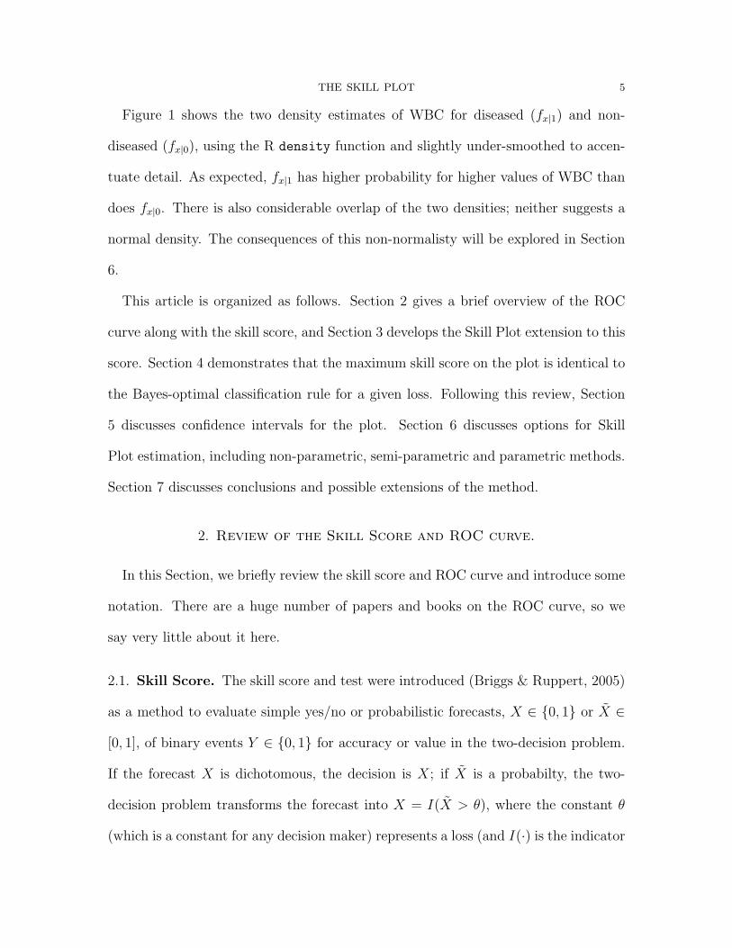
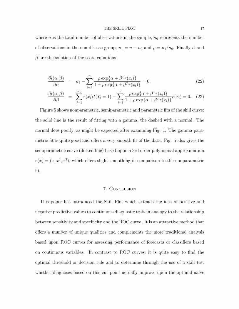
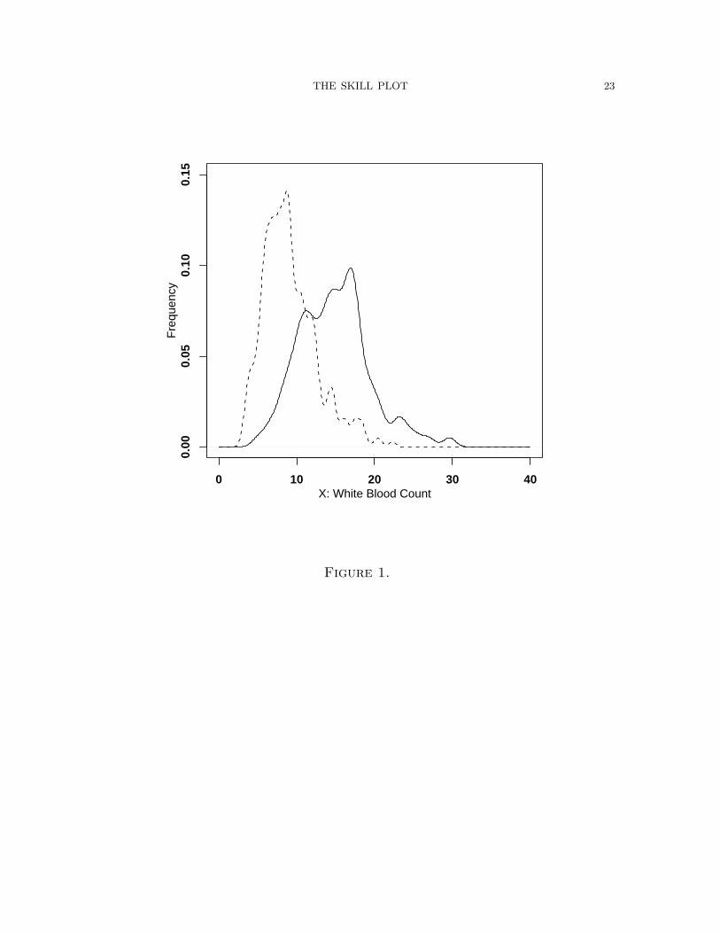
Figure 1 shows the two density estimates of WBC for diseased (fx|1) and non-
diseased (fx|0), using the R density function and slightly under-smoothed to accen-
tuate detail. As expected, fx|1 has higher probability for higher values of WBC than
does fx|0. There is also considerable overlap of the two densities; neither suggests a
normal density. The consequences of this non-normalisty will be explored in Section
6.
This article is organized as follows. Section 2 gives a brief overview of the ROC
curve along with the skill score, and Section 3 develops the Skill Plot extension to this
score. Section 4 demonstrates that the maximum skill score on the plot is identical to
the Bayes-optimal classification rule for a given loss. Following this review, Section
5 discusses confidence intervals for the plot. Section 6 discusses options for Skill
Plot estimation, including non-parametric, semi-parametric and parametric methods.
Section 7 discusses conclusions and possible extensions of the method.
2. Review of the Skill Score and ROC curve.
In this Section, we briefly review the skill score and ROC curve and introduce some
notation. There are a huge number of papers and books on the ROC curve, so we
say very little about it here.
2.1. Skill Score. The skill score and test were introduced (Briggs & Ruppert, 2005)
as a method to evaluate simple yes/no or probabilistic forecasts, X ∈ {0, 1} or X̃ ∈
[0, 1], of binary events Y ∈ {0, 1} for accuracy or value in the two-decision problem.
If the forecast X is dichotomous, the decision is X; if X̃ is a probabilty, the two-
decision problem transforms the forecast into X = I(X̃ > θ), where the constant θ
(which is a constant for any decision maker) represents a loss (and I(·) is the indicator
6 THE SKILL PLOT
function). The value of θ derives from letting the loss kyz ≥ 0 when Y = y, X = z:
typically, though not necessarily, k11 = k00 = 0; that is, the loss for correct forecasts
is 0 (see Briggs (2005) for a discussion of general loss). This allows us to write the
loss θ = k01/(k10 + k01), when Y = 0, Z = 1 (false positive), and 1− θ the loss when
Y = 1, Z = 0 (false negative).
Also required is the concept of an optimal naive forecast (ONF), which is the
decision one would make knowing only P (Y = 1) and θ. To model the forecasts and
observations, we write pyx = P (Y = y, X = x) and so on. We also write, for example,
p+x = P (Y = 0, X = x) + P (Y = 1, X = x).
A (set of) forecasts is said to have skill when it is more accurate than the ONF (for
forecasts of the same event). A forecast is said to have value when its expected loss is
smaller than the expected loss of using the ONF: the ONF is defined as I(p1+ > θ).
Skill and value are equivalent when the loss is symmetric, i.e., when θ = 1/2. No
decision maker should use a forecast if it does not have skill (or value), because the
ONF forecast is superior; that is, using a forecast which does not have skill is, in this
sense, worse than doing nothing.
Briggs & Ruppert (2005) derive the skill score K, the skill test statistic and give
its distribution. Interested readers should refer to that paper for complete details. A
limitation of the original skill score is that it was developed for a fixed (probabilistic)
forecast. The skill curve (introduced below) generalizes the concept to handle a
diagnostic test. Here the X̃ may be a continuous number and the forecast (decision)
becomes X = I(X̃ ≥ xc). As before xc is some cutoff.
THE SKILL PLOT 7
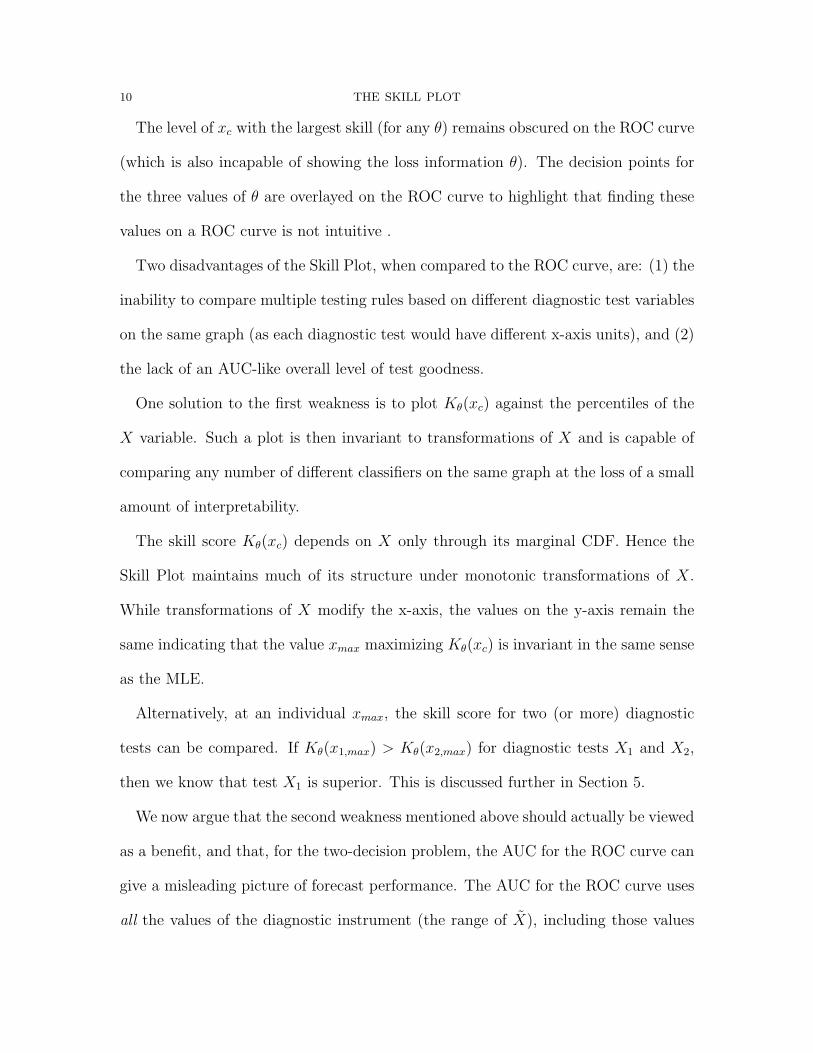
2.2. ROC curve. ROC curves plot the true positive rate (or “hit rate”) vs. the
false positive rate for a classification rule X = I(X̃ ≥ xc) based on a continuously
increasing sequence of cutoff values xc (Pepe, 2000b; Venkatraman & Begg, 1996).
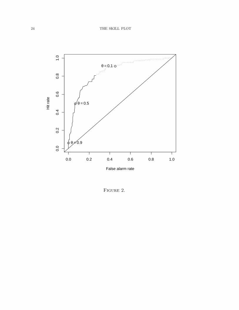
The ROC curve for the Birkhahn appendicitis data is shown in Fig. 2 (the solid plus
dashed lines form the ROC curve; the other markings are explained below).
The area under the ROC curve (AUC) is commonly used as a measure of forecast
quality. The AUC is equivalent to the probability that a random observation X
coming from the the diseased population is larger than that from the non-diseased
population, i.e. P (XY =1 > XY =0). It can be estimated using the Mann-Whitney
U-statistic (Hanley & McNeil, 1982). If this probability is extreme it indicates that
the sample contains information that is useful for discrimination. The ROC curve is
invariant to monotonic transformations of the diagnostic variable X, and ROC curves
from several different diagnostic tests can be displayed on the same plot. Examples of
formal tests of the equivalence of ROC curves for different diagnostics can be found
in Venkatraman and Begg (1996). Regression modeling strategies can also be useful
(see Pepe (2000a) for references). The AUC for the appendicitis data is AUC = 0.85.
Some shortcomings of the ROC curve are clear. While one can get a general sense of
the performance of the forecast, statistics such as AUC are not especially relevant to
someone who must make a decision about a particular xc. Furthermore, the optimal
cutoff (the xc that gives the best forecast performance) is not easily apparent on the
plot. Work is required to translate the optimal decision point from ROC space to the
original coordinate space. We conclude that despite their elegance and the intuitive
information that they provide the experienced user, ROC curves lack or obscure
8 THE SKILL PLOT
several quantities that are necessary for evaluating the operational effectiveness of
diagnostic tests.
A historical note may help. Receiver operating characteristic curves were first used
to check how radio receivers (like radar) operated over a range of frequencies. It
was desirable that the radio discriminate against noise at each frequency. In other
words, the radio operator had to make a decision at each different frequency: is
what I’m hearing signal or noise? The ROC curve provides a graphical display of
such performance. This is not how most ROC curves are used now, particularly in
medicine. The receiver of a diagnostic measurement, say the doctor for the patient
with suspected appendicitis, must have in mind (with all else equal) a level of white
blood count above which he will act as if the patient has appendicitis. That is, he
wants to make a decision based on some xc, and is not especially interested in how
well he would have done had he used some different cutoff. The next Section will
clarify this.
3. The Skill Plot
We label the diagnostic measurement (or forecast) X̃ ∈ <. We are interested in the
two-decision problem, and so label the forecast Xxc = I(X̃ ≥ xc) for a fixed cutoff
xc. Let I(p1+ ≤ θ) = Ip. For a forecast to have skill when Ip = 1, it is important
that the forecast does well when the observed is 1 as the optimal naive forecast in
those cases is to always say 0. The opposite is true when Ip = 0: the forecast should
do well when the observed is 0. Briggs and Ruppert derive the skill (or value) score,
here for a fixed xc, as the expected loss of the ONF minus the expected loss of the
given forecast, divided by the expected loss of the ONF (to provide a scaling so that
THE SKILL PLOT 9
the maximum skill score is 1); or as
Kθ(xc) =p+1(p1|1 − θ)
p1+(1− θ)Ip (1)
+(1− p+1)(p0|0 − (1− θ))
(1− p1+)θ(1− Ip),
with an estimated score of
K̂θ(xc) =n11(1− θ)− n01θ
(n11 + n10)(1− θ)Ip +
n00θ − n10(1− θ)
(n00 + n01)θ(1− Ip), (2)
where nyx are the counts when Y = y and X = x.
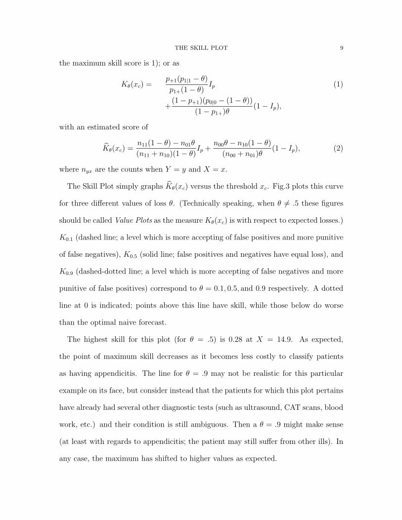
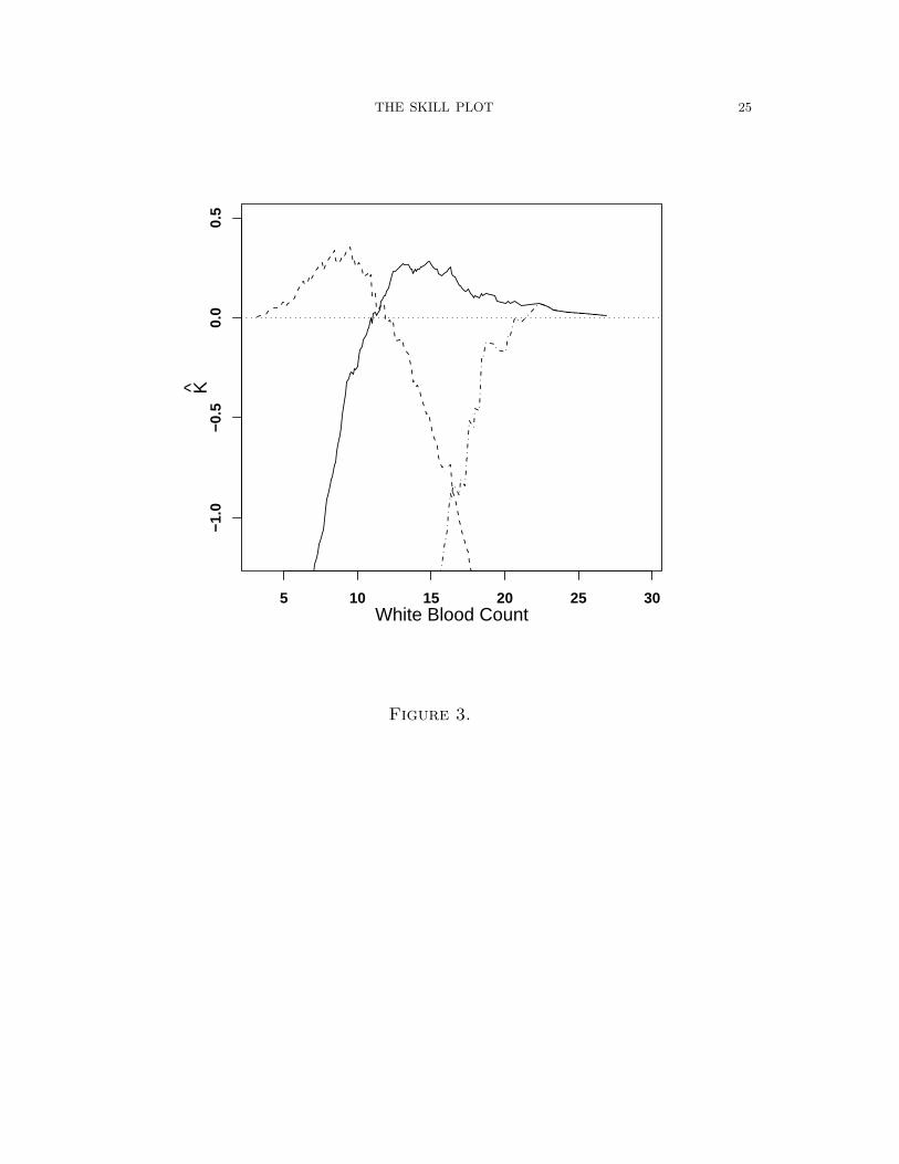
The Skill Plot simply graphs K̂θ(xc) versus the threshold xc. Fig.3 plots this curve
for three different values of loss θ. (Technically speaking, when θ 6= .5 these figures
should be called Value Plots as the measure Kθ(xc) is with respect to expected losses.)
K0.1 (dashed line; a level which is more accepting of false positives and more punitive
of false negatives), K0.5 (solid line; false positives and negatives have equal loss), and
K0.9 (dashed-dotted line; a level which is more accepting of false negatives and more
punitive of false positives) correspond to θ = 0.1, 0.5, and 0.9 respectively. A dotted
line at 0 is indicated; points above this line have skill, while those below do worse
than the optimal naive forecast.
The highest skill for this plot (for θ = .5) is 0.28 at X = 14.9. As expected,
the point of maximum skill decreases as it becomes less costly to classify patients
as having appendicitis. The line for θ = .9 may not be realistic for this particular
example on its face, but consider instead that the patients for which this plot pertains
have already had several other diagnostic tests (such as ultrasound, CAT scans, blood
work, etc.) and their condition is still ambiguous. Then a θ = .9 might make sense
(at least with regards to appendicitis; the patient may still suffer from other ills). In
any case, the maximum has shifted to higher values as expected.
10 THE SKILL PLOT
The level of xc with the largest skill (for any θ) remains obscured on the ROC curve
(which is also incapable of showing the loss information θ). The decision points for
the three values of θ are overlayed on the ROC curve to highlight that finding these
values on a ROC curve is not intuitive .
Two disadvantages of the Skill Plot, when compared to the ROC curve, are: (1) the
inability to compare multiple testing rules based on different diagnostic test variables
on the same graph (as each diagnostic test would have different x-axis units), and (2)
the lack of an AUC-like overall level of test goodness.
One solution to the first weakness is to plot Kθ(xc) against the percentiles of the
X variable. Such a plot is then invariant to transformations of X and is capable of
comparing any number of different classifiers on the same graph at the loss of a small
amount of interpretability.
The skill score Kθ(xc) depends on X only through its marginal CDF. Hence the
Skill Plot maintains much of its structure under monotonic transformations of X.
While transformations of X modify the x-axis, the values on the y-axis remain the
same indicating that the value xmax maximizing Kθ(xc) is invariant in the same sense
as the MLE.
Alternatively, at an individual xmax, the skill score for two (or more) diagnostic
tests can be compared. If Kθ(x1,max) > Kθ(x2,max) for diagnostic tests X1 and X2,
then we know that test X1 is superior. This is discussed further in Section 5.
We now argue that the second weakness mentioned above should actually be viewed
as a benefit, and that, for the two-decision problem, the AUC for the ROC curve can
give a misleading picture of forecast performance. The AUC for the ROC curve uses
all the values of the diagnostic instrument (the range of X̃), including those values
THE SKILL PLOT 11
(such as those < 10.9 as seen in Fig. 4) that are deemed unskillful. These points are
illustrated on Fig. 2 as the dashed part of the ROC curve. We argue that including
these points in AUC calculations can give a misleading picture of a test’s actual
performance. For example, it may be possible for AUC1 < AUC2 (for two different
diagnostic tests) while Kθ(x1,max) > Kθ(x2,max). In practice, the decision maker using
a diagnostic test is not interested in the AUC. He is interested in how well the test
performs at the actual xmax used. In this way, the Skill Plot presents a more relevant
analysis to the scientist using the test.
4. Optimal Skill Thresholds.
Here we demonstrate an important optimality property of the skill function, namely
that the skill maximizing cutoff xc is exactly the optimal Bayes classification bound-
ary. Hence, skill curves provide a method to visualize optimal Bayesian classification.
We assume without loss of generality that the disease is diagnosed if the diagnostic
test exceeds the threshold, Xxc = I(X̃ ≥ xc). We first write equation 1, for a fixed
xc, as
Kθ(xc) =P (X̃ > xc)(P (Y = 1|X̃ > xc)− θ)
p1+(1− θ)Ip (3)
+P (X̃ ≤ xc)(P (Y = 0|X̃ ≤ xc)− (1− θ))
(1− p1+)θ(1− Ip)
Expanding this, and condensing some notation, gives
Kθ(xc) =1
p1+(1− θ)
[P (X̃ > xc, Y = 1)− θP (X̃ > xc)
]Ip
+1
(1− p1+)θ
[P (X̃ ≤ xc, Y = 0)− (1− θ)P (X̃ ≤ xc))
](1− Ip)
=(1− θ)(1− F1) + θF0
p1+(1− θ)Ip +
−(1− θ)F1 + θF0
(1− p1+)θ(1− Ip) (4)
12 THE SKILL PLOT
using, for example, the fact that P (Y = 1|X̃ ≤ xc)P (X̃ ≤ xc) = P (X̃ ≤ xc, Y = 1),
and P (X̃ > xc) = 1− P (X̃ ≤ xc); where F1 = P (X̃ ≤ xc, Y = 1), and F0 = P (X̃ ≤
xc, Y = 0). It follows that F1 + F0 = P (X̃ ≤ xc).
For completeness, we also give the skill score for the rule Xxc = I(X̃ < xc). For
this rule we have
Kθ(xc) =(1− θ)F1 − θF0
p1+(1− θ)Ip +
(1− θ)F1 + θ(1− F0)
(1− p1+)θ(1− Ip) (5)
The following theorem contains our main result, namely that xmax which maximizes
Kθ(xc) is in fact the optimal separation point as defined by Bayes rule in classification.
Theorem 4.1. Let f(·|Y = y) denote the conditional density for x when Y = y.
The point xmax = argmaxxc{Kθ(xc)} is equivalent to the point x? = {x : f(x|Y =1)f(x|Y =0)
=
θ1−θ
1−p1+
p1+} where x? defines the optimal decision boundary for a Bayesian classifier.
Proof. To find the maximum of Kθ(xc), take the derivative of (4) with respect to xc,
set equal to 0, and solve for xmax. We do this first for Ip = 1. The skill becomes
Kθ(xc) =(1− θ)(1− F1) + θF0
p1+(1− θ)(6)
and
dKθ(xc)
dxc
= − 1
p1+
fx,1(xc) +θ
p1+(1− θ)fx,0(xc) (7)
where, by the Fundamental Theorem of Calculus, dFi/dxc = fx,i(xc) is the joint
density of (X, Y = 1) evaluated at xc. Setting (7) equal to 0 to solve for xc gives
fx,1(xc)
fx,0(xc)=
θ
1− θ(8)
which can also be written as
fx|1(xc)
fx|0(xc)=
θ
1− θ
1− p1+
p1+
. (9)
THE SKILL PLOT 13
where fx|i is the conditional density of X given Y = i.
Second, let Ip = 0 so that
Kθ(xc) =−(1− θ)F1 + θF0
(1− p)θ(10)
and
dKθ(xc)
dxc
=(1− θ)
(1− p1+)θfx,1(xc)−
1
(1− p1+)fx,0(xc) (11)
Setting (11) equal to 0 and solving for xc again gives
fx,1(xc)
fx,0(xc)=
θ
1− θ. (12)
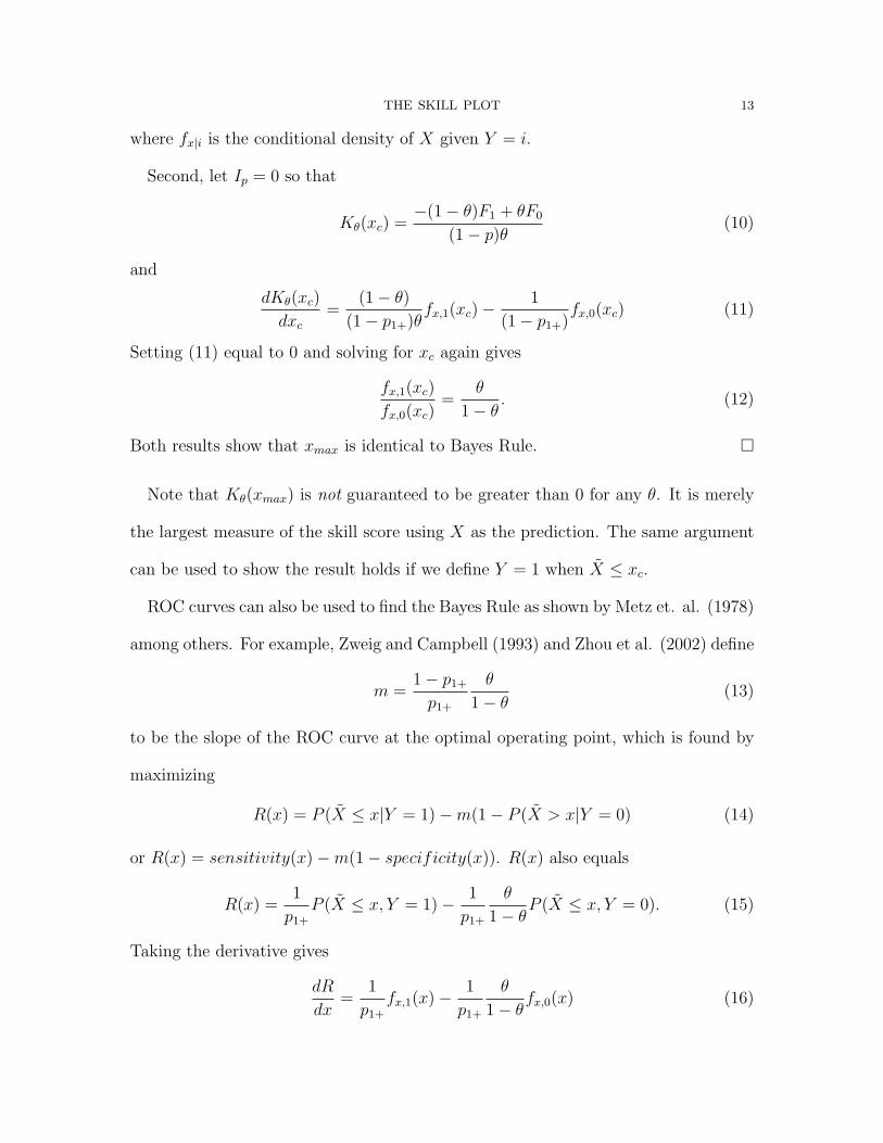
Both results show that xmax is identical to Bayes Rule. �
Note that Kθ(xmax) is not guaranteed to be greater than 0 for any θ. It is merely
the largest measure of the skill score using X as the prediction. The same argument
can be used to show the result holds if we define Y = 1 when X̃ ≤ xc.
ROC curves can also be used to find the Bayes Rule as shown by Metz et. al. (1978)
among others. For example, Zweig and Campbell (1993) and Zhou et al. (2002) define
m =1− p1+
p1+
θ
1− θ(13)
to be the slope of the ROC curve at the optimal operating point, which is found by
maximizing
R(x) = P (X̃ ≤ x|Y = 1)−m(1− P (X̃ > x|Y = 0) (14)
or R(x) = sensitivity(x)−m(1− specificity(x)). R(x) also equals
R(x) =1
p1+
P (X̃ ≤ x, Y = 1)− 1
p1+
θ
1− θP (X̃ ≤ x, Y = 0). (15)
Taking the derivative gives
dR
dx=
1
p1+
fx,1(x)− 1
p1+
θ
1− θfx,0(x) (16)
14 THE SKILL PLOT
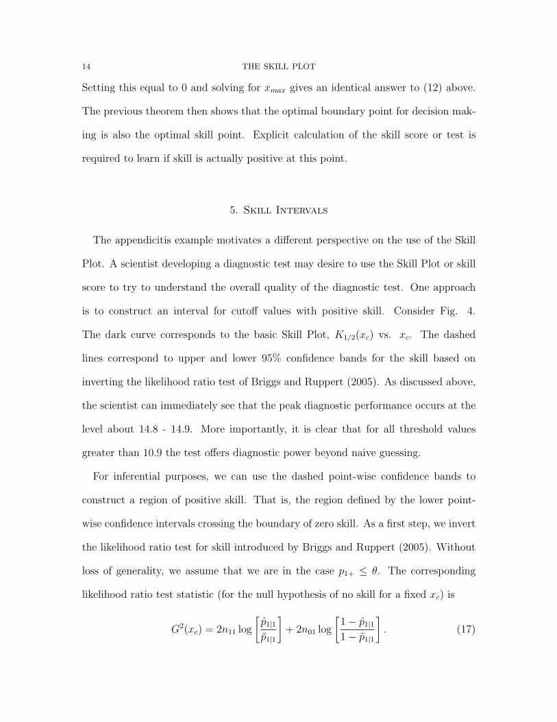
Setting this equal to 0 and solving for xmax gives an identical answer to (12) above.
The previous theorem then shows that the optimal boundary point for decision mak-
ing is also the optimal skill point. Explicit calculation of the skill score or test is
required to learn if skill is actually positive at this point.
5. Skill Intervals
The appendicitis example motivates a different perspective on the use of the Skill
Plot. A scientist developing a diagnostic test may desire to use the Skill Plot or skill
score to try to understand the overall quality of the diagnostic test. One approach
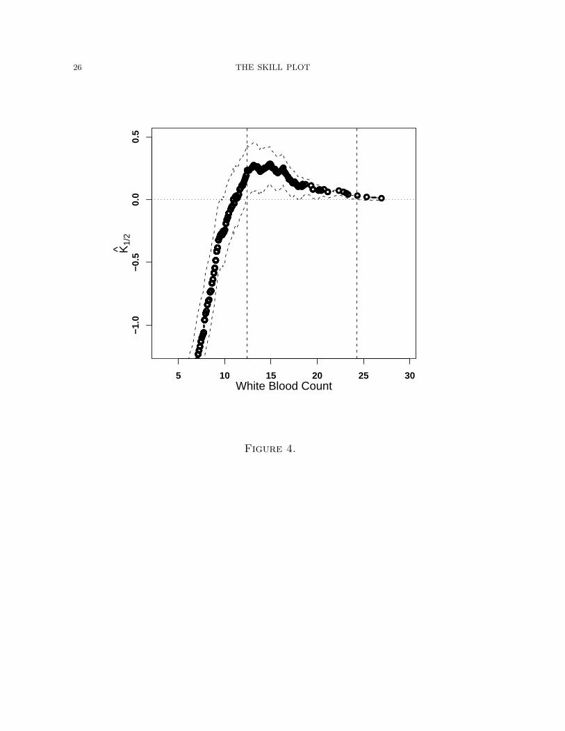
is to construct an interval for cutoff values with positive skill. Consider Fig. 4.
The dark curve corresponds to the basic Skill Plot, K1/2(xc) vs. xc. The dashed
lines correspond to upper and lower 95% confidence bands for the skill based on
inverting the likelihood ratio test of Briggs and Ruppert (2005). As discussed above,
the scientist can immediately see that the peak diagnostic performance occurs at the
level about 14.8 - 14.9. More importantly, it is clear that for all threshold values
greater than 10.9 the test offers diagnostic power beyond naive guessing.
For inferential purposes, we can use the dashed point-wise confidence bands to
construct a region of positive skill. That is, the region defined by the lower point-
wise confidence intervals crossing the boundary of zero skill. As a first step, we invert
the likelihood ratio test for skill introduced by Briggs and Ruppert (2005). Without
loss of generality, we assume that we are in the case p1+ ≤ θ. The corresponding
likelihood ratio test statistic (for the null hypothesis of no skill for a fixed xc) is
G2(xc) = 2n11 log
[p̂1|1
p̃1|1
]+ 2n01 log
[1− p̂1|1
1− p̃1|1
]. (17)
THE SKILL PLOT 15
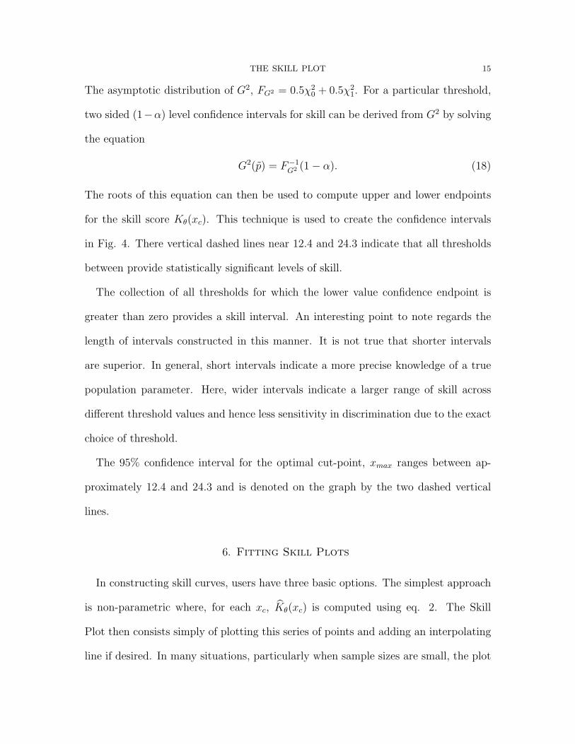
The asymptotic distribution of G2, FG2 = 0.5χ20 + 0.5χ2
1. For a particular threshold,
two sided (1−α) level confidence intervals for skill can be derived from G2 by solving
the equation
G2(p̃) = F−1G2 (1− α). (18)
The roots of this equation can then be used to compute upper and lower endpoints
for the skill score Kθ(xc). This technique is used to create the confidence intervals
in Fig. 4. There vertical dashed lines near 12.4 and 24.3 indicate that all thresholds
between provide statistically significant levels of skill.
The collection of all thresholds for which the lower value confidence endpoint is
greater than zero provides a skill interval. An interesting point to note regards the
length of intervals constructed in this manner. It is not true that shorter intervals
are superior. In general, short intervals indicate a more precise knowledge of a true
population parameter. Here, wider intervals indicate a larger range of skill across
different threshold values and hence less sensitivity in discrimination due to the exact
choice of threshold.
The 95% confidence interval for the optimal cut-point, xmax ranges between ap-
proximately 12.4 and 24.3 and is denoted on the graph by the two dashed vertical
lines.
6. Fitting Skill Plots
In constructing skill curves, users have three basic options. The simplest approach
is non-parametric where, for each xc, K̂θ(xc) is computed using eq. 2. The Skill
Plot then consists simply of plotting this series of points and adding an interpolating
line if desired. In many situations, particularly when sample sizes are small, the plot
16 THE SKILL PLOT
will lack smoothness due to its discrete nature. Because the values of Kθ(xc) do
not change between succeeding ordered values of xc, the plot is essentially piecewise
constant with jumps similar to a Kaplan-Meier curve.
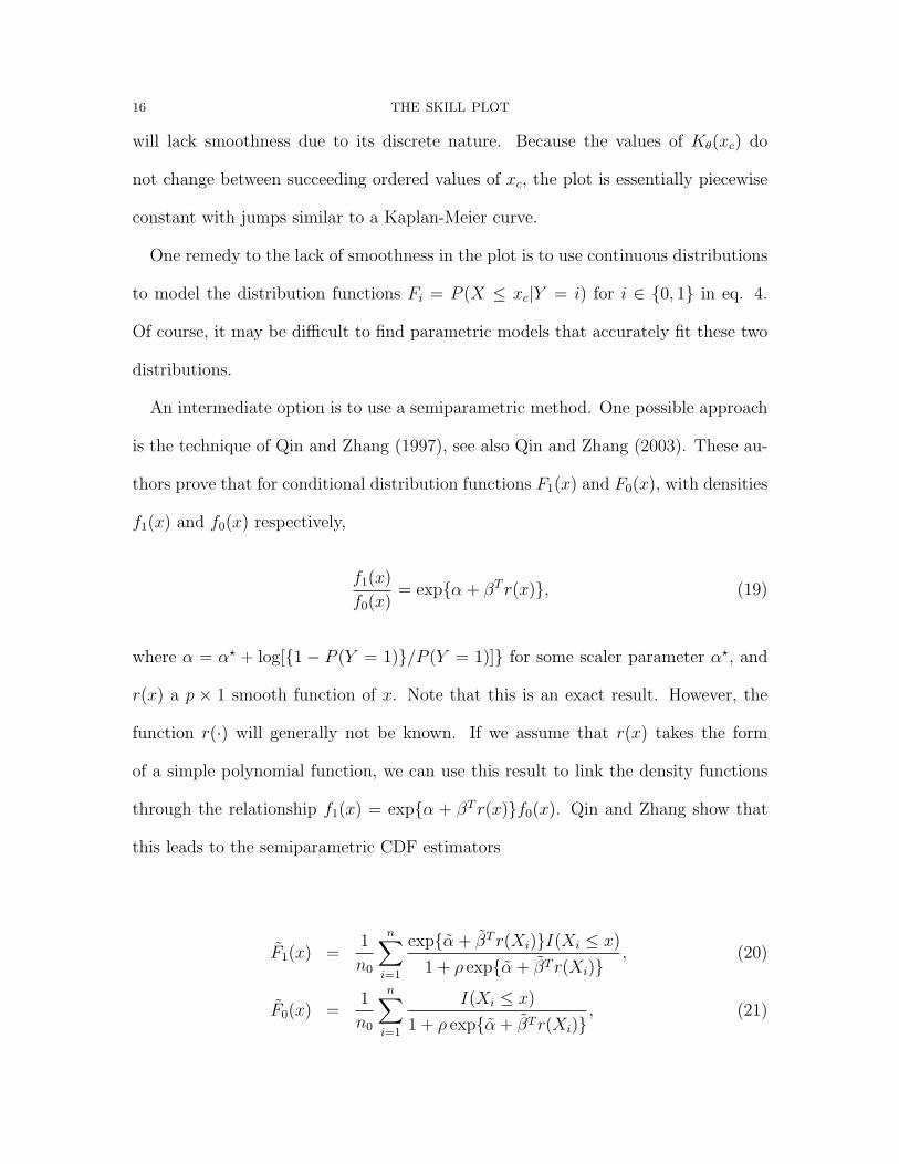
One remedy to the lack of smoothness in the plot is to use continuous distributions
to model the distribution functions Fi = P (X ≤ xc|Y = i) for i ∈ {0, 1} in eq. 4.
Of course, it may be difficult to find parametric models that accurately fit these two
distributions.
An intermediate option is to use a semiparametric method. One possible approach
is the technique of Qin and Zhang (1997), see also Qin and Zhang (2003). These au-
thors prove that for conditional distribution functions F1(x) and F0(x), with densities
f1(x) and f0(x) respectively,
f1(x)
f0(x)= exp{α + βT r(x)}, (19)
where α = α? + log[{1 − P (Y = 1)}/P (Y = 1)]} for some scaler parameter α?, and
r(x) a p × 1 smooth function of x. Note that this is an exact result. However, the
function r(·) will generally not be known. If we assume that r(x) takes the form
of a simple polynomial function, we can use this result to link the density functions
through the relationship f1(x) = exp{α + βT r(x)}f0(x). Qin and Zhang show that
this leads to the semiparametric CDF estimators
F̃1(x) =1
n0
n∑i=1
exp{α̃ + β̃T r(Xi)}I(Xi ≤ x)
1 + ρ exp{α̃ + β̃T r(Xi)}, (20)
F̃0(x) =1
n0
n∑i=1
I(Xi ≤ x)
1 + ρ exp{α̃ + β̃T r(Xi)}, (21)
THE SKILL PLOT 17
where n is the total number of observations in the sample, n0 represents the number
of observations in the non-disease group, n1 = n− n0 and ρ = n1/n0. Finally α̃ and
β̃ are the solution of the score equations
∂l(α, β)
∂α= n1 −
n∑i=1
ρ exp{α + βT r(xi)}1 + ρ exp{α + βT r(xi)}
= 0, (22)
∂l(α, β)
∂β=
n1∑j=1
r(xi)I(Yi = 1)−n∑
i=1
ρ exp{α + βT r(xi)}1 + ρ exp{α + βT r(xi)}
r(xi) = 0. (23)
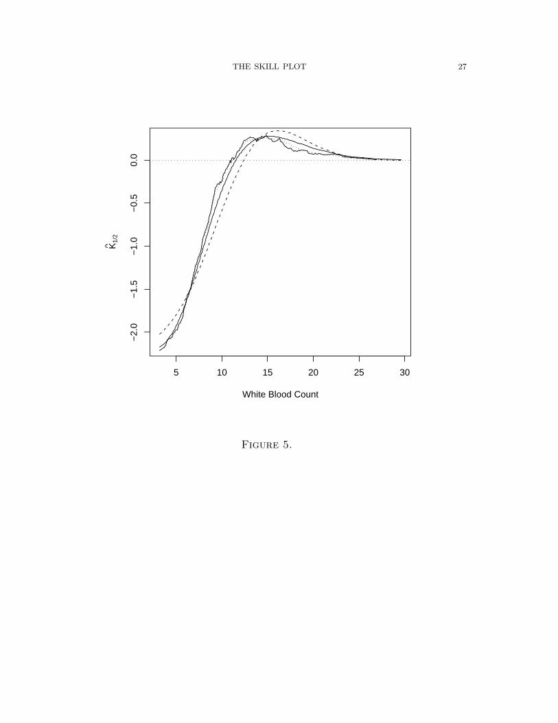
Figure 5 shows nonparametric, semiparametric and parametric fits of the skill curve:
the solid line is the result of fitting with a gamma, the dashed with a normal. The
normal does poorly, as might be expected after examining Fig. 1. The gamma para-
metric fit is quite good and offers a very smooth fit of the data. Fig. 5 also gives the
semiparametric curve (dotted line) based upon a 3rd order polynomial approximation
r(x) = (x, x2, x3), which offers slight smoothing in comparison to the nonparametric
fit.
7. Conclusion
This paper has introduced the Skill Plot which extends the idea of positive and
negative predictive values to continuous diagnostic tests in analogy to the relationship
between sensitivity and specificity and the ROC curve. It is an attractive method that
offers a number of unique qualities and complements the more traditional analysis
based upon ROC curves for assessing performance of forecasts or classifiers based
on continuous variables. In contrast to ROC curves, it is quite easy to find the
optimal threshold or decision rule and to determine through the use of a skill test
whether diagnoses based on this cut point actually improve upon the optimal naive

18 THE SKILL PLOT
forecast. The method is invariant to transformations of the diagnostic statistic similar
to ROC curves. The optimal threshold indicated on the plot is exactly equivalent to
that indicated by optimizing the posterior odds in accordance with Bayesian decision
theory. Confidence intervals can be displayed which demonstrate the range of useful
values for discrimination.
Acknowledgements
The clarity of this paper was vastly improved by incorporating suggestions of the
referees and editors.
THE SKILL PLOT 19
References
Begg, C. B.(1991). Advances in statistical mehodology for diagnostic medicine in the
1980’s. Statistics in Medicine, 10, 1887-95.
Birkhahn, R., Briggs, W., Datillo, P., Deusen, S. V., & Gaeta, T.(2005). Classifying
patients suspected of appendicitis with regard to likelihood. American Journal of
Surgery, 191 (4), 497-502.
Briggs, W. M. (2005). A general method of incorporating forecast cost and loss in
value scores. Monthly Weather Reivew, 133(11), 3393-3397.
Briggs, W. M., & Ruppert, D. (2005). Assessing the skill of yes/no predictions.
Biometrics, 61(3), 799-807.
Hanley, J., & McNeil, B. (1982). The meaning and use of the area under a receiver
operating characteristic (roc) curve. Radiology, 143, 29-36.
Metz, C. (1978). Basic principles of roc analysis. Seminars in Nuclear Medicine, 8,
283-298.
Pepe, M. S. (2000a). An interpretation for roc curve and inference using glm proce-
dures. Biometrics, 56, 352-359.
Pepe, M. S. (2000b). Receiver operating characteristic methodology. Journal of the
American Statistical Association, 95, 308-11.
Pepe, M. S. (2004). The statistical evaluation of medical tests for classification and
prediction. Oxford.
Qin, J., & Zhang, B.(1997). A goodness-of-fit test for logistic regression models based
on case-control data. Biometrika, 84 (3), 609-618.
20 THE SKILL PLOT
Qin, J., & Zhang, B. (2003). Using logistic regression procedures for estimating
receiver operating characteristic curves. Biometrika, 90 (3), 585-596.
Venkatraman, E., & Begg, C. B.(1996). A distribution free procedure for comparing
receiver operating characteristic curves from a paired experiment. Biometrika, 83,
835-48.
Zhou, X. H., Obuchowski, N., & McClish, D.(2002). Statistical methods in diagnostic
medicine. New York: Wiley.
Zweig, M., & Campbell, G. (1993). Receiver-operating characteristic (roc) plots: a
fundamental evaluation tool in clinical medicine. Clinical Chemistry, 39 (4), 561-
577.

THE SKILL PLOT 21
List of Figures
Figure 1 The the two densities fx|1 and fx|0: the solid line is the former. The
x-axis is white blood count with units in thousands of cells per microliter of blood.
These plots were produced using the R density function and slightly under-smoothed
so that more detail can be seen.
Figure 2 ROC curve for the Birkhahn et al. data. The ROC curve is the
combination of the solid and dotted lines. The dotted portion of the curve corresponds
to the area of white blood count values in which there is no skill. The three points of
decision corresponding to θ = .1, .5, .9 are also shown.
Figure 3 The estimated skill/value for θ = .1 (dashed), .5 (solid; symmetric loss),
.9 (dot-dash) for each level of X. A dotted line at a skill of 0 is indicated; points above
this line have skill/value, while those below do worse than the optimal naive forecast.
The x-axis is white blood count with units in thousands of cells per microliter of
blood.
Figure 4 The estimated skill K̂1/2 for each level of X, plus the point-wise 95%
confidence interval at each point. A dotted line at a skill of 0 is indicated; points
above this line have skill, while those below do worse than the optimal naive forecast.
The two vertical lines indicate the points at which the confidence interval of the skill
cross 0.

22 THE SKILL PLOT
Figure 5 The estimated skill K̂1/2 for each level of X (rough, solid line), along
with two parametric fitted skill curves: the solid line is fit with a gamma, the dashed
with a normal. The semiparametric fit is the dotted line, and fits best.
THE SKILL PLOT 23
0 10 20 30 40
0.00
0.05
0.10
0.15
X: White Blood Count
Fre
quen
cy
Figure 1.
24 THE SKILL PLOT
0.0 0.2 0.4 0.6 0.8 1.0
0.0
0.2
0.4
0.6
0.8
1.0
False alarm rate
Hit
rate
● θ = 0.5
●θ = 0.1
● θ = 0.9
Figure 2.
THE SKILL PLOT 25
5 10 15 20 25 30
−1.0
−0.5
0.0
0.5
White Blood Count
K̂
Figure 3.
26 THE SKILL PLOT
●●●●●●●●●●●●●●●●●●●●●●●●●●●●●●●●●●●●●●●●
●●●●●●●●●●●●●●●●●●●●●●●●●●●●●●●●●●●●
●●●●●●●●●●●●●●●●●●●●●●●●●●
●●●●●●●●●●●
●●●●●●●●●●●●●●●●●●●●●●
●●●●●●
●●●●●●●●●●●●
●●●●●●●●●●●●●●●●●●●●●●●●●●●●●●●●●●●●●●●●●●●●●●●●●●●●●●●●●●●●●●●●●●●●●●●●
●●●●●●●●●●●●●●●●●●●●●●●●●●●●●●●●●●●●●●●●●●●●●●●●●●●●●●●●●●●●
●●●●●●●●●●●●●●●●●●●●●●●●●●●●●
●●●●●●●●●●●●●●●●●●●●●●●●●●●●●●●●●●●●● ●●●● ●●●●●● ●●●● ● ● ●
5 10 15 20 25 30
−1.0
−0.5
0.0
0.5
White Blood Count
K̂1/
2
Figure 4.
THE SKILL PLOT 27
5 10 15 20 25 30
−2.
0−
1.5
−1.
0−
0.5
0.0
White Blood Count
K̂1/
2
Figure 5.