The Journal of Typographic Research Volume IV, Number 3 ...
49
The Journal of Typographic Research Volume IV, Number 3, Summer 1970 1 99-212 Words in Th eir Place Rudolf Arnheim 213-240 Broken Scripts and th e Classification of T ypefaces Gerrit Noordzij 241-257 The Siloam Inscription and Alphabetic Origins Roy K. Patteson, Jr. 259-270 Times R oman: A R e-assessment Allen H utt 271-280 Proposed American National Standard: Presentation of Alphameric Characters for Information Processing 281-284 Book R eviews 285-287 Abstracts ofJournal Articles in French and German 288 The Authors The]oumal of Typographic Research, Volume IV, Number 3, Summer 1970. Published quarterly (Winter, Spring, Summer, and Fall) by the Journal, cfo The Clevela nd Museum of Art, Cleveland, Ohio, USA 44106. Copyright© 1970 by The Journal of Typographic Research .
-
Upload
khangminh22 -
Category
Documents
-
view
1 -
download
0
Transcript of The Journal of Typographic Research Volume IV, Number 3 ...

The Journal of Typographic Research Volume IV, Number 3, Summer 1970
199-212 Words in Their Place Rudolf Arnheim
213-240 Broken Scripts and the Classification ofTypefaces Gerrit Noordzij
241-257 The Siloam Inscription and Alphabetic O rigins Roy K. Patteson, Jr.
259-270 Times Roman: A R e-assessment Allen H utt
271-280 Proposed American National Standard: Presentation of Alphameric Characters for Information Processing
281-284 Book Reviews
285-287 Abstracts ofJournal Articles in French and German
288 The Authors
The]oumal of Typographic Research, Volume IV, Number 3, Summer 1970. Published quarterly (Winter, Spring, Summer, and Fall) by the Journal, cfo The Cleveland Museum of Art, Cleveland, Ohio, USA 44106. Copyright© 1970 by The Journal of Typographic Research.

Dr. Merald E. Wrolstad, Editor and Publisher cfo The Cleveland Museum of Art, Cleveland, Ohio, USA 44106.
ADVISORY BOARD
Fernand Baudin, Bonlez par Grez-Doiceau, Belgium
Dr. Roger Bloomquist, University of North Dakota
Pieter Brattinga, Form Mediation International, Amsterdam
Rev. Edward M. Catich, Saint Ambrose College
John Dreyfus, Mono type Corporation, et at. Eugene Ettenberg, Columbia University
Ephraim Gleichenhaus, ICTA Representative, New York
Dr. William T. Hagestad, Wisconsin State University, River Falls
Dr. Randall P . Harrison, Michigan State University
Ernest Hoch, rcoGRADA Representative, Coventry College of Art
Dr. J. K. Hvistendahl, AEJ/GD Representative, I owa State University
Alexander Lawson, Rochester Institute of Technology
R . Hunter Middleton, Ludlow Typograph Company John Miles, Banks and Miles, London
Dr. G. W. Ovink, Lettergieterij Amsterdam
Dr. Donald E. Payne, Marplan, New York City
Dr. Christopher Poulton, Applied Psychology Research Unit, Cambridge, England
Philippe Schuwer, Editor and Art Director, Paris
Jack W . Stauffacher, The Greenwood Press, San Francisco
Dr. Miles A. Tinker, Emeritus Professor, University of Minnesota L. W. Wallis, Crosfield Electronics, London
Dr. Dirk Wendt, Psychologisches Institut, Hamburg
Dr. Richard H . Wiggins, Louisiana State University
Dr. Bror Zachrisson, Director, Grafiska Institutet, Stockholm
Hermann Zapf, Frankfurt am Main
General Information
The Journal of Typographic Research is devoted to critical investigation and experimentation that contribute to a better understanding of the role letterforms play in the communication process. "Typography" is interpreted in the broadest possible sense, encompassing any use or reproduction ofletterforms and related symbols within our own and other language systems-and including their origins, historic development and special applications. It is theJ ournal's purpose, first to identify and encourage letterform research internationally, and second to pursue the natural association of experimental work in all research areas concerned with our visible language. Research on letterform problems is flourishing in
education linguistics cartography journalism poetry
psychology archeology architecture aesthetics art history
engineering highway safety graphic design information theory advertising
AddressesforCommunication with the Journal
bibliography electronics documentation mass communications painting & sculpture
All editorial and general correspondence should be addressed to the Editor, cfo The Cleveland Museum of Art, Cleveland, Ohio, USA 44106.
Business correspondence about subscriptions, advertising, and related matters should be addressed to either of two addresses :
North & South America: TheJ ournal ofTypographic Research, c/o The Cleveland Museum of Art, Cleveland, Ohio, USA 44106.
Other Areas: The j ournal of Typographic Research, cfo W &J Mackay & Company Ltd, Fair Row, Chatham, Kent, England.
Subscription Rates
Quarterly for one year $11.00
Quarterly for two years $21.00
Quarterly for three years $30.00
£4. 12. 0
£8. 15. 0
£12. 10. 0
Subscriptions are available on a calendar-year basis only. In other words, subscriptions received at any time during the year will receive all four Journal numbers for that year.
195

A unified subscription rate schedule is now in effect for allJ ournal subscribers. As announced in the October 1969 number of the Journal and in recent subscription information mailings, the Journal was forced to discontinue its two-level subscription rate, for individual and institutional subscriptions.
Gift subscriptions. A subscription to theJ ournal makes an excellent gift for a friend or business associate. A special calligraphic greeting card will be sent (on any date you select) announcing your gift. To arrange for a gift subscription, send a note to theJournal Subscription Office (see business correspondence, above) together with your check, plus any special message to be included on the greeting card-or enclose a note you may wish sent with the gift card.
Discounts. Agents and book dealers receive a 10% discount on all orders. There is no club arrangement; there are no quantity, cash, library, or other special discounts except the reduced rates for two- and three-year subscriptions listed above.
Recommend the Journal to Your Library. The Journal is, essentially, a continuing reference work as well as a source of current information on letterform r·esearch. The reference department of your company or institution will also want to subscribe; approximately 15- 20% of total subscribers are libraries. Your personal recommendation will help your library evaluate the Journal.
Keep in mind : The Journal of Typographic Research is a professional journal and is thereby tax deductible.
Back Copies A limited quantity of all back numbers of the Journal are available at $3.00 (£1. 5. 0) each. Copies should be ordered from the appropriate area business address listed above.
A folder listing the contents of all past Journal issues is available on request.
Reprints of specific articles. Readers interested in securing copies of any of the articles published in the Journal should send for the appropriate number of the Journal, see above. Individual reprints are not available.
Manuscripts All manuscripts and inquiries about research articles and other contributions to the Journal should be addressed to the Editor. An Author's Guide for the organization, preparation, and submission of manuscripts is also available and includes special instructions for designers in preparing research reports. Authors are strongly advised to follow the general editorial style- headings, refer·ences, tables, captions- as shown in this and past copies of the Journal.
All copy must be double-spaced, including all references and long quotations in the text. All manuscripts should be submitted in triplicate, one of which should be an original typed copy. Authors are cautioned to retain a copy of their manuscript to guard against loss in the mail.
All illustrations should be prepared for publication by the author; duplicate copies may be photocopied or pencil-drawn.
196
Abstracts. Manuscripts should be accompanied by an abstract of 100-120 words, typed on a separate sheet of paper. An abstract of a research paper should contain statements of (a) the problem, (b) the method, (c) the results, and (d) conclusions. Results are most important, and every abstract should contain at least the trend of results. A n abstract of a discussion article should state the topics covered and the central thesis of the article. Only complete sentences should be used in abstracts.
Author's B iography. Manuscripts should also be accompanied by a 100-120 word biography of the author, listing his current posit ion (with complete address), research and/or educational background, major publications, and current research interests. See example biographies on the Authors p age in this and past copies of the Journal.
Letters to the Editor The editors welcome comments on articles, reviews, and le tters that have appeared in theJ ournal. Communications should be addressed to the Editor. The Editor will also relay to the author your quest ions or comments on any article. Your response-and the author's comment in reply-will not be published without your permission and your approval of any editing.
Books for Review Publishers should send books and other materials for review to either of two addresses:
Europe-M. Fernand Baudin, cfo The Journal of T ypographic Research, 64 Rue du Village, 5983 Bonlez, Belgium.
All other publishers-to the Editor a t the address listed previously.
News of Current Letteiform Research Developments in a variety of disciplines are revealing implications for letterform investigation undreamed of only a generation ago, but the Journal must be aware of specific research projects in order to report on them. Without a supporting association, the Journal must rely on reports ofletterform research activity from interested individuals.
The Journal, therefore, encourages communication from research p eople, administrators, and students on individual and departmental research projects, theses, research grants, etc. Please send thej ournal Editor a copy of any research report or an outline of the study-with the name and address of the people involved.
Joining the J ournal Staff Letterform research being an academic orphan, the Journal has no reservoir of talent to call upon for help in handling the myriad editorial and organizational jobs that need doing. Journal activities that involve communication with an international body of individuals and research groups can be particularly rewarding.
If you would like to join the journal's staff, please write the Editor-mentioning, if possible, any particular area of activity you are interested in.
197

Affiliation with Groups Thej ournal invites inquiries about possible cooperation from associations, societies, and other professional groups. It is our policy to help promote the research and related professional activities of appropriate groups which have as a major concern the study ofletterforms. Announcements of conferences, special publications, etc., that such groups may want mentioned in theJ ournal should be addressed to the Editor-preferably with a letter of explanation.
Inquiries about Current Letteiform Research The editors will make every effort to answer subscribers' requests for information about current and past research on letterform problems or to refer them to the most appropriate individuals working in that research area. In order to give your question proper consideration, please make your request as specific as possible.
Graduate students in particular are encouraged to inquire about research topics for thesis work.
Index An annual index of article titles, authors, and book reviews appears at the end of the finaljournal number in each volume.
Change of Address Address changes must reach the Journal Subscription Office by the tenth of the month preceding quarterly publication dates:January I, Aprill,July 1, and October I . Undelivered copies resulting from address changes will not be replaced; subscribers should notify the post office that they will guarantee forwarding postage. Other claims for undelivered copies must be madt> within four months of publication. When you notify us of an address change, enclose the address stamp or label used on the last] ournal mailing envelope you received. Address changes should be sent to the appropriate area business address listed above.
Advertising Advertising Type-page Overall Rates Size Page Size
Full page $100 £40. 0. 0 26 x 41 picas 6 X 9 inches Half page $60 £24. 0. 0 26 X 20 picas 6 X 4-!inches
For inside covers, add 25%. Minimum space is a half page. Bleed pages and color accepted; write for additional information. Printed letterpress. Cost of engravings charged to advertiser at cost. Agency commission 15% . No cash discount. Advertising content subject to approval of publisher. Advertising copy and engravings should be received two months prior to quarterly publication on !January, 1 April, !July, and 1 October.
198
Words in Their Place
Rudolf Arnheim
Although language helps thinking, it is not indispensable to thought and its structure or perceptual dimensions as a medium of thought a re severely limited. What makes language valuable for thinking is our use of words to refer to other thought media, such as visual imagery. Not being restricted as language is to linearity, the visual medium offers structural equivalences to all characteristics of objects, events, relationships- in two and three dimensions. A literary image grows through accretion by amendment; a pictorial image presents itself whole, in simultaneity.
Can one think in words, as one can think in circles or rectangles or other such shapes?
The answer commonly given is almost automatically positive. In fact, language is widely assumed to be a much better vehicle of thought than other shapes or sounds. More radically, it is taken to be indispensable for thought and perhaps the only medium available. Thus Edward Sapir says in his influential book on language: "Thought may be a natural domain apart from the artificial one of speech, but speech would seem to be the only road we know of that leads to it."1
Nobody denies that language helps thinking. What needs to be questioned is whether it performs this service substantially by means of properties inherent in the verbal medium itself or whether it functions indirectly, namely, by pointing to the referents of words and propositions, that is, to facts given in an entirely different medium. Also, we need to know whether language is indispensable to thought.
The answer to the latter question is "no." Animals, and particularly primates, give clear proof of productive thinking. Roger Brown
© 1969 by The Regents of the University of California.
199
-----------------------~- --~--
has concluded that it is very clearly the character of the animal mind to abstract. Animals can respond to categories of things, and they display "an astonishing disregard of the unique object."2 By means of their perceptual concepts, animals solve problems that look elementary ifjudged by human standards but have the striking characteristics of genuine productive thinking. Animals can connect items of their environment by relations that lead to the solution of a given problem; they can suitably restructure a situation facing them; they can transfer a solution to different, but structurally similar instances. And they do all this without the help of words.
However, animal thinking may be inferior to that ofhumans in one important respect. It may be limited to coping with directly given situations. A chimpanzee uses his powers of abstract thought ingeniously for the practical purpose of escaping fi·om an enclosure or fashioning a tool. But there is no evidence that he can think about how one could make a short stick longer if the problem does not face him then and there. Experiments do tell that a chimpanzee's reasoning is not strictly confined to what meets his eye. He can turn around and get from his den a blanket he wants to use to retrieve an object outside his cage. But it is quite possible that he cannot detach his thinking from his immediate practical needs. In the words of Wittgenstein: "We say, the dog is afraid his master will beat him; but not: he is afraid his master will beat him tomorrow. Why not ?"3
How man succeeded in overcoming this limitation need not concern us here. What matters is, first, that this independence of human thought is by no means necessarily a gift oflanguage and, second, that it is not in itself an aspect of reasoning. Detached, theoretical thinking can function without words; and the ability to think about a remote question while sitting at a desk or walking through the woods concerns the organism's use of its cognitive functions, not the nature of these functions themselves. I n many ways it is surely easier to think about something when one has the facts in front of one's eyes, although the stubborn presence of these facts can also hamper the freedom of thought. It is easier to play a game of chess with one's eyes on the board than to play it blind, but it is equally true that one may have to remove one's attention from a given particular event in order to find the solution of a problem. The nature of the cognitive operations that constitute thinking does not
200
depend on whether the target of thought is physically present or absent. The range, applications, and objectives of animal thinking may be severely restricted; but the feats that reasoning animals do perform, without the benefit oflanguage, have the earmarks of genuine thought.
Words as Images Language, then, is not indispensable to thought, but it helps. The question is, in what way. Since language is a set of perceptual shapes- auditory, kinesthetic, visual- we can ask to what extent it lends itself to dealing with structural properties. The answer must ignore the so-called meaning of words, that is, their referents. They belong to a different realm of perceptual experience. It must limit itself to the shapes oflanguage.
Suppose we asked what reasoning can be done with the shapes of music. Consider the intricate pattern of pitch relations in the diatonic mode ofWestern music. A pentatonic scale divided into five equal intervals suggests a simpler level of thought. But even so-called primitive music is made dazzlingly complex by the interaction of structural varia bles. There are the many ratios of duration, the variety of rhythms, the relations between melody and harmony, the ranges and sequences of intensity, the different timbres of instruments. To handle these intricate patterns calls for thinking that taxes the brain to its limits. Musical thinking takes place entirely within the formal resources of the medium itself, although the content of musical statements is derived from, and applicable to, life experience beyond the realm of the tones.
If one examines verbal language in this same way one finds its perceptual dimensions severely limited. To be sure, there is no dearth of sounds, noises, or rhythms; in fact, there are more of them in every known language than there are in most purely musical systems. But, variety does not guarantee structure. The structural aspects of speech patterns are quite limited. Words or word sequences can vary in length and rhythm; they are all composed of a limited number of elements, and they can produce assonances and other auditory and visual resemblances. However, these perceptual dimensions of language are structurally so amorphous that nothing at all complex can be built of them. Compared with even the simplest musical tune,
201
the sound pattern of a poem is a largely irrational sequence of noises, sustained by some regular meter and by some phrasing of pitch and rhythm. This statement will sound offensively absurd if the reader fails to remember that I am talking here exclusively about language as perceptual shape; about what comes across from the sounds or written characters of a language to a listener who does not understand a word of it. The point is that the sounds oflanguage achieve their subtle beauty, order, and meaning largely by reference to the intended meanings of the words.
The similarity of words based on common elements can be used for grouping. Rhyme ties similar words together; identical prefixes or suffixes create verbal categories. But the mere grouping of otherwise unrelatable sound patterns yields very little structurally. For example, the elementary grammatical difference between things and actions is not depicted by the sounds oflanguage, although language sounds can, of course be either static or dynamic in character. One can tell nouns from verbs by their different sounds, but the distinction produces nothing but two bagfuls of sound patterns of no further common or different meaning whatsoever. Similarly, the linear sequence of words in sentences is a clear-cut structural feature, but language makes little use of it, if compared with the musical structure of a melody. In certain languages, one can distinguish nouns from verbs by their location in the sentence. But since nouns and verbs are nothing but two nondescript agglomerations of sounds, the purely sensory gain is negligible.
Given so largely amorphous a medium; it is not possible to think in words, unless one is satisfied with elementary statements such as: a sounds like b; or a comes always before b; or a takes longer than b. The human mind needs better tools than that.
It is true that a certain type of cognitive operation can be carried out within the language medium itself, but although useful it is hardly productive thinking. It is possible to learn that words which stand for certain concepts are related to each other in certain ways. One learns, for example, that ten minus seven is three. The learning can be done by routine drill, and the meaning attached to the concepts can be neglected or indeed unknown. Every time the statement "ten minus seven" is fed into the system, "three" will turn up automatically. This sort of association requires no reference to anything beyond the
202
verbal material. It leads to a system of storing and retrieval which makes information available. But the work can be done by machine and involves no productive thinking.
Language can supply information by what Kant calls analytical j,?diments. 4 In such propositions. the predicate is nothing but a known property of the sub'ect and therefore sim 1 explicates an aspect of the su ]ect. The statement "All physical bodies have extension" is analytical if extension is one of the properties by which physical bodies are defined. No foray into the world of experience is needed. Such analytical judgments can be produced in a purely verbal way if the word that stands for the subject has been associated by verbal learning with words standing for predicates. Suppose somebody tells me that Mrs. X, who lives in Kansas City, is looking for a psychiatrist. I know a Dr. Y, whose name is tied in my mind to the information that he lives in Kansas City. I can therefore accommodate Mrs. X without going appreciably beyond the realm oflanguage. But the same help could be supplied by a suitably programmed sorting machine, which would retrieve the pattern of punched holes assigned to Kansas City psychiatrists. Assume now that I were asked whether Dr. Y is the kind of person likely to establish good rapport with Mrs. X . This question will probably require what Kant calls a unthetic judgment .. in whjqh dti predicate adds to the subject somethin not contained in its verbal definition. I must go beyond words to my expenence w1t both persons and come forwar with a relation not previously established. For this problem, more nearly one of produchve thmkmg, words as such are of little use.
Purely verbal thinking is the prototype of thoughtless thinking, the automatic recourse to connections retrieved from storage. It is useful but sterile. What makes language so valuable for thinking, then, cannot be thinking in words. It must be the help tha t words lend to thinking while it operates in a more appropriate medium, such as visual imagery.
Words Point to Percepts The visual medium is so enormously superior because it offers structural equivalents to all characteristics of ob · ects, events, relations. The variety of available visua shapes is as great as that of possihle speech sounds, but what matters is that they can be organized
203

according to readily definable patterns, of which the geometrical shapes are the most tangible illustration. The principal virtue of the visual medium is that of representing shapes in two-dimensional and three-dimensional space, as compared with the one-dimensional sequence of verbal language. This polydimensional space not only yields good thought models of physical objects or events, it also represents isomorphically the dimensions needed for theoretical reasoning.
The histories oflanguages show that words which do not seem now to refer to direct perceptual experience did so originally. Many of them are still recognizably figurative. Profundity of mind, for example, is named in English by a word that contains the La tin fundus, i.e., bottom. The "depth" of a well and " depth" of thought are described by the same word even today, and S. E. Asch has shown in a study on the metaphor that this sort of"naive physics" is found in the figurative speech of the most divergent languages. 5
[
The universal verbal habit reflects, of course, the psychological process by which the concepts describing "non perceptual" facts derive from perceptual ones. The notion of the depth of thought is derived from physical depth; what is more, depth is not merely a convenient metaphor to describe the mental phenomenon but the only possible way of even conceiving of that notion. Mental depth is not thinkable without an awareness of physical depth . H ence the figurative quality of all theoretical speech, of which Whorfgives telling examples :
I "grasp" the "thread" ofanother's arguments, butifits " level" is "over my head" my attention may "wander" and "lose touch" with the "drift" of it, so that when he "comes" to his "point" we differ "widely," our "views" being indeed so "far apart" that the "things" he says "appear" " much" too arbitrary, or even "a lot" of nonsense ! a
Actually, Whorfis much too economical with his quotation marks, because the rest of his words, including the prepositions and conjunctions, derive their meanings from perceptual origins also. Of course, the non-visual senses contribute their share to making nonperceptual things thinkable. An argument may be sharp-edged or impenetrable; t 1eories may harmonize or be in discord with each other; a political situation may be tense; and the stench of corruption may characterize an evil regime. Man can confidently rely on the senses to supply
204
him with tho perceptual equivalents of all thoocotical notions boc3 these notions derive from sensory experience in the first place. To put it more sharply : human thinking cannot go beyond the patterns suppliable by the human senses.
Language, then, argues loudly in favor of the contention that thinking takes place in the realm of the senses. If so, what have words themselves to contribute? .
The Imagery of Logical Links Language turns out to be a perceptual medium of sounds or signs which, by itself, can give shape to very few elements of thought. For the rest it has to refer to imagery in some other medium. Obviously, this must hold true for all the parts of verbal statements, not just for some; they all need a mental realm to exist in. Wha t about concepts that do not refer to physically tangible things? It is easy to think of images representing "house" or "struggle" or even relations between physical objects, such as "larger than" or "included among." But what about "if, because, like, although, either-or"? These are conjunctions and prepositions mentioned by Freud for a very similar purpose. Being concerned with the so-called dream work, which has to give sensory appearance to the underlying dream thoughts, Freud raises the question ofhow the important logical links of reasoning can be represented in images. 7 An analogous problem, he says, exists for the visual arts. T here are indeed parallels between dream images and those created in art on the one hand and the mental images serving as the vehicle of thought on the other; but by noting the resemblance one also becomes aware of the differences, and these can help to characterize thought imagery more precisely.
The principal difference is that thought imagery, in order to fulfil its function, must embody all the aspects of a piece of reasoning since this imagery is the medium in which the thought takes shape. A dream or a painting, on the other hand, is a product of thoughts, which an observer can try to extract from the image by interpretation. A dream can suggest, Freud tells us, that one fact is the cause of another by simply making the episodes follow each other in time. In doing so, however, the dream does not express the casual relation; it merely implies it, just as the English language often omits the logical links and simply suggests the relation by sequence, thus leaving the
205

reader with the task of supplying the connections. This is not possible in thought imagery. What is not given shape is not there and cannot be supplied from elsewhere.
If a dream depicts resemblance, identification, or comparison by fusing the images of several things into one it creates a contradiction between what is shown and what is meant and thereby poses a puzzle. In thought imagery, such a contradiction would be self-defeating. Similarly, if Raphael, s to use Freud's example, assembles on a mountain top or in a hall philosophers or poets who never met, he shows a geographical community and leaves it to the beholder to understand that these men belong together only in thought, not in space and time. Minotaur and centaur symbolize the meeting of beastly and human nature only for the interpreting spectator; as images they show two species of a fantastic zoology and nothing more.
Thought imagery achieves what dreams and paintings do not because it can combine different and separate levels of abstractness in one sensory situation. To repeat my example, it can leave the images of the empirical figures of Alexander and Napoleon unrelated in time and space as the historical facts demand it, and overlay this level or imagery with the more abstract one of"greater than," thereby connecting the two components of the thought without letting them blur each other.
It is not difficult to become aware of the kind of spatial action to which conjunctions and prepositions point. Since they are theoretical relations they are best represented by highly abstract, topological shapes. The barrier character of"but" is quite different from "although," which does not stop the flow of action but merely burdens it with a complication. Causal relations, as Michotte's experiments have shown, 9 are directly perceivable actions; therefore "because" introduces an effectuating agent, which pushes things along. How different is the victorious overcoming of a hurdle conjured up by "in spite of'' from the oscillation of displacement in "either-or" or "instead"; and how different is the stable attachment of"with" or "of" from the belligerent "against."
Language Overrated . . At best, the relation of words to their meanings is precarious.
Being stable and permanent signs, words suggest that their meanings
06
are equally permanent. This, however, is obviously not so, although Susanne K. Langer maintains that one of the salient characteristics of true language is that its elements are words with fixed meanings.lO Actually, words have different connotations in different contexts and for different individuals or groups. As a currency of thought they are hardly more reliable than coins would be if their value changed unpredictably from hour to hour, from person to person. Philosophers and scientists constantly struggle with the verbal shells which they must use to package their thoughts for preservation and communication. Should they keep a familiar term and try to invest it with a new meaning, at the risk of seeming to use a concept they have abandoned? Should they coin a new term? All this trouble arrives because words, as mere labels, try to keep up with the live action of thought taking place in another medium. "The birth of a new concept," says Sapir, "is invariably foreshadowed by a more or less strained or extended use of old linguistic material."11 This strain of birth exists primarily in the medium of thought itself. It comes about because the structure of the matter under scrutiny, to which the mind clings, is put under stress by the new, more appropriate structure imposing itself. The struggle against the old words is only a reflec-tion of the true drama going on in thought. To see things in a new light is a genuine cognitive challenge; to adjust the language to the new insight is nothing more than a bothersome technicality. Eric Lenneberg has stressed this point by asserting that "words tag the processes by which the species deals cognitively with its environment."12 Since these processes involve constant change, the referents of words cannot be said to be fixed.
The Effect of Lineari~y Intellectual thinking, I said earlier, strings perceptual concepts in linear succession. Caught in a four-dimensional world of sequence and spatial simultaneity, the mind operates, on the one hand, intuitively by apprehending the products of freely interacting field forces; on the other hand, it cuts one-dimensional paths through the spatial landscape intellectually. Intellectual thinking dismantles the simultaneity of spatial structure. It also transforms all linear relations into one-directional successions-the sort of event we represent by an arrow. Equality, for example, which can be a state of symmetrical
207

interaction between two entities to the eye-twins sitting on a bench-is transformed by intellectual thinking into the sequential event of one thing equating itself with another. An equation is first of all a statement about a one-dimensional operation of one thing upon another; only secondary contemplation can transform it into an image of symmetrical coexistence.
V erballanguage is a one-dimensional string of words because it is used by intellectual thinking to label sequences of concepts. The verbal medium as such is not necessarily linear. Artistically, several strings of words can be used at the same time, for example, in duets or quartets of opera. In fact, verbal sequences can be made entirely unlinear when a group of speakers, performing simultaneously, shout isolated words at irregular intervals. Words can also be distributed freely over a painting or a book page, as in "concrete poetry" .
Language is used linearly because each word or cluster of words stands for an intellectual concept, and such concepts can be combined only in succession. Since words are not pictures but only signs, the spatial relation involved in the statement "Cherries on trees" cannot be depicted in the verbal phrase, which is a mere enumeration of three concepts: cherries, on, and trees. Similarly, language can describe action only by nonaction. Susanne K. Langer has put it well:
The transformation which facts undergo when they are rendered as propositions is that the relations in them are turned into something like objects. Thus, "A killed B" tells of a way in which A and B were unfortunately combined; but our only means of expressing this way is to name it, and presto !- a new entity, "killing," seems to have added itself to the complex of A and B. The event which is "pictured" in the proposition undoubtedly involved a succession of acts by A and B, but not the succession which the proposition seems to exhibit- first A, then "killing," then B. Surely A and B were simultaneous with each other and with the killing. But words have a linear, discrete, successive order; they are strung one
-after another like beads on a rosary. . . .13
The examples show that the sequences of intellectual concepts which language presents are often statements about an intuitively perceived situation and can serve to reconstruct that situation. The phrase "Cherries on trees" was derived by the speaker or writer from the spatial image of an orchard and can be used to conjure up a similar scene in the listener or reader. "A killed B" can evoke a scene of
208
'-! · 0
murderous action. In such examples, language serves as a bridge between image and image. However, the linear nature of the connecting medium is not without effect on the images it suggests. Although the image can supply the action that cannot be directly depicted by words, that evoked action tends to remain linear. ~0 example, simultaneous interaction cannot be described in speech directly, and the effect of such interaction is difficult to convey b words. The classical discussion of this problem can be found in Lessing's Laokoon, a treatise on the limitations of painting and poetry,14 Lessing argues that painting, concerned with shapes and colors in space, is equipped to deal with objects which coexist in space or whose parts do so: whereas actions, successions in time, are the proper concern of poetry. Painting can depict actions indirectly through bodies, and poetry can describe bodies indirectly through actions. If poetry-and this includes all language- undertakes instead to describe a visual situation by an enumeration of its parts, the mind is often unable to integrate these pieces in the intended image. Instead of citing Lessing's own examples, I will take one from the letters of Georg Christoph Lichtenberg, who, having gone to the theatre in London, attempted to describe to a German friend how David Garrick performed Hamlet's reaction to the appearance of his father's ghost:
Garrick, upon these words, throws himself suddenly around and in the same moment falls two or three steps backward with collapsing knees. His hat drops to the floor; both arms, especially the left, are almost completely extended, the hand is at the level of the head, the right arm more bent than the left and the right hand lower; the fingers are spread out, and the mouth is open. Thus he stops, as though petrified, in a large but not excessive step, supported by his friends, who are better acquainted with the apparition and who fear he may fall. In his face horror is expressed in such a way that dread overcame me repeatedly even before he began to speak. 15
This transcript by enumeration is unlikely to reconstruct in many minds the image Lichtenberg saw. Therefore writers, relying intuitively on the principle which Lessing formulated in theory, tend to describe what is by what happens. They introduce the static inventory of a scene on the wings of action. This device performs the task of describing a situation by means congenial to language. It traces linear connections across the state of affairs and presents each of
209

these partial relations as a one-dimensional sequence of events. More importantly, it presents these sequences in a meaningful order, starting perhaps with a particularly significant or evocative detail and making the facets of the situation follow each other as though they were the steps of an argument. The description of the scene becomes an interpretation. The writer uses the idiosyncrasies of his medium to guide the reader through a scene, just as a film can move the spectator from detail to detail and thereby reveal a situation by controlled sequence. This technique is particularly evident and e ective in the very first sentences of a piece of fiction, in which the narrator calls up the introductory scene from nothingness by a series of select strokes. The first sentences of Henry James' The Turn of the Screw are a masterly example. As a less familiar illustration I will insert here the beginning of Albert Camus' story, The Adulterous T¥oman.
A housefly had been circling for the last few minutes in the bus, though the windows were closed. An odd sight here, it had been silently flying back and forth on tired wings. Janine lost track of it, then saw it light on her husband's motionless hand. The weather was cold. The fly shuddered with each gust of sandy wind that scratched against the windows. In the meager light of the winter morning, with a great fracas of sheet metal and axles, the vehicle was rolling, pitching, and making hardly any progress. J anine looked at her husband. With wisps of graying hair growing low on a narrow forehead, a broad nose, a flabby mouth. Marcel looked like a pouting faun. At each hollow in the pavement she felt him jostle against her. Then his heavy torso would slump back on his widespread legs and he would become inert again and absent, with vacant stare. Nothing about him seemed active but his thick hairless hands, made even shorter by the flannel underwear extending below his cuffs and covering his wrists. His hands were holding so tight to a little canvas suitcase set between his knees that they appeared not to feel the fly's halting progress. IS
In the empty cloud chamber of the reader's mind appears the onedimensional track of the insect's flight, pacing the narrow dimensions of the bus and animating the static hollow space with action. The wind is introduced not as an item of the scene's inventory but by the effect it makes. Constant features of the situation, such as the cold air, enter the stage at an appropriate point of the sequence, like an actor obeying his cue. A continuous action, such as the exploits of the
210
fly, can be given three separate appearances, for three different purposes: the pacing of the confined space, the discovery of the contrastingly motionless hand, the demonstration of the man's insensitivity to touch. By selecting a few significant features and by describing them with a purposeful stress on some of their qualities, the writer presents the abstract, dynamic components ofhis plot: the frantic struggle against confining walls, an observant woman, a man moved by nothing but his sense of possession, contact without communication, chill, a clumsy locomotion without progress, burdensome weight. Here then the perceptual evocation of a stationary situation is channeled into controlled scanning. This is obtained by imposing upon the potentially two-dimensional or three-dimensional medium of visual imagery the one-dimensional medium oflanguage. Language forces the referents of the verbal statements into a sequence by acting as a kind of template. I?
Needless to say, such a sequence of statements can serve at the same time to build up the whole stationary situation gradually, as brush strokes build up a painting. But one needs only to compare the effect of a painting on a somewhat similar subject, perhaps Daumier's Third Class Carriage, 18 with the visual experience produced by Camus' narration to grasp the fundamental difference.
A pictorial image presents itself whole, in simultaneity. A succes~sul literary image grows through what one might call accretion by amendment. Each word, each statement, is amended by the next into something closer to the intended total meaning . ...
Since any verqal concept is committed to one of its particular aspects by the proposition, definition, or other context in which it is used, its visual nature is not different in principle from pictorial representation in drawing and painting. True, the part of the concept which the eyes can see directly is limited in verbal representation to an almost totally arbitrary sign or complex of signs whereas the visible picture contains more elements of portrayal. But there is only a difference of degree between the verbal concept reclining nude and a particular piece of sculpture representing that subject. Both percepts, the words and the bronze, a re hung with mental associations beyond what is directly perceived. The statue, being much more specific, restricts the range of pertinent connotations more severely. It is much less adaptable.
211

~One cannot take pictures or pieces of pictures and put them together o produce new statements as easily as one can combine words or deographs. Pictorial montages show their seams, whereas the images
produced by words fuse into unified wholes. The shapes and color patterns of visual art form the particular image that constitutes the statement. The shapes of verbal language are tooled for the mass evocation of images, whose individuality is induced indirectly by the combination of the standardized labels.
I. Language (New York: Harcourt Brace, 1921), p. 15. - 2. Words and Things (New York: Free Press, 1958), p . 268.
3. Philosophische Untersuchungen (Frankfurt a.M.: Suhrkamp, 1967) (Philosophical Investigations, Oxford: Blackwell, 1953), Part I , 650. 4. I mmanuel Kant, Kritik der reinen Vernunft, Introduction, section 4. 5. "The Metaphor: A Psychological Inquiry," in Mary Henle ( ed.), Documents of Gestalt Psychology (Berkeley and Los Angeles : University of California Press, 1961), pp. 324-333. 6. Language, Thought, and Reality (Cambridge: M.I.T. Press, 1956), p. 146. 7. Sigmund Freud, Die Traumdeutwif (Leipzig and Vienna: Deuticke, 1922) (The Interpretation qf Dreams, London: Allen and Unwin, 1954), Chapter 6, Section c. 8. Raphael, The School qf Athens and Parnassus (1508-11) are in the Stanza della Segnatura in the Vatican. 9. A. M ichotte, La Perception de la Causalite (Lou vain: Institut Superieur de Philosophie, 1946) (ThePerceptionofCausality, New York: Basic Books, 1963). 10. Philosophy in a New Key (Cambridge : Harvard University Press, 1960), Chap terS. 11. Language, p. 17. 12. B iological Foundations of Language (New York: Wiley, 1967), p. 334. 13. Philosophy in a New Key, p . 80. 14. Gotthold Lessing, Laokoon oder Ueber die Grenzen der Malerei und Poesie, Lessings Werke, Volume V (Leipzig: Goschen, 1887( Laocoon, Boston: Little Brown, 1910), esp. section 16. 15. Briife aus England, letter to H einrich Christian Boie, dated October 1 , 1775. 16. In L'exil et le Royaume (Paris: Gallimard, 1957) (Exile and the Kingdom, New York : Knopf, 1958). 17. Rudolf Arnheim, Radio (London: Faber and Faber, 1936), Chapter 7. 18. Honore Daumier's painting, Un Wagon de Troisienne Classe (ca. 1861), is in the Metropolitan Museum of Art, New York.
This article has been excerpted from Dr. Rudolf Arnheim's book Visual Thinking (Berkeley & Los Angeles: University of California Press, 1969) and is reprinted by kind permission of the author and publisher.
212
r Broken Scripts and the Classification ofTypefaces
Gerrit Noordzij
Current systems of typeface classification are fundamentally useless as they isola te type from other renderings of handwriting. Typeface design can only be understood in its relation to handwriting. The German classification system (DIN 16 518) is analyzed, and a binary classification system is suggested-not of type only, but of writing generally. Broken type is not more German than other derivatives of the roman alphabet; its isolation h as done much damage to German type design and typography.
This article has its original cause in Walter Plata, Schatze der Typography, gebrochene Schriften (Frankfurt on Main: Polygraph Verlag, 1968, 96 pages). Three articles by Walter Plata and the reactions of seventeen other German authors are collected in this book on broken type and its application. The contributors differ in their evaluation of broken type, but they agree in the presumption that broken type should be German heritage and that it could be regarded as opposed to roman type according to the German classification of typefaces DIN 16 518.
The book shows about twenty typefaces of the discussed class in text and display, and there are lists with many other typefaces available for hand- and machine-composition. These features a lone make the book a valuable source of information on the subj ect of broken type.
Rather than entering the discussion, it will be my concern here to examine the said presumption, wh ich is generally accepted-and not only in Germany as we can learn from the following quotations:
" It was the penetration of western Europe by the spirit of humanism that brought about the victory of'roman' and 'italic' types; and it was the resistance to the spirit of humanism that made the Germans, Russians, and Turks cling to the isolationalism ofFraktur, Cyrillic,
213

and Arabic types. The recent transition to the 'Latin' alphabet by the Germans and the Turks is a major step to the unity of world civilization" (S. H. Steinberg, Five Hundred Years of Printing).
". . . the Germa ns assumed too great a freedom in a field not naturally their own- theirs being Gothic and its several derivativeshaving at the same time the presumption that they could and would teach the world at large what roman type ought to be" (Jan van Krimpen, On Designing and Devising Type).
Steinberg goes as far as to range fraktur among exotic scripts such as Cyrillic and Arabic. But where he applaudes the abolition of fraktur, Van Krimpen wants to confine the Germans to it and so to save the roman hand from the disgusting exhibitionism in contemporary German calligraphy. This is fallacy, of course; fraktur originated in the same spirit of humanism which Steinberg wants to call to arms against it. And fraktur is as genuine a descendant of the " Latin" alphabet as italic. If we were restricted to what is "naturally our own," we would have very little to boast of: even] an van Krimpen was born an illiterate.
The German discussion is of the same alloy: fraktur should be preserved because it is the best vehicle for German text, or it should be abolished because it is abused for nationalistic propaganda. The first is humbug and the second argument could serve as well to fight the telephone, newspapers, speech, and education. Hardly anything is said of the merits offraktur.
Classification of Typefaces The DIN classification is given much authority. It must be considered as a representative of the current opinion on the classification oftype (Fig. 1).
l. Purpose. The classification proposes to unify the nomenclature of type, to help printers in choosing type and schools with instruction.
2. Groups of Type
I. Venezianische Renaissance-Antiqua [Venetian Old Style]
II. Franzosische Renaissance-Antiqua [Old Face J I take these two groups together, as the explanation fails to indicate a difference: the first group contains the imitations of the Jenson roman, provided that they have little contrast between thick and
214
1. Zweck Durch die Klassifi katian sail erreicht werden, daB die bisherige Unsicherheit in der Benennung der Schriftgruppen beseitigt und demit die Grundlage fiir eine einheitliche Schriftenardnung geschaffen wird, Den Druckereien und ihren Kunden wird die Auswahl der Schriften erleichtert und deri Schulen eine Unterstiitzung fiir den Unterricht gegeben.
2. Schriftgruppen
Gruppe I
Venezianische Renaissance-Antiquo
Beispiel:
Mom berg gesetzt a us der Schrift .,Antiquo der Bremer Presse"
Zu der Gruppe gehoren u. a . Trajanus, Schneidler· Medieval und Golden Type von William Morris.
Die Vene:ianischc Renaissance-Antiquo ist hervorgegangen aus der humanistisclrcn Minus/,cl des 15. }ahrhundertS, die mit der schriig angesctzten Breitfeder im Weduel:.ug geschricben u:orden ist . Der QuerstricJ, de!l Kleinbuchstabens e liegl schriig. Die Acluc der Rundungen ist nach link! geneigt . Haar- und Grundstriche !lind in der Didce niclu sehr ver· .sch.ieden. Die Serif en (A n- und Ab!triche) sind cin wenig aus· gerundet. In der Regel l ind die oberen Serifen der GroObuchstaben (Versalien) M und N nach beidcn Seit en au!·
gebildet.
Gruppe II
Fron:zosische Renaissance-Antiquo
Beispiel:
Momberg gesetzt aus der Schrift ,Garamond"
Zu der Gruppe gehoren u. a. WeiB-Anliqua, Palati11o und Trump-Medieval.
Die Fran:O.si.sche Renaiu ance-Anti.qua gleicht ihrer Herkunft nach wie aucl& in ihren. Eigeruchaften der Vene:iani.schen Renais.sanl'e-Antiqua. Sie wei.st jedoch gr08ere Untersd!.iede in der Strichdicke auf. Der Querstrich deJ Kleinbuch.stabens e liegt waagerecht .
Gruppe Ill
Borock-Antiquo (Vorklossizistische Antiquo)
Beispiel:
Mom berg gesetzt aus der Schrift ,Janson"
Zu der Gruppe gehoren u. a . Fournier, Baskerville und Imprimatur.
Die Darock·Antiqua 5teht unter dem Einflu8 der Kupfer· stedaer~Sdariften. Sie weist grOOere Untersdtiede in der Strichdicke auf als die Renaissance·Antiqua. Die Aclue der Run· dungen ist fast sen"redtt. Die Seri/en sind wenig oder gar nicht ausgerundet. In der Regel sind die Serifen der Kleinbudutaben oben schriig, unten aber waagerec:ht ange!et:z;t.
Gruppe IV
Klossi%istische Antiquo
Beispiel :
Mom berg gesetzt aus der Schrift .,Walbaum"
Zu der Gruppe gehoren u. a. Bodoni, Didat und Corvinus.
Die klanizistische Antiqua steht den Kupferstecher·Schri/ten besonder~ nahe. Die Seri/en sind waagerec:lu angesetzt. Die Winkel :r.wisd1en den Seri/en und den Grundstrichen oder schriigen Haar.stricJ,en sind kaum merklich ocler gar nicht tiiugerundet. Haar- !lnd Grunds1ridl.e unterscheiden si.c:la krOfti.g. Die AdtJe der Rundunren tteht !enkrec:ht.
Figure l. Excerpted from "Kiassifikation der Schriften" (DIN 16 518), Fachnormenausschul3 Graphisches Gewerbe im Deutschen Normenausschu£3 (DNA), August 1964. Copies are available from Beuth-Vertrieb GmbH, Berlin 30, Germany, $1.20 ( 10 shillings) when purchased from abroad; DM4,40 inland.
215

Gruppo V
Serifonbotonto linear-Antiquo
Beispiel:
Momberg gesetzl aus der Schrifl ,.Memphis"
Zu der Gruppe gehoren u. o. Clarendon, Volta, Schodow und Pro Arte.
Die 1/aar• und CrundstrirlJe tier urifenbetonten Linear• Antiquo untrrsclteitlen •~'da tccnig in du Dicke oder .sind sogar, einlflllit!Diid• der Serif en, optisch einheillich ( linear). Allen Schriften dieur Cruppe ist die mehr oder weniger .starke, aber immer a!llfaltende BetortUIIB dcr Ser if en gemein.sam.
Gruppe VI
Serife nloso Linear-Antiquo
Beispiel:
Mom berg gesetzt ous der Schrift ,.Futuro"
Zu der Gruppe gehoren u. a . Akzidenz-Grotesk, ErborGrotesk, Folio, Helvetica, Univers und Optima.
Ein Teil der :ur uri/enlosen Linear-Antiqu.a :4hlemlen Sdari/ten iu in der Strit:lulidce vorwie&end oder .so&ar oprist:A gan% einheitil'ck Bei einem ancleren Teil dieur Schriftgruppe unrersdaeiden sich di• Stric:Julit:hen erheblich.
Gruppo VII
Antlqua-Varianton
Beispiel:
MOM BERG gesetzt a us der Schrift .. WeiB-lopidor"
Zu der Gruppe gehiiren u. o. Codex, Columna, Hammer· Unziole, largo, Neuland und Profil.
Zu d ert Antiquo· Varianten gela iiren aile Antiqua-Schri/ten, die d en Cruppen I biJ VI, V III und IX nic:ht :ugeordnet werden hOnnen, 10dl ihre Stritlaji1l1rung uom Charakter der genannten Cruppen abweiclu. Den K ern derCruppe bildetl Yersallchriften f iir tlekorotive urul monumenta.le Zwecke.
Gruppo VIII
Schroibschriften
Beispiel:
J~m~e"? gesetzt aus der Schrift ,.lithographic"
Zu der Gruppo gohoren u. a. Kunstler-Schreibschrift, Bernhord-Schonschrift, Virtuoso, Chorme, Mistral, Ariston, Forelle und legende.
Schreibldlriften nennt man die :ur Drucktype .gewordenen ,lateini1claen14 Srl&ul· und Kan:leiuhri/ten.
Gruppo IX
Handschriftli ch e Antiquo
Beispiel:
gesetzt ous der Schrift ,.Time-Script"
Zu der Gruppe ~~horen u. a . Post-Antiquo, Polka und Hyperion.
Handschriftlidte Antiquo ttJerden die Schri/ten benann4 die -von der Antique oder deren. Ku rsiu herkommend - das Alphabet ira einer per~Onlidten Wei.se handschrifrlich ab141andeln.
Gruppo X
Gobrocheno Schrlften
Xa Gotisch
Beispiel:
LIDomberg gesetzt ous der Schrilt ,.WeiB-Gotisch"
Zu dieser Untergruppe gehoren u. a. Wilhelm-KiingsporSchrift, Hupp-Gotisch, Trump-Deutsch, Monuskript-Gotisch und Caslon-Gotisch.
Mit ,.CotiJclafol WJerden die naclt. dem Vorbild der u:hmallau/entlen Textur de1 15. /ahrhunderts gesdmiuenen Sclariften benannt, desaleic:hen. deren bre.itere Formen aus spiiterer Zeit.
Die &oti.sdae Sd~ri/t in enx und hoc:lutrebend. Die Cruntlstriche der Kleinbuc:Astaben sind &ebrochen; An/iinge und En.dunaen :ei&en W~rfelform.
X b ilundgotlsch
Beispiel:
mombtrg gesetzt ous der Schrift ,.Wollou"
Zu dieser Untergruppo gehiirt ouch die WeiB-Rundgotisch.
Die Rund&otilch beruht auf der Rotunda der Friihdruclueit. Die gebrochenen Formen der Cotisdr. .sind hier in herben Rundungen oblefon&en; Anfi:inge und Endungen ::ei&en heine Wurfel{orm.
X c Schwabacher
Beispiel:
tltomberg gesetzt aus der Schrift ,.Aile Schwobacher"
Zu dieser Untergruppe gehoren u. a. Renata, EhmckeSchwobocher und Nurnberger Schwobacher.
Die im 15. lalarlwndert entllandenen breilloufenden uolks· tilmliclaen Schriftcn erhielten spiirer den Sammelnamen Schwabad1er. Typisd1 ill der krii/tige Quentrid. des Klein• bucla~tobeus I·
Xd Fraktur
Beispiel:
rolon1&erg gesetzt aus der Schrilt , Breitkopf-Froktur"
Zu dieser Untergruppe gehiiren u_ o. Unger-Froktur, DiirerFroktur, Gilgengart, Fichte-Froktur und Zentenor-Froktur.
Die1e alii dem Kulturkr~is Alaximilions 1. hen:or1eranaene gebrodume Werkschrift hat scluc;ungvolle CrotJbuclaltaben I OIGie - Ubenuie&enJ sdr.male - Kleinbucltstaben mit Jf!•
gabelten Oberliingen bei b, h, k und /.
G ruppe XI
Fromdo Schriften
X a Fraktur-Variante n
Beispiel:
gesetzt aus der Schrilt ,Koch-Kurrent"
Zu dieser Untergruppe gehoren aile gebrochenen Schriften, die X a) bis d) nicht zugeordnet worden konnen, weil ihre Strichfiihrung vom Charakter der genonnten Untergruppen obweicht, z. B. Claudius, WeiB-Froktur-Kursiv und HeinrichsenKonzlei.
Diese Gruppe umfoBI die Schriften, die nicht romischen Ursprungs sind.
Dozu gehoren u. o. Bilderschriften, griechische und kyrillische Schriften 1owie ouBereuropaische Alphabetschrilten, z. B.
hebrcische und orobische.
thin strokes; which excludes the most faithful copy of this roman, Bruce Rogers' Centaur. The second group has been derived from the Aldine roman (Venetian as well) and should show more contrast and a horizontal bar in lower case e. Hermann Zapf's Palatino, which does not realize these conditions, is nevertheless mentioned as a typical example of the second group.
III. Barock-Antiqua (Vorklassizistische Antiqua) [Transitional] The term baroque roman seems to need explication (pre-classicist roman), but my understanding is not more augmented by it than it would have been by the addition of, for instance, post-renaissance roman. The illustration(] anson) resembles the Garamont imitation which illustrates group II and, indeed, Garamont is a good representative of baroque type design.
This group of typefaces is said to have been influenced by copperplate engraving_ (This information is repeated for group IV.) If this could be true, I might ask what kind of copper engraving is meant; probably not the superb engraved lettering by Ortellius. Very different typefaces (Janson, Fournier, Baskerville) are mentioned as examples of"baroque roman." Van Dijck, Grandjean, Caslon, and Austin might be added too, but then Bodoni and Didot (who worked exactly according to the principles ofBaskerville) have to be included as well.
217

IV. Klassizistische Antiqua [Modern face]
V. Serifenbetonte Linear-Antiqua [Slab serif]
Every typeface belongs to this group provided that its serifs are thick enough. Modern face with reduced contrast (Clarendon), type "designed" by engineers (Rockwell), and even our common typewriter script are unified here. The classification is restricted to type, otherwise the arch of Constantin would also be unified with my typewriter.
VI. Serifenlose Linear-Antiqua [Sans-serif] Every typeface belongs to this group provided that its serifs do not protrude too conspicuously. Further, these typefaces have not much in common. If a typographer cannot get Helvetica, he might accept U nivers or Akzidenz Grotesk, but not Gill or Futura. If a classification wants to be of any use, it should make clear the fundamental differences between at least three groups of sans-serif typefaces.
VII. Antiqua-Varianten [Roman variants] Roman type which does not belong to another group belongs to this group. Uncials are also supposed to be romans. Among the examples is Koch's Neuland, which is much more a "Serifenlose LinearAntiqua" than Zapf's Optima, which is among the examples of group VI.
VIII. Schreibschriften [Scripts] These are school and chancery hands transferred into type. This must give rise to difficulties, as the description says exactly what the greater part of our italics are. Bembo, Palatino, Baskerville, Bodoni, and Lutetia have in their italics almost perfect renderings of school and chancery hands. Instead of these we find rubbish in this group as, for instance, Mistral; but also Schneidler's Legende, wh ich as a gothic bastarda should have been classified in group xe.
IX. Handschriftliche Antiqua [Handwriting-like roman] If a typeface looks as if it is not a typeface and if the conventional letterform shows some personal variation, the typeface fits in this group. Among the examples is Post-Antiqua, which has much akin with Optima of group vr and which for that reason should be classified in VII.
218
X . Gebrochene Schriften [Broken type J Without saying a word on broken type the classification continues with a subdivision of this group. Xa. Gotisch [Textura] X b. Rundgotisch [Rotunda] Xc. Schwabacher Xd. Fraktur There is no reason to quote the "explanation" to this group; fraktur, for instance, is said to be characterized by curled majuscules and pronged ascenders. Without these embellishments, a fraktur is found no longer a fraktur. X e. Fraktur-Varian ten [Fraktur variants] The illustration is not a fraktur (Koch Kurrent) but a school hand transferred into type.
XI. Fremde Schriften [Exotic scripts] These scripts have only in common that they are not derived from the Latin alphabet.
The classification of type DIN 16 518 is chaotic and contains a lot of blunders. At least three different systems are used in this document: typefaces are grouped according to construction , historical style, and treatment of details. R oman type is related to historical forms, but sans-serif and slab-serif typefaces are excluded. Differences in construction are not regarded in roman type, but broken type has been classified only from this point of view. This arbitrary approach is inexcusable.
Classification of Broken Scripts Though type classification might suggest this, the field of broken scripts is not clearly demarcated. There exist definitely broken scripts which can be easily distinguished as such from roman and italic, but there are many scripts for which any decision would be a matter of taste. The rotunda in Gutenberg's Catholicon (1460) is in some respects much more a roman than the typeface of De oratore by Sweynheym & Pannartz ( 1465) which is called roman by Stanley Morison. As, moreover, every broken script has its equivalent outside this field, there is no reason to give roman and broken type a different treatment in classification.
219

6d)ti~ !ft ein Q3eftaltung6miffel, fein nationale6 6pmbo!. Wfan gonne ben ~taftutd=:iebl)abern iiJte ~teube unb il)t Q:Jetgmlgen an bern batocfen ~otmenteid)tum, abet man fol!te nid)t Q:Jecgangene6 fiinft!idJ ~u neuem ..eeben muecfen 1vol!en obet gat nationale c.Remini6cenben bamit t>etbinben.
~ie in ben anbmn ..ennbern, fo enbet audJ bas beutfd;e 6ptad;gebiet fd)on lange·nid)t mel)t an ben ..ennbe6gten3en.2Wein bet tuiffenfdJa~lidJe2{u6taufd; in3eitfdJti~en unb Q3iid)etn im 3eif• altet bet c.:ted;nif uedongt uon un6, bap feine 3Ufnt;lid)en <Etfd;tuecniffe beim ..eefen -wie e6 butd; bie Q:Jmvenbung bet ~taftut bet ~a!! wate- cine tafd;e Qietbteitung bel)inbetn.
~et bfe <Entwi<flung in ben bwan~iget jal)ten um.1otein• genommen ftubietf, witb feftfte!len, bop aud; ol)ne jenen unfinnigen c.Regietung6edap im januat 1941 bie 2{ntiqua ftiil)et obet fpatet bie ~taftutfd;ti~en abgeloft bnffe.
2{((3uo~ wutben mit bet ~toftut nntiono!iftifdJe Patolen t>etfniip~, unb gembe bie Qiecgangen(Jeif lel)tfe un6, bap t1.lit Iemen fo!lfen, mid;tetn unb unooteingenommen bie <Begebenl)eiten uon IJeute ~u fel)en.
!Da6 <Wotf ,.6d)ti~fulfilt" fo!lte man bei un6 ftet6 in 2{nfiil)tUng63eid)en fte!len. ~fran bettad)te fid) einmol bfe amtlidJen Q3efdJti~ungen l)iet in !DeutfdJianb an Q3ebnuben, ~lugplat;en, 2{utobol)nen etc. unb uetgleidJe fie mit ben <.:oefdJti~ungen in <Englanb unb in ben 2\iebetlonben. !Vet UnfetfdJieb 3U unfmt ,.6d)ti~fultut" witb nut 3u beutlidJ.
~it tuollen ftOI) fein, bap ba5 !Den fen in national en <Btenaen enb!ld; tueitfid;tigmn <Bebanfen Plat; ~u madJen beginnt. !Die 3ufun~ gel) ott einbeutig bet 2{ntiqua, genaufo tuie b!e 3ufun~ bet 2l:JiffenfdJa~ unb bern ubetnationa(en !Den fen gel)oten tuftb.
<Jd) glaube (Jeute nid)t mel)t batan, bop bie ~taffutfdJti~en jemal6 tu!ebet eine ptnftifd;e Q3ebeutung edangen wetben. 6ie ttHlten eine wid)tige l)iftotifdJe <Entwicfhmg6pl)afe in bet 6dJti~gefdJidJfe unfm5 ..ennbes,wie beifpie!5tueife bie Un3iale, e!Je bie fato!ingifdJe ~inu5fe! fie ablofte.
fjetmann 3apf
Figure 2. Gilgengart by Hermann Zap f. The only available fraktur which preserved the upstroke.
220
Broken scripts show a great variety in construction, but they have in common that the transition of constructional elements is accentuated. The effect of this stress is favored by a broad stroke in relation to the height of the letter (black letter). A twelfth-century gotico antiqua needs only to be written with a narrower pen to become a perfect humanistic minuscule, and it only needs some more accent on the transition of curves and stems to be a perfect rotunda. In teaching, where emphasis on construction is necessary, a round hand tends to get features ofbroken script as can be observed in Edward Johnston's "foundational hand."
Rotunda and textura are characterized as broken scripts by the sharp junction of the oblique part and the vertical part of the downstroke. This oblique part is curved in rotunda and straight in textura.
Fraktur has this sharp junction between the downstroke and the upstroke. The upstroke supersed ed the oblique part of the downstroke to a great extent. There remains only a curved part which transits fluently in the straight part of the downstroke.
Punch cutters, who did not understand the construction offraktur, reduced the upstroke and accentuated again the oblique part in the downstroke. The resulting typefaces are, in fact, mixtures offraktur and textura. All available typefaces I know are such bastards but for Gilgengart by H ermann Zapf (Fig. 2).
In the same sense, Schwabacher is a mixture oftextura and bastarda. For someone who is trained to exploit the difference of roman and italic (cursive), it is extremely difficult to appreciate type that has been knocked together of repelling materials.
Figure3.
Geographies
MCheS ~~ tp f-i1e ~Yli-SOlJJm
M ~ sb c~~.n.~t,f ~
In Germany printing began in textura. This script was soon accompanied by the originally-Italian rotunda and roman. Since fraktur got its splendid formal form inN uremberg about 1510, this script became predominant.
221
Latin texts were the main output of the presses. Karl Brandi suggested ( Unsere Schrijt, Gottingen , 1911) that printers of dictionaries and grammar books introduced the custom to reserve fraktur for the vernacular. This custom justifies the expression "German type" for fraktur. For the same reason textura is still called "Dutch" (oud Hollands) in the Netherlands. Finally, Plata says, the expression covered the whole range of broken type, but he does not say how Germany came to its annexation of French and Italian hands. This question deserves some consideration.
We reserve the word fraktur for a d efined script. Others may, however, think of the fractures which characterize every broken script. When we say that fraktur may be called German script, it could be understood as if broken type would be German type. In the discussed book the context sometimes shows what is meant by German script, but often it does not. Plata himself seems to be not always aware of the confusion. For one of the contributions he choose Manuscript-Gotisch, a textura of the Bauer Foundry, which is an imitation of the typical Flemish and Dutch printing types of the sixteenth and seventeenth centuries. The font has very black majuscules, which make it unfit for the composition of German text, since German orthography still requires a majuscule at the beginning of every noun. Before Plata, the type founder misinterpreted the Dutch textura: the fitting of the German font, which is too wide for such a black letter, gives the page a speckled look. Even the name expresses misunderstanding, Manuscript-Gotisch being not a very adequate indication for baroque printing type.
No available German textura font is nearly as good as the textura's by H enrie Lettersnider , Christoffel Van Dijck, Johann Michael Fleischmann, and others, which still can be had from the Enschede foundry in the Netherlands. Nevertheless, these typefaces are not mentioned in the compilation of available type; the German authors must have been preoccupied by the erroneous conviction that broken type is German type. Textura flourished in the Netherlands and in England, but not in Germany. There is no reason to call this pre-eminently broken type German, neither to call it (as the German classification does) gothic. If the classification would have been consequently arranged according to historical style, we might now enjoy the group of baroque gothic.
222
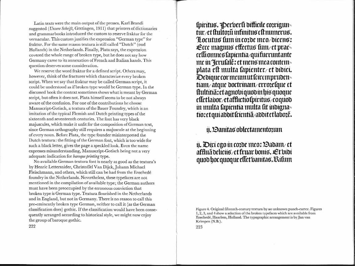
fplrttu~ .. lPerberft nltflrde ro~rlgun~ tttr;et llulto~u lnflnttu~ ctlnunteru~ .. 'Jlorutu~ fun1 In co~ be nteo; blcrn~: ..Seer magnu~ rffertus funt; £t prar·~ ceffi OlllltCSfaptftttta;qtttfttcruntantc n1r In ]erufale: ft mens n1ca rontnn~ plata eft tnulta faplenter; et blbtrt .. iOcbtquc cor mcun1 ut frirunpruben~ tlant; atquc bortrlnatn; erro~efque rt llultltla: d agnobl qtlob In ~~s quoque dl'ctlabor;etaftlirttofptrttus;coquob in tnulta faplentla ttlttlta ftt tnbtgna~ tlo: et qui abbtt fdentla;abbtt ct labo~e ..
ij .. aanttat> oblertatnento~utn
tj .. 101~1 rgo In ro~be nuo: Sabattl; ct aftlua behrtt~ ;ct fruar bonlt> .. .Et bibt quob ~or quoque etretbantta~ .. ltlfum
Figure 4. Original fifteenth-century textura by an unknown punch-cutter. Figures I , 2, 3, and 4 show a selection of the broken typefaces which are available from Enschede, H aarlem, H olland. The typographic arrangement is by J an van Krimpen (N.B.).
223

J3o111iu.:n; i!J opne,., fuoj1d ~~"" ¢ (f¢-pnd¢'') ieCiuf. Quif
1cuii!:J ;c"'"'J n99u;:-¢fj j'Pf pof1' , ..... fufu.-n co.9uor•nf.
+· S!Jrdi <."'L'"' n9 nCin/ ;Cf S!iSi ,;;neuuwinf/ 'l""¢ rull foe{.; .!JL'VIlldll\"j/{f !'nc\".!:!llnf inu ort'nfi lll l)/ l {f Cll¢111ill¢1l_J ;on:
foen f o~.:''J' (! 1¢• po 1 (&-- ~:¢ fifi~ •·t; 1co::.1"l.J \> ioer<n fin¢ f """" fot- 1111) " " c:3iei o ~.:jfifufof. ¢f e .... ~n\.>i (.' "n,<Jif c"'o~(uofj
'l" " ''J S!iu toakf : 1cf f.:eirio~¢ •t; (P fvo'liiL'-' i1~i;n\.>ij 'l"i t.11 ¢r9tu 'J C11nf11f ;Cff/ t1·1¢c uiSif (.'linen •ptn¢ ,,. (l foe¢ fi unf.
~11\"rlll ') CO II (¢111f'enfut riii 'J Olllll ¢fo en£?o~¢f t,0111i111111J/
1cf i a~ufhinf .. ,.;,,.,,S\.>,'l'fi -pnf,·l'{.; i11 uiSio¢ pvoc:3in1i: 1cf
i!J J3o.- 1cv,<Jo S!n,.ifnf / 1d '"""' fup,·rfeun 1c(f . '6fuefuf co111pei;nf (.'"nlutf funf / ;d ;:-o111¢S,f ; nr u¢f funfj ~i .:; t<nf:
Qvr ~eior ¢(1' l''~ieeuf .;IIJ"') l:¢'llli¢/ 'l"n ''J pe.:,n ufvn'l" 0
L'"""uf ""') en£lo~L"/ ; cf ntfeirfiO IIL'"'nllillai. Co11 fi&,•rnllf r¢-p¢.-i ;et neinllJ (Pn~ti fn(¢n; fu ll foe ..... , \.>uuf
¢ft / , d r.:runSun; f! ' O!J J3nll.:fj (!IO!J fieiu i'J/ C"O!J fvnfl:¢1"')/ ,d fn Ill~ enllo~n··e.; (! 10!) .:;¢ n-nf/ (!1¢.:; rnfin~•f 11 11"'" ocuei , ciuf ~j'Qjfjjf: (! I¢C V¢rosifnfj~j.;l'ttf : C 11i fnflo~oj ;{f fvnu9o n II j,.
mnn; <."' .:n II) llo ~tif? i!:J r::~c 'l"o<t«¢ 'on.ui fnf 1c ft/ ;ef" tfeirfio
.-p¢fTi"'" · Q1~¢eiuf ¢f1 ;e ... 3o~uof ¢ n -¢ p, .. le/ 'l"""' .., ,,."1J' J3nllt'nf ;C uin; 1c t11o euml'ltfm'J fo .:i .: fnfif fun¢ : fi S!nuf
.;¢ri 9.: rifj nll nef¢110 f .. eri.:fllll. 'on.¢ roe;·, 'l"i" .;: 1111) '"¢ri9¢1'ifj
c,I'IO!J ~n£1¢( fu £le¢\.>M.f¢11J r &'. ¢f fi ~Ot.tlli¢vinf~IIO/ fo\:1 ¢:
flu" fur G""'fuo: f'P•u•f 'l"o"'~o c:ae¢fi¢f? ¢ f r; 'l"i f p int')
Figure 5. Civilite by H enri de la Tour, sixteenth century. Civilite is a class of broken type which has been completely forgotten in the DIN Classification and in Plata's book. It was used in France and in The Nethedands. Civilite should not exist for the convenience of authors who iden tify broken script wi th German script.
224
entm jpirttu~ japientiaej ct not1Hl1crallitma" Icbicum a Iauii~ jui~ : t}nontmn rcnum Hliu~ teJlt~ £!1 '®en~/ et COJili~ illiu~ jcrutator cjt ueru~/ et linguae ciu~ aubitor. ~u onimn jpi" titu~ ~omini replellit OJlJ em terra rum: ct floc/ uu oil continet omnia/ fci cntimn flail et lloci~. ~toptcr floc qui loquitur inil}tm/ non poteft latere/ nee praeterfet mum (~lJ tipicn~ iu bi ci um. :fin c o.ni tationiitu~ enim i mpii inter"' rogatio erft: jermonum autem HHu~ aubitio ab ~emu lJ cniet/ ab roJrepti on em fnilJuitn" tum [email protected] aurf~ ~elf au bit omnia/ et tunmituP' murmurattonum non nftfconbc" tur. <!!:tq1obite er.no llo~ a murmm·atione/ t}uae niflil proilet1/ ct a bettnctione patritc lingthte/ l}ll onimu jermo on fcuru~ in llacuum non illit : o~ autem/ qnob mentftur/ ordbit Rllilllmn. J.~olite jdRte lllOttem ill cttO.?e lJftRe lleJltae/ ll£t}Ue acquirati~ petbitionem in ope" tibu~ manuum yeJ1rarum. qauontmu ~eu~ moJtemnon fecit/ nee Iaetatur in perbition~ llflloJum. <!treabit enim/ ut eft;ent omnia: et fmmitilc~ fecit natfone~ OJiti~ termrum: ct non et1 iit illi~ mebicmncntum e~terminii/ nee fttfetoJum re,nnum in terra. '::f:uftithl enim perpetlla eJ1/ et immoJtali~. ~~mpii autem nmnillu~ et berui~ accerfierunt mam: et nefti"
Figure 6. T extura by Johann Michael Fleischmann, eighteenth centu ry.
225

aetati~ !)abuetitjetanima illiu~ non utatur boni~ fubt1antiae fuaejfepulturaquc careat: be !)oc ego pronundo quotJ mdiorillo fitabo~tibu~. f'ruftra enim ben it/ ct pcrgit atJ tenebra~/ et oblibione tJdebitur nomen ciu~. Jf}on bftlit folem; neque cognobit tli,1antiam bonietmali: ttiam fi tJuobu~ millibu~ anni~ bi,:ctit/ et non fuerit perfruitu~ boni~ : no nne atJ unum locum properant omnia~ $mni~ labor !)omini~ in o~c eiu~: feb animaeiu~ non implebitur. ~nib !)abet ampliu~ fapien~ a t1ulto ~ et quit! pauper nifi ut pergat illut/ ubi t11 bita~ Jjll)diu~ et1 bitlere quotJ cupia~jquam tltfi" tlerare quotJ nefcia~. feb et !)oc banita~ et1/ et praefmnptio fpiritu~. ~ui futuru~et1/iam boca" tum e'1 nomen eiu~: et fcitur quotJ !)omo fit/ et non potTit contra fo~tio~em fe in iutlido conten" tlerc. }l)erba funt plurima/ multamque in tlifpu"' tantlo !)abentia banitatem. bij. ~uitl necetTe ell Domini maio~a fequaercrej cum igno~etquitJ con" tlucat fibi in bita fua numero tlierum peregrina" tioni~ fuae; et tempo~e/ quotJ bdut umbra prae" tetit~ 2Uut qui~ ti poterit intlicare quit! po11 eum futurum fub fole fit~
Figure 7. T extura by Christoffel van Dijck, seventeenth century. This style dominated Dutch ba roque typography (which was neither gothic nor German).
226
1iurcg '<!llmfrage auf <ll:Srunb bon 1Lcfeproben bd ~tubcnten fn ~cmfnarcn galle feb fcftgtfttlit, baf; bit altcn lSud)~ ftabentppen, hlfc fie fn ,~d;iit;c bcr -m;ppograpl)ic: i.!5cllrocgcnc ~cl)tiftctt", lScilagen uub Qluffiit;c bott Balter ~lata, auP jier ~olpgtapl), jfj)cftc 7 , s, to 1abr~ gang 1966, jftanitfutt am fo'tain, mit borgdcgt hlurbcn, famt unb fonbct~ gdefcn hletbcn kotmttn.
jj9£c banbgefcgriebene bcutfcgc jfruittur- hlfe fd) fie al~ ~d;illet nod; gdcrnt battc- hlitb hlcber gtfcgricben nocg gdcfen. ~dbft mdne .11\.fnbtt- mit Qlu~nabme mtiner iiltcftcn -m::ocgttt [30 1abtt], bit bit ~iittttlfnfcbrfft nocb gdctnt battc - kiinnen bie ~cgtift nicl)t ent;iffetn.
®bhlobl fd; bot bem Jltticgc nut in jfraittur fcgtiell unb lcbiglicg ftembfpt acglicge 33tftfe in Iatdnifcgen lSucgftallcn betfaf;tt, fd)tefbe feb jet;t al~ 1Lebret nut in lattinffd;cn lSud;ftal.lcn, abet and; nicgt ftiltcin. 3f ell bin butcb bit fran;iififcge <ll:Stfangenfd;aft ;u bicfet ~cl)tift ge;hlungcn hlotbtn [41abtc], babe abet bic altt jfraktur nfd;t bergcffen. ~fe hlitb frcilid) nicgt mebt fo geHiufig gcfcgtfebcn hlie friil)et.
1 cb kcnne tine gan;e 1\cibc iiltcrcr 1Lcute, bfe nut jfraktur fcl)refben, bercn lSriefc jcbod; ben Jltfnbern bOt:::' gdefcn hlerben miiffttt.1 cb bebauere cp, baf; in unfercn ~cgulen bide ~d) rift nicgt a neg gdtbtt hlirb, ba fie alteP Jltulturgut ift.llllletm in r.!5vmnafien nod; bic grfed;ifd)c ~cbtfft gdel)rt hlirb - ol)nc fie kann c~ kcincn ij{ntcrtfd)t
Figure 8. Manuskript Gotisch (Bauer Foundry). A modern German imitation of the old Dutch textura (Fig. 7) . The numerals a re a German invention. The many majuscules are too conspicuous because they are too heavy. Van Dijck made a d escending S; for the same amount of black he had more sp ace a t h is disposal. But the main fault is not in the majuscules; they would behave m uch more ha rmoniously if the lower-case had been fitted closer.
227

Rotunda was favorite in Spain, long after it had lost its position in Italy to the humanistic minuscule. Spanish printers imported type from the Netherlands, but the design of these rotundas kept close to the handwriting models of] uan deY ciar and Francisco Lucas. Excellent rotundas were cut in Germany 300 years ago, but if this would be a reason to call rotunda German, every script (but for the humanistic cursive) could be regarded as German, as even the first roman font was cast in Germany. Of all these different hands, only fraktur became a tradition in German typography.
There is a widespread belief that fraktur should be the ideal script to represent German language. The fraktur tradition was broken by the arbitrary and violent decree of the Nazi government in 1941. We cannot but loathe this measure, but we should keep in mind that the tradition came into being by just as arbitrary a decision by sixteenthcentury printers. Fraktur is not necessarily at its best in German text (which would be a remarkable coincidence: fraktur is not likely to be an exception of the rule that a script, derived from the Latin alphabet and developed in the writing of Latin text, is consequently at its best in Latin text). In Natural Writing (London, 1709) Shelley shows English text in a fraktur which we find one century earlier in Jan van den V elde, De spiegel der schri;fconste (Rotterdam, 1605) . This AngloDutch fraktur is superior to its German contemporaries.
A Binary Classification System Faktur is a script which is distinguished from textura by its curved elements, from rotunda by its narrowness, from the gothic bastarda by its tallness and from the humanistic cursive by its stress on the joints of the structural elements. These accents, accomplished by interruptions in the movement of the pen, explain the name fraktur (Fig. 10).
The breaks, evident in the comparison of fraktur and italic, are meaningless in the comparison of fraktur and textura. In this confrontation textura, and not fraktur, is the script with the fractures. This might h ave seduced typefounders to accentuate the breaks in
Figure 9. The splendid Dutch fraktur. Jan van den Velde, Spieghel der Schrijfconste, 1605 (reduced).
228

ntr lllC
me me Figure 10.
fraktur. The well-known Unger fraktur looks like an attempt to justify the word fraktur at too high a price. It was not necessary that German type design abandon ned substance for a mere cry, as every broken script has at least as many fractures as fraktur; fraktur deserves its name only when it is compared with the humanistic cursive. This should have been done.
Only when fraktur may be regarded as the North-Alpine counterpiece of the humanistic cursive, it becomes clear why just this elegant, curved script got the name fraktur. Germany never adopted the R oman chancery hand; in its contemporary fraktur, Germany had its imperial chancery hand.
Related scripts are kept apart by the actual classification. If this barrier to understanding should be crossed by investigation, we must look for a more relevant classification. I have tried to find its measures at the root of all type design, in the technique of handwriting. We can distinguish cursive and interrupted writing. Interrupted writing consists of dashes, which are all downstrokes. During the movement from the end of a downstroke to the beginning of the next one, the pen is lifted from the paper, the linking upstroke does not appear in the letterform.
In cursive writing downstrokes are linked by upstrokes, which are essential parts of the letterform.
llll Figure 11.
(In paleography the word cursive is, with some historical right, used for informal writing, even for informal interrupted writing. The paleographer cannot say formal cursive, which would mean a contradiction for him, and consequently he cannot see a formal cursive. This may be the reason why the purest cursives are called bastarda. The difference between formal and informal writing needs not to be considered in printing type. Type is always formalized handwriting; what looks like a flick is the result of wanton accuracy and not of speed.)
Figure 12.
CII·1'S~vrWI·ihlj ft,M1~~ J,Drlu>!-WMcrn·fs.
':T11·r t 'S'S hci-1·~,( ynw if o m. J~..,,...,~sti c "~""" r\rr
~ '11-6l-M" rf.Uf' r (n-rvm~t-u-~) ~ ... ~r(.v.
Next to structural differences we can regard differences in contrast according to their origin.
The contrast of thin and thick parts in a letter depends on the shape of the pen and on varying pressure on the pen. The latter only becomes obvious when the pen is pointed and flexible . In a script written with a stiff, broad-nib bed pen, the influence of pressure on the pen may be neglected.
When a figure is translated, its moving points cover an area, showing the same contrast as a stroke with a broad-nibbed pen. To
231

C).gint
Figure 13.
c.mtl·ast Jcrvrrncd·!J· tl1es /1 aye 1 tltcrm (trans latioa)
CD')t,tyMtjUVYYned !J-HterY(SSl-I.YC O'n the rt"J, (t:Xpansion.)
detach this phenomena from the writing pen, we could call it translation. Similarly, the effect of pressure might be called expansion.
According to these four categories each script and each typeface can be classified. Such a classification is easy to handle for anyone who has a basic knowledge of writing. This binary classification gives the essential information on the behavior of type, because it keeps handwriting and type design together. Leading, length ofline, and choice of paper-important factors oflegibility-are related to structure and contrast of the typeface. Structure, contrast, writingtechnique, and reading-technique developed in correlation. It is extremely difficult to isolate letterform or legibility from handwriting without producing nonsense. This might result in theories such as that of the influence of copperplate engraving on type design, which is generally believed but which cannot stand the slightest criticism.
nn n n
Figure 14.
Reality has not the comfortable simplicity of the system. The system is not a substitute for reality but a key to understanding. Simplification is the first purpose of classification. Disturbing features may be neglected or- when they are too obvious-we can introduce a transitional group. Fournier, for instance, clung to typefaces which were designed on the principle of translation, but he could understand contrast only as the consequence of pressure on a pointed pen. His misinterpretation of old typefaces was the basis of his designs, which do not fit in the system. Van Dijck however, still shows enough translation to justify its place among Gutenberg, Jenson, etc. Baskerville has nothing that reminds of translation; his designs have their origin in expansion and not elsewhere. To call Baskerville transitional would be sheer nonsense.
Similar observations can be made in the construction of script and type. The carolingian minuscule has an oblique part in the downstroke which characterizes interrupted scripts, but it also has the linking upstroke which is typical for a cursive. The structure of the
Figure 15.
i,.-m.,(/rrrrL W"'!-;n-;~1 c IHHII>H-t-i $he. .,~. ~ •uU Clll : )
l owu-shokn n ... !r
iwttnsi~tnuvC (cAtYof0-J ;~'" ,.. .... ,:,"."s ,.,[c) _
tl"' 'Tmltc i.$ n<~t i-J,J~srmr~1"[cjn- H,r iA-mti!/ "f t/,f lettrr:r
C1WSWr wnfi..~ (J1.1M1 .. ~5tJ;c twr>-c.n:) t~ ~..:wk..:u wrsmk..e i-1 n~

"' e-o pAm l-"-
tL \)
"' ""' > tcp~m VI
"' :J
·~
cop am eoapm
vo ropam 1--"-
" \.)
"' 0
u.l
~ ropa11l :l r!.. r!.. 11..1
~ eopat1'l 1.
Figure 16.
Cwl'OI~•t1~~v ~"l.-:1 vtt;SC LC..k
bA.st.H·ti~
fnl•tHl'
lulHl(,\.H(sh'r e~c,~·s wr
H~hP'll.'
}'0 h~Hitt·
),.,, '"•~'~' ,:Jh·.- ·u H··u-us c" I.e
carolingian minuscule is transitional between the cursive chancery hands and interrupted text hands, broken or not.
From this point of view the class of the broken scripts looses its coherence. Textura, humanistic minuscule (roman type), and rotunda are interrupted scripts; fraktur, humanistic cursive (italic), and the gothic bastarda's are cursives (Fig. 16).
In the course of time ignorant punchcutters got the opportunity to copy successful typefaces without understanding their underlying principles. This even resulted in a theory that type design should be independent of handwriting. Finally only great designers- Baskerville, Bodoni, Van Krimpen, Dwiggins-kept their typefaces close to handwriting. The majority of our typefaces have a second-hand relation to handwriting. This is the main cause of difficulties in the classification of type. The fraktur-proof issued by Unger about 1790 is an interesting example of such ignorance. The grades cut by Unger show an interrupted script, whilst the font by Didot is definitely cursive. Unger understood nothing of fraktur as a cursive. If there is a relation between the preference for Unger Fraktur among German printers and the spread of discutable opinions in German typography, we could readily understand the rash identification offraktur and textura as " German type" and puristic abuses such as letterspacing.
:U3enn roir einen ®runb fud)en, unb roir follten bas tun, roarunt bie 'i5"raftur mit ben jiingeren ~l)pograpl)en nid)t per ::Du i~, f o gelangen ll)it ~u einem einfacl)en ~rgeonis. :mer !>on una f ud)t bie 91i:il)e befTen, ben er nid)t !>cr~~~t'? ~er~el)t in ~roeifad)ent ®inne, benn 3uni:icl)~ i~ il)m alleo fremb, roas ~ur 'ijrahur gel)ort. ::Doe oeginnt oeim Iangen f, unb bas en bet oei ben ;\3igaturen. ::Da6tvif cl)en fiegt bie ganbe .stia!>iatur ber ~erf alien, bie il)m etroa f o !>ertraut i~, roie baa griecl)if cl)e ~Ipl)aoet. ::Der sroeite ®runb Iiegt in ber ~atfacl)e, baa bie 'ijraftur in !>ieien ~e· trieoen nid)t mel)r !>orl)anben ifl, !>ielleid)t noel) im .}ta~en, aoer nid)t mel)r im ~erouStfein ber .}tollegen.
Figure 17. Unger Fraktur (Linotype) . Ignorance.
235

German Problems Returning to the German discussion: we know that if there should exist a problem of German type, it is the problem of a peculiar cursive script. The peculiarity offraktur has some consequences, but they do not affect legibility. Each script can be rendered more or less legible; if somebody calls a typeface legible, he says perhaps more of his own habituation than of the qualities of a design. A bad typeface could be the best one for people with the worst habits. Illegibility might be an objection against certain fonts, but not against fraktur as such. (This can be reversed. Stanley Morison says that fraktur is more legible than roman type because fraktur has shorter as~enders a~d .. descenders. With that kind of argument one could praise the legibility of bad press-work; you get so much more black on your paper.)
According to some German authors, the longs should survive in fraktur. With this premise they argue against fraktur, since nobody still knows where this longs should be placed correctly. The longs should be used when it is prescribed by orthography (but then also in roman type) and if not, it should be used nowhere. Germans do not learn to use the longs correctly because it seems to have been abolished by German orthography. But then it would not be orthographically correct to use the longs at all. If German orthography would change with the typeface, it would be the funniest orthography of the world. The German discussion could suggest that the tradition of the longs should be restricted to broken type. On the development of this tradition in roman type Ronald B. McKerrow gives some information in Paul A. Bennet, Books and Printing (New York: World Publishing, 1953). That this same longs makes fraktur difficult to read for outsiders would be a strange argument against the use of fraktur by insiders. This argument can, however, be found in the German book.
We are accustomed to the arbitrary and anachronistic combination of roman, italic, and capital. Fraktur has no accompanying capitals but majuscules which are adapted uncials. This may be as anachronistic, but the cursive aspect of the uncial has been fully exploited in the adaption for fraktur. This harmonious combination permits the use of many majuscules without disturbing the page. Calligraphic practice gave rise to the German habit of beginning each noun with a majuscule, which would have given difficulties in the combination of
236
MP~
Figure 18.
roman and capital. The abolition of this custom has been discussed, since roman type is generally used in German printing, but it seems to be possible still to find arguments for the conservation of sixteenthcentury calligraphic abundance in contemporary typography. Anyhow, as this custom depends wholly on the absence of capitals in fraktur, it is a mistake to apply it to roman type. In the integrated majuscules, fraktur has an advantage over roman and italic which depend on capitals for majuscules. On the other hand, a fraktur font offers no possibilities for accentuation of passages and headings: headings composed in majuscules would be absolutely illegible, and the alternative letterspacing has spoiled much German printing. If fraktur has to be used in a sound typographic concept, its use will be limited to plain texts (novels and poetry).
This restriction is used as another argument against fraktur; in fact, it does not condemn fraktur, but typographic purism-which could make roman and italic as difficult to handle as fraktur.
There is a better way than letterspacing: the contribution of Albert Kapr (composed in Zentenar-Fraktur) required some capitals. Plata choose Times New Roman which works very well (Fig. 19).

l{)er ®treitigfeitcn unb Biinfereien roegen ber Iateinifd)en ober ,beutfc~en" ®c~ri~ maren 0u £ut~erll, hU <Boet~ell unb ~ill• marcfll Beiten fo oie!e, ba~ ell geraten fd)eint, nc~ oom ton fall ber ~ifem hU bi~an3ir~en . .3m 91acpfa~ ber £ut~erbibef be5 2lbam £ufft, Q.Bittenberg 1545, ~e~t folgenber 91ad)fa~ oon ry{oocr [ry{ooCU'iu5] , . . . finb 3tueverici ~ucp~aben ber 21~ ~ unb ABC <Be~alt gefe~t, bern unerfarenen £efer Untcrfc~ieb anhlloeigen. f.Da!l fo in biefer 21~~ ~e~cn, bie ~c~ri~ rebe oon <Bnabe, :tt·o~ ufro., bie ABC oon ®traffe". ~iefe mer• teufefung ber 21ntiqua beutet fc~on an, in mere~ ~arfem IJJ1o~e bie ®c~t·impaftung mit ber Jtircpenfpaltung oerbunben roar. 2lber nocp micptiger mag un5 ~cute bie ;3rage fein, mit toelcpen 2IIT 03iationen unb ~ebeutungen bie ;3raftur bcfracptet mar unb nocp i~. <JJlancpen ber iilteren <Bcneration i~ fie cine Iieben5merte ~eimatlid)c ;3orm; t>cr i)ugcnb cr[c~eint fie oer• fc~norfe!t unb altmobifcb; ber £ieb~aber beu~d)er £iteratur fc~ii~t fie al5 bie ®d)ri~ fiir bie ®prac~e oon <JJloricfe unb ®ti~er; ber QBeltmann oerurteilt fie al5 beu~c9tllmelnt> unb prooinhicll. £cit>cr i~ nic~t ganh au5gefcl>loiTcn, ba~ fie oon einer notiona!i~ifcpen Q.BeHe emeut pocpgefpLl!t merben fonnte, mie bic5 in ben i)apren nac~ 19 33 bcr ;3all mar.
;3Lir micp geporen bie lSot·mcn ber ;3ntftur, ber ®cpma• bacpcr, bcr ~1unt>gotifcp, ber ~otifcp unb oor aHem t>ie oielen 2fbtuanb!ungen ber gotifcpen ~a~arba. 0um ®cpon~en unb s.pracptig~en ber ®cpri~fun~ tibcrpmtpt. Q.Ber ba5 ®cpri~· fcprciben ricptig edernen mill, barf an t>iefcn pi~orifcpen ;3ormen nicpt oorlibergepen, ipre oielcn mm:ianten mepren fcinen ;3igurenrcic9tum unt> regen fcine l.ppantafie an, aucp toenn cr fpiiter burrp r eine 2lufgaben ollr ~rcngercnunb fii[terett 2Intiqua oerpfiicptct mirt>.
Figure 19. Zentenar Fraktur by Ernst Schneidler. The result of this mixture with Times New Roman should encourage more experiments.
238
Figure 20.
CJI11' comfn.:u rvh'tnl/1
Pliff~·m-tsrnrt.r ('~"'~~-~~ . imltv, vwr~h:d) -t\'WVk.c.s tl.. (ut~wt 11"P'»~Mr-:Jrc ft-fw "7).,.:fffi-rn,i rLft:f.
"JY.t-1-.bw sl~111dd. lrr l~rtr.j ,.NtrJ, i~ ru,vJt,.-CU}~~b,'».:t.ft.OlV5 ~t~t
S ~r,ow(,d J~.wr A. cf~MII!C fv
5Wl·vivf. 'Tir~t ill"shnHow.r )11.'7 rfJ..OW H11Vt fnJvtwr' tuLtnd-r-s s-udt-evv,,,,t,.,~nw.
Curls and pronged ascenders characterize fraktur. This statement, which can be found in the DIN classification, tallies with the actual situation and this might be the strongest argument, not against fraktur, but against centuries of German type design which sought a substitute for quality in interesting flicks and curls. Without curled tails and forked ascenders, fraktur would again have another chance to inspire good typefaces.
The list of available fraktur fonts fails to impress the designers among the contributors in Plata's book. They learned to appreciate the wide range of possibilities in a good roman font. Iffraktur should have a future, it must not be as an alternative to this range, but as an addition. If understood as a bold, upright cursive, an accompanying fraktur could enrich many roman fonts (Fig. 20).

------ ------------------
This would mean a new beginning, which we cannot expect from the traditional typefounders; the production ofleaden type is a painstaking process. But photographic matrices are very easily made by every designer who masters handwriting. Independent from the commercial afterthought of type foundries, designers will have the future in their hands, provided that these hands are trained to write.
The Siloam Inscription and Alphabetic Origins
Roy K. Patteson, Jr.
The Siloam Inscription is one of the most important monuments to alphabetic writing. It is, however, almost unknown to people in Western civilization. This article relates the story of its discovery and points to some of the evidence for the development of writing contained within that inscription. The acrophonic principle, upon which the inscription is based, seems to have been the invention of a domestic situation within Palestine. Theories about the origin of the alphabet are discussed, with a tentative conclusion that Palestine was the alphabet's place of origin.
The precise age and place of origin of our alphabet are questions which have remained unanswered down until our time. Literary monuments from the Near East, in addition to their value for historical inquiry, contain vital information for scholars interested in the development of the alphabet and writing. Eventually we shall be able to give an accurate account of alphabetic origins, perhaps within the next five to ten years.l
The purpose of this paper is to acquaint the reader with the Siloam Inscription-one of the most important, but little-known, monuments of early writing. This article points to evidence for development of writing contained within that inscription, when it is compared with other prominent Palestinian inscriptions which can also be dated. Internal developments in the writing style, when connected with a unique acrophonic principle, suggest that the alphabet originated within Palestine in simple domestic situations. In contrast to cuneiform and hieroglyphics, this alphabet prevailed in Western civilization.
The Siloam Inscription was discovered in 1880 at the opening of the Siloam Tunnel, a hand-cut aquaduct located on the south-eastern edge of the present city ofjerusalem (Fig. 1). While our main concern
241

SILOAM 'MINEL- JlliUSAL!ll •cal• in reet
0 ;og 1000 1500 Pnsent. 111'alla .. .............. -Anclent. h)'pathet.lul va.Us ... -·-fll.lla&nel.o~nt..ain:e ••••••••• ~
l.ount or Olh u __..
01hon ~ .S prin1
Figure I. Map of jerusalem shmving the location oft he inscription within the Siloam Tunnel.
is with the Siloam Inscription, the story of the discovery of the Siloam Tunnel is in itself thrilling.
Edward Robinson, a famed English archaeologist, began his researches in Palestine in 1856. He found it a current belief among the Arabs that a passage existed under Mt. Ophel connecting two water sources, the Virgin's Fountain and the Pool of Siloam. Prior to Robinson's work (1856), there was no written mention of an underground passage under Mt. Ophel.
Jerome had noted in the fourth century that the Pool of Siloam did not flow regularly, but instead at times the waters flowed with great abundance from the hollows and caverns of hard rock. Josephus, the Jewish historian of the first century, spoke of these waters as "abundant." In 1099 only the Pool ofSiloam remained unpoisoned during the Crusaders' siege ofJerusalem. Men and animals fought and died for a drink at the opening in the rocks, below which the Pool of Siloam formed. I nJ esus' day it was commonly believed that the waters had curative powers (John 9 :6).
In April, 1856, Edward Robinson succeeded in crawling through the aq uaduct on hands and knees, timing his trip to coincide with the slack period of water. In December, 1867, Capt. Charles Warren began the work of clearing the aq uad uct and prepared a survey to determine the length and various heights of the passage (Warren, 1871 ). An ensuing debate raged between scholars concerning the identity and age of the tunnel, all of which was complicated by the lack of exact knowledge about the site of the ancient city of J erusalem.
In 1880 a chance occurrence opened a new era of investigation of the Siloam Tunnel- the discovery of the Siloam Inscription. C. Schick, a German schoolmaster, who was much interested in the identity of the Tunnel, wrote (Schick, 1880):
I had very little hope that we should ever arrive at any certainty respecting its [the Siloam Tunnel] age. An accidental occurrence has, however, led me to believe that we shall in course of time learn something definite about this aquaduct. A short time ago one of my pupils stumbled over bits of rock and fell into the water. On rising to the surface, he discovered some marks like letters on the wall of rock.
These strange marks were the famous Siloam Inscription, cut into a smooth slab of rock about 16 feet inside the tunnel from the Pool of Siloam.
The Siloam Inscription The newly discovered tablet measured about 2 feet 2 inches wide and 8 inches high as reported by Schick. More exact dimensions are : height, about 0.38 m; length, about 0. 72 m (Pritchard, 1955) . The inscription itself consisted of six lines ofPaleohebrew, with evidence that the upper portion of the rock had been prepared to receive writing, but did not.
The letters were very faint, differing in color and condition, with some lines under the water. A deposit of silicate had formed over the letters.
In J anuary, 1881, Schick succeeded in making a hand-copied facsimile by candlelight. This he sent to A. H . Sayee and W . F. Birch who, in a letter sent to the Palestine Exploration Fund, pronounced the inscription the most important yet found in Palestine. The inscription was subsequently removed by Arabs.
243

244
. • . . 1~y~ . i1:lpj;, • .,~, • ;,•;, • ;,n • :-1:1pj;, [ • on]
p. tt'N . Sp • • [:lp]ji1S. rlbN . tttS~ • 1~V~~ . ~Vi . SN • tt'N • Jli.li1
:-1 • l:l':l~ •••••• Jb'b • .,~~ • :-117 • rl':-1 • ·~ • ~Vi . SN • Ni
~~s,, . JTi.l • Sy . JTi.l • ~Yi • n;pS • tt'N • l:l~~t'T:-1 • t::l:-1 • :1.:lpJ
(N)b' .• :-TbN • ~SN~ . o•nNb:l • ;,~;:1;, . SN • N~'bn • ib • l:l'bi"T
[OJ~~n;, • tt'Ni • Sy • ;~;, • ;,~.:~ • ;,•;, • :1bN • n
Figure 3. Handmade copy of the inscription and transliteration.
[When the tunnel] was d riven through. And th is was the way in which it was cut through. While [ ] [we] still [ ] axes, each m an toward his fellow, and while there were yet three cubits to be cut through, [there was heard] the voice of a man calling to h is fellow, for there was an overlap in the rock on the right [and on the left]. And when the tunnel was d riven through the quarrym en hewed the rock each man toward his fellow, axe against axe; and the water flowed from the spring toward the reservoir for 1200 cubits, and the height of the rock above the head[s] of the quarrymen was 100 cubits.2

The rock slab was broken into several pieces, bul ultimately found its way into the :tviuseum of the Ancient Orient at Istanbul, where it remains today.
Throughout the eighties and nineties a debate raged over the nature of the inscription, primarily between Birch and Sayce.3
The deposits over the letters were removed and a gypsum cast was m ade. Other and better squeezes were made, and with the help of these, European scholars were able to study th e inscription in comfort and leisure (Figs. 2 and 3) .
The dating and identity of the tunnel could now be made. The epigraphy of the inscription corresponded to the writing of the Moabite Inscription (840 B.c.) ; and the nature of the tunnel closely agreed with the Biblical accounts ofHezelciah's work of planning the d efenses of the city of Jerusalem by diver6ng its water supply to within the city walls. The Biblical witness is as follows:
And when they [the Assyrian host against] erusalem] were come up they came and stood by the conduit of the upper pool, which is in the highway of the fuller's field (II Kings 18: 17).
This same Hezekiah also stopped the upper watercourse of Gihon and brought it straight down to the west side of the city ofDavid (II Chron. 32: 30).
. .. and ye gathered together the waters of the lower pool. And ye numbered the houses ofJ erusalem, and the houses ye have broken down to fortify the wall. Ye made also a ditch between the two walls, for the water of the old pool, but ye have not looked to the maker thereof, neither had respect unto him that fashioned it long ago (Isaiah 22:9- 11).
These references to Hezekiah's monumental work fit exactly the tunnel as it may still be seen today.
By the twentieth century there were still disagreements between scholars about the proper translation of the inscription and its date. However, there was universal appreciation for an inscription which contained some of the most ancient Hebrew writing known to be in existence. Here was a Jewish monumental text on which scholars could form an opinion about the development of the alphabet and H ebrew writing.
For the benefit of the readers who may be unfamiliar with epigraphic monuments of the ancient Near East, a brief excursus on
246
Hebrew writing may be helpful. There has been a paucity of monuments containing the Palestinian Semitic antecedents to our epigraphy. This is in marked contrast to the thousands of clay tablets in the cuneiform script which have come from Mesopotamia, and to the abundance of Egyptian monumental inscriptions in hieroglyphics. But neither of these sources shed much light upon the development of the alphabet and Hebrew writing.
Israel, important for her religion and ethics, was not a nation of great military conquests. Whatever monuments she erected have probably perished with time. The Hebrews probably wrote abundantly, but on less durable materials. One suspects that their scruples against images militated against the possibility of any great artistic expressions, and thus attenuated the monumental styles. Consequently, there remain great gaps in our knowledge of the stages of development of Palestinian epigraphy.
In addition to the Siloam Inscription, the most important Palestinian monuments are the Sinai Inscription (date unknown), the Gezer Calendar (tenth century), and the Moabite Stone. These inscriptions illustrate the methods and materials for writing as they existed in Palestine from about 1050 B.C. onward. Of these, only the Moabite Stone can be closely dated.
Among other monuments to alphabetic writing, there are: a blade of an inscribed dagger, an ewer inscribed in writing similar to the Sinai script; a seal inscribed with Hebrew, "Belonging to Shem a, the servant ofJeroboam" (786- 746 B.c.); seal-inscribed j ar handles; and the Lachish ostraca, 21 in number (589- 588 B.c.). Among later witnesses are inscriptions in Aramaic, which supplanted H ebrew; the later, but very valuable, Dead Sea Scrolls and the Mas ada Scrolls discovered in 1964. To this list, we may add coins of the Seleucid period and the period of the Maccabees. The Siloam Inscription and the Moabite Stone are the most important monuments to alphabetic development.
The Siloam I nscription reveals an acrophonic principle, whereby there is a correspondence between the pictographic letterforms and the initial sounds of their names. In the Siloam Inscription , the letters are still essentially pictographic. The following list of 22 consonants illustrates the correspondence between the letterform, the name of the letter, and its acrophonic derivative.
247

Siloam Form Name Transliteration Later Hebrew There is a close correspondence between the name of the letter and
-r- Aleph (ox) silent, later a N the sign of the letter. This correspondence cannot be accidental ; it is impossible tha t the name and sign should match if either of the two
_j Beth (house) b,bh :J were borrowed. The pictographs on which the alphabet was based were simple
1 Gimel (camel) g,gh l items, such as ox, house, camel, doorway, hook, hand, head, mouth,
4 Daleth (door) d, dh , eye, and tooth. The spectrum of the pictographs remained simple and constant throughout the evolution of H ebrew script. It is not likely
~ He (window) h il that a more complicated script stands behind the simpler one. The monuments to Paleohebrew attest that the Hebrew alphabet
~ Waw (hook) w resisted the influences of other systems until it flowed into the square
:::s:=; Zayin (trap) z charactered Aramaic script, in which it still retained the basic P aleohebrew pictographs. The only accommodations which are
~ H eth kh n discernible are the rearrangement of the sequence of the original
Teth t! letters, and the later inclusion of vocalic notation while also retaining the consonants as vowels. 4 The alphabet seems to have been based
~ Yadh (hand) y,i originally upon the classes of objects represented in the pictographs, such as animals, and closely associated domestic objects (ox, horse,
J Kaph (bent hand) k, kh ::> camel, door, window opening, hook, weapons, fence) and personal features (hand, bent hand, eye, mouth, back of the head, the head, ? Lamedh " tooth). These would have been in close-order in the original alphabet
j Mem (water) ~ and the objects themselves would have served as mnemonic devices
m to jog the memory. The grouping of the soft labial, palate!, and
J Nun (fish) n dental (:::1, l, , ), and the liquids(';!,~, l) betray an attempt at classification ofletters.
Samekh s 0 We have clear evidence in the Greek alphabet that borrowing of
Ayin (eye) gutteral ay lJ the alphabet did occur. In this case there is no mistaking the borrowed
(} signs and names. If the Hebrew alphabet were borrowed, we should
J Pe, Phe (mouth ) p , ph ~ expect some analogies between the Hebrew script and its exemplar. We conclude from the above points that the earliest, purely
~ Sadhe tz ~ phonetic-alphabet script was ofPalestinian origin. It must have been
Qoph (back of head) v invented within a settled, domestic, agrarian society which we see
t> q reflected in the pictographs. We must, of course, acknowledge some
"1 Res (head) r , influence from Egypt and Mesopotamia: from Egypt, perhaps the
consonantal idea; and from the Babylonians, only the rudiments of Sin (tooth) s, sh IV the language itself. w
t, th n 249 X Taw, Thaw

Early Development within the Alphabet The Siloam Inscription shows us the state of the alphabet at about 700 B.C. and provides us insight into the direction of development of the Palestinian alphabet.
( 1) The Siloam Inscription reveals that the alphabet was drifting away from pictographs and receiving marks of an arbitrary nature. These markings could have given rise to new letters unrelated to signs. We may note arbitrary marks appearing in the following pairs offorms:
~ (He) and ~ (Kheth)
J (Nun) and J (Mem)
~ (Zayin) and ~ (Sadhe)
X (Taw) and X (Teth)
-'f (Qoph) and 1 (Resh)
(2) We can detect considerable development in the Siloam Inscription over the Moabite Stone and Gezer Calendar. The following pairs will illustrate the direction of developments:
Siloam Inscription Moabite Stone
-r (Aleph) shortened strokes 4 :J (Beth) squared base 9 ~ (Kheth) three horizontal strokes ~
J~ (Waw) curved stem y (Nun) curved stem '1 (Sadhe) analogous to Zayin ·fz-
1-y (Pe) curved stern 7 (Qoph) evidence of cursive stroke 9
The above illustrations reveal that by the time of the Siloam Inscription (700 B.c.) considerable writing was being done on soft materials with pen and ink. The earlier writings were rendered in an uneven and apparently more archaic manner without regard to careful line or consistent vertical strokes ( cf., the Gezer Calendar and the Sinai Inscription). By 700 B.c. writing had become stylized to the point that the script was lighter and more flowing. The line was precise. The letters were shorter with the stemmed letters being more rounded or curved toward the left. T he words were divided by points. A long-standing tradition for a cursive script in Palestine prior to the Siloam I nscription should be assumed, for it is clear that a cursive model had intruded itself into and determined the Hebrew monumental writing by 700 B.C. General lapidary writing, even today, tends to consist of angular junctions of strokes due to the hardness of stone and the nature of cutting tools. Based upon the curved shafts of the Siloam Inscription, we must assume the existence of a strong cursive tradition prior to 700 B.C. We see that the writing of the Siloam Inscription had not yet achieved a full sophistication. There was not yet hesitation to divide words at the ends oflines (c£, lines 2, 3, and 5 in which last words are divided), nor did the script allow for the lengthening of certain letters at the ends of words in order to fill empty spaces. The script had not evolved to the point where it was written "plene," that is, forcing the consonants to serve as vowels.
From the Siloam Inscription we also learn what the earliest writing of the Old Testament looked like. Some of the most important documents, such as the '']" and "E" documents, now embedded in the Hexateuch of the Old Testament, were certainly written in this Paleohebrew script. The writing prophets of the seventh and eighth centuries composed their famous oracles in the same script as we see in the Siloam Inscription. Many of the Psalms, especially the acrostic Psalms, revea l the fascination the alphabet held for ancient writers.

Alphabetic Origins The alphabet has been thought to have been borrowed from the cuneiform script which was widely used in Mesopotamia from 3000 B.C. and in north-western Palestine down to 1500- 1400 B.c.
This late use of cuneiform in Palestine is attested by the excavation of the Canaanite city ofUgarit in 1929. Cuneiform was used to write a number of Semitic dialects, including Old and New Akkadian, Babylonian, and Old and New Assyrian. Cuneiform provided bases also for Old Persian, Ugaritic, and Armenian. Cuneiform evolved from pictographs into ideographs and finally into stylized syllables, made by wedge-shaped tools pressed into clay. The pictographs were made by hundreds of signs, among which are some which appear similar to signs in the Palestinian alphabet (such as the sign for the ox).
Even though the cuneiform remained prestigeous into the second millenium, the differences oflanguages in Mesopotamia would have reduced any phonetic values of the signs to confusion. One doubts, therefore, that cuneiform would have been borrowed by Palestinians because of phonetic values. At Ugarit, where a simpler system of cuneiform was used to express thirty basic signs, one is tempted to conclude that cuneiform provided the alphabetic typology for Palestinian epigraphy. But the Palestinian epigraphy was more likely the model which prompted the Ugaritic abandonment of the cuneiform syllabary. The cuneiform syllabary contained four vowels (a, e, i, u), but it is significant that these do not appear in the Palestinian script. Only later were the Hebrews troubled by a vowelless epigraphy, and not until then did they begin to force certain consonants into functioning as vowels. Thus, it does not seem that cuneiform was the parent of the Semitic alphabet.
The Egyptian origin of the alphabet has been widely accepted. It has been speculated that Egypt derived its system of hieroglyphics (picture writing) from ancient Sumer. It must be noted that hieroglyphic writing did not develop consistently on the phonetic principle. The same picture might be used to indicate an idea, a word, or sometimes a consonant. By the Middle Kingdom period spelling was more consistent and more consonants were represented. Usually there were multiple signs for the 24 basic consonants, and some signs might represent more than one consonant. Words could
252
only be precisely written thusly: by including a picture of the primary object; adding or deleting strokes to indicate if the word should be read as pictured; the inclusion of determinative signs to designate the class of the word; and finally the inclusion of basic phonetic signs to guide the reader in pronunciation, with final consonants of each syllable reproduced at the end of each syllable to insure that the right word would be pronounced. Egyptian writing did not abandon these principles even when it evolved into the bookhand script ofhieratic by about 1900- 1500 B.c., and later into demotic which was written about the turn of this era.
The close cultural ties which obtained between Palestine and Egypt during the second millenium B.C. could have provided an excellent context for borrowing. S. R. Driver (1944) has suggested that the Palestinians derived the phonetic principle of a "sign for a sound" from the Egyptians.
On the negative side of the Egyptian origin of the Paleohebrew script, we note the lack of specific evidence of borrowing by the Palestinian people. Hebrew signs corresponded to Hebrew words. If there were borrowing from Egypt, we would expect some Egyptian words in the alphabet. 5 The language differences prevented the possibility of the transmission of phonetic values. An alphabet, to function in a new linguistic environment, must sacrifice the inner connection between what is written and what is said. We must, however, acknowledge the development of the phonetic principle in Egypt although it was largely confined to syllabics. Egypt never abandoned hieroglyphics in favor of the more efficient phonetic system.
There are other possible sources for the Palestinian writing. Alan Gardiner ( 1916), in similarity to S. R. Driver, believes there existed in the Sinai Peninsula by about 1500 B.c. a mode of writing based upon Egyptian hieroglyphics. H e believes that this script was the parent of both the Phoenician and the South Semitic (Arabic) scripts. Few inscriptions support this theory, but it is widely accepted today. While Sinai was the site of copper mining operations, it seems unlikely that alphabetic writing originated in a region so remote and uncultured.
W. E. Staples (1941) has suggested that Paleohebrew was a product of the combination of the cuneiform syllabary, plus its few
253

signs used to indicate pure vowels a, i, e, u, and the Egyptian system which became consonantal but remained vowel-less. This view is tempting, since Palestine was the landbridge between the great empires of Egypt and Mesopotamia. But this still fails to account for the unique character of the Hebrew script, which is vowel-less, nonsyllabic, and acrophonic.
It has also been suggested that the Hebrew script could have developed from the Mycenaean syllabic script of Crete and Rhodes, whence it was imported to Palestine by the Phoenicians. However, the evidence indicates that the Mycenaean script was obliterated by the Dorian invasions in 1100 B.c. and that the Greeks recovered writing by copying the Palestinian alphabet, brought to them by Phoenician traders several centuries later.
If the Paleohebrew script were borrowed, we should expect to find a measure ofkinship between that alphabet and some exemplar. This we cannot find in any measure that is convincing. The obvious conclusion which remains is that the alphabet is a product of invention on Palestinian soil.
Summary The Siloam Inscription broke the long silence of Hebrew epigraphy. It still holds interest for us in the areas of history, philology, and epigraphy. We see in its letters the evidence for a firm and longstanding cursive tradition prior to 700 B.C., coupled with a resistence to outside influences from vocalic cuneiform and pictographic hieratic. The simplicity, ingenuity, uniqueness, and usefulness of the Semitic alphabet determined that it should become the epigraphic model for Western civilization's alphabet. As studies in U garitic go forward and as more Palestinian inscriptions come to light, we may expect more information on the origin of the alphabet.
T 1. Discoveries within the last decade of epigraphic monuments have been manifold. AB these are published, abundant evidence will be at hand to complete our present insights. In a later article, this writer will summarize recent discoveries and their implications for the history of epigraphy.
2. The word ( i1if)= zdh in line 3 of the inscription is of unknown meaning. I t is here translated "overlap."
3. These debates are printed in the Palestine Exploration Fund from 1881 to 1898.
4. We cannot be certain what the original sequence might have been, though it must have been similar to the arrangement we now know. The eight or nine "Alphabetic Psalms" in the Old Testament, in which the number of verses is determined by the letters of the Hebrew alphabet, suggest that the original number ofletters was 22. However, there are irregularities in certain Psalms: Ps. 34 omits , and adds!:) at the end ; Ps. 35 omits, and adds!:) at the end ; Ps. 9 omits i and l;l, j umps from :l to j? and from j? to IV and omits ill; Ps. 1 0 uses only the last fourletters, j?, i , IV, n; Ps. 119 is complete, but omits an extra ill which appears to have been a later development.
5. An excellent example of what we should expect in a borrowed alphabet is afforded in the Greek alphabet, which took over the phonetic writing of the Palestinians by about 825 B.c. The Semitic names of the letters and their signs were kept by the Greeks in precise relationship, i.e., (Aleph) became A (Alpha), etc.
BIBLIOGRAPHY
Albright, W. F. The Archaeology of Palestine. New York: Penguin Books, 1949. 271 pp. Albright, W. F. The Early Evolution qfthe Hebrew Alphabet. (No other information. ) Albright, W. F. From Stone Age to Christianity. Baltimore: Johns Hopkins Press, 1940.
363pp. Ave-Yonah.Jerusalem. New York: Orion Press, 1960. (Unnumbered pages.) Berger, Phillipe. La Bible et la Inscriptions. Paris: Frisch backer, (N.D.) Birnbaum, S. A. The Hebrew Script. London : Paleographia, 1955. (Unnumbered
plates.) Brustom, C. L'inscription de Siloe. Paris: Librairie Frischbacker, 1904. 18 pp. Burrows, Millar. What Mean These Stones? New Haven : American Schools of
Oriental Research, 1941.292 pp. Conder, Claude R . The Survey of Western Palestine. London : Committee of the
Palestine Exploration Fund, 1881-1888. Conder, Claude R. Syrian Stone-Lore. London: Alexander Watt, 1889. Cooke, G. A. Textbook of North Semitic Inscriptions. Oxford: Clarendon Press, 1903.
362 pp. Diringer, David. The Alphabet. New York: Hutchinson's Scientific and Technical
Publications, 1949. 576 pp. Diringer, David. Le Iscrizioni Antico-ebraiche Palestinesi. Firenzi: F. Le Monnier,
1934. 361 pp. (Complete bibliography on the Siloam Inscription up to 1934.)
255

Diringer, David. The Story of the Aleph Beth. London: Philosophical Library, 1958. 195 pp.
Driver, S. R. Semitic Writing. London: British Academy, 1944. 238 pp. Gesenius, Wilhelm. Hebrew Grammar. Ed. by E . Kautzsch and Rev. by A. E.
Cowley. Oxford: Clarendon Press, 1910. 598 pp. Gelb, I.J. A Study of Writing. Chicago: Univ. of Chicago Press, 1952. 295 pp. Harris, J. Rende!. Some Interesting Syrian and Palestine Inscriptions. London: Clay and
Sons, 1891. 33 pp. Lidzbarski, Mark. Handbuch det Nordsemitischen Epigraphik. Weimar: 1898. Moscoti, S. L'epigrajia Ebraica Antica. Rome: I 951. Petrie, Flinders. The Formation of the Alphabet. London : McMillan Co., 1912. 20 pp. Pritchard, james B. The Ancient Near East in Pictures. Princeton : The Univ. Press,
1954. Pritchard, j ames B. Ancient Near Eastern Texts. Princeton: The Univ. Press, I 955. Robinson, Edward. Biblical Research in Palestine. Boston: Croker and Brewster
1856.614pp. ' Sayee, A. H. Fresh Light from tlze Ancient lvfonuments. London: Religious Tract
Society, 1892. 160 pp. Vriezen, Th. C. Palestinian Inscriptions. Lei den: E.J. Brill, 1951. 40 pp. Warren, Capt. C. The Recovery of Jerusalem. London: Richard Bentley Sons, 187 1.
551 pp.
Periodicals (chronological order)
Birch, W. A. "Zion, City of David," Palestine Exploration Fund Quarterly Statement, (Hereafter noted as PEFQS) 1878- 1879, pp. 187-189.
Schick, C. "The Phoenician Inscription in the Pool of Siloam," PEFQS, 1880, pp. 238-239.
Sayee, A. H . "The Phoenician Inscription in the Pool of Siloam," PEFQS, 1881, pp. 69-73.
Taylor, Isaac. " The Date of the Siloam Inscription," PEFQS, 1881, pp. 141-157. Kautzsch, E. " Die Hebraische Inschrift im Siloah Kana! ," Beilage zur Augsburger
AllgemeinZeitungNo. ll9, Ap.29, l88l , pp.l739ff. Sayee, A. H . and others. "The Ancient Hebrew Inscription in the Pool of Siloam,"
PEFQS, 1881 , pp. 282- 297. Sayee, A. H. and others. "The Siloam Inscription," PEFQS, 1882, pp. 62- 63. Conder, C. R. "The Siloam T unnel," PEFQS, 1882, pp. 122- 131. Wright , Wm. " Remarks on the Siloam Inscription," Proceedings of the Society of
Biblical Archaeology, 1881-1882, pp. 68-70. Guthe, Von H. "Die Siloahinschrift," Zeitschrift der Deutsclzen lvforgenlandischen
Gesellschaft. (Hereafter ZDMG) No. 36, 1882, pp. 725-750. Birch, W. F. "Siloam and the Pools," PEFQS, 1883, pp. 105- !07. Sayee, A. H . "The Siloam Inscription," PEFQS, 1883, pp. 210- 215. Beswick, S. "The Siloam Inscription," PEFQS, 1884, pp. 255-257. Schick, C. " The Aquaducts at Siloam," PEFQS, 1886, pp. 88-91. Clermont-Ganneau, M. "L 'Inscription Hebraique de l'Aquaduct de Siloe,"
Recueil d'Arclzaeology, Tome I , 1888, pp. 293-299. Birch, W. F. " The Siloam Inscription," PEFQS, 1890, pp. 208-2!0.
256
Davis, Ebeneza. "The Siloam and Later Inscriptions Considered in Relation to Sound Textual Criticism," PEFQS, 1894, pp. 269-277.
Conder, C. R . "The Date of the Siloam T ext," PEFQS, 1897, pp. 204-208. Pilcher, E.J. "On the Date of the Siloam Inscription," PEFQS, 1898, pp. 56--60. Blake, F. R. "The Word zdh in the Siloam Inscription," Journal of the American
Oriental Society No. XXII, 190 I, pp. 55-60. Fischer, A. "Zur Siloahinschrift," Z DMG: No. 56, 1902, pp. 800-809. Clermont-Ganneau. R ecueil d'Arclzeology Orientale, Tome VI , paragraph 12. 1904. Clermont-Ganneau. " L' Inscription Israelite de 1' Aquaduct de Siloe," Receuil
d'Archeology Orientale, Tome VI, 1905, pp. 107- 111. Praetorius, Fr. "Zur Siloahinschrift ," Z DMG, No. 60, 1906, p. 403. Cook, Stanley. "The Old H ebrew Alphabet and the Gezer Tablet," PEFQS, 1909,
p. 289. Gardiner, Alan. " The Egyptian Origin of the Semitic Alphabet," Journal of
Egyptian Archeology, III, Jan. 1916, pp. 1- 16. Sidersky, D. "L'Inscription H ebraique de Siloe," Essai BibliograjJhique Revue
Archaeology, 1924, pp. 1 I 7- 131. Wordsworth , W. A. " The Siloam Inscription," PEFQS, 1939, pp. 41--43. Staples, W. E. "The Reading of Hebrew," American Journal of Semitic Languages and
Literature, XLIII, jan. 194 1, pp. 139-145. Diringer, David, "Early Hebrew Script Versus Square H ebrew Script," Cambridge
Oriental Series, No.2, 1950, p. 40. Strobe, H. " Uberlegungen Zur Siloahinschrift," Zeitschrift des Deutschen Palestina
Vereins, 1955, pp. 124-140.

On Scribes
I admit that among those of your tasks which require physical effort that of the scribe, if he writes correctly, appeals most to me; and it appeals, perhaps not without reason, for by reading the Divine Scriptures he wholesomely instructs his own mind and by copying the precepts of the Lord he spreads them far and wide. Happy his design, praiseworthy his zeal, to preach to men with the hand alone, to unleash tongues with the fingers, to give salvation silently to mortals, and to fight against the illicit temptations of the devil with pen and ink. Every word of the Lord written by the scribe is a wound inflicted on Satan. And so, though seated in one spot, with the dissemination of his work he travels through different provinces. The product of his toil is read in holy places; people hear the means by which they may turn themselves away from base desire and serve the Lord with heart undefiled. Though absent, he labors at his task. I cannot deny that he may receive a renovation of life from these many blessings, if only he accomplishes things of this sort, not with a vain show of ambition, but with upright zeal. Man multiplies the heavenly words, and in a certain metaphorical sense, if one may so express himself, that which the virtue of the Holy Trinity utters is written by a trinity of fingers. 0 sight glorious to those who contemplate it carefully! With gliding pen the heavenly words are copied so that the devil's craft, by means of which he caused the head of the Lord to be struck during His passion, may be destroyed. They deserve praise too for seeming in some way to imitate the action of the Lord, who, though it was expressed figuratively, wrote His law with the use of His all-powerful finger. Much indeed is there to be said about such a distinguished art, but it is enough to mention the fact that those men are called scribes (librarii ) who serve zealously the just scales (libra) of the Lord.
Cassiodorus Senator (ca. 480-575), An Introduction to Divine and Human Readings, Chapter XXX; translated with an introduction and notes by Leslie Webber Jones (New York: Columbia University Press, 1946).
Times Roman: A Re-assessment
Allen Hutt
In its original concept, Times Roman was an "oldstyle" typeface, and essentially a restyling ofMonotype Plantin. It was designed for a newspaper produced under high production standards which no longer exist. Its usefulness as a newspaper text face is waning, but it has continued wide acceptance for periodicals and books, particularly in the United States. The various modifications of Times Romane.g. , Times Bold, Times Titling-are discussed and illustrated.
The start of the 1970s seems an appropriate time to reassess Times Roman, more particularly in its primary role as a news-text type face, for the evidence suggests that it will not survive the decade as a major news-text, at any rate in hot-metal form for rotary letterpress printing. I make that qualification since the situation may be somewhat different with photo-set, offset-printed Times; this is considered below. The twilight of Times Roman is sensationally confirmed with the indication that after a date sometime in 1975 it will not continue to be the text face of The Times, for which it was originally designed under Stanley Morison's direction nearly 40 years ago.
"Mid-1975" has been scheduled by the Thomson Organization for the closure of the historic Printing House Square offices and plant in the City of London-birthplace of The Times in 1 785-and the transfer of the famous morning paper's production to the suitably enlarged establishment of the Sunday Times some couple of miles to the north. The motive here, of course, is one of economic and technical commonsense. The increasing run of The Times calls for additional press capacity which cannot be provided at Printing House Square. That press capacity is available at the Sunday Times, now working uneconomically with only one night a week on full production. Combining the daily and Sunday production in a single plant
259

maximizes productive efficiency and economy, and this applies to the composing room as well as to the presses.
Clearly this combined operation in the composing room only makes sense if a single text range is provided on the linecasters, and it is quite certain that the Sunday Times would not consider abandoning its lntertype R oyal (comparable to Linotype Corona) for Times R oman. Equally, I conceive, The Times would never agree to abandon its own, now historic, text face for Royal. What then? Neither paper is likely to favor the admirable new Linotype Modern, because of its initial pre-emption by the Daily and Sunday Telegraph. Thus there appears to be only one possibility, already being confidentially canvassed; namely that a new news-text should be designed for the common use ofTim es Newspapers.
Any attempt to discuss this last point is bound to be speculative and, indeed, irrelevant to the argument of this article. What is germane, is the general assumption that Times Roman is no longer an effective news-text in the current production conditions of Times Newspapers, daily or Sunday; and it is significant that one other well-produced na tional newspaper, the Financial Times (for many years set in Times Roman) decided to scrap it and , after experimenting with existing news-texts to secure a suitable replacement, has now gone over to Royal.
Like many others, I was an early enthusiast for Times Roman. In 1935- 36 when I was redesigning RC.JmOlds News, I was keen to use Times for tha t now defunct Sunday paper's text, but in those days the necessary 8-point size was not available inlinecaster matrices, and the parsimonious co-operative proprietors of the paper j ibbed at the modest £400 required by Linotype & Machinery Ltd. to cut it. Later experience, however, modified the enthusiasm. T en years ago, in the first edition of Newspaper Design, I stressed as the "essential fact" of T imes Roman that "it was designed for the text of a newspaper in a class of its own. The impeccable presswork and high-grade paper of The Times is necessary to exhibit T imes R oman in its proper brilliance." I added that "rough presswork and common newsprint" gave the face "little chance"; further, "the stylishness of the close-set Times had to be paid for by excessive matrix replacement, due to the speedier breakdown of the ultra-thin sidewalls." It is noteworthy that Times never caught on as a news-text in the United States; the
260
reports of the American Newspaper Publishers Association show that in December, 1968, there were 382 plants using Corona for text and only three using Times.
Times Roma n, in short, was designed for production conditions which have ceased to exist. In 1932, and for long after, the nightly run of The Times was modest; it was produced without undue haste on high-grade, bulky mechanical printing which enabled color to be kept strong. Since Lord Thomson acquired control of T/ze Times in 1966, its run has vastly increased to nearly half a million, perforce produced at high speed on newsprint inevitably lower in quality and bulk, resulting from the increased run and growth in paging. Under these conditions it is not possible to sustain the crisp presswork and strong color necessary; and while Morison could rightly claim in 1932 that Times Roman was "readable . . . not only in a good, but in a bad light" I this is no longer true. In 1970 it is only necessary to compare the thin, grey look of The Times- though its news-text is uniformly 9-point- with the more colorful appearance of the Linotype Modern in the Daily Telegraph- mainly in 8-point-to perceive where greater legibility lies.
The story of the conception and birth ofTimes Roman, including the nature and effect of Morison's celebrated Memorandum of 1930, has often been told. 2 But all commentators, including myself, have hitherto entirely missed the simple fact that Times Roman is a sharpened-up, tighter, re-proportioned version ofMonotype Plantin 110, with an increased x-height and some letters modified-the splayed M, for instance, and the crossed W. This is scarcely surprising, since the late Victor Lardent, the artist in the publicity d epartment of The Times who drew the alphabets for the new design under Morison's direction, recalled that Morison initially handed him a photo-copy of a page from a book printed by Plan tin. Morison might just as well have handed Lardent some specimen sheets of l l 0, the first ( 1913) and still one of the greatest of the Monotype recuttings of the classics.
The comparative specimens show the differences, as well as the similarities, between Times Roman 327 and Plantin 110; on the whole it is the similarities that are the more striking. When The Times Literary Supplement changed its run-of-paper headline style in the first week ofjanuary, 1970, from 327 to 110, I doubt whether even informed readers were instantly conscious of the difference, in
261

ABCDEFGHIJKLMNOPQ RSTUVWXYZ abcdefghijklmnopqrstuvwxyz Figure 1. Monotype Plan tin 110, 24-point.
ABCDEFGHIJKLMNOPQ RSTUVWXYZ abcdefghijklmnopqrstuvwxyz ABCDEFGHIJKLMNOPQR STUVWXYZ abcdefghijklmnopqrstuvwxyz Figure 2. Monotype Times Roman 327, 24-point.
Type, the voice of the printed page, can be legible
Type, the voice of the printed page, can be legible Figure 3. Monotype Plantin 110 (top) and Monotype Times 327, 24-point.
36-point lower-case, between Times and Plan tin. In text sizes I have sometimes been taken in, surmising at first glance that Plantin 110, printed with minimum color and kiss impression on coated paper was Times 327. The reason is clear; both types are old face, and the one is derived from the other.
In one of his earliest expositions of the new face ( 1932), Morison himself admitted as much. That is to say, he did not admit the Plan tin provenance, but he said plainly that Times Roman was "something of a reaction" from the conventional newspaper "modern" back to old face, of which Times possessed "many structural features." However, he went on, "it is not exactly an old face, for its sharp serifs are tokens of modern face. It is a newspaper typeand hardly a book type. . . . A modified design will be cut for bookwork." Times could be classified, he concluded, as a "modernized old face."3 I doubt whether the sharpness of the serifs is enough to justifY entirely the adjective "modernized"; sharp they certainly are, and that sharpness makes Times more brilliant than the general run of old faces, contributing markedly to its enormous and permanent success for book, periodical, and general work; but their bracketing and angle is old face, not modern, as is the diagonal stress of the whole design. In passing it is worth noting that Morison was wrong when he opined that 327 was "hardly a book type"; for it is in that version, with or without the alternative long descenders, that Times has become one of the universal book faces of this century, not in the "modified design-for bookwork" (Times Wide 427). It was in its standard version that Times made its impact on American magazine production, when it was adopted, after extensive experiment, by the Crowell-Collier Publishing Company ofNew York, publishers of Collier's; they enthusiastically called it "a heaven-sent medium for any periodical.' '
A few years later Morison offered a quite different, and indeed rather odd, characterization of the nature ofTimes Roman. Discussing "The Editorial Text" in 1936, he developed the correct criticism he had previously voiced of the then new Mergenthaler Linotype Ionic news-text, with its heavy color and monotone strokes. He then described the origin ofTimes Roman in these words: "The authorities at The Times [i.e., S.M.] made three decisions, (1) to retain the proportions of the Modern, (2) to increase the weight of
263

•.
the face by relating it to Ionic, (3) to dilute the heaviness oflonic by reducing the weight of the sub-strokes where they join the mainstrokes. When the traditional thick and thin structure thus reappeared it was found to save the composition from the flat monotony of Ionic . . . while, at the same time, occupying a great deal less space ."4 No word here, it will be noticed, about the "reaction" from modern to old face; and it may well be concluded that to describe the construction of an old face like Times as a combination of the characteristics of Modern and Ionic, with some specific reductions in stroke weight, is hardly more than a typographical version of going to Bannockburn by way of Brighton Pier. Alternatively, it can only be regarded as a piece ofMorisonian mystification that bore no real relation to the end-product.
It is interesting that Morison seems to have had Modern on his mind at that particular moment. In an illuminating passage in the same article he praised the technical superiority of the re-drawn American Ionic to the conventionallinecaster news "moderns" hitherto available, adding: "But a similarly high degree of technical ability given to the old-fashioned 'modern' would have transformed it into a very desirable face. It is more than probable that such a revised 'modern' would be more readable than ... Ionic." Why, then, did Morison produce a spruced-up old face instead of a revised and transformed modern? Not until30 years later (1967- 69) did Walter Tracy absolutely justify Morison's prophecy by designing Linotype Modern, already referred to- a news-text which satisfies current production conditions in a way Times R oman was never intended to, and cannot, do. Tracy, however, is himself a draughtsman, which Morison was not. Morison almost certainly had a subjective leaning towards the elegance of old face. Finally, he was obsessed by the problem of space-saving.
Throughout the initial development of Times Roman, Morison constantly stressed the need for a news-text to be relatively condensed, to have a certain "slenderness," as he used to say, in contrast to lonic-"too circular . .. too expensive of space." Times Roman emerged as the news-text most economical in lateral space; in 8-point its lower-case alphabet length was 109 points as against the 127 points oflonic. This space-saving quality, however, was only of significance in relation to the style of The Times at that period, namely
264
AFTER the introduction comes the solid text itself; the too, too solid text as it was in the classical newspaper days of the last century, when even paragraphing was virtually unknown and any subheading in text utterly unheard of. Suitable paragraphing is indeed the primary way of breaking solid text, the first aid to ease in reading.
This may sound a very obvious commonplace; but the important word is 'suitable' and to secure that, it is necessary to grasp certain technical principles which are not at all commonplace. They are, however, entirely commonsense.
The main principle is the relation
AFTER the introduction comes the solid text itself; the too, too solid text as it was in the classical newspaper days of the last century, when even paragraphing was virtually unknown and any subheading in text utterly unheard of. Suitable paragraphing is indeed the primary way of breaking solid text, the first aid to ease in reading.
This may sound a very obvious commonplace; but the important word is 'suitable' and to secure that, it is necessary to grasp certain technical principles which are not at all commonplace. They are, however, entirely commonsense.
The main principleistherelation
AFTER the introduction comes the solid text itself; the too, t oo solid text as it was in the classical newspaper days of the last century, when even paragraphing was virtually unknown and any subheading in text utterly unheard of. Suitable paragraphing is indeed the primary way of breal<ing solid text, the first aid to ease in reading.
This may sound a very obvious commonplace; but the important word is 'suitable ' and to secure t hat, it is necessary to grasp certain technical principles which are not at all commonplace. They are, however, entirely common-
After the introduction comes the solid text itself ; the too, too solid text as it was in the classical newspaper days of the last century, when even paragraphing was virtually unknown and any subheading in text utterly unheard of. Suita ble paragraphing is indeed the primary way of breaking solid text, the first aid to ease in reading.
This may sound a very obvious commonplace; but the important word is 'suitable' and to secure that, it is necessary to grasp certain technical principles which are not at all
Figure 4. Top: Linotype Times (left) and Linotype Modern. Bottom: Linotype Jubilee (left) and Linotype Ionic. All8-point.

of wide measures (14 ems) and infrequent paragraphing. Given those conditions, there was meaning in Morison's comparison of a dozen lines of9-point in Ionic or Times Roman-the former rating 55 words, the latter 72. With the 11-em measure, and frequent paragraphing, common to contemporary broadsheets, the relative width of the text type is of no consequence. The multiplication ofbreaklines absorbs the difference between types of varying alphabet lengths; when the Telegraph changed over from the narrower Jubilee to the wider Modern last year a precisely reset page showed only three places in its eight 22-inch columns where the Modern made an extra line.
On a ll counts, then-its old-face elegance (requiring strong color on high-grade paper) and its space-economizing "slenderness"Times Roman as a news-text functioned only in terms of conditions which, in hot metal and rotary letterpress, no longer operate. Its qualities were specific and not general. Here, perhaps, is the appropriate moment to put the question: is there a future for Times Roman when it is photo-set and offset-printed? When Times Roman is set, for instance, on a Linotron 505 the nagging problem of matrix replacement through sidewall breakdown does not exist; and weboffset production enables the necessary strong color to be run. The agreeable effect of Times so set and printed can be seen in The News, the Portsmouth, Hampshire, local evening and its associated weeklies produced in the publishers' new, computerized plant at the Portsmouth suburb ofHilsea. The remaining consideration here is one of style and taste; that is to say, is the elegance and urbanity of Times the most apt typographical vehicle for a popular newspaper in the last third of the twentieth century?
So far I have only been concerned with the normal weight of Times Roman (Monotype 327 and its linecaster equivalent). Times Bold (334) is entirely different; as Peggy Lang put it "it is a companion letter, rather than a bold variant . . . 'Modern' in character, though not consistently so in detail.'' 5 The modern-style flat serifs of Times Bold immediately catch the eye (in the roman, that is) for the bold italic strangely went back to old face. Times Bold Italic is a thickening-up, a bold variant, of the 327 italic and thus works uneasily, especially in the large display size, with the bold roman. The lower-case ofTimes Bold roman appears to be more condensed than the normal weight, since the thickening has been arranged within the
266
ABCDEFGIDJKLMNOPQR STUVWXYZ abcdefghijklmnopqrstuvwxyz ABCDEFGHIJKLMNOPQR STUVWXYZ abcdefghijklmnopqrstuvwxyz Figw-e 5. Mono type Times Bold 334, 24-point.
Tories refuse Maud plans Tories refuse Maud plans Figure 6. Monotype Times Bold 334 (top) and Ludlow Century Bold, 42-point.

ABCDEFGHIJKLMNOPQRSTUVW XYZ abcdefghijklmnopqrstuvwxyz ABCDEFGHIJKLMNOPQRSTUVWX YZ abcdefghijklmnopqrstuvwxyz
Figure 7. Mono type Times Wide 427, 18-point.
ABCDEFGHIJKLMNOPQ RSTUVWXYZ abcdefghijklmnopqrstu vwxyz Figure 8. Monotype Times Semi-bold 421 , 24-point.
letter ; it compares, in display, with the lower-case of Century Bold, though the caps of that purely modern face are more closely proportioned to the lower-case than are the caps of Times Bold. A glance at the big lower-case display of the Guardian (Century Bold) and The Times (Times Bold) suggests that in overall effect there is little to choose between them. Times Bold is somewhat sharper but its slightly greater condensation is not really an advantage.
Of the other members of the Times family I have already mentioned the book version (Times Wide 427; a long-descender variant is designated Times Book 627). To meet the needs of German bookwork, where the multiplication of initial caps can make for a spottylooking page, a set oflighter capitals (727) was cut to sort with 327
268
ABCDEFGHIJKLM NOPQRSTUVW XYZ
ABCDEFGHIJKLM NOPQRSTUVWXYZ Figure 9. Mono type Times Bold Titling 328 (top) and 332, 36-point.
ABCDEFGHIJKLMN OPQRSTUVWXYZ Figure 10. Mono type Times Extended Titling 339, 30-point.

lower-case. Times Semi-Bold ( 421) was first cut in 1936 as a bible text for the Cambridge University Press ; later it was variously used in The Times, from double-column introduction and captions to the author-title-publisher paragraphs heading the reviews in the Literary Supplement; in the display sizes it is a useful medium-weight letter, although it may be felt to have some slight coarseness in cut.
Most interesting of all, perhaps, despite the current trend away from caps in display, are the Bold Tidings. Morison himself said, referring to the re-dress of The Times in 1932, that "the most important difference in design" was not to be found in the body type "but in the headlines."6 He meant that the color relationship, and contrast, between headlines and text was logically organized and controlled for the first time; and it must be conceded that, for the old well-spaced "decker" headline style in caps throughout, the new Tidings worked splendidly.
In the passage cited, Morison went on to describe the Tidings as "heavier versions of the caps belonging to the text founts." This was an over-simplification. There was certainly a relationship; but the fine condensed Bold Titling 328-Linotype Times Heading Bold Condensed-was mainly "modern" in character, modifYing certain letters, like the R (and the same could be said of the thick and littleused, but not unattractive, Bold Titling 332). The Extended Titling 339-Linotype Times Heading Bold-is one of the finest cap alphabets in the roman letter at the printer's disposal, much superior to the caps ofTimes Bold. Some may feel it a pity that fashion today prefers lower-case to caps in display (not, of course, without reason) and that the utility of this grand Titling is therefore less than it might be.
I. Monotype Recorder, XXXI, No. 327, p. 15.
2. See my Newspaper Design, 2nd edition, pp. 58-61; Peggy Lang, Alphabet & Image, No.2, pp. 5- 17 ; James Moran, Morwtype Recorder, XLIII, No.3, pp. 22-23 (Morison memorial issue).
3. Quoted by Moran, op. cit., p. 23. 4. Monotype Recorder, XXXV, No. 1, pp. 3-6.
5. Peggy Lang, op. cit., pp. 16-17.
6. Printing The Times, 1953, pp. 69-70.
Proposed American National Standard: Presentation of Alphameric Characters for Information Processing
Foreword
This foreword is not a part of Proposed USA Standard Presentation of Alphameric Characters for Information Processing.
An early step in a data processing cycle is the transcription of data from a form legible to humans to a form capable of being sensed by machines. Prior to this transcription act, data are often transmitted from man to man as hand-lettered documents. It has long been recognized that certain characters (including the alphabet and numerals) may be readily mistaken for other characters when the data are being transcribed into machine language. Over the years individual data processing activities have developed techniques of writing these characters in such a way as to reduce ambiguity and subsequent misunderstanding by the transcriber. The passage oftime and the increase in data processing activities has rapidly increased the number of the character representation techniques.
-It has been a common practice to add a distinctive mark to one of a pair of characters when experience has indicated that the two were similar enough to be easily confused. The distinctive mark and the choice of character to which it is added have been largely matters oflocal determination. As an example, a letter 0 may be marked with an underline, a horizontal bar through the middle, or with a virgule (slant line) through it to distinguish it from a zero. Another data processing activity may decide to mark the zero with a virgule and leave the letter 0 without mark.
EDIT 0 R' S N 0 T E: This proposed American National Standard has been accepted for publication by American National Standards Committee X3, Computers and Information Processing. In order that the final version of the proposed standard reflect the largest public consensus, X3 authorized publication of this document to elicit comment and general public reaction, with the understanding that such a working document is an intermediate result in the standardization process and is subject to change, modification, or withdrawal in part or in whole. Comments should be addressed to the X3 Secretary, Business Equipment Manufacturers Association, 235 East 42 Street, New York, N.Y. 10017.
271

The conventions for use of distinguishing marks for certain characters are easily learned by programmers, analysts, code clerks, or other personnel preparing and reading data for transcription. However, personnel transferring between activities using opposite conventions are faced with a period of confusion and are prone to make errors until the forces of habit are overcome. In addition, source data prepared at one activity may be transcribed at another, and if different conventions exist at the two places, the possibility for error increases.
Due to the continuing expansion of the computer community, the occasion for information exchange between activities has become a significant consideration. The number of computer personnel moving from one activity to another is growing. Also, the number of characters that can be expressed by computer systems continues to expand. Thus, the early establishment of a uniform representation of all the widely used characters will greatly benefit the industry.
The X3 Sectional Committee on Computers and Information Processing Standards delegated to the X3.6 Subcommittee on Problem Description and Analysis the responsibility for preparing a standard for this purpose. In meeting this obligation, the X3.6 Subcommittee has:
(I) Obtained comments and recommendations for character writing conventions from individuals and organizations as listed in Appendix B.
(2) Reviewed pertinent USA Standards in other technical fields for applicability.
(3) Reviewed existing literature pertinent to the subject as listed in Appendix C.
(4) Developed a working paper based on the resul ts of the foregoing.
Proposed USA Standard
1.0 Purpose. This standard establishes recommended forms for handprinted alphameric characters to be used in information processing systems. The use of the standard forms will tend to eliminate ambiguity and subsequent possible misunderstanding and error.
2.0 Scope. This standard is intended for use in a man-to-man environment, where data are first manually coded and then later manually transcribed in to a machine-sensible form. It does not cover the form of characters used for optical or magnetic ink character recognition, nor characters produced by machine.
3.0 Character sets
3.1 The recommended form for hand-printed numerals is shown at Figure l .
272
I
~ (Q) ~tl 2 3 -2. z
--L I -,~, 1~2 I~ 7J
I
a ~~t 2.
Figw-e I. Hand-printed numerals.
3.2 The recommended form for hand-printed upper-case letters is shown at Figure 2.
4.0 Presentation.
4. 1 The size of the characters should be consistent throughout a given document in which they appear.
4.2 Characters may be hand-printed in either a vertical or inclined style. Inclined characters should be uniformly slanted at a slope of approximately 2 in 5, or 67 t degrees with horizontal.
A P PEN o I x A : Design Considerations
A l Introduction
Al.l The development of this standard was initiated in 1965. One of the first tasks of the Working Group was to survey existing practices in the data processing community. Accordingly, BEMA issued a press release, which was published in several technical journals, announcing the formation of the Working Group and soliciting comment. More than twenty responses indicated a community desire for such a standard.
273
J

Figure 2. Hand-printed upper-case letters.
AI .2 Analysis to date has enabled the Working Group to arrive at a consensus for the upper-case a lphabetic characters and numerals. Work will continue in the following areas (not necessarily listed in order of priority):
Al.2.1 Lower-case alphabetics Al.2.2 Punctuation marks A I .2.3 Arithmetic symbols Al .2.4 O ther special characters Al .2.5 R elationship to other standards Al.2.6 Foreign language alphabetic characters.
A.2 Specific Criteria
A2.1 This section contains the criteria by which the character forms were selected . Not all criteria have been entirely satisfied. Acceptable compromises were attained through discussion.
A2.2 The scope of the standard indicates that it does not cover the form of characters used for optical or magnetic-ink character recognition, nor characters produced by machine. However, these forms were considered during Working Group deliberations. Liaison with X3.1 was established at an early date.
A2.3 The established selection criteria were:
A2.3.1 Characters should be prepared by the fewest number of strokes compatible with legibility, uniqueness, and understanding. A stroke made with a straight line is counted as ending when direction is changed or line is broken. A stroke made with a curved line is counted as ending when direction is abruptly changed or line is broken.
A2.3.2 Fluidity of movement of the writing implement is desirable.
A2 .3.3 Characters should resemble standard lettering (usA Std Yl4.2-1957), customary writing and lettering practices, and printed characters where possible. Optical character recognition efforts should be recognized and considered.
A2.3.4 Characters which require a mark or other special characteristic to insure identification should be of the same sub-set. For this purpose, only the alphabetic characters will be marked.
A2.3.5 For characters of similar design, the techniques used to aid identification will be similar for the sake of consistency.
A2.3.6 Underlines, overlines, and extraneous diagonals or bars will be avoided unless there is an overriding de facto standard or consensus to the contrary.
275

A3 Foreign Languages and Conventions
A3.1 The problem of the European "seven" (i.e., with cross-bar) was apparent at an early date. Correspondence with ECMA resulted in no acceptable compromise, to date. It is not feasible to adopt a cross-bar seven for USA usage. It appears that this character should be permitted to have two forms, one as shown for USA usage; and one with cross-bar for international usage, if desired. The matter will be studied further if additional comments are received from the international community. Comments have been requested. A3.2 Additional alphabetic characters for certain European languages will be the subject offurther study, as noted in A l .2 above.
A4 .{,ero and Letter Oh The survey indicated a majority of the respondents used a diagonal slash (virgule) superimposed on the letter to distinguish it from zero. This, in itself, did not seem conclusive to the Working Group. For one thing, the communications community (as distinct from data processing) was felt to favor the slashed zero. At least ten different conventions were proposed for distinguishing these two characters. Indeed, the problem was highlighted on the cover of Communications cif the Association for Computing Machinery (X [August 1967]). Programmers accustomed to use of business-type languages seemed to favor marking the zero. Those using mathematical or scientifictype languages conversely favored marking the letter. Most respondents qualified their comments to indicate that, while they used a certain convention locally, they would favor a standard of any convention. Despite the proliferation of machines and devices which print these characters in stylized forms, the Working Group settled on the forms shown in the standard as being the most acceptable.'*'
AS Summary Character Anarysis This section provides guidance for the understanding of the nuances of each character and of the rationale for selection (the following two pages) .
*See previous discussion on d ifferentiation ofOh and Zero in theju1y 1969 and Spring 1970 numbers of this journal.
276
0 I 2 3 Lf. 5
' 7
8 q A :B c D
E F G
H
Closed circle with no added identifying characteristic.
Single vertical bar, no added identifying characteristic.
No loop at bottom.
Curved lines, no straight top line.
Open top to reduce confusion with 9. This is preferred by ECMA, also.
Vertical and top lines joined a t right angle.
Loop closed a t bottom to avoid confusion with zero or lower-case b .
Crossbar used in Europe conside.red confusing with letter Z, and does not have support of usA community.
Made with two circles adjoining vertically to avoid confusion with special characters ampersand and dollar sign.
Straight leg from common usage.
Use of squared top not supported by sufficient evidence of confusion.
Overhang top and bottom is used to reduce possibility of confusion with numeral 8 or 13. Distinct center division required Lo avoid similarity to letter D.
No evidence of confusion. There is some similarity to left parenthesis if curve is not deep enough.
Overhang top and bottom is used to reduce possibility of confusion with numeral zero. This convention is similar to letter B.
Rounded left side is to be avoided to reduce confusion with ampersand.
Similar to letter E, above.
Strong, emphasized serif reduces possibility of confusion with letter Cor numerals 6 and zero.
Parallel sides.

I J K l M
p Q R s T u y w X y :
Serifs top and bottom are de facto standard.
Top serif reduces confusion with letter U.
Slanting legs are joined at center.
No special convention.
Legs spread at bottom, center division extends to bottom ofletter. Rounded tops should be avoided.
Parallel legs.
Loop added at top by arbitration to avoid virgule, now too confusing. This appears to be an acceptable compromise.
Overhang at top added for consistency with letters B, D, and R .
No special convention.
Overhang at top added for consistency with letters B, D, and P.
Serif added at top only for ease of preparation and to distinguish letter from numeral 5 and special character dollar sign.
No special convention.
This convention adopted to distinguish from letter V and lower-case letter u.
No special convention required if the letter U has an identifying characteristic.
Center division extends to top ofletter. Rounded bottom should be avoided.
No special convention.
Vertical leg bisects angle formed by top legs to avoid confusion with numeral4.
Horizontal bar is de facio standard.
A P PEN o I x B : Contributing Organizations
The following organizations made available much of the material used in preliminary studies:
Aluminum Company of Canada, Ltd. American Telephone and Telegraph
Company Association for Computing Machinery Bell Telephone Labora tories, I nc. The Boeing Company Bureau of the Census Computer Applications Incorporated Computer Sciences Corp oration Contra Costa County Department of
Education Control Data Corporation Department of the Air Force Department of the Army Digitek Corporation Educational Testing Service John Felix Associates General Electric Company General Services Administration Georgia Institute of Technology W. R. Grace & Co. Honeywell Incorporated International Business Machines
Corporation
International Computers and Tabulators Limited
International Paper Company Los Alamos Scientific Laboratory Massachusetts Institute of Technology Mellon National Bank and Trust Company The National Cash Register Company National Resource Analysis Center Naval Command Systems Support Activity Rabinow Electronics, I nc. Radio Corporation of America Research Analysis Corporation Seattle Public Schools Southern Bell Telephone Southern Services, Inc. State of New York, Executive Department J. Walter Thompson Co. UNIVAC Division of Sperry Rand
Corporation UOP Bostrom Division Western Research Laboratories, Inc. Westinghouse Electric Corporation
A P PEN o I x c : Additional Riference Material
Allen, Jodie T. An Individual System/Organization Cost Nfodel, Vol II, Computer Program Design and Operation. Technical Paper RAC-TP-183, Research Analysis Corporation, McLean, Va.,January, 1966.
Anon. Impact rifCode Structure for Data Elements on the Accurag of Information and Data Systems. Department oft he Army Technical Bulletin 18-10, Washington,June, 1966.
Anon. International Business Corporation advertisement. Computer and Automation (November 1966), pp. 14--15.
Anon. Recognition Equipment Inc. advertisement. Sq.ftware Age (November 1967), p.47.
Bell, G. L. Studies rif Display Symbol Legibility, Part XV. Relative Legibility of Leroy and Teletypewriter Symbols. AD-641-926, Defense Documentation Center, Springfield, Va., September, 1966.
Berner, R. W. Toward standards fo r handwritten zero and oh. Comm. ACM 10 (August 1967) pp. 513-518.
279

Brandon, Dick. Nlanagement Standards for Data Processing. Van Nostrand, Princeton, 1963.
Chapdelaine, Perry A. Accuracy Control in Source Data Colltction. H q., USAF Logistics Command. Wright-Patterson Air Force Base, Ohio.
Cornog, D. Y. & Rose, F. C. Legibility of Alphanumeric Characters and Other Symbols. ational Bureau of Standards Miscellaneous 262- 2. U.S. Government Printing
Office, Washington, February, 1967. Kinney, G., et al. Studies in Display Symbol Legibility: Pari XI. The Relative Legibility
of Selected Alphanumerics in Two Fonts. AD-639- 750, Defense Documentation Center, Springfield, Va., August, 1966.
Kinney, G. et al. Studies of Display Symbol Legibility. Part XIII. Studies of the Legibility of Alphanumeric Symbols in the BUIC Symbol. AD-638-664, Defense Documentation Center, Springfield, Va., August, 1966.
Kinney, G. C. & Showman, D.]. The relative legibility of upper-case and lowercase typewritten words. Information Display (September/October, 1967), pp. 34-49.
Klemmer, E. T . & Lockhead, G. R. An Anarysis of Productivity on Errors an Keypunches and Bank Proof Machines. Research R eport R C 354, IBM Corporation R esearch Center, Yorktown Heights, N.Y., November, 1960.
McArthur, Bruce N. Accuracy of Source Data Human Error in Hand Transcription. T echnical Report ASD- TR-65-10. Hq., USAF Logistic Command. WrightPatterson Air Force Base, Ohio, May, 1965.
Radio Corporation of America. Systems Standards Riference Manual, All Systems. 70-00-610, September, 1966, pp. 20-22.
Smith, D. E. & Ginsburg,]. From numbers to numerals and from numerals to computation, in The World of Mathematics, Simon and Schuster, New York, 1956.
Style Manual, PM 117a, USA Standards Institute, New York, J anuary, 1960. USA Standard Character Set for Optical Character Recognition. USAS X3.17-
1966. U DC 681.3 :003.62. USA Standards Institu te, New York, 1966. USA Standard Code for Information Interchange. USAS X3.4-1963. U DC 681.3
(T entative). USA Standards Institute, New York,J une, 1963. U SA Standard Drafting Standards M anual, Section 2, Line Conventions, Section
ing and Lettering. USAS Y 14.2- 1957. UDC 62 1.7:744. American Society of Mechanical Engineers, New York, 1957.
U.S. Army Field Manual24-17. Tactical Communications Center Operations. Department of the Army, Washington, September, 1961, pp. 49- 50.
Book R eviews
H erbert Spencer. Pioneers if lvfodem Typography. London : L und Humphries, 1969, 162 pp. 84/-
In the introduction to this book Herbert Spencer states: "The roots of modern typography are entwined with those of twentieth-century painting, poetry, and architecture; photography, technical changes in printing, new reproduction techniques, social changes, and new philosophical attitudes have also helped to erase the frontiers between the graphic arts, poetry, and typography and have encouraged typography to become more visual, less linguistic, and less purely linear." To support this statement Spencer has collected a number of reproductions of the work ofEl Lissitzky, Theo van Doesburg, Kurt Schwitters, H . N. Werkman, Piet Zwart, Paul Schuitema, Alexander Rodchenko, Lazlo Moholy-Nagy, H erbert Bayer, and J an T schichold.
This marvellous, illustrated book has been written around the available illustrations of these ten pioneers. In the introduction Spencer gives a survey of a number of interesting but isolated happenings from the middle of the nineteenth-centur y up to the early 1930's. "Artistic pr inting" during the 1870's; Futurism, the beginning of Dadaism, and the work of K urt Schwitters; the emerging of a group of architects, painters, a nd sculptors around the magazine De Stijl; the role of Berlin as a center of artistic activities; the ideas of Walter Gropius for a new school "to be called the Bauhaus"; the group of expressionists around the magazine :(droj in Poland ; the experiments with a printing press, type-high material, and typefaces by a printer called Werkman and the honest work of t-wo Dutchmen called Zwart and Schuitema; the asymmetrical typography by Tschichold ; and the experiments on alphabets by Herbert Bayer- all are mentioned in the introduction as isolated facts. After the introduction each of the pioneers has a number of pages.
It is a pity that the emerging of a new approach to the use of typefacesnot only as a tool of communication but a lso as a mean of expression-is not brought into perspective with the emerging of new ideas, on several artistic
281

fronts as well as in social and political thinking. The pioneers mentioned by Spencer are certainly pioneers, but not without a background or influence. There are certain links between the French and the Polish group ; between the Dutch and those active in Berlin. But there are no links between the printer-painter Werkman and someone like H erbert Bayer. Their initial ideas would be too far apart, while the visual result of their thinking would give the idea that they would be spiritually in agreement. I t might have been better if Spencer had expressed this in his otherwise very clear introduction.
The illustrations which are used for this book are marvellous and very clear. It is good to have a book which brings together all the work we have seen in isolated places. In the introduction many i llustrations are used to clarify the text. It is a pity that there is no line depicting the edges of the page on which the illustration originally appeared. One of the main goals of these pioneers was " honesty in material." By showing isolated illustrations without the edge of the original page, one might create a wrong impressionespecially an impression with too much value on the artistic expression.
It is a very precise statement which Spencer uses in his introduction and which I quoted above. One should go much deeper into the roots of modern typography and discuss the works and ways of, for instance, Jan T schichold to come to a complete background study of the beginnings of present-day typography. Spencer's book gives a fascinating collection of reproductions of the work of the mentioned pioneers.
Pieter Brattinga
Pieter Brattinga is senior partner of Form M ediation, In ternational (Prinsengracht 628, Amsterdam). He travels extensively in Europe, the Far East, and the United States, and has been on the faculty or visiting lecturer at Pratt Institute, Yale and Southern Illinois Universities. He is active in various international graphic arts societies.
Arthur H . Phillips. Computer Peripherals and Typesetting. London: Her Majesty's Stationery O ffice, 1968,665 pp. 160/- (Cloth) .
Those students of typesetting techniques that find book-learning difficult may be attracted to a theory of the reviewer's that deems only three titles to be compulsory reading. Furthermore, once read and understood, the texts will provide a very secure grounding in the subject. They are M echanick Exercises on the Whole Art of Printing ( 1683) by Joseph Moxon; Typographical Printing Suifaces ( 1916) by L. A. Legros and J. C. Grant; and
282
Computer Peripherals and Typesetting ( 1968) by Arthur H . Phillips. The first gives an authoritative description of the compositor's handicraft which has not changed in essential principle since Moxon's day; the second affords a thorough and scientific explanation of the mechanized typesetting processes; while the third documents the processes of electronicization (a word coined specially for the occasion) a nd computerization currently taking place in certain areas of typesetting. There can be no greater tribute to Arthur Phillips' mammoth book than to link it with the other two standard works: an association that history will surely vindicate.
Computer Peripherals and Typesetting is divided into three main sections dealing respectively with ( 1) automa tic data processing applied to text composition, (2) computer peripherals and data stores, and (3) alphanumeric text composition. Of the three sections, the first comes over the most successfully and will be the most useful to readers. It argues the rationale of the subject and offers some good common sense, a refreshing change from the brash claims for the new technology too often heard at trade conventions and conferences. Nevertheless, the author does not allow pragmatism to give way to pessimism and one finishes the section feeling that much more remains to be accomplished and, more important, will be accomplished: a fair reflection of the present situation.
In many respects, the second section on computer peripherals and data stores is the least satisfying, though the collector of straightforward facts on hardware will not be disappointed. One wishes, however, that a more interpretative approach had been adopted in this section and that the information had been related more directly to typesetting, an omission that has deprived the book of some usefulness. For those of us that know the wealth of practical experience and insight possessed by Phillips, the omission is the more regrettable, since readers have been denied a rare treat of authoritative and incisive thinking. None the less, the concentrate of information provides a handy reference for printers and is the first of its kind to be offered to the industry.
Most typographers and printers will feel immediately at home with the third section which covers hot-metal composition and photo-typesetting systems. It contains some thought-provoking attitudes to typographic units of measurement, to book work specifications, and to character sets. Though sketchy in parts, the descriptions of actual typesetting hardware are succinct and do not miss the salient points, but a critical or interpretative comment here and there would have added spice to the text and provided a muchneeded service to readers.
When confronted by the 600-odd pages of Computer Peripherals and Typesetting, one can marvel only at the singular achievement of the author ; the
283

wealth of information gathered together surpasses anything else that has been published on the subject. I t is a book that will be well thumbed in reference libraries and should be on the shelves of everyone liable to be concerned with the newer typesetting processes. Such an encyclopaedic tome seems to anaesthetize the critical faculties, yet one wonders whether Arthur Phillips has attempted the impossible at this point in history. Legros and Grant completed their work when the nineteenth-century upheavals in mechanical typesetting had virtually settled, whereas Arthur Phillips has tried to document a subject that is still very much in a state of flux. Inevitably, the book is already out of date and presumably each new edition will be overtaken swiftly by technical events, at least for the foreseeable future. Nevertheless, the faint hearts of reviewers achieve little; whi le the tenacity of authors, like Arthur Phillips, very nearly accomplish the impossible.
Quite clearly, the striving for currency in the text of Computer Peripherals and Typesetting posed many production problems. I t is sobering to reflect that the book was set by Monotype hot-metal methods "so that the text could be updated right up to the final page-proof stage," rather than by the methods that constituted the subject matter of its pages: a portentous comment on the long road that lies ahead for making the newer whizz systems as flexible as the conventional ones.
L . W. Wallis
Lawrence W. Wallis (12 Bedster Gardens, West Molesey, Surrey, England) trained as a compositor in London. He works currently in the Phototypesetting Division of Crosfield Electronics Ltd. and was previously employed as systems adviset· to the Mono type Corporation.
The Journal would like to call particular attention to the publication of The Development of the Roman Alphabet, a special edition of Typographische Monatsbliitter, the Swiss graphic arts periodical. The development of the roman alphabet is shown chronologically by means of300 illustrations- from the earliest conceptions to modern handwriting, and including early and later forms of every national and regional script style. 100 pages; 9-! x I2t inches; text in German, French, and English; organized and written (introduction and running text) by Andre Giirtler, type designer and teacher oflettering and typography at the Kunstgewerbeschule, Basel. Post paid : $6.00 or 50/- (schools and students: $1.75 or 14/-) from Typographische Monatsblatter, Fi.irstenlandstral3e 122,9001 St. Gallen, Switzerland.
Resume de Articles
Traduction: Femand Baudin
Les mots remis a leur place par Rudolf Amheim
Le language est un auxiliaire de Ia pensee, mais ne lui est p as indispensable. La structure, !a portee de ses perceptions en tant qu'instruments de pensee sont meme fort limitees. Ce qu' fair le prix du language pour !a pensee, c'est que les mots nous servent de truchements a l'egard des aut res modes de pensee tels que les images visuelles. Celles-ci, n'etant pas limitees par Ia linearite du language, peuvent donner des equivalents structurels pour toutes les caracteristiques des objets, des evenements, des rapports-et cela en deux ou trois dimensions. Une image litteraire se developpe par additions successives. Une image visuelle frappe globalement et instantanement.
Le gothique et les classifications de caracteres par Gerrit Noordzij
Les systemes de classification actuellement en usage sont parfaitement inutiles parce qu'ils traitent les caracteres independamment des autres formes d'ecriture. Le dessin des caracteres n'est intelligible qu'en relation avec l'ecriture. L'auteur examine Ia classification allemande (DIN 16.518) et propose un systeme binaire applicable a l'ecriture aussi bien qu'aux caracteres. Le gothique n'est pas plus germanique que les aut res derives de !'alphabet latin. Cette discrimination a gravement affecte Ia creation des caracteres et Ia typographic en Allemagne.
L'inscription de Siloam et l'origine de l'ecriture alphabetique par Roy K. Patteson, Jr.
L'inscription de Siloam est un des monuments les plus importants dans l'histoire de l 'ecriture. Elle est a peu pres inconnue en Occident. L'article en relate Ia decouverte et indique les elements qui en font un jalon dans le developpement de !'alphabet. L'inscription est basee sur le principe acrophonetique qui semble a voir son origine dans Ia petite histoire locale, c. a. d. palestinienne. Les diverses theories sur l'origine de !'alphabet soot discutees. En conclusion: Ia Palestine est envisagee comme lieu d'origine de l'ecriture alphabetique.
L'origine et l'avenir du Times Roman par Allm Hutt
A l'origine le T imes New Roman etait une reale-garalde, en fait une nouvelle version du caracti:re Plant in Mono type. II fut dessine pour un quotidien et surtout en vue de methodes de production depuis lors depassees. Son utilite comme caractere de journal est de jour en jour mains evidente, alors qu'il reste fort demande pour les livres et les periodiques, surtout en Amerique. L 'auteur en analyse les diverses series: romain, gras, t it rage, etc, qui sont aussi reproduites.
285

Kurzfassung der Beitrage
Obersetzung: Dirk Wendt
Worte an ihren Stellen von Rudolf Arnheim
Die Sprache ist ein Hilfsmittel des Denkens, aber sic ist dem Den ken nicht unentbehrlich. In der Tat ist sie strukturmassig und in ihren sinnlichen Qualitaten als Denkmedium sehr begrenzt. Der Nutzen der Worte besteht darin, class sie auf andere, direktere Gedankenspharen hlndeuten, vor all em auf Gesichtsvorstellungen. Die visuelle Sphare ist nicht , wie die Sprache, auflineare Abfolgen angewiesen, sondern besitzt Strukturaquivalente fur aile denkbaren Eigenschaften von Gegenstanden, Ereignissen, Beziehungen, seien sie nun zwei- oder dreidimensional. Sprachliche Bildvorstellungen entstehen stufenweise durch Zuwachs und Angleichung, wahrend ein Anschauungsbild sich als unmittelbar gegenbenes Ganzes darbietet. R .A.
Gebrochene Schriften und die Klassifikation der Schriften von Gerrit Noordzij
Die gegenwii.rtigen Systeme der Schriftklassifikation sind grundsatzlich nutzlos, weiJ sie die Druckschrift von anderen Erscheinungsformen der Handschriften isolieren. Druckschrift kann nur in ihrem Zusammenhang mit der Handschrift verstanden werden. Das Deutsche Klassifikationssystem (DIN 16 518) wird besprochen und ein binares Klassifikationssystem vorgeschlagen-nicht nur fur Druckschrift, sondern ftir Schrift schlechthin. Gebrochene Schriften sind nicht "deutscher" als andere Abkommlinge des lateinischen Alphabets. Ihre Isolation hat deutschem Schriftentwurfund Typographic sehr geschadet.
Die Siloam Inschrift und die Anfange des Alphabets von Roy K. Patterson,Jr.
Die Siloah-Inschrift ist einer der bedeutendsten Marksteine auf dem Wege zu AJphabet-Schriften. Sie istjedoch im westlichen Kulturkreis daum bekannt. Dieser Aufsatz bringt die Geschichte ihrer Entdeckung und einige Hinweise auf die Bedeutung dieser Inschrift ftir die Entwicklung des Schreibens. Das Akrophonie-Prinzip, * auf dem die Inschrift beruht, scheint a us einer innenpolitischen Situation in Palii.stina hera us erfunden zu sein. Es werden Theorien tiber den Ursprung des Alphabets dislrutiert, mit einer vorsichtigen Schlul3folgerung, da/3 Palii.stina die Geburtsstii.tte des Alphabets gewesen sein ki:innte.
* Technik, ein Bildsymbol zur Darstellung des Anfangslautes cines Gege.nstandes zu benutzen (Anm. d. Obers.)
Die Tirnes-Antiqua: eine Neu-Bewertung von Allen Hull
Ursprtinglich war die Times-Antiqua eine "altmodische" Schrift, im wesentlichen der Mono type Plant in nachempfunden. Sie war entworfen fur eine Zeitung, die unter hochgradig standardisierten Bedingungen hergestellt wurde, die heute nicht mehr gegeben sind. Ihre Brauchbarkeit als Zeitungs-Brotschrift schwindet, aber sie ist-besonders in den USA- in wei tern Umfang fur Zeitschriften und Bucher aufgenommen worden. Die verschiedenen Variationen der Times-Antiqua-z.B. halbfette Times und Times-Obe1·schriften-werden diskutiert und gezeigt.
This number of The Journal of Typographic Research has been composed in Monotype Baskerville types and produced by W. & J. Mackay & Company Ltd., of Chatham, England, on Bowater B20 Cartridge, Double Royal84t lb. The layout is based on the original design by J ack Stauffacher of the Greenwood Press, San Francisco.
287

The Authors
Rudolf Arnheim is professor of the psychology of art at the Carpenter Center for the Visual Arts, Harvard University (Cambridge, Mass. 02 138). His main research and academic interests concern psychological studies of the form and function of art. Dr. Arnheim has lectured and published widely ; his books include Art and Visual Perception, Film as Art, and Toward a Psychology of Art.
Gerrit Noordzij is a designer oflettering; Langstraat 11, Tuil (Haaften), Holland. He teaches writing, lettering, and book design at the Roal Academy (The Hague) a nd is a lecturer at the Plan tin Institute, Antwerp.
Roy Kinneer Patteson,Jr., is the academic dean at Davidson Community College (Lexington, N.C. 27292). He did his graduate work at Union Theological Seminary (Richmond, Va.) and Duke University; his doctorate concentrated in ancient languages and history. Dr. Patteson has travelled in the Middle East and studied archaeology and historical geography at St. Georges College injerusalem.
Allen Hutt is a journalist and newspaper design consultant (8 R egent's Park Terrace, London NW I, England). He was closely associated with the late Stanley Morison and Beatrice Warde, and was newspaper adviser to the Mono type Corporation. Since 1948 he has been editor of The Joumalist, organ of the National Union of journalists, of which he is a past-president; he is chairman of the Wynkyn de Warde Society. Author of numerous articles, his Newspaper Design was published in its second edition in 1967.