The Elements of Typographic Style v3.0 - WordPress.com
195
-
Upload
khangminh22 -
Category
Documents
-
view
0 -
download
0
Transcript of The Elements of Typographic Style v3.0 - WordPress.com

THE ELEMENTS
TYPOGRAPHIC
version3.o
Robert Bringhurst
HARTLEY Publishers

Copyright© 1992, 1996, by Robert Bringhurst
Version 3.0 ' 5 4 3 2 1
All rights reserved. No part of this
book may be reproduced in any form
or by any means without permission
from the publisher (or in the case of
photocopying in Canada, without
a licence from Access Copyright,
the Canadian Copyright Licensing
Agency). Critics are welcome, of
course, to quote brief passages by way
of criticism and review.
HARTLEY & MARKS, PUBLISHERS
• PO Box 147 Point Roberts, WA 98281
USA
• 3661 West Broadway Vancouver, sc v6R 2B8
Canada
Designed & assembled in Canada;
printed & bound in China.
Library 4congress Cataloguing in
Publication Data:
Bringhurst, Robert.
The elements of typographic style I Robert Bringhurst. - 3rd ed.
p. cm. Includes bibliographical references
and index.
ISBN 0-88179-205-5 -ISBN 0-88179-206-3 (pbk.)
1. Graphic design (Typography)
2. Type and type-founding.
3. Book design. 1. Title.
z246.B74 2004 686.2'24 - dc22
2004053913
National Wm1ry of Canada
Cataloguing in Publication Datw
Bringhurst, Robert, 1946-
The elements of typographic style I Robert Bringhurst. - 3rd ed.,
expanded and rev.
Includes bibliographical references
and index.
ISBN 0-88179-205-5 (bound) -
ISBN 0-88179-206-3 (pbk.)
1. Layout (Printing)
2. Type and type-founding. 3. Book design.
4. Printing - Specimens.
1. Title.
z246. B74 2004 c2004-902010-2

for my colleagues & friends
in the worlds of letters:
writers & editors,
type designers, typographers,
printers & publishers,
shepherding words and books
on their lethal and innocent ways
D D
ll

CONTENTS
Foreword 9
Historical Synopsis 12
1 The Grand Design 17
2 Rhythm & Proportion 25
3 Harmony & Counterpoint 45
4 Structural Forms & Devices 61
5 Analphabetic Symbols 75
6 Choosing & Combining Type 93
7 Historical Interlude 119
8 Shaping the 143
9 The State of the Art 179
Grooming the Font 198
11 the Specimen Books
APPENDIX A: TheWorkingAlphabet 288
APPENDIX B: GlossaryofCharacters 301
APPENDIXc: GlossaryofTerms 321
APPENDIXD: Type Designers 333
App END Ix E: Typefoundries 346
Further Reading 357
Afterword to the Third Edition 365
Index 367
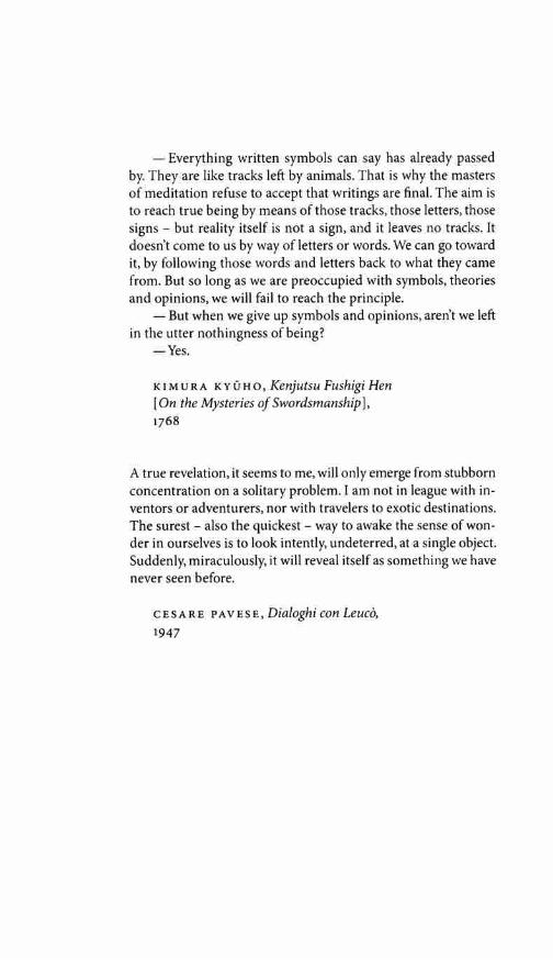
- Everything written symbols can say has already passed by. They are like tracks left by animals. That is why the masters of meditation refuse to accept that writings are final. The aim is to reach true being by means of those tracks, those letters, those signs but reality itself is not a sign, and it leaves no tracks. It doesn't come to us by way of letters or words. We can go toward it, by following those words and letters back to what they came from. But so long as we are preoccupied with symbols, theories and opinions, we will fail to reach the principle.
- But when we give up symbols and opinions, aren't we left in the utter nothingness of being?
-Yes.
KIMURA KYUHO, Kenjutsu Fushigi Hen [On the Mysteries of Swordsmanship], 1768
A true revelation, it seems to me, will only emerge from stubborn concentration on a solitary problem. I am not in league with in-ventors or adventurers, nor with travelers to exotic destinations. The surest - also the quickest - way to awake the sense of won-der in ourselves is to look intently, undeterred, at a single object. Suddenly, miraculously, it will reveal itself as something we have never seen before.
CESARE PAVESE, Dialoghi con Leuco, 1947

FOREWORD
There are many books about typography, and some of them are models of the art they teach. But when I set myself to compile a simple list of working principles, one of the benchmarks I first thought of was William Strunk and E.B. White's small master-piece, The Elements of Style. Brevity, however, is the essence of Strunk & White's manual of literary technique. This book is lon-ger than theirs, and for that there is a cause.
Typography makes at least two kinds of sense, if it makes any sense at all. It makes visual sense and historical sense. The visual side of typography is always on display, and materials for the study of its visual form are many and widespread. The history of letterforms and their usage is visible too, to those with access to manuscripts, inscriptions and old books, but from others it is largely hidden. This book has therefore grown into something more than a short manual of typographic etiquette. It is the fruit of a lot oflong walks in the wilderness of letters: in part a pocket field guide to the living wonders that are found there, and in part a meditation on the ecological principles, survival techniques and ethics that apply. The principles of typography as I understand them are not a set of dead conventions but the tribal customs of the magic forest, where ancient voices speak from all directions and new ones move to unremembered forms.
One question, nevertheless, has been often in my mind. When all right-thinking human beings are struggling to remember that other men and women are free to be different, and free to become more different still, how can one honestly write a rulebook? What reason and authority exist for these commandments, suggestions and instructions? Surely typographers, like others, ought to be at liberty to follow or to blaze the trails they choose.
Typography thrives as a shared concern - and there are no paths at all where there are no shared desires and directions. A typographer determined to forge new routes must move, like other solitary travelers, through uninhabited country and against the grain of the land, crossing common thoroughfares in the si-lence before dawn. The subject of this book is not typographic solitude, but the old, well-traveled roads at the core of the tradi-tion: paths that each of us is free to follow or not, and to enter and leave when we choose - if only we know the paths are there
9

and have a sense of where they lead. That freedom is denied us if the tradition is concealed or left for dead. Originality is every-where, but much originality is blocked if the way back to earlier discoveries is cut or overgrown.
If you use this book as a guide, by all means leave the road when you wish. That is precisely the use of a road: to reach indi-
Foreword vidually chosen points of departure. By all means break the rules, and break them beautifully, deliberately and well. That is one of the ends for which they exist.
Letterforms change constantly yet differ very little, because they are alive. The principles of typographic clarity have also scarcely altered since the second half of the fifteenth century, when the first books were printed in roman type. Indeed, most of the principles oflegibility and design explored in this book were known and used by Egyptian scribes writing hieratic script with reed pens on papyrus in 1000 BC. Samples of their work sit now in museums in Cairo, London and New York, still lively, subtle and perfectly legible thirty centuries after they were made.
Writing systems vary, but a good page is not hard to learn to recognize, whether it comes from Tang Dynasty China, the Egyptian New Kingdom or Renaissance Italy. The principles that unite these distant schools of design are based on the structure and scale of the human body - the eye, the hand and the fore-arm in particular - and on the invisible but no less real, no less demanding and no less sensuous anatomy of the human mind. I don't like to call these principles universals, because they are largely unique to our species. Dogs and ants, for example, read and write by more chemical means. But the underlying principles of typography are, at any rate, stable enough to weather any number of human fashions and fads.
It is true that typographers' tools are presently changing with considerable force and speed, but this is not a manual in the use of any particular typesetting system or medium. I suppose that most readers of this book will set most of their type in digital form, using computers, but I have no preconceptions about which brands of computers, or which versions of which proprietary soft-ware, they may use. The essential elements of style have more to do with the goals typographers set for themselves than with the mutable eccentricities of their tools. Typography itself, in other words, is far more device-independent than PostScript, which is the computer language used to render these particular letters, and the design of these pages, into typographic code. If I have
10

succeeded in my task, this book should be as useful to artists and antiquarians setting foundry metal by hand and pulling proofs on a flat-bed press, as to those who check their work on a screen or laser printer, then ship it to high-resolution digital output de-vices by optical disk or long-distance telephone line.
Typography is the craft of endowing human language with a durable visual form, and thus with an independent existence. Its Foreword heartwood is calligraphy - the dance, on a tiny stage, of the living, speaking hand - and its roots reach into living soil, though its branches may be hung each year with new machines. So long as the root lives, typography remains a source of true delight, true knowledge, true surprise.
As a craft, typography shares a long common boundary and many common concerns with writing and editing on the one side and with graphic design on the other; yet typography itself belongs to neither. This book in its turn is neither a manual of editorial style nor a textbook on design, though it overlaps with both of these concerns. The perspective throughout is first and foremost typographic - and I hope the book will be useful for that very reason to those whose work or interests may be centered in adjacent fields.
This book owes much to the conversation and example, over the years, of several friends and master craftsmen - Kay Amert, Stan Bevington, Crispin Elsted, Glenn Galuska, Peter Koch, Vic Marks, George Payerle and others - and to the practice of two artists and exemplars: the late Adrian Wilson, and Hermann Zapf. Artists and scholars around the world have shared their knowl-edge freely. James Mosley, his staff and his successors at the St Bride Printing Library, London, have been particularly helpful. I am grateful to them all.
I have many others to thank as well for their contributions to the second and now the third edition of the book. Their names appear in the afterword, page 365.
R.B.
11

Historical Synopsis
aperrure: the opening in letters
such as a, c, e, s
These charts show first and
foremost the axis of the stroke, which is the axis
of the pen that makes the letter. It is often very different from the axis of the
lettershape itself. A pen that points
northwest can make an upright letter or a letter
that slopes to the northeast.
RENAISSANCE (15th & 16th centuries): modulated stroke; humanist [oblique] axis; crisp, pen-formed terminals; large aperture; italic equal to and independent of roman.
BAROQUE (17th century): modulated stroke; variable axis; modeled serifs and terminals; moderate aperture; italic subsidiary to roman and closely linked with it. A secondary vertical axis often develops in Baroque letters - but the primary axis of the penstroke is normally oblique.
12

f<t>¢=
N EOCLAS SI CAL (18th century): modulated stroke; rationalist( vertical] axis; refined. adnate serifs: lachrymal terminals; moderate aperture: italic fully subjugated to roman.
1<t>¢=
ROM ANT IC (18th & 19th centuries): hypermodulated stroke; intensified rationalist axis; abrupt, thin serifs; round terminals; small aperture; fully subjugated italic. In Neoclassical and Romantic letters alike, the primary axis is usually vertical and the secondary axis oblique.
13
Historical Synopsis
adnate· llowing into the stem; lachrymal : tear-drop shaped

Historical Synopsis
REALIST (19th & early 20th centuries) : unmodulated stroke; implied vertical axis ; s mall ape rture; serifs absent or abrupt and of equal weight with main strokes; italic absent or replaced by sloped roman.
a a
GEOMETRIC M 0 DERN I ST (20th century): unmodulated stroke; bowls often c ircula r (no axis); moderate aperture; serifs absent o r of equal weight with main strokes; italic absent or replaced by sloped roman. The modeling, however, is often much more subtle than 1t first appears.
14
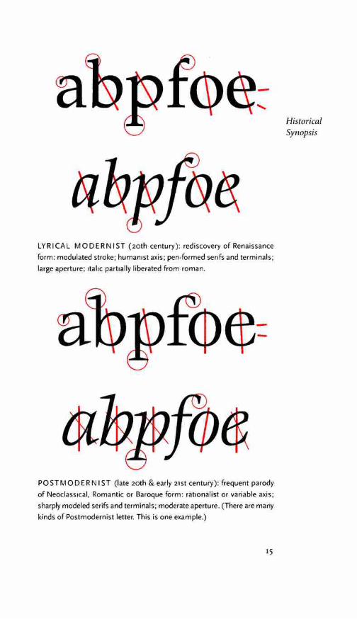
LYRICAL M 0 DERN IS T (20th century): rediscovery of Renaissance form : modulated stroke; humanist axis; pen-formed serifs and terminals; large aperture; 1tal1c partially liberated from roman.
fcp¢:
POSTM 0 DERN I ST (late 20th & early 21st century): frequent parody of Neoclassical, Romantic or Baroque form : rationalist or variable axis; sharply modeled serifs and terminals; moderate aperture. (There are many kinds of Postmodernist letter. This is one example.)
15
Historical Synopsis

rigo Habraam numera i a mofaica lege(f eptim r)Ced narural1 fuit ratio idit enim Habraam de<
• m quoq1 gent1um patr oes gentes hoc mdeltc
m eft:cuius ille iuft1tia? us eft:q ui pofr mulras' 1mum omnium diuin< ) naf ceretur tradidic:u( gnum:uel uthocquaf r uos imitari conaref':au um nobis modo eft.Po Roman type cut in 1469 by Nicolas Jenson, a French typographer working in Venice. The original is approximately 16 pt. The type is shown here as Jenson printed it, but at twice actual size. This is the ancestor of the type (Bruce Rogers's Centaur) shown at the top of page 12.
16

THE GRAND DESIGN
1.1 FIRST PRINCIPLES
1.1.1 Typography exists to honor content.
Like oratory, music, dance, calligraphy - like anything that lends its grace to language - typography is an art that can be deliberately misused. It is a craft by which the meanings of a text (or its absence of meaning) can be clarified, honored and shared, or knowingly disguised.
In a world rife with unsolicited messages, typography must often draw attention to itself before it will be read. Yet in order to be read, it must relinquish the attention it has drawn. Typography with anything to say therefore aspires to a kind of statuesque transparency. Its other traditional goal is durability: not immunity to change, but a clear superiority to fashion. Typography at its best is a visual form of language linking timelessness and time.
One of the principles of durable typography is always leg-ibility; another is something more than legibility: some earned or unearned interest that gives its living energy to the page. It takes various forms and goes by various names, including serenity, liveliness, laughter, grace and joy.
These principles apply, in different ways, to the typography of business cards, instruction sheets and postage stamps, as well as to editions of religious scriptures, literary classics and other books that aspire to join their ranks. Within limits, the same principles apply even to stock market reports, airline schedules, milk cartons, classified ads. But laughter, grace and joy, like legibility itself, all feed on meaning, which the writer, the words and the subject, not the typographer, must generally provide.
In 1770, a bill was introduced in the English Parliament with the following provisions:
... all women of whatever age, rank, profession, or degree, whether virgins, maids, or widows, that shall ... impose upon, seduce, and betray into matrimony, any of His Majesty's subjects, by the scents, paints, cosmetic washes, artificial teeth, false hair, Spanish wool, iron stays, hoops, high heeled shoes [or] bolstered hips shall incur
17
1

the penalty of the law in force against witchcraft ... and ... the marriage, upon conviction, shall stand null and void.
The function of typography, as I understand it, is neither to further the power of witches nor to bolster the defences of those, like this unfortunate parliamentarian, who live in terror of
First being tempted and deceived. The satisfactions of the craft come Principles from elucidating, and perhaps even ennobling, the text, not from
deluding the unwary reader by applying scents, paints and iron stays to empty prose. But humble texts, such as classified ads or the telephone directory, may profit as much as anything else from a good typographical bath and a change of clothes. And many a book, like many a warrior or dancer or priest of either sex, may look well with some paint on its face, or indeed with a bone in its nose.
1.1.2 Letters have a life and dignity of their own.
Letterforms that honor and elucidate what humans see and say deserve to be honored in their turn. Well-chosen words deserve well-chosen letters; these in their turn deserve to be set with affec-tion, intelligence, knowledge and skill. Typography is a link, and it ought, as a matter of honor, courtesy and pure delight, to be as strong as the others in the chain.
Writing begins with the making of footprints, the leaving of signs. Like speaking, it is a perfectly natural act which humans have carried to complex extremes. The typographer's task has always been to add a somewhat unnatural edge, a protective shell of artificial order, to the power of the writing hand. The tools have altered over the centuries, and the exact degree of unnaturalness desired has varied from place to place and time to time, but the character of the essential transformation between manuscript and type has scarcely changed.
The original purpose of type was simply copying. The job of the typographer was to imitate the scribal hand in a form that permitted exact and fast replication. Dozens, then hundreds, then thousands of copies were printed in less time than a scribe would need to finish one. This excuse for setting texts in type has disap-peared. In the age of photolithography, digital scanning and offset printing, it is as easy to print directly from handwritten copy as from text that is typographically composed. Yet the typographer's
18

task is little changed. It is still to give the illusion of superhuman speed and stamina - and of superhuman patience and precision - to the writing hand.
Typography is just that: idealized writing. Writers themselves now rarely have the calligraphic skill of earlier scribes, but they evoke countless versions of ideal script by their varying voices and literary styles. To these blind and often invisible visions, the The typographer must respond in visible terms. Grand
In a badly designed book, the letters mill and stand like Design starving horses in a field. In a book designed by rote, they sit like stale bread and mutton on the page. In a well-made book, where designer, compositor and printer have all done their jobs, no mat-ter how many thousands of lines and pages they must occupy, the letters are alive. They dance in their seats. Sometimes they rise and dance in the margins and aisles.
Simple as it may sound, the task of creative non-interference with letters is a rewarding and difficult calling. In ideal condi-tions, it is all that typographers are really asked to do - and it is enough.
1.1.3 There is a style beyond style.
Literary style, says Walter Benjamin, "is the power to move freely in the length and breadth of linguistic thinking without slipping into banality:' Typographic style, in this large and intelligent sense of the word, does not mean any particular style - my style or your style, or Neoclassical or Baroque style - but the power to move freely through the whole domain of typography, and to function at every step in a way that is graceful and vital instead of banal. It means typography that can walk familiar ground without sliding into platitudes, typography that responds to new conditions with innovative solutions, and typography that does not vex the reader with its own originality in a self-conscious search for praise.
Typography is to literature as musical performance is to composition: an essential act of interpretation, full of endless opportunities for insight or obtuseness. Much typography is far removed from literature, for language has many uses, includ-ing packaging and propaganda. Like music, it can be used to manipulate behavior and emotions. But this is not where typog-raphers, musicians or other human beings show us their finest side. Typography at its best is a slow performing art, worthy of the
19
from part 2 of Benjamin's essay on Karl Kraus, in ll/uminationen (fr.inkfurt, 1955). There is an Eng-lish translation in Walter Benjamin, Reflections, ed. Peter Demetz (New York, 1978).
First Principles
same informed appreciation that we sometimes give to musical performances, and capable of giving similar nourishment and pleasure in return.
The same alphabets and page designs can be used for a bi-ography of Mohandas Gandhi and for a manual on the use and deployment of biological weapons. Writing can be used both for love letters and for hate mail, and love letters themselves can be used for manipulation and extortion as well as to bring delight to body and soul. Evidently there is nothing inherently noble and trustworthy in the written or printed word. Yet generations of men and women have turned to writing and printing to house and share their deepest hopes, perceptions, dreams and fears. It is to them, not to the extortionist - nor to the opportunist or the profiteer - that the typographer must answer.
1.2 TACTICS
1.2.1 Read the text before designing it.
The typographer's one essential task is to interpret and commu-nicate the text. Its tone, its tempo, its logical structure, its physical size, all determine the possibilities of its typographic form. The typographer is to the text as the theatrical director to the script, or the musician to the score.
1.2.2 Discover the outer logic of the typography in the inner logic of the text.
A novel often purports to be a seamless river of words from be-ginning to end, or a series of unnamed scenes. Research papers, textbooks, cookbooks and other works of nonfiction rarely look so smooth. They are often layered with chapter heads, section heads, subheads, block quotations, footnotes, endnotes, lists and illustrative examples. Such features may be obscure in the manu-script, even if they are clear in the author's mind. For the sake of the reader, each requires its own typographic identity and form. Every layer and level of the text must be consistent, distinct, yet (usually) harmonious in form.
The first task of the typographer is therefore to read and understand the text; the second task is to analyze and map it. Only then can typographic interpretation begin.
If the text has many layers or sections, it may need not only
20

heads and subheads but running heads as well, reappearing on every page or two-page spread, to remind readers which intel-lectual neighborhood they happen to be visiting.
Novels seldom need such signposts, but they often require typographic markers of other kinds. Peter Matthiessen's novel Far Tortuga (New York, 1975; designed by Kenneth Miyamoto) uses two sizes of type, three different margins, free- floating block paragraphs and other typographic devices to separate thought, speech and action. Ken Kesey's novel Sometimes a Great Notion (New York, 1964) seems to flow like conventional prose, yet it shifts repeatedly in mid-sentence between roman and italic to distinguish what characters say to each other from what they say in silence to themselves.
In poetry and drama, a larger typographic palette is some-times required. Some of Douglass Parker's translations from classical Greek and Dennis Tedlock's translations from Zuni use roman, italic, bold, small caps and full caps in various sizes to emulate the dynamic markings of music. Robert Massin's typo-graphic performances of Eugene Ionesco's plays use intersecting lines of type, stretched and melted letters, inkblots, pictograms, and a separate typeface for each person in the play. In the works of other artists such as Guillaume Apollinaire and Guy Daven-port, boundaries between author and designer sometimes vanish. Writing merges with typography, and the text becomes its own illustration.
The typographer must analyze and reveal the inner order of the text, as a musician must reveal the inner order of the music he performs. But the reader, like the listener, should in retrospect be able to close her eyes and see what lies inside the words she has been reading. The typographic performance must reveal, not replace, the inner composition. Typographers, like other artists and craftsmen - musicians, composers and authors as well - must as a rule do their work and disappear.
1.2.3 Make the visible relationship between the text and other elements (photographs, captions, tables, diagrams, notes) a reflection of their real relationship.
If the text is tied to other elements, where do they belong? If there are notes, do they go at the side of the page, the foot of the page, the end of the chapter, the end of the book? If there are photographs or other illustrations, should they be embedded in
21
The Grand Design
See for example Aristophanes, Four Comedies (Ann Arbor, Michigan, 1969), Dennis Tedlock, Finding the Center (New York, 1972); Eugene Ionesco, La Cantatrice chauve (Paris, 1964), and De/ire a deux (Paris, 1966). There are samples of Massin's work in Typographia n.s 11 (1965).

the text or should they form a special section of their own? And if the photographs have captions or credits or labels, should these sit close beside the photographs or should they be separately housed?
If there is more than one text - as in countless publications issued in Canada, Switzerland, Belgium and other multilingual
Tactics countries - how will the separate but equal texts be arrayed? Will they run side by side to emphasize their equality (and perhaps to share in a single set of illustrations), or will they be printed back-to-back, to emphasize their distinctness?
aAa aaa a a a aaA a a a
a a aa
No matter what their relation to the text, photos or maps must sometimes be grouped apart from it because they require a separate paper or different inks. If this is the case, what typo-graphic cross-references will be required?
These and similar questions, which confront the working typographer on a daily basis, must be answered case by case. The typographic page is a map of the mind; it is frequently also a map of the social order from which it comes. And for better or for worse, minds and social orders change.
1.2-4 Choose a typeface or a group of faces that will honor and elucidate the character of the text.
This is the beginning, middle and end of the practice of typog-raphy: choose and use the type with sensitivity and intelligence. Aspects of this principle are explored throughout this book and considered in detail in chapters 6, 7 and 11.
Letterforms have tone, timbre, character, just as words and sentences do. The moment a text and a typeface are chosen, two streams of thought, two rhythmical systems, two sets of habits, or if you like, two personalities, intersect. They need not live together contentedly forever, but they must not as a rule collide.
The root metaphor of typesetting is that the alphabet (or in Chinese, the entire lexicon) is a system of interchangeable parts. The word form can be surgically revised, instead of rewritten, to become the word farm or firm or fort or fork or from, or with a little more trouble, to become the word pineapple. The old compositor's typecase is a partitioned wooden tray holding hundreds of such interchangeable bits of information. These subsemantic particles, these bits - called sorts by letterpress printers - are letters cast on standardized bodies of metal, waiting to be assembled into meaningful combinations, then dispersed and reassembled in a
22
different form. The compositor's typecase is one of the primary ancestors of the computer - and it is no surprise that while type-setting was one of the last crafts to be mechanized, it was one of the first to be computerized.
But the bits of information handled by typographers differ in one essential respect from the computer programmer's bits. Whether the type is set in hard metal by hand, or in softer metal The by machine, or in digital form with a computer, every comma, Grand every parenthesis, every e, and in context, even every empty space, Design has style as well as bald symbolic value. Letters are microscopic works of art as well as useful symbols. They mean what they are as well as what they say.
Typography is the art and craft of handling these doubly meaningful bits of information. A good typographer handles them in intelligent, coherent, sensitive ways. When the type is poorly chosen, what the words say linguistically and what the letters imply visually are disharmonious, dishonest, out of tune.
1.2.5 Shape the page and frame the textblock so that it honors and reveals every element, every relationship between elements, and every logical nuance of the text.
Selecting the shape of the page and placing the type upon it is much like framing and hanging a painting. A cubist painting in an eighteenth-century gilded frame, or a seventeenth-century still-life in a slim chrome box, will look no sillier than a nine-teenth-century text from England set in types that come from seventeenth-century France, asymmetrically positioned on a German Modernist page.
If the text is long or the space is short, or if the elements are many, multiple columns may be required. If illustrations and text march side by side, does one take precedence over the other? And does the order or degree of prominence change? Does the text suggest perpetual symmetry, perpetual asymmetry, or something in between?
Again, does the text suggest the continuous unruffled flow of justified prose, or the continued flirtation with order and chaos evoked by flush-left ragged-right composition? (The running heads and sidenotes on the recto (righthand) pages of this book are set flush left, ragged right. On the verso (lefthand) pages, they are ragged left. Leftward-reading alphabets, like Arabic and Hebrew, are perfectly at home in ragged-left text, but with
23

rightward-reading alphabets like Latin, Greek OJ Thai, ragged-left setting emphasizes the end, not the beginning, of the line. This makes it a poor choice for extended composition.)
Shaping the page goes hand in hand with choosing the type, and both are permanent typographical preoccupations. The subject of page shapes and proportions is addressed in greater
Tactics detail in chapter 8.
i.2.6 Give full typographic attention even to incidental details.
Some of what a typographer must set, like some of what any mu-sician must play, is simply passage work. Even an edition of Plato or Shakespeare will contain a certain amount of routine text: page numbers, scene numbers, textual notes, the copyright claim, the publisher's name and address, and the hyperbole on the jacket, not to mention the passage work or background writing that is implicit in the text itself. But just as a good musician can make a heart-wrenching ballad from a few banal words and a trivial tune, so the typographer can make poignant and lovely typog-raphy from bibliographical paraphernalia and textual chaff. The ability to do so rests on respect for the text as a whole, and on re-spect for the letters themselves.
Perhaps the principle should read: Give full typographic at-tention especially to incidental details.
1.3 SUMMARY
There are always exceptions, always excuses for stunts and sur-prises. But perhaps we can agree that, as a rule, typography should perform these services for the reader:
• invite the reader into the text; • reveal the tenor and meaning of the text; • clarify the structure and the order of the text; • link the text with other existing elements; • induce a state of energetic repose, which is the ideal condition for
reading.
While serving the reader in this way, typography, like a musical performance or a theatrical production, should serve two other ends. It should honor the text for its own sake - always assuming that the text is worth a typographer's trouble - and it should honor and contribute to its own tradition: that of typography itself.
24

RHYTHM & PROPORTION
2.1 HORIZONTAL MOTION
An ancient metaphor: thought is a thread, and the raconteur is 2 a spinner of yarns - but the true storyteller, the poet, is a weaver. The scribes made this old and audible abstraction into a new and visible fact. After long practice, their work took on such an even, flexible texture that they called the written page a textus, which means cloth.
The typesetting device, whether it happens to be a computer or a composing stick, functions like a loom. And the typogra-pher, like the scribe, normally aims to weave the text as evenly as possible. Good letterforms are designed to give a lively, even texture, but careless spacing of letters, lines and words can tear this fabric apart.
Another ancient metaphor: the density of texture in a written or typeset page is called its color. This has nothing to do with red or green ink; it refers only to the darkness or blackness of the letterforms in mass. Once the demands of legibility and logical order are satisfied, evenness of color is the typographer's normal aim. And color depends on four things: the design of the type, the spacing between the letters, the spacing between the words, and the spacing between the lines. None is independent of the others.
2.u De.fine the word space to suit the size and natural letter.fit of the font.
Type is normally measured in picas and points (explained in detail on pages 328-329), but horizontal spacing is measured in ems, and the em is a sliding measure. One em is a distance equal to the type size. In 6 point type, an em is 6 points; in 12 pt type it is 12 points, and in 60 pt type it is 60 points. Thus a one-em space is proportionately the same in any size.
D D D D 12 pt em 18 pt em 24 pt em 36 pt em
25

Horizontal Motion
for example. the word space na-tive to the font
w;ed here is 227
units wide, or 227
thousandths of an em. The type-setting software is instructed to
allow, in the main text, a minimum
word space of 85%. That is 193
units: just under a fifth of an em. The maximum
word space is set to 150%, which
is 340 units: JUSt over a third of
an em.
Typesetting machines generally divide the em into units, Ems of i8, 36 or 54 units, for example, are commonly found in the older machines. In newer devices, the em is generally a thousand units. Typographers are more likely to divide the em into simple frac-tions: half an em, a third of an em, and so on, knowing that the unit value of these fractions will vary from one machine to the next. Half an em is called an en.
If text is set ragged right, the word space (the space between words) can be fixed and unchanging. If the text is justified (set flush left and right, like the text in this book), that space must usually be elastic. In either case, the size of the ideal word space varies from one circumstance to another, depending on factors such as letterfit, type color, and size. A loosely fitted or bold face will need a larger interval between the words. At larger sizes, when letterfit is tightened, the spacing of words can be tightened as well. For a normal text face in a normal text size, a typical value for the word space is a quarter of an em, which can be written M/4. (A quarter of an em is typically about the same as, or slightly more than, the set-width of the letter t.)
Language has some effect on the word space as well. In highly inflected languages, such as Latin, most word boundaries are marked by grammatical tags, and a smaller space is therefore sufficient. In English and other uninflected languages, good word spacing makes the difference between a line that has to be deci-phered and a line that can be efficiently read.
If the text is justified, a reasonable minimum word space is a fifth of an em (M/5), and M/4 is a good average to aim for. A reasonable maximum in justified text is M/2. If it can be held to M/3, so much the better. But for loosely fitted faces, or text set in a small size, M/3 is often a better average to aim for, and a better minimum is M /4. In a line of widely letterspaced capitals, a word space of M/2 or more may be required.
2.i.2 Choose a comfortable measure.
Anything from 45 to 75 characters is widely regarded as a satisfac-tory length of line for a single-column page set in a serifed text face in a text size. The 66-character line (counting both letters and spaces) is widely regarded as ideal. For multiple-column work, a better average is 40 to 50 characters.
If the type is well set and printed, lines of 85 or 90 characters will pose no problem in discontinuous texts, such as bibliogra-
26

phies, or, with generous leading, in footnotes. But even with gen-erous leading, a line that averages more than 75 or So characters is likely to be too long for continuous reading.
A reasonable working minimum for justified text in English is the 40-character line. Shorter lines may compose perfectly well with sufficient luck and patience, but in the long run, justified lines averaging less than 38 or 40 characters will lead to white acne or pig bristles: a rash of erratic and splotchy word spaces or an epidemic of hyphenation. When the line is short, the text should be set ragged right. In large doses, even ragged-right composi-tion may look anorexic if the line falls below 30 characters, but in small and isolated patches - ragged marginal notes, for example - the minimum line (if the language is English) can be as little as 12 or 15 characters.
These line lengths are in every case averages, and they include empty spaces and punctuation as well as letters. The simplest way of computing them is with a copyfitting table like the one on page 29. Measure the length of the basic lowercase alphabet - abcdefghijklmnopqrstuvwxyz - in any face and size you are considering, and the table will tell you the average number of characters to expect on a given line. In most text faces, the 10 pt roman alphabet will run between 120 and 140 points in length, but a 10 pt italic alphabet might be 100 points long or even less, while a 10 pt bold might run to 160. The 12 pt alphabet is, of course, about i.2 times the length of the 10 pt alphabet - but not exactly so unless it is generated from the same master design and the letterfit is unchanged.
On a conventional book page, the measure, or length of line, is usually around 30 times the size of the type, but lines as little as 20 or as much as 40 times the type size fall within the expectable range. If, for example, the type size is 10 pt, the measure might be around 30 x 10 = 300 pt, which is 300/12 = 25 picas. A typical lowercase alphabet length for a 10 pt text font is 118 pt, and the copyfitting table tells us that such a font set to a 25-pica measure will yield roughly 65 characters per line.
2.i.3 Set ragged if ragged setting suits the text and the page.
In justified text, there is always a trade-off between evenness of spacing and frequency of hyphenation. The best available com-promise will depend on the nature of the text as well as on the specifics of the design. Good compositors like to avoid consecu-
27
When the counters of the letterforms themselves, not JUSt the spaces between words, Jre elastic, justification can be carried to greater extremes See pp 190-192

tive hyphenated line-ends, but frequent hyphens are better than sloppy spacing, and ragged setting is better yet.
Narrow measures - which make good justification extremely difficult - are commonly used when the text is set in multiple columns. Setting ragged right under these conditions will lighten the page and decrease its stiffness, as well as preventing an out-
Horizonta/ break of hyphenation. Motion Many unserifed faces look best when set ragged no matter
what the length of the measure. And monospaced fonts, which are common on typewriters, always look better set ragged, in standard typewriter style. A typewriter (or a computer-driven printer of similar quality) that justifies its lines in imitation of typesetting is a presumptuous, uneducated machine, mimicking the outward form instead of the inner truth of typography.
/.,When setting ragged text with a computer, take a moment to refine your software's understanding of what constitutes an honest rag. Software is often predisposed to invoke a minimum as well as a maximum line. If permitted to do so, it will hyphenate words and adjust the word spaces regardless of whether it is ragging or justifying the text. Ragged setting with these parameters tends to produce an orderly ripple down the righthand side, making the text look like a neatly pinched piecrust. If that is what you want, fine; but it may not be. Unless the measure is excruciatingly narrow, you may prefer the greater variations of a hard rag. This means fixed word spaces, no minimum line, no letterspacing, and no hyphenation beyond what is inherent in the text. In a hard rag, hyphenated linebreaks may occur in words like self consciousness, which are hyphenated anyway, but they cannot occur without manual intervention in words like hyphenation or pseudosophisticated, which aren't.
2.i.4 Use a single word space between sentences.
In the nineteenth century, which was a dark and inflationary age in typography and type design, many compositors were encouraged to stuff extra space between sentences. Generations of twentieth-century typists were then taught to do the same, by hitting the spacebar twice after every period. Your typing as well as your typesetting will benefit from unlearning this quaint Victorian habit. As a general rule, no more than a single space is required

AVERAGE CHARACTER COUNT PER LINE
10 12 14 16 IS 20 22 24 26 2S 30 32 34 36 3S 40
So 40 4S 56 64 72 So 88 96 104 112 120 12S 136 144 152 160
S5 38 45 53 60 6S 76 S3 91 98 106 113 121 129 136 144 151
90 36 43 50 57 64 72 79 86 93 100 107 115 122 129 136 143
95 34 41 4S 55 62 69 75 S2 89 96 103 110 117 123 130 137
100 33 40 46 53 59 66 73 79 86 92 99 106 112 119 125 132
105 )2 38 44 51 57 63 70 76 S2 89 95 101 108 114 120 127
110 30 37 43 49 55 61 67 73 79 S5 92 98 104 110 11 6 122
115 29 35 41 47 53 59 64 70 76 S2 88 94 100 105 Ill 11 7
120 28 34 39 45 50 56 62 67 73 7S S4 90 95 101 106 112
125 27 32 )8 43 4S 54 59 65 70 75 SI 86 91 97 102 108
130 26 31 36 41 47 52 57 62 67 73 7S S3 88 93 98 104
135 25 30 35 40 45 50 55 60 65 70 75 So S5 90 95 100
140 24 29 34 39 44 4S 53 5S 63 6S 73 77 S2 87 92 97
145 23 28 33 37 42 47 51 56 61 66 70 75 So S4 89 94
150 23 28 32 .l7 41 46 51 55 60 64 69 74 7S S3 87 92
155 22 27 31 36 40 45 49 54 5S 63 67 72 76 SI 85 90
160 22 26 30 35 39 43 48 52 56 61 65 69 74 78 82 87
165 21 25 30 34 38 42 46 51 55 59 63 68 72 76 So 84
170 21 25 29 33 37 41 45 49 53 57 62 66 70 74 78 82
175 20 24 28 32 36 40 44 48 52 56 60 64 68 72 76 So
180 20 23 27 31 35 39 43 47 51 55 59 62 66 70 74 78
185 19 23 27 30 34 38 42 46 49 53 57 61 65 6S 72 76
190 19 22 26 _lO 33 37 41 44 48 52 56 59 63 67 70 74
195 18 22 25 29 32 36 40 43 47 50 54 58 61 65 68 72
200 18 21 25 28 32 35 39 42 46 49 53 56 60 63 6 7 70
210 17 20 23 27 30 33 37 40 43 47 50 53 57 60 63 6 7
220 16 19 22 25 29 32 35 38 41 45 48 51 54 57 60 64
230 15 18 21 24 27 30 33 36 40 43 46 49 52 55 58 61
240 15 17 20 2_l 26 29 32 35 38 41 44 46 49 52 55 5S
250 14 17 20 22 25 28 31 34 36 39 42 45 4S 50 53 56
260 14 16 19 22 24 27 30 32 35 )8 41 43 46 49 51 54
270 13 16 18 21 23 26 29 31 34 36 39 42 44 47 49 52
2So 13 15 18 20 23 25 28 30 33 35 38 40 43 45 48 50
290 12 15 17 20 22 24 27 29 32 34 37 39 41 44 46 49
300 12 14 17 19 21 24 26 28 31 33 35 38 40 42 45 47
320 II 13 16 18 20 22 25 27 29 31 34 36 38 40 43 45
340 10 13 15 17 19 21 23 25 27 29 32 34 36 38 40 42
360 10 12 14 16 18 20 22 24 26 28 JO 32 34 36 38 40
29
Read down, 1n the left column: lowercase alphabet length 1n points. Read across, 1n the top row: line length in picas.
after a period, a colon or any other mark of punctuation. Larger spaces (e.g., en spaces) are themselves punctuation.
The rule is sometimes altered, however, when setting classical Latin and Greek, romanized Sanskrit, phonetics or other kinds of texts in which sentences begin with lowercase letters. In the absence of a capital, a full en space (M/2) between sentences may
Horizontal be welcome. Motion
2.I.5 Add little or no space within strings of initials.
Names such as W.B. Yeats and J.C.L. Prillwitz need hair spaces, thin spaces or no spaces at all after the intermediary periods. A normal word space follows the last period in the string.
2.I.6 Letterspace all strings of capitals and small caps, and all long strings of digits.
Acronyms such as CIA and PLO are frequent in some texts. So are abbreviations such as CE and BCE or AD and BC. The normal value for letterspacing these sequences of small or full caps is 5% to 10% of the type size. If your software sees the em as 1000
PostScript units, that means 50 to 100 units of letterspacing. With digital fonts, it is a simple matter to assign extra width
to all small capitals, so that letterspacing occurs automatically. The width values of full caps are normally based on the assumption that they will be used in conjunction with the lower case, but letterspacing can still be automated through the use of kerning tables (see pages 33-34).
In titles and headings, extra letterspacing is often desirable. Justified lines of letterspaced capitals are generally set by insert-ing a normal word space (M/5 to M/4) between letters. This cor-responds to letterspacing of 20% to 25% of the type size. But the extra space between letters will also require more space between lines. A Renaissance typographer setting a multi-line head in let-terspaced text-size capitals would normally set blanks between the lines: the hand compositor's equivalent of the keyboard operator's extra hard return, or double spacing.
There is no generalized optimum value for letterspacing capitals in titles or display lines. The effective letterspacing of caps in good classical inscriptions and later manuscripts ranges from 5% to 100% of the nominal type size. The quantity of space is far less important than its balance. Sequences like LA or A VA
30

may need no extra space at all, while sequences like N N and H 1 H
beg to be pried open.
WAVADOPATTIMMILTL
WAVADOPATTIMMILTL
Letterspaced caps, above: kerned but unletterspaced. below.
Many typographers like to letterspace all strings of numbers as well. Spacing is essential for rapid reading oflong, fundamen-tally meaningless strings, such as serial numbers, and it is help-ful even for shorter strings such as phone numbers and dates. Numbers set in pairs need not be letterspaced; strings of three or more may need a little air. This is the rationale behind the old European habit of setting phone numbers in the form oo oo oo instead of 000-0000.
2.1.7 Don't letterspace the lower case without a reason.
A man who would letterspace lower case would steal sheep, Frederic Goudy liked to say. If this wisdom needs updating, it is chiefly to add that a woman who would letterspace lower case would steal sheep as well.
Nevertheless, like every rule, this one extends only as far as its rationale. The reason for not letterspaLing lower case is that it hampers legibility. But there are some lowercase alphabets to which this principle doesn't apply.
Headings set in exaggeratedly letterspaced, condensed, un-serifed capitals are now a hallmark, if not a cliche, of postmodern typography. In th is context, secondary display can be set perfectly well in more modestly letterspaced, condensed, unserifed lower case. Moderate letterspacing can make a face such as lowercase Univers bold condensed more legible rather than less. Inessential ligatures are, of course, omitted from letterspaced text.
wharves and wharfingers Lowercase Univers bold condensed, letterspaced 10%.
It would be possible, in fact, to make a detailed chart oflower-case letterforms, plotting their inherent resistance to letterspacing.
31
Rhythm and Proportion

Horizontal Motion
)l(l1
)/(U
Near the top of the list (most unsuitable for letterspacing) would be Renaissance italics, such as Arrighi, whose structure strongly implies an actual linkage between one letter and the next. A little farther along would be Renaissance romans. Still farther along, we would find faces like Syntax, which echo the forms of Renais-sance roman but lack the serifs. Around the middle of the list, we would find other unserifed faces, such as Helvetica, in which nothing more than wishful thinking bonds the letters to each other. Bold condensed sanserifs would appear at the bottom of the list. Letterspacing will always sabotage a Renaissance roman or italic. But when we come to the other extreme, the faces with no calligraphic flow, letterspacing oflowercase letters can sometimes be of genuine benefit.
Because it isolates the individual elements, letterspacing has a role to play where words have ceased to matter and letters are what count. Where letters function one by one (as in acronyms, web-site and e-mail addresses) letterspacing is likely to help, no matter whether the letters are caps, small caps or lower case.
Outside the domain of roman and italic type, the letterspacing of text has other traditional functions. Blackletter faces have, as a rule, no companion italic or bold, and no small caps. The simplest methods of emphasis available are underlining and letterspacing. The former was the usual method of the scribes, but letterspacing is easier for letterpress printers. In digitial typography, however, underlining is just as easy as letterspacing and sometimes does less damage to the page.
In Cyrillic, the difference between lower case and small caps is more subtle than in the Latin or Greek alphabets, but small caps are nonetheless important to skilled Cyrillic typographers. In former days, when Cyrillic cursive type was scarce and small caps almost nonexistent, Cyrillic was routinely set like fraktur, with letterspaced upright (roman) lower case where the small caps and the cursive (italic) would have been. Improved Cyrillic types have made that practice obsolete.
2.1.8 Kern consistently and modestly or not at all.
Inconsistencies in letterfit are inescapable, given the forms of the Latin alphabet, and small irregularities are after all essential to the legibility of roman type. Kerning - altering the space between selected pairs of letters - can increase consistency of spacing in a word like Washington or Toronto, where the combinations Wa
32

and To are kerned. But names like Wisconsin, Ttibingen, Tbilisi and Los Alamos, as well as common words like The and This, remain more or less immune to alteration.
Hand compositors rarely kern text sizes, because their kern-ing pairs must be manually fitted, one at a time. Computerized typesetting makes extensive kerning easy, but judgment is still required, and the computer does not make good judgment any easier to come by. Too little kerning is preferable to too much, and inconsistent kerning is worse than none.
In digital type, as in foundry type, each letter has a standard width of its own. But computerized typesetting systems can mod-ify these widths in many ways. Digital fonts are generally kerned through the use of kerning tables, which can specify a reduction or increase in spacing for every possible pair of letters, numbers or symbols. By this means, space can be automatically added to com-binations like HH and removed from combinations like Ty. Prefab-ricated kerning tables are now routine components of well-made digital fonts, but they still sometimes require extensive editing to suit individual styles and requirements. If you use an automatic kerning program, test it thoroughly before trusting its decisions, and take the time to repair its inevitable shortcomings.
Kerning tables generally subtract space from combinations such as Av, Aw, Ay, 'A, 'A, L, and all combinations in which the first element is T, V, W or Y and the second element is anything other than b, h, k or I. Not all such combinations occur in English, but a good kerning table will accommodate names such as Tchaikovsky, Tmolos, Tsimshian, Vazquez, Chateau d'Yquem and Ysaye.
The table also normally adds space to sequences like f', f), f], f?, f!, (j, [j, (J and [J. In some italics, space must also be added to gg and gy. If your text includes them, other sequences - gf, gj, qf, qj, for instance - may need attention as well.
Especially at larger sizes, it is common to kern combinations involving commas and periods, such as r, I r. Iv, Iv. I w, I w. I y, I y. But use care in kerning combinations such as F. IP. IT. IV Capitals need their space, and some combinations are easy to misread. P.F. Didot may be misread as R E Didot if too enthusiastically kerned.
Numbers are often omitted from kerning tables, but numbers often need more kerning than letters do. Most fonts, both metal and digital, are equipped with tabular figures - figures that all have identical set-width, so columns of typeset figures will align. If you are forced to use such a font, heavy kerning will be required. A
33
Rhythm and Proportion
There is more about kerning tables on pp 203-207.
Top
To pf
(j")
w, f'

Horizontal Motion
' s ' aa " . l
ck IJ
good text font will give you proportional figures instead. A digital font in the OpenType format may offer you four choices: propor-tional and tabular lining (titling) figures, and proportional and tabular old-style (text) figures. No matter how the figures are cut, when used in text, they are likely to need some kerning, to each other and to the en dash.
Unkerned Sabon numerals, left, and well-kerned numerals, right
Whatever kerning you do, make sure it does not result in col-lisions with diacritics. Wolf can be kerned more than Wolfilin in many faces, and Tennyson more than Tete-a-tete. Also beware the composite effect of sequential kerns. The apostrophes in L'Hotel and D'Artagnan can be brought up fairly close, but in L'Anse aux Meadows, two close kerns in a row will produce a collision.
A kerning table written expressly for one language will need subtle alteration before it can do justice to another. In English, for example, it is normal to kern the combinations 'd 'm 'r's 't, which appear in common contractions. In French, 'a 'a 'e 'e 'e 'e 'o 'o are kerned instead, because these appear in elisions. In Native American texts, apostrophes can appear in many other contexts. For Spanish, one kerns the combinations 't and "t · For German, a careful typographer will take space out of the combinations ,T ,,T ,V ,,V ,W ,,W and may add some space to ,J and ,,J.
The letter c is not a full-fledged member of the German al-phabet, and in former times it was always restricted, in German, to the ligatures ch and ck. English-speaking readers often find these combinations kerned too close for comfort in German-made fonts - or they find the right side bearing of the c too close-cut to begin with. In fonts from the Netherlands, unusually tight kerning is common in the sequence ij instead.
Binomial kerning tables are powerful and useful typographic tools, but they eliminate neither the need nor the pleasure of making final adjustments by hand. Names like T. V. R. Murti and T. R.V. Murti, for example, pose microscopic typographic prob-lems that no binomial kerning table can solve. Fonts with poly-nomial kerning tables - able to kern a given pair of letters in dif-ferent ways according to context - have existed for a decade and may someday be the norm. For now, they are a rarity.
34

2.1.9 Don't alter the widths or shapes of letters without cause.
Type design is an art practiced by few and mastered by fewer - but font-editing software makes it possible for anyone to alter in a moment the widths and shapes of letters to which an artist may have devoted decades of study, years of inspiration and a rare concentration of skill. The power to destroy such a type designer's work should be used with caution. And arbitrarily condensing or expanding letterforms is the poorest of all methods for fitting uneditable copy into unalterable space.
In many fonts, the exclamation mark, question mark, semico-lon and colon need a wider left sidebearing than manufacturers have given them, but the width of any character should be altered for one purpose only: to improve the set of the type.
Typographic letters are made legible not only by their forms and by the color of the ink that prints them but also by the sculpted empty space between and around them. When type is cast and set by hand, that space is physically defined by blocks of metal. When the type is reduced to a face, photographically or digitally stored, the letter still has a room of its own, defined by its stated body height and width, but it is a virtual room. In the world of digital type, it is very easy for a designer or compositor with no regard for letters to squish them into cattle trains and ship them to the slaughter.
letterfit letterfit When letters are maltreated in this way, their reserve ofleg-
ibility is sapped. They can do little in their turn except shortchange and brutalize the reader.
2 .1.10 Don't stretch the space until it breaks.
Lists, such as contents pages and recipes, are opportunities to build architectural structures in which the space between the elements both separates and binds. The two favorite ways of de-stroying such an opportunity are setting great chasms of space that the eye cannot leap without help from the hand, and setting unenlightening rows of dots (dot leaders, they are called) that force the eye to walk the width of the page like a prisoner being escorted back to its cell.
The following examples show two among many ways of han-
35
Rhythm and Proportion
Horizontal Motion
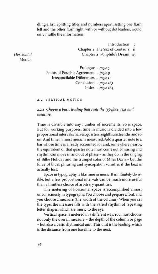
dling a list. Splitting titles and numbers apart, setting one flush left and the other flush right, with or without dot leaders, would only muffle the information:
Introduction 7 Chapter 1 The Sex of Centaurs 11
Chapter 2 Poliphilo's Dream 43
Prologue . pages Points of Possible Agreement . page 9
Irreconcilable Differences . page 11 Conclusion . page 163
Index . page 164
2.2 VERTICAL MOTION
2.2.1 Choose a basic leading that suits the typeface, text and measure.
Time is divisible into any number of increments. So is space. But for working purposes, time in music is divided into a few proportional intervals: halves, quarters, eighths, sixteenths and so on. And time in most music is measured. Add a quarter note to a bar whose time is already accounted for and, somewhere nearby, the equivalent of that quarter note must come out. Phrasing and rhythm can move in and out of phase - as they do in the singing of Billie Holiday and the trumpet solos of Miles Davis - but the force of blues phrasing and syncopation vanishes if the beat is actually lost.
Space in typography is like time in music. It is infinitely divis-ible, but a few proportional intervals can be much more useful than a limitless choice of arbitrary quantities.
The metering of horizontal space is accomplished almost unconsciously in typography. You choose and prepare a font, and you choose a measure (the width of the column). When you set the type, the measure fills with the varied rhythm of repeating letter shapes, which are music to the eye.
Vertical space is metered in a different way. You must choose not only the overall measure - the depth of the column or page - but also a basic rhythmical unit. This unit is the leading, which is the distance from one baseline to the next.

Eleven-point type set solid is described as 11/11. The theo-retical face of the type is 11 points high (from the top of d to the bottom of p, if the type is full on the body), and the distance from the baseline of line one to the baseline of line two is also 11 points. Add two points of lead (interlinear space), and the type is set 11/13. The type size has not changed, but the distance from baseline to baseline has increased to 13 points, and the type has more room to breathe.
The text of the book you are reading, to take an example, is set 10/12 x 21. This means that the type size is 10 pt, the added lead is 2 pt, giving a total leading of 12 pt, and the line length is 21 picas.
A short burst of advertising copy or a title might be set with negative leading (18/15, for example), so long as the ascenders and descenders don't collide:
this is an example of negative leading
Continuous text is very rarely set with negative leading, and only a few text faces read well when set solid. Most text requires positive leading. Settings such as 9/11, 10/12, 11/13 and 12/15 are routine. Longer measures need more lead than short ones. Dark faces need more lead than light ones. Large-bodied faces need more lead than smaller-bodied ones. Faces like Bauer Bodoni, with substantial color and a rigid vertical axis, need much more lead than faces like Bembo, whose color is light and whose axis is based on the writing hand. And unserifed faces often need more lead (or a shorter line) than their serifed counterparts.
Extra leading is also generally welcome where the text is thickened by superscripts, subscripts, mathematical expressions, or the frequent use of full capitals. A text in German would ide-ally have a little more lead than the same text in Latin or French, purely because of the increased frequency of capitals.
2.2.2 Add and delete vertical space in measured intervals.
For the same reason that the tempo must not change arbitrarily in music, leading must not change arbitrarily in type.
Pages and columns are set most often to uniform depth, but ragged depths are better in some situations. A collection of short
37
Rhythm and Proportion
brj erf brj erf Bauer Badoni and Bembo, both set 40/42.

texts, such as catalogue entries, set in multiple-column pages, is likely to look better and read more easily if the text is not sawed into columns of uniform depth. A collection of short poems is bound to generate pages of varying depth as well - and so much the better.
Continuous prose offers no such excuse for variation. It is Vertical therefore usually set in pages of uniform depth, designed in sym-Motion metrical pairs. The lines and blocks of text on facing pages in this
format should align, and the lines on the front and back of the leaf (the recto and verso pages) should align as well. Typographers check their reproduction proofs by holding them up to the light in pairs, to see that the text and crop marks match from page to page. Press proofs are checked in the same way, by holding them up to the light to see that textblocks back each other up when the sheet is printed on both sides.
Headings, subheads, block quotations, footnotes, illustrations, captions and other intrusions into the text create syncopations and variations against the base rhythm of regularly leaded lines. These variations can and should add life to the page, but the main text should also return after each variation precisely on beat and in phase. This means that the total amount of vertical space consumed by each departure from the main text should be an even multiple of the basic leading. If the main text runs 11/13, intrusions to the text should equal some multiple of 13 points: 26, 39, 52, 65, 78, 91, 104 and so on.
Subheads in this book are leaded in the simplest possible way, with a white line (that is, in keyboard terms, a hard return) before and after. They could just as well be leaded asymmetrically, with more space above than below, so long as the total additional lead is equivalent to an even number of text lines.
If you happen to be setting a text 11/13, subhead possibilities include the following:
• subheads in 11/13 small caps, with 13 pt above the head and 13 pt below;
• subheads in 11/13 bold u&lc (upper and lower case), with 8 pt above the head and 5 pt below, since 8 + 5 = 13;
• subheads in 11/13 caps with 26 pt above and 13 pt below; • one-line subheads in 14/13 italic u&lc, with 16 pt above the
head and 10 pt below. (The negative leading is merely to minimize coding in this case. If the heads are one line long, no cramping will occur.)

2.2.3 Don't suffocate the page.
Most books now printed in the Latin alphabet carry from 30 to 45 lines per page. The average length of line in most of those books is 60 to 66 characters. In English and the Romance languages, a word is typically assumed to average five letters plus a space. Ten or eleven such words fit on a line of 60 to 66 characters, and the page, if it is full, holds from 300 to 500 words.
Outside these conventional boundaries lie many interesting typographic problems. If the text deserves the honor, a handsome page can be made with very few words. A page with 17 lines of 36 characters each, as an example, will carry only 100 words. At the other extreme, a page with 45 lines of 70 characters each will carry 525 words. If you want more than 500 words to the page, it is time to consider multiple columns. A two-column book page will comfortably carry 750 words. If it must, it can carry a thousand.
However empty or full it may be, the page must breathe, and in a book - that is, in a long text fit for the reader to live in - the page must breathe in both directions. The longer the line, the more space necessary between lines. Two columns of short lines are therefore more compact than a single column oflong lines.
2.3 BLOCKS & PARAGRAPHS
2.3.1 Set opening paragraphs flush left.
The function of a paragraph indent is to mark a pause, setting the paragraph apart from what precedes it. If a paragraph is preceded by a title or subhead, the indent is superfluous and can therefore be omitted, as it is here.
2.3.2 In continuous text, mark all paragraphs after the first with an indent of at least one en.
Typography like other arts, from cooking to choreography, in-volves a balance between the familiar and the unfamiliar, the de-pendably consistent and the unforeseen. Typographers generally take pleasure in the unpredictable length of the paragraph while accepting the simple and reassuring consistency of the paragraph indent. The prose paragraph and its verse counterpart, the stanza, are basic units of linguistic thought and literary style. The typog-rapher must articulate them enough to make them clear, yet not
39
Rhythm and Proportion
Blocks and
Paragraphs
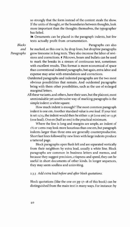
so strongly that the form instead of the content steals the show. If the units of thought, or the boundaries between thoughts, look more important than the thoughts themselves, the typographer has failed. /., Ornaments can be placed in the paragraph indents, but few texts actually profit from ornamentation.
Paragraphs can also be marked, as this one is, by drop lines, but dropline paragraphs grow tiresome in long texts. They also increase the labor of revi-sions and corrections. Pilcrows, boxes and bullets can be used to mark the breaks in a stream of continuous text, sometimes with excellent results. This format is more economical of space than conventional indented paragraphs, but again, extra labor and expense may arise with emendations and corrections.
Outdented paragraphs and indented paragraphs are the two most obvious possibilities that remain. And outdented paragraphs bring with them other possibilities, such as the use of enlarged marginal letters.
All these variants, and others, have their uses, but the plainest, most unmistakable yet unobtrusive way of marking paragraphs is the simple indent: a white square.
How much indent is enough? The most common paragraph indent is one em. Another standard value is one lead. If your text is set 11/13, the indent would then be either 11 pt (one em) or 13 pt (one lead). One en (half an em) is the practical minimum.
Where the line is long and margins are ample, an indent of 1 \/2 or 2 ems may look more luxurious than one em, but paragraph indents larger than three ems are generally counterproductive. Short last lines followed by new lines with large indents produce a tattered page.
Block paragraphs open flush left and are separated vertically from their neighbors by extra lead, usually a white line. Block paragraphs are common in business letters and memos, and because they suggest precision, crispness and speed, they can be useful in short documents of other kinds. In longer sequences, they may seem soulless and uninviting.
2.3.3 Add extra lead before and after block quotations.
Block quotations (like the one on pp 17-18 of this book) can be distinguished from the main text in many ways. For instance: by
40
a change of face (usually from roman to italic), by a change in size (as from 11 pt down to 10 pt or 9 pt), or by indention.
Combinations of these methods are often used, but one de-vice is enough. If your paragraph indent is modest, you may for consistency's sake want to use the same indent for quotations. And even if your block quotations are set in a size smaller than normal text, you may want to leave the leading unchanged. If the main text runs 10/12, the block quotations might run 10/12 italic or 9/12 roman. If you prefer greater density or are eager to save space, you might set them 9/11 or 9/10\li.
However the block quotations are set, there must be a visible distinction between main text and quotation, and again between the quotation and subsequent text. This usually means a white line or half-line at the beginning and end of the block. But if the leading within the block quotation differs from the leading of the main text, these blanks before and after the quotation must be elastic. They afford the only opportunity for bringing the text back into phase.
Suppose your main text is 11/13 and a five-line block quota-tion set 10/12 intervenes. The depth of the quotation is 5 x 12 = 60. This must be bulked up to a multiple of 13 to bring the text back into phase. The nearest multiple of 13 is 5 x 13 = 65. The re-maining space is 65 - 60 = 5, and 5/2 = 2.5, which is not enough. Adding 2.5 points before and after the quotation will not give adequate separation. The next multiple of 13 is 6 x 13 = 78, which is better: 78 - 60 = 18, and 18/2 = 9. Add 9 pt lead before and after the quotation, and the text will realign.
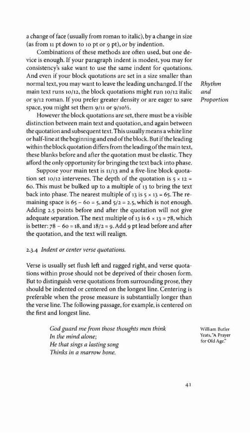
2.3-4 Indent or center verse quotations.
Verse is usually set flush left and ragged right, and verse quota-tions within prose should not be deprived of their chosen form. But to distinguish verse quotations from surrounding prose, they should be indented or centered on the longest line. Centering is preferable when the prose measure is substantially longer than the verse line. The following passage, for example, is centered on the first and longest line.
God guard me from those thoughts men think In the mind alone; He that sings a lasting song Thinks in a marrow bone.
41
Rhythm and Proportion
William Butler Yeats, "A Prayer for Old Age."

Blocks and
Paragraphs
Suppose your main text is set on a 24-pica measure and you have decided to set verse quotations in italic at the text size. Suppose that the longest line in your quotation measures 269 points. The indent for this quotation might be computed as follows: 24 x 12 = 2SS pt, which is the full prose measure, and 2SS - 269 = 19 pt, which is the difference between the measure and the longest verse line. The theoretically perfect left indent for the verse quotation is 19/2 = 9.5 pt. But if another indent close to 9.5 pt is already in use, either for block quotations in prose, or as a paragraph indent, then the verse quotation might just as well be indented to match.
Suppose however that the longest line in the verse is 12S points. The measure, again, is 2SS points, and 2SS - 12S = 160. Half of 160 is So points. No other indent in the vicinity of So points is likely to be in use. The verse quotation would then be indented by precisely that amount.
2.4 ETIQUETTE OF HYPHENATION & PAGINATION
The rules listed below are traditional craft practice for the setting of justified text. Except for the last rule, they are all programmable, but the operation of these rules necessarily affects the spacing of words and thus the texture and color of the page. If decisions are left to the software, they should be checked by a trained eye - and no typesetting software should be permitted to compress, expand or letterspace the text automatically and arbitrarily as a means of fitting the copy. Copyfitting problems should be solved by creative design, not fobbed off on the reader and the text nor cast like pearls before machines.
For a brief discussion of software justification engines, which now do most of the work, see §9-4, page 190.
2-4.I At hyphenated line-ends, leave at least two characters behind and take at least three forward.
Fi-nally is conventionally acceptable line-end hyphenation, but final-ly is not, because it takes too little of the word ahead to the next line.
2-4.2 Avoid leaving the stub-end of a hyphenated word, or any word shorter than four letters, as the last line of a paragraph.
42

2-4·3 Avoid more than three consecutive hyphenated lines.
2-4-4 Hyphenate proper names only as a last resort unless they occur with the frequency of common nouns.
245 Hyphenate according to the conventions of the language.
In English we hyphenate cab-ri-o-let but in French ca-brio-let. The old German rule which hyphenated Glockenspiel as Glok-kenspiel was changed by law in i998, but when ossze is broken in Hungar-ian, it still turns into osz-sze. In Spanish the double consonants 11 and rr are never divided. (The only permissible hyphenation in the phrase arroz con polio is thus arroz con po-llo.) The conven-tions of each language are a part of its typographic heritage and should normally be followed, even when setting single foreign words or brief quotations.
246 Link short numerical and mathematical expressions with hard spaces.
All you may see on the keyboard is a space bar, but typographers use several invisible characters: the word space, fixed spaces of various sizes (em space, en space, thin space, figure space, etc) and a hard space or no-break space. The hard space will stretch, like a normal word space, when the line is justified, but it will not convert to a linebreak. Hard spaces are useful for preventing linebreaks within phrases such as 6.2 mm, 3 in., 4 x 4, or in phrases like page 3 and chapter 5.
When it is necessary to break longer algebraic or numerical expressions, such as a + b = c, the break should come at the equal sign or another clear logical pause.
247 Avoid beginning more than two consecutive lines with the same word.
248 Never begin a page with the last line of a multi-line paragraph.
The typographic terminology is telling. Isolated lines created when paragraphs begin on the last line of a page are known as orphans. They have no past, but they do have a future, and they
43
Hart's Rules for Compositors (39th ed, 1983) includes a good, brief guide to hyphenation and punctuation rules for sev-eral European languages. Its fat successor, Ritter's Oxford Guide to Style (2002) is more thorough but much less handy. It is always worth-while, however, to consult a style manual written in and for the language at issue - e.g., for French, the Lexique des reg/es typographiques en usage a l'impri-merie nationale (Paris, 1990).

Etiquette of
need not trouble the typographer. The stub-ends left when para-graphs end on the first line of a page are called widows. They have a past but not a future, and they look foreshortened and forlorn. It is the custom - in most, if not in all, the world's typographic cultures - to give them one additional line for company. This rule is applied in close conjunction with the next.
Hyphenation 2-4.9 Balance facing pages by moving single lines. and
Pagination Pages with more than two columns often look best with the col-umns set to varying depths. This is the vertical equivalent of ragged-right composition. Where there are only one or two main text columns per page, paired columns and facing pages (ex-cept at the end of a chapter or section) are usually set to a uni-form depth.
Balance facing pages not by adding extra lead or puffing up the word space, but by exporting or importing single lines to and from the preceding or following spreads. The same technique is used to avoid widows, and to extend or shorten any chapters that would otherwise end with a meager few lines on the final page. But this balancing should be performed with a gentle hand. In the end, no spread of continuous text should have to run more than a single line short or a single line long.
2410 Avoid hyphenated breaks where the text is interrupted.
Style books sometimes insist that both parts of a hyphenated word must occur on the same page: in other words, that the last line on a page must never end with a hyphen. But turning the page is not, in itself, an interruption of the reading process. It is far more important to avoid breaking words in those locations where the reader is likely to be distracted by other information. That is, whenever a map, a chart, a photograph, a pull-quote, a sidebar or other interruption intervenes.
2-4.11 Abandon any and all rules of hyphenation and pagination that Jail to serve the needs of the text.
44

HARMONY & COUNTERPOINT
3.1 SIZE
3.u Don't compose without a scale.
The simplest scale is a single note, and sticking with a single note draws more attention to other parameters, such as rhythm and inflection. The early Renaissance typographers set each book in a single font - that is, one face in one size - supplemented by hand-drawn or specially engraved large initial letters for the openings of chapters. Their pages show what sensuous evenness of texture and variety of rhythm can be attained with a single font of type: very much greater than on a typewriter, where letters have, more often than not, a single width and a single stroke-weight as well as a single size.
In the sixteenth century, a series of common sizes developed among European typographers, and the series survived with lit-tle change and few additions for 400 years. In the early days, the sizes had names rather than numbers, but measured in points, the traditional series is this:
aaaaaaaaaaaa 6 7 8 9 10 11 12 14 16 18 21 24
aaaa 60 72
This is the typographic equivalent of the diatonic scale. But modern equipment makes it possible to set, in addition to these sizes, all the sharps and flats and microtonal intervals between. Twenty-point, 22-point, 23-point, and 10Vi-point type are all avail-able for the asking. The designer can now choose a new scale or tone-row for every piece of work.
These new resources are useful, but rarely all at once. Use the old familiar scale, or use new scales of your own devising, but limit yourself, at first, to a modest set of distinct and related intervals. Start with one size and work slowly from there. In time, the scales you choose, like the faces you choose, will become recognizable features of personal style.
45
3
A few examples of the many older names for type sizes: 6 pt: nonpareil 7pt:minion 8 pt: brevier or
small text 9 pt:bourgeois or
galliard wpt:longprimer
or garamond 11 pt:small pica or
philosophy 12 pt: pica 14 pt:english or
augustin 18 pt:great primer

Numerals, Capitals
and Small Caps
A °' . The arabic
numerals of Latin script are
derived from the Indian
numerals of Arabic script
(above)
3.2 NUMERALS, CAPITALS & SMALL CAPS
3.2.1 Use titling figures with full caps, and text figures in all other circumstances.
So the date is 23 August 1832; it could be 3:00 AM in Apartment 6-B, 213-A Beacon Street; it is 27° c or 81° F; the price is $47,000 uso or £28,200; the postal codes are NL 1034 WR Amsterdam, SF 00170 Helsinki 17, Honolulu 96814, London wc1 2NN, New Delhi no 003, Toronto M5S 2G5, and Dublin 2.
BUT IT IS 1832 AND 81° IN FULL CAPITALS.
Arabic numerals - known in Arabic as Indian numerals, arqam hindiyya, because the Arabs obtained them from India - entered the scribal tradition of Europe in the thirteenth century. Before that (and for many purposes afterward) European scribes used roman numerals, written in capitals when they occurred in the midst of other capitals, and in lowercase in the midst of lowercase letters. Typographers have naturally inherited this custom of setting roman numerals so that they harmonize with the words:
Number xiii lowercase AND XI I I UPPERCASE AND THE NUMBER XIII IN SMALL CAPITALS
and the roman numeral xiii in italic
When arabic numerals joined the roman alphabet, they too were given both lowercase and uppercase forms. Typographers call the former text figures, hanging figures, lowercase figures, or old-style figures ( osF for short) and make a point of using them whenever the surrounding text is set in lowercase letters or small caps. The alternative forms are called titlingfigures, rangingfigures or liningfigures, because they range or align with one another and with the upper case.
Text 1234567890 figures TITLING 1234567890 FIGURES
FIGURES 1234567890 WITH SMALL CAPS
Italic text 12 3 4 s 6 7 8 9 o figures

Text figures were the common form in European typography between 1540 and 1800. But in the mid-eighteenth century, when European shopkeepers and merchants were apt to write more numbers than letters, handwritten numerals developed propor-tions of their own. These quite literally middle-class figures en-tered the realm of typography in 1788, when a British punchcutter named Richard Austin cut a font of three-quarter-height lining .figures for the founder John Bell.
Bell letters and 1234567890 figures in roman and 1234567890 in italic
In the nineteenth century, which was not a great age for typography, founders stretched these figures up to cap height, and titling figures became the norm in commercial typography. Renaissance letterforms were revived in the early twentieth cen-tury, and text figures found their way back into books. But in news and advertising work, titling figures remained routine. In the 1960s, phototypesetting machines with their truncated fonts once again made text figures difficult to find. The better digital foundries now offer a wide selection of fonts with text figures and small caps. These are often sold separately and involve extra expense, but they are essential to good typography. It is better to have one good face with all its parts, including text figures and small caps, than fifty faces without.
It is true that text figures are rarely useful in classified ads, but they are useful for setting almost everything else, including good magazine and newspaper copy. They are basic parts of ty-pographic speech, and they are a sign of civilization: a sign that dollars are not really twice as important as ideas, and numbers are not afraid to consort on an equal footing with words.
It is also true that a number of excellent text faces, both serifed and unserifed, were originally issued without text figures. Exam-ples include Adrian Frutiger's Mfridien, Eric Gill's Gill Sans, Paul Renner's Futura, Hans Eduard Meier's Syntax, Hermann Zapf's Comenius and Optima, and Gudrun Zapf-von Hesse's Carmina. In several of these cases, text figures were part of the original conception or even the finished design but were scuttled by the foundry. Many such missing components have belatedly been is-sued in digital form. With any text face that is missing text figures, it is reasonable to enquire whether commercial intimidation or, in effect, commercial censorship may not have played a role.
47
Harmony and Counterpoint
Numerals, Capitals
and Small Caps
During most of the nineteenth and twentieth centuries, lin-ing figures were widely known as 'modern' and text figures as 'old-style: Modernism was preached as a sacred duty, and num-bers, in a sense, were actually deified. Modernism is nothing if not complex, but its gospel was radical simplicity. Many efforts were made to reduce the Latin alphabet back to a single case. (The telegraph and teletype, with their unicameral alphabets, are also products of that time.) These efforts failed to make much head-way where letters were concerned. With numbers, the campaign had considerable success. Typewriters soon came to have letters in both upper and lower case but numbers in upper case alone. And from typewriters have come computer keyboards.
Typographic civilization seems, nonetheless, determined to proceed. Text figures are again a normal part of type design - and have thus been retroactively supplied for faces that were earlier denied them. However common it may be, the use of titling fig-ures in running text is illiterate: it spurns the truth of letters.
3.2.2 For abbreviations and acronyms in the midst of normal text, use spaced small caps.
This is a good rule for just about everything except two-letter geographical acronyms and acronyms that stand for personal names. Thus: 3:00 AM, 3:00 PM, the ninth century CE, 450 BC to AD 450, the OAS and NATO; World War II or WWII; but JFK and Fr J.A.S. O'Brien, OMI; HMS Hypothesis and uss Ticonderoga; Washington, DC, and Mexico, DF; J.S. Bach's Prelude and Fugue in minor, swv 867.
Many typographers prefer to use small caps for postal abbre-viations (San Francisco, CA 94119 ), and for geographical acronyms longer than two letters. Thus, the USA, or in Spanish, las EEUU,
and Sydney, NSW. But the need for consistency intervenes when long and short abbreviations fall together. From the viewpoint of the typographer, small caps are preferable in faces with fine features and small x-height, full caps in faces with large x-height and robust form.
Genuine small caps are not simply shrunken versions of the full caps. They differ from large caps in stroke weight, letterfit, and internal proportions as well as in height. Any good set of small caps is designed as such from the ground up. Thickening, shrinking and squashing the full caps with digital modification routines will only produce a parody.

Sloped small capitals - AB c DEF G - have been designed and cut for relatively few faces in the history of type design. They can be faked with digital machinery, by sloping the roman small caps, but it is better to choose a face (such as this one, Robert Slimbach's Minion) which includes them, or to live without. Sloped (italic) text figures, on the other hand, are part of the basic requirement and are available for most good text fonts.
3.2.3 Refer typographic disputes to the higher courts of speech and thinking.
Type is idealized writing, and its normal function is to record idealized speech. Acronyms such as co and TV or USA and UFO
are set in caps because that is the way we pronounce them. Acro-nyms like UNESCO, ASCII and FORTRAN, which are pronounced not as letters but as words, are in the process of becoming pre-cisely that. When a writer accepts them fully into her speech and urges readers to do likewise, it is time for the typographer to ac-cept them into the common speech of typography by setting them in lower case: Unesco, Ascii (or ascii) and Fortran. Other acronymic words, such as laser and radar, have long since trav-eled the same road.
Logograms pose a more difficult question. An increasing number of persons and institutions, from e.e. cummings to WordPerfect, now come to the typographer in search of special treatment. In earlier days it was kings and deities whose agents demanded that their names be written in a larger size or set in a specially ornate typeface; now it is business firms and mass-mar-ket products demanding an extra helping of capitals, or a pro-prietary face, and poets pleading, by contrast, to be left entirely in the vernacular lower case. But type is visible speech, in which gods and men, saints and sinners, poets and business executives are treated fundamentally alike. Typographers, in keeping with the virtue of their trade, honor the stewardship of texts and im-plicitly oppose private ownership of words.
Logotypes and logograms push typography in the direction of hieroglyphics, which tend to be looked at rather than read. They also push it toward the realm of candy and drugs, which tend to provoke dependent responses, and away from the realm of food, which tends to promote autonomous being. Good typography is like bread: ready to be admired, appraised and dissected before it is consumed.
49
Harmony and Counterpoint

ffi f+f +i->Jfi
J
The lam-a/if ligature above is from Nabih
Jaroudi's Yakout Arabic. The pi-
tau, chi-rho and mu-alpha-iota
ligatures below are from Mat-thew Carter's Wilson Greek.
µ, + (1, +' ---> f-(S!1
3.3 LIGATURES
3.3.1 Use the ligatures required by the font, and the characters required by the language, in which you are setting type.
I
In most roman faces the letter f reaches into the space beyond it. In most italics, the f reaches into the space on both sides. Typogra-phers call these overlaps kerns. Only a few kerns, like those in the arm of the f and the tail of the j, are implicit in a normal typefont, while others, like the overlap in the combination To, are optional refinements, independent of the letterforms.
Reaching into the space in front of it, the arm of the f will collide with certain letters - b, f, h, i, j, k, 1 - and with question marks, quotation marks or parentheses, if these are in its way.
Most of the early European fonts were designed primarily for setting Latin, in which the sequences fb, fh, fj, fk do not oc-cur, but the sequences ff, fi, fl, ffi, ff! are frequent. The same set of ligatures was once sufficient for English, and these five ligatures are standard in traditional roman and italic fonts. As the craft of typography spread through Europe, new regional ligatures were added. An fj and re were needed in Norway and Denmark for words such as fjeld and fjord and mer. In France an ce, and in Germany an 13 (eszett or double-s) were required, along with accented and umlauted vowels. Double letters which are read as one - // in Spanish, ij in Dutch, and ch in German, for example - were cast as single sorts for regional markets. An ffj was needed in Iceland. New individual letters were added, like the Polish l, the Spanish fi, and the Danish and Norwegian 0. Purely decorative ligatures were added to many fonts as well.
English continues to absorb and create new words - fjord, gajfhook, halfback, hors d'reuvre - that call for ligatures beyond the Latin list. As an international language, English must also accommodate names like Youngfox, al-Hajji and Asdzqq Yolgai. These sometimes make demands on the roman alphabet which earlier designers didn't foresee. In the digital world, some of these compound characters and ligatures can, in effect, take care of themselves. In text work, there is no burning need for a specially crafted fb or th ligature when the digital forms can be cleanly superimposed, but in display work, such ligatures can be crucial. Recent type designers, alive to these polylingual demands on the alphabet, have often simplified the problem further by designing faces in which no sequence of letters involves a collision.
50

£(£ M fh [f fiffi Jjlfi fl fr y u U CJ? ff f Ch jh Ji fl j} jJ fl j/i Jjl fl ft m
1E CE re re te ce B fl ff fi fl ffi ffi ift ifl a sr a fl £h fi fl ff fr fh Ji fl ff fl
Top two lines: Ligatures from an italic font cut in the 1650s by Christoffel van Dijck. Lower two lines: Ligatures from Adobe Caslon, a digital face by Carol Twombly, after William Caslon, dating from about 1750. These are Baroque typefaces. As such, they include a set of ligatures withf and a second set formed with the longs (f,f). Long s and its ligatures were normal in European typography until late in the eighteenth century, though fonts designed to do without them were cut as early as the 1640s.
Separation of the letters f and i is sometimes crucial. In Turk-ish, i with a dot and 1 without - or in capitals, i and I - are two different letters. To set Turkish well, you need a face whose f is designed so it does not disguise the difference.
This does not do away with the question of the five Latin liga-tures. Older typefaces - Bembo, Garamond, Caslon, Baskerville and other distinguished creations - are, thankfully, still with us, in metal and in digital revivals. Many new faces also perpetuate the spirit of these earlier designs. These faces are routinely supplied with the five basic ligatures because they require them. And for digital typographers, software is available that will automatically insert them.
ff fi fl ffi ffi ff fi fl ffi ffl
Bembo, set with ligatures (above) and without (below)
If your software is inserting ligatures automatically, take·a moment to verify two things: ( 1) that the software is inserting all the ligatures you want and none that you do not want; (2) that all these ligatures are staying where they're put.
51
Harmony and Counterpoint
Decorative ligatures such as SI and Th are now deservedly rare. The ligature jjJl is rarer, but it has been cut for at least one typeface (Jona-than Hoefler's Requiem italic) and can be used in at least two words: German SauerSlojfjlasche (oxygen bottle) and SauerSloff-flaschenSf>Uler (oxygen bottle washer).

iJj
1h
Good OpenType digital fonts usually include the five Latin ligatures (ff, ffi, ffi, fi, fl), and many include the two Scandinavian ligatures (ffj, fj). There may also be a set of ornamentals and archa-ics (ct, sp, st, Th; fi, fk, fl, ffi, ill, etc) - and sometimes there are more of these special-purpose ligatures (quaints, as typographers call them) in italic than in roman. Where such a feast of ligatures is present, they are usually divided into classes: basic and discretion-ary. If your software is conversant with OpenType fonts, it can be told to use the ligatures from either class or from both. But the classes are not always well defined. For now at least, fonts in the 'Adobe Originals' series all have the Th ligature misclassified as basic, not discretionary. Unless you edit the font to fix this error, you cannot get fi, fj, ff and ffi without getting Th also. If you want the Th ligature, this is fine. But Th has a different pedigree than fi and its brethren. Stylistically, it belongs to a different register. These two registers can certainly be paired; they should not be arbitrarily blurred together.
Some software that inserts Jigs automatically will also strip them out again as soon as the type is letterspaced. If you let such software justify a text by adding space between the letters, you may find ligatures present in one line and missing in the next. The solution for this is twofold: (1) good software and (2) intelligent justification. Ligatures should go where they are needed and then stay no matter what.
3.3.2 If you wish to avoid ligatures altogether, restrict yourself to faces that don't require them.
It is quite possible to avoid the use of ligatures completely and still set beautiful type. All that is required is a face with non-kerning roman and italic f - and some of the finest twentieth-century faces have been deliberately equipped with just this feature. Aldus, Melior, Mendoza, Palatino, Sabon, Trajanus and Trump Mediaval, for example, all set handsomely without ligatures. Full or partial ligatures do exist for these faces, and the ligatures may add a touch
fi fi fi f i fi fi fi f i Ligatured and unligatured combinations 1n Sabon (left) and Trump Med1-aval (right). In faces such as these.fligatures are optional - and 1n most such faces, only a partial set of ligatures exists.
52

of refinement - but when ligatures are omitted from these faces, no unsightly collisions occur.
The choice is wider still among sanserifs. Ligatures are impor-tant to the design of Eric Gill's Gill Sans, Ronald Arnholm's Legacy Sans, Martin Majoor's Scala Sans and Seria Sans but irrelevant to many unserifed faces. (Dummy ligatures, consisting of separate letters, are usually present on digital versions of those fonts, but using these dummies has no visible effect.)
3.4 TRIBAL ALLIANCES & FAMILIES
3-4·1 To the marriage of type and text, both parties bring their cultural presumptions, dreams and family obligations. Accept them.
Each text, each manuscript (and naturally, each language and each alphabet) has its own requirements and expectations. Some types are more adaptable than others in meeting these demands. But typefaces too have their individual habits and presumptions. Many of them, for instance, are rich with historical and regional connections - a subject pursued at greater length in chapter 7. For the moment, consider just the sociology of typefaces. What kinds of families and alliances do they form?
The union of uppercase and lowercase roman letters - in which the upper case has seniority but the lower case has the power - has held firm for twelve centuries. This constitutional monarchy of the alphabet is one of the most durable of European cultural institutions.
Ornamental initials, small caps and arabic figures were early additions to the roman union. Italics were a separate tribe at first, refusing to associate with roman lower case, but forming an alli-ance of their own with roman (not italic) capitals and small caps. Sloped caps developed only in the sixteenth century. Roman, italic and small caps formed an enlarged tribal alliance at that time, and most text families continue to include them.
Bold and condensed faces became a fashion in the nineteenth century, partially displacing italics and small caps. Bold weights and titling figures have been added retroactively to many earlier faces (Bembo and Centaur for example), though they lack any historical justification. Older text faces, converted from metal to digital form, are usually available in two fundamentally different versions. The better digital foundries supply authentic reconstruc-
53
Harmony and Counterpoint
Aa BbB ccC Dd Ee Ee Ff
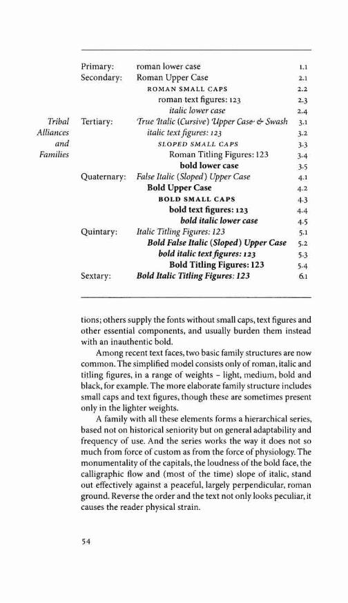
Tribal Alliances
and Families
Primary: roman lower case 1.1
Secondary: Roman Upper Case 2.1 ROMAN SMALL CAPS 2.2
roman text figures: 123 2.3 italic lower case 2.4
Tertiary: 'True 1talic (Cursive) Vpper Case-- & Swash 3.1 italic text figures: 123 3.2
SLOPED SMALL CAPS 3.3 Roman Titling Figures: 123 3.4
bold lower case 3.5 Quaternary: False Italic (Sloped) Upper Case 4.1
Bold Upper Case 4.2 BOLD SMALL CAPS 4.3
bold text figures: 123 4-4 bold italic lower case 4.5
Quintary: Italic Titling Figures: 123 5.1 Bold False Italic (Sloped) Upper Case 5.2
bold italic text figures: 123 5.3 Bold Titling Figures: 123 5-4
Sextary: Bold Italic Titling Figures: 123 6.1
tions; others supply the fonts without small caps, text figures and other essential components, and usually burden them instead with an inauthentic bold.
Among recent text faces, two basic family structures are now common. The simplified model consists only of roman, italic and titling figures, in a range of weights - light, medium, bold and black, for example. The more elaborate family structure includes small caps and text figures, though these are sometimes present only in the lighter weights.
A family with all these elements forms a hierarchical series, based not on historical seniority but on general adaptability and frequency of use. And the series works the way it does not so much from force of custom as from the force of physiology. The monumentality of the capitals, the loudness of the bold face, the calligraphic flow and (most of the time) slope of italic, stand out effectively against a peaceful, largely perpendicular, roman ground. Reverse the order and the text not only looks peculiar, it causes the reader physical strain.
54
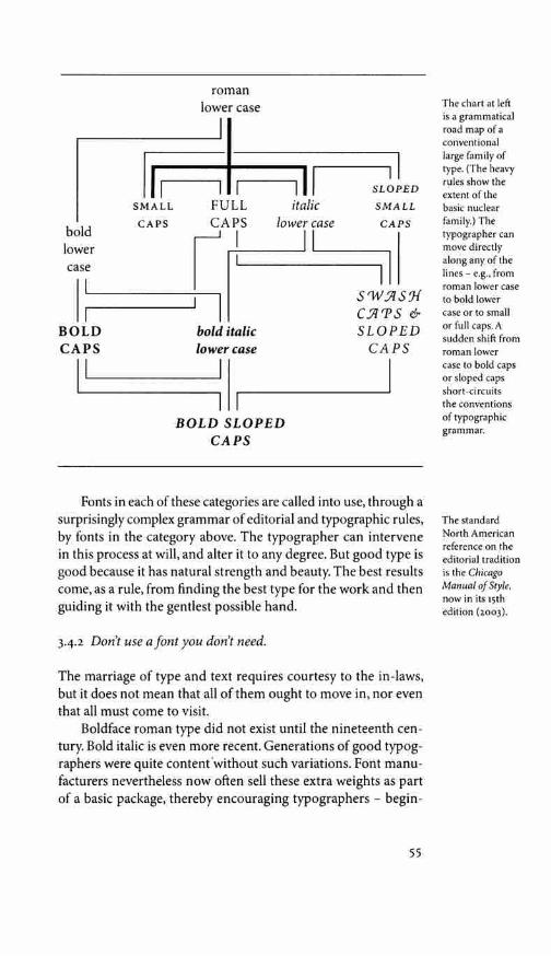
bold lower case
BOLD CAPS
roman lower case
SMALL FULL italic CAPS
I.__________. I I
BOLD SLOPED CAPS
SLOPED
SMALL
Fonts in each of these categories are called into use, through a surprisingly complex grammar of editorial and typographic rules, by fonts in the category above. The typographer can intervene in this process at will, and alter it to any degree. But good type is good because it has natural strength and beauty. The best results come, as a rule, from finding the best type for the work and then guiding it with the gentlest possible hand.
342 Don't use a font you don't need.
The marriage of type and text requires courtesy to the in-laws, but it does not mean that all of them ought to move in, nor even that all must come to visit.
Boldface roman type did not exist until the nineteenth cen-tury. Bold italic is even more recent. Generations of good typog-raphers were quite content 'without such variations. Font manu-facturers nevertheless now often sell these extra weights as part of a basic package, thereby encouraging typographers - begin-
55
The chart at left is a grammatical road map of a conventional large family of type. (The heavy rules show the extent of the basic nuclear family.) The typographer can move directly along any of the lines - e.g., from roman lower case to bold lower case or to small or full caps. A sudden shift from roman lower case to bold caps or sloped caps short-circuits the conventions of typographic grammar.
The standard North American reference on the editorial tradition is the Chicago Manual of Style, now in its 15th edition (2003).

ners especially - to use bold roman and italic whether they need them or not.
Bold and semibold faces do have their value. They can be used, for instance, to flag items in a list, to set titles and subheads u&lc in small sizes, to mark the opening of the text on a complex page, or to thicken the texture of lines that will be printed in pale
Tribal ink or as dropouts (negative images) in a colored field. Sparingly Alliances used, they can effectively emphasize numbers or words, such as
and the headwords, keywords and definition numbers in a dictionary. Families They can also be used (as they often are) to shout at readers, putting
them on edge and driving them away; or to destroy the historical integrity of a typeface designed before boldface roman was born; or to create unintentional anachronisms, something like adding a steam engine or a fax machine to the stage set for King Lear.
3.4.3 Use sloped romans sparingly and artificially sloped romans more sparingly still.
It is true that most romans are upright and most italics slope to the right - but flow, not slope, is what really differentiates the two. Italics have a more cursive structure than romans, which is to say that italic is closer to longhand or continuous script. Italic serifs are usually transitive; they are direct entry and exit strokes, depict-ing the pen's arrival from the previous letter and its departure for the next. Roman serifs, by contrast, are generally reflexive. They show the pen doubling back onto itself, emphasizing the end of the stroke. Italic serifs therefore tend to slope at a natural writing angle, tracing the path from one letter to another. Roman serifs, especially at the baseline, tend to be level, tying the letters not to each other but to an invisible common line.
Some italics are more cursive than others; so are some ro-mans. But any given italic is routinely more cursive than the roman with which it is paired.
e e 1 l m mu u Baskerville roman and italic. Baskerville has less calligraphic flow than most earlier typefaces, but the italic serifs are, like their predecessors, transitive and oblique, showing the path of the pen from letter to letter. The roman serifs are reflexive and level, tying letters to a common line.

Early italic fonts had only modest slope and were designed to be used with upright roman capitals. There are some beautiful fifteenth-century manuscript italics with no slope whatsoever, and some excellent typographic versions, old and new, that slope as little as 2° or 3°. Yet others slope as much as 25°.
Italic and roman lived quite separate lives until the middle of the sixteenth century. Before that date, books were set in either roman or italic, but not in both. In the late Renaissance, typographers began to use the two for different features in the same book. Typically, roman was used for the main text and italic for the preface, headnotes, sidenotes and for verse or block quo-tations. The custom of combining italic and roman in the same line, using italic to emphasize individual words and mark specific classes of information, developed in the sixteenth century and flowered in the seventeenth. Baroque typographers liked the extra activity this mixing of fonts gave to the page, and the convention proved so useful to editors and authors that no subsequent change of typographic taste has ever driven it entirely away. Modulation between roman and italic is now a basic and routine typographic technique, much the same as modulation in music between major and minor keys. (The system of linked major and minor keys in music is, of course, another Baroque invention.)
Since the seventeenth century, many attempts have been made to curb the cursive, fluid nature of italic and to refashion it on the roman model. Many so-called italics designed in the last two hundred years are actually not italics at all, but sloped romans - otherwise known as obliques. And many are hybrids between the two.
As lowercase italic letterforms mutated toward sloped roman, their proportions changed as well. Most italics (though not all) are 5% to 10% narrower than their roman counterparts. But most sloped romans (unless designed by Eric Gill) are as wide or wider than their upright roman companions.
Renaissance italics were designed for continuous reading, and modern italics based on similar principles tend to have similar virtues. Baroque and Neoclassical italics were designed to serve as secondary faces only, and are best left in that role. Sloped romans, as a general rule, are even more devotedly subsidiary faces. They have been with us for ten centuries or more, but have rarely suc-ceeded in rising above the status of calligraphic stunts or short-term perturbations of the upright roman.
57
Harmony and Counterpoint
In addition to families consist-ing of upright and sloped roman, there are now sev-eral families con-sisting of upright (or nearly upright) and sloped italic. Hermann Zapf's Zapf Chancery (ITC, 1979) is an example. The 'roman' is an italic with a slope of 4°; the 'italic' is also an italic, but with swash caps and a slope of 14°. An-other example is Eaglefeather Infor-mal (seep 271), in which the 'roman' is an italic with a slope of 0° and the 'italic' is in essence the same design with a slope of 10°.

Tribal Alliances
and Families
1 adefmpru adefmpru (19 pt]
2 adefmpru adefmpru [18 pt]
3 adefmpru adefmpru (24 pt]
4 adefmpru adefmpru [18 pt]
5 adefmpru adefmpru (21 pt]
1 Adrian Frutiger's Meridien roman and italic; 2 Lucida Sans roman and italic, by Kris Holmes & Charles Bigelow; 3 Perpetua roman and its italic - actually a hybridized sloped roman - by Eric Gill; 4 Univers roman and its oblique (a pure sloped roman), by Adrian Frutiger; 5 Romulus roman and oblique (again a pure sloped roman), by Jan van Krimpen.
Typesetting software is capable of distorting letters in many different ways: condensing, expanding, outlining, shadowing, sloping, and so on. If the only difference between a roman and its companion font were slope, the roman font alone would be enough for the computer. Sloped versions could be generated at will. But italic is not sloped roman, and even a good sloped roman is more than simply roman with a slope.
Direct electronic sloping of letterforms changes the weight of vertical and sloped strokes, while the weight of the horizontal strokes remains the same. Strokes that run northwest-southeast in the parent form - like the right leg of the A or the upper right and lower left corners of the 0 - are rotated toward the vertical when the letter is given a slope. Rotation toward the vertical causes these strokes to thicken. But strokes running northeast-southwest, like the left leg of the A, and the other corners of the 0, are rotated farther away from the vertical. Rotation away from the vertical thins them down. Stroke curvature is altered in this translation process as well. The natural inclinations of a calligrapher drawing a sloped roman differ from what is convenient for the machine. Even 'italic' capitals - which nowadays are rarely anything except sloped roman - require individual shaping and editing to reach a durable form.
Through the collaborative efforts of calligraphers, typogra-phers and engineers, software for the design and editing of typo-graphic letterforms continues to improve. As it does, it continues
58

to mimic more and more closely those subtle and primitive tools that lie at the root of all typography: the stick, the brush, the chisel and the broadnib pen. Rules for transforming roman into good sloped roman forms, instead of into parodies, can surely be derived through close analysis of what the best scribes do. When parts of the procedure can be stated with mechanical precision, they can also be entrusted to machines. But rules for translating roman into italic cannot be stated clearly because no such rules exist. The two kinds of letterform have different genealogies, like apples and bananas. They form a common heritage and share an evolutionary source, yet neither one is a direct modification of the other.
A A A 0 0 0 Adobe Caslon roman, the same roman sloped electronically, and the true 'italic' capitals as drawn. Caslon ita lics have an average slope of 20°.
a a a o o o Palatino roman, the same roman s loped electronically, and the genuine italic, whose average slope is 9°.
True italic capitals: the swash forms from Robert Slimbach's Minion italic. It is the structure, not the slope, of the letters that marks them as italic.
Once in a while, nevertheless, a typographer will pine for a sloped version of a font such as Haas Clarendon or Andre Gi.irtler's Egyptian 505, for which no italic, nor even a sloped roman, has been drawn. On such occasions, a sloped roman generated by computer may suffice as a temporary solution. But the slope should be modest (perhaps 10° maximum), because less slope yields less distortion.
59
Harmony and Counterpoint
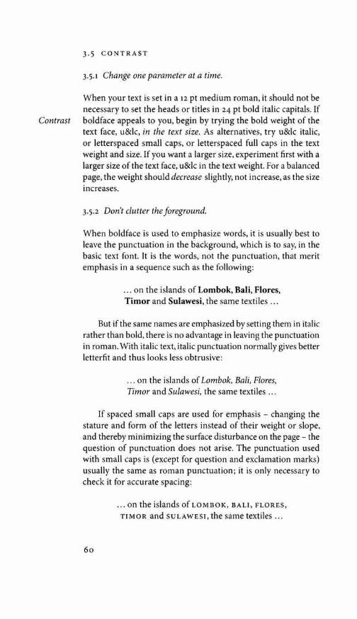
3.5 CONTRAST
3.5.1 Change one parameter at a time.
When your text is set in a 12 pt medium roman, it should not be necessary to set the heads or titles in 24 pt bold italic capitals. If
Contrast boldface appeals to you, begin by trying the bold weight of the text face, u&lc, in the text size. As alternatives, try u&lc italic, or letterspaced small caps, or letterspaced full caps in the text weight and size. If you want a larger size, experiment first with a larger size of the text face, u&lc in the text weight. For a balanced page, the weight should decrease slightly, not increase, as the size increases.
3.5.2 Don't clutter the foreground.
When boldface is used to emphasize words, it is usually best to leave the punctuation in the background, which is to say, in the basic text font. It is the words, not the punctuation, that merit emphasis in a sequence such as the following:
... on the islands of Lombok, Bali, Flores, Timor and Sulawesi, the same textiles ...
But if the same names are emphasized by setting them in italic rather than bold, there is no advantage in leaving the punctuation in roman. With italic text, italic punctuation normally gives better letterfit and thus looks less obtrusive:
... on the islands of Lombok, Bali, Flores, Timar and Sulawesi, the same textiles ...
If spaced small caps are used for emphasis - changing the stature and form of the letters instead of their weight or slope, and thereby minimizing the surface disturbance on the page - the question of punctuation does not arise. The punctuation used with small caps is (except for question and exclamation marks) usually the same as roman punctuation; it is only necessary to check it for accurate spacing:
60
... on the islands ofLOMBOK, BALI, FLORES, TIMOR and SULAWESI, the same textiles ...

STRUCTURAL FORMS & DEVICES
4.1 OPENINGS
4.u Make the title page a symbol of the dignity and presence of the text.
If the text has immense reserve and dignity, the title page should have these properties as well - and if the text is devoid of dignity, the title page should in honesty be the same.
Think of the blank page as alpine meadow, or as the purity of undifferentiated being. The typographer enters this space and must change it. The reader will enter it later, to see what the typog-rapher has done. The underlying truth of the blank page must be infringed, but it must never altogether disappear - and whatever displaces it might well aim to be as lively and peaceful as it is. It is not enough, when building a title page, merely to unload some big, prefabricated letters into the center of the space, nor to dig a few holes in the silence with typographic heavy machinery and then move on. Big type, even huge type, can be beautiful and useful. But poise is usually far more important than size - and poise consists primarily of emptiness. Typographically, poise is made of white space. Many fine title pages consist of a modest line or two near the top, and a line or two near the bottom, with little or nothing more than taut, balanced white space in between.
4.1.2 Don't permit the titles to oppress the text.
In books, spaced capitals of the text size and weight are often perfectly adequate for titles. At the other extreme, there is a fine magazine design by Bradbury Thompson, in which the title, the single word Boo M, is set in gigantic bold condensed caps that fill the entire two-page spread. The text is set in a tall narrow column inside the stem of the big B. The title has swallowed the text - yet the text has been reborn, alive and talkative, like Jonah from the whale.
Most unsuccessful attempts at titling fall between these two extremes, and their problem is often that the title throws its weight around, unbalancing and discoloring the page. If the title is set in a larger size than the text, it is often best to set it u&lc in a light
61
4
For examples of Thompson's work, see Bradbury Thompson, The Art of Graphic Design (1988)
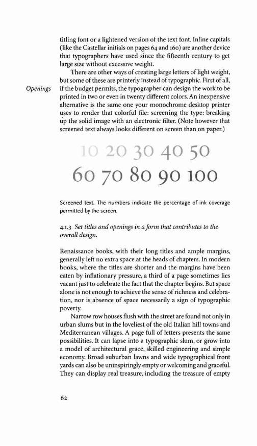
titling font or a lightened version of the text font. Inline capitals (like the Castellar initials on pages 64 and 160) are another device that typographers have used since the fifteenth century to get large size without excessive weight.
There are other ways of creating large letters of light weight, but some of these are printerly instead of typographic. First of all,
Openings if the budget permits, the typographer can design the work to be printed in two or even in twenty different colors. An inexpensive alternative is the same one your monochrome desktop printer uses to render that colorful file: screening the type: breaking up the solid image with an electronic filter. (Note however that screened text always looks different on screen than on paper.)
20 30 40 50 60 70 So 90 100
Screened text. The numbers indicate the percentage of ink coverage permitted by the screen.
4.1.3 Set titles and openings in a form that contributes to the overall design.
Renaissance books, with their long titles and ample margins, generally left no extra space at the heads of chapters. In modern books, where the titles are shorter and the margins have been eaten by inflationary pressure, a third of a page sometimes lies vacant just to celebrate the fact that the chapter begins. But space alone is not enough to achieve the sense of richness and celebra-tion, nor is absence of space necessarily a sign of typographic poverty.
Narrow row houses flush with the street are found not only in urban slums but in the loveliest of the old Italian hill towns and Mediterranean villages. A page full of letters presents the same possibilities. It can lapse into a typographic slum, or grow into a model of architectural grace, skilled engineering and simple economy. Broad suburban lawns and wide typographical front yards can also be uninspiringly empty or welcoming and graceful. They can display real treasure, including the treasure of empty
62

space, or they can be filled with souvenirs of wishful thinking. Neoclassical birdbaths and effigies of liveried slaves, stable boys and faded pink flamingoes all have counterparts in the typo-graphic world.
4.i.4 Mark each beginning and resumption of the text.
The simplest way of beginning any block of prose is to start from the margin, flush left, as this paragraph does. On a peaceful page, where the text is announced by a head or subhead, this is enough. But if the text, or a new section of text, begins at the top of a page with no heading to mark it, a little fanfare will probably be required. The same is true if the opening page is busy. If there is a chapter title, an epigraph, a sidenote, and a photograph and caption, the opening of the text will need a banner, a ten-gallon hat or a bright red dress to draw the eye.
Fleurons (typographic ornaments) are often used to flag text openings, and are often printed in red, the typographer's habitual second color. The opening phrase, or entire first line, can also be set in small caps or in bold u&lc. Another excellent method of marking the start of the text, inherited from ancient scribal practice, is a large initial capital: a versal or lettrine. Versals can be treated in many ways. Indented or centered, they can stick up from the text. Flush left, they can be nested into the text (typog-raphers call these drop caps, as opposed to elevated or stick-up caps). If there is room, they can hang in the left margin. They can be set in the same face as the text or in something outlandishly different. In scribal and typographic tradition alike, where the budget permits, versals too are generally red or another color in preference to black.
Elevated caps are easier to set well from a keyboard, but drop caps have closer links with the scribal and letterpress tradition. And the tooling and fitting of drop caps is something typog-raphers do for fun, to test their skill and visual intuition. It is common practice to set the first word or phrase after the versal in caps, small caps or boldface, as a bridge between versal and normal text. Examples are shown on the following page.
In English, if the initial letter is A, I or 0, a question can arise: is the initial letter itself a word? The answer to this question must come in the spacing of the text in relation to the versal. If the first word of the text is Ahead, for example, excessive space betwen the initial A and the rest of the word is bound to cause confusion.
Structural Forms and Devices

Openings
Passages from the Song of
Songs, set in Aldus 10/12 x 10
RR. Elevated cap: Castellar 54 pt.
Drop caps: Aldus 42 pt, mortised
line by line.
o>CUUTU' me osculo oris sui; quia meliora sunt ubera tua vino, <t fragantia unguentis optimis. Oleum effusum nomen tu um; ideo adoles-centulae dilexerunt te. T RAHE ME,postte
curremus in odorem unguentorum tuorum.
Introduxit me rex in cellaria sua; exsultabimus et laetabimur in te, memores uberum tuorum super vinum. Recti diligunt te. N IGRA SUM,sed
« formosa, filiae lerusalem, sicut
tabernacula Cedar, sicut pelles Salomonis. Nolite me considerare quod fusca sim, quia decoloravit me sol. Filii matris meae pugnaverunt contra me .... »
vos,filiae Ierusalem, per
capreas cervosque camporum, ne suscitetis, neque evigilare faciatis
dilectam, quoadusque ipsa velit." V: OX DILECTI MEI;
ecce iste venit, saliens n montibus, transiliens
colles. <t Similis est dilectus meus capreae, hinnuloque cervorum. En ipse stat post parietem nostrum, respi-ciens per fenestras, pro-spiciens per cancellos. En dilectus meus loquitur mihi. Su R c E, propera, amica
mea, columba mea, formosa mea, et veni.
<t lam enim hiems transiit; imber abiit, et recessit. <t Flores apparuerunt in terra nostra ....
[VI PEDES MEOS, quomodo inquinabo illos? <t Dilectus meus
misit manum suam per foramen, et venter meus intremuit ad tactum eius. <t Surrexit ut aperirem dilecto meo; manus meae stillaverunt myrrham, et digiti mei pleni myrrha probatissima. Pessulum ostii mei ....
4.1.5 If the text begins with a quotation, include the initial quotation mark.
Quotation marks have a long scribal history as editorial signs added after the fact to other people's texts, but they did not come into routine typographic use until late in the sixteenth century. Then, because they interfered with established habits for position-ing large initials, they were commonly omitted from the open-

ings of texts. Some style books still prescribe this concession to convenience as a fixed procedural rule. But digital typography makes it simple to control the size and placement of the opening quotation mark, whether or not the text begins with a versa!. For the reader's sake, it should be there.
4.2 HEADINGS & SUBHEADS
4.2.1 Set headings in a form that contributes to the style of the whole.
Headings can take many forms, but one of the first choices to make is whether they will be symmetrical or asymmetrical. Sym-metrical heads, which are centered on the measure, are known to typographers as crossheads. Asymmetrical heads usually take the form of left sideheads, which is to say they are set flush left, or modestly indented or outdented from the left. Right sideheads work well in certain contexts, but more often as main heads than as subheads. A short, one-line head set flush right needs substantial size or weight to prevent the reader from missing it altogether.
One way to make heads prominent without making them large is to set them entirely in the margin, like the running heads (in typographic terms, they are running shoulderheads) used throughout this book.
4.2.2 Use as many levels of headings as you need: no more and no fewer.
As a rule it is best to choose a predominantly symmetrical or asymmetrical form for subheads. Mixing the two haphazardly leads to stylistic as well as logical confusion. But the number of levels available can be slightly increased, if necessary, by judi-cious combinations. If symmetrical heads are added to a basically asymmetrical series, or vice versa, it is usually better to put the visiting foreigners at the top or bottom of the hierarchical pile. Two six-level series of subheads are shown, by way of example, on the following pages.
In marking copy for typesetting, the various levels of subheads are generally given letters rather than names: A-heads, B-heads, c-heads, and so on. Using this terminology, the heads on the fol-lowing pages run from A through F.
Structural Forms and Devices
These principles are reversed, of course, when setting leftward-reading alphabets such as Arabic and Hebrew.

Headings and
Subheads
hypethral: from Greek
Ev unai6pC:J. 'in the open air'
"'-' Main Section Title "'-'
I F A MAN walk in the woods for love of them half of each day, he is in danger of being regarded as a loafer; but if he spends his whole day as a speculator, shearing off those
woods and making earth bald before her time, he is esteemed an industrious and enterprising citizen.
MAIN CROSSHEAD
II! The ways by which you may get money almost without excep-tion lead downward. To have done anything by which you earned money merely is to have been truly idle or worse .... If you would get money as a writer or lecurer, you must be popular, which is to go down perpendicularly ....
Heavy Crosshead
In proportion as our inward life fails, we go more constantly and desperately to the post office. You may depend on it, that the poor fellow who walks away with the greatest number ofletters ... has not heard from himself this long while.
M E DIUM CROSS HE AD
do not know but it is too much to read one newspaper a week. I have tried it recently, and for so long it seems to me that I have not dwelt in my native region. The sun, the clouds, the snow, the trees say not so much to me . . ..
Light Crosshead
cannot serve two masters. It requires more than a day's devotion to know and to possess the wealth of a day . ... Really to see the sun rise or go down every day, so to relate ourselves to a universal fact, would preserve us sane forever.
RUN-IN SIDEHEAD Shall the mind be a public arena ... ? Or shall it be a quarter of heaven itself, an hypethral temple, con-secrated to the service of the gods?
66

Main Section Title
@ IF I AM TO BE a thoroughfare, I prefer that it be of the mountain brooks, the Parnassian streams, and not the town sewers .... I believe that the mind can be permanently pro-faned by attending to trivial things, so that all our thoughts shall be tinged with triviality.
MAIN CROSSHEAD
Our very intellect shall be macadamized, as it were: its foundation broken into fragments for the wheels of travel to roll over; and if you would know what will make the most durable pavement, surpassing rolled stones, spruce blocks, and asphaltum, you have only to look into some of our minds ....
lf'6\ ORNAMENTED CROSSHEAD lf'6\
Read not the Times. Read the Eternities .... Even the facts of science may dust the mind by their dryness, unless they are in a sense effaced each morning, or rather rendered fertile by the dews of fresh and living truth.
INDENTED SIDEHEAD
Knowledge does not come to us by details, but in flashes of light from heaven. Yes, every thought that passes through the mind helps to wear and tear it, and to deepen the ruts, which, as in the streets of Pompeii, evince how much it has been used.
Secondary Indented Sidehead
When we want culture more than potatoes, and illumination more than sugar-plums, then the great resources of a world are taxed and drawn out, and the result, or staple production, is not slaves, nor operatives, but ... saints, poets, philosophers ....
Run-in Sidehead In short, as a snowdrift is formed where there is a lull in the wind, so, one would say, where there is a lull of truth, an institution springs up ....
Structural Forms and Devices
The texts on this and the facing page are excerpts from HENRY DAVID THOREAU'S "Life Without Principle;· c. 1854, first published in 1863. The type on the facing page is Adobe Caslon 10/12 x 21,
and on this page, recut Monotype Centaur & Arrighi 11/12 x 21.

4.3 NOTES
4.3.1 If the text includes notes, choose the optimum form.
If notes are used for subordinate details, it is right that they be set in a smaller size than the main text. But the academic habit of
Notes relegating notes to the foot of the page or the end of the book is a mirror of Victorian social and domestic practice, in which the kitchen was kept out of sight and the servants were kept below stairs. If the notes are permitted to move around in the margins - as they were in Renaissance books - they can be present where needed and at the same time enrich the life of the page.
Footnotes are the very emblem of fussiness, but they have their uses. If they are short and infrequent, they can be made economical of space, easy to find when wanted and, when not wanted, easy to ignore. Long footnotes are inevitably a distraction: tedious to read and wearying to look at. Footnotes that extend to a second page (as some long footnotes are bound to do) are an abject failure of design.
Endnotes can be just as economical of space, less trouble to design and less expensive to set, and they can comfortably run to any length. They also leave the text page clean except for a peppering of superscripts. They do, however, require the serious reader to use two bookmarks and to read with both hands as well as both eyes, swapping back and forth between the popular and the persnickety parts of the text.
Sidenotes give more life and variety to the page and are the easiest of all to find and read. If carefully designed, they need not enlarge either the page or the cost of printing it.
Footnotes rarely need to be larger than 8 or 9 pt. Endnotes are typically set in small text sizes: 9 or 10 pt. Sidenotes can be set in anything up to the same size as the main text, depending on their frequency and importance, and on the overall format of the page.
4.3.2 Check the weight and spacing of superscripts.
If they are not too frequent, sidenotes can be set with no super-scripts at all (as in this book), or with the same symbol (normally an asterisk) constantly reused, even when several notes appear on a single page. For endnotes, superscript numbers are standard. For footnotes, symbols can be used if the notes are few. (The
68

traditional order is * t :j: § II '"· But beyond the asterisk, dagger and double dagger, this order is not familiar to most readers, and never was.) Numbers are more transparent, and their order is much less easy to confuse.
Many fonts include sets of superscript numbers, but these are not always of satisfactory size and design. Text numerals set at a reduced size and elevated baseline are sometimes the best or only choice. Establishing the best size, weight and spacing for superscripts will, however, require some care. In many faces, smaller numbers in semibold look better than larger numbers of regular weight. And the smaller the superscripts are, the more likely they are to need increased character space.
Superscripts frequently come at the ends of phrases or sen-tences. If they are high above the line, they can be kerned over a comma or period, but this may endanger readability, especially if the text is set in a modest size.
4.3.3 Use superscripts in the text but full-size numbers in the notes themselves.
In the main text, superscript numbers are used to indicate notes because superscript numbers minimize interruption. They are typographic asides: small because that is an expression of their relative importance, and raised for two reasons: to keep them out of the flow of the main text, and to make them easier to find. In the note itself, the number is not an aside but a target. Therefore the number in the note should be full size. 1
To make them easy to find, the numbers of footnotes or end-notes can be hung to the left (like the marginal numbers on the following two pages and the footnote number below). Punctua-tion, apart from empty space, is not normally needed between the number and text of the note.
4.3.4 Avoid ambiguity in the numbering and placement of endnotes.
Readers should never be forced to hunt for the endnotes. As a rule, this means the endnotes should not appear in small clumps
This footnote is flagged by a superscript in the text, but the note itself is introduced by an outdented figure of the same size used for the text of the note. The main text on this page is set 10/12 x 21, and the note is 8/11.
Structural Forms and Devices
1. Ba

at the end of each chapter. It is better to place them together at the end of the book. Wherever possible, they should also be numbered sequentially from the beginning to end of the book, and the notes themselves should be designed so the numbers are readily visible. If the notes are numbered anew for each section or chapter or essay, running heads will be needed along with the
Notes notes to point the way. If the running heads accompanying the notes say, for instance, "Notes to Pages 44-62;' readers will know their way. But if the running heads say something like "Notes to Chapter s:' then chapters must be identified as such by running heads of its own.
For graphic alternatives to
typographic ta-bles, see Edward
R. Tufte, The Visual Display
of Quantitative Information
(2nd ed., 2001) and Envisioning
Information (1990).
4.4 TABLES & LISTS
4.4.1 Edit tables with the same attention given to text, and set them as text to be read.
Tables are notoriously time-consuming to typeset, but the prob-lems posed are often editorial as much as typographic. If the table is not planned in a readable form to begin with, the typographer can render it readable only by rewriting or redesigning it from scratch.
Tables, like text, go awry when approached on a purely tech-nical basis. Good typographic answers are not elicited by asking questions such as "How can I cram this number of characters into that amount of space?"
If the table is approached as merely one more form of text, which must be made both good to read and good to look at, several principles will be clear:
I All text should be horizontal, or in rare cases oblique. Setting column heads vertically as a space-saving measure is quite fea-sible if the text is in Japanese or Chinese, but not if it is written in the Latin alphabet.
2 Letterforms too small or too condensed for comfortable reading are not part of the solution.
3 There should be a minimum amount of furniture (rules, boxes, dots and other guiderails for traveling through typographic space) and a maximum amount of information.
4 Rules, tint blocks or other guides and dividers, where they are necessary at all, should run in the predominant reading direction: vertically in the case of lists, indices and some numerical tables, and horizontally otherwise.
70
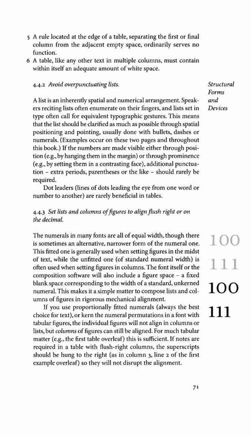
5 A rule located at the edge of a table, separating the first or final column from the adjacent empty space, ordinarily serves no function.
6 A table, like any other text in multiple columns, must contain within itself an adequate amount of white space.
442 Avoid overpunctuating lists.
A list is an inherently spatial and numerical arrangement. Speak-ers reciting lists often enumerate on their fingers, and lists set in type often call for equivalent typographic gestures. This means that the list should be clarified as much as possible through spatial positioning and pointing, usually done with bullets, dashes or numerals. (Examples occur on these two pages and throughout this book.) If the numbers are made visible either through posi-tion (e.g., by hanging them in the margin) or through prominence (e.g., by setting them in a contrasting face), additional punctua-tion - extra periods, parentheses or the like - should rarely be required.
Dot leaders (lines of dots leading the eye from one word or number to another) are rarely beneficial in tables.
443 Set lists and columns of figures to align flush right or on the decimal.
The numerals in many fonts are all of equal width, though there is sometimes an alternative, narrower form of the numeral one. This fitted one is generally used when setting figures in the midst of text, while the unfitted one (of standard numeral width) is often used when setting figures in columns. The font itself or the composition software will also include a figure space - a fixed blank space corresponding to the width of a standard, unkerned numeral. This makes it a simple matter to compose lists and col-umns of figures in rigorous mechanical alignment.
If you use proportionally fitted numerals (always the best choice for text), or kern the numeral permutations in a font with tabular figures, the individual figures will not align in columns or lists, but columns of figures can still be aligned. For much tabular matter (e.g., the first table overleaf) this is sufficient. If notes are required in a table with flush-right columns, the superscripts should be hung to the right (as in column 3, line 2 of the first example overleaf) so they will not disrupt the alignment.
71
Structural Forms and Devices
100 111 100 111
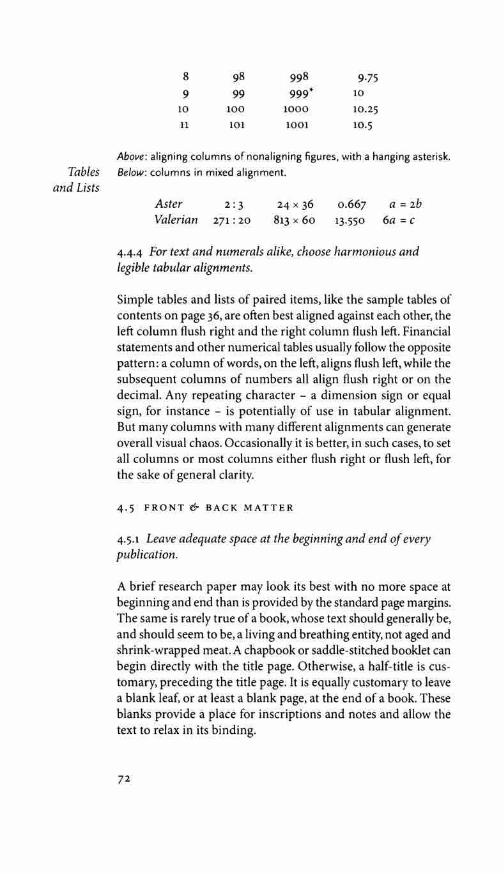
8 9
10 11
98 99
100 101
998 999*
1000 1001
9.75 10 10.25 10.5
Above: aligning columns of nonaligning figures, with a hanging asterisk. Tables Below: columns in mixed alignment.
and Lists Aster 2: 3 24 x 36 0.667 a = 2b Valerian 271 : 20 813 x 60 13.550 6a = c
4-4-4 For text and numerals alike, choose harmonious and legible tabular alignments.
Simple tables and lists of paired items, like the sample tables of contents on page 36, are often best aligned against each other, the left column flush right and the right column flush left. Financial statements and other numerical tables usually follow the opposite pattern: a column of words, on the left, aligns flush left, while the subsequent columns of numbers all align flush right or on the decimal. Any repeating character - a dimension sign or equal sign, for instance - is potentially of use in tabular alignment. But many columns with many different alignments can generate overall visual chaos. Occasionally it is better, in such cases, to set all columns or most columns either flush right or flush left, for the sake of general clarity.
4.5 FRONT & BACK MATTER
4.5.1 Leave adequate space at the beginning and end of every publication.
A brief research paper may look its best with no more space at beginning and end than is provided by the standard page margins. The same is rarely true of a book, whose text should generally be, and should seem to be, a living and breathing entity, not aged and shrink-wrapped meat. A chapbook or saddle-stitched booklet can begin directly with the title page. Otherwise, a half-title is cus-tomary, preceding the title page. It is equally customary to leave a blank leaf, or at least a blank page, at the end of a book. These blanks provide a place for inscriptions and notes and allow the text to relax in its binding.
72

4.5.2 Give adequate space to the prelims.
A text preceded by an interminable chain of forewords, prefaces, introductions and prologues is unlikely to be read. But a dedica-tion that is stuffed, like a typographic afterthought, onto an already overfilled copyright page is no dedication at all. And a list of contents which is incomplete (or missing altogether), and which does not have the page to itself, is usually a sign of typographic desperation or of disregard for the reader.
4.5.3 Balance the front and back matter.
Books are normally built up from gatherings or signatures -printed and folded sheets - with each signature forming a unit of 8, 12, 16, 24 or 32 pages. The 16-page signature is by far the most common. Typographers therefore work to make most of their books seem divinely ordained and conceived to be some multiple of 16 pages in length. Seasoned book typographers recite in their meditations not only the mantra of points and picas - 12, 24, 36, 48, 60, 72 ... - but also the mantra of octavo signatures: 16, 32, 48, 64, 80, 96, 112, 128, 144, 160, 176, 192, 208, 224, 240, 256, 272, 288, 304, 320, 336, 352, 368, 384, 400 .... These are the lengths of the books that we read.
In a work of continuous prose, the illusion of divine love for the number sixteen is obtained by straightforward copyfitting. If the length of the text is accurately measured, the page can be designed to yield a book of appropriate length. More compli-cated books are often surrounded by paraphernalia - not only the standard half-title, title page, copyright page, dedication page and some blanks, but also perhaps a detailed table of contents, a list of charts, illustrations and maps, a table of abbreviations, a page or two of acknowledgements, and a preface, counterbal-anced by appendices, endnotes, bibliography, index and a colo-phon. Copyfitting the main text for a volume of this kind may be highly complex, and room may be taken up or conserved in the large aura of front and back matter. But for complex books and simple books alike, it is up to the typographer to balance the front matter, back matter and text. A wad of blank leaves at the end of a book is a sign of carelessness, not of kindliness toward readers who like to take notes.
73
Structural Forms and Devices
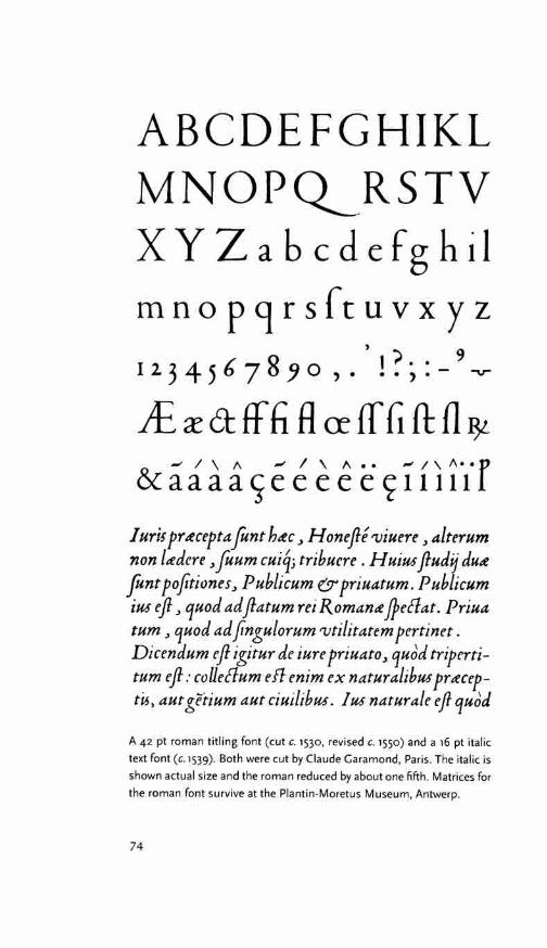
ABCDEFGHIKL MNOPQ_RSTV XYZabcdefghil mnopqrsfruvxyz
' 6 8 ,) .. 9 12 345 7 , ... ,.-.,.,...
i£ fffi R er lf G ft f1 & a a a a e e e e e c; 1111·1 r
I uri5 prttcepta font httc, H onefte 'Viuere, alterum non lttdere, Juum cui4; tribuere . H uiU! ftudij dutt fantpojitiones, Publicum & priuatum. Publicum iU! eft, quod ad ftatum rei Romantt JfeClat. Priua tum, quod ad jingulorum 'Vtilitatem pertinet. Dicendum eft igitur de iure priuato, qu6d triperti-tum eft: colleClum eff enim ex naturalibU! prttcep-
aut %/'tium aut ciuilibU!. I U! naturale ejl qu6d
A 42 pt roman titling font (cut c. 1530, revised c. 1550) and a 16 pt italic text font (c. 1539). Both were cut by Claude Garamond, Paris. The italic is shown actual size and the roman reduced by about one fifth. Matrices for the roman font survive at the Plantin-Moretus Museum, Antwerp.
74

CHOOSING & COMBINING TYPE
6.1 TECHNICAL CONSIDERATIONS
6.i.1 Consider the medium for which the typeface was originally designed.
Typographic purists like to see every typeface used with the tech-nology for which it was designed. Taken literally, this means that virtually all faces designed before 1950 must be set in metal and printed letterpress, and the majority must be set by hand. Most typographers apply this principle in a more relaxed and complex way, and settle for preserving something rather than everything of a type's original character.
On the technical side, several things can be done to increase the chance that a letterpress typeface will survive translation to digital composition and offset printing.
6.i.2 When using digital adaptations of letterpress faces, choose fonts that are faithful to the spirit as well as the letter of the old designs.
Letterpress printing places the letterform into the paper, while offset printing lays it on the surface. Many subtle differences re-sult from these two approaches to printing. The letterpress adds a little bulk and definition to the letter, especially in the thin strokes, and increases the prominence of the ends of thin serifs. Metal typefaces are designed to take advantage of these features of letterpress printing.
On the offset press - and in the photographic procedures by which camera-ready art and offset printing plates are prepared
6
_ thin strokes tend to get thinner and the ends of delicate serifs I li• are eaten away. In a face like Bembo, for instance, offset printing tends to make features like the feet of i and I, and the heads and feet of H and I, slightly convex, while letterpress printing tends to make them slightly concave.
Faces designed for photographic manipulation and offset printing are therefore weighted and finished differently from letterpress designs. And adapting a letterpress face for digital composition is a far from simple task.
93

Digital fonts poorly translated from metal originals are some-times too dark or light or blunt throughout, or uneven in stroke weight, or faithless in their proportions. They sometimes lack text figures or other essential components of the original design. But digital translations can also be too faithful to the original. They sometimes neglect the subtle adjustments that the shift
Technical from three-dimensional letterpress to two-dimensional offset Consider- printing requires.
ations
aa aa
Ir aa aa
6.i.3 Choose faces that will survive, and if possible prosper, under the final printing conditions.
Bembo and Centaur, Spectrum and Palatino, are subtle and beau-tiful alphabets, but if you are setting 8 pt text with a laser printer on plain paper at 300 dpi, the refined forms of these faces will be rubbed into the coarse digital mud of the imaging process. If the final output will be 14 pt text set directly to plate at 2800 dpi, then printed by good offset lithography on the best coated paper, every nuance may be crystal clear, but the result will still lack the character and texture of the letterpress medium for which these faces were designed.
Some of the most innocent looking faces are actually the most difficult to render by digital means. Optima, for example - an unserifed and apparently uncomplicated face - is (in its authentic form) entirely constructed of subtle tapers and curves that can be adequately rendered only at the highest resolutions.
Faces with blunt and substantial serifs, open counters, gentle modeling and minimal pretensions to aristocratic grace stand the best chance of surviving the indignities oflow resolution.Amasis, Caecilia, Lucida Sans, Stone and Utopia, for example, while they prosper at high resolutions, are faces that will also survive under cruder conditions lethal to Centaur, Spectrum, Linotype Di dot or almost any version of Bodoni.
6.1.4 Choose faces that suit the paper you intend to print on, or paper that suits the faces you wish to use.
Most Renaissance and Baroque types were made to be pressed into robust, lively papers by fairly robust means. They wilt when placed on the glossy, hard-surfaced sheets that came into vogue toward the end of the eighteenth century. Most Neoclas-sical and Romantic types, on the other hand, were designed to
94

require smooth papers. Rough, three-dimensional papers break their fragile lines. Geometric Modernist types such as Futura, and overhauled Realist types such as Helvetica, can be printed on rough and smooth papers alike, because they are fundamen-tally monochrome. (That is to say, the stroke is nearly uniform in width.) But the aura of machine precision that emanates from a type like Futura is reinforced by a smooth paper and contradicted (or counterbalanced) by a paper that feels homespun.
6.2 PRACTICAL TYPOGRAPHY
6.2.1 Choose faces that suit the task as well as the subject.
You are designing, let us say, a book about bicycle racing. You have found in the specimen books a typeface called Bicycle, which has spokes in the 0, an A in the shape of a racing seat, a T that resembles a set of racing handlebars, and tiny cleated shoes perched on the long, one-sided serifs of ascenders and descend-ers, like pumping feet on the pedals. Surely this is the perfect face for your book?
Actually, typefaces and racing bikes are very much alike. Both are ideas as well as machines, and neither should be burdened with excess drag or baggage. Pictures of pumping feet will not make the type go faster, any more than smoke trails, pictures of rocket ships or imitation lightning bolts tied to the frame will improve the speed of the bike.
The best type for a book about bicycle racing will be, first of all, an inherently good type. Second, it will be a good type for books, which means a good type for comfortable long-distance reading. Third, it will be a type sympathetic to the theme. It will probably be lean, strong and swift; perhaps it will also be Italian. But it is unlikely to be carrying excess ornament or freight, and unlikely to be indulging in a masquerade.
6.2.2 Choose faces that can furnish whatever special effects you require.
If your text includes an abundance of numerals, you may want a face whose numerals are especially well designed. Palatino, Pon-tifex, Trump Mediaval and Zapf International, for example, all recommend themselves. If you prefer three-quarter-height lining numerals, your options include Bell, Trajanus and Weiss.
95
The types associated with these historical categories are epitomized on pp 12-15 and explored in more detail in chapter 7.

Practical Typography
If you need small caps, faces that lack them (such as Frutiger and Meridien) are out of the running. If you need a range of weights, Spectrum is disqualified but Frutiger may work. If you need matching phonetics, your options include Stone Serif and Sans, Lucida Sans, and Times Roman. For the sake of a match-ing Cyrillic, you might choose Charter, Minion, Lazurski, Offi-cina, Quadraat, Warnock, or, among the unserifed faces, Syntax, Myriad or Futura. For the sake of a matching Greek, you might choose Georgia or Palatino, or for the sake of a matching Chero-kee, Plantagenet. To obtain a perfectly mated sanserif, you might choose Haarlemmer, Legacy, Lucida, Le Monde, Officina, Quad-raat, Scala, Seria or Stone. These matters are explored in more de-tail in chapter 11, which addresses individual typefaces.
Special effects can also be obtained through more unorthodox combinations, which are the subject of §6.5.
6.2.3 Use what there is to the best advantage.
If there is nothing for dinner but beans, one may hunt for an onion, some pepper, salt, cilantro and sour cream to enliven the dish, but it is generally no help to pretend that the beans are really prawns or chanterelles.
When the only font available is Cheltenham or Times Ro-man, the typographer must make the most of its virtues, limited though they may be. An italic, small caps and text figures will help immensely if they can be added, but there is nothing to be gained by pretending that Times Roman is Bembo or Cheltenham is Aldus in disguise.
As a rule, a face of modest merits should be handled with great discretion, formality and care. It should be set in modest sizes (better yet, in one size only) with the caps well spaced, the lines well leaded, and the lower case well fitted and modestly kerned. The line length should be optimal and the page impec-cably proportioned. In short, the typography should be richly and superbly ordinary, so that attention is drawn to the quality of the composition, not to the individual letterforms. Only a face that warrants close scrutiny should be set in a form that invites it.
Using what there is to best advantage almost always means using less than what is available. Baskerville, Helvetica, Palatino and Times Roman, for example - which are four of the most widely available typefaces - are four faces with nothing to offer
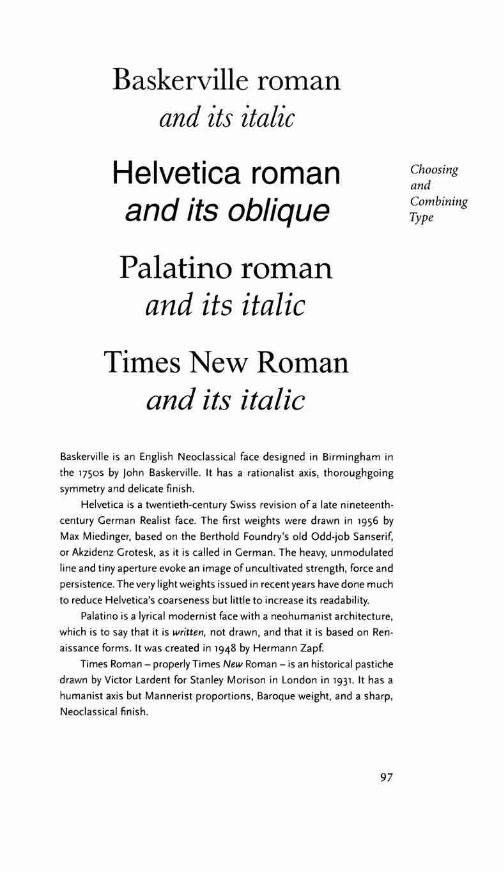
Baskerville roman and its italic
Helvetica roman and its oblique
Palatino roman and its italic
Times New Roman and its italic
Baskerville is an English Neoclassical face designed in Birmingham in the 1750s by john Baskerville. It has a rationalist axis, thoroughgoing symmetry and delicate finish.
Helvetica is a twentieth-century Swiss revision of a late nineteenth-century German Realist face. The first weights were drawn in 1956 by Max Miedinger, based on the Berthold Foundry's old Odd-job Sanserif, or Akzidenz Grotesk, as it is called in German. The heavy, unmodulated line and tiny aperture evoke an image of uncultivated strength, force and persistence. The very light weights issued in recent years have done much to reduce Helvetica's coarseness but little to increase its readability.
Palatino is a lyrical modernist face with a neohumanist architecture, which is to say that it is written, not drawn, and that it is based on Ren-aissance forms. It was created in 1948 by Hermann Zapf.
Times Roman - properly Times New Roman - is an historical pastiche drawn by Victor Lardent for Stanley Morison in London in 193i. It has a humanist axis but Mannerist proportions, Baroque weight, and a sharp, Neoclassical finish.
97
Choosing and Combining Type

one another except public disagreement. None makes a good companion face for any of the others, because each of them is rooted in a different concept of what constitutes a letterform. If the available palette is limited to these faces, the first thing to do is choose one for the task at hand and ignore the other three.
Historical 6.3 HISTORICAL CONSIDERATIONS Consider-
ations Typography, like other arts, preys on its own past. It can do so with the callousness of a grave robber, or with the piety of unquestion-ing ancestor worship. It can also do so in thoughtful, enlightened and deeply creative ways.
abc abc
Roman type has been with us for more than five centuries. Its root components - the roman upper and lower case, basic analphabetic symbols, and the arabic numerals - have been with us for much longer yet. There are typographers who resolutely avoid using any typeface designed in an earlier era, but even they must learn something of how the older letterforms functioned, because the ancient forms are living in the new. Typographers who willingly use the old faces, and who wish to use them intelligently, need to know all they can learn about the heritage they enjoy.
6.3.1 Choose a face whose historical echoes and associations are in harmony with the text.
Any contemporary library will furnish examples of typographic anachronism. There are books on contemporary Italy and on seventeenth-century France set in typefaces such as Baskerville and Caslon, cut in eighteenth-century England. There are books about the Renaissance set in faces that belong to the Baroque, and books about the Baroque set in faces from the Renaissance. To a good typographer it is not enough merely to avoid these kinds of laughable contradictions. The typographer seeks to shed light on the text, to generate insight and energy, by setting every text in a face and form in which it actually belongs.
It is not that good typographers object to mixing centuries and cultures. Many take delight in doing so - especially when they have no other choice. A text from ancient Athens, for example, cannot be set in an ancient Athenian version of roman type. A face designed in North America in the 1990s may well be used instead. Texts from seventeenth-century France or eighteenth-

century England also might be set perfectly well in faces of recent design. But a face that truly suits an historical text is likely to have some fairly clear historical content of its own. There is no typeface equally suited to texts from Greek antiquity, the French Baroque and the English Neoclassical period - though faces equally unsuited to each of them abound.
The historical affiliations of individual typefaces are discussed in chapters 7 and 11.
6.3.2 Allow the face to speak in its natural idiom.
Books that leap historical boundaries and mix historical subjects can pose complex and exciting typographic problems. But often, if a text calls for a Renaissance type, it calls for Renaissance typog-raphy as well. This usually means Renaissance page proportions and margins, and an absence of bold face. It may also mean large Renaissance versals, Renaissance style in the handling of quota-tions, and the segregation of roman and italic. If the text calls for a Neoclassical type, it likewise often calls for Neoclassical page design. When you undertake to use an historical typeface, take the trouble to learn the typographic idiom for which it was intended. (Works of reference that may be useful in solving particular prob-lems are listed in the bibliography, page 357.)
6.4 CULTURAL & PERSONAL CONSIDERATIONS
641 Choose faces whose individual spirit and character is in keeping with the text.
Accidental associations are rarely a good basis for choosing a typeface. Books of poems by the twentieth-century Jewish Ameri-can poet Marvin Bell, for example, have sometimes been set in Bell type -which is eighteenth-century, English and Presbyterian - solely because of the name. Such puns are a private amusement for typographers; they also sometimes work. But a typographic page so well designed that it attains a life of its own will be based on real affinities, not on an inside joke.
Letterforms have character, spirit and personality. Typog-raphers learn to discern these features through years of working first-hand with the forms, and through studying and comparing the work of other designers, present and past. On close inspec-
99
Choosing and Combining Type
abc abc

aa aa aG
a
tion, typefaces reveal many hints of their designers' times and temperaments, and even their nationalities and religious faiths. Faces chosen on these grounds are likely to give more interesting results than faces chosen through mere convenience of availability or coincidence of name.
If, for example, you are setting a text by a woman, you might prefer a face, or several faces, designed by a woman. Such faces were rare or nonexistent in earlier centuries, but there are now a number to choose from. They include Gudrun Zapf-von Hesse's admirable Alcuin, Carmina, Diotima and Nofret families; Eliza-beth Friedlander's Elizabeth; Kris Holmes's Sierra and Lucida; Kris Holmes's and Janice Prescott Fishman's Shannon; Carol Twombly's handsome text face Chaparral and her titling faces Charlemagne, Lithos, Nueva and Trajan; Zuzana Licko's Journal and Mrs Eaves, and Ilse Schiile's Rhapsodie. For some purposes, one might also go back to the work of Elizabeth Colwell, whose Colwell Handletter, issued by ATF in 1916, was the first American typeface designed by a woman.
But perhaps a text by a French author, or a text dealing with France, might best be set in a French typeface, without regard to the gender of author or designer. The choices include Garamond, Jan non, Mendoza, Meridien, Vendome and many others, but even this abbreviated list covers considerable range. Garamond - of which there are many recent revivals - was designed in sixteenth-century Paris. It owes much to Italian forms and belongs to the world of Renaissance Catholicism. Jan non is equally elegant but nonconformist. It belongs to the Reformation rather than the Re-naissance, and its designer, Jean Jan non, was a French Protestant who suffered all his life from religious persecution. Vendome, designed by Frarn;:ois Ganeau, is a witty twentieth-century face much indebted to Jannon. Mendoza, designed in Paris in 1990, goes back to the tough humanist roots from which Garamond sprang. Meridien, from the 1950s, is more in touch with the sec-ular spirit of twentieth-century Swiss industrial design, yet it in-cludes a regal, even imperious, upper case and a very crisp and graceful italic. These five different faces invite additional differ-ences in page design, paper and binding as well as different texts, just as different musical instruments invite different phrasings, different tempi, different musical modes or keys.
Even nations such as Greece and Thailand, which have al-phabets of their own, share in a multinational tradition of type
100

Garamond roman and its italic
Jannon roman and its italic
Mendoza roman and its italic
Meridien roman and its italic
Vendome roman and its oblique
Stempel Garamond is the Stempel Foundry's replica of a text roman and italic designed by Claude Garamond (c. 1490-1561). (Compare the repro-ductions of some of Garamond's actual type on page 74.)
Monotype 'Garamond' 156 is a revival of a type designed by Jean Jan-non (1580-1658), the greatest typecutter of the French Baroque. Jannon's type was once misidentified as Garamond's and is still routinely sold under his name.
Mendoza was designed about 1990 by Jose Mendoza y Almeida. Adrian Frutiger's Meridien and Frarn;:ois Ganeau's Vend6me are products of the 1950s. Ganeau - who worked as a painter, sculptor and set designer more than as a typographer - based Vend6me on Jannon's letters, but moved them playfully in the direction of French Neoclassicism.
101
Choosing and Combining Type

design. Nevertheless, some typefaces seem more redolent of national character than others. Frederic Goudy, for example, is widely regarded as the most ebulliently American of all Ameri-can type designers. The sensitive typographer would not choose one of Goudy's faces to set, let us say, the text of the Canadian or Mexican constitution.
Cultural This subject is a lifelong study, and for serious typographers and Personal it is a lifelong source of discovery and delight. Here it is pursued
Consider- at greater length in chapter 11. Appendix o (page 333) is a cross-ations indexed list of type designers.
aAa a A a a A a a A a
6.5 THE MULTICULTURAL PAGE
Consistency is one of the forms of beauty. Contrast is another. A fine page, even a fine book, can be set from beginning to end in one type in one size. It can also teem with variety, like an equato-rial forest or a modern city.
6.5.1 Start with a single typographic family.
Most pages, and most entire documents, can be set perfectly well with only one family of type. But perhaps the page confronting you requires a chapter title, two or three levels of subheads, an epigraph, a text in two languages, block quotations within the text, a couple of mathematical equations, a bar graph, several explanatory sidenotes, and captions for photographs and a map. An extended type family, such as Legacy, Lucida, Quadraat, Seria or Stone, may provide sufficient resources even for this task. An-other possibility is Gerard Unger's comprehensive series known as Demos, Praxis and Flora - which is a family with no surname to unite it. Each of these series includes both roman and italic in a range of weights, matching serifed and unserifed forms, and other variations. If you restrict yourself to faces within the family, you can have variety and homogeneity at the same time: many shapes and sizes but a single typographic culture. Such an approach is well suited to some texts, poorly suited to others.
You can also, of course, mix faces at random, by drawing them out of a hat.
Between these two extremes is the wide arena of thoughtful mixing and matching, in which the typographic intelligence often does its most creative work and play.
102

6.5.2 Respect the integrity of roman, italic and small caps.
It has been the normal practice of type designers since the middle of the sixteenth century to offer text faces in the form of a matched triad, consisting of roman, italic and small caps. Because some of these marriages are more successful than others, it is wise to examine the roman and the italic both separately and together when choosing a text face.
There are several celebrated instances in which an italic de-signed by one artist has been happily and permanently married to another designer's roman. These matches always involve some redrawing (and the face that is most heavily redrawn is almost always the italic, which is the subsidiary and 'feminine' font in post-Renaissance typography). There are also instances in which a roman and its italic have been designed by the same artist many years apart. But casual liaisons, in which the roman of one family is paired momentarily with the italic of another, have little hope of success. Mixing small caps from one face with full caps from another is even less likely to succeed.
If you use type strictly in the Renaissance manner, treating the roman and italic as separate but equal, not mixing them on the line, you may find that greater latitude is possible. Jan van Krimpen's Lutetia italic mixes well with his later Romanee roman, for example, if the two are not too intimately combined. One is visibly more mature than the other, but they are close in color and structure, and they are patently the work of the same designer.
6.5.3 Consider bold faces on their own merits.
Choosing and Combining Type
The original boldface printing types are the blackletters used by Gutenberg in the 1440s. For the next two centuries, blackletter fonts were widely used not only in Germany but in France, Spain, E the Netherlands and England. (That is why blackletter fonts are occasionally sold in the USA as 'Olde English:)
Boldface romans, however, are a nineteenth-century inven-tion. Bold italic is even more recent, and it is hard to find a suc-cessful version designed before 1950. Bold romans and italics have been added retroactively to many earlier faces, but they are often simply parodies of the original designs.
Before using a bold weight, especially a bold italic, ask yourself whether you really need it at all. If the answer is yes, you may want
103

The Multicultural
Page
to avoid type families such as Bembo, Garamond or Baskerville, to which bold weights have been retroactively added but do not in fact belong. You might, instead, choose a twentieth-century family such as Apollo, No fret or Scala, in which a range of weights is part of the original design.
If your text face lacks a bold weight, you may also find an appropriate bold close by. Hermann Zapf's Aldus, for example, is a twentieth-century family on the Renaissance model, limited to roman, italic and small caps. But Aldus is a close cousin of the same designer's Palatino family, which does include a bold, and Palatino bold sits comfortably enough with Aldus text.
a aardvark; b balloon; 3 thruppence Aldus 16 pt roman and italic with Palatino 15 pt bold
Equally interesting results can often be obtained by reaching much farther afield. The normal function of boldface type is, after all, to contrast with the roman text. If the bold is used in small amounts, and bold and roman are not too intimately combined, a difference in structure as well as weight may be an asset. Under these conditions, a typographer is free to choose both roman and bold on their own merits, seeking basic compatibility rather than close genetic connection.
c chinstrap; d daffodil; 6 saxophone Sabon 16 pt roman and italic with Zapf International 15 pt demi bold
A text might be set in Sabon, for example, with Zapf Inter-national as a titling face and Zapf International demi or heavy for subheads and flags. Structurally, these are very different faces, with very different pedigrees. But Sabon has the calm and steady flow required for setting text, while Zapf International's vitality makes it a good face for titling - and this vitality persists even in the boldest weights. The bold weights of fonts that are closer in structure Sabon often look splayed and deformed.
Fifteenth-century typographers - Nicolas Jenson for example - rarely mixed fonts except when mixing languages. They loved an even page. Bold roman is therefore an appendage they did happily without. If, nevertheless, you were using one of the fine text faces
104

based on Jenson's single roman font and wanted to embellish it with bold, you might consider using Jenson's kind of bold. The only dark faces he cut were blackletters.
1Elevc elephant; fool filibuster; lvi phytogenic
Bruce Rogers's Centaur (here i6 pt) with Karlgeorg Hoefer's San Marco Choosing (12 pt). Centaur is based on the roman that Nicolas Jenson cut at Venice and in i469. San Marco is based on the rotundas he cut there in the i47os. Combining
6.5.4 Choose titling and display faces that reinforce the structure of the text face.
Titling faces, display faces and scripts can be chosen on much the same principles as bold faces. Incestuous similarity is rarely a ne-cessity, but empathy and compatibility usually are.A geometrically constructed, high-contrast face such as Bauer Bodoni, beautiful though it may be, has marginal promise as a titling face for a text set in Garamond or Bembo, whose contrast is low and whose structure is fundamentally calligraphic. (Bodoni mixes far more happily with Baskerville - of which it is not a contradiction but rather an exaggeration.)
6.5.5 Pair serifed and unserifed faces on the basis of their inner structure.
When the basic text is set in a serifed face, a related sanserif is frequently useful for other elements, such as tables, captions or notes. In complicated texts, such as dictionary entries, it may also be necessary to mix unserifed and serifed fonts on the same line. If you've chosen a family that includes a matched sanserif, your problems may be solved. But many successful marriages between serifed and unserifed faces from different families are waiting to be made.
Frutiger Meridien Univers Suppose your main text is set in Meridien - a serifed roman
and italic designed by Adrian Frutiger. It would be reasonable to look first of all among Frutiger's other creations for a related sanserif. Frutiger is a prolific designer of types, both serifed and
105
Type
The version of Frutiger used here is the recent revision known as Frutiger Next.
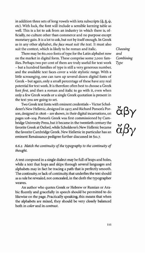
in addition three sets oflong vowels with iota subscripts (q., ft,¢, etc). With luck, the font will include a sensible kerning table as well. This is a lot to ask from an industry in which there is, of-ficially, no culture other than commerce and no purpose except monetary gain. It is a lot to ask, but not by itself enough. In Greek as in any other alphabet, the face must suit the text. It must also suit the context, which is likely to be roman and italic.
There may be 60,000 fonts of type for the Latin alphabet now on the market in digital form. These comprise some 7,000 fam-ilies. Perhaps two per cent of them are truly useful for text work - but a hundred families of type is still a very generous number, and the available text faces cover a wide stylistic range. With a little scrounging, one can turn up several dozen digital fonts of Greek - but again, only a small percentage of these have any real potential for text work. It is therefore often best to choose a Greek font first, and then a roman and italic to go with it, even when only a few Greek words or a single Greek quotation is present in the text you are going to set.
Two Greek text fonts with eminent credentials - Victor Schol-derer's New Hellenic, designed in 1927, and Richard Parson's Par-son, designed in 1806 - are shown, in their digital incarnations, on pages 108-109. Parson's Greek was first commissioned by Cam-bridge University Press, but it became in the twentieth century the favorite Greek at Oxford, while Scholderer's New Hellenic became the favorite Cambridge Greek. New Hellenic in particular has an eminent Renaissance pedigree further discussed in §11.7.
6.6.2 Match the continuity of the typography to the continuity of thought.
A text composed in a single dialect may be full ofleaps and holes, while a text that hops and skips through several languages and alphabets may in fact be tracing a path that is perfectly smooth. The continuity, or lack of continuity, that underlies the text should as a rule be revealed, not concealed, in the cloth the typographer weaves.
An author who quotes Greek or Hebrew or Russian or Ara-bic fluently and gracefully in speech should be permitted to do likewise on the page. Practically speaking, this means that when the alphabets are mixed, they should be very closely balanced both in color and in contrast.
111
Choosing and Combining Type
Uf3y

Mixing Alphabets
abyohi abyohi abyohi abyohi abyohi abyohi
Victor Scholderer's New Hellenic paired with Jose Mendoza's Mendoza (above), with Peter Matthias Noordzij's Caecilia (center) and with Adobe Jenson (below). Mendoza is a face with very low contrast (the thicks and thins are nearly the same). New Hellenic and Caecilia have an unmodu-lated stroke - in other words, no contrast at all. New Hellenic and Adobe Jenson have stylistic compatibility of a different kind. Both stem from the work of Nicolas Jenson, who in 1469 cut the father of this roman and in 1471 the grandfather of this Greek.
Flow and slope are other factors to consider, especially when balancing Latin and Greek. Many Greek text faces (the Porson and Didot Greeks for example) are structurally comparable to italics. That is, they are cursive. Some of them are upright none-theless (like the Didot), and some (like the Porson) slope. When roman, italic and Greek are combined on the page, the Greek may be upright like the roman, or it may harmonize with the italic in flow and slope. It may also stand aloof, with a gait and inclination of its own.
6.6.3 Balance the type optically more than mathematically.
Two other factors of importance when types sit side by side are their torso (x-height) and extension. When a long-limbed Greek is paired with a short-limbed Latin, the difference will stand out. Large disparities in x-height are far more obvious still. In metal, this is a harsh typographic constraint. In the digital medium, it is easy to match the torso of any Greek face to that of any Latin face exactly, through microscopic adjustments in size. But an optical, not mathematical, match is the goal. Classical Greek, beneath its cloud of diacritics, needs more room to breathe than roman type. And when setting Greek in footnotes, the minimum practical size is the size at which the accents are still legible.
112

HISTORICAL INTERLUDE
Printing from movable type was first invented not in Germany in the 1450s, as Europeans often claim, but in China in the 1040s. In preference to Gutenberg, we should honor a scholarly engineer by the name of Bi Sheng ( l- -ff-). The earliest surviving works printed in Asia from movable type seem to date from the thirteenth century, but there is a clear account of the typesetting process, and Bi Sheng's role in its development, by the eleventh-century essayist Shen Kuo.
The new technology reached Korea before the middle of the thirteenth century and Europe by the middle of the fifteenth. There it intersected the already long and fertile history of the roman letter. And there typesetting flourished as it had failed to do in China, because of the far smaller number of glyphs Euro-pean scripts required. Even at the end of the nineteenth century, most printing in China was done by the same method used in the eighth century to make the first printed books: entire pages of text were carved by hand into wooden printing plates. Cor-rections were made by drilling out the error, installing a wooden plug, and cutting the new characters. Text, in other words, was treated just like woodcut illustrations. To this day, a page of type is known in Chinese as hu6biin ( ;f, :f&.), "a living plank."
7.1 THE EARLY SCRIBAL FORMS
The earliest surviving European letterforms are Greek capitals scratched into stone. The strokes are bony and thin, almost ethe-real - the opposite of the heavy substance they are carved in. The letters are made primarily from straight lines, and when curved forms appear, they have a very large aperture. This means that forms like Sand C and M, which can be relatively open or rela-tively closed, are about as open as they can get. These early Greek letters were drawn freehand, not constructed with compasses and rule, and they have no serifs - neither the informal entry and exit strokes left by a relaxed and fluent writer, nor the symmetrical finishing strokes typically added to letters by a formal scribe.
In time, the strokes of these letters grew thicker, the aperture lessened, and serifs appeared. The new forms, used for inscrip-tions throughout the Greek empire, served as models for formal
119
7 Shen Kuii's account is contained in his Mengxl Bitan
"Dream Creek Essays:' For more information in English, see Denis Twitchett, Printing and Publishing in Medieval China (1983) and Thomas F. Carter, The Invention of Printing in China and Its Spread Westward, ind ed. (1955).

The Early
Scribal Forms
lettering in imperial Rome. And those Roman inscriptional letters - written with a flat brush, held at an angle like a broadnib pen, then carved into the stone with mallet and chisel - have served in their turn as models for calligraphers and type designers for the past two thousand years. They have a modest aperture, a modulated stroke (a stroke whose thickness varies with direction), and they have lively but full and formal serifs.
ABCS PQR Trajan, designed by Carol Twombly in i988, is based on the inscription at the base of Trajan's Column, Rome, carved in AD 113.
Between the Roman inscriptions and Gutenberg's time, there were many further changes in European letterforms. Narrow rus-tic capitals, wide uncials and other forms evolved. Writing spread to the farthest corners of Europe, and many regional scripts and alphabets arose. Monastic scribes - who were designers, copy-ists and archivists as well - kept many of the older letterforms alive. They used them for titles, subheads and initials, choosing newer and more compact scripts for running text. Out of this rich multiplicity of letters, a basic dichotomy evolved: majuscules and minuscules: large formal letters and smaller, more casual ones: the upper and lower case, as we call them now.
CAROLUS MAGNUS Caroline or Carolingian means of the time of the Emperor Cha.rlema.5ne: "Bis Charles"·
Carol Twombly's Charlemagne (above), Gudrun Zapf-von Hesse's Alcuin (center) and Gottfried Pott's Carolina (below) are typefaces based on Carolingian majuscules and minuscules from ninth- and tenth-century European manuscripts.
Many of the old scribal conventions survive in typesetting to-day. Titles are still set in large, formal letters; large initials mark the beginnings of chapters or sections; small capitals mark an opening phrase. The well-made page is now what it was then: a window into
120

history, language and the mind: a map of what is being said and a portrait of the voice that is silently speaking.
In the later Middle Ages and the early Renaissance, a well-trained European scribe might know eight or ten distinct styles of script. Each was defined as precisely as a typeface, stored like a font in the human memory, and each had certain uses. Sacred scriptures, legal documents, romance literature, business and per-sonal letters all required different scripts, and particular forms evoked specific languages and regions.
When the technology of movable type arrived, Europe was rich with Gothic, Byzantine, Romanesque and humanistic hands, and with a wealth of older letters. They are all still with us in some way, but the humanistic hand, based on the Carolingian minuscule, has become the central form: the roman lower case, evolving into a thousand variations, sports and hybrids, like the willow or the rose.
7.2 THE TYPOGRAPHIC LATIN LETTER
Several systems are in use for classifying typefaces. Some of them use fabricated terms such as 'garalde' and 'didone: Others rely on familiar but vague labels such as 'old style; 'modern' and 'transitional: All these systems work to a certain extent, but all leave much to be desired. They are neither good science nor good history.
Rigorously scientific descriptions and classifications of type-faces are certainly possible, and important research has been un-der way in this field for several years. Like the scientific study of plants and animals, the infant science of typology involves precise measurement, close analysis, and the careful use of technically descriptive terms.
But letterforms are not only objects of science. They also belong to the realm of art, and they participate in its history. They have changed over time just as music, painting and architecture have changed, and the same historical terms - Renaissance, Ba-roque, Neoclassical, Romantic, and so on - are useful in each of these fields.
This approach to the classification ofletterforms has another important advantage. Typography never occurs in isolation. Good typography demands not only a knowledge of type itself, but an understanding of the relationship between letterforms and the
121
Historical Interlude
The art history of Latin letter-forms is treated in greater detail in an incomplete series of essays in Serif maga-zine, issues 1-5 (1994-97).

other things that humans make and do. Typographic history is just that: the study of the relationships between type designs and the rest of human activity - politics, philosophy, the arts, and the history of ideas. It is a lifelong pursuit, but one that is informative and rewarding from the beginning.
The p.1 The Renaissance Roman Letter Typographic
Latin Letter
Renaissance roman letters developed among the scholars and scribes of northern Italy in the fourteenth and fifteenth cen-turies. Their translation from script to type began in Italy in 1465 and continued for more than a century. Like Renaissance painting and music, Renaissance letterforms are full of sensuous
abcefgnopj abcefgnopj abcefgnopj abcefgnopj
Four twentieth-century reconstructions of Renaissance roman typefaces. Centaur (top) was designed by the American typographer Bruce Rogers, Boston, c. i914, after Nicolas Jenson, Venice, i469. Bembo (second) was cut by Monotype, London, in i929, based on the design ofFrancesco Griffo, Venice, i499. Adobe Garamond (third) was designed by Robert Slimbach, San Francisco, i988, after Claude Garamond, Paris, c. i540. DTL Van den Keere (bottom) is Frank Blokland's reconstruction of a font cut for Chris-tophe Plantin by Hendrik van den Keere, Antwerp, in i575.
122

and unhurried light and space. They have served as typographic benchmarks for five hundred years.
The earliest surviving roman punches or matrices may well be Garamond's, cut in Paris in the 1530s. For earlier type, we have no evidence beyond the printed books themselves. The basic struc-ture and form of these early typefaces is clear beyond dispute, but in their subtlest details, all the existing replicas of fifteenth-century Italian type are hypothetical reconstructions.
Like Roman inscriptional capitals, Renaissance roman low-ercase letters have a modulated stroke (the width varies with direction) and a humanist axis. This means that the letters have the form produced by a broadnib pen held in the right hand in a comfortable and relaxed writing position. The thick strokes run Nw/sE, the axis of the writer's hand and forearm. The serifs are crisp, the stroke is light, and the contrast between thick strokes and thin strokes is generally modest.
In summary, the characteristics of the early Renaissance ro-man letter are these:
• stems vertical • bowls nearly circular • modulated stroke • consistent humanist axis • modest contrast • modest x-height • crisp, oblique head serifs (on letters such as b and r) • abrupt, flat or slightly splayed bilateral foot serifs (on letters such
as r, 1 and p) • abrupt, pen-formed terminals on a, c, f and r • rising crossbar in e, perpendicular to the stroke axis • the roman font is solitary (there is no italic or bold)
In later Renaissance forms (from 1500 on), the letterforms grow softer, smoother and more self-contained in subtle ways:
• head serifs become more wedge-shaped • foot serifs become adnate (flowing smoothly into the stem)
instead of abrupt • terminals of c, f and r become less abrupt and more lachrymal
(teardrop-shaped) • crossbar of e becomes horizontal
123
Historical Interlude

The Typographic
Latin Letter
7.2.2 The Renaissance Italic Letter
Rome is located in the midst of Italy. Why is roman type a category separate from italic? It seems a question to which typographers might possess the answer. But the question and the answer both have as much to do with politics and religion as with calligraphy and typography.
Roman type consists of two quite different basic parts. The upper case, which does indeed come from Rome, is based on Roman imperial inscriptions. The lower case was developed in northern Europe, chiefly in France and Germany, in the late Middle Ages, and given its final polish in Venice in the early Renaissance. Nevertheless, it too is Roman in the larger sense. While the roman upper case is a legacy of the Roman Empire, the lower case is a legacy of the Holy Roman Empire, the pagan empire's Christianized successor. It acquired its fundamental form at the hands of Christian scribes, many of them employed dur-ing the late eighth century as administrators and teachers by the Holy Roman Emperor Charlemagne.
Italic letterforms, on the other hand, are an Italian Renais-sance creation. Some early italics come from Rome, others from elsewhere in Italy, and when they were first converted to type, italics were still full of local flavor and freshness. But the earliest italic fonts, cut between 1500 and 1540, consist oflower case only. They were used with upright roman caps but not in conjunction with the roman lower case.
abcefgnopxyz abcefgnopxyz
Two revivals of Renaissance italic type. Monotype Arrighi (above) is de-rived from one of a series of italics designed by Frederic Warde, London and Paris, 1925-29, after Ludovico degli Arrighi, Rome, 1524. Monotype Bembo italic (below) was cut in London in 1929, based on the work of both Arrighi and Giovanantonio Tagliente, Venice, 1524.
124

The characteristics of the Renaissance italic letter can be summarized as follows:
• stems vertical or of fairly even slope, not exceeding 10°
• bowls generally elliptical • light, modulated stroke • consistent humanist axis • low contrast • modest x-height • cursive forms with crisp, oblique entry and exit serifs • descenders serifed bilaterally or not at all • terminals abrupt or lachrymal • italic lower case paired with small, upright roman capitals, and
with occasional swash capitals; italic otherwise fully indepen-dent of roman
Early Renaissance italics are known as A/dine italics, in honor of the scholar and publisher Aldus Manutius, who commissioned the first italic type from Francesco Griffo in 1499. Strange to say, in 2004, not a single authentic reconstruction of an Aldine italic appears to be on the market, in either metal or digital form. Monotype Bembo roman and Monotype Poliphilus are both based on Griffo's work, but their companion italics are not; they come from a different age. The digital italic nearest to an Aldine in design is Giovanni Mardersteig's Dante italic, but even this has sloped instead of upright capitals.
ZJ abefopabefop
Two recent typefaces in the Mannerist tradition. Poetica (above) is a chan-cery italic based on sixteenth-century models. It was designed by Robert Slimbach and issued by Adobe in i992. Galliard (below), designed by Matthew Carter, was issued by Linotype in i978. It is based on letterforms cut in the sixteenth century by Robert Granjon.
125
Historical Interlude
See page 210 for reproductions of two Aldine italics.
ae

The Typographic
Latin Letter
7.2.3 The Mannerist Letter
Mannerist art is Renaissance art to which subtle exaggerations - of length, angularity or tension, for example - have been added. Mannerist typographers, working chiefly in Italy and France early in the sixteenth century, began the practice of using roman and italic in the same book, and even on the same page - though rarely on the same line. It was also during the Mannerist period that sloped roman capitals were first added to the italic lower case.
There are many fine sixteenth-century examples of Manner-ist typefaces, including roman titling fonts with long, delicate ex-tenders, chancery italics with even longer and often ornamented extenders, and text faces with short extenders but increased ten-sion in the forms. Digital interpretations of a number of these faces have recently been made. Two significant examples - one ornate and one restrained - are shown overleaf.
abef opabefap abefopahefOp abefopabefop abefopabefap
Four revivals of Baroque typefaces. Monotype 'Garamond' (top) is based on fonts cut in France by Jean jannon, about 1621. DTL Elzevir (second) is based on fonts cut by Christoffel van Dijck at Amsterdam in the 1660s. Linotype Janson Text (third) is based on fonts cut by Miklos Kis, Amsterdam, about 1685. Adobe Caslon (bottom), by Carol Twombly, is based on faces cut by William Casi on, London, in the 1730s.
126

7.2-4 The Baroque Letter
Baroque typography, like Baroque painting and music, is rich with activity and takes delight in the restless and dramatic play of contradictory forms. One of the most obvious features of any Baroque typeface is the large variation in axis from one letter to the next. Baroque italics are ambidextrous: both right- and lefthanded. And it was during the Baroque that typographers first made a habit of mixing roman and italic on the same line.
In general, Baroque letterforms appear more modeled and less written than Renaissance forms. They give less evidence of the direct trace of the pen. Yet they take many different forms, and they thrived in Europe throughout the seventeenth century, endured through much of the eighteenth, and enjoyed an enthu-siastic revival during the nineteenth.
Baroque letterforms generally differ from Renaissance letters in the following ways:
• stroke axis of the roman and italic lower case varies widely within a single alphabet
• slope of italic averages 15° to 20° and often varies considerably within a single alphabet
• contrast increased • x-height increased • aperture generally reduced • further softening of terminals from abrupt to lachrymal • roman head serifs become sharp wedges • head serifs of italic ascenders become level and sharp
7.2.5 The Rococo Letter
The historical periods listed here - Renaissance, Baroque and so on - belong to all the arts, and they are naturally not limited, in typography, to roman and italic letters. Black.letter and script types passed through the same phases as well. But the Rococo period, with its love of florid ornament, belongs almost entirely to blackletters and scripts.
Roman and italic type was certainly used by Rococo typogra-phers, who often surrounded their texts with typographic orna-ments, engraved medallions, and so on. They produced a good deal of Rococo typography, but not much Rococo roman and italic type. Several romans and italics that might indeed be classified
127
Historical Interlude

The Typographic
Latin Letter
Though he was born and trained
in Germany, Fleischman
moved to the Netherlands
before his 30th birthday and
remained there the rest of his
life. Fleischmann is the German spelling of his
name; the Dutch form Fleischman
is the one he chose to use in
all his published specimens. The digital versions of Fleischman's
type, published in the Netherlands, were created by
the German type designer Erhard
Kaiser, who christened them
Fleischmann.
abcefgnopy CEFOTZ
abcefgnopy DTL Fleischmann. Note the ornate forms of g, y and several of the capitals, and the exaggerated contrast in italic o. This exaggerated contrast is typi-cal of the Romantic types cut by Firmin Didot and Giambattista Bodoni after Fleischman's death in 1768. But Romantic types have an obsessively vertical axis. The primary axis of Fleischman's type is oblique. Structurally, these letters belong to the Baroque. But their tendency to ornamentation and exaggeration sets them apart from earlier Baroque types. That is a reason for calling them Rococo.
as Rococo were, however, cut in Amsterdam in 1738-39 by the German-born punchcutter Johann Michael Fleischman. Digital versions of these fonts have recently been released by the Dutch Type Library in 's-Hertogenbosch.
7.2.6 The Neoclassical Letter
Generally speaking, Neoclassical art is more static and restrained than either Renaissance or Baroque art, and far more interested in rigorous consistency. Neoclassical letterforms follow this pat-tern. In Neoclassical letters, an echo of the broadnib pen can still be seen, but it is rotated away from the natural writing angle to a strictly vertical or rationalist axis. The letters are moderate in contrast and aperture, but their axis is dictated by an idea, not by the truth of human anatomy. They are products of the Rational-ist era: frequently beautiful, calm forms, but forms oblivious to the more complex beauty of organic fact. If Baroque letterforms are ambidextrous, Neoclassical letters are, in their quiet way, neitherhanded.
128

abef opabefop abef opabefop abef opabefop
Three twentieth-century revivals of Neoclassical letterforms. Above: Mono-type Fournier, which is based on types cut by Pierre Simon Fournier, Paris, about i740. Center: Monotype Baskerville, which is based on the designs of john Baskerville, Birmingham, about i754. Below: Monotype Bell, based on the types cut in London in i788 by Richard Austin for the typefounder and publisher john Bell.
The first Neoclassical typeface, known as the romain du roi or King's Roman, was designed in France in the 1690s, not by a typographer but by a government committee consisting of two priests, an accountant and an engineer. Other Neoclassical faces were designed and cut in France, England, Italy and Spain during the eighteenth and nineteenth centuries, and some of them have remained in continuous use throughout all subsequent changes of style and fashion.
The American printer and statesman Benjamin Franklin deeply admired the Neoclassical type of his English contemporary John Baskerville, and it is partly due to Franklin's support that Baskerville's type became more important in the United States and France than it ever was in Baskerville's native land. But the connection between Baskerville and America rests on more than Benjamin Franklin's personal taste. Baskerville's letters correspond very closely to the federal style in American architecture. They are as purely and unperturbably Neoclassical as the Capitol Building, the White House, and many another federal and state edifice. (The Houses of Parliament in London and in Ottawa, which are Neogothic instead of Neoclassical, call for typography of a different kind.)
129
Historical Interlude

The Typographic
Latin Letter
In brief, Neoclassical letterforms differ from Baroque letters as follows:
• predominantly vertical axis in both roman and italic • slope of italic generally uniform, averaging 14 ° to 16 ° • serifs generally adnate, but thinner, flatter, more level
7.2.7 The Romantic Letter
Neoclassicism and Romanticism are not sequential movements in European history. They marched through the eighteenth cen-tury and much of the nineteenth side by side: vigorously opposed in some respects and closely united in others. Both Neoclassical and Romantic letterforms adhere to a rationalist axis, and both look more drawn than written, but it is possible to make some precise distinctions between the two. The most obvious differ-ence is one of contrast. In Romantic letters we will normally find the following:
• abrupt modulation of the stroke • vertical axis intensified through exaggerated contrast • hardening of terminals from lachrymal to round • serifs thinner and more abrupt • aperture reduced
This remarkable shift in type design - like all structural shifts in type design - is the record of an underlying change in handwrit-ing. Romantic letters are forms from which the broadnib pen has vanished. In its place is the pointed and flexible quill. The broadnib pen produces a smoothly modulated stroke whose thickness varies with direction, but the pointed quill performs quite differently. The stroke of a flexible quill shifts suddenly from thin to thick to thin again, in response to changes in pressure. Used with restraint, it pro-duces a Neoclassical flourish. Used with greater force, it produces a more dramatic and Romantic one. Dramatic contrast, which is essential to much Romantic music and painting, is essential to Romantic type design as well.
Romantic letters can be extraordinarily beautiful, but they lack the flowing and steady rhythm of Renaissance forms. It is that rhythm which invites the reader to enter the text and read. The statuesque forms of Romantic letters invite the reader to stand outside and look at the letters instead.
130

abefopabefop abef opabefop abefopabefop abefop abefop
Four revivals of Romantic letterforms. Monotype Bulmer (top) is based on a series of fonts William Martin cut in London in the early 1790s. Linotype Didot (second), drawn by Adrian Frutiger, is based on fonts Firmin Didot cut in Paris between 1799 and 1811. Bauer Bodoni (third) is based on fonts cut by Giambattista Bodoni at Parma between 1803 and 1812. Berthold Walbaum (bottom) is based on types cut by Justus Erich Walbaum, Weimar, about 1805.
7.2.8 The Realist Letter
The nineteenth and twentieth centuries have entertained a be-wildering variety of artistic movements and schools - Realism, Naturalism, Impressionism, Expressionism, Art Nouveau, Art Deco, Constructivism, Cubism, Abstract Expressionism, Pop Art, Op Art, and many more. Virtually all of these movements have raised waves in the typographic world as well, though not all are important enough to merit a place in this brief survey. One of these movements - one which has not by any means yet expired - is typographic Realism.
The Realist painters of the nineteenth century - Gustave Courbet, Frarn;:ois Millet and many others - turned their backs on the subjects and poses approved by the academy. They set out instead to paint ordinary people doing their ordinary tasks. Realist type designers - Alexander Phemister, Robert Besley
131
Historical Interlude

The Typographic
Latin Letter
abcefgnop abcefgnop
Akzidenz Grotesk (above) is a Realist typeface issued by the Berthold Foundry, Berlin, in 1898. It is the immediate ancestor of Morris Benton's Franklin Gothic (1903) and of Helvetica, issued by the Haas Foundry in 1952. Haas Clarendon (below), designed in 1951 by Hermann Eidenbenz, is a revival of an earlier Realist face, the first Clarendon, cut by Benjamin Fox for Robert Besley, London, 1845.
and others, who have not achieved the posthumous fame of the painters - worked in a similar spirit. They made blunt and simple letters, based on the script of people denied the opportunity to learn to read and write with fluency and poise. Realist letters very often have the same basic shape as Neoclassical and Romantic letters, but most of them have heavy, slab serifs or no serifs at all. The stroke is often uniform in weight, and the aperture (often a gauge of grace or good fortune in typefaces) is tiny. Small caps, text figures and other signs of sophistication and elegance are almost always missing.
7.2.9 Geometric Modernism: The Distillation of Function
Early modernism took many intriguing typographic forms. One of the most obvious is geometric. The sparest, most rigorous architecture of the early twentieth century has its counterpart in the equally geometric typefaces designed at the same time, often by the same people. These typefaces, like their Realist predeces-sors, make no distinction between main stroke and serif. Their serifs are equal in weight with the main strokes or are missing altogether. But most Geometric Modernist faces seek purity more than populism. Some show the study of archaic inscriptions, and some include text figures and other subtleties, but their shapes owe more to pure mathematical forms - the circle and the line - than to scribal letters.
132

abcefgnop abcefgnop
Two Geometric Modernist typefaces. Futura (above) was designed in Ger-many 1n 1924-26 by Paul Renner. Memphis (below) was designed in 1929 by Rudolf Wolf, art director at the Stempel Foundry. The original design for Futura included text figures and many highly geometric, alternative characters which have never been issued in metal, though The Foundry (London) issued them in digital form in 1994·
abef opabefop abef opabefop abefopabefop abefopabefop
Four neohumanist or Lyrical Modernist typefaces. Spectrum (top) was designed by Jan van Krimpen in the Netherlands during the 1940s and issued by both Enschede and Monotype in 1952. Palatino (second) was designed by Hermann Zapf, Frankfurt, 1948. Dante (third) was designed by Giovanni Mardersteig, Verona, 1952. Pontifex (bottom) was designed by Friedrich Poppl, Wiesbaden, 1974· All but the last were originally cut by hand in steel, JUSt like Renaissance faces.
133
Historical Interlude

The Typographic
Latin Letter
7.2.10 Lyrical Modernism: The Rediscovery of Humanist Form
Another major phase of modernism in type design is closely allied with abstract expressionist painting. Painters in the twen-tieth century rediscovered the physical and sensory pleasures of painting as an act, and the pleasures of making organic instead of mechanical forms. Designers of type during those years were equally busy rediscovering the pleasures of writing letterforms rather than drawing them. In rediscovering calligraphy, they redis-covered the broadnib pen, the humanist axis and humanist scale of Renaissance letters. Typographic modernism is fundamentally the reassertion of Renaissance form. There is no hard line between modernist design and Renaissance revival.
7.2.11 The Expressionist Letter
In yet another of its aspects, typographic modernism is rough and concrete more than lyrical and abstract. Rudolf Koch, Vojtech Preissig and Oldfich Menhart are three designers who explored this path in the early part of the twentieth century. They are in some respect the typographic counterparts of expressionist pain-ters such as Vincent van Gogh and Oskar Kokoschka. More recent painters and type designers, such as Zuzana Licko, have proven that the genre is still richly productive.
Expressionist designers use many different tools. Koch and Preissig often cut their own letters in metal or wood. Menhart worked with a pen and rough paper. Licko has exploited the
a beef ghijop abef opabefop
Two Expressionist types - one Modernist and one Postmodern. Preissig (above) was designed in New York in i924 by the Czech artist Vojtech Preis-sig. It was cut and cast in Prague in i925. Zuzana Licko's journal (below) was designed in Berkeley in i990 and issued in digital form by Emigre.
134

harsh economies of digital plotting routines, slicing from control point to control point not with a knife, file or chisel but with digitized straight lines.
7.2.12 Elegiac Postmodernism
Modernism in type design has its roots in the study of history, the facts of human anatomy, and in the pleasures of calligraphy. Like the Renaissance itself, modernism is more than a phase or fad that simply runs its course and expires. It remains very much alive in the arts generally and in type design in particular, though it no longer seems the final word. In the last decades of the twentieth century, critics of architecture, literature and music - along with others who study human affairs - all perceived movements away from modernism. Lacking any proper name of their own, these movements have come to be called by the single term postmod-ernism. And postmodernism is as evident in the world of type design as it is in other fields.
Postmodern letterforms, like Postmodern buildings, fre-quently recycle and revise Neoclassical, Romantic and other premodern forms. At their best, they do so with an engaging lightness of touch and a fine sense of humor. Postmodern art is for the most part highly self-conscious, but devoutly unserious. Postmodern designers - who frequently are or have been Mod-ernist designers as well - have proven that it is possible to infuse Neoclassical and Romantic form, and the rationalist axis, with genuine calligraphic energy.
abef opabefop abefopabefop
Two Postmodern faces. Esprit (above) was designed by jovica Veljovic, Beograd, i985. Nofret (below) was designed by Gudrun Zapf-von Hesse, Darmstadt, i990. Both types sing, where many Postmodern faces merely screech. But the song is elegiac more than lyrical.
135
Historical Interlude

The Typographic
Latin Letter
abefopabefop abef opabefop
Two Geometric Postmodern faces: Triplex Sans (above) and Officina Serif (below). Triplex italic was designed by john Downer in 1985. Its companion romans - one with serifs, one without - were designed by Zuzana Licko in 1989-90, and the full menage a trois was issued in 1990 by Emigre. Officina (ITC, 1990) was designed by Erik Spiekermann. It has been issued in both serifed and unserifed versions.
7.2.13 Geometric Postmodernism
Some Postmodern faces are highly geometric. Like their predeces-sors the Geometric Modernist faces, they are usually slab-serifed or unserifed, but often they exist in both varieties at once or are hybrids of the two. They are rarely, it seems, based on the pure and simple line and circle, but almost always on more mannered, often asymmetric forms. And like other Postmodern types, they are rich with nostalgia for something premodern. Many of these faces are indebted to older industrial letterforms, including typewriter faces and the ubiquitous factory folk-art of North American highway signs. They recycle and revise not Romantic and Neoclassical but Realist ideas. To this industrial unpretentiousness, however, they often add not only Postmodern humor but also the fruits of typographic sophistication: text figures, small caps, large aperture, and subtle modeling and balancing of forms.
Postmodern art, like Neoclassical art, is above all an art of the surface: an art of reflections rather than visions. It has thrived in the depthless world of high-speed offset printing and digital design, where modernism starves. But the world of the scribes, in which the craft of type design is rooted, was a depthless world too. It was the world of the Gothic painters, in which everything is present in one plane. In that respect at least, postmodernism and modernism alike confront the basic task with which typography began. That is the task of answering in two (or little more than two) dimensions to a world that has many.

7.3 MECHANICAL TYPESETTING
7.3.1 The Linotype Machine
The Linotype machine, invented in the 1880s by Ottmar Mer-genthaler and much modified over the years, is a kind of cross between a casting machine, a typewriter, a vending machine and a backhoe. It consists of a series of slides, belts, wheels, lifts, vises, plungers and screws, controlled from a large mechanical keyboard. Its complex mechanism composes a line of matrices, justifies the line by sliding tapered wedges into the spaces be-tween the words, then casts the entire line as a single metal slug for letterpress printing.
Typeface design for the Linotype was restricted by three basic factors. First, kerning is impossible without special compound matrices. (The basic italic fin a Linotype font therefore always has a stunted head and tail.) Second, the em is divided into only 18 units, which discourages subtlety of proportion. Third, the italic and roman matrices are usually paired. In most faces, each italic letter must therefore have the same width as its counterpart in roman.
A number of typefaces designed for the Linotype were artis-tically successful in spite of these constraints. Hermann Zapf's Aldus and Optima, Rudolph Ruzicka's Fairfield, Sem Hartz's Ju-liana, and W. A. Dwiggins's Electra, Caledonia and Falcon were all designed for the Linotype machine. Linotype Janson, adapted by Zapf in 1952 from the seventeenth-century originals of Miklos Kis, is another eminent success. Many Linotype faces have never-theless been modified in the course of digitization, to make use of the kerning capabilities of digital machines and restore the independent proportioning of roman and italic.
7.3.2 The Monotype Machine
In 1887, in competition with Mergenthaler, Tolbert Lanston cre-ated a machine that stamped individual letters in cold metal and assembled them into lines. This device was soon abandoned for another - built in 1900 by Lanston's colleague John Bancroft - that cast individual letters from molten metal rather than cold-stamping them. It was soon sold worldwide as the Mono-type machine. It is two machines in fact, a terminal and an out-put device, and in this respect resembles most computer-driven
137
For a detailed account of the growth of mechanized typesetting, see Richard E. Huss, The Development of Printers' Mechanical Typesetting Methods 1822-
1925 (1973).

Mechanical Typesetting
typesetting machines. But the Monotype terminal carries a large mechanical keyboard, including seven full alphabets as well as analphabetics. The keyboard punches holes in a paper tape, like a narrow player-piano roll, by driving pins with compressed air. The output device is the caster, which reads the paper tape by blowing more compressed air through the punched holes, then casts and assembles the letters.
The Monotype em, like the Linotype em, is divided into only 18 units, but italic and roman are independent in width, kerning is possible, and because the type remains in the form of separate letters, typeset lines can be further adjusted by hand. Characters larger than 24 pt are cast individually and left for hand assembly. In fact, the Monotype machine is a portable typefoundry as much as it is a composing machine - and it is increasingly used as such, even though its unit system imposes restrictions on letterform design, and it is incapable of casting in hard metal.
7.3.3 Two-Dimensional Printing
From the middle of the fifteenth century to the middle of the twentieth, most roman letters were printed by a technique rooted in sculpture. In this process, each letter is carved at actual size on the end of a steel punch. The punch is then struck into a matrix of softer metal, the matrix is fitted into a mold, and three-dimen-sional metal type is cast from an alloy of lead, tin and antimony. The cast letters are locked in a frame and placed in a printing press, where they are inked. Their image is then imprinted into the paper, producing a tactile and visual image. The color and sheen of the ink join with the smooth texture of crushed paper, recessed into the whiter and rougher fibers surrounding the letters and lines. A book produced by this means is a folding inscription, a flexible sculpture in low relief. The black light of the text shines out from within a well-printed letterpress page.
Renaissance typographers reveled in the physical depth and texture they could achieve by this method of printing. Neoclassi-cal and Romantic printers, like Baskerville, often took a different view. Baskerville printed his sheets by letterpress - since he had no other method - but then had them ironed like laundry to remove the sculptural tinge.
With the development of lithography, at the end of the eighteenth century, printing moved another step back toward the two-dimensional world of the medieval scribes. Since the
138

middle of the twentieth century, most commercial printing has been by two-dimensional means. The normal method is offset photolithography, in which a photographic or digital image is etched into a plate, inked, offset to a smooth intermediary blanket, then laid flat on the surface of the page.
In the early days of commercial offset printing, type was still set with Linotype or Monotype machines. Proofs were pulled in a letterpress, then cut, pasted and photographed. Type designers saw their work altered by this process. Most letters designed to be printed in three dimensions look weaker when printed in two. But other letters prospered: geometric letters, which evoked the world of the draftsman rather than the goldsmith, and flowing letters recalling the heritage of the scribe.
7-3-4 Phototype Machines
Light flashes through the image of a letter carried on glass or photographic film; the size of the letter is altered with a lens; its target location is fixed by a mirror, and it is exposed like any other photographic image onto photosensitive paper or film. Machines that operate on this principle are the natural children of the cam-era and the offset press. They were designed and patented in the 1890s and in regular use for setting titles and headlines by 1925, though it was not until the 1960s that they came to dominate the trade.
Just as the sophistication and subtlety of handset type seemed at first to be swept aside when composing machines appeared, so the sophistication slowly achieved with Linotype and Monotype machines seemed to be swept aside by this new technological wave. The photosetters were fast, but they knew nothing of subtle changes in proportion from size to size. Their fonts lacked liga-tures, text figures and small caps. American-made fonts lacked even the simplest accented characters. The choice of faces was poor. And with the sudden, widespread use of these complex but simplistic machines came the final collapse of the old craft system of apprenticeships and guilds.
Phototypesetting machines and their users had only begun to answer these complaints when digital equipment arrived to replace them. Some excellent faces were designed for phototype machines - from Adrian Frutiger's Apollo (1962) to Bram de Does's Trinite (1982) - but in retrospect, the era of phototype seems only a brief interregnum between hot metal and digital
139
Historical Interlude

Mechanical Typesetting
aa aa aa
composition. The important innovation of the period was not, after all, the conversion of fonts from metal to film, but the intro-duction of microcomputers to edit, compose and correct the text and to drive the last generations of photosetting machines.
7.3.5 Historical Recutting and Twentieth-Century Design
New typefaces have been designed in vast numbers in the past hundred years, and many old ones have been resuscitated. From 1960 to 1980, most new types and revivals were designed for pho-tosetting, and since 1980, almost all have been planned for digital composition. But most of the older faces now sold in digital form have already passed through another stylistic filter. They were recut in the early twentieth century, either as foundry type or as matrices for the Monotype or Linotype machines. Typography was radically reformed between 1920 and 1950, through the com-mercial reinvention of typographic history. It is worth looking back at this process to see something of what went on, because its legacy affects us still.
Two separate companies - one based in England, one in America - rose up around the Monotype machine and followed two quite separate development programs. The English company, advised during its heyday by a scholar named Stanley Morison, cut a series of facsimiles based on the work of Francesco Griffo, Giovanantonio Tagliente, Ludovico degli Arrighi and other early designers. It was Morison who conceived the idea of turning in-dependent Renaissance faces into families by mating one design-er's roman with another's formerly self-sufficient italic. The fruits of this enterprise included Poliphilus and Blado (one of Griffo's romans mated with an altered version of one of Arrighi's italics), Bembo (a later version of the same roman, paired with an altered version of one of Tagliente's italics), and the brilliantly successful shotgun marriage of Centaur roman (designed by Bruce Rog-ers) with the Arrighi italic (designed by Frederic Warde). This program was supplemented by commissioning new faces from artists such as Eric Gill, Alfred Fairbank, Jan van Krimpen and Berthold Wolpe.
Lanston Monotype, as the American company was called, made some historical recuttings of its own and issued many new and historically based faces designed by its own advisor, Fred-eric Goudy. A third campaign to recreate typographic history in

marketable form was mounted by Linotype, under the direction of the English master printer George William Jones.
Several of the larger typefoundries - including ATF (Ameri-can Type Founders) in the United States, Deberny & Peignot in France, Enschede in the Netherlands, Stempel in Germany and Grafotechna in Czechoslovakia - continued ambitious programs of their own, lasting in some cases into the 1980s. Revivals of faces by Claude Garamond, Miklos Kis and other early designers came from these foundries during the twentieth century, along with important new faces by such designers as Hermann Zapf, Jan van Krimpen, Adrian Frutiger, Oldfich Menhart and Hans Eduard Meier. Zapf's Palatino, which became the most widely used (and most widely pirated) face of the twentieth century, was cut by hand in steel and cast as a foundry type in the ancient way, in 1949-50, while phototype machines and a few cumbersome early computers were humming no great distance away.
The earlier history of type design is the history of forms made by individual artists and artisans who began their careers as apprentices and ended them as independent masters and small businessmen. The scale of the industry enlarged in the seventeenth and eighteenth centuries, and questions of fashion increasingly superseded questions of artistry. By the end of the nineteenth century, commercial considerations had changed the methods as well as the taste of the trade. Punches and matrices were increasingly cut by machine from large pattern letters, and calligraphic models were all but unknown.
The twentieth-century rediscovery of the history and prin-ciples of typographic form was not associated with any particular technology. It occurred among scholars and artists who brought their discoveries to fruition wherever they found employment: in typefoundries, typesetting-machine companies, art schools and their own small, independent studios.
Despite commercial pressures, the best of the old metal foundries, like the best of the new digital ones, were more than merely market-driven factories. They were cultural institutions, on a par with fine publishing houses and the ateliers of printmakers, potters, weavers and instrument makers. What made them so was the stature of the type designers, living and dead, whose work they produced - for type designers are, at their best, the Stradivarii of literature: not merely makers of salable products, but artists who design and make the instruments that other artists use.
141
Historical Interlude

Mechanical Typesetting
(J)
7.3.6 Digital Typography
It is much too soon to summarize the history of digital typog-raphy, but the evolution of computerized bitmapping, hinting and scaling techniques has proceeded very quickly since the development of the microchip at the beginning of the i97os. At the same time, the old technologies, freed from commercial duties, have by no means died. Foundry type, the Monotype, the Linotype and letterpress remain important artistic instruments, alongside brush and chisel, pencil, graver and pen.
Typographic style is founded not on any one technology of typesetting or printing, but on the primitive yet subtle craft of writing. Letters derive their form from the motions of the human hand, restrained and amplified by a tool. That tool may be as complex as a digitizing tablet or a specially programmed keyboard, or as simple as a sharpened stick. Meaning resides, in either case, in the firmness and grace of the gesture itself, not in the tool with which it is made.
7.4 THE PLURALITY OF TYPOGRAPHIC HISTORY
Every alphabet is a culture. Every culture has its own version of history and its own accumulation of tradition - and this chapter has dwelt on the recent history of one alphabet only. The Arabic, Armenian, Burmese, Cherokee, Cree, Cyrillic, Devanagari, Geor-gian, Greek, Gujarati, Hebrew, Japanese, Korean, Malayalam, Tamil and Telugu alphabets and syllabaries - to name only a few - have other histories of their own, in some cases every bit as intricate and long as - or longer than - the history of Latin letterforms. So, of course, has the logographic script of Chinese. These histo-ries have touched at certain points; at other points, they diverge. Here at the beginning of the twenty-first century, an unusual de-gree of convergence can be seen. But the challenge and excitement of multilingual typography still lies largely in the fact that differ-ent typographic histories momentarily share the page. Typogra-phers working with multiple alphabets are multiply blessed: with a chance to learn the cultural history as well as the typographic technicalities of every script concerned.
The histories of Greek and Cyrillic types are taken up more briefly in chapter 11, and the legacies of individual typefoundries are summarized briefly in appendix E, page 346.
142

SHAPING THE PAGE
A book is a flexible mirror of the mind and the body. Its overall 8 size and proportions, the color and texture of the paper, the sound it makes as the pages turn, and the smell of the paper, adhesive and ink, all blend with the size and form and placement of the type to reveal a little about the world in which it was made. If the book appears to be only a paper machine, produced at their own convenience by other machines, only machines will want to read it.
8.1 ORGANIC, MECHANICAL & MUSICAL PROPORTION
A page, like a building or a room, can be of any size and propor-tion, but some are distinctly more pleasing than others, and some have quite specific connotations. A brochure that unfolds and refolds in the hand is intrinsically different from a formal letter that lies motionless and flat, or a handwritten note that folds into quarters and comes in an envelope of a different shape and size. All of these are different again from a book, in which the pages flow sequentially in pairs.
Much typography is based, for the sake of convenience, on standard industrial paper sizes, from 35 x 45 inch press sheets to 31/2 x 2 inch conventional business cards. Some formats, such as the booklets that accompany compact discs, are condemned to especially rigid restrictions of size. But many typographic proj-ects begin with the opportunity and necessity of selecting the dimensions of the page.
There is rarely a free choice. A page size of 12 x 19 inches, for example, is likely to be both inconvenient and expensive because it is just in excess of 11 x 17, which is a standard industrial unit. And a brochure that is 5 x 9 inches, no matter how handsome, might be unacceptable because it is too wide to fit into a standard business envelope (4x9Yi). But when the realm of practicality has been established, and it is known that the page must fall within certain limits, how is one to choose? By taking whatever is easiest, or biggest, or whatever is the most convenient standard size? By trusting to blind instinct?
Instinct, in matters such as these, is largely memory in dis-guise. It works quite well when it is trained, and poorly otherwise.
143
Organic, Mechanical
and Musical Proportion
Two very useful works on natural
form and struc-ture are D'Arcy Thompson, On
Growth and Form (rev. ed.,
1942) and Peter S. Stevens, Patterns in Nature (1974).
An equally important book
on structures made by hu-
mans is Dorothy Washburn &
Donald Crowe, Symmetries of
Culture: Theory and Practice of
Plane Pattern Analysis (1988)
But in a craft like typography, no matter how perfectly honed one's instincts are, it is useful to be able to calculate answers ex-actly. History, natural science, geometry and mathematics are all relevant to typography in this regard - and can all be counted on for aid.
Scribes and typographers, like architects, have been shaping visual spaces for thousands of years. Certain proportions keep recurring in their work because they please the eye and the mind, just as certain sizes keep recurring because they are comfortable to the hand. Many of these proportions are inherent in simple geometric figures - equilateral triangle, square, regular pentagon, hexagon and octagon. And these proportions not only seem to please human beings in many different centuries and countries, they are also prominent in nature far beyond the human realm. They occur in the structures of molecules, mineral crystals, soap bubbles, flowers, as well as books and temples, manuscripts and mosques.
The tables on pages 148-149 list a number of page propor-tions derivable from simple geometric figures. These proportions occur repeatedly in nature, and pages that embody them recur in manuscripts and books from Renaissance Europe, Tang and Song dynasty China, early Egypt, precolumbian Mexico and ancient Rome. It seems that the beauty of these proportions is more than a matter of regional taste or immediate fashion. They are therefore useful for two purposes. Working and playing with them is a way of developing good typographic instincts, and they serve as useful references in analyzing old designs and calculating new ones.
For comparison, several other proportions are included in the tables. There are several simple numerical ratios, several standard industrial sizes, and several proportions involving four irrational numbers important in the analysis of natural structures and pro-cesses. These numbers are TI= 3.14159 .. ., which is the circumfer-ence of a circle whose diameter is one; {2 = 1.41421. . ., which is the diagonal of a unit square; e = 2.71828 .. ., which is the base of the natural logarithms; and cp = 1.61803 ... , a number discussed in greater detail on page 155. Certain of these proportions reappear in the structure of the human body; others appear in musical scales. Indeed, one of the simplest of all systems of page proportions is based on the familiar intervals of the diatonic scale. Pages that embody these basic musical proportions have been in common use in Europe for more than a thousand years.
144

Sizing and spacing type, like composing and performing music or applying paint to canvas, is largely concerned with intervals and differences. As the texture builds, precise relationships and very small discrepancies are easily perceived. Establishing the overall dimensions of the page is more a matter of limits and sums. In this realm, it is usually sufficient, and often it is better, if structural harmony is not so much enforced as implied. That is one of the reasons typographers tend to fall in love with books. The pages flex and turn; their proportions ebb and flow against the underlying form. But the harmony of that underlying form is no less important, and no less easy to perceive, than the harmony of the letterforms themselves.
The page is a piece of paper. It is also a visible and tangible proportion, silently sounding the thoroughbass of the book. On it lies the textblock, which must answer to the page. The two together - page and textblock - produce an antiphonal geometry. That geometry alone can bond the reader to the book. Or conversely, it can put the reader to sleep, or put the reader's nerves on edge, or drive the reader away.
Arithmetic and mathematics also drive away some readers, and this is a chapter peppered with both. Readers may well ask whether all this is necessary, merely in order to choose where some letters should sit on a piece of paper and where the paper itself should be trimmed. The answer, naturally, is no. It is not in the least necessary to understand the mathematics in order to perform the actions that the math describes. People walk and ride bicycles without mathematical analyses of these complex operations. The chambered nautilus and the snail construct per-fect logarithmic spirals without any need of logarithmic tables, sliderules or the theory of infinite series. The typographer likewise can construct beautiful pages without knowing the meaning of symbols liken or cp, and indeed without ever learning to add and subtract, ifhe has a well-educated eye and knows which buttons to push on the calculator and keyboard.
The mathematics are not here to impose drudgery upon any-one. On the contrary, they are here entirely for pleasure. They are here for the pleasure of those who like to examine what they are doing, or what they might do or have already done, perhaps in the hope of doing it still better. Those who prefer to act directly at all times, and to leave the analysis to others, may be content in this chapter to study the pictures and skim the text.
145
Shaping the Page
The textblock is known in Chinese as yexin (Jr .;; ), a useful phrase. Ye means page; xin means heart and mind.

Chromatic Scale
of Page Proportions
[] octave. 1 : 2
rnrn major 7th, 8 : 15 minor 7th, 9: 16
rnrn major 6th, 3 : 5 minor 6th, 5 : 8
rn DJ ITJ fifth. 2 : 3 dim. 5th/aug. 4th, 1 : {2 fourth, 3: 4
major 3rd, 4 : 5 minor 3rd, 5 : 6
major 2nd, 8 : 9 minor 2nd, 15 : 16
unison, 1: 1
Page proportions corresponding to the chromatic scale, from unison (at the bottom) to octave (at the top). The musical correlations are shown in detail on the facing page.
146
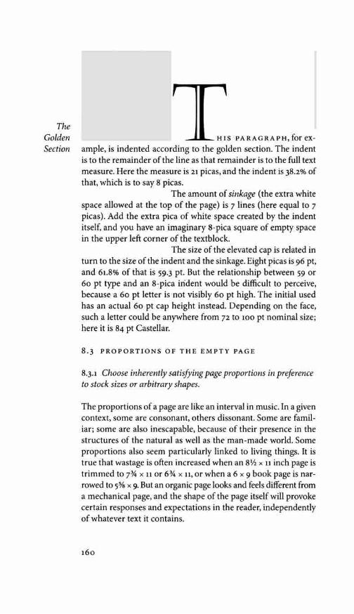
The Golden Section
Ts eARAGRAett,focex-ample, is indented according to the golden section. The indent is to the remainder of the line as that remainder is to the full text measure. Here the measure is 21 picas, and the indent is 38.2% of that, which is to say 8 picas.
The amount of sinkage (the extra white space allowed at the top of the page) is 7 lines (here equal to 7 picas). Add the extra pica of white space created by the indent itself, and you have an imaginary 8-pica square of empty space in the upper left corner of the textblock.
The size of the elevated cap is related in turn to the size of the indent and the sinkage. Eight picas is 96 pt, and 61.8% of that is 59.3 pt. But the relationship between 59 or 60 pt type and an 8-pica indent would be difficult to perceive, because a 60 pt letter is not visibly 60 pt high. The initial used has an actual 60 pt cap height instead. Depending on the face, such a letter could be anywhere from 72 to 100 pt nominal size; here it is 84 pt Castellar.
8.3 PROPORTIONS OF THE EMPTY PAGE
8.3.1 Choose inherently satisfying page proportions in preference to stock sizes or arbitrary shapes.
The proportions of a page are like an interval in music. In a given context, some are consonant, others dissonant. Some are famil-iar; some are also inescapable, because of their presence in the structures of the natural as well as the man-made world. Some proportions also seem particularly linked to living things. [t is true that wastage is often increased when an 8\12 x 11 inch page is trimmed to x 11 or 6% x 11, or when a 6 x 9 book page is nar-rowed to 5% x 9. But an organic page looks and feels different from a mechanical page, and the shape of the page itself will provoke certain responses and expectations in the reader, independently of whatever text it contains.
160
8.4 THE TEXTBLOCK
8-4.1 If the text is meant to invite continuous reading, set it in columns that are clearly taller than wide.
Horizontal motion predominates in alphabetic writing, and for beginners, it predominates in reading. But vertical motion predominates in reading for those who have really acquired the skill. The tall column of type is a symbol of fluency, a sign that the typographer does not expect the reader to have to puzzle out the words.
The very long and very narrow columns of newspapers and magazines, however, have come to suggest disposable prose and quick, unthoughtful reading. A little more width not only gives the text more presence; it implies that it might be worth savoring, quoting and reading again.
842 Shape the textblock so that it balances and contrasts with the shape of the overall page.
The proportions that are useful for the shapes of pages are equally useful in shaping the textblock. This is not to say that the pro-portions of the textblock and the page should be the same. They often were the same in medieval books. In the Renaissance, many typographers preferred a more polyphonic page, in which the proportions of page and textblock differ. But it is pointless for them to differ unless, like intervals in music, they differ to a clear and purposeful degree.
For all the beauty of pure geometry, a perfectly square block of type on a perfectly square page with even margins all around is a form unlikely to encourage reading. Reading, like walking, involves navigation - and the square block of type on a square block of paper is short of basic landmarks and clues. To give the reader a sense of direction, and the page a sense of liveliness and poise, it is necessary to break this inexorable sameness and find a new balance of another kind. Some space must be narrow so that other space may be wide, and some space emptied so that other space may be filled.
In the simple format shown overleaf, a page whose propor-tions are i : i.62 (the golden section) carries a textblock whose proportions are i : i.8 [ 5 : 9]. This difference constitutes a primary visual chord which generates both energy and harmony in the
Shaping the Page

page. It is supplemented by secondary harmonies created by the proportions of the margins and the placement of the textblock - not in the center of the page but high and toward the spine.
The textblock itself, in this example, is symmetrical, but it is placed asymmetrically on the page. The lefthand page is a mirror image of the right, but no mirror image runs the other way. The
The two-page spread is symmetrical horizontally - the direction in Textblock which the pages turn, either backward or forward, as the reader
consults the book - but it is asymmetrical vertically - the direc-tion in which the page stays put while the reader's eye repeatedly works its way in one direction: down.
This interlocking relationship of symmetry and asymmetry, and of balanced and contrasted shape and size, was not new when this example was designed (in Venice in 1501). The first European typographers inherited some two thousand years' worth of re-search into these principles from their predecessors, the scribes. Yet the principles are flexible enough that countless new typo-graphic pages and page-spreads wait to be designed.
Page spread, probably by Francesco Griffo, Venice, 1501. The text is Virgil's Aeneid, set entirely in a crisp, simple italic lower case, 12/12 x 16, with roman small capitals, approximately 5 pt high. The original page size is 10.7 x 17.3 cm.
8.5 MARGINS & SATELLITES
8.5.1 Bring the margins into the design.
In typography, margins must do three things. They must lock the textblock to the page and lock the facing pages to each other through the force of their proportions. Second, they must frame the text-block in a manner that suits its design. Third, they must protect the textblock, leaving it easy for the reader to see and convenient to handle. (That is, they must leave room for the reader's thumbs.) The third of these is easy, and the second is not difficult. The first is like choosing type: it is an endless opportunity for typographic play and a serious test of skill.
Perhaps fifty per cent of the character and integrity of a printed page lies in its letterforms. Much of the other fifty per cent resides in its margins.
8.5.2 Bring the design into the margins.
The boundaries of the textblock are rarely absolute. They are nibbled and punctured by paragraph indents, blank lines between sections, gutters between columns, and the sinkage of chapter openings. They are overrun by hanging numbers, outdented para-graphs or heads, marginal bullets, folios (page numbers) and often running heads, marginal notes and other typographic satellites. These features - whether recurrent, like folios, or unpredictable, like marginal notes and numbers - should be designed to give vitality to the page and further bind the page and the textblock.
8.5.3 Mark the reader's way.
Folios are useful in most documents longer than two pages. They can be anywhere on the page that is graphically pleasing and easy to find, but in practice this reduces to few possibilities: (1) at the head of the page, aligned with the outside edge of the text block (a common place for folios accompanied by running heads); (2) at the foot of the page, aligned with or slightly indented from the outside edge of the text; (3) in the upper quarter of the outside margin, beyond the outside edge of the text; (4) at the foot of the page, horizontally centered beneath the textblock.
The fourth of these choices offers Neoclassical poise but is not the best for quick navigation. Folios near the upper or lower outside
Shaping the Page

Margins and
Satellites
corner are the easiest to find by flipping pages in a small book. In large books and magazines, the bottom outside corner is generally more convenient for joint assaults by eye and thumb. Folios placed on the inner margin are rarely worth considering. They are invisible when needed and all too visible otherwise.
It is usual to set folios in the text size and to position them near the textblock. Unless they are very black, brightly colored or large, the folios usually drown when they get very far away from the text. Strengthened enough to survive on their own, they are likely to prove a distraction.
8.5.4 Don't restate the obvious.
In Bibles and other large works, running heads have been stan-dard equipment for two thousand years. Photocopying machines, which can easily separate a chapter or a page from the rest of a book or journal, have also given running heads (and running feet, or footers) new importance.
Except as insurance against photocopying pirates, running heads are nevertheless pointless in many books and documents with a strong authorial voice or a unified subject. They remain essential in most anthologies and works of reference, large or small.
Like folios, running heads pose an interesting typographic problem. They are useless if the reader has to hunt for them, so they must somehow be distinguished from the text, yet they have no independent value and must not become a distraction. It has been a common typographic practice since 1501 to set them in spaced small caps of the text size, or if the budget permits, to print them in the text face in a second color.
8.6 PAGE GRIDS & MODULAR SCALES
8.6.1 Use a modular scale if you need one to subdivide the page.
Grids are often used in magazine design and in other situations where unpredictable graphic elements must be combined in a rapid and orderly way.
Modular scales serve much the same purpose as grids, but they are more flexible. A modular scale, like a musical scale, is a prearranged set of harmonious proportions. In essence, it is a measuring stick whose units are indivisible (or are treated as
166

Improvisa-tions and
Adjustments
adjust the margins thereafter - paying more attention in the latter case to absolute proportion than to convenient units of measure-ment. When space is measured purely in points, the temptation to rearrange it into even picas is miraculously lessened.
8.8.3 Keep the page design supple enough to provide a livable home for the text.
Architects build perfectly proportioned kitchens, living rooms and bedrooms in which their clients will make, among other things, a mess. Typographers likewise build perfectly propor-tioned pages, then distort them on demand. The text takes pre-cedence over the purity of the design, and the typographic tex-ture of the text takes precedence over the absolute proportions of the individual page.
If, for instance, three lines remain at the end of a chapter, looking forlorn on a page of their own, the design must flex to accommodate them. The obvious choices are: (1) running two of the previous spreads a line long (that is, adding one line to the depth of two pairs of facing pages), which will leave the final page one line short; (2) running half a dozen of the previous spreads a line short, thereby bumping a dozen lines along to the final page; or (3) reproportioning some non-textual element - perhaps an illustration or the sinkage, if any, at the head of the chapter.
Spacious chapter heads stand out in a book, as they are meant to. Reproportioning the sinkage is therefore a poor option unless all chapter heads can be reproportioned to match. And running six spreads short is, on the face of it, clearly a greater evil than running two spreads long.
If there are only a few pages to the document, the whole thing can, and probably should, be redesigned to fit the text. But in a book of many pages, widow lines, orphaned subheads, and the runt ends of chapters or sections are certain to require repropor-tioning some spreads. A rigid design that demands an invariant page depth is therefore inappropriate for a work of any length. Altering the leading on short pages to preserve a standard depth (vertical justification, it is sometimes called) is not a solution. Neither is stuffing extra space between the paragraphs. These antics destroy the fabric of the text and thus strike at the heart of the book.

APPENDIX B: GLOSSARY OF CHARACTERS
There is, of course, no limit to the number of typographic char-acters. Still less is there a limit to the number of variant glyphs by which these characters are realized. This appendix lists characters included on standard ISO (PS-1, TrueType or OpenType) and pan-European (TTO or OpenType) Latin text fonts. It also lists a few additional characters of long-standing typographic importance. Unicode numbers are given in square brackets at the end of each entry. Some characters (especially diacritics) have more than one address in Unicode. As a rule, only one of these addresses is given here. Two addresses are given for characters (such as aesc) that occur in both the upper and lower case.
acute An accent used on vowels - a e i 6 u y re - in Czech, French, Gaelic, Hungarian, Icelandic, Italian, Navajo, Spanish and other languages, and on consonants - c n f s z - in Basque, Croatian, Polish and romanized Sanskrit. In romanized Chinese it is used with vowels and a nasal - a e i n 6 u u - to mark the rising tone. It is also used with Cyrillic consonants - f and K - in Macedonian, and with all the vowels in Greek. Upper- and lowercase versions of the basic six acute vowels appear on standard ISO Latin text fonts. Pan-European fonts usually include both upper- and lowercase forms of the basic five acute consonants and the old Icelandic vowel ce. The acute schwa(;}) and open o (5) and the Athapaskan high nasal vowels - 4 j 9 t} - are present only on specialized fonts. [ u + o 3 o l]
aesc This ligature is a letter of the alphabet in Danish, Norwe-gian, Anglo-Saxon and Old Norse, corresponding in part to the Swedish ii. It is also sometimes used (unnecessarily) in Latin. In English, words of Greek origin were formerly spelled with re cor-responding to Greek ai (alpha iota). Thus aesthetics in older texts is cesthetics. Deliberate archaism and pedantically correct quota-tion still, therefore, require the ligature even in English. Aesc (cesc in the older spelling) is pronounced ash. [u+ooc6, +ooE6]
ampersand A scribal abbreviation for and, dating back to Roman times. It takes many forms - eiJ & & & &c - all derived from the Latin word et. [u+oo26]
301
,
lE
&

< )
'
+ <+>
x +
angle brackets These useful characters are missing from most text fonts, but they are readily found on pi fonts and on some fonts of blackletter and Greek. They serve many functions in mathematical and scientific writing. In the editing of classi-cal texts, angle brackets are used to mark editorial additions while braces mark the editor's deletions. See also square brackets. (u+2329, +232A]
apostrophe Also called raised comma or single close-quote. A mark of elision in English, French, Italian and many other lan-guages. It grew from that use in English to become also a sign of the possessive. (It's = it is, but John's = Johnes =belonging to John.) A superimposed apostrophe (not to be confused with the acute) is the standard symbol in linguistics for a glottalized consonant: ill p q w, etc. As a matter of convenience, these symbols are often converted to consonants followed by normal apostrophes: m' p' q', etc. Apostrophized consonants of this sort are frequent in typog-raphy. The apostrophized d and t (d' and t', whose capital forms are D and t) are letters of the alphabet in Czech; so are I' and t in Slovak, while ch', k', k', l', s', t', ti', ts', x', their corresponding capitals (written with apostrophes, not carons) are letters of the alphabet in Tlingit. Used alone, the apostrophe often serves as a sign for the glottal stop. In Unicode, these functions are carefully distinguished. See also dumb quotes, glottal stop, palatal hook and quotation marks. [u+o2sc, +0313, +0315, +2019]
arch A diacritic used with vowels and one syllabic consonant - a e 16 u r (and the corresponding Cyrillic letters, a e fl o y p) - to mark the long falling tone in Serbo-Croatian. Though not employed in ordinary writing, these forms are used in teaching, in linguistics, and in some editions of metrical poetry. Few text fonts include either the arch or the composite glyphs in which it is used. Not to be confused with the circumflex, which is pointed. Also known as a dome or inverted breve. It has also been called a cap, which leads to confusion. [u+o311]
arithmetical signs Only eight basic signs,+ - ± x 7 < = >,are included in most text fonts. When other mathematical symbols, such as * = V = ..; .;;; ;;,, , are required, it is generally best to take all signs, including the basic ones, from the same technical font so that all forms match in color and size. [u+oo2B, +2212, +oos1, +0007, OOF7, 003c, 0030, 003E, &c.]
302
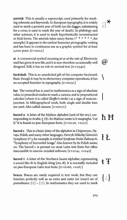
asterisk This is usually a superscript, used primarily for mark-ing referents and keywords. In European typography, it is widely used to mark a person's year of birth (as the dagger, substituting for a cross, is used to mark the year of death). In philology and other sciences, it is used to mark hypothetically reconstructed or fetal forms. The asterisk takes many forms ( * * * * * *, for example). It appears in the earliest Sumerian pictographic writing and has been in continuous use as a graphic symbol for at least 5,000 years. [u+oo2A]
at A commercial symbol meaning at or at the rate of Electronic mail has given it new life, and it is now therefore occasionally well designed. Still, it has no role in normal text. [u+o340]
backslash This is an unsolicited gift of the computer keyboard. Basic though it may be to elementary computer operations, it has no accepted function in typography. [u+oo5c]
bar The vertical bar is used in mathematics as a sign of absolute value, in prosodical studies to mark a caesura, and in propositional calculus (where it is called Sheffer's stroke) as a sign of noncon-junction. In bibliographical work, both single and double bars are used.Also called caesura. [u+oo7c)
barred u A letter of the Maltese alphabet (and of the IPA), cor-responding to Arabic t (b). Its Maltese name is h maqtugha, "cut h:' It is found on pan-European fonts. [u+o126, +0127)
barred L This is a basic letter of the alphabet in Chipewyan, Na-vajo, Polish, and many other languages. Henryk Mikolaj G6recki's Symphony N° 3, for example, is entitled Symfonia Piesni Zalosnych, "Symphony of Sorrowful Songs:' Also known by its Polish name, ew. The barred L is present on most Latin text fonts but often inaccessible to narrow-minded software. [u+o141, +0142)
barred T A letter of the Northern Saami alphabet, representing a sound like th in English thing [IPA 0]. It is normally included on pan-European Latin text fonts. [u+o166, +0167)
braces Braces are rarely required in text work, but they can function perfectly well as an extra and outer (or inner) set of parentheses: { ( [ - ] ) }. In mathematics they are used to mark
303
a*
@
\
hH
lL
t 'f
{ }
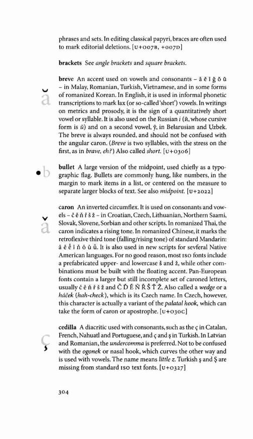
•
v a
phrases and sets. In editing classical papyri, braces are often used to mark editorial deletions. [u+oo7B, +0070)
brackets See angle brackets and square brackets.
breve An accent used on vowels and consonants - a e I g 6 u - in Malay, Romanian, Turkish, Vietnamese, and in some forms of romanized Korean. In English, it is used in informal phonetic transcriptions to mark lax (or so-called 'short') vowels. In writings on metrics and prosody, it is the sign of a quantitatively short vowel or syllable. It is also used on the Russian i (11, whose cursive form is ii) and on a second vowel, y, in Belarusian and Uzbek. The breve is always rounded, and should not be confused with the angular caron. (Breve is two syllables, with the stress on the first, as in brave, eh?) Also called short. [ u+o306]
bullet A large version of the midpoint, used chiefly as a typo-graphic flag. Bullets are commonly hung, like numbers, in the margin to mark items in a list, or centered on the measure to separate larger blocks of text. See also midpoint. [ u+2022]
caron An inverted circumflex. It is used on consonants and vow-els - c en f s z - in Croatian, Czech, Lithuanian, Northern Saami, Slovak, Slovene, Sorbian and other scripts. In romanized Thai, the caron indicates a rising tone. In romanized Chinese, it marks the retroflexive third tone (falling/rising tone) of standard Mandarin: a e i n 6 u u. It is also used in new scripts for sevferal Native American languages. For no good reason, most 1so fonts include a prefabricated upper- and lowercase s and z, while other com-binations must be built with the floating accent. Pan-European fonts contain a larger but still incomplete set of caroned letters, usually c e n f s z and C D E N R S t Z. Also called a wedge or a hacek (hah-check), which is its Czech name. In Czech, however, this character is actually a variant of the palatal hook, which can take the form of caron or apostrophe. [ u +o 3oc)
cedilla A diacritic used with consonants, such as the <;: in Catalan, French, Nahuatl and Portuguese, and <;: and in Turkish. In Latvian and Romanian, the undercomma is preferred. Not to be confused with the ogonek or nasal hook, which curves the other way and is used with vowels. The name means little z. are missing from standard 1so text fonts. [u+o327)
304

circumflex A diacritic used on vowels - a e i 6 u w y - in Cree, French, Portuguese, Romanian, Vietnamese, Welsh and many other languages. In transliterated texts (e.g., from Arabic, Greek, Hebrew and Sanskrit), it is sometimes used as a substitute for the macron, to mark long vowels. In romanized Thai, a circumflex signifies a falling tone. Most Latin text fonts include all the cir-cumflected vowels except Welsh wand y. [u+o302]
colon A grammatical marker inherited from the medieval Eu-ropean It is also used in mathematics to indicate ratios and 11: as a mark of prolongation. The name is from Greek. In classie;J rhetoric and prosody, a colon (plural, cola) is a long dause, and a comma is a short one. [u+oo3A]
comma ,\ grammatical marker, descended from early scribal practice. In German, anJ often in East European languages, the comma is used as an open quote. Throughout Europe, it is also used as a decim.11 point, where most North Americans expect a period. In North American usage, the comma separates thou-sands, while a space is preferred in Europe. Thus 10,000,000 = 10 ooo ooo, but a number such as 10,001 is typographically ambiguous. It could mean either ten and one one-thousandth or ten thousand and one. See also quotation marks. [ u+oo2c]
copyright On poorly designed fonts, the copyright symbol some-times appears as a superscript, but its rightful place in typography is on the baseline:©. [ u+ooA9]
curl See hoi.
currency symbols Most 1so character sets of recent vintage in-clude six genuine currency signs - $ £ € f ¥ ¢ - and one imagi-nary sign, o:. That so-called 'general currency sign; the louse, has no typographic function. It merely holds a place on the font to which a real symbol for local currency (rupee, cruzeiro, peseta, etc) can be assigned. The cent sign{¢), now an American typo-graphical heirloom, is equally irrelevant for most work. It remains in the character set chiefly out of nostalgia.
The dollar sign, a slashed S, is descended from an old symbol for the shilling. The same sign has come to be used for curren-cies with many other names: sol, peso, escudo, yuan, etc. The sign of the pound sterling, a crossed cursive L, actually stands
305
A a
a:
)
©
$£€
f (fl Rp
Rs¥¢
a
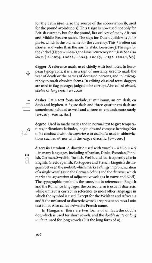
t
0
•• a
for the Latin libra (also the source of the abbreviation lb, used for the pound avoirdupois). This£ sign is now used not only for British currency but for the pound, lira or livre of many African and Middle Eastern states. The sign for Dutch guilders is f, for florin, which is the old name for the currency. This f is often cut shorter and wider than the normal italic lowercase f The sign for the shekel (Hebrew sheqel), the Israeli currency unit, is li!I. See also louse. [u+oo24, +00A2, +00A3, +00A5, +0192, +2oAC, &c.]
dagger A reference mark, used chiefly with footnotes. In Euro-pean typography, it is also a sign of mortality, used to mark the year of death or the names of deceased persons, and in lexicog-raphy to mark obsolete forms. In editing classical texts, daggers are used to flag passages judged to be corrupt. Also called obelisk, obelus or long cross. [u+2020]
dashes Latin text fonts include, at minimum, an em dash, en dash and hyphen. A figure dash and three-quarter em dash are sometimes included as well, and a three-to-em dash more rarely. [u+2013, +2014, &c.]
degree Used in mathematics and in normal text to give tempera-tures, inclinations, latitudes, longitudes and compass bearings. Not to be confused with the superior o or ordinal o used in abbrevia-tions such as N°, nor with the ring, a diacritic. [ u + o o Bo)
diaeresis I umlaut A diacritic used with vowels - a e 1 6 ii w y - in many languages, including Albanian, Dinka, Estonian, Finn-ish, German, Swedish, Turkish, Welsh, and less frequently also in English, Greek, Spanish, Portuguese and French. Linguists distin-guish between the umlaut, which marks a change in pronunciation of a single vowel (as in the German Schon) and the diaeresis, which marks the separation of adjacent vowels (as in naive and Noel). The typographic symbol is the same, but in reference to English and the Romance languages, the correct term is usually diaeresis, while umlaut is correct in reference to most other languages in which the symbol is used. Except for the Welsh w and African £ and J, the umlauted or diaeretic vowels are present on most Latin text fonts. Also called trema, its French name.
In Hungarian there are two forms of umlaut: the double dot, which is used for short vowels, and the double acute or long umlaut, used for long vowels (ii is the long form of ii).
306

The letter ji is a vowel sometimes used in archaic French and still required in the modern form of a few personal names and place names. It is also an alternate form of the ij ligature in Flemish. [u+o308]
diesis An alternate name for the double dagger.
dimension sign An unserifed x, usually square, also known as a multiplication sign. See arithmetical signs. [ u +oo 07]
dotless i and dotted I These are both letters of the alphabet in Turkish, where the lowercase form of I is 1 and the uppercase form of i is i. The dotless form signifies a back vowel (IPA w), the dotted one a front vowel (IPA i, as in English liter. [u+o130, +0131]
dome See arch.
double acute A diacritic used on two Hungarian vowels: 6 and ii. Also called long umlaut. The name 'Hungarian umlaut' (used in PostScript jargon) is unhelpful, since the short umlauted vowels o and i.i also appear in Hungarian. Not to be confused with the double prime nor with the close quote. [u+o30B]
double bar This is a standard symbol in bibliographical work and an old standard reference mark in European typography. It is missing from most text fonts but is easily made by kerning two single bars together. [u+2016]
double dagger A reference mark for footnoting. Also called diesis or double obelisk. [ u+2021]
double grave A Serbo-Croatian diacritic used, like the arch, with five vowels and one syllabic consonant: a e 'i o u r (and in Cyrillic, a e 11 o y p ). This is a prosodic sign, to indicate the short falling tone. Though not employed in ordinary writing, the double grave is used in teaching, in linguistics, and in editions of metrical po-etry. It is rarely found on text fonts. [ u + 030 F]
double prime An abbreviation for inches (1" = 2.54 cm) and for seconds of arc (360" = 1°). Not to be confused with quotation marks, the double acute, nor with dumb quotes. Prime and double prime are rarely found on text fonts. See also prime. [u+2033]
x •
illi
,, 0
11
"
"
/\ )
ff I I ff 1
dD
• • •
oD
dumb caret Also known, in vain, as the ascii circumflex. This is a stray, like the backslash and dumb quotes, ossified into the standard ASCII keyboard. The true circumflex(') is a different and genuine character. So is the logical and (A, the sign oflogical conjunction). Since it has no typographic function, the dumb caret also has no typographic form. In other words, this is not really a character at all. It is a wasted slot on the keyboard, waiting for something else to take up residence. [u+oo5E]
dumb quotes These are refugees from the typewriter keyboard. Typesetting software interprets quotation -mark keystrokes in context, converting the dumb quotes to smart quotes (never in-fallibly). Yet the dumb quotes are still there, taking space on the font. They have no typographic function. See also double prime, quotation marks and prime. [u+oo22, +0027]
dyet A basic letter of the alphabet in Serbo-Croatian (where it has the sound of IPA ct3) and Vietnamese (where it is now IPA d and used to be d). The uppercase form of the letter is, as a rule, graphi-cally the same as the uppercase eth, but it is notionally different. It therefore has a different Unicode address. [u+ono, +0111]
ellipsis The sign of elision and of rhetorical pause: three dots . [u+2026]
eng A letter of the alphabet in Northern Saami and in many African languages. Lowercase eng is also used in linguistics and lexicography to represent the ng sound in the word wing. (Note the different sounds represented by the same letters in the words wing, Wingate, singlet and singe: IJ, n-g, l)g, nd3.) The eng is found on pan-European and pan-African fonts. [u+o14A, +014B]
eszett The ss ligature, longs+ shorts (f + s). It was once essential for setting English and is still essential for German. Not to be confused with the Greek beta, known as sharps. Note that not all instances of ss in German turn to 13. [u+oooF]
eth A letter of the alphabet in Anglo-Saxon, Faroese, Icelandic, and in IPA. The uppercase eth is the same as the uppercase dyet, but the lowercase forms are not interchangeable, and the letters represent quite different sounds. (The name eth, also spelled edh, is pronounced like the eth in whether.) [u+oooo, +ooFo]
308

ethel A ligature formerly used in English and still essential for setting French. English words and names derived from Greek were formerly spelled with the ethel (or cethel) corresponding to the Greek 01 (omicron iota). Thus the old form of ecumenical is cecumenical (from otKoc;, Greek for 'house') and the Greek name Oi<'>irrouc; (Oidipous), Latinized as Oedipus, was formerly written CEdipus. The ligature is required, therefore, for deliberate archa-ism and for academically correct quotation from older English sources, as well as for spelling French terms such as hors d'ceuvre. In IPA, Cl', CE and e are three different letters. [u+o152, +0153]
ew See barred L.
exclamation In Spanish, the inverted exclamation mark is used at the beginning of the phrase and the upright mark at the end. In mathematics, the upright exclamation mark is the symbol for factorials (4! = 4 x 3 x 2 x 1). It is also often used to represent the palatal clicks of the Khoisan languages of Africa. Thus, for ex-ample, the name !Kung. British printers often call the exclamation mark a screamer. [ u+oo21, +00A1]
ezh This is an altered form of z, generally representing a sound like that of z in English azure or j in French justice, which is the sound of Czech z or Polish z. Ezh is a letter of the alphabet in Skolt, a language of the Saami family, spoken in northern Rus-sia and Finland. The lowercase form is also part of the 1 PA and therefore present on any font of phonetic characters. Not to be confused withyogh. [u+o1B7, +0292]
figures A text font normally includes at least one set of figures, which usually ought to be (and usually are not) text figures ( OSF ). Supporting fonts and OpenType fonts often include three fur-ther sets: titling (i.e., lining) figures, superiors and inferiors. The superiors are used for exponents, superscripts and the numera-tors of fractions, the inferiors for the denominators of fractions. For chemical formulae (H20 etc) and mathematical subscripts, lowered inferior figures are needed. [u+oo30-0039; +00B2, +00B3,+00B9, +2070, +2074-2079; +2080-2089]
fist The typographer's fist is neither a blunt instrument nor a closed purse. It is a silent, pointing hand. All too often, however, it is overdressed, with ruffles at the cuff. A Baroque invention, the
309
re CE
3
123
45

' a
< > . »> cl <«
« »
fist is missing from the standard 1so character set and must be found on a supplementary font. [u+261A-261F]
fractions Three fractions - Y-< \/2 % - appear on most ISO text fonts, and six more - Vs \!J % % 2h "Ys - on some pan-European fonts. [u+OOBC-OOBE; +2153-215E]
glottal stop The glottal stop is a sound in search of a character: a basic sound in many languages now written in Latin letters, but one for which the Latin, Greek and Cyrillic alphabets have no traditional symbol. Linguists use the character 7 or ' - a gelded question mark - to represent this sound, but the symbol most commonly used in setting texts is the apostrophe. In romanized Arabic the inverted comma or open quote (') is often used to represent the letter 'ain (t), whose phonetic symbol is or\ and the apostrophe (') is used to represent hamza (., i, ! , etc), the Arabic glottal stop. Thus, the Koran in romanized Arabic is al-Qur'an; Arab is 'arab; the family is al-a'ila. Also known by its Spanish name, saltillo, "little leap:' See also apostrophe, inverted comma and quotation marks. [u+o294, +02Bc, +02co]
grave An accent used with vowels - a e i o u y - in French, Italian, Portuguese, Catalan, Vietnamese and many other languages. In romanized Chinese it is used with vowels - a e i o u u - to mark the falling tone. In Gaelic the grave is normally used instead of the macron to mark elongated vowels. The basic five grave vowels are present on most Latin text fonts. [u+o300]
guillemets Single and double guillemets are widely used as quotation marks with the Latin, Cyrillic and Greek alphabets in Europe, Asia and Africa. Attempts to introduce them into North America have met with only slight success. In French and Italian, the guillemets almost always point out, «thus» and <thus >, but in German they more frequently point in, »SO« and >SO<. Single guillemets should not be confused with angle brackets nor with the arithmetical operators meaning greater-than and less-than.
Guillemet means Little Willy, in honor of the sixteenth-century French typecutter Guillaume l William] Le Be, who may have invented them. Also called chevrons, duck feet and angle quotes. [u+OOAB, +OOBB, +2039, +203A]
hacek See caron and palatal hook.
310

hedera An ivy leaf: a type of fleuron. (Hedera is the Latin name for ivy.) This is one of the oldest of all typographic ornaments, present in early Greek inscriptions. [ u +2619, +2766, + 2767]
hoi This is one of the five tonemarks used with vowels in the Vietnamese alphabet. It resembles a small dotless question mark and signifies the dipping-rising tone. The spelling in Vietnamese is, naturally, h6i - and the name in Vietnamese does mean "ques-tion:' In English it is also called a curl. [ u +0309]
horned o A letter of the Vietnamese alphabet, representing a close mid-back unrounded vowel (an unrounded o, the IPA¥). [u+olAO, +OlAl]
horned u A letter of the Vietnamese alphabet, representing a close back unrounded vowel (IPA w). [u+o1AF, +oIBo]
hyphen The shortest of the dashes. [u+oo20]
inverted breve See arch.
inverted comma Also called a single open-quote, and used for that purpose in English, Spanish and many other languages. In transliterated Arabic and Hebrew, it also represents the letter 'ain (t) or ayin (.Y), a pharyngeal continuant (IPA 'I), while its opposite, the apostrophe, represents the glottal stop. Thus: King Ibn Sa'iid; the Beqa'a Valley. Only the well-curved form of the glyph (' instead of') is useful in transliteration. See also glottal stop, quotation marks, reversed apostrophe. [u+2018]
kropka See overdot.
krouzek See ring.
letters At least three varieties of letters appear in an ordinary font of Latin type. There is normally a full alphabet in both upper and lower case and a partial alphabet of superior letters. The latter are used in numerical abbreviations such as 151, 2nd, 3rd, the French 1• (premier, premiere) and the Spanish 2•, 2° (segunda, segundo ). They are also used in a few verbal abbreviations, such as 4° = quarto; 8° = octavo; Mr = mister; N° = number, but in English most such forms are now archaic. The basic 1so alphabet includes
3ll
(
0
O'
tf
(

aB
Qu ry s fj
fijfi B dsp
f J
only two superior letters, the ordinal a and ordinal o, which are essential for setting text in Romance languages. (They are called ordinals because they are used for ordinal numbers: first, second, third .... ) A fuller set - conventionally limited to ab de i Im n ° rs t
- is often to be found on an 'expert' or OpenType font. OpenType fonts routinely include small caps in addition to
u&lc and superior letters. Full pan-European fonts also include a complete set of Cyrillic and Greek characters. Some fonts include swashes and quaints such as the longs (f) and its ligatures.
Note that the identity of the letters varies from language to language. The digraph ch, for example, is regarded as a single letter in Czech, Lithuanian and Spanish; II is treated as a single letter in Spanish and Basque; dd,ff, ng, II, ph, rh, th are all treated as single letters in Welsh; and in Serbo-Croatian the digraphs dz, lj, nj are regarded as single letters (corresponding to Cyrillic 1,1,lb and lb). [u+oo41-005A; +0061-007A; +ooco-0006; +ooo8-ooF6; +ooF8-ooFF, &c.]
ligatures Basic ISO fonts are limited to two typographic ligatures, fi and fl. Rigid definitions of the glyph set, leaving no provision for additional ligatures (such as ff,ffi,Jjl,Jj) are a hazard to typog-raphy. Ligatures required by the design of the individual typeface should always reside on the basic font.
The lexical ligatures a?, /E, re, CE and fl are bonafide Unicode characters, separately listed in this appendix. Typographic ligatures such as fi and S1 are glyphs, not characters; they are now consigned to the 'private use' section of Unicode.
logical not See negation.
longs This taller form of s looks like f without its crossbar. (Note however that the roman form usually does have a spur on the left.) Longs was commonly used in English (ufed in Englifh, ufed in Englijh, USED IN ENGLISH) through the end of the eighteenth century. It was then the normal form of s in initial and medial positions. Shorts was used at the ends of words and (usually) as the second s in a pair. Long s + short s forms the ligature g, still used in German. Longs itself is still routinely used in blackletter though archaic in roman and italic. It often entails a substantial further Set ofligatures - e.g., fb fh fi fk fl ffffi fil. [u+o17F]
long umlaut See double acute.
312

louse From Filzlaus, "pubic louse;· a German name for the cur-rency symbol placeholder (a). Also known in English as a sputnik. Since the symbol is parasitic (it takes up space on the font but offers nothing in return), louse may be the better name. Having no true function, it has no authentic form. [u+ooA4]
lowline This is a standard 1 so character, positioned as a baseline rule. Not to be confused with the underscore. [u+oo5F]
macron A diacritic used to mark long vowels - a e I 6 0 - in many languages: Fijian, Hausa, Latvian and Lithuanian, among others. It marks long vowels in romanized Arabic, Greek, Hebrew, Japanese, Sanskrit and other languages, and level tones in roman -ized Chinese. Some writers of Lakhota (Sioux) also use it to write de-aspirated consonants (ck pt). [u+o304]
midpoint An ancient European mark of punctuation, widely used in typography to flag items in a vertical list and to separate items in a horizontal line. A closely spaced midpoint is also often used to separate syllables or letters, especially in Catalan when one l adjoins another. (In Catalan as in Spanish, II is treated as a single letter. When one l is adjacent to but separate from another, they are written[.[. Examples: the Catalan words cel-les [cells], col-lecci6 [collection] and para/.lel.) The same sign is used in mathematics for scalar multiplication and in symbolic logic for logical conjunc-tion. Also called interpoint. [u+ooB7]
(Upper- and lowercase L +midpoint [L & 1-] are needlessly treated by 1so, and therefore by Unicode, as single characters: u+o13F & +0140.)
mu The Greek lowercase m represents the prefix micro- = 10·0•
Thus milligrams is written mg and micrograms µg. (A millionth of a meter or micron, formerly writtenµ, is now ordinarily writ-ten µm.) [u+o3Bc)
musical signs Three elementary musical symbols - b # q, the flat, sharp and natural - are needed for setting normal texts that make reference to standard European musical pitches and keys (Beethoven's Sonata Op. no in Ab, Ennemond Gaultier's Suite for Lute in F#m, the drop from C# to Cq, etc). These characters are, however, missing from most text fonts. (The octothorp is not an adequate substitute for the sharp.) [u+2660-266F I
313
a
1-1
µ

-, b
0
# 6
nang See underdot.
nasal hook See ogonek.
negation The negation sign used in the propositional calculus (symbolic logic) was formerly the swung dash (- ). Since the swung dash is also used as a sign of similarity, this created con-fusion. The usual form of the negation sign now is the angled dash (•).This is part of the standard 1so Latin character set and is included on most digital text fonts, even though it is useless without the other logical operators, such as u n /\ v =, which are almost never found on text fonts. Also called logical not. (U+OOAC]
null Also known as a slashed or crossed zero. This glyph is used to distinguish zero from the letters 0 and o. But the null in its usual form is easily confused with slashed o ( 0, o ), a letter of the alphabet in Danish and Norwegian, and even with the Greek let-ter phi ( cp. <fi ). The crossed form of the null, -e-, is also confusible with theta (8). A null glyph is present on some text fonts and on many phonetic and technical fonts. (As an alternate form of zero, this glyph has no address of its own in Unicode.)
numeral sign See octothorp.
obelisk Also obelus (plural, obeli). Synonym for dagger.
octothorp Otherwise known as the numeral sign. It has also been used as a symbol for the pound avoirdupois, but this usage is now archaic. In cartography, it is a traditional symbol for vil-lage: eight fields around a central square. That is the source of its name. Octothorp means eight fields. [u+oo23]
ogonek A diacritic used with vowels - C} <; i 9 I} - in Lithuanian, Navajo, Polish and other languages. Also called a nasal hook. Not to be confused with the cedilla, which is used with consonants and curves the other way. Ogonek is a Polish diminutive, mean-ing 'little tail: It is also the Polish name for the stem of an apple. Vowels with ogonek are known as tailed vowels. A reversed ogonek is used in the Bashkir [ u +o328)
ordinal a, ordinal o See letters.
314

overdot A diacritic used with consonants - c g ri1 iJ. z - in Mal-tese, Polish, old Gaelic and romanized Sanskrit, and with vowels - e and i - in Lithuanian and Turkish. In phonetics, it is widely employed as a sign of palatalization. Often known by its Polish name, kropka. See also dotless i and dotted I. [u+o307)
palatal hook A diacritic used in the Czech and Slovak alphabets to mark the so-called soft or palatal consonants. It usually looks like an apostrophe or single close quote but is differently fitted (cut closer on the left). In some fonts it also differs slightly from the apostrophe in shape and size. It combines with ascending lowercase consonants (d', I', O and one capital (I'.). The uppercase forms of d' and t' are J) and t (and Lis an alternate form of I'.). The caron form is used for both the caps and lower case of non-ascending letters (C. c. R. f). In Czech, both these forms of the diacritic are known as hacek, "hook." Also sometimes called the apostrophe accent. See also undercomma. [u+o3oc]
paragraph See pilcrow.
parentheses These are used as phrase markers in grammar and in mathematics, and sometimes to isolate figures or letters in a numerical or alphabetical list. [u+oo28, +0029)
per cent Parts per hundred. Not to be confused with the symbol c/o, 'in care of; which is also sometimes cut as a single character. [u+o025]
per mille Parts per thousand (61o/oo = 6.1%). Though it is very rarely needed in text typography, this sign has been given a place in the standard 1so Latin character set. [ u+2030]
period The normal sign for the end of a sentence in all the lan-guages of Europe. But it is also a letter of the alphabet in Tlingit, pronounced as a glottal stop, and in phonetics it is the sign of a syllable boundary. Also called full point or full stop. [ u+oo2E]
phonomark The copyright symbol used for sound recordings. Also sometimes known, oddly, as the publish symbol. [u+2117)
pilcrow An old scribal mark used at the beginning of a paragraph or main text section. It is still used by typographers for that very
315
• c
'
(a)
%
%0
a. ®
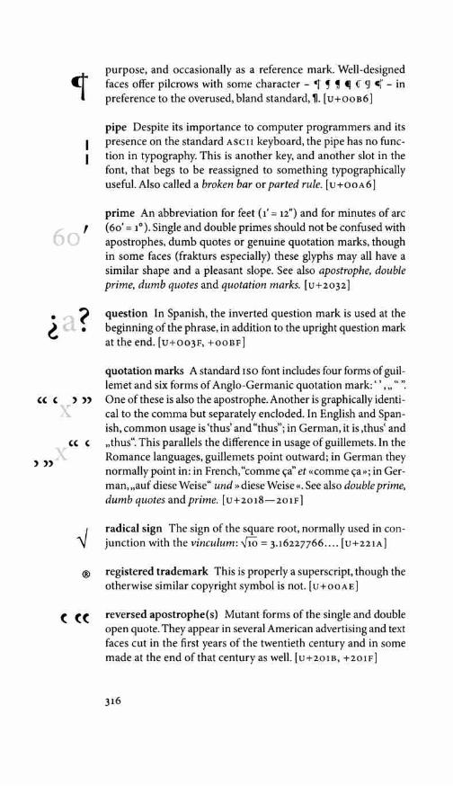
60 '
• •
(( ( ) )) T
'' ' ) ))
®
( ((
purpose, and occasionally as a reference mark. Well-designed faces offer pilcrows with some character - 1 ! ' tJ { 91 cj' - in preference to the overused, bland standard, 'II. [ u + o o B 6]
pipe Despite its importance to computer programmers and its presence on the standard ASCII keyboard, the pipe has no func-tion in typography. This is another key, and another slot in the font, that begs to be reassigned to something typographically useful. Also called a broken bar or parted rule. [u+ooA6]
prime An abbreviation for feet (1' = 12") and for minutes of arc (60' = 1°). Single and double primes should not be confused with apostrophes, dumb quotes or genuine quotation marks, though in some faces (frakturs especially) these glyphs may all have a similar shape and a pleasant slope. See also apostrophe, double prime, dumb quotes and quotation marks. [u+2032]
question In Spanish, the inverted question mark is used at the beginning of the phrase, in addition to the upright question mark at the end. [u+oo3F, +ooBF]
quotation marks A standard ISO font includes four forms of guil-lemet and six forms of Anglo-Germanic quotation mark:'',,,"''. One of these is also the apostrophe. Another is graphically identi-cal to the comma but separately encloded. In English and Span-ish, common usage is 'thus' and "thus"; in German, it is ,thus' and ,,thus". This parallels the difference in usage of guillemets. In the Romance languages, guillemets point outward; in German they normally point in: in French,"comme <;a" et «comme <;a»; in Ger-man,,,auf diese Weise" und »diese Weise«. See also double prime, dumb quotes and prime. [ u +2018 - 201F]
radical sign The sign of the square root, normally used in con-junction with the vinculum: '110 = 3.16227766 .... [u+221A]
registered trademark This is properly a superscript, though the otherwise similar copyright symbol is not. [u+ooA E]
reversed apostrophe(s) Mutant forms of the single and double open quote. They appear in several American advertising and text faces cut in the first years of the twentieth century and in some made at the end of that century as well. [u+201B, +201F]
316

ring Also called krouiek. A diacritic used in Arikara, Cheyenne, Czech, Danish, Norwegian, Swedish and other languages. The Scandanavian round A (a, A = I PA :l) is present on 1so text fonts, but u and D (u with krouiek), just as common in Czech, must be found on an East European or pan-European font, or built from component parts. In Arikara and Cheyenne, the ring marks devoiced letters. Uppercase or small cap round A or A-ring is the symbol for angstrom units (104 A= 1 µm) . [u+o30A]
schwa A rotated e, representing a short, bland vowel (in the jargon of phonetics, a mid central unrounded vowel). It occurs in many African and Native American alphabets. Two uppercase forms are current in Africa: 3 and J. Note that the first of these is hori-zontally mirrored instead of rotated. [u+o18E, +orno, +0259.]
section A scribal form of double s, now used chiefly with refer-ence to legal codes and statutes, when citing particular sections for reference. (The plural abbreviation, meaning sections, is written by doubling the symbol:§§.) [u+ooA7]
semicolon A grammatical marker, hybrid between colon and comma, derived from European scribal practice. In Greek, how-ever, the same symbol is used as a question mark. [u+oo3B]
slashed o This is a basic letter of the alphabet in Norwegian and Danish, generally corresponding to the Swedish o. The lowercase form is also part of the 1 PA. Henrik Ibsen's last play, for example, was Nar vi dode vagner, and one of his first was Pru Inger til 0strat. The letter is sometimes needed in English too, for setting names such as J0rgen Moe and S0ren Kierkegaard. [u+ooo8, +ooF8]
solidus The fraction bar. Used with superior and inferior num-bers to construct ad hoc fractions. The solidus was a Roman im-perial coin introduced by Constantine in AD 309. There were 72 solidi to the libra, the Roman pound, and 25 denarii to the solidus. The British based their own imperial coinage and its symbols -£/s/d, for pounds, shillings and pence - on the Roman model, and solidus became in due course not only a byword for shilling but also the name of the slash mark with which shillings and pence were written. (Given the design and fitting of the characters on most modern type fonts, the solidus is now best used for fractions alone. An italic virgule is usually the best character for setting
317
0
0
§
a;

[a]
[ ]
-TM
references to British imperial money.) See also virgule, which is a separate character. [ u+2044]
sputnik See louse.
square brackets These essentials of text typography are used for interpolations into quoted matter and as a secondary and inner set of parentheses. In the editing of classical texts, square brackets normally mark editorial restorations while angle brackets mark editorial and conjectural insertions, and braces mark deletions. Double square brackets (rarely to be found except on technical fonts) are used by textual scholars to mark deletions made not by the editor but by the original author or scribe. In editing manu-scripts and papyri, square brackets also mark hiatuses caused by physical damage. [u+oo5s, +0050]
swung dash A rare character in text but important in logic and mathematics as the sign of similarity (a - b) and in lexicography as a sign of repetition. The same sign has been used in symbolic logic to indicate negation, but to avoid confusion, the angular negation sign or logical not(•) is preferred. In the eyes of ISO
and Unicode, the swung dash found on computer keyboards is an ascii tilde - a character of use to computer programmers but meaningless to typographers. Most fonts actually carry a swung dash, not a tilde, in this position. To Unicode, the true swung dash has a different address, though not a different graphic form. The true tilde is different in every respect and functions only as a diacritic. [u+oo7E; +2053, +223c]
thorn A basic letter of the alphabet in Anglo-Saxon and Middle English, as well as in Icelandic: Pott pu langfbrull legoir .... Its sound is that of IPA 8: voiceless th, as in English thorn. Not to be confused with wynn. [u+oooE, +OOFE]
tilde A diacritic used on vowels - a e £ 16 5 u y - in many lan-guages (Estonian, Kikuyu, Portuguese, Twi, Vietnamese ... ) and on at least one consonant (fl) in many more. A, a, N, fl, 0, 6 are found on standard 1so text fonts. Pan-European fonts include the old Greenlandic vowels i, i, 0, u as well. [ u +o303]
trademark This is a superscript, found on most text fonts but useless except for commercial work. [u+2122]
318

turned undercomma This diacritic is a variant of the under-comma, used in the lowercase form of the Latvian soft g (g). The uppercase form of this letter is Q. (The g is the only palatalized Latvian letter that happens to have a descender.) See also under-comma. [u+o326, used in u+o123]
umlaut See diaeresis.
undercomma This is a variant form of the cedilla, popularized in the early twentieth century through the use of typewriters which lacked a real cedilla subscript. Through long habituation, it is now preferred to the cedilla by many writers and some typographers working in Latvian and Romanian. In these languages it is used to mark the soft (palatal) consonants: I Q r t and their uppercase counterparts. It has become, in other words, a variant form of the palatal hook.
Because of its descender, Latvian lowercase palatal g (g) is marked with a raised and inverted form of this diacritic, the turned undercomma. [u+o326 ]
underdot A diacritic used with consonants - <;l l:i ! l r r t ?- - in romanized Arabic, Hebrew and Sanskrit, and primarily with vowels in Igbo, Yoruba, Twi, and many other African alphabets. In Vietnamese, it is a tonemark signifying low glottalized vowels
i q lf &c). Editors of inscriptions and papyri routinely use the underdot to mark all letters whose reading is uncertain. Its typographic nickname, nang, is a simplified form of its Vietnam-ese name, nqng. It is missing from most Latin text fonts. Like the period, it can take many shapes, but in African scripts, a squarish or elongated dot is often preferred. [ u+o323]
underscore A diacritic required for many African and Native American languages, and useful for some purposes in English. It is also used as an alternative to the underdot in setting romanized Arabic and Hebrew. To clear descenders, a repositioned version of the character is required. See also towline. [ u+o332)
unequal A useful symbol missing from most 1so text fonts. It is essential in setting mathematics and, on occasion, important in general text. [ u + 22 6 o]
vertical rule See bar.
319
( g
'
a •

AA
a/c
]?
vinculum An overbar or overline, used in mathematics ( '110) and in the sciences (AB) to signify the unity of a group. The name is Latin for bond or chain. [u+203E]
virgule An oblique stroke, used by medieval scribes and many later writers as a form of comma. It is also used to build level fractions (e.g., n/3), to represent a linebreak when verse is set as prose, and in dates, addresses and elsewhere as a sign of separa-tion. In writing the Khoisan languages of western Africa, it is sometimes used to represent dental or lateral clicks. Also called slash or front slash (to distinguish it from the backslash). It is poorly positioned on many fonts and consequently needs some subtle editing. Compare solidus. [ u + o 02 F]
wedge Another name for the caron.
wynn This is an archaic English predecessor of the modern letter w. It appears only in specialized fonts designed for medievalists, and it is all too easy to confuse with thorn, but out of faithfulness to the manuscript tradition, it is occasionally used in printing Middle English texts. [u+o1BF, +01F7]
yen See currency symbols.
yogh This is an archaic Western European form of y, sometimes still used in Old and Middle English texts. The twelfth-century English poet Layamon, for example, wrote at a time when the English alphabet included aesc, eth, thorn and yogh, and the letter yogh appeared where we now put a y in Layamon's name:
The pronunciation varies with context between the sound of yin English layer and that of gin German sagen. Yogh is very rarely found on text fonts. The numeral 3 is not an adequate substitute. [u+o21c, +0210]
NOTE: A number of reference works (including the first three editions of The Unicode Standard, both editions of Pullum & Ladusaw's Phonetic Symbol Guide, and the first two editions of The Elements of Typographic Style) fail to distinguish yogh from ezh. The two characters can be graphically identical and therefore can be realized by one in the same glyph, but they are different in origin and sound - and also different now in Unicode.
320

APPENDIX C: GLOSSARY OF TERMS
Names of individual characters and diacritics (circumflex, dyet, midpoint, virgule, etc) are not in this glossary. Look for them in appendix s. For summary definitions of historical categories (Renaissance, Baroque, etc), see chapter 7.
10/12 x 18 Ten on twelve by eighteen, which is to say, ten-point (10 pt) type set with 12 pt leading (2 pt extra lead, in addition to the body size of 10 pt, for a total of 12 pt from baseline to baseline) on a measure of 18 picas.
Abrupt and Adnate Serifs are either abrupt - meaning they break from the stem suddenly at an angle - or they are adnate, meaning that they flow smoothly into or out of the stem. In the older typographic literature, adnate serifs are generally described as bracketed.
A/dine Relating to the publishing house operated in Venice by Aldus Manutius between 1494 and 1515. Most of Aldus's type - which included roman, italic and Greek- was cut by Fran-cesco Griffo of Bologna. Type that resembles Griffo's, like ty-pography that resembles Aldus's, is called Aldine. Monotype Poliphilus and Bembo roman are Aldine revivals, though their companion italics are not. No Aldine italics or Aldine Greeks are in circulation at the present time.
Analphabetic A typographic symbol used with the alphabet but lacking a place in the alphabetical order. Diacritics such as the acute, umlaut, circumflex and caron are analphabetics. So are the asterisk, dagger, pilcrow, comma and parentheses.
Aperture The openings of letters such as C, c, S, s, a and e. Hu-manist faces such as Bembo and Centaur have large apertures, while Romantic faces such as Bodoni and Realist faces such as Helvetica have small apertures. Very large apertures occur in archaic Greek inscriptions and in typefaces such as Lithos, which are derived from them.
Axis In typography, the axis of a letter generally means the axis of the stroke, which in turn reveals the axis of the pen or other tool used to make the letter. If a letter has thick strokes and thin ones, find the thick strokes and extend them into lines. These lines reveal the axis (or axes; there may be several) of the letter. Not to be confused with slope.
321
II aa
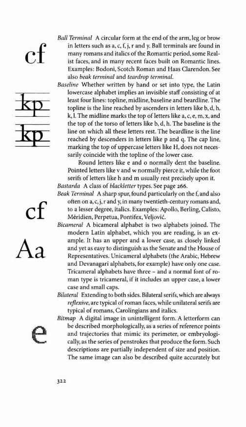
cf
cf Aa
e
Ball Terminal A circular form at the end of the arm, leg or brow in letters such as a, c, f, j, r and y. Ball terminals are found in many romans and italics of the Romantic period, some Real-ist faces, and in many recent faces built on Romantic lines. Examples: Bodoni, Scotch Roman and Haas Clarendon. See also beak terminal and teardrop terminal.
Baseline Whether written by hand or set into type, the Latin lowercase alphabet implies an invisible staff consisting of at least four lines: topline, midline, baseline and beardline. The topline is the line reached by ascenders in letters like b, d, h, k, I. The midline marks the top of letters like a, c, e, m, x, and the top of the torso of letters like b, d, h. The baseline is the line on which all these letters rest. The beardline is the line reached by descenders in letters like p and q. The cap line, marking the top of uppercase letters like H, does not neces-sarily coincide with the topline of the lower case.
Round letters like e and o normally dent the baseline. Pointed letters like v and w normally pierce it, while the foot serifs of letters like h and m usually rest precisely upon it.
Bastarda A class of blackletter types. See page 266. Beak Terminal A sharp spur, found particularly on the f, and also
often on a, c, j, randy, in many twentieth-century romans and, to a lesser degree, italics. Examples: Apollo, Berling, Calisto, Meridien, Perpetua, Pontifex, Veljovic.
Bicameral A bicameral alphabet is two alphabets joined. The modern Latin alphabet, which you are reading, is an ex-ample. It has an upper and a lower case, as closely linked and yet as easy to distinguish as the Senate and the House of Representatives. Unicameral alphabets (the Arabic, Hebrew and Devanagari alphabets, for example) have only one case. Tricameral alphabets have three - and a normal font of ro-man type is tricameral, if it includes an upper case, a lower case and small caps.
Bilateral Extending to both sides. Bilateral serifs, which are always reflexive, are typical of roman faces, while unilateral serifs are typical of romans, Carolingians and italics.
Bitmap A digital image in unintelligent form. A letterform can be described morphologically, as a series of reference points and trajectories that mimic its perimeter, or embryologi-cally, as the series of pen strokes that produce the form. Such descriptions are partially independent of size and position. The same image can also be described quite accurately but
322

superficially as the addresses of all the dots (or bits) in its digital representation. This sort of description, a bitmap, ties the image to one orientation and size.
Blackletter Blackletter is to typography what Gothic is to ar-chitecture: a general name for a wide variety of forms that stem predominantly from the north of Europe. Like Gothic buildings, blackletter types can be massive or light. They are often tall and pointed, but sometimes round instead. Com-pare whiteletter. The categories of blackletter include bastarda, fraktur, quadrata, rotunda and textura. See page 266.
Bleed As a verb, to bleed means to reach to the edge of the printed page. As a noun, it means printed matter with no margin. If an image is printed so that it reaches beyond the trim line, it will bleed when the page is trimmed. Photographs, rules, solids and background screens or patterns are often allowed to bleed. Type can rarely do so.
Blind In letterpress work, printing blind means printing without ink, producing a colorless impression.
Blind Folio A page which is counted in the numbering sequence but carries no visible number.
Block Quotation A quotation set off from the main text, forming a paragraph of its own, often indented or set in a different face or smaller size than the main text. A run-in quotation, on the other hand, is run in with the main text and usually enclosed in quotation marks.
Body (1) In reference to foundry type: the actual block of type-metal from which the sculpted mirror-image of the printed letter protrudes. (2) In reference to phototype or digital type: the rectangular face of the metal block that the letter would be mounted on if it were three-dimensional metal instead of a two-dimensional image or bitmap. Retained as a fiction for use in sizing and spacing the type.
Body Size In graphic terms, the height of the face of the type, which in letterpress terms is the depth of the body of the type. Originally, this was the height of the face of the metal block on which each individual letter was cast. In digital type, it is the height of its imaginary equivalent, the rectangle defining the space owned by a given letter, and not the dimension of the letter itself. Body sizes are usually given in points - but European type sizes are often given in Didot points, which are 7% larger than the points used in Britain and North America.
323
ao oa

00
f
Bowl The generally round or elliptical forms which are the basic bodyshape of letters such as C, G, 0 in the upper case, and b, c, e, o, p in the lower case. Also called eye.
Cap Height The distance from baseline to cap line of an alphabet, which is the approximate height of the uppercase letters. It is often less, but sometimes greater, than the height of the ascending lowercase letters. See also baseline and x-height.
Chancery A class of cursive letterforms, generally featuring extra ligatures and lengthened and curved extenders. Many, but not all, chancery letterforms are also swash forms.
Cicero A unit of measure equal to 12 Didot points. This is the continental European counterpart to the British and Ameri-can pica, but the cicero is slightly larger than the pica. It is equivalent to 4.52 mm or 0.178 inch. See point.
Color The darkness of the type as set in mass, which is not the same as the weight of the face itself. The spacing of words and letters, the leading of lines, and the incidence of capitals, not to mention the properties of the ink and of the paper it is printed on, all affect the color of the type.
Contrast In the analysis of letterforms, this usually refers to the degree of contrast between the thick strokes and thin strokes of a given letter. In Romantic faces such as Bulmer and Bodoni, the contrast is high. In unmodulated faces such as Gill Sans and Futura, contrast is low or nonexistent.
Counter The white space enclosed by a letterform, whether wholly enclosed, as in d or o, or partially, as in c or m.
Crosshead A heading or subhead centered over the text. Compare sidehead.
Cursive Flowing. Often used as a synonym for italic. Dingbat A typographic glyph or symbol subject to scorn because
it has no apparent relation to the alphabet. Many dingbats are pictograms - tiny pictures of churches, airplanes, skiers, tele-phones, and the like, used in the tourist industry. Others are more abstract symbols - check marks, crosses, cartographic symbols, the emblems of the suits of playing cards, and so on. Compare fleuron and hedera.
Dot Leader A row of evenly spaced periods or midpoints, occa-sionally used to link flush-left text with flush-right numerals in a table of contents or similar context. (There are none in this book.)
DPI Dots per inch. The usual measure of output resolution in digital typography and in laser printing.
324
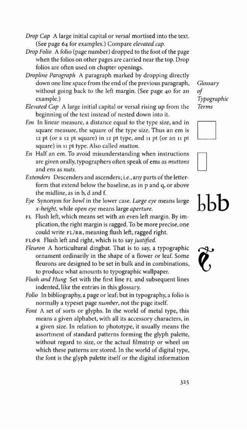
Drop Cap A large initial capital or versa/ mortised into the text. (See page 64 for examples.) Compare elevated cap.
Drop Folio A folio (page number) dropped to the foot of the page when the folios on other pages are carried near the top. Drop folios are often used on chapter openings.
Dropline Paragraph A paragraph marked by dropping directly down one line space from the end of the previous paragraph, without going back to the left margin. (See page 40 for an example.)
Elevated Cap A large initial capital or versa! rising up from the beginning of the text instead of nested down into it.
Em In linear measure, a distance equal to the type size, and in square measure, the square of the type size. Thus an em is 12 pt (or a 12 pt square) in 12 pt type, and 11 pt (or an 11 pt square) in 11 pt type. Also called mutton.
En Half an em. To avoid misunderstanding when instructions are given orally, typographers often speak of ems as muttons and ens as nuts.
Extenders Descenders and ascenders; i.e., any parts of the letter-form that extend below the baseline, as in p and q, or above the midline, as in b, d and f.
Eye Synonym for bowl in the lower case. Large eye means large x-height, while open eye means large aperture.
FL Flush left, which means set with an even left margin. By im-plication, the right margin is ragged. To be more precise, one could write FL/RR, meaning flush left, ragged right.
FL&R Flush left and right, which is to say justified. Fleuron A horticultural dingbat. That is to say, a typographic
ornament ordinarily in the shape of a flower or leaf. Some fleurons are designed to be set in bulk and in combinations, to produce what amounts to typographic wallpaper.
Flush and Hung Set with the first line FL and subsequent lines indented, like the entries in this glossary.
Folio In bibliography, a page or leaf; but in typography, a folio is normally a typeset page number, not the page itself.
Font A set of sorts or glyphs. In the world of metal type, this means a given alphabet, with all its accessory characters, in a given size. In relation to phototype, it usually means the assortment of standard patterns forming the glyph palette, without regard to size, or the actual filmstrip or wheel on which these patterns are stored. In the world of digital type, the font is the glyph palette itself or the digital information
325
Glossary of Typographic Terms
D D bbb
Glossary of
Typographic Terms
Q
encoding it. (The older British spelling,fount, has not only the same meaning but also the same pronunciation.)
Fore-edge The outside edge or margin of a book page; i.e., the edge or margin opposite the spine.
FR Flush right. With an even right margin. By implication, the left margin is ragged. The sidehead on this page is an example.
Fraktur A class of blackletter types. See page 266. Glyph An incarnation of a character. See sort. Gutter The blank column between two columns of type or the
margins at the spine between two facing textblocks. Hanging Figures Text figures. Hair Space Normally M/24 or the width of a slip of paper. Hard Space A word space that will not translate into a line-break.
Also called no-break space. Hint The letterforms that make up a digital font are usually
defined mathematically in terms of outlines or templates, which can be freely scaled, rotated and moved about. When pages are composed, these outlines are given specific locations and sizes. They must then be rasterized: converted into solid forms made up of dots at the resolution of the output device. If the size is very small or the resolution low, the raster or grid will be coarse, and the dots will fill the mathematical template very imperfectly. Hints are the rules of compromise applied in this process of rasterization. At large sizes and high resolutions, they are irrelevant. At smaller sizes and lower resolutions, where distortion is inevitable, they are crucial. Hinted fonts include hints as integral parts of the font def-inition. See also bitmap.
Humanist Humanist letterforms originated among the humanists of the Italian Renaissance and persist to the present day. They are of two primary kinds: roman and italic, both of which derive from Roman capitals and Carolingian minuscules. Humanist letterforms show the clear trace of a broadnib pen held by a right-handed scribe. They have a modulated stroke and a humanist axis.
Humanist Axis An oblique stroke axis reflecting the natural inclination of the writing hand. See pp i2-15.
Inline A letter in which the inner portions of the main strokes have been carved away, leaving the edges more or less intact. Inline faces lighten the color while preserving the shapes and proportions of the original face. Outline letters, on the other hand, are produced by drawing a line around the outsides of
326

the letters and removing the entire original form. Outline let-ters, in consequence, are fatter than the originals and have less definition. Castellar, Smaragd and Romulus Open Kapitalen are examples of inline faces.
IPA International Phonetic Association and its alphabet. The organization was founded in 1886. The alphabet is a set of phonetic letters, diacritics and tonemarks, widely used but - like any scientific system - subject to constant refinement and modification. (See page 299.)
1 so International Organization for Standardization, headquar-tered in Geneva. An agency for international cooperation on industrial and scientific standards. Its membership consists of the national standards organizations of more than one hundred countries.
Italic A class of letterforms more cursive than roman but less cursive than script, developed from the Carolingian hand in fifteenth-century Italy. In most italics, the separate letters are implicitly connected by their transitive serifs.
Justify To adjust the length of the line so that it is flush left and right on the measure. Type in the Latin alphabet is commonly set either justified or FL/RR (flush left, ragged right).
Kern (1) Part of a letter that extends into the space of another. In many alphabets, the roman f has a kern to the right, the roman j a kern to the left, and the italic f one of each. ( 2) As a verb, to kern means to alter the fit of certain letter combinations - To or VA, for example - so that the limb of one projects over or under the body or limb of the other.
Lachrymal Terminal See teardrop terminal. Lead [rhyming with red] Originally a strip of soft metal (type-
metal or brass) used for vertical spacing between lines of type. Now meaning the vertical distance from the baseline of one line to the baseline of the next. Also called leading.
Lettrine Literally, 'a large letter: Synonym for versa!. Ligature Two or more letters tied into a single character. The ifi
sequence ffi, for example, forms a ligature in most Latin text faces.
Lining Figures Figures of even height. Usually synonymous with titling figures, but some lining figures are smaller and lighter than the uppercase letters.
Logogram A specific typographic form tied to a certain word. Example: the nonstandard capitalizations in the names e.e. cummings, Tiapafpacp, TrueType and WordPerfect.
327

e e ' at
,, a1
Lowercase Figures Synonym for text figures or old-style figures. M/3 A third of an em: e.g., 4 pt in 12 pt type; 8 pt in 24 pt type. Measure The standard length of the line; i.e., column width or
width of the overall textblock, usually measured in picas. Mid Space A space measuring M/4, a fourth of an em. Modulation In relation to typography, modulation means a vari-
ation - usually cyclical and predictable - in the width of the stroke. In monochrome (unmodulated) letterforms such as Frutiger, the stroke is always fundamentally the same width. In a face such as Bembo or Centaur, the stroke is based on the trace of a broadnib pen, which makes thin cross strokes and thicker pull strokes. When letters are written with such an instrument, regular modulation automatically occurs.
Monotonic Modern Greek retains only one of the old tonic accent marks, the (oxeia) or acute. (Greek has often, in fact, been written and sometimes set this way, but the practice did not become official until 1982.) Fonts designed for set-ting Greek this way are known as monotonic. Their acute (renamed the tonos) is usually vertical. Compare polytonic.
Mutton An em. Also called mutton quad. Negative Leading Leading - that is to say, line space - smaller
than the body size. Type set 16/14, for example, is set with negative leading.
Neohumanist Recent letterforms that revive and reassert human-ist principles are called neohumanist.
Nut An en. Old-Style Figures ( OSF) A common synonym for text figures. Orthotic A class of Greek scripts and types that flourished in
Western Europe between 1200 and 1520, revived in the early twentieth century. Orthotic Greeks are noncursive and usually bicameral. In other words, they are analogous to the roman form of Latin script. Both caps and lower case are usually upright. Serifs, when present, are usually short, abrupt and unilateral. The geometric figures of circle, line and triangle are usually prominent in their underlying structure. Victor Scholderer's New Hellenic is an example.
Pi Font A font of assorted mathematical or other symbols, de-signed to be used as an adjunct to one or more text fonts.
Pica A unit of measure equal to 12 points. Two different picas are in common use. (1) In traditional printers' measure, the pica is 4.22 mm or 0.166 inch: close to, but not exactly, one sixth of an inch. This is the customary British and American
328

unit for measuring the length of the line and the depth of the textblock. (2) The PostScript pica is precisely one sixth of an inch: 0.166666 ... ".The difference between these units is roughly 0.03%. (Note: the continental European counterpart to the pica is the cicero, which is 7% larger.)
Piece Fraction A fraction (such as %4) that is not included in the font and must therefore be made on demand from separate components.
Point (1) In traditional British and American measure, a point is a twelfth of a pica, which makes it 0.3515 mm, or 0.01383 inch. In round numbers, there are 72 points per inch, or 28.5 points per centimeter. (2) In continental Europe a larger point, the Di dot point, is used. The Didot point (one twelfth of a cicero) is 0.38 mm or 0.01483 inch. In round numbers, there are 26.5 Didot points per centimeter, or 67.5 per inch. (3) Nearly all digital typesetting devices, like the PostScript and TrueType languages they employ, make the point precisely 'In inch and the pica precisely one sixth of an inch.
Polytonic Classical Greek has been set since the fifteenth century with an array of tonic accents and other diacritics inherited from the Alexandrian scribes. These diacritics - oxeia (acute), bareia (grave), perispomene (circumflex),psili (smooth breath-ing), daseia (rough breathing), diaeresis and iota subscript - are used singly and in many combinations. Modern Greek retains only the acute (reinterpreted to a vertical mark called the tonos) and an occasional diaeresis. Greek fonts equipped with the full set of accents are accordingly known as polytonic Greeks, and modern Greek fonts as monotonic.
Quad An em. Also called mutton quad. Quaint An antiquated sort or glyph, used to recreate the typo-
graphic flavor of a bygone age. The a, sp and fl ligatures, and the longs and its ligatures, are examples.
Ranging Figures Synonymous with lining figures. Raster Digital grid. See hint. Rationalist Axis Vertical axis, typical of Neoclassical and Roman-
tic letterforms. See pp 12-13. Compare humanist axis. Reflexive A type of serif that concludes the stroke of the pen by
drawing back upon itself. Reflexive serifs are typical of roman faces, including the face in which these words are set. They always involve a sudden, small stoppage and reversal of the pen's direction, and more often than not they are bilateral. See also transitive.
329
Glossary of Typographic Terms
n w \.
m

Glossary of
Typographic Terms
m m
TL • • 1 l
n
Resolution In digital typography, resolution is the fineness of the grain of the typeset image. It is usually measured in dots per inch (dpi). Laser printers, for example, generally have a resolution between 300 and 1200 dpi, and platemakers or typesetting machines a resolution significantly greater than 1200 dpi. The resolution of the conventional television screen is only about 50 dpi, and the resolution of most computer screens is also very low: between 72 and 133 dpi. But other factors besides resolution affect the apparent roughness or fineness of the typeset image. These factors include the inherent design of the characters, the skill with which they are digitized, the hinting technology used to compensate for coarse rasterization, and the nature of the surface on which they are reproduced.
Rotunda A class of blackletter types. See page 266. RR Ragged right, which is to say unjustified. Sanserif From the earlier English forms sans serif and sans sur-
ryphs, without serifs: synonymous with unserifed. Serif A stroke added to the beginning or end of one of the main
strokes of a letter. In the roman alphabet, serifs are usually reflexive finishing strokes, forming unilateral or bilateral stops. (They are unilateral if they project only to one side of the main stroke, like the serifs at the head of T and the foot of L, and bilateral if they project to both sides, like the serifs at the foot ofT and the head of L.) Transitive serifs - smooth entry or exit strokes - are usual in italic.
There are many descriptive terms for serifs, especially as they have developed in roman faces. They may be not only unilateral or bilateral, but also long or short, thick or thin, pointed or blunt, abrupt or adnate, horizontal or vertical or oblique, tapered, triangular, and so on. In texturas and some frakturs, they are usually scutulate (diamond-shaped), and in some architectural scripts, such as Eaglefeather and Tekton, the serifs are virtually round.
Sidehead A heading or subhead set flush left (more rarely, flush right) or slightly indented. Compare crosshead.
Slab Serif An abrupt or adnate serif of the same thickness as the main stroke. Slab serifs are a hallmark of the so-called egyptian and clarendon types: two groups of Realist faces produced in substantial numbers since the early nineteenth century. Memphis, Rockwell and Serifa are examples. A more recent example is PMN Caecilia.
330

Slope The angle of inclination of the stems and extenders of let-ters. Most (but not all!) italics slope to the right at something between 2° and 20°. Not to be confused with axis.
Solid Set without additional lead, or with the line space equiva-lent to the type size. Type set 11/11 or 12/12, for example, is set solid.
Sort A single piece of metal type; thus a letter or other character in one particular style and size. In the world of digital type, where letters have no physical existence until printed, the word sort has been largely displaced by the word glyph. A glyph is a version - a conceptual, not material, incarnation - of the abstract symbol called a character. Thus, z and z are alternate glyphs (in the same face) for the same character.
Stem A main stroke that is more or less straight, not part of a bowl. The letter o has no stem; the letter l consists of stem and serifs alone.
Swash A letterform reveling in luxury. Some swash letters carry extra flourishes; others simply occupy an extra helping of space. Swash letters are usually cursive and swash typefaces therefore usually italic. True italic capitals (as distinct from sloped roman capitals) are usually swash. (7he Caps in this Sentence are Examples.) Hermann Zapf's Zapf Renaissance italic and Robert Slimbach's Poetica are faces in which the swash can be extended to the lower case.
Teardrop Terminal A swelling, like a teardrop, at the end of the arm in letters such as a, c, f, g, j, r and y. This feature is typical of typefaces from the Late Renaissance, Baroque and Neoclassical periods, and is present in many recent faces built on Baroque or Neoclassical lines. Examples: Jannon, Van Dijck, Kis, Caslon, Fournier, Baskerville, Bell, Walbaum, Zapf International, Galliard. Also called lachrymal terminal. See also ball terminal and beak terminal.
Textblock The part of the page normally occupied by text. Text Figures Figures - 12 3 4 s 6 - designed to match the lowercase
letters in size and color. Most text figures are ascending and descending forms. Also called oldstyle figures. Compare lining figures, ranging figures and titling figures.
Textura A class of blackletter types. See page 266. Thick Space A space usually measuring M/3, a third of an em. Thin Space In letterpress work, a space measuring M/5, a fifth of
an em. In computer typesetting, sometimes understood as M/6 or M/8. Compare hair space, mid space and thick space.
331
de[ gg
cf
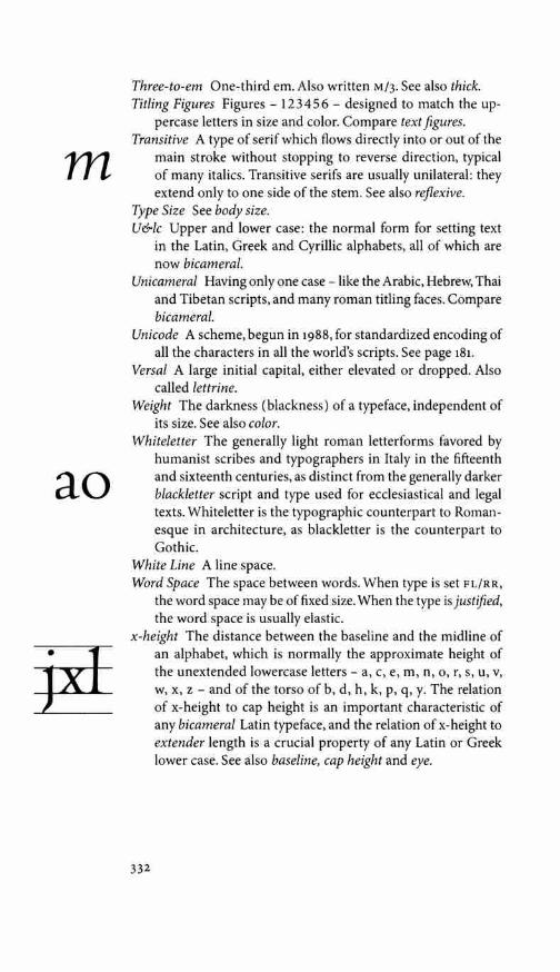
m
ao
Three-to-em One-third em. Also written M/3. See also thick. Titling Figures Figures - 12 3 4 5 6 - designed to match the up-
percase letters in size and color. Compare text figures. Transitive A type of serif which flows directly into or out of the
main stroke without stopping to reverse direction, typical of many italics. Transitive serifs are usually unilateral: they extend only to one side of the stem. See also reflexive.
Type Size See body size. U&lc Upper and lower case: the normal form for setting text
in the Latin, Greek and Cyrillic alphabets, all of which are now bicameral.
Unicameral Having only one case - like the Arabic, Hebrew, Thai and Tibetan scripts, and many roman titling faces. Compare bicameral.
Unicode A scheme, begun in i988, for standardized encoding of all the characters in all the world's scripts. See page i8i.
Versa/ A large initial capital, either elevated or dropped. Also called lettrine.
Weight The darkness (blackness) of a typeface, independent of its size. See also color.
Whiteletter The generally light roman letterforms favored by humanist scribes and typographers in Italy in the fifteenth and sixteenth centuries, as distinct from the generally darker blackletter script and type used for ecclesiastical and legal texts. Whiteletter is the typographic counterpart to Roman-esque in architecture, as blackletter is the counterpart to Gothic.
White Line A line space. Word Space The space between words. When type is set FL/RR,
the word space may be of fixed size. When the type is justified, the word space is usually elastic.
x-height The distance between the baseline and the midline of an alphabet, which is normally the approximate height of the unextended lowercase letters - a, c, e, m, n, o, r, s, u, v, w, x, z - and of the torso of b, d, h, k, p, q, y. The relation of x-height to cap height is an important characteristic of any bicameral Latin typeface, and the relation of x-height to extender length is a crucial property of any Latin or Greek lower case. See also baseline, cap height and eye.
332

APPENDIX D: TYPE DESIGNERS
A biographical index of designers important to typographic his-tory, and of all those doing important work in the present day, would be a book in itself. The following list is little more than a cross-reference to important designers whose work is mentioned elsewhere in this book.
LUDOVICO DEGLI ARRIGHI (c.1480-1527) Italian calligrapher and designer of at least six chancery italic fonts. Frederic Warde's Vicenza and Arrighi (the italic companion to Cen-taur) are based on one of his faces. Monotype Blado (the italic companion to Poliphilus) is a rough approximation of another.
ANTOINE AUGE REAU (c. 1490-1534) Parisian punchcutter and printer. Author of several text romans and at least one Greek. Along with his contemporary Simon de Colines, Augereau defined the style of French typography later identified with the name of his most famous apprentice, Claude Garamond. This activity came to an end when he was hanged and his corpse was publicly burnt, on Christmas Eve of 1534, for printing a psalm without permission.
RICHARD AUSTIN (c.1765-1830) English punchcutter produc-ing Neoclassical and Romantic faces. He cut the original Bell type, the first Scotch Roman, and the original version of Porson Greek. W. A. Dwiggins's Caledonia is based primarily on Austin's work.
JOHN BASKERVILLE (1706-1775) English calligrapher, prin-ter and businessman. Designer of a series of Neoclassical romans, italics and one Greek. Most of the faces sold in his name are based on his work and some resemble it closely. His punches are now at the University Library, Cambridge, and the St Bride Printing Library, London. A set of original matrices, formerly in Paris, is now in the Frutiger Foundry, Miinchenstein, Switzerland.
LUCIAN BERNHARD (1885-1972) German immigrant to the USA. Painter, poet, industrial designer and typographer. Author of a large number of roman faces, distinguished by their long extenders. These were cut and cast primarily by ATF and Bauer.
333
Type Designers
CHARLES BIGELOW (1945- ) American typographer and scholar. Codesigner, with Kris Holmes, of the Lucida family.
ARCHIBALD BINNEY (1762-1838) Scottish immigrant to the USA.
He was trained as a punchcutter in Edinburgh. With James Ronaldson, another Scottish immigrant, he established the Binney & Ronaldson Foundry in Philadelphia, where he cut Baroque, Neoclassical and Romantic type.
FRANK BLOKLAND (1959- ) Dutch type designer and founder of the Dutch Type Library in 's-Hertogenbosch. His faces include Berenice and Documenta. His historical revivals include DTL
Van den Keere and its companion, Guyot italic. GIAMBATTISTA BODON! (1740-1813) Italian punchcutter,printer
and prolific designer of type, working at Rome and Parma. Bodoni is best known for his dark and razor-sharp Romantic romans, italics and sometimes wildly ornamental Greeks, but he also designed and cut a large number of Neoclassical fonts. Bauer Bodoni, Berthold Bodoni, and some of the other faces now sold in his name are based on his work. His punches are in the Museo Bodoniano, Parma.
LUDOLF BORCHTORP (c.1470-c. 1510) Polish mathematician and engraver. Author of the first fonts of Cyrillic type, which he evidently cut in Krakow about 1490, for the printer Szwaj-polt Fiol.
CHRIS BRAND (1921-1999) Dutch calligrapher, the designer of the Albertina family. Some of his finest work - including the Hebrew face Zippora, the Elsschot family and the Denise italic - has yet to be released.
DAN CARR (1951- ) American punchcutter, poet, typographer and printer. Proprietor, with Julia Ferrari, of the Golgonooza Letter Foundry, Ashuelot, New Hampshire. Carr is one of the few active punchcutters now living. Designer and cutter of Regulus foundry roman and Parmenides foundry Greek; designer of the digital family Cheneau.
MATTHEW CARTER (1937- ) English-born American type de-signer, punchcutter and scholar, based in Cambridge, Mas-sachusetts. His text faces include Auriga, Charter, Galliard and Manutius; his titling faces include Mantinia and Sophia. His historical revivals include Wilson Greek.
WILLIAM CASLON (1692-1766) English engraver, punchcutter and typefounder; author of many Baroque romans, italics, Greeks and other non-Latin faces. ATF Caslon, Monotype Caslon, and Carol Twombly's Adobe Caslon are closely based
334

on his work. A collection of his punches is now in the St Bride Printing Library, London.
WARREN CHAPPELL (1904-1991) American book artist, trained in Germany, where he studied with Rudolf Koch. His type-faces include Trajanus, Lydian and the still unmanufactured Eichenauer.
SIMON DE CO LINES (c. 1480-1547) French master printer, typog- Type rapher and punchcutter. Author of a dozen or more roman Designers fonts, several italics, several blackletters and a fine cursive Greek. Colines as much as any single person appears to be responsible for creating the typographic style of the French golden age. Garamond and Augereau were part of the same circle. None of Colines's faces has evidently yet been trans-lated to digital form.
CARL DAIR (1912-1967) Canadian book designer and typog-rapher, working chiefly in Toronto. Designer of the Cartier family, which was left incomplete at Dair's death and later improved and completed by Rod McDonald.
GERARD DANIELS (1966- ) Dutch type designer and typogra-pher, trained under Gerrit Noordzij in The Hague. Designer of Caspari.
!SMAR DAVID (1910-1996) German-born American book de-signer, architect, graphic artist and type designer. His faces include David Hebrew, released by lntertype in 1954, and a number of photolettering faces still awaiting digital revival.
GIOVANNI DEFACCIO (1966- ) Italian calligrapher. With Lui Karner, he is codesigner of the Rialto family, produced by their digital foundry dffype.
FRANyOIS-AM BROISE DID OT (1730-1804) Parisian printer and publisher. Designer of several Neoclassical romans and italics, cut under his supervision by Pierre-Louis Vaffiard. Father of Firmin Didot and founder of the Didot dynasty in printing and typography.
FIRMIN DIDOT (1764-1836) Parisian printer and punchcutter; son of F.-A. Didot and student of Pierre-Louis Vaffiard; father of Ambroise Firmin-Didot. Author of several Neoclassical faces as well as the Romantic fonts for which he is posthu-mously known. Monotype Didot and Linotype's digital Didot (drawn by Adrian Frutiger) are based on his work.
BRAM DE DOES (1934- ) Dutch typographer, formerly chief designer at Joh. Enschede en Zonen, Haarlem. Designer of the Trinite and Lexicon families.
335

WILLIAM ADDISON DWIGGINS (1880-1956) American designer and typographer. Dwiggins designed typefaces exclusively for the Linotype machine. In the 1930s and 1940s, he also cre-ated the typographic house style at Alfred Knopf, New York. His serifed faces include Caledonia, Eldorado, Electra and Falcon. His only completed sanserif is Metro. His one uncial
Type face is Winchester. Many of his type drawings are now in the Designers Boston Public Library.
ALFRED FAIRBANK (1895-1982) English calligrapher and de-signer of Fairbank italic.
AMBROISE FIRMIN-DIDOT (1790-1876) French scholar, type-cutter and printer. He was the son of Firmin Didot (whose full name he took as his own surname) and grandson ofFrarn;:ois-Ambroise Didot. Author of the first Didot Greek fonts.
JOHANN MICHAEL FLEISCHMAN (1701-1768) German-born punchcutter and founder working in the Netherlands. A prolific and skilled cutter of romans, italics and ornamental blackletters. Also the author of several Arabic and Greek fonts. His early romans and italics are Baroque, but in the 1730s he cut a series of text fonts idiosyncratic and self-conscious enough to be called Rococo. Most of his surviving material is now at the Enschede Museum in Haarlem.
KARL-ERIK FORSBERG (1914-1995) Swedish calligrapher and typographer, designer of the Berling text roman. His titling faces include Carolus, Ericus and Lunda.
PIERRE SIMON FOURNIER (1712-1768) French printer and punchcutter. Author of many French Neoclassical fonts and typographic ornaments. Nearly all of his original material has been damaged or lost. Monotype Fournier and Barbou are based on his work, and W. A. Dwiggins's Electra owes much to the study of it.
HENRI FRIEDLAENDER (1904-1996) Israeli book and type de-signer, born in France of a Dutch father and English mother, and trained primarily in Germany. In 1950, after twenty years on the drawing table, a trial casting of his Hadassah Hebrew family was made by the Amsterdam Foundry. After further revision, working versions were issued beginning in 1958.
ADRIAN FRUTIGER (1928- ) Swiss immigrant to France. A prolific and versatile designer of type and signage. He was involved in the early transition from metal type to phototype. His serifed faces include Apollo, Breughel, Glypha, Iridium and Meridien. His sanserifs include Avenir, Frutiger, and

Univers. His titling and script types include Herculanum, Ondine, Pompeijana and Rusticana.
CLAUDE GARAMOND (c. 1490-1561) French punchcutter, work-ing chiefly in Paris. Author of many roman fonts, at least two italics, and a full set of chancery Greeks. His surviving punches and matrices are now at the Plantin-Moretus Mu-seum in Antwerp and at the Imprimerie Nationale, Paris. Stempel Garamond roman and italic, Linotype Granjon ro-man, Gunter Gerhard Lange's Berthold Garamond roman, Robert Slimbach's Adobe Garamond roman, and Ronald Arn-holm's Legacy italic are all based on his designs. Monotype Garamond is not. (See also pp 230-32.)
ERIC GILL (1882-1940) English engraver and stonecutter, work-ing in England and Wales. His serifed faces include Joanna, Perpetua and Pilgrim. His one unserifed face is Gill Sans. Perpetua Greek is also his, but Gill Sans Greek is by other hands. Gill's type drawings are now in the St Bride Library, London. Some of the matrices and punches for his types are now at the University Library, Cambridge; others are in the Clark Library, Los Angeles - but none of these punches were cut by Gill himself.
FREDERIC GOUDY (1865-1947) American type designer and founder. His serifed faces include University of California Old Style (later adapted for machine composition as Cali-fornian), Deepdene, Italian Old Style, Kaatskill, Kennerley, Village N° 1 and Village N° 2. His blackletters include Francis-can, Goudy Text and Goudy Thirty. His titling faces include Forum, Goudy Old Style and Hadriano. Goudy Sans is his only unserifed face. His only uncial is Friar. Most of Goudy's original material was destroyed by fire in 1939. What survives is at the Rochester Institute of Technology.
ROBERT GRAN JON (c. 1513-1590) French typecutter working at Paris, Lyon, Antwerp, Frankfurt and Rome. Author of many Renaissance and Mannerist romans, italics, scripts, several Greeks, a Cyrillic, some Hebrews, and the first successful fonts of Arabic type. Some of his punches and matrices survive at the Plantin-Moretus Museum, Antwerp and the Nordiska Mu-seet, Stockholm. Matthew Carter's Galliard is based primarily on Granjon's Ascendonica roman and italic.
FRANCESCO GRIFFO (c. 1450-1518) Bolognese punchcutter, working in Venice, Bologna and elsewhere in Italy. Author of at least seven romans, three italics, four Greeks and a He-
337
The spelling Garamont is now customary in France. The English spelling Garamond is derived from the Latin Garamon-dius, often used by GJrJmont himself.

Giovanni Mardersteig's postscript to
Pietro Bembo, De Aetna (Ve-rona: Officina Badoni, 1969)
gives a good introduction to Griffo's roman types and their
derivatives. More important still is the series of
essays collected in Mardersteig's
Scritti (1988).
Complutensian means'from Complutum;
which is the old Roman name
for Alcala.
brew. None of Griffo's actual punches or matrices are known to survive, and the house of Aldus Manutius in Venice, where he did most of his work, has vanished. (The site is now oc-cupied by a bank.) Griffo's letterforms have nonetheless been patiently reconstructed from the printed books in which his type appears. Giovanni Mardersteig's Griffo type is an exact-ing replica of one of Griff o's fonts. Monotype Bembo roman is based more loosely on the same font. Monotype Poliphilus is a rough reproduction of the same lower case with different caps. Mardersteig's Dante roman and italic are also based on a close study of Griffo's work. The italics, overall, have received far less attention than the romans.
ARNALDO GUILLEN DE BROCAR (c.1460-1524) Spanish mas-ter printer and typographer working at Alcala de Henares, which is now a suburb of Madrid. Author of several romans and at least two Greek fonts. The most notable of these is the Complutensian Greek type, cut about 1510.
FRAN<(OIS GUYOT (c.1510-1570) Punchcutter and typefounder, born at Paris. He moved to Antwerp in the 1530s and spent most of the rest of his life there, cutting type for the printer Christophe Plantin and others.
VICTOR HAMMER (1882-1967) Austrian-born printer working chiefly in Italy and the USA. All of Hammer's types are un-cials. These include American Uncial, Andromache, Hammer Uncial, Pindar and Samson. His type drawings and punches are now at the University of Kentucky, Lexington.
JONATHAN HOEFLER (1970- ) American type designer and digital founder. He established the Hoefler Type Foundry, New York, in 1989. Designer of Hoefler Text, Hoefler Titling, Gestalt, the Requiem family, and other faces.
KRIS HOLMES (1950- ) American calligrapher. Designer of Isa-dora and Sierra; codesigner with Janice Fishman of Shannon, and with Charles Bigelow of the Lucida family.
JOHN HUDSON (1968- ) English/Canadian type designer and expert in multilingual digital encoding. Designer of Aeneas and Manticore. Cofounder, with Ross Mills, of Tiro Type-works in Vancouver.
MARK JAM RA (1956- ) American typographer and graphic artist, trained in Switzerland. Designer of several artful postmodern faces, including Jamille, Latienne and Kinesis.
JEAN JANN ON (1580-1658) French punchcutter and printer. His romans and italics, cut at Paris and Sedan, appear to be the

first Baroque types ever made. Much of his material survives at the Imprimerie Nationale, Paris, where his type is known as the caracteres de /'universite. Monotype 'Garamond; Linotype 'Garamond' 3, ATF 'Garamond; Lanston 'Garamont' and Sim-oncini 'Garamond' are based on his work. (See pp 230-32.)
NICOLAS JENSON (c. 1420-1480) French punchcutter and printer, working in Venice. Author of at least one roman, one Greek and five rotundas. Jenson's punches and matrices have long vanished, but his type has often been copied from his printed books. Bruce Rogers's Centaur, Ronald Arnholm's Legacy ro-man and Robert Slimbach's Adobe Jenson roman are based on his. Karlgeorg Hoefer's San Marco is based in large part on Jenson's rotundas.
GEORGE WILLIAM JONES (1860-1942) English printer and type designer. Author of Linotype Estienne, Linotype Granjon, and the Venezia roman, which was later mated with an italic by Frederic Goudy. All Jones's faces are historical reconstruc-tions. Linotype Granjon was the first commercial adaptation of a Garamond roman, mated with a Granjon italic.
LUI KARNER (1948- ) Austrian typographer and letterpress printer. Codesigner, with Giovanni DeFaccio, of the Rialto family and partner in the digital foundry d}Type.
MIKLOS TOTFALUSI KIS (1650-1702) Hungarian scholar, printer and typecutter. Kis was trained in Amsterdam and worked there and in Kolozsvar (now Cluj, Romania). Stempel Jan-son is struck and cast primarily from his surviving punches. Linotype Janson Text (both the metal and digital versions) and Monotype Erhardt are based on his work.
RUDOLF KOCH (1876-1934) German calligrapher and artist. His titling faces include Koch Antiqua and Neuland. His blackletters include Claudius, Jessen, Wallau and Wilhelm Klingspor Schrift. Kabel is his only sanserif. Much of his material, formerly in the Klingspor Archive, Offenbach, is now in the Haus fiir Industriekultur, Darmstadt.
HENK KRIJGER (1914-1979) Dutch typographer and visual artist, born and raised in Sumba, Indonesia. His Indonesian name is Senggih. Designer of several titling faces, the most important of which is Raffia.
JOOS LAMBRECHT (c. 1510-1556) Flemish punchcutter, type-founder and printer. Author of several fine romans, one italic and at least one textura. All of his original material has perished, but printed specimens survive.
339
In addition to his 16 pt roman, Jenson cut at least the caps for a 12 pt font. In addition to his five rotundas (ranging from 12 to 21 pt), he also cut at least the lower case for a sixth and smaller font.

VA DIM VLADIMIROVICH LAZURSKI (I909-1994) Russian cal-ligrapher and book designer. His Lazurski family includes both Cyrillic and Latin alphabets. The Cyrillic also exists in a proprietary foundry version known as Pushkin.
GUILLAUME LE BE the elder (1525-1598) French punchcutter working in Paris, Florence, Venice and Rome. Author of many
Type Hebrew fonts, some fine romans and music types. Designers HENRIC PIETERSZOON LETTERSNIDER (fl. 1492-1511) Dutch
punchcutter working at Gouda, Antwerp, Rotterdam and Delft. Author of a substantial number of blackletter types and fonts of large initials.
ZUZANA LICKO (1961- ) Slovakian immigrant to the USA.
Cofounder of Emigre magazine and its offshoot, the Emigre digital foundry. Designer of Journal, Electrix, Modula and other faces. With John Downer, codesigner of Triplex.
RICHARD LIPTON (1953- ) American graphic artist. Designer of Arrus. Codesigner, with Jacqueline Sakwa, of the script face Cataneo.
MARTIN MAJOOR (1960- ) Dutch graphic artist trained at the Arnhem Academy. Designer of the Scala and Seria families.
GIOVANNI MARDERSTEIG (1892-1977) German immigrant to Italy. A master printer, scholar, typographer and type designer. Author of Dante, Fontana, Griffo and Zeno. His material is at the Officina Bodoni, Verona.
GABRIEL MARTINEZ MEAVE (1972- ) Mexican type designer, working near Mexico City. His faces include Organica, In-tegra, Neocodex and Mexica.
ROD MCDONALD (1947- ) Canadian graphic artist and type designer working in Toronto and, since 2002, in Halifax. His work includes the Laurentian family and Cartier Book, a family of type begun by Carl Dair.
HANS EDUARD MEIER (1922- )Swisstypographer.Designerof Barbedor, Syndor and the several versions of Syntax.
JOSE MENDOZA y ALMEIDA (1926- ) French graphic artist and type designer, working in Paris. His faces include Mendoza, Photina, Pascal, Fidelio (a chancery script), Sully Jonquieres (an upright italic) and Convention.
OLDRICH MENHART (1897-1962) Czech type designer and cal-ligrapher. His serifed Latin faces include Figural, Menhart and Parliament. His Manuscript family includes both Latin and Cyrillic faces. His titling faces include Czech Uncial and Monument.
340
WILLIAM ROSS MILLS (1970- ) Canadian type designer. Co-founder with John Hudson of Tiro Typeworks in Vancouver. Author of the Plantagenet Novus family (Latin, Greek and Cherokee) and two families of Canadian Syllabic type, Uqam-maq and Pigiarniq, for setting Inuktitut. His historical revivals include the 1520 Garamond Roman.
ANTONIO DI BARTOLOMEO MISCOMINI (c.1445-c.1495) Ital-ian punchcutter and printer, probably born in Bologna. He did most of his work in Venice, Modena and Florence, where he printed during the early 1490s and brought his roman and orthotic Greek types to final form.
GERRIT NOORDZIJ (1950- ) Dutch typographer and teacher. From 1960 to 1990 he was responsible for training type de-signers at KABK (Koninklijke Academie van Beeldende Kun-sten: The Royal Academy of Fine Arts) in The Hague, and thereby profoundly affected the course of modern type design in the Netherlands and elsewhere. Only one of his own de-signs is publicly available at present: the Ruse family, issued in digital form by the Enschede Font Foundry.
PETER MATTHIAS NOORDZIJ (1961- ) Dutch typographer and digital founder. Designer of PMN Caecilia and proprietor of the Enschede Font Foundry.
FRIEDRICH PETER (1933- ) Canadian calligrapher and visual artist, born in Dresden and trained in Berlin. Designer of the script faces Vivaldi and Magnificat.
ALEXANDER PHEMISTER (1829-1894) Scottish punchcutter. Author of the Old Style Antique issued by Miller & Richard, Edinburgh, beginning in 1858. In 1861 he moved to Boston where he worked for the Dickenson Foundry.
FRIEDRICH POPPL (1923-1982) German calligrapher. Hisser-ifed faces include Pontifex and Popp! Antiqua. His sanserif is Laudatio. His titling faces include Nero and Saladin. His script types include Popp! Exquisit and Residenz.
JEAN-FRAN<(OIS PORCHEZ (1964- ) French type designer; founder and proprietor of Porchez Typofonderie in Mala-koff, near Paris. Designer of Angie, Apolline, Parisine, and the extensive Le Monde family, created for the Paris newspaper Le Monde.
RICHARD PORSON (1759-1808) English classical scholar. He designed the original Porson Greek, which was cut in steel by Richard Austin. Monotype Porson and the digital GFS
Porson are based closely on his work.
341
Type Designers
Noorcl!ij\ 'Ruse' was originally
version E
of a face designed for a Russian bibliography Specimens of five of romans, four two Greeks and one bastarda are included in Lommen & Verheul, Haagse Letters (1996).

EUDALD PRADELL (1721-1788) Catalan punchcutter and type-founder, working in Barcelona and Madrid. Some of the best eighteenth-century Spanish books are printed in his types.
VOJTECH PREISSIG (1873-1944) Czech artist, typographer and teacher, working in Czechoslovakia and in New York City. Preissig designed several text and titling faces, including the
Type one that bears his name. His surviving drawings are in the Designers Strahov Abbey, Prague.
ERHARD RATDOLT (1447-1528) German punchcutter and printer working at Augsburg and Venice. Author of at least ten black-letters, three romans and one Greek. In 1486 he issued the first known type specimen. (The one surviving copy is in the Munich State Library.)
IMRE REINER (1900-1987) Hungarian artist and designer work-ing in Germany, the USA and Switzerland. He was a skilled wood engraver and book illustrator. Author of several Expres-sionist script faces.
PAUL RENNER (1878-1956) German typographer, type designer and teacher. Designer of Futura, Renner Antiqua, Renner Grotesk and the blackletter Ballade. His drawings for Futura are now in the Fundici6n Tipografica Bauer, Barcelona.
JIM RIMMER (1934- ) Canadian punchcutter and type designer. He has produced digital revivals of several of Frederic Goudy's faces and made new text faces - notably Amethyst and Al-bertan - in similar spirit. His titling faces include Credo, a revival of Robert Foster's Pericles.
BRUCE ROGERS (1870-1957) American typographer, working chiefly in Boston, London and Oxford. Designer of Montaigne and Centaur. The original drawings for Centaur are now in the Newberry Library, Chicago.
SJOERD HENDRIK DE ROOS (1877-1962) Dutch designer, typog-rapher and printer. Author of the uncials Libra and Simplex, the Nobel sanserif, and De Roos roman and italic.
RUDOLPH RUZICKA (1883-1978) Czech-born American typog-rapher. Designer of Linotype Fairfield and Primer.
JACQUES DE SANLECQUE the elder (1558-1648) French punch-cutter, student of Guillaume Le Be the elder. Author of several fine romans and italics, music type, and a number of non-Latin faces, including Armenian, Samaritan and Syriac.
JACQUES DE SANLECQUE the younger (1613-1659) Son of the preceding. French punchcutter and founder revered for his technical finesse in cutting small sizes.
342
VICTOR SCHOLDERER (1880-1971) English classical scholar and librarian. Designer of the New Hellenic Greek.
FRANTSYSK HEORHII SKARYNA (c.1488-c.1540) Belarusian physician, translator and printer, educated at Krakow and Padova. Author of several fonts of Cyrillic type, with which he printed at Prague and Vilnius.
ROBERT SLIM BACH (1956- ) American type designer, on staff Type at Adobe since 1987. His faces include Cronos, Adobe Gara- Designers mond, Giovanni, Minion, Poetica, Slimbach, Utopia, Kepler and Warnock. His script faces include Sanvito and Caflisch. The Myriad family is a joint design by Slimbach and Carol Twombly.
FRED SMEIJERS (1961- ) Dutch typographer and type designer. Author of the Quadraat family, Reynard, and the useful book Counterpunch.
ERIK SPIEKERMANN (1947- ) German graphic artist and one of the founders of the FontShop digital foundry. Designer of the Meta and Officina families.
SUMNER STONE (1945- ) American type designer and first direc-tor of the type department at Adobe Systems. Author of Silica, Cycles, Stone Print, and of the Stone typeface family, which includes serifed, unserifed and 'informal' series.
KONRAD SWEYNHEYM (c. 1415-1477) German monk and let-terpress printer, working in central Italy. He is probably the author of the two romans and one Greek which he and his partner Arnold Pannartz used at Subiaco and Rome between 1464 and 1473.
GIOVANANTONIO TAGLIENTE (fl. 1500-1525) Italian callig-rapher and designer of at least one chancery italic type. Monotype Bembo italic is derived from this font.
AMEET TAVERNIER (c. 1522-1570) Flemish typecutter and prin-ter working primarily at Antwerp. Author of many romans, italics, blackletters and civilite script types.
GEORG TRUMP (1896-1985) German artist and type designer, initially a pupil of Ernst Schneidler. His serifed text faces include Mauritius, Schadow and Trump Mediaval. His black-letters include Trump Deutsch. His titling faces and scripts include Codex, Delphin, Jaguar and Time.
JAN TSCHICHOLD (1902-1974) German immigrant to Swit-zerland. Designer of the Sabon family and the Saskia script. Several of Tschichold's unproduced phototype designs were destroyed in the Second World War.
343

CAROL TWOMBLY (1959- ) American type designer and visual artist. From 1988 to 1999 she was one of two type designers on staff at Adobe Systems. Her work includes the text family Chaparral and the titling faces Charlemagne, Lithos, Nueva, Trajan and Viva. Adobe Caslon is her digital revival of the work of William Caslon. With Robert Slimbach, she is the
Type codesigner of the Myriad family. Designers GERARD UNGER (1942- ) Dutch type designer and teacher. His
serifed faces include Amerigo, Demos, Hollander, Oranda, Paradox and Swift. His unserifed faces include Argo, Flora and Praxis.
HENDRIK VAN DEN KEERE (c.1540-1580) Belgian typecutter, working at Ghent and Antwerp. He cut many romans and blackletters, at least one script type (a civilite) and several fonts of music type. DTL Van den Keere roman is based on his work.
CHRISTOFFEL v AN DI)CK (1606-1669) Dutch punchcutter. Author of several Baroque romans, italics and blackletters. Monotype Van Dijck and DTL Elzevir are based on his work. Jan van Krimpen's Romanee and Gerard Unger's Hollander echo it in various ways. Most of Van Dijck's material has perished. The few surviving punches and matrices are at the Enschede Museum, Haarlem.
JAN v AN KRIMPEN (1892-1958) Dutch typographer, for many years chief designer at Joh. Enschede en Zonen, Haarlem. His type designs include Lutetia, Romanee, Romulus, Sheldon, Spectrum, Haarlemmer, Cancelleresca Bastarda (a chancery italic), Romulus Sans, Antigone Greek, Double Augustin Open Capitals, Lutetia Open Capitals and Romulus Open Capitals. Except for Haarlemmer and Sheldon, all these faces were first cut at Enschede by Paul Helmuth Radisch. Much of his work is still awaiting digital revival.
JOVICA vELJOVIC (1954- ) Calligrapher and type designer born in Kosovo, trained in Belgrade, now working in Germany. His types include Gamma, Esprit, Ex Ponto, Silentium and Veljovic.
JUSTUS ERICH WALBAUM (1768-1837) German typefounderand printer, author of several Neoclassical and Romantic faces. Both Berthold Walbaum and Monotype Walbaum are based on his surviving punches and matrices.
FREDERIC WARDE (1894-1939) American typographer, work-ing chiefly in France, Italy and England. Designer of the
344

Vicenza and Arrighi italics. Some of Warde's drawings are in the Newberry Library, Chicago. Punches and matrices for the early (handcut) Arrighi are now at the Rochester Institute of Technology.
EMIL RUDOLF WEISS (1875-1942) German poet, painter, callig-rapher and type designer. Author of a fraktur, a textura (Weiss Gotisch), a rotunda (Weiss Rundgotisch), Weiss Antiqua ro- Type man and italic, a suite of typographic ornaments, and three Designers series of titling caps or initials. All these were cut by Louis Hoell and issued by the Bauer Foundry, Frankfurt.
ALEXANDER WILSON (1714-1786) Scottish punchcutter, type-founder and astronomer, working at Camlachie, near Glasgow. Author of the best romans, italics and Greeks produced in the Scottish Enlightenment.
BERTHOLD WOLPE (1905-1989) German calligrapher and typog-rapher who spent his later life in England. Pegasus is his text face. His titling faces include Albertus and Hyperion.
HERMANN ZAPF (1918- ) German master calligrapher, type de-signer, artist and teacher. His types include the roman and italic faces Aldus, Comenius, Euler, Hunt Roman, Marconi, Melior, Optima, Orion, Palatino, Zapf Book and Zapf Renais-sance; the blackletters Gilgengart, Winchester and Stratford; the titling faces Kompakt, Michelangelo, Sistina and Zapf In-ternational; the Greeks Attika, Euler, Heraklit, Optima, Pala-tino Greek and Phidias; and the script faces Venture, Zapf Chancery, Zapf Civilite and Zapfino.
GUDRUN ZAPF-VON HESSE (1918- ) German calligrapher and book artist. Her text and titling faces include Alcuin, Carmina, Diotima, Nofret, Ariadne and Smaragd.
345

APPENDIX E: TYPEFOUNDRIES
A reliable encyclopedia of the world's typefoundries - metal, pho-tographic and digital; present and past - would be a very useful document. It would also be a thick one. This brief list is limited to metal and digital foundries and matrix engravers that have issued or preserved original designs that seem to me of lasting value for setting text in Latin, Greek or Cyrillic.
Many of the type designers listed in appendix o (Robert Granjon, William Caslon, Hendrik van den Keere, for instance) also cast and sold their own type. Their foundries are listed again here only if (1) the foundries outlived their founders and devel-oped into independent entities or (2) they are currently active.
The phone numbers, fax numbers and physical locations of foundries are subject to frequent change. Under present condi-tions, so is their financial health and consequent legal status. Cur-rent information is obtainable through the internet and the trade press. Other useful references include the consolidated catalogues of vendors such as Precision Type, in Cammack, New York, and FontShop in Berlin, and the websites of on-line retailers such as MyFonts and Identifont.
Adobe Systems, San Jose, Calif. Fundamentally a software com-pany, founded in 1982 by John Warnock and Charles Geschke. Adobe was the original developer of the Post Script computer language - one of the foundation stones of digital typography. It is also, with Microsoft, co-creator of the OpenType font format. In the early 1980s it established a digital foundry and an ambitious type development program directed by Sumner Stone. Adobe has issued digital versions of many historical types as well as original designs by Robert Slimbach, Carol Twombly, Jovica Veljovic and many others.
Agfa, Wilmington, Mass. In 1988 Agfa-Gevaert absorbed the Compugraphic Corporation, a manufacturer of photosetting machines and film matrices. A digital foundry known as Agfa-Compugraphic was then formed and passed from hand to hand (e.g., it was for a time part of the Bayer Corporation). In 1997,Agfa acquired the remains of Monotype, and in 1998 a new firm, Agfa Monotype, was formed. Agfa per se issu'ed new designs by Otl Aicher, David Siegel and others.

Amsterdam Foundry, Amsterdam. A metal foundry established in Rotterdam in 1851 by Nicolaas Tetterode with stock from the Broese Foundry in Breda. The firm moved to Amsterdam in 1856 and in 1892 changed its name from Lettergieterij N. Tet-terode to Lettergieterij Amsterdam. Typecasting operations waned in the 1970s and ceased altogether in 1988. During the twentieth century it issued new designs by Sjoerd de Roos and Typefoundries Dick Dooijes. The surviving matrices and other materials are now at the library of the University of Amsterdam.
ATF (American Type Founders), Elizabeth, New Jersey. This was the largest metal typefoundry in North America, formed in 1892 by amalgamating a number of smaller firms. In its best days, it issued original designs by M.F. Benton, Lucian Bernhard, Frederic Goudy and many others. Though the company began to falter in the 1920s, it clung to life until 1993. Its library is now at Columbia University, New York. Much of the older typographic material is in the Smithsonian Institution, Washington, DC.
Bauer Foundry, Frankfurt. A metal foundry established in 1837 by Johann Christian Bauer. It expanded into an international network toward the end of the nineteenth century. The Bauer Foundry as such ceased to exist in 1972, but one branch of the old empire - the Fundicion Tipografica Bauer (FTB) in Barcelona - has survived. (It is separately described in this list.) Bauer issued original faces by its founder and later by Lucian Bernhard, Imre Reiner, Paul Renner, Emil Rudolf Weiss and others. The surviving punches and matrices are now at FTB in Barcelona and at wMD in Leipzig.
Berlingska Stilgjuteriet, Lund, Sweden. A metal typefoundry and printing house important for its castings, during the twentieth century, of original faces by Karl-Erik Forsberg.
H. Berthold, Berlin. Hermann Berthold's metalworks entered the typefounding business in 1893. It acquired the original punches and matrices of J.E. Walbaum and later issued origi-nal faces by Gunter Gerhard Lange, Herbert Post, Imre Reiner and others. Berthold was involved in the creation of photo-type as early as 1935. It ceased casting metal type in 1978 and turned to producing digital fonts in the 1980s. This activity all but ceased in 1993, but the company has resumed selling its own digital fonts. The foundry's collection of punches and matrices is now in the care of the Museum for Verkehr und Technik, Berlin.
347

Bitstream, Cambridge, Mass. A digital foundry established in 1981 by Matthew Carter and Mike Parker, both of whom later left the company. Bitstream has issued digital revivals of many earlier faces and new designs by Carter, John Downer, Richard Lipton, Gerard Unger, Gudrun Zapf-von Hesse and others.
Carter & Cone, Cambridge, Mass. A digital foundry established in Typefoundries 1992 by Matthew Carter and Cherie Cone. It issues original
designs and historical revivals by Carter. Caslon Foundry, London. A metal typefoundry established by Wil-
liam Caslon about 1723 and maintained as a family business for four generations. It survived as the firm of H.W. [Henry William] Caslon until 1936. Most of the older surviving pun-ches are now in the St Bride Printing Library, London. The newer material passed to Stephenson, Blake. In 1998, Justin Howes acquired rights to the name H. W. Caslon & Co. Under this name, his digital foundry in Northamptonshire issues the series known as Founder's Caslon.
Deberny & Peignot, Paris. Joseph Gaspard Gille the elder, one of Fournier's apprentices, opened his own foundry in Paris in 1748 and left the business to his son in 1789. In 1827, the novelist Honore de Balzac acquired this foundry as part of his intended writing, printing and publishing empire. The scheme failed at once, but the foundry was rescued by its manager and bought by Alexandre de Berny.
Gustave Peignot entered separately into the typefounding business in 1865. His own foundry entered its first creative phase under his son and grandson Georges and Charles Peignot, who issued historical revivals of the work of Jean Jan non and created a series of types based on the lettering of the eighteenth-century engraver Nicolas Cochin.
The De Berny and Peignot foundries merged in 1923. Under the guidance of Charles Peignot, the enlarged firm is-sued new designs by Adolphe Cassandre, Adrian Frutiger and others. When o&P ceased production in 1975, the type draw-ings and company library went to the Bibliotheque Forney, Paris, and most of the typographic material - including a set of original Baskerville matrices - to the Haas (now Fruttiger) Foundry, Miinchenstein. Baskerville's punches, also formerly held by D&P, are now at the University Library, Cambridge.
dfType, Texing, Austria. A digital foundry established in 1999 by the Venetian calligrapher Giovanni DeFaccio and the Aus-trian printer-typographer Lui Karner. The foundry issues

the Rialto family and other text and titling faces, rooted in DeFaccio's calligraphy.
DTL (Dutch Type Library), 's-Hertogenbosch, Netherlands. A digi-tal foundry established by Frank Blokland in 1990. It has is-sued original faces by Blokland, Chris Brand, Gerard Daniels, Sjoerd de Roos, Gerard Unger and others, and historical re-vivals of types by Christoffel van Dijck, Jan van Krimpen, J.M. Typefoundries Fleischman and Hendrik van den Keere.
EETS (Eratpda EAAf]VLKWV Turroypa<ptKWV ). Listed here under its English name, G FS: Greek Font Society.
Elsner & Flake, Hamburg. A digital foundry established in 1989 by Gunther Flake and Veronika Elsner. The firm has produced a large number of digital revivals and made the original digital versions of a number of ITC faces.
Emigre, Sacramento. A digital foundry established in Berkeley in 1985 by Rudy VanderLans and Zuzana Licko. In 1992, the office moved to Sacramento. The firm issues original faces by Licko,VanderLans, John Downer and others.
Joh. Enschede en Zonen (Johann Enschede & Sons), Haarlem, Netherlands. A printing plant and typefoundry operating from 1743 to 1990. In two and a half centuries of operation, the firm acquired material from many sources, including some of the punches and matrices of J.M. Fleischman and Christoffel van Dijck. During the early twentieth century, it issued in foundry form the types of its chief designer, Jan van Krimpen. In 1990, its stock of matrices and punches was transferred to the Enschede Museum.
The Enschede Font Foundry, Hurwenen, Netherlands. A digital foundry established in 1991 under the direction of Peter Mat-thias Noordzij. It has issued original designs by Bram de Does, Gerrit Noordzij, Christoph Noordzij, and Fred Smeijers.
Esselte Letraset, London. Letraset Ltd. was founded in 1959 as a manufacturer of dry transfer lettering. It was acquired by the Swiss firm Esselte in 1981 and a few years later began to issue its faces in digital form. The digital library now includes both historical revivals and original designs by Michael Gills, Michael Neugebauer and others.
Fann Street Foundry, London. A metal foundry established in 1802 by Robert Thorne. Its creative period came in the 1850s, when it was owned by Robert Besley and issued original designs cut by Benjamin Fox. The surviving material was acquired by Stephenson, Blake in 1905.
349

Font Bureau, Boston. A digital foundry established in 1989 by David Berlow and Roger Black. It has issued both historical revivals and original designs by John Downer, Tobias Frere-Jones, Richard Lipton, Greg Thompson and others.
FontShop International, Berlin. A digital foundry established in 1989 by Erik Spiekermann. It has issued original designs by
Typefoundries Spiekermann, Erik van Blokland, Martin Majoor, Just van Rossum, Fred Smeijers and many others.
Walter Fruttiger, Miinchenstein, Switzerland. The Fruttiger Foun-dry, operating under this name since 1989, traces its roots to an operation founded by Jean Exertier in 1580. For more than two centuries it was known as the Haas Foundry, after Johann Wilhelm Haas, who acquired the company in 1740. It now possesses little material from before the eighteenth century, and in its long life has not been the source of many original faces. In the first half of the twentieth century, however, Haas issued new designs by Walter Diethelm and, in 1951, the first versions of Max Miedinger's Helvetica. It does possess some original Baskerville matrices, acquired by Haas from D&P.
FTB (Fundici6n Tipografica Bauer), Barcelona. A metal foundry established in 1885. It is the last surviving branch of the old Bauer network and now holds much of the Bauer Foundry's surviving typographic material. From 1922 to 1995 it was known as FTN, the Fundici6n Tipografica Neufville - a name still used by the digital arm of the company.
Genzsch & Heyse, Hamburg. A metal foundry established in 1833 and absorbed by Linotype in 1963. It issued both blacklet-ter and whiteletter types designed by Friedrich Bauer, Otto Hupp and others.
Golgonooza Letter Foundry, Ashuelot, New Hampshire. Estab-lished in 1980 by Dan Carr and Julia Ferrari, who cast type from Monotype matrices and issue Carr's own faces, some cut by hand in steel and others created in digital form.
Grafotechna, Prague. A metal typefoundry important for its cast-ings of the work of Miloslav Fulin, Oldi'ich Menhart, Vojtech Preissig and other Czech designers.
GFS (Greek Font Society),Athens. A digital foundry established in 1992. It has issued digital versions of historically important Greek types designed by Ambroise Firmin-Didot, Richard Porson and Victor Scholderer, as well as new Greek designs by Takis Katsoulides and George Matthiopoulos.
Haas Foundry. See Walter Fruttiger.
350

Hoefler & Frere-Jones, New York. Jonathan Hoefler established his own digital foundry in Manhatten in 1989. In 2004 the name was changed to reflect the increased role of his associate Tobias Frere-Jones. The firm has produced important designs by Hoefler and useful digital revivals of the Fell types.
Dr-Ing. Rudolf Hell. See Linotype. Imprimerie Nationa/e, Paris. A printing house and foundry es- Typefoundries
tablished by Louis x111 in 1640 as the Imprimerie Royale. With the French Revolution (1789), the lmprimerie Royale became first l'Imprimerie Nationale and then l'Imprimerie de la Republique. With the coronation of Napoleon 1 in 1804, it became l'Imprimerie Imperiale. After the Restora-tion of 1815, it was again l'Imprimerie Royale. In 1848, after two more revolutions, it was l'Imprimerie Nationale once more. It has retained this name ever since - except for the hiatus, 1852-1870, under Napoleon III, when it reverted to l'Imprimerie Imperiale. It owns the surviving punches and matrices of Jean Jannon (the source of most of the world's 'Garamonds') and a large quantity of historically important material for the typography of Asian languages. Over the years it has sponsored new designs by many hands, includ-ing Firmin Didot, Philippe Grandjean, Marcellin Legrand, Louis-Rene Luce and Jose Mendoza y Almeida. It is the one surviving institution with punchcutters on salary.
Intertype (International Typesetting Machine Co.), New York. When the basic Mergenthaler Linotype patents expired in 1912, a group of investors had assembled in New York, ready to build a competing, and very similar, machine. Its matrices included new adaptations of foundry faces designed by Dick Dooijes and S.H. de Roos. The firm was involved in photo-typesetting as early as 1947· After a merger in the 1950s, it was known as the Harris Intertype Corporation and became a principal manufacturer of photographic matrices.
ITC (International Typeface Corporation), New York. Founded by Aaron Burns and Herb Lubalin in 1969 as a typeface licensing and distribution agency. The original domain was limited to phototype. In the 1980s, ITC began to license digital designs as well. Not until 1994 did it start to produce and market its faces directly. For more than a decade, there was a readily identifiable ITC style: a standardized large torso with inter-changeable serifs that reduced the alphabet and its history to superficial costume. This Procrustean approach to type design
351

faded in the 1980s. Coincidentally, the company was bought in 1986 by Esselte Letraset. The list includes original designs by Ronald Arnholm, Matthew Carter, Erik Spiekermann, Hermann Zapf and many others.
Klingspor Brothers, Offenbach. A metal foundry established in 1842 and operated under several different names before its
Typefoundries acquisition in 1892 by Karl Klingspor. It issued original faces by Peter Behrens, Rudolf Koch and Walter Tiemann. After its closure in 1953, the library and drawings were transferred to the Klingspor Museum, Offenbach, and most of the matrices to the Stempel Foundry, Frankfurt.
Lanston Monotype Machine Co., Philadelphia. The Monotype machine as we know it was devised by John Sellers Bancroft of Philadelphia in 1900. It grew, however, from a series of earlier machines invented by Tolbert Lanston of Washington, DC, beginning in 1887. The American company created to manufacture and sell these devices started slowly and was soon outdistanced by its English counterpart, formed a de-cade later with the same objective and almost the same name (see below: The Monotype Corporation). The American firm nevertheless remained in business, moving to Philadelphia in 1901 and pursuing on a smaller scale its own design agenda. This included cutting mats for historical revivals and original designs by Frederic Goudy, Sol Hess and others. The surviving material was dispersed in 1983.
Lanston Type Co., Mt Stewart, Prince Edward Island. In 1983 Ger-ald Giampa acquired a collection of patterns and drawings from the Lanston Monotype Company of Philadelphia. With this foundation, he established a digital foundry in Vancouver, moving to PEI in 1994· The library consists almost entirely of digitized versions of American Monotype faces, especially work by Frederic Goudy.
LetterPerfect, Seattle & New York. A digital foundry established in 1986 by Paul Shaw and Garret Boge. It has specialized in titling faces, including many with carefully researched inscriptional pedigrees.
Linotype Library, Bad Homburg. In Brooklyn in 1886, Ottmar Mergenthaler began to sell his newly invented Linotype ma-chine. This led to the founding of the Mergenthaler Linotype Co., Brooklyn, and Mergenthaler Linotype & Machinery Ltd., Manchester, both in 1890. Their German ally, Mergenthaler Setzmaschinen- Fabrik, Berlin, was created in 1896. Many
352

of the early matrices were produced under contract by the Stempel Foundry, Frankfurt, from designs by artists such as Warren Chappell, Georg Trump and Hermann Zapf. Oth-ers were produced in England from the designs of George W. Jones, and in the USA from designs by W. A. Dwiggins, Rudolph Ru:licka and others.
Linotype began producing photosetting equipment in Typefoundries the 1950s, CRT (cathode ray tube) photosetters in the 1960s, and high-resolution laser setters in the 1980s. The German firm, which had relocated to Frankfurt in 1948, merged in 1990 with Dr.-Ing. Rudolf Hell GmbH of Kiel.
In 1997, Linotype's digital foundry was spun off under the name the Linotype Library, which relocated to Bad Homburg, north of Frankfurt, in 1998. It has issued many of the old Linotype faces in digital form, and new designs by Adrian Frutiger, Hermann Zapf and many others. A large collection of early material from the American branch of the company is now at the Rochester Institute of Technology, Rochester, New York, and the University of Kentucky, Lexington.
The Ludlow Typograph Co., Chicago. Washington Ludlow of Chi-cago began making typecasting machinery in 1906, but the Ludlow caster which his company sold throughout the early twentieth century was a later device, designed and built by William Reade in 1909. The machine casts slugs from handset proprietary matrices and was therefore used for little except display type, but several Ludlow faces have been successfully adapted for digital text composition. The company issued both historical revivals and original designs, chiefly by its director of typography, R.H. Middleton. It ceased operation in North America in 1986. The English arm, founded in the early 1970s, closed in 1990.
Ludwig & Mayer, Frankfurt. A metal foundry established circa 1920 and closed in 1985. The surviving material was trans-ferred to FTB in Barcelona. During its heyday, the firm issued original designs by Jakob Erbar, Helmut Matheis, Ilse Schiile and others.
Mergenthaler. See Linotype. Miller & Richard, Edinburgh. A metal foundry established in
1809 by George Miller, joined by Walter Richard in 1832. The foundry issued original designs by Richard Austin, Alexander Phemister and others. When it ceased operation in 1952, the surviving material went to Stephenson, Blake.
353

The Monotype Corporation, Redhill, Surrey, England. An entity called the Lanston Monotype Company was first formed in the USA in 1887. Another, called the Lanston Monotype Corporation (later simply the Monotype Corporation) was formed in England a decade later. For the American firm, see Lanston Monotype.
Typefoundries The typographically creative phase of the English firm began in 1922 with the appointment of Stanley Morison as typographic advisor. Over the next few decades, English Monotype cut a number of meticulously researched historical revivals as well as new designs by Eric Gill, Giovanni Mard-ersteig, Jose Mendoza y Almeida, Victor Scholderer, Jan van Krimpen, Berthold Wolpe and others. The firm began produc-ing photosetting equipment and photographic matrices in the 1950s, and laser typesetting machines in the 1970s.
In the early 1990s a new and smaller company, Monotype Typography, was spun off to produce and market digital type, including digital reincarnations of the faces originally cut in metal for the Monotype machine. This firm merged with Agfa in 1999, becoming Agfa Monotype. Metal matrices are still made on demand in England by the Monotype Trust.
Nebiolo Foundry, Torino. A metal typefoundry established in 1878 by Giovanni Nebiolo through the amalgamation of several older and smaller firms. It is important for its castings of original designs by Alessandro Butti and Aldo Novarese. Nebiolo ceased operation about 1990.
Neufville Foundry, Barcelona. See FTB.
Norstedt Foundry, Stockholm. A metal foundry, formerly supplied with matrices by Robert Granjon, Guyot, Ameet Tavernier and others. The surviving material is now in the Nordiska Museet, Stockholm.
Fonderie Olive, Marseilles. A metal foundry which ceased opera-tion in 1978. It issued a number of original designs by Roger Excoffon, Ganeau and others. The surviving material is now at the Fruttiger Foundry, Miinchenstein.
ParaType, Moscow. Successor (as of 1998) to the ParaGraph (or Parallel Graphics) digital foundry, which was founded in 1989. It issues original designs and historical revivals of Cyrillic, Latin, Georgian, Arabic, Hebrew and Greek faces.
Pie Tree Press & Foundry, New Westminster, British Columbia. Jim Rimmer's press and foundry, started in 1960, now produces both metal and digital type by Rimmer and others.
354

Plantin-Moretus Museum, Antwerp. The printing house and foundry established by Christophe Plantin about 1555 was conserved for nearly three centuries by descendants of Plan-tin's son-in-law, Jan Moretus. It was converted to a museum in 1877. It includes a rich collection of original material by Claude Garamond, Robert Granjon, Hendrik van den Keere, Ameet Tavernier and other early artists. Typefoundries
Polygraph mash (HrlO rlon11rpa$Maw), Moscow. The Institute for Machine Printing. Its drawing office, active from 1938 to 1992, issued type designs by Galina Bannikova, Nikolai Ku-dryashev, Pavel Kuzanyan, Vadim Lazurski, Anatoli Shchukin and others.
Scangraphic, Hamburg. Formerly Mannesmann Scangraphic, a manufacturer of photosetting equipment. In the 1980s it began to issue digital fonts. These were poorly finished but included one important design by Hermann Zapf.
Schelter & Giesecke, Leipzig. Johann Gottfried Schelter and Chris-tian Friedrich Giesecke established this foundry in 1819. Many of the early faces were designed by Schelter himself. In 1946 the firm was nationalized as Typoart.
D. Stempel, Frankfurt. After its foundation by David Stempel in 1895, this firm absorbed the holdings of many other German foundries. It also issued many original faces by Hermann Zapf, Gudrun Zapf-von Hesse and others, and sold type cast from the original matrices of Miklos Kis. After the foundry closed in 1986, the typographic material was transferred to a museum known as the Haus fiir Industriekultur in Darm-stadt. The tools of Stempel's last master punchcutter, August Rosenberger (who cut the original versions of Zapf's Palatino) are now in the Gutenberg Museum, Mainz.
Stephenson, Blake & Co., Sheffield, England. A metal foundry established in 1819 by John Stephenson, James Blake and William Garnet, using materials acquired chiefly from Wil-liam Caslon 1v. Over time, the firm has added further material from the Fann Street Foundry, the original Caslon Foundry, and other operations. Much of the inherited typographic ma-terial is now in the fledgling London Type Museum, though the company still casts and sells some type.
Stone Type Foundry, Palo Alto. A digital foundry established in 1991 by Sumner Stone. It issues Cycles, Silica and other faces designed by its proprietor.
Tetterode. See Amsterdam Foundry.
355
Tiro Typeworks, Vancouver. A digital foundry established in 1994 by John Hudson and William Ross Mills. It is named for Mar-cus Tullius Tiro, the Roman slave (freed in 53 Be) who served as Cicero's scribe. Tiro has developed extensive expertise in the design and encoding of non-Latin faces, especially those involving many contextual alternates.
Typefoundries Typoart, Dresden & Leipzig. A metal foundry formed in 1946 by nationalizing the existing operations of Schelter & Giesecke and Schriftguss. From 1964 until 1995, when operations ceased, the head of design was Albert Kapr. The surviving typographic material is now at WMD, Leipzig.
URW (Unternehmensberatung Karow Rubow Weber), Hamburg. Established as a software firm in 1971, URW was diverted into digital typography by Peter Karow, a physicist excited by ty-pography, who joined it in 1972. It was the original developer of the Ikarus system for digitizing type and of the HZ system for paragraph-based justification. It issued a large number of historical revivals as well as original faces by Hermann Zapf, Gudrun Zapf-von Hesse and others. The firm entered receivership in 1995. Its library has since been distributed by a corporate successor known as 'uRw+ +:
Johannes Wagner, Ingolstadt. Established at Leipzig in 1902 by Ludwig Wagner and relocated to Ingolstadt in 1949 by his son Johannes. It has acquired matrices from Berthold, Johns, Weber and other foundries, and continues to cast type.
C.E. Weber Foundry, Stuttgart. A metal foundry established in 1827. It issued original faces by Georg Trump and others before it closed in 1971. The surviving material was bought by the Stempel and by Wagner foundries.
WMD (Werkstiitten und Museum fur Druckkunst), Leipzig. A working typographic museum founded in 1994 by Eckehart Schumacher-Gebler. Its large stock of typographic material includes original punches and matrices by Johann Chris-tian Bauer, Lucian Bernhard, Jakob Erbar, Albert Kapr, Paul Renner, Jacques Sabon and many others.
Y & Y, Carlisle, Mass. A digital foundry specializing in fonts and system software for the setting of mathematics and scientific texts. It has issued original designs by Charles Bigelow, Kris Holmes and Hermann Zapf.

INDEX
The names of typefaces are italicized in this index, but no distinction is made between generic names, such as Garamond or Badoni, and specific ones, such as Bembo or Aldus.
abbreviations 30 punctuation of 88
accents see diacritics acronyms 30, 48-49, 88 acute accent 301 Adobe Systems 184, 199, 346, &c Aeneas 338 aesc 50, 288, 289, 301 African languages 116, 288-95, 319
see also Hausa; Khoisan languages Agfa Monotype 199, 207, 346
see also Monotype Aicher, Otl 346 Akhmatova, Anna 110 Akzidenz Grotesk 97, 132 Albanian 91, 291, 306 Albertan 213, 342 Albertina 213, 275, 280, 334 Albertus 282, 287, 345 Alcuin 100, 120, 212, 213, 247, 345 Aldine types 125, 225, 321 Aldus 52, 64, 78, 96, 104, 137, 214-15,
277. 282, 284, 345 alpha iota 301 Amasis 94 American Standard Code for Informa-
tion Interchange (ASCII) 180 American Type Founders (ATF) 100,
141, 212, 347 American Uncial 269, 338 Amerigo 344 Amethyst 215, 342 ampersand 78, 301 Amsterdam Type Foundry 347 analphabetics 75-92, 300-320, 321 Andromache 338 Angelico, Fra 284 angle brackets 302 angle quotes see guillemets Anglo-Saxon 288-89, 301, 308, 318, 320 Antigone 274, 275, 344 antiqua, defined 84
aperture 12, 97, 119, 120, 132, 321 Apollinaire, Guillaume 21 Apo/line 341 Apollo 104, 139, 215, 238, 257, 336 apostrophe 87-88, 302, 310
reversed 316 apprenticeship system 139 Arabic 23, 65, 106, 111, 114, 142, 181, 184,
186, 205, 291-95, 303, 310, 311, 313, 319, 322, 336, 337
arch (diacritic) 302 architectural scripts 270-71 Architype Renner 212 Argo 344 Ariadne 226, 282, 345 arithmetical signs 302, 319, 320 Armenian 142, 343 Arnholm, Ronald 53, 222, 234, 235, 258,
339, 352 Arnold, Matthew 191 Arrighi 32, 67, 79, 124, 140, 186, 206, 217,
222, 233, 333, 345 Arrighi, Ludovico degli 85, 124, 140,
173, 222, 227, 235, 243, 244, 333 Arrus 215,J40 artistic styles & typography 119-42 ASCII 180 Asian languages 201, 288-95 asterisk n 303 asymmetry 164 at sign 303 ATF see American Type Founders Athapaskan languages 301 Attika 345 Augereau, Antoine 230, 333 Augustea 282, 287 Auriga 334 Austin, Richard 47, 129, 216, 228, 278,
333, 341, 353 Avant Garde 282, 287 Avenir 336 Avestan 117 axis (of letterforms) 12, 123, 127, 128,
321, 325, 329
""' back matter 72-73
see also endnotes backslash 303

Index Bahasa -
Ca11celleresca
Bahasa Indonesia 91 Baker, Arthur 270 Ballade 342 Balzac, Honore de 348 Bancroft, John Sellers 137, 352 Bannikova, Galina 279, 355 bar 303, 307, 316 Barbedor 340 Barbou 229, 336 Baroque 12, 51, 57, 84, 86, 94, 97, 98, 101,
126-27, 128, 221, 228, 229, 231, 235, 252, 260, 276, 336, 339
baseline 322 Baskerville 51, 56, n 82, 84, 85, 96-98,
97, 98, 104, 105, 129, 206, 209, 216, 273, 331
Cyrillic 279, 280 Baskerville, John n 97, 129, 138, 188,
211, 216, 218, 228-29, 274, 333, 348 Basque 91, 290-94 bastarda 266, 267, 322 Bauer, Johann Christian 267, 347, 356 Bauer Foundry 212, 347, &c Behrens, Peter 352 Belarusian 298-99, 304 Bell 47, 95, 99, 129, 216, 228, 249, 331 Bell, John 47, 129, 216 Bell, Marvin 99 Bembo 37, 51, 84, 93, 94, 96, 104, 105,
122, 124, 125, 140, 216-17, 227, 242,
243, 244, 338 Bembo, Pietro: De Aetna 217 Bengali 181 Benjamin, Walter 19 Benton, Morris Fuller 132, 218, 222,
223, 231, 234, 347 Beowolf 190 Berenice 334 Berkeley 219, 220 Berling 84, 85, 217, 322, 336 Berling Foundry 347 Berlow, David 206, 219, 350 Bernard, Saint, of Clairvaux 267 Bernhard, Lucian 333, 347, 356 Berry, Jean, due du 267 Berthold, Hermann 347 Berthold Foundry 132, 348, &c Besley, Robert 131-32, 223, 349 Bezier, Pierre 182 Bezier splines 182-83 Bi Sheng u9 bibliographies 81 bicameral alphabets 322
bicycle racing & typography 95 Bigelow, Charles 58, 258, 334, 338, 356 Biko! 91 bilingual typography
see multilingual typography binding 195 Binney, Archibald 334 bitmapped fonts 182 bitmaps 182, 322-23 Bitstrearn 348, &c
type taxonomy 202-3 Black, Roger 350 blackletter 32, 103, 127, 266-68, 323, 339 Blada 79, 140, 206, 241, 243, 333 Blada, Antonio 243 Blake, James 355 blam 288, 292 bleed (in printing) 323 Blokland, Erik van 350 Blokland, Frank 122, 226, 233, 252, 258,
334, 349 Badoni 37, 94, 105, 106, 131, 217, 279,
324, 334 Greek 113, 276
Bodoni, Giambattista 106, 128, 131, 211,
217, 228, 253, 274, 276, 334 body (of type) 323 Boge, Garret 352 boldface 53-56, 60, 103-5 Borchtorp, Ludo If 279, 334 bowl (ofletterform) 324 braces 303-4 brackets 76-n, 84-8s, 302, 304, 318 Brand, Chris 213, 275, 280, 334, 349 Breton 91, 306 Breughel 336 breve 304 Broese foundry 347 bullet 304 Bulmer 131, 218, 324 Bulmer, William 218 Burns, Aaron 351 Butti, Alessandro 282, 354 Byron, George Gordon 217
Caecilia 94, 112, 218, 331, 341 Caecilia Metella 218 caesura 303 Caflisch 270, 343 Caledonia 137, 226, 273, 333, 336 Californian 219, 220 Calisto 322 Cancelleresca bastarda 246, 344

capitals, height of 324 see also case; small capitals
caret, dumb 308 Carmina 47, 100, 219, 345 Carolina 120 Caroline script 120-21, 176, 212, 215,
247 Carolus 336 caron 304 Carr, Dan 334,J50 Carter, Harry 280 Carter, Matthew 87, 186-87, 229, 243,
278, 284, 286, 334, 337, 348, 352 Carter, Thomas F. 119 Carter & Cone 348 Cartier 219, 221, 282, 287, 335, 340 case, upper & lower 49, 53-55, 120, 179,
311-12,322
Caslon 51, 59, 67, 98, 113, 126, 221-22, 234, 279, 331, 334, 344
Caslon, William 51, 126, 211, 221-22, 255, 273, 274, 276, 334-35, 344, 346, 348
Caslon, William IV 255, 355 Caslon Foundry 348, 355 Caspari 226, 256, 264, 265, 335 Cassandre, Adolphe Mouron 348 Castagna, Andrea de! 284 Casteljau, Paul de 182 Caste/lar 62, 64, 160, 282, 287, 327 Catalan 91, 290-92, 304, 310, 313 Cataneo 216, 340 Catches, Violet 115 Cebuano 91 cedilla 304 Centaur 67, 79, 84, 94, 105, 122, 140,
202, 206, 217, 222, 233-34, 244, 333, 339.342
Century Schoolbook 223 chancery types 256, 273-74, 324 Chaparral 100, 222, 344 Chappell, Warren 79, 249, 281, 335, 353 chapter openings 62-63 character count 29 character sets 76, 179-82, 258-59,
288-95, 301-20 vs glyph palettes 185-88, 331
Charlemagne 100, 120, 283, 287, 344 Charlemagne (Carolus Magnus) 120,
124 Charter 96, 279, 334 Cheltenham 96 Cheneau 334
Cherokee 96, 113, 142, 241 chevrons
see guillemets Chinese 142, 181, 184, 301, 304, 313 Ching, Frank 272 Chipewyan 117 Choe 270 chromatic scale & page
proportions 146 cicero (type measure) 324, 329 circumflex 305 Cistercian Order 267 City 251 civilite types 188, 271, 344 Clairvaux 267 Clarendon 59, 106, 132, 223 clarendon types 223, 330-31 class-based kerning 203 classification of typefaces 12-15,
121-36 Claudius 339 Cloister 222, 234 Cobden-Sanderson, Thomas 222 Cochin, Nicolas 348 Codex 251, 282, 287, 343 Codex Sinaiticus 175 Colines, Simon de 85, 189, 210, 273,
277.335 colon 35, 76, 305 Colonna, Francesco: Hypnerotomachia
Poliphili 171, 241 color, typographic 25, 107, 194, 324 Colwell, Elizabeth 100 Colwell Handletter 100 Comenius 47, 85, 223, 345 Comenius, Jan 223 comma 77, 78, 305
inverted 311 Complutensian Greek 273, 274, 338 Compugraphic 346 Cone, Cherie 348 Consort 223 contrast 60, 102, 111, 130, 324
Convention 340 copyfitting 26-31, 35, 36-39, 73 copyright (symbol) 305 Cornford, Francis M. 108, 109 Cossgrove, Carl 227 counter (of letterform) 194, 324 Courbet, Gustave 131 Credo 342 Cree 113, 142 Cristal 282, 287
Index capitals -Cristal

Index Cronos - Edo
Cronos 343 crossheads 65-67, 324 culture & typography 22, 99-u4,
u9-42, 143, 180, &c curl (diacritic) 3ll currency symbols 305-6, 317-18 cursives 32, 56-59, 76, ll2, 265, 324
Cyrillic 279 Greek 273-74 see also chancery types
Cycles 343, 355 Cyrillic 32, 96, 107, 110, 114, 142, 179,
181, 185, 205, 279-81, 298-99, 334 pryamoi 279-80
Czech 180, 289-95, 301, 302, 304, 315 Czech Uncial 340
dagger 306, 307 Dair, Carl 219, 221, 282, 335, 340 Daniels, Gerard 226, 256, 265, 335, 349 Danish 50, 91, 301, 314, 317 Dante 125, 133, 206, 225, 244, 282, 338,
340 dashes 76, 80-84, 306
em dash 80-81, 83 en dash 80-81 swung dash 314, 318 three-to-em dash So, 332 see also hyphen
Davenport, Guy 21 David, lsmar 335 David Hebrew 335 Davis, Miles 36 De Roos 342 Dead Sea Scrolls 171 Deberny & Peignot 141, 348 Deepdene 209, 225, 337 Dehccio, Giovanni 244, 285, 335,
339, 348 degree sign 306 [)elphin 251, 282, 287, 343 Demos 102, 256, 344 Denise 334 depth oi page 37-38 Derby 270 Detterer, Ernst 222 Devanagari 142, 181, 184, 322 djType 245, 348 diacritics 34, 76, 89-92, 299, 300-320
editing 200-201 Greek 110-11, 112, 179, 296-97, 328,
329 diaeresis 306-7, 328
370
dialogue, typography of 81 'didone' types 121 Didot 94, 131, 210, 276, 335
Greek 112, 113, 276, 336 Didot, Am braise Firmin
see Firmin-Dido!, Ambroise Didot, Hrmin 128, 131, 210, 253, 335, 351 Didot, Francois-Ambroise 335 diesis 307 Diethelm, Walter 350 digital typography 94-95, 111, 136, 137,
142, 182-85, 196-97, 198-99, 203, 207, &c
Dijck, Christoffel van see Van Dijck, Christoffel
dimension sign 82, 307 dingbats 324, 325 Diogenes 277 /Jiotima 100, 219, 224, 225-26, 239,
282, 345 Diotima oi Mantinea 225-26 dipthongs, typographic 92
see also ligatures /)ocumenta 226, 334 Does, Bram de 79, 139, 236, 249, 335,
349 Dooijes, Dick 351 Dostoevsky, Fyodor 107 dot leaders 35, 71, 324 dotless i 51, 288, 307 double acute 306, 307 double grave 307 Doves Roman 222 Double Augustin Open Capitals 344 Downer, John 136, 265, 340, 348, 349,
350 o P 1 see resolution, digital drama, typography of 21 drop caps see versals dropline paragraphs 40, 325 nT 1. see Dutch Type Library Due de Berry 267 duck-foot quotation marks 86 dumb quotes 308 Dutch 34, 50, 91 Dutch Type Library 128, 349 Dwiggins, William Addison 79, u3,
137, 226, 227, 269, 333, 336, 353 dyet 288, 308
Eaglefeather 57, 270-71, 330 Eaves, Sarah Ruston 188 Edo 116

EETS (Greek Font Society) 350 Egyptian 505 59, 236 'egyptian' types see slab-serif types Eichenauer 335 Eidenbenz, Hermann 132, 223 El Greco 270 Eldorado 336 Electra 79, t13, 137, 226, 227, 336 Electrix 340 elevated caps see versals Elizabeth 100 ellipsis 82-83, 308 Elsner, Veronika 349 Elsner & Flake 349 &c Elsschot 334 Elzevir 126, 265, 344 em 25-26, 138, 325, 328, 332 em dash 80-81, 83 Emigre Foundry 340, 349, &c en 325 en dash 80-81 endnotes 68-70 eng 288, 308 Enschede, Johann en Zonen 141, 349,
&c Enschede Font Foundry, The 141, 341,
349, &c Erasmus, Desiderius 271 Erbar, Jakob 353, 356 Erhardt 235, 339 Ericus 336 Esprit 113, 135, 226, 252, 344 Esselte Letraset 349 Estienne 339 Estienne, Henri 11 85 Estienne, Robert 78, 85 Estonian 306, 318 eszett 50, 288, 308 eth 288, 308 ethel 50, 288, 309 ethnocentricity, typographic 89-90 Euler 345 Eusebius 222 ew (I) 288, 292, 303 Ex Ponto 252, 271, 344 exclamation mark 35, 77, 309 Excotfon, Roger 270, 354 Exertier, Jean 350 Expressionism 83, 134, 228 extenders 325 extension (ofletterform) 112 eye (of letterform) 324,J25 ezh 289, 309
Fairbank 216, 227, 336 Fairbank, Alfred 140, 227, 336 Fairfield 137, 226, 227, 342 Falcon 137, 336 families, typographic 53-59, 102-6,
140,208 Fann Street Foundry 349, 355 Farnese 91, 288, 295, 308 'fat face' 267 Faulkner, William 83-84 Ferrari, Julia 334, 350 Fibonacci, Leonardo 155 Fibonacci series 155-58, 167, 196 Fidelio 340 Figural 79, 108, 109, 228, 236, 340 figures 46-48, 53, 309, 326, 327, 328,
329, 331, 332 spacing & kerning of 31, 33-34,
71-72 Fijian 91, 313 Finnish 91, 306 Firmin-Didot, Ambroise 273, 274, 276,
336, 350 Fishman, Janice Prescott 100, 338 fist 309-10 Flake, Gunther 349 Fleischman, Johann Michael 128, 228,
273. 276, 336, 349 Fleischmann 128, 228 Flemish 91 fleurons 63, 221, 285, 3t1, 325 Flora 79, 102, 249, 256, 264, 344 FL&R see justification flush & hung 325 folios (page numbers) 165-66, 175,
323, 325 Fonderie Olive 354 Font Rureau, The 350 &c Fontana 340 fonts
bitmapped 182 defined 325-26 digital m, 182-85, 206-7, 209, &c editing 35, 79, 181, 184-85, 198-207 GX 184, 190 licensing 199-201, 209, 211 naming 208, 211-13
OpenType 34, 52, 184-85, 190, 202, 205, 206, 237, 240
pi 110, 238 PostScript 182-84, 189, 201, 202 pretypographic 121
371
Index EETS -
fonts

Index fonts -Greek
fonts (continued) selection of 93-117, 198-208 TrueType 182-84 TrueType Open 184, 190
FontShop 190, 198-99, 208, 350, &c food & drugs 19, 49, 94, 96, 117 footnotes 68-69 fore-edge 326 Forsberg, Karl-Erik 84, 85, 217, 336, 347 Forum 337 Foster, Robert 283, 342 Foundry, The 133, 212 Fournier 129, 206, 228-29, 331, 336 Fournier, Pierre Simon 129, 228-29,
336 Fox (Algonquian language) 114 Fox, Benjamin 132, 223, 349 fractions 81-82, 310, 329 fraktur 32, 266, 267, 326 Franklin, Benjamin 129 Franklin Gothic 132, 255 French 34, 37, 43, 50, 82, 91, IOO, 180,
288-95, 304, 305, 306, 307, 316 Frere-Jones, Tobias 350, 351 Friar 337 Friedlaender, Henri 336 Friedlander, Elizabeth IOO Frisian 91 Froben, Johann 85, 210 front matter 72-73 Frutiger 96, 105-6, 237, 253, 257, 264,
265, 279, 336 Frutiger, Adrian 47, 58, IOI, 105-6,
118, 131, 139, 141, 215, 235, 237, 238, 243, 253, 257, 271-72, 283, 286, 335, 336-37, 348, 353
Fruttiger, Walter, Foundry 350, 354 Fulfulde 116 Fulin, Miloslav 350 Fundici6n Tipografica Bauer 347, 350 Fundici6n Tipografica NeufVille 350 Futura 47, 95, 96, 106, 133, 212, 253, 257,
264, 279, 342
""' Gaelic 310, 290-94 Galliard 87, 229, 243, 331, 334, 337 Gamma 252, 344 Ganeau, IOO, IOI, 354 'garalde' types 121 Garamond 51, 85, IOo, IOI, 104, 105,
I06, 122, 189, 230-32, 343 Jannon's types known as IOI, 126,
231-32, 339, 351
372
Garamond, Claude 74, 78, IOI, 122, 123, 141.172, 188, 189, 230-32, 245, 246, 337, 355
Greeks 188, 273, 274, 2n, 337 italics 235, 245, 337
Garamont 231 Garnet, William 355 Geoffrey of Anjou 241 geometric form 95, 132-33, 136, 139,
144-53, 257, 258, 274, 328 Geometric Modernism 14 Georgia 96 Gering, Ulrich 219 German 34, 37, 43, 50, 91, 114, 180,
288-94, 306, 316 Geschke, Charles 346 Gestalt 338 GFS see Greek Font Society Gilgengart 345 Gill, Eric 47, 53, 57, 58, 140, 207, 234,
246, 258, 260, 277. 337, 354 Gill Sans 47, 53, 206, 234, 258, 264, 2n,
279, 324, 337 Gills, Michael 349 Giovanni 343 glam 297 glottal stop 310, 311 glottalization 114, 115, 116, 302 Glypha 336 glyphic (vs graphic) form 270 glyphs & glyph palettes 179, 185-90,
325, 326, 331 editing 200-207
golden section 150, 155-60, 175 Golden Type 222 Golgonooza Letter Foundry 350 Gothic art 136, 266 Goudy, Frederic 31, 79, 102, 140, 201,
213, 219, 220, 225, 231, 234, 267, 268, 269, 337, 339, 342, 347, 352
Goudy Old Style 337 Goudy Sans 337 Goudy Text 267,J37 Goudy Thirty 268, 337 Grafotechna Foundry 141, 350, &c Grandjean de Fouchy, Philippe 351 Granjon 230, 339 Granjon, Robert 125, 188, 229, 230, 243,
271, 273, 276, 337, 346, 354 grave 310 Greek 24, 89, 96, IOO-I02, 107-13, 142,
162, 179, 181, 184, 185, 205, 255, 256, 273-75, 296-97
Greek (continued) diacritics 110- n, 296-97 linguists' 297 Modernist 274-75 monotonic 110, 328
numeric 297 polytonic no, 274, 329 taxonomy of 273-75, 328
Greek Font Society 349 Greenlandic 288, 318 grids 166-67 Griffo 338, 340 Griffo, Francesco 122, 125, 140, 164, 171,
188, 189, 210, 211, 216, 225, 227, 241, 243, 273, 274, 277. 321, 337-38
guillemets 86, 310, 316 Guillen de Brocar, Arnaldo 273, 274,
2n,338 Gurtler, Andre 59 Gutenberg, Johann Gensfleisch 103,
l19, 120, 155, 179-80, 188, 189, 190, 266
42-line Bible 180, 188 gutter 326 Guyot 334 Guyot, Francois 25>, 338, 354 GX fonts 184, 190
Haarlemmer 96, 233, 245-46, 247, 248, 258,J44
Haarlemmer Sans 258 Haas, Johann Wilhelm 350 Haas Foundry 132, 350 haeek 304,J15 Hadassah Hebrew 336 Hadriano 337 Haida 114, 115 Hammer, Victor 269, 338 Hammer Uncial 338 handsetting 179-80, 186 Handy, John 216, 218 Harris Intertype 351 Hartz, Sem 137, 245, 247 Hausa n6, 180, 313 Hauy, Valentin 255 Hawaiian 91, n5 headings 65-67 Hebrew 23, 65, 89, 106, 111, 142, 162,
179, 181, 205, 3ll, 313, 319, 322 hedera 311 Hell, Rudolf 353, &c Helvetica 32, 78, 95, 96-98, 97, 106, 132,
211, 255, 265, 273, 279, 350
Heraklit 209, 240, 274-75, 277, 345 Herculanum u8, 283, 286, 337 Hermes Trismegistos 286 Hess, Sol 212, 352 Hiligaynon 91 hinting. digital 207, 326 historical authenticity 98-99 history of letterforms 12-16, 98-99,
I19-42 Hoefer, Karlgeorg 105, 255, 268, 269,
270, 339 Hoejler 338 Hoefler, Jonathan 244, 285, 338, 351 Hoefler & Frere-Jones 351 Hoell, Louis 217, 345 hoi 311 Holiday, Billie 36 Hollander 233, 256, 344 Holmes, Kris 58, 100, 258, 334, 338, 356 Hopi 113, 293 horizontal motion 25-36, 163 Howes, Justin 221-22, 348 Hudson, John 282, 338, 356 humanism 12, 260, 321, 326 Humanist 521, 531, 777 ( = Gill Sans,
Syntax, Frutiger) 202 Hungarian 43, 91, 180, 301, 306, 307 Hunt Roman 345 Hyperion 345 hypertext 193 hyphen
forms 76, 78-80, 3n usage 42-44,88-89 see also dashes
Icelandic 91, 288-95, 308, 318 Igbo n6 lkarus 356 illustrated books 21-22, 161 Ilocano 91 Imprimerie Nationale 351 indents 39-43 Indonesian 91 Industrial Revolution 255 initials
large see versals in personal names 30, 33, 34
ink 195 inline letters 62, 326-27 inscriptional letterforms 75-76,
119-20, 255, 256, 259, 326-27 instinct & typography 143-45 lntegra 340
373
Index
Greek-Integra

Index International - Lambrecht
International Organization for Standardization (1so) 327
character sets 76, 180, 301-20 paper shape & sizes i48, 153, 154, 175
International Phonetic Alphabet (1 PA)
II6, 299, 327 International Typeface Corporation
(ITC) 351 Intertype (International Typesetting
Machine Co.) 351 intonation 88-89 Inuktitut n3, 341 Ionesco, Eugene 21 iota subscript no-II, 296-97, 329 Iridium 336 Isadora 338 ISO see International Organization for
Standardization Italian 91, 289-94 Italian Old Style 337 italic 53-55, 56- 59, 60, 74, 103, II2,
124-25, 137, 140, 265, 275, 327 Aldine 125, 210 alphabet length 27, 57 capitals 54-55, 59, 331 Colines 210 Dante 125 Didot 210 Fournier 229 origins 124 transitivity 56 unserifed 255, 264 upright 57, 271 vs sloped roman 56-59
italicization quotient 264 ,.., Jaguar 251, 270, 343 Jamil/e 338 Jamra, Mark 235, 338 Jan non ( = Mono type 'Garamond')
100, 101, 230-32, 279, 331 Jannon, Jean 100, 101, 126, 230-32, 276,
338-39, 348, 351 Janson 126, 137, 235, 339 Janson, Anton 235 Japanese 76, 142, 181 Jenson n2, 184, 222, 233-34, 235, 339 Jenson, Nicolas 16, II2, 122, 189, 339
blackletters 104-5, 268 Greek 2n, 273, 274, 277 roman 16, 104-5, 2II, 222, 233, 235,
258 types and replicas 222, 339
374
Jessen 339 Joanna 234, 246, 337 Jones, George W. 141, 222, 230, 339, 353 Journal 100, 134, 234, 340 Juliana 137 justification 26-27, 42-44, 190-92,
325, 327
Kaatskill 213, 337 Kabel 279, 339 Kaiser, Erhard 128, 228 Kapr, Albert 355, 356 Karner, Lui 244, 285, 335, 339, 348 Karow, Peter 190-92, 356 Katsoulides, Takis n3, 276, 278, 350 Kazcun, Alex 227 Keere, Hendrik van den
see Yan den Keere, Hendrik Kennerley 79, 201, 234, 337 Kennerley, Mitchell 234 Kepler 343 kerning 32-34, 50, 69, 87, 137, 138, 199,
203-7, 327 polynomial vs binomial 35
Kesey, Ken 21 keyboard layouts 75, 90-92, 138, 180 Khoisan languages n5, 309, 320 Kinesis 235, 338 Kis, Miklos 126, 137, 141, 235, 273, 276,
339 Kis (=Janson) 235, 331 Klingspor, Karl 352 Klingspor Bros. Foundry 352 Kobayashi, Akira 259-60 Koch, Peter Rutledge 277 Koch, Rudolf 134, 267, 268, 284-85, 335,
339, 352 Koch Antiqua 339 Kokoschka, Oskar 134 Komensky, Jan Amos 223 Kompakt 345 Korean 142, 181, 185, 304 kra 288 Krijger, Henk 339 Krimpen, )an van
see Van Krimpen, Jan krouiek 317 Kudryashev, Nikolai 355 Kuzanyan, Pavel 279, 355 Kwakwala n4, 289-95
Lakhota n5, 291, 294 Lambrecht, Joos 339

Lange, Gunter Gerhard 269, 270, 347 Lanston, Tolbert 137, 352 Lanston Monotype 140, 212, 352 Lanston Type Co. 352, &c Lardent, Victor 97 Latienne 338 Latin 24, 37, 114, 181, 184, 185, 205 Latvian 180, 304, 313, 319 Laudatio 341 Laurentian 340 lay of the case 179 Lazurski 96, 110, 280, 340 Lazurski, Vadim 110, 279, 280, 340, 355 Le Be, Guillaume, the elder 243, 340 1.e Corbusier [Edouard Jeanneret[
Modulor system 157, 158, 167, 169 Le Monde 96,J41 leading 36-37, 327, 328 Legacy 96, 102, 222, 234, 235-36, 246,
339 Legacy Sans 53, 264, 265 Legende 271 Legrand, Marcell in 351 letterfit 35 LetterPerfect 352 letterpress 93-94, 138 Lettersnider, Henrie 266, 340 letterspacing 30-32, 202-3 lettrines see versals Lexicon 236, 335 Libra 342 licensing 199-201, 209, 211 Lii'ko, Zuzana ioo, 134-35, 136, 188,
234, 340, 349 ligatures 31, 50-53, 179, 188, 312, 327 line length see measure Linotype Library 198, 350, 352-53, &c Linotype machine 137-42, 139, 352, &c Lipton, Richard 215, 340, 348, 350 lists (typography of) 35-36, 70-72 Liszt, Ferencz 217 lithography 138-39 Lithos 100, 118, 281, 283, 344 Lithuanian 304, 312, 313, 314, 315 logic, symbolic 303, 305, 313, 314, 318 logical form 20-24 logical not 312, 314 logograms 49, 76, 327 logotypes 49 Lombardic Capitals 267 longs 51, 288, 294, 312 louse 313 lowline 313
Lubalin, Herb 282, 351 Luce, Louis-Rene 351 Lucida 57, 94, ioo, 102, 264, 334, 338 Lucida Sans 96, 116, 258-59 Ludlow Typograph 353 Ludwig & Mayer 353 Lunda 336 Lutetia 103, 245-46, 275, 281, 344 Lutetia Open Capitals 344 Lydian 249, 335 Lyrical Modernism 15, 133
Macedonian 291, 301, 308 macron 313 Magnificat 270, 341 Majoor, Martin 53, 79, 208, 246, 247,
260-62, 340, 350 Malay 91 Malayalam 142, 184 Malin, Charles 225 Maltese 288-295, 303, 315 Manfredi, Victor 116 Mannerism 97, 125-26, 229, 243, 276,
337 Mantegna, Andrea 284 Manticore 282, 338 Mantinia 186, 229, 284, 334 Manuscript 209, 228, 236 Manutius 334 Manutius, Aldus 85, 125, 171, 241 Maori 115, 289-94 Marconi 345 Mardersteig, Giovanni 125, 133, 225,
280, 282, 338, 340, 354 margins 165-78, 323 Marigold 270 Maring, Herbert 267 Martin, Robert 218 Martin, William 131, 118 Martinez Meave, Gabriel 340 Massin, Robert 21 Master of Basel 210, 227 Matheis, Helmut 353 mathematical symbols 302 mathematics & typography 145 Matthiessen, Peter 21 Matthiopoulos, George 278, 350 Matura 270 Mauritius 343 Mayan languages 116 McDonald, Rod 221, 335, 340 measure 26- 28, 161, 163, 328 mechanical typesetting 137-42
375
Index Lange -mechanical

Index mediaval -
Noordzij
'media val' types 84 Medici ( = Palatino) 211
Meier, Hans Eduard 47, 106, 141, 261, 340
Melior 52, 85, 345 Memphis 133, 331 Mendoza 52, 100, 101, 108, 112, 237, 340 Mendoza y Almeida, Jose 79, 101, 112,
200, 237, 240, 340, 351, 354 Menhart 340 Menhart, Oldi'ich 79, 134, 141, 228, 236,
269, 284, 340, 350 Mergenthaler, Ott mar 137, 352 Meridien 47, 58, 96, 100, 101, 105-6, 215,
237, 238, 243, 257, 265, 322, 336 Meta 343 Metro 336 Mexica 340 Michelangelo 215, 240, 277, 284, 287, 345 Microsoft 204, &c Middleton, Robert Hunter 353 midpoint 75-76, 313 Miedinger, Max 97, 211, 350 Miller & Richard 353 Millet, Franc;ois 131 Mills, William Ross 230, 240, 338,
341,J56 Mincho katsuji 76 Minion 49, 59, 96, 106, 107, 201, 281,
237, 343 Cyrillic 107, 280 Greek 107, 275
Miscomini, Antonio 219, 2n. 341 Mistral 270 Miyamoto, Kenneth 21 'modern' types 121 Modernism 14, 15, 48, 95, 97, 132-34,
243 Modula 340 modular scales 166-69 modulation
between roman and italic 57 of penstroke 76, 120, 130, 255, 328
Modular system 157 monitors, typography for 192-93 monochrome types 95 monotonic, Greek uo Monotype 122, 133, 206-7, 354, &c
machine 137-42, 139, 180, 354 see also Agfa Monotype
Monotype, Lanston 140 Montaigne 342 Monument 228, 284, 287, 340
Morison, Stanley 97, 140, 207, 227, 246, 270, 354
Morris, William 222 Mosley, James 255 movable type, early history of 119 Mozart, Wolfgang Amadeus 229 Mrs Eaves 188 mu(µ) 313 multicultural typography 102-17, 142 multilingual typography 22, 50, 91-92,
106-17, 142 multiple-column pages 37-38, 39, 44 multiple master (MM) typefaces 184 music & typography 19, 21, 24, 35, 45,
83, 100, 117, 144, 146-47, 162, 163, 166-67, 198, &c
musical signs 313 mutton see em Myriad 96, 343, 344
nang 319 nasal hook 304, 314 nationalism, typographic 100-102 Native American languages 34, 113-16,
201, 288-95, 304, 314, 319 Syntax character set 261
Navajo 113, 115, 180, 289-94, 303, 314 Nebiolo Foundry 354 negation sign 314 Neo Hellenic 108
see also New Hellenic Neoclassicism 13, 57, 77, 84, 94-95, 97,
99, 101, 113, 128-30, 135, 136, 138, 162, 216, 229, 241, 259, 274, 278
Neocodex 340 Neogothicism 129 Neohumanism n. 97, 133, 217, 225, 237,
239, 241, 244, 246, 328 Nero 341 Neue Hammer Unziale 269 Neufville Foundry
see Fundici6n Tipographica Rauer Neugebauer, Michael 270, 349 Neu/and 284-85, 287, 339 New Hellenic 111, 112, 274, 277-78, 343 Nicholas, Robin 227 Nigerian languages 116, 288-95 Nobel 342 Nofret 100, 104, 135, 219, 224, 226, 239,
345 nomenclature 211-13 Noordzij, Christoph 349 Noordzij, Gerri! 335, 341, 349
Noordzij, Peter Matthias 112, 218, 341, 349
Norstedt Foundry 354 Norton, Robert 219-21 Norwegian 50, 91, 288, 301, 314, 317 notes, textual 68-70 Novarese, Aldo 282, 354 novels, typography of 20-21, 81 Nueva 344 null 314 numerals 46, 95-96, 314
see also figures nut see en
""' obelisk 306, 307, 314 obelus 306 obliques 54-55, 56-59, 126 octothorp n 313, 314 Odd-job Sanserif 97 Officina 96, 136, 239, 279, 343 offset printing 93-94, 136, 139 ogonek 115, 304, 314 Ojibwa 113 Old Style Antique 341 'old style' types 121 Olive Foundry 354 Olivieri, Ruggiero 280 Omnia 269 omicron iota 309 Ondine 271-72, 283, 337 Open Kapitalen 281 openings, textual 61-65, 281 OpenType fonts 34, 52, 184-85, 190,
202, 205, 206, 237, 240
Optima 47, 94, 137, 211, 259, 264, 345 Granda 233, 344 ordinal letters 312 Organica 340 Orion 345 ornaments 40
see also fleurons; hedera orphans (typographic) 43 orthographies, new 113-17 orthotic types 89, 273-74, 2n 328 outdents 40 outline letters 326-27 overdo! 115, 315 Ovid 271
""' page shapes 10, 143-78 pagination 42-44, 165-66, 175, 178
see also folios palatal hook 315
Palatino 52, 59, n 94, 95, 96-98, 97, 104, 115, 133, 141, 204, 209, 211, 214, 215, 239-40, 253-54, 274-75, 277, 278, 282, 284, 345
Cyrillic 281 origin of name 211
Palatino, Giovanni Battista 211 Palomba 251, 270 Pan-Nigerian alphabet 115-16 Pannartz, Arnold 212, 343 paper 94-95, 100, 138, 143-45, 162, 195 Paradox 344 ParaGraph International 354, &c paragraphs 39 Para Type 354, &c parentheses 76-n 84-85, 315 Parker, Douglass 21 Parliament 340 Parmenides 107, 277 Parmenides 334 Pascal 340 Pegasus 345 Peignot, Charles 348 Peignot, Remy 282 Pepita 270 Pericles 283, 287, 342 period (full stop) 77.315 Perpetua 58, 322, 337 personality 99-102 Peter, Friedrich 270, 341 Peters, John 282 Phemister, Alexander 131, 341, 353 Phidias 240, 2n 284, 345 Philippine languages 91 phonetic types 116-17, 327 phonomark 315 Photina 79, 200, 209, 240, 340 phototype 139-40 pi fonts 110, 328 pica 25, 73, 177-78
defined 328-29 Pie Tree Press & Foundry 354 Pigiarniq 341 pilcrow 77,J15-16 Pilgrim 337 Pindar 269, 338 pipe 316 pixels 192-93 Plantagenet 96, 240-41, 341 Plantin 279 Plantin, Christophe 78, 122, 252, 338,
355 Plantin-Moretus Museum 74.355
377
Index Noordzij -Plantin

Index
Plato -roman
Plato Symposium 226 Timaeus 168
Poetica 125, 186, 188, 189, 237, 241, 244, 331, 343
poetry, typography of 21 point, typographic 25, 73, 177-78, 323
defined 329 Di dot point 323, 324, 329
Poliphilus 79, 125, 140, 206, 241-43, 333, 338
Polish 50, 91, 180, 288-95, 303, 314, 315 Polk, Noel 83 Polygraphmash 355 Polynesian languages 115 Pompeijana 286, 337 Pontifex 78, 95, 133, 176, 211, 243, 322,
341 Popp!, Friedrich 78, 133, 176, 211, 243,
341 Popp! Antiqua 341 Popp/ Exquisit 341 Porchcz, 341 Parson w8, 111-13, 278, 333, 341 Parson, Richard 111, 113, 274, 278, 341,
350 Portuguese 91, 304, 305, 306, 318 Post, Herbert 347 Postmodernism 15, 135-36, 227, 240,
252 PostScript fonts 182-84, 189, 201, 202 Pott, Gottfried 120, 267 Pradell, F.udald 342 Praxis 102, 249, 256, 344 Preissig 134 Preissig, Yojtech 134, 342, 350 prelims 35-36, 72-73 Present 272 prime 307, 316 Primer 342 Prince, Edward 222 printing 93-94, 136, 138-39, 194-95,
203 proofing type 193-94 proportion 25-44, 143-78 punchcutting 133, 138, 186-87 punctuation 30, 3s, 75-89 Pushkin 280, 340 Pye, David 189
quad sec em Quadraat 96, 102, 244, 246, 260, 343
Cyrillic 281
Quadraat Sans 260, 264 quaints 329 Quay, David 212 question mark 35, n 316 Quiche 116 quill, pointed 130 quotation
block form 40-41, 86, 323 marking 64-65, n 86-87, 311, 316
'"' racism, typographic 89-90, 180 Radisch, Paul Helmuth 344 Raffia 339 ragged setting 27-28, 325, 326
see also justification Raleigh 221 random variation 188-90 rasterization 326, 330 Ratdolt, Erhard 189, 342 rationalism 128, 216, 329 Realism 14, 95, 97, 131-32, 136, 321, 322 Reformation 100
Regulus 334 Reiner, Im re 270, 342, 347 religion & typography wo, 231, 333 Renaissance form 12, 30, 32, 78, 86, 94,
97, 98, 99, 106, 122-25, 127, 134, 138, 156, 157, 162, 201, 222, 230, 234, 241, 246, 251, 261, 337
Renner, Paul 47, 133, 212, 253, 257, 342, 347, 356
Renner Antrqua 342 Renner Grotesk 342 Requiem 244, 285, 338 resolution, digital 94, 192, 324, 330
screen monitors 192
Reynard 343 Rhapsodic wo, 268 rhythm 25 -44, 45, 193 Rialto 244-45, 285, 335, 339 Riggs, Stephen R. 115 Rimmer, Jim 213, 342 ring (diacritic) 306, 317 Rockwell 331 Rococo 127-28, 228, 229, 336 Rogers, Bruce 79, ws. 122, 140, 207,
222, 233, 339, 342 romain du roi 129
Roman Empire 120, 124, 152, 162, 317 roman type
alliances 53-55 alphabet length 27, 57 boldface 55-56, 60

roman type (continued) components 124 historical development 119-42 sloped 56-59, 126, 2'1, 261 specimens 213-65, 281-87 vs script 270-72 see also case; small capitals
Romanee w3, 245, 246, 275, 344 Romanesque art 332 Romansch 91 Romanticism 13, 86, 95, 128, 130-31,
135, 138, 217, 218, 253, 274, 321, 322 Romulus 58, 233, 245-46, 248, 260, 282,
287, 327, 344 Romulus Sans 209, 260, 344 Ronaldson, James 334 Roos, Sjoerd Hendrik de 269, 342,
349, 351 Rosart, Jacques-Francois 228 Rosenberger, August 239, 259, 284 Rossum, Just van 188, 190, 350 rotunda I05, 255, 266, 268, 330, 339 Ruano, Ferdinando 244 Rumanian 91, 180, 279, 304, 305, 319 running heads & footers 20-21, 65,
70, 166 Ruse 341 Russian 32, 111, 298, 304
see also Cyrillic Rusticana 118, 286, 337 Ruzicka, Rudolph 137, 226, 227, 342, 353
""' Saami languages 288, 303, 308, 309 Saban 34, 52, 104, I06, 230, 246, 343 Sabon, Jacques 246, 356 Sack, Freda 212 Safaev, Tagir 239 Sakwa, Jacqueline 340 Saladin 341 Sallwey, Friedrich 272 Saito & Saltino 270 Samaritan 343 Samson 269, 338 San Marco w5, 255, 268, 339 Sanlecque, Jacques de, the elder 243,
342 Sanlecque, Jacques de, the
younger 342 sanserif types 97, I02, w5-6, 255-56,
330 Sanskrit 292-94, 313, 318, 319 Sanvito 270, 343 Saskia 343
Scala 79, 96, w4, 208, 246-47, 260, 262-63, 340
Scala Sans 53, 208, 260, 262-63, 264 Scangraphic 355 &c Schadow 343 Scheller & Giesecke 355, 356 Schneidler, Ernst 271, 343 Schoeffer, Peter, the elder 274 Schoeffer, Peter, the younger 200 Scholderer, Victor 111, 112, 274, 277-78,
343, 350, 354 Schule, Ilse 100, 268, 353 schwa 288, 290, 317 Schwabacher 266, 268 Scotch Roman 333 screen monitors, typography for
192-93 screened text 62 scribal tradition 136, 138-39
broadpen vs pointed quill 130 Chinese & Japanese 10, 76 Egyptian 10, 161-62, 173, 175 European io, 120-21, 161, 164, 173,
196, 215, 255, 269, 281 Greek 162 Hebrew 162 justification 190 modulation of penstroke 75-76, 255 punctuation 76, n 78, 86 Roman 75-76, 255
scribes 32, &c script types 89, 127, 270-72 scroll form 162, 171 section sign n 317 semicolon 35, 317 Serbo-Croatian 279, 288-99, 302,
307, 308 Seri a 96, I02, 247, 340 Seria Sans 53, 261 Serifa 331 serifs
abrupt & adnate 321 bilateral & unilateral 322, 330 concave & convex 93 defined 93 inscriptional 119-20 omission of 255-56 reflexive & transitive 56, 329, 332 roman & italic 56, 330 on screen 193 scutulate 330 slab 330-31 see also sanserif; slab-serif
379
Index roman -serifs

Index set-width -
Tagalog
set-width 71-72, 137, 205 Shannon 100, 338 Shaw, Paul 352 Shchukin, Anatoli 279, 355 Sheffer's stroke 303 Sheldon 245, 344 Shen Kuo 119 sidebearings 202-3 side heads 65-67, 330 sidenotes 68, 161, 176 Siegel, David 271, 272, 346 Sierra 100, 338 sigma no signatures (gatherings) 73 signposts, textual 20-21 Silentium 247, 344 Silica 343, 355 Simoncini, Francesco 231
Simplex 342 sinkage 160 Sistina 215, 240, 284, 287, 345 sizes, typographic 45, 157, 321, 323 Skaryna, Frantsysk 279, 343 Skolt 289, 295, 309 slab-serif ( egyptian) types 132, 136,
218, 239, 330 Slimbach 343 Slimbach, Robert 49, 59, 107, 122, 125,
188, 200, 222, 230, 233, 237, 241, 244, 270, 274-75, 280, 281, 339, 343, 344, 346
slope, defined 331 sloped roman 54-55, 56-59, 126 Slovak 290-95, 302, 304 Slovene 304 small capitals 31, 46, 48-49, 53-55, 60,
63, 103, 312, 322 Cyrillic 32, 279
Smaragd 281, 286, 327, 345 Smeijers, Fred 244, 260, 281, 343, 350 Smith, Eve 191 software, typesetting 51-52, 90-91, 180,
188-90, 192, 196-97, 198-207 solid setting 37, 331 solidus 81-82, 317-18 Soncino, Gershom 85 Song of Songs 64 Sophia 186-87, 189, 286, 334 Sorbian 293, 295, 304 sorts (typographic) 22, 179-88, 331 spaces
between sentences 28-30 between words 26-31, 332
380
spaces (continued) hair 326 hard 43, 326 mid 328, 332 thick 331 thin 331
Spanish 43, 50, 91, 180, 289-94, 306, 309, 3n, 312, 316
Spectrum 94, 96, 133, 233, 246, 247-48, 275, 344
speech, as reference for typography 49,88-89
Spiekermann, Erik 136, 239, 343, 350, 352
sputnik 313 square brackets 318 Squire 270 Stan, Tony 219, 231 stem 331 Stempel 106 Stempel Foundry 101, 133, 141, 355, &c Stephenson, Blake & Co. 223, 348, 349,
353, 355 Stinehour, Christopher 277 Stone 94, 96, 102, n5, 343
phonetic u6 Stone, Sumner 343, 346, 355 Stone Print 343 Stone Type Foundry 355, &c Stradivari, Antonio 141 Stratford 345 subheads 38,65-67 subscripts 309 Sulla, Lucius Cornelius 218 Sully fonquieres 340 superscripts 68-69, 71, 309, 316 swash 54, 55, 59, 324, 331 Swedish 91, 301, 306 Sweynheym, Konrad 212, 274, 343 Swift 79, 233, 249, 256, 344 swung dash 314, 318 syllabics, Canadian 341 symmetry 164 Syndor 340 synonymy 2n-13 Syntax 32, 47, 96, 106, 202, 261, 264,
265, 279, 340 Native American character set 261
Syriac 343 system maintenance 195-97 ,,., tables 36, 70-72 Tagalog 91, 318

Tagliente, Giovanantonio 124, 140, 217, 343
Tahitian 91 Takaichi Hori 76 Tavernier, Ameet 343, 355 taxonomy 12-16, 121-36, 211-13 Tedlock, Dennis 21 Tekton 270-71, 272, 330 Telingater, Solomon 279 terminals (of letterform) 12-15, 312,
322,J31 Tetterode Foundry 347 textblock 145, 148-53, 163-78, 331 textura 266, 332 texture, typographic 25, 114 Thai 24, 100-102, 181 theatrical typography 21, 83 Thompson, Bradbury 61 Thompson, Greg 350 Thoreau, Henry David 66-67, 156 thorn 288,J18 Thorne, Robert 349 Thoth 286 three-em rule 81 three-to-em dash So, 332 Tibetan 181, 184 Tiemann, Walter 352 tilde 318 Time 251, 343 Times New Roman 96-98, 204, 273,
279 phonetic u6
Tiro Typeworks 356 &c title pages 61 titles 30, 61-62 titling faces 281-87 Tlingit u3, u5, 291-95, 302 Toriumi-Lawrence, Carol 271 torso 48, 193
see also x-height Trajan 100, 120, 286, 344 Trajan us 52, 79, 82, 95, 249, 335
Cyrillic 249 'transitional' types 121 trema 306 tribes, typographic 53-59 tricameral alphabets 311-12,J22 Trinite 79, 139, 249-51, 265, 335 Triplex 136, 264, 265, 340 True Type fonts 182-84, 190, 201, 202 Trump, Georg 78, 84, 85, 243, 251, 268,
270, 282, 343, 353, 356 Trump Deutsch 268>344
Trump Mediaval 52, 78, 84, 85, 95, 243, 251, 343
Tschichold, Jan 106, 173, 230, 246, 343 Tsimshian 114, 289-95 Turkish 51, 180, 288, 304, 306, 307, 315 Twitchell, Denis ll9 two-column pages 37-38, 39, 44 Twombly, Carol 51, 100, u8, 120, 126,
221, 222, 281, 283, 286, 334, 343, 344, 346
type library ll7 typefounding 138, 140-42 typefoundries 346-56 Typoart Foundry 356 typography, defined 9-11, 17-24, 209
""' u&lc 38, 332 umlaut 306-7 uncials 120, 269, 275 undercomma 319 underdot 319 underscore 319 Unger, Gerard 79, 102, 233, 249, 256,
344, 348, 349 "Dutch Landscape with Letters" 256
unicameral alphabets 312, 322, 332 Unicode character set 179-82, 185, 332 Univers 31, 58, 105-6, 174, 240, 273,
279, 337 University of California Old Style 206,
219, 220, 337 unserifed types 102, 105-6, 136, 255-56,
264,330 Uqammaq 341 URW 356 &c Utopia 94, 343 uvular consonants us Uzbek 299>304
Vafflard, Pierre-Louis 335 Van Blokland, Erik 190 Van den Keere i22, 252, 334, 344 Van den Keere, Hendrik 122, 252, 344,
349, 355 Van Dijck 206, 207, 252, 331, 344 Van Dijck, Christoffel 51, 126, 245, 252,
265, 344, 349 Van Gogh, Vincent 134 Van Krimpen, Jan 58, 103, 133, 140,
141, 207, 233, 245-46, 247-48, 249, 251, 258, 260, 274, 275, 281-82, 344, 349, 354
Van Rossum, just 188, 190, 350
Index Tagliente -Van Rossum

Index
VanderLans - Zippora
VanderLans, Rudy 349 Veijovic 252, 322, 344 VeljoviC, jovica 113, 135, 226, 247, 252,
271, 344, 346 Vendome 100, 101, 209 Venezia 222, 339 Venture 345 versals 63-65, 281-87, 325, 332 verse 41-42 vertical motion 36-39, 163 Vicenza 333, 345 Vietnamese 180, 205, 288-95, 304, 308,
310, 311, 318, 319 Village N' 1 337 Village N' 2 337 vinculum 320 virgule 76, 81-82, 320 Visigoth 270 Viva 344 Vivaldi 270, 341
""' Wagner, Johannes, Foundry 356 Walbaum 131, 253, 331, 344 Walbaum, Justus Erich 131, 253, 344,
347 Walker, Emery 222 Wallau 339 Warde, Frederic 79, 124, 140, 222, 233,
333, 344-45 Warnock 96, 281, 343
Cyrillic 281 Warnock, John 346 Weber Foundry 356 wedge (diacritic) 304 weight of typeface 332
see also color Weiss 95 Weiss, Emil Rudolf 345, 347 Weiss Antiqua 345 Weiss Gotisch 345 Weiss Initials 345 Weiss Rundgotisch 345 Welsh 91, 180, 201, 289-95, 305, 306 Werkstatten und Museum fur
Druckkunst, Leipzig 356
white line 332 whiteletter 89, 332 widows (typographic) 44 widths of letters 35, 71-7i, 137, 19i, 215 Wilhelm Klingspor Schrift 268, 339 Wilson, Alexander 274, 278, 345 Wilson Greek 278, 334 Winchester 336, 345 Wolf, Rudolf 133 Wolpe, Berthold 140, 282, 345, 354 women in type design 100 word space 26-31, 206-7, 332 Wright, Frank Lloyd 271 wynn 289, 320
x-height 48, 112, 113, 332 see also torso
xylography 119
Y&Y 356 Yasubumi Miyake 76 Yeats, William Butler 41, 189 Yefimov, Vladimir 280 yogh 289, 320 Yoruba 116, 180, 293, 294
Zapf, Hermann 47, 57, n 78, 85, 97, 104, 116, 133, 137, 141, 190-92, 211, 215, 223, 235, 239, 249, 253, 259-60, 272, 274-75, 277, 278, 281, 284, 345, 352, 355, 356
Zapf Book 345 Zapf Chancery 57, 345 Zapf Civilite 345 Zapf International 85, 95, 104, 331 Zapf Renaissance 189, 253-54, 278,
331, 345 Zapf-von Hesse, Gudrun 47, 100, 120,
135, 212, 215, 219, 224, 225, 239, 247, 281, 282, 286, 345, 348, 355, 356
Zapfi110 186, 190, 27i, 345 Zeno 340 Zippora 334

This book was designed by Robert Bringhurst. It was edited and set into type in Canada,
then printed and bound by C&C in Hong Kong.
The text face is Minion Pro, designed by Robert Slimbach. This is an enlargement and revision of Slimbach's original Minion type
issued by Adobe Systems. Mountain View, California, in 1989.
The captions are set in Scala Sans, part of a family of type designed in the Netherlands by Martin Majoor. The face was issued by FontShop International, Berlin, and its affiliates in 1994.
The paper is Glatfelter Laid, made at the Spring Grove Mill in Pennsylvania.
It is of archival quality and acid-free.