The Development of Graph Understanding in the Mathematics ...
76
The Development of Graph Understanding in the Mathematics Curriculum Report for the NSW Department of Education and Training Jane Watson and Noleine Fitzallen April 2010
-
Upload
khangminh22 -
Category
Documents
-
view
3 -
download
0
Transcript of The Development of Graph Understanding in the Mathematics ...

The Development of Graph Understanding in the Mathematics Curriculum
Report for the NSW Department of Education and Training
Jane Watson and Noleine Fitzallen
April 2010

AcknowledgementsThe preparation of this report was supported by funding from the New South Wales Department of Education and Training.
The Development of Graph Understanding in the Mathematics Curriculum.
© State of New South Wales through the Department of Education and Training, 2010. This work may be freely reproduced and distributed for personal, educational or government purposes. Permission must be received from the Department for all other uses.
ISBN 9780731386871SCIS 1458886
Contents 3© State of New South Wales through the NSW Department of Education and Training, 2010
The Development of Graph Understanding in the Mathematics Curriculum
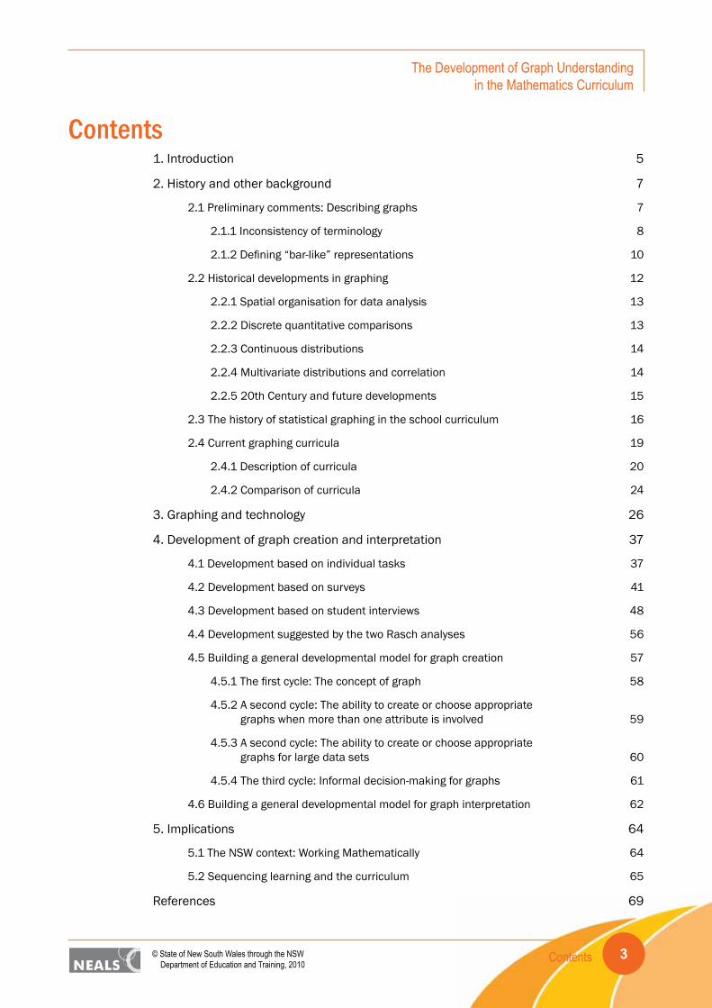
Contents1. Introduction 5
2. History and other background 7
2.1 Preliminary comments: Describing graphs 7
2.1.1 Inconsistency of terminology 8
2.1.2 Defining “bar-like” representations 10
2.2 Historical developments in graphing 12
2.2.1 Spatial organisation for data analysis 13
2.2.2 Discrete quantitative comparisons 13
2.2.3 Continuous distributions 14
2.2.4 Multivariate distributions and correlation 14
2.2.5 20th Century and future developments 15
2.3 The history of statistical graphing in the school curriculum 16
2.4 Current graphing curricula 19
2.4.1 Description of curricula 20
2.4.2 Comparison of curricula 24
3. Graphing and technology 26
4. Development of graph creation and interpretation 37
4.1 Development based on individual tasks 37
4.2 Development based on surveys 41
4.3 Development based on student interviews 48
4.4 Development suggested by the two Rasch analyses 56
4.5 Building a general developmental model for graph creation 57
4.5.1 The first cycle: The concept of graph 58
4.5.2 A second cycle: The ability to create or choose appropriate graphs when more than one attribute is involved 59
4.5.3 A second cycle: The ability to create or choose appropriate graphs for large data sets 60
4.5.4 The third cycle: Informal decision-making for graphs 61
4.6 Building a general developmental model for graph interpretation 62
5. Implications 64
5.1 The NSW context: Working Mathematically 64
5.2 Sequencing learning and the curriculum 65
References 69

4 © State of New South Wales through the NSW Department of Education and Training, 2010
The Development of Graph Understanding in the Mathematics Curriculum
Introduction 5© State of New South Wales through the NSW Department of Education and Training, 2010
The Development of Graph Understanding in the Mathematics Curriculum
1. IntroductionGraphs play a highly significant role across the mathematics curriculum, providing visual means of presenting information that may be held for example in a functional relationship or a data set. The visual representations provide numerical, pictorial, and statistical information by combining symbols, points, lines, a coordinate system, numbers, shading and colour (Tufte, 1983), with the aim of conveying information quickly and efficiently. This report focuses on the application of graphs for portraying data, and their potential as instruments for reasoning about quantitative information.
Whereas the conventions for creating graphs in the algebraic side of mathematics in various coordinate systems appear fixed, in statistics there is much more flexibility and lack of agreement on what the conventions should be. This may be due to the more recent emergence of the field of statistics and in the next 50 years perhaps more rigid conventions will emerge. It also may be that graphing in statistics has needed to be more flexible because the stories held within data sets are so varied. Authors such as Tufte (1983, 1990, 1997) and Wainer (1997) demonstrate the very large differences in representations of data that have been used to tell the stories of various kinds of data. Most of the graphs they show are not included in the school mathematics curriculum, probably because of the influence of the rest of the curriculum in requiring tight conventions and because there would be too many “types” to cover reasonably in an already crowded curriculum. This rigidness has encouraged various graph types to be introduced at particular stages of the curriculum, only to be superseded by other graph types introduced later on. It is somewhat unfortunate for example that the pictograph, which is included in the mathematics curriculum for the early years of schooling, has traditionally been forgotten, whereas it is often used in media and older students need to be able to analyse such forms critically, particularly where “area” is involved in representing quantity.
One of the difficulties with being too rigid in prescribing graphical conventions for statistical data across the school years is that it may have the effect of stifling students’ creativity in thinking of ways to tell the stories in their data sets. Research such as that of Moritz (2006) demonstrates many successful but unconventional attempts by quite young students to show association between variables. To suggest to teachers that students cannot display stories of association until they have been taught the rules for creating a scatterplot, would be very unfortunate. Allowing creativity within bounds, however, is likely to put stress on the assessment of graphing skills. “Correct” answers for items such as “draw a graph to show that for children, as they get older they grow taller” and “draw a scatterplot for the following data set of children’s ages and heights” are unlikely to look similar to each other. The second will display the procedural skills whereas the first is likely to determine if students understand how to connect the two variables and create a representation.
Another difficulty arises when students use software applications to create graphs. Software applications are designed to enable students to visualise data to promote sense-making from the arrangement of information in space. At their best, they provide dynamic interactive structures that can be manipulated easily, reducing the burden of graph creation on students. Some graphing software packages, however, are not interactive and apply rigid graphing conventions, often producing graphs that do not make sense and are not useful. An emphasis on applying graphical conventions enforced by the software may not only limit the way in which students use graphing

Introduction6
The Development of Graph Understanding in the Mathematics Curriculum
© State of New South Wales through the NSW Department of Education and Training, 2010
software to be creative but also limit the way it can be used to influence students’ thinking and understanding. The selection of graphing software to enact the curriculum should be based on its ability to provide the best learning environment for achieving the outcomes of developing students’ thinking about data as well as graph creation.
How to build creativity of graph construction into the curriculum given the constraints noted is a great challenge. Curricula need to be constructed and implemented carefully and writing realistic assessment items (plus having the resources to mark them) is not easy. Teachers also need to have enough appreciation of tasks undertaken in the classroom so that they can recognise appropriate uses of a variety of graphical representations in order to guide both adaptations of created forms and movement toward conventions. There is no doubt that conventions are needed but students need to appreciate why particular graphs do the appropriate job of telling the story in the data.
The underlying themes that contribute to this report are:
• the history of graphing, both outside and inside the school curriculum;
• the 21st century graphing technology, including what it does and does not offer;
• research on the development of student understanding;
• recognition of the close and critical relationship of graph creation and graph interpretation; and
• the implications of graph understanding for Working Mathematically interpreted as facilitating decision-making.
These themes contribute to the recommendations for implementation of a 21st century graphing curriculum.
History and other background 7© State of New South Wales through the NSW Department of Education and Training, 2010
The Development of Graph Understanding in the Mathematics Curriculum
2. History and other background2.1 Preliminary comments: Describing graphs
Tufte’s three books, The Visual Display of Quantitative Information (1983), Envisioning Information (1990), and Visual Explanations: Images and Quantities, Evidence and Narrative (1997), provide a commentary on the different types of visual images developed since the 1600s. They show a variety of representations that are often complex and multi-dimensional, requiring well developed analytical and critical thinking skills to interpret. They also illustrate the way in which powerful imagery has been used to communicate with audiences.
A recurring theme throughout Tufte’s three books is the need for graphing practices to be committed to finding, telling, and showing the truth about the data. He emphasised the importance of visual representations being able to sum up and convey information as well as stimulate ideas. He also recognised that the construction of data displays is as much about reasoning about statistical evidence as it is about displaying statistical information effectively. The effectiveness, however, depends heavily on the ability of the user to understand the imagery used and the conventions applied. Playfair (1805) recognised the potential complexity of graphs and cautioned:
Opposite to each Chart are descriptions and explanations. The reader will find, five minutes attention to the principle on which they are constructed, a saving of much labour and time; but, without that trifling attention, he may as well look at a blank sheet of paper as at one of the Charts. (p. xvi)
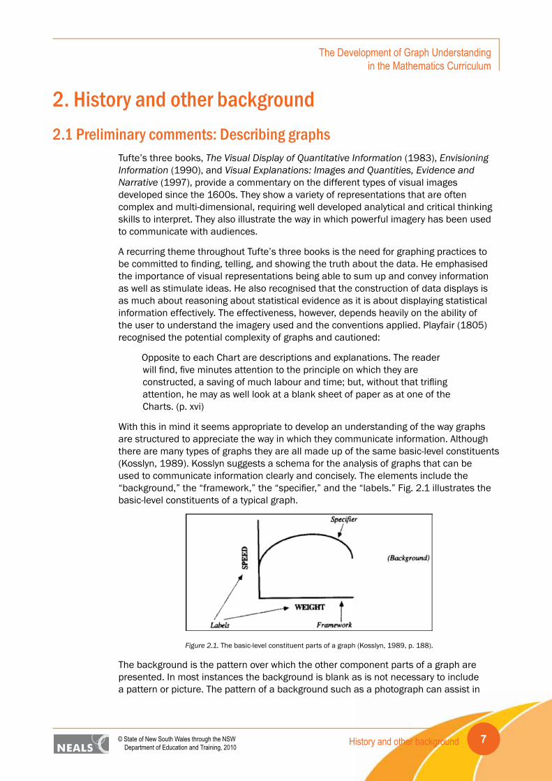
With this in mind it seems appropriate to develop an understanding of the way graphs are structured to appreciate the way in which they communicate information. Although there are many types of graphs they are all made up of the same basic-level constituents (Kosslyn, 1989). Kosslyn suggests a schema for the analysis of graphs that can be used to communicate information clearly and concisely. The elements include the “background,” the “framework,” the “specifier,” and the “labels.” Fig. 2.1 illustrates the basic-level constituents of a typical graph.
Figure 2.1. The basic-level constituent parts of a graph (Kosslyn, 1989, p. 188).
The background is the pattern over which the other component parts of a graph are presented. In most instances the background is blank as is not necessary to include a pattern or picture. The pattern of a background such as a photograph can assist in
History and other background8
The Development of Graph Understanding in the Mathematics Curriculum
© State of New South Wales through the NSW Department of Education and Training, 2010
conveying the information of the graph but when too detailed, may interfere with the ability to read the graph.
The framework extends to the edges of the graph and its function is to organise the graph as a meaningful whole. Some graphs may have an inner framework which is nested within the outer framework. An inner framework is a structure (e.g., a grid) that maps points on the outer framework to other parts of the display.
The specifier conveys specific information about the framework by mapping parts of the framework to other parts of the framework. The specifier may be a point, line, or bar and is often based on a pair of values.
The labels of a graph are an interpretation of a line or region. They may be letters, words, or pictures that provide information about the framework or the specifier.
To analyse graphs it is necessary to understand the interrelated connections among the constituents of a graph. The connections foster the interpretation of graphs on three levels (Kosslyn, 1989). First the individual elements and their organisation can be described. Second, understanding of the display can be determined by looking at the relations between the elements of the graph. Third, the analysis can extend to interpretation of the symbols and lines that goes beyond the literal reading of the information. The interpretation of the meaning of the graph is conveyed by the way in which the information is organised.
Influenced by the work of Kosslyn, Curcio (1989) considered school students’ interpretation of graphs from three perspectives, reading data directly, reading “between” the data, and reading “beyond” the data. Shaughnessy (2007) added to this by suggesting the further need to read “behind” the data. These phrases reflect to some extent the increasing demands of the levels suggested by Kosslyn (1989). The work of Curcio in turn influenced other developmental models as is discussed in Section 4.
2.1.1 Inconsistency of terminology
One of the frustrating aspects of studying the history of graphing, research on graphing and suggestions for specific graphs to be included in the school curriculum is the lack of consistency in nomenclature and definition. Sometimes the same name is applied to slightly different representations and sometimes a particular graph has several names. The bar graph or bar chart is one that has various definitions, sometimes representing a total frequency of a category or individual values of data, and at other times displaying internal frequencies or percentages with respect to the category. The box plot or box-and-whisker plot is plagued with distinctions about how long its whiskers ought to be. For younger students the whiskers extend to the extreme values in the range of the data but later some definitions insist that the whiskers should be 1.5 times the length of the interquartile range, with values further out marked individually as outliers. Moore and McCabe (1989) also suggest that at times for large data sets it may be appropriate to use the 10th and 90th percentiles as the ends of the whiskers.
Perhaps the most confusing nomenclature or lack of it is associated with a graph that plots measurement values, e.g., temperature, for each case of a variable, e.g., various dates throughout the year. This temperature-date graph is the example presented in the National Council of Teachers of Mathematics’ (NCTM) Standards (1989, p. 55) with no name to accompany it (see Fig. 2.2). Chick, Pfannkuch, and Watson (2005, p. 87)

History and other background 9© State of New South Wales through the NSW Department of Education and Training, 2010
The Development of Graph Understanding in the Mathematics Curriculum
presented a graph of similar appearance for fast food consumption of 16 students, again without naming it. Whether such a graph tells the story of the relationship between two variables depends on the data. When looking at correlation, Konold (2002) said such a graph was made up of “case-value” bars, creating a case-value graph. The term value bar graph is used in the software TinkerPlots and the bars can be displayed either horizontally or vertically. Choosing the type of icon for the representation makes it possible to switch between value bars and dots that can create a stacked dot plot. Cobb (1999) suggested that moving from horizontal value bars to a stacked dot plot assisted students to make the connection between the magnitude of the measurement and the scale upon which the dots were plotted. This discussion is further developed in the following section with examples.
Figure 2.2. Graph of temperature values (NCTM, 1989, p. 55).
The confusion of naming and usage for such “value” graphs is a focus here because it is the kind of graph often created spontaneously by less-experienced but creative students (e.g., Chick & Watson, 2001; Pfannkuch & Rubick, 2002). Whether the graph is a step to a uni-variate distribution or a scatterplot of two variables, it is important to acknowledge its existence and potential for helping students tell the story in a data set. Associated with the creation of various types of value graphs is the idea of transnumeration. Wild and Pfannkuch (1999) introduced the term transnumeration for the process of “changing representations to engender understanding” (p. 227). They included three aspects: (i) capturing measures from the real world, (ii) reorganising and calculating with the data, and (iii) communicating the data through some representation. Although all three aspects are highly relevant to students doing genuine statistical investigations, the second and third aspects are the most closely related to graphs and graphing. The second is relevant because it is through the different arrangements of data (e.g., combining across different characteristics or choosing to display frequencies rather than values) that different representations are created. Success is likely to depend on knowing what types of representation are useful and having a range of techniques for transforming data into forms conducive to such representations (Chick, 2003).
Another source of confusion is associated with “line plot” or “dot plot” or “stacked dot plot,” all of which refer to a scaled (usually) horizontal line with dots indicating all values in the data set. Particularly useful with smaller data sets, such plots display shape – gaps, clumping, skewness, and spread. Stacked dot plot is the phrase used in this report due to the confusion of “line plot” with “line graph,” the latter being a phrase used for

History and other background10
The Development of Graph Understanding in the Mathematics Curriculum
© State of New South Wales through the NSW Department of Education and Training, 2010
graphs usually displaying sequential data (e.g., hourly-temperatures over a day) where the dots for the data values are connected with straight lines.
2.1.2 Defining “bar-like” representations
The difference between a case-value plot and a bar chart, which may superficially look the same, is that each “bar” for a case-value plot represents an individual data point, whereas a bar chart collects together like data values and reports their total frequency. The time this can be most confusing is when those data in the set themselves are frequency or count values, for example “how many books each child in the class has read.” For a class of 12 children the following might be the data:
Mary 2 Anne 4 George 4 Barb 4
Tom 3 Jerry 0 Dan 2 Laura 3
Carol 4 Fred 2 Ken 1 Pat 1
The case-value plot could look like the plot in Fig. 2.3.
Figure 2.3. Case-value plot of number of books read by students.
This plot puts the names in alphabetical order. The plot might also be arranged in numerical order, say from least number of books read to most as in Fig. 2.4.
Figure 2.4. Case-value plot ordered by number of books read by students.
For young children this type of plot is likely to aid the transnumeration into a bar chart. A bar chart of these data represents the number of data points (students) who have read each number of books. Hence looking across the data there are five possible values the

History and other background 11© State of New South Wales through the NSW Department of Education and Training, 2010
The Development of Graph Understanding in the Mathematics Curriculum
data take: “0,” “1,” “2,” “3,” and “4.” The frequencies for each value are determined by the number of students who read that number of books, as in Fig. 2.5. In this situation using words rather than numbers on the horizontal axis may be helpful to ease confusion.
Figure 2.5. Bar chart of frequency of number of books read by students.
Sometimes the suggested transition from a case-value plot (Fig. 2.4) to the bar chart (Fig. 2.5) is to stack the names of the students in a column to create the bars in the bar chart. The names are associated with the number of books read not the actual books themselves (e.g., Fig. 2.6).
Figure 2.6. Stacked data to create a bar chart.
The transnumeration of measurement data, e.g., height, from a case-value plot is in many cases likely to create a stacked dot plot rather than a bar graph (Fig. 2.7) so perhaps there is likely to be less confusion of the two forms (see also Konold & Higgins, 2003).

History and other background12
The Development of Graph Understanding in the Mathematics Curriculum
© State of New South Wales through the NSW Department of Education and Training, 2010
Figure 2.7. Case-value plot with corresponding stacked dot plot.
2.2 Historical developments in graphingQuantitative graphics have been used since ancient times to represent information. They have their origins in mapping but have evolved over time to become important data analysis tools. The Egyptians used a coordinate system to show the location of points in real space c3200BC and used graphical representations to show the area of shapes, including squares, trapeziums, triangles and circles c1500BC (Beniger & Robyn, 1978). From that time until the 1600s, for the most part, graphical representations were used for mapping, and recording the orbits of planets over time. It was not until the late 18th and early 19th centuries that the use of graphs and charts for data displays became accepted practice (Fienberg, 1979). Since that time the development of graphic methods has depended on advances in technology, data collection and statistical theory (Friendly, 2007).
In a brief overview of the history of quantitative graphics in statistics, Beniger and Robyn (1978) describe four stages that correspond to successive historical periods that began in the early 1600s. During these periods developments were made that came about as a result of major graphical problems that preoccupied scientists and data analysts at the time. The four stages are: spatial organization for data analysis, discrete quantitative comparisons, continuous distributions, and multivariate distributions and correlation. Beniger and Robyn also include another section that introduces the innovations developed in the 20th century. Collectively, the four stages and the 20th century innovations describe progressive developments that have influenced the way in which data are represented and analysed today. Although the developments were

History and other background 13© State of New South Wales through the NSW Department of Education and Training, 2010
The Development of Graph Understanding in the Mathematics Curriculum
introduced in successive historical periods, the ideas introduced in earlier periods were not superseded by successive developments. Elements of each stage were carried over and incorporated into the next.
2.2.1 Spatial organisation for data analysis
Technological innovations in the form of automatic measuring devices invented in the 17th and 18th centuries made it possible to collect and record large sets of data. Measuring devices such as the air and water thermometer, weather-clock, pendulum clock, and mercury thermometer were used to develop scientific instruments that were capable of making multiple measurements. As a result, new ways of organising and analysing data were necessary to handle the large collections of data. Generally, the automatic recording devices produced moving line graphs that represented data collected over a period of time using a coordinate system. At the time, it was common for the data to be translated from this graphical form into tabular form for analysis. The graphical form was considered a means of recording data and the potential for it to be used for analysis did not occur until later. The coordinate system of Cartesian plots reintroduced in mathematics by Descartes in 1637 did not become an important tool for data analysis until the 1830s (Beniger & Robyn, 1978).
2.2.2 Discrete quantitative comparisons
The combination of visual imagery and statistical data to create graphical representations of information other than scientific data was instigated by Playfair in 1786. He replaced tables of numbers with visual representations, creating the opportunity to use pictures and graphics to reason about quantitative information (Tufte, 1983). The graphs Playfair produced were very complex, often displaying multivariate data on the same graphic. Although others preceded Playfair in using graphics to display data, he extended their use to the areas of economics and finance, making the use of statistical graphics popular for general interest information (Wainer & Velleman, 2001).
One of Playfair’s first innovations was the bar chart. This representation was used to display categorical data. At the time, he was very cautious about the effectiveness of bar charts and apologised for their lack of detail as they were not related to a particular duration of time, as with time-series graphs (Funkhouser, 1937). Ironically, bar charts have become a universal language and it is the simplicity of the representation that has made them so useful.
During the 1700s scientists and economists developed ways of gathering large amounts of information about populations and social activities, such as trade data. Although it was commonplace to organise the data into tables for analysis, it was time consuming and difficult. To address this difficulty, Playfair developed the circle graph (pie chart) to allow for the visualisation of data. He recognised that people were able to make direct comparisons of proportion and magnitude of shapes intuitively by eye, stating: “it is the best and easiest method of conveying a distinct idea” (Playfair, 1801, p. 4). He also went on to elaborate about the compelling nature of graphical representations.
It is different with a chart, as the eye cannot look on familiar forms without involuntarily as it were comparing their magnitudes. So that what in the usual mode was attended with some difficulty, becomes not only easy, but as it were unavoidable. (p. 6)

History and other background14
The Development of Graph Understanding in the Mathematics Curriculum
© State of New South Wales through the NSW Department of Education and Training, 2010
Playfair applied these principles in a graph displaying the area, population, and revenue of European countries, with circles representing the area of countries and lines representing population and tax data. The areas of the circles were proportional to the areas of the countries, allowing for direct comparison. Some of the circles were segmented and coloured, displaying the data as parts of the whole and differentiating the parts by colour. The resulting graphic is a pie chart whose main purpose is to display the relationship of a part to the whole (Spence, 2005).
2.2.3 Continuous distributions
In 1821, J. B. J. Fourier was the first to apply graphical analysis to population statistics, furthering the development of vital statistics. In order to show the number of inhabitants of Paris per 10,000 in 1817 who were of a given age or over, he developed the cumulative frequency distribution. He began with a bar chart representing the age groupings, and then placed the bars one atop each other for a particular age range (Beniger & Robyn, 1978). This was repeated for other age ranges at regular intervals to produce a graph. Fourier analysed the cumulative frequency distribution to determine geometrically “the mean duration and probable duration of life, the mean age of a population and the stability of life” (Funkhouser, 1937, p. 296). The cumulative frequency distribution was named an “ogive” by Galton in 1875 (Beniger & Robyn, 1978). Cumulative frequency is used to construct box plots, a semigraphical innovation designed by Tukey in 1977.
Another innovation developed from the bar chart was the histogram. In 1833, A. M. Guerry produced histograms by arranging ordered categories for continuous data (Beniger & Robyn, 1978). He used columns of equal width to represent the frequency for each class at equal intervals of the data. A frequency polygon was obtained by joining the midpoints of the class intervals. The broken line formed begins and ends on the horizontal axis, resulting in an irregular polygon. The frequency curve was the smoothed curve derived from the frequency polygon (Funkhouser, 1937). The word “histogram” was first used by Karl Pearson (1895) in Contributions to the Mathematical Theory of Evolution – II. Pearson recorded data collected in a histogram and compared the graph with a corresponding theoretical skewed frequency curve. Adolphe Quetelet furthered the development of the graphics of continuous distributions by applying the theory of probabilities to graphical methods (Funkhouser, 1937). In 1846 he recorded the results of sampling from urns as symmetrical histograms, and then showed the limiting “curve of possibility.” This was developed further and later called the normal curve (Friendly, 2009).
2.2.4 Multivariate distributions and correlation
During the mid-19th century the data related to vital statistics became more complex and involved interrelationships among more than two variables. Contour maps and stereograms were developed to accommodate this increase in complexity as they provided two dimensional representations of multivariate distributions and correlations. The use of contour maps included the display of population density in a geographic region and stereograms were used to represent the density of a population by age groupings for a particular region. When the relationship between two variables is examined, the data are referred to as being bivariate.
History and other background 15© State of New South Wales through the NSW Department of Education and Training, 2010
The Development of Graph Understanding in the Mathematics Curriculum
Bivariate data provide information about two variables that are not necessarily dependent on each other. A scatterplot is a graphical technique used to display bivariate data: paired measurements of two quantitative variables. It is a useful exploratory method for identifying clusters of points and outliers in a distribution of bivariate data. It assists in the identification of the relationship and dependence between the variables, and variation from those (Cleveland, 1993).
2.2.5 20th Century and future developments
After a period of time in the early 1900s when formal statistical analysis of data was favoured over graphical analysis, the importance of the visualisation of data for graphical analysis regained prominence. This can be attributed to three main developments. First, Tukey (1977) introduced the concept of exploratory data analysis, second Bertin (1981) developed a theory of graphics, and third technological innovations allowed for the computer processing of statistical data (Friendly, 2009).
Exploratory data analysis (EDA) is an informal, robust, and graphical approach to data analysis that focuses on the appearance of graphs to provide insights about the data rather than making formal inferences from statistical calculations. It is based on graphical representations of data with a few added quantitative techniques. EDA is a paradigm that is flexible and allows data analysis to be repetitive, iterative, and creative (Tukey, 1977). Tukey suggests that data analysis is not just about getting the right answer to a question. It is also about what influences the answer, what questions are asked and the way in which they are asked. These notions are in opposition with confirmatory data analysis (CDA). CDA employs principles and procedures that look at a sample and what it can tell us about the larger population. It is then assessed to determine the precision with which the inference from sample to population is made.
Tukey (1977) suggests that exploratory data analysis should be taught along with the techniques of confirmatory data analysis. He states: “We need to teach exploratory as an attitude, as well as some helpful techniques, and we probably need to teach it before confirmatory” (Tukey, 1980, p. 25). He refers to exploratory data analysis as:
It is an attitude, AND
A flexibility, AND
Some graph paper (or transparencies, or both).
The graph paper – and transparencies are there, not as a technique, but rather as a recognition that the picture-examining eye is the best finder we have of the wholly unanticipated. (Tukey, 1980, p. 24)
Tukey (1977) designed semigraphical displays that provided a visual representation of the data as well as statistical information. These included the stem-and-leaf display and the box-and-whisker plot. The stem-and-leaf display is an alternative to tallying values into frequency distributions. It displays a distribution of a variable with numbers themselves. In overall appearance the display resembles a horizontal histogram (Emerson & Hoaglin, 1983). The distribution of two data sets can be compared when displayed as a back-to-back stem-and-leaf plot. Another useful display for comparing multiple data sets is the box-and-whisker plot (Emerson & Strenio, 1983; Feinberg, 1979). The box-and-whisker plot can be determined from cumulative frequency and is directly related to the ogive representation.

History and other background16
The Development of Graph Understanding in the Mathematics Curriculum
© State of New South Wales through the NSW Department of Education and Training, 2010
The second development of the 20th century is attributed to the work of Bertin (1983). In 1967 he published his theory of information visualisation in French, Semiologie Graphique. Bertin’s interest in this area started when he identified that graphical representations produced in scientific publications were not understood. The theory he developed focused on the interpretation of the visual and perceptual elements of graphics. His work made a distinction between how the qualitative and quantitative elements imparted meaning (Card, Mackinlay, & Shneiderman, 1999). Tufte (1983) also developed a theory of data graphics that emphasised the maximisation of the density of information and the minimisation of extraneous information he termed “chart junk.”
Advances in computer technologies have had and will continue to have a significant impact on the analysis of data and the visual displays used to represent the data. Graphing software and associated technologies provide an alternative to hand-drawn graphics, embellishment of older graphical types, analysis of large multivariate data sets, and representation of multivariate data sets in two or three dimensions (Beniger & Robyn, 1978). Graphing software such as TinkerPlots: Dynamic Data Exploration (Konold & Miller, 2005), are evidence of the way in which interactive and digital technologies are intersecting with the theories of graphics and the philosophy of EDA. In the future, the application of computer technologies to data analysis has the potential to produce new and innovative data representations.
2.3 The history of statistical graphing in the school curriculumThis section considers graphs related to portraying data, not related to functions and relationships elsewhere in the mathematics curriculum. In fact early arithmetic and algebra books (e.g., Hall & Knight, 1885; Pendlebury, 1896) had no graphing at all in them. There were no early books on statistics for schools but by the 1930s it is possible to see what kinds of graphs were being used in applications of statistics. Boddington (1936) in writing about statistical applications to commerce devoted two chapters to “the graphic method.” The first and simplest form of graph introduced was what today would be called an ordered case-value plot (for 80 items) (cf. Sections 2.1.1, 2.1.2), including the lower quartile, median, and upper quartile. This was followed by a frequency polygon, a normal frequency curve, an ogive for cumulative frequency, “historigrams,” as well as other “bar” and “block” graphs. He then described various diagrams as “pictograms,” including segmented bar diagrams, comparison diagrams based on areas of squares and circles, as well as an adaptation to show three variables. Each of the representations is elementary enough to be included in the school curriculum.
In 1980 the NCTM in the US proposed an Agenda for Action in Mathematics for the 1980s including eight recommendations. In 1983 the Council’s Yearbook, The Agenda in Action (Shufelt, 1983), reported on the recommendations with articles reporting “actions” related to them. Although none of the recommendations specifically mentioned statistics, Recommendation 2 concerning basic skills being more than computational ability, provided the opportunity to tie statistics to the quantitative needs of an information society. Swift (1983) did this and included scatterplots and stem-and-leaf plots. Recommendation 6 called for “more mathematics” and Noether (1983) suggested applying mathematical concepts to lines of fit for scatterplots. This was a very humble beginning in gaining a place for statistics and graphing in the mathematics curriculum. Also in 1980, the Schools Council published its report on Teaching Statistics 11-16 (Holmes, 1980), which presented comprehensive coverage of the state of statistics

History and other background 17© State of New South Wales through the NSW Department of Education and Training, 2010
The Development of Graph Understanding in the Mathematics Curriculum
education in the UK, the needs and proposals for schools. Graphs and graphing were an innovative part of the suggested lessons.
In the meantime, the NCTM had acknowledged the potential of statistics and probability by publishing its 1981 Yearbook (Shulte, 1981) on the topic. Among the contributions, Maher (1981) introduced side-by-side and back-to-back histograms, back-to-back stem-and-leaf plots, and box plots, all shown to be useful for examining classroom data. The 1980s also brought a growing recognition that statistics deserved a place in the mathematics curriculum and the Quantitative Literacy series produced by the NCTM and the American Statistical Association (ASA) provided realistic contexts and straightforward explanations for meaningful applications. The graphical forms introduced in this series (Landwehr & Watkins, 1986) were exactly those that came to inhabit the curricula that followed: stacked dot plots (line plots), stem-and-leaf-plots, box plots, scatterplots, and time series plots.
By the time of the publishing of the NCTM’s Curriculum and Evaluation Standards for School Mathematics (1989), statistics and probability were accepted as warranting inclusion among the standards. For the K-4 Standard, the graphing form displayed, although not given a name, was again equivalent to a value bar plot (cf. Section 2.1.1). For the 5-8 Standard for Statistics, line graphs and box-and-whisker plots were the examples used with an emphasis on interpreting the information provided in them. The graphical display in conjunction with the 9-12 Standard for Statistics was a scatterplot with a regression line. In the Probability Standard at the 9-12 level the standard normal distribution was displayed, linked to the actual data scale and showing a shaded region of probability. A stem-and-leaf plot was used to display simulation outcomes but it was not stated that this is the level for the stem-and-leaf plot to be introduced. In a document with the scope of the NCTM Standards, it would be impossible to suggest all the appropriate graphical types for each of the three levels. Subsequent research has shown that it may be preferable to introduce box-and-whisker plots later (e.g., Bakker, 2004) and students can understand stem-and-leaf plots before grade 9.
Following the NCTM’s 1989 statement and a similar document from the Department of Education and Science and the Welsh Office (1989) in the UK, various individuals and groups made suggestions for appropriate graphical forms for various ages. Rangecroft (1991a) gave examples of representations suitable for the first Key Stage of the UK curriculum for children up to age 7. She included a progression of pictographs and mapping diagrams to tell stories of relationships, and included several types of “temporary” graphs made with concrete materials or with the children themselves, as well as “block” graphs, ending with bar charts. Rangecroft considered bar charts quite abstract and not the appropriate starting point for young children’s graphing experiences. Many of her suggestions, for example, related to tallying and pictograph symbols representing more than one value, are likely to be the type of representation created independently by students without instruction if given initial starting points.
Rangecroft (1991b) went on to suggest a progression for the secondary years that again paralleled the UK curriculum, moving from bar charts to include stem-and-leaf plots, scaled bar charts, scaled strip graphs, stick graphs, line graphs, box-and-whisker plots, pie charts, scatterplots, frequency polygons, cumulative frequency curves, histograms, graphs with non-linear scales, special distributions, and plots on special paper (e.g., star diagrams). Rangecroft was particularly concerned to emphasise the importance of scale in graph creation and this is confirmed by other research showing students’ difficulties

History and other background18
The Development of Graph Understanding in the Mathematics Curriculum
© State of New South Wales through the NSW Department of Education and Training, 2010
in this area (e.g., Moritz & Watson, 1997). According to Rangecroft’s progression no new graph types were introduced between ages 7 and 12.
At about this time the Center for Statistical Education of the American Statistical Association put out its own guidelines, Teaching Statistics: Guidelines for Elementary through High School (Burrill, Scheaffer, & Rowe, 1994). It is interesting that the 10 principles in the document only mentioned graphing explicitly in Number 5: “The exploration of and the experimentation with simple counting and graphing techniques should precede formal algorithms and formulas” (p. 5). Throughout the 28 activities suggested for grades K to 12, the usual representations are suggested: pictographs, bar graphs, stem-and-leaf plots, stacked dot plots (line plots), and histograms. “Broken-line graphs” were the only new graph suggested in the activities. It is significant to note that the ASA guidelines are not built around graphing and various graph types but on the types of experiences students should have and where graphs are tools for assisting in the overall process to reaching a conclusion based on data.
Australia’s A National Statement on Mathematics for Australian Schools (Australian Education Council, 1991) followed the United States (US) and UK models, including Chance and Data as one of five content strands. In the Statement itself, no different types of graphs from those already mentioned were introduced but several salient comments were made about the process of creating and using graphs.
Whether the ‘graphs’ are concrete, pictorial or more symbolic, the need to use a common baseline when comparing frequencies or measures is a fundamental notion which is not at all obvious to young children, and which develops gradually as they gain experience in using graphs to compare occurrences. (Band A, p. 165)
Graphs should not be regarded as an end in themselves; rather they should serve purposes which are clear to children. As the children perceive the need for increasingly sophisticated forms of data representation, the teacher can assist them by introducing new methods of representation. Little is likely to be achieved by providing a collection of data (found in a text) and having children practise drawing graphs types in isolation. (Band B, p. 168)
Many interpretations of data are based on summary statistics, such as measures of central tendency, variability and association, and graphs such as line plots [stacked dot plots], histograms, stem-and-leaf plots, box plots, scatter plots, and lines of best fit. Students should be able to interpret these various representations, understand the conditions under which their use is appropriate, and compare and select from different possible representations of the same data. (Band C, p. 173)
The second iteration of the NCTM’s suggested curriculum, Principles and Standards for School Mathematics (2000), had similar structure to the 1989 document but divided the years of schooling into four sections rather than three, extending the earliest downward to include Pre-K-2 and changing the title related to statistics to Data Analysis and Probability. The representations shown for Pre-K-2 included placing counters in bowls, creating horizontal [value] bar graphs for data for children in the class, and creating a stacked dot plot to display the frequency for each “group” of the data. An innovation in this document was the introduction of a misleading display to raise students’ awareness
History and other background 19© State of New South Wales through the NSW Department of Education and Training, 2010
The Development of Graph Understanding in the Mathematics Curriculum
of potential difficulties of interpretation at an early age. At the 3-5 level, spreadsheets of data were introduced but no advice was given on using the graphing software likely to be available with spreadsheets. The translation of data from tallies in tables to stacked dot plots was shown along with recommendations for comparing two different plots. Bar graphs, although not named, were shown for recording frequencies for several categories of two attributes. The focus on comparing and contrasting data sets was significant because it was intended to create greater interest in students and motivate them to use their graphing skills productively to answer meaningful questions. The Data Analysis and Probability Standard for grade 6-8 included a relative-frequency histogram, box-and-whisker plots and a scatterplot, whereas the standard for grade 9-12, extended the usage of these graphs combined with other analysis methods such as line-fitting to a scatterplot and using a [value] frequency plot to represent the distribution of simulations for creating random samples. By this level the graphs were seen very much as tools to be used as part of more comprehensive analyses.
It is interesting to return to the introductory paragraph in this section and the summary of the graphs suggested for application to commerce in 1936 (Boddington, 1936). Of Boddington’s representations, the main omission in curriculum documents is to any reference to graphs where area represents magnitude. The exception to this might be considered to be the Pre-K-2 reference to a misleading representation by the NCTM (2000). As critical statistical literacy is now part of the curriculum and the use of such graphs based on area in the media is often misleading, it might have been expected that more explicit mention might have occurred. Certainly such examples are consistent with expectations of the 9-12 NCTM Standard to “evaluate published reports.”
The most comprehensive recent document on statistics at the school level is the Guidelines for Assessment and Instruction in Statistics Education (GAISE) framework (Franklin et al., 2007) from the ASA, suggesting curriculum guidelines from pre-K to grade 12. Complementary to the NCTM’s Standards (2000), it provides much more detail across the school years and again graphs are seen as the tools in the data analysis stage of statistical problem solving. As such they feature prominently in the report, with nomenclature that may become the common usage: picture graph, bar graph, dot plot, time plot. Presenting the framework in three levels (A, B, and C), Franklin et al. introduce the graphical forms in levels A and B, applying them in more sophisticated settings in level C. Misleading graphs based on area representations are featured, completing the link back to Boddington (1936). The only one of Boddington’s graphs not featured in the GAISE report is the cumulative frequency graph or ogive. It must be expected that the GAISE report will guide curriculum development in statistics education for the next decade, at least in the US.
2.4 Current graphing curriculaIn this section current curriculum documents from government schools in New South Wales (NSW), Western Australia (WA), Tasmania, and the draft Australian Mathematics Curriculum released for consultation in March 2010 (Australian Curriculum, Assessment and Reporting Authority [ACARA], 2010), are examined to determine how graph creation and graph interpretation are incorporated into K-10 syllabuses. These curriculum documents are considered in relation to the progression of development of graphing proposed by Rangecroft (1991a, 1991b), summarised in the previous section.
History and other background20
The Development of Graph Understanding in the Mathematics Curriculum
© State of New South Wales through the NSW Department of Education and Training, 2010
2.4.1 Description of curricula
The Tasmanian Mathematics Curriculum (Department of Education Tasmania [DoET], 2007) is divided into five standards, with each standard equating approximately to two years of the compulsory years of schooling. The Data component of the curriculum that includes graph creation and graph interpretation is organised within the Chance and Data strand. The development of these notions across the curriculum is seen as complementary, in that most references to graph creation are followed by graph interpretation outcome statements.
In Standards 1−3 the emphasis for graph creation is on the introduction of graph types such as pictographs and bar charts. It is not until Standard 4 that more complex graphs are introduced. Like Rangecroft’s (1991a, 1991b) model, scatterplots and pie charts are introduced in the first two years of high school. Standard 5 does not refer to the introduction of any new graph types but focuses on extending the use of graph types encountered previously.
Graph interpretation is developed progressively across all the standards of the Tasmanian Mathematics Curriculum (DoET, 2007). Collecting, organising, representing, summarising, and describing variation in data are the emphases for graph interpretation in the primary years (Standard 1−3), with Standard 4 focusing on using measures of centre to represent data sets. In Standard 5 graph interpretation shifts towards the application of higher order thinking skills, with an emphasis on analysing, interpreting, justifying, and drawing conclusions from the data.
The NSW Mathematics Curriculum for years K−10 is divided into five stages, Early Stage 1 and Stage 1, Stage 2, Stage 3, Stage 4, and Stage 5 consisting of sub-stages 5.1, 5.2, and 5.3 (Board of Studies New South Wales [BoSNSW], 2002a, 2002b). The curriculum includes a Data strand with a substrand of Data for Early Stage 1−Stage 3, and substrands of Data Representation, Data Representation and Analysis, and Data Analysis and Evaluation for Stages 4−5. In the early years of schooling graph creation starts with the use of concrete materials and pictures to construct different ways of displaying data. In Stage 2 data are represented abstractly in graphs constructed on grid paper. Vertical and horizontal column graphs are introduced during this stage, with the addition of divided bar graphs in Stage 3. In both Stage 2 and 3 the emphases are on using axes with marked scales to construct graphs and naming the components of graphs. In Stage 4 histograms and frequency polygons are introduced, whereas box-and-whisker plots are introduced during Stage 5.2.
In Stages 1−3 of the NSW Mathematics Curriculum (BoSNSW, 2002a) graph interpretation is limited to reading and interpreting different graph types. It is not until Stage 4 that graph interpretation extends to using data to make predictions and the application of measures of centre to analyse data. During Stage 5.2 the nature of graphs in terms of skewedness and the shape of distributions are used to describe graphs.
The WA Mathematics Curriculum (Department of Education and Training Western Australia [DoETWA], 2007) has a Chance and Data strand, with sub-strands of Collect and process data, Summarise and represent data, and Interpret data. Like other curricula, the WA curriculum starts using objects as data and creating graphs from physical models. In contrast to other curricula it does not specify learning about many different graph types but does introduce new ideas about graphing evenly throughout the nine stages of the curriculum. Initially, for graph creation, univariate data are

History and other background 21© State of New South Wales through the NSW Department of Education and Training, 2010
The Development of Graph Understanding in the Mathematics Curriculum
represented in picture and column graphs. In Stage 4 and 5 frequency graphs and scatterplots are used. This is followed by the introduction of histograms and cumulative frequency in Stage 6. During Stages 7 and 8 the focus shifts to calculating trend lines and quantifying association. As in graph creation, graph interpretation in the WA curriculum is developed evenly across the curriculum. It is specifically about using graphical representations to compare data sets, make inferences from samples for the population, and comment on predictions made.
The Australian Mathematics Curriculum (ACARA, 2010) consists of three main organisers: Number and Algebra, Statistics and Probability, and Measurement and Geometry. The curriculum covers the compulsory years of schooling from Kindergarten to Year 10, with an additional section for Year 10 Advanced. In the Statistics and Probability strand, the topics relevant to graph creation and graph interpretation include data representation, data investigations, data interpretation, summary statistics, data measures, and bivariate data. Not all the topics are covered every year, with the emphasis for each year varying. The content related to graph creation and graph interpretation for each year level is summarised in Tables 2.1 and 2.2.
Table 2.1. Summary of the Statistics and Probability strand of the Australian Mathematics Curriculumrelevant to graph creation and graph interpretation – Years K-6.
Year Graph creation Graph interpretation
Kindergarten Pictographs Determining the mode from a graph
Year 1 Pictographs, bar charts Comparing information in data categories
Making connections between different representations of the same data – tables, graphs, and lists
Year 2 Pictographs, bar charts, column graphs
Understanding information stays the same even though the representation may change
Explaining how information can be extracted from graphical representations
Year 3 Pictographs, column graphs, and dot plots
Other graphs from prepared baselines as well as student generated graphs
Pictographs and dot plots involving many-to-one ratios between symbols and data points
Scale
Understanding the purpose and usefulness of different data representations
Understanding the importance of scale and equally spaced intervals on an axis
Comparing different student-generated data representations
History and other background22
The Development of Graph Understanding in the Mathematics Curriculum
© State of New South Wales through the NSW Department of Education and Training, 2010
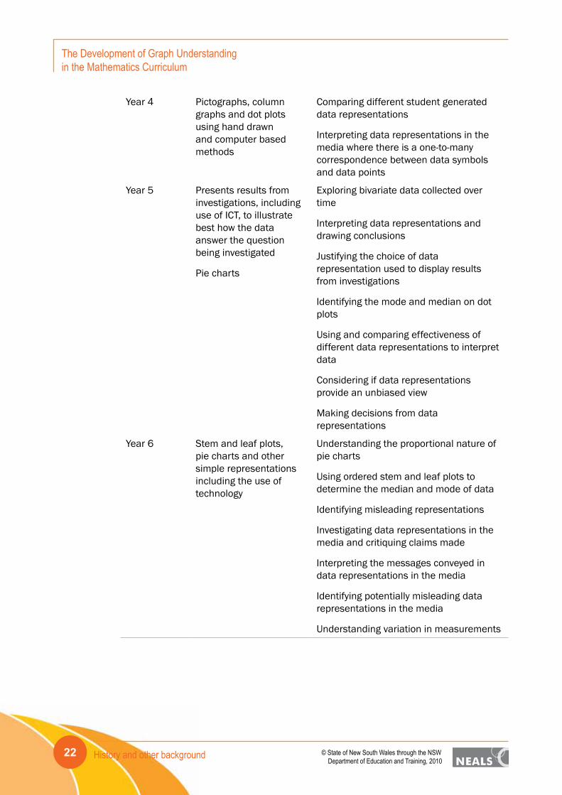
Year 4 Pictographs, column graphs and dot plots using hand drawn and computer based methods
Comparing different student generated data representations
Interpreting data representations in the media where there is a one-to-many correspondence between data symbols and data points
Year 5 Presents results from investigations, including use of ICT, to illustrate best how the data answer the question being investigated
Pie charts
Exploring bivariate data collected over time
Interpreting data representations and drawing conclusions
Justifying the choice of data representation used to display results from investigations
Identifying the mode and median on dot plots
Using and comparing effectiveness of different data representations to interpret data
Considering if data representations provide an unbiased view
Making decisions from data representations
Year 6 Stem and leaf plots, pie charts and other simple representations including the use of technology
Understanding the proportional nature of pie charts
Using ordered stem and leaf plots to determine the median and mode of data
Identifying misleading representations
Investigating data representations in the media and critiquing claims made
Interpreting the messages conveyed in data representations in the media
Identifying potentially misleading data representations in the media
Understanding variation in measurements
History and other background 23© State of New South Wales through the NSW Department of Education and Training, 2010
The Development of Graph Understanding in the Mathematics Curriculum
Table 2.2. Summary of the Statistics and Probability strand of the Australian MathematicsCurriculum relevant to graph creation and graph interpretation – Years 7-10A.
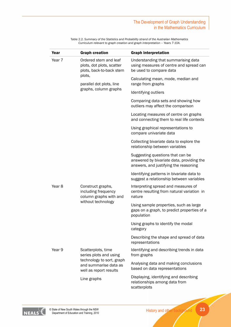
Year Graph creation Graph interpretation
Year 7 Ordered stem and leaf plots, dot plots, scatter plots, back-to-back stem plots,
parallel dot plots, line graphs, column graphs
Understanding that summarising data using measures of centre and spread can be used to compare data
Calculating mean, mode, median and range from graphs
Identifying outliers
Comparing data sets and showing how outliers may affect the comparison
Locating measures of centre on graphs and connecting them to real life contexts
Using graphical representations to compare univariate data
Collecting bivariate data to explore the relationship between variables
Suggesting questions that can be answered by bivariate data, providing the answers, and justifying the reasoning
Identifying patterns in bivariate data to suggest a relationship between variables
Year 8 Construct graphs, including frequency column graphs with and without technology
Interpreting spread and measures of centre resulting from natural variation in nature
Using sample properties, such as large gaps on a graph, to predict properties of a population
Using graphs to identify the modal category
Describing the shape and spread of data representations
Year 9 Scatterplots, time series plots and using technology to sort, graph and summarise data as well as report results
Line graphs
Identifying and describing trends in data from graphs
Analysing data and making conclusions based on data representations
Displaying, identifying and describing relationships among data from scatterplots

History and other background24
The Development of Graph Understanding in the Mathematics Curriculum
© State of New South Wales through the NSW Department of Education and Training, 2010
Year 10 Box plots, parallel box plots
Comparing visually and numerically the centre and spread of data sets
Judging the spread of data visible on dot plots
Determining whether one data set is more or less spread than another
Choosing among graphs and measures of centre and spread to suit data analysis purposes
Suggesting alternative models for representing data
Year 10 Advanced
Scatterplots, graphs showing linear relationships in bivariate data
Interpreting the slope and intercept of the least squares line
Distinguishing between interpolation and extrapolation when using least squares lines to make predictions
Describing the relationship between two numerical values
In relation to the discussion of terminology in Section 2.1.2, the elaboration for column graph in Year 2 is a case-value plot whereas for Year 3, the elaboration for a column graph is a frequency plot using children’s names as counters. In Year 7 again column graph represent case values (lengths) over time and the term “frequency column graph,” does not occur until Year 8. A striking omission is the term “histogram.” Its presence and importance across the history of statistics (cf. Section 2.2) and the school statistics curriculum (cf. Section 2.3), as well as current usage (e.g., Shaughnessy, Chance & Kranendonk, 2009), would suggest this may lead to recommendations for its inclusion at Year 9 or 10.
2.4.2 Comparison of curricula
The WA (DoETWA, 2007) and Tasmanian (DoET, 2007) curricula are similar as they are quite descriptive about the ways in which data and graphs could be used to compare groups, describe association, make predictions, and interpret data within a context. The detail provided for graph interpretation is quite specific in both documents, providing vital information about how data can be used to make inferences and inform decisions.
The WA curriculum (DoETWA, 2007) is less crowded than the other curricula examined, staging the introduction of new graph types to coincide with the complexity of the data collected. Column and picture graphs are used to represent univariate data and when bivariate data are introduced they are represented in scatterplots. The interpretation of graphs also aligns with the graph creation concepts. When compared to the WA curriculum the NSW curriculum (BoSNSW, 2002a) introduces more graph types but does not include how graphs and data could be used to make inferences. Statements in the Data strand are limited to “read and interpret graphs” with supporting information on how to use data situated in the Working Mathematically Strand of the curriculum.
History and other background 25© State of New South Wales through the NSW Department of Education and Training, 2010
The Development of Graph Understanding in the Mathematics Curriculum
The Tasmanian curriculum (DoET, 2007) includes more of the conventional graph types than the other curricula but introduces most of them at the beginning of high school as described by Rangecroft (1991b). The advantage of this is that the choice of graph representation available is extensive, potentially providing the opportunity to use the graph type most appropriate for the data collected and the questions explored.
The Australian Curriculum model (ACARA, 2010) develops the notions of graph interpretation progressively across the curriculum and stages the introduction of different graph types across most of the years of schooling similar to the other curricula. It is, however, more general in its descriptions as it often refers to the analysis and interpretation of data without being explicit about how to use graphs for these purposes. It has an emphasis on students developing graphing and data analysis skills when conducting investigations but does not extend the application of these skills to make informed decisions and make conclusions based on the context of the investigation. One aspect of the Australian curriculum not mentioned in any detail in the other curricula is the incorporation of students using secondary data sources, particularly from the media. The need for students to understand how the media and other sources use graphical representations to convey messages cannot be underestimated in today’s society of expanding electronic and digital communication mediums.
In most of the curricula examined in this section there is a lack of recognition that students need to learn about and understand the specific characteristics of different graph types. Kosslyn (1989) suggests that an understanding of the constituent parts of graphs and their relationships with each other is vital to students’ understanding of graphs and their ability to communicate clearly with graphs. This becomes extremely important when students work with different data representations. The story told by the data representations used and the way in which they are displayed can impact on students’ ability to interpret the messages within the data.
Another aspect noticeable for its absence across the curricula is the opportunity for students to develop an understanding of variation. In most of the curricula variation is expressed in terms of “spread” but they do not extend the application of this concept more broadly. The Australian Mathematics Curriculum (ACARA, 2010) does refer to students using the spread of data and the measures of centre to compare data sets in the later years of schooling, as do some of the other curricula, but does not incorporate explicitly these notions with graph interpretation. In Year 6, for example, under the heading of “Variation,” there are elaborations related to measurement variation and collecting repeated measurements but an opportunity is lost to link this to the related observations in graphical representations. For the most part the curricula align the development of variation with the application of box plots.
All of the curricula provide the opportunity for students to use a variety of graph types and stage the introduction across most of the years of schooling. With some curricula there is a density of new graph types introduced at the beginning of high school whereas others spread the introduction more evenly. This spacing of material probably places fewer demands on students to learn a large amount of new information at the same time but it needs to be recognised more explicitly that graphs introduced in the early years should be used continually even after more complex and sophisticated graphical representations are introduced. The emphasis needs to be on using and applying the graphical representation that is most appropriate for the data collected, the questions to be answered, and the context of the problem under investigation.

Graphing and technology26
The Development of Graph Understanding in the Mathematics Curriculum
© State of New South Wales through the NSW Department of Education and Training, 2010
3. Graphing and technologyThe issue of the use of technology in relation to the prescribing of graphing skills in the mathematics curriculum is a vexing one. Similar to elsewhere in the curriculum where there is debate about what algebra skills students need to have when a CAS calculator can complete the required procedures, there are many software packages that can create graphs for students. In both cases those who go on to study mathematics or statistics at tertiary level, or enter careers in these fields, will undoubtedly use technology to perform basic procedures, just as nearly everyone today uses the four-function calculator in their mobile phone. What is important in all of these areas is that the student understands the principle behind the process being carried out, be it multiplication or plotting an association of two numerical variables. Hence it appears that to the present time all curriculum documents indicate types of graphs that students should understand (and presumably be able create) before moving on to use technology to create the graphs. This is fine as far as it goes but there are two complications. One is that some software packages, such as Excel, readily produce graphs that are not in the curriculum; some of these are colourful and attractive and students use them when they are inappropriate for the story in the data. The other complexity is that some software packages, such as TinkerPlots (Konold & Miller, 2005), do provide the opportunity for students to be creative, similar to how they might be without software, but in ways that are not specified by the curriculum.
It is the view of the authors of this report that students should have the option of creating graphs with or without technology (even rulers might once have been described as technology), with the understanding that they can explain what they have created and the conclusions they can draw from the representation. Having said this, it is necessary to discuss what is possible with a software package such as TinkerPlots. In contrast to Excel, from the Microsoft suite of computer applications, which produces “finished” products for those who specify the variables correctly, TinkerPlots allows students to begin with the data randomly arranged in a plot window. An example is shown in Fig. 3.1. Variables can be placed (with a “drag and drop” feature) on either the horizontal or vertical axis. Students can explore the possibilities of different representations, changing and adapting as necessary.
Figure 3.1. Initial random arrangement of data icons for a data set with 57 values.
Graphing and technology 27© State of New South Wales through the NSW Department of Education and Training, 2010
The Development of Graph Understanding in the Mathematics Curriculum
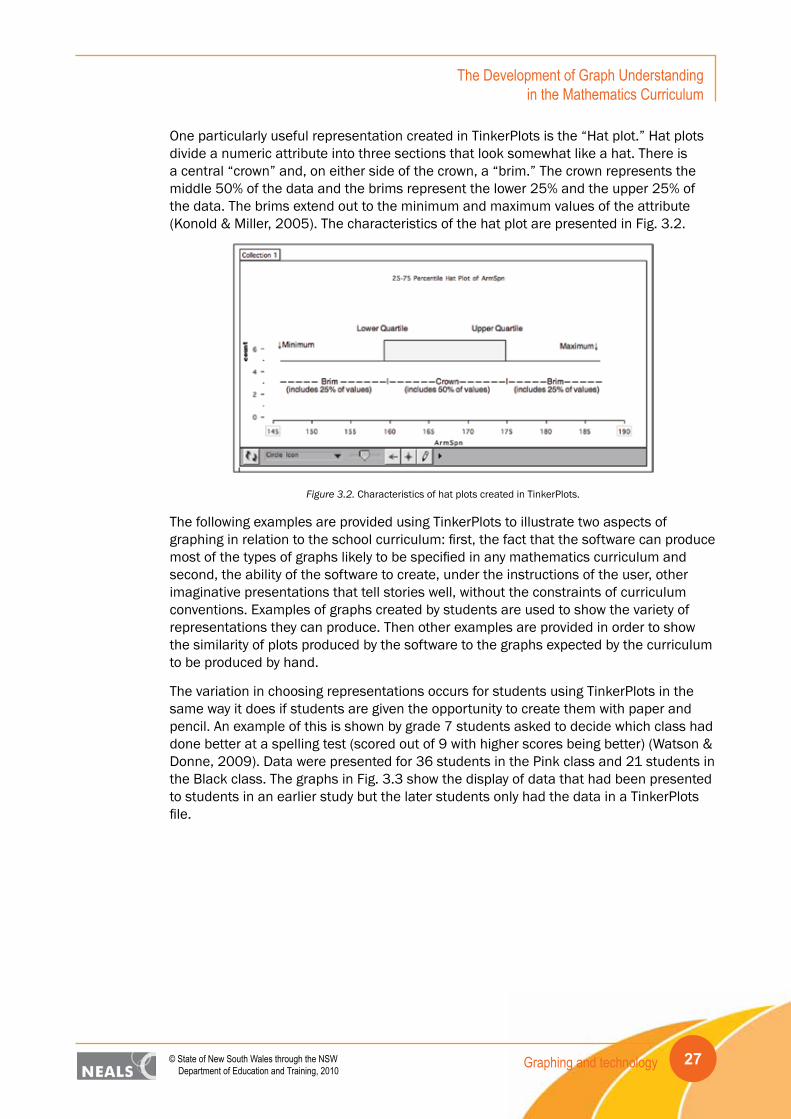
One particularly useful representation created in TinkerPlots is the “Hat plot.” Hat plots divide a numeric attribute into three sections that look somewhat like a hat. There is a central “crown” and, on either side of the crown, a “brim.” The crown represents the middle 50% of the data and the brims represent the lower 25% and the upper 25% of the data. The brims extend out to the minimum and maximum values of the attribute (Konold & Miller, 2005). The characteristics of the hat plot are presented in Fig. 3.2.
Figure 3.2. Characteristics of hat plots created in TinkerPlots.
The following examples are provided using TinkerPlots to illustrate two aspects of graphing in relation to the school curriculum: first, the fact that the software can produce most of the types of graphs likely to be specified in any mathematics curriculum and second, the ability of the software to create, under the instructions of the user, other imaginative presentations that tell stories well, without the constraints of curriculum conventions. Examples of graphs created by students are used to show the variety of representations they can produce. Then other examples are provided in order to show the similarity of plots produced by the software to the graphs expected by the curriculum to be produced by hand.
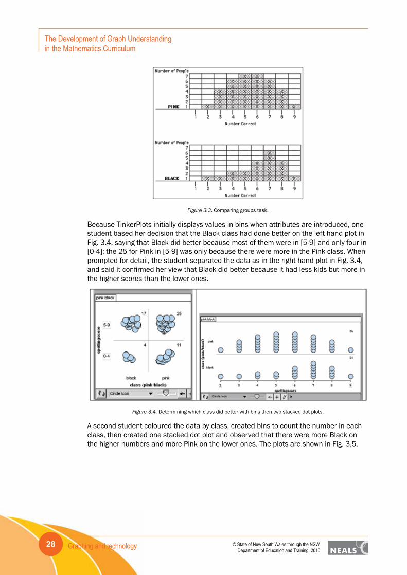
The variation in choosing representations occurs for students using TinkerPlots in the same way it does if students are given the opportunity to create them with paper and pencil. An example of this is shown by grade 7 students asked to decide which class had done better at a spelling test (scored out of 9 with higher scores being better) (Watson & Donne, 2009). Data were presented for 36 students in the Pink class and 21 students in the Black class. The graphs in Fig. 3.3 show the display of data that had been presented to students in an earlier study but the later students only had the data in a TinkerPlots file.
Graphing and technology28
The Development of Graph Understanding in the Mathematics Curriculum
© State of New South Wales through the NSW Department of Education and Training, 2010
Figure 3.3. Comparing groups task.
Because TinkerPlots initially displays values in bins when attributes are introduced, one student based her decision that the Black class had done better on the left hand plot in Fig. 3.4, saying that Black did better because most of them were in [5-9] and only four in [0-4]; the 25 for Pink in [5-9] was only because there were more in the Pink class. When prompted for detail, the student separated the data as in the right hand plot in Fig. 3.4, and said it confirmed her view that Black did better because it had less kids but more in the higher scores than the lower ones.
Figure 3.4. Determining which class did better with bins then two stacked dot plots.
A second student coloured the data by class, created bins to count the number in each class, then created one stacked dot plot and observed that there were more Black on the higher numbers and more Pink on the lower ones. The plots are shown in Fig. 3.5.

Graphing and technology 29© State of New South Wales through the NSW Department of Education and Training, 2010
The Development of Graph Understanding in the Mathematics Curriculum
Figure 3.5. Determining which class did better with bins then one stacked dot plot coloured by class.
A third student created the plot in Fig. 3.6, which is more conventional but stacked against the vertical axis rather than the horizontal. The graph also includes Hat plots showing the middle 50% of the data in each group. The hat helped some students, for example one stating that Black was better because 75% of its values were “up” in the higher scores.
Figure 3.6. Determining which class did better with two stacked dot plots and hats.
In another activity the same students were given data on various attributes for 16 students, including age and weight. Asked to explore the data set some students considered the association of these two attributes. The four plots in Fig. 3.7 show the variety of representations that these students used to claim that generally the older students in the data set weighed more.

Graphing and technology30
The Development of Graph Understanding in the Mathematics Curriculum
© State of New South Wales through the NSW Department of Education and Training, 2010
Figure 3.7. Different representations to show the association of Weight and Age.
In another study of grade 7 students in a classroom learning environment (Watson, 2008), students collected data on their resting and active (after jumping rope) heart rates. Following a class discussion on expectations, in the first lesson students were free to explore the data in TinkerPlots. As is typical some students were very interested in the rates of the students in the class and finding themselves in particular. Three students created the plots in Fig. 3.8. Only the top plot has ordered the data from lowest to highest rate and these are shown in bins rather than on a scaled plot as in the middle plot. Each value is labelled and it appears that perhaps both resting and exercise values were entered for “peter.” The bottom pair of plots shows case-value plots for the students.

Graphing and technology 31© State of New South Wales through the NSW Department of Education and Training, 2010
The Development of Graph Understanding in the Mathematics Curriculum
Figure 3.8. Different representations for students’ names and reaction times.
In the second lesson the teacher reviewed understanding of percentage and students were introduced to Hat plots. The plot shown in Fig. 3.9 shows one student’s plots, having created two plots with the same scale in order to compare the resting and exercise heart rates (note that this was not done in the two case-value plots in Fig. 3.8). The student who created these plots discussed the range of the crown of the hat and the entire range, noting that the resting values were “all in together” and in the exercise they were “all spread out.” The overlap of the data sets made the student want the classmates with the lowest exercise values to “do it again,” not believing the data were correct.

Graphing and technology32
The Development of Graph Understanding in the Mathematics Curriculum
© State of New South Wales through the NSW Department of Education and Training, 2010
Figure 3.9. Stacked dot plots and hats to compare resting and exercise heart rates.
TinkerPlots does not produce stem-and-leaf plots but the stacked dot plot using bin widths of the same size as the stem-and-leaf intervals holds the same information and since it can be positioned on either axis, provides either a direct or transformed representation. This is shown for a data set in Van de Walle (2007, p. 461), which includes test scores for two classes (Mrs. Day and Mrs. Knight). Fig. 3.10 shows the possibilities for displaying one of the classes (Mrs. Day), whereas Fig. 3.11 is a representation based on the horizontal axis.
Basic horizontal stacked dot plot Basic horizontal stacked dot plot with labels
Basic horizontal stacked dot plot ordered with labels
Figure 3.10. TinkerPlots versions of stem-and-leaf plots.

Graphing and technology 33© State of New South Wales through the NSW Department of Education and Training, 2010
The Development of Graph Understanding in the Mathematics Curriculum
Figure 3.11. Stacked dot plot with bins similar to stem-and-leaf intervals.
TinkerPlots cannot do back-to-back plots, as would be used with stem-and-leaf plots but Fig. 3.12 shows how a similar comparison can take place either with the scale vertical, as in a stem-and-leaf plot, or horizontal.
Figure 3.12. TinkerPlots comparisons similar to back-to-back stem-and-leaf plots.
The Hat plot, as described earlier in this section, is related to the Box plot, as a simpler representation that can introduce the ideas of density and spread in data distributions (Watson, Fitzallen, Wilson, & Creed, 2008). In Fig. 3.13 the data for all winners of the Melbourne Cup are displayed by the Weight attribute, that is how many kg the horse had to carry in the race as a handicap. The stacked dot plot with a hat on the left is for all horses from 1861 to 2009, whereas the plot on the right is separated into 30 year intervals with hats included to help consider the change over time. The hat on the left shows that the middle 50% of the weights lie between 48 and 55 kg and the overall range is from 33.5 to 66 kg. In particular there appears to be less variation overall in the weights carried over time, with the range decreasing in each interval and the last 30 year’s middle 50% being 50.9 to 55.4 kg. For students, having the data visible at the same time as the hats helps them to appreciate the relationship between the two.

Graphing and technology34
The Development of Graph Understanding in the Mathematics Curriculum
© State of New South Wales through the NSW Department of Education and Training, 2010
Figure 3.13. Use of the hat plot to monitor the change in distribution of Weight over time.
In Fig. 3.14 the same data are displayed but the axes are swapped and box plots are used. In TinkerPlots it is possible to hide the data icons and have them reappear. The plot on the left is the type of display of box plots that is often used, for example in reporting statewide student outcomes for schools. With no data present, this representation is much more difficult for students to interpret. With TinkerPlots it is possible to switch back and forth to seeing the data icons. It is also possible to revert to the representations in Fig. 3.13.
Figure 3.14. Use of the box plot to monitor the change in distribution of Weight over time.
TinkerPlots does not provide lines of best fit but it is possible to draw lines over data displays using the mouse as a pencil. The software, Fathom, which extends TinkerPlots for the senior years, provides this facility. Other representations that are possible with TinkerPlots are bar charts, segmented bar charts, histograms, line graphs, and pie charts (circle graphs). Examples are given in Fig. 3.15.

Graphing and technology 35© State of New South Wales through the NSW Department of Education and Training, 2010
The Development of Graph Understanding in the Mathematics Curriculum
Bar chart of Sex of Melbourne Cup winners Bar chart of Sex segmented by Colour for Melbourne Cup winners
Histogram of Winning Margin for Melbourne Cup winners Line graph of Weight carried over the years for Melbourne Cup winners
Pie chart for Sex of Melbourne Cup winners Pie charts for Gender segmented by Sex for Melbourne Cup winners
Figure 3.15. Various types of graphs available in TinkerPlots.
TinkerPlots also displays means, medians, modes, and midranges, with labels (or reference lines). The plot in Fig. 3.16 contains the dates on 100 randomly collected Australian 10-cent pieces (in 2007). In the plot the mean is 1995.1, the median is
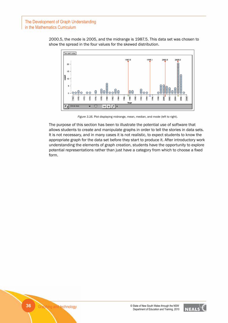
Graphing and technology36
The Development of Graph Understanding in the Mathematics Curriculum
© State of New South Wales through the NSW Department of Education and Training, 2010
2000.5, the mode is 2005, and the midrange is 1987.5. This data set was chosen to show the spread in the four values for the skewed distribution.
Figure 3.16. Plot displaying midrange, mean, median, and mode (left to right).
The purpose of this section has been to illustrate the potential use of software that allows students to create and manipulate graphs in order to tell the stories in data sets. It is not necessary, and in many cases it is not realistic, to expect students to know the appropriate graph for the data set before they start to produce it. After introductory work understanding the elements of graph creation, students have the opportunity to explore potential representations rather than just have a category from which to choose a fixed form.

Development of graph creation and interpretation 37© State of New South Wales through the NSW Department of Education and Training, 2010
The Development of Graph Understanding in the Mathematics Curriculum
4. Development of graph creation and interpretationAlthough researchers in statistics education have shown considerable interest in students’ development of understanding in relation to graphs and graphing, none have specifically focused on particular types of graphs and the order in which they might be introduced in the school curriculum. In fact the main contribution to suggestions for ordering in the curriculum comes from historical curriculum documents based on advice from tertiary statisticians, observed practice, and the historical order of introduction (mainly throughout the 20th century).
From a theoretical point of view statisticians generally build up single-variable techniques (e.g., z-tests) and then move on to more than one variable (e.g., ANOVAs), based on the complexity of the mathematics required for the tests. What research with school students has found is that for small and moderate sized data sets, students can handle, and find interesting, dealing with two variables (e.g., comparing attributes for boys and girls, or comparing height and armspan) at a younger age than might be anticipated. Although they cannot make formal statistical inferences, they can compare groups and make informal inferences about underlying “populations.” Hence it is not necessary to know everything about graphing large data sets for a single attribute before moving on to considering more than one attribute.
Research into school students’ understanding of graphing generally has employed one of three methods. In one it has been based on analysis of a single, perhaps multi-step, task, where student development is observed and modelled in relation to cognitive functioning for that particular graphical context. The analysis may be based on student surveys or interviews. Second several interview tasks have been combined to suggest a broader picture of statistical understanding, with graphing being a component of the analysis. Third many shorter tasks have been combined in surveys, with data analysis, such as Rasch (1980) techniques, used to provide a hierarchy on a variable such as “statistical literacy.” Graphing tasks are often among the items used in the surveys but do not constitute the total set.
The following three sections focus on these three aspects of research into school students’ understanding of graphing: first, some examples of individual tasks; second, outcomes based on surveys; and third, developmental models based on interviews. Finally a short section ties together the Rasch analyses from the survey study and the interview study. Within the sub-sections, the discussion distinguishes between the tasks of graph creation and graph interpretation. Given the historical development of graphical representations for various types of data it is clear that for some people the creation of graphs was important to tell their stories. Creators had to be aware that others would need to interpret their graphs in order to recreate the stories behind them. The question of how well the creators do at their job is seen when the interpreters are tested on the meaning of graphs they are given.
4.1 Development based on individual tasksResearch that is based on students’ creation of graphs must give students freedom to create and hence cannot be specifically tied to graphical forms prescribed in curriculum documents. Idiosyncratic graphs may or may not tell the story of a data set as well as a form from the formal curriculum. The stages of development displayed are related to how the students use their representations to tell the stories in the data. In doing so however, higher levels are usually associated with more conventional representations.
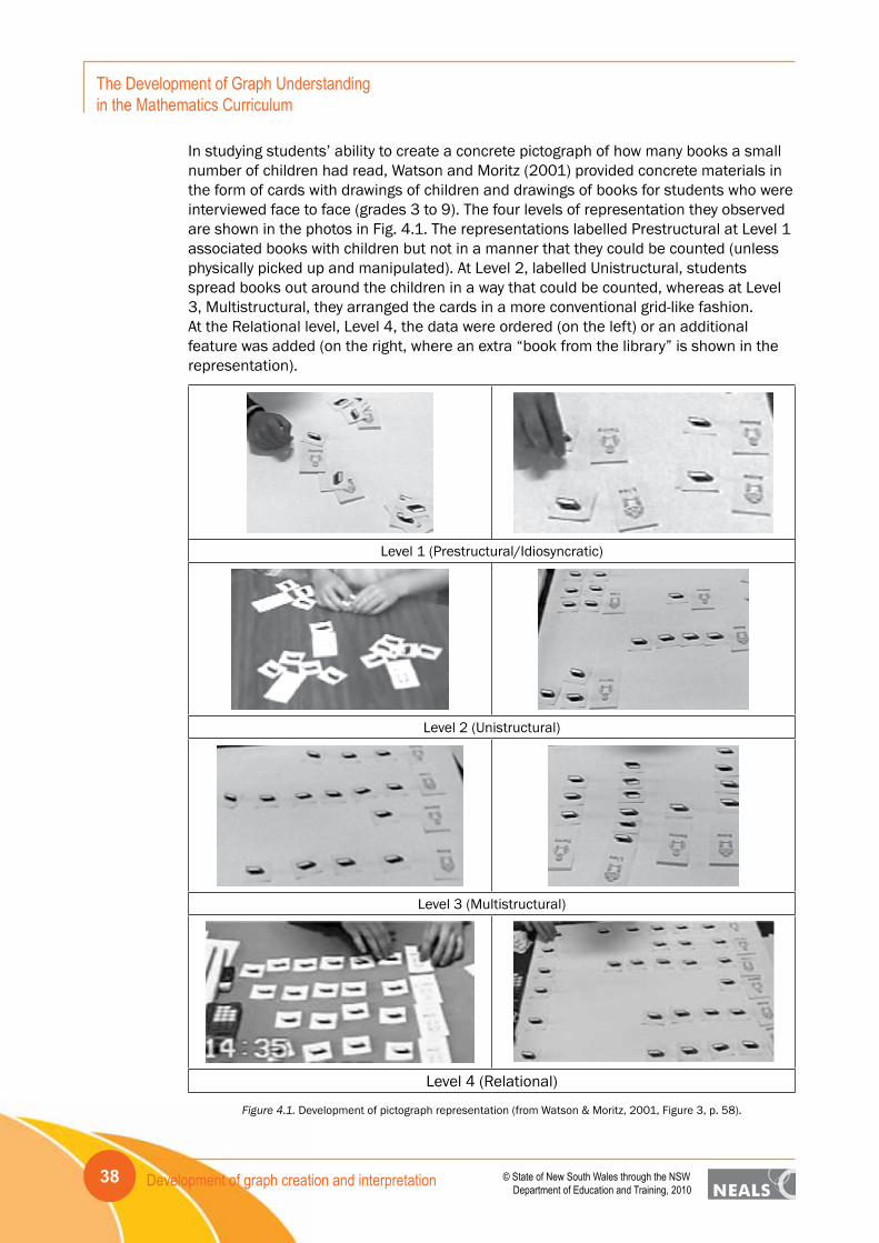
Development of graph creation and interpretation38
The Development of Graph Understanding in the Mathematics Curriculum
© State of New South Wales through the NSW Department of Education and Training, 2010
In studying students’ ability to create a concrete pictograph of how many books a small number of children had read, Watson and Moritz (2001) provided concrete materials in the form of cards with drawings of children and drawings of books for students who were interviewed face to face (grades 3 to 9). The four levels of representation they observed are shown in the photos in Fig. 4.1. The representations labelled Prestructural at Level 1 associated books with children but not in a manner that they could be counted (unless physically picked up and manipulated). At Level 2, labelled Unistructural, students spread books out around the children in a way that could be counted, whereas at Level 3, Multistructural, they arranged the cards in a more conventional grid-like fashion. At the Relational level, Level 4, the data were ordered (on the left) or an additional feature was added (on the right, where an extra “book from the library” is shown in the representation).
Level 1 (Prestructural/Idiosyncratic)
Level 2 (Unistructural)
Level 3 (Multistructural)
Level 4 (Relational)
Figure 4.1. Development of pictograph representation (from Watson & Moritz, 2001, Figure 3, p. 58).
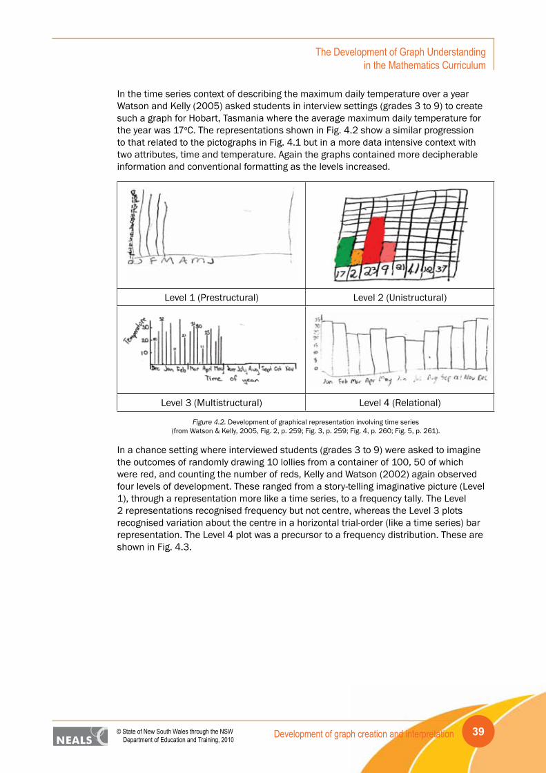
Development of graph creation and interpretation 39© State of New South Wales through the NSW Department of Education and Training, 2010
The Development of Graph Understanding in the Mathematics Curriculum
In the time series context of describing the maximum daily temperature over a year Watson and Kelly (2005) asked students in interview settings (grades 3 to 9) to create such a graph for Hobart, Tasmania where the average maximum daily temperature for the year was 17oC. The representations shown in Fig. 4.2 show a similar progression to that related to the pictographs in Fig. 4.1 but in a more data intensive context with two attributes, time and temperature. Again the graphs contained more decipherable information and conventional formatting as the levels increased.
Level 1 (Prestructural) Level 2 (Unistructural)
Level 3 (Multistructural) Level 4 (Relational)
Figure 4.2. Development of graphical representation involving time series(from Watson & Kelly, 2005, Fig. 2, p. 259; Fig. 3, p. 259; Fig. 4, p. 260; Fig. 5, p. 261).
In a chance setting where interviewed students (grades 3 to 9) were asked to imagine the outcomes of randomly drawing 10 lollies from a container of 100, 50 of which were red, and counting the number of reds, Kelly and Watson (2002) again observed four levels of development. These ranged from a story-telling imaginative picture (Level 1), through a representation more like a time series, to a frequency tally. The Level 2 representations recognised frequency but not centre, whereas the Level 3 plots recognised variation about the centre in a horizontal trial-order (like a time series) bar representation. The Level 4 plot was a precursor to a frequency distribution. These are shown in Fig. 4.3.
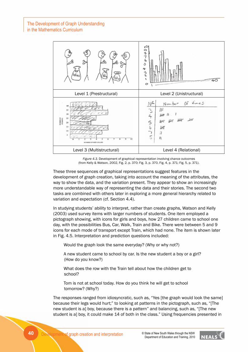
Development of graph creation and interpretation40
The Development of Graph Understanding in the Mathematics Curriculum
© State of New South Wales through the NSW Department of Education and Training, 2010
Level 1 (Prestructural) Level 2 (Unistructural)
Level 3 (Multistructural) Level 4 (Relational)
Figure 4.3. Development of graphical representation involving chance outcomes(from Kelly & Watson, 2002, Fig. 2, p. 370; Fig. 3, p. 370, Fig. 4, p. 371; Fig. 5, p. 371).
These three sequences of graphical representations suggest features in the development of graph creation, taking into account the meaning of the attributes, the way to show the data, and the variation present. They appear to show an increasingly more understandable way of representing the data and their stories. The second two tasks are combined with others later in exploring a more general hierarchy related to variation and expectation (cf. Section 4.4).
In studying students’ ability to interpret, rather than create graphs, Watson and Kelly (2003) used survey items with larger numbers of students. One item employed a pictograph showing, with icons for girls and boys, how 27 children came to school one day, with the possibilities Bus, Car, Walk, Train and Bike. There were between 5 and 9 icons for each mode of transport except Train, which had none. The item is shown later in Fig. 4.5. Interpretation and prediction questions included:
Would the graph look the same everyday? (Why or why not?)
A new student came to school by car. Is the new student a boy or a girl? (How do you know?)
What does the row with the Train tell about how the children get to school?
Tom is not at school today. How do you think he will get to school tomorrow? (Why?)
The responses ranged from idiosyncratic, such as, “Yes [the graph would look the same] because their legs would hurt;” to looking at patterns in the pictograph, such as, “[The new student is a] boy, because there is a pattern” and balancing, such as, “[The new student is a] boy, it could make 14 of both in the class.” Using frequencies presented in

Development of graph creation and interpretation 41© State of New South Wales through the NSW Department of Education and Training, 2010
The Development of Graph Understanding in the Mathematics Curriculum
the graph provided higher level responses, e.g., “[Tom will come by] bus, more people catch the bus.” The highest level responses, however, included acknowledgement of uncertainty in the interpretation or prediction: “No [the graph would not be the same], sometimes people get sick.” “[The new student] is probably a girl because more girls get a car to school.” The questions in this task were devised to allow students the opportunity to display appreciation of variation and uncertainty in predictions. Not all tasks encourage such recognition.
In asking an interpretation question about a pie chart that did not add up to 100%, again in a survey setting, Watson (1997, 2006) worded the question as “Is there anything unusual about it?” rather than “What is the error?” in order to measure students’ memory for the conventions associated with pie charts. Some responses at the lowest level, took the unusual aspect to be visual, such as “It’s cut into all different shapes” or “The black part.” At the next level, students took into account relevant features but missed the main point: “Other [a category] is bigger than the rest.” The highest level response reflected the error in the graph in several ways: “Where it has Other, it says 61.2% and the percentage of that section on the pie is less than 50%” and “The percentages add up to 128.5. They should equal 100!!”
These types of questions are useful in delving into specific aspects of students’ ability to interpret graphs in particular contexts. Combining them requires more complex analysis and this is considered later (cf. Section 4.5).
4.2 Development based on surveysMuch of the developmental research into students’ interaction with graphical concepts has focussed on evidence of progression with respect to specific tasks (e.g., Moritz, 2000; Watson, 2000; Watson Collis, Callingham, & Moritz, 1995; Watson & Kelly, 2005). The work of Watson and Callingham (2003), however, used some items based on graphing in their study related to defining a statistical literacy construct. The study was based on Partial Credit Rasch modelling (Masters, 1982), which ranks task-steps for rubrics associated with levels of observed performance for each question. The task-steps hence make it possible to suggest ability levels descriptively in six stages. The hierarchical development in understanding of creating and interpreting graphs as extracted from this study and that of Watson, Callingham, and Kelly (2007) is summarised in the following section. The focus of this section is graphing based on the survey items used in the statistical literacy study (Watson & Callingham, 2003), one of which related to graph creation and six of which related to graph interpretation. The overall statistical literacy construct, based on surveys that included the graphing tasks, is summarised in Table 4.1.

Development of graph creation and interpretation42
The Development of Graph Understanding in the Mathematics Curriculum
© State of New South Wales through the NSW Department of Education and Training, 2010
Table 4.1. Statistical Literacy Construct (from Watson & Callingham, 2003)
Level Brief characterisation of step levels of tasks
6. Critical Mathematical
Task-steps at this level demand critical, questioning engagement with context, using proportional reasoning particularly in media or chance contexts, showing appreciation of the need for uncertainty in making predictions, and interpreting subtle aspects of language.
5. Critical Task-steps require critical, questioning engagement in familiar and unfamiliar contexts that do not involve proportional reasoning, but which do involve appropriate use of terminology, qualitative interpretation of chance, and appreciation of variation.
4. Consistent Non-critical
Task-steps require appropriate but non-critical engagement with context, multiple aspects of terminology usage, appreciation of variation in chance settings only, and statistical skills associated with the mean, simple probabilities, and graph characteristics.
3. Inconsistent Task-steps at this level, often in supportive formats, expect selective engagement with context, appropriate recognition of conclusions but without justification, and qualitative rather than quantitative use of statistical ideas.
2. Informal Task-steps require only colloquial or informal engagement with context often reflecting intuitive non-statistical beliefs, single elements of complex terminology and settings, and basic one-step straightforward table, graph, and chance calculations.
1. Idiosyncratic Task-steps at this level suggest idiosyncratic engagement with context, tautological use of terminology, and basic mathematical skills associated with one-to-one counting and reading cell values in tables.
Among the survey items was one that asked students to draw a graph showing an association described in a newspaper article about car usage and heart deaths. This item is shown in Fig. 4.4. Responses that created appropriate bivariate or series comparison graphs appeared at the Critical level (5) of the hierarchy, whereas incomplete representations that showed a trend or a double comparison appeared at the Consistent Non-Critical level (4), and basic labelled graphs or single-value comparison graphs as responses were at the Inconsistent level (3).
Family car is killing us, says Tasmanian researcher
Twenty years of research has convinced Mr Robinson that motoring is a health hazard. Mr Robinson has graphs which show quite dramatically an almost perfect relationship between the increase in heart deaths and the increase in use of motor vehicles. Similar relationships are shown to exist between lung cancer, leukaemia, stroke and diabetes.
Draw and label a sketch of what one of Mr. Robinson’s graphs might look like.
Figure 4.4. Graph creation item from the statistical literacy survey.
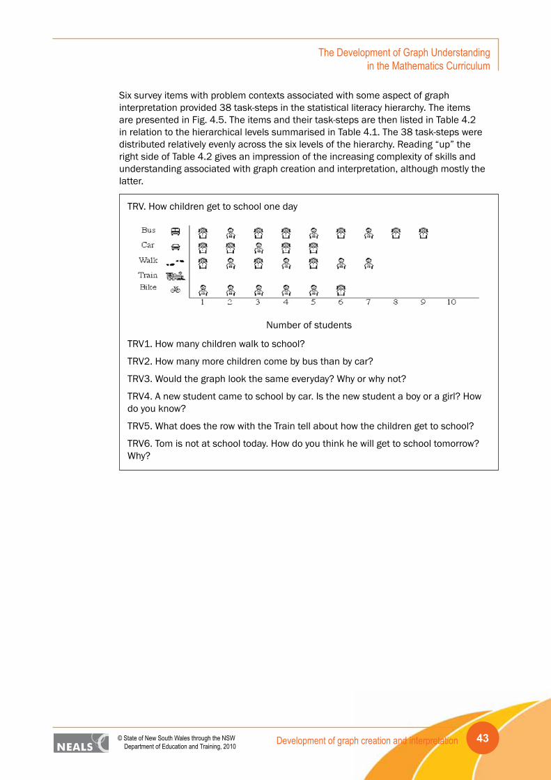
Development of graph creation and interpretation 43© State of New South Wales through the NSW Department of Education and Training, 2010
The Development of Graph Understanding in the Mathematics Curriculum
Six survey items with problem contexts associated with some aspect of graph interpretation provided 38 task-steps in the statistical literacy hierarchy. The items are presented in Fig. 4.5. The items and their task-steps are then listed in Table 4.2 in relation to the hierarchical levels summarised in Table 4.1. The 38 task-steps were distributed relatively evenly across the six levels of the hierarchy. Reading “up” the right side of Table 4.2 gives an impression of the increasing complexity of skills and understanding associated with graph creation and interpretation, although mostly the latter.
TRV. How children get to school one day
Number of students
TRV1. How many children walk to school?
TRV2. How many more children come by bus than by car?
TRV3. Would the graph look the same everyday? Why or why not?
TRV4. A new student came to school by car. Is the new student a boy or a girl? How do you know?
TRV5. What does the row with the Train tell about how the children get to school?
TRV6. Tom is not at school today. How do you think he will get to school tomorrow? Why?

Development of graph creation and interpretation44
The Development of Graph Understanding in the Mathematics Curriculum
© State of New South Wales through the NSW Department of Education and Training, 2010
SP. A class did 50 spins of the above spinner many times and the results for the number of times it landed on the shaded part are recorded below.
SP6.What is the lowest value?
SP7. What is the highest value?
SP8. What is the range?
SP9. What is the mode?
SP10. How would you describe the shape of the graph?
SP11.Imagine that three other classes produced graphs for the spinner. In some cases, the results were just made up without actually doing the experiment.
a) Do you think class A’s results are made up or really from the experiment?
__Made up
__Real from experiment
Explain why you think this.
b) Do you think class B’s results are made up or really from the experiment?
__Made up
__Real from experiment
Explain why you think this.
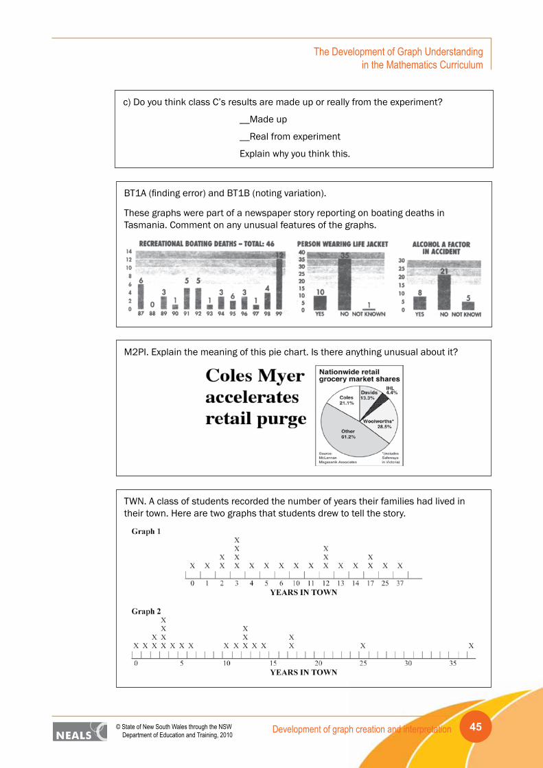
Development of graph creation and interpretation 45© State of New South Wales through the NSW Department of Education and Training, 2010
The Development of Graph Understanding in the Mathematics Curriculum
c) Do you think class C’s results are made up or really from the experiment?
__Made up
__Real from experiment
Explain why you think this.
BT1A (finding error) and BT1B (noting variation).
These graphs were part of a newspaper story reporting on boating deaths in Tasmania. Comment on any unusual features of the graphs.
M2PI. Explain the meaning of this pie chart. Is there anything unusual about it?
TWN. A class of students recorded the number of years their families had lived in their town. Here are two graphs that students drew to tell the story.
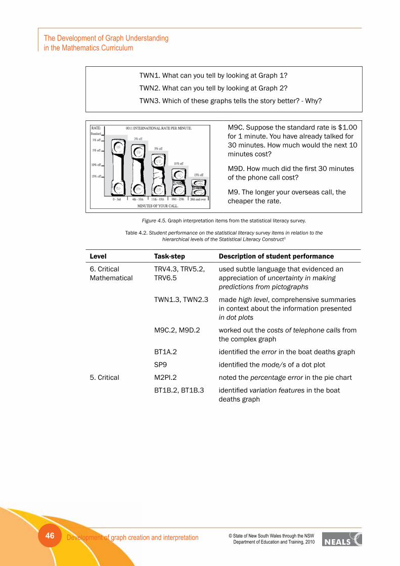
Development of graph creation and interpretation46
The Development of Graph Understanding in the Mathematics Curriculum
© State of New South Wales through the NSW Department of Education and Training, 2010
TWN1. What can you tell by looking at Graph 1?
TWN2. What can you tell by looking at Graph 2?
TWN3. Which of these graphs tells the story better? - Why?
M9C. Suppose the standard rate is $1.00 for 1 minute. You have already talked for 30 minutes. How much would the next 10 minutes cost?
M9D. How much did the first 30 minutes of the phone call cost?
M9. The longer your overseas call, the cheaper the rate.
Figure 4.5. Graph interpretation items from the statistical literacy survey.
Table 4.2. Student performance on the statistical literacy survey items in relation to thehierarchical levels of the Statistical Literacy Construct1
Level Task-step Description of student performance
6. Critical Mathematical
TRV4.3, TRV5.2, TRV6.5
used subtle language that evidenced an appreciation of uncertainty in making predictions from pictographs
TWN1.3, TWN2.3 made high level, comprehensive summaries in context about the information presented in dot plots
M9C.2, M9D.2 worked out the costs of telephone calls from the complex graph
BT1A.2 identified the error in the boat deaths graph
SP9 identified the mode/s of a dot plot
5. Critical M2PI.2 noted the percentage error in the pie chart
BT1B.2, BT1B.3 identified variation features in the boat deaths graph

Development of graph creation and interpretation 47© State of New South Wales through the NSW Department of Education and Training, 2010
The Development of Graph Understanding in the Mathematics Curriculum
4. Consistent Non-critical
SP7, SP8 identified the highest value and the range of a dot plot
SP10 acknowledged variation in describing the shape of the dot plot
SP11.2 chose appropriately the real and made-up dot plots
TRV4.2, TRV6.3 provided arguments for predictions for the pictograph that were based on balance or majority in the graph
TWN3.3 identified the scaled dot plot as better than the non-scaled plot
M2PI.1 focussed on peripheral issues rather than critical ones when commenting on the unusual features of the pie chart
BT1B.1 little focus on variation for the graph of boat deaths
3. Inconsistent TWN1.2, TWN2.1, TWN3.2
read data values only in commenting on stacked dot plots or could make only one summary statement from the plot
BT1A.1 made specific comments about elements of the graph, some of which were incorrect
2. Informal TRV4.1, TRV6.2 used patterns to provide reasons for questions about the pictograph
SP6 identified the lowest value in a dot plot
TWN1.1 made comments based only on reading data from a dot plot
TWN3.1 gave personal preference (non-data based) for which of the two graphs was better
M9C.1, M9D.1 made incorrect calculations of costs for telephone calls based on a graphical representation
1. Idiosyncratic TRV1, TRV2 read values from a pictograph
TRV3 recognised the presence of variation in potential changes in the travel graph from day to day
TRV5.1, TRV6.1 gave personal non-data-based interpretations of the pictograph
SP11.1 identified correctly one of the three dot plot scenarios as real or made up
1 The presence of a decimal value indicates that the item is associated with a coding rubric with more than a correct/incorrect response, i.e., was associated with partial credit.

Development of graph creation and interpretation48
The Development of Graph Understanding in the Mathematics Curriculum
© State of New South Wales through the NSW Department of Education and Training, 2010
This section has focused on graphing items used in larger surveys that also considered other aspects of statistical literacy, for example, chance, sampling, averages, and inference. The fact that the increasingly complex demands of the graphing items mesh at every level with the demands of the other items indicates the interrelationships of the concepts in the statistics component of the school curriculum. Graphing cannot be seen as something separate but must be integrated with the other content at all levels as the expectations for students grow from idiosyncratic engagement to critical mathematical ability. The importance of context throughout in reaching the critical thinking levels foreshadows not only the need to acknowledge the importance of a Working Mathematically component in the curriculum but also the need to expand the influence and impact of graphing across into other curriculum areas.
4.3 Development based on student interviewsThe earliest comprehensive research on the developmental aspects of statistical thinking centred on graphing (or data representation) is that of Jones, Thornton, Langrall, Mooney, Perry, and Putt (2000) based on the Biggs and Collis (1982, 1991) cognitive development model (SOLO) and interviews with 20 children, four in each of grades 1 to 5. Mooney (2002) then extended the work with the model based on interviews with a total of 12 students in grades 6 to 8. Although reporting under the phrase “statistical thinking,” in fact the research was not concerned with issues of data collection and sampling or the part played by chance in statistical analyses. Jones et al. and Mooney considered four levels of performance for each of four components of statistical thinking, each component dependent to some extent on graphical representations. The first component, Describing data displays, reflected the work of Curcio (1987, 1989) in being able to read information from graphical displays, being aware of graphing conventions, and recognising different displays of the same data as such. The second, Organizing and reducing data, included being able to group and order data, aware of potentially losing information, representing typicality, and representing spread. Although these processes could be carried out without graphical representations, for example with lists, tables or formulas, the tasks used with children all employed some type of visual graphical display. The third component, Representing data, was based on constructing representations and visual displays, including the elemental conventions for such constructions. Given the constraints of their design and tasks, this did not allow for tremendous freedom or creativity on the part of students in that they were presented with frameworks (axes) to add information to or asked to present data currently in a graph in a “different” way. The fourth component, Analysing and interpreting data, was again based on the presentation of graphical displays and reflected Curcio’s (1989) reading “between” and “beyond” the data, expecting students to recognize patterns, trends, and missing elements in order to make “inferences” and predictions. Some of the questions incorporated in their tasks were difficult to distinguish between being related to Describing data and being related to Analysing and Interpreting data. The significant aspect of the research of Jones et al. and Mooney for this report is that graphical representation is central to all four components of statistical thinking as considered in the research. In comparing this conception of statistical thinking with that say of Holmes (1980), the Holmes’ views are more broadly based including the asking of questions and understanding appropriate methods of collecting of data, before reaching a point where display of data is likely to take place, and later in the process appreciating the necessity to deal with uncertainty using basic concepts of probability.
Development of graph creation and interpretation 49© State of New South Wales through the NSW Department of Education and Training, 2010
The Development of Graph Understanding in the Mathematics Curriculum
For each of the four Jones et al. (2000) components of statistical thinking, four levels of development were hypothesised based on the work of Biggs and Collis (1982, 1991) and trialled, adapted, and confirmed based on the student interviews. The descriptive labels attached to the levels were “Idiosyncratic,” “Transitional,” “Quantitative,” and “Analytical,” parallel to the SOLO model levels of Prestructural, Unistructural, Multistructural and Relational, in the stage of development called the Concrete Symbolic Mode, the stage relevant to children during the school years. The Jones et al. descriptors are closely related to the context of statistical thinking but the details reflect the structural nature of the SOLO model. “Idiosyncratic” responses are often subjective or irrelevant to the content of tasks set, missing the point, which fits with the Prestructural description of not employing any of the elements relevant to the task set. “Transitional” responses generally recognize the meaning of the task set but can only make limited progress toward achieving it, for example providing a partial reading or interpretation of data from a graph, appreciating the nature of typicality but not providing a measure, and identifying some aspects required to extend a partially completed graph. These responses often focus on a single relevant feature of the task and correspond reasonably with the Unistructural level of the SOLO model. “Quantitative” responses pick up more than one relevant aspect of task set, often in a procedural fashion, in order to meet basic requirements, which correspond to the SOLO Multistructural level where several elements of the task are employed in sequence to reach a conclusion. Whether this is considered sufficient depends on the nature of the task. For Jones et al., Quantitative responses generally read and compare data in graphs correctly, order data, appreciate centres at a surface level, can follow provided models in completing graphs, and can make multiple responses in interpreting data. “Analytical” responses correspond to Relational SOLO responses in that all of the elements provided in the task are combined to provide coherent and comprehensive solutions to tasks. For each of the four components of statistical thinking Analytical implies satisfying the task requirements in a statistically appropriate fashion, for example, showing complete understanding of the link between data and displays, understanding measures of centre and spread (e.g., range), constructing valid graphs, and making valid “inferences” from data representations. Only one of Jones et al.’s students could approach the Analytical level. Similarly Mooney’s (2002) older students were generally unable to surpass the Quantitative level on any of the four components of statistical thinking as described by the team of researchers.
The work of Jones and his team (2000) highlights the importance of the graph as the instrument, tool, and foundation of much of the statistical learning that takes place at the school level. Putting aside issues of initial question-setting, data collection, and understanding chance through formal probability, the concrete, visual aspects of graphs make them an appropriate vehicle for developing statistical concepts. Their work also indicates the breadth of opportunity to answer questions provided by graphing, beyond the basic construction of graphs to display data.
Reading (2002) produced a profile of statistical understanding based more broadly on Holmes (1980) five basic areas of statistics: Data collection, Data tabulation and representation, Data reduction, Probability, and Interpretation and inference. Her model of development, using an adapted SOLO model, consisted of nine levels: three in the Ikonic mode and two cycles of three levels in the Concrete Symbolic Mode. With respect to Data tabulation and representation, the summary of the performance in the Ikonic mode was “only mention title or the axis labels (variables) involved” (p. 2, Fig. 1); for the first Concrete Symbolic cycle, “interact with the data in non-statistical terms – describe

Development of graph creation and interpretation50
The Development of Graph Understanding in the Mathematics Curriculum
© State of New South Wales through the NSW Department of Education and Training, 2010
individual data points” (p. 2, Fig. 1); and for the second Concrete Symbolic Cycle, “interact with the data in more statistical terms – describe features of behaviour of the data” (p. 2, Fig. 1). For Interpretation and inference, the three descriptions began with “describe patterns but prediction impossible” (p. 2, Fig. 1) for the Ikonic mode, and then increased to “describe patterns but predict using personal experience and not the data” (p. 2, Fig. 1) for the Concrete Symbolic Cycle 1 and “predict using pattern descriptions – justification makes use of the data” (p. 2, Fig. 1) for the second cycle. These were the two components dependent on graphing and the hierarchical description runs parallel to that of Jones et al. (2000). In suggesting grade levels associated with the progression in her hierarchical model, Reading found that Data tabulation and representation was the component of statistical thinking that students progressed through most rapidly across the high school years. They appeared to start at lower levels on this component compared to the other components but progressed to the second Concrete Symbolic cycle by grade 12. For Interpretation and prediction, the students progressed through the first Concrete Symbolic cycle by grade 7 but then did not enter the second cycle until grade 12. Perhaps this outcome reflects a focus on graphing skills across the high school years but little recognition of using graphs in statistical decision-making during this time in the state where her data were collected (NSW).
In making recommendations for teaching statistics at the high school level, Reading and Pegg (1995) suggested tasks for interpreting and analysing data with respect to the “story” told in the graphs presented and basing data reduction on graphical representations. Again the tasks are related to graph interpretation rather than creation.
In the interview study of Watson, Callingham, and Kelly (2007), six comprehensive settings provided the opportunity to explore student understanding of expectation and variation in statistics based on Rasch analysis (1980) for 73 students in grades 3 to 9. Of the 11 tasks defined in the six settings, one task with four task-steps asked for the creation of a graph, two tasks with 9 task-steps required only interaction with, explanation of or interpretation of a graph presented in the task, whereas one task with four task-steps asked for both graph creation and interpretation. The overall analysis suggested six levels of a single variable. In the context of the interviews the Idiosyncratic level (1) displayed little or no appreciation of either expectation or variation, the Informal level (2) reflected primitive or single aspects of expectation and/or variation and no interaction of the two, the Inconsistent level (3) displayed acknowledgement of expectation and variation, often with support, but few links between them, and the Consistent level (4) showed appreciation of both expectation and variation with the beginning of acknowledged interaction between them. Given the contexts of tasks used for the interviews, the highest two levels of the hierarchy were related to the ability to apply proportional reasoning for either one or two variables. Level 5 was termed Distributional, displaying established links between variation and proportional expectation in a single setting (e.g., with a single variable), whereas Level 6 was called Comparative Distributional, where responses displayed established links between expectation and variation in comparative settings (e.g., with two variables) with proportional reasoning.
The task that requested a graph to be created (LGR) was based on a scenario of drawing 10 lollies “randomly” from a container of 100 with 50 red. Initial questions based on expectations were part of another task. For the graphing scenario, students were asked to imagine performing this process 40 times (with replacement each time) and to draw a graph of the outcomes (cf. Fig. 4.3). Two of the tasks (CGV, CGX) were based on

Development of graph creation and interpretation 51© State of New South Wales through the NSW Department of Education and Training, 2010
The Development of Graph Understanding in the Mathematics Curriculum
interpreting pairs of bar charts to distinguish which represented a class that had done better on a spelling test – one task considered expectation and the other variation based on the interpretation of the graphs. The fourth task (WGR) asked for both the creation of a graph to describe Hobart’s maximum daily temperature over a year (cf. Fig. 4.2) and interpretation of three other graphs. The four tasks used in the interview related to graphs are shown in Fig. 4.6. The tasks and their levels in relation to the hierarchy of understanding of expectation and variation are summarised in Table 4.3.
LGR. Lollies Scenario: [Suppose you were given a container with 100 lollies in it. 50 are red, 20 are yellow, and 30 are green. You pull out 10 lollies. How many reds do you expect? Would you get this many every time? What would surprise you?...]
Suppose that 40 students pulled out 10 lollies from the container, wrote down the number of reds, put them back, mixed them up.
(a) Can you show what the number of reds look like in this case? [Blank space]
(b) Now use the graph below to show what the number of reds might look like for the 40 students. [2 labelled axes with no data]
CGV/CGX. Two schools are comparing some classes to see which is better at spelling.
a) Number of People54 23 22 2 31 2 3
BLUE 1 2 3 4 5 6 7 8 9Number Correct
Number of People543 6 72 6 71 6 7
RED 1 2 3 4 5 6 7 8 9Number Correct
Now look at the scores of all students in each class, and then decide. Did the two classes score equally well, or did one of the classes score better? Explain how you decided.

Development of graph creation and interpretation52
The Development of Graph Understanding in the Mathematics Curriculum
© State of New South Wales through the NSW Department of Education and Training, 2010
b) Number of People5 54 53 52 4 5 61 4 5 6
YELLOW 1 2 3 4 5 6 7 8 9Number Correct
Number of People543 52 4 5 61 3 4 5 6 7
BROWN 1 2 3 4 5 6 7 8 9Number Correct
Did the two classes score equally well, or did one of the classes score better? Explain how you decided.
c) Number of People7 5 66 5 6 75 4 5 6 74 3 4 5 6 73 3 4 5 6 7 82 3 4 5 6 7 81 2 3 4 5 6 7 8 9
PINK 1 2 3 4 5 6 7 8 9Number Correct
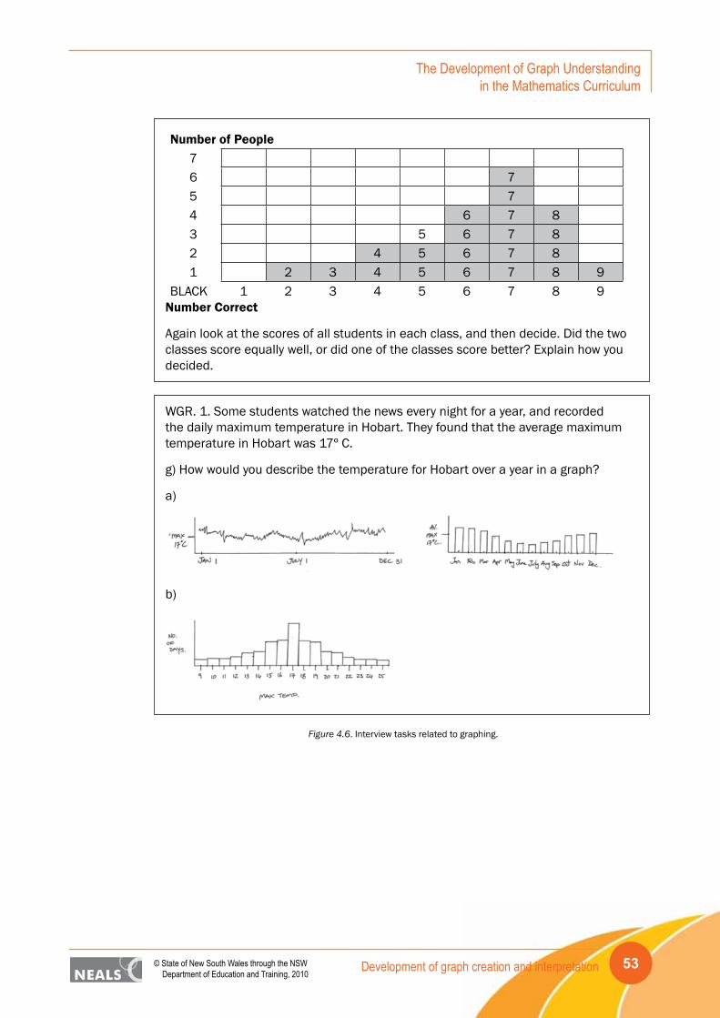
Development of graph creation and interpretation 53© State of New South Wales through the NSW Department of Education and Training, 2010
The Development of Graph Understanding in the Mathematics Curriculum
Number of People76 75 74 6 7 83 5 6 7 82 4 5 6 7 81 2 3 4 5 6 7 8 9
BLACK 1 2 3 4 5 6 7 8 9Number Correct
Again look at the scores of all students in each class, and then decide. Did the two classes score equally well, or did one of the classes score better? Explain how you decided.
WGR. 1. Some students watched the news every night for a year, and recorded the daily maximum temperature in Hobart. They found that the average maximum temperature in Hobart was 17º C.
g) How would you describe the temperature for Hobart over a year in a graph?
a)
b)
Figure 4.6. Interview tasks related to graphing.
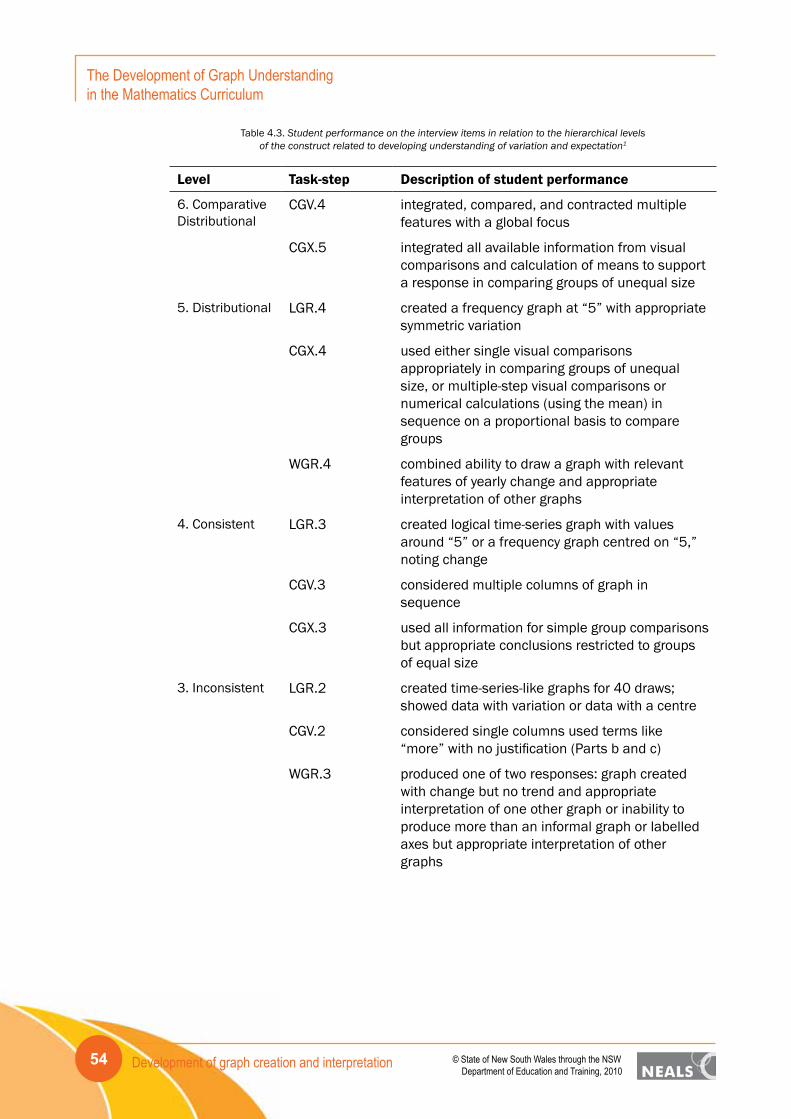
Development of graph creation and interpretation54
The Development of Graph Understanding in the Mathematics Curriculum
© State of New South Wales through the NSW Department of Education and Training, 2010
Table 4.3. Student performance on the interview items in relation to the hierarchical levelsof the construct related to developing understanding of variation and expectation1
Level Task-step Description of student performance
6. Comparative Distributional
CGV.4 integrated, compared, and contracted multiple features with a global focus
CGX.5 integrated all available information from visual comparisons and calculation of means to support a response in comparing groups of unequal size
5. Distributional LGR.4 created a frequency graph at “5” with appropriate symmetric variation
CGX.4 used either single visual comparisons appropriately in comparing groups of unequal size, or multiple-step visual comparisons or numerical calculations (using the mean) in sequence on a proportional basis to compare groups
WGR.4 combined ability to draw a graph with relevant features of yearly change and appropriate interpretation of other graphs
4. Consistent LGR.3 created logical time-series graph with values around “5” or a frequency graph centred on “5,” noting change
CGV.3 considered multiple columns of graph in sequence
CGX.3 used all information for simple group comparisons but appropriate conclusions restricted to groups of equal size
3. Inconsistent LGR.2 created time-series-like graphs for 40 draws; showed data with variation or data with a centre
CGV.2 considered single columns used terms like “more” with no justification (Parts b and c)
WGR.3 produced one of two responses: graph created with change but no trend and appropriate interpretation of one other graph or inability to produce more than an informal graph or labelled axes but appropriate interpretation of other graphs

Development of graph creation and interpretation 55© State of New South Wales through the NSW Department of Education and Training, 2010
The Development of Graph Understanding in the Mathematics Curriculum
2. Informal LGR.1 wrote single numbers or lists, drew pictures, or sketched graphs without context
CGV.1 considered single columns and used terms like “more” with no justification (Parts b or c)
CGX.2 used multi-step comparisons or numerical calculations in sequence for absolute values for simple equal-sized group comparisons
WGR.2 produced graph showing change but no trend and focused on single features of other graphs presented
1. Idiosyncratic CGX.1 compared single features in equal-sized groups to determine which class had done better
WGR.1 produced axes only for created graph and misinterpreted the others presented
1The presence of a decimal value indicates that the item is associated with a coding rubric with more than a correct/incorrect response, i.e., was associated with partial credit.
The highest two levels of the analysis of expectation and variation from the student interviews correspond closely with the ability to carry out calculational aspects of the statistics curriculum, the mean and standard deviation. Understanding of the standard deviation was not part of the student survey but average was, in terms of both mean and median. Two tasks (CGV.4, CGX.5) on these topics appeared at Level 6 for their most difficult task-step, indicating a relationship between understanding the measures of central tendency and the intuition to appreciate the underlying concept of variation applied in the context of comparative graphical representations. Other task steps were distributed downward throughout all levels reflecting less appreciation of expectation and variation as observed (and interpreted) in the graphs.
The four levels of graph creation and interpretation for Hobart’s maximum temperature over a year range across Idiosyncratic (WGR.1), Informal (WGR.2), Inconsistent (WGR.3), and Distributional (WGR.4). For the chance task based on drawing 10 lollies randomly from a container of 100, the four levels of graph creation shown by tasks in Fig. 3.7 correspond to Informal (LGR.1), Inconsistent (LGR.2), Consistent (LGR.3), and Distributional (LGR.4). The relative placement of the task-steps indicates that for these students and tasks, creating the representation of Hobart’s maximum temperature over a year was slightly easier than creating the distribution of the chance outcomes from random draws of lollies. In relation to the other tasks in the analysis the two tasks were considered to be based on a “single” variable and their placement in the hierarchy is reasonable in relation to the more difficult task of comparing the two groups of spelling scores when numbers in the groups are unequal.
Again, as was noted with the survey items in the previous section, the tasks that involve graphing are spread across all levels of the variable documenting students’ increasing understanding of variation and expectation within the statistics curriculum. This is the case in terms of both creating and interpreting graphs. By acknowledging the importance of linking understanding to visual representations, a solid foundation can be developed for the introduction of theoretical statistics for some students.
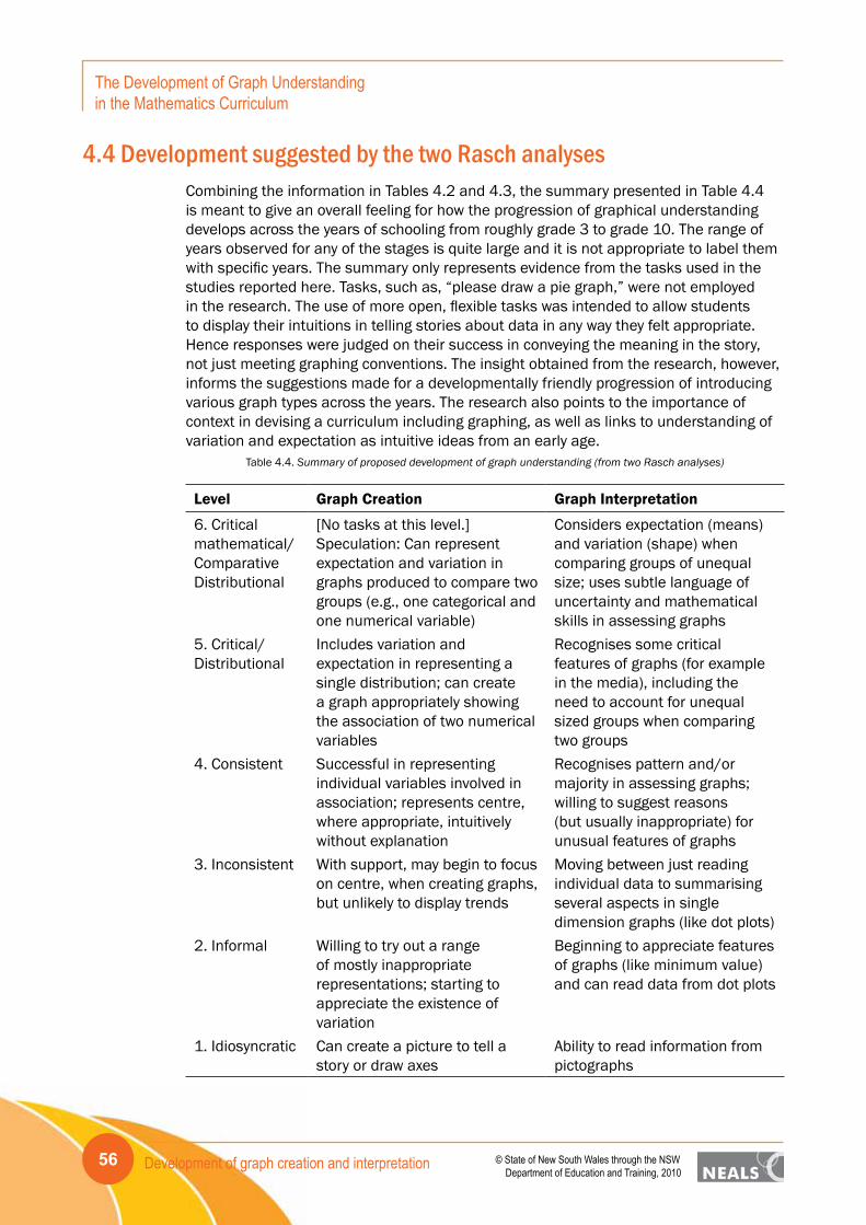
Development of graph creation and interpretation56
The Development of Graph Understanding in the Mathematics Curriculum
© State of New South Wales through the NSW Department of Education and Training, 2010
4.4 Development suggested by the two Rasch analysesCombining the information in Tables 4.2 and 4.3, the summary presented in Table 4.4 is meant to give an overall feeling for how the progression of graphical understanding develops across the years of schooling from roughly grade 3 to grade 10. The range of years observed for any of the stages is quite large and it is not appropriate to label them with specific years. The summary only represents evidence from the tasks used in the studies reported here. Tasks, such as, “please draw a pie graph,” were not employed in the research. The use of more open, flexible tasks was intended to allow students to display their intuitions in telling stories about data in any way they felt appropriate. Hence responses were judged on their success in conveying the meaning in the story, not just meeting graphing conventions. The insight obtained from the research, however, informs the suggestions made for a developmentally friendly progression of introducing various graph types across the years. The research also points to the importance of context in devising a curriculum including graphing, as well as links to understanding of variation and expectation as intuitive ideas from an early age.
Table 4.4. Summary of proposed development of graph understanding (from two Rasch analyses)
Level Graph Creation Graph Interpretation
6. Critical mathematical/ Comparative Distributional
[No tasks at this level.] Speculation: Can represent expectation and variation in graphs produced to compare two groups (e.g., one categorical and one numerical variable)
Considers expectation (means) and variation (shape) when comparing groups of unequal size; uses subtle language of uncertainty and mathematical skills in assessing graphs
5. Critical/ Distributional
Includes variation and expectation in representing a single distribution; can create a graph appropriately showing the association of two numerical variables
Recognises some critical features of graphs (for example in the media), including the need to account for unequal sized groups when comparing two groups
4. Consistent Successful in representing individual variables involved in association; represents centre, where appropriate, intuitively without explanation
Recognises pattern and/or majority in assessing graphs; willing to suggest reasons (but usually inappropriate) for unusual features of graphs
3. Inconsistent With support, may begin to focus on centre, when creating graphs, but unlikely to display trends
Moving between just reading individual data to summarising several aspects in single dimension graphs (like dot plots)
2. Informal Willing to try out a range of mostly inappropriate representations; starting to appreciate the existence of variation
Beginning to appreciate features of graphs (like minimum value) and can read data from dot plots
1. Idiosyncratic Can create a picture to tell a story or draw axes
Ability to read information from pictographs
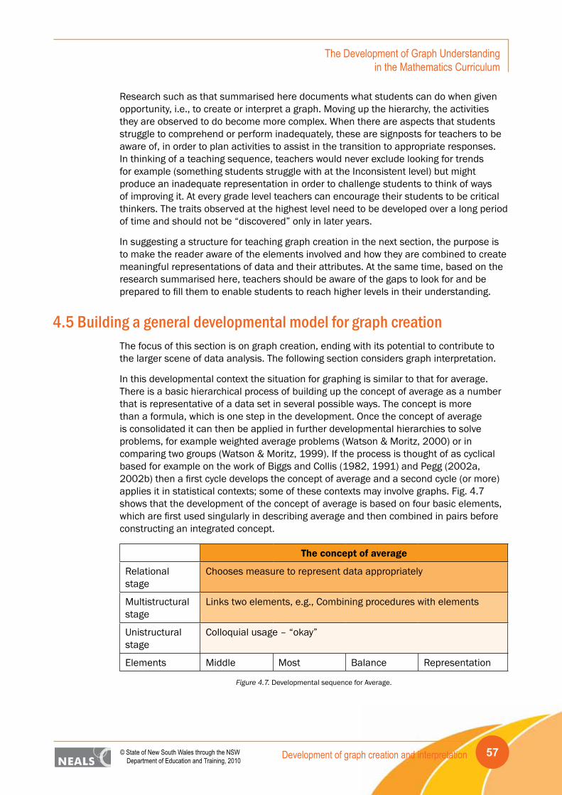
Development of graph creation and interpretation 57© State of New South Wales through the NSW Department of Education and Training, 2010
The Development of Graph Understanding in the Mathematics Curriculum
Research such as that summarised here documents what students can do when given opportunity, i.e., to create or interpret a graph. Moving up the hierarchy, the activities they are observed to do become more complex. When there are aspects that students struggle to comprehend or perform inadequately, these are signposts for teachers to be aware of, in order to plan activities to assist in the transition to appropriate responses. In thinking of a teaching sequence, teachers would never exclude looking for trends for example (something students struggle with at the Inconsistent level) but might produce an inadequate representation in order to challenge students to think of ways of improving it. At every grade level teachers can encourage their students to be critical thinkers. The traits observed at the highest level need to be developed over a long period of time and should not be “discovered” only in later years.
In suggesting a structure for teaching graph creation in the next section, the purpose is to make the reader aware of the elements involved and how they are combined to create meaningful representations of data and their attributes. At the same time, based on the research summarised here, teachers should be aware of the gaps to look for and be prepared to fill them to enable students to reach higher levels in their understanding.
4.5 Building a general developmental model for graph creationThe focus of this section is on graph creation, ending with its potential to contribute to the larger scene of data analysis. The following section considers graph interpretation.
In this developmental context the situation for graphing is similar to that for average. There is a basic hierarchical process of building up the concept of average as a number that is representative of a data set in several possible ways. The concept is more than a formula, which is one step in the development. Once the concept of average is consolidated it can then be applied in further developmental hierarchies to solve problems, for example weighted average problems (Watson & Moritz, 2000) or in comparing two groups (Watson & Moritz, 1999). If the process is thought of as cyclical based for example on the work of Biggs and Collis (1982, 1991) and Pegg (2002a, 2002b) then a first cycle develops the concept of average and a second cycle (or more) applies it in statistical contexts; some of these contexts may involve graphs. Fig. 4.7 shows that the development of the concept of average is based on four basic elements, which are first used singularly in describing average and then combined in pairs before constructing an integrated concept.
The concept of average
Relational stage
Chooses measure to represent data appropriately
Multistructural stage
Links two elements, e.g., Combining procedures with elements
Unistructural stage
Colloquial usage – “okay”
Elements Middle Most Balance Representation
Figure 4.7. Developmental sequence for Average.
Development of graph creation and interpretation58
The Development of Graph Understanding in the Mathematics Curriculum
© State of New South Wales through the NSW Department of Education and Training, 2010
In another regard, however, the situation for graphing is different and more complex than that for average. There may be three or four basic measures for average but there are many more types of graphs relevant to the school curriculum. Also the procedure for finding an average does not change if there are a small or large number of data points (it just may become more tedious). The procedures associated with creating graphs, however, change if large data sets are involved or if the variables involved are numerical (e.g., measurements) or categorical (e.g., gender). It is hence suggested here that after an initial developmental cycle that produces the concept of a graph, there are two parallel cycles of development building on the basic graphing concept: one is based on the ability to create and/or choose appropriate graphs for large data sets, and the other is based on the ability to create and or choose appropriate graphs when more than one attribute needs to be displayed at the same time. As examples, the first may require development of understanding of the histogram, whereas the second may require development of understanding of the scatterplot.
Once these understandings are developed the consolidated concepts are available to be combined with the concept of average to embark on a yet higher level cycle (probably in the formal mode of the Biggs and Collis model), the decision-making processes that lead to informal statistical inference. Another cycle or perhaps more than one, building the mathematical procedures and understanding, is needed to achieve application to formal statistical inference, but speculation on this is beyond the scope of this report. The following three subsections focus on the first cycle building the concept of graph and the two “second” cycles that follow it for larger data sets or more attributes.
4.5.1 The first cycle: The concept of graph
The basic elements required to develop the concept of graph are attribute – something of interest that is measured or counted; data – the existence or collection of information about the attribute for different cases; variation – the acknowledgement of difference or change among the data/cases; and scale – the necessity to keep track of the data in a fashion that makes fair comparisons possible. The idea that variation is absolutely fundamental to statistics (Moore, 1990) makes it one of the critical elements of developing the concept of graph. Students are unlikely to have sophisticated ideas about variation but the expectation that data for attributes will vary/change is essential to the process of graph creation. The fact that the word variable is synonymous with attribute reflects this understanding but variable and variation are not exactly the same – both are needed in the process and using the term “attribute” assists to make the distinction. Although context is not mentioned explicitly in the model, it is assumed that the context represented by the attribute and the data are understood.
At the first stage in the process of developing the concept of graph, students are likely to comprehend one or more of the four elements but not be able to link them together meaningfully. For example they may recognise variation in the characteristics of the students in the classroom but not be able to measure or represent it; they may be able to count accurately but not represent numbers to compare; they may see data as “dots” but not be able to connect them with the attributes they represent. Following the Biggs and Collis (1982, 1991) model this stage is labelled unistructural (e.g., Watson & Moritz, 2001). At the next stage students can link two or more of the elements, perhaps creating simple pictographs and discussing difference or discussing how the data tell about the attribute. This stage is labelled multistructural. At the stage where the four elements are connected meaningfully, called relational, students can create a meaningful picture/

Development of graph creation and interpretation 59© State of New South Wales through the NSW Department of Education and Training, 2010
The Development of Graph Understanding in the Mathematics Curriculum
diagram with appropriate scale and tell the story of the variation in the data and what it means for the attribute being displayed. With this concept of a graph as a pictorial representation of the elements, the student is ready to move on to a second cycle and extend the concept in two directions. This developmental structure is shown in Fig. 4.8.
The Concept of Graph
Relational stage
Combines all elements to create a representative graph
Multistructural stage
Links 2 or 3 elements to create basic graphs
Unistructural stage
Uses single elements unlinked
Elements Attribute Data Variation Scale
Figure 4.8. Developmental sequence for the basic Concept of Graph.
Having reached this point it does not seem reasonable to suggest that one of the next two cycles should precede the other. Conceptually they are parallel. In fact from considering curriculum documents there appears to be a mix of graph types of the two sorts across the years. The potential motivational value of adding more attributes to the mix, however is now acknowledged (e.g., NCTM, 2000) and since it can often be managed with small data sets, it is likely that dealing with two attributes occurs earlier.
4.5.2 A second cycle: The ability to create or choose appropriate graphs when more than one attribute is involved
The basic elements needed for the development of graph creation for more than one attribute are: the consolidated graph concept from the first cycle; different types of attributes – categorical, numerical, discrete, continuous; two-dimensional scaling; and measurement of two or more attributes on a single case unit. These are the elements that are combined to create the types of graphs that tell stories about two (or more) attributes: split stacked dot plots, time series graphs, line graphs, scatterplots. Time deserves special mention in this context because often events are documented over time. Time may also be implicit in “before” and “after” measurements, as well as being the focus of one of the measurements, such as heart rate or “winning” time. A hierarchical sequence can be imagined to create each variation on the theme of displaying the relationship between two attributes and the aim at the relational level is to understand the range of possible graphs and where they are appropriate for application to tell a story. At the unistructural stage students struggle to go beyond their basic concept of graphing and incorporate the other elements, perhaps confusing the different types of attributes or how to plot two values on different axes to create a single point in a scatterplot. At the multistructural level of this cycle students create some or all of the representations for the various possible pairs of attributes. Having built a repertoire of graph types at this level, students may find it difficult to use each. As noted, however, at the relational level, students can recognise among the graph types they understand, the one appropriate for particular associations between attributes and apply it to tell the story of the data. Fig. 4.9 summarises this progression.
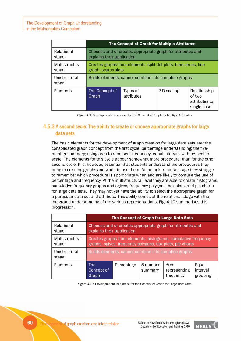
Development of graph creation and interpretation60
The Development of Graph Understanding in the Mathematics Curriculum
© State of New South Wales through the NSW Department of Education and Training, 2010
The Concept of Graph for Multiple Attributes
Relational stage
Chooses and or creates appropriate graph for attributes and explains their application
Multistructural stage
Creates graphs from elements: split dot plots, time series, line graph, scatterplots
Unistructural stage
Builds elements, cannot combine into complete graphs
Elements The Concept of Graph
Types of attributes
2-D scaling Relationship of two attributes to single case
Figure 4.9. Developmental sequence for the Concept of Graph for Multiple Attributes.
4.5.3 A second cycle: The ability to create or choose appropriate graphs for large data sets
The basic elements for the development of graph creation for large data sets are: the consolidated graph concept from the first cycle; percentage understanding; the five-number summary; using area to represent frequency; equal intervals with respect to scale. The elements for this cycle appear somewhat more procedural than for the other second cycle. It is, however, essential that students understand the procedures they bring to creating graphs and when to use them. At the unistructural stage they struggle to remember which procedure is appropriate when and are likely to confuse the use of percentage and frequency. At the multistructural level they are able to create histograms, cumulative frequency graphs and ogives, frequency polygons, box plots, and pie charts for large data sets. They may not yet have the ability to select the appropriate graph for a particular data set and attribute. This ability comes at the relational stage with the integrated understanding of the various representations. Fig. 4.10 summarises this progression.
The Concept of Graph for Large Data Sets
Relational stage
Chooses and or creates appropriate graph for attributes and explains their application
Multistructural stage
Creates graphs from elements: histograms, cumulative frequency graphs, ogives, frequency polygons, box plots, pie charts
Unistructural stage
Builds elements, cannot combine into complete graphs
Elements The Concept of Graph
Percentage 5-number summary
Area representing frequency
Equal interval grouping
Figure 4.10. Developmental sequence for the Concept of Graph for Large Data Sets.

Development of graph creation and interpretation 61© State of New South Wales through the NSW Department of Education and Training, 2010
The Development of Graph Understanding in the Mathematics Curriculum
4.5.4 The third cycle: Informal decision-making for graphs
The third cycle takes the appropriate creation and choosing of graphs one step further and applies the graphs to decision-making, potentially in the form of informal inference. The elements are the two advanced graphing understandings related to multiple attributes and to large data sets, the concept of average – required to consider central tendency in graphs; and the concept of variation – revisited although an element of the original concept of graph due to its significance in contrasting with average. At the unistructural stage students are likely to struggle for example to combine the comparison of multiple attributes with presence of large data sets, or to appreciate the link between central tendency and variation. Combining pairs of the elements is likely to provide partial answers to statistical questions at the multistructural level but for most statistical enquiries all elements will need to be integrated for completely justified conclusions to be reached. The overall developmental model is summarised in Fig. 4.11.
Informal* Decision Making for Graphs
Relational stage
Combines all elements as required by the question to reach an informal conclusion
Multistructural stage
Combines two or more elements to reach partial informal conclusions for questions about a data set
Unistructural stage
Appreciates elements in isolation, has difficulty combining
ElementsConcept of Variation
Concept of Graph for Multiple Attributes
Concept of Graph for Large Data Sets
Concept of Average
Concept of Graph
*The term informal is used here to distinguish the hierarchy from one that would involve formal statistical t ests.
Figure 4.11. Development sequence for Informal Decision Making for Graphs.
The important aspect of teaching graph creation is to be certain that all of the elements are made known to students as the work is begun. Since it is likely that it will take some time before all students are able to integrate the elements, repetition will be needed when each new type of graph is introduced. The need to understand the element, attribute, means that the creation of graphs should not be considered without a context. Data are needed to create a graph and they must be “measuring” some attribute. The concept of graph is built over time from seeing many different examples in different contexts. It is building this repertoire that makes it possible to choose and use graphs when given data handling questions.
Young children for example may be able to create partial pictographs, for example without scale and this may be adequate as a starting point given their ability to understand basic scaling. They may be able to consolidate the ideas attribute, data and variation, to which they can add scale later.
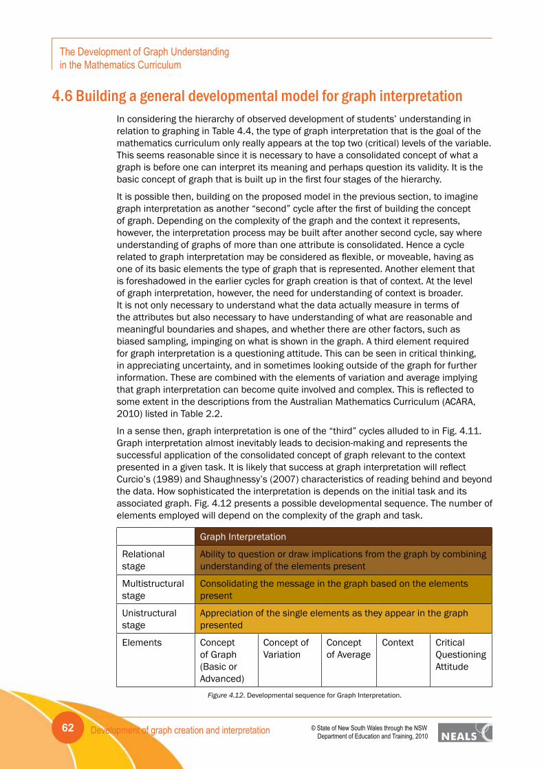
Development of graph creation and interpretation62
The Development of Graph Understanding in the Mathematics Curriculum
© State of New South Wales through the NSW Department of Education and Training, 2010
4.6 Building a general developmental model for graph interpretationIn considering the hierarchy of observed development of students’ understanding in relation to graphing in Table 4.4, the type of graph interpretation that is the goal of the mathematics curriculum only really appears at the top two (critical) levels of the variable. This seems reasonable since it is necessary to have a consolidated concept of what a graph is before one can interpret its meaning and perhaps question its validity. It is the basic concept of graph that is built up in the first four stages of the hierarchy.
It is possible then, building on the proposed model in the previous section, to imagine graph interpretation as another “second” cycle after the first of building the concept of graph. Depending on the complexity of the graph and the context it represents, however, the interpretation process may be built after another second cycle, say where understanding of graphs of more than one attribute is consolidated. Hence a cycle related to graph interpretation may be considered as flexible, or moveable, having as one of its basic elements the type of graph that is represented. Another element that is foreshadowed in the earlier cycles for graph creation is that of context. At the level of graph interpretation, however, the need for understanding of context is broader. It is not only necessary to understand what the data actually measure in terms of the attributes but also necessary to have understanding of what are reasonable and meaningful boundaries and shapes, and whether there are other factors, such as biased sampling, impinging on what is shown in the graph. A third element required for graph interpretation is a questioning attitude. This can be seen in critical thinking, in appreciating uncertainty, and in sometimes looking outside of the graph for further information. These are combined with the elements of variation and average implying that graph interpretation can become quite involved and complex. This is reflected to some extent in the descriptions from the Australian Mathematics Curriculum (ACARA, 2010) listed in Table 2.2.
In a sense then, graph interpretation is one of the “third” cycles alluded to in Fig. 4.11. Graph interpretation almost inevitably leads to decision-making and represents the successful application of the consolidated concept of graph relevant to the context presented in a given task. It is likely that success at graph interpretation will reflect Curcio’s (1989) and Shaughnessy’s (2007) characteristics of reading behind and beyond the data. How sophisticated the interpretation is depends on the initial task and its associated graph. Fig. 4.12 presents a possible developmental sequence. The number of elements employed will depend on the complexity of the graph and task.
Graph Interpretation
Relational stage
Ability to question or draw implications from the graph by combining understanding of the elements present
Multistructural stage
Consolidating the message in the graph based on the elements present
Unistructural stage
Appreciation of the single elements as they appear in the graph presented
Elements Concept of Graph (Basic or Advanced)
Concept of Variation
Concept of Average
Context Critical Questioning Attitude
Figure 4.12. Developmental sequence for Graph Interpretation.
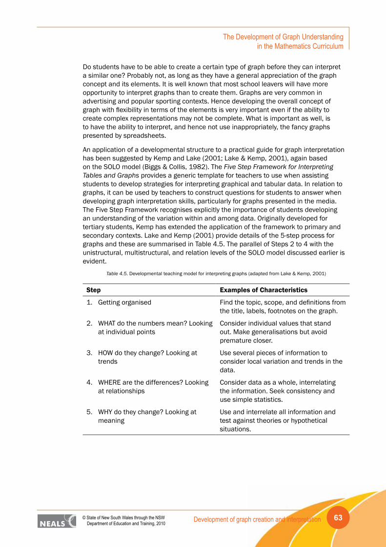
Development of graph creation and interpretation 63© State of New South Wales through the NSW Department of Education and Training, 2010
The Development of Graph Understanding in the Mathematics Curriculum
Do students have to be able to create a certain type of graph before they can interpret a similar one? Probably not, as long as they have a general appreciation of the graph concept and its elements. It is well known that most school leavers will have more opportunity to interpret graphs than to create them. Graphs are very common in advertising and popular sporting contexts. Hence developing the overall concept of graph with flexibility in terms of the elements is very important even if the ability to create complex representations may not be complete. What is important as well, is to have the ability to interpret, and hence not use inappropriately, the fancy graphs presented by spreadsheets.
An application of a developmental structure to a practical guide for graph interpretation has been suggested by Kemp and Lake (2001; Lake & Kemp, 2001), again based on the SOLO model (Biggs & Collis, 1982). The Five Step Framework for Interpreting Tables and Graphs provides a generic template for teachers to use when assisting students to develop strategies for interpreting graphical and tabular data. In relation to graphs, it can be used by teachers to construct questions for students to answer when developing graph interpretation skills, particularly for graphs presented in the media. The Five Step Framework recognises explicitly the importance of students developing an understanding of the variation within and among data. Originally developed for tertiary students, Kemp has extended the application of the framework to primary and secondary contexts. Lake and Kemp (2001) provide details of the 5-step process for graphs and these are summarised in Table 4.5. The parallel of Steps 2 to 4 with the unistructural, multistructural, and relation levels of the SOLO model discussed earlier is evident.
Table 4.5. Developmental teaching model for interpreting graphs (adapted from Lake & Kemp, 2001)
Step Examples of Characteristics
1. Getting organised Find the topic, scope, and definitions from the title, labels, footnotes on the graph.
2. WHAT do the numbers mean? Looking at individual points
Consider individual values that stand out. Make generalisations but avoid premature closer.
3. HOW do they change? Looking at trends
Use several pieces of information to consider local variation and trends in the data.
4. WHERE are the differences? Looking at relationships
Consider data as a whole, interrelating the information. Seek consistency and use simple statistics.
5. WHY do they change? Looking at meaning
Use and interrelate all information and test against theories or hypothetical situations.

Implications64
The Development of Graph Understanding in the Mathematics Curriculum
© State of New South Wales through the NSW Department of Education and Training, 2010
5. Implications5.1 The NSW context: Working Mathematically
The Working Mathematically strand of the NSW Mathematics Syllabus (BoSNSW, 2002a, 2002b) consists of five interrelated processes – Questioning, Applying Strategies, Communicating, Reasoning, and Reflecting. These are noted with some examples for every stage of every content area and appear from introductory material to be considered undefined terms. In creating an annotated bibliography of sources for this project, the processes from Working Mathematically were used repeatedly, with all five considered a part of the research or teaching focus of many of the sources. They appear so intrinsically entwined that placing an excessively strong emphasis on one process to the exclusion of others is likely to lead to learning that is limited in its scope and application. Concentrating learning on graph creation, for example, to facilitate the development of Communication and Applying Strategies skills may be successful for those two but not develop Reflection. A holistic approach to learning about data and associated graphs hence is required to achieve comprehensive learning outcomes that encompass all five aspects of Working Mathematically. This can be achieved using an inquiry-based approach to learning. Inquiry-based learning encompasses investigations that require students to answer questions set in meaningful contexts. Students work through learning activities that include gathering information, making decisions about the best way to display and transform the information, deciding the validity of the information, looking for relationships in the information, and making connections between what they have learnt from the information and their existing knowledge. As these are also the fundamental skills and processes that are developed through graph creation and graph interpretation, embedding all components together as a fundamental part of the mathematics curriculum has the potential to satisfy all aspects of Working Mathematically.
As students progress through the years of schooling they will build up their knowledge of graph types. This process is cumulative, giving the students a tool kit of representations that they can select from when given the freedom to do so. When students make the decisions about which representation to use to answer a particular question about the data, they engage in critical thinking, drawing on their understanding of the graph type as well as their graph interpretation skills. Having a selection of graph types to choose from also allows them to be creative and explore various representations of the same data, with and without the use of technology. Engaging in the learning process in this way also allows for the development of critical thinking, thereby honing their Working Mathematically skills.
The situation exists today where technology is available in the classroom when students begin school. Young students have access to and are able to use graphing software to create accurate graphs. The task of creating a graph by hand can be laborious and prone to error and inaccuracy, particularly when specific graph conventions are to be adhered to. Further, as drawing graphs by hand is very time consuming, the creation of multiple graphs and looking at the same data using different graphs types may not occur. Graphing software provides the freedom to create multiple graphs and various graph types to explore how data can inform decisions, influence opinions, and support hypotheses. This is not to say students should not create graphs by hand. There is great value in being able to draw graphs as well as create graphs by manipulating data in the

Implications 65© State of New South Wales through the NSW Department of Education and Training, 2010
The Development of Graph Understanding in the Mathematics Curriculum
form of data cards and pictures. Technology provides the additional opportunity to learn how to work mathematically using data without the burden of physical graph creation.
It is important to remember that the thinking about and interpretation of graphs produced by software, or by hand for that matter, cannot occur if students do not understand the representations applied. Therefore, learning about different graphs types and the subsequent creation of them must go hand-in-hand with developing an understanding of what they mean and what they can be used for. To address this issue, also keeping in mind the comments made in Section 4.6, any curriculum must be flexible enough to allow for the development of graph creation in coordination with graph interpretation. At times, when new graph types are introduced the learning emphasis will be on graph creation and to a lesser extent graph interpretation. At other times, when students are proficient at creating particular graph types the emphasis will be on making sense of the data and making inferences, from their own graphs and others. Overlaying student learning about data representations and using data is the way students develop an understanding of not only the underlying mathematics but also the way in which it can be used. Surely this encompasses what Working Mathematically is about.
5.2 Sequencing learning and the curriculumThe implication of considering students’ development of understanding is not that teachers introduce graphing and graphing types in incomplete stages but that they are aware of the elements that they need to make explicit at the start and constantly reinforce how the elements are linked in order to create a meaningful representation. It is not just a matter of drawing lines with rulers and plotting numbers in a procedural fashion but of thinking about each element and how it is linked to the others. At the end of any activity it is essential for the teacher to reinforce the relationships and how they tell the story in the data.
As an example in relation to Fig. 4.8 on the Concept of Graph consider the introduction of a stem-and-leaf plot. An appropriate attribute might be heart rate, which could be discussed with students in terms of exercise or rest. The associated data might be measured on the students and the link to the attribute can be made in terms of a decision about whether the rate recorded is “per 15 seconds,” “per 30 seconds,” or “per minute.” The recorded data can then be discussed in terms of place value, focussing on the tens and units digits. This information can then be linked to the scale to determine end points (top and bottom) and intermediate tens values. As data are recorded in the plot, variation is noted as the leaves extend further for some tens values than others. Labelling the plot reminds students of the attribute and they can write a summary about the story present in the data they have plotted.
To use the same data to introduce a stacked dot plot instead of a stem-and-leaf plot would only change the discussion of creating the scale on a baseline, determining the end points and markers in between them. The implications for discussing variation would be similar as data values were plotted.
For the next cycle of introducing another attribute (cf. Fig. 4.9), one of the elements assumed is the basic stem-and leaf or stacked dot plot. Teachers need to be certain students have this element consolidated. It is then important to introduce the new attribute, carefully distinguishing it from the first; for example it might be another heart rate, say after exercise if the first measurements were taken at rest. Or the second

Implications66
The Development of Graph Understanding in the Mathematics Curriculum
© State of New South Wales through the NSW Department of Education and Training, 2010
attribute might be the categorical attribute, gender. In either situation it needs to be made clear that for each case (e.g., student) on which measurements are made, there are now two pieces of information, either active and rest heart rates, or heart rate and gender. For the stem-and-leaf plot scenario, the adaptation and perhaps extension of the central scale is straightforward but students need to be aware of the meaning attached to the leaves that appear on each side of the stem. In the two examples suggested the meaning is somewhat different. For the resting and active heart rates, a student is represented by two leaves, one on each side of the stem. For heart rate and gender, a student’s numerical value only occurs once, the second attribute being determined by the side of the stem the leaf is on. The link to the attributes is made explicit through the labelling of the plot.
Similarly, for the stacked dot plot, adding a second heart rate may suggest the introduction of a second scaled horizontal baseline, labelled with the name of the attribute, perhaps longer than the first but arranged so common values are seen in relation to each other. In this situation a student will be represented by a dot on each plot. As well, however, a scaled vertical axis could be introduced to intersect the horizontal line, providing the opportunity to represent each student with only one dot but a dot that conveys two pieces of information, a heart rate from each labelled axis, thereby constructing a scatterplot. These two possible representations show the relative power of the scatterplot to show trends based on individual values rather than group values (as is the case in two stacked dot plots). Further than this, however, having both representations in their repertoire allows students to make choices about how they tell the stories they find in data sets. Depending on the variation in the data, one representation might be better or simpler at getting the message across than the other. Considering the attributes heart rate and gender, again two stacked dot plots with linked scales (one for each gender) would be used and this time a student’s data value would be represented by only one dot, placed on the plot for the appropriate gender.
These examples show how complex the process of introducing even relatively simple graphical forms can be. Once the elements are made clear and reinforced, however, students have power to create meaningful representations to tell the stories in the data sets.
The order in which graph types are introduced is likely to reflect the complexity associated understanding the basic elements as other related aspects of mathematics are developing. Conservation of number and counting are clearly prerequisites for work with graphing, although early graphs can be used for reinforcement of counting and comparison skills. Categorical attributes, such as colours or fruit types, are likely to be understood before measurement attributes, for example, measuring with rulers. The related complexity of the scales for axes suggests an ordering such as categories (e.g., red, blue, green, …), followed by whole number markings for “stacking dots,” then scales with markings in fractions or decimals between whole number values. Later interval scales associated with histograms may be quite variable and hence more complex.
The Australian Mathematics Curriculum (ACARA, 2010) aligns the introduction of graphs with the specific years, or sometimes a series of years. Once a graph type is introduced it should be available in successive years depending on the requirements of a particular investigation and its associated data set. What is missing from the curriculum, as noted in Section 2.4.1, is a clarification on terminology associated with “column” graphs and the case-value plots discussed in this report. It is also possible to argue

Implications 67© State of New South Wales through the NSW Department of Education and Training, 2010
The Development of Graph Understanding in the Mathematics Curriculum
that stem-and-leaf plots could be introduced earlier than Year 6, as soon as students have a consolidated understanding of place value. Work with pie charts depends on the understanding of the proportional representation possible using areas of the segments of the circle. The actual construction of pie charts is relatively simple and does not depend on calculations involving central angles and 360o in the early years. Overall, the sequence of introduction of graph types appears reasonable, although in some instances they may be accessible in earlier years. If the earlier types of graphs are consolidated well, then it seems reasonable to leave box plots until Year 10, as students are more likely to have the proportional reasoning understanding necessary to appreciate the density representations they provide. Hat plots (cf. Section 3) would be a useful intermediate step as suggested by Watson et al. (2008).
In relation to graph interpretation, again it is useful to be aware of the potential levels of development that students are likely to experience and to help them make connections necessary to reach higher levels. Kemp’s work (cf. Section 4.6) provides a workable model that can actually be given to students to assist them to get the most out of graphs they wish to interpret. Links back to the suggestions of Kosslyn (1989) are also very relevant in terms of graph interpretation. He first focuses on the individual elements or constituent parts of the graph (cf. Fig. 2.1) and then moves to the relationships shown among the elements. He finally suggests extending the interpretation to the symbols and lines that go beyond a literal reading of the graph. Taking this suggestion to include the context of the graph fits well with the framework of Lake and Kemp (2001) and the recognition of student’s developmental needs (Rangecroft, 1991a).
The history of graphs and graphing (cf. Section 2.2) is instructive in thinking about the future of graph creation and interpretation in the school curriculum. Across several centuries, advances in scientific technology provided more types of data, which in turn forced innovation in graph creation. Some of these graph types have come into common usage and others have become quaint historical oddities. Similar scientific or social science innovations in data collection today continue to require new software tools to provide visual representations to tell the stories in the data. In terms of the school curriculum, Wall and Benson (2009) capture the dilemma in their title, “So many graphs, so little time,” for an article showing some of the latest innovations in graphing. The dilemma for the school curriculum also includes the potential complexity of representations of limited application that could become a distraction from the basic understanding that will be applicable, with variation, across many contexts. As students are unlikely to have the state-of-the-art software tools available to them for graph creation, the importance of graph interpretation grows, with the further potential of cross-curriculum links.
The extracts from the Australian Mathematics Curriculum (ACARA, 2010) in relation to graph interpretation outlined in Tables 2.1 and 2.2 demonstrate the importance of graph interpretation across all years K−10. Some statements relate, for example, to averages, which could be thought of a separate procedural part of the Statistics and Probability curriculum. The view taken here is that relating averages explicitly to visual representations is essential to make complete and meaningful interpretations of the messages from graphs. Hence the elaborations that include graph interpretation serve two important purposes: they reinforce graph creation at every level and they link to wider goals of statistical literacy. The latter is important not only for the Mathematics Curriculum but also more widely for the entire Australian Curriculum, as statistical literacy is a critical element of “Numeracy,” which is seen in the Shape Statement
Implications68
The Development of Graph Understanding in the Mathematics Curriculum
© State of New South Wales through the NSW Department of Education and Training, 2010
(National Curriculum Board, 2009), as an essential skill, along with Literacy (p. 7). The Shape Statement further says, “Numeracy knowledge, skills and understanding need to be used and developed in all learning areas” (p. 12). The door is now open for much more cross-curriculum engagement with both graph creation and graph interpretation. Having built a firm foundation on creating and then interpreting graphs in the Mathematics Curriculum, there is great opportunity to illustrate their value as part of Numeracy across the curriculum.
References 69© State of New South Wales through the NSW Department of Education and Training, 2010
The Development of Graph Understanding in the Mathematics Curriculum
ReferencesAustralian Curriculum, Assessment and Reporting Authority. (2010). Draft Consultation
1.0 Mathematics. Canberra: Author. Retrieved March 20, 2010 from http://www.australiancurriculum.edu.au/Home
Australian Education Council. (1991). A national statement on mathematics for Australian schools. Melbourne: Author.
Bakker, A. (2004). Design research in statistics education: On symbolizing and computer tools. Utrecht, The Netherlands: CD-ß Press, Center for Science and Mathematics Education.
Beniger, J.R., & Robyn, D.L. (1978). Quantitative graphics in statistics. The American Statistician, 32(1), 1-11.
Bertin, J. (1981). Graphics and graphic information-processing. Translated by W.J. Berg and P.S. Berlin: De Gruyter.
Bertin, J. (1983). Semiology of graphics: Diagrams, networks, maps. (W.J. Berg, Trans.). Madison, WI: University of Wisconsin Press. (Original work published 1967)
Biggs, J.B., & Collis, K.F. (1982). Evaluating the quality of learning: The SOLO taxonomy. New York: Academic Press.
Biggs, J.B., & Collis, K.F. (1991). Multimodal learning and the quality of intelligent behaviour. In H.A.H. Rowe (Ed.), Intelligence: Reconceptualization and measurement (pp. 57-76). Hillsdale, NJ: Lawrence Erlbaum.
Board of Studies New South Wales. (2002a). Mathematics K-6 syllabus. Sydney:Author.
Board of Studies New South Wales. (2002b). Mathematics years 7-10 syllabus. Sydney:Author.
Boddington, A.L. (1936). Statistics and their application to commerce. (7th ed.). London: Sir Isaac Pitman & sons, Ltd.
Burrill, G., Scheaffer, R., & Rowe, K.B. (Eds.). (1994). Teaching statistics: Guidelines for elementary through high school. Palo Alto, CA: Dale Seymour Publications and the Center for Statistical Education American Statistical Association.
Card, S.K., Mackinlay, J., & Shneiderman, B. (Eds.) (1999). Readings in information visualization: Using vision to think. San Francisco, CA: Morgan Kaufmann Publishers
Chick, H. (2003). Tools for transnumeration: Early stages in the art of data representation. In L. Bragg, C. Campbell, G. Herbert, & J. Mousley (Eds.), Mathematics education research: Innovation, networking, opportunity (Proceedings of the 26th annual conference of the Mathematics Education Research Group of Australasia, Geelong, pp. 207-214). Sydney, NSW: MERGA.
Chick, H.L., & Watson, J.M. (2001). Data representation and interpretation by primary school students working in groups. Mathematics Education Research Journal, 13, 91-111.
Chick, H.L., Pfannkuch, M., & Watson, J.M. (2005). Transnumerative thinking: Finding and telling stories with data. Curriculum Matters, 1, 87-108.
References70
The Development of Graph Understanding in the Mathematics Curriculum
© State of New South Wales through the NSW Department of Education and Training, 2010
Cleveland, W.S. (1993). The visualisation of data. Summit, NJ: Hobart Press.
Cobb, P. (1999). Individual and collective mathematical development: The case for statistical data analysis. Mathematical Thinking and Learning, 1, 5-43.
Curcio, F.R. (1987). Comprehension of mathematical relationships expressed in graphs. Journal for Research in Mathematics Education, 18, 382-393.
Curcio, F.R. (1989). Developing graph comprehension. Reston, VA: National Council of Teachers of Mathematics.
Department of Education Tasmania. (2007). The Tasmania curriculum: Mathematics-numeracy. K-10 syllabus and support materials. Hobart: Author.
Department of Education and Science and the Welsh Office. (1989). Mathematics in the National Curriculum. London: HMSO.
Department of Education and Training Western Australia. (2007). K-10 overview - Mathematics - Chance and data. Retrieved January 23, 2010 from http://k-10syllabus.det.wa.edu.au/content/syllabus-documents/k-10-overviews/k-10-overview-mathematics
Emerson, J.D., & Hoaglin, D.C. (1983). Stem-and-leaf displays. In D. C. Hoaglin, F. Mosteller, & J. W. Tukey (Eds.), Understanding robust and exploratory data analysis (pp. 7-32). New York, NY: John Wiley & Sons, Inc.
Emerson, J.D., & Strenio, J. (1983). Boxplots and batch comparison. In D. C. Hoaglin, F. Mosteller, & J. W. Tukey (Eds.), Understanding robust and exploratory data analysis (pp. 58-96). New York, NY: John Wiley & Sons, Inc.
Fienberg, S. E. (1979). Graphical methods in statistics. The American Statistician, 33(4), 165-178.
Franklin, C., Kader, G., Mewborn, D., Moreno, J., Peck, R., Perry, M., & Scheaffer, R. (2007). Guidelines for assessment and instruction in statistics education (GAISE) report: A preK-12 curriculum framework. Alexandria, VA: American Statistical Association. Retrieved July 3, 2009 from http://www.amstat.org/education/gaise/
Friendly, M. (2007). A brief history of data visualization. In C. Chen, W. Hardle, & A. Unwin (Eds.), Handbook of Computational Statistics: Data Visualization, Vol III, Heidelberg: Springer. Retrieved November 18, 2009, from: http://www.math.yorku.ca/SCS/Gallery/milestone/
Friendly, M. (2009). Milestones in the history of thematic cartography, statistical graphics, and data visualization. Retrieved November 18, 2009, from: http://www.math.yorku.ca/SCS/Gallery/milestone/
Funkhouser, H.G. (1937). Historical development of the graphical representations of statistical data. Osiris, 3, 269-404.
Hall, H.S., & Knight, S.R. (1885). Elementary algebra for schools. London: MacMillan and Co.
Holmes, P. (1980). Teaching statistics 11-16. Slough, UK: Schools Council and Foulsham Educational.
Jones, G.A., Thornton, C.A., Langrall, C.W., Mooney, E.S., Perry, B., & Putt, I.J. (2000). A framework for characterizing children’s statistical thinking. Mathematical Thinking and Learning, 2, 269-307.

References 71© State of New South Wales through the NSW Department of Education and Training, 2010
The Development of Graph Understanding in the Mathematics Curriculum
Kelly, B.A., & Watson, J.M. (2002). Variation in a chance sampling setting: The lollies task. In B. Barton, K.C. Irwin, M. Pfannkuch, & M.O.J. Thomas (Eds.), Mathematics Education in the South Pacific (Proceedings of the 26th Annual Conference of the Mathematics Education Research Group of Australasia, Auckland, Vol. 2, pp. 366-373). Sydney, NSW: MERGA.
Kemp, M., & Lake, D. (2001). Choosing and using tables. Australian Mathematics Teacher, 57(3), 40-44.
Konold, C. (2002). Alternatives to scatterplots. In B. Phillips (Ed.), Proceedings of the Sixth International Conference on Teaching Statistics: Developing a Statistically Literate Society, Cape Town, South Africa. [CDrom] Voorburg, The Netherlands: International Statistical Institute.
Konold, C., & Higgins, T.L. (2003). Reasoning about data. In J. Kilpatrick, W.G. Martin, & D. Schifter (Eds.), A research companion to Principles and Standards for School Mathematics (pp. 193-215). Reston, VA: NCTM.
Konold, C., & Miller, C.D. (2005). Tinkerplots: Dynamic data exploration. [Computer software] Emeryville, CA: Key Curriculum Press.
Kosslyn, S.M. (1989). Understanding charts and graphs. Applied Cognitive Psychology, 3, 185-226.
Lake, D., & Kemp, M. (2001). Choosing and using graphs. Australian Mathematics Teacher, 57(3), 7-12.
Landwehr, J.M., & Watkins, A.E. (1986). Exploring data: Quantitative literacy series. Palo Alto, CA: Dale Seymour.
Maher, C.A. (1981). Simple graphical techniques for examining data generated by classroom activities. In A.P. Shulte (Ed.), Teaching statistics and probability. 1981 yearbook (pp. 109-117). Reston, VA: National Council of Teachers of Mathematics.
Masters, G.N. (1982). A Rasch model for partial credit scoring. Psychometrika, 47, 149-174.
Mooney, E.S. (2002). A framework for characterizing middle school students’ statistical thinking. Mathematical Thinking and Learning, 4(1), 23-63.
Moore, D.S. (1990). Uncertainty. In L.A. Steen (Ed.), On the shoulders of giants: New approaches to numeracy (pp. 95-137). Washington, DC: National Academy Press.
Moore, D.S., & McCabe, G.P. (1989). Introduction to the practice of statistics. New York: W.H. Freeman and Co.
Moritz, J.B. (2000). Graphical representations of statistical associations by upper primary students. In J. Bana & A. Chapman (Eds.), Mathematics Education Beyond 2000 (Proceedings of the 23rd Annual Conference of the Mathematics Education Research Group of Australasia, Vol. 2, pp. 440-447). Perth, WA: MERGA.
Moritz, J.B. (2006). Developing students’ understandings and representations of statistical covariation. Unpublished doctoral thesis. Hobart: University of Tasmania. Retrieved December 12, 2009 from http://eprints.utas.edu.au/1473/
Moritz, J.B., & Watson, J.M. (1997). Graphs: Communication lines to students? In F. Biddulph & K. Carr (Eds.), People in mathematics education (Proceedings of the 20th Annual Conference of the Mathematics Education Research Group of Australasia, Vol. 2, pp. 344-351). Waikato: MERGA.

References72
The Development of Graph Understanding in the Mathematics Curriculum
© State of New South Wales through the NSW Department of Education and Training, 2010
National Council of Teachers of Mathematics. (1989). Curriculum and evaluation standards for school mathematics. Reston, VA: Author.
National Council of Teachers of Mathematics. (2000). Principles and standards for school mathematics. Reston, VA: Author.
National Curriculum Board. (2009). The shape of the Australian Curriculum. Barton, ACT: Commonwealth of Australia.
Noether, G.E. (1983). Statistics in the curriculum for the 1980s. In G. Shufelt (Ed.), The agenda in action. 1983 yearbook (pp. 195-199). Reston, VA: National Council of Teachers of Mathematics.
Pearson, K. (1895). Contributions to the mathematical theory of evolution – II. Skew variation in homogeneous material. Philosophical Transactions of the Royal Society of London. A, 186, 343-414.
Pegg, J.E. (2002a). Assessment in mathematics: A developmental approach. In J.M. Royer (Ed.), Mathematical cognition (pp. 227-259). Greenwich, CT: Information Age Publishing.
Pegg, J.E. (2002b). Fundamental cycles of cognitive growth. In A. Cockburn & E. Nardi (Eds.), Proceedings of the 26th Conference of the International Group for the Psychology of Mathematics Education (Vol. 4, pp. 41-48). Norwich, UK: University of East Anglia.
Pendlebury, C. (1896). Arithmetic. (9th ed.). London: George Bell and Sons.
Pfannkuch, M., & Rubick, A. (2002). An exploration of students’ statistical thinking with given data. Statistics Education Research Journal, 1(2), 4-21.
Playfair, W. (1801). The statistical breviary; Skewing on a principle entirely new, the resources of every state and kingdom in Europe. London. Retrieved November 13, 2009, from http://books.google.com
Playfair, W. (1805). An inquiry into the permanent causes of the decline and fall of powerful and wealthy nations. London. Retrieved November 13, 2009, from http://books.google.com
Rangecroft, M. (1991a). Graphwork – Developing a progression. Part 1 – The early stages. Teaching Statistics, 13(2), 44-46.
Rangecroft, M. (1991b). Graphwork – Developing a progression. Part 2 – A diversity of graphs. Teaching Statistics, 13(3), 90-92.
Rasch, G. (1980). Probabilistic models for some intelligence and attainment tests. Chicago: University of Chicago Press (Original work published 1960).
Reading, C. (2002). Profile for statistical understanding. In B. Phillips (Ed.), Proceedings of the Sixth International Conference on Teaching Statistics: Developing a Statistically Literate Society, Cape Town, South Africa. Voorburg, The Netherlands: International Statistical Institute.
Reading, C., & Pegg, J. (1995). Teaching statistics: Background and implications. In L. Grimison & J. Pegg (Eds.), Teaching secondary school mathematics: Theory into practice (pp. 140-163). Sydney: Harcourt Brace.

References 73© State of New South Wales through the NSW Department of Education and Training, 2010
The Development of Graph Understanding in the Mathematics Curriculum
Shaughnessy, J.M. (2007). Research on statistics learning and reasoning. In F.K. Lester, Jr. (Ed.), Second handbook on research on mathematics teaching and learning (pp. 957-1009). Charlotte, NC: Information Age Publishing.
Shaughnessy, J.M., Chance, B., & Kranendonk, H. (2009). Focus on high school mathematics: Reasoning and sense making in statistics and probability. Reston, VA: National Council of Teachers of Mathematics.
Shufelt, G. (Ed.). (1983). The agenda in action. 1983 yearbook. Reston, VA: National Council of Teachers of Mathematics.
Shulte, A.P. (1981). Teaching statistics and probability. 1981 yearbook. Reston, VA: National Council of Teachers of Mathematics.
Spence, I. (2005). No humble pie: The origins and usage of a statistical chart. Journal of Educational and Behavioral Statistics, 30(4), 353-368.
Swift, J. (1983). A statistics course to lighten the information overload. In G. Shufelt (Ed.), The agenda in action. 1983 yearbook (pp. 110-119). Reston, VA: National Council of Teachers of Mathematics.
Tufte, E.R. (1983). The visual display of quantitative information. Cheshire, CT: Graphics Press.
Tufte, E.R. (1990). Envisioning information. Cheshire, CT: Graphics Press.
Tufte, E.R. (1997). Visual explanations: Images and quantities, evidence and narrative. Cheshire, CT: Graphics Press.
Tukey, J.W. (1977). Exploratory data analysis. Reading, Mass: Addison-Wesley Publishing Company.
Tukey, J.W. (1980). We need both exploratory and confirmatory. The American Statistician 34(1), 23-25.
Van de Walle, J.A. (2007). Elementary and middle school mathematics: Teaching developmentally. Boston: Pearson.
Wainer, H. (1997). Visual revelations: Graphical tales of fate and deception from Napoleon Bonaparte to Ross Perot. New York: Copernicus.
Wainer, H., & Velleman, P.F. (2001). Statistical graphics: Mapping the pathways of science. Annual Review of Psychology, 52, 305-335.
Wall, J.J., & Benson, C.C. (2009). So many graphs, so little time. Mathematics Teaching in the Middle School, 15, 82-91.
Watson, J.M. (1997). Assessing statistical literacy using the media. In I. Gal & J.B. Garfield (Eds.), The assessment challenge in statistics education (pp. 107-121). Amsterdam: IOS Press and The International Statistical Institute.
Watson, J.M. (2000). Statistics in context. Mathematics Teacher, 93, 54-58.
Watson, J.M. (2006). Statistical literacy at school: Growth and goals. Mahwah, NJ: Lawrence Erlbaum.
Watson, J.M. (2008). Exploring beginning inference with novice grade 7 students. Statistics Education Research Journal, 7(2), 59-82.
Watson, J.M., & Callingham, R.A. (2003). Statistical literacy: A complex hierarchical construct. Statistics Education Research Journal, 2(2), 3-46.

References74
The Development of Graph Understanding in the Mathematics Curriculum
© State of New South Wales through the NSW Department of Education and Training, 2010
Watson, J.M., Callingham, R.A., & Kelly, B.A. (2007). Students’ appreciation of expectation and variation as a foundation for statistical understanding. Mathematical Thinking and Learning, 9, 83-130.
Watson, J.M., Collis, K.F., Callingham, R.A., & Moritz, J.B. (1995). A model for assessing higher order thinking in statistics. Educational Research and Evaluation, 1, 247-275.
Watson, J.M., & Donne, J. (2009). TinkerPlots as a research tool to explore student understanding. Technology Innovations in Statistics Education, 3 (1), 1-35. Retrieved December 20, 2009 from http://repositories.cdlib.org/uclastat/cts/tise/vol3/iss1/art1
Watson, J.M., Fitzallen, N.E., Wilson, K.G., & Creed, J.F. (2008). The representational value of hats. Mathematics Teaching in the Middle School, 14, 4-10.
Watson, J.M., & Kelly, B.A. (2003). Inference from a pictograph: Statistical literacy in action. In L. Bragg, C. Campbell, G. Herbert, & J. Mousley (Eds.), Mathematics education research: Innovation, networking, opportunity (Proceedings of the 26th Annual Conference of the Mathematics Education Research Group of Australasia, Geelong, pp. 720-727). Sydney, NSW: MERGA.
Watson, J.M., & Kelly, B.A. (2005). The winds are variable: Student intuitions about variation. School Science and Mathematics, 105, 252-269.
Watson, J.M., & Moritz, J.B. (1999). The beginning of statistical inference: Comparing two data sets. Educational Studies in Mathematics, 37, 145-168.
Watson, J.M., & Moritz, J.B. (2000). The longitudinal development of understanding of average. Mathematical Thinking and Learning, 2(1&2), 11-50.
Watson, J.M., & Moritz, J.B. (2001). Development of reasoning associated with pictographs: Representing, interpreting, and predicting. Educational Studies in Mathematics, 48, 47-81.
Wild, C., & Pfannkuch, M. (1999). Statistical thinking in empirical enquiry. International Statistical Review, 67(3), 223-248