"The Atlas Effect. Markus Rissanen", presentation to the conference Drawing in the University Today,...
30
1 THE ATLAS EFFECT Markus Rissanen : science, tiling and art as images. João Francisco Figueira Faculty of Architecture, Technical University of Lisbon jffigueira –a–t– hotmail.com Abstract: When the painter and artist Markus Rissanen develops on his work and interests he stresses the importance of scientific imagery. Indeed, both his work seems to be reminiscent of it and he developed complex grids crafted in the realm of mathematics. However, to me, they seemed to relate to other streams of visual culture. I therefore started to craft my own “Rissanen atlas”, that, indeed, points towards the realms of textile and colour (more specifically, to aspects developed by the social history of colour), fauvism, abstraction and pop art, the realms of animation, some cartoon and psychedelic culture, among many others. Adding to these references the scientific ones that the artist mentions, we get a particular heterogeneous and anachronistic net, i.e. over-determined, that drives his “pictures [tableaux]” and “art” into the realm of “images”. The “Rissanen atlas” plays a major role in this process, an atlas that owes something to the practice and direction that Warburg gave to his famous atlas of images, that, for Didi-Huberman, constitutes a tool “of the inexhaustible openness to possibilities not yet given”; it determines the “explosion of the frame” of the “tableau”, both artistic as well as scientific (in Atlas, Paris, Minuit, 2011, p. 13). Key words: Markus Rissanen, science, tiling, art, atlas, images.
Transcript of "The Atlas Effect. Markus Rissanen", presentation to the conference Drawing in the University Today,...
1
THE ATLAS EFFECT Markus Rissanen : science, tiling and art as images.
João Francisco Figueira
Faculty of Architecture, Technical University of Lisbon
jffigueira –a–t– hotmail.com
Abstract:
When the painter and artist Markus Rissanen develops on his work and interests he
stresses the importance of scientific imagery. Indeed, both his work seems to be
reminiscent of it and he developed complex grids crafted in the realm of
mathematics. However, to me, they seemed to relate to other streams of visual
culture. I therefore started to craft my own “Rissanen atlas”, that, indeed, points
towards the realms of textile and colour (more specifically, to aspects developed by
the social history of colour), fauvism, abstraction and pop art, the realms of
animation, some cartoon and psychedelic culture, among many others. Adding to
these references the scientific ones that the artist mentions, we get a particular
heterogeneous and anachronistic net, i.e. over-determined, that drives his “pictures
[tableaux]” and “art” into the realm of “images”. The “Rissanen atlas” plays a major
role in this process, an atlas that owes something to the practice and direction that
Warburg gave to his famous atlas of images, that, for Didi-Huberman, constitutes a
tool “of the inexhaustible openness to possibilities not yet given”; it determines the
“explosion of the frame” of the “tableau”, both artistic as well as scientific (in Atlas,
Paris, Minuit, 2011, p. 13).
Key words:
Markus Rissanen, science, tiling, art, atlas, images.
2
O EFEITO ATLAS Markus Rissanen : ciência, mosaicos e arte como imagens
João Francisco Figueira
Faculdade de Arquitectura, Universidade Técnica de Lisboa
jffigueira –a–t– hotmail.com
Resumo:
Quando o pintor Markus Rissanen se pronuncia acerca do seu trabalho e interesses
refere com especial ênfase as imagens de âmbito científico. Com efeito, não só o
seu trabalho parece ser reminiscente deste, como desenvolveu malhas complexas
oriundas do domínio da matemática. Não obstante, pela minha parte, tendia a vê-lo
com relação a referencias visuais e culturais muito diferentes. Foi assim que encetei
a construção de um “atlas Rissanen”, que, com efeito, aponta para os universos dos
têxteis e da cor (mais concretamente, para matérias tratadas no âmbito da história
social da cor), fauvismo, abstraccionismo e pop art, os universos da animação, certa
BD e cultura psicadélica, entre outros. Considerando estas referências e as que o
autor refere, obtém-se uma rede particularmente heterogénea e anacrónica, i.e.
sobredeterminada, que arrasta os seus “quadros” e “arte” para o campo da
“imagem”. Nesta história, desempenha um papel fundamental o “atlas Rissanen”,
devedor da prática e sentido que Warburg conferiu ao seu famoso atlas, que, para
Didi-Huberman, constitui a ferramenta “da inesgotável abertura às possibilidades
não dadas ainda”, fazendo “explodir os limites” do “quadro”, tanto artístico como
científico (in Atlas, Paris, Minuit, 2011, p. 13).
Palavras chave:
Markus Rissanen, ciência, mosaicos, arte, atlas, imagens.
3
THE ATLAS EFFECT Markus Rissanen : science, tiling and art as images.
João Francisco Figueira
Faculty of Architecture, Technical University of Lisbon
jffigueira –a–t– hotmail.com
1. Intro
When, around 2005-06, for the first time I came across the work of the Finnish
painter Markus Rissanen, immediately I thought that it should have a relation to
children's illustration, Japanese animation, the broad world of graphic design, pop art
and psychedelic culture, with Hieronymus Bosch (c1450-1516), The Garden of
Earthly Delights (1480-90), with the late Matisse and the work of Frank Stella (due to
his use of homogeneous colour and attached as he was to the flatness of the
canvas). Therefore, already a fairly heterogeneous network of references.
However, when we first talked together about his work, Markus Rissanen put
scientific imagery, science and knowledge on colour on top of his (p)references and
interests. Although it was Rissanen that mentioned to me the self-taught artist Henry
Darger, infancy and colour being at the core of his imagination, both the reference to
and the preference for scientific imagery came before everything else. Later, I learnt
about his interest on Penrose tiling (named after Roger Penrose, b1931, who
invented it in 1974, fig. 1), on its development into Dan Shechtman’s (b1941)
quasicrystals (invented in 1984, fig. 2-3) and about the tiling that Rissanen developed
after Penrose’s (fig. 4).1 This interest in science relates to a broader interest in the
non-perceptual representation of nature.2 The contrast between my perception on Rissanen’s work and his own, is at the
source of this research. The kind of images that Markus has been doing nourish my
imagination and constitute a major challenge to my interpretative skills, and therefore
I cannot help them.
In the following table I summarize the state of the matter, with, in the third
column, a clarification on where I now stand.
1 Partly presented on the occasion of the exhibition Figuring Out Nature, Turku University, 13/10-21/10/2011. While Penrose tiling are fully non-periodical, Rissanen’s allow non-periodocity. 2 M. Rissanen, “Constructed images, artistic imagination and scientific visualization”, p. 92-95.
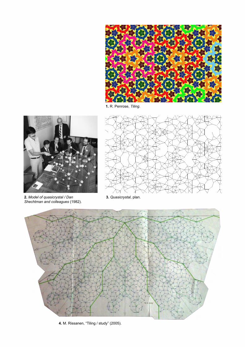
1. R. Penrose, Tiling.
2. Model of quasicrystal / Dan Shechtman and colleagues (1982).
3. Quasicrystal, plan.
4. M. Rissanen, “Tiling / study” (2005).

4
Markus Rissanen on his (p)references and interests: - scientific imagery - Penrose tiling - Shechtman quasicrystals - non-perceptual representation of nature
My initial perception: - children's illustration - (Japanese) animation - graphic design - pop art - psychedelic culture - Hieronymus Bosch, The Garden of earthly delights (1480-90) - Frank Stella (homogeneous colours and flatness)
Half way through, where I stand: - perspective - absence of cast shadows - simple forms and pure colours - cartoons, animation, design - infancy - flatness and homogeneous colours - Noland and Stella - textiles and botanic species - Talbot
2. Perspective and cast shadows
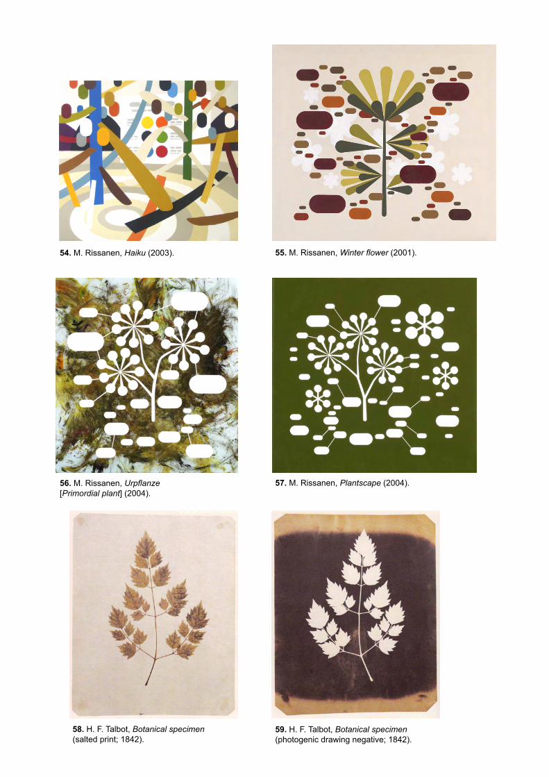
Since 2000, Rissanen has painted around 150 canvases, of which some less than
1/4 are perspective representations (fig. 5-8). Though not a numerous cluster, its
interest is certain.
The kinship between painting and perspective is, obviously, an old one, and the
representation of cast shadows is an integral part of this history:
a) Theorized as a property of the body throughout the Middle Ages, it was not
until the 15th century that painting embraced the systematic representation of
cast shadows;
b) Masaccio (1401-1428) was one of the first to use linear perspective and
master the related language of cast shadows. Saint Peter healing the sick with
his shadow (1426-1427) (fig. 9) is a major achievement at both respects;
c) The polyptych that Giovanni di Paolo (c1400-1472) did in 1436 (of which just
a few fragments have survived) makes of him the likely forerunner in the matter
and in this medium;
d) The theme was given due attention in the training of artists (and architects),
as well as in the treatises of Cennino Cennini (The Craftsman's Handbook,
c1390, 1437), L. B. Alberti (On Painting, 1435),3 Leonardo (A Treatise on
Painting, c1500), A. Dürer (The Four Books on Measurement, 1525, fig. 10),
among others.4
The first aspect of importance in relation to Rissanen’s perspectives, is that cast
shadows are totally absent (fig. 5-8). In my view, the reason for this is rather simple:
they are not descended from the great tradition of painting that unfolded from the
Renaissance to the academic painting of the 19th century, but rather, in matters of
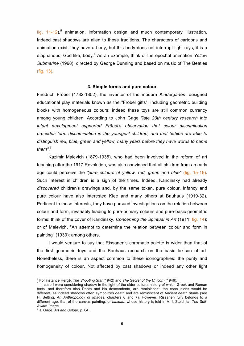
perspective, with more recent traditions: comics (such as The Adventures of Tintin,
3 Namely, book I, 11, and book II, 46-47. 4 For an in-depth and quite remarkable history of shadow, see V. I. Stoichita, Short History of Shadow.
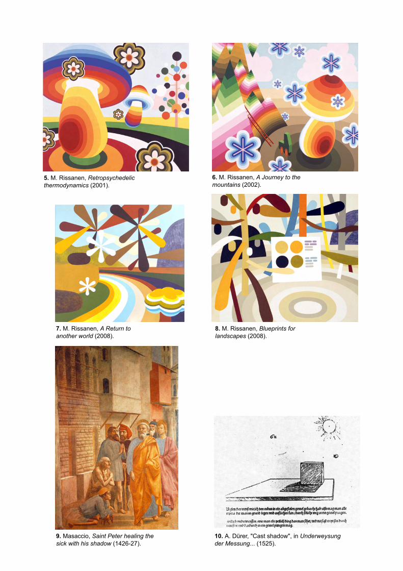
5. M. Rissanen, Retropsychedelic thermodynamics (2001).
6. M. Rissanen, A Journey to the mountains (2002).
8. M. Rissanen, Blueprints for landscapes (2008).
7. M. Rissanen, A Return to another world (2008).
10. A. Dürer, "Cast shadow", in Underweysung der Messung... (1525).
9. Masaccio, Saint Peter healing the sick with his shadow (1426-27).
5
fig. 11-12),5 animation, information design and much contemporary illustration.
Indeed cast shadows are alien to these traditions. The characters of cartoons and
animation exist, they have a body, but this body does not interrupt light rays, it is a
diaphanous, God-like, body.6 As an example, think of the epochal animation Yellow
Submarine (1968), directed by George Dunning and based on music of The Beatles
(fig. 13).
3. Simple forms and pure colour
Friedrich Fröbel (1782-1852), the inventor of the modern Kindergarten, designed
educational play materials known as the "Fröbel gifts", including geometric building
blocks with homogeneous colours; indeed these toys are still common currency
among young children. According to John Gage "late 20th century research into
infant development supported Fröbel's observation that colour discrimination
precedes form discrimination in the youngest children, and that babies are able to
distinguish red, blue, green and yellow, many years before they have words to name
them".7
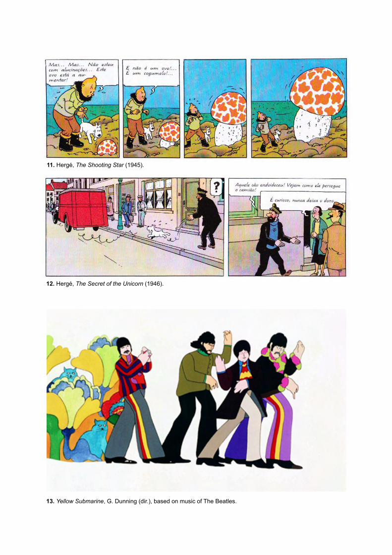
Kazimir Malevich (1879-1935), who had been involved in the reform of art
teaching after the 1917 Revolution, was also convinced that all children from an early
age could perceive the "pure colours of yellow, red, green and blue" (fig. 15-16).
Such interest in children is a sign of the times. Indeed, Kandinsky had already
discovered children's drawings and, by the same token, pure colour. Infancy and
pure colour have also interested Klee and many others at Bauhaus (1919-32).
Pertinent to these interests, they have pursued investigations on the relation between
colour and form, invariably leading to pure-primary colours and pure-basic geometric
forms: think of the cover of Kandinsky, Concerning the Spiritual in Art (1911; fig. 14);
or of Malevich, "An attempt to determine the relation between colour and form in
painting" (1930); among others.
I would venture to say that Rissanen's chromatic palette is wider than that of
the first geometric toys and the Bauhaus research on the basic lexicon of art.
Nonetheless, there is an aspect common to these iconographies: the purity and
homogeneity of colour. Not affected by cast shadows or indeed any other light
5 For instance Hergé, The Shooting Star (1942) and The Secret of the Unicorn (1946). 6 In case I were considering shadow in the light of the older cultural history of which Greek and Roman texts, and therefore also Dante and his descendents, are reminiscent, the conclusions would be different, as indeed shadows often symbolizes death and are reminiscent of Ancient death rituals (see H. Belting, An Anthropology of Images, chapters 6 and 7). However, Rissanen fully belongs to a different age, that of the canvas painting, or tableau, whose history is told in V. I. Stoichita, The Self-Aware Image. 7 J. Gage, Art and Colour, p. 64.
11. Hergé, The Shooting Star (1945).
12. Hergé, The Secret of the Unicorn (1946).
13. Yellow Submarine, G. Dunning (dir.), based on music of The Beatles.
14. W. Kandinsky, Concerning the Spiritual in Art (1911; cover after earlier version of the book).
15. K. Malevich, Red Square, Painterly realism of a peasant woman in two dimensions (1915).
16. K. Malevich, Suprematism, Non-objective composition (1915).
6
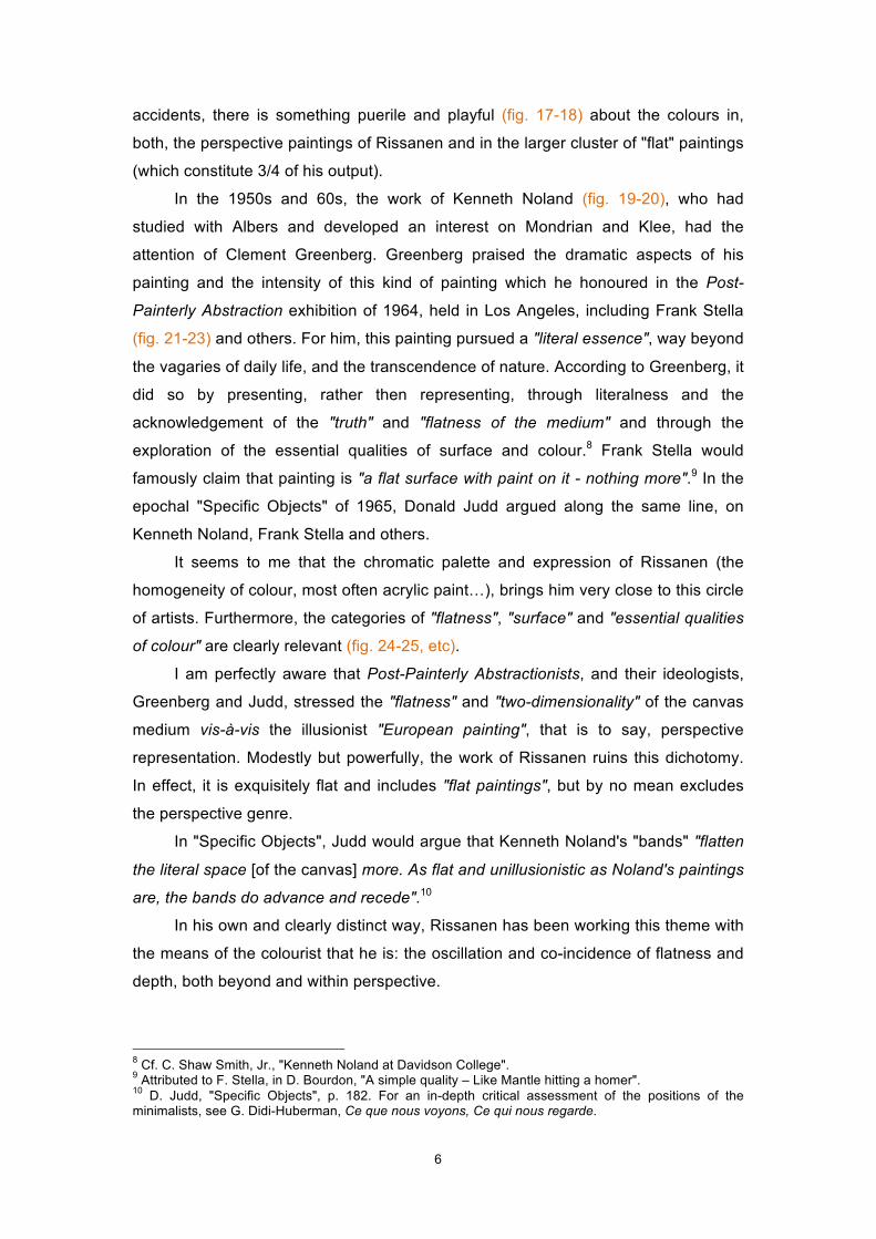
accidents, there is something puerile and playful (fig. 17-18) about the colours in,
both, the perspective paintings of Rissanen and in the larger cluster of "flat" paintings
(which constitute 3/4 of his output).
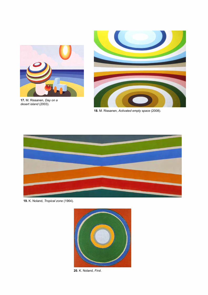
In the 1950s and 60s, the work of Kenneth Noland (fig. 19-20), who had
studied with Albers and developed an interest on Mondrian and Klee, had the
attention of Clement Greenberg. Greenberg praised the dramatic aspects of his
painting and the intensity of this kind of painting which he honoured in the Post-
Painterly Abstraction exhibition of 1964, held in Los Angeles, including Frank Stella
(fig. 21-23) and others. For him, this painting pursued a "literal essence", way beyond
the vagaries of daily life, and the transcendence of nature. According to Greenberg, it
did so by presenting, rather then representing, through literalness and the
acknowledgement of the "truth" and "flatness of the medium" and through the
exploration of the essential qualities of surface and colour.8 Frank Stella would
famously claim that painting is "a flat surface with paint on it - nothing more".9 In the
epochal "Specific Objects" of 1965, Donald Judd argued along the same line, on
Kenneth Noland, Frank Stella and others.
It seems to me that the chromatic palette and expression of Rissanen (the
homogeneity of colour, most often acrylic paint…), brings him very close to this circle
of artists. Furthermore, the categories of "flatness", "surface" and "essential qualities
of colour" are clearly relevant (fig. 24-25, etc).
I am perfectly aware that Post-Painterly Abstractionists, and their ideologists,
Greenberg and Judd, stressed the "flatness" and "two-dimensionality" of the canvas
medium vis-à-vis the illusionist "European painting", that is to say, perspective
representation. Modestly but powerfully, the work of Rissanen ruins this dichotomy.
In effect, it is exquisitely flat and includes "flat paintings", but by no mean excludes
the perspective genre.
In "Specific Objects", Judd would argue that Kenneth Noland's "bands" "flatten
the literal space [of the canvas] more. As flat and unillusionistic as Noland's paintings
are, the bands do advance and recede".10
In his own and clearly distinct way, Rissanen has been working this theme with
the means of the colourist that he is: the oscillation and co-incidence of flatness and
depth, both beyond and within perspective.
8 Cf. C. Shaw Smith, Jr., "Kenneth Noland at Davidson College". 9 Attributed to F. Stella, in D. Bourdon, "A simple quality – Like Mantle hitting a homer". 10 D. Judd, "Specific Objects", p. 182. For an in-depth critical assessment of the positions of the minimalists, see G. Didi-Huberman, Ce que nous voyons, Ce qui nous regarde.
17. M. Rissanen, Day on a desert island (2003).
18. M. Rissanen, Activated empty space (2008).
19. K. Noland, Tropical zone (1964).
20. K. Noland, First.
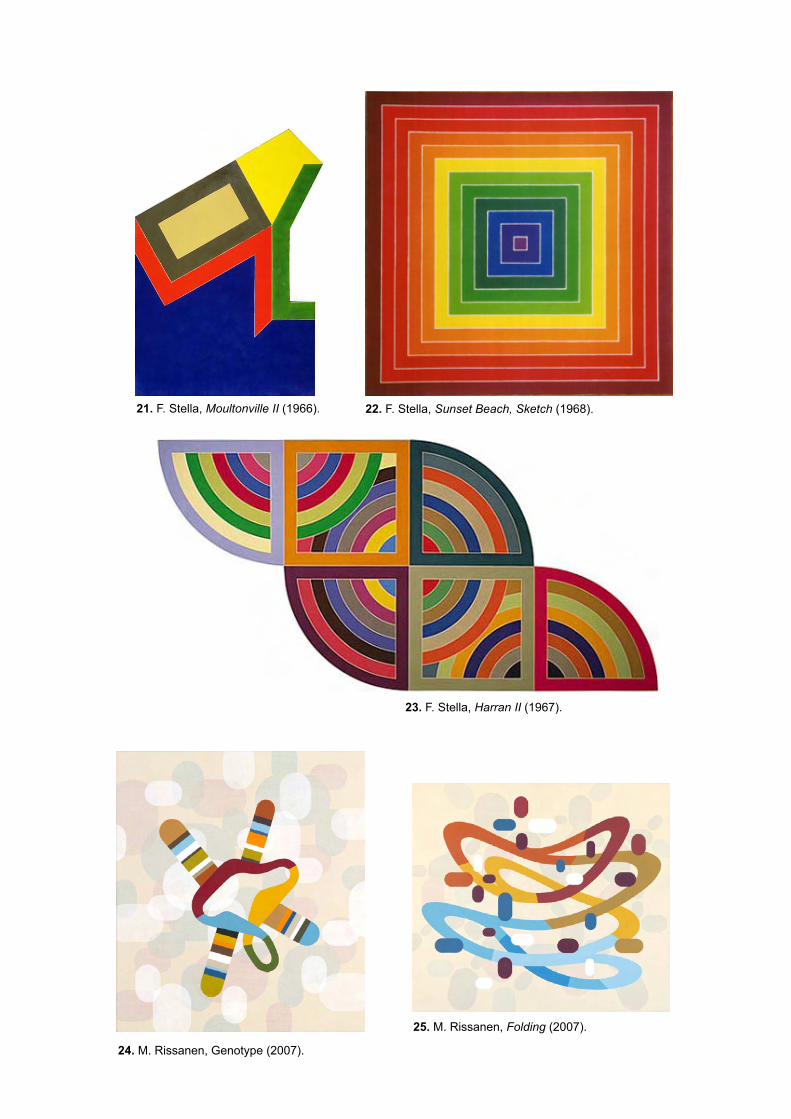
23. F. Stella, Harran II (1967).
22. F. Stella, Sunset Beach, Sketch (1968). 21. F. Stella, Moultonville II (1966).
24. M. Rissanen, Genotype (2007).
25. M. Rissanen, Folding (2007).
7
4. Feminine, textile, botanic
According to Georges Roque, in the Western imaginary by the end of the 19th
century, colour was massively attached to the feminine genre: an ornament, a
burden, a feminine rhetoric.11 Charles Blanc, the apologue for the colourism of
Delacroix, expressed the view that "drawing is the male organ of art; colour is the
feminine organ".12
This statement may be chauvinistic, but also interesting and symptomatic of the
long and crucially important history of textile and fashion. Indeed, social historians of
colour agree that these domains are critical for the history of colour, since this is also
a history of pigments and technical innovation, of commerce, symbolic value and
taste, and this game was crucially played in the realm of textile and fashion. It
happens that colour was a feminine prerogative.
Charles V of Spain (1500-58, fig. 26) dressed throughout his whole life with a
marked preference for black. It was a choice made at the crossroads of contradictory
determinations: (i) his descent from the House of Burgundy, a court which was the
centre of luxury and fashion during the reign of Philip the Good (1396-1497) and
where black reigned; (ii) the influence of Protestantism (although he was Catholic
and fought Protestant Reformation); (iii) and Catholic monastic modesty. Although
the clash between Reformists and Counter-Reformists led the opposing parties to
diverge radically in many aspects, in the matter of dress codes, the valorisation of
black as a male colour was general and enduring. No matter how strange this may
sound, "bourgeois values" have their genesis in the court of Charles V and in the
lines of force that traversed it. However, the "black" of Charles V is, in fact, two-sided:
it is the modest black with monastic sources, and a lavish black of the kind that can
be seen, for example, in Hans Holbein, The Ambassadors (1533, fig. 27).13
The code was quite different in relation to women, a gap that would
increasingly widen over the centuries. In the mean time Newton (1643-1727) had
excluded black and white from the realm of colours - a split already inscribed in the
cultural order long before. By the 19th century the exhibition of bourgeois splendour
is a feminine affair. Manet, Monet, Matisse and Degas, just to quote a few names, all
bear witness to this. In the second half of the 20th century the gap shortened, with
men’s fashion entering the realm of colour.
11 G. Roque, Art et science de la couleur, p. 467. 12 As quoted in ibid., p. 467: "le dessin est le sexe masculin de l'art; la couleur en est le sexe féminine”. 13 M. Pastoreau, "Morales de la couleur: Le chromoclasme de la Réforme", p. 43-44.

27. H. Holbein the Younger, The Ambassadors (1533).
26. Titien, Portrait of Charles V Seated (1548).
29. Constance Wibaut, illustrator.
28. Manish Arora, designer.

8
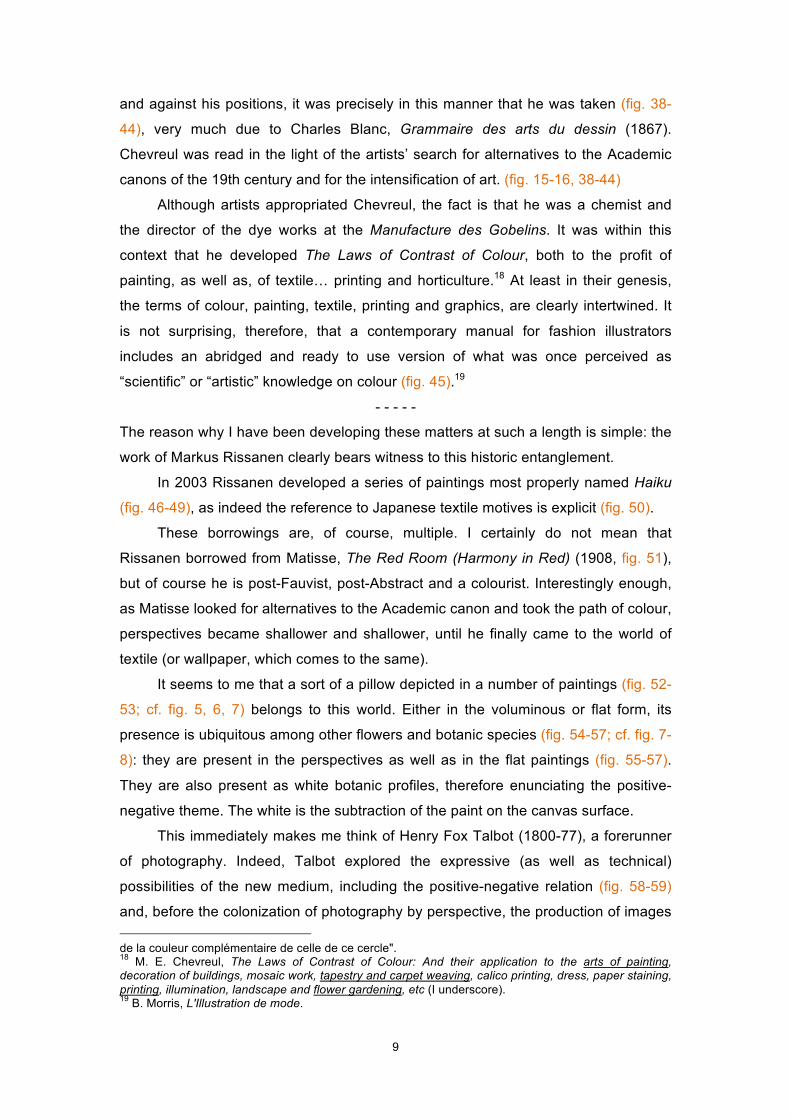
Fashion and textile constitute a universe of colour, as one readily realizes when
browsing magazines, with their photos (fig. 28) and illustrations (fig. 29). Not only one
easily finds design reminiscent of specific artistic-visual traditions, as I eventually
found a fashion illustration bearing the caption: “sometimes you’re an art movement”
(fig. 30). But when it comes to matters of fashion and art it is necessary to
acknowledge that the artists themselves have intervened in the world of fashion, as it
is the case of the Vogue covers signed by Miró, Hockney, Warhol, Dalí and
Chagall...14 (fig. 31-33) all of them remarkable colourists, and interestingly the covers
are particularly flat: where colour is the protagonist, perspective looses depth.
- - - - -
What does this traffic between art and fashion mean?15 Is it just a matter of
“influences” between contained disciplines?
I believe there is a deeper reason for this intertwining. In fact, much literature
that was read, misread or used by artists in their search for alternatives to the
Academic Art of the 19th century, was also matched by other disciplines of the image
(fashion and textile included) or actually were developed in these “applied” fields.16 A
case in point, probably the most prominent one, is that of Michel Eugène Chevreul
(1786-1889), the author of The Laws of Contrast of Colour (1839, fig. 34-37). This
book played an important role in the reception of Delacroix (1798-1863), in the work
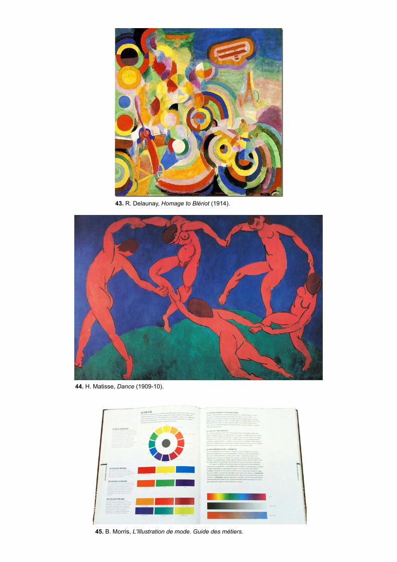
of Van Gogh (1853-1890), Gauguin (1848-1903), Seurat (1859-1891), the Fauves
such as Derain (1880-1954), Vlaminck (1876-1958) or Matisse (1869-1954), as well
as Robert Delaunay (1885-1941), the Italian Futurists (Balla, Severini, Boccioni, etc),
and others.
Among other aspects, Chevreul noticed that in certain conditions the vision of a
colour could entail the perception of its complementary. When Chevreul represented
the red with its green halo (fig. 36-37), he simply meant to illustrate this perceptual
phenomenon. Although he did not mean that artists should depict the
complementary,17 victim as he was of misreading, often through secondary sources
14 C. Blackman, 100 Ans d'illustration de mode; L. Borelli, Fashion Illustration Now; L. E. Nebreda, Fashion Design; Vogue Covers. 15 One could easily add graphic design, particularly the design of pictograms, illustration, graffiti, etc. 16 I. Newton, Optics (1704), J. W. von Goethe, Theory of Colours (1810), H. von Helmholtz, Physiologic Optics (1856-1866), L. Wittgenstein, Remarks on Colour (1977), among others. Artists also wrote on colour, deserving to be highlighted, J. Itten, The Art of Colour (1961) and J. Albers, Interaction of Colour (1976). 17 M. E. Chevreul, De la loi du contraste simultané des couleurs / Atlas, p. "Explication des planches": "Les figures 4, 5, 6, 7, 8, 9, 10 et 11 sont destinées à familiariser le lecteur avec l’effet que le rouge, le vert, l’orangé, le bleu, le jaune verdâtre, le violet, l’indigo et le jaune orangé tendent à produire en nous, lorsqu’ils nous font paraître les surfaces qui les entourent de leur couleur complémentaire, laquelle s’affaiblit graduellement à partir des limites de la première couleur. Les figures ne représentent pas l’effet réel, mais l’effet chargé, c’est-à-dire que l’espace contigu à chaque cercle a reçu une teinte légère
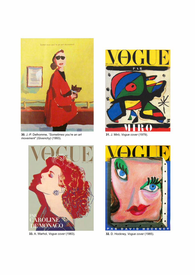
30. J.-P. Delhomme, “Sometimes you’re an art movement” (Givenchy) (1993).
31. J. Miró, Vogue cover (1979).
32. D. Hockney, Vogue cover (1985). 33. A. Warhol, Vogue cover (1983).
9
and against his positions, it was precisely in this manner that he was taken (fig. 38-
44), very much due to Charles Blanc, Grammaire des arts du dessin (1867).
Chevreul was read in the light of the artists’ search for alternatives to the Academic
canons of the 19th century and for the intensification of art. (fig. 15-16, 38-44)
Although artists appropriated Chevreul, the fact is that he was a chemist and
the director of the dye works at the Manufacture des Gobelins. It was within this
context that he developed The Laws of Contrast of Colour, both to the profit of
painting, as well as, of textile… printing and horticulture.18 At least in their genesis,
the terms of colour, painting, textile, printing and graphics, are clearly intertwined. It
is not surprising, therefore, that a contemporary manual for fashion illustrators
includes an abridged and ready to use version of what was once perceived as
“scientific” or “artistic” knowledge on colour (fig. 45).19
- - - - -
The reason why I have been developing these matters at such a length is simple: the
work of Markus Rissanen clearly bears witness to this historic entanglement.
In 2003 Rissanen developed a series of paintings most properly named Haiku
(fig. 46-49), as indeed the reference to Japanese textile motives is explicit (fig. 50).
These borrowings are, of course, multiple. I certainly do not mean that
Rissanen borrowed from Matisse, The Red Room (Harmony in Red) (1908, fig. 51),
but of course he is post-Fauvist, post-Abstract and a colourist. Interestingly enough,
as Matisse looked for alternatives to the Academic canon and took the path of colour,
perspectives became shallower and shallower, until he finally came to the world of
textile (or wallpaper, which comes to the same).
It seems to me that a sort of a pillow depicted in a number of paintings (fig. 52-
53; cf. fig. 5, 6, 7) belongs to this world. Either in the voluminous or flat form, its
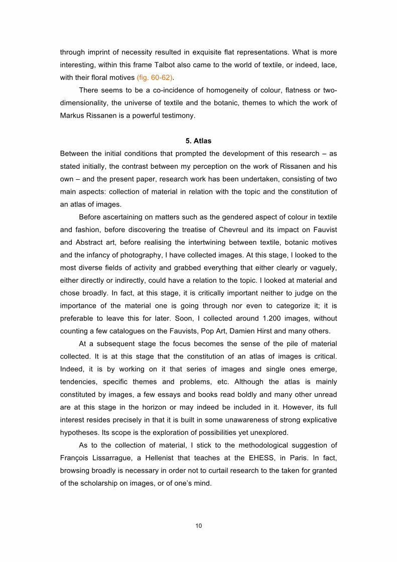
presence is ubiquitous among other flowers and botanic species (fig. 54-57; cf. fig. 7-
8): they are present in the perspectives as well as in the flat paintings (fig. 55-57).
They are also present as white botanic profiles, therefore enunciating the positive-
negative theme. The white is the subtraction of the paint on the canvas surface.
This immediately makes me think of Henry Fox Talbot (1800-77), a forerunner
of photography. Indeed, Talbot explored the expressive (as well as technical)
possibilities of the new medium, including the positive-negative relation (fig. 58-59)
and, before the colonization of photography by perspective, the production of images de la couleur complémentaire de celle de ce cercle". 18 M. E. Chevreul, The Laws of Contrast of Colour: And their application to the arts of painting, decoration of buildings, mosaic work, tapestry and carpet weaving, calico printing, dress, paper staining, printing, illumination, landscape and flower gardening, etc (I underscore). 19 B. Morris, L'Illustration de mode.
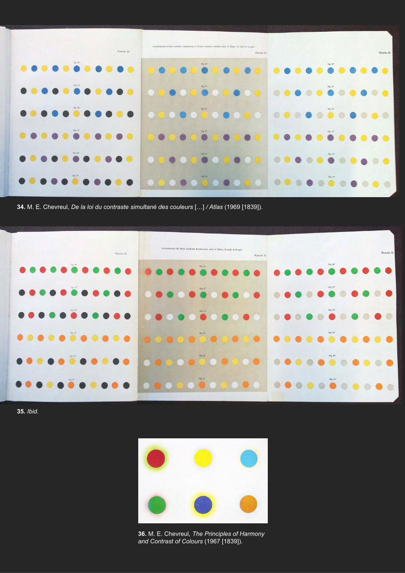
34. M. E. Chevreul, De la loi du contraste simultané des couleurs […] / Atlas (1969 [1839]).
35. Ibid.
36. M. E. Chevreul, The Principles of Harmony and Contrast of Colours (1967 [1839]).

37. M. E. Chevreul, The Laws of Contrast of Colour (1857 [1839]).
38. V. van Gogh, Night café (1888).
40. M. de Vlaminck, Restaurant “La Machine” at Bougival (c1905).
42. E. Kirchner, Two Pink Nudes by the Lake (Moritzburg) (c1909).
39. A. Derain, Portrait of Matisse (1905).
41. K. Malevich, Bather (1911).
43. R. Delaunay, Homage to Blériot (1914).
44. H. Matisse, Dance (1909-10).
45. B. Morris, L'Illustration de mode. Guide des métiers.
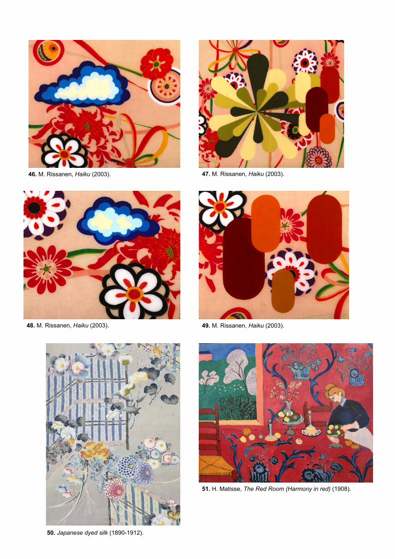
46. M. Rissanen, Haiku (2003). 47. M. Rissanen, Haiku (2003).
49. M. Rissanen, Haiku (2003). 48. M. Rissanen, Haiku (2003).
50. Japanese dyed silk (1890-1912).
51. H. Matisse, The Red Room (Harmony in red) (1908).
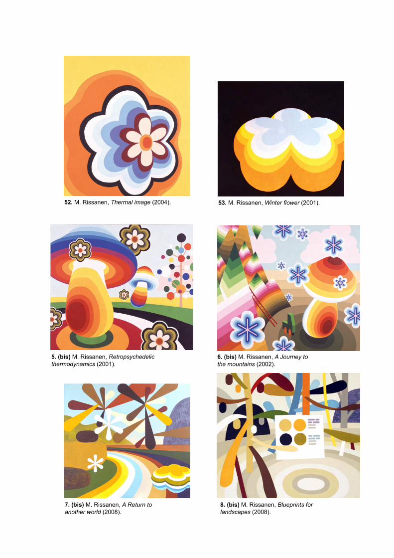
53. M. Rissanen, Winter flower (2001). 52. M. Rissanen, Thermal image (2004).
5. (bis) M. Rissanen, Retropsychedelic thermodynamics (2001).
6. (bis) M. Rissanen, A Journey to the mountains (2002).
8. (bis) M. Rissanen, Blueprints for landscapes (2008).
7. (bis) M. Rissanen, A Return to another world (2008).
54. M. Rissanen, Haiku (2003). 55. M. Rissanen, Winter flower (2001).
56. M. Rissanen, Urpflanze [Primordial plant] (2004).
57. M. Rissanen, Plantscape (2004).
59. H. F. Talbot, Botanical specimen (photogenic drawing negative; 1842).
58. H. F. Talbot, Botanical specimen (salted print; 1842).
10
through imprint of necessity resulted in exquisite flat representations. What is more
interesting, within this frame Talbot also came to the world of textile, or indeed, lace,
with their floral motives (fig. 60-62).
There seems to be a co-incidence of homogeneity of colour, flatness or two-
dimensionality, the universe of textile and the botanic, themes to which the work of
Markus Rissanen is a powerful testimony.
5. Atlas
Between the initial conditions that prompted the development of this research – as
stated initially, the contrast between my perception on the work of Rissanen and his
own – and the present paper, research work has been undertaken, consisting of two
main aspects: collection of material in relation with the topic and the constitution of
an atlas of images.
Before ascertaining on matters such as the gendered aspect of colour in textile
and fashion, before discovering the treatise of Chevreul and its impact on Fauvist
and Abstract art, before realising the intertwining between textile, botanic motives
and the infancy of photography, I have collected images. At this stage, I looked to the
most diverse fields of activity and grabbed everything that either clearly or vaguely,
either directly or indirectly, could have a relation to the topic. I looked at material and
chose broadly. In fact, at this stage, it is critically important neither to judge on the
importance of the material one is going through nor even to categorize it; it is
preferable to leave this for later. Soon, I collected around 1.200 images, without
counting a few catalogues on the Fauvists, Pop Art, Damien Hirst and many others.
At a subsequent stage the focus becomes the sense of the pile of material
collected. It is at this stage that the constitution of an atlas of images is critical.
Indeed, it is by working on it that series of images and single ones emerge,
tendencies, specific themes and problems, etc. Although the atlas is mainly
constituted by images, a few essays and books read boldly and many other unread
are at this stage in the horizon or may indeed be included in it. However, its full
interest resides precisely in that it is built in some unawareness of strong explicative
hypotheses. Its scope is the exploration of possibilities yet unexplored.
As to the collection of material, I stick to the methodological suggestion of
François Lissarrague, a Hellenist that teaches at the EHESS, in Paris. In fact,
browsing broadly is necessary in order not to curtail research to the taken for granted
of the scholarship on images, or of one’s mind.
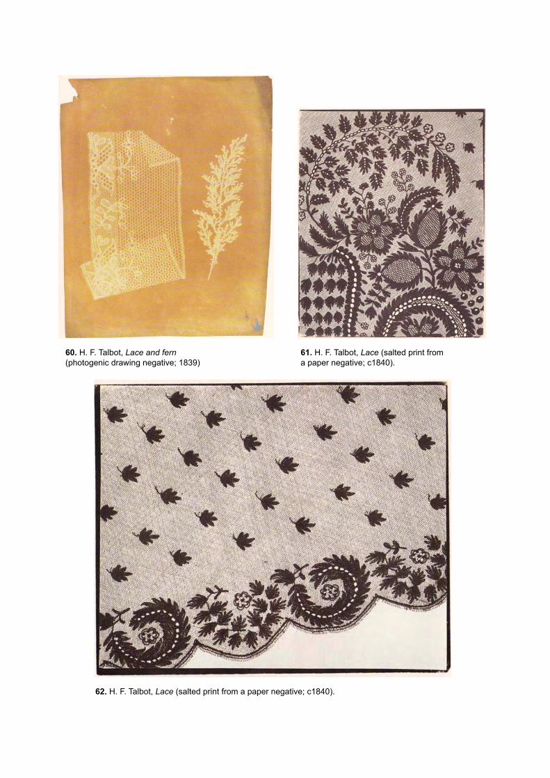
60. H. F. Talbot, Lace and fern (photogenic drawing negative; 1839)
61. H. F. Talbot, Lace (salted print from a paper negative; c1840).
62. H. F. Talbot, Lace (salted print from a paper negative; c1840).
11
As to the constitution of the atlas of images, it is critical for precisely finding and
developing unforeseen paths. According to Georges Didi-Huberman, the atlas
constitutes a tool “of the inexhaustible openness to possibilities not yet given”, as
well as it determines the “explosion of the frame” of the “tableau”, both artistic as well
as scientific, meaning the well ordered arrangement of elements or data in full
accordance with an Idea; it “deliberately ignores definitive axioms”; “through its own
exuberance, it deconstructs the ideals of unity, of specificity, of purity, of integral
knowledge”.20
- - - - -
This brings me back to the ongoing research on the work of Markus Rissanen, of
which the current essay is no more than a cross-section. I am attached to show how
this work is open to other possibilities of interpretation, that can indeed include the
(p)references and interests of Rissanen, but by no means are limited to these.
Indeed the stake is higher, since by adding the aspects of textile, infancy, colour,
botanic, etc, to (p)references and interests boldly fitting into the clear cut domains of
“since” and “art”, I displace his work as a whole towards the more unstable, mobile,
haunted, domain of “images”. Considering that, alike unconscious formations as
theorized by Freud, images “suffer from reminiscences”,21 then, between his work
and the mentioned aspects, the relations are no longer of reference, quotation or
even conscious, as they imply the return of both present and forgotten streams of
cultural history, that indeed return transformed, displaced, condensed, are
characterized by contradiction and return intensified, they imply the blurring of the
borders between art and non-art.
Lisbon, March 2013.
Textual and filmic sources BELTING, Hans, An Anthropology of Images. Picture, Medium, Body (2001), trans. T. Dunlap, Princeton
University Press, 2011. [Pour une anthropologie de l’image (2001), trans. J. Torrent, Paris,
Gallimard, 2004.]
BLACKMAN, Cally, 100 Ans d'illustration de mode, Paris, Eyrolles, 2007.
BORELLI, Laird, Fashion Illustration Now, London, Thames and Hudson, 2003.
BOURDON, David, "A simple quality – Like Mantle hitting a homer", in Life, 19 Jan. 1968.
20 G. Didi-Huberman, Atlas ou le gai savoir inquiet, p. 13. 21 S. Freud, "Five lectures on psychoanalysis", p. 16: "Our hysterical patients suffer from reminiscences. Their symptoms are the residues and the mnemic symbols of particular (traumatic) experiences. A comparison with other memory symbols from other sources will perhaps enable us to better understand this symbolism”. Cf. G. Didi-Huberman, L’Image survivante, p. 307ss (“Les images aussi souffrent de réminiscences” – phrase and claim that is pervasive and justified in the work of this author) and J. F. Figueira, Images at Work, p. 103ss.

12
BOWLT, John E., and Rose-Carol WASHTON LONG, The Life of Vasilii Kandinsky in Russian art: A
study of "On the spiritual in art" by Wassily Kandinsky, Newtonville (MA.), ORP, 1984.
CHEVREUL, Michel Eugène, De la loi du contraste simultané des couleurs et de l'assortiment des
objets colorés considéré d'après cette loi dans ses rapports avec la peinture, les tapisseries des
Gobelins, les tapisseries de Beauvais pour meubles, les tapis, la mosaïque, les vitraux colorés,
l'impression des étoffes, l'imprimerie, l'enluminure, la décoration des édifices, l'habillement et
l'horticulture (1839, 1889), Paris, L. Laget, 1969.
CHEVREUL, Michel Eugène, De la loi du contraste simultané des couleurs […] / Atlas (1839, 1889),
Paris, L. Laget, 1969.
CHEVREUL, Michel Eugène, The Laws of Contrast of Colour: And their application to the arts of
painting, decoration of buildings, mosaic work, tapestry and carpet weaving, calico printing,
dress, paper staining, printing, illumination, landscape and flower gardening, etc (1839, 1889),
trans. J. Spanton, London, George Routledge and Sons, 1857.
CHEVREUL, Michel Eugène, The Principles of Harmony and Contrast of Colours [...] (1839, 1889), New
York, Reinhold, 1967.
DIDI-HUBERMAN, Georges, Ce que nous voyons, Ce qui nous regarde, Paris, Minuit, 1992. [O que nós
vemos, O que nos olha, trans. G. Anghel and J. P. Cachopo, Porto, Dafne, 2011.]
DIDI-HUBERMAN, Georges, L’Image survivante. Histoire de l’art et temps des fantômes selon Aby
Warburg, Paris, Minuit, 2002.
DIDI-HUBERMAN, Georges, Atlas ou le gai savoir inquiet, Paris, Minuit, 2011. [Atlas ou a Gaia Ciência
Inquieta, trans. R. C. Botelho and R. P. Cabral, Lisbon, KKYM, 2013.]
ELKINS, James, “Art history and images that are not art”, in Art Bulletin, vol. 77, nº 4, 1995.
FIGUEIRA, João Francisco, ‘Images’ at Work. Holl’s entry for Kiasma and Lordi, The works of two over-
determined images, Helsinki, JFF and TKK, 2009. [Available at:
http://pt.scribd.com/doc/47554923/Images-at-Work.]
FREUD, Sigmund, "Five Lectures on Psychoanalysis" (1910), in The Standard Edition of the Complete
Psychological Works of Sigmund Freud, vol. 11, trans. A. Strachey and others, Vintage, London,
2001.
GAGE, John, Art and Colour, London, Thames and Hudson, 2006.
GLASER, Bruce, et al., “Questions to Stella and Judd” (1964), in G. Battcock (ed.), Minimal Art: A
Critical Anthology (1968), Berkeley, Los Angeles and London, University of California Press,
1995.
JUDD, Donald, "Specific Objects", in Arts Yearbook, 8, 1965.
KANDINSKY, Wassily, Concerning the Spiritual in Art (1911), trans. M. T. Sadler, London, Tate, 2001.
MALEVICH, Kazimir, "An attempt to determine the relation between colour and form in painting" (1930),
in Essays on Art, 1928-1933, vol. II, ed. T. Andersen, trans. X. Glowacki-Prus and A. McMillan,
Copenhagen, Borgen, 1968.
MORRIS, Bethan, L'Illustration de mode. Guide des métiers, trans. S. Renaut, Paris, Pyramyd, 2006.
NEBREDA, Laura Eceiza, Fashion Design. L'Atlas des stylistes de mode, trans. C. Carrion, Barcelona,
Maomao, 2008.
PASTOUREAU, Michel, "Morales de la couleur: Le chromoclasme de la Réforme", in P. Junod and M.
Pastoureau (eds.), La Couleur. Regards croisés sur la couleur du Moyen Âge au XXe siècle,
Paris, Léopard d'Or, 1994.
PASTOUREAU, Michel, Les Couleurs de notre temps, Paris, Christine Bonneton, 2003.
13
RISSANEN, Markus, “Constructed images, artistic imagination and scientific visualization”, in The
Artist’s Knowledge, 2. Research at the Finnish Academy of Fine Arts, ed. J. Kaila, Helsinki,
Kuvataideakatemia, 2008.
ROQUE, Georges, Art et science de la couleur (1996), Paris, Gallimard, 2009.
SHAW SMITH, Jr, C., "Kenneth Noland at Davidson College" (1999), in
http://www2.davidson.edu/academics/acad_depts/art/galleries/noland.html [retrieved Aug. 2010].
STOICHITA, Victor I., The Self-Aware Image. An insight into early Modern Meta-Painting (1993), trans.
A.-M. Glasheen, Cambridge and New York, Cambridge University Press, 1997. [L’Instauration du
Tableau. Métapeinture à l'aube des temps modernes (1993), Geneva, Droz, 1999.]
STOICHITA, Victor I., A Short History of Shadow, trans. A.-M. Glasheen, London, Reaktion, 1997.
[Brève histoire de l’ombre, Geneva, Droz, 2000.]
Vogue Covers, 1920-2009, cat. of the exhibition held at Vogue, Champs-Elysées, Paris, 1/10-1/11/2009,
published by Ramsay.
WARBURG, Aby, “Sandro Botticelli’s Birth of Venus and Spring” (1902), in The Renewal of Pagan
Antiquity, trans. D. Britt, Getty Research Institute for the History of Art and Humanuties, Los
Angeles, 1999. ["O Nascimento de Vénus" e "A Primavera" de Sandro Botticelli (1902), trans. A.
Morão, Lisboa, KKYM, 2012.]
Yellow Submarine, George Dunning (dir.), based on music of The Beatles, produced by United Artists,
1968.
Image sources / credits 1. R. Penrose, Tiling, in http://xahlee.info/math/algorithmic_math_art_2.html [retrieved Mar. 2013].
2. Model of quasicrystal / Dan Shechtman and colleagues (1982), in
http://www.commerce.gov/blog/2011/10/05/nist-colleagues-congratulate-shechtman-nobel-
chemistry-prize [retrieved Mar. 2013].
3. Quasicrystal, plan, in C. Reiter, “Web addendum to ‘Atlas of quasicrystalline tilings’”
http://webbox.lafayette.edu/~reiterc/aqct/index.html [retrieved Mar. 2013].
9. Masaccio, Saint Peter healing the sick with his shadow (1426-27), fresco, 230 x 162, Cappella
Brancacci, Santa Maria del Carmine, Florence.
10. A. Dürer, "Cast shadow", in Underweysung der Messung... [Four Books on Measurement] (1525).
11. Hergé, The Shooting Star (1945), in A Estrela Misteriosa, Lisboa, Difusão Verbo, 2003.
12. Hergé, The Secret of the Unicorn (1946), in O Segredo do Licorne, Lisboa, Difusão verbo, 2003.
13. Yellow Submarine, G. Dunning (dir.), based on music of The Beatles. Fill still.
14. W. Kandinsky, Concerning the Spiritual in Art (1911; cover of J. E. Bowlt and R.-C. Washton Long,
The Life of Vasilii Kandinsky in Russian art…, op. cit., after earlier version).
15. K. Malevich, Red Square, Painterly realism of a pesant woman in two dimensions (1915), oil on
canvas, 53 x 53 cm. State Russian Museum, St. Petersburg.
16. K. Malevich, Suprematism, Non-objective composition (1915), oil on canvas, 80 x 80 cm.
Ekaterinburg Museum of Fine Arts, St. Petersburg.
19. K. Noland, Tropical zone (1964), acrylic on canvas, 2400 x 948 cm, in
http://www.allartnews.com/american-color-field-artist-kenneth-noland-dies-at-the-age-of-
85/kenneth-noland-tropical-zone-1964-acrylic-on-canvas-gift-of-the-artist-in-honor-of-peter-c-
marzio-2005-159/ [retrieved Mar. 2013].
14
20. K. Noland, First, in http://www.all-art.org/art_20th_century/modern_art/modern%20art8.htm
[retrieved Jan. 2011].
21. F. Stella, Moultonville II (1966), fluorescent alkyd and epoxy paints on canvas, 124 x 86 x 4 inches.
Collection of Mr. and Mrs. David Mirvish, Toronto.
22. F. Stella, Sunset Beach, Sketch (1968), fluorescent and plain alkyd on canvas, 69 1/2 x 69 1/2
inches. U.S. Embassy, Ottawa.
23. F. Stella, Harran II (1967), polymer and fluorescent polymer paint on canvas, 120 x 240 inches.
Solomon R. Guggenheim Museum, New York.
26. Titien, Portrait of Charles V Seated (1548), oil on canvas, 203,5 cm × 122 cm, Alte Pinakotek,
Munich.
27. H. Holbein the Younger, The Ambassadors (1533), oil on wood, 207 × 209,5 cm, National Gallery,
London.
28. Manish Arora, designer, in L. E. Nebreda, Fashion Design, op. cit.
29. Constance Wibaut, illustrator, in L. Borelli, Fashion Illustration Now, op. cit.
30. J.-P. Delhomme, “Sometimes you’re an art movement” (Givenchy) (1993), gouache on paper,
advertisement, in L. Borelli, Fashion Illustration Now, op. cit.
31. J. Miró, Vogue cover (1979, December).
32. D. Hockney, Vogue cover (1985, December).
33. A. Warhol, Vogue cover (1983, December).
34. M. E. Chevreul, De la loi du contraste simultané des couleurs […] / Atlas Atlas (1969 [1839]), pl. 24-
23-25, “assortiments d’une couleur lumineuse et d’une couleur sombre avec le banc, le noir et le
gris”.
35. Ibid., pl. 12-11-13, “assortiments de deux couleur lumineuses avec le blanc, le noir et le gris”.
36. M. E. Chevreul, The Principles of Harmony and Contrast of Colours (1967 [1839]).
37. M. E. Chevreul, The Laws of Contrast of Colour […] (1857 [1839]), pl. III, p. 17.
38. V. van Gogh, Night café (1888), oil on canvas, 72,4 cm × 92,1 cm. Yale university Art gallery, New
Haven.
39. A. Derain, Portrait of Matisse (1905), oil on canvas, 46 x 34,9 cm. Tale, London.
40. M. de Vlaminck, Restaurant “La Machine” at Bougival (c1905), oil on canvas, 60 x 81,5 cm. Musée
d’Orsay, Paris.
41. K. Malevich, Bather (1911), gouache on paper, Stedelijk Museum, Amsterdam.
42. E. Kirchner, Two Pink Nudes by the Lake (Moritzburg) (c1909), oil on canvas, 90 x 120 cm. Werner
& Gabrielle Merzbacher, Zurich.
43. R. Delaunay, Homage to Blériot (1914), oil on canvas, 250 x 250 cm. Kunstmuseum, Basel.
44. H. Matisse, Dance (1909-10), oil on canvas, 260 x 391 cm. State Hermitage Museum, St.
Petersburg.
45. B. Morris, L'Illustration de mode. Guide des métiers, op. cit, p. 56-57.
50. Japanese dyed silk (1890-1912), Victoria and Albert Museum, London (in
http://collections.vam.ac.uk/item/O14613/textile-unknown/ [retrieved Aug. 2010]).
51. H. Matisse, The Red Room (Harmony in red) (1908), oil on canvas, 180 x 220 cm, Hermitage, St.
Petersburg.
58. H. F. Talbot, Botanical specimen (salted print; 1842), in Huellas de Luz [Traces of Light]. El Arte e
los Esperimentos de William Henry Fox Talbot, Actar, et. al., Barcelona, 2002.
59. H. F. Talbot, Botanical specimen (photogenic drawing negative; 1842), in ibid.

15
60. H. F. Talbot, Lace and fern (photogenic drawing negative; 1839), in ibid.
61. H. F. Talbot, Lace (salted print from a paper negative; c1840), in ibid.
62. H. F. Talbot, Lace (salted print from a paper negative; c1840), in ibid.
4, 5, 6, 7, 8, 17, 18, 24, 25, 46, 47, 48, 49, 52, 53, 54, 55, 56, 57. M. Rissanen, by kind permission.
Acknowledgements Thanks to Markus and Angela.