Supporting reflection on time spent while studying - DIVA
52
Supporting reflection on time spent while studying Felix Blomqvist [email protected] Interaktionsdesign Bachelor 22.5HP Spring / 2021 Supervisor: Lizette Reitsma
-
Upload
khangminh22 -
Category
Documents
-
view
0 -
download
0
Transcript of Supporting reflection on time spent while studying - DIVA
Supporting reflection on time spent while studying
Felix Blomqvist [email protected]
Interaktionsdesign Bachelor 22.5HP Spring / 2021 Supervisor: Lizette Reitsma

2 of 52
Abstract During the Covid-19 pandemic, students has been forced to spend more time studying alone at home, which in some cases has led to increased stress and anxiety. This thesis explores qualities in Slow, Calm and Persuasive technology, together with temporal concepts in theory and qualities derived from ideation, with the aim to explore which qualities should be considered while designing for supporting self-reflection on time spent while studying. The process in this thesis is explorative, moving from ideation, to digital and physical prototypes, with the authors reflections and experiences driving the process forward and experience sessions with participants that were used to ground the experience through their reflections and new perspectives. Through evaluating the reflections and experiences with tools and design principles, the work ends up with the four qualities flow, tension, unfolding and balance as suggestions to work with in future research on designing for supporting self-reflection on time spent while studying.

3 of 52
Acknowledgement I would like to thank all the people that has supported me throughout this project. Thank you to the three participants in the Experience sessions, for your time, reflections and patience. Thank you to my amazing fiancé, my parents and all my friends for the motivation and support. I would like to give an extra big thanks to my supervisor Lizette for all the discussions, support and motivation throughout the project.

4 of 52
Table of Contents
TableofContents
Abstract .......................................................................................................................... 2
Acknowledgement .......................................................................................................... 3
Table of Contents ............................................................................................................ 4
1 Introduction ............................................................................................................ 6
1.1 Context and Motivation ........................................................................................ 6
1.2 Aim ........................................................................................................................ 7
1.3 Research question ................................................................................................. 7
1.4 Ethical considerations ........................................................................................... 7
2 Theory .................................................................................................................... 8
2.1 Slow and calm technology ..................................................................................... 8 2.1.1 Slow .................................................................................................................. 8 2.1.2 Calm ................................................................................................................ 10
2.2 Persuasive technology ......................................................................................... 10
2.3 Temporality ......................................................................................................... 11 2.3.1 Interaction design perspective ....................................................................... 11 2.3.2 Art perspective ............................................................................................... 12
2.4 Related work ....................................................................................................... 13 2.4.1 Olly .................................................................................................................. 13 2.4.2 Photobox ........................................................................................................ 14 2.4.3 Dayclo ............................................................................................................. 14
3 Research approach and methods .......................................................................... 15
3.1 Research through design ..................................................................................... 15
3.2 Interaction driven design ..................................................................................... 16
3.3 Analysing prototypes ........................................................................................... 16 3.3.1 Interaction quality framework ........................................................................ 16 3.3.2 Aesthetic experience ...................................................................................... 18 3.3.3 Experience sessions ........................................................................................ 19
3.4 Sketching and prototyping .................................................................................. 20 3.4.1 Material considerations .................................................................................. 20 3.4.2 Sketching and prototyping .............................................................................. 21
4 Exploration process ............................................................................................... 23
5 of 52
4.1 Thinking about time ............................................................................................ 23
4.2 Arduino and Processing ....................................................................................... 24 4.2.1 Time through the act of walking ..................................................................... 25 4.2.2 Different sensors ............................................................................................ 25 4.2.3 Exploring interaction and feedback ................................................................ 26 4.2.4 Moving forward .............................................................................................. 28
4.3 Physical visualisation ........................................................................................... 28 4.3.1 Flow ................................................................................................................ 29 4.3.2 Tension ........................................................................................................... 30 4.3.3 Pattern ............................................................................................................ 31 4.3.4 Unfolding ........................................................................................................ 31 4.3.5 The “fifth” concept ......................................................................................... 32 4.3.6 The experience sessions ................................................................................. 32 4.3.7 IQF and Aesthetic experience ......................................................................... 36 4.3.8 Moving forward .............................................................................................. 40
4.4 Developing Flow and Tension .............................................................................. 40 4.4.1 Sketching and prototyping .............................................................................. 41 4.4.2 Evaluation ....................................................................................................... 43
5 Discussion ............................................................................................................. 46
5.1 Research question ............................................................................................... 46
5.2 Research through design and self-critique .......................................................... 47
5.3 Reflecting on limitation ....................................................................................... 49
5.4 Future work ......................................................................................................... 50
6 Conclusion ............................................................................................................ 50
7 References ............................................................................................................ 51

6 of 52
1 Introduction 1.1 Context and Motivation
This thesis is set in the context of studying from home in a pandemic, where you may not be able to leave your home and go to school. The context was decided on from my own experience of dealing with Covid-19 and suffering from stress and anxiety by not leaving my home while studying. Discussions with my classmates gave me the impression that I was not alone in feeling this way. An interview survey study conducted by Son, Hegde, Smith, Wang, & Sasangohar (2020) looked in to how college students in the United States of America dealt with no longer having the luxury of studying in school. It confirmed that this problem is worldwide. Reports of increased stress, anxiety, concentration difficulties and increased concerns about academic results were brought up in the study. Below are two interesting quotes from students in the study:
“I just want to lay in my bed. Now no one is keeping me accountable. If I'm on my phone, I'm not paying attention to any of these lectures.”
“Now I'm at home. I'm literally sitting in the same desk for five or six hours a day.”
(Son et al., 2020, p.6-7)
The motivation for going into temporal and reflective aspects is to make the students more aware of how they spend their time through self-reflection while studying. Slow, Calm and Persuasive Technologies (Case, 2015; Fogg, 1998; Hallnäs & Redström, 2001) are grounded in theory and explored through the exploration phase of this thesis. Qualities in the technologies are interesting for the work in this thesis. Slow technologies are known for their reflective qualities (Hallnäs & Redström, 2001), Calm technologies focuses on bringing information in a calm manner to the user (Case, 2015) and Persuasive technologies is focused on changing the behaviour of the user (Fogg, 1998). Looking into these technologies and exploring the context is relevant for the knowledge contribution towards further research and development of artefacts that supports reflecting on time spent while studying.
The explorative phase of the thesis will go through several iterations, starting with ideation on paper around temporal aspects, then moving from digital to physical prototypes and finally end up with four prototypes, whereof two further iterated on. The four prototypes will be the subject of Experience sessions with three students to be able to ground my own reflections and to get new perspectives. Since this explorative thesis will be driven mainly by my own experiences, it was important for me to have these three sessions, to

7 of 52
be able to be as objective as possible while evaluating the prototypes. The Interaction Quality Framework and the principles of Aesthetic interaction by Ross & Wensveen (2010) were used to evaluate the prototypes and their experience in a similar way, which also supported me in being objective in the process.
For generating knowledge to the Interaction design field, this thesis will evaluate the work conducted through the Research through design method created by Zimmerman, Forlizzi, & Evenson (2007). The four criteria lenses for evaluating the contribution are Process, Invention, Relevance and Extensibility.
1.2 Aim The aim of this thesis is that through exploration be able to generate knowledge that could be used in future research, research on how to design for reflecting on time passing by and how that might help finding a work(student) life balance.
1.3 Research question What qualities should be considered while designing for supporting self-reflection on time spent while studying?
1.4 Ethical considerations In this thesis, I conducted three individual experiencing sessions. The sessions were set up in the context I am exploring, which is studying. All participants are students and during the sessions they were studying on their own. During the sessions I observed how the participants reacted to the prototype. When they had experienced all the prototypes, a brief discussion was held about their experiences.
In accordance with the Swedish Research Council (2017) the participants were informed prior to starting the sessions that nothing would be recorded throughout the sessions. Before starting, they were also informed about the work in the thesis and what I was exploring. Notes were taken on paper during the discussion afterwards and no names of the participants were written down. They were referred to in which order the sessions were conducted, that is, the first, second and third participant. The participants were also informed that they could leave the session at any given time, and if they wanted to retract their participation, the notes from their sessions would be removed.
8 of 52
2 Theory In this chapter I will introduce the theory supporting the work in this thesis. It will be about technology that is used for reflection on time, in which technology is not about efficiency or user experience, but more as art to stop and think through the technology about your reality. Through literature reviews I have found interesting qualities in the coming theory that supports the aim of this thesis. Qualities and attributes in these theories will help ground the design work on a theoretical level before exploring how they can be used in this context.
2.1 Slow and calm technology Slow and calm technologies share values between each other, even though they are considered as two different design approaches. This section will bring up the background of each practice along with the differences and similarities between them. I will also explain why these approaches are relevant for this thesis.
2.1.1 Slow
Slow Technology (ST) is a design approach that was proposed by Hallnäs & Redström (2001). ST focus on expression and slowness in the design, not to be an efficient tool but a cause for reflective use. How does the technology express itself for it to have reflective qualities? The slowness in the design should be for the user not to save time, but to be aware of time and reflect about the technology. Hallnäs & Redström (2001) brings up an example of a slow doorbell, which originally is a way of informing people that someone is at the door. In this case it is the melody the doorbell makes that is divided and can only be fully understood after several interactions with it. The user has to stop and reflect to be able to understand the message behind it.
“It is a doorbell designed for reflection in a world of expressions using time and presence as key parameters”
(Hallnäs & Redström, 2001, p.203)
Technology that takes a long time to learn how to use and takes time to understand could give the user an unwanted experience. If their expectations are that it will be easy to use and understand, they might be disappointed and see the technology as poorly designed. ST, as a design approach can have these characteristics and can give the user a rewarding experience (Hallnäs & Redström, 2001). It is the work that Hallnäs & Redström (2001) did on how to design for reflection, that is the basis for how we see ST today. It is slowness that is the key to ST, but not in how we perceive time passing by, it is about time presence. It is not about efficiency, but about bringing time presence to the user, which opens up for reflection (Hallnäs & Redström, 2001).
9 of 52
Bennett & Fraser (2012) claim that ST is inefficient and must be resilient. Not only in its hardware and software, but in the overall design. It has to be able to stand the test of time, surviving so it can be passed down through generations to come. For digital ST, Bennett & Fraser (2012) suggest that the software could be open source, for it to develop in line with the passing of time. For physical objects, they make comparisons to old ST that has survived and been passed down from generations, objects like the typewriter and microfilm (Bennett & Fraser, 2012).
How is it to live with a ST? Odom et al., (2014) have explored this through a field study, to expand the research on ST. The participants in this study reported that the technology from time to time melted into the background of their awareness and became a part of their home. It was reported as non-intrusive, it did not bother them or called for their attention. Reports of calming and reminiscent experiences were also brought up (Odom et al., 2014). These are characteristics that should be considered when designing ST, for example, how do I design for the user to re-visit the artefact?
ST is all about expression through form and function, to create space and room for reflection (Hallnäs & Redström, 2001). It draws from art and tools, but are neither, they use slowness to make room for reflection.
“good design of slow technology is primarily about inner logic and aesthetics, since these seem to be key factors in creating something that can serve as an incitement for reflection.”
(Hallnäs & Redström, 2001, p.209).
Hallnäs & Redström (2001 p.210) proposes two guidelines for designing ST:
“Focus on slowness of appearance (materialisation, manifestation) and presence – the slow materialisation and design presence of form”
“Focus on aesthetics of material and use simple basic tools of modern technology – the clear and simple design presence of material”
In this thesis, the focus will be on finding qualities in the expression through form and function that supports reflection for the students. What qualities in the interaction are important to support reflection, without becoming an intrusive artifact? I will focus on how I, through the appearance of the prototypes, can support reflection. Making the users aware of how they spend their time through the slowness in the interaction between user and prototype. Creating time presence.
Moving on to Calm Technology (CT), where I will draw on similarities between slow and calm and how they are relevant for this thesis.

10 of 52
2.1.2 Calm When Hallnäs & Redström, (2001) bring up CT it is already an established field, and they propose ST as something that can elevate it. The difference between the two is that CT doesn’t require the users attention or actively pursue it, where ST promotes reflection (Hallnäs & Redström, 2001).
Weiser & Brown, (1996) describe CT as something in the periphery, that can move in and out of the users focus without causing informational overload and stress. They bring up three indicators showing that a technology is in fact calm. First, it can be something in the periphery, that easily moves back and forth from the centre of attention. Second, it could enhance the peripheral reach. And third, they bring up locatedness, which is when something brings us the feeling of familiarity (Weiser & Brown, 1996).
Case (2015, p.16) states that “if good design allows someone to get to their goal with the fewest steps, Calm Technology allows them to get there with the lowest mental cost”. Together with her eight principles on what to think about when designing CT, she gives examples that helped to inspire some of the work in this thesis. For example:
“Technology should inform and create calm” and “technology should make use of the periphery”
(Case, 2015, p.16).
These qualities are important to think about while creating the prototypes, they should aim to be informative in a calm way and that they make use of the periphery without being intrusive.
2.2 Persuasive technology Fogg (1998) describes persuasive computers as “an interactive technology that changes a person’s attitudes or behaviors”. The persuasion or intent does not come from the technology itself, but the designers who create it. In the text written by Fogg (1998), he brings up three types of intent; endogenous, exogenous and autogenous. The work in this thesis can be described as endogenous, which is when the designer has the intent of changing the users behaviour of the technology (Fogg, 1998). The programming in the prototypes created could be seen as persuasive, since the user has to move away from the computer to interact with the prototype. The intention is that the users should become aware of how they spend their time while studying, but due to the interaction, they have to move between two states to make the prototypes work. The two states being in front and away from the computer, which can be seen as studying versus taking a break. In a way, the technology persuades the user to take a break.
11 of 52
In this thesis, the intention was not initially to create a persuasive technology, but through the process of experimentation, persuasive behaviour came up. Therefore it is important to note that the prototypes follow the ethical considerations that Fogg (1998) brings up. The technologies that are prototyped during this experimentation phase have no maleficent intent behind it, nor does it intrude on the user’s privacy by storing any information. The intention of making users take a break comes from my own experiences while sitting in front the computer for longer periods of time without breaks.
2.3 Temporality To ground this thesis, I have to address issues and possibilities on how to work with temporality as an interaction designer. In Slow Technology (ST), the art perspective is brought up frequently as a way of thinking about reflection, since art focuses on making their users reflect on the artwork and what it means. Therefore, it is important to gain knowledge in how temporality has been dealt with in art. For grounding both the thesis and for inspiration.
2.3.1 Interaction design perspective Pschetz & Bastian (2018) criticized the way researchers and designers have worked with temporality in design, saying that research “often reduce the original proposal of temporal diversification to a dichotomy between fast and slow” (Pschetz & Bastian, 2018, p.169). Through their paper, they try to move beyond ‘time as space’ and ‘time as direction’, and they end up with creating the design perspective Temporal Design (Pschetz & Bastian, 2018). Below is their proposed process for Temporal Design quoted:
- Identifying dominant narratives, including the forces and infrastructures that sustain them or which they help to support;
- Challenging these narratives, e.g. by revealing more nuanced expressions of time;
- Drawing attention to alternative temporalities, their dynamics and significance;
- Exposing networks of temporalities, so as to illustrate multiplicity and variety.
(Pschetz & Bastian, 2018, p.174-175)
By using this process, Pschetz & Bastian (2018) conducted design experiments where they found out that the experience of time is not neutral. It is individual and could be seen in social hierarchy, which then affected the way we perceive time. Moving away from the feeling of time being slow or fast, the participants placed emphasise on the context they were in at the
12 of 52
time. In this thesis, the context of where the user are will also be the inspiration for how time could manifest itself, how do we experience time when we don’t have a schedule to conform to? How can we through reflecting on how we spend our time, get more control over our own interaction with time?
2.3.2 Art perspective
To get an understanding, of how art has been used to visualize time passing by to support reflection and time awareness, this section will focus on how we can relate to time through art.
Koenderink, Pinna, & van Doorn (2020) unfold different aspects that we can relate time through art, for example, in the visualization of time through sculptures and storytelling. This thesis will focus on the temporal expression in art through that article. For example, the structure of how each brush stroke is painted, you can see the temporality within the flow of the activity. Storytelling can reveal, but also alter the way we perceive time, as we get thrown in and out of a story, with flashbacks to the past and glances of the future. It is similar to the way we daydream about the past, present and the future. This is connected to the lived-time, which for example, can be linear, nesting, repeating and reversible (Koenderink et al., 2020). To be able to notice these nuances in the art, time is required for the viewer to reflect on how all the small things create a whole and what expression they have for them individually. Art can be differently experienced from individual to individual and can therefore create different meanings for different individuals.
The art perspective is important to the work in this thesis, since it creates individual meaning for their viewers through reflection. Art can invite people to stand still and think about what they are experiencing. That is something this thesis tend to explore, how I can invite people to take a moment to reflect about what they are experiencing and what it means.
13 of 52
2.4 Related work To provide an understanding of how ST has been designed together with temporal aspects in the past, I will present a few prototypes/products that share these characteristics.
2.4.1 Olly How can music support users to reflect on past experiences with personal data? Odom et al., (2019) presents Olly, a ST that takes music that has been played from the users Last.FM account in the past and present it to the users on random occasions. Olly cannot be triggered by its user. The user has to wait for it to present a song for them. Only then, they can decide on letting Olly play the music by spinning on a disk on top of it. They placed Olly in participants home over a longer period of time to gain valuable information of what it would be like to live with a ST and what kind of experiences it would give (Odom et al., 2019).
In their study, Odom et al., (2019) could see how Olly became a part of the participants lives. It created experiences were the participants reflected on their past experiences with music that they had been playing themselves in the past. An extraction from one of the participants quotes about a specific experience with a Zeppelin song:
“It made me think about how time moves on, but some music sticks, you know, becomes part of your life’s soundtrack”
(Odom et al., 2019, p.10)
But it also shows the general experiences of a ST that gets implemented in someone’s life over a longer period of time through this quote from one of the participants:
I wouldn’t think it’d become obsolete. It has a specific function and it does it well. It’s not like ‘oh I wish it did this’ and I can’t wait until ‘Olly 2’. I could definitely see myself having it for a long time. It’s tech but not like any tech I have. It’s not furniture but can sometimes feel like it. It falls into its own space when I think about all of the things I have. It’s moved into a category of things I’d keep for a long time. Absolutely has a place in my life.
(Odom et al., 2019, p.11)
These quotes are just indications that the ST has been designed successfully and there is much to learn from this project. For example, how they were able to create familiarity in the design and how they used randomness for when the music was displayed for the user.
14 of 52
2.4.2 Photobox Photobox is an artifact that is connected to its users Flickr account, which randomly prints out a picture that the user had posted in the past. The user has no control over when the photo will be printed or from what time period in their life it will be taken from. This led to some initial frustration that later blossomed into anticipation and excitingly waiting for a picture to be printed. This study that Photobox was a part of, highlights the importance of long-term interaction with a ST (Odom et al., 2014). A quote from one participant in the study shows how she had to re-think her own perception of technology to get an understanding of the Photobox:
Even though it’s using a laptop and getting on my Flickr, I had to let go of any idea that it’s like our other gadgets. …[laughs] it’s not too typical that I have to wait for technology. That took time to get used to.
(Odom et al., 2014, p.1966)
For one of the participants, the Photobox became distracting and frustrating due to its placement in their home. The location created frustration because the user would see it all the time and was disappointed because they had to wait and wait without getting any response. By moving it from the forefront of focus to somewhere less prominent, it helped them to further embrace the technology (Odom et al., 2014). This shows how important the location of the ST has on its users, different locations might create different experiences.
2.4.3 Dayclo Through their own research work, Lee et al., (2020) found the importance that tangible objects should have a familiarity to them, they needed this to support self-reflection through schedule data. They designed an interactive clock that was visually inspired by analogue clocks, which helped create familiarity in the object, making it an everyday item. The interaction came through personal scheduled data, which were shown in an abstract way to support reflection on how long it was until the next meeting or similar activity (Lee et al., 2020). The Dayclo is not a ST, but it does aim to support self-reflection on how users spend their time, which makes it interesting for this thesis.
15 of 52
3 Research approach and methods In this chapter of the thesis, I will present different methods used throughout the work. Methods for how to contribute with design knowledge and other methods that supports the process I will work in.
3.1 Research through design In this thesis, the research through design method developed by Zimmerman, Forlizzi, & Evenson (2007) will be the main method to follow for contributing knowledge to the interaction design field. They propose four lenses to follow as criteria for evaluation of contribution to interaction design. “Process, invention, relevance and extensibility” (Zimmerman et al., 2007, p.499).
The process lens is focused on the choices of methods and whether it would be possible to recreate this process. It will be a focus on having the process in detail to make this possible, it should be easy to follow the process. There also has to be sufficient arguments and rationale for making the choice of using a method (Zimmerman et al., 2007).
There has to be novel invention, meaning that what is produced in this thesis has to contribute and elevate some area within the interaction design community. Thorough literature review has to be presented to ground the field. There should also be provided future directions and how the work could be further advanced (Zimmerman et al., 2007).
Is the work relevant? Relevance in what has been produced has to be shown and explained for the interaction design research community. It cannot be of personal relevance, it needs to show why other researchers should care about this work (Zimmerman et al., 2007).
Is it possible to build on the work presented? The extensibility is the last of the lenses and it means that the knowledge presented will be “described and documented in a way that the community can leverage the knowledge derived from the work” (Zimmerman et al., 2007, p.500).
In the discussion and the contribution, these four criteria will be used to critically break down and evaluate the work done.

16 of 52
3.2 Interaction driven design Maeng, Lim, & Lee (2012) define three different approaches for product development. Two of them will be used during the design process in this thesis. The approaches are user-driven and interaction-driven. They are defined as:
“User-driven product development: Starting point of product development was led by analyzing the user needs from their context.
Interaction-driven product development: Starting point of product development was led by exploring product opportunities through interaction concepts.”
(Maeng et al., 2012, p.449)
In this thesis, there is no focus on developing a product, but exploring what qualities could be used for product development in the future, within the context this thesis tends to explore. The approaches will be used in some way to start the design work. For example, it could be argued that in the beginning of this thesis, I start off with a user-driven starting point, because of where the idea came from, designing for students, studying from home. And through exploring the context I was designing for I had an interaction-driven starting point. Because I experimented with different sensors and ways of interacting with them while being in the design context.
Being able to have a starting point through an interaction-driven and user-driven focus, helped the initial ideation sessions. I could start exploring the context by placing myself there and think about what I was doing during a day of studying. Then I could start from my own needs before exploring the different interactions that took place throughout a day.
3.3 Analysing prototypes Creating an evaluation framework for all the prototypes was important to keep the process similar to each of the prototypes. Through sections of the interaction quality framework (IQF) and the aesthetic experience principles that are proposed by Ross & Wensveen (2010), the prototypes could be similarly evaluated through my own reflections and the experience from the participants in the experience sessions.
3.3.1 Interaction quality framework To make use of the IQF (Figure 1) as effectively as possible, the decision to not use the entire framework, but only four of the eight qualities was taken to be able to personalize the framework to the work in the thesis. Ross & Wensveen (2010) ask the users of this framework to use the relevant qualities for their project, since all qualities might not suit them. The qualities are
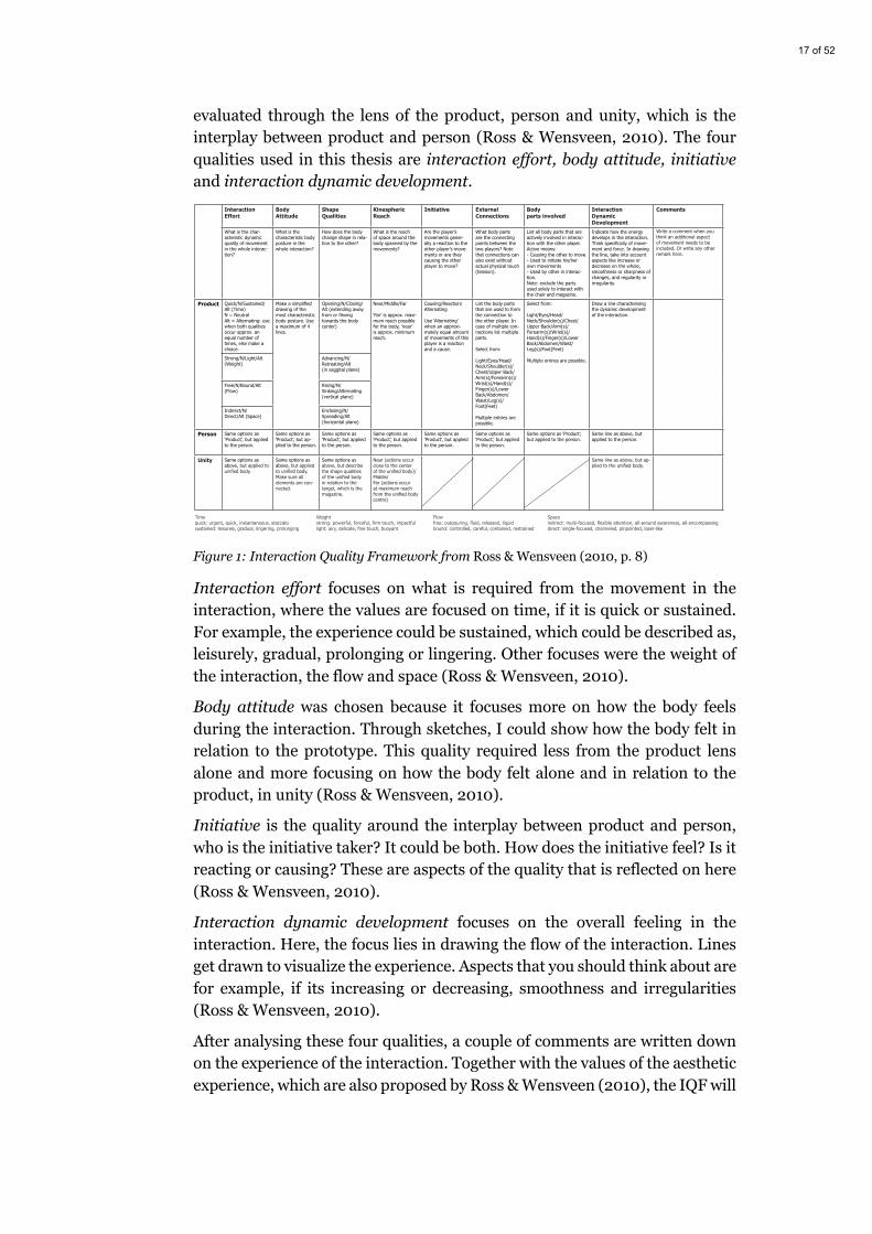
17 of 52
evaluated through the lens of the product, person and unity, which is the interplay between product and person (Ross & Wensveen, 2010). The four qualities used in this thesis are interaction effort, body attitude, initiative and interaction dynamic development.
Figure 1: Interaction Quality Framework from Ross & Wensveen (2010, p. 8)
Interaction effort focuses on what is required from the movement in the interaction, where the values are focused on time, if it is quick or sustained. For example, the experience could be sustained, which could be described as, leisurely, gradual, prolonging or lingering. Other focuses were the weight of the interaction, the flow and space (Ross & Wensveen, 2010).
Body attitude was chosen because it focuses more on how the body feels during the interaction. Through sketches, I could show how the body felt in relation to the prototype. This quality required less from the product lens alone and more focusing on how the body felt alone and in relation to the product, in unity (Ross & Wensveen, 2010).
Initiative is the quality around the interplay between product and person, who is the initiative taker? It could be both. How does the initiative feel? Is it reacting or causing? These are aspects of the quality that is reflected on here (Ross & Wensveen, 2010).
Interaction dynamic development focuses on the overall feeling in the interaction. Here, the focus lies in drawing the flow of the interaction. Lines get drawn to visualize the experience. Aspects that you should think about are for example, if its increasing or decreasing, smoothness and irregularities (Ross & Wensveen, 2010).
After analysing these four qualities, a couple of comments are written down on the experience of the interaction. Together with the values of the aesthetic experience, which are also proposed by Ross & Wensveen (2010), the IQF will
www.ijdesign.org
8InternationalJournalofD
esignVol.4No.22010
DesigningB
ehaviorinInteraction:Using A
esthetic Experience as a M
echanism for D
esign
Interaction Effort
Body Attitude
Shape Qualities
Kinespheric Reach
Initiative External Connections
Body parts involved
Interaction Dynamic Development
Comments
What is the char-acteristic dynamic quality of movement in the whole interac-tion?
What is the characteristic body posture in the whole interaction?
How does the body change shape in rela-tion to the other?
What is the reach of space around the body spanned by the movements?
Are the player’s movements gener-ally a reaction to the other player’s move-ments or are they causing the other player to move?
What body parts are the connecting points between the two players? Note that connections can also exist without actual physical touch (tension).
List all body parts that are actively involved in interac-tion with the other player. Active means: - Causing the other to move- Used to initiate his/her own movements- Used by other in interac-tion. Note: exclude the parts used solely to interact with the chair and magazine.
Indicate how the energy develops in the interaction. Think specifically of move-ment and force. In drawing the line, take into account aspects like increase or decrease on the whole, smoothness or sharpness of changes, and regularity or irregularity.
Write a comment when you think an additional aspect of movement needs to be included. Or write any other remark here.
Product Quick/N/Sustained/Alt (Time)N = NeutralAlt = Alternating: use when both qualities occur approx. an equal number of times, else make a choice.
Make a simplified drawing of the most characteristic body posture. Use a maximum of 4 lines.
Opening/N/Closing/Alt (extending away from or flexing towards the body center)
Near/Middle/Far
‘Far’ is approx. maxi-mum reach possible for the body, ‘near’ is approx. minimum reach.
Causing/Reaction/Alternating
Use ‘Alternating’ when an approxi-mately equal amount of movements of this player is a reaction and a cause.
List the body parts that are used to form the connection to the other player. In case of multiple con-nections list multiple parts.
Select from:
Light/Eyes/Head/Neck/Shoulder(s)/Chest/Upper Back/Arm(s)/Forearm(s)/Wrist(s)/Hand(s)/Finger(s)/Lower Back/Abdomen/Waist/Leg(s)/Foot(Feet)
Multiple entries are possible.
Select from:
Light/Eyes/Head/Neck/Shoulder(s)/Chest/Upper Back/Arm(s)/Forearm(s)/Wrist(s)/Hand(s)/Finger(s)/Lower Back/Abdomen/Waist/Leg(s)/Foot(Feet)
Multiple entries are possible.
Draw a line characterising the dynamic development of the interaction.
Strong/N/Light/Alt (Weight)
Advancing/N/Retreating/Alt(in saggital plane)
Free/N/Bound/Alt (Flow)
Rising/N/Sinking/Alternating (vertical plane)
Indirect/N/Direct/Alt (Space)
Enclosing/N/Spreading/Alt(horizontal plane)
Person Same options as ‘Product’, but applied to the person.
Same options as ‘Product’, but ap-plied to the person.
Same options as ‘Product’, but applied to the person.
Same options as ‘Product’, but applied to the person.
Same options as ‘Product’, but applied to the person.
Same options as ‘Product’, but applied to the person.
Same options as ‘Product’, but applied to the person.
Same line as above, but applied to the person.
Unity Same options as above, but applied to unified body.
Same options as above, but applied to unified body. Make sure all elements are con-nected.
Same options as above, but describe the shape qualities of the unified body in relation to the target, which is the magazine.
Near (actions occur close to the center of the unified body)/Middle/Far (actions occur at maximum reach from the unified body centre)
Same line as above, but ap-plied to the unified body.
Weightstrong: powerful, forceful, firm touch, impactfullight: airy, delicate, fine touch, buoyant
Flowfree: outpouring, fluid, released, liquidbound: controlled, careful, contained, restrained
Timequick: urgent, quick, instantaneous, staccatosustained: leisurely, gradual, lingering, prolonging
Spaceindirect: multi-focused, flexible attention, all-around awareness, all-encompassingdirect: single-focused, channeled, pinpointed, lazer-like
Figure 4. The interaction quality framew
ork.
18 of 52
be used to get an understanding of how the interaction between user and prototype feel, while the principles of aesthetic experience will provide an overview of the experience.
The reason for having the IQF and aesthetic experience together is to provide a greater understanding of the experience of the prototypes from an overview and detailed level. The use of these evaluations could help future researchers make use of the knowledge created in this thesis.
3.3.2 Aesthetic experience
Ross & Wensveen (2010) introduces an approach on how to design aesthetic interaction through four principles. They propose that:
“Aesthetic Interaction is an experienced interaction with a product or system that:”
• “has practical use next to intrinsic value.”
• “has social and ethical dimensions.”
• “has satisfying dynamic form.”
• “involves the whole human being.”
(Ross & Wensveen, 2010, p.4)
These principles will not be used as a guide for how I will design in the exploration phase. They will be used to evaluate the aesthetic experience. The principles were important for me to keep consistency in the evaluation of all the prototypes, it also helped me reflect on the experiences and write them down.
The first principle state that to design for aesthetic experience, the prototype needs to be practical and rewarding for the user. Secondly, seeing something as beautiful is based on a lot of factors and it can be very subjective to ones’ feelings, but when designing, the designer needs to think about the ethical and social aspects of the design, quoted:
“Designers need to consider what kind of behaviors they want to invite with their designs.”
(Ross & Wensveen, 2010, p.4)
The third focus on the dynamic shape and form of the prototype, which can be seen as how the prototype looks and if people think that it has a satisfying form. The last principle focuses on involving all of the values and experiences of the body, from cognitive to emotional and social (Ross & Wensveen, 2010).
Next is a section about the experience sessions held with participants.

19 of 52
3.3.3 Experience sessions During the development of the first four physical prototypes, experience sessions were planned with three different students. I call it experience sessions because my focus was not about the user testing the usability but seeing how the participants experienced being around the prototypes.
The sessions were constructed around the activity of studying. Since all the participants were students, they could focus on their own studies while experiencing the prototypes. One by one, the prototypes would be put up with an interval of circa one hour for each prototype (including the setup/change time). After the last prototype had been in use for the hour, all of the prototypes would be put up on display and a discussion about the overall experience was held.
The order of when the prototypes were presented differed for two of the prototypes, “Flow” was always first, with “Pattern” second and then it varied between which of “Unfolding” and “Tension” were presented third and fourth. “Pattern” was the only prototype that had its own servomotors, the other prototypes were sharing servomotors. The reason for this order was to minimize the time it would take to change prototypes. While “Pattern” was running I could switch the servos in “Flow” to “Unfolding” or “Tension”.
The sessions were not recorded on any devices, observations and the discussion were written down on paper with notes and later compiled in a text document saved on a personal hard drive. The questions to start the conversations were open-ended and were prepared beforehand. The reason for using open-ended questions were to dive deep into the experience of the prototype and let the participants talk freely about how it felt. Muratovski (2015) says that we can use them to get additional information, which I thought were a good way to start the discussion, starting in the deep end. Observation were written down on how the participants reacted when the prototype was in action.
The setup was kept consistent throughout the sessions, all the participants could sit freely and focus on their work, while the prototype was a little bit further away, but still in their periphery. Two sessions were conducted at Malmö University (Figure 2, right) while the third were held at my home (Figure 2, left). The only difference was that in my home, the prototype came closer to the participant.
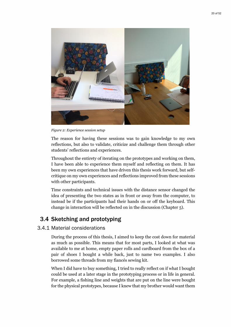
20 of 52
Figure 2: Experience session setup
The reason for having these sessions was to gain knowledge to my own reflections, but also to validate, criticize and challenge them through other students’ reflections and experiences.
Throughout the entirety of iterating on the prototypes and working on them, I have been able to experience them myself and reflecting on them. It has been my own experiences that have driven this thesis work forward, but self-critique on my own experiences and reflections improved from these sessions with other participants.
Time constraints and technical issues with the distance sensor changed the idea of presenting the two states as in front or away from the computer, to instead be if the participants had their hands on or off the keyboard. This change in interaction will be reflected on in the discussion (Chapter 5).
3.4 Sketching and prototyping 3.4.1 Material considerations
During the process of this thesis, I aimed to keep the cost down for material as much as possible. This means that for most parts, I looked at what was available to me at home, empty paper rolls and cardboard from the box of a pair of shoes I bought a while back, just to name two examples. I also borrowed some threads from my fiancés sewing kit.
When I did have to buy something, I tried to really reflect on if what I bought could be used at a later stage in the prototyping process or in life in general. For example, a fishing line and weights that are put on the line were bought for the physical prototypes, because I knew that my brother would want them

21 of 52
when I dismantle the prototypes in the end. That way, I knew what I bought would not go to waste. Four corkboards had to be bought, for the different physical prototype ideas, but even here I made sure that I would not destroy them too much, so that I could have use of them in the future. Each of the prototypes would need four to five micro-servos, which would sum up to 30 servos in the end. Instead, I only bought eight of them, and made it simple for the servos to be moved from one prototype to the other.
Through the technical part of the project, Arduino’s platform (Arduino, n.d.) has been used alongside with their sensors and boards. In the physical prototypes, servo motors were used in a way to give feedback and response to the interaction (with the system) that takes place through a distance sensor. The distance sensor was also used while making the digital prototypes, but here the Arduino board sent signals to Processing, which were used to create the feedback from the system interaction. Arduino is described as inexpensive, easy to learn and open-source (Arduino, n.d.). During the Interaction Design bachelor program, we have been introduced and worked with it during these three years. To keep the costs down, continuing to work with Arduino was the natural choice, since I did not have to learn a lot of new things and I already had a toolkit with sensors and an Arduino board.
3.4.2 Sketching and prototyping
Since this thesis is centred around exploration through building concepts and prototypes there is a need to understand how they will be used and what the prototypes do prototype. Houde & Hill (1997) proposed a way of thinking about what the prototypes actually prototype, to gain knowledge they created a triangular model (Figure 3), each end stood for role, implementation and look and feel.
Figure 3: Triangular model of what prototypes prototype (Houde & Hill, 1997, p.3)
Resolution and fidelity are two terms brought up in their text as well. Resolution meaning “amount of detail” (Houde & Hill, 1997, p.3), and fidelity stands for “closeness to the eventual design”(Houde & Hill, 1997, p.3). In this
22 of 52
thesis, the focus on what the prototype actually prototype, will be more towards the role and look and feel dimensions of the triangular model, and less towards implementation. The resolution and fidelity will also be lower in the beginning of the process to evolve to a mid-resolution and -fidelity in the end.
“Role” refers to questions about the function that an artifact serves in a user’s life—the way in which it is useful to them. “Look and feel” denotes questions about the concrete sensory experience of using an artifact—what the user looks at, feels and hears while using it.
(Houde & Hill, 1997, p.3)
The implementation dimension is a part of the prototype, but the focus lays primarily on the other dimensions. Look and feel is the primary way forward, since it’s the sensory experiences that drives the work in this thesis. The role dimension is important because during the experimentations, the prototypes will be placed next to the student, while studying. The role of the prototype will be inside the context that is designed for.
During the idea generation sessions, inspiration from theory and own sensory experience lay the ground for sketching (drawing) ideas around the topic in the beginning of the work. Sketching was important to get an understanding around the look, of the look and feel dimension, it was also used to start things off, because all you need is a pen and some paper.
As mentioned in the material considerations section, Arduino was used for the interactive part of the prototypes. In the first digital prototypes, the visualisation for the feedback used the program Processing, the Arduino communicated with serial information to send information from the distance sensor to the computer screen. The physical prototypes were purely Arduino based, with the distance sensor providing the interaction with the system and servomotors that gave the feedback to the user. In material consideration (section 3.4.1), there is a closer look on other materials which was used in the prototypes.
Throughout the exploration process I bring up the concept of feedback in the visualisation, therefore it would be useful to present what I meant by that. The feedback is the response from the system, caused by the interaction from the user. Norman (2013) describes feedback as the response the user gets from their action, for example, if she flips the light switch in the kitchen, the light will turn on almost immediately – giving her the feedback that it works. But in this thesis, the feedback for the user won’t always be immediate to their actions, therefore when feedback is mentioned in the text, it relates to feedback between the Arduino and the servo motors. The servo motors should move (feedback) when the Arduino sends a signal for them to move.
23 of 52
4 Exploration process Throughout this chapter, the explorative design process will be presented. It will contain exploration through ideation, digital and physical prototyping and analyses of the prototypes with IQF, aesthetic experience principles and experience sessions, before we move to the discussion.
4.1 Thinking about time Before I started to explore with technology, I tried to get an understanding of how I experience time every day. To get this understanding, I deepened my knowledge through mind-mapping and questioning my own experiences and got ideas from theory. This was done to get a brief understanding of different qualities that I could work with while I started to explore through prototyping.
The slowness in ST is in one way related to how fast or slow we learn how a product works, slowness here is not seen as something bad, it is seen as a way for us users to take time to reflect on what is happening (Hallnäs & Redström, 2001). How can we gain awareness of how time passes us by and where we spend that time? What qualities do the prototypes need to have?
How do we experience time? It can be our subjective experience, depending on what activity we are doing and if we considered it boring or entertaining. How fast or slow we perceive time could be interesting to explore through the prototypes, but it is important to know that the experiences will be personalized and probably different from each person. One student studying is not the same as another, the same probably goes for how they perceive time. Since it will mainly be my own experiences that will drive the work, I will try to be as objective as possible. The findings in this thesis will be merely suggestions to continue exploring this context. The importance is that the prototypes supports reflecting about how time is spent while studying.
Heyer's (2018) text about designing for coping brings up interesting ideas about texture in material and how we can use the qualities in material to support coping. In the context of this thesis, coping with time while studying could be seen as being aware of how you spend your time. How that measures up successfully, might be hard to measure. But gaining control over how you spend time through reflecting about where you spend it, could possibly help students take more breaks and ease on the stressfulness that has been reported from studying home, alone (Son et al., 2020).
“Texture is an inherent quality of material that the designer may choose to subdue or bring forth”
(Heyer, 2018, p.503)
24 of 52
I thought about texture in nature elements together with time, to get inspiration for how I could use those qualities in the prototypes. For example, growth. Growth through a flower, how do we experience it? An experience I have had several of times is when I go to one of my houseplants, and a new leaf or branch has popped out. This moment of surprise causes me to reflect on the extent of time that has passed since I paid attention to it last time. I see the progress in the flower through its growth.
Another way I relate to time is through activities, how long time it takes to walk from my home to the grocery shop for example. That is something I do multiple times per week, but I never think consciously about the time it takes to walk over there. I always relate it to a song on my phone, which is between three to five minutes long. When I stop and reflect on how long time it takes to walk over there, I think about one of the most played songs I have in my phone and relate it to that. In this scenario, I relate multiple things to each other to be able to reflect on the time it takes. But how can I use qualities from movement to show that something has changed? Time moves continuously, but we perceive it subjectively. How do I support reflection through the qualities in small or large movements?
Another way I experience time is how I divide the day into multiple segments. For example, morning, before lunch, after lunch and the evening. This made me think about progress and how we can experience time through different milestones or working our way towards a goal. In relation to a day, the sun is one indicator that time always is moving forward. The light strength and the location of the sun can help us think about what time it is. But other things, like getting hungry can be an indicator that certain amount of time has passed since you last ate.
In the following sections I explore how to help users be aware of the time that passes by, through ST and CT qualities and hopefully through these explorations working out what qualities should be considered while designing for temporal awareness while studying at home. Derived from this section I will take the qualities and concepts that are progress, milestones, growth, continuity and movement. The exploration will further these qualities and concepts into different or evolved ones.
4.2 Arduino and Processing Exploring with technology was a way of starting to conceptualize ideas surrounding temporal awareness and ST. In this section I will start out by presenting early prototypes that only used Arduino, then move on to prototypes using Arduino together with Processing.
25 of 52
4.2.1 Time through the act of walking To get familiarized with ST and gain temporal awareness through an activity, the first prototype created was an Arduino based alert system. It used a distance sensor for the interaction with the user, and LED lights and a buzzer for the feedback. The distance sensor reacted when I walked past it and added one tick to the counter in the system each time. When the counter reached ten, the buzzer gave away a low frequency sound and the lights started blinking. The purpose of this first prototype was to get a feeling around how I could use something else than a timer that counted each second. Instead, the system counted each time someone walked by. Nothing more than knowledge and inspiration on how the distance sensor worked and could be used in further prototypes was derived from this prototype.
4.2.2 Different sensors Once the distance sensor was tested and understood, I tinkered with using an obstacle sensor and a tilt sensor as the interaction. Both sensors could give a state of zero or one, which could be used to represent users being either in front of the computer or away from it. Both sensors were deemed not relevant to use as the interaction mechanism. The obstacle sensor could only measure if something was circa 3 centimetres in front of it and the tilt sensor had to be physically altered with to change it states. Another sensor that was used in the early tinkering stages was a light sensor, that measured the amount of light that touched its surface. This sensor would give output from zero to over a hundred. But because it relied on light, it might be difficult to use it as the main interaction, because you had to physically cover the sensor here as well.
ST requires time to learn and if I would have used one of these sensors, the user would have to learn how to interact with the system before they could interact with it. These sensors were still used throughout the early tinkering stages were Arduino and Processing were used, since they could simulate being in front or away from a computer with either two states or placing a cup over the light sensor to signal the same thing.
The distance sensor had a broader range than the other three sensors. In the sense that it required less from the user. With the distance sensor, the ST could be understood as a ubiquitous computing concept. Ubiquitous computing introduced by Weiser (1999), where the user would almost be unaware of its interaction with the computational system. The interaction with the distance sensor could be seen in the way Kindberg & Fox (2002) describes spontaneous interaction, where the user is unaware that for example, their phone connects to an environment when they enter it. But in the work of this thesis, the user could be unaware that they interact with the technology, making it ubiquitous.
26 of 52
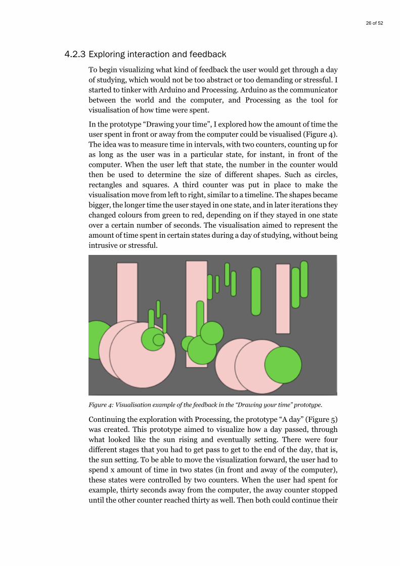
4.2.3 Exploring interaction and feedback To begin visualizing what kind of feedback the user would get through a day of studying, which would not be too abstract or too demanding or stressful. I started to tinker with Arduino and Processing. Arduino as the communicator between the world and the computer, and Processing as the tool for visualisation of how time were spent.
In the prototype “Drawing your time”, I explored how the amount of time the user spent in front or away from the computer could be visualised (Figure 4). The idea was to measure time in intervals, with two counters, counting up for as long as the user was in a particular state, for instant, in front of the computer. When the user left that state, the number in the counter would then be used to determine the size of different shapes. Such as circles, rectangles and squares. A third counter was put in place to make the visualisation move from left to right, similar to a timeline. The shapes became bigger, the longer time the user stayed in one state, and in later iterations they changed colours from green to red, depending on if they stayed in one state over a certain number of seconds. The visualisation aimed to represent the amount of time spent in certain states during a day of studying, without being intrusive or stressful.
Figure 4: Visualisation example of the feedback in the “Drawing your time” prototype.
Continuing the exploration with Processing, the prototype “A day” (Figure 5) was created. This prototype aimed to visualize how a day passed, through what looked like the sun rising and eventually setting. There were four different stages that you had to get pass to get to the end of the day, that is, the sun setting. To be able to move the visualization forward, the user had to spend x amount of time in two states (in front and away of the computer), these states were controlled by two counters. When the user had spent for example, thirty seconds away from the computer, the away counter stopped until the other counter reached thirty as well. Then both could continue their
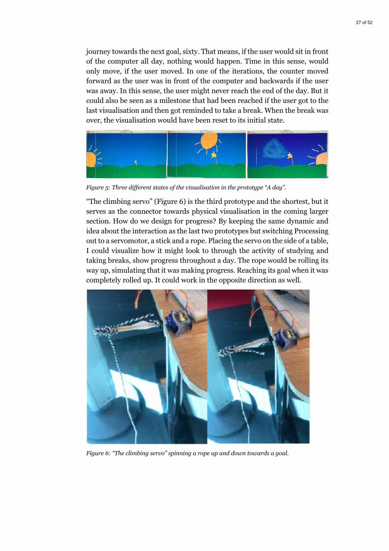
27 of 52
journey towards the next goal, sixty. That means, if the user would sit in front of the computer all day, nothing would happen. Time in this sense, would only move, if the user moved. In one of the iterations, the counter moved forward as the user was in front of the computer and backwards if the user was away. In this sense, the user might never reach the end of the day. But it could also be seen as a milestone that had been reached if the user got to the last visualisation and then got reminded to take a break. When the break was over, the visualisation would have been reset to its initial state.
Figure 5: Three different states of the visualisation in the prototype “A day”.
“The climbing servo” (Figure 6) is the third prototype and the shortest, but it serves as the connector towards physical visualisation in the coming larger section. How do we design for progress? By keeping the same dynamic and idea about the interaction as the last two prototypes but switching Processing out to a servomotor, a stick and a rope. Placing the servo on the side of a table, I could visualize how it might look to through the activity of studying and taking breaks, show progress throughout a day. The rope would be rolling its way up, simulating that it was making progress. Reaching its goal when it was completely rolled up. It could work in the opposite direction as well.
Figure 6: “The climbing servo” spinning a rope up and down towards a goal.

28 of 52
4.2.4 Moving forward These three prototypes, together with the first prototype which explored the distance sensor, were prototyped to get the overall feeling of working with ST qualities and concepts relating to time awareness. The goal of this part in the thesis was just to get a feeling of how it is to interact with ST and how I could represent temporal qualities and concepts like progress, being aware of how you spend your time and being able to support reflecting about these areas. In the coming section, I dive deeper into how to represent time in physical prototypes.
4.3 Physical visualisation Moving into physical visualisation and away from the screen. I will go through the four prototypes that were created in the coming sub-sections. Then with the experiencing sessions analyse them together with IQF and the aesthetic experience principles. One of the goals in all of the coming prototypes was that I wanted the reflective quality of a ST, but the calming, informative and non-stressful qualities of a CT. The interaction with the prototypes will be non-direct and slow, while the visualisation aims to be informative in a calm manner. The groundwork in all the physical prototypes is very similar to each other, for example, all of them are built on a corkboard with a frame around it and is operated by Arduino with servomotors and a distance sensor. The idea for using the corkboards was to create a familiarity in the design and in accordance to Houde & Hill's (1997) look and feel dimension, it would resemble a painting on the wall. The idea about having it look like a painting was for it to look like something you might see every day, but not reflecting on that it is a technology. It is possible that this might help the prototype become an everyday object.
The code in each of the following prototypes is very similar in their structure, the differences are in which values that are sent to the servomotors and how many servos that are active. The code shares a lot of similarities to how previous prototypes operated as well; it was built up by two counters, that had to reach the same numbers before being able to move on to the next visualisation (Figure 7). The counters represented the two states the student is in, in front of the computer studying or away from it, taking a break.
Figure 7: Counter1 can’t go over 60 until Counter2 has reached 60 as well.
29 of 52
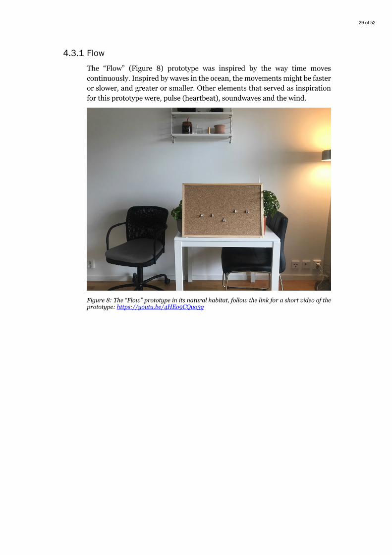
4.3.1 Flow The “Flow” (Figure 8) prototype was inspired by the way time moves continuously. Inspired by waves in the ocean, the movements might be faster or slower, and greater or smaller. Other elements that served as inspiration for this prototype were, pulse (heartbeat), soundwaves and the wind.
Figure 8: The “Flow” prototype in its natural habitat, follow the link for a short video of the prototype: https://youtu.be/4HEo9CQuo3g

30 of 52
4.3.2 Tension In the “Tension” prototype (Figure 9), inspiration came from the experience of sitting at a desk for a longer period of time and how that can create tension in certain parts of the body, like the shoulders. It also got its inspiration from the feeling of time stretching out over a period of time, for example, in relation to how time can feel longer or shorter, depending on the activity. The idea was to show the student if they had stayed in a moment too long, for example, a larger amount of time in front of the computer in an instant could make time stretch out and therefore the rubber band would become tense. By moving away from the screen for a while, the rubber band would loosen and become less tense, the band would rest. The technology could be seen as persuasive in the way Fogg (1998) defines persuasive technologies. The aim of this prototype does not intend to change the user’s behaviour in a harmful way, it simply wants them to be aware of how they spend their time with the intent of taking breaks from their studies.
Figure 9: Two of the “Tension” prototypes states, follow the link for a short video of the prototype: https://youtu.be/wZZrGK16TqQ

31 of 52
4.3.3 Pattern This prototype was inspired by the work of Vallgårda, Winther, Mørch, & Vizer (2015), in their article about temporal form. They created abstract paintings, that could be altered by manipulation through stepper motors and knobs that users could interact with (Vallgårda et al., 2015). The end visuals created temporal patterns. Which is similar to what I tried to do in the “Pattern” prototype (Figure 10). The changes in the pattern are caused by the user movement, bringing form to how they move through the temporal space of studying. The pattern is generated randomly, but one could imagine that the tightening of the pattern through the spinning servos could, similar to the “Tension” prototype relate to how time stretches in or loosens out.
Figure 10: Side by side images of the “Pattern” prototype, without and with fabric on top, follow the link for a short video of the prototype: https://youtu.be/39xaXQypMBg
4.3.4 Unfolding
The “Unfolding” prototype (Figure 11) took inspiration from intervals and progression towards a goal. For example, the way nature shows us progression and time passing us by, through a flower that slowly blooms open. This prototype aims to show a four-part progression towards a goal, by opening one cardboard flap as time passed by through the interaction of the user.
Figure 11: Front and backside of the “Unfolding” prototype, follow the link for a short video of the prototype: https://youtu.be/M0If84EsujQ
32 of 52
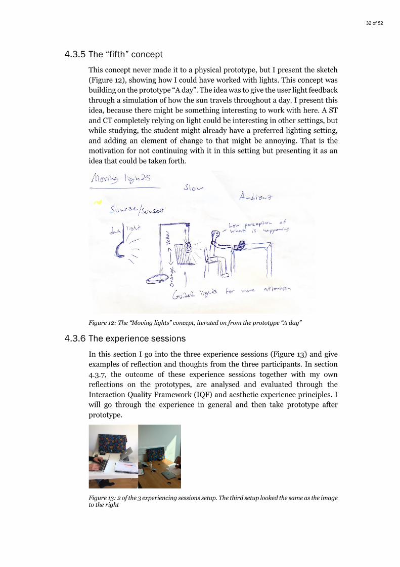
4.3.5 The “fifth” concept This concept never made it to a physical prototype, but I present the sketch (Figure 12), showing how I could have worked with lights. This concept was building on the prototype “A day”. The idea was to give the user light feedback through a simulation of how the sun travels throughout a day. I present this idea, because there might be something interesting to work with here. A ST and CT completely relying on light could be interesting in other settings, but while studying, the student might already have a preferred lighting setting, and adding an element of change to that might be annoying. That is the motivation for not continuing with it in this setting but presenting it as an idea that could be taken forth.
Figure 12: The “Moving lights” concept, iterated on from the prototype “A day”
4.3.6 The experience sessions
In this section I go into the three experience sessions (Figure 13) and give examples of reflection and thoughts from the three participants. In section 4.3.7, the outcome of these experience sessions together with my own reflections on the prototypes, are analysed and evaluated through the Interaction Quality Framework (IQF) and aesthetic experience principles. I will go through the experience in general and then take prototype after prototype.
Figure 13: 2 of the 3 experiencing sessions setup. The third setup looked the same as the image to the right
33 of 52
4.3.6.1 General
Throughout all of the sessions, the sound that the servomotors created, made the participants react through flinching or quickly turning their head to see what had happened on the board. This was something that faded away as they became more focused on their studies and as they became more accustomed to the prototypes. It should be noted that this reaction to the sound only happened in the first fifteen minutes when the first prototype was presented.
Another thing that all the participants reflected on, was that after a while the prototypes disappeared into the background of their attention span, but they still checked on it from time to time to see what was happening. This could possibly be because of their studies, which they were focused on.
All of the participants got the feeling of randomness in the feedback that they received from the prototypes. Questions were asked around whether they really were in control of the prototypes and what the feedback meant. Or if it even had a meaning at times.
Since the “Flow” prototype was the first in order to be experienced, the participants might not have been able to fully comprehend and understand it to the same extent as the other prototypes. This will be discussed further in the discussion (Chapter 5).
Every now and then, an object would be unintentionally placed in front of the distance sensor, which made the system not react to an eventual movement from the participants, which shows that more research and experimentation will have to go into other sensors or other ways to interact with the system.
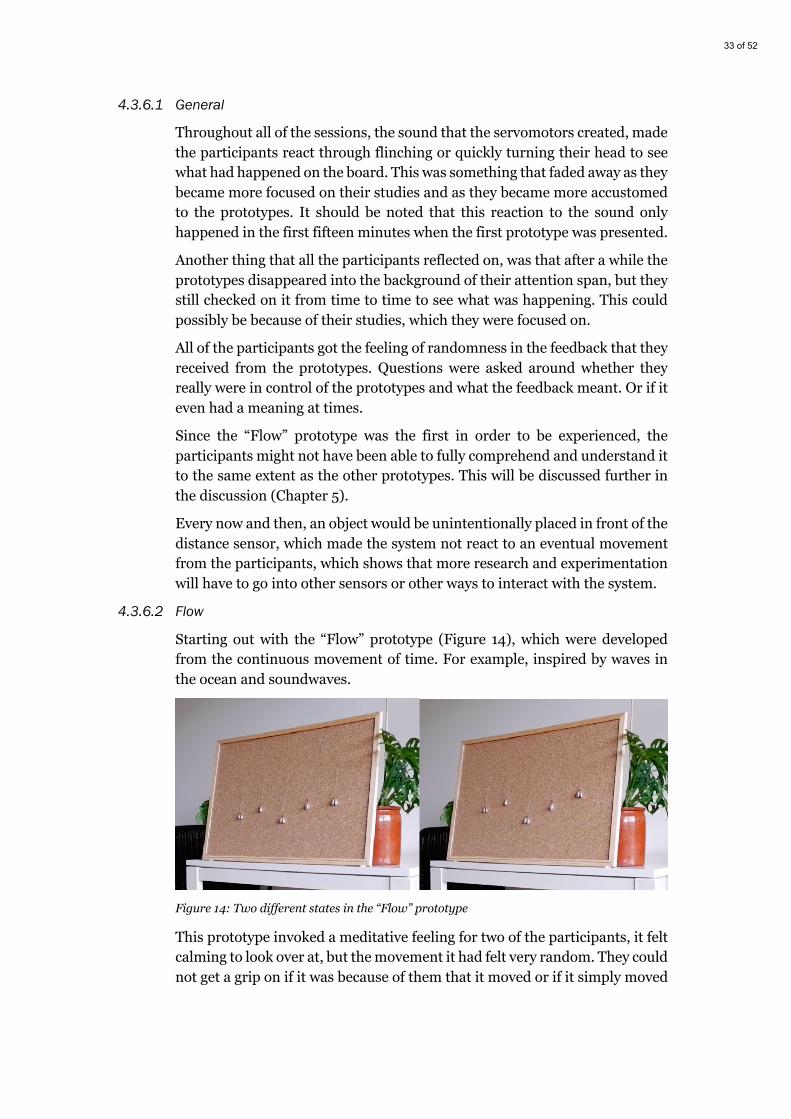
4.3.6.2 Flow
Starting out with the “Flow” prototype (Figure 14), which were developed from the continuous movement of time. For example, inspired by waves in the ocean and soundwaves.
Figure 14: Two different states in the “Flow” prototype
This prototype invoked a meditative feeling for two of the participants, it felt calming to look over at, but the movement it had felt very random. They could not get a grip on if it was because of them that it moved or if it simply moved
34 of 52
because time was passing by. One participant talked about how it just felt like an abstract representation of time, a clock on the wall that was hard to understand. The randomness in the feedback was also a factor in the reason that one participant did not follow what happened, it was hard to remember how the visuals looked like before they changed. They heard that something happened but could not see any changes or remember how it looked like previous to the sound.
The third participant seemed unfazed throughout the entire hour, even though it was reported afterwards that in fact the participant had been aware of the changes it made. The experiences were similar to the other participants.
4.3.6.3 Tension
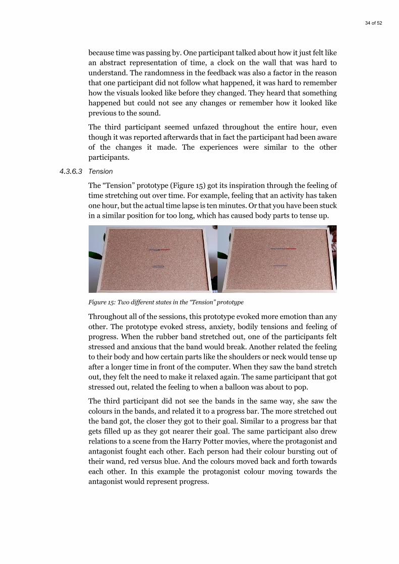
The “Tension” prototype (Figure 15) got its inspiration through the feeling of time stretching out over time. For example, feeling that an activity has taken one hour, but the actual time lapse is ten minutes. Or that you have been stuck in a similar position for too long, which has caused body parts to tense up.
Figure 15: Two different states in the “Tension” prototype
Throughout all of the sessions, this prototype evoked more emotion than any other. The prototype evoked stress, anxiety, bodily tensions and feeling of progress. When the rubber band stretched out, one of the participants felt stressed and anxious that the band would break. Another related the feeling to their body and how certain parts like the shoulders or neck would tense up after a longer time in front of the computer. When they saw the band stretch out, they felt the need to make it relaxed again. The same participant that got stressed out, related the feeling to when a balloon was about to pop.
The third participant did not see the bands in the same way, she saw the colours in the bands, and related it to a progress bar. The more stretched out the band got, the closer they got to their goal. Similar to a progress bar that gets filled up as they got nearer their goal. The same participant also drew relations to a scene from the Harry Potter movies, where the protagonist and antagonist fought each other. Each person had their colour bursting out of their wand, red versus blue. And the colours moved back and forth towards each other. In this example the protagonist colour moving towards the antagonist would represent progress.
35 of 52
One of the participants asked the question why there were two rubber bands in the prototype? This was a vision about having two different values, one for being away from the computer and one for being in front of it. But it disappeared for the users, since they felt the feedback itself was a bit random, or it simply just did not come through in the design.
4.3.6.4 Pattern
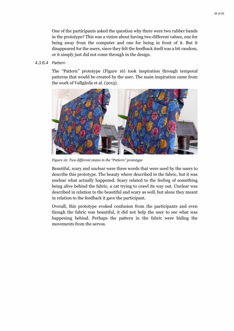
The “Pattern” prototype (Figure 16) took inspiration through temporal patterns that would be created by the user. The main inspiration came from the work of Vallgårda et al. (2015).
Figure 16: Two different states in the “Pattern” prototype
Beautiful, scary and unclear were three words that were used by the users to describe this prototype. The beauty where described in the fabric, but it was unclear what actually happened. Scary related to the feeling of something being alive behind the fabric, a cat trying to crawl its way out. Unclear was described in relation to the beautiful and scary as well, but alone they meant in relation to the feedback it gave the participant.
Overall, this prototype evoked confusion from the participants and even though the fabric was beautiful, it did not help the user to see what was happening behind. Perhaps the pattern in the fabric were hiding the movements from the servos.

36 of 52
4.3.6.5 Unfolding
Reaching milestones in time on the way towards a goal and a flower blooming were the main inspirations for the “Unfolding” prototype (Figure 17).
Figure 17: Two different states in the “Unfolding” prototype
‘Quarters in time, time moving in quarters towards a whole’. That was one way a participant described the experience of this prototype. Similar to reaching a milestone on the way to their goal or an interval, but in this way, they had to get past four milestones or four intervals to reach the goal. The same participant felt in control of the prototype, that she could make it move if she wanted to. Another participant experienced the prototypes feedback as being random, she could not interpret if she were in control of it or if it lived a life on its own. The visuals were also interpreted as abstract, and that they did not know what the folding doors meant, or why they were acting in the way they were. The third participant reported similar experiences as the first in this section, she felt like the opening of the flaps were in relation to moving towards a goal.
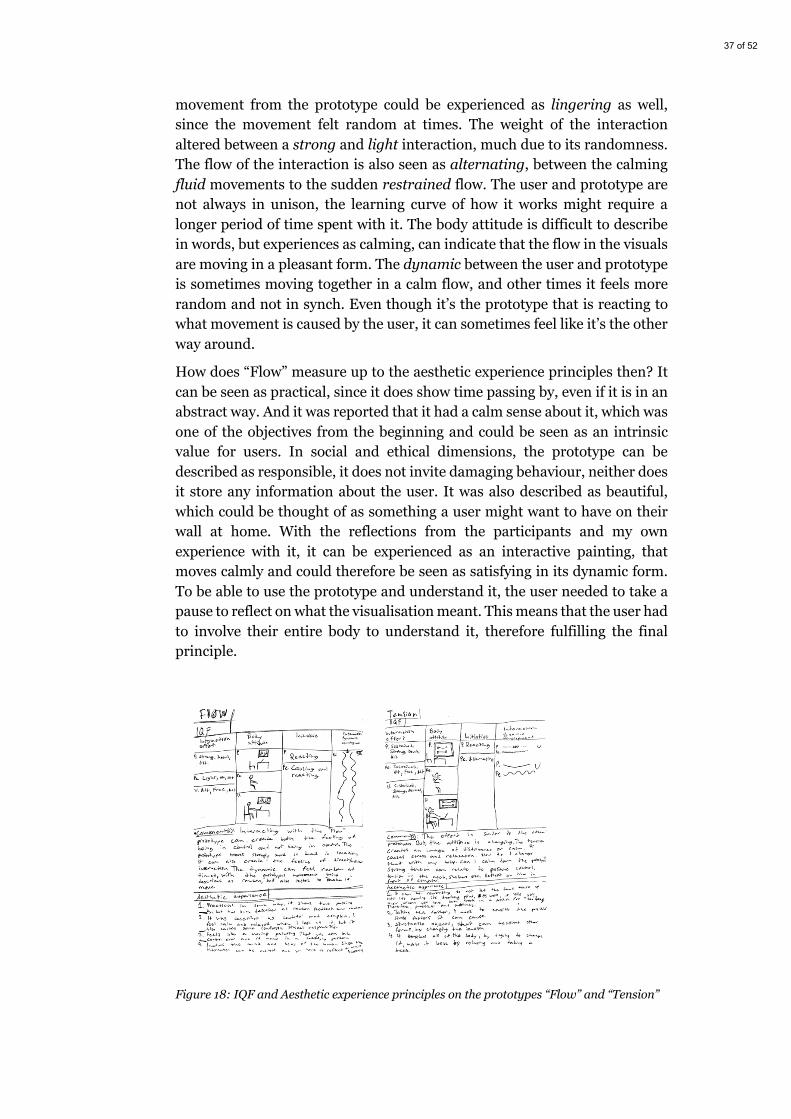
4.3.7 IQF and Aesthetic experience Together with the experiences from the participants in the experiencing sessions and my own experience I evaluated the prototypes as objectively as possible through the IQF (Figure 20) and the aesthetic experience principles. I did this to be able to understand how I could work with certain qualities and attributes that could be used in designing for a context of studying at home. Each prototype was evaluated on one A4 paper (Figure 18 & 19), and through this section I will describe each evaluation before moving on to two prototypes that were iterated on.
Starting out with the “Flow” prototype (Figure 18, left), I will describe it through the IQF. The interaction effort in the dynamic between the user and the product can be described in time as quick and lingering. The sudden
37 of 52
movement from the prototype could be experienced as lingering as well, since the movement felt random at times. The weight of the interaction altered between a strong and light interaction, much due to its randomness. The flow of the interaction is also seen as alternating, between the calming fluid movements to the sudden restrained flow. The user and prototype are not always in unison, the learning curve of how it works might require a longer period of time spent with it. The body attitude is difficult to describe in words, but experiences as calming, can indicate that the flow in the visuals are moving in a pleasant form. The dynamic between the user and prototype is sometimes moving together in a calm flow, and other times it feels more random and not in synch. Even though it’s the prototype that is reacting to what movement is caused by the user, it can sometimes feel like it’s the other way around.
How does “Flow” measure up to the aesthetic experience principles then? It can be seen as practical, since it does show time passing by, even if it is in an abstract way. And it was reported that it had a calm sense about it, which was one of the objectives from the beginning and could be seen as an intrinsic value for users. In social and ethical dimensions, the prototype can be described as responsible, it does not invite damaging behaviour, neither does it store any information about the user. It was also described as beautiful, which could be thought of as something a user might want to have on their wall at home. With the reflections from the participants and my own experience with it, it can be experienced as an interactive painting, that moves calmly and could therefore be seen as satisfying in its dynamic form. To be able to use the prototype and understand it, the user needed to take a pause to reflect on what the visualisation meant. This means that the user had to involve their entire body to understand it, therefore fulfilling the final principle.
Figure 18: IQF and Aesthetic experience principles on the prototypes “Flow” and “Tension”

38 of 52
In the prototype “Tension” (Figure 18, right), a difference in the bodily attitude stands out. This is the prototype that related more to the bodily experiences than others did. The tensions in the rubber band could be thought of as bodily tensions, from a person that had been still in one position for too long. It was also seen as tension in time, in the way a moment could be stretched out in their experience or moving towards something. The interaction relation between prototype and user also felt more sustained and slower in time, at the same time it felt very strong, since its evoked anxiety about the band possibly snapping. The feeling it evokes is also related to relaxing the rubber band, when it tenses up, and you gain awareness of tense body parts, the need to relax both the band and the body arises. The dynamic between users and the prototype differs a bit from each other. They are both affected by each other, the user could be moving calmly, and the prototype might tense up at any given point. This can shift the dynamic so that it is the prototype that steers the user more than the user causing the prototype to move.
The prototype is of practical use in situations where a user could use it as a reminder to relax or that they have been sitting still for a longer period of time. It can be used as a reminder to take a break, or perhaps the other way around. The ethical and social values it provokes could possibly be felt as intrusive or a moment of stress, which would not be feasible. But I think the quality of the tension, could be used in a positive way. So that users could reflect about how much time is spent in front of the computer and reminding them to not get worked up or stressed. The dynamic form is satisfying, the flexibility in the rubber band can be used to create other forms, for example, squares, circles or triangles, which would be interesting to follow up on. Similar to “Flow” and “Unfolding”, this prototype also involves the users bodily, cognitive and emotional values. The user relates it to their body at the same time as they have to stop and reflect on what the visualisation means and why it moves the way it moves.
The “Pattern” prototype (Figure 19, left) probably had the most unclear interaction between itself and its user. The effort could be described as sustained and alternating between strong and light. There were instances where the initiative from the user did not create a visually detectable reaction. And other times were the user felt creeped out because it felt like a cat was trying to crawl out from behind the fabric.
Through the aesthetic experience, I think that this prototype failed to reach any of the principles in a satisfying manner. The beauty in the fabric takes away any practical use and the poorly sewed on servos could have been more tightly put on.
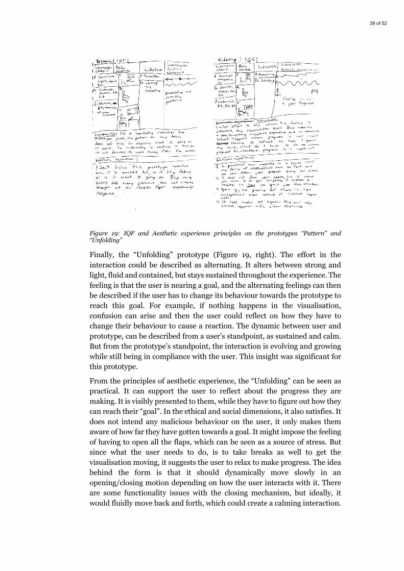
39 of 52
Figure 19: IQF and Aesthetic experience principles on the prototypes “Pattern” and “Unfolding”
Finally, the “Unfolding” prototype (Figure 19, right). The effort in the interaction could be described as alternating. It alters between strong and light, fluid and contained, but stays sustained throughout the experience. The feeling is that the user is nearing a goal, and the alternating feelings can then be described if the user has to change its behaviour towards the prototype to reach this goal. For example, if nothing happens in the visualisation, confusion can arise and then the user could reflect on how they have to change their behaviour to cause a reaction. The dynamic between user and prototype, can be described from a user’s standpoint, as sustained and calm. But from the prototype’s standpoint, the interaction is evolving and growing while still being in compliance with the user. This insight was significant for this prototype.
From the principles of aesthetic experience, the “Unfolding” can be seen as practical. It can support the user to reflect about the progress they are making. It is visibly presented to them, while they have to figure out how they can reach their “goal”. In the ethical and social dimensions, it also satisfies. It does not intend any malicious behaviour on the user, it only makes them aware of how far they have gotten towards a goal. It might impose the feeling of having to open all the flaps, which can be seen as a source of stress. But since what the user needs to do, is to take breaks as well to get the visualisation moving, it suggests the user to relax to make progress. The idea behind the form is that it should dynamically move slowly in an opening/closing motion depending on how the user interacts with it. There are some functionality issues with the closing mechanism, but ideally, it would fluidly move back and forth, which could create a calming interaction.
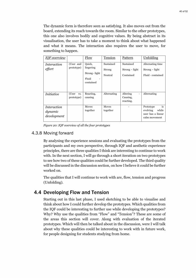
40 of 52
The dynamic form is therefore seen as satisfying. It also moves out from the board, extending its reach towards the room. Similar to the other prototypes, this one also involves bodily and cognitive values. By being abstract in its visualisation, the user has to take a moment to think about what happened and what it means. The interaction also requires the user to move, for something to happen.
IQF overview Flow Tension Pattern Unfolding
Interaction effort
(User and prototype)
Quick, lingering
Strong - light
Fluid - contained
Sustained
Strong
Neutral
Sustained
Strong – light
Contained
Alternating time
Strong – light
Fluid - contained
Initiative (User vs. prototype)
Reacting, causing
Alternating Altering - Causing, reacting.
Alternating
Interaction dynamic development
Moves together
Moves together
- Prototype is evolving while user has a linear calm movement
Figure 20: IQF overview of all the four prototypes
4.3.8 Moving forward
By analysing the experience sessions and evaluating the prototypes from the participants and my own perspective, through IQF and aesthetic experience principles, there are three qualities I think are interesting to continue to work with. In the next section, I will go through a short iteration on two prototypes to see how two of these qualities could be further developed. The third quality will be discussed in the discussion section, on how I believe it could be further worked on.
The qualities that I will continue to work with are, flow, tension and progress (Unfolding).
4.4 Developing Flow and Tension Starting out in this last phase, I used sketching to be able to visualise and think about how I could further develop the prototypes. Which qualities from the IQF could be interesting to further use while developing the prototypes? Why? Why use the qualities from “Flow” and “Tension”? These are some of the areas this section will cover. Along with evaluation of the iterated prototypes. Which will then be talked about in the discussion, were I will talk about why these qualities could be interesting to work with in future work, for people designing for students studying from home.

41 of 52
4.4.1 Sketching and prototyping The newly sketched ideas (Figure 21 & 22) got a new element added to them, that is, colour. A lot of questions about what the meaning for the previous iteration’s visualisations, were brought up in the previous sections. They were thought of as being too abstract and random. The idea to add colour, was therefore thought of as additional information, a way to make it clearer for the users that something had happened. Maybe the added information would make it more distinguishable that something had happened. Adding more qualities to one prototype, or even combining two of the previous prototypes was ideated on. How could I work with tension and progress in the same prototype? Or how could tension and flow work together to create a calming sensation when something is stretched out to its maximum capacity?
Figure 21: Sketched ideas

42 of 52
Figure 22: More sketched ideas
Due to time pressure, most of these sketches will remain as concepts on how we can use these qualities. The iteration would instead only add colour to the prototypes, to see the impact it could have.
Starting out with the “Tension” prototype, the iteration is called “Tension.colour” (Figure 23). It is very similar to its previous iteration, what has changed is the number of rubber bands and that their colours now are more distinguishable from each other. The idea is that they should signal two different states, which could help the user get a better understanding of how it works. For example, it might be easier to distinguish between being away from the computer and in front of it, if the red one always moves when you have been away or vice versa.
Figure 23: “Tension.colour” prototype, follow the link for a short video of the prototype: https://youtu.be/sahai5ilutM
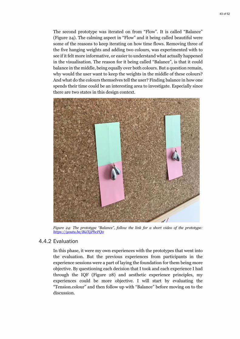
43 of 52
The second prototype was iterated on from “Flow”. It is called “Balance” (Figure 24). The calming aspect in “Flow” and it being called beautiful were some of the reasons to keep iterating on how time flows. Removing three of the five hanging weights and adding two colours, was experimented with to see if it felt more informative, or easier to understand what actually happened in the visualisation. The reason for it being called “Balance”, is that it could balance in the middle, being equally over both colours. But a question remain, why would the user want to keep the weights in the middle of these colours? And what do the colours themselves tell the user? Finding balance in how one spends their time could be an interesting area to investigate. Especially since there are two states in this design context.
Figure 24: The prototype “Balance”, follow the link for a short video of the prototype: https://youtu.be/BiJXjPbcFQ0
4.4.2 Evaluation
In this phase, it were my own experiences with the prototypes that went into the evaluation. But the previous experiences from participants in the experience sessions were a part of laying the foundation for them being more objective. By questioning each decision that I took and each experience I had through the IQF (Figure 28) and aesthetic experience principles, my experiences could be more objective. I will start by evaluating the “Tension.colour” and then follow up with “Balance” before moving on to the discussion.
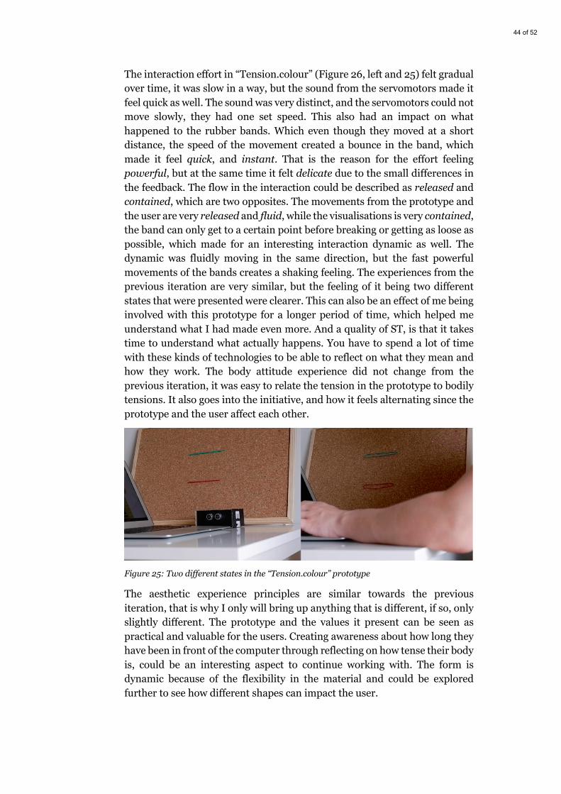
44 of 52
The interaction effort in “Tension.colour” (Figure 26, left and 25) felt gradual over time, it was slow in a way, but the sound from the servomotors made it feel quick as well. The sound was very distinct, and the servomotors could not move slowly, they had one set speed. This also had an impact on what happened to the rubber bands. Which even though they moved at a short distance, the speed of the movement created a bounce in the band, which made it feel quick, and instant. That is the reason for the effort feeling powerful, but at the same time it felt delicate due to the small differences in the feedback. The flow in the interaction could be described as released and contained, which are two opposites. The movements from the prototype and the user are very released and fluid, while the visualisations is very contained, the band can only get to a certain point before breaking or getting as loose as possible, which made for an interesting interaction dynamic as well. The dynamic was fluidly moving in the same direction, but the fast powerful movements of the bands creates a shaking feeling. The experiences from the previous iteration are very similar, but the feeling of it being two different states that were presented were clearer. This can also be an effect of me being involved with this prototype for a longer period of time, which helped me understand what I had made even more. And a quality of ST, is that it takes time to understand what actually happens. You have to spend a lot of time with these kinds of technologies to be able to reflect on what they mean and how they work. The body attitude experience did not change from the previous iteration, it was easy to relate the tension in the prototype to bodily tensions. It also goes into the initiative, and how it feels alternating since the prototype and the user affect each other.
Figure 25: Two different states in the “Tension.colour” prototype
The aesthetic experience principles are similar towards the previous iteration, that is why I only will bring up anything that is different, if so, only slightly different. The prototype and the values it present can be seen as practical and valuable for the users. Creating awareness about how long they have been in front of the computer through reflecting on how tense their body is, could be an interesting aspect to continue working with. The form is dynamic because of the flexibility in the material and could be explored further to see how different shapes can impact the user.
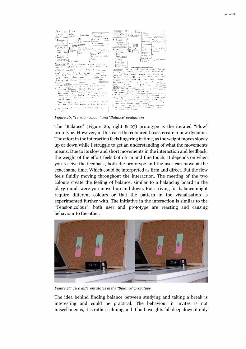
45 of 52
Figure 26: “Tension.colour” and “Balance” evaluation
The “Balance” (Figure 26, right & 27) prototype is the iterated “Flow” prototype. However, in this case the coloured boxes create a new dynamic. The effort in the interaction feels lingering in time, as the weight moves slowly up or down while I struggle to get an understanding of what the movements means. Due to its slow and short movements in the interaction and feedback, the weight of the effort feels both firm and fine touch. It depends on when you receive the feedback, both the prototype and the user can move at the exact same time. Which could be interpreted as firm and direct. But the flow feels fluidly moving throughout the interaction. The meeting of the two colours create the feeling of balance, similar to a balancing board in the playground, were you moved up and down. But striving for balance might require different colours or that the pattern in the visualisation is experimented further with. The initiative in the interaction is similar to the “Tension.colour”, both user and prototype are reacting and causing behaviour to the other.
Figure 27: Two different states in the “Balance” prototype
The idea behind finding balance between studying and taking a break is interesting and could be practical. The behaviour it invites is not miscellaneous, it is rather calming and if both weights fall deep down it only
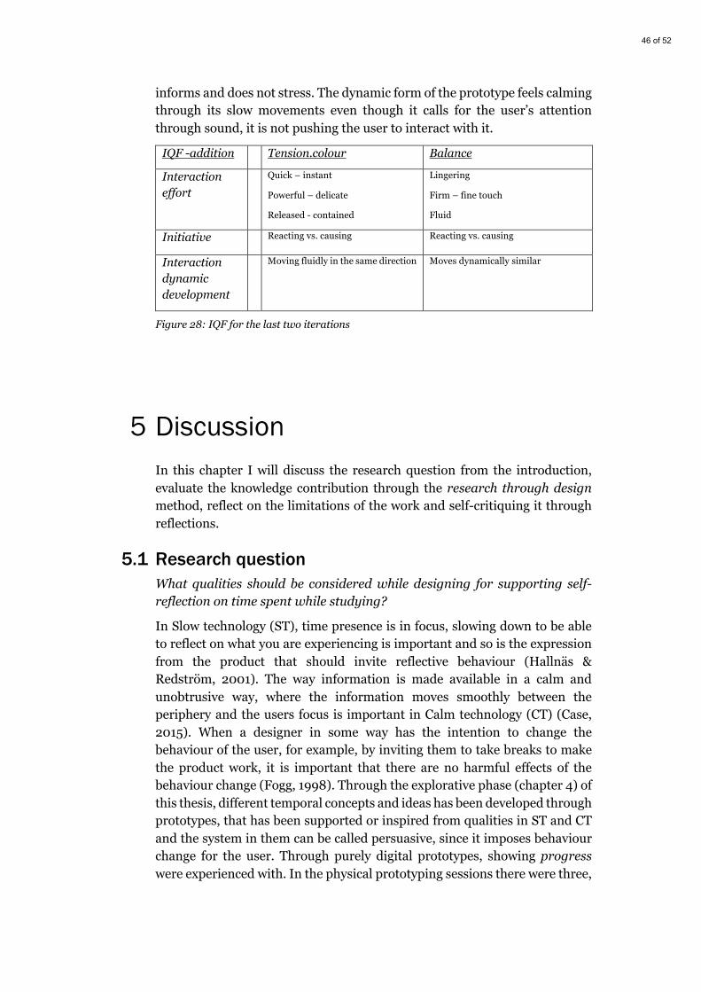
46 of 52
informs and does not stress. The dynamic form of the prototype feels calming through its slow movements even though it calls for the user’s attention through sound, it is not pushing the user to interact with it.
IQF -addition Tension.colour Balance
Interaction effort
Quick – instant
Powerful – delicate
Released - contained
Lingering
Firm – fine touch
Fluid
Initiative Reacting vs. causing Reacting vs. causing
Interaction dynamic development
Moving fluidly in the same direction Moves dynamically similar
Figure 28: IQF for the last two iterations
5 Discussion In this chapter I will discuss the research question from the introduction, evaluate the knowledge contribution through the research through design method, reflect on the limitations of the work and self-critiquing it through reflections.
5.1 Research question What qualities should be considered while designing for supporting self-reflection on time spent while studying?
In Slow technology (ST), time presence is in focus, slowing down to be able to reflect on what you are experiencing is important and so is the expression from the product that should invite reflective behaviour (Hallnäs & Redström, 2001). The way information is made available in a calm and unobtrusive way, where the information moves smoothly between the periphery and the users focus is important in Calm technology (CT) (Case, 2015). When a designer in some way has the intention to change the behaviour of the user, for example, by inviting them to take breaks to make the product work, it is important that there are no harmful effects of the behaviour change (Fogg, 1998). Through the explorative phase (chapter 4) of this thesis, different temporal concepts and ideas has been developed through prototypes, that has been supported or inspired from qualities in ST and CT and the system in them can be called persuasive, since it imposes behaviour change for the user. Through purely digital prototypes, showing progress were experienced with. In the physical prototyping sessions there were three,
47 of 52
eventually four qualities (that will be discussed) of how to express change in time through the prototypes. Flow, tension, unfolding and balance are the qualities that I propose to be considered while designing for self-reflection on time spent.
Why should these qualities then be considered? All of these qualities have a backstory, from being inspired by elements in nature to concepts around making progress in time, through milestones and working towards a goal. The expression in the prototypes might not be the best way to express these qualities and they definitely should be further explored, and more time would be required to be able to fully understand them. All of the prototypes that explore these qualities, has underlying qualities of ST and CT with an intent to change the behaviour of the user (taking breaks). The evaluation of the prototypes through IQF and aesthetic experience principles shows why these qualities should be considered to be used while designing for self-reflecting about time spent while studying, and the reason for each one is:
Flow, the actual flow in the interaction could be described as fluid and restrained, and that could be the reason the form expresses a calmness. Even though it also were described as being unclear in what it meant, reflecting behaviour through stopping up and thinking about the form were required to be able to make sense of it.
Tension, the qualities in tension can be related to the entire body, feeling tensity in certain muscles that could be related to being stuck in a position for too long. Being aware of how your body feels could be a way to reflect on how much time has been spent in one place. The flexibility in form is also an interesting aspect that should be further explored.
Unfolding, unfolding the time spent can relate to progress made, if there are four flaps that folds out, they could be related to reaching a milestone. And reflecting on what that progress means can relate to the time that is spent.
Balance, finding balance in how time is spent in an activity is another way to make the interaction information explicit, and if done in an abstract way, the user has to reflect about what the imbalance in the visualisation means.
Adding colour to the aforementioned qualities can also help users understand the information presented easier or make them reflect on why there are different colours, and why does the red colour always move more when I have been sitting still for a long time.
5.2 Research through design and self-critique I will be going through each of the four lenses created by Zimmerman et al. (2007) one by one and critically reflect on how the work in this thesis creates knowledge through design.
Process: The process in this thesis has been driven by exploration and recreating it in the exact same steps would probably not yield the same
48 of 52
results. But that is okey, according to Zimmerman et al. (2007) the result probably won’t be the same if the process would be recreated, the importance is that the decision and reasoning behind which methods that are used is motivated for. Throughout the Method chapter (chapter 3) I clearly motivate why I chose to work with interaction/user driven design as a way of starting out in the explorative process and then why I used the tools IQF and aesthetic experience principles to evaluate the prototypes, through the reflections from participants in the experience sessions and my own reflections.
Invention: The aim of this thesis has been to explore a design context through the use of relevant theory that helped to ground and bring inspiration to the qualities that has been derived from the work in this thesis. Through theory and related work, I have not been able to find any similar research in this specific context, which could indicate that the qualities I present through this thesis are innovative for the focus area of this thesis.
Relevance: Why is this work relevant for interaction designers? Zimmerman et al. (2007) says that the work has to be grounded in the real world and show relevance to why the result should be considered by others. Through the previous section (5.1), I work through the relevance of why the qualities I present should be considered. When I started out within this context, I thought it would be relevant for myself (as a user) since I had struggled with dealing with how I spent my time while studying from home and through the study by Son et al. (2020), I could see that it is a relevant context to design for.
Extensibility: In the future work (section 5.4), I discuss possible future directions to take with the results from the work in this thesis. The prototypes presented in this thesis are not meant to be how a future product would look and operate, but the qualities derived from them could be used in deepening the understanding of how to design for supporting self-reflection about time spent while studying
While I have evaluated the work done in this thesis myself, I have strived to be objective in how I used the lenses from research through design by going through all of the work done in the thesis and tried to question why for example, I think this work is relevant for the interaction design community. Getting reflections from participants in the experience sessions has helped ground my own reflection on the qualities that are presented. Using the Interaction Quality Framework and aesthetic experience principles by Ross & Wensveen (2010) also helped me to be critical in my evaluation of the prototypes, through both my own and the participants experience.
49 of 52
5.3 Reflecting on limitation There are some limitations to the work conducted in this thesis, even though I have been trying to be objective in evaluating the prototypes with help from participants experiences and relevant tools. More research and evaluation are needed on the qualities that has been presented, it would for example be interesting to place the prototypes in participants home for a longer period of time, letting them experience them every day and then they might understand them better. That could help further evaluation on which qualities could be considered to be used for self-reflecting on time spent, and it would also be a way of further critiquing my own experience.
There were some changes in how the interaction was set up, instead of the users having to move away completely from the computer, the distance sensor only read the two states as users having their arms on top of the keyboard or away from the keyboard. There were some functionality issues with the distance sensor because it had a hard time getting correct values when a piece of clothing was placed in front of it. During the relatively short time span of the experience sessions, they might not move away from the computer too many times anyways, so therefore moving their arms away from the computer could be seen as taking a break from studying (at least writing). There could also have been a deeper discussion with the participants after the sessions but studying for circa four hours while also experiencing the prototypes was draining for the energy levels. Therefore, as I previously mentioned, the prototypes would probably benefit from being in the participants lives for a longer period of time.
The order of which prototype was experienced first in the experience session could have been a reason for why the “Flow” prototype was perceived as more random in its feedback than other prototypes. It could be that the other prototypes benefitted from being placed later in the order and that they became more aware and accustomed to them through it. Placing the prototypes in the context for a longer period of time could be the way to help participants understand it more.

50 of 52
5.4 Future work The qualities presented in this thesis should be seen as suggestions for further research in designing to support self-reflection for time spent while studying. It would also be interesting to see how the qualities would work in relation to other contexts, maybe the context of working from home would be interesting to use with the qualities presented. Further research on different ways to interacting with these qualities would have to be done, since the distance sensor only presents one way of interacting with the prototypes and throughout the discussion, I have shown why its technically flawed.
Further exploration on the form and expression in prototypes with the qualities is also necessary, the form and expressivity in the prototypes created are only example of how the qualities could be used.
6 Conclusion This thesis ends up with what is four qualities that are proposed for consideration while designing to support self-reflecting on time spent while studying. The qualities are flow, tension, unfolding and balance. These qualities should be seen as suggestions for further research in this or other related contexts. The findings through the qualities indicate that there is a possibility of using qualities from Slow technology (Hallnäs & Redström, 2001), Calm technology (Case, 2015) and Persuasive technology (Fogg, 1998) to support reflection on how a student spends their time while studying. It also shows that the need for more time spent with the prototypes is important, due to the fact that the visualisation in the prototypes could be seen as abstract and hard to understand at times. It can also be concluded that taking inspiration from nature and temporal concepts can be a way of working with how to design expression in form. When working alone in an explorative process the need to bring in other participants can be important to evaluate and self-critiquing your own experiences and reflections. Also using tools like Interaction Quality Framework and aesthetic experience principles (Ross & Wensveen, 2010) to further ground the experiences can be useful to make the experiences more objective along with having the same evaluating tools for each prototype.
51 of 52
7 References Arduino. (n.d.). Arduino - Introduction. Retrieved May 7, 2021, from
https://www.arduino.cc/en/guide/introduction
Bennett, P., & Fraser, M. (2012). Slow Technology is Inefficient but Resilient. DIS 2012 Workshop on Slow Technology: Critical Reflection and Future Directions, (July), 2–4.
Case, A. (2015). Calm Technology : Principles and Patterns for Non-Intrusive Design. O’Reilly Media, Incorporated. Retrieved from http://www.designprinciplesftw.com/collections/principles-of-calm-technology#931
Fogg, B. (1998). Persuasive computers. In Proceedings of the SIGCHI conference on Human factors in computing systems - CHI ’98 (pp. 225–232). New York, New York, USA: ACM Press. https://doi.org/10.1145/274644.274677
Hallnäs, L., & Redström, J. (2001). Slow Technology – Designing for Reflection. Personal and Ubiquitous Computing, 5(3), 201–212. https://doi.org/10.1007/PL00000019
Heyer, C. (2018). Designing for Coping. Interacting with Computers, 30(6), 492–506. https://doi.org/10.1093/iwc/iwy025
Houde, S., & Hill, C. (1997). What do Prototypes Prototype? In Handbook of Human-Computer Interaction (pp. 367–381). Elsevier. https://doi.org/10.1016/B978-044481862-1.50082-0
Kindberg, T., & Fox, A. (2002). System Software for Ubiquitous Computing. IEEE Pervasive Computing, 1(1), 70–81. https://doi.org/10.1109/MPRV.2002.993146
Koenderink, J., Pinna, B., & van Doorn, A. (2020). Capricious Texture of Time in Awareness and Art. Art and Perception, 8(2), 188–236. https://doi.org/10.1163/22134913-bja10008
Lee, K.-R., Ju, S., Dzhoroev, T., Goh, G., Lee, M.-H., & Park, Y.-W. (2020). DayClo. In Proceedings of the 2020 ACM Designing Interactive Systems Conference (pp. 1793–1806). New York, NY, USA: ACM. https://doi.org/10.1145/3357236.3395439
Maeng, S., Lim, Y., & Lee, K. (2012). Interaction-driven design. In Proceedings of the Designing Interactive Systems Conference on - DIS ’12 (pp. 448–457). New York, New York, USA: ACM Press. https://doi.org/10.1145/2317956.2318022
Muratovski, G. (2015). Research for designers: A guide to methods and practice. SAGE Publications Ltd.
52 of 52
Norman, D. (2013). The design of everyday things: Revised and expanded edition. Basic Books.
Odom, W. T., Sellen, A. J., Banks, R., Kirk, D. S., Regan, T., Selby, M., … Zimmerman, J. (2014). Designing for slowness, anticipation and re-visitation. In Proceedings of the SIGCHI Conference on Human Factors in Computing Systems (pp. 1961–1970). New York, NY, USA: ACM. https://doi.org/10.1145/2556288.2557178
Odom, W. T., Wakkary, R., Hol, J., Naus, B., Verburg, P., Amram, T., & Chen, A. Y. S. (2019). Investigating Slowness as a Frame to Design Longer-Term Experiences with Personal Data. In Proceedings of the 2019 CHI Conference on Human Factors in Computing Systems (pp. 1–16). New York, NY, USA: ACM. https://doi.org/10.1145/3290605.3300264
Pschetz, L., & Bastian, M. (2018). Temporal Design: Rethinking time in design. Design Studies, 56, 169–184. https://doi.org/10.1016/j.destud.2017.10.007
Ross, P. R., & Wensveen, S. A. G. (2010). Designing behavior in interaction: Using aesthetic experience as a mechanism for design. International Journal of Design, 4(2), 3–13.
Son, C., Hegde, S., Smith, A., Wang, X., & Sasangohar, F. (2020). Effects of COVID-19 on College Students’ Mental Health in the United States: Interview Survey Study. Journal of Medical Internet Research, 22(9), 1–14. https://doi.org/10.2196/21279
Swedish Research Council. (2017). Good Research Practice. Retrieved from https://www.vr.se/download/18.5639980c162791bbfe697882/1555334908942/Good-Research-Practice_VR_2017.pdf
Vallgårda, A., Winther, M., Mørch, N., & Vizer, E. E. (2015). Temporal form in interaction design. International Journal of Design, 9(3), 1–15. Retrieved from www.ijdesign.org
Weiser, M. (1999). The computer for the 21 st century. ACM SIGMOBILE Mobile Computing and Communications Review, 3(3), 3–11. https://doi.org/10.1145/329124.329126
Weiser, M., & Brown, J. S. (1996). Designing Calm Technology. PowerGrid Journal, 1(1), 75–85. Retrieved from http://www.ubiq.com/weiser/calmtech/calmtech.htm
Zimmerman, J., Forlizzi, J., & Evenson, S. (2007). Research through design as a method for interaction design research in HCI. In Proceedings of the SIGCHI Conference on Human Factors in Computing Systems - CHI ’07 (pp. 493–502). New York, New York, USA: ACM Press. https://doi.org/10.1145/1240624.1240704