Spirograph inspired visualization of ecological networks
11
Spirograph inspired visualization of ecological networks Katayoon Etemad * , Sheelagh Carpendale † and Faramarz Samavati ‡ University of Calgary Figure 1: Aesthetic visualization of ecological networks, inspired by Spirograph. Abstract Ecological networks are directed weighted graphs for represent- ing direct and indirect relationships between species in ecosystems. These complex cyclic networks play an important role in under- standing an ecosystem’s dynamics. In this paper, we present a vi- sualization layout inspired by Spirograph patterns, specifically de- signed for ecological networks. Our visualization supports both the direct and indirect quantities commonly required in ecological studies. The layout is circular to reflect the containment of the rep- resented ecosystem and to clarify which connections are internal and which are external. In this layout, nodes are arranged along the circumference of a large circle as arcs, and edges are mapped to thorn-like shapes that represent the direction and the weight of the edge. Finally, we illustrate the use of this visualization on several example ecological networks. CR Categories: I.3.8 [Computer Graphics and Application]: — [H.5]: Information Interfaces and Representation—; Keywords: Visualization, Weighted Directed Graph, Ecological Network * e-mail:[email protected] † e-mail:[email protected] ‡ e-mail:[email protected] 1 Introduction Understanding ecosystems both from the perspective of necessary exchanges within the ecosystems and from their relationships and possible impact upon other external entities and systems is chal- lenging. To improve our understanding, these systems are often studied at many different scales including the relatively small scale of just a few nodes. This is important because larger ecosystems are often composed of smaller ones and because even small ecosys- tems are complex. This complexity arises from internal and ex- ternal exchanges, energy flows, cycles and dynamics. In working with this data ecologists are encoding many details in relative node masses and in relationship weights. This results in ecosystem for- malizations that are directed, weighted graphs. While graph draw- ing is well established [Battista et al. 1998], relatively less attention has been paid to details of the visualization of weighted directed graphs, particularly in context of ecosystem dynamics. Commonly, these types of graphs are laid out using thickness of edges or la- bels to represent weights and arrowheads for indicating direction. We introduce an alternative graph-based representation for ecolog- ical networks. Our visualization displays the basic network and the associated flow of energy and matter between species in an ecosys- tem. The primary purpose of these networks is to support ecol- ogists in their analysis and exploration of these ecosystems, and to use visualization to gain a better understanding of exchanges of nutrients and energy that form the dynamics and flow of the ecosys- tem [Ulanowicz 2004]. These ecosystem networks are directed weighted graphs often containing one or more cycles. Each node is a biological unit (i.e. a species) in the ecosystem. The size of the node represents the biomass as calculated by ecologists [Ulanowicz 2004]. The edges all have direction and associated weight, which contains information about the amount of material flowing from one node to the next. Figure 2 shows a simple five-node example of this type of networks. In this diagram the numerical values of the node
Transcript of Spirograph inspired visualization of ecological networks

Spirograph inspired visualization of ecological networks
Katayoon Etemad∗, Sheelagh Carpendale†and Faramarz Samavati‡
University of Calgary
Figure 1: Aesthetic visualization of ecological networks, inspired by Spirograph.
Abstract
Ecological networks are directed weighted graphs for represent-ing direct and indirect relationships between species in ecosystems.These complex cyclic networks play an important role in under-standing an ecosystem’s dynamics. In this paper, we present a vi-sualization layout inspired by Spirograph patterns, specifically de-signed for ecological networks. Our visualization supports boththe direct and indirect quantities commonly required in ecologicalstudies. The layout is circular to reflect the containment of the rep-resented ecosystem and to clarify which connections are internaland which are external. In this layout, nodes are arranged alongthe circumference of a large circle as arcs, and edges are mapped tothorn-like shapes that represent the direction and the weight of theedge. Finally, we illustrate the use of this visualization on severalexample ecological networks.
CR Categories: I.3.8 [Computer Graphics and Application]:— [H.5]: Information Interfaces and Representation—;
Keywords: Visualization, Weighted Directed Graph, EcologicalNetwork
∗e-mail:[email protected]†e-mail:[email protected]‡e-mail:[email protected]
1 Introduction
Understanding ecosystems both from the perspective of necessaryexchanges within the ecosystems and from their relationships andpossible impact upon other external entities and systems is chal-lenging. To improve our understanding, these systems are oftenstudied at many different scales including the relatively small scaleof just a few nodes. This is important because larger ecosystemsare often composed of smaller ones and because even small ecosys-tems are complex. This complexity arises from internal and ex-ternal exchanges, energy flows, cycles and dynamics. In workingwith this data ecologists are encoding many details in relative nodemasses and in relationship weights. This results in ecosystem for-malizations that are directed, weighted graphs. While graph draw-ing is well established [Battista et al. 1998], relatively less attentionhas been paid to details of the visualization of weighted directedgraphs, particularly in context of ecosystem dynamics. Commonly,these types of graphs are laid out using thickness of edges or la-bels to represent weights and arrowheads for indicating direction.We introduce an alternative graph-based representation for ecolog-ical networks. Our visualization displays the basic network and theassociated flow of energy and matter between species in an ecosys-tem. The primary purpose of these networks is to support ecol-ogists in their analysis and exploration of these ecosystems, andto use visualization to gain a better understanding of exchanges ofnutrients and energy that form the dynamics and flow of the ecosys-tem [Ulanowicz 2004]. These ecosystem networks are directedweighted graphs often containing one or more cycles. Each nodeis a biological unit (i.e. a species) in the ecosystem. The size of thenode represents the biomass as calculated by ecologists [Ulanowicz2004]. The edges all have direction and associated weight, whichcontains information about the amount of material flowing from onenode to the next. Figure 2 shows a simple five-node example of thistype of networks. In this diagram the numerical values of the node
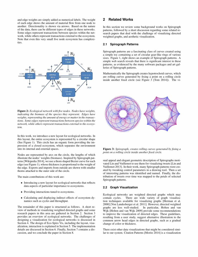
and edge weights are simply added as numerical labels. The weightof each edge shows the amount of material flow from one node toanother. Directionality is shown via arrows. Based on the natureof the data, there can be different types of edges in these networks.Some edges represent transactions between species within the net-work, while others represent transactions external to the ecosystem.Note that even this very small five node ecosystem has complexi-ties.
Figure 2: Ecological network with five nodes. Nodes have weights,indicating the biomass of the species they represent. Edges haveweights, representing the amount of energy or matter in the transac-tions. Some edges represent transactions between species within thenetwork, while others represent transactions external to the ecosys-tem.
In this work, we introduce a new layout for ecological networks. Inthis layout, the entire ecosystem is represented by a circular shape(See Figure 1). This circle has an organic form providing the im-pression of a closed ecosystem, which separates the environmentinto its internal and external spaces.
Nodes are represented by arcs on the circle, the lengths of whichillustrate the nodes’ weights (biomass). Inspired by Spirograph pat-terns [Wikipedia 2014], we use a thorn shaped Bezier curve for eachedge (see Figure 1), whose thickness is proportional to the weight ofthe edge. Exports and imports from outside are shown with smallerthorns attached to the outer side of the circle.
The main contributions of this work are:
• Introducing a new layout for ecological networks that reflectsdata aspects of particular importance to ecosystems.
• Providing interactions tuned to ecosystems.
• Calculating and displaying indirect effects of ecosystem dy-namics such as cycles and throughput.
The remainder of this paper is structured as follows. A short re-view of methods in visualizing weighted directed graphs and someresearch papers in this area are gathered in Section 2. Section 3provides an overview of ecological networks. The challenges ofdesigning a visualization for ecological networks is discussed inSection 4. The design of Eco-Spiro Vis, including the layout, visu-alization, interaction is explained in Section 5. The implementationdetails are discussed in Section 6. Finally, Section 7 contains a dis-cussion, and we conclude the paper in Section 8.
2 Related Works
In this section we review some background works on Spirographpatterns, followed by a short discussion regarding some related re-search papers that deal with the challenge of visualizing directedweighted graphs, and aesthetic visualization.
2.1 Spirograph Patterns
Spirograph patterns are a fascinating class of curves created usinga simple toy containing a set of circular gear-like rings of varioussizes. Figure 1, right shows an example of Spirograph patterns. Asimple web search reveals that there is significant interest in thesepatterns, as evidenced by the many software packages and art gal-leries of Spirograph patterns.
Mathematically the Spirograph creates hypotrochoid curves, whichare rolling curves generated by fixing a point on a rolling circleinside another fixed circle (see Figure 3 [Tom 2014]). The vi-
Figure 3: Spirograph, creates rolling curves generated by fixing apoint on a rolling circle inside another fixed circle.
sual appeal and elegant geometric description of Spirographs moti-vated Lin and Vuillemot to use them for visualizing tweets [Lin andVuillemot 2013]. In their work, many Spirograph patterns were cre-ated by tweaking control parameters in a drawing tool. Then a setof interesting patterns was identified and named. Finally, the dis-tribution of tweets over time was mapped to the petals of selectedSpirograph patterns.
2.2 Graph Visualization
Ecological networks are weighted directed graphs which maycontain cycles. There are wide variety of graph visualiza-tion techniques available for visualizing graphs [Herman et al.2000] [Von Landesberger et al. 2011]. However, directed weightedgraphs are less well-studied. In particular, Holten and vanWijk [Holten and van Wijk 2009] provide some recommendationsto improve the visualization of directed edges. These guidelines,resulting from a user study, suggest alternative illustration to thecommon arrow head edges in directed graphs, such as a gradualchange of color or thickness.
There exist other data visualizations that might be considered simi-lar to our system. Citation Patterns [Moritz 2014] is a visualization

Figure 4: An image of a current ecological network. This imageshows a food web, which is a special kind of ecological networks.Food web shows the who eats whom part of the network [Allesinaand Pascual 2009]
project that gives an overview of the citation network. The orienta-tion of nodes in this visualization is similar to Spirograph visualiza-tion, however the edge design is not based on repetitive curves likefor Spirograph patterns. Also, as the direction and weight of edgeswas not important to the structure of the data used in their visualiza-tion, it was not included in their system. Krzywinski Et.at. [Krzy-winski et al. 2009] introduced Circos, a visualization tool to assistthe procedure of comparison of genomes. In this work, a similarcircular layout is motivated and used for visualizing data with ahigh data-to-link ratio. However, the nature of our data is different.In ecological network this rate is usually small, but other exter-nal edges and indirect effects should be supported. Holten [Holten2006] used a similar orientation of nodes in his hierarchical edgebundling visualization, and in 2009 Meyer and Munzner [Meyeret al. 2009] designed a multiscale browser for biologists to explorespecies’ genome, chromosome, and block levels. In both visual-izations, the direction and weight of the edges was not considered.Allesina et al. [Allesina and Pascual 2009] used a node-link lay-out to visualize food webs (See Figure 4), which are a special kindof ecological network where only connectivity (who eats whom) ispresented, but the flow of energy (i.e. the weights of the edges) isnot visualized.
Sankey diagrams are a type of layout used for weighted layered net-works (see Figure 5). Riehmann et al. in [Riehmann et al. 2005]present an interactive visualization system for Sankey diagrams.The layered structure of these networks has been used to designa layer-by-layer layout. Despite its simple structure (acyclic), thevisualization may be tangled. Given that ecological networks aregenerally cyclic, it is not clear how to customize Sankey in orderto support cycles. Furthermore, the indirect quantities captured inLeontief [Leontief 1987] matrix should be provided (at least on de-mand).
2.3 Aesthetic Data Visualization
Nowadays, computers are fast enough to store and represent largedata sets, but reading and extracting useful information remains atask to be performed by humans. It is challenging to present largegraphs on a limited screen space, due to the possibility of node over-lapping and edge crossing. This makes it tedious for a human to
Figure 5: Sankey diagram visualizing the energy system (imagecourtesy of H. Alemasoom and F. Samavati, University of Calgary).
perceive the information presented by a large graph. Attractive andengaging graph representations can help analysts in their tediousexploration tasks. The effects of aesthetics in graph visualizationhave been studied in [Purchase 1997] by Purchase et al. They showthat maximizing symmetry as well as minimizing node overlapping,edge crossing and edge bending have strong effects on understand-ing the graph structure. In the series of studies conducted by Pur-chase et al., in [Purchase et al. 2012], participants were asked todraw graphs in a more understandable way. The results indicatedthat the participants tried to follow the same criteria in their draw-ing: reducing edge crossings, edge bending and increasing symme-try. Bennett et al. in [Bennett et al. 2007] also explored the aspectsof aesthetics in improving the graph visualization.
Taking an aesthetical perspective in visualization is not a novelapproach. Recently, increasing number of data visualization re-searchers have been considering aesthetics in their designs. Ex-amples are Informative Art [Miller and Stasko 2003] and InfoCan-vas [Holmquist and Skog 2003]. Pousman et al. in [Pousman et al.2007] provides a review of the visualizations that have consideredaesthetic patterns in their designs.
3 Ecological Networks
As demonstrated in Figure 2, an ecological network is a directedweighted graph in which nodes are species and edges represent theenergy or material flow in the system. Each node’s weight corre-sponds to the biomass of the associated species and each edge’sweight represents the amount of energy that flows between thenodes in the system. There are usually three types of edges in thesekinds of networks: exchange, input and output edges. Exchangesare simply edges between nodes. Input edges, enter the system fromthe outside, and output edges leave the system. In practice it is pos-sible to have multiple types of outputs. In Figure 2, there are twotypes of output edges: energy and respiration (or breathing).
Ecological networks are important tools which ecologists use inquantifying the flow of energy/matter in the ecosystem. However,even for a moderately sized system (i.e. with 30 to 40 nodes) thenetwork becomes very complex. Therefore, a proper representa-tion of these networks is required for the study of whole ecosys-tems [Ulanowicz 2013]. In order to quantify indirect effects, it isnecessary to evaluate and visualize measures beyond the weights ofedges. For example, in Figure 2, it is important to know the totalenergy flow from N1 to N4. To evaluate this measure, it is neces-sary to find all pathways from N1 to N4, possibly including cycles(e.g. N2 → N3 → N5 → N2). These quantities are usually com-puted using linear algebra [Ulanowicz 2004][Leontief 1987]. The

connectivity of the network can be captured by an adjacency matrixA where:
aij =
{1, if i is connected to j;0, otherwise.
For example, if we ignore the input and output edges in Figure 2,its adjacency matrix will be:
A =
0 0 0 0 10 0 1 0 10 0 0 1 10 0 0 0 10 1 1 0 0
.
The inputs and outputs can be included by introducing some extraphantom vertices. Note that the adjacency matrix has also beenused as a layout for general graph visualizations [Henry and Fekete2006] [Henry et al. 2007].
One can show that the powers of A can be used to calculate the in-direct connections between vertices. For example; A3(i, j) showsthe number of paths of length 3 from i to j. In order to includeweights, a similar matrix Wn×n is defined where wi,j is the flowexchange from Ni to Nj . For instance, for the network in Figure 2,we have:
W =
0 0 0 0 88810 0 75 0 16000 0 0 370 2000 0 0 0 1670 5205 2309 0 0
.
Similar to the adjacency matrix, W 3i,j shows the flow exchange be-
tweenNi andNj , through paths with the length of three. Therefore,the entire throughput of the network can be found by summing allthe powers of W :
S =W 0 +W 1 +W 2 + . . . (1)
However, in cyclic networks Wn does not converge to zero and,therefore S in Equation 1 is not well defined. To address this issue,W is normalized such that no entry in the matrix is greater thanone. Let Gn×n be defined such that gi,j is the normalized flowfrom node Ni to the node Nj :
gi,j =wi,j
Ej +∑nk=1 wkj
(2)
where Ej is the external input to the node Nj . For the network inFigure 2, we have:
G =
0.0 0.0 0.0 0.0 0.7730.0 0.0 0.031 0.0 0.1390.0 0.0 0.0 1.0 0.0170.0 0.0 0.0 0.0 0.0150.0 1.0 0.969 0.0 0.0
.
Now the summation is well defined as:
L = G0 +G1 +G2 + . . . = [I −G]−1 (3)
where I is the identity matrix and L is called the Leontief matrix(See [Ulanowicz 2004] and [Jorgensen and Fath 2008]). In 1973,Wassily Leontief earned the Nobel prize in economics for his input-output model related to L [Leontief 1987]. As an example, for thenetwork in Figure 2 we have:
L =
1.0 0.933 0.933 0.933 0.9330.0 1.169 0.201 0.201 0.1690.0 0.039 1.039 1.039 0.0390.0 0.018 0.018 0.018 0.0180.0 1.207 1.207 1.207 1.207
.
In this case, the total (direct, indirect) normalized exchange be-tween nodes 2 and 4 is 0.201. In a cyclic network it is possi-ble for entries to be larger than one. In summary, the matrix Lprovides very useful information for ecologists to study the net-work [Ulanowicz 2004] [Jorgensen and Fath 2008].
Note that Equation 2 is just one of many possible normalizationequations. Other possibilities have been discussed in [Ulanowicz2004].
4 Design Challenges
While it may be tempting to think that traditional graph visualiza-tions would be adequate for ecosystem networks most of the detailsthat are of particular interest to ecologists get suppressed, and aswith all graphs the complexity of even small networks becomes vi-sually overwhelming.
Currently variations on flow diagrams as used in computer hard-ware and software diagrams are in use. With these flow-basednode-link diagrams, for simple networks the visual representationis helpful in establishing an overview of the network. Furthermore,it may be possible to capture some of the topological connections(who eats whom) and simple measurements of the flow. However,exploring indirect and more global effects commonly used by ecol-ogists (see Section 3 for more details), such as qualifying cyclicfractions of the network or the total amount of flow from a node toanother, is still challenging [Ulanowicz 2004]. In addition, as thesystem grows even moderately larger, this type of node-link layoutquickly becomes cluttered, making it difficult to answer even sim-ple and direct questions (e.g. discovering all adjacent nodes) (SeeFigure 6) [Baird and Ulanowicz 1989].
To create an interactive visualization that addresses some of thechallenges faced by ecologists interacting with visualization wenote the following challenges:
1. Providing an impression of a coherent system.
2. Offering a clear delineation of internal and external factors.
3. Representing node and edge weights visually in the layout.
4. Providing a powerful representation of directionality.
5. Offering appropriate interaction techniques via highlightingand filtering that are linked to common ecosystem questionssuch as: adjacency for incoming and outgoing connections;and revealing cycles of different lengths.
6. Providing options of exploring network structure indepen-dently of weighted network structure.

Figure 6: Simple node-link diagram is not sufficient for presentingthis data [Baird and Ulanowicz 1989].
7. Adding ecosystem specific analysis by making it possible toevaluate and provide indirect exchange quantities using theLeontief Matrix.
We use the above challenges to develop a more aesthetically pleas-ing layout for visualizing ecosystem dynamics.
5 Eco-Spiro Vis
In this section, we introduce our visualization method for ecologicalnetworks. In the first section we cover the layout of our visualiza-tion. Following that we will discuss the visualization design andexplain the interaction tools that are provided in the system.
5.1 Layout
In our layout, we represent the entire ecosystem using a thick circle(see Figure 7). The closed nature of the circle is useful in imply-ing the concept of the “closed” ecosystem. Although, other roundshapes like ellipses can be used for this design, we choose circle tokeep the symmetric overall look of the design. Each node is pre-sented as an arc of the circle. Each arc is determined by a specificangle, which is proportional to the species’ biomass (i.e. the node’sweight). Let αi denote the angle of the arc associated with Ni,which is proportional to Ni’s biomass. The order of the nodes isusually the same as that provided in the input file. If it is necessary,we reorder the nodes for better distribution. To position the nodeson the circle, we start from a specific angle (say θ = 0). Then weincrementally add new arcs to the end of the previous one (see Fig-ure 7). More formally, if θi is the angular position for the center ofNi, then:
θi+1 = θi +1
2(αi + αi+1)
For the representation of edges, the direction and the weight of eachedge should be visible. Therefore, techniques provided in [Holtenand van Wijk 2009] do not work well since they do not considerweight requirement. We have tried several designs for edges. Forexample, a simple thick line or arrow between nodes is not an aes-thetic choice. Our final design is a curved thorn/spike-like shapewith variable thickness (see Figure 8). Thorns impose a natural di-rection on edges. The thicker part of the thorn is attached to the
Figure 7: α for each arc is proportional to the biomass of thespecies that it represents.
source and the tip to the destination node. The thickness of thethorn is proportional to the weight of the corresponding edge. Thestructure of the thorn’s curve is defined such that visual similarity(inspired by Spirograph patterns) is established between edges. Toaccomplish this, the tangent at the source and the destination andalso the curvature of the thorn are controlled by the center of theecosystem circle (see Figure 8). In our implementation, we haveused cubic Bezier curves in order to construct thorns. As demon-strated in Figure 8, each thorn consists of three pieces: internal,external and the base. Let the control points of the internal and theexternal Bezier curves, from Ni to Nj , be represented respectfullyby {P1, P2, P3, P4} and {P5, P6, P3, P4}. The center of the circleis denoted by O and the weight factor of each edge is denoted bythe angle γi. P4 is simply the intersection of ONj with the internalcircle edge. Point M , used in the definition of P1 and P5, is deter-mined as the intersection of ONi with the internal circle edge (seeFigure 8). Then P5 and P1 are defined by adding and subtractingγi2
to M ’s angle in the polar coordinates. And finally we define:
P2 = µO + (1− µ)P1
P6 = µO + (1− µ)P5
P3 = µO + (1− µ)P4
where µ is a constant to control the curvature of the thorns. In ourimplementation we set µ to 0.625 (the golden ratio).
As mentioned in Section 2, ecological networks have external edges(input and output edges). In our layout, we use thorns attachedto the outer layer of each node’s corresponding arc to show theseedges (see Figure 9). The length of these thorns is controlled by aphantom circle Cphantom illustrated in Figure 9.
The Bezier curves of the input and output edges are constructedsimilarly to the exchange edges.
5.2 Visualization
Using the layout described in the previous section, we design andimplement a visualization prototype for ecological networks. Fig-ure 10 demonstrates our Spirograph visualization of the network inthe Figure 2. Each node is represented by an arc with a specificcolor. The angle of the arc is proportional to the node’s biomass.

Figure 8: Arc point i is the origin of the thorn-shaped edge and arcpoint j is the destination of that edge.
Figure 9: External edges. For our implementation, the distance ofCphantom and Couter is the same as Couter and Cinner
Since the biomass numbers’ range is wide, a logarithmic mappingis used to normalize the biomass.
As described in the layout section, edges are presented by thornswhose tip points towards the destination node and whose base iden-tifies the source node. The color of each thorn is taken to be thesame as the source node’s color, but it fades along the edge. Asshown in Figure 10, the weight of an edge is mapped to the thick-ness of its thorn. The edge from “Bacteria” to “Feeder” is smallerthan the edge from “Plants” to “Detritus” (see Figure 10). Onceagain, we have used a logarithmic mapping to normalize the rangeof the edge weights.
External edges are identified by the directions of the thorns. Theinputs are shown in black and the outputs are shown with the samecolor as each’s original node. The color of the respirations is white,so that they are distinguishable among other edges (see Figure 11).
5.2.1 Interaction
To provide a practical tool for ecologists to achieve their goals fromthis visualization, we have designed some interaction possibilities.
Ecological networks may contain more than a hundred nodes. Con-
Figure 10: Spirograph visualization of the example network in Fig-ure 2.
Figure 11: The inputs, outputs and respiration edges. For the node“Plants” input is 11184, output is 2003, respiration is 300 and itsexchange to other nodes in the network is 8881.
sidering the fact that nodes that represent species have differentbiomass amounts, presenting the thickness of all edge and nodeweights is not always practical. Therefore, in these cases the im-pact of these weights may be optionally ignored. It is up to theecologist to decide whether to present the edges with their weightsor not (see Figure 12).
Furthermore, in our implementation, when a node is selected withmouse/touch interaction, the nodes and all exiting edges are high-lighted and their weights are reported with mouse hover (Fig-ure 13).
Evaluating and displaying indirect connections and effects (e.g.paths, cycles, cyclic fractions, total exchange) are also important inecological networks. In our visualization prototype, we have imple-mented some of these tasks to demonstrate the potential for Spiro-graph ecosystem visualization. Figure 14 shows how we displaymultiple cycles. In the network shown, which has fifteen nodes,there are two cycles that go through node “Mesozooplankton”. Theleft image shows the first cycle and the middle image shows the

Figure 12: The visualization may optionally ignore edge weights. In cases with larger number of nodes, edges weights are visible by selection.
second cycle. The right image is the view of the network with bothcycles highlighted. In path/cycle mode, all regular edges are fadedand only the edges of the various cycles are highlighted. Each cyclehas its own individual color.
Another important requirement for ecologists is the display of to-tal flow between two nodes. To achieve this, we first evaluate theLeontief matrix from Equation 3. Our visualization provides a sim-ple interaction tool for selecting two nodes, whose total exchangeis displayed (see Figure 15).
6 Implementation and Data
We have used the Processing 2.12 development environment for thevisualization tool. Forty eight ecosystem data files have been pro-vided to us by Professor Robert Ulanowicz, Chesapeake BiologicalLaboratory, from the University of Maryland. The number of nodesranges from five to one hundred twenty five. Thirty five data filescontain less that fifteen nodes. Figure 16, shows a screen shot ofone of these networks, with twenty on nodes visualized in our testsof the Eco-Spiro Vis. Each data file contains the following fields:
• Ecosystem name
• Number of nodes or species in the ecosystem
• List of node labels or the species names
• List of the nodes’ weights or species biomass
• List of inputs
• List of outputs
• List of Respirations
• List of exchanges
We have used Matlab to compute the Leontief matrix L for all theecosystems. Figure 17, shows how L can be used for all flow ex-changes.
7 Discussion
In this work, our goal was to create a visualization that, integratesrevealing as much data as effectively possible, with goals to designan aesthetically appealing visualization for ecological networks.Here we discuss our visualization in terms of our design challengesas formulated through discussion with ecologists (Section 4).
While each identified ecosystem is naturally embedded in largerecosystems, maintaining a visual impression of it as a coherent sys-tem was deemed important. Since metaphorically, a circle both of-fers visual containment and a sense of completeness, we chose towork with a circle as our basic structure. Using this circle to holdthe nodes within its rim, to contain the internal edges in its interiorand to orient the external edges outwards, provides an overview ofthe system. The ecologists we have worked with told us that thisglobal view of the adjacent nodes is helpful for realizing the overallstructure of the network and as requested provides a clear distinc-tion between internal and external energy flows in the system. Onecomment made about the overall impression of the visualizationwas “I delight in the lovely organic forms by which the informationis conveyed”1 Matching node and outgoing edge colors is one of theappreciated factors. The initial feedback from our ecological teamconfirms this by saying, “I like the colorful nature of the graphics itgives a good idea of adjacency”.
Our visualization is able to present all node and edge weights bymapping them into graphical values: nodes are sized proportionalto their biomass; and the wide end of the edge thorn is proportional
1quotes in this section are from personal communications (with MishtuBanerjee) and are used with permission.

Figure 14: Two cycles that include node “Mesozooplankton” are shown. This first cycle is shown in the left image with color red, the secondcycle is shown in the middle image with color blue, and the right image shows both cycles together.
Figure 13: Ecological network with twenty one nodes. The node“Detritus” with eight exiting exchange edges is selected .
to its weight. Also using the thorn or spike-shaped edges maintainsclear visual directionality while reducing the clutter that caused byarrow heads. On the other hand, if desired, the ecologists can usethe system with no edge weights, to consider connectivity only orwhile working with larger ecological networks.
As always in visualization, scalability is an issue. However, perhapsin part due to the complexity of ecosystems in general, it appearsthat often small ecosystems are studied. For example, of the forty-eight ecosystem data-sets we are working with only one is as largeas 150 nodes and most are considerable less than twenty nodes.We recognize that our visualization is best suited for ecosystemdata sets in these size ranges and would be challenged to displaymore than a couple hundred nodes. There are other scalability is-sues, for example, since the weight of the nodes are spread across
Figure 15: Energy/matter flow from node “Benthic Susp” to thenode “Deposit”. These two nodes are not directly connected, butthere is an energy flow between them through the network.
a large range of sizes with some extremely small and some verylarge, it can become challenging to create a data consistent displayin which all nodes are visible. While these issues present interestingfuture challenges, our visualization is successful with our currentdata sets.
Our prototype visualization offers interactive tools for exploringecological networks including highlighting, and various types ofselections and filtering. These interactions are continually beingrefined through closer collaboration with ecologists and inclusionof more detailed descriptions of their task requirements. For ex-ample, this currently includes showing indirect exchanges of en-

Figure 16: Crystal River Creek, an ecological network with 21 nodes.
ergy, which is important requirement for studying ecological net-works [Ulanowicz 2004]. Our collaborating ecologist team has re-iterated this same point noted in [Ulanowicz 2013]. We have ad-dressed this in our visualization, the discussion of which is pro-vided in Section 5. Our tool shows cycles and the total exchange ofenergy/matter between species.
8 Conclusion and Future Work
In this paper, we have presented Eco-Spiro Vis, a visualizationspecifically designed for ecological networks. Eco-Spiro Vis usesa circle as the basic layout structure to provide an impression ofthe coherent system. While nodes are colored distinctly, edges arecolored to match the node from which they emanated. This pro-vides clear visuals of single level links. The circle layout also pro-vides structure to visually present a clear delineation of internaland external factors. Nodes are angularly sized proportionally totheir biomass and similarly edge widths are set by their weights.Representing the numerical values visually helps to provide a vi-
sual overview of ecosystem dynamics. The tapered edges providea representation of directionality. In addition, Eco-Spiro Vis offersinteraction techniques for highlighting and filtering that are linkedto common ecosystem questions such as showing adjacency for in-coming and outgoing connections and for revealing cycles of dif-ferent lengths.
Including ecosystem specific analysis makes it possible to showsuch factors as indirect exchange quantities using the Leontief Ma-trix [Ulanowicz 2004; Leontief 1987]. Also, by providing interac-tions tuned to ecosystems Eco-Spiro Vis can calculate and displayindirect effects of ecosystem dynamics such as cycles and through-put. Our visualization tool interactively presents indirect quantitiesin addition to common aspects of direct weighted graphs. We haveillustrated the use of Eco-Spiro Vis by visualizing several examplesof real ecosystems.
A formal evaluation of our tool is a potential area of future work.Furthermore, other indirect quantities (e.g. trophic level, which isthe position of the species on the food chain) could potentially be

Figure 17: Left image, an example network with fifteen nodes, all exchange edges are displayed. Right image, the same example with fifteennodes, instead of exchange edges, energy/matter flow between nodes are presented.
evaluated and displayed in the visualization tool. Currently, we useMatlab to compute indirect quantities. To extend this work andto support other indirect quantities, an integrated implementationwould be required.
As mentioned in the Section 5, nodes can be rearranged. One aspectfor future work is to include interactive rearranging of nodes.
In the current prototype the color of the nodes are generated itera-tively. As a future work, color assignment can be improved by ex-porting color palettes from well-known artist paintings using toolslike Colorvis [Lynch et al. 2012].
9 Acknowledgement
Thanks to Dr. Robert Ulanowicz and Mishtu Banerjee for theirinsightful comments and feedback regarding the use of ecologi-cal networks. We also thank Troy Alderson for proofreading andeditorial comments. Our thanks go to Haleh Alemasoom for pro-viding the image of Sankey. This research was supported in partby National Science and Engineering Research Council of Canada,GRAND Network of Center of Excellence of Canada, SurfnetStrategic Network, and SMART Technologies.
References
ALLESINA, S., AND PASCUAL, M. 2009. Food web models: Aplea for groups. Ecology Letters 12, 7, 652–662.
BAIRD, D., AND ULANOWICZ, R. E. 1989. The seasonal dynam-ics of the chesapeake bay ecosystem. Ecological Monographs59, 4, pp. 329–364.
BATTISTA, G. D., EADES, P., TAMASSIA, R., AND TOLLIS,I. G. 1998. Graph drawing: algorithms for the visualizationof graphs. Prentice Hall PTR.
BENNETT, C., RYALL, J., SPALTEHOLZ, L., AND GOOCH, A.2007. The aesthetics of graph visualization. In ComputationalAesthetics, Citeseer, 57–64.
HENRY, N., AND FEKETE, J.-D. 2006. Matrixexplorer: a dual-representation system to explore social networks. Visualizationand Computer Graphics, IEEE Transactions on 12, 5, 677–684.
HENRY, N., FEKETE, J., AND MCGUFFIN, M. J. 2007. Node-trix: a hybrid visualization of social networks. Visualization andComputer Graphics, IEEE Transactions on 13, 6, 1302–1309.
HERMAN, I., MELANCON, G., AND MARSHALL, M. S. 2000.Graph visualization and navigation in information visualization:A survey. Visualization and Computer Graphics, IEEE Transac-tions on 6, 1, 24–43.
HOLMQUIST, L. E., AND SKOG, T. 2003. Informative art: infor-mation visualization in everyday environments. In Proceedingsof the 1st international conference on Computer graphics and in-teractive techniques in Australasia and South East Asia, ACM,229–235.
HOLTEN, D., AND VAN WIJK, J. J. 2009. A user study on visual-izing directed edges in graphs. In Proceedings of the SIGCHIConference on Human Factors in Computing Systems, ACM,2299–2308.
HOLTEN, D. 2006. Hierarchical edge bundles: Visualization ofadjacency relations in hierarchical data. Visualization and Com-puter Graphics, IEEE Transactions on 12, 5, 741–748.
JORGENSEN, S. E., AND FATH, B. 2008. Encyclopedia of Ecology,Five-Volume Set, vol. 1. Newnes.
KRZYWINSKI, M., SCHEIN, J., BIROL, I., CONNORS, J., GAS-COYNE, R., HORSMAN, D., JONES, S. J., AND MARRA, M. A.2009. Circos: an information aesthetic for comparative ge-nomics. Genome research 19, 9, 1639–1645.

LEONTIEF, W. 1987. Input-output analysis. The new palgrave. Adictionary of economics 2, 860–64.
LIN, Y., AND VUILLEMOT, R. 2013. Spirograph designs for ambi-ent display of tweets. Proceedings of the IEEE VIS Arts Program(VISAP).
LYNCH, S., HABER, J., AND CARPENDALE, S. 2012. Colourvis:Exploring colour in digital images. Computers & Graphics 36,6, 696–707.
MEYER, M., MUNZNER, T., AND PFISTER, H. 2009. Mizbee: amultiscale synteny browser. Visualization and Computer Graph-ics, IEEE Transactions on 15, 6, 897–904.
MILLER, T., AND STASKO, J. 2003. Infocanvas: A highly person-alized, elegant awareness display. In Supporting Elegant Periph-eral Awareness, workshop at CHI03, Citeseer.
MORITZ, S., 2014. Wel-formed eigenfactor.
POUSMAN, Z., STASKO, J. T., AND MATEAS, M. 2007. Casualinformation visualization: Depictions of data in everyday life.Visualization and Computer Graphics, IEEE Transactions on 13,6, 1145–1152.
PURCHASE, H. C., PILCHER, C., AND PLIMMER, B. 2012. Graphdrawing aestheticscreated by users, not algorithms. Visualizationand Computer Graphics, IEEE Transactions on 18, 1, 81–92.
PURCHASE, H. 1997. Which aesthetic has the greatest effect onhuman understanding? In Graph Drawing, Springer, 248–261.
RIEHMANN, P., HANFLER, M., AND FROEHLICH, B. 2005. In-teractive sankey diagrams. In Information Visualization, 2005.INFOVIS 2005. IEEE Symposium on, IEEE, 233–240.
TOM, B., 2014. Guilloche pattern generator.
ULANOWICZ, R. E. 2004. Quantitative methods for ecologicalnetwork analysis. Computational Biology and Chemistry 28, 5,321–339.
ULANOWICZ, R. E. 2013. Circumscribed Complexity in Ecolog-ical Networks. Wiley VCH Verlag GmbH and Co. KGaA, 249–258.
VON LANDESBERGER, T., KUIJPER, A., SCHRECK, T.,KOHLHAMMER, J., VAN WIJK, J. J., FEKETE, J.-D., ANDFELLNER, D. W. 2011. Visual analysis of large graphs: State-of-the-art and future research challenges. In Computer graphicsforum, vol. 30, Wiley Online Library, 1719–1749.
WIKIPEDIA, 2014. Spirograph — Wikipedia, the free encyclope-dia. [Online; accessed 17-Apr-2014].