
Spatialization design: Comparing points and landscapes
8
Spatialization Design: Comparing Points and Landscapes Melanie Tory, David W. Sprague, Fuqu Wu, Wing Yan So, and Tamara Munzner, Member, IEEE Abstract— Spatializations represent non-spatial data using a spatial layout similar to a map. We present an experiment comparing different visual representations of spatialized data, to determine which representations are best for a non-trivial search and point estimation task. Primarily, we compare point-based displays to 2D and 3D information landscapes. We also compare a colour (hue) scale to a grey (lightness) scale. For the task we studied, point-based spatializations were far superior to landscapes, and 2D landscapes were superior to 3D landscapes. Little or no benefit was found for redundantly encoding data using colour or greyscale combined with landscape height. 3D landscapes with no colour scale (height-only) were particularly slow and inaccurate. A colour scale was found to be better than a greyscale for all display types, but a greyscale was helpful compared to height-only. These results suggest that point-based spatializations should be chosen over landscape representations, at least for tasks involving only point data itself rather than derived information about the data space. Index Terms— Spatialization, Information Landscape, User Study, Numerosity, 3D, 2D, Colour, Greyscale, Surface, Points 1 INTRODUCTION People are familiar with spatial concepts such as distance and height as part of their everyday life. Spatialization [8] takes advantage of this knowledge by using a spatial metaphor to display abstract, non- spatial data. Spatializations have been used for many applications, but most commonly for visualizing document collections [4][25]. For example, news articles from an archival database can be arranged in a map-like layout to illustrate themes [25]. The spatial arrangement of items is typically created through a dimensionality reduction technique such as multi-dimensional scaling (MDS) or principle component analysis. Such layouts allow the user to infer the similarity of items by observing their spatial distance on the display (the distance-similarity metaphor). Research suggests that spatializations promote understanding of high dimensional relationships, by enabling users to easily see similarities, clusters, and outliers [1][2][11]. We address the challenge of how to visually represent spatializations once the two-dimensional (2D) layout of points has been determined. Many different visual representations of the points are possible. Each point can be represented as a dot, with the dots coloured by some property of the data. For example, the price or fuel economy of a specific model in a car database could be represented using point colour. Alternately, a surface can be fitted to the 2D arrangement of points to produce a visualization resembling a landscape. A classic example of a three-dimensional (3D) information landscape is Themescape [25], where coloured ‘hills’ represent common themes in a collection of documents. In Themescape, the height of each ‘hill’ represents the density of points at that location. However, height could also be used to represent a variable in the data itself, such as the time a document was created. Colour can be added to 3D landscapes; colour and height can represent two different variables or can redundantly encode the same variable. Keeping the points on a plane and then fitting a surface to the points can be used to create 2D visualizations resembling topographic maps. We categorize spatializations into two groups based on the graphical mark used to represent data: • Points: Spatializations that show only points. • Information Landscapes: Spatializations where a surface has been fitted to the set of underlying points. Points may be shown on the surface. We refer to these simply as landscapes. We also identify the following characteristics of spatializations that may affect their usability: • Dimensionality (2D or 3D): In 3D landscapes, the points are first arranged in 2D space using dimensionality reduction, and then the landscape height is used to encode some component of the data. In 3D point visualizations, the height dimension may be used to encode a component of the data similar to 3D landscapes, or the dimensionality may be directly reduced to 3D instead of 2D. • Colouring method: Points and landscapes may be coloured using greyscale or colour scale mappings, or may have no colour mapping applied. It is currently unclear which of these many options is best suited to different visual analysis tasks. 1.1 Empirical Knowledge about Graphical Encoding and Numerosity Redundantly encoding data using two or more retinal variables has been shown to improve perceptual salience and task performance for some retinal variables and tasks [3][18]. However, it remains unclear whether 3D landscapes that redundantly encode data using height with either greyscale or colour will have similar benefits. 3D displays often suffer from occlusion and clutter, and can be difficult to interact with. For example, Cockburn et al. [6] found that 3D worlds were more difficult to perceive and analyze. For these reasons, redundantly encoding information using height plus colour or greyscale may actually be detrimental. We also investigate the use of colouring methods. We focus on data analysis tasks involving continuous data, such as a car’s price in an automobile dataset. Intuitively, one might choose a lightness or saturation scale for this data. However, only approximately four lightness levels can be easily distinguished as compared with five to ten colours [22]. For tasks where users need to focus on particular ranges of values, having easily distinguishable colours is important [19]. Hence, colour may be a better choice for this type of task. Furthermore, in 3D landscapes the surface must be shaded to enable people to accurately judge surface shape and height [22]. Using the lightness channel to additionally represent data may therefore be confusing. By contrast, hue-based encodings may be correctly perceived irrespective of shading and lighting, due to colour consistency. These results suggest that a hue scale may be better than a lightness scale for 3D landscapes. We focus on a task where users need to estimate the number of points (numerosity) of a specified colour within a spatial area. • Melanie Tory, David W. Sprague, Fuqu Wu, and Wing Yan So are with the University of Victoria, E-Mail: {mtory, dsprague, fuquwu}@cs.uvic.ca and [email protected]. • Tamara Munzner is with the University of British Columbia, E-Mail: [email protected]. Manuscript received 31 March 2007; accepted 1 August 2007; posted online 27 October 2007. For information on obtaining reprints of this article, please send e-mail to: [email protected]. Published 14 September 2007. 1262 1077-2626/07/$25.00 © 2007 IEEE Published by the IEEE Computer Society IEEE TRANSACTIONS ON VISUALIZATION AND COMPUTER GRAPHICS, VOL. 13, NO. 6, NOVEMBER/DECEMBER 2007
-
Upload
independent -
Category
Documents
-
view
4 -
download
0
Transcript of Spatialization design: Comparing points and landscapes

Spatialization Design: Comparing Points and Landscapes
Melanie Tory, David W. Sprague, Fuqu Wu, Wing Yan So, and Tamara Munzner, Member, IEEE
Abstract— Spatializations represent non-spatial data using a spatial layout similar to a map. We present an experiment comparingdifferent visual representations of spatialized data, to determine which representations are best for a non-trivial search and pointestimation task. Primarily, we compare point-based displays to 2D and 3D information landscapes. We also compare a colour (hue)scale to a grey (lightness) scale. For the task we studied, point-based spatializations were far superior to landscapes, and 2Dlandscapes were superior to 3D landscapes. Little or no benefit was found for redundantly encoding data using colour or greyscalecombined with landscape height. 3D landscapes with no colour scale (height-only) were particularly slow and inaccurate. A colourscale was found to be better than a greyscale for all display types, but a greyscale was helpful compared to height-only. Theseresults suggest that point-based spatializations should be chosen over landscape representations, at least for tasks involving onlypoint data itself rather than derived information about the data space.
Index Terms— Spatialization, Information Landscape, User Study, Numerosity, 3D, 2D, Colour, Greyscale, Surface, Points
1 INTRODUCTION
People are familiar with spatial concepts such as distance and heightas part of their everyday life. Spatialization [8] takes advantage ofthis knowledge by using a spatial metaphor to display abstract, non-spatial data. Spatializations have been used for many applications,but most commonly for visualizing document collections [4][25]. Forexample, news articles from an archival database can be arranged ina map-like layout to illustrate themes [25]. The spatial arrangementof items is typically created through a dimensionality reductiontechnique such as multi-dimensional scaling (MDS) or principlecomponent analysis. Such layouts allow the user to infer thesimilarity of items by observing their spatial distance on the display(the distance-similarity metaphor). Research suggests thatspatializations promote understanding of high dimensionalrelationships, by enabling users to easily see similarities, clusters,and outliers [1][2][11].We address the challenge of how to visually represent
spatializations once the two-dimensional (2D) layout of points hasbeen determined. Many different visual representations of the pointsare possible. Each point can be represented as a dot, with the dotscoloured by some property of the data. For example, the price or fueleconomy of a specific model in a car database could be representedusing point colour. Alternately, a surface can be fitted to the 2Darrangement of points to produce a visualization resembling alandscape. A classic example of a three-dimensional (3D)information landscape is Themescape [25], where coloured ‘hills’represent common themes in a collection of documents. InThemescape, the height of each ‘hill’ represents the density of pointsat that location. However, height could also be used to represent avariable in the data itself, such as the time a document was created.Colour can be added to 3D landscapes; colour and height canrepresent two different variables or can redundantly encode the samevariable. Keeping the points on a plane and then fitting a surface tothe points can be used to create 2D visualizations resemblingtopographic maps.We categorize spatializations into two groups based on the
graphical mark used to represent data:• Points: Spatializations that show only points.• Information Landscapes: Spatializations where a surface
has been fitted to the set of underlying points. Points may beshown on the surface. We refer to these simply as landscapes.
We also identify the following characteristics of spatializations thatmay affect their usability:• Dimensionality (2D or 3D): In 3D landscapes, the points are
first arranged in 2D space using dimensionality reduction,and then the landscape height is used to encode somecomponent of the data. In 3D point visualizations, the heightdimension may be used to encode a component of the datasimilar to 3D landscapes, or the dimensionality may bedirectly reduced to 3D instead of 2D.
• Colouring method: Points and landscapes may be colouredusing greyscale or colour scale mappings, or may have nocolour mapping applied.
It is currently unclear which of these many options is best suited todifferent visual analysis tasks.
1.1 Empirical Knowledge about Graphical Encodingand Numerosity
Redundantly encoding data using two or more retinal variables hasbeen shown to improve perceptual salience and task performance forsome retinal variables and tasks [3][18]. However, it remains unclearwhether 3D landscapes that redundantly encode data using heightwith either greyscale or colour will have similar benefits. 3Ddisplays often suffer from occlusion and clutter, and can be difficultto interact with. For example, Cockburn et al. [6] found that 3Dworlds were more difficult to perceive and analyze. For thesereasons, redundantly encoding information using height plus colouror greyscale may actually be detrimental.We also investigate the use of colouring methods. We focus on
data analysis tasks involving continuous data, such as a car’s price inan automobile dataset. Intuitively, one might choose a lightness orsaturation scale for this data. However, only approximately fourlightness levels can be easily distinguished as compared with five toten colours [22]. For tasks where users need to focus on particularranges of values, having easily distinguishable colours is important[19]. Hence, colour may be a better choice for this type of task.Furthermore, in 3D landscapes the surface must be shaded to enablepeople to accurately judge surface shape and height [22]. Using thelightness channel to additionally represent data may therefore beconfusing. By contrast, hue-based encodings may be correctlyperceived irrespective of shading and lighting, due to colourconsistency. These results suggest that a hue scale may be better thana lightness scale for 3D landscapes.We focus on a task where users need to estimate the number of
points (numerosity) of a specified colour within a spatial area.
• Melanie Tory, David W. Sprague, Fuqu Wu, and Wing Yan So are with theUniversity of Victoria, E-Mail: {mtory, dsprague, fuquwu}@cs.uvic.ca and
[email protected].• Tamara Munzner is with the University of British Columbia, E-Mail:[email protected].
Manuscript received 31 March 2007; accepted 1 August 2007; posted online27 October 2007.For information on obtaining reprints of this article, please send e-mail to:[email protected].
Published 14 September 2007.
1262
1077-2626/07/$25.00 © 2007 IEEE Published by the IEEE Computer Society
IEEE TRANSACTIONS ON VISUALIZATION AND COMPUTER GRAPHICS, VOL. 13, NO. 6, NOVEMBER/DECEMBER 2007

Experimental evidence [7] suggests that clustering, density, and dotregularity will all affect perceived numerosity. In addition, Healey etal. [12] have shown experimentally that visually estimating theproportion of points of a particular colour is a pre-attentive process.However, Healey et al.’s task required users to compare the numberof points of different colours, whereas in our experiment the othercolours are distractors. In addition, their work considered only point-colour, not surface colour. Hence, although surface colour mayenable users to rapidly identify the region of interest, it remainsunclear whether estimating the numerosity in a coloured region canbe done in parallel with identifying the target region.
1.2 Common Visualization AssertionsDespite the considerable theoretical foundations establishing theefficacy of points and the challenges associated with 3D displays,such as navigation and occlusion, many researchers have proposedusing landscapes (e.g., [1][4][8][13][25]). Proponents of landscapessuggest several reasons why landscapes may be beneficial. Using alandscape metaphor may facilitate pattern recognition and spatialreasoning [21]. Information landscapes may also avoid problemswith some dimensions obfuscating others, may simplify the amountof data to be presented, and may display data in a way that is optimalfor information processing [4]. Several authors suggest that thelandscape metaphor is easily understood by most users and facilitateshierarchical clustering of data items [1][11][13][14]. For 3Dspatializations, the landscape surface may also provide a constantreference to reduce disorientation when navigating in 3D space [4]and to aid depth perception [17]. Most of these assertions about thebenefits of information landscapes have not been tested empirically.Another common assertion is that the rainbow colour scale is a
poor choice for representing quantitative data. Although categoricaldata is commonly represented using hue, it is generally believed thatordinal and continuous data should be represented using lightness orsaturation scales. However, as described in the previous section,there are reasons to believe that a rainbow colour map may be a verygood choice for some tasks and for 3D landscapes.
Similarly, redundantly encoding data using two or more retinalvariables is generally considered better than encoding data using asingle retinal variable. Although there is experimental evidencesupporting this claim for some retinal variables, it may not be truefor all representations. It is particularly unclear whether redundantlyencoding data using height and colour or height and greyscale willprovide any benefit compared to a single encoding.
1.3 Our ExperimentWe designed an experimental study to empirically test the assertionsdescribed above. We compared a subset of spatializations that aremost likely to be effective data display methods. Our primaryobjective was to compare 2D points to both 2D and 3D landscapes.We also compared a greyscale to a colour scale, and considered a 3Dlandscape with no colour mapping. We do not consider points withno colour or greyscale mapping because they are unable encode dataoutside of horizontal spatial location. We also do not consider 3Dpoints and 2D landscapes without colour or greyscale because theyhave previously been shown to be ineffective [8]. Fig. 1 illustratesthe seven types of displays compared in our study. We designed ourstudy to answer the following questions:1. Is performance better when data is represented using
landscapes or points?2. For representing data using landscapes, which single retinal
variable supports the best performance: colour, greyscale, orheight?
3. In landscapes, what is the benefit or drawback of redundantlyencoding data using colour and height, or greyscale andheight?
4. Does a colour scale or greyscale support better performancefor tasks where users need to focus on a specific range ofquantitative data?
As our benchmark task, we chose a non-trivial search taskinvolving spatial areas and estimation. To design this task, we firstused a spatialization to explore experimental data from one of ourprior user studies, and examined the low-level mental operations weperformed. A frequently occurring low-level operation was to
(a) Coloured Points (b) Greyscale Points (c) Coloured 2D Landscape (d) Greyscale 2D Landscape
(e) Coloured 3D Landscape (f) Greyscale 3D Landscape (g) Height-only
Fig. 1 Point-based displays and information landscapes used in our experiment. All displays show the same data.
1263IEEE TRANSACTIONS ON VISUALIZATION AND COMPUTER GRAPHICS, VOL. 13, NO. 6, NOVEMBER/DECEMBER 2007
identify areas of the display containing many points in a given valuerange. For example, we asked ourselves questions such as, “Where inthe display are the trials with the fastest response times?”, “Does thisarea also contain low error levels?”, and, “Does this area largelycorrespond to one experimental condition?”. Our benchmark taskrepresents this style of data analysis. Participants estimated whicharea of the display contained the most points in a given value range,as described in section 3.2. Our task was designed to satisfy thefollowing criteria:• Non-trivial task complexity. The task involved multiple
points, and was more complex than a simple lookup,comparison, or outlier search task.
• Response time of less than 1 minute. To test many factors(several display types and data complexities), the task neededto be simple enough to repeat many times.
• Tasks involving both spatial layouts (multidimensionalsimilarity) and dimension specific values. We wanted toinclude all the information that is typically available at anygiven time when analyzing information landscape data.
We should note that spatial areas in our task were explicitly definedby a grid; this characteristic was artificially imposed to enable oursoftware to easily collect and evaluate answers. Users would definespatial areas more dynamically and imprecisely in real analysis.
2 RELATEDWORK
Several experiments have considered point spatializations. Montelloet al. [16] demonstrated that people naturally equate distance withsimilarity, but visual illusions and emergent features (e.g. belongingto a common cluster) can override the distance-similarity metaphor.Hornbæk and Frøkjær [14] report that information retrieval using a2D point display was not more effective than using text summaries,but subjects preferred the spatialization. Chalmers [4] reported that a3D point spatialization had usability problems due to occlusion andscene complexity. Similarly, Newby [17] reports that althoughpeople were able to use a 3D point spatialization, they had difficultyjudging distances between items and became disoriented whennavigating through 3D space. Westerman and Cribbin [23] directlycompared 2D and 3D point spatializations, where dimensionality wasreduced to two and three dimensions respectively, for a simplesearch task. They showed that participants performed better with 2Dpoints than with 3D points and that the goodness-of-fit of the layoutalgorithm also affected performance.Experiments with landscape spatializations have been more
limited. In a series of studies, Fabrikant [8] experimentally comparedspatializations similar to those used in our experiment. Shedemonstrated that people could intuitively understand the distance-similarity metaphor, landscape representations of non-spatial data,and the relationship between 3D landscapes and the underlying datapoints. She found that 2D landscapes were usually faster than 3Dlandscapes for simple distance and density judgement tasks, but thataccuracy of some tasks was higher with 3D than 2D. For point-baseddisplays, she found that only 2D points were effective; 3D point-based displays were very difficult to understand. Fabrikant’sexperiments provide a useful starting point for investigatingspatialization design. However, her studies were limited tolandscapes where height and colour represented point density ratherthan some other variable. They did not consider different colouringmethods and they examined only simple tasks. Our experimentbuilds on Fabrikant’s thesis work by addressing these limitations.Other variations of spatialized displays have also been considered
empirically. Fabrikant et al. have investigated perceptual issues inspatializations where there are graphical links between objects [10]and in spatializations that have discrete regions, analogous tochoropleth maps [9]. Cribbin and Chen [5] demonstrated thatvisually connecting the most similar nodes in a 2D pointspatialization could improve performance at some tasks. These typesof spatializations are not considered in our study.
3 METHOD
3.1 Experimental DesignWe used a 7 display 5 target level 3 data complexity within-subjects design. Order of all conditions was randomized. Measureswere response time, correctness, and questionnaire responses aboutvarious aspects of the task.
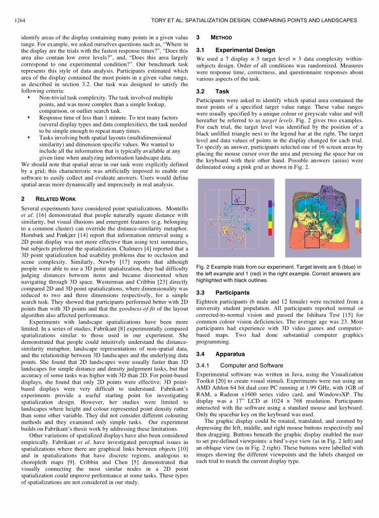
3.2 TaskParticipants were asked to identify which spatial area contained themost points of a specified target value range. These value rangeswere usually specified by a unique colour or greyscale value and willhereafter be referred to as target levels. Fig. 2 gives two examples.For each trial, the target level was identified by the position of ablack unfilled triangle next to the legend bar at the right. The targetlevel and data values of points in the display changed for each trial.To specify an answer, participants selected one of 16 screen areas byplacing the mouse cursor over the area and pressing the space bar onthe keyboard with their other hand. Possible answers (areas) weredelineated using a pink grid as shown in Fig. 2.
Fig. 2 Example trials from our experiment. Target levels are 5 (blue) inthe left example and 1 (red) in the right example. Correct answers arehighlighted with black outlines.
3.3 ParticipantsEighteen participants (6 male and 12 female) were recruited from auniversity student population. All participants reported normal orcorrected-to-normal vision and passed the Ishihara Test [15] forcommon colour vision deficiencies. The average age was 23. Mostparticipants had experience with 3D video games and computer-based maps. Two had done substantial computer graphicsprogramming.
3.4 Apparatus
3.4.1 Computer and Software
Experimental software was written in Java, using the VisualizationToolkit [20] to create visual stimuli. Experiments were run using anAMD Athlon 64 bit dual core PC running at 1.99 GHz, with 1GB ofRAM, a Radeon x1600 series video card, and WindowsXP. Thedisplay was a 17” LCD at 1024 768 resolution. Participantsinteracted with the software using a standard mouse and keyboard.Only the spacebar key on the keyboard was used.The graphic display could be rotated, translated, and zoomed by
depressing the left, middle, and right mouse buttons respectively andthen dragging. Buttons beneath the graphic display enabled the userto set pre-defined viewpoints: a bird’s-eye view (as in Fig. 2 left) andan oblique view (as in Fig. 2 right). These buttons were labelled withimages showing the different viewpoints and the labels changed oneach trial to match the current display type.
1264 TORY ET AL: SPATIALIZATION DESIGN: COMPARING POINTS AND LANDSCAPES

3.4.2 Stimuli
Each participant completed 105 experimental trials, representing allcombinations of 7 displays 5 target levels 3 data complexities.105 questions were created, each with a particular target level, set ofdata values, and one best answer. Target levels and data for eachquestion were selected at random. Each participant answered all 105questions, but different displays were randomly assigned to eachquestion for each person. Trials were presented in random order.Stimuli were created from a multidimensional environmental
dataset containing 5000 rows and 290 columns. We used real ratherthan synthetic data to ensure the spatializations were realistic.Participants were not told anything about the nature of the data. Thevalues in the table were normalized to range from 0 to 1, to ensureconsistent heights in the 3D landscapes. The entire dataset was laidout in 2D space using the MDSteer system for multidimensionalscaling [24] and then the 300 lowest stress points were selected foruse in the experiment. The number of points was chosen to make thetask challenging but still manageable in a short time.Positions of the points in 2D space remained constant throughout
all trials. For each trial, one of the 290 columns in the dataset wasselected, and the value for each point using this dimension wasdisplayed graphically using:• Point colour or greyscale (for point conditions),• Surface colour or greyscale (for all landscape conditions
except height-only), and / or• Surface height (for 3D landscape conditions).
Low values appeared as valleys in the 3D displays and as colours atthe bottom of the legend. Each of the 290 columns in the data set wasassigned a complexity value of low, medium, or high according tothe visual complexity of the display when that data column was used.Complexity was judged by visual inspection. Examples of the threecomplexity levels are shown in Fig. 3.
Low Medium High
Fig. 3 Examples of the three data complexity levels. Occlusionincreases with higher complexity levels for 3D displays.
For point-based displays, points were directly displayed and wereassigned a colour or greyscale level based on their data value. For theother displays, a graphic surface was created. For 3D displays, pointswere first moved to a height representing their data value. Pointswere then triangulated to create a surface and the surface wassmoothed to make it appear like continuous terrain. Contours wereextracted at the interpolated boundaries between target value ranges.Contours were shown using colour bands, greyscale bands, orcontour lines depending on landscape type. Points were coloured redin greyscale landscapes and black in the other landscapes. Pointcolour was chosen to maximize visibility.Greyscale levels ranged from black to white, with three
intermediate shades of grey. Colour scales used a five level hue scaleranging from red to blue. For coloured points, fully saturated colourswere used to maximize point visibility. However, for coloured 2Dand 3D landscapes the saturation was reduced to 0.75 because largepatches of highly saturated colour were hard on the eyes. Thesaturation difference can be seen in the colour legends of Fig. 2.Point-based displays and 2D landscapes were initially rendered
from a bird’s-eye viewpoint and 3D landscapes were initiallyrendered from an oblique viewpoint. These standard viewpoints are
shown in Fig. 2. Participants could change the viewpointinteractively through rotation / translation / zoom or by pressing thestandard viewpoint buttons.
3.5 ProcedureParticipants were first screened for colour blindness using theIshihara test [15]. They then filled in a questionnaire aboutdemographic information and computer experience, and reviewed aprinted tutorial that described the task, procedure, and instructions onhow to use the test system. The tutorial intentionally did not describethe data represented or how to interpret the displays. Participantswere shown all seven types of displays one by one, and at the sametime, they were asked to experiment with the corresponding displayin our test system. The experimenter ensured participants understoodand tried out all operations in the test system, repeating examples ifnecessary. Participants then started the test. Each test sessionconsisted of one practice session with 14 trials followed by three realsessions with 35 trials each. Trial order, including assignment tosessions, was random. Participants could ask questions during thepractice session, but not during the real sessions. Five-minute breakswere enforced between real sessions. After the testing wascompleted, participants rated the different displays on three criteriaand were encouraged to make comments about the task and displays.For each trial, participants were asked to be reasonably confident
in their answer, but to estimate the answer rather than count thepoints. Participants were told that their responses and response timeswere being recorded by the test system. Each trial began when theparticipant pressed an onscreen Ready button using the mouse, andended when the participant pressed the spacebar (with the mousecursor placed over a screen area to indicate the answer).
3.6 HypothesesOur primary hypotheses, based on our four major research questions,were as follows:H1: Landscapes would be slower than points.H2: When data was encoded by a single variable in a landscape,colour would be the best, followed by greyscale. Height would be theworst.H3: Redundantly encoding data using height plus either colour orgreyscale would be less effective than single encoding using colouror greyscale, respectively. In particular, redundant encoding wouldincrease response time with no increase in accuracy.H4: Colour would be faster and more accurate than greyscale for alldisplay types.
We also had the following secondary hypotheses:H5a: Low and high target levels would be faster and more accuratethan middle target levels.H5b: Differences between target levels would be greatest forgreyscale conditions and 3D conditions.H6a: Higher data complexity would increase errors and responsetime.H6b: Differences between data complexity levels would be greatestfor the 3D conditions.
4 RESULTS
Results were analyzed statistically using repeated measures analysisof variance (ANOVA) followed by Bonferroni-corrected pairwisecomparisons. In approximately 1% of trials, landscape colouring didnot render correctly; data for these trials were replaced with the meanvalues for the series. One participant did not completely fill in thequestionnaire; this participant’s rating data was discarded. Data wastransformed using a natural log or square root when this improvedthe fit to a normal curve. When Mauchly’s Test of Sphericityindicated it was necessary, we used the Huynh-Feldt correction.Factors in the analysis were display (7 display types), target level (5levels), and landscape complexity (3 levels). Target level 1 was thebottom and level 5 was the top. We used paired-samples t-tests to
1265IEEE TRANSACTIONS ON VISUALIZATION AND COMPUTER GRAPHICS, VOL. 13, NO. 6, NOVEMBER/DECEMBER 2007

compare 3D to 2D (for coloured and greyscale landscapes), and tocompare the two colour scales (greyscale and colour). Below wedescribe the most interesting results. ANOVA results are given intables with F, p, degrees-of-freedom (DOF), and 2
p values. Post-hoctests are indicated by p-values only. Many post-hoc test results havebeen aggregated with only the largest p-value given.
4.1 Response TimeMean response time for each display / target level combination isshown in Fig. 4. Overall statistical results are shown in Table 1.
Fig. 4 Mean reponse time for displays with each target level.
Table 1. Statistical Results for Response Time
Effect F DOF p 2p
Display 123.6 6, 102 < 0.001 0.88Target Level 77.8 4, 68 < 0.001 0.82Complexity 108.7 2, 34 < 0.001 0.87
Display * Target Level 2.7 19.6,332.5
< 0.001 0.14
Complexity * Target Level 10.2 8, 136 < 0.001 0.38Complexity * Display *Target Level
1.5 28.5,485.5
0.043 0.08
All displays were significantly different from all others (p0.04), except that 3D colour was not significantly different from 2Dgreyscale. Coloured points were the fastest, followed by greyscalepoints and 2D coloured landscapes. Height-only was the slowest.Colour was significantly faster than greyscale (t=7.2, df=17,p<0.001). When considering only the coloured and greyscalelandscapes (blue and orange lines in Fig. 4), 2D landscapes werefaster than 3D (t=7.5, df=17, p<0.001).Response time was faster for the highest and lowest value ranges.
All target levels were significantly different from all others (p0.05), except 1 and 5 (top and bottom levels) and 3 and 4 (middlelevels). However, this trend was not consistent across all displaytypes. As shown in Fig. 4, the differences between target levels werelargest for 3D displays, smaller for 2D displays and greyscale points,and very small for coloured points. Response time also increasedwith increasing data complexity, with all complexity levelssignificantly different from each other overall (p < 0.001, data notshown). This trend did not vary significantly with display type, butwe note that complexity appeared to have a smaller effect oncoloured points than on the other displays.
4.2 ErrorsWe considered the following measures of trial error (whereAN = number of points of the target level in the participant’s answer,BN = number of points of the target level in the best answer, andTN = total number of points of the target level in the whole display):
• Binary: whether the best answer was selected or not• Percent from best = 100% |(AN – BN) | / BN• Difference over total = 100% |(AN – BN)| / TN
All measures resulted in the same overall trends, providingconfidence in their validity. We therefore conducted a statisticalanalysis only on percent from best. Intuitively, this measures thepercentage difference (in the number of target points) between thegiven answer and the correct answer. Mean error (percent from best)for each display / target level combination is shown in Fig. 5, andmean error for each display / data complexity combination is shownin Fig. 6. Overall statistical results are shown in Table 2.
Fig. 5 Mean error level (percent from best) of the displays with eachtarget level.
Fig. 6 Mean error level (percent from best) for each display type withlow, medium, and high data complexities. Error bars show 95%confidence intervals.
Coloured points and greyscale points had significantly lowererror levels overall than the other display conditions (p 0.004).Colour had significantly lower error than greyscale (t=2.3, df=17,p=0.035). Error levels were higher for target levels in the middle ofthe scale (middle value ranges), with all target levels significantlydifferent from each other (p 0.043), except that level 1 was notsignificantly different from level 5, and level 3 was not significantlydifferent from level 4. This trend occurred only for the landscapes(not for points), as shown in Fig. 5. Overall, the error level increasedwith increasing landscape complexity, as shown by the differentshades of blue in Fig. 6. All complexity levels were significantlydifferent (p 0.022). Significant differences between complexitylevels did not occur for points, but occurred for all landscape-styledisplays (p 0.038). Of the landscapes, complexity had the smallest
1266 TORY ET AL: SPATIALIZATION DESIGN: COMPARING POINTS AND LANDSCAPES
effect on 3D colour. Only the lowest and highest complexity levelswere significantly different for the 3D colour display.
Table 2. Statistical Results for Error
Effect F DOF p 2p
Display 21.2 4.6, 79 < 0.001 0.56Target Level 31.3 4, 68 < 0.001 0.65Complexity 44.7 2, 34 < 0.001 0.72Display * Complexity 3.8 12, 204 < 0.001 0.18
Display * Target Level 2.5 17.0,289.1
0.001 0.13
Complexity * Target Level 9.6 7.6, 129 < 0.001 0.36Complexity * Display *Target Level
1.5 35.1,596.6
0.027 0.08
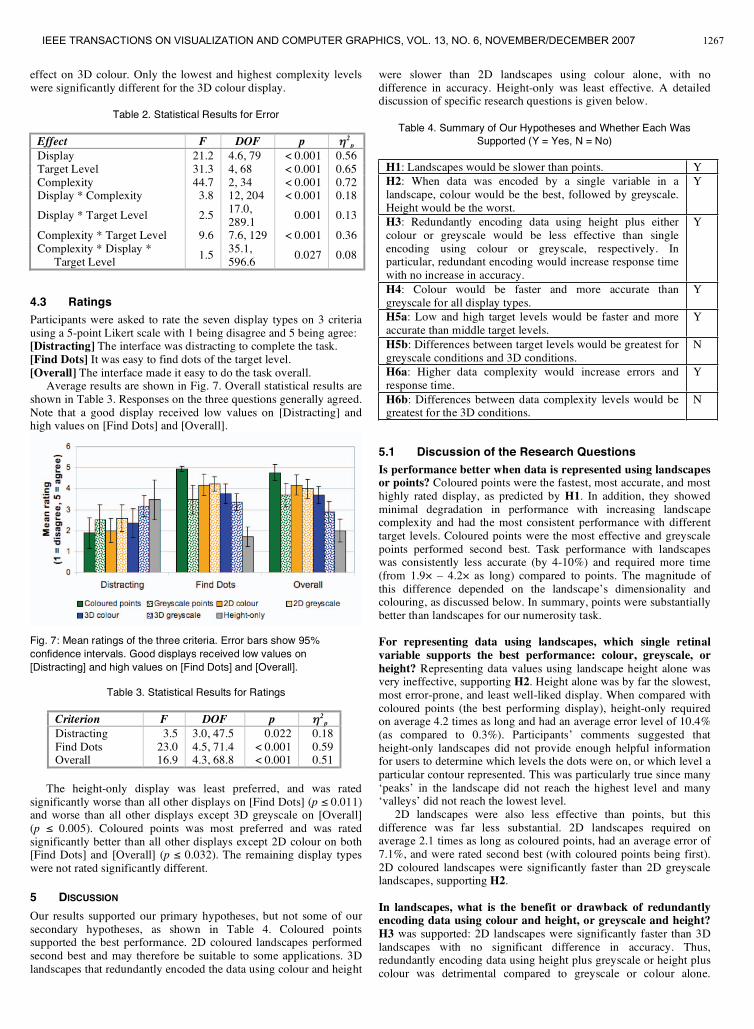
4.3 RatingsParticipants were asked to rate the seven display types on 3 criteriausing a 5-point Likert scale with 1 being disagree and 5 being agree:[Distracting] The interface was distracting to complete the task.[Find Dots] It was easy to find dots of the target level.[Overall] The interface made it easy to do the task overall.Average results are shown in Fig. 7. Overall statistical results are
shown in Table 3. Responses on the three questions generally agreed.Note that a good display received low values on [Distracting] andhigh values on [Find Dots] and [Overall].
Fig. 7: Mean ratings of the three criteria. Error bars show 95%confidence intervals. Good displays received low values on[Distracting] and high values on [Find Dots] and [Overall].
Table 3. Statistical Results for Ratings
Criterion F DOF p 2p
Distracting 3.5 3.0, 47.5 0.022 0.18Find Dots 23.0 4.5, 71.4 < 0.001 0.59Overall 16.9 4.3, 68.8 < 0.001 0.51
The height-only display was least preferred, and was ratedsignificantly worse than all other displays on [Find Dots] (p 0.011)and worse than all other displays except 3D greyscale on [Overall](p 0.005). Coloured points was most preferred and was ratedsignificantly better than all other displays except 2D colour on both[Find Dots] and [Overall] (p 0.032). The remaining display typeswere not rated significantly different.
5 DISCUSSION
Our results supported our primary hypotheses, but not some of oursecondary hypotheses, as shown in Table 4. Coloured pointssupported the best performance. 2D coloured landscapes performedsecond best and may therefore be suitable to some applications. 3Dlandscapes that redundantly encoded the data using colour and height
were slower than 2D landscapes using colour alone, with nodifference in accuracy. Height-only was least effective. A detaileddiscussion of specific research questions is given below.
Table 4. Summary of Our Hypotheses and Whether Each WasSupported (Y = Yes, N = No)
H1: Landscapes would be slower than points. YH2: When data was encoded by a single variable in alandscape, colour would be the best, followed by greyscale.Height would be the worst.
Y
H3: Redundantly encoding data using height plus eithercolour or greyscale would be less effective than singleencoding using colour or greyscale, respectively. Inparticular, redundant encoding would increase response timewith no increase in accuracy.
Y
H4: Colour would be faster and more accurate thangreyscale for all display types.
Y
H5a: Low and high target levels would be faster and moreaccurate than middle target levels.
Y
H5b: Differences between target levels would be greatest forgreyscale conditions and 3D conditions.
N
H6a: Higher data complexity would increase errors andresponse time.
Y
H6b: Differences between data complexity levels would begreatest for the 3D conditions.
N
5.1 Discussion of the Research QuestionsIs performance better when data is represented using landscapesor points? Coloured points were the fastest, most accurate, and mosthighly rated display, as predicted by H1. In addition, they showedminimal degradation in performance with increasing landscapecomplexity and had the most consistent performance with differenttarget levels. Coloured points were the most effective and greyscalepoints performed second best. Task performance with landscapeswas consistently less accurate (by 4-10%) and required more time(from 1.9 – 4.2 as long) compared to points. The magnitude ofthis difference depended on the landscape’s dimensionality andcolouring, as discussed below. In summary, points were substantiallybetter than landscapes for our numerosity task.
For representing data using landscapes, which single retinalvariable supports the best performance: colour, greyscale, orheight? Representing data values using landscape height alone wasvery ineffective, supporting H2. Height alone was by far the slowest,most error-prone, and least well-liked display. When compared withcoloured points (the best performing display), height-only requiredon average 4.2 times as long and had an average error level of 10.4%(as compared to 0.3%). Participants’ comments suggested thatheight-only landscapes did not provide enough helpful informationfor users to determine which levels the dots were on, or which level aparticular contour represented. This was particularly true since many‘peaks’ in the landscape did not reach the highest level and many‘valleys’ did not reach the lowest level.2D landscapes were also less effective than points, but this
difference was far less substantial. 2D landscapes required onaverage 2.1 times as long as coloured points, had an average error of7.1%, and were rated second best (with coloured points being first).2D coloured landscapes were significantly faster than 2D greyscalelandscapes, supporting H2.
In landscapes, what is the benefit or drawback of redundantlyencoding data using colour and height, or greyscale and height?H3 was supported: 2D landscapes were significantly faster than 3Dlandscapes with no significant difference in accuracy. Thus,redundantly encoding data using height plus greyscale or height pluscolour was detrimental compared to greyscale or colour alone.
1267IEEE TRANSACTIONS ON VISUALIZATION AND COMPUTER GRAPHICS, VOL. 13, NO. 6, NOVEMBER/DECEMBER 2007

Cognitive complexity of 3D displays may have contributed to thedifference [23], but the most likely cause is occlusion. In 3Dlandscapes, the user needed to rotate the display to alleviateocclusion. This need to rotate was partially caused by the defaultoblique viewpoint. However, using a bird’s eye viewpoint wouldhave made the default 3D landscape appear very similar to the 2Dlandscape and seemed like an unnatural initial view. These problemsappear to outweigh any potential benefit of redundant encoding.Five participants developed an unexpected strategy for dealing
with occlusion in the 3D landscapes. These participants sometimesrotated the landscape approximately 180 degrees around thehorizontal axis, so they could view the landscape upside down.Turning the ‘hills’ into ‘valleys’ in this way sometimes made iteasier to see details, particularly in complex landscapes. Thisexample illustrates the awkward workarounds that participants findfor dealing with non-optimal display conditions.
Does a colour scale or greyscale support better performance fortasks where users need to focus on a specific range ofquantitative data? A hue scale was better overall for ournumerosity task, supporting H4. Colour scale displays weresignificantly faster and more accurate than greyscale. Our taskrequired users to focus on a particular data range. This is easiestwhen points in the range are pre-attentively distinct from otherpoints, which is most easily done using colour. These resultsemphasize that choosing an optimal colour scale depends more onthe user’s task than on the data type.Preference differences between colour and greyscale were
greatest for point-based displays, moderate for 3D landscapes, andsmall for 2D landscapes. Participants’ comments suggest that thegreyscale levels were harder to distinguish in small points than in thelarge grey areas of the 2D landscapes. For example, one participantcommented, “It was hard to distinguish dark grey [dots] from black[dots]”. Greyscales were also problematic in 3D landscapes becausegrey levels were confounded with surface shading. Surface shadingcould not simply be eliminated because prior research has indicatedit is important for understanding 3D landscapes [8].
How do target level and data complexity affect performance withdifferent spatializations? Overall, performance was higher with lowand high target levels compared to middle levels, supporting H5a.We expect this occurred because the user could simply look forpeaks or valleys. Performance also degraded with increasing datacomplexity, supporting H6a. However, our data did not supporthypotheses H5b and H6b. H5b predicted that differences betweentarget levels would be greatest for greyscale conditions (wheredistinguishing middle greyscale values may be more difficult thanblack or white) and 3D conditions (where peaks appear as physicalhills). Instead, target level affected all landscapes, not just 3D andgreyscale ones. Similarly, H6b predicted that differences betweendata complexity levels would be greatest for 3D conditions becauseof occlusion. Performance with 3D landscapes did vary with thisfactor, as expected, but performance with 2D landscapes alsodegraded significantly. Consequently our predictions that 2D wouldbe more tolerant than 3D to changes in target level and datacomplexity were not supported. Notably, only point displays seemedunaffected by changes in the target level and data complexity. Highand low target levels do not have emergent features (i.e. peaks andvalleys) for point displays. The tolerance of point displays to changesin data complexity suggests that points could be processed in parallelwhen estimating numerosity within spatial regions.
5.2 Colour DesignOur result that points were very effective agrees with Healey et al.’sstudy [12], which demonstrated that estimating numerosity ofcoloured points is pre-attentive. Our experiment further suggests thatestimating numerosity may not be pre-attentive with backgroundcolouring. Several possible explanations could account for thisdifference. We initially thought that large patches of colour might be
easier to perceive than small points of colour. Although large patchesmay attract the eye, this may be counter-intuitive for the task sincepeople might naturally search for large patches, when the sizeprovides no information about the number of points. In addition,identifying points of the target range and estimating their numbermay require two separate steps when the surface is coloured, but maybe done in parallel when the points are coloured. Additionally, datavalues were ambiguous in landscapes when the points were on ornear a colour boundary, whereas point colour was unambiguous.Although points supported superior performance, we found a
qualitative advantage for landscapes when a greyscale was used. Inparticular, participants found it easier to judge grey levels of largepatches on the landscape surface than on small points.We considered many colour scale options for this study. Since the
data covers a continuous range, we initially planned to compare acontinuous, isoluminant colour scale to a continuous greyscale.However, our pilot analysis revealed that most queries involvedfocusing on points within a range of values, a task that is easier witha segmented, non-isoluminant colour map [22]. We might have alsosegmented the height variable, but felt that choppy “terraced”landscapes would look unnatural. As a result, we essentially showedcategorical data using colour but continuous data using height. Thismismatch did not appear to confuse participants, but may be an issueto explore in future studies, along with continuous colour maps. Wealso note that in real practice, we would expect users to set upcustom segmented colour maps with thresholds appropriate for theirtask, rather than our five equally-spaced bins, perhaps by alternatingbetween continuous and categorical colouring.
5.3 Choice of Benchmark TaskChoice of benchmark tasks is often a difficult issue affecting thegenerality of the results. We modelled our task on a mental operationwhere people identify areas containing many points within a valuerange. Among other criteria, we chose this task because it occurredfrequently during a pilot analysis of how people use spatializationtools. This frequency, and the fact that the task must be performedmentally and often several times in quick succession, suggested thatthis task would substantially affect many higher-level activities.However, we recognize that tasks of a different nature may be
better suited to landscapes. Specifically, landscapes can show acontinuous distribution of values across the data space, not just thevalues at discrete data points. For this reason, landscapes may bebeneficial for tasks involving this type of derived information.Examples might include understanding the ‘shape’ of a data space,such as its ‘peakiness’ or slope, remembering this shape, andidentifying points in areas with different shapes. In addition, surfacecolour could be useful for judging the size of a spatial areacontaining points with similar values, or the number of large areaswith a given value range. Landscapes may also provide better spatialcontext, such as whether points are in a peak or valley.Our benchmark task may be construed as having a bias toward
point spatializations. We contend that the mental operations used inour task would be performed frequently in many types of high-levelanalysis. For this type of operation, point spatializations have theinherent advantage of representing data values directly. Somelandscapes had a small performance cost, and might be worthconsidering when the high-level task involves analyzing the shape ofthe data space. Further research is needed to validate whetherlandscapes provide better performance when analyzing derivedinformation, and to determine when these benefits are worthwhile,considering the performance cost for some basic mental operations.
5.4 Additional LimitationsWe did not tell participants what the data represented and did notexplain how to interpret the displays, to assess whether the displayswere understood intuitively. Consequently, results could change forcomplicated tasks or specific user populations, particularly usersexperienced with visual data analysis. Our experiment was also
1268 TORY ET AL: SPATIALIZATION DESIGN: COMPARING POINTS AND LANDSCAPES
limited to a relatively small number of points. Landscapes may beworth considering with more points, particularly when the numberexceeds the display resolution so that points overlap. Futureexperiments should examine these factors. In addition, ourexperiment only considered landscapes derived from data valuesthemselves. Landscapes derived from the density of points, such asThemescape [25], may be interpreted differently. This is particularlytrue since point density would be redundantly encoded by thelandscape and the point positions, whereas in our experiment datavalues were sometimes singly encoded by the landscape.Information landscapes also have the potential to display at least
two variables simultaneously by encoding one using height and oneusing colour or greyscale, a condition that was not tested in ourstudy. Our results suggest that encoding two variables in this wayshould be done with great caution since error levels were high whendata was encoded using landscape surface properties, especiallyheight. Representing two variables in a landscape display – one usingheight and one using surface colour – can be expected to be evenmore perceptually complex, and may allow only approximatejudgements about each variable. It is also not clear whetherunmatched height and surface colour values would be confusing.
6 CONCLUSION AND FUTUREWORK
We presented an experiment comparing different methods of visuallyrepresenting spatializations, to determine which representations arebetter for a non-trivial search task. Our results demonstrated thatpoint-based displays were substantially more effective thanlandscapes. Landscape-style representations varied in theireffectiveness. Performance was better with 2D than 3D landscapes,so little or no benefit was found for redundantly encoding data usingcolour and height or greyscale and height. Height-only 3Dlandscapes were by far the least effective. A colour scale was foundto be better than a greyscale for all display types, but a greyscale washelpful compared to no colour scale at all (height-only).We plan to conduct further studies that compare different
spatialization designs for additional abstract tasks as well as higher-level tasks. We also plan to explore methods of representing multiplevariables in a spatialization. The current experiment provides auseful starting point for these future investigations, and shouldprovide valuable information to inform spatialization design.
ACKNOWLEDGEMENTS
This work was supported by a grant from the Natural Sciences andEngineering Research Council of Canada (NSERC).
REFERENCES
[1] U. Bischoff, N. Diakopoulos, F. Lösch, and Y. Zhou. ThemeExplorer:A Tool for Understanding the History of the Field of InformationVisualization. InfoVisFun 2004, October 2004.
[2] U. Brandes and T. Willhalm. Visualization of bibliographic networkswith a reshaped landscape metaphor. In Proceedings of the Symposiumon Data Visualization (VisSym ’02), pages 159-164, 2002.
[3] C.M. Carswell and C.D. Wickens. Information integration and theobject display: and interaction of task demands and display superiority.Ergonomics, 30(3): 511-527, 1987.
[4] M. Chalmers. Using a landscape metaphor to represent a corpus ofdocuments. In Proceedings of the European Conference on SpatialInformation Theory (COSIT '93), volume 716 of Lecture Notes inComputer Science, pages 377-390, September 1993.
[5] T. Cribbin and C. Chen. Visual-spatial exploration of thematic spaces: acomparative study of three visualisation models. In Electronic Imaging2001: Visual Data Exploration and Analysis VIII, pages 199--209,January 2001.
[6] A. Cockburn and B. McKenzie. Evaluating the effectiveness of spatialmemory in 2D and 3D physical and virtual environments. InProceedings of the SIGCHI Conference on Human Factors inComputing Systems (CHI '02), pages 203-210, April 2002.
[7] F.H. Durgin (1995). Texture density adaptation and the perceivednumerosity and distribution of texture. In Journal of ExperimentalPsychology: Human Perception and Performance, volume 21, pages149-169, 1995.
[8] S. I. Fabrikant. Spatial metaphors for browsing large data archives.Ph.D. thesis. University of Colorado-Boulder, Boulder, CO, 2000.
[9] S.I. Fabrikant, D.R. Montello, and D.M. Mark. The distance-similaritymetaphor in region-display spatializations. IEEE Computer Graphicsand Applications, 26(4): 34-44, July/August 2006.
[10] S.I. Fabrikant, D.R. Montello, M. Ruocco, and R.S. Middleton. Thedistance-similarity metaphor in network-display spatializations.Cartography and Geographic Information Science, 31(4): 237-252,2004.
[11] M. Granitzer, W. Kienreich, V. Sabol, K. Andrews, and W. Klieber.Evaluating a system for interactive exploration of large, hierarchicallystructured document repositories. In Proceedings of the IEEESymposium on information Visualization (InfoVis'04), pages 127-134,October 2004.
[12] C.G. Healey, K.S. Booth, and J.T. Enns. High-speed visual estimationusing preattentive processing. ACM Transactions on Computer-HumanInteraction, 3(2): 107-135, 1996.
[13] E. Hetzler and A. Turner. Analysis experiences using informationvisualization. IEEE Computer Graphics and Applications, 24(5): 22-26,September 2004.
[14] K. Hornbæk and E. Frøkjær. Do thematic maps improve informationretrieval? In the Seventh IFIP Conference on Human-ComputerInteraction (INTERACT'99), pages 179-186, August 1999.
[15] S. Ishihara. Ishihara’s test for colour blindness. Found athttp://www.toledo-bend.com/colorblind/Ishihara.html, 2007.
[16] D.R. Montello, S.I. Fabrikant, M. Ruocco, and R.S. Middleton. Testingthe First Law of Cognitive Geography on Point-Display Spatializations.In Proceedings of the Conference on Spatial Information Theory(COSIT '03), pages 316-331, September 2003.
[17] G. B. Newby. Empirical study of a 3D visualization for informationretrieval tasks. Journal of Intelligent Information Systems, 18(1):31-53,January 2002.
[18] L. Nowell, R. Schulman, and D. Hix. Graphical Encoding forInformation Visualization: An Empirical Study. In Proceedings of theIEEE Symposium on Information Visualization (InfoVis'02), pages 43-50, October 2002.
[19] B.E. Rogowitz and L.A. Treinish. How not to lie with visualization.Computers in Physics, 10(3): 268-274, May/June 1996.
[20] W. Schroeder, K. Martin, and W. Lorensen. The Visualization Toolkit,Prentice Hall PTR, second edition, 1998.
[21] R. Spence. Information Visualization, Addison Wesley Publishers, firstedition, 2000.
[22] C. Ware. Information Visualization: Perception for Design. MorganKaufmann Publishers, second edition, 2004.
[23] S.J. Westerman and T. Cribbin. Mapping semantic information invirtual space: dimensions, variance and individual differences.International Journal of Human Computer Studies, 53(5): 765-787,November 2000.
[24] M. Williams and T. Munzner. Steerable, progressive, multidimensionalscaling. In Proceedings of the IEEE Symposium on InformationVisualization (InfoVis'04), pages 57-64, October 2004.
[25] J. A. Wise, J.J. Thomas, K. Pennock, D. Lantrip, M. Pottier, A. Schur,and V. Crow. Visualizing the non-visual: spatial analysis and interactionwith information from text documents. In Proceedings of the IEEESymposium on Information Visualization (InfoVis'95), pages 51-58,October 1995.
1269IEEE TRANSACTIONS ON VISUALIZATION AND COMPUTER GRAPHICS, VOL. 13, NO. 6, NOVEMBER/DECEMBER 2007