Section 2: Tips and Tricks for More Impact - | PARIS21
102
Operationalizing CD4.0 in the Philippines: Capacity development to strengthen subnational gender statistics for community-based SDGs monitoring Section 2: Tips and Tricks for More Impact Philippine Statistical Research and Training Institute Josefina V. Almeda, Ph.D. Head/Executive Director III Philippine Statistical Research and Training Institute Associate Professor 5 School of Statistics, UP Diliman 24-26 November 2020
-
Upload
khangminh22 -
Category
Documents
-
view
1 -
download
0
Transcript of Section 2: Tips and Tricks for More Impact - | PARIS21

Data Visualization Using Infographics – Engaging the Public
Operationalizing CD4.0 in the Philippines: Capacity development to strengthen subnational
gender statistics for community-based SDGs monitoring
Section 2: Tips and Tricks for More Impact
Philippine Statistical Research and Training Institute
Josefina V. Almeda, Ph.D.Head/Executive Director III
Philippine Statistical Research and Training Institute Associate Professor 5
School of Statistics, UP Diliman
24-26 November 2020

Data Visualization Using Infographics – Engaging the Public
GRAPHICAL
PRESENTATION

Data Visualization Using Infographics – Engaging the Public
USES OF GRAPHS
Communicates the numerical figures found in tables
Reveals probable relationships among variables
Compares different series or groups
Validate conclusions made in the study
3

4
TYPES OF STATISTICAL CHARTS
Line Chart
Column Chart
Horizontal Bar Chart
Doughnut Chart
Pictograph
StatisticalMap
Pie Chart
Radar Chart

Data Visualization Using Infographics – Engaging the Public

Data Visualization Using Infographics – Engaging the Public

Data Visualization Using Infographics – Engaging the Public
LINE CHART
For time series data
Emphasis is on the movement
Shows trends, patterns, forecasts
Applicable for one or more time series data for comparison purposes
Variable of interest is placed on the vertical axis and the time period on the horizontal axis
7

Data Visualization Using Infographics – Engaging the Public 8
Chart Title
Grid Line
Axis Scale Figures
Source Note
Parts of a Line Chart
Border of Plot Area
Border of Chart Area
Axis Title
LINE CHART: PARTS
0
5
10
15
20
25
30
35
2006 2007 2008 2009 2010 2011 2012 2013 2014 2015 2016 2017 2018
%
Figure 1: Percentage of Youth 15-24 years old Not in Education and Not in Employment by Sex Philippines, 2006-2018
WOMEN
MEN
Source: Philippine Statistics Authority

Data Visualization Using Infographics – Engaging the Public

Data Visualization Using Infographics – Engaging the Public
SIMPLE LINE CHART
• Only one curve and appropriate for one series of time data
10
0
5
10
15
20
25
30
35
40
45
50
2010 2011 2012 2013 2014 2015 2016 2017 2018
Nu
mb
er o
f P
erso
ns
(in
10
0,0
00
)
Source: Philippine Statistics Authority
Figure 2. Number of Unemployed Persons in the Philippines: 2010-2018
Year No.
2010 4,432,341
2011 4,332,740
2012 4,408,950
2013 4,404,672
2014 4,228,852
2015 4,091,157
2016 3,746,875
2017 3,987,933
2018 3,777,995
Table 1: No. of Unemployed Persons Philippines: 2010-2018

Data Visualization Using Infographics – Engaging the Public
MULTIPLE LINE CHART• Two or more curves and used to compare the trends in two or more
time series data
11
0
2
4
6
8
10
12
14
2012 2013 2014 2015 2016 2017 2018
No
. of
veh
icle
s, p
erm
its,
an
d li
cen
ses
(in
Mill
ion
s)
Figure 3. Number of Government Employees by Sex in Country A 2012-2018
Men
Women
Year Men Women2012 7,463,393 4,553,272 2013 7,690,038 4,825,584 2014 8,081,224 5,214,352 2015 8,706,607 5,626,046 2016 9,251,565 5,875,732 2017 10,410,814 6,627,549 2018 11,595,434 7,436,731
Table 2. Number of Government Employees by Sex in Country A: 2012-2018
Data Visualization Using Infographics – Engaging the Public
LINE CHART

Data Visualization Using Infographics – Engaging the Public13
0
5
10
15
20
1 2 3 4 5 6 7 8 9 10
TIME
Sa
les in
Mill
ion
s
0
5
10
15
20
1 2 3 4 5 6 7 8 9 10
TIME
Sa
les in
Mill
ion
s
Good Grid Proportions
0
5
10
15
20
1 2 3 4 5 6 7 8 9 10
TIME
Sal
es in
Milli
ons
Figure 4CFigure 4A
Figure 4B
Ratio of height to width should be 2:3 or 3:4

Data Visualization Using Infographics – Engaging the Public
GRIDLINES

Data Visualization Using Infographics – Engaging the Public
MAKE THE LINE THE RIGHT THICKNESS

Data Visualization Using Infographics – Engaging the Public
SEPARATE DATA SERIES
Country A Country B
Country C Country D

Data Visualization Using Infographics – Engaging the Public
USE DIRECT LABELLING
Country A
Country B
Country C
GOOD BETTER

Data Visualization Using Infographics – Engaging the Public
USE ANNOTATION
• Helps the reader understand how to read or use the chart
• It guides the reader through the content.
1
2
1 Point one: Description of text of this annotation
2 Point two: Description of text of this annotation
Data Visualization Using Infographics – Engaging the Public 19
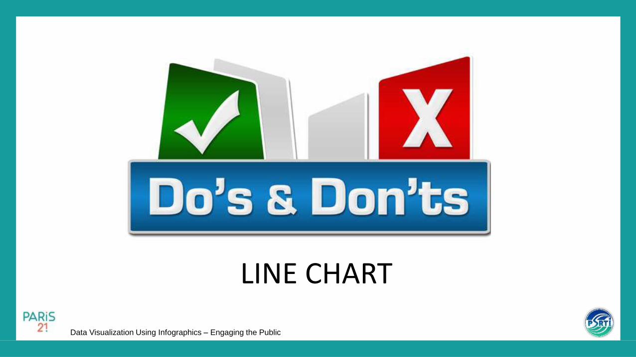
Guidelines for Axis Value or Category
0
5
10
15
2012 2013 2014 2015 2016 2017 2018
No
. of
emp
loye
es
(in
Mill
ion
s)
Figure 5A. Number of Government Employees by Sexin Country A: 2012-2018
Men
Women
0
2
4
6
8
10
12
14
2012 2013 2014 2015 2016 2017 2018
No
. of
emp
loye
es
(in
Mill
ion
s)
Figure 5B. Number of Government Employees by Sex in Country A: 2012-2018
Men
Women
USE EASY MULTIPLES FOR SCALE VALUES
• Use multiples of five or other easy to work with multiples for scale values

Data Visualization Using Infographics – Engaging the Public 20
Guidelines for Axis Value or Category
For big scale values, limit the number of digits of the axis values to one or two, then; place the unit of measurement in the axis title
With at most two digits on the scale figuresActual figures displayed on the scale
0
2000000
4000000
6000000
8000000
10000000
12000000
14000000
2012 2013 2014 2015 2016 2017 2018
no
. of
emp
loye
es
Figure 6A. Number of Government Employees by Sex in Country A: 2012-2018
Men
Women
0
2
4
6
8
10
12
14
2012 2013 2014 2015 2016 2017 2018
no
. of
emp
loye
es
(in
mill
ion
s)
Figure 6B. Number of Government Employees by Sexin Country A: 2012-2018
Men
Women
NUMBER OF DIGITS OF AXIS VALUES

Data Visualization Using Infographics – Engaging the PublicDate 21
Guidelines for Axis Value or Category
51.9
52
52.1
52.2
52.3
52.4
52.5
52.6
52.7
1 2 3 4 5
Exch
ange
Rat
e
Day
Figure 7A. Peso Dollar Exchange Rate
Axis value of the vertical axis starts with zero for line chart
0
10
20
30
40
50
60
1 2 3 4 5
Exch
ange
Rat
eDay
Figure 7B. Peso Dollar Exchange Rate
AXIS VALUE OF THE VERTICAL AXIS

Data Visualization Using Infographics – Engaging the Public 22
If there is a need for the upper part of the coordinate fields to portray the data, still retain the zero but exclude the lower part of the figures by putting a break on the vertical scale
VERTICAL AXIS BREAK

Data Visualization Using Infographics – Engaging the Public
LINE DRAWING CHARTS

Data Visualization Using Infographics – Engaging the Public

Data Visualization Using Infographics – Engaging the Public
COMPARING VALUE
CHANGES FAIRLY
• A value increase of 20 to 40 isn’t the same as a value increase of 100 to 120. The first increase has doubled (100%), while the latter has only increased by 20%.
• However, when you visualise the absolute values in a graph, you don’t see much of a performance difference.
Year Country A Country B
1 USD 20 USD 100
2 USD 40 USD 120
% change +100% +20%
0
20
40
60
80
100
120
Year 1 Year 2
Country B
Country A

Data Visualization Using Infographics – Engaging the Public
COMPARING VALUE
CHANGES FAIRLY
• Better to plot the data based on the percentage changes in order to better illustrate the amount of change between values (in this example it’s the % change between two years).
Year Country A Country B
1 USD 20 USD 100
2 USD 40 USD 120
% change +100% +20%
0%
20%
40%
60%
80%
100%
Year 1 Year 2
Country B
Country A

Data Visualization Using Infographics – Engaging the Public
DATA MISSING
• With Line Graphs, you can simply not plot the point and instead connect the line between points that do exist in the data.
• Bare in mind though, that if you have too many data points missing, then it’s best to not draw the chart at all.
0
20
40
60
80
Jan Feb Mar Apr May Jun Jul Aug Sep Oct Nov Dec

Data Visualization Using Infographics – Engaging the Public
Data Visualization Using Infographics – Engaging the Public
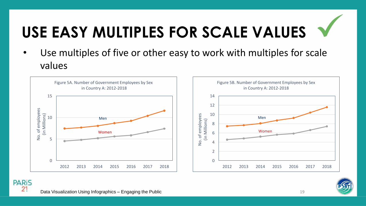
COLUMN CHART
For time series data
Shows change over time by comparing column lengths.
Compares the magnitudes of the variable in the Y-axis for the different categories of variable in the X-axis
Emphasis is on the magnitude
29

Data Visualization Using Infographics – Engaging the Public 30
Chart title
Source note
Data Label
Plot area border
Chart area border
44 43 44 44 42 41
37 40
38
0
5
10
15
20
25
30
35
40
45
50
2010 2011 2012 2013 2014 2015 2016 2017 2018
NU
MB
ER IN
10
0,0
00
SOURCE: PHILIPPINE STATISTICS AUTHORITY
Figure 8. Number of Unemployed Persons Philippines: 2010-2018
Axis title
PARTS OF A COLUMN CHART

Data Visualization Using Infographics – Engaging the Public
Data Visualization Using Infographics – Engaging the Public
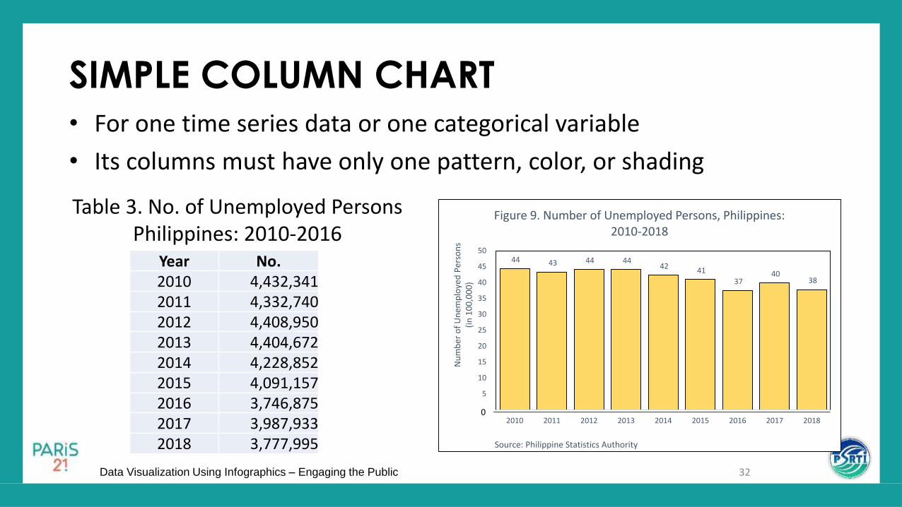
SIMPLE COLUMN CHART• For one time series data or one categorical variable
• Its columns must have only one pattern, color, or shading
32
44 43 44 44 42
41
37 40
38
-
5
10
15
20
25
30
35
40
45
50
2010 2011 2012 2013 2014 2015 2016 2017 2018
Nu
mb
er o
f U
nem
plo
yed
Per
son
s (i
n 1
00
,00
0)
Source: Philippine Statistics Authority
Figure 9. Number of Unemployed Persons, Philippines: 2010-2018
0
Year No.2010 4,432,3412011 4,332,7402012 4,408,9502013 4,404,6722014 4,228,8522015 4,091,1572016 3,746,8752017 3,987,9332018 3,777,995
Table 3. No. of Unemployed Persons Philippines: 2010-2016

Data Visualization Using Infographics – Engaging the Public
GROUPED COLUMN CHART• Compares 2 or more time series data by using different colors,
shading, or patterns
33
Year Open Dump Controlled Dump
2004 1,500 590
2005 1,610 620
2006 1,380 780
2007 1,470 560
2008 1,350 530
2009 1,680 790
2010 1,580 760
2011 1,290 760
2012 1,210 680
2013 1,200 640
2014 1,170 630
2015 700 410
2016 740 260
2017 590 180
Table 4: No. of Solid Waste Disposal Facilities, Philippines2004-2017
2004 2005 2006 2007 2008 2009 2010 2011 2012 2013 2014 2015 2016 2017
Open Dump 1,500 1,610 1,380 1,470 1,350 1,680 1,580 1,290 1,210 1,200 1,170 700 740 590
Controlled Dump 590 620 780 560 530 790 760 760 680 640 630 410 260 180
0
200
400
600
800
1,000
1,200
1,400
1,600
1,800
No
. of
Faci
litie
s
Figure 10. Number of Solid Waste Disposal Facilities Philippines: 2004-2017

Data Visualization Using Infographics – Engaging the Public
SUBDIVIDED COLUMN CHART• Shows the component parts of a series of values
• Uses different colors to show the different components of the column
34
0
5
10
15
20
25
30
35
40
45
50
2010 2011 2012 2013 2014 2015 2016 2017Ave
rage
No
. of
Emp
loye
es (
in T
ho
usa
nd
s)
Source: DENR
Figure 11. Average Number of Employees by Sex in Major-Forest-Based Industries, Philippines:
2010-2017
Female
Male
YearAverage Number of Employees
Men Women2010 25,679 7,8202011 23,022 5,1632012 32,182 11,3912013 21,333 7,3662014 18,524 5,5402015 8,256 2,8612016 6,515 1,7152017 4,038 804
Table 5. Average Number of Employees by Sex in Major Forest-Based Industries, Philippines:
2010-2017

Data Visualization Using Infographics – Engaging the Public
100% SUBDIVIDED COLUMN CHART• Components are in percentages • Uses different colors to show the component• Facilitates comparison of two or more time series data
35
0%
10%
20%
30%
40%
50%
60%
70%
80%
90%
100%
2010 2011 2012 2013 2014 2015 2016 2017
Per
cen
tage
of
Emp
loye
e D
istr
ibu
tio
n
Source: DENR
Figure 12. Percentage Distributionof Employees by Sex in Major-Forest-Based Industries,
Philippines: 2010-2017
Female
Male
Year Men % Women % Total
2010 25,679 76.7 7,820 23.3 33,499
2011 23,022 81.7 5,163 18.3 28,185
2012 32,182 73.9 11,391 26.1 43,573
2013 21,333 74.3 7,366 25.7 28,699
2014 18,524 77.0 5,540 23.0 24,064
2015 8,256 74.3 2,861 25.7 11,117
2016 6,515 79.2 1,715 20.8 8,230
2017 4,038 83.4 804 16.6 4,842
Table 6. Percentage Distribution of Employees by Sexin Major-Forest-Based Industries, Philippines: 2010-2017
Source: DENR

Data Visualization Using Infographics – Engaging the Public
Used for showing increases
and decreases, gains and
losses, and positive and
negative numbers over time
Vertical axis will have positive
and negative scales
Figure 13. Percent Change in the Price of Rice in Country A: January to December, 2019
NET DEVIATION COLUMN CHART

Data Visualization Using Infographics – Engaging the Public
COLUMN CHART

Data Visualization Using Infographics – Engaging the Public
AXES TITLES
Describe both horizontal and vertical axes
39
52.23 52.45 52.56 52.21 52.64
0
10
20
30
40
50
60
1 2 3 4 5
Exch
ange
Rat
eDay
Figure 15. Peso Dollar Exchange Rate
Axes Titles

Data Visualization Using Infographics – Engaging the Public
WIDTH AND SPACING OF COLUMNS
40
Usual space/gap between bars is around one-fourth of the width of the column
44 43 44 44 42
41
37 40
38
0
5
10
15
20
25
30
35
40
45
50
2010 2011 2012 2013 2014 2015 2016 2017 2018
No
. of
Per
son
s in
10
00
00
Source: Philippine Statistics Authority
Figure 16A. Number of Unemployed Persons in the Philippines: 2010-2018
44 43 44 44 42
41
37 40
38
0
5
10
15
20
25
30
35
40
45
50
2010 2011 2012 2013 2014 2015 2016 2017 2018
No
. of
Per
son
s in
10
00
00
Source: Philippine Statistics Authority
Figure 16B. Number of Unemployed Persons in the Philippines: 2010-2018

Data Visualization Using Infographics – Engaging the Public
COLUMN COLOR
41
For one series of data, use only one color or pattern
44 43 44 44 42
41
37 40
38
0
5
10
15
20
25
30
35
40
45
50
2010 2011 2012 2013 2014 2015 2016 2017 2018
No
. of
Per
son
s in
10
00
00
Source: Philippine Statistics Authority
Figure 17A. Number of Unemployed Persons in the Philippines: 2010-2018
44 43 44 44 42
41
37 40
38
0
5
10
15
20
25
30
35
40
45
50
2010 2011 2012 2013 2014 2015 2016 2017 2018
No
. of
Per
son
s in
10
00
00
Source: Philippine Statistics Authority
Figure 17B. Number of Unemployed Persons in the Philippines: 2010-2018

Data Visualization Using Infographics – Engaging the Public
LABELLING ISSUES

Data Visualization Using Infographics – Engaging the Public
MULTISET BAR CHART COLOURS
• Avoid using too many different colours or selecting colours the opposite side of the colour wheel as dramatic contrast can distract from the data.
• Instead, use graduating shades of a single colour or use colours from the same side of the colour wheel.

Data Visualization Using Infographics – Engaging the Public
BAD TYPOGRAPHY
Chart titleA brief description of the data can be written here
Chart titleA brief description of the data can be written here

COLUMN SHADING
45
0
2
4
6
8
10
12
14
0
2
4
6
8
10
12
14
0
2
4
6
8
10
12
14
0
2
4
6
8
10
12
14
Figure 18A
Figure 18B
Figure 18C
Figure 18D

Data Visualization Using Infographics – Engaging the Public
Chart titleA brief description of the data can be written here
CLEAR TEXT
Chart Title
A brief description of the data can be written here
CHART TITLEA BRIEF DESCRIPTION OF THE DATA CAN BE WRITTEN HERE
Chart title
A brief description of the data can be written here

Data Visualization Using Infographics – Engaging the Public 47
Guidelines for Axis Value or Category
52.23
52.45
52.56
52.21
52.64
51.9
52
52.1
52.2
52.3
52.4
52.5
52.6
52.7
1 2 3 4 5
Exch
ange
Rat
e
Day
Figure 19A. Peso Dollar Exchange Rate
Axis value of the vertical axis starts with zero for column chart
52.23 52.45 52.56 52.21 52.64
0
10
20
30
40
50
60
1 2 3 4 5
Exch
ange
Rat
e
Day
Figure 19B. Peso Dollar Exchange Rate
AXIS VALUE START

Data Visualization Using Infographics – Engaging the Public
Data Visualization Using Infographics – Engaging the Public
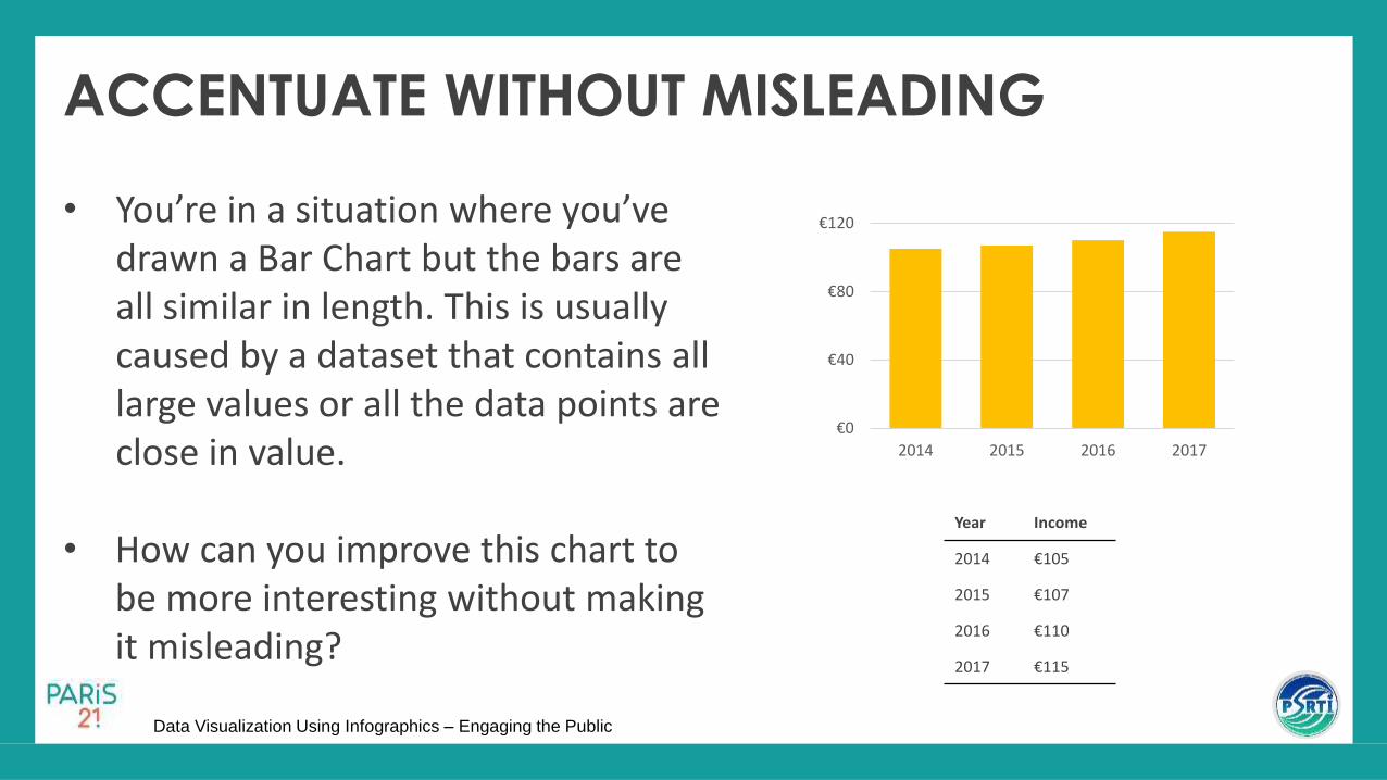
ACCENTUATE WITHOUT MISLEADING
• You’re in a situation where you’ve drawn a Bar Chart but the bars are all similar in length. This is usually caused by a dataset that contains all large values or all the data points are close in value.
• How can you improve this chart to be more interesting without making it misleading?
€0
€40
€80
€120
2014 2015 2016 2017
Year Income
2014 €105
2015 €107
2016 €110
2017 €115

Data Visualization Using Infographics – Engaging the Public
ACCENTUATE WITHOUT MISLEADING
• Instead of plotting the absolute values, you can instead calculate and plot the change in values between each year instead.
• This can be in percentage change as well.
+€0
+€1
+€2
+€3
+€4
+€5
2015 2016 2017
Year IncomeChange from previous year
2014 €105
2015 €107 + €2
2016 €110 + €3
2017 €115 + €5

Data Visualization Using Infographics – Engaging the Public
DATA MISSING
• With Bar Charts, don’t plot a bar for the missing data point.
• Also, make sure to leave a note in the footnote about any missing data.
0
4
8
12
16
20

Data Visualization Using Infographics – Engaging the Public

Data Visualization Using Infographics – Engaging the Public
HORIZONTAL BAR CHART
For qualitative types of data given a specific period of time
Compares the magnitudes of the different categories of a qualitative variable
Place the categories of the qualitative variable on the y-axis and the amount or number on the horizontal axis
53

54
23
25
26
31
57
60
64
84
0 10 20 30 40 50 60 70 80 90
Respiratory Tuberculosis
Chronic lower respiratory infections
Hypertensive diseases
Diabetes Mellitus
Pneumonia
Cerebrovascular diseases
Neoplasms
Ischaemic heart diseases
Number of Persons (in Thousands)
Figure 20. Top 8 Leading Causes of Death in the Philippines: 2017
Source: Philippine Statistics Authority
Chart Title
Plot area border
Axis Categories
Source Note
Chart area border
Axis Title
PARTS OF A HORIZONTAL BAR CHART

Data Visualization Using Infographics – Engaging the Public

Data Visualization Using Infographics – Engaging the Public
SIMPLE BAR CHART
• Shows magnitude of the categories of a qualitative variable for specific period of time
• Length of the bar represents the value of each category
56
110
59
51
7
0 20 40 60 80 100 120
I know it
I know most of it
I know a bit
I don't know it
No. of Employees
Figure 21. Level of Awareness of Women on Human Rights in Municipality A: 2019
Level of Awareness No.
I know it 110
I know most of it 59
I know a bit 51
I don’t know it 7
Table 7. Level of Knowledge of Women on Human Rights in Municipality A: 2019

Data Visualization Using Infographics – Engaging the Public
GROUPED BAR CHART
• Compares the amounts of two or more data sets with the same set of categories for specific period of time
57
22
19
25
0
88
40
26
7
0 10 20 30 40 50 60 70 80 90 100
I know it
I know most of it
I know a bit
I don't know it
No. of Employees
Figure 22. Level of Knowledge on Gender Equalityby Sex, Municipality A: 2019
Male Female
Table 8. Level of Knowledge of Employees on Gender Equality by Sex, Municipality A: 2019
Level of Knowledge Male Female
I know it 88 22
I know most of it 40 19
I know a bit 26 25
I don’t know it 7 0

Data Visualization Using Infographics – Engaging the Public
Is the column chart correct for this data?
58
88
40
26
7
2219
25
00
10
20
30
40
50
60
70
80
90
100
I know it I know most of it I know a bit I don’t know it
no
. of
emp
loye
es
Figure 23. Level of Knowledge of Employees on Gender Equality by Sex in Municipality A: 2019
Male
Female

Data Visualization Using Infographics – Engaging the Public
SUBDIVIDED BAR CHART• Divides one bar into several
components
• Uses absolute numbers in the scale values
59
22
19
25
88
40
26
7
0 20 40 60 80 100 120
I know it
I know mostof it
I know a bit
I don't know it
No. of Employees
Figure 24. Level of Knowledge of Employeeson Gender Equality by Sex in Municipality A: 2019
Female Male
Table 9. Level of Knowledge of Employees on Gender Equality by Sex, Municipality A: 2019
Level of Knowledge Male Female
I know it 88 22
I know most of it 40 19
I know a bit 26 25
I don’t know it 7 0

Data Visualization Using Infographics – Engaging the Public
SUBDIVIDED 100% BAR CHART• Indicates the parts of a whole such
that the parts total to 100%
60
20%
32%
49%
80%
68%
51%
100%
0% 20% 40% 60% 80% 100%
I know it
I know most of it
I know a bit
I don't know it
No. of Employees
Figure 25. Level of Knowledge of Employees on Gender Equality by Sex, Municipality A: 2019
Female
Male
Table 10. Level of Knowledge of Employees on Gender Equality by Sex, Municipality A: 2019
Level of Knowledge
Male % Female % Total
I know it 88 80 22 20 110
I know most of it 40 68 19 32 59
I know a bit 26 51 25 49 51
I don’t know it 7 100 0 0 7

Data Visualization Using Infographics – Engaging the Public
HORIZONTAL BAR CHARTS

Data Visualization Using Infographics – Engaging the Public
SPACES IN BETWEEN BARS
62
Gap between bars is 1/5 of the width of the bar Gap between bars is 1/2 of the width of the bar
8
62
333
675
1,176
4,225
0 1000 2000 3000 4000 5000
Africa
Unspecified
Oceania
Europe
America
Asia
Number (in 100,000)
Figure 26B. Visitor Arrivals by Region of Residence: 2017
8
62
333
675
1,176
4,225
0 1000 2000 3000 4000 5000
Africa
Unspecified
Oceania
Europe
America
Asia
Number (in thousands)Source: DOT
Figure 26A. Visitor Arrivals by Region of Residence: 2017
Source: DOT
Spaces in between the bars may be one-fifth to one-half the width of the bar

Data Visualization Using Infographics – Engaging the Public
BAR ARRANGEMENT AND USE HIGHLIGHTING
• Arrange the bars according to length to facilitate comparisons
• Use highlighting to emphasise key data points.
• Colour can give elements a visual hierarchy, creating multiple levels of information within the chart.

Data Visualization Using Infographics – Engaging the Public
BARS ARE TOO LONG• When all the bars are long, use data labels for easy comparison
0 10,000 20,000 30,000 40,000 50,000 60,000 70,000
ARMM
CARAGA
REGION XII
REGION X
REGION IX
REGION VIII
REGION VII
REGION VI
REGION V
REGION IV
REGION III
REGION II
REGION I
CAR
NCR
25,000
28,100
30,200
32,100
34,200
36,100
38,200
40,000
41,200
43,200
45,200
50,100
53,200
54,500
57,777
0 10,000 20,000 30,000 40,000 50,000 60,000 70,000
ARMM
CARAGA
REGION XII
REGION X
REGION IX
REGION VIII
REGION VII
REGION VI
REGION V
REGION IV
REGION III
REGION II
REGION I
CAR
NCR

Data Visualization Using Infographics – Engaging the Public
Data Visualization Using Infographics – Engaging the Public
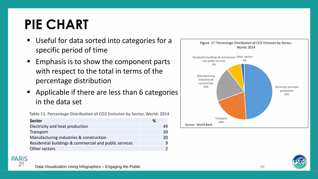
PIE CHART
66
Electricity and heat production
49%
Transport20%
Manufacturing industries & construction
20%
Residential buildings & commercial and public services
9%
Other sectors2%
Figure 27. Percentage Distribution of CO2 Emission by Sector, World: 2014
Source: World Bank
Useful for data sorted into categories for a specific period of time
Emphasis is to show the component parts with respect to the total in terms of the percentage distribution
Applicable if there are less than 6 categories in the data set
Sector % Electricity and heat production 49Transport 20Manufacturing industries & construction 20Residential buildings & commercial and public services 9Other sectors 2
Table 11. Percentage Distribution of CO2 Emission by Sector, World: 2014

Data Visualization Using Infographics – Engaging the Public
PIE CHART

Data Visualization Using Infographics – Engaging the Public
PIE CHART SLICE ORDERING
Plot the biggest slice at 12 o’clock
Arrange components of the pie chart according to magnitude
5
4
3
2
1

Data Visualization Using Infographics – Engaging the Public
OTHERS CATEGORY SLICE POSITION
Reseller, 44%
Others, 39%
Apple, 11%
Nintendo, 6%
Reseller, 44%
Apple, 11%Nintendo,
6%
Others, 39%
If there is an “Others” category, put it in the last section

Data Visualization Using Infographics – Engaging the Public
Reseller, 44%
Others, 39%
Apple, 11%
Nintendo, 6%
Reseller, 44%
Others, 39%
Apple, 11%
Nintendo, 6%
USE OF EXPLODE OPTION

Data Visualization Using Infographics – Engaging the Public
2.43% 3.28%3.42%
3.79%
4.07%
4.11%
4.46%
5.26%
5.45%
5.53%
5.60%6.22%
7.02%
7.36%
7.39%
7.81%
8.39%
8.42% Pharmeceutical & Biotechnology
Travel & Leisure
Tobacco
Life Insurance
Beverages
General Financial
Electricity
Gas, Water & Multiutilities
Support Services
Aerospace & Defence
Construction & Materials
Mining
General Retailers
Oil & Gas Producers
Mobile Telecommunications
Food Producers & Processors2.43%
3.28%
3.42%
3.79%
4.07%
4.11%
4.46%
5.26%
5.45%
5.53%
5.60%
6.22%
7.02%
7.36%
7.39%
7.81%
8.39%
8.42%
0.00% 2.00% 4.00% 6.00% 8.00% 10.00%
Pharmeceutical & Biotechnology
Travel & Leisure
Tobacco
Life Insurance
Beverages
General Financial
Electricity
Gas, Water & Multiutilities
Support Services
Aerospace & Defence
Construction & Materials
Mining
General Retailers
Oil & Gas Producers
Mobile Telecommunications
Food Producers & Processors
Banks
Media
TOO MANY CATEGORIES

Data Visualization Using Infographics – Engaging the Public
Data Visualization Using Infographics – Engaging the Public
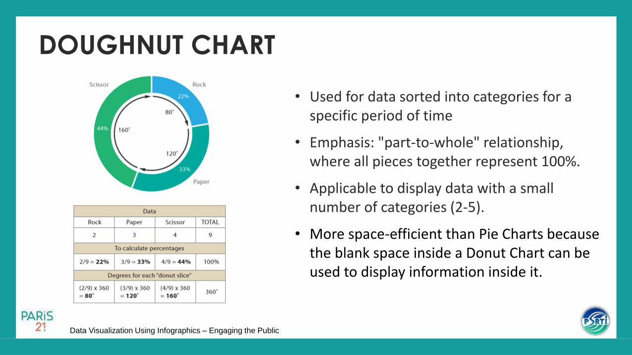
• Used for data sorted into categories for a specific period of time
• Emphasis: "part-to-whole" relationship, where all pieces together represent 100%.
• Applicable to display data with a small number of categories (2-5).
• More space-efficient than Pie Charts because the blank space inside a Donut Chart can be used to display information inside it.
DOUGHNUT CHART

Data Visualization Using Infographics – Engaging the Public
TOTAL DATA VALUE
• Total data value, data labels orany additional information canbe placed in the hole of adoughnut chart.

Data Visualization Using Infographics – Engaging the Public

Data Visualization Using Infographics – Engaging the Public
PICTOGRAPH Used for data sorted into
categories for a specific period of time
Emphasis: to get the attention of the reader
Symbols selected should be self-explanatory and easy to understand
Each symbol represents a number
76
Source: Philippine Statistics Authority
2000
2007
2010
2015
= 10,000,000
Figure 28. Philippine Population for Census Years: 2000, 2007, 2010, and 2015

Data Visualization Using Infographics – Engaging the Public
1960: P100.00
1970
1980
1990
CONSISTENT SIZE OF SYMBOLS
19601970: P160
1980: P310
1990: P380
= 100
Minimum Wage

Data Visualization Using Infographics – Engaging the Public
Data Visualization Using Infographics – Engaging the Public
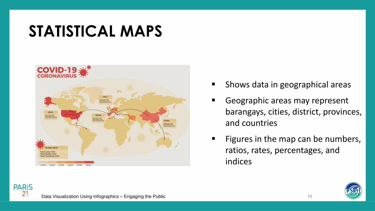
STATISTICAL MAPS
Shows data in geographical areas
Geographic areas may represent barangays, cities, district, provinces, and countries
Figures in the map can be numbers, ratios, rates, percentages, and indices
79

Data Visualization Using Infographics – Engaging the Public
THEMATIC MAP
Uses shading to indicate the
degree of magnitude of the
figures
Or uses color to differentiate
the different figures
80
Data Visualization Using Infographics – Engaging the Public
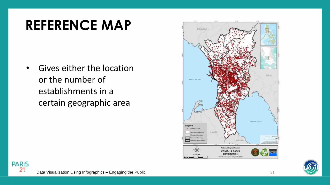
REFERENCE MAP
• Gives either the location or the number of establishments in a certain geographic area
81

Data Visualization Using Infographics – Engaging the Public
STATISTICAL MAPS

Data Visualization Using Infographics – Engaging the Public
USE INTERVALS
• When using colour to visualise values, break the quantitative values into discrete classifications or bin instead of using a continuous gradient scale.

Data Visualization Using Infographics – Engaging the Public
COMPARING GEOGRAPHICAL AREA SIZES
• For when you need to compare different between land mass.
84
1 Municipality = 1.22 City

Data Visualization Using Infographics – Engaging the Public

Data Visualization Using Infographics – Engaging the Public
RADAR CHART
• Used to plot one or more groups of values over multiple common variables represented on axes starting from the same point.
• Multiple observations can be placed in a single chart by displaying multiple polygons, overlaying them and reducing the opacity of each polygon.
• The data from a single observation are plotted along each axis and connected to form a polygon.

Data Visualization Using Infographics – Engaging the Public
Example: Average Employee Performance Appraisal by Sex
Performance Criteria Men Women
Punctuality 4 5
Communication Skills 2 4
Technical Knowledge 5 4
Teamwork 2 5
Problem Solving 4 4
Meeting Deadline 3 5 MEN WOMEN
Average Employee Performance Appraisal by Sex (Scale of 1 – 5, 5 being the highest)
Communication Skills
Technical KnowledgePunctuality
Problem SolvingTeamwork
Meeting Deadline

Data Visualization Using Infographics – Engaging the Public 88
RECAP

Data Visualization Using Infographics – Engaging the Public
RE
CA
P!
89
1. It emphasizes the movement of the time series.
2. It shows the proportions with respect to the total.
3. It shows the location of the different Jollibee stores in Region 3.
4. It attracts the attention of the reader and shows only approximate figures.
5. It is applicable for data sorted into categories for a specific period of time.
Choose the correct type of chart for the following statements. Write on the chat box the letter of your choice. A. Line Chart D. Pie Chart G. Doughnut ChartB. Column Chart E. Pictograph H. Radar ChartC. Horizontal Bar Chart F. Map Chart

Data Visualization Using Infographics – Engaging the Public 90
TRUE or FALSE: Write TRUE or FALSE on the CHAT BOX.
1. The Pie chart shows the component parts with respect to thetotal in terms of the percentage distribution.
2. When creating a line and vertical bar chart, the vertical axisshould always start at one.
3. The pie chart’s biggest pie slice must be at the 12 o’clockposition.
4. Gap size between bars in a column chart should be around 1/5to 1/2 of the width of the bar.
5. The grid lines may be removed if there are data labels placedon the bar charts.
6. The ratio of height to width of a line graph should be 1:3.

Data Visualization Using Infographics – Engaging the Public 91
EXERCISES
Direction: Given the charts on the next slides, specify what’s wrong with the construction.

Data Visualization Using Infographics – Engaging the Public

Data Visualization Using Infographics – Engaging the Public

Data Visualization Using Infographics – Engaging the Public
Data Visualization Using Infographics – Engaging the Public

Data Visualization Using Infographics – Engaging the Public

Data Visualization Using Infographics – Engaging the Public

Data Visualization Using Infographics – Engaging the Public

Data Visualization Using Infographics – Engaging the Public

Data Visualization Using Infographics – Engaging the Public

Data Visualization Using Infographics – Engaging the Public

Data Visualization Using Infographics – Engaging the Public

Data Visualization Using Infographics – Engaging the Public 103
Thank you!