RUSH ENTERPRISES BRAND STYLE GUIDE
27
RUSH ENTERPRISES BRAND STYLE GUIDE 4
-
Upload
khangminh22 -
Category
Documents
-
view
3 -
download
0
Transcript of RUSH ENTERPRISES BRAND STYLE GUIDE

RUSH ENTERPRISES BRAND STYLE GUIDE
4
OUR BRAND 1
VOICE AND TONE 2
WRITING STYLE 3
BRANDED LANGUAGE 4
WRITING FOR PRINT AND WEB 5
WRITING FOR EMAIL, SOCIAL MEDIA AND POWERPOINT 6
LOGOS 7
LOGOS (APPROVED VERSIONS) 9
LOGO LOCKUPS 11
COLORS 12
TAGLINE AND TRADEMARKS 13
FLOURISHES AND BULLET POINTS 14
FONTS 15
FULL-FRAME PHOTOGRAPHY 19
CLIPPED PHOTOGRAPHY 20
ILLUSTRATION/ICONS 21
GRAPHIC ELEMENTS 22
BROCHURES 23
FLYERS 25
EMAIL 27
INVENTORY ADVERTISING 30
PRINT ADVERTISING 31
POWERPOINT 32
DIGITAL ADVERTISING 33
OUTDOOR ADVERTISING 35
STATIONERY 37
TRADE SHOW ASSETS 39
VEHICLE GRAPHICS 41
DEALERSHIP SIGNAGE 43
DIRECTIONAL SIGNAGE 45
UNIFORMS AND LOGO WEAR 46
EMAIL SIGNATURE AND PHOTOS 47
GREETING CUSTOMERS 48
TABLE OF CONTENTS

Rush Enterprises is the premier solutions provider to the commercial vehicle industry. We don’t
make that statement in a boastful manner, but as a matter of fact. Our focus is on providing
the highest-quality products and solutions to meet our customers’ needs. Our brand represents
premium quality in everything we do. We are not a loosely associated group of individual
dealerships and business units, but rather, we are a single network that moves in lockstep to
provide a consistent high-level experience to customers wherever they do business with us.
OUR BRAND PROMISE. Rush Enterprises is dedicated to exceeding customer expectations
– in the culture and values that drive our business, the quality of the brands and solutions we
offer, our state-of-the-art facilities and our unrivaled network reach and scale. We are part
of the commercial vehicle industry, but we are unique in the industry. And our promise to our
customers and to ourselves comes down to two simple words – expect more.
THE POWER OF BRAND. We believe in the power of a well-managed and fully integrated
brand to win customers, create loyalty and inspire evangelism. To that end, we must
consistently deliver experiences and messages aligned with our brand promise – in every
interaction our customers and prospects have with us – whether in attitude, words, visual
design or offering. A consistent brand encourages familiarity. Familiarity builds trust.
And people prefer doing business with people and companies they trust.
THE PURPOSE OF THIS DOCUMENT. This brand style guide serves as a road map
for correctly administering Rush Enterprises’ brands in marketing and communications.
The success of our company’s branding efforts lies, in large part, with the correct execution
of this style guide. It should be followed diligently by employees of the company and suppliers
and partners who have been granted permission to use Rush Enterprises’ brand assets.
All marketing and communication activities are to be led by the Rush Enterprises Marketing
and Communications Department. Questions on this style guide should be directed to
OUR BRAND
1 2
One of the ways we represent our brand is by the voice and tone we use when writing content
for both external and internal audiences. This section explains the difference between voice
and tone and lays out the elements of each as they apply to Rush Enterprises.
So, what’s the difference between our brand’s voice and tone? Think of yourself. Your voice
is your voice. It’s pretty consistent. But your tone changes depending on your audience and the
situation. Our brand is no different. Our voice shouldn’t change much, but our tone changes
all the time.
VOICE. Our voice is a direct reflection of our driving principles – fairness, productivity,
excellence, positive attitude and integrity. And it represents our leadership position in the
industry. We understand the challenges our customers face every day. And we offer solutions.
That’s why we speak as a confident, approachable and well-spoken expert. We impart our
expertise with clarity, thoughtfulness and empathy. We are plain-spoken. We never try to
impress with big words or fancy terminology that just confuses real people. We are concise,
and we encourage conversations. Every word we write should inform and educate.
TONE. Generally, our tone is professional but not stuffy. When people read or hear the words
we’ve written, they should feel they are coming from a real person, not a corporation.
When writing on behalf of the company, consider your subject matter and audience. Are you
speaking to a large fleet executive or an owner-operator? A Vice President of Purchasing or
Maintenance Manager? Before writing the first word, understand whom you are speaking to
and their pain points and frame of mind. Adjust your tone accordingly.
VOICE AND TONE
Regardless of the tone, here are a few key elements to keep in mind when writing in
Rush Enterprises’ voice.
• Use active voice. Avoid passive voice. It’s more confident and easier to understand.
(Ex. “Rush Truck Centers represents leading truck and bus manufacturers” vs. “Leading truck and bus
manufacturers are represented by Rush Truck Centers.”)
• Avoid slang and jargon. Write in simple English. Assume the reader has no knowledge
of your subject.
• Write positively. Use positive language rather than negative.
(Ex., increase uptime vs. minimize downtime)
• Get to the point. Lead with the most important thought. Avoid fluff and unnecessary modifiers.
SOME SPECIFICS. In general, we follow The Associated Press Stylebook when it comes to
punctuation and grammar. But here are a few rules that are unique to us.
• We always use a period at the end of a headline, even if it is not a complete sentence.
• We always use two spaces after a period or colon.
• We never use exclamation marks unless the phrase is truly an exclamation.
And never more than one.
• We avoid abbreviations whenever possible.
• We avoid acronyms unless it is the more common use, and then we include the full name
on the first mention.
• In most circumstances, using contractions in marketing copy is permitted and encouraged. Contractions
humanize our content and make it feel friendlier and more approachable.
• It’s OK to start a sentence with words such as “And” or “But” for the same reasons we like contractions.
• We avoid shortening the company name to “Rush.” Whenever possible, use Rush Enterprises,
Rush Truck Centers, etc.
WRITING STYLE
3 4
There are certain phrases and words we use regularly in marketing and communications copy that
brand the content to us. When writing on behalf of the company, try to use these phrases where it
makes sense. But never force branded language where it isn’t a natural choice. Examples of our
branded language include:
• Expect more. These two words encapsulate our brand promise. They are also used as a tagline
to “sign off” marketing communication. However, they can also be worked into marketing copy.
Ex., You can expect more from Rush Truck Centers.
• When it comes to trucking, no one offers you more. This phrase can often be used as a concluding
sentence in content summarizing our position as the industry’s total solutions provider.
• When it comes to ______, no one offers you more. Used in the same manner as above, but
specific to a product or solution. Ex., When it comes to all-makes parts, no one offers you more.
• The premier solutions provider to the commercial vehicle industry. Used in overview copy to
highlight our leadership role in the industry.
BRANDED LANGUAGE
HEADLINES AND SUBHEADS. Eight out of ten people will read a headline. Only two out of
ten will proceed to the rest of the content. Your headline must be interesting enough to draw
the reader in. Use simple but powerful language. Keep it short.
WRITING FOR PRINT. The purpose of printed, or even digital, marketing collateral is to
pique interest and facilitate in-person conversations. To that end, marketing copy should be
compelling, but as short and concise as possible. It should provide a high-level overview of
the topic, not every detail.
WRITING FOR WEBSITES. The objective of most physical marketing material, and even
email, is to drive people to our websites to learn more or take an action. Webpages can
provide the details that are not practical in other media. With that said, website copy is
generally scanned. Keep it simple and put the most important information first. Make sure
people can easily find what they are looking for.
• Headers. Not only does good header text make it easy for a user to determine if the page
content is relevant to them, it’s also key to good search engine optimization of our web pages.
Think of the H1 text as the title of the book and H2 text as the title of each chapter. Headers
should always include relevant search terms that succinctly summarize the content of the
page. They are always written in a style that is consistent with our brand language.
• Body copy. Adhere to the style outlined in this guide, but keep it as simple as possible.
Short paragraphs with short sentences are best. Avoid unnecessary words and flowery
language. Be direct with a focus on stating the primary feature and benefit to the user.
Whenever possible, include a call to action in a link or button.
WRITING FOR PRINT AND WEB
5 6
WRITING FOR EMAIL. We are all bombarded with emails. You have about half of one
second to convince someone to open and read your email.
• Subject line. Keep it descriptive and intriguing. It should make the reader want to
open the email to learn more. Keep it as short as possible. Many email clients only
display the first few words of a subject line.
• Email content. Keep it minimal. Headline and body copy should be concise and
designed to drive the reader to a click. Use images to tell the story. Leave the details
for a landing page.
• Call to action. Make it clear what you want the reader to do next – buy something, read
something or respond to something. Buttons should contain actions in all capital letters.
WRITING FOR SOCIAL MEDIA. We use social media to inform, engage and encourage
conversations. When writing for social media, we should generally follow the style points
outlined in this section with an emphasis on keeping content short and concise – generally,
one to two short sentences with a clear call to action. We do not use emojis or common
text/social abbreviations such as “4” for “for” or “u” for “you.”
WRITING FOR POWERPOINT. Effective PowerPoint presentations reinforce the most important
points of a spoken presentation. They are not intended to detail every word of a presentation.
They are not the speaker’s notes.
• Headlines. Should concisely summarize the slide content. Avoid using the same headline
on subsequent slides whenever possible.
• Slide content. Each slide should be limited to a maximum of seven bullets with no more
than seven words per bullet, fewer if possible. Avoid complete sentences and unnecessary
articles. Minimum font size should be 18 points for all content.
• Spreadsheets, tables and charts. These often make terrible PowerPoint slides. If the
content is not readable to someone with average eyesight, it should not be on the slide.
If the content is important, provide it as a handout.
WRITING FOR EMAIL, SOCIAL MEDIA AND POWERPOINT
LOGOS
7 8
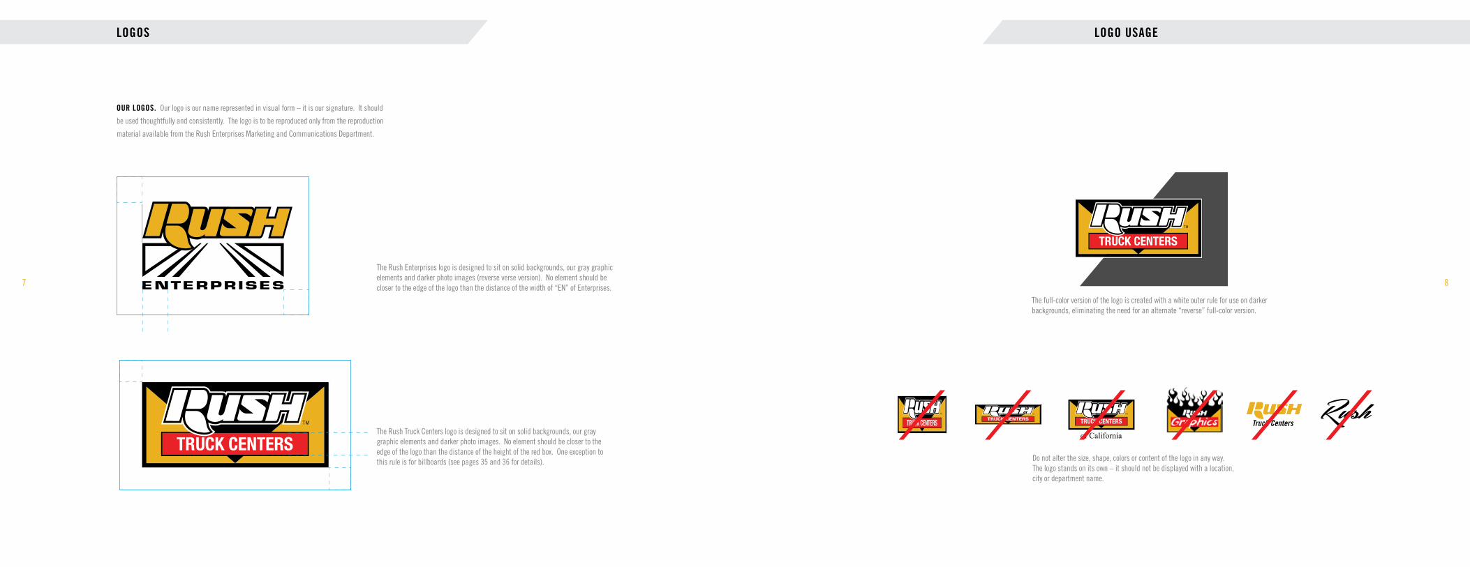
OUR LOGOS. Our logo is our name represented in visual form – it is our signature. It should
be used thoughtfully and consistently. The logo is to be reproduced only from the reproduction
material available from the Rush Enterprises Marketing and Communications Department.
The full-color version of the logo is created with a white outer rule for use on darker backgrounds, eliminating the need for an alternate “reverse” full-color version.
of California
Do not alter the size, shape, colors or content of the logo in any way. The logo stands on its own – it should not be displayed with a location, city or department name.
Truck Centers
LOGO USAGE
The Rush Truck Centers logo is designed to sit on solid backgrounds, our gray graphic elements and darker photo images. No element should be closer to the edge of the logo than the distance of the height of the red box. One exception to this rule is for billboards (see pages 35 and 36 for details).
The Rush Enterprises logo is designed to sit on solid backgrounds, our gray graphic elements and darker photo images (reverse verse version). No element should be closer to the edge of the logo than the distance of the width of “EN” of Enterprises.
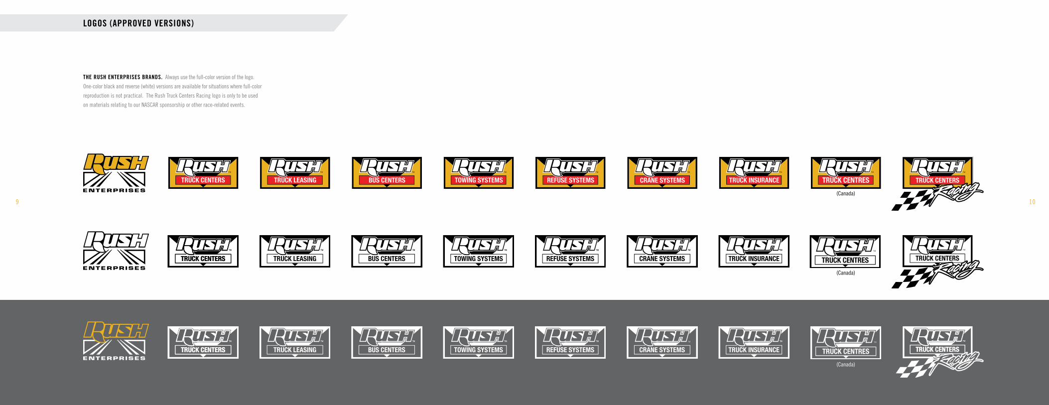
LOGOS (APPROVED VERSIONS)
9 10
THE RUSH ENTERPRISES BRANDS. Always use the full-color version of the logo.
One-color black and reverse (white) versions are available for situations where full-color
reproduction is not practical. The Rush Truck Centers Racing logo is only to be used
on materials relating to our NASCAR sponsorship or other race-related events.
(Canada)
(Canada)
(Canada)
LOGO LOCKUPS
11 12
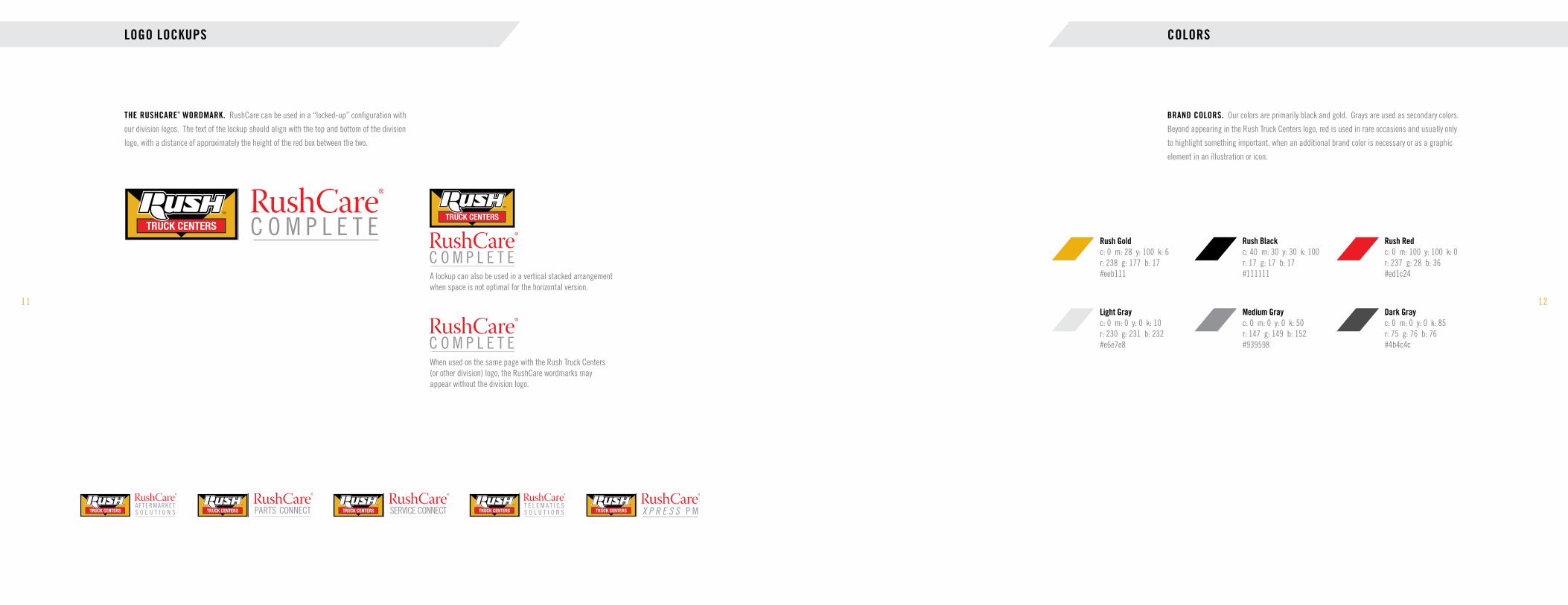
THE RUSHCARE® WORDMARK. RushCare can be used in a “locked-up” configuration with
our division logos. The text of the lockup should align with the top and bottom of the division
logo, with a distance of approximately the height of the red box between the two.
Rush Gold c: 0 m: 28 y: 100 k: 6 r: 238 g: 177 b: 17 #eeb111
Rush Red c: 0 m: 100 y: 100 k: 0 r: 237 g: 28 b: 36 #ed1c24
Rush Black c: 40 m: 30 y: 30 k: 100 r: 17 g: 17 b: 17 #111111
Light Gray c: 0 m: 0 y: 0 k: 10 r: 230 g: 231 b: 232 #e6e7e8
Medium Gray c: 0 m: 0 y: 0 k: 50 r: 147 g: 149 b: 152 #939598
Dark Gray c: 0 m: 0 y: 0 k: 85 r: 75 g: 76 b: 76 #4b4c4c
COLORS
BRAND COLORS. Our colors are primarily black and gold. Grays are used as secondary colors.
Beyond appearing in the Rush Truck Centers logo, red is used in rare occasions and usually only
to highlight something important, when an additional brand color is necessary or as a graphic
element in an illustration or icon.
When used on the same page with the Rush Truck Centers (or other division) logo, the RushCare wordmarks may appear without the division logo.
A lockup can also be used in a vertical stacked arrangement when space is not optimal for the horizontal version.
TAGLINE AND TRADEMARKS
13 14
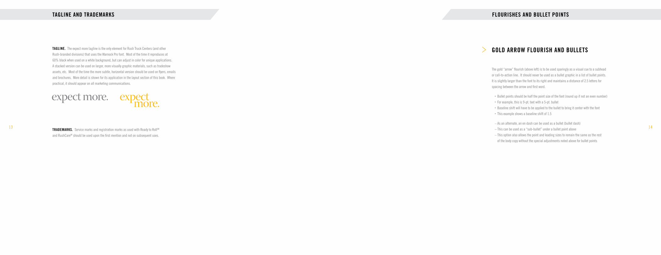
TAGLINE. The expect more tagline is the only element for Rush Truck Centers (and other
Rush-branded divisions) that uses the Warnock Pro font. Most of the time it reproduces at
60% black when used on a white background, but can adjust in color for unique applications.
A stacked version can be used on larger, more visually graphic materials, such as tradeshow
assets, etc. Most of the time the more subtle, horizontal version should be used on flyers, emails
and brochures. More detail is shown for its application in the layout section of this book. Where
practical, it should appear on all marketing communications.
FLOURISHES AND BULLET POINTS
The gold “arrow” flourish (above left) is to be used sparingly as a visual cue to a subhead
or call-to-action line. It should never be used as a bullet graphic in a list of bullet points.
It is slightly larger than the font to its right and maintains a distance of 2.5 letters for
spacing between the arrow and first word.
• Bullet points should be half the point size of the font (round up if not an even number)
• For example, this is 9-pt. text with a 5-pt. bullet
• Baseline shift will have to be applied to the bullet to bring it center with the font
• This example shows a baseline shift of 1.5
– As an alternate, an en dash can be used as a bullet (bullet dash)
– This can be used as a “sub-bullet” under a bullet point above
– This option also allows the point and leading sizes to remain the same as the rest
of the body copy without the special adjustments noted above for bullet points
GOLD ARROW FLOURISH AND BULLETS
TRADEMARKS. Service marks and registration marks as used with Ready to RollSM
and RushCare® should be used upon the first mention and not on subsequent uses.

FONTS
15
TRADE GOTHIC is the primary font used for Rush Truck Centers and all other operating
divisions of Rush Enterprises represented in this manual. There are many variations
within the Trade Gothic font family; we use only the Bold Condensed No. 20 and
Condensed No. 18. DO NOT use other versions of the Trade Gothic font family.
Trade Gothic Bold Condensed No. 20Aa Bb Cc Dd Ee Ff Gg Hh Ii Jj Kk Ll Mm Nn Oo Pp Qq Rr Ss Tt Uu Vv Ww Xx Yy Zz
Trade Gothic Condensed No. 18Aa Bb Cc Dd Ee Ff Gg Hh Ii Jj Kk Ll Mm Nn Oo Pp Qq Rr Ss Tt Uu Vv Ww Xx Yy Zz
16
WARNOCK PRO is the primary font for corporate communications (Rush Enterprises).
Do not use Warnock Pro for communications that are not specifically Rush Enterprises-
branded. Trade Gothic can be used in some cases as a secondary font for bullet point
copy, subheads, etc.
Warnock Pro DisplayAa Bb Cc Dd Ee Ff Gg Hh Ii Jj Kk Ll Mm Nn Oo Pp Qq Rr Ss Tt Uu Vv Ww Xx Yy Zz
Warnock Pro RegularAa Bb Cc Dd Ee Ff Gg Hh Ii Jj Kk Ll Mm Nn Oo Pp Qq Rr Ss Tt Uu Vv Ww Xx Yy Zz
Warnock Pro BoldAa Bb Cc Dd Ee Ff Gg Hh Ii Jj Kk Ll Mm Nn Oo Pp Qq Rr Ss Tt Uu Vv Ww Xx Yy Zz
FONTS

FONTS (EMAIL AND POWERPOINT)
17
HELVETICA AND ARIAL NARROW. Because of the font limitations of email and
PowerPoint, these two fonts can be used as a substitute to our official corporate fonts.
Helvetica is our alternate font to be used only for marketing emails. Arial Narrow is
the substitute font to be used in PowerPoint.
Helvetica Bold (alternate font for eblasts only)
Aa Bb Cc Dd Ee Ff Gg Hh Ii Jj Kk Ll Mm Nn Oo Pp Qq Rr Ss Tt Uu Vv Ww Xx Yy Zz
Helvetica Regular (alternate font for eblasts only)
Aa Bb Cc Dd Ee Ff Gg Hh Ii Jj Kk Ll Mm Nn Oo Pp Qq Rr Ss Tt Uu Vv Ww Xx Yy Zz
Arial Narrow BoldAa Bb Cc Dd Ee Ff Gg Hh Ii Jj Kk Ll Mm Nn Oo Pp Qq Rr Ss Tt Uu Vv Ww Xx Yy Zz
Arial Narrow RegularAa Bb Cc Dd Ee Ff Gg Hh Ii Jj Kk Ll Mm Nn Oo Pp Qq Rr Ss Tt Uu Vv Ww Xx Yy Zz
18
ZAPFINO. This is a specialty, decorative font used on very rare occasion for
corporate invitations and special events. The font should be used sparingly as
an initial greeting or headline, such as “You’re Invited,” “Welcome,” etc.
ZapfinoAa Bb Cc Dd Ee Ff Gg Hh Ii Jj Kk Ll Mm Nn Oo Pp Qq Rr Ss Tt Uu Vv Ww Xx Yy Zz
FONTS (SCRIPT SPECIAL EVENT)

FULL-FRAME PHOTOGRAPHY
19
GRAPHIC TREATMENT TO PHOTOGRAPHY. Our catalog of photography comes from
a variety of photographers and geographic regions around the country and spans a time
frame of several years. One way to bring our photography into a more “unified” look is to
give them a graphic treatment by darkening the top and bottom to create a more tonal
“mood” or enriched appearance.
Apply a gradient feather to a black box (at the top and the bottom), and apply a multiplied transparency effect to each. Set the black to 70%. Use this as a starting place; the graphic designer will have to use best judgment based on the characteristics of the original photo.
Unedited original.
Correct
20
GROUNDED IMAGES. All photography that has had the background removed, or “clipped”
away, should be “grounded” with a realistic drop shadow. The truck below illustrates how
an effective shadow makes the truck appear to be firmly “planted” on the ground with the
darker shadows under the tires, where the truck is closest to the ground.
CLIPPED PHOTOGRAPHY
Correct
Incorrect
ILLUSTRATION/ICONS
21
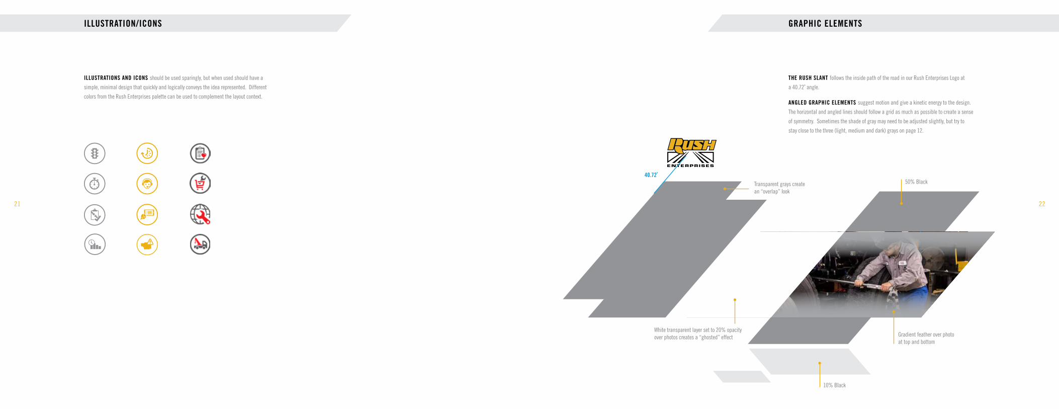
ILLUSTRATIONS AND ICONS should be used sparingly, but when used should have a
simple, minimal design that quickly and logically conveys the idea represented. Different
colors from the Rush Enterprises palette can be used to complement the layout context.
22
GRAPHIC ELEMENTS
THE RUSH SLANT follows the inside path of the road in our Rush Enterprises Logo at
a 40.72˚ angle.
ANGLED GRAPHIC ELEMENTS suggest motion and give a kinetic energy to the design.
The horizontal and angled lines should follow a grid as much as possible to create a sense
of symmetry. Sometimes the shade of gray may need to be adjusted slightly, but try to
stay close to the three (light, medium and dark) grays on page 12.
Transparent grays create an “overlap” look
White transparent layer set to 20% opacity over photos creates a “ghosted” effect
50% Black
10% Black
Gradient feather over photo at top and bottom
40.72˚
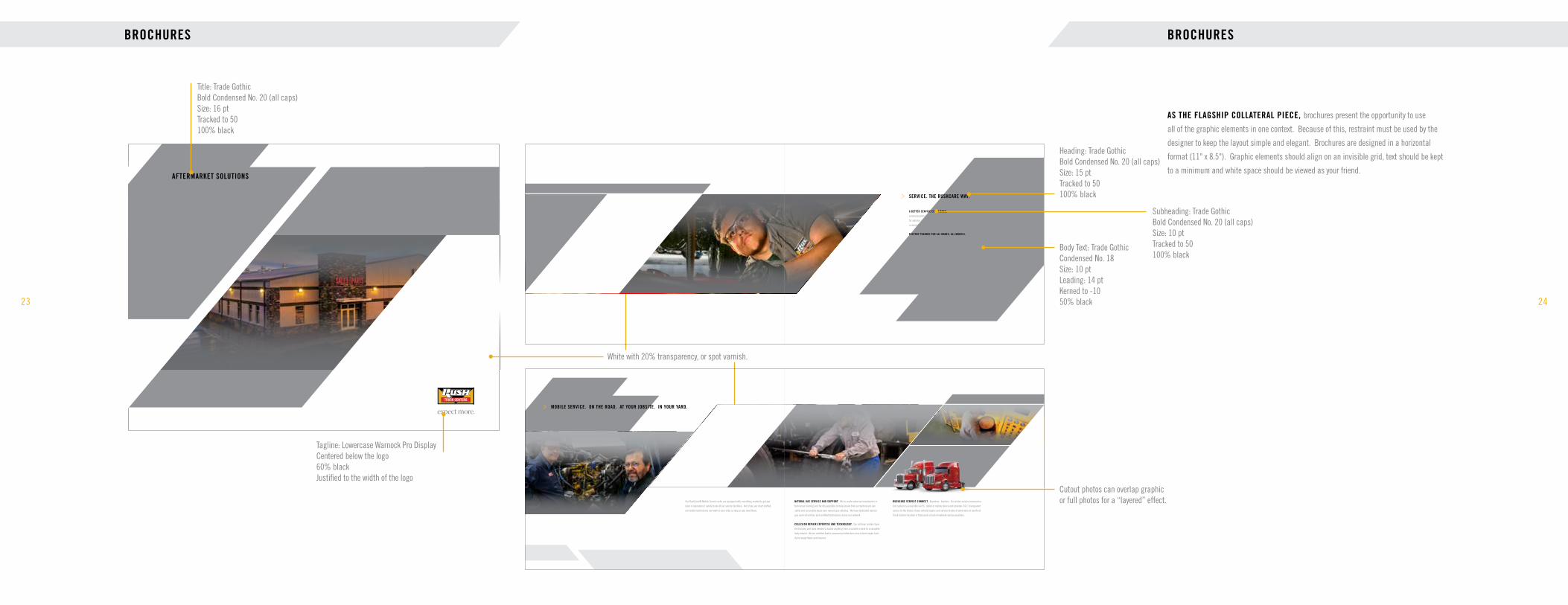
BROCHURES
23
AFTERMARKET SOLUTIONS
Title: Trade Gothic Bold Condensed No. 20 (all caps) Size: 16 pt Tracked to 50 100% black
Tagline: Lowercase Warnock Pro Display Centered below the logo 60% black Justified to the width of the logo
White with 20% transparency, or spot varnish.
24
BROCHURES
AS THE FLAGSHIP COLLATERAL PIECE, brochures present the opportunity to use
all of the graphic elements in one context. Because of this, restraint must be used by the
designer to keep the layout simple and elegant. Brochures are designed in a horizontal
format (11" x 8.5"). Graphic elements should align on an invisible grid, text should be kept
to a minimum and white space should be viewed as your friend.
A BETTER SERVICE EXPERIENCE. RushCare Service Connect is a state-of-the-art online service
communication system that provides customers an on-demand, 360-degree view of the service process
for vehicles in our service departments. You’ll have 24/7 access to the status of your repairs as well as
a complete service history of all service work done.
FACTORY TRAINED FOR ALL MAKES, ALL MODELS. Staffed by factory-trained and ASE-certified
professionals qualified to work on heavy- and medium-duty vehicles, we’re qualified to perform preven-
tive maintenance, repairs or warranty work on trucks, trailers, buses, truck bodies, diesel, gas and
alternative fuel engines, transmissions, differentials and braking systems.
SERVICE. THE RUSHCARE WAY.
NATURAL GAS SERVICE AND SUPPORT. We’ve made extensive investments in
technician training and facility upgrades to help ensure that our technicians can
safely and accurately repair your natural gas vehicles. We have dedicated natural
gas service facilities and certified technicians across our network.
COLLISION REPAIR EXPERTISE AND TECHNOLOGY. Our collision centers have
the training and tools needed to tackle anything from a scratch or dent to a complete
body rebuild. We are certified Axalta commercial refinishers and a direct repair facil-
ity for major fleets and insurers.
Our RushCare® Mobile Service units are equipped with everything needed to get you
back in operation or safely to one of our service facilities. And if you are short staffed,
our mobile technicians can work in your shop as long as you need them.
3 4
RUSHCARE SERVICE CONNECT. Anywhere. Anytime. Our online service communica-
tion system is accessible via PC, tablet or mobile device and provides 24/7, transparent
access to the status of your vehicle repairs and service history of work done at any Rush
Truck Centers location or thousands of out-of-network service providers.
MOBILE SERVICE. ON THE ROAD. AT YOUR JOBSITE. IN YOUR YARD.
Cutout photos can overlap graphic or full photos for a “layered” effect.
Heading: Trade Gothic Bold Condensed No. 20 (all caps) Size: 15 pt Tracked to 50 100% black
Subheading: Trade Gothic Bold Condensed No. 20 (all caps) Size: 10 pt Tracked to 50 100% black
Body Text: Trade Gothic Condensed No. 18 Size: 10 pt Leading: 14 pt Kerned to -10 50% black
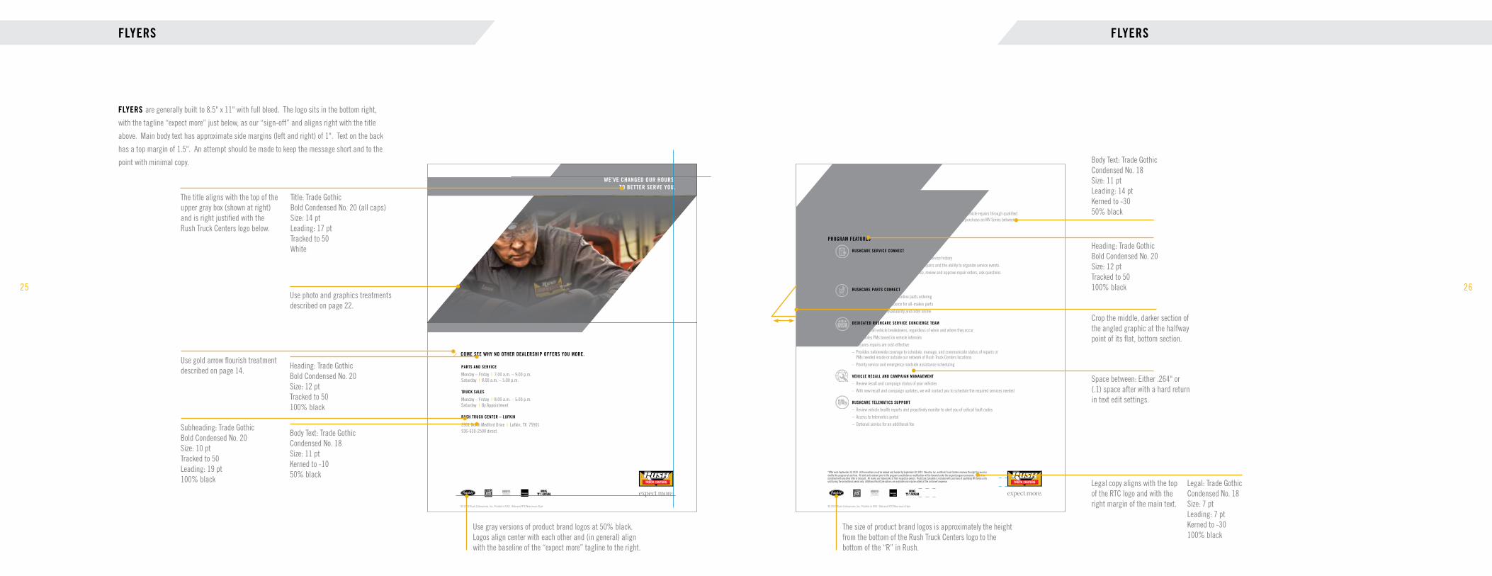
FLYERS
25
© 2019 Rush Enterprises, Inc. Printed in USA. Rebrand RTC New hours Flyer
WE’VE CHANGED OUR HOURS. TO BETTER SERVE YOU.
COME SEE WHY NO OTHER DEALERSHIP OFFERS YOU MORE.
PARTS AND SERVICE
Monday – Friday | 7:00 a.m. – 9:00 p.m.Saturday | 8:00 a.m. – 5:00 p.m.
TRUCK SALES
Monday – Friday | 8:00 a.m. – 5:00 p.m.Saturday | By Appointment
RUSH TRUCK CENTER – LUFKIN
3901 North Medford Drive | Lufkin, TX 75901936-630-2500 direct
FLYERS are generally built to 8.5" x 11" with full bleed. The logo sits in the bottom right,
with the tagline “expect more” just below, as our “sign-off” and aligns right with the title
above. Main body text has approximate side margins (left and right) of 1". Text on the back
has a top margin of 1.5". An attempt should be made to keep the message short and to the
point with minimal copy.
Use photo and graphics treatments described on page 22.
Heading: Trade Gothic Bold Condensed No. 20 Size: 12 pt Tracked to 50 100% black
Use gold arrow flourish treatment described on page 14.
Body Text: Trade Gothic Condensed No. 18 Size: 11 pt Kerned to -10 50% black
Subheading: Trade Gothic Bold Condensed No. 20 Size: 10 pt Tracked to 50 Leading: 19 pt 100% black
Use gray versions of product brand logos at 50% black. Logos align center with each other and (in general) align with the baseline of the “expect more” tagline to the right.
Title: Trade Gothic Bold Condensed No. 20 (all caps) Size: 14 pt Leading: 17 pt Tracked to 50 White
The title aligns with the top of the upper gray box (shown at right) and is right justified with the Rush Truck Centers logo below.
© 2019 Rush Enterprises, Inc. Printed in USA. Rebrand RTC New hours Flyer
RushCare Complete is an all-inclusive service that coordinates, monitors and expedites vehicle repairs through qualified service facilities across North America. Exclusively from Rush Truck Centers, when you purchase an MV Series between now and August 31, 2019. Telematics support is available upon request.
PROGRAM FEATURES
RUSHCARE SERVICE CONNECT
– 24/7 access to the status of repairs, including service history
– Provides transparency into the progress of repairs and the ability to organize service events
– Two-way communication to request service, review and approve repair orders, ask questions and provide feedback
RUSHCARE PARTS CONNECT
– 24/7 access for immediate online parts ordering
– Comprehensive online source for all-makes parts
– Search, check local availability and order online
DEDICATED RUSHCARE SERVICE CONCIERGE TEAM
– Manages all vehicle breakdowns, regardless of when and where they occur
– Schedules PMs based on vehicle intervals
– Ensures repairs are cost-effective
– Provides nationwide coverage to schedule, manage, and communicate status of repairs or PMs needed inside or outside our network of Rush Truck Centers locations
– Priority service and emergency roadside assistance scheduling
VEHICLE RECALL AND CAMPAIGN MANAGEMENT
– Review recall and campaign status of your vehicles
– With new recall and campaign updates, we will contact you to schedule the required services needed
RUSHCARE TELEMATICS SUPPORT
– Review vehicle health reports and proactively monitor to alert you of critical fault codes
– Access to telematics portal
– Optional service for an additional fee
*Offer ends September 30, 2019. All transactions must be booked and funded by September 30, 2019. Navistar, Inc. and Rush Truck Centers reserves the right to cancel or modify this program at any time. All sold units ordered prior to the program cancellation or modification will be honored under the original program provisions. Cannot be combined with any other offer or discount. All marks are trademarks of their respective owners. RushCare Complete is included with purchase of qualifying MV Series units sold during the promotional period only. Additional RushCare options are available and may be added at the customer’s expense.
26
FLYERS
Legal: Trade Gothic Condensed No. 18 Size: 7 pt Leading: 7 pt Kerned to -30 100% black
Legal copy aligns with the top of the RTC logo and with the right margin of the main text.
Heading: Trade Gothic Bold Condensed No. 20 Size: 12 pt Tracked to 50 100% black
Body Text: Trade Gothic Condensed No. 18 Size: 11 pt Leading: 14 pt Kerned to -30 50% black
Crop the middle, darker section of the angled graphic at the halfway point of its flat, bottom section.
The size of product brand logos is approximately the height from the bottom of the Rush Truck Centers logo to the bottom of the “R” in Rush.
Space between: Either .264" or (.1) space after with a hard return in text edit settings.

EMAIL (FULL PHOTOS)
27
EMAIL TEMPLATES. The specs provided here are mainly for the InDesign file. Once
the layout is finalized, graphic elements will be converted to JPEGs and placed into an
email application. Live text will be built in the email application to match the InDesign
layout. These designs assume shorter headlines and are intended to remain within the
gray graphics at the top of the templates shown here.
© 2019 Rush Enterprises, Inc. All Rights Reserved. 0139-0319 RTC Dallas MD March Parts and Service Eblast
RUSH TRUCK CENTER – DALLAS MEDIUM-DUTY4200 Irving Boulevard | Dallas, TX 75247 | 214-624-9100 direct | 866-905-4466 toll free
10% offyour next service repair.*
*Limit 1 per customer. Coupon must be presented at time of purchase. Discount toward posted labor rates only. Cannot be combined with any other coupon or discount offer. Excludes engine parts. PM’s are not included. Offer valid through June 30, 2019 at
Rush Truck Center – Dallas Medium-Duty only. See store manager for details.
LIMITED-TIME SAVINGS ON SERVICE AND PARTS.
FIND A LOCATIONFIND A LOCATION
Buttons are always .36" tall with Helvetica Bold as the font.
The side margin of the button should be approximately twice the size of the top and bottom margins from the the text.
A negative space equal to the height of the button should be allowed above and below the button.
Title: Trade Gothic Bold Condensed No. 20 Size: 12 pt (can vary slightly based on length) Leading: 14 pt Tracked to 50 White
CTA and Location: Helvetica Bold Size: 11 pt Kerned to 0 100% black
Coupons will be made into a JPEG, so use Trade Gothic fonts
Gold Header: Trade Gothic Bold Condensed No. 20 Size: 40 pt
Subhead: Trade Gothic Bold Condensed No. 20 Size: 14 pt Leading: 14 pt 100% black
Legal: Trade Gothic Condensed No. 18 Size: 7 pt Leading: 7 pt 100% black
Address: Helvetica Roman Size: 8 pt Kerned to 0 100% black Gold seperators with two spaces before and after
Tagline is 1.08" wide in the InDesign file and sits on the “dark gray” background (shown on page 12).
28
EMAIL (CLIPPED PHOTOS)
© 2019 Rush Enterprises, Inc. All Rights Reserved. 0175-0419 RTC - April Ready to Roll eblast
VIEW OUR FULL INVENTORY
CONTACT OUR READY TO ROLL HOTLINE TODAY.
855-765-7874
It’s construction season. And Rush Truck Centers has the trucks you need to get the job done this summer. See them all
at rushtruckcenters.com/readytoroll.
26 IN STOCKATTENUATOR TRUCKS
VIEW INVENTORY
190 IN STOCKDUMP TRUCKS
VIEW INVENTORY
IN STOCK AND READY TO ROLL.SM
Use gray versions of product brand logos. Logos align on their center.
The size of product brand logos is approximately the height of the gold button (depending on the shape of the logos).
Title: Trade Gothic Bold Condensed No. 20 Size: 15 pt (can vary slightly based on length) Tracked to 50 100% black Centered with the logo above
Body Text: Helvetica Roman Size: 9 pt Leading: 12 pt Kerned to 0 100% black Aligns center with RTC logo above
“View Inventory” buttons nudge up close to the text below the image but still keep specified space after.
Top: Helvetica Bold Sub: Helvetica Roman
CTA: Helvetica Roman 9 pt 70% black
Phone Number: Helvetica Bold Size: 21 pt

EMAIL (PREFERRED STYLE)
29
THE IDEAL EMAIL. As mentioned previously in this guide, communications
with minimal content tend to engage the user more and perform better. This
email example emphasizes large photos and graphics with a single concise
message that encourages the user to click. Clean. Simple. To the point.
30
INVENTORY ADVERTISING
ADVERTISING TEMPLATES. All templates have been created with Truck Paper specs and the
Rush Truck Centers brand. Do not modify templates by adjusting image sizes, image frames, text
frames, font sizes, headers, footers, etc.
TAKING YOUR OWN PHOTOS. Take the photo of the truck at eye level from in front of the driver’s
side at a 3/4 angle, as shown at left. If possible, try to shoot from noon to 2:00 p.m. for the best
lighting. This lighting will prevent shadows that may obscure certain truck modifications and features.
Take a photo using a high-quality camera (minimum of 8 megapixels) using the highest photo quality
setting. Photos must maintain high-resolution quality and only be edited in their original file size.
Final photos should be in the CMYK color format. Do not reduce below 1200 x 800 pixels. Save as a
JPEG, tiff or eps. If saving as a JPEG, be sure to use the maximum image quality setting.
Correct photography angle
Follow directions on page 20 of this guide for proper clipping and shadowing instructions.
Incorrect photography angles
WHEN IT COMES TO TRUCKING, NO ONE OFFERS YOU MORE.
SEE OUR FULL INVENTORY AT RUSHTRUCKCENTERS.COM.
City, ST XXX-XXX-XXX City, ST XXX-XXX-XXX City, ST XXX-XXX-XXX City, ST XXX-XXX-XXX
City, ST XXX-XXX-XXX City, ST XXX-XXX-XXX City, ST XXX-XXX-XXX City, ST XXX-XXX-XXX
City, ST XXX-XXX-XXX City, ST XXX-XXX-XXX City, ST XXX-XXX-XXX City, ST XXX-XXX-XXX
City, ST XXX-XXX-XXX City, ST XXX-XXX-XXX City, ST XXX-XXX-XXX City, ST XXX-XXX-XXX
City, ST XXX-XXX-XXX City, ST XXX-XXX-XXX City, ST XXX-XXX-XXX City, ST XXX-XXX-XXX
City, ST XXX-XXX-XXX City, ST XXX-XXX-XXX City, ST XXX-XXX-XXX City, ST XXX-XXX-XXX
City, ST XXX-XXX-XXX City, ST XXX-XXX-XXX City, ST XXX-XXX-XXX City, ST XXX-XXX-XXX
City, ST XXX-XXX-XXX City, ST XXX-XXX-XXX City, ST XXX-XXX-XXX City, ST XXX-XXX-XXX
Bowling Green, KY 270-266-4687
Charlotte, NC704-901-7050
Chester, VA804-410-6004
Memphis, TN901-424-7016
Nashville, TN615-685-7142
Richmond, VA804-299-7004

© 2019 Rush Enterprises, Inc. Printed in USA. 428-0719 RTC-Salt Lake City UAPA Print Ad
WHEN IT COMES TO DUMP TRUCKS, NO ONE OFFERS YOU MORE.
IN STOCK AND READY TO WORK.
JAMES TAYLOR – TRUCK SALES REPRESENTATIVE
435-230-2817 cell | 801-303-5204 [email protected]
At Rush Truck Centers, we’ve got the trucks you want when you need them. With bodied-up trucks in stock from the brands you trust, there is no need to wait for the body you need to be mounted on the truck chassis. If we don’t have your truck in stock, we can spec a custom truck to your exact requirements.
RUSH TRUCK CENTERS IN UTAH
Farr West, Salt Lake City, Springville and St. George
PRINT ADVERTISING
31
PRINT ADS are built per size specifications for each publication. The logo sits in the bottom right,
with the tagline “expect more” just below, as our “sign-off,” and aligns right with the title above.
Main body text has an approximate left margin of 1", with a right margin not to go past the left edge
of the Rush Truck Centers logo below. In general, the graphic and photo should take up at least half of
the page. An attempt should be made to keep the message short and to the point with minimal copy.
Use photo and graphics treatments described on page 22.
Heading: Trade Gothic Bold Condensed No. 20 Size: 12 pt Tracked to 50 100% black
Use gold arrow flourish treatment described on page 14.
Body Text: Trade Gothic Condensed No. 18 Size: 11 pt Kerned to -10 60% black
Subheading: Trade Gothic Bold Condensed No. 20 Size: 10 pt Tracked to 50 Leading: 19 pt 100% black Use gray versions of product brand logos at 50% black.
Logos align on their center and (in general) align with the baseline of the “expect more” tagline at right.
Title: Trade Gothic Bold Condensed No. 20 (all caps) Size: 14 pt Leading: 17 pt Tracked to 50 White
The title aligns with the top of the upper gray box (shown at right) and is right justified with the logo below.
Body Text: Trade Gothic Condensed No. 18 Size: 11 pt Leading: 15 pt Kerned to -10 60% black
32
POWERPOINT
TEMPLATES are available on RushNet. Fonts and format should not be altered from that shown in the template.
Headlines should concisely summarize the slide content. Avoid using the same headline on subsequent slides
whenever possible. Each slide should be limited to a maximum of seven bullets with no more than seven words
per bullet; fewer is preferred. Avoid complete sentences and unnecessary articles. Minimum font size should be
18 points for all content. Spreadsheets, tables and charts often make terrible PowerPoint slides. If the content is
not readable to someone with average eyesight, it should not be on the slide.
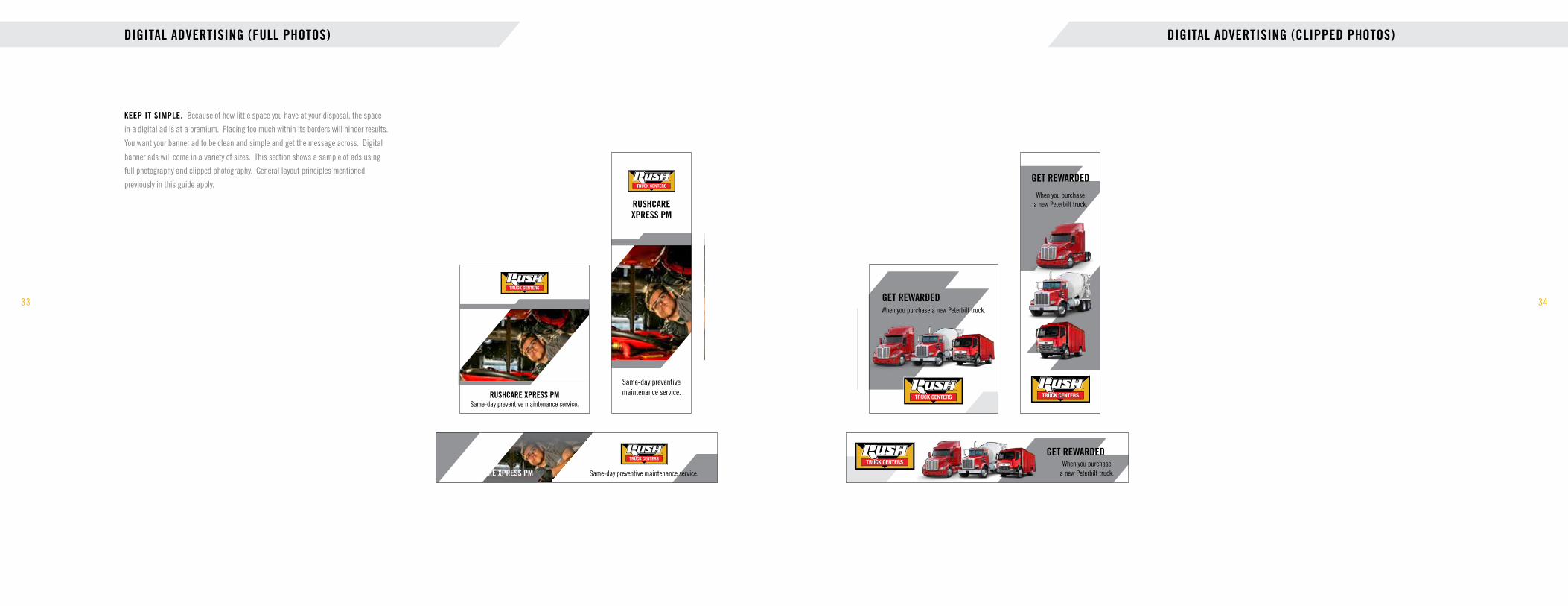
DIGITAL ADVERTISING (FULL PHOTOS)
33
KEEP IT SIMPLE. Because of how little space you have at your disposal, the space
in a digital ad is at a premium. Placing too much within its borders will hinder results.
You want your banner ad to be clean and simple and get the message across. Digital
banner ads will come in a variety of sizes. This section shows a sample of ads using
full photography and clipped photography. General layout principles mentioned
previously in this guide apply.
Same-day preventive maintenance service.
RUSHCARE XPRESS PMSame-day preventive maintenance service.
RUSHCARE XPRESS PM
Same-day preventive maintenance service.
RUSHCARE XPRESS PM
Same-day preventive maintenance service.
RUSHCARE XPRESS PMSame-day preventive maintenance service.
RUSHCARE XPRESS PM
Same-day preventive maintenance service.
RUSHCARE XPRESS PM
34
DIGITAL ADVERTISING (CLIPPED PHOTOS)
When you purchase a new Peterbilt truck.
GET REWARDED
When you purchase a new Peterbilt truck.
GET REWARDED
When you purchase a new Peterbilt truck.
GET REWARDED
When you purchase a new Peterbilt truck.
GET REWARDED
When you purchase a new Peterbilt truck.
GET REWARDED
When you purchase a new Peterbilt truck.
GET REWARDED

EXIT 556
MONDAY – FRIDAY
OPEN UNTIL 9 P.M.
EXIT 19855 MILES
OPENUNTIL 9 P.M.MONDAY – FRIDAY
OUTDOOR ADVERTISING
35
A QUICK READ. Six seconds has been touted as the industry average for reading a
billboard. So, around six words should get the message across. You can push this to a
few more, depending on their length and ease of reading, but as a rule of thumb, less
is more. Headlines that are small paragraphs will not be read.
The logo should be approximately one-third the width of the billboard.
Full-color brand logos (when applicable) align center under the Rush Truck Centers logo.
Trade Gothic Bold Condensed No. 20 for all headlines (size in relation to board).
Use gold and white text on dark backgrounds and black on light backgrounds.
EXIT 556
MONDAY – FRIDAY
OPEN UNTIL 9 P.M.
EXIT 19855 MILES
OPENUNTIL 9 P.M.MONDAY – FRIDAY
EXIT 556
MONDAY – FRIDAY
OPEN UNTIL 9 P.M.
EXIT 19855 MILES
OPENUNTIL 9 P.M.MONDAY – FRIDAY
36
OUTDOOR ADVERTISING
Sizing for brand logos should match approximately the height of the red bar in the Rush Truck Centers logo (depending on the shape of the brand logo).

STATIONERY (OPERATING DIVISIONS)
37
LETTERHEAD AND BUSINESS CARDS. Sales calls and written communications
are some of our most frequent opportunities to make an impression on customers or
prospects. The quality of our business cards and letterhead is a direct reflection of
our premium brand. And business cards, in particular, are a lasting reminder to
customers of our brand promise. Printed stationery and business cards are available
for order on the Marketing Resource Center accessible via RushNet. Downloadable
letterhead is also available at no cost on the Marketing Resource Center.
Rush Truck Center – Location | Street Address | City, ST Zip Code 678-578-1600 direct | 800-328-6136 toll free
FIRST LAST NAMETitle goes here
303-291-6301 direct832-385-5604 cell888-895-7383 toll free303-292-5377 fax
Rush Truck Centers – LocationStreet AddressCity Name, ST Zip Code
rushtruckcenters.com
38
STATIONERY (CORPORATE)
555 IH-35 South | New Braunfels, Texas 78130 | 678-578-1600 direct | 800-328-6136 toll free
JAMES E. THORSenior Vice President,Retail Sales
800-973-7874 toll free830-302-5908 direct210-823-3069 cell
555 IH-35 South New Braunfels, Texas 78130
rushenterprises.com

TRADESHOW ASSETS
39
PORTABLE BANNERS. These are like small billboards, used in an interior space. They have
primarily visual content, using bold photography and graphic elements. Headlines should be simple
and to the point. The tagline is used in a two-color, stacked version for more visual impact.
WHEN IT COMES TO TRUCKING, NO ONE OFFERS YOU MORE.
expect more.
IN STOCK AND READY TO ROLL.SM
expect more.
90" x 92"Cutout photos can overlap graphic or full photos for a “layered,” 3-dimensional effect. Use the bottom edge of the full photo in the background as a “horizon line” behind the cutout images.
40
TRADESHOW ASSETS
WHEN IT COMES TO PARTS AND SERVICE, NO ONE OFFERS YOU MORE.
expect more.
WHEN IT COMES TO PARTS, NO ONE OFFERS YOU MORE.
expect more.
36" x 92"
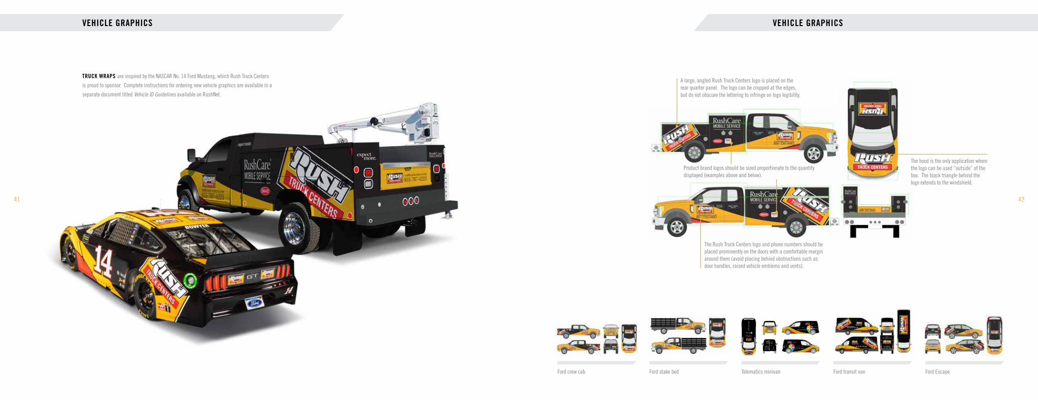
VEHICLE GRAPHICS
41
TRUCK WRAPS are inspired by the NASCAR No. 14 Ford Mustang, which Rush Truck Centers
is proud to sponsor. Complete instructions for ordering new vehicle graphics are available in a
separate document titled Vehicle ID Guidelines available on RushNet.
42
VEHICLE GRAPHICS
Ford crew cab Ford stake bed Telematics minivan Ford transit van Ford Escape
The hood is the only application where the logo can be used “outside” of the box. The black triangle behind the logo extends to the windshield.
The Rush Truck Centers logo and phone numbers should be placed prominently on the doors with a comfortable margin around them (avoid placing behind obstructions such as door handles, raised vehicle emblems and vents).
A large, angled Rush Truck Centers logo is placed on the rear quarter panel. The logo can be cropped at the edges, but do not obscure the lettering to infringe on logo legibility.
Product brand logos should be sized proportionate to the quantity displayed (examples above and below).
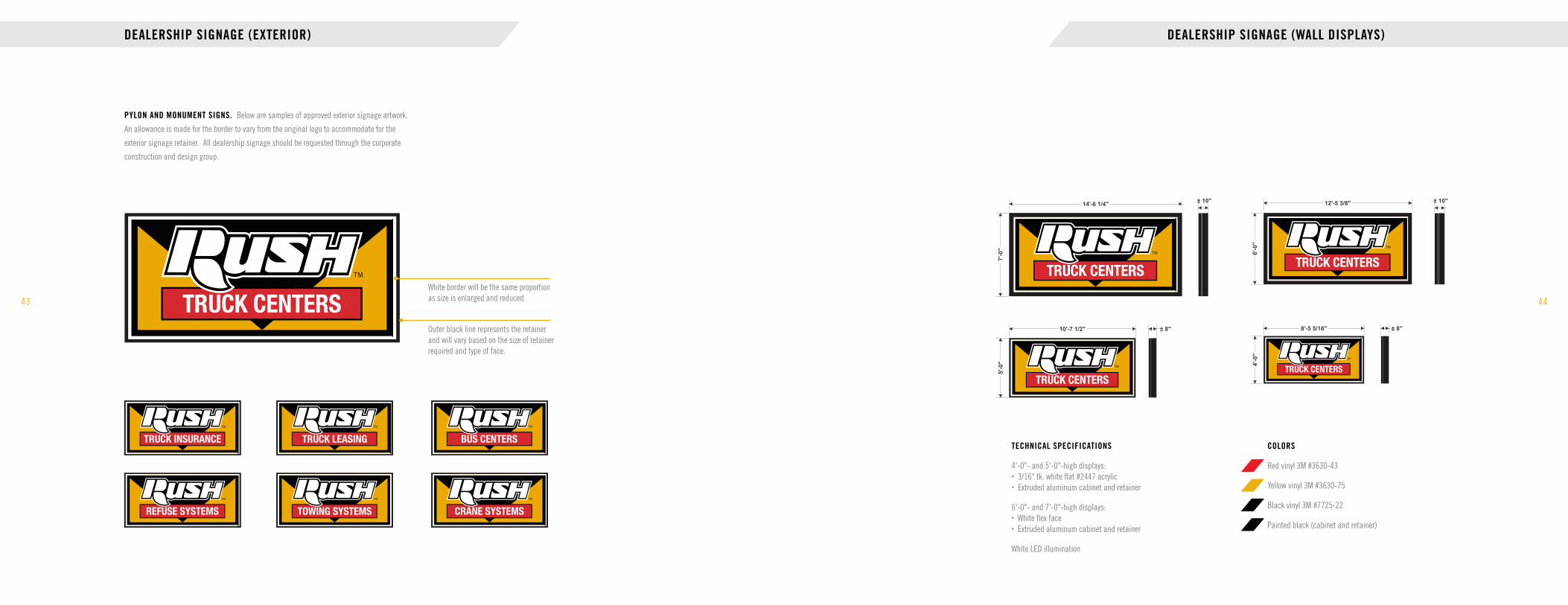
DEALERSHIP SIGNAGE (EXTERIOR)
43
PYLON AND MONUMENT SIGNS. Below are samples of approved exterior signage artwork.
An allowance is made for the border to vary from the original logo to accommodate for the
exterior signage retainer. All dealership signage should be requested through the corporate
construction and design group.
Exterior Signage Standards and Specs 2019
(V.9) 05.2019
White border will be the same proportion as size is enlarged and reduced.
Outer black line represents the retainer and will vary based on the size of retainer required and type of face.
Approved Artwork for Reproduction
2
Most Commonly Used GraphicThe only difference in the graphics is the text in the red center rectangle.
(V.9) 05.2019
WHITE BORDER WILL BE THE SAME PROPORTIONAS SIZE IS ENLARGED AND REDUCED
OUTER BLACK LINE REPRESENTS THE RETAINERAND WILL VARY BASED ON THE SIZE OF RETAINERREQUIRED AND TYPE OF FACE
44
DEALERSHIP SIGNAGE (WALL DISPLAYS)
RUSH Wall Displays
Technical specifications:
4’-0” and 5’-0”high displays:• 3/16” tk. white flat #2447 acrylic• Extruded aluminum cabinet and retainer
6’-0” and 7’-0”high displays:• White flex face• Extruded aluminum cabinet and retainer
White LED illumination
6'-
0"
± 10"± 10"
7'-
0"
14'-6 1/4" 12'-5 3/8"
10'-7 1/2"
5'-
0"
8'-5 5/16"
4'-
0"
± 8" ± 8"
Specifications
• The same sizes can be used when “TRUCK LEASING”, “BUS CENTER” “REFUSE SYSTEMS”, “TOWING SYSTEMS” or “ CRANE SYSTEMS” is specified for the red rectangle.
3
Colors:
Red vinyl 3M #3630-43
Yellow vinyl 3M #3630-75
Black vinyl 3M #7725-22
Painted black (cabinet and retainer)
(V.9) 05.2019
TECHNICAL SPECIFICATIONS
4'-0"- and 5'-0"-high displays: • 3/16" tk. white flat #2447 acrylic • Extruded aluminum cabinet and retainer
6'-0"- and 7'-0"-high displays: • White flex face • Extruded aluminum cabinet and retainer
White LED illumination
COLORS
Red vinyl 3M #3630-43
Yellow vinyl 3M #3630-75
Black vinyl 3M #7725-22
Painted black (cabinet and retainer)

DIRECTIONAL SIGNAGE
45
TECHNICAL SPECIFICATIONS. Panels to be 1/8" painted black with vinyls and digital
print applied to surface. Install between two 3"x3" posts. Only directional text, arrows and
yellow strip at top and bottom will be reflective. (Text on address directional layout to be
white reflective vinyl.) All directional signage should be requested through the corporate
construction and design group.
COLORS
Digitally printed graphics on white vinyl (Letters should never be smaller than 3" high)
Red vinyl #7725-13
Reflective yellow vinyl #3271
Reflective white vinyl #3290
Painted black (panel and posts)
Directionals
Technical specifications:
Panels to be 1/8” painted black withvinyls and digital print applied to surface.Install between two 3"x3" posts
Only directional text, arrows and yellowstrip at top and bottom will be reflective.(Text on address directional layout tobe white reflective vinyl)
Font: Trade Gothic Condensed Eighteen Bold
Font (expect more + address): Warnock Pro
18
3400 Lee Hill Dr. SHIPPING | RECEIVINGSERVICE
SALES
LEASING
SHIPPING | RECEIVINGSERVICE
SALES
LEASING
LOGO OPTION PREFERRED OPTION (4'-0")
PREFERRED OPTION (3'-0")ADDRESS DIRECTIONAL
7'-0"
7'-6"
4'-
0"
8'-
0"
5'-6"
6'-0"
4'-
6"
7'-
0"
5'-3"
5'-9"
3'-
0"
6'-
0"
7'-0"
7'-6"
4'-
0"
8'-
0"
Colors:
Digitally printed graphics onwhite vinyl
Reflective yellow vinyl #3271
Reflective white vinyl #3290
Red vinyl #7725-13
Painted black (panel and posts)
Notes:
Letters should never smaller than 3" high
(V.9) 05.2019
Directionals
Technical specifications:
Panels to be 1/8” painted black withvinyls and digital print applied to surface.Install between two 3"x3" posts
Only directional text, arrows and yellowstrip at top and bottom will be reflective.(Text on address directional layout tobe white reflective vinyl)
Font: Trade Gothic Condensed Eighteen Bold
Font (expect more + address): Warnock Pro
18
3400 Lee Hill Dr. SHIPPING | RECEIVINGSERVICE
SALES
LEASING
SHIPPING | RECEIVINGSERVICE
SALES
LEASING
LOGO OPTION PREFERRED OPTION (4'-0")
PREFERRED OPTION (3'-0")ADDRESS DIRECTIONAL
7'-0"
7'-6"
4'-
0"
8'-
0"
5'-6"
6'-0"
4'-
6"
7'-
0"
5'-3"
5'-9"
3'-
0"
6'-
0"
7'-0"
7'-6"
4'-
0"
8'-
0"
Colors:
Digitally printed graphics onwhite vinyl
Reflective yellow vinyl #3271
Reflective white vinyl #3290
Red vinyl #7725-13
Painted black (panel and posts)
Notes:
Letters should never smaller than 3" high
(V.9) 05.2019Logo option Preferred option (4'-0") Address directional Preferred option (3'-0")
46
UNIFORMS AND LOGOWEAR
BRANDED APPAREL. Uniforms enable customers to easily identify our employees, provide a standard
look across our network, reinforce our branding and are a visible representation of the professionalism of
our staff. All Aftermarket Operations employees are expected to wear approved uniforms. For the Parts
Department, the program includes all administrative staff, inventory control, delivery and inside and outside
sales personnel and warehouse personnel. For the Service and Body Shop Departments, the program includes
all administrative staff, service advisors and estimators, but excludes technicians, shop foremen and porters,
who already have shop uniforms. Uniforms may only be purchased through the approved branded merchandise
site on the Marketing Resource Center. Recommended dress slack colors are black, gray or khaki. Hats are
not an approved uniform item.
NAME BADGES. Name badges are a required component of the company uniform and should be worn by all
employees during work hours and when representing the company at industry events. Branded name badges
should be ordered from the Branded Merchandise section of the Marketing Resource Center on RushNet.
Ladies Glacier® Soft-Shell Jacket
Ladies’ Lightweight Snag-Proof Polo
The North Face Ladies’ Sweater Fleece Jacket
Warehouse Short-Sleeve T-Shirt
Under Armour Men’s Ultimate Short-Sleeve Button-Down
John Smith
Rush Enterprises logo on polished brass and Warnock Pro Display font for the name, worn on the right chest.
Rush Truck Centers (or division logo) on white and Trade Gothic Bold Condensed No. 20 font for the name, worn on the right chest.John Smith

EMAIL SIGNATURE AND PHOTOS
47
A CONSISTENT GOOD IMPRESSION. Using an email signature is like handing a person a business card
every time you send an email. You want it to look professional and show our brand in the best light. If used,
personal photos should be professional by abiding by the following: Look straight at the camera, though your
face can be at an angle. Make sure the photo is clear, in sharp focus and free from red eye and any reflection/
glare from glasses. Look natural and relaxed. Don’t hide behind items like sunglasses or hair. No silly poses
(your email signature reflects on the organization as a whole). Do not digitally manipulate any images to look
unnatural. Illustrations or emojis are not permitted. Do not use “wallpaper” backgrounds. Avoid inspirational
phrases or quotes in your signature. If you use just one phone number, no need to indicate “direct.” You can
make the URL a link if you want, just be sure to change the color to gray from the default blue.
48
GREETING CUSTOMERS
PART OF OUR BRAND. Many customers never set foot into our dealerships and businesses.
Their interactions with us are often limited to face-to-face and phone conversations. The impressions
we make on customers when greeting them should be a sincere reflection of our brand promise.
ANSWERING THE PHONE. How you answer the phone is a direct reflection of our brand promise.
Always answer with a cheerful but professional tone that conveys a sincere desire to help.
An example greeting:
“Thank you for calling (Rush Truck Centers). This is (your first name). How can I help you today?”
VOICEMAIL GREETING. We strive to answer the phone always. However, occasionally, customers
do call when we are away from our phones. Your voicemail greeting should have the same cheerful
and professional tone that you use when speaking to a customer in person. Voicemail messages
should be returned as quickly as possible, but always within the same day.
An example voicemail greeting:
“Hello. You’ve reached the voice mailbox of (your full name) with (Rush Truck Centers). I am away from
my desk at the moment, but your call is very important to me. Please leave your name, phone number
and a brief message and I will return your call as soon as I return. Thank you for calling.
IN-PERSON GREETINGS. It is true that first impressions are the most important. How we welcome
customers into our dealerships sets the tone for their interactions with us. Every customer who walks
through our doors should be greeted and welcomed. If you know the customer’s name, use it. If you do
not, introduce yourself. Look them in the eye. Shake their hand. Always thank them for their business.
Example phrases:
Hello. Welcome to Rush Truck Centers. My name is (your first name). How can I assist you today?
Hello, John. What can I help you with today?
Thank you for shopping at Rush Truck Centers. We appreciate your business.
Thank you for your business. Have a great day.
First and Last Name | TitleCompany Name | Street Address | City, ST | ZipXXX-XXX-XXXX direct | XXX-XXX-XXXX cellRushEnterprises.com
Two return spaces that will leave a comfortable vertical space between your message and your name.
Arial Bold, 10 pt, gray
Arial Regular, 10 pt, gray
Logo should be 150 pixels wide at 72 dpi (dots per inch).
(Canada)
Approved email photo styles Not approved
Place a gold, vertical pipe (with two spaces before and after) as a divider.
RUSHENTERPRISES.COM