Brand Style Guide and editorial style guide
39
MIT ALUMNI ASSOCIATION brand style guide and editorial style guide Volunteer Edition
-
Upload
khangminh22 -
Category
Documents
-
view
1 -
download
0
Transcript of Brand Style Guide and editorial style guide

MIT ALUMNI ASSOCIATIONbrand style guide andeditorial style guide
Volunteer Edition

MIT ALUMNI ASSOCIATION brANd STyLe
gUIde

INTrOdUCTION TO The brANd
MIT alumni are a diverse, talented, and invigorating community.
The MIT Alumni Association provides services and resources that
strengthen alumni ties to MIT and each other —across every stage
of life and around the globe.
This brand style guide presents the elements and visual standards
that govern the application of a new visual identity system to
all communications from the MIT Alumni Association. These
standards represent an effort to achieve a number of goals:
• To support the mission to engage alumni in serving the
strategic goals of MIT;
• To establish a distinctive visual language (i.e., logotype,
color, typeface, imagery) that clearly identifies
communications from all of the programs of the
Association;
• To provide flexibility within the system so that each piece
of communication can achieve the marketing objectives
of its respective program;
• To express the key personality attributes of MIT and the
MIT alumni community:
• Innovative
• Curious
• Entrepreneurial
• Diverse
• Global
• Quirky
• Fun
• To be consistent with the MIT institutional brand identity.
The MIT Alumni Association brand will become stronger and
more effective when these visual identity standards are applied
consistently from program to program and across all physical
and digital media. If you have questions or if you need files
or templates, please contact the MIT Alumni Association
communications team.
brANd STyLe gUIde INTrOdUCTION | 3

brANd STyLe gUIde The MIT ALUMNI ASSOCIATION brANd IdeNTITy | 4
prIMAry vISUAL IdeNTIfIerS
The visual identifiers are the core of the MIT Alumni
Association brand. In addition to the primary MIT Alumni
Association identifier, there are two related identifiers: MIT
Annual Fund and MIT Parents. The tilted square and the
name are in Alumni Red (PMS 186). “MIT” is in Alumni Gray
(PMS Cool Gray 7). All the text in both identifier variations
are in Proxima Nova Regular. Each identifier is comprised of
two parts: the logotype and the name. It is usually preferable
to use the logotype + name identifier, but the logotype-only
identifier may be used by itself if horizontal space is limited
and the context is clear.
LOgOType + NAMe IdeNTIfIer
The identifer may be scaled as a unit but not
altered. This serves as the primary branding
element and is used on most of the Association's
communications. This identifier consists of the
logotype with the full Association name. When
there is enough space, it is preferable to use
the identifer so the organization branding is
recognizable to everyone.
LOgOType-ONLy IdeNTIfIer
The logotype is the core of the visual identity of the
MIT Alumni Association. It serves as an alternate
version of the identifier and should only be used
when space does not allow for the name to appear
with the identifier. When using just the logotype,
make sure to show the full name as close to it as
possible and make sure that it is visually connected
to the logotype by using the same typeface and color.
NOTe: Always consult with MIT Alumni Association
Communications when using the visual identifier and
always use the appropriate files. Do not try to create
the identifiers. Also always consult the communications
team to ensure the correct file format is used and/or
shared with your vendors.
PMS Cool Gray 7logotype
PMS 186name

brANd STyLe gUIde | 5
MINIMUM dISpLAy SIze
To assure the quality and legibility of the identifier, never
reduce it to a scale smaller than specified below.
LOgOType + NAMe IdeNTIfIer LOgOType-ONLy IdeNTIfIer
prINT:
The smallest acceptable print width is 120 points, or
1.6667 inches.
prINT:
The smallest acceptable print width is 65 points, or
0.9028 inches.
ONLINe:
The smallest acceptable online width is 110 pixels.
ONLINe:
The smallest acceptable online width is 53 pixels.
120 pts 65 pts
110 px 53 px
The MIT ALUMNI ASSOCIATION brANd IdeNTITy | 5

X
X
X
X
X
X
X
X
brANd STyLe gUIde | 6
prOTeCTed AreA ArOUNd IdeNTIfIer
To assure the integrity and visibility of the identifier,
provide a minimum amount of protected area on
all sides. The protected area should be free of any
graphic elements that might crowd or obscure the
identifier. The dimensions of the protected area
are determined by measuring the height of the
letter M in MIT as shown below. The protected area
specifications are the same for the MIT Annual Fund
and MIT Parents identifiers.
LOgOType + NAMe IdeNTIfIer
Requires a clear space based on the height of
the letter “M” in MIT, marked “X” in the diagram
below. The same will occur for Annual Fund and
Parents versions.
LOgOType-ONLy IdeNTIfIer
Requires a clear space based on the height of
the letter “M” in MIT, marked “X” in the diagram
below. The same will occur for Annual Fund and
Parents versions.
NOTe: The relationship between the identifier and
the protected area is proportional, not absolute.
When the identifier gets smaller, the protected area
scales down as well.
The MIT ALUMNI ASSOCIATION brANd IdeNTITy | 6

TexT ALIgNMeNT
When placing the identifier on a page with text, align the text with the
“M” of “MIT Alumni Association” (as seen in example 1). When spacing is
limited, align text to the left of “MIT” (as seen in example 2).
Example 1
Example 2
brANd STyLe gUIde The MIT ALUMNI ASSOCIATION brANd IdeNTITy | 7
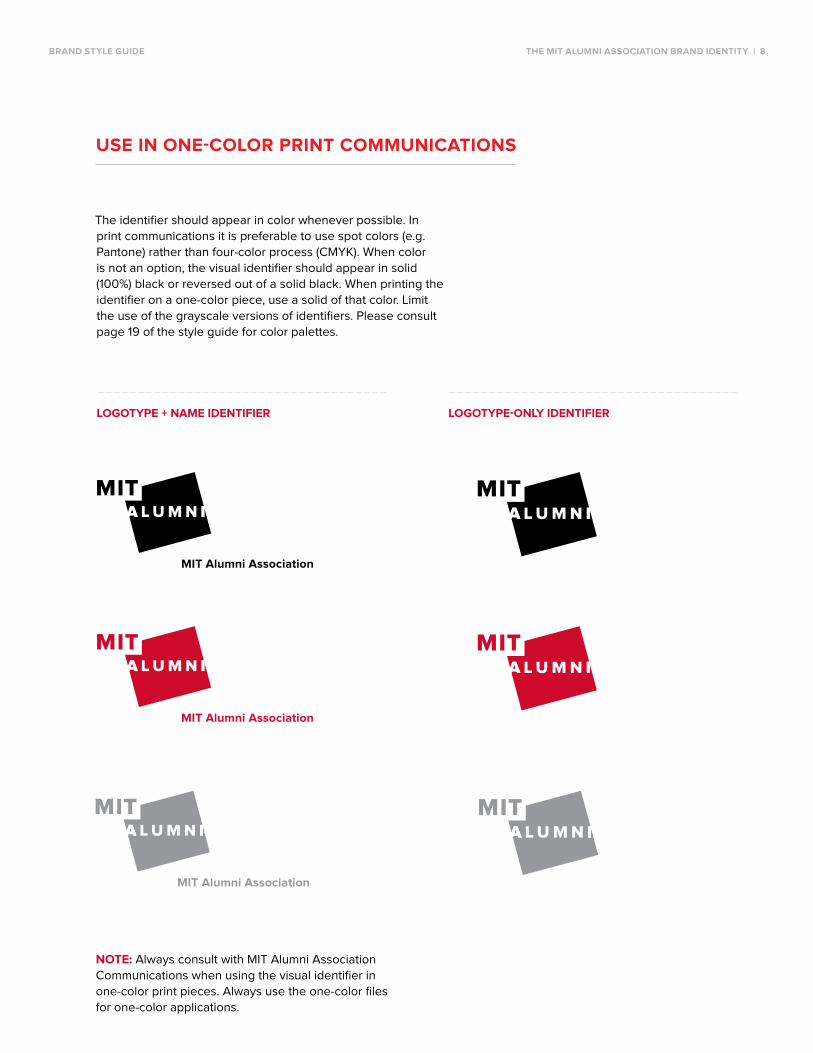
USe IN ONe-COLOr prINT COMMUNICATIONS
The identifier should appear in color whenever possible. In
print communications it is preferable to use spot colors (e.g.
Pantone) rather than four-color process (CMYK). When color
is not an option, the visual identifier should appear in solid
(100%) black or reversed out of a solid black. When printing the
identifier on a one-color piece, use a solid of that color. Limit
the use of the grayscale versions of identifiers. Please consult
page 19 of the style guide for color palettes.
NOTe: Always consult with MIT Alumni Association
Communications when using the visual identifier in
one-color print pieces. Always use the one-color files
for one-color applications.
LOgOType + NAMe IdeNTIfIer LOgOType-ONLy IdeNTIfIer
brANd STyLe gUIde The MIT ALUMNI ASSOCIATION brANd IdeNTITy | 8

brANd STyLe gUIde | 9
USe IN ONe- ANd TwO-COLOr
prINT COMMUNICATIONS exCepTIONS
If red or black are not available in a communications
piece, the identifier can be displayed in a different color.
Make sure that colors work harmoniously and there is
enough contrast that the identifier is still legible and clear.
NOTe: Always consult with MIT Alumni Association
Communications when using the visual identifier in
one-color print pieces. Always use the one-color files
for one-color applications.
LOgOType + NAMe IdeNTIfIer LOgOType-ONLy IdeNTIfIer
The MIT ALUMNI ASSOCIATION brANd IdeNTITy | 9

brANd STyLe gUIde | 10
USe wITh SOLId bACkgrOUNdS
When the identifier appears on a solid color
background, it should be reversed.
NOTe: Always consult with MIT Alumni Association
Communications when reversing out the visual
identifiers from a solid color. Always use the appropriate
files for reversing the identifier out of a solid.
LOgOType + NAMe IdeNTIfIer LOgOType-ONLy IdeNTIfIer
The MIT ALUMNI ASSOCIATION brANd IdeNTITy | 10

% % %
×
×
×
×
×
×
% %
% % %
%
% % %
brANd STyLe gUIde The MIT ALUMNI ASSOCIATION brANd IdeNTITy | 11
beST prACTICeS
LOgOType-ONLy IdeNTIfIer LOgOType + NAMe IdeNTIfIer
dO Use the appropriate artwork file.
dON'T Alter the identifier's or logo-type's perspective.
dON'T Skew or distort the identifier or logotype.
dO Reverse identifiers when on a photograph.
dO Place identifiers on a solid background color that has enough contrast.
dO Reverse identifier on a solid color.
% dO Check that the correct file type and size is being used so the logotype remains crisp in the selected medium.

× × ×
× × ×
× × ×
× × ×
× × ×
× × ×
brANd STyLe gUIde The MIT ALUMNI ASSOCIATION brANd IdeNTITy | 12
LOgOType-ONLy IdeNTIfIer LOgOType + NAMe IdeNTIfIer
dON'T
Use the MITAA red in a way that may conflict with the MIT red.
dON'T
Use patterns that compromise legibility of identifiers when reversed.
dON'T
Use identifiers on gray that may conflict with MITAA gray.
dON'T
Alter configuration or size relationships.
dON'T
Place identifiers on patterns or textures that may be distracting.
dON'T
Change the color of the identifier or logotype to the official MIT palette (PMS 201 + 424) unless restricted.

brANd STyLe gUIde The MIT ALUMNI ASSOCIATION brANd IdeNTITy | 13
The primary colors for the MIT Alumni Association identity
are indicated below for both print applications (spot and
CMYK) and digital applications (RGB and HEX). For print
communications, spot colors are preferable to CMYK
values. Alumni Red and Alumni Gray are the colors for the
Association identity. It is preferable to use these colors
when possible. The Alumni Alternate Gray should only be
used when the Alumni Gray is not available or is too dark.
prIMAry COLOr pALeTTe
ALUMNI RED
SPoT PMS 186 C
CMYK 0 | 100 | 81 | 4
RGB 207 | 30 | 54
HEX #CE1126
ALUMNI GRAY
SPoT PMS Cool Gray 7
CMYK 0 | 1 | 4 | 35
RGB 165 | 163 | 158
HEX #A5A39E
GRAYSCALE 48% Black
ALUMNI ALTERNATE GRAY
SPoT PMS 421 C
CMYK 13 | 8 | 11 | 26
RGB 178 | 180 | 178
HEX #B2B4B2
GRAYSCALE 37% Black
OffICIAL MIT pALeTTe
The MIT Red and Gray are to be used
only in official documents that are pro-
duced by the office of the President. For
all other communications, please use the
Association colors.
MIT RED
SPoT PMS 201 C
CMYK 0 | 100 | 65 | 34
RGB 153 | 51 | 51
HEX #993333
MIT GRAY
SPoT PMS 424 C
CMYK 0 | 0 | 0 | 70 (70% black)
RGB 102 | 102 | 102
HEX #666666
brANd STyLe gUIde The MIT ALUMNI ASSOCIATION brANd IdeNTITy | 14
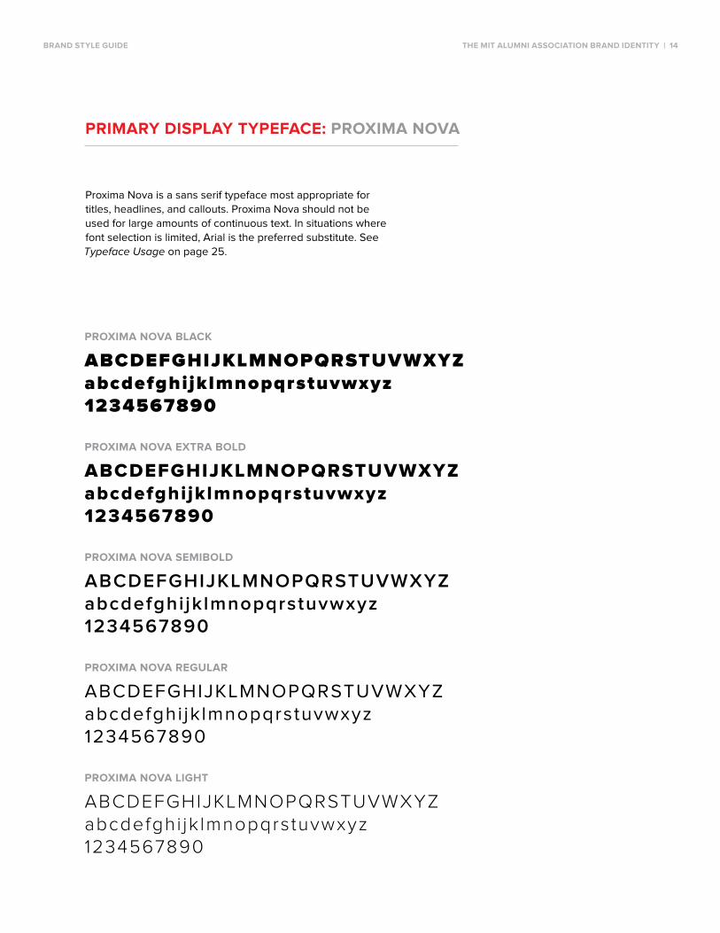
prIMAry dISpLAy TypefACe: prOxIMA NOvA
Proxima Nova is a sans serif typeface most appropriate for
titles, headlines, and callouts. Proxima Nova should not be
used for large amounts of continuous text. In situations where
font selection is limited, Arial is the preferred substitute. See
Typeface Usage on page 25.
prOxIMA NOvA bLACk
ABCDEFGHIJKLMNOPQRSTUVWXYZabcdefghijklmnopqrstuvwxyz1234567890 prOxIMA NOvA exTrA bOLd
ABCDEFGHIJKLMNOPQRSTUVWXYZabcdefghijklmnopqrstuvwxyz1234567890 prOxIMA NOvA SeMIbOLd
ABCDEFGHIJKLMNOPQRSTUVWXYZabcdefghi jk lmnopqrstuvwxyz1234567890 prOxIMA NOvA regULAr
ABCDEFGHIJKLMNoPQRSTUVWXYZabcdefghi jk lmnopqrstuvwxyz1234567890 prOxIMA NOvA LIghT
ABCDEFGHIJKLMNOPQRSTUVWXYZabcdefghi jk lmnopqrstuvwxyz1234567890

brANd STyLe gUIde The MIT ALUMNI ASSOCIATION brANd IdeNTITy | 15
prIMAry TexT TypefACe: AdObe CASLON prO
Adobe Caslon Pro is ideally suited for large quantities of
continuous text and for the contact information on Association
stationery. Adobe Caslon Pro should not be used for titles,
headlines, and callouts. In situations where font selection is
limited, Georgia is the preferred substitute. See Typeface
Usage on page 25.
AdObe CASLON prO bOLd
ABCDEFGHIJKLMNOPQRSTUVWXYZabcdefghijklmnopqrstuvwxyz1234567890 AdObe CASLON prO SeMIbOLd
ABCDEFGHIJKLMNOPQRSTUVWXYZabcdefghijklmnopqrstuvwxyz1234567890 AdObe CASLON prO regULAr
ABCDEFGHIJKLMNOPQRSTUVWXYZabcdefghijklmnopqrstuvwxyz1234567890

brANd STyLe gUIde The MIT ALUMNI ASSOCIATION brANd IdeNTITy | 16
ALTerNATe TypefACeS
These alternative typefaces are to be used only when the primary
typefaces are not available. See Typeface Usage on page 25.
ALTerNATIve dISpLAy TypefACe: ArIAL
ArIAL bOLd
ABCDEFGHIJKLMNOPQRSTUVWXYZabcdefghijklmnopqrstuvwxyz1234567890 ArIAL regULAr
ABCDEFGHIJKLMNOPQRSTUVWXYZabcdefghi jk lmnopqrstuvwxyz1234567890
ALTerNATIve TexT TypefACe: geOrgIA
geOrgIA bOLd
ABCDEFGHIJKLMNOPQRSTUVWXYZabcdefghijklmnopqrstuvwxyz1234567890 geOrgIA regULAr
ABCDEFGHIJKLMNOPQRSTUVWXYZabcdefghijklmnopqrstuvwxyz1234567890

%×
×
×
%
%×
×
%
%×
×
%
%×
×
%
% ×
brANd STyLe gUIde The MIT ALUMNI ASSOCIATION brANd IdeNTITy | 17
Below is a guide to which applications are most likely to have, or
not have, the primary typefaces available.
TypefACe USAge
prIMAry TypefACeS ALTerNATIve TypefACeS
Adobe Creative Suite programs
Photoshop
Illustrator
InDesign
Flash
After Effects
Microsoft Office programs
Word
PowerPoint
Excel
outlook
brANd STyLe gUIde The MIT ALUMNI ASSOCIATION brANd IdeNTITy | 18
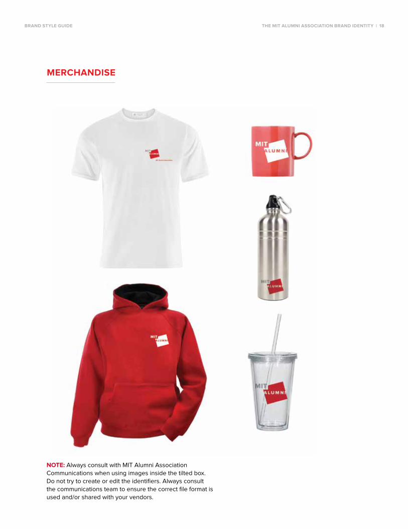
NOTe: Always consult with MIT Alumni Association
Communications when using images inside the tilted box.
Do not try to create or edit the identifiers. Always consult
the communications team to ensure the correct file format is
used and/or shared with your vendors.
MerChANdISe

brANd STyLe gUIde The MIT ALUMNI ASSOCIATION brANd IdeNTITy | 19
For overall brand-related questions including style,
brand assets, and messaging, please contact:
emily Muldoon kathan
CONTACT INfOrMATION

MIT ALUMNI ASSOCIATION
edITOrIAL STyLe gUIde

INTrOdUCTION
The MIT Alumni Association Editorial Style Guide provides guidelines for copy created by the
Association for print and electronic media. The goal is to make it easier for staff to solve common
editorial problems and streamline the publication process.
The editorial guide consists of two sections that list topics in alphabetical order:
• MIT Style covers degrees, nomenclature, acronyms, and other Institute guidelines.
• Grammar, Usage, and Style (GUS) offers best practices for clear writing.
Other references and guides
For more detailed queries, please consult these sources:
Style Guide
• Chicago Manual of Style, 16th edition (requires MIT certificate)
• Chicago Manual of Style Q & A
Dictionary
• Merriam-Webster
Additional References
• MIT Libraries References
• MIT Publications office Style Guide
• MITAA Brand Style Guide
Hyperlinks are highlighted throughout this document in THIS CoLoR and are additionally listed in
the order they appear, at the end of each section.
www.chicagomanualofstyle.org/16/contents.html
www.chicagomanualofstyle.org/qanda/latest.html
www.merriam-webster.com
libguides.mit.edu/content.php?pid=12379&sid=82999
web.mit.edu/annualreports/stylesheet.html
edITOrIAL STyLe gUIde INTrOdUCTION | 21

MIT STyLe

ACAdeMIC degreeS
MIT. Abbreviated MIT degrees do not have periods {Correct—PhD; Incorrect—Ph.D.}.
Current List of MIT Degrees offered
Abbreviation degree Abbreviation degree
SB Bachelor Science MArch Master of Architecture
MBA Master of Business Administration SM Master of Science
MCP Master of City Planning PhD Doctor of Philosophy
MEng Master of Engineering ScD Doctor of Science
MFin Master of Finance
Advance database. Degree abbreviations from the Advance software database reports may not
be correct for publications. Some examples:
Correct Incorrect (Advance)
MArch MAR
MEng MNG
MFin MF
PhD PHD
ScD SCD
For more information, see MIT’s degrees offered. For history and past degrees offered, see the
Registrar's degree and enrollment history.
referencing alumni. Upon first reference of alumni, list all MIT degrees. The undergraduate
degree is noted by year only—do not precede the undergraduate year with “SB.” Graduate and
doctoral degrees should list degree and year earned {Tim Beaver ’99, SM ’03, PhD ’07}.
All single quotes abbreviating class years must face away from the number {’99} in print text.
online, straight quotes are used.
web.mit.edu/facts/degrees.html
web.mit.edu/registrar/stats/mobile/all-time/degree.html
edITOrIAL STyLe gUIde MIT STyLe | 23

ACAdeMIC ANd prOfeSSIONAL TITLeS
Professional titles—both academic and administrative—should be uppercase before a person’s
name and lowercase after. {The lecture will be led by Professor Simon Johnson.} {Simon Johnson,
a professor of global economics and management at Sloan, will lead the lecture.}
faculty. In formal contexts, faculty with endowed professorships should be identified by their
complete title {Ronald A. Kurtz ’54 Professor of Entrepreneurship Simon Johnson}. In less formal
settings, including Slice of MIT, emails, and newsletters, faculty should be referred to by their pro-
fessional title only {Professor Simon Johnson}.
If faculty members have multiple titles, they should be listed in descending order based on rank
{Matthew Wilson, associate department head for education, brain, and cognitive sciences and a
Picower scholar, is the featured speaker at next month’s Faculty Forum online}.
Alumni faculty. Faculty, staff, and administrators who are also MIT alumni should have their MIT
degrees listed after their name upon first reference {Chancellor Eric Grimson PhD ’80}.
ACrONyMS
Institute acronyms do not use periods. The acronym MIT is acceptable for first reference. All other
acronyms must first list the complete name immediately followed by the acronym in parentheses
{Black Alumni of MIT (BAMIT)}. The acronym alone is acceptable thereafter.
MIT Acronyms offers a comprehensive list.
wikis.mit.edu/confluence/display/ACRoNYMS/Acronyms+Home
ALUMNI ASSOCIATION
In first reference, MIT Alumni Association or Alumni Association is acceptable. In second and other
references, MITAA or the Association can be used but must be capitalized. Do not capitalize “the”
in “the Association.” AA is only acceptable for internal documents.
edITOrIAL STyLe gUIde MIT STyLe | 24

ALUMNI defINed
Former MIT students are considered alumni if they earned a degree from MIT or completed one
semester of undergraduate study or one year of graduate study.
bUILdINgS ANd rOOMS
Upon first reference, locations with a specific building and room should be denoted as building-
hyphen-room. {Building W98, room 302 becomes W98-302}. Building addresses that do not refer
to a specific room should be noted as Bldg. [#]. “Bldg.” is always capitalized {Building W98 = Bldg.
W98}. In formal contexts, endowed buildings should be referred to by their endowed name with
the building number in parentheses {The Cecil and Ida Green Building (Bldg. 54)}. When an event
is in a named room, add that after the room number {10-105, Bush Room}. In second references
and less formal settings, the building number can be used alone. A complete list of MIT building numbers and addresses are listed in the building appendix or
check the Institute’s interactive map.
web.mit.edu/comdor/editguide/appendices/campus.html
whereis.mit.edu/
CApITALIzATION
Massachusetts Institute of Technology is always capitalized. MIT is acceptable for first reference.
The word Institute, when referring to MIT, can be used as a second reference and is always capital-
ized {Tim Beaver has been the Institute’s mascot for nearly 100 years.}
The following items are always capitalized.
Item example
Building names Bldg. 7
Complete names of MIT locations Killian Court
Complete course names Ecology I: The Earth System
Course numbers Course 6
Full names of committees, programs, groups, and clubs MIT Club of Germany
Formal department names Department of Physics
edITOrIAL STyLe gUIde | 25 MIT STyLe | 25

The following items are not capitalized.
Item example
Second, generic references to MIT locations the student center
Second, abbreviated references to committees,
programs, groups, and clubs the club
Informal or second references to departments the physics department
COUpLeS, SpOUSeS, ANd pArTNerS
In most cases, the Association addresses invitations and letters to individual alumni. If the invita-
tion is sent to a couple or a couple is being acknowledged for a gift, they may be addressed either
formally or less formally using first names with the woman’s name first. For same-sex couples, the
names will be listed alphabetically.
The style of named gifts will be negotiated with donors.
Same last name
Mr. and Mrs. Curtis Marble (traditional)
Kathy Marble and Curtis Marble (modern)
different last names
Nancy Fellows and Scott Dunn
Dr. Barbara Harris and Mr. James Werner
Mr. Robert Hanson and Mr. James Watson
If the occasion calls for degree years
Betty and Tim Beaver ’52
Betty ’52, SM ’53 and Tim Beaver ’53
edITOrIAL STyLe gUIde MIT STyLe | 26

COUrSe/COUrSe
Course (capitalized). The organized curriculum leading to a specific degree, also called a major at
other institutions {Course 15: SB in management from the Sloan school}. For MIT-specific audienc-
es only.
course (lowercase). A generic subject or class. View a complete list of the courses offered within
each school's departments.
web.mit.edu/facts/academic.html
CUrreNT STUdeNTS
Undergraduate. Current undergraduate students may be referred to by their anticipated gradua-
tion year {John Smith ’17}. They can also be referred to as sophomore John Smith or some varia-
tion {engineering student John Smith, undergraduate John Smith}.
graduate. Graduate students may be referred to with a “G” following their name {Jane Smith G} or
as graduate student Jane Smith.
degreeS
MIT. Unless beginning a sentence, the terms master's degree, master of science, bachelor's
degree, bachelor of science, doctorate, and similar degree terminology are not capitalized. Please
note the apostrophe in master’s and bachelor’s. Degree names are not capitalized. {Jane Smith
received a bachelor’s degree in biology from MIT.}
If MIT alumni received more than one undergraduate degree in the same year, that year should
only be mentioned once {John Smith ’98}. If alumni received more than one graduate or doctoral
degree in the same year, each degree should be listed {John Smith SM ’08, SM ’08, PhD ’13}.
Non-MIT degrees. on name badges, list only MIT degrees, not degrees from other universities. In
text, non-MIT degrees may be mentioned {Stevens, who also holds a master’s degree from Boston
College, was named president of the company in 2006.} Avoid non-MIT suffixes (JD, MD, etc.)
Active military titles should be included in the first reference.
edITOrIAL STyLe gUIde MIT STyLe | 27

depArTMeNT NAMeS ANd NUMberS
Department names are capitalized when written formally as the complete official title. otherwise,
they are not capitalized. {Samuel Allen was appointed associate professor in the Department of
Material Science and Engineering.}
LAbOrATOrIeS ANd CeNTerS
View a list of labs, centers, and programs offered at MIT. Use the same rules as Department
Names and Numbers.
web.mit.edu/research/
MIT
Use the indefinite article “an” when preceding MIT instead of “a.” {Amar Gopal Bose ’51, SM ’52,
ScD ’56 became an MIT professor in the 1950s.} However, use “a” before Massachusetts Institute
of Technology.
NAMe bAdgeS
Tech reunions, AA events. Name badges should have three lines. Line one has the graduate’s pre-
ferred first name in bold and larger than the other lines {Bob}. The second line has the last name
and degree {Ferrara ’67}. The third line has additional information that can be changed based on
the event, including location, volunteer role, living group, and course.
If the name badge has a particularly large font or if alumni have many degrees, the third line
cannot be used. Do not use middle initials on name badges. The Alumni Association logo should
appear at the bottom of the badge and another event or department logo may appear next to the
AA logo.
fonts. Use a serif font {serif vs. sans serif.} See the MITAA Brand Style Guide for specifics.
Cardinal and gray. Events with an older population should use large font sizes.
edITOrIAL STyLe gUIde MIT STyLe | 28

pAreNTS
Parents should be identified with a “P” and the graduation or anticipated graduation year of their
student following their last name. If the parent has more than one graduate or student, the earliest
degree year should be listed first {Ron Stevens P ’10, P ’14, P ’16}. Parents of current graduate stu-
dents may request the designation P G.
preSIdeNT reIf
on written first reference, always use the full name and title {MIT President L. Rafael Reif}. on sec-
ond reference, Rafael Reif and President Reif are correct. {President Reif became an MIT faculty
member in 1980.} Phonetics: (rīf).
pUbLICATIONS
MIT newspapers, blogs, and magazines are italicized {The Tech, Slice of MIT, Spectrum, MIT Tech-
nology Review}. Web-only news sites are not italicized {MIT News}.
SChOOLS wIThIN MIT
MIT has five schools. Upon first reference, they should be spelled out and capitalized. If the abbre-
viated second reference is an acronym, it should be listed in parentheses immediately after the
first reference.
School (first reference) Second reference
School of Architecture and Planning (SA+P) SA+P
School of Engineering the engineering school
MIT Sloan School of Management Sloan
School of Humanities, Arts, and Social Sciences (SHASS) SHASS
School of Science the science school
edITOrIAL STyLe gUIde MIT STyLe | 29

SLANg
MIT slang. View a helpful, comprehensive list of MIT slang and nomenclature. Using MIT slang
may not be appropriate for more formal publications or marketing materials.
studentlife.mit.edu/mindandhandbook/campus-life/mit-slang
wIdOwS ANd wIdOwerS
Widows and widowers may be referred with a W preceding their late spouse’s year of graduation
{Jane Smith W ’47}.
edITOrIAL STyLe gUIde MIT STyLe | 30

grAMMAr, USAge,
ANd STyLe

ACrONyMS
When using acronyms, write out the full name with the first mention and put the acronym in paren-
theses after that mention. Exceptions include MIT, US, and USA. In general, use all caps and no
periods {ACLU, NASA, US}. Avoid using acronyms in headlines unless they are widely known.
AddreSSeS
Differentiate the parts of an address with commas: addressee, street info, and state info {Send
photos to the Class of ’73 secretary, 82 Jones Street, Billings, Montana, 59101}. If you are using
the US postal state abbreviations, no commas separate town, state, and ZIP code, but do put two
spaces between state and ZIP code. {Send your registration to Tech Reunions, MIT, W98-200, 600
Memorial Dr., Cambridge MA 02139, before midnight EDT.}
ALUMNI/ALUMNAe/ALUMNUS/ALUMNA
alumni a group of male graduates or a group of both male and female graduates
alumnae a group of female graduates
alumnus one male graduate
alumna one female graduate
AMperSANd (&)
Avoid using the ampersand as an abbreviation for “and” except when it is part of an official name
of a company, product, or other proper noun.
edITOrIAL STyLe gUIde grAMMAr, USAge, ANd STyLe | 32

CApITALIzATION
Capitalize complete formal names {Department of Biology, but not biology department}. Capitalize
class names {Introduction to Bioengineering}. Avoid capitalizing "the" even if the organization uses
that style. {She is a longtime reader of the New York Times.} Seasons are not capitalized unless
they begin a sentence. {Spring, summer, fall, and winter can be lovely in New England.}
CLIChéS
Avoid overused language, such as elephant in the room or reinvent the wheel. Research shows
that clichés are meaningless to readers. Never put a cliché in quotes—that just emphasizes the
error. For a quick reminder, see this cliché list.
www.clichelist.net/
COMMAS
Serial commas. Place a comma before the conjunction {and, or} when using three or more items.
{Giving to MIT benefits MIT, the donor, and current students.}
Complex sentences. Use a comma to separate parts of a compound sentence when there is a
subject and verb in both parts. {He lived in Africa, and she lived in the United States.} Do not use a
comma if the sentence has one subject and two verbs. {He lived in Africa and then moved to Hol-
land.} Avoid comfort commas—commas that are placed in long, wordy sentences where a speaker
might want to pause. It's better to rewrite it or break the sentence into two.
Use a comma to set off a slight break in a sentence. {The report was, to say the least, a bombshell.}
Use an em dash when a more abrupt break in thought occurs. {Professor Miller’s lecture—an ex-
plosive commentary on Syria—was published on the Huffington Post website.}
Locations. When using a city and state, put commas around the state. {My aunt once lived in Mis-
soula, Montana, but hated the cold.} If abbreviations are necessary, use the US postal code without
the comma {Missoula MT}.
edITOrIAL STyLe gUIde grAMMAr, USAge, ANd STyLe | 33
dASheS ANd hypheNS
em dash. Use the em dash to set up abrupt changes, digressions, or defining elements in a sen-
tence. {She only invited three people—those who could appreciate the movie—to go with her.}
en dash. Use the en dash with dates, times, and in place of “through” or “to” in inclusive dates and
times. {The dinner is 6:30–7:30 p.m. tonight.}
hyphens. Hyphens are used for word breaks, compound adjectives, and prefixes. {The right-hand
choice is best.}
Dashes and hyphens should not be surrounded by spaces.
dATeS, TIMe, ANd erAS
dates. In regular text, use month, date, and year. {The event was scheduled for December 12,
2014, from 10:00 a.m.–1:30 p.m.} In display text (programs or booklets), you may use abbreviations
as long as they are consistent throughout the publication {Dec. 12, 10:00 a.m.–1:30 p.m.}.
A comma should be placed before and after the year in a three-part date. {on January 22, 2004,
Chuck Will spoke to the WebPub group about blogging.} When only the month and year are given,
however, do not use commas. {Anne sent around the March 2004 meeting agenda}.
Time. 12:00 p.m. should be written as noon; 12:00 a.m. should be written as midnight. {The recep-
tion was set for September 23, 9:00 p.m.–midnight.}
If the times are both morning or afternoon, do not repeat a.m./p.m. {Dec. 12, 1:00–2:30 p.m.}
Centuries and eras. Use words for fewer than 10 centuries, numerals for 10 or more. {The Aya
Sofya was built in the fourth century; its use was changed from church to mosque in the 15th cen-
tury.}
For decades, use an apostrophe to indicate something is missing. All single quotes abbreviating
decades must face away from the number {the ’90s}.
Time zones
When a time zone is critical, such as a registration deadline, use Eastern Daylight Time (EDT) or
Eastern Standard Time (EST), as needed. {Submit your entry by 10:00 p.m. EDT to enter the con-
test.} Daylight time changes mid-March and early November.
edITOrIAL STyLe gUIde grAMMAr, USAge, ANd STyLe | 34

eMAIL TexT
Subject lines. Keep subject lines short (6-8 words). Load the first two words of subject lines,
headlines, and bullet points with information-carrying words—they are the most visible to readers.
{Wrap Your Baby in Swaddling Gear?}
best email practices. Use concise, easy-to-scan text. Avoid excessive font sizes and treatments,
exclamation points, too many links, and lengthy paragraphs.
Propose a clear call to action: be specific about the message and response options.
Check emails on multiple browsers and mobile devices. When possible, make file sizes smaller by
reducing photos and PDF attachments to improve deliverability and ease mobile users’ data loads.
LISTS
In text. Colons may begin lists, but only after a complete phrase or sentence. {Three elements
comprise alumni engagement: event attendance, giving, and online activities.} To avoid problems,
never put a colon after a verb or a preposition such as "to." In display text or for emphasis, you may
turn lists into bullet lists.
{Three elements comprise alumni engagement:
• Eventattendance
• Giving
• Onlineactivities}
edITOrIAL STyLe gUIde grAMMAr, USAge, ANd STyLe | 35

NONdISCrIMINATOry LANgUAge
gender. Avoid using male terms to describe mixed groups or positions held by either gender. Use
plurals rather than gender-specific singular. Use gender-neutral titles.
Correct Incorrect
Contestants must submit their portfolios. A contestant must submit her portfolio.
The child left a lunch box on the bus. The child left his lunch box on the bus.
Bill was chair of the board of trustees, Bill was chairman of the board of trustees,
taking over from Jill. taking over from Jill.
Humans lived on the Savannah Men lived on the Savannah
for thousands of years. for thousands of years.
First-year students arrive for orientation early. Freshmen arrive for orientation early.
They were staffing the registration desk. They were manning the registration desk.
Other biases. Emphasize the person, not the characteristic. Terms are best used as adjectives,
not nouns. Avoid using labels, such as sex, race, ethnicity, disability, religion, or sexual orientation,
unless they are relevant.
Correct Incorrect
The six-year-old child was deaf and mute. The deaf-mute was six years old.
Shirley Chisolm was the first African-American Shirley Chisolm was a fine African-American
woman elected to Congress. Congressional representative.
NUMberS
Spell out numbers under 10; use numerals starting with 10 and above.
edITOrIAL STyLe gUIde grAMMAr, USAge, ANd STyLe | 36

pAreNTheTICAL eLeMeNTS
When adding explanatory material, set off the phrase with punctuation. If just a slight break is
needed, use commas to offset the explanation or comment. {The report was, to say the least,
provocative.} Use an em dash if more emphasis is desired. {The report—which condemned the
decision—was widely circulated to senior managers.}
perSON: I, yOU, They
first person. only use first person (I or we) when the author is named. {I hope you will attend our
30th reunion in June—Class President John Jones.} Convert phrases like “Join us at the xxx.” to
“Please come to the xxx.”
Second person. Use second person, or direct address, to emphasize a connection between the
reader and the event or topic. overuse, however, can sound like sales copy. {You can register now
for your 30th reunion.}
Third person. Use third person most of the time. {The Association welcomed 300 alumni to their
30th reunion last year.}
QUOTATION MArkS
Use smart quotes in print; on the web, use straight quotes (to avoid coding disasters).
Periods and commas always go inside quotation marks. {He always wanted “to hear only the best
about his friends.”}
Question marks and exclamation points go outside quotes unless they are part of the quoted ma-
terial. {It was too bad he never got an answer to his question, “What is the meaning of life?”}
Colons and semicolons go outside of quotation marks. {The students protested lab animal condi-
tions that were “beyond abysmal”; however, they could not cite examples of problems.}
Quotes are used around titles of short works or parts of whole works. {I wrote the chapter, “Ru-
minating about God,” published in the 2013 book, Life's Great Puzzles.} {The article, “How to Use
Social Media,” was published in the New York Times.}
edITOrIAL STyLe gUIde grAMMAr, USAge, ANd STyLe | 37

reSTrICTIve ANd NONreSTrICTIve CLAUSeS
restrictive. Use “that” if the clause includes information essential to the meaning of the sentence
and do not add commas. {The book that I just finished reading is due back tomorrow.}
Nonrestrictive. Use “which” and offset with commas if the absence of the material would not
change the meaning of the sentence. {The book, which described French cathedrals, is due back
tomorrow.} Use the same rule with phrases beginning with "such as" and "including" i.e. use a com-
ma when the information is nonrestrictive.
SpACeS beTweeN SeNTeNCeS
Use only one space between sentences in published text whether print or digital. However, use
two spaces between a postal state abbreviation and the ZIP code.
TeLephONe NUMberS
Do not use parentheses around area codes since they are no longer optional. Use hyphens to
separate the groups of numbers {617-333-4444}.
TITLeS
example Action
Event and program titles Capitalize and do not use quotation marks. {The panel on How
to Reverse Climate Change drew a wide audience.}
MIT classes and lectures Capitalize and do not use quotation marks. {He took
2.009 Product Engineering Processes.}
Whole units Books, operas, magazines, TV series are capitalized and
in italics {I love NCIS.}
Parts of whole units Chapters, songs, articles, episodes: capitalized in quotes.
{The fifth NCIS episode, “Dante’s Dilemma,” was great.}
edITOrIAL STyLe gUIde grAMMAr, USAge, ANd STyLe | 38

people. Capitalize titles in front of names {President L. Rafael Reif was inaugurated last year.} Titles
following a name or as a subsequent reference should be lowercase. {L. Rafael Reif, president of
MIT, was inaugurated last year. The chancellor has agreed to serve on the board for an additional
year.}
Use the same rules for club and class officers. {MIT Club of Boston President Tim Beaver ’67 re-
ceived an award this year. Beaver, president since 2010, holds two MIT degrees.}
web LINkS, UrLS, ANd SOCIAL MedIA
Both the Internet and the World Wide Web, the formal names, are capitalized but informal referenc-
es like the web or the net are not.
Use each social media’s preferred capitalization: LinkedIn, Facebook, Twitter (but you contribute
tweets), Google+, Instagram, etc.
UrLs. URLs in print text do not need “http://” or “https://.” {Learn more on the MIT Alumni Associa-
tion website: alum.mit.edu.}
The Association uses the modern term, email, without the hyphen.
digital links. Text links in digital text should use a few key words that describe what the link leads
to or actions to take. Avoid terms like “click here” or “more.” {After the election, the state published
the county-by-county totals. For the discount, please register by May 15.}
CONTACT INfOrMATION
For editorial style or MIT style questions, please contact:
Nancy duvergne Smith
Jay London
edITOrIAL STyLe gUIde grAMMAr, USAge, ANd STyLe | 39