Perfect Maps for Quick Reading? Comparing Usability of Heat ...
24
International Journal of Geo-Information Article Heat Maps: Perfect Maps for Quick Reading? Comparing Usability of Heat Maps with Different Levels of Generalization Katarzyna Slomska-Przech * , Tomasz Panecki and Wojciech Pokojski Citation: Slomska-Przech, K.; Panecki, T.; Pokojski, W. Heat Maps: Perfect Maps for Quick Reading? Comparing Usability of Heat Maps with Different Levels of Generalization. ISPRS Int. J. Geo-Inf. 2021, 10, 562. https://doi.org/ 10.3390/ijgi10080562 Academic Editor: Wolfgang Kainz Received: 6 July 2021 Accepted: 15 August 2021 Published: 18 August 2021 Publisher’s Note: MDPI stays neutral with regard to jurisdictional claims in published maps and institutional affil- iations. Copyright: © 2021 by the authors. Licensee MDPI, Basel, Switzerland. This article is an open access article distributed under the terms and conditions of the Creative Commons Attribution (CC BY) license (https:// creativecommons.org/licenses/by/ 4.0/). Department of Geoinformatics, Cartography and Remote Sensing, Faculty of Geography and Regional Studies, University of Warsaw, Krakowskie Przedmiescie 30, 00-927 Warsaw, Poland; [email protected] (T.P.); [email protected] (W.P.) * Correspondence: [email protected] Abstract: Recently, due to Web 2.0 and neocartography, heat maps have become a popular map type for quick reading. Heat maps are graphical representations of geographic data density in the form of raster maps, elaborated by applying kernel density estimation with a given radius on point- or linear-input data. The aim of this study was to compare the usability of heat maps with different levels of generalization (defined by radii of 10, 20, 30, and 40 pixels) for basic map user tasks. A user study with 412 participants (16–20 years old, high school students) was carried out in order to compare heat maps that showed the same input data. The study was conducted in schools during geography or IT lessons. Objective (the correctness of the answer, response times) and subjective (response time self-assessment, task difficulty, preferences) metrics were measured. The results show that the smaller radius resulted in the higher correctness of the answers. A larger radius did not result in faster response times. The participants perceived the more generalized maps as easier to use, although this result did not match the performance metrics. Overall, we believe that heat maps, in given circumstances and appropriate design settings, can be considered an efficient method for spatial data presentation. Keywords: heat map; thematic map; user study; generalization 1. Introduction The world of small-scale mapping on the web is constantly evolving. The main aim of such cartographic representations is often to quickly and quite effectively present geographical relations of both qualitative and quantitative character. For the latter, different thematic map types are used, including those already well established, such as diagrams, choropleth maps, dot maps, or isolines. In the age of neocartography and Web 2.0 [1,2], new map types have emerged, such as heat maps that allow point data density based on point-to-area estimation to be visualized [3–5]. From the point of view of the classification of data presentation methods by MacEachren and DiBiase [6], heat maps can be classified as continuous and smooth maps. The growing popularity of heat maps comes from their attractiveness and ease of creation, using various mapping libraries [5]. Despite being commonly applied, it has not been evaluated whether they are an effective solution as maps for quick reading in a web environment. Similarly, it has not been verified to what extent their level of detail (generalization) is a key issue. Heat maps were imported into cartography from data visualization techniques, similar to other map types already well established in cartography, such as diagrams, charts, dots or choropleths [7]. Heat maps are visualizations for the graphical representation of the density of spatial phenomena, usually measured in points. De Boer [3] highlights the fact that the term itself is not unambiguous; it can denote both the density map (regardless of the method used) and the process of estimation of point-to-surface data (point density estimation). Heat maps are not necessarily connected strictly to geography [8]. They are ISPRS Int. J. Geo-Inf. 2021, 10, 562. https://doi.org/10.3390/ijgi10080562 https://www.mdpi.com/journal/ijgi
-
Upload
khangminh22 -
Category
Documents
-
view
0 -
download
0
Transcript of Perfect Maps for Quick Reading? Comparing Usability of Heat ...
International Journal of
Geo-Information
Article
Heat Maps: Perfect Maps for Quick Reading? ComparingUsability of Heat Maps with Different Levels of Generalization
Katarzyna Słomska-Przech * , Tomasz Panecki and Wojciech Pokojski
�����������������
Citation: Słomska-Przech, K.;
Panecki, T.; Pokojski, W. Heat Maps:
Perfect Maps for Quick Reading?
Comparing Usability of Heat Maps
with Different Levels of
Generalization. ISPRS Int. J. Geo-Inf.
2021, 10, 562. https://doi.org/
10.3390/ijgi10080562
Academic Editor: Wolfgang Kainz
Received: 6 July 2021
Accepted: 15 August 2021
Published: 18 August 2021
Publisher’s Note: MDPI stays neutral
with regard to jurisdictional claims in
published maps and institutional affil-
iations.
Copyright: © 2021 by the authors.
Licensee MDPI, Basel, Switzerland.
This article is an open access article
distributed under the terms and
conditions of the Creative Commons
Attribution (CC BY) license (https://
creativecommons.org/licenses/by/
4.0/).
Department of Geoinformatics, Cartography and Remote Sensing, Faculty of Geography and Regional Studies,University of Warsaw, Krakowskie Przedmiescie 30, 00-927 Warsaw, Poland; [email protected] (T.P.);[email protected] (W.P.)* Correspondence: [email protected]
Abstract: Recently, due to Web 2.0 and neocartography, heat maps have become a popular map typefor quick reading. Heat maps are graphical representations of geographic data density in the formof raster maps, elaborated by applying kernel density estimation with a given radius on point- orlinear-input data. The aim of this study was to compare the usability of heat maps with differentlevels of generalization (defined by radii of 10, 20, 30, and 40 pixels) for basic map user tasks. A userstudy with 412 participants (16–20 years old, high school students) was carried out in order tocompare heat maps that showed the same input data. The study was conducted in schools duringgeography or IT lessons. Objective (the correctness of the answer, response times) and subjective(response time self-assessment, task difficulty, preferences) metrics were measured. The results showthat the smaller radius resulted in the higher correctness of the answers. A larger radius did notresult in faster response times. The participants perceived the more generalized maps as easier touse, although this result did not match the performance metrics. Overall, we believe that heat maps,in given circumstances and appropriate design settings, can be considered an efficient method forspatial data presentation.
Keywords: heat map; thematic map; user study; generalization
1. Introduction
The world of small-scale mapping on the web is constantly evolving. The mainaim of such cartographic representations is often to quickly and quite effectively presentgeographical relations of both qualitative and quantitative character. For the latter, differentthematic map types are used, including those already well established, such as diagrams,choropleth maps, dot maps, or isolines. In the age of neocartography and Web 2.0 [1,2],new map types have emerged, such as heat maps that allow point data density based onpoint-to-area estimation to be visualized [3–5]. From the point of view of the classificationof data presentation methods by MacEachren and DiBiase [6], heat maps can be classifiedas continuous and smooth maps. The growing popularity of heat maps comes from theirattractiveness and ease of creation, using various mapping libraries [5]. Despite beingcommonly applied, it has not been evaluated whether they are an effective solution asmaps for quick reading in a web environment. Similarly, it has not been verified to whatextent their level of detail (generalization) is a key issue.
Heat maps were imported into cartography from data visualization techniques, similarto other map types already well established in cartography, such as diagrams, charts, dots orchoropleths [7]. Heat maps are visualizations for the graphical representation of the densityof spatial phenomena, usually measured in points. De Boer [3] highlights the fact thatthe term itself is not unambiguous; it can denote both the density map (regardless ofthe method used) and the process of estimation of point-to-surface data (point densityestimation). Heat maps are not necessarily connected strictly to geography [8]. They are
ISPRS Int. J. Geo-Inf. 2021, 10, 562. https://doi.org/10.3390/ijgi10080562 https://www.mdpi.com/journal/ijgi
ISPRS Int. J. Geo-Inf. 2021, 10, 562 2 of 24
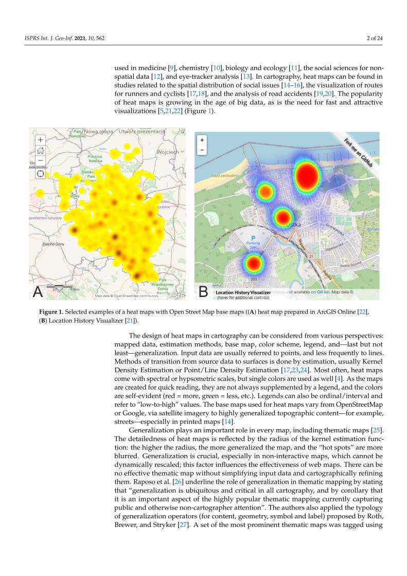
used in medicine [9], chemistry [10], biology and ecology [11], the social sciences for non-spatial data [12], and eye-tracker analysis [13]. In cartography, heat maps can be found instudies related to the spatial distribution of social issues [14–16], the visualization of routesfor runners and cyclists [17,18], and the analysis of road accidents [19,20]. The popularityof heat maps is growing in the age of big data, as is the need for fast and attractivevisualizations [5,21,22] (Figure 1).
ISPRS Int. J. Geo-Inf. 2021, 10, x FOR PEER REVIEW 2 of 25
used in medicine [9], chemistry [10], biology and ecology [11], the social sciences for non-spatial data [12], and eye-tracker analysis [13]. In cartography, heat maps can be found in studies related to the spatial distribution of social issues [14–16], the visualization of routes for runners and cyclists [17,18], and the analysis of road accidents [19,20]. The pop-ularity of heat maps is growing in the age of big data, as is the need for fast and attractive visualizations [5,21,22] (Figure 1).
Figure 1. Selected examples of a heat maps with Open Street Map base maps ((A) heat map prepared in ArcGIS Online [22], (B) Location History Visualizer [21]).
The design of heat maps in cartography can be considered from various perspectives: mapped data, estimation methods, base map, color scheme, legend, and—last but not least—generalization. Input data are usually referred to points, and less frequently to lines. Methods of transition from source data to surfaces is done by estimation, usually Kernel Density Estimation or Point/Line Density Estimation [17,23,24]. Most often, heat maps come with spectral or hypsometric scales, but single colors are used as well [4]. As the maps are created for quick reading, they are not always supplemented by a legend, and the colors are self-evident (red = more, green = less, etc.). Legends can also be ordi-nal/interval and refer to “low-to-high” values. The base maps used for heat maps vary from OpenStreetMap or Google, via satellite imagery to highly generalized topographic content—for example, streets—especially in printed maps [14].
Generalization plays an important role in every map, including thematic maps [25]. The detailedness of heat maps is reflected by the radius of the kernel estimation function: the higher the radius, the more generalized the map, and the “hot spots” are more blurred. Generalization is crucial, especially in non-interactive maps, which cannot be dynamically rescaled; this factor influences the effectiveness of web maps. There can be no effective thematic map without simplifying input data and cartographically refining them. Raposo et al. [26] underline the role of generalization in thematic mapping by stating that “gener-alization is ubiquitous and critical in all cartography, and by corollary that it is an im-portant aspect of the highly popular thematic mapping currently capturing public and otherwise non-cartographer attention”. The authors also applied the typology of general-ization operators (for content, geometry, symbol and label) proposed by Roth, Brewer, and Stryker [27]. A set of the most prominent thematic maps was tagged using these op-
Figure 1. Selected examples of a heat maps with Open Street Map base maps ((A) heat map prepared in ArcGIS Online [22],(B) Location History Visualizer [21]).
The design of heat maps in cartography can be considered from various perspectives:mapped data, estimation methods, base map, color scheme, legend, and—last but notleast—generalization. Input data are usually referred to points, and less frequently to lines.Methods of transition from source data to surfaces is done by estimation, usually KernelDensity Estimation or Point/Line Density Estimation [17,23,24]. Most often, heat mapscome with spectral or hypsometric scales, but single colors are used as well [4]. As the mapsare created for quick reading, they are not always supplemented by a legend, and the colorsare self-evident (red = more, green = less, etc.). Legends can also be ordinal/interval andrefer to “low-to-high” values. The base maps used for heat maps vary from OpenStreetMapor Google, via satellite imagery to highly generalized topographic content—for example,streets—especially in printed maps [14].
Generalization plays an important role in every map, including thematic maps [25].The detailedness of heat maps is reflected by the radius of the kernel estimation func-tion: the higher the radius, the more generalized the map, and the “hot spots” are moreblurred. Generalization is crucial, especially in non-interactive maps, which cannot bedynamically rescaled; this factor influences the effectiveness of web maps. There can beno effective thematic map without simplifying input data and cartographically refiningthem. Raposo et al. [26] underline the role of generalization in thematic mapping by statingthat “generalization is ubiquitous and critical in all cartography, and by corollary thatit is an important aspect of the highly popular thematic mapping currently capturingpublic and otherwise non-cartographer attention”. The authors also applied the typologyof generalization operators (for content, geometry, symbol and label) proposed by Roth,Brewer, and Stryker [27]. A set of the most prominent thematic maps was tagged using

ISPRS Int. J. Geo-Inf. 2021, 10, 562 3 of 24
these operators, which were also distinguished as critical and incidental. The most com-mon operators are reclassification, aggregation, merging and simplification for thematiccontent, and elimination for base maps. Based on these rules, we can say that for heatmaps, one should consider the following: reclassify for content, aggregate, merge, simplify,smooth for geometry, and adjust color, enhance, adjust pattern, adjust transparency forsymbols. When elaborating a heat map, data are aggregated and merged by applyingkernel density estimation; therefore, the surfaces are smoothed and simplified. The den-sity map is given an appropriate symbology (color scale) and, when the base map ispresent, transparency.
Empirical verification of usability does not always keep pace with technologicaldevelopment. Often, science focuses on technical aspects, and only after the solutionsare fully formed are they tested. This is likely the case with heat maps for which thereis very little empirical research. Most of the previous studies on heat maps focused onsoftware testing (performance, capabilities, etc.) [5,28] or involved heat maps as map typesused for data visualization [29]. The generalization of heat maps can also be studied interms of their usability, understood here as the efficiency of providing correct geographicinformation as quickly as possible. Therefore, in this study, we compared four heat mapswith different levels of generalization—that is, a different kernel radius. The aforesaid levelof generalization is crucial for thematic maps [25,26]; hence, we wanted to provide empiricalevidence of if, and how, it differs in terms of usability metrics. We investigated whether heatmaps are a good solution for making small-scale maps for quick reading, and if they allowyoung users to retrieve quantitative values quickly and correctly. Due to the increasingpopularity of heat maps [5], we also wanted to analyze how they are judged from theperspective of users’ subjective metrics. We posed the following research questions:
• RQ1: How does heat map’s generalization, defined by the size of the kernel radius,influence its effectiveness?
• RQ2: What are the discrepancies between differently generalized heat maps in thecontext of efficiency and perceived efficiency?
• RQ3: How do users perceive heat map difficulty depending on a generalization level?
In order to answer the research questions, we conducted a user study with 412 highschool students (16–20 years old) during geography or IT lessons. The research groupconsisted of adolescents who have similar experiences with maps due to school education.We wanted to observe how different levels of heat map generalization—namely, differentkernel radii—impact map usability.
2. Background2.1. Heat Maps and Generalization in Cartography
Comparing and evaluating design solutions within thematic map types is a commonaim in empirical research in cartography [30–33]. Yet, heat maps have rarely been used asstudy material in empirical cartographic user-centered research. Map types with smoothpresentation of data are often the subject of color scheme studies [34–37]. So far, in termsof the usability of heat maps, only studies of the subjective metrics and scenario-baseddesign methods have been conducted. Netek et al. [4] analyzed preferences and heatmap readability in relation to the cartographic education of users (42 experts, 27 novices).The authors examined user preferences and the legibility of maps presenting traffic-accident(point) data by using a questionnaire and a think-aloud interview. The questions given tothe participants concerned color scales, the transparency of the heat maps in relation to thebase map, and the generalization level. They analyzed four radius values: 10, 20, 30, and40 pixels, regardless of the map scale. The participants usually indicated their preferencefor lower values (10, 20 pixels)—namely, a less generalized map with visible “hot spots”.Radii of 10 and 20 pixels were also indicated as the most readable. Interestingly, novicesmore often indicated a 10-pixel radius, and experts a 20-pixel radius. Higher radii (30,40 pixels) were not preferred, as they provide more complex maps that require skills forcorrect interpretation, as many graphical overlaps occur. Netek et al. [4] recommended

ISPRS Int. J. Geo-Inf. 2021, 10, 562 4 of 24
a heat map for the fast preview of data, identifying hot spots, but they advised againstusing it for reading exact values from the map. However, it should be noted that theresearch concerned only preferences, and not effectiveness—understood as the degree ofeffectiveness of the transmission of geographical information. What is more, the study didnot include statistical analysis and the statistical significance of differences between thegroups, or dependencies between the variables.
Linear data could also be used to create heat maps. Nelson and MacEachren [38]studied Metro DataView—an interactive map that depicts data on bike traffic for urbanplanning purposes—using a raster-to-vector heat map. The authors presented the processof tool development, using scenario-based design techniques. Participants of the studyassessed the heat maps as being easy to use and responsive. They also appreciated thatthis kind of visualization does not require a computationally expensive aggregation pro-cess. However, participants pointed out that it was not possible to obtain individual oraggregated data from the map. They also described it as “visually noisy”.
As generalization is substantial for thematic mapping [25,26], a significant amount ofresearch on this subject could be expected. However, most papers on the topic of general-ization incorporate theory or describe self-analysis by the authors [39,40]. The differencesbetween multiscale thematic maps were analyzed by Roth et al. [41,42]. They took four maptypes into account: choropleth (continuous and abrupt), dot density (discrete and smooth),proportional symbol (discrete and abrupt), and tinted isoline, also referred to as a heat map(continuous and smooth); they examined these at two levels of resolution—25 square U.S.counties (overview) and 625 square U.S. townships (detailed view). In this task-based study,171 participants took part. In their preliminary results, the authors reported that participantswere more comfortable with continuous than discrete thematic maps, as they reported betterresults on metrics of confidence and difficulty for these map types. What is more, tasks solvedwith tinted isoline maps had a low error rate, as around 90% of responses were correct;in the case of proportional symbols, approximately 84% were correct; for the choropleth map,approximately 70%; and for the dot density map, approximately 54%. The results indicatethat it is worth developing and using widely continuous mapping techniques.
To sum up, the studies described above have identified a range of issues that shouldbe investigated in more detail with regard to heat maps. The preferences of the respondentsrequire confirmation through analyses, taking statistical testing into account, and requireconsideration of the variables of effectiveness and efficiency.
2.2. Objective and Subjective Metrics
Subjective metrics are as substantial in usability studies as objective metrics [43,44].They include not only preferences [4,30,45,46], but also an assessment of the difficulty ofthe task [32,41,42], the confidence of the response [41,42], a response time assessment andthe users’ comfort level [47].
In studies conducted on interactive thematic maps, Andrienko and Andrienko [47]reported that user satisfaction corresponds to user performance (namely, accuracy ofresponse). Similarly, in the Roth et al. study [41,42], participants using discrete mappingtechniques had good results in terms of the error rate and, at the same time, assessedthese maps well in terms of response confidence and difficulty. However, studies that takevisualization complexity into consideration report that users prefer more complex maps,even when they do not perform better while using them [48,49]. In summary, the resultsfor consistency of objective and subjective metrics are not always coherent.
3. User Study
The aim of the study was to fill the gap in user studies on heat maps of various kernelradii. We decided to take up this topic because there are many papers on the technologicalaspects of heat maps, and what is more, this type of thematic map is used more and moreoften as a means of quick visualization—for example, in internet portals—yet heat mapshave not been empirically tested thoroughly. We chose to compare heat maps with various

ISPRS Int. J. Geo-Inf. 2021, 10, 562 5 of 24
degrees of generalization in terms of effectiveness (correctness of response), efficiency (timeof response), perceived response time, task difficulty, and user preferences.
We formulated three hypotheses addressing the research questions presented inthe introduction:
Hypothesis 1 (H1). Lower levels of generalization result in higher correctness of answers by heatmap users.
Hypothesis 2 (H2). Higher levels of generalization result in faster responses and a higher perceivedefficiency by heat map users.
Hypothesis 3 (H3). Heat map users perceive less generalized maps as easier.
As the level of generalization is considered important for thematic maps, we assumedthat it affects the usability of heat maps. We expect that precise information, which is aconsequence of the lower level of generalization, results in higher accuracy of the answersgiven by the map users. Moreover, we expect that map users perceive less generalizedmaps as easier, as the information is more explicit—as studied by Netek et al. [4]. Finally,when it comes to the time of the response and perceived time of response, we believe that ahigher level of generalization provokes faster answers and the impression of a faster reply,as the map is less visually complex.
3.1. Study Material
In the study, we decided to compare four heat maps (later referred to as HM) withdifferent levels of generalization (Table 1). For this reason, 24 maps on a scale of 1:1,000,000were created and served as the stimuli to be used when solving different tasks by theusers (Figure S1). The thematic content used to prepare the heat maps were wind turbines(point data) from the beginning of the 19th century, derived from the Gaul/Raczynskidatabase [50]. As base maps, 16 Polish districts with their borders slightly changed werechosen. We obtained the data for the base map from the official Polish State database [51].The maps were prepared in ArcGIS 10.3 with the Kernel Density tool, and the kernel radiuswas chosen based on previous research [4].
Table 1. Comparison of heat maps elaborated for the study.
The Search Radius (px) The Search Radius (Meters) Stimuli Code Map Preview
10 2640 HM10
ISPRS Int. J. Geo-Inf. 2021, 10, x FOR PEER REVIEW 5 of 25
aspects of heat maps, and what is more, this type of thematic map is used more and more often as a means of quick visualization—for example, in internet portals—yet heat maps have not been empirically tested thoroughly. We chose to compare heat maps with vari-ous degrees of generalization in terms of effectiveness (correctness of response), efficiency (time of response), perceived response time, task difficulty, and user preferences.
We formulated three hypotheses addressing the research questions presented in the introduction:
Hypothesis 1 (H1). Lower levels of generalization result in higher correctness of answers by heat map users.
Hypothesis 2 (H2). Higher levels of generalization result in faster responses and a higher per-ceived efficiency by heat map users.
Hypothesis 3 (H3). Heat map users perceive less generalized maps as easier.
As the level of generalization is considered important for thematic maps, we as-sumed that it affects the usability of heat maps. We expect that precise information, which is a consequence of the lower level of generalization, results in higher accuracy of the an-swers given by the map users. Moreover, we expect that map users perceive less general-ized maps as easier, as the information is more explicit—as studied by Netek et al. [4]. Finally, when it comes to the time of the response and perceived time of response, we believe that a higher level of generalization provokes faster answers and the impression of a faster reply, as the map is less visually complex.
3.1. Study Material In the study, we decided to compare four heat maps (later referred to as HM) with
different levels of generalization (Table 1). For this reason, 24 maps on a scale of 1:1,000,000 were created and served as the stimuli to be used when solving different tasks by the users (Figure S1). The thematic content used to prepare the heat maps were wind turbines (point data) from the beginning of the 19th century, derived from the Gaul/Raczyński database [50]. As base maps, 16 Polish districts with their borders slightly changed were chosen. We obtained the data for the base map from the official Polish State database [51]. The maps were prepared in ArcGIS 10.3 with the Kernel Density tool, and the kernel radius was chosen based on previous research [4].
Table 1. Comparison of heat maps elaborated for the study.
The Search Radius (px) The Search Radius (Meters) Stimuli Code Map Preview
10 2640 HM10
20 5290 HM20
ISPRS Int. J. Geo-Inf. 2021, 10, x FOR PEER REVIEW 6 of 25
20 5290 HM20
30 7930 HM30
40 10,580 HM40
3.2. Participants In total, 412 high school students took part in the study, voluntarily. Approximately
half (51%) of the respondents declared that they use maps once a month or less frequently. Only 34% of respondents claimed that they use maps once a week or more often. Some 15% claimed not to use maps at all. Participants were aged between 16 and 20 (M = 17.49, SD = 0.83). In the study group, the participants were 59% women and 41% men.
3.3. Tasks and Procedures To define the tasks for heat maps analysis (maps for quick reading), we used a com-
pilation of objective-based taxonomies by Roth [52]. We had six tasks asking users to com-pare, sort, cluster, analyze distribution, and retrieve value and cluster (twice) (Table 2). In three tasks (T1, T5, T6) respondents had to indicate a correct answer from the options: A, B, C, and D. In T1, a particular district was expected to be indicated; in T5, proportions of two areas were divided by a line; and in T6, an estimation of the number of wind turbines was made. Two further tasks (T2, T3) were open questions, and the users were asked to estimate the number of wind turbines (T2) and sort districts in descending order based on the number of wind turbines (T3). The last type of task (T4) involved indicating (marking) a particular district on the map, based on a comparison with another district.
Table 2. Content of tasks, type of tasks, and answer types.
ISPRS Int. J. Geo-Inf. 2021, 10, 562 6 of 24
Table 1. Cont.
The Search Radius (px) The Search Radius (Meters) Stimuli Code Map Preview
30 7930 HM30
ISPRS Int. J. Geo-Inf. 2021, 10, x FOR PEER REVIEW 6 of 25
20 5290 HM20
30 7930 HM30
40 10,580 HM40
3.2. Participants In total, 412 high school students took part in the study, voluntarily. Approximately
half (51%) of the respondents declared that they use maps once a month or less frequently. Only 34% of respondents claimed that they use maps once a week or more often. Some 15% claimed not to use maps at all. Participants were aged between 16 and 20 (M = 17.49, SD = 0.83). In the study group, the participants were 59% women and 41% men.
3.3. Tasks and Procedures To define the tasks for heat maps analysis (maps for quick reading), we used a com-
pilation of objective-based taxonomies by Roth [52]. We had six tasks asking users to com-pare, sort, cluster, analyze distribution, and retrieve value and cluster (twice) (Table 2). In three tasks (T1, T5, T6) respondents had to indicate a correct answer from the options: A, B, C, and D. In T1, a particular district was expected to be indicated; in T5, proportions of two areas were divided by a line; and in T6, an estimation of the number of wind turbines was made. Two further tasks (T2, T3) were open questions, and the users were asked to estimate the number of wind turbines (T2) and sort districts in descending order based on the number of wind turbines (T3). The last type of task (T4) involved indicating (marking) a particular district on the map, based on a comparison with another district.
Table 2. Content of tasks, type of tasks, and answer types.
40 10,580 HM40
ISPRS Int. J. Geo-Inf. 2021, 10, x FOR PEER REVIEW 6 of 25
20 5290 HM20
30 7930 HM30
40 10,580 HM40
3.2. Participants In total, 412 high school students took part in the study, voluntarily. Approximately
half (51%) of the respondents declared that they use maps once a month or less frequently. Only 34% of respondents claimed that they use maps once a week or more often. Some 15% claimed not to use maps at all. Participants were aged between 16 and 20 (M = 17.49, SD = 0.83). In the study group, the participants were 59% women and 41% men.
3.3. Tasks and Procedures To define the tasks for heat maps analysis (maps for quick reading), we used a com-
pilation of objective-based taxonomies by Roth [52]. We had six tasks asking users to com-pare, sort, cluster, analyze distribution, and retrieve value and cluster (twice) (Table 2). In three tasks (T1, T5, T6) respondents had to indicate a correct answer from the options: A, B, C, and D. In T1, a particular district was expected to be indicated; in T5, proportions of two areas were divided by a line; and in T6, an estimation of the number of wind turbines was made. Two further tasks (T2, T3) were open questions, and the users were asked to estimate the number of wind turbines (T2) and sort districts in descending order based on the number of wind turbines (T3). The last type of task (T4) involved indicating (marking) a particular district on the map, based on a comparison with another district.
Table 2. Content of tasks, type of tasks, and answer types.
3.2. Participants
In total, 412 high school students took part in the study, voluntarily. Approximatelyhalf (51%) of the respondents declared that they use maps once a month or less frequently.Only 34% of respondents claimed that they use maps once a week or more often. Some15% claimed not to use maps at all. Participants were aged between 16 and 20 (M = 17.49,SD = 0.83). In the study group, the participants were 59% women and 41% men.
3.3. Tasks and Procedures
To define the tasks for heat maps analysis (maps for quick reading), we used acompilation of objective-based taxonomies by Roth [52]. We had six tasks asking users tocompare, sort, cluster, analyze distribution, and retrieve value and cluster (twice) (Table 2).In three tasks (T1, T5, T6) respondents had to indicate a correct answer from the options: A,B, C, and D. In T1, a particular district was expected to be indicated; in T5, proportions oftwo areas were divided by a line; and in T6, an estimation of the number of wind turbineswas made. Two further tasks (T2, T3) were open questions, and the users were asked toestimate the number of wind turbines (T2) and sort districts in descending order based onthe number of wind turbines (T3). The last type of task (T4) involved indicating (marking)a particular district on the map, based on a comparison with another district.
The study was conveyed in Poland using a web application during high schoolgeography or IT lessons (Figure 2, link to the application with the study: https://emprek-ca39f.firebaseapp.com/badania/heat-map-v3, accessed on 6 July 2021). The participantswere divided into four, almost parallel, groups with approximately 100 people in each.Each participant solved one of the four possible tests, which were randomly selected whenthe application started. The tests differed in generalization levels (4) and area variants (2) ofthe heat maps in order to avoid a learning effect. These areas, although different, were of asimilar degree of difficulty, so the results are comparable.
ISPRS Int. J. Geo-Inf. 2021, 10, 562 7 of 24
Table 2. Content of tasks, type of tasks, and answer types.
Task Number Task Answer Type
T1 compare Identify the area where you see the highest number of wind turbinesites (among three marked). A, B, C
T2 retrieve value and cluster In the marked areas, there is a given number of wind turbines.Estimate how many turbines are in the highlighted area. Open question
T3 sort Order the areas, starting with the one where the number of windturbines is the smallest. Open question
T4 clusterThe marked area is characterized by a given number of windturbines. Indicate the areas where you think there is a similar
number of wind turbines.Mark on map
T5 distributionThere are a different number of wind turbines in the area dividedby the line. Estimate the proportions in which the whole area was
divided in terms of their number.A, B, C, D
T6 retrieve value & cluster Estimate how many wind turbines are in the marked area. A, B, C, D
ISPRS Int. J. Geo-Inf. 2021, 10, x FOR PEER REVIEW 7 of 25
T2 retrieve value and
cluster
In the marked areas, there is a given number of wind turbines. Estimate how many turbines are in the highlighted area.
Open ques-tion
T3 sort Order the areas, starting with the one where the number of wind turbines is the smallest.
Open ques-tion
T4 cluster The marked area is characterized by a given number of wind turbines. Indi-cate the areas where you think there is a similar number of wind turbines.
Mark on map
T5 distribution There are a different number of wind turbines in the area divided by the line.
Estimate the proportions in which the whole area was divided in terms of their number.
A, B, C, D
T6 retrieve value & cluster
Estimate how many wind turbines are in the marked area. A, B, C, D
The study was conveyed in Poland using a web application during high school ge-ography or IT lessons (Figure 2, link to the application with the study: https://emprek-ca39f.firebaseapp.com/badania/heat-map-v3, accessed on 6 July 2021). The participants were divided into four, almost parallel, groups with approximately 100 people in each. Each participant solved one of the four possible tests, which were randomly selected when the application started. The tests differed in generalization levels (4) and area variants (2) of the heat maps in order to avoid a learning effect. These areas, although different, were of a similar degree of difficulty, so the results are comparable.
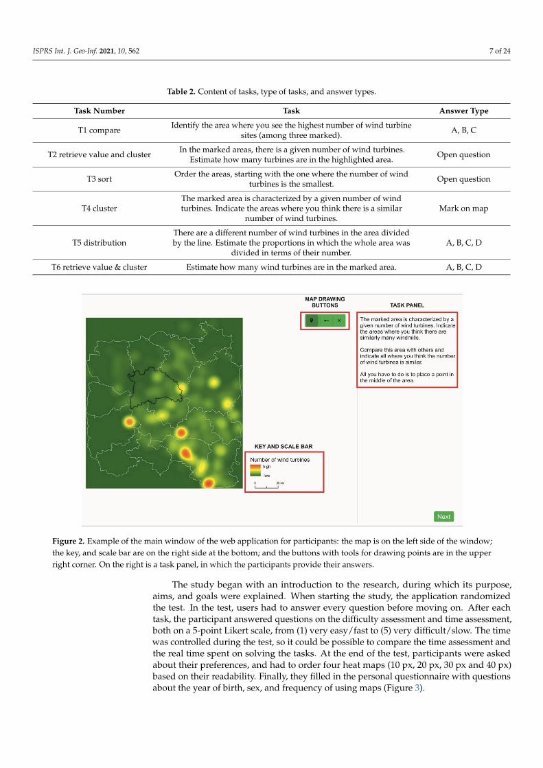
Figure 2. Example of the main window of the web application for participants: the map is on the left side of the window; the key, and scale bar are on the right side at the bottom; and the buttons with tools for drawing points are in the upper right corner. On the right is a task panel, in which the participants provide their answers.
The study began with an introduction to the research, during which its purpose, aims, and goals were explained. When starting the study, the application randomized the test. In the test, users had to answer every question before moving on. After each task, the participant answered questions on the difficulty assessment and time assessment, both on a 5-point Likert scale, from (1) very easy/fast to (5) very difficult/slow. The time was con-trolled during the test, so it could be possible to compare the time assessment and the real time spent on solving the tasks. At the end of the test, participants were asked about their
Figure 2. Example of the main window of the web application for participants: the map is on the left side of the window;the key, and scale bar are on the right side at the bottom; and the buttons with tools for drawing points are in the upperright corner. On the right is a task panel, in which the participants provide their answers.
The study began with an introduction to the research, during which its purpose,aims, and goals were explained. When starting the study, the application randomizedthe test. In the test, users had to answer every question before moving on. After eachtask, the participant answered questions on the difficulty assessment and time assessment,both on a 5-point Likert scale, from (1) very easy/fast to (5) very difficult/slow. The timewas controlled during the test, so it could be possible to compare the time assessment andthe real time spent on solving the tasks. At the end of the test, participants were askedabout their preferences, and had to order four heat maps (10 px, 20 px, 30 px and 40 px)based on their readability. Finally, they filled in the personal questionnaire with questionsabout the year of birth, sex, and frequency of using maps (Figure 3).
ISPRS Int. J. Geo-Inf. 2021, 10, 562 8 of 24ISPRS Int. J. Geo-Inf. 2021, 10, x FOR PEER REVIEW 9 of 25
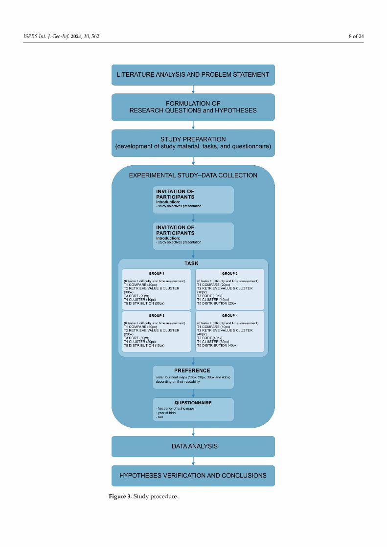
Figure 3. Study procedure.
3.4. Data Analysis
Figure 3. Study procedure.

ISPRS Int. J. Geo-Inf. 2021, 10, 562 9 of 24
3.4. Data Analysis
Data were statistically analyzed in SPSS Statistics software. The chi-square test,which allows the dependence between variables to be verified, was applied for correctnessof the response. Additionally, Cramér’s V was used to indicate the degree of associationbetween the two variables. It is an extension of the chi-square test for tables larger than2 × 2 [53]. Concerning the time metrics, the data did not follow the normal distributionaccording to the Kolmogorov–Smirnov test; therefore, the Kruskal–Wallis test was applied.The Kruskal–Wallis test is a non-parametric test that can be performed on ranked data.The Kruskal–Wallis test allows for the verification of a significant difference between atleast two groups in terms of the medians in the set of all analyzed medians [53]. For thelast two variables—time assessment and task difficulty—data were collected on the ordinalLikert scale; thus, the Kruskal–Wallis test was used.
4. Results4.1. Answer Correctness
The participants answered 20% of all tasks correctly. The highest rate of correctanswers was measured while using HM20 (25%) and HM10 (24%). While using more gen-eralized maps, participants achieved a lower score (HM30 16%; HM40 15%). The accuracyof answers was dependent on the level of heat map generalization: X2 (3, N = 2454) = 29.145,p < 0.001, Cramér’s V = 0.109, p < 0.001. Moreover, pairwise comparisons showed that therelation between variables occurred in four cases when comparing less generalized maps(HM10, HM20) with more generalized (HM30, HM40):
• HM10-HM20 X2 ns (the abbreviation ‘ns’ stands for ‘not statistically significant’);• HM10-HM30 X2 (1, N = 1238) = 11.483, p < 0.001, Cramér’s V = 0.096, p < 0.001 (with
better results for participants working with HM10);• HM10-HM40 X2 (1, N = 1217) = 13.859, p < 0.001, Cramér’s V = 0.107, p < 0.001 (with
better results for participants working with HM10);• HM20-HM30 X2 (1, N = 1237) = 17.962, p < 0.001, Cramér’s V = 0.110, p < 0.001 (with
better results for participants working with HM20);• HM20-HM40 X2 (1, N = 1216) = 17.600, p < 0.001, Cramér’s V = 0.120, p < 0.001 (with
better results for participants working with HM20);• HM30-HM40 ns.
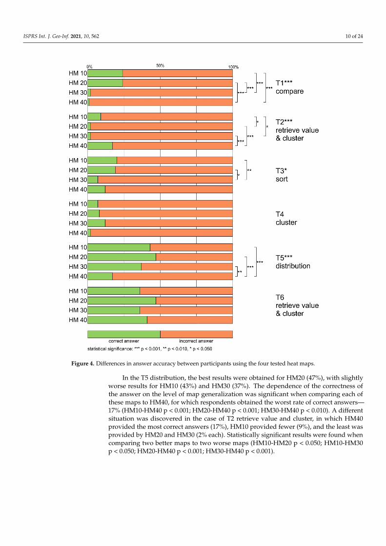
The highest rate of correct answers was obtained for T6 retrieve value and cluster(40%). Slightly fewer respondents answered correctly for T5 distribution (37%). In bothcases, the highest percentage of correct answers was achieved in the HM20 group (47%).The lowest rate of correct answers was obtained for two tasks—T2 retrieve value andcluster, and T4 cluster (7%). In the case of these questions, in some groups, only 1 or 2% ofthe respondents chose the right answer (e.g., HM30, HM40, Figure 4).
When it comes to inferential analysis, the statistical significance of the associationbetween the mapping type and the correctness of the answers was found for four outof the six tasks: T1 compare, T2 retrieve value and cluster, T3 sort, and T5 distribution(Table 3). In one case, the association was moderate (T1), and in the remaining three cases,the dependence was weak (T2, T3, T5).
In T1 compare, the best result (24%) was achieved for HM10 and HM20, and theoutcome of the statistical tests was significant when the results were compared to the resultsrecorded with HM30 and HM40, which performed very poorly (HM30 2%, HM40 1%)(HM10-HM30 p < 0.001; HM10-HM40 p < 0.001; HM20-HM30 p < 0.001; HM20-HM40p < 0.001). A similar situation was found for T3. In that case, the pairwise comparisonsshowed that the dependence of the correctness of the answer on the level of generalizationwas significant only when comparing the results of HM10 (20%) and HM20 (19%) withthe results of HM30 (7%), but not with those of HM40 (12%) (HM10-HM30 p < 0.010;HM20-HM30 p < 0.050).
ISPRS Int. J. Geo-Inf. 2021, 10, 562 10 of 24ISPRS Int. J. Geo-Inf. 2021, 10, x FOR PEER REVIEW 11 of 25
Figure 4. Differences in answer accuracy between participants using the four tested heat maps.
When it comes to inferential analysis, the statistical significance of the association between the mapping type and the correctness of the answers was found for four out of the six tasks: T1 compare, T2 retrieve value and cluster, T3 sort, and T5 distribution (Table 3). In one case, the association was moderate (T1), and in the remaining three cases, the dependence was weak (T2, T3, T5).
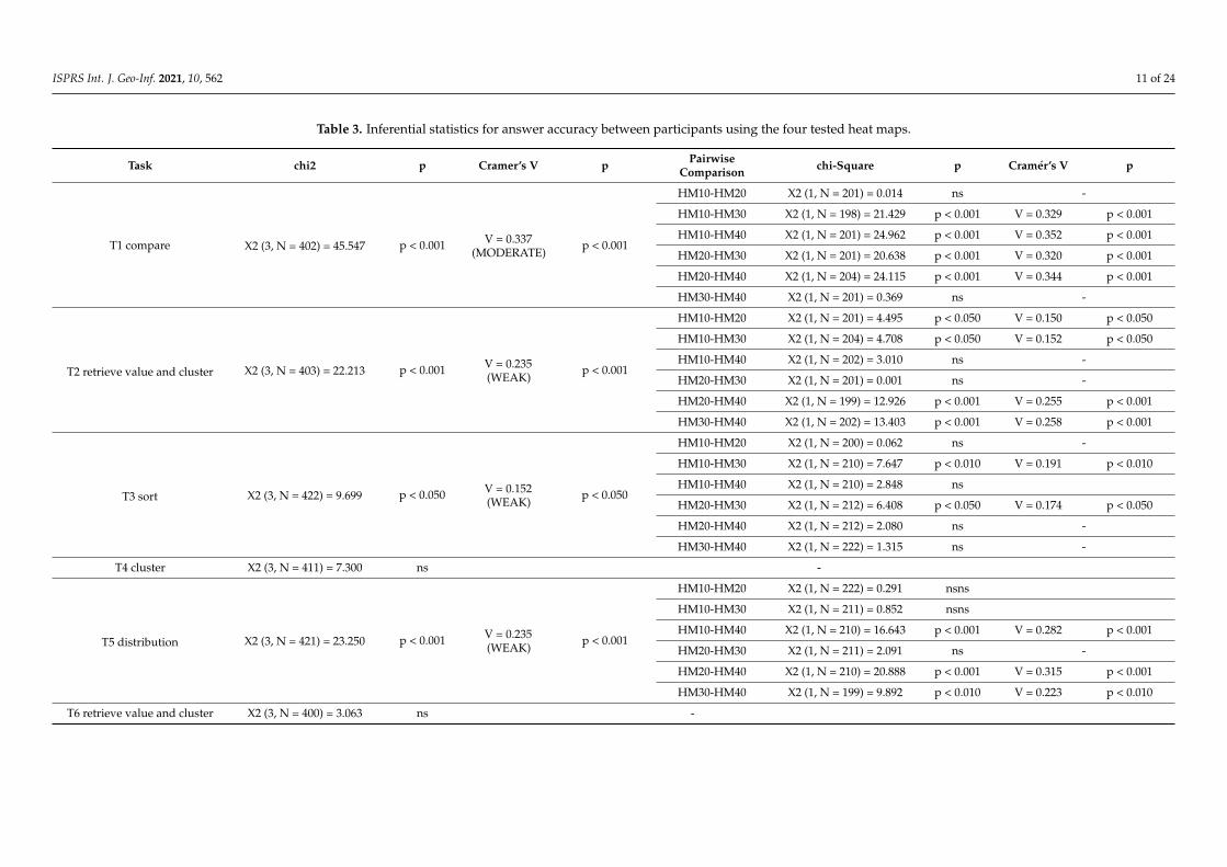
Table 3. Inferential statistics for answer accuracy between participants using the four tested heat maps.
Task chi2 p Cramer’s
V P Pairwise Compari-
son chi-Square p
Cra-mér’s V p
T1 compare X2 (3, N = 402) = 45.547 p < 0.001
V = 0.337 (MODER-
ATE)
p < 0.001
HM10-HM20
X2 (1, N = 201) = 0.014 ns -
HM10-HM30
X2 (1, N = 198) = 21.429
p < 0.001
V = 0.329
p < 0.001
HM10-HM40
X2 (1, N = 201) = 24.962
p < 0.001
V = 0.352
p < 0.001
Figure 4. Differences in answer accuracy between participants using the four tested heat maps.
In the T5 distribution, the best results were obtained for HM20 (47%), with slightlyworse results for HM10 (43%) and HM30 (37%). The dependence of the correctness ofthe answer on the level of map generalization was significant when comparing each ofthese maps to HM40, for which respondents obtained the worst rate of correct answers—17% (HM10-HM40 p < 0.001; HM20-HM40 p < 0.001; HM30-HM40 p < 0.010). A differentsituation was discovered in the case of T2 retrieve value and cluster, in which HM40provided the most correct answers (17%), HM10 provided fewer (9%), and the least wasprovided by HM20 and HM30 (2% each). Statistically significant results were found whencomparing two better maps to two worse maps (HM10-HM20 p < 0.050; HM10-HM30p < 0.050; HM20-HM40 p < 0.001; HM30-HM40 p < 0.001).
ISPRS Int. J. Geo-Inf. 2021, 10, 562 11 of 24
Table 3. Inferential statistics for answer accuracy between participants using the four tested heat maps.
Task chi2 p Cramer’s V p PairwiseComparison chi-Square p Cramér’s V p
T1 compare X2 (3, N = 402) = 45.547 p < 0.001 V = 0.337(MODERATE)
p < 0.001
HM10-HM20 X2 (1, N = 201) = 0.014 ns -
HM10-HM30 X2 (1, N = 198) = 21.429 p < 0.001 V = 0.329 p < 0.001
HM10-HM40 X2 (1, N = 201) = 24.962 p < 0.001 V = 0.352 p < 0.001
HM20-HM30 X2 (1, N = 201) = 20.638 p < 0.001 V = 0.320 p < 0.001
HM20-HM40 X2 (1, N = 204) = 24.115 p < 0.001 V = 0.344 p < 0.001
HM30-HM40 X2 (1, N = 201) = 0.369 ns -
T2 retrieve value and cluster X2 (3, N = 403) = 22.213 p < 0.001 V = 0.235(WEAK)
p < 0.001
HM10-HM20 X2 (1, N = 201) = 4.495 p < 0.050 V = 0.150 p < 0.050
HM10-HM30 X2 (1, N = 204) = 4.708 p < 0.050 V = 0.152 p < 0.050
HM10-HM40 X2 (1, N = 202) = 3.010 ns -
HM20-HM30 X2 (1, N = 201) = 0.001 ns -
HM20-HM40 X2 (1, N = 199) = 12.926 p < 0.001 V = 0.255 p < 0.001
HM30-HM40 X2 (1, N = 202) = 13.403 p < 0.001 V = 0.258 p < 0.001
T3 sort X2 (3, N = 422) = 9.699 p < 0.050 V = 0.152(WEAK)
p < 0.050
HM10-HM20 X2 (1, N = 200) = 0.062 ns -
HM10-HM30 X2 (1, N = 210) = 7.647 p < 0.010 V = 0.191 p < 0.010
HM10-HM40 X2 (1, N = 210) = 2.848 ns
HM20-HM30 X2 (1, N = 212) = 6.408 p < 0.050 V = 0.174 p < 0.050
HM20-HM40 X2 (1, N = 212) = 2.080 ns -
HM30-HM40 X2 (1, N = 222) = 1.315 ns -
T4 cluster X2 (3, N = 411) = 7.300 ns -
T5 distribution X2 (3, N = 421) = 23.250 p < 0.001 V = 0.235(WEAK)
p < 0.001
HM10-HM20 X2 (1, N = 222) = 0.291 nsns
HM10-HM30 X2 (1, N = 211) = 0.852 nsns
HM10-HM40 X2 (1, N = 210) = 16.643 p < 0.001 V = 0.282 p < 0.001
HM20-HM30 X2 (1, N = 211) = 2.091 ns -
HM20-HM40 X2 (1, N = 210) = 20.888 p < 0.001 V = 0.315 p < 0.001
HM30-HM40 X2 (1, N = 199) = 9.892 p < 0.010 V = 0.223 p < 0.010
T6 retrieve value and cluster X2 (3, N = 400) = 3.063 ns -

ISPRS Int. J. Geo-Inf. 2021, 10, 562 12 of 24
4.2. Response Time
The mean response time for all maps was similar (HM10 M = 26.5 s, SD = 0.767; HM20M = 25.3 s, SD = 0.558; HM30 M = 24.6, SD = 0.543; HM40 M = 26.4, SD = 0.782). The differ-ences in response time while using heat maps with different levels of generalization werenot significant: H (3) = 1.898, ns.
The average task-solving time varied by up to 24 s. The task, which on average was an-swered the slowest, was the T2 retrieve value and cluster (M = 38.6 s, SD = 0.958). The low-est mean response time was achieved for the T6 retrieve value and cluster (M = 14.0 s,SD = 0.385). For T1 compare and T5 distribution, the difference was less than two seconds(T1 M = 18.6 s, SD = 0.509; T5 M = 20.5 s, SD = 0.584). For T3 sort and T4 cluster, the averageresponse time was around 30 s (T3 M = 28.8 s, SD = 0.637; T3 M = 33.5 s, SD = 0.940)(Figure 5).
ISPRS Int. J. Geo-Inf. 2021, 10, x FOR PEER REVIEW 14 of 25
Figure 5. Differences in answer time between participants using the four tested heat maps.
The differences in response time between the maps were statistically significant for all tasks, and post hoc (Bonferroni) tests were conducted in order to identify significant intergroup differences (Table 4).
Table 4. Inferential statistics between participants using the four tested heat maps.
Task Kruskal–Wallis H p Method M (s) SD Post Hoc Groups p
T1 compare X2 (3, N = 402) = 23.783 p < 0.001
HM10 15.7 0.741 HM10-HM20 ns HM20 17.4 0.757 HM10-HM30 p < 0.001 HM30 21.7 1.187 HM10-HM40 p < 0.050 HM40 19.7 1.203 HM20-HM30 p < 0.050
HM20-HM40 ns HM30-HM40 ns
T2 retrieve value & cluster X2 (3, N = 403) = 76.113 p < 0.001
HM10 45.4 2.301 HM10-HM20 p < 0.001 HM20 33.7 1.346 HM10-HM30 p < 0.001 HM30 31.0 1.699 HM10-HM40 ns
Figure 5. Differences in answer time between participants using the four tested heat maps.

ISPRS Int. J. Geo-Inf. 2021, 10, 562 13 of 24
The differences in response time between the maps were statistically significant forall tasks, and post hoc (Bonferroni) tests were conducted in order to identify significantintergroup differences (Table 4).
Table 4. Inferential statistics between participants using the four tested heat maps.
Task Kruskal–Wallis H p Method M (s) SD Post Hoc Groups p
T1 compare X2 (3, N = 402) = 23.783 p < 0.001
HM10 15.7 0.741 HM10-HM20 ns
HM20 17.4 0.757 HM10-HM30 p < 0.001
HM30 21.7 1.187 HM10-HM40 p < 0.050
HM40 19.7 1.203 HM20-HM30 p < 0.050
HM20-HM40 ns
HM30-HM40 ns
T2 retrievevalue &cluster
X2 (3, N = 403) = 76.113 p < 0.001
HM10 45.4 2.301 HM10-HM20 p < 0.001
HM20 33.7 1.346 HM10-HM30 p < 0.001
HM30 31.0 1.699 HM10-HM40 ns
HM40 45.1 1.693 HM20-HM30 ns
HM20-HM40 p < 0.001
HM30-HM40 p < 0.001
T3 sort X2 (3, N = 422) = 37.750 p < 0.001
HM10 26.7 1.230 HM10-HM20 p < 0.010
HM20 31.9 1.219 HM10-HM30 ns
HM30 24.4 1.004 HM10-HM40 p < 0.010
HM40 32.3 1.434 HM20-HM30 p < 0.001
HM20-HM40 ns
HM30-HM40 p < 0.001
T4 cluster X2 (3, N = 411) = 29.231 p < 0.001
HM10 39.8 2.071 HM10-HM20 p < 0.001
HM20 30.1 1.619 HM10-HM30 p < 0.001
HM30 28.0 1.181 HM10-HM40 ns
HM40 36.7 2.344 HM20-HM30 ns
HM20-HM40 p < 0.050
HM30-HM40 p < 0.010
T5distribution
X2 (3, N = 421) = 97.307 p < 0.001
HM10 16.5 0.843 HM10-HM20 p < 0.001
HM20 25.4 1.165 HM10-HM30 p < 0.001
HM30 25.6 1.412 HM10-HM40 ns
HM40 14.3 0.671 HM20-HM30 ns
HM20-HM40 p < 0.001
HM30-HM40 p < 0.001
T6 retrievevalue &cluster
X2 (3, N = 400) = 91.527 p < 0.001
HM10 15.1 0.562 HM10-HM20 ns
HM20 14.5 0.749 HM10-HM30 ns
HM30 16.9 0.989 HM10-HM40 p < 0.001
HM40 8.7 0.364 HM20-HM30 ns
HM20-HM40 p < 0.001
HM30-HM40 p < 0.001
ISPRS Int. J. Geo-Inf. 2021, 10, 562 14 of 24
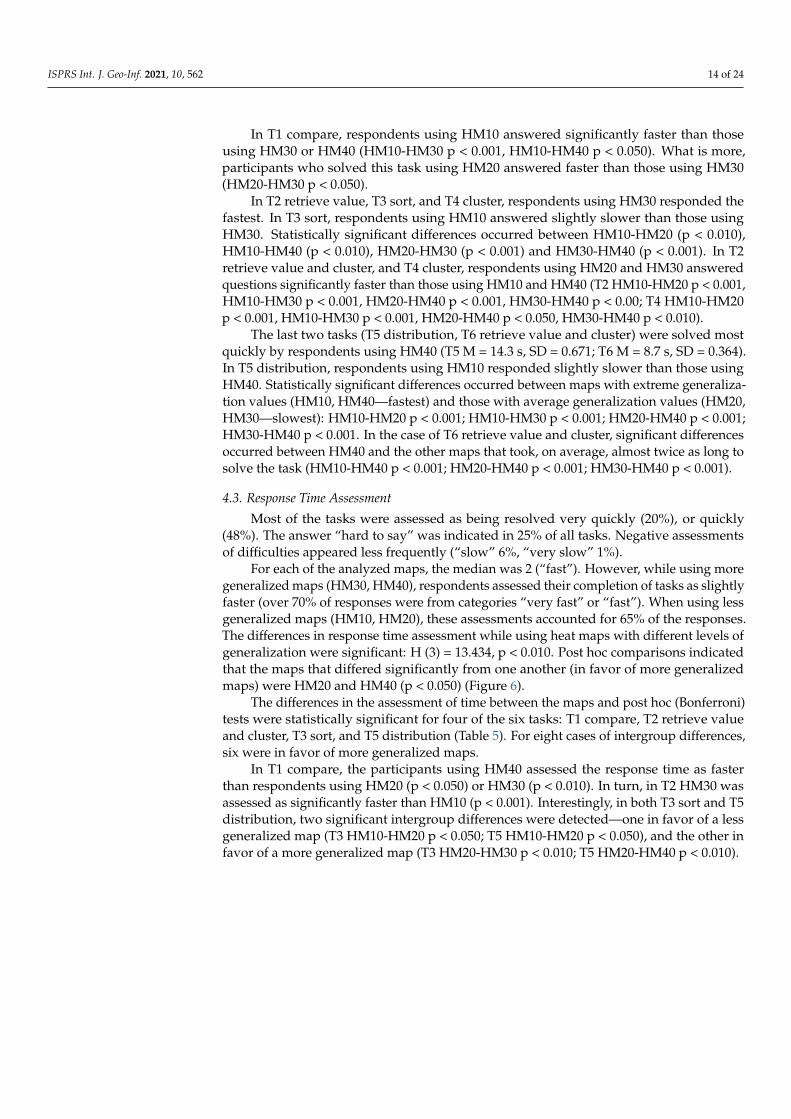
In T1 compare, respondents using HM10 answered significantly faster than thoseusing HM30 or HM40 (HM10-HM30 p < 0.001, HM10-HM40 p < 0.050). What is more,participants who solved this task using HM20 answered faster than those using HM30(HM20-HM30 p < 0.050).
In T2 retrieve value, T3 sort, and T4 cluster, respondents using HM30 responded thefastest. In T3 sort, respondents using HM10 answered slightly slower than those usingHM30. Statistically significant differences occurred between HM10-HM20 (p < 0.010),HM10-HM40 (p < 0.010), HM20-HM30 (p < 0.001) and HM30-HM40 (p < 0.001). In T2retrieve value and cluster, and T4 cluster, respondents using HM20 and HM30 answeredquestions significantly faster than those using HM10 and HM40 (T2 HM10-HM20 p < 0.001,HM10-HM30 p < 0.001, HM20-HM40 p < 0.001, HM30-HM40 p < 0.00; T4 HM10-HM20p < 0.001, HM10-HM30 p < 0.001, HM20-HM40 p < 0.050, HM30-HM40 p < 0.010).
The last two tasks (T5 distribution, T6 retrieve value and cluster) were solved mostquickly by respondents using HM40 (T5 M = 14.3 s, SD = 0.671; T6 M = 8.7 s, SD = 0.364).In T5 distribution, respondents using HM10 responded slightly slower than those usingHM40. Statistically significant differences occurred between maps with extreme generaliza-tion values (HM10, HM40—fastest) and those with average generalization values (HM20,HM30—slowest): HM10-HM20 p < 0.001; HM10-HM30 p < 0.001; HM20-HM40 p < 0.001;HM30-HM40 p < 0.001. In the case of T6 retrieve value and cluster, significant differencesoccurred between HM40 and the other maps that took, on average, almost twice as long tosolve the task (HM10-HM40 p < 0.001; HM20-HM40 p < 0.001; HM30-HM40 p < 0.001).
4.3. Response Time Assessment
Most of the tasks were assessed as being resolved very quickly (20%), or quickly(48%). The answer “hard to say” was indicated in 25% of all tasks. Negative assessmentsof difficulties appeared less frequently (“slow” 6%, “very slow” 1%).
For each of the analyzed maps, the median was 2 (“fast”). However, while using moregeneralized maps (HM30, HM40), respondents assessed their completion of tasks as slightlyfaster (over 70% of responses were from categories “very fast” or “fast”). When using lessgeneralized maps (HM10, HM20), these assessments accounted for 65% of the responses.The differences in response time assessment while using heat maps with different levels ofgeneralization were significant: H (3) = 13.434, p < 0.010. Post hoc comparisons indicatedthat the maps that differed significantly from one another (in favor of more generalizedmaps) were HM20 and HM40 (p < 0.050) (Figure 6).
The differences in the assessment of time between the maps and post hoc (Bonferroni)tests were statistically significant for four of the six tasks: T1 compare, T2 retrieve valueand cluster, T3 sort, and T5 distribution (Table 5). For eight cases of intergroup differences,six were in favor of more generalized maps.
In T1 compare, the participants using HM40 assessed the response time as fasterthan respondents using HM20 (p < 0.050) or HM30 (p < 0.010). In turn, in T2 HM30 wasassessed as significantly faster than HM10 (p < 0.001). Interestingly, in both T3 sort and T5distribution, two significant intergroup differences were detected—one in favor of a lessgeneralized map (T3 HM10-HM20 p < 0.050; T5 HM10-HM20 p < 0.050), and the other infavor of a more generalized map (T3 HM20-HM30 p < 0.010; T5 HM20-HM40 p < 0.010).

ISPRS Int. J. Geo-Inf. 2021, 10, 562 15 of 24
ISPRS Int. J. Geo-Inf. 2021, 10, x FOR PEER REVIEW 16 of 25
4.3. Response Time Assessment Most of the tasks were assessed as being resolved very quickly (20%), or quickly
(48%). The answer “hard to say” was indicated in 25% of all tasks. Negative assessments of difficulties appeared less frequently (“slow” 6%, “very slow” 1%).
For each of the analyzed maps, the median was 2 (“fast”). However, while using more generalized maps (HM30, HM40), respondents assessed their completion of tasks as slightly faster (over 70% of responses were from categories “very fast” or “fast”). When using less generalized maps (HM10, HM20), these assessments accounted for 65% of the responses. The differences in response time assessment while using heat maps with dif-ferent levels of generalization were significant: H (3) = 13.434, p < 0.010. Post hoc compar-isons indicated that the maps that differed significantly from one another (in favor of more generalized maps) were HM20 and HM40 (p < 0.050) (Figure 6).
Figure 6. Differences in the response time assessment between participants using the four tested heat maps.
The differences in the assessment of time between the maps and post hoc (Bonferroni) tests were statistically significant for four of the six tasks: T1 compare, T2 retrieve value
Figure 6. Differences in the response time assessment between participants using the four testedheat maps.
Table 5. Inferential statistics between participants using the four tested heat maps.
Task Kruskal–Wallis H p Post Hoc Groups p
T1 compare X2 (3, N = 402) = 12.871 p < 0.010
HM10-HM20 ns
HM10-HM30 ns
HM10-HM40 ns
HM20-HM30 ns
HM20-HM40 p < 0.050
HM30-HM40 p < 0.010
ISPRS Int. J. Geo-Inf. 2021, 10, 562 16 of 24
Table 5. Cont.
Task Kruskal–Wallis H p Post Hoc Groups p
T2 retrieve value and cluster X2 (3, N = 403) = 14.858 p < 0.010
HM10-HM20 ns
HM10-HM30 p < 0.001
HM10-HM40 ns
HM20-HM30 ns
HM20-HM40 ns
HM30-HM40 ns
T3 sort X2 (3, N = 422) = 13.273 p < 0.010
HM10-HM20 p < 0.050
HM10-HM30 ns
HM10-HM40 ns
HM20-HM30 p < 0.010
HM20-HM40 ns
HM30-HM40 ns
T4 cluster X2 (3, N = 411) = 8.442 p < 0.050
HM10-HM20 ns
HM10-HM30 ns
HM10-HM40 ns
HM20-HM30 ns
HM20-HM40 ns
HM30-HM40 ns
T5 distribution X2 (3, N = 421) = 13.660 p < 0.010
HM10-HM20 p < 0.050
HM10-HM30 ns
HM10-HM40 ns
HM20-HM30 ns
HM20-HM40 p < 0.010
HM30-HM40 ns
T6 retrieve value and cluster X2 (3, N = 400) = 5.853, ns ns -
4.4. Difficulty of the Task
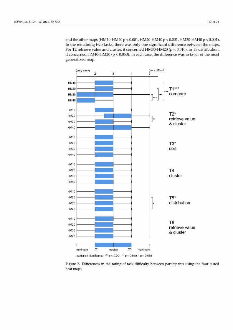
Most of the tasks were assessed positively (“easy” 37%, “very easy” 27%). The answer“hard to say” was indicated in as many as 33% of all tasks. Negative assessments ofdifficulties appeared less frequently (“difficult” 10%, “very difficult” 3%).
For each of the analyzed maps, the median was 2 (“easy”). However, while usingmore generalized maps (HM30, HM40), respondents assessed the tasks as slightly easier(around 55% of responses were from categories “very easy” or “easy”), whereas, when us-ing less generalized maps (HM10, HM20), these assessments accounted for 50% of theresponses. The differences in difficulty assessment between heat maps with different levelsof generalization were significant: H (3) = 28.242, p < 0.001. Post hoc comparisons indicatedthat the maps which differed significantly from one another were HM10-HM40 (p < 0.001)and HM20-HM40 (p < 0.001) (Figure 7).
The differences in task difficulty between the groups were statistically significant forthree of the six tasks: T1 compare, T2 retrieve value and cluster, T3 sort, and T5 distribution(Table 6). Post hoc (Bonferroni) tests showed that in each of the three cases, the moregeneralized maps were rated as easier, and in the case of T3 sort, no differences at theintergroup level were found.
The highest number of intergroup differences was found for T1 compare. Statisticallysignificant differences in the assessment of the difficulty of tasks occurred between HM40
ISPRS Int. J. Geo-Inf. 2021, 10, 562 17 of 24
and the other maps (HM10-HM40 p < 0.001, HM20-HM40 p < 0.001, HM30-HM40 p < 0.001).In the remaining two tasks, there was only one significant difference between the maps.For T2 retrieve value and cluster, it concerned HM30-HM20 (p < 0.010); in T5 distribution,it concerned HM40-HM20 (p < 0.050). In each case, the difference was in favor of the mostgeneralized map.
ISPRS Int. J. Geo-Inf. 2021, 10, x FOR PEER REVIEW 18 of 25
For each of the analyzed maps, the median was 2 (“easy”). However, while using more generalized maps (HM30, HM40), respondents assessed the tasks as slightly easier (around 55% of responses were from categories “very easy” or “easy”), whereas, when using less generalized maps (HM10, HM20), these assessments accounted for 50% of the responses. The differences in difficulty assessment between heat maps with different lev-els of generalization were significant: H (3) = 28.242, p < 0.001. Post hoc comparisons indi-cated that the maps which differed significantly from one another were HM10-HM40 (p < 0.001) and HM20-HM40 (p < 0.001) (Figure 7).
Figure 7. Differences in the rating of task difficulty between participants using the four tested heat maps.
The differences in task difficulty between the groups were statistically significant for three of the six tasks: T1 compare, T2 retrieve value and cluster, T3 sort, and T5 distribu-tion (Table 6). Post hoc (Bonferroni) tests showed that in each of the three cases, the more generalized maps were rated as easier, and in the case of T3 sort, no differences at the intergroup level were found.
Figure 7. Differences in the rating of task difficulty between participants using the four testedheat maps.
ISPRS Int. J. Geo-Inf. 2021, 10, 562 18 of 24
Table 6. Inferential statistics between participants using the four tested heat maps.
Task Kruskal–Wallis H P Post Hoc Groups p
T1 compare X2 (3, N = 402) = 46.843 p < 0.001
HM10-HM20 ns
HM10-HM30 ns
HM10-HM40 p < 0.001
HM20-HM30 ns
HM20-HM40 p < 0.001
HM30-HM40 p < 0.001
T2 retrieve value and cluster X2 (3, N = 403) = 9.953 p < 0.050
HM10-HM20 ns
HM10-HM30 ns
HM10-HM40 ns
HM20-HM30 p < 0.010
HM20-HM40 ns
HM30-HM40 ns
T3 sort X2 (3, N = 422) = 7.836 p < 0.050
HM10-HM20 ns
HM10-HM30 ns
HM10-HM40 ns
HM20-HM30 ns
HM20-HM40 ns
HM30-HM40 ns
T4 cluster X2 (3, N = 411) = 6.695, ns ns -
T5 distribution X2 (3, N = 421) = 10.614 p < 0.050
HM10-HM20 ns
HM10-HM30 ns
HM10-HM40 ns
HM20-HM30 ns
HM20-HM40 p < 0.050
HM30-HM40 ns
T6 retrieve value and cluster X2 (3, N = 400) = 5.210 ns -
4.5. Preferences
The participants were asked to rank maps according to those that best representedthe spatial diversity of the phenomenon. The responses of 22 participants were consideredinvalid (e.g., they repeatedly indicated the same map) and were not taken into accountduring the analysis. In over half of the answers (57%), HM10 was chosen as the mostsuitable. HM30 was indicated more than two times less frequently (26%). The lowestpercentage concerning the most adequate solution was recorded for HM40 (11%) andHM20 (5%).
The sequence analyses took responses that occurred ten times or more into account.The most frequently indicated sequence was HM10, HM40, HM20, HM30 (48%) (Figure 8).Interestingly, as many as 22% selected the reverse order. However, in the next mostfrequently repeated sequences, HM30 was indicated as the map that least favorably repre-sented the spatial diversity of the phenomenon (Figure 8).
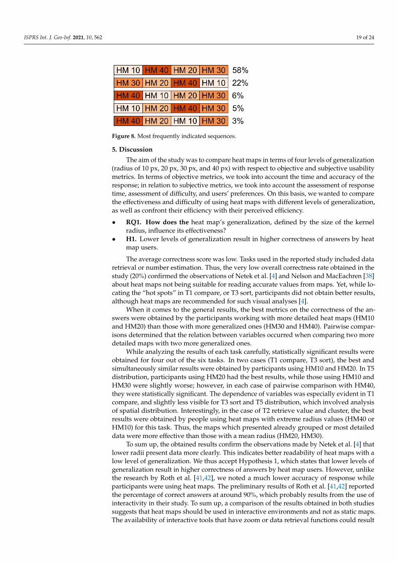
ISPRS Int. J. Geo-Inf. 2021, 10, 562 19 of 24ISPRS Int. J. Geo-Inf. 2021, 10, x FOR PEER REVIEW 20 of 25
Figure 8. Most frequently indicated sequences.
5. Discussion The aim of the study was to compare heat maps in terms of four levels of generaliza-
tion (radius of 10 px, 20 px, 30 px, and 40 px) with respect to objective and subjective usability metrics. In terms of objective metrics, we took into account the time and accuracy of the response; in relation to subjective metrics, we took into account the assessment of response time, assessment of difficulty, and users’ preferences. On this basis, we wanted to compare the effectiveness and difficulty of using heat maps with different levels of gen-eralization, as well as confront their efficiency with their perceived efficiency. • RQ1. How does the heat map’s generalization, defined by the size of the kernel ra-
dius, influence its effectiveness? • H1. Lower levels of generalization result in higher correctness of answers by heat
map users. The average correctness score was low. Tasks used in the reported study included
data retrieval or number estimation. Thus, the very low overall correctness rate obtained in the study (20%) confirmed the observations of Netek et al. [4] and Nelson and MacEachren [38] about heat maps not being suitable for reading accurate values from maps. Yet, while locating the “hot spots” in T1 compare, or T3 sort, participants did not obtain better results, although heat maps are recommended for such visual analyses [4].
When it comes to the general results, the best metrics on the correctness of the an-swers were obtained by the participants working with more detailed heat maps (HM10 and HM20) than those with more generalized ones (HM30 and HM40). Pairwise compar-isons determined that the relation between variables occurred when comparing two more detailed maps with two more generalized ones.
While analyzing the results of each task carefully, statistically significant results were obtained for four out of the six tasks. In two cases (T1 compare, T3 sort), the best and simultaneously similar results were obtained by participants using HM10 and HM20. In T5 distribution, participants using HM20 had the best results, while those using HM10 and HM30 were slightly worse; however, in each case of pairwise comparison with HM40, they were statistically significant. The dependence of variables was especially evident in T1 compare, and slightly less visible for T3 sort and T5 distribution, which involved anal-ysis of spatial distribution. Interestingly, in the case of T2 retrieve value and cluster, the best results were obtained by people using heat maps with extreme radius values (HM40 or HM10) for this task. Thus, the maps which presented already grouped or most detailed data were more effective than those with a mean radius (HM20, HM30).
To sum up, the obtained results confirm the observations made by Netek et al. [4] that lower radii present data more clearly. This indicates better readability of heat maps with a low level of generalization. We thus accept Hypothesis 1, which states that lower levels of generalization result in higher correctness of answers by heat map users. How-ever, unlike the research by Roth et al. [41,42], we noted a much lower accuracy of re-sponse while participants were using heat maps. The preliminary results of Roth et al. [41,42] reported the percentage of correct answers at around 90%, which probably results from the use of interactivity in their study. To sum up, a comparison of the results ob-tained in both studies suggests that heat maps should be used in interactive environments and not as static maps. The availability of interactive tools that have zoom or data retrieval
Figure 8. Most frequently indicated sequences.
5. Discussion
The aim of the study was to compare heat maps in terms of four levels of generalization(radius of 10 px, 20 px, 30 px, and 40 px) with respect to objective and subjective usabilitymetrics. In terms of objective metrics, we took into account the time and accuracy of theresponse; in relation to subjective metrics, we took into account the assessment of responsetime, assessment of difficulty, and users’ preferences. On this basis, we wanted to comparethe effectiveness and difficulty of using heat maps with different levels of generalization,as well as confront their efficiency with their perceived efficiency.
• RQ1. How does the heat map’s generalization, defined by the size of the kernelradius, influence its effectiveness?
• H1. Lower levels of generalization result in higher correctness of answers by heatmap users.
The average correctness score was low. Tasks used in the reported study included dataretrieval or number estimation. Thus, the very low overall correctness rate obtained in thestudy (20%) confirmed the observations of Netek et al. [4] and Nelson and MacEachren [38]about heat maps not being suitable for reading accurate values from maps. Yet, while lo-cating the “hot spots” in T1 compare, or T3 sort, participants did not obtain better results,although heat maps are recommended for such visual analyses [4].
When it comes to the general results, the best metrics on the correctness of the an-swers were obtained by the participants working with more detailed heat maps (HM10and HM20) than those with more generalized ones (HM30 and HM40). Pairwise compar-isons determined that the relation between variables occurred when comparing two moredetailed maps with two more generalized ones.
While analyzing the results of each task carefully, statistically significant results wereobtained for four out of the six tasks. In two cases (T1 compare, T3 sort), the best andsimultaneously similar results were obtained by participants using HM10 and HM20. In T5distribution, participants using HM20 had the best results, while those using HM10 andHM30 were slightly worse; however, in each case of pairwise comparison with HM40,they were statistically significant. The dependence of variables was especially evident in T1compare, and slightly less visible for T3 sort and T5 distribution, which involved analysisof spatial distribution. Interestingly, in the case of T2 retrieve value and cluster, the bestresults were obtained by people using heat maps with extreme radius values (HM40 orHM10) for this task. Thus, the maps which presented already grouped or most detaileddata were more effective than those with a mean radius (HM20, HM30).
To sum up, the obtained results confirm the observations made by Netek et al. [4] thatlower radii present data more clearly. This indicates better readability of heat maps with alow level of generalization. We thus accept Hypothesis 1, which states that lower levels ofgeneralization result in higher correctness of answers by heat map users. However, unlikethe research by Roth et al. [41,42], we noted a much lower accuracy of response whileparticipants were using heat maps. The preliminary results of Roth et al. [41,42] reportedthe percentage of correct answers at around 90%, which probably results from the use ofinteractivity in their study. To sum up, a comparison of the results obtained in both studiessuggests that heat maps should be used in interactive environments and not as static maps.The availability of interactive tools that have zoom or data retrieval functions could result
ISPRS Int. J. Geo-Inf. 2021, 10, 562 20 of 24
in map users being able to gain a more detailed view of the phenomena and use heat mapsmore effectively.
• RQ2. What are the discrepancies between differently generalized heat maps in thecontext of efficiency and perceived efficiency?
• H2. Higher levels of generalization result in faster responses and a higher perceivedefficiency by heat map users.
Given the general results of the time of response, there were no significant differencesbetween using heat maps with different levels of generalization. Nevertheless, while look-ing at the more detailed results—in five cases (T2 retrieve value & cluster, T3 sort, T4 cluster,T5 distribution, T6 retrieve value & cluster)—usage of the more generalized heat maps(HM30, HM40) resulted in the fastest response, and only in one task (T1 compare) wasHM10 the most efficient map.
Yet another insight was provided by post hoc tests. Statistically significant resultswere obtained for all of the six tasks. The most frequent (occurring in half of the cases—T2retrieve value and cluster, T3 sort, T4 cluster) was the difference between HM30 and HM40,with the results being in favor of HM30. In two cases (T2 retrieve value and cluster, and T4cluster), participants using HM30 were also significantly faster than participants usingHM10. With regard to the other outcomes, it would be quite impossible to indicate anyconsistency in the results, as, for instance, there are two cases where the results for HM10are better than HM20, and for when HM20 are better than HM10. For example, when theparticipants’ task was to retrieve, value and cluster the data, in T2, the results were in favorof mean radii values (HM20, HM30), and in T6, they were in favor of the map with thehighest radius (HM40). While conducting the task of comparison (T1), participants hadbetter results while using HM10 or HM20 than maps with higher radii values, a result thatis similar to the case of answer correctness.
When it comes to the perceived response time, more consistent results were obtained.Participants assessed that they conducted tasks faster when using more generalized maps.In terms of particular tasks, statistically significant results occurred in four out of six cases.In the case of T1 compare, participants indicated that they responded faster using HM40than HM10 or HM20, which is the opposite of the real-time response results. The actualand perceived efficiency scores were also inconsistent for T4 cluster. In terms of objectivemetrics, the participants using HM20 and HM30 had better results than those workingwith HM10 and HM40. Yet, in terms of subjective metrics, the difference occurred betweenparticipants using HM40 and HM20, being in favor of the higher radius value. Two cases ofconsistency of statistically significant differences occurred in T3 sort, where users achievedbetter objective and subjective results using HM10 and HM30 than HM20. In T2 retrievevalue and cluster, there was only one case of the difference being the same, which wasthe only significant post hoc difference of the time assessment for this task—with HM30participants solving tasks faster and also perceiving that they performed faster than thoseusing HM10.
In conclusion, for subjective metrics, unlike objective metric, the overall result wassignificant in favor of one level of heat map generalization—HM40. Moreover, there weremany more specific differences in the response time than in the perceived response time.Therefore, we can only partially accept Hypothesis 2 stating that higher levels of gener-alization result in faster responses and a higher perceived efficiency by heat map users.In terms of time metrics, the obtained results confirm the findings on the inconsistencybetween objective and subjective metrics [48,49]. However, in some cases, regarding thecompliance of the results with the metrics, some authors reported the consistency of thedata in relation to the correctness of the answers and subjective metrics [41,42,47]. Yet,in the study reported in this paper, participants obtained the lowest error rate using mapswith a high degree of detail, and positively assessed the response time and difficulty oftasks in relation to the most generalized maps in the reported study. Thus, we obtainedconsistent results only for subjective metrics.
ISPRS Int. J. Geo-Inf. 2021, 10, 562 21 of 24
• RQ3. How do users perceive heat map difficulty depending on a generalization level?• H3. Heat map users perceive less generalized maps as easier.
In general, participants of the reported study found the heat map tasks easy. However,Roth et al. [41,42] reported better results on heat map difficulty. Presumably, the reasonwas that the participants of their study could benefit from interactive functions, as in thecase of the correctness of answers.
In terms of the overall difficulty of the test, participants assessed more generalizedmaps as the easiest. Statistically significant differences occurred between heat maps withdifferent levels of generalization in three out of six tasks (T1 compare, T2 retrieve value andcluster, T5 distribution). Additionally, in each of these cases, participants using heat mapswith a larger radius (HM 30 or HM40) rated the tasks as being easier than those using heatmaps with a smaller radius (HM10 and HM20). In T1 compare, a significant differenceappeared, even when comparing HM40 and HM30, in favor of a more generalized map.The obtained results are not consistent with the subjective metrics from the study byNetek et al. [4], in which participants assessed heat maps with radius values of 10 and20 pixels as preferred and more legible. However, these results were obtained on the basisof survey questions that were not preceded by the performance of tasks as in the studyreported in this paper.
In conclusion, participants found heat maps with higher levels of generalization to beless difficult. Thus, we cannot accept Hypothesis 3, stating that heat map users perceiveless generalized maps as easier. Perhaps participants from the reported study recognizedless generalized heat maps as “visually noisy”, similar to those who took part in the studyby Nelson and MacEachren [38]. It might also be possible that the results would have beendifferent had the study material been interactive, as in the studies by Roth et al. [41,42] andNelson and MacEachren [38].
We decided not to make any hypotheses about the preferences of the study participants,as we did not analyze this variable for statistical significance. Yet, we would like to pointout the difference between the results among participants’ preferences obtained in thestudy reported in this paper and those in the study by Netek et al. [4] conducted amongboth cartographers and the general public. In our study, conducted among high schoolstudents, the most preferred solutions were the most extreme ones, namely, HM10 andHM40. However, the older age group (age mean 26 years) from the study by Netek et al. [4]preferred heat maps with low radii settings of 10 px and 20 px. Such differences in theresults may encourage map research on different levels of generalization to be conductedin relation to the age of users, as research with reference to age groups is an important partof cartographic empirical research [54–56].
6. Conclusions
Based on the presented user study, we can state that, in the given circumstances,heat maps can be considered a useful method for spatial data presentation. Three state-ments could be made to justify this. Firstly, although the average answer correctnessscore was quite low, lower levels of generalization resulted in higher correctness of theanswers, especially in T1 compare, T4 cluster, and T5 distribution. Secondly, higher levelsof generalization did not result in faster response times: there were no notable differencesbetween heat maps with different levels of generalization. However, the users perceivedmore generalized heat maps as being more efficient and less time-consuming for solvingtasks. Thirdly, the participants perceived more generalized maps as being easier to use,although this was not reflected in the answer correctness.
The authors of this study are fully aware of its limitations. It was focused on theusability of heat maps with respect to the generalization level only and included certaintypes of participants and tasks. As heat maps are becoming more and more popular,especially in the web environment, the next step is to assess them more thoroughly andincorporate other visual variables into consideration, such as, for example, color schemesand transparency, as well as variables, such as different base maps (e.g., satellite imagery
ISPRS Int. J. Geo-Inf. 2021, 10, 562 22 of 24
or topographic maps), and the level of interactivity. The latter is substantially impor-tant, as heat maps are mostly used in interactive environments and not as static maps.The availability of interactive tools, including zoom or data retrieval functions, could resultin map users’ possibility to gain a more detailed view of the phenomenon in order to useheat maps more effectively. Therefore, it is worth analyzing which interactive functionsare most useful while using heat maps. Other—already grounded—map types, such aschoropleth, isoline maps or dot maps, should also be compared with heat maps in termsof efficiency. It would be interesting to compare flow maps and heat maps in relationto linear phenomena. Quantitative analysis of the generalization process could also beinteresting for future research of heat maps, as it proved to be in terms of tactile maps [57]or topological information [58]. To sum up, considering the possibilities of analyses in thefield of the use of heat maps in cartography, we are presented with a very wide field ofresearch possibilities. We hope that our study will contribute to further interest in this typeof map and further empirical research.
Supplementary Materials: The following are available online at https://www.mdpi.com/article/10.3390/ijgi10080562/s1, Figure S1: Maps used in the empirical study.
Author Contributions: Conceptualization, methodology, software, validation, formal analysis, in-vestigation, resources, data curation, writing—original draft preparation, supervision and projectadministration: Katarzyna Słomska-Przech and Tomasz Panecki; funding acquisition: Tomasz Pa-necki; visualization, writing—review and editing: Katarzyna Słomska-Przech, Tomasz Panecki andWojciech Pokojski. All authors have read and agreed to the published version of the manuscript.
Funding: This research was funded by the National Science Centre, Poland, grant number UMO-2016/23/B/HS6/03846, “Evaluation of cartographic presentation methods in the context of mapperception and effectiveness of visual transmission”.
Institutional Review Board Statement: The study was conducted according to the guidelines of theDeclaration of Helsinki and approved by the Ethics Committee of the Faculty of Geography andRegional Studies, University of Warsaw.
Informed Consent Statement: Informed consent was obtained from all subjects involved in the study.
Data Availability Statement: The data presented in this study are available on request from thecorresponding author. The data are not publicly available due to privacy.
Acknowledgments: We express our thanks to EMPREK Team colleagues Izabela Gołebiowska,Jolanta Korycka-Skorupa, Izabela Karsznia, Tomasz Nowacki for their help at the data collectionstage. Moreover, we would like to thank all the students who participated in this study for their timeand efforts.
Conflicts of Interest: The authors declare no conflict of interest.
References1. Kraak, M.-J. Is There a Need for Neo-Cartography? Cartogr. Geogr. Inf. Sci. 2011, 38, 73–78. [CrossRef]2. Cartwright, W. Neocartography: Opportunities, Issues and Prospects. S. Afr. J. Geomat. 2012, 1, 14–31.3. DeBoer, M. Understanding the Heat Map. Cartogr. Perspect. 2015, 39–43. [CrossRef]4. Netek, R.; Pour, T.; Slezakova, R. Implementation of Heat Maps in Geographical Information System–Exploratory Study on
Traffic Accident Data. Open Geosci. 2018, 10, 367–384. [CrossRef]5. Netek, R.; Tomecka, O.; Brus, J. Performance Testing on Marker Clustering and Heatmap Visualization Techniques: A Comparative
Study on JavaScript Mapping Libraries. ISPRS Int. J. Geo-Inf. 2019, 8, 348. [CrossRef]6. MacEachren, A.M.; DiBiase, D. Animated Maps of Aggregate Data: Conceptual and Practical Problems. Cartogr. Geogr. Inf. Syst.
1991, 18, 221–229. [CrossRef]7. Bertin, J. Semiology of Graphics, 1st ed.; ESRI Press: Redlands, CA, USA, 2010; ISBN 978-1-58948-261-6.8. Pettit, C.; Widjaja, I.; Russo, P.; Sinnott, R.; Stimson, R.; Tomko, M. Visualisation Support for Exploring Urban Space and Place.
ISPRS Ann. Photogramm. Remote Sens. Spat. Inf. Sci. 2012, I-2, 153–158. [CrossRef]9. Moon, J.-Y.; Jung, H.-J.; Moon, M.H.; Chung, B.C.; Choi, M.H. Heat-Map Visualization of Gas Chromatography-Mass Spectrometry
Based Quantitative Signatures on Steroid Metabolism. J. Am. Soc. Mass Spectrom. 2009, 20, 1626–1637. [CrossRef]10. Rosenbaum, L.; Hinselmann, G.; Jahn, A.; Zell, A. Interpreting Linear Support Vector Machine Models with Heat Map Molecule
Coloring. J. Cheminf. 2011, 3, 11. [CrossRef]

ISPRS Int. J. Geo-Inf. 2021, 10, 562 23 of 24
11. Pleil, J.D.; Stiegel, M.A.; Madden, M.C.; Sobus, J.R. Heat Map Visualization of Complex Environmental and Biomarker Measure-ments. Chemosphere 2011, 84, 716–723. [CrossRef]
12. Gove, R.; Gramsky, N.; Kirby, R.; Sefer, E.; Sopan, A.; Dunne, C.; Shneiderman, B.; Taieb-Maimon, M. NetVisia: Heat Map &Matrix Visualization of Dynamic Social Network Statistics & Content. In Proceedings of the 2011 IEEE Third Int’l Conference onPrivacy, Security, Risk and Trust and 2011 IEEE Third Int’l Conference on Social Computing, Boston, MA, USA, 9–11 October2011; IEEE: Piscataway, NJ, USA, 2011; pp. 19–26.
13. Špakov, O.; Miniotas, D. Visualization of Eye Gaze Data Using Heat Maps. Elektron. Elektrotech. 2007, 74, 55–58.14. Borzuchowska, J. Poszukiwanie nowych metod kartograficznych dla mapowania prohlemów społecznych. In Główne Problemy
Współczesnej Kartografii. Kartograficzne Programy Komputerowe. Konfrontacja Teorii z Praktyka; Zyszkowska, W., Spallek, W., Eds.;Uniwersytet Wrocławski: Wrocław, Poland, 2007; pp. 135–144. (In Polish)
15. Silva, A.T.; Ribone, P.A.; Chan, R.L.; Ligterink, W.; Hilhorst, H.W.M. A Predictive Coexpression Network Identifies Novel GenesControlling the Seed-to-Seedling Phase Transition in Arabidopsis Thaliana. Plant Physiol. 2016, 170, 2218–2231. [CrossRef]
16. Cao, M.; Cai, B.; Ma, S.; Lü, G.; Chen, M. Analysis of the Cycling Flow Between Origin and Destination for Dockless SharedBicycles Based on Singular Value Decomposition. ISPRS Int. J. Geo-Inf. 2019, 8, 573. [CrossRef]
17. Sainio, J.; Westerholm, J.; Oksanen, J. Generating Heat Maps of Popular Routes Online from Massive Mobile Sports TrackingApplication Data in Milliseconds While Respecting Privacy. IJGI 2015, 4, 1813–1826. [CrossRef]
18. Pánek, J.; Benediktsson, K. Emotional Mapping and Its Participatory Potential: Opinions about Cycling Conditions in Reykjavík,Iceland. Cities 2017, 61, 65–73. [CrossRef]
19. Anderson, T.K. Kernel Density Estimation and K-Means Clustering to Profile Road Accident Hotspots. Accid. Anal. Prev. 2009,41, 359–364. [CrossRef]
20. Plug, C.; Xia, J.; Caulfield, C. Spatial and Temporal Visualisation Techniques for Crash Analysis. Accid. Anal. Prev. 2011,43, 1937–1946. [CrossRef]
21. Location History Visualizer. Available online: https://locationhistoryvisualizer.com/heatmap/ (accessed on 17 August 2021).22. ArcGIS Online. Available online: https://www.arcgis.com/index.html (accessed on 17 August 2021).23. Silverman, B.W. Density Estimation for Statistics and Data Analysis; Monographs on Statistics and Applied Probability; Chapman
and Hall: London, UK; New York, NY, USA, 1986; Volume 26.24. Yin, P. Kernels and Density Estimation. Geogr. Inf. Sci. Technol. Body Knowl. 2020. [CrossRef]25. Jenks, G.F. Generalization in Statistical Mapping. Ann. Assoc. Am. Geogr. 1963, 53, 15–26. [CrossRef]26. Raposo, P.; Touya, G.; Bereuter, P. A Change of Theme: The Role of Generalization in Thematic Mapping. ISPRS Int. J. Geo-Inf.
2020, 9, 371. [CrossRef]27. Roth, R.E.; Brewer, C.A.; Stryker, M.S. A Typology of Operators for Maintaining Legible Map Designs at Multiple Scales. Cartogr.
Perspect. 2011, 29–64. [CrossRef]28. Bebortta, S.; Das, S.K.; Kandpal, M.; Barik, R.K.; Dubey, H. Geospatial Serverless Computing: Architectures, Tools and Future
Directions. ISPRS Int. J. Geo-Inf. 2020, 9, 311. [CrossRef]29. Hwang; Lee; Kim Real-Time Pedestrian Flow Analysis Using Networked Sensors for a Smart Subway System. Sustainability 2019,
11, 6560. [CrossRef]30. Sun, H.; Li, Z. Effectiveness of Cartogram for the Representation of Spatial Data. Cartogr. J. 2010, 47, 12–21. [CrossRef]31. Dong, W.; Wang, S.; Chen, Y.; Meng, L. Using Eye Tracking to Evaluate the Usability of Flow Maps. ISPRS Int. J. Geo-Inf. 2018, 7,
281. [CrossRef]32. Korycka-Skorupa, J.; Gołebiowska, I. Numbers on Thematic Maps: Helpful Simplicity or Too Raw to Be Useful for Map Reading?
IJGI 2020, 9, 415. [CrossRef]33. Schnürer, R.; Ritzi, M.; Çöltekin, A.; Sieber, R. An Empirical Evaluation of Three-Dimensional Pie Charts with Individually
Extruded Sectors in a Geovisualization Context. Inf. Vis. 2020, 19, 183–206. [CrossRef]34. Ware, C. Color Sequences for Univariate Maps: Theory, Experiments and Principles. IEEE Comput. Graph. Appl. 1988, 8, 41–49.
[CrossRef]35. Kumler, M.P.; Groop, R.E. Continuous-Tone Mapping of Smooth Surfaces. Cartogr. Geogr. Inf. Syst. 1990, 17, 279–289. [CrossRef]36. Reda, K.; Nalawade, P.; Ansah-Koi, K. Graphical Perception of Continuous Quantitative Maps. In Proceedings of the CHI 2018
Conference on Human Factors in Computing Systems, Montréal, QC, Canada, 21–26 April 2018; ACM: New York, NY, USA, 2018;pp. 1–12.
37. Gołebiowska, I.; Coltekin, A. Rainbow Dash: Intuitiveness, Interpretability and Memorability of the Rainbow Color Scheme inVisualization. IEEE Trans. Vis. Comput. Graph. 2020, 1. [CrossRef]
38. Nelson, J.K.; MacEachren, A.M. User-Centered Design and Evaluation of a Geovisualization Application Leveraging AggregatedQuantified-Self Data. Cartogr. Perspect. 2020, 2020, 7–31. [CrossRef]
39. Miller, O.M.; Voskuil, R.J. Thematic-Map Generalization. Geogr. Rev. 1964, 54, 13. [CrossRef]40. Steiniger, S.; Weibel, R. Relations among Map Objects in Cartographic Generalization. Cartogr. Geogr. Inf. Sci. 2007, 34, 175–197.
[CrossRef]41. Roth, R.E.; Kelly, M.; Underwood, N.; Lally, N.; Vincent, K.; Sack, C. Interactive & Multiscale Thematic Maps: A Preliminary
Study. Abstr. Int. Cartogr. Assoc. 2019, 1. [CrossRef]

ISPRS Int. J. Geo-Inf. 2021, 10, 562 24 of 24
42. Roth, R.E.; Kelly, M.; Underwood, N.; Lally, N.; Liu, X.; Vincent, K.; Sack, C. Interactive & Multiscale Thematic Maps: PreliminaryResults from an Empirical Study. In Proceedings of the AutoCarto 2020, Online, 18 November 2020.
43. Tullis, T.; Albert, B. Measuring the User Experience: Collecting, Analyzing, and Presenting Usability Metrics; The Morgan Kaufmannseries in interactive technologies; [5. pr.]; Elsevier/Morgan Kaufmann: Amsterdam, The Netherlands; Berlin/Heidelberg,Germany, 2011; ISBN 978-0-12-373558-4.
44. Šterba, Z.; Šašinka, C.; Stachon, Z.; Štampach, R.; Morong, K. Selected Issues of Experimental Testing in Cartography, 1st ed.; MasarykUniversity: Brno, Czech Republic, 2015; ISBN 80-210-7909-6.
45. Mendonça, A.L.A.; Delazari, L.S. What do People prefer and What is more effective for Maps: A Decision making Test.In Advances in Cartography and GIScience, Volume 1; Lecture Notes in Geoinformation and Cartography; Ruas, A., Ed.; Springer:Berlin/Heidelberg, Germany, 2011; Volume 29, pp. 163–181. ISBN 978-3-642-19142-8.
46. Mendonça, A.; Delazari, L. Testing Subjective Preference and Map Use Performance: Use of Web Maps for Decision Making inthe Public Health Sector. Cartogr. Int. J. Geogr. Inf. Geovis. 2014, 49, 114–126. [CrossRef]
47. Andrienko, N.; Andrienko, G.; Voss, H.; Bernardo, F.; Hipolito, J.; Kretchmer, U. Testing the Usability of Interactive Maps inCommonGIS. Cartogr. Geogr. Inf. Sci. 2002, 29, 325–342. [CrossRef]
48. Hegarty, M.; Smallman, H.S.; Stull, A.T. Decoupling of Intuitions and Performance in the Use of Complex Visual Displays.In Proceedings of the Proceedings of the 30th Annual Conference of the Cognitive Science Society; Cognitive Science Society,Washington, DC, USA, 23–26 July 2008; pp. 881–886.
49. Hegarty, M.; Smallman, H.S.; Stull, A.T.; Canham, M.S. Naïve Cartography: How Intuitions about Display Configuration CanHurt Performance. Cartogr. Int. J. Geogr. Inf. Geovis. 2009, 44, 171–186. [CrossRef]
50. Panecki, T. Cyfrowe Edycje Map Dawnych: Perspektywy i Ograniczenia Na Przykładzie Mapy Gaula/Raczynskiego (1807–1812).Stud. Zródłoznawcze Comment. 2020, 58, 185. (In Polish) [CrossRef]
51. Główny Urzad Geodezji i Kartografii Geoportal Infrastruktury Informacji Przestrzennej. Available online: https://www.geoportal.gov.pl/ (accessed on 2 August 2021). (In Polish)
52. Roth, R.E. Cartographic Interaction Primitives: Framework and Synthesis. Cartogr. J. 2012, 49, 376–395. [CrossRef]53. Sheskin, D.J. Handbook of Parametric and Nonparametric Statistical Procedures, 3rd ed.; Chapman & Hall/CRC: Boca Raton, FL, USA,
2004; ISBN 1-58488-440-1.54. Lloyd, R.E.; Bunch, R.L. Technology and Map-Learning: Users, Methods, and Symbols. Ann. Assoc. Am. Geogr. 2003, 93, 828–850.
[CrossRef]55. Wakabayashi, Y. Intergenerational Differences in the Use of Maps: Results from an Online Survey. In Proceedings of the ICC 2019
Proceedings, Shanghai, China, 20–24 May 2019.56. Beitlova, M.; Popelka, S.; Vozenilek, V. Differences in Thematic Map Reading by Students and Their Geography Teacher. IJGI
2020, 9, 492. [CrossRef]57. Wabinski, J.; Moscicka, A.; Kuzma, M. The Information Value of Tactile Maps: A Comparison of Maps Printed with the Use of
Different Techniques. Cartogr. J. 2020, 1–12. [CrossRef]58. Li, Z.; Huang, P. Quantitative Measures for Spatial Information of Maps. Int. J. Geogr. Inf. Sci. 2002, 16, 699–709. [CrossRef]