
Peart, Tony (2015) Voysey's lettering designs. The Orchard, 4 ...
12
Peart, Tony (2015) Voysey’s lettering designs. The Orchard, 4 . pp. 35-45. Downloaded from: http://insight.cumbria.ac.uk/id/eprint/5478/ Usage of any items from the University of Cumbria’s institutional repository ‘Insight’ must conform to the following fair usage guidelines. Any item and its associated metadata held in the University of Cumbria’s institutional repository Insight (unless stated otherwise on the metadata record) may be copied, displayed or performed, and stored in line with the JISC fair dealing guidelines (available here ) for educational and not-for-profit activities provided that • the authors, title and full bibliographic details of the item are cited clearly when any part of the work is referred to verbally or in the written form • a hyperlink/URL to the original Insight record of that item is included in any citations of the work • the content is not changed in any way • all files required for usage of the item are kept together with the main item file. You may not • sell any part of an item • refer to any part of an item without citation • amend any item or contextualise it in a way that will impugn the creator’s reputation • remove or alter the copyright statement on an item. The full policy can be found here . Alternatively contact the University of Cumbria Repository Editor by emailing [email protected] .
-
Upload
khangminh22 -
Category
Documents
-
view
4 -
download
0
Transcript of Peart, Tony (2015) Voysey's lettering designs. The Orchard, 4 ...

Peart, Tony (2015) Voysey’s lettering designs. The Orchard, 4 . pp. 35-45.
Downloaded from: http://insight.cumbria.ac.uk/id/eprint/5478/
Usage of any items from the University of Cumbria’s institutional repository ‘Insight’ must conform to thefollowing fair usage guidelines.
Any item and its associated metadata held in the University of Cumbria’s institutional repository Insight (unlessstated otherwise on the metadata record) may be copied, displayed or performed, and stored in line with the JISCfair dealing guidelines (available here) for educational and not-for-profit activities
provided that
• the authors, title and full bibliographic details of the item are cited clearly when any partof the work is referred to verbally or in the written form
• a hyperlink/URL to the original Insight record of that item is included in any citations of the work
• the content is not changed in any way
• all files required for usage of the item are kept together with the main item file.
You may not
• sell any part of an item
• refer to any part of an item without citation
• amend any item or contextualise it in a way that will impugn the creator’s reputation
• remove or alter the copyright statement on an item.
The full policy can be found here. Alternatively contact the University of Cumbria Repository Editor by emailing [email protected].
35
Voysey’s lettering designs
Tony Peart
Typography is two-dimensional architecture, based on experience and imagination, guided by rules and readability. And this is the purpose of typography: the arrangement of design elements within a given structure should allow the reader to easily focus on the message, without slowing down the speed of his reading.
So wrote the great German typeface designer Hermann Zapf (1918–2015) in Manuale Typographicum (1954). As one of the leading architects of his day, it seems entirely fitting that C F A Voysey should have also excelled in that discipline. In his time, his graphic work was highly regarded, widely disseminated and very influential. Of all his architect contemporaries, only C R Mackintosh produced lettering designs that remain so instantly recognisable and inextricably linked to their creator.
From the outset it should be made clear that Voysey was not a typeface designer. Each character of a typeface, once designed, never alters because it is mechanically reproduced, thereby giving text a consistent appearance. Voysey produced bespoke hand lettering, redrawn for each application and frequently subject to spontaneous alteration and variation – this is lettering as individual and subtly nuanced as its creator.
Before the advent of rub-down lettering and digital typography, an ability to create legible, professional-looking inscriptions was an essential skill employed in the production of “finished” design drawings. It was a craft that any architect or designer would be expected to master early in their training. Interestingly, in the case of Voysey (and unlike his early architectural designs), it is difficult to discern little if any stylistic influence in the development of his characteristic lettering style from those architects to whom he was apprenticed.
Voysey was first articled to the Gothic Revival architect J P Seddon (1827–1906) in 1874. Looking at the drawings produced by the Seddon office, it is readily apparent that there was no attachment to any particular lettering style; in fact the inscriptions invariably feature various forms of calligraphy. Lettering and calligraphy are often confused but are quite different activities. Calligraphy is made with a single stroke of the drawing instrument be it pen, pencil or brush, whereas hand lettering is slowly built up with the use of multiple strokes, often in pencil and subsequently “inked in” with a brush or pen. Calligraphy is visually closer to hand writing, whereas hand lettering is much closer to typography (the use of prefabricated, consistent letters). Certainly the Seddon drawings exhibit a wide number of different

36
‘‘hands’’, probably junior draughtsmen and apprentices, and range from traditional copperplate, through various Gothic scripts to simple, sans serif treatments.
There is even less variety in the lettering found on the drawings of Voysey’s final “master” George Devey (1820-1886) to whom he was apprenticed during the years 1880-81. Devey was a habitual user of copperplate script for inscriptions, in combination with an inked rubber stamp which featured his name and office address, set in a stylised Roman typeface.
The earliest extant example of Voysey’s lettering is a change of address card dated 1882 (figure 1) and comes from the earliest days of his independent practice.1 The lettering is rendered in an awkward, heavily ornamented Gothic “Blackletter” script that in places is almost illegible. It utilises a combination of both upper and lower case letters arranged somewhat haphazardly alongside a line drawing of a medieval herald (possibly intended as a self portrait). The “olde-worlde” grammar – “Un to alle + sondrie. Know ye hereby yt ye Architect Master C.F.A. Voysey heretofore of Queen Anne’s Gate...” – would seem to indicate a gentle parody of the then, still influential, Gothic Revival style and may well
Figure 1 – Change of address card (detail) 1882.
Figure 2 – Detail of lettering on the construction drawing for the Swan chair c1882–85
the orchard number four 2015

37
have been an isolated one-off. The most likely source of inspiration is a 12th century alphabet from the British Museum featured in The Book of Ornamental Alphabets, Ancient and Modern by F Delamotte; the first edition being produced in 1858 and proving so popular it was still in print well into the 20th century. This influential work, documenting many Gothic alphabets, was required reading for any architect or designer and would have been seen by Voysey whilst working in J P Seddon’s office. This early, isolated example shows none of the clarity, precision, consistency and individuality of his mature style.
The advice and influence of Arthur Heygate Mackmurdo (1851-1942) during the early years of Voysey’s practice is well documented, particularly in the fields of wallpaper, textile and furniture design. Mackmurdo and the Century Guild’s influential and beautifully designed periodical (first published in April 1884) was read by Voysey. The woodcut illustrations he saw there clearly influence his pictorial work; however, the magazine appears to have had little effect on the design of his lettering, although its use of “justified” text (copy arranged so that both the left and right sides of the text block have a straight edge) is the layout style that Voysey would adopt and apply obsessively in his later lettering work.
Figure 3 – Bedford Park Summer Ball invitation 1885
Voysey’s lettering designs
1Voysey opened his first office at 8 Queen Anne’s Gate in 1881.
2SB 114/Voy [207] in the RIBA drawings collection.

38
In most cases it took Voysey many years of trial and error to master designing for any particular application or medium, be it architecture, furniture or patterns. It could be argued that, although he started in independent practice as early as 1881, his work across all three disciplines did not fully mature until the mid 1890s at the commencement of what was to be a “golden” decade (roughly the years 1896-1905). Against this background of slow, painstaking development it appears that Voysey’s early prowess with lettering was the one exception to that rule.
The carefully rendered pencil lettering (figure 2) found on the construction drawings for his well known “swan” chair2 (made sometime between 1882 and 1885) show his nascent alphabet to be already well on the way to its fully resolved, final form. He has dispensed with lower case (small) letters and uses only upper case (capitals) although there is still a variation in scale created by his use of small capitals. The characteristic Lombardic3 “E” and “A” (with its flat top and vertical right stroke) are present, as is the classical v-shaped “U”. By mid 1885 the lettering featured on Voysey’s design for the Bedford Park Summer Ball invitation (figure 3) has become even more sophisticated, maintaining a uniform scale. He now begins to employ a gently swelling line, giving his lettering visual rhythm and movement, although the “ghost” of a Gothic influence can still be discerned in the decorative curlicues attached to some letters.
The earliest reference to graphic design (and, by inference, lettering) found in Voysey’s own Black Book4 is in 1889 for the “design of advertisements” for Essex & Co a wallpaper company founded two years earlier by Richard Walter Essex (1857-1941). Concurrently, Voysey was also commissioned to design the company’s showroom interior and furnishings. He enjoyed a long working relationship with Essex, providing his company with many wallpaper designs, and was ultimately commissioned to design his house, Dixcot5 in South London (1897). Voysey continued to provide a range of inventive advertisements for Essex & Co for over 15 years (figure 4), many appearing in The Studio magazine, including this playful design (figure 5) which was also reused as a bookplate for the company’s founder. Here the “S” of a punning “S”
Figure 5 (below middle) – Essex & Co advertisement from The Studio, 1901
Figure 6 (above) – Decorative cloth binding for The Studio, 1893
Figure 4 (below left) – Essex & Co advertisement from The Studio, c1898
Figure 7 (below right) – Cover design for The Kyrle Pamphlets – St Paul’s Cathedral, 1896

39
and “X” (Ess-ex) is fancifully created from the turbulence created by a flock of dislocated, flapping birds’ wings!
Voysey’s Use and Beauty design (figure 6) created for the cover of the first two bound volumes of The Studio (1893) disseminated his graphic design work to a wide audience. His highly personal lettering style, as exemplified by this design for The Kyrle Society (figure 7), became so well known that by the latter part of the decade it was featured in Edward F Strange’s comprehensive survey of historical and contemporary lettering – Alphabets a Manual on Lettering (1897).6 Strange described the work as follows:
‘‘Mr. C. F. A Voysey supplies us with two alphabets and a set of Arabic numerals of considerable value and interest. They are evidently based on early Italian Renaissance forms; and following the useful practice of the masters of that period, many of the letters are modified to suit the exigencies of effective combination.’’
A comparison of Voysey’s alphabets (figure 8) to an inlaid inscription round the font of San Giovanni, Siena, by Jaob della Querica (1430) (figure 9) clearly shows his indebtedness to early Renaissance treatments of classic, Roman forms. Voysey was far from alone in looking to the Roman past for his inspiration, as William Heyny pointed out in his book Modern Lettering, Artistic and Practical (1913): 7
It may be said that practically all the lettering now used in architectural offices in this country is derived, however remotely it may seem in some cases, from the old Roman capitals, as developed and refined during the period of the Italian Renaissance.
It is impossible to precisely define Voysey’s lettering of the 1890s and early 1900s simply because each application is subtly different. The two alphabet examples illustrated by Strange (figure 8) are broadly similar; however closer inspection reveals many small differences. To
Figure 8 (left) – Two alphabets illustrated in Edward F Strange, Alphabets a Manual on Lettering, George Bell, 1897
Figure 9 (middle) – Early Italian Renaissance lettering illustrated in Edward F Strange, Alphabets a Manual on Lettering, George Bell, 1897
Figure 10 (right) – Carved inscription, 1899
3The Lombards were a Germanic-speaking people who settled in North Italy during the sixth century.
4Voysey’s own chronological record of his works, commenced c1890. 5A disagreement between architect and client resulted in Voysey abandoning this project. A revised version was built under the supervision of Walter Cave.
6Strange, Edward F Alphabets a Manual of Lettering for the use of Students with Historical and Practical Descriptions, London, George Bell and Sons, 1897. 7Heyny, William, Modern Lettering, Artistic and Practical, New York, W T Comstock, 1913.
40
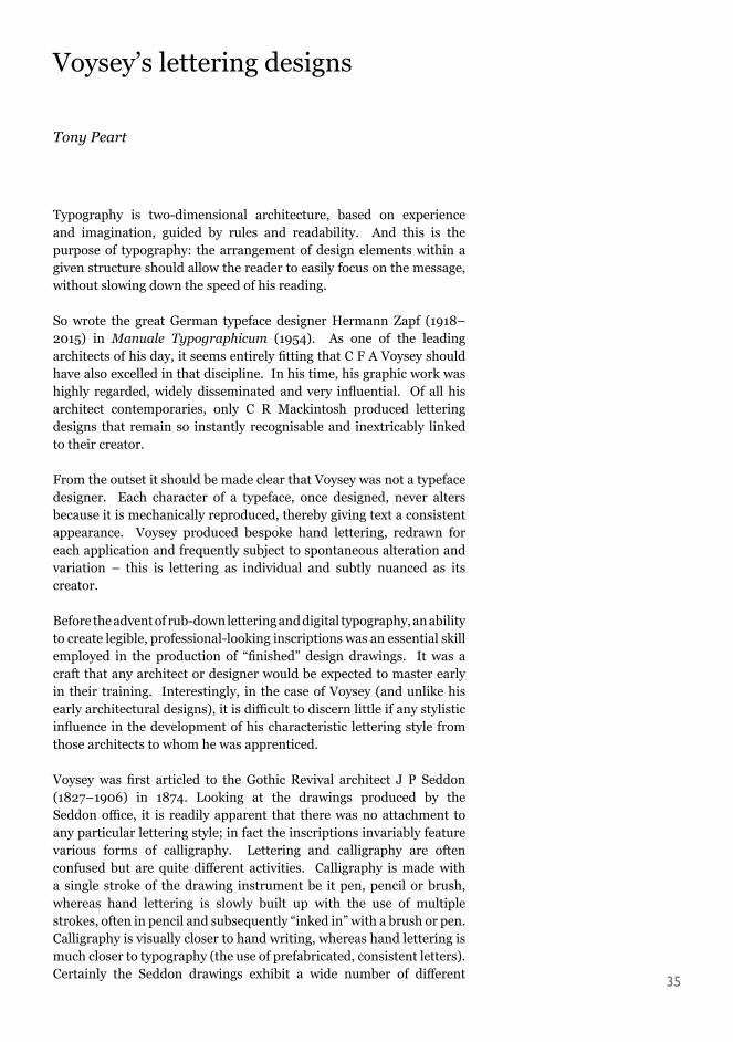
The Orchard number fOur 2015 complicate the matter even further, Voysey introduced elements from one alphabet to another at whim. An inspection of the designs held at the RIBA drawings collections gives an insight into his typical working methods: sketching and refining his design freehand, in pencil, before carefully tracing it and transferring it to another sheet (often a paste board manufactured by O W Papers) and finally inking it in with either brush or pen. However, although there are many subtle differences between examples, it is possible to create a general description of the typical Voysey lettering of this period. The incised tablet recording the completion of what is probably his most well known building, Broad Leys in 1899 (figure 10) will serve as an example. It clearly demonstrates Voysey’s love of justification and his abhorrence of negative (empty) space. His denial of negative space within the body of text at times bordered on the obsessive and would remain with him throughout his career. Word spacing (the gaps between words) are an important element in creating “readable” copy, but Voysey freed himself from their use by employing bullets to signify the break between words. The ligature – two or more characters joined together – was another favoured device frequently employed to create the words “THE” and “AND”, and can be seen in this example in four distinct combinations. There are also playful (often daring) liberties taken in the arrangement of individual letters such as the vertical stacking of the word “BY”, and the “nesting” of awkwardly shaped letters – in this case exemplified by the “L” and “T” of “BUILT” and the “L” and “E” of “HELEN”. The letter “O” in combination with certain other letters could also create visually awkward, negative space. In this case Voysey solved the problem by tucking the “O” under the “V”, although he frequently employed decorative “filler” elements placed under the “O”, thereby giving a circular form a more rectangular appearance – a device C R Mackintosh probably took from Voysey, along with the elevated crossbar that creates a greater feeling of stability. Remarkably, this radical treatment of letter forms does little to impede the readability of the text and, in combination with the “standard” letter shapes, creates an inscription with an internal grace and rhythm. Although speaking of furniture, Voysey’s words of 1894 would also seem to throw light on his approach to the design of lettering:
‘‘Is it faithful work? And for love’s sake ask, is it proportioned, coloured and disposed as the natural beauties in creation? Are its lines and masses graceful and pleasing? Do any of its parts quarrel? Does it express sobriety, restraint, and purity?’’ 8
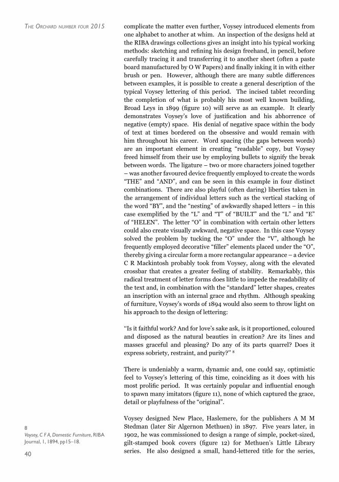
There is undeniably a warm, dynamic and, one could say, optimistic feel to Voysey’s lettering of this time, coinciding as it does with his most prolific period. It was certainly popular and influential enough to spawn many imitators (figure 11), none of which captured the grace, detail or playfulness of the “original”.
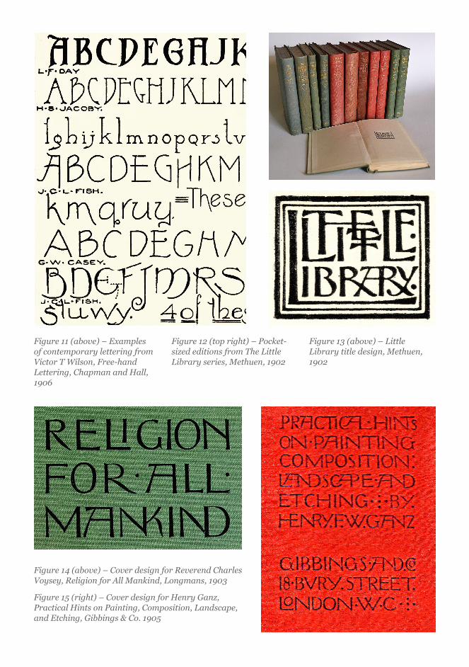
Voysey designed New Place, Haslemere, for the publishers A M M Stedman (later Sir Algernon Methuen) in 1897. Five years later, in 1902, he was commissioned to design a range of simple, pocket-sized, gilt-stamped book covers (figure 12) for Methuen’s Little Library series. He also designed a small, hand-lettered title for the series,
8Voysey, C F A, Domestic Furniture, RIBA Journal, 1, 1894, pp15–18.
41
Figure 11 (above) – Examples of contemporary lettering from Victor T Wilson, Free-hand Lettering, Chapman and Hall, 1906
Figure 12 (top right) – Pocket-sized editions from The Little Library series, Methuen, 1902
Figure 13 (above) – Little Library title design, Methuen, 1902
Figure 14 (above) – Cover design for Reverend Charles Voysey, Religion for All Mankind, Longmans, 1903
Figure 15 (right) – Cover design for Henry Ganz, Practical Hints on Painting, Composition, Landscape, and Etching, Gibbings & Co. 1905
42
The Orchard number fOur 2015 which appeared as a frontispiece in each volume (figure 13). This is probably Voysey’s most inventive and extreme lettering composition as he condenses and combines elements into a tiny, confined space. That it remains instantly readable borders on the miraculous and shows him at the height of his lettering prowess.
Further commissions followed: a cover design for his father’s Religion for all Mankind (1903) (figure 14); advertisements for Sanderson’s wallpaper (1905); another “variant” alphabet featured in Dekorative Kunst9; and the previously undocumented cover for Henry Ganz’s Practical Hints on Painting, Composition, Landscape, and Etching (1905)10 (figure 15). Ganz was a member of the Rev Voysey’s Theistic Church and a landscape painter and etcher whose work occasionally featured in The Studio. The Ganz volume also contains a Voysey-designed circular monogram for the author and a lettered advertisement for The Rowley Gallery in yet another ‘‘variant’’ alphabet (figure 16). This highly flexible alphabet which had served Voysey well for over 20 years, made one of its last public appearances on the cover of his own Reason as a Basis of Art (1906) (figure 17), an elegantly understated and beautifully resolved piece of lettering.
By the time Voysey produced the hand-lettered cover to Ganz’s second book Practical Hints On Modelling, Design, And Mural Decoration (1908)11 a much more formal, austere style was in the ascendancy (figure 18). The majority of the characters had now adopted classical form; a sea-change had taken place and there would be no return to the romanticism of his earlier style. By cross-referencing the inscriptions on Voysey’s designs for furniture it is possible to date this dramatic shift to the period between late 1907 and early 1908. The change was not a result of gradual evolution but a conscious decision to adopt a more conservative, traditional form of lettering. Although retaining a basic classical Roman form, Voysey’s lettering from this point forward gradually develops more overtly “pointed”, Gothic decorative elements – a transformation that was also reflected in his architectural and furniture designs from the same period. The greater consistency of letter scale required to create this more austere, regular body of text
Figure 16 (left) – Advertisement for The Rowley Gallery, 1905
Figure 17 (middle) – Cover design for Reason as a Basis of Art, Elkin Mathews, 1906
Figure 18 (right) – Cover design for Henry Ganz, Practical Hints On Modelling, Design, and Mural Decoration, Gibbings & Co 1908

43
would not allow for the playful distortions of size previously used to fill areas of unwanted space. Voysey’s solution to this problem was to employ a decorative version of the Teutonic cross (known in heraldry as a “cross potent”) alongside the familiar bullet used to signify word spaces. The cross visually complemented the letter forms and was so central to this new way of working that Voysey actually designed it as an additional character (glyph) in this new, classically inspired alphabet (figure 19). Apart from fulfilling an important visual role, Voysey was well aware that it had rich symbolic meanings. Writing in 1932, Voysey described his attitude towards it as follows: “The cross is used as a symbol of faith, not necessarily Christian.” 12
In 1910 Voysey designed the cover, title page and decorative borders for The Rubáiyát of Omar Khayyám13 (figure 20). This lettering shows even less variety in line weight, and the letter forms have started to resemble Gothic calligraphy, created at a single stroke, with a chisel tipped pen. Perversely however, this was not the case as the artwork
9Konody, P G, C F A Voysey’s Neuere Arbeiten, Dekorative Kunst , Vol.14, 1906, pp. 193–8. 10Ganz, Henry F W, Practical Hints on Painting, Composition, Landscape and Etching, London,Gibbings & Company, 1905. 11Ganz, Henry F W, Practical Hints on Modelling, Design and Mural Work, London,Gibbings & Company, 1908.
12Symbolism in Design, unpublished manuscript in RIBA Drawings Collection, 1930. 13FitzGerald, Edward, The Rubáiyát of Omar Khayyám, London, T N Foulis, 1910.
Figure 19 (above) – Alphabet designed for the Central Control Board (Liquor Traffic), 1916
Figure 20 (left) – Cover and title page design for The Rubáiyát of Omar Khayyám, T N Foulis, 1910

44
was still sketched in pencil and subsequently inked in methodically with a brush or pen.
The widely reproduced “blueprint” alphabet (figure 19), previously dated to c1895, was actually produced over 20 years later and can now be confidently dated to 1916. It forms part of a flurry of lettering and graphic design that Voysey designed for the Central Control Board (Liquor Traffic) between 1916 and 1918. The CCB was an attempt to solve a massive drink problem involving the workers at various munitions factories, which had escalated to such a point that it was in danger of threatening the war effort. Voysey produced a wide range of graphic work to be displayed in the public houses taken into state control. These comprised such items as morally “uplifting” coloured poster decorations, lettered notices, pub signs and year calendars. This final alphabet (with a few minor variations) would be used for the rest of his career. It is essentially a further refinement of the one he had employed the previous year, for the cover of his second book, Individuality (1915) (figure 21) – although at this point the “E” has not yet gained its characteristic curving top stroke.
As with his contemporaneous architectural and furniture designs, Voysey’s lettering had embraced an uncompromising “pointed” Gothic style, perversely at odds with prevailing fashion. The playfulness and rhythmic variety of his early lettering designs was abandoned in favour of a much more formal approach which although gaining in legibility loses the fluidity and warmth of his earlier style. This is lettering that exudes conservative austerity, and in the context of its time can be read as provocative and reactionary.
As his architectural practice dwindled Voysey was forced to turn to both pattern and graphic design as his primary source of income. The major focus of his graphic/lettering work in these later years was fulfilling a wide range of bookplate and badge commissions for various clients, friends and family. An activity no doubt facilitated by exposure in a two-page feature on his bookplate designs in the February 1915 issue of The Studio14. This was the only published article devoted solely to his graphic work and featured six bookplates, the majority very recent designs featuring his late, “pointed” lettering. The anonymous author states:
‘‘... So many and varied are the forms in which his decorative genius has expressed itself that a bare enumeration of them would fill a considerable space. It is not surprising, therefore, that he should have bestowed his attention upon a class of design which, if lying outside the broad ambit of his practice as an architect, is yet one calling for the play of the decorative faculty which he possesses in such a marked degree...’’
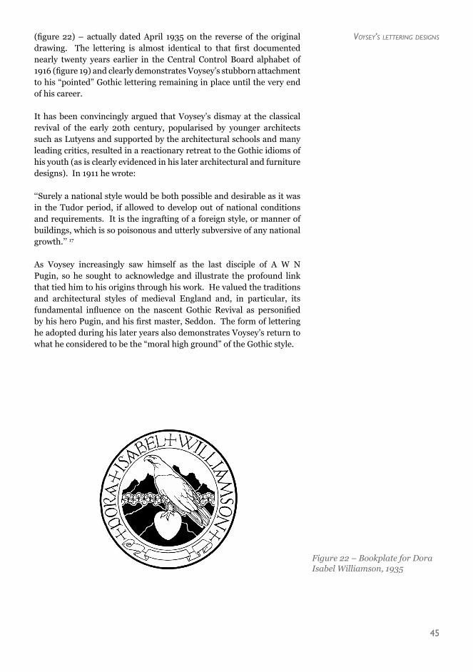
A compilation of the majority of this later graphic and lettering design can be found in The Bookplates and Badges of C F A Voysey15. Frustratingly many of the designs featured are not given a date16 but an analysis of the lettering style employed, clearly indicates whether they were designed before or after the “watershed” year of 1908. A very late design featured is an undated bookplate for Dora Isabel Williamson
Figure 21 – Cover design for Individuality, Chapman and Hall, 1915
14The Studio Vol 64 No. 263, February 1915, pp50–51. 15Livingstone, Karen, The Bookplates and Badges of C F A Voysey, Antique Collectors’ Club, 2011. 16Most of the undated bookplates can be given an exact date by reference to the original designs in the RIBA drawings collection or by simply referring to Joanna Symonds excellent catalogue of the RIBA’s Voysey holdings. 17Voysey, C F A, The English Home, British Architect, Vol 75, 1911, p60.
45
(figure 22) – actually dated April 1935 on the reverse of the original drawing. The lettering is almost identical to that first documented nearly twenty years earlier in the Central Control Board alphabet of 1916 (figure 19) and clearly demonstrates Voysey’s stubborn attachment to his “pointed” Gothic lettering remaining in place until the very end of his career.
It has been convincingly argued that Voysey’s dismay at the classical revival of the early 20th century, popularised by younger architects such as Lutyens and supported by the architectural schools and many leading critics, resulted in a reactionary retreat to the Gothic idioms of his youth (as is clearly evidenced in his later architectural and furniture designs). In 1911 he wrote:
‘‘Surely a national style would be both possible and desirable as it was in the Tudor period, if allowed to develop out of national conditions and requirements. It is the ingrafting of a foreign style, or manner of buildings, which is so poisonous and utterly subversive of any national growth.’’ 17
As Voysey increasingly saw himself as the last disciple of A W N Pugin, so he sought to acknowledge and illustrate the profound link that tied him to his origins through his work. He valued the traditions and architectural styles of medieval England and, in particular, its fundamental influence on the nascent Gothic Revival as personified by his hero Pugin, and his first master, Seddon. The form of lettering he adopted during his later years also demonstrates Voysey’s return to what he considered to be the “moral high ground” of the Gothic style.
Figure 22 – Bookplate for Dora Isabel Williamson, 1935
Voysey’s lettering designs


![[Kilo Books Com]-Ebook cafe cung tony - sach goc](https://static.fdokumen.com/doc/165x107/6323e1b948d448ffa006e27d/kilo-books-com-ebook-cafe-cung-tony-sach-goc.jpg)