Pareto Analysis - SNS Courseware
22
The Basic Seven (B7) Tools of Quality Pareto Analysis • Very similar to Histograms • Use of the 80/20 rule • Use of percentages to show importance
-
Upload
khangminh22 -
Category
Documents
-
view
6 -
download
0
Transcript of Pareto Analysis - SNS Courseware
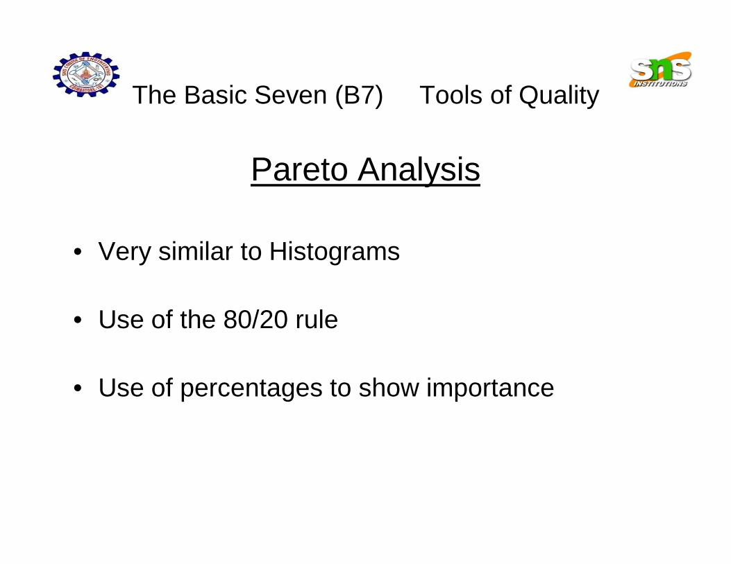
The Basic Seven (B7) Tools of Quality
Pareto Analysis
• Very similar to Histograms
• Use of the 80/20 rule
• Use of percentages to show importance
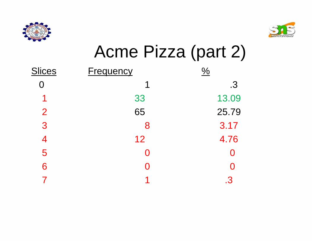
Acme Pizza (part 2)Slices Frequency %
0 1 .31 33 13.092 65 25.793 8 3.174 12 4.765 0 06 0 07 1 .3

Acme Pizza (part 2)• The completed Pareto Analysis results in the following graph:
0
10
20
30
40
50
60
70
1 2 3 4 5 6 7
Slices of Pizza
2 1 4 3 7 5 6

4

Acme Pizza (part 2)Critical Thinking
• How does the Pareto Analysis differ from the Histogram?
• How can this be a useful tool to the Acme boss?
The Basic Seven (B7) Tools of Quality
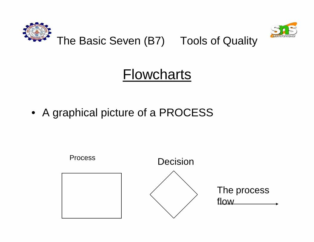
Flowcharts
• A graphical picture of a PROCESS
Process Decision
The process flow
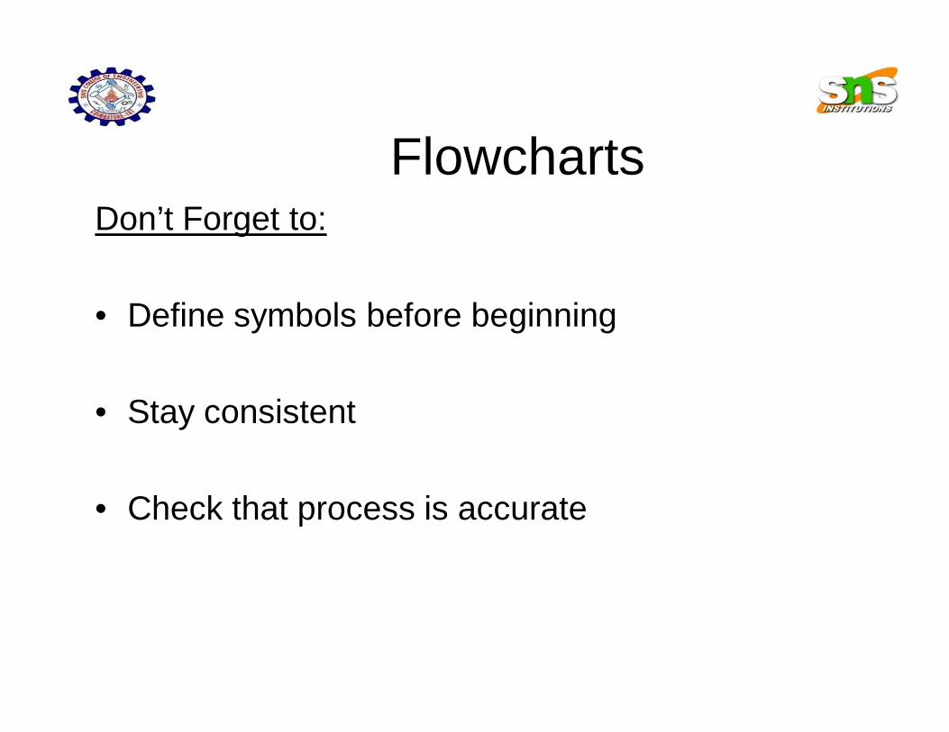
FlowchartsDon’t Forget to:
• Define symbols before beginning
• Stay consistent
• Check that process is accurate
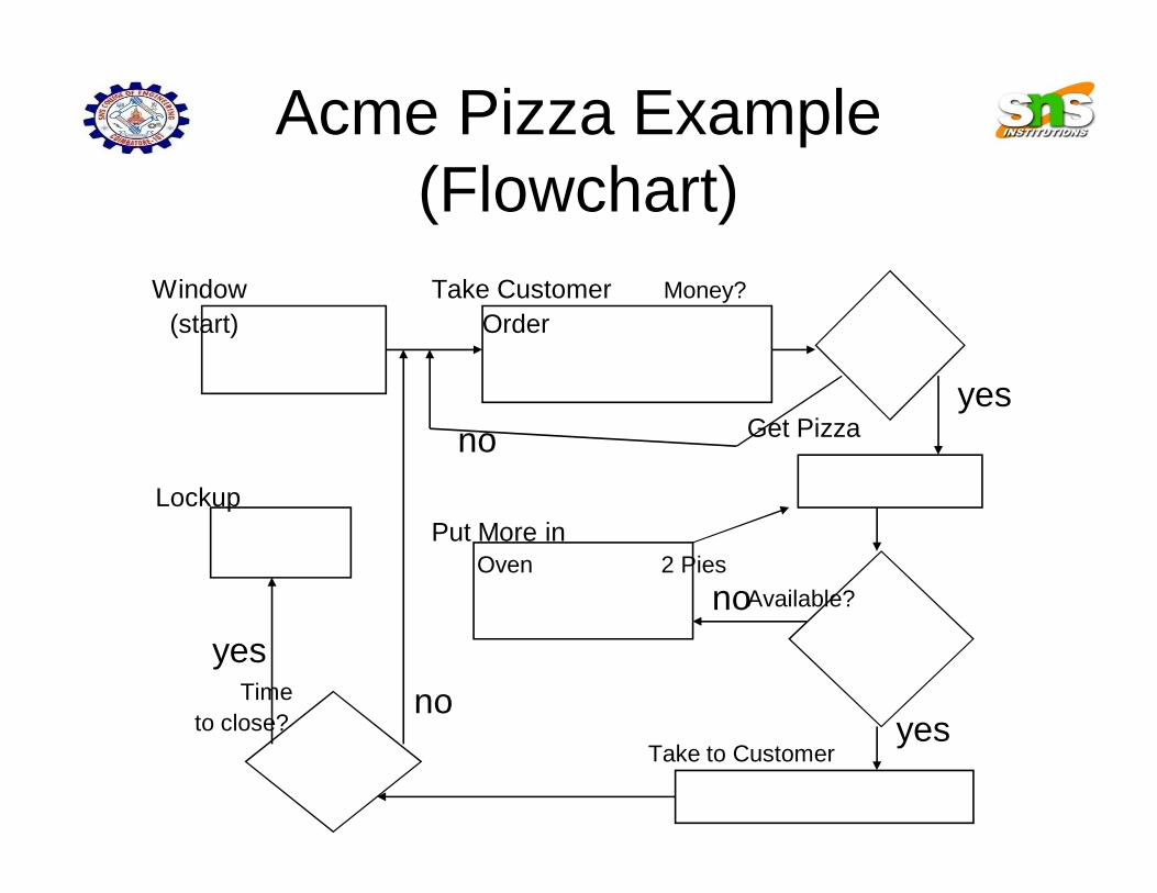
Acme Pizza Example (Flowchart)
Window Take Customer Money?(start) Order
Get Pizza
LockupPut More in
Oven 2 PiesAvailable?
Timeto close?
Take to Customer
noyes
no
yesno
yes

How can we use the flowchart to analyze improvement ideas from the Histogram?
Window Take Customer Money?(start) Order
Get Pizza
LockupPut More in
Oven 2 PiesAvailable?
Timeto close?
Take to Customer
noyes
no
yesno
yes

Want some practice?Make a flowchart for:
• Taking a shower• Cooking dinner• Driving a car• Having a party• Creating a Flowchart
Any other processes you can think of?
The Basic Seven (B7) Tools of Quality
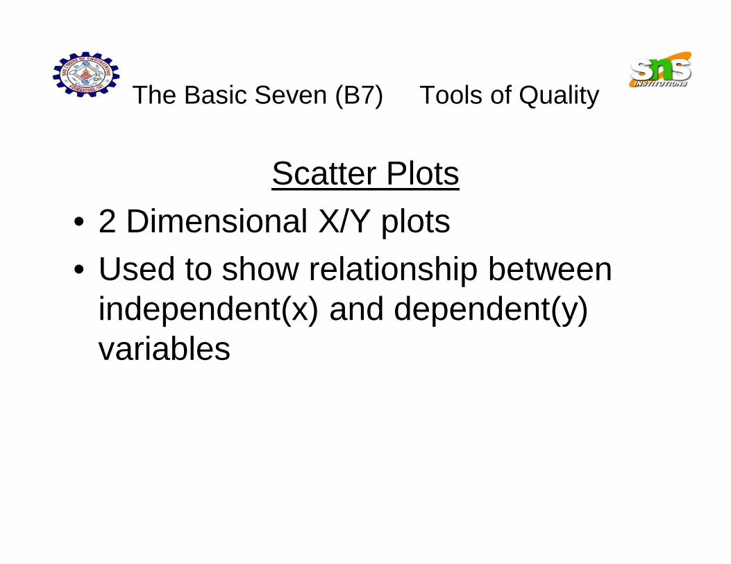
Scatter Plots• 2 Dimensional X/Y plots• Used to show relationship between
independent(x) and dependent(y) variables
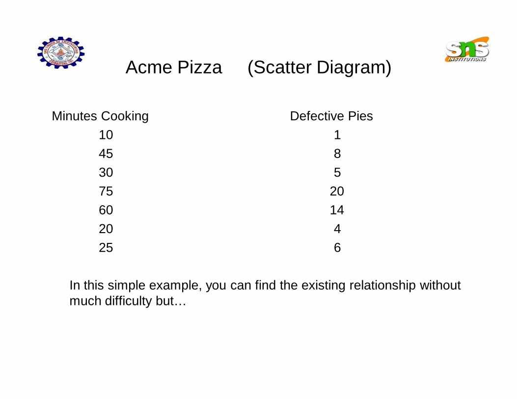
Acme Pizza (Scatter Diagram)
Minutes Cooking Defective Pies10 145 830 575 2060 1420 425 6
In this simple example, you can find the existing relationship without much difficulty but…
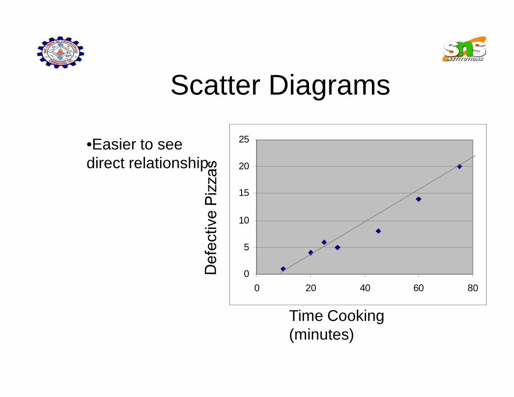
Scatter Diagrams
0
5
10
15
20
25
0 20 40 60 80
•Easier to see direct relationship
Time Cooking (minutes)
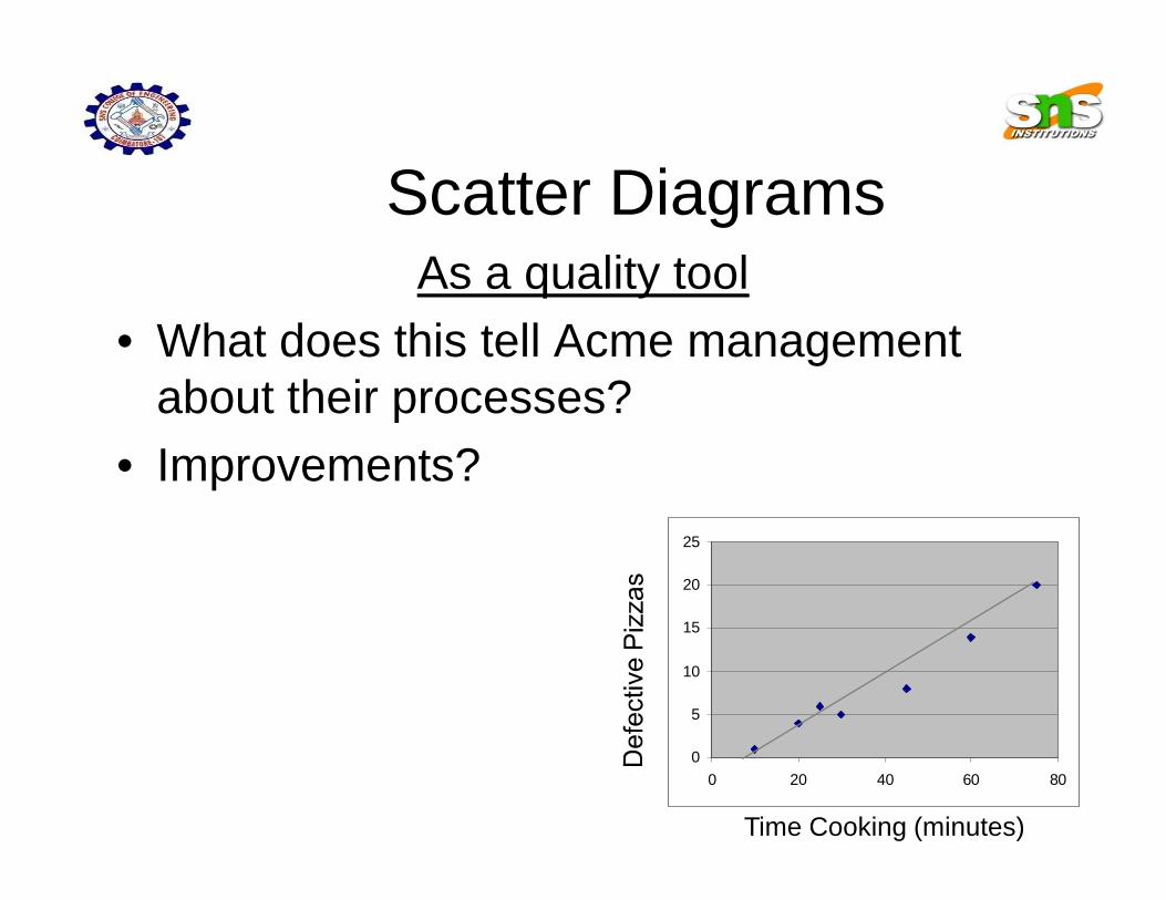
Scatter DiagramsAs a quality tool
• What does this tell Acme management about their processes?
• Improvements?
0
5
10
15
20
25
0 20 40 60 80
Time Cooking (minutes)

The Basic Seven (B7) Tools of Quality
Run charts• Time-based (x-axis)
• Cyclical
• Look for patterns

Run Charts
8 9 10 11 12 1 2 3 4
8 9 10 11 12 1 2 3 4
8 9 10 11 12 1 2 3 4PM- AM PM- AM PM- AM
Thursday
Week 1
Thursday
Week 2
Thursday
Week 3
Slices/hour
Time

The Basic Seven (B7) Tools of Quality
Control Charts• Deviation from Mean
• Upper and Lower Spec’s
• Range
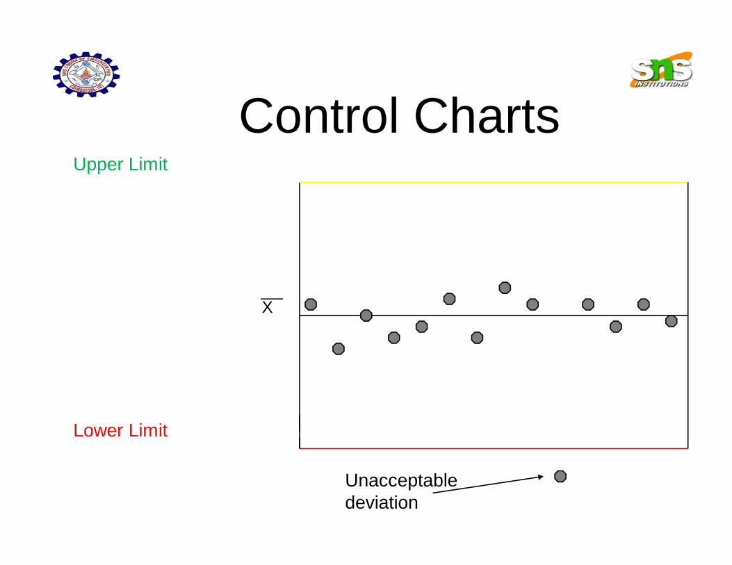
Control ChartsUpper Limit
Lower Limit
Unacceptable deviation
X
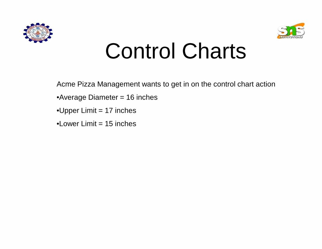
Control ChartsAcme Pizza Management wants to get in on the control chart action
•Average Diameter = 16 inches
•Upper Limit = 17 inches
•Lower Limit = 15 inches

Acme example Control Charts
Upper Limit17 inches
Lower Limit15 Inches
Small Pie
X16 inches=

Acme example #50Control Charts
•Pies within specifications were acceptable
•One abnormally small pie is “uncommon”
•Should be examined for quality control
Summary• Basic Seven Tools of Quality
• Measuring data
• Quality Analysis
• “Democratized statistics”