
OPRO X Designer First Step Guide
212
OPRO X Designer First Step Guide OPRO Japan Co., Ltd
-
Upload
khangminh22 -
Category
Documents
-
view
0 -
download
0
Transcript of OPRO X Designer First Step Guide

OPRO X Designer First Step Guide
OPRO Japan Co., Ltd
Table of Contents 1 Chapter 1: OPRO X Designer Architecture ............................................................................................................... - 2 -
1.1 Objectives of Chapter 1 ..................................................................................................................................................... - 2 - 1.2 OPRO X Designer Architecture .......................................................................................................................................... - 2 - 1.3 Integration of OPRO X Server and OPRO X Designer .................................................................................................... - 5 - 1.4 Starting OPRO X Designer ................................................................................................................................................. - 8 - 1.5 Basic operations of OPRO X Designer............................................................................................................................ - 12 -
2 Chapter 2: Creating an Employee List (Basics of OPRO X Designer)................................................................... - 17 - 2.1 Objectives of Chapter 2 ................................................................................................................................................... - 17 - 2.2 Setting the Database Connections .................................................................................................................................. - 19 - 2.3 Creating the Template and building Database Queries using VQB ............................................................................- 20 - 2.4 Displaying the Data ..........................................................................................................................................................- 37 - 2.5 Setting the Title .................................................................................................................................................................. - 51 - 2.6 Output from Sample HTML ..............................................................................................................................................- 56 -
3 Chapter 3: Creation of a Product List (Creating a data report which uses the SUM function)...........................- 62 - 3.1 Objectives of Chapter 3 ...................................................................................................................................................- 62 - 3.2 Creating the Template and building Database Queries using VQB ............................................................................- 64 - 3.3 Arranging the Data ........................................................................................................................................................... - 81 - 3.4 Displaying the Total Stock Amount ..................................................................................................................................- 93 - 3.5 Setting the Title ............................................................................................................................................................... - 102 - 3.6 Displaying the Date........................................................................................................................................................ - 105 - 3.7 Showing Page Numbers................................................................................................................................................ - 108 - 3.8 Output from Sample HTML ............................................................................................................................................ - 112 -
4 Chapter 4: Creating a Leave and Earning Statement (pay slip) with Data Security ......................................... - 114 - 4.1 Objectives of Chapter 4 ................................................................................................................................................. - 114 - 4.2 Setting the Database Connections ................................................................................................................................ - 116 - 4.3 Creating the Template and building Database Queries using VQB .......................................................................... - 117 - 4.4 Displaying the Data ........................................................................................................................................................- 121 - 4.5 Setting the Title and showing the details ...................................................................................................................... - 168 - 4.6 Display Data by Combining the functions of Label and Table Components............................................................ - 179 - 4.7 Displaying a Note.......................................................................................................................................................... - 188 - 4.8 Displaying the Company Logo ..................................................................................................................................... - 192 - 4.9 Setting the Security......................................................................................................................................................... - 197 - 4.10 Output from Sample HTML ........................................................................................................................................... - 202 - 4.11 Appendix ........................................................................................................................................................................ - 205 -

- 2 -
1 Chapter 1: OPRO X Designer Architecture
1.1 Objectives of Chapter 1
This chapter will familiarize you with the OPRO X Designer architecture. It is a prerequisite for the chapter 2,
building of an Employee List Report.
1.2 OPRO X Designer Architecture
1.3 Integration of OPRO X Server and OPRO X Designer
1.4 Starting OPRO X Designer
1.5 Basic Operations of OPRO X Designer
1.2 OPRO X Designer Architecture
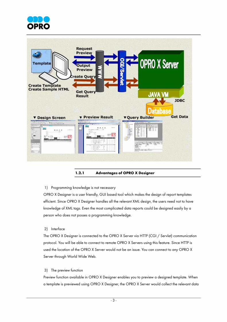
OPRO X Server (OXS) can retrieve data from multiple databases and data sources available remotely
through the Internet, in order to generate documents in a wide range of output formats. These output
formats are OPR (OPRO Print Report), OXR (OPRO XML Report), PDF (Portable Document Format), XDW
(DocuWorks File Format) and HTML. OXS provides connectivity to databases such as Access, Cache, MS
SQL, Oracle, DB2, DB2 Native, Sybase, Informix, My SQL, PostgreSQL, Lotus and OPRO XML-Database.
Documents generated through the OXS are delivered securely through Print, Fax or Email to any remote
location via the Internet.
Powerful designer (OPRO X Designer – OXD) and browser (OPRO X Browser – OXB) applications are
available for easy interaction with OXS. OXD allows users to design various types of document templates
for OXS that has a user friendly GUI, while OXB is used to view documents generated by OXD in OPR or
in OXR formats.
OXS users can preview documents or request generated documents remotely via CGI/Servlet, which
enables wide connectivity to OXS.
OPRO X Designer is the tool used to design the documents mentioned below.
- 3 -
1.2.1 Advantages of OPRO X Designer
1) Programming knowledge is not necessary
OPRO X Designer is a user friendly, GUI based tool which makes the design of report templates
efficient. Since OPRO X Designer handles all the relevant XML design, the users need not to have
knowledge of XML tags. Even the most complicated data reports could be designed easily by a
person who does not posses a programming knowledge.
2) Interface
The OPRO X Designer is connected to the OPRO X Server via HTTP (CGI / Servlet) communication
protocol. You will be able to connect to remote OPRO X Servers using this feature. Since HTTP is
used the location of the OPRO X Server would not be an issue. You can connect to any OPRO X
Server through World Wide Web.
3) The preview function
Preview function available in OPRO X Designer enables you to preview a designed template. When
a template is previewed using OPRO X Designer, the OPRO X Server would collect the relevant data

- 4 -
from the database in real time and will generate a preview, enabling the client to preview a
document within few seconds. In addition a document can be previewed in many formats including
OPR, PDF and HTML. It is also possible to preview a template while you are gradually designing the
template. This would make the task of template design simple.
4) Query Designing
With the powerful and user friendly Visual Query Builder available in OPRO X Designer you can
design queries interactively. The user needs not to worry about the complex SQL syntax. You can
view the results of the designed query in the GUI.
Since OPRO X Designer uses XML in the background the designing process is effective and you can
handle large data sources through OXD with ease.

- 5 -
1.3 Integration of OPRO X Server and OPRO X Designer
1.3.1 Connecting OPRO X Server and OPRO X Designer
Connecting OPRO X Designer and OPRO X Server is done through CGI/Servlet.
1) Setting up the CGI/Servlet URL
Setting the URL of CGI/Servlet on OPRO X Designer is done using the menu Options
Environment Options
* For details please refer to section 1.4.4 – “Setting the options”
1.3.2 Connecting OPRO X Server and Databases
1) Connecting OPRO X Server and databases
OPRO X Server maintains the connection details of databases inside an XML file named
ODCAW.xml.
For instance when an Oracle database named db817 is used, the following setting should be added
to the ODCAW.xml file.
Sample ODCAW.xml entry that refers to an Oracle Database
<DATABASE>
<Name>Scott</Name>
<Type>Oracle</Type>
<URL>jdbc:oracle:thin:@172.16.100.100:1521:db817</URL>
<Driver>oracle.jdbc.driver.OracleDriver</Driver>
<UserID>scott</UserID>
<Password>tiger</Password>
<Connections>3</Connections>
</DATABASE>
2) Setting of <DATABASE> element
For each database there is a corresponding sample entry added to the ODCAW.xml similar to the
- 6 -
example shown above. Please do the necessary settings for your databases following this example.
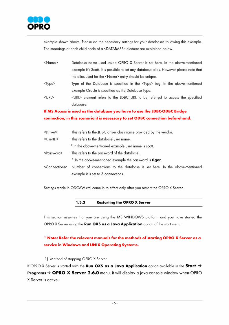
The meanings of each child node of a <DATABASE> element are explained below.
<Name> Database name used inside OPRO X Server is set here. In the above-mentioned
example it’s Scott. It is possible to set any database alias. However please note that
the alias used for the <Name> entry should be unique.
<Type> Type of the Database is specified in the <Type> tag. In the above-mentioned
example Oracle is specified as the Database Type.
<URL> <URL> element refers to the JDBC URL to be referred to access the specified
database.
If MS Access is used as the database you have to use the JDBC-ODBC Bridge
connection, in this scenario it is necessary to set ODBC connection beforehand.
<Driver> This refers to the JDBC driver class name provided by the vendor.
<UserID> This refers to the database user name.
* In the above-mentioned example user name is scott.
<Password> This refers to the password of the database.
* In the above-mentioned example the password is tiger.
<Connections> Number of connections to the database is set here. In the above-mentioned
example it is set to 3 connections.
Settings made in ODCAW.xml come in to effect only after you restart the OPRO X Server.
1.3.3 Restarting the OPRO X Server
This section assumes that you are using the MS WINDOWS platform and you have started the
OPRO X Server using the Run OXS as a Java Application option of the start menu.
* Note: Refer the relevant manuals for the methods of starting OPRO X Server as a
service in Windows and UNIX Operating Systems.
1) Method of stopping OPRO X Server.
If OPRO X Server is started with the Run OXS as a Java Application option available in the Start
Programs OPRO X Server 2.6.0 menu, it will display a java console window when OPRO
X Server is active.
- 7 -
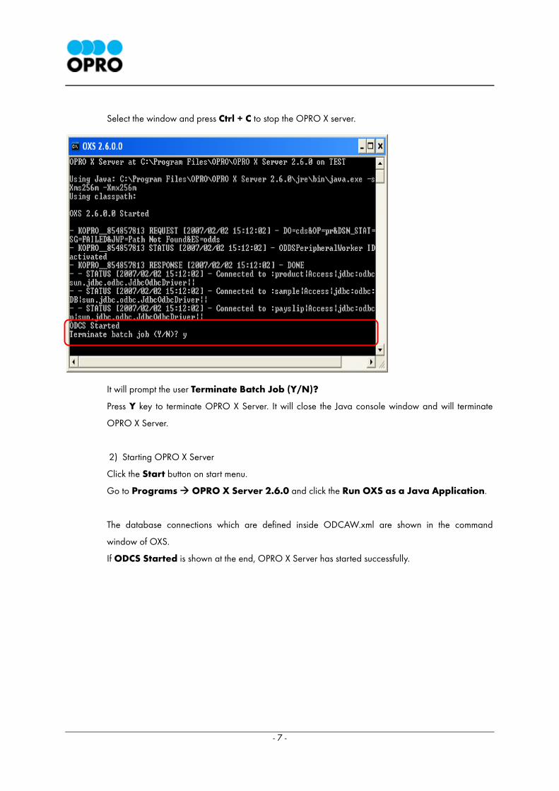
Select the window and press Ctrl + C to stop the OPRO X server.
It will prompt the user Terminate Batch Job (Y/N)?
Press Y key to terminate OPRO X Server. It will close the Java console window and will terminate
OPRO X Server.
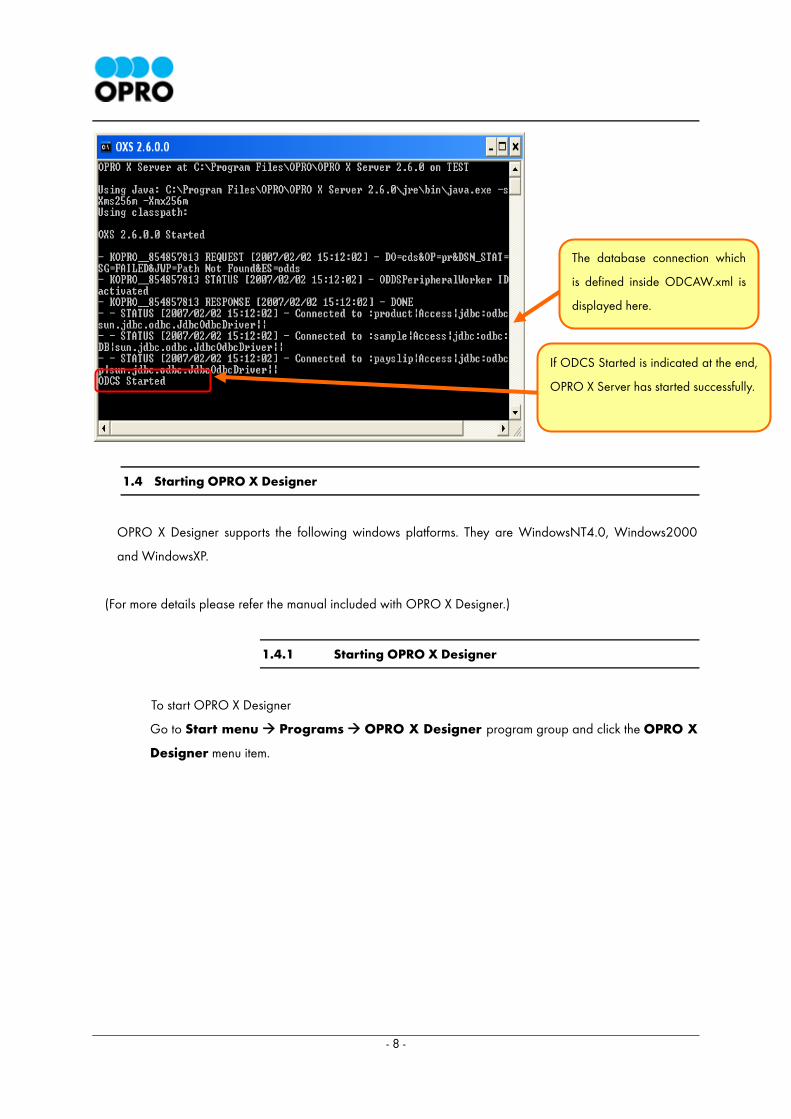
2) Starting OPRO X Server
Click the Start button on start menu.
Go to Programs OPRO X Server 2.6.0 and click the Run OXS as a Java Application.
The database connections which are defined inside ODCAW.xml are shown in the command
window of OXS.
If ODCS Started is shown at the end, OPRO X Server has started successfully.
- 8 -
1.4 Starting OPRO X Designer
OPRO X Designer supports the following windows platforms. They are WindowsNT4.0, Windows2000
and WindowsXP.
(For more details please refer the manual included with OPRO X Designer.)
1.4.1 Starting OPRO X Designer
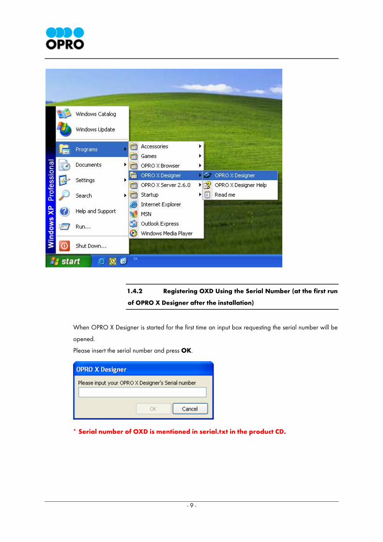
To start OPRO X Designer
Go to Start menu Programs OPRO X Designer program group and click the OPRO X
Designer menu item.
The database connection which
is defined inside ODCAW.xml is
displayed here.
If ODCS Started is indicated at the end,
OPRO X Server has started successfully.
- 9 -
1.4.2 Registering OXD Using the Serial Number (at the first run
of OPRO X Designer after the installation)
When OPRO X Designer is started for the first time an input box requesting the serial number will be
opened.
Please insert the serial number and press OK.
* Serial number of OXD is mentioned in serial.txt in the product CD.
- 10 -
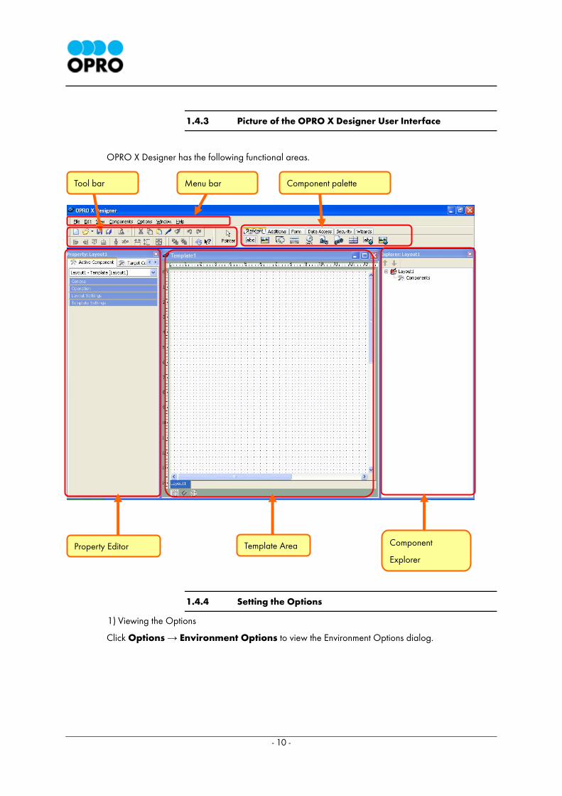
1.4.3 Picture of the OPRO X Designer User Interface
OPRO X Designer has the following functional areas.
1.4.4 Setting the Options
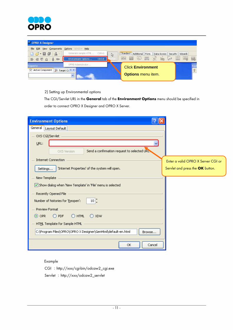
1) Viewing the Options
Click Options → Environment Options to view the Environment Options dialog.
Tool bar Component palette Menu bar
Property Editor Template Area Component
Explorer
- 11 -
2) Setting up Environmental options
The CGI/Servlet URL in the General tab of the Environment Options menu should be specified in
order to connect OPRO X Designer and OPRO X Server.
Example
CGI :http://xxx/cgi-bin/odcaw2_cgi.exe
Servlet :http://xxx/odcaw2_servlet
Enter a valid OPRO X Server CGI or
Servlet and press the OK button.
Click Environment
Options menu item.
- 12 -
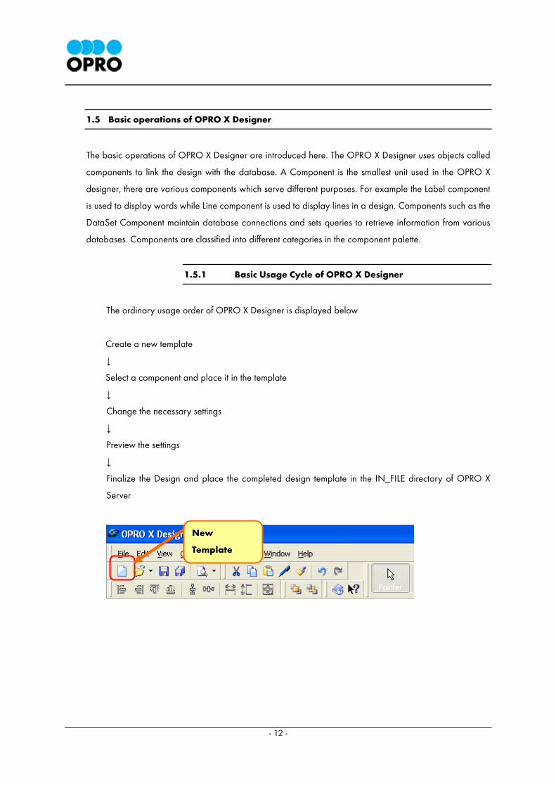
1.5 Basic operations of OPRO X Designer
The basic operations of OPRO X Designer are introduced here. The OPRO X Designer uses objects called
components to link the design with the database. A Component is the smallest unit used in the OPRO X
designer, there are various components which serve different purposes. For example the Label component
is used to display words while Line component is used to display lines in a design. Components such as the
DataSet Component maintain database connections and sets queries to retrieve information from various
databases. Components are classified into different categories in the component palette.
1.5.1 Basic Usage Cycle of OPRO X Designer
The ordinary usage order of OPRO X Designer is displayed below
Create a new template
↓
Select a component and place it in the template
↓
Change the necessary settings
↓
Preview the settings
↓
Finalize the Design and place the completed design template in the IN_FILE directory of OPRO X
Server
New
Template
- 13 -
1) Creating a new template
Click on the New Template button to create a new blank template
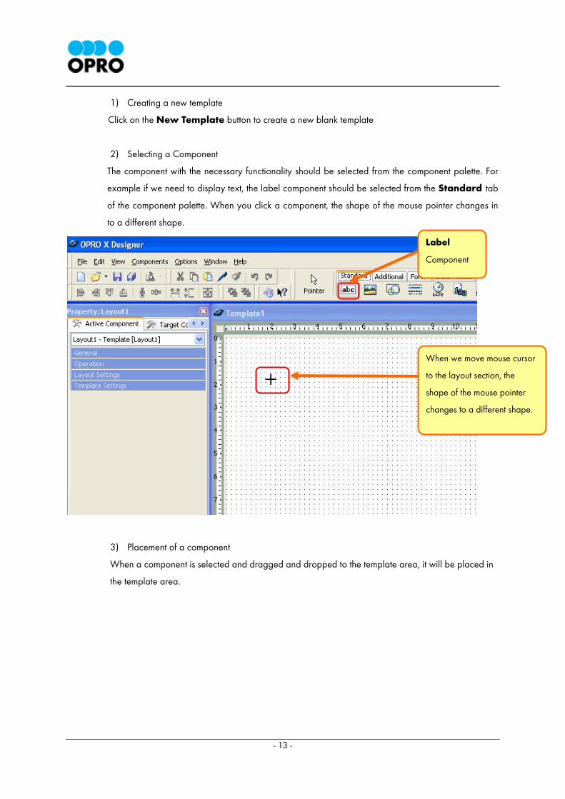
2) Selecting a Component
The component with the necessary functionality should be selected from the component palette. For
example if we need to display text, the label component should be selected from the Standard tab
of the component palette. When you click a component, the shape of the mouse pointer changes in
to a different shape.
3) Placement of a component
When a component is selected and dragged and dropped to the template area, it will be placed in
the template area.
+
When we move mouse cursor
to the layout section, the
shape of the mouse pointer
changes to a different shape.
Label
Component
- 14 -
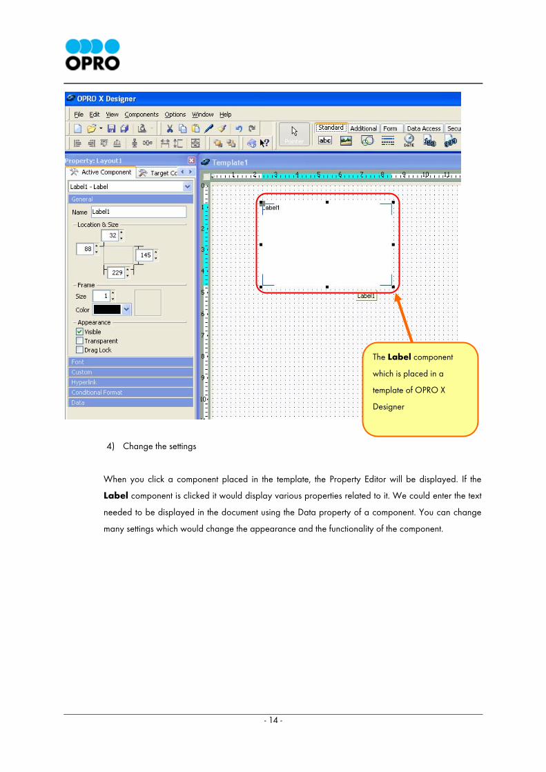
4) Change the settings
When you click a component placed in the template, the Property Editor will be displayed. If the
Label component is clicked it would display various properties related to it. We could enter the text
needed to be displayed in the document using the Data property of a component. You can change
many settings which would change the appearance and the functionality of the component.
The Label component
which is placed in a
template of OPRO X
Designer
- 15 -
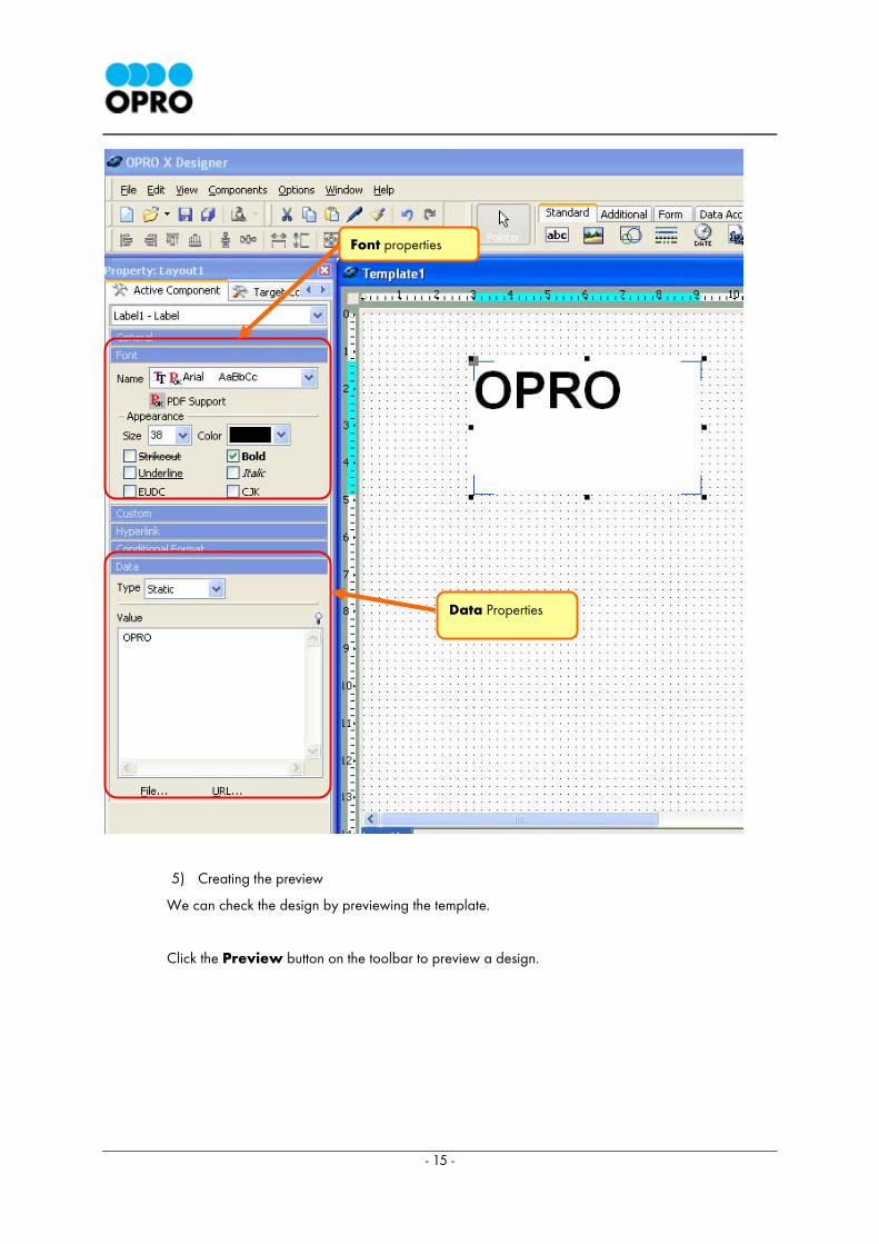
5) Creating the preview
We can check the design by previewing the template.
Click the Preview button on the toolbar to preview a design.
Font properties
Data Properties
- 16 -
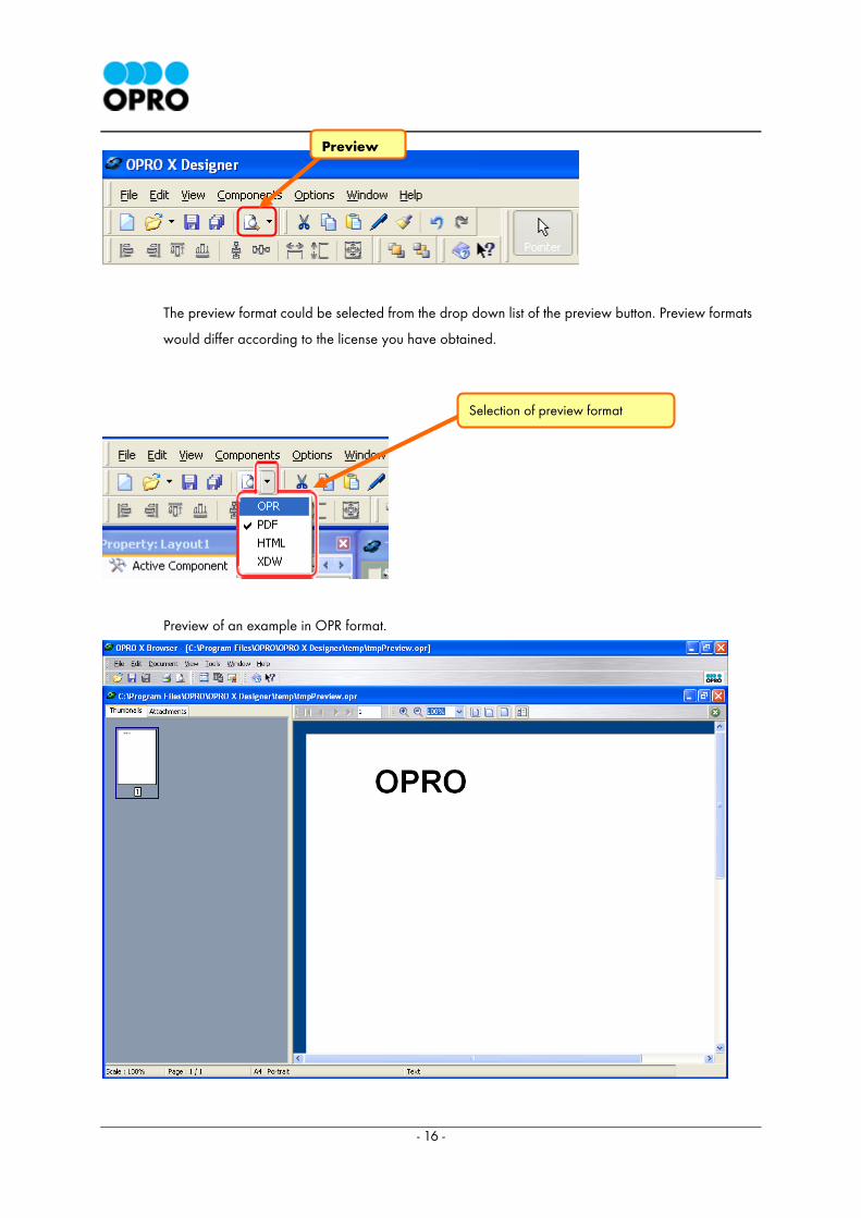
The preview format could be selected from the drop down list of the preview button. Preview formats
would differ according to the license you have obtained.
Preview of an example in OPR format.
Preview
Selection of preview format

- 17 -
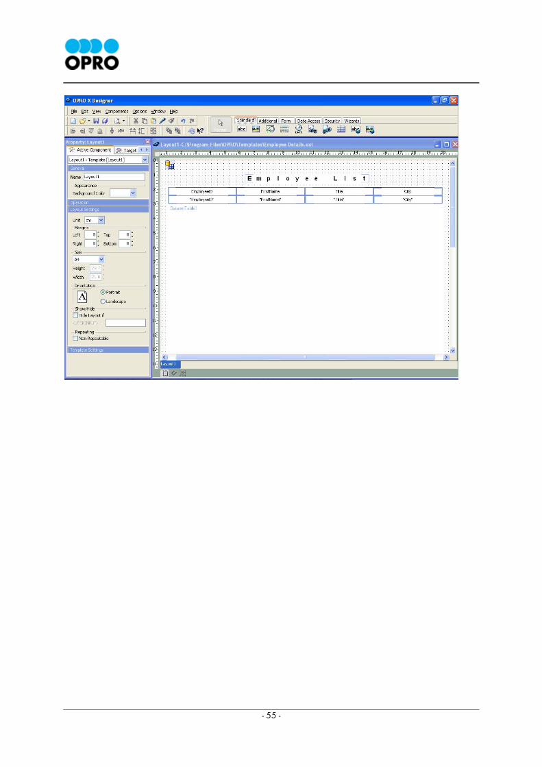
2 Chapter 2: Creating an Employee List (Basics of OPRO X Designer)
2.1 Objectives of Chapter 2
You can learn the basics of OPRO X Designer while designing this sample. The objective of this chapter is
to familiarize you with the basics of OPRO X Designer template design. In order to continue with this
chapter you would need to create an employee list similar to the one displayed below.
This template is a simple data report. However you are advised to follow the steps rather than creating
the data report by yourself. Please follow the steps specified in this document throughout the process of
creating the data report.

- 18 -
2.2 Setting the Database Connection
2.3 Creating the Template and Building Database Queries using VQB
2.4 Displaying the data
2.5 Setting the Title
2.6 Output from the Sample HTML
A request is sent to OXS via web browser and the document is generated in the OXS.
- 19 -
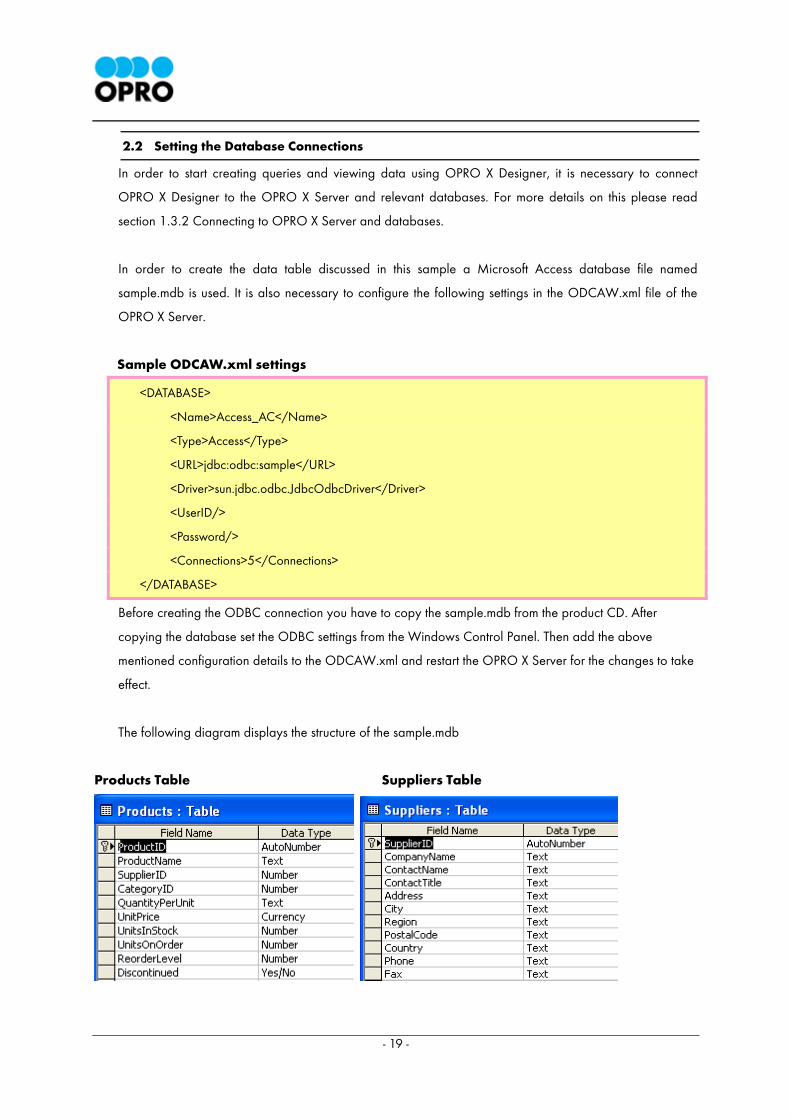
2.2 Setting the Database Connections
In order to start creating queries and viewing data using OPRO X Designer, it is necessary to connect
OPRO X Designer to the OPRO X Server and relevant databases. For more details on this please read
section 1.3.2 Connecting to OPRO X Server and databases.
In order to create the data table discussed in this sample a Microsoft Access database file named
sample.mdb is used. It is also necessary to configure the following settings in the ODCAW.xml file of the
OPRO X Server.
Sample ODCAW.xml settings
<DATABASE>
<Name>Access_AC</Name>
<Type>Access</Type>
<URL>jdbc:odbc:sample</URL>
<Driver>sun.jdbc.odbc.JdbcOdbcDriver</Driver>
<UserID/>
<Password/>
<Connections>5</Connections>
</DATABASE>
Before creating the ODBC connection you have to copy the sample.mdb from the product CD. After
copying the database set the ODBC settings from the Windows Control Panel. Then add the above
mentioned configuration details to the ODCAW.xml and restart the OPRO X Server for the changes to take
effect.
The following diagram displays the structure of the sample.mdb
Products Table Suppliers Table
- 20 -
2.3 Creating the Template and building Database Queries using VQB
2.3.1 Creating the Template
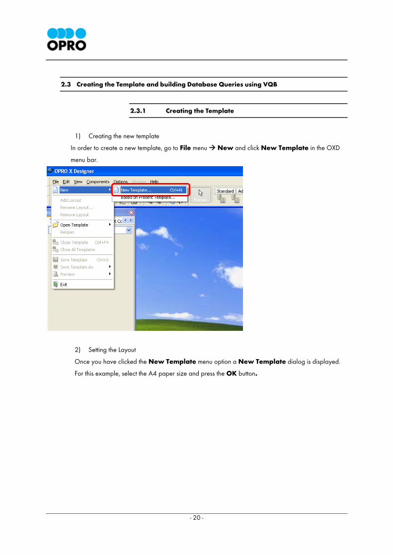
1) Creating the new template
In order to create a new template, go to File menu New and click New Template in the OXD
menu bar.
2) Setting the Layout
Once you have clicked the New Template menu option a New Template dialog is displayed.
For this example, select the A4 paper size and press the OK button.

- 21 -
< Illustration > New template dialog
Displaying of New Template dialog could also be controlled using the Show dialog check box which
is listed under the Options menu Environment Options.
The New Template dialog will not be displayed if you uncheck the Show Dialog check box. If this
check box is ticked the New Template dialog will be displayed each time you select the New
Template menu option from the File menu.
An Image of Environment Options dialog box is displayed below.
Additional layout information could be added
or removed from here.
Paper orientation is set here
If this check box is ticked, New Template
dialog will not appear when you click the
New Template menu option and the settings
specified here will automatically be assigned to
new OXD templates.
Paper size is set here.
- 22 -
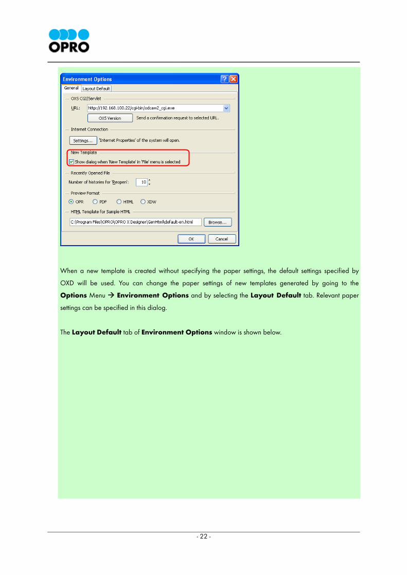
When a new template is created without specifying the paper settings, the default settings specified by
OXD will be used. You can change the paper settings of new templates generated by going to the
Options Menu Environment Options and by selecting the Layout Default tab. Relevant paper
settings can be specified in this dialog.
The Layout Default tab of Environment Options window is shown below.
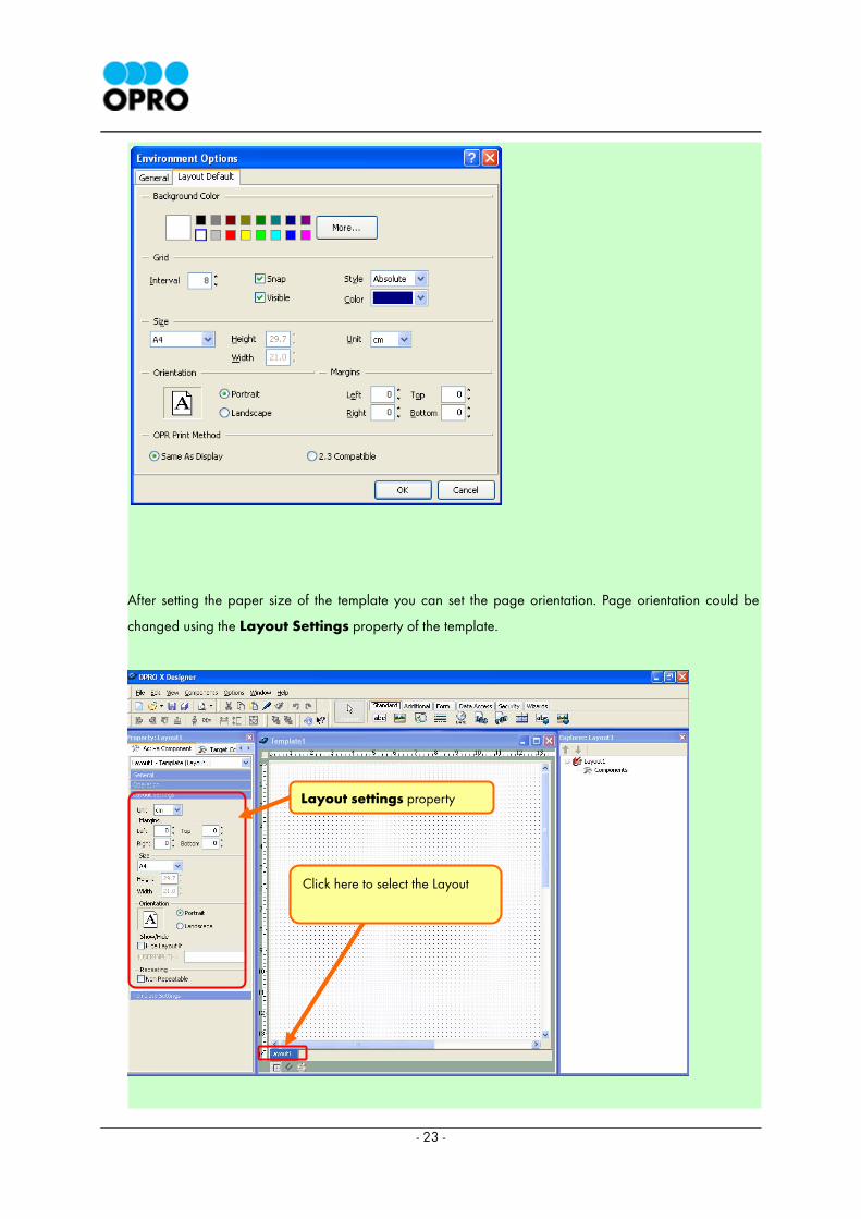
- 23 -
After setting the paper size of the template you can set the page orientation. Page orientation could be
changed using the Layout Settings property of the template.
Layout settings property
Click here to select the Layout
- 24 -
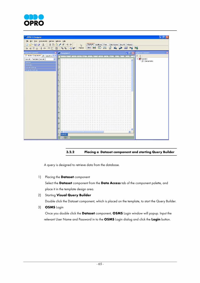
2.3.2 Placing a Dataset component and starting Visual Query
Builder
The Dataset component encapsulates a database. The Dataset component is used to access
data in the table(s) of a database using the Visual Query Builder tool. This provides access to
all the records and field of the database. Databases such as Oracle, SQL Server, Access, Cache,
DB2, DB2native, Informix, Lotus, MySQL, PostgreSQL, Sybase and OPROXML are supported by
OPRO X Designer.
Data stored in a database could be added to OXD templates with ease by using Dataset
components. This smart feature gives you a comparative advantage in creating complex business
reports.
1) Placing a Dataset Component
Fist select a Dataset component from the Data Access tab of the component palette, and place
it on the Template.
In order to avoid restrains on template design, it is advised to place Dataset components on the
top left hand corner of the template. You could change it’s location by dragging and dropping it to
the necessary location.
* The placement of the Dataset component does not have any impact on it’s
operation.
2) Starting Visual Query Builder
Double click the Dataset component, which is placed in the template.
A Dataset component placed on top left
corner of the template.
Dataset component
- 25 -
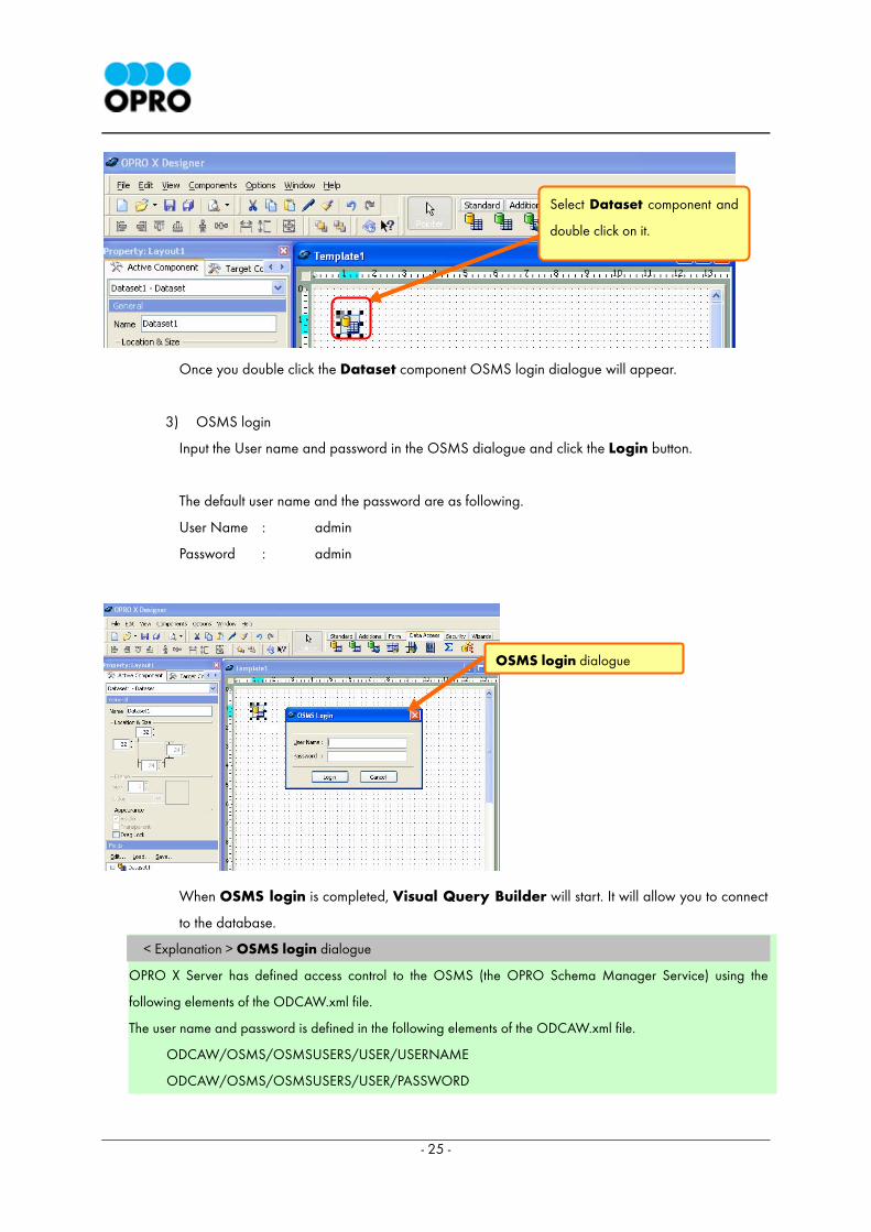
Once you double click the Dataset component OSMS login dialogue will appear.
3) OSMS login
Input the User name and password in the OSMS dialogue and click the Login button.
The default user name and the password are as following.
User Name : admin
Password : admin
When OSMS login is completed, Visual Query Builder will start. It will allow you to connect
to the database.
< Explanation > OSMS login dialogue
OPRO X Server has defined access control to the OSMS (the OPRO Schema Manager Service) using the
following elements of the ODCAW.xml file.
The user name and password is defined in the following elements of the ODCAW.xml file.
ODCAW/OSMS/OSMSUSERS/USER/USERNAME
ODCAW/OSMS/OSMSUSERS/USER/PASSWORD
Select Dataset component and
double click on it.
OSMS login dialogue
- 26 -
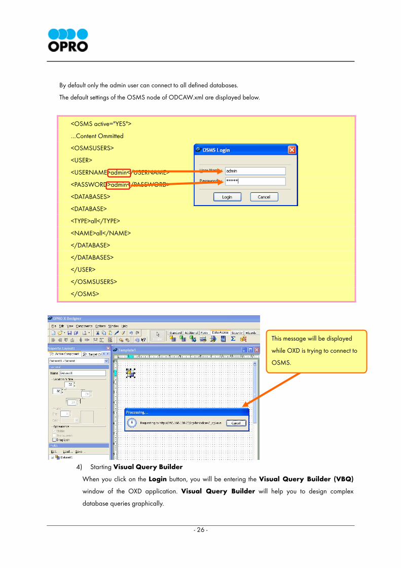
By default only the admin user can connect to all defined databases.
The default settings of the OSMS node of ODCAW.xml are displayed below.
<OSMS active="YES">
…Content Ommitted
<OSMSUSERS>
<USER>
<USERNAME>admin</USERNAME>
<PASSWORD>admin</PASSWORD>
<DATABASES>
<DATABASE>
<TYPE>all</TYPE>
<NAME>all</NAME>
</DATABASE>
</DATABASES>
</USER>
</OSMSUSERS>
</OSMS>
4) Starting Visual Query Builder
When you click on the Login button, you will be entering the Visual Query Builder (VBQ)
window of the OXD application. Visual Query Builder will help you to design complex
database queries graphically.
This message will be displayed
while OXD is trying to connect to
OSMS.
- 27 -
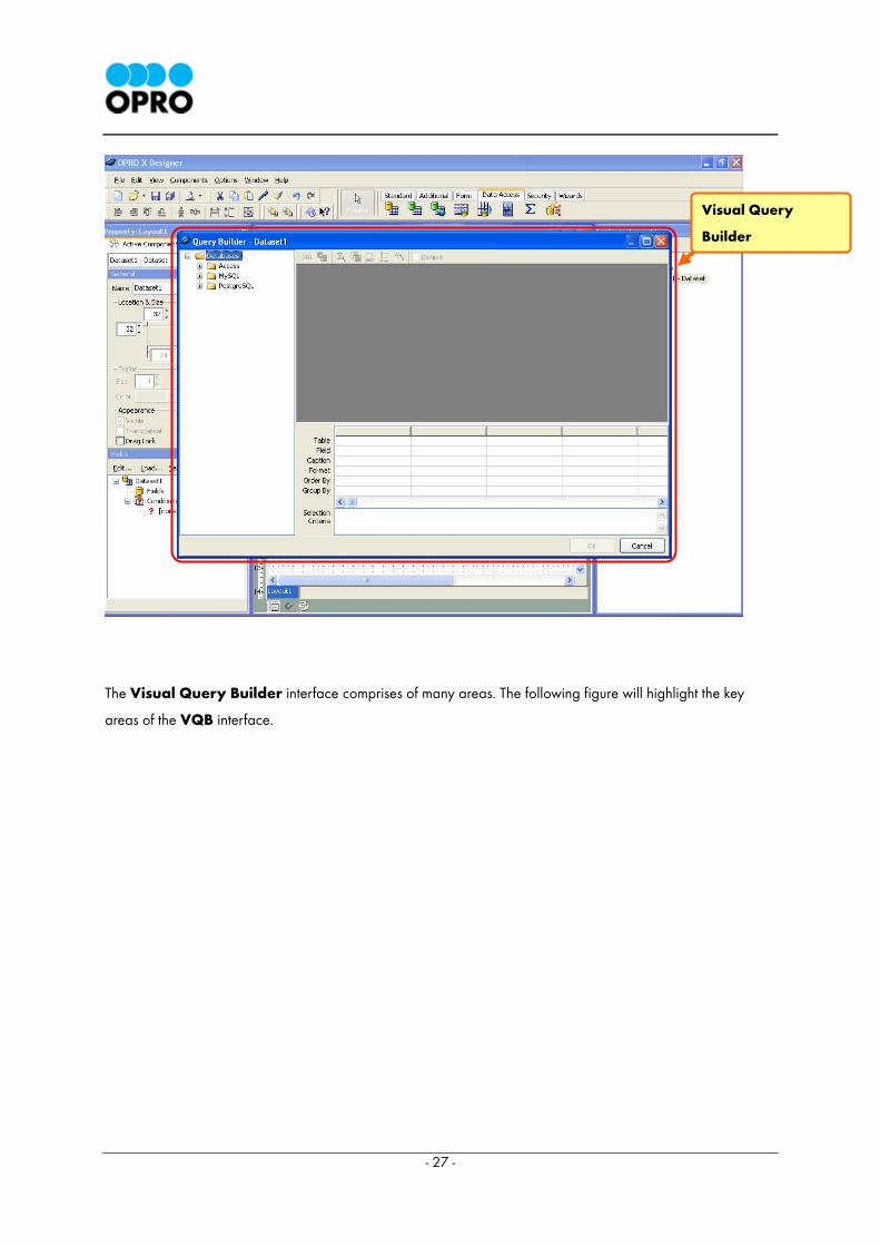
The Visual Query Builder interface comprises of many areas. The following figure will highlight the key
areas of the VQB interface.
Visual Query
Builder
- 28 -
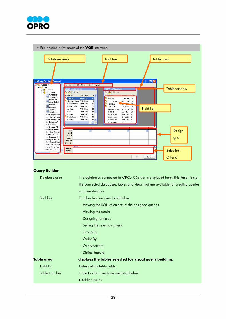
< Explanation >Key areas of the VQB interface.
Query Builder
Database area The databases connected to OPRO X Server is displayed here. This Panel lists all
the connected databases, tables and views that are available for creating queries
in a tree structure.
Tool bar Tool bar functions are listed below
・Viewing the SQL statements of the designed queries
・Viewing the results
・Designing formulas
・Setting the selection criteria
・Group By
・Order By
・Query wizard
・Distinct feature
Table area displays the tables selected for visual query building.
Field list Details of the table fields
Table Tool bar Table tool bar Functions are listed below
• Adding Fields
Database area Tool bar Table area
Table window
Field list
Design
grid
Selection
Criteria
- 29 -
• Adding all Fields
• Viewing data Fields
• View table data
Design grid displays the selected fields of a table. It also displays the format and the caption
of each selected field.
Selection Criteria The conditional expressions created by Condition Builder are displayed here.
2.3.3 Displaying Table Data
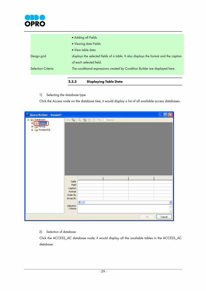
1) Selecting the database type
Click the Access node on the database tree; it would display a list of all available access databases.
2) Selection of database
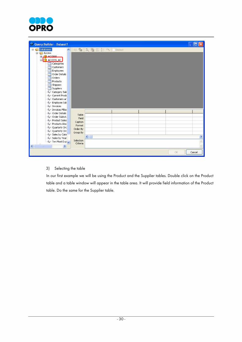
Click the ACCESS_AC database node; it would display all the available tables in the ACCESS_AC
database.
- 30 -
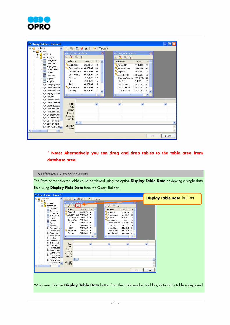
3) Selecting the table
In our first example we will be using the Product and the Supplier tables. Double click on the Product
table and a table window will appear in the table area. It will provide field information of the Product
table. Do the same for the Supplier table.
- 31 -
* Note: Alternatively you can drag and drop tables to the table area from
database area.
< Reference > Viewing table data
The Data of the selected table could be viewed using the option Display Table Data or viewing a single data
field using Display Field Data from the Query Builder.
When you click the Display Table Data button from the table window tool bar, data in the table is displayed
Display Table Data button
- 32 -
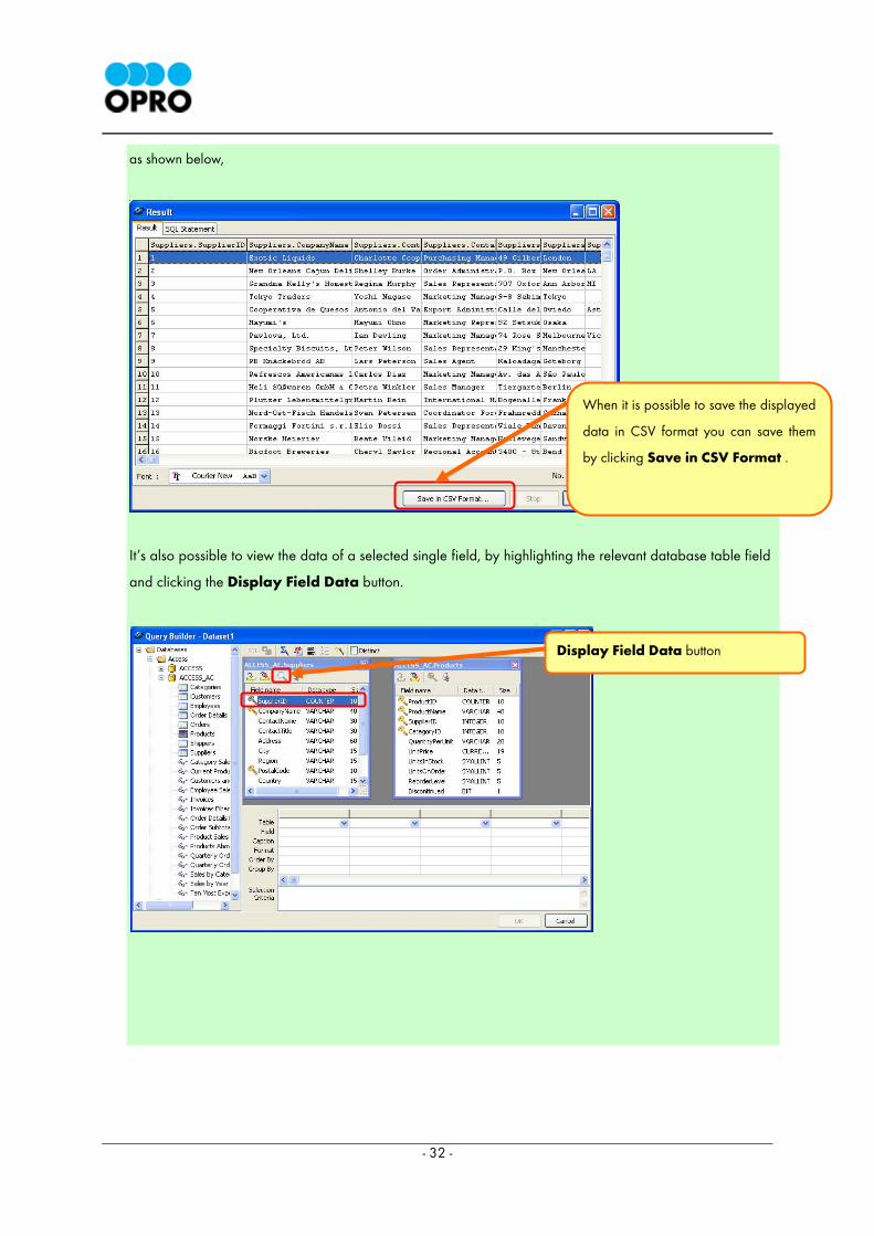
as shown below,
It’s also possible to view the data of a selected single field, by highlighting the relevant database table field
and clicking the Display Field Data button.
When it is possible to save the displayed
data in CSV format you can save them
by clicking Save in CSV Format .
Display Field Data button
- 33 -
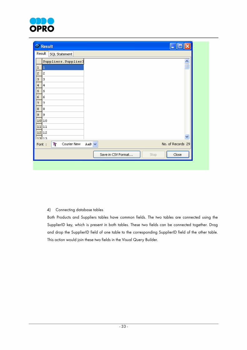
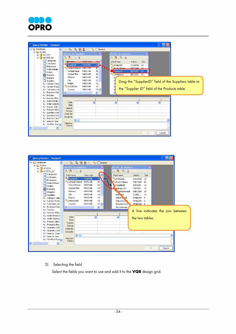
4) Connecting database tables
Both Products and Suppliers tables have common fields. The two tables are connected using the
SupplierID key, which is present in both tables. These two fields can be connected together. Drag
and drop the SupplierID field of one table to the corresponding SupplierID field of the other table.
This action would join these two fields in the Visual Query Builder.
- 34 -
5) Selecting the field
Select the fields you want to use and add it to the VQB design grid.
Drag the “SupplierID” field of the Suppliers table to
the “Supplier ID” field of the Products table.
A line indicates the join between
the two tables.
- 35 -
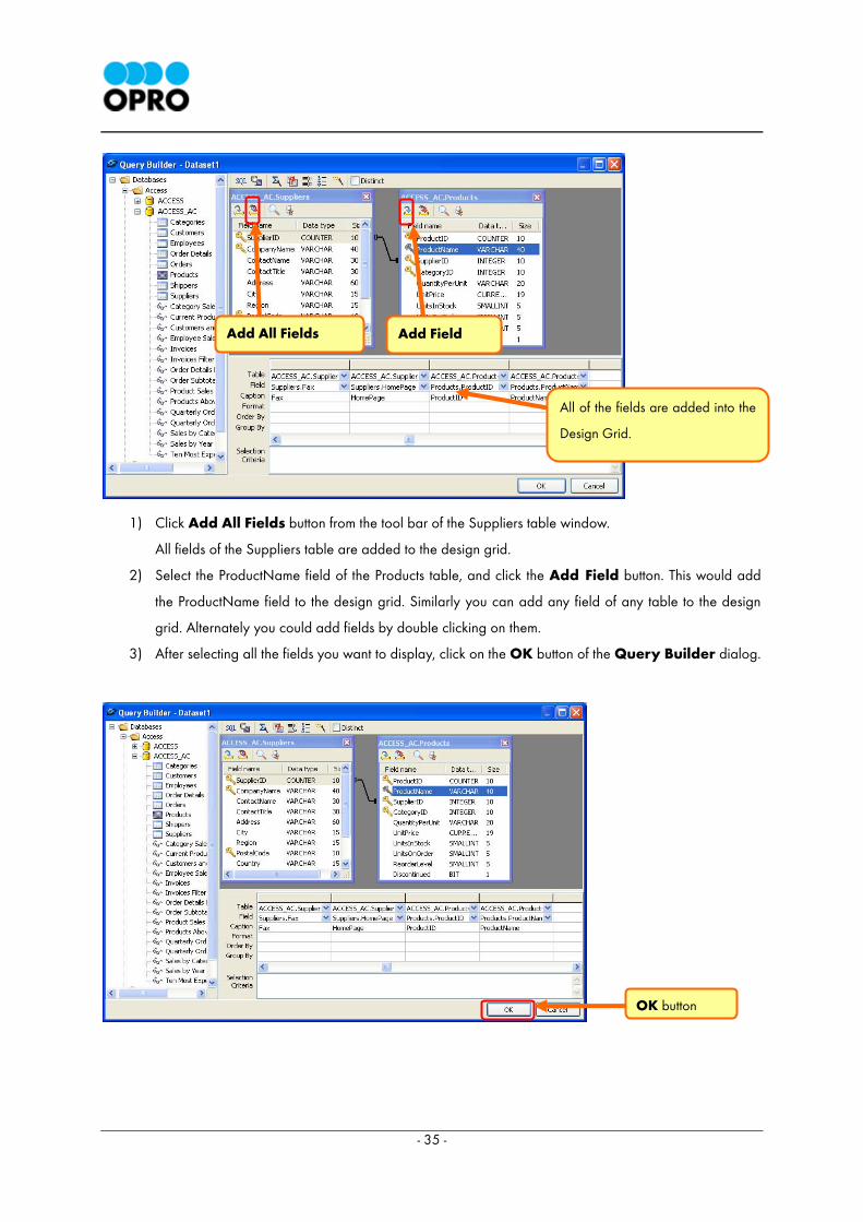
1) Click Add All Fields button from the tool bar of the Suppliers table window.
All fields of the Suppliers table are added to the design grid.
2) Select the ProductName field of the Products table, and click the Add Field button. This would add
the ProductName field to the design grid. Similarly you can add any field of any table to the design
grid. Alternately you could add fields by double clicking on them.
3) After selecting all the fields you want to display, click on the OK button of the Query Builder dialog.
OK button
Add Field Add All Fields
All of the fields are added into the
Design Grid.
- 36 -
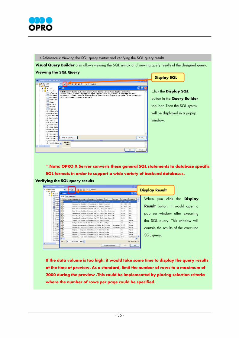
< Reference > Viewing the SQL query syntax and verifying the SQL query results
Visual Query Builder also allows viewing the SQL syntax and viewing query results of the designed query.
Viewing the SQL Query
* Note: OPRO X Server converts these general SQL statements to database specific
SQL formats in order to support a wide variety of backend databases.
Verifying the SQL query results
If the data volume is too high, it would take some time to display the query results
at the time of preview. As a standard, limit the number of rows to a maximum of
2000 during the preview .This could be implemented by placing selection criteria
where the number of rows per page could be specified.
Display SQL
Display Result
Click the Display SQL
button in the Query Builder
tool bar. Then the SQL syntax
will be displayed in a popup
window.
When you click the Display
Result button, It would open a
pop up window after executing
the SQL query. This window will
contain the results of the executed
SQL query.
- 37 -
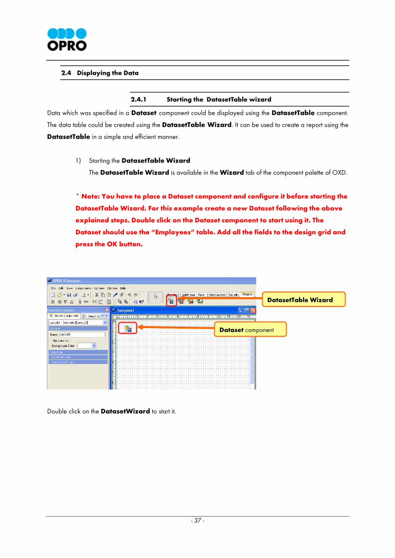
2.4 Displaying the Data
2.4.1 Starting the DatasetTable wizard
Data which was specified in a Dataset component could be displayed using the DatasetTable component.
The data table could be created using the DatasetTable Wizard. It can be used to create a report using the
DatasetTable in a simple and efficient manner.
1) Starting the DatasetTable Wizard
The DatasetTable Wizard is available in the Wizard tab of the component palette of OXD.
* Note: You have to place a Dataset component and configure it before starting the
DatasetTable Wizard. For this example create a new Dataset following the above
explained steps. Double click on the Dataset component to start using it. The
Dataset should use the “Employees” table. Add all the fields to the design grid and
press the OK button.
Double click on the DatasetWizard to start it.
DatasetTable Wizard
Dataset component
- 38 -
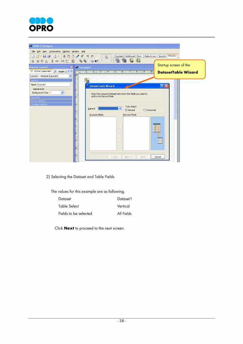
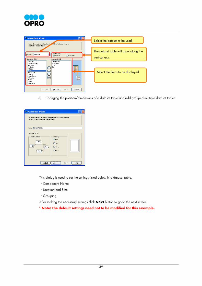
2) Selecting the Dataset and Table Fields
The values for this example are as following.
Dataset Dataset1
Table Select Vertical
Fields to be selected All Fields
Click Next to proceed to the next screen.
Startup screen of the
DatasetTable Wizard
- 39 -
3) Changing the position/dimensions of a dataset table and add grouped multiple dataset tables.
This dialog is used to set the settings listed below in a dataset table.
・Component Name
・Location and Size
・Grouping
After making the necessary settings click Next button to go to the next screen.
* Note: The default settings need not to be modified for this example.
Select the dataset to be used.
The dataset table will grow along the
vertical axis.
Select the fields to be displayed
- 40 -
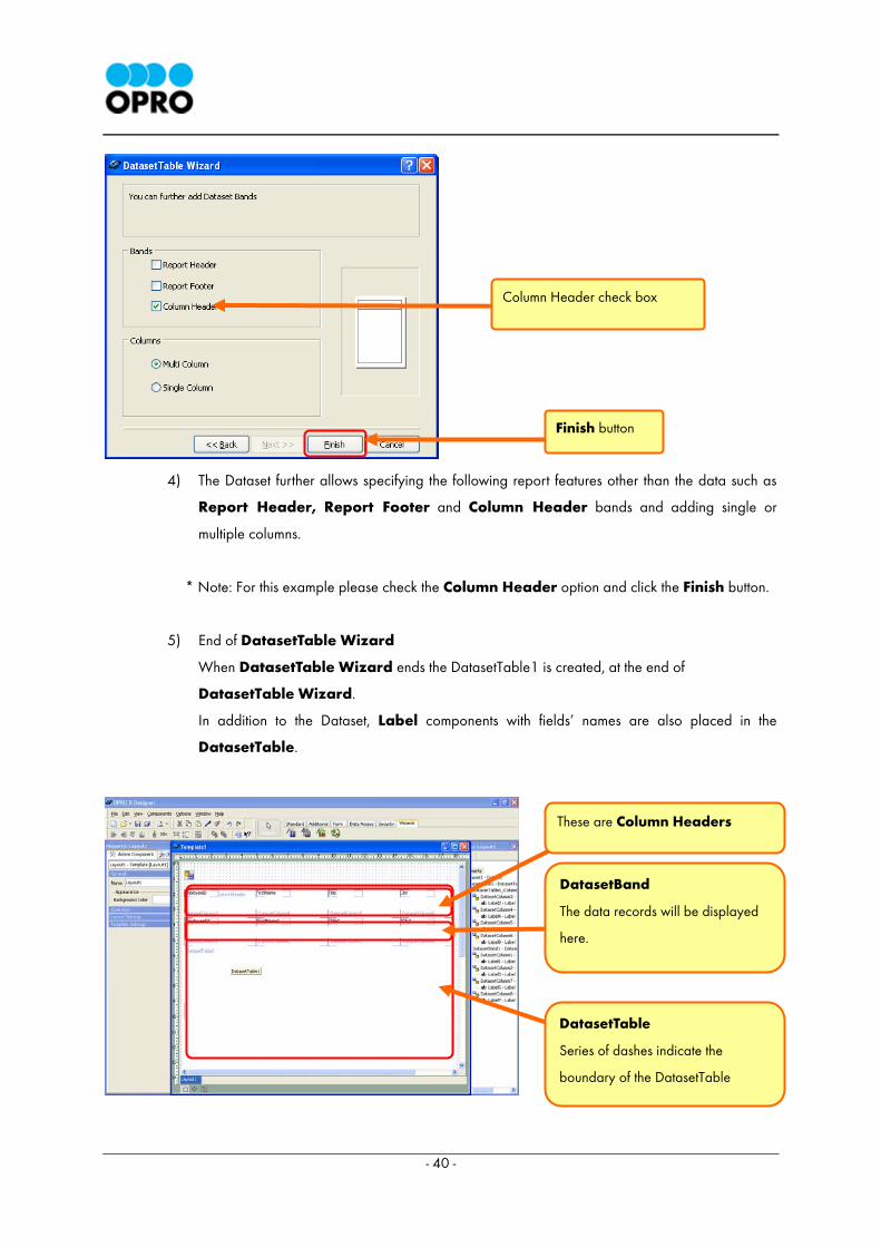
4) The Dataset further allows specifying the following report features other than the data such as
Report Header, Report Footer and Column Header bands and adding single or
multiple columns.
* Note: For this example please check the Column Header option and click the Finish button.
5) End of DatasetTable Wizard
When DatasetTable Wizard ends the DatasetTable1 is created, at the end of
DatasetTable Wizard.
In addition to the Dataset, Label components with fields’ names are also placed in the
DatasetTable.
Column Header check box
Finish button
These are Column Headers
DatasetBand
The data records will be displayed
here.
DatasetTable
Series of dashes indicate the
boundary of the DatasetTable
- 41 -
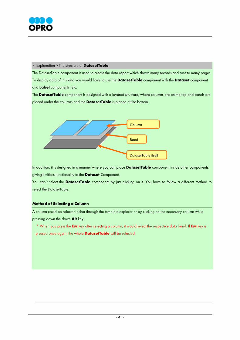
< Explanation > The structure of DatasetTable
The DatasetTable component is used to create the data report which shows many records and runs to many pages.
To display data of this kind you would have to use the DatasetTable component with the Dataset component
and Label components, etc.
The DatasetTable component is designed with a layered structure, where columns are on the top and bands are
placed under the columns and the DatasetTable is placed at the bottom.
In addition, it is designed in a manner where you can place DatasetTable component inside other components,
giving limitless functionality to the Dataset Component.
You can’t select the DatasetTable component by just clicking on it. You have to follow a different method to
select the DatasetTable.
Method of Selecting a Column
A column could be selected either through the template explorer or by clicking on the necessary column while
pressing down the down Alt key.
* When you press the Esc key after selecting a column, it would select the respective data band. If Esc key is
pressed once again, the whole DatasetTable will be selected.
Column
DatasetTable itself
Band
- 42 -
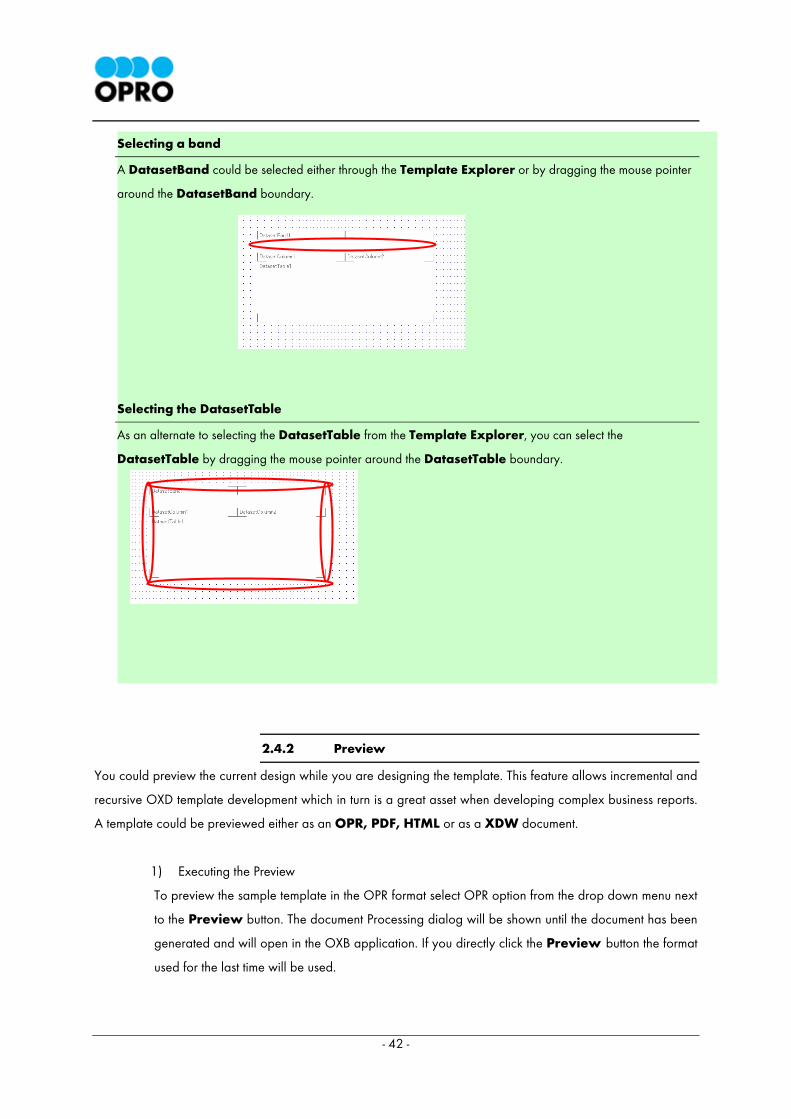
Selecting a band
A DatasetBand could be selected either through the Template Explorer or by dragging the mouse pointer
around the DatasetBand boundary.
Selecting the DatasetTable
As an alternate to selecting the DatasetTable from the Template Explorer, you can select the
DatasetTable by dragging the mouse pointer around the DatasetTable boundary.
2.4.2 Preview
You could preview the current design while you are designing the template. This feature allows incremental and
recursive OXD template development which in turn is a great asset when developing complex business reports.
A template could be previewed either as an OPR, PDF, HTML or as a XDW document.
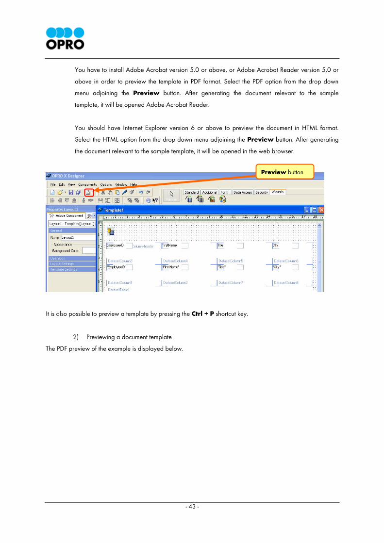
1) Executing the Preview
To preview the sample template in the OPR format select OPR option from the drop down menu next
to the Preview button. The document Processing dialog will be shown until the document has been
generated and will open in the OXB application. If you directly click the Preview button the format
used for the last time will be used.
- 43 -
You have to install Adobe Acrobat version 5.0 or above, or Adobe Acrobat Reader version 5.0 or
above in order to preview the template in PDF format. Select the PDF option from the drop down
menu adjoining the Preview button. After generating the document relevant to the sample
template, it will be opened Adobe Acrobat Reader.
You should have Internet Explorer version 6 or above to preview the document in HTML format.
Select the HTML option from the drop down menu adjoining the Preview button. After generating
the document relevant to the sample template, it will be opened in the web browser.
It is also possible to preview a template by pressing the Ctrl + P shortcut key.
2) Previewing a document template
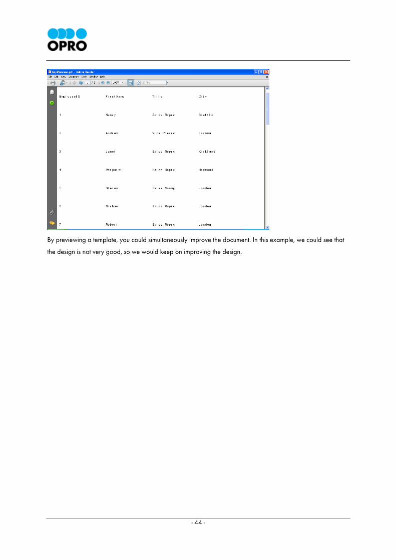
The PDF preview of the example is displayed below.
Preview button
- 44 -
By previewing a template, you could simultaneously improve the document. In this example, we could see that
the design is not very good, so we would keep on improving the design.
- 45 -
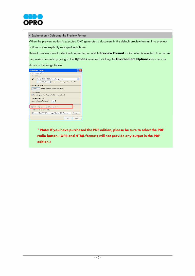
< Explanation > Selecting the Preview Format
When the preview option is executed OXD generates a document in the default preview format If no preview
options are set explicitly as explained above.
Default preview format is decided depending on which Preview Format radio button is selected. You can set
the preview formats by going to the Options menu and clicking the Environment Options menu item as
shown in the image below.
* Note: If you have purchased the PDF edition, please be sure to select the PDF
radio button. (OPR and HTML formats will not provide any output in the PDF
edition.)
- 46 -
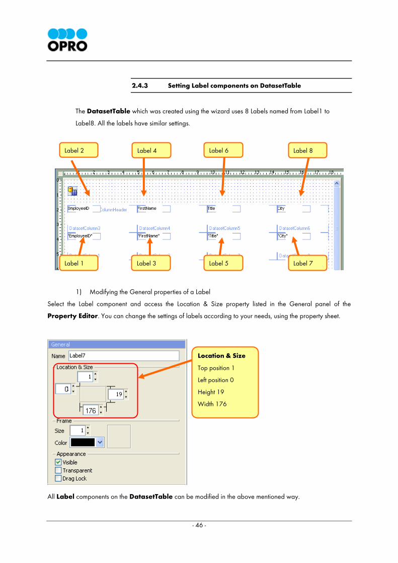
2.4.3 Setting Label components on DatasetTable
The DatasetTable which was created using the wizard uses 8 Labels named from Label1 to
Label8. All the labels have similar settings.
1) Modifying the General properties of a Label
Select the Label component and access the Location & Size property listed in the General panel of the
Property Editor. You can change the settings of labels according to your needs, using the property sheet.
All Label components on the DatasetTable can be modified in the above mentioned way.
Label 4 Label 2
Label 7 Label 5 Label 3
Location & Size
Top position 1
Left position 0
Height 19
Width 176
Label 1
Label 6 Label 8
- 47 -
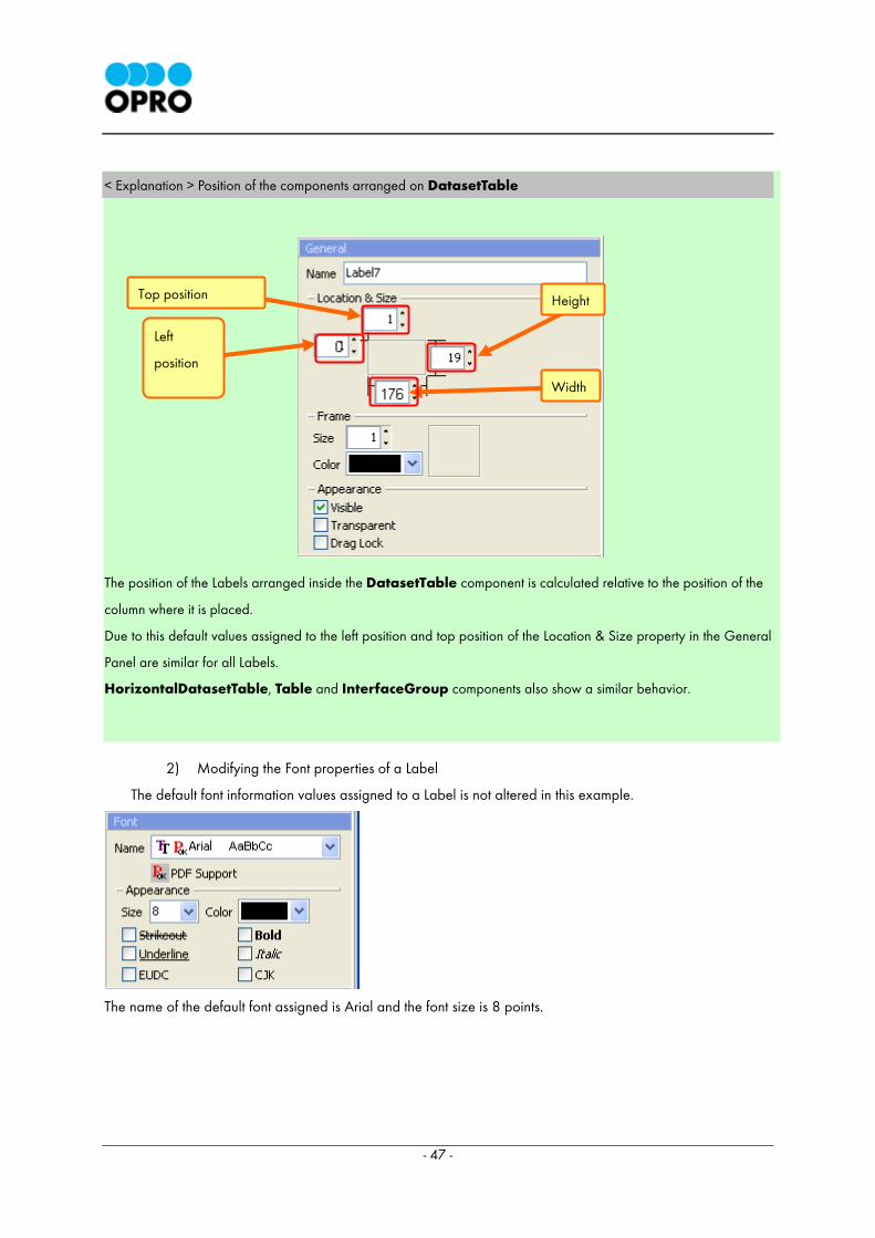
< Explanation > Position of the components arranged on DatasetTable
The position of the Labels arranged inside the DatasetTable component is calculated relative to the position of the
column where it is placed.
Due to this default values assigned to the left position and top position of the Location & Size property in the General
Panel are similar for all Labels.
HorizontalDatasetTable, Table and InterfaceGroup components also show a similar behavior.
2) Modifying the Font properties of a Label
The default font information values assigned to a Label is not altered in this example.
The name of the default font assigned is Arial and the font size is 8 points.
Height Top position
Left
position
Width
- 48 -
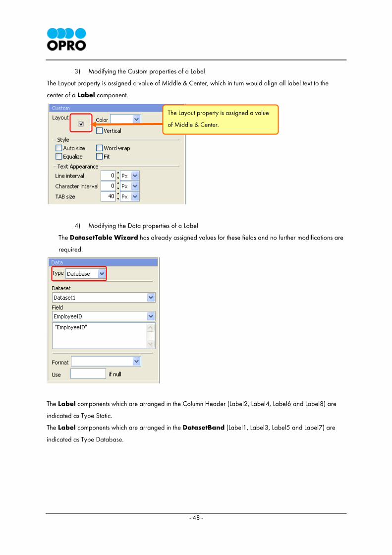
3) Modifying the Custom properties of a Label
The Layout property is assigned a value of Middle & Center, which in turn would align all label text to the
center of a Label component.
4) Modifying the Data properties of a Label
The DatasetTable Wizard has already assigned values for these fields and no further modifications are
required.
The Label components which are arranged in the Column Header (Label2, Label4, Label6 and Label8) are
indicated as Type Static.
The Label components which are arranged in the DatasetBand (Label1, Label3, Label5 and Label7) are
indicated as Type Database.
The Layout property is assigned a value
of Middle & Center.
- 49 -
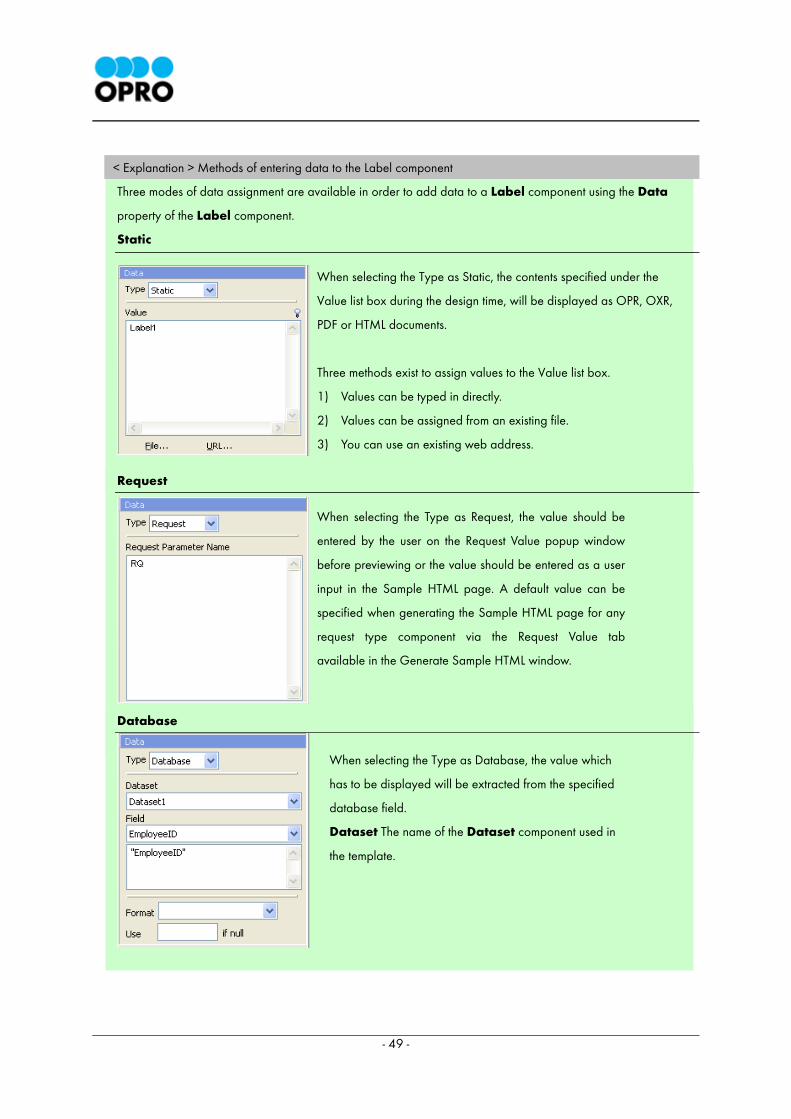
< Explanation > Methods of entering data to the Label component
Three modes of data assignment are available in order to add data to a Label component using the Data
property of the Label component.
Static
Request
Database
When selecting the Type as Static, the contents specified under the
Value list box during the design time, will be displayed as OPR, OXR,
PDF or HTML documents.
Three methods exist to assign values to the Value list box.
1) Values can be typed in directly.
2) Values can be assigned from an existing file.
3) You can use an existing web address.
When selecting the Type as Request, the value should be
entered by the user on the Request Value popup window
before previewing or the value should be entered as a user
input in the Sample HTML page. A default value can be
specified when generating the Sample HTML page for any
request type component via the Request Value tab
available in the Generate Sample HTML window.
When selecting the Type as Database, the value which
has to be displayed will be extracted from the specified
database field.
Dataset The name of the Dataset component used in
the template.
- 50 -
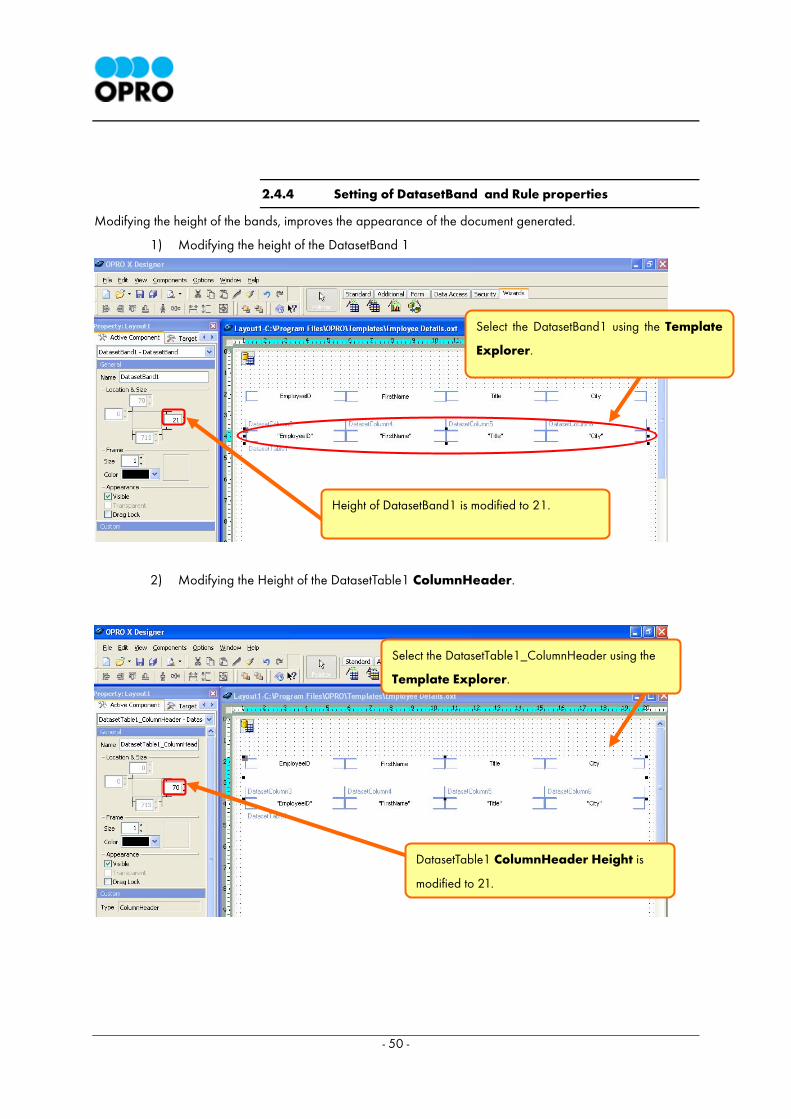
2.4.4 Setting of DatasetBand and Rule properties
Modifying the height of the bands, improves the appearance of the document generated.
1) Modifying the height of the DatasetBand 1
2) Modifying the Height of the DatasetTable1 ColumnHeader.
Select the DatasetBand1 using the Template
Explorer.
Select the DatasetTable1_ColumnHeader using the
Template Explorer.
DatasetTable1 ColumnHeader Height is
modified to 21.
Height of DatasetBand1 is modified to 21.

- 51 -
3) Setting the rule
The Rule property is used to add a border to the selected component. Only lines can be used to draw borders
under the Rule property.
Select the DatasetTable1 using the Template Explorer. Choose the Rule property of the DatasetTable1 and
select the below displayed rule by clicking on it.
2.5 Setting the Title
We could display the document title using a Label component.
2.5.1 Arrangement of Label component
The document title should be displayed above the DatasetTable component in bold type fonts and
its text alignment should be Middle & Center.
1) Positioning the Label component
Select the Label component from the Standard tab of the OXD component pallet. Drag the
Label component across the template to adjust its location. Then resize the component on the
template to the required size. The name of the Label component is Label9.
Click here to select this
border pattern.
- 52 -
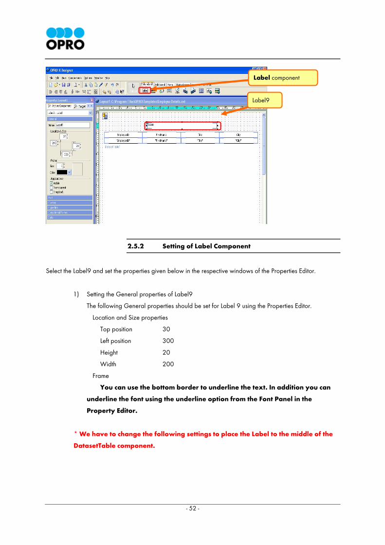
2.5.2 Setting of Label Component
Select the Label9 and set the properties given below in the respective windows of the Properties Editor.
1) Setting the General properties of Label9
The following General properties should be set for Label 9 using the Properties Editor.
Location and Size properties
Top position 30
Left position 300
Height 20
Width 200
Frame
You can use the bottom border to underline the text. In addition you can
underline the font using the underline option from the Font Panel in the
Property Editor.
* We have to change the following settings to place the Label to the middle of the
DatasetTable component.
Label component
Label9
- 53 -
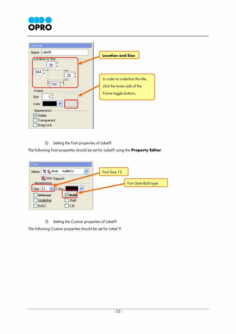
2) Setting the Font properties of Label9
The following Font properties should be set for Label9 using the Property Editor.
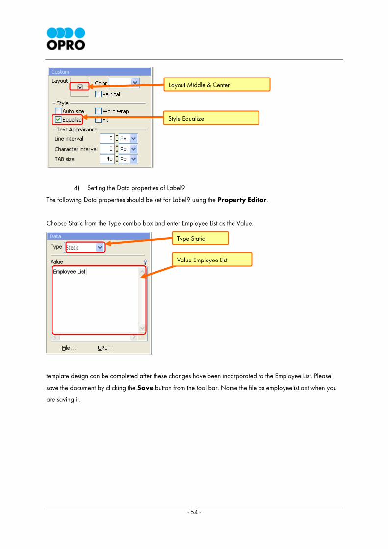
3) Setting the Custom properties of Label9
The following Custom properties should be set for Label 9.
In order to underline the title,
click the lower side of the
Frame toggle buttons.
Font Size 12
Font Style Bold type
Location and Size
- 54 -
4) Setting the Data properties of Label9
The following Data properties should be set for Label9 using the Property Editor.
Choose Static from the Type combo box and enter Employee List as the Value.
template design can be completed after these changes have been incorporated to the Employee List. Please
save the document by clicking the Save button from the tool bar. Name the file as employeelist.oxt when you
are saving it.
Style Equalize
Type Static
Value Employee List
Layout Middle & Center
- 55 -

- 56 -
2.6 Output from Sample HTML
Now we will generate the HTML page, which is used to request the generated document of the
employeelist.oxt.
* Note: Template which you are going to request through a sample HTML page,
should be placed in the templates folder of the OPRO X Server. The default
template folder location is C:\Program Files\OPRO\Templates. This folder location
may vary if configuration details in the ODCAW.xml file have been altered.
2.6.1 Compilation of sample HTML
1) Generating a sample HTML page.
In order to carryout this task, select Options menu → Generate Sample HTML from the main
menu of the OXD application.
The Generate Sample HTML Window is shown below.
Generate Sample HTML
- 57 -
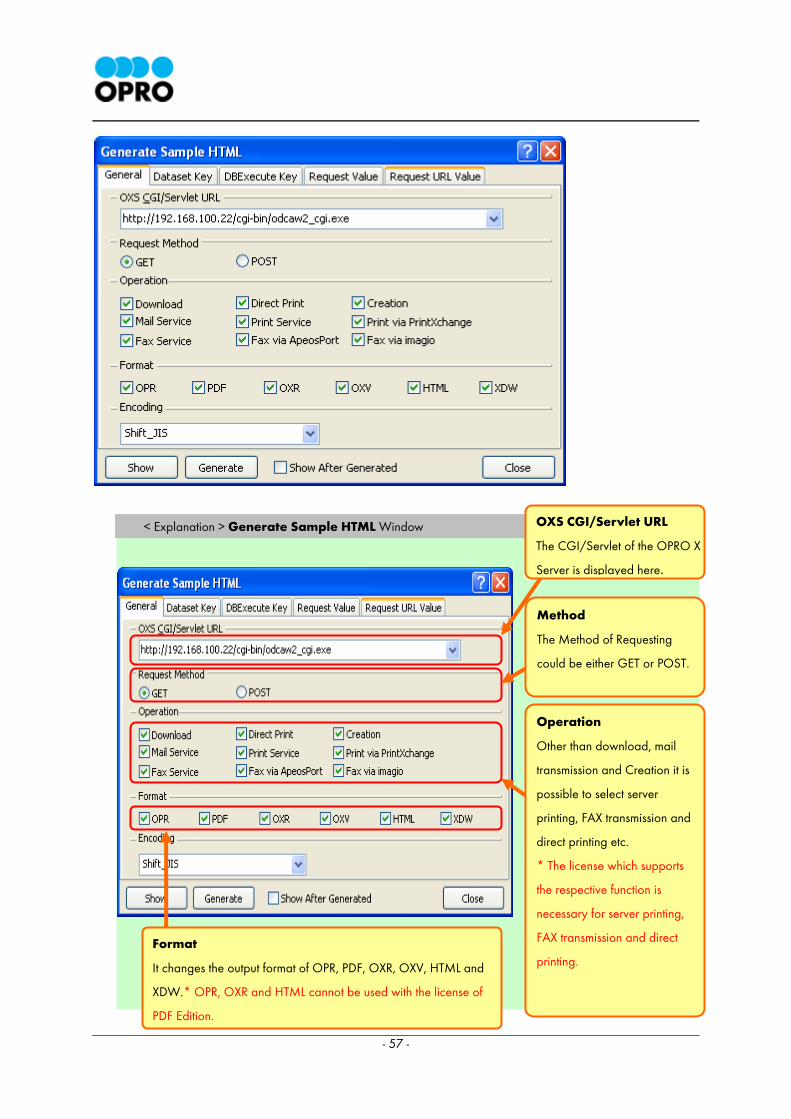
< Explanation > Generate Sample HTML Window
OXS CGI/Servlet URL
The CGI/Servlet of the OPRO X
Server is displayed here.
Method
The Method of Requesting
could be either GET or POST.
Operation
Other than download, mail
transmission and Creation it is
possible to select server
printing, FAX transmission and
direct printing etc.
* The license which supports
the respective function is
necessary for server printing,
FAX transmission and direct
printing.
Format
It changes the output format of OPR, PDF, OXR, OXV, HTML and
XDW.* OPR, OXR and HTML cannot be used with the license of
PDF Edition.
- 58 -
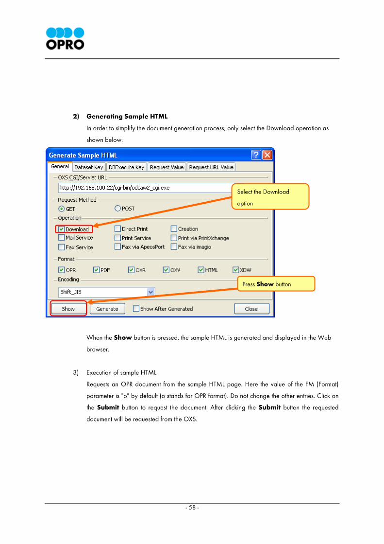
2) Generating Sample HTML
In order to simplify the document generation process, only select the Download operation as
shown below.
When the Show button is pressed, the sample HTML is generated and displayed in the Web
browser.
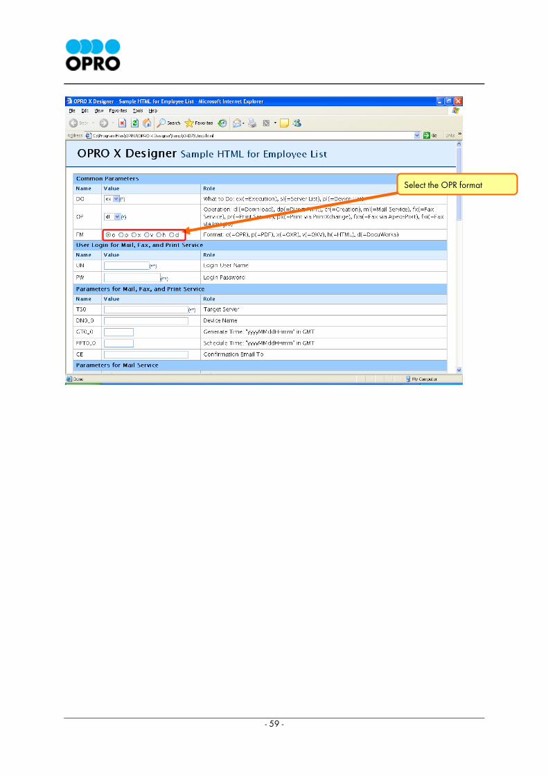
3) Execution of sample HTML
Requests an OPR document from the sample HTML page. Here the value of the FM (Format)
parameter is "o" by default (o stands for OPR format). Do not change the other entries. Click on
the Submit button to request the document. After clicking the Submit button the requested
document will be requested from the OXS.
Select the Download
option
Press Show button
- 59 -
Select the OPR format
- 60 -
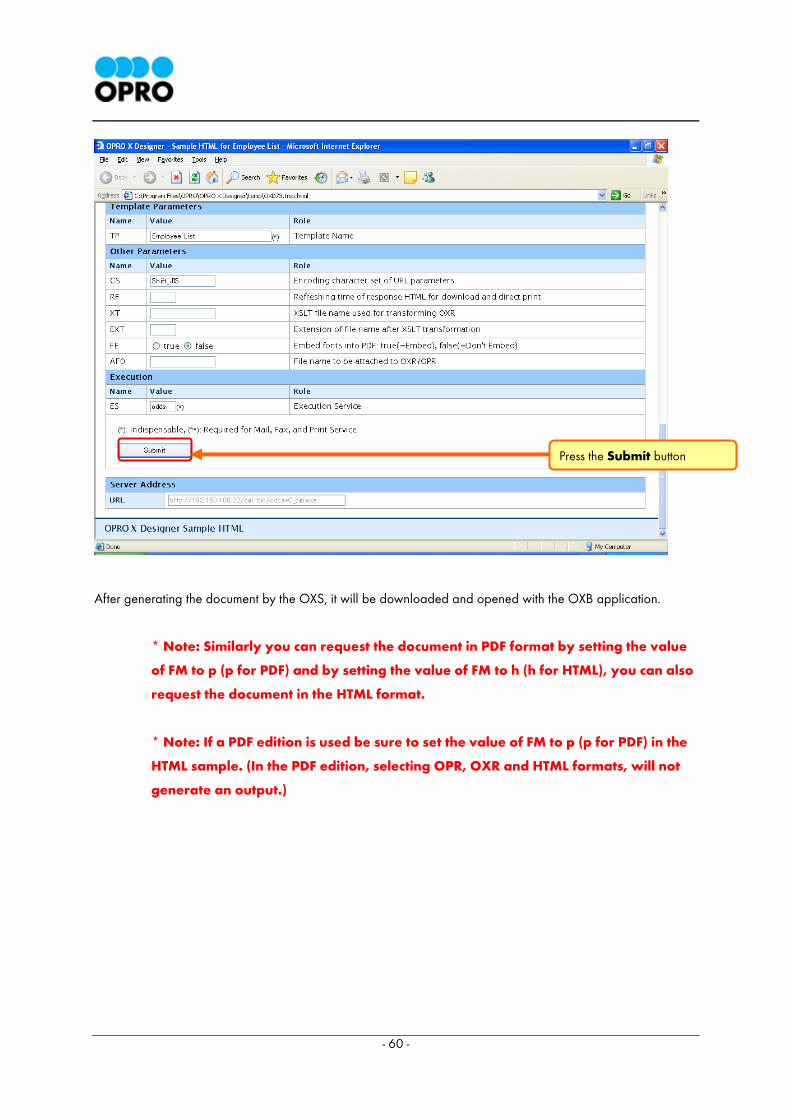
After generating the document by the OXS, it will be downloaded and opened with the OXB application.
* Note: Similarly you can request the document in PDF format by setting the value
of FM to p (p for PDF) and by setting the value of FM to h (h for HTML), you can also
request the document in the HTML format.
* Note: If a PDF edition is used be sure to set the value of FM to p (p for PDF) in the
HTML sample. (In the PDF edition, selecting OPR, OXR and HTML formats, will not
generate an output.)
Press the Submit button
- 61 -
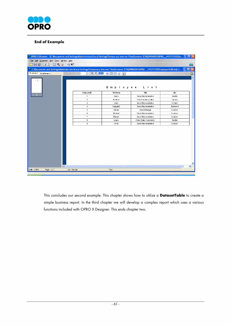
End of Example
This concludes our second example. This chapter shows how to utilize a DatasetTable to create a
simple business report. In the third chapter we will develop a complex report which uses a various
functions included with OPRO X Designer. This ends chapter two.

- 62 -
3 Chapter 3: Creation of a Product List (Creating a data report which uses the SUM function)
3.1 Objectives of Chapter 3
In the second chapter we created an employee list. In this chapter an advanced data report will be created by
applying the fundamentals learned at chapter 2.
In this example we are creating a report named Product List which is similar to the Employee List report.
However it has a more professional design where more functions of the OPRO X Designer are used. For
example we would be calculating the stock amount, total and grand total using the Aggregate Functions of
the OPRO X Designer. These calculations were created using the Expression Builder and Aggregate
Functions of OXD. While mastering the advance functions of OXD please try to apply these concepts in
various reports you will have to create using OXD.
- 63 -
Steps involved in creating the Product List report
3.2 Creating the template and building database queries using VQB
3.3 Setting up data display
3.4 Displaying the sum of the records
3.5 Setting the title
3.6 Displaying the date
3.7 Showing the page numbers
3.8 Producing an output as sample HTML
In order to create queries and view the data using OPRO X Designer, it is necessary to connect to OPRO X
Server and the database. For details on this please refer section 1.3.2 Connecting to OPRO X Server and
the database.
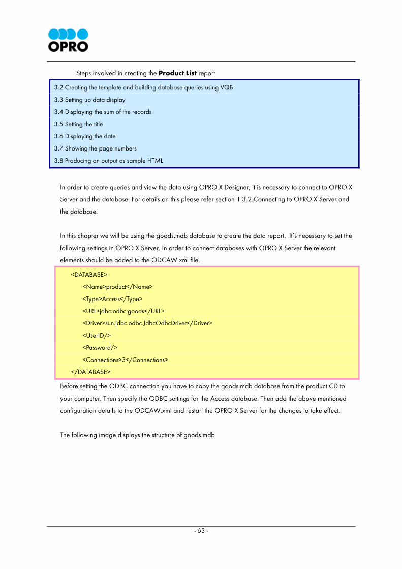
In this chapter we will be using the goods.mdb database to create the data report. It’s necessary to set the
following settings in OPRO X Server. In order to connect databases with OPRO X Server the relevant
elements should be added to the ODCAW.xml file.
<DATABASE>
<Name>product</Name>
<Type>Access</Type>
<URL>jdbc:odbc:goods</URL>
<Driver>sun.jdbc.odbc.JdbcOdbcDriver</Driver>
<UserID/>
<Password/>
<Connections>3</Connections>
</DATABASE>
Before setting the ODBC connection you have to copy the goods.mdb database from the product CD to
your computer. Then specify the ODBC settings for the Access database. Then add the above mentioned
configuration details to the ODCAW.xml and restart the OPRO X Server for the changes to take effect.
The following image displays the structure of goods.mdb
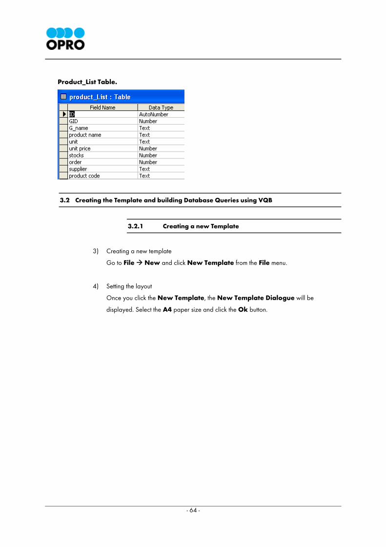
- 64 -
Product_List Table.
3.2 Creating the Template and building Database Queries using VQB
3.2.1 Creating a new Template
3) Creating a new template
Go to File New and click New Template from the File menu.
4) Setting the layout
Once you click the New Template, the New Template Dialogue will be
displayed. Select the A4 paper size and click the Ok button.
- 65 -
3.2.2 Placing a Dataset component and starting Query Builder
A query is designed to retrieve data from the database.
1) Placing the Dataset component
Select the Dataset component from the Data Access tab of the component palette, and
place it in the template design area.
2) Starting Visual Query Builder
Double click the Dataset component, which is placed on the template, to start the Query Builder.
3) OSMS Login
Once you double click the Dataset component, OSMS Login window will popup. Input the
relevant User Name and Password in to the OSMS Login dialog and click the Login button.
- 66 -
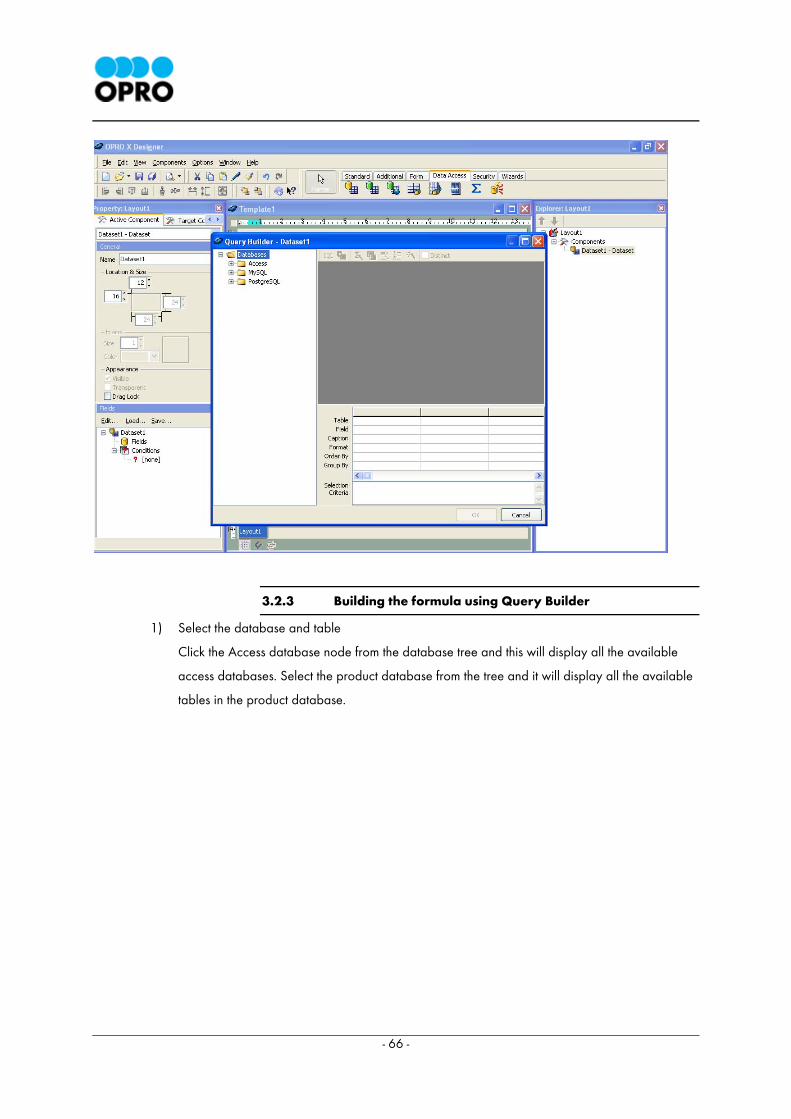
3.2.3 Building the formula using Query Builder
1) Select the database and table
Click the Access database node from the database tree and this will display all the available
access databases. Select the product database from the tree and it will display all the available
tables in the product database.
- 67 -
Double click the product_list table and it will appear in the VQB table area.
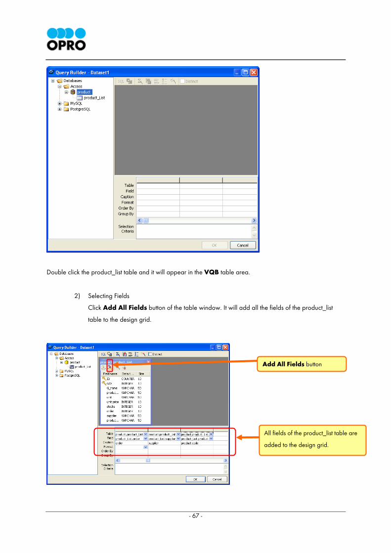
2) Selecting Fields
Click Add All Fields button of the table window. It will add all the fields of the product_list
table to the design grid.
All fields of the product_list table are
added to the design grid.
Add All Fields button
- 68 -
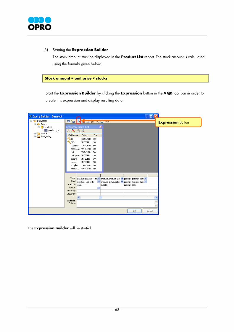
3) Starting the Expression Builder
The stock amount must be displayed in the Product List report. The stock amount is calculated
using the formula given below.
Stock amount = unit price × stocks
Start the Expression Builder by clicking the Expression button in the VQB tool bar in order to
create this expression and display resulting data,.
The Expression Builder will be started.
Expression button

- 69 -
4) Creating the Formula
Double click the unit price field to add it to the expression area.
unit price field
Expression Builder
Expression area
- 70 -
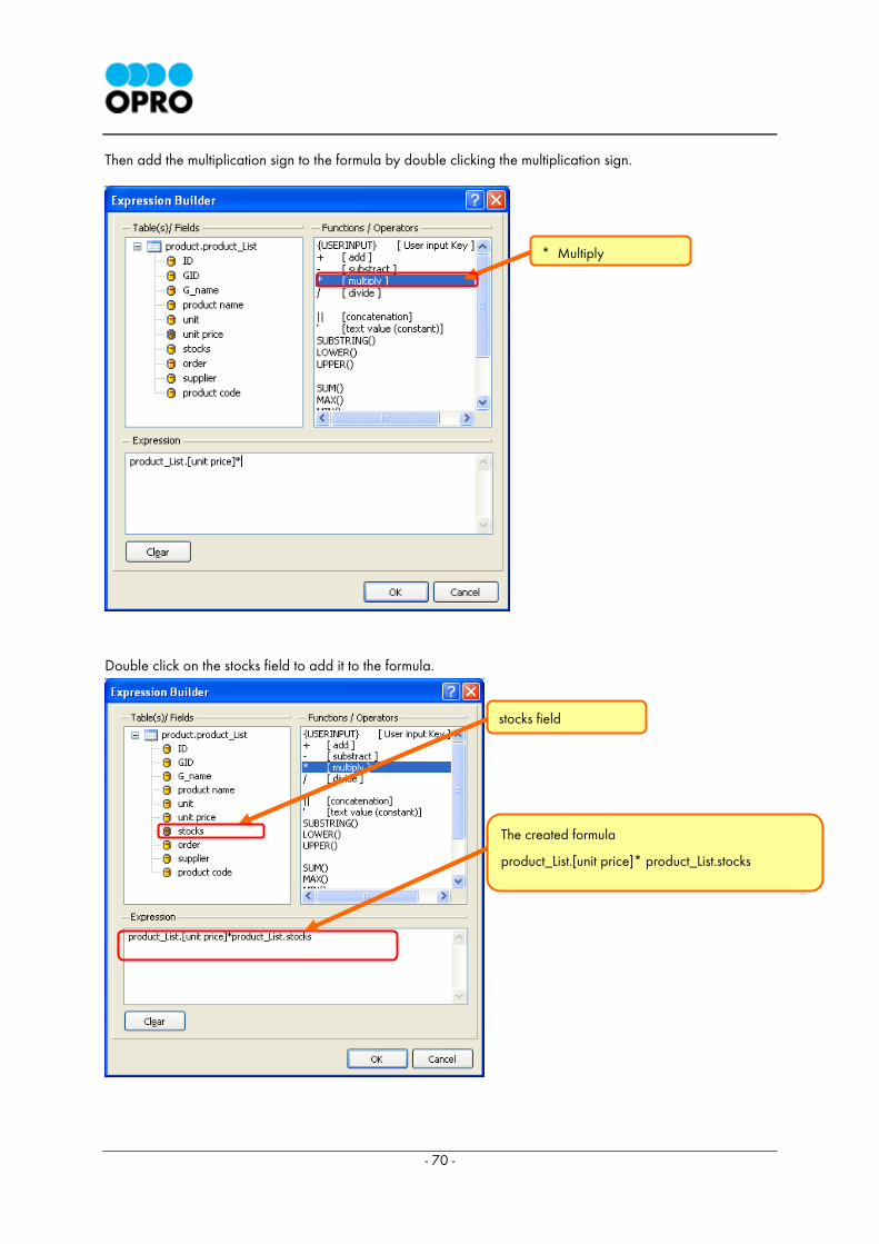
Then add the multiplication sign to the formula by double clicking the multiplication sign.
Double click on the stocks field to add it to the formula.
* Multiply
stocks field
The created formula
product_List.[unit price]* product_List.stocks
- 71 -
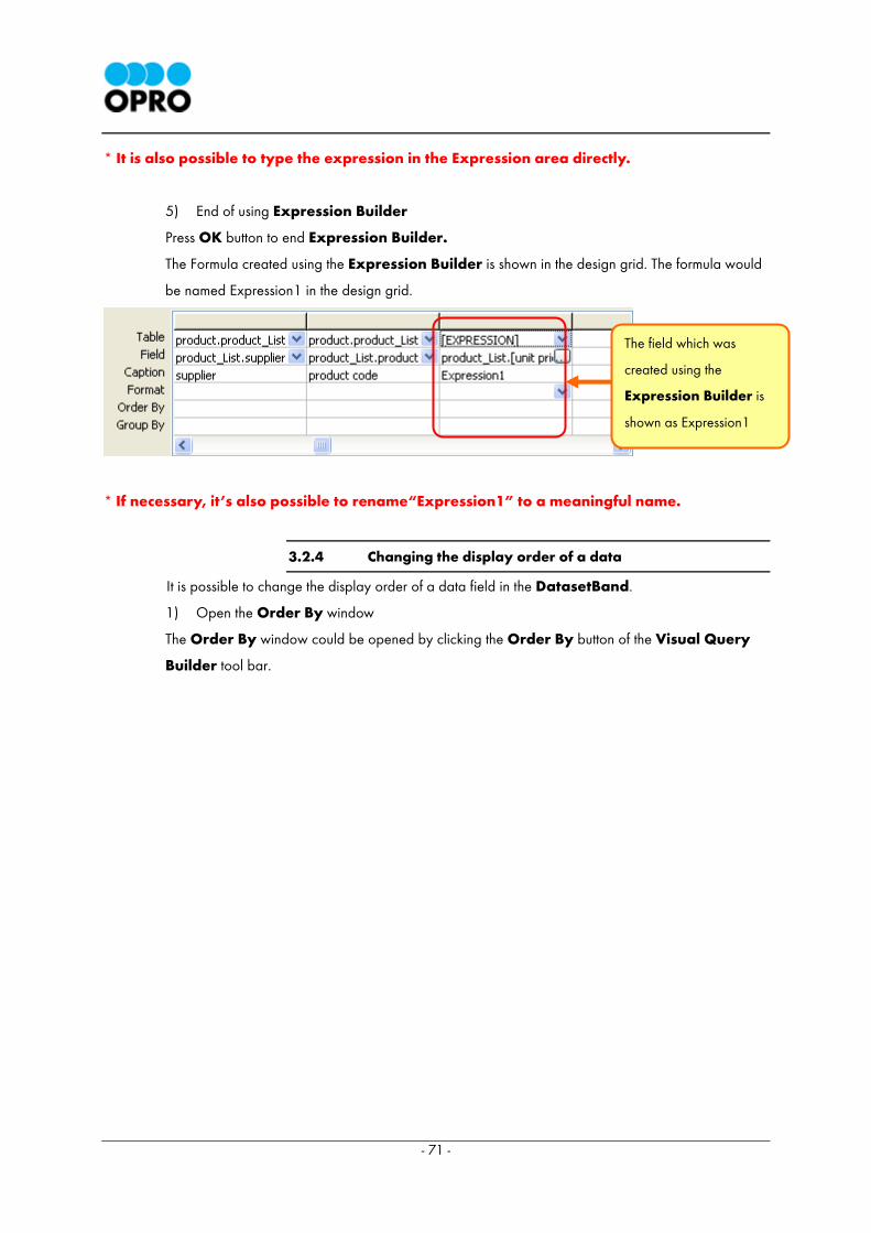
* It is also possible to type the expression in the Expression area directly.
5) End of using Expression Builder
Press OK button to end Expression Builder.
The Formula created using the Expression Builder is shown in the design grid. The formula would
be named Expression1 in the design grid.
* If necessary, it’s also possible to rename“Expression1” to a meaningful name.
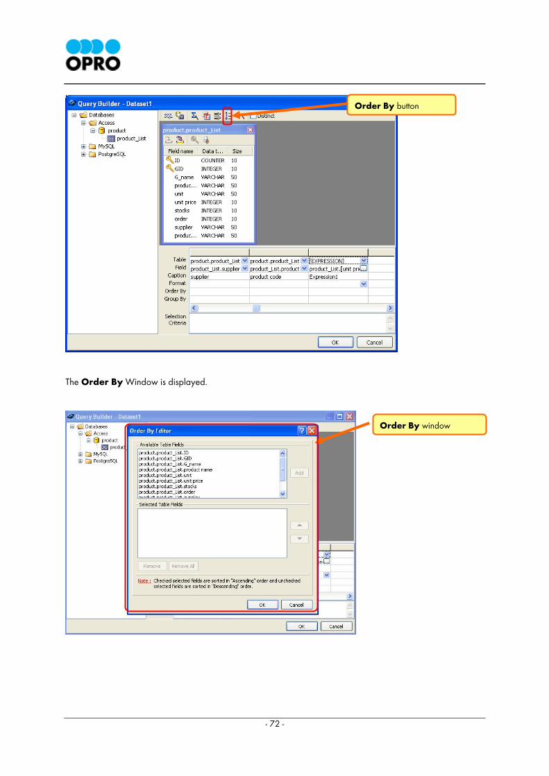
3.2.4 Changing the display order of a data
It is possible to change the display order of a data field in the DatasetBand.
1) Open the Order By window
The Order By window could be opened by clicking the Order By button of the Visual Query
Builder tool bar.
The field which was
created using the
Expression Builder is
shown as Expression1
- 72 -
The Order By Window is displayed.
Order By button
Order By window
- 73 -
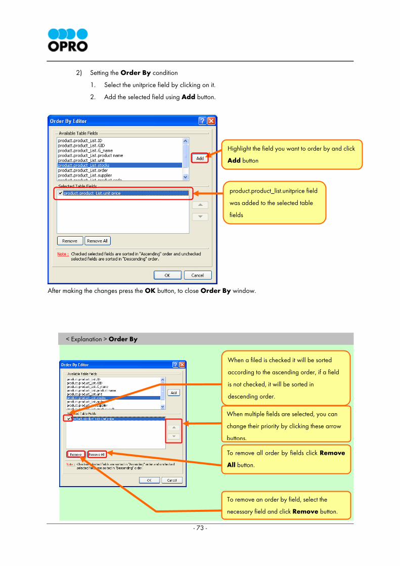
2) Setting the Order By condition
1. Select the unitprice field by clicking on it.
2. Add the selected field using Add button.
After making the changes press the OK button, to close Order By window.
< Explanation > Order By
Highlight the field you want to order by and click
Add button
product.product_list.unitprice field
was added to the selected table
fields
When multiple fields are selected, you can
change their priority by clicking these arrow
buttons.
To remove all order by fields click Remove
All button.
To remove an order by field, select the
necessary field and click Remove button.
When a filed is checked it will be sorted
according to the ascending order, if a field
is not checked, it will be sorted in
descending order.
- 74 -
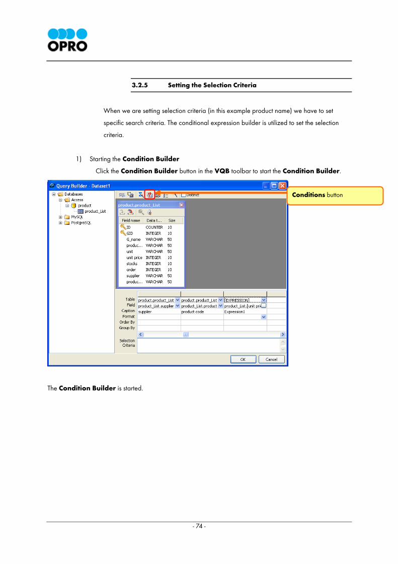
3.2.5 Setting the Selection Criteria
When we are setting selection criteria (in this example product name) we have to set
specific search criteria. The conditional expression builder is utilized to set the selection
criteria.
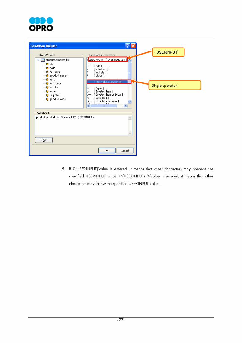
1) Starting the Condition Builder
Click the Condition Builder button in the VQB toolbar to start the Condition Builder.
The Condition Builder is started.
Conditions button

- 75 -
2) Creating the Condition
1) Double click the G_Name field to add it to the conditions area.
Condition Builder window

- 76 -
2) Type a space
3) In order to search using LIKE, double click LIKE keyword and it will be added to the
conditions area.
.
4) Add {USERINPUT} in between single quotations by clicking on them.
G_Name field
LIKE
Conditions area
- 77 -
5) If‘%{USERINPUT}’value is entered ,it means that other characters may precede the
specified USERINPUT value. If‘{USERINPUT} %’value is entered, it means that other
characters may follow the specified USERINPUT value.
{USERINPUT}
Single quotation

- 78 -
3) End of Condition Builder
Press OK button to close the Condition Builder window.
< Explanation > About the Condition Builder
The Condition Builder allows specifying conditions for the selected Table(s)/Fields during the design stage.
This has a feature where the user can input values for the condition when previewing the document. For this,
the user should build the condition with {USERINPUT}. When previewing or requesting from server via HTML,
the user will be prompted to enter the value for the {USERINPUT} specified in Condition Builder. There can be
any number of conditions designed through the Condition Builder.
Product.product_list.G_name LIKE‘%{USERINPUT}’
- 79 -
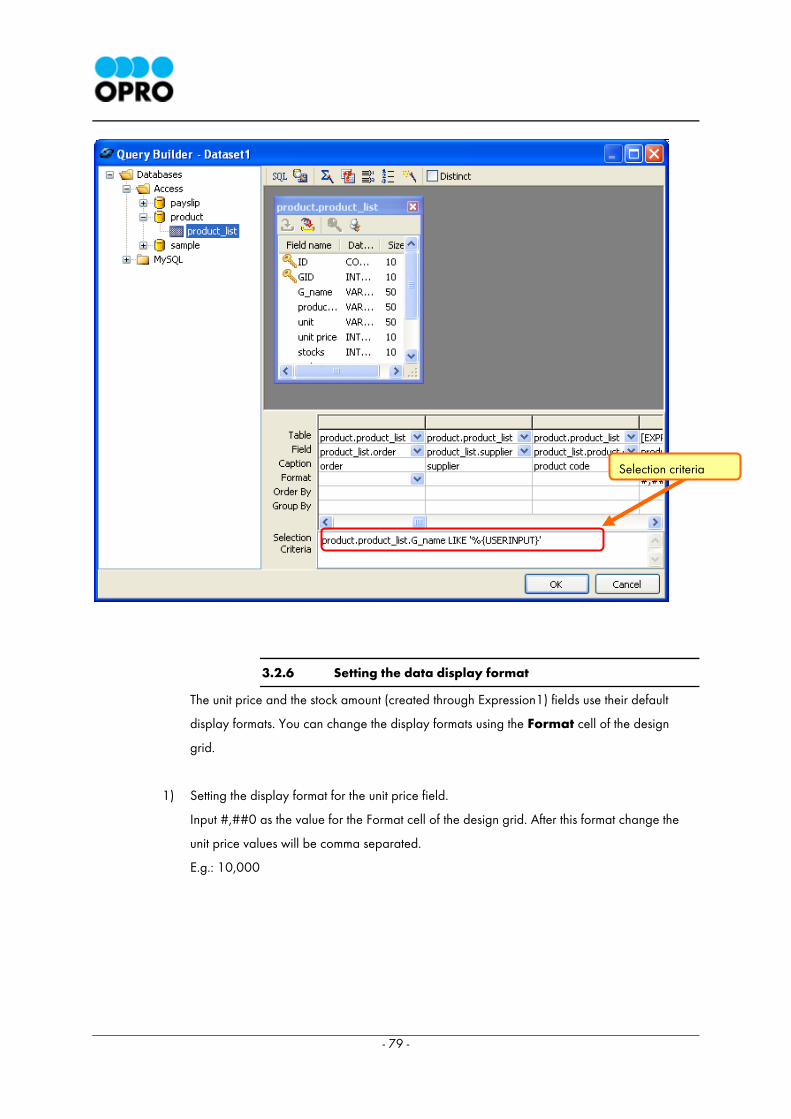
3.2.6 Setting the data display format
The unit price and the stock amount (created through Expression1) fields use their default
display formats. You can change the display formats using the Format cell of the design
grid.
1) Setting the display format for the unit price field.
Input #,##0 as the value for the Format cell of the design grid. After this format change the
unit price values will be comma separated.
E.g.: 10,000
Selection criteria
- 80 -
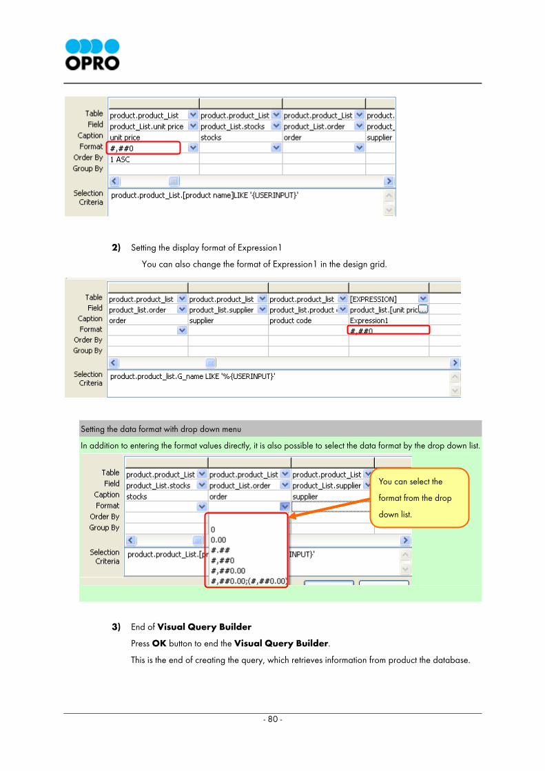
2) Setting the display format of Expression1
You can also change the format of Expression1 in the design grid.
Setting the data format with drop down menu
In addition to entering the format values directly, it is also possible to select the data format by the drop down list.
3) End of Visual Query Builder
Press OK button to end the Visual Query Builder.
This is the end of creating the query, which retrieves information from product the database.
You can select the
format from the drop
down list.
- 81 -
3.3 Arranging the Data
This section deals with the displaying of information retrieved from the database. We will have to use the
DatasetTable component and DatasetTable Wizard to display the data.
We can display the data obtained from the database using the DatasetTable component. This
component would display the information retrieved from the database in the form of a data report.
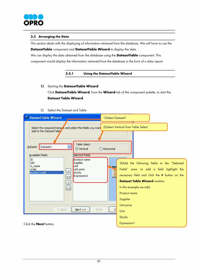
3.3.1 Using the DatasetTable Wizard
1) Starting the DatasetTable Wizard
Click DatasetTable Wizard, from the Wizard tab of the component palette, to start the
Dataset Table Wizard.
2) Select the Dataset and Table
Click the Next button.
1)Select Dataset1
2)Select Vertical from Table Select
3)Add the following fields to the “Selected
Fields” area. to add a field highlight the
necessary field and click the > button on the
Dataset Table Wizard window.
In this example we add,
Product name
Supplier
Unit price
Unit
Stocks
Expression1
- 82 -
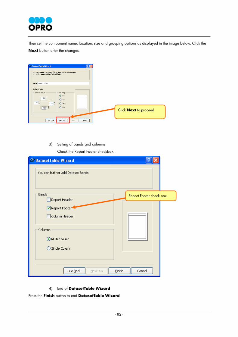
Then set the component name, location, size and grouping options as displayed in the image below. Click the
Next button after the changes.
3) Setting of bands and columns
Check the Report Footer checkbox.
4) End of DatasetTable Wizard
Press the Finish button to end DatasetTable Wizard.
Report Footer check box
Click Next to proceed
- 83 -
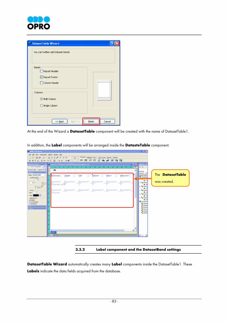
At the end of the Wizard a DatasetTable component will be created with the name of DatasetTable1.
In addition, the Label components will be arranged inside the DatasteTable component.
3.3.2 Label component and the DatasetBand settings
DatasetTable Wizard automatically creates many Label components inside the DatasetTable1. These
Labels indicate the data fields acquired from the database.
The DatasetTable
was created.
- 84 -
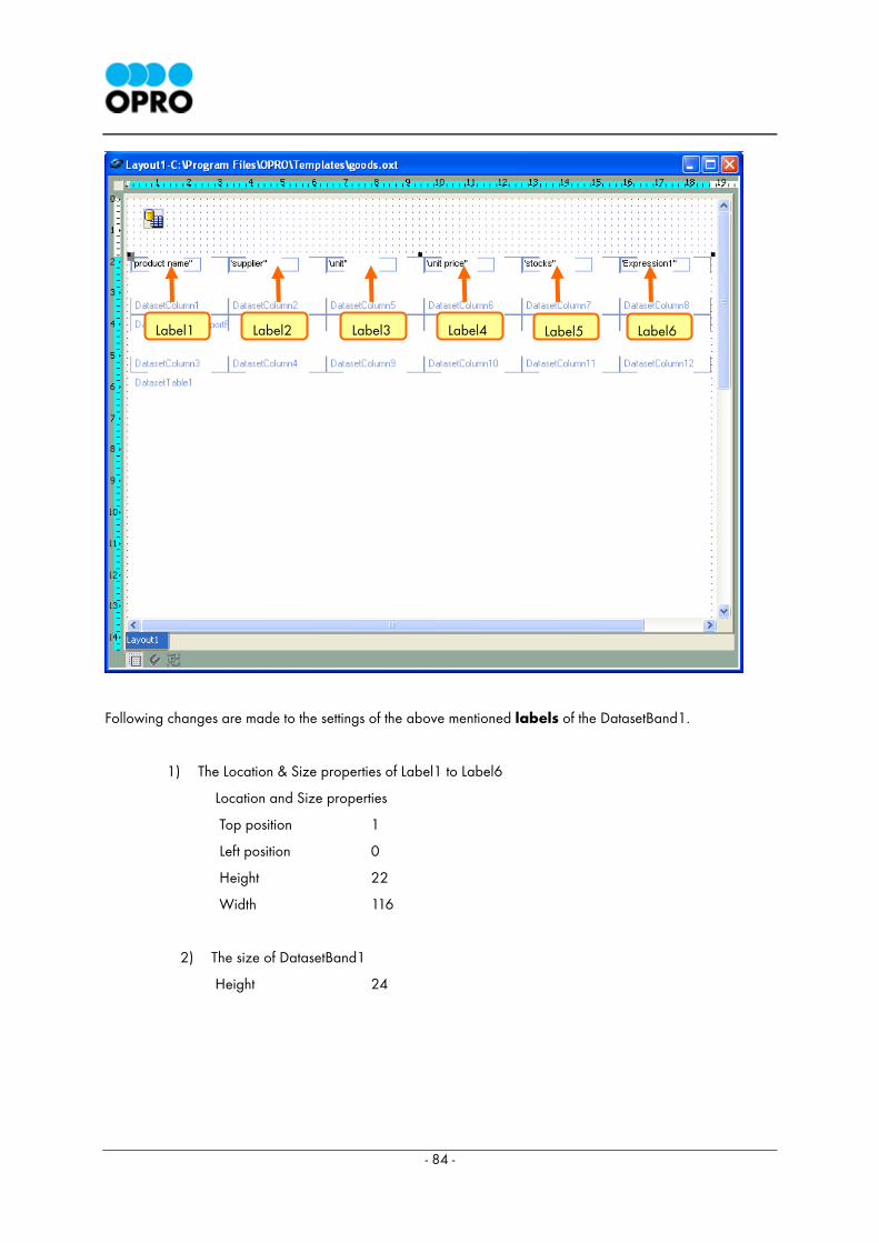
Following changes are made to the settings of the above mentioned labels of the DatasetBand1.
1) The Location & Size properties of Label1 to Label6
Location and Size properties
Top position 1
Left position 0
Height 22
Width 116
2) The size of DatasetBand1
Height 24
Label6 Label5 Label4 Label3 Label1 Label2
- 85 -
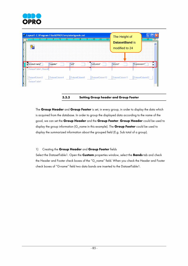
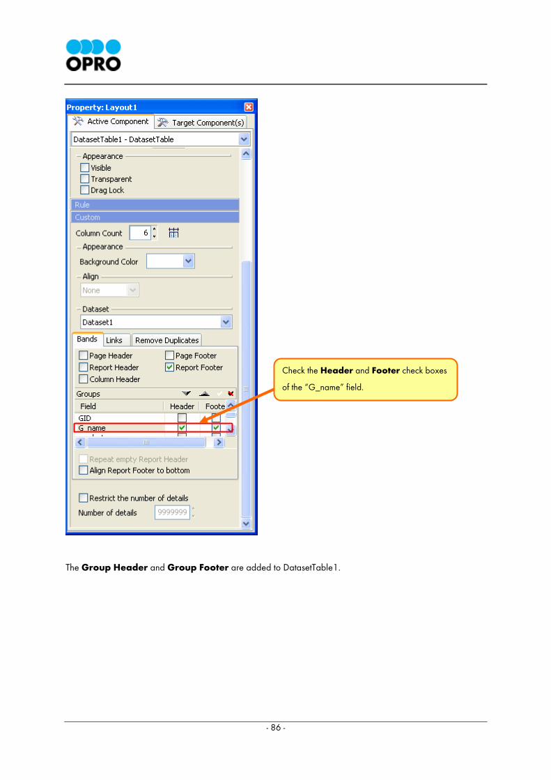
3.3.3 Setting Group header and Group Footer
The Group Header and Group Footer is set, in every group, in order to display the data which
is acquired from the database. In order to group the displayed data according to the name of the
good, we can set the Group Header and the Group Footer. Group Header could be used to
display the group information (G_name in this example). The Group Footer could be used to
display the summarized information about the grouped field (E.g. Sub total of a group).
1) Creating the Group Header and Group Footer fields
Select the DatasetTable1. Open the Custom properties window, select the Bands tab and check
the Header and Footer check boxes of the “G_name” field. When you check the Header and Footer
check boxes of “G-name” field two data bands are inserted to the DatasetTable1.
The Height of
DatasetBand is
modified to 24
- 86 -
The Group Header and Group Footer are added to DatasetTable1.
Check the Header and Footer check boxes
of the “G_name” field.
- 87 -
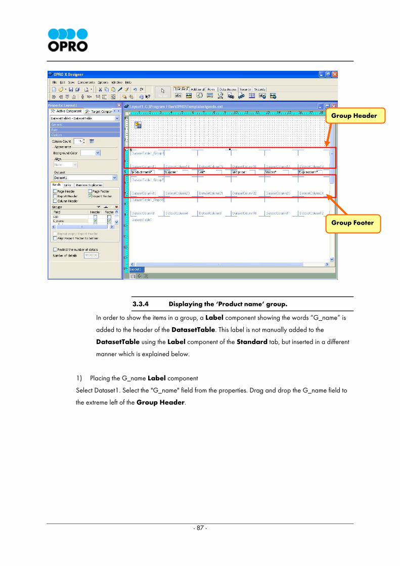
3.3.4 Displaying the ‘Product name’ group.
In order to show the items in a group, a Label component showing the words “G_name” is
added to the header of the DatasetTable. This label is not manually added to the
DatasetTable using the Label component of the Standard tab, but inserted in a different
manner which is explained below.
1) Placing the G_name Label component
Select Dataset1. Select the "G_name" field from the properties. Drag and drop the G_name field to
the extreme left of the Group Header.
Group Header
Group Footer
- 88 -
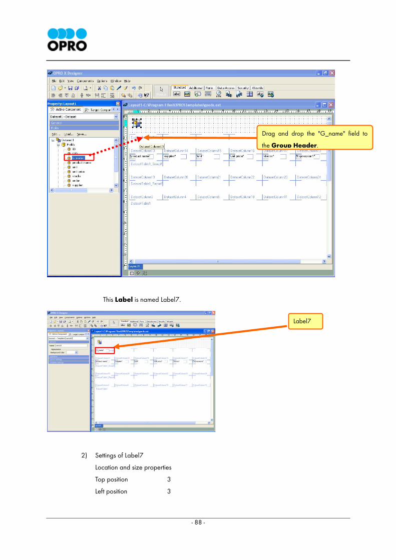
This Label is named Label7.
2) Settings of Label7
Location and size properties
Top position 3
Left position 3
Drag and drop the "G_name" field to
the Group Header.
Label7
- 89 -
Height 18
Width 112
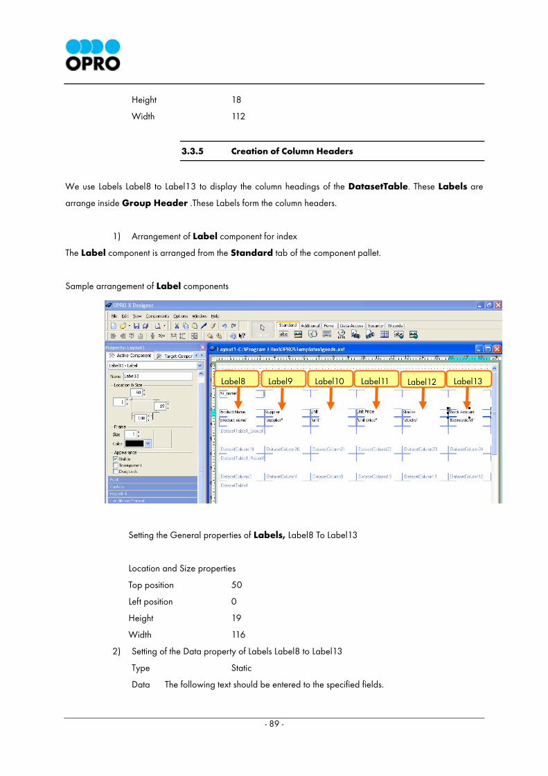
3.3.5 Creation of Column Headers
We use Labels Label8 to Label13 to display the column headings of the DatasetTable. These Labels are
arrange inside Group Header .These Labels form the column headers.
1) Arrangement of Label component for index
The Label component is arranged from the Standard tab of the component pallet.
Sample arrangement of Label components
Setting the General properties of Labels, Label8 To Label13
Location and Size properties
Top position 50
Left position 0
Height 19
Width 116
2) Setting of the Data property of Labels Label8 to Label13
Type Static
Data The following text should be entered to the specified fields.
Label13 Label12 Label8 Label10 Label9 Label11

- 90 -
Label8 Product name
Label9 Supplier
Label10 Unit
Label11 Unit Price
Label12 Stocks
Label13 Stock Amount
3.3.6 Setting of form feed processing
A new page could be started, when the contents of the Group Header is changed. For
example if the supplier column shows a different value those values will be displayed in a
separate page.
1) Setting of form feed
Open the Custom property of the Group Header.
Check the New page for new group check box.
Check the New page for new group
check box.
- 91 -
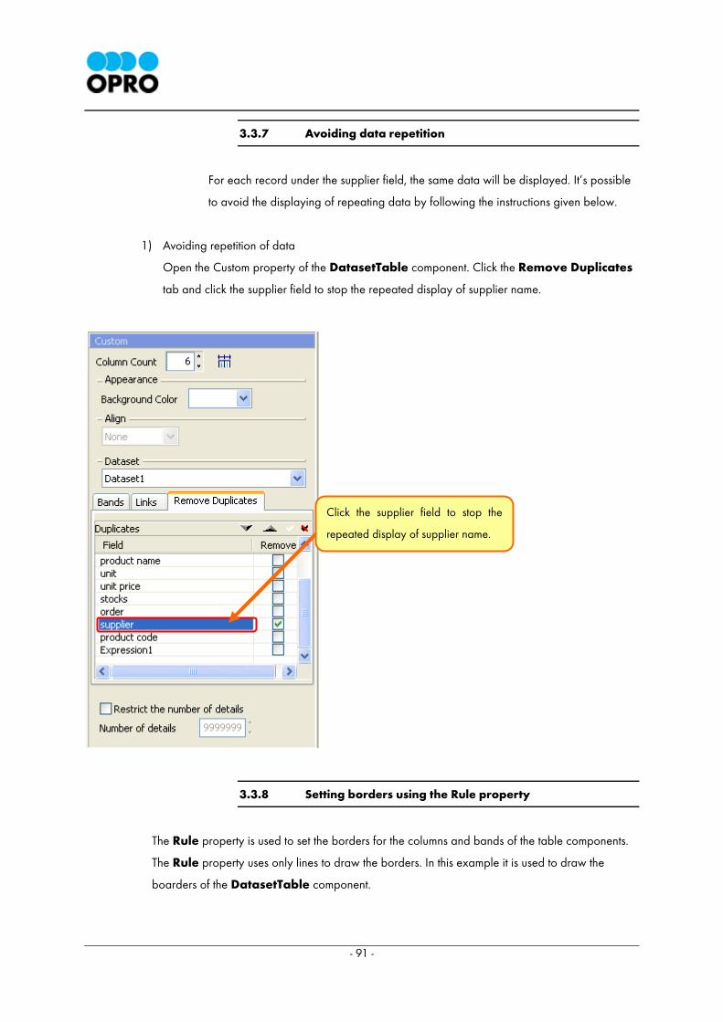
3.3.7 Avoiding data repetition
For each record under the supplier field, the same data will be displayed. It’s possible
to avoid the displaying of repeating data by following the instructions given below.
1) Avoiding repetition of data
Open the Custom property of the DatasetTable component. Click the Remove Duplicates
tab and click the supplier field to stop the repeated display of supplier name.
3.3.8 Setting borders using the Rule property
The Rule property is used to set the borders for the columns and bands of the table components.
The Rule property uses only lines to draw the borders. In this example it is used to draw the
boarders of the DatasetTable component.
Click the supplier field to stop the
repeated display of supplier name.
- 92 -
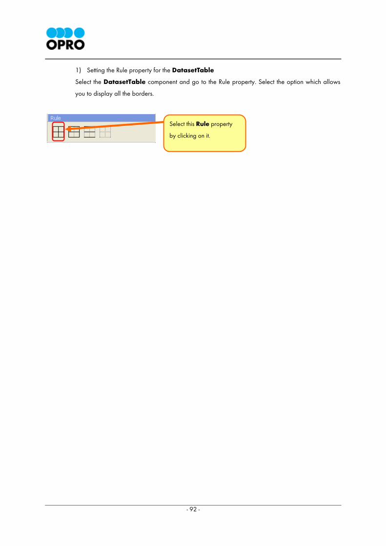
1) Setting the Rule property for the DatasetTable
Select the DatasetTable component and go to the Rule property. Select the option which allows
you to display all the borders.
Select this Rule property
by clicking on it.
- 93 -
3.4 Displaying the Total Stock Amount
It is possible to display the total stock amount for each supplier using OXD. In addition the grand total
of stock amount is also displayed in this report.
The totals displayed in the report are calculated using the Aggregate Function component.
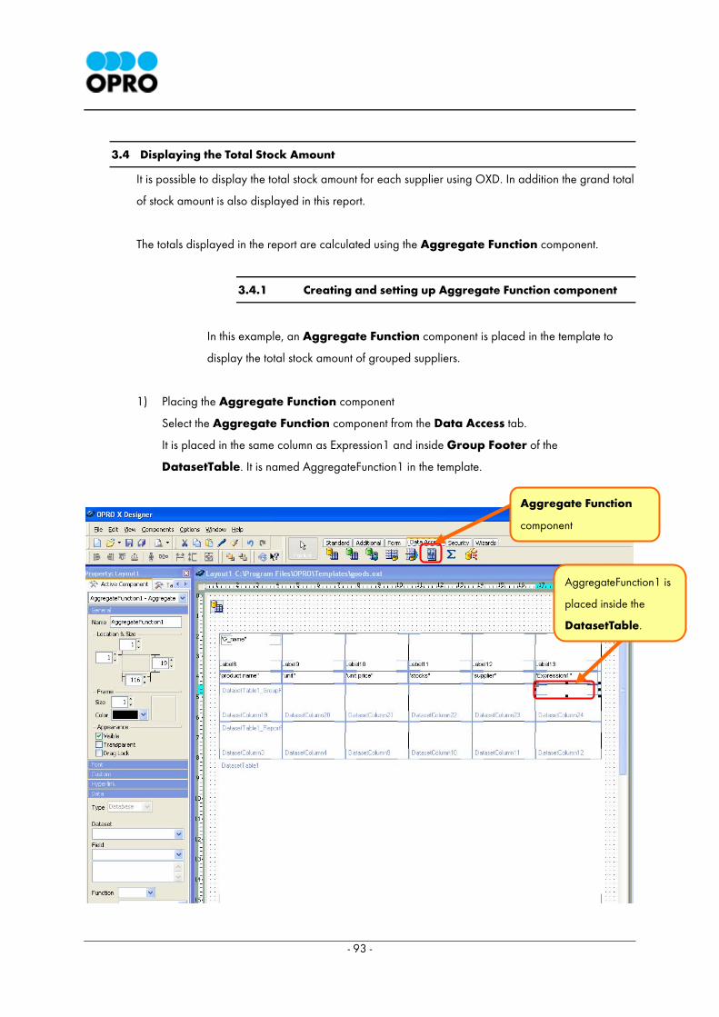
3.4.1 Creating and setting up Aggregate Function component
In this example, an Aggregate Function component is placed in the template to
display the total stock amount of grouped suppliers.
1) Placing the Aggregate Function component
Select the Aggregate Function component from the Data Access tab.
It is placed in the same column as Expression1 and inside Group Footer of the
DatasetTable. It is named AggregateFunction1 in the template.
AggregateFunction1 is
placed inside the
DatasetTable.
Aggregate Function
component
- 94 -
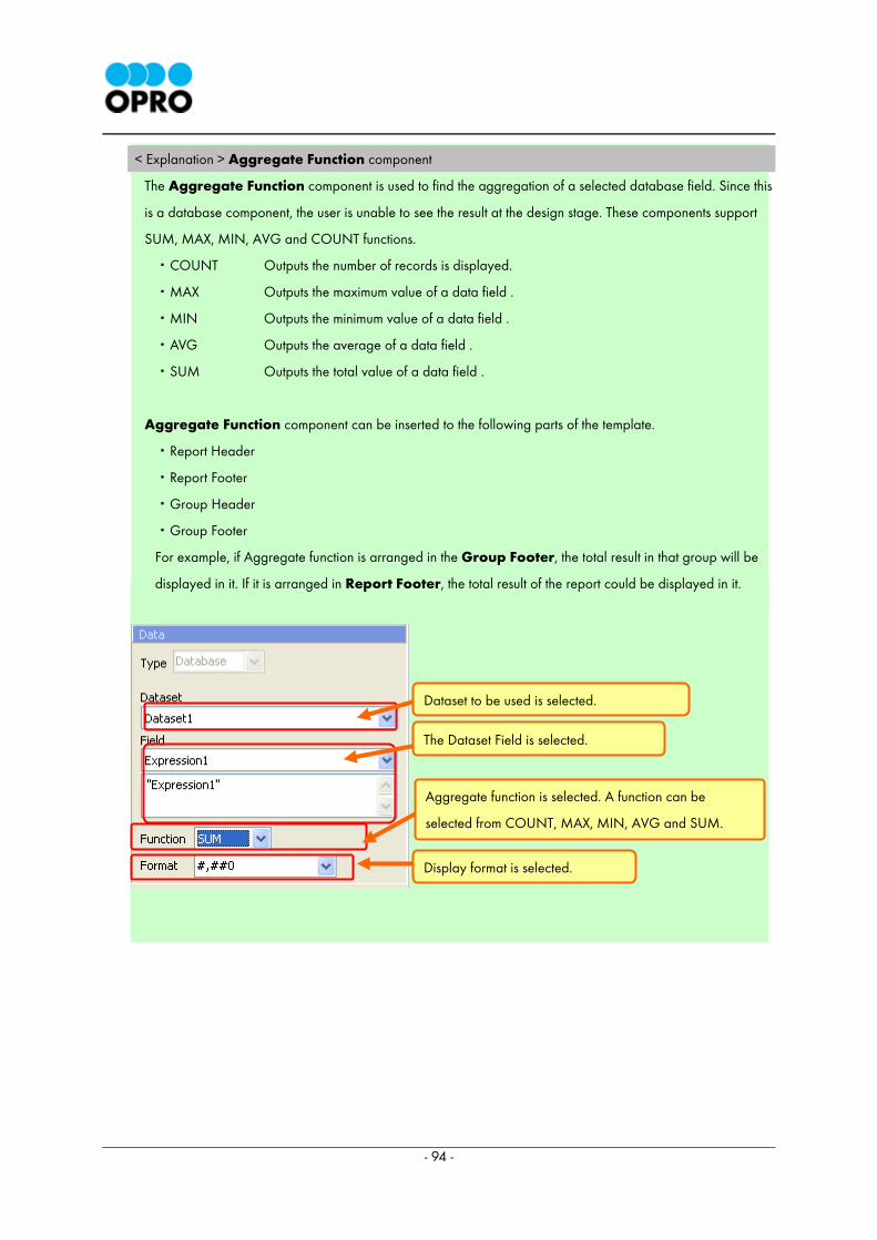
< Explanation > Aggregate Function component
The Aggregate Function component is used to find the aggregation of a selected database field. Since this
is a database component, the user is unable to see the result at the design stage. These components support
SUM, MAX, MIN, AVG and COUNT functions.
・COUNT Outputs the number of records is displayed.
・MAX Outputs the maximum value of a data field .
・MIN Outputs the minimum value of a data field .
・AVG Outputs the average of a data field .
・SUM Outputs the total value of a data field .
Aggregate Function component can be inserted to the following parts of the template.
・Report Header
・Report Footer
・Group Header
・Group Footer
For example, if Aggregate function is arranged in the Group Footer, the total result in that group will be
displayed in it. If it is arranged in Report Footer, the total result of the report could be displayed in it.
Dataset to be used is selected.
The Dataset Field is selected.
Aggregate function is selected. A function can be
selected from COUNT, MAX, MIN, AVG and SUM.
Display format is selected.
- 95 -
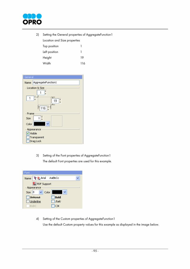
2) Setting the General properties of AggregateFunction1
Location and Size properties
Top position 1
Left position 1
Height 19
Width 116
3) Setting of the Font properties of AggregateFunction1
The default Font properties are used for this example.
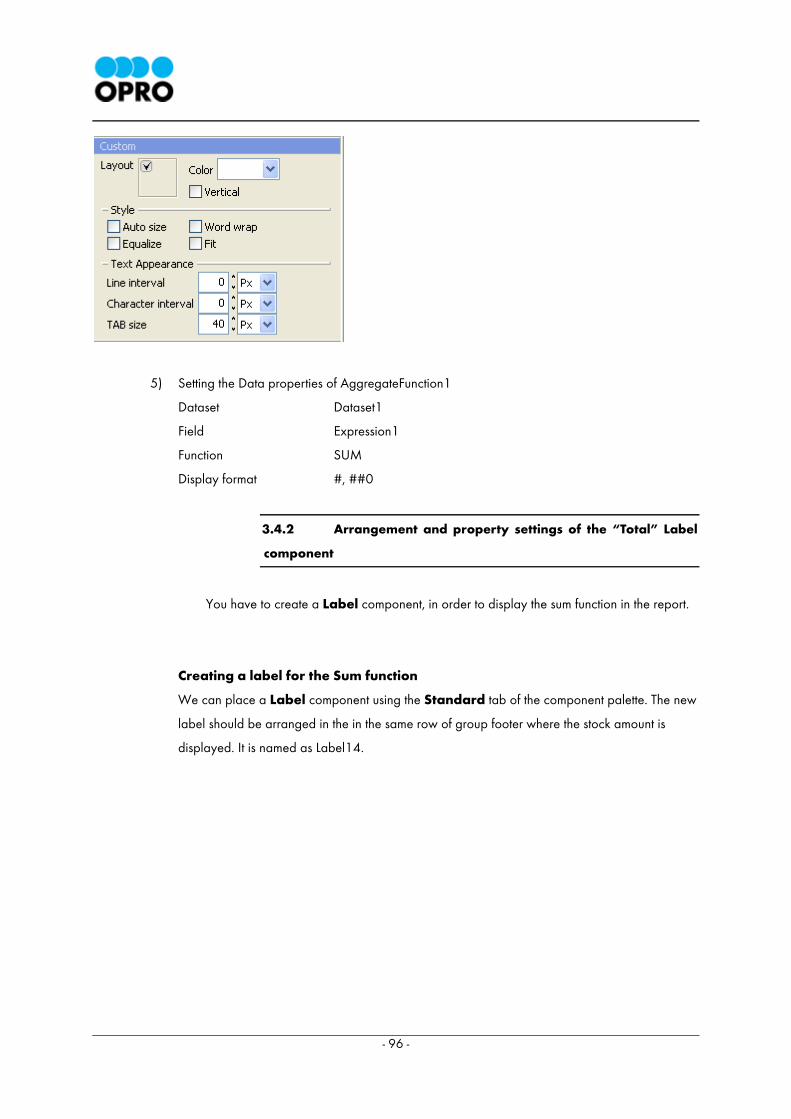
4) Setting of the Custom properties of AggregateFunction1
Use the default Custom property values for this example as displayed in the image below.
- 96 -
5) Setting the Data properties of AggregateFunction1
Dataset Dataset1
Field Expression1
Function SUM
Display format #, ##0
3.4.2 Arrangement and property settings of the “Total” Label
component
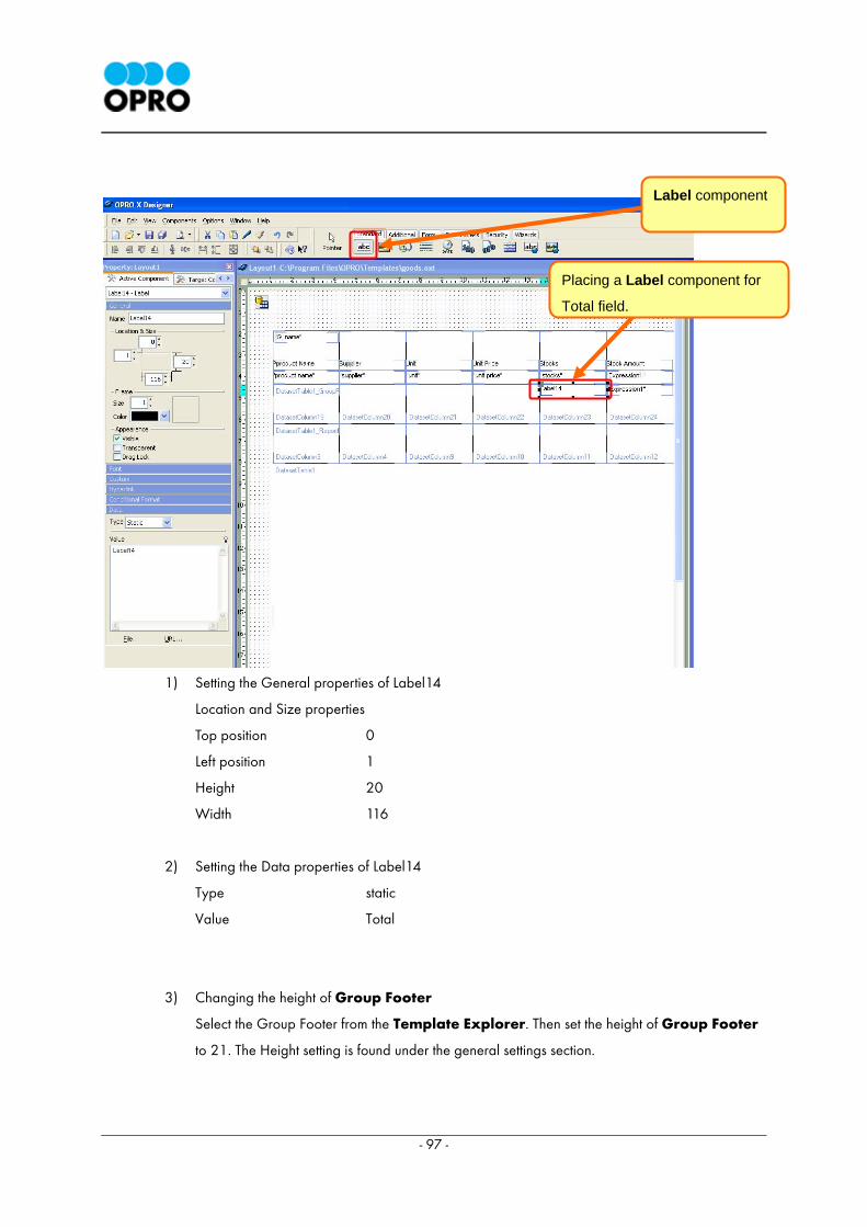
You have to create a Label component, in order to display the sum function in the report.
Creating a label for the Sum function
We can place a Label component using the Standard tab of the component palette. The new
label should be arranged in the in the same row of group footer where the stock amount is
displayed. It is named as Label14.
- 97 -
1) Setting the General properties of Label14
Location and Size properties
Top position 0
Left position 1
Height 20
Width 116
2) Setting the Data properties of Label14
Type static
Value Total
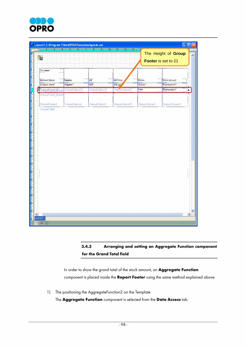
3) Changing the height of Group Footer
Select the Group Footer from the Template Explorer. Then set the height of Group Footer
to 21. The Height setting is found under the general settings section.
Placing a Label component for
Total field.
Label component
- 98 -
3.4.3 Arranging and setting an Aggregate Function component
for the Grand Total field
In order to show the grand total of the stock amount, an Aggregate Function
component is placed inside the Report Footer using the same method explained above.
1) The positioning the AggregateFunction2 on the Template
The Aggregate Function component is selected from the Data Access tab.
The Height of Group
Footer is set to 21
- 99 -
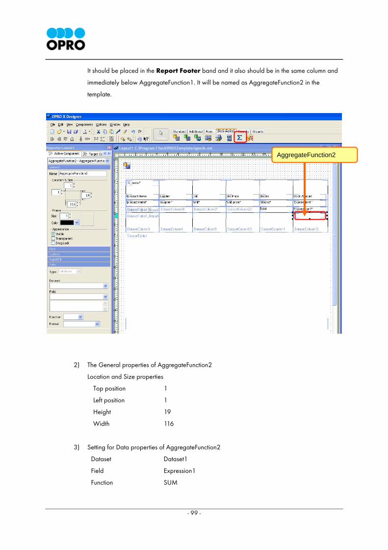
It should be placed in the Report Footer band and it also should be in the same column and
immediately below AggregateFunction1. It will be named as AggregateFunction2 in the
template.
2) The General properties of AggregateFunction2
Location and Size properties
Top position 1
Left position 1
Height 19
Width 116
3) Setting for Data properties of AggregateFunction2
Dataset Dataset1
Field Expression1
Function SUM
AggregateFunction2
- 100 -
The Font properties and the Custom properties of AggregateFunction2 need not to be modified.
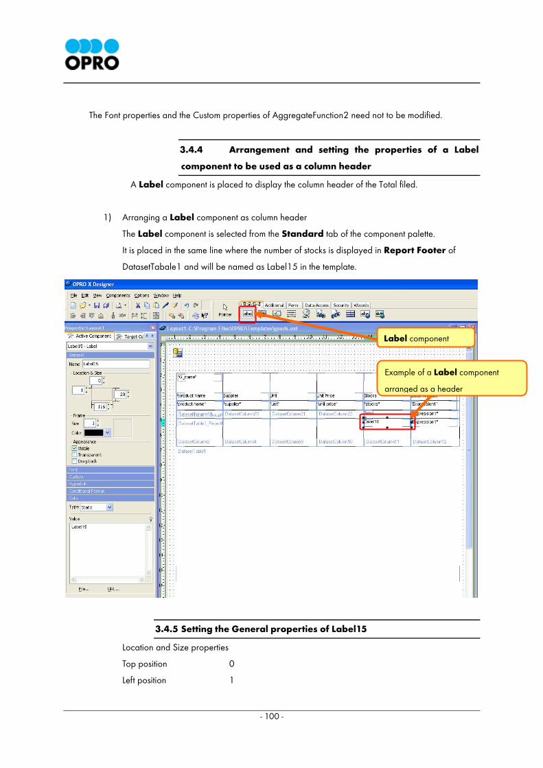
3.4.4 Arrangement and setting the properties of a Label
component to be used as a column header
A Label component is placed to display the column header of the Total filed.
1) Arranging a Label component as column header
The Label component is selected from the Standard tab of the component palette.
It is placed in the same line where the number of stocks is displayed in Report Footer of
DatasetTabale1 and will be named as Label15 in the template.
3.4.5 Setting the General properties of Label15
Location and Size properties
Top position 0
Left position 1
Example of a Label component
arranged as a header
Label component
- 101 -
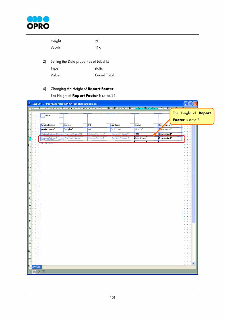
Height 20
Width 116
2) Setting the Data properties of Label15
Type static
Value Grand Total
4) Changing the Height of Report Footer
The Height of Report Footer is set to 21.
The Height of Report
Footer is set to 21
- 102 -
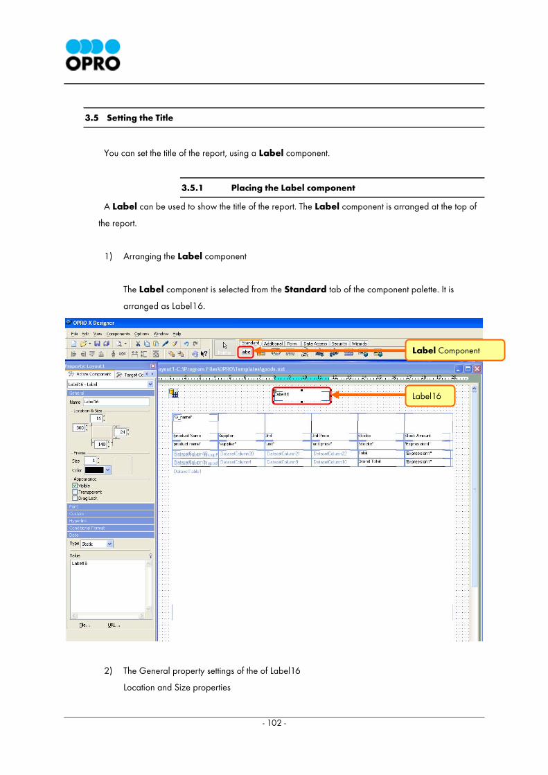
3.5 Setting the Title
You can set the title of the report, using a Label component.
3.5.1 Placing the Label component
A Label can be used to show the title of the report. The Label component is arranged at the top of
the report.
1) Arranging the Label component
The Label component is selected from the Standard tab of the component palette. It is
arranged as Label16.
2) The General property settings of the of Label16
Location and Size properties
Label Component
Label16
- 103 -
Top position 16
Left position 300
Height 24
Width 140
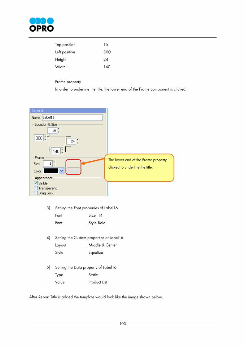
Frame property
In order to underline the title, the lower end of the Frame component is clicked.
3) Setting the Font properties of Label16
Font Size 14
Font Style Bold
4) Setting the Custom properties of Label16
Layout Middle & Center
Style Equalize
5) Setting the Data property of Label16
Type Static
Value Product List
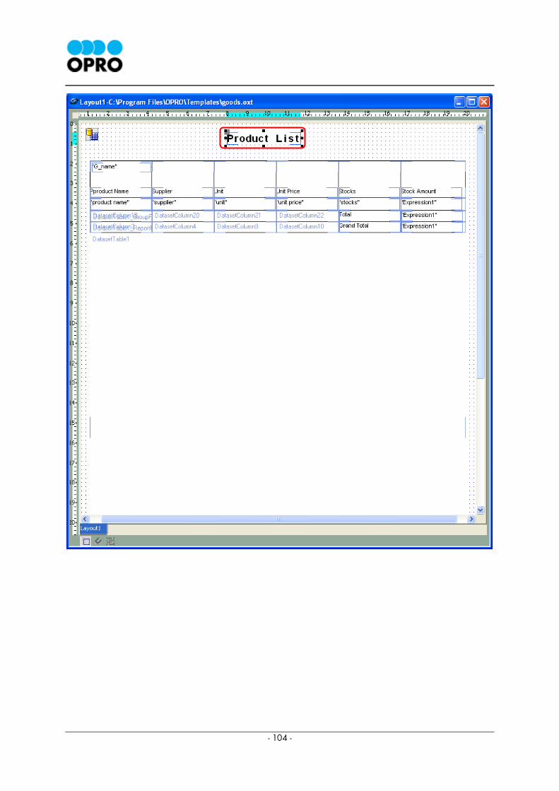
After Report Title is added the template would look like the image shown below.
The lower end of the Frame property
clicked to underline the title.
- 104 -
- 105 -
3.6 Displaying the Date
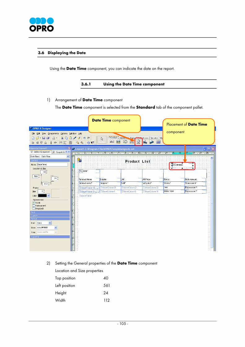
Using the Date Time component, you can indicate the date on the report.
3.6.1 Using the Date Time component
1) Arrangement of Date Time component
The Date Time component is selected from the Standard tab of the component pallet.
2) Setting the General properties of the Date Time component
Location and Size properties
Top position 40
Left position 561
Height 24
Width 112
Date Time component
Placement of Date Time
component
- 106 -
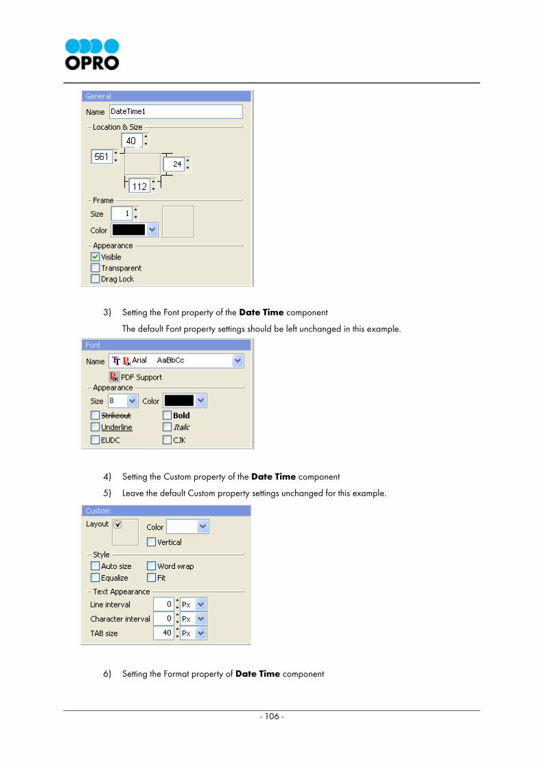
3) Setting the Font property of the Date Time component
The default Font property settings should be left unchanged in this example.
4) Setting the Custom property of the Date Time component
5) Leave the default Custom property settings unchanged for this example.
6) Setting the Format property of Date Time component

- 107 -
Set the format of date as indicated below.
Kind Date
Date ' yyyy ' (year) ' MM ' (month) ' dd ' (day)
Example: 2003 April 30th
< Explanation > DateTime component
Kind
You can find several options to display the date and
time in this drop down menu.
Date ・ ・ ・ ・ ・ ・ ・ ・ ・ date only
Time ・ ・ ・ ・ ・ ・ ・ ・ ・ time only
Date Time・ ・ ・ ・ ・ ・ ・date and time
Date
Display format of Date is set here. (It is also
possible to type the values directly)
Time
Display format of time is set here.(It is also possible
to input values directly)
- 108 -
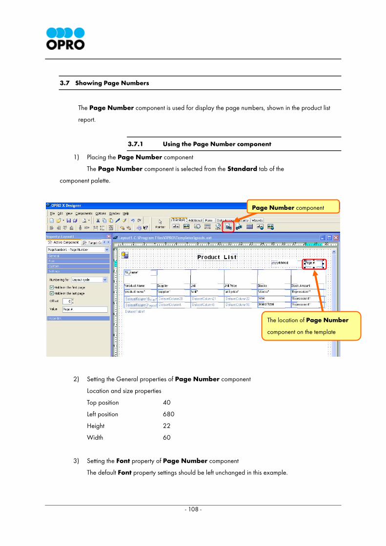
3.7 Showing Page Numbers
The Page Number component is used for display the page numbers, shown in the product list
report.
3.7.1 Using the Page Number component
1) Placing the Page Number component
The Page Number component is selected from the Standard tab of the
component palette.
2) Setting the General properties of Page Number component
Location and size properties
Top position 40
Left position 680
Height 22
Width 60
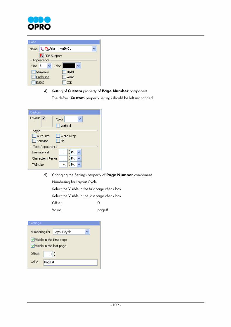
3) Setting the Font property of Page Number component
The default Font property settings should be left unchanged in this example.
Page Number component
The location of Page Number
component on the template
- 109 -
4) Setting of Custom property of Page Number component
The default Custom property settings should be left unchanged.
5) Changing the Settings property of Page Number component
Numbering for Layout Cycle
Select the Visible in the first page check box
Select the Visible in the last page check box
Offset 0
Value page#
- 110 -
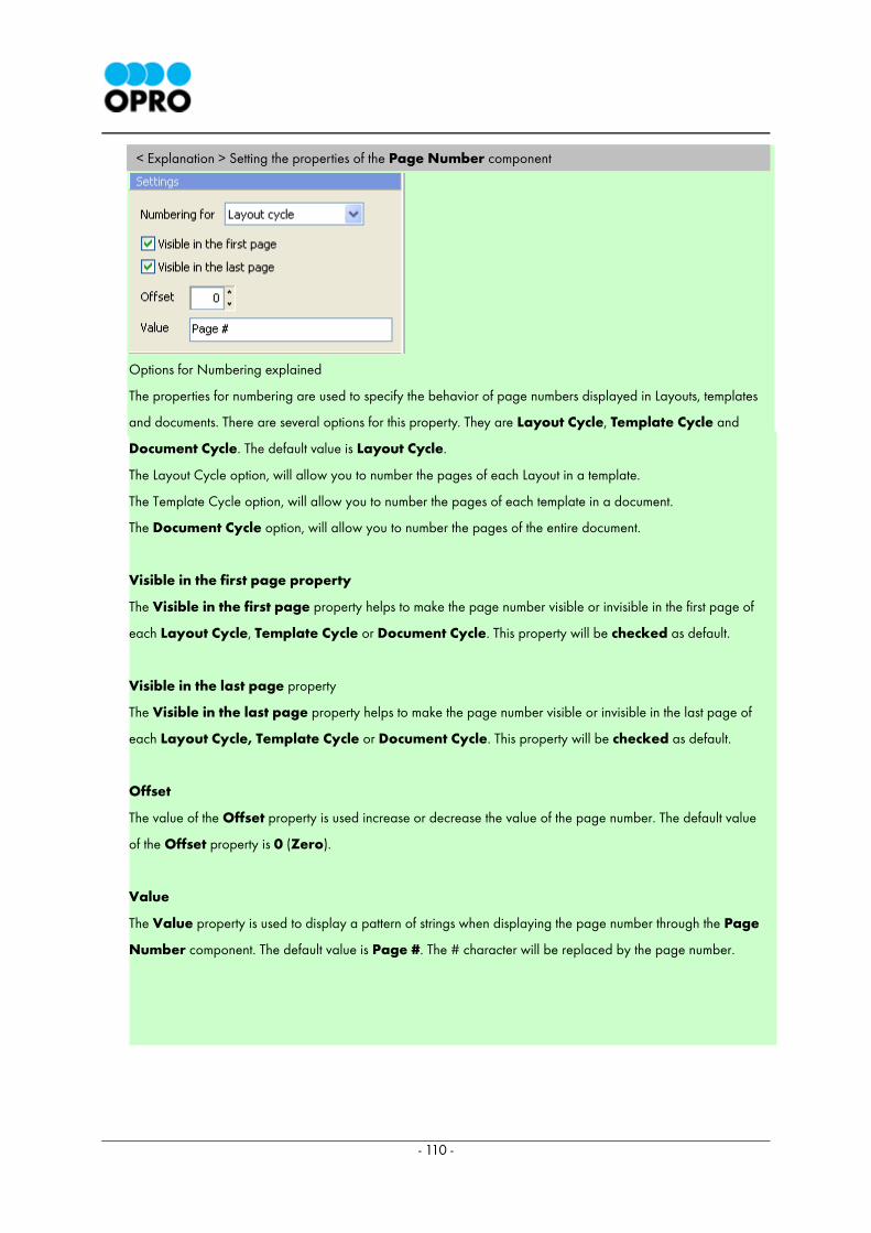
< Explanation > Setting the properties of the Page Number component
Options for Numbering explained
The properties for numbering are used to specify the behavior of page numbers displayed in Layouts, templates
and documents. There are several options for this property. They are Layout Cycle, Template Cycle and
Document Cycle. The default value is Layout Cycle.
The Layout Cycle option, will allow you to number the pages of each Layout in a template.
The Template Cycle option, will allow you to number the pages of each template in a document.
The Document Cycle option, will allow you to number the pages of the entire document.
Visible in the first page property
The Visible in the first page property helps to make the page number visible or invisible in the first page of
each Layout Cycle, Template Cycle or Document Cycle. This property will be checked as default.
Visible in the last page property
The Visible in the last page property helps to make the page number visible or invisible in the last page of
each Layout Cycle, Template Cycle or Document Cycle. This property will be checked as default.
Offset
The value of the Offset property is used increase or decrease the value of the page number. The default value
of the Offset property is 0 (Zero).
Value
The Value property is used to display a pattern of strings when displaying the page number through the Page
Number component. The default value is Page #. The # character will be replaced by the page number.
- 111 -
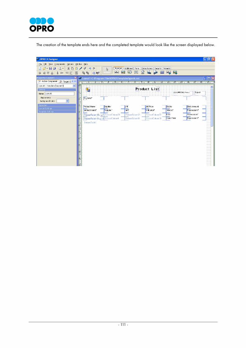
The creation of the template ends here and the completed template would look like the screen displayed below.
- 112 -
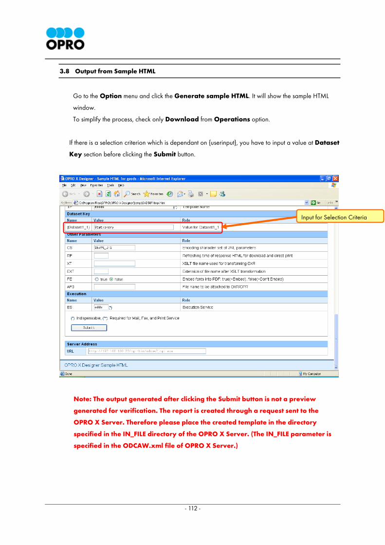
3.8 Output from Sample HTML
Go to the Option menu and click the Generate sample HTML. It will show the sample HTML
window.
To simplify the process, check only Download from Operations option.
If there is a selection criterion which is dependant on {userinput}, you have to input a value at Dataset
Key section before clicking the Submit button.
Note: The output generated after clicking the Submit button is not a preview
generated for verification. The report is created through a request sent to the
OPRO X Server. Therefore please place the created template in the directory
specified in the IN_FILE directory of the OPRO X Server. (The IN_FILE parameter is
specified in the ODCAW.xml file of OPRO X Server.)
Input for Selection Criteria
- 113 -
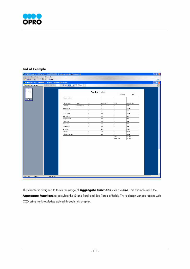
End of Example
This chapter is designed to teach the usage of Aggregate Functions such as SUM. This example used the
Aggregate Functions to calculate the Grand Total and Sub Totals of fields. Try to design various reports with
OXD using the knowledge gained through this chapter.
- 114 -
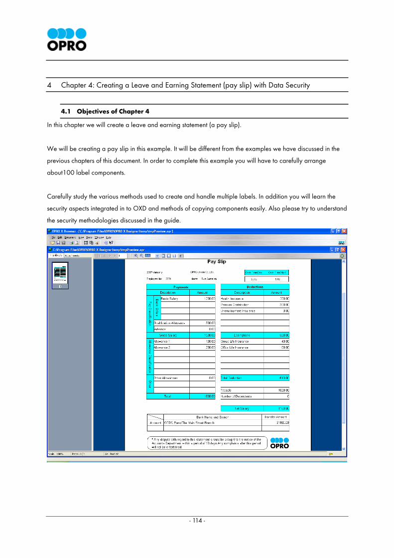
4 Chapter 4: Creating a Leave and Earning Statement (pay slip) with Data Security
4.1 Objectives of Chapter 4
In this chapter we will create a leave and earning statement (a pay slip).
We will be creating a pay slip in this example. It will be different from the examples we have discussed in the
previous chapters of this document. In order to complete this example you will have to carefully arrange
about100 label components.
Carefully study the various methods used to create and handle multiple labels. In addition you will learn the
security aspects integrated in to OXD and methods of copying components easily. Also please try to understand
the security methodologies discussed in the guide.
- 115 -
Complete procedure of creating the leave and earning statement.
4.2 Setting the database connections
4.3 Creating the template and building database queries using VQB.
4.4 Displaying the data
4.5 Setting the title and showing the details
4.6 Display Data
4.7 Displaying a note
4.8 Displaying Company Logo
4.9 Setting up security
The Document Security component is to secure from modification through a password.
4.10 Output as sample HTML
4.11 Appendix
- 116 -
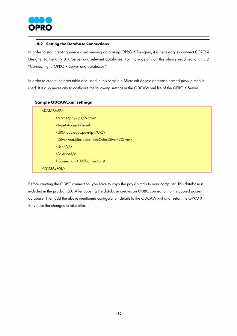
4.2 Setting the Database Connections
In order to start creating queries and viewing data using OPRO X Designer, it is necessary to connect OPRO X
Designer to the OPRO X Server and relevant databases. For more details on this please read section 1.3.2
“Connecting to OPRO X Server and databases ".
In order to create the data table discussed in this sample a Microsoft Access database named payslip.mdb is
used. It is also necessary to configure the following settings in the ODCAW.xml file of the OPRO X Server.
Sample ODCAW.xml settings
<DATABASE>
<Name>payslip</Name>
<Type>Access</Type>
<URL>jdbc:odbc:payslip</URL>
<Driver>sun.jdbc.odbc.JdbcOdbcDriver</Driver>
<UserID/>
<Password/>
<Connections>3</Connections>
</DATABASE>
Before creating the ODBC connection, you have to copy the payslip.mdb to your computer. This database is
included in the product CD. .After copying the database creates an ODBC connection to the copied access
database. Then add the above mentioned configuration details to the ODCAW.xml and restart the OPRO X
Server for the changes to take effect.
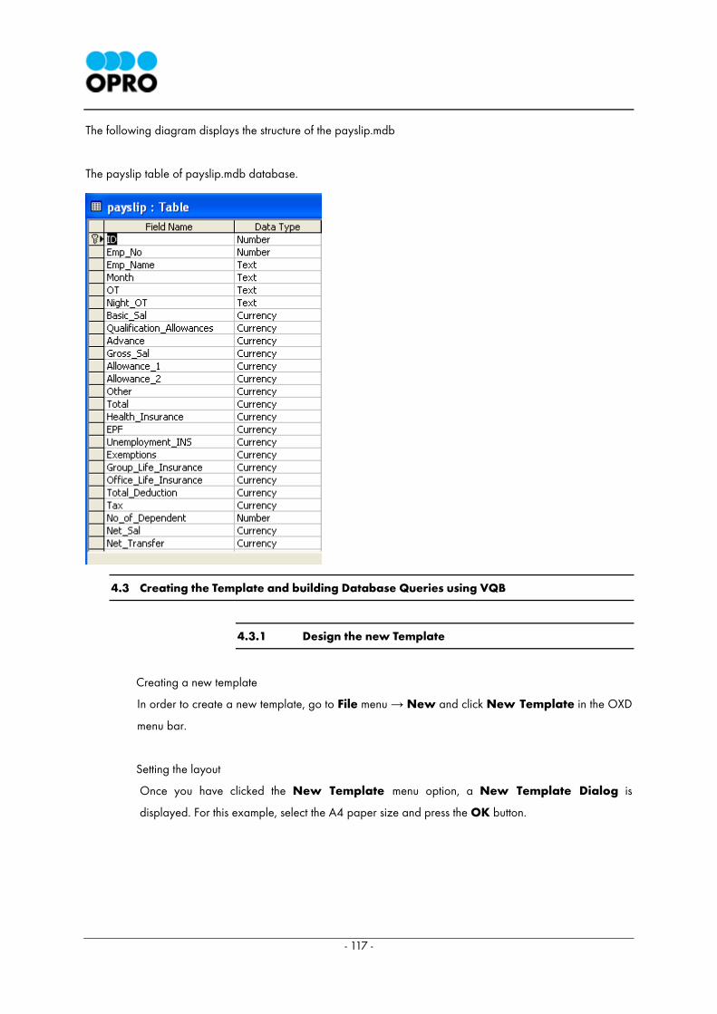
- 117 -
The following diagram displays the structure of the payslip.mdb
The payslip table of payslip.mdb database.
4.3 Creating the Template and building Database Queries using VQB
4.3.1 Design the new Template
Creating a new template
In order to create a new template, go to File menu → New and click New Template in the OXD
menu bar.
Setting the layout
Once you have clicked the New Template menu option, a New Template Dialog is
displayed. For this example, select the A4 paper size and press the OK button.
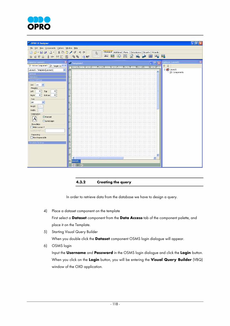
- 118 -
4.3.2 Creating the query
In order to retrieve data from the database we have to design a query.
4) Place a dataset component on the template
First select a Dataset component from the Data Access tab of the component palette, and
place it on the Template.
5) Starting Visual Query Builder
When you double click the Dataset component OSMS login dialogue will appear.
6) OSMS login
Input the Username and Password in the OSMS login dialogue and click the Login button.
When you click on the Login button, you will be entering the Visual Query Builder (VBQ)
window of the OXD application.
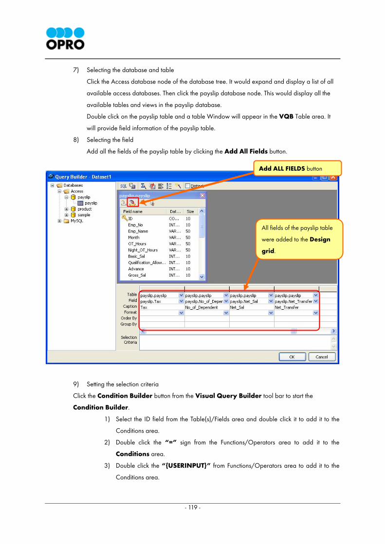
- 119 -
7) Selecting the database and table
Click the Access database node of the database tree. It would expand and display a list of all
available access databases. Then click the payslip database node. This would display all the
available tables and views in the payslip database.
Double click on the payslip table and a table Window will appear in the VQB Table area. It
will provide field information of the payslip table.
8) Selecting the field
Add all the fields of the payslip table by clicking the Add All Fields button.
9) Setting the selection criteria
Click the Condition Builder button from the Visual Query Builder tool bar to start the
Condition Builder.
1) Select the ID field from the Table(s)/Fields area and double click it to add it to the
Conditions area.
2) Double click the “=” sign from the Functions/Operators area to add it to the
Conditions area.
3) Double click the “{USERINPUT}” from Functions/Operators area to add it to the
Conditions area.
Add ALL FIELDS button
All fields of the payslip table
were added to the Design
grid.
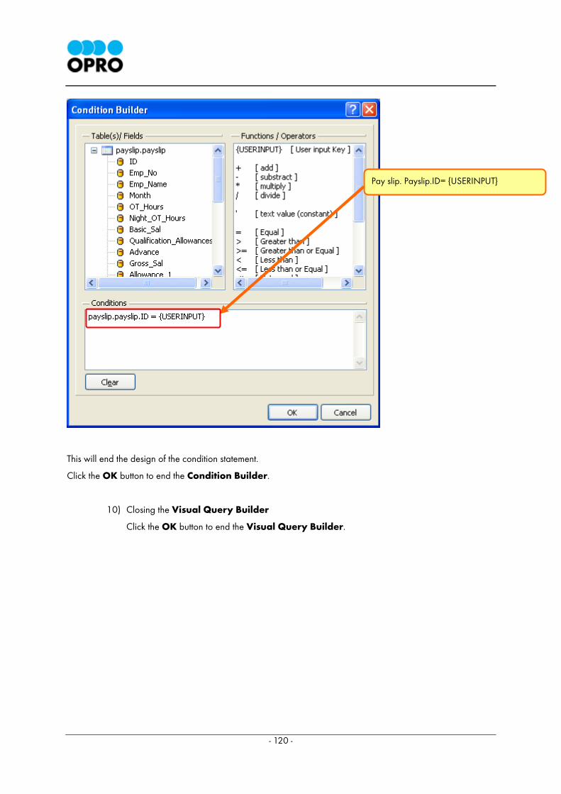
- 120 -
This will end the design of the condition statement.
Click the OK button to end the Condition Builder.
10) Closing the Visual Query Builder
Click the OK button to end the Visual Query Builder.
Pay slip. Payslip.ID= {USERINPUT}
- 121 -
4.4 Displaying the Data
The best way to start designing the leave and earning statement is by arranging and aligning the
necessary Label components first. In this example we are using many Label components. Manual
aligning and placement of these components would be time consuming. Therefore tips for
arranging Label components accurately are also included in this example along with the
guidelines to create the pay slip template.
4.4.1 Placing and aligning of Label components : Label1 to
Label21
First place a Label component and place 20 more Labels similarly. They should be placed
immediately below the first Label component and following one after the other along the
vertical axis. These Label components will be named Label2 to Label21. They should be
arranged vertically. After placing these Labels on the template they should be aligned using
the align functions available in OXD.
1) Placing Label1
Select the Label component from the Standard tab of the component palette.
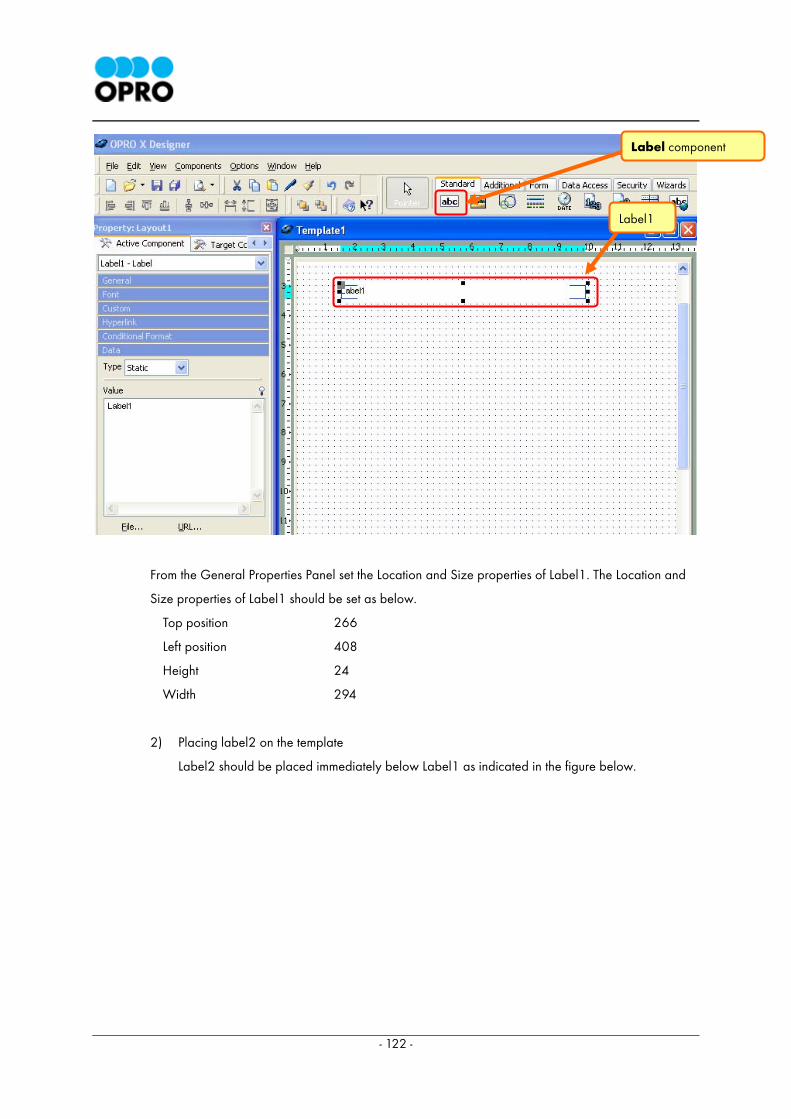
- 122 -
From the General Properties Panel set the Location and Size properties of Label1. The Location and
Size properties of Label1 should be set as below.
Top position 266
Left position 408
Height 24
Width 294
2) Placing label2 on the template
Label2 should be placed immediately below Label1 as indicated in the figure below.
Label1
Label component
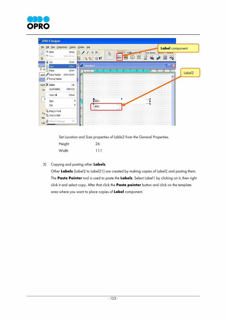
- 123 -
Set Location and Size properties of Lable2 from the General Properties.
Height 26
Width 111
3) Copying and pasting other Labels.
Other Labels (Label2 to Label21) are created by making copies of Label2 and pasting them.
The Paste Pointer tool is used to paste the Labels. Select Label1 by clicking on it, then right
click it and select copy. After that click the Paste pointer button and click on the template
area where you want to place copies of Label component.
Label2
Label component
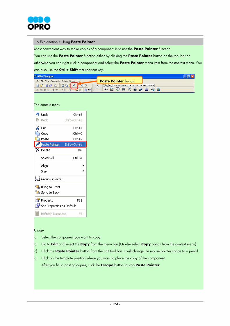
- 124 -
< Explanation > Using Paste Pointer
Most convenient way to make copies of a component is to use the Paste Pointer function.
You can use the Paste Pointer function either by clicking the Paste Pointer button on the tool bar or
otherwise you can right click a component and select the Paste Pointer menu item from the context menu. You
can also use the Ctrl + Shift + v shortcut key.
The context menu
Usage
a) Select the component you want to copy.
b) Go to Edit and select the Copy from the menu bar.(Or else select Copy option from the context menu)
c) Click the Paste Pointer button from the Edit tool bar. It will change the mouse pointer shape to a pencil.
d) Click on the template position where you want to place the copy of the component.
After you finish pasting copies, click the Escape button to stop Paste Pointer.
Paste Pointer button
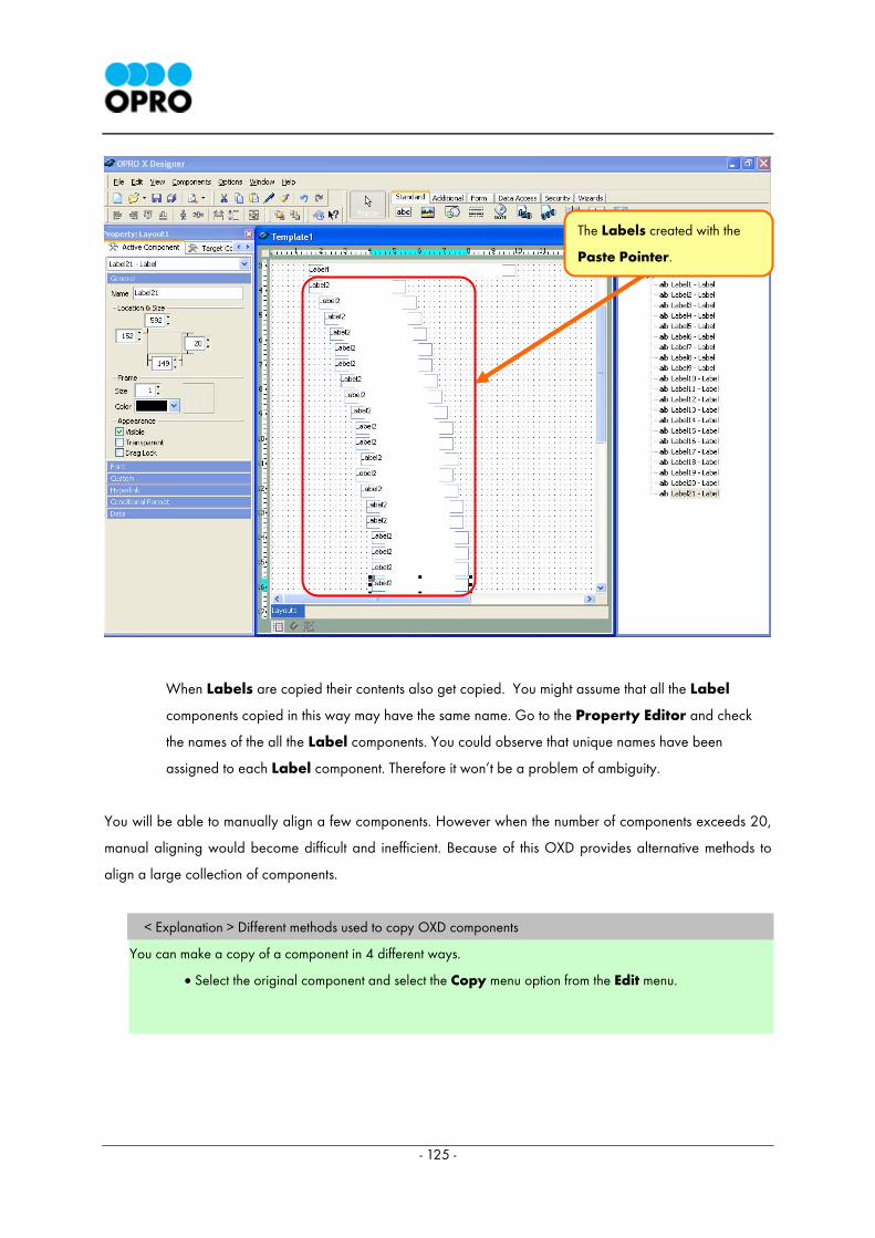
- 125 -
When Labels are copied their contents also get copied. You might assume that all the Label
components copied in this way may have the same name. Go to the Property Editor and check
the names of the all the Label components. You could observe that unique names have been
assigned to each Label component. Therefore it won’t be a problem of ambiguity.
You will be able to manually align a few components. However when the number of components exceeds 20,
manual aligning would become difficult and inefficient. Because of this OXD provides alternative methods to
align a large collection of components.
< Explanation > Different methods used to copy OXD components
You can make a copy of a component in 4 different ways.
• Select the original component and select the Copy menu option from the Edit menu.
The Labels created with the
Paste Pointer.
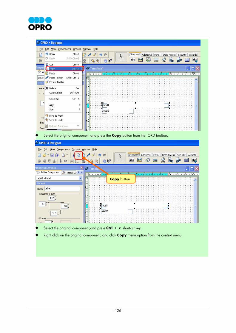
- 126 -
Select the original component and press the Copy button from the OXD toolbar.
Select the original component,and press Ctrl + c shortcut key.
Right click on the original component, and click Copy menu option from the context menu.
Copy button
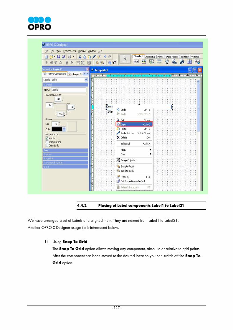
- 127 -
4.4.2 Placing of Label components Label1 to Label21
We have arranged a set of Labels and aligned them. They are named from Label1 to Label21.
Another OPRO X Designer usage tip is introduced below.
1) Using Snap To Grid
The Snap To Grid option allows moving any component, absolute or relative to grid points.
After the component has been moved to the desired location you can switch off the Snap To
Grid option.
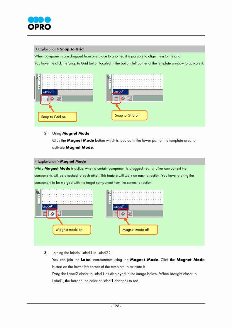
- 128 -
< Explanation > Snap To Grid
When components are dragged from one place to another, it is possible to align them to the grid.
You have the click the Snap to Grid button located in the bottom left corner of the template window to activate it.
2) Using Magnet Mode
Click the Magnet Mode button which is located in the lower part of the template area to
activate Magnet Mode.
< Explanation > Magnet Mode
While Magnet Mode is active, when a certain component is dragged near another component the
components will be attached to each other. This feature will work on each direction. You have to bring the
component to be merged with the target component from the correct direction.
3) Joining the labels, Label1 to Label22
You can join the Label components using the Magnet Mode. Click the Magnet Mode
button on the lower left corner of the template to activate it.
Drag the Label2 closer to Label1 as displayed in the image below. When brought closer to
Label1, the border line color of Label1 changes to red.
Snap to Grid on Snap to Grid off
Magnet mode on Magnet mode off
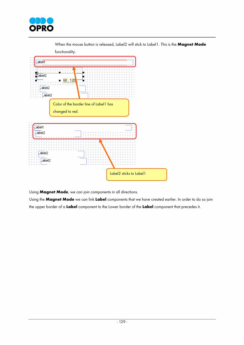
- 129 -
When the mouse button is released, Label2 will stick to Label1. This is the Magnet Mode
functionality.
Using Magnet Mode, we can join components in all directions.
Using the Magnet Mode we can link Label components that we have created earlier. In order to do so join
the upper border of a Label component to the Lower border of the Label component that precedes it.
Color of the border line of Label1 has
changed to red.
Label2 sticks to Label1
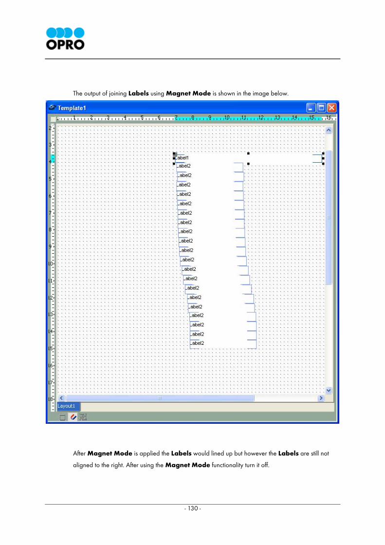
- 130 -
The output of joining Labels using Magnet Mode is shown in the image below.
After Magnet Mode is applied the Labels would lined up but however the Labels are still not
aligned to the right. After using the Magnet Mode functionality turn it off.
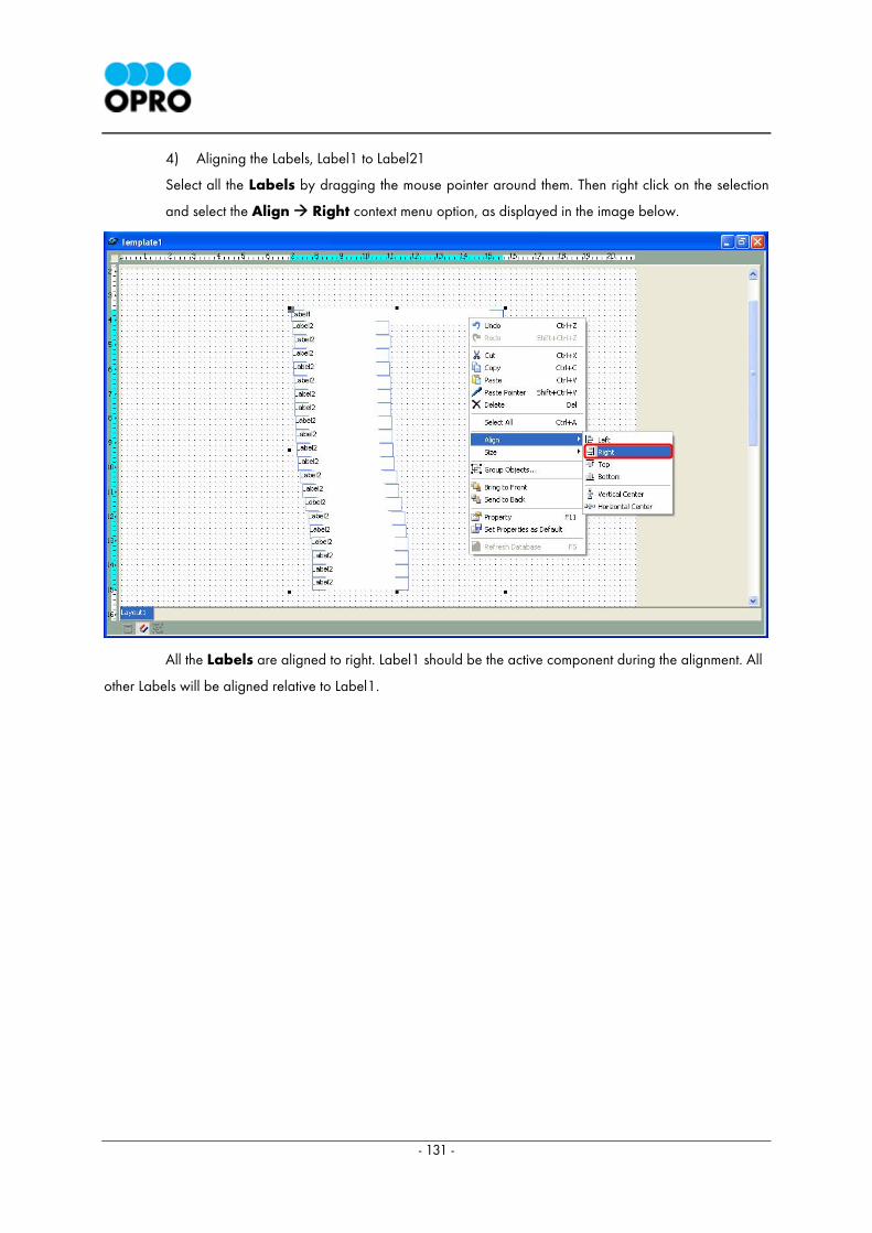
- 131 -
4) Aligning the Labels, Label1 to Label21
Select all the Labels by dragging the mouse pointer around them. Then right click on the selection
and select the Align Right context menu option, as displayed in the image below.
All the Labels are aligned to right. Label1 should be the active component during the alignment. All
other Labels will be aligned relative to Label1.
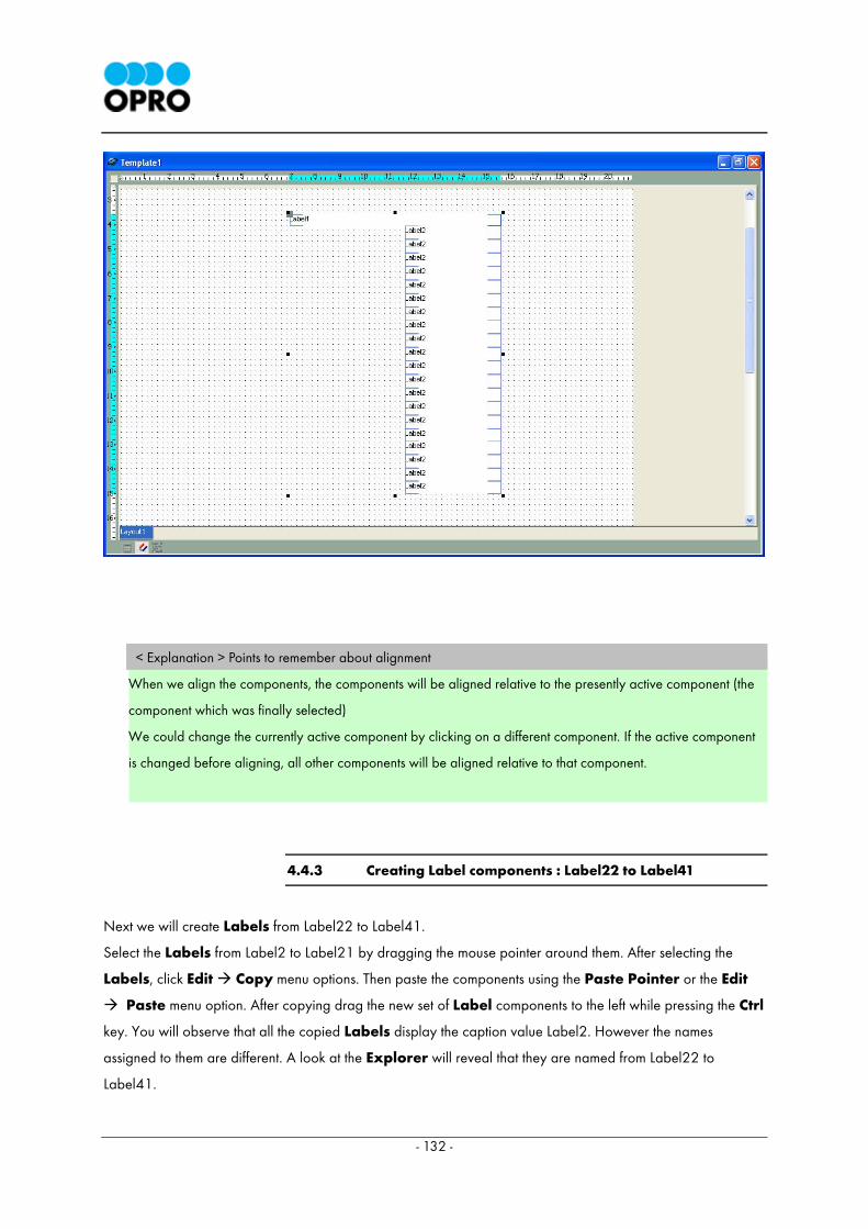
- 132 -
< Explanation > Points to remember about alignment
When we align the components, the components will be aligned relative to the presently active component (the
component which was finally selected)
We could change the currently active component by clicking on a different component. If the active component
is changed before aligning, all other components will be aligned relative to that component.
4.4.3 Creating Label components : Label22 to Label41
Next we will create Labels from Label22 to Label41.
Select the Labels from Label2 to Label21 by dragging the mouse pointer around them. After selecting the
Labels, click Edit Copy menu options. Then paste the components using the Paste Pointer or the Edit
Paste menu option. After copying drag the new set of Label components to the left while pressing the Ctrl
key. You will observe that all the copied Labels display the caption value Label2. However the names
assigned to them are different. A look at the Explorer will reveal that they are named from Label22 to
Label41.
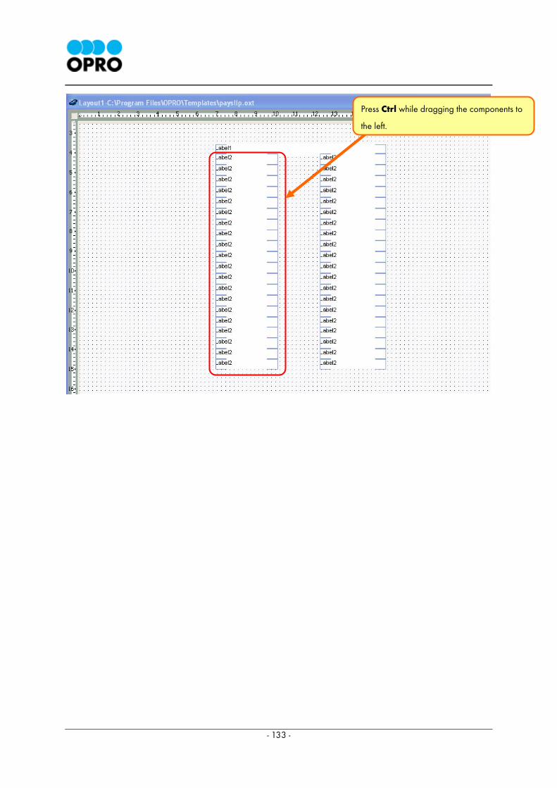
- 133 -
Press Ctrl while dragging the components to
the left.
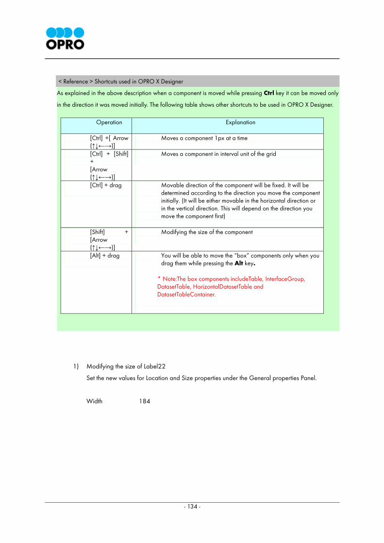
- 134 -
< Reference > Shortcuts used in OPRO X Designer
As explained in the above description when a component is moved while pressing Ctrl key it can be moved only
in the direction it was moved initially. The following table shows other shortcuts to be used in OPRO X Designer.
1) Modifying the size of Label22
Set the new values for Location and Size properties under the General properties Panel.
Width 184
Operation
Explanation
[Ctrl] +[ Arrow (↑↓←→)]
Moves a component 1px at a time
[Ctrl] + [Shift] + [Arrow (↑↓←→)]
Moves a component in interval unit of the grid
[Ctrl] + drag
Movable direction of the component will be fixed. It will be determined according to the direction you move the component initially. (It will be either movable in the horizontal direction or in the vertical direction. This will depend on the direction you move the component first)
[Shift] + [Arrow (↑↓←→)]
Modifying the size of the component
[Alt] + drag
You will be able to move the “box” components only when you drag them while pressing the Alt key.
* Note:The box components includeTable, InterfaceGroup, DatasetTable, HorizontalDatasetTable and DatasetTableContainer.
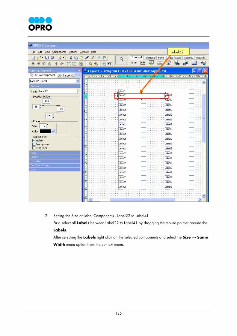
- 135 -
2) Setting the Size of Label Components , Label22 to Label41
First, select all Labels between Label22 to Label41 by dragging the mouse pointer around the
Labels.
After selecting the Labels right click on the selected components and select the Size → Same
Width menu option from the context menu.
Label22
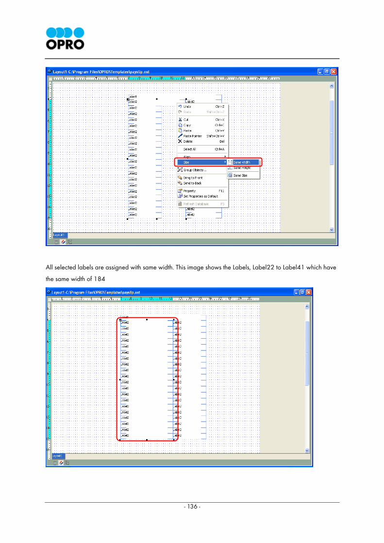
- 136 -
All selected labels are assigned with same width. This image shows the Labels, Label22 to Label41 which have
the same width of 184
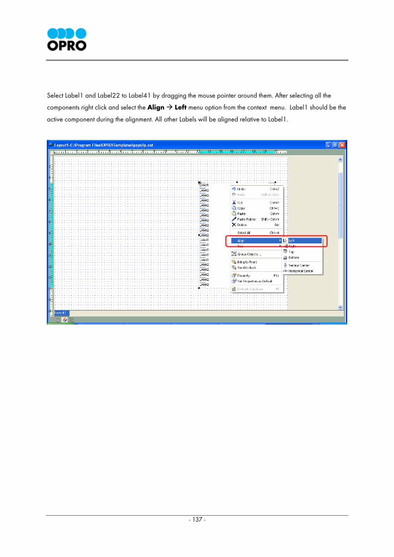
- 137 -
Select Label1 and Label22 to Label41 by dragging the mouse pointer around them. After selecting all the
components right click and select the Align Left menu option from the context menu. Label1 should be the
active component during the alignment. All other Labels will be aligned relative to Label1.
The image below shows the template after the above mentioned component alignments have been
completed.
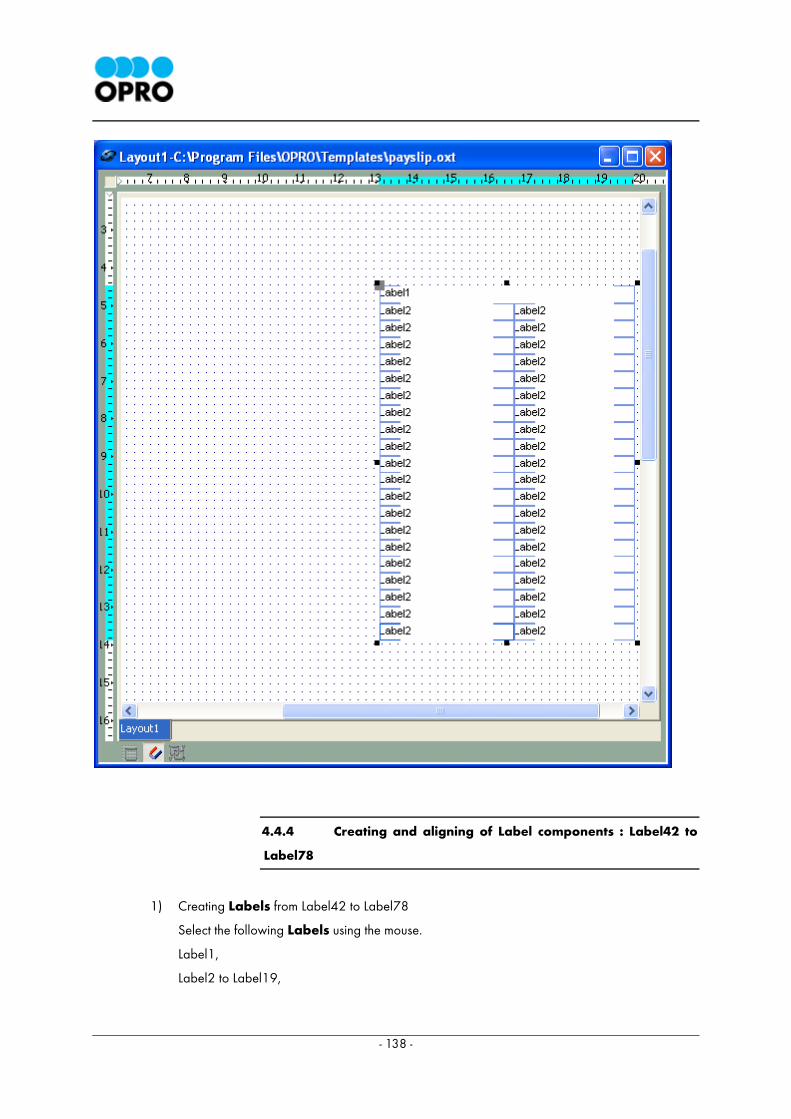
- 138 -
4.4.4 Creating and aligning of Label components : Label42 to
Label78
1) Creating Labels from Label42 to Label78
Select the following Labels using the mouse.
Label1,
Label2 to Label19,
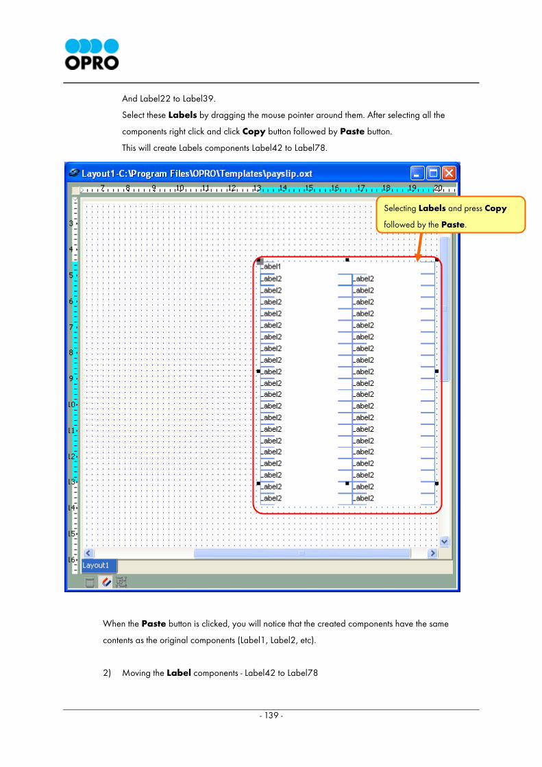
- 139 -
And Label22 to Label39.
Select these Labels by dragging the mouse pointer around them. After selecting all the
components right click and click Copy button followed by Paste button.
This will create Labels components Label42 to Label78.
When the Paste button is clicked, you will notice that the created components have the same
contents as the original components (Label1, Label2, etc).
2) Moving the Label components - Label42 to Label78
Selecting Labels and press Copy
followed by the Paste.
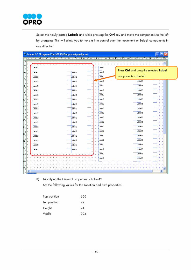
- 140 -
Select the newly pasted Labels and while pressing the Ctrl key and move the components to the left
by dragging. This will allow you to have a firm control over the movement of Label components in
one direction.
3) Modifying the General properties of Label42
Set the following values for the Location and Size properties.
Top position 266
Left position 92
Height 24
Width 294
Press Ctrl and drag the selected Label
components to the left.
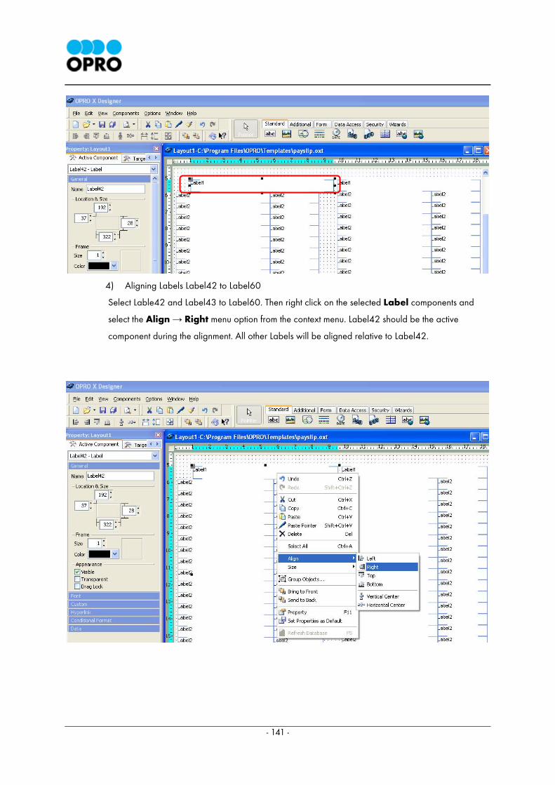
- 141 -
4) Aligning Labels Label42 to Label60
Select Lable42 and Label43 to Label60. Then right click on the selected Label components and
select the Align → Right menu option from the context menu. Label42 should be the active
component during the alignment. All other Labels will be aligned relative to Label42.
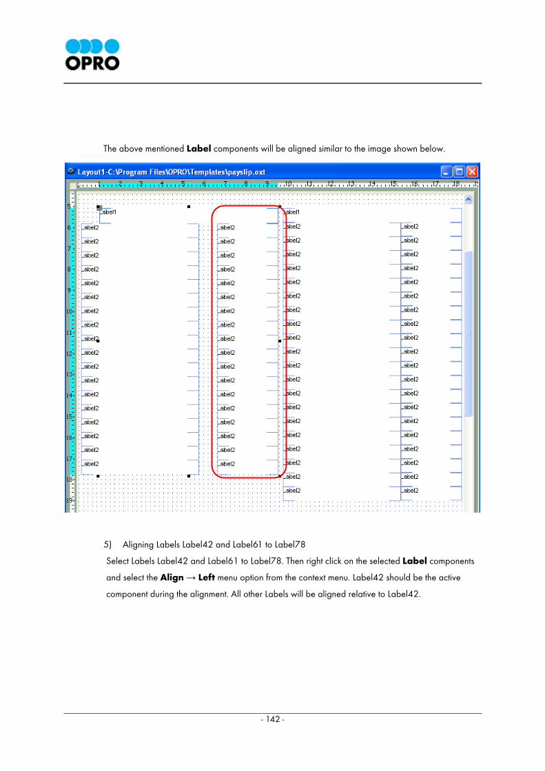
- 142 -
The above mentioned Label components will be aligned similar to the image shown below.
5) Aligning Labels Label42 and Label61 to Label78
Select Labels Label42 and Label61 to Label78. Then right click on the selected Label components
and select the Align → Left menu option from the context menu. Label42 should be the active
component during the alignment. All other Labels will be aligned relative to Label42.
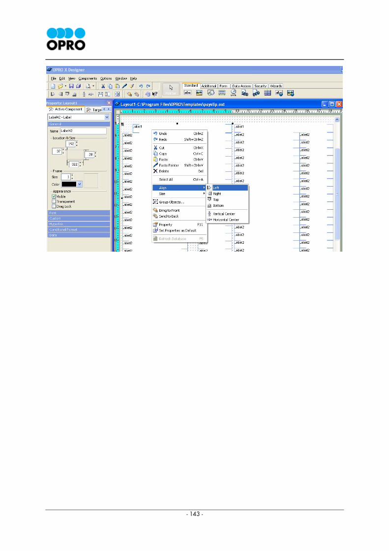
- 143 -
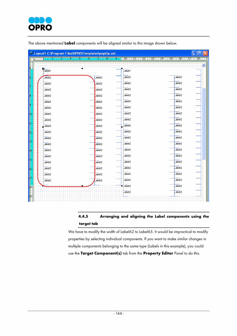
- 144 -
The above mentioned Label components will be aligned similar to this image shown below.
4.4.5 Arranging and aligning the Label components using the
target tab
We have to modify the width of Label62 to Label65. It would be impractical to modify
properties by selecting individual components. If you want to make similar changes in
multiple components belonging to the same type (Labels in this example), you could
use the Target Component(s) tab from the Property Editor Panel to do this.
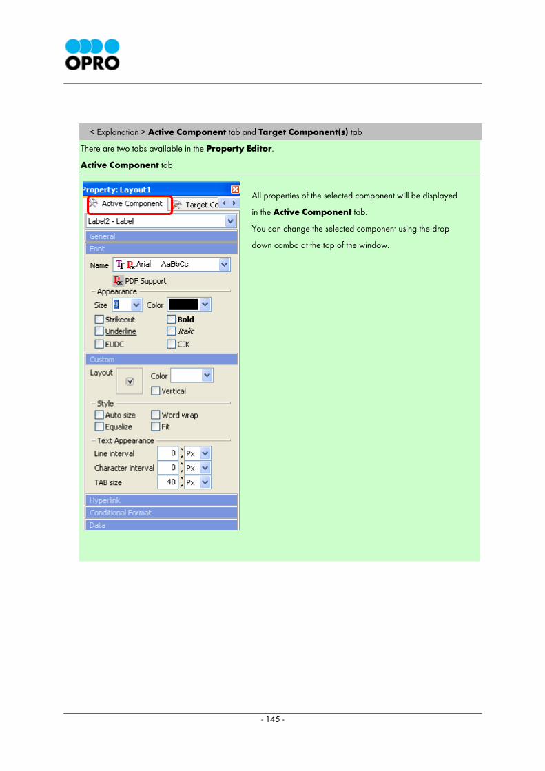
- 145 -
< Explanation > Active Component tab and Target Component(s) tab
There are two tabs available in the Property Editor.
Active Component tab
All properties of the selected component will be displayed
in the Active Component tab.
You can change the selected component using the drop
down combo at the top of the window.
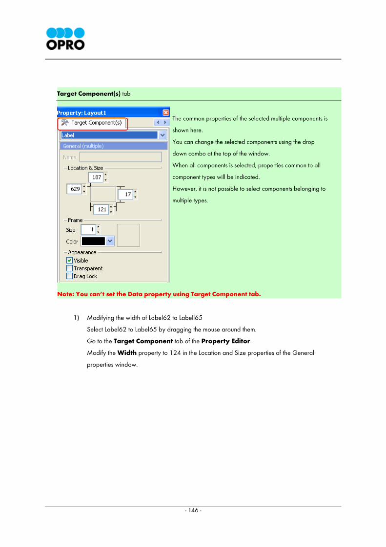
- 146 -
Target Component(s) tab
Note: You can’t set the Data property using Target Component tab.
1) Modifying the width of Label62 to Labell65
Select Label62 to Label65 by dragging the mouse around them.
Go to the Target Component tab of the Property Editor.
Modify the Width property to 124 in the Location and Size properties of the General
properties window.
The common properties of the selected multiple components is
shown here.
You can change the selected components using the drop
down combo at the top of the window.
When all components is selected, properties common to all
component types will be indicated.
However, it is not possible to select components belonging to
multiple types.
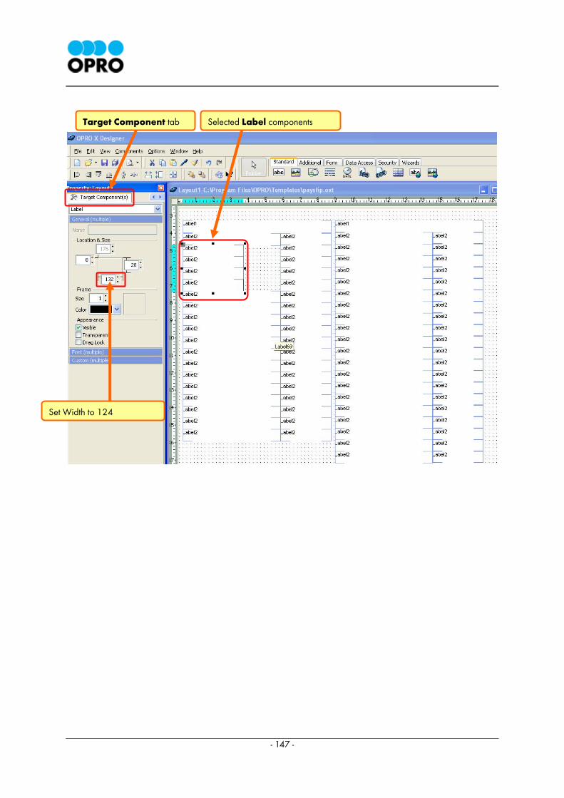
- 147 -
Selected Label components Target Component tab
Set Width to 124

- 148 -
After the above mentioned change the template would appear as below.
2) Alignment of Labels , Label61 to Label65
Label61 to Label65 should be aligned to the right.
Select Label61 to Label65 by dragging the mouse pointer around the Labels. Then right click
on the selected Label components and select the Align → Right menu option from the
context menu.
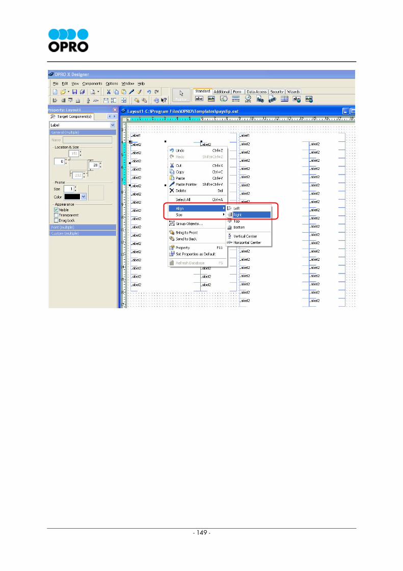
- 149 -
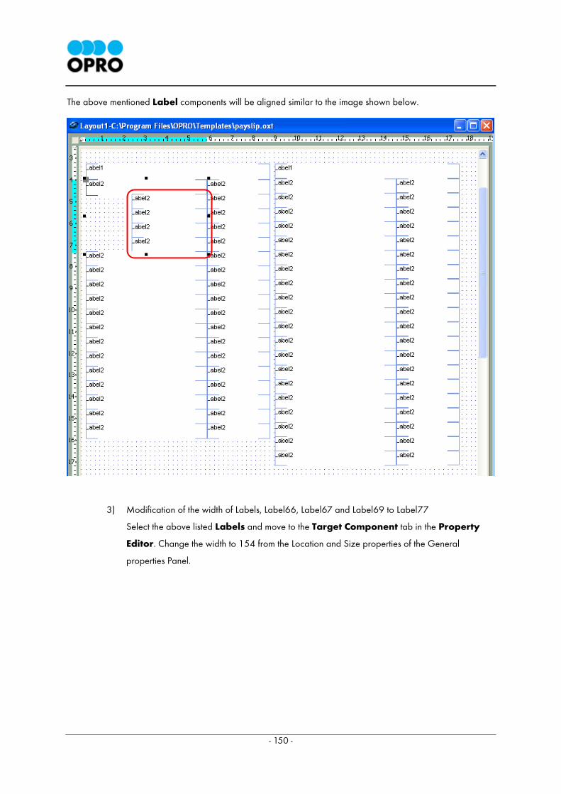
- 150 -
The above mentioned Label components will be aligned similar to the image shown below.
3) Modification of the width of Labels, Label66, Label67 and Label69 to Label77
Select the above listed Labels and move to the Target Component tab in the Property
Editor. Change the width to 154 from the Location and Size properties of the General
properties Panel.
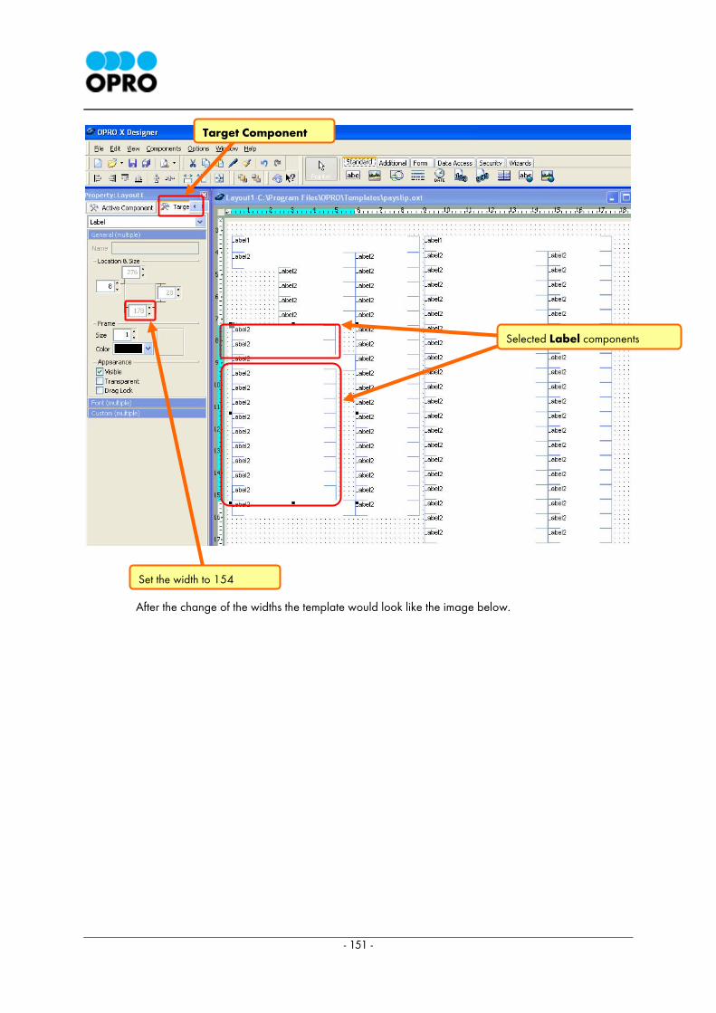
- 151 -
After the change of the widths the template would look like the image below.
Target Component
Set the width to 154
Selected Label components
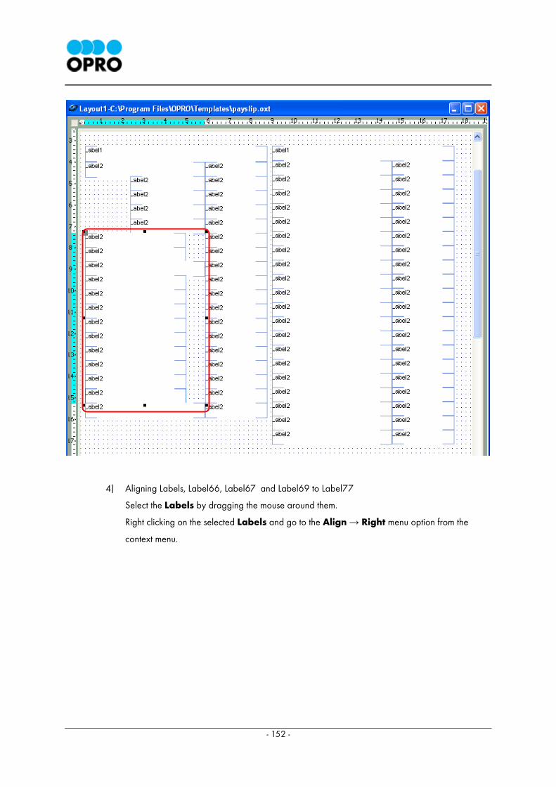
- 152 -
4) Aligning Labels, Label66, Label67 and Label69 to Label77
Select the Labels by dragging the mouse around them.
Right clicking on the selected Labels and go to the Align → Right menu option from the
context menu.
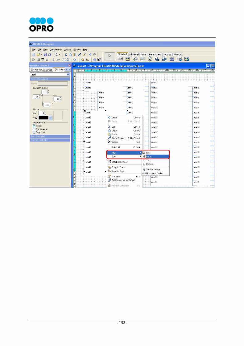
- 153 -

- 154 -
The selected components would be aligned as shown below.
4.4.6 Arranging and aligning of Labels, Label79 to Label82
This section describes the arrangement Label79, Label80, Label81 and Label82 on the template.
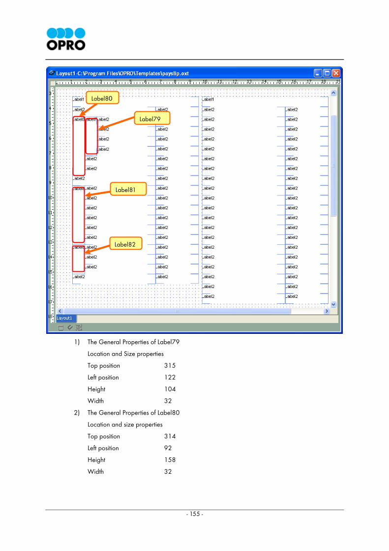
- 155 -
1) The General Properties of Label79
Location and Size properties
Top position 315
Left position 122
Height 104
Width 32
2) The General Properties of Label80
Location and size properties
Top position 314
Left position 92
Height 158
Width 32
Label80
Label79
Label81
Label82
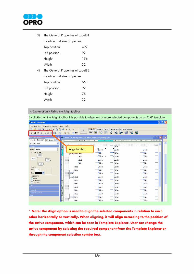
- 156 -
3) The General Properties of Label81
Location and size properties
Top position 497
Left position 92
Height 156
Width 32
4) The General Properties of Label82
Location and size properties
Top position 653
Left position 92
Height 78
Width 32
< Explanation > Using the Align toolbar
By clicking on the Align toolbar it is possible to align two or more selected components on an OXD template.
* Note: The Align option is used to align the selected components in relation to each
other horizontally or vertically. When aligning, it will align according to the position of
the active component, which can be seen in Template Explorer. User can change the
active component by selecting the required component from the Template Explorer or
through the component selection combo box.
Align toolbar
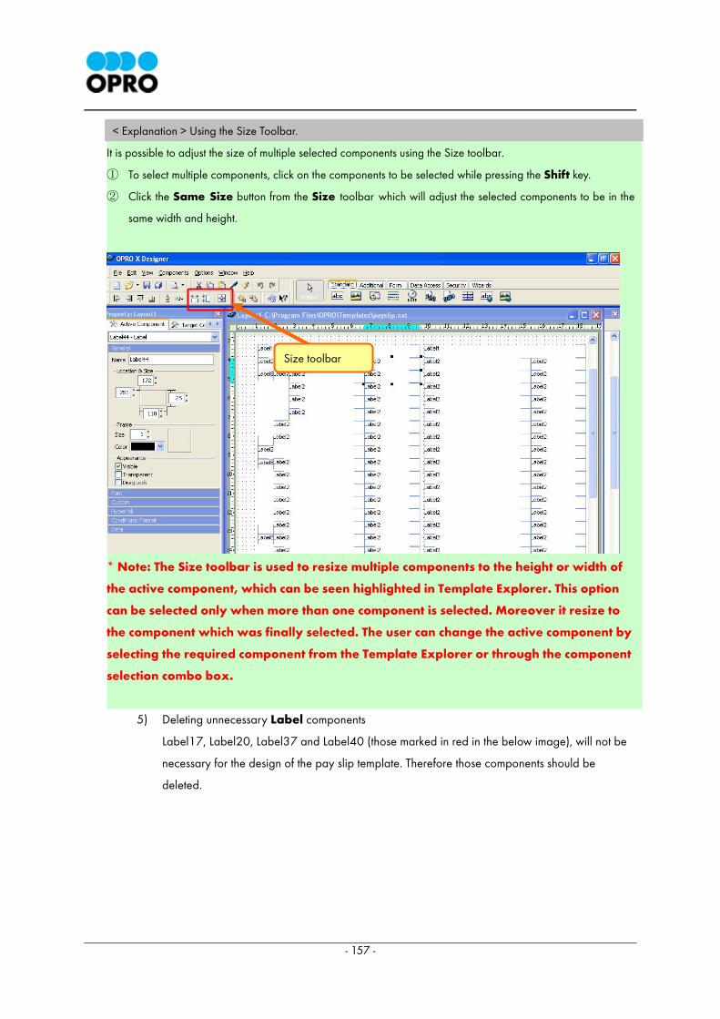
- 157 -
< Explanation > Using the Size Toolbar.
It is possible to adjust the size of multiple selected components using the Size toolbar.
① To select multiple components, click on the components to be selected while pressing the Shift key.
② Click the Same Size button from the Size toolbar which will adjust the selected components to be in the
same width and height.
* Note: The Size toolbar is used to resize multiple components to the height or width of
the active component, which can be seen highlighted in Template Explorer. This option
can be selected only when more than one component is selected. Moreover it resize to
the component which was finally selected. The user can change the active component by
selecting the required component from the Template Explorer or through the component
selection combo box.
5) Deleting unnecessary Label components
Label17, Label20, Label37 and Label40 (those marked in red in the below image), will not be
necessary for the design of the pay slip template. Therefore those components should be
deleted.
Size toolbar
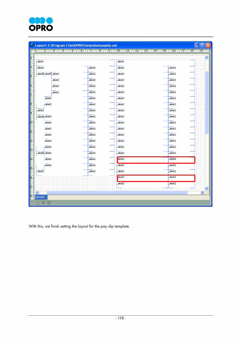
- 158 -
With this, we finish setting the layout for the pay slip template.
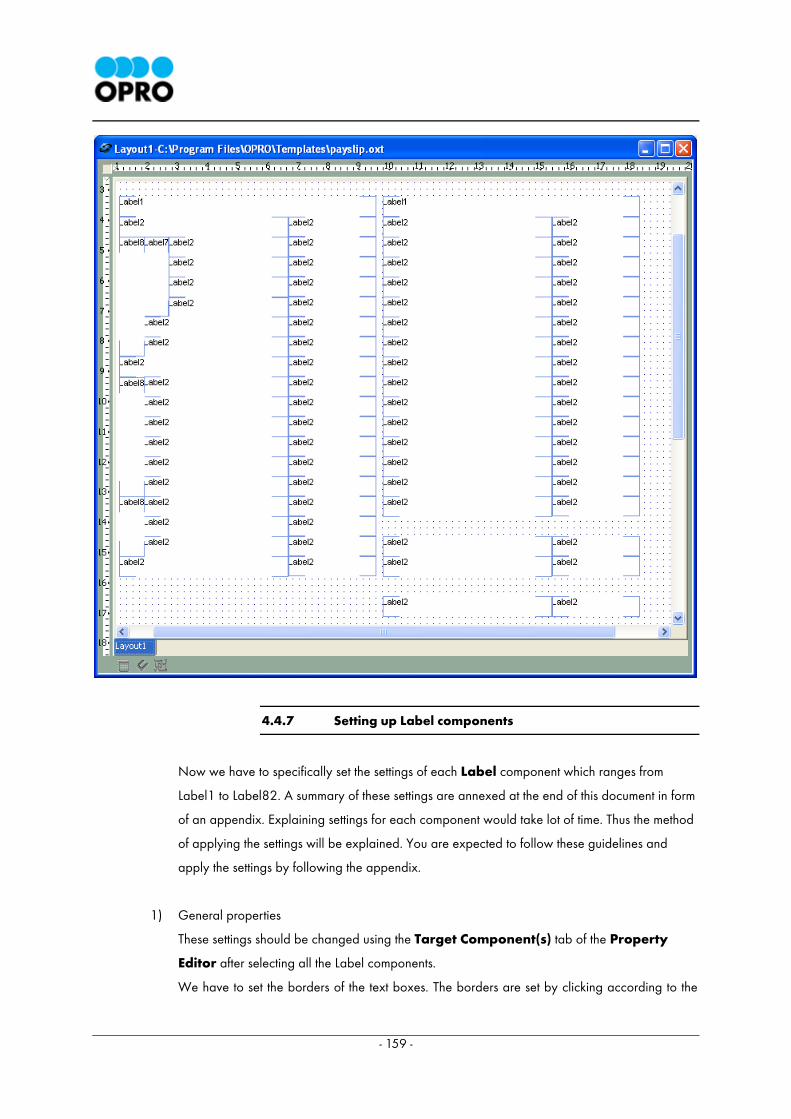
- 159 -
4.4.7 Setting up Label components
Now we have to specifically set the settings of each Label component which ranges from
Label1 to Label82. A summary of these settings are annexed at the end of this document in form
of an appendix. Explaining settings for each component would take lot of time. Thus the method
of applying the settings will be explained. You are expected to follow these guidelines and
apply the settings by following the appendix.
1) General properties
These settings should be changed using the Target Component(s) tab of the Property
Editor after selecting all the Label components.
We have to set the borders of the text boxes. The borders are set by clicking according to the
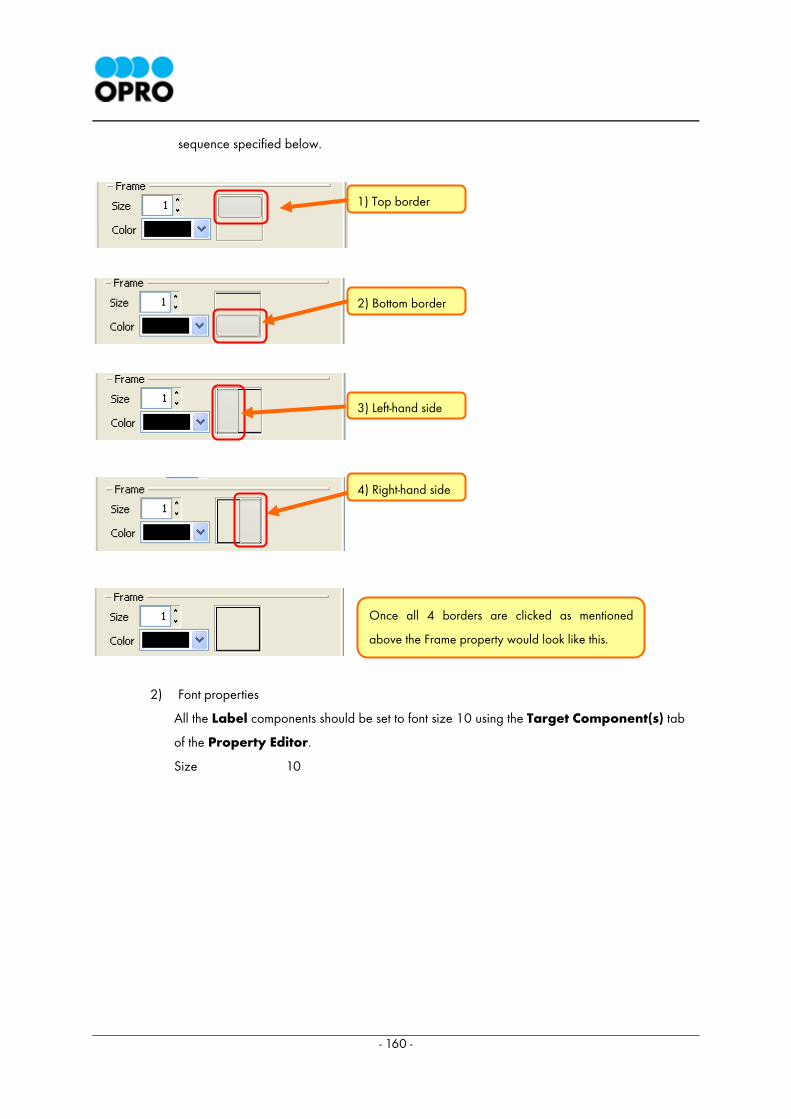
- 160 -
sequence specified below.
2) Font properties
All the Label components should be set to font size 10 using the Target Component(s) tab
of the Property Editor.
Size 10
1) Top border
2) Bottom border
3) Left-hand side
4) Right-hand side
Once all 4 borders are clicked as mentioned
above the Frame property would look like this.
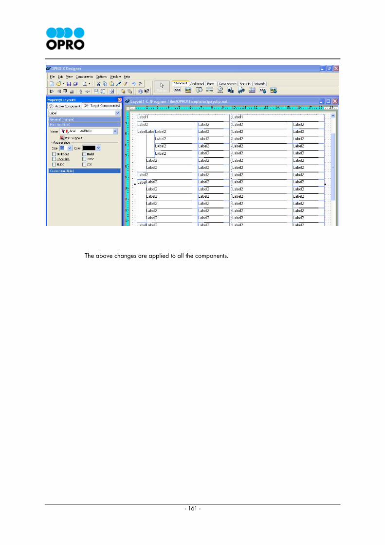
- 161 -
The above changes are applied to all the components.

- 162 -
3) Custom properties
The background color of the components outlined in a red border should be changed to cyan.
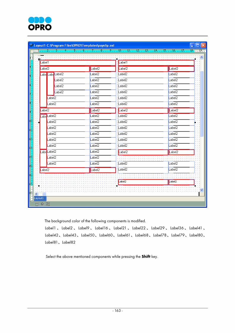
- 163 -
The background color of the following components is modified.
Label1、 Label2、 Label9、 Label16、 Label21、 Label22、 Label29、 Label36、 Label41、
Label42、Label43、Label50、Label60、Label61、Label68、Label78、Label79、Label80、
Label81、Label82
Select the above mentioned components while pressing the Shift key.
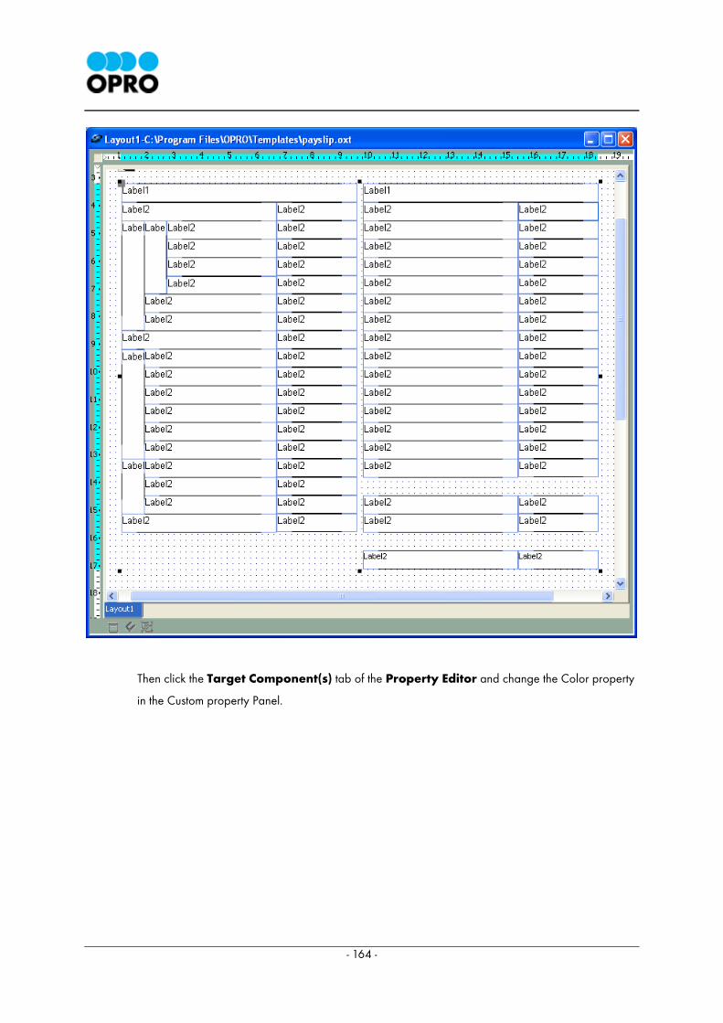
- 164 -
Then click the Target Component(s) tab of the Property Editor and change the Color property
in the Custom property Panel.
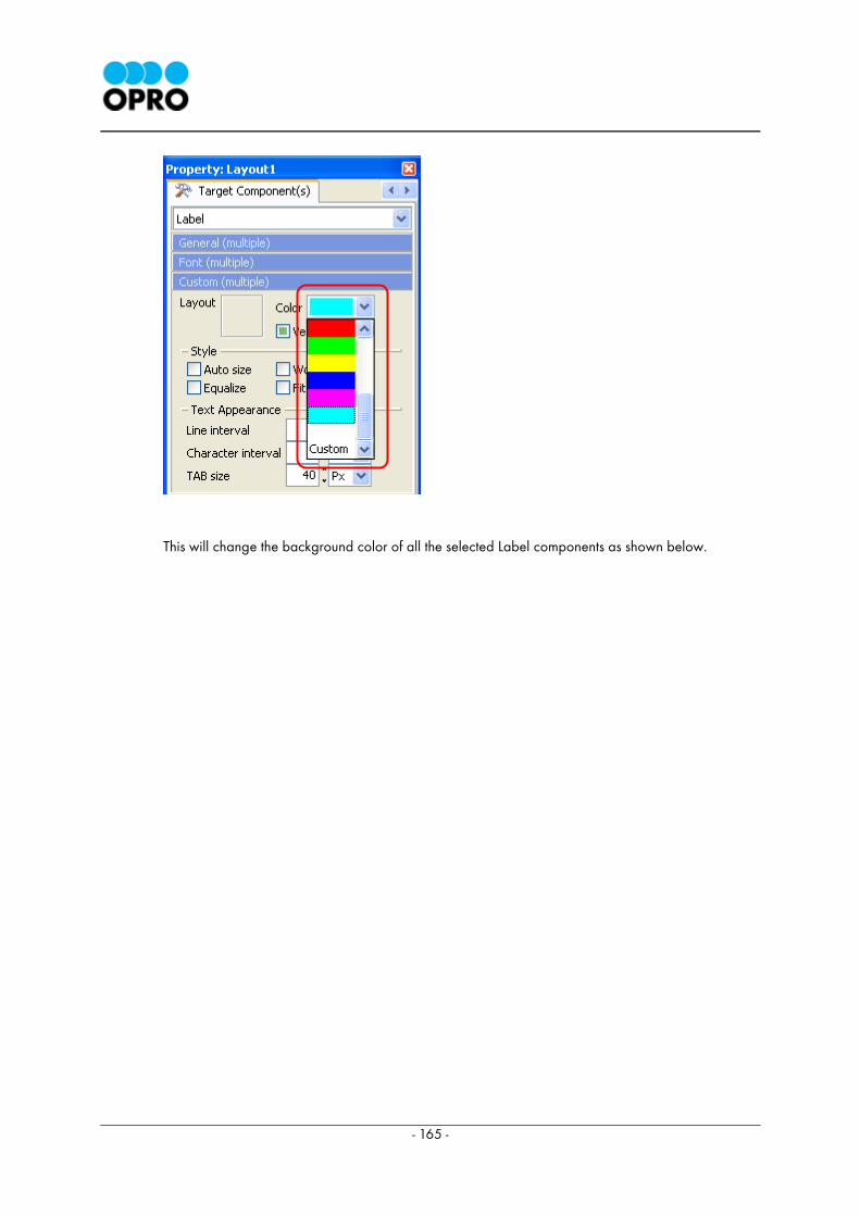
- 165 -
This will change the background color of all the selected Label components as shown below.
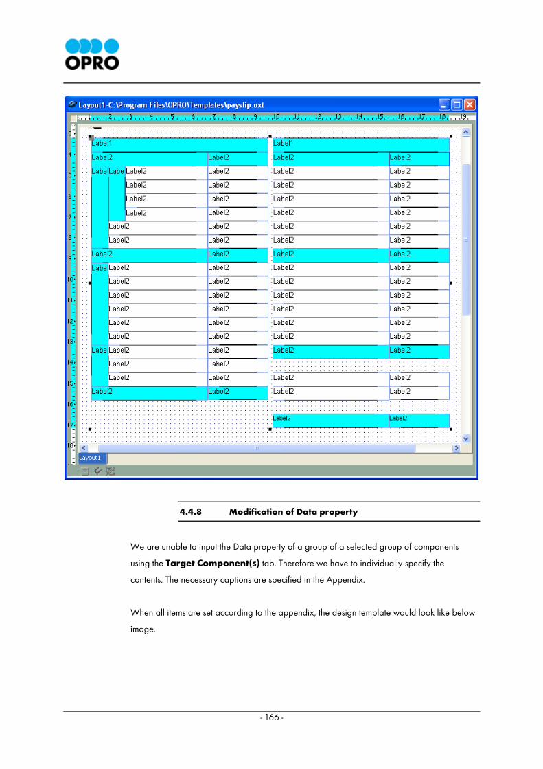
- 166 -
4.4.8 Modification of Data property
We are unable to input the Data property of a group of a selected group of components
using the Target Component(s) tab. Therefore we have to individually specify the
contents. The necessary captions are specified in the Appendix.
When all items are set according to the appendix, the design template would look like below
image.
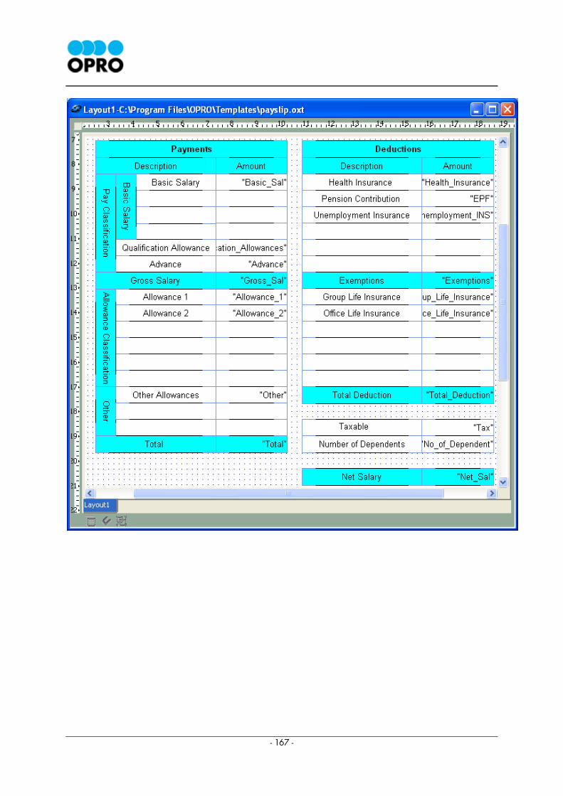
- 167 -
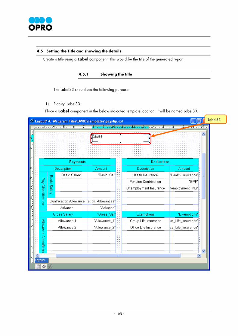
- 168 -
4.5 Setting the Title and showing the details
Create a title using a Label component. This would be the title of the generated report.
4.5.1 Showing the title
The Label83 should use the following purpose.
1) Placing Label83
Place a Label component in the below indicated template location. It will be named Label83.
Label83
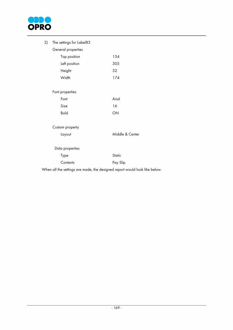
- 169 -
2) The settings for Label83
General properties
Top position 154
Left position 305
Height 32
Width 174
Font properties
Font Arial
Size 16
Bold ON
Custom property
Layout Middle & Center
Data properties
Type Static
Contents Pay Slip
When all the settings are made, the designed report would look like below.
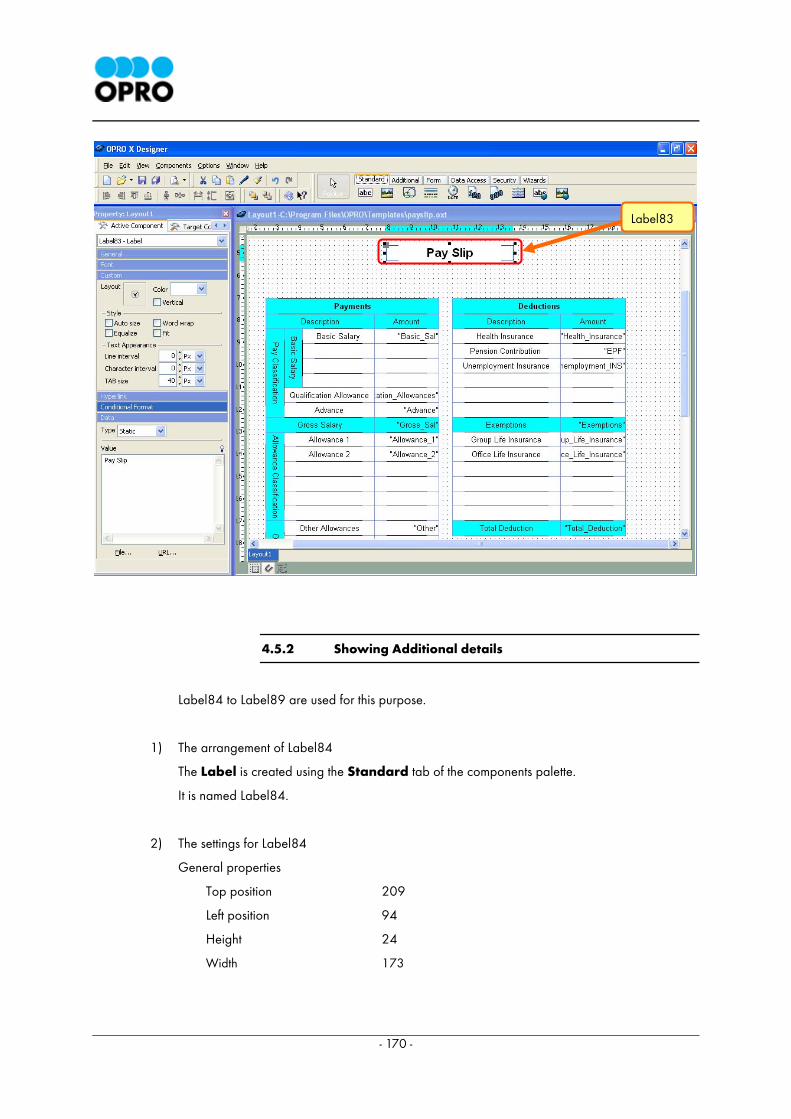
- 170 -
4.5.2 Showing Additional details
Label84 to Label89 are used for this purpose.
1) The arrangement of Label84
The Label is created using the Standard tab of the components palette.
It is named Label84.
2) The settings for Label84
General properties
Top position 209
Left position 94
Height 24
Width 173
Label83
- 171 -
Data properties
Type Database
Dataset Dataset1
Field Month
3) The arrangement of Label85
The Label is created using the Standard tab of the components palette.
It is named Label85.
4) The settings for Label85
General properties
Top position 233
Left position 94
Height 23
Width 82
Data properties
Type Static
Value Employee No:
5) The arrangement of Label86
The Label is created using the Standard tab of the components palette.
It is named Label86.
6) The settings for Label86
General properties
Top position 233
Left position 175
Height 23
Width 92
Data properties
Type Database
Dataset Dataset1
Field Emp_No
- 172 -
7) The arrangement of Label87
The Label is created using the Standard tab of the components palette.
It is named Label87.
8) The settings for Label87
General properties
Top position 208
Left position 280
Height 25
Width 160
Data properties
Type Static
Value OPRO Japan Co., Ltd.
9) The arrangement of Label88
The Label is created using the Standard tab of the components palette.
It is named Label88.
10) The settings for Label88
General properties
Top position 232
Left position 280
Height 24
Width 47
Data properties
Type Static
Value Name:
11) The arrangement of Label89
The Label is created using the Standard tab of the components palette.
It is named Label89.
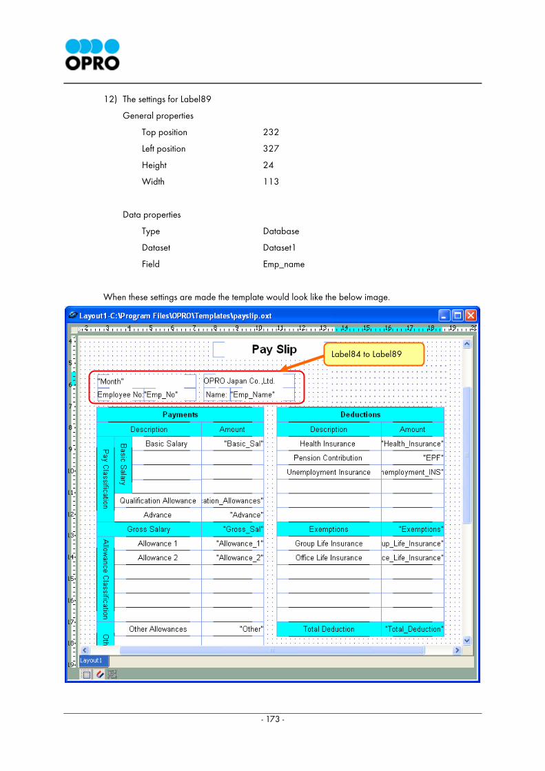
- 173 -
12) The settings for Label89
General properties
Top position 232
Left position 327
Height 24
Width 113
Data properties
Type Database
Dataset Dataset1
Field Emp_name
When these settings are made the template would look like the below image.
Label84 to Label89
- 174 -
13) The arrangement of Label90
The Label is created using the Standard tab of the components palette.
It is named Label90.
14) The settings for Label90
General properties
Top position 205
Left position 511
Height 24
Width 188
The component border is displayed on all four sides.
Custom property
Color Cyan
Data properties
Type Static
Value (No contents)
15) The arrangement of Label91
The Label is created using the Standard tab of the components palette.
It is named Label91.
16) The settings for Label91
General properties
Top position 233
Left position 511
Height 24
Width 188
The component border is displayed on all four sides.
Data property
Type Static
Value (no contents)
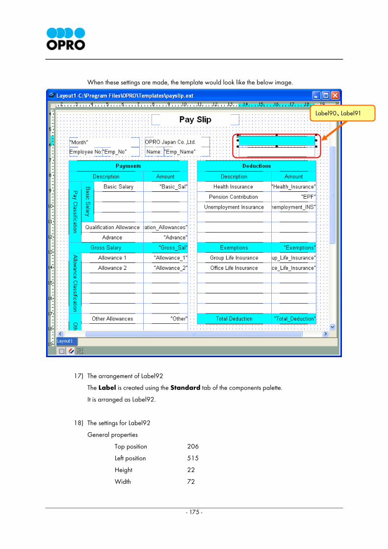
- 175 -
When these settings are made, the template would look like the below image.
17) The arrangement of Label92
The Label is created using the Standard tab of the components palette.
It is arranged as Label92.
18) The settings for Label92
General properties
Top position 206
Left position 515
Height 22
Width 72
Label90、Label91
- 176 -
Transparent On
Custom property
Layout Middle & Center
Data property
Type Static
Contents Over Time/Day
19) The arrangement of Label93
The Label is created using the Standard tab of the components palette.
It is arranged as Label93.
20) The settings for Label93
General properties
Top position 206
Left position 613
Height 22
Width 76
Transparent On
Custom property
Layout Middle & Center
Data property
Type Static
Contents Over Time/Night
21) The arrangement of Label94
The Label is created using the Standard tab of the components palette.
It is arranged as Label94.
- 177 -
22) The settings for Label94
General properties
Top position 234
Left position 523
Height 22
Width 57
Custom property
Layout Middle and Center
Data property
Type Database
Dataset Dataset1
Field OT
23) The arrangement of Label95
The Label is created using the Standard tab of the components palette.
It is arranged as Label95.
24) The settings for Label95
General properties
Top position 234
Left position 615
Height 22
Width 75
Custom property
Layout Middle and Right
Data property
Type Database
Dataset Dataset1
Field Night_OT
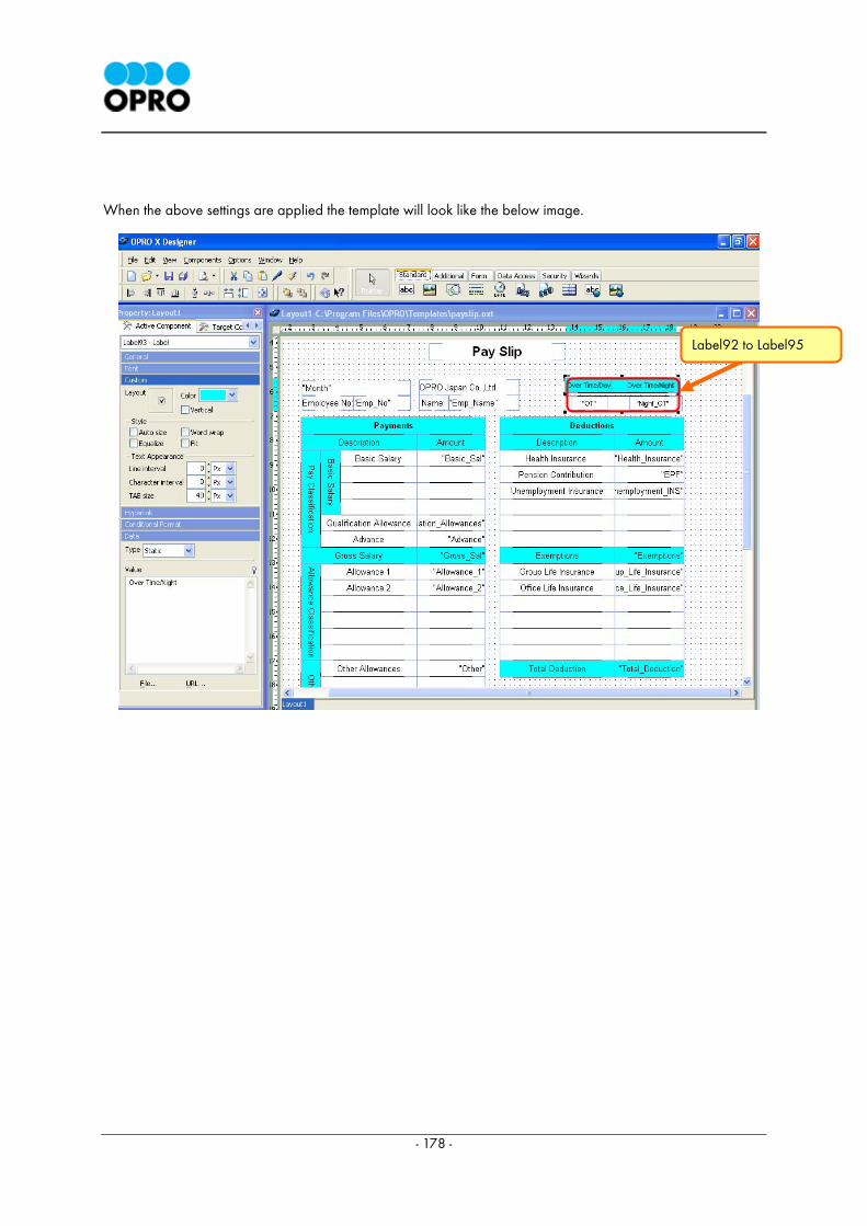
- 178 -
When the above settings are applied the template will look like the below image.
Label92 to Label95
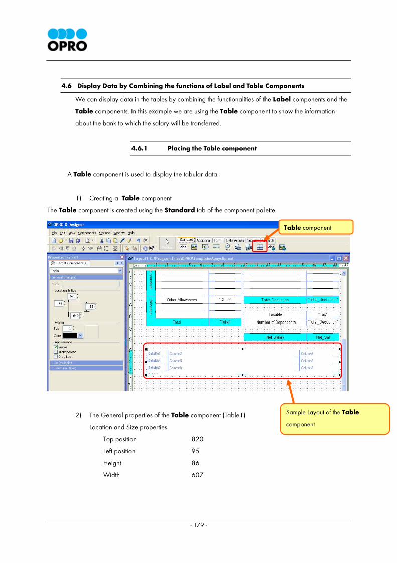
- 179 -
4.6 Display Data by Combining the functions of Label and Table Components
We can display data in the tables by combining the functionalities of the Label components and the
Table components. In this example we are using the Table component to show the information
about the bank to which the salary will be transferred.
4.6.1 Placing the Table component
A Table component is used to display the tabular data.
1) Creating a Table component
The Table component is created using the Standard tab of the component palette.
2) The General properties of the Table component (Table1)
Location and Size properties
Top position 820
Left position 95
Height 86
Width 607
Table component
Sample Layout of the Table
component
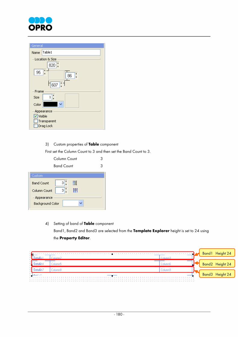
- 180 -
3) Custom properties of Table component
First set the Column Count to 3 and then set the Band Count to 3.
Column Count 3
Band Count 3
4) Setting of band of Table component
Band1, Band2 and Band3 are selected from the Template Explorer height is set to 24 using
the Property Editor.
Band2 Height 24
Band1 Height 24
Band3 Height 24
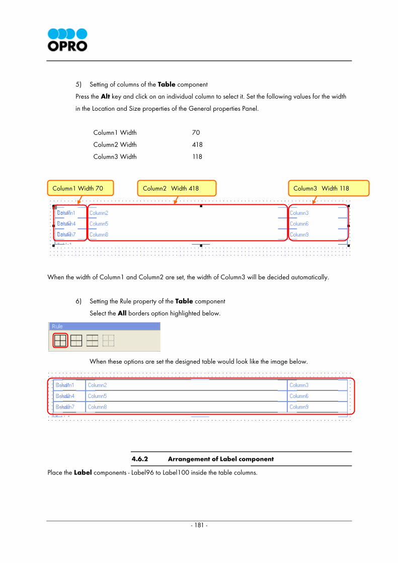
- 181 -
5) Setting of columns of the Table component
Press the Alt key and click on an individual column to select it. Set the following values for the width
in the Location and Size properties of the General properties Panel.
Column1 Width 70
Column2 Width 418
Column3 Width 118
When the width of Column1 and Column2 are set, the width of Column3 will be decided automatically.
6) Setting the Rule property of the Table component
Select the All borders option highlighted below.
When these options are set the designed table would look like the image below.
4.6.2 Arrangement of Label component
Place the Label components - Label96 to Label100 inside the table columns.
Column1 Width 70 Column2 Width 418 Column3 Width 118
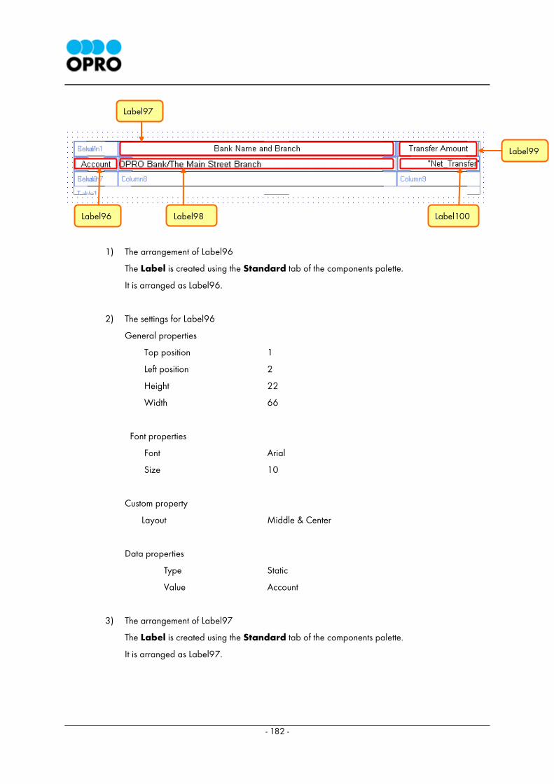
- 182 -
1) The arrangement of Label96
The Label is created using the Standard tab of the components palette.
It is arranged as Label96.
2) The settings for Label96
General properties
Top position 1
Left position 2
Height 22
Width 66
Font properties
Font Arial
Size 10
Custom property
Layout Middle & Center
Data properties
Type Static
Value Account
3) The arrangement of Label97
The Label is created using the Standard tab of the components palette.
It is arranged as Label97.
Label97
Label99
Label100 Label98 Label96
- 183 -
4) The settings for Label97
General properties
Top position 1
Left position 2
Height 22
Width 414
Font properties
Font Arial
Size 10
Custom property
Layout Middle & Center
Data properties
Type Static
Value Bank Name and Branch
5) The arrangement of Label98
The Label is created using the standard tab of the components palette.
It is arranged as Label98.
6) The settings for Label98
General properties
Top position 1
Left position 2
Height 22
Width 414
Font properties
Font Arial
Size 10
Custom property
Layout Middle & Left
- 184 -
Data properties
Type Static
Value OPRO Bank/The Main Street Branch
7) The arrangement of Label99
The Label is created using the Standard tab of the components palette.
8) The settings for Label99
General properties
Top position 0
Left position 2
Height 22
Width 114
Font properties
Font Arial
Size 10
Custom property
Layout Middle & Center
Data properties
Type Static
Value Transfer Amount
9) The arrangement of Label100
The Label is created using the Standard tab of the components palette.
It is arranged as Label100.
10) The settings for Label100
General properties
Top position 0
Left position 2
Height 22
Width 114
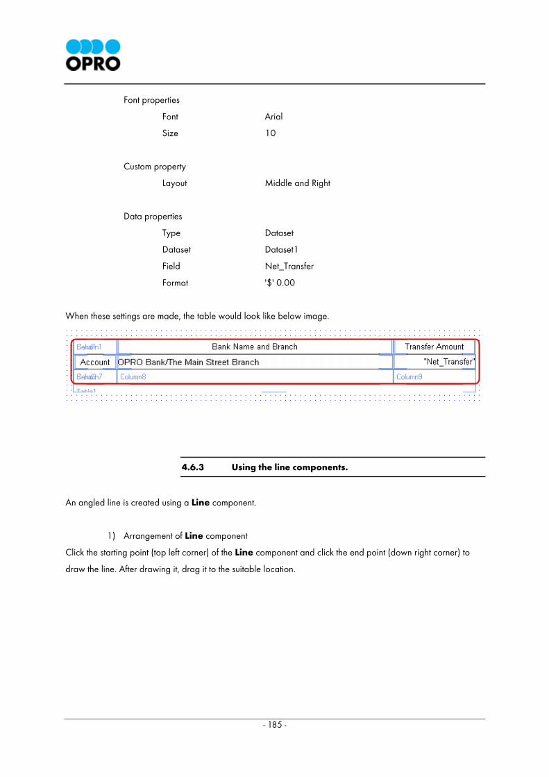
- 185 -
Font properties
Font Arial
Size 10
Custom property
Layout Middle and Right
Data properties
Type Dataset
Dataset Dataset1
Field Net_Transfer
Format '$' 0.00
When these settings are made, the table would look like below image.
4.6.3 Using the line components.
An angled line is created using a Line component.
1) Arrangement of Line component
Click the starting point (top left corner) of the Line component and click the end point (down right corner) to
draw the line. After drawing it, drag it to the suitable location.
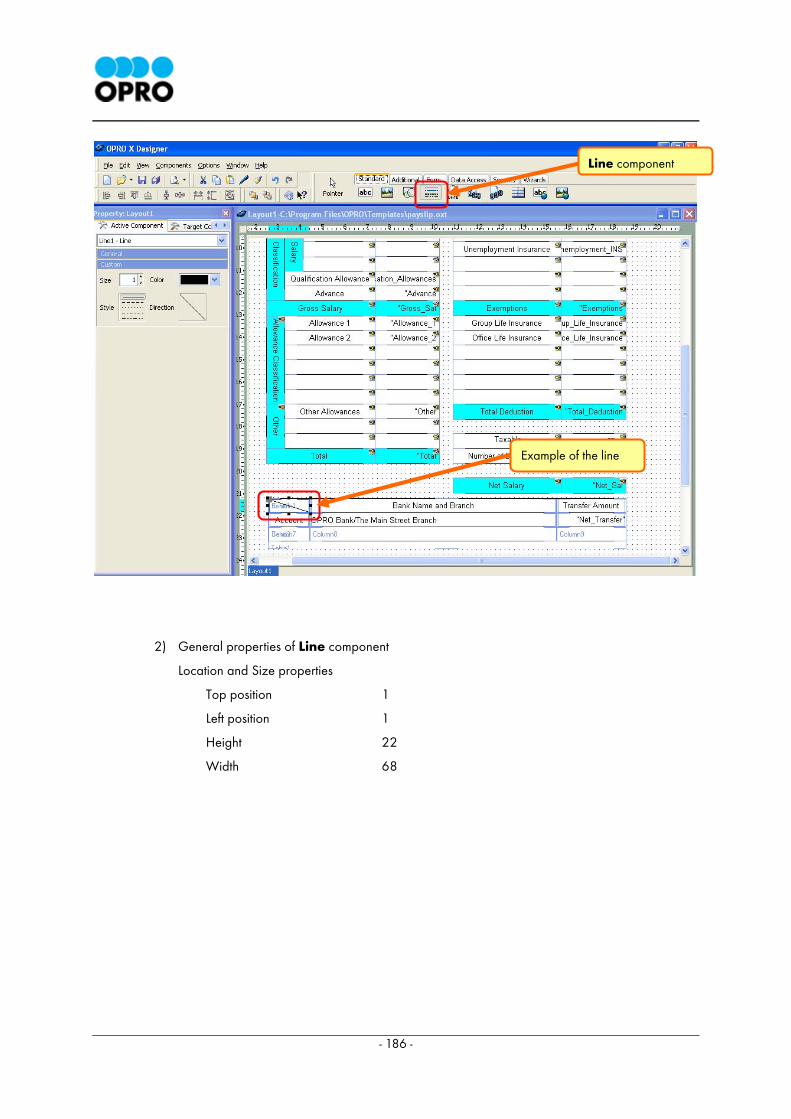
- 186 -
2) General properties of Line component
Location and Size properties
Top position 1
Left position 1
Height 22
Width 68
Line component
Example of the line
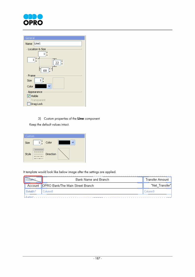
- 187 -
3) Custom properties of the Line component
Keep the default values intact.
It template would look like below image after the settings are applied.
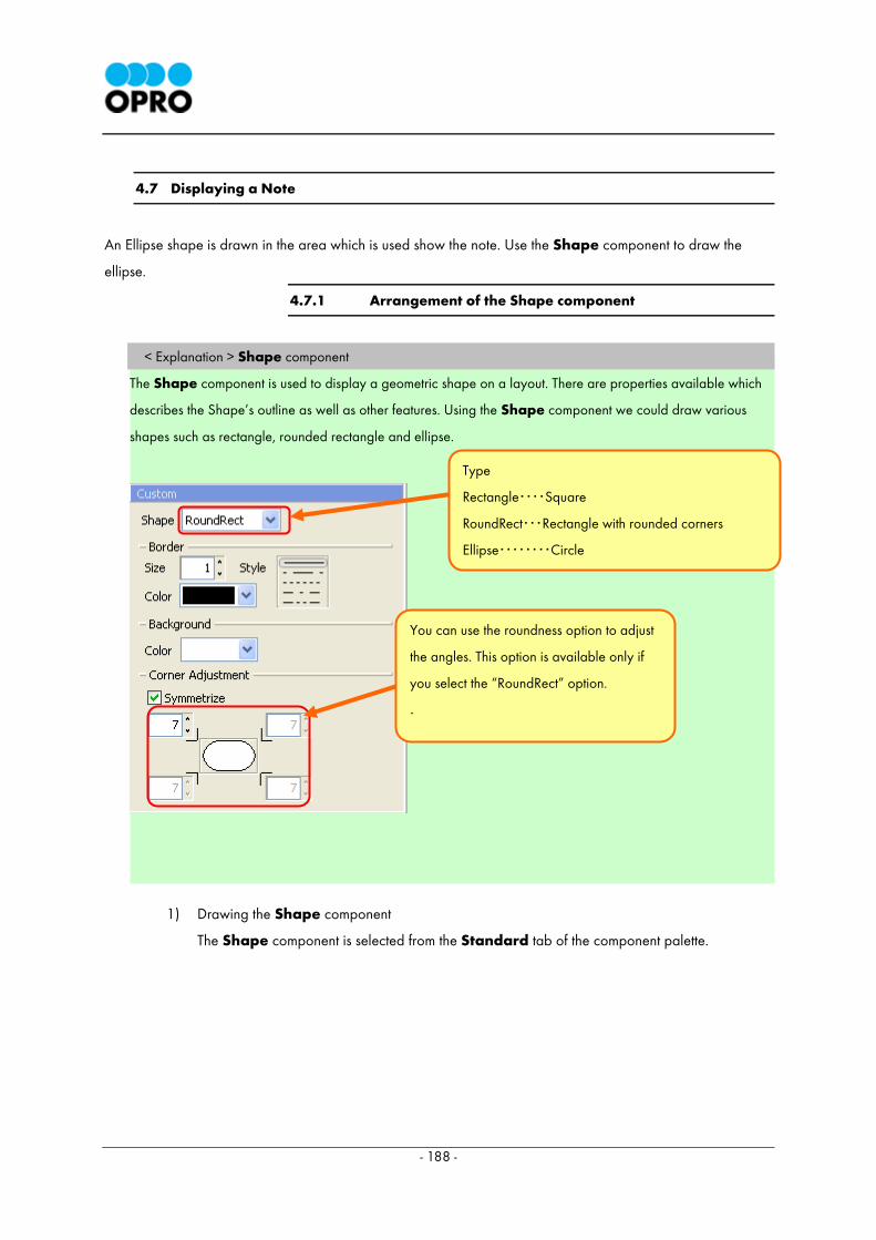
- 188 -
4.7 Displaying a Note
An Ellipse shape is drawn in the area which is used show the note. Use the Shape component to draw the
ellipse.
4.7.1 Arrangement of the Shape component
< Explanation > Shape component
The Shape component is used to display a geometric shape on a layout. There are properties available which
describes the Shape’s outline as well as other features. Using the Shape component we could draw various
shapes such as rectangle, rounded rectangle and ellipse.
1) Drawing the Shape component
The Shape component is selected from the Standard tab of the component palette.
Type
Rectangle・・・・Square
RoundRect・・・Rectangle with rounded corners
Ellipse・・・・・・・・Circle
You can use the roundness option to adjust
the angles. This option is available only if
you select the “RoundRect” option.
.
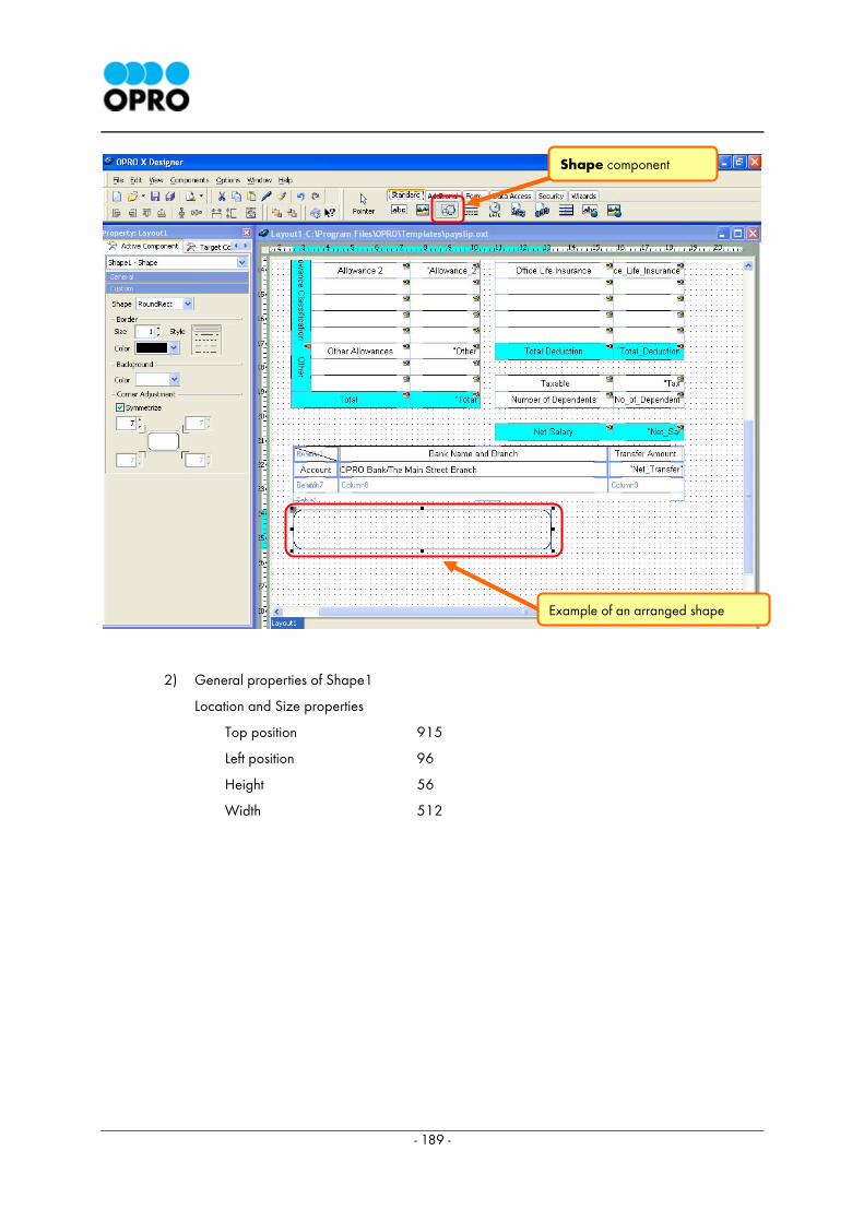
- 189 -
2) General properties of Shape1
Location and Size properties
Top position 915
Left position 96
Height 56
Width 512
Shape component
Example of an arranged shape
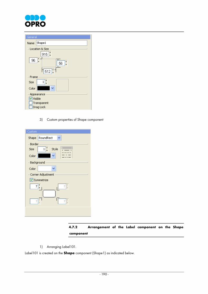
- 190 -
3) Custom properties of Shape component
4.7.2 Arrangement of the Label component on the Shape
component
1) Arranging Label101.
Label101 is created on the Shape component (Shape1) as indicated below.
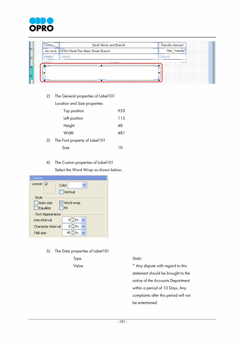
- 191 -
2) The General properties of Label101
Location and Size properties
Top position 920
Left position 115
Height 48
Width 481
3) The Font property of Label101
Size 10
4) The Custom properties of Label101
Select the Word Wrap as shown below.
5) The Data properties of Label101
Type Static
Value * Any dispute with regard to this
statement should be brought to the
notice of the Accounts Department
within a period of 10 Days. Any
complaints after this period will not
be entertained.
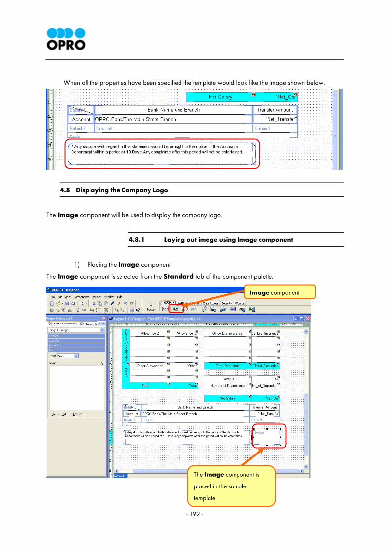
- 192 -
When all the properties have been specified the template would look like the image shown below.
4.8 Displaying the Company Logo
The Image component will be used to display the company logo.
4.8.1 Laying out image using Image component
1) Placing the Image component
The Image component is selected from the Standard tab of the component palette.
Image component
The Image component is
placed in the sample
template
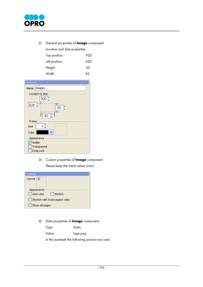
- 193 -
2) General properties of Image component
Location and Size properties
Top position 920
Left position 620
Height 50
Width 82
3) Custom properties of Image component
Please keep the initial values intact.
4) Data properties of Image component
Type Static
Value logo.png
In this example the following picture was used.
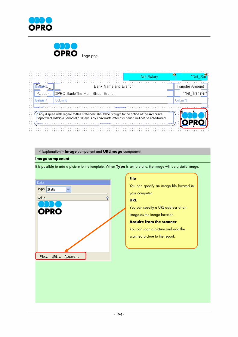
- 194 -
Logo.png
< Explanation > Image component and URLImage component
Image component
It is possible to add a picture to the template. When Type is set to Static, the image will be a static image.
File
You can specify an image file located in
your computer.
URL
You can specify a URL address of an
image as the image location.
Acquire from the scanner
You can scan a picture and add the
scanned picture to the report.
- 195 -
When Type is set to "Database", the image will be taken from a database.
URLImage component
If the URLImage component is used, you can specify an image located in a web site as the image to be used.
You can specify the web address of the image. It will not set the picture image itself to the template but the
specified image will be displayed in the data report.
Type of the Data property could be on of the following types.
・Static URL address of picture is specified.
・Request When the selected type is "Request", and when previewing the template, the OXD will
display an input box to input the value before preview. Thereafter the corresponding values will pass to the OXS.
If the template has any component with request type, when generating the Sample HTML page, it can define the
default request value in 'Request Value' tab.
・Database When selecting the type as "Database", the value which has to be displayed is extracted
from the database field selected .
URLPrefix and URLSuffix
Both these properties are displayed when Request or Database type is selected from the Type combo box. For
example when a web site contains images and if requests are made to these images frequently, then the URL
path can be specified in the URLPrefix and the type of the image can be specified in URLSuffix. Thereby user can
merely enter the image name when the template is displayed.
Example
The following example will explain the "URL prefix" and “URL suffix” for a graphics file URL.
http://www.opro.lk/image1.jpg http://www.opro.lk/image2.jpg http://www.opro.lk/image3.jpg
URL prefix: http: //www.opro.lk/image URL suffix: Jpg
Type http://www.opro.lk/image in URLPrefix and .jpg in URLSuffix. When the template is displayed, the users
only have to type the number 1 or 2 or 3 to call the image. This will eliminate entering the whole path
repetitively.
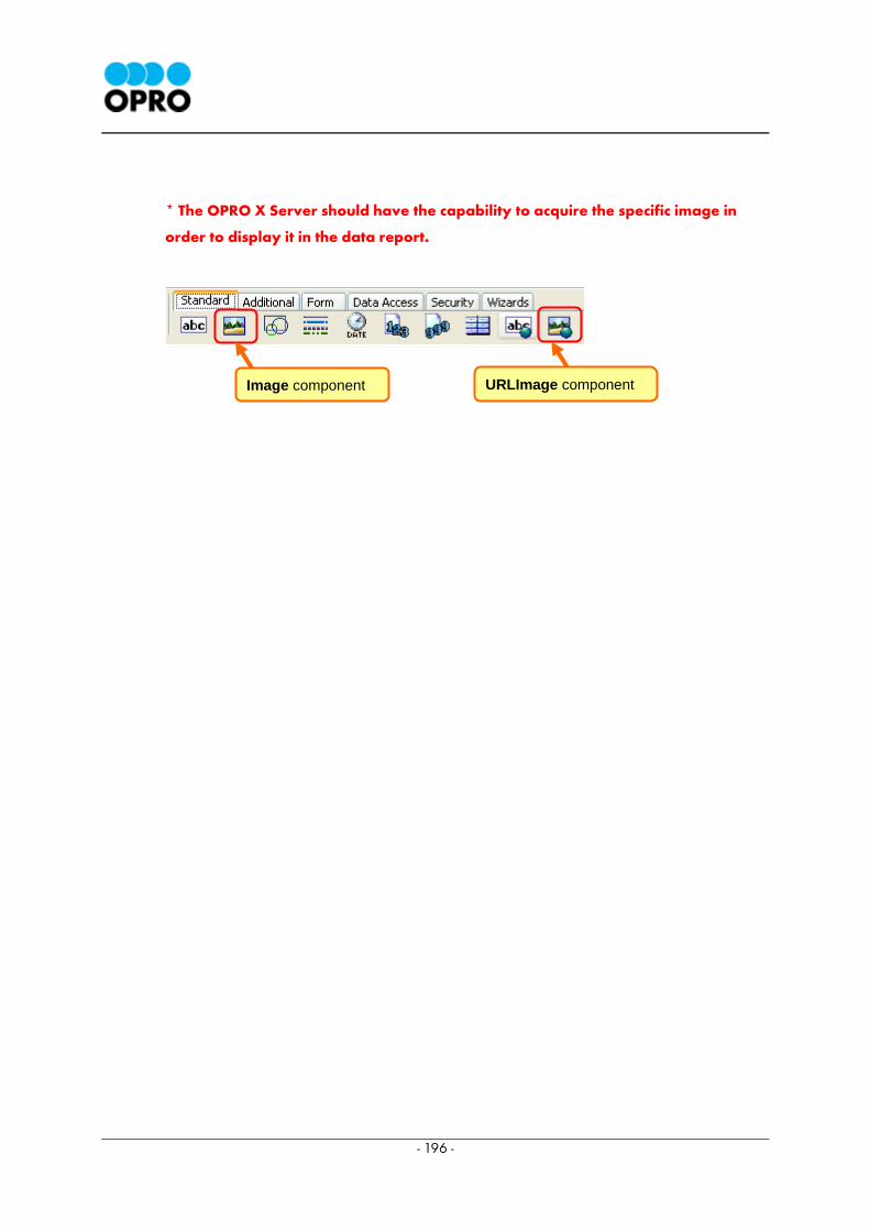
- 196 -
* The OPRO X Server should have the capability to acquire the specific image in
order to display it in the data report.
Image component URLImage component
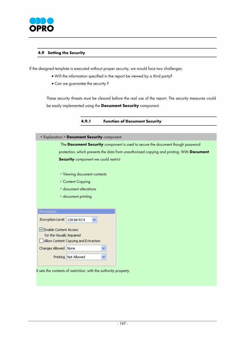
- 197 -
4.9 Setting the Security
If the designed template is executed without proper security, we would face two challenges.
• Will the information specified in the report be viewed by a third party?
• Can we guarantee the security ?
These security threats must be cleared before the real use of the report. The security measures could
be easily implemented using the Document Security component.
4.9.1 Function of Document Security
< Explanation > Document Security component
The Document Security component is used to secure the document though password
protection, which prevents the data from unauthorized copying and printing. With Document
Security component we could restrict
・Viewing document contents
・Content Copying
・document alterations
・document printing
It sets the contents of restriction, with the authority property.
- 198 -
The users can specify two passwords.
Master password Protects against the altering of the document permissions. It is necessary to set this
password. When the user enters this password when opening document, he/she can
read the document with full access permissions.
User password Protects the document from being opened by everyone and it is necessary to set this
password. The User Password will be required when opening the document by a
document viewer, such as OXB. A single Document Security component can be
placed on a template.
*Note: The Type property is used to select the type of the content input for the component. The user can select
from Static, Request or Database types
*Note: You cannot use more than one Document Security component for a template. The maximum length
for Master and User password is 15 characters.
4.9.2 Placing the Document Security component
1) Creating the DocumentSecurity component
The DocumentSecurity component is selected from the Security tab of the component
palette.
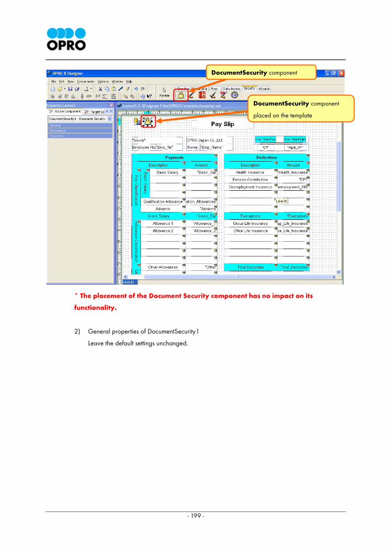
- 199 -
* The placement of the Document Security component has no impact on its
functionality.
2) General properties of DocumentSecurity1
Leave the default settings unchanged.
DocumentSecurity component
DocumentSecurity component
placed on the template
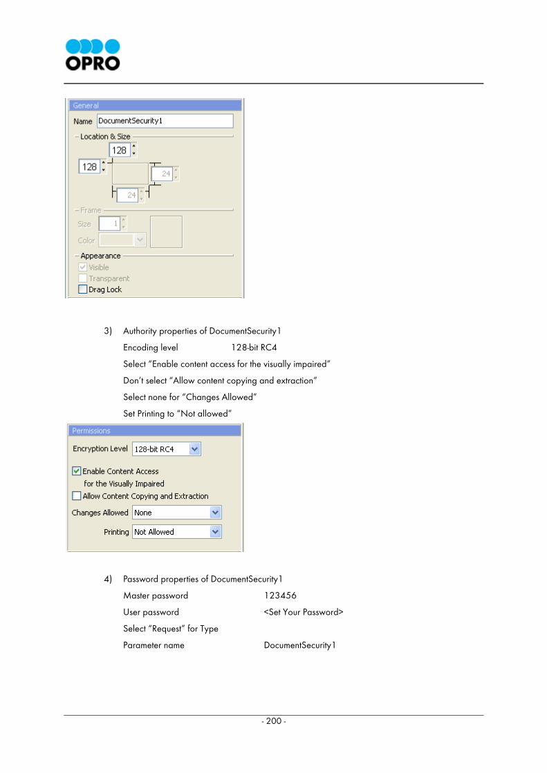
- 200 -
3) Authority properties of DocumentSecurity1
Encoding level 128-bit RC4
Select “Enable content access for the visually impaired”
Don’t select “Allow content copying and extraction”
Select none for “Changes Allowed”
Set Printing to “Not allowed”
4) Password properties of DocumentSecurity1
Master password 123456
User password <Set Your Password>
Select “Request” for Type
Parameter name DocumentSecurity1

- 201 -
When user password is requested during report generation, it will be requested using the
parameter name "DocumentSecurity1".
< Explanation > Setting the encoding level to 40-bit RC4,
In this example, we use 128-bit RC4, but it is also possible to use 40-bit RC4.
If 40-bit RC4 is used you will have to specify the following settings.
・No Printing
・No Changing the document
・No content copying or Extraction , Disable Accessibility
・No adding or Changing comments and Form fields
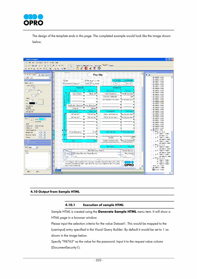
- 202 -
The design of the template ends in this page. The completed example would look like the image shown
below.
4.10 Output from Sample HTML
4.10.1 Execution of sample HTML
Sample HTML is created using the Generate Sample HTML menu item. It will show a
HTML page in a browser window.
Please input the selection criteria for the value Dataset1. This would be mapped to the
{userinput} entry specified in the Visual Query Builder. By default it would be set to 1 as
shown in the image below.
Specify "98765" as the value for the password. Input it to the request value column
(DocumentSecurity1).
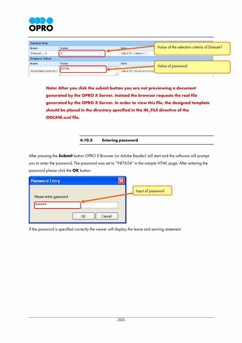
- 203 -
Note: After you click the submit button you are not previewing a document
generated by the OPRO X Server. Instead the browser requests the real file
generated by the OPRO X Server. In order to view this file, the designed template
should be placed in the directory specified in the IN_FILE directive of the
ODCAW.xml file.
4.10.2 Entering password
After pressing the Submit button OPRO X Browser (or Adobe Reader) will start and the software will prompt
you to enter the password. The password was set to “987654” in the sample HTML page. After entering the
password please click the OK button.
If the password is specified correctly the viewer will display the leave and earning statement.
Value of the selection criteria of Dataset1
Value of password
Input of password

- 204 -
Our objective was to design a report which is similar to the above table. The created report is attractive and
has high security. If you followed the guidelines carefully the designed report may look similar to the above
report.
After this page you will find an appendix which explains details of all the Labels used in the payslip created in
the example. While you are designing the template you can refer to this appendix.
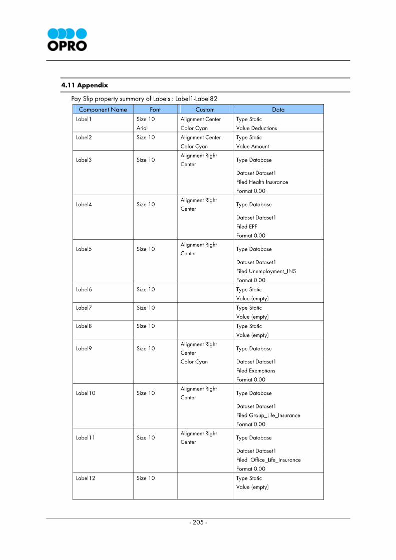
- 205 -
4.11 Appendix
Pay Slip property summary of Labels : Label1-Label82
Component Name Font Custom Data Label1 Size 10 Alignment Center Type Static
Arial Color Cyan Value Deductions
Label2 Size 10 Alignment Center Type Static
Color Cyan Value Amount
Label3 Size 10 Alignment Right
Center Type Database
Dataset Dataset1
Filed Health Insurance
Format 0.00
Label4 Size 10 Alignment Right
Center Type Database
Dataset Dataset1
Filed EPF
Format 0.00
Label5 Size 10 Alignment Right
Center Type Database
Dataset Dataset1
Filed Unemployment_INS
Format 0.00
Label6 Size 10 Type Static
Value (empty)
Label7 Size 10 Type Static
Value (empty)
Label8 Size 10 Type Static
Value (empty)
Label9 Size 10 Alignment Right
Center Type Database
Color Cyan Dataset Dataset1
Filed Exemptions
Format 0.00
Label10 Size 10 Alignment Right
Center Type Database
Dataset Dataset1
Filed Group_Life_Insurance
Format 0.00
Label11 Size 10 Alignment Right
Center Type Database
Dataset Dataset1
Filed Office_Life_Insurance
Format 0.00
Label12 Size 10 Type Static
Value (empty)
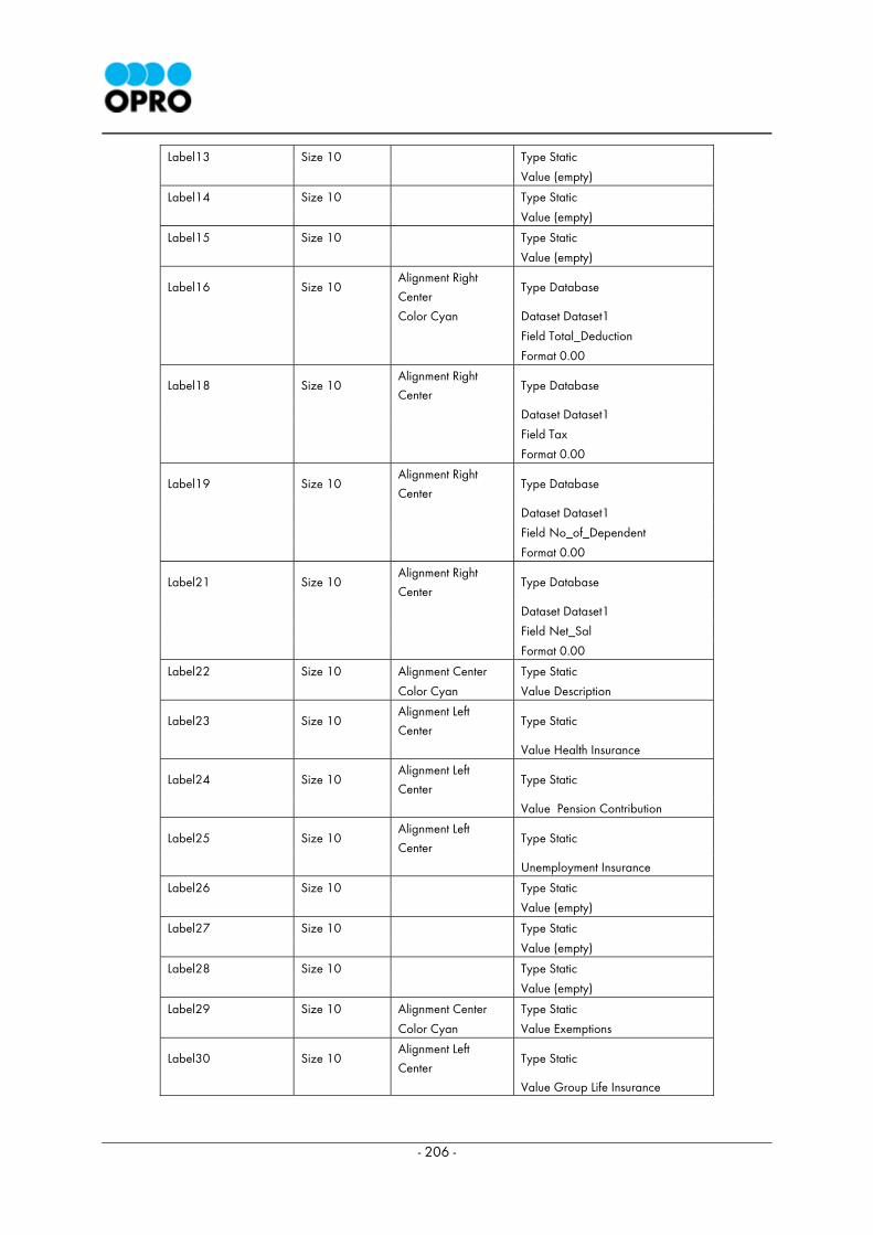
- 206 -
Label13 Size 10 Type Static
Value (empty)
Label14 Size 10 Type Static
Value (empty)
Label15 Size 10 Type Static
Value (empty)
Label16 Size 10 Alignment Right
Center Type Database
Color Cyan Dataset Dataset1
Field Total_Deduction
Format 0.00
Label18 Size 10 Alignment Right
Center Type Database
Dataset Dataset1
Field Tax
Format 0.00
Label19 Size 10 Alignment Right
Center Type Database
Dataset Dataset1
Field No_of_Dependent
Format 0.00
Label21 Size 10 Alignment Right
Center Type Database
Dataset Dataset1
Field Net_Sal
Format 0.00
Label22 Size 10 Alignment Center Type Static
Color Cyan Value Description
Label23 Size 10 Alignment Left
Center Type Static
Value Health Insurance
Label24 Size 10 Alignment Left
Center Type Static
Value Pension Contribution
Label25 Size 10 Alignment Left
Center Type Static
Unemployment Insurance
Label26 Size 10 Type Static
Value (empty)
Label27 Size 10 Type Static
Value (empty)
Label28 Size 10 Type Static
Value (empty)
Label29 Size 10 Alignment Center Type Static
Color Cyan Value Exemptions
Label30 Size 10 Alignment Left
Center Type Static
Value Group Life Insurance
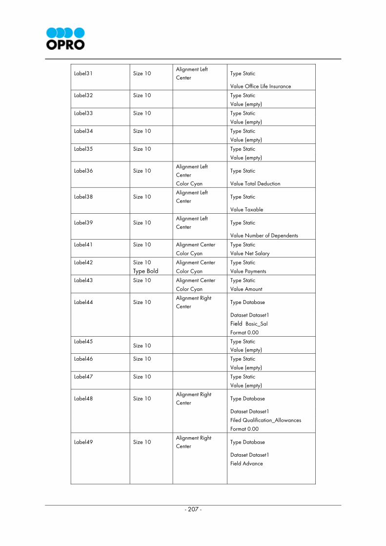
- 207 -
Label31 Size 10 Alignment Left
Center Type Static
Value Office Life Insurance
Label32 Size 10 Type Static
Value (empty)
Label33 Size 10 Type Static
Value (empty)
Label34 Size 10 Type Static
Value (empty)
Label35 Size 10 Type Static
Value (empty)
Label36 Size 10 Alignment Left
Center Type Static
Color Cyan Value Total Deduction
Label38 Size 10 Alignment Left
Center Type Static
Value Taxable
Label39 Size 10 Alignment Left
Center Type Static
Value Number of Dependents
Label41 Size 10 Alignment Center Type Static
Color Cyan Value Net Salary
Label42 Size 10 Alignment Center Type Static
Type Bold Color Cyan Value Payments
Label43 Size 10 Alignment Center Type Static
Color Cyan Value Amount
Label44 Size 10 Alignment Right
Center Type Database
Dataset Dataset1
Field Basic_Sal
Format 0.00
Label45
Size 10
Type Static
Value (empty)
Label46 Size 10 Type Static
Value (empty)
Label47 Size 10 Type Static
Value (empty)
Label48 Size 10 Alignment Right
Center Type Database
Dataset Dataset1
Filed Qualification_Allowances
Format 0.00
Label49 Size 10 Alignment Right
Center Type Database
Dataset Dataset1
Field Advance
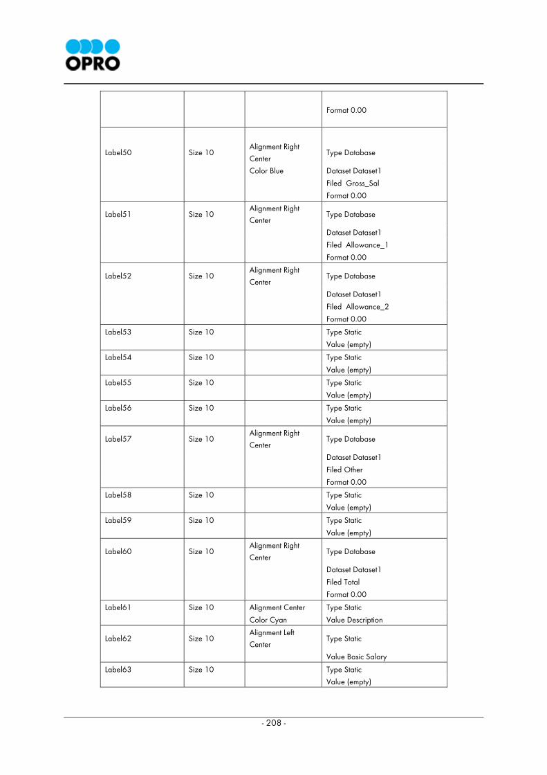
- 208 -
Format 0.00
Label50
Size 10
Alignment Right
Center
Type Database
Color Blue Dataset Dataset1
Filed Gross_Sal
Format 0.00
Label51 Size 10 Alignment Right
Center Type Database
Dataset Dataset1
Filed Allowance_1
Format 0.00
Label52 Size 10 Alignment Right
Center Type Database
Dataset Dataset1
Filed Allowance_2
Format 0.00
Label53 Size 10 Type Static
Value (empty)
Label54 Size 10 Type Static
Value (empty)
Label55 Size 10 Type Static
Value (empty)
Label56 Size 10 Type Static
Value (empty)
Label57 Size 10 Alignment Right
Center Type Database
Dataset Dataset1
Filed Other
Format 0.00
Label58 Size 10 Type Static
Value (empty)
Label59 Size 10 Type Static
Value (empty)
Label60 Size 10 Alignment Right
Center Type Database
Dataset Dataset1
Filed Total
Format 0.00
Label61 Size 10 Alignment Center Type Static
Color Cyan Value Description
Label62 Size 10 Alignment Left
Center Type Static
Value Basic Salary
Label63 Size 10 Type Static
Value (empty)
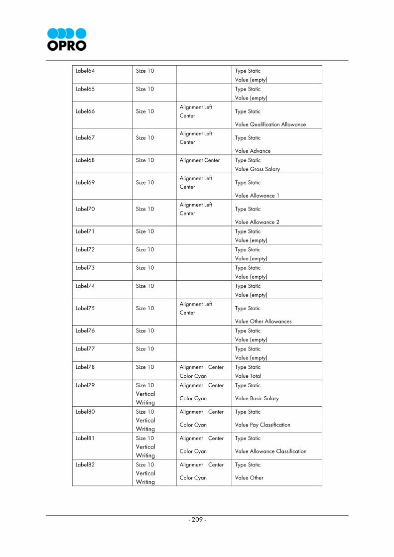
- 209 -
Label64 Size 10 Type Static
Value (empty)
Label65 Size 10 Type Static
Value (empty)
Label66 Size 10 Alignment Left
Center Type Static
Value Qualification Allowance
Label67 Size 10 Alignment Left
Center Type Static
Value Advance
Label68 Size 10 Alignment Center Type Static
Value Gross Salary
Label69 Size 10 Alignment Left
Center Type Static
Value Allowance 1
Label70 Size 10 Alignment Left
Center Type Static
Value Allowance 2
Label71 Size 10 Type Static
Value (empty)
Label72 Size 10 Type Static
Value (empty)
Label73 Size 10 Type Static
Value (empty)
Label74 Size 10 Type Static
Value (empty)
Label75 Size 10 Alignment Left
Center Type Static
Value Other Allowances
Label76 Size 10 Type Static
Value (empty)
Label77 Size 10 Type Static
Value (empty)
Label78 Size 10 Alignment Center Type Static
Color Cyan Value Total
Label79 Size 10 Alignment Center Type Static
Vertical Writing
Color Cyan Value Basic Salary
Label80 Size 10 Alignment Center Type Static
Vertical Writing
Color Cyan Value Pay Classification
Label81 Size 10 Alignment Center Type Static
Vertical Writing
Color Cyan Value Allowance Classification
Label82 Size 10 Alignment Center Type Static
Vertical Writing
Color Cyan Value Other

- 210 -
This is end of the 4th Chapter.
Release Date : July 20, 2007
OPRO X Server 2.6.0
OPRO X Designer 2.6.0
OPRO X Browser 2.6.0

211