
Network Diagrams Guideline document - Motorola Solutions
49
NETWORK DIAGRAMS GUIDELINE DOCUMENT
-
Upload
khangminh22 -
Category
Documents
-
view
0 -
download
0
Transcript of Network Diagrams Guideline document - Motorola Solutions
NETWORK DIAGRAMSGUIDELINE DOCUMENT

PURPOSEOur new iconography plays an important role within our brand’s visual system.A network diagram is a visual representation of an actual system, architecture, product, software or service, and it relies on this iconography to visually represent components and how they relate to one another. Network diagrams stand alone from our typical Motorola Solutions illustrations.
Building on this cleaner, more contemporary look of our iconography, we've added graphical elements, embellishments and color to provide a consistent and simplified approach to creating network diagrams. Combined with content, these elements will help communicate complex systems by visually tying together physical components and the relationships that exist between them.
This simple approach is bold and concise and is a reflection of our visual identity.
As an employee, creative agency or contractor, use this guidance to understand our new visual style. It highlights specifications – including the use of iconography, color, typography, spacing, and graphical elements such as lines and embellishments.

ARTBOARD SETUP

ARTBOARDDOWNLOADABLE TEMPLATES
Network diagrams are designed to fit our standard rule of thirds. This is the most common format used within collaterals. We have created 4 artboard templates for designers to create their layouts. These templates include a ⅓ horizontal layout, ⅔ horizontal, ⅓ vertical, and ⅔ vertical. This will ensure consistency across all assets.
After the initial layout is complete, the composition can be scaled up or down to fit any specific size needed. Scaled stroke and effects must be checked for all icons, lines, and embellishments to scale in proportion. Adjustments may be needed once finalized and are up to the discretion of the designer.
⅓ vertical template
⅔ horizontal template⅓ horizontal template
⅔ vertical template
download master template .25in

ICONOGRAPHY
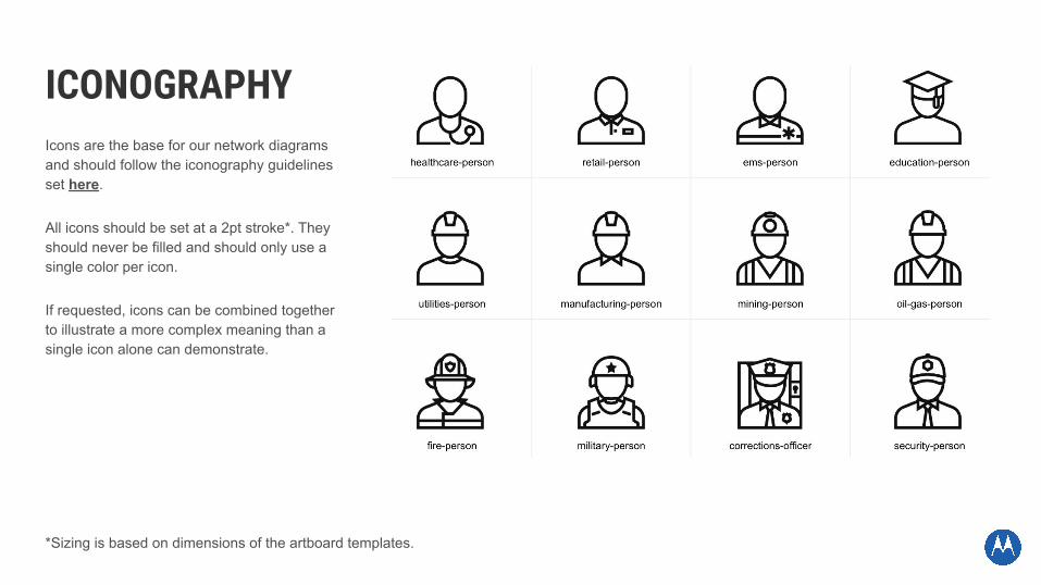
ICONOGRAPHYIcons are the base for our network diagrams and should follow the iconography guidelines set here.
All icons should be set at a 2pt stroke*. They should never be filled and should only use a single color per icon.
If requested, icons can be combined together to illustrate a more complex meaning than a single icon alone can demonstrate.
*Sizing is based on dimensions of the artboard templates.

View our icon library here. Our simplified format will enable quick access and searching so you can easily identify the best icon suited for your needs.
● 500 icons organized in more than 25 categories.● Intuitive and easy to navigate with no duplication.● Simply copy and paste any icon for immediate usage.
ADDITIONAL RESOURCESCollective (you may need to login)
● Icons grouped in one collection and easy to locate.● EPS and PNG files available in black.● Hundreds of consistent tags from the icon library.
How-to Guide● Access, selection and creation.● Mechanics including stroke, color, margin, scale and weight.● Icon exporting and visual examples.● Icon review process
ICONOGRAPHYOUR LIBRARY

ICONOGRAPHYUSAGE
DO set the icon at a 2pt stroke using one of our core brand colors. Then scale to fit your composition if needed.
DO NOT fill icons.DO NOT use more than one color for a single icon.
DO NOT use multiple stroke weights in a single icon.
DO NOT place drop shadows or effects on icons.

ICONOGRAPHYSIZING
Not all icons are created equal for our network diagrams. To create a dynamic design, your icons should establish a sense of hierarchy.
The most common way we achieve hierarchy within our diagrams is by scaling icons. Often the most important icons, or the first icons within a chain, will be the largest.

COLOR

COLOROur standard color palette is meant to distinguish our brand and contribute to strong brand recognition. The colors used in our network diagrams are based on the Motorola Solutions core colors found here.
This section of the style guide provides suggested color chords and usage for common requests. This is a basic starting point and color chords may vary as necessary for your communications. Do not use too many different colors in any one composition. If there is already an established color chord for a particular product or concept being illustrated, please use that.

COLOR CHORDSSINGLE-COLOR
SECONDARY COLOR
70% DARK BLUE TINT---
R:77 G:142 B:205C:69 M:36 Y:0 K:0
Hex #4d8ecd
SUPPORT COLOR 1
LIGHT BLUE299C
R:0 G:163 B:224C:86 M:8 Y:0 K:0
Hex #00a3e0
SUPPORT COLOR 2
70% LIGHT BLUE TINT---
R:77 G:191 B:233C:60 M:4 Y:2 K:0
Hex #4dbfe9
SUPPORT COLOR 3
30% LIGHT BLUE TINT---
R:179 G:227 B:246C:27 M:0 Y:1 K:0
Hex #b3e3f6
PRIMARY COLOR
DARK BLUE300C
R:0 G:94 B:184C:99 M:50 Y:0 K:0
Hex #005eb8
*Primary and secondary colors should always use either Motorola Solutions’ Dark Blue (for light backgrounds) or white (for dark backgrounds). Support colors are up to the discretion of the designer.

COLOR CHORDSSINGLE-COLOR USAGE
70% TINT
Secondary Labels
CORE COLOR
Secondary IconsMessage DotsDotted Lines
70% TINT
Dotted Lines
30% TINT
Dotted Lines
CORE COLOR
Main IconographyMain Labels

MAIN ICONOGRAPHYPrimary ColorCore Color2pt stroke
DOTTED LINESSupport ColorTint/Core Color1.25pt stroke
MAIN LABELPrimary ColorCore Color16ptUnivers 67 Condensed Bold
SECONDARY LABELSecondary ColorTint8ptUnivers 57Condensed
COLOR CHORDSSINGLE-COLOR BREAKDOWN
Source File
MESSAGE DOTSSupport ColorCore Color1.25pt stroke

SECONDARY COLOR
70% DARK BLUE TINT---
R:77 G:142 B:205C:69 M:36 Y:0 K:0
Hex #4d8ecd
SUPPORT COLOR 1
LIGHT BLUE299C
R:0 G:163 B:224C:86 M:8 Y:0 K:0
Hex #00a3e0
SUPPORT COLOR 2
ORANGE151 C
R:255 G:130 B:0C:0 M:60 Y:100 K:0
Hex #ff8200
SUPPORT COLOR 3
LIGHT GREEN583 C
R:183 G:191 B:16C:26 M:1 Y:100 K:0
Hex #b7bf10
PRIMARY COLOR
DARK BLUE300C
R:0 G:94 B:184C:99 M:50 Y:0 K:0
Hex #005eb8
COLOR CHORDSMULTI-COLOR
*This multi-color chord option exceeds 3 core colors. Please note that Illustrations are an exemption from this rule.

CORE COLOR
Secondary IconsMessage Dots
Dotted Lines(You may also use a 10% & 30% tint)
CORE COLOR
Secondary IconsMessage Dots
Dotted Lines(You may also use a 10% & 30% tint)
CORE COLOR
Secondary IconsMessage Dots
Dotted Lines(You may also use a 10% & 30% tint)
70% TINT
Secondary Labels
COLOR CHORDSMULTI-COLOR
CORE COLOR
Main IconographyMain Labels

MAIN LABELPrimary ColorCore Color16ptUnivers 67 Condensed Bold
SECONDARY LABELSecondary ColorTint8ptUnivers 57Condensed
SECONDARY ICONOGRAPHYSupport ColorCore Color2pt stroke
MAIN ICONOGRAPHYPrimary ColorCore Color2pt stroke
DOTTED LINESSupport ColorTint1.25pt stroke
COLOR CHORDSMULTI-COLOR BREAKDOWN
MESSAGE DOTSSupport ColorCore Color1.25pt stroke
Source File

COLOR CHORDSGRAYSCALE
PRIMARY COLOR
WHITER:255 G:255 B:255
C:0 M:0 Y:0 K:0Hex #ffffff
SUPPORT COLOR 1
30% GRAYR:179 G:179 B:179C:0 M:0 Y:0 K:30
Hex #b3b3b3
SUPPORT COLOR 2
50% GRAYR:128 G:128 B:128C:0 M:0 Y:0 K:50
Hex #808080

COLOR CHORDSGRAYSCALE
WHITE
Main IconographyMain Labels
Message DotsDotted Lines
TINT
Secondary IconsSecondary Labels
Dotted Lines
TINT
Dotted Lines
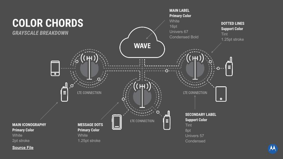
MAIN LABELPrimary ColorWhite16ptUnivers 67 Condensed Bold
SECONDARY LABELSupport ColorTint8ptUnivers 57Condensed
MAIN ICONOGRAPHYPrimary ColorWhite2pt stroke
DOTTED LINESSupport ColorTint1.25pt stroke
COLOR CHORDSGRAYSCALE BREAKDOWN
MESSAGE DOTSPrimary ColorWhite1.25pt stroke
Source File

BACKGROUNDSRECOMMENDED COLORS
WHITER:255 G:255 B:255
C:0 M:0 Y:0 K:0Hex #ffffff
10% GRAYR:230 G:230 B:230C:0 M:0 Y:0 K:10
Hex #e6e6e6
80% GRAYR:51 G:51 B:51
C:0 M:0 Y:0 K:80Hex #343434
*Color use may vary and should be determined based on need. These are the recommended colors. Please note that these colors deviate from our Motorola Solutions approved colors. Motorola Solutions core colors could also be used, but only at the discretion of the designer.

BACKGROUNDSEXAMPLES
*See how the same diagram can change with different background colors.

COLOR USAGEUSAGE
DO NOT use colors that blend into the background or create low contrast.
DO use appropriate background colors for your diagram. Motorola core colors can be used at the discretion of the designer.
DO use core color tints and shades that stand out from the background.

LINES & EMBELLISHMENTS

LINESConnections between icons in a network diagram can be expressed through lines. This can help visualize complex ideas and add dynamic composition. Additionally, lines can be used to visualize non-tangible elements like cell service, firewalls, datalines and more.
Lines used in our network diagrams should be set at 1.25pt* stroke. They should be dashed with a 3.5pt* dash and 2.5pt* gap.
Motorola Solutions core colors can be used for dotted lines as well as standard tints and shades.
Avoid putting arrows at the end of lines.
*Sizing is based on our artboard template dimensions

Weight: 1.25pt Dashed Line: 3.5pt dash | 2.5pt gap
LINESBREAKDOWN
Core Color
70% Tint
30% Tint

Weight: 1.25pt Dashed Line: 3.5pt dash | 2.5pt gap
Pure White
30% Gray
50% Gray
LINESBREAKDOWN

EMBELLISHMENTSMESSAGE DOTS
Embellishments can add visual interest to a composition. One of the main embellishments that may be used are message dots. These are used to represent the flow of communication and information.
Message dots should have a height and width of 6.75px* with a 1.25pt stroke.
Only Motorola Solutions core colors should be used for message dots.
W 6.75pxH 6.75px
1.25pt strokeCore Color
*Sizing is based on dimensions of the artboard templates.

EMBELLISHMENTSOFFSET CIRCLES
Other embellishments that may be used are offset shapes. Offset shapes can be used to add visual interest and draw attention to key points. They should only be used with Main Iconography.
To create this element add a shape behind the icon/s being embellished. Using the clear space guidelines found here, cut out a negative shape around each icon. Use circular shapes only.
Our offset shape colors are unique from other graphic elements in the network diagram. They should always have a 10% difference from your background. For example, when working with a pure white background you should use a 10% tint of our Motorola Solutions core colors. When working with an 80% gray background you should use a 70% gray.
SUPPORT COLOR
10% DARK BLUE TINTR:233 G:240 B:248
C:7 M:3 Y:0 K:0Hex #e9f0f8
SUPPORT COLOR
70% GRAYR:77 G:77 B:77
C:0 M:0 Y:0 K:70Hex #4d4d4d
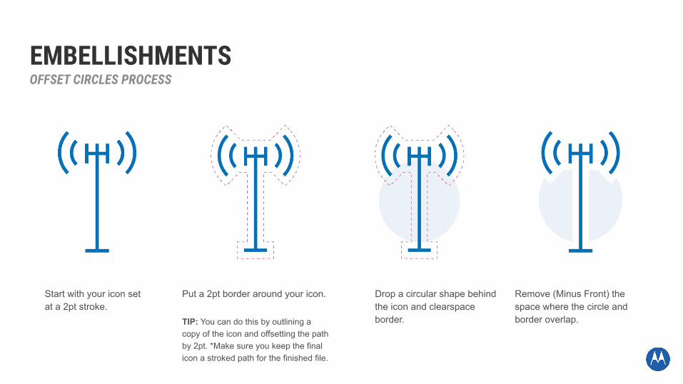
EMBELLISHMENTSOFFSET CIRCLES PROCESS
Start with your icon set at a 2pt stroke.
Put a 2pt border around your icon.
TIP: You can do this by outlining a copy of the icon and offsetting the path by 2pt. *Make sure you keep the final icon a stroked path for the finished file.
Drop a circular shape behind the icon and clearspace border.
Remove (Minus Front) the space where the circle and border overlap.

SPACING
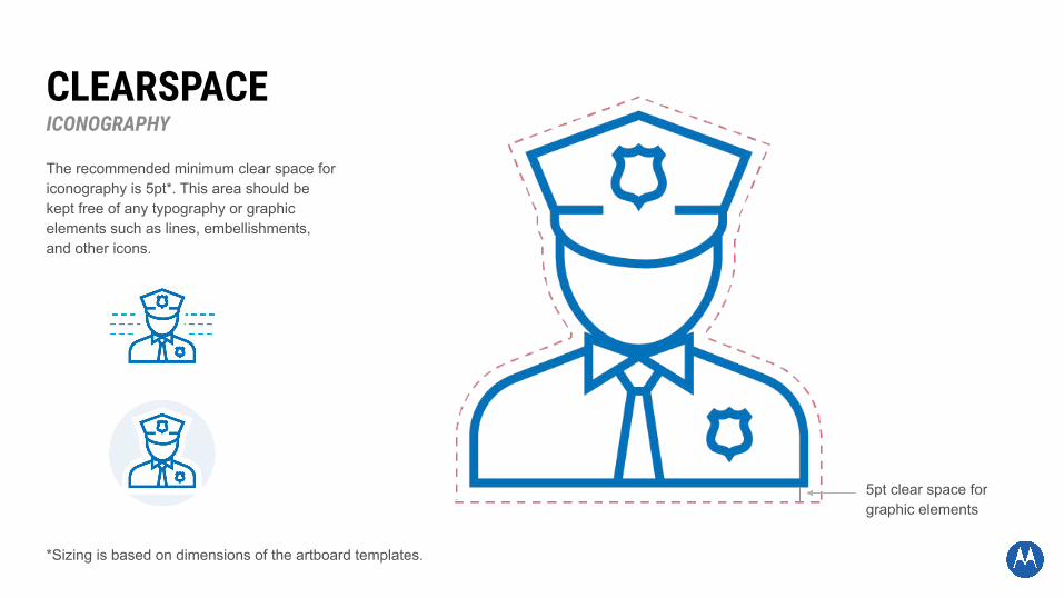
CLEARSPACEICONOGRAPHY
The recommended minimum clear space for iconography is 5pt*. This area should be kept free of any typography or graphic elements such as lines, embellishments, and other icons.
5pt clear space for graphic elements
*Sizing is based on dimensions of the artboard templates.

CLEARSPACETYPOGRAPHY
The recommended minimum clear space for typographic elements is 10pt*. This area should be kept free of any graphics to ensure readability.
10pt clear space
*Sizing is based on dimensions of the artboard templates.

*Sizing is based on dimensions of the artboard templates.
SPACINGLINES
The recommended minimum spacing between lines and concentric circles is 5pt*.
5pt spacingbetween lines

TYPOGRAPHY

LABELS & TYPOGRAPHYType hierarchy and structure are effective tools to communicate with clarity and confidence. General guidance including font selection, case and alignment is provided in this section of the styleguide.
Specific type sizes and leading may vary and should be determined based on dimensions of applications and media type. This is a basic starting point, and additional levels may be added as necessary for your communications. Do not use too many different forms of typography in any one composition.

MAIN LABELS
Font: Univers 67 Condensed Bold, uppercase
Size: 16pt*
Leading: 15.5pt*
Alignment: Center
WHEN TO USE: To identify the main elements of the network diagram.
*Sizing is based on a 8.5x3.667” layout and will need to be adjusted for different compositions

SECONDARY LABELS
Font: Univers 57 Condensed, uppercase
Size: 8pt*
Leading: 9.6pt*
Alignment: Center
WHEN TO USE: To add clarity to icons/concepts that may be too vague on their own.
*Sizing is based on a 8.5x3.667” layout and will need to be adjusted for different compositions

ANIMATION

ANIMATIONTHIS SECTION IS STILL UNDER REVIEW AND MAY CHANGE.
Animation should only be used to emphasize the importance of a specific network diagram, and should not be used for every use case.
Animated network diagrams can be hosted on the web with permission from the digital team, embedded as a part of videos, or used sparingly in presentations.

ANIMATIONGENERAL MOVEMENT
The look of the animation should follow all previously mentioned guidelines. Animation should reinforce the flow of data - it should walk the user through the diagram/story.
A typical animation will start with an establishing shot, then animate focal point/main iconography and any relevant secondary points. Zoom, motion, and color should be used to highlight the most important steps of the diagram.
*Example of establishing shot and main focal points

ANIMATIONSPECIFICS
Animated elements should be concise and snappy, but not overly-animated. The animation should be smooth, and use appropriate easing, and motion blur so the movement feels natural.
Lines typically will move along dotted lines in a “marching ants” style. Secondary elements such as message dots can move along paths/lines.
*Example of easing, motion blur, and marching ants.


MORE EXAMPLES