More than decoration: An investigation into the role of visual rhetoric and ethos in corporate...
127
Graduate eses and Dissertations Graduate College 2009 More than decoration: An investigation into the role of visual rhetoric and ethos in corporate visual identity Jennifer R. Veltsos Iowa State University Follow this and additional works at: hp://lib.dr.iastate.edu/etd Part of the English Language and Literature Commons , and the Rhetoric and Composition Commons is Dissertation is brought to you for free and open access by the Graduate College at Digital Repository @ Iowa State University. It has been accepted for inclusion in Graduate eses and Dissertations by an authorized administrator of Digital Repository @ Iowa State University. For more information, please contact [email protected]. Recommended Citation Veltsos, Jennifer R., "More than decoration: An investigation into the role of visual rhetoric and ethos in corporate visual identity" (2009). Graduate eses and Dissertations. Paper 10643.
Transcript of More than decoration: An investigation into the role of visual rhetoric and ethos in corporate...
Graduate Theses and Dissertations Graduate College
2009
More than decoration: An investigation into therole of visual rhetoric and ethos in corporate visualidentityJennifer R. VeltsosIowa State University
Follow this and additional works at: http://lib.dr.iastate.edu/etd
Part of the English Language and Literature Commons, and the Rhetoric and CompositionCommons
This Dissertation is brought to you for free and open access by the Graduate College at Digital Repository @ Iowa State University. It has been acceptedfor inclusion in Graduate Theses and Dissertations by an authorized administrator of Digital Repository @ Iowa State University. For moreinformation, please contact [email protected].
Recommended CitationVeltsos, Jennifer R., "More than decoration: An investigation into the role of visual rhetoric and ethos in corporate visual identity"(2009). Graduate Theses and Dissertations. Paper 10643.
More than decoration: An investigation into the role of visual rhetoric and ethos in corporate visual identity
by
Jennifer R. Veltsos
A dissertation submitted to the graduate faculty
in partial fulfillment of the requirements for the degree of
DOCTOR OF PHILOSOPHY
Major: Rhetoric & Professional Communication
Program of Study Committee: Charles Kostelnick, Major Professor
Lee Honeycutt Barbara Blakely Margaret LaWare Debra Satterfield
Iowa State University
Ames, Iowa
2009
Copyright © Jennifer R. Veltsos, 2009. All rights reserved.

ii
DEDICATION
To Noah, who was with me at the start of this journey.
To Nikolas, who was with me at the end of it.
And to Chris, who was beside me all the way.
iii
TABLE OF CONTENTS
List of Tables .............................................................................................................................................. iv
List of Figures .............................................................................................................................................. v
Abstract ....................................................................................................................................................... vi Chapter 1: Introduction: Visual Communication and Professional Communication Intersect ..... 1
Understanding “Corporate Visual Identity” ......................................................................... 2
Visual Identity and Visual Rhetoric ........................................................................................ 6
Why Study Corporate Visual Identity? .................................................................................. 8
Corporate Visual Identity, Start-ups, and Ethos ................................................................ 10
Chapter 2: Literature Review & Theoretical Framework: The Role of Visual Rhetoric and Ethos in Corporate Visual Identity .................................................................................................................... 15
The Importance of Establishing Ethos ............................................................................... 17
The Role of Rhetoric in Visual Communication ................................................................ 21
Visual Rhetoric and Professional Communication ............................................................ 24
A Need for Design Heuristics ............................................................................................... 28
Chapter 3: Research Methodology: Analyzing Corporate Visual Identity ........................................ 30
Qualitative Research Methodology ...................................................................................... 32
Research Philosophy .............................................................................................................. 33
Research Participants .............................................................................................................. 34
Data Collection........................................................................................................................ 35
Data Analysis ........................................................................................................................... 40
Chapter 4: Results of Interviews: How Organizations Create Corporate Visual Identity.............. 44
Voices of Experience ............................................................................................................. 45
Voices of the Novices ............................................................................................................ 50
What the Interviews Reveal About Creating Corporate Visual Identity ........................ 61
Chapter 5: Results of Document Analysis: The Methods and Techniques Behind Corporate Visual Identity ............................................................................................................................................ 65
The Elements of a Corporate Visual Identity ..................................................................... 65
Use of Typical Design Techniques in the Corporate Visual Identities ........................... 78
Using the Visual Techniques in Concert ............................................................................. 85
What the Techniques Imply About the Novice Designers .............................................. 92
Chapter 6: Conclusion and Implications: Visual Rhetoric in the Professional Communication Classroom ................................................................................................................................................... 95
The Link Between Ethos and Visual Identity ..................................................................... 96
Design Methods Used by Entrepreneurs ............................................................................ 97
Design Techniques in the Professional Documents .......................................................... 98
Implications for Visual Rhetoric & Professional Communication Pedagogy ................ 99
Suggestions for Future Research ....................................................................................... 102
Conclusion ............................................................................................................................ 104
Bibliography ............................................................................................................................................ 105
Appendix A Prospecting Letter ........................................................................................................... 114
Appendix B Sample Interview Questions .......................................................................................... 117
Acknowledgements ................................................................................................................................ 120

iv
LIST OF TABLES
Table 1: Summary of data collected from participants. ....................................................................... 41
Table 2 Analysis codes developed from interviews with the nine participants. .............................. 41
Table 3 The continua of visual techniques used to evaluate sample documents............................. 43
Table 4 A categorization of the visual techniques described by Dondis (1973).. ............................ 79
Table 5 A suggestion for teaching students how to experiment with visual techniques ............. 101
v
LIST OF FIGURES
Figure 1 The icon used by Sebastien’s university. ................................................................................ 66 Figure 2 Emily's pet services logo .......................................................................................................... 67 Figure 3 Emily's secondary icon. ............................................................................................................ 67 Figure 4 Sarah's new logo featuring her main puppet. ........................................................................ 68 Figure 5 The photograph that functioned as Sarah's former logo. .................................................... 68 Figure 6 Two versions of Susan's logo.. ................................................................................................ 68 Figure 7 An imitation of Scott's logotype. ............................................................................................. 69 Figure 8 Photos of Scott's facility featuring actual clients ................................................................... 75 Figure 9 Sarah's new photo.. ................................................................................................................... 75 Figure 10 Emily's pet taxi graphic........................................................................................................... 77 Figure 11 Predictability, regularity, sequentiality, and singularity................................................................... 80 Figure 12 Balance and symmetry ................................................................................................................. 81 Figure 13 Complexity, fragmentation, and intricacy...................................................................................... 82 Figure 14 Boldness, neutrality, and accent. ................................................................................................... 83 Figure 15: The typical "quadrant" business card layout. ..................................................................... 86 Figure 16 Symmetry, unity, and opacity. ...................................................................................................... 87 Figure 17 Accent and simplicity. .................................................................................................................. 87 Figure 18 Accent and balance. ..................................................................................................................... 87 Figure 19 Spontaneity, irregularity, and juxtaposition among other techniques. ..................................... 88 Figure 20 Balance and predictability. ........................................................................................................... 88 Figure 21 Predictability, regularity, fragmentation, episodicity, and complexity. ............................................. 89 Figure 22 Sharpness and diffusion as well as economy, spontaneity and accent. ........................................... 89 Figure 23 Accuracy, asymmetry, exaggeration, diffusion and consistency. ....................................................... 90 Figure 24 Symmetry, instability, predictability, complexity and accuracy. ....................................................... 91
vi
ABSTRACT
Companies rely on corporate visual identity (CVI), a collection of visual elements, to
unify their communications and suggest a corporate persona. Start-up companies must quickly
capture the attention of their audience and create ethos if they hope to be successful. Yet little is
known about how start-ups create their CVI and use it for professional communication.
Although the issues behind CVI—audience, ethos, visual rhetoric, and persuasion—are all very
rhetorical, the topic has not yet received much attention in rhetoric or professional
communication. Most of the existing research in marketing and graphic design focuses on large,
well-known organizations with visual identities created by professional designers.
Using a theoretical framework based upon ethos, social construction, and visual rhetoric,
this qualitative research study examines how start-up businesses develop CVI and use it to
establish corporate ethos. Using document analysis and interviews with graphic designers,
marketing specialists, and entrepreneurs from the Midwest, this study suggests that
entrepreneurs recognize the informational and persuasive purposes of CVI but that they are not
always able to implement the CVI consistently. The development and implementation of their
CVIs indicated several common constraints: using personal experience and intuition rather than
audience analysis, a lack of experience in design, limited technical skill and access to appropriate
software, and reliance upon friends and family for assistance. The visual techniques used in their
promotional documents suggest that the start-ups want to attract readers’ attention and project a
sense of order in their documents. Unfortunately, some of the designs are self-defeating because
they present too much information, lack focal points and whitespace, and display cautious,
structured layouts rather than spontaneous, unexpected ones.
These results demand a renewed emphasis on visual rhetoric in professional
communication classrooms, including instruction in both theory and execution via technology.
Visual elements are more than illustration: they communicate messages that can explain,
reinforce, or even contradict the documents that contain them. By studying visual rhetoric in the
workplace, particularly cases in the margins like start-up businesses, we can refine our
understanding of its use by writers and its impact on readers.
1
CHAPTER 1: INTRODUCTION
VISUAL COMMUNICATION AND
PROFESSIONAL COMMUNICATION INTERSECT
Few people look at a company’s stationery and think, “This is so beautiful, I’ll triple my order,” or “This is so ugly, I’ll cancel my order.” But when people see your stationery, they think something about you and it’s going to be positive or negative, depending upon the design and feel of the stationery.
– Robin Williams, The Non-Designer’s Design Book
While writing this dissertation I had an unusual experience. As I sat surrounded by
books and notes, my three-year-old son picked up one of my library books and started reading it
to me. To be fair, the book he read combines words, clip art, and shapes into a quasi academic
graphic novel. In Visual Language Robert Horn (1998) explains that our early education begins
with drawings and other visual elements. Gradually the visuals are integrated with words until
verbal communication eventually overtakes the visual. As my son inadvertently demonstrated,
Horn’s explanation of the significance of visual communication in early literacy is correct:
images can tell a story, although integration with text paints a much fuller and more nuanced
picture.
Just as I was mulling over Horn’s argument, the power of visual communication jumped
into the popular press during the 2008 presidential campaign. In 2007, Michael Beirut of the
design firm Pentagram analyzed several logos of the leading Republican and Democratic
candidates for Newsweek magazine. He explained that “All the Democrats have swooshy
elements, a curve somewhere designed to signify a suppleness and willingness to listen.” John
McCain’s choice of Optima typeface is “a hybrid for people who can’t decide between a serif or
sans serif…It’s wishy-washy, neither contemporary nor traditional.” And Hillary Clinton’s use of
her first name in her visual identity was designed “to make her approachable and friendly, and to
disassociate herself from the Clinton dynasty” (Stumper Stickers). But it was Barak Obama’s
visual identity—the typeface and graphics used on promotional materials such as yard signs, T-
shirts, and his website—that received the most attention and praise for its simplicity and
rhetorical effectiveness. In fact, the Obama “brand” received nearly as much attention as his
position on the issues. Obama’s typeface, Gotham, was created for GQ magazine to “feel
modern yet authoritative and masculine” (Bennet 2008). His logo became one of the most
2
recognized icons in the country: a circle enclosing a field of red and white rows and a blue sky
with a rising sun. The symbolism is as simple as it is effective: Obama will bring a new day of
hope and change to America. Sol Sender, a graphic designer at the Chicago firm that created
Obama’s visual identity, explains that the design, one of eight submitted for consideration by the
campaign, was developed in two weeks and was inspired by the candidate’s two books. Obama
and his team were ultimately impressed by the campaign’s skillful implementation and evolution
of the visual identity:
Various vendors needed to reproduce the mark on signs, banners, and they needed some rules. So our initial concern was compliance and consistency. Having said that, we did think it was such a strong mark—strong marks have the potential for broad successful application and viral growth—and we were cognizant of its possibilities. We saw (and visualized as part of the creative process) buttons, billboards, ads, Web banners, T-shirts and hats. We did not foresee the scope of the variations and the potential ‘ownership’ that emerged, though.
We handed the logo and design assets off to the campaign in the summer of 2007. From that point on, everything that you’ve seen was done by the campaign, including the “demographic” variations of the logo. They also evolved the typography to uppercase, incorporated Joe Biden’s name and added a white line around the mark.” (in Heller 2008)
The image of a rising sun is not unique, of course; many people have noted the
similarities between Obama’s icon and the logo used by Farm Aid as well as the Great Seal of
the State of Ohio. But the power of Obama’s icon and typography came from their ability to
project qualities that the candidate seemed to embody: hopefulness, elegance, confidence.
As a junior senator embarking on a presidential campaign, Barak Obama faced a
problem similar to that of many start-up companies: how to capture the attention of his
audience and create enough ethos in a short span of time to earn its trust and, more importantly,
its votes. And like many other new businesses, one solution he chose to use was a corporate
visual identity.
Understanding “Corporate Visual Identity”
This research study investigates a typical task encountered by organizations of all sizes
and structures. How can an organization attract the attention of its audience, particularly when
competing with other businesses who may be more well-known or when potential readers are
3
unfamiliar with its product or service? One way is to create a visual identity that is memorable,
attractive, and informative. A corporate visual identity is a package of elements used by
organizations to unify their communications. The elements of a visual identity provide an
organization with an opportunity to differentiate itself from competition, build a relationship
with the audience, create credibility, and bring order to chaos (Adams, Morioka, and Stone 2004,
15). The corporate visual identity (CVI) is a visual expression of the corporate identity and an
external representation of its culture, people, behavior, and communication (van Riel and Balmer
1997; Witt and Rode 2005). “Identity is expressed in the names, symbols, logos, colours and rites
of passage which the organization uses to distinguish itself, its brands and its constituent
companies. At one level, these serve the same purpose as religious symbolism, chivalric heraldry,
or national flags…At another level, they represent consistent standards of quality and therefore
encourage consumer loyalty” (Olins 1989, 9).
Effective visual identities are memorable and flexible, appearing on everything from
letterhead and business cards to websites and promotional materials and even employee
uniforms and company cars. The visual identities, like written or oral messages, are carefully
constructed to catch readers’ attention and persuade them to use the organization’s products or
services. For well-established organizations, a strong corporate visual identity makes a statement
that viewers instantly recognize and associate with a host of qualities that the organization
wishes to promote. For example, the Nike “Swoosh” is one of the most recognized logos in the
world. The simple design, suggesting movement and energy, has achieved such iconic status that
the design has not required much updating in its thirty-six years. The appearance of the Swoosh
on a pair of shoes, a shirt, or other sports paraphernalia validates an expensive price tag by
inspiring thoughts of specialized design and quality workmanship or a desire to emulate the
professional athletes associated with the brand.
Three key terms appear regularly in discussions of the public face of an organization:
corporate identity, brand or brand identity, and corporate visual identity. In graphic design the
terms often appear interchangeable (Fishel 2000; Peterson 1999) whereas marketers seem to
view corporate visual identity as merely an expression of the larger concepts of branding and
corporate identity (Baker and Balmer 1997; Moingeon and Ramanantsoa 1997; Topalian 2003).

4
For the purposes of this project, I define the terms in the following manner:
� Corporate identity is an internal factor composed of the organization’s
culture, people, behavior, and communication (Olins 1989, van Riel and
Balmer 1997; Witt and Rode 2005).
� Brand identity is the visible expression of corporate identity that helps us
classify, recall, and navigate the world around us (Bernstein 1984).
� Branding encompasses any contact with customers and suppliers from the
product to the architecture of buildings and from the way employees dress to
the way they answer the telephone when customers call (Smith 2000).
� Corporate visual identity is the collection of graphical and textual elements
that make up the brand.
A corporate visual identity (CVI) typically includes “a name, a symbol and/or logo,
typography, color, a slogan, and—very often—additional graphic elements” (van den Bosch, de
Jong, and Elving 2005, 108). For example, the McDonald’s brand is made up of CVI elements
such as the red and yellow color scheme, the golden arches logo that is often reflected in the
architecture of the restaurants, and the Ronald McDonald mascot. CVI creates an image that
attracts readers’ attention and reveals information about the culture or personality of an
organization as well as its products or services. The purpose of the CVI is to unify the
organization’s communication and reinforce its ethos by presenting a positive image that
customers remember and associate with the reputation of the organization.
An organization creates or alters visual identities to accomplish one of five purposes: to
position or reposition itself within its market, to modernize its look, to reflect changes in the
business, to promote growth, and to start over (Fishel 2000, 9-11). In industry some familiar
visual identities include the red and white script and hourglass bottle of Coca-Cola and the
distinctive green of John Deere, both of which have been immensely successful in positioning
the products in the minds of national and international consumers. In 2002 UPS even used its
signature color as a tagline, asking customers “What can BROWN do for you?” In a press
release posted on UPS.com Dale Hayes, vice president for brand management and customer
communications, explained that the company wanted to capitalize upon its familiarity as it
launched new services. “At UPS, brown is more than a color – it's a tangible asset that people
associate with all the things that are good about our brand.”
5
And just as a personal identity can grow and change over time, so can corporate visual
identities. For instance, the IBM logo has changed seven times since the company was founded
in 1889. Several of these changes occurred when the company’s name changed, but even the
famous logotype has been updated four times (IBM.com). The iconic apple logo of Apple
Corporation received a facelift in 1998 when the company replaced its rainbow design with a
series of icons in monochromatic colors. On a local scale the corporate visual identity for Iowa
State University has been in place for twenty of its 150 years, says university marketing director
Carol Custer. In fact, the ISU visual identity demonstrates how complex a CVI can be. The
Visual Identity System webpage explains that the university’s visual identity consists of a
nameplate, typography, several variations of color palettes, stock photography, various athletic
marks, the university seal, and detailed editorial guidelines. The objective of such a
comprehensive CVI is to “[tie] all the colleges, institutes, centers and units of our university
together.” The thoroughness of these guidelines suggests that the CVI is used to unify official
university documents and avoid a “visual Tower of Babel” (Baker and Balmer 1997, 377).
Each of these organizations uses its visual identity as part of its corporate
communication strategy to unite messages, establish ethos, and even make pathetic appeals to
loyalty and previous experience with the brand. A fundamental concept of sales and marketing is
the Marketing Mix of product, price, place, and promotion, also known as “the 4 Ps.” Corporate
visual identity addresses two elements of the mix: product (brand, packaging) and promotion
(recognition, advertising, consistent message). Corporate visual identity, as an element in a larger
branding program, can “help customers to reduce their anxiety when purchasing products or
services” (van den Bosch, de Jong, and Elving 2006, 139) because the visual identity can serve as
shorthand for the organization’s name and reputation and can also cue memories of past
experience (Baker and Balmer 1997). In fact, when there is no difference between the quality or
price of two products consumers often rely solely upon the reputation of the organization—
whether real or perceived—or upon past experience with the product to differentiate
(Alessandri, Yang, and Kinsey 2006; Melewar 2001; Olins 1989). A strong CVI is thus important
to all organizations but crucial to start-ups because customers do not have prior experience to
use in evaluating the organization or its products/services (Witt and Rode 2005).
6
Visual Identity and Visual Rhetoric
In recent years the value of visual communication has earned increasing attention in
composition and professional communication classrooms. Scholars such as Charles Hill (2004),
Diana George (2002), and others have argued that the traditional emphasis on verbal literacy in
composition has largely excluded visual communication to the detriment of our students.
George writes that "Literacy means more than words, and visual literacy means more than play"
(16). Bringing visual communication into composition classes can take a variety of forms
including web page design, poster presentations, quantitative data analysis, and analysis of
advertising and other promotional materials. This turn to visual communication is part of a
larger movement by composition instructors to explore the intersection of verbal and visual
literacies in electronic and multimodal communication (Williams 2001). Just as verbal literacy
refers to the ability to read and construct text, visual literacy refers to the ability to both read and
interpret visual messages and to create visual messages to communicate with others (Brumberger
2007; see also Braden & Hortin 1982; Curtiss 1987). Jonathan Matusitz (2005) takes this idea one
step further by arguing that we should go beyond visual literacy and develop “visual
intelligence.” The difference between the two seems to be an ability to think critically about
visual communication and to recognize manipulation within designs. He explains that “visual
intelligence requires the student to learn to distinguish between good and bad information”
(106).
Visual intelligence would help readers be aware of (and beware of) the power of rhetoric
in visual communication. Extending the traditional definition of rhetoric—the art of using
language effectively and persuasively—to visual rhetoric would indicate that an author is able to
use visual elements to persuade or please an audience. The power of visual rhetoric, explains
Charles Kostelnick (1989), is that the choices an author makes for the visual elements of a
document “make a difference—in readers’ attitudes toward a document, in how readers process
its information, and in which information they value” (77). As authors such as Edward Tufte
(2001, 2003) and Howard Wainer (1997) have demonstrated, data do not speak for themselves;
rather, the person who uses the data to construct a visual has the power to both reveal and hide
information from the reader and to inform or mislead as he/she sees fit. And the logistics of
creating visual messages has never been easier. With desktop publishing software and a good
printer, novices can now do the work that used to require teams of people with specialized skills.
7
But are novices aware that even subtle design choices like typeface affect the tone (ethos) of a
document and the organization the document represents (Kinross 1985; Allen 1996; Henderson,
Giese, and Cote 2004)? Are they aware of the influence of culture and discourse communities in
their ability to identify and exercise conventions and in the ability of the audience to understand
the meaning they are trying to create in their designs? These are questions that are essential for
visual literacy. Unfortunately, incorporating visual literacy into the business communication
classroom can be difficult in already full curricula. A 2005 survey by Eva Brumberger showed
that in business communication classrooms visual communication is overshadowed by written
and oral communication; two-thirds of her respondents spend less than 20 percent of their time
teaching visual communication in undergraduate courses.
The changes in communication brought on by the economy, technology, and the
Internet make visual literacy an essential skill for modern professional communicators. Cheap
computers and software have put the tools for visual communication at their fingertips while
budget crunches have condensed many jobs into few and made professional writers responsible
for more than just writing words. Additionally, readers are savvier about visuals and often expect
elements of document design in even simple documents like interoffice memos. As Brumberger
(2005, 320) explained, “To meet users' needs…business communicators must be more than
good writers. Given the prevalence of visual rhetoric in the workplace, their proficiency with
written and oral language must be complemented by proficiency with visual language.” Yet she
warns that if professional communication courses do not value the visual mode of
communication as highly as the verbal mode then we risk creating a generation of “visual
technicians” (Brumberger 2007) who may have technical skills to create documents that include
visual elements but who are not able to think critically about the work they produce.
An informal review of online articles about visual communication published in four of
the leading professional communication journals (Journal of Business Communication 1988-2007,
Business Communication Quarterly 1993-2007, Journal of Business and Technical Communication 1996-
2007, and Technical Communication Quarterly 1996-2007) demonstrated that visual communication
is a popular topic in professional communication. They include articles about general document
design, charts and graphs, web pages and writing for the web, new media and multimedia, and
several about PowerPoint. Business communication textbooks often suggest that authors who
incorporate visual rhetoric into their documents improve readability, present quantitative
8
information more efficiently and effectively than text alone, and enhance the persuasiveness of
their writing (for example see Oliu, Brusaw, and Alred 2008 or Locker and Kinzler 2008).
I propose that studying corporate visual identity offers professional communication
instructors an additional way to bring visual rhetoric into their curricula. As Brumberger’s 2005
study suggested, in many universities business communication is a single course within existing
programs. Rather than limiting visual rhetoric to a single unit within that course, corporate visual
identity offers an opportunity to add a visual component to existing units such as job
applications and corporate correspondence. Furthermore, as the participants in this study show,
corporate visual identity offers a glimpse at how visual communication can help users establish
corporate ethos and practice some typical visual techniques that have long been used in
specialized fields like graphic design.
Why Study Corporate Visual Identity?
This study was inspired by my entrepreneurial family and friends as well as by my
students who aspire to be entrepreneurs. When my husband started an information security
consultancy in 2006, he spent a summer debating names and designing the “stuff” that would
help him communicate with his audience. That “stuff” now includes letterhead, return address
labels, business cards, notepaper, postcards, a website, and promotional clothing. Everything is
united by the elements of his visual identity. He chose to forgo a graphical logo in favor of a
logotype using the Handel Gothic typeface. He also uses a few choices of stock photography, a
blue and white color palette, and Futura as his body text typeface.
My husband’s experience even inspired an assignment for my business communication
class. As part of the WOVE composition pedagogy at Iowa State University we are encouraged
to have students practice written, oral, visual, and electronic modes of communication, so in the
Fall semester of 2006 I asked my students to create a personal visual identity to practice the
visual mode of communication as well as to experiment with some of the basic features of
desktop publishing software. My hope for the assignment was to have the students think about
the design choices that are made for them by software templates and default style sheets and to
encourage them to take control of those choices to impart a sense of self in their documents.
Additionally, the personal visual identity would unify their resume, cover letter, and professional
portfolio and help them stand out from the masses at the annual career fair who simply use

9
Microsoft Word templates. When the semester finished, students had a visual identity package
consisting of two typefaces, a color palette, and a logo that could be a symbol, monogram, or
logotype.
This project is an example of what John B. Killoran (1999) calls “synthetic
institutionalism,” an effort by individuals to make their visual identities resemble that of
established corporations in order to construct ethos with their audience. My intention for the
assignment was not to make students imitate corporations, although sometimes that is what
happened. Rather, my intention was to help students understand the decisions that go into
document design, recognize the opportunities and limitations before them, and become better
consumers of visual information. In The Crystal Goblet Beatrice Warde (1956) addresses the need
to include typography in secondary education, not just for those who plan to enter the printing
trade but also for those who will one day become print customers. She suggests that the need for
education for professionals extends on both sides of the company. “Understanding the
problems of Design helps Management…[An] awareness of Design, or consciousness of the
look of the job and the way in which it affects the ultimate reader’s eye, tends to make a good
manager a better one…” (50-51). A basic introduction to design such as the visual identity
assignment is one way of preparing these future managers for some of the work that lies ahead
of them beyond writing text.
There are three issues about corporate visual identity that I find particularly interesting
and that inspired my research study:
Good designs exhibit consistency, clarity, and flexibility. A good design can be
used in many sizes and on various media. As the Obama CVI illustrated, the design must
function equally well on paper, on business cards, on posters, and on promotional items like
clothes or gifts. When my husband started designing his CVI, he did not think beyond the
document he needed at that moment. He based each design upon the last one, repeating the
things that worked and revising the things that had not. As a consumer he knew that consistency
was important, and each new product convinced him that flexibility was important too, but these
lessons were learned through trial and error rather than by consulting experts or reading identity
design books. Was his experience the exception or the rule?
Designing a visual identity often involves technology. Although conventional
wisdom says that “millennial” students are tech savvy, I have found that is not always true. They
10
surf the web and use most of the standard productivity software, but when it comes to being
creative, they are often stumped. In my experience only a handful of students in professional
communication classes know how to use specialized graphic editing or desktop publishing
software like Adobe Photoshop, InDesign, or even Microsoft Publisher. In fact, most of the
students persist in trying to create their visual identities in Microsoft Word in spite of the
frustrations it causes. If entrepreneurs in the field have similar backgrounds to my students,
many of whom wish to become entrepreneurs themselves one day, then what technologies are
entrepreneurs using, and how are they making it work?
Corporate visual identities are an opportunity to explore creativity. Eva
Brumberger (2007) argues that design is not a mysterious gift that some lucky people have and
the rest of us do not. Creativity, she says, is a way of thinking and working that can be developed
through practice and experimentation just as we do with writing. The corporate visual identity
project is one example of an assignment that allows students to experiment with visual rhetoric
and practice creative thinking. But where do novices get their inspiration? What are the reasons
behind the decisions they make regarding the elements that form their visual identities? And
what techniques do they use to implement those elements into their documents?
Of course, all of these questions are addressed if an organization hires a professional
graphic designer. The designer has the education and experience to know what a corporate
visual identity consists of, how to create one that is flexible enough to be used on various media,
and how to use it consistently across various messages. The designer uses the right software,
reads industry journals for information about trends and innovations, and pays attention to
visual messages for inspiration. But if an organization does not hire a graphic designer, as my
husband did not for financial reasons, then how does it create a visual identity on its own? That
is what I wanted to discover.
Corporate Visual Identity, Start-ups, and Ethos
Most of the existing research about corporate visual identity appears in marketing and
graphic design literature; it usually focuses on large, well-known organizations in which the
visual identities are created by professional designers, tested extensively with potential users, and
protected fiercely against imitators. Yet while companies like Coca-Cola, Nike, or UPS fill the
11
spotlight, 99 percent of U.S. employers are small businesses1. According to the Small Business
Administration, every year more than 600,000 new businesses are formed. In spite of these
statistics, very little is known about how start-up organizations and entrepreneurs create their
corporate visual identities and use them as a form of professional communication. Furthermore,
although the issues behind corporate visual identity—audience, ethos, visual rhetoric, and
persuasion—all fall within the realm of rhetoric and professional communication, the topic has
not yet received much attention in this field.
The purpose of my dissertation research is to fill that gap: to identify and examine the
ways that start-up organizations develop their corporate visual identities and use them to
develop corporate ethos as they communicate with their audiences. Like President Obama, start-
up organizations need to quickly create visual identities to unify their corporate communications
and establish their ethos; unlike the Obama campaign, however, many start-ups create their
visual identities on their own because they cannot afford to hire professional graphic designers.
Their own expertise may not include graphic design, nor do they have the tools, technical skills,
or research to develop a corporate visual identity with the same flexibility and consistency as a
professional would do. Instead they shape their identities based upon trial and error,
experimentation, intuition, and a little help from family and friends. To explore this endeavor I
conducted a qualitative research study guided by the following research questions:
1. In what ways do start-up entrepreneurs perceive a link between their corporate visual
identity and their corporate ethos?
2. How do start-up entrepreneurs create their visual identities?
3. What design techniques do start-up entrepreneurs use in their corporate visual
identities and in professional or promotional documents?
Using a theoretical framework based upon theories of ethos, social construction, and
visual rhetoric, I conducted a series of interviews with two graphic designers, two marketing
specialists, and five entrepreneurs in the Midwest. This sample was selected to explore the
experiences of participants in different industries and different stages in their development in
order to focus on conceptual issues. The start-up participants own companies that were no older
1 According to the U.S. Small Business Administration, a small business employs less than 500 people. In 2007 approximately twenty-seven million companies were classified as “small” businesses compared to seventeen thousand “large” businesses. Of those small businesses, nearly twenty million (75 percent) had no employees.
12
than five years at the time of the interviews; the rationale for this age restriction is that younger
companies are still in the process of constructing their professional identities and thus are more
likely to either be creating or have recently created visual identity designs. Since the object of my
research is to understand the design process and decisions used by untrained practitioners,
companies that are franchises of established businesses or that used the services of professional
graphic designers or advertising agencies were excluded. In order to put the information from
the start-ups into perspective and to get a richer idea of how organizations use visual identity to
establish their ethos, I then broadened my sample to include both graphic designers who create
visual identities and organizations that have been in business longer than five years and have
received assistance from professional graphic designers in creating and implementing their visual
identities.
The results of these interviews follow the qualitative methodology of instrumental case
studies which use the case to focus upon issues and to understand a general situation (Stake
1995). The opinions and experiences of the participants in this study helped me investigate the
rhetorical nature of corporate visual identity as a form of corporate communication. Based upon
this information I arrived at the following conclusions:
1. The start-up entrepreneurs recognize that a corporate visual identity is a
conventional element of business communication that serves both informational and
persuasive purposes. They also recognize that, in addition to providing a consistent
look and feel to corporate documents, the corporate visual identity has the potential
to affect their ethos with their audience. Yet for a host of reasons—the software they
used, their lack of technical skill in design and printing considerations, or even just
lack of time and attention—they have not always been successful in being consistent
in the design of their documents.
2. Largely because of concerns about cost, the start-up participants relied upon their
own experience and intuition to design their visual identities rather than doing
audience analysis research as the experienced participants have done. This lack of
research threatens the effectiveness of their ability to construct ethos in the
traditional sense of interaction between the speaker/author and the audience. In
other words, the start-ups know what they want their identities to say about their
businesses, but the effectiveness of that message is unproven and largely anecdotal.
13
Furthermore, the development and execution of their visual identities were
constrained by their lack of experience in design, their technical skill and choice of
technology, and their reliance upon assistance from outsiders for some specialized
tasks.
Beyond the interviews I analyzed a collection of corporate documents from the start-ups
to search for patterns in the use of visual techniques using a framework suggested by Donis A.
Dondis (1973). This analysis led to the following conclusion:
3. Without any special research or training, the start-up entrepreneurs developed their
own versions of the conventional elements of a visual identity: logo, color palette,
typography, tagline, and imagery. The techniques that they used to implement these
elements in their documents imply that the participants prefer order in the layout of
their documents and that the purpose of their documents is to attract attention and
serve as informational as well as persuasive documents. Unfortunately some of the
designs are self-defeating, presenting too much information and lacking focal points
and whitespace. The way the start-ups employ the visual techniques suggests that
untrained users may prefer cautious, structured designs rather than more
spontaneous, unexpected ones. It also suggests that novices need more instruction in
how to execute the visual techniques both in theory and in practice using typical
desktop publishing software.
In the remainder of this dissertation, I discuss my theoretical framework, research study,
and results in the following manner. I argue that corporate visual identity is a form of visual
rhetoric that helps organizations establish their reputations and promote their products or
services to their audiences. In Chapter 2 I review literature from the fields of rhetoric,
professional communication, graphic design, and marketing to explore the role that visual
rhetoric plays in developing an organization’s ethos through its corporate communication and
branding materials.
In Chapter 3 I introduce my research participants and describe the qualitative research
data collection and analysis methods used. Chapter 4 provides an overview of the results
analysis of the interviews with the graphic designers, marketing specialists, and entrepreneurs. I
describe the methods and design techniques that a group of start-up entrepreneurs use in
developing their visual identities, how they use their visual identities in their corporate
14
communication, and I consider how their visual identities may or may not shape their corporate
ethos. In Chapter 5 I present examples of the visual identity elements from the start-up
participants. From there I review a sample of corporate documents that feature those elements
and identify trends in the use of nineteen visual techniques suggested by Dondis (1973).
Finally, in Chapter 6 I discuss the conclusions of my research questions. I also identify
implications of this study for professional communication instructors, students, and
practitioners. In doing so, I argue that visual rhetoric is more important than ever in business
communication classes. Furthermore, corporate visual identity is a useful way to teach visual
rhetoric in business communication while introducing an authentic assignment into the
curriculum (McCarthy and McCarthy 2003). I also propose that the information gleaned from
the start-up participants, a group of design novices who chose to experiment with their own
visual identities, may help instructors teach students to read and create their own visual
documents.
The results of this study will inform the discipline of rhetoric and professional
communication about the practice of professional communication and visual design in a non-
academic setting and provide business communication teachers with information about visual
rhetoric that is closer to actual practice. In doing so, this study answers the call from Kostelnick
(1994) to use contextual research to inform document design and to develop the discussion of
visual rhetoric within professional communication literature. Furthermore, this study elaborates
on a call to include design principles in lessons about visual communication in composition
classes by Margaret Graham, Katherine Hannigan, and Paula Curran (2005). They argue that
both writing and design focus upon a rhetorical situation of writer/designer, reader, content, and
context, but by teaching only rhetorical analysis in composition we privilege the verbal over the
visual and make visual communication suspect. Finally, the results of this study will also provide
a basis for more detailed study of corporate visual identity from the perspective of both
professional design professionals and design novices. In the following chapter I begin by
reviewing literature that may inform these perspectives.
15
CHAPTER 2: LITERATURE REVIEW & THEORETICAL FRAMEWORK
THE ROLE OF VISUAL RHETORIC AND ETHOS IN
CORPORATE VISUAL IDENTITY
The way something is presented will define the way you react to it. So you can take the same message and present it in three different typefaces, and the response to that, the immediate emotional response will be different. And the choice of typeface is the prime weapon, if you want, in that communication. And I say weapon largely because with commercial marketing and advertising, the way a message is dressed is going to define our reaction to that message in the advertising.
- Neville Brody, graphic designer, in Helvetica
Branding is the combination of visual elements used to communicate with stakeholders
like customers, vendors, investors, and employees. In addition to explicit claims about the
company and its products or services, organizations make implicit claims through the symbols
they use such as a logo, a color scheme, and typefaces (Adams, Morioka, and Stone 2004), or
even the architecture of its buildings (Walters 2007) and the art it hangs on its walls (Hoeken and
Ruikes 2006).
The role of ethos in persuading and informing potential audiences helps us understand
why organizations carefully manage their image through coordinated branding. Naomi Klein
(2000) explains that in pre-industrial times consumers usually lived in small towns and shopped
at the local store or bought food from local farmers. The shopkeepers and farmers developed
relationships with their customers and established their ethos through these relationships. In the
last century, however, the small stores and farms have been replaced by large, often faceless
corporations. Responding to fears about quality and anonymity, as well as competition from
products with little differentiation in quality or price, companies began to use branding and
fictional characters such as Aunt Jemima or the Jolly Green Giant to give the organization a face
and to develop surrogate relationships with consumers (Klein 2000). Consumers expect spokes-
characters to be honest, sincere, and reliable, a set of qualities that maps to Aristotle’s ideals of
good sense, good moral character, and goodwill. In some instances consumers even ascribe
expertise to spokes-characters, an attribute that is often at play in the audience’s evaluation of
ethos (Garretson and Niedrich 2004). By the 1980s, the idea of branding began to oveshadow
the products or services it was supposed to represent and companies like Nike, Benetton, Apple
16
Computer Corporation, and others began to co-op values like diversity and rebellion to create
“brand tribes” (Klein, Garner, and Jhally 2003). As Richard A. Lanham (2006, 2) explains, “It is
the relationship to the consumer that matters now, not the object that engenders it.”
Many companies turn to professional graphic designers to create visual identity packages
that will create a unique look for the organization and provide an element of consistency to its
external communications that enhances its ethos and sense of professionalism. “All my outward
communications are now consistently branded, so I look more businesslike,” says one technical
communication consultant regarding the visual identity she uses to brand her work (Frick 2008,
37). Corporate visual identities build the organization’s ethos with its stakeholders by using
visual elements that signal a deliberate message about the organization’s product or service as
well as its corporate identity. The choice of visual elements is based in part upon expectations of
the audience. By using conventions that match those expectations to guide their decisions about
format, layout, color, or typography, designers create a visual identity using a vocabulary and
structure that the audience can “read.”
In communication, the use of conventions is an example of social construction.
Conventions are techniques or practices that have been developed through negotiation and
experience within a discourse community; they exist because they represent a useful way to
perform a design task. Like textual genres, conventions are not just containers for ideas but
methods and techniques with historical backgrounds that “serve as keys to understanding how
to participate in the actions of a community” (Miller 1984, 165). Design conventions tell us not
only about the individual who uses them but also about the communities she lives and works
within and the culture that surrounds her. Novice and experienced designers alike rely upon
conventions in the same way that writers rely upon rhetorical commonplaces. Because the texts
we create are inspired by or based upon existing texts, designs, and ideas within the discourse
community, we can consider all texts as intertextual. Because we make choices about when and
how to use conventions based upon our audience and context, all design is rhetorical (Kinross
1985).
In this dissertation I argue that corporate visual identity is a form of professional
communication that helps organizations promote their products or services to potential
customers and establish or enhance their own reputation. In this chapter I review literature from
the fields of rhetoric, professional communication, design, and marketing to explore how each
17
contributes to design decisions. I begin with a review of the concepts of ethos and social
construction to explain the significance of a corporate visual identity as a representation of the
corporate persona. Next, I examine the intersection of visual rhetoric and corporate
communication in order to emphasize that visual rhetoric is ubiquitous and to consider its role
in corporate visual identity. I conclude with a survey of visual rhetoric in professional
communication literature to identify theories and advice that even novice professional
communicators can use to guide the design decisions for their corporate visual identities.
The Importance of Establishing Ethos
From a graphic design perspective, the corporate visual identity (CVI) is a reflection of
the organization’s “inner self” (Fishel 2000) or an interpretation of its character (Arnheim 1969,
Olins 1989). Using appeals to one’s character as a means of persuasion is a widely used
technique that dates back to classical rhetoric and the concept of ethos. The term is frequently
used to describe the personal characteristics of a speaker (or author) that he or she uses to affect
an audience and influence decisions about the topic at hand (Lanham 1991; Hauser 2002).
The concept of ethos is usually described in one of two ways: as a moral quality of the
speaker (see Plato, Longinus, Quintilian, Blair) or as a strategic device that the speaker deploys
(see Aristotle, Cicero, Burke). These two perspectives shed light on different views of the role of
rhetoric: the idealistic or Platonic view of rhetoric and more specifically dialectic as a way of
discovering truth, or the pragmatic or Aristotelian view rhetoric as a means of persuasion
(Johnson 1984). Since marketing—the broad discipline that encompasses advertising, branding,
and CVI—is generally associated with persuasion, I will focus my discussion of ethos upon the
pragmatic perspective.
As Aristotle explains in Rhetoric,
Persuasion is achieved by the speaker’s personal character when the speech is spoken as to make us think him credible.…This kind of persuasion, like the others, should be achieved by what the speaker says, not by what people think of this character before he begins to speak. It is not true…that the personal goodness revealed by the speaker contributes nothing to his power of persuasion; on the contrary, his character may almost be the most effective means of persuasion he possesses (I, 1356a).
Aristotle argues that the audience views each interaction as a tabula rasa, ignoring any
previous interactions with the speaker. Hauser (2002) concurs, adding that the audience
18
evaluates the speaker through inferences about her mental, moral, and emotional habits based
upon the information that she chooses to include or omit from her speech. Thus ethos is not a
pre-existing quality of the speaker or author but rather “an interpretation that is the product of
speaker-audience interaction” (147). Although the reputation of the speaker may precede her,
each instance of communication is a new opportunity to create ethos.
In recent years rhetoric and the concept of ethos have been adapted from the tradition
of speech communication to describe both textual and visual communication. Discussions of
ethos in composition are often disguised by terminology like tone, voice, persona, and credibility
(Johnson 1984), but the focus upon the expectations and needs of the audience remains (see
Faigley 2003 and Lunsford 2002 for examples). In design ethos is described as a reflection of
designers "not as they are, but as they wish to appear” (Buchanan 1985, 14). In order to build
ethos, designers often associate a new idea or organization with qualities that the audience values
such as good sense, virtue, or even irony (Tyler 1992). The success of a design “is not judged
theoretically by appealing to the knowledge of a small group of experts, but practically by
appealing to the interests, attitudes, opinions, and values of users” (Buchanan 1985, 19). In other
words, ethos is a fiction that is mutually created by a speaker, author, or designer and an
audience.
The concept of ethos is particularly important for entrepreneurial organizations. In the
early stages of operation entrepreneurs are focused on developing their product or service (as
they should), but start-ups may also find it useful to spend time developing an identity that will
attract attention and encourage potential clients to try their products or services. Conventional
wisdom says that logos, or an appeal to reason, is a particularly effective method of persuasion.
However, in situations in which arguments are equally compelling or in which the audience lacks
information, ethos is actually more persuasive than logos (Braet 1992; Hauser 2002). A
customer’s lack of information is particularly problematic for start-up organizations since they
are often competing with the visibility and audience awareness of more mature competitors.
Furthermore, start-up entrepreneurs must establish ethos with their audiences quickly. A
common myth is that up to 90% of new businesses fail in their first year; in actuality, U.S.
19
Census data indicate that the odds of success are marginally greater: only 50% of businesses
survive their first four years (Headd and Kirchhoff 2007).2
Ethos, Social Construction, & Conventions
In rhetoric, social construction is the foundation of ethos. The concept of social
construction may date back to Protagoras and his observation that “Man is the measure of all
things.” Yet it was the social turn in composition in the 1980s that truly helped scholars in
composition and rhetoric explore the interplay between an author and an audience. Influenced
in part by Thomas S. Kuhn’s (1962) idea of paradigms and community-based knowledge in
science, the social perspective (Faigley 1985) argues that there is no universal knowledge waiting
to be discovered. Everything we know is based upon language (Bruffee 1986; Berlin 1992), and
the language we use is governed by the discourse communities we belong to. Discourse
communities determine what “knowledge” is for their specific contexts, and members of the
communities know what kinds of information other members are likely to know or value
(Faigley 1985). The ability to participate in a community’s discourse—to use the jargon, draft the
documents, practice the traditions, or cite the right sources—demonstrates membership (Winsor
1990). Thus a competence with community conventions is one way to build ethos within that
community.
A potential problem with conventions is the tendency to hide issues of power and to
suppress difference in favor of the status quo (Berlin 1992; Barton and Barton 1993a, 1993b;
Hall and Jhally 1997). The ideological approach to social construction (Thralls and Blyler 1993)
asks writers to consider the issues of power and control that underlie conventions and shape the
way that writers construct their messages and identities. For example, maps often use an
ethnocentric design that centers the designer’s homeland in the center of the page; this design
convention dates back to the original Mercator projection in the fifteenth century (Barton and
Barton 1993a). Many readers accept this convention without question, even though the resulting
maps often distort land masses and may even subjugate other countries by relegating them to the
fringes of the page. Similarly, readers generally accept the conventions that control business
2 While business failures are tallied by organizations like the Census, the Small Business Administration, and private firms, the term “failure” actually includes companies that change name or structure or that close even though the business was successful. Thus any generalizations about small business failures are difficult to substantiate. For more information see “Redefining Business Success: Distinguishing Between Closing and Failure” in Small Business Economics 2003, available online at http://www.sba.gov/advo/stats/bh_sbe03.pdf.
20
documents, such as North American and International standard paper sizes, without considering
the cultural, political, and financial influences that created them.
In design, however, the unstated power and control can work to a designer’s advantage.
For example, Charles Kostelnick and Michael Hassett (2003) describe five ways that designers
can misdirect readers: bungling conventions, hiding them, mocking them, using stealthy
conventions, or simply flouting conventions. The first misdirection, bungling, is a user error: the
designer either does not know the appropriate conventions or is unable to conform to them
because she lacks the necessary technical skill. For example, some commercial websites use
Comic Sans as a body font, silently sending a message that the information is humorous or
trivial.
The other forms of misdirection, however, are intentional challenges to the conventions
of the discourse community on the part of the designer. In 2008 the web design site
[Re]encoded.com3 featured more than eighty business cards that either mock or flout the
traditional 2.5 x 3 inch card in favor of designs such as a packet of seeds or a set of dog tags. For
example, former hacker Kevin Mitnick uses a die-cut metal card featuring a selection of lock-
picking tools to promote his information security consultancy. Other examples (a flash drive, a
bottle opener, a fingernail file) ignore the business “card” convention altogether, although a case
could be made that the items are actually promotional items rather than variations of a business
card. In each case the decision to mock or flout a convention is a deliberate one that requires
considerable skill and knowledge of the expectations and norms of the discourse community.
Designers who engage in deliberate misdirection are so familiar with conventions that they are
able to manipulate them to their own advantage or ignore them altogether. The designers who
deliberately misdirect, then, have recognized the conventions that guide their work and the
ideology that influences them; they have also recognized their own power to exercise influence
through unconventional practices.
For most users, however, conventions serve a useful purpose of guiding the user and
offering reliable solutions to common design questions or problems. As this review of literature
has demonstrated, meeting the needs and expectations of users allows an organization to build
its ethos, even if the user meets those needs in an unusual way. Yet while it may seem
3 The complete list of creative business cards is available at http://www.reencoded.com/2008/05/20/42-awesome-business-card-designs-with-links-to-100s-more/.
21
impossible to create a polished, visually appealing document without a background in graphic
design, the reality is that all documents contain elements of visual rhetoric that affect everything
from the reader’s first impression of the document to how she navigates through it and
understands relationships and hierarchies in the information.
The remainder of this chapter explores the topic of visual rhetoric from the perspective
of corporate communication and document design. First I consider how the discussion of visual
rhetoric and document design applies to various elements of corporate visual identity. I then
review the advice of several academic and popular press authors to explore visual guidelines that
professional communicators can use to improve the eloquence and persuasiveness of their
documents.
The Role of Rhetoric in Visual Communication
Visual rhetoric has a long history in graphic design. For example, in 1965 Gui Bonsiepe
argued that theories of rhetoric should be updated to include the interplay of words and images.
Until then rhetoric was largely the domain of speech and writing programs, and designers liked
to think that they worked with pure information. Bonsiepe argued that pure information does
not exist. All of the decisions involved in the layout and presentation of information, no matter
how banal, are rhetorical. Claiming that “the practice of rhetoric has far outrun its theory" (24),
Bonsiepe nonetheless endeavors to apply the classical figures of speech to visual/verbal
communication in the form of advertising.
One of the more useful elements of Bonsiepe’s argument in respect to this research
project is that Bonsiepe directly links rhetoric to advertising and consumerism, suggesting that
rhetoric can be used in tandem with design to “implant an opinion” that will persuade buyers
(23). He explains that “The consumer is given a wide range of choice between goods and
services and it becomes desirable to influence him in the selection he makes” (24).
It is useful to remember that Bonsiepe’s argument about the pervasiveness of visual
rhetoric was made during the height of the Swiss influence on design, an influence that favored
neutrality rather than rhetoric. Twenty years later Robin Kinross (1985) reaffirmed Bonsiepe’s
argument that all design is rhetorical. Analyzing an example of “pure” information—a railroad
timetable—Kinross asks: If design is neutral and information is pure, as many designers insist,
then what was the purpose of a 1930 redesign of the London railways timetable to feature
22
Monotype’s new Gill Sans typeface? Or the use of color on a Dutch railway table? In both cases,
Kinross explains, the designers sought to create documents that were not just informative but
eloquent. Thus, argues Kinross, while modernism may have promised a future in which design
could produce information in a manner that is free of rhetoric, the distinction between design
for information and design for persuasion is not at all clear (21).
Yet Bonsiepe’s claim that rhetoric could “implant” opinions implies that consumers
passively accept information. Ann C. Tyler (1992) disagrees, asserting that the audience is often
an active participant in visual rhetoric. She explains that “The goal of visual communication is to
persuade an audience to adopt a new belief” (29). By working with a carefully identified audience
in mind, the designer can select elements that tap into or coincide with existing beliefs and
cultural expectations of the audience in order to make visual arguments more persuasive. The
designer may also go one step further and turn the audience into a dynamic participant by
constructing a visual argument with a negotiated meaning rather than merely an image to be
viewed or read. The audience approaches the design with a set of beliefs; the designer hopes to
use those beliefs to persuade by linking old beliefs with the new idea (22).
Tyler goes on to explain three purposes of design: to persuade the audience to act, to
educate the audience, and to provide the audience with an experience. It is in the second
purpose that Tyler's work intersects with corporate visual identity. She explains that
Corporate and institutional logos are an example of design that attempts to educate. The logo defines the company and persuades the audience that the qualities of the logo are also the qualities of the institution it represents. The audience includes both the company employees and those who come in contact with the company. Audience identification with the values of the organization serves the goals of management as well as those of public relations (26).
However, the power of a corporate logo is only as strong as its interpretation by the
audience. The problem with many icons that are pressed into service as logos is that they are
only “part-time symbols” that have different meanings in other contexts (Arnheim 1969). To
create a symbol that is uniquely associated with a company’s corporate visual identity, many
designers turn to abstraction. Faced with competition first from printers and later from desktop
publishing software, graphic designers began to position themselves as specialists who have “the
unique ability to analyze and project images that constitute the symbolic meaning in the public
message of their clients” (27). But abstraction and symbols, suggests Frances C. Butler (1984),
23
create a gap between graphic designers and their audiences. Using Ong's (1982) concept of
orality and literacy, Butler asserts that graphic designers (the “literate” culture in terms of design)
value abstraction and innovation whereas clients (the oral culture) value realism, detail,
repetition, and reliance on standard forms. Butler warns that designs based upon abstraction
may not be what their clients really want, nor are they even rhetorically effective because
concrete images, not abstractions, help readers draw upon memory to understand and remember
the message. “When the image is too general, it cannot activate memory because it cannot be
assimilated into any personal experience, and thus can only substitute itself for any past
memory” (Butler 1984, 38). In other words, abstract icons lead to generic associations that do
not really serve the client or the audience unless the icon is surrounded by an explanatory
context or consistent, unique usage (Arnheim 1969).
Abstraction is not necessarily a bad thing, however. Arnheim suggests that abstraction is
really a complex process in which the reader’s mind searches for similarities and differences
between objects, making generalizations by distilling information. Perhaps for this reason Scott
McCloud (1993) differentiates between abstract and realistic images rather than concrete ones,
claiming that abstract images are better for general purpose use. He suggests that realistic images
may contain too much information or offer too many possible interpretations whereas the
simplicity of abstraction allows the author more control over meaning.
This is not to say that realistic or concrete visuals cede all control over meaning to
readers. The staging of the image and cropping effects on photos can be used for very rhetorical
purposes (Kienzler 1997). In fact, the process of taking professional photos, often called
“composition,” involves a collection of techniques that indicate photographs are carefully
constructed visuals rather than mere reflections of reality (see Douglis 2006). Furthermore,
images used in advertising do not usually represent reality anyway. Instead, they often consist of
rather complex rhetorical arguments that use the same techniques as verbal arguments
(invention, arrangement, and delivery) and that rely upon a pictorial vocabulary grounded in the
shared culture of the author and the reader (Scott 1994). Advertising exploits the shared culture
by creating an extrinsic visual metonymy in which the relationship between the elements in a
design and the product or service being publicized is artificially created by the designer
(Willerton 2005). A particularly effective method of creating extrinsic metonymies in advertising
involves using rhetorical figures of speech such as puns and metaphors (Ehses 1984; McQuarrie

24
and Mick 1999). These figures are useful conceptual tools in designs because they help writers
and readers make sense of the world around them by mapping abstract ideas to concrete ideas
(Lakoff and Johnson 1981).
Visual Rhetoric and Professional Communication
Up to this point I have reviewed the role of visual rhetoric advertising and visual identity
mainly from the perspective of graphic design. Yet many of the individuals who become
entrepreneurs do not have experience with art or design. For these individuals, their exposure to
visual rhetoric may only be their own experience as readers of visual messages or perhaps from
classes or books about professional communication. Both academic and popular press authors
emphasize that successful visual communication hinges upon meeting the needs of the reader,
purpose, and context. Authors must consider whether the document design choices support the
rhetorical function of the text; otherwise, document design could easily become “the grammar
and punctuation of current-traditional rhetorics, with an emphasis on the correctness of surface
features” rather than the interplay of the visual and verbal elements (Takayoshi 1996, 250). In
the following section I review several frameworks that can guide design decisions about visual
elements in professional communication.
Frameworks for Using Visual Rhetoric
Several scholars have suggested guidelines for professional communicators who want to
make their documents more visually effective. For example, Gestalt theory is often used to
provide document designers with a vocabulary or list of principles that describe how readers
perceive visual elements (Bernhardt 1986; Moore and Fitz 1993a, 1993b; Kostelnick and Roberts
1998; Ball and Arola 2004, 2006). The principles of Gestalt psychology explain how humans
read visual images by perceiving them holistically rather than as a collection of individual
elements. First, our mind looks for figure-ground contrast to separate shapes from their background.
The mind naturally groups shapes based upon their similarity to each other, their proximity to each
other, and their location along a line of symmetry. It tries to connect elements or create patterns
through continuation and to complete missing elements through closure (filling in missing areas
within the shape). In fact, some authors contend that humans have a biological preference for
some of the Gestalt principles. Contrast, rhythm, and balance, which correspond to figure-
ground, similarity, and symmetry, are “basic principles in the organization and biology of the
25
organic form” that helped our predecessors recognize organic forms and survive by recognizing
similarities between new and previously known organisms (Stebbing 2004, 64).
Another vocabulary for designers is the visual/verbal cognates of arrangement,
emphasis, clarity, conciseness, tone, and ethos suggested by Charles Kostelnick and David D.
Roberts (1998). When used successfully, the cognates guide authors in creating documents that
are both pleasing and persuasive. In addition to reviewing the ways that the cognates can help
professional communicators create visual documents, the authors also provide a twelve-cell
matrix of visual coding modes to help designers understand how elements, both textual and
visual, work together to structure information.
Visual rhetoric extends beyond structuring the layout. It can also provide cues that help
the reader evaluate what the document is and whether it is worth her time and attention. Eric C.
Kumpf’s (2000) theory of visual metadiscourse identifies ten design issues that affect the way
readers understand a document. A successful design matches the expectations of the audience.
For example, the category of heft describes the size, shape, or “bulk” of a document relevant to
the expectations of readers. The right heft for the assembly instructions of a wheelbarrow is
probably a single page with diagrams; a thick booklet would exceed reader’s expectations and
probably go unread. The category of expense describes how the design of the document is
perceived in terms of money. Readers will expect formal reports or sales brochures for
expensive goods to be printed in full color on heavy, glossy paper rather than in black and white
on copy paper. Conflicts between the visual and verbal tone of the message confuses readers and
affects their perception of both the document and its author, argues Kumpf, so understanding
of how visual rhetoric influences the reader’s interpretation of the document can help writers
both improve their documents and establish ethos.
Other scholars focus their attention on more concrete document design decisions such
as layout. For instance, Robert Kramer and Stephen A. Bernhardt (1996) demonstrate the
efficacy of several document design techniques by contrasting a “typical” composition essay
page with a professional document layout. The elements that work to make the document more
visually appealing and rhetorically persuasive are the use of a grid for page layout, active
whitespace, text structures that guide the reader, thoughtful use of fonts and spacing, and
controlling the document through style sheets. Several popular press authors have echoed this
advice. For example, Robert C. Parker (2006) provides a thorough introduction to document
26
design concepts and terminology including organization, type, white space, and graphics.
Christine Sevilla (2002) addresses page layout, color, document appearance (paper, binding, or
what Kumpf would call expense), and illustrations. Robin Williams (1994) adapts the Gestalt
principles of similarity, symmetry, and proximity into guidelines for laypeople, telling novice
designers to develop the document’s unity using repetition of elements, connecting the elements
to one another via alignment, and placing related items close to each other. On the other hand,
she writes, “If the elements (type, color, size, line thickness, shape, space, etc.) are not the same,
then make them very different” using contrast (14, emphasis in original).
Another design element that is widely addressed in visual rhetoric literature is the
selection and use of color. As Kinross suggests in his discussion of railroad timetables, the use of
color goes beyond mere decoration to serve a rhetorical function in documents. Ann R. Richards
and Carol David (2005) argue that color functions as emotional, ethical, and logical appeals in
document design. Studying the design of corporate websites, they suggest that color pleases
viewers aesthetically in order to encourage them to explore the site (emotional function), links
the website with an organization through consistent use of color palettes (ethical function), and
leads the eye through the design to the designer’s intended focal point (logical function). The
logical function is especially important in online documents like websites. If readers do not
actually read but rather scan websites, then the rhetorical use of color may help communicators
slow their progress, point out items of importance, and lead them through the document. In
fact, applying color to typographic cues can illustrate structure, create focus points, and highlight
important information within the structure (Keyes 1993). Sophisticated use of shades and hues
of one or two colors can help readers differentiate information in data rich documents (Tufte
1990) and create hierarchies within the information (Puhalla 2008).
With so many colors at one’s disposal, however, how can a communicator pick one or
two that are both aesthetically pleasing and that convey the intended message? Paul A.
Bottomley and John R. Doyle (2007) suggest matching the connotations of colors and products.
For example, they found that black, gray, green, and blue were more appropriate for functional
products such as household cleaner or anti-freeze; red, yellow, bright pink, and purple were
more appropriate for sensory-social products such as upscale restaurants or ice cream. Relying
upon color connotations is a popular technique of selecting colors, and explanations of color
27
connotations are widely available online4. Yet Richards and David warn that most color
connotations are culturally specific. Designers and users sometimes select colors based upon
trends, such as those established annually by the Pantone Corporation5. But Richards and David
remind technical communicators that the best way to ensure that a color scheme evokes the
intended response is to interview users. They advise technical communicators to use color to tell
a story via conventional color connotations, to link the organization to the material world, to
symbolize a primary characteristic of the organization, or to humanize large organizations,
particularly if the name is rather anonymous or generic.
Even seemingly trivial decisions about visual elements affect the way readers interpret
documents. Conventional wisdom suggests that the choice of typeface can affect the tone of
documents. As Rick Poynor explains, “Type is saying things to us all the time. Typefaces express
a mood, an atmosphere, they give words a certain coloring” (in Hustwit 2007). Studies indicate
that readers do attribute personality traits to typefaces (Brumberger 2003a; Henderson, Giese,
and Cote 2004) and that readers also perceive typefaces to be more appropriate for texts with
similar personas (Brumberger 2003b). In fact, consumer decisions to investigate or try a product
may be influenced by the use of a font that is perceived to be “appropriate” to the product and
brand name (Doyle and Bottomley 2004). Although there is no evidence that mismatches
between typeface persona and text persona cause problems with readability or usability
(Brumberger 2004), these studies do suggest that the relationship between the text and content
may affect the reader’s perception of the author’s or organization’s ethos. Regarding corporate
communication, one may infer that using a font that matches the message or product featured in
a document may positively influence both brand perception and market share. As graphic
designer Neville Brody explains, the choice of typeface for advertising can influence the reader’s
perception of both the company and the product:
So if [a sign] says “buy these jeans” and it’s in a grunge font you would expect it to be some kind of ripped jeans or to be sold in some kind of underground clothing store. If you see that same message in Helvetica, you know, it’s probably
4 An excellent collection of color connotations is available on the site “Color in Motion” by Claudia Cortes (2003). http://www.mariaclaudiacortes.com/colors/Colors.html 5 The Pantone Corporation’s Color System standardizes colors used in graphic design, industrial design, fashion, and paint. Its biennial Colour Planner forecasts color trends for fashions and interior design; the 2009 color, a yellow called Mimosa, was chosen to project “hope and reassurance” during the economic recession. For more information see http://www.pantone.com/pages/pantone/pantone.aspx?pg=20634&ca=10.
28
on sale at the Gap. It’s going to be clean, well fitted, and you’re not going to stand out. (in Hustwit 2007)
Yet while conventional wisdom says that typeface should be chosen to influence the
tone of the message and reader’s perception of the message, the practice is far from universal.
Dutch graphic designer and typographer Wim Crouwel argues that “It [the typeface] should be
neutral. It shouldn’t have a meaning by itself. The meaning is in the content of the text, not in
the typeface” (in Hustwit 2007). Brumberger even warns that the results show no support for a
prescriptive method of selecting typefaces based upon persona or for “practitioner’s lore” that
particular typefaces affect the way readers interpret messages (2004, 21). Instead, designers must
consider the context and the interaction between the individual text and the typeface they select.
A Need for Design Heuristics
As I have explained in this review of literature, the concepts of social construction,
ethos, and visual rhetoric converge in corporate visual identity. Consciously or not, individuals
who work together, play together, or live together collectively form a culture that determines
what is considered knowledge and what is considered acceptable behavior. Furthermore, the
culture tells members of an organization how to “express what they know, what they mean, and
what they feel through their use of idiosyncratic vocabularies, images, metaphors, slogans,
rituals, and stories” (Harrison and Katz 1997, 20-21). Using the “right” images, slogans,
typography, and colors can help an organization establish ethos by signaling its membership in
the same discourse communities as the audience it wishes to reach.
Computer technology combining word processing with desktop publishing is so widely
available that nearly anyone can create sophisticated documents with very little formal training.
In fact, the desktop publishing features incorporated into modern word processors allows
decisions about document design to occur simultaneously with decisions about text, putting
more control about the final document in the hands of professional communicators who may
not be familiar with guidelines or conventions governing visual communication (Kostelnick
1994). Therefore we must remember that visual communication requires more than just
competence with desktop publishing. A study of student websites revealed that they modeled
the design of their personal websites on existing corporate designs that they admired without
considering how the design might or might not be relevant or appropriate for them (Karper
29
2005). The students wanted to look "professional" but weren't really able to explain what that
meant. This inability to explain or reflect upon design decisions is dangerous because it suggests
that technology is encouraging the development of a generation of visual technicians
(Brumberger 2007, 378). This review of literature provides several frameworks that can provide
guidance for professional communicators who plan to incorporate visual elements into their
documents. Visual rhetoric goes beyond decorating texts; it provides guidance for decisions at
both the local and the global levels of the document’s design. Furthermore, effective use of
visual communication improves an author’s ethos by demonstrating her ability to execute a
design that meets the needs and expectations of her readers (Brumberger 2004; Kostelnick 1989;
Kumpf 2000).
Unfortunately, many individuals still have difficulty applying visual rhetoric to actual
documents. Novice users also need heuristics to guide their decisions, particularly those that are
made “by intention or default" (Allen 1996, 103). One such heuristic can be found in the work
of Donis A. Dondis (1973). She suggests that the concept of visual literacy lags behind its verbal
counterpart. Verbal literacy is clearly understood as the ability to read and write basic textual
messages; traditional education in the U.S. teaches these skills from an early age. Yet the skills of
reading and creating visual messages is not as widely taught or practiced. Most readers, she
writes, “would not, to make a verbal literacy analogy, recognize or know what was a misspelling,
and incorrectly phrased sentence, a badly organized theme” in visual rhetoric (10). Dondis
identifies eight “basic elements” of visual composition: dot, line, shape, direction, texture,
dimension, scale, and movement (108). She then illustrates how twenty basic design techniques
can be used to manipulate the elements to create effective designs. These techniques are
presented as polarities (e.g. symmetry/asymmetry); she acknowledges, however, that they are not
binaries but rather poles on a continuum that allows nearly an infinite number of potential
designs. To use her analogy to verbal literacy, the visual techniques are the grammatical rules that
can help users understand how to construct visual messages.
The following chapter describes the research methodology that guided this study. First I
introduce the participants, a group of start-up companies as well as some graphic designers and
marketing specialists from the Midwest. Next I describe the methods of data collection and
analysis that I used to investigate how start-up companies create and use their visual identities.
30
CHAPTER 3: RESEARCH METHODOLOGY
ANALYZING CORPORATE VISUAL IDENTITY
The second important thing to remember about your personal visibility campaign is: it all matters. When you're promoting brand You, everything you do—and everything you choose not to do—communicates the value and character of the brand….It even gets down to the level of your brand You business card: Have you designed a cool-looking logo for your own card? Are you demonstrating an appreciation for design that shows you understand that packaging counts—a lot—in a crowded world?
– Tom Peters, “The Brand Called You”
I began to learn about corporate visual identity (CVI) by exploring graphic design
literature. The topic of visual identity and branding are common, but I was surprised to find that
discussions of corporate visual identity are often dominated by exemplars of design rather than
descriptions of the process that led to the design. For example, Fishel (2000) fills the pages of
her book Redesigning Identity with glossy full-color examples of design ranging from the
ubiquitous Coca-Cola to the somewhat more obscure Taco Bueno
(http://www.tacobueno.com/). However, Fishel (and others like her) describes what the
designers did and not always why they did it. For example, she describes the CVI development
for Mexican fast food chain Taco Bueno in the following manner:
After immersing itself in the fast-food business, Pentagram [the design agency] explored a series of identities, starting with a taco shell full of alphabet letters spelling out Bueno and progressing to the ultimate choice, a caricature face formed from the word taco. The face expressed through a dialogue bubble—another cartoon device—the word Bueno. (Part of the chain’s and the design firm’s thinking was that the Taco half of the name would eventually go away, leaving a well-established and far more flexible and unique Bueno identity” (60).
In the nine years since Fishel published her book, the CVI of Taco Bueno has continued
to evolve. The taco face has disappeared but the name remains the same. Fishel’s description is
entertaining, and it is clear that both the client and the design team included flexibility for the
design to be modified in the future, but descriptions like this feel incomplete to an outsider. For
instance, why did the designers choose to use a cartoon-like image? How did the team “immerse
itself” in the fast-food business? What did the team learn about the fast-food business and Taco
Bueno’s target market that led them to believe (with reported success) that customers would
31
respond positively to the “lively, informal feel” and its “spicy color scheme [that] speaks
volumes about the establishment’s food offerings” (Fishel 59)?
In management and marketing journals, on the other hand, authors discuss the impact of
corporate visual identity and its importance on a company’s reputation. These articles normally
focus on what was changed and why but not how the decisions about the changes were made.
For example, in March 2000, France Télécom (www.francetelecom.com/fr) revealed a new
visual identity consisting of a new symbol, color scheme, typography, and slogan. The previous
identity, created seven years earlier, was considered restrictive and dated (in part due to a slogan
that referred to the year 2000); the new visual identity, based upon extensive interviews with
both internal and external customers, reflects France Télécom’s wider product mix and suggests
warmth and relationships, a personality that the company wishes to project to customers
(Melewar, Hussey, and Srivoravilai 2005). The article begins by describing the perceived need for
the change and ends by describing what was changed (and, of course, that the effect of the
change on the corporation’s image was positive). But the voices of both the designers and the
clients are silent.
Why do we know so little about the way start-up entrepreneurs work on CVI? The
authors of books and articles about CVI tend to be either professional designers or branding
consultants or the academics who study them. If an entrepreneur chooses to create a CVI
package on her own or is forced to do so by constraints of time or budget, then her actions
would go largely unnoticed. Another reason for a lack of attention to CVI in start-up companies
may be resistance or difficulty in identifying the personality that will drive the corporate visual
identity. A study of small- to medium-sized businesses in Great Britain revealed that the “CEOs
struggled to identify the central message they wished to convey about their organization. Those
messages they did create suffered from being either banal or grandiose, and the task defeated
many” (Inskip 2004, 360).
In his seminal book on corporate visual identity, Wally Olins (1978) defines two
developmental phases within organizations that affect their CVI packages.
In the first or heroic period of a company’s development the personality of its founder gives it its identity. In the second or technocratic phase the carefully cultivated and developed corporate identity is the major element that provides this link. It becomes the substitute for the personality of the entrepreneur. (Olins 78, as cited in Baker 1989, p. 287-88)
32
Olins uses the phrase “cultivated and developed corporate identity” to describe the stage
when design professionals are consulted to devise the CVI for a maturing organization; this
technocratic phase is described most often in marketing and graphic design literature. Olins
seems to believe that “a company should and can unproblematically look like what it is
like…companies do have a sense of identity (no matter how trivial, as in ‘we are modern’) and
the designer’s job is to truthfully reflect that identity” (Baker 1989, 278).
While students of design and marketing may find it easy to locate research and examples
of CVI to guide them, little is known about the ways that start-up entrepreneurs perceive and
create their visual identities as they begin to establish themselves during what Olins termed the
“heroic period” of the company. Typically, while professional graphic designers have extensive
preparation and training for CVI projects, start-up entrepreneurs and students with
entrepreneurial aspirations often have no training in design and thus may “go it alone” in their
early efforts at creating a corporate presence.
Qualitative Research Methodology
To explore the ways that start-up organizations use and create visual identity, I used
qualitative research methods. Qualitative research is exploratory in nature and provides a
“detailed understanding of a central phenomenon” (Creswell 2005, 45). Since corporate visual
identity is a relatively new topic within rhetoric and professional communication, the
characteristics of qualitative research—naturalistic, humanistic, participatory, interpretative,
reflexive, and inductive (Creswell 2003)—suited my intention to develop a greater understanding
of how CVI functions as strategic professional communication. My methodology follows the
conventions of qualitative research case studies. The data collection methods I employed in this
project are interviews and document analyses. These methods are widely used in qualitative
research including case studies (Stake 1995), grounded theory (Creswell 2005), and ethnography
(Miles and Huberman 1994; Creswell 2005; Doheny-Farina and Odell 1985; Katz 2002).
I focused on a small sample (nine participants) and attempted to gather very rich data
about perceptions, opinions, and processes of developing corporate visual identity. Since
corporate visual identity is a relatively new topic within professional communication, I used the
data collection to develop working theories about CVI as professional communication rather
33
than to test or confirm a hypothesis. My objectives and methods correspond with Creswell’s
(2005, 396) definition of grounded theory as “a systematic, qualitative procedure used to
generate a theory that explains, at a broad conceptual level, a process, an action, or an interaction
about a substantive topic.”
The results of the data collection take the form of instrumental case studies. As Robert
E. Stake (1995) explains, instrumental case studies use the case to focus upon issues and to
understand a general situation or understand other cases. Case studies use small sample sizes and
focus upon particulars. The purpose of case study research is not to make generalizations but
rather to refine them. These methods echo several characteristics of ethnographic research:
inductive in nature, open interpretation of data, and small number of cases (Bishop 1999, 6). The
researcher analyzes data by looking for “correspondence” (78) or patterns and then constructs
an assertion based upon the interpretation of the data. In this way the results of case study
research are quite similar to the “fiction” of ethnographic research (Clifford 1986). As Gary Alan
Fine (1993, 270) explains, "Everything is capable of multiple interpretations, and
misunderstandings stem not from incompetence but from competencies in other domains."
Research Philosophy
My research was based upon the following assumptions:
1. The research report is a narrative based upon the responses of the participants.
Although I do not expect the participants to intentionally lie, it is possible that they
may tell me what I want to hear (Goetz and LeCompte 1984) or accidentally
misrepresent their actions or opinions in recounting their experience (Schriver 1997).
2. The research report is a “true fiction” (Clifford 1986) based upon my interpretations
of the participants and their work, which are in turn influenced by my academic
culture, my disciplinary training in marketing and rhetoric, my objectives for the
project, and many other social and personal factors (Van Maanen 1988; Creswell
2005; Fine 1993; Clifford 1986; Geertz 1973). Therefore, reflexivity is a crucial aspect
in my analysis.
3. The research report is limited in scope to a few “bounded systems” of particular
individuals engaged in a particular task (Stake 1995). While I may begin forming a
theory about the ways that entrepreneurs use CVI, the data is not truly representative
34
and will not be useful for making generalizations about opinions, perceptions, or
practices.
In the remainder of this chapter I discuss both my research participants and the data
collection methods. I begin by describing my participant selection methodology and introduce
the individual participants of the study. I then describe the methods I used to collect, sort, and
analyze the data accumulated.
Research Participants
My objective was to identify three to five organizations that were established or
incorporated within the last five years. The rationale for this age restriction is that younger
companies are still in the process of constructing their professional identities and thus are more
likely either to be creating or to have recently created visual identity designs. Since the object of
my research is to understand the design process and decisions used by untrained practitioners,
companies who have used the services of professional graphic designers or advertising agencies
were excluded. The sample was theoretically driven with a concern for participants in different
industries and different stages in their development in order to focus on the conceptual issues
rather than true representativeness (see Miles and Huberman 1994, 29).
To identify this small purposive sample of entrepreneurial companies, I relied upon
reputational case selection (Miles and Huberman 1994, 28) by getting recommendations from
experts in entrepreneurship and economic development. I began by contacting several business
assistance organizations: Minnesota Small Business Development Center (SBDC), Greater
Mankato Growth Inc., Riverbend Center for Entrepreneurial Facilitation (RCEF), and the
Pappajohn Center for Entrepreneurship at Iowa State University. Additionally, I contacted
professors of marketing and entrepreneurship at Minnesota State University, Mankato, for
assistance in identifying potential research participants. The organizations and professors were
sent a prospecting letter that introduced me, outlined my research project and the type of data
collection I planned to complete, and asked them for assistance in locating potential research
subjects. (See the prospecting letters in Appendix A.)
The Director of Emerging Markets at Greater Mankato Growth Inc. and the Facilitator
of RCEF both agreed to contact clients who fit my project specifications, describe my project,
and invite them to contact me if they were interested in participating in the project. Each contact
35
yielded three potential participants. The entrepreneurship instructor at MSU provided the name
of two potential participants.
The Pappajohn Center did not have any clients that fit my specifications. The Minnesota
SBDC informed me that state privacy laws prevent the SBDC from sharing information about
their clients, so I broadened my search by purchasing a list of new business filings from the
Minnesota Secretary of State’s office. I requested filings of sole proprietorships, LLCs,
corporations, and non-profit corporations for the cities of Mankato, North Mankato, and St.
Peter (zip codes 56001, 56002, 56003, 56006 & 56082) during the years 2006 and 2007. This
search yielded 627 start-up organizations. Ultimately, based upon the positive responses from
clients of Greater Mankato Growth, RCEF, and the entrepreneurship professor, I did not use
this list.
Companies who indicated interest in the project were contacted via e-mail or telephone
to arrange an initial meeting. Participants agreed to initial interviews of 30 minutes to one hour
in length and shared samples of corporate materials featuring their visual identities. Follow-up
interviews were then scheduled to review the responses and materials in more depth.
In order to get a richer idea of how organizations use visual identity to establish their
ethos, I broadened my sample to include both graphic designers who create visual identities and
organizations that have been in business longer than five years and that have received assistance
from professional graphic designers in creating, maintaining, and updating their visual identities.
The rationale for including these participants was to compare and contrast their opinions and
experience with the start-ups who had little or no professional assistance.
My final participant sample consisted of nine individuals representing four start-up
companies (less than five years old) and three well-established organizations, as well as two
graphic designers who create corporate visual identities.
Data Collection
Interviews with Adam and Angelina were conducted in April and early May of 2007. The
remainder of the data were collected from March to September of 2008 via interviews and
document analysis of promotional materials featuring the visual identity.
36
Interviews with Start-up Organizations
The primary data for this research project consist of interviews using open-ended
questions. Interviews with the start-up organizations occurred between February and September
2009. Each participant was interviewed twice; each meeting lasted approximately one hour.
During the interviews the participants shared samples of materials featuring their visual identity
elements and discussed their methods of developing the materials, from the decisions they made
to the software they used and the assistance they received from others. The interviews also
explored the participants’ perceptions of the audience and purpose for their materials and how
effective they perceive them to be.
Many of the interview questions were inspired by Kostelnick and Hassett’s (2003) theory
of visual conventions. In particular, I inquired about the following factors that shape
conventions and how they may have influenced the design of the visual identities:
� Discourse community factors: organizational structure and expectations, discipline-specific
conventions, and cultural norms (82)
� Rhetorical factors: genre and reader expectations (82-83)
� External practical factors: technology, costs, and legal issues (83)
Each interview was recorded, transcribed, and coded for common themes. This phase of
the research project was approved by the Iowa State University Institutional Research Board
(IRB ID 07-532).
Participant 1: Emily
Emily, the sole proprietor of a pet services company, has been in business since
February 2008. Her services focus mainly on walking dogs, short-term in-home care for dogs
and cats, and the newer services of pet transportation and pet photography. At the time of our
first meeting her company was only a few weeks old, and she was still in the process of designing
her corporate visual identity, which consists of a name, a logo, a color scheme, some typography,
and several icons. She was also actively developing materials that feature the CVI. She shared
samples of her business card, a brochure, a sign that she posts on bulletin boards, a photograph
of her car door sign (a magnet), and window signs pasted on her van. She even had a cake made
for a promotional event featuring her nameplate written in frosting.
37
Participant 2: Sarah
Sarah is a ventriloquist and motivational speaker who performs with a collection of
puppets at schools, nursing homes, and libraries. She has been in business for six years. Sarah
was able to share several promotional materials including business cards, brochures, flyers,
letters, and early prototypes of two documents that she has since rejected. Her CVI currently
consists of the company name, a color scheme, stock photography of herself and her puppets,
and a tagline. She briefly hired a local marketing person to assist her with promotional materials
but was undecided on the results. In the summer of 2008, her fifth year of business, she finally
received a logo designed by her brother-in-law. She plans to begin incorporating the logo into
future documents and reprints of her business cards.
Participant 3: Susan
Susan, the co-owner of an alpaca breeding farm, has been in business for five years. In
addition to her farm, she has a full-time job as a career counselor; in the past she has worked in
marketing and personal sales. Because of this breadth of experience, Susan can speak very clearly
about the image she wants to project, but she feels that her own lack of time and experience is
limiting the effectiveness of her branding and promotional materials. Susan’s CVI consists of a
logo that is used on her business cards; a color scheme that she uses on her barn, her cards, and
her flyers; and typography. She shared samples of her sales flyers and business card as well as a
photograph used for her logo.
Participant 4: Scott
Scott is a co-owner of a sports training company that has been in business for two years.
Scott is a unique case in that he is also a professor at the local university specializing in
entrepreneurship. He understands the importance of visual identity but does not feel as though
his company’s CVI is well established. However, of the four start-up participants he seems to
have the most elements of visual identity: a color palette, a logo, some imagery, some
animations/video, a tagline, and some copy. He uses the visual identity on items like the website,
T-shirts, letterhead, business cards, flyers, videos, print advertisements, and in the interior of his
facility.
38
Interviews with Established Organizations and Marketing Professionals
In order to lay a foundation upon which to develop the research project, I interviewed
two graphic designers, Adam and Zoe. Both are entrepreneurs who work on a freelance basis.
The purpose of these interviews was to understand the purpose of corporate visual identity, the
elements that compose the identity, and the general methods that professionals typically use in
developing corporate identities. To develop a more balanced perspective on developing and
employing visual identity I also interviewed representatives of three well-established
organizations who are responsible for making decisions about visual identity as part of the larger
process of advertising and corporate branding. Sebastien and Angelina are marketing specialists
who have been directly involved in corporate visual identity programs. Lola is an entrepreneur
who has been in business for twelve years.
The interviews with Adam and Angelina were conducted in March and May 2007,
respectively. The interviews with Sebastien, Lola, and Zoe occurred during the summer of 2008.
During the interviews each participant demonstrated several examples of their organization’s
visual identity and discussed how the identity builds ethos within their communities.
Digital recordings of the interviews have been transcribed and have been coded for
themes in conjunction with the data from the start-up organizations. This phase of the research
study was approved by the ISU Institutional Research Board (ISU ID 07-031).
Established Organizations and Marketing Professional Participants
Participant 5: Adam
Adam, a graphic designer in a small Midwestern city, has worked on “a dozen” CVI
projects for clients in both the Midwest and the Northeast United States. Adam’s clients include
both small and large businesses, including a major medical and research facility on the East
Coast. At the time of our interview he was working with an Iowa economic development group
to create visual identities for several towns. The interview with him helped me understand the
importance of a visual identity and learn some of the terms and resources that designers use on
these projects. Following his interview Adam shared three sample documents that he regularly
uses with clients: a creative brief, a description of effective branding, and a statement of
requirements for branding projects.
39
Participant 6: Zoe
Zoe is a graphic designer in a small Midwestern city. Her career began as a marketing
communications specialist for a large medical products company, but she soon found herself
drawn to graphic design when she began working with her company’s designer on marketing
materials. In her “second life” she relocated, enrolled in a graphic design course at an area
technical college, and eventually opened her own company. Ten years later she has a successful
graphic design business that has largely focused upon designing visual identities and marketing
materials for small businesses and non-profit organizations.
Participant 7: Angelina
Angelina is a marketing specialist for a large public university in the Midwest. She
supervised the rebranding of her university nearly twenty years ago (the university is more than
100 years old) and continues to be the self-proclaimed “logo cop.” During our one-and-a-half
hour interview, Angelina helped me understand the design decisions from the perspective of
both a client who wants to improve a visual identity and a marketing specialist who must
constantly protect the standards of consistency of the identity. Angelina shared several
documents featuring her university’s identity during our interview and directed me to the page
on her university’s website that contains the identity standards.
Participant 8: Sebastien
Sebastien is in charge of integrated marketing for a mid-sized public university in the
Midwest. He represents the interests and actions of a well established organization (the
university is more than 100 years old). Although his university’s visual identity has been in place
for the last ten years, Sebastien was quick to point out that the university failed to consistently
use its visual identity until his position was created three years ago. The one hour interview
yielded much information and both print and video samples featuring his university’s visual
identity.
Participant 9: Lola
Lola owns a popular yoga studio in a small Midwestern city. She started the business out
of her home twelve years ago; nine years ago she rented a former auto dealership in the
downtown area and has been in that location ever since. She admits that by the standards of
40
most business how-to books she should be a failure but suggests instead that the books are
wrong. Lola admits to changing her visual identity several times over the past decade, all with the
purpose of improving it. She provides an interesting perspective from a successful business
woman that both supports and conflicts with information provided by the other participants.
Samples of Lola’s present and past visual identity were collected from her business, downloaded
from her current website, and retrieved from the Wayback Machine archive website.
Document analysis
To complement the interviews I analyzed the corporate visual identity elements of each
start-up and their use on promotional and internal materials (e.g. letterhead, business cards,
websites, company vehicles). The study of these documents not only stimulated discussion with
the research subjects and helped me trace the development and use of the identity design but
also shed light on the importance that the organizations place on visual identity.
In addition to exploring the conventions of visual identity design and implementation, I
also hoped to understand how the results of this research might be useful to teachers of visual
rhetoric and professional communication. Using a set of visual techniques presented by Donis
A. Dondis (1973), I analyzed each sample’s elements to look for patterns, trends, or even
absences in the use of typical visual design techniques.
Data Analysis
During each interview I recorded the conversations and took handwritten field notes.
Following each interview I transcribed both the recording and the notes; the recordings were
then deleted from my computer. (See sample interview questions in Appendix B.) Table 1
summarizes the data collected during the course of this project.
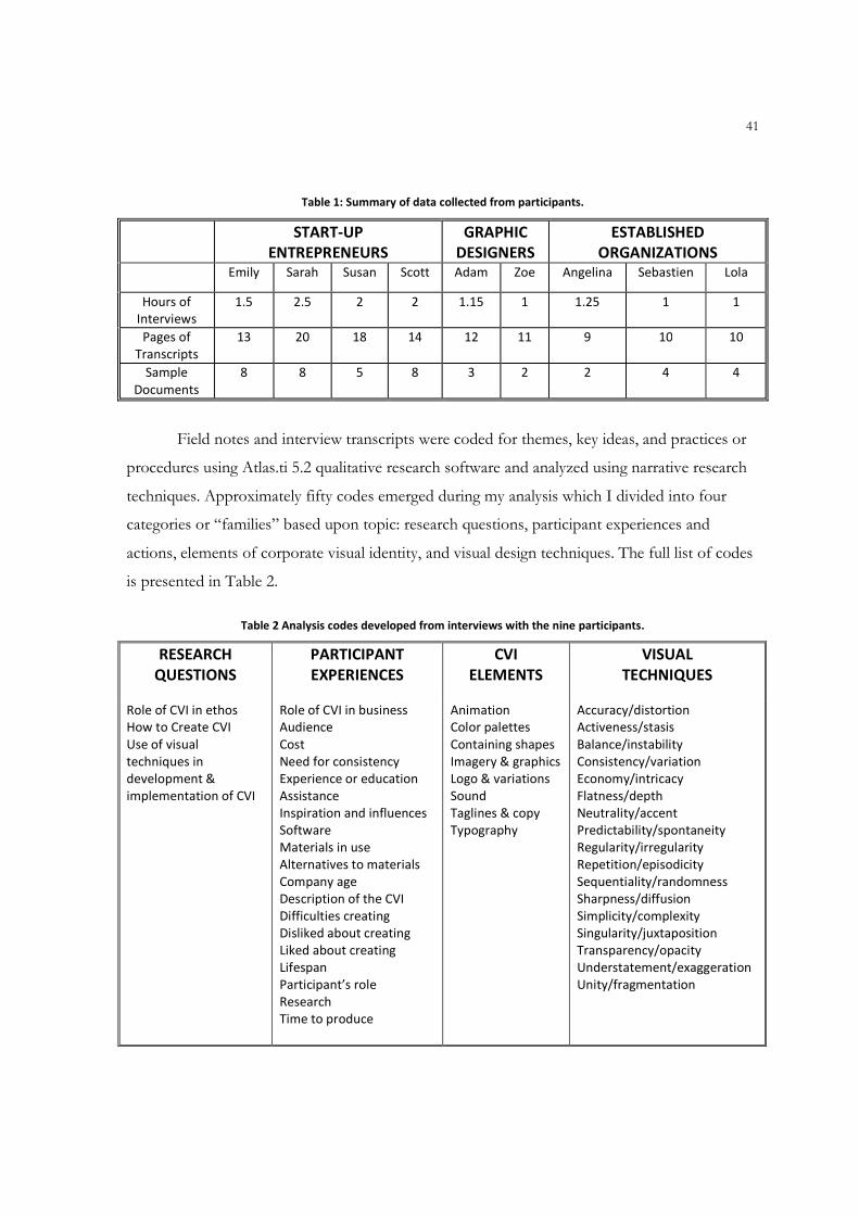
41
Table 1: Summary of data collected from participants.
START-UP
ENTREPRENEURS
GRAPHIC
DESIGNERS
ESTABLISHED
ORGANIZATIONS
Emily Sarah Susan Scott Adam Zoe Angelina Sebastien Lola
Hours of
Interviews
1.5 2.5 2 2 1.15 1 1.25 1 1
Pages of
Transcripts
13 20 18 14 12 11 9 10 10
Sample
Documents
8 8 5 8 3 2 2 4 4
Field notes and interview transcripts were coded for themes, key ideas, and practices or
procedures using Atlas.ti 5.2 qualitative research software and analyzed using narrative research
techniques. Approximately fifty codes emerged during my analysis which I divided into four
categories or “families” based upon topic: research questions, participant experiences and
actions, elements of corporate visual identity, and visual design techniques. The full list of codes
is presented in Table 2.
Table 2 Analysis codes developed from interviews with the nine participants.
RESEARCH
QUESTIONS
PARTICIPANT
EXPERIENCES
CVI
ELEMENTS
VISUAL
TECHNIQUES
Role of CVI in ethos
How to Create CVI
Use of visual
techniques in
development &
implementation of CVI
Role of CVI in business
Audience
Cost
Need for consistency
Experience or education
Assistance
Inspiration and influences
Software
Materials in use
Alternatives to materials
Company age
Description of the CVI
Difficulties creating
Disliked about creating
Liked about creating
Lifespan
Participant’s role
Research
Time to produce
Animation
Color palettes
Containing shapes
Imagery & graphics
Logo & variations
Sound
Taglines & copy
Typography
Accuracy/distortion
Activeness/stasis
Balance/instability
Consistency/variation
Economy/intricacy
Flatness/depth
Neutrality/accent
Predictability/spontaneity
Regularity/irregularity
Repetition/episodicity
Sequentiality/randomness
Sharpness/diffusion
Simplicity/complexity
Singularity/juxtaposition
Transparency/opacity
Understatement/exaggeration
Unity/fragmentation
42
For the document analysis I created an evaluation instrument based upon nineteen visual
techniques identified by Donis A. Dondis (1973). Rather than creating sketches and designs
haphazardly, Dondis explains, “the visual communicator is engaged…in a highly complex
process of selection and rejection” (107). She presents the visual techniques as a series of
polarities, such as symmetry/asymmetry or understatement/exaggeration, that allow visual
communicators to employ the basic elements of design (dot, line, shape, direction, texture,
dimension, scale, and movement) into limitless possibilities. To use these polarities as an
evaluation tool I created a scale with three points. A score of 1 indicated the dominance of the
first polarity of the technique. In my judgment this group generally consists of conservative
methods of employing the techniques. A score of 3 indicated dominance of the opposite
polarity, which might be described as more aggressive or radical forms of the techniques.
Instances that showed a hybrid of the polarities was indicated by a score of 2. A zero score
indicated that the technique was not used at all in the document. (See Table 3 for a copy of the
evaluation instrument featuring a complete list of the techniques and their polarities.)
In the following chapters I report the results of this analysis. Chapter 4 describes the
experiences, actions, and opinions of the nine participants regarding the development of
corporate visual identity. It begins with the voices of the experienced participants: the graphic
designers Adam and Zoe, the marketing specialists Angelina and Sebastien, and veteran
entrepreneur Lola as they discuss the importance of creating visual identities to establish
corporate ethos and then offer advice to novices who might choose to design their own
identities. From there the voices of the novices enter to share their own perceptions of the
audience and purpose of visual identity and to describe their methods, motivations, and
experience. They also offer a glimpse into the unique challenges start-ups face about cost,
needing outside assistance, and lack of design experience, software, and technical skill. Chapter 5
then focuses on several specific issues involved in the design and implementation of the visual
identities. It begins with a review of the typical visual identity elements and presents examples of
each from the start-up participants. Next, using examples of promotional documents created by
the start-ups, I demonstrate how the techniques work alone and together within the designs
created by the novices.
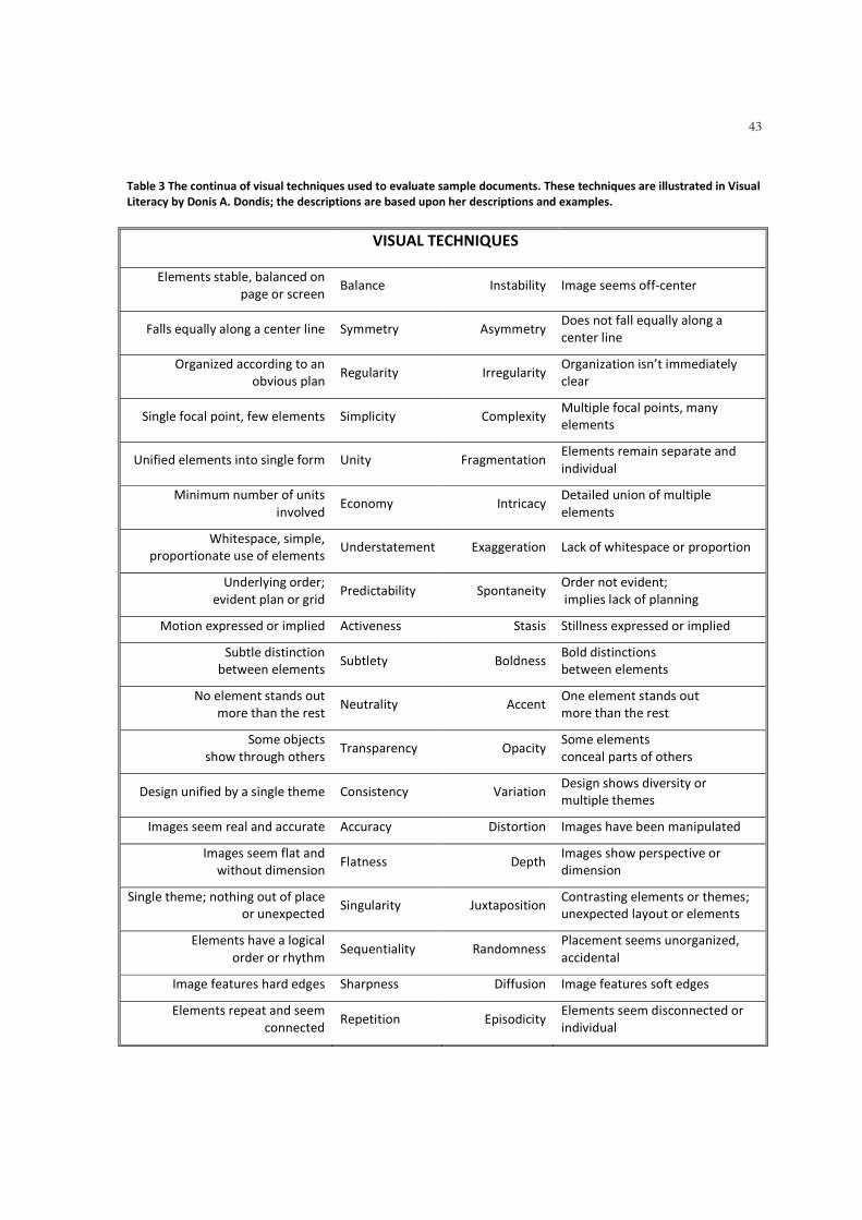
43
Table 3 The continua of visual techniques used to evaluate sample documents. These techniques are illustrated in Visual
Literacy by Donis A. Dondis; the descriptions are based upon her descriptions and examples.
VISUAL TECHNIQUES
Elements stable, balanced on
page or screen Balance Instability Image seems off-center
Falls equally along a center line Symmetry Asymmetry Does not fall equally along a
center line
Organized according to an
obvious plan Regularity Irregularity
Organization isn’t immediately
clear
Single focal point, few elements Simplicity Complexity Multiple focal points, many
elements
Unified elements into single form Unity Fragmentation Elements remain separate and
individual
Minimum number of units
involved Economy Intricacy
Detailed union of multiple
elements
Whitespace, simple,
proportionate use of elements Understatement Exaggeration Lack of whitespace or proportion
Underlying order;
evident plan or grid Predictability Spontaneity
Order not evident;
implies lack of planning
Motion expressed or implied Activeness Stasis Stillness expressed or implied
Subtle distinction
between elements Subtlety Boldness
Bold distinctions
between elements
No element stands out
more than the rest Neutrality Accent
One element stands out
more than the rest
Some objects
show through others Transparency Opacity
Some elements
conceal parts of others
Design unified by a single theme Consistency Variation Design shows diversity or
multiple themes
Images seem real and accurate Accuracy Distortion Images have been manipulated
Images seem flat and
without dimension Flatness Depth
Images show perspective or
dimension
Single theme; nothing out of place
or unexpected Singularity Juxtaposition
Contrasting elements or themes;
unexpected layout or elements
Elements have a logical
order or rhythm Sequentiality Randomness
Placement seems unorganized,
accidental
Image features hard edges Sharpness Diffusion Image features soft edges
Elements repeat and seem
connected Repetition Episodicity
Elements seem disconnected or
individual
44
CHAPTER 4: RESULTS OF INTERVIEWS
HOW ORGANIZATIONS CREATE CORPORATE VISUAL IDENTITY
He slipped a card across the table. There was his name and a slogan that read Alarm Technology of the Future, a message that was somewhat at odds with his trademark—a small drawing of a parrot on a perch squawking “Au voleur!”
– Peter Mayle, Toujours Provence
In this chapter I explore the ways that start-up companies create their visual identities.
This chapter focuses on the role of visual identity in establishing corporate ethos and on the
opinions, experiences and actions of the participants to create their identities. This discussion
focuses on several themes that dominated the interviews: the perceptions of audience and
purpose for the visual identity, the cost of development and implementation of promotional
materials, the experience or education of the participants regarding visual identity and visual
communication in general, and the methods the participants use to develop the visual identity.
I begin by sharing the attitudes and experiences of several professionals who specialize in
corporate visual identity: Adam and Zoe, two graphic designers who are themselves
entrepreneurs; Sebastien and Angelina, two marketing specialists who oversee the branding of
two universities in the Midwest; and Lola, an entrepreneur whose visual identity has grown with
her and her business over the past twelve years. These “experienced” participants describe the
role that visual identity plays in building corporate ethos—an important tool, but just one part of
a larger communication strategy. In explaining the process of developing a visual identity, these
participants emphasize the importance of researching the audience in order to create a design
that will resonate with readers and implementing that design “consistently, relentlessly” in
promotional materials. Their conversation concludes with advice for start-ups who choose to
create a visual identity on their own.
I then compare the information and advice from the experienced participants with the
voices of the start-ups: Emily, the owner of a pet services company; Sarah, a ventriloquist; Susan,
an alpaca rancher; and Scott, the owner of a sports training facility. I begin this section with the
start-ups’ perceptions of the role of visual identity in establishing their corporate ethos. Next, I
investigate the decisions they made in creating their visual identities. First, I focus upon three
critical issues involved in designing the visual identity: identifying the audience and purpose of
45
the visual identity, factoring the direct and indirect costs of developing and using the visual
identity, and implementing the visual identity consistently in promotional documents. Next, I
introduce four issues that posed constraints for the start-ups: a lack of experience in visual
communication, a need for assistance from others, the sources of inspiration for their designs,
and the software the start-ups used to create them. Finally, I conclude the chapter with by
considering what the responses from the participants reveal about corporate visual identity
design and use.
Voices of Experience
To begin to understand how corporate visual identity is created and used, I consulted
individuals with expertise and experience on the topic. In this section I present their opinions
about the importance of corporate visual identity. Next I describe their experiences developing
and implementing the identity. I begin, as they did, by discussing the research behind their work.
From there I turn to the implementation of their work in corporate documents in what
Sebastien would describe as the “consistent, relentless application” of the visual identity
elements as a tool for communicating with an audience. Finally, I present some advice that the
experienced participants offered to individuals who choose to work on their own.
The Role of Corporate Visual Identity: A Part of a Larger Communication Strategy
The role of a visual identity is to garner attention from an organization’s audience and
imply information about the organization itself. Yet the visual identity is just one piece of a
comprehensive corporate communication plan. Adam explains that
Branding is just that kind of recognition. Visual identity is part of it. You recognize the logo, you recognize the colors…And That is supposed to trigger a good feeling about the company. It’s almost touchy-feely in that way….[But] it’s not just the logo. It’s very much the whole package….Starting with a visual identity system is a great way to start, but it’s just a start. It’s by no means the end. It goes to your website, the people who work for you, all of that.
Angelina echoes this opinion when she calls visual identity a “tactic” and not the focus
of the communication, calling the university’s visual identity a tool in her toolbox that would
help her and other university administrators “figure out what it was going to take to get us to the
next level and be looked at in a different way.” The visual identity elements, when chosen
purposefully and used consistently, reinforce the intangible image that the organization wants to
46
promote. Angelina explains that her university’s visual identity was developed to help increase
awareness by potential students and to develop a reputation that the university is “bold,
aggressive, [yet] still traditional.” But while the visual identity may be only one element of a
larger process of corporate branding, it does help the organization’s ethos by increasing its
visibility. This “identity creep” is an important part of an organization’s visual communication
because it makes the product or service more easily recognized and remembered. As Adam
explains, when the visual identity is used repeatedly as part of branding, the logo, colors, and
other elements can “trigger certain thoughts in your head” that influence whether to search out
or avoid the product. But he warns that an engaging visual identity is not enough. “A brand is
not going to fly unless it’s good quality.”
Research for the Visual Identity Design
A first step in designing a visual identity is research. Angelina and Sebastien, both
marketing administrators at public universities in the Midwest, agree that extensive research
focusing upon the intended audience is crucial to creating a message that will be remembered
and that will project the image that the organization wants to use. Nearly twenty years ago
Angelina’s university updated its identity as part of its effort to change its image from an
agricultural college to a major research institution. As Angelina explains, “We undertook a
massive amount of research. We researched students, prospective students, faculty, staff,
administrators, alumni, donors, legislators…to help us learn what the university’s image was,
what the university wanted it to be, and how those things matched.” Sebastien concurs,
explaining that a good visual identity is carefully chosen based upon the audience’s perception of
the organization. “It’s not a whim, what you think or I think about icons. It’s what our target
market says appeals to them.” Since his arrival at his university three years ago he has regularly
engaged in focus groups and surveys to evaluate the appeal of its branding campaign in the
target market.
On the design side research is equally thorough. Adam, a graphic designer, describes
three main forms of data collection: the creative brief followed by interviews with key players in
the client’s organization and review of competitors’ information and designs. “The most
important thing to start with is the creative brief,” explains Adam, “where I’m getting
information directly from the client to these very important questions, sort of fleshing it out in

47
their head and getting them to think more than just ‘We need a logo.’” He describes the brief as
a set of questions that focus upon the audience for the promotional materials as well as the
image the client wants to create. Zoe describes the same process, which is not surprising for
professionals with similar education. In addition to the creative brief, she also appreciates when
clients share their own sources of inspiration. “I love it when people give me examples of what
they like, pieces they think are effective, and maybe a competitor’s piece.” In fact, she says, the
more information the client can provide the better. “If they can say ‘I want it to be a brochure
that will go in an envelope or a self-mailer’ That is helpful too. If they can give me their copy,
That is great.” Both graphic designers also admit to checking out the competition. After the data
collection, the designer gets to work. But “work” does not mean immediately picking up a pen
or turning on a computer. “I stew a lot. I try to let things just simmer for a while, let the
information sit and ask questions afterward. I do not just throw anything out,” explains Zoe.
Implementation of the Visual Identity
Once the visual identity elements are in place, advises Sebastien, the next step is to use
them “consistently, relentlessly.” Both universities have moved toward monolithic identities
which feature a single look (name, typeface, color palettes, etc.) for all units in the organization
rather than a branded look in which each unit develops its own identity (Olins 1989). A large
part of each decision to use a monolithic identity was the need to increase visibility within their
target markets. After all, to potential students, who are usually the focus of university
promotional materials, the individual academic units are indistinct. The students think in terms
of the institution as a whole, its reputation for excellence and the quality of life they will
experience if they attend the school. As Angelina pointed out, her university is competitive, but
its individual units do not have the recognition of powerhouses like the Wharton School of
Business. Thus the “product lines” are not the focus of the university’s marketing efforts.
Sebastien has been in charge of his university’s marketing only since 2005; prior to his arrival
there was no single person responsible for the university’s branding efforts. As a result, he
explains, “There was no look. There was just cacophony, both in print and on the web….The
standards were barely that, if at all.” He goes on to explain that “If branding becomes a series of
choices, then it’s just not branding. How will they remember you if you are inconsistent in
projecting the brand?”
48
In fact, Sebastien found himself in the same position Angelina had been in nearly two
decades ago: each unit was promoting itself with chaotic and inconsistent results. Sebastien’s
design audit (Olins 1989) showed that designers merely focused upon the “correct” placement
of the logo. “In old pieces you could barely tell what our school colors were….The brand was
logo focused. Basically, if you treated the logo right, you were OK and could do your thing.”
Angelina explains that her audit of the materials in use when she began her work on unifying the
identity revealed that some units did not even emphasize the university’s name but merely
included it as part of a return address. Both marketers now oversee plans designed to raise the
profile of their respective universities and develop a consistent look in print, on the web, on
billboards and in television commercials, and even on merchandise like coffee cups and water
bottles.
Both Sebastien and Angelina direct the carefully designed and polished visual identities
of their universities with an eye toward controlling the visual message. By contrast Zoe, the
owner of a successful yoga studio, has a more easy-going attitude toward her visual identity in
keeping with the service her company offers. She cites a local coffee shop as inspiration for her
visual identity. The “clumsy” design of the coffee shop ads was in keeping with its clientele, a
somewhat edgy, alternative crowd who eschew corporate America. She realized that her clientele
was similar in a way. Many of her clients work for the local university; they are highly educated,
open-minded people who are largely liberal in their politics. Lola explains that she adopted the
free spirit of the coffee shop ads to create her own alternative ethos with her clients.
The slick-looking corporate ad, That is not my customer. They do not want that. They want something roughly hewn. Home grown. Homemade. Handmade. So if it looks like the ad was put together by someone with an Exacto knife, that’s OK. Our client is alternative in a way.
Lola believes that the unsophisticated aesthetic builds her credibility with her audience.
“They’re looking for a non-corporate experience, a non-pre-packaged experience. They don’t
want a McYoga, so I’ve tried to keep my ads that way too.” Lola’s current visual identity is the
product of twelve years of refinement. The visual identity in use now features her second logo
(or third, depending upon whether she counts the one that is “just used on stationery”). In her
own early years as a start-up she traded services with a yoga student; today she works with a
graphic designer but relies heavily on her own background in journalism and keen artistic eye.
She continues to use earlier versions of her logo and color palettes on “vintage” merchandise as
49
well as on a flag that flies outside her building. While she acknowledges that changing a visual
identity might cause confusion or signal to the audience that the business is growing
haphazardly, Lola points out that a lack of competition and her own visibility in the community
and network of friends and clients have given her a freedom to experiment with her visual
identity without harming the business.
Advice for DIY Visual Identity
Both the graphic designers and the experienced organizations warned that entrepreneurs
should remember the importance of differentiation in their visual identities. Lola bemoaned the
“generic and very boring” designs that result from popular, pre-packaged, “design it yourself”
(DIY) sites like Vistaprint.com. In fact, Adam explained that differentiation is one of the key
selling points for using his services rather than a DIY site. Pointing to a brochure for women’s
primary care at a Boston-based medical facility, he explained that the stock image used on the
cover was also used in an HIV advertisement. “The argument I would make is ‘Who else is using
this look?’…You do not know where stuff like that is going to be used. It’s not unique.”
Lola expressed the same concern about DIY sites and templates. She admits to freely
changing elements of her visual identity over time and to giving her graphic designer free rein to
change anything when it feels appropriate, including the company’s logo. “It’s a longer, harder,
more circuitous route to not take a package,” she explained. “But you get a product that
expresses who you are and where you’ve been. It’s OK if people look at your marketing
materials over the past five years and see that they’ve changed because it shows growth.” Lola
believes that change is a good idea as long as it improves the identity. To ensure that the changes
are positive, she routinely consults her clients, many of whom have studied yoga with her for
years, about designs and promotional materials.
Yet Zoe concedes that the demands upon a start-up’s time and funding often make the
visual identity a secondary concern. She even admits to feeling the pressure herself:
A lot of small businesses do whatever it takes to get by and stay running. Anything above that will take extra time and money. It’s a struggle. I do that too. I’ve used this logo [pointing to her business card] for five years now. I want to redesign that. It’s literally something that I threw together one day because I had to order business cards. I look at it and say “Ugh.” But when I printed new cards a couple of weeks ago…I told the printer to just use the old logo. I just wanted to be done.
50
Sebastien’s advice to entrepreneurs is to be both bold and simple via the use of color and
white space; in fact, he advocates using bold color as white space, citing Target as a source of
personal inspiration. He explains that many businesses are “stingy” with white space because
they do not feel that they get value from it. In fact, several of the start-up participants expressed
this very reservation, explaining that they feel the need to make the most of the space they have
available. Yet Sebastien insists that his data show that people pay attention to materials with lots
of whitespace, turning their focus to the foreground element(s) in a manner that does not
happen when the document is cluttered with text or images.
Zoe echoes Sebastien’s advice with her own thoughts on the value of simplicity in
design. She explains that she usually creates three variations to show clients, and the client
usually picks the one she hates, the one that is more complicated than the rest. Ironically, they
often choose the design she spent the least amount of time creating. People who design their
own logos go wrong, she says, when they try to create really complicated designs without
thinking about how they will appear at various sizes, on different media, or when copied
repeatedly. Her preference is for designs that are simple and streamlined. “Maybe I’m boring
that way, but if you’re paying me to help you communicate then I do not think my role is to
make it so sexy that it loses your message.”
Finally, Sebastien offers a simple piece of advice about what makes the larger process of
branding work and why so many companies fail: “Branding is successful when you have modest
pressure relentlessly applied. It’s the relentlessly part That is generally jettisoned.”
Voices of the Novices
So far we have heard from experienced marketers, professionals who either create visual
identities or use one created by a graphic designer to promote their business. These individuals
value a corporate visual identity as an important part of an organization’s communication with
prospective customers and with the communities that support the business. In this section I turn
to a group of novices, owners and operators of start-up businesses who have discovered that
developing a visual identity is an important yet difficult step in establishing their companies.
When possible I compare the responses of the start-ups to those of the more experienced
participants to consider how the decisions of the start-ups might emulate the practices or
opinions of the more experienced practitioners.

51
None of the start-up business owners has any formal education or experience in graphic
design or professional communication. Each of them has developed a corporate visual identity
largely through intuition, personal preference, and trial and error. They have relied upon
assistance from others in varying degrees ranging from logo design by relatives to alterations
made by employees of local printing facilities. In this section I describe several common
concerns and experiences from my sample of start-up entrepreneurs. First, I focus on
development issues such as how their knowledge of their audiences and the purpose they
envision for their visual identity has influenced, or might influence, visual identity elements like
copy, logo, colors, etc. The cost of development, both in terms of the money required for
materials and development as well as the time it takes to develop the visual identity, is another
factor that influences the visual identity, creating constraints on what they develop and how they
use it. Next, I reflect upon their common aspiration for consistency, or as Sebastien called it,
relentless application. They describe their intent in using the visual identity in corporate
documents as serving an ethical function of establishing their reputations with their audience;
consistency seems to be one way they feel they can accomplish that.
Finally, I introduce several issues or concerns that are unique to the start-ups. First, as a
group they chose to design their visual identities on their own rather than hire a graphic designer
for assistance in spite of their own lack of expertise with visual communication. When they
needed help with specialized tasks or when their own technical skill failed them, they turned to
friends and family for help. But for the most part they relied on their own intuition, on a sense
of what others in their field have done, and upon the software they have at their fingertips, even
if the software they have is not necessarily the best one for the job.
Perceiving the Role of Visual Identity in Establishing Corporate Ethos
The visual identity helps a company build its ethos by meeting the expectations of its
audience: more and more customers expect to see elements like logos and taglines, and they
expect to find them on conventional documents like business cards, brochures, and websites.
Although they may not have used the word ethos, each of the participants expressed the hope
that their visual identity would help them communicate with their audiences and build a positive
reputation. Emily, for instance, hopes that her visual identity projects a sense of professionalism
to her audience. She wants readers to understand that her pet services company, and the
52
materials promoting it, was not “thrown together helter skelter.” Instead, she explains, she wants
potential clients to see her promotional materials and realize that her pet services company is
“not somebody in a little corner place trying to start a business. That it’s a legitimate business
and there’s a reason for them to bring their pets to me.”
But the responses from the start-ups also suggest that the corporate visual identity serves
an informational purpose, too. For example, Sarah faces a unique problem: not everyone knows
what a ventriloquist is, and those that do often think of the old-fashioned wooden puppets a la
Howdy Doody. Sarah uses photos of her puppets on her materials to show them exactly what
her company offers. “I’ve heard…people say I’ve got nice puppets. The types of puppets I
have—of course that does not mean I do it well—but it indicates I’ve invested in this.”
Scott, on the other hand, faces a problem of differentiation. Although he has no direct
competition within sixty miles, when people read his company’s name they often think his sports
training company is really physical therapy. To counteract this confusion he has changed his
tagline and shortened his company’s name; his plan, he says, is to use the visual identity to brand
the company and gain instant recognition with his audience and community.
As a fellow small business owner, Lola understands the need for her audience of yoga
students to believe in her and her company’s ability to offer a quality service. Even though she is
capitalizing upon a “home made, home grown” design aesthetic, she warns that “There’s always
a chance that you’ll be misread.” Lola hasn’t worried about changes in her visual identity causing
confusion or hurting her reputation because she’s so well known in her community that “Lola”
and “yoga” are nearly synonymous. But she has more than a decade of interactions with the
public to draw upon. She acknowledges that start-ups may have a more difficult time building
their ethos.
Designing the Visual Identity
For the start-up participants, identifying the rhetorical situation of their visual identity
was clear: The purpose of their visual identity is to attract the attention of their potential
audiences and to make them appear to be credible, reliable businesses. Yet the time, attention,
and money needed to create a visual identity and ensure its consistent use across a variety of
documents comes at a cost because those are resources that could be used on the company’s
core product or service instead.
53
Identifying the Audience & Purpose of Visual Identity. The participants seem to
agree that the purpose of their corporate visual identity is largely to attract attention from their
target markets. However, of the four start-up participants only Scott (sports training) seemed to
be able to clearly explain who his audience is; presumably, his background as a management and
entrepreneurship professor helps him stay focused on his customers. In fact, Scott made two
important discoveries after a year of promoting his sports training business: his target audience is
younger than he originally thought and, therefore, traditional advertising is not very effective for
his business. Rather than teaching students the fundamentals of popular sports, Scott’s sports
training business helps students develop their skills, speed, and agility so that they can be more
competitive athletes. Initially he assumed that local high school students would become his
clients; he soon learned that the athletic coaches already have programs in place for those
students. Therefore Scott and his team turned their focus to middle school students with an eye
on helping them develop the skills to be selected for varsity teams in the future. Yet Scott has
discovered that communicating with his audience is “unbelievably hard…..Who do you advertise
to? We’re still struggling with that. Do we keep plugging to the kids or the parents?” His
solution has been to design a visual identity with elements that are attractive to teenagers but to
place his materials where parents will find them.
Sarah, the ventriloquist, is in a similar situation. She has two distinct audiences: the
people who attend her shows and the people who decide to hire her. She admits that developing
materials that will interest both groups is challenging: children are often the primary audience for
her shows, particularly in the summer months, but they are not the ones to whom she is really
selling her services. She says
I’m hoping people will look at this and say “We’ve never had a ventriloquist before. This looks like a lot of fun. Something different and exciting.” But I also want it to be appealing to all audiences, not just children and not just adults, and That is a difficult thing to come up with. I’m hoping that the logo shows that it’s not just a kiddie thing.
Susan has a good idea of her audience because she works in a relatively small sphere of
alpaca ranchers in the Midwest. In fact, Susan jokingly referred to the sixty alpaca ranchers in her
state as a cult because of their passion for the animals and their tight-knit community. Her visual
identity and promotional materials are designed to emphasize the quality of her two products:
the animals and their fiber. She is the only participant to actively use a tagline on all her
54
materials, but she feels the tagline is essential because it emphasizes her focus on quality. In one
of her first competitions her male alpaca won his category, so the emphasis seems justified.
Because Susan shows her alpacas in competition, she is in a unique position to get to
know both her competitors and potential customers personally and develop relationships that
might further her business. Before each show she prints out flyers with photographs and lineage
information of her alpacas to distribute to attendees. (See Chapter 5 for examples of these
documents.) But Susan also sees her documents as serving an educational purpose because
outside of her industry many people do not know what an alpaca is. After all, alpaca farming
might be one of South America’s oldest and largest industries, but it is still fairly new to the
United States. She sees part of her job as educating people about the animal to help develop the
North American market for the products made from their fiber. Therefore her documents, and
the visual identity that unites them, are created for both experts within her field as well as lay
persons that she meets around town or at competitions.
Emily’s pet services company is the newest business in the sample and she is still refining
her definition of audience. An early draft of her business plan broadly describes her audience as
“pet owners who need assistance with their pet care needs,” but conversations reveal that she is
actually focused on owners of mainly dogs and cats with specific needs and in a small geographic
area. Like the other start-up participants, Emily faces an audience of potential clients who are
unfamiliar with who she is and what she does. Yet as the youngest company in my sample, it is
especially important for Emily’s pet services company to quickly establish a positive reputation
because she faces the most direct and indirect competition for the services she offers and thus
has a greater risk of confusion or being overlooked. Her documents need to help her build her
client base, which she hopes will then multiply through referrals.
Factoring the Costs of Developing a Visual Identity. The work involved in graphic
design is more than just intuition. It is the result of both education and experience (Frascara
2007). Yet outsiders—that is to say most clients—do not necessarily understand or value the
work involved in creating designs, explain both Adam and Zoe. New clients often ask how
much a project will cost, as if graphic design were something one could order off a menu.
While revenue and expenses are a concern for every business, the cost of creating a
visual identity and promotional materials featuring the identity are especially important to start-
ups who are walking a fine line between revenues and expenses. Each participant mentioned
55
cost as a crucial factor in the decisions about designing and employing their visual identities.
Scott (sports training) admitted that his choices for his visual identity were inspired in part by
cost. “I’m always conscious that too many colors make the cost of printing go up. By staying
with blue and gray you can always do things in grayscale.” Susan is also acutely conscious of
expenses, explaining that most of her money goes into her animals, not her promotional
materials:
I’ve hesitated about making a lot of things. I’ve invested a little in business cards but we truly are nickel and diming it. Paying vet bills, buying hay…there are other expenses so without being able to have any of it professionally done I’ve just made as many business cards as I need. When we go to shows I do things like this [pointing to flyer created in Word and photocopied at OfficeMax]. I haven’t even made a tri-fold…
An additional audience factor mentioned by each of the start-ups was the effect of the
recent economic downturn on their sales. All four participants mentioned that they working
harder to convince their audiences to purchase their products or services because they are
essentially competing with a variety of other businesses for increasingly smaller disposable
incomes.
Implementing the Visual Identity Consistently. One of the most frequently repeated
themes in the interviews was the need for consistency in the application of the visual identity
elements to corporate documents. As Robin Williams (2008) explains, repetition of elements
provides a sense of consistency across documents. She suggests that users repeat fonts, rules,
colors, graphics, even page formats to provide cohesiveness and unity (51). “The great thing
about repetition is that it makes items look like they belong together, even if they are not exactly
the same,” writes Williams (59), a technique she calls “unity with variety” (61). Sebastien
(university) feels that repetition is so important that he focuses most of his attention (and
money) on three elements: use of the university colors, use of the name, and employment of the
flame icon. Billboards in his target markets usually feature only these three elements with no
additional text or imagery. While such a spare design may seem boring or simplistic to many
viewers, he is getting compliments from experts. A representative of Clear Channel Outdoor, a
major outdoor advertising company, praised Sebastien recently saying “What [your university]
has done is consistently apply a very clear message through color and image across time,” a plan
that most billboard clients do not follow.
56
All of the start-up participants seemed concerned that their promotional materials
portray a consistent look and feel, and a look at sample materials reveals that they are achieving
their goal via repetition of elements and layouts. (The sample documents are included and
discussed in more detail in the following chapter.) Scott has created a series of handouts for his
sports training services that exemplify unity with variety. All are black and white, the front of
each features a photo representing a sport, and the back of each contains information about
both the general services his company offers and the ones specific to that sport. The elements of
repetition—color scheme, use of logo and tagline, layout and styles of the text—turn a set of
individual documents into a cohesive collection that packs a visual punch.
On the other hand, Sarah (ventriloquist) has not achieved the consistency that she
believes she needs. “I’m not consistent in my use of fonts and stuff like that. Even this
[combination of typeface and color] isn’t consistent in materials I’m sending out to people.”
Until recently the only truly consistent element of her visual identity was the color green,
although a decorative typeface (Comic Sans) and a photo of herself with some of her puppets
were also used frequently. Yet she still seems to feel that her identity is inconsistent and perhaps
a bit unfinished. “This is all new to me,” she explains. She hopes that her new logo, acquired in
the summer of 2008, will help tie her materials together and provide the consistency that she
feels is missing from her visual identity.
As Emily (pet services) explains, being consistent is important but a bit frustrating as
well. “There are so many choices out there. The hardest part was narrowing it down. If I had my
way I would have a different logo on everything because there are so many to choose from. And
so many colors and typestyles, too.” As Emily develops additional promotional materials for her
pet services company, she may be losing focus on her initial decisions about visual identity in
favor of items she can afford. In an early meeting with an entrepreneurial expert she expressed
an interest in painting her car to look like an American flag. He helped her see that the flag
might not be a particularly useful way to differentiate herself or establish her business, yet four
months later she has purchased an order of promotional pens that do not fit into her visual
identity at all. “They did not have animals and I couldn’t choose the typestyle, so I went with the
flag. It’s patriotic. They had stars and moons, but none of it had anything to do with my
business, so I thought that flags would be more neutral. You can really do any business with
those.” A second promotional giveaway, key chains, is available in the paw print she uses on all
57
of her materials, but rather than sticking to her color palette of cream or white and burgundy,
she has chosen to purchase blue ones. Perhaps the choice was economic—her colors may not
have been available in that style—but she explains the choice quite simply: “Blue is my favorite
color, so they’re going to be blue.” Will the inconsistency create a problem for her company? It
is too soon to tell with her company only a year old. But it seems that Lola’s advice to
experiment with visual identity certainly has a fan in Emily.
Design and Implementation Constraints for the Start-Ups
Much like the experienced participants, the start-up participants devised a visual identity
by thinking about their potential audience, identifying the purpose of visual identity as a way of
attracting attention, communicating information about their businesses, and then selecting visual
identity elements to meet those needs. They knew that they should be consistent in their use of
visual identity elements in order to build recognition and develop an ethos with their audience.
But from here the experiences of the start-ups and the experienced participants diverged. In this
section I outline three themes from the interviews that were unique to the start ups: a lack of
expertise in visual communication, the need for assistance from family and friends, and the
inspirations and resources that influenced their designs.
Lack of Expertise in Visual Communication. As stated previously, none of the start-
up participants has any formal education or experience in advertising, graphic design, or visual
communication. They have created companies based upon their areas of expertise or interests;
their focus now is on finding clients and providing quality products or services. Creating a visual
identity and using it on marketing materials to communicate with the clients was largely an
afterthought: a necessary part of their business but not part of their daily operations.
Susan and Scott are both in a somewhat stronger position than Emily and Sarah. Susan
explained that she has worked in personal sales and marketing in the past. In addition to her
alpaca farm she is currently a career services specialist at a two-year college, a job that entails
teaching students how to sell themselves to potential employers. She even keeps a file of
documents and designs that she likes and uses them for inspiration in her own work both on the
ranch and at the college. Scott not only runs his sports training business but also is a
management professor at a Midwestern university. His education in business has introduced him
58
to the concepts of marketing, professional communication, branding, and corporate identity
even though it is not his area of expertise.
Sarah and Emily, on the other hand, have no business or marketing background. They
admit that a lot of their work has been created through experimentation and trial and error.
Sarah shared an early draft of her company’s tri-fold brochure, a document filled with photos of
her puppets but one that she does not like and has not used very often. She has ideas for
improving the brochure into a second draft but has not yet found time to do so. Emily explains
that her only previous design work was when she would “doodle a lot” in the margins of her
notebooks. Her logo and promotional materials are all the result of “trial and error.” Her first
brochure was designed in about one week, although the content inside was soon revised to
reflect new services for pet owners.
Of course, trial and error is a natural part of the design process, as even Adam and Zoe,
the graphic designers, can attest. “Creativity comes from experience. It comes from trial and
error. It comes from education. It comes from all these things that you can’t really spell out to
anybody,” explains Adam. And even the professionals sometimes err. Zoe described an
experience in which the document she designed simply did not meet the customer’s needs.
“Maybe I was having a bad week or something…But it made me realize that I need to listen a lot
more and take a lot more time up front rather than just throwing out ideas.”
Using Assistance from Outsiders. Sebastien and Angelina are fortunate that their
universities have dedicated marketing budgets and access to professional graphic designers and
marketing/advertising specialists to help them design and employ their visual identities on
promotional materials. Although her business is much smaller, Lola also benefits from the
expertise of a professional graphic designer. She works closely with Zoe to develop marketing
materials for her successful yoga studio. After working together for nearly a decade the two
women have a comfortable and trusting working relationship. They respect each other’s talents
and contribute their respective strengths to the design process: Lola provides copy and
storyboards of potential layouts, colors, and elements; Zoe uses that information and her own
expertise to create the final design. Lola gives Zoe complete control over the visual identity,
even giving her permission to change the logo or other identity elements if she feels it will make
the best impact in the design.
59
The start-up participants received assistance in designing and applying their visual
identities, too, but on a smaller scale and often for free. Each of the start-up participants
received assistance to some degree from friends, family, and others in the community. Susan’s
alpaca logo, for example, is a photo of her weathervane taken by a neighbor who is a
professional photographer. A clerk at the Office Max copy shop made a minor alteration to the
weathervane icon to rotate the alpaca figure. Susan’s mentor even suggested the tagline that
Susan uses on all of her materials to emphasize her focus on quality animals and fiber.
Sarah (ventriloquist) received significant help from her brother-in-law who used his
experience designing signs and vehicle advertising wraps to design a custom logo featuring
Sarah’ company’s name and an image of her primary puppet. At the recommendation of a local
entrepreneurship consultant, Sarah also hired a local marketing consultant to help her design a
postcard and a website, but she was not entirely happy with the results of the professional
assistance. When the marketing specialist moved out of state recently, Sarah decided to end their
professional relationship and focus more on developing the business materials on her own.
Scott asked an employee at his sports training company to develop gift certificates to sell
in his facility and to give away at athletic events. He also purchased a CD-ROM with 15,000
images of stock photography to use in his promotional materials. In each of the instances
described, the assistance was necessary to fill a gap in the entrepreneur’s own knowledge or
abilities.
On the other hand, Emily likes her independence and chose to work alone in her pet
services business. The few times she has reached out for help seem to have been more
frustrating than anything else. “I like being the one to make the decisions. I do not want a
partner to collaborate with. I want to be able to add something to [the design] without having to
haggle with someone else,” she explains. On the advice of an entrepreneurship consultant, Emily
received minor assistance from a local college student to create her website as his class project,
but she was disappointed with the result. She is hoping that the consultant will help her find
someone to improve and finish the site. She also sought outside assistance in developing a new
icon to supplement her two main icons of a dog-walker and a paw print. The woman who was
going to help her knows Illustrator, a software program that Emily has not used before.
Unfortunately, the resulting design was unsatisfactory. “Not even my typestyle, not even close to

60
what I had. I was not at all happy with that. She just was not listening.” Ultimately, Emily
decided to continue with her existing CVI elements and forgo the outside help.
Seeking Inspiration for Visual Identity Elements. Before they start working on a
design, graphic designers Adam and Zoe seek inspiration from industry journals, information
about competitors, even fine art. And of course they also rely on their own thoughts and
experiences. Zoe goes for walks with her dog to “stew” about a project; Adam reads information
from the client to learn details that might guide his design. “But I learned in school that you do
not start at the computer,” says Zoe.
Like Adam and Zoe, Susan sought inspiration from the materials that surround her. A
photograph of the alpaca-shaped weathervane on her barn became her logo; the colors of her
barn became her color palette. She keeps an “ideas file” with advertisements from other
breeders or documents that she gets in the mail that have design elements that appeal to her.
Both Scott and Sarah also sought inspiration from existing documents. Although Scott’s blue
and black palette was chosen to keep printing costs low, he explains that black is also widely
used by similar sports training companies around the country. Sarah was inspired by her mentor,
a ventriloquist in Texas who is nationally known and whose materials are “fantastic.” Like him,
she features photographs of her puppets in all of her documents and inserts them into a simple
green pocket folder when distributing them to potential clients.
Using Software at Their Disposal. While Adam and Zoe use specialized desktop
publishing software to design the visual identity elements and to make the documents that they
send to professional printers, the start-ups work with significantly lower-tech resources. Most of
the documents in my sample, as well as others described by the start-up participants, were
created using software that is not necessarily suitable for the task of creating a visual identity or
promotional materials. Each start-up entrepreneur mentioned using Microsoft Word to create
documents ranging from invoices to flyers and tri-fold brochures. Although Word is capable of
creating these documents, it does not offer the range of features available in desktop publishing
software, nor does it allow a novice user as much control or flexibility over all of the design
decisions involved in creating these types of documents.
It seems that participants understand the limitations of their software and the advantages
of using the right tool for the job. Emily created most of her materials using Adobe InDesign
software; Sarah created her documents using Microsoft Publisher. However, they also
61
mentioned limitations in their knowledge of the full range of features in desktop publishing
software. “I have [Photoshop],” said Emily, “but I can’t put one person’s face on another
person’s body. I can crop and That is about it.” Instead, she edited clip art to create her dog-
walker logo using Paint, a simple drawing software that is standard in Microsoft Windows
operating systems. Scott started creating his sports training documents using InDesign as well
but switched to Word when he received a new PC and continued using it to facilitate file sharing
with his employees.
By contrast, Susan relies upon Microsoft Word, Excel, or PowerPoint for all of her
alpaca-related documents. Those programs are what she knows how to use, she explains, and
she is not sure she wants to learn any others. To create her logo she tried using PictureIt, a
discontinued photo editing application. She also expressed an interest in buying a license for
software that would allow her to design postcards on her computer. The service would allow her
to submit designs to be printed and mailed remotely, saving both time and money.
What the Interviews Reveal About Creating Corporate Visual Identity
The participants in this study represent a breadth of experience and expertise in creating
corporate visual identities. Adam and Zoe, professional graphic designers, each have more than
a decade of experience in addition to education in art and graphic design. Sebastien and Angelina
may not create visual identities, but they use their education and experience in marketing to help
them apply the visual identities to the university branding campaigns and to explain to internal
users why maintaining a consistent look and feel to documents is an important part of
communications with their stakeholders. Lola uses her background in journalism, a decade of
experience as small business owner, and the assistance of a graphic designer to create and
execute her visual identity and corporate documents. Furthermore, the experienced participants
also use research regarding their audiences and their competition to guide their decisions. The
start-up participants, on the other hand, relied mainly upon educated guesses and personal
experience to describe their audiences. None conducted any formal audience analysis prior to
developing their visual identities or implementing the visual identity in promotional materials.
The start-ups agreed with the experienced participants that the purpose of their visual
identity was to raise their visibility with their audiences. The start-ups had an additional purpose
though: they wanted their visual identities to help them look professional and established, like a
62
“legitimate business.” Although each recognized the value of hiring a professional, the start-ups
all indicated that in these early years they need to focus more of their scarce resources—time,
attention, and money—on the day-to-day expenses of running their business. Unfortunately, this
view of the visual identity as an expense rather than as an asset could be short-sighted. In the
year since this project was started, the American economy has entered a recession, and
disposable incomes have shrunken swiftly; each start-up must acknowledge their products or
services are not necessities, so being visible to potential clients is more important than ever.
In choosing to forgo professional assistance and without formal training in visual
communication, the start-ups relied instead on intuition, experimentation, and personal
preference to make their designs. They also relied upon the tools already at their disposal to
implement the visual identities in their professional documents, including clip art, stock
photography, personal digital photos, and the small business productivity software. But in spite
of their best efforts, their visual identities were often constrained by their access or ability to use
the most appropriate technology to create their designs. Most of the software mentioned by the
start-ups—Word, Paint, PictureIt—are not intended for complex design tasks. Even Publisher,
the Microsoft desktop publishing application that Sarah used, is limited in higher-end features
such as text on paths or image editing. The Microsoft.com website describes Publisher as a tool
for creating a small business brand identity via color, fonts and logo, but it also emphasizes the
use of templates to create documents to create that identity. Therein lies a tradeoff that many
novice designers face: Starting from scratch may be the most creative outlet, but using the wrong
software may limit the ability to execute that creativity or may lead to inconsistency in
implementation. On the other hand, using a template is certainly easier than starting from
scratch. However, even with moderate customization the documents tend to be boring, cookie-
cutter designs that fail to attract the attention that start-ups so desperately need. Furthermore,
none of the software currently used by the start-up participants includes the specialized features
like color separation that would be needed by professional printers. In fact, the start-ups may be
surprised to learn that even basic elements like fonts or graphics may pose problems for printers
if the elements are not embedded within the document, a task that is not difficult but not routine
either. The corporate visual identities of the start-ups were all quite original, but the participants
did express frustration about trying to ensure consistent implementation in their promotional
materials.
63
Getting help from family and friends is not always the best solution either. Projects
sometimes take longer to complete when one is not a paying client, as Sarah learned with the
creation of her logo. And even if someone is ready and willing to help, he or she might not do a
thorough job, as Susan learned with the editing of her logo. Relying upon students often seems
like a mutually beneficial endeavor, but student projects involve a risk of working with someone
who is more interested in earning a grade than creating something good, as Emily learned with
her website.
Finally, the confluence of several decisions on the part of the start-up participants—to
forgo audience research and analysis, to design from intuition, and to work alone or with only
minimal assistance—could prove to be an impediment to establishing the professional ethos
they all yearn for. After all, ethos is created by each interaction of a speaker/author and her
audience. As the experienced participants suggest, researching one’s audience is the best way to
identify the characteristics and values that they will find appealing and persuasive. A visual
identity created in a vacuum runs the risk of creating a design that fails to please or persuade
anyone other than its creator.
This chapter has explored the ways that start-up entrepreneurs create their corporate
visual identities. To better understand the tasks and decisions that the start-ups face, I compared
the thoughts and advice of several experienced marketing and graphic design professionals to
the responses of the start-up participants. The start-up entrepreneurs recognize that a corporate
visual identity is a standard part of typical business communication, a visual method of
communicating information about their company and corporate identity that also provides a
consistent look and feel to corporate documents. They also recognize that their corporate visual
identity has the potential to affect their ethos with their audience of potential clients. In their
current financial situations and with limited experience in design, the start-up participants make
do with what they have, but their experiences show that even DIY has a cost.
In the following chapter I delve more deeply into the corporate visual identities of the
start-up participants. In order to understand how theories of visual rhetoric presented in rhetoric
and professional communication literature inform the practice of developing CVI, I use a
framework suggested by Dondis (1973) to analyze the design techniques that are evident in
several sample documents provided by the start-ups. My objective is to identify patterns in the
techniques the start-ups use. After all, they have admitted that they are developing their materials
64
through trial and error with no education or experience in visual communication. As I argue in
Chapter 6, knowing which techniques seem to be used more or less often by novices can inform
the teaching of visual rhetoric in professional communication by suggesting ways to experiment
with elements. Such experimentation helps students to reflect upon their design decisions and
increase their visual literacy.
65
CHAPTER 5: RESULTS OF DOCUMENT ANALYSIS
THE METHODS AND TECHNIQUES BEHIND
CORPORATE VISUAL IDENTITY
Visual intelligence is no different than general intelligence and the control of the elements of visual media presents the same problems as the mastery of any skill. To accomplish it, you must know what you are working with and how to proceed.
Donis A. Dondis, Visual Literacy
In Chapter 4 I explored the ways that start-up entrepreneurs create their corporate visual
identities. I now turn my focus to the sample documents that the participants provided. Each
document features one or more of six elements of corporate visual identity: logos, color palettes,
typography, graphics and imagery, copy and taglines, and animations (Adams, Morioka, and
Stone 2004). Data from the participants revealed that none is currently using the containing
shape element in their identity. An additional element, sound signatures, does not fit into the
scope of this project. I begin by describing how the start-ups have developed their own version
of each element for their visual identities. Then I analyze the elements of the visual identities and
the sample documents provided by the start-ups within the framework of nineteen visual
techniques suggested by Donis A. Dondis (1973) and listed in Chapter 3. Dondis claims that
these visual techniques (along with the basic technique of contrast) allow users to manipulate the
basic elements of dot, line, shape, direction, texture, dimension, scale, and movement into
designs. I believe that identifying how novices use these techniques may help instructors teach
students to read and create their own visual documents.
The Elements of a Corporate Visual Identity
Corporate Logos
A logo is “a distinctive symbol of a company, object, publication, person, service, or
idea” (Adams, Morioka, and Stone 2004, 16). A logo may consist of the organization’s name
(logotype), a symbol (icon), or a combination of the two. Robert C. Parker (2006, 47) calls logos
a “visual shorthand” for an organization that creates consistency across documents and easy
recognition for readers. He offers this advice to novices who are creating logos: “The best logos
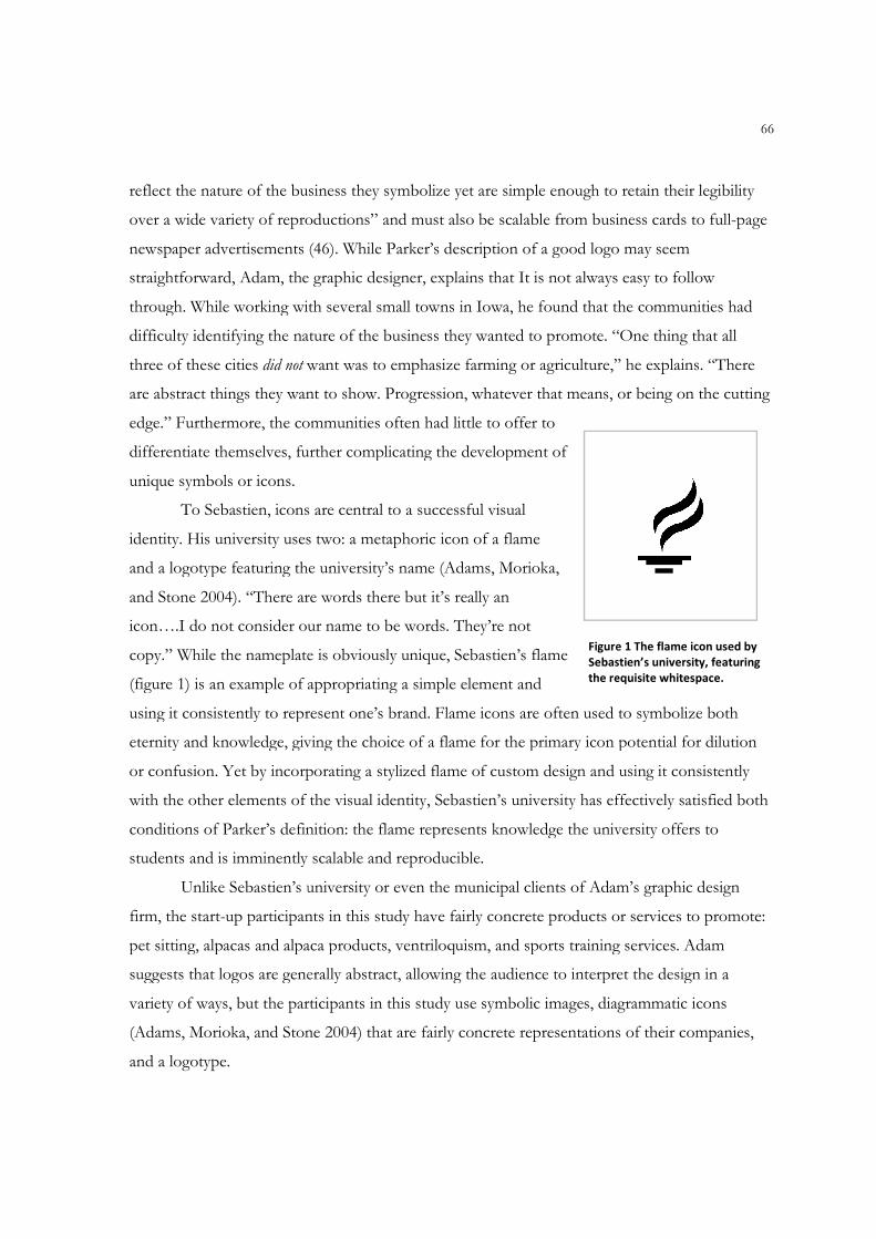
reflect the nature of the business they symbolize yet are simple enough to retain their legibility
over a wide variety of reproductions” and must also be scalable from business cards to full
newspaper advertisements (46). While Parker’s
straightforward, Adam, the graphic designer, explains that
through. While working with several small towns in Iowa, he found that the communities had
difficulty identifying the nature of t
three of these cities did not want was to emphasize farming or agriculture,” he explains. “There
are abstract things they want to show. Progression, whatever that means, or being on the cutting
edge.” Furthermore, the communities often had little to offer to
differentiate themselves, further complicating the development of
unique symbols or icons.
To Sebastien, icons are central to a successful visual
identity. His university uses two: a metaphoric icon of a flame
and a logotype featuring the
and Stone 2004). “There are words there but it’s really an
icon….I do not consider our name to be words. They’re not
copy.” While the nameplate is obviously unique, Sebastien’s flame
(figure 1) is an example of appropriating a simple element and
using it consistently to represent one’s brand. Flame icons are often used to symbolize both
eternity and knowledge, giving the choice of a flame for the primary icon potential for dilution
or confusion. Yet by incorporating a stylized flame of custom design
with the other elements of the visual identity, Sebastien’s university has effectively satisfied both
conditions of Parker’s definition: the flame represents knowledge the university offers to
students and is imminently scalable a
Unlike Sebastien’s university or
firm, the start-up participants in this study have fairly concrete products or services to promote:
pet sitting, alpacas and alpaca products, ventriloqu
suggests that logos are generally abstract, allowing the audience to interpret the design in a
variety of ways, but the participants in this study use symbolic images, diagrammatic icons
(Adams, Morioka, and Stone 20
and a logotype.
reflect the nature of the business they symbolize yet are simple enough to retain their legibility
over a wide variety of reproductions” and must also be scalable from business cards to full
newspaper advertisements (46). While Parker’s description of a good logo may seem
straightforward, Adam, the graphic designer, explains that It is not always easy to follow
through. While working with several small towns in Iowa, he found that the communities had
difficulty identifying the nature of the business they wanted to promote. “One thing that all
want was to emphasize farming or agriculture,” he explains. “There
are abstract things they want to show. Progression, whatever that means, or being on the cutting
” Furthermore, the communities often had little to offer to
differentiate themselves, further complicating the development of
To Sebastien, icons are central to a successful visual
uses two: a metaphoric icon of a flame
and a logotype featuring the university’s name (Adams, Morioka,
and Stone 2004). “There are words there but it’s really an
consider our name to be words. They’re not
copy.” While the nameplate is obviously unique, Sebastien’s flame
(figure 1) is an example of appropriating a simple element and
ng it consistently to represent one’s brand. Flame icons are often used to symbolize both
eternity and knowledge, giving the choice of a flame for the primary icon potential for dilution
or confusion. Yet by incorporating a stylized flame of custom design and using it consistently
with the other elements of the visual identity, Sebastien’s university has effectively satisfied both
conditions of Parker’s definition: the flame represents knowledge the university offers to
students and is imminently scalable and reproducible.
Unlike Sebastien’s university or even the municipal clients of Adam’s
participants in this study have fairly concrete products or services to promote:
pet sitting, alpacas and alpaca products, ventriloquism, and sports training services. Adam
suggests that logos are generally abstract, allowing the audience to interpret the design in a
the participants in this study use symbolic images, diagrammatic icons
(Adams, Morioka, and Stone 2004) that are fairly concrete representations of their companies,
Figure
Sebastien’s university, featuring
the requisite whitespace.
66
reflect the nature of the business they symbolize yet are simple enough to retain their legibility
over a wide variety of reproductions” and must also be scalable from business cards to full-page
description of a good logo may seem
not always easy to follow
through. While working with several small towns in Iowa, he found that the communities had
he business they wanted to promote. “One thing that all
want was to emphasize farming or agriculture,” he explains. “There
are abstract things they want to show. Progression, whatever that means, or being on the cutting
ng it consistently to represent one’s brand. Flame icons are often used to symbolize both
eternity and knowledge, giving the choice of a flame for the primary icon potential for dilution
and using it consistently
with the other elements of the visual identity, Sebastien’s university has effectively satisfied both
conditions of Parker’s definition: the flame represents knowledge the university offers to
Adam’s graphic design
participants in this study have fairly concrete products or services to promote:
ism, and sports training services. Adam
suggests that logos are generally abstract, allowing the audience to interpret the design in a
the participants in this study use symbolic images, diagrammatic icons
04) that are fairly concrete representations of their companies,
Figure 1 The flame icon used by
Sebastien’s university, featuring
the requisite whitespace.
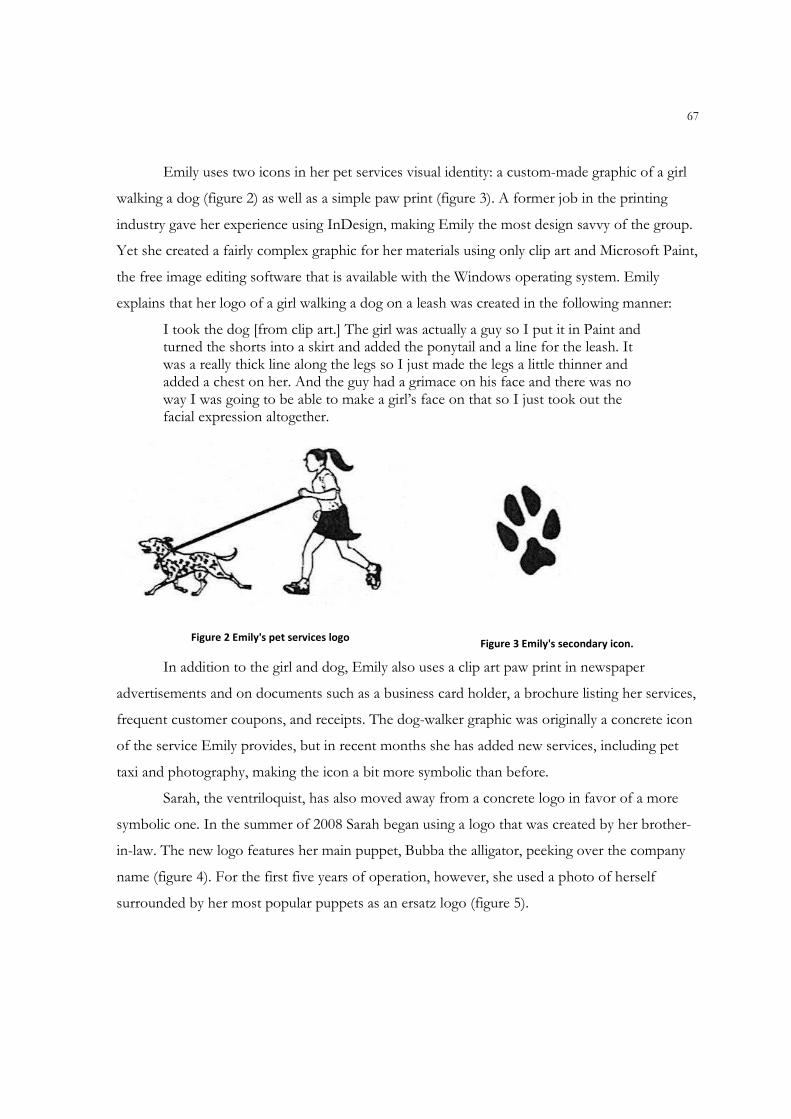
67
Emily uses two icons in her pet services visual identity: a custom-made graphic of a girl
walking a dog (figure 2) as well as a simple paw print (figure 3). A former job in the printing
industry gave her experience using InDesign, making Emily the most design savvy of the group.
Yet she created a fairly complex graphic for her materials using only clip art and Microsoft Paint,
the free image editing software that is available with the Windows operating system. Emily
explains that her logo of a girl walking a dog on a leash was created in the following manner:
I took the dog [from clip art.] The girl was actually a guy so I put it in Paint and turned the shorts into a skirt and added the ponytail and a line for the leash. It was a really thick line along the legs so I just made the legs a little thinner and added a chest on her. And the guy had a grimace on his face and there was no way I was going to be able to make a girl’s face on that so I just took out the facial expression altogether.
Figure 2 Emily's pet services logo
Figure 3 Emily's secondary icon.
In addition to the girl and dog, Emily also uses a clip art paw print in newspaper
advertisements and on documents such as a business card holder, a brochure listing her services,
frequent customer coupons, and receipts. The dog-walker graphic was originally a concrete icon
of the service Emily provides, but in recent months she has added new services, including pet
taxi and photography, making the icon a bit more symbolic than before.
Sarah, the ventriloquist, has also moved away from a concrete logo in favor of a more
symbolic one. In the summer of 2008 Sarah began using a logo that was created by her brother-
in-law. The new logo features her main puppet, Bubba the alligator, peeking over the company
name (figure 4). For the first five years of operation, however, she used a photo of herself
surrounded by her most popular puppets as an ersatz logo (figure 5).
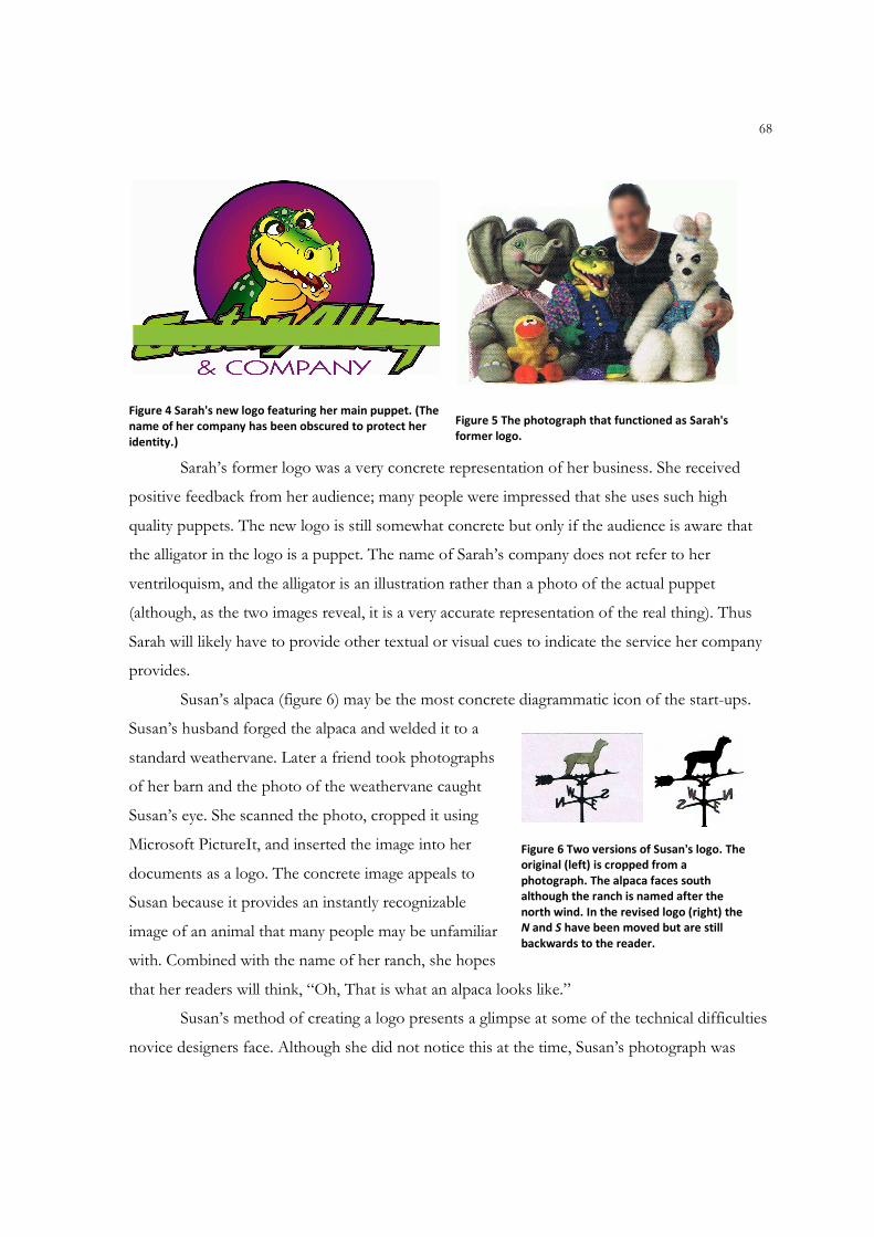
68
Figure 4 Sarah's new logo featuring her main puppet. (The
name of her company has been obscured to protect her
identity.)
Figure 5 The photograph that functioned as Sarah's
former logo.
Sarah’s former logo was a very concrete representation of her business. She received
positive feedback from her audience; many people were impressed that she uses such high
quality puppets. The new logo is still somewhat concrete but only if the audience is aware that
the alligator in the logo is a puppet. The name of Sarah’s company does not refer to her
ventriloquism, and the alligator is an illustration rather than a photo of the actual puppet
(although, as the two images reveal, it is a very accurate representation of the real thing). Thus
Sarah will likely have to provide other textual or visual cues to indicate the service her company
provides.
Susan’s alpaca (figure 6) may be the most concrete diagrammatic icon of the start-ups.
Susan’s husband forged the alpaca and welded it to a
standard weathervane. Later a friend took photographs
of her barn and the photo of the weathervane caught
Susan’s eye. She scanned the photo, cropped it using
Microsoft PictureIt, and inserted the image into her
documents as a logo. The concrete image appeals to
Susan because it provides an instantly recognizable
image of an animal that many people may be unfamiliar
with. Combined with the name of her ranch, she hopes
that her readers will think, “Oh, That is what an alpaca looks like.”
Susan’s method of creating a logo presents a glimpse at some of the technical difficulties
novice designers face. Although she did not notice this at the time, Susan’s photograph was
Figure 6 Two versions of Susan's logo. The
original (left) is cropped from a
photograph. The alpaca faces south
although the ranch is named after the
north wind. In the revised logo (right) the
N and S have been moved but are still
backwards to the reader.
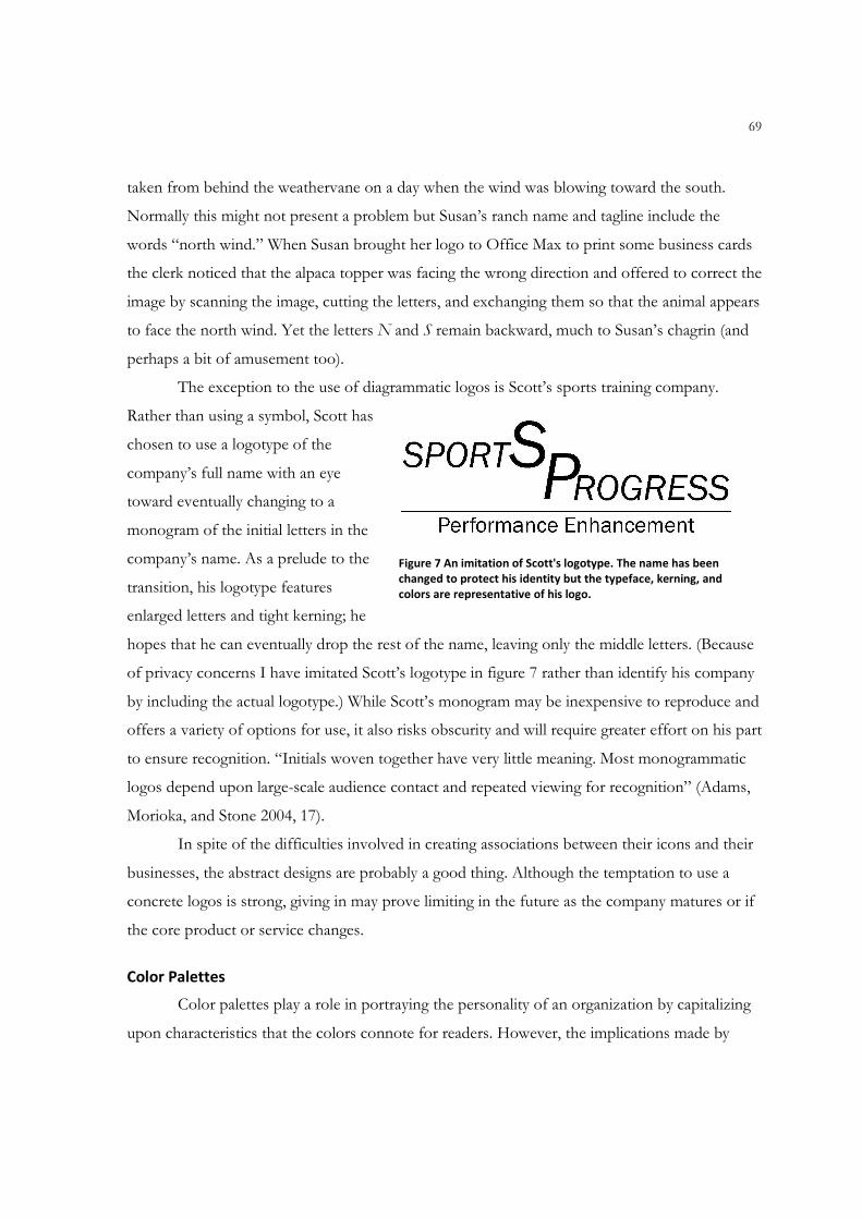
69
taken from behind the weathervane on a day when the wind was blowing toward the south.
Normally this might not present a problem but Susan’s ranch name and tagline include the
words “north wind.” When Susan brought her logo to Office Max to print some business cards
the clerk noticed that the alpaca topper was facing the wrong direction and offered to correct the
image by scanning the image, cutting the letters, and exchanging them so that the animal appears
to face the north wind. Yet the letters N and S remain backward, much to Susan’s chagrin (and
perhaps a bit of amusement too).
The exception to the use of diagrammatic logos is Scott’s sports training company.
Rather than using a symbol, Scott has
chosen to use a logotype of the
company’s full name with an eye
toward eventually changing to a
monogram of the initial letters in the
company’s name. As a prelude to the
transition, his logotype features
enlarged letters and tight kerning; he
hopes that he can eventually drop the rest of the name, leaving only the middle letters. (Because
of privacy concerns I have imitated Scott’s logotype in figure 7 rather than identify his company
by including the actual logotype.) While Scott’s monogram may be inexpensive to reproduce and
offers a variety of options for use, it also risks obscurity and will require greater effort on his part
to ensure recognition. “Initials woven together have very little meaning. Most monogrammatic
logos depend upon large-scale audience contact and repeated viewing for recognition” (Adams,
Morioka, and Stone 2004, 17).
In spite of the difficulties involved in creating associations between their icons and their
businesses, the abstract designs are probably a good thing. Although the temptation to use a
concrete logos is strong, giving in may prove limiting in the future as the company matures or if
the core product or service changes.
Color Palettes
Color palettes play a role in portraying the personality of an organization by capitalizing
upon characteristics that the colors connote for readers. However, the implications made by
Figure 7 An imitation of Scott's logotype. The name has been
changed to protect his identity but the typeface, kerning, and
colors are representative of his logo.
70
color palette may be quite difficult to manage because the connotations attached to colors are
both personal and cultural. For example, white represents purity in many Western countries but
death or mourning in China. Even within the same culture a color may represent many different,
even contradictory, meanings. In the United States the color orange usually represents warning
or caution and is closely associated with the holiday Halloween, although it may also be
associated with excitement and creativity (Cortes 2003). In designing a visual identity, the choice
of color palette may quietly influence readers into making inferences about an organization’s
reputation or behavior. For instance, the use of green can be a positive choice for organizations
wishing to emphasize their sensitivity to environmental issues.
Like many universities in the United States, the universities that Angelina and Sebastien
work for have chosen pairs of colors that are used on athletic uniforms, promotional
merchandise, and official university publications. Yet Angelina points out that the color palette
in her university’s visual identity extends far beyond the school’s “official” two-color scheme of
red and gold. “We did a color palette that was based on agriculture and nature, some of the
founding principles of what this place is.” Sebastien’s university, on the other hand, is more
conservative in its variety of color. Market research and secondary research in psychology
showed that his university’s scheme of purple and gold has mainly positive connotations,
especially since it coincides with a popular professional sports team nearby. Sebastien has made a
special effort to emphasize the school colors in its materials and on its website, saying “Color is
critical.” A color palette may even be chosen by the graphic designer creating the visual identity.
Adam points out that professional designers are often influenced by fads in colors that are often
endorsed by industry journals like Communication Arts. “A couple of years ago it was chartreuse. It
seemed like it was everywhere.”
The start-up participants in this study, on the other hand, seemed unaware of trends and
largely uninfluenced by audience or psychology. For the most part, they have chosen color
palettes that appeal to them personally or that are cost effective. Emily’s color palette of cream
and burgundy, for example, was selected to support her identity of “feminine but not frilly.”
Susan’s choice of black and tan (or white) with accents of brick red was inspired by the colors on
the barn that houses her alpacas.
Scott’s identity features three colors—white, blue, and grey—that are widely used in
sports, that are popular with his teenage audience, and that have “impact.” Unlike the other
71
participants, however, Scott also factored in economics into his color palette. Everything Scott
designs can also be reproduced in grayscale without affecting its legibility or emphasis. His
intention is to keep his promotional costs low and allow him to channel as much money as he
can back into the business.
Sarah, on the other hand, uses a rainbow assortment of colors to appeal to children and
to project an image of youth and fun. The dominant color in her documents is a deep green, a
color inspired by her alligator puppet. She has learned the hard way, however, that using too
many colors, particularly in a rainbow effect, can reduce legibility. One of her postcards, for
example, features rainbow letters on a green background. Unfortunately, the blue letters are
difficult to discern because of low contrast. A similar problem occurred on a flyer with yellow
letters printed on a white background. Although she wisely avoids using the natural complement
of green (red, which would lend the documents a Christmas connotation), she might benefit
from trying a secondary triad matching green with orange and purple or a monochromatic
combination of analogous colors by pairing true green with aqua and lime (Williams 2008). Yet
with either choice she must ensure sufficient contrast between her text and background to make
the document legible.
Typography Selection
Typography can play an equally important role in establishing the personality and
reputation of an organization. A popular attitude by Modernist designers was to view typography
as a “crystal goblet,” meaning that the typeface should be neutral and the meaning of the
communication should be conveyed solely by the content of the message (Warde and Jacob
1956). Many contemporary typographers and graphic designers take a more individualistic view,
however. Type designer Tobias Frere-Jones compares selecting typography to being a casting
director in films:
I think even if they’re not consciously aware of the typeface that they’re reading they’ll certainly be affected by it the same way that an actor That is miscast in a role will affect someone’s experience of a movie or play that they’re watching. They’ll still follow the plot but, you know, be less convinced or excited or affected .(in Hustwit 2007)
Both Sebastien’s and Angelina’s universities have selected specific typefaces for use in
their copy and promotional materials and make these typefaces available to users for a small fee
72
to cover licensing costs. The nameplates also feature particular typefaces to maintain a consistent
look. Sebastien’s university uses the Trajan typeface while Angelina’s institution further
differentiates itself from others via a custom typeface that is not available except in files
containing the entire nameplate. Lola juxtaposes both her professional and whimsical sides in
the nameplate for her company, which features an elegant serif typeface interrupted by a hand-
drawn sun-and-moon icon standing in for the O in “yoga.”
The entrepreneurs, of course, are more limited in their typographic decisions in terms of
both cost and availability. Each chose to use typefaces that are available within their software
rather than searching out alternatives from web-based font houses or from CD-ROMs. Scott’s
original logotype used the Impact font, a choice inspired perhaps by Scott’s vision of his sports
training business. After all, he described his color scheme as having impact too. The current
logotype was revised slightly with the help from its web site developer but still uses a strong,
simple sans serif typeface in italic and upright forms.
Prior to receiving her new logo, Sarah typically used the decorative Comic Sans
typeface for her company name. The rounded, almost cartoonish letterforms coincide nicely
with the nature of her ventriloquism business and probably appeal to the children who attend
most of her shows. Several of her sample documents show that she extends the use of the font
into body text as well. Although extended use of decorative typefaces is often discouraged, the
choice of Comic Sans for her promotional materials creates text that is still legible and readable.
Her newly acquired official logo, on the other hand, features a modern, hard-edged sans serif
that angles to the right as if in italics. Sarah’s hope is that the new logo with its angular letters
will convey that her business is not just for children.
Emily, working alternately with Word at home and InDesign at work, chose a decorative
typeface in Word (French ScriptFrench ScriptFrench ScriptFrench Script ) and its near-twin in InDesign (Typo Upright ) to reinforce her
“feminine but not frilly” image as the female owner of a pet services company. Aware of
legibility issues, she uses the decorative font only for her company’s name. For body text she
uses Georgia, a graceful serif with good legibility. In advertising she has occasionally replaced
her decorative typeface with Cooper, a bold serif typeface, to make the company name stand
out more effectively on a page full of similar-sized ads.
73
Susan, on the other hand, keeps her choice of typography simple in the promotional
materials for her alpacas. She uses Times New Roman for her company name and for all other
text in her documents. Susan’s choice was based on practicality as well as on legibility. She
believes that her choice of Times New Roman will work to her advantage given the widespread
use of Microsoft Word. She also seems to have considered the issue of reproducibility of her
typeface, pointing out that her choice prints well consistently, unlike some typefaces with a
strong contrast between thick and thin strokes. Yet there was also a symbolic element to her
decision as well. “It’s [the typeface] got that gothic feel like old fashioned weathervanes,” she
explains. Ironically, however, she has chosen a typeface so ubiquitous that it is nearly
transparent.6
Taglines & Copy
A tagline is a short phrase that appears next to a company’s logo. The text represents a
distilled form of the company’s mission or its promise to customers. Of the four start-ups, only
Susan and Scott use text that would be considered traditional taglines. Susan’s simple statement
“Quality strong as the north wind” ties together her weathervane logo, the name of her ranch
(which features the Japanese words for “north breeze”), and her desire to develop a reputation
for quality animals and alpaca fiber. She incorporates the tagline, along with her logo and name,
on as many materials as she can in order to reinforce her message. The copy she uses in her
flyers is concise and focused on her animals: name, pedigree, and breeding or sale information.
Although she wants to set herself apart from her competition with service after the sale via
mentorship as well as the on-site store that will open each winter, her sample materials do not
reflect this information.
Scott currently incorporates a tagline directly below his logotype but indicated that he
wants to move away from the tagline and simplify his copy in order to make his sports training
business seem less technical. As he explains, the original text includes phrases such as “a
scientific approach through biomechanics, neuromuscular coordination, anaerobic conditioning
and muscle physiology to achieve higher levels of performance.” Text like this might accurately
describe his sports training business, but it does not resonate with his target audience of
6 Thanks to the ubiquity of Microsoft Office, Times New Roman may have achieved what Beatrice Warde described in The Crystal Goblet: invisible typography that functions like a window through which the reader may “look out at the landscape of an author’s words” (1956, 13).
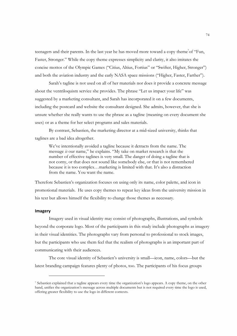
74
teenagers and their parents. In the last year he has moved more toward a copy theme7of “Fun,
Faster, Stronger.” While the copy theme expresses simplicity and clarity, it also imitates the
concise mottos of the Olympic Games (“Citius, Altius, Fortius” or “Swifter, Higher, Stronger”)
and both the aviation industry and the early NASA space missions (“Higher, Faster, Farther”).
Sarah’s tagline is not used on all of her materials nor does it provide a concrete message
about the ventriloquism service she provides. The phrase “Let us impact your life” was
suggested by a marketing consultant, and Sarah has incorporated it on a few documents,
including the postcard and website the consultant designed. She admits, however, that she is
unsure whether she really wants to use the phrase as a tagline (meaning on every document she
uses) or as a theme for her select programs and sales materials.
By contrast, Sebastien, the marketing director at a mid-sized university, thinks that
taglines are a bad idea altogether.
We’ve intentionally avoided a tagline because it detracts from the name. The message is our name,” he explains. “My take on market research is that the number of effective taglines is very small. The danger of doing a tagline that is not corny, or that does not sound like somebody else, or that is not remembered because it is too complex…marketing is limited with that. It’s also a distraction from the name. You want the name.
Therefore Sebastien’s organization focuses on using only its name, color palette, and icon in
promotional materials. He uses copy themes to repeat key ideas from the university mission in
his text but allows himself the flexibility to change those themes as necessary.
Imagery
Imagery used in visual identity may consist of photographs, illustrations, and symbols
beyond the corporate logo. Most of the participants in this study include photographs as imagery
in their visual identities. The photographs vary from personal to professional to stock images,
but the participants who use them feel that the realism of photographs is an important part of
communicating with their audiences.
The core visual identity of Sebastien’s university is small—icon, name, colors—but the
latest branding campaign features plenty of photos, too. The participants of his focus groups
7 Sebastien explained that a tagline appears every time the organization’s logo appears. A copy theme, on the other hand, unifies the organization’s message across multiple documents but is not required every time the logo is used, offering greater flexibility to use the logo in different contexts.
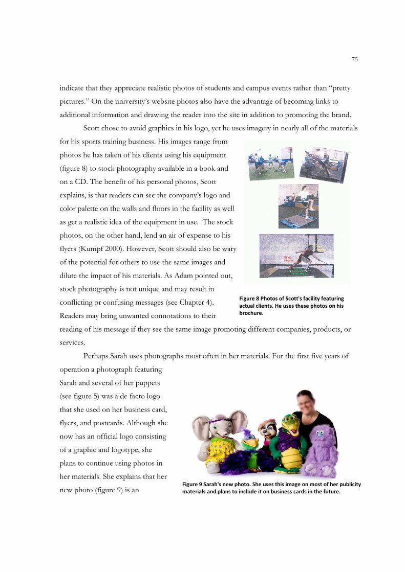
75
indicate that they appreciate realistic photos of students and campus events rather than “pretty
pictures.” On the university’s website photos also have the advantage of becoming links to
additional information and drawing the reader into the site in addition to promoting the brand.
Scott chose to avoid graphics in his logo, yet he uses imagery in nearly all of the materials
for his sports training business. His images range from
photos he has taken of his clients using his equipment
(figure 8) to stock photography available in a book and
on a CD. The benefit of his personal photos, Scott
explains, is that readers can see the company’s logo and
color palette on the walls and floors in the facility as well
as get a realistic idea of the equipment in use. The stock
photos, on the other hand, lend an air of expense to his
flyers (Kumpf 2000). However, Scott should also be wary
of the potential for others to use the same images and
dilute the impact of his materials. As Adam pointed out,
stock photography is not unique and may result in
conflicting or confusing messages (see Chapter 4).
Readers may bring unwanted connotations to their
reading of his message if they see the same image promoting different companies, products, or
services.
Perhaps Sarah uses photographs most often in her materials. For the first five years of
operation a photograph featuring
Sarah and several of her puppets
(see figure 5) was a de facto logo
that she used on her business card,
flyers, and postcards. Although she
now has an official logo consisting
of a graphic and logotype, she
plans to continue using photos in
her materials. She explains that her
new photo (figure 9) is an
Figure 8 Photos of Scott's facility featuring
actual clients. He uses these photos on his
brochure.
Figure 9 Sarah's new photo. She uses this image on most of her publicity
materials and plans to include it on business cards in the future.
76
important selling point for her services because it explains what she does and illustrates the
quality of her puppets. “I’ve heard people say ‘Oh, That is what a ventriloquist does? I’ve also
heard people say I’ve got nice puppets. The types of puppets I have—of course that does not
mean I do it well—but it indicates I’ve invested in this….they’re not raggedy puppets.”
Like Sarah, Susan also relies upon photos in her promotional and sales materials. She
breeds the animals, shows them in regional competitions, and sells their fiber. In fact, the quality
of an animal’s fiber is a strong selling point, making the quality of her photos particularly
important. Yet other than a handful of photos taken by a friend, Susan is her own photographer,
a job that is harder than it may appear. She has to consider backgrounds and shadows as well as
the movements of the animal. “They do not just pose!” she laughed, pointing to an ad in a glossy
industry magazine. Taking professional-quality photographs requires more time and expertise
than she has and therefore the photographs may not be as nice as she would like. Yet the quality
of the photos is a tradeoff she is prepared to make at this point as she juggles the responsibilities
of running a farm with an outside job that subsidizes her ranch.
To promote both her company and a healthy lifestyle, Lola uses photographs of herself,
her employees, and nature. She believes that her photos are a crucial part of her visual identity.
She too takes the photos with a digital camera—or asks friends to take them—but the personal
photos are part of her strategy rather than a decision brought on by necessity. “We are proud
that we use absolutely no stock photos. We do not download photos from online. If there are
pictures they are yoga students, the studio, or photos of town.” In addition to the photos of
teachers in various poses as well as socializing with each other and the students, Lola also
includes a nature photograph, such as a flower, in every document. She believes that images of
nature are calming and restorative and has read studies that support her belief.
One successful ad featured one of Lola’s instructors seated in lotus position with a
television on her head, accompanied by the copy theme “Too much television is bad for your
head. Try yoga at [company] instead.” But Lola is aware of the need to adapt her message to
different audiences, so she ran that photo only in the local university student newspaper. “She’s
got her stomach exposed. She’s got a pierced belly button, a lot of flesh with just a cami bra, a
long beautiful body with lots of skin. I wouldn’t put that into the city paper. That is too much
flesh and too perfect of a body to market anywhere other than the college.”
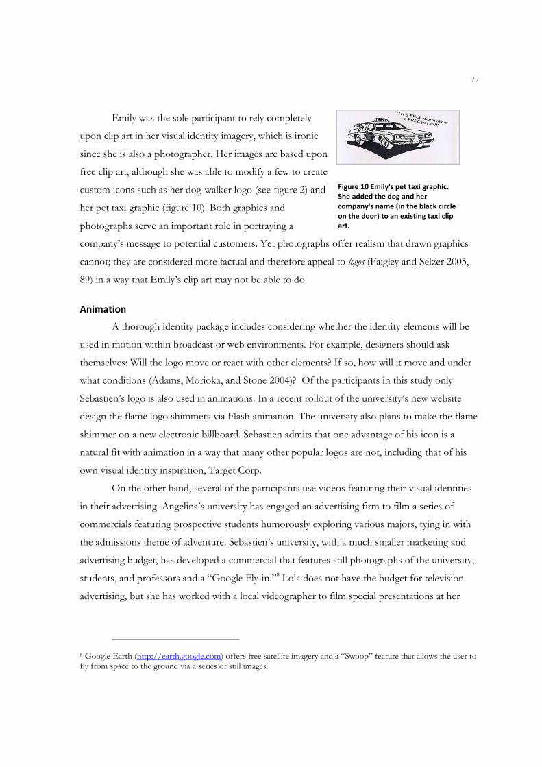
77
Emily was the sole participant to rely completely
upon clip art in her visual identity imagery, which is ironic
since she is also a photographer. Her images are based upon
free clip art, although she was able to modify a few to create
custom icons such as her dog-walker logo (see figure 2) and
her pet taxi graphic (figure 10). Both graphics and
photographs serve an important role in portraying a
company’s message to potential customers. Yet photographs offer realism that drawn graphics
cannot; they are considered more factual and therefore appeal to logos (Faigley and Selzer 2005,
89) in a way that Emily’s clip art may not be able to do.
Animation
A thorough identity package includes considering whether the identity elements will be
used in motion within broadcast or web environments. For example, designers should ask
themselves: Will the logo move or react with other elements? If so, how will it move and under
what conditions (Adams, Morioka, and Stone 2004)? Of the participants in this study only
Sebastien’s logo is also used in animations. In a recent rollout of the university’s new website
design the flame logo shimmers via Flash animation. The university also plans to make the flame
shimmer on a new electronic billboard. Sebastien admits that one advantage of his icon is a
natural fit with animation in a way that many other popular logos are not, including that of his
own visual identity inspiration, Target Corp.
On the other hand, several of the participants use videos featuring their visual identities
in their advertising. Angelina’s university has engaged an advertising firm to film a series of
commercials featuring prospective students humorously exploring various majors, tying in with
the admissions theme of adventure. Sebastien’s university, with a much smaller marketing and
advertising budget, has developed a commercial that features still photographs of the university,
students, and professors and a “Google Fly-in.”8 Lola does not have the budget for television
advertising, but she has worked with a local videographer to film special presentations at her
8 Google Earth (http://earth.google.com) offers free satellite imagery and a “Swoop” feature that allows the user to fly from space to the ground via a series of still images.
Figure 10 Emily's pet taxi graphic.
She added the dog and her
company's name (in the black circle
on the door) to an existing taxi clip
art.
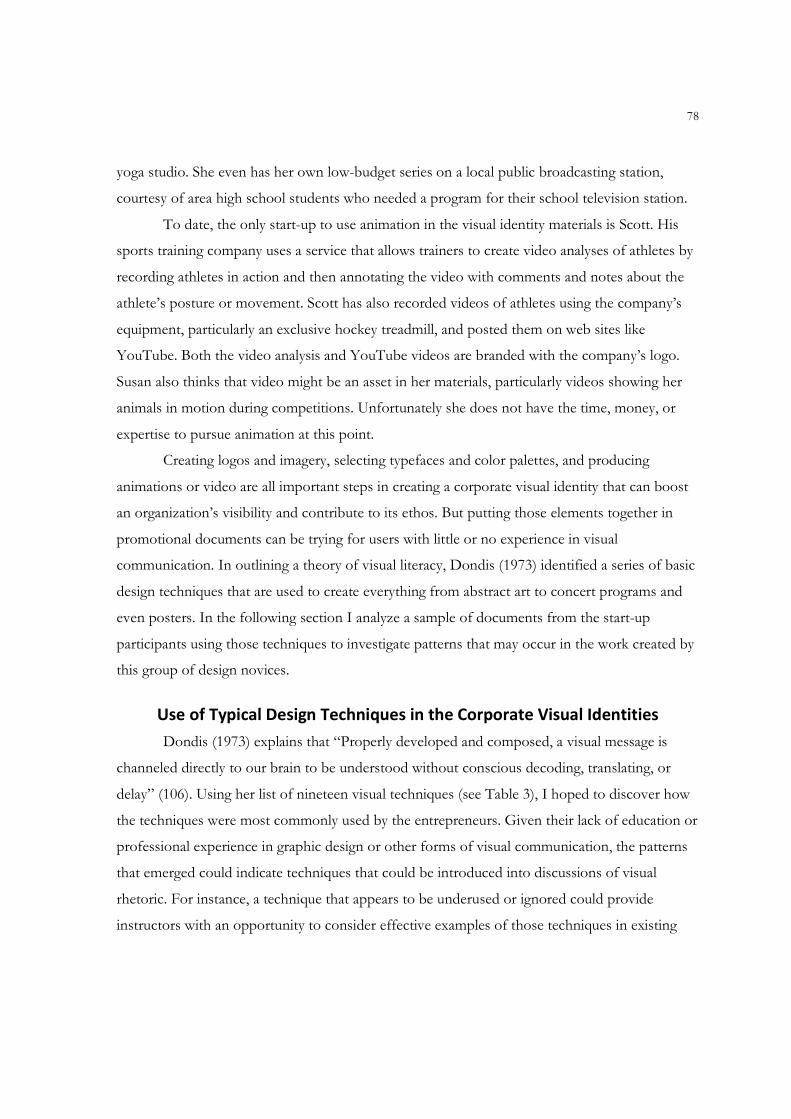
78
yoga studio. She even has her own low-budget series on a local public broadcasting station,
courtesy of area high school students who needed a program for their school television station.
To date, the only start-up to use animation in the visual identity materials is Scott. His
sports training company uses a service that allows trainers to create video analyses of athletes by
recording athletes in action and then annotating the video with comments and notes about the
athlete’s posture or movement. Scott has also recorded videos of athletes using the company’s
equipment, particularly an exclusive hockey treadmill, and posted them on web sites like
YouTube. Both the video analysis and YouTube videos are branded with the company’s logo.
Susan also thinks that video might be an asset in her materials, particularly videos showing her
animals in motion during competitions. Unfortunately she does not have the time, money, or
expertise to pursue animation at this point.
Creating logos and imagery, selecting typefaces and color palettes, and producing
animations or video are all important steps in creating a corporate visual identity that can boost
an organization’s visibility and contribute to its ethos. But putting those elements together in
promotional documents can be trying for users with little or no experience in visual
communication. In outlining a theory of visual literacy, Dondis (1973) identified a series of basic
design techniques that are used to create everything from abstract art to concert programs and
even posters. In the following section I analyze a sample of documents from the start-up
participants using those techniques to investigate patterns that may occur in the work created by
this group of design novices.
Use of Typical Design Techniques in the Corporate Visual Identities
Dondis (1973) explains that “Properly developed and composed, a visual message is
channeled directly to our brain to be understood without conscious decoding, translating, or
delay” (106). Using her list of nineteen visual techniques (see Table 3), I hoped to discover how
the techniques were most commonly used by the entrepreneurs. Given their lack of education or
professional experience in graphic design or other forms of visual communication, the patterns
that emerged could indicate techniques that could be introduced into discussions of visual
rhetoric. For instance, a technique that appears to be underused or ignored could provide
instructors with an opportunity to consider effective examples of those techniques in existing
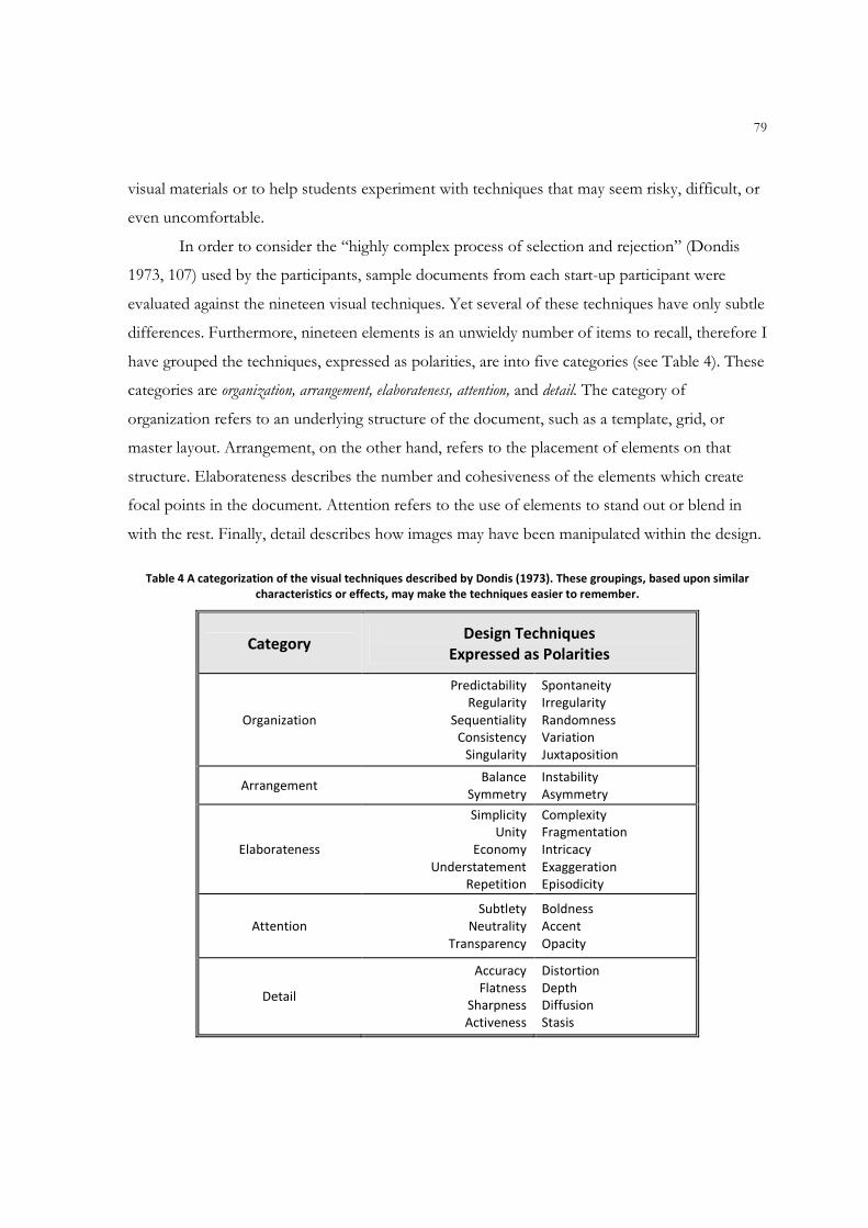
79
visual materials or to help students experiment with techniques that may seem risky, difficult, or
even uncomfortable.
In order to consider the “highly complex process of selection and rejection” (Dondis
1973, 107) used by the participants, sample documents from each start-up participant were
evaluated against the nineteen visual techniques. Yet several of these techniques have only subtle
differences. Furthermore, nineteen elements is an unwieldy number of items to recall, therefore I
have grouped the techniques, expressed as polarities, are into five categories (see Table 4). These
categories are organization, arrangement, elaborateness, attention, and detail. The category of
organization refers to an underlying structure of the document, such as a template, grid, or
master layout. Arrangement, on the other hand, refers to the placement of elements on that
structure. Elaborateness describes the number and cohesiveness of the elements which create
focal points in the document. Attention refers to the use of elements to stand out or blend in
with the rest. Finally, detail describes how images may have been manipulated within the design.
Table 4 A categorization of the visual techniques described by Dondis (1973). These groupings, based upon similar
characteristics or effects, may make the techniques easier to remember.
Category Design Techniques
Expressed as Polarities
Organization
Predictability
Regularity
Sequentiality
Consistency
Singularity
Spontaneity
Irregularity
Randomness
Variation
Juxtaposition
Arrangement Balance
Symmetry
Instability
Asymmetry
Elaborateness
Simplicity
Unity
Economy
Understatement
Repetition
Complexity
Fragmentation
Intricacy
Exaggeration
Episodicity
Attention
Subtlety
Neutrality
Transparency
Boldness
Accent
Opacity
Detail
Accuracy
Flatness
Sharpness
Activeness
Distortion
Depth
Diffusion
Stasis
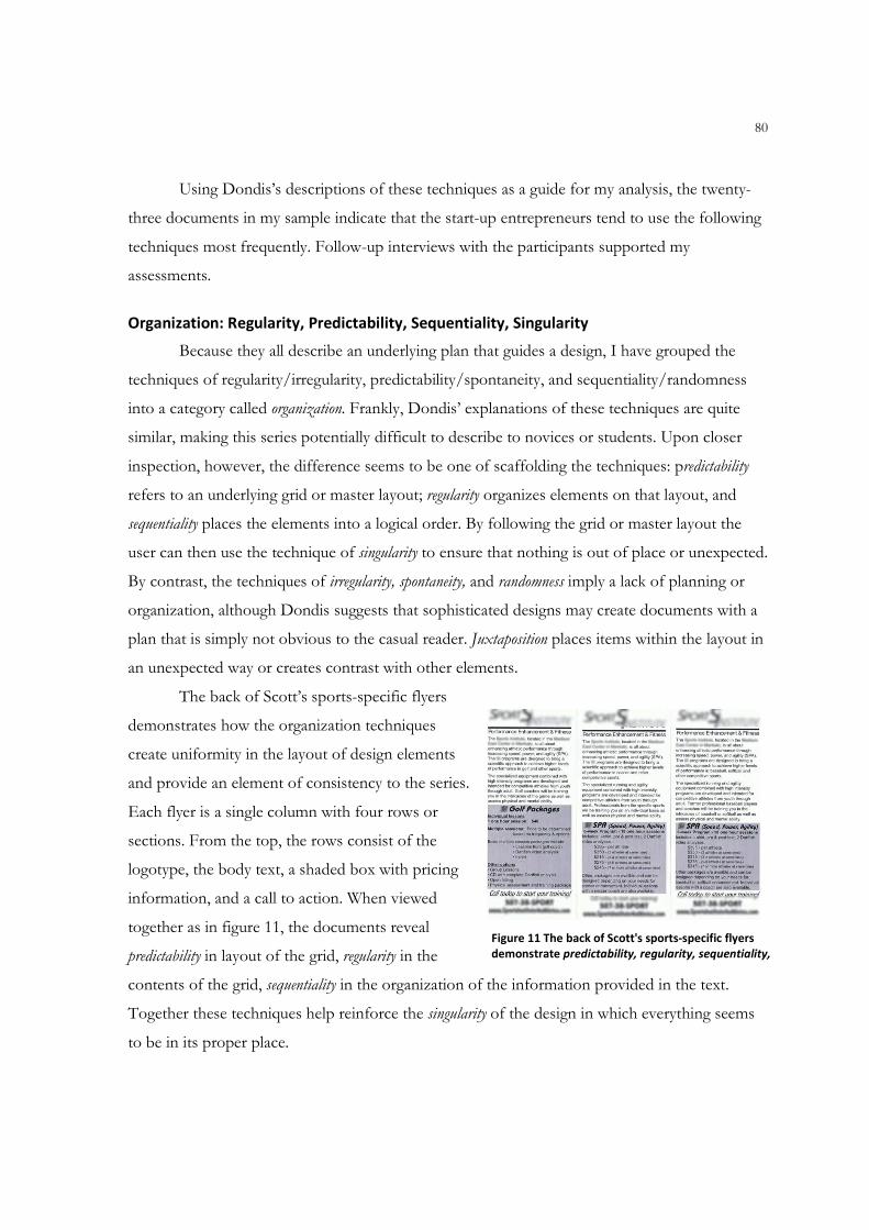
80
Using Dondis’s descriptions of these techniques as a guide for my analysis, the twenty-
three documents in my sample indicate that the start-up entrepreneurs tend to use the following
techniques most frequently. Follow-up interviews with the participants supported my
assessments.
Organization: Regularity, Predictability, Sequentiality, Singularity
Because they all describe an underlying plan that guides a design, I have grouped the
techniques of regularity/irregularity, predictability/spontaneity, and sequentiality/randomness
into a category called organization. Frankly, Dondis’ explanations of these techniques are quite
similar, making this series potentially difficult to describe to novices or students. Upon closer
inspection, however, the difference seems to be one of scaffolding the techniques: predictability
refers to an underlying grid or master layout; regularity organizes elements on that layout, and
sequentiality places the elements into a logical order. By following the grid or master layout the
user can then use the technique of singularity to ensure that nothing is out of place or unexpected.
By contrast, the techniques of irregularity, spontaneity, and randomness imply a lack of planning or
organization, although Dondis suggests that sophisticated designs may create documents with a
plan that is simply not obvious to the casual reader. Juxtaposition places items within the layout in
an unexpected way or creates contrast with other elements.
The back of Scott’s sports-specific flyers
demonstrates how the organization techniques
create uniformity in the layout of design elements
and provide an element of consistency to the series.
Each flyer is a single column with four rows or
sections. From the top, the rows consist of the
logotype, the body text, a shaded box with pricing
information, and a call to action. When viewed
together as in figure 11, the documents reveal
predictability in layout of the grid, regularity in the
contents of the grid, sequentiality in the organization of the information provided in the text.
Together these techniques help reinforce the singularity of the design in which everything seems
to be in its proper place.
Figure 11 The back of Scott's sports-specific flyers
demonstrate predictability, regularity, sequentiality,
and singularity. From left: golf, soccer, and baseball.
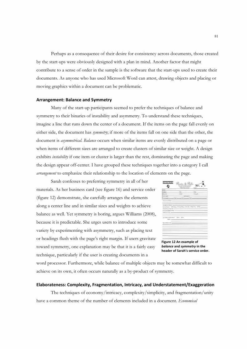
81
Perhaps as a consequence of their desire for consistency across documents, those created
by the start-ups were obviously designed with a plan in mind. Another factor that might
contribute to a sense of order in the sample is the software that the start-ups used to create their
documents. As anyone who has used Microsoft Word can attest, drawing objects and placing or
moving graphics within a document can be problematic.
Arrangement: Balance and Symmetry
Many of the start-up participants seemed to prefer the techniques of balance and
symmetry to their binaries of instability and asymmetry. To understand these techniques,
imagine a line that runs down the center of a document. If the items on the page fall evenly on
either side, the document has symmetry; if more of the items fall on one side than the other, the
document is asymmetrical. Balance occurs when similar items are evenly distributed on a page or
when items of different sizes are arranged to create clusters of similar size or weight. A design
exhibits instability if one item or cluster is larger than the rest, dominating the page and making
the design appear off-center. I have grouped these techniques together into a category I call
arrangement to emphasize their relationship to the location of elements on the page.
Sarah confesses to preferring symmetry in all of her
materials. As her business card (see figure 16) and service order
(figure 12) demonstrate, she carefully arranges the elements
along a center line and in similar sizes and weights to achieve
balance as well. Yet symmetry is boring, argues Williams (2008),
because it is predictable. She urges users to introduce some
variety by experimenting with asymmetry, such as placing text
or headings flush with the page’s right margin. If users gravitate
toward symmetry, one explanation may be that it is a fairly easy
technique, particularly if the user is creating documents in a
word processor. Furthermore, while balance of multiple objects may be somewhat difficult to
achieve on its own, it often occurs naturally as a by-product of symmetry.
Elaborateness: Complexity, Fragmentation, Intricacy, and Understatement/Exaggeration
The techniques of economy/intricacy, complexity/simplicity, and fragmentation/unity
have a common theme of the number of elements included in a document. Economical
Figure 12 An example of
balance and symmetry in the
header of Sarah's service order.

82
documents feature only a few elements. Simple documents use a small number of elements and
direct the eye to a single focal point. Even if a document has multiple elements, it may exhibit
unity by arranging them into a single form such as business cards. (See the following section for
more information about the techniques used in
the participants’ business cards.)
Many of the documents in my sample
featured multiple, separate elements. For that
reason I have grouped these techniques into a
category called elaborateness, meaning
complicated or full of detail. Sarah’s sales flyer
for her summer 2008 program (figure 13) was
perhaps the most elaborate document with
thirteen discrete objects on a gradient green
background. The sheer quantity of elements
placed on this 8.5 x 11 inch page fulfills the
description of intricacy. Each element remains
separate and independent from the others,
creating fragmentation. Furthermore, the elements
create multiple focal points that compete for the
reader’s attention, a characteristic of complexity.
In the case of understatement/exaggeration, few designs showed signs of either polarity.
Instead the entrepreneurs tended to produce designs with elements of both in what I call a
hybrid of the techniques. Understatement is a minimalist technique that often features generous
use of white space; its polarity exaggeration features a lack of whitespace or a lack of proportion
between the elements. Both are concepts that are quite dramatic in their intention. Perhaps this
is the reason why the start-ups avoided either polarity of the technique: the entrepreneurs
wanted to make the most of the “real estate” at their disposal without diluting the message or
making it difficult to read.
A possible explanation for the tendency of the start-ups to create elaborate documents
may be their concerns about cost. Whitespace may seem like wasted space, particularly in
documents that serve both informational and persuasive purposes. Sarah mentioned that she
Figure 13 The text boxes in Sarah's sales flyer illustrate
the techniques of complexity, fragmentation, and
intricacy.
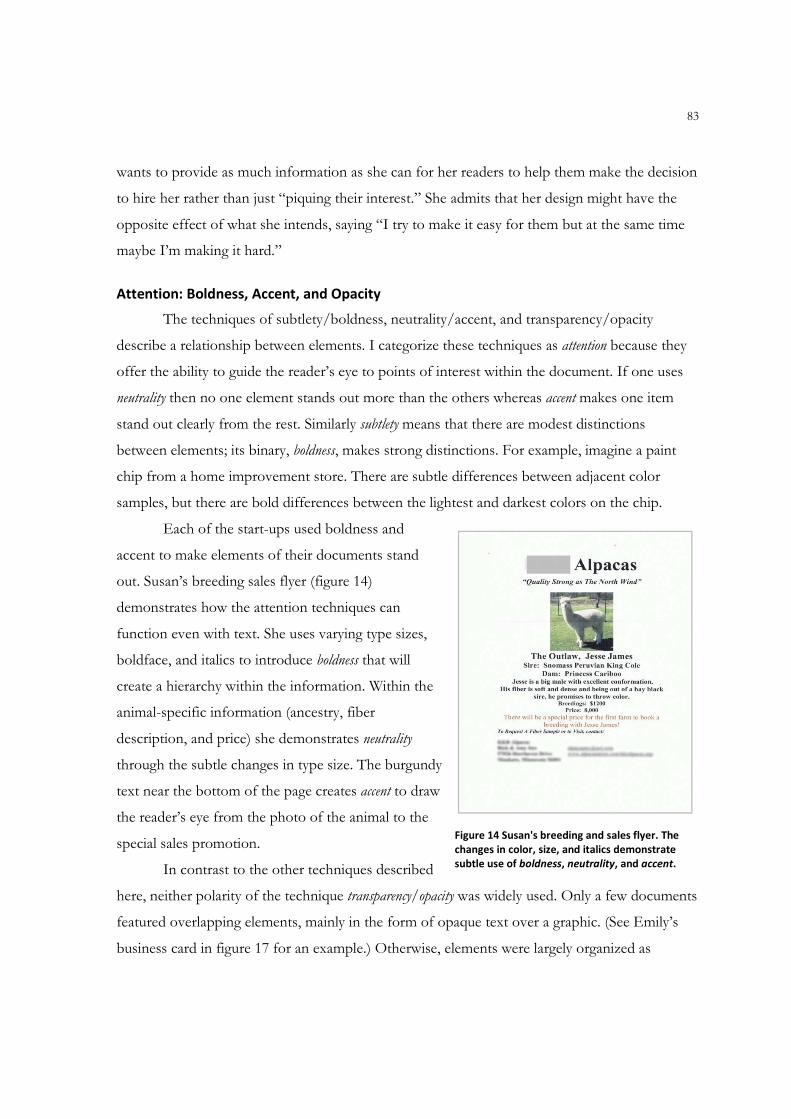
83
wants to provide as much information as she can for her readers to help them make the decision
to hire her rather than just “piquing their interest.” She admits that her design might have the
opposite effect of what she intends, saying “I try to make it easy for them but at the same time
maybe I’m making it hard.”
Attention: Boldness, Accent, and Opacity
The techniques of subtlety/boldness, neutrality/accent, and transparency/opacity
describe a relationship between elements. I categorize these techniques as attention because they
offer the ability to guide the reader’s eye to points of interest within the document. If one uses
neutrality then no one element stands out more than the others whereas accent makes one item
stand out clearly from the rest. Similarly subtlety means that there are modest distinctions
between elements; its binary, boldness, makes strong distinctions. For example, imagine a paint
chip from a home improvement store. There are subtle differences between adjacent color
samples, but there are bold differences between the lightest and darkest colors on the chip.
Each of the start-ups used boldness and
accent to make elements of their documents stand
out. Susan’s breeding sales flyer (figure 14)
demonstrates how the attention techniques can
function even with text. She uses varying type sizes,
boldface, and italics to introduce boldness that will
create a hierarchy within the information. Within the
animal-specific information (ancestry, fiber
description, and price) she demonstrates neutrality
through the subtle changes in type size. The burgundy
text near the bottom of the page creates accent to draw
the reader’s eye from the photo of the animal to the
special sales promotion.
In contrast to the other techniques described
here, neither polarity of the technique transparency/opacity was widely used. Only a few documents
featured overlapping elements, mainly in the form of opaque text over a graphic. (See Emily’s
business card in figure 17 for an example.) Otherwise, elements were largely organized as
Figure 14 Susan's breeding and sales flyer. The
changes in color, size, and italics demonstrate
subtle use of boldness, neutrality, and accent.
84
discrete chunks on the page. Layering elements can be a difficult technique, particularly in
software that is not designed for desktop publishing. Grouping and ordering multiple elements
and adjusting the formatting of an object to make it transparent are fairly sophisticated features
that may be unfamiliar to novice users. Furthermore, obscuring part of an image might seem
dangerous if the image is crucial to explaining what the company does, as with Sarah’s puppets
(see Figures 5 and 10). In Susan’s documents, for example, the photograph of the alpaca is
evidence of her claims about breeding and quality. Obscuring that photo by layering other items
on top might affect her ability to persuade her audience to inspect her animal or buy its fiber.
Detail: Accuracy and Sharpness
The analysis of the sample documents indicates that the start-ups prefer accuracy and
sharpness to their polarities of distortion and diffusion. Yet this result is skewed by the
overwhelming number of photographs in the start-ups’ documents. The accuracy of the images is
important to the participants because they are still trying to establish themselves in their
communities and identify their products or services to potential audiences. A side effect is
sharpness or hard edges created by the use of photographs. Emily’s logo and imagery were outliers
in this category because she was able to include imagery with softer edges while maintaining a
certain level of abstraction in her choice of clip art.
Combinations: Flatness & Depth, Activeness & Stasis, Consistency & Variation
In contrast to the techniques described above that usually favored one polarity over the
other, three techniques appeared widely in both polarities. The sample documents indicate that
the start-up participants use both flatness and depth, activeness and stasis, and consistency and
variation in their designs. For example, while the icons and graphics usually appeared flat on the
page, the widespread use of photographs created instances of depth via perspective, light, and
shadow. Although the text and some of the imagery in the sample (such as Sarah’s alpaca
photograph in figure 15) could be described as static, Emily’s dog-walker (figure 2), the italicized
text in Scott’s logotype (figure 7) and Sarah’s new logo (figure 4), and the photos in Scott’s
sports flyers (see figure 24 below) provided examples of activeness in the designs.
Ironically, although the start-up participants indicated in the interviews that they wanted
to ensure consistency in the designs and uses of their visual identities, the technique of variation
was used just as often in the sample of corporate materials. For the start-ups consistency means
85
using their visual identity elements (logos, typefaces, color schemes, taglines, imagery) on as
many of their documents as possible. While Dondis proposes the techniques as polarities, the
sample documents used in this study indicate that the techniques can co-exist quite effectively.
When used together the polarities of consistency and variation create a single design theme that
dominates the collection while still offering flexibility in creating documents with different
purposes. For example, in Susan’s documents her logo, tagline, and typeface provide
consistency. Within the sample flyer, however, she changes type size, color, and emphasis,
creating variation within the document in spite of the consistent use of her typeface. In Emily’s
sample documents consistency is created by the repetition of her logo, nameplate, and
typography choices even though the documents (a business card, some customer cards, a
newspaper ad, and the cover of her brochure) vary. Scott’s one-third sheet flyers are dominated
by photos illustrating different sports but are consistent in their layout, text, and theme creating
a visual relationship among the elements even if the corporate logo were missing.
Perhaps the greatest variation is in the sample of Sarah’s documents. Her flyer,
postcards, brochure, business card, and letter to potential clients vary in their layout, use of
typography, and imagery. In spite of her changes, however, consistency is evident in the use of
her photo logo, the signature green color, and the repetition of the Comic Sans typeface on
several (but not all) of her documents.
Of course, the visual techniques do not function in a vacuum. As I have implied in my
discussion of each category, the techniques actually work together, or sometimes against each
other, to create designs that can be simultaneously attractive, informative, or persuasive.
Using the Visual Techniques in Concert
Whether the participants were aware of the visual techniques or not, they all employed
several techniques simultaneously in their promotional materials. To take a closer look at how
the entrepreneurs used the visual techniques in concert, I now turn to two typical business
documents that feature the start-up participants’ visual identities: business cards and
promotional flyers and brochures. The discussion of each genre will address the visual
techniques identified in Table 3. In addition to the works discussed previously in the review of
literature, the analysis below also draws from two books written to instruct novices in document
design: Looking Good in Print (2006) by Robert C. Parker and The Non-Designer’s Design and Type
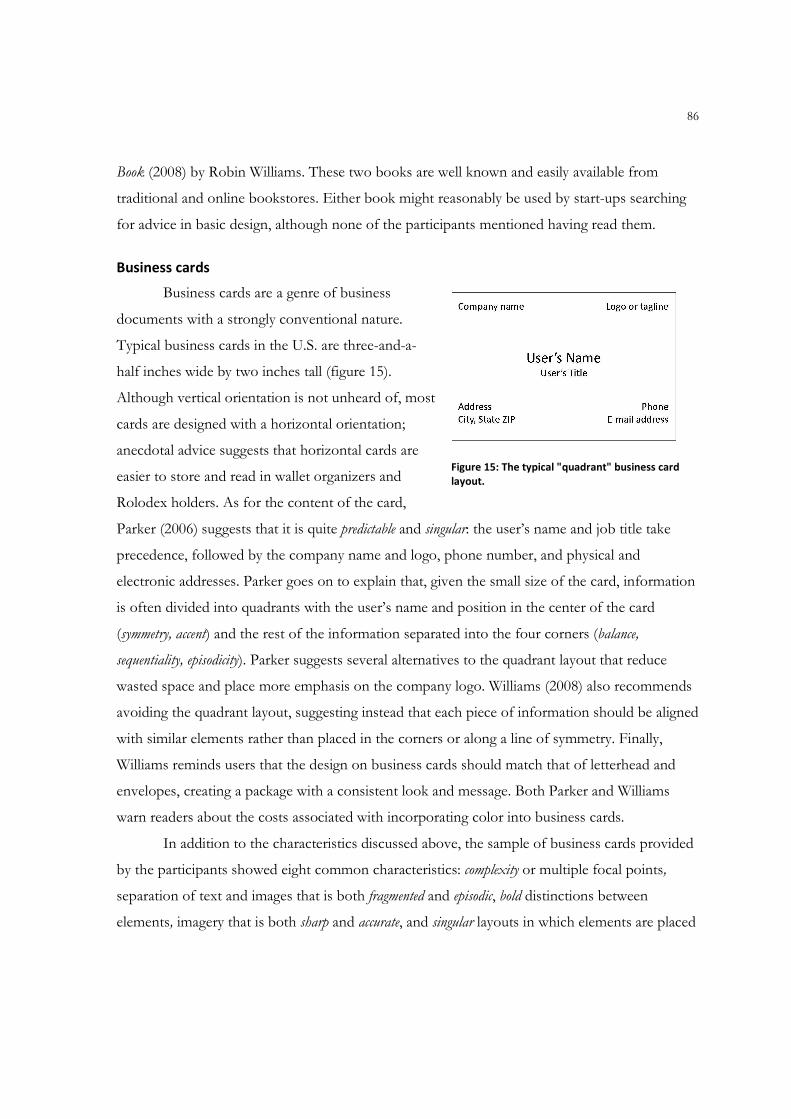
86
Book (2008) by Robin Williams. These two books are well known and easily available from
traditional and online bookstores. Either book might reasonably be used by start-ups searching
for advice in basic design, although none of the participants mentioned having read them.
Business cards
Business cards are a genre of business
documents with a strongly conventional nature.
Typical business cards in the U.S. are three-and-a-
half inches wide by two inches tall (figure 15).
Although vertical orientation is not unheard of, most
cards are designed with a horizontal orientation;
anecdotal advice suggests that horizontal cards are
easier to store and read in wallet organizers and
Rolodex holders. As for the content of the card,
Parker (2006) suggests that it is quite predictable and singular: the user’s name and job title take
precedence, followed by the company name and logo, phone number, and physical and
electronic addresses. Parker goes on to explain that, given the small size of the card, information
is often divided into quadrants with the user’s name and position in the center of the card
(symmetry, accent) and the rest of the information separated into the four corners (balance,
sequentiality, episodicity). Parker suggests several alternatives to the quadrant layout that reduce
wasted space and place more emphasis on the company logo. Williams (2008) also recommends
avoiding the quadrant layout, suggesting instead that each piece of information should be aligned
with similar elements rather than placed in the corners or along a line of symmetry. Finally,
Williams reminds users that the design on business cards should match that of letterhead and
envelopes, creating a package with a consistent look and message. Both Parker and Williams
warn readers about the costs associated with incorporating color into business cards.
In addition to the characteristics discussed above, the sample of business cards provided
by the participants showed eight common characteristics: complexity or multiple focal points,
separation of text and images that is both fragmented and episodic, bold distinctions between
elements, imagery that is both sharp and accurate, and singular layouts in which elements are placed
Figure 15: The typical "quadrant" business card
layout.
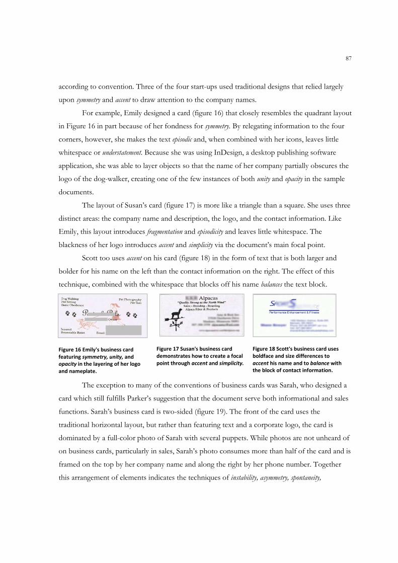
87
according to convention. Three of the four start-ups used traditional designs that relied largely
upon symmetry and accent to draw attention to the company names.
For example, Emily designed a card (figure 16) that closely resembles the quadrant layout
in Figure 16 in part because of her fondness for symmetry. By relegating information to the four
corners, however, she makes the text episodic and, when combined with her icons, leaves little
whitespace or understatement. Because she was using InDesign, a desktop publishing software
application, she was able to layer objects so that the name of her company partially obscures the
logo of the dog-walker, creating one of the few instances of both unity and opacity in the sample
documents.
The layout of Susan’s card (figure 17) is more like a triangle than a square. She uses three
distinct areas: the company name and description, the logo, and the contact information. Like
Emily, this layout introduces fragmentation and episodicity and leaves little whitespace. The
blackness of her logo introduces accent and simplicity via the document’s main focal point.
Scott too uses accent on his card (figure 18) in the form of text that is both larger and
bolder for his name on the left than the contact information on the right. The effect of this
technique, combined with the whitespace that blocks off his name balances the text block.
Figure 16 Emily's business card
featuring symmetry, unity, and
opacity in the layering of her logo
and nameplate.
Figure 17 Susan's business card
demonstrates how to create a focal
point through accent and simplicity.
Figure 18 Scott's business card uses
boldface and size differences to
accent his name and to balance with
the block of contact information.
The exception to many of the conventions of business cards was Sarah, who designed a
card which still fulfills Parker’s suggestion that the document serve both informational and sales
functions. Sarah’s business card is two-sided (figure 19). The front of the card uses the
traditional horizontal layout, but rather than featuring text and a corporate logo, the card is
dominated by a full-color photo of Sarah with several puppets. While photos are not unheard of
on business cards, particularly in sales, Sarah’s photo consumes more than half of the card and is
framed on the top by her company name and along the right by her phone number. Together
this arrangement of elements indicates the techniques of instability, asymmetry, spontaneity,
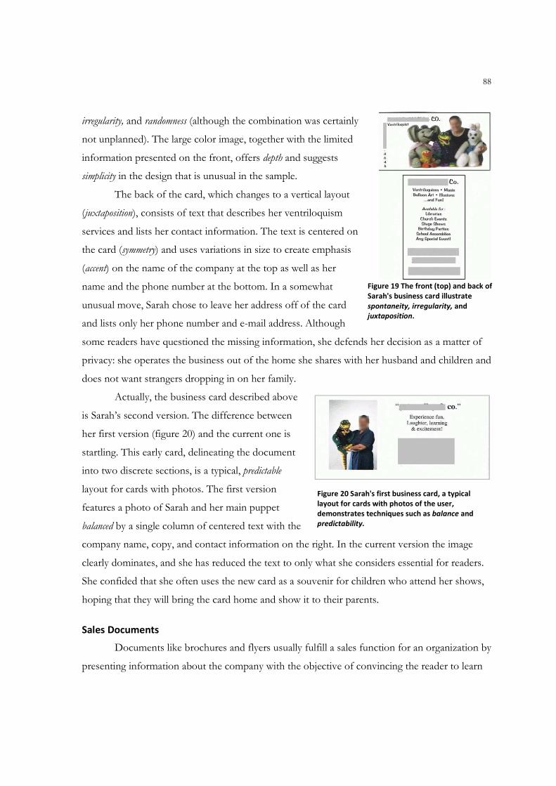
88
irregularity, and randomness (although the combination was certainly
not unplanned). The large color image, together with the limited
information presented on the front, offers depth and suggests
simplicity in the design that is unusual in the sample.
The back of the card, which changes to a vertical layout
(juxtaposition), consists of text that describes her ventriloquism
services and lists her contact information. The text is centered on
the card (symmetry) and uses variations in size to create emphasis
(accent) on the name of the company at the top as well as her
name and the phone number at the bottom. In a somewhat
unusual move, Sarah chose to leave her address off of the card
and lists only her phone number and e-mail address. Although
some readers have questioned the missing information, she defends her decision as a matter of
privacy: she operates the business out of the home she shares with her husband and children and
does not want strangers dropping in on her family.
Actually, the business card described above
is Sarah’s second version. The difference between
her first version (figure 20) and the current one is
startling. This early card, delineating the document
into two discrete sections, is a typical, predictable
layout for cards with photos. The first version
features a photo of Sarah and her main puppet
balanced by a single column of centered text with the
company name, copy, and contact information on the right. In the current version the image
clearly dominates, and she has reduced the text to only what she considers essential for readers.
She confided that she often uses the new card as a souvenir for children who attend her shows,
hoping that they will bring the card home and show it to their parents.
Sales Documents
Documents like brochures and flyers usually fulfill a sales function for an organization by
presenting information about the company with the objective of convincing the reader to learn
Figure 19 The front (top) and back of
Sarah's business card illustrate
spontaneity, irregularity, and
juxtaposition.
Figure 20 Sarah's first business card, a typical
layout for cards with photos of the user,
demonstrates techniques such as balance and
predictability.

89
more about, or even try, the product or service. Unlike advertisements, which are created for a
general audience, sales materials are targeted to a prospective audience, one that may already be
interested in the information presented (Parker 2006, 182). Each of the participants realized the
necessity of sales documents and has created at least one. In fact, Scott created six separate
documents as part of a series to explain the various sports services his company offers. The sales
documents showed remarkable
consistency in the use of most of the
design techniques.
Emily created a brochure to
identify the services she offers and
their prices (figure 21). The interior
of the brochure is dominated by a
table describing her services and
prices, the use of this grid
demonstrating the organizing
techniques of predictability, regularity,
and sequentiality. By using a table she
has grouped the information into a
single unit (unity), but the tight spacing, minimal leading, and gridlines create a design with little
whitespace (exaggeration). The result is that each cell appears to be an individual unit (fragmentation
and episodicity) and the document fails to achieve a focal point within the text listing prices and
services (complexity). Instead, the focal point becomes a graphic at the bottom of the central panel
representing her pet taxi, only one of many services she offers.
Sarah’s sales documents include a brochure,
some sales letters, some flyers, and a postcard (figure
22). The purpose of the postcard was to introduce
herself as a local entertainer and ventriloquist, a
unique service in her mid-sized Minnesota town.
The postcard has a whimsical feel derived from the
colors and the choice of Comic Sans typeface. The
font creates softness (diffusion) in the document,
Figure 21 The interior of Emily's brochure. She outlines the services she
offers and their corresponding rates to answer as many potential
questions as she can. The table illustrates techniques such as
predictability, regularity, fragmentation, episodicity, and complexity.
Figure 22 Sarah's promotional postcard,
designed by a small business marketing
consultant. It features both sharpness and
diffusion as well as economy, spontaneity and
accent.
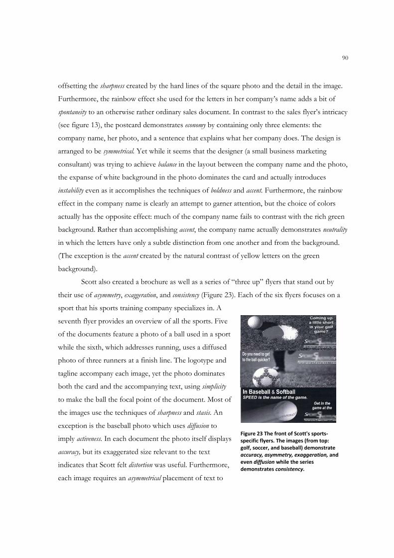
90
offsetting the sharpness created by the hard lines of the square photo and the detail in the image.
Furthermore, the rainbow effect she used for the letters in her company’s name adds a bit of
spontaneity to an otherwise rather ordinary sales document. In contrast to the sales flyer’s intricacy
(see figure 13), the postcard demonstrates economy by containing only three elements: the
company name, her photo, and a sentence that explains what her company does. The design is
arranged to be symmetrical. Yet while it seems that the designer (a small business marketing
consultant) was trying to achieve balance in the layout between the company name and the photo,
the expanse of white background in the photo dominates the card and actually introduces
instability even as it accomplishes the techniques of boldness and accent. Furthermore, the rainbow
effect in the company name is clearly an attempt to garner attention, but the choice of colors
actually has the opposite effect: much of the company name fails to contrast with the rich green
background. Rather than accomplishing accent, the company name actually demonstrates neutrality
in which the letters have only a subtle distinction from one another and from the background.
(The exception is the accent created by the natural contrast of yellow letters on the green
background).
Scott also created a brochure as well as a series of “three up” flyers that stand out by
their use of asymmetry, exaggeration, and consistency (Figure 23). Each of the six flyers focuses on a
sport that his sports training company specializes in. A
seventh flyer provides an overview of all the sports. Five
of the documents feature a photo of a ball used in a sport
while the sixth, which addresses running, uses a diffused
photo of three runners at a finish line. The logotype and
tagline accompany each image, yet the photo dominates
both the card and the accompanying text, using simplicity
to make the ball the focal point of the document. Most of
the images use the techniques of sharpness and stasis. An
exception is the baseball photo which uses diffusion to
imply activeness. In each document the photo itself displays
accuracy, but its exaggerated size relevant to the text
indicates that Scott felt distortion was useful. Furthermore,
each image requires an asymmetrical placement of text to
Figure 23 The front of Scott's sports-
specific flyers. The images (from top:
golf, soccer, and baseball) demonstrate
accuracy, asymmetry, exaggeration, and
even diffusion while the series
demonstrates consistency.
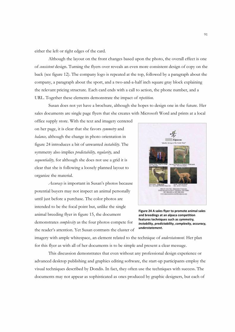
91
either the left or right edges of the card.
Although the layout on the front changes based upon the photo, the overall effect is one
of consistent design. Turning the flyers over reveals an even more consistent design of copy on the
back (see figure 12). The company logo is repeated at the top, followed by a paragraph about the
company, a paragraph about the sport, and a two-and-a-half inch square gray block explaining
the relevant pricing structure. Each card ends with a call to action, the phone number, and a
URL. Together these elements demonstrate the impact of repetition.
Susan does not yet have a brochure, although she hopes to design one in the future. Her
sales documents are single page flyers that she creates with Microsoft Word and prints at a local
office supply store. With the text and imagery centered
on her page, it is clear that she favors symmetry and
balance, although the change in photo orientation in
figure 24 introduces a bit of unwanted instability. The
symmetry also implies predictability, regularity, and
sequentiality, for although she does not use a grid it is
clear that she is following a loosely planned layout to
organize the material.
Accuracy is important in Susan’s photos because
potential buyers may not inspect an animal personally
until just before a purchase. The color photos are
intended to be the focal point but, unlike the single
animal breeding flyer in figure 15, the document
demonstrates complexity as the four photos compete for
the reader’s attention. Yet Susan contrasts the cluster of
imagery with ample whitespace, an element related to the technique of understatement. Her plan
for this flyer as with all of her documents is to be simple and present a clear message.
This discussion demonstrates that even without any professional design experience or
advanced desktop publishing and graphics editing software, the start-up participants employ the
visual techniques described by Dondis. In fact, they often use the techniques with success. The
documents may not appear as sophisticated as ones produced by graphic designers, but each of
Figure 24 A sales flyer to promote animal sales
and breedings at an alpaca competition
features techniques such as symmetry,
instability, predictability, complexity, accuracy,
understatement.
92
the participants reports that the documents largely accomplish their objectives: to promote the
businesses and inform audiences about their products or services.
What the Techniques Imply About the Novice Designers
Based upon the analysis outlined above, I now summarize the polarities of techniques
that appeared most often in the sample of documents provided by the start-up participants. The
patterns that appeared in the sample document may provide insight into polarities of techniques
that other design novices may use and suggest other polarities that novices should be
encouraged to try. The patterns also suggest opportunities to introduce a discussion of design
into professional communication courses and perhaps suggest ways to demonstrate how
technology can assist users in executing the visual techniques.
The Start-ups Want to Project Order
More than 70% of the documents featured symmetry, balance, predictability, regularity,
sequentiality and singularity. These polarities of the organization and arrangement techniques
emphasize order. The reason for this pattern could be that following a pattern such as a grid or
adhering to conventions is easy to implement and maintain whereas the opposite polarities on
these continuua (such as asymmetry, instability, and spontaneity) are more difficult to employ well as
a novice, particularly in software that is not designed for desktop publishing. For example,
inserting an image into a text document is fairly easy, but moving that image around the page,
changing its size, or layering it with other elements requires the user to apply advanced
formatting features that until recently were somewhat difficult to find in applications like
Microsoft Word.
The start-ups also favored sharpness and accuracy in their designs, particularly in their
imagery. This result is not unexpected since using elements of distortion or randomness, for
example, could be perceived as interfering with their messages or harming the ethos they are
trying to create. Taken together, however, the dominance of these technique polarities indicate
that the start-up participants are cautious in their design choices or limited in their abilies to
execute them.
93
The Start-ups Want to Attract Attention
Both boldness and accent were also used in more than 70% of the items in the sample. The
methods used with these technique polarities ranged from boldface text to graphics to strategic
use of color. Boldness, claims Dondis, is “an obvious visual technique” whose purpose is “to
seek optimum visibility” (119). Likewise accent is “just one thing highlighted against a sameness
of background” (120). Certainly these techniques help users create visual impact that will capture
the reader’s attention. They are also the easiest techniques to execute in the software that the
start-ups used. Their lack of experience with the software’s advanced features may have created
some constraints in their designs as well. Although most of the sample documents featured both
text and graphics that were unified by a single theme (singularity), it was rare to find a document
that unified the two into a single image or idea. Emily provided one of only a handful of
examples in her business card (see figure 16) and in a laminated bulletin board sign in which she
superimposed the company name and list of services on top of her paw print icon. In most
other documents the elements were largely organized as discrete chunks within the overall
design.
Furthermore, many of the documents in the sample were complicated and busy. The
techniques of complexity, fragmentation, and intricacy were quite common in the sample documents,
polarities that focus upon the individual elements within the design. These visual techniques,
combined with comments from the start-up participants, suggest that the participants do not
understand the design principle “less is more.” They want their documents to do too much
work, to answer all of the audience’s potential questions rather than piquing the audience’s
interest and inviting them to contact the start-up for more information. To these participants,
less is simply less. With limited funds and limited opportunities to reach their audiences, the
participants want to create documents that explain everything at once without realizing that this
approach is ultimately counter-productive. Rather than drawing readers into a document through
careful placement of focal points, many of the documents in the sample contain elements that
compete for attention and make the document difficult to read and remember.
In Chapter 4 I explored how start-up participants describe their process of creating
corporate visual identity and the purpose they perceive for using the visual identity in their
corporate documents. In this chapter I delved more deeply into the corporate visual identities of
the start-up participants by examining both the individual elements such as logos and

94
typography choices and analyzing how these elements are applied to corporate materials using a
collection of visual techniques. In the following chapter I argue that the results of this study can
inform visual rhetoric pedagogy by identifying techniques that professional communication
novices such as students or even laypersons may use or avoid. This information can suggest
ways to experiment with elements and help students to reflect upon their design decisions and
increase their visual literacy.
95
CHAPTER 6: CONCLUSION AND IMPLICATIONS
VISUAL RHETORIC IN THE
PROFESSIONAL COMMUNICATION CLASSROOM
…creativity, like intelligence, is distributed throughout the population. It is not an attribute only of "creative types" such as artists and writers.
- Michael J. Shannon, “Toward a Rationale for a Public Design Education”
This study was inspired by my family, friends, and students who aspire to be
entrepreneurs as well as by my experience teaching visual rhetoric in business communication
classes. In particular, there are three issues regarding corporate visual identity that inspired my
research questions. First, good designs exhibit consistency, clarity, and flexibility. Effective visual
identities contain elements that are consistent across documents, clear and scalable in different
sizes, and flexible enough to appear on a variety of media. A second issue is that designing a
visual identity often involves technology. Unfortunately, the technology often imposes
limitations on the possibilities of the design. Finally, corporate visual identities are an
opportunity to explore creativity and mold the audience’s perception of the company’s
personality. In large or well-established companies the decisions about visual identity elements
may be made by a graphic designer. But as the participants in this study indicated, start-up
entrepreneurs often work on their own because their funds are needed far more in other aspects
of their business. Based upon these issues I identified three research questions in Chapter 1:
1. In what ways do start-up entrepreneurs perceive a link between their corporate visual
identity and their corporate ethos?
2. How do start-up entrepreneurs create their visual identities?
3. What design techniques do start-up entrepreneurs use in their corporate visual
identities and other professional documents?
In this conclusion of the dissertation I summarize key findings of my research study and their
implications for visual rhetoric and professional communication pedagogy. I argue that visual
rhetoric is a key element of modern professional communication and therefore visual literacy
deserves a greater emphasis in our professional communication classrooms. Finally, I conclude
with suggestions for future study.

96
The Link Between Ethos and Visual Identity
Each of the entrepreneurs perceives corporate visual identity as a means of establishing
ethos with an audience. Credible, reputable, legitimate…all of these words were used by the
start-up participants to describe the image they hoped to project with their visual identities. The
common purpose for their visual identities is to be both informative and persuasive. If ethos is
more persuasive than logos in situations when the audience lacks information (Braet 1992;
Hauser 2002) then that purpose is appropriate. After all, the start-ups in this study were all in
their first five years of operation at the time of the interviews. They were still struggling to
establish themselves within their communities and to communicate their products and services
to their audiences.
All of the participants understand that corporate visual identity goes beyond decorating
corporate documents to informing readers about the corporate image or personality, but the
start-ups learned that developing and implementing a visual identity is harder than it looks. None
conducted any formal audience analysis. They simply do not have the experience of developing
creative briefs that Adam and Zoe typically use, the resources to conduct focus groups and
interviews that Sebastien and Angelina have used, nor do they have the well-established client
base that Lola relies upon for feedback. Ultimately the start-ups were able, with varying degrees
of specificity, to describe their audiences and the types of information that those audiences
might want or need to decide whether to engage their services based upon their personal
experience and informal research. Susan has perhaps the most accurate idea of her audience
since her audience is a fairly small discourse community of fellow alpaca ranchers. Emily knows
the general characteristics of her audience but, at the time of this study, was still searching for
the best way to reach them. Both Scott and Sarah found themselves in the tenuous position of
providing services for children but communicating with adults; their visual identity elements
must bridge the gap between these groups without alienating either one.
Working without audience analysis or research is understandable given the financial and
other constraints the start-ups face, but the decision to do so is risky. Ethos is not an inherent
characteristic but rather the product of an exchange between speaker and audience. Without any
input from the audience, whether through formal market research or informal audience analysis,
the message of a visual identity may run contrary to the informational and persuasive intentions
of the documents that feature it.
97
A common theme in the responses from the start-up participants was a desire for
consistency in the implementation of their visual identity elements into their corporate
documents. Consistency (Kumpf 2000), which is also sometimes called alignment (Hassett 1996)
and repetition (Williams 2008), results in a series of documents that adhere to conventions of
business documents while maintaining a look and feel that is easily identifiable with a specific
company. For the most part the participants were successful in maintaining consistency via
repetition of elements and layouts, although some measure of variety was also evident either by
design (as in Scott’s flyers) or by accident. While using a different typeface on a new run of
business cards or in a newspaper ad may not be noticed by most readers, such inconsistencies
are likely to increase as more people become involved in creating corporate documents or as the
entrepreneur has less time to devote to the task. Perhaps formalizing the visual identity into a
plan or reference guide should be the next step in the design process to help the start-ups
maintain the consistency they want so badly to achieve.
A serious concern is that their focus upon consistency may prevent the start-ups from
envisioning alternatives or altering their designs as their companies mature. None of the start-
ups plan any modifications to their visual identities in the near future, but perhaps they should
reconsider. After all, as Lola suggested, organizations often change as they grow. What are the
chances that a design that was developed in the first year or two of operation will continue to be
the best representation of that company’s personality five years later?
Design Methods Used by Entrepreneurs
In spite of a universal recognition of the benefits of hiring an expert to design the visual
identity, the start-up participants chose to work on their own or with the assistance of family and
friends. Without formal training in visual communication, they relied on intuition and
experimentation to make their choices and implement them in their professional documents.
They relied upon readily available resources, including clip art, stock photography, personal
digital photos, and the software at their disposal. Their decision to eschew professional
assistance was largely one based upon necessity: in the early stages of operation each start-up felt
that the best use of their meager funds was on expenses that have a more direct effect on their
bottom line. Nor did any of them express any interest in hiring a graphic designer in the near
future. Sarah expressed mixed feelings about the postcard a marketing consultant created for
98
her. Scott and Susan want to focus their funds on operating expenses, and Emily simply prefers
to work on her own.
But the participants have also learned that there are consequences to taking a DIY
approach to visual identity. In spite of their best efforts, they were limited by their access or
ability to use the most appropriate technology to create their designs. Getting help from family
and friends is not always the best solution either since unpaid projects are often a low priority.
Even Adam and Zoe, the graphic designers, admit that projects that bring in revenue take
precedence over their own visual identities. Is it any wonder that the start-ups feel the same? Yet
their experiences show that even DIY has a cost.
Design Techniques in the Professional Documents
The elements of a visual identity include several inherent factors that affect a reader’s
perception of the document: first impression, convention, expense, and style (Kumpf 2000).
Before reading a document, users make assumptions about its value based upon its “curb
appeal” or initial visual interest, whether it resembles other documents in the same genre,
whether the physical and aesthetic elements indicate its expense, and finally, whether the design
choices set a tone that matches the content of the message. In each case, the design choices
should match readers’ expectations about both the product or service and the genre of the
document. Without any special research the start-ups created visual identities comprised of
conventional elements: logos, color palettes, typefaces, imagery, and taglines. They generally
used concrete icons, imagery, and copy to describe their businesses, which is perhaps not
surprising since they are all still struggling a bit to explain their designs and introduce themselves
to their audiences.
The document analysis showed that the start-up participants implemented their visual
identity elements using similar visual techniques. Although outliers existed for each of the
techniques, most of the documents demonstrate a sense of order and control via the polarities of
symmetry, balance, predictability, regularity, sequentiality and singularity. Their imagery and
icons are concrete images, usually photographs, that feature sharpness and accuracy. These
results suggest that the start-up participants prefer structure to guide them but that concept of
structure is rather cautious. Rather than creating grids to govern their documents, they often rely
upon convention, intuition, or personal preference. Another explanation may simply be that the
99
limiting factor is not the imagination of the participants but rather their technical skill or the
available features in the software they are using to create their documents.
The sample documents also demonstrate a call for attention via the polarities of boldness
and accent as well as complexity, fragmentation, and intricacy, polarities that focus upon the
individual elements within the design. The analysis, combined with the interview data, suggests
that the participants feel that whitespace is wasted space. The designer’s mantra of “less is more”
is a luxury they feel they cannot afford. Instead they see their documents as valuable real estate
to showcase their products or services. They attempt to provide as much information as possible
in the given space, resulting in documents that are, at times, complicated and hard to read.
The results of this analysis show that novices may be able to create the elements of a
corporate visual identity but that their results may be limited by their understanding of audience,
their limited technical skill, their unwillingness to experiment with visual techniques, and their
lack of awareness of fundamental design concepts like whitespace and grids. In the following
section I consider the implications of this project on the study of visual rhetoric and professional
communication, with particular emphasis on pedagogy.
Implications for Visual Rhetoric & Professional Communication Pedagogy
Inexpensive computers and software have given professional communicators and
students the ability to do work that formerly required teams of people with specialized skills
(Allen 1996; Benson 1995; Rea and White 1999; Stroup 2000). The terms “cut, copy and paste”
once described the actual tasks involved in creating documents for publication; today they refer
to keyboard commands. More recently budget crunches have condensed many jobs into few and
made professional communicators responsible for more than just writing words. At the same
time readers are savvier about visuals and expect more sophisticated document design. After all,
with the templates and style sheets built in to some of the most popular word processors,
anyone can be a document designer.
These changes demand a renewed emphasis on visual rhetoric in professional
communication classrooms. Rather than letting the software do the thinking, users need
guidance in making design decisions involving technology (Benson 1985; Bonk 1999). Since
professional communication courses are often the only communication courses students take
beyond first year composition, it falls to instructors to teach students that visuals require just as
100
much rhetorical planning and intent as verbal communication (Allen 1996), otherwise we risk
producing “visual technicians” who can create visual elements but not think or reflect critically
about what they are doing, why they are doing it, and whether their documents are really meeting
the needs of their readers (Brumberger 2007, 378).
Nancy Allen (1996) calls for visual rhetorics that professional communicators can use to
understand when and how to make design decisions in their documents. There are several
frameworks available to help instructors and professional communicators consider the rhetorical
effects of their design choices (see Barton and Barton 1985; Kostelnick and Roberts 1998).
Plenty of advice is available in professional communication literature to help students make
decisions about typographic elements like typeface or leading (Baker 2001, 2006; Benson 1985;
Brumberger 2003a, 2003b; Kumpf 2000; Kramer and Bernhardt 1996; Tebeaux 1988), layout
(White 2005a), color (White 2005b), textual elements (Tebeaux 1998), and they synchronization
of graphical elements (Stroupe 2000). Some of the popular professional communication
textbooks also provide guidance for students who face design decisions in their documents such
as identifying audience and purpose; using document design elements such as headings, color,
and whitespace; or explaining the design principles of proximity, alignment, repetition, and
contrast (Lannon 2009; Markel 2010; Oliu, Brusaw, and Alred 2008). Similar information is
available in popular press books designed for novice users (Parker 2006, Williams 2008).
Yet the results of this study demonstrate that actual users, like the start-up participants in
this study, make decisions about typography, layout, color, etc., in an informational void. Visual
design is simply not a topic that receives much attention in American schools, a problem that
some say has been exacerbated by a combination of decreased funding and the emphasis placed
upon reading and math by the No Child Left Behind Act of 2001. At the university level, even if
instructors have sufficient time to include a unit on visual rhetoric, many instructors find the
topic difficult to teach. For one thing, many professional communication courses are located
within English departments where instruction in visual communication or design principles is
often lacking (George 2002; Hassett 1996; Matusitz 2005) because most English departments
privilege verbal communication over visual (Williams 2001; Allen 1996). The inclusion of visual
analysis assignments in “writing” classrooms is often tinged with distrust, but by avoiding or
minimizing discussions of visual rhetoric, “composition instructors may inadvertently lead
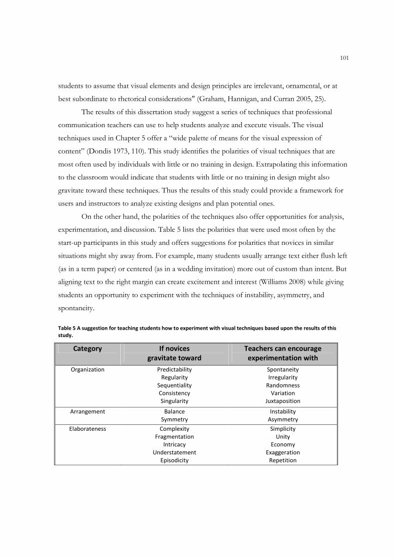
101
students to assume that visual elements and design principles are irrelevant, ornamental, or at
best subordinate to rhetorical considerations" (Graham, Hannigan, and Curran 2005, 25).
The results of this dissertation study suggest a series of techniques that professional
communication teachers can use to help students analyze and execute visuals. The visual
techniques used in Chapter 5 offer a “wide palette of means for the visual expression of
content” (Dondis 1973, 110). This study identifies the polarities of visual techniques that are
most often used by individuals with little or no training in design. Extrapolating this information
to the classroom would indicate that students with little or no training in design might also
gravitate toward these techniques. Thus the results of this study could provide a framework for
users and instructors to analyze existing designs and plan potential ones.
On the other hand, the polarities of the techniques also offer opportunities for analysis,
experimentation, and discussion. Table 5 lists the polarities that were used most often by the
start-up participants in this study and offers suggestions for polarities that novices in similar
situations might shy away from. For example, many students usually arrange text either flush left
(as in a term paper) or centered (as in a wedding invitation) more out of custom than intent. But
aligning text to the right margin can create excitement and interest (Williams 2008) while giving
students an opportunity to experiment with the techniques of instability, asymmetry, and
spontaneity.
Table 5 A suggestion for teaching students how to experiment with visual techniques based upon the results of this
study.
Category If novices
gravitate toward
Teachers can encourage
experimentation with
Organization Predictability
Regularity
Sequentiality
Consistency
Singularity
Spontaneity
Irregularity
Randomness
Variation
Juxtaposition
Arrangement Balance
Symmetry
Instability
Asymmetry
Elaborateness Complexity
Fragmentation
Intricacy
Understatement
Episodicity
Simplicity
Unity
Economy
Exaggeration
Repetition
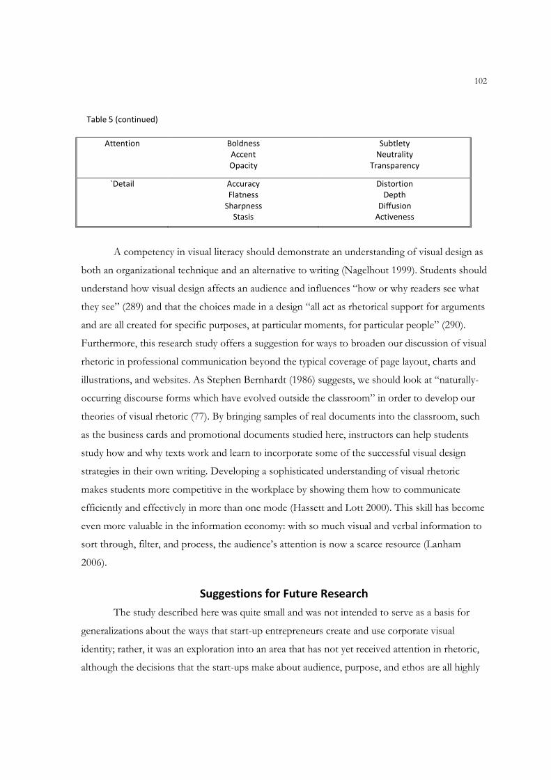
102
Table 5 (continued)
Attention Boldness
Accent
Opacity
Subtlety
Neutrality
Transparency
`Detail Accuracy
Flatness
Sharpness
Stasis
Distortion
Depth
Diffusion
Activeness
A competency in visual literacy should demonstrate an understanding of visual design as
both an organizational technique and an alternative to writing (Nagelhout 1999). Students should
understand how visual design affects an audience and influences “how or why readers see what
they see” (289) and that the choices made in a design “all act as rhetorical support for arguments
and are all created for specific purposes, at particular moments, for particular people” (290).
Furthermore, this research study offers a suggestion for ways to broaden our discussion of visual
rhetoric in professional communication beyond the typical coverage of page layout, charts and
illustrations, and websites. As Stephen Bernhardt (1986) suggests, we should look at “naturally-
occurring discourse forms which have evolved outside the classroom” in order to develop our
theories of visual rhetoric (77). By bringing samples of real documents into the classroom, such
as the business cards and promotional documents studied here, instructors can help students
study how and why texts work and learn to incorporate some of the successful visual design
strategies in their own writing. Developing a sophisticated understanding of visual rhetoric
makes students more competitive in the workplace by showing them how to communicate
efficiently and effectively in more than one mode (Hassett and Lott 2000). This skill has become
even more valuable in the information economy: with so much visual and verbal information to
sort through, filter, and process, the audience’s attention is now a scarce resource (Lanham
2006).
Suggestions for Future Research
The study described here was quite small and was not intended to serve as a basis for
generalizations about the ways that start-up entrepreneurs create and use corporate visual
identity; rather, it was an exploration into an area that has not yet received attention in rhetoric,
although the decisions that the start-ups make about audience, purpose, and ethos are all highly
103
rhetorical. The participants in this study represent a variety of industries but are not
representative of the population as a whole. Perhaps the best way to continue this exploration
simply would be to gather more voices. Continuing to study start-ups in different industries and
in different geographic areas would enable us to achieve a more thorough understanding of the
technical and rhetorical aspects of creating and implementing corporate visual identity.
This research study investigated the ways that rhetoric and professional communication
theory and research intersect with the realities of professionals in the workplace regarding only
one aspect of their corporate communications. A related avenue for research lies in exploring
other professional communication practices of entrepreneurs. Research studies such as this one
can reach out to people “between extremes” (Kalmbach 1988) of novice and professional,
including the people who create documents in the workplace as part of their jobs but who may
not be trained as professional writers. An additional benefit of research in this field is that it
bolsters our own ethos in our field and in the community at large. As Gail Fann Thomas (2007)
explains, researching organizations and collaborating with businesses allows us to share our
specialized knowledge and increases our credibility within the classroom and the business
community. Future study could also consider ways to embed visual communication in “authentic
assignments” that increase student engagement and learning by reflecting a variety of
communication tasks that students may encounter in the workplace (McCarthy and McCarthy
2003).
Finally, this study demonstrates that an opportunity exists for rhetoric and professional
communication scholars to collaborate with other disciplines. As the literature reviewed in
Chapters 1 and 2 suggests, many of the issues addressed in this dissertation are also addressed in
both graphic design and marketing. A similar overlap occurs in areas such as professional
documents like business plans, sales copy, proposals, advertising materials, and document
design. We can enrich our own research by working more closely with our counterparts in
business disciplines such as marketing, management, and entrepreneurship as well as those in art
and graphic design. Such collaboration can provide a way to broaden our outlook, fill in gaps in
visual rhetoric and professional communication theory, and further develop our own areas of
expertise. It may also provide a way to tap into other funding sources or use our own resources
more efficiently.
104
Conclusion
I admire the courage of Emily, Sarah, Susan, and Scott in starting their own businesses.
As a teacher of rhetoric and professional communication, I appreciate the challenges they face in
constructing the documents that establish, operate, and promote their companies. In particular I
sympathize with the difficulty of creating visual documents given the emphasis on written and
oral modes of communication in American schools. The design of a document is not mere
decoration; it either supports or undermines the rhetorical purpose of the text, which in turn
affects the document’s success or failure in the workplace (Takayoshi 1996; Tebeaux 1988;
Dubinsky 1993). To start-up companies that are busy building clientele and developing their
products or services, creating and using corporate visual identity might seem like nothing more
than a quaint custom that should be followed but that does not have a major impact on their
bottom lines. Yet all of the participants in this study, both experienced and start-up,
acknowledged that their visual identities also have the potential to educate and persuade
audiences about the companies’ personalities and the products or services they provide. In their
own ways, the start-ups demonstrated creativity, ingenuity, and a simple awareness of their
unique rhetorical situations as they analyzed their audiences, the purposes of their visual
identities, and the ways to use those identity elements in their promotional documents.
In this conclusion I have argued that rhetoric and professional communication
instructors and scholars must continue to advocate a “double voiced rhetoric” that encompasses
both visual and verbal communication (Stroupe 2000, 609). The study of visual rhetoric
encourages an understanding that visual elements are more than illustration: they communicate
messages that can explain, reinforce, or even contradict the documents that contain them. By
continuing to study instances of visual rhetoric in the workplace, particularly in workplaces on
the margins such as the ones here, we can refine our understanding of its use by writers and of
its impact on readers.
105
BIBLIOGRAPHY
Adams, Sean, Noreen Morioka, and Terry Stone. 2004. Logo design workbook: A hands-on guide to creating logos. Beverly, MA: Rockport.
Alessandri, Sue Westcott, Sung-Un Yang, and Dennis F. Kinsey. 2006. An integrative approach to university visual identity and reputation. Corporate Reputation Review 9 (4):258-270.
Allen, Nancy. 1996. Ethics and visual rhetorics: Seeing's not believing anymore. Technical Communication Quarterly 5 (1):87-105.
Aristotle. 2007. Rhetoric [hypertext]. http://www.public.iastate.edu/~honeyl/Rhetoric/, January 10, 2007 [cited February 27 2007].
Arnheim, Rudolph. 1969. Visual thinking. Berkeley: University of California Press.
Baker, Michael J., and John M.T. Balmer. 1997. Visual identity: Trappings or substance? European Journal of Marketing 31 (5/6):366-382.
Baker, Steve. 1989. Re-reading The Corporate Personality. Journal of Design History 2 (4):275-292.
Ball, Cheryl, and Krisin L. Arola. 2004. ix visual exercises. Boston: Bedford-St. Martin's. CD-ROM.
- - -. 2006. ix tech comm., Boston: Bedford-St. Martin's. CD-ROM.
Balmer, John M.T. 2001. Corporate identity, corporate branding, and corporate marketing: Seeing through the fog. European Journal of Marketing 35 (3-4):248-291.
Barton, Ben F., and Marthalee S. Barton. 1993a. Ideology and the map: Toward a postmodern visual design practice. In Professional communication: The social perspective, edited by N. R. Blyler and C. Thralls. Newbury Park, CA: Sage.
- - -. 1993b. Modes of power in technical and professional visuals. Journal of Business and Technical Communication 7 (1):138-162.
Bennett, Jessica. 2008. Just go to Helvetica. Newsweek, April 7, 54.
Berlin, James A. 1992. Poststructuralism, cultural studies, and the composition classroom: Postmodern theory in practice. Rhetoric Review 11 (1):16-33.
Bernhardt, Stephen. 1986. Seeing the text. College Composition and Communication 37:66-78.
Bernstein, David. 1984. Company image and reality: a critique of corporate communications. Eastbourne, East Sussex: Holt Advertising Association.
Bishop, Wendy. 1999. Ethnographic writing research: Writing it down, writing it up, and reading it. Portsmouth, NH: Heinemann.
106
Bonk, Robert J. 1999. Visually teaching technical communication-despite technology. Paper read
at Annual Conference of the Society for Technical Communication, at Cincinnati, OH.
Bonsiepe, Gui. 1965. Visual/verbal rhetoric. Ulm 14/15/16:23-40.
Bottomley, Paul A., and John R. Doyle. 2006. The interactive effects of colors and products on
perceptions of brand logo appropriateness. Marketing Theory 6 (1):63-83.
Braden, Roberts A., and John A. Hortin. 1982. Identifying the theoretical foundations of visual literacy. Journal of Visual/Verbal Language 2 (2):37-42.
Braet, Antoine C. 1992. Ethos, pathos, and logos in Aristotle's time: A re-examination. Argumentation 6 (3):307-320.
Bruffee, Kenneth A. 1986. Social construction, language, and the authority of knowledge: A bibliographical essay. College English 48:773-790.
Brumberger, Eva. 2001. The rhetoric of typography: Five experimental studies of typeface
personality and its effects on readers and reading: New Mexico State Univ.
- - -. 2003a. The rhetoric of typography: The persona of typeface and text. Technical Communication 50:206-223.
- - -. 2003b. The rhetoric of typography: The awareness and impact of typeface appropriateness. Technical Communication 50:224-231.
- - -. 2004. The rhetoric of typography: Effects on reading time, reading comprehension, and perceptions of ethos. Technical Communication 51 (1):13-24.
- - -. 2005. Visual rhetoric in the curriculum: Pedagogy for a multimodal workplace. Business Communication Quarterly 68 (3):318-333.
- - -. 2007. Making the strange familiar: A pedagogical exploration of visual thinking. Journal of Business and Technical Communication 21 (4):376-402.
Buchanan, Richard. 1985. Declaration by design: Rhetoric, argument, demonstration in design practice. Design Issues 2 (1):4-22.
Butler, Frances C. 1984. Eating the image: The graphic designer and the starving audience. Design Issues 1 (1):27-40.
Clifford, James. 1986. Introduction: Partial truths. In Writing Culture: The Poetics and Politics of Ethnography, edited by J. Clifford and G. E. Marcus. Berkeley: University of California Press.
107
Creswell, John W. 2003. Research design: Qualitative, quantitative, and mixed methods approaches. 2nd ed. Newbury Park: Sage.
- - -. 2005. Educational research: Planning, conducting, and evaluating quantitative and qualitative research. Upper Saddle River, NJ: Pearson.
Curtiss, Deborah. 1987. Introduction to visual literacy: a guide to the visual arts and communication. Upper Saddle River, NJ: Prentice Hall.
Doheny-Farina, Stephen, and Lee Odell. 1985. Ethnographic research on writing: Assumptions and methodology. In Writing in Nonacademic Settings, edited by L. Odell and D. Goswami. New York: Guilford Press.
Dondis, Donis A. 1973. A primer of visual literacy. Cambridge, MA: MIT Press.
Douglis, Philip N. 2006. Composition: Organizing pictures as communication. Communication World 23 (6):44-45.
Dubinsky, James M. 1993. The rhetoric of page design: Making meaning visible. Paper read at
83rd Annual Meeting of the National Council of Teachers of English, November 17-22,
at Pittsburgh, PA.
Ehses, Hanno H. J. 1984. Representing Macbeth: A case study in visual rhetoric. Design Issues 1 (1):53-63.
Faigley, Lester. 1985. Non-academic writing: The social perspective. In Writing in non-academic settings, edited by L. Odell and D. Goswami. New York: Guilford.
- - -. 2003. The brief penguin handbook. New York: Pearson Education.
Faigley, Lester, and Jack Selzer. 2006. Good reasons: designing and writing effective arguments. 3rd ed. New York: Pearson Longman.
Fine, Gary Alan. 1993. Ten lies of ethnography. Journal of Contemporary Ethnography (22):267-294.
Fishel, Catherine M. 2000. Redesigning identity: Graphic design strategies for success. Gloucester, Mass.: Rockport.
Frascara, Jorge. 2007. Hiding lack of knowledge: Bad words in design education. Design Issues 23 (4):62-68.
Frick, Elizabeth G. 2008. Branding your company. Intercom, May.
From globes to stripes: The IBM logo 2007. http://www-03.ibm.com/ibm/history/exhibits/logo/ [cited November 13 2007].
108
Garretson, Judith A., and Ronald W. Niedrich. 2004. Creating character trust and positive brand attitudes. Journal of Advertising 33 (2):25-37.
George, Diana. 2002. From analysis to design: Visual communication in the teaching of writing. College Composition and Communication 54 (1):11-39.
Goetz, Judith Preissele, and Margaret Diane LeCompte. 1984. Ethnography and Qualitative Design in Educational Research. Orlando, FL: Academic Press.
Graham, Margaret, Katherine Hannigan, and Paula Curran. 2005. Imagine: Visual design in first-year composition. Journal of Visual Literacy 25 (1):21-40.
Hall, Stuart, and Sut Jhally. 1997. Representation & the media. Northampton, MA: Media Education Foundation. videorecording.
Harrison, Theresa M., and Susan M. Katz. 1997. On taking organizations seriously: Organizations as social contexts for technical communication. In Theory, practice, and program design in technical communication: Foundations for teaching in an emergent discipline, edited by K. M. Staples and C. M. Ornatowski. Greenwich, CT: Ablex.
Hassett, Michael J. 1996. Teaching the rhetoric of document design. Business Communication Quarterly 59 (3):65-68.
Hassett, Michael, and Rachel W. Lott. 2000. Seeing student texts. Composition Studies 28 (1):29-47.
Hauser, Gerard A. 2002. Persuasiveness of character. In Introduction to rhetorical theory. Prospect Heights, IL: Waveland Press, Inc.
Headd, Brian, and Bruce Kirchhoff. 2007. Small business growth: Searching for stylized facts:
Small Business Administration.
Heller, Steven. 2008. The 'O' in Obama, November 20, 2008. [cited November 26 2008]. Available from http://campaignstops.blogs.nytimes.com/2008/11/20/the-o-in-obama/.
Henderson, Pamela W., Joan L. Giese, and Joseph A. Cote. 2004. Impression management using typeface design. Journal of Marketing 68 (4):60-72.
Hill, Charles. 2004. Reading the visual in college writing. In Visual Rhetoric in a Digital World: A Critical Sourcebook, edited by C. Handa. Boston: Bedford/St. Martin's.
Hoeken, Hans, and Lenneke Ruikes. 2006. Art for art's sake? An exploratory study of the possibility to align works of art with an organization's identity. Journal of Business Communication 42 (3):233-246.
Horn, Robert E. 1998. Visual language: Global communication for the 21st century. Bainbridge Island, WA: Macro-Vu.
109
Hustwit, Gary. 2007. Helvetica. England: Swiss Dots. Ltd. DVD.
Inskip, Irene. 2004. Corporate branding for small to medium-sized businesses - A missed opportunity or an indulgence? Brand Management 11 (5):358-365.
Johnson, Nan. 1984. Ethos and the aims of rhetoric. In Essays on critical rhetoric and modern discourse, edited by R. J. Connors, L. Ede and A. Lunsford. Carbondale: Southern Illinois University Press.
Karper, Erin. 2005. "Ordinary people do this": Rhetorical examination of novice web design. Business Communication Quarterly 68 (3):340-344.
Katz, Susan M. 2002. Ethnographic research. In Research in technical communication, edited by L. J. Gurak and M. M. Lay. Greenwich, CT: Ablex.
Keyes, Elizabeth. 1993. Typography, color, and information structure. Technical Communication 40 (4):638-654.
Kienzler, Donna S. 1997. Visual ethics. Journal of Business Communication 34 (2):171-187.
Killoran, John B. 1999. Under construction: A "PR" department for private citizens. Business Communication Quarterly 62 (2):101-105.
Kinross, Robin. 1985. The rhetoric of neutrality. Design Issues 2 (2):18-30.
Klein, Naomi. 2000. No logo: Taking aim at the brand bullies. 1st Picador USA ed. New York: Picador USA.
Klein, Naomi, Kelly Garner, and Sut Jhally. 2003. No logo: Brands, globalization, resistance. [Northampton, Mass.]: Media Education Foundation. Video recording.
Kostelnick, Charles. 1988. A systematic approach to visual language in business communication. Journal of Business Communication 25 (3):29-48.
- - -. 1989. Visual rhetoric: A reader-oriented approach to graphics and designs. The Technical Writing Teacher 16 (1):77-88.
- - -. 1994. From pen to print: The new visual landscape of professional communication. Journal of Business and Technical Communication 8:91-117.
Kostelnick, Charles, and Michael Hassett. 2003. Shaping information: the rhetoric of visual conventions. Carbondale: Southern Illinois University Press.
Kostelnick, Charles, and David D. Roberts. 1998. Designing visual language: Strategies for professional communicators, Allyn and Bacon series in technical communication. Boston: Allyn and Bacon.
110
Kramer, Robert, and Stephen A. Bernhardt. 1996. Teaching text design. Technical Communication Quarterly 5 (1):35-60.
Kuhn, Thomas S. 1996. The structure of scientific revolutions. 3rd ed. Chicago: University of Chicago Press. Original edition, 1962.
Kumpf, Eric C. 2000. Visual metadiscourse: Designing the considerate text. Technical Communication Quarterly 9 (4):401-424.
Lakoff, George, and Mark Johnson. 1981. Metaphors We Live By. Chicago: University of Chicago Press.
Lanham, Richard A. 1991. A handlist of rhetorical terms. 2nd ed. Berkeley: University of California Press.
- - -. 2006. The economics of attention: Style and substance in the age of information. Chicago: University of Chicago Press.
Locker, Kitty O., and Donna S. Kienzler. 2007. Business and administrative communication. 8th ed. Columbus, OH: McGraw-Hill.
Lunsford, Andrea. 2002. Easy writer: A pocket guide. Boston: Bedford-St. Martin's.
Matusitz, Jonathan. 2005. The current condition of visual communication in colleges and universities in the United States. Journal of Visual Literacy 25 (1):97-112.
McCloud, Scott. 1993. Understanding comics: The invisible art. New York: HarperCollins.
McQuarrie, Edward, F., and David Glen Mick. 1999. Visual rhetoric in advertising: Text-interpretive, experimental, and reader-response analyses. Journal of Consumer Research 26 (1):37.
Melewar, T. C. 2001. Measuring visual identity: A multi-construct study. Corporate Communications 6 (1):36-41.
Melewar, T. C., Gareth Hussey, and Nopporn Srivoravilai. 2005. Corporate visual identity: The re-branding of France Telecom. Brand Management 12 (5):379-394.
Miles, Matthew B., and A. M. Huberman. 1994. Qualitative data analysis: An expanded sourcebook. 2nd ed. Thousand Oaks, Calif.: Sage.
Miller, Carolyn. 1984. Genre as social action. Quarterly Journal of Speech 70 (2):151-67.
Moingeon, Bertrand, and Bernard Ramanantsoa. 1997. Understanding corporate identity: The French school of thought. European Journal of Marketing 31 (5/6):383.
Moore, Patrick, and Chad Fitz. 1993a. Gestalt theory and instructional design. Journal of Technical Writing and Communication 23 (2):137-57.
111
- - -. 1993b. Using Gestalt theory to teach document design and graphics. Technical Communication Quarterly 2 (4):389-410.
Nagelhout, Ed. 1999. Pre-professional practices in the technical writing classroom: Promoting multiple literacies through research. Technical Communication Quarterly 8 (3):285-299.
Olins, Wally. 1978. The corporate personality: an inquiry into the nature of corporate identity. London: Design Council.
- - -. 1989. Corporate identity: making business strategy visible through design. London: Thames and Hudson.
Oliu, Walter E., Charles T. Brusaw, and Gerald J. Alred. 2007. Writing that works: Communicating effectively on the job. 9th ed. Boston: Bedford/St. Martin's.
Ong, Walter J. 1982. The orality of language. In Orality and literacy. London: Methuen & Co. Ltd.
Parker, Roger C. 2006. Looking good in print. 6th ed. Scottsdale, AZ: Paraglyph.
Peterson, Eric. 1999. What’s in a brand? ColoradoBiz. 26 (9): 70-73.
Richards, Ann R., and Carol David. 2005. Decorative color as a rhetorical enhancement on the World Wide Web. Technical Communication Quarterly 14 (1):31-48.
Schriver, Karen A. 1997. Dynamics in Document Design: Creating Texts for Readers. New York: John Wiley & Sons.
Scott, Linda M. 1994. Images in advertising: The need for a theory of visual rhetoric. Journal of Consumer Research 21 (2):252.
Sevilla, Christine. 2002. Information design desk reference. Menlo Park, CA: Crisp.
Smith, Wendy. 2000. Designs on your business. Director 54 (3):19.
Stake, Robert E. 1995. The art of case study research. Thousand Oaks: Sage Publications.
The stumper stickers: A design expert critiques the brand messaging of the 2008 front runners. Newsweek. 2007. http://www.newsweek.com/id/32972. [cited December 16, 2008.]
Takayoshi, Pamela. 1996. The shape of electronic writing: Evaluating and assessing computer-assisted writing processes and products. Computers and Composition 13 (2):245-257.
Tebeaux, Elizabeth. 1988. Writing in academe; writing at work: Using visual rhetoric to bridge the gap. Journal of Teaching Writing 7 (2):215-236.
Thralls, Charlotte, and Nancy Roundy Blyler. 1993. The social perspective and professional communication. In Professional Communication: The Social Perspective, edited by N. R. Blyler and C. T. Thralls. Newbury Park: Sage Publications.
112
Topalian, Alan. 2003. Experienced reality: The development of corporate identity in the digital era. European Journal of Marketing 37 (7/8):1119-1130.
Tufte, Edward R. 1990. Envisioning information. Cheshire, Conn. (P.O. Box 430, Cheshire 06410): Graphics Press.
- - -. 2001. The visual display of quantitative information. 2nd ed. Cheshire, CT: Graphics Press.
- - -. 2003. The cognitive style of PowerPoint. Cheshire, CT: Graphics Press.
Tyler, Ann C. 1992. Shaping belief: The role of audience in visual communication. Design Issues 9 (1):21-29.
van den Bosch, Annette L. M., Menno D. T. de Jong, and Wim J. L. Elving. 2005. How corporate visual identity supports reputation. Corporate Communications: An International Journal. 10 (2):108-116.
- - -. 2006. Managing corporate visual identity: Exploring the differences between manufacturing and service, and profit-making and nonprofit organizations. Journal of Business Communication 4 (43):138-157.
Van Maanen, John. 1988. Tales of the field: on writing ethnography, Chicago guides to writing, editing, and publishing. Chicago: University of Chicago Press.
van Riel, Cees B.M., and John M.T. Balmer. 1997. Corporate identity: The concept, its measurement and management. European Journal of Marketing 31 (5/6):340+.
Visual Identity System. 2007. http://www.marketing.iastate.edu/identity/ [cited November 13 2007].
Wainer, Howard. 1997. Visual revelations: Graphic tales of fate and deception from Napoleon Bonaparte to Ross Perot. Mahwah, NJ: Lawrence Erlbaum Associates.
Walters, Helen. 2007. The 2007 architecture awards. BusinessWeek, December 10, 056-060.
Warde, Beatrice, and Henry Jacob. 1956. The crystal goblet: Sixteen essays on typography. Cleveland: World Pub. Co.
White, Alex. 1999. Type in use: effective typography for electronic publishing. 2nd ed. New York: W.W. Norton.
White, Jan V. 2005a. Building blocks of functional design. Technical Communication 52 (1):37-41.
- - -. 2005b. Color: The newest tool for technical communicators. Technical Communication 50 (4):485-491.
Willerton, Russell. 2005. Visual metonymy and synecdoche: Rhetoric for stage-setting images. Journal of Technical Writing and Communication 35 (1):3-31.
113
Williams, Robin. 2008. The non-designer's design & type books: Design and typographic principles for the visual novice. Third ed. Berkeley: PeachPit Press.
Williams, Sean D. 2001. Part 1: Thinking out of the pro-verbal box. Computers and Composition 18:21-32.
Winsor, Dorothy. 1990. Engineering writing/Writing engineering. College Composition and Communication 41 (1):58-70.
Witt, Peter, and Verena Rode. 2005. Corporate brand building in start-ups. Journal of Enterprising Culture 13 (3):273-294.

114
APPENDIX A
PROSPECTING LETTER
115
January 9, 2008
Jill Klinger New Enterprise & Emerging Business Director Mankato Business Accelerator/Greater Mankato Growth 1961 Premier Drive, Suite 100 Mankato, MN 56001
Dear Ms. Klinger,
I am writing to ask for your help in identifying potential participants for my doctoral dissertation research study in Rhetoric & Professional Communication at Iowa State University.
My dissertation research investigates the use of visual communication as part of a start-up organization’s strategic communication practices. You may have heard the phrase “Dress for the job you want.” My project looks at the way that start-ups use corporate visual identity to do just that. A corporate visual identity is a package of elements consisting of a name, a symbol and/or logo, typography, color, a slogan, and often additional graphic elements. Effective designs are memorable and flexible, appearing on everything from letterhead and business cards to websites and promotional materials to employee uniforms and company cars. These designs, like written or oral messages, are carefully constructed to catch readers’ attention and persuade them to use the organization’s products or services. For well-established organizations a strong corporate visual identity makes a statement that viewers instantly recognize and associate with a host of qualities that the organization wishes to promote. For example, the Nike “Swoosh” is one of the most recognized logos in the world. Its appearance on a pair of shoes, a shirt, or other sports paraphernalia validates an expensive price tag by inspiring thoughts of serious athletes, specialized design, and quality workmanship.
Most of the existing research about corporate visual identity focuses on large, well-known organizations, designs created by professional designers, tested extensively with potential users, and protected fiercely against imitators. Very little is known about how start-up organizations and entrepreneurs think about and create corporate visual identities. The purpose of my dissertation research is to fill that gap: to identify and examine the way start-up organizations use corporate visual identity as a form of professional communication with customers, vendors, and the general public.
As the New Enterprise & Emerging Business Director for the area’s economic development organization you are in a position to work with just the type of organizations and individuals that would I like to meet. I would appreciate the opportunity to meet with you to talk about my project and get your help identifying possible research participants. To help you learn a little more about what I plan to do, and to assure you that the project won’t be a burden on the participants, I have included a copy of my research proposal. If you have any questions or comments or if you would like to meet to talk about the project in person, feel free to call or e-mail me using the contact information below.
This new and uncharted research area in professional communication could help organizations, students, and educators understand the role that visual communication plays in corporate strategy and communication. It can also help improve students’ critical thinking skills by making them aware of the signs and symbols around them that communicate visually rather than textually.
Thank you for your time, and I look forward to speaking with you in the near future.
Jennifer R. Veltsos

116
To: Susan
From: [email protected]
Date: March 17, 2008
Hello Susan, Jill Klinger at Greater Mankato Growth gave me your name and contact information. She suggested that you might be interested in participating in a research study that I am conducting about corporate visual identity in start-up companies. To give you a bit more information about the project I have attached a PDF file with an overview of my project as well as a more detailed research proposal. In a nutshell, I would like to talk to you or a representative of your company about the decisions you made and the methods you used to create your visual identity. (A visual identity consists of the elements that are used in your marketing or branding materials, such as colors, typefaces, images, etc.) If it is convenient for you I will call you on the morning of Wednesday, March 19 to discuss your participation and to schedule the first of two or three interviews. My schedule is pretty flexible; I am usually available on Mondays, Wednesdays, and Fridays from 9:00 to 4:00 and on Tuesdays and Thursdays from 9:00 to noon. I can meet you at your office or at a neutral location such as Dunn Bros. Coffee or the Hub, whichever location feels most comfortable for you. I look forward to talking with you on Monday. Regards, Jennifer -- Jennifer R. Veltsos Rhetoric & Professional Communication Program Department of English Iowa State University [email protected] http://veltsos.public.iastate.edu "Start anywhere. Work to the edges."

117
APPENDIX B
SAMPLE INTERVIEW QUESTIONS
118
Sample Questions for Initial Interview
1. What does <company> do?
2. What is your role in the company? How many people work with/for you?
3. When did <company> start operations?
4. Does <company> have a corporate visual identity (CVI)?
a. If so, how would you describe the visual identity? What are you trying to say about yourself in your visual communication?
b. If not, why not?
5. What did/do you like about creating your CVI? What did/you dislike about creating it?
6. What inspired you or influenced you when you were designing your CVI? Where did you get your ideas?
7. What would you say has been the most difficult part about designing your CVI? The easiest? The most fun?
8. How long did it take you to design the CVI?
9. Was anyone else involved in the CVI design with you? What were their roles?
10. What type of background or experience do you have in visual communication, graphic design, or business communication?

119
Sample Questions for Follow-up Interviews
1. What do you hope the visual identity says about you? If people do not know you or your company, what do you think (or hope) they will think when they see your visual identity?
2. In what ways to you think the CVI supports your ethos, or credibility, as a viable business? In what ways do you wish the CVI would do a better job at supporting your ethos?
3. What do you think your audience (customers, suppliers, the community) wants or needs to know about your company in order to decide whether to use your services? Do you feel that your visual identity provides cues to this information? Why or why not?
4. What are some conventions (typical techniques or designs) that you followed?
5. Were there any times when you chose to go a different way and do something out of the ordinary or unique with your visual identity elements or the documents that use the visual identity?
6. Can you think of any cultural issues that might affect you (positively or negatively) when people view your materials and design?
7. What do you think are typical ways to use one’s visual identity in promotional or professional materials? Do you employ any of these? Do you use any unusual documents or materials that feature your visual identity?
For each sample document, please answer the following:
1. Who is the intended audience of this document?
2. What is the basic message you are trying to communicate with this document?
3. What is the purpose of the document? What do you hope it will accomplish?
4. Where will readers typically encounter this document?
5. What similar messages have your readers encountered from other sources or competitors?
6. How does this document relate to your other documents?
120
ACKNOWLEDGEMENTS
I am indebted to many people for their assistance in completing this dissertation.
My dissertation committee, Lee Honeycutt, Barbara Blakely, Margaret LaWare, and
Debra Satterfield, for their interest and support in my work.
Charlie Kostelnick for taking on this project so willingly even given the inevitable
obstacles that working from a distance would create. Your feedback has been invaluable.
Rebecca Burnett for guiding me through my first three years at Iowa State,
brainstorming ideas about research topics, and providing advice and suggestions about preparing
for the dissertation and job hunting.
Marty Graham and Dorothy Winsor, my research teachers, who helped me develop
my proficiency with qualitative research and influenced the design of my study.
Jill Klinger of Greater Mankato Growth and Brian Stading of the Riverbend Center
for Entrepreneurial Facilitation for their assistance in locating my research participants.
My research participants for sharing their precious time with me to talk about visual
identity, ethos, audience, and how they put it all together.
To my mother-in-law, Elisabeth Veltsos for her willingness to spend so much time
away from her home and living in ours during my final year in residence at Iowa State.
My parents Darryl and Gladys Romero for encouraging me and my siblings to go to
college, although I do not think they imagined I would be in college for nearly twenty years.
Finally, I must thank my husband Chris for his unending support and encouragement
during this academic journey, for sacrificing his own time and career to keep our family together
while I studied 200 miles away, and for his patience once I returned home to work on this
dissertation.