Ketchup ads through the ages - Philpot Education
22
Ketchup ads through the ages Philpot Education
-
Upload
khangminh22 -
Category
Documents
-
view
1 -
download
0
Transcript of Ketchup ads through the ages - Philpot Education

Ketchup ads through the ages
Philpot Education
Instructions 1. Work in groups. Place the 10 ketchup ads on a
large table, with each ad facing up. Each ad has been taken from a different decade from 1910-2010. Try to place each ad in the correct sequence from left to right, going from old to new. As you sort these ads, discuss how your knowledge of the 20th century helps you place them. Furthermore, comment on the stylistic and structural features that make each ad both unique and similar to the others.
2. When you have finished, turn over the ads to reveal the years of publication and points for consideration. How accurate was your sequence? What kinds of stylistic and structural features are common among most of these ads? How do these ads reflect evolving cultural values? How have the conventions of print ads evolved over these decades?
3. Create a similar sequencing game for your classmates, by searching for and collecting a series of ‘ads through the ages’. Consider a product that has been around for decades, like cola, clothing or cars.


Text 1: 1910s Points to consider • There’s a strong focus on the quality of the
product through the phrase ‘superior materials’.
• There is an emphasis on cleanliness and purity in the phrases ‘clean kitchens’ and ‘free from Benzoate’.
• The two-tone red and beige aligns the tomatoes with the ketchup.
• There are workers picking tomatoes in a field, suggesting the product comes from a farm and not a factory.
• The emphasis on ‘57 varieties’ suggests that Heinz accommodates for all tastes.


Text 2: 1920 Points to consider • Compared to today’s ads, this ad has a lot
of copy. • The dark green is associated with nature
and natural products. • Ketchupisstronglyassociatedwithsummer
inthetagline. • Quiteabitofimageryisused,appealingto
multiplesenses.• Thecopyopenswitharhetoricalquestion,
whichintriguesthereader.
• Thereisanextraincentivetogetasalad-makingrecipeforfourcents.
• Thereisanextraincentivetogetasalad-makingrecipeforfourcents.
• Theuseofpersonificationinthelastline,‘everydropawakensappetite,’makesketchupsoundpoetic.

Text 3: 1930s Points to consider • ‘How to please a husband’ clearly targets
housewives concerned with this. • The copy appeases women’s fears that
husbands might not be happy with a ready-made, rather than a home-made sauce.
• The signature from the president of Heinz and the phrase ‘artful blending’ suggest that the product is like a work of art.
• The phrase ‘the largest selling Ketchup in the world’ creates a bandwagon effect for readers.
• It looks like the husband is truly pleased. His lips and cheeks are almost as red as the bottle
• The bottle is depicted twice, which reinforces product recognition.


Text 4: Points to consider • There is no copy, which suggests the
image can sell the product on its own. • The bottle of ketchup is presented as an
exquisite fashion product to a dilatant. • The photograph alludes to the Cinderella
fairytale, implying it is every woman’s desire to own ketchup.
• The man’s facial expression suggests he is pleading for the woman’s attention in desperation.
• The woman’s facial expression is aloof and reserved, as if she is playing ‘hard to get’.


Text 5: 1950s Points to consider • This is a kind tutorial for women (see
hands) on how to use ketchup in creative, trendy ways.
• The ad appeals to anyone who is hungry by showing plates of food.
• The use of the pronoun ‘you’ includes and activates readers.
• Imperative verbs such as ‘try’ and ‘make’ also activate the reader.
• There is an emphasis on the purity of the product in the line ‘without artificial flavouring’.
• The words ‘Mediterranean’ and ‘Scandinavian’ suggest that Heinz is global and people who use it are internationally minded.
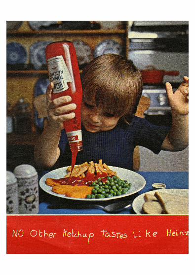
Text 6: 1960s Points to consider • The font seems to be written by the child,
suggesting that the ad is about him. • The boy is enjoying the freedom of
pouring the ketchup by himself. • The house seems quite ‘homey’
associating the product with family life. • This ad might appeal to mothers who are
looking for quick and easy meals like fish fingers.
• The use of the red background behind the tagline matches the bottle, the ketchup and the pot, aligning the product with homeliness and hunger.
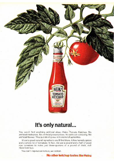

Text 7: 1970s Points to consider • Through photo editing, the ketchup bottle
appears to grow straight from the tomato plant, suggesting that it comes straight from the farm and not the factory.
• The use of ellipsis after the tagline ‘it’s only natural...’ makes the reader want to read the copy.
• The repetition of ‘no’ before artificial ‘thickeners,’ ‘preservatives,’ ‘colouring’ and ‘flavouring’ emphasises its commitment to ‘natural’.
• The word ‘reckon’ is rather colloquial, which appeals to the ‘average man’.
• The use of negative space allows the reader to focus on the product and its simplicity.
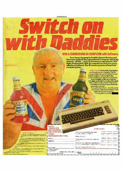
Text 8: 1980s Points to consider • This ad is built on the assumption that
people who consume ketchup in the UK want to own a Commodore 64 computer.
• The man holding the bottles is neither young nor glamorous, which pitches ‘Daddies’ as ‘every man’s’ choice and appeals to plain folks.
• The Union Jack waistcoat appeals to nationalist ideals.
• Most of the copy is dedicated to explaining the competition rules and delivering the competition questions, which makes the ad more about the marketing scheme than the quality of the product.
• The yellow background and red font create a contrast that captures the reader’s attention.
• The copy includes multiple references to numbers, which suggests that readers value facts and quantities.

Text 9: 1990s Points to consider • The ‘oil on canvas’ look suggests that the
product is like a work of art. • The use of green emphasises nature and
natural ingredients. • The font on the label of the bottle looks
handwritten, which personalises the message.
• The label attacks ‘other’ brands of ketchup that use starch, and promotes the innocence of Heinz that ‘just’ uses tomatoes.
• The simplicity of the entire image encourages readers to think that the product is pure and natural.


Text 10: 2000s Points to consider
• The structure of this ad is not conventional of an ad but of a notice board, which intrigues the reader.
• Step-by-step tutorial on how to make a ‘cheats pizza’ appeals to students or others who do not know how to cook.
• The ingredients list, the coupon, the Polaroid pictures and the label, all pinned to the corkboard make the ad seem like part of the reader’s everyday environment.
• ‘Squirt some on a friend’ makes the ad seem playful.
• The coupon clearly appeals to readers who are looking for a deal.