
Introduction to Statistical Quality Control - Food QA Project
177
Introduction to Statistical Quality Control 1 st Hour Based on the book “Introduction to Statistical Quality Control”, 7th Edition by Douglas C. Montgomery.
-
Upload
khangminh22 -
Category
Documents
-
view
2 -
download
0
Transcript of Introduction to Statistical Quality Control - Food QA Project

Introduction to Statistical Quality Control
1st Hour
Based on the book “Introduction to Statistical Quality Control”, 7th Edition by Douglas C. Montgomery.

Speaker Introductions
• Dr. Bersimis Sotirios is an Assistant Professor atthe Statistics and Insurance ScienceDepartment of the University of Piraeus, wherehe has been providing his academic servicessince 2010.
• He is a PhD holder in Statistics and Probability,from the Statistics and Insurance ScienceDepartment of the University of Piraeus. Healso holds an MSc in Statistics from AthensUniversity of Economics and Business and a BScin Statistics and Insurance Science from theUniversity of Piraeus.
• His doctoral research has been funded by ascholarship from the Hellenic GeneralSecretary of Research and Technology. He hasalso been granted a post-doctoral fellowscholarship by the Hellenic State ScholarshipsFoundation.
2

STATISTICAL QUALITY CONTROLQUALITY
QUALITY DIMENSIONS AND CHARACTERISTICS

Statistical Quality Control
• Which is the exact definition of Statistical QualityControl?
• With the term of Statistical Quality Control (SQC) we
describe the toolbox of Statistical methods which are
used in Industry (as a whole) in order to ensure the
quality of the produced goods and services.

Definition of Quality
• What is Quality?
• There are a lot of definitions for the term Quality.
• According to Joseph Juran “Quality” can be defined as
the adjustment of a product’s (or Sevice’s) characteristics
so as to respond to consumers’ needs and expectations.
• The term “Quality” should not be confused with the term
of “high standards”.

6
•This is a traditional definition
•Quality of design
•Quality of conformance

DIMENSIONS OF QUALITY
What is a “Qualitative”
Product/Service
The product/service is adjusted to consumers’ expectations and needs in terms of:
Performance
Reliability
Durability
Serviceability
Aesthetics
Features
Perceived Quality
Conformance of Standards

DIMENSIONS OF QUALITY
• Most people “confuse” “Quality” with the dimensions aproduct or service must possess

DIMENSIONS OF QUALITY
• Performance: Does the product/service meet the purpose
of which it is destined? Does it work better than similar
products/services?
• Reliability: Does the product need frequent repairs?
• Durability: Which is the lifespan of the product?
• Serviceability: In case of a damage to the product, how
fast this can be restored? At what cost?

DIMENSIONS OF QUALITY
• Aesthetics: Is the product satisfactory in terms of its
external characteristics? (color, shape, wrapping, etc.)
• Features: Which are the additional capabilities of the
product?
• Perceived Quality: Is the company’s reputation good or
bad?
• Conformance of Standards: Is the product manufactured
according to specifications set by its designer?

QUALITY CHARACTERISTICS OF A PRODUCT
• Is a product’s characteristic (a variable) which can be
controlled (monitored) and it is related to one or more of
the products’ quality dimensions.

QUALITY CHARACTERISTICS
OF A PRODUCT
12Introduction to Statistical Quality Control, 7th Edition by Douglas C. Montgomery.
Copyright (c) 2012 John Wiley & Sons, Inc.

DIMENSIONS OF QUALITY & QUALITY CHARACTERISTICS (VARIABLES)
Απόδοση
Αξιοπιστία
Διάρκεια ζωής
Επισκευασιμότητα
Αισθητική
Δυνατότητες
Φήμη εταιρείας
Κατασκευή σύμφωνη με τις σχεδιαστικές προδιαγραφές
Length: Χ1
Quality Characteristics
Strength : Χ2
Temp : Χ3
Length : Χ4
Color Factor Χ5
Diameter: Χ6

Consumer perceives the dimensions of a product’s
quality
Performance
Reliability
Durability
Serviceability
Aesthetics
Features
Perceived Quality
Manufacturing goods according to
technical requirements
Quality ControlsFinal Product Characteristics
Production Processaccording to specifications
QUALITY - CONTROL -SPECIFICATIONS
Quality of the Final Product = adjustment of the product’s characteristics to consumers’ expectations and needs

QUALITY & QUALITY SPECIFICATIONS
Crucial Points: Quality of the Final Product = adjustment of product’s
characteristics to the consumer’s needs!
Quality of the Final Product ≠ “High” Standards!
Example: A car can be characterized as a quality car whether it costs
10.000€ or 30.000€.
But, undoubtedly, a car costing 30.000€ has better ProductSpecifications (greater engine power, more safety characteristicsetc.)
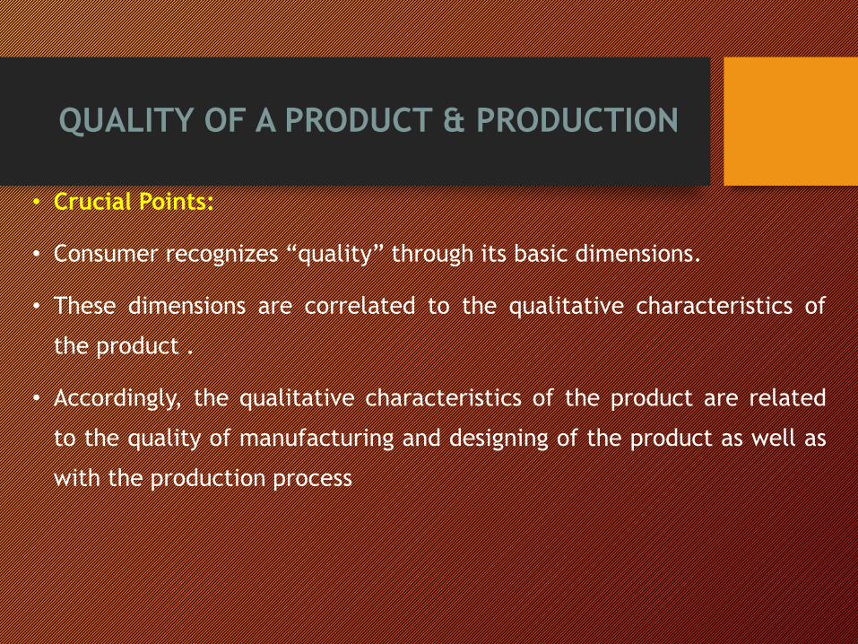
QUALITY OF A PRODUCT & PRODUCTION
• Crucial Points:
• Consumer recognizes “quality” through its basic dimensions.
• These dimensions are correlated to the qualitative characteristics of
the product .
• Accordingly, the qualitative characteristics of the product are related
to the quality of manufacturing and designing of the product as well as
with the production process

QUALITY AND SPECIFICATIONS
Example:
A car is manufactured (specifications) in order to meetconsumers’ needs with specific characteristics.
In order to achieve this goal, in the phase of manufacturingsome technical specification s are set not only for the productitself but also for the production process.
In order for this car to be a quality car: the production process must be in accordance to technical
specifications so as,
the product to be consistent to the manufacturing specifications, thatis,
the qualitative characteristics (which are connected to the qualitydimensions) to be in accordance with the specifications, and finally,
the consumer to perceive that the product satisfies his needs andexpectations.

STATISTICAL QUALITY CONTROLSTATISTICS AND QUALITY

STATISTICS AND QUALITY
• How is Statistics related to Quality?• A more recent term defines quality as inversely proportional to thevariability of the characteristics of the production process whichdefine the quality of a product.
• We should therefore aim at reducing this variability of the qualitativecharacteristics which are related to the dimensions of quality and in thisway, finally, the way in which we perceive as consumers the quality of theproduct itself.

20
• The transmission example illustrates the utility of this definition
• An equivalent definition is that quality improvement is the
elimination of waste. This is useful in service or transactional
businesses.

STATISTICS AND QUALITY
This is a modern definition of quality

STATISTICAL QUALITY CONTROLPRODUCTION PHASES &
TECHNICS OF STATISTICAL QUALITY CONTROL

ProductDesign
ProductionProcess
Final Product
Design and Analysisof Experiments
Statistical ProcessControl
Acceptance Sampling
Pro
du
cti
on
Ph
ase
SQ
CT
ech
nic
PRODUCTION PHASES AND SQC

Acceptance Sampling
• Trend today is toward developing testing methodsthat are so quick, effective, and inexpensive thatproducts are submitted to 100% inspection/testing
• Every product shipped to customers is inspected andtested to determine if it meets customerexpectations
• But there are situations where this is eitherimpractical, impossible or uneconomical
• Destructive tests, where no products survive test
• In these situations, acceptance plans are sensible

Acceptance Plans
• An acceptance plan is the overall scheme for either accepting or rejecting a lot based on information gained from samples.
• The acceptance plan identifies the:• Size of samples, n
• Type of samples
• Decision criterion, c, used to either accept or reject the lot
• Samples may be either single, double, or sequential.

Single-Sampling Plan
• Acceptance or rejection decision is made afterdrawing only one sample from the lot.
• If the number of defectives, c’, does not exceed theacceptance criteria, c, the lot is accepted.

Single-Sampling Plan
Lot of N Items
Random
Sample of
n ItemsN - n Items
Inspect n Items
c’ > c c’ < c
n Nondefectives
c’ Defectives
Found in Sample
Reject Lot Accept Lot

Double-Sampling Plan
• One small sample is drawn initially.
• If the number of defectives is less than or equal tosome lower limit, the lot is accepted.
• If the number of defectives is greater than someupper limit, the lot is rejected.
• If the number of defectives is neither, a second largersample is drawn.
• Lot is either accepted or rejected on the basis of theinformation from both of the samples.

Double-Sampling Plan
Lot of N Items
Random
Sample of
n1 ItemsN – n1 Items
Inspect n1 Items
c1’ > c2 c1’ < c1
Replace
Defectives
n1 Nondefectives
c1’ Defectives
Found in Sample
Reject Lot
Accept Lot
Continue
c1 < c1’ < c2
(to next slide)

(c1’ + c2’) > c2
Double-Sampling Plan
N – n1 Items
Random
Sample of
n2 Items
N – (n1 + n2)
Items
Inspect n2 Items
Replace
Defectives
n2 Nondefectives
c2’ Defectives
Found in SampleReject Lot
Accept Lot
Continue
(c1’ + c2’) < c2
(from previous slide)

NEGATIVE CONSEQUENCES IN USINGACCEPTANCE SAMPLING (SOLELY)
Cost in company’s reputation
• This is the worst scenario – with UNPREDICTED consequences for the company
Cost of Labor and raw materials
• Lost manhours
• In the most likely event of a sole reprocess of the product, a loss of earnings for the company is present
• In case the product cannot be reprocessed at all, then is considered waste/scrap

AcceptanceRegion
ToleranceRegion
ToleranceRegion
Non-AcceptanceRegion
Non-AcceptanceRegion
Quality Control of the Final Product related to a Qualitative Characteristic (screw, length of a screw))
The product can reach the end user only if it is up to the orange region
Red regions mean products inappropriate for the market or
that the product must be reprocessed
ProductDesign
ProductionProcess
Final Product
Traditional Sampling Control of the Final Product
International Practices
FINAL PRODUCT
Off- Specification Product
Off- Specification Product
Product within Specifications
Product within Specifications
Qualitative Product
Zero Cost Reputation
Cost
Financial
Cost
Reputation
Cost
Financial
Cost

THE SOLUTION
Strict production control with the use of StatisticalProcess Control in all production phases.
Statistical Process Control aims at diagnosing anypotential violation of quality borders by real-timesurveillance of the production processes, and alertingthe responsible for the production personnel for themalfunctions long before the process goes out ofcontrol!
Real-time production surveillance is feasible bymonitoring a product variable (of qualitativecharacteristics) or by monitoring a process variable(which has a prompt influence at the product’s qualitativecharacteristics).
ProductDesign
ProductionProcess
FinalProduct

Terminology
• Specifications• Lower specification limit
• Upper specification limit
• Target or nominal values
• Defective or nonconforming product
• Defect or nonconformity
• Not all products containing a defect are necessarily defective
34

An example of a process flow without the use of Statistical Process Control (SPC)
4
6
8
10
12
14
16
18
1 2 3 4 5 6 7 8 9 10 11 12 13 14 15 16 17 18 19 20 21 22 23 24 25 26 27 28 29 30 31 32 33 34 35 36 37 38 39 40
Lit
ers
Time
Ποιοτικό Χαρακτηριστικό Άνω Όριο Προδιαγραφών Άνω Όριο Ελέγχου
Τιμή Στόχος Κάτω Όριο Ελέγχου Κάτω Όριο Προδιαγραφών
ProductDesign
Production Process
FinalProduct
Εντός Στατιστικού Ελέγχου Διεργασία:
ΑΠΟΔΕΚΤΟ ΠΡΟΪΟΝ
Εκτός ΣτατιστικούΕλέγχου
Διεργασία:ΠΙΘΑΝΑ
ΑΝΕΚΤΟ ΠΡΟΪΟΝ
Measurements in out of Specification LimitsLead to Non-Acceptable Products

4
6
8
10
12
14
16
18
1 2 3 4 5 6 7 8 9 10 11 12 13 14 15 16 17 18 19 20 21 22 23 24 25 26 27 28 29 30 31 32 33 34 35 36 37 38 39 40
Lit
ers
Time
Ποιοτικό Χαρακτηριστικό Άνω Όριο Προδιαγραφών Άνω Όριο Ελέγχου
Τιμή Στόχος Κάτω Όριο Ελέγχου Κάτω Όριο Προδιαγραφών
Product Design
ProductionProcess
Final Product
Process within Statistical
Control:
ACCEPTED PRODUCT
Process Off Statistical Control:
Possibly Accepted Product
Off specifications ProcessΕκτός :Non-Accepted
Product

4
6
8
10
12
14
16
18
1 2 3 4 5 6 7 8 9 10 11 12 13 14 15 16 17 18 19 20 21 22 23 24 25 26 27 28 29 30 31 32 33 34 35 36 37 38 39 40
Χρόνος
Λίτρα
Ποιοτικό Χαρακτηριστικό Άνω Όριο Προδιαγραφών Άνω Όριο Ελέγχου
Τιμή Στόχος Κάτω Όριο Ελέγχου Κάτω Όριο Προδιαγραφών
Σχεδιασμός Προϊόντος
ΠαραγωγικήΔιεργασία
ΤελικόΠροϊόν
Identification

Without SPC
4
6
8
10
12
14
16
18
1 2 3 4 5 6 7 8 9 10 11 12 13 14 15 16 17 18 19 20 21 22 23 24 25 26 27 28 29 30 31 32 33 34 35 36 37 38 39 40
Χρόνος
Λίτρα
Ποιοτικό Χαρακτηριστικό Άνω Όριο Προδιαγραφών Άνω Όριο Ελέγχου
Τιμή Στόχος Κάτω Όριο Ελέγχου Κάτω Όριο Προδιαγραφών
Σχεδιασμός Προϊόντος
ΠαραγωγικήΔιεργασία
ΤελικόΠροϊόν
Without SPC
Costs

4
6
8
10
12
14
16
18
1 2 3 4 5 6 7 8 9 10 11 12 13 14 15 16 17 18 19 20 21 22 23 24 25 26 27 28 29 30 31 32 33 34 35 36 37 38 39 40
Χρόνος
Λίτρα
Ποιοτικό Χαρακτηριστικό Άνω Όριο Προδιαγραφών Άνω Όριο Ελέγχου
Τιμή Στόχος Κάτω Όριο Ελέγχου Κάτω Όριο Προδιαγραφών
Identification
Διαφυγόν Κέρδος
Σχεδιασμός Προϊόντος
ΠαραγωγικήΔιεργασία
ΤελικόΠροϊόν

40Introduction to Statistical Quality Control, 7th Edition by Douglas C. Montgomery.
Copyright (c) 2012 John Wiley & Sons, Inc.
Walter A. Shewart (1891-1967)
• Trained in engineering and physics
• Long career at Bell Labs
• Developed the first control chart
about 1924

41
• The design of experiments (DOE, DOX, or experimental design) is the design
of any task that aims to describe or explain the variation of information under
conditions that are hypothesized to reflect the variation.
• In its simplest form, an experiment aims at predicting the outcome by
introducing a change of the preconditions, which is represented by one or
more independent variables, also referred to as "input variables" or "predictor
variables."
• The change in one or more independent variables is generally hypothesized to
result in a change in one or more dependent variables, also referred to as
"output variables" or "response variables."
• The experimental design may also identify control variables that must be held
constant to prevent external factors from affecting the results.
• Experimental design involves not only the selection of suitable independent,
dependent, and control variables, but planning the delivery of the experiment
under statistically optimal conditions given the constraints of available
resources.
• Correctly designed experiments advance knowledge in the natural and social
sciences and engineering. Other applications include marketing and policy
making.
What is Experimental Design?

What is Experimental Design?Experimental design includes both
• Strategies for organizing data collection
• Data analysis procedures matched to those data collection strategies
Classical treatments of design stress analysis procedures based on the analysis of variance (ANOVA)
Other analysis procedure such as those based on hierarchical linear models or analysis of aggregates (e.g., class or school means) are also appropriate

Why Do We Need Experimental Design?Because of variability
We wouldn’t need a science of experimental design if
• If all units were identical
and
• If all units responded identically to treatments
We need experimental design to control variability so that treatment effects can be identified

The Father of DOE

45

Introduction to Statistical Quality Control
2nd Hour

STATISTICAL QUALITY CONTROLBasic Statistics

Definition: Science of collection, presentation, analysis, and reasonable
interpretation of data.
Statistics presents a rigorous scientific method for gaining insight into data. For
example, suppose we measure the weight of 100 patients in a study. With so
many measurements, simply looking at the data fails to provide an informative
account. However statistics can give an instant overall picture of data based
on graphical presentation or numerical summarization irrespective to the
number of data points. Besides data summarization, another important task of
statistics is to make inference and predict relations of variables.


▪ Statistics describes a numeric set of data by its▪ Center
▪ Variability
▪ Shape
▪ Statistics describes a categorical set of data by ▪ Frequency, percentage or proportion of each category

Variable - any characteristic of an individual or entity. A variable can take
different values for different individuals. Variables can be categorical or
quantitative. Per S. S. Stevens…• Nominal - Categorical variables with no inherent order or ranking sequence such as names
or classes (e.g., gender). Value may be a numerical, but without numerical value (e.g., I, II, III).
The only operation that can be applied to Nominal variables is enumeration.
• Ordinal - Variables with an inherent rank or order, e.g. mild, moderate, severe. Can be
compared for equality, or greater or less, but not how much greater or less.
• Interval - Values of the variable are ordered as in Ordinal, and additionally, differences
between values are meaningful, however, the scale is not absolutely anchored. Calendar
dates and temperatures on the Fahrenheit scale are examples. Addition and subtraction, but
not multiplication and division are meaningful operations.
• Ratio - Variables with all properties of Interval plus an absolute, non-arbitrary zero point, e.g.
age, weight, temperature (Kelvin). Addition, subtraction, multiplication, and division are all
meaningful operations.

Distribution - (of a variable) tells us what values the variable takes and how often it takes these values.• Unimodal - having a single peak
• Bimodal - having two distinct peaks
• Symmetric - left and right half are mirror images.

Age 1 2 3 4 5 6
Frequency 5 3 7 5 4 2
Age Group 1-2 3-4 5-6
Frequency 8 12 6
Frequency Distribution of Age
Grouped Frequency Distribution of Age:
Consider a data set of 26 children of ages 1-6 years. Then the frequency
distribution of variable ‘age’ can be tabulated as follows:

Age Group 1-2 3-4 5-6
Frequency 8 12 6
Cumulative Frequency 8 20 26
Age 1 2 3 4 5 6
Frequency 5 3 7 5 4 2
Cumulative Frequency 5 8 15 20 24 26
Cumulative frequency of data in previous page

% of Population over 65—Data
Alabama 13 Louisiana 11 Ohio 13
Alaska 5 Maine 14 Oklahoma 14
Arizona 13 Maryland 11 Oregon 14
Arkansas 15 Mass 14 Penn 16
California 11 Michigan 12 R Island 16
Colorado 10 Minnesota 12 S Carolina 12
Connecticut 14 Mississippi 12 S Dakota 14
Delaware 13 Missouri 14 Tennessee 13
Florida 19 Montana 13 Texas 10
Georgia 10 Nebraska 14 Utah 9
Hawaii 13 Mevada 11 Vermont 12
Idaho 11 N Hampshire 12 Virginia 11
Illinois 13 N Jersey 14 Washington 12
Indiana 13 N Mexico 11 W Virginia 15
Iowa 15 N York 13 Wisconsin 13
Kansas 14 N Carolina 13 Wyoming 11
Kentucky 13 N Dakota 1555
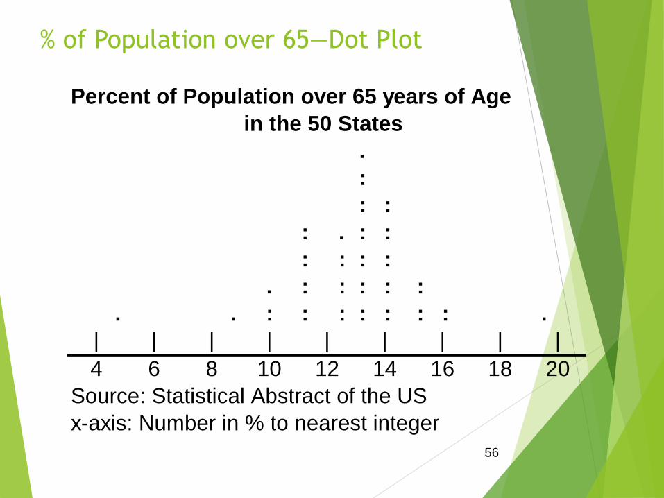
% of Population over 65—Dot Plot
Percent of Population over 65 years of Age
in the 50 States
.
:
: :
: . : :
: : : :
. : : : : :
. . : : : : : : : .
| | | | | | | | |
4 6 8 10 12 14 16 18 20
Source: Statistical Abstract of the US
x-axis: Number in % to nearest integer
56

% of Population over 65—Data
Fre- Rel
Class Tally quency Freq
A 4 x < 6 %
B 6 x < 8 %
C 8 x < 10 %
D 10 x < 12 %
E 12 x < 14 %
F 14 x < 16 %
G 16 x < 18 %
H 18 x < 20 %
Totals
57

% of Population over 65—DataFre- Rel
Class Tally quency Freq
A 4 x < 6 % I 1 0.02
B 6 x < 8 % 0 0 0.00
C 8 x < 10 % I 1 0.02
D 10 x < 12 % IIIII IIIII I 11 0.22
E 12 x < 14 % IIIII IIIII IIIII IIII 20 0.40
F 14 x < 16 % IIIII IIIII IIIII 14 0.28
G 16 x < 18 % II 2 0.04
H 18 x < 20 % I 1 0.02
Totals 50 50 1.0058

Two types of statistical presentation of data - graphical and numerical.
Graphical Presentation: We look for the overall pattern and for striking deviations
from that pattern. Over all pattern usually described by shape, center, and spread
of the data. An individual value that falls outside the overall pattern is called an
outlier.
Bar diagram and Pie charts are used for categorical variables.
Histogram, stem and leaf and Box-plot are used for numerical variable.

Data Presentation –Categorical Variable
Bar Diagram: Lists the categories and presents the percent or count of individuals
who fall in each category.
Treatment
Group
Frequency Proportion Percent(%)
1 15 (15/60)=0.25 25.0
2 25 (25/60)=0.333 41.7
3 20 (20/60)=0.417 33.3
Total 60 1.00 100
Figure 1: Bar Chart of Subjects in
Treatment Groups
0
5
10
15
20
25
30
1 2 3
Treatment Group
Nu
mb
er
of
Su
bje
cts

Data Presentation –Categorical Variable
Pie Chart: Lists the categories and presents the percent or count of individuals
who fall in each category.
Figure 2: Pie Chart of
Subjects in Treatment Groups
25%
42%
33% 1
2
3
Treatment
Group
Frequency Proportion Percent(%)
1 15 (15/60)=0.25 25.0
2 25 (25/60)=0.333 41.7
3 20 (20/60)=0.417 33.3
Total 60 1.00 100

Figure 3: Age Distribution
0
2
4
6
8
10
12
14
16
40 60 80 100 120 140 More
Age in Month
Nu
mb
er
of
Su
bje
cts
Mean 90.41666667
Standard Error 3.902649518
Median 84
Mode 84
Standard Deviation 30.22979318
Sample Variance 913.8403955
Kurtosis -1.183899591
Skewness 0.389872725
Range 95
Minimum 48
Maximum 143
Sum 5425
Count 60
Histogram: Overall pattern can be described by its shape, center, and spread.
The following age distribution is right skewed. The center lies between 80 to
100. No outliers.

Chapter 363
Intro
duct
ion
to
Stati
stica
l
Qua
lity
Cont
rol,
7th
Editi
on
by
Dou
glas
C.
Mon
tgo
Group values of the variable into bins, then count the number
of observations that fall into each bin
Plot frequency (or relative frequency) versus the values of
the variable
HISTOGRAMS – USEFUL FOR LARGE DATA SETS

Chapter 364
Intro
duct
ion
to
Stati
stica
l
Qua
lity
Cont
rol,
7th
Editi
on
by
Dou
glas
C.
Mon
tgo
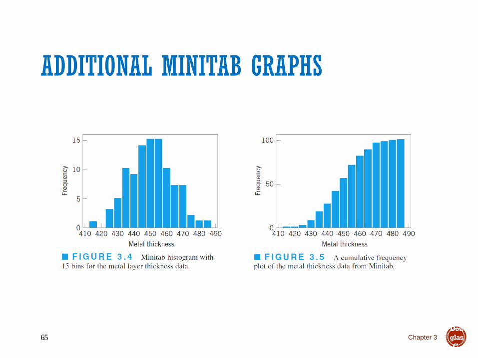
ADDITIONAL MINITAB GRAPHS
Chapter 365
Intro
duct
ion
to
Stati
stica
l
Qua
lity
Cont
rol,
7th
Editi
on
by
Dou
glas
C.
Mon
tgo

Chapter 366
Intro
duct
ion
to
Stati
stica
l
Qua
lity
Cont
rol,
7th
Editi
on
by
Dou
glas
C.
Mon
tgo

To understand how well a central value characterizes a set of observations, let
us consider the following two sets of data:
A: 30, 50, 70
B: 40, 50, 60
The mean of both two data sets is 50. But, the distance of the observations from
the mean in data set A is larger than in the data set B. Thus, the mean of data
set B is a better representation of the data set than is the case for set A.
A fundamental concept in summary statistics is that of a central value for a set
of observations and the extent to which the central value characterizes the
whole set of data. Measures of central value such as the mean or median must
be coupled with measures of data dispersion (e.g., average distance from the
mean) to indicate how well the central value characterizes the data as a whole.

n
x
n
xxxx
x
nxxx
n
i
i
n
n
121
,21
...
variable, thisofmean Then the .
variablea of nsobservatio are ...,Let :Notation
Commonly used methods are mean, median, mode, geometric mean etc.
Mean: Summing up all the observation and dividing by number of observations.
Mean of 20, 30, 40 is (20+30+40)/3 = 30.
Center measurement is a summary measure of the overall level of a dataset

Median: The middle value in an ordered sequence of observations. That is, to
find the median we need to order the data set and then find the middle value.
In case of an even number of observations the average of the two middle
most values is the median. For example, to find the median of {9, 3, 6, 7, 5},
we first sort the data giving {3, 5, 6, 7, 9}, then choose the middle value 6. If
the number of observations is even, e.g., {9, 3, 6, 7, 5, 2}, then the median is
the average of the two middle values from the sorted sequence, in this case,
(5 + 6) / 2 = 5.5.
Mode: The value that is observed most frequently. The mode is undefined
for sequences in which no observation is repeated.

The median is less sensitive to outliers (extreme scores) than the mean and
thus a better measure than the mean for highly skewed distributions, e.g. family
income. For example mean of 20, 30, 40, and 990 is (20+30+40+990)/4 =270.
The median of these four observations is (30+40)/2 =35. Here 3 observations
out of 4 lie between 20-40. So, the mean 270 really fails to give a realistic
picture of the major part of the data. It is influenced by extreme value 990.

Chapter 3Introduction to Statistical Quality Control, 7th Edition by Douglas C. Montgomery.
Copyright (c) 2012 John Wiley & Sons, Inc.71

Commonly used methods: range, variance, standard deviation, interquartile
range, coefficient of variation etc.
Range: The difference between the largest and the smallest observations. The
range of 10, 5, 2, 100 is (100-2)=98. It’s a crude measure of variability.
Variability (or dispersion) measures the amount of scatter in a dataset.

1
)(....)( 22
12
n
xxxxS n
Variance: The variance of a set of observations is the average of the squares of
the deviations of the observations from their mean. In symbols, the variance of
the n observations x1, x2,…xn is
Variance of 5, 7, 3? Mean is (5+7+3)/3 = 5 and the variance is
413
)57()53()55( 222
Standard Deviation: Square root of the variance. The standard deviation of the
above example is 2.

▪ Shape of data is measured by
▪ Skewness
▪ Kurtosis

▪Measures asymmetry of data ▪ Positive or right skewed: Longer right tail
▪ Negative or left skewed: Longer left tail
2/3
1
2
1
3
21
)(
)(
Skewness
Then, ns.observatio be ,...,Let
n
i
i
n
i
i
n
xx
xxn
nxxx

▪Measures peakedness of the distribution of data. The kurtosis of normal distribution is 0.
3
)(
)(
Kurtosis
Then, ns.observatio be ,...,Let
2
1
2
1
4
21
n
i
i
n
i
i
n
xx
xxn
nxxx

Chapter 377
Intro
duct
ion
to
Stati
stica
l
Qua
lity
Cont
rol,
7th
Editi
on
by
Dou
glas
C.
Mon
tgo
NUMERICAL SUMMARY OF DATASample average:

Chapter 378
Intro
duct
ion
to
Stati
stica
l
Qua
lity
Cont
rol,
7th
Editi
on
by
Dou
glas
C.
Mon
tgo

THE STANDARD DEVIATION
Chapter 379
Intro
duct
ion
to
Stati
stica
l
Qua
lity
Cont
rol,
7th
Editi
on
by
Dou
glas
C.
Mon
tgo

Chapter 381
Intro
duct
ion
to
Stati
stica
l
Qua
lity
Cont
rol,
7th
Editi
on
by
Dou
glas
C.
Mon
tgo
PROBABILITY DISTRIBUTIONS
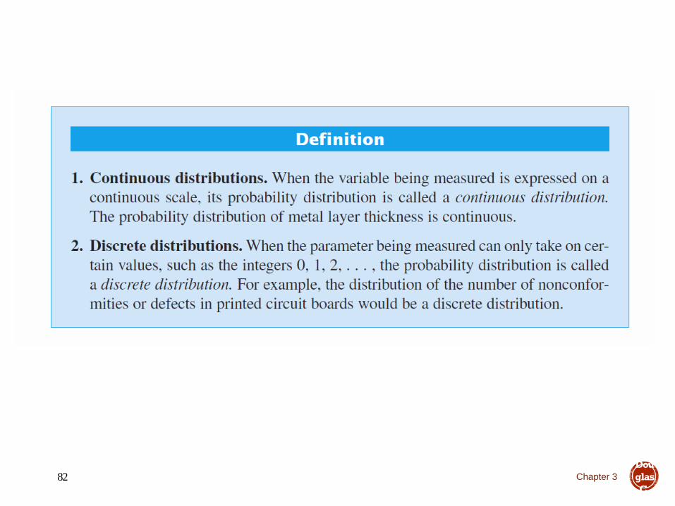
Chapter 382
Intro
duct
ion
to
Stati
stica
l
Qua
lity
Cont
rol,
7th
Editi
on
by
Dou
glas
C.
Mon
tgo

Chapter 383
Intro
duct
ion
to
Stati
stica
l
Qua
lity
Cont
rol,
7th
Editi
on
by
Dou
glas
C.
Mon
tgo
Will see many examples in the text
Sometimes called a
probability mass function
Sometimes called a
probability density function

Chapter 384
Intro
duct
ion
to
Stati
stica
l
Qua
lity
Cont
rol,
7th
Editi
on
by
Dou
glas
C.
Mon
tgo

Chapter 385
Intro
duct
ion
to
Stati
stica
l
Qua
lity
Cont
rol,
7th
Editi
on
by
Dou
glas
C.
Mon
tgo

Chapter 386
Intro
duct
ion
to
Stati
stica
l
Qua
lity
Cont
rol,
7th
Editi
on
by
Dou
glas
C.
Mon
tgo
The mean is the point at which the distribution exactly “balances”.

Chapter 387
Intro
duct
ion
to
Stati
stica
l
Qua
lity
Cont
rol,
7th
Editi
on
by
Dou
glas
C.
Mon
tgo
The mean is not necessarily the 50th percentile of the distribution
(that’s the median)
The mean is not necessarily the most likely value of the random
variable (that’s the mode)

Chapter 388
Intro
duct
ion
to
Stati
stica
l
Qua
lity
Cont
rol,
7th
Editi
on
by
Dou
glas
C.
Mon
tgo

Chapter 3102
Intro
duct
ion
to
Stati
stica
l
Qua
lity
Cont
rol,
7th
Editi
on
by
Dou
glas
C.
Mon
tgo
The Normal Distribution
3.3 Important Continuous Distributions

Chapter 3103
Intro
duct
ion
to
Stati
stica
l
Qua
lity
Cont
rol,
7th
Editi
on
by
Dou
glas
C.
Mon
tgo

Chapter 3104
Intro
duct
ion
to
Stati
stica
l
Qua
lity
Cont
rol,
7th
Editi
on
by
Dou
glas
C.
Mon
tgo

Chapter 3105
Intro
duct
ion
to
Stati
stica
l
Qua
lity
Cont
rol,
7th
Editi
on
by
Dou
glas
C.
Mon
tgo

Chapter 3106
Intro
duct
ion
to
Stati
stica
l
Qua
lity
Cont
rol,
7th
Editi
on
by
Dou
glas
C.
Mon
tgo
Chapter 3107
Intro
duct
ion
to
Stati
stica
l
Qua
lity
Cont
rol,
7th
Editi
on
by
Dou
glas
C.
Mon
tgo

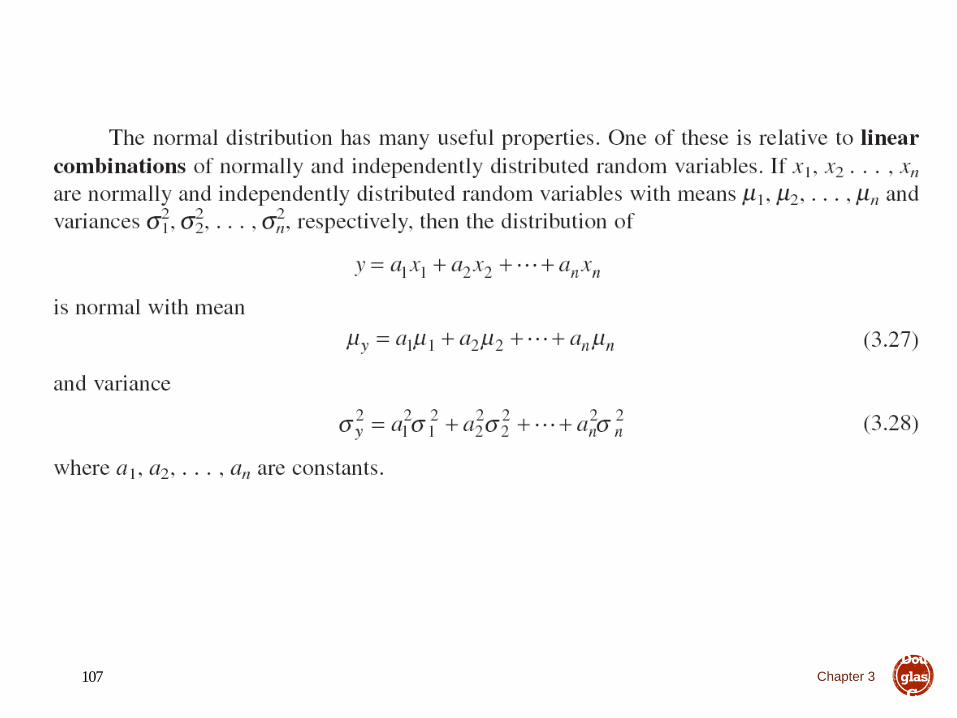
THE CENTRAL LIMIT THEOREM
Chapter 3108
Intro
duct
ion
to
Stati
stica
l
Qua
lity
Cont
rol,
7th
Editi
on
by
Dou
glas
C.
Mon
tgo
Practical interpretation – the sum of independent random
variables is approximately normally distributed regardless of
the distribution of each individual random variable in the sum

Introduction to Statistical Quality Control
3rd Hour

STATISTICAL QUALITY CONTROLThe Magnificent Seven

What are the Basic Seven Tools of Quality?
• Fishbone Diagrams
• Check Sheets
• Flowcharts
• Histograms
• Pareto Analysis
• Scatter Plots
• Run Charts

Where did the Basic Seven come from?
Kaoru Ishikawa• Known for “Democratizing Statistics”
• The Basic Seven Tools made statistical analysis less complicated for the average person
• Good Visual Aids make statistical and quality control more comprehendible.

Flowcharts
Flowcharts
• No statistics involved
• A graphical picture of a PROCESSProcess
Decision
The process
flow

Flowcharts
Don’t Forget to:
• Define symbols before beginning
• Stay consistent
• Check that process is accurate

134Flowcharts

Check Sheets
The check sheet is a form (document) used tocollect data in real time at the location wherethe data is generated. The data it captures canbe quantitative or qualitative. When theinformation is quantitative, the check sheet issometimes called a tally sheet.

136Check Sheets

Fishbone Diagrams
Fishbone Diagrams
• No statistics involved
• Maps out a process/problem
• Makes improvement easier
• Looks like a “Fish Skeleton”

Constructing a Fishbone Diagram
• Step 1 - Identify the Problem
• Step 2 - Draw “spine” and “bones”
Example: High Inventory Shrinkage at local Drug Store
Shrinkage

Constructing a Fishbone Diagram
• Step 3 - Identify different areas where problems may arise from
Ex. : High Inventory Shrinkage at local Drug Store
Shrinkage
employees
shoplifters

Constructing a Fishbone Diagram
• Step 4 - Identify what these specific causes could be
Ex. : High Inventory Shrinkage at local Drug Store
Shrinkage
shoplifters
Anti-theft tags poorly designedExpensive merchandise
out in the open
No security/
surveillance

Constructing a Fishbone Diagram
• Ex. : High Inventory Shrinkage at local Drug Store
Shrinkage
shoplifters
Anti-theft tags poorly designedExpensive merchandise out in the
open
No security/ surveillance
employeesattitude
new
trainee
training
benefits practices

Constructing a Fishbone Diagram
• Step 5 – Use the finished diagram to brainstorm solutions to the main problems.

The Basic Seven Tools of Quality
Histograms
• Bar chart
• Used to graphically represent groups of data

144
Why use a Histogram
To summarize data from a process that has been
collected over a period of time, and graphically
present its frequency distribution in bar form.

145
What Does a Histogram Do?
• Displays large amounts of data that are difficult to interpret in
tabular form
• Shows the relative frequency of occurrence of the various data
values
• Reveals the centering, variation, and shape of the data
• Illustrates quickly the underlying distribution of the data
• Provides useful information for predicting future performance of
the process
• Helps to indicate if there has been a change in the process
• Helps answer the question “Is the process capable of meeting my
customer requirements?”

How do I do it?
1. Decide on the process measure
• The data should be variable data, i.e., measured on a continuous scale. For
example: temperature, time, dimensions, weight, speed.
2. Gather data
• Collect at least 50 to 100 data points if you plan on looking for patterns and
calculating the distribution’s centering (mean), spread (variation), and
shape. You might also consider collecting data for a specified period of time:
hour, shift, day, week, etc.
• Use historical data to find patterns or to use as a baseline measure of past
performance.
146

How do I do it? (cont’d)
3. Prepare a frequency table from the data
a. Count the number of data points, n, in the sample
147
9.9 9.3 10.2 9.4 10.1 9.6 9.9 10.1 9.8
9.8 9.8 10.1 9.9 9.7 9.8 9.9 10 9.6
9.7 9.4 9.6 10 9.8 9.9 10.1 10.4 10
10.2 10.1 9.8 10.1 10.3 10 10.2 9.8 10.7
9.9 10.7 9.3 10.3 9.9 9.8 10.3 9.5 9.9
9.3 10.2 9.2 9.9 9.7 9.9 9.8 9.5 9.4
9 9.5 9.7 9.7 9.8 9.8 9.3 9.6 9.7
10 9.7 9.4 9.8 9.4 9.6 10 10.3 9.8
9.5 9.7 10.6 9.5 10.1 10 9.8 10.1 9.6
9.6 9.4 10.1 9.5 10.1 10.2 9.8 9.5 9.3
10.3 9.6 9.7 9.7 10.1 9.8 9.7 10 10
9.5 9.5 9.8 9.9 9.2 10 10 9.7 9.7
9.9 10.4 9.3 9.6 10.2 9.7 9.7 9.7 10.7
9.9 10.2 9.8 9.3 9.6 9.5 9.6 10.7
In this example, there are 125 data
points, n = 125. For our example,
125 data points would be divided
into 7-12 class intervals.
b. Determine the range, R, for the entire
sample. The range is the smallest
value in the set of data subtracted from
the largest value. For our example:
R = x max – xmin = 10.7-9.0 = 1.7
c. Determine the number of class
intervals, k, needed.
Use the table below to provide a
guideline for dividing your sample into
reasonable number of classes.
Number of Number of
Data Points Classes (k)
Under 50 5-750-100 6-10100-250 7-12Over 250 10-20

How do I do it? (cont’d)
Tip: The number of intervals can influence the pattern of the sample. Too few intervals will produce a tight, high pattern. Too many intervals will produce a spread out, flat pattern.
d. Determine the class width, H.
• The formula for this is:
H = R = 1.7 = 0.17
k = 10
• Round your number to the nearest value with the same decimal numbers as the original sample. In our example, we would round up to 0.20. It is useful to have intervals defined to one more decimal place than the data collected.
e. Determine the class boundaries, or end points.
• Use the smallest individual measurement in the sample, or round to the next appropriate lowest round number. This will be the lower end point for the firstclass interval. In our example this would be 9.0.
148

How do I do it? (cont’d)
• Add the class width, H, to the lower end point. This will be the
lower end point for the next class interval. For our example:
9.0 + H = 9.0 + 0.20 = 9.20
Thus, the first class interval would be 9.00 and everything up to,
but not including 9.20, that is, 9.00 through 9.19. The second
class interval would begin at 9.20 and everything up to, but not
including 9.40.
Tip: Each class interval would be mutually exclusive, that is, every
data point will fit into one, and only one class interval.
• Consecutively add the class width to the lowest class boundary
until the K class intervals and/or the range of all the numbers
are obtained.
149

How do I do it? (cont’d)
f. Construct the frequency table based on the values you computed in item “e”.
A frequency table based on the data from our example is show below.
150
Class
#
Class
Boundaries
Mid-
Point Frequency Total
1 9.00-9.19 9.1 1
2 9.20-9.39 9.3 9
3 9.40-9.59 9.5 16
4 9.60-9.79 9.7 27
5 9.80-9.99 9.9 31
6 10.00-10.19 10.1 22
7 10.20-10.39 10.3 12
8 10.40-10.59 10.5 2
9 10.60-10.79 10.7 5
10 10.80-10.99 10.9 0

How do I do it? (cont’d)
4. Draw a Histogram from the frequency table
• On the vertical line, (y axis), draw the frequency (count) scale to cover class interval with the highest frequency count.
• On the horizontal line, (x axis), draw the scale related to the variable you are measuring.
• For each class interval, draw a bar with the height equal to the frequency tally of that class.
151
0
10
20
30
40
9.0 9.2 9.4 9.6 9.8 10.0 10.2. 10.4 10.6 10.8
Thickness
Fre
quency
Spec.
Target
Specifications
9 +/- 1.5 USL

How do I do it? (cont’d)
5. Interpret the Histogram
a. Centering. Where is the distribution centered?
b. Is the process running too high? Too low?
152
Customer
Requirement
Process
centered
Process
too low
Process
too high

How do I do it? (cont’d)
b. Variation. What is the variation or spread of the data? Is it too variable?
153
Customer
Requirement
Process
within
requirement
s
Process too
variable

How do I do it? (cont’d)
c. Shape. What is the shape? Does it look like a normal, bell-shaped distribution? Is it positively or negatively skewed, that is, more data values to the left or to the right? Are there twin (bi-modal) or multiple peaks?
154
Tip: Some processes are
naturally skewed; don’t expect
every distribution to follow a
bell-shaped curve.
Tip: Always look for twin or
multiple peaks indicating that
the data is coming from two or
more different sources, e.g.,
shifts, machines, people,
suppliers. If this is evident,
stratify the data.
Normal Distribution
Bi-Modal
Distribution
Mulit-Modal
Distribution
Positively
Skewed
Negatively
Skewed
Normal Distribution
Bi-Modal
Distribution
Mulit-Modal
Distribution
Positively
Skewed
Negatively
Skewed

How do I do it? (cont’d)d. Process Capability. Compare the results of your Histogram to your customer
requirements or specifications. Is your process capable of meeting the requirements, i.e., is the Histogram centered on the target and within the specification limits?
155
TargetLower
Specification
Limit
Upper Specification
Limit(a) Centered and well within
customer limits.
Action: Maintain present
state
(b) No margin for error.
Action: Reduce variation
(c) Process running low. Defective
product/service.
Action: Bring average closer to
target.
(d) Process too variable.
Defective
product/service.
Action: Reduce
variation (e) Process off center and too variable.
Defective product/service.
Action: Center better and reduce
variation

How do I do it? (cont’d)
Tip: Get suspicious of the accuracy of the data if the Histogram
suddenly stops at one point (such as a specification limit) without
some previous decline in the data. It could indicate that defective
product is being sorted out and is not included in the sample.
Tip: The Histogram is related to the Control Chart. Like a Control
Chart, a normally distributed Histogram will have almost all its
values within +/-3 standard deviations of the mean. See Process
Capability for an illustration of this.
156

The Basic Seven Tools of Quality
Pareto Analysis
• Very similar to Histograms
• Use of the 80/20 rule
• Use of percentages to show importance

158Pareto Chart

The Basic Seven Tools of Quality
Scatter Plots
• 2 Dimensional X/Y plots
• Used to show relationship between independent(x) and dependent(y) variables

Scatter Plot
• A scatter plot is a graph of a collection of ordered pairs (x,y).
• The graph looks like a bunch of dots, but some of the graphs are a general shape or move in a general direction.

Positive Correlation
• If the x-coordinates and the y-coordinates both increase, then it is POSITIVE CORRELATION.
• This means that both are going up, and they are related.

Positive Correlation
• If you look at the age of a child and the child’s height, you will find that as the child gets older, the child gets taller. Because both are going up, it is positive correlation.
Age 1 2 3 4 5 6 7 8
Height
“
25 31 34 36 40 41 47 55

Negative Correlation
• If the x-coordinates and the y-coordinates have one increasing and one decreasing, then it is NEGATIVE CORRELATION.
• This means that 1 is going up and 1 is going down, making a downhill graph. This means the two are related as opposites.

Negative Correlation
• If you look at the age of your family’s car and its value, you will find as the car gets older, the car is worth less. This is negative correlation.
Age of
car
1 2 3 4 5
Value $30,000 $27,000 $23,500 $18,700 $15,350

No Correlation
• If there seems to be no pattern, and the points looked scattered, then it is no correlation.
• This means the two are not related.

ScatterplotsWhich scatterplots below show a linear trend?
a) c) e)
b) d) f)
NegativeCorrelation
PositiveCorrelation
ConstantCorrelation

Year
Sport Utility Vehicles
(SUVs) Sales in U.S.
Sales (in Millions)
1991
1992
1993
1994
1995
1996
1997
1998
1999
0.9
1.1
1.4
1.6
1.7
2.1
2.4
2.7
3.2
1991 1993 1995 1997 1999
1992 1994 1996 1998 2000x
y
Year
Veh
icle
Sal
es (
Mil
lions)
5
4
3
2
1
Objective - To plot data points in the
coordinate plane and interpret scatter
plots.

1991 1993 1995 1997 1999
1992 1994 1996 1998 2000x
y
Year
Veh
icle
Sal
es (
Mil
lions)
5
4
3
2
1
Trend is increasing.
Scatterplot - a coordinate graph of data points.
Trend appears linear.
Positive correlation.
Year
SUV Sales
Predict the sales in 2001.

Plot the data on the graph such that homework time
is on the y-axis and TV time is on the x-axis..
StudentTime SpentWatching TV
Time Spenton Homework
Sam
Jon
Lara
Darren
Megan
Pia
Crystal
30 min.
45 min.
120 min.
240 min.
90 min.
150 min.
180 min.
180 min.
150 min.
90 min.
30 min.
90 min.
90 min.
90 min.

Plot the data on the graph such that homework time
is on the y-axis and TV time is on the x-axis.
TV Homework
30 min.
45 min.
120 min.
240 min.
90 min.
150 min.
180 min.
180 min.
150 min.
90 min.
30 min.
120 min.
120 min.
90 min.
Time Watching TV
Tim
e on
Hom
ework
30 90 150 210 60 120 180 240
240
210
180
150
120
90
60
30

Describe the relationship between time spent on
homework and time spent watching TV.
Time Watching TV
Tim
e on
Hom
ework
30 90 150 210 60 120 180 240
240
210
180
150
120
90
60
30
Trend is decreasing.
Trend appears linear.
Negative correlation.
Time on TV
Time on HW

The Basic Seven Tools of Quality
Run charts
• Time-based (x-axis)
• Cyclical
• Look for patterns

Run Charts
8 9 10 11 12 1 2 3
4
8 9 10 11 12 1 2 3
4
8 9 10 11 12 1 2 3
4PM- AM PM- AM PM- AMThursday
Week 1
Thursday
Week 2
Thursday
Week 3
Slices/ho
ur
Time

The Basic Seven Tools of Quality
Control Charts
• Deviation from Mean
• Upper and Lower Spec’s
• Range

Control Charts
Upper Limit
Lower Limit
Unacceptable
deviation
X

STATISTICAL QUALITY CONTROLUnderstanding Variability

Variability is inherent in every process Natural or common
causes
Special or assignable causes
Provides a statistical signal when assignable causes are present
Detect and eliminate assignable causes of variation
Statistical Process Control (SPC)

Also called common causes
Affect virtually all production processes
Expected amount of variation
Output measures follow a probability distribution
For any distribution there is a measure of central tendency and dispersion
If the distribution of outputs falls within acceptable limits, the process is said to be “in control”
Natural Variations

Also called special causes of variation
Generally this is some change in the process
Variations that can be traced to a specific reason
The objective is to discover when assignable causes are present
Eliminate the bad causes
Incorporate the good causes
Assignable Variations

Copyright 2006 John Wiley &
Sons, Inc.4-180
Types of Variations
• Common Cause
• Random
• Chronic
• Small
• System problems
• Mgt controllable
• Process improvement
• Process capability
• Special Cause
• Situational
• Sporadic
• Large
• Local problems
• Locally controllable
• Process control
• Process stability

4-181
Process
Variation

4-182

4-183

To measure the process, we take samples and analyze the sample statistics following these steps
(a) Samples of the product, say five boxes of cereal taken off the filling machine line, vary from each other in weight
Fre
quency
Weight
#
## #
##
##
#
# # ## # ##
# # ## # ## # ##
Each of these represents one sample of five
boxes of cereal
Figure S6.1
Samples
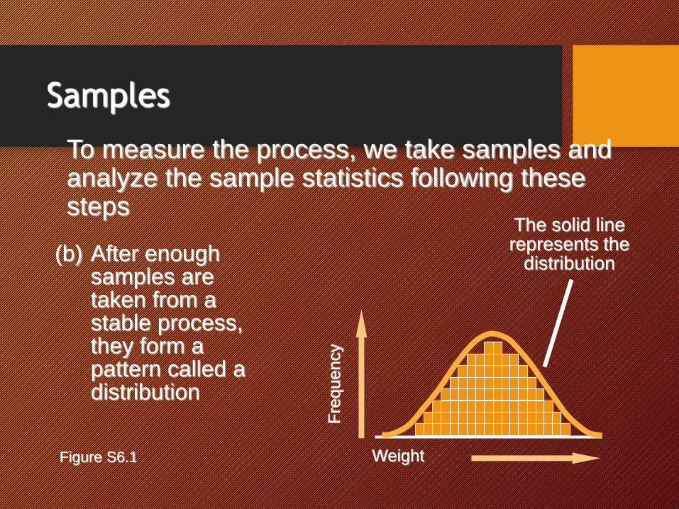
To measure the process, we take samples and analyze the sample statistics following these steps
(b) After enough samples are taken from a stable process, they form a pattern called a distribution
The solid line represents the
distribution
Fre
quency
WeightFigure S6.1
Samples

To measure the process, we take samples and analyze the sample statistics following these steps
(c) There are many types of distributions, including the normal (bell-shaped) distribution, but distributions do differ in terms of central tendency (mean), standard deviation or variance, and shape
Weight
Central tendency
Weight
Variation
Weight
Shape
Fre
quency
Figure S6.1
Samples

To measure the process, we take samples and analyze the sample statistics following these steps
(d) If only natural causes of variation are present, the output of a process forms a distribution that is stable over time and is predictable
Weight
Fre
quency Prediction
Figure S6.1
Samples

To measure the process, we take samples and analyze the sample statistics following these steps
(e) If assignable causes are present, the process output is not stable over time and is not predicable
Weight
Fre
quency Prediction
????
??
????
?????????
Figure S6.1
Samples

Constructed from historical data, the purpose of control charts is to help distinguish between natural variations and variations due to assignable causes
Control Charts

Figure S6.2
Frequency
(weight, length, speed, etc.)
Size
Lower control limit Upper control limit
(a) In statistical control and capable of producing within control limits
(b) In statistical control but not capable of producing within control limits
(c) Out of control
Statistical Process Control

Regardless of the distribution of the population, the distribution of sample means drawn from the population will tend to follow a normal curve
1. The mean of the sampling distribution (x) will be the same as the population mean m
x = m
s
nsx =
2. The standard deviation of the sampling distribution (sx) will equal the population standard deviation (s) divided by the square root of the sample size, n
Central Limit Theorem

Three population distributions
Beta
Normal
Uniform
Distribution of sample means
Standard deviation of the sample means
= sx =s
n
Mean of sample means = x
| | | | | | |
-3sx -2sx -1sx x +1sx +2sx +3sx
99.73% of all xfall within ± 3sx
95.45% fall within ± 2sx
Figure S6.3
Population and Sampling Distributions

x = m
(mean)
Sampling distribution of means
Process distribution of means
Figure S6.4
Sampling Distribution

Types of Data
Characteristics that can take any real value
May be in whole or in fractional numbers
Continuous random variables
Variables Attributes
Defect-related characteristics
Classify products as either good or bad or count defects
Categorical or discrete random variables

Introduction to Statistical Quality Control
4th Hour

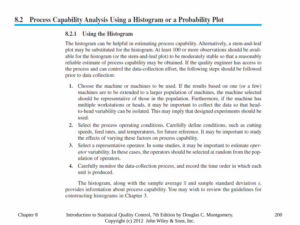
STATISTICAL QUALITY CONTROLProcess Cabability

Chapter 8 197Introduction to Statistical Quality Control, 7th Edition by Douglas C. Montgomery.
Copyright (c) 2012 John Wiley & Sons, Inc.
Process Capability
Natural tolerance limits are defined as follows:

Chapter 8 198Introduction to Statistical Quality Control, 7th Edition by Douglas C. Montgomery.
Copyright (c) 2012 John Wiley & Sons, Inc.
Uses of process capability data:

Chapter 8 199Introduction to Statistical Quality Control, 7th Edition by Douglas C. Montgomery.
Copyright (c) 2012 John Wiley & Sons, Inc.
Process may have
good potential
capability
Reasons for Poor Process Capability
Chapter 8 200Introduction to Statistical Quality Control, 7th Edition by Douglas C. Montgomery.
Copyright (c) 2012 John Wiley & Sons, Inc.

Chapter 8 201Introduction to Statistical Quality Control, 7th Edition by Douglas C. Montgomery.
Copyright (c) 2012 John Wiley & Sons, Inc.

Chapter 8 202Introduction to Statistical Quality Control, 7th Edition by Douglas C. Montgomery.
Copyright (c) 2012 John Wiley & Sons, Inc.
Chapter 8 203Introduction to Statistical Quality Control, 7th Edition by Douglas C. Montgomery.
Copyright (c) 2012 John Wiley & Sons, Inc.
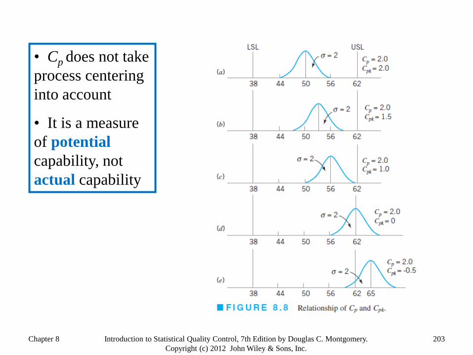
• Cp does not take
process centering
into account
• It is a measure
of potential
capability, not
actual capability

Chapter 8 204Introduction to Statistical Quality Control, 7th Edition by Douglas C. Montgomery.
Copyright (c) 2012 John Wiley & Sons, Inc.
A Measure of Actual Capability
Process Capability
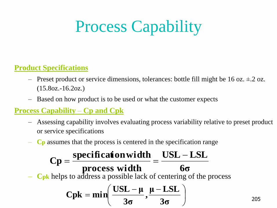
Product Specifications
– Preset product or service dimensions, tolerances: bottle fill might be 16 oz. ±.2 oz.
(15.8oz.-16.2oz.)
– Based on how product is to be used or what the customer expects
Process Capability – Cp and Cpk
– Assessing capability involves evaluating process variability relative to preset product
or service specifications
– Cp assumes that the process is centered in the specification range
– Cpk helps to address a possible lack of centering of the process6σ
LSLUSL
width process
width ionspecificatCp
3σ
LSLμ,
3σ
μUSLminCpk
205

Relationship between Process Variability
and Specification Width
• Three possible ranges for Cp
– Cp = 1, as in Fig. (a), process
variability just meets specifications
– Cp ≤ 1, as in Fig. (b), process not capable of producing within specifications
– Cp ≥ 1, as in Fig. (c), process
exceeds minimal specifications
• One shortcoming, Cp assumes that the process is centered on the specification range
• Cp=Cpk when process is centered
206

Computing the Cp Value at Cocoa Fizz: 3 bottling machines are being evaluated for
possible use at the Fizz plant. The machines must be capable of meeting the design
specification of 15.8-16.2 oz. with at least a process capability index of 1.0 (Cp≥1)
Machine σ USL-LSL 6σ
A .05 .4 .3
B .1 .4 .6
C .2 .4 1.2
The table below shows the information gathered
from production runs on each machine. Are
they all acceptable?
207
Solution:
– Machine A
– Machine B
Cp=
– Machine C
Cp=
1.336(.05)
.4
6σ
LSLUSLCp

Computing the Cpk Value at Cocoa Fizz
.33.3
.1Cpk
3(.1)
15.815.9,
3(.1)
15.916.2minCpk
• Design specifications call for a target
value of 16.0 ±0.2 OZ.
(USL = 16.2 & LSL = 15.8)
• Observed process output has now
shifted and has a µ of 15.9 and a
σ of 0.1 oz.
• Cpk is less than 1, revealing that the
process is not capable
208

±6 Sigma versus ± 3 Sigma
• In 1980’s, Motorola coined “six-sigma” to describe their higher quality efforts
Six-sigma quality standard is now a benchmark in many industries
– Before design, marketing ensures customer product characteristics
– Operations ensures that product design characteristics can be met by controlling materials and processes to 6σ levels
– Other functions like finance and accounting use 6σ concepts to control all of their processes
• PPM Defective for ±3σ versus ±6σ quality
209

STATISTICAL QUALITY CONTROLThe End


![jkekf'ki] >qa>quw 2017-18 Community Fund](https://static.fdokumen.com/doc/165x107/632271b628c445989105c764/jkekfki-qaquw-2017-18-community-fund.jpg)