Hidden in Plain Sight: Northwest Impressionism, 1910-1935
254
Hidden in Plain Sight: Northwest Impressionism, 1910-1935 John E. Impert A dissertation submitted in partial fulfillment of the requirements for the degree of Doctor of Philosophy University of Washington 2012 Reading Committee: Susan Casteras, Chair René Bravmann Douglas Collins Program authorized to Offer Degree: Art History
-
Upload
khangminh22 -
Category
Documents
-
view
0 -
download
0
Transcript of Hidden in Plain Sight: Northwest Impressionism, 1910-1935

Hidden in Plain Sight: Northwest Impressionism, 1910-1935
John E. Impert
A dissertation
submitted in partial fulfillment of the
requirements for the degree of
Doctor of Philosophy
University of Washington
2012
Reading Committee:
Susan Casteras, Chair
René Bravmann
Douglas Collins
Program authorized to Offer Degree:
Art History

University of Washington
Abstract
Hidden in Plain Sight: Northwest Impressionism, 1910-1935
John E. Impert
Chair of the Supervisory Committee:
Professor Susan Casteras
Art History
Northwest Impressionist artists are among the forgotten figures in American art history.
Responsible for bringing Modernism to Washington and Oregon, they dominated the art
communities in Seattle and Portland from about 1910 to 1928, remaining influential until the mid
1930’s. After describing the artists briefly, this dissertation summarizes and evaluates the slim
historiography of Northwest Impressionism. Impressionism and Tonalism are contrasted in
order to situate these artists within the broad currents of American art history.
Six important artists who have not been studied in the past are each accorded a chapter
that summarizes their educations, careers, and artistic developments. In Seattle, Paul Gustin, the
early leader of the Seattle art community, was most closely associated with images of Mount
Rainier. Edgar Forkner, a well established Indiana artist, moved to Seattle and painted numerous
canvases of old boats at rest and still lifes of flowers. Dorothy Dolph Jensen, a latecomer,
emphasized shoreline and harbor scenes in her work. In Portland, Charles McKim traded
complete anonymity in Portland, Maine for the leadership of the Oregon art community, creating
a variety of landscapes and seascapes. Clyde Keller produced an enormous output of landscapes
over a long career that extended to California as well as Oregon. Clara J. Stephens, a favorite
pupil of William Merritt Chase, was a leading art teacher in Portland as well an artist whose
work encompassed many genres.

The factors that make Northwest Impressionism unique are explored, primarily the
iconography of its tallest mountains, Mount McKinley, Mount Rainier, and Mount Hood, and of
decrepit sailing ships, and the treatment pictorially of precipitation and atmospheric humidity. A
rich iconography is developed based upon a reverence for the greatest mountains, combined with
an awareness of their multiple significations of business activity and possession of the American
patrimony. Postmodern parody analysis assists in understanding levels of meanings. The work
of Northwest Impressionist artists is compared to American Impressionists in California and
elsewhere. The quality and originality of the art is made evident.

i
ACKNOWLEDGEMENTS
In addition to the guidance provided by my adviser, Professor Susan Casteras, I would
like to thank David F. Martin in Seattle and Mark Humpal in Portland for making their artist files
available. I would also like to thank Jay Franklin for providing photographic images of the
Edgar Forkner scrapbook and the exhibition records of the Seattle Fine Arts Society, and for Jay
Franklin’s and David Martin’s willingness to provide numerous digital images of works by some
of the artists discussed in this dissertation. In the preparation of this dissertation, I am grateful to
those who reviewed an earlier draft and provided helpful corrections and comments, David
Martin, Mark Humpal, Ginny Allen, and Randy Dagel. Needless to say, I accept full
responsibility for any errors or omissions.

ii
DEDICATION
My inspiration for undertaking this dissertation arose from the graduate seminar on
Northwest Impressionism given at the University of Washington in the fall term of 2007 by
Professor Susan Casteras. It is a subject that had not been examined by the academy, and
Professor Casteras demonstrated that it was a potentially rich area of art awaiting its first
advanced academic study. Further inspiration was provided by the example of David F. Martin,
an independent curator, art historian, and art dealer, who has written several excellent exhibition
catalogs on “forgotten” Northwest artists, proving that the art of the Northwest in the first third
of the twentieth century is deserving of study and respect. I wish to dedicate this dissertation to
them.

iii
Table of Contents
Page
Introduction………………………………………………………………………………..1
Chapter I: Impressionism, Tonalism, and Modernism…………………………….…..35
Chapter II: Paul Morgan Gustin (1886-1974)………………………………………….47
Chapter III: Charles C. McKim (1862-1939)…………………………………………...76
Chapter IV: Clara J. Stephens (1877-1952)…………………………………………....105
Chapter V: J. Edgar Forkner (1857-1945)………………………………………….....122
Chapter VI: Clyde Leon Keller (1872-1962)………………………………………......142
Chapter VII: Dorothy Dolph Jensen (1895-1977)…….………………………………...163
Chapter VIII: Iconography and Parody……………….…………………………………180
Chapter IX: Comparison of Northwest Impressionists with Other Regional Groups....208
Chapter X: Conclusion.……………………………………………………………......221
Bibliography………………………………………………………………………….......232

iv
List of Figures Page
1. Paul M. Gustin, Nootka Island [British Columbia], 1919, oil on canvas, 32 ¼ x 26 ¼”, Seattle
Art Museum…………………………………………………………………………………….....2
2. Sydney Laurence, Mount McKinley from the Rapids of the Tokosheetna, 1929, oil on canvas,
71 x 143”, location unknown……………………………………………………………………..4
3. John Marion Crook, Salt Marsh, Pacific Shore, 1909, watercolor on paper, 11 3/8 x 17 3/8”,
s. l. l., private collection……………………………………………………………..……………9
4. Clyde Leon Keller, Water Lily Pond, 1917, oil on canvas, Miranda Collection……………..10
5. Charles C. McKim, Mount Hood Viewed from a Marsh, oil on canvas, Miranda Collection.11
6. Clara J. Stephens, Mount Hood, 1923, oil on canvas, location unknown…………………….11
7. John Henry Trullinger, Old French Mill, 1910, pastel on paper, 13 ½ x 15 ¼”, s. l. l., private
collection…………………………………………………………………………………………12
8. Harry Wentz, Sand Dune, Neah-Kah-Nie [Oregon coast], c. 1914, oil on canvas board, 11 x
16 ¼,” Portland Museum of Art………………………………………………………………….13
9. Melville T. Wire, Upper Columbia River Farm, Early Morning, watercolor on paper, 14 x
24”, s. l. l., private collection…………………………………………………………………….14
10. Belmore Browne, Surprised, 1915, oil on canvas, 20 x 30,” Len Braarud Fine Art.………..15
11. John Davidson Butler, untitled [figure study], 1915, oil on canvas, location
unknown…………………………………………………………………………………….……15

v
12. Louise Crowe, untitled [landscape with cabin], oil on canvas, location
unknown……………….……………………………………………………………………...….16
13. Edgar Forkner, Boats of Lake Union, watercolor on paper, 16 x 22,” s. l. l., private
collection…………………………………………………………………………………………17
14. Lance Wood Hart, Camp Lewis, Washington, October, 1917, watercolor and gouache on
paper, 8 x 13 ½”, s. l. r., private collection………………………………………………………18
15. Abby Williams Hill, Emerald Pool [Yellowstone], 1906, oil on canvas, 22 x 17,” University
of Puget Sound……………………………………………………………………………….…..19
16. Dorothy Dolph Jensen, untitled [cabin on Puget Sound], 1935, oil on canvas, 34 x 40,”
Mansion of the Governor of Washington ………………………………………….………….19
17. Sydney Laurence, Aurora Bridge [Seattle], 11 ½ x 15 ½,” oil on canvas board, location
unknown…………………………………………………………………………………………20
18. Roi Partridge, In a Robe of Mist [Mount Rainier], 1915, etching on paper, 12 x 16,” s. l. c.,
private collection…………………………………………………………………………………21
19. Fokko Tadama, Lake Washington, Union Bay Marsh, oil on canvas, 19 x 32”, s. l. l., private
collection………………………………………………………………………………….……...22
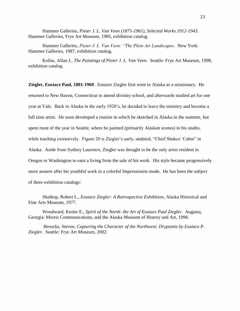
20. Eustace Ziegler, Chief Shakes’ Cabin [Alaska], c. 1922, oil on canvas board, 9 ½ x 11 ¼”,
location unknown…..……………………………………………………………………..….….24
21. Edna C. Breyman, Old Boats Near Steel Bridge, oil on canvas, Parsons Collection………24

vi
22. Waldo Spore Chase, USS Louisville, 1931, color woodblock on cream laid Japan paper, 6 x
10,” s. l. r., private collection……………………………………………………………………25
23. Wendell Corwin Chase, Sunset [Mount Rainier], 1927, color woodblock on cream laid Japan
paper, 7 ½ x 13,” s. l. l., private collection…….………………………………………………...26
24. Peter Sheffers, Foggy Morning on the Coast, 1942, oil on canvas, Parsons Collection……27
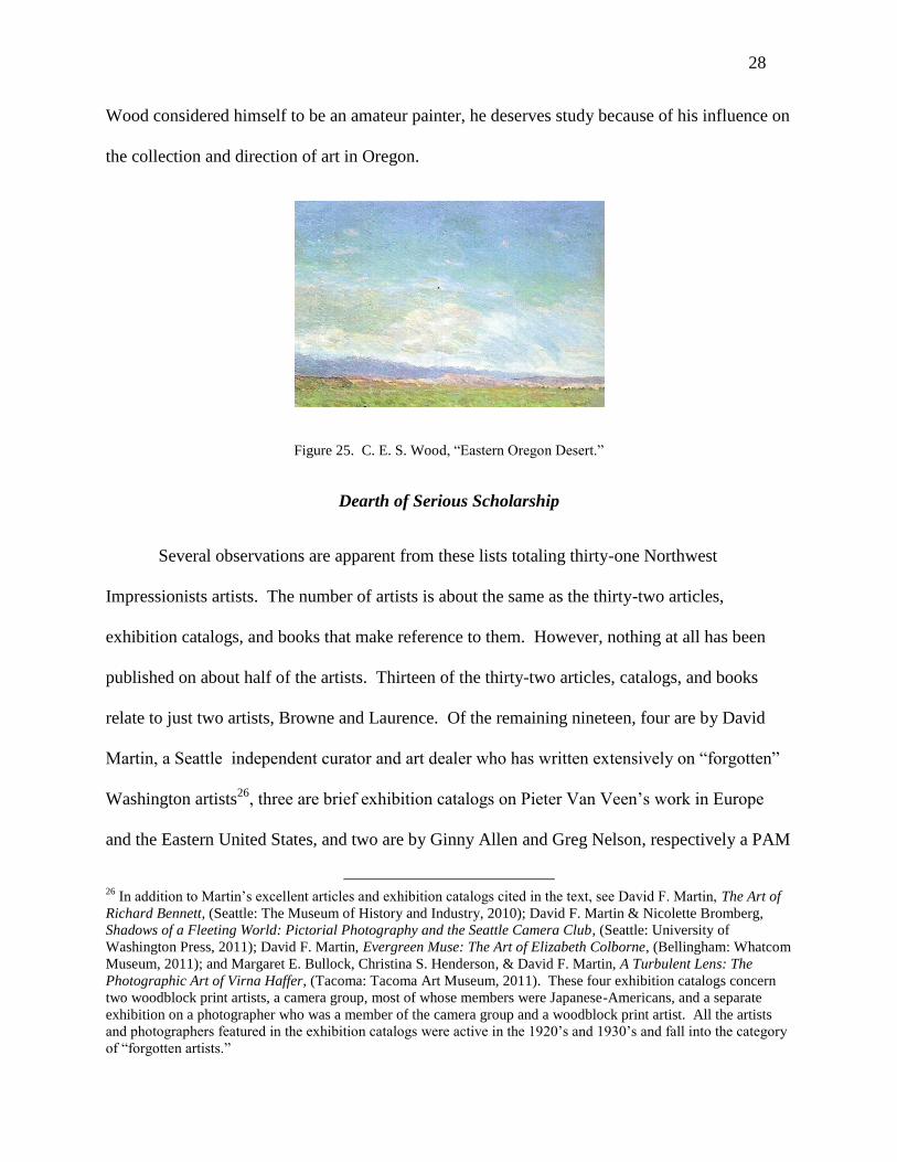
25. C. E. S. Wood, Eastern Oregon Desert, 1915, oil on canvas, Sovereign Collection….……28
26. Sydney Laurence, Northern Lights [Alaska], 1925, oil on canvas, 16 x 20,” s. l. r., private
collection…………………………………………………………………………………………38
27. James McNeill Whistler, Nocturne in Black and Gold—The Falling Rocket, c. 1874, oil on
panel, 24 x 18”, The Detroit Institute of Arts……………………………………………………39
28. Childe Hassam, Afternoon Sky, Harney Desert, 1908, oil on canvas, 20 x 30”, Portland
Museum of Art…………………………………………………………………………………..42
29. Paul M. Gustin, King above the Clouds [Mount Rainier], oil on canvas, 36 x 46”, The
Rainier Club, Seattle……………………………………………………………………………..48
30. Paul M. Gustin, On the Quinault [Olympic National Park], oil on canvas, 26 x 32”, location
unknown…………………………………………………………………………………………55
31. Paul M. Gustin, untitled [meadow landscape], c. 1909, oil on board, 9 x 12 ½”, Martin-
Zambito Fine Art………………………………………………………………………………...56
32. Ella McBride, photograph of Paul Gustin painting a Seattle harbor scene, 1922, Martin-
Zambito Fine Art………………………………………………………………………………...64

vii
33. Paul M. Gustin, Fishing Boats at the Pier, dated 1938, originally painted 1922, oil on
canvas, Martin-Zambito Fine Art…………………………….………………………………….65
34. Paul M. Gustin, Sunset, Docks on Seattle Waterfront, 1928, oil on canvas, 20 x 26”, s. l. l.,
private collection…………………………………………………………………………………66
35. Giorgio de Chirico, The Mystery and Melancholy of a Street, 1914, oil on canvas, location
unknown…………………………………………………………………………………………67
36. Paul M. Gustin, Barber Pole—Deerfoot Vanilla Leaf, Wildflowers of Mount Rainier, 1952,
watercolor on paper, 15 ½ x 11,” s. l. l., private collection….…………………………………..74
37. Paul M. Gustin, Mistmaiden on Paradise River, Mount Rainier, 1954, watercolor on paper,
16 x 13,” s. l. l., private collection……………………………………………………………….74
38. Charles C. McKim, The Old Mill, c. 1895, oil on canvas, 13 x 9,” private collection……...79
39. Charles C. McKim, Landscape with Mill and Waterfall [“Little Niagara Falls,” Western
Maine], c. 1900, oil on canvas, 22 x 36”, s. l. r.., private collection…………………………….87
40. Charles C. McKim, Off the Maine Coast, c. 1905, oil on board, 8 x 10”, s. l. r., private
collection………………………………………………………………………………………...89
41. Charles C. McKim, untitled [Farm/Maine], c. 1909, oil on canvas, J. Franklin Fine Arts...89
42. Charles C. McKim, The Pond, 1911, oil on canvas, Mark Humpal Collection…...………..91
43. Charles C. McKim, Tidal Pool, Oregon Coast, c.1910, oil on canvas, 8 x 10”, s. l. r., private
collection……………………………………………………………………………….………...92

viii
44. Charles C. McKim, Salt Marsh, Oregon Coast, c. 1912, watercolor on paper, 9 x 12”, s. l. l.,
private collection…………………………………………………………………………………93
45. Charles Demuth, The Bay #4, c. 1912, watercolor on paper, 10 x 14”, Woodmere Art
Museum………………………………………………………………………………………….95
46. Charles C. McKim, Spring Evening, Sauvie Island, 1915, oil on canvas, 24 x 34”, s. l. l.,
private collection………………………………………………………………………………..100
47. Charles C. McKim, Oregon Forest Stream, c. 1924, oil on board, 12 x 16”, s. l. r., private
collection………………………………………………………………………………………..101
48. Charles C. McKim, Mount Hood, Early Morning, 1927, oil on canvas, 22 x 36”, s. l. r. and s.
and dated on verso, private collection………………………………………………………….102
49. Clara J. Stephens, Woman Gardening, Goose Hollow, c. 1920, oil on board, 10 x 8”, private
collection…………………………………………………………………………….………….114
50. Clara J. Stephens, New Bridge at Oregon City, 1924, oil on canvas, Powell Collection….115
51. Clara J. Stephens, Cow Puncher, 1924, oil on canvas, 18 x 24”, location unknown……...118
52. Edgar Forkner, Golden Sail, 1928, oil on canvas, 32 x 35”, J. Franklin Fine Arts……….123
53. John Elwood Bundy, Wane of Winter [Richmond, Indiana], 1914, 16 x 20”, oil on canvas,
location unknown……………………………………………………………………….………127
54. Edgar Forkner, Mount Rainier, c. 1915, watercolor and gouache on paper, J. Franklin Fine
Arts……………………………………………………………………………………………..130

ix
55. Edgar Forkner, The Market in the Early Morning, c. 1912, watercolor on paper, 13.7 x
10.25”, J. Franklin Fine Arts……………………………………………………………….…..131
56. Edgar Forkner, Peonies and Larkspur in Green Vase, 33 x 31”, oil on canvas, J. Franklin
Fine Arts…………………………………………………………………………………….….138
57. Clyde Keller, Spring Rain [St. James Lutheran Church, Park Avenue, Portland], 1912,
watercolor on paper, 9 ½ x 13 ½”, s. l. r., original Keller frame, private collection…………...146
58. Clyde Keller, Sea Rocks at Cannon Beach, 1915, oil on board, 12 x 16”, s. l. l., private
collection………………………………………………………………………………………..149
59. Photograph of Clyde Keller on the Oregon coast, undated, Mark Humpal archive….……151
60. Clyde Keller, Late Autumn [Tatoosh Range from Mount Rainier National Park], 1924, oil on
canvas, 20 x 30”, s. l. r., private collection……….…………………………………………….154
61. Clyde Keller, Fields of Purple and Gold, 1930, oil/masonite, 22 x 30,” J. Franklin Fine
Arts……………………………………………………………………………………………..155
62. Granville Redmond, Poppies and Lupines, oil on canvas, 25 x 29”, The Irvine Museum…156
63. Clyde Keller, Tatoosh Range from Mount Rainier National Park, 1930, oil/masonite, 24 x
30”, J. Franklin Fine Arts…………………………………………………………………… 157
64. Clyde Keller, Summer Afternoon, 1942, oil on canvas, 18 x 24”, private collection….…..160
65. Dorothy Dolph Jensen, Ballard Locks, oil on canvas, Martin-Zambito Fine Art…………165
66. Newspaper photograph of Dorothy Dolph Jensen, c. 1919, Martin-Zambito archive……..168
x
67. Dorothy Dolph Jensen, Lake Union, watercolor on paper, Martin-Zambito Fine Art.……..170
68. Dorothy Dolph Jensen, Farm, c. 1940, watercolor on paper, 22 x 31”, Doris Jensen Carmin
inventory, 2002, Martin-Zambito Fine Art..……………………………………………………175
69. Dorothy Dolph Jensen, Mount Rainier, oil on canvas, Martin-Zambito Fine Art…………176
70. Dorothy Dolph Jensen, Boiler Bay [Oregon coast], oil on canvas, 20 x 16”, s. l. r., private
collection………………………………………………………………………………………..178
71. Belmore Browne, Mount McKinley, the South Face, 1913, oil on canvas, 36 x 40”, Alaska
Museum of History and Art…………………….………………………………………………184
72. Eustace P. Ziegler, Mount McKinley, c. 1935, oil on canvas, 16 x 20”, s. l. l., private
collection………………………………………………………………………………………..187
73. Paul Morgan Gustin, Mountain Climbing Trees, Rainier, three color woodblock prints on
paper, private collection………………………………………………………………………...190
74. Waldo S. Chase, Seattle Skyline Silhouetted against Mount Rainier, 1927, color woodblock
on cream laid paper, 5 x 11”, s. l. l., private collection…………..…………………………….193
75. Elizabeth Colborne, Mount Baker, Washington c. 1928, color woodblock on tissue, 13 x 9”,
s. l. l. in block, s. l. r. estate stamp, private collection………………………………………….196
76. Alfred Schroff, untitled [woodlands with pond], 1915, oil on canvas, 21 x 17”, Mark
Humpal…………………………………………………………………………………………198
77. Elizabeth Colborne, In the Rain Forests of Washington, c. 1933, color woodblock on tissue,
12 1/8 x 9 1/8”, s. l. r. estate stamp, private collection…………………………………………199

xi
78. Eustace P. Ziegler, Fish Pirates, oil on canvas, 34 x 34”, location unknown…….……….200
79. Virna Haffer, Strange Forest Creatures, c. 1927-30, black and white woodblock/ paper, 6 ½
x 4 ¼”, initials l. r. in block, private collection…………………………………………………203
80. Virna Haffer, untitled photograph of Corwin Chase, 1930, Martin-Zambito Fine Art……206
81. Dorothy Dolph Jensen, untitled [coastal tree], oil on canvas, Martin-Zambito Fine Art….211
82. Edgar Payne, The Sierra Divide, 1921, oil on canvas, 24 x 28”, Joan Irvine Smith………212
83. Jack Wilkinson Smith, Sierra Slopes, 1922, oil on canvas, 24 x 30”, location unknown…213
84. William Wendt, Where Nature’s God Hath Wrought, 1925, oil on canvas, 50 ½ x 60”, Los
Angeles County Museum of Art………………………………………….…………………….214
85. William L. Lathrop, The Tow Path [Pennsylvania], oil on canvas, Phillips Collection…...216
86. J. Alden Weir, Afternoon by the Pond, c. 1908, oil on canvas, Phillips Collection……….217
87. John Twachtman, Fishing Boats At Gloucester, 1901, oil on canvas, Phillips
Collection……………………………………………………………………………………….218

1
Introduction
Northwest Impressionism as terminology—and as a worthwhile subject of study—has not
yet enjoyed the imprimatur of the art history academy. The dean of historians of American
regional art and American Impressionism, William D. Gerdts, published three weighty volumes
entitled Art Across America, the third of which, The Plains States and the West, 1710-1920,
addressed art produced in Oregon and Washington, the two states typically identified as the
Pacific Northwest.1 Although Gerdts used “Impressionism” in his description of California
artists, he eschewed use of the “I” word when he turned to the Northwest, speaking simply of
landscapes. The principal promoter of the study of American Impressionism thus did not find
any art in the Northwest to identify by the designation of Impressionist.
Nevertheless, one of the landscapes by a Northwest artist that Gerdts chose to illustrate in
The Plains States and the West is Paul Morgan Gustin’s “Nootka Island,” 1919, figure 1. A
Vancouver Island scene, with an Indian village in the background, “Nootka Island” is
constructed with the typical broken brushstrokes of American Impressionist artists. According to
Sam Hunter, American artists embraced Impressionism to a far greater extent than in any other
country except France, and it became a national style with a specifically American orientation.
“Americans…significantly changed the French accent—toning down the bright French palette
and using…broken brushstrokes…more to embellish surface, or to heighten the perception of
observed reality than as a device for analyzing light effects and the act of perception itself, or to
1 William D. Gerdts, Art Across America: The Plains States and the West: regional painting in America 1710-1920
(New York: Abbeville Press, 1990), 183-222.

2
engage theoretical and scientific problems…The mood [of American artists] was far more
decorous, tasteful and conservative.”2
Gustin may not have been engaged in attacking a scientific problem in painting “Nootka
Island,” but he was interested in depicting the effects of the light in the Northwest through the
use of his typically Impressionist broken brushstrokes. “Nootka Island’s” primary focus, the
bottom 60% of the canvas, is all about the
reflection of light—pink, yellow, creamy white,
green, and blue—from the water and rocks of
Nootka Sound. 3
Gustin has painted what his eyes
see under the particular meteorological conditions
he experienced, that is pink, almost dematerialized
rocks, not the massive gray rocks he knows are
there. Gustin evidences no particular
anthropological or topographical interest in the
Indians, their village, or the hills and trees around
them, and they are rendered in very little detail.
The effect of light on the scene is the principal artistic interest of the “Nootka Island,” and its
style is nothing if not American Impressionist.
The low point in the reputation of American Impressionism occurred in the mid-decades
of the twentieth century, when the Metropolitan Museum in New York sold about two-thirds of
2 Sam Hunter, American Impressionism: The New Hope Circle (Fort Lauderdale: Fort Lauderdale Museum of Art,
1985), 15. 3 Nootka Sound, on the west coast of Vancouver Island, British Columbia, was the “most important rendezvous of
trading vessels in the Northwest” prior to the development of seaports in Puget Sound. Thomas Minor Pelly, North-
Westward, Seattle: Lowman & Hanford, 1930, 33. A limited edition book, North-Westward contains an original
color woodblock print by Corwin Chase, one of the Washington artists discussed in this dissertation.
Figure 1. Paul Gustin, "Nootka Island."

3
its collection of American Impressionist art in order to buy works by living artists.4 The renewal
of interest in American Impression began about 1975, according to William Gerdts. 5
In 1980,
the Henry Art Gallery of the University of Washington presented one of the first major
retrospective reexaminations of American Impressionism. Although the show originated in
Seattle before traveling to other cities, the 140 American Impressionist works in the exhibition
did not include a single painting by a Northwest artist.6 Gerdts’s later magnum opus on the
subject, American Impressionism, second edition, 2001, mentions only one Northwest artist,
Sydney Laurence, and in only one sentence. “In Alaska, Sydney Laurence’s repeated images of
Mount McKinley and other snow-covered peaks in a high-keyed colorism with glowing sunlight
effects are not directly Impressionist, but the distinction between his vision and the older
aesthetic of artists such as Albert Bierstadt must be attributed to Impressionism.”7 “Mount
McKinley from the Rapids of the Tokosheetna,” 1929, figure 2, is one of Laurence’s grandest
landscapes of Mount McKinley. None of Laurence’s works is illustrated in Gerdts’s book.
Although Gerdts attributes Laurence’s use of brighter colors and his emphasis on the effects of
light on snow—both evident in figure 2—to the influence of Impressionism, he nevertheless
avoids the designation Impressionist, or indeed any other categorization, for Laurence’s art.
Aside from the early work of Mark Tobey, Morris Graves, Kenneth Callahan, and other
Northwest Mystics, few art historians have written about any Northwest art—academic realist,
Tonalist, Impressionist, or Modernist—that dates from the first third of the 20th
century.
Nevertheless, in my opinion, Portland, Oregon, and Seattle, Washington, had resident artists who
worked in an Impressionist mode at a high level of expertise, and this dissertation will thus fill
4 James Burke, PhD, retired director, Saint Louis Museum of Art, lecture at Portland Museum of Art, March 21,
2011. 5 William H. Gerdts, ed., American Impressionism (Seattle: University of Washington, 1980), 9.
6 Gerdts, catalog of exhibition listed above.
7 William H. Gerdts, American Impressionism (New York: Abbeville Press, 2
nd ed., 2001), 255.

4
Figure 2. Sydney Laurence, "Mount McKinley from the Rapids of the Tokosheetna"
what has been a gaping hole in the corpus of American art history. These artists were not pale
imitators of French or well-known American Impressionists. Much of their work is unlike that
created elsewhere in the country or, indeed, elsewhere in the world. Their paintings tend to be
images of the Northwest’s iconic mountains (as Laurence’s “Mount McKinley from the Rapids
of the Tokosheetna”), of its wild seashores (as in Gustin’s “Nootka Island”), and of its dark,
evergreen forests. Their favorite subjects do not include fields of bluebonnets as in Texas or of
poppies as in California.
Not only did Northwest Impressionists emphasize a different subject matter than artists
elsewhere in America, the places they chose to paint carried unique meanings for them. There is
an iconography of Northwest Impressionist art to be identified and elaborated that differs from
Impressionist art elsewhere. 8
The great volcanoes of the Cascades, in particular, embodied a
sort of manifestation of the divine, first to Northwest Indians, and later to white artists. The
specific meanings of the great mountains and dark forests can be elaborated through observations
and remarks of the artists themselves, as well as contemporary journalistic commentaries.
8 Iconographic studies that I have found useful are E. Panofsky, “Et in Arcadia Ego: Poussin and the Elegiac
Tradition” and Louis Marin, “Toward a Theory of Reading in the Visual Arts: Poussin’s The Arcadian Shepherds.”
In The Art of Art History: A Critical Anthology, edited by Donald Preziosi, 257-276, Oxford: Oxford University
Press, 1998

5
The Northwest light is unique in the United States, with an especially marked contrast to
the light of Southern California. Instead of bone dry atmosphere, the Northwest atmosphere is
humid and misty. In contrast to Laguna Beach’s average of 281 days of bright sunlight every
year, Seattle has an average of 201 overcast days, plus frequent drizzle.9 In the Northeast, bright
winter days with deep blue sky are common; in the Northwest, the winter sky—on those rare
occasions when it is largely visible—is a pale, wan blue. The challenges of representing
precipitation, misty atmosphere, and attenuated sunlight are a second theme to be developed in
this dissertation.
The majority of Northwest Impressionist artists enjoyed a serious studio art education.
Many of the artists studied with prestigious teachers and art academies in America and Europe
and exhibited in American metropolises like New York and Chicago. For example, at least eight
Northwest artists studied with William Merritt Chase (1845-1916) in Europe, New York, or
California, and four of them were been singled out by Chase for special praise.10
Several studied
at the Art Students League in New York and at the Art Institute in Chicago; one studied for
several years at the Royal Swedish Academy of Arts, and three enrolled at the Académie Julian
in Paris; many lived or traveled in Europe.11
Indeed, two of these artists were Dutchmen who
had studied art and painted in the Netherlands and France before immigrating to the Pacific
Northwest during the first third of the twentieth century.12
Yet, today, the names of only three of
9 My own experience, confirmed by the statistics available at www.weather.com
10 Belmore Browne, Edna Breyman, John Butler, Louise Crow, Edgar Forkner, Abby Hill, Clara Stephens, and Myra
Wiggins (1869-1956) studied with Chase. Chase gave oils he had painted to Butler, Crow, and Stephens as
recognition of their talent, and he publicly predicted the success of Hill. 11
John Butler, Edgar Forkner, and Roi Partridge studied at the Art Students League in New York City; Edgar
Forkner and Lance Wood Hart studied at the Art Institute of Chicago; Hart also studied at the Royal Swedish
Academy of Art, and Browne, Dorothy Jensen, and John Trullinger were enrolled at the Académie Julian in Paris.
In addition, Butler, Forkner, Partridge, Stephens, and Wentz traveled and worked extensively in Europe; Sydney
Laurence lived and painted in France and Great Britain for over fifteen years. 12
Citations for these facts, and for other basic information on the artists contained in this introduction, will be given
in subsequent sections where they are treated in more detail.

6
the approximately thirty Northwest Impressionists who were most active might be recognized by
someone with an extensive knowledge of American art: Sydney Laurence, Eustace Ziegler, and
Belmore Browne.13
Few people, even in the Pacific Northwest, will have heard of Charles C.
McKim, Clara J. Stephens, or Paul Morgan Gustin, all prolific and well known Oregon and
Washington Impressionists of their time.
With one exception, major museums in the Oregon and Washington have not collected
these artists in a serious or concerted fashion. The Seattle Art Museum (“SAM”) owns only a
few paintings by them, and they are almost never on display. The Portland Museum of Art
(“PAM”) does better in typically exhibiting a handful of works by Oregon Impressionists in its
third floor Portland Room, but there is no depth in its Northwest Impressionist collection.14
In
contrast, The Frye Art Museum in Seattle (“Frye”) has 65 Alaskan paintings by Laurence and
Ziegler in its permanent collection, as well as a large number of works by lesser known Alaskan
artists, although they are rarely on view.15
(It is no coincidence that Eustace Ziegler advised the
Frye family for many years on their acquisition policies.16
) As a result of this overall situation of
institutional indifference, anyone interested in paintings by these artists must seek to see them
13
Although Browne spent his adolescence in Washington in the late 19th
century, Laurence wintered in Washington
in the 1930’s, and Ziegler was domiciled in Washington from the early 1920’s until his death in 1969, the scenes for
which they are best known are of Alaska and the Canadian Rockies. Because the Pacific Northwest (Washington
and Oregon) was not the principal subject of their work, and because they have already received serious art
historical consideration, they will not be extensively discussed in this dissertation. 14
The online list of PAM’s collection includes only three works by Oregon artists named in this chapter, two by
Harry Wentz and one by C. E. S. Wood, one of the founders of the museum, although not all PAM’s collection is
listed online. Most of the Northwest Impressionist works that are on view from time to time in PAM’s Portland
Room would appear to be borrowed. SAM’s online collection list includes no Northwest Impressionists, but files in
the SAM library indicate that the museum owns three paintings by Paul Gustin and one by John Butler. 15
In 1980, the Frye announced plans to construct a new addition to house and exhibit its Alaskan art collection.
Deloris Tarzan, “Frye plans wing for Alaskan art,” Seattle Times, June 22, 1980, E1. Although planned for
completion in 1981, it did not open until 1984, when it was called the “Alaska wing,” and was said to be destined for
“art from its permanent Alaskan collection and from traveling exhibitions.” Tarzan, “Wingding, The Frye Museum
celebrates its new $2 million Alaska wing,” Seattle Times, January 26, 1984, D1. In practice, none of the Frye’s
Alaskan art is normally on view, and the new space is devoted almost exclusively to temporary exhibitions. Indeed,
one hears rumors that the Frye would now like to find an Alaskan museum to take over its Alaska collection. 16
The Charles and Emma Frye Art Museum: A Handbook of the Collection, (Seattle, 1989), 10.

7
primarily in private collections or in whatever happens to constitute the inventory of a few
dealers who carry their art.
Historiography of Principal Northwest Impressionist Artists
Apart from Browne, Laurence, and Ziegler, no substantial monograph or exhibition
catalog has been published on any of these artists. No doctoral dissertation has addressed any of
them, including Browne, Laurence, and Ziegler. The University of Washington, the only
Northwest institution that grants doctorates in art history, has offered only one course within
memory on Northwest Impressionism, a graduate seminar by Professor Susan Casteras in 2007.
In the four years in which I have taken an interest in their work, the only public exhibitions of
any Oregon and Washington Impressionist art have been the two or three paintings normally
hung in the Portland Room of PAM mentioned earlier, a selection of 10 Northwest Impressionist
paintings shown at the Tacoma Art Museum (“TAM”) as part of a much larger exhibition of
Northwest art in 2009-2010, and a group of 10 small sized Northwest Impressionist images—
having some overlap with the Tacoma show—that were part of an exhibition on Northwest Arts
& Crafts at the Washington Museum of History and Industry (“MOHAI”) in Seattle and
elsewhere in the Northwest earlier in 2009.17
In addition, during the summer of 2010, the Frye
exhibited some of its Alaskan collection, along with paintings in the inventory of Len Braarud,
the best known Washington art dealer who carries “Western art”, i.e., art that focuses on Indians,
wildlife, frontier men, ranching, and the Western wilderness. (Within this category, Braarud’s
emphasis is Alaska.) Unfortunately, there was no catalog for any of these exhibits.
17
The exhibition was organized in connection with the publication of Lawrence Kreisman and Glenn Mason, The
Arts and Crafts Movement in the Pacific Northwest (Portland: Timber Press, 2007). Chapter 10, Painting and
Printmaking, 283-311, mentions several Northwest Impressionist artists who were active during the period of the
Arts & Crafts movement.

8
The following is a list, in alphabetical order by state and artist, of all the scholarly or
quasi-scholarly articles, books, and exhibition catalogs of which I am aware (in addition to The
Arts and Crafts Movement in the Pacific Northwest, the book that stimulated the Arts & Crafts
exhibition mentioned above), that focused on any of the Northwest Impressionist artists.18
The
list does not include newspaper articles. The criteria for inclusion are the following:
1. The artist has been identified with American Impressionism and was active within the
period 1910-1935. The starting point of 1910 was chosen because it was the year that Charles C.
McKim first visited Oregon, and it coincided generally with public exhibitions in the Northwest
by many of the artists discussed in this chapter. It was four years after Paul Gustin moved to
Seattle from Denver and Clyde Keller relocated to Portland from San Francisco, and it was two
years after PAM purchased its first painting, a landscape in Eastern Oregon from the second of
two trips to Oregon by Childe Hassam, in 1904 and 1908.19
The end point of 1935 was selected
because it marked the last full year of operation of Keller’s studio and art shop, which were
liquidated the following year in connection with his bankruptcy. In addition, from the mid
1930’s, there were few articles in Seattle or Portland newspapers that mention any Northwest
Impressionist artist, except obituaries or occasional exhibitions granted toward the end of their
lives.
2. The artist was the subject of one or more books or articles that appeared in art or
history journals or was covered by local newspapers on a regular basis.
18
With the exception of some early pieces on Browne, Gustin, and Laurence, the publications listed date from the
last thirty-five years. The biographical information summarized in this introduction has been drawn primarily from
these publications and from news articles, obituaries, and genealogical research. I have confirmed my information
with the data published in Ginny Allen and Jody Klevit, Oregon Painters: The First Hundred Years (1859-1959),
(Portland: Oregon Historical Society Press, 1999), and Dode Trip and Sherburne E. Cook, Washington State Art and
Artists 1850-1950, (Puyallup, Washington: Valley Printing, 1992). I have met with Ginny Allen to discuss
corrections in her book, which is generally reliable. (The Trip and Cook directory contains numerous errors.) 19
Margaret E. Bullock, Childe Hassam: Impressionist in the West, (Portland: Portland Art Museum, 2004), 31-41,
exhibition catalog.

9
3. The artist exhibited at museum shows, fine arts associations, or state fairs in the
Northwest.
4. Paintings by the artist are sufficiently available today to be viewed in public and
private collections and at art dealers.
5. The artist lived in Washington or Oregon for a number of years and developed a
significant relationship with one of these states.
Oregon Impressionists:
Crook, John Marion, 1867-1924. Crook painted watercolors mainly at Astoria on the Oregon
Coast, while actively participating in Portland art organizations. His emphasis on atmospheric
mist is one of the typical features of Northwest Impressionism. He has not been the subject of
any scholarly investigation. “Salt Marsh,” figure 3, is a much ‘dissolved’ landscape near the
seashore at Astoria dated 1909.
Figure 3. John Marion Crook, “Salt Marsh.”
Keller, Clyde Leon, 1872-1962: Keller was surely the most prolific Northwest Impressionist,
estimating later in life that he had produced thousands of canvases. He had many students in
10
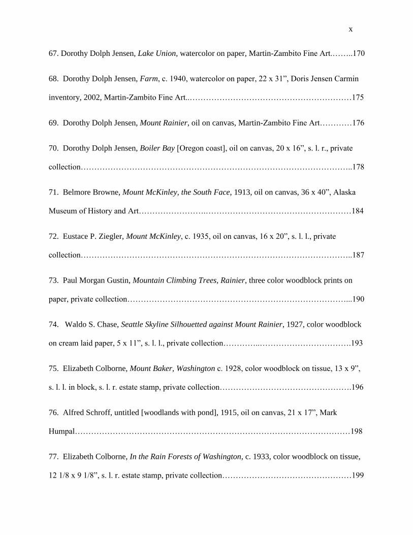
Portland and exhibited constantly throughout the Northwest and elsewhere in the United States.
Keller has not been the subject of any scholarly examination. “Water Lily Pond,” figure 4, is an
Oregon landscape of 1917.
Figure 4. Clyde Keller, "Water Lily Pond"
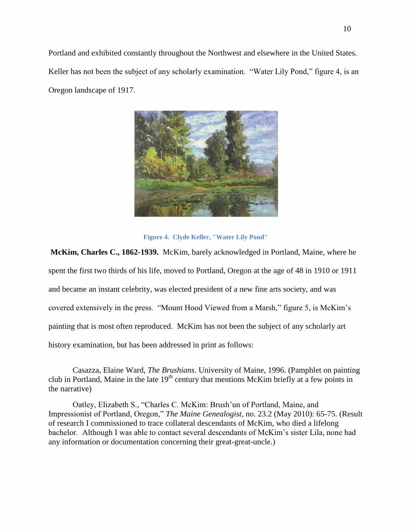
McKim, Charles C., 1862-1939. McKim, barely acknowledged in Portland, Maine, where he
spent the first two thirds of his life, moved to Portland, Oregon at the age of 48 in 1910 or 1911
and became an instant celebrity, was elected president of a new fine arts society, and was
covered extensively in the press. “Mount Hood Viewed from a Marsh,” figure 5, is McKim’s
painting that is most often reproduced. McKim has not been the subject of any scholarly art
history examination, but has been addressed in print as follows:
Casazza, Elaine Ward, The Brushians. University of Maine, 1996. (Pamphlet on painting
club in Portland, Maine in the late 19th
century that mentions McKim briefly at a few points in
the narrative)
Oatley, Elizabeth S., “Charles C. McKim: Brush’un of Portland, Maine, and
Impressionist of Portland, Oregon,” The Maine Genealogist, no. 23.2 (May 2010): 65-75. (Result
of research I commissioned to trace collateral descendants of McKim, who died a lifelong
bachelor. Although I was able to contact several descendants of McKim’s sister Lila, none had
any information or documentation concerning their great-great-uncle.)
11
Figure 5. Charles McKim, “Mount Hood Viewed from a Marsh.”
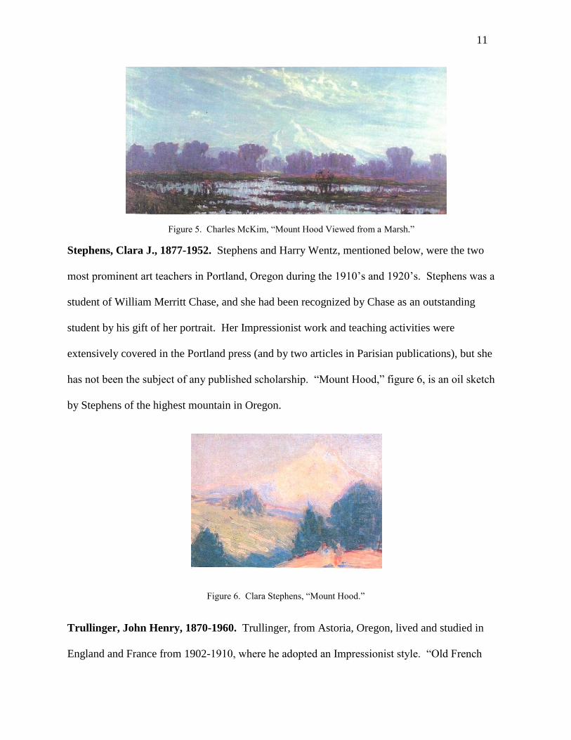
Stephens, Clara J., 1877-1952. Stephens and Harry Wentz, mentioned below, were the two
most prominent art teachers in Portland, Oregon during the 1910’s and 1920’s. Stephens was a
student of William Merritt Chase, and she had been recognized by Chase as an outstanding
student by his gift of her portrait. Her Impressionist work and teaching activities were
extensively covered in the Portland press (and by two articles in Parisian publications), but she
has not been the subject of any published scholarship. “Mount Hood,” figure 6, is an oil sketch
by Stephens of the highest mountain in Oregon.
Figure 6. Clara Stephens, “Mount Hood.”
Trullinger, John Henry, 1870-1960. Trullinger, from Astoria, Oregon, lived and studied in
England and France from 1902-1910, where he adopted an Impressionist style. “Old French

12
Mill,” figure 7, is a Trullinger pastel of the French countryside that he exhibited at PAM in 1910.
Once he returned to Oregon, he earned his living painting realistic portraits. Trullinger worked
alone and appears to have rarely associated with his peers in Portland. One piece has been
published on him:
Andrus, Lisa, The Legacy of John Henry Trullinger. Astoria, Oregon: Heritage Museum,
Clatsop County Historical Society, 1989, exhibition catalog.
Figure 7. John Trullinger, “Old French Mill.”
Wentz, Harry, 1875-1965. “Sand Dune, Neah-Kah-Nie”, a landscape by Wentz, figure 8, was
among fifty-one works by Wentz exhibited at PAM from November 20-December 7, 1914, and
was the first painting by a Northwest artist to enter the collection of PAM in 1914.20
Like Clara
Stephens, Wentz was primarily known in Portland as an art teacher, and there has been no
scholarly examination of his work.
20
Funds were raised by public subscription to purchase “Sand-Dune, Neah-Kah-Nie” for PAM. “Work of Oregon
Artist to Adorn Art Museum,” The Oregonian, Dec. 13, 1914. Neahkahnie Mountain rises 1800’ above the Oregon
seacoast. The prefix “ne” in Northwest Indian languages means a place inhabited by the tribe. Lewis A. McArthur,
Oregon Geographical Names, 4th
edition, (Portland: Oregon Historical Society, 1974), 530.
13
Figure 8. Harry Wentz, “Sand Dune Neah-Kah-Nie.”
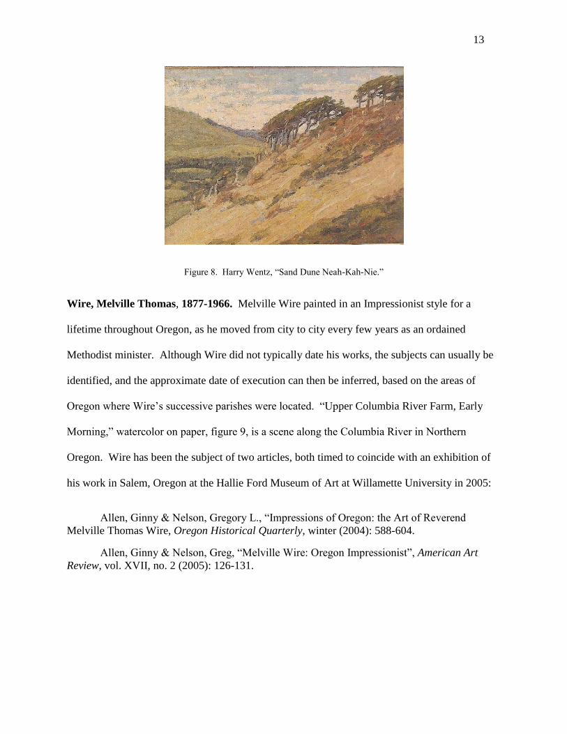
Wire, Melville Thomas, 1877-1966. Melville Wire painted in an Impressionist style for a
lifetime throughout Oregon, as he moved from city to city every few years as an ordained
Methodist minister. Although Wire did not typically date his works, the subjects can usually be
identified, and the approximate date of execution can then be inferred, based on the areas of
Oregon where Wire’s successive parishes were located. “Upper Columbia River Farm, Early
Morning,” watercolor on paper, figure 9, is a scene along the Columbia River in Northern
Oregon. Wire has been the subject of two articles, both timed to coincide with an exhibition of
his work in Salem, Oregon at the Hallie Ford Museum of Art at Willamette University in 2005:
Allen, Ginny & Nelson, Gregory L., “Impressions of Oregon: the Art of Reverend
Melville Thomas Wire, Oregon Historical Quarterly, winter (2004): 588-604.
Allen, Ginny & Nelson, Greg, “Melville Wire: Oregon Impressionist”, American Art
Review, vol. XVII, no. 2 (2005): 126-131.

14
Figure 9. Melville Wire, “Upper Columbia River Farm.”
Washington Impressionists:
Browne, Belmore, 1880-1954. Browne spent his adolescence in Tacoma, Washington, but his
art was created primarily in Alaska and the Canadian Rockies. “Surprised,” figure, 10 is an
Alaskan scene of 1915 with hunters and a moose. Browne was an explorer and a writer as well
as an artist, and he has attracted more recent interest by publishers than any other Northwest
Impressionist.
Browne, Belmore, The Conquest of Mount McKinley. First edition, 1913; second edition,
Cambridge: Houghton Mifflin, 1956. (Browne discovered the standard route to climb Mount
McKinley. Autobiography.)
Browne, Belmore, The Quest of the Golden Valley. New York: G. P. Putnam, 1916.
(Novel of Yukon adventure with 8 illustrations by Browne.)
Browne, Belmore, “Paintbrush on the Heights,” The American Alpine Journal, vol. IV,
no. 2, (1941), reprinted The Alaska Journal, vol. 3, no. 2, spring (1973): 105-6 (Memoir).
Kennedy, Michael S., “Belmore Browne and Alaska,” The Alaska Journal, vol. 3, no. 2,
spring (1973): 96-104 (Biography).
Render, Lorne E., The Mountains and the Sky, Glenbow: McClelland and Stewart West,
1974, 12, 170-79 (Art collection of Glenbow-Alberta Institute).
Bates, Robert H., Mountain Man: The story of Belmore Browne, hunter, explorer, artist,
naturalist. Clinton, NJ: Amwell Press, 1988. (Biography with copious illustrations.)

15
Ordeman, John T. & Schreiber, Michael M., George & Belmore Browne: Artists of the
North American Wilderness. Toronto: Warwick, 2004. (Biography with copious illustrations and
extracts from personal papers.)
Figure 10. Belmore Browne, “Surprised.”
Butler, John Davidson, 1890-1976. Butler, a Wisconsin native, studied with William Merritt
Chase (receiving the gift of a Chase painting as recognition of his talent) and painted in an
Impressionist style during his early career. He left Seattle after a few years of residence as an
artist, and his career was afterwards devoted primarily to ceramics and to teaching in Virginia.
He has not been the subject of any scholarly examination. Figure 11 is an untitled “parasol”
scene painted on the shores of Lake Washington that is reminiscent of Chase’s work on Long
Island.
Figure 11. John Davidson Butler, untitled [Lake Washington].

16
Crow, Louise (a.k.a. Boyac), 1891-1968. Crow, a native of Washington, studied with William
Merritt Chase and was rewarded for her excellence by Chase’s gift of a painting he created
during the summer school session. Like Butler, Crow left Seattle, in her case residing primarily
in Santa Fe, New Mexico, where she is generally identified with modernist trends in art. She
returned periodically to Seattle to teach and exhibit. Figure 12 is an untitled landscape typical of
her Impressionist period. She has been the subject of one brief article:
Martin, David F., “Louise Crow Boyac,” Artifact, vol. 1, no. 2, September/October
(1995), 29-30.
Figure 12. Louise Crow, untitled landscape.
Forkner, J. Edgar, 1867-1945. Forkner is considered to be a member of the Richmond Group
of artists in Indiana, the region of his origin. However, he spent most of his working career in
Seattle, and is one of the most prolific Northwest Impressionists. “Boats of Lake Union”, figure
13, is a Forkner harbor scene in Seattle. He continued to exhibit both in Washington and
Indiana, and he was one of the standouts of the annual Hoosier Salon in Chicago.21
Forkner has
not been the subject of any scholarly examination.22
21
Judith Vale Newton and Carol Weiss, A Grand Tradition: The Art and Artists of the Hoosier Salon, 1925-1990,
(Indianapolis: Hoosier Salon Patrons Association, 1993), 227.
22 The Special Collections of the Seattle Public Library purports to have a short article by Katherine Wilson, “The
Art of Edgar Forkner,” that appeared in Northwestern Woman, May 1928, 9, but the librarian has been unable to find
it when a search was requested in February, 2012. I have been unable to identify any other library with that journal.

17
Figure 13. Edgar Forkner, “Boats of Lake Union.”
Gustin, Paul Morgan, 1886-1974. Gustin settled in Seattle in 1906 and was soon recognized as
the city’s leading artist. Gustin, who worked for many years in a polished Impressionist style,
has been the subject of a single small exhibition of his etchings at the Frye that included a
catalog, as well as two magazine articles:
Bailey, Madge, “Paul Martin Gustin,” American Magazine of Art (March 1922): 82-86.
Wilson, Catherine, “The Dean of Northwest Artists,” Northwestern Woman (April 1928):
9.
Martin, David F., From Lake Union to the Louvre: the Etchings of Paul Morgan Gustin.
Seattle: Frye Art Museum, 2004, exhibition catalog.
Hart, Lance Wood, 1892-1941. Wood’s early work shows the influence of Impressionism, but
he became more interested in decorative art, particularly art deco styles. He was an influential
art teacher, as the first teacher of Robert Motherwell, the New York abstract expressionist (like
Hart, a native of Aberdeen, Washington), and as an instructor at the University of Oregon.
Wilson wrote a similar piece on Gustin, which I was able to find, and she wrote more extensively on Eustace
Ziegler.

18
“Camp Lewis,” figure 14, is a Hart watercolor gouache of 1917 depicting a rainy day at the army
camp where Hart had volunteered during World War I. Hart was the subject of one brief article:
Martin David F.,” Lance Wood Hart,” Artifact, vol. 1, no. 1 (July/August 1995): 31-32.
Figure 14. Lance Wood Hart, “Camp Lewis.”
Hill, Abby Williams, 1861-1943. Somewhat older than the Northwest Impressionist artists
listed in this chapter, Hill rarely participated in annual art exhibitions in Seattle and Portland.
Yet another student of William Merritt Chase, who praised her talent and work ethic, much of
her work evidences an Impressionist style. Her renown arises from a series of commissions from
Western railroads to paint the wilderness of the West, the last of which occurred in 1906. Figure
15 is her “Emerald Pool” from Yellowstone National Park of 1906. Hill has been the subject of
a book by an art historian.
Fields, Ronald, Abby Williams Hill and the Lure of the West, (Tacoma: Washington State
Historical Society, 1989). Fields reports that William Merritt Chase told Hill “you can go to the
top if you want to. You have talent and you have a genius for work; they go together.” Fields,
11.

19
Figure 15. Abby Williams Hill, “Emerald Pool.”
Jensen, Dorothy Dolph, 1895-1977. Jensen enjoyed an education in art in Brussels and Paris.
Originally from a prominent Oregon family, she settled in Seattle and painted in both
Washington and Oregon. Most of her artistic output is similar in its Impressionist style, and her
Impressionist work is instantly recognizable. Figure 16 is an untitled 1935 landscape painted in
Union, Washington, on Puget Sound. A few pages on Jensen were included in an exhibition
catalog:
Martin, David F., An Enduring Legacy: Women Painters of Washington 1930-2005.
Bellingham: Whatcom Museum of History and Art, 2005, 36-40.
Figure 16. Dorothy Dolph Jensen, untitled Puget Sound scene
Laurence, Sydney, 1868-1940. Laurence is the Northwest’s best known artist from the period
1910-1935. Although identified primarily with Alaska, he spent the winters in Seattle during the

20
1930’s and painted a few Seattle scenes, such as “Aurora Bridge,” figure 17. A prolific artist, his
work regularly appears in auction sales in New York. As noted earlier, he is the only Northwest
artist mentioned by William Gerdts in American Impressionism. Laurence has been the subject
of two (unreliable) biographies and other publications as follows:
Jones, H. Wendy, “Sydney Laurence: Alaska’s Celebrated Painter,” American Artist,
April (1962), 46-51. (Biography)
Jones, H. Wendy, The Man and the Mountain: The Life of Sydney Laurence. Anchorage:
Alaskan Publishing (1962). (Biography)
Laurence, Jeanne, My Life with Sydney Laurence. Seattle: Superior Publishing (1972).
(Biography)
Shalkop, Robert L., Sydney Laurence: an American Impressionist. Anchorage:
Anchorage Historical and Fine Arts Museum, 1975, exhibition catalog.
Shalkop, Robert L., Sydney Laurence: His Life and Work. Anchorage: Anchorage
Historical and Fine Arts Museum, 1982, exhibition catalog.
Woodward, Kesler E., Sydney Laurence: Painter of the North. Seattle: University of
Washington Press, 1990, exhibition catalog.
Figure 17. Sydney Laurence, “Aurora Bridge.”
Partridge, George Roi, 1888-1984. Partridge was a close friend of John Butler, traveling with
him to Paris to study and work.23
Although a printmaker rather than a painter, some of
23
Jennifer Kate Ward, “The Etchings of Roi Partridge,” in Anthony R. White, The Graphic Art of Roi Partridge: a
Catalogue Raisonné, (Los Angeles: Hennessey & Ingalls, 1988), 3.

21
Partridge’s early prints show an Impressionist influence, and he took an intense interest in the
portrayal of the Washington’s iconic mountain. Figure 18 is Partridge’s etching of Mount
Rainier, “In a Robe of Mist” of 1915, which captures the visual occlusion of the mountain
resulting from precipitation. Partridge and his wife, the photographer Imogen Cunningham, are
considered today as California artists, Cunningham as one of America’s outstanding
photographers, Partridge as the West Coast’s most notable 20th
century printmaker. There has
been no scholarly examination of his Washington era work, apart from his catalogue raisonné:
White, Anthony R., The Graphic Art of Roi Partridge. Los Angeles: Hennessey &
Ingalls, 1988, 114-133.
Figure 18. Roi Partridge, “In a Robe of Mist.”
Tadama, Fokko, 1871-1937. Tadama, who immigrated to Seattle in 1909, was part of an
unusual concentration of Dutch artists in Washington. In addition to Van Veen below, the third
was Peter Camfferman, a modernist who was their contemporary. (A second unusual
coincidence among Northwest Impressionists is that both Sydney Laurence and Tadama
abandoned their wives and two sons in Europe, afterwards remarrying in America without ever
having divorced their spouses.) Tadama, who earned his living primarily by teaching art,
worked in an Impressionist style that he had developed in the Netherlands. Figure 19 is
Tadama’s “Lake Washington, Union Bay Marsh,” a large landscape c. 1915 that provides

22
something of a Northwest version of Monet’s water lilies. A monograph in Dutch on American
artist George Hitchcock, with whom Tadama painted in the Netherlands, contains a chapter on
Tadama:
Van den Berg, Peter J. H., De Uitdaging Van Het Licht (An Outpouring of Light):
George Hitchcock (1850-1913), Bahlmond Publishers, 2008, 118-122. (Annick Geelhand de
Merxem, my wife, who is a native Dutch speaker, has translated the chapter on Tadama.)
Figure 19. Fokko Tadama, “Lake Washington, Union Bay Marsh.”
Van Veen, Pieter J. L., 1875-1961. Van Veen was a member of the “Hague Barbizon” school
of Dutch painters. He immigrated to America during World War I and painted in Connecticut
during the 1920’s in a rich Impressionist manner. He married a woman from Tacoma in the
1930’s and moved to Washington, where he transitioned to an American scene style. Because
Van Veen had abandoned Impressionism by the time he moved to the Northwest, none of his
works is illustrated in this dissertation. The permanent collection of the Frye contains two of his
Impressionist works painted in Connecticut and a third canvas painted in Europe. There are
three exhibition catalogs on Van Veen, the first two commercial catalogs dating from the time
paintings from his estate were being offered for sale.
23
Hammer Galleries, Pieter J. L. Van Veen (1875-1961), Selected Works 1912-1943.
Hammer Galleries, Frye Art Museum, 1985, exhibition catalog.
Hammer Galleries, Pieter J. L. Van Veen: “The Plein Air Landscapes. New York:
Hammer Galleries, 1987, exhibition catalog.
Kollar, Allan J., The Paintings of Pieter J. L. Van Veen. Seattle: Frye Art Museum, 1998,
exhibition catalog.
Ziegler, Eustace Paul, 1881-1969. Eustace Ziegler first went to Alaska as a missionary. He
returned to New Haven, Connecticut to attend divinity school, and afterwards studied art for one
year at Yale. Back in Alaska in the early 1920’s, he decided to leave the ministry and become a
full time artist. He soon developed a routine in which he sketched in Alaska in the summer, but
spent most of the year in Seattle, where he painted (primarily Alaskan scenes) in his studio,
while teaching extensively. Figure 20 is Ziegler’s early, undated, “Chief Shakes’ Cabin” in
Alaska. Aside from Sydney Laurence, Ziegler was thought to be the only artist resident in
Oregon or Washington to earn a living from the sale of his work. His style became progressively
more austere after his youthful work in a colorful Impressionist mode. He has been the subject
of three exhibition catalogs:
Shalkop, Robert L., Eustace Ziegler: A Retrospective Exhibition, Alaska Historical and
Fine Arts Museum, 1977.
Woodward, Kesler E., Spirit of the North: the Art of Eustace Paul Ziegler. Augusta,
Georgia: Morris Communications, and the Alaska Museum of History and Art, 1998.
Broocks, Steven, Capturing the Character of the Northwest: Drypoints by Eustace P.
Ziegler. Seattle: Frye Art Museum, 2002.

24
Figure 20. Eustace Ziegler, “Chief Shakes’ Cabin”
Other Northwest Impressionists:
For the sake of completeness, some additional Northwest Impressionist artists deserve
mention. None has been the subject of any academic study of his or her art. A few comments
follow:
Breyman, Edna Cranston, 1881-1918, Oregon. Breyman also studied with William Merritt
Chase, but she died young, with a relatively little extant work. “Old Boats near Steel Bridge,”
figure 21, is a Portland harbor scene.
Figure 10. Edna Breyman, “Old Boats Near Steel Bridge.”

25
Chase, Waldo Spore, 1895-1988, Washington. Starting in 1924, Chase engraved color
woodblock prints of the Northwest, principally of Mount Rainier and other great mountains.
Although woodblocks by their nature emphasize flat areas of color, Waldo Chase experimented
with reflections of light on water that imitate the broken brushstrokes of Impressionist painters,
such as the color woodblock print, “USS Louisville,” figure 22, of 1931.
Figure 22. Waldo Chase, “USS Louisville.”
Chase, Wendell Corwin, 1897-1988, Washington. Like his brother Waldo, Corwin Chase was
interested in achieving Impressionistic effects through the unlikely medium of obdurate
woodblock prints. He was able to represent the Northwest mist and the resultant hazy form of
Mount Rainier, as in “Sunset,” figure 23, of 1927. Corwin Chase wrote an idiosyncratic account
of living in teepees in the Washington wilderness while creating color woodblock prints, along
with his older brother Waldo, during the period from 1924 to 1930.24
24
W. Corwin Chase, Teepee Fires, Burley, WA: Coffee Break Press, 1981.

26
Figure 23. Corwin Chase, “Sunset.”
Fulton, Cyrus, 1873-1949, Oregon. Fulton studied with Harry Wentz and Alfred Schroff, both
listed herein, and his work appears derivative of theirs.
Hamilton, George [dates?], Washington. Hamilton—a shadowy figure—exhibited at the
Seattle Fine Arts Society in the 1920’s, and his extant work evidences a strong Impressionist
style. However, his dates of birth and death are unknown, as is his period of residence in Seattle.
LeFever, Bird, 1885-1977, Oregon. LeFever was a student of Keller and often painted with
him on Sauvie Island near Portland. Her style seems derivative of Keller’s.
Manser, Percy, 1886-1973, Oregon. Manser’s early painting reflected the academic training he
had received in England, and his later painting was more reflective of American scene art
associated with the 1930’s than with American Impressionism.
Schroff, Alfred, 1863-1939, Oregon. Schroff was both an Impressionist artist and a teacher at
the University of Oregon. His dark image of the evergreen forests of the Northwest is figure 76.

27
Sheffers, Peter, 1893-1949, Oregon. Sheffers was the last significant Northwest artist to work
in an Impressionist style, painting in Oregon in the late 1930’s, and residing in Oregon from
1941-1949, when he died from a heart attack. He sold much of his work through Gump’s in San
Francisco.25
During the 1940’s, he specialized in the depiction of rain, mist, and fog along the
Oregon Coast. One such work, “Foggy Morning on the Coast,” is figure 24.
Figure 24. Peter Sheffers, “Foggy Morning on the Coast.”
Southworth, Frederick W., 1860-1946, Washington. Southworth was a practicing physician
who exhibited his Impressionist works in Seattle and Tacoma. His output was not large, and he
remains an essentially marginal player.
Wood, C. E. S. (Charles Erskine Scott), 1852-1944, Oregon. Wood was a protean figure in
Oregon art, inviting New York Impressionists Childe Hassam and J. Alden Weir to visit and
paint in the state in the early years of the 20th
century, and being instrumental in the founding of
the Portland Public Library and PAM. Some of his work, such as “Eastern Oregon Desert,”
figure 25, is nearly indistinguishable from Hassam’s landscapes of Eastern Oregon. Although
25
Conversation with Len Braarud, December, 2007.
28
Wood considered himself to be an amateur painter, he deserves study because of his influence on
the collection and direction of art in Oregon.
Figure 25. C. E. S. Wood, “Eastern Oregon Desert.”
Dearth of Serious Scholarship
Several observations are apparent from these lists totaling thirty-one Northwest
Impressionists artists. The number of artists is about the same as the thirty-two articles,
exhibition catalogs, and books that make reference to them. However, nothing at all has been
published on about half of the artists. Thirteen of the thirty-two articles, catalogs, and books
relate to just two artists, Browne and Laurence. Of the remaining nineteen, four are by David
Martin, a Seattle independent curator and art dealer who has written extensively on “forgotten”
Washington artists26
, three are brief exhibition catalogs on Pieter Van Veen’s work in Europe
and the Eastern United States, and two are by Ginny Allen and Greg Nelson, respectively a PAM
26
In addition to Martin’s excellent articles and exhibition catalogs cited in the text, see David F. Martin, The Art of
Richard Bennett, (Seattle: The Museum of History and Industry, 2010); David F. Martin & Nicolette Bromberg,
Shadows of a Fleeting World: Pictorial Photography and the Seattle Camera Club, (Seattle: University of
Washington Press, 2011); David F. Martin, Evergreen Muse: The Art of Elizabeth Colborne, (Bellingham: Whatcom
Museum, 2011); and Margaret E. Bullock, Christina S. Henderson, & David F. Martin, A Turbulent Lens: The
Photographic Art of Virna Haffer, (Tacoma: Tacoma Art Museum, 2011). These four exhibition catalogs concern
two woodblock print artists, a camera group, most of whose members were Japanese-Americans, and a separate
exhibition on a photographer who was a member of the camera group and a woodblock print artist. All the artists
and photographers featured in the exhibition catalogs were active in the 1920’s and 1930’s and fall into the category
of “forgotten artists.”

29
docent and a Portland art collector, both of which concern the same artist, Melville Wire, and
were written to coincide with a single exhibition of his work. One article on Charles C. McKim
is the result of genealogical study that I commissioned for the research for this dissertation. Only
three of the thirty-two publications are by authors with advanced academic credentials in art.
Kesler Woodward, the author of exhibition catalogs on Laurence and Ziegler, is a professor of
art—not art history—at the University of Alaska Fairbanks.27
Ronald Fields, the author of the
book on Abby Williams Hill, is a retired professor of art history at University of Puget Sound,
Tacoma, Washington, which is the repository of the largest part of Hill’s oeuvre.
Most of the writings concern Washington rather than Oregon artists. This is partly a
result of the fact that Browne, Laurence, and Ziegler, although primarily associated through their
art with Alaska and Western Canada, had important Washington connections. (Washington has
long been the “gateway” to Alaska in terms of commerce and travel.) The preponderance of
Washington artists is also the result of the fact that several of the articles were written by David
F. Martin, a Seattle art dealer, guest curator, and (very knowledgeable) autodidact. Martin
initially sold works by both Oregon and Washington artists of this period, but once Oregon
dealers took an increasing interest in their regional artists, Martin decided to concentrate and
write on Washington artists. Finally, although PAM takes a greater interest in Oregon
Impressionists than SAM takes in those from Washington, smaller Washington museums in
recent years like TAM and the Whatcom Museum in Bellingham have been willing to “invest” in
artists of this period through guest-curator shows and serious catalogs. For whatever reason,
when an Oregon museum has mounted a similar show, such as the Melville Wire exhibition at
the Hallie Ford Museum in Salem in 2005, there was no catalog.
27
Woodward initially moved to Alaska as a museum curator, and he writes with insight and authority. Alaskan
artists have been fortunate to have an accomplished art historian publish so much.

30
Reputation of Northwest Impressionists
American Impressionism fell out of favor by the 1930’s, if not earlier. In Seattle, the fall
from grace can be dated to April, 1928, when several Northwest Impressionists were excluded
from the annual exhibition of the Seattle Fine Arts Society (described in detail in Chapter II).
Although some Northwest Impressionists like Edgar Forkner, who exhibited in Chicago
regularly, and Clara J. Stephens, who exhibited often in New York, were known in the art world
outside the Northwest, they too dropped out of public consciousness as the 1930’s progressed.
The case of Stephens is illustrative. At the time of her death in 1952, the contents of her studio
and her inventory of paintings were sold at a general estate auction, and her papers were sent to
the dump.28
In this dissertation, we will look at the single year of Stephens’s journals that
survived, full of insightful comments, and very well written. Stephens had been perhaps the
most publicized Portland artist when the full period of 1910-1935 is considered, yet over the
fifteen years preceding her death, she had become largely forgotten, and documents that would
be of interest today to students of the period have been irretrievably lost. In fact, apart from
Browne and Hill, both of whom have already been the subject of one or more books, there is not
a single significant archive of papers of any of these artists available for study. Many of these
artists, like McKim, Forkner, and Stephens, were unmarried and, in the absence of descendants
who might have preserved their work and papers, their possessions were dispersed or discarded
at their death.
In the Northwest, Impressionism had become old-fashioned by the late 1920’s as new
modernist trends overtook the Impressionist style that, in the early 1900’s, been the vanguard of
28
Robert Lundberg, “Clara Jane Stephens, An American Impressionist,” Portland: unpublished manuscript, 2000,
19. Mark Humpal archive.
31
modernism for the Pacific Northwest. At the fine art exhibitions in state fairs in Oregon and
Washington, by the 1930’s, Impressionist work was categorized as conservative, and separate
prizes were awarded for it as compared to newer modernist styles.29
To adapt to changing tastes,
and to explore new methods of art, some of these Northwest Impressionist artists adopted other
styles, such as Crow’s creating modernist visions of Native Americans, Hart’s conversion to art
deco, and Van Veen’s adopting the preferred “WPA” realism of the 1930’s. Gustin and Wire
forsook oils for watercolors, perhaps more for their own enjoyment than for sale to eventual
clients. McKim appears to have greatly reduced his artistic activity after 1927. As the Great
Depression persisted during the 1930’s, and art markets in Portland and Seattle dried up, many
artists became too discouraged to continue creating works of art.
Although these artists remain “forgotten” today in the broader American art community,
a few dealers have taken an interest in them and promoted their work, starting in the late 1970’s.
The first was Len Braarud of La Conner, Washington, who specialized in Sydney Laurence,
advertized heavily, and encouraged smaller museums to exhibit Laurence’s work.30
David
Martin opened a gallery in Seattle in the mid 1980’s oriented toward these artists. Allan Kollar,
an American art dealer and consultant in Seattle, took a particular interest in Pieter Van Veen,
writing the catalog for a show at the Frye Art Museum in 1998, while Jay Franklin is the most
recent Seattle dealer to buy and sell their works. In Portland, Robert Joki and Mark Humpal
operate galleries that carry the work of Oregon Impressionists, and Humpal has posted
29
An anonymous reviewer anticipated this development when he described Ziegler’s canvases as “representative of
the conservative school,” Seattle Post-Intelligencer October 28, 1926. In the Washington State Fair of 1935, Paul
Gustin won first prize in the “Conservative group” for oil painting, and in 1936, Edgar Forkner won first prize in the
Conservative group for watercolors. Presumably attentive to a categorization that placed his art on the wrong side of
history, Gustin entered his watercolors in the “Modernistic group” in 1936 and won second prize. Seattle Times,
September 17, 1935, 10 and September 25, 1936, 21. 30
Braarud told me in a conversation in November, 2011, that when William Gerdts researched his chapters on
Northwest art for his series on regional American art, Gerdts remarked to him that he obtained his best information
from knowledgeable dealers like Braarud.
32
biographical blogs on Oregon artists active in the first half of the 20th
century on his gallery’s
website. Harvey and Steve’s Gallery in Portland typically has several works of Melville Wire on
offer, as they acquired the paintings in Wire’s estate. The Portland area also has an art gallery
that organizes two fine arts auctions per year, Matthew’s Galleries, in nearby Lake Oswego. The
gallery and auctions on occasion have works by Oregon Impressionists, particularly Clyde
Keller. Thus, there is a renewal of interest in Northwest Impressionism among art dealers and
collectors, but that interest has not pierced the academy. The lack of visibility today of these
Washington and Oregon artists among members of the academy is similar to that of California
and Eastern Impressionists in 1975, the year William Gerdts identified as the beginning of the
revival of broad interest in American Impressionism. Not only was the Pacific Northwest one of
the last regions of the United States to adopt Impressionism as Modern art in the early 20th
century, it is also one of the last regions to rediscover the very same Impressionists who once
brought new ideas about art to the public in Portland and Seattle.
Because no serious academic work—at the level of a dissertation—has been done on
these artists, this dissertation will address them as a group, much as Thomas Folk’s seminal work
on Pennsylvania Impressionists originated as a dissertation under William Gerdts.31
I will
present short artistic biographies and examine in depth the art of Paul M. Gustin, Charles C.
McKim, Clara J. Stephens, J. Edgar Forkner, Clyde Leon Keller, and Dorothy Dolph Jensen, all
of whom have been briefly described earlier. I have chosen this order to facilitate the
development of the themes of choice of subject, iconography, and the depiction of atmosphere
that differentiate Northwest artists from other American Impressionists. These artists were
selected for more intensive study because no research on their work has been published, yet they
31
Folk, Thomas C., The Pennsylvania Impressionists, (Madison: Fairleigh Dickinson University Press, 1997).

33
were among the most prominent Northwest artists of their day.32
All were prolific artists whose
work can be viewed in private collections. There are many modern auction records for sales of
work by Forkner and Keller, and a significant number of modern records for McKim. Gustin
was recognized as the leader of the Impressionist community in Seattle, while McKim was
elected the leader in Portland. Forkner and Gustin were important art teachers in Seattle, as were
Keller and Stephens in Portland. Jensen, originally from Oregon, painted extensively in both
states. Thus, through the careers of these six artists, the overall map of the development of
Northwest Impression can be charted.
This dissertation will emphasize how Northwest Impressionism differs from that of other
places such as Boston, New York, Pennsylvania, and especially California. It will describe the
unique features of Northwest Impressionism in terms of its implicit iconography, drawing upon
research that has explored the iconography of French Impressionism.33
Northwest iconography’s
most important aspect is the frequent choice of the highest mountains in the region, Mount Hood
in Oregon, Mount Rainier in Washington, and Mount McKinley in Alaska, as the subject of
paintings. (Indeed, images of Mount McKinley are so prevalent in the work of Laurence, e.g.,
figure 2, and Ziegler, that today their artistic identity is largely defined by them.) The various
meanings of this focus on iconic mountains will be explored, drawing upon observations by
contemporary journalists and the artists themselves. Other sources of Northwestern
Impressionist iconography to be examined are the images of its forest wilderness, with little trace
of human presence, and urban harbor scenes.
32
At least one work of each of Gustin, Keller, McKim, and Stephens is illustrated in Kreisman and Mason in their
recent brief survey of Northwest Impressionism in the context of the Arts & Crafts movement, footnoted above,
reinforcing my choice of them as illustrative artists for purposes of this study. 33
Richard Brettell, “The Impressionist Landscape and the Image of France,” in A Day in the Country:
Impressionism and the French Landscape, ed. by Richard Brettell et al. (New York: Harry N. Abrams, 1984), 27-53.

34
Apart from iconography, the most noticeable difference between Northwest
Impressionism and American Impressionism elsewhere is the representation of the physical
atmosphere of the Northwest. No rain or scenes of falling snow appear in Southern California
Impressionist painting, but rain, mist, and fog are ubiquitous in Northwest art. Pennsylvania
Impressionists are renowned for their snow scenes, as is New York Impressionist Guy Wiggins’s
scenes of New York City under a siege of snow. In Northwest art, by way of contrast, snow is
depicted on the mountains that tower above Portland and Seattle, but it is the constant drizzle of
rain, and the frequent fog and mist, that is represented in the foregrounds of paintings. How
Northwest artists have “painted” the atmosphere, particularly the manner in which light in the
Northwest is treated, differentiates Northwest Impressionism from that of the rest of the United
States. Indeed, although this visual understanding of the Northwest atmosphere is more complex
than the clear blue skies often depicted elsewhere, critics have generally failed to appreciate the
expertise required to paint it. The subtle and sometimes somber depiction of the Northwest
atmosphere has probably militated against public enthusiasm compared to the bright sun and
clear light of Laguna Beach. A California Impressionist work inevitably brightens a room, while
a Northwest Impressionist painting sometimes does not. The difference may be analogous to
that between French Impressionist art of the English Channel and North Sea in contrast to that of
the Mediterranean. We recognize that these differences in treatment are justifiable, even
admirable in France, but that same recognition and admiration has so far been denied to
Northwest Impressionists.

35
Chapter I
Impressionism, Tonalism, and Modernism
In identifying about thirty artists as representative of Northwest Impressionism, it is
necessary to assert that their work is sufficiently similar to be discussed together. Not only
should their work have been created at roughly the same time, but they should have been aware
of each other’s painting, or better, they should have belonged to the same organizations, or even
have physically painted together. To contemporary and later observers, their collective work
should evidence a certain consistency of “style” such that generalizations about their art should
apply to most of them, most of the time. In other words, they should all comfortably fit within
the parameters of American Impressionism.
In the cases of some artists, like Claude Monet (1840-1926) in France and Childe
Hassam (1859-1935) in America, identification with Impressionism is evident. Monet was one
of the seven “board members” of the first “independent exhibition” in France in 1874 by artists
soon identified as Impressionists.34
Hassam, born in Massachusetts in 1859, made his first trip to
Europe at the age of 24, and his second at 26 to study at the Académie Julian in Paris. By the
time he returned to America at the age of 30, according to Margaret Bullock, “he had developed
a full Impressionist style focusing on urban scenes painted with broken brushwork and a high-
keyed palette.” 35
Hassam was also a founding member of the “Ten,” a “loosely knit
organization” that first exhibited together in 1898 at the Durand-Ruel gallery in New York City.
34
Brettell et al, A Day in the Country, 331. The other artists on the board were Pissarro, Degas, Sisley, Morisot, and
Guillaumin. All are today identified as Impressionists, although Guillaumin is largely ignored by the academy. 35
Bullock, Impressionist in the West, 17.

36
Not only were the majority of the Ten “committed to an Impressionist aesthetic,” but Durand-
Ruel was the Parisian art dealer, with a gallery in New York as well, that is most closely
identified with Impressionism.36
Bullock’s implicit definition of Impressionism quoted above
contains three elements: urban scene, broken brush strokes, and high-keyed palette, the latter
short brush strokes of pure, not blended, color. This description of Impressionism applies to
urban artists identified as Impressionist in Paris and New York (where Hassam relocated upon
his return to America), and it can be applied also to artists outside major cities whose chosen
subject matter was not urban.37
However clearly the appellation of Impressionist applies to Monet or Hassam, there is
considerable disagreement when it is extended to others. For example, William Gerdts in
American Impressionism accepts without qualification that J. Alden Weir (1852-1919), John
Twachtman (1853-1902), and William Merritt Chase, all members of the Ten, were American
Impressionists. However, David A. Cleveland, an independent curator and art historian, in his
recent A History of American Tonalism, includes them as Tonalists, not Impressionists, with
Twachtman receiving an extensive subsection of his own nearly on a par with those of George
Inness (1825-1894) and James McNeill Whistler (1834-1903), generally acknowledged as the
inspiration for Tonalism.38
John Wilmerding, a retired professor of art history at Princeton, who
wrote the foreword to Cleveland’s massive book, noted that Cleveland’s decision to include the
36
Gerdts, American Impressionism, 171. 37
Edward Lucie-Smith’s Dictionary of Art Terms ( London: Thames & Hudson, 1984), 103, provides a similar
definition of Impressionism that comprises painting out of doors in small touches of pure color, while catching a
fleeting impression of light. 38
David A. Cleveland, A History of American Tonalism: 1880-1920 ( New York: Hudson Hills Press, 2010), 94-
101.

37
“more dissolved landscapes” of American Impressionists within the ambit of Tonalism would be
“provocative” in art history circles.39
Tonalism, according to Cleveland, is an established style of American art dating from
before 1880. The term is claimed to have been fully recognized by 1890 among American art
critics, who differentiated “somber tonalism” from the “frank naturalism” of Impressionism.40
Rather than defining Tonalism by specific elements in the construction of a painting, like broken
brush strokes and choice of pigments, Cleveland relies primarily upon the effect achieved by
Tonalist artists, “the expression of poetic feeling or mood.”41
When referring to specific
elements of style, Cleveland emphasizes “the use of a low-toned palette consisting mostly of
cool colors—earthy greens, blues, mauve, violet, black—and a range of intervening grays, colors
considered poetic and suggestive.”42
Thus, Cleveland’s definition of style ignores brush strokes,
and substitutes low-toned blended colors for Impressionism’s more highly-keyed colors.
When looking at Northwest Impressionist art, these defining characteristics of
Impressionism and Tonalism tend to be intertwined. Cleveland explains the “affinity for
Tonalism” expressed in the work of northern California artists, whom others classify as
California Impressionists, in terms of “the type of landscape and peculiar microclimate found
along the Pacific coast.” Quoting Harvey Jones, “the landscape along the Pacific coast
contributes its own distinctive colors…the faded greens and tawny ochre’s of the grassy hillsides
39
Cleveland, vii. In what may be another “provocation” within the academy, Cleveland’s over 600 pages make no
reference to Wanda Corn or her exhibition catalog, The Color of Mood: American Tonalism, 1880-1910, which
launched the rediscovery of Tonalism in 1972, about the same time as William Gerdts was gearing up to take a new
look at American Impressionism. Elsewhere, Corn tends to figure prominently in books or articles on Tonalism,
such as Marc Simpson’s Like Breath on Glass: Whistler, Inness, and the Art of Painting Softly, (New Haven: Yale
University Press, 2008), which reprints Corn’s essay in its entirety, 228-254.
40 Cleveland, xx. Although the word “tonalism” was used in a descriptive sense in the nineteenth century, it was
not in common use as the name of a style or school of art. 41
Cleveland, xxi. 42
Idem.

38
in late summer, along with the gray-green foliage of eucalyptus, live oak, and olive trees, blend
their muted tones with the pearly grays of marine mists and fogs…”43
Although Jones was
speaking of northern California, and the trees he named are not commonly found in the Pacific
Northwest, the point remains pertinent, even exactly parallel, if evergreens, black cottonwoods,
and other species of oak found in the Northwest are substituted for the trees of the northern
California coast. Nature imposes its own imperatives of subject, light, and color on any mimetic
representation of the landscape. The Northwest light is attenuated compared to California, and
colors become more muted, more inclined toward gray-greens, the farther one progresses up the
Pacific coast. It is thus not surprising that definitions of Impressionism and Tonalism overlap
when applied to the landscape art of the Northwest.
Figure 26, Sydney Laurence, “Northern Lights.”
As noted in the introduction, the best known Northwest landscape artist of the early
twentieth century is Sydney Laurence. In his exhibition catalog, Sydney Laurence, Painter of the
North, Kesler E. Woodward aligns Laurence with Tonalism, primarily because of feeling rather
than technique. The concluding sentence of Woodward’s essay lauds Laurence for allowing “a
few more generations to feel the magic of the frontier.” (emphasis supplied) Laurence lived and
43
Cleveland, 512, quoting Harvey L. Jones, Twilight and Reverie: California Tonalist Painting, 1890-1930,
(Oakland: The Oakland Museum of California, 1995), 4.

39
worked in Europe for many years, arriving in 1889, and residing mostly in the artist’s colony of
St. Ives in Cornwall, England until his relocation to Alaska in the early twentieth-century during
the gold rush.44
His fifteen adult years abroad far exceeded those of any other American-born
Northwest artist of that era. Laurence had many opportunities in England to be influenced by
Whistler and his followers. Thus, in the case of Laurence, an exploration of Tonalism makes
some sense, in particular for his paintings of the Northern Lights such as figure 26, which has
many affinities with Whistler’s Nocturnes (e.g., figure 27), a derivation surprisingly not
emphasized by Woodward. Both Laurence’s series of Northern Lights and Whistler’s numerous
Nocturnes share monochromatic color schemes, largely dark blue, the quiet tonal scheme
enlivened by the aurora borealis, city night lights or, in the case of figure 27, exploding
fireworks. In my opinion, however, Woodward’s effort to fit the sometimes bombastic Laurence
into a modest Tonalist mold is unsuccessful. The panache, enormity, and sublimity of
Laurence’s great paintings of Mount McKinley like figure 2 have little to do with the understated
gray-blue landscapes of farm fields and meadows of most Tonalist canvases.
Figure 27. James McNeill Whistler, “Nocturne in Black and Gold—The Falling Rocket.”
44
Woodward, Laurence, 14-17. An earlier exhibition catalog from Alaska, Robert L. Shalkop, Sydney Laurence:
an Alaskan Impressionist, (Anchorage: Anchorage History and Fine Arts Museum, 1975), obviously took a different
tack, emphasizing the “quite impressionist treatment” of much of Laurence’s work. Shalkop, Laurence, 1975, 10.

40
If Laurence is suspect as a Tonalist, is that true of the other Northwest artists addressed in
this dissertation? William Gerdts eschewed the use of Tonalism as well as Impressionism when
discussing Northwest artists in Art Across America, clearly not wanting to take a position, and
perhaps waiting for others to initiate a debate. In my opinion, the primary reason to opt for
Impressionism is that American Impressionism is a well defined category of art, related both to
French Impressionism, where the style was born, and to emanations of Impressionism in
America and throughout the world. The concept of Tonalism, in contrast, remains in flux in
America, and it seems to be largely unknown outside of the United States. In the standard
English Dictionary of Art Terms referred to earlier, Tonalism is not even mentioned.
Furthermore, in David Cleveland’s expansive view of the subject, Tonalism incorporates so
many artists, from so many styles like realism, naturalism, and Impressionism, that it tends to
lose specificity in relation to technique, relying instead on amorphous “feeling.” As explained in
the Introduction, many Northwest artists lived and studied in France when Impressionism was,
in art market terms, the most important style, and eight studied with William Merritt Chase, the
latter typically categorized as an American Impressionist (except by Cleveland). Thus, in terms
of their own experience of art in Europe, and the undoubted influence of their most renowned
teacher, Impression is the style with which they would have identified if asked to make a
choice—certainly none would have requested to be called a Tonalist, as that was no more than an
adjective in a few art reviews of the period. Although Kesler Woodward argues at length that
Laurence is a Tonalist—and Laurence makes a good test case because his European experience
was primarily in England, not in France—Woodward, as I have argued, is not convincing. This
dissertation will thus proceed to treat these Northwest artists as Impressionists, raising points of
technique and style (and sometimes Tonalist color and feeling) as relevant.
41
A word remains to be said on the reception of Modernism in the Northwest. American
Impressionism is often dismissed or underrated by art critics on what seems to be grounds of
nationalism or patriotism because of its derivation from French Impressionism. Tonalism, by
contrast, is described as an American invention (although Whistler, of course, made his
contributions to Tonalism in England.) Indeed, Cleveland’s apotheosis of Tonalism is based on
its deep American roots, as well as his assertion that it was the first manifestation of Modernism
in America. “Tonalism’s modernity, its transcendentalist and Whistlerian embodiments,
[epitomize] America’s progress in the arts.”45
Nevertheless, most cultural and art historians
credit the birth of Modernism to mid-nineteenth century Paris, and they designate Charles
Baudelaire (1821-1867) as the first Modernist in literature, and Gustave Courbet (1819-1877) or
Edouard Manet (1832-1883) as the first Modernist in art. They choose Impressionism as the first
broad avant-garde movement to exemplify Baudelaire’s “painters of modern life” and to
challenge, root and branch, the art academy.46
Applying this cultural history of Modernism to the United States, Impressionism became
the first Modernist art movement. American Impressionism, like the experience in other
countries, involved an adaptation of Impressionism that reflected American sensibilities and
priorities. American artists were intrigued with the Impressionist emphasis on color and the
effects of light. However, they tended not to emphasize pure color applied in small touches that
blended in the eye of the observer, and they certainly were not interested in turning the subject of
a painting into a motif like Monet’s Rouen Cathedral. Rather, for American artists,
45
Cleveland, xiv. 46
See, e.g., Peter Gay, Modernism, The Lure of Heresy: from Baudelaire to Beckett and Beyond, (New York: W. W.
Norton, 2008), 104, where Gay designates Impression the first modernist art movement; more specifically, see T. J.
Clark, The Absolute Bourgeois: Artists and Politics in France, 1848-51, (London: 1973); T. J. Clark, Image of the
People: Gustave Courbet and the 1848 Revolution,( London: 1973); T. J. Clark, The Painting of Modern Life: Paris
in the Art of Manet and his Followers, (Princeton: Princeton University Press, 1984); and Francis Frascina et al,
Modernity and Modernism, French Painting in the Nineteenth Century, (New Haven: Yale University Press, 1993).

42
representation of the subject qua subject remained their goal. Mount Rainier had to be
reverentially depicted as the Northwest’s most iconic mountain, not as a motif for exploring the
effects of light in the dissolution of mass and form. In the Northwest experience of the reception
of Impressionism, colors tended to be blended because of the green-gray chromatics of the
northern Pacific Coast. Northwest Impressionists adopted the broken brush strokes of the
original Impressionists, but eschewed the highly-keyed colors found in France and among
Southern California Impressionists, reacting in their cases to the bright sunshine of their
“Mediterranean” climates.
Figure 28, Childe Hassam, "Afternoon Sky, Harney Desert.”
The Northwest admittedly lagged much of the rest of the United States in its reception of
Modernism. The first generation American Impressionists who resided in Giverny, the home of
Claude Monet, as early as 1885, returned to the Eastern United States; some of the second
generation of Giverny from 1900, including Richard Miller (1875-1943) and Guy Rose (1867-
1925), settled in California.47
None of the American artists who sojourned in Giverny relocated
to the Pacific Northwest. Modernism arrived in the Northwest later than elsewhere, most
dramatically in Childe Hassam’s second trip in 1908, when PAM purchased its first oil painting,
47
Gerdts, American Impressionism, 58, 263.

43
Afternoon Sky, Harney Desert, by Hassam, figure 28. Five years later, more recent emanations
of Modernism paid a brief, dramatic visit when selections from the New York Armory Show
were exhibited in Portland in 1913, including Marcel Duchamp’s (1887-1968) “Nude
Descending a Staircase.”48
Impressionism, the Northwest’s first introduction to Modernism,
took root in the form of Northwest Impressionism. The second introduction to Modernism—
Duchamp, Picasso (1881-1973), and others from the Armory Show—was initially rejected by the
public as too strange and different.49
American Impressionism remained essentially the sole
Modernist influence in the art of the Northwest until the 1920’s, which marked the arrival of
artists like Mark Tobey (1890-1976) in Seattle, and a general recognition that Impressionism had
by then become the conservative standard by which to measure twentieth century art.
A last problematical term, related indirectly to the Northwest’s late reception of
Modernism, is regionalism. Although the Dictionary of Art Terms ignores Tonalism and
basically gives up on Modernism, defining it lamely as “a succession of avant-garde styles in
art”, the Dictionary of Art Terms defines Regionalism as “the work of a small group of North
American artists of the 1930’s and 1940’s who concentrated on rural Midwestern subject-
matter”, citing Thomas Hart Benton as an example.50
William Gerdts uses regionalism with a
small “r” much more broadly in his three volumes of Art Across America, Two Centuries of
Regional Painting, covering all fifty states and many thousands of artists, but not the
metropolitan centers of New York, Philadelphia, and Boston. Gerdts’s sense of regionalism thus
encompasses most of the art created over a period of two hundred years in the United States
outside the confines of these three somewhat arbitrarily chosen Eastern cities. Although Gerdts’s
48
Allen, Oregon Painters, 31. 49
Meyer Schapiro described the initial reaction of the New York public as “bewilderment, disgust, and rage.”
Meyer Schapiro, Modern Art, 19th
and 20th
Centuries (New York: Braziller, 1982), 136. Some Portland artists like
Carl Walters and Floyd Wilson were comfortable with more radical art exhibited in the Armory Show. 50
Lucie-Smith, Dictionary, 122, 158.

44
use of regionalism is intended merely to be descriptive, many intellectuals, art historians, and
museum curators tend to use “regional” in the sense of “provincial” and consequently to denote
something of less interest or value.51
The United States is a federal nation, with political power broadly shared between the
federal government in Washington, DC, and the states. In political and economic terms,
Washington, DC is preeminent in politics, while various cities and states dominate different
economic sectors, e.g., Texas and Oklahoma in oil production, Silicon Valley, California, in
semi-conductors, Seattle in commercial aircraft and personal computer software, and so on. New
York City is America’s financial center and, for most of the twentieth century, it was the most
important artistic center (the two are closely linked). Of course, for the art of music, that mantle
has been shared with cities like Chicago, Cleveland, Pittsburgh, Boston, and Philadelphia, and
for film and television, the artistic center has been Los Angeles. It seems to me that describing
most art produced outside three Eastern cities as “regionalist” is problematical because it is
inconsistent with the federal history of America. On the one hand, the very use of the term tends
to stigmatize artists in the rest of the country as less worthy than (principally) New York based
artists. On the other, the practice runs counter to that of nations like Germany and Italy, where
cities like Munich are the equal of Berlin, and Florence and Venice rivals of Rome. Even small
nations like Belgium and the Netherlands do not accord any sense of superiority to art produced
in Brussels or Amsterdam over that of Antwerp, Bruges, or The Hague. Indeed, smaller cities in
Europe have their own art museums that feature the work of artists who lived in the area. When
one visits the Beaux-Arts Museum of Lyons, for example, one primarily sees the work of
51
See, e.g., Michael Dirda’s assertion that “regionalist [connotes] folksy and second-rate.” Michael Dirda, “One of
America’s Best,” The New York Review of Books, May 10, 2012, v. LIX, no. 8, 53.

45
Lyonnais artists through the centuries, along with a smattering of works from elsewhere in
France that the Louvre lacked the space to exhibit.
In my opinion, it is regrettable that “regional” American art museums like the Seattle Art
Museum and the Portland Museum of Art give precedence to the very same contemporary artists,
typically centered in New York City, found in the museums of many other American cities. As
noted earlier, SAM and PAM evidence very little interest in their own art history, an attitude
entirely at odds with that of “regional” European museums. The result is a depressing sameness
among American museums, many vying to display the identical “multiples” of artists like Andy
Warhol (1928-1987) and Jeff Koons (b. 1955). Their lack of interest in local artists because they
were merely regional, and because they were allegedly not working in the forefront of
Modernism, reduces them to permanently poor relatives of New York who can never compete
with their admired Eastern cousins.52
Having said this, we remain burdened with “regionalism”
in art history usage, as it has been adopted by the academy and museums in reference to artists
who lived in places removed from New York.
Having clarified my use of Impressionism, Tonalism, Modernism, and regionalism, this
dissertation thus addresses regional artists who worked in the Northwest using important
elements of Impressionism as it was received in the United States. Most of the paintings that
will be discussed are landscapes because landscapes have long been the preferred subject of art
for Americans generally.53
Although the climate of the northern Pacific Coast discourages artists
52
Meyer Schapiro, otherwise one of the most insightful art historians of the mid twentieth century, epitomized this
New York-centric view, describing American reaction to Modernism outside of New York as “a singular play of
provincial backwardness.” As such, regional American art was unworthy of scholarly interest. Schapiro, Modern
Art, 157. 53
James Burke, March 21, 2011 lecture at PAM, observed that, year after year, about 75% of the art sold at auction
in the United States is landscape. In terms of contemporary American taste, portraits and still lifes do poorly at
auction, and works with a religious subject are “dead upon arrival.”

46
from the consistent use of bright colors, their tendency toward hues favored by Tonalists
elsewhere in America does not make the work of these Northwest artists Tonalist—
Impressionism was the style that inspired them. Northwest Impressionists were the first
Modernists of the twentieth century in Oregon and Washington—they deserve credit for being
the vanguard in identifying and adopting a Modernist impulse.

47
Chapter II
Paul Morgan Gustin (1886-1974)
Paul Morgan Gustin was born in 1886 in Fort Vancouver, Washington, where his father
was stationed as an army officer. Gustin grew up in Denver, Colorado, taking art lessons from
Jean Mannheim (1863-1945), a German-born Impressionist who resided in Denver for reasons of
health before relocating to California in 1908. Gustin reported that his studies with Mannheim
lasted several years, ending at the age of 16, when Mannheim told him “You know the
fundamentals. Now go to work by yourself and don’t let any teacher spoil you.”54
Gustin
moved with his family to Seattle in 1906 after his father’s retirement. Gustin’s life continued to
be closely linked with his mother until her death in 1953. During much of that time, Gustin’s
mother lived in a house that Gustin designed in Normandy Park, a wealthy, waterfront suburb of
Seattle, and Gustin and his mother often traveled together, including spending the year of 1930
in Europe.
The first press notices of Gustin the artist are newspaper accounts of his one-man show at
the Seattle Fine Arts Society, the predecessor of the Seattle Art Museum, in May, 1913.55
Among the nineteen canvases exhibited were “Fog on the Bay” and “Mount Rainier.” The latter
could conceivably have been the large oil painting entitled “King above the Clouds,” figure 29,
that now belongs to the Rainier Club of Seattle.
54
Helen Ross, “Coming to the Front: Paul M. Gustin,” The Town Crier, May, 1916. Most such information
concerning the artists addressed in this dissertation is self-reported and cannot be independently verified. 55
Starting in 1914, the Seattle Fine Arts Society held fourteen annual exhibitions by Northwest artists, mostly in
rented premises on Harvard Avenue; the fifteenth through the eighteenth were sponsored by the Art Institute of
Seattle, the successor organization to the Fine Arts Society, in a nearby location through 1932; the Seattle Art
Museum was founded subsequently, and it assumed responsibility for the annual exhibitions at its premises in
Volunteer Park. The annual exhibitions were discontinued after 1971, when the museum’s mission to promote
interest in the work of local artists apparently ended. Gustin served as an officer or director of the Fine Arts Society
from at least 1914 until the early 1920’s, and he wrote the introductory paragraphs for several of the programs for
the annual exhibitions.

48
Figure 29. Paul Gustin, “King above the Clouds”
“King above the Clouds” is not dated. Because of its size and evident ambition, David Martin
speculated that Gustin may have painted it for possible exhibition at the Alaska-Yukon-Pacific
Exposition in Seattle in 1909 or the Panama Pacific International Exposition in San Francisco in
1915.56
Although the “Mount Rainier” that Gustin exhibited in 1913 in Seattle was not
published, the “Mount Rainier” that he exhibited in 1916 in Oregon is a different work than
“King above the Clouds,” rather more static, with the foreground in shadow, and the mountain
depicted in the clear light of day.57
The first mention of the title “King above the Clouds” in the
newspapers occurred in 1923 in connection with a campaign to raise funds to purchase it,
described later in this chapter. Nothing is said about the work having been re-named. Compared
to the earliest painting of Gustin that I have seen, an untitled pasture scene of 1909 described in
more detail below, “King above the Clouds” seems to be the work of a more mature artist. It is
more ambitious, the composition more complex, the brush strokes more concise, and the
56
Conversation with David Martin, March, 2012. 57
The Sunday Oregonian, November 19, 1916.

49
intended effect more dramatic. Whatever its date of execution, because “King above the Clouds”
is Gustin’s best known painting, it seems appropriate to present it at this point in the narrative. 58
“King above the Clouds” illustrates several facets of Gustin’s work. The title announces
that Washington’s highest mountain is more than a huge pile of rocks and lava, and that it
deserves to be treated in a manner akin to the respect granted to royalty. The choice of king for
the title thus emphasizes Gustin’s deferential, even reverential, attitude toward the mountain.
The evergreen trees in the foreground, probably mountain hemlocks, are blown back and lean to
the right. These leaning trees do not necessarily indicate that Gustin intended to depict the effect
of the wind, as trees around Mount Rainier at high altitude have all been permanently bent by the
strong winter blasts. Nevertheless, the crooked stature of the hemlocks certainly draws the eye
toward them. Trees, like tall mountains, were symbolically important for Gustin and, as will be
discussed later in this chapter, Gustin showed a tendency to anthropomorphize them. Clouds
surround the lower part of the Mount Rainier, blending imperceptibly with the fallen snow.
Flecks of clouds blowing away in the upper right confirm that it is indeed a windy day near the
summit. While the trees are depicted individually, the clouds and mountain are painted without
much detail through a sort of haze, typical of the weather around the mountains of the Northwest,
and illustrating Gustin’s interest in accurately representing the Northwest atmosphere. Although
the sky is blue, and the deep azures scattered in the middle ground must reflect the presence of
bright sunlight, the mountain is viewed through a thin, all enveloping, mist.
Gustin’s early work demonstrated a mastery of the misty atmosphere of the Pacific
Northwest that was seized upon by commentators. The reviewer in the Seattle Post-Intelligencer
58
In the Seattle Fine Arts Society’s 1923 Exhibition of Pacific Northwest artists, “King above the Clouds” was
described as “invited,” the only time a specific work of any artist was so identified and honored.

50
of Gustin’s paintings in his first one-man show of 1913 noted that he was “tenderly brilliant, but
never dazzling. He has caught one of the finest atmospheric impressions of an always-changing
panorama.” Referring again to Washington’s variable weather, he observed that Gustin’s beach
and pastoral scenes will “delight the many…who have witnessed…the endless vagaries, the
hourly transformations, which visit and overspread these familiarly beautiful places.”59
Responding also to Gustin’s representations of the Northwest atmosphere, David Paul’s review
in The Town Crier was nevertheless less admiring overall. Although Paul lauded Gustin’s
“masterly” success in catching “the atmospheric spirit” of Puget Sound, he lamented Gustin’s
lack of “detail” and “finish” in his foregrounds.60
Nostalgia for the rigorous academic standards
of art of the nineteenth century thus lingered in Seattle well into the twentieth century. (Paul’s
criticism of one of the most Modernist aspects of Impressionism—its lack of detail and finish—
confirms the argument in the introduction to this dissertation that Impressionism was the vehicle
for first introducing the Northwest to Modernism.) One year later, several of Gustin’s paintings
were selected to be shown in San Francisco at the Panama Pacific International Exposition of
1915, the most important “world’s fair” held on the West Coast in the twentieth century. The
Seattle Post-Intelligencer’s reviewer singled out Gustin’s “Mountain Snowfields” (not
illustrated) for catching “the spirit of mountain solitude. The simplicity of the composition and
the tremendous distance suggested by Gustin’s skillful handling of subtle color dramatize the
charm of the primitive.”61
Although I have not identified or viewed “Mountain Snowfields,”
there is nothing in Gustin’s oeuvre that I would describe as primitive, and I assume the reviewer
59
John H. Raftry, “Seattle Artist to Exhibit Work,” Seattle Post-Intelligencer (Seattle P-I), May 4, 1913. (When
page numbers—and sometimes specific dates—are omitted in these footnotes, it is because the article has been
found in a scrapbook or library file, for which the compiler failed to note these details, and a physical archive of the
newspaper files was not available for identification of the page number or date.) 60
David Paul, “Fine Arts Society Sees Gustin’s Works,” The Town Crier, May 4, 1913. 61
Jack Bechdolt, “Art Works that Win Honor Are Placed on View,” Seattle P-I, October 14, 1914.

51
used the term to contrast Gustin’s views of the natural world (which to his eyes were unmediated
by deep intention) with sophisticated scenes of city life seen elsewhere. Nevertheless, the
reviewer correctly pointed out the sense of solitude that pervades the mountain views of Gustin
and other Northwest Impressionists, as well Gustin’s skill in suggesting through subtle
gradations of the color of the atmosphere the great distance between the vantage point of the
artist (and viewer) and the mountain itself.
Gustin was a relatively prolific artist, exhibiting regularly from 1913 until the mid-
1930’s, and occasionally thereafter, with several one-man shows that often included fifty or sixty
works, the last of which occurred in 1954-1955. Later accounts state that over 300 of his
paintings were owned by Seattle collectors.62
Yet there is a question about Gustin’s extant
oeuvre—where is it? It is not in local museums, as SAM owns only three paintings by Gustin,
the Henry Art Gallery of the University of Washington (the “Henry”) two works, and the Frye
none.63
During the four years I have taken an interest in Northwest Impressionism, I have heard
of only one Gustin oil for sale, “Sunset, Docks on Seattle Waterfront”, 1928, figure 34. In
contrast with Charles C. McKim, whom I consider the Portland artist most comparable to Gustin,
there have been over a dozen McKim’s on the market during this period, yet he painted actively
in the Northwest for fewer than 20 years, while Gustin painted here for over 60 years. During
the same period of 2007-2011, there have been dozens of Keller’s for sale, and many works for
sale by Forkner and Wire, and several by Jensen. On askart.com in February 2012, there are 18
Ziegler’s offered for sale by multiple dealers. One explanation is that Gustin himself destroyed
many canvases. Madge Bailey’s review of Gustin’s 1920 one-man show at the Seattle Fine Arts
62
John Voorhees, “Flowers that Bloom in Museums,” Seattle P-I, December 19, 1954. The same figure of over 300
paintings owned locally appears in the Seattle Times review of the same date. 63
The Frye does have 30 etchings by Gustin, which must represent a complete set, or nearly so, and the Henry has
two etchings.

52
Society noted that the works on view “represented the majority of his finished work for the past
ten years…he destroys earlier work that he feels his skill has outgrown.”64
Another explanation
is a fire at the home of Frank Pratt, his most important patron, in 1962. Although there is no
mention in the newspapers of this fire, a letter from Roi Partridge to Gustin dated September 27,
1962 said he was “sorry to hear of the Frank Pratt fire and loss of works of art.”65
In her twelve page memoir prepared for Gustin’s last one-man show at SAM in 1954-55,
Mrs. Carl F. Gould, Jr. stated that Pratt owned about 200 of Gustin’s oils and watercolors.66
Mrs. Gould is a credible witness, as she was the Dorothy Fay Gould who reviewed Gustin’s 1920
one-man show at the Seattle Fine Arts Society.67
Her husband, Carl Gould, Seattle’s leading
architect of the pre-World War II period, was a fellow officer or director with Gustin in the
Seattle Fine Arts Society, and Mrs. Gould’s name appeared frequently in the press in connection
with art events in Seattle. In 1999, an appraisal in conjunction with the death of Robert Pratt, the
son of Frank Pratt, listed only 20 paintings by Gustin, along with 51 drawings and watercolors,
in his estate. One of the oils, 20 x 26”, was appraised at a nominal value because of fire
damage.68
As best as can be ascertained, the estate included other paintings by Gustin that were
too damaged in the fire to include in the inventory. Today, all the works originally owned by
Frank and Robert Pratt remain with their heirs or legatees.69
Another substantial part of
Gustin’s oeuvre remains in the possession of the family of Gustin’s widow, whom he married
after his mother’s death. Thus, despite Mrs. Gould’s report of Gustin’s steady sales, said to
64
Madge Bailey, “Fine Art Notes,” Seattle P-I, October 17, 1920. 65
A copy of this letter is found in the Gustin archive of Martin-Zambito Fine Art. 66
Mrs. Carl F. Gould, Jr., Notes on the Paul Morgan Gustin Exhibition December 8, 1954-January 2, 1955, 3,
Seattle Public Library art files. 67
Dorothy Fay Gould, “Hundreds Daily View Work,” Seattle Times, February 22, 1920. 68
J. L. O’Rourke, Appraisal of fine art from the estate of Robert Y. Pratt, November 20, 1999, p. 6 of 37, Martin-
Zambito archive. 69
Conversation with David Martin, March, 2012.
53
occur “year in and year out,” including seven of his last ten paintings completed before Mrs.
Gould’s 1954 interview, and her claim that “no other [Seattle] artist has so many pictures
privately owned in Seattle and other major cities,”70
it would appear that a large proportion of his
work remained unsold during his lifetime and, like the collection of Robert Pratt, is still in the
possession of his heirs.
Following Gustin’s one-man show of 1913, one of his Mount Rainier views, as noted
above, was published in the Sunday Oregonian in connection with an exhibition of Northwest art
at PAM.71
The Seattle Fine Arts Society devoted a second one-man show to Gustin in January,
1918, although he was not reportedly discharged from the United States Navy, where he held the
officer’s rank of Ensign, until March 31, 1919.72
The reviewer in the Seattle Times described
Gustin’s show as “the finest exhibition of Western paintings recently shown in Seattle,”
consisting of 55 oils and watercolors and an unspecified number of drawings, some of them of
New York and New England subjects completed during the fall of 1918.73
(Gustin may have
been assigned to a Navy base in New York or Boston, where he could have had the occasion to
paint the New York harbor and New England villages.) Madge Houston lauded Gustin’s “subtle
will-o-the-wisp blue mists and reddish purples of Puget Sound waters and mountains”, as well as
“the soul-inspiring grandeur of our forests.” She could almost “hear the hymn of the wind
through the vaults of green branches.”74
(Later, as Madge Bailey, she will amplify her
metaphors of the depiction of wind as hymns, and trees as cathedrals, in Gustin’s art.) She also
found some of Gustin’s forest scenes suggestive of the peaceful repose extolled in Bryant’s
70
Gould, Notes, 3. 71
Edith Knight Holmes, “Attractive Works…on Exhibit,” The Oregonian, November 19, 1916, with Gustin’s Mount
Rainier chosen as illustrative of the exhibition. 72
Seattle Times, March 31, 1919. 73
“Western Scenes Exhibited by Seattle Artist Attract Many,” Seattle Times, January 20, 1918. 74
Madge Houston, “Washington Artist’s Work, Depicting State’s Natural Beauty, Draws Art Lovers,” Seattle P-I,
January 23, 1918.

54
Thanatopsis, while others reminded her of the “wild romance” of Longfellow’s Hiawatha.75
The
sense of movement in the trees in Gustin’s mountain scenes, like the wind-blown mountain
hemlocks in the foreground of “King above the Clouds,” might suggest the passion of romance,
while repose seems to be the dominant reaction of the viewer to the stately lines of Douglas firs
or poplars in Gustin’s placid landscapes of forests and pastures.
That Gustin did not fully embrace Modernism is foretold in Houston’s last paragraph,
where she describes Gustin’s hope in 1918 for “a great awakening in art.” After the “great war
tragedy,…never again will there be room for the fantastic propaganda of such adventurers in art
as the cubists and futurists, who represented the colorful brain seethings of international
unrest.”76
As Gustin hoped, Picasso, Léger (1881-1955), and the Italian futurists did “return to
order” for a time after the war,77
but the direction of the emanations of their seething brains
pointed elsewhere than Gustin’s reverence for a regal or divine presence in mountains and
forests.
As noted earlier, for such an apparently prolific artist, few paintings of Gustin are
available for study. An example of forest scenes that imply the great arches of medieval
cathedrals is the sole Gustin recorded by askart.com as sold at auction, “On the Quinault,” figure
30.78
Although this thumbnail image of figure 30 is very small, one can imagine the path leading
into the painting as the center aisle between rows of mighty columnar Douglas firs in a forest
75
Houston, same as above. 76
Houston, same as above. 77
See Kenneth E. Silver, Esprit de Corps, the Art of the Parisian Avant-Garde and the First World War, 1914-1925,
(Princeton University Press, 1989) and Chaos & Classicism, Art in France, Italy, and Germany, 1918-1936, (New
York: Guggenheim Museum, 2010); see also Christopher Green and Jens M. Daehner, Modern Antiquity: Picasso,
De Chirico, Léger, Picabia, (Los Angeles: J. Paul Getty Museum, 2011). 78
On the Quinault, undated, 26 x 32”, sold at Christie’s New York, May 21, 1996, for $2772.

55
“cathedral,” and the shining sunset at the end of the path as the stained glass windows over the
altar.
Figure 30. Paul Gustin, “On the Quinault.”
Another Gustin landscape with a line of tall trees across the horizon is an untitled oil
painting, figure 31, 1909. This small oil is the work of Gustin most often available for public
view, as I have seen it both in a temporary show at Martin-Zambito Fine Art in 2007 and at the
Arts & Crafts exhibition at MOHAI in Seattle in 2009 described earlier. It is also reproduced in
Kreisman and Mason.79
Figure 31 shows a meadow with standing water in the foreground and
two cows grazing in the background near a windbreak of poplars, perhaps the black cottonwoods
common in marshy regions in the Northwest. Beyond the trees is a vaguely depicted hill. The
day is sunny, with the scene brightly lit without shadows, probably at mid-day. Unlike “King
above the Clouds,” the entire image is constructed of relatively large broken brush strokes
applied freely. There is no attempt to suggest the often misty atmosphere of the Northwest.
Colors are mostly shades of green, with the meadow itself, the horizontal line of poplar trees, and
the hills beyond all variations on the same green hues, giving the composition a strong sense of
unity. The static effect of this simple composition reminds the viewer of the sense of repose
found in rural pastures, just as “On the Quinault” exemplifies the sensation of spiritual quietude
within the great cathedral-like groves of national parks.
79
Kreisman and Mason, 301.

56
Figure 31. Paul Gustin, untitled meadow landscape.
During the decade of the 1920’s, opportunities to show art in Seattle at public-like
institutions remained limited to the annual Northwest art exhibitions at the Seattle Fine Arts
Society and its occasional one-man shows, for example, those offered to Gustin in 1913, 1918,
and 1920. In 1921, the MacDougall-Southwick store in Seattle hung 23 paintings by Gustin in
its main stairwell in a sort of commercial one-man show.80
In 1923, as a demonstration of
Gustin’s preeminent position among local artists, when he announced plans to depart for Europe,
an attempt was made to raise money for the purchase of four of his large paintings to ensure that
they remained in Seattle. The paintings were “King above the Clouds,” figure 29, described as
his “masterpiece,” “Quinault,” said to blend “the glory of a western sunset with the rich greens”
of the forest (very probably “On the Quinault,” figure 30, given its similar composition and large
size), “Glory of the Eastern Autumn,” a New York State scene which is unidentified, and
“Nootka Village” (very possibly “Nootka Island,” figure 1).81
The amount needed was $2800,
and the effort failed, as the paintings were never purchased and exhibited as a group.
Upon his return from Europe, the Seattle Fine Arts Society gave Gustin his fourth one-
man show in early 1927. “Most of his oils are of clouded opalescent peaks and Douglas fir
80
Dorothy Fay Gould, “Paul Gustin’s Art Graces Walls of Downtown Store,” Seattle P-I, July 28, 1921. 81
“Seattle Artist’s Pictures May Grace Hotel Olympic,” Seattle Times, September 25, 1924.

57
forests,” reported a reviewer, suggesting that his time in Europe had not changed Gustin’s
primary focus on the Northwest’s mountains and forests. 82
The reviewer noted, however, that
Gustin’s watercolors were of European scenes, and his etchings of Italy (the only work
illustrated was an etching of an inn identified as a “scene in Italy,” although the house is
quintessentially Northern European), and he singled out a watercolor of a cathedral interior for
its expression of “quietness and loftiness.” 83
(If Gustin cannot find a forest cathedral in Europe,
then an urban one will have to do.) In connection with the one-man show, the Seattle Post-
Intelligencer published an essay that lauded Gustin as “the best of the artists now living in
Seattle.” Gustin’s comments at the exhibition were quoted as follows:
I try to paint not what I actually see with my eyes in a landscape, but what I feel in the
landscape, the sense of freedom, or of quiet, or of freshness. Observe the painting…showing a
tree on a mountain ridge, with higher mountains in the distance. Now, as actually seen with the
eye, those far away mountains were very clear and vivid. But if they are made too strong in the
picture, they become a high wall across the background and destroy the sense of freedom and
openness which was the main feeling of this windswept spot. That is the reason why I toned
down the distant mountains and emphasized the foreground and the tree.
Every tree is different. So many artists paint a distant ridge of trees as if the trees were
all alike. But this is a mistake, even in a very far-off ridge where each tree is only a small plot.
Even so far away, they are different from each other. Many artists paint trees as if they were
dead. Just beautiful designs. I am interested in them as lines of life. I want their roots firm in
the soil, and every branch showing that it is growing, pushing upward and outward, moving in
the wind.
82
“Art Exhibit by Gustin is Well Liked,” Seattle Times, February 13, 1927. 83
Trips to Europe, especially from the West Coast, were very expensive before the age of air travel, so the reviewer
or editor should be forgiven for his inability to recognize styles of architecture in different European countries. The
reviewer or editor should not be forgiven for his inattention to detail, however, as the commercial signs in the
etching are written in English, and the place is identified in the lower right corner as “York.” The etching is
included in Martin, From Lake Union to the Louvre, 29.
58
Gustin diminished the clarity of distant mountains in a painting in order to emphasize the
“freedom and openness” that he felt upon deciding to depict a tree in the foreground in a
particular spot. Gustin’s “special fondness for trees,” noted by the author of the essay, is
underlined by Gustin’s express desire to depict each tree individually, emphasizing its struggle to
grow in mountainous, windswept terrain.84
In addition to this newspaper essay exploring Gustin’s technique and motivation, two
magazine articles appeared on Gustin in the 1920’s. In 1922, Madge Bailey’s piece reprised and
inflated the religious metaphors in her earlier newspaper article as Madge Houston discussed
above. Calling Gustin a “poet-painter,” she described his “dignity of restraint” as “suggestive of
the understanding and vision of the temple builders of old Athens.” Noting that Native-
Americans called Mount Rainier “the mountain that was god,” Bailey could identify no other
Washington artist who excelled Gustin’s “painted Odyssey of the wanderings of the storm spirit
battling…Mount Rainier.”85
Even for Americans of the 1920’s, the mountain’s “soul-inspiring
beauty and awesome grandeur remains god to the thousands who ascend to Paradise…at the edge
of the snowline.” Turning to forests, Bailey’s fondness for religious metaphors continued
unabated. Abandoning Greek temples and Native-American religion, Bailey turned to
Christianity and druids. “With the same reverence with which he has approached the spirit of the
mountains, he has followed an unblazed trail that leads to the heart of the mighty druids of the
evergreen glades. He has heard the deep-toned reverberation of the organ of the winds sounding
forth a continual ‘Gloria in Excelsis’ through the Gothic pillared aisles of Nature’s cathedrals
where the starlit skies frescoing the green-arched domes are of the deepest blue. He has
84
Anise, “An Hour of Color and Joy,” Seattle P-I, February 13, 1927. 85
In the earliest ascents of Mount Rainier, Native-American guides were enlisted to help choose routes to the
summit, but they refused to accompany the white climbers for fear of profaning the mountain. See Dee Molenaar,
The Challenge of Rainier, (Seattle: Mountaineers Books, 2011).

59
paraphrased these triumphal chants into tones of mauve, misty green, and softest grays for his
forest pictures.”86
Although Bailey’s rhetoric seems overblown to today’s sensibilities, it reflects the effect
Gustin must have had upon many viewers of his paintings, and the (unsuccessful) effort in 1923
to purchase four of his major works for permanent exhibition together in Seattle. Referring to a
painting entitled “Outpost Trees: the Tatoosh Mountains” [near Mount Rainier] that depicts two
large twisted and knurled mountain hemlocks in the foreground, with somewhat indistinct
mountain peaks in the background, Bailey noted that “[Gustin] has shown a keen sympathy for
the hemlocks and cedars which fight the battle of life on the wind-swept mountain tops.” She
lauded his ability to depict the “elusive effect of the mist so delicately caught by this artist in
paint.” 87
Bailey’s commentary distills what I agree are the essential aspects of Gustin’s implicit
iconography in his mountain and forest scenes. As noted at the outset of this chapter, Gustin’s
respect and reverence for Mount Rainier—evidenced by his choice of title and compositional
focus on the mountain peak—is analogous to the message borne by the Native-Americans’
naming it “the mountain that was god.” Bailey compares Gustin’s pictorial approach to that of
the architects of the great Athenian temples, who built on hilltops so that people would raise their
gaze in awe. For Gustin, Washington’s highest mountain seems to perform the equivalent
function of an ancient hilltop temple in causing people to look up and reflect on its grandeur.88
86
Madge Bailey, “Paul Morton Gustin,” American Magazine of Art, (March 1922): 82-85. 87
Bailey, “Gustin,” 85-86. 88
The tall mountain whose iconography has been most studied is Mount Fuji. Its etymology “fu-shi” means “no
death,” suggesting that even as the world around it changes, the mountain remains steadfast. The belief that
veneration of the mountain confers immortality has made it the focus of a devotional cult, with many pilgrims
climbing it in the summer months. Because Mount Fuji is the tallest mountain in India, China, and Japan, pride in
Fuji became colored with nationalistic connotations in the nineteenth century. Fuji has also become a favored

60
Similarly, Gustin’s deep forest scenes like “On the Quinault,” instead of causing the viewer to
stare upwards at the visible presence of the sublime, lead him or her to enter the eternal peace of
its temple or cathedral, whose walls and aisles are constructed from the tallest Douglas firs of the
forest. There is no visible human presence in Gustin’s mountain and forest paintings. Instead of
people in his paintings, Gustin substitutes a quasi-human presence through his foreground trees
in mountain scenes. The trees are not depicted as if “dead,” but instead “fight the battle of life.”
In place of the tall and straight Douglas firs of the forests that remind one of the perfection of
nature or of the divine, the “outpost” or “climbing” trees of the mountains are stooped and worn
like some of the human viewers of Mount Rainier. 89
In proximity to the peak that incarnates the
sublimity of nature and the presence of god, the valiant, yet twisted human-like forms remain
poor things indeed.
In a manner similar to Gustin’s other critics, Bailey marvels at his depiction of the typical
Northwest haze. Gustin’s remarks add an element of intention. He accentuated the mist and
haze—or even invented it on those clear summer days when it is absent—in order to prevent the
mountain background from forming a “wall” that repulsed the viewer’s gaze. Gustin did not
want the viewer to ignore the quasi-human presence in the foreground of many of his mountain
images, i.e., the “outpost” or “climbing” trees that “fight” to survive. Instead of the human
staffage in nineteenth century American landscape, intended to assist the viewer in situating
himself or herself in the scene represented, Gustin substituted his bent and struggling mountain
subject of artists, especially Katsushika Hokusai (1760-1849). Compared to the cult of Fuji, Gustin’s concentration
on Mount Rainier might seem minor. Nevertheless, when one thinks of artistic focus on specific tall mountains in
the United States, the only three that merit discussion are Mount Hood, Mount Rainier, and Mount McKinley, in the
Pacific Northwest and Alaska. Thus, for the Northwest, iconic mountains are significant. For a discussion of the
Japanese iconography of Mount Fuji, see Christine M. E. Guth, “Hokusai’s Great Waves in Nineteenth-Century
Japanese Visual Culture,” The Art Bulletin, (December 2011): 473-474. 89
Gustin also created small woodblock images of Mount Rainier in the 1920’s, e.g., figure 73, with stooped
mountain hemlocks in the foreground. He titled the prints “mountain-climbing trees”, again anthropomorphizing the
trees.
61
trees, each individualized, each a surrogate for the human viewer. Gustin’s compositional
devices thus caused the viewer’s gaze to linger on the quasi-human trees of the foreground, to
reflect upon their struggle for life, and then to lift to the mountain in the background, the symbol
of the sublime and divine in nature.
An iconography for the Impressionist landscape of France has been developed by Richard
Brettell based upon the identification of the tourist as the “everyman” of late nineteenth century
France: “The tourist-based landscape of Impressionism has a modernist/populist iconography.” 90
Brettell buttresses his argument by showing how the specific places painted by the
Impressionists tended to be located along the new railways of France that transported thousands
to the countryside every weekend. Brettell contrasts Impressionist iconography of the French
countryside—as a public place belonging in some sense to the tourists—to that of the Barbizon
school of painters earlier in the century. “The Impressionists’ landscape…is almost everywhere
at odds with the landscapes preferred by the Barbizon school…When in the Barbizon painters’
forests, the viewer is far from civilization in a natural world of knurled trees, rugged rock
formations, and deep, hidden pools…Being alone in the midst of nature was often given
pantheistic meanings…the viewer was thought to become a better or more moral person through
his contact with isolated nature…conceived as the equivalent…of wilderness or virgin nature:
the place of God.”91
The meta-message of Gustin’s images of Mount Rainier, with no human presence apart
from surrogate outpost trees, at first blush seems analogous to the iconography Brettell describes
for the Barbizon artists. Yet the Northwest iconography must be a mix of the two sets of French
90
Brettell, “The Impressionist Landscape and the Image of France,” 40. 91
Brettell, 37.

62
symbols of nature and cultivated countryside, god and mammon. As Bailey pointed out,
thousands of visitors came yearly to Paradise, one of the two highest points on the mountain that
can be reached by road, to view Mount Rainier up close. Many people also visit Mount Hood
annually, as it is even nearer to Portland, and as there is a ski resort on the mountain itself.
While fewer people visit Mount McKinley because it requires such a long trip, first to Alaska
and then to the mountain, it is known above all as a quintessential tourist destination. One
suspects that Gustin, as high-minded as he appears to have been, would have preferred to believe
that his mountain, Mount Rainier, symbolized some mixture of the sublime and the divine for
viewers of his paintings. Nevertheless, those who saw, and those who purchased, his images of
Mount Rainier would have felt it also belonged to them as part of their American patrimony, and
they may have been drawn to it as a memory of a place visited. As far as tourism is concerned,
all three mountains are tourist destinations, especially Mount Rainier and Mount McKinley.
Mount Rainier is one of the five highest mountains in the lower forty-eight states (and by far the
tallest looking because it rises from near sea level, whereas the bases of the slightly higher
mountains in Colorado are already one mile high.) Mount McKinley, the highest mountain in
North America, is not only Alaska’s premier tourist destination, but Laurence’s and Ziegler’s
many paintings of it were their most popular subjects, and a favored object of purchase by
tourists who could afford them. According to Kesler Woodward, the primary authority on
Laurence and Ziegler, the “increasing tourist demand” for Laurence’s landscapes of Mount
McKinley from such steady customers as Belle Simpson’s Nugget Shop in Juneau, the tourist
gateway to Alaska, caused Laurence to paint “many smaller, hurried, and repetitive canvases
from the late 1920’s onward.”92
Although neither Seattle nor Portland had a successful tourist-
oriented art gallery like the Nugget Shop, a tourist store with a fine arts department, it seems
92
Woodward, Laurence, 19.

63
likely that some of the purchasers of Gustin’s paintings (and he exhibited widely outside the
Northwest) would have been attracted to images of Mount Rainier because of its fame as a
national park and a tourist destination. Thus, the meaning of Mount Rainer for Gustin’s public
must have combined elements of the sublime with a more down to earth sense of pride and
possession of the national patrimony.93
The last article to appear on Gustin was “The Dean of Northwest Artists.” After noting
his sojourn in Europe from 1924-26, the author applauded Gustin’s return to depicting the unique
landscape of the Pacific Northwest, “a vigor, a vitality, a serenity, a majesty, beauty, poetry and
romance found altogether in no other region of the world.” She paraphrased Gustin’s declaration
that the Northwest possesses “a wealth of material for a new school in landscape painting, a
school that will evolve an expression of its own for forms, the spirit and substance of which have
long since entered into the very fibre of its people, producing here a culture distinctive and
unique.” 94
In the exploration of the meaning of Impressionism in chapter I, it was noted that most
definitions emphasized the urban character of the typical subjects of Impressionist painters, at
least in France, New York, and Boston. That aspect of Impressionism has not applied to artists
in Bucks County, Pennsylvania, Indiana, or California, who preferred rural, seashore, or
wilderness scenes. At first blush, Northwest Impressionists might also seem to have avoided
93
The life of Belmore Browne incarnates the convergence of the sublime and tourism in artists’ images of iconic
American mountains. Browne is the mountain climber who is credited with discovering the “standard” route to
climb Mount McKinley. He participated in three attempts to summit the mountain over several years and, although
he missed reaching the top by only 125 feet, his account of the three expeditions has become a classic of
mountaineering exploits. See Browne, The Conquest of Mount McKinley. Browne thus contributed to the
“discovery” of Mount McKinley as a destination for tourists and mountain climbers, while becoming one of the
leading Northwest Impressionist creators of mountain scenes. Ironically, compared to Laurence and Ziegler, he was
the only one who knew Mount McKinley intimately, yet he was the only one of the three who rarely painted it.
Perhaps the memory of the climbs was too painful. 94
Katherine Wilson, “The Dean of Northwest Artists,” Northwestern Woman, (April 1928): 9, 31.

64
urban subjects, but that reaction is mistaken. Gustin, as well as other Northwest Impressionists,
was drawn to an important urban element of Northwest cities, their harbors, which combine
human activity with port structures, ships, and water. Indeed, recalling that the prohibition of the
sale of alcohol in the United States during the 1920’s had decimated bars and cafés as centers of
urban activity, and that the cool, wet weather of much of the year in the Northwest militates
against outdoor restaurants, it is not surprising that Northwest artists turned their backs on the
centers of cities and set up their easels in the ports. Thus, I would argue that Northwest
Impressionism fulfills all the “dictionary” requirements of the style, as it includes a substantial
corpus of urban harbor scenes.
Ella McBride’s photograph of Paul Gustin painting at a Seattle Pier, 1922 (figure 32),
captures a well dressed Gustin, wearing coat, tie, and hat, engaged in painting fishing boats. In
what appears to be an obviously posed scene, Gustin is sitting uncomfortably low in order to
reveal the pier in the background. Gustin’s painting “Fishing Boats at the Pier” (figure 33) is
dated 1938, but it is manifestly the same painting recorded in McBride’s photograph. (As noted
earlier, Gustin tended to date paintings the last time he worked on them, perhaps to repair some
damage that had occurred after it was sold.)
Figure 32. Ella McBride, “Paul Gustin Painting.”

65
The broad horizontal brush strokes in the green water and blue sky are similar to those in
Gustin’s untitled pasture scene (figure 31) c. 1909, evidencing his stability in technique. A few
men can be made out in the distance working along the pier, but the boats are tied up in port
awaiting the opening of the fishing season.
Figure 33. Paul Gustin, “Fishing Boats at the Pier.”
“Fishing Boats at the Pier,” figure 33, can be contrasted with “Sunset, Docks on Seattle
Waterfront,” 1928, figure 34, in some ways a similar scene combining repose and activity along
the waterfront. A fishing boat glides by close to shore, while an ocean liner or freighter with two
smoke stacks is barely visible as it steams out of the harbor through the mist. The rain has just
stopped, the ground is wet, and the sun is peeping through the clouds as it descends toward the
horizon. Two men are engaged in a lazy conversation along the water, while others appear to be
working the wooden cranes to the left. Once again, Gustin uses broad, broken brush strokes to
depict the surface of the pier and water.

66
Figure 34. Paul Gustin, “Sunset, Docks on Seattle Waterfront.”
“Sunset, Docks on Seattle Waterfront” reveals an evolution in Gustin’s painting.
Although similar to the earlier work in depicting a large pier on the right, slanting out into the
water, balanced by a smaller bit of slanted structure on the left, there is much less symmetry in
the later work. On the right, the pier building slants left, while its walkway seems to slants to the
right as it narrows in the distance. Is this an optical contradiction? It might be correct if it were
placed in the center of the scene in front of where the painter stands, but it looks slightly wrong
off to the right. Meanwhile, the working crane on the left is slanted at a very different angle and,
moreover, it is ambiguous. Is it another pier structure with a crane, or a barge with a crane?
“Sunset, Docks on Seattle Waterfront” manifests Gustin’s ability to depict Seattle’s rain and
mist, and in that sense it demonstrates greater skills than “Fishing Boats at the Pier,” painted in
good weather. However, the elongated perspective of the pier looks unsettling and out of
character with earlier works by Gustin. Two possible explanations come to mind. First, Gustin
had recently returned from Europe, where he had spent several months in Paris, at the time when
the French Surrealists had entered into a public dispute with Giorgio de Chirico (1888-1978),

67
who had appeared to have abandoned his ‘metaphysical’ style that the Surrealists worshipped as
a precursor of their movement.95
De Chirico’s “Mystery and Melancholy of a Street,” 1914
Figure 35. Giorgio de Chirico, “The Mystery and Melancholy of a Street.”
(figure 35), is typical of his pre-war work cherished by the Surrealists and exhibited by them in
the mid 1920’s to counter de Chirico’s return to classicism in his paintings of horses and
gladiators. Gustin’s pier in unusual perspective is reminiscent of the elongated perspective of de
Chirico’s metaphysical piazza arcade, visible in figure 35, which he could have seen (or others
like it) during his sojourn in Paris. Second, 1928, the year of execution of “Sunset, Docks on
Seattle Waterfront,” was the year that Gustin was excluded from the annual exhibition of the
Seattle Fine Arts Association, along with other “conservative” artists, to be described in more
detail later in this chapter. Did this painting, consciously or unconsciously, represent an attempt
by Gustin to become a bit more Modernist?
As it happened, Modernism in various forms was taking root in Seattle, especially after
Mark Tobey’s arrival in 1923. Other Northwest Impressionists like John Butler and Louise
Crow, Gustin’s contemporaries, had left Seattle or transitioned to other styles of work. Gustin’s
disappointment in the loss of interest in the Impressionist Northwestern landscape may have
95
See, e.g., Jole de Sanna, De Chirico and the Mediterranean. (New York: Rizzoli, 1998): 72-74.

68
been signaled by a second departure for Europe in 1929. In a piece in The Town Crier in March
1930, Jean Fay describes a letter she received from Gustin, written in Spain after having spent
several months with his mother in France. Gustin describes the works exhibited at the autumn
Salon in Paris as “almost all freshly modernistic in a strident realism. There were a few crazy-
quilts of triangles and squares in odd corners.”96
In contrast to disappointment in contemporary
French painting, he applauded new sculpture and architecture, particularly the casino in Nice. (à
chacun son goût—the Nice casino, still in operation, is very much in the style of the elaborate art
deco movie theatres built in the 1920’s in the United States and Europe.) Upon his return from
Europe, a second article by Jean Fay notes that Gustin was exhibiting his oils, watercolors, and
etchings at his apartment in Seattle, not, it should be noted, at the Seattle Fine Arts Society. One
of his oils from France, Le Vieux Moulin (the Old Mill), was reported to be on exhibit at the
Grand Central Galleries in New York City.97
The SAM library files indicate that Gustin had a one-man show at SAM in 1933, soon
after the art museum opened, but there are no records at SAM of what the show entailed. In the
Seattle Times, two short paragraphs by Virginia Boren were devoted to the show, mostly
enthusing over “the gorgeously hued mist” in Gustin’s painting “Lavender Mist” that reminded
the author of crushed orchids (along with advice on how to pamper orchids).98
For Virginia
Boren, art criticism had merged with fashion and gardening. In the event, Gustin ceased sending
paintings to the annual SAM exhibitions of Northwest artists, which continued to 1971. Gustin
had exhibited watercolors along with oils at least from 1924, when he exhibited watercolors in
96
Jean Fay, “Paul Gustin writes from Spain,” The Town Crier, March, 1930. 97
Jean Fay, “Paul M. Gustin Returns,” The Town Crier, February, 1931. Gustin was the only Northwest
Impressionist listed in 1928 as a “member” of Grand Central Galleries. Brochure, Grand Central Galleries file,
SAM files, University of Washington Special Collections. 98
Virginia Boren, “Art Museum Preview,” Seattle Times, December 7, 1933.

69
Chicago, but he seems to have concentrated primarily on watercolors after 1935.99
In 1935, he
entered a watercolor of flowers in the annual fine arts exhibition at the Washington state fair and,
as noted earlier, received second prize in the “modernistic” section. (In 1934, he had received
first prize in the “conservative” section.)
By 1945, the former “dean of Washington artists” was largely forgotten. Kenneth
Callahan (1905-1986) , one of the leading members of the so-called Northwest Mystics, an
informal group whose other major figures were Mark Tobey, Morris Graves (1910-2001), and
Guy Anderson (1906-1998), was an art critic as well as a painter. In an article in the national
publication Art News in 1946, Callahan described developments in Northwest art from the year
that Mark Tobey and Raymond Hill (1891-1980)100
constituted the majority on the jury that
vetted paintings for the Seattle Fine Arts Society’s annual exhibition. “Until then painting here
was pretty conservative…dominated [by] Eustace Ziegler, a highly skilled neo-Impressionist
landscape painter…and an equally talented watercolorist, Edgar Forkner, who devoted himself
exclusively to flowers and the local scene rendered in the Sargent manner. But in the 1929
annual, prizes were awarded to relatively unknown artists and many of the familiar, “accepted”
painters were turned down.” 101
In fact, the revolt occurred in April of 1928, when neither Gustin
nor Forkner were included in the show, although one genre scene of Ziegler was exhibited. The
Seattle Times reported that the jury issued a statement explaining its criteria on whom to include
99
Gustin’s watercolors are listed in the programs for the Fourth and Fifth International Water Color Exhibitions at
the Art Institute of Chicago in 1924 and 1925. University of Washington Special Collections. 100
Hill was a professor of art at the University of Washington, and he painted in the 1920’s in a realistic style. 101
Kenneth Callahan, “Pacific Northwest,” Art News, (July 1946).

70
in terms of “modernism, the effort to paint as nearly as possible in the spirit of our own
generation.”102
In a unique departure from past practices, the Seattle Fine Arts Society held a second
1928 “annual” in October, 1928. An examination of all the general correspondence of the
Society, the correspondence of the President, Carl Gould, and the files on the three “annual”
exhibitions in 1927-1928 revealed only a few documents related to the issue. My belief is that a
decision was made not to retain letters concerning those artists who were excluded, but a few
items escaped the purge. This inference is based upon finding a plethora of letters in the files on
minor matters, such as the supply of sandwiches for board meetings, but virtually none on the
question of exclusion. The dispute was anticipated by a lengthy letter from F. W. Southworth, a
Northwest Impressionist, to President Carl Gould on October 25, 1927 in which he proposed a
series of criteria for decisions on admission to Society exhibitions and the award of prizes.
Southworth’s proposed standards had a traditional ring, such as balance in composition,
harmonious choice of colors, and so on. Southworth added that if jurors operated under such
criteria, it “would cut out all this falsely styled ‘Modernism’ and raise the standards of art.”103
Although Gould was assiduous in responding to letters, there is no response in the files, which
implies that Gould discussed the letter orally with Southworth, rejecting his proposals. On May
12, 1928, after the “exclusionary” annual, Gould wrote to Southworth. “We are now
expecting…to put in a fully representative Northwest Artists Exhibit in the fall…We will
probably have two juries and the pictures can be judged at the discretion of the exhibitors under
102
Seattle Times, April 4, 1928, 21. Louise Crow was quoted in the unsigned article. “Mark Tobey admits that he
was rejected in Paris and New York at different exhibitions. I have not been rejected in those cities. I was admitted
to the Autumn Salon in Paris and the Ainsley Gallery in New York. Washington, Oakland and San Francisco shows
are open to me. It remained for Mr. Tobey to reject me. My painting is objective. I consider subjectivity the refuge
of artists who don’t know how to draw.” 103
Letter from F. W. Southworth to Carl F. Gould, October 25, 1927, Special Collections, University of Washington
library, Seattle Art Museum files.

71
either.”104
In annuals through April, 1928, the jury is listed in the Seattle Fine Arts Society’s
program, but in the October, 1928 and later annuals, the jury or juries are not listed, so it cannot
be determined if Gould actually instituted the system of two juries and, if so, for how long it
lasted.105
In several letters in the 1928 file, Gould noted that the Society had rented the entire H.
C. Henry property for future annuals, rather than only the “gallery” used in the April annual, as it
had proved to be “far too small.”106
The letters do not mention any dispute or unhappiness at the
choices of admission to the April annual, suggesting Gould had decided to “spin” the issue as a
matter of space. Nevertheless, the jury’s statement to the Seattle Times quoted earlier, and an
April, 1928 telegram in the files, confirm that there had been a sharp disagreement of opinion. In
the telegram, Anna Crocker, the curator of PAM, wrote to Mrs. McLouth, the curator of the
Seattle Fine Arts Society, in support of the Society’s actions as follows: “consider the jury
decision very fair based entirely upon artistic convictions of jurors…in the long run honest even
if severe judging…is a general benefit.”107
Anna B. Crocker (1868-1961), a fine artist in her
own right, was curator of PAM for twenty-seven years, her job description the equivalent of
what today is called director.108
104
Letter from Carl F. Gould to F. W. Southworth, May 12, 1928, University of Washington Special Collections.
(Southworth’s name did not appear in the April 1928 list of works exhibited for the Seattle Fine Arts Society annual,
but he did have one painting in the October annual, so he may also have been a “victim” of the April exclusions.) 105
Correspondence and exhibition files at the Society for 1928 make no mention of the “two jury” system. 106
e.g., letter by Carl F. Gould, December 1, 1928, University of Washington Special Collections. 107
Telegram from Anna B. Crocker to Mrs. McLouth, April, 1928, University of Washington Special Collections.
The curators in Portland and Seattle were very straightforward in their communications, with none of the “political
correctness” so characteristic of our generation. In a letter from Mrs. McLouth to a disappointed exhibitor, someone
whose work was not accepted for the October, 1928 annual, she wrote: “We are in receipt of your discourteous
letter and regret to see that your absence from contact with developments in the art world have told with such
disastrous effects upon you. We beg to call your attention to the fact that the standards of excellence which were
avidly accepted by untutored pioneers during a mining rush are not standards which necessarily hold in a more
developed civilization.” Letter from Mrs. Farley McLouth to George Jeffery, Portland, Oregon, October 9, 1928,
University of Washington Special Collections. 108
Allen & Klevit, 138-39.

72
According to Kenneth Callahan’s 1946 article, since the exclusion of the “accepted”
artists (that actually occurred in April, 1928), “painting in the Pacific Northwest has followed a
new direction…such unifying characteristics as a consistent use of broken forms and greyed
color; preference for tempera as a medium; leanings toward symbolism and expressionism; and
the influence of Oriental art. Above all…a mystical essence.” These characteristics of
Northwest art cited by Callahan differ in most respects from the majesty, vigor, and rich color of
the Northwest landscape that Gustin had predicted as the future of Northwest art in Katherine
Wilson’s article, published coincidentally in April, 1928. Tellingly, Callahan omitted Gustin
entirely from his 1946 article in Art News, implying he had indeed ended up in the dustbin of
history. Ziegler had been Callahan’s teacher, which may help explain why Ziegler had one work
accepted in the “exclusionary” April 1928 show and why Ziegler was anointed in the 1946
article with special praise.
In 1954, the year of Gustin’s seventieth birthday, SAM accorded him a last one-man
show of “all new” work (although Le Vieux Moulin from 1931 was included, apparently meaning
it was new to SAM).109
The show was said to be his second in that twenty year period (referring
presumably to the 1933 one-man show for which no records have survived at SAM). SAM’s
monthly announcement for December, 1954 noted that Gustin “has not submitted any paintings
for local exhibitions for a number of years, [but] he has continued to be very active as an artist.
He has specialized in the portrayal of mountains and flowers.” The show was reviewed in the
Seattle Times by the same Kenneth Callahan who had failed to mention Gustin in his 1946 piece
surveying art in the Northwest. Callahan lamented that Gustin had shown no interest in “the
109
Gustin’s etchings received a posthumous show at the Frye in 2004, thirty years after his death. The review by
Judy Wagonfeld in the Seattle P-I noted Gustin’s mastery at “poetic atmosphere”, placing her in the same
relationship to Gustin as his reviewers ninety years earlier. Judy Wagonfeld, “Gustin’s etchings capture bygone
times in remarkable detail,” Seattle P-I, October 1, 2004.

73
dramatic beauty of Rainier in stormy weather.” (I would disagree with Callahan, as many of
Gustin’s views of Mount Rainier are partially veiled by mist, which can be associated with bad
weather, and the prominence given twisted mountain trees is evidence of mountain tempests. If
Mount Rainier was obscured by snow or fog, there would be nothing to paint.) Callahan
correctly underlined Gustin’s “strong consistency in use of color and handling of paint. Nature is
customarily seen in highly keyed colors characteristic of the post-impressionistic landscape
school.”110
Callahan observed in passing that, in Gustin’s watercolors of wild flowers on Mount
Rainier, he had “made a tentative gesture toward modern cubist design by boxing in areas with
line.” Callahan found “the arbitrarily placed lines…to be disturbing to the otherwise often
charming rendering of the flowers.”111
The Seattle P-I art critic, John Voorhees, took a different tack, finding the watercolors of
flowers “to be the most successful…A new trend in his paintings—and a commendable one
adding a good deal of interest to the paintings—is the use of cube-like prisms around the flowers
as though magnifying them.”112
The Seattle P-I illustrated one of the Mount Rainier flower
paintings entitled “Deep Forest Flowers,”113
an oil almost identical to “Barber Pole—Deerfoot
Vanilla Leaf, Wildflowers of Mount Rainier,” 1952 (figure 36), a watercolor possibly also
exhibited at SAM. A second watercolor most likely exhibited at SAM is “Mistmaiden on
Paradise River, Mount Rainier,” 1954 (figure 37). In both watercolors, the greens are
110
The use of separate categories for American Impressionism and American post-Impressionism—which is not
limited to Callahan by any means—makes no sense, in my opinion, in the American context. In French usage, the
prefix “post” differentiates between the original Impressionists, who exhibited at one or more of the independent
Impressionist shows in Paris, and later painters who adopted aspects of their technique like Seurat, Van Gogh, and
Bonnard. American Impressionists, particularly late-comers like Northwest Impressionists, were “post” to all of
them, and were influenced in differing measure by all of them. Thus, using “post-Impressionism” with reference to
American artists is superfluous and confusing. 111
Kenneth Callahan, “Gustin is Interpreter of Mount Rainier,” Seattle Times, December 19, 1954. 112
John Voorhees, “Flowers that Bloom in Museums,” Seattle P-I, December 19, 1954. 113
Seattle P-I, December 12, 1954.

74
Figure 36. Paul Gustin, “Barber Pole—Deerfoot Vanilla Leaf, Wildflowers of Mount Rainier.”
exceptionally saturated, while the yellow mistmaidens are very bright as well. Mrs. Carl Gould
attributed his luminous palette to the fact that Gustin “never uses fugitive colors which alter with
age—but always the pure French colors he obtains from Paris. Thus, his [watercolors] retain
their penetrating, jewel-like colors.”114
Figure 37. Paul Gustin, “Mistmaiden on Paradise River, Mount Rainier."
114
Gould, Notes, 11.

75
In “Barber Pole—Deerfoot Vanilla Leaf, Wildflowers of Mount Rainier,” figure 36, the
cubist design appears only in the small rectangular arrangement of fallen stalks of barber pole on
the forest floor in the right foreground. The cube-like prisms are much more in evidence in
“Mistmaiden on Paradise River, Mount Rainier,” figure 37, most strikingly in the “well” seen in
the center right, boxed in by several rectangles, as well as in the larger quadrilateral forms that
overlay much of the canvas. Looking at these two watercolors, dated 1952 and 1954, one can
imagine how Gustin might have discovered and expanded his “cubist” concept. In “Barber
Pole—Deerfoot Vanilla Leaf, Wildflowers of Mount Rainier,” 1952, dead stalks of the barber
pole plant are depicted as having simply fallen in the ground, scattered on the left, but in a
roughly rectangular shape on the right. If Gustin were to have obsessed about the ramifications
of such apparent designs created by chance on the forest floor, he could have been stimulated to
experiment and multiply the geometric shapes, arriving at the expanded number and variety of
complex designs revealed in the 1954 work. Like Voorhees, Mrs. Gould was intrigued by the
rectangular shapes. “He organizes into patterns through a mosaic medium of semi-geometric
compositions of nature fantasies—square color planes of space…this approach is frankly
contemporary, without strident realism.”115
Gustin’s late forays into watercolors are, strictly
speaking, outside the focus of this dissertation, but have been included to complete this brief
narrative of Gustin’s career, and to show where his encounters with the changing faces of
Modernism ultimately led.
115
Gould, Notes, 11.

76
Chapter III
Charles C. McKim (1862-1939)
Charles McKim’s personal and professional life story has many gaps, which this chapter
will endeavor to fill. In the generally reliable biographical dictionary of Northwestern artists by
Marion Appleton published in 1941, two years after McKim’s death—when any knowledge of
him should have been fresh—McKim’s entry’s was among the shortest: “deceased, painter,
teacher, pupil of Winslow Homer”.116
As we shall see, the first three are correct—McKim had
painted; McKim had provided lessons in his studio, although the number of students who can be
identified is small;117
McKim was dead; but McKim was surely never a pupil (in the normally
accepted sense) of Winslow Homer.
Born while his father, William D. McKim, was serving in the Union Army during the
Civil War, Charles McKim had what would be called today a deprived childhood in Bristol,
Maine. His mother, Mary Sullivan, gave birth to seven children according to the United States
census of 1870, of whom Charles, then aged seven, was the fifth. His parents later separated
and, in 1904, McKim wrote a letter to the United States Pension Office in support of his
mother’s claim to 50% of her husband’s Civil War pension.
As for providing a home for his wife and children, he never did, unless you would call
half starved, half clothed and half housed providing one. [In] 1870-72, we went a good many
days hungry and never had decent clothes and practically no shoes so we could not go to school
in winter at all…My mother, after a good deal of urging got him to go to Portland [to work]
while she and the rest of us remained at South Bristol…He did not average sending eight dollars
a month to his family…I have known my mother to be obliged to go into the surrounding woods
116
Marion B. Appleton, Who’s Who in Northwest Art. ( Seattle: Frank McCaffrey, 1941.) 117
Mark Humpal states that there is a strong case that Conrad Pedersen was a student of McKim, as he has seen two
canvases with a Pedersen on one side and a McKim on the other. Email from Humpal, April, 2012.

77
and pick up firewood in order to keep from freezing to death…When we came to Portland, it was
about as bad…He would come home drunk day after day. 118
After McKim left school at an unidentified date, most likely prior to high school, he was
said to have been employed on a farm near Portland. There is no other record of his activities up
to the age of twenty in 1882. If he attended high school, it would have been Portland High
School, but he was never a registered student. The Portland Directory listed him as a clerk at
Guptil Grocery in 1882, at the age of twenty, after which in 1885 he became a clerk or furniture
painter at T. F. Foss & Sons. Evidencing an entrepreneurial spirit, from 1886 through 1903 he
ran a variety store with Edmund Sprague. From 1904 until 1909, he was listed as an artist and a
boarder at 203 Cumberland Avenue with no other place of business, implying his home and
studio were the same. In 1910, he was recorded as having moved to Guilford, Maine, although
there is no evidence of his presence there. It is a sparse record for the first 48 years of a person’s
life.119
In describing his art education much later in Oregon, McKim said that he had studied
drawing in Portland, Maine with Charles Lewis Fox in the early 1890’s.120
Fox’s art school
opened in 1887 as a student cooperative with classes day and night. The school was inexpensive,
and McKim could have worked during the day and studied art in the evening during the time he
ran a variety store.121
As noted above, according to the City Directory, he had abandoned
business and had no other occupation than as an artist after 1904. At an unspecified date,
McKim became a second generation member of the Brush’uns, an old Portland sketching club,
118
Quoted in Elizabeth Oatley, “McKim: Brush’un…”, 67, the article from which McKim’s early biographical facts
are drawn. As noted in the Introduction, I hired Ms. Oatley to research McKim’s genealogy in order to try to
contact living relatives who might have documentary information on him. Although my goal proved fruitless, Ms.
Oatley was sufficiently interested in the subject to publish an article on the results of her research. 119
See Oatley. 120
“Beauties of Oregon Told in Oils,” The Spectator, May 23, 1925, 2. 121
Oatley, 4.
78
whose members were mostly amateur artists. In an article by William Barry, McKim is
mentioned under the rubric of “latter-day, less well-known painters” in the club. Another second
generation Brush’uns member, the architect John C. Stevens, is said to have introduced club
members to his friend Winslow Homer.122
McKim’s relationship with Winslow Homer will be
addressed below.
A pamphlet on the Brush’uns published in 1996 gave the nicknames of ten members
during the unspecified period that McKim belonged to the club. McKim was called the
“Watercolorist,” the only art-related nickname among the members. According to the pamphlet,
“McKim is believed to be the only one of the Brushians who concentrated entirely in this
medium.”123
The club organized weekly outings to paint in the Portland and Cape Elizabeth
area, and “over the years the Brushians ranged far and wide to paint…between Portland and the
White Mountains.”124
The only other mention of McKim in the pamphlet is in reference to a
club outing by six members to a cottage by the Atlantic, where it is noted that “McKim had sent
a plausible excuse” for not going along. The dates of the episodes chronicled in the pamphlet are
not specified. McKim’s membership in the Brush’uns adds a second element in his art education
to his drawing lessons with Fox, but his apparently low profile in the club, and the unknown
length of time of his membership, leave considerable doubt as to the importance of the Brush’uns
in McKim’s development as an artist.
122
William David Barry, “The Brush’uns—a Portland, Maine Art Group,” Maine Antique Digest, (April 1979), 18-
19. Mark Humpal reported that he has seen 5 Maine watercolors of McKim. Email from Humpal, April, 2012. 123
Elaine Ward Casazza, The Brushians, (University of Maine, 1996), 16. Although Casazza’s pamphlet opts for
the more serious sounding “Brushians,” other sources cite the name as “Brush’uns.” 124
Casazza, 17.

79
Figure 38, Charles McKim, “The Old Mill.”
“The Old Mill” (figure 38), a small oil by McKim from his Maine period, evidences a
mastery of the American academic realist style as it was practiced in the late nineteenth century.
It depicts what is already a very old mill in Eastern Maine, probably located on one of the
tributaries near Portland of the Androscoggin River, the industrial river of nineteenth century
Maine. The decrepit mill is held up by bracing from across the creek. Although a relatively dark
and “closed-in” work in browns and pale greens, each detail is carefully depicted in a skilled
manner. The work is that of an accomplished artist who has mastered the dictum of the realist
school that if the artist can get every detail right, then the entire painting will be right. A static
rural industrial landscape, there is no human element or sense of movement, both prominent in
Homer’s work. The painting is signed “McKim” and is not dated.
Although McKim’s signature changed over the years, he almost never dated his work.
As an oil painting, “The Old Mill” would seem to date after the period of McKim’s membership

80
as an amateur watercolorist with the Brush’uns. However, as will be seen subsequently, McKim
painted in at least three other styles in Maine, so that leaves relatively little time for all the steps
in the evolution of his art in Maine to have occurred. If McKim’s recollection is correct that he
took drawing lessons the first time in the early 1890’s, and if he belonged to the Brush’uns while
he was taking lessons, and if he painted as a Brush’un only in watercolors, then “The Old Mill”
would have had to have been painted at the earliest in, say, 1895, shortly before he began to run a
variety store for his own account. This chronology allows about fifteen years for McKim’s
artistic evolution through several distinct styles in Maine from 1895 up to 1910, the year he first
visited Oregon. However, if it is believed that McKim needed some longer period of years to
develop his skills as a painter in oils, then “The Old Mill” must have been painted later than
1895, and the chronology for McKim’s stylistic development would have to be further
compressed.
In addition to McKim’s drawing lessons and communal sketching with the Brush’uns, a
third element of his art education is a claimed relationship with Winslow Homer (1836-1910). A
broad assertion of a teacher/student relationship between McKim and Winslow Homer (along
with other art “studies” in Boston and New York) was made in The Oregonian, Portland’s
leading newspaper, in a birthday announcement in connection with McKim’s return to Portland
in 1932 after more than three years absence:
He began drawing pictures in his youth [in Maine] and continued to make sketches after
he quit school and began working on a farm near Portland. A friend showed McKim’s drawings
to Winslow Homer, America’s greatest marine painter, and that artist had the young man join
him at his summer camp on the Maine seashore. Under the eye of this master, young McKim
made notable progress. Later he went to Boston and studied, returning to Portland, Maine, to set

81
up his first studio. After a number of years, Mr. McKim went to New York City and painted and
studied, although he never became a member of the Greenwich Village paint colony.125
The Oregonian published a similar version of this account in McKim’s obituary in 1939, which
reported that “the work of the youth was shown the great painter and Winslow Homer sent for
the boy to come and see him. Then and there began a friendship that ended only with Homer’s
death.”126
Homer’s family owned a home at Prout’s Neck in Scarborough, Maine. Homer lived
in England in 1882-82, and he moved to Prout’s Neck permanently in 1883, by which time
McKim was living in Portland, working in a grocery store. 127
If McKim had met Homer, their
meeting would have occurred before 1881 during a visit by Homer with family members in
Maine, a time when McKim, a teen-ager, was working on a farm outside Portland.
In the Portland, Oregon The Spectator in 1922, McKim wrote what appears to be his
earliest account of a relationship with Winslow Homer. McKim said he worked in some
unspecified fashion for Homer or another family member one summer during his youth and
recalled the extended Homer family to have been withdrawn and formal. McKim remarked
“what a strange family they were” and recounted the following incident:
A group of us were sketching on the Scarborough marsh…and ordinarily he [Homer]
would pass us by with or without a curt nod or no sort of nod at all. But this morning he was
very friendly, and pleasantly greeted us all. He came out where we were and looked over our
sketches. He did not say very much about them…I suppose least said the better. But it was the
jolly and kindly side of Winslow Homer we saw that day. He told us on leaving that he had a
toothache, and was on his way to the dentist, and was glad to stop and talk with us as it kept him
125
The Oregonian, October 17, 1932. 126
The Oregonian, February 9, 1939. McKim’s obituaries in other Oregon newspapers included similar versions of
this story. The Oregon Journal stated that McKim “progressed” under Homer’s “tutelage.” Oregon Journal,
February 8, 1939. The Oregon Daily Journal reported that McKim’s “talents became evident early in life and
flowered under the encouragement of Winslow Homer.” Oregon Daily Journal, February 9, 1939. 127
Sarah Burns and John Davis, eds., American Art to 1900: A Documentary History, (Berkeley: University of
California Press, 2009), 582.
82
that much longer from the torture chair. You had to take him as you found him. We were glad
to find him in this mood, even though it took a toothache to bring it about.128
This very different story of McKim’s relationship with Homer from 1922 cannot be
reconciled with the later expansive accounts from 1932 and 1939. Indeed, only the 1922 account
can be clearly attributed to McKim, as the later stories by anonymous newspaper reporters do not
cite a source. Apart from “work” for a Homer family member, McKim’s only specific claim of
meeting and speaking with Homer was a brief group conversation alongside a marsh. If McKim
had had a significant friendship with Homer as an adolescent or a young man, it could have been
reflected in the Brush’uns account of meeting Homer, which was attributed solely to the
initiative of another member of the club. Furthermore, biographies of Homer do not mention his
having had a student. Putting aside the Homer question, there is no evidence that McKim ever
lived or studied art in Boston, although he seems probable he would have visited Boston—a
fairly brief train ride from Portland—and viewed American Impressionist art there in the 1890’s
or the first decade of the 1900’s. An intriguing possible relationship with another artist would be
Childe Hassam, who made two extended visits to Oregon to paint in 1904 and 1908. One
wonders if it was some news of those trips, or seeing some of Hassam’s Oregon work in Boston,
his home town, that might have led McKim to investigate moving to Oregon. Finally, there is no
evidence McKim resided and painted in New York City, although he may have visited New
York in 1910, the year he left Portland, Maine, and the year before he is typically said to have
begun his permanent residence in Portland, Oregon.129
My conclusion from this spotty collection of facts and stories is that McKim’s formal art
education was limited to his drawing lessons at Fox’s school in Portland, Maine for a few years
128
Charles C. McKim, “Winslow Homer: a Personal Impression of the Great Marine Artist,” The Spectator, August
26, 1922. 129
See, e.g., Allen & Klevit, 322.

83
after 1890 at a time when McKim was working as a clerk and would have taken classes in the
evening. McKim’s formal schooling apparently ended in grade school. I see no reason to
believe he had anything other than a casual and limited acquaintance with Winslow Homer. I
cannot but suspect that as McKim aged, he magnified his relationship with Homer in reminiscing
of his youth, as the same time as he reinvented a more suitable family background, claiming to
have been an architect himself, and that one of America’s most famous architects was his
uncle.130
Nevertheless, I do not wish to belittle McKim’s education and career as an artist.
Growing up in poverty in a broken household, having little formal education, being largely self-
taught in art, and slowly emancipating himself from the world of small business to begin a career
as an artist beginning in his 40’s, is in itself a remarkable achievement.
Ms. Oatley, in the summary of her research into the McKim’s genealogy, concludes that
McKim’s “sense of family kept him in Portland [Maine] until everyone had either died or moved
away.” 131
By 1904, his older brother William J. was the only immediate family member still
living in Portland. In November 1909, William J. died, followed by both parents early in 1910.
McKim was intrepid in leaving the East coast at the age of 48 and in seeking to earn a living as
an artist in Portland, Oregon, a city where he was entirely unknown. Although the Portland
Maine City Directories indicate he was a self-employed artist from 1904-1909, McKim and his
art are entirely forgotten there today. The Portland Maine Museum of Art, while having an
estimable collection of art by such American nineteenth century luminaries as Homer, Frederick
Church, and Fitz Henry Lane, has no information on McKim. None of the local art galleries are
130
In Allen and Klevit’s handbook on Oregon painters, McKim is described as the nephew of Charles Follen
McKim (1847-1909), the aristocratic and distinguished architect who designed Pennsylvania Station in New York
City, an error in light of Ms. Oatley’s exhaustive research of McKim’s genealogy. Allen & Klevit, 232. Ginny
Allen has told me that McKim’s death certificate listed his occupation as “retired architect and artist.” Email from
Allen, April 2, 2011. There is no evidence that McKim was ever educated or worked as an architect. 131
Oatley, 69.

84
aware of or handle his work, and there are no auction records of the sale of his paintings in the
East. (When examples of his Maine paintings like figures 38 and 39 have turned up in the East
in recent years, the sellers have sent them to Portland, Oregon for sale at auction.)
The contrast between McKim’s obscurity in Portland, Maine, and his rapid rise to
celebrity in Portland, Oregon, is striking. In September, 1911, an exhibition of art by McKim in
the Portland Press Club was reviewed in the Portland arts weekly, The Spectator. The show
included over twenty paintings of scenes around Portland, as well as a “large collection” of
Pacific coast scenes. “A dozen or more pictures brought from the Atlantic coast are especially
interesting in comparison with the Pacific scenes,” the reviewer noted. Springtime is not
propitious for painting along the Pacific coast, as the weather is often rainy and foggy. To have
completed thirty to forty works deserving of exhibition over one summer in Oregon seems
unlikely, so it is probable that McKim moved to Oregon soon after leaving Maine in 1910. The
anonymous reviewer described McKim’s work as “brilliant in color and masterly in
composition…marked by [pronounced] individuality…When an artist brings a brand-new
method, like McKim’s, to town we are apt to blink a bit at first, because we are not yet
accustomed to just that way of seeing things.” What did the Oregon reviewer see in McKim’s
work that was so novel? Childe Hassam’s first visit to Oregon had occurred seven years
previously, and many of his American Impressionist paintings of Eastern Oregon had been
purchased and exhibited by Portland patrons.132
Although the reviewer did not specify what
caused him to “blink” at McKim’s paintings, McKim’s commentary on his work quoted in the
132
During the summer of 1909, C. E. S. Wood organized an exhibition at PAM that included 17 paintings by J.
Alden Weir and 23 by Hassam. Shaping a Collection: C. E. S. Wood and Portland’s Early Art Scene, undated
Portland Art Museum brochure, last page.

85
article seems to anticipate some resistance from Oregon viewers to his departure from the older,
accepted canons of realism.
Mr. McKim, in a critical way derides the terms “impressionism,” “realism.” “One should
paint the thing as one sees it,” he says. “The result is realistic to the painter and to all who see it
like him. The truer his impression, the stronger will be his realism. Much depends on what you
are after. Some think that to reproduce the charm of the landscape is itself enough to strive for;
others seek to add something that may not be in the landscape, the result often being freakish, but
sometimes infinitely poetic and fascinating.”133
McKim seems to be defending his Impressionistic style on the grounds that it is “realistic” in
terms of how he sees the landscape, thus reassuring Portland viewers of his work that it is not too
radical. He hopes that whatever he may have “added” to the landscape will be appreciated for its
poetry, not rejected as “freakish.”
Before looking at McKim’s work from his early Oregon period, another contemporary
viewpoint by a fellow artist can be recounted. McKim figures in the diaries of Helen Lawrence
Walters, a twenty-four year old graduate of the Minneapolis School of Fine Art who moved from
Minneapolis to Portland in 1912 to marry fellow graduate Carl Walters. They remained in
Portland until 1919, when they relocated to Woodstock, New York, with their Portland friend
Floyd Wilson, all three becoming notable members of the Woodstock art colony. Her diaries
describe how Carl and she often took the streetcar “to Charles C. McKim’s place near Columbia
Slough,” implying an interest in visiting or painting with McKim. Her reaction to McKim and
other Portland artists was mixed, however. After a December 2, 1912 meeting of the Society of
Oregon Artists, of which the fifty year old McKim was a founder and the first president, she
wrote that the members were “a dreadful bunch of old fogies!” On April 20, 1913, they attended
133
The Spectator, September 30, 1911.

86
another meeting in the hope that her husband Carl might be elected president as McKim’s
successor. “Exciting meeting of the Oregon artists this evening. McKim had said so many times
that he would not take [the presidency] again, that was a big surprise when he made no attempt
to get out of it. [Some were] prepared to elect Walters but the McKim element, i.e., sign
painters, was too strong.” This pejorative view of McKim—“sign painters”—continued in her
notes of the November 14, 1913 meeting. “The meetings of the SOA are such jokes. Mr.
McKim, as president, presides chewing gum and never letting anyone know what business there
is. So at the end it is all a muddle.”134
After the Society of Oregon Artists’ November, 1913
show had closed, however, Walters took issue with a letter that appeared in the December, 9,
1913 Oregonian that “deplored the excessive impressionism and lack of detail” in paintings in
the show. She reported “Mr. McKim most enthusiastic” in her desire to defend the art in a
proposed letter to the editor. That Walters may have objected more to McKim’s supporters than
McKim himself is also evidenced by another entry in her diaries concerning a portrait she was
painting, which she thought was “awful” enough to suit her client, a Mrs. Adams. Walters
reported that McKim “tried to tell [Mrs. Adams] that things in nature weren’t ‘smooth’, so
‘smooth’ painting is false,” in an unsuccessful effort to convince Mrs. Adams to accept the
portrait. Walters’s good relationship with McKim, apart from the abortive electoral attempt, is
attested also by her report of preparing for a costume party in April, 1913, where she planned to
wear a Rembrandt costume and McKim to dress up as Hal’s “Laughing Cavalier.” The Walters
“went out to dinner” with McKim and they “afterwards worked on their costumes.”135
134 The Society of Oregon Artists was not necessarily the center of the art community in Portland and, in any event,
it ceased to exist after 1913, having sponsored four exhibitions during its brief life. According to Michael Munk,
more important were the Portland Museum of Art and its art school that opened in 1909. Michael Munk, “The
Diaries of Helen Lawrence Walters,” Oregon Historical Quarterly, vol. 106, no. 4 (2005): 3. 135
Munk, 2-6.

87
A last example of Walters’ sometimes ambiguous attitudes toward quality in art and
artists appears in her entry for May Day, 1914, where the Walters visited C. E. S. Wood’s house
and pictures. (C.E. S. Wood was the amateur artist who had been instrumental in founding PAM
and the Portland Public Library and in bringing American Impressionists J. Alden Weir and
Childe Hassam to Portland to paint.) “A little disappointing. House full of beautiful things, but
too full, cluttered up. None of his pictures much either—lots of Hassams.” Walters’ diary entry
on Wood’s art collection is ambiguous, as her deprecatory remarks may have been directed only
at Wood’s own paintings, or they may have included the Weir’s and Hassam’s. As concerns
McKim, at a minimum her diary constitutes further testimony of the preeminent position McKim
enjoyed among local artists so soon after his relocation to Portland.
An examination of McKim’s later Maine work and early Oregon work makes clear that
he had become an American Impressionist by the time of his settling in Oregon in 1910 or 1911.
Over little more than the prior decade, his work had evolved considerably from the academic
realism of “The Old Mill”. A second Maine painting that includes an old mill, the canvas much
larger and the mill relatively smaller, is “Landscape with Mill and Waterfall,” oil on canvas, 22 x
36” (figure 39). The colors remain dark, mostly browns, but McKim’s attention to detail
Figure 39. Charles McKim, “Landscape with Mill and Waterfall.”

88
has lessened. The many minute reflections of light from the water of the river are not painted
individually with tiny brushstrokes as in the earlier work. Instead, McKim has concentrated on
expressing the turbulence of the spring run-off, as well as the enormous concentrations of mud
deposited on both banks of the river. Although not fully evident in reproduction, there is a huge
amount—several millimeters—of thick impasto in the paint depicting the dark brown mud and
brownish water. (It is surprising that none has broken off in the past one hundred or more years.)
Compared to the academic realism without use of impasto that informed “The Old Mill”, figure
39 seems inspired by the loose handling of paint of the Barbizon school, with McKim’s heavy
use of impasto surpassing work done in France. The Brush’uns reportedly painted together in
the White Mountains of Western Maine, and that would appear to be the location of “Landscape
with Mill and Waterfall.” The trees depicted are the large deciduous hardwood trees of Western
Maine, not the mainly evergreen trees of the Atlantic coast, and the impressive waterfall in the
distance resembles photographs of the so-called “Little Niagara Falls” of Western Maine. Yet,
once again, if McKim painted this large landscape on an outing with fellow Brush’uns, he should
not be remembered solely as a watercolorist. Perhaps McKim’s brush with the Brush’uns was of
short duration at the time he was studying drawing around 1890-1894 and, for whatever reason
he avoided their company as he became a proficient painter in oils over the next fifteen years in
Portland, Maine.
Two further stylistic developments are evident in McKim’s Maine work. “Off the Maine
Coast” (figure 40) is a small oil painting by McKim. Undated, like nearly all McKim’s, it has a
new form of signature, C. C. McKim instead of simply McKim. The artist has adopted the
broken brushstrokes of American Impressionism in this canvas, while maintaining a strong dose
of impasto, although nothing like the mud of the spring New England run-off from melted snow

89
Figure 40, Charles McKim, “Off the Maine Coast.”
in figure 39. There are traces of violet in the clouds, but the coloration of the rocks and water is
somber. Nevertheless, the work looks American Impressionist in style because of its broken
brushstrokes, brighter violets, and lack of detail and “finish.” If McKim had visited Boston and
viewed the work of the Boston Impressionists, that encounter could explain the new direction he
had taken, although he has eschewed their sunny seacoast scenes, enlivened by beautiful young
women in white.
Figure 41, Charles McKim, Untitled, farm in Maine.

90
Before relocating to Oregon, McKim’s art evolved yet again. In what must be among his
last paintings in Maine is a series of four scenes at an old farm. One of the four (figure 41)
shows three farm buildings from a distance, framed by a grove of the tall evergreen trees of
Eastern Maine on the right, and by a lone deciduous tree on the left. The latter has lost its leaves,
but the remainder of the work is a riot of bright colors in broken brushstrokes. The
predominance of reds, pinks, and yellows suggests an October scene when the fall colors are at
their peak. The artist’s small, jewel-like brushstrokes have replaced the more conventional
longer broken brushstrokes of American Impressionism in the seascape “Off the Maine Coast,”
figure 40, and the overall effect is much brighter, consistent with the use of more saturated
colors. This work is also signed C. C. McKim and is undated. McKim’s use of impasto
continues unabated, but the impasto elements are more controlled, consistent with the enamel-
like effect of the smaller brushstrokes.
Figures 38 to 41, four oils from successive periods within about fifteen years, represent
the four different styles in which McKim worked in Maine. It is impressive that a largely self-
taught artist, with no obvious models for his work—certainly not Winslow Homer, whose genre
scenes have nothing in common with McKim—could develop so steadily. In the small
community of Portland, Maine, McKim had been known solely as a watercolorist when he was a
member of the Brush’uns, presumably about 1890-1894. McKim must have experimented on his
own, out of sight of his former sketching friends, during the later 1890’s and the first decade of
the 1900’s. Unknown in Maine, he became an instant celebrity when he relocated to Oregon in
1910 or 1911. He helped found a new fine arts society, the Society of Oregon Artists, and he
was elected its first president. He exhibited 40 to 50 works, mostly of Oregon scenes, at the
Portland Press Club in 1911 and was feted in the newspapers for introducing Portland to

91
something new. What he brought seemed to be his newest variation of American Impressionism
emphasizing small, enamel-like brushstrokes of saturated color, evident in figure 41 and its three
companion Maine farm scenes.
Figure 42, Charles McKim, “The Pond.”
One of McKim’s few dated paintings is figure 42, a snow scene of 1911 that Mark
Humpal suggested to me was painted in Oregon after McKim’s permanent relocation that year.
There is a wide pathway in the foreground, with an abundance of snow underfoot, bordered by a
scrim of trees in the middle ground that mostly hide the pond, three tall birches with white bark,
as well as evergreens to their right. American Impressionism is evident in the broken brush
strokes that represent the melting snow and mud, and in the focus on reflections of sunlight from
the snow. Birches are not native to the Northwest, but they have been widely planted in cities
and towns. Looking at the trees—white birches being common in Maine—the work might have
been based on McKim’s memories of Maine. In terms of brightness of the reflected light and the
attributes of his brushstrokes, McKim’s technique seems similar to, if more controlled than, the
farm paintings c. 1909.

92
Figure 42 was illustrated in the Portland Sunday Journal shortly after a big snowfall in
1924, accompanied by a story to the effect that the walls of McKim’s studio were lined with
“new and interesting snow scenes.”136
Oddly enough, this 1911 painting, chosen for illustration,
had obviously not been painted after the 1924 snowstorm that prompted the article, and the other
painting illustrated is a scene along the Oregon coast—not in Portland where the recent snowfall
had occurred—in which it is hard to tell if the gray sand is snow covered or not. (Perhaps they
were the only two works hung in his studio for which McKim had photographs to provide to the
newspaper.)
Figure 43. Charles McKim, “Tidal Pool, Oregon Coast”
Another coastal scene of McKim’s is “Tidal Pool, Oregon Coast”, figure 43. Although
undated, its small, enamel-like brushstrokes are even more similar to the Maine farm scenes than
McKim’s 1911 snow scene, suggesting it be should be dated c. 1910. Like figure 42, the work is
very bright, the saturated colors popping off the canvas. McKim’s brilliant treatment of ocean-
reflected light marks an evident change from his small Maine coastal scene, figure 40, a darker
work. Although the brushstrokes are smaller in figure 43 than in figure 40, the continued use of
136
Sunday Journal, February 14, 1924.

93
impasto is consistent with his Maine paintings once he had abandoned academic realism. Figure
43 was most likely painted at Yachats, midway down the Oregon coast toward California.137
Yachats’s rocky coast has many small tidal pools where the surf splashes in unexpected
directions as the tide is coming in or out. To the south, the Yachats coast is dominated by Cape
Perpetua, a tall mountain ridge that rises steadily as it retreats from the shore. As well as notable
for its brilliant color, “Tidal Pool, Oregon Coast,” figure 43, is worthy of study for its ambiguous
composition that must reflect, in my opinion, McKim’s sense of visual humor. On the one hand,
a viewer can interpret the small work as depicting a close up view of a tidal pool as a wave
splashes into it. In that case, the rocky formation to the left would also be short, perhaps six feet
high, and it would be an amusing coincidence that its silhouette exactly copies that of Cape
Perpetua, rising hundreds of feet from the ocean. On the other hand, if the rocky formation to
the left is in fact Cape Perpetua, then the wave has to be an enormous tsunami, given its height in
relation to Cape Perpetua. This ambiguity in interpretation would be evidence of McKim visual
sense of humor.
Figure 44. Charles McKim, “Salt Marsh, Oregon Coast.”
137
The Evening Telegram, March 23, 1916, carried a long article on McKim’s exhibition of 43 oils, many painted
“along the rock-strewn coast near Yachats.”

94
A similarly great wave appears in a rare McKim watercolor of the Oregon coast,
presumably the area around Astoria at the northern end of the coast, with its abundance of salt
marshes. “Salt Marsh, Oregon Coast,” figure 44, is different in that the scale implied by the
height of trees at different distances from the viewer permits of only one interpretation of the
scene, a salt marsh bordered by oak trees, with the Pacific in the background—another giant
tsunami is about to crash down upon the shore!
“Salt Marsh, Oregon Coast,” along with a companion watercolor looking inland, is
notable for two other reasons. McKim utilized a unique signature where the C, C and M are
combined in one symbol. In his oil paintings of the period, McKim laid on paint thickly, and his
signatures “C. C. McKim” were thick lines, often with horizontal slashes before and between the
C’s. However, his signature of this watercolor is a bit of complex calligraphy that required a fine
line that would not have been possible using thick slashes of oil paint. Thus, I wonder if this is a
signature he reserved only for watercolors. The watercolor is also notable for its electric, neon-
like colors, much less naturalistic than the colors used in his oils. “Salt Marsh, Oregon Coast”
bears comparison to Charles Demuth’s (1883-1935) “The Bay # 4,” a watercolor painted in
Paris, c. 1912, figure 45. In an article on Demuth’s Parisian watercolors, the author described
figure 45 as Demuth’s having “applied bright, irrational tones in broad washes across the sky and
intense passages along the shoreline”138
In McKim’s watercolor, the colors in the sky and ocean
are naturalistic, but the onshore colors of the land surrounding the marsh and the trees are as
“irrational” as Demuth’s choice of colors. McKim, residing in Oregon at the time of Demuth’s
trip to Paris, is unlikely to have seen his work in person or in reproduction, so the similarities
138
Anne M. Lampe, “Charles Demuth in the City of Lights,” American Art Review, vol. XXIII, no. 3 (June 2011):
103.

95
Figure 45, Charles Demuth, “The Bay #4.”
must be taken as a sign of the times, as well as an indication of McKim’s interest in
experimenting with Modernist impulses.
In his day, McKim was celebrated primarily as a marine painter. In his review of an
exhibition of 43 McKim oils at the Meier & Frank’s department store in 1916, David Hazen
describes his reaction to a Yachats scene. “At last the spirit of the artist found the spirit of the
mist, and then the painter was able to record his impressions on the canvas…At first one thinks
the paint has not dried, but this is only a part of the skill of the impressionist, for he has made his
sea seem wet and his fog cold…Mr. McKim has given the world a picture of shore and sea and
fog that no other artist has ever excelled, not even Winslow Homer.” (One wonders if McKim
recounted his Homer anecdote to the reviewer.) Hazen also provides an insight into McKim’s
working habits. “Mr. McKim spent all last summer at the rim of [Crater Lake]. He sketched
every day…worked all summer long at Crater Lake. He filled several sketch books. Then he
returned to his Portland home in the fall and went to work. How many pictures do you think he
painted of this rare gem of the Cascades? One!” 139
Even discounting what may have been
McKim’s hyperbole in his description of his modus operandi, this story nevertheless reinforces
139
David W. Hazen, “Witchery of Fog Shown on Canvas,” Evening Telegram, March 23, 1916.

96
the hypothesis that McKim must have relocated to Oregon in 1910 in order to have had the time
to paint so many Oregon landscapes before his exhibition at the end of the summer of 1911.140
McKim organized another showing of paintings from Yachats in 1922 in his studio in the
Labbe building.141
An article in The Spectator mentioned views of Cape Perpetua and Heceta
Head at Yachats, as well as scenes of mountains, forests, and Mount Hood. The author noted
that marines predominate in McKim’s personal collection, and he singled them out as “his best.
He can convincingly portray with his brushes the weight and mass of moving water and the color
and atmosphere peculiar to the sea.”142
In addition to his article describing an encounter with Winslow Homer discussed at
length above, The Spectator published a third piece on or by McKim in the summer of 1922
where McKim described his philosophy of art.
A picture to be good must have several qualities, such as good color and values,
composition or balance, personality or style, and good drawing. Even then, it may not be a work
of art. In fact, it may be all work, and no art at all. To make use of an Irishism, “Most of the
good things in a picture are those that are left out.”
Art is something almost indefinable. It is an appeal to the emotions. It should be a big
think simply stated. Art has been defined in many terms; one definition, given by one of our
teachers, is ‘nature seen through a temperament.’ But an impression of a mood of nature
temperamentally expressed or interpreted, may or may not be art; temperament has done some
wonderful things, but it has also been the cause of much disaster. Art, I would say, is self-
expression, and the more nearly it is self-expressed (other things being equal) the better the art.
140
In the several articles by and on McKim in The Spectator in the 1920’s, McKim typically says he “visited”
Oregon in 1910 before returning to Maine to prepare to relocate in 1911. 141
McKim did not paint only at Yachats on the coast. “About Art and Artists” reported that McKim was leaving for
Pacific City for the month of September, “the best beach month.” Sunday Journal, September 9, 1923. 142
“Some New McKim Pictures,” The Spectator, September 9, 1922, 8.

97
An academic training is a mighty good thing, but, too, it may just make a very good
mechanic of the student. A photographic rendition of a bit of nature can be a good example of
workmanship but the artist can express the same thing in a lucid and simple manner. And while
there will be apparently a lack of detail, his canvas will have all the significance of form
necessary to express his impressions. This is the difference between art and a labored piece of
workmanship. You will find yourself admiring the very fine finish of a photographic impression,
but the big thing is not there. Art never appeals to one as having been very painstakingly worked
out, but has the full, free and restful feeling of not having been any work at all.
Technique…is just habit. Sometimes an artist’s technique is so lauded by the critics that
it is taken too seriously by the painter, and his work becomes all technique. The artist’s business
is to convey to his public the beautiful in form and color, and when he does that the technique
will be there. But the big thing, that which counts, will predominate.143
McKim’s essay is well-written and insightful for someone with an elementary school
education. The “Irishness” and perhaps wisdom, of his mother, née Sullivan, can be inferred in
his advice to simplify and avoid extraneous detail. McKim sees his appeal as targeting the
viewer’s emotions, not his intellect, and McKim accomplishes it by emphasizing a big thing. It
would be convenient if McKim had pointed out his big thing in any particular canvas, but absent
a good example, the viewer will have to discern it. At the very least, we know the big thing has
not been painstakingly worked out, but must appear to be spontaneous. McKim seems to stand
firmly in the school of naturalism of J. M. W. Turner (1775-1851) and John Constable (1776-
1837), where representing the essence in nature is an important responsibility of the artist.
Overall, McKim advocates an appeal to the viewer’s emotions sparked by one big thing he has
discerned in the corner of nature he has chosen to represent. In what I have tongue-in-cheek
called his tsunami seascapes, the big waves could be the big thing. McKim’s depiction of the
brilliant reflections of light on snow could be the big thing in his snow scene. The big thing in
143
C. C. McKim, “Art,” The Spectator, September 22, 1922.

98
McKim’s old mill and waterfall is surely the incredible run-off of roiled water and mud from the
melting of the winter snowfall in Maine. (Anyone who has spent time in the spring in rural New
England knows that “muddy” is the most necessary adjective to describe it.) Perhaps if a work
of McKim “speaks” to us directly, we are responding to his big thing, even if we cannot clearly
name it.
Although one-man shows were given to other Portland artists at PAM, McKim did not
have one. McKim seems to have exhibited his work primarily at other institutions like the
Portland Press Club or department stores, and especially in his own studio. He almost never sent
paintings to Seattle exhibitions as Keller, Wire, Wentz, and Stephens commonly did. In 1923, a
Daily Journal writer visited McKim’s studio and reported on his recent works. McKim
explained to the reporter that “California is [not] the only state in which a Western artist may
successfully ply his trade. [All] are not suited to that sunny clime.” Like Paul Gustin, McKim
believed that the West “is offering a new impetus to the artistic expression of [America.] Here
on the Pacific coast the people are removed from European influence. They do not look across
the Atlantic for their ideals and traditions. The great pioneer movement, and the romance of the
untouched forests, contributes to a freshness and spontaneity of expression.” Like Gustin,
McKim may have become disillusioned that his prediction did not materialize, and “the romance
of the untouched forests” petered out as a subject of art by the late 1920’s. McKim is described
in the Daily Journal as spending his summers painting on the coast near Yachats and his winters
in the Willamette Valley. But the canvas that drew the reporter’s eye upon entering the studio
was “a large oil of Mount Hood…It is a great vibrating giant lifting its proud head to the
morning sky.” Although the reporter lamented that McKim “does not talk of himself,” he
recounted McKim’s story of moving to Oregon for its “color schemes and interesting

99
foliage…after having made a name for himself in the East.” 144
I suppose that McKim’s pride
prevented him from admitting he was a nonentity in the East, but his fulgurate ascension to
leadership of the Portland art community coming from nowhere at the age of fifty is remarkable
in itself.
The Spectator’s last article by McKim was published in 1925, “What the Artist Sees in
Oregon: The painter sees some things that do not go into the picture.” McKim wrote that “the
autumn just passed…has been the most beautiful in years. The foliage has been a glory of gold,
reds and purples, intermingled with deep bronzy greens, with the grays of the rocky banks.”
McKim recounted how he painted a canvas on “one of those autumn-winter days when you feel
that all nature is in perfect accord.” After an extended description of the creek where he was
camping, McKim spoke of trout jumping, and little ouzels diving and skimming around on the
water. (Apparently it was the trout and ouzels that he omitted from the painting.) Rather than
extend his philosophy of art as set forth in an earlier article in 1922, McKim extolled the joy of
trout fishing and cooking on a roaring campfire, all with a Hemingwayesque flavor.145
Later in
the year, in another Spectator piece on McKim, the reporter described viewing a “group of
interesting canvases [of] the bright-hued autumn scenes on Patton Creek” near Portland from
1924. 146
It must have been Patton Creek where McKim camped, fished, and painted in the
autumn of 1924.
McKim’s art underwent a further evolution in Oregon that can be followed through three
canvases, one dated 1915, the second attributable to the autumn of 1924 on Patton Creek, and the
third dated 1927. “Spring Evening, Sauvie Island” (figure 46), depicts a scene that is almost
144
“Oregon Scenery Bewitching Artist Finds Joy in Rain,” Daily Journal, July 8, 1923. 145
Charles C. McKim, “What the Artist Sees in Oregon: The Painter Sees Some Thing that do not go into the
Picture,” The Spectator, March 14, 1925. 146
“Beauties of Oregon Told in Oils: Charles C. McKim’s Canvases,” The Spectator, May 23, 1925.

100
unchanged today. A date in July, 1915 is written on the stretcher. Sauvie Island is located just
north of Portland at the confluence of the Willamette and Columbia Rivers. It was a frequent
destination for weekend painting by McKim, Keller, and the latter’s pupils. Indeed, an oil on
board by Keller dated 1942 to be discussed in the chapter on him, depicts the same spot on
Sauvie Island. “Spring Evening, Sauvie Island,” is a well-balanced composition centered on
Figure 46. Charles McKim, “Spring Evening, Sauvie Island.”
the marsh known as Virginia Lake, framed by large oak trees. A few cows are grazing in the
distance. The predominant color is the pink of the sky, echoed in the reflected pink on the leaves
on the oaks. The alternation of dry seasons and wet seasons in the coastal Northwest implies that
the work was executed in the spring or early summer, as the normal drought of the summer dry
season would eliminate any grass for the cows to eat in the fields and pastures of Sauvie Island.
Thus, an autumn date of execution must be excluded. Today, this specific area of Sauvie Island
is a small state park surrounded by dairy farms and, as one walks around the marsh called

101
Virginia Lake, cows are visible in the distance. It is evident that by 1915, McKim had moved
away from the riot of colors of his Maine farm scenes, or even his c. 1910 Yachats tidal
pool/tsunami, in favor of a more harmonious use of color with variations on one or two hues, in
this case greens and pinks. The spring evening seems especially quiet without a human
presence, the cows peaceably foraging in the background. In a word, McKim’s Impressionism
had begun to embrace the limited range of colors of Tonalism, as well as its preferred feeling of
peace and quiet. One holdover from his earlier style is a continued use of impasto, although to a
markedly lesser extent.
Figure 47. Charles McKim, “Oregon Forest Stream.”
“Oregon Forest Stream,” figure 47, is painted with a greater variety of colors than
“Spring Evening, Sauvie Island.” Instead of the setting sun “painting” the leaves of the trees
with the pink color of the clouds overhead, McKim has depicted a closed-in section of a forest
stream, illuminated by sunlight filtering through the leaves. There are many hues in evidence,

102
with a predominance of yellows, greens, and pinks. The variety of color suggests an autumn
scene, which would be consistent with a date of execution in the fall of 1924 when McKim
reported that he painted numerous canvases along Patton Creek. By this date, McKim had
entirely abandoned the use of impasto. Despite affinities with Tonalism in the sense of quiet and
the emphasis on pastel colors, in many ways, “Oregon Forest Stream” is one of McKim’s most
Impressionist canvases. The rocks in the stream have picked up the pink colors of the leaves,
becoming dematerialized reflections of the forest canopy instead of the solid rocks that actually
rest in the creek bed. Like Gustin’s “Nootka Island,” figure 1, which shares its predominantly
pink rocks, “Oregon Forest Stream” is a quintessentially Northwest Impressionist work, perhaps
McKim’s most perfect plein air sketch.
Figure 48, Charles McKim, “Mount Hood, Early Morning.”
“Mount Hood Viewed from a Marsh,” figure 5, is McKim’s largest and best known
painting of Mount Hood, reproduced in Allen & Klevit’s handbook on Oregon Painters, as well

103
as in Kreisman & Mason’s book on the Arts and Crafts movement in the Pacific Northwest. Its
date has been attributed to the time of McKim’s arrival in Oregon,147
although I find that
improbable, as its colors are muted and it lacks the enamel-like brushstrokes of McKim’s late
Maine and early Oregon work. “Mount Hood, Early Morning,” figure 48, can be securely dated
to 1927, written on the back of the canvas in McKim’s hand. The two works are sufficiently
similar that I believe figure 5 also dates from the mid 1920’s. It may very well be the “great
vibrating giant [of a mountain]” that dominated McKim’s studio walls in 1923 mentioned earlier.
“Mount Hood Viewed from a Marsh,” figure 5, is most likely the first executed, since “Mount
Hood, Early Morning’s” scrim of trees in the foreground represents a sufficient improvement in
the composition—adding variety and a heightened sense of depth—to imply that it was created
later when McKim gave himself a second chance at depicting the specific scene. “Mount Hood,
Early Morning” epitomizes some of the defining characteristics of Tonalism examined in
Chapter I, especially its low-toned palette and sense of repose. The paint is sufficiently thin that,
on occasion, the white color of the canvas can be seen and composes part of the early morning
mist. “Mount Hood, Early Morning’s” time of day is indicated by the pink reflection from the
rising sun as it illuminates the peak of the mountain, as well as by the streaks and wisps of fog
and mist among the trees and bushes in the foreground of the work. Mist is very much a
morning phenomenon in the Northwest, burning away as the morning advances. After more than
fifteen years of study of the Northwest’s mist and fog, McKim’s talent in its depiction—often
noted by his reviewers in the press—is evident. “Mount Hood, Early Morning” represents a
synthesis of the American Impressionist and Tonalist traditions, nowhere better achieved than in
McKim’s magisterial oil.
147
See the color plate in Allen and Klevit.

104
There remains a last unanswered question in the life and career of McKim. After 1925,
when several articles devoted to him appeared in the Portland press, little more was said until his
death in 1939. In 1928 or 1929, McKim left Portland, for reasons that are unexplained, for about
three years. The last time the press mentioned any of his works on exhibition was in July, 1929,
when “three large canvases” of McKim were part of a larger show organized by the Mazamas, a
Portland club.148
His return in 1931 or 1932 was noted in the newspapers several months after he
had moved back to Portland, adding that “he has done landscapes in the southwestern states” and
that “he didn’t get excited over the landscapes he found in Wyoming, but enjoyed his stay at the
artists’ colony at Taos, New Mexico.”149
However, no painting by McKim from Wyoming or
New Mexico has been identified. Thus, he appears to have painted much less after the late
1920’s, when he was still at the top of his form, and much appreciated in Portland.150
After his
return to Portland in 1931 or 1932, there was no other mention of McKim in the press until his
death in 1939 at the Whyte sanatorium, where he had been a patient for two years. McKim’s
death certificate listed diabetes, arteriosclerosis that began in 1929, and acute cardiac dilation.151
The most likely explanation therefore for McKim’s much reduced artistic activity was his health,
not the Great Depression.
148
“Mountain Pictures shown by Mazamas,” Oregonian, July 1, 1929, 10. 149
Daily Journal and Oregonian, respectively, October 17, 1932. 150
In emails of April, 2012, Mark Humpal reported that McKim painted two small California scenes of live oaks at
unknown dates, and that he participated, or attempted to participate, in a federal arts project in the mid 1930’s. 151
Email from Ginny Allen, April 2, 2012.

105
Chapter IV
Clara Jane Stephens (1877-1952)
Clara J. Stephens and Harry Wentz were the two Portland artists most often mentioned in
Portland newspapers and weeklies during the 1910’s and 1920’s, far more regularly than
McKim. Both were also the most respected art teachers in Portland, initially in secondary
schools, and later at the Portland Museum Art School. Both received one-man shows at the
Portland Museum of Art. Both were identified with American Impressionism. As noted in the
introduction, a small oil painting by Wentz was the first work by an Oregon artist to be
purchased by the Portland Museum of Art, where it is typically exhibited in the Portland Room.
Allen and Klevit indicate that PAM also owns two works by Stephens.152
Stephens appears to
have been a more prolific artist than Wentz. While Wentz’s style of painting is not dissimilar to
that of his Oregon contemporaries, Stephens’s work is sometimes surprising. Stephens’s
subjects are different, as she depicted children, genre scenes, and center city scenes as well as
landscapes. Her facture became distinctive, with very free brushstrokes. She has been called
“wild.”153
Works by Wentz or Stephens do not come to the art market often. As best I can tell,
not a single work by Wentz has been offered for sale in recent years, and there are no auction
records for him. Two small oil sketches by Stephens have appeared at auction over the past ten
years, and one small oil sketch has been offered for sale recently by a dealer.154
I initially
152
Allen and Klevit, 289. When I asked PAM about their Stephens’ holdings, I was referred to their website, which
does not list any. However, their website does not provide a complete listing of the museum’s collection. 153
Allan Kollar, the Seattle art consultant mentioned in the introduction, cautioned me to be “careful” with
Stephens, as some of her work is “wild.” 154
Two oil sketches by Stephens were sold at auction at Matthew’s Galleries for $392 and $456, very modest prices
indicating a low interest in her work.. The other oil sketch was sold by a dealer in 2008. Stephens’s small oil

106
decided to include in this dissertation one of the principal art teachers in Portland who was also
known as a practicing artist. Because of what seems to be a greater extant oeuvre, which is more
original in style and subject, I have chosen Stephens rather than Wentz for study.
Stephens was born in England in 1877. Orphaned at an early age, she was taken to
Portland to be raised by distant relatives. In her diary for 1939-1940, she noted that she “had
practically no ‘formal’ education.”155
In a newspaper interview for one of her last exhibitions,
she described how, as a child, she paid for her art lessons. “I just wanted to paint from as early as
I can remember. I used to scribble on the blank pages of my books in school. I am an orphan,
however, and when no money could be spared for education along these lines from those with
whom I lived, I earned the money.”156
In December, 1892, when Stephens was fifteen, Mr. A. P.
Armstrong, Principal of the Portland Business School, wrote to the Portland law firm of Caples,
Hurley & Allen recommending Stephens as a stenographer, “not rapid in her work, but
[otherwise] industrious and willing…I think you will find in her desirable help, as soon as she
becomes familiar with…her duties.”157
Compared to the hyperbole in a “normal” letter of
recommendation today, Armstrong would seem to have damned with faint praise, but I suspect
his was the more measured style of the Victorian age. In any event, an unpublished account of
her education and early life reports that she found employment with Caples in 1895 at the age of
eighteen, when she moved into an apartment.158
Whether she found regular employment at
sketches are typically not signed, and she may have painted some of them in connection with her art classes as
demonstrations for students, perhaps inspired by the example of her teacher, William Merritt Chase. 155
Clara J. Stephens, Green Fallow Journal, PAM library archive, 206. Although Stephens does not explain “Green
Fallow,” her neighborhood was called “Goose Hollow,” and I would guess that Green Fallow was the name given to
the house where she resided. 156
“Local Studies Rule Stephens Art Exhibition”, Daily Journal, January, 1926. 157
A. P. Armstrong, letter to Messrs. Caples, Hurley, & Allen, December 8, 1892, PAM library archive. 158
Robert Lundberg, Clara Jane Stephens, An American Impressionist, 2000, unpublished manuscript, Mark
Humpal archive. This article was intended for publication in the Oregon Historical Quarterly, but Lundberg died
before agreement had been reached on its editing.

107
fifteen or eighteen, it appears that she continued to finance her art studies with her savings from
work. Stephens joined the Portland Sketch Club in 1896, taking lessons from Eva Woolfolk.
Frank Vincent DuMond (1865-1951), an artist and teacher on the faculty of the Art Students
League in New York City, taught at the Sketch Club in Portland in 1898 and 1905, and he was
presumably responsible for Stephens enrolling in classes at the Art Students League in New
York City in 1904-1905, when she studied with DuMond, Kenyon Cox (1856-1919), and George
Bridgman (1865-1943). In 1909, the successor of the Portland Sketch Club was reorganized as
the Museum Art School of PAM, where Stephens then enrolled to study drawing and painting
with Harry Wentz, graduating with the first class one year later, at the age of thirty-three. Unlike
Paul Gustin, who arrived on the Seattle art scene as a wunderkind at twenty, and more like
Charles McKim, who was first recognized as a serious artist at forty-eight, Stephens underwent a
lengthy period of study and maturation before she exhibited frequently.
The Portland City Directories list Stephens as a permanent resident from 1895 until the
1940’s. The records of the Art Students League do not show her dates of attendance.159
It is
probable that she purchased tickets of admission to classes on a month to month basis when she
had the opportunity to spend a few months in New York. The capstone of Stephens’s art
education, also apparently financed through her savings from working as a secretary and art
teacher, was taking William Merritt Chase’s last European summer class in 1913 as one of thirty
students. Chase painted her portrait in Italy, giving it to Stephens as a reward for the quality of
her work, and inscribing it “To my friend and pupil, Clara J. Stephens, Venice, 1913.” 160
A
159
Lundberg, 4. 160
Lundberg, 2-5. The portrait was included in a 1916 exhibition at PAM of works of Chase following his death in
New York on October 25, 1916. It was illustrated in the Sunday Journal, November 12, 1916 in a photograph of a
wall of the exhibition, as well as in the Oregonian, November 12, 1916, in a truncated sketch of the portrait.
108
follow-on stage in Stephens’s art education was participating in Chase’s California summer
course in 1914 in Carmel.
In September, 1914, the Portland Art Association, the parent organization of PAM,
organized a one-man show for Stephens at PAM, where she presented 30 oil paintings and
several drawings and illustrations for children’s books. The oils were mostly sketches, including
a number from her summer courses with Chase in Venice and Carmel. The Oregonian made the
most of the Chase connection when it reported that “an interesting new feature at the Museum of
Art is an exhibition…of paintings and drawings by Miss Clara J. Stephens, a well-known
Portland artist who has spent the last two summers in Italy and at Carmel-by-the Sea painting
with William M. Chase.”161
In 1915, Stephens was appointed a member of the Advisory
Committee for the West in connection with the selection of thousands of art works exhibited at
the Panama-Pacific International Exposition in San Francisco in 1914-1915. Although none of
Stephens’s work was selected for inclusion in the official venue, the Palace of Fine Arts, two
small paintings by Stephens were exhibited in the Oregon Building.162
Stephens exhibited her
work in the first annual show at PAM in 1911 and continued in subsequent years, for example
nine paintings in 1912, six in 1913, two in 1914, and nine in 1915.163
The Portland Art
Association gave Stephens a second one-man show in 1919, where she exhibited 45 oils along
with watercolors and drawings.164
161
Lillian Tingle, “Home art on View, Work by Clara J. Stephens, of Portland, at Museum, Paintings are Notable,
Local Expert’s Talent Is Shown Particularly in Venetian Subjects. Oregon’s Riot of colors Also Pictured
Faithfully,” The Oregonian, September 22, 1914, 13. According to Mark Humpal, Stephens’s first significant
exhibition was having a painting included in the Lewis & Clark Exposition of 1905. Email from Humpal, April,
2012. 162
Lundberg, 8. 163
Lundberg, 10. 164
Lundberg, 10-11.

109
Following Stephens’s courses in 1904-05 at the Art Students League, she became an art
teacher at the Portland Academy, a private school. It would appear that she ceased working as a
legal secretary, although the precise chronology of her employment is not mentioned by
Lundberg or in newspaper articles. After the Portland Academy closed in 1916, Stephens began
teaching children’s art classes for the Portland Art Association before joining the faculty of the
Museum Art School in 1917, where she taught with Harry Wentz for the next twenty-one years.
She rented a studio nearby to have space for work and storage.165
Stephens’s painting “Mount Hood,” figure 6, was probably created in 1923 or earlier.166
Like the images of mountains by Gustin illustrated in Chapter II, Stephens’s vision of Mount
Hood is depicted through a sort of haze reflecting the atmospheric conditions of the Northwest.
As reported by Mark Humpal, Stephens did three versions of figure 6, as well as at least two
other views of Mount Hood. According to the catalog entry when a “Mount Hood” was
exhibited in New York at the Ainslie Galleries in 1925, the painting’s viewpoint was “from an
upland valley about eleven miles from the mountain, the last flush of sunset.”167
This describes
figure 6 (and the two other versions of the scene). The mountain’s conical outline can easily be
distinguished in figure 6, but there is virtually no detail, either well defined shadows or crags,
apart from a few bluish spots. Instead of Gustin’s clearly identifiable “climbing” trees,
Stephens’s foreground features large smudges of green trees and bushes and two human viewers
of the sunset. Stephens is not interested in any particularities of the trees or brush, and the two
165
Lundberg, 10 166
A Portland Daily Journal article refers to her paintings that were exhibited at the Anderson Gallery in New York
City in 1923. Among them—according to its description—was a canvas of Mount Hood, said to be a “study,
unusual in its color treatment.” Thus, if figure 6 is the study in question, its correct date of execution should be 1923
or earlier. Calling it a “study” probably reflects Stephens’s loose handling of paint. It was also called a study in
“Local Artist’s Work is Shown at Curio Shop,” Daily Journal, March 19, 1923. 167
List of Paintings, no. 12, Exhibition of Paintings by C. J. Stephens, Ainslie Galleries, April, 1925. The Spectator
called it a “small landscape of special merit.” “Miss Stephens’ Art of the West,” March 16, 1925. Mark Humpal
reported that Stephens rarely titled her works verso with notations or labels. Email from Humpal, April, 2012.

110
sketchy foreground human figures are equally vague. Stephens’s style is Impressionist in terms
of the long, broken brushstrokes and the frequent use of purple and violet, suggestive of
shadows. In the general imprecision of the scene, the mountain and trees could be said to be
dissolved in the dim, evening light. Yet it is not evident that Stephens intended to explore the
effect of light on the landscape or, alternatively, that she wished the viewer to marvel at the
sublimity of the mountain as the sun was setting. Stephens’s “Mount Hood” is neither obviously
majestic nor dissolved into a giant pile of shaved ice. She seems to aim at something in-between
the French Impressionists’ concentration on bright light’s dissolution of form, and the goal of
other Northwest Impressionists of depicting the nobility of the Western landscape in a new
idiom. Her “Mount Hood” is not a king, but is perhaps a young prince, awaiting a different day
to be depicted in a manner reminiscent of regal ermine and the like.
Stephens’s journal provides insights into what informed her visions of nearby mountains.
Instead of awe at the pantheistic theophany imagined by Madge Bailey when she viewed
Gustin’s “King above the Clouds,” Stephens articulated her reaction in the language of fashion.
In the single year of Stephens’s diaries that have survived, from September 1939 to September
1940, Stephens writes in her journal a total of twenty-six times about the two iconic mountains
of the Cascades that can be seen easily from Portland, Mount Hood and Mount Saint Helens.168
In a late autumn entry in 1939, she sees “Mount Hood…wearing a new coat of winter white, but
Mount Saint Helens is in retirement [presumably obscured by clouds]—waiting until her winter
garb is ready, perhaps.” In December, 1939, “Mount Hood is out showing off its new coat.
168
The typewritten daily journal commences on September 11, 1939 and ends on September 2, 1940. In a
Foreword, Stephens explained that her journal was written during a year of “miserable illness.” Manifesting a strict
sense of privacy, Stephens never specifies the illness, where she was staying (her home or elsewhere), who took care
of her, or the name of anyone who is recorded as having visited her. This one year journal is part of the PAM
library’s small archive on Stephens. It was given to the museum, along with a few letters, by a woman who
described herself as an acquaintance.

111
Regal ermine, no less. Very splendid against a background of palest dove-color, just a hint of
pink in it.” One month later, “Mount Hood is out too, superlatively beautiful in ermine with crag
shadows for the ‘tails’ [of the ermines]. There too is Mount Saint Helens, but just peeping over a
grey coat collar. Suppose that is moleskin she is wearing, keeping her ermine for high
occasions.” Switching from metaphors of dress to those of jewelry, “at sunset, the atmosphere
seemed to round out the form of Saint Helens, so that it looked like a big pink pearl against the
sky of pale turquoise, set in a piece of ancient Navajo jewelry.” As if looking at a beautiful
woman, in another entry, “today it is a hard matter to keep one’s eyes off Mount Saint Helens.
All morning it has stood out in regal splendor…Is Fujiyama [Mount Fuji] as beautiful…perhaps
it is that gleaming new snow that makes the lines of Saint Helens’ clearer…Today Hood is
hidden by clouds and Saint Helens holds the center of the stage. It is hard to take one’s eyes
away from it.” On another winter day, “it was a pleasant surprise to see Mount Saint Helens
against the background of gray…and how lovely. Reminded me of a pale blond girl I once
knew. Later it resembled a baroque pearl.” On yet another day, “Mount Saint Helens wears a
delicate veil over her white robes.” On only one occasion is Mount Saint Helens not seen as a
woman or jewel. “Its usual Fuji-like shape is trimmed by clouds to look like a ship in full sail,
accompanied by a flock of small clouds resembling birds.” Finally, as Mount Saint Helens’
snowcap melted in the early summer, the mountain is awarded one last entry in June, 1940.
“Saint Helens returns today in a new wrap of violet-blue velvet in a white collar, all that remains
of her winter ermine.”169
Is it Stephens’s femininity that explains her frequent recourse to
metaphors of fashion, mainly clothing, but also jewelry, in describing Mount Hood and Mount
Saint Helens? Both were conical mountains at the time Stephens wrote, the shorter Mount Saint
Helens almost a perfect cone until its eruption in 1982, Mount Hood narrower and thrusting
169
Stephens, Daily Journal, 54-55, 100, 118, 164, 165, 172, 221, 290, 343.
112
higher. It is not surprising that Saint Helens garnered the more feminine descriptions and was
sometimes referred to as “her.” Mount Hood was always described as “it”, and its garb was
typically regal ermine, without reference to more feminine veils and wraps. Putting gender-
related imagery aside, Stephens’s metaphors align with those of Gustin, her “regal ermine” the
equivalent of his “king.” Thus, concepts like the royal mountain, and the mountain sublime,
seem relevant in the iconography common to both artists.
Stephens not only anthropomorphized the nearly mountains, she saw classical figures in
the clouds. “One saw ‘Zeus on Olympus,’ then ‘Hercules’ and his labors, or Neptune rising from
billowy seas.” On another occasion, the clouds “bring to mind drawings of figures and torsi by
da Vinci, light graceful figures floating, flying dancing through the air, appearing, fading,
vanishing so delicately.”170
In addition to the imaginary figures described in Stephens’s journal,
she makes vivid notes of people seen from her deck during her period of invalidity. In an early
entry, Stephens describes “a tall youth…His bare arms and neck are a warm bronze color against
his white sweatshirt. Well, if he hasn’t jerked the sweatshirt off over his head, and there he is, a
bronze statue to the waist.”171
The following summer of 1940, Stephens watches children
playing in the street of Goose Hollow, her neighborhood. “In the Hollow children play about in
the most abbreviated of scanties, scantiest of abbreviations, perhaps better, in spite of which they
do not look comfortable. Too much clothing or too little seems to have about the same
effect….Not so long ago children’s clothes seemed about ideal. Now the ‘strip’ craze seems to
have struck them.” 172
Returning her gaze to young men, on the following day, “this ‘back to
nature’ trend has its amusing side. A door or two away, on our old-fashioned, conservative
170
Stephens, Journal, 215, 315. Many Northwest mountains were given the names of pagan gods. See Smitty
Parratt, Gods & Goblins: a Field Guide to Place Names of Olympic National Park, (Port Angeles: C P Publications,
1984). 171
Stephens, Journal, 11. 172
Stephens, Journal, 287.

113
street, a ‘Life Class’ could set up easels and drawing boards; there is the model, ready for the call
of ‘pose.’ A splendid model too, complete with breech-clout.173
A handsome young neighbor
washes his car at the curb. Of course, he considers that he is wearing ‘trunks.’ If he is right,
either the laundry or many swims has reduced the aforesaid trunks to their least possible
dimensions—that sounds like something in arithmetic, or is it geometry. There is nothing
geometric about this ‘gent.’ Suppose the ‘street’ is shocked (much time in ‘life classes’ only
makes my fingers tingle for a piece of charcoal. What a painting an Eakins, a Chase, a Bellows,
could make of the sunlight on this fine lithe blond figure and the sunlight on the flying spray
from the garden hose he is flourishing vigorously about. Too bad it is wasted on me.)”174
As noted in the introduction, many of the artists discussed in this dissertation never
married, or married for the first time very late in life. It was of course difficult to earn a living as
an artist in the early twentieth century in the Northwest, so some may have remained unmarried
because of financial constraints. Given the role married women were expected to play as
homemakers, one can understand how a Clara Stephens might have decided to remain single as
the only guarantee that she could try to pursue her career on a full-time basis. Another
possibility is that some of the unmarried artists were gay or lesbians. In view of the public
disapproval of homosexuality in the early twentieth century, especially in more “provincial”
areas like the Northwest of that era, most homosexuals experienced closeted lives. If any
compromising letters or other documents remained at their deaths, such papers would have been
quickly discarded by any relative or friend who looked through their possessions. My
interpretation of the passages quoted above from Stephens’s journals is that she was
heterosexual, enthusing over the “bronze statue” of a first handsome young man, and desiring to
173
A scanty loincloth, e.g., the type worn by American Indians. 174
Stephens, 288.

114
draw the nearly nude, well-dimensioned, second young man vigorously spraying from his garden
hose. Although it is true she noted that the image of the second young man, described in terms
that could suggest an erection and ejaculation, are “wasted on her,” such a reaction could simply
be a reflection of her age and infirmity. Given the sharp observations and sexual metaphors, and
her impatient—her “tingling”—desire to draw the young man in his revealing shorts, I would
conclude that her sexual interest in males—at least on an intellectual level—remained strong at
the age of sixty-three.
Figure 49, Clara Stephens, “Woman Gardening, Goose Hollow.”
By way of contrast, a demure example of what Stephens might have seen from her deck
is the oil sketch “Woman Gardening, Goose Hollow” figure 49. This small oil on board depicts
a woman in a long, bright blue dress hoeing or raking in her garden. The scene is very much an
urban or suburban setting, the viewer looking down into the small garden where the woman is
working. She seems too well dressed for serious planting, so perhaps she is simply raking up

115
during what must be an early Portland spring, judging from the white flowering tree or scrub in
the top center. The canvas appears to have been painted quickly, the surface a mixture of thick
impasto in a few places with thin washes of paint elsewhere, the weave of the canvas strongly
showing through in many spots. Robert Lundberg, a Stephens collector as well as researcher,
noted that her public exhibitions always included a generous number of sketches, drawings, and
studies.175
This sketch’s free combination of brush, palette knife, thick impasto, and thinned oils
is more varied than the overall consistency of brushstrokes in “Mount Hood,” figure 6,
suggesting that it may have been executed as a demonstration of different painting techniques to
show to her students. Indeed, perhaps Stephens asked one of her students to pose as the
overdressed gardener of the sketch. According to Mark Humpal, the largest part of Stephens’s
oeuvre consisted of these small, unsigned oil sketches on board.
Figure 50. Clara Stephens, “New Bridge at Oregon City.”
One of the works of which Stephens seems to have been most proud is “New Bridge at
Oregon City,” figure 50, a painting from the same period as “Mount Hood.” It was illustrated in
an article on Stephens that appeared in French in the Parisian Revue du Vrai et du Beau in
175
Lundberg, 9.

116
1924;176
it also appeared on the cover of the program for Stephens’s exhibition at the Ainslie
Galleries on 677 Fifth Avenue in New York in 1925 (it was no. 1 in the list of paintings; no. 12
was “Mount Hood,” possibly figure 6); and it was published in The Spectator’s piece on the
Ainslie exhibition.177
The latter article explained that word of the Ainslie exhibition had reached
Paris, and that two Parisian art journals, Les Artistes d’Aujourd’hui and the Revue du Vrai et du
Beau, had written to Miss Stephens asking her for photographs of her work and copies of
American newspaper clippings. A second article in The Spectator later in 1925 quoted from the
piece on Stephens that appeared in Les Artistes d’Aujourd’hui. “These are modern works,
without exaggeration, which immediately separate themselves from the ordinary by their use of
color and the spiritual realism of the persons depicted; all here are alive.”178
(I suspect the last
part of the French text would have been better translated along the lines of “everything teems
with life.”) “New Bridge at Oregon City” depicts the bridge under construction, its scaffolding
prominent on the right. At the time of execution, only the main steel arch of the bridge had been
built. Stephens’s very free brushstrokes are visible in the thumbnail reproduction on the water
and in the sky. Her alleged “wildness,” here well under control, is implied in the red-tinged trees
on the left, the bright red reflections from the scaffolding, and the reddish hill rising to the right.
Stephens’s subsequent exhibition history in Portland and elsewhere included landscapes,
genre scenes, and portraits. All were in evidence at The Artcraft and Curio Shop in 1923, whose
exhibition included some of the paintings that were subsequently shown at the Ainslie Exhibition
176
Comte Chabrier, C. V. Stephens(sic), Revue du Vrai et du Beau, August 10, 1924, 28. 177
“Miss Stephens’ Art of the West,” The Spectator, March 16, 1925. The Spectator got the chronology wrong, as
the article in Revue du Vrai et du Beau appeared the year before the Ainslie Exhibition, so the latter could not have
prompted the interest of the French journal.. Its curiosity about Stephens probably arose from her inclusion in the
group exhibitions in New York City of the Society of Independent Artists and The Salons of America starting in
1921 and 1922, respectively. News in Paris about these exhibitions could have prompted inquiries from the Parisian
publications. Stephens’s participation in these group exhibitions are described later in this chapter. 178
“Paris Notes Miss Stephens’ Art”, The Spectator, October 10, 1925.

117
in New York in 1925.179
A number of the works exhibited at the Curio Shop, including the
“Mount Hood,” are described as studies, consistent with Lundberg’s assertion that her
exhibitions always included sketches, studies, and drawings. The Anderson Gallery in New
York, the venue for shows of The Salons of America, exhibited Stephens’s “Flower Seller” (not
illustrated) in 1925, after which it went for exhibition in Buffalo, New York. A Buffalo
reviewer, Lula Merrick, wrote in The Spur that it is “a charming and vigorous canvas…with its
ably-handled reds a brilliant achievement.”180
Stephens also enjoyed a last one-man show at
PAM early in January, 1926, mostly the same works exhibited the prior April in New York.
Despite her earlier shows at PAM, The Oregonian’s reviewer suggested she was insufficiently
known in Portland. “Miss Stephens is one of the most notable, and one of the most unassuming,
of Oregon artists. It is only by degrees that Portland has learned of the work of this artist, whose
paintings have been well received in the east and other parts of the coast.” 181
In a review of the
show in another newspaper, Stephens is described as “a dark haired, charming little woman.”
The apparently male reviewer heralded her “virile brush. If it was not known that a woman’s
hand had created these, one could so easily be deceived into believing the artist a man, so strong
and virile are the subjects and their treatment.”182
Beginning in 1921, Stephens had also exhibited one or two paintings per year at the
Society of Independent Artists (“SIA”) in New York City. The SIA had been founded in 1917
by a group of artists who had been excluded from an exhibition at the National Academy of
Design, and Marcel Duchamp’s original “readymade” wall urinal, signed R. Mutt, was submitted
to its first show. Stephens exhibited at SIA in 1921, 1922, 1924, 1925, 1927, and 1931. A
179
“Local Artist’s Work is Shown at Curio Shop,” Daily Journal, March 19, 1923. 180
Quoted in “Paintings of Clara Jane Stephens, Portland Artist, Exhibited Here,” Oregonian, January 10, 1926. 181
Article above. The exhibition was also reviewed in the Daily Telegram, January 6, 1926 and The Spectator of
January 16, 1926. 182
“Local Studies Rule Stephens Art Exhibition”, Daily Journal, January, 1926.
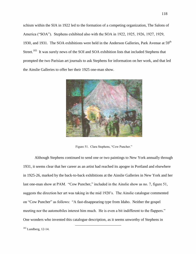
118
schism within the SIA in 1922 led to the formation of a competing organization, The Salons of
America (“SOA”). Stephens exhibited also with the SOA in 1922, 1925, 1926, 1927, 1929,
1930, and 1931. The SOA exhibitions were held in the Anderson Galleries, Park Avenue at 59th
Street.183
It was surely news of the SOI and SOA exhibition lists that included Stephens that
prompted the two Parisian art journals to ask Stephens for information on her work, and that led
the Ainslie Galleries to offer her their 1925 one-man show.
Figure 51. Clara Stephens, “Cow Puncher.”
Although Stephens continued to send one or two paintings to New York annually through
1931, it seems clear that her career as an artist had reached its apogee in Portland and elsewhere
in 1925-26, marked by the back-to-back exhibitions at the Ainslie Galleries in New York and her
last one-man show at PAM. “Cow Puncher,” included in the Ainslie show as no. 7, figure 51,
suggests the direction her art was taking in the mid 1920’s. The Ainslie catalogue commented
on “Cow Puncher” as follows: “A fast-disappearing type from Idaho. Neither the gospel
meeting nor the automobiles interest him much. He is even a bit indifferent to the flappers.”
One wonders who invented this catalogue description, as it seems unworthy of Stephens in
183
Lundberg, 12-14.

119
comparison to the quality of her 1939-1940 journal. The painting, a night-time scene, depicts in
silhouette three men wearing some variety of cowboy hats lounging outside a large tent. A
sketchily drawn horse is standing to their right, with an automobile a bit farther back. Several
indistinct figures can be seen outside the tent, the door of which is the only brightly lit part of the
scene. Taking the Ainslie description into account, the canvas must depict the tent where a
gospel meeting is being held, the posture of the slouching cowboys proclaiming their lack of
interest. As the cowboys seem equally indifferent to the automobile and the horse, Ainslie seems
off point in claiming the cowboys do not like cars. The Ainslie comment on flappers appears
frankly ridiculous, as a gospel meeting would be the last place to meet racy young women, and
none are in evidence outside the gospel tent. (If the tent harbors an entertainment event that
would attract flappers, then the emphasis on the gospel meeting would be misplaced.)
Proportion and perspective are not priorities of Stephens in this work, as the horse appears to be
placed in approximately the same plane as the cowboys, but if so, it is about half its “correct”
size. In her desire to exhibit with more progressive elements in New York, Stephens would seem
to have abandoned the tenants of perspective that were still applied rigorously by her Northwest
contemporaries like Gustin and McKim. Her goal seems to have become more spontaneous and
expressive, heightening her impact on the viewer with an “irrational” color like the intense blue
of the nighttime sky. She thus appears to be trying to paint in a more Modernist fashion than
either Gustin or McKim in 1924.
As Stephens’s exhibitions were winding down in the 1930’s, her attitude toward art and
artists may be reflected by the comments in her journal on Ernest Lawson, a member of “The
Eight,” or “Ash Can School,” who committed suicide in 1939. “Read of the sad death of Ernest
Lawson. I owe this artist a debt of gratitude for the beautiful pictures he painted. Never knew

120
him or saw him, even, that I know of, but his landscapes, shown with ‘The Eight’, are treasures
of memory [Stephens had viewed Lawson’s work at MacBeth Gallery with others of The
Eight]...The world owed better things to the man whose “palette was set…with crushed jewels.”
To think of the rewards in money showered on prizefighters, football gladiators and slick
politicians, while Lawson was denied the means of life. Something is wrong.”184
Two years
earlier, in 1937, a Northwest Impressionist, Fokko Tadama, committed suicide in Seattle.
According to his obituary, “he shot himself in the heart with an automatic pistol which he took
with him when he left home. Tadama had been in ill health and unemployed for some time…His
body was cremated…, but his urn was never picked up.”185
Stephens’s journal does not make a
connection with Tadama’s suicide, which was also attributed to his dire financial situation,
although she must have known of him from her frequent exhibitions in Seattle.186
Stephens did
not share Lawson’s or Tadama’s financial fate. Whether from her own earnings as an art
teacher, or as a gift from a friend, Stephens gained a life tenancy in a house in San Diego, and
she spent an increasing amount of time there from the mid 1930’s onward.187
In the fall of 1948,
she had a last one-man show at the Frances Webb Galleries in Los Angeles. The gallery reused
the introduction to the catalogue from her Ainslie show nearly twenty-five years earlier, and the
paintings exhibited were mostly from the mid 1920’s and included several that had been
exhibited then in New York and Portland. Her price list ranged from $40 to $550, very probably
184
Stephens, Journal, 119-120. 185
Peter J. H. van den Berg, De Uitdaging van het Licht: George Hitchcock, Netherlands: Bahlmond Publishers,
2008, 122, translation by Annick Geelhand de Merxem. 186
Stephens exhibited at the Fine Arts Society’s annual shows in Seattle in 1915, 1920, 1922, 1923, 1925, 1926,
1927, 1928, and 1929. Spread sheet in Annual Northwest Artists Exhibition folder at SAM Library. She also had
what appears to have been a small one-man show at the Seattle Fine Arts Society in 1921. “Clara Stephens Pictures
Will Cheer You Up,” Seattle Star, April 26, 1921, Scrapbook, Fine Arts Society, Seattle Public Library, Special
Collection. 187
Lundberg, 18.

121
lower than the 1925 prices at the Ainslie Galleries.188
Most apparently were not sold, and they
remained at her house in San Diego until her death. Lundberg concluded his account of her life
as follows:
Clara Jane continued living between California and Portland for the next four years [after
the Webb show]. She died in Portland on May 1, 1952, from injuries received in a fall…As was
the case with so many women artists of her period Clara Jane had neither children nor close
family around her to foster and preserve her memory. Her personal papers, letters, and
photographs were discarded. Her studio was sold off, and the many paintings remaining in her
possession were, ultimately, dispersed widely having been neither catalogued nor
photographed.189
Like Gustin, whose position in the Seattle art scene was sharply diminished after 1928,
when he was excluded by the “young Turks” from the annual Fine Arts Society exhibition, and
like McKim, who appears to have cut back his painting after 1927, Stephens’s public position
peaked in Portland in 1926 with her third one-man show at PAM. She essentially stopped
exhibiting in 1931, apart from a last duplicative one-man show in 1948. The “curve” of the
Northwest careers of all three artists began about 1910, peaked in the mid 1920’s, and reached
bottom by the early 1930’s. Stephens and Gustin did have last one-man shows much later, in
1948 and 1954, respectively, but these brief renewals of public attention did not re-launch
either’s career. Thus, the significant Northwest Impressionist period of each artist lasted only
about fifteen years.
188
Frances Webb Galleries catalogue and Stephens’s hand-written price list, PAM library archive. 189
Lundberg, 19.

122
Chapter V
J. Edgar Forkner (1867-1945)
Edgar Forkner was a diligent, esteemed, and uncontroversial artist and art teacher. He
painted and exhibited up to his death in 1945 at seventy-seven. When Kenneth Callahan wrote
the first significant article in a national arts publication on developments in Northwest art from
the 1930’s, as noted earlier, he singled out Forkner as one of only two Seattle artists worth
mentioning from what he considered the prior generation. After naming Eustace Ziegler, a “neo-
Impressionist” and Callahan’s own teacher, he added “an equally talented watercolorist, Edgar
Forkner, who devoted himself exclusively to flowers and the local scene rendered in the Sargent
manner.”190
Making a comparison to John Singer Sargent (1856-1925) constituted high praise,
as Sargent was not only one of a handful of internationally famous American artists at the time
Callahan was writing, but his watercolors were especially prized for their sparkling treatment of
light, freshness, and original expression of Sargent’s rare talent. Callahan should have eschewed
“exclusively,” however, as Forkner’s largest and most ambitious paintings were oils, although
his watercolor output outnumbered his oil paintings. Callahan was nevertheless correct that
Forkner generally restricted himself to a narrow choice of subjects, flowers and boats tied up in a
harbor, with a few exceptions. In terms of style, Callahan seemed to draw a distinction between
artists whose style is Impressionist (or neo-Impressionist, a possibly useful term, but one that
never caught on) and who work in oils (e.g., Ziegler), and those who work in watercolors like
Forkner. This distinction is not apposite. Ziegler did many watercolors on location in Alaska,
producing his oil paintings of Alaskan scenes in the winter in his Seattle studio. Thus, both
artists worked in watercolors and oil. Furthermore, Forkner’s oil paintings produce, in my
190
Callahan, “Pacific Northwest,” 2.

123
opinion, a greater Impressionist effect than Ziegler’s. Thus, this chapter will not dwell further on
Forkner’s identification as a Northwest Impressionist, and the Impressionist qualities of his
facture will be noted as appropriate. A good example is Forkner’s “Golden Sail,” figure 52,
which garnered the record price for a Forkner sold at auction, $17,080 on May 26, 2010.191
Figure 52, Edgar Forkner, “Golden Sail.”
“Golden Sail,” a large oil on canvas, shows two old fishing sailboats in the foreground, tied to a
dock along with other sailboats and utility boats. In the background is the Ballard Bridge over
the Ship Canal in Seattle. The white sailboat on the left has its golden-colored sail rigged out,
probably for drying. The loose broken brushstrokes and the emphasis on light reflecting from
the boats and golden sail on the water make this work quintessentially Northwest Impressionist.
Forkner has not overemphasized the coloration, however, as the day is partially cloudy, and the
Northwestern haze has diminished the clarity of the bridge in the background, even though the
boats are quite close to it. Thus, the painting’s attention to atmosphere keeps in well within the
191
AskArt is an on-line subscription service with prices of art sold at auction around the world.
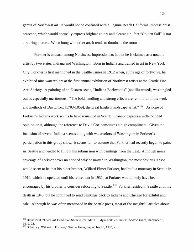
124
gamut of Northwest art. It would not be confused with a Laguna Beach California Impressionist
seascape, which would normally express brighter colors and clearer air. Yet “Golden Sail” is not
a retiring picture. When hung with other art, it tends to dominate the room
Forkner is unusual among Northwest Impressionists in that he is claimed as a notable
artist by two states, Indiana and Washington. Born in Indiana and trained in art in New York
City, Forkner is first mentioned in the Seattle Times in 1912 when, at the age of forty-five, he
exhibited nine watercolors at the first annual exhibition of Northwest artists at the Seattle Fine
Arts Society. A painting of an Eastern scene, “Indiana Backwoods” (not illustrated), was singled
out as especially meritorious. “The bold handling and strong effects are remindful of the work
and methods of David Cox [1783-1859], the great English landscape artist.” 192
As none of
Forkner’s Indiana work seems to have remained in Seattle, I cannot express a well-founded
opinion on it, although the reference to David Cox constitutes a high compliment. Given the
inclusion of several Indiana scenes along with watercolors of Washington in Forkner’s
participation in this group show, it seems fair to assume that Forkner had recently begun to paint
in Seattle and needed to fill out his submission with paintings from the East. Although news
coverage of Forkner never mentioned why he moved to Washington, the most obvious reason
would seem to be that his older brother, Willard Elmer Forkner, had built a mortuary in Seattle in
1910, which he operated until his retirement in 1931, so Forkner would likely have been
encouraged by his brother to consider relocating to Seattle.193
Forkner resided in Seattle until his
death in 1945, but he continued to send paintings back to Indiana and Chicago for exhibit and
sale. Although he was often mentioned in the Seattle press, most of the insightful articles about
192
David Paul, “Local Art Exhibition Shows Great Merit…Edgar Forkner Shines”, Seattle Times, December 3,
1912, 22. 193
“Obituary, Willard E. Forkner,” Seattle Times, September 28, 1935, 9.

125
him are by Indiana and Chicago journalists. Of the 82 records for his work at auction from 1993
to February, 2012 listed on askart.com, only 7 are from Northwestern auction houses; Indiana
firms constitute the vast majority. In terms of subject, 44 are harbor scenes from Seattle, 21 are
still lifes of flowers, and 17 are landscapes, the latter all of Indiana scenes. Thus, at least in terms
of work of Forkner sold at auction, nautical subjects predominate. “Boats of Lake Union,” figure
13, is atypical of Forkner’s Puget Sound area watercolors, which tend to focus on two or three
old boats tied up at a dock. Figure 13 depicts over ten boats, in the foreground, middle ground,
and background, of many different types, including two old commercial sailboats, already
obsolete at the time. The closest large sailboat on the right is depicted at a strange angle,
implying that it rests partially on the lake bottom, a sign of abandonment. The other large
sailboat is visible only in its masts. Like most of Forkner’s watercolors of nautical scenes, its
colors are less vivid than in his large oil paintings. It is also notable for Forkner’s attention to
atmospheric detail, particularly the fog that obscures much of Queen Ann Hill in the background,
suggesting it was painted in the early morning.194
Forkner rarely talked at length about his art, and he never published newspaper accounts
of his ideas like McKim did. As is the case with most other Northwest Impressionists, there are
no archives of his papers and letters. At his death, he was survived by a sister, Mrs. Florence
Lesh, then of Seattle, and a niece and nephew of his deceased brother, both of Seattle.195
Mrs.
Lesh kept a scrapbook of news clippings that she gave to the Seattle Public Library. Many
clippings are from Chicago and Indiana newspapers and, on the few occasions when Mrs. Lesh is
194
References to Forkner’s depictions of “sea and lakes” should be understood in the Seattle context. The city of
Seattle has an hourglass shape, squeezed between the saltwater of Puget Sound and the freshwater of Lake
Washington, a large lake to the immediate east of Seattle. The two bodies of water are joined by the ship canal built
in the early twentieth century, which itself transits a smaller lake in the middle of Seattle, Lake Union. A reference
to Forkner’s images of “sea” refers to the Seattle harbor in Puget Sound, and of “lakes” refers to Lake Union. Both
provide mooring for seagoing ships at anchor, with the result that images of both places can be similar. 195
“J. E. Forkner, Noted Painter, Dies in Seattle”, Seattle Times, July 8, 1945, 25.

126
mentioned in the Seattle Times in connection with social life within the art community, she is
said to be from Chicago. Thus, it appears that she moved to Seattle late in her life, presumably
to live with or near Edgar, who had never married.
Mrs. Lesh’s scrapbook, as well as brochures from SAM and the Frye in connection with
his one-man shows, state that he studied with John Elwood Bundy (1853-1933) in Richmond,
Indiana, and for two years with Irving Wiles (1861-1948) at the Art Students League in New
York, as well as with William Merritt Chase and J. Carroll Beckwith (1852-1917), both
identified with American Impressionism, and with Frank DuMond, also at the Art Students
League. Following his studies in New York, he traveled and painted in Italy and taught at the
Chicago Auditorium before relocating to Seattle. 196
Although the Hoosier Impressionists of Brown County, Indiana, led by Theodore Steele
(1847-1926), are better known, the Richmond, Indiana, Group of artists also has a rich history.
The Art Association of Richmond mounted annual shows from 1898, and traveling shows from
1910, the latter following a circuit as far north as Milwaukee, as far west as Lincoln, Nebraska,
as far south as New Orleans, and as far east as Syracuse, New York.197
The leader of the
Richmond Group, John Elwood Bundy, is described by William Gerdts as a “naturalist” in style.
A teacher as well as an artist, Bundy took charge of the art department of Earlham College in
Richmond in 1888, and it was possibly there or as a private student that Forkner studied with
him. “Wane of Winter,” 1914, figure 53, an oil sketch of Bundy’s, is typically American
Impressionist in its broken brushstrokes and interest in the reflection of light from snow.
196
J. Edgar Forkner Scrapbook, 5, Seattle Public Library; see, also Frye Vues, Frye Art Museum, September 1978. 197
William H. Gerdts, A Walk in the Woods: The Art of John Elwood Bundy (1853-1933), (Richmond: Eckert Fine
Art Galleries, 2000): 5.

127
Figure 53. John Elwood Bundy, “Wane of Winter.”
Bundy’s studio works, however, have a very finished appearance, with brush strokes much less
evident, presumably leading Gerdts to characterize his art as naturalist. Gerdts’s thoughtful
essay on Bundy develops an iconography based on Bundy’s choice of trees in his landscapes,
associating elms with spiritual values and oaks with a paternalistic, sheltering role, for
example.198
Bundy’s paintings that include close-ups of particular species of trees are similar to
Forkner’s Indiana landscapes, tending to confirm a teacher/pupil relationship. Gerdts’s essay on
Bundy mentions Forkner on two occasions as the member of the Richmond Group who gained
“significant fame” in the Northwest.199
A 1903 article on the Richmond Group by a New York journal emphasized the
importance—as a subject of painting—of the Valley of the Whitewater, a nearby river gorge
with precipitous bluffs, and many of Bundy’s landscapes depict the Whitewater. In addition to
Bundy, the 1903 article described the careers of three other Richmond Group artists, including
Forkner. “Edgar Forkner, who has for many years had an enviable reputation as one of the most
198
Gerdts, Bundy, 19. 199
Gerdts, Bundy, 7.

128
delightful water color painters in Indiana, studied in New York and has, within the past few
years, established a studio in Chicago, where his work has been seen at all the principal
exhibitions held in that city, including those of the Society of Chicago Artists and the Associated
Arts, of which latter organization Mr. Forkner is a member.” Two watercolor landscapes of
Forkner are illustrated in the journal, “Country Roadway” and “The Miller’s Home,” the latter a
freely painted sketch of a mill along the river, probably the Whitewater.200
The black and white
image projects a strong contrast between the brilliant sky and the shaded foreground in the
shadow of the mill, suggesting an American Impressionist influence that Forkner could have
assimilated during his studies at the Art Students League in New York as well as from the study
of Bundy’s preliminary sketches.
Forkner also took an interest in landscapes by the artists now called Tonalists,
particularly Bruce Crane (1857-1927). A 1938 article on art in Richmond around the turn of the
century recounted a story involving Forkner, who returned to Richmond from New York, where
he was studying at the Art Students League, with a canvas by Bruce Crane.
Mr. Forkner displayed the painting on an easel in an empty store room on Main Street
and invited Richmond people to see it. The painting represented a late evening scene, with a
foreground and middle distance in the lovely grays and violets characteristic of Mr. Crane’s
work, then a distant red after-glow on low lying clouds with a green sky above. We went in
crowds to visit this painting and expressed our ignorant opinions freely, as people do now about
the progressive art of today [1938]. We accepted the foreground, we knew sunsets were red, but
we balked at the green sky…Nature settled the question by producing…a series of red sunsets
with skies so green that they could not be denied. [We decided to learn] to see beauty in nature
200
“The Richmond Group of Painters,” The Art Interchange, New York City, (October, 1903): 85-89.

129
as the [painter’s eye] sees it…and were grateful to Mr. Forkner for his valuable lesson…which is
one of the fundamentals of art appreciation.201
A charming anecdote, it demonstrates that Forkner as an art student had a desire to teach
and to introduce people to developments in art with which they were unfamiliar. Compared to
what the people of Richmond expected to see in a painting—presumably a familiar image that
did not require reflection on its technique, along the lines of McKim’s academic realist “The Old
Mill,” figure 38—Forkner exhibited a landscape with an unusual sunset effect that he knew
would be resisted and would invite comment. At the same time, Forkner was not a person to
expound from a soapbox, so he left it to the people of Richmond to observe and draw their own
conclusions. The gentle Forkner thus had a radical side, but it was well disguised.
Like Charles McKim, Forkner moved to the Pacific Northwest in his late-forties. Unlike
McKim, Forkner already had an established reputation and client base, in his case in Indiana and
Chicago. After moving to Seattle, Forkner mostly ignored rural landscapes as subject, becoming
an urban artist specializing in harbor scenes and still lifes of flowers, and taking up oil painting
for some of his sketching and most of his largest works. In 1915, three years after Forkner
participated in the first Annual Exhibition of Northwest Artists by the Seattle Fine Arts Society,
he had a one-man show at the Washington State Art Association of over fifty pictures. Among
them was “Country Roadway” illustrated in the 1903 article, so it would appear that works he
considered to be among his best did not always find buyers.202
A piece in a Chicago newspaper
in 1918 indicated that “since his residence in Seattle for the past three years, he has added oil as
the medium of portraying the charm of Puget Sound marine views and mountainous wilds,”
thereby dating his permanent residence in Seattle to 1915 and his adoption of oil painting to
201
Ella Bond Johnston, “History of Richmond Art Association, First Meeting in 1898 Foreshadowed by Previous
Art Events and Influences,” 1938, Forkner Scrapbook, 38. 202
“Forkner’s Works to form Exhibit, Seattle Times, October 29, 1916, 60.

130
1915-1918, although David Martin observed to me that he has never seen a Forkner oil with a
date before the mid 1920’s.203
Another piece from the same period speaks of “the riot of color,
atmosphere, and splendid scenery [of] Naples and [other] Italian ports where he has pursued
studies.”204
Figure 10. Edgar Forkner, “Mount Rainier.”
As the Chicago critic noted, Forkner did show an interest in portraying the Northwest’s
“mountainous wilds.” His watercolor of “Mount Rainier,” figure 54, c. 1915, depicts the iconic
volcano on a typical Seattle spring day of mixed cloud and sun, with the right side of the
mountain in sunlight, and the left in shade. The viewpoint of “Mount Rainier” is from Paradise
Valley, and the season must be early summer in the valley—which translates to early spring on
the mountain—evidenced by the snow near the vantage point of the artist that still lingers in the
mountain meadows. A few “climbing” trees are visible to the right, but they are incidental to the
203
Conversation with Martin, March, 2012. The newspaper clipping, with only the year 1918 specified, is found in
the Forkner Scrapbook, 4. I have cross-checked the incompletely labeled news clippings in the Forkner Scrapbook
by doing an on-line search of newspapers from Washington, Indiana, and Illinois, but as most newspaper historical
editions are not on-line, I have been able to find complete citations for only a few Forkner Scrapbook articles that
appeared in the Seattle Times. 204
Clipping, Forkner Scrapbook, 5. David Martin has seen only one Forkner depicting a European scene. The
exhibition list for Forkner’s December, 1920 one-man show at the Seattle Fine Arts Society lists 112 watercolors
and 1 oil, but none bears a title that suggests an Italian or European origin.

131
mountain, which dominates the scene. This watercolor demonstrates that Forkner was sensitive
to the majesty of Rainier, even if it did not inspire him in the same way as the harbor scenes and
still lifes that constituted the vast part of his oeuvre.
Forkner exhibited frequently in Seattle, as well as in Chicago, his former home. In
February, 1917, Young’s Art Galleries in Chicago took out a full page advertisement in the
Chicago Tribune touting the exhibition of work of three Indiana artists, including Bundy and
Forkner. The unusual advertisement consisted of a long article by J. W. Young, “A
Straightforward Business Talk to Western People by a Western Art Dealer about Western Art
Conditions,” arguing that the purchase of American art was a better investment than European
art.205
In 1918, the Seattle Fine Arts Society offered a three-man show to Forkner, along with
Fokko Tadama and Hamilton. A. Wolf (1883-1967). Forkner’s works consisted of Puget Sound
scenes, along with woodlands and meadows, the latter presumably from Indiana. One of the
Puget Sound scenes was possibly Forkner’s watercolor “The Market in the Early Morning,” a
Figure 55, Edgar Forkner, “The Market in Early Morning.”
205
Forkner Scrapbook, 7.

132
watercolor sketch of flower sellers at Seattle’s Pike Street Public Market, figure 55, which was
published in The Town Crier on December 21, 1918.206
Most of the stalls have not yet opened,
and a few buyers walk along checking out the flowers, and perhaps vegetables, on offer. The
Public Market on Pike Street remains operating in Seattle today, looking much like “The Market
in Early Morning,” and it is regrettable that very few early images of it were created by Seattle
artists. Forkner’s interest in urban scenes, like Gustin’s, was oriented mainly toward the harbors,
both on Lake Union and along Elliot Bay, the principal Seattle port at the time.
In December 1920, Forkner had his first one-man show at the Seattle Fine Arts Society,
consisting of 112 watercolors and one oil painting. Forkner arrived in Seattle a mature artist, and
the only artistic evolution that can be credited to Seattle was his increasing recourse to oil
painting. There are no discernible developments in his style that can help in dating any
particular work. “The Market in Early Morning” was not included in his one-man show, but
several watercolors had what for Forkner are generic titles like “Old Boats,” “A Crowd of
Boats,” and “Boats at Lake Union,” any one of which could have been figure 13, called “Boats
of Lake Union” by its present owner. Madge Bailey, who in passing enthuses about the “Grecian
simplicity” of Gustin’s mountains, credits Forkner with “voicing the pastel charms of color of
our skies, waters, and wooded landscapes…he has endeared himself to the public through his
studies of the ocean weary boats resting in the harbor of Lake Union and the sheltered bays of
the Sound. He never tires of depicting the romance of the era in these derelicts or in creating
fairy fantasies of color in the intricacies of their shadows reflected in the water.”207
Earlier in the
year, when Forkner had exhibited ten paintings at the annual exhibition of the Fine Arts Society,
Bailey emitted a similar reflection. “Mr. Forkner finds unlimited material for his deft brush in
206
Town Crier, December 21, 1918, 32. 207
Madge Bailey, “Fine Art Notes,” Seattle P-I, December, 1920, Forkner Scrapbook 10.

133
these old hulks and their grotesque shadows. They appeal to him like weary world wanderers
who, reflecting over past adventures, retell the romances of distant seas in lazy contentment amid
the soft tap of waves of the inland waters the gray of morning mists and purple sunsets.”208
Bailey’s purple prose notwithstanding, she has certainly intuited the sense of nostalgia
that Forkner’s numerous images of old commercial sailboats—already obsolete—were surely
intended to stimulate. Bailey observes that “a number…will fine immediate market in the East
where [Forkner’s] name is better known than here.”209
It must be that this romantic attachment
to the lost world of exploration and trade by sailing ships appealed as much, or more, to inland
Americans. Forkner’s work thus gives evidence of an urban iconography that differs from
Gustin’s, who painted working fishing boats, as well as steamships and boats gliding past in the
distance. Gustin’s iconography of ships made them emblematic of their role in industry and
commerce. However, as in “Sunset—Docks on Seattle Waterfront,” figure 34, where the
steamship appears as a wraith in the fog, Gustin’s ships constitute a modest symbol compared to
what would be required for his vision of a new American art based on the greatness of the natural
wonders of the American West. I would not go as far to say that Forkner’s iconography of
decrepit, ruined sailboats implies the decline of American economic strength and the irrelevance
of the American West in establishing any new direction for American art. Yet I suspect the
romance of old hulks may have been modest Forkner’s antidote to the boasting that sometimes
seems endemic in America, as well as an appeal to the nostalgia of Americans for what they
recalled as the earlier, simpler era of sailing ships.
208
Madge Bailey, “Fine Art Notes,” Seattle P-I, February 2, 1920, Forkner Scrapbook 11. 209
Bailey, February 2, 1920.

134
In 1925, in connection with a second one-man show at the Seattle Fine Arts Society,
Forkner observed to a journalist that “art is first good drawing, color sense, good taste, and
sincerity…The modern idea of vibrating light and color is pleasing to me.”210
While Forkner’s
advice is basic and unsurprising, it is noteworthy that he includes himself within Modernism
through his use of the Impressionist technique of capturing the “vibrations” of color in light.
Forkner is of course correct in terms of his own art, but times were changing, and the very
moment Forkner was proclaiming his adherence to Modernist techniques, the “young Turks” of
the Seattle art world were labeling painters like him “conservative.” Forkner claimed a stronger
identification with Modernism in an article in the Chicago Tribune in 1929. “Mr. Forkner is a
modernist, though not an extreme one. He likes the modern, he says, because it is giving art
more color and simplicity.”211
The article emphasized Forkner’s tendency to paint more in oils.
One may surmise that Forkner’s desire to be categorized as modern was an impetus for his
increasing practice of using oil paints, as his colors in oils were considerably more brilliant than
in watercolors. Forkner’s embrace, in his fashion, of the modern found some acceptance. In
1931, Eleanor Jewett reviewed “Modern Art” currently exhibited in New York and Chicago for
the Chicago Tribune. She cited as makers of modern art Oskar Gross (1871-1963) and Edgar
Forkner (for his “colorful” still lifes of flowers) in Chicago, and Charles Demuth, and William
Zorach (1887-1966) and Marguerite Thompson Zorach (1887-1968), at the Knoedler Gallery in
New York.212
Those who believe “Northwest Impressionism” is a backward-looking group that
is best forgotten—and that is the predominant view in the academy today—would be bemused at
a contemporary critic finding it normal in 1931 to list Forkner with a member of the Vienna
Secession (Gross), a Modernist watercolorist whom I already compared to McKim (Demuth),
210
G. V. Boucher, “Art News of the City,” Forkner Scrapbook, 1925, 15. 211
Chicago Tribune, May 12, 1929, Forkner Scrapbook, 24. 212
Eleanor Jewett, “Shows Depict Modern Art in East, Midwest,” Chicago Tribune, 1931, Forkner Scrapbook, 28.

135
and the acknowledged Modernist sculptor and painter (William Zorach) and his Modernist
painter wife (Marguerite Zorach). In any event, the march of Modernism tended to leave
Forkner behind, even in conservative Seattle. As noted earlier, Forkner received first prize in the
“conservative” section at the state fair in 1933, his entry referred to in the press as being among
the “very conservative pictures, well painted in the conservative manner.” 213
Yet we must be
careful in assuming we understand the categories used by prior generations, as the conservative
group was said also to include a “decorative panel” by Guy Anderson, (1906-1998), one of the
leading members of the Modernist Northwest Mystics.
Whether or not art critics accepted Forkner’s claim to be Modernist, all reviewers
continued to be beguiled by Forkner’s fidelity to the proper representation of the Northwest
atmosphere, emphasized by the Seattle Post-Intelligencer’s critic as follows: “The
paintings…have always in them the atmosphere of this country, whether done in oil or water
color. The coloring is subdued; the skies are always clouded, and the light that filters through
them mellows every object in the picture. A good example of this atmosphere is very evident
when Mr. Forkner’s low-toned pictures are compared with [his] clear and brilliantly colored ones
from the East…In fact, many of these [Seattle] pictures appear monotonous unless viewed under
a strong light. All possess to a remarkable measure the quality of light and air in the Northwest.
And to that they owe as much of their excellence as to anything.”214
Perhaps the subdued quality
of their colors, especially of Forkner’s watercolors like “Boat of Lake Union,” figure 13,
explains why the newspapers often chose a work of Forkner to illustrate in connection with a
group show rather than a painting by another artist. The hues of gray of a newspaper
213
“Seattle Artists Win Prize at Puyallup Fair,” Seattle Times, September 24, 1933, and “The Art Museum,” Seattle
Times, October 29, 1933, 11. 214
“Forkner’s Paintings of Northwest on Display,” Seattle P-I, October 25, 1925, Forkner Scrapbook, 17.

136
reproduction do less violence to a low-toned Forkner watercolor than to a brighter work by
another artist. In newspaper reports of Seattle annual group shows between 1917 and 1927, nine
Forkner's were illustrated in the Seattle papers, but no works by other artists. Conversely, over
the same period, several Gustin’s were published in the Seattle newspapers, but always in
connection with his one-man shows.
It would be tedious to catalogue all of Forkner’s exhibitions and prizes, in Seattle as well
as in Chicago at the annual Hoosier Salons. For example in 1922, in the absence of an
institutional one-man show, Forkner organized a private exhibition of 40 watercolors in a West
Seattle home, where he enthused to a reporter that “Seattle is the Venice of the New World,”215
and in 1923, Forkner won two prizes at the annual exhibition of the Fine Arts Society, for
miniatures as well as watercolors.216
The Chicago Daily News reported that Forkner’s “Summer
Flowers” won first prize in the watercolor category at the two week Hoosier Salon in 1926,217
and Forkner was awarded a silver medal for “Lake Union Ships” in the International Water
Color Exhibition in Vancouver, British Columbia, also in 1926, where the work was described as
“juicy in its handling.”218
Forkner’s renown in Chicago was not limited to the Hoosier Salons.
In 1927, the Chicago Galleries filled one exhibition room with Forkner watercolors and oils from
the preceding three years. The Chicago critic, Eleanor Jewett, particularly admired an oil of two
old ships “laid up…for a gradual falling to ruin,” indicating that Forkner’s appeal to nostalgia
through his images of ruined sailing ships was recognized by his Midwestern critics, who
attributed purpose and process to the otherwise static image of old ships at dock.219
Three years
later, in 1930, the Chicago Galleries gave Forkner another show of twenty paintings. The art
215
“Seattle Held Venice of America,” Seattle Times, November 3, 1922, 20. 216
“Coasts Artist’s Exhibit,” Seattle Times, December 23, 1923. 217
Marguerite B. Williams, “Prizes Awarded in Hoosier Art Exhibit” Chicago Daily News, March 18, 1926. 218
“Art Notes Here and There,” unidentified Vancouver B. C. newspaper, Forkner Scrapbook, 19. 219
Eleanor Jewett, “Edgar Forkner Watercolors on Exhibition, Forkner Scrapbook, 22.

137
critic of the Indianapolis Star devoted a long article to Forkner, focusing once again on old ships.
“There clings to [this picture of old ships] an indefinable something that seems to come out of
the past…the two old ships that thrust forward their snouts as if poking inquisitive noses into this
modern world to find out what it is all about.” For Lucille Morehouse, these two themes of
nostalgia for the “lost time” of the sailing ships, and the challenge of Modernity, were conjoined
in Forkner’s portrait of the two hulks. “Brought to life again,” 220
as it were, the old ships are
defying ideas of Modernity by their very presence. In this analysis, not only is Forkner adopting
aspects of Modernity in his new, more colorful, works in oil, at the same time he is challenging it
by dwelling on the past.
Forkner is quoted on his fascination for old ships:
The old sailing vessels, the three-masted and the five-masted ships, will be a thing of the
past before many years, as they are fast being sent from the ocean to the “boneyard” in lakes and
bays. Sometimes they are driven back and forth many months before they find themselves at rest
with the other derelicts. One such old craft was a Japanese sailing vessel, wonderfully strong as
originally built, but without masts and rigging when it drifted in. The ship’s log book showed
that it had been beaten back and forth in the channels for two years. On its decks and in its hold
were half a score of dead men, some of whom had turned cannibal, the last one drying, it was
evident, only a few weeks before the old ship came to shore.
Morehouse comments that Forkner’s story “sounds like an old sea captain’s tale.”221
Nevertheless, it testifies to the depth of Forkner’s emotional commitment to his old hulks and his
effort to express the Proustian “lost time” that inform them. It would certainly represent a
220
Lucille Morehouse, “In the World of Art,” Indianapolis Star, February 16, 1930. 221
Morehouse, Indianapolis Star, 1930.

138
superficial reaction to dismiss Forkner’s work as tourist pictures for visitors to Seattle or as
something “romantic” for land-locked Midwesterners to hang in their living rooms.222
Morehouse finds that Forkner “puts as much romance into his flower paintings” as his
boat paintings. If the same in both cases, the “romance” could not be the simple love of beauty,
but rather the awareness of the passing of time—and the need to make something of life—before
the inevitable approach of decay and death. “Peonies and Larkspur in Green Vase,” figure 56,
illustrates an observation that Morehouse makes with respect to a Forkner painting of tulips.
Figure 56, Edgar Forkner, “Peonies and Larkspur in Green Vase.”
“The handling of the light background is so skillful that the light seems to envelop the [flowers]
and enhances the note of contrast in the pale yellow and red blossoms.”223
While it is true that
figure 56 is very skillfully painted, with subtle contrasts between the hues of the flowers and wall
222
Others interpreted Forkner’s old ships in a similar way, stressing the sense of repose they project. “The
penitentiary wants to hang Edgar Forkner’s “Ships in Lake Union” in the warden’s office. It’s a restful thing and
has a softening effect on tough mugs called into the warden’s presence.” Doug Welch, “PWA Art Sought by State
Prison for Inspection, Seattle P-I, July 7, 1934. 223
Morehouse, “In the World of Art.”

139
behind, there is also a sense of unease or apprehension arising from the dark shadow the bouquet
casts on the wall to the right. Making the parallel to old ships closer, the table top is littered with
leaves and petals from the roses, in the full but advanced beauty of their “bloom,” at the same
time redolent of decay and death. Thus, Forkner’s images of old ships and his still lifes of
flowers are not two unrelated subjects of his art, but rather they are of a piece in suggesting the
transience of life, recalling its romance to be sure, but pointing towards an inevitable slide into
senescence. This of course is not a new trope in art, especially for still lifes. Dutch and Flemish
paintings of the seventeenth century have long been described in terms of symbolic
representations of the vanity of human ambition and the omnipresence of death. Louis Marin has
pointed out that, in the context of Poussin’s symbolic representation of death in his paintings of
shepherds in Arcadia, death can be represented both as dying and as delight.224
Forkner, in his
own modest way, has achieved a similar synthesis of death and beauty in his paintings of
decrepit ships and fading flowers.
Forkner augmented his income by teaching and, by 1930, some of his students received
independent recognition. In a 1929 article on the upcoming annual Northwest artists exhibition,
the director of education at SAM noted that “Mr. Forkner’s boats and flower painting is well
known here and in the East. He has had a studio in Seattle for many years and his pupils are
legion.” 225
In 1930, a Seattle newspaper covered the one-man show of Crissie Cameron at the
Washington Athletic Club. “She is a student of Edgar Forkner. Miss Cameron won second prize
in the watercolor group at the state fair last fall. She is now exhibiting two pictures at the
Philadelphia Watercolor Club, and has pictures hanging in Grant’s Galleries in Brooklyn, N. Y.
224
Louis Marin, “Toward a Theory of Reading in the Visual Arts: Poussin’s ‘The Arcadian Shepherds,’” in The Art
of Art History: A Critical Anthology, edited by Donald Preziosi. (Oxford: Oxford University Press, 1998.) 275. 225
A. M. Young, Educational Director, SAM, “Artists Prepare for N. W. Exhibit,” 1929, Forkner Scrapbook, 24.
140
Her pictures in the exhibit being held here are watercolors of flowers and boats.”226
(Emphasis
added.)
During the 1930’s, Forkner continued to exhibit at the Hoosier Salons and the annual
Northwest artist exhibitions in Seattle. Within the larger art community, there was no consensus
on the direction artists should follow. Kenneth Callahan expressed his concern at the annual
exhibition of Northwest artists in 1936, then under the aegis of the Seattle Art Museum. “There
is good painting in the exhibition…But here, as in other regional exhibitions, there is a
noticeable lack of conception, a lack of thinking on the part of our artists, that certainly is not
too encouraging for future generations…There is…a large group of paintings which springs from
…direct sources. Painting in which the artist was moved by the color, texture or attractiveness of
the subject, such as Edgar Forkner’s “Flowers in my Window…[Callahan regretted artists]
painting their pictures unthinkingly, uncaringly, content with minor achievements and ignoring
their real hope for eternality, the creation of new symbols to express the great forces which exist
in life today…I am not excluding myself from this criticism. I am equally guilty.”227
Callahan
seemed to intend to include more traditional artists like Forkner, responding to “direct sources”
like an arrangement of flowers on a table, among those who were content with “minor
achievement.” Thoughtful as ever, Callahan found himself as deficient as other artists in being
unable to “create new symbols to express [today’s] great forces.” But, of course, it is the rare
critic who can understand and identify new artistic currents at the moment of creation. The
direction becomes evident much later. Considering that Forkner developed his symbolic
vocabulary of old, obsolete sailboats and withering flowers during the prosperity of the 1920’s,
226
“Exhibiting Paintings this Month,” 1930, Forkner Scrapbook, 25. 227
Kenneth Callahan, “The Art Museum,” 1936, Forkner Scrapbook, 36.

141
he was prescient to have been able to express them during the long, dreary decline of the Great
Depression that followed, even if hardly anyone noticed.
Forkner continued to exhibit at the annual exhibition of Northwest artists at SAM and at
the Hoosier Salon until his death in 1945—even after his death, as his pictures were also
included in the Hoosier Salon in 1946 and 1947.228
A memorial exhibition for Forkner was held
at the Hoosier Salon in late July, 1945 and, in the two months before his death, SAM gave
Forkner a one-man show that was extended from the planned month to a full six weeks because
of the enthusiastic attendance.229
Forkner died on July 7, 1945, not long after the show closed.
In a talk about Forkner broadcast on the radio, Theodora Harrison seemed to recognize the
elegiac quality of Forkner’s harbor scenes “of boats quietly at anchor waiting, at dusk, for the
pall of darkness to blot out, one by one…the tiresome details.” Nevertheless, so familiar were
Forkner’s pictures of flowers and old boats that Harrison saw them primarily as “lovely,
untroubled, romantic…and set apart from the…strife of everyday life.” She credited Forkner
with giving a “more polished, urbane, and gracious atmosphere” to the formerly “raw and crude”
Seattle. 230
Although I would agree with Harrison that Forkner’s work always exhibited a sense
of refinement, I think an excessive familiarity with Forkner’s consistent imagery over thirty
years had blinded her to its nostalgic longing for “lost time” and its message of inevitable
senescence and death. The subversive side of the young Forkner, bringing what he knew would
be a controversial landscape to Richmond and letting the people argue it out, remained at work
throughout his life in his superficially pretty, but essentially melancholy, images of decaying
ships and soon to be desiccated flowers.
228
Newton & Weiss, 207. 229
Lucile E. Morehouse, “Forkner Memorial Exhibition Continues at Hoosier Salon”, Indianapolis Star, July 22,
1945, 18, and Theodora Harrison, “An Appreciation of Edgar Forkner,” radio station KXA, July 14, 1945. 230
Harrison, 2-3.
142
Chapter VI
Clyde Leon Keller (1872-1962)
Clyde Keller was without doubt the most prolific Northwest Impressionist, indeed among
the most prolific artists in Northwest history. This achievement—if indeed that is what it is—
was due to working fast, showing resiliency in the face of the San Francisco earthquake and
personal bankruptcy, and living a long life. Keller was born in Salem, Oregon, worked in San
Francisco as a young adult for ten to twelve years, and relocated to Portland, Oregon for most of
the remainder of his life, dying at ninety in Cannon Beach, the Oregon coastal town where he
often had painted. Keller had an artist son, Clyde Keller, Jr., who has been available to fill in
details and interpret episodes in his father’s life, in contrast to the four artists covered in previous
chapters, none of whom left descendants. Thus, his dictionary entry in Allen and Klevit’s
Oregon Painters, for example, can be considered to be better founded and more reliable than
McKim’s entry, which begins with two assertions that are not borne out at by recent research,
i.e., his close relationship with Winslow Homer, and that his uncle was the famed architect
Charles Follen McKim. Keller also made an implausible claim of studio art study in Boston,
Munich, and London, but he surely misread the questionnaire, and Allen and Klevit would have
been able to confirm his error in interpretation after consulting with his son.231
231
A “biographical record” form in the PAM Library that Keller filled out on May 25, 1949 asking “where” he
studied states that he studied under Bridges in Munich, Professor Knowles in Boston, and E. W. Christmas, R.B.A.
[Royal British Academy?] in London. (Although there is no Royal British Academy, there is a Royal Academy of
Art in London.) E. W. Christmas (1863-1918), who was born in Adelaide, Australia, and died in Honolulu, Hawaii,
spent much of his life in California, where he exhibited at the Panama Pacific International Exhibition in San
Francisco in 1915, as did Keller. It is thus plausible that Keller studied with Christmas in San Francisco. Mary
Bridges Watson (1853-1916) taught at Willamette University in Salem from 1882-1887, and she must be the
“Bridges” with whom Keller said he studied, as he grew up on Salem. According to Ginnie Allen, Keller studied

143
According to Allen and Klevit, Keller first studied art with Mary Bridges (Mary Bridges
Watson, 1853-1916) in Salem in 1884, at the age of twelve. In Keller’s youth, he was also
interested in music and entertainment. With his brother Harry, the two performed in a musical
act, including writing and publishing their own songs.232
“I wore a bright red wig, made up my
cheeks with lots of color, and informed the audience that I had got sunburned from eating too
many tomatoes. We played the Western circuit, and our act went over in good shape.”233
By
1893, Keller was listed as an artist—not an actor or musician—in the Salem City Directory, and
in 1894, Allen and Klevit report he was employed as a cartoonist for the San Francisco
Examiner.234
After the San Francisco earthquake in 1906, he moved to Portland, Oregon. A
painting frame has been published with the label “Clyde L. Keller, the Modern Picture Framer,”
and a San Francisco address, and when Keller moved to Portland, he opened a frame shop where
he initially operated as “Keller, the Art Man, Modern Picture Framing”, and later as simply
“Keller, The Art Man” until 1936.235
In a 1921 interview, Keller gave a more detailed account of his San Francisco experience.
“In my late teens…I had the ambition to become a cartoonist. Homer Davenport of Silverton
[Oregon], at one time the best known, most loved, and highest paid cartoonist in the United
States, was a long-time friend of mine, so he got me a place on the Examiner in San
Francisco…If you go through files of the Examiner for 1896, you will find some of my cartoons.
with Joe Knowles, an artist who lived in Seaview, Washington, in 1920. Email from Allen dated April 2, 2012.
Keller is thus innocent of exaggerating the prestige of the locations in which he studied art. 232
Clyde Leon Keller, “Memories of Salem,” Oregon Magazine, March, 1922, 24. 233
Fred Lockley, “Impressions and Observations of the Journal Man,” Daily Journal, April 4, 1927, 10. 234
Keller most likely became a free lance cartoonist. There is a newspaper report to the effect that Keller was doing
“art work” in San Francisco, where his “pictures” had “appeared in different newspapers.” The Oregonian, March
8, 1898, 3. Working independently and part time as a free lance cartoonist seems consistent with operating a picture
frame shop, whereas being employed by one newspaper seems less so. 235
Images of Keller’s various frame labels in San Francisco and Portland are posted on clydeleonkeller.com. The
website also has images of seventeen of his paintings.

144
At San Francisco, I met E. W. Christmas…a noted landscape artist…Mr. Christmas took a great
interest in me and advised me to devote my efforts to landscape painting.”236
In another
newspaper interview in 1927, Keller said that he opened his art store in San Francisco with his
savings. “My older brother, Edward, took charge of the mechanical end of the business while I
rustled orders. From an investment of a few hundred dollars, within ten years our business had
so increased that we had nine men working for us…We were sitting pretty, when out of a clear
sky came the earthquake and fire of April 13, 1906, and by noon of that day we had lost $70,000.
It was a case of beginning from the very bottom and building up a new establishment, so we
came to Portland and started in business under the name Keller the Art Man.”237
It is difficult to
accept this story in all respects, as $70,000 amounted to a small fortune in 1906, and it is hard to
imagine a picture frame shop, even one employing nine persons, worth so much. San Francisco
was quickly rebuilt and, if the business was so phenomenally successful, one wonders why
Keller and his brother did not remain there and rebuild.
In any case, it seems evident that Keller’s most time consuming activity in art was
operating his picture frame shops and studios from about the age of twenty-two in San Francisco
until the age of sixty-four in Portland, when he apparently filed for bankruptcy in 1936, and the
contents of his Portland shop were sold at auction.238
Keller claimed at various times to have
painted up to 4500 canvases during his lifetime, a plausible figure given the large number of his
paintings available for sale in Portland today, mostly executed after 1936, when Keller stated that
236
Fred Lockley, “Observations and Impressions of the Journal Man,” Daily Journal, May 27, 1921. It should be
noted that Keller dates his employment by the Examiner to 1896, not 1894, making his San Francisco period ten
years. Since the years 1894 and 1896 have both appeared in the press as the time Keller moved to San Francisco, I
have referred to both dates whenever Keller’s relocation to San Francisco is mentioned. 237
Fred Lockley, Daily Journal, April 4, 1927, 10. 238
Wilson’s Auction House advertised an initial auction on December 9, 1936, of the contents of Keller’s frame
shop, as well as some of his paintings and sketches. Follow-on sales occurred on December 14 and 21, with the last
one promising to “positively close out the balance…of the stock.” Newspaper clippings, Mark Humpal archive.
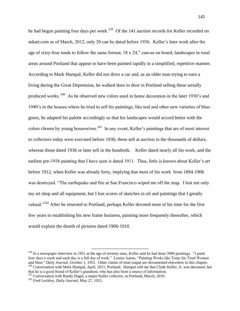
145
he had begun painting four days per week.239
Of the 141 auction records for Keller recorded on
askart.com as of March, 2012, only 20 can be dated before 1936. Keller’s later work after the
age of sixty-four tends to follow the same format, 18 x 24,” canvas on board, landscapes in rural
areas around Portland that appear to have been painted rapidly in a simplified, repetitive manner.
According to Mark Humpal, Keller did not drive a car and, as an older man trying to earn a
living during the Great Depression, he walked door to door in Portland selling these serially
produced works. 240
As he observed new colors used in home decoration in the later 1930’s and
1940’s in the houses where he tried to sell his paintings, like teal and other new varieties of blue-
green, he adapted his palette accordingly so that his landscapes would accord better with the
colors chosen by young housewives.241
In any event, Keller’s paintings that are of most interest
to collectors today were executed before 1936; these sell at auction in the thousands of dollars,
whereas those dated 1936 or later sell in the hundreds. Keller dated nearly all his work, and the
earliest pre-1936 painting that I have seen is dated 1911. Thus, little is known about Keller’s art
before 1912, when Keller was already forty, implying that most of his work from 1894-1906
was destroyed. “The earthquake and fire at San Francisco wiped me off the map. I lost not only
my art shop and all equipment, but I lost scores of sketches in oil and paintings that I greatly
valued.”242
After he returned to Portland, perhaps Keller devoted most of his time for the first
few years to establishing his new frame business, painting more frequently thereafter, which
would explain the dearth of pictures dated 1906-1910.
239
In a newspaper interview in 1951 at the age of seventy-nine, Keller said he had done 3000 paintings. “I paint
four days a week and each day is a full day of work.” Louise Aaron, “Painting Works like Tonic for Tired Women
and Men,” Daily Journal, October 1, 1951. Other claims of total output are documented elsewhere in this chapter. 240
Conversation with Mark Humpal, April, 2011, Portland. Humpal told me that Clyde Keller, Jr. was deceased, but
that he is a good friend of Keller’s grandson, who has also been a source of information. 241
Conversation with Randy Dagel, a major Keller collector, in Portland, March, 2010. 242
Fred Lockley, Daily Journal, May 27, 1921.

146
Figure 57. Clyde Keller, “Spring Rain.”
“Spring Rain”, a Keller watercolor dated 1912, figure 57, depicts a street corner in
downtown Portland, the near side of which is now the home of the Portland Art Museum,
constructed in 1932. A man holding an umbrella scurries across Park Avenue during a spring
rainstorm. The sky is about to clear, as the sun peeps under the dark stratus clouds, illuminating
the belfry of St. James Lutheran Church. The tall trees along Park Avenue are still mostly bare,
with a smattering of green as the spring leaves begin to show. Keller at forty is a mature artist,
with large brushstrokes that suggest the mantle of new leaves without depicting any individually.
Keller seems intent on creating a rainy-day mood. His brushstrokes are broader and more
smudged than the Forkner watercolors illustrated in the prior chapter. The somewhat dark blue-
green hues are consistent with a late afternoon shower, the sun about to peep out beneath the
clouds for a few moments before setting. Keller demonstrates a marvelous technical skill in a
few bright patches of light that seem to shine through the trees and reflect off the street. This
work is the second oldest Keller, and the only watercolor, that I have seen in person or

147
illustrated.243
Keller’s signature is “Clyde Keller” in print with a very elaborate “K” and without
his middle name “Leon.” Its original frame bears the “Keller the Art Man” label on the back.
Reminiscing at seventy-nine, Keller described his approach to painting as follows:
My first work was a crayon drawing of a band of sheep…I had a natural instinct but I had
to study, too. Study is necessary to any painter. I have observed through the years the different
trends. I continue doing conservative or representative painting of what I honestly see and feel
in nature. I feel a good painting, say of a tree, may be photographic in appearance but it must
have atmosphere and values of color, must bring out some of the poetry of the subject not caught
by a camera. I paint honestly and that is what all artists must do…paint the way they see and
feel.244
In other interviews twenty-five years earlier, Keller provided more details on how and
what he painted:
When someone asks me how long it takes to paint a landscape…I usually say ‘about 30
years and four hours,’ which is the truth. Every picture speaks for the background of the artist
who creates it… Eleven months I devote to landscape paintings and one month to marines. [I
spend] two full days a week with [my] easel out of doors.245
Keller’s thus described a schedule of spending five days in his frame shop, managing the
shop and teaching in his studio located in the same premises, and two days painting outdoors. In
another interview, Keller explained how he came to combine painting and the frame business.
I have been painting, first in watercolors and later in oil, the beauty spots of the
West…When I started in the painting of landscapes in California, I had to make my living…I
started an art store. …I would give instruction in painting and my students put me in the way of
a good deal of work in the framing of pictures. Then, too, I soon began to sell my canvases to
243
There must be more, as a 1923 article on Keller noted that “his watercolors are done on tinted paper.” Daily
Journal, November 4, 1923. 244
Daily Journal, October 1, 1951. 245
“Portland Painter Makes Specialty of Oregon Scenes,” Sunday Journal, November 4, 1923.

148
tourists and occasionally canvases of my pupils. During the past 30 years [1891-1921] I have
painted about 1700 canvases.246
Keller concentrated on landscapes once he moved to California in 1894 or 1896. He
began as a watercolorist. He worked fast, claiming to expend four hours per canvas. If he
painted 1700 canvases over thirty years starting at the age of twenty, it amounts to 85 per year.
If he took four hours per canvas, plus time to and from his home, he could have done all of them
by painting one canvas on Sunday every week, plus another on Saturday about every other week.
In other words, Keller had adequate time to manage his art shop and paint one or two canvases
per week, both in California after 1894 or 1896 and in Portland after 1906.
Although there is no reason to believe Keller was dissatisfied with subjects for painting
around San Francisco, he claimed that Oregon offered the best landscapes. “With our majestic
snow-clad sentinel peaks, our filmy and lace-like waterfalls, our crystal-clear mountain streams,
our lush meadows, our evergreen-clad foothills, our sky-reflecting inland lakes and our surf-
kissed shore, Oregon is an inspiration and a dream of delight to an artist.”247
Keller rarely specified the place he painted, but rather titled his paintings in terms of the
time of day or mood, for example, “Late Autumn Afternoon.” As he had explained, he was most
interested in the “poetry” of a scene and how he “felt.” In the conservative art market of the
pre-World War I Northwest, Keller may have seemed modern in his focus on his own reactions
and the lack of precision and specificity implied by his poetic response to the landscape.
Certainly, “Spring Rain” has nothing in it of academic realism. In the opinion of partisans of
traditional American realism, this self-referential approach was surely exacerbated by adopting
Impressionist techniques in the choice and application of colors. In the earliest criticism of his
246
Fred Lockley, Daily Journal, May 27, 1921. 247
Fred Lockley, Daily Journal, May 27, 1921.
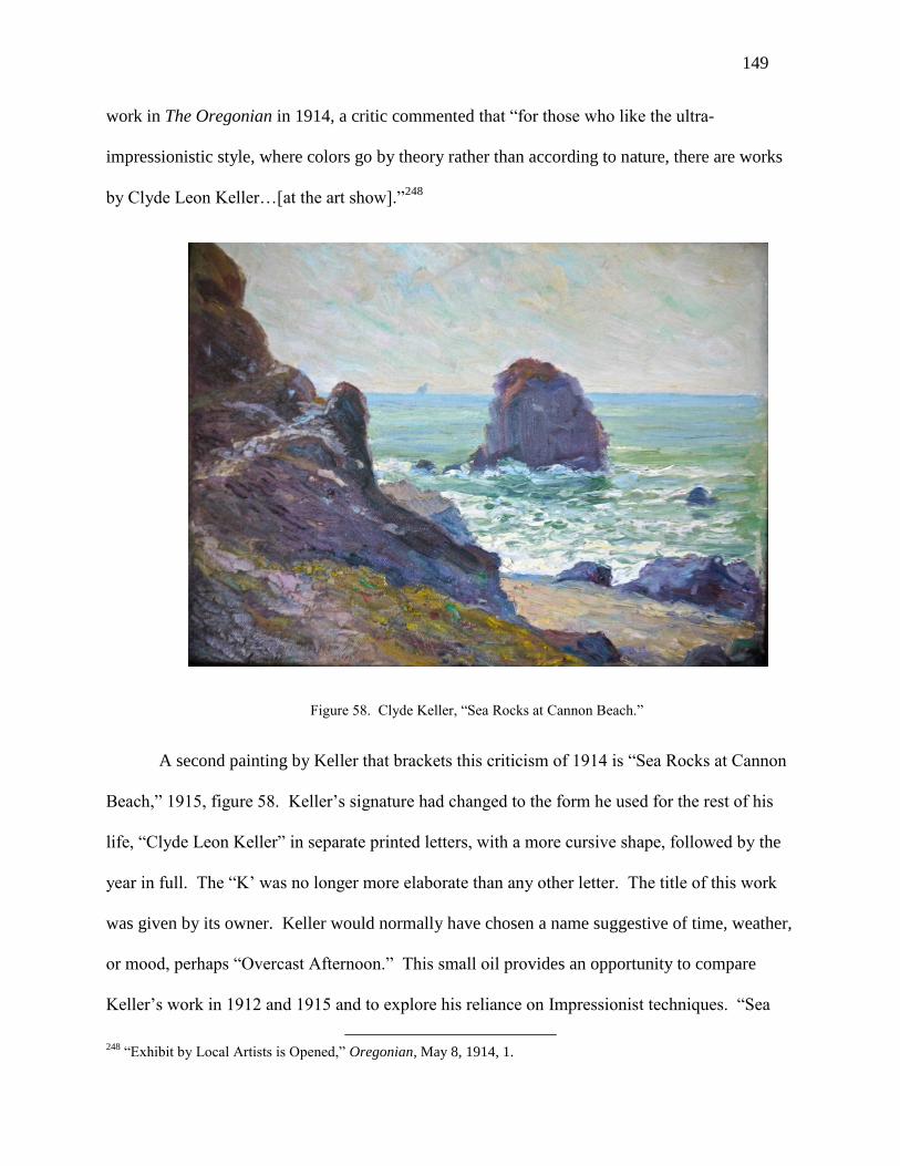
149
work in The Oregonian in 1914, a critic commented that “for those who like the ultra-
impressionistic style, where colors go by theory rather than according to nature, there are works
by Clyde Leon Keller…[at the art show].”248
Figure 58. Clyde Keller, “Sea Rocks at Cannon Beach.”
A second painting by Keller that brackets this criticism of 1914 is “Sea Rocks at Cannon
Beach,” 1915, figure 58. Keller’s signature had changed to the form he used for the rest of his
life, “Clyde Leon Keller” in separate printed letters, with a more cursive shape, followed by the
year in full. The “K’ was no longer more elaborate than any other letter. The title of this work
was given by its owner. Keller would normally have chosen a name suggestive of time, weather,
or mood, perhaps “Overcast Afternoon.” This small oil provides an opportunity to compare
Keller’s work in 1912 and 1915 and to explore his reliance on Impressionist techniques. “Sea
248
“Exhibit by Local Artists is Opened,” Oregonian, May 8, 1914, 1.

150
Rocks at Cannon Beach” depicts the southern end of one of the largest and best known beach
towns on the Oregon coast. Ecola State Park is located at the northern end of Cannon Beach.
When looking south from the park, the scene is dominated by a huge rock—Haystack Rock—
lying offshore in the center of Cannon Beach. Most photographs of the shore at Cannon Beach
feature Haystack Rock. There are also several close offshore rocks at the southern end of the
beach, but they are smaller and do not seem to have been awarded distinctive names. In this
painting, Keller has depicted one of these south end sea rocks, a rounded boulder whose outline
is not dissimilar to Haystack Rock, along with some of the smaller rocks that surround it, with a
much larger rock far offshore in the distance. (The rock far offshore can be mistaken for a ship.)
When one visits Cannon Beach and takes the long walk to its southern end, the scene today—if
the viewer focuses only on the sea rocks in the painting and ignores everything to their right—is
unchanged.249
The right and left sides of this small canvas on board are slightly abraded, consistent with
Keller’s having painted it on the spot and then slid it into the storage area for canvas boards that
can be found inside paint boxes. Figure 59 is an undated photograph of Keller painting along the
Oregon coast, and his paint box, with what seems to be a supply of canvas boards inside it, is
visible underneath his makeshift easel. Although Keller is painting in a field close to a forest
area, it is clear from his nearly completed canvas that he is looking straight at the Pacific Ocean.
No sea rocks are visible, so Keller is probably not standing near Cannon Beach, unless he is
standing in the state park and intends to add Haystack Rock afterwards.
249
These sea rocks at the southern end of the beach include a tall pointed rock immediately north of the large
rounded boulder in the painting. In framing the painting, Keller simply excluded the tall pointed rock.

151
Figure 59. Clyde Keller painting.
In “Sea Rocks at Cannon Beach,” nearly half the image is the steep, rocky hillside that
walls off the south end of the beach. When the canvas is viewed up close, the ocean in the
distance is seen to consist of alternating horizontal bands of blue and green, while in the nearby
ocean between the sea rocks and shore, these bands are obliterated by the heavy white impasto of
the breaking waves. When viewed from a normal distance, the separate bands seem to disappear
as the eye interprets the subtle color changes as the expression of movement and depth. Pace
Leonardo, the “band” farthest away is blue, while green predominates in the closer bands.
Although Keller seems to have reversed classical Renaissance techniques for expressing depth in
using blue rather than green in the farthest distance, it seems to work, implying that it is the
change in color that signifies distance, not that the color farthest away must imperatively be
green. (When depicting the ocean, the bands of color also imply movement, which may be as
important as maximizing the viewer’s sense of depth.) Keller has painted with short, compact
brushstrokes, and he has avoided depicting any details in the scene. In fact, he has lavished most
attention on the waves, expending little effort in showing how the path in the foreground might

152
lead up the rocky promontory on the left. For someone who favors academic realism in art, or
someone who prefers the information overload that a photograph can provide, it is
understandable that “Sea Rocks at Cannon Beach” might be called “ultra-impressionist.”
However, for most knowledgeable art viewers of the period, “Sea Rocks at Cannon Beach”
would have been only “mildly Impressionist” because of Keller’s avoidance of saturated colors
and his tightly knit construction. (The foreground of “Spring Rain” is even more imprecise,
making the work a more likely target of abuse by Keller's unnamed 1914 critic.)
Keller’s artistic development in Portland can be separated into four periods. During the
decade of 1910, Keller seems to have produced mostly smaller canvases like “Spring Rain” and
“Sea Rocks at Cannon Beach, figures 57 and 58, his oils tightly constructed with small
brushstrokes like those in figure 58. In his choice of palette, Keller eschewed very bright colors.
During the decade of 1920, Keller painted larger and more ambitious canvases, built up with
larger broken brushstrokes. Keller introduced more color into his oils, but at a level of
brightness still less than that of Southern California Impressionists. Keller elaborated on his
approach to painting in his 1923 interview:
‘When I’m out after a picture,’ this thin, eager-eyed artist explained, ‘I work at top speed.
Nature is like an unruly child. She never stands still.’ This is the fun of it all, Keller finds. The
artist is continually running a race with moods of nature. If he completes his impressions in
paint before the scene changes, he wins. Oregon scenery is especially temperamental, Keller
finds, and runs the artist a merry chase.
Because of this constant change of landscape, Keller begins his paintings with a series of
color notes on the side of his canvas. This enables him to keep his color values balanced should
he not complete his sketch before the scene takes on other hues. Nature never changes in spots,
Keller said. Her transformations are complete. If the sky shifts from blue to gray, there is a

153
corresponding difference in the shades of hills and trees, etc. In her color harmonies, Keller
insists, nature is consistent.250
When it comes to the design of a picture—the artist laughed mischievously—‘I never
hesitate to transplant a tree or move a mountain to aid my design.’ This, he explains, is not done
with the idea of improving upon nature. Because a picture is bound by four straight lines and
excludes so much, it is necessary often to arrange objects within the frame.251
In a column in The Spectator, fellow artist William Purcell described what it was like to
paint outdoors with Keller:
During the past winter, I have gone out with Mr. Keller nearly every week to paint nature
as we found it. He makes it perfectly plain to his classes and proves his case for me, that you
must not let the weather deter you, however threatening. We sat in the snow, a foot of it, and
were comfortable. We sat under his delicate canvas shelter in the pouring rain and kept right on
painting. Some days it blew, and some days we had samples of a little of everything...
Keller knows how to make any spot outdoors look like home in a few minutes, and on
chilly days a big fire to leeward, is all that is needed in addition to warmly clad feet, sweaters,
and mittens minus a finger or two.252
“Late Autumn,” figure 60, is a large oil on canvas dated 1924.253
Not only do the yellow
and brown colors in the trees indicate that it is late in the autumn, the very long shadows in the
foreground demonstrate that the time of day is late in the afternoon. A tall mountain ridge with
multiple peaks is visible in the distance, well illuminated by the late afternoon sun. Colored a
salmon pink by the setting sun, the tallest peak shares the viewer’s attention with the line of trees
250
See Thayne J. Logan, “Painting with Clyde Leon Keller,” Brushmarks, no. 91, undated, Oregon Society of
Artists, for a more detailed account of how Keller painted, and how he placed paint on the pallet. Mark Humpal
archive. 251
“Portland Painter Makes Specialty of Oregon Scenes,” Sunday Journal, November 4, 1923. 252
William Gray Purcell, A. I. A., President, Society of Oregon Artists, “The Arts,” The Spectator, June 29, 1929,
10. 253
Keller tended to title his paintings with references to time or season, such as “Summer Afternoon” or “Late
Autumn.” Over time, these titles have become lost or forgotten, and most owners today title the same paintings by
referring to the places the owners believe they were painted.
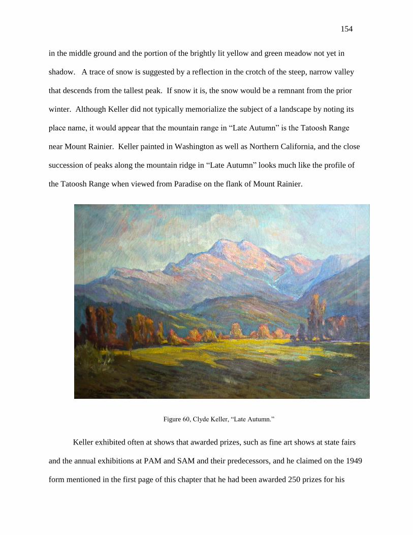
154
in the middle ground and the portion of the brightly lit yellow and green meadow not yet in
shadow. A trace of snow is suggested by a reflection in the crotch of the steep, narrow valley
that descends from the tallest peak. If snow it is, the snow would be a remnant from the prior
winter. Although Keller did not typically memorialize the subject of a landscape by noting its
place name, it would appear that the mountain range in “Late Autumn” is the Tatoosh Range
near Mount Rainier. Keller painted in Washington as well as Northern California, and the close
succession of peaks along the mountain ridge in “Late Autumn” looks much like the profile of
the Tatoosh Range when viewed from Paradise on the flank of Mount Rainier.
Figure 60, Clyde Keller, “Late Autumn.”
Keller exhibited often at shows that awarded prizes, such as fine art shows at state fairs
and the annual exhibitions at PAM and SAM and their predecessors, and he claimed on the 1949
form mentioned in the first page of this chapter that he had been awarded 250 prizes for his
155
work. As it happens, “Sea Rocks at Cannon Beach” was awarded the “First Premium” prize at
the Multnomah County Fair (Portland is located in Multnomah County) in 1915, and “Late
Autumn” won First Honorable Mention at the Seattle Fine Arts Society in 1924. When Keller
painted a canvas with a particular prize in mind (that he expected to win), he signed the painting
in red!
Figure 61. Clyde Keller, “Fields of Purple and Gold.”
“Fields of Purple and Gold”, 1930, figure 61, and “Tatoosh Range from Mount Rainier
National Park”, 1931, figure 63, are two large canvases from a few years later. Both evidence
Keller’s increasing tendency toward bright colors and subject matter that resemble California
Impressionist art from Laguna Beach and Los Angeles, in these cases blue, purple, and yellow
wildflowers that run riot though the meadows. Both combine broken brush strokes and highly
saturated colors and, in my opinion, are the closest that any Northwest Impressionist artist came
to the vast beds of poppies and lupines that attracted California Impressionists like Granville

156
Redmond (1871-1935), e.g., his “Poppies and Lupines,” undated, figure 62. Like Redmond’s
vista of Southern California hillside meadows in yellows and blues, the similarly colored flowers
in Keller’s “Fields of Purple and Gold” occupy about half the canvas. Keller’s facture is looser
than Redmond’s, as Redmond has painted the blue flowers with individual daubs of paint, while
Keller’s plants are represented by purple splotches that encompass several flowers at once.
Keller also uses a broader range of hues, with bright greens, purples, and oranges. In fact, not a
single low-toned color is visible. Redmond, in contrast, uses highly saturated yellow, but his
blues are lower toned, as are his greens and browns.
Figure 62. Granville Redmond, “Poppies and Lupines.”
The “Tatoosh Range from Mount Rainier National Park,” figure 63, provides another
basis of comparison with respect to the artist’s treatment of atmosphere. Even though Redmond
has depicted a partially cloudy day in “Poppies and Lupines,” figure 62, with shadows visible
under the trees, his air is much more transparent than Keller’s. There is very little loss of clarity

157
and definition from the front to the back of the painting, a scene that might encompass ten or
twenty miles in the coastal mountains of Southern California. The hills in the middle ground and
background are relatively dark and may well be in the shadow of the clouds above, but their
topographical ridges and valleys are easily situated. The “Tatoosh Range from Mount Rainier
National Park” also represents a partially cloudy day. Although the foreground trees are
depicted as clearly as Redmond’s, the intervening mountains in the middle ground are almost
completely indistinct, more like blue clouds than gray stone and rock. The more humid
Northwest atmosphere has swallowed almost all detail and definition. The snow-covered
Tatoosh ridge in the distance does exhibit a more definite shape, but only because it is
illuminated by bright sunlight that cuts through the haze, while the middle ground is left in
shade. Once the viewer reflects on the presence or absence of the painting’s expression of
atmosphere, it is immediately apparent which painting is by the hand of an artist from the more
humid Northwest, and which was created in the desert-like conditions of Southern California.
Figure 63. Clyde Keller, “Tatoosh Range from Mount Rainier National Park.”

158
In a brief article published after Keller’s death, Thayne J. Logan, a fellow artist,
described how Keller used the “atmospheric effect” to increase the expression of depth in a
painting. “He knew the name of each mountain and hill on the horizon and could paint them in a
way they seemed to go away back into infinity. He called this getting the atmospheric effect and
as it was disappearing into the distance, it was a poetic or ethereal effect. Today we call it aerial
perspective. He helped people to see nature as they did not know existed before.”254
The “Tatoosh Range from Mount Rainier National Park,” figure 63, can also be
compared with “Late Autumn,” figure 60. Both depict the same mountain ridge, although Keller
composed them with the liberty he explained earlier, that is his freedom of choice in the position,
and the inclusion or exclusion, of elements of the scene. The main difference of course is that
figure 63 was painted in the Northwest spring, when wildflowers proliferate and the peaks
remain covered in snow, while figure 60 depicts late autumn when the only botanical color is
provided by fading leaves, and there is no more than a trace of snow remaining in a distant
mountain crevice. Both paintings share the same almost palpable atmosphere that eliminates
definition in the middle grounds and backgrounds. Both show the same descending mountain
ridge in the middle ground that frames the scene on the right, but the big blue middle ground
descending ridge that frames the peaks on the left of figure 63 is absent in figure 60. Either
Keller made the change in framing for aesthetic reasons, or he may have chosen such a different
viewpoint that the ridge on the left was not visible in figure 60. The placement of the humps on
the spine of the Tatoosh ridge is also somewhat different in the two views of the mountains, but I
suspect this difference is largely aesthetic. Keller was not a topographical artist, and such details
were not as important to him as the poetic mood he wished to achieve.
254
Thayne J. Logan, Painting with Clyde Leon Keller,” Brushmarks no. 91, Oregon Society of Artists.

159
Not only did Keller submit many works to exhibitions in the hope of winning prizes and
renown, he gave a painting to President Herbert Hoover of a swimming hole near Newburg,
Oregon, where Hoover and he had swum as children. As Keller recalled it, Hoover had once
loaned him a bicycle when they were children in Oregon and, to return that “kindness,” Keller
sent Hoover a painting of a swimming pool in the Chehalem River “a few miles from Newberg
where President Hoover lived during his boyhood…Tall trees shelter an inviting pool, and the
light is such that an illusion of the heat of summer and the coolness of the retreat is very
definitely created.” 255
There are no follow-on articles describing President Hoover’s reaction to
the work, and its present location is unknown.
In addition to Keller’s painting his most ambitious canvases at this time, the studio
connected with his art shop had become an important place for teaching and exhibiting. In 1930,
The Oregon Society of Artists showed 45 paintings in Keller’s studio at 450 Washington Street
that had been donated for sale with the goal of raising enough funds to erect a beach lodge for its
members at Neah-Kah-Nie.256
Among his students, perhaps the most successful was Paul
Lauritz, who later moved to California and became a respected member of the second generation
of California Impressionists.257
In 1931, Keller was elected President of the Oregon Society of
Artists, and in 1931 and 1932 his studio was again used for large shows of waterfront scenes for
the annual exhibition of work of members of the Society.258
Thus, Keller’s loss of his art shop
and studio in 1936 was another significant setback, perhaps rivaling his losses in the San
Francisco earthquake.
255
“Hoover Retreat Painted,” Oregonian, October 18, 1931, 1. 256
“Paintings Put on Sale,” Oregonian, December 9, 1930, 9. 257
“Paul Lauritz Studies under Clyde Leon Keller, Oregonian, February 9, 1931, 11. 258
“Waterfront Scenes Will Be Displayed at Keller Art Studios,” Oregonian, June 17, 1931, and “June Art
Exhibition Set,” Oregonian, April 20, 1932, 20.

160
A last word is needed on the paintings Keller produced between his bankruptcy in 1936
and his death in 1962, a period of 26 years as he aged from 66 to 90, when he seemed to have
produced the largest part of his oeuvre. The owner of one of the most extensive collections of
Oregon Impressionists in Portland told me that it is a shame all these later Keller’s have not been
tossed into a bonfire, as their repetitiveness and banality reflects badly on Keller’s earlier work,
which is much more skilled and distinctive.259
“Summer Afternoon,” figure 64, is dated 1942
and thus represents an example of Keller’s last period. It happens to depict exactly the same
place as Charles McKim’s “Spring Evening, Sauvie Island,” figure 46, painted 27 years earlier.
Figure 64. Clyde Keller, “Late Afternoon.”
I attest personally to this claim, and I have walked through the area and identified the spot. The
same prominent group of spreading oak trees stands on a hillock to the right, serving as a
repoussoir in the two works, increasing a sense of depth. During the twenty-seven years
259
Conversation, March, 2010.

161
intervening between 1915 and 1942, the oaks continued to grow, and their horizontal extension
became much greater in Keller’s later work. McKim chose to depict a spring evening in early
summer when the sky was colored a vivid pink, while Keller’s image was created in mid-
summer when the predominant hue is green, and the meadow is turning brown. There is nothing
left for cows to graze upon, and the cows, or rather their progeny, have gone elsewhere in search
of forage. Admittedly, Keller’s oaks are depicted in a more rubbery manner than McKim’s or
the trees in his 1930 landscapes like figures 61 and 63, which stand straight and rigid, and
Keller’s limb lying on the ground in the 1942 work looks formulaic and artificial. Conversely,
the “second” subject of the 1942 landscape, the lake and row of trees in the background, is a
wonderful synthesis of Impressionist brightness of color and Tonalist economy of hue, the trees
and water a shimmering variation on blue-green within a very narrow range (and blue-greens that
harmonized well with home decoration c. 1940). Looking simply at this part of the landscape, it
demonstrates as much skill as anything Keller did earlier
Keller continued to work until his death in 1962 at the age of ninety. According to his
obituary, he had painted approximately 4500 paintings over his lifetime, compared to the 1700
he reported in 1921 and the 3000 in 1951. Although the obituary implies that Keller painted an
additional 1500 paintings in his last 11 years, about 135 per year during his 80’s, this is probably
an exaggeration. The obituary also claims a total of 275 prizes at his death compared to 250 in
1949.260
Taking both claims at face value, it would seem that the quality of his art had declined
in statistical terms, as Keller produced 33% of the total during a bit more than his last decade, but
won only 9% of the prizes during the same period. In any event, it is safe to conclude that Keller
painted a few thousand landscapes over a career of about seventy years, that his work of around
260
“Obituary: Clyde Leon Keller, 90, Noted Oregon Artist, Succumbs”, Daily Journal, August 9, 1962.

162
1930 is as free and brilliant in color and execution as similar scenes by Southern California
Impressionists, and that his later years were marked by a surprising increase in the rate of
production for a person in his 70’s and 80’s, but an unsurprising reliance on formula and routine.

163
Chapter VII
Dorothy Dolph Jensen (1895-1977)
Dorothy Dolph Jensen’s career as an artist was very different from that of Clara J.
Stephens. Not only was Stephens older by half a generation, Stephens pursued her career as a
self-supporting single woman without reliance upon family wealth, a husband, or “solidarity”
with women’s organizations. Even in patriarchal American society around 1900, the Portland art
community treated Stephens in a gender-neutral manner. Her group exhibitions and one-man
shows were well reviewed in Portland journals and newspapers and, apart from one passing
comment quoted in her chapter where she was described as a “little woman”—which was true in
terms of physical stature—there was nothing that implied that the critics treated her differently
than male artists. Her work was extensively covered in the press, and it was typically praised
without relating it to her gender. Indeed, the overall attention she received was greater than that
accorded Charles McKim or Clyde Keller, her contemporaries in Portland. (Stephens may have
received more coverage because she was a prominent teacher at the Museum Art School of
PAM, while McKim and Keller taught privately. Stephens received several one-man shows at
PAM, while neither McKim nor Keller had any.)
Although eighteen years younger than Stephens, Jensen “caught up” with Stephens in
terms of her career development because her art education began at a young age and continued
uninterruptedly. Stephens did not complete her training as an artist until her mid-thirties, as her
family was poor and she worked first as a legal secretary and later as an art teacher to save
enough for study in New York and Europe. In contrast, Jensen came from what today is called a
privileged background. Her grandfather Joseph N. Dolph (1835-1897) served two terms in the

164
United States Senate representing Oregon. Her mother, Augusta Armstrong Dolph, had been an
actress on the stage in New York and in motion pictures. Although her father died when Jensen
and her two sisters were young, the family had the means to send them to Europe and enroll
them in a boarding school in Antwerp, Belgium, for girls from wealthy families. (One wonders
if Augusta Armstrong’s desire to re-launch her career played a role in this decision to send her
daughters to boarding school. As her acting in New York occurred about 1890, and as she sent
her daughters to Europe in 1907, a large parenthesis in her career had already occurred.261
Perhaps Augusta Armstrong Dolph and her in-laws simply thought it was the best place for
them.262
)
Jensen’s art education was in many ways the opposite of Stephens. As noted, Jensen’s
instruction in art started young, and it began in Europe. By the age of twenty, Jensen had studied
art privately in Belgium for six years and for one year in Paris at the Academy Julian, the source
of instruction in Europe favored by American art students. Nevertheless, Jensen must have paid
a price for her privilege. On the one hand, she undoubtedly suffered an emotional shock in being
“abandoned” by her mother in a foreign country thousands of miles from home. On the other
hand, once she returned to the Northwest, married, and combined family and art, the art
community treated her sometimes as a housewife instead of as an artist. The press covered her
far less than Stephens, and far less than her Seattle male contemporaries Gustin and Forkner.
There is not a single article that discussed her philosophy of art, her goals as an artist, or the
techniques she used. Jensen became a founding member of Women Painters of Washington in
261
A photo of Jensen c. 1920, figure 66, in one of her mother’s stage dresses, was taken thirty years after her mother
acted in New York, situating the apogee of Augusta Armstrong’s theatrical career about 1890. 262
David Martin has a substantial archive of childhood letters Jensen wrote to her mother, friends, and relatives.
Jensen’s boarding school letters to Augusta Armstrong were written in both English and French, indicating that her
mother had at least a reading knowledge of French. Jensen’s letters to her mother were mainly factual, describing
recent activities. Her letters to her grandmother and aunts seem to have been written in a warmer tone. In a letter to
her grandmother dated April 26, 1914, Jensen lamented that “mother hasn’t written for quite a while.”

165
1930. The new organization was well covered in the Seattle press during the 1930’s and 1940’s.
In common with other organizations, newspaper articles seemed to emphasize the “society”
aspects of its activities as much as its stated purpose. (Male artists, and Clara Stephens, were
covered by both male and female journalists, but artists associated with Women Painters of
Washington were covered only by female journalists. Although this exclusively feminine point
of view, combining fashion and art, may have resulted in more total press coverage, it tended to
steer members of the organization into the category of amateur artists.)
Figure 65. Dorothy Dolph Jensen, “Ballard Locks.”
Like her Seattle contemporary Edgar Forkner, Jensen often depicted urban waterfront
scenes, but she favored boats operating on the Ship Canal that links Lake Washington with Puget
Sound, not derelicts grounded in Lake Union. Jensen did not normally date her work. She
painted mostly in oils and watercolors in the 1920’s, but once the Depression arrived, like other
artists in Seattle, Jensen gravitated toward prints, in her case etchings, dry points, and

166
lithographs, at least in part because they were less expensive for potential clients. “Ballard
Locks,” oil on canvas, figure 65, can be assigned to the 1920’s. The viewpoint looks eastward
toward Lake Union, and the Ballard Locks on the Ship Canal are not visible, being located just
around the corner where the bascule railroad bridge has been rotated to its up position. The
dominant color is the blue of the water, sky, and vegetation and hills in the middle ground. The
foreground is green, with trees framing on the view on the right and left, and with smudged
scrubs, grass, or weeds occupying the space immediately in front of the viewer along the bank of
the canal. The sky is radiant with pink and violet. A sailboat under power, smoke trailing, chugs
down the canal toward salt water, while a boat in the distance, sailing with the wind, must be
moving more slowly on this languid spring or summer day. As is evident even in reproduction,
Jensen applied paint freely, using impasto, with palette knife as well as brush. The image is
harmoniously conceived, created with confidence. A Northwest artist’s ever present attention to
atmosphere is evident. Because of the maritime humidity, there is little definition in the middle
ground. The tall metal tower in the center right disappears in the haze. Jensen’s small, sharp
brushstrokes are prominent, and she emphasizes the reflections of light between the sky and the
water. Indeed, there is considerable dissolution of forms in the painting, especially of the towers,
and there is no doubt that Jensen can be characterized as a Northwest Impressionist.
In articles and exhibition catalogs that address Jensen, her seven years in Europe are
treated in summary fashion. None explores the implications of her particular boarding school
education. Jensen and her sisters were enrolled in Notre Dame de Sion, usually specified to have
been a “French” or “Parisian” boarding school. More accurately, Notre Dame de Sion should
have been described as a Roman Catholic boarding school for girls in Antwerp, Belgium,
operated by a religious order that originated in Paris. Notre Dame de Sion had the unusual

167
mission to improve understanding between Christians and Jews. Its founding in 1844 is traced to
Théodore Ratisbonne (1802-1884), a Strasbourg Jew who became interested in Christianity, and
to his brother Alphonse, who converted to Roman Catholicism in 1843.263
As a teaching order,
the nuns provided instruction in the language of their pupils. Antwerp is a Dutch speaking city.
However, in the nineteenth century, the upper and educated classes in Antwerp spoke French,
and Notre Dame de Sion’s instructional language was French because it catered to students from
wealthy families in Belgium and abroad. Located in the center of an important port where Dutch
was spoken in the streets, it provided a more complex environment than “French boarding
school” would imply.264
Jensen took private lessons in art during her six years of residence in Antwerp. Toward
the end of her time in Europe, Jensen’s mother joined her for a year and took Jensen to Paris,
where she enrolled in the Academy Julian and studied with Jean-Paul Laurens (1838-1921), one
of its best known teachers in the academically prescribed styles of the nineteenth century. Her
arrival and departure from Antwerp were equally precipitous. Jensen and her sisters were
awakened one morning in Portland in 1907 at 6:00 AM by their mother, who announced that
they were leaving immediately for Europe with an aunt, their mother having packed their bags
the night before. During their years in Notre Dame de Sion in Antwerp, one of Dorothy’s sisters
263
Notre Dame de Sion website. It is not a well-known religious order; it does not appear, for example, in the recent
dictionary of religious orders, Gaston Duchet-Suchaux and Monique Duchet-Suchaux, Les Ordres religieux, (Paris:
Flammarion, 2006.) 264
The late Sister Martha, a friend of mine, became one of the first female lawyers in Antwerp. Finding the practice
of law unfulfilling, she decided to join the order of Notre Dame de Sion and become a nun, and she eventually
became director of their schools throughout the Middle East with the mission to educate Muslim and Jewish girls.
My sister in law, Sylviane Geelhand de Merxem, married Sister Martha’s brother, Baron Jack Delbeke. Jack and his
sister were born in London, where their family had taken refuge during World War I, and their parents called them
Jack and Jill. When Jill entered the order of Notre Dame de Sion, she took the name Soeur Marthe. Speaking
English fluently from her childhood in England, as well as Dutch and French, and taking account of her legal
education and experience in the practice of law, this impressive background surely contributed to Sister Martha’s
career as an administrator within the Sisters of Notre Dame de Sion. It is regrettable that Jensen never reminisced in
print about the effect of her European education on her career as an artist.

168
decided to join the order as a nun and entered the convent. Just before World War I, some Dolph
relatives visited Antwerp in 1914 and asked Dorothy and her other sister to meet them in the port
of Antwerp to say good-bye. According to Jensen, “before they knew what was happening, they
had been shanghaied.”265
Taken on board ship without any luggage, all their possessions,
including Dorothy’s paintings, were left behind in Antwerp and never recovered. Jensen seemed
to attribute this unseemly and hasty departure to the threat of war, but it reads to me more like
the family was worried by the threat of the remaining two sisters being shanghaied as nuns.
Upon her return to Oregon in 1914, Jensen studied portraiture in Portland with Sydney
Bell; she also studied with Harry Wentz. Working at the Schneider Gallery in Seattle in 1917,
she met Lloyd Jensen, a frame maker employed at the gallery. They were married in 1919.266
A
photo of Jensen that appeared in the press shortly after her marriage is figure 66. A beautiful
young woman, her wistful look is enhanced by the rose at her breast and the lacy gown worn
many years before by her mother on stage in New York.267
Figure 66. Newspaper photograph of Dorothy Dolph Jensen
265
“Walk a Little Faster,” Seattle Times, October 18, 1936, 32. 266
David Martin, An Enduring Legacy: Women Painters of Washington, 1930-2005 (Seattle: University of
Washington Press, 2005): 36. 267
“Wears Quaint Gown…Mrs. Jensen [in] stage gown worn by her mother thirty years ago when, as Augusta
Armstrong, she appeared in ‘A Fair Rebel’…at the Old Fourteenth Street Theater in New York City,” undated
newspaper photo, c. 1920, Martin-Zambito archive.

169
Jensen’s participation in the Seattle Fine Arts Society “annuals,” which had begun in
1914, permits inferences about competing demands of career and motherhood, and what she
believed were her most successful subjects of painting. Jensen exhibited one portrait at the
Seattle Fine Arts Society annual in 1920. In 1921, she exhibited another portrait and a genre
scene, one priced at $40 and the other at $150. (Until 1927, prices were listed only once—for
the 1921 show—in the Society’s brochure.) Among the other artists discussed in this
dissertation, Forkner exhibited five seascapes and landscapes priced from $40 to $100 in 1921,
Keller three landscapes from $150 to $300, and Gustin five landscapes and seascapes from $150-
$800. Jensen’s work was thus priced in the middle. (Gustin always priced his paintings far
above everyone else.) Jensen did not exhibit again until 1930, when she submitted one portrait
specified “not for sale.” Jensen returned with two portraits in 1932, one NFS, the other priced at
only $30. Jensen next exhibited in 1936, a watercolor landscape listed at $75; in 1938, she sent
another watercolor landscape, this time at $60, and in 1940, another at $45.268
All in all, Jensen
had a relatively slim exhibition record at the Fine Arts Society (SAM after 1932). During the
period 1920-1940, Jensen exhibited a total of 9 works compared to Forkner’s 60, Gustin’s 26,
Stephens’s 26 (1920-1929 only), and Keller’s 25 (1920-1930 only). The expense of sending
paintings from Oregon to Seattle, and presumably the small number of sales that resulted, must
have discouraged Keller and Stephens after the onset of the Depression. Consistent with what
the public could afford during the Depression, Jensen switched her submissions to the annual
exhibitions from oils to watercolors, and decreased her prices as time passed. For the first fifteen
years, almost all her submissions were portraits; afterwards, they were all landscapes. The
Jensen’s had only one child, Doris Jensen Carmin (1920-2002). Jensen’s absence from the
exhibition lists at the Fine Arts Society annuals from 1921 to 1930 were probably related to her
268
This data is taken from a spreadsheet of Seattle Fine Arts Society exhibitions, SAM Library archive.

170
role as a mother and homemaker during that period. In fact, a keyword search of the Seattle
Times reveals only one article that mentioned Jensen during the 1920’s, in connection with an art
show in West Seattle in 1925, where she exhibited one work.269
Her predilection for exhibiting
portraits in the Fine Arts Society annuals may have stemmed from her studies in portraiture with
Sidney Bell after she returned from Europe, and may have been the type of work for which she
considered herself to be most proficient during her early career.
Figure 67. Dorothy Dolph Jensen, “Lake Union.”
As has been noted, Jensen exhibited only watercolors at the SAM annuals during the
latter half of the 1930’s, and a good example of her talent in watercolor is “Lake Union,” figure
67. The bridge in the distance is University Bridge (formerly Roosevelt Bridge), a draw bridge
with a central span that opens and fixed arches on either side. The freighter belching smoke has
probably paused to pick up its pilot from the small boat alongside before departing for Puget
269
“Art Club Pays Tribute to Mrs. Baker,” Seattle Times, March 15, 1925, 46.

171
Sound and ports unknown. Jensen has a vivid sense of color, having used virtually every color
in her watercolor kit, mostly pure, saturated colors. Is the extreme coloration, Fauvist in its
intensity, Jensen’s concession to Modernism? In any case, the image is noticeably Northwest
Impressionist in its subtle understanding of mist, the ships in the distance almost merging into
the far hillside, which itself presents no more detail than the clouds above.
Other inferences about Jensen’s choice of subjects can be made from the inventory of her
work belonging to her daughter Doris at the time of Doris’s death in 2002.270
Of the 163
paintings and prints in the list, only 18 were identified as portraits. Seven of the eighteen were
said to be portraits of Doris, and ten were estimated to have “no value” because they would
appeal to family members only. Thus, judging from the description of her works that remained
in the family, portraits constituted a small proportion, and many were personal mementos of her
only child. The large majority of the works were landscapes, which thus appear to have become
Jensen’s preferred subject of painting as she matured as an artist, consistent with other Northwest
Impressionists.
As noted earlier, Jensen was one of the founding members of Women Painters of
Washington in 1930, and most of the press’s attention to Jensen occurred in the context of that
organization. The earliest mention happened in 1932, but Jensen was merely named as an
exhibitor (of portraits) and as a member.271
Although there are nearly 300 such references in the
Seattle Times after 1932, they provide little insight into critics’ and Jensen’s ideas about her art.
Jensen made an effort to exhibit publicly. In October, 1933, the Northwest Art Galleries
270
Anita Carmin-Tomisser, “Inventory of art in the possession of Doris Jensen Carmin,” October 2, 2003, Martin-
Zambito archive. 271
“Artists of Washington to Exhibit,” Seattle Times, July 31, 1932, 14.

172
provided her a one week show272
, and two months later, her paintings were hung in the Weaver’s
Inn in Seattle.273
In 1934, Jensen was awarded first prize among the paintings exhibited by
Women’s Artists of Washington at SAM. A full length photograph of Jensen was published that
included her winning painting, but the photographer’s emphasis was on Jensen, and little can be
discerned about the painting. The article does not give its title, and nothing about Jensen or her
work appears in the text.274
On January, 10, 1935, a piece appeared on Polynesian art at SAM,
and a reception held to preview the exhibition. Jensen’s photo appeared in the article, but her
only mention in the text was as one of many attendees.275
(Did the fact that Jensen was
photogenic deflect attention from her art?) In May, 1935, Women Painters of Washington
offered Jensen the second one-man show they organized at the Washington Athletic Club. The
Seattle Times article was perfunctory, adding the information that Jensen had studied etching
with Eustace Ziegler, presumably recently, and that she shared a studio at 1105 Seneca Street
with her husband, Lloyd Jensen, a “wood carver.”276
Jensen’s artistic relationship with her
husband was surely significant to them both, and it is regrettable that nothing seems to have been
recorded on the subject. Lloyd Jensen is remembered today as Seattle’s premier picture frame
maker of hand carved frames, and many of Jensen’s paintings—like figure 70—were framed by
him. The Town Crier published in 1936 a dry point by Jensen, “Old Ironsides,” an image of the
warship from the days of sailing ships, but there was no discussion of paintings or her prints in
the text.277
272
“Dorothy Jensen’s Art to be Shown,” Seattle Times, October 8, 1933, 5. 273
Seattle Times, November 26, 1933, 17. 274
Virginia Boren, “Artists Given Awards,” Seattle Times, August 8, 1934, 11. 275
Virginia Boren, “At the Art Preview,” Seattle Times, January 10, 1935, 10. 276
“U. W. Artists Hold Second One-Man-Show,” Seattle Times, May 22, 1935, 12. (One speculates that the person
responsible for headlines read the article carelessly and inferred that the artists were associated with the University
of Washington!) 277
“Old Ironsides,” Town Crier, May, 1936, 7.

173
In 1938, Jensen was granted a one-man show in her childhood home town of Corvallis,
Oregon, at Oregon State College (now University). Although covered by a long article in the
local paper, it must have copied her press release, as it summarized her education and exhibition
history, without describing or commenting on the thirty five oils and water colors in the
exhibition.278
In January, 1939, in connection with a one-man show in the fine arts gallery of the
Frederick & Nelson Department Store, Jensen was interviewed by a Seattle Times reporter
designated by her initials, V. B., surely Virginia Boren, who wrote regular arts columns for the
paper. Described by V. B. as “a small, vital person, who brims over with personality and love of
her work,” Jensen explained what inspired her to draw “The Big Tree,” a sketch that appealed to
the reporter. “That’s the one I call my coffee cup sketch. Honestly, I saw it in my coffee cup…I
looked in my cup an saw a landscape with many trees…I turned the cup around and I saw a
surrealist bit: an old harpie (sic) standing on a pile of trash and trying to push me down in the
rubbish. I quickly turned the cup around and then came this landscape I’ve painted, with the big
tree…The rest of my pictures are painted from actual scenes and people…right in Seattle.” The
reporter concluded that “it’s a good show, a show of brilliant coloring. It has landscapes,
wistfully reminiscent of spring…[and] flowers that make you rush out to buy a bunch of
violets.”279
One senses yet again the reluctance of art critics to take seriously a member of an
“amateur” group, even a person as active in the arts community as Jensen. V. B. avoids using
her own full name, and the metaphor of the coffee cup reduces the reporter’s dialogue with the
278
“Socially Speaking: Artist Returning to Show Paintings in Her Home City,” Corvallis Daily Gazette-Times, April
14, 1938, 4. 279
V. B., “Mrs. Jensen Inspired by Coffee Cup Figures,” Seattle Times, January 25, 1939, 12. As described in the
chapter on Paul Gustin, Virginia Boren reviewed his 1933 one-man show at the Seattle Art Museum. Her review
emphasized the proper care of orchids more than Gustin’s depictions of flowers. Judging Ms. Boren as a reviewer
based only on that article, one would characterize her observations as superficial in the extreme.

174
artist to idle chat over a cup of coffee. Jensen seems to have joined the game by inventing the
story about images in the swirling coffee, including the harpy trying to pull Jensen into a pile of
rubbish. Or was Virginia Boren the harpy, and did Jensen anticipate that Boren intended to
trivialize the interview, just as prior Seattle Times coverage of Jensen’s art had been so
superficial? On this reading, there are two levels of parody in Jensen’s story. The primary level
is Jensen’s parody of the supposedly serious nature of the artistic process in her visualization of a
landscape with trees in the patterns of cream in a cup of coffee. At this level, Jensen included
herself, the artist, as the target of her parody. But there is a second level in Jensen’s anecdote of
the harpy, a witch-like female mythological figure, trying to pull the artist into the harpy’s
rubbish pile. If the harpy represents Virginia Boren, an arts journalist who failed to take female
artists seriously, then the parody can be “re-contextualized” to target Boren. This is my
preferred interpretation, one that will be developed at some length in other contexts in the next
chapter on iconography and parody. If so, Jensen’s parodist intention probably backfired, as
once again, her work failed to receive the same serious consideration by newspaper art
journalists as had the work of her contemporaries Stephens and Gustin during the 1920’s.
In January, 1940, Jensen held a one-man show in the Little Gallery of the Frederick &
Nelson Department Store.280
In an interview, Jensen explained that she had gone almost entirely
into landscape painting because “it is more restful and healthful. One works out of doors and
one is free to paint what she sees. Portrait work sometimes is very trying, particularly if a
subject does not see eye to eye with the painter.”281
(In 1933, Jensen, described as a “dainty,
little woman brimming with personality,” was quoted with a similar remark. “Trees can’t talk
280
“Heads Artists’ Group,” Seattle Times, January 11, 1940. 281
“There’ll be a Showing,” Seattle P-I, January, 1940, Martin-Zambito archive.

175
back to you like live models, that’s why I find them restful to do.”282
) These snippets of
commentary on Jensen’s views on art in 1933 and 1940 constitute virtually the entirety of what
the Seattle press published on Jensen’s ideas and experience.283
In September, 1940, she won
first prize in watercolors in the fine arts exhibition at the Washington state fair, beating Edgar
Forkner, who was second.284
Jensen’s winning picture was published in the newspaper, a
realistic depiction of a farm, with a haystack or pile of grain in the center. Jensen’s palpable
concern with realism demonstrates that, by 1940, Jensen had adopted the preferred “WPA” style,
as had other Northwest artists like Pieter Van Veen. The painting remained in her daughter’s
inventory as no. 35, “Farm,” 22 x 31”, figure 68. Jensen’s twenty year commitment to American
Impressionism had ended.
Figure 68. Dorothy Dolph Jensen, “The Farm.”
In 1942, Jensen received a one-man show at SAM, her first in her own name and not as a
member of Women Painters of Washington.285
An undated, handwritten note by Kenneth
Callahan is filed in the Martin-Zambito archive, along with other documents on this show. There
282
“With Virginia Boren,” Seattle Times, August 3, 1933, 12. 283
In the archive of Jensen’s letters at Martin-Zambito Fine Art, there is an unsigned, handwritten note entitled
“Thoughts” dated July, 1937, that ends “To the heart that stays loyal, And keeps at his task--The Recording of
beauty in everyday life.” Perhaps that was Jensen’s motto. 284
“Seattle Artists Win Puyallup Fair Awards,” Seattle Times, September 15, 1940. 285
“Art Museum,” Seattle Times, June 1, 1942, 9.

176
were no worthwhile press reviews, merely perfunctory recitals of education and prior
exhibitions. Callahan, a leading Northwest Mystic artist, was in my opinion the most insightful
critic of Northwest art of his era. He was not enthusiastic about American Impressionist or WPA
style realist artists. His remarks on Jensen imply an effort to say something laudatory without
endorsing her art personally. “Good painting is always the result of serious concerted effort,
humility of approach to one’s subject, and an open mind—these are the characteristics of Mrs.
Jensen, and her paintings show the results. They are decorative, charming and, more
importantly, sincere, personal observations of nature.”286
Figure 69. Dorothy Dolph Jensen, “Mount Rainier.”
One year after Jensen’s death, she had a one-man show at the Frye in 1978, whose notice
of the exhibition was not dissimilar in tone to Callahan’s somewhat dismissive note thirty-five
years earlier. “Her paintings, watercolors and oils, are uncomplicated by detail and show her
286
Kenneth Callahan, undated, signed note, Martin-Zambito archive.

177
appreciation and familiarity with the Northwest.”287
In 1995, she was one of three artists of
Scandinavian descent whose works were exhibited at the Northwest Heritage Museum in Seattle.
An article in Western Viking paid more attention to her prints than to her painting. Jensen “was
one of the few artists in Seattle producing intaglio prints during the 1930’s. She was the only
woman to have her own etching press—imported from France—during that time.”288
To
illustrate its article, Western Viking chose Jensen’s “Mount Rainier,” figure 69, an oil rather than
a print. The mountain is framed by hemlocks on the right and left and, adhering to the
conventions of art school, a path is shown leading toward the mountain to facilitate the viewer’s
imaginary entrance into the picture. Although evidencing the humility and seriousness
underlined by Callahan, the subject does not seem to have stimulated Jensen’s “open mind” to
the same extent as her waterfront scenes of Seattle, figures 65 and 67. Although the facture of
Impressionism is present, Jensen made no particular effort to depict the Northwest atmosphere,
apart from a few clouds that obscure portions of Mount Rainier’s face. The clouds blend so well
with the snow cover, both depicted with broad broken brushstrokes, that it takes a second look to
see them.
“Boiler Bay,” figure 70, is another Jensen seascape, this time the Oregon coast about
midway to California. Jensen’s attraction to bright colors places this oil within the aesthetic of
“Lake Union,” figure 67. Jensen has unified the canvas with an almost “irrational” blue-green
that permeates the vegetation, the water, and the sky. The sense of freedom, even of abandon, of
Jensen’s brushstrokes is particularly visible in the bank on the lower left.
287
Frye Vues, December, 1978. 288
“Dorothy Dolph Jensen, Ebba Rapp and Jean Johanson: Remembering Three Early Seattle Artists of
Scandinavian Descent,” Western Viking, June 30, 1995, B.

178
Figure 70. Dorothy Dolph Jensen, “Boiler Bay.”
“Boiler Bay” provides an opportunity to admire Lloyd Jensen’s frames, as it has a very
typical Jensen design in its geometric art deco pattern carved into the four corners of the frame,
and a gray reserve between the liner and the outside frame. “Boiler Bay” was one of Doris
Jensen Carmin’s favorite canvases painted by her mother; before Doris’s demise, she gave it to
her son, who owned it until its recent sale.
It is regrettable that Jensen did not receive more serious attention from the art community
in the Northwest.289
Her art education and time spent in Europe occurred earlier in her life and
lasted longer than the European experiences of Gustin, Stephens, and Forkner, and that alone
could have led the Northwest art community to take an interest in her work. It was surely the
289
In a 1971 article on Mark Tobey, an interview with Jensen was quoted from 1940. She had taken a class with
Tobey at the Cornish School at an unspecified date (after 1923, when Tobey moved to Seattle.) She credited Tobey
with freeing her from “the idea that things had to be perfect.” The article described Jensen as a “housewife,”
highlighting the fact that her husband Lloyd “framed paintings for so many of the well-known painters.” Thus, by
1971, six years before her death, Jensen had been forgotten as an artist. “Art Northwest: a day with Mark Tobey,”
Seattle Star, March, 1971, 5.

179
fact that Jensen was out of the public eye during the 1920’s that limited her reputation. The
period of preeminence of Northwest Impressionism was the approximately seventeen years from
1911 to 1928, from Charles McKim’s celebration in Portland in 1911 for bringing what was
“new” in art to the Northwest, to Gustin’s and Forkner’s exclusion from the Seattle Fine Arts
Society annual show in 1928 as too “conservative”. As a style, Impressionism dominated the art
scene in Portland and Seattle during that period, where it was embraced as the vehicle for
Modernism in art. Unfortunately for Jensen, although she may have continued to paint at home
with baby Doris during the 1920’s, she was invisible to the public and her peers until 1930. By
the time she exhibited again, American Impressionism was on the wane, and Jensen was further
marginalized by associating primarily with other female artists, many of them amateurs. Her
style was distinctive, and her extremes of coloration were original; she deserved better.

180
Chapter VIII
Iconography and Parody
The “Western sublime” is used by art historians to describe the work of artists like
Thomas Moran (1837-1926), who painted the great natural monuments of the American west in
canvases that were themselves monumental in size. “Moran denies that he is in any sense a
topographer; he tends, rather, ‘toward idealization.’ Unlike Frederic Church, celebrated for the
precision of description in his panoramic views of exotic scenery, Moran seeks to blend
observation with expression, description with feeling. In this aim, he aligns himself with a newer
sensibility that exalts poetry and subjectivity over prosaic fidelity to surface appearances. Critics
almost invariably stood in awe before the immensity and energy of Moran’s huge paintings,
which seemed in their very size to embody the vastness of the West.”290
There are elements of
the western sublime embedded in the work of the Northwest Impressionists, particularly the
blend of observation with expression, and description with feeling. Moran’s tendency toward
idealization refers to his willingness to rearrange the specific elements of the landscape to
achieve a more harmonious whole that better reflects its emotional impact on the viewer. Clyde
Keller explicitly defended the reordering of nature in his canvases to better “frame” the scene
and, although he could name every element of the landscape to a viewer, he omitted all such
information from the titles of his landscapes, preferring expressions of mood or ambiance.291
Viewers and critics of Northwest Impressionists would rarely have stood in open-mouthed awe
before their paintings of the Northwest landscape. For one thing, a large work by a Northwest
Impressionist would be 24 x 32”, a small fraction of one of Moran’s grand landscapes. For
290
Burns and David, American Art to 1900, 631. 291
References for such assertions are found in the chapters on the artists earlier in this dissertation.

181
another, a sense of awe would most likely arise from the viewer’s reflections on the meaning of
the image, such as a viewer’s recognition that Gustin’s great diagonals of Douglas firs suggested
the columns of a Gothic cathedral. The canvas itself is too small and muted to project directly
the vastness and magnificence of the scene in the fashion of a Moran.
The predilection of Northwest Impressionists for painting the tallest mountains of
Oregon, Washington, and Alaska has been explored at length. Paul Gustin was best known for
his paintings of Mount Rainier and, whenever his art was exhibited, it tended to be views of
Mount Rainier that were requested by the organizer of the show, and that were published in
newspaper reviews. Edgar Forkner and Dorothy Dolph Jensen also painted Mount Rainier,
although less frequently. In Portland, Charles McKim depicted Mount Hood in his grandest
canvases, and Clara Stephens not only exhibited her canvases of Mount Hood on several
occasions, but she wrote at length about Mount Hood and its female consort, Mount Saint
Helens, garbed in an ever changing repertory of feminine fashion, such as ermine coats, veils,
and wraps. Interestingly, it was only Clyde Keller—the most prolific Oregon landscapist—who
generally forsook Mount Hood (although he painted it once or twice) in favor of lesser known
mountains, probably because he did not wish the viewer’s fixed ideas of place to impede
reception of Keller’s desired mood or ambiance. How could Keller have titled a view of Mount
Hood anything other than “Mount Hood,” given that every resident of Portland sees it every clear
day of the year?
Northwest artists were not insensible to the idea of the mountain sublime, but they could
no longer achieve it with huge canvases that directly awed the viewer, as that fashion had passed.
Their use of Impressionist techniques that softened outlines, smudged foregrounds, eliminated
detail, and dissolved forms increased the opportunity for poetry and feeling at the expense of

182
stimulating open-mouthed awe and mindless wonder. Paul Gustin declared that he wished to
achieve a higher level in Western art through a new school of landscape painting that would
evolve its own expression for the forms of nature. Charles McKim hoped to provide a new
impetus to American artistic expression, with freshness and spontaneity, in depicting unique
parts of nature like the West’s untouched forests. McKim sought one big thing that would create
an emotional response in the viewer. Gustin spoke at greater length—and with less directness—
of what he hoped to achieve. Gustin seemed to express a view of human existence akin to
Jansenism, a Catholic school of thought that emphasized original sin and human frailty. Nous
sommes peu de choses—we struggle to find our place in the divine scheme of things—to
paraphrase a French Jansenist motto—might well describe Gustin’s vision of “climbing” or
“outpost” trees that fight to survive in the hostile environment of Mount Rainier. Gustin veiled
Mount Rainier in thick mist in order to force the viewer to contemplate the forlorn climbing
trees, surrogates for humanity, and to marvel at their continued struggle for existence. Gustin
rarely pictured humanity explicitly, but it was always present symbolically in his paintings of
Mount Rainier, sharing the stage with the sublime mountain, each with its own place in nature.
Apart from any relationship with humanity, the tallest mountain was entitled to respect
for its size alone. In terms of visual impact, the great volcanoes of the Northwest and Alaska are
among the most impressive mountains in the world. Although Mount Rainier is the fifth highest
mountain in the lower forty-eight states, it is within about 200 feet in height of the tallest.
However, Mount Rainier has much more visual impact than its taller cousins in California and
Colorado because their bases are already very high, over one mile in the case of Colorado. From
their bases to the summits, they are much shorter than Mount Rainier or Mount Hood, whose
bases rest close to sea level. In fact, Mount Rainier’s “topographical prominence” exceeds that

183
of K2 in the Himalayas. Mount McKinley’s visual impressiveness is unmatched in the world, as
it is the tallest mountain worldwide when measured from its base, also near sea level, to its
summit. Furthermore, all these iconic Northwest and Alaska volcanoes stand alone, enhancing
their topographical prominence, rather than being an integral part of a mountain range, and
therefore sometimes hard to distinguish from peaks nearby.
Gustin called Mount Rainier “king” in his most renowned image, “King above the
Clouds,” figure 26. Stephens mentally clothed Oregon’s tallest mountain in ermine, but implied
a male identity by her coquettish references to Mount Hood’s companion, Mount Saint Helens.
Stephens’s choice of genders is not surprising, as Mount Hood is more phallic in form than any
other great Northwest mountain. In comparison, Mount Rainier is shaped like a pyramid of ice
cream scoops, and Mount McKinley like a pile of enormous ice cubes. Although located in
southern Washington, Mount Saint Helens is nearly as visible in Portland as Mount Hood.
Before its eruption in 1982, Mount Saint Helens was a symmetrical cone, more perfect in shape
than Mount Fuji, its beauty befitting the regal feminine garb in which Clara Stephens dressed it
day to day. Although Mount McKinley might look more like a blockhouse than a tower, it rises
so abruptly from its surroundings, and its massive size is so overpowering, that it certainly
constitutes a regal presence, more threatening than reassuring, as is evident in Belmore Browne’s
“portrait” discussed below.
Sydney Laurence painted a few very large landscapes that merit comparison to those of
Thomas Moran, for example “Mount McKinley from the Rapids of the Tokosheetna,” figure 2,
which is nearly twelve feet wide. According to Kesler Woodward, it is a “studio construction,

184
[with] ambitious scale, careful construction, and delicate handling of color and form.”292
Woodward does not explore or develop an iconography for Laurence, but Laurence’s depictions
of Mount McKinley seem to fit as easily within the royal symbolism articulated by Washington
and Oregon artists as within Thomas Moran’s “Western sublime” when Laurence’s largest
canvases are considered.
Figure 71. Belmore Browne, “Mount McKinley, the South Face.”
Belmore Browne painted a different view of Mount McKinley in his “Mount McKinley,
the South Face,” figure 71. Indeed, Browne is the only artist among Laurence, Ziegler, and
himself who actually saw Mount McKinley up close from multiple vantage points. Browne’s
close acquaintance with the mountain of course occurred during the many months expended in
his three expeditions to climb it. Laurence and Ziegler viewed it from a greater distance, and
their favored representations of the mountain appear to be chosen in a manner to permit easy
292
Woodward, Sydney Laurence, 20.

185
variation of the foreground so that each of their many renditions can be somewhat different.293
The incredible human effort expended in Browne’s three expeditions to Mount McKinley
suggests that he understood the mountain as a metaphor for struggle, not on behalf of suffering
humanity like Gustin’s outpost trees, but by the would-be conquering explorer. “Always
dominating man’s endeavor is the struggle against the forces of nature…and when all is said, this
is the world-old magnet that draws alike scientist, explorer, prospector, mountaineer, and hunter.
This was the force that brought men who joined our ventures.”294
Bradford Washborn, a more
recent explorer of Mount McKinley, has written that mountaineers admire Browne and his fellow
climbers “for the very quality of their undertaking, their daring spirit and their amazing
determination. In their tragic defeat, they displayed a quality of fairness and nobility that is still
applauded…throughout the world.”295
Their third and most successful expedition to Mount
McKinley, led by Browne, was forced to turn back because of storms 125 feet from the summit.
Browne’s victory consisted in finding the standard route to the summit and in proving that it was
practicable. His defeat was not reaching the summit on any of his three ascents. It is perhaps for
this failure that Browne rarely depicted Mount McKinley in his many years of plein air painting.
Taking account of Browne’s determined, but perhaps to him futile, efforts, Gustin’s iconography
combining the majesty of the mountain and the struggles of bent-over humanity can find an echo
in Browne’s painting. The South face of Mount McKinley in figure 71 is viewed from across a
forbidding bed of ice. There is nothing that suggests a path on and up the mountain. Browne
thus omitted any reference to his notoriety in finding the best route to the summit. Although the
293
Len Braarud, the leading dealer of Laurence’s work and a student of the region, has told me that the biographies
of Laurence by Wendy Jones and Jeanne Laurence—listed in the bibliography—are filled with “fabrications.”
Nevertheless, Laurence had prospected to the south of Mount McKinley in 1906 and “knew that terrain as well as
Browne and certainly better than Ziegler.” Email from Braarud, June 2, 2012. 294
Belmore Browne, The Conquest of Mount McKinley, (Boston: Houghton Mifflin, 1913, new ed. 1956), vii. 295
Bradford Washburn, “Foreword,” Robert H. Bates, Mountain Man: The Story of Belmore Browne, (Clinton, NJ:
Amwell Press, 1988), 7.

186
summit is bathed in bright light, two dark ominous rocky outcroppings frame the South face,
implicitly warning the climber of the dangers ahead. Clouds swirl from the level of the observer
all the way above the top of the mountain, close to fifty percent higher than Mount Rainier.
Browne’s portrait of the mountain is fearsome and foreboding. In contrast, Laurence’s Mount
McKinley is viewed from afar, at a point where thoughts of climbing the Mountain would not be
paramount. Browne’s viewpoint is that of an explorer who has reached the place where the trek
to the mountain has ended, and the explorer must either turn around and go home or commence
what seems an impossible ascent. The “tragedy” of the explorer’s failure-to-be places him in the
company of Gustin’s bent-over climbing trees, which are also destined never to reach the
summit.
Eustace Ziegler’s “Mount McKinley with a Prospector,” figure 72, is one of many
versions of what Ziegler called “his Alaska potboilers,” which he created in his studio using a
grid that allowed him to transfer his preferred composition of the mountain to a canvas of any
size.296
Figure 72 is 16 x 20”, but Ziegler could scale the image up to a length of nearly six
feet.297
I have seen a number of these canvases in person and in reproductions, and Ziegler’s
grid technique makes them all close cousins. Indeed, Ziegler can be considered a precursor of
Andy Warhol’s conception of the making of art as akin to a manufacturing process that results in
series of “multiples,” differing principally in color in Warhol’s case. Ziegler of course worked
alone, not supported by a team of assistants who actually produced or manufactured the work,
and his finished products differed in foreground detail and the amount of care devoted to the
application of paint. The larger the “Mount McKinley,” the looser the brushstrokes used to
296
Estill Curtis Pennington, “The Seekers and the Sought: Notes on the Pictures of Eustace P. Ziegler,” in
Woodward, Spirit of the North, 52-54. 297
Ziegler’s “Mount McKinley with pack train” illustrated in Woodward, Spirit of the North, 54-55, is 48 x 114”.

187
produce it. Yet the most important part of the work, the massive mountain itself, is essentially
the same image no matter the size of the canvas, just as Marilyn Monroe’s facial expression
remains constant in Warhol’s multiples.
Figure 72, Eustace Ziegler, “Mount McKinley with a Prospector.”
Ziegler’s iconography of great mountains is related to that of Laurence and Browne, but
it is both more complex and more mundane. His Mount McKinley is business above all. It is
hard business and hard labor. In the foreground of his Mount McKinley potboilers, Ziegler
tended to paint prospectors, hunters, or pack horses. If the latter, instead of the prospector in
figure 72, the pack horses would be seen resting on the promontory, with Mount McKinley in the
distance. On other occasions, instead of the promontory, Ziegler created a wide, flat, wet
traverse that the pack horses splash across. These foreground subjects—unless they are artists
like Ziegler and his sketching friend Ted Lambert—are rarely represented gazing at Mount
McKinley. Instead, they are depicted resting, staring aimlessly into the distance, but not at the

188
mountain. Ziegler represents the men and horses of Alaska going about their business of
prospecting for minerals, hunting game, or carrying provisions. Mount McKinley looms over
them, dominating their puny presence, but they are oblivious, contemplating the hard work
ahead. Susan Larkin has listed the strategies used by American Impressionists to diminish the
impact of sacrifice signified by the depiction of hard labor, such as distancing, concealment and
erasure.298
Ziegler has chosen yet another strategy, what might be called intermittency of labor,
i.e., choosing periods of rest instead of periods of hard work.
“Mount McKinley with a Prospector,” figure 72, illustrates Ziegler’s style as it developed
in the 1930’s. Instead of the broad, broken brush strokes of “Chief Shakes’ Cabin,” figure 20,
dating to about 1922 after Ziegler’s return to Alaska following a year of study at Yale, his Mount
McKinley in figure 72 is constructed as much with a palette knife as a brush. The blue-green
geometric construction of ‘ice cubes’ that is Ziegler’s “Mount McKinley with a Prospector” is
carefully worked up from the promontory in the foreground. Ziegler painted most of the
foreground indistinctly, except for the lone tree, a companion for the lonely prospector taking a
break from his search for minerals. It is a very skilled construction; one that Ziegler had had
many opportunities to perfect as it remained his most sought after subject.”299
Apart from its
general avoidance of detail, there is not much American Impressionism remaining in this “Mount
McKinley with a Prospector,” so tightly is it constructed of small, disciplined brush strokes and
points of the palette knife. In its blue-green color scheme for the foreground and mountain, it too
298
Susan G. Larkin, American Impressionism: The Beauty of Work, Greenwich, CN: Bruce Museum of Arts and
Science, 2006, 56. 299
Figure 72 is undated, as is most of Ziegler’s work. It bears a label from the Golden Nugget Shop in Juneau,
which closed in 1939, indicating a prior date of execution. My brother, an artist in Los Angeles, has viewed
collections of Northwest Impressionists with me, and chose this canvas as his favorite work. He admired it not for
its mimetic properties or its iconography, but for Ziegler’s painterly skill in representing the great mountain as an
intricate pile of something like blue-green ice cubes.
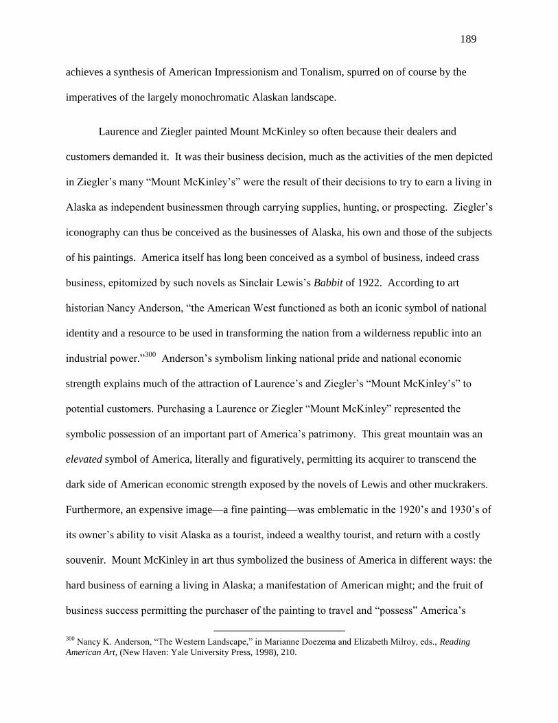
189
achieves a synthesis of American Impressionism and Tonalism, spurred on of course by the
imperatives of the largely monochromatic Alaskan landscape.
Laurence and Ziegler painted Mount McKinley so often because their dealers and
customers demanded it. It was their business decision, much as the activities of the men depicted
in Ziegler’s many “Mount McKinley’s” were the result of their decisions to try to earn a living in
Alaska as independent businessmen through carrying supplies, hunting, or prospecting. Ziegler’s
iconography can thus be conceived as the businesses of Alaska, his own and those of the subjects
of his paintings. America itself has long been conceived as a symbol of business, indeed crass
business, epitomized by such novels as Sinclair Lewis’s Babbit of 1922. According to art
historian Nancy Anderson, “the American West functioned as both an iconic symbol of national
identity and a resource to be used in transforming the nation from a wilderness republic into an
industrial power.”300
Anderson’s symbolism linking national pride and national economic
strength explains much of the attraction of Laurence’s and Ziegler’s “Mount McKinley’s” to
potential customers. Purchasing a Laurence or Ziegler “Mount McKinley” represented the
symbolic possession of an important part of America’s patrimony. This great mountain was an
elevated symbol of America, literally and figuratively, permitting its acquirer to transcend the
dark side of American economic strength exposed by the novels of Lewis and other muckrakers.
Furthermore, an expensive image—a fine painting—was emblematic in the 1920’s and 1930’s of
its owner’s ability to visit Alaska as a tourist, indeed a wealthy tourist, and return with a costly
souvenir. Mount McKinley in art thus symbolized the business of America in different ways: the
hard business of earning a living in Alaska; a manifestation of American might; and the fruit of
business success permitting the purchaser of the painting to travel and “possess” America’s
300
Nancy K. Anderson, “The Western Landscape,” in Marianne Doezema and Elizabeth Milroy, eds., Reading
American Art, (New Haven: Yale University Press, 1998), 210.

190
patrimony. The Northwest Impressionists achieved a multiple symbolism of iconic peaks that
included variations on the mountain sublime, allied with related significations of business, work,
and American might. It is a much richer iconography than the single signification developed by
Brettell, discussed in Chapter III, linking French Impressionism and tourism.
Figure 73. Paul Gustin, “Mountain Climbing Trees, Rainier.”
Japanese woodblock prints had a decisive influence on the development of
Impressionism in France and elsewhere, encouraging artists to depart from symmetrical, well
ordered compositions, and to try new bird’s eye perspective. “To paint in a Japanese manner
means to paint in a decidedly foreign, anti-rationalist style, with new colors, without shadow, and
without single point perspective…The incorporation of lessons from Japanese color woodblock

191
prints…brought about new palettes [and] new compositions.”301
During the same period in the
1920’s and early 1930’s that Impressionism became the dominant aesthetic in the Northwest,
numerous artists, especially in Washington, took up woodblock prints. Paul Gustin “crossed-
over” and created small color woodblock prints in the 1920’s. Figure 73 consists of three small
color woodblock prints by Gustin, all of Mount Rainier. According to David Martin, Gustin
learned techniques of etching in 1910 and woodblock printing later, only to abandon them in the
1930’s as he withdrew from an active exhibition schedule. Later in life, Gustin used his small
woodblock prints as Christmas season greeting cards, entitling them “Mountain Climbing Trees,
Rainier.” The three prints in figure 73 are miniature versions of Gustin’s personal iconography
combining surrogate humanity and the great mountain, but their subject of snow and evergreens
made them suitable for greeting cards, with a reminder of Gustin’s serious purpose in their title
for those who might want to reflect further on what Gustin may have intended by his choice of
words and image.
Other Washington artists devoted themselves primarily to woodblock prints, and there
appears to have been a considerable amount of cross-fertilization between painters and print-
makers. The Chase brothers and Elizabeth Colborne in the period 1925-1934 introduced aspects
of Impressionism in their woodblocks. Among the “forgotten” artists of the Northwest, Waldo
and Corwin Chase were perhaps the most idiosyncratic. The only extensive account of their
activities is found in Corwin Chase’s memoir, Teepee Fires, of 1981, and it primarily involves
sewing teepees and living outdoors.302
According to Corwin, elder brother Waldo proposed they
should live in teepees in wilderness areas of Western Washington and learn to make woodblock
301
Gary Tinterow, “The Impressionist Landscape,” in Gary Tinterow and Henri Loyrette, eds., The Origins of
Impressionism (New York: Abrams, 1994), 233. 302
W. Corwin Chase, Teepee Fires, (Burley, WA: Coffee Break Press, 1981).

192
prints using Japanese techniques. “In June, 1924, we undertook the project of learning to do
wood blocks in the Oriental manner…[carving] our own designs on blocks of wood using this
simple craft method which required no expensive press.”303
Having acquired F. Morley
Fletcher’s textbook Wood-block Printing as Practiced by the Japanese, 1916, along with
appropriate supplies from Japanese stores in Seattle, they studied the book and experimented
painfully over the summer, completing and printing two full designs, one of which—“Mount
Rainier, as seen from Lake Washington” (not identified or illustrated)—they printed in 80 copies
to give away as publicity. In 1925, they set up their teepees in Glacier Basin on Mount Rainier
and proceeded to create additional prints, selling some to tourists and hikers.304
Considering how proficient in woodblock printing the brothers became, this claim of
being autodidacts has met with skepticism. “Fletcher [in his textbook] entered into the minutia
of methodology…and only the truly dedicated could have slogged through it.”305
David Martin
explains that they were instructed by the Japanese woodblock printer Kazuo Yamagishi, who
offered a class to Seattle artists in 1927,306
although it is not mentioned in Chase’s memoir.
The Chase brothers published numerous prints, the first dated prints that I have seen
being 1927. According to Corwin’s 1981 memoir, they typically pitched their teepees along the
Hood Canal in the Olympic Peninsula to the west of Seattle, residing in them during the dry
months, and retreating to Seattle in the winter. However, in a 1987 interview, Corwin said they
lived primarily on Mount Rainier from 1924-1928.307
In 1930, Corwin married, and the memoir
ends with his honeymoon with Dee at Aurora Lake in Mount Rainier National Park. The
303
Chase, 2. 304
Chase, 52. 305
Clive Cristy, Art and the Aesthete: The Chase Brothers, clivechristy.com 306
Martin-Zambito Fine Art, Biography for Waldo Chase, ask.art.com. The Chase family owns a Japanese
woodblock print with an inscription indicating that it was given to the brothers by the Japanese instructor. 307
Julie Staggers, W. Corwin Chase: Artist, (Peninsula Life, August 12, 1987), B.

193
brothers used Japanese hand-made Hosho paper, and there is a suggestion that the difficulty in
obtaining Japanese artisanal paper in the 1930’s contributed to a slower rhythm of production of
color woodblock prints.308
In any event, Corwin’s memoir states that Corwin ceased living in
teepees with his marriage.
This brief account of the Chase brothers is relevant for two reasons. As mentioned in the
introduction, both used painterly techniques in their creation of woodblocks that are not part of
the traditional Japanese woodblock vocabulary, but that seem inspired by Northwest
Impressionism. For example, in “USS Louisville,” figure 22, Waldo has carved horizontal
broken “woodstrokes” in the portions of the wood blocks that represent water and seem to
capture the effect of Impressionist brushstrokes, very much like those in Paul Gustin’s “Nootka
Island”, figure 1. As each separate color requires a separate woodblock, and as Waldo used
several colors for the water, Waldo would have been required to have carved the strokes for each
color on separate blocks, while ensuring that all the strokes meshed perfectly when printed. In
Waldo’s “Seattle Skyline Silhouetted against Mount Rainier,” 1927, figure 74, the horizontal
Figure 74. Waldo Chase, “Seattle Skyline Silhouetted against Mount Rainier.”
308
Chase, 47.

194
bands of clouds that traverse the face of Mount Rainier offer multi-colored visual effects that
imitate paintings of clouds and increase the illusion of depth. In contrast, traditional Japanese
woodblock printing resulted in flat areas of monochromatic color that lessened the depth of the
image and produced more of a decorative effect. At the time of the print’s creation, Seattle had
only one skyscraper, Smith Tower on the far right. The second structure from the right is the
clock tower at Colman Dock on the waterfront. Prints or paintings by any artist of the period of
the Seattle skyline are rare, and Waldo’s woodblock combining the skyline and Mount Rainier is
highly accomplished as well as visually striking in its Impressionist cloud effects. Dated 1927,
its high quality implies that their training that year with a Japanese teacher supplied those
technical elements in woodblock printing they had been unable to work out fully for themselves.
As for Corwin Chase, rather than finding inspiration in techniques of Impressionist
brushstrokes, Corwin seems to have taken a cue from Paul Gustin’s interview where he
emphasized the climbing trees of Mount Rainier. In Corwin’s “Sunset,” figure 23, also dated
1927, the prominent mountain hemlocks in the foreground seem inspired by Gustin, as does
Corwin’s decision to veil the mountain in mist to such an extent that only a few of its features are
visible. In the unlikely medium of woodblock prints, Corwin has taken Gustin’s Impressionist
vision of “King above the Clouds” and diminished the presence of the king, while augmenting
the prominence of his subjects, the climbing trees. Once again, the Chase brothers had mastered
all the elements of Japanese woodblock printing, the design (the only part performed by the great
Japanese woodblock artists like Utagawa Hiroshige, 1797-1858), the carving of the woodblocks,
and the printing process, each of which was performed by different specialists in Japan.
The primary relevance of the Chase brothers in this chapter is their devotion to Mount
Rainier. Fifty percent of their prints that I have seen depict Mount Rainier or some part of

195
Mount Rainier National Park, like Aurora Peak where Corwin and Dee spent their honeymoon.
Yet the brothers were not content merely to create images of Mount Rainier and its environs,
they insisted on living there for months at a time in their home-made teepees. Apart from monks
like Fra Angelico who resided in monasteries while creating religious images, or early artists of
Native Americans, it is difficult to think of secular artists more devoted to their subject, living on
its flanks while depicting it under primitive conditions. Teepee Fires is not a deeply self-
reflective memoir, and Corwin Chase never says what drew the brothers to Mount Rainier. Yet
their actions speak volumes, and their months living on Mount Rainier epitomize the incredible
magnetism of iconic mountains for Northwest artists of the 1920’s.
The most accomplished woodblock artist of the period was not a Chase brother, however.
Elizabeth Colborne (1885-1948), after spending her childhood in Bellingham, Washington,
resided in New York City, where she earned her living as an illustrator. Returning often to
Bellingham, she created exquisitely finished and complex color woodblock prints of the forests
and mountains of the area. Bellingham’s iconic mountain is Mount Baker, the third highest
mountain in Washington, visible also from Seattle when one has unobstructed views to the
north.309
“Mount Baker, Washington,” figure 75, is one of Colborne’s five different woodblock
views of Mount Baker, constituting an important part of her oeuvre. Colborne’s “Mount Baker,
Washington,” exhibits a very traditional composition. The image is framed by the branches of
mountain hemlocks or Douglas firs. The immediate foreground is the darkly silhouetted
evergreen forest, a monochromatic dark green. The middle ground is a taller hillside in lighter
greens, with large sections of brown that must represent rocky, avalanche prone areas where few
trees can grow. Above the hillside rises the rounded summit of Mount Baker, a cheery white.
309
Like Mount Rainier, Mount Baker is inactive in the sense that it has not erupted recently. However, copious
steam escapes continually from the craters of both volcanoes.

196
Figure 75. Elizabeth Colborne, “Mount Baker, Washington.”
Colborne’s Mount Baker is not a threatening image.310
Colborne’s talent is evidenced
by the intricate, interlocking shapes of the branches that frame the image, as well as sense of
relief or depth suggested by splotches of light green against the darker green of most of the
framing branches. Colborne also created color woodblock prints of Mount Rainier, Mount
Hood, and other northwest tall mountains, all inactive volcanoes.311
In an excerpt from her
journal of 1933, she analogized the mountains to theatre. “The day ended in a glorious cloud
show over the mountains across the lake, like a dramatic backdrop of stage scenery in its
dramatic glory…The sun must have set intensely to throw such a reflection on the heavy clouds
310
When I moved to Seattle, I took mountaineering lessons and climbed to the summit of Mount Baker for the
graduation hike. Climbers must rope up together because they traverse glaciers with hidden crevasses, but the
summit at 10,781 feet is not exceptionally high. Two years later, I climbed Mount Rainier, but I turned back at
about 12,400 feet with altitude sickness, well short of the summit at 14, 411. 311
David F. Martin, Evergreen Muse: The Art of Elizabeth Colborne, (Seattle: University of Washington Press,
2011).

197
that floated about the top of the mountains.”312
“Mount Baker, Washington,” figure 75, is
framed by evergreen branches much like the manner in which curtains frame a proscenium stage.
This particular image does not feature a sunset with “dramatic glory,” but a placid mid-day
scene. Colborne’s significance for the argument of this chapter relates but incidentally to
methods of Northwest Impressionist painting; its primary relevance is her concentration on
images of iconic mountains. The mountain sublime that informed the Pacific Northwest
landscape pulled female artists, as well as male, within its sphere of influence.
In addition to mountains, Gustin was attracted to the dark forests of the Northwest, as
were McKim and Keller. Gustin depicted rows of tall Douglas firs that reminded viewers of the
columns of the naves of the great Gothic cathedrals of Europe, according to a Seattle critic.
Gustin’s most important such image is “On the Quinault,” figure 30, most likely one of the four
paintings for which a subscription was launched to try to ensure they remained in Seattle. An
Oregon Impressionist who has been passed over previously deserves mention at this point.
Alfred Schroff taught for many years at the University of Oregon and exhibited at the annual
shows in Portland, and occasionally in Seattle, notably in 1920, 1923, and the second annual in
October 1928. Some of Schroff’s paintings are of dark woodland scenes such as figure 76, an
untitled oil dated 1915. This landscape depicts an untended pond, where several trees have
fallen into the water in the foreground. Slowly rotting away, they have become beds for weeds
and wildflowers, the red wildflowers providing the only touch of brightness.
312
Elizabeth Colborne, Journal, June 28, 1933, quoted in Martin, Evergreen Muse, 30.

198
Figure 76. Alfred Schroff, untitled landscape.
Admittedly, Schroff has not depicted a wilderness area, as a fence bisects the painting in
the middle ground, and the trace of a building can be discerned through the dense trees.
However, Schroff’s oil is illustrative of a certain Northwest taste for the aesthetic of dark forests
that is uncommon elsewhere in America, and entirely absent among Southern California
Impressionists. Another example is “Lake Washington, Union Bay Marsh,” figure 19, in which
Fokko Tadama depicted the marshy wetlands of Lake Washington near the northern edge of the
Arboretum, the largest Seattle city park. Instead of choosing to paint the open water of Lake
Washington, which would have resulted in a brighter scene with blue water, Tadama has chosen
a marsh along the lake that is shaded with Douglas firs and other Northwest evergreens. The
native yellow water lilies are suggested by a few yellow daubs of paint, but Tadama’s coloration
is otherwise muted and low-toned. A sense of quasi-religious reverence can be discerned in
works by Gustin, but other Northwest artists who were drawn to forest and marshland scenes like

199
McKim, Keller, Tadama, and Schroff seem more charmed by the quiet and seclusion of these
closed-in spaces, a sensation epitomized by McKim’s “Oregon Forest Stream”, figure 47. In
McKim’s small oil, light filters through trees to reveal bright autumn colors, the only possible
sound the “laughing” water coursing down the trout stream. Keller also painted wilderness
forests, like those that ring the mountain meadows of Mount Rainier in figures 60 and 63, views
of the Tatoosh Range from Paradise in Mount Rainier National Park. Keller’s eye was drawn
more toward the meadows—and their spring flowers when in season—than to the depths of the
tall evergreen forests. Indeed, as discussed earlier, Keller is the Northwest Impressionist most
comparable to California artists. Although Gustin’s iconography of reverence and awe applies
primarily to his work and somewhat to that of Stephens, the expression of calm and repose is
common to all these artists.
Figure 77. Elizabeth Colborne, “In the Rain Forests of Washington.”

200
Elizabeth Colborne’s work is significant in exploring the iconography of Northwest
forests because she depicted individual trees of the deep forest, an example being “In the Rain
Forests of Washington,” figure 77. Colborne has anthropomorphized a cedar stump whose dark
bulk occupies much of the image. A sharp bit of broken limb could be the nose, a few ferns the
hair, and a faint white spot in the side of the stump, the eye. There are several large white
mushrooms growing around the stump, and the “eye” is most likely another mushroom that has
taken hold in the rotting bark of the stump. In this image, Colborne achieves painterly effects in
the blobs of mushrooms, which look like white daubs of paint. The small area of bare ground in
front of the stump is depicted with broken “woodstrokes” of brown and speckled white, perhaps
the influence of Northwest Impressionism. Colborne accomplished an enhanced—and eerie—
deep yellow background through printing colors on both side of the paper. A critic’s comment
on Gustin’s forest interiors applies to Colborne as well. “It is perhaps on these wood interiors
that the eye rests with the greatest delight, full of the wonder of dark trunks and green gloom of
the foliage.”313
Figure 78. Eustace Ziegler, “Fish Pirates.”
313
“Western Scenes by Seattle Artist Attract Many,” Seattle Times, January 20, 1918, 62, quoted in David Martin,
Evergreen Muse, 19.

201
Other iconographies embedded in Northwest Impressionism are not as pervasive as those
of mountains and forests. Gustin, Forkner, and Jensen depicted urban port scenes in Seattle.
Ziegler also painted maritime scenes in Alaska and Seattle, often of fishermen pulling in fish at
sea or unloading their catches in port. A colorful example of the former in an Impressionist
idiom is Ziegler’s “Fish Pirates,” figure 78, showing six fishermen gathering in their nets,
standing ankle deep in fish. It provides another example of Ziegler’s interest in depicting
Alaskans at work, here engaged in the tough and dangerous life of the fisherman, some of whom
perish every year in winter storms. It also illustrates Ziegler’s method of painting as described
by Woodward. Ziegler organizes “the planar space into formal layers directing the movement of
his figures from foreground to rear ground with considerable ease. His work also evinces a
highly personal color sensibility, partially derived from impressionist and tonalist precedents,
which rather wondrously conveys the striking colors of the Alaskan terrain.”314
Keller and
Stephens depicted port activity in Oregon, but not as frequently as Seattle artists. Seaport scenes
of Keller, Stephens, Gustin, and Jensen tended to feature working images of the waterfront that
were the Northwestern urban equivalent of the Central Park and Washington Square paintings of
New York Impressionists or the Parisian and suburban café scenes of French Impressionists. As
such, they captured fleeting images of urban work and leisure, without a deeply symbolic
component. While they represented “work” primarily in their images of moving ships, they did
not dissect work close-up apart from Ziegler’s depictions of fishermen pulling in the catch like
“Fish Pirates,” figure 78.
A more profound urban iconography is provided by Forkner’s symbolic representation of
decaying boats and fading flowers, both suggestive of senescence and death. It was easy to
314
Woodward, Spirit of the North, 50.

202
overlook Forkner’s deeper meanings in his many paintings of old, often colorful, sailboats like
those in “Golden Sail,” figure 52. To most viewers, they stimulated nostalgia for the romance of
the days of sailing ships, but few noted the compelling evidence of decay in Forkner’s sunny,
bright scenes of the waterfront retirement of obsolete vessels. Gentle Forkner was not the least
didactic or bombastic. It required reflection, with no assistance from Forkner, to discern his
emblems of decay that remind the viewer of the inevitable transience of life.
Presentations of serious ideas, if repetitive, can give rise to parodies that ridicule the
original intentions. Indeed, the existence of parody is a back-handed compliment, recognition
that the artist’s ideas have been widely—too widely—communicated. If no one has understood
them apart from the author of the parody, then the effort at ridicule falls flat. In the academy,
“postmodernist parody” is one step removed from this usual meaning of parody. Postmodernist
parody refers to use of the parodied text or image to target something else. An example in
contemporary art is Andy Warhol’s multiple images of Campbell Soup cans. Warhol famously
claimed to have consumed one can a day of Campbell Soup for years, so his paintings and silk
screens of oversized, repetitive, banal copies of Campbell Soup cans were not meant to make fun
of soup as nourishment. Rather, Warhol’s “multiples” should be understood as raising questions
about the means and limits of artistic expression, the role of advertizing in the American visual
experience, and the effects of celebrity culture (in the case of his Marilyn Monroe, Elizabeth
Taylor, Elvis Pressley, and other celebrity multiples).315
315
As concerns parody in art, see Linda Hutcheon, A Theory of Parody: The Teachings of Twentieth-century Art
Forms (New York: Methuen, 1985), 42, 46-49, 57-61. All of Hutcheon’s examples concern parodies of famous
works of art, e.g., Ingres’s “La Grande Odalisque,” where the parodist intent is evident at first glance. In this
particular example, Mel Ramos’s “Plenti-Grand Odalisque,” 1973, parodies both Ingres’s work of the almost-same
name (for those who don’t recognize the image), as well as a second level parody of Playboy photos. Both the first
level parody and the re-contextualized parody are not hard to find. The two levels of parody in the Northwest
examples cited in this dissertation are more subtle and require more effort of the viewer or reader.

203
Virna Haffer (1899-1974) was a Tacoma photographer and free spirit who took up
woodblock printing c. 1927-1930.316
“Strange Forest Creatures,” figure 79, an unpublished
Haffer woodblock print, was created during the apogee of Northwest Impressionism and its
unrelenting focus on iconic mountains and dark evergreen forests. The background of the image
in “Strange Forest Creatures” is a mountain lake surrounded by evergreens, enlivened by a few
cartoonish flowers. A tall, drooping Douglas fir frowns at the viewer, simultaneously sticking
out its tongue. The typical cartoonist’s “face” of the tree looks more idiotic than angry. In the
sky above hovers an enormous anthropomorphic cloud, its “teeth” the sails of a great clipper
ship. One smaller cloud “eye” is rests above the teeth, and something like a torso with bended
head floats to the left. The print is untitled by Haffer, so her parodist intentions were not
articulated verbally.
Figure 80. Virna Haffer, “Strange Forest Creatures.”
316
David F. Martin, “Daughter of Destiny: Virna Haffer and the Transcending of Regionalism,” in Margaret E.
Bullock, Christina S. Henderson, and David F. Martin, A Turbulent Lens: The Photographic Art of Virna Haffer,
(Seattle: University of Washington Press, 2011), 96-97.

204
Haffer had not seen Colborne’s cedar stump or trees in other Colborne prints of the
deep forest if David Martin is correct in dating them c. 1933. Thus, she did not intend to mock
Colborne specifically, although she has been prescient in creating an image with many features
in common with “In the Rain Forests of Washington,” figure 77. Haffer’s intent to mock Gustin
and other Northwest Impressionist artists of dark evergreen forests could be plausible because of
the prominence given her idiotic tree. But where is the regal mountain? In its place, Haffer has
piled up the enormous cloud “monster” with its sailing ship mouth. Was she thinking of
Wagner’s Flying Dutchman, or Forkner’s derelict wrecks? Was she bored by maritime portraits
of the great clipper ships, a subject always popular with marine artists? Had she been listening to
someone explaining the shapes he saw in changing cloud formations, much as Clara J. Stevens
visualized Greek mythological figures in the cumulus clouds of Portland? Haffer could have
intended to mock various symbolic interpretations of Northwest art in “Strange Forest
Creatures.” Her target could have been Gustin’s brave outpost trees, here transformed into a
slumped, village idiot. It could have been other anthropomorphic images that resembled
Colborne’s witty cedar stump with its perky fern hair and pretty garniture of mushrooms. Rather
than lampoon the mountain sublime directly, Haffer may have found more opportunity for humor
in an amorphous cloud. Like an iconic mountain, it dominates the scene, but unlike the
mountain, the cloud’s non-specific and every-changing shape lends itself to multiple
anthropomorphic associations. Instead of a sternly regal mountain, Haffer substituted the giant
nimbus, smiling stupidly at the viewer through its “clipper ship” teeth. There is no majesty in
this print, and there is nothing deserving of reverence. Instead of the mountain sublime, there is
the cloud ridiculous. Instead of the surrogate human fighting to gain a foothold on the mountain
side, there is a loopy, droopy fir, its facial expression that of the village idiot.

205
It is possible to re-contextualize Haffer’s image and suggest a target once removed from
the works of art of her contemporaries. If Haffer were living in today’s green generation of
environmentalists, Haffer could be making fun of the “tree huggers” of the Northwest by
offering an idiot tree that would be repulsive to embrace. But Haffer was a rebel, having been
raised in the Home Colony, a commune on the Oregon coast described as a “hotbed of anarchy
and free love.”317
She would seem an unlikely candidate to have mocked efforts to preserve the
natural environment. During the 1920’s and 1930’s, the national forests were managed by the
federal government as piggy banks for big timber companies, which cut down old growth forests
at a fast pace. Yet Haffer’s print would seem to embrace the policy of ridding the West of
ancient trees, so forlorn and stupid is her old evergreen. The promotion of the destruction of old
growth forests would be an unlikely intention for a person with Haffer’s rebellious nature. To
re-contextualize Haffer’s print, a more likely target for the 1920’s would not be artists like
Gustin who memorialized nature from the comfort of their urban studios, but artists like Waldo
and Corwin Chase who chose not only to create works of art inspired by the sublimity of nature,
but to live in “primitive” conditions in the actual physical space their art represented. Perhaps
the scene in “Strange Forest Creatures” was inspired by the mountain lake where the Chase
brothers set up their teepees, “playing” at living like Native-Americans.
There is no doubt that Haffer was fully cognizant of the concept of the mountain sublime
and the compulsive attention paid by Northwest artists to Mount Rainier, as she was an
acquaintance of Corwin Chase. In the most amusing section of Teepee Fires, Corwin Chase
recounts a morning visit at the teepee by Haffer and her friend Betty. Haffer is said to have
desired to photograph Chase “in the raw,” and Chase had started to prepare by drawing bulls’
317
Christina S. Henderson, “Virna Haffer: The Radical Light,” in Bullock, et al, 46.

206
eye patterns on his leg with batik dye. Upon seeing him, Haffer said “Don’t you think I’d better
paint you all over? It’ll look funny if only your legs are painted” As Chase described it, Haffer
“continued to decorate me, covering my buttocks, back, hips and belly, breast, shoulders, arms
and face with paint. All of which is a distinct delight to me, to Betty, to Virna…I wade in the
creek…pose against the sunlight, sneak through the weeds, [and] hunt for wild fowl…I fill the
exploring eyes of the girls playing over me deliciously, like invisible hands.”318
Ultimately,
Haffer used up all her film taking pictures of the nude Chase with her Graflex, and the three
friends retired to the teepee for a lunch of stew prepared by Chase.
Figure 80. Virna Haffer, untitled photograph of Corwin Chase.
Figure 80 is an untitled photograph of Chase, nude, gesturing toward the forest. His
position recalls that of classical period Greek sculpture, here perhaps in the service of the
imitation of conventional poses attributed to Native-Americans when drawn by white artists.
318
Chase, Teepee Fires, 90. Needless to say, Chase has recounted his own interpretation of the women’s reactions.
They may well have experienced it differently, more as absurdity than sensuality.

207
Photos of Chase “sneaking thorough the weeds or hunting wild fowl” might not have made as
clear a parodist statement. The artfully posed nude of figure 80 reveals almost as obvious an
intention of parody as “Strange Forest Creatures.” Its target as conceived jointly by Chase and
Haffer could have been the iconic photographic portraits of American Indians by Edward Curtis
(1868-1952), a resident of Seattle, which were known to be artificially composed, or perhaps the
fancifully dressed and carefully posed Indian warriors depicted by George de Forest Brush
(1855-1941). Turning to postmodernist parody theory, the target of parody of figure 80 once
removed as re-conceptualized by Haffer could have been Chase himself and his pretentions of
living like a “noble savage” in the wilderness. After the séance of photography, and back in the
teepee, when the conversation turned to the mountain sublime, or pantheistic interpretations of
clouds and trees, Haffer could have been inspired to create a woodblock print to parody directly
the images implied by Chase’s harangue, and to parody at a level once removed Chase’s fanciful
life as a counterfeit Native-American living in a teepee on Mount Rainier. “Strange Forest
Creatures,” figure 79, would have been the result.

208
Chapter IX
Comparison of Northwest Impressionism with Other Regional Groups
Potential examples for comparison of Northwest Impressionism with American
Impressionism from other regions can be selected from scenes of tall mountains, forests, urban
harbors, or other subject that are similar, or which suggest an interesting contrast, to the
Northwest Impressionist works discussed in this dissertation. The illustrations in this chapter
were drawn from a diverse list of books, despite the frequency of the name of William Gerdts.319
The American Impressionist paintings illustrated in Frank’s book are largely drawn from the
Phillips Collection in Washington, D. C., and reflect the taste of Duncan Phillips, c. 1920.
Similarly, the works in the Irvine Museum survey were primarily selected by Joan Irvine Smith,
in her case within the last twenty years. The Pfeil Collection contains paintings purchased
mostly in the 1980’s, and it therefore reflects prevailing taste a decade or two earlier than the
works in the Irvine Museum. The California Art Club illustrates paintings of members of the
club, which include a very large number of artists. Gerdts’s own choices are found in his
surveys of American Impressionism and New York Impressionism, which is treated as another
“region” in this chapter. Lastly, Gerdts’s survey of California Impressionism is two books in
one, the choice of illustrations in the second half having been made by Will South.
319
Frank, Susan B., American Impressionists: Painters of Light and the Modern Landscape (New York: Rizzoli,
2007); Gerdts, William H., All Things Bright and Beautiful: California Impressionist Paintings from the Irvine
Museum. (Irvine: The Irvine Museum, 1998); Gerdts, William H., American Impressionism, 2nd
ed. (New York:
Abbeville, 2001); Gerdts, William H., and South, Will, California Impressionism (New York: Abbeville, 1998);
Gerdts, William H., Impressionist New York (New York: Artabras, 1994); Gerdts, William H., Masterworks of
American Impressionism from the Pfeil Collection (Alexandria, VA: Art Services International, 1992); Stern, Jean,
and Siple, Molly California Light: A Century of Landscapes—Paintings of the California Art Club (New York:
Rizzoli, 2011.)

209
Looking through the hundreds of paintings illustrated in these sources, it turns out that it
is difficult to identify works with subjects similar to those of Northwest Impressionists. There
are no American Impressionist paintings from other regions that focus on an iconic mountain—
not a single one that I can find. There are mountains, of course, but the choice seems incidental
to the artist’s purpose, and the paintings rarely seem to focus on only one mountain. There are
few dense forests depicted by these artists. California has groves of redwood and sequoia that
rise higher than the Northwest’s old growth Douglas firs, but no California Impressionist seems
to have painted them. There are urban harbor scenes, but not so many that concentrate on small
craft and abandoned sailboats. Conversely, many subjects that were popular elsewhere were
rarely depicted in the Northwest, such as women in white, women with parasols, nude women,
children on the beach and playing in sand dunes, city streets, city parks, factories and tenements,
mansions and homes, interior scenes, farms, fields of poppies, hillsides in autumn, snowy
hillsides in winter, and frozen lakes and rivers.
In Chapter VI on Clyde Keller, landscapes by Keller and California artist Granville
Redmond were compared. Keller’s treatment of a field of wildflowers in summer was contrasted
with that of Redmond, the California artist most closely identified with fields of poppies. In
terms of painterly approach, Keller tended to aggregate flowers in broad swaths of color in his
“Fields of Purple and Gold,” figure 61, while Redmond painted many lupines individually in his
“Poppies and Lupines,” figure 62. This is a difference, to be sure, but not a fundamental one.
The distinctive contrast involved Keller’s treatment of atmosphere, his sense that the
Northwest’s humidity results in mists or heavier air that veil objects in the distance. Redmond’s
background hills, also decked out with wildflowers, are as clearly depicted as the poppies and
lupines in the foreground. Redmond provided an adequate illusion of depth, but the dry desert
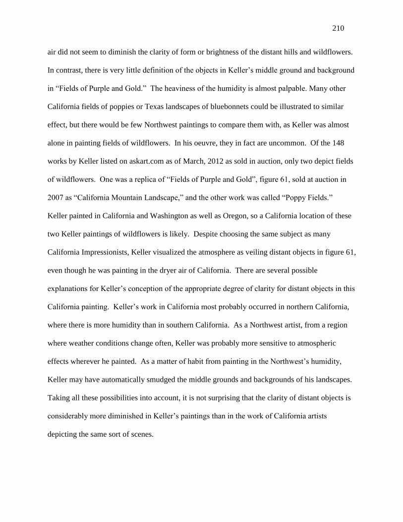
210
air did not seem to diminish the clarity of form or brightness of the distant hills and wildflowers.
In contrast, there is very little definition of the objects in Keller’s middle ground and background
in “Fields of Purple and Gold.” The heaviness of the humidity is almost palpable. Many other
California fields of poppies or Texas landscapes of bluebonnets could be illustrated to similar
effect, but there would be few Northwest paintings to compare them with, as Keller was almost
alone in painting fields of wildflowers. In his oeuvre, they in fact are uncommon. Of the 148
works by Keller listed on askart.com as of March, 2012 as sold in auction, only two depict fields
of wildflowers. One was a replica of “Fields of Purple and Gold”, figure 61, sold at auction in
2007 as “California Mountain Landscape,” and the other work was called “Poppy Fields.”
Keller painted in California and Washington as well as Oregon, so a California location of these
two Keller paintings of wildflowers is likely. Despite choosing the same subject as many
California Impressionists, Keller visualized the atmosphere as veiling distant objects in figure 61,
even though he was painting in the dryer air of California. There are several possible
explanations for Keller’s conception of the appropriate degree of clarity for distant objects in this
California painting. Keller’s work in California most probably occurred in northern California,
where there is more humidity than in southern California. As a Northwest artist, from a region
where weather conditions change often, Keller was probably more sensitive to atmospheric
effects wherever he painted. As a matter of habit from painting in the Northwest’s humidity,
Keller may have automatically smudged the middle grounds and backgrounds of his landscapes.
Taking all these possibilities into account, it is not surprising that the clarity of distant objects is
considerably more diminished in Keller’s paintings than in the work of California artists
depicting the same sort of scenes.

211
Figure 81. Dorothy Dolph Jensen, untitled [coastal tree].
Dorothy Jensen’s landscapes illustrate the effects of the humid Northwest atmosphere as
interpreted by Washington artists. Figure 81 is her untitled image of a coastal tree, most likely
created on an island or along the shoreline of Puget Sound. Although the scene appears to have
been painted on a warm day in the summer—the sun is shining while the sky is mostly clear—
the entire image is indistinct, from the verdant foreground meadow to the large tree in the middle
ground to the blue-colored shoreline in the background. Jensen’s vision is quintessentially that
of the Northwest. It would be difficult to imagine that this painting originated in Southern
California.
The mountain sublime was not a subject that attracted American Impressionists outside of
the Northwest and Alaska. Eastern mountains do not make the grade, and the American Rockies
do not seem to have attracted American Impressionists. Jean Mannheim lived in Denver for a
time, but his published work tends to consist of interior scenes in Southern California. A
California Impressionist who often painted mountains was Edgar Payne (1883-1947). A typical
work is “The Sierra Divide,” figure 82, which depicts a mountain ridge with several peaks, the

212
tallest in the center.320
At their base is a mountain lake, and repoussoirs of tall evergreens have
been placed on either side of the foreground to frame the view and accentuate the sensation of
depth. Payne’s strong broken brushstrokes stand out, revealing little detail in the objects in the
painting. Bright sunshine radiates from the right, with subdued purple shadows on the face of
the ridge, and dark purple shadows under a few of the evergreens. There is a feeling of repose in
this mid-day scene, with no suggestion of wind, even at high altitude. There is little sense of
majesty or sublimity, however, and no call for the viewer to assume an attitude of reverence.
The foreground evergreens have not been tested by winter storms. They stand tall, not deformed
like Gustin’s climbing trees. Some snow remains on the mountain ridges, but nothing suggests
that they would be extremely difficult to climb. Payne’s broad brushstrokes have smoothed out
much of the mountainside, and the slopes are not terribly steep. It is not a formidable presence in
the same way as the Northwest’s giant sleeping volcanoes.
Figure 82. Edgar Payne, “Sierra Divide.”
320
This painting is popular with authors and editors, as it appears in Gerdts, All Things Bright and Beautiful, 24, and
Stern & Siple, California Light, 48.

213
This quintessentially California scene also illustrates the transparency of the California
atmosphere in the eyes of California artists. Rocky formations on the mountains are rendered
with the same degree of detail as the boulders in the foreground. Those on the mountain are
much farther away, but there is no suggestion of an intervening haze that diminishes their clarity.
The viewer’s sensation of depth arises primarily from the high vantage point and the diminished
hues of the sandy colored mountain ridge compared to the more intense dark greens of the
grasses and trees of the foreground rim.
Figure 83. Jack Wilkinson Smith, “Sierra Slopes.”
There are a seemingly endless number of similar views of the Sierras by other artists, like
Paul Lauritz (1889-1975) and Jack Wilkinson Smith (1873-1949). Smith’s “Sierra Slopes,” 1922,
is illustrated as figure 83. A detailed description of “Sierra Slopes” is unnecessary, as much of
what was said with respect to Edgar Payne’s work applies in terms of composition, mood, and
depiction of atmosphere. Smith’s Sierras landscape is more conventional in composition. Smith
leads the viewer into the scene with a meandering mountain stream in the center of the painting,

214
still frozen solid, a banal device. Smith’s modest mountain outcroppings are placed from the
middle ground to the background, avoiding any message of monumentality. Smith’s landscape
epitomizes typical Southern California clarity in his depiction of distant objects, with no sense of
an intervening heaviness of the air, and no haze of any sort. (At the time these works were
created, man-made photochemical smog had not penetrated to such rural areas in California. In
coastal areas of the Northwest, the haze or mist that often veils the great mountains is a natural
phenomenon created when air that has been cooled by the Pacific flows inland.)
Figure 84. William Wendt, “Where Nature’s God Hath Wrought.”
When discussing attitudes toward iconic mountains in the Northwest, it was necessary to
parse the writings of critics, and draw inferences from remarks by the artists, to develop an
iconography of that included regal and quasi-religious symbols, as well as multiple significations
of work and labor. That effort is often unnecessary with respect to the landscapes of California
Impressionist William Wendt (1865-1946), who incorporated overtly religious references in the
titles of many of his landscapes, such as “Where Nature’s God Hath Wrought,” 1925, figure 84.
Although not explicitly Christian, Wendt’s echo of the language of the King James’s Bible
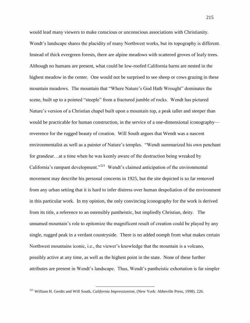
215
would lead many viewers to make conscious or unconscious associations with Christianity.
Wendt’s landscape shares the placidity of many Northwest works, but its topography is different.
Instead of thick evergreen forests, there are alpine meadows with scattered groves of leafy trees.
Although no humans are present, what could be low-roofed California barns are nested in the
highest meadow in the center. One would not be surprised to see sheep or cows grazing in these
mountain meadows. The mountain that “Where Nature’s God Hath Wrought” dominates the
scene, built up to a pointed “steeple” from a fractured jumble of rocks. Wendt has pictured
Nature’s version of a Christian chapel built upon a mountain top, a peak taller and steeper than
would be practicable for human construction, in the service of a one-dimensional iconography—
reverence for the rugged beauty of creation. Will South argues that Wendt was a nascent
environmentalist as well as a painter of Nature’s temples. “Wendt summarized his own penchant
for grandeur…at a time when he was keenly aware of the destruction being wreaked by
California’s rampant development.”321
Wendt’s claimed anticipation of the environmental
movement may describe his personal concerns in 1925, but the site depicted is so far removed
from any urban setting that it is hard to infer distress over human despoliation of the environment
in this particular work. In my opinion, the only convincing iconography for the work is derived
from its title, a reference to an ostensibly pantheistic, but impliedly Christian, deity. The
unnamed mountain’s role to epitomize the magnificent result of creation could be played by any
single, rugged peak in a verdant countryside. There is no added oomph from what makes certain
Northwest mountains iconic, i.e., the viewer’s knowledge that the mountain is a volcano,
possibly active at any time, as well as the highest point in the state. None of these further
attributes are present in Wendt’s landscape. Thus, Wendt’s pantheistic exhortation is far simpler
321
William H. Gerdts and Will South, California Impressionism, (New York: Abbeville Press, 1998). 226.

216
than the multiple significations expressed by Northwest Impressionists when they depicted
Mount Hood, Mount Rainier, and Mount McKinley.
Descending from lofty mountains to the lowlands, one finds that Northwest artists have
created numerous verdant waterside scenes, typically along streams and rivers, but also on Puget
Sound, notably Keller’s “Water Lily Pond,” figure 4, Jensen’s untitled figure 16, probably a
cabin on Puget Sound, Gustin’s untitled figure 31, a watery meadow, McKim’s “Spring Evening,
Sauvie Island,” figure 46, McKim’s “Oregon Forest Stream,” figure 47, and Keller’s “Summer
Afternoon,” figure 64. All used Impressionist painterly techniques to depict a restful scene along
the water, typically in direct sunlight, or with sunlight streaming through a leafy arbor.
Figure 85. William L. Lathrop, “The Tow Path.”
Such scenes were popular with American Impressionists elsewhere, such as William L.
Lathrop’s “The Tow Path,” undated, figure 85, and J. Alden Weir’s “Afternoon by the Pond,” c.
1908, figure 86. Lathrop was the founder of the art colony at New Hope, Pennsylvania, and
Alden Weir was a founding member of the Ten, as well as a childhood friend of C. E. S. Wood,

217
the most active promoter of fine art in Portland. The subject of Lathrop’s very subdued
landscape is announced by its title as a tow path along a canal, probably no longer in use for
water transport by the early twentieth century. A lone person stands or walks in the distance.
Various hues of light green depict the grass on both sides of the tow path, the water, and the trees
that border the canal. The sky is a very pale blue-green, with a few reflections on the surface of
the canal. Nothing would seem to move on this hazy, Pennsylvania summer day. Lathrop has
utilized many small broken brush strokes throughout the canvas, the sky more smoothly brushed
in, the foreground strokes more broken. Lathrop’s Impressionist facture aside, “The Tow Path”
could easily be claimed by the Tonalists for its low-toned, limited range of color and expression
of lethargy. Although Northwest Impressionist works tend to look subdued when compared to
those from Southern California, they appear bright and forceful in comparison with Lathrop’s
landscape dominated by such muted greens.
Figure 86. J. Alden Weir, “Afternoon by the Pond.”
Alden Weir’s landscape “Afternoon by the Pond,” figure 86, is marginally brighter. In a
few places, the sun has broken through what might be the mantle of tall trees behind the artist,

218
illuminating two trees along the pond, as well as some bits of lawn. The pond and sky are blue,
and Weir has thus used two colors compared to Lathrop’s essentially monochromatic green
canal. Weir’s foreground is mostly shrouded in shadow, giving his work a dark, monotonous
overall tone despite some light playing on the pond’s surface. Weir’s relationship with
Impressionism is redeemed by his small broken brushstrokes, but a claim of affinity by the
Tonalists would not be out of order. Both Weir’s and Lathrop’s landscapes could appear boring
to viewers. Of course, there are many lively paintings by Pennsylvania and New York
Impressionists, but they often involve city or beach scenes with a great deal of human activity.
When Eastern Impressionists painted quiet scenes along the water, the subject of choice for
many Northwest Impressionists, their efforts sometimes fall flat in comparison with their
Western counterparts.
Figure 87. John Twachtman, “Fishing Boats at Gloucester.”
New York Impressionists painted many harbor scenes, but they were typically of a larger
scale than those assayed by Northwest artists, featuring great monuments like the Brooklyn
Bridge, or large seaport cranes unloading ocean going freighters. A closer comparison to

219
Northwest artists could be made with John Twachtman’s Gloucester, Massachusetts paintings
around 1900, such as “Fishing Boats at Gloucester,” 1901, figure 87. Twachtman depicted three
sailboats moored to the dock, with another in the distance. The dockside is ringed by old
wooden boathouses. The sailboats appear to be fishing boats judging from the gear on their
decks. Their furled sails indicate they remain active members of the local fishing fleet, but by
1901, the Gloucester seaport must be a pale reflection of its storied past, and Twachtman’s scene
a nostalgic reminder of the great era of New England fishing and whaling ports.
Twachtman, in my opinion, was the most original American Impressionist, and I would
not argue that any Northwest seascape discussed in this dissertation exceeded the quality of his
work. The streaks of white in “Fishing Boats at Gloucester” that suggest the furled sails and
reflect highlights along the docks appear to be spontaneous yet result from subtle intention. The
myriad tones of brown that make up the prevailing color scheme surprise the viewer by their
variety and veracity; although low-toned, they are not the banal choices of colors in Lathrop’s
and Weir’s paintings. Twachtman’s image exudes repose, but it is the repose of fatigue, and it
does not promise any renewed vitality after a time of rest. Rather, the viewer anticipates
continued decline in the port’s fortunes; perhaps Twachtman’s ill heath and fear of an early death
prompted his vision.
Although the port scenes of Northwest Impressionists illustrated in earlier chapters may
not exceed Twachtman’s exacting standards of execution, they are enlivened by colors that seem
appropriate to their situation, like Forkner’s golden sail, the yellow port buildings in Gustin’s
canvases, and Jensen’s vivid blues along the Seattle Ship Canal. In “Sunset, Docks on Seattle
Waterfront,” figure 34, Gustin has recreated a scene where the sun breaks through just as a
rainstorm is ending. The precipitation remaining in the air is palpable, while the bright

220
reflections of the setting sun on the pavement emphasize how wet it remains. Not only were
these Northwest artists highly skilled technically, but at least Forkner’s seafront scenes express
an iconography that can confidently be enunciated because he expressed it so consistently.
Twachtman painted for a short period in Gloucester before his early death, and although the
iconography suggested for his “Fishing Boats at Gloucester may seem credible, it has not been
confirmed by consistency over time. The viewer of Forkner’s canvases can be confident that a
message of senescence and death is embodied in his work because it was evidenced in a lifetime
of painting. Perhaps it was the Seattle public’s implicit understanding of Forkner’s iconography
that contributed to their appetite to view his works in his last one-man show in 1945 just before
his death, which was uniquely extended for two weeks because of the great public response.
Mere mimetic images of flowers and boats, and only those two subjects, without a deeper
signification, would seem insufficient to have attracted so many viewers.

221
Chapter X
Conclusion
The academic world has no valid reason to have ignored Northwest Impressionist artists
for the past one hundred years. No dissertation has been written on any Northwest Impressionist
artist. Very few learned articles touching upon them have been published by university art
historians. In an attempt to remedy this inexcusable neglect, the careers of thirty-one Northwest
Impressionists have been identified in this dissertation, and separate chapters have been devoted
to six of the most representative among them who have been overlooked by the academic world.
Paul Morgan Gustin, Edgar Forkner, and Dorothy Dolph Jensen had extended artistic careers in
Seattle, Washington. All three traveled and painted in Europe. Forkner studied at the Art
Students League in New York, and Jensen was enrolled in the Academy Julian in Paris. Gustin
was lionized as the “dean” of Northwest artists, and he regularly exhibited in New York at the
Grand Central Galleries, of which he was the only Northwest member. Forkner, originally part
of the significant Richmond, Indiana group of painters, remained closely connected with Chicago
and Indiana after he moved to Seattle, sending the majority of his work there for exhibition and
sale. Jensen’s career opportunities were curtailed by child raising during the 1920’s, the heyday
of Northwest Impressionism, but she exhibited, as did Forkner, throughout the 1930’s, even as
Gustin curtailed his calendar of exhibitions.
The trajectory of Northwest Impressionism was similar in Portland, Oregon. Charles C.
McKim, an unknown, uneducated, middle-aged Portland, Maine artist, moved to Oregon in
1910-1911 and was instantly celebrated for introducing Portland to his Impressionist approach to
art. McKim, like Gustin, was largely self-taught. McKim appears to have invented a more
222
storied past as the nephew of Charles Follen McKim, the great Beaux-Arts architect from New
York, as well as a student of Winslow Homer. Clara J. Stephens, like McKim and Keller, came
from a very modest background. Indeed, in the case of Stephens and McKim, their childhoods
could genuinely be described as deprived. Stephens worked and saved diligently for several
years as a legal secretary and later an art teacher, financing her art education in Portland, New
York, California, and Europe, including two summer study sessions with William Merritt Chase.
Her youthful portrait, painted by Chase as a reward for her effort and talent as a student, became
her prize possession. Extensive exhibitions by all three began in Portland around 1911. McKim
and Keller exhibited privately in their studios, and Keller submitted works to exhibitions in
museums, fine arts societies, and state and local fairs, primarily in the Northwest. Keller’s
obituary stated that he garnered 275 prizes through these exhibitions throughout his long life, a
claim that seems plausible given his output of something like 4500 canvases. McKim painted
much less after 1927, probably because of ill health, although he lived until 1939. Stephens’s
exhibition activity reached a peak in 1925-1926, when she was granted one-man shows in
Portland and New York. Although she continued to teach and paint, her period of prominence
had ended. Keller doggedly continued to paint, increasing his pace after the bankruptcy of his art
store and studio in 1936 in order to earn what must have been a meager living.
Three other Northwest Impressionist artists, Belmore Browne, Sydney Laurence, and
Eustace Ziegler, enjoyed more prominent careers. They have not been extensively treated in this
dissertation because articles and books on them have already appeared, generally written by
museum curators. Nevertheless, interest in their work, individually or collectively, has never
reached a critical mass sufficient for the academy to take note of them and include them within
the purview of studies of American Impressionism. Belmore Browne and Sydney Laurence both

223
studied art in the East, in Boston and New York, respectively, and both studied and worked in
Europe, Browne for several months at the Academy Julian in Paris, Laurence for fifteen years in
Europe, mostly as a member of the artist colony at St. Ives in England. Eustace Ziegler studied
art in Detroit and at Yale. All three men moved to Alaska in the early years of the twentieth
century, Browne as a mountaineer and explorer, Laurence as a prospector for gold, abandoning
his family in England, and Ziegler as a lay missionary. All three eventually returned to their
earlier vocations as artists and painted the Alaskan landscape. Browne’s association with Alaska
ended the soonest, as he moved to Banff in the Canadian Rockies, where the largest part of his
oeuvre was created. Browne became the director of the art school in Santa Barbara, California,
and transitioned to a painter of dioramas in natural history museums during the Great Depression
and afterwards. Laurence gained the most fame of any Alaska landscape artist, his period of
greatest activity being the 1920’s and 1930’s, when his work was not only sold to tourists to
Alaska, but also throughout parts of the Midwest. Ziegler and his family lived in Seattle from
the 1920’s onward. Ziegler sketched during the summers in Alaska, creating his “multiples” of
Mount McKinley in his studio in Seattle during the winters. Ziegler was for many years a
leading Seattle art teacher, instructing artists who became identified with the Northwest Mystics
like Kenneth Callahan and Guy Anderson. All three Northwest Impressionists had ties with
Washington. Browne moved to Tacoma with his parents during his childhood; Laurence spent
his winters in Seattle during the 1930’s; and Ziegler was a Seattle resident and prominent
participant in the Seattle art community for over forty years.
In the early twentieth century, Oregon and Washington remained something of “frontier”
communities, as of course did Alaska, Currents in European Modernism—starting with French
Impressionism—adopted in the Eastern United States in the 1890’s, and in California a decade

224
afterward, did not take root in Portland and Seattle until after 1910. The period chosen for this
dissertation begins in 1910 because that was the year Charles McKim first visited Oregon, and it
was approximately the time that many Northwest Impressionist artists began to exhibit publicly.
It followed closely upon New York Impressionist Childe Hassam’s two visits to Oregon in 1904
and 1908, when he painted more than 80 canvases, mostly in Eastern Oregon. News of artists
like Gustin, Forkner and Jensen in Seattle, and McKim, Keller, and Stephens in Portland, did not
appear regularly in the press until after 1910, roughly coincident with the founding of the
Portland Museum of Art and the Seattle Fine Arts Society, which became the principal
institutional supporters of art in the two cities. The period of ascendency of Northwest
Impressionism was relatively short, from about the year 1911, when Charles McKim was
celebrated for bring the new to Portland, to 1928, when Paul Gustin and Edgar Forkner were
excluded from the Seattle Fine Arts Society April annual show for being too conservative.
McKim seems to have painted very little after 1927, while Gustin traveled to Europe for the year
1930 and, after his return, concentrated mostly on watercolors, exhibiting much less frequently.
Forkner continued to paint until his death in 1945 in an American Impressionist idiom. Jensen’s
period of greatest activity occurred during the 1930’s, but by 1940, she had abandoned
Impressionism for a “WPA” style of art. As noted earlier, Keller continued to paint until the age
of 90, but his work became simplified and formulaic. Stephens’s career followed a trajectory
similar to Gustin’s, peaking about 1925-1926, followed by continued painting (and teaching in
the case of Stephens), but with a much lower level of public interest in her work.
A subject commented upon, but not addressed in depth, was the differential treatment that
the art communities and journalists in Portland and Seattle meted out to Clara J. Stephens and
Dorothy Dolph Jensen. The brief narratives of their lives reveal many differences. Stephens, an

225
orphan from a deprived background, first tried to enter the job market at fifteen to earn a living
to enable her to pursue art lessons in her free time. Jensen, from a politically prominent family,
was educated at a religious boarding school in Europe for girls from wealthy backgrounds. She
benefitted from private lessons in art for six years, as well as one year at the Academy Julian in
Paris, studying with one of its most prominent instructors. Upon her return to Portland, she
continued her art studies. Although younger than Stephens, she “caught up” with Stephens by
completing her studies in her early twenties, whereas Stephens was not able to reach a similar
level until her mid-thirties. However, Stephens by then was an established art teacher as well as
an artist in Portland, and she benefitted from regular exhibitions at the Portland Museum of Art
and elsewhere in the country. She never married, enabling her to devote all her time and energy
to her dual careers in art and teaching. Conversely, Jensen moved to Seattle and married another
artist, a wood carver and frame maker, and she essentially disappeared from the Seattle art world
during the 1920’s after her daughter was born. When she re-engaged publicly with art about
1930, she had missed the years of ascendency of the Impressionist movement in the Northwest.
Furthermore, she re-engaged in the context of Women Painters of Washington, an estimable
organization, but one that the press seemed to treat as amateurs less deserving of probing
interviews and articles. The anecdote recounted in Jensen’s chapter of the harpy in the cup of
coffee illustrated Jensen’s difficulty in being taken seriously by the press. Jensen was certainly a
bright, insightful woman, and an analysis of the two levels of parody in her anecdote
demonstrated that she put something over on her interviewer, although it did not result in better
press coverage. As an example of the challenges that faced female artists in America before
World War II, a dual study of Stephens and Jensen would produce worthwhile insights.

226
The very late reception of Modernism in the Northwest—in the form of American
Impressionism about 1910—is most likely the reason that the academy has shunned Northwest
Impressionists, deeming their art doubly derivative of earlier developments in France and New
York, and out of touch with newer Modernist trends like those in evidence at the Armory Show
in New York City in 1913, a portion of which traveled to Portland without making any
noticeable impact. It took another fifteen years for avowedly Modernist artists like Mark Tobey
to gain traction in Seattle, the key date being the 1928 exclusion of Gustin and Forkner from the
Seattle Fine Arts Society annual exhibition when Tobey was named a member of the jury.
Nevertheless, this dissertation has demonstrated that Gustin, Forkner, Jensen, McKim, Stephens,
and Keller were skilled and talented artists who first introduced Modernity in the form of
Impressionism to the Northwest, and whose presence dominated the art communities of Portland
and Seattle for over fifteen years. Furthermore, those years were a vibrant period for artists, with
regular coverage in the daily press in Portland and Seattle, as well as in weekly journals of art
and culture like The Spectator and The Town Crier. Portland and Seattle are much, much larger
and wealthier cities today, but there is possibly less media coverage of the visual arts (with the
exception of cinema, of course). Not only was 1910-1935 a period of media interest in the arts
produced locally, but the Portland Museum of Art sponsored regular group and one-man shows
for home-town artists, while the precursor of the Seattle Art Museum, the Seattle Fine Arts
Society, performed the same role in Seattle. Today, in contrast, neither institution takes any
significant interest in the contemporary art scene in their cities, looking instead for their cues to
New York. Thus, the period of 1910-1935 was in some ways a “golden age” for artists in Seattle
and Portland, and it deserves the attention of the academy, whose mission should include
deepening the understanding of American art history in all regions of the country.

227
Impressionist art movements worldwide have typically been appreciated by the public for
the brightness of their colors, and the attention paid to vignettes or “snapshots” of daily urban
life. In Southern California, artists heightened the saturation of their colors, while preferring
more rural scenes of seashores, meadows, the high deserts, and the Sierras. As one moves up the
Pacific Coast, however, the colors of nature become more muted, and the air more humid. The
visual effect of these changes in the environment was expressed in the work of artists who
gravitated toward Impressionism. The lower-toned colors of San Francisco artists of the period
have led proponents of Tonalism to claim some of these artists for their own. Artistic
developments north of San Francisco that followed the reception of Impressionism have
generally been ignored by art historians.
A similar pattern occurred in Canada. The books devoted to Canadian Impressionism
start in the Eastern provinces and stop in Winnipeg, less than one half of the way across the
continent. The only exception is a few pages devoted to the Impressionist years of Emily Carr
(1871-1945), the now celebrated outlier genius of Vancouver and Victoria, British Columbia.
Carr achieved recognition very late in life. During her last ten years, she gave up painting for
writing, and eventually five of her books were published, including those that appeared
posthumously. Thus, developments in art during the 1910’s and 1920’s in the American Pacific
Northwest and in the Canadian Northwest, with the exception of Carr, have been largely
overlooked by art historians, I believe because of the North American academy’s strong Eastern
cultural bias.
This dissertation has demonstrated that a tendency toward the use of lower-keyed colors
by Northwest Impressionists is consistent with the actual hues of the Northwest, where dark
evergreens are the dominant forest trees, and the colors of the mountains above the tree line tend

228
toward shades of gray. In addition to use of more subdued colors, landscape artists have
expressed the Northwest’s “atmospheric effect” of diminishing the level of detail in objects in
the middle ground of canvases and of veiling distant mountains in mist. The higher level of skill
required to paint the Northwest landscape successfully has not been recognized by critics outside
the region. The canvases produced by Northwest Impressionists are typically more pale and
subdued than those from Southern California. Yet they compare well to landscapes of summer
meadows and seascapes of small harbors created in the East, and the skill required to paint them
surely exceeds what is needed for similar scenes in Southern California, where artists face fewer
atmospheric challenges because of the predictably dry air and steady sunlight.
Not only were Northwest Impressionists adept at picturing atmospheric conditions that
affect the clarity of distant objects, they were expert in painting precipitation manifested as
falling rain, fog, and water on the ground. Lance Wood Hart’s “Camp Lewis,” 1917, figure 14,
depicts soldiers walking along a dirt roadway filled with puddles, light rain still falling. Hart
reduced his colors to shades of gray and pale blue to capture the muted visual experience, the wet
feeling of an autumn rainy day, and a certain sense of foreboding—these young soldiers were
about to depart for the trenches in France. In the medium of etching, Roi Partridge used myriad
parallel lines to represent the light rain or heavy mist that mostly veiled the left side of his image
of Mount Rainier, “In a Robe of Mist,” figure 18. In Peter Sheffers’s “Foggy Morning on the
Coast,” figure 24, the viewer feels the chill of the fog and the dampness from the ocean spray as
Pacific waves crash against the rocks. Paul Gustin’s “Sunset, Docks on Seattle Waterfront,”
figure 34, illustrates the moment after the rain when the setting sun peeps through the clouds.
Gustin’s broad broken brushstrokes and variety of muted pinks and grays wonderfully express
the reflections of sunlight from the wet pier surface. Lastly, in Clyde Keller’s “Spring Rain,”

229
figure 57, various aspects of representing precipitation and mood are combined in one small
watercolor. The subdued tonality of a rainy spring day is suggested by Keller’s dominant blue-
green color scheme derived from newly sprouted foliage. Falling rain is made manifest by the
lone pedestrian with an umbrella, bending his body into the wind. The wetness of the spring
leaves and dark pavement is expressed by the reflections from the setting sun, sensed under the
stratus clouds, typical of a Northwest afternoon. Despite the falling rain, Keller has managed to
impart a cheery mood, emblematic of the renewal of springtime. In Southern California, when it
occasionally rained, one imagines that Southern California Impressionists made the decision to
take the day off. It is difficult to think of a single work from that region that could be compared
to any of these Northwest depictions of precipitation.
What is unique in Northwest Impressionism, in addition to its atmospheric effects, is its
iconography of tall mountains. Each of Oregon, Washington, and Alaska has a single inactive
volcano which stands much higher than other mountains. Native-Americans venerated Mount
Rainier as “the mountain that was god.” White settlers internalized this attitude, which was
seized upon by the Northwest artists of the first third of the twentieth century, who
disproportionally depicted Mount Hood, Mount Rainier, and Mount McKinley compared to other
scenes available to them. A sense of reverence toward these mountains was expressed in
different ways. Gustin developed a personal iconography of a regal Mount Rainier, approached
but never conquered by its ring of “outpost” or “climbing” mountain hemlocks that cling, twisted
and wind-blown, to its flanks. Gustin viewed these stunted trees as surrogates for humanity, and
he emphasized their visual and emotional impact on the viewer by accentuating the veiling effect
of Northwest mist to shroud the mountain peak above. McKim and Stevens painted Mount Hood
in Oregon with different emphases. In her journal, Stevens revealed herself attracted to the

230
mountain’s ever changing garb, typically seeing its winter wear as snowy, royal ermine. McKim
preferred to depict Mount Hood in the far distance, with a foreground marsh on whose waters
played pink reflections of sunlight from the snows of Mount Hood. McKim’s vision was more a
matter of aesthetics and mood, and he achieved the fullest synthesis of Northwest Impressionism
and Tonalism, a related style of American art that emphasized subdued colors and a feeling of
quietude.
Those artists who painted Mount McKinley, nearly fifty percent higher than Mount
Rainier, developed related iconographies. Sydney Laurence, the best known, remained within
Gustin’s regal signification, without an emphasis on humankind’s relationship to the mountain.
Browne, having suffered tremendously during three attempts to climb McKinley, rarely painted
it, but when he did, it presented an impassive, threatening face to the viewer, more of a distant,
mysterious god than a possibly approachable king. Ziegler combined an exalted image of Mount
McKinley accompanied by small-in-stature representatives of an indifferent humanity in the
form of traders, hunters, and prospectors who paused in its shadow, looking elsewhere. Ziegler
expressed his own symbolism of the work of the people of Alaska in these “potboilers,” perhaps
better described as “multiples,” produced in his studio from a grid design in quasi-industrial
fashion. An additional iconographic element in the many “Mount McKinley’s” of Laurence and
Ziegler arose from their acquisition by tourists to Alaska and admirers of the American national
parks, who sought to possess America’s patrimony both tangibly and symbolically.
A different parallel iconography can be observed in New York Impressionist John
Twachtman’s paintings of old fishing boats in Gloucester, Massachusetts and Edgar Forkner’s
many canvases of decrepit sailing ships rotting along the piers of Seattle. Twachtman’s “brown”
harbor scenes may have presaged his early demise. Forkner lived a long life, and he kept

231
returning in the vast majority of his works to images of obsolete ships and fading flowers,
annunciations of senescence and death. Forkner’s seemingly morbid symbolism was often offset
by bright green hulls and golden sails, or by hiding the old wrecks in plain sight through
surrounding them with other vessels. Thus, purchasers of Forkner’s paintings could choose to
see them as uplifting or depressing depending on which aspects of the work they preferred to
focus. Some may have understood Forkner’s symbols of decline as signifying both death and
delight.
The thirty-one Northwest Impressionists named in this dissertation do not constitute the
entirety of artists who could be so described. Others are less well known as painters because
they did not live in Seattle and Portland, because they exhibited less widely, because they are
more appreciated as photographers, or because their extant work is small. Alaskan art has many
parallels to art produced in Oregon and Washington, and this dissertation has addressed Alaska
briefly, and only with respect to three significant artists with important connections to
Washington. Alaska has been fortunate in having Robert Shalkop and Kesler Woodward, who
have mounted several exhibitions on Impressionist or Impressionist-influenced artists of the
1920’s and 1930’s, and written serious essays on them. Apart from David Martin’s exhibition
catalogs on forgotten Washington artists, Oregon and Washington have not fared as well. The
talent and skill of Northwest Impressionist artists should be obvious, and the refusal of the
academic world in the Northwest to study them—in distinction to their contemporaries in
California, Pennsylvania, New York, Indiana, and Boston—is hard to understand. This
dissertation represents but the beginning of the research that could be accomplished on
Northwest Impressionism.

232
Bibliography
Global and National Context of Impressionism
Brettell, Richard, “The Impressionist Landscape and the Image of France.,” In A Day in the
Country: Impressionism and the French Landscape, edited by Richard Brettell, Sylvie-Gache-
Patin, Françoise Heilbrun, and Scott Schaefer, 27-53. New York: Harry N. Abrams, 1984.
Boyle, Richard J., American Impressionism, Boston: Little, Brown & Company, 1982.
Broude, Norma, World Impressionism: the international movement, 1860-1920, New York:
Abrams, 1990.
Cleveland, David A., A History of American Tonalism: 1880-1920, New York: Hudson Hills
Press, 2010.
Doezema, Marianne, and Milroy, Elizabeth, Reading American Art, New Haven: Yale University
Press, 1998.
Duval, Paul, Canadian Impressionism, Toronto: McClelland & Stewart, 1990.
Frank, Susan B., American Impressionists: Painters of Light and the Modern Landscape, New
York: Rizzoli, 2007.
Gay, Peter, Modernism: The Lure of Heresy, New York: W. W. Norton, 2008.
233
Gerdts, William H., ed., American Impressionism. Seattle: The Henry Art Gallery, University of
Washington, 1980.
Gerdts, William H., American Impressionism, 2nd
ed. New York: Abbeville, 2001.
Gerdts, William H., Art across America: The East and the Mid-Atlantic; The Plains States and
the West; and The South and the Midwest. New York: Abbeville, 1990.
Gerdts, William H., Masterworks of American Impressionism from the Pfeil Collection.
Alexandria, VA: Art Services International, 1992.
Larkin, Susan G., American Impressionism: The Beauty of Work. Greenwich, CN: Bruce
Museum of Arts and Science, 2006.
Lowrey, Carol, Visions of Light and Air: Canadian Impressionism, 1885-1920, New York:
Americas Society, 1995.
Meister des Impressionismus, Wallraf-Richartz-Museum. Cologne: Hatje Cantz, 2008.
Neff, Emily B., and Shackelford, George T., American Painters in the Age of Impressionism,
Houston: The Museum of Fine Arts, 1994.
Render, Lorne E., The Mountains and The Sky, Alberta: Glenbow–Alberta Institute, 1974.
Schapiro, Meyer, Modern Art, 19th
and 20th
Centuries, Selected Papers, New York: Braziller,
1982.
Silcox, David P., The Group of Seven and Tom Thomson, Richmond Hill: Firefly, 2003.
234
Simpson, Marc, Like Breath on Glass: Whistler, Inness, and the Art of Painting Softly.
Williamstown: Sterling and Francine Clark Art Institute, 2008.
Wilton, Andrew, and Barringer, T. J., American Sublime: landscape painting in the United
States, 1820-1880. Princeton: Princeton University Press, 2002.
Regional Studies and Monographs
Allen, Ginny, and Klevit, Jody, Oregon Painters: The First Hundred Years (1859-1959),
Portland: Oregon Historical Society Press, 1999.
Allen, Ginny, and Nelson, Gregory L., “Impressions of Oregon: the Art of Reverend Melville
Thomas Wire.” Oregon Historical Quarterly, winter (2004): 588-604.
Allen, Ginny, and Nelson, Greg, “Melville Wire: Oregon Impressionist.” American Art Review,
vol. XVII, no. 2 (2005): 126-131.
Andrus, Lisa, The Legacy of John Henry Trullinger. Astoria, Oregon: Heritage Museum,
Clatsop County Historical Society, 1989.
Appleton, Marion Brymner, Who’s Who in Northwest Art: a Biographical Directory of Persons
in the Pacific Northwest Working in the Media of Painting, Sculpture, Graphic Arts, Illustration,
Design, and the Handicrafts. Seattle: Frank McCaffrey, 1941.
Bailey, Madge, “Paul Martin Gustin.” American Magazine of Art (March, 1922): 82-86.
Bates, Robert H., Mountain Man: The story of Belmore Browne, hunter, explorer, artist,
naturalist. Clinton, NJ: Amwell Press, 1988.

235
Broocks, Steven, Capturing the Character of the Northwest: Drypoints by Eustace P. Ziegler.
Seattle: Frye Art Museum, 2002.
Browne, Belmore, “Paintbrush on the Heights.” The American Alpine Journal, vol. IV, no. 2,
(1941), reprinted in The Alaska Journal, vol. 3, no. 2, (Spring 1973): 105-6.
Bullock, Margaret E., Childe Hassam, Impressionist in the West. Portland: Portland Museum of
Art, 2004.
Calhoun, Anne A., A Seattle Heritage: The Fine Arts Society. Seattle: Lowman & Hanford,
1942.
Callahan, Kenneth, “Pacific Northwest,” Art News, July 1946.
Casazza, Elaine Ward, The Brushians. Portland: University of Maine, 1996.
Coles, William A., East Meets West: American Impressionism. Scottsdale: Fleischer Museum,
1997.
Fairbrother, Tervor J., The Bostonians: Painters for an Elegant Age, 1870-1930. Boston:
Northeastern Press, 1986.
Folk, Thomas C., The Pennsylvania Impressionists. Madison: Fairleigh Dickinson University
Press, 1997.
Gerdts, William H., All Things Bright and Beautiful: California Impressionist Paintings from
the Irvine Museum. Irvine: The Irvine Museum, 1998.
Gerdts, William H., and South, Will, California Impressionism. New York: Abbeville, 1998.

236
Gerdts, William H., Impressionist New York. New York: Artabras, 1994.
Hammer Galleries, Pieter J. L. Van Veen (1875-1961), Selected Works 1912-1943. New York:
Hammer Galleries, Frye Art Museum, 1985.
Hammer Galleries, Pieter J. L. Van Veen: The Plein Air Landscapes. New York: Hammer
Galleries, 1987.
Harmon, Kitty, ed., The Pacific Northwest Landscape, a Painted History. Seattle: Sasquatch
Books, 2001.
Hull, Roger, “The Lure of Pacific Northwest Art.” American Art Review, vol. XI, no. 1 (1999):
168-177.
Hunter, Sam, American Impressionism: The New Hope Circle. Fort Lauderdale: The Museum of
Art, 1985.
Jones, H. Wendy, “Sydney Laurence: Alaska’s Celebrated Painter.” American Artist, (April
1962): 46-51.
Jones, H. Wendy, The Man and the Mountain: The Life of Sydney Laurence. Anchorage:
Alaskan Publishing (1962).
Kennedy, Michael S., “Belmore Browne and Alaska.” The Alaska Journal, vol. 3, no. 2 (Spring
1973): 96-104.
Keyes, Donald, and Simon, Janice, Crosscurrents in American Impressionism. Atlanta: Georgia
Museum of Art, 1996.
Kollar, Allan J., The Paintings of Pieter J. L. Van Veen. Seattle: Frye Art Museum, 1998.

237
Kreisman, Lawrence, and Mason, Glenn, The Arts and Crafts Movement in the Pacific
Northwest. Portland: Timber Press, 2007.
Larkin, Susan G., The Cos Cob Art Colony: Impressionists on the Connecticut Shore. New
York: National Academy of Design, 2001.
Laurence, Jeanne, My Life with Sydney Laurence. Seattle: Superior Publishing 1972.
Martin David F.,” Lance Wood Hart.” Artifact, vol. 1, no. 1 (July/August 1995): 31-32.
Martin, David F., “Louise Crow Boyac.” Artifact, vol. 1, no. 2 (September/October 1995): 29-30.
Martin, David F., From Lake Union to the Louvre: the Etchings of Paul Morgan Gustin. Seattle:
Frye Art Museum, 2004.
Martin, David F., An Enduring Legacy: Women Painters of Washington 1930-2005. Bellingham:
Whatcom Museum of History and Art, 2005, 36-40.
Matilsky, Barbara, Show of Hands: Northwest Women Artists 1880-2010, Bellingham: Whatcom
Museum, 2010.
Munk, Michael, “The Diaries of Helen Lawrence Walters.” Oregon Historical Quarterly, vol.
106, no. 4 (2005).
Newton, Judith Vale and Weiss, Carol, A Grand Tradition: The Art and Artists of the Hoosier
Salon, 1925-1990. Indianapolis: Hoosier Salon Patrons Association, 1993.
Oatley, Elizabeth S., “Charles C. McKim: Brush’un of Portland, Maine, and Impressionist of
Portland, Oregon.” The Maine Genealogist, no. 23.2 (May 2010): 65-75.

238
Ordeman, John T. & Schreiber, Michael M., George & Belmore Browne: Artists of the North
American Wilderness. Toronto: Warwick, 2004.
Shalkop, Robert L., Eustace Ziegler: A Retrospective Exhibition. Anchorage: Alaska Historical
and Fine Arts Museum, 1977.
Shalkop, Robert L., Sydney Laurence: an American Impressionist. Anchorage: Anchorage
Historical and Fine Arts Museum, 1975.
Shalkop, Robert L., Sydney Laurence: His Life and Work. Anchorage: Anchorage Historical and
Fine Arts Museum, 1982.
Sharylen, Maria, “Where Eagles Fly: Artists of the Pacific Northwest.” American Art Review
vol. VI, no. 2 (April-May 1994): 138-45.
Sharylen, Maria, Artists of the Pacific Northwest: a Biographical Dictionary, 1600’s-1970.
Jefferson, NC: McFarland & Company, 1993.
Solon, Deborah E., Colonies of American Impressionism. Laguna Beach: Laguna Art Museum,
1999.
Stern, Jean and Siple, Molly, California Light: A Century of Landscapes—Paintings of the
California Art Club. New York: Rizzoli, 2011.
Trip, Dode and Cook, Sherburne E. Washington State Art and Artists 1850-1950. Puyallup,
Washington: Valley Printing, 1992.
Van den Berg, Peter J. H., De Uitdaging Van Het Licht (An Outpouring of Light): George
Hitchcock (1850-1913). Netherlands: Bahlmond Publishers, 2008.

239
White, Anthony R., The Graphic Art of Roi Partridge. Los Angeles: Hennessey & Ingalls, 1988.
Wilson, Catherine, “The Dean of Northwest Artists,” Northwestern Woman (April, 1928): 9.
Woodward, Kesler E., Painting in the North: Alaskan Art in the Anchorage Museum of History
and Art. Seattle: University of Washington Press, 1993.
Woodward, Kesler E., Spirit of the North: the Art of Eustace Paul Ziegler. Augusta, Georgia:
Morris Communications, and the Alaska Museum of History and Art, 1998.
Woodward, Kesler E., Sydney Laurence: Painter of the North. Seattle: University of
Washington Press, 1990.

240
Vita of John Impert
Advanced Degrees:
Certificate of Political Studies, Institût d’Etudes Politiques, Paris, 1962
Bachelor of Arts, Political Science, Magna Cum Laude, Phi Beta Kappa, Yale College, 1963
Juris Doctor, Harvard Law School, 1966
Master of Arts, Art History, University of Washington, 2009
Doctor of Philosophy, Art History, University of Washington, 2012
Publications:
“Restitution of Art and Antiquities: What are the implications of Holocaust restitution for
museums that collect antiquities?” Muséologies, April, 2008, vol. 2, no. 2, 12-41.
“A Program for Compliance with the Foreign Corrupt Practices Act,” The International Lawyer,
Winter 1990, vol. 24, no. 4, 1009-1028.
“Selecting and Managing Foreign Litigation Counsel, International Quarterly, July, 1989, vol.
1, no. 3, 1-10.
“Relations with Outside Counsel in Asia Pacific,” The International Lawyer, Winter 1985, vol.
19, no. 1, 29-38.
Employment:
Lieutenant, Judge Advocate General Corps, United States Naval Reserve, active duty, 1966-1969
Associate, Cleary, Gottlieb, Steen, & Hamilton, New York, Brussels, Paris, 1969-1974
Area General Counsel, ITT, Brussels, New York, 1974-1987
Senior International Counsel, then Vice President—Government Affairs, Boeing, Seattle,
Brussels, 1987-2004