Graphical Exploration II: ggplot
34
Graphical Exploration II: ggplot http://www.pelagicos.net/classes_biometry_fa18.htm
-
Upload
khangminh22 -
Category
Documents
-
view
5 -
download
0
Transcript of Graphical Exploration II: ggplot

Graphical Exploration II:
ggplot
http://www.pelagicos.net/classes_biometry_fa18.htm

Exploring Data With Graphs
Chapter 4
R Packages Used in this Chapter
ggplot2
install.packages(“ggplot2”)
library(ggplot2)

Functions in R Package ggplot2
• ggplot creates more versatile graphs.
Introduction: ggplot2 involves two separate functions
• qplot provides faster options.
qplot is the first ggplot2 function, short for quick plot.
qplot makes it easy to produce complex plots, often requiring several lines of code using other plotting systems, in one line.
qplot can do this because it is based on the grammar of graphics, which allows the user to create a simple, yet expressive, description of the plot.

Graphs with R Package ggplot2
Laye
rs
Plot
ggplot creates more versatile graphs.
Introduction: ggplot2 creates a series of stacked layers

Graphs with R Package ggplot2
Plot(The finished product)
Aesthetics(Colour, shape, size,
Location)
Layers
Geoms(Bars, lines, text, points)
The anatomy of a graph:
Geometric elements:Basic graph elements(bars, lines, points, text)are known as geoms
Aesthetics elements: Control the appearance of the graph layers (color, size, shapes)

Geometric Objects in ggplot2
• There is a variety of geometric objects (e.g., geom_point(), geom_line(), geom_bar(), ...
Geoms: (See Table 4.1 in Field Textbook)
• Each geom is followed by brackets “()”, indicating that they can accept aesthetics attributes.
Required aesthetics: the variables involved in the plot(others will take on the default values, unless specified)
Optional aesthetics: Over-ride default values, determine color of the geom, color to fill geom, type of line used…
(See Optional Aesthetics Table 4.2 in Field Textbook)

Geometric Objects in ggplot2
Aesthetic
DataColourSize
Shapeetc.
Variable
e.g.,gender,
experimental group
Specific
e.g.,"Red"
2
Use aes()
e.g.,aes(colour = gender),aes(shape = group)
Don't use aes()
e.g.,colour = "Red"
linetype = 2
Plot
Layer/Geom
Specifying aesthetics in ggplot2:
• Specific settings apply to entire figure; do not use aes()
• Variable settings defined by a changing variable; use aes()

Anatomy of ggplot() function
1) Create object that specifies the plot. You can set any aesthetic properties that apply to all layers (geoms) in plot.
myGraph <- ggplot(myData, aes())
myGraph <- ggplot(myData, aes(x variable, y variable))
NOTE: We created a graph object, called myGraph, but it has no graphical elements and it cannot be plotted.
We need to add other layers, with the necessary graphical elements: figure, bars, labels

Anatomy of ggplot() function
2) Add options, like a title: + opts (title = “Title”)
NOTE: This command has created a graph object, called myGraph, which has no graphical elements and cannot be plotted. We need to add other layers, with the necessary graphical elements, before we can plot this figure.
3) Add other layers, using the “add” symbol (+):
options, like a title: + opts (title = “Title”)
myGraph <- ggplot(myData, aes())
myGraph <- ggplot(myData, aes(x variable, y variable))
Examples of ggplot() function
• 1. Scatterplots
• 2. Histograms
• 3. Boxplots / Density Plots
• 4. Error bar charts
Goals: In this assignment, you will practice creating 4 types of figures, using ggplot function:

1. Scatterplots with ggplot()
➢ Use Dataset “ExamAnxiety.xlsx”
• Anxiety and exam performance
• Participants:
– 103 students
• Measures
– Time spent revising (hours)
– Exam performance (%)
– Exam Anxiety (the EAQ, score out of 100)
– Gender

1a. Scatterplots with ggplot()
➢ Imported “ExamAnxiety” with Rcmdr and renamed it “examData”
➢ To make scatterplot of Anxiety and Exam:
scatter <- ggplot(examData, aes(Anxiety, Exam))
• This creates an object using the examData dataframe, and the variables Anxiety and Exam. However, no plot is created… yet.
• To print the figure, you need to add a layer with a visual element to the scatter object.

1a. Scatterplots with ggplot()
➢ To print the scatterplot of Anxiety and Exam
Add the dots using the geom_point() function:
scatter + geom_point()
This command creates a simple scatterplot

1a. Scatterplots with ggplot()
➢ To add labels to the scatterplot
Use the labs() function:
scatter + geom_point() +
labs(x = "Exam Anxiety",
y = "Exam Performance %")

1a. Scatterplots with ggplot()➢ To add a smooth line through the data
Use the geom_smooth() function:
scatter + geom_point() +
geom_smooth() +
labs(x = "Exam Anxiety",
y = "Exam Performance %")

1a. Scatterplots with ggplot()
➢ To add a straight line through the data:
Modify the geom_smooth()
Function, by defining the
method as “lm”
scatter + geom_point() +
geom_smooth(method = “lm”) +
labs(x = "Exam Anxiety",
y = "Exam Performance %")

1b. Scatterplots with ggplot()➢ Grouped Scatterplot:Create two scatterplots, with the male / female data plotted separately
scatter <- ggplot(examData, aes(Anxiety, Exam, colour = Gender))
scatter + geom_point() + geom_smooth(method = "lm", aes(fill = Gender)) + labs(x = "Exam Anxiety", y = "Exam Performance %", colour = "Gender")

2a. Histograms with ggplot()
➢ Imported “MusicFestival.xlsx” with Rcmdr and renamed it “festival”
➢ To make histogram of the daily data:
festivalHistogram <- ggplot(festival, aes(day1))
• This command creates plot object for day1:
• To print the figure, you need to add a layer with a visual element to the scatter object.
festivalHistogram + geom_histogram(binwidth = 0.4 )
+ labs(x = "Hygiene (Day 1 of Festival)", y = "Frequency")

2a. Histograms with ggplot()➢ Modify this Histogram to have a binwidth of 1

2b. Histograms with ggplot()➢ Make Histogram of day2 data with binwidth of 1

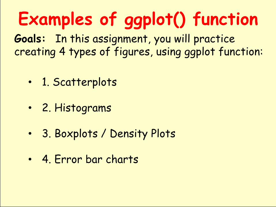
3a. Boxplots with ggplot()➢ Make boxplots of males / females using the
Day1 data from the MusicFestival dataset.
festivalBoxplot <- ggplot(festival, aes(gender, day1))
• This command creates box plot object for day1:
• To print the figure, you need to add a layer with a visual element to the boxplot object.
festivalBoxplot + geom_boxplot() +
labs(x = "Gender", y = "Hygiene (Day 1 of Festival)")
3a. Boxplots with ggplot()➢ Make a boxplof of day1 data by gender
3b. Density plot with ggplot()➢ Make density plots of males / females using
the Day1 data from the MusicFestival dataset.
festivalDensity <- ggplot(festival, aes(day1))
• This command creates density plot object for day1:
• To print the figure, you need to add a layer with a visual element to the boxplot object.
festivalDensity + geom_density() +
labs(x = "Hygiene (Day 1)”, y = “Density Estimate”)

3b. Density plots with ggplot()➢ Make a density plof of day1

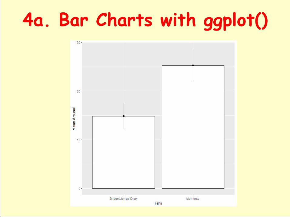
4a. Bar Charts with ggplot()➢ Load the ChickFlick.xlsx dataset, which involves
the following data (1 dependent variable and 2 independent variables: movie and gender):
• Question: Is there such a thing as a ‘chick flick’?• Participants:
– 20 men– 20 women
• Half of each sample saw one of two films:– A ‘chick flick’ (Bridget Jones’s Diary), – A control film (Memento).
• Outcome measure– Physiological arousal as an indicator of how much they
enjoyed the film.

4a. Bar Charts with ggplot()➢ First, make bar of mean arousal score (y-axis) for
each film (x-axis), combining male / female data)
bar <- ggplot(chickFlick, aes(film, arousal))
➢ To add the mean displayed as bars, we add a layer to bar using the stat_summary() function:
+ bar + stat_summary(fun.y = mean, geom = "bar", fill = "White", colour = "Black“)
➢ NOTE: the bars are white with a black outline

4a. Bar Charts with ggplot()

4a. Bar Charts with ggplot()➢ Next, add 95% confidence intervals to the bars:
+ stat_summary(fun.data = mean_cl_normal, geom = "pointrange")
➢ Finally, add labels to the graph using lab():
+ labs(x = "Film", y = "Mean Arousal")
➢ The overall command is as follows:
bar + stat_summary(fun.y = mean, geom = "bar", fill = "White", colour = "Black") + stat_summary(fun.data = mean_cl_normal, geom = "pointrange") + labs(x = “Film", y = "Mean Arousal")
4a. Bar Charts with ggplot()

4b. Bar Charts with ggplot()
➢ Finally, make bar graph of mean arousal score (y-axis) for the two genders (x-axis), combining both films).
Makethe same plot, with 95% CI error bars.

4c. Bar Charts with ggplot()➢ First, make bar of mean arousal score (y-axis)
for each film and gender (x-axis)
bar <- ggplot(chickFlick, aes(film, arousal, fill = gender))
➢ To add the error bars and the legend, use this:
bar + stat_summary(fun.y = mean, geom = "bar", position="dodge") + stat_summary(fun.data = mean_cl_normal, geom = "errorbar", position = position_dodge(width = 0.90), width = 0.2) + labs(x = "Film", y = "Mean Arousal", fill = "Gender")
➢ NOTE: the bars are the default colors (red / blue)

4c. Bar Charts with ggplot()➢ Bar graph of
mean arousal score (y-axis) with 95% CI for each film and gender combination (x-axis)
➢ NOTE: bars are the default colors (red / blue)

4d. Bar Charts with ggplot()➢ Bar graph of
mean arousal score (y-axis) with 95% CI for each film and gender combination (x-axis)
➢ NOTE: bars are the default colors (red / blue)

Graphs with R Package ggplot2 References:
https://cran.rproject.org/web/packages/ggplot2/ggplot2.pdf
http://ggplot2.org/
Other Resources:
You might also find the following presentations useful:
ggplot2: past, present and future.
ggplot2 workshop given at Vanderbilt, 2007. (r code)