Fooled by beautiful data: Visualization aesthetics bias trust in ...
46
1 Fooled by beautiful data: Visualization aesthetics bias trust in science, 1 news, and social media 2 Authors: Chujun Lin * , Mark Thornton 3 Affiliations: 4 Department of Psychological and Brain Sciences, Dartmouth College; Hanover, NH, USA. 5 * Corresponding author. Email: [email protected] 6 7
-
Upload
khangminh22 -
Category
Documents
-
view
0 -
download
0
Transcript of Fooled by beautiful data: Visualization aesthetics bias trust in ...
1
Fooled by beautiful data: Visualization aesthetics bias trust in science, 1
news, and social media 2
Authors: Chujun Lin*, Mark Thornton 3
Affiliations: 4
Department of Psychological and Brain Sciences, Dartmouth College; Hanover, NH, USA. 5
* Corresponding author. Email: [email protected] 6
7
2
Abstract: Scientists, policymakers, and the public increasingly rely on data visualizations – such 1
as COVID tracking charts, weather forecast maps, and political polling graphs – to inform 2
important decisions. The aesthetic decisions of graph-makers may produce graphs of varying 3
visual appeal, independent of data quality. Here we tested whether the beauty of a graph 4
influences how much people trust it. Across three studies, we sampled graphs from social media, 5
news reports, and scientific publications, and consistently found that graph beauty predicted 6
trust. In a fourth study, we manipulated both the graph beauty and misleadingness. We found that 7
beauty, but not actual misleadingness, causally affected trust. These findings reveal a source of 8
bias in the interpretation of quantitative data and indicate the importance of promoting data 9
literacy in education. 10
One-Sentence Summary: Four preregistered studies show that beauty increases trust in graphs 11
from scientific papers, news, and social media. 12

3
Data are reshaping every aspect of human life: consumers buy products guided by online 1
reviews, drivers navigate to novel places relying on satellite data, and governments design cities 2
based on local activity patterns. The explosion of big data calls for tools that digest and interpret 3
data to better inform decision making. Among these tools are data visualizations, such as charts 4
of COVID cases, weather forecasts, stock prices, and election outcomes. The popularity of data 5
visualization has given rise to specialized platforms on social media (e.g., the “Data Is Beautiful” 6
community on Reddit), revolutions in journalism (e.g., visual and data journalism), and new 7
disciplines in universities (e.g., doctorates in data visualization). How might data visualizations 8
influence whether people trust what they see on social media, the news, and in scientific articles? 9
Converting quantitative data into graphical visualizations requires making many decisions, such 10
as choosing what statistics in the data to visualize (e.g., mean, trend, correlation), what types of 11
graphs to use (e.g., bar, line, map), and how to aesthetically style the figure. Good choices make 12
it easier for readers to understand the data (1–3), whereas bad choices lead to confusion and 13
inaccessibility (4–9). For instance, poor color choices such as pairing red and green can hinder 14
people with color-vision deficits from extracting useful information from graphs (5, 10). 15
Aesthetic decisions influence not only the legibility of a graph, but also its visual appeal, or 16
beauty. Choices such as color palette, spacing, font type, shape, and outlining can all influence 17
whether a graph is perceived as beautiful or ugly, independent of the quality of the underlying 18
data or how accurately the graph reflects those data. Recent advances in visualization methods 19
have substantially enhanced people’s ability to produce beautiful graphs and lowered the 20
technical barriers to doing so (11–13). 21
Many regard beauty as irrelevant to the interpretation of graphs (14–16). However, others have 22
noted the power that aesthetically appealing figures can have, both for good and ill (17, 18). For 23
4
instance, some have speculated that graph beauty may bias the scientific review process and 1
cause reviewers and editors to miss substantive flaws in research. There is good reason to believe 2
that this might be true: psychological research indicates that people are susceptible to a bias 3
known as the “halo effect” – and more specifically, the “beauty-is-good” stereotype (19). These 4
refer to people’s tendency to overgeneralize from one good feature of a person to other, unrelated 5
features. For example, people often believe that the individuals that they perceive as beautiful are 6
also trustworthy and intelligent, without any direct evidence (20–23). If this bias extends to data 7
visualizations, then we would expect that people will trust graphs more when they are more 8
beautiful, regardless of the quality of the data or whether the graph accurately portrays them. 9
Here we test the hypothesis that the beauty of data visualizations influences how much people 10
trust them. We first examined the correlation between perceived beauty and trust in graphs. To 11
maximize the generalizability and external validity of our findings, we systematically sampled 12
graphs (Fig. 1) of diverse types and topics (Fig. 2) from the real world. These graphs spanned a 13
wide range of domains, including social media (Study 1), news reports (Study 2), and scientific 14
publications (Study 3). We asked participants how beautiful they thought the graphs looked and 15
how much they trusted the graphs. We also measured how much participants found the graphs 16
interesting, understandable, surprising, and negative, to control for potential confounds (Fig. 17
3A). In addition to predicting trust ratings, we also examined whether participants’ beauty 18
ratings predicted real-world impact. We measured impact using indices including the number of 19
comments the graphs received on social media, and the number of citations the graphs’ 20
associated papers had. Finally, we tested the causal effect of graph beauty on trust by generating 21
graphs using arbitrary data (Study 4). We orthogonally manipulated both the beauty and the 22
actual misleadingness of these graphs and measured how these manipulations affected trust. 23
5
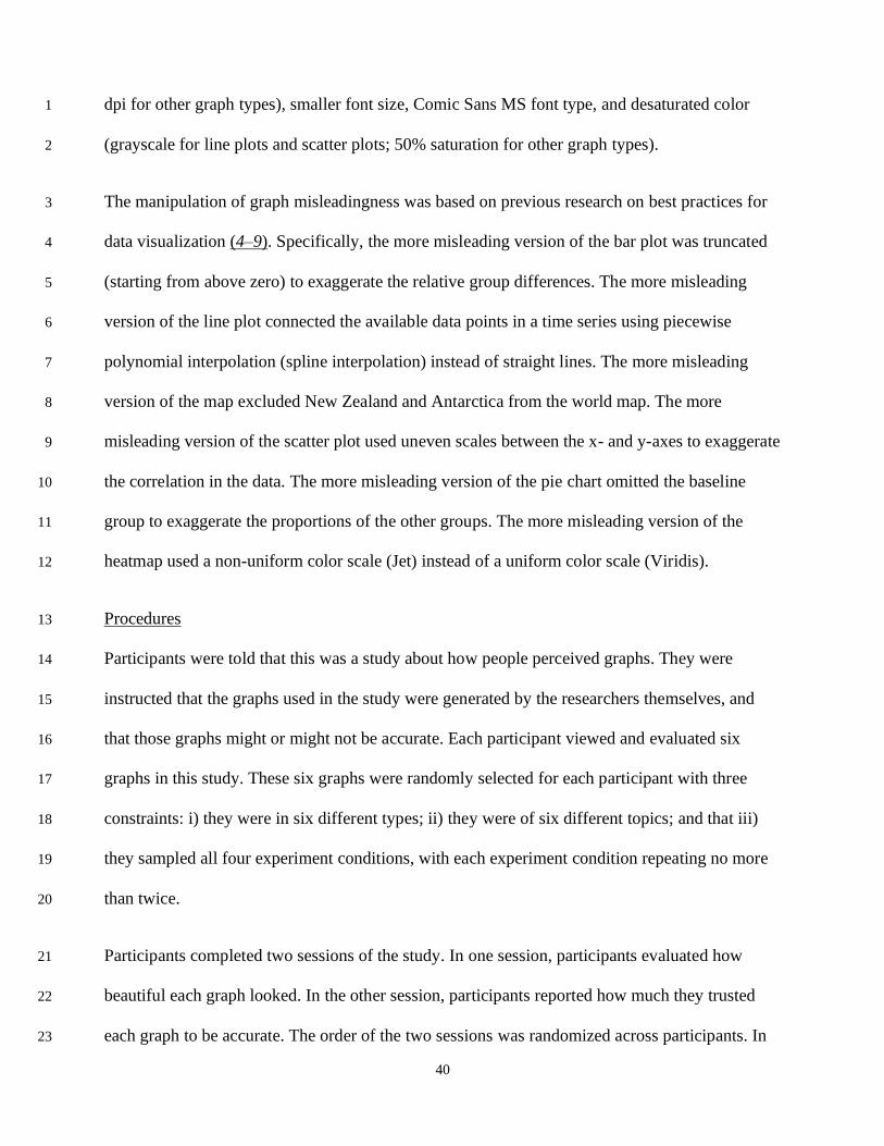
1
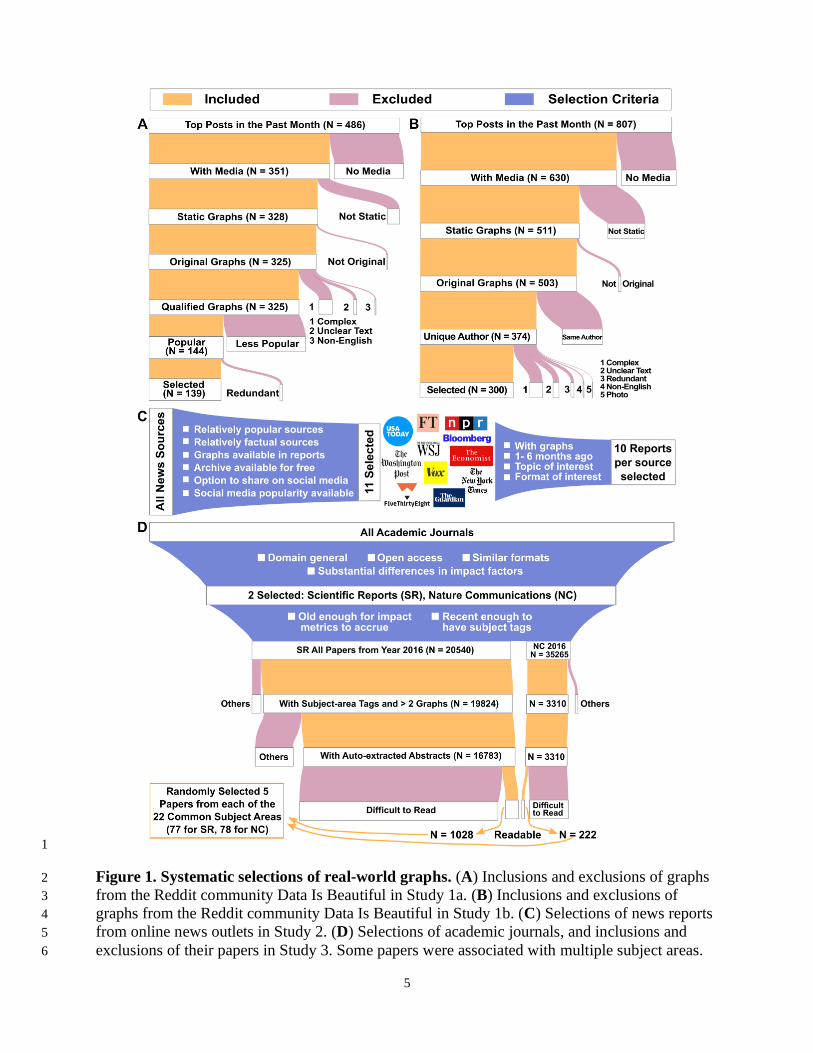
Figure 1. Systematic selections of real-world graphs. (A) Inclusions and exclusions of graphs 2
from the Reddit community Data Is Beautiful in Study 1a. (B) Inclusions and exclusions of 3
graphs from the Reddit community Data Is Beautiful in Study 1b. (C) Selections of news reports 4
from online news outlets in Study 2. (D) Selections of academic journals, and inclusions and 5
exclusions of their papers in Study 3. Some papers were associated with multiple subject areas. 6
6
1
7
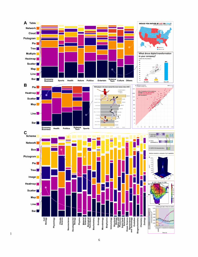
Figure 2. Types and topics of real-world graphs in Studies 1-3. (A) Types and topics of the 1
439 graphs in Study 1 (left; including 139 graphs in Study 1a and 300 graphs in Study 1b) and 2
two examples of the graphs (right). (B) Types and topics of the 110 graphs in Study 2 (left) and 3
two examples of the graphs (right). (C) Types and subject areas of the 310 graphs in Study 3 4
(left). Most graphs included multiple panels; four examples of the panels are shown (right). 5
Some of these examples (their papers) were associated with multiple subject areas; only one 6
subject area is indicated here for simplicity. 7
Results 8
Beauty correlates with trust across domains 9
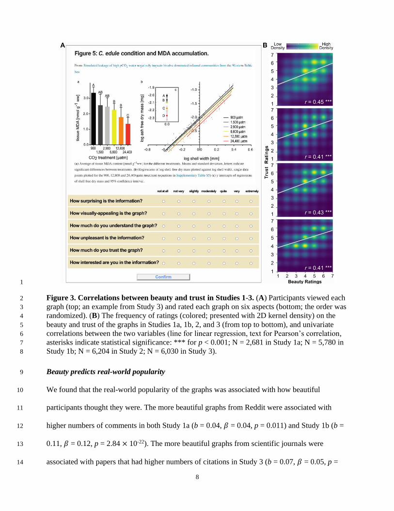
We found that participants’ trust in graphs was associated with how beautiful participants 10
thought the graphs looked for graphs across all three domains (Fig. 3B): social media posts on 11
Reddit (Pearson’s r = 0.45, p = 4.15 × 10-127 in Study 1a; r = 0.41, p = 3.28 × 10-231 in Study 12
1b), news reports (r = 0.43, p = 1.14 × 10-278 in Study 2), and scientific papers (r = 0.41, p = 6.55 13
× 10-234 in Study 3). These findings indicate that, across diverse contents and sources of the 14
graphs, perceived beauty and trust in graphs are reliably correlated in the minds of perceivers. 15
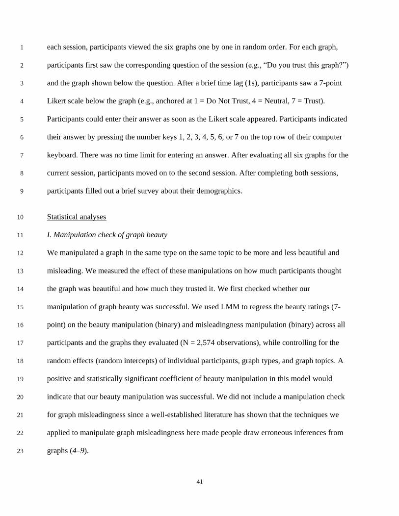
The association between beauty and trust remained robust when controlling for factors that might 16
influence both perceived beauty and trust, including how much participants thought the graphs 17
were interesting, understandable, surprising, and negative (linear mixed modeling: b = 0.19, 18
standardized 𝛽 = 0.22, p = 1.05 × 10⁻³⁰ in Study 1a; b = 0.14, 𝛽 = 0.16, p = 8.81 × 10-46 in 19
Study 1b; b = 0.14, 𝛽 = 0.15, p = 5.35 × 10⁻³⁵ in Study 2; b = 0.10, 𝛽 = 0.12, p = 1.85 × 10⁻²⁵ in 20
Study 3; see Fig. S1 for the coefficients of covariates). These findings indicate that beautiful 21
visualizations predict increased trust even when controlling for the effects of interesting topics, 22
understandable presentation, confirmation bias, and negativity bias. 23
8
1
Figure 3. Correlations between beauty and trust in Studies 1-3. (A) Participants viewed each 2
graph (top; an example from Study 3) and rated each graph on six aspects (bottom; the order was 3
randomized). (B) The frequency of ratings (colored; presented with 2D kernel density) on the 4
beauty and trust of the graphs in Studies 1a, 1b, 2, and 3 (from top to bottom), and univariate 5
correlations between the two variables (line for linear regression, text for Pearson’s correlation, 6
asterisks indicate statistical significance: *** for p < 0.001; N = 2,681 in Study 1a; N = 5,780 in 7
Study 1b; N = 6,204 in Study 2; N = 6,030 in Study 3). 8
Beauty predicts real-world popularity 9
We found that the real-world popularity of the graphs was associated with how beautiful 10
participants thought they were. The more beautiful graphs from Reddit were associated with 11
higher numbers of comments in both Study 1a (b = 0.04, 𝛽 = 0.04, p = 0.011) and Study 1b (b = 12
0.11, 𝛽 = 0.12, p = 2.84 × 10⁻²²). The more beautiful graphs from scientific journals were 13
associated with papers that had higher numbers of citations in Study 3 (b = 0.07, 𝛽 = 0.05, p = 14
9
0.001; but not higher numbers of views, b = 0.03, 𝛽 = 0.02, p = 0.264). The association between 1
the perceived beauty of a paper’s graphs and the paper’s number of citations remained robust 2
when controlling for the paper’s publication date and how much participants thought the graphs 3
were interesting, understandable, surprising, and negative (b = 0.05, 𝛽 = 0.04, p = 0.005). These 4
findings suggest that people’s bias in favor of trusting beautiful graphs has real-world 5
consequences. 6
We did not find evidence that the more beautiful graphs from news reports were associated with 7
higher real-world popularity in Study 2 (b = 0.04, 𝛽 = 0.02, p = 0.074). This null result may be 8
due to the estimation of popularity: we approximated the news reports’ popularity using the 9
counts of comments, shares, and likes about the news reports on four social media platforms 10
(Facebook, Twitter, Pinterest, Reddit) tracked by a third-party app instead of the news sources 11
themselves. These counts were likely noisy and incomplete. 12
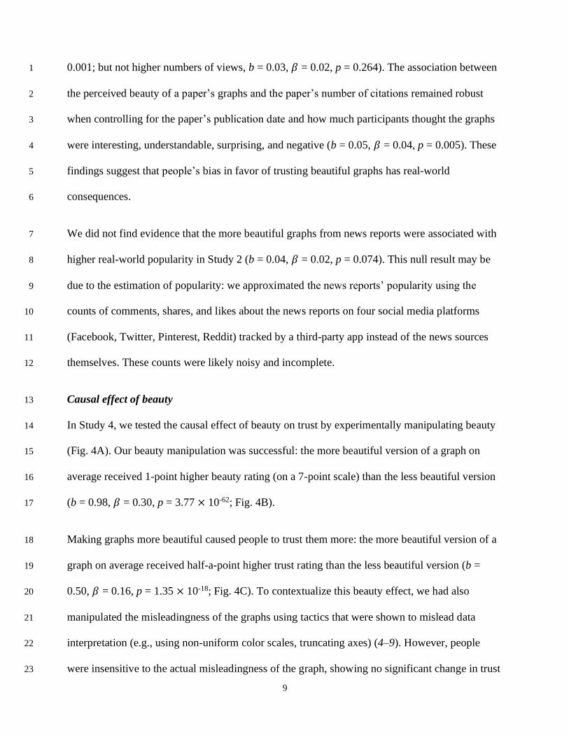
Causal effect of beauty 13
In Study 4, we tested the causal effect of beauty on trust by experimentally manipulating beauty 14
(Fig. 4A). Our beauty manipulation was successful: the more beautiful version of a graph on 15
average received 1-point higher beauty rating (on a 7-point scale) than the less beautiful version 16
(b = 0.98, 𝛽 = 0.30, p = 3.77 × 10-62; Fig. 4B). 17
Making graphs more beautiful caused people to trust them more: the more beautiful version of a 18
graph on average received half-a-point higher trust rating than the less beautiful version (b = 19
0.50, 𝛽 = 0.16, p = 1.35 × 10⁻¹⁸; Fig. 4C). To contextualize this beauty effect, we had also 20
manipulated the misleadingness of the graphs using tactics that were shown to mislead data 21
interpretation (e.g., using non-uniform color scales, truncating axes) (4–9). However, people 22
were insensitive to the actual misleadingness of the graph, showing no significant change in trust 23
10
due to this manipulation (b = -0.07, 𝛽 = -0.02, p = 0.233; Fig. 4C). The magnitude of the causal 1
effect of graph beauty on trust was significantly greater than the magnitude of the effect of graph 2
misleadingness (∆|b| = 0.43, 95% CI = [0.27, 0.58]; ∆|𝛽| = 0.14, 95% CI = [0.09, 0.19]). These 3
findings support a causal interpretation of the correlations observed in Studies 1-3, indicating 4
that graph beauty is indeed responsible for increasing trust. 5
The misleadingness manipulation (Fig. 4A) had a weak effect on the perceived beauty of the 6
graphs (b = -0.12, 𝛽 = -0.03, p = 0.034). We therefore also analyzed the association between 7
trust and the perceived beauty of the graphs as reported by the participants. Results further 8
supported the association between trust in graphs and the graphs’ perceived beauty (b = 0.26, 𝛽 = 9
0.29, p = 5.57 × 10-40). 10
11
Figure 4. Causal effects of beauty on trust in Study 4. (A) Manipulations of an example graph 12
of a specific type and topic in four experimental conditions. (B) Manipulation check of beauty. 13
11
Linear mixed model regression of beauty ratings (7-point Likert scale) on beauty manipulations 1
(binary), while controlling for the manipulations of misleadingness and the random effects of 2
participants, graph types, and graph topics (N = 2,574 observations). (C) Causal effects of beauty 3
and misleadingness. Linear mixed model regression of trust ratings (7-point Likert scale) on 4
beauty and misleadingness manipulations (binary), while controlling for the random effects of 5
participants, graph types, and graph topics (N = 2,574 observations). 6
Weak moderation by education 7
We found weak evidence that education moderates the association between trust in graphs and 8
how much participants thought the graphs were beautiful in Study 1b (𝛽 = 0.025, p = 0.013). 9
This finding suggests that people who are more educated may be more susceptible to perceiving 10
beautiful graphs as trustworthy. However, in all other studies, the moderation effect of education 11
was not significant (𝛽 = 0.002, p = 0.884 in Study 1a; 𝛽 = 0.013, p = 0.217 in Study 2; 𝛽 = -12
0.002, p = 0.931 in Study 4; not tested in Study 3 since all participants were required to be 13
college graduates). Education did not moderate the causal effect of beauty on trust in Study 4 14
either (𝛽 = -0.034, p = 0.057). But participants with higher education tended to rate all graphs as 15
looking more beautiful (𝛽 = 0.068, p = 0.012). These findings suggest that receiving more 16
overall education does not alleviate people’s trust bias in favor of beautiful graphs; worse yet, 17
more education may even exacerbate this bias in some cases. 18
We also tested the moderation effect of other factors, including political affiliation and 19
personality (agreeableness and conscientiousness) for graphs from news reports in Study 2. None 20
of these factors had a significant moderation effect (𝛽 = 0.01, p = 0.500 for political affiliation; 𝛽 21
= -0.01, p = 0.181 for agreeableness; 𝛽 = 0.02, p = 0.063 for conscientiousness). These results 22
indicate that the extent to which an individual perceives more beautiful graphs as more 23
trustworthy is not influenced by whether the individual is republican or democrat, agreeable or 24
critical, and conscientious or careless. 25

12
Discussion 1
This investigation characterized the relationship between the beauty of data visualizations and 2
how much people trust them. We found that the more beautiful people perceived a graph to be, 3
the more they trusted it (Fig. 3B). This association was robust across graphs of diverse content, 4
including entertaining topics on social media (Fig. 2A), news on business, politics, health, 5
technology, and sports (Fig. 2B), and sophisticated scientific findings across a range of 6
disciplines (Fig. 2C). The effect sizes were large and highly consistent across studies, explaining 7
16% to 20% of the variance in trust (Fig. 3B). Critically, we showed that this association was 8
causal: visualizing the same data in a more beautiful way caused people to trust it more (Fig. 9
4C). These findings indicate that decisions about visualization aesthetics influence people’s 10
interpretation of the data. People trust the information more when presented in a more beautiful 11
way. 12
Two mechanisms may underlie this bias. First, perceiving more beautiful graphs as more 13
trustworthy may be an overgeneralization of the beauty-is-good stereotype. This stereotype was 14
originally discovered in how people perceive other people (19). It describes the common belief 15
that physically attractive people also have other positive social attributes such as more 16
trustworthy and friendlier (20, 24). People are also influenced by this stereotype when evaluating 17
non-human objects. For instance, people associate more beautiful products, packaging, and web 18
pages with better performance (25–27). The trust bias in favor of more beautiful graphs found 19
here may be another manifestation of the beauty-is-good stereotype. 20
A second, non-mutually exclusive, explanation suggests that this apparent bias may be rooted in 21
rational thinking. More beautiful graphs may indicate that the data is of higher quality and that 22
the graph maker is more skillful (28). However, our results suggest that this reasoning may not 23

13
be accurate. It does not require sophisticated techniques to make beautiful graphs: we reliably 1
made graphs look more beautiful simply by increasing their resolution and color saturation, and 2
using a legible, professional font (Fig. 4A-B). Findings from the real-world graphs (Studies 1-3) 3
also suggest that one could make a very basic graph such as a bar plot look very beautiful (Fig. 4
S2F). Visual inspection of the more and less beautiful real-world graphs suggests that people 5
perceive graphs with more colors (e.g., rainbow colors), shapes (e.g., cartoons, abstract shapes), 6
and meaningful text (e.g., a title explaining the meaning of the graph) as more beautiful. It also 7
does not require high quality data to make a beautiful graph either: we generated graphs that 8
were perceived as beautiful using arbitrary data (Fig. 4B). Therefore, our findings highlight that 9
the beauty of a graph may not be an informative cue for its quality. Even if beauty was correlated 10
with actual data quality in the real-world, this would be a dangerous and fallible heuristic to rely 11
upon for evaluating research and media. 12
Importantly, we showed that the trust bias in favor of beautiful graphs predicted behaviors in the 13
real world. Internet users were more likely to comment on social media posts that contained 14
more beautiful graphs (Study 1). This behavioral tendency may accelerate the circulation of less 15
credible but more beautifully presented information on the internet, which may in turn exerts a 16
greater influence on public opinions. We also found that publications containing more beautiful 17
graphs were associated with a higher number of citations across a range of disciplines (Study 3). 18
Although we cannot verify whether papers with more beautiful graphs were more scientifically 19
sound, this finding suggests that researchers may be biased by appealing data visualizations 20
when evaluating the scientific merit of a study (18). 21
These findings highlight the need to educate both the general public and the scientific 22
community on data visualizations (29). Our findings suggest that current curricula may not be 23
14
addressing this need: we found that higher levels of education did not reduce people’s trust bias 1
in favor of beautiful graphs in most studies, and that education increased this bias in one study. 2
These findings call for updates in course materials to foster better skills in interpreting data 3
visualizations. Some colleges and universities have already added courses and degrees in data 4
visualizations. However, given the ubiquity of data visualizations in everyday life, it will be 5
helpful to promote data literacy from an earlier stage, such as high school (30). These updated 6
course materials may also cover misleading visualization techniques, as our results suggest that 7
people are much less sensitive to misleading visualization techniques than the beauty of the 8
graphs (Fig. 4C). 9
In addition to educating the public to consume data visualizations, we must continue to better 10
educate practitioners to create them. This education should focus on inclusivity, in two different 11
senses. First, practitioners should be trained to make graphs as accessible as possible. For 12
instance, even though “rainbow” color schemes arguably make graphs more visually appealing, 13
they exclude people with color-visual deficits from fully understanding the data (5, 31, 32). We 14
encourage data visualization practitioners to educate themselves on inclusive practices (e.g., 15
larger font size for population with visual impairments) and not to trade inclusion for beauty. The 16
other sense of inclusivity concerns the accessibility of data visualization tools (33). There are 17
many existing software tools for generating rigorous and appealing graphs that are freely 18
accessible in various programming languages (2). However, learning to use these tools is far 19
from trivial, and not all practitioners may have equal opportunity to acquire the requisite skills. 20
Free online courses that keep practitioners up to date with these tools may promote more 21
uniformly beautiful, accurate, and understandable visualizations across domains. 22
15
We tried to maximize the generalizability of our findings by sampling diverse graphs from the 1
real world. However, three limitations constrain our conclusions. First, all participants were 2
recruited online in the United States. They were not representative of the U.S. population or 3
humans in general. That said, this limitation may have less of an impact on the generalizability of 4
our findings than on other social science research (34, 35) because the populations that were not 5
included in our samples (e.g., people without internet access) are by the same token also less 6
likely to be exposed to data visualizations in the course of everyday life. In other words, internet 7
users are not only convenient subjects – they are also a population of particular interest for this 8
research. Second, our participants ranged from those who had less than high school education to 9
some who had graduate degrees. However, we did not specifically sample scientists or other data 10
visualizations experts. As a result, our present data cannot determine whether professional 11
training in data visualizations could override people’s bias in favor of beautiful graphs, or at least 12
make them relatively more sensitive to actively misleading graphs. Finally, in all studies, we 13
presented graphs with minimal contextual information, such as the titles and abstracts of 14
scientific articles. It remains an open question how much people may be biased by the beauty of 15
data visualizations when they know the sources of the graphs or read the full media posts and 16
research articles. For example, on Reddit, popular (and hence highly visible) comments often call 17
out poor data visualization practices. Readers who check these comments may have their beauty 18
bias somewhat deflated, relative to seeing the graph in isolation. 19
Altogether, the present investigation demonstrates that people perceive more beautiful graphs as 20
more trustworthy across a wide range of sources, topics, and graph types. These findings identify 21
a common bias that may influence public trust in science, news, and social media. There are 22
likely other factors that bias people’s interpretation of data, such as visualizations represent 23
uncertainty. For instance, people viewing a hurricane forecast might misinterpret the uncertainty 24
16
region around the storm’s path as a representation of its size. Future research should seek to fully 1
characterize the major biases influencing the interpretation of data visualizations. The current 2
study presents a systematic approach for estimating such biases with high external and internal 3
validity. We hope that others can adapt this approach to characterize other ways in which people 4
(mis)interpret graphs. By doing so, the field can develop a comprehensive understanding of the 5
psychology of data visualizations and generate strategies that help people better navigate today’s 6
big data world. 7
References 8
1. S. L. Franconeri, L. M. Padilla, P. Shah, J. M. Zacks, J. Hullman, The Science of Visual 9
Data Communication: What Works. Psychol Sci Public Interest. 22, 110–161 (2021). 10
2. E. Hehman, S. Y. Xie, Doing Better Data Visualization. Advances in Methods and 11
Practices in Psychological Science. 4, 1–18 (2021). 12
3. P. Dragicevic, Y. Jansen, Blinded with Science or Informed by Charts? A Replication 13
Study. IEEE Transactions on Visualization and Computer Graphics. 24, 781–790 (2018). 14
4. E. A. Allen, E. B. Erhardt, V. D. Calhoun, Data Visualization in the Neurosciences: 15
Overcoming the Curse of Dimensionality. Neuron. 74, 603–608 (2012). 16
5. F. Crameri, G. E. Shephard, P. J. Heron, The misuse of colour in science communication. 17
Nat Commun. 11, 5444 (2020). 18
6. G. Jones, How to lie with charts (LaPuerta, Santa Monica, CA, ed. 2nd, 2006). 19
7. C. Lauer, S. O’Brien, How People Are Influenced by Deceptive Tactics in Everyday Charts 20
and Graphs. IEEE Transactions on Professional Communication. 63, 327–340 (2020). 21
8. A. V. Pandey, K. Rall, M. L. Satterthwaite, O. Nov, E. Bertini, How Deceptive are 22
Deceptive Visualizations?: An Empirical Analysis of Common Distortion Techniques. 23
Proceedings of the 33rd Annual ACM Conference on Human Factors in Computing 24
Systems, 1469–1478 (2015). 25
9. B. W. Yang, C. Vargas Restrepo, M. L. Stanley, E. J. Marsh, Truncating Bar Graphs 26
Persistently Misleads Viewers. Journal of Applied Research in Memory and Cognition. 10, 27
298–311 (2021). 28
10. M. Geissbuehler, T. Lasser, How to display data by color schemes compatible with red-29
green color perception deficiencies. Opt. Express, OE. 21, 9862–9874 (2013). 30
17
11. A. Tareen, J. B. Kinney, Logomaker: beautiful sequence logos in Python. Bioinformatics. 1
36, 2272–2274 (2020). 2
12. R. L. Barter, B. Yu, Superheat: An R package for creating beautiful and extendable 3
heatmaps for visualizing complex data. J Comput Graph Stat. 27, 910–922 (2018). 4
13. K. Theys, P. Lemey, A.-M. Vandamme, G. Baele, Advances in Visualization Tools for 5
Phylogenomic and Phylodynamic Studies of Viral Diseases. Frontiers in Public Health. 7, 6
208 (2019). 7
14. A. Lau, A. Vande Moere, Towards a Model of Information Aesthetics in Information 8
Visualization. 2007 11th International Conference Information Visualization (IV ’07), 87–9
92 (2007). 10
15. G. Judelman, Aesthetics and inspiration for visualization design: bridging the gap between 11
art and science. Proceedings. Eighth International Conference on Information 12
Visualisation, 2004. IV 2004., 245–250 (2004). 13
16. L. Harrison, K. Reinecke, R. Chang, Infographic Aesthetics: Designing for the First 14
Impression. Proceedings of the 33rd Annual ACM Conference on Human Factors in 15
Computing Systems, 1187–1190 (2015). 16
17. G. Ertug, M. Gruber, A. Nyberg, H. K. Steensma, From the Editors—A Brief Primer on 17
Data Visualization Opportunities in Management Research. AMJ. 61, 1613–1625 (2018). 18
18. S. Seifirad, V. Haghpanah, Letter to the editor: Clothes Do Not Make the Man: Well-19
favored Figures are Game-changers in the Biomedical Publication. Journal of Korean 20
Medical Science. 30, 1713–1713 (2015). 21
19. K. Dion, E. Berscheid, E. Walster, What is beautiful is good. Journal of personality and 22
social psychology. 24, 285 (1972). 23
20. I. Bascandziev, P. L. Harris, In beauty we trust: Children prefer information from more 24
attractive informants. British Journal of Developmental Psychology. 32, 94–99 (2014). 25
21. B. W. Darby, D. Jeffers, THE EFFECTS OF DEFENDANT AND JUROR 26
ATTRACTIVENESS ON SIMULATED COURTROOM TRIAL DECISIONS. soc behav 27
pers. 16, 39–50 (1988). 28
22. F. R. Moore, D. Filippou, D. I. Perrett, Intelligence and attractiveness in the face: Beyond 29
the attractiveness halo effect. Journal of Evolutionary Psychology. 9, 205–217 (2011). 30
23. L. A. Zebrowitz, J. M. Montepare, Social Psychological Face Perception: Why Appearance 31
Matters. Soc Personal Psychol Compass. 2, 1497 (2008). 32
24. N. Zhao, M. Zhou, Y. Shi, J. Zhang, Face Attractiveness in Building Trust: Evidence from 33
Measurement of Implicit and Explicit Responses. soc behav pers. 43, 855–866 (2015). 34
18
25. A. Sundar, E. S. Cao, K. A. Machleit, How product aesthetics cues efficacy beliefs of 1
product performance. Psychology & Marketing. 37, 1246–1262 (2020). 2
26. Y.-M. Li, Y.-S. Yeh, Increasing trust in mobile commerce through design aesthetics. 3
Computers in Human Behavior. 26, 673–684 (2010). 4
27. C. Crolic, Y. Zheng, J. Hoegg, J. W. Alba, The Influence of Product Aesthetics on 5
Consumer Inference Making. Journal of the Association for Consumer Research. 4, 398–6
408 (2019). 7
28. J. Steele, N. Iliinsky, Beautiful Visualization: Looking at Data through the Eyes of Experts - 8
Julie Steele, Noah Iliinsky - Google Books (O’Reilly Media, Inc., 2010). 9
29. S. L. Franconeri, Three Perceptual Tools for Seeing and Understanding Visualized Data. 10
Curr Dir Psychol Sci. 30, 367–375 (2021). 11
30. K. Börner, A. Bueckle, M. Ginda, Data visualization literacy: Definitions, conceptual 12
frameworks, exercises, and assessments. Proc Natl Acad Sci USA. 116, 1857–1864 (2019). 13
31. A. Light, P. J. Bartlein, The end of the rainbow? Color schemes for improved data graphics. 14
Eos, Transactions American Geophysical Union. 85, 385–391 (2004). 15
32. K. Moreland, Why We Use Bad Color Maps and What You Can Do About It. Electronic 16
Imaging. 2016, 1–6 (2016). 17
33. G. Reina, H. Childs, K. Matković, K. Bühler, M. Waldner, D. Pugmire, B. Kozlíková, T. 18
Ropinski, P. Ljung, T. Itoh, E. Gröller, M. Krone, The moving target of visualization 19
software for an increasingly complex world. Computers & Graphics. 87, 12–29 (2020). 20
34. E. Jolly, L. J. Chang, The Flatland Fallacy: Moving Beyond Low–Dimensional Thinking. 21
Topics in Cognitive Science. 11, 433–454 (2019). 22
35. S. A. Nastase, A. Goldstein, U. Hasson, Keep It Real: Rethinking the Primacy of 23
Experimental Control in Cognitive Neuroscience. NeuroImage. 222, 117254 (2020). 24
36. L. Litman, J. Robinson, T. Abberbock, TurkPrime.com: A Versatile Crowdsourcing Data 25
Acquisition Platform for the Behavioral Sciences. Behav Res. 49, 433–442 (2017). 26
37. T. Schäfer, M. A. Schwarz, The Meaningfulness of Effect Sizes in Psychological Research: 27
Differences Between Sub-Disciplines and the Impact of Potential Biases. Front. Psychol. 28
10 (2019), doi:10.3389/fpsyg.2019.00813. 29
30
31
19
Acknowledgments: We thank Sasha Brietzke, Tessa Rusch, Lindsey Tepfer, Landry Bulls, and 1
Caroline Conway for their assistance. 2
Author contributions: 3
Conceptualization: CL, MT 4
Study Design: CL, MT 5
Material Preparation: CL 6
Data Collection: CL 7
Data Analysis: CL 8
Supervision: MT 9
Funding acquisition: MT 10
Writing – original draft: CL 11
Writing – review & editing: CL, MT 12
Competing interests: Authors declare that they have no competing interests. 13
Data and materials availability: All data, code, and materials used in the analysis are 14
available on Open Science Framework: 15
https://osf.io/yutgx/?view_only=b679d0841fd440eb901a28cecf5908b9. 16
Supplementary Materials 17
Materials and Methods 18
Table S1 19
Figs. S1 to S2 20
References (36–37) 21
22

20
1
2
Supplementary Materials for 3
4
Fooled by beautiful data: Visualization aesthetics bias trust in science, 5
news, and social media 6
Chujun Lin*, Mark Thornton 7
Correspondence to: [email protected] 8
9
10
This PDF file includes: 11
Materials and Methods 12
Table S1 13
Figs. S1 to S2 14
References (36–37) 15
16
21
Materials and Methods 1
All studies were pre-registered except for Study 1a. The registrations of methods and planned 2
analyses can be accessed on the Open Science Framework (OSF): 3
https://osf.io/px4mt/?view_only=7641adc103104b15a81d3c46bdf84236 for Study 1b, 4
https://osf.io/p7fsm/?view_only=4f32b6ab90504c278077b5c9c8bcd561 for Study 2, 5
https://osf.io/rgves/?view_only=4735e9c6dfae4bc082afa45c83cb51f0 for Study 3, and 6
https://osf.io/bekz8/?view_only=fc1517e5b85948d48811b93976d66f22 for Study 4. We did not 7
deviate from our planned data collection and analysis methods in any study. We did conduct and 8
report one exploratory analysis – the Pearson correlations between beauty ratings and trust 9
ratings (Fig. 3B). Participants in all studies provided informed consent in a manner approved by 10
the Committee for the Protection of Human Subjects of Dartmouth College. All materials, data, 11
and code can be accessed on OSF: 12
https://osf.io/yutgx/?view_only=b679d0841fd440eb901a28cecf5908b9. 13
Study 1a 14
Participants 15
Participants were recruited from Amazon Mechanical Turk (MTurk) via Cloud Research 16
(formerly known as TurkPrime) (36). We recruited participants based on the following inclusion 17
criteria. Participants were required to be i) aged 18 and older, with ii) normal or corrected-to-18
normal vision, iii) at least high school education, iv) a good performance history on Amazon 19
Mechanical Turk (approval rate ≥ 99%, previous submissions ≥ 50), and v) located in the 20
United States. 21
Study 1a was a pilot study. We recruited 20 participants for each experiment module (in which 22
participants rated one of the seven subsets of graphs; see Materials below). A total of 141 23
22
participants completed our study (58 women, 76 men, 2 non-binary; Age [range = 19 to 70, M = 1
40, SD = 12, ten participants refused to answer]; 107 White, 17 Black, 13 Asian, 4 others). 2
We processed the data according to the following exclusion criteria. A trial was excluded if i) the 3
response time for examining the graph was ≤ 1s; ii) the response time for rating the graph on all 4
five aspects was ≤ 5s; iii) the total response time for examining and rating the graph was ≤ 6s or 5
≥ 160s. A participant was excluded if more than half of their trials were excluded. According to 6
these criteria, n = 166 out of 2,800 trials were excluded, and n = 6 out of N = 141 participants 7
were excluded. The final sample size was 135 participants (see Table S1 for demographics). 8
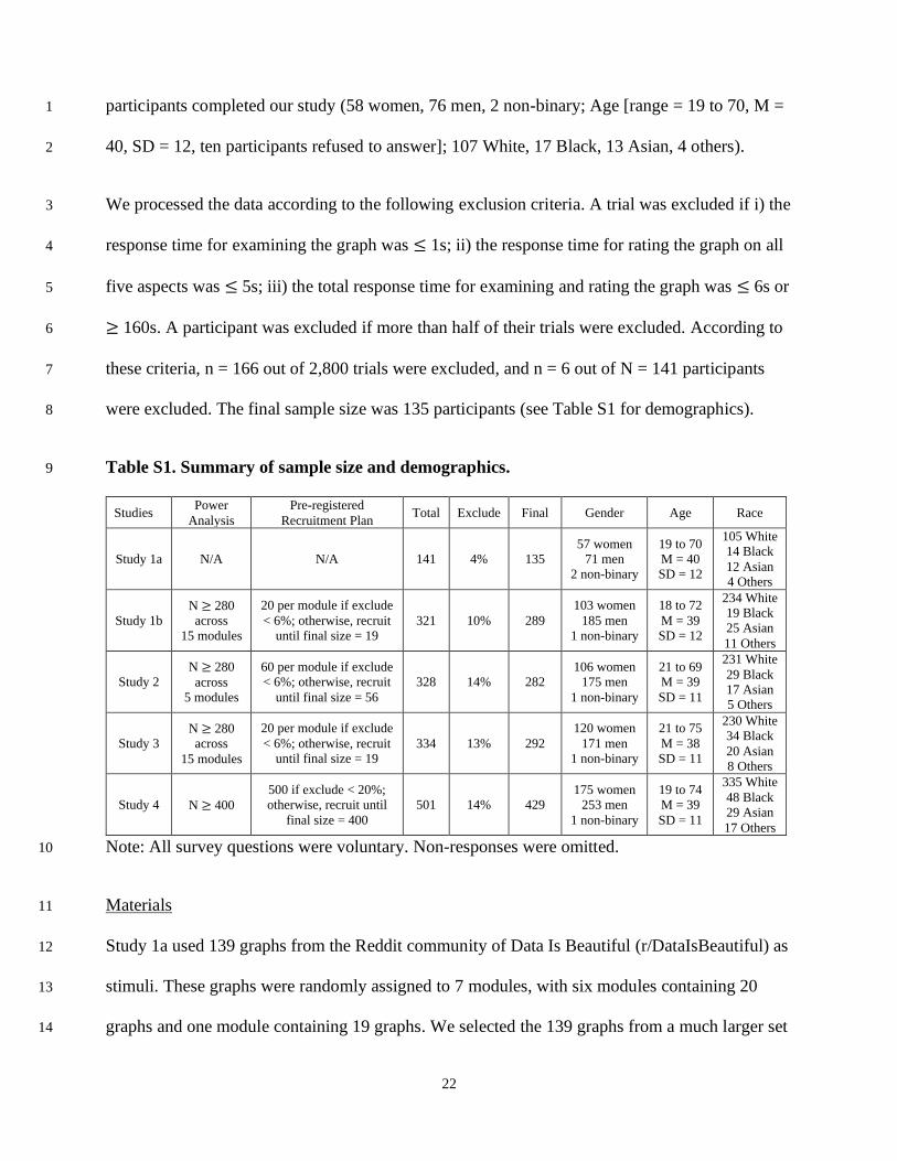
Table S1. Summary of sample size and demographics. 9
Studies Power
Analysis
Pre-registered
Recruitment Plan Total Exclude Final Gender Age Race
Study 1a N/A N/A 141 4% 135
57 women
71 men
2 non-binary
19 to 70
M = 40
SD = 12
105 White
14 Black
12 Asian
4 Others
Study 1b
N ≥ 280
across
15 modules
20 per module if exclude
< 6%; otherwise, recruit
until final size = 19
321 10% 289
103 women
185 men
1 non-binary
18 to 72
M = 39
SD = 12
234 White
19 Black
25 Asian
11 Others
Study 2
N ≥ 280
across
5 modules
60 per module if exclude
< 6%; otherwise, recruit
until final size = 56
328 14% 282
106 women
175 men
1 non-binary
21 to 69
M = 39
SD = 11
231 White
29 Black
17 Asian
5 Others
Study 3
N ≥ 280
across
15 modules
20 per module if exclude
< 6%; otherwise, recruit
until final size = 19
334 13% 292
120 women
171 men
1 non-binary
21 to 75
M = 38
SD = 11
230 White
34 Black
20 Asian
8 Others
Study 4 N ≥ 400 500 if exclude < 20%;
otherwise, recruit until
final size = 400 501 14% 429
175 women
253 men
1 non-binary
19 to 74
M = 39
SD = 11
335 White
48 Black
29 Asian
17 Others
Note: All survey questions were voluntary. Non-responses were omitted. 10
Materials 11
Study 1a used 139 graphs from the Reddit community of Data Is Beautiful (r/DataIsBeautiful) as 12
stimuli. These graphs were randomly assigned to 7 modules, with six modules containing 20 13
graphs and one module containing 19 graphs. We selected the 139 graphs from a much larger set 14

23
based on 9 criteria (Fig. 1A). We i) first included the 486 most popular posts in Data Is Beautiful 1
from Sep-Oct, 2020 by applying the filters “Top” and “This Month”. From these posts, we 2
excluded posts ii) that did not include valid media components, which indicated that no graphs 3
were in these posts; iii) whose media components were not static images, since we only focused 4
on static graphs; and iv) that were not created originally by Reddit users. We extracted the 5
graphs from the remaining posts, and excluded graphs v) that were too complex, such as long 6
graphs that expanded multiple pages; vi) that were not in English; vii) whose text labels were not 7
clear, such as displaying excessive text in illegible font sizes. These selection processes retained 8
291 graphs. Since we targeted around 100 graphs in this pilot study, we further viii) excluded 9
graphs with lower popularity (“upvote” was not above the median), and ix) for graphs depicting 10
the exact same content (e.g., all locations of Costco near the user), included only the most 11
popular one (highest “upvote”). These processes selected the final set of 139 graphs. 12
Procedures 13
Participants were randomly assigned to one of the seven modules. In each module, participants 14
viewed a subset of graphs and evaluated them on five aspects: i) beauty, ii) trust, iii) interest, iv) 15
understanding, and v) surprise. Participants first read the instructions of the task and the 16
definitions of each of these five aspects: i) “How visually-appealing is the graph? That is, how 17
beautiful does the graph look?” ii) “How much do you trust the graph? That is, how much do you 18
believe that the information described by the graph is accurate?” iii) “How interested are you in 19
the topic? That is, how curious or concerned are you about the topic described by the graph?” iv) 20
“How much do you understand the graph? That is, how much do you grasp the information 21
intended to be conveyed by the graph?” v) “How surprising is the graph? That is, how much does 22
the graph describe something you didn’t know before or different from what you believe?” 23
24
In each trial, participants first viewed the title of the Reddit post (from which the graph was 1
extracted). Participants clicked a button when they finished reading the title. Participants then 2
viewed the graph that appeared below the title. Participants clicked a button when they finished 3
examining the graph. Then the five questions appeared below the graph (as in Fig. 3A, except 4
that the question about unpleasantness was not asked in the present study). The order of the five 5
questions was randomized for each trial and each participant. Participants indicated their answer 6
for each question by clicking the radio buttons on a 7-point Likert scale, anchored at 1 = not at 7
all and 7 = extremely. Participants clicked a button to confirm that they had finished answering 8
all questions, and moved on to the next trial. The order of trials (i.e., graphs) was randomized for 9
each participant. After completing all trials, participants filled out a brief survey about their 10
demographics. 11
Statistical analyses 12
I. Association between perceived beauty and trust 13
We tested whether participants’ trust in a graph was associated with how much they thought the 14
graph looked beautiful. We used Linear Mixed Modeling (LMM) to regress participants’ trust 15
ratings (7-point) on their beauty ratings of the graphs (7-point) across all participants and the 16
graphs they evaluated (N = 2,681 observations), while controlling for the random effects of 17
individual participants (random intercepts). A positive and statistically significant coefficient of 18
beauty ratings in this model would indicate that the more beautiful graphs were associated with 19
higher trust. 20
We further controlled for the factors that might influence both participants’ trust in the graphs 21
and how much they thought the graphs looked beautiful. These factors included how much 22
participants found the graphs to be interesting, understandable, and surprising. We included these 23

25
three covariates (7-point) in the above LMM model. A positive and statistically significant 1
coefficient of beauty ratings in this model would indicate that the more beautiful graphs were 2
associated with higher trust even when controlling for potential influencing factors. 3
II. Moderation effect of education 4
We tested whether participants’ education level (5-point) would moderate the association 5
between perceived beauty and trust in graphs. We used LMM to regress participants’ trust 6
ratings on their beauty ratings (z-scored), education (z-scored), the interaction between beauty 7
ratings and education, while controlling for the three covariates and the random effects of 8
individual participants (N = 2,681 observations). A positive and statistically significant 9
coefficient of the interaction term between beauty ratings and education would indicate that the 10
more educated people were the more likely that their trust in graphs was associated with how 11
beautiful they perceived the graphs to be. 12
III. Association between perceived beauty and real-world popularity 13
We tested whether the real-world popularity of the graphs was associated with how beautiful our 14
participants thought the graphs looked. We approximated the real-world popularity of the graphs 15
using the number of comments that their posts received on Reddit. We used LMM to regress the 16
beauty ratings (7-point) on the number of comments of the graphs (log-transformed, ranged from 17
1.79 to 8.58) across all participants and the graphs they evaluated (N = 2,681 observations), 18
while controlling for the random effects of individual participants. A positive and statistically 19
significant coefficient of the number of comments would indicate that the more beautiful graphs 20
were associated with the posts that had greater real-world popularity on Reddit. 21
Study 1b 22
Participants 23
26
Participants were recruited from MTurk as in Study 1a. Participants were recruited based on the 1
same five inclusion criteria as in Study 1a. 2
We planned to recruit 300 participants in total. This sample size was determined based on formal 3
power analyses (targeting α = .05 and 95% power) and participant exclusion contingencies 4
(Table S1). We performed power analysis using data from Study 1a for our main hypothesis: that 5
the perceived beauty of the graphs would be associated with the real-world popularity of the 6
graphs (the number of comments on Reddit), taking into account the random effects of individual 7
participants. Data from Study 1a showed that the effect size was 0.04 (using R package lme4 and 8
function lmer to regress the beauty ratings on the log-transformed number of comments and the 9
random intercepts of participants). A simulation power analysis showed that to detect an effect 10
size of 0.04, we would need around 280 participants (using R package simr and functions extend 11
and powerCurve to simulate the effect as a function of participants). 12
Assuming an exclusion rate of around 6%, we determined to recruit 300 participants in total (20 13
participants per module). We also planned that, if the actual exclusion rate turned out to be over 14
6% in a module (more than one participant), we would recruit participants until the final sample 15
size after exclusion (see criteria below) reached 19 participants per module. This contingent plan 16
ensured that the total sample size across the 15 modules (see Materials below) would not be 17
fewer than 280 participants, as required by the power analysis. 18
We processed the data according to the following exclusion criteria. A trial was excluded if i) the 19
response time for examining the graph was < 1s; ii) the response time for rating the graph on all 20
six aspects was < 7s; iii) the total response time for examining and rating the graph was < 8s or > 21
200s; iv) all six aspects received the same rating. A participant was excluded if > 20% of their 22
trials were excluded. According to these criteria, n = 453 out of 6,420 trials were excluded, and n 23
27
= 32 out of N = 321 participants were excluded (actual exclusion rate > 6% in some modules). 1
The final sample size was 289 participants, with every module having 19 or 20 participants as 2
planned (see Table S1 for demographics). 3
Materials 4
Study 1b used 300 graphs from the Reddit community of Data Is Beautiful. These 300 graphs 5
were randomly assigned to 15 modules, each containing 20 graphs. We selected these 300 graphs 6
from a much larger set based on 10 criteria (Fig. 1B). We i) first included the 807 most popular 7
posts in Data Is Beautiful from Jan-Feb, 2021 by applying the filters “Top” and “This Month”. 8
From these posts, we excluded posts ii) that did not include valid media components, which 9
indicated that no graphs were in these posts; iii) whose media components were not static 10
images, since we only focused on static graphs; iv) that were not created originally by Reddit 11
users; and v) for posts created by the same author, included only the most popular post (highest 12
“upvote”). We extracted the graphs from the remaining posts, and excluded graphs vi) that were 13
too complex, such as long graphs that expanded multiple pages; vii) that were not in English; 14
viii) whose text labels were not clear, such as displaying excessive text in illegible font sizes; ix) 15
that was a photo instead of data visualization; and x) for graphs depicting the exact same content 16
(e.g., the relationship between film length and average IMDB rating), included only the most 17
popular one (highest “upvote”). These processes selected the final set of 300 graphs. 18
Procedures 19
Participants were randomly assigned to one of the fifteen modules. The procedures were the 20
same as in Study 1a, except that participants evaluated the graphs on six instead of five aspects: 21
i) beauty, ii) trust, iii) interest, iv) understanding, v) surprise, and vi) valence. The valence 22
question asked, “How unpleasant is the information? That is, how much does the graph describe 23
28
something you find negative, or bad news?” We added the question about valence for its 1
potential impacts on both perceived beauty and trust in graphs. 2
Statistical analyses 3
I. Association between perceived beauty and trust 4
We tested whether participants’ trust in a graph was associated with how much they thought the 5
graph looked beautiful, using the same LMM model as in Study 1a (N = 5,780 observations). 6
We further controlled for four covariates that might influence both participants’ trust in the 7
graphs and how much they thought the graphs looked beautiful as in Study 1a. These four 8
covariates were how much participants found the graphs to be interesting, understandable, 9
surprising, and negative. 10
II. Moderation effect of education 11
We tested whether participants’ education level would moderate the association between 12
perceived beauty and trust in graphs, using a similar LMM model as in Study 1a but with four 13
instead of three covariates. That is, we regressed participants’ trust ratings on their beauty ratings 14
(z-scored), education (z-scored), the interaction between beauty ratings and education, while 15
controlling for the four covariates and the random effects of individual participants (N = 5,780 16
observations). 17
III. Association between perceived beauty and real-world popularity 18
We tested whether the real-world popularity of the graphs was associated with how beautiful our 19
participants thought the graphs looked, using the same LMM model as in Study 1a (N = 5,780 20
observations; log-transformed number of comments ranged from 0.69 to 8.16). 21
Study 2 22
29
Participants 1
Participants were recruited from MTurk as in Study 1a and Study 1b. Participants were recruited 2
based on the same five inclusion criteria as in Study 1a and Study 1b. 3
We planned to recruit 300 participants in total. This sample size was determined based on formal 4
power analyses (targeting α = .05 and 95% power) and participant exclusion contingencies 5
(Table S1). We performed power analysis for our main hypothesis: that the perceived beauty of 6
the graphs would be associated with the real-world popularity of the graphs across four popular 7
social media platforms (Facebook, Twitter, Pinterest, Reddit). We expect that this effect would 8
be similar to that in Study 1a. The same power analysis procedure as in Study 1b indicated that 9
we would need around 280 participants. 10
Assuming an exclusion rate of around 6%, we determined to recruit 300 participants in total (60 11
participants per module). We also planned that, if the actual exclusion rate turned out to be over 12
6% in a module (more than three participants), we would recruit participants until the final 13
sample size after exclusion (see criteria below) reached 56 participants per module. This 14
contingent plan ensured that the total sample size across the 5 modules (see Materials below) 15
would not be fewer than 280 participants, as required by the power analysis. 16
We processed the data according to the following exclusion criteria. A trial was excluded if i) the 17
response time for examining the graph was < 1s; ii) the response time for rating the graph on all 18
six aspects was < 7s; iii) all six aspects received the same rating. A participant was excluded if > 19
20% of their trials were excluded. According to these criteria, n = 624 out of 7,216 trials were 20
excluded, and n = 46 out of N = 328 participants were excluded (actual exclusion rate > 6% in 21
some modules). The final sample size was 282 participants, with every module having 56 or 57 22
participants as planned (see Table S1 for demographics). 23
30
Materials 1
Study 2 used 110 graphs from 11 online new sources. These 110 graphs were randomly assigned 2
to 5 modules, each containing 22 graphs. We selected these 11 online news sources based on six 3
criteria (Fig. 1C, left). We included sources that i) were relatively popular based on the number 4
of circulation or subscription; ii) were relatively factual based on the study of media bias by a 5
media watchdog organization (https://www.adfontesmedia.com/); iii) frequently showed graphs 6
in their news reports; iv) provided free access to news reports that were several months old; v) 7
provided options for readers to share the news reports on various social media, so that we could 8
assess the real-world popularity of these reports; and vi) whose real-world popularity data across 9
multiple social media platforms were available via a social enterprise for online content research 10
(https://buzzsumo.com/). Based on these six criteria, we targeted 11 news sources: Bloomberg, 11
FiveThirtyEight, NPR News, The Economist, Financial Times, The Guardian, The New York 12
Times, The Wall Street Journal, The Washington Post, USA Today, and Vox. 13
We selected 10 news reports from each of these 11 news sources. News reports were sampled 14
from the most recent to the older ones based on four criteria (Fig. 1C, right). We targeted news 15
reports that i) had a graph (if multiple, randomly selected one graph); ii) were from the past one 16
to six months (Feb-June, 2021), so that the real-world popularity data had meaningfully accrued 17
and the contents were still recent enough to be relevant; iii) covered one of the five topics that 18
were overlapping across the 11 news sources (economy and business, health, politics, science 19
and technology, sports); and iv) were in one of the six types that were most common based on 20
the Reddit community Data Is Beautiful (bar plot, line plot, map, scatter plot, heatmap, and pie 21
chart). These processes selected the final set of 110 graphs (Fig. 2B). Source information was 22
removed from all graphs to avoid the effects of participants’ heterogeneous preferences for 23
different news sources. 24
31
Procedures 1
Participants were randomly assigned to one of the five modules. The procedures were the same 2
as in Study 1b. After completing all trials, participants completed a brief survey about their 3
demographics, news media engagement, political affiliation, and personality traits. We added 4
questions beyond demographics in the survey to understand those factors’ potential moderation 5
effects on the relationship between beauty and trust in graphs. 6
Statistical analyses 7
I. Association between perceived beauty and trust 8
We tested whether participants’ trust in a graph was associated with how much they thought the 9
graph looked beautiful, using the same LMM model as in Study 1 (N = 6,204 observations). 10
We further controlled for the four covariates that might influence both participants’ trust in the 11
graphs and how much they thought the graphs looked beautiful as in Study 1b. 12
II. Moderation effect of education, political affiliation, and personality 13
We tested whether participants’ education level would moderate the association between 14
perceived beauty and trust in graphs, using the same LMM model as in Study 1b (N = 6,204 15
observations). 16
We also tested whether participants’ political affiliation (5-point) and personality traits (in 17
particular, agreeableness and conscientiousness; 7-point) would moderate the association 18
between perceived beauty and trust in graphs. We used the same LMM model as in testing the 19
moderation effect of education, but replacing education with these three different moderators one 20
at a time (z-scored). 21
III. Association between perceived beauty and real-world popularity 22
32
We tested whether the real-world popularity of the graphs was associated with how beautiful our 1
participants thought the graphs looked. We approximated the graphs’ real-world popularity using 2
the counts of comments, shares, and likes of the news reports on multiple social media platforms. 3
These counts across platforms were highly correlated (mean r = 0.72). As pre-registered, we first 4
performed a principal component analysis (PCA) on these different counts (log-transformed, z-5
scored), and approximated the graphs’ real-world popularity using the first PC (with varimax 6
rotation). We used LMM to regress the beauty ratings on the scores of the first PC across all 7
participants and the graphs they evaluated (N = 6,204 observations), while controlling for the 8
random effects (random intercepts) of individual participants and news sources. A positive and 9
statistically significant coefficient of the PC scores would indicate that the more beautiful graphs 10
were associated with the news reports that had greater real-world popularity across multiple 11
social media platforms. 12
Study 3 13
Participants 14
Participants were recruited from MTurk as in Studies 1a, 1b, and 2. We recruited participants 15
based on the following inclusion criteria. Participants were required to be i) aged 18 and older, ii) 16
native English speaker, with iii) normal or corrected-to-normal vision, iv) at least Bachelor’s 17
degrees, v) a good performance history on Amazon Mechanical Turk (approval rate ≥ 99%, 18
previous submissions ≥ 50), and vi) located in the United States. Different from Studies 1a, 1b, 19
and 2, here we required participants to be native English speakers and have at least Bachelor’s 20
degrees. We used these two criteria because participants in the present study viewed graphs from 21
academic papers. We expected that these graphs were more difficult to comprehend than those 22
from Reddit or the news. Expecting this difficulty, we only included papers whose title and 23
33
abstract (which were also shown to participants to provide background information) had no 1
acronym and were understood by people with college education (see Materials below). 2
We planned to recruit 300 participants in total. This sample size was determined based on formal 3
power analyses (targeting α = .05 and 95% power) and participant exclusion contingencies 4
(Table S1). We performed power analysis for our main hypothesis: that the perceived beauty of 5
the graphs would be associated with the real-world popularity of the papers (e.g., the number of 6
citations). We expect that this effect would be similar to that in Study 1a. The same power 7
analysis procedure as in Studies 1b and 2 indicated that we would need around 280 participants. 8
Assuming an exclusion rate of around 6%, we determined to recruit 300 participants in total (20 9
participants per module). We also planned that, if the actual exclusion rate turned out to be over 10
6% in a module (more than one participant), we would recruit participants until the final sample 11
size after exclusion (see criteria below) reached 19 participants per module. This contingent plan 12
ensured that the total sample size across the 15 modules (see Materials below) would not be 13
fewer than 280 participants, as required by the power analysis. 14
We processed the data according to the following exclusion criteria. A trial was excluded if i) the 15
response time for examining the title and abstract of the paper was < 1s; ii) the response time for 16
examining a graph was < 1s; iii) the response time for rating the graph on all six aspects was < 17
7s; iv) all six aspects received the same rating. A participant was excluded if > 20% of their trials 18
(i.e., graphs) were excluded. According to these criteria, n = 524 out of 6,902 trials were 19
excluded, and n = 42 out of N = 334 participants were excluded (actual exclusion rate > 6% in 20
some modules). The final sample size was 292 participants, with every module having 19, 20, or 21
22 (in two modules) participants as planned (see Table S1 for demographics). 22

34
Materials 1
Study 3 used 310 graphs from 155 scientific publications (2 graphs from each paper). Graphs 2
from these 155 papers were randomly assigned to 15 modules, with 10 modules containing 20 3
graphs from 10 papers and 5 modules containing 22 graphs from 11 papers. We selected these 4
155 papers from two journals (Fig. 1D). These two journals were selected based on four criteria. 5
We targeted journals that were i) domain general, so that we could include graphs of diverse 6
subject areas (e.g., physical, biological, health sciences); ii) open access, so that we could freely 7
download their information and show them to participants; iii) used similar display formats, to 8
minimize potential biases from format differences between journals (e.g., whether or not the 9
figure and paper titles were displayed in the image file); and iv) substantially differed in their 10
impact factors, so that we could compare graphs from papers with a wide range of real-world 11
popularity. Based on these four criteria, we selected two journals: Scientific Reports, and Nature 12
Communications. 13
From these two journals, we targeted papers that were published within a single year to minimize 14
the effect of publication time differences on the real-world popularity metrics (e.g., the number 15
of citations). We targeted the year of 2016, because it was old enough that the real-world 16
popularity metrics had meaningfully accrued, and recent enough that both journals had started 17
tagging papers for their subject areas. In the year of 2016, N = 20,540 papers were published in 18
Scientific Reports, and N = 3,526 papers were published in Nature Communications. 19
From those papers, we selected a smaller subset for each journal based on seven criteria. We 20
excluded papers that i) were without subject-area tags, since we aim to sample papers across a 21
wide range of subject areas; ii) whose subject areas did not overlap with the common subject 22
areas between the two journals; iii) whose subject areas had fewer than ten papers; and iv) had 23
35
fewer than two graphs, since we aim to sample two graphs from each paper. We used automated 1
web scraping to extract a paper’s title and abstract, which were shown to participants to help 2
them understand the graphs. We excluded papers whose titles and abstracts v) were not properly 3
extracted (15%); vi) had any acronym (a word with more than two capital letters); and vii) were 4
not understood by people below college education (readability > 16, quantified with R package 5
qdap and function automated_readability_index). These procedures retained N = 1,028 papers 6
from Scientific Reports, and N = 222 papers from Nature Communications. 7
For the remaining papers, we identified the common subject areas between the two journals that 8
had more than five papers (n = 22 subject areas; see Fig. 2C). We randomly selected five papers 9
from each of these subject areas for each journal by i) first randomly shuffling the 22 subject 10
areas, and then ii) sequentially selecting 5 papers for each subject area randomly. The order of 11
the subject areas made a difference to the paper selection because most papers had multiple 12
subject-area tags. Selecting one paper would not only up the number of the papers for the current 13
subject area, but potentially other (subsequent) subject areas. No more paper was selected for a 14
subject area if there were already five or more papers associated with it when its turn came. 15
These processes selected N = 77 papers from Scientific Reports and N = 78 papers from Nature 16
Communications. We randomly selected two graphs from each paper, resulting in the final set of 17
310 graphs in total. The papers and their graphs that were randomly assigned to each module 18
were balanced between the two journals (i.e., an equal number of papers from each journal). 19
Procedures 20
Participants were randomly assigned to one of the fifteen modules. In each module, participants 21
viewed a subset of papers and their graphs. Participants evaluated the graphs on six aspects as in 22
Studies 1b and 2: i) beauty, ii) trust, iii) interest, iv) understanding, v) surprise, and vi) valence. 23

36
The order of the papers and the order of the two graphs from each paper were randomized for 1
each participant. 2
In each trial, participants first viewed the title and abstract of the paper. Participants clicked a 3
button when they finished reading those materials. Participants then viewed one of the graphs 4
and its legend from that paper. Participants clicked a button when they finished examining the 5
graph. Then the six questions appeared in random order below the graph (Fig. 3A). Participants 6
indicated their answer for each question by clicking the radio buttons on a 7-point Likert scale as 7
in Studies 1-2. Participants clicked a button to confirm when they finished answering all 8
questions for this graph. Participants then viewed the other graph (and its legend) from this same 9
paper. Participants repeated the previous procedures and answered the six questions (in random 10
order) for this second graph. After completing all questions for both graphs from the paper, 11
participants moved on to the next paper. After evaluating all graphs from all papers in the 12
module, participants filled out a brief survey about their demographics. 13
Statistical analyses 14
I. Association between perceived beauty and trust 15
We tested whether participants’ trust in a graph was associated with how much they thought the 16
graph looked beautiful, using the same LMM model as in Studies 1-2 with an additional random 17
effect: the graphs’ associated papers (N = 6,030 observations). 18
We further controlled for the four covariates that might influence both participants’ trust in the 19
graphs and how much they thought the graphs looked beautiful as in Studies 1b and 2. 20
II. Association between perceived beauty and real-world popularity 21
37
We tested whether the real-world popularity of the scientific papers that used the graphs was 1
associated with how beautiful our participants thought the graphs looked. We approximated the 2
real-world popularity of the papers using two different measures: i) the number of citations, and 3
ii) the number of views the papers received that were provided on the journal website. We 4
averaged the ratings on each aspect (beauty, trust, interest, understanding, surprise, valence) 5
across the two graphs from each paper for each participant. We fit two LMM models, one for 6
each type of the popularity measures. In each model, we regressed the average beauty of the 7
graphs per paper on the paper’s popularity (log-transformed) across all participants and the 8
papers they evaluated (N = 3,015 observations), while controlling for the random effects of 9
individual participants and the papers’ subject areas. Since most papers were associated with 10
multiple subject areas, we used a random selection procedure to determine the subject area for 11
each paper in the LMM model. Specifically, we fit the LMM model for 1,000 iterations; in each 12
iteration, we randomly selected one subject area for each paper from their associated subject 13
areas; finally, we averaged the model estimates (arithmetic mean of coefficients, harmonic mean 14
of p-values) across all iterations. A positive and statistically significant coefficient of popularity 15
would indicate that the more beautiful graphs were associated with papers that had greater real-16
world popularity. 17
We further controlled for the factors that might influence both the papers’ real-world popularity 18
and how much participants thought the graphs looked beautiful. These factors included the 19
number of days since the paper was published, and participants’ ratings on how interesting, 20
understandable, surprising, and negative the graphs were. We added these covariates to the above 21
LMM model for each popularity measure, and repeated the analysis procedures. 22
Study 4 23
38
Participants 1
Participants were recruited from MTurk as in Studies 1-3. We recruited participants based on the 2
following inclusion criteria. Participants were required to be i) aged 18 and older, with ii) normal 3
or corrected-to-normal vision, iii) a good performance history on Amazon Mechanical Turk 4
(approval rate ≥ 99%, previous submissions ≥ 50), and iv) located in the United States. 5
Different from Studies 1-3, here we did not set any requirement for participants’ education. We 6
intended to include participants of all education levels in the present study to further investigate 7
how education may moderate the causal effect of beauty on trust in the general public. 8
We planned to recruit 500 participants in total. This sample size was determined based on formal 9
power analyses (targeting α = .05 and 95% power) and participant exclusion contingencies 10
(Table S1). We performed power analysis based on our main hypothesis: that individual 11
participants would trust the more beautiful graphs more than the less beautiful graphs. We 12
targeted an effect size of d = 0.1807, a small effect size in pre-registered publications using 13
within-subject designs according to a recent survey on the empirical effect sizes in psychological 14
research (37). A two-sided paired t-test power analysis indicated that to detect such an effect 15
size, we would need at least 400 participants (using R package pwr and function pwr.t.test). 16
Assuming an exclusion rate of around 20%, we determined to recruit 500 participants in total. 17
We also planned that, if the actual exclusion rate turned out to be over 20%, we would recruit 18
participants until the final sample size after exclusion (see criteria below) reached 400 19
participants. This contingent plan ensured that our final sample size would not be fewer than 20
what the power analysis required. 21
We processed the data according to the following exclusion criteria. A trial was excluded if the 22
response time was < 1500 milliseconds. A participant was excluded if i) more than 3 out of their 23
39
12 trials were excluded; or ii) they gave the same rating to all graphs on an aspect (e.g., beauty). 1
According to these criteria, n = 667 out of 3,006 trials were excluded, and n = 72 out of N = 501 2
participants were excluded (actual exclusion rate < 20%). The final sample size was 429 3
participants, reaching the sample size required by the power analysis as planned (see Table S1 4
for demographics). 5
Materials 6
We used random data to generate a total of 144 graphs (6 types x 6 topics x 4 experiment 7
conditions). These graphs were in six types: bar plot, line plot, map, scatter plot, heatmap, and 8
pie chart. These were the six graph types that were most common in the Reddit community Data 9
Is Beautiful (Study 1) and the same as those from the news (Study 2). These graphs covered six 10
different topics that were popular in the news: politics (lobbying), sports (soccer), science and 11
technology (clean energy), economic and business (money laundering), health (stress), and 12
nature (climate risk). 13
We used the same set of random data to generate all graphs of a specific type, regardless of their 14
topics. For a graph of a specific type and a specific topic, we digitally manipulated it to derive 15
four versions (Fig. 3A): i) more beautiful and less misleading, ii) less beautiful and less 16
misleading, iii) more beautiful and more misleading, and iv) less beautiful and more misleading. 17
The manipulation of graph beauty was based on previous research on the aesthetics of data 18
visualization. Specifically, we manipulated the graph beauty in four aspects: image resolution, 19
font size, font type, and color saturation. The more beautiful versions of the graphs were plotted 20
with high image resolution (300 dpi), legible font size, Sans font type, and saturated color. The 21
less beautiful version of the graphs were plotted with low image resolution (18 dpi for maps; 26 22
40
dpi for other graph types), smaller font size, Comic Sans MS font type, and desaturated color 1
(grayscale for line plots and scatter plots; 50% saturation for other graph types). 2
The manipulation of graph misleadingness was based on previous research on best practices for 3
data visualization (4–9). Specifically, the more misleading version of the bar plot was truncated 4
(starting from above zero) to exaggerate the relative group differences. The more misleading 5
version of the line plot connected the available data points in a time series using piecewise 6
polynomial interpolation (spline interpolation) instead of straight lines. The more misleading 7
version of the map excluded New Zealand and Antarctica from the world map. The more 8
misleading version of the scatter plot used uneven scales between the x- and y-axes to exaggerate 9
the correlation in the data. The more misleading version of the pie chart omitted the baseline 10
group to exaggerate the proportions of the other groups. The more misleading version of the 11
heatmap used a non-uniform color scale (Jet) instead of a uniform color scale (Viridis). 12
Procedures 13
Participants were told that this was a study about how people perceived graphs. They were 14
instructed that the graphs used in the study were generated by the researchers themselves, and 15
that those graphs might or might not be accurate. Each participant viewed and evaluated six 16
graphs in this study. These six graphs were randomly selected for each participant with three 17
constraints: i) they were in six different types; ii) they were of six different topics; and that iii) 18
they sampled all four experiment conditions, with each experiment condition repeating no more 19
than twice. 20
Participants completed two sessions of the study. In one session, participants evaluated how 21
beautiful each graph looked. In the other session, participants reported how much they trusted 22
each graph to be accurate. The order of the two sessions was randomized across participants. In 23
41
each session, participants viewed the six graphs one by one in random order. For each graph, 1
participants first saw the corresponding question of the session (e.g., “Do you trust this graph?”) 2
and the graph shown below the question. After a brief time lag (1s), participants saw a 7-point 3
Likert scale below the graph (e.g., anchored at 1 = Do Not Trust, 4 = Neutral, 7 = Trust). 4
Participants could enter their answer as soon as the Likert scale appeared. Participants indicated 5
their answer by pressing the number keys 1, 2, 3, 4, 5, 6, or 7 on the top row of their computer 6
keyboard. There was no time limit for entering an answer. After evaluating all six graphs for the 7
current session, participants moved on to the second session. After completing both sessions, 8
participants filled out a brief survey about their demographics. 9
Statistical analyses 10
I. Manipulation check of graph beauty 11
We manipulated a graph in the same type on the same topic to be more and less beautiful and 12
misleading. We measured the effect of these manipulations on how much participants thought 13
the graph was beautiful and how much they trusted it. We first checked whether our 14
manipulation of graph beauty was successful. We used LMM to regress the beauty ratings (7-15
point) on the beauty manipulation (binary) and misleadingness manipulation (binary) across all 16
participants and the graphs they evaluated (N = 2,574 observations), while controlling for the 17
random effects (random intercepts) of individual participants, graph types, and graph topics. A 18
positive and statistically significant coefficient of beauty manipulation in this model would 19
indicate that our beauty manipulation was successful. We did not include a manipulation check 20
for graph misleadingness since a well-established literature has shown that the techniques we 21
applied to manipulate graph misleadingness here made people draw erroneous inferences from 22
graphs (4–9). 23

42
II. Causal effects of beauty and misleadingness manipulations 1
We tested whether making a graph look more beautiful would increase people’s trust in it. We 2
used LMM to regress participants’ trust ratings (7-point) on the beauty manipulation of the 3
graphs, while controlling for the misleadingness manipulation of the graphs and random effects 4
of individual participants, graph types, and graph topics (N = 2,574 observations). A positive and 5
statistically significant coefficient of beauty manipulation in this model would indicate that 6
making a graph more beautiful caused people to trust it more. This model would also show 7
whether the misleadingness manipulation influenced participants’ trust in the graphs. 8
We compared the causal effects of beauty manipulation versus misleadingness manipulation on 9
the trust in graphs. We used bootstrap resampling to test whether the coefficient of beauty 10
manipulation in the above LMM model was significantly greater than the coefficient of 11
misleadingness manipulation. In each resampling iteration, we randomly sampled participants 12
with replacement, and used this new set of participants’ data to refit the LMM model. We 13
computed the difference between the absolute value of the coefficient for beauty manipulation 14
and the absolute value of the coefficient for misleadingness manipulation. Over 1,000 iterations, 15
we generated an empirical distribution of the differences between the two coefficients. We 16
obtained the 95% confidence interval of this difference by taking the .025 and .975 quantiles of 17
the empirical distribution. A positive lower bound of the 95% confidence interval would indicate 18
that the causal effect of beauty manipulation was significantly greater than the causal effect of 19
misleadingness manipulation. 20
As preregistered, we would repeat the above analyses using a second LMM model if besides 21
beauty manipulation, the misleadingness manipulation also influenced perceived beauty (see 22
Analysis I). This second LMM model differed from the first LMM model (mentioned in the first 23

43
paragraph of Analysis II) in that it regressed participants’ trust ratings (7-point) on their beauty 1
ratings of the graphs (7-point), instead of the beauty manipulation of the graphs. All other 2
aspects of the second LMM model were the same as the first LMM model. A positive and 3
statistically significant coefficient of beauty ratings in this model would indicate that people’s 4
trust in graphs were associated with how beautiful they thought the graphs looked. 5
III. Moderation effect of education 6
We tested whether participants’ education level would moderate the causal effect of beauty 7
manipulation on trust in graphs. We used LMM to regress participants’ trust ratings on the 8
beauty manipulation, the misleadingness manipulation, participants’ education, the interaction 9
between beauty manipulation and participants’ education, and the interaction between 10
misleadingness manipulation and participants’ education, while controlling for the random 11
effects of individual participants, graph types, and graph topics (N = 2,574 observations). A 12
positive and statistically significant coefficient of the interaction term between beauty 13
manipulation and education would indicate that the more educated people were, the more likely 14
their trust in graphs would be biased by the beauty of the graphs. 15
As preregistered, we would repeat the above analysis using a second LMM model if besides 16
beauty manipulation, the misleadingness manipulation also influenced perceived beauty (see 17
Analysis I). This second LMM model differed from the above LMM model in that it replaced all 18
variables regarding beauty manipulation with the beauty ratings from participants. A positive and 19
statistically significant coefficient of the interaction term between beauty rating and education 20
would indicate that the association between graph beauty and trust were stronger in people with 21
higher education. 22
23
44
1
Fig. S1. Coefficients of beauty and four covariates in LMM across Studies 1-3. Each column 2
plots the results from one study. For each study, we regressed participants’ trust in the graphs on 3
participants’ ratings regarding five aspects of the graphs (panels; negativity was not measured in 4
Study 1a), using linear mixed effect modeling. Individual participants were treated as random 5
effects. Dots indicate the coefficients and whiskers indicate the standard errors. The number of 6
observations were N = 2,681 in Study 1a; N = 5,780 in Study 1b; N = 6,204 in Study 2; N = 7
6,030 in Study 3). 8
9
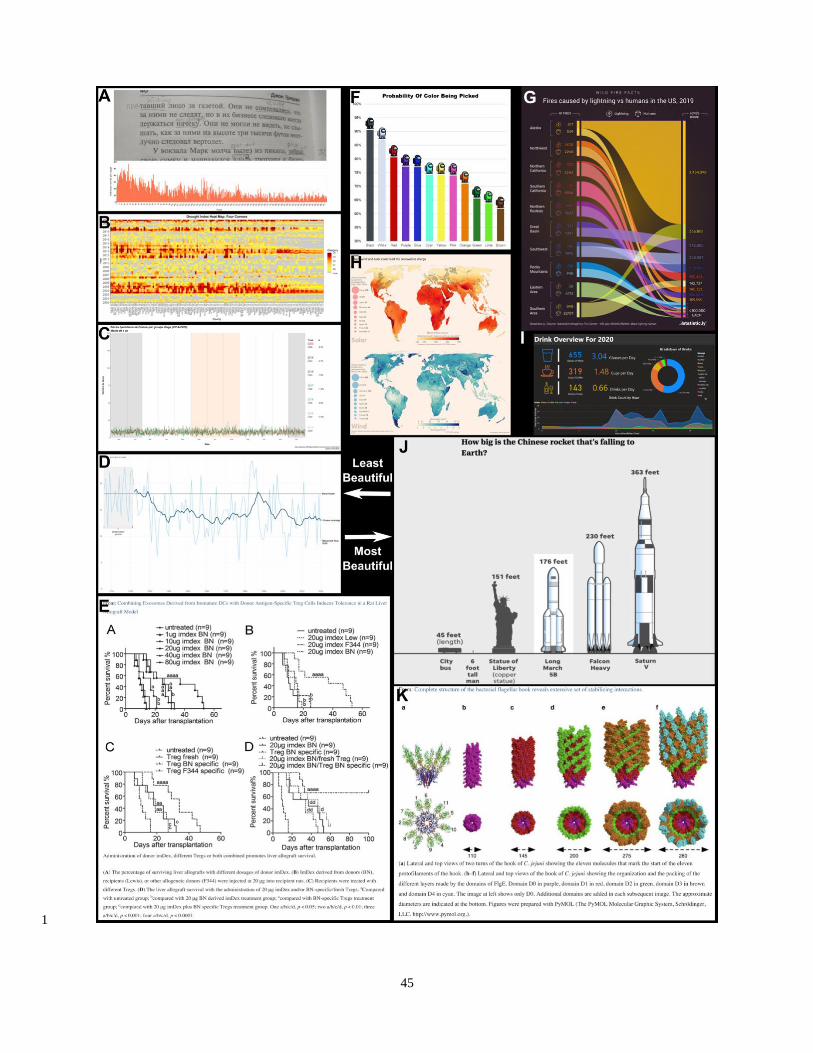
45
1
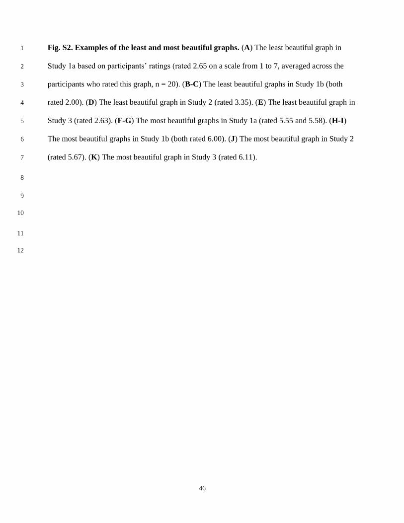
46
Fig. S2. Examples of the least and most beautiful graphs. (A) The least beautiful graph in 1
Study 1a based on participants’ ratings (rated 2.65 on a scale from 1 to 7, averaged across the 2
participants who rated this graph, n = 20). (B-C) The least beautiful graphs in Study 1b (both 3
rated 2.00). (D) The least beautiful graph in Study 2 (rated 3.35). (E) The least beautiful graph in 4
Study 3 (rated 2.63). (F-G) The most beautiful graphs in Study 1a (rated 5.55 and 5.58). (H-I) 5
The most beautiful graphs in Study 1b (both rated 6.00). (J) The most beautiful graph in Study 2 6
(rated 5.67). (K) The most beautiful graph in Study 3 (rated 6.11). 7
8
9
10
11
12