Eurovision Marking Schemes
24
1 Eurovision marking schemes (or why the current Eurovision marking scheme picks out the runner with the most boring shoes in the 100m race, rather than the fastest runner!) Physalis Franchetti 1. Introduction Eurovision has been going as a song contest since 1956. Initially, deciding who had the most popular song was achieved by juries; one in each country. Countries voted for other countries using a points system, and the winner got to host the contest the next year. In the beginning, there were only 10 or so competing countries, but nowadays, the number can be as high as 43. The actual method of placing votes has changed over the years; initially each country had a national jury, but the contest moved to televoting from 1997 onwards. After problems with televoting, a new 50/50 split voting scheme was introduced in 2009, where 50% of the marks came from televoting and 50% from national juries of music industry professionals. If we want to analyse the marking scheme, the first question we must ask ourselves is “What does the term ‘The Best Song’ mean exactly?”, since it is not obvious what the answer should be, and in fact, in asking ourselves this question, we identify two flaws in the marking scheme that will impact the outcome of the contest. We processed results from the Eurovision finals for the years 1975-1996, since this period is the most stable in terms of minimal rule changes and produced graphs of long-term trends in voting patterns. We looked at the ideal version of what should have happened in the jury voting years, and then compared this to the reality. In doing so, we identified a further two flaws in the marking scheme. A new voting mechanism was introduced in 1997, and in it 5 countries used televoting (where all members of the public can ring in to vote for their favourite song). The televoting years that we analysed were taken to be 1998-2008. It is important to identify the behaviour of a typical televoting public in order to analyse the graphs. The graphs we look at start off with the simplest example of the problems associated with televoting: Germany. We then move on to look at a more complex example: The UK & Ireland. Some countries benefited much more from televoting than others, and here we look at the extreme example: Russia. Severe problems with televoting prompted the EBU to change the rules in 2009, and a new voting scheme was introduced: 50/50 split voting, where 50% of the marks come from the televoting public and 50% of the marks from a national jury. The intention of the new marking scheme was to ease the problems associated with televoting, and the effects can be clearly seen in our simplest example: Armenia. We also investigated another graph for 50/50 split voting, that of Serbia, where the effects of split voting can be seen in terms of two groups of countries. The identified pattern can be seen in the graphs for all countries in Europe, with one notable exception; that of Azerbaijan, where rather than reducing the level of biased voting it looks to increase, and we look at this graph in detail. More changes to the rules occurred in 2013, the running order allocation was moved from a completely random draw to one which partly uses a random draw to place countries into the first half or the second half of the show, but then the actual running order is decided by the organisers. A further rule change occurred in 2013, the 50/50 split voting scheme was adjusted in order to further reduce the problems associated with the remaining 50% televote. The impact of the adjusted 50/50 scheme is that the new scheme favours mediocrity. We conclude by examining the question of what we actually want from a jury and present our final list of the seven flaws of Eurovision.
-
Upload
independent -
Category
Documents
-
view
5 -
download
0
Transcript of Eurovision Marking Schemes

1
Eurovision marking schemes (or why the current Eurovision marking scheme picks out the runner with the most boring shoes in the 100m race, rather than the fastest runner!)
Physalis Franchetti
1. Introduction Eurovision has been going as a song contest since 1956. Initially, deciding who had
the most popular song was achieved by juries; one in each country. Countries voted for other
countries using a points system, and the winner got to host the contest the next year. In the
beginning, there were only 10 or so competing countries, but nowadays, the number can be as
high as 43. The actual method of placing votes has changed over the years; initially each
country had a national jury, but the contest moved to televoting from 1997 onwards. After
problems with televoting, a new 50/50 split voting scheme was introduced in 2009, where
50% of the marks came from televoting and 50% from national juries of music industry
professionals.
If we want to analyse the marking scheme, the first question we must ask ourselves is
“What does the term ‘The Best Song’ mean exactly?”, since it is not obvious what the answer
should be, and in fact, in asking ourselves this question, we identify two flaws in the marking
scheme that will impact the outcome of the contest.
We processed results from the Eurovision finals for the years 1975-1996, since this
period is the most stable in terms of minimal rule changes and produced graphs of long-term
trends in voting patterns. We looked at the ideal version of what should have happened in the
jury voting years, and then compared this to the reality. In doing so, we identified a further
two flaws in the marking scheme.
A new voting mechanism was introduced in 1997, and in it 5 countries used
televoting (where all members of the public can ring in to vote for their favourite song). The
televoting years that we analysed were taken to be 1998-2008. It is important to identify the
behaviour of a typical televoting public in order to analyse the graphs. The graphs we look at
start off with the simplest example of the problems associated with televoting: Germany. We
then move on to look at a more complex example: The UK & Ireland. Some countries
benefited much more from televoting than others, and here we look at the extreme example:
Russia.
Severe problems with televoting prompted the EBU to change the rules in 2009, and a
new voting scheme was introduced: 50/50 split voting, where 50% of the marks come from
the televoting public and 50% of the marks from a national jury. The intention of the new
marking scheme was to ease the problems associated with televoting, and the effects can be
clearly seen in our simplest example: Armenia. We also investigated another graph for 50/50
split voting, that of Serbia, where the effects of split voting can be seen in terms of two
groups of countries. The identified pattern can be seen in the graphs for all countries in
Europe, with one notable exception; that of Azerbaijan, where rather than reducing the level
of biased voting it looks to increase, and we look at this graph in detail.
More changes to the rules occurred in 2013, the running order allocation was moved
from a completely random draw to one which partly uses a random draw to place countries
into the first half or the second half of the show, but then the actual running order is decided
by the organisers. A further rule change occurred in 2013, the 50/50 split voting scheme was
adjusted in order to further reduce the problems associated with the remaining 50% televote.
The impact of the adjusted 50/50 scheme is that the new scheme favours mediocrity.
We conclude by examining the question of what we actually want from a jury and
present our final list of the seven flaws of Eurovision.
2
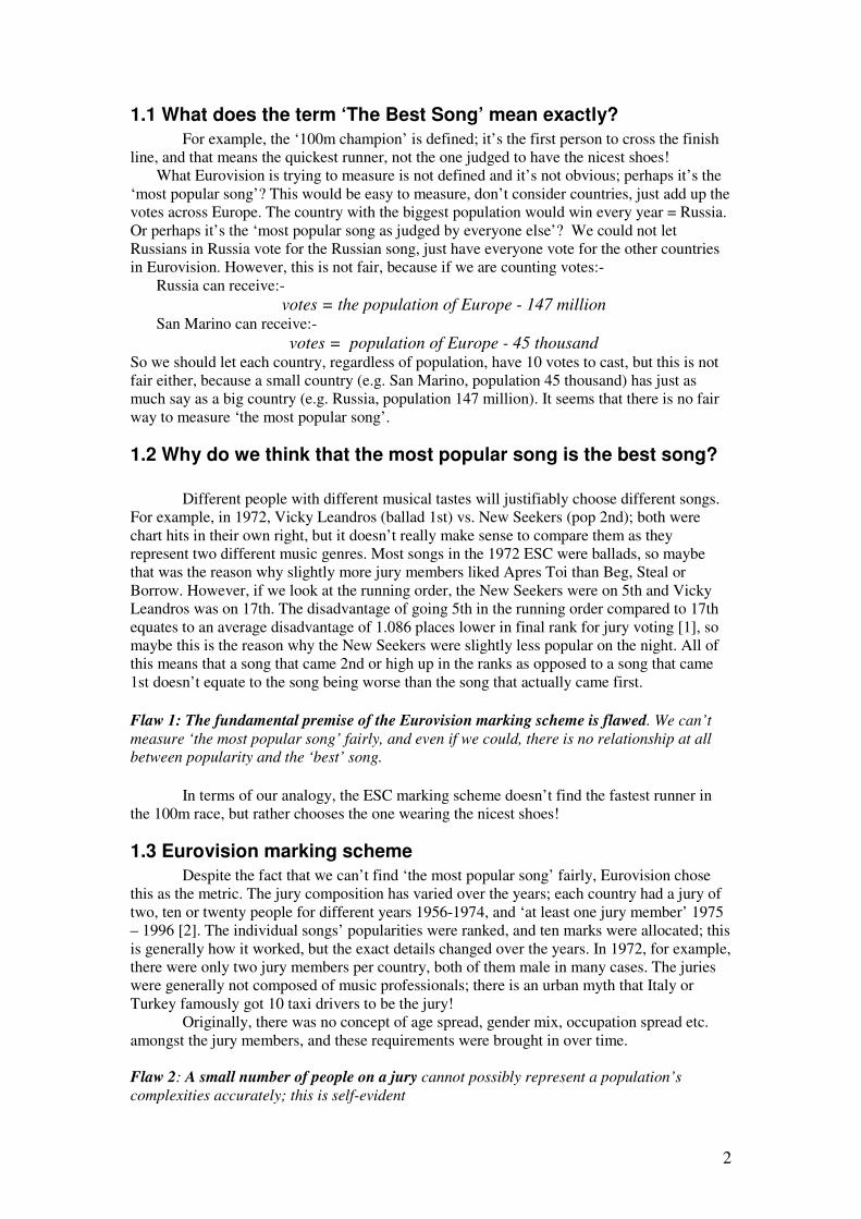
1.1 What does the term ‘The Best Song’ mean exactly?
For example, the ‘100m champion’ is defined; it’s the first person to cross the finish
line, and that means the quickest runner, not the one judged to have the nicest shoes!
What Eurovision is trying to measure is not defined and it’s not obvious; perhaps it’s the
‘most popular song’? This would be easy to measure, don’t consider countries, just add up the
votes across Europe. The country with the biggest population would win every year = Russia.
Or perhaps it’s the ‘most popular song as judged by everyone else’? We could not let
Russians in Russia vote for the Russian song, just have everyone vote for the other countries
in Eurovision. However, this is not fair, because if we are counting votes:-
Russia can receive:-
votes = the population of Europe - 147 million San Marino can receive:-
votes = population of Europe - 45 thousand So we should let each country, regardless of population, have 10 votes to cast, but this is not
fair either, because a small country (e.g. San Marino, population 45 thousand) has just as
much say as a big country (e.g. Russia, population 147 million). It seems that there is no fair
way to measure ‘the most popular song’.
1.2 Why do we think that the most popular song is the best song?
Different people with different musical tastes will justifiably choose different songs.
For example, in 1972, Vicky Leandros (ballad 1st) vs. New Seekers (pop 2nd); both were
chart hits in their own right, but it doesn’t really make sense to compare them as they
represent two different music genres. Most songs in the 1972 ESC were ballads, so maybe
that was the reason why slightly more jury members liked Apres Toi than Beg, Steal or
Borrow. However, if we look at the running order, the New Seekers were on 5th and Vicky
Leandros was on 17th. The disadvantage of going 5th in the running order compared to 17th
equates to an average disadvantage of 1.086 places lower in final rank for jury voting [1], so
maybe this is the reason why the New Seekers were slightly less popular on the night. All of
this means that a song that came 2nd or high up in the ranks as opposed to a song that came
1st doesn’t equate to the song being worse than the song that actually came first.
Flaw 1: The fundamental premise of the Eurovision marking scheme is flawed. We can’t
measure ‘the most popular song’ fairly, and even if we could, there is no relationship at all
between popularity and the ‘best’ song.
In terms of our analogy, the ESC marking scheme doesn’t find the fastest runner in
the 100m race, but rather chooses the one wearing the nicest shoes!
1.3 Eurovision marking scheme
Despite the fact that we can’t find ‘the most popular song’ fairly, Eurovision chose
this as the metric. The jury composition has varied over the years; each country had a jury of
two, ten or twenty people for different years 1956-1974, and ‘at least one jury member’ 1975
– 1996 [2]. The individual songs’ popularities were ranked, and ten marks were allocated; this
is generally how it worked, but the exact details changed over the years. In 1972, for example,
there were only two jury members per country, both of them male in many cases. The juries
were generally not composed of music professionals; there is an urban myth that Italy or
Turkey famously got 10 taxi drivers to be the jury!
Originally, there was no concept of age spread, gender mix, occupation spread etc.
amongst the jury members, and these requirements were brought in over time.
Flaw 2: A small number of people on a jury cannot possibly represent a population’s
complexities accurately; this is self-evident

3
1.4 The ideal version of how a jury system is supposed to work
The ideal version of how a jury system should work would be where the countries
each vote for their favourite song, and which song wins is based on the quality of the song
alone. In this case, all the countries in Eurovision would have an equal chance of producing
the winning song. If we then look across a number of years, who wins the contest should
change each year. So, if we average the data over a number of years, no country should stand
out as being better than another country.
During the jury voting years in Eurovision, there were less than 20 contestants. If all
countries had the same chance of winning, then we would expect an individual country to win
Eurovision once every 20 years. These days, there are 43 or so countries taking part each year
and, if there was an equal chance of winning, we could expect an individual country to win
once every 43 years.
1.5 We did some stats to look at the biases in the ESC marking scheme
Our approach was based on a research paper by Derek Gatherer [3]. We got all the
data for the finals from the Eurovision web-site [4]. In order to reduce the impact of song
quality on the results, so we could see the voting patterns, we averaged all the marks from one
country to another over a sliding 5 year time-frame. We also ran a series of computer
simulations to determine the level above which we can say that we are 95% sure that the votes
are consistently higher than would be expected. This is our favouritism or bias level.
We constructed a 5 year sliding window as follows:-
• We took 5 years of marks from Ireland to the UK (e.g. 0,5,1,12,0 from years 1983,
1984, 1985, 1986, & 1987), and averaged them 0+5+1+12+0 = 18/5 = 3.6. We then
used our ‘favouritism level’ to scale the output, and this gave us the point for 1983 on
the graph.
• We then moved the numbers on by one year. The new marks are 5+1+12+0+6 = 24/5
= 4.8. Again, we incorporated the ‘favouritism level’ into the result and this is the
point for 1984.
What this does is it reduces the effect of the really good year (12 points), and also that of
a bad year (0 points), so we can look at how a country is doing overall. The exact technical
details can be found in appendix 1. Windowing the data, and shifting and scaling the results
means that data for a range of years can be plotted on a single graph. This allows us to see
what is going on in each country and to compare every country with every other country.
Being able to do this is crucial to understanding the ESC marking scheme and its flaws. We
are able to plot graphs of marks to a country and marks from a country. The contribution of
this work is to allow the data to be presented graphically: something which is crucial to
understanding what is going on.
First, we are going to look at the jury voting years. Every graph has 51 countries, so
the key for each graph with all its associated colours and symbols can be found in appendix 3.
4
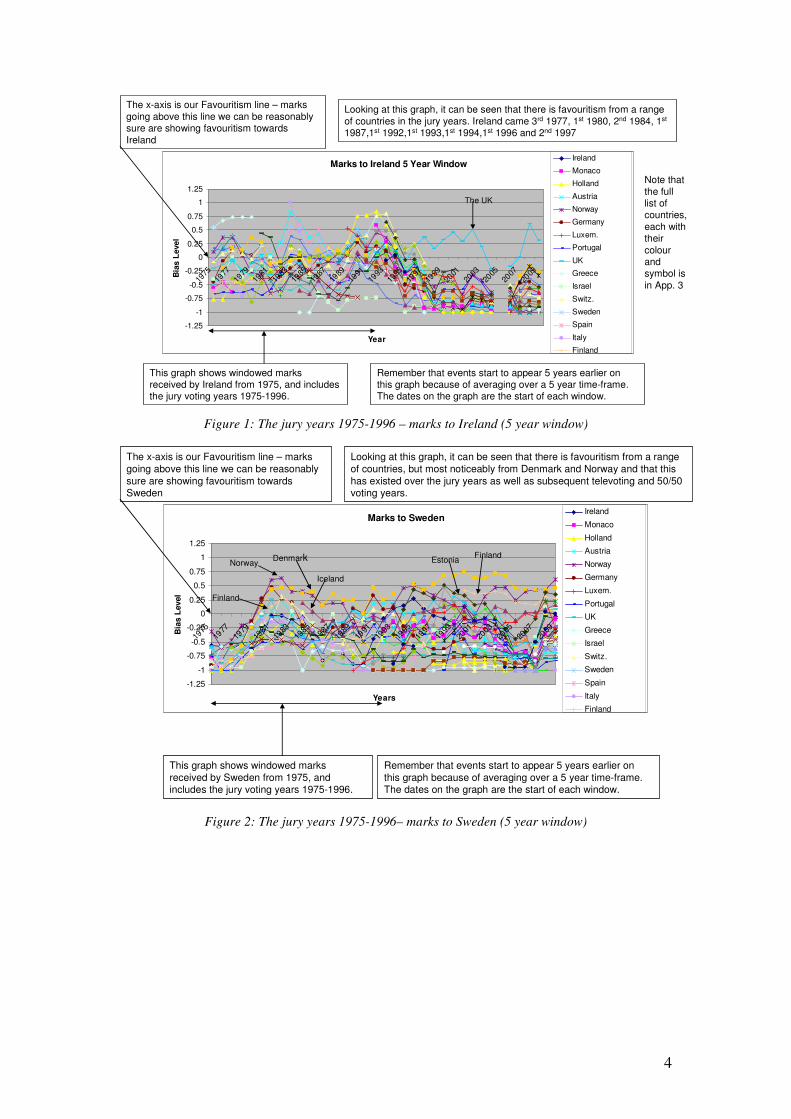
Figure 1: The jury years 1975-1996 – marks to Ireland (5 year window)
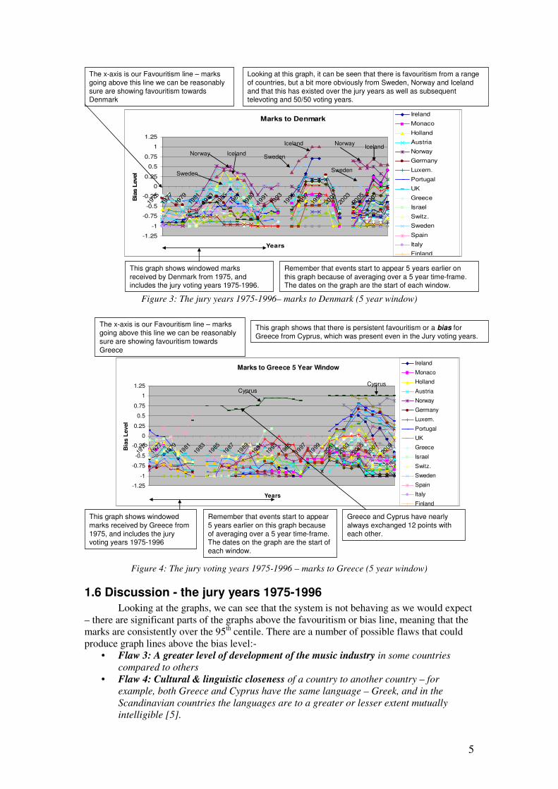
Figure 2: The jury years 1975-1996– marks to Sweden (5 year window)
Marks to Ireland 5 Year Window
-1.25
-1
-0.75
-0.5
-0.25
0
0.25
0.5
0.75
1
1.25
1975
1977
1979
1981
1983
1985
1987
1989
1991
1993
1995
1997
1999
2001
2003
2005
2007
2009
Year
Bia
s L
evel
Ireland
Monaco
Holland
Austria
Norway
Germany
Luxem.
Portugal
UK
Greece
Israel
Switz.
Sweden
Spain
Italy
Finland
The x-axis is our Favouritism line – marks
going above this line we can be reasonably sure are showing favouritism towards
Ireland
This graph shows windowed marks received by Ireland from 1975, and includes the jury voting years 1975-1996.
Remember that events start to appear 5 years earlier on this graph because of averaging over a 5 year time-frame. The dates on the graph are the start of each window.
Looking at this graph, it can be seen that there is favouritism from a range
of countries in the jury years. Ireland came 3rd 1977, 1st 1980, 2nd 1984, 1st
1987,1st 1992,1st 1993,1st 1994,1st 1996 and 2nd 1997
The UK
Note that
the full list of countries,
each with their
colour and symbol is
in App. 3
Marks to Sweden
-1.25
-1
-0.75
-0.5
-0.25
0
0.25
0.5
0.75
1
1.25
1975
1977
1979
1981
1983
1985
1987
1989
1991
1993
1995
1997
1999
2001
2003
2005
2007
2009
Years
Bia
s L
evel
Ireland
Monaco
Holland
Austria
Norway
Germany
Luxem.
Portugal
UK
Greece
Israel
Switz.
Sweden
Spain
Italy
Finland
The x-axis is our Favouritism line – marks
going above this line we can be reasonably
sure are showing favouritism towards Sweden
Remember that events start to appear 5 years earlier on
this graph because of averaging over a 5 year time-frame. The dates on the graph are the start of each window.
This graph shows windowed marks
received by Sweden from 1975, and includes the jury voting years 1975-1996.
Looking at this graph, it can be seen that there is favouritism from a range
of countries, but most noticeably from Denmark and Norway and that this
has existed over the jury years as well as subsequent televoting and 50/50 voting years.
NorwayDenmark
Iceland
Finland
EstoniaFinland
5
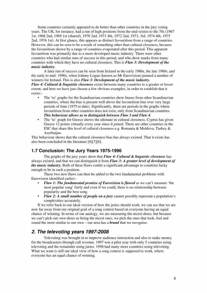
Figure 3: The jury years 1975-1996– marks to Denmark (5 year window)
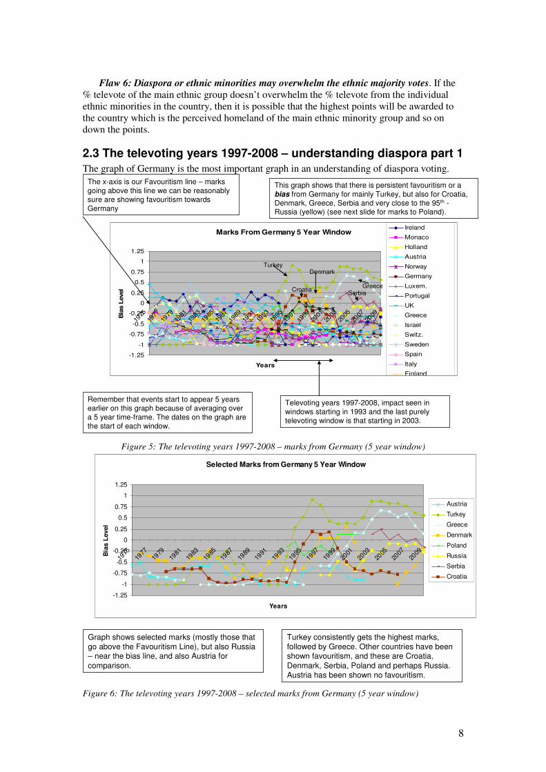
Figure 4: The jury voting years 1975-1996 – marks to Greece (5 year window)
1.6 Discussion - the jury years 1975-1996
Looking at the graphs, we can see that the system is not behaving as we would expect
– there are significant parts of the graphs above the favouritism or bias line, meaning that the
marks are consistently over the 95th centile. There are a number of possible flaws that could
produce graph lines above the bias level:-
• Flaw 3: A greater level of development of the music industry in some countries
compared to others
• Flaw 4: Cultural & linguistic closeness of a country to another country – for
example, both Greece and Cyprus have the same language – Greek, and in the
Scandinavian countries the languages are to a greater or lesser extent mutually
intelligible [5].
Marks to Denmark
-1.25
-1
-0.75
-0.5
-0.25
0
0.25
0.5
0.75
1
1.25
1975
1977
1979
1981
1983
1985
1987
1989
1991
1993
1995
1997
1999
2001
2003
2005
2007
Years
Bia
s L
evel
Ireland
Monaco
Holland
Austria
Norway
Germany
Luxem.
Portugal
UK
Greece
Israel
Switz.
Sweden
Spain
Italy
Finland
The x-axis is our Favouritism line – marks
going above this line we can be reasonably
sure are showing favouritism towards Denmark
Looking at this graph, it can be seen that there is favouritism from a range
of countries, but a bit more obviously from Sweden, Norway and Iceland
and that this has existed over the jury years as well as subsequent televoting and 50/50 voting years.
This graph shows windowed marks
received by Denmark from 1975, and includes the jury voting years 1975-1996.
Remember that events start to appear 5 years earlier on
this graph because of averaging over a 5 year time-frame. The dates on the graph are the start of each window.
Iceland
Sweden
Norway
Norway Iceland
SwedenSweden
Iceland
Marks to Greece 5 Year Window
-1.25
-1
-0.75
-0.5
-0.25
0
0.25
0.5
0.75
1
1.25
1975
1977
1979
1981
1983
1985
1987
1989
1991
1993
1995
1997
1999
2001
2003
2005
2007
2009
Years
Bia
s L
evel
Ireland
Monaco
Holland
Austria
Norway
Germany
Luxem.
Portugal
UK
Greece
Israel
Switz.
Sweden
Spain
Italy
Finland
The x-axis is our Favouritism line – marks going above this line we can be reasonably sure are showing favouritism towards
Greece
This graph shows windowed
marks received by Greece from 1975, and includes the jury voting years 1975-1996
Remember that events start to appear
5 years earlier on this graph because of averaging over a 5 year time-frame. The dates on the graph are the start of each window.
This graph shows that there is persistent favouritism or a bias for Greece from Cyprus, which was present even in the Jury voting years.
Greece and Cyprus have nearly
always exchanged 12 points with each other.
CyprusCyprus
6
Some countries certainly appeared to do better than other countries in the jury voting
years. The UK, for instance, had a run of high positions from the mid-sixties to the 70s (1967
1st, 1968 2nd, 1969 1st (shared), 1970 2nd, 1971 4th, 1972 2nd, 1973, 3rd, 1974 4th, 1975
2nd, 1976 1st). At first glance, this appears as distinct favouritism from a range of countries.
However, this can be seen to be a result of something other than cultural closeness, because
the favouritism shown by a range of countries evaporated after this period. This apparent
favouritism was primarily due to a more developed music industry. There were other
countries who had similar runs of success in this period, and who drew marks from many
countries with which they have no cultural closeness. This is Flaw 3: Development of the
music industry.
A later run of success can be seen from Ireland in the early 1980s, the late 1980s, and
the early to mid- 1990s, when Johnny Logan (known as Mr Eurovision) penned a number of
winners for Ireland. This is also Flaw 3: Development of the music industry.
Flaw 4: Cultural & linguistic closeness exists between many countries to a greater or lesser
extent, and here we have just chosen a few obvious examples, in order to establish that it
exists:-
• The ‘to’ graphs for the Scandinavian countries show biases from other Scandinavian
countries, where the bias is present well above the favouritism line over very large
periods of time (1975 to date). Significantly, there are periods in the graphs where
favouritism from other countries does not exist, only from Scandinavian countries.
This behaviour allows us to distinguish between Flaw 3 and Flaw 4.
• The ‘to’ graph for Greece shows the ultimate in cultural closeness. Cyprus has given
Greece 12 points virtually every year since it joined. There are other countries in the
ESC that share this level of cultural closeness e.g. Romania & Moldova, Turkey &
Azerbaijan.
This behaviour shows that the cultural closeness bias has always existed. That it exists has
also been concluded in the literature [6][7][8].
1.7 Conclusion: The Jury Years 1975-1996
The graphs of the jury years show that Flaw 4: Cultural & linguistic closeness has
always existed, and that we can distinguish it from Flaw 3: A greater level of development of
the music industry. Both of these flaws confer a significant advantage to countries lucky
enough to be in such a position.
These two new flaws can then be added to the two fundamental problems with
Eurovision identified earlier:-
• Flaw 1: The fundamental premise of Eurovision is flawed as we can’t measure ‘the
most popular song’ fairly and even if we could, there is no relationship between
popularity and the best song.
• Flaw 2: A small number of people on a jury cannot possibly represent a population’s
complexities accurately.
If we refer back to our ideal version of how the juries should work, we can see that we are
now far away from our original goal of a song contest based on everyone having an equal
chance of winning. In terms of our analogy, we are measuring the nicest shoes, but because
we can’t pick our own shoes as being the nicest ones, we pick the ones that look, feel and
sound the most similar to our own – our area has a brand that we recognise.
2. The televoting years 1997-2008 Televoting was brought in to improve audience interaction and also to make money
for the broadcasters through call revenue. 1997 was a pilot year with only 5 countries using
televoting and the remainder using juries. 1998 had many more countries using televoting.
What we want is still our ideal view of how a song contest is supposed to work, where
everyone has an equal chance of winning.

7
2.1 A typical televoting public
If we think about what a televoting public in a country will look like, we can start to
see some potential problems:-
• In any country, the largest group in the population is usually the main ethnic group
e.g. in Germany, the main ethnic group is composed of Germans.
• There are also ethnic minority groups who have lived there for many hundreds of
years as a result of border changes. In any country, there can be more than one such
group e.g. in Finland, there is a group of ethnic Swedes [9] who have always been
there and are the result of border changes.
• There are also ethnic groups who are a result of 20th and 21st century migration, and
these can be from any country in the world. In any country, there can be more than
one such group e.g. Ireland probably has the highest concentration of Lithuanians
relative to its total population size [10]. In the UK, the 2nd largest ethnic minority
group of the countries that take part in Eurovision is Polish, whose numbers have
increased by a factor of 10 in the last decade [11].
• Some components of an ethnic group may be non-residents, such as student
populations [12][13] and temporary workers.
• The perceived homeland countries of some of the minority ethnic groups are other
participants in Eurovision.
2.2 The natural voting behaviour of a typical televoting public
The main ethnic group (e.g. Germans living in Germany) cannot vote for its own
country. Votes are smattered around the other contestants, depending upon the popularity of
individual songs i.e. perhaps one year Sweden is the favourite. The next year, votes are again
smattered around the other contestants, but usually a different country will be the most
popular e.g. perhaps Greece is the favourite. Members of minority ethnic groups will vote for
their perceived ancestral country of origin:-
% of televote for Country A in Germany = % televote from main ethnic group (if averaged
over a number of years = approx. 1/25th of average no. who vote) + % televote from
minority ethnic group that perceives Country A to be their homeland
Whereas, if Country B has no sizeable minority ethnic group in Germany:-
% of televote for Country B = % televote from main ethnic group (averaged over a number of
years = approx. 1/25)
Country B can therefore receive far fewer votes than country A, depending on the size and
commitment of the minority ethnic groups.
The picture will in fact be more complicated than this. Votes will also come from:-
• Temporary residents such as minority ethnic group students
• Members of other ethnic minority groups in the country who have some cultural
closeness to the main ethnic minority group e.g. if country A is Denmark, and if other
Scandinavian countries have diaspora in Germany, then members of these diaspora
may preferentially vote for other Scandinavian countries such as Denmark.
In addition to the random (if we look across multiple years) song popularity votes from
the ethnic majority, and the regular televotes from ethnic minorities in each country, there
will also be voting that can be said to be largely political in nature.
Flaw 5: Political voting – global events affect votes. Political voting may produce a
positive or a negative bias. To date, we have only been able to distinguish hatred from other
types of voting, and really then only over a 10 year window, which was needed to yield
statistically significant results.
8
Flaw 6: Diaspora or ethnic minorities may overwhelm the ethnic majority votes. If the
% televote of the main ethnic group doesn’t overwhelm the % televote from the individual
ethnic minorities in the country, then it is possible that the highest points will be awarded to
the country which is the perceived homeland of the main ethnic minority group and so on
down the points.
2.3 The televoting years 1997-2008 – understanding diaspora part 1
The graph of Germany is the most important graph in an understanding of diaspora voting.
Figure 5: The televoting years 1997-2008 – marks from Germany (5 year window)
Figure 6: The televoting years 1997-2008 – selected marks from Germany (5 year window)
Marks From Germany 5 Year Window
-1.25
-1
-0.75
-0.5
-0.25
0
0.25
0.5
0.75
1
1.25
1975
1977
1979
1981
1983
1985
1987
1989
1991
1993
1995
1997
1999
2001
2003
2005
2007
2009
Years
Bia
s L
evel
Ireland
Monaco
Holland
Austria
Norway
Germany
Luxem.
Portugal
UK
Greece
Israel
Switz.
Sweden
Spain
Italy
Finland
The x-axis is our Favouritism line – marks
going above this line we can be reasonably
sure are showing favouritism towards
Germany
Remember that events start to appear 5 years
earlier on this graph because of averaging over
a 5 year time-frame. The dates on the graph are
the start of each window.
This graph shows that there is persistent favouritism or a
bias from Germany for mainly Turkey, but also for Croatia,
Denmark, Greece, Serbia and very close to the 95th -Russia (yellow) (see next slide for marks to Poland).
Turkey
GreeceCroatia
Denmark
Serbia
Televoting years 1997-2008, impact seen in
windows starting in 1993 and the last purely
televoting window is that starting in 2003.
Graph shows selected marks (mostly those that go above the Favouritism Line), but also Russia – near the bias line, and also Austria for
comparison.
Turkey consistently gets the highest marks, followed by Greece. Other countries have been shown favouritism, and these are Croatia,
Denmark, Serbia, Poland and perhaps Russia. Austria has been shown no favouritism.
Selected Marks from Germany 5 Year Window
-1.25
-1
-0.75
-0.5
-0.25
0
0.25
0.5
0.75
1
1.25
1975
1977
1979
1981
1983
1985
1987
1989
1991
1993
1995
1997
1999
2001
2003
2005
2007
2009
Years
Bia
s L
evel
Austria
Turkey
Greece
Denmark
Poland
Russia
Serbia
Croatia

9
An approximate calculation can be performed to illustrate the potential impact of an
ethnic minority vote:-
Assuming that votes are evenly distributed across all entries, means that there will be
1/25th of the total vote to each country. 1/25 of the ethnic majority’s vote = 4%, so on
average, there is 4% of the vote from the ethnic majority population for each of the
other countries.
% of ethnic Turkish minority group in Germany is ~4% [14]
This means that if the same percentage of the ethnic majority and the same
percentage of the Turkish minority group actually votes, Germany is likely to award
Turkey significant points.
1993 0, 1994 Turkey relegated, 1995 0, 1996 No Germany, 1997 (start of televoting)
12, 1998 12, 1999 12, 2000 10, 2001 7, 2002 0, 2003 10
The result that sticks out a mile is that from 2002. Germany were the pre-contest
favourites in 2002; I conjecture (although I can’t say for certain) that enough ethnic Germans
watched and voted for a range of (predominantly western European) countries, so that the
ethnic minority votes were overwhelmed. Except for 2002, Germany awarded very high
points to Turkey from the start of televoting.
2.4 The televoting years 1997-2008 – understanding diaspora part 2
Figure 7: The televoting years 1997-2008 – marks from the UK (5 year window)
Marks From The UK 5 Year Window
-1.25
-1
-0.75
-0.5
-0.25
0
0.25
0.5
0.75
1
1.25
1975
1977
1979
1981
1983
1985
1987
1989
1991
1993
1995
1997
1999
2001
2003
2005
2007
2009
Years
Bia
s L
evel
Ireland
Monaco
Holland
Austria
Norway
Germany
Luxem.
Portugal
UK
Greece
Israel
Switz.
Sweden
Spain
Italy
Finland
Remember that events start to appear 5 years
earlier on this graph because of averaging over
a 5 year time-frame. The dates on the graph are
the start of each window.
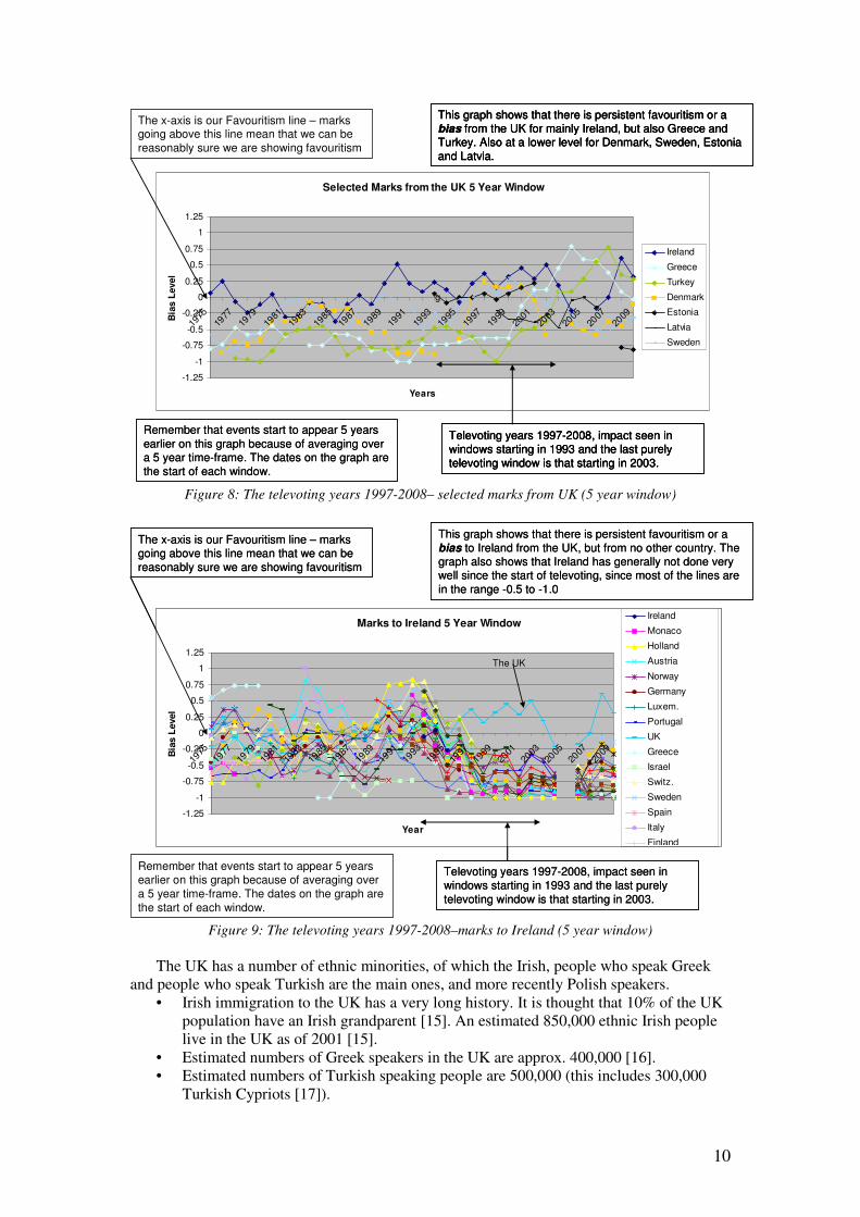
Televoting years 1997-2008, impact seen in
windows starting in 1993 and the last purely
televoting window is that starting in 2003.
The x-axis is our Favouritism line – marks
going above this line mean that we can be
reasonably sure we are showing favouritism
This graph shows that there is persistent favouritism or a
bias from the UK for mainly Ireland, but also Greece and
Turkey. Also at a lower level for Denmark, Sweden, Estonia
and Latvia.
The x-axis is our Favouritism line – marks
going above this line mean that we can be
reasonably sure we are showing favouritism
Greece Turkey
IrelandIreland
Denmark EstoniaSweden
10
Figure 8: The televoting years 1997-2008– selected marks from UK (5 year window)
Figure 9: The televoting years 1997-2008–marks to Ireland (5 year window)
The UK has a number of ethnic minorities, of which the Irish, people who speak Greek
and people who speak Turkish are the main ones, and more recently Polish speakers.
• Irish immigration to the UK has a very long history. It is thought that 10% of the UK
population have an Irish grandparent [15]. An estimated 850,000 ethnic Irish people
live in the UK as of 2001 [15].
• Estimated numbers of Greek speakers in the UK are approx. 400,000 [16].
• Estimated numbers of Turkish speaking people are 500,000 (this includes 300,000
Turkish Cypriots [17]).
Selected Marks from the UK 5 Year Window
-1.25
-1
-0.75
-0.5
-0.25
0
0.25
0.5
0.75
1
1.25
1975
1977
1979
1981
1983
1985
1987
1989
1991
1993
1995
1997
1999
2001
2003
2005
2007
2009
Years
Bia
s L
evel
Ireland
Greece
Turkey
Denmark
Estonia
Latvia
Sweden
g
Televoting years 1997-2008, impact seen in windows starting in 1993 and the last purely
televoting window is that starting in 2003.
Remember that events start to appear 5 years
earlier on this graph because of averaging over a 5 year time-frame. The dates on the graph are
the start of each window.
The x-axis is our Favouritism line – marks going above this line mean that we can be
reasonably sure we are showing favouritism
This graph shows that there is persistent favouritism or a bias from the UK for mainly Ireland, but also Greece and Turkey. Also at a lower level for Denmark, Sweden, Estonia
and Latvia.
Televoting years 1997-2008, impact seen in windows starting in 1993 and the last purely
televoting window is that starting in 2003.
This graph shows that there is persistent favouritism or a bias from the UK for mainly Ireland, but also Greece and Turkey. Also at a lower level for Denmark, Sweden, Estonia
and Latvia.
Remember that events start to appear 5 years
earlier on this graph because of averaging over a 5 year time-frame. The dates on the graph are
the start of each window.
Televoting years 1997-2008, impact seen in windows starting in 1993 and the last purely
televoting window is that starting in 2003.
This graph shows that there is persistent favouritism or a bias from the UK for mainly Ireland, but also Greece and Turkey. Also at a lower level for Denmark, Sweden, Estonia
and Latvia.
Marks to Ireland 5 Year Window
-1.25
-1
-0.75
-0.5
-0.25
0
0.25
0.5
0.75
1
1.25
1975
1977
1979
1981
1983
1985
1987
1989
1991
1993
1995
1997
1999
2001
2003
2005
2007
2009
Year
Bia
s L
evel
Ireland
Monaco
Holland
Austria
Norway
Germany
Luxem.
Portugal
UK
Greece
Israel
Switz.
Sweden
Spain
Italy
Finland
The x-axis is our Favouritism line – marks going above this line mean that we can be
reasonably sure we are showing favouritism
Televoting years 1997-2008, impact seen in
windows starting in 1993 and the last purely
televoting window is that starting in 2003.
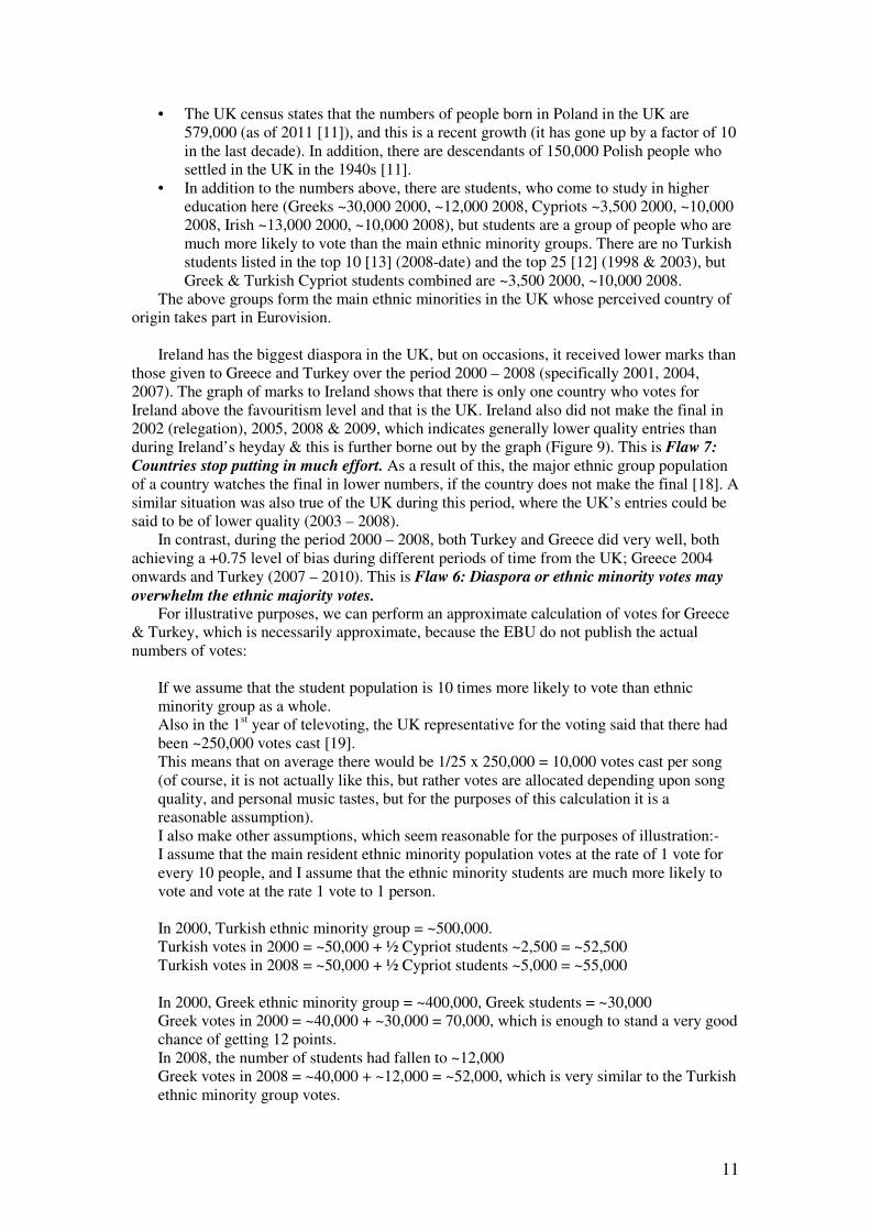
This graph shows that there is persistent favouritism or a
bias to Ireland from the UK, but from no other country. The graph also shows that Ireland has generally not done very well since the start of televoting, since most of the lines are
in the range -0.5 to -1.0
The UK
Marks to Ireland 5 Year Window
-1.25
-1
-0.75
-0.5
-0.25
0
0.25
0.5
0.75
1
1.25
1975
1977
1979
1981
1983
1985
1987
1989
1991
1993
1995
1997
1999
2001
2003
2005
2007
2009
Year
Bia
s L
evel
Ireland
Monaco
Holland
Austria
Norway
Germany
Luxem.
Portugal
UK
Greece
Israel
Switz.
Sweden
Spain
Italy
Finland
The x-axis is our Favouritism line – marks going above this line mean that we can be
reasonably sure we are showing favouritism
Remember that events start to appear 5 years earlier on this graph because of averaging over
a 5 year time-frame. The dates on the graph are
the start of each window.
Televoting years 1997-2008, impact seen in windows starting in 1993 and the last purely
televoting window is that starting in 2003.
This graph shows that there is persistent favouritism or a
bias to Ireland from the UK, but from no other country. The graph also shows that Ireland has generally not done very well since the start of televoting, since most of the lines are
in the range -0.5 to -1.0
The UK
11
• The UK census states that the numbers of people born in Poland in the UK are
579,000 (as of 2011 [11]), and this is a recent growth (it has gone up by a factor of 10
in the last decade). In addition, there are descendants of 150,000 Polish people who
settled in the UK in the 1940s [11].
• In addition to the numbers above, there are students, who come to study in higher
education here (Greeks ~30,000 2000, ~12,000 2008, Cypriots ~3,500 2000, ~10,000
2008, Irish ~13,000 2000, ~10,000 2008), but students are a group of people who are
much more likely to vote than the main ethnic minority groups. There are no Turkish
students listed in the top 10 [13] (2008-date) and the top 25 [12] (1998 & 2003), but
Greek & Turkish Cypriot students combined are ~3,500 2000, ~10,000 2008.
The above groups form the main ethnic minorities in the UK whose perceived country of
origin takes part in Eurovision.
Ireland has the biggest diaspora in the UK, but on occasions, it received lower marks than
those given to Greece and Turkey over the period 2000 – 2008 (specifically 2001, 2004,
2007). The graph of marks to Ireland shows that there is only one country who votes for
Ireland above the favouritism level and that is the UK. Ireland also did not make the final in
2002 (relegation), 2005, 2008 & 2009, which indicates generally lower quality entries than
during Ireland’s heyday & this is further borne out by the graph (Figure 9). This is Flaw 7:
Countries stop putting in much effort. As a result of this, the major ethnic group population
of a country watches the final in lower numbers, if the country does not make the final [18]. A
similar situation was also true of the UK during this period, where the UK’s entries could be
said to be of lower quality (2003 – 2008).
In contrast, during the period 2000 – 2008, both Turkey and Greece did very well, both
achieving a +0.75 level of bias during different periods of time from the UK; Greece 2004
onwards and Turkey (2007 – 2010). This is Flaw 6: Diaspora or ethnic minority votes may
overwhelm the ethnic majority votes. For illustrative purposes, we can perform an approximate calculation of votes for Greece
& Turkey, which is necessarily approximate, because the EBU do not publish the actual
numbers of votes:
If we assume that the student population is 10 times more likely to vote than ethnic
minority group as a whole.
Also in the 1st year of televoting, the UK representative for the voting said that there had
been ~250,000 votes cast [19].
This means that on average there would be 1/25 x 250,000 = 10,000 votes cast per song
(of course, it is not actually like this, but rather votes are allocated depending upon song
quality, and personal music tastes, but for the purposes of this calculation it is a
reasonable assumption).
I also make other assumptions, which seem reasonable for the purposes of illustration:-
I assume that the main resident ethnic minority population votes at the rate of 1 vote for
every 10 people, and I assume that the ethnic minority students are much more likely to
vote and vote at the rate 1 vote to 1 person.
In 2000, Turkish ethnic minority group = ~500,000.
Turkish votes in 2000 = ~50,000 + ½ Cypriot students ~2,500 = ~52,500
Turkish votes in 2008 = ~50,000 + ½ Cypriot students ~5,000 = ~55,000
In 2000, Greek ethnic minority group = ~400,000, Greek students = ~30,000
Greek votes in 2000 = ~40,000 + ~30,000 = 70,000, which is enough to stand a very good
chance of getting 12 points.
In 2008, the number of students had fallen to ~12,000
Greek votes in 2008 = ~40,000 + ~12,000 = ~52,000, which is very similar to the Turkish
ethnic minority group votes.
12
In the years 2004-2006, for 2 out of the 3 years, Greece received 12 pts from the UK. In
the years, 2007-2010, Turkey and Greece took it in turns to get 12 pts from the UK.
This example is also evidence of almost exclusively diaspora driven points allocation, but
it does not extend from the beginning of the televoting period. I conjecture (although I can’t
be certain) that there was significant promotion of the Greek and Turkish entries to their
diaspora in the UK through radio in the later years of the competition to account for the
increase compared to the earlier years.
2.5 Impact of the semi-finals on the televoting years
Countries are put into 2 pots to try and separate countries from their diaspora and
semi-final places allocated accordingly [4]. This is obviously going to create problems, since
some countries have a very large number of diaspora, and cannot be separated from all of
them. Also, far fewer people watch the semis [18]; this means that it is much more likely that
ethnic majority voting will not overwhelm the diaspora voting. This is not a graceful solution
to the problem and is completely unfair. It meant that some countries did not qualify for the
final for many years (countries like Holland, but the list is long). Last year, all of the Balkan
countries failed to qualify except for Greece.
Not qualifying for several years means that fewer artists will volunteer to represent
their country and that less of the ethnic majority will watch the show – this means that
countries get stuck in a downward spiral – failing to even qualify for the final means that
fewer and fewer artists are prepared to risk their reputations (or future reputations) at
Eurovision, hence the down-ward spiral. Flaw 7: Countries stop putting in much effort.
2.6 The televoting years 1997-2008 – understanding diaspora part 3
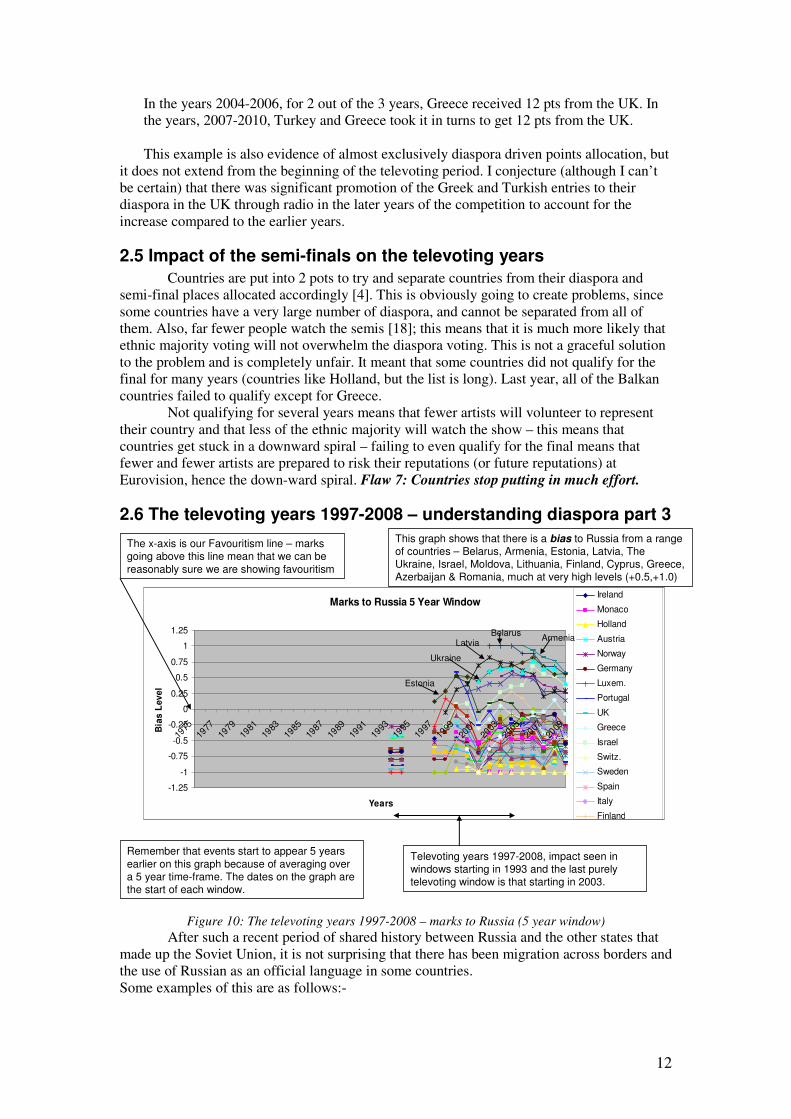
Figure 10: The televoting years 1997-2008 – marks to Russia (5 year window)
After such a recent period of shared history between Russia and the other states that
made up the Soviet Union, it is not surprising that there has been migration across borders and
the use of Russian as an official language in some countries.
Some examples of this are as follows:-
Marks to Russia 5 Year Window
-1.25
-1
-0.75
-0.5
-0.25
0
0.25
0.5
0.75
1
1.25
1975
1977
1979
1981
1983
1985
1987
1989
1991
1993
1995
1997
1999
2001
2003
2005
2007
2009
Years
Bia
s L
ev
el
Ireland
Monaco
Holland
Austria
Norway
Germany
Luxem.
Portugal
UK
Greece
Israel
Switz.
Sweden
Spain
Italy
Finland
The x-axis is our Favouritism line – marks going above this line mean that we can be
reasonably sure we are showing favouritism
Remember that events start to appear 5 years
earlier on this graph because of averaging over a 5 year time-frame. The dates on the graph are the start of each window.
This graph shows that there is a bias to Russia from a range of countries – Belarus, Armenia, Estonia, Latvia, The Ukraine, Israel, Moldova, Lithuania, Finland, Cyprus, Greece, Azerbaijan & Romania, much at very high levels (+0.5,+1.0)
Televoting years 1997-2008, impact seen in windows starting in 1993 and the last purely televoting window is that starting in 2003.
BelarusArmenia
Latvia
Ukraine
Estonia

13
• In the Ukraine for example, the Russian speaking population is known to be ~17%
[20].
• In Armenia for example, there are 0.4% Russians in the population, but this makes up
the biggest minority group whose perceived country of origin takes part in ESC
(people of Kurdish ethnicity form a larger ethnic group in Armenia). In addition,
Russian is widely spoken by 95% of the population [21].
• In Moldova for example, as of 2004, 11.2% of the population are Ukrainians and
9.4% of the populations are Russians for Moldova as a whole, or 8.35% Ukrainian
and 5.95% Russians for the part of Moldova under control of the Moldovan
government [22].
• In Latvia, 26.9% of the population is Russian [23].
2.7 The televoting years 1997-2008 - conclusion
It is easy to surmise that if the advantage of diaspora voting was discovered
accidentally, countries subsequently learnt that promoting the song heavily to their diaspora
produced dividends. The culmination of televoting was in the years 2006, 2007 and 2008,
which were very nearly won by the same country (2006 Russia 2nd place, 2007 3rd place and
2008 1st place). Apart from the more or less random behaviour of the ethnic majority voting,
which is removed by our windowing, voting patterns follow relative diaspora levels virtually
exactly, but the graph of marks to Russia for the televoting period shows the what should
have been the predictable results of diaspora voting:- • Countries with a large number of diasporas in other countries have a much, much
greater chance of winning Eurovision than other countries (compare the graphs of
Ireland and Russia)
• Most of the 10 marks a country had to give out were being allocated to diaspora and
there were very few marks left to be awarded based on song quality
As discussed earlier, diaspora voting does not guarantee a win by countries with a large
diaspora, since it is possible for the votes of a country’s ethnic majority to overwhelm
diaspora voting amongst other factors – it depends how many of the ethnic majority
population vote (and this also depends upon song quality and political voting). As discussed
in one of our earlier presentations [24], political bias can also impact the voting (UK 2003
onwards) Flaw 5: Political Voting – global events affect votes. After many complaints in
2007, 50/50 split voting was finally introduced in 2009.
Returning to our analogy, the brand of the shoes is pushed to the consumers by
advertising, and the quality of the item plays less of a part. We conjecture that promotion of
the home country’s song to its diaspora via radio played more of a part in the last years of
televoting. That there were no marks available outside of the usual diaspora can be seen in
most of the graphs across Europe, which show a strong negative bias from most other
countries.
3. 50/50 split voting – juries and televoting (2009 – date)
3.1 50/50 split voting – history and mechanism of combining the marks
Juries as part of a 50/50 mix were brought in briefly in 2001, and used by three
countries – Malta, Croatia and Greece. This was to reduce the disadvantage due to running
order for televoting (6.2 places on average for a field of 26, the disadvantage starting at 6.2 at
position 1 and reducing linearly to 0 at position 26 [1]. 50/50 voting was ditched in 2002 after
allegations of vote fixing were made [25]. Because of the problems identified in the section
on televoting, 50/50 split voting was brought in again in 2009.
It is still early days, as there is only 1 pure data point in the graph – window 2009-
2013, where there are just components from the 50/50 marking scheme, and not a
combination of 50/50 and televoting only data points in the graph. BUT we can see the
14
growing impact of the 50/50 marking scheme over the last 5 data points in the graph. Of
course, the diaspora televoting bias is still present, albeit now in 50% of the marks.
Two different approaches to combining the jury and televote marks have been used.
Method of combining the two different forms of voting in scheme 1 (2009-2012):-
• The televoting call totals are ranked in order and marks allocated
(12,10,8,7,6,5,4,3,2,1).
• The jury ranks the songs and allocates marks (12,10,8,7,6,5,4,3,2,1).
• Marks from the jury and the televote are added, the songs re-ranked and marks re-
allocated.
Method of combining the two different forms of voting in scheme 2 (2013-date):-
• The televoting call totals are ranked in order 1-25 in each country.
• The jury ranks the songs 1-25 in each country.
• The ranks from the jury and the televote are added, the songs re-ranked and marks
allocated (12,10,8,7,6,5,4,3,2,1).
3.2 Jury composition for 50/50 split voting
The rules of the ESC for 2009 stipulate that:-
Juries consist of 8 people, 4 professionals and 4 members of the public, plus a non-
voting chairperson. There must be equal numbers of men and women on the jury and
a wide spread of ages.
The rules of the ESC for 2013 stipulate that:-
The jury must consist of 5 people, all music professionals (Radio DJ, artist,
composer, lyrics author, music producer). There must be a balance to ensure
representativeness in terms of gender, age and background.
However, there are reports of the jury mix not being rigorously enforced. In 2013, Italy’s jury
was all male and all music journalists [26].
3.3 50/50 split voting – reduction in the impact of diaspora voting – part 1
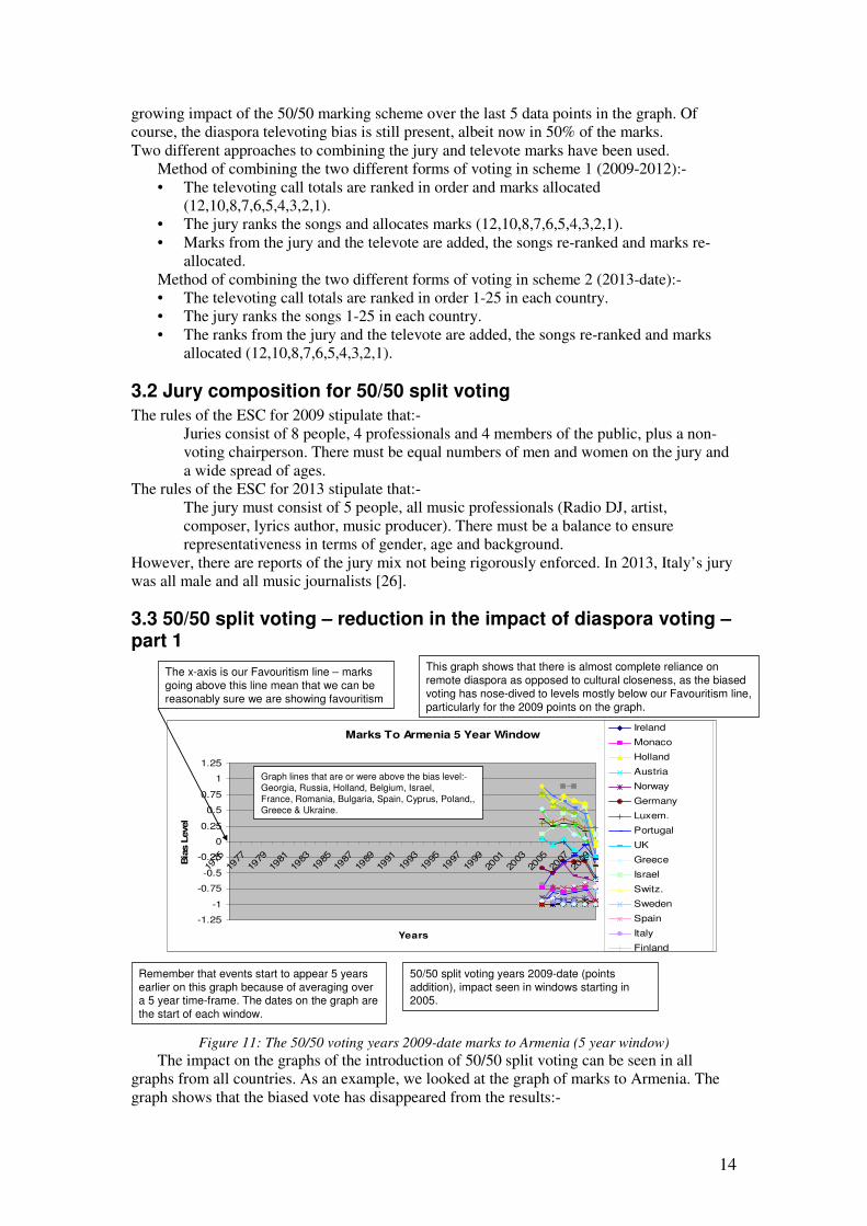
Figure 11: The 50/50 voting years 2009-date marks to Armenia (5 year window)
The impact on the graphs of the introduction of 50/50 split voting can be seen in all
graphs from all countries. As an example, we looked at the graph of marks to Armenia. The
graph shows that the biased vote has disappeared from the results:-
Marks To Armenia 5 Year Window
-1.25
-1
-0.75
-0.5
-0.25
0
0.25
0.5
0.75
1
1.25
1975
1977
1979
1981
1983
1985
1987
1989
1991
1993
1995
1997
1999
2001
2003
2005
2007
2009
Years
Bia
s L
evel
Ireland
Monaco
Holland
Austria
Norway
Germany
Luxem.
Portugal
UK
Greece
Israel
Switz.
Sweden
Spain
Italy
Finland
Remember that events start to appear 5 years
earlier on this graph because of averaging over a 5 year time-frame. The dates on the graph are
the start of each window.
The x-axis is our Favouritism line – marks
going above this line mean that we can be
reasonably sure we are showing favouritism
This graph shows that there is almost complete reliance on
remote diaspora as opposed to cultural closeness, as the biased
voting has nose-dived to levels mostly below our Favouritism line,
particularly for the 2009 points on the graph.
50/50 split voting years 2009-date (points
addition), impact seen in windows starting in 2005.
Graph lines that are or were above the bias level:-
Georgia, Russia, Holland, Belgium, Israel,
France, Romania, Bulgaria, Spain, Cyprus, Poland,,
Greece & Ukraine.
15
• The countries who were voting at the biased level were:- Georgia, Russia, Holland,
Belgium, Israel, France, Bulgaria, Spain, Cyprus, Poland, Greece, Ukraine, Romania
(some of these regular votes were at high levels, +0.75 (+1.0 = regular 12 points).
• The remote diaspora who perceive Armenia as their home country will still produce
50% of the final marks if the ethnic majority of a host country does not overwhelm
the diaspora vote (i.e. if the ethnic majority is not voting in sufficient numbers – this
might be the case if the country does not qualify for the final [18]).
• With the adoption of 50/50 split voting where marks were added (2009-2012), a high
televote was guaranteed to gain at least 50% of the final marks.
• With the introduction of 50/50 split voting where ranks are added (2013-date), the
televote will only impact the final marks if the jury rates an individual song from
Armenia highly enough
However, this means that, should a song from a country with a large number of diasporas
enter quite a good song into Eurovision, then this country stands a much greater chance of
winning than a country with a song of the same quality, but who has no or very few diasporas
in other countries. Flaw 6: Diaspora or ethnic minority votes may overwhelm the ethnic
majority votes persists –occasionally.
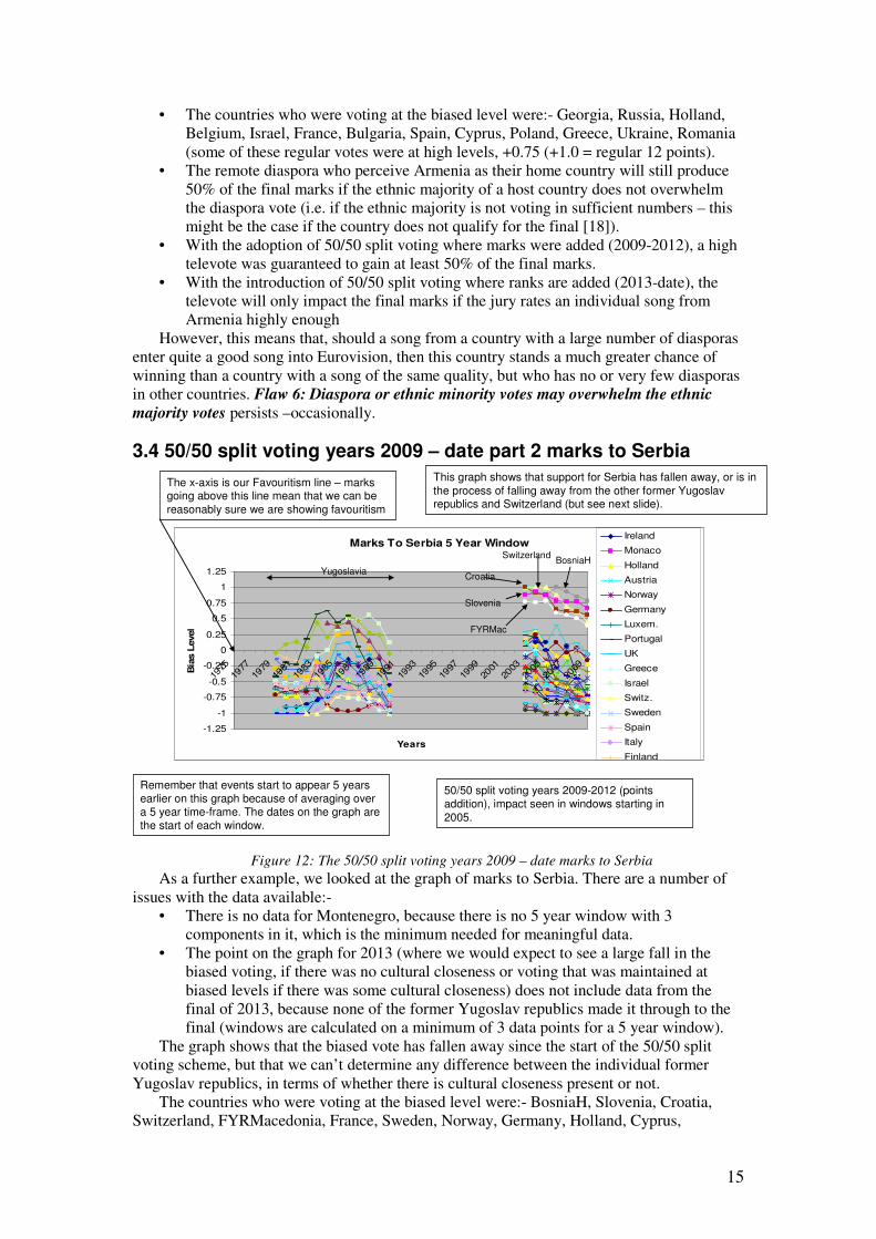
3.4 50/50 split voting years 2009 – date part 2 marks to Serbia
Figure 12: The 50/50 split voting years 2009 – date marks to Serbia
As a further example, we looked at the graph of marks to Serbia. There are a number of
issues with the data available:-
• There is no data for Montenegro, because there is no 5 year window with 3
components in it, which is the minimum needed for meaningful data.
• The point on the graph for 2013 (where we would expect to see a large fall in the
biased voting, if there was no cultural closeness or voting that was maintained at
biased levels if there was some cultural closeness) does not include data from the
final of 2013, because none of the former Yugoslav republics made it through to the
final (windows are calculated on a minimum of 3 data points for a 5 year window).
The graph shows that the biased vote has fallen away since the start of the 50/50 split
voting scheme, but that we can’t determine any difference between the individual former
Yugoslav republics, in terms of whether there is cultural closeness present or not.
The countries who were voting at the biased level were:- BosniaH, Slovenia, Croatia,
Switzerland, FYRMacedonia, France, Sweden, Norway, Germany, Holland, Cyprus,
Marks To Serbia 5 Year Window
-1.25
-1
-0.75
-0.5
-0.25
0
0.25
0.5
0.75
1
1.25
1975
1977
1979
1981
1983
1985
1987
1989
1991
1993
1995
1997
1999
2001
2003
2005
2007
2009
Years
Bia
s L
evel
Ireland
Monaco
Holland
Austria
Norway
Germany
Luxem.
Portugal
UK
Greece
Israel
Switz.
Sweden
Spain
Italy
Finland
Remember that events start to appear 5 years earlier on this graph because of averaging over a 5 year time-frame. The dates on the graph are the start of each window.
The x-axis is our Favouritism line – marks going above this line mean that we can be
reasonably sure we are showing favouritism
This graph shows that support for Serbia has fallen away, or is in
the process of falling away from the other former Yugoslav republics and Switzerland (but see next slide).
50/50 split voting years 2009-2012 (points addition), impact seen in windows starting in
2005.
Yugoslavia
Slovenia
Croatia
BosniaHSwitzerland
FYRMac
16
Romania, Russia, Hungary & Greece. The remote diaspora who perceive Serbia as their home
country will still produce 50% of the final marks if the ethnic majority of a country does not
overwhelm the diaspora vote (i.e. if the ethnic majority is not voting in sufficient
numbers[18]). With the adoption of 50/50 split voting where marks were added (2009-2012),
a high televote was guaranteed to gain at least 50% of the final marks. However, with eth
adoption of 50/50 split voting where ranks were added (2013 – date), the televote will only
impact the final marks if the jury rates an individual song from Serbia highly enough.
However, this means that, should a song from a country with a large number of diasporas
enter quite a good song into Eurovision, then this country stands a much greater chance of
winning than a country with a song of the same quality, but who has no or very few diasporas
in other countries. Flaw 6: Diaspora or ethnic minority votes in a country may overwhelm
the ethnic majority votes persists –occasionally.
3.5 50/50 Split voting – bucking the trend – part 3
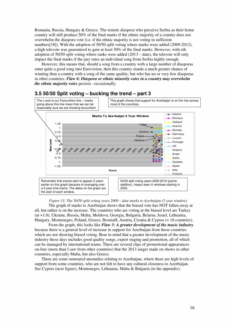
Figure 13: The 50/50 split voting years 2009 – date marks to Azerbaijan (5 year window)
The graph of marks to Azerbaijan shows that the biased vote has NOT fallen away at
all, but rather is on the increase. The countries who are voting at the biased level are Turkey
(at +1.0), Ukraine, Russia, Malta, Moldova, Georgia, Bulgaria, Belarus, Israel, Lithuania,
Hungary, Montenegro, Poland, Greece, BosniaH, Austria, Croatia & Cyprus (= 18 countries).
From the graph, this looks like Flaw 3: A greater development of the music industry
because there is a general level of increase in support for Azerbaijan from those countries
which are not showing biased voting. Bear in mind that a greater development of the music
industry these days includes good quality songs, expert staging and promotion, all of which
can be managed by international teams. There are several clips of promotional appearances
on-line (more than I saw from other countries) that the 2013 singer made on shows in other
countries, especially Malta, but also Greece.
There are some rumoured anomalies relating to Azerbaijan, where there are high levels of
support from some countries, who are not felt to have any cultural closeness to Azerbaijan.
See Cyprus (next figure), Montenegro, Lithuania, Malta & Bulgaria (in the appendix).
Marks To Azerbaijan 5 Year Window
-1.25
-1
-0.75
-0.5
-0.25
0
0.25
0.5
0.75
1
1.25
1975
1977
1979
1981
1983
1985
1987
1989
1991
1993
1995
1997
1999
2001
2003
2005
2007
2009
Years
Bia
s L
evel
Ireland
Monaco
Holland
Austria
Norway
Germany
Luxem.
Portugal
UK
Greece
Israel
Switz.
Sweden
Spain
Italy
Finland
Remember that events start to appear 5 years
earlier on this graph because of averaging over a 5 year time-frame. The dates on the graph are
the start of each window.
50/50 split voting years 2009-2012 (points
addition), impact seen in windows starting in 2005.
This graph shows that support for Azerbaijan is on the rise across
most of the countries.
The x-axis is our Favouritism line – marks
going above this line mean that we can be
reasonably sure we are showing favouritism
Turkey
Ukraine
Russia
Moldova
17
3.6 The 50/50 split voting years – part 3 votes for Azerbaijan from Cyprus
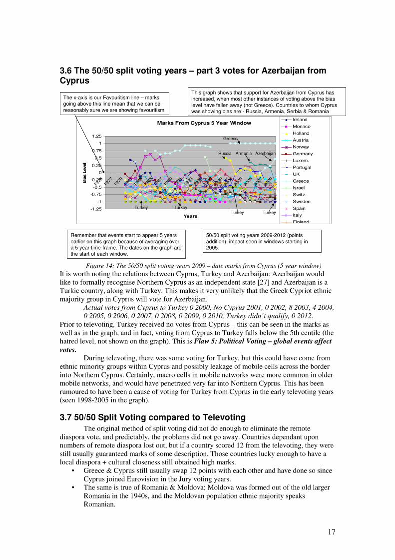
Figure 14: The 50/50 split voting years 2009 – date marks from Cyprus (5 year window)
It is worth noting the relations between Cyprus, Turkey and Azerbaijan: Azerbaijan would
like to formally recognise Northern Cyprus as an independent state [27] and Azerbaijan is a
Turkic country, along with Turkey. This makes it very unlikely that the Greek Cypriot ethnic
majority group in Cyprus will vote for Azerbaijan.
Actual votes from Cyprus to Turkey 0 2000, No Cyprus 2001, 0 2002, 8 2003, 4 2004,
0 2005, 0 2006, 0 2007, 0 2008, 0 2009, 0 2010, Turkey didn’t qualify, 0 2012.
Prior to televoting, Turkey received no votes from Cyprus – this can be seen in the marks as
well as in the graph, and in fact, voting from Cyprus to Turkey falls below the 5th centile (the
hatred level, not shown on the graph). This is Flaw 5: Political Voting – global events affect
votes. During televoting, there was some voting for Turkey, but this could have come from
ethnic minority groups within Cyprus and possibly leakage of mobile cells across the border
into Northern Cyprus. Certainly, macro cells in mobile networks were more common in older
mobile networks, and would have penetrated very far into Northern Cyprus. This has been
rumoured to have been a cause of voting for Turkey from Cyprus in the early televoting years
(seen 1998-2005 in the graph).
3.7 50/50 Split Voting compared to Televoting
The original method of split voting did not do enough to eliminate the remote
diaspora vote, and predictably, the problems did not go away. Countries dependant upon
numbers of remote diaspora lost out, but if a country scored 12 from the televoting, they were
still usually guaranteed marks of some description. Those countries lucky enough to have a
local diaspora + cultural closeness still obtained high marks.
• Greece & Cyprus still usually swap 12 points with each other and have done so since
Cyprus joined Eurovision in the Jury voting years.
• The same is true of Romania & Moldova; Moldova was formed out of the old larger
Romania in the 1940s, and the Moldovan population ethnic majority speaks
Romanian.
Marks From Cyprus 5 Year Window
-1.25
-1
-0.75
-0.5
-0.25
0
0.25
0.5
0.75
1
1.25
1975
1977
1979
1981
1983
1985
1987
1989
1991
1993
1995
1997
1999
2001
2003
2005
2007
2009
Years
Bia
s L
evel
Ireland
Monaco
Holland
Austria
Norway
Germany
Luxem.
Portugal
UK
Greece
Israel
Switz.
Sweden
Spain
Italy
Finland
Remember that events start to appear 5 years
earlier on this graph because of averaging over a 5 year time-frame. The dates on the graph are the start of each window.
50/50 split voting years 2009-2012 (points
addition), impact seen in windows starting in 2005.
This graph shows that support for Azerbaijan from Cyprus has
increased, when most other instances of voting above the bias level have fallen away (not Greece). Countries to whom Cyprus was showing bias are:- Russia, Armenia, Serbia & Romania
The x-axis is our Favouritism line – marks going above this line mean that we can be
reasonably sure we are showing favouritism
Greece
Turkey
AzerbaijanArmeniaRussia
Turkey TurkeyTurkey

18
• Turkey & Azerbaijan are Turkic countries and their language is partially intelligible
[28].
• The Scandinavian countries (Sweden, Denmark, Norway, Iceland, Finland and
Estonia, with much lower contributions from other Baltic states) have a non-equal
partnership resulting from different numbers of local diasporas, a shared history
associated with past events, and fundamentally under-pinned by an intelligibility of
each other’s languages: Swedish and Norwegian are mutually intelligible and Danish
is partially intelligible with Swedish and Norwegian [28].
Russia, Serbia and the Ukraine’s domination waned, to be replaced by the Scandinavians;
3 out 5 of the 50/50 split voting years were won by a Scandinavian country. There was an
increase in the song quality from some of the Scandinavian countries BUT this does not mean
that the competition is fair, because there are countries who still have little chance of winning.
Flaw 4: Cultural closeness has always existed at Eurovision. Of the Scandinavian
countries, initially between Sweden and Denmark. Now there are many Scandinavian
countries taking part and the effect is much larger.
3.8 The new 50/50 Split Voting Scheme
It is way too early to draw any conclusions about the impact of the new 50/50 split
marking scheme as it was only brought introduced in 2013. However, the new method of split
voting seems at first glance to have done much more to eliminate the remote diaspora vote.
The biased voting for countries like Armenia has been taken to below the 95th centile in the
graphs, but the same cannot be said yet of the remote diaspora vote to Russia and other
Eastern block countries (see figure 10).
This scheme has done nothing at all to reduce the impact of Cultural Closeness +
local diaspora, and the Scandinavian domination of the competition continues. Turkey and
now Serbia have withdrawn, citing the new voting scheme amongst other reasons, but as can
be seen from the graph, their mainstay of points has been removed.
3.9 Running order allocation changes
One other change happened in 2013. For the first time, running order is no longer
completely randomly decided. Countries are drawn into the semi-finals (still using the semi-
final pots) and then drawn into the first half or the second half of the semi. The organisers
then choose where to place the countries in each half, notionally to provide a musically
coherent show.
We used the figures calculated in an earlier presentation [1]:-
Average Rank Disadvantage In Semis Average Rank Disadvantage in the Final
The tables show the average disadvantage in terms of rank of going 1st to 13th in the final
and 14th to 26th for both jury voting and televoting, and the average disadvantage of going
1st to 8th and 9th to 16th for both jury voting and televoting in the semi-final: a song going 1st
in the final will generally be 6.2 places lower in the televote ranks and 2.4 places lower in the
jury vote ranks, than if it had gone last.
The whole point about this is someone’s choice = bias, and it may be that one or other
country always loses out as they are placed early on in the running order. In 2013, Denmark
and Azerbaijan, were placed 18th and 20
th in the running order, thus magnifying any original
advantage. At least if it’s drawn randomly, it’s fair on average!
Running
Order
Televoting
= 0.2385
per pl.
Jury voting
= 0.0905
per pl.
Running
Order
Televoting
= 0.2385
per pl.
Jury voting
= 0.0905
per pl.
1st 3.8160 1.4480 1
st 6.2010 2.3530
8th 2.1465 0.8145 13
th 3.3390 1.2670
9th 1.9080 0.7240 14
th 3.1005 1.1765
16th 0 0 26
th 0 0
19
3.10 50/50 split voting juries and televoting scheme 2
The jury has much, much more power under this new scheme. There are predictably
going to be knock-on effects for the new method of 50/50 voting where ranks are added. It is
possible for a televote win achieved without the aid of any biased voting to be virtually
eliminated by a national jury who ranks the song near the bottom, and at this point we should
be asking ourselves what we are trying to achieve by using the marking scheme. Extreme
songs lose out (e.g. 3 members of the jury place a song 1st and 2 members at 25th – how are
these ranks combined? 1st? Last? 11th – the average, this is just as bad as last because you are
likely to get zero points when the majority of the jury rated it 1st. The marking scheme
promotes mediocrity; appearing somewhere in the middle of the televoting list and
somewhere in the middle of the jury voting list for many countries will result in high marks,
even if the song wasn’t the favourite of either jury or televote.
The idea is now to produce a song that is disliked by no-one, and to produce a nice, safe
‘middle-of-the-road’ song – we have a suspicion that this approach has been adopted in 2014,
since many of this year’s songs have no cultural elements present, are sung entirely in English
and could have come from any country in Europe.
In terms of our analogy, we are now selecting the runner with the most boring shoes.
3.11 Given that the jury has lots of power, we should ask ourselves what we actually want from a jury
What is a jury supposed to look like? Is it supposed to represent the ethnicity of the
major ethnic group? If the jury is composed of the major ethnic group (e.g. in Germany, this
is people who are ethnically German), then we expect that the idea is to strengthen the major
ethnic group’s view (remember that the points were awarded to diaspora during the televoting
years, when the ethnic majority were not watching and voting numbers did not overwhelm the
diaspora vote).
There are obvious problems with this approach:-
• A jury of 5 people cannot possibly represent the views of a population. Is this a left
over from when the EBU had stand-by juries in case televoting failed for some
reason; 5 professionals and 5 ordinary members of the public? Perhaps the thinking is
that the televote provides the ordinary members vote?
• 5 people on a jury is just not enough to represent anything; the outcome from a group
of 5 people will be a mixture of 5 people’s likes, complete with prejudices. Is this
why the jury results last year just looked random compared to each other?
• The trouble with such a small number of people on the jury is the risk of having the
jury corrupted (as was found out earlier). With 100 people, say, more have to be
bought to have an impact, and it would be more likely for information about the
corruption to get into the public domain.
• We are extremely uncomfortable with the notion of just having the major ethnic
group as members of the jury. There is no mention of jury ethnicity in the rules – this
is not morally defendable. There is necessarily going to be an inherent (often
unconscious) bias in any jury which excludes ethnic minorities from a particular
country.
• There is also no mention in the rules of gender identity, sexual orientation or
disabilities representation – this is not morally defendable.
• There is no mention of music tastes spread – 5 country and western fans or 5 pop fans
is not a good idea – is this why dub step appeared unpopular with the juries in 2013?
• Why is the voting scheme 50/50? A 40/60 choice or any other mix would be still as
valid and the reasoning for selecting 50/50 is not made public.
4. Conclusion In this work, we have identified 7 flaws in the marking scheme:
20
• Flaw 1: The fundamental premise of the Eurovision marking scheme is flawed, as
we can’t measure the ‘most popular song’ fairly, and even if we could, there is no
relationship at all between popularity and the best song
• Flaw 2: A small number of people on a jury cannot possibly represent a population’s
complexities accurately
• Flaw 3: A greater level of development of the music industry in some countries was
evident in the jury years
• Flaw 4: Cultural and linguistic closeness of a country to another country produces a
bias in the points awarded
• Flaw 5: Political voting – global events affect votes produces variations in the marks
allocated, but generally, we have seen this most clearly in terms of hatred of 1
country for another
• Flaw 6: Diaspora or ethnic minorities in a country may overwhelm the ethnic
majority votes • Flaw 7: Countries stop putting in much effort when they feel they have a negligible
chance of winning or even qualifying for the final
Our contribution has been to realise that we are able to plot graphs of the Eurovision
biases, after taking account of participant number variations. From this work, we have been
able to identify and distinguish between a wide range of biases present in the Eurovision
marking scheme. The bias of cultural closeness between Sweden and Denmark and also
Greece and Cyprus was present in Eurovision right from when these countries joined. This
bias persists to the present day, but is now much stronger in the case of the Scandinavian
countries as many more have joined Eurovision. We can now say that the Eurovision results
were definitely diaspora driven during the televoting only period, culminating in a virtually
entirely predictable contest in 2006, 2007 & 2008.
The predictability of the contest was eased when 50/50 marking was introduced in 2009,
and more so when ranks instead of points were added together to produce the final mark in
2013, but the advantages of a widespread diaspora remain for countries who can produce a
middle of the road song hated by no-one. The introduction of 50/50 split voting has enabled
another bias, cultural closeness to re-emerge as the defining factor in the Eurovision marking
scheme, and to date, nothing has been done about this.
Splitting countries into pots before allocation to semi-finals in order to separate countries
from their diaspora does not work, since some countries always qualify and others never
qualify for years (some countries have such a widespread diaspora, that it is not possible to
separate them). We have considered the jury composition in light of the requirements placed
upon it, and have found that it is not representative in any way, shape or form.
Appendices
Appendix 1 - The technical details
Approach based on “Voting in Eurovision: Shared tastes or cultural epidemic?” by
Derek Gatherer, Empirical Text and Culture Research 3, 2007, p.72-83 [3].
The actual marks have been taken from the Eurovision web-site. We averaged all the
marks from every country to every other country from 1975 onwards, using a 5-year sliding-
window – 5 years represents a good compromise between suppressing the effects of good and
bad songs on the average, and being able to see the impact of events reasonably quickly.
• 95th centile: in order to generate the 95th centile (represents 95% confidence that
marks going above the line in our graphs are not just fluctuations but actually show
bias), we randomly generated a series of marks for each country pair. The distribution
is probably calculable, but difficult, so we chose to simulate instead.
• Generating random marks for each country pair: the randomly generated marks use a
random number generator, which is then used as an index into an array whose size is
based on the number of actual countries present each year (12, 10 etc. marks, plus
enough zeroes to equal actual number of countries present). If either member of a pair
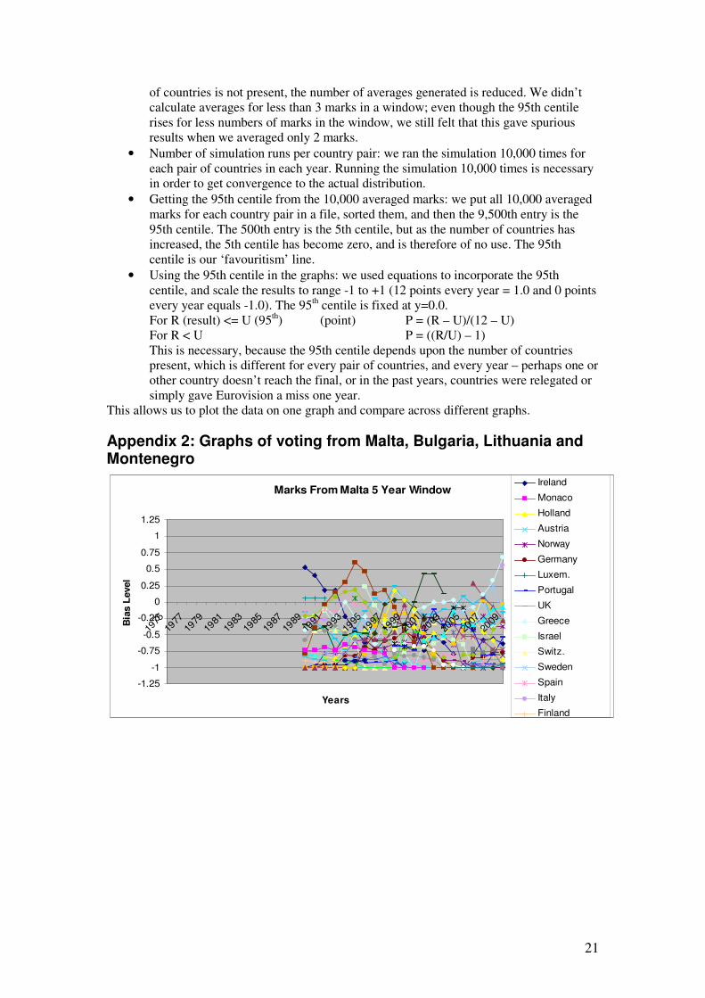
21
of countries is not present, the number of averages generated is reduced. We didn’t
calculate averages for less than 3 marks in a window; even though the 95th centile
rises for less numbers of marks in the window, we still felt that this gave spurious
results when we averaged only 2 marks.
• Number of simulation runs per country pair: we ran the simulation 10,000 times for
each pair of countries in each year. Running the simulation 10,000 times is necessary
in order to get convergence to the actual distribution.
• Getting the 95th centile from the 10,000 averaged marks: we put all 10,000 averaged
marks for each country pair in a file, sorted them, and then the 9,500th entry is the
95th centile. The 500th entry is the 5th centile, but as the number of countries has
increased, the 5th centile has become zero, and is therefore of no use. The 95th
centile is our ‘favouritism’ line.
• Using the 95th centile in the graphs: we used equations to incorporate the 95th
centile, and scale the results to range -1 to +1 (12 points every year = 1.0 and 0 points
every year equals -1.0). The 95th centile is fixed at y=0.0.
For R (result) <= U (95th) (point) P = (R – U)/(12 – U)
For R < U P = ((R/U) – 1)
This is necessary, because the 95th centile depends upon the number of countries
present, which is different for every pair of countries, and every year – perhaps one or
other country doesn’t reach the final, or in the past years, countries were relegated or
simply gave Eurovision a miss one year.
This allows us to plot the data on one graph and compare across different graphs.
Appendix 2: Graphs of voting from Malta, Bulgaria, Lithuania and Montenegro
Marks From Malta 5 Year Window
-1.25
-1
-0.75
-0.5
-0.25
0
0.25
0.5
0.75
1
1.25
1975
1977
1979
1981
1983
1985
1987
1989
1991
1993
1995
1997
1999
2001
2003
2005
2007
2009
Years
Bia
s L
evel
Ireland
Monaco
Holland
Austria
Norway
Germany
Luxem.
Portugal
UK
Greece
Israel
Switz.
Sweden
Spain
Italy
Finland
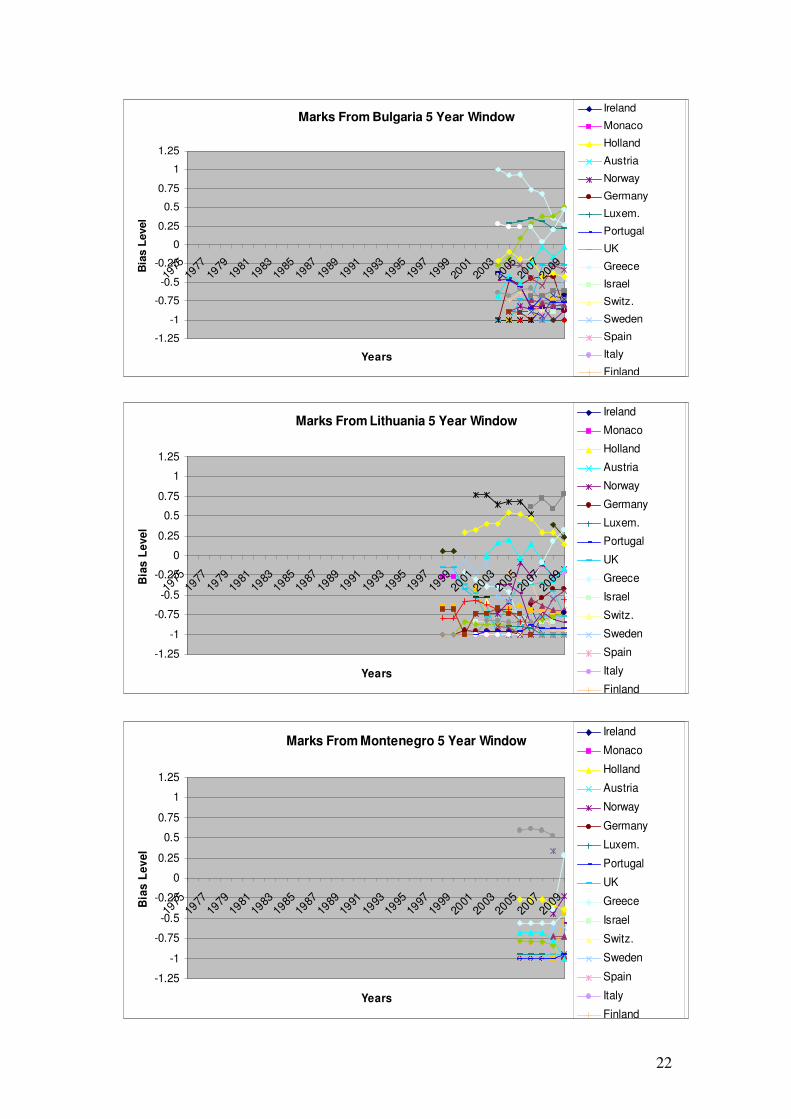
22
Marks From Bulgaria 5 Year Window
-1.25
-1
-0.75
-0.5
-0.25
0
0.25
0.5
0.75
1
1.25
1975
1977
1979
1981
1983
1985
1987
1989
1991
1993
1995
1997
1999
2001
2003
2005
2007
2009
Years
Bia
s L
evel
Ireland
Monaco
Holland
Austria
Norway
Germany
Luxem.
Portugal
UK
Greece
Israel
Switz.
Sweden
Spain
Italy
Finland
Marks From Lithuania 5 Year Window
-1.25
-1
-0.75
-0.5
-0.25
0
0.25
0.5
0.75
1
1.25
1975
1977
1979
1981
1983
1985
1987
1989
1991
1993
1995
1997
1999
2001
2003
2005
2007
2009
Years
Bia
s L
eve
l
Ireland
Monaco
Holland
Austria
Norway
Germany
Luxem.
Portugal
UK
Greece
Israel
Switz.
Sweden
Spain
Italy
Finland
Marks From Montenegro 5 Year Window
-1.25
-1
-0.75
-0.5
-0.25
0
0.25
0.5
0.75
1
1.25
1975
1977
1979
1981
1983
1985
1987
1989
1991
1993
1995
1997
1999
2001
2003
2005
2007
2009
Years
Bia
s L
ev
el
Ireland
Monaco
Holland
Austria
Norway
Germany
Luxem.
Portugal
UK
Greece
Israel
Switz.
Sweden
Spain
Italy
Finland
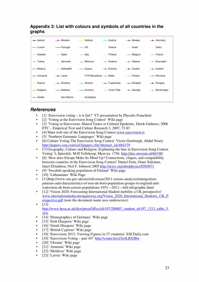
23
Appendix 3: List with colours and symbols of all countries in the graphs
References • [1] ‘Eurovision voting – is it fair?’ YT presentation by Physalis Franchetti
• [2] ‘Voting at the Eurovision Song Contest’ Wiki page
• [3] ‘Voting in Eurovision: Shared Tastes or Cultural Epidemic, Derek Gatherer, 2006
ETC – Empirical Text and Culture Research 3, 2007, 72-83
• [4] Main web-site of the Eurovision Song Contest www.eurovision.tv
• [5] ‘Northern Germanic Languages’ Wiki page
• [6] Culture Voting The Eurovision Song Contest’ Victor Ginsburgh, Abdul Noury
http://papers.ssrn.com/sol3/papers.cfm?abstract_id=884379
• [7] Geography, Culture and Religion: Explaining the bias in Eurovision Song Contest
Voting’ L.Spierdyk, M.H.Vellekoop, Mem no. 1794. http://doc.utwente.nl/66198/
• [8] ‘How does Europe Make Its Mind Up? Connections, cliques, and compatibility
between countries in the Eurovision Song Contest’ Daniel Fenn, Omer Suleman,
Janet Efstathiou, Neil F. Johnson 2005 http://arxiv.org/abs/physics/0505071
• [9] ’Swedish-speaking population of Finland’ Wiki page
• [10] ‘Lithuanians’ Wiki Page
• [11]http://www.ons.gov.uk/ons/rel/census/2011-census-analysis/immigration-
patterns-and-characteristics-of-non-uk-born-population-groups-in-england-and-
wales/non-uk-born-census-populations-1951---2011---full-infographic.html
• [12] ‘Vision 2020: Forecasting International Student mobility a UK persepective’
www.internationaleducationgateway.org/Vision_2020_International_Students_UK_P
erspective.pdf (note the document name uses underscores)
• [13]
http://www.hesa.ac.uk/dox/pressOffice/sfr197/280607_student_sfr197_1213_table_5.
xlsx
• [14] ‘Demographics of Germany’ Wiki page
• [15] ‘Irish Diaspora’ Wiki page
• [16] ‘Greek Diaspora’ Wiki page
• [17] ‘British Cypriots’ Wiki page
• [18] ‘Eurovision 2012: Viewing Figures in 27 countries’ ESCDaily.com
• [19] ‘Eurovision Voting – part 4/5’ http://youtu.be/cJ3e4LBXfBw
• [20] ‘Ukraine’ Wiki page
• [21] ‘Armenia’ Wiki page
• [22] ‘Moldova’ Wiki page
• [23] ‘Latvia’ Wiki page
Marks From Albania 5 Year Window
-8
-6
-4
-2
0
2
4
6
8
1975
1977
1979
1981
1983
1985
1987
1989
1991
1993
1995
1997
1999
2001
2003
2005
2007
2009
Years
Bia
s L
evel
Ireland Monaco Holland Austria Norway Germany
Luxem. Portugal UK Greece Israel Switz.
Sweden Spain Italy Finland Belgium France
Turkey Denmark Morocco Andorra Albania Bosnia&H
Belarus Serbia&M Cyprus Estonia Croatia Iceland
Lithuania Latvia FYR Macedonia Malta Poland Romania
Russia Slovenia Ukraine Yugolslavia Slovakia Hungary
Bulgaria Moldova Armenia Czech Rep. Georgia Montenegro
Serbia San Marino Azerbaijan

24
• [24] ‘Voting in Eurovision What it means for us in the UK’ YT presentation by
Physalis Franchetti
• [25] ‘Cheating at the Eurovision Song Contest 2002?’ esctoday.com
• [26] ‘Italy RAI Reveals Televoting Numbers, Questionable Jury (update)’ Bogdan
Honciuc Eurovision News http://wiwibloggs.com/2013/05/20/italy-rai-reveals-
televoting-numbers/27306/
• [27] ‘Azerbaijan backs Turkey over Cyprus but fears Karabakh impact, says Azeri
PM’ Cansu Camlibel http://www.hurriyetdailynews.com
• [28] ‘Mutual Intelligibility’ Wiki Page