Essentials of Business Analytics 2nd Edition Camm Solutions ...
20
02_EBA2eSolutionsChapter2.pdf 02_EBA2e Case Soln Chapter2.pdf Essentials of Business Analytics 2nd Edition Camm Solutions Manual Full Download: http://testbanklive.com/download/essentials-of-business-analytics-2nd-edition-camm-solutions-manual/ Full download all chapters instantly please go to Solutions Manual, Test Bank site: testbanklive.com
-
Upload
khangminh22 -
Category
Documents
-
view
0 -
download
0
Transcript of Essentials of Business Analytics 2nd Edition Camm Solutions ...

02_EBA2eSolutionsChapter2.pdf
02_EBA2e Case Soln Chapter2.pdf
Essentials of Business Analytics 2nd Edition Camm Solutions ManualFull Download: http://testbanklive.com/download/essentials-of-business-analytics-2nd-edition-camm-solutions-manual/
Full download all chapters instantly please go to Solutions Manual, Test Bank site: testbanklive.com

Descriptive Statistics
2 - 1
Chapter 2
Descriptive Statistics
Solutions:
1. a. Quantitative
b. Categorical
c. Categorical
d. Quantitative
e. Categorical
2. a. The top 10 countries according to GDP are listed below.
Country Continent GDP (millions of US$)
United States North America 15,094,025
China Asia 7,298,147
Japan Asia 5,869,471
Germany Europe 3,577,031
France Europe 2,776,324
Brazil South America 2,492,908
United Kingdom Europe 2,417,570
Italy Europe 2,198,730
Russia Asia 1,850,401
Canada North America 1,736,869
b. The top 5 countries by GDP located in Africa are listed below.
Country Continent GDP (millions of US$)
South Africa Africa 408,074
Nigeria Africa 238,920
Egypt Africa 235,719
Algeria Africa 190,709
Angola Africa 100,948
3. a. The sorted list of carriers appears below.
Carrier
Previous Year
On-time
Percentage
Current Year
On-time
Percentage
Blue Box Shipping 88.4% 94.8%
Cheetah LLC 89.3% 91.8%
Smith Logistics 84.3% 88.7%
Granite State Carriers 81.8% 87.6%

Descriptive Statistics
2 - 2
Super Freight 92.1% 86.8%
Minuteman Company 91.0% 84.2%
Jones Brothers 68.9% 82.8%
Honsin Limited 74.2% 80.1%
Rapid Response 78.8% 70.9%
Blue Box Shipping is providing the best on-time service in the current year. Rapid Response is
providing the worst on-time service in the current year.
b. The output from Excel with conditional formatting appears below.
c. The output from Excel containing data bars appears below.
d. The top 4 shippers based on current year on-time percentage (Blue Box Shipping, Cheetah LLC,
Smith Logistics, and Granite State Carriers) all have positive increases from the previous year and
high on-time percentages. These are good candidates for carriers to use in the future.
4. a. The relative frequency of D is 1.0 – 0.22 – 0.18 – 0.40 = 0.20.
b. If the total sample size is 200 the frequency of D is 0.20*200 = 40.
c. and d.
Class Relative Frequency Frequency
% Frequency
A 0.22 44
22

Descriptive Statistics
2 - 3
B 0.18 36
18
C 0.40 80
40
D 0.20 40
20
Total 1.0 200
100
5. a. These data are categorical.
b.
Show
Frequency
%
Frequency
Jep 9 18
JJ 8 16
BBT 14 28
THM 6 12
WoF 13 26
Total 50 100
c. The largest viewing audience is for The Big Bang Theory and the second largest is for Wheel of
Fortune.
6. a. Least = 12, Highest = 23
b.
Percent
Hours in Meetings per
Week Frequency Frequency
11-12 1 4%
13-14 2 8%
15-16 6 24%
17-18 3 12%
19-20 5 20%
21-22 4 16%
23-24 4 16%
25 100%

Descriptive Statistics
2 - 4
c.
The distribution is slightly skewed to the left.
7. a.
Industry Frequency % Frequency
Bank 26 13%
Cable 44 22%
Car 42 21%
Cell 60 30%
Collection 28 14%
Total 200 100%
b. The cellular phone providers had the highest number of complaints.
c. The percentage frequency distribution shows that the two financial industries (banks and collection
agencies) had about the same number of complaints. Also, new car dealers and cable and satellite
television companies also had about the same number of complaints.
8. a.
0
1
2
3
4
5
6
7
11-12 13-14 15-16 17-18 19-20 21-22 23-24
Feq
uen
cy
Hours per Week in Meetings
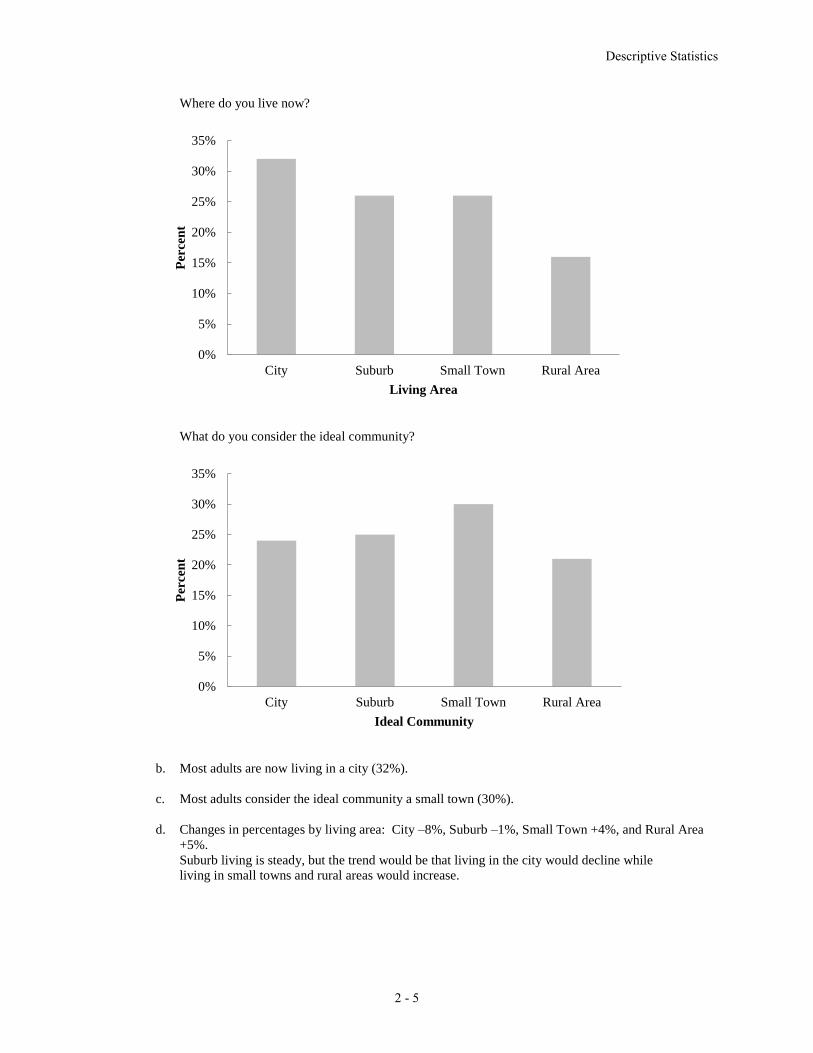
Living Area Live Now Ideal Community
City 32/100=32% 24/100=24%
Suburb 26/100=26% 25/100=25%
Small Town 26/100=26% 30/100=30%
Rural Area 16/100=16% 21/100=21%
Total 100% 100%
Descriptive Statistics
2 - 5
Where do you live now?
What do you consider the ideal community?
b. Most adults are now living in a city (32%).
c. Most adults consider the ideal community a small town (30%).
d. Changes in percentages by living area: City –8%, Suburb –1%, Small Town +4%, and Rural Area
+5%.
Suburb living is steady, but the trend would be that living in the city would decline while
living in small towns and rural areas would increase.
0%
5%
10%
15%
20%
25%
30%
35%
City Suburb Small Town Rural Area
Per
cen
t
Living Area
0%
5%
10%
15%
20%
25%
30%
35%
City Suburb Small Town Rural Area
Per
cen
t
Ideal Community

Descriptive Statistics
2 - 6
9. a.
Class Frequency
12-14 2
15-17 8
18-20 11
21-23 10
24-26 9
Total: 40
b.
Class Relative Frequency Percent Frequency
12-14 0.050 5.0%
15-17 0.200 20.0%
18-20 0.275 27.5%
21-23 0.250 25.0%
24-26 0.225 22.5%
Total: 1.000 100.0%
10.
Class Frequency Cumulative Frequency
10-19 10 10
20-29 14 24
30-39 17 41
40-49 7 48
50-59 2 50
11. a – d.
Class Frequency
Relative
Frequency
Cumulative
Frequency
Cumulative
Relative
Frequency
0-4 4 0.20 4 0.20
5-9 8 0.40 12 0.60
10-14 5 0.25 17 0.85
15-19 2 0.10 19 0.95
20-24 1 0.05 20 1.00
Total: 20 1.00
e. From the cumulative relative frequency distribution, 60% of customers wait 9 minutes or less.

Descriptive Statistics
2 - 7
12. a.
Class Frequency
800-1000 1
1000-1200 3
1200-1400 6
1400-1600 10
1600-1800 7
1800-2000 2
2000-2200 1
2200-2400 0
b. The distribution is slightly skewed to the right.
c. The most common score for students is between 1400 and 1600. No student scored above 2200, and
only 3 students scored above 1800. Only 4 students scored below 1200.
13. a. Mean = 10+20+12+17+16
5= 15 or use the Excel function AVERAGE.
To calculate the median, we arrange the data in ascending order:
10 12 16 17 20
Because we have n = 5 values which is an odd number, the median is the middle value which is 16
or use the Excel function MEDIAN.
b. Because the additional data point, 12, is lower than the mean and median computed in part a, we
expect the mean and median to decrease. Calculating the new mean and median gives us mean =
14.5 and median = 14.
14. Without Excel, to calculate the 20th percentile, we first arrange the data in ascending order:
15 20 25 25 27 28 30 34
The location of the pth percentile is given by the formula 𝐿𝑝 =𝑝
100(𝑛 + 1)
For our date set, 𝐿20 =20
100(8 + 1) = 1.8. Thus, the 20th percentile is 80% of the way between the
value in position 1 and the value in position 2. In other words, the 20th percentile is the value in
position 1 (15) plus 0.80 time the difference between the value in position 2 (20) and position 1 (15).
Therefore, the 20th percentile is
15 + 0.80*(20-15) = 19.
0
2
4
6
8
10
12

Descriptive Statistics
2 - 8
We can repeat the steps above to calculate the 25th, 65th and 75th percentiles. Or using Excel, we
can use the function PERCENTILE.EXC to get:
25th percentile = 21.25
65th percentile = 27.85
75th percentile = 29.5
15. Mean = 53+55+70+58+64+57+53+69+57+68+53
11= 59.727 or use the Excel function AVERAGE.
To calculate the median arrange the values in ascending order
53 53 53 55 57 57 58 64 68 69 70
Because we have n = 11, an odd number of values, the median is the middle value which is 57 or use
the Excel function MEDIAN.
The mode is the most often occurring value which is 53 because 53 appears three times in the data
set, or use the Excel function MODE.SNGL because there is only a single mode in this data set.
16. To find the mean annual growth rate, we must use the geometric mean. First we note that
3500=5000 1 2 9x x x , so
1 2 9x x x =0.700 where x1, x2, … are the growth factors for years, 1, 2, etc. through year 9.
Next, we calculate �̅�g = √(𝑥1)(𝑥2) ⋯ (𝑥𝑛)n
= √0.709
= 0.961144.
So the mean annual growth rate is (0.961144 – 1)100% = -0.38856%
17. For the Stivers mutual fund,
18000=10000 1 2 8x x x , so
1 2 8x x x =1.8
where x1, x2, … are the growth factors for years, 1, 2, etc. through year 8.
Next, we calculate 8
1 2 8 1.80 1.07624ngx x x x
So the mean annual return for the Stivers mutual fund is (1.07624 – 1)100 = 7.624%.
For the Trippi mutual fund we have:
10600=5000 1 2 8x x x , so
1 2 8x x x =2.12 and
8
1 2 8 2.12 1.09848ngx x x x
So the mean annual return for the Trippi mutual fund is (1.09848 – 1)100 = 9.848%.
While the Stivers mutual fund has generated a nice annual return of 7.6%, the annual return of 9.8%
earned by the Trippi mutual fund is far superior.

Descriptive Statistics
2 - 9
Alternatively, we can use Excel and the function GEOMEAN as shown below:
18. a. Mean =
∑ xini=1
n=
1291.5
48= 26.906
b. To calculate the median, we first sort all 48 commute times in ascending order. Because there are an
even number of values (48), the median is between the 24th and 25th largest values. The 24th largest
value is 25.8 and the 25th largest value is 26.1.
(25.8 + 26.1)/2 = 25.95
Or we can use the Excel function MEDIAN.
c. The values 23.4 and 24.8 both appear three times in the data set, so these two values are the modes
of the commute times. To find this using Excel, we must use the MODE.MULT function.
d. Standard deviation = 4.6152. In Excel, we can find this value using the function STDEV.S.
Variance = 4.61522 = 21.2998. In Excel, we can find this value using the function VAR.S.
e. The third quartile is the 75th percentile of the data. To find the 75th percentile without Excel,
we first arrange the data in ascending order. Next we calculate 𝐿𝑝 =𝑝
100(𝑛 + 1) = 𝐿75 =
75
100(48 + 1) = 36.75.
In other words, this value is 75% of the way between the 36th and 37th positions. However, in our
date the values in both the 36th and 37th positions are 28.5. Therefore, the 75th percentile is 28.5. Or
using Excel, we can use the function PERCENTILE.EXC.
19. a. The mean waiting time for patients with the wait-tracking system is 17.2 minutes and the median
waiting time is 13.5 minutes. The mean waiting time for patients without the wait-tracking system is
29.1 minutes and the median is 23.5 minutes.
b. The standard deviation of waiting time for patients with the wait-tracking system is 9.28 and the
variance is 86.18. The standard deviation of waiting time for patients without the wait-tracking
system is 16.60 and the variance is 275.66.

Descriptive Statistics
2 - 10
c and d.
e. Wait times for patients with the wait-tracking system are substantially shorter than those for
patients without the wait-tracking system. However, some patients with the wait-tracking system still
experience long waits.
20. a. The median number of hours worked for science teachers is 54.
b. The median number of hours worked for English teachers is 47.
c.
d.

Descriptive Statistics
2 - 11
e. The box plots show that science teachers spend more hours working per week than English teachers.
The box plot for science teachers also shows that most science teachers work about the same amount
of hours; in other words, there is less variability in the number of hours worked for science teachers.
21. a. Recall that the mean patient wait time without wait-time tracking is 29.1 and the standard deviation
of wait times is 16.6. Then the z-score is calculated as, 𝑧 =37−29.1
16.6= 0.48.
b. Recall that the mean patient wait time with wait-time tracking is 17.2 and the standard deviation of
wait times is 9.28. Then the z-score is calculated as, 𝑧 =37−17.2
9.28= 2.13.
As indicated by the positive z–scores, both patients had wait times that exceeded the means of their
respective samples. Even though the patients had the same wait time, the z–score for the sixth patient
in the sample who visited an office with a wait tracking system is much larger because that patient is
part of a sample with a smaller mean and a smaller standard deviation.
c. To calculate the z-score for each patient waiting time, we can use the formula 𝑧 =𝑥𝑖−�̅�
𝑠 or we can use
the Excel function STANDARDIZE. The z–scores for all patients follow.
Without Wait-Tracking System With Wait-Tracking System
Wait Time z-Score Wait Time z-Score
24 -0.31 31 1.49
67 2.28 11 -0.67
17 -0.73 14 -0.34
20 -0.55 18 0.09
31 0.11 12 -0.56
44 0.90 37 2.13
Descriptive Statistics
2 - 12
12 -1.03 9 -0.88
23 -0.37 13 -0.45
16 -0.79 12 -0.56
37 0.48 15 -0.24
No z-score is less than -3.0 or above +3.0; therefore, the z–scores do not indicate the existence of
any outliers in either sample.
22. a. According to the empirical rule, approximately 95% of data values will be within two standard
deviations of the mean. 4.5 is two standard deviation less than the mean and 9.3 is two standard
deviations greater than the mean. Therefore, approximately 95% of individuals sleep between 4.5
and 9.3 hours per night.
b. 𝑧 =8−6.9
1.2= 0.9167
c. 𝑧 =6−6.9
1.2= −0.75
23. a. 615 is one standard deviation above the mean. The empirical rule states that 68% of data values will
be within one standard deviation of the mean. Because a bell-shaped distribution is symmetric half
of the remaining values will be greater than the (mean + 1 standard deviation) and half will be below
(mean – 1 standard deviation). In other words, we expect that 0.5*(1 - 68%) = 16% of the data
values will be greater than (mean + 1 standard deviation) = 615.
b. 715 is two standard deviations above the mean. The empirical rule states that 95% of data values will
be within two standard deviations of the mean, and we expect that 0.5*(1 - 95%) = 2.5% of data
values will be above two standard deviations above the mean.
c. 415 is one standard deviation below the mean. The empirical rule states that 68% of data values will
be within one standard deviation of the mean, and we expect that 0.5*(1 - 68%) = 16% of data
values will be below one standard deviation below the mean. 515 is the mean, so we expect that 50%
of the data values will be below the mean. Therefore, we expect 50% - 16% = 36% of the data values
will be between the mean and one standard deviation below the mean (between 414 and 515).
d. 𝑧 =620−515
100= 1.05
e. 𝑧 =405−515
100= −1.10
24. a.
b. There appears to be a negative linear relationship between the x and y variables.
0
10
20
30
40
50
60
70
0 5 10 15 20
y
x

Descriptive Statistics
2 - 13
c. Without Excel, we can use the calculations shown below to calculate the covariance:
xi yi (𝑥𝑖 − �̅�) (𝑦𝑖 − �̅�) ( )( )i ix x y y
4 50 -4 4 -16
6 50 -2 4 -8
11 40 3 -6 -18
3 60 -5 14 -70
16 30 8 -16 -128
�̅� = 8
�̅� = 46
𝑠𝑥𝑦 =∑(𝑥𝑖−�̅�)(𝑦𝑖−�̅�)
𝑛−1=
−16−8−18−70−128
4= −60
Or, using Excel, we can use the COVARIANCE.S function.
The negative covariance confirms that there is a negative linear relationship between the x and y
variables in this data set.
d. To calculate the correlation coefficient without Excel, we need the standard deviation for x and y:
𝑠𝑥 = 5.43, 𝑠𝑦 = 11.40. Then the correlation coefficient is calculated as:
𝑟𝑥𝑦 =𝑠𝑥𝑦
𝑠𝑥𝑠𝑦=
−60
(5.43)(11.40)= −0.97.
Or we can use the Excel function CORREL.
The correlation coefficient indicates a strong negative linear association between the x and y
variables in this data set.
25. a. The scatter chart indicates that there may be a positive linear relationship between profits and
market capitalization.
b. Without Excel, we can use the calculations below to find the covariance and correlation coefficient:
ix
iy ( )ix x ( )iy y 2( )ix x 2( )iy y ( )( )i ix x y y
313.2 1891.9 -2468.57 -35259.75 6093826.70 1243249856.32 87041077.46
631 81458.6 -2150.77 44306.95 4625801.88 1963105961.23 -95293962.27
706.6 10087.6 -2075.17 -27064.05 4306321.16 732462715.10 56162440.18
-29 1175.8 -2810.77 -35975.85 7900415.30 1294261667.17 101119754.14
4,018.00 55188.8 1236.23 18037.15 1528270.20 325338838.31 22298108.67
959 14115.2 -1822.77 -23036.45 3322482.24 530677954.29 41990095.01
6,490.00 97376.2 3708.23 60224.55 13750986.48 3626996616.98 223326625.02
8,572.00 157130.5 5790.23 119978.85 33526789.60 14394924834.35 694705416.89
12,436.00 95251.9 9654.23 58100.25 93204200.49 3375639237.48 560913323.32
1,462.00 36461.2 -1319.77 -690.45 1741786.89 476718.98 911231.51
3,461.00 53575.7 679.23 16424.05 461356.46 269749471.38 11155745.66
854 7082.1 -1927.77 -30069.55 3716288.47 904177740.20 57967105.40
369.5 3461.4 -2412.27 -33690.25 5819035.66 1135032836.38 81269899.40
399.8 12520.3 -2381.97 -24631.35 5673770.32 606703323.37 58671077.30
278 3547.6 -2503.77 -33604.05 6268852.91 1129232068.00 84136732.35
9,190.00 32382.4 6408.23 -4769.25 41065440.67 22745730.18 -30562451.36
599.1 8925.3 -2182.67 -28226.35 4764038.47 796726743.27 61608740.10
2,465.00 9550.2 -316.77 -27601.45 100341.80 761839953.07 8743248.48

Descriptive Statistics
2 - 14
𝑠𝑥𝑦 =∑(𝑥𝑖 − �̅�)(𝑦𝑖 − �̅�)
𝑛 − 1=
3954149359
30= 131804978.6
𝑠𝑥 = √∑(𝑥𝑖 − �̅�)2
𝑛 − 1= √
368589209.4
30= 3505.18
𝑠𝑦 = √∑(𝑦 − �̅�)2
𝑛 − 1= √
62647162947
30= 45697.25
𝑟𝑥𝑦 =𝑠𝑥𝑦
𝑠𝑥𝑠𝑦
=131804978.6
(3505.18)(45697.25)= 0.8229
Or using Excel, we use the formula = COVARIANCE.S(B2:B32,C2:C32) to calculate the
covariance, which is 131804978.638. This indicates that there is a positive relationship between
profits and market capitalization.
c. In the Excel file, we use the formula =CORREL(B2:B32,C2:C32) to calculate the correlation
coefficient, which is 0.8229. This indicates that there is a strong linear relationship between profits
and market capitalization.
26. a. Without Excel, we can use the calculations below to find the correlation coefficient:
3,527.00 65917.4 745.23 28765.75 555371.12 827468465.86 21437166.03
602 13819.5 -2179.77 -23332.15 4751387.41 544389148.36 50858664.40
2,655.00 26651.1 -126.77 -10500.55 16070.06 110261516.43 1331130.81
1,455.70 21865.9 -1326.07 -15285.75 1758455.66 233654103.75 20269937.85
276 3417.8 -2505.77 -33733.85 6278871.98 1137972527.00 84529189.10
617.5 3681.2 -2164.27 -33470.45 4684054.86 1120270915.23 72439011.75
11,797.00 182109.9 9015.23 144958.25 81274412.67 21012894710.67 1306832306.01
567.6 12522.8 -2214.17 -24628.85 4902538.79 606580172.87 54532401.62
697.8 10514.8 -2083.97 -26636.85 4342921.55 709521692.00 55510332.79
634 8560.5 -2147.77 -28591.15 4612906.27 817453766.09 61407146.21
109 1381.6 -2672.77 -35770.05 7143687.40 1279496361.62 95605031.46
4,979.00 66606.5 2197.23 29454.85 4827829.60 867588283.54 64719150.12
5,142.00 53469.4 2360.23 16317.75 5570696.31 266269017.70 38513683.74
Total 368589209.4 62647162947 3954149359
ix
iy ( )ix x ( )iy y 2( )ix x 2( )iy y ( )( )i ix x y y
7.1 7.02 0.2852 0.6893 0.0813 0.4751 0.1966
5.2 5.31 -1.6148 -1.0207 2.6076 1.0419 1.6483
7.8 5.38 0.9852 -0.9507 0.9706 0.9039 -0.9367
7.8 5.40 0.9852 -0.9307 0.9706 0.8663 -0.9170
5.8 5.00 -1.0148 -1.3307 1.0298 1.7709 1.3505
5.8 4.07 -1.0148 -2.2607 1.0298 5.1109 2.2942
9.3 6.53 2.4852 0.1993 6.1761 0.0397 0.4952
5.7 5.57 -1.1148 -0.7607 1.2428 0.5787 0.8481
7.3 6.99 0.4852 0.6593 0.2354 0.4346 0.3199
7.6 11.12 0.7852 4.7893 0.6165 22.9370 3.7605
8.2 7.56 1.3852 1.2293 1.9187 1.5111 1.7028
7.1 12.11 0.2852 5.7793 0.0813 33.3998 1.6482
6.3 4.39 -0.5148 -1.9407 0.2650 3.7665 0.9991
6.6 4.78 -0.2148 -1.5507 0.0461 2.4048 0.3331
6.2 5.78 -0.6148 -0.5507 0.3780 0.3033 0.3386
6.3 6.08 -0.5148 -0.2507 0.2650 0.0629 0.1291
7.0 10.05 0.1852 3.7193 0.0343 13.8329 0.6888
6.2 4.75 -0.6148 -1.5807 0.3780 2.4987 0.9719
Descriptive Statistics
2 - 15
𝑠𝑥𝑦 =∑(𝑥𝑖 − �̅�)(𝑦𝑖 − �̅�)
𝑛 − 1=
25.5517
26= 0.9828
𝑠𝑥 = √∑(𝑥𝑖 − �̅�)2
𝑛 − 1= √
25.77407
26= 0.9956
𝑠𝑦 = √∑(𝑦 − �̅�)2
𝑛 − 1= √
130.0594
26= 2.2366
𝑟𝑥𝑦 =𝑠𝑥𝑦
𝑠𝑥𝑠𝑦
=0.9828
(0.9956)(2.2366)= 0.44
Or we can use the Excel function CORREL.
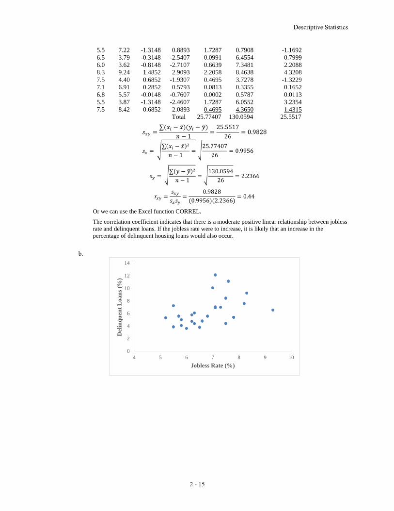
The correlation coefficient indicates that there is a moderate positive linear relationship between jobless
rate and delinquent loans. If the jobless rate were to increase, it is likely that an increase in the
percentage of delinquent housing loans would also occur.
b.
0
2
4
6
8
10
12
14
4 5 6 7 8 9 10
Del
inq
uen
t L
oan
s (%
)
Jobless Rate (%)
5.5 7.22 -1.3148 0.8893 1.7287 0.7908 -1.1692
6.5 3.79 -0.3148 -2.5407 0.0991 6.4554 0.7999
6.0 3.62 -0.8148 -2.7107 0.6639 7.3481 2.2088
8.3 9.24 1.4852 2.9093 2.2058 8.4638 4.3208
7.5 4.40 0.6852 -1.9307 0.4695 3.7278 -1.3229
7.1 6.91 0.2852 0.5793 0.0813 0.3355 0.1652
6.8 5.57 -0.0148 -0.7607 0.0002 0.5787 0.0113
5.5 3.87 -1.3148 -2.4607 1.7287 6.0552 3.2354
7.5 8.42 0.6852 2.0893 0.4695 4.3650 1.4315
Total 25.77407 130.0594 25.5517

Chapter 2
Descriptive Statistics
Case Problem: Heavenly Chocolates Website Traffic
1. Descriptive statistics for the time spent on the website, number of pages viewed, and amount spent
are shown below.
Time (min) Pages Viewed Amount Spent ($)
Mean 12.8 4.8 68.13
Median 11.4 4.5 62.15
Standard Deviation 6.06 2.04 32.34
Range 28.6 8 140.67
Minimum 4.3 2 17.84
Maximum 32.9 10 158.51
Sum 640.5 241 3406.41
The mean time a shopper is on the Heavenly Chocolates website is 12.8 minutes, with a minimum
time of 4.3 minutes and a maximum time of 32.9 minutes. The following histogram demonstrates
that the data are skewed to the right.
The mean number of pages viewed during a visit is 4.8 pages with a minimun of 2 pages and a
maximum of 10 pages A histogram of the number of pages viewed indicates that the data are slightly
skewed to the right.
30252015105
14
12
10
8
6
4
2
0
Time (min)
Fre
qu
en
cy
Histogram of Time (min)

Solutions to Case Problems
The mean amount spent for an on-line shopper is $68.13 with a minimum amount spent of $17.84
and a maximum amount spent of $158.51. The following histogram indicates that the data are
skewed to the right.
2. Summary by Day of Week
Day of Week Frequency
Total Amount
Spent ($)
Average Amount
Spent ($)
Sunday 5 218.15 43.63
Monday 9 813.38 90.38
Tuesday 7 414.86 59.27
Wednesday 6 341.82 56.97
Thursday 5 294.03 58.81
Friday 11 945.43 85.95
Saturday 7 378.74 54.11
Total 50 3406.41 68.13
108642
12
10
8
6
4
2
0
Pages Viewed
Fre
qu
en
cy
Histogram of Pages Viewed
16014012010080604020
10
8
6
4
2
0
Amount
Fre
qu
en
cy
Histogram of Amount

The above summary shows that Monday and Friday are the best days in terms of both the total
amount spent and the averge amount spent per transaction. Friday had the most purchases (11) and
the highest value for total amount spent ($945.43). Monday, with nine transactions, had the highest
average amount spent per transaction ($90.38). Sunday was the worst sales day of the week in terms
of number of transactions (5), total amount spent ($218.15), and average amount spent per
transaction ($43.63). However, the sample size for each day of the week are very small, with only
Friday having more than ten transactions. We would suggest a larger sample size be taken before
recommending any specific stratgegy based on the day of week statistics.
3. Summary by Type of Browser
Browser Frequency
Total Amount
Spent ($)
Average Amount
Spent ($)
Firefox 16 1228.21 76.76
Chrome 27 1656.81 61.36
Other 7 521.39 74.48
Chrome was used by 27 of the 50 shoppers (54%). But, the average amount spent spent by
customers who used Chrome ($61.36) is less than the average amount spent by customers who used
Firefox ($76.76) or some other type of browser ($74.48). This result would suggest targeting special
promotion offers to Firefox users or users of other types of browsers. But, before recommending
any specific strategies based upon the type of browser, we would suggest taking a larger smaple size.
4. A scatter diagram showing the relationship between time spent on the website and the amount spent
follows:
The sample correlation coefficient between these two variables is .580. The scatter diagram and the
sample correlation coefficient indicate a postive relationship between time spent on the website and
the total amount spent. Thus, the sample data support the conclusion that customers who spend more
time on the website spend more.
5. A scatter diagram showing the relationship between the number of pages viewed and the amount
spent follows:

Solutions to Case Problems
The sample correlation coefficient between these two variables is .724. The scatter diagram and the
sample correlation coefficient indicate a postive relationship between time spent on the website and
the number of pages viewed. Thus, the sample data support the conclusion that customers who view
more website pages spend more.
6. A scatter diagram showing the relationship between the number of pages viewed and the time spent
on the website follows:
The sample correlation coefficient between these two variables is .596. The scatter diagram and the
sample correlation coefficient indicate a postive relationship between the number of pages viewed
and the time spent on the website.
Summary: The analysis indicates that on-line shoppers who spend more time on the company’s
website and/or view more website pages spend more money during their visit to the website. If Heavenly Chocolates can develop an attractive website such that on-line shoppers are willing to
spend more time on the website and/or view more pages, there is a good possiblity that the company
will experience greater sales. And, consideration should also be given to developing marketing
strategies based upon possible differences in sales associated with the day of the week as well as
differences in sales associated with the type of browser used by the customer.
Essentials of Business Analytics 2nd Edition Camm Solutions ManualFull Download: http://testbanklive.com/download/essentials-of-business-analytics-2nd-edition-camm-solutions-manual/
Full download all chapters instantly please go to Solutions Manual, Test Bank site: testbanklive.com