ENVIRONMENTAL SCAN
84
ENVIRONMENTAL SCAN CHAIRMAN JOHN EAVES VICE CHAIR LIZ HAUSMANN BOB ELLIS LEE MORRIS JOAN P. GARNER MARVIN S. ARRINGTON, JR. EMMA I. DARNELL District 7 – At Large District 1 District 2 District 3 District 4 District 5 District 6 FULTON COUNTY BOARD OF COMMISSIONERS Dick Anderson | County Manager
-
Upload
khangminh22 -
Category
Documents
-
view
0 -
download
0
Transcript of ENVIRONMENTAL SCAN

ENVIRONMENTAL SCAN
CHAIRMAN JOHN EAVES
VICE CHAIR LIZ HAUSMANN
BOB ELLIS
LEE MORRIS
JOAN P. GARNER
MARVIN S. ARRINGTON, JR.
EMMA I. DARNELL
District 7 – At Large
District 1
District 2
District 3
District 4
District 5
District 6
FULTON COUNTY BOARD OF COMMISSIONERS
Dick Anderson | County Manager

PAGE 1
Fulton County Government: 2016 Environmental Scan

PAGE 2
Fulton County Government: 2016 Environmental Scan
Table of Contents
3 Introduction and Purpose
4 Executive Summary
7 Population
Population Information Source Key Indications Overall Growth Regional Population Age Household Income Race and Ethnicity Racial Diversity
16 Economy
Economy Information Source
Key Indications
Residential Building Permits
Jobs and Employment
Job Growth
Taxation
23 Public Health
Public Health Information Source
Key Indications
Causes of Death
Sexually Transmitted Diseases
Teen Pregnancy
Diabetes
Obesity
County Health Rating
35 Public Safety
Public Safety Information
Key Indications
Crime Rates
Incarceration Rates
Juvenile Crime

PAGE 3
Fulton County Government: 2016 Environmental Scan
42 Technology
Smartphone Usage Broadband Access Smartphone and Internet Usage by Age and Race
47 Commissioner District Profiles
General Profile Population by Race and Ethnicity Housing Units Income Distribution Households Population by Age and Sex
34 District 1 37 District 2
42 District 3 46 District 4 49 District 5 59 District 6
66 Appendices – “Raw Data” Tables
Table 1 – Population Indicators
Table 2 – Economic Indicators
Table 3 – Public Health Indicators
Table 4 – Public Safety Indicators
Table 5 – Technology Indicators
Table 6 – Commission Districts

PAGE 4
Fulton County Government: 2016 Environmental Scan
FO
CU
S
SC
OP
E O
F C
OM
PA
RIS
ON
AP
PR
OA
CH
Identifed a project team and resources
Developed a project plan and timeline
Selected a “scanning type”
Defined the “Scope of Comparison” and "Focus"
Gathered data
Conducted analyses
Generated scan report
Atlanta Regional Commission Core 10 Counties (ARC Core 10)
State of Georgia
United States
Counties of similar size
Population
Economy
Public Health
Public Safety
Technology
Introduction & Purpose
The Fulton County Environmental Scan is updated annually to inform
development of strategic initiatives as well as the County’s resource allocation
priorities. The Environmental Scan also promotes transparency in that it is made
public to the constituency of the County upon publication, and includes results of
citizen surveys by which customer satisfaction levels are measured.
Environmental scanning is the systematic use of formal methodologies to explore
the organizational environment toward an end of both identifying strengths and
weaknesses of internal factors, and projecting threats and opportunities in the
event external factors are analyzed. There are two fundamental scanning types:
“Social Intuitive” and Formal Analytical.” Social intuitive is a less rigorous,
informal means that involves networking, asking questions, and generating
opinions. Formal analytical, the methodology selected for the 2016 scan, is a
scanning process in which people investigate a wide range of sources and produce
an analytical report.
This scan report is organized by “Focus Area” each of which begins with source
information and key indicators. Focus Area sub-sections are then analytically
summarized and graphically represented. The report concludes with a catalogue
of Appendices which contain the raw data upon which the analyses were based.
ENVIRONMENTAL SCAN
DEVELOPMENT
FRAMEWORK

PAGE 5
Fulton County Government: 2016 Environmental Scan
Executive Summary
Population & Economy
Fulton County maintains its ranking as the most populous county within the state
of Georgia with most recent estimates at just over one million residents. An aging
population will increase demands for senior services for years and even decades to
come. The County’s economic trends are generally consistent with that of the
state and the nation, indicating slow but progressive improvement from the most
recent recession. Specifically, residential building permits are on the rise after
bottoming out in 2010, and healthy job growth in metro Atlanta placed it 7th in the
nation in the number of jobs gained in 2014. The county’s unemployment rate fell
below 6% last year for the first time since 2008 and reached as low as 4.8% in April
of 2016.
Public Health & Public Safety
Similar to the data supporting economic trends, Fulton County’s overall health
trends are also consistent with those seen nationally and state-wide. For instance,
death rates from cardio-vascular diseases as well as teen pregnancy rates are on the
decline across the board. Notably, however, one public health area in which
Fulton is dissimilar to the state is sexually transmitted diseases. Fulton has one of
the highest rates of HIV and syphilis in the nation. Overall, Fulton County’s health
ranking falls mid-way in a comparison between members of the ARC Core 10
Counties. Likely resulting from its uniquely urban nature, Fulton County
surpasses other counties in the ARC Core 10 in instances of serious crimes.
However, the overall trend for all Part I (serious) crime rates has declined over the
last decade, with the exception of a slight “uptick” in recent years for murder,
robbery, and larceny.
Technology
Technology trends suggest Fulton’s population is ripe and prepared for
technological advancements to support growth and improvement in the above-
summarized areas. Announcements by Google, AT&T and Comcast to bring
Gigabit broadband service to the Atlanta area could place Fulton among the fastest
counties in the US in terms of internet speeds. Not only will the competition be
good for residents, but Gigabit networks will make the area even more attractive to
business.

PAGE 6
Fulton County Government: 2016 Environmental Scan
Strengths, Weaknesses, Opportunities and Threats Analysis
STRENGTHS WEAKNESSES
Established and well organized Board of Commissioners
Largest most diverse County in the State of Georgia
Recently updated Customer Service training for employees
Strong leadership in place
Modernized Human Resources processes
Fulton County is home to the only Level 1 trauma center in the State, Grady Hospital
We have a major investment in Arts and Culture
Availability of Post-Secondary schools for research and partnership
Although we have processes, they are cumbersome, especially for “internal” customers (each other!)
Technology infrastructure needs updating
Aging County assets/buildings in need of renewal/replacement
Coordination of data collection with municipal, community, arts and cultural partners/not-for-profits
OPPORTUNITIES THREATS
Fulton is estimated to have added nearly 90,000 residents since the 2010 census.
Building permits issuances rebounded from recession levels.
Metro Atlanta’s 2015 employment
growth rate is on trend to see a 3.4% increase (96,300 jobs).
Fulton’s unemployment rate has
remained well below 6% through the first half of 2016.
Teen pregnancy rate has
Fulton’s population is aging and younger, working-aged groups have declined.
The percentage of jobs held by the 25-
34 year old demographic is decreasing.
Mental and behavioral diseases puts
Fulton outside the national pattern for 3rd “causes of death”
Fulton has some of the highest rates
of HIV and syphilis in the nation Fulton surpasses all other counties in

PAGE 7
Fulton County Government: 2016 Environmental Scan
consistently been on the decline over the last decade.
The overall obesity rate in Fulton is lower than that of the State.
Plans for Gigabit broadband
service in Atlanta could give much of Fulton County access to the highest internet speeds in the US.
Implement a Performance Management System to drive accountability and improve impact, service and efficiency
Availability of South Fulton for development
Fulton Industrial Boulevard
Fulton County Airport, Brown Field
the ARC Core 10 in instances of serious crimes
Availability of workforce housing opportunities
Employee resistance to change
.
PAGE 8
Fulton County Government: 2016 Environmental Scan
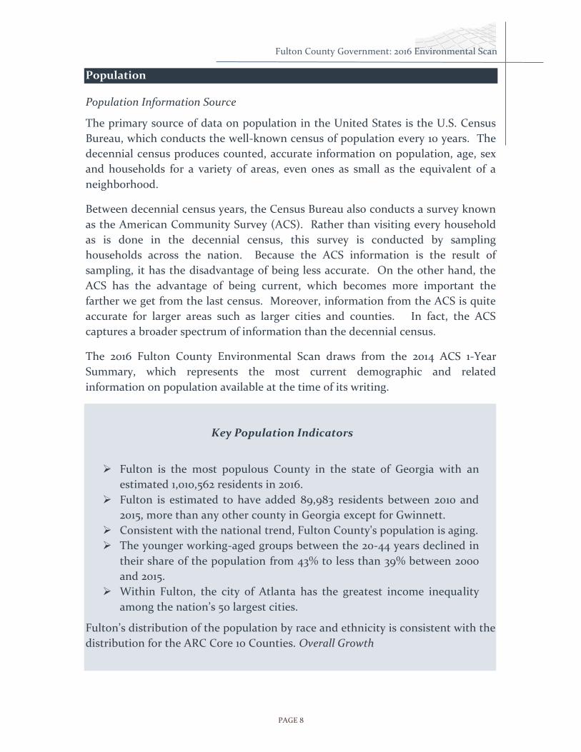
Population
Population Information Source
The primary source of data on population in the United States is the U.S. Census
Bureau, which conducts the well-known census of population every 10 years. The
decennial census produces counted, accurate information on population, age, sex
and households for a variety of areas, even ones as small as the equivalent of a
neighborhood.
Between decennial census years, the Census Bureau also conducts a survey known
as the American Community Survey (ACS). Rather than visiting every household
as is done in the decennial census, this survey is conducted by sampling
households across the nation. Because the ACS information is the result of
sampling, it has the disadvantage of being less accurate. On the other hand, the
ACS has the advantage of being current, which becomes more important the
farther we get from the last census. Moreover, information from the ACS is quite
accurate for larger areas such as larger cities and counties. In fact, the ACS
captures a broader spectrum of information than the decennial census.
The 2016 Fulton County Environmental Scan draws from the 2014 ACS 1-Year
Summary, which represents the most current demographic and related
information on population available at the time of its writing.
Key Population Indicators
Fulton is the most populous County in the state of Georgia with an
estimated 1,010,562 residents in 2016.
Fulton is estimated to have added 89,983 residents between 2010 and
2015, more than any other county in Georgia except for Gwinnett.
Consistent with the national trend, Fulton County's population is aging.
The younger working-aged groups between the 20-44 years declined in
their share of the population from 43% to less than 39% between 2000
and 2015.
Within Fulton, the city of Atlanta has the greatest income inequality
among the nation’s 50 largest cities.
Fulton’s distribution of the population by race and ethnicity is consistent with the
distribution for the ARC Core 10 Counties. Overall Growth

PAGE 9
Fulton County Government: 2016 Environmental Scan
After a slight decline in the 1970’s, Fulton County’s population has grown
continuously when viewed on a decennial basis (Figure 1). According to estimates
for 2015, the latest year for which the Census Bureau has released information, the
County’s population was estimated at 1,010,562.
FIGURE 1 POPULATION OF FULTON COUNTY ACCORDING TO DECENNIAL CENSUS COUNTS, 1970 TO 2010,
WITH 2015 ESTIMATE
605,210 589,904 648,776
816,006
920,581
1,010,562
0
200,000
400,000
600,000
800,000
1,000,000
1,200,000
1970 1980 1990 2000 2010 2015
Po
pu
lati
on
Year
2015 estimate

PAGE 10
Fulton County Government: 2016 Environmental Scan
Regional Population
When viewed in the context of its regional population, Fulton County has
maintained the rank as the most populous county among the ARC Core 10 (Figure
2). Only Gwinnet County as consistently outpaced Fulton in terms of the number
of people added each decade since 1970. Estimates for recent years, between 2010
and 2015, show that Fulton County added 89,983, while Gwinnett added 90,499. It
should be noted that estimates by the Atlanta Regional Commission (ARC) show
somewhat smaller growth for both counties over the same period.1 The ARC
forecasts that the 20-county Atlanta region will increase in population from about
5.6 million in 2015 to over 8 million in 2040, representing a somewhat modest
annual growth rate of 1.5% when compared to an historical growth rate of about
3% from the 1950’s to the 2000’s. Fulton County, though forecasted to remain the
most populous of the 20 counties, is expected to have a slower growth rate than all
counties except Clayton, Cobb and DeKalb.
FIGURE 2 POPULATION FOR EACH OF THE ARC CORE 10 COUNTIES, 1970 TO 2015
1 ARC’s 2014 Population Estimates, http://documents.atlantaregional.com/research/pop_estimates_main2014.pdf
Cherokee
Clayton
Cobb DeKalb
Douglas Fayette
Fulton
Gwinnett
Henry
Rockdale
0
200,000
400,000
600,000
800,000
1,000,000
1,200,000
1970 1980 1990 2000 2010
Po
pu
lati
on
Year

PAGE 11
Fulton County Government: 2016 Environmental Scan
Although Fulton County’s population continues to grow, so does the population of
the metro region. Notably, Fulton’s share of the total ARC Core 10 county
population has declined in each of the last four decades (Figure 3). In 1970 for
instance, Fulton County accounted for over 40% of the Core 10 population.
However, by 2010, that share had fallen to just over 22%.
FIGURE 3 FULTON COUNTY POPULATION AS A SHARE OF THE TOTAL ARC CORE 10 COUNTY POPULATION
0
500,000
1,000,000
1,500,000
2,000,000
2,500,000
3,000,000
3,500,000
4,000,000
4,500,000
5,000,000
1970 1980 1990 2000 2010 2015
Po
pu
alt
ion
Year
Fulton
ARC Without Fulton
PAGE 12
Fulton County Government: 2016 Environmental Scan
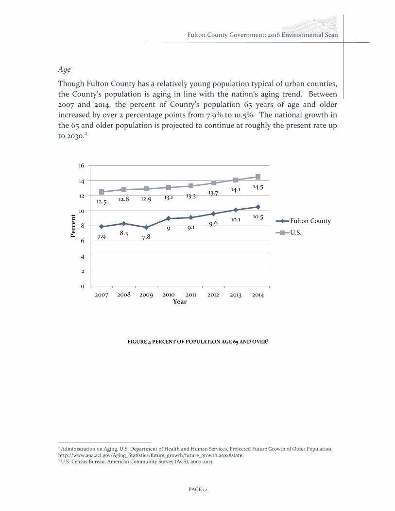
Age
Though Fulton County has a relatively young population typical of urban counties,
the County’s population is aging in line with the nation’s aging trend. Between
2007 and 2014, the percent of County’s population 65 years of age and older
increased by over 2 percentage points from 7.9% to 10.5%. The national growth in
the 65 and older population is projected to continue at roughly the present rate up
to 2030.2
FIGURE 4 PERCENT OF POPULATION AGE 65 AND OVER3
2 Administration on Aging, U.S. Department of Health and Human Services, Projected Future Growth of Older Population, http://www.aoa.acl.gov/Aging_Statistics/future_growth/future_growth.aspx#state. 3 U.S. Census Bureau, American Community Survey (ACS), 2007-2013.
7.9 8.3 7.8
9 9.1 9.6
10.1 10.5
12.5 12.8 12.9 13.1 13.3 13.7 14.1 14.5
0
2
4
6
8
10
12
14
16
2007 2008 2009 2010 2011 2012 2013 2014
Pe
rce
nt
Year
Fulton County
U.S.

PAGE 13
Fulton County Government: 2016 Environmental Scan
The aging of the population can also be seen in a comparison of population
pyramids for 2000 and 2013 (Figures 5 and 6). Though the population below age 20
has remained about the same, the younger, working age groups (20 to 44) have
dropped between 2000 and 2013 from 43.4% to 39.0%. Conversely, the older
working age groups (45-64 and 65+) have grown in proportion.
FIGURE 5 POPULATION DISTRIBUTIONS BY SEX AND AGE, FULTON COUNTY, 2000
FIGURE 6 POPULATION DISTRIBUTIONS BY SEX AND AGE, FULTON COUNTY, 2013
-10% -5% 0% 5% 10%
0-4
10-14
20-24
30-34
40-44
50-54
60-64
70-74
80-84
Percent of Population
Ag
e G
rou
p
Male
Female
-10% -5% 0% 5% 10%
0-4
10-14
20-24
30-34
40-44
50-54
60-64
70-74
80-84
Percent of Population
Ag
e G
rou
p
Male
Female
PAGE 14
Fulton County Government: 2016 Environmental Scan
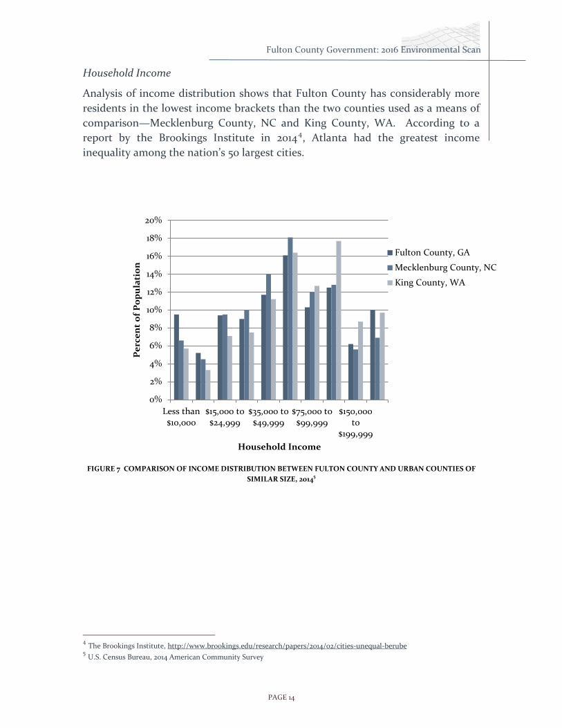
Household Income
Analysis of income distribution shows that Fulton County has considerably more
residents in the lowest income brackets than the two counties used as a means of
comparison—Mecklenburg County, NC and King County, WA. According to a
report by the Brookings Institute in 20144, Atlanta had the greatest income
inequality among the nation’s 50 largest cities.
FIGURE 7 COMPARISON OF INCOME DISTRIBUTION BETWEEN FULTON COUNTY AND URBAN COUNTIES OF
SIMILAR SIZE, 20145
4 The Brookings Institute, http://www.brookings.edu/research/papers/2014/02/cities-unequal-berube
5 U.S. Census Bureau, 2014 American Community Survey
0%
2%
4%
6%
8%
10%
12%
14%
16%
18%
20%
Less than$10,000
$15,000 to$24,999
$35,000 to$49,999
$75,000 to$99,999
$150,000to
$199,999
Pe
rce
nt
of
Po
pu
lati
on
Household Income
Fulton County, GA
Mecklenburg County, NC
King County, WA

PAGE 15
Fulton County Government: 2016 Environmental Scan
Race and Ethnicity
The distribution of population by race and ethnicity for Fulton County is similar to
the distribution for the ARC Core 10 counties as a whole. Fulton County has
somewhat fewer Hispanic and white residents and more black residents, but
racial/ethnic makeup for the County is not drastically different from that of the
region as a whole.
When compared to individual counties in 2010, Fulton had a lower proportion of
Hispanic residents (7.9%) than any of the Core 10, except for Fayette and Henry.
Gwinnett had the highest proportion of Hispanics at 20.1%, and also had the
largest absolute number of all ten counties.
FIGURE 8 POPULATION DISTRIBUTION BY RACE AND ETHNICITY FOR ARC CORE 10 COUNTIES, 2014
0%
10%
20%
30%
40%
50%
60%
70%
80%
90%
100%
Hispanic
Other, Non-Hispanic
Asian, Non-Hispanic
Black, Non-Hispanic
White, Non-Hispanic

PAGE 16
Fulton County Government: 2016 Environmental Scan
Racial Diversity
Futon County can be compared to other counties in terms of racial diversity using
the Diversity Index6. According to the index, Fulton County is second only to
Gwinnett County in terms of diversity and is tied with Rockdale an DeKalb
counties (Figure 9).
It is important to note that measures of diversity are highly dependent on the
geographic area over which diversity is being measured. For example, a county
can have a highly diverse population even though the population within the county
is highly segregated.
FIGURE 9 RACIAL DIVERSITY INDEX FOR ARCCORE 10 COUNTIES
6 The Diversity Index represents the likelihood that two persons, chosen at random from the same area, belong to different race or ethnic groups.
41
64
45
67
64
54
67
77
62
67
0 20 40 60 80 100
Cherokee
Clayton
Cobb
DeKalb
Douglas
Fayette
Fulton
Gwinnett
Henry
Rockdale

PAGE 17
Fulton County Government: 2016 Environmental Scan
Economy
Economy Information Source
The Bureau of Labor Statistics (BLS), an extension of the United States department
of Labor, was a key source for information provided within the Economy
section. The BLS has captured employment, labor, & wage related information
dating back to the 1880s. The 2014 American Community Survey’s 1 – Year
Summary, also used to support data within the Population section, was also a key
source of information.
Other sources include the Georgia Department of Labor which develops its
own “Area Labor Profile” specifically for Fulton County. This profile includes labor
force activity, population, industry mix, per capita, high school graduates and
other important demographic information.
Lastly the Georgia Economic Forecasting Center was used for the most recent
labor and economy figures. This publication is done on a quarterly basis and
provides an analysis of Georgia’s current economy, historical economic data for the
last nine years, and the forecast for the next three years. This center is one of the
few university-based forecasting centers to provide comprehensive analysis of the
national economy on a quarterly basis. It is the only center to publish a quarterly
forecast for Georgia and Atlanta.
Key Economic Indicators
In 2015, building permits issuances continued to rebound from
precipitous drops during the recession. However, they did so just over
½-way to the 2006 issuance levels.
In keeping with the national trend, the proportion of the metro area’s
job-holders 55 years and older is expected to continue increasing.
The Atlanta metro region added 76,600 jobs between May 2015 and May
2016, the third-fastest growth rate among the nation’s 12 largest metro
areas.
Metro Atlanta’s unemployment is at around 7.2% and is on trend to
decrease to 6.3% in 2015, and 5.7% in 2016.

PAGE 18
Fulton County Government: 2016 Environmental Scan
Residential Building Permits
Few measures accurately illustrate the Great Recession for local governments as
clearly as the issuance of building permits for residential housing. Viewed annually,
permits in Fulton County dropped precipitously in 2007 and hit bottom in 2010. In
2013, issuances rebounded only half way to 2006 levels based on total construction
costs. The permit issuances have continued to grow throughout 2015 to pre-2008
levels.
FIGURE 10 RESIDENTIAL CONSTRUCTION PERMITS ISSUED IN FULTON COUNTY BY COSTS, 2006 TO 2015
FIGURE 11 FULTON COUNTY RESIDENTIAL CONSTRUCTION PERMITS BY NUMBER OF UNITS, 2006 TO 2015
$0
$500,000,000
$1,000,000,000
$1,500,000,000
$2,000,000,000
$2,500,000,000
Co
nst
ruct
ion
Co
sts
Year
Multi-Family Permits
Single-Family Permits
0
2,000
4,000
6,000
8,000
10,000
12,000
14,000
16,000
18,000
20,000
Nu
mb
er
of
Un
its
Year
Multi-Family Permits
Single-Family Permits

PAGE 19
Fulton County Government: 2016 Environmental Scan
Jobs and Employment
The unemployment rate for the 25-34 year old demographic age group may be
attributable to the fact that the 55-64 year old population has experienced a steady
increase of jobs held since the year 2000. This age group is working longer, and
since a portion of this demographic has been in the workforce for a while, their
wages tend to be higher thus increasing their economic strength.
Notably, while the 65+ year old demographic of workers has also experienced a
steady increase of jobs held, it does not increase at the same rate of the 55-64 year
old demographic of workers cohort. The graphic below demonstrates (1) the
Atlanta Region is aging, and (2) workers in the 65+ year old and 55-64 year old
demographics are staying in the workforce past traditional retirement age.
FIGURE 12 PERCENTAGE OF JOBS HELD BY AGE GROUPS.
11.5% 11.0% 9.9%
27.2% 23.2% 21.9%
50.4% 50.0%
49.6%
8.8% 12.6% 14.8%
2.1% 3.0% 3.8%
0%
20%
40%
60%
80%
100%
120%
2000 2008 2013
Pe
rce
nt
of
Job
s H
eld
By
Year
65+ yrs old
55-64 yrs old
35-54 yrs old
25-34 yrs old
14-24 yrs old
PAGE 20
Fulton County Government: 2016 Environmental Scan
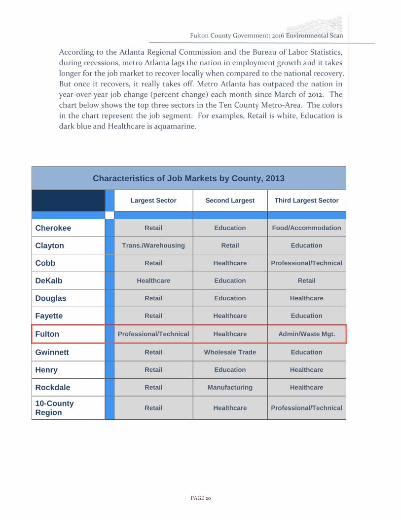
According to the Atlanta Regional Commission and the Bureau of Labor Statistics,
during recessions, metro Atlanta lags the nation in employment growth and it takes
longer for the job market to recover locally when compared to the national recovery.
But once it recovers, it really takes off. Metro Atlanta has outpaced the nation in
year-over-year job change (percent change) each month since March of 2012. The
chart below shows the top three sectors in the Ten County Metro-Area. The colors
in the chart represent the job segment. For examples, Retail is white, Education is
dark blue and Healthcare is aquamarine.
Characteristics of Job Markets by County, 2013
Largest Sector Second Largest Third Largest Sector
Cherokee Retail Education Food/Accommodation
Clayton Trans./Warehousing Retail Education
Cobb Retail Healthcare Professional/Technical
DeKalb Healthcare Education Retail
Douglas Retail Education Healthcare
Fayette Retail Healthcare Education
Fulton Professional/Technical Healthcare Admin/Waste Mgt.
Gwinnett Retail Wholesale Trade Education
Henry Retail Education Healthcare
Rockdale Retail Manufacturing Healthcare
10-County Region
Retail Healthcare Professional/Technical

PAGE 21
Fulton County Government: 2016 Environmental Scan
Job Growth
Metro Atlanta's employment grew by 76,600 between May 2015 and May 2016, an
increase of 3.0%, ranking it third behind Dallas and Phoenix among the 12 largest
metro areas in the nation. In the Atlanta metropolitan area, the trade,
transportation, and utilities industry had the largest employment gain from May
2015 to May 2016, up 20,300 or 3.5 percent.
Metro Atlanta's unemployment remained around 7.2% for 2014 while projections
indicate this number will fall to 6.3% in 2015. Moving forward the unemployment
forecast will decrease steadily to 5.7% in 2016 and decrease again in 2017 falling to
5.3%.
FIGURE 12 CHANGE IN NUMBER OF JOBS IN METRO ATLANTA BY NAICS CATEGORY JAN-JUN 2016
-1,000 1,000 3,000 5,000 7,000 9,000 11,000
Information
Telecommunications
Finance & Insurance
Management, Science, & Technology
Utilities
Air Transportation
Other Services
Federal Government
Computer Systems & Designs
Management of Companies
Real Estate, Rental, & Leasing
Accounting & Related Services
Wholesale Trade
Transportation & Warehousing
Government
Education & Health
Construction
Manufacturing
Leisure & Hospitality
Retail Trade
Administrative & Support

PAGE 22
Fulton County Government: 2016 Environmental Scan
Taxation
Over the last five fiscal years, Fulton County has fallen near the middle among the
five largest metro counties in terms of millage rate. However, it should be noted
that millage rates are calculated somewhat differently for different counties as
described below, making direct comparisons difficult.
Fulton County FY16 rate is 10.5 mills.
Gwinnett County, Cobb County, and DeKalb County FY14 rates reflect the
millage adopted. So, rates for FY15 are not unknown – different FY cycles.
DeKalb County’s millage includes the rate for Hospital and General Funds.
Fulton County generally funds its capital budget out of the same millage for
General Fund, while Gwinnett and Cobb Counties have a dedicated Special
Local Option Sales Tax (SPLOST) for their capital activities.
Gwinnett County changed the composition of its General Fund millage rate
in FY2013 by transferring some of its previous General Fund expenditures
into newly created tax districts along with applicable millage rate.
Cobb County rate excludes .33 mill for County Bond and 3.06 for Fire.
FIGURE 13 MILLAGE RATES FOR THE FIVE LARGEST ATLANTA METRO COUNTIES, 2011 TO 2015
FY12 FY13 FY14 FY15 FY16
Gwinnett 11.78 7.4 7.4 7.4 7.229
Clayton 15.813 14.912 14.661 14.869 15.862
DeKalb 11.37 11.51 11.51 11.9 11.28
Cobb 7.72 7.52 7.52 7.32 7.12
Fulton 10.28 10.28 11.781 11.781 10.5
0
2
4
6
8
10
12
14
16
18
Mil
lag
e R
ate

PAGE 23
Fulton County Government: 2016 Environmental Scan
Public Health
The primary source of data on public health was the Georgia Department of Public
Health’s Online Analytical Statistical Information System (OASIS), which contains
mortality and morbidity data at the county level by cause and a number of
demographic variables. Most data are available for the years 1999 to 2014.
Data from the Centers for Disease Control and Prevention (CDC) was also used
where comparisons with the U.S. population were used as with causes of
death. The CDC data was extracted using CDC WONDER, an online data query
system. Selected facts regarding diseases and health conditions among Fulton
County residents were taken from The State of Health in Fulton County. This
publication is produced by the Fulton County Department of Health & Human
Services, and served as a general guide to understanding the major health concerns
for County health officials. Additional sources include the U.S. Census Bureau, the
Population Health Institute and the Atlanta Regional Commission.
It should be noted that all information on public health is reported at the county
level. In addition, causes of death, the prevalence of diseases and other health
conditions can and do vary widely within Fulton County. Accordingly, County-
level data often mask disparities that exist within the County.
Key Public Health Indicators
Consistent with national patterns, cardiovascular diseases and cancer
are the leading causes of death in Fulton County.
Fulton diverges from the State and US in having a relatively low rate of
death from respiratory diseases but a relatively high rate for infectious
diseases.
Fulton has some of the highest rates of HIV and Syphilis in the country.
The teen birth rate is on the decline, falling from 74.3 in 1994 to 20.1 in
2015, though the rate for white teens has increased over the last 3 years.
Fulton’s overall health rating ranks it midway between the ARC Core 10
Counties, with Fayette enjoying the most impressive ranking and
Clayton being the most deficient.
The overall rate of obesity in Fulton is lower than that for the State.

PAGE 24
Fulton County Government: 2016 Environmental Scan
Causes of Death
Overview: Causes of Death
The most recent data from the Centers for Disease Control and Prevention (CDC)
show that the major causes of death in Fulton County generally match the national
pattern when measured in terms of broad classifications (ICD-10 chapters).
Cardio-vascular diseases and cancers are by far the two most common causes of
death. However, whereas respiratory diseases rank third both nationally and in
the state of Georgia, in Fulton County the mortality rate from respiratory diseases
was comparatively small, ranking fourth below external causes, which include
motor vehicle accidents and accidental falls. The rate of death from infectious
diseases was relatively high in Fulton County, ranking 7th compared to 9th for the
state and nation.
FIGURE 12 AGE-ADJUSTED MORTALITY RATES: 2014 TOP TEN CAUSES OF DEATH BY ICD CHAPTER.7
7 Centers for Disease Control and Prevention, National Center for Health Statistics. Compressed Mortality File.
0 50 100 150 200 250 300
Cardio-Vascular Disease
Cancer
External Causes
Respiratory Diseases
Mental & Behavioral Diseases
Nervous System Diseases
Infectious Diseases
Endocrine, Metabolic Diseases
Digestive System Diseases
Reproductive Urinary Diseases
Fulton County
Georgia
United States

PAGE 25
Fulton County Government: 2016 Environmental Scan
Cardiovascular Disease
Death rates from cardiovascular disease have been declining over the years.
However, cardiovascular disease is still responsible for 1 out of 3 deaths in Fulton
County.
In 2013, 904 men and 897 women died from cardiovascular disease in the County.
The rate of death from cardiovascular disease for black, Fulton County residents
has approximately matched that of black Georgia residents since 1994. However,
the rate for white Fulton County residents is significantly lower than that of white
Georgia residents, and both are lower than for black residents. The Fulton County
death rate for both black and white residents fell by more than 10% in 2014 while
the Georgia resident’s death rate fell by 1% for white residents and 2% for black
residents.
FIGURE 14 AGE-ADJUSTED MOTALITY RATES FOR MAJOR CARDIOVASCULAR DISEASES BY RACE, FULTON
COUNTY AND GEORGIA, 1994 TO 2014
0
100
200
300
400
500
600
19
94
19
95
19
96
19
97
19
98
19
99
20
00
20
01
20
02
20
03
20
04
20
05
20
06
20
07
20
08
20
09
20
10
20
11
20
12
20
13
20
14
Age
-ad
just
ed
Mo
rtal
ity
Rat
e
Year
Fulton, White
Fulton, Black
Georgia, White
Georgia, Black

PAGE 26
Fulton County Government: 2016 Environmental Scan
Legend
Age-Adjusted Rate
Discharges per 100,000
Less than 700
700 - 1200
1201 - 2000
2001 - 3000
Greater than 3000
Commission District
6
2
5
1
3
4
Cardiovascular Disease: Differences within the County
The prevalence of major cardiovascular disease varies significantly within Fulton
County. The map below shows the age-adjusted de-duplicated hospital discharge
rates8 for each census tract in Fulton County for the year 2014. The map reflects
the higher rates of disease among the predominately black populations in the
south and also the higher rates among the low-income populations of south and
west Atlanta.
8 Hospital discharge rates were used to estimate the prevalence of disease by census tract. Discharge counts are de-duplicated to eliminate counting individuals more than once. Age-adjustments to the rates are made in order to remove the effects of differing age distributions among census tracts. The estimated age-specific population of Fulton County according to the 2014 American Community Survey 5-year Summary was used as the population standard in calculating the age-adjusted rates. De-duplicated hospital discharge counts by census tract were extracted from the Georgia Department of Public Health OASIS.
FIGURE 15 AGE-ADJUSTED DE-DUPLICATED HOSPITAL DISCHARGE RATE FOR MAJOR CARDIOVASCULAR DISEASE,
2014

PAGE 27
Fulton County Government: 2016 Environmental Scan
Lung Cancer
Lung cancer (including cancer of the bronchus and trachea) remains the leading
cause of death among all types of cancer in Fulton County. Notably, however, the
CDC reports that the incidence of lung cancer and mortality rates dropped
significantly between 2001 and 2010 for whites, black and Hispanics and for men
and women9. Figure 14 shows the age-adjusted death rates from the five leading
types of cancer in Fulton County from 2000 to 2014.
FIGURE 16 MORTALITY RATES FOR THE LEADING CAUSES OF CANCER DEATH: FULTON COUNTY, 2000 TO 2014
9 Centers for Disease Control and Prevention, Lung Cancer Trends, http://www.cdc.gov/cancer/lung/statistics/trends.htm
0
20
40
60
80
100
120
140
Ag
e-A
dju
ste
d M
ort
ali
ty R
ate
Year
Pancreas
Prostate
Colorectal
Breast
Lung
PAGE 28
Fulton County Government: 2016 Environmental Scan
Legend
Age-Adjusted Hosptial Discharge Rate
Discharges per 100,000 people
Less than 150
150 - 200
201 - 260
261 - 340
341 - 470
Commission District
1
2
3
4
6
5
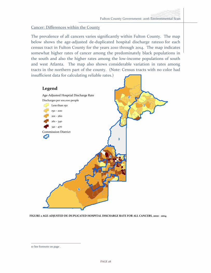
Cancer: Differences within the County
The prevalence of all cancers varies significantly within Fulton County. The map
below shows the age-adjusted de-duplicated hospital discharge rates10 for each
census tract in Fulton County for the years 2010 through 2014. The map indicates
somewhat higher rates of cancer among the predominately black populations in
the south and also the higher rates among the low-income populations of south
and west Atlanta. The map also shows considerable variation in rates among
tracts in the northern part of the county. (Note: Census tracts with no color had
insufficient data for calculating reliable rates.)
10 See footnote on page .
FIGURE 2 AGE-ADJUSTED DE-DUPLICATED HOSPITAL DISCHARGE RATE FOR ALL CANCERS, 2010 - 2014

PAGE 29
Fulton County Government: 2016 Environmental Scan
Diabetes
Diabetes is a leading cause of kidney failure, heart disease and stroke. Death rates
due to diabetes have been generally declining in Fulton County over the years.
However, it is important to note that recorded death rates due to diabetes do not
reflect the true impact of the disease, because often another cause is listed as the
immediate cause of death. Although the death rate for diabetes is in decline, the
number of diabetes cases is increasing. Accordingly, the falling death rate may be
due to better diagnosis and control of the disease rather than a decline in its
incidence. 2014 showed a significant drop in deaths from diabetes.
FIGURE 17 MORTALITY RATES FOR DIABETES IN FULTON COUNTY, 2000 TO 2014
0
5
10
15
20
25
30
Ag
e-A
dju
ste
d M
ort
ali
ty R
ate
Year
Fulton County
Georgia

PAGE 30
Fulton County Government: 2016 Environmental Scan
Sexually Transmitted Diseases
According to a report from the Fulton County Department of Health and
Wellness11, Fulton County has some of the highest rates of HIV and syphilis in the
country. The syphilis rate for Fulton County was 37.2 cases per 100,000 in 2013 and
has average a rate of 35.3 since 2000. This compares to the state’s rate of 9.8 in
2013 and average of 7.7 since 2000. Figure 15 shows the rate of the County and
state from 2000 to 2014.12 The CDC notes that syphilis rates are rising particularly
among men and in Georgia, the rate among blacks is 7.8 times that of whites, and
the rate among Hispanics is 1.5 times that of whites. The Atlanta area is third in
the nation in syphilis infection behind New Orleans and Miami. Georgia is not
among the top ten states for fentanyl/heroin deaths, but like the rest of the nation,
those deaths have risen dramatically.
FIGURE 18 RATES SYPHILIS AS CASES PER 100,000, FULTON COUNTY AND GEORGIA, 2000 TO 2014
11 Status of Health in Fulton County 12 Georgia Department of Public Health, OASIS, https://oasis.state.ga.us/
0
5
10
15
20
25
30
35
40
45
50
1 2 3 4 5 6 7 8 9 10 11 12 13 14 15
Ca
ses
pe
r 10
0,0
00
Year
Fulton
Georgia
Moving Average

PAGE 31
Fulton County Government: 2016 Environmental Scan
Teen Pregnancy
According to the CDC, the live birth rate among U.S. teens reached a record low of
24.2 per 1,000 women in 2014. Similarly, the birth rate for teens in Fulton County
was 20.1 in 2012 after falling from 74.3 in 1994. The decline can be see for white,
black and Hispanic women with the rate for Hispanic women rising up to 2003 but
then falling dramatically thereafter. The rates for black and Hispanic teens have
dropped by about 65% since 2006. Birth rates among white teens, while still
relatively low, have risen over the last three years.
FIGURE 19 BIRTH RATE FOR TEENS, 15 TO 19 YEARS BY RACE AND ETHNICITY, FULTON COUNTY, 1994 TO 201513
13 Georgia Department of Public Health, OASIS, https://oasis.state.ga.us
0
20
40
60
80
100
120
140
160
180
200
199
4
199
5
199
6
199
7
199
8
199
9
200
0
200
1
200
2
200
3
200
4
200
5
200
6
200
7
200
8
200
9
2010
2011
2012
2013
2014
2015
Bir
ths
pe
r 1,
00
0
Year

PAGE 32
Fulton County Government: 2016 Environmental Scan
While reasons for the declines are not clear, teens may be less sexually active, and
more of those who are sexually active may be using birth control than in previous
years. The decline in teen pregnancy is good news for a number of reasons.
According to the CDC14:
“In 2011, teen pregnancy and childbirth accounted for at least $9.4 billion in
costs to U.S. taxpayers for increased health care and foster care, increased
incarceration rates among children of teen parents, and lost tax revenue
because of lower educational attainment and income among teen mothers.
Pregnancy and birth are significant contributors to high school dropout
rates among girls. Only about 50% of teen mothers receive a high school
diploma by 22 years of age, versus approximately 90% of women who had
not given birth during adolescence.
The children of teenage mothers are more likely to have lower school
achievement and drop out of high school, have more health problems, be
incarcerated at some time during adolescence, give birth as a teenager, and
face unemployment as a young adult.”
Obesity
Obesity is a condition in which a person has a Body Mass Index (BMI) of over 30.
In comparison, a person with a BMI between 25 and 30 is classified as Overweight.
Obesity is a public health issue because of the high percentage of Americans who
are obese, and because of the health conditions that have been shown to be related
to obesity—heart disease, stroke, type 2 diabetes and some cancers.
Obesity also takes an economic toll. According to the CDC, the estimated annual
cost of obesity in the U.S. is $147 billion in 2008 U.S. dollars and the medical costs
for people who are obese is $1,429 higher than those of normal weight.15
The prevalence of obesity varies by race and sex but the differences are striking
between the white and black populations. In Fulton County, for the years 2006 to
2010, an estimated 35% of black residents were obese while an estimated 13% of
white residents were obese. The rate of obesity was somewhat higher for women
than for men. Overall, the rate of obesity was lower in Fulton County than for the
entire state.16
14 Centers for Disease Control and Prevention, Reproductive Health: Teen Pregnancy, http://www.cdc.gov/teenpregnancy/ 15 Centers for Disease Control and Prevention, Overweight and Obesity, http://www.cdc.gov/obesity/index.html 16 Georgia Department of Public Health, OASIS, https://oasis.state.ga.us

PAGE 33
Fulton County Government: 2016 Environmental Scan
FIGURE 20 OBESITY RATES FOR FULTON COUNTY AND GEORGIA BY SEX AND RACE, 2006 TO 2010
County Health Rankings
The annual County Health Rankings17 measure vital health factors, including high
school graduation rates, obesity, smoking, unemployment, access to healthy foods,
the quality of air and water, income, and teen births in nearly every county in
America. The figure below shows the rankings for the ARC Core 10 counties.
Counties are ranked in order among all 159 counties of the state. A higher ranking
(lower number) indicates a better health score.
Of the ARC Core 10 Counties, Fayette County enjoys the most favorable Health
Ranking scores with scores of 5 or less in all but one measured area (Physical
Environment). Fulton’s Health Ranking scores fall just about in the center of the
ten compared counties. While Fulton is surpassed by Fayette, Cobb, Cherokee and
Gwinnett Counties, it is trailed by Clayton, DeKalb, Douglas, Henry and Rockdale
Counties. Fulton received the highest Health Ranking scores in the areas of
“Health Behaviors” and “Clinical Care,” and had no scores in any category that
reached the “red” threat level except for Physical Environment.
17
County Health Rankings and Roadmaps (2016), Robert Wood Johnson Foundation, http://www.countyhealthrankings.org
0
5
10
15
20
25
30
35
40
45
Total Men Women White Black
Pe
rce
nt
Ob
ese
Fulton County
Georgia

PAGE 34
Fulton County Government: 2016 Environmental Scan
Cherokee Clayton Cobb DeKalb Douglas Fayette Fulton Gwinnett Henry Rockdale
Health Outcomes
6 61 7 30 36 3 25 5 20 35
Length of Life
7 31 6 19 27 5 21 3 24 29
Quality of Life
4 105 12 53 58 3 33 11 26 55
Health Factors
6 148 7 29 45 2 22 11 13 48
Health Behaviors
4 132 3 15 60 2 9 8 17 53
Clinical Care
32 129 29 9 76 1 6 55 16 53
Social & Economic
5 136 8 71 34 3 49 17 21 48
Physical Environment
150 159 103 106 149 135 140 129 109 144
ublic Safety FIGURE 21 COUNTY HEALTH RANKINGS FOR ARC CORE 10 COUNTIES, 2016

PAGE 35
Fulton County Government: 2016 Environmental Scan
Public Safety
Public Safety Information Source
The primary source for information on the incidence of crime was the Crime
Statistics website (http://services.georgia.gov/gbi/crimestats) provided by the
Georgia Bureau of Investigation (GBI). Crimes are reported by the GBI as counts.
However, for the purpose of comparing with other counties, rates were calculated
by dividing the crime count by the county population and multiplying by 100,000
to get the number of crimes per 100,000 people.
Information on incarceration came from the University of Georgia’s GeorgiaStats
website at http://georgiastats.uga.edu.
Key Public Safety Indicators
Violent and property crime rates are highest in Atlanta and
jurisdictions to the immediate south.
The rates of incidences of rape, robbery and assault have declined over
the last decade.
Fulton surpasses all other counties in the ARC Core 10 in instances of
Part 1 (serious) crimes, with Fayette County enjoying the lowest
incidents rates.
Violent Crimes
The Uniform Crime Report (UCR) Program includes the categories of murder, rape,
aggravated assault and robbery as Part 1 violent crimes18. In Fulton County, the
number of murders has remained fairly steady with an average of 145 murders per
year being committed between 2000 and 2014. Rape on the other hand has seen a
18 Part 1 crimes are serious crimes falling into one of two categories: Violent=Aggravated assault, forcible rape, murder, and robbery, and Property Crimes = arson, burglary, larceny-theft, and motor vehicle theft are classified as property crimes.

PAGE 36
Fulton County Government: 2016 Environmental Scan
decline over the same period, averaging 370 per year over the first half of the
period and 253 over the second half.19
FIGURE 22 NUMBER OF MURDERS AND RAPES REPORTED IN FULTON COUNTY, 2000 TO 2014
Both aggravated assault and robbery show somewhat of a decline since 2000,
though the downward trend is more pronounced for assault. Both types of crime,
but robbery in particular, increased temporarily between 2006 and 2008 before
continuing a general decline.
19 Georgia Bureau of Investigation, Crime Statistics, http://services.georgia.gov/gbi/crimestats/viewCrimeStatReport.do
0
100
200
300
400
500
600
Nu
mb
er
of
Cri
me
s
Year
Murder
Rape

PAGE 37
Fulton County Government: 2016 Environmental Scan
FIGURE 23 NUMBER OF ROBBERIES AND AGGRAVATED ASSAULTS IN FULTON COUNTY, 2000 TO 2013
The rate of violent crimes for the County as a whole masks the considerable
variations between different parts of the county. In general, the highest rates of
violent crime occur in Atlanta and cities just to its south, while the cities to the
extreme south and north of Atlanta experience the lowest rates of violent crime.
FIGURE 24 RATES OF VIOLENT CRIME BY FULTON COUNTY JURISDICTION, 2014
0
1000
2000
3000
4000
5000
6000
7000
8000
Nu
mb
er
of
Cri
me
s
Year
Robbery
Assault
0 500 1,000 1,500 2,000 2,500
Milton
Johns Creek
Alpharetta
Roswell
Sandy Springs
Palmetto
Chattahoochee Hills
Fairburn
Hapeville
Unincorporated
Atlanta
Union City
East Point
College Park
Violent Crimes per 100,000 Residents

PAGE 38
Fulton County Government: 2016 Environmental Scan
Property Crime
Part 1 property crimes include burglary, larceny and vehicle theft. All three have
remained relatively constant since 2000, with the exception of 2008, during which
there were noticeable spikes in both burglary and larceny.
FIGURE 25 NUMBER OF BURGLURIES, LARCENIES AND AUTO THEFTS IN FULTON COUNTY, 2006 TO 2014
As with violent crime, the rates of property crime differ considerably in different
parts of the County. Again, the city of Atlanta and the smaller cities and
unincorporated area to the immediate south and west have the highest rates of
property crime, while cities in the extreme south and north of Atlanta have the
0
5000
10000
15000
20000
25000
30000
35000
40000
45000
Nu
mb
er
of
Cri
me
s
Year
Burglary
Larceny
Vehicle Theft

PAGE 39
Fulton County Government: 2016 Environmental Scan
lowest rates.
FIGURE 26 RATES OF PROPERTY CRIME BY FULTON COUNTY JURISDICTION, 2014
Regional Comparison of Part 1 Crimes
When viewed in terms of absolute numbers, Fulton County surpasses all other
ARC Core 10 counties in all Part 1 crime categories with nearly 60,000 crimes
reported in 2013 (Figure 23). DeKalb County had the second greatest total number
with just fewer than 40,000. When viewed in terms of rate, Fulton County is still
in the lead with about 6,000 Part 1 crimes per 100,000 people (Figure 24). Fulton
County also led in each individual crime category except for rape and burglary.
Clayton County led in rapes per 100,000 people followed by Fulton. DeKalb led in
the rate of burglary, followed by Clayton and Fulton.
0 2,000 4,000 6,000 8,000 10,000 12,000
Johns Creek
Milton
Roswell
Alpharetta
Palmetto
Chattahoochee Hills
Sandy Springs
Fairburn
Atlanta
Unincorporated
Hapeville
Union City
East Point
College Park
Property Crimes per 100,000 Residents

PAGE 40
Fulton County Government: 2016 Environmental Scan
FIGURE 27 NUMBER OF PART 1 CRIMES REPORTED, ARC CORE 10 COUNTIES, 2014
FIGURE 28 PART 1 CRIMES REPORTED PER 100,000 PEOPLE, ARC CORE 10 COUNTIES, 2014
0
10,000
20,000
30,000
40,000
50,000
60,000
70,000
Nu
mb
er
of
Cri
me
s
County
Vehicle Theft
Larceny
Burglary
Assault
Robbery
Rape
Murder
0
1,000
2,000
3,000
4,000
5,000
6,000
7,000
Ra
te (
Cri
me
pe
r 10
0,0
00
)
County
Vehicle Theft
Larceny
Burglary
Assault
Robbery
Rape
Murder

PAGE 41
Fulton County Government: 2016 Environmental Scan
Technology
Information on Technology came from various sources including the U.S. Census
Bureau and the Pew Research Center (PRC). The PRC is a nonpartisan fact tank
that informs the public about the issues, attitudes and trends shaping America and
the world. They conduct public opinion polling, demographic research, media
content analysis and other data-driven social science research without taking
policy positions on any of the data reported.
Technology information was also derived from a survey conducted by Harris
Interactive. Harris is a subsidiary of the publicly traded Nielson Company, which
utilizes the Harris Poll Online® to gather information from respondents that “span
a diverse range from consumers to business professionals.”
Key Technology Indicators
Smartphone ownership among Americans has grown from 35% in 2011
to 64% in 2015. The ownership rate for young adults was 85% in 2015.
The city of Atlanta has a smartphone access rate of 60% and ranks 7th
among a list of top 10 cities surveyed.
As of 2014, 73.4% of American households had broadband internet
access.
At 76.8%, Fulton County has a slightly higher broadband connection
rate than the national rate and ranked 7th among a list of counties of
similar size.
Plans for Gigabit networks could give Fulton County some of the fastest
internet speeds in the US
PAGE 42
Fulton County Government: 2016 Environmental Scan
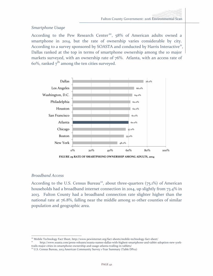
Smartphone Usage
According to the Pew Research Center20, 58% of American adults owned a
smartphone in 2014, but the rate of ownership varies considerable by city.
According to a survey sponsored by SOASTA and conducted by Harris Interactive21,
Dallas ranked at the top in terms of smartphone ownership among the 10 major
markets surveyed, with an ownership rate of 76%. Atlanta, with an access rate of
60%, ranked 7th among the ten cities surveyed.
FIGURE 29 RATE OF SMARTPHONE OWNERSHIP AMONG ADULTS, 2014
Broadband Access
According to the U.S. Census Bureau22, about three-quarters (75.1%) of American
households had a broadband internet connection in 2014, up slightly from 73.4% in
2013. Fulton County had a broadband connection rate slighter higher than the
national rate at 76.8%, falling near the middle among 10 other counties of similar
population and geographic area.
20 Mobile Technology Fact Sheet, http://www.pewinternet.org/fact-sheets/mobile-technology-fact-sheet/ 21 http://www.soasta.com/press-releases/soasta-names-dallas-with-highest-smartphone-and-tablet-adoption-new-york-trails-major-cities-in-smartphone-ownership-and-usage-atlanta-trailing-in-tablets/ 22 U.S. Census Bureau, 2013 American Community Survey 1-Year Summary (Table DP02)
48.0%
55.0%
57.0%
60.0%
61.0%
62.0%
62.0%
64.0%
66.0%
76.0%
0% 20% 40% 60% 80% 100%
New York
Boston
Chicago
Atlanta
San Francisco
Houston
Philadelphia
Washington, D.C.
Los Angeles
Dallas

PAGE 43
Fulton County Government: 2016 Environmental Scan
FIGURE 30 PERCENT OF HOUSEHOLDS WITH BROADBAND INTERNET SUBSCRIPTION, FULTON COUNTY AND
COMPARABLE U.S. COUNTIES, 2014
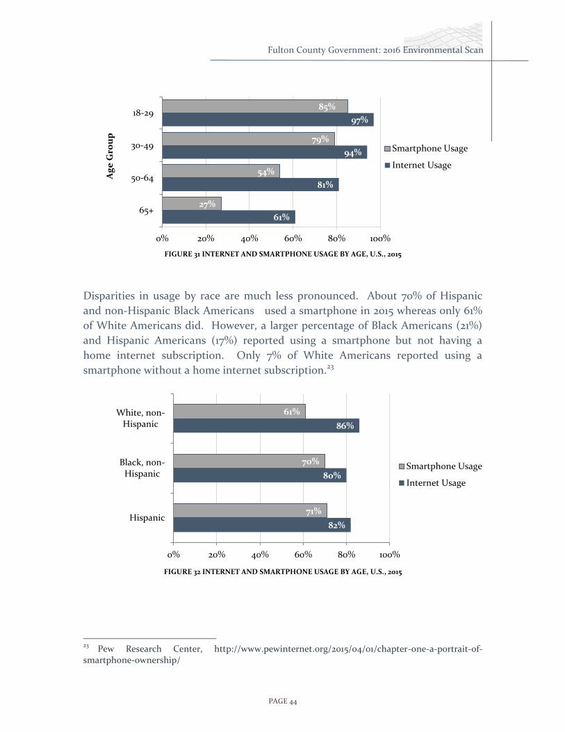
Smartphone and Internet Usage by Age and Race
Data on the use of smartphones and the internet by age and race are not currently
available at the state or county levels. However, national-level data is useful for
getting a sense of how usage varies by demographics.
In 2011, 35% of American adults owned smartphones. In 2016, 92% of adults 18 – 34
own a smart phone.
The disparity was less extreme for internet usage but there were still distinct
differences. Just over half of Americans 65 years and older used the internet while
about 88% of young adults were internet users. In 2015, the death rate on
Georgia’s roads is up 22%, 1432 over 1170 in 2014. The DOT has said that this is due
to an increase in smartphone usage and other distracted driving.
65.9%
71.2%
72.6%
75.5%
76.8%
79.8%
80.6%
81.3%
82.2%
82.2%
84.8%
0% 10% 20% 30% 40% 50% 60% 70% 80% 90%
Shelby, TN (Memphis)
Milwaukee, WI (Milwaukee)
Cuyahoga, OH (Cleveland)
Allagheny, PA (Pittsburgh)
Fulton, GA (Atlanta)
Franklin, OH (Columbus)
Hennepin, MN (Minneapolis)
Orange, FL (Orlando)
Mecklinburg, NC (Charlotte)
Travis, TX (Austin)
Wake, NC (Raleigh)
Percent Households with Broadband Internet Subscription
PAGE 44
Fulton County Government: 2016 Environmental Scan
FIGURE 31 INTERNET AND SMARTPHONE USAGE BY AGE, U.S., 2015
Disparities in usage by race are much less pronounced. About 70% of Hispanic
and non-Hispanic Black Americans used a smartphone in 2015 whereas only 61%
of White Americans did. However, a larger percentage of Black Americans (21%)
and Hispanic Americans (17%) reported using a smartphone but not having a
home internet subscription. Only 7% of White Americans reported using a
smartphone without a home internet subscription.23
FIGURE 32 INTERNET AND SMARTPHONE USAGE BY AGE, U.S., 2015
23
Pew Research Center, http://www.pewinternet.org/2015/04/01/chapter-one-a-portrait-of-smartphone-ownership/
61%
81%
94%
97%
27%
54%
79%
85%
0% 20% 40% 60% 80% 100%
65+
50-64
30-49
18-29A
ge
Gro
up
Smartphone Usage
Internet Usage
82%
80%
86%
71%
70%
61%
0% 20% 40% 60% 80% 100%
Hispanic
Black, non-Hispanic
White, non-Hispanic
Smartphone Usage
Internet Usage

PAGE 45
Fulton County Government: 2016 Environmental Scan
Commission District Profiles
The following pages provide a district by district breakdown of population
and housing characteristics.
Fulton County
Board of Commissioners
John H. Eaves, District 7 (At-Large)
Liz Hausmann, District 1
Bob Ellis, District 2
Lee Morris, District 3
Joan P. Garner, District 4
Marvin S. Arrington, Jr. District 5
Emma I. Darnell, District 6

PAGE 46
Fulton County Government: 2016 Environmental Scan
District 1
District 1 is located in north Fulton County and
encompasses the city of Johns Creek and parts of the cities
of Alpharetta, Roswell and Sandy Springs. The population
according to the 2010 census was 153,878, 66.7% of which
was white, 11.1% black, and 16.4% Asian. In 2015, the
population was 161,918 of which 64% was white, 11% black,
and 19% Asian.
District 1 has the largest Asian population of all the districts. District 1 also has the
highest proportion of high-income households with just under half the households
having an income of over $100,000. The district has a relatively small number of
young adults compared to other districts, but has a relatively high number of
school-age children and middle-age adults. District 1 is dominated by married-
couple households (62.3%) and has the smallest proportion of households headed
by a single adult of any district.
43%
44%
0%
7%
0%
3%
3%
8%
64%
11%
0%
19%
0%
3%
3%
9%
0% 10% 20% 30% 40% 50% 60% 70%
White
Black
Native American
Asian
Native Hawaiian/Pacific Islander
Other
Multiracial
Hispanic Origin
Percent of Population
Population by Race and Ethnicity District 1 Population = 161,918 Hispanic Population = 13,925
District 1
Fulton County

PAGE 47
Fulton County Government: 2016 Environmental Scan
District 1
District 1
86%
43%
43%
14%
95%
64%
31%
5%
0% 20% 40% 60% 80% 100%
Occupied
Owner
Renter
Vacant
Percent of all Housing Units
Housing Units Total District 1 Housing Units = 62,061
District 1
Fulton County
13%
8%
8%
10%
13%
9%
10%
5%
9%
4%
4%
6%
8%
14%
12%
17%
10%
21%
0% 5% 10% 15% 20% 25%
Less than 15,000
15-24,999
25-34,999
35-49,999
50-74,999
75-99,999
100-149,999
150-199,999
Over 200,000
Percent of Households
Income Distribution
District 1
Fulton County

PAGE 48
Fulton County Government: 2016 Environmental Scan
35.7%
4.2%
15.7%
35.4%
9.0%
62.3%
3.2%
9.5%
20.4%
4.6%
0% 20% 40% 60% 80% 100%
Husband & Wife
Male Householder, No Wife Present
Female Householder, No Husband…
Householder Living Alone
Householder Not Living Alone
Percent of All Households
Households
District 1
Fulton County
Total Households in District 1 = 55,761 Non-family Households
Family Households
-15% -10% -5% 0% 5% 10% 15%
0-4
10-14
20-24
30-34
40-44
50-54
60-64
70-74
80-84
Percent of Male or Female Population
Ag
e
Male Female
Population by Sex and Age Male Population of District 1 = 75,333 Female Population of District 1 = 78,545
Fulton

PAGE 49
Fulton County Government: 2016 Environmental Scan
District 2
District 2 is located in north Fulton County and
encompasses the city of Milton and parts of the cities
of Alpharetta, Roswell and Sandy Springs. The
population according to the 2010 census was 152.246,
70.1% of which was white, 15.5% black, and 6.8% Asian.
The 2015 population was 162,726, 69% of which was
white, 15% black, and 8% Asian.
District 2 has a relatively high proportion of high-income households with over a
third the households having an income of over $100,000. The district’s age
distribution comes close to matching that of the County as a whole.
District 2 is second only to District 1 in the proportion of family households with a
married-couple (48.3%). About 14% of family households are headed by a single
male or by a single female.
43%
44%
0%
7%
0%
3%
3%
8%
69%
15%
0%
8%
0%
5%
3%
11%
0% 10% 20% 30% 40% 50% 60% 70% 80%
White
Black
Native American
Asian
Native Hawaiian/Pacific Islander
Other
Multiracial
Hispanic Origin
Percent of Population
Population by Race and Ethnicity District 2 Population = 162,726 Hispanic Population = 18,063
District 2
Fulton County

PAGE 50
Fulton County Government: 2016 Environmental Scan
86%
43%
43%
14%
93%
53%
40%
7%
0% 20% 40% 60% 80% 100%
Occupied
Owner
Renter
Vacant
Percent of all Housing Units
Housing Units Total Distict 2 housing units = 71,549
District 2
Fulton County
13%
8%
8%
10%
13%
9%
10%
5%
9%
7%
6%
8%
11%
14%
11%
14%
9%
12%
0% 2% 4% 6% 8% 10% 12% 14% 16%
Less than 15,000
15-24,999
25-34,999
35-49,999
50-74,999
75-99,999
100-149,999
150-199,999
Over 200,000
Percent of Households
Income Distribution
District 2
Fulton County

PAGE 51
Fulton County Government: 2016 Environmental Scan
District 2
35.7%
4.2%
15.7%
35.4%
9.0%
48.3%
3.6%
10.3%
30.4%
7.4%
0% 20% 40% 60% 80% 100%
Husband & Wife
Male Householder, No Wife Present
Female Householder, No HusbandPresent
Householder Living Alone
Householder Not Living Alone
Percent of All Households
Households
District 2
Fulton County
Total Households in District 2 = 62,860
Non-family Households
Family Households
-15% -10% -5% 0% 5% 10% 15%
0-4
4-9
10-14
15-19
20-24
25-29
30-34
35-39
40-44
45-49
50-54
55-59
60-64
65-69
70-74
75-79
80-84
85-
Percent of Male or Female Population
Ag
e
Male Female
Population by Sex and Age
Male Population of District 2 = 75,443 Female Population of District 2 = 79,693
Fulton

PAGE 52
Fulton County Government: 2016 Environmental Scan
District 3
District 3 is located in central Fulton County and
encompasses most of the city of Sandy Springs and the
northern part of the city of Atlanta including Buckhead
and Midtown. The population according to the 2010
census was 153,860, 76% of which was white, 12% black,
and 5% Asian. The population in 2015 was 164,267, 73%
of which was white, 12% black, and 11% Asian.
District 3 has the largest proportion of white residents
of all the districts and is second only to District 2 in the
number of Hispanic residents (about 10%). District 3 also has the highest
proportion of very high-income households with 18.7% of the households having
an income of over $200,000.
The district has a relatively small number of children and teenagers but has a very
high proportion of young adults, especially between the ages of 25 and 30. District
3 ties District 4 for having the greatest proportion of households with a person
living alone (45%).
43%
44%
0%
7%
0%
3%
3%
8%
73%
12%
0%
7%
0%
4%
3%
11%
0% 10% 20% 30% 40% 50% 60% 70% 80%
White
Black
Native American
Asian
Native Hawaiian/Pacific Islander
Other
Multiracial
Hispanic Origin
Percent of Population
Population by Race and Ethnicity District 3 Population = 164,267 Hispanic Population = 17,741
District 3
Fulton County

PAGE 53
Fulton County Government: 2016 Environmental Scan
86%
43%
43%
14%
87%
40%
47%
13%
0% 20% 40% 60% 80% 100%
Occupied
Owner
Renter
Vacant
Percent of all Housing Units
Housing Units Total District 3 Housing Units = 94,546
District 3
Fulton County
13%
8%
8%
10%
13%
9%
10%
5%
9%
9%
6%
7%
9%
12%
9%
11%
7%
16%
0% 5% 10% 15% 20%
Less than 15,000
15-24,999
25-34,999
35-49,999
50-74,999
75-99,999
100-149,999
150-199,999
Over 200,000
Percent of Households
Income Distribution
District 3
Fulton County

PAGE 54
Fulton County Government: 2016 Environmental Scan
35.7%
4.2%
15.7%
35.4%
9.0%
34.0%
2.4%
4.9%
45.9%
12.8%
0% 20% 40% 60% 80% 100%
Husband & Wife
Male Householder, No Wife Present
Female Householder, No HusbandPresent
Householder Living Alone
Householder Not Living Alone
Percent of All Households
Households
District 3
Fulton County
Total Households in District 3 = 76,655
Non-family Households
Family Households
-15% -10% -5% 0% 5% 10% 15%
0-4
4-9
10-14
15-19
20-24
25-29
30-34
35-39
40-44
45-49
50-54
55-59
60-64
65-69
70-74
75-79
80-84
85-
Percent of Male or Female Population
Ag
e
Male Female
Population by Sex and Age
Male Population of District 3 = 77,083 Female Population of District 3 = 76,777
Fulton

PAGE 55
Fulton County Government: 2016 Environmental Scan
District 4
District 4 is located entirely within the city of Atlanta,
including Downtown and much of the western area of
the city. The population according to the 2010 census
was 153,555, 67.8% of which was black and 24.2% white.
The population in 2015 was 160,125, 67% was black and
24% was white.
District 4 also has the highest proportion of very low-
income households with 18.1% of the households
having an income below $10,000. The district has a relatively small number of
children and younger teens, but has a very high proportion of college-age young
adults, probably due to the presence of Georgia Tech, Georgia State University,
Clark Atlanta University, Spelman College and Morehouse College within the
district. District 4 has the highest proportion of renters of all the districts (nearly
50%) and ties with District 3 for the greatest proportion of households with a
person living alone (about 46%).
District 4
43%
44%
0%
7%
0%
3%
3%
8%
24%
67%
0%
4%
0%
2%
2%
5%
0% 20% 40% 60% 80%
White
Black
Native American
Asian
Native Hawaiian/PacificIslander
Other
Multiracial
Hispanic Origin
Percent of Population
Population by Race and Ethnicity District 4 Population = 160,125
Hispanic Population = 7366
District 4
Fulton County

PAGE 56
Fulton County Government: 2016 Environmental Scan
District 4
86%
43%
43%
14%
77%
26%
50%
23%
0% 20% 40% 60% 80% 100%
Occupied
Owner
Renter
Vacant
Percent of all Housing Units
Housing Units Total District 4 Housing Units = 83,401
District 4
Fulton County
13%
8%
8%
10%
13%
9%
10%
5%
9%
23%
10%
9%
10%
9%
7%
6%
2%
2%
0% 5% 10% 15% 20% 25%
Less than 15,000
15-24,999
25-34,999
35-49,999
50-74,999
75-99,999
100-149,999
150-199,999
Over 200,000
Percent of Households
Income Distribution
District 4
Fulton County

PAGE 57
Fulton County Government: 2016 Environmental Scan
35.7%
4.2%
15.7%
35.4%
9.0%
16.2%
4.9%
20.6%
45.9%
12.4%
0% 20% 40% 60% 80% 100%
Husband & Wife
Male Householder, No Wife Present
Female Householder, No HusbandPresent
Householder Living Alone
Householder Not Living Alone
Percent of All Households
Households
District 4
Fulton County
Total Households in District 4 = 61,161
Non-family
Family
-15% -10% -5% 0% 5% 10% 15%
0-4
4-9
10-14
15-19
20-24
25-29
30-34
35-39
40-44
45-49
50-54
55-59
60-64
65-69
70-74
75-79
80-84
85-
Percent of Male or Female Population
Ag
e
Male Female
Population by Sex and Age
Male Population of District 4 = 78,886 Female Population of District 4 = 74,669
Fulton

PAGE 58
Fulton County Government: 2016 Environmental Scan
District 5
District 5 stretches from east Atlanta all the way to
the unincorporated section of the County in the
south. It encompasses all of southeast Atlanta, most
of the city of East Point and a portion of southwest
Atlanta. The population according to the 2010
census was 152,450, 67.8% of which was black, 24.2%
white, and 3.5% Asian. The population in 2015 was
158,452, 76% of which was black and 18% white.
District 5 is second only to District 4 in the number of households earning less
than $10,000 (14.8%). The age distribution of residents in District 5 is
representative of the distribution for the County as a whole with the highest
proportion of residents in the 25 to 40 year age bracket.
District 5 has the lowest proportion of households with married couples (22.9%)
than any district other than District 4. District 5 is second only to District 4 in the
proportion of renters (44.8%).
43%
44%
0%
7%
0%
3%
3%
8%
18%
76%
0%
1%
0%
2%
2%
6%
0% 20% 40% 60% 80% 100%
White
Black
Native American
Asian
Native Hawaiian/Pacific Islander
Other
Multiracial
Hispanic Origin
Population by Race and Ethnicity District 5 Population = 158,452
Hispanic Population = 8715
District 5
Fulton County

PAGE 59
Fulton County Government: 2016 Environmental Scan
86%
43%
43%
14%
83%
34%
48%
17%
0% 20% 40% 60% 80% 100%
Occupied
Owner
Renter
Vacant
Percent of all Housing Units
Housing Units Total District 5 Housing Units = 78,733
District 5
Fulton County
13%
8%
8%
10%
13%
9%
10%
5%
9%
20%
11%
10%
11%
11%
7%
7%
3%
2%
0% 5% 10% 15% 20% 25%
Less than 15,000
15-24,999
25-34,999
35-49,999
50-74,999
75-99,999
100-149,999
150-199,999
Over 200,000
Percent of Households
Income Distribution
District 5
Fulton County

PAGE 60
Fulton County Government: 2016 Environmental Scan
District 5
35.7%
4.2%
15.7%
35.4%
9.0%
22.9%
5.5%
25.4%
36.3%
9.9%
0% 20% 40% 60% 80% 100%
Husband & Wife
Male Householder, No Wife Present
Female Householder, No HusbandPresent
Householder Living Alone
Householder Not Living Alone
Percent of All Households
Households
District 5
Fulton County
Total Households in District 5 = Non-family
Family
-15% -10% -5% 0% 5% 10% 15%
0-4
4-9
10-14
15-19
20-24
25-29
30-34
35-39
40-44
45-49
50-54
55-59
60-64
65-69
70-74
75-79
80-84
85-
Percent of Male or Female Population
Ag
e
Male Female
Population by Sex and Age
Male Population of District 5 = 72,798 Female Population of District 5 = 74,669
Fulton

PAGE 61
Fulton County Government: 2016 Environmental Scan
District 6
District 6 has the greatest geographic extent of any
of the districts, reaching from west Atlanta down to
Chattahoochee Hills, across the southern-most
region of the County and back up through College
Park to Hapeville. The population according to the
2010 census was 152,592, 88.2% of which was black
and 11.5% white. The population in 2015 was 161,887,
83% was black and 11% white.
The district has a roughly normal distribution of
incomes with over half the households having an income in the mid-range
between $25,000 and $100,000. The district has a relatively young population with
a high proportion below age 20, particularly males. About one third of the
households are renting. Of all the districts, District 6 has the highest proportion of
households headed by a single female. About a third of the households are
families with married couples.
District 6
43%
44%
0%
7%
0%
3%
3%
8%
11%
83%
0%
1%
0%
3%
2%
6%
0% 10% 20% 30% 40% 50% 60% 70% 80% 90%
White
Black
Native American
Asian
Native Hawaiian/Pacific Islander
Other
Multiracial
Hispanic Origin
Axis Title
Population by Race and Ethnicity District 6 Population = 161,887 Hispanic Population = 10,037
District 6
Fulton County

PAGE 62
Fulton County Government: 2016 Environmental Scan
86%
43%
43%
14%
88%
49%
39%
12%
0% 20% 40% 60% 80% 100%
Occupied
Owner
Renter
Vacant
Percent of all Housing Units
Housing Units Total District 6 Housing units = 70,291
District 6
Fulton County
13%
8%
8%
10%
13%
9%
10%
5%
9%
14%
10%
11%
14%
15%
11%
8%
3%
2%
0% 2% 4% 6% 8% 10% 12% 14% 16%
Less than 15,000
15-24,999
25-34,999
35-49,999
50-74,999
75-99,999
100-149,999
150-199,999
Over 200,000
Percent of Households
Income Distribution
District 6
Fulton County

PAGE 63
Fulton County Government: 2016 Environmental Scan
District 6
35.7%
4.2%
15.7%
35.4%
9.0%
32.8%
6.0%
26.4%
29.4%
5.4%
0% 20% 40% 60% 80% 100%
Husband & Wife
Male Householder, No Wife Present
Female Householder, No HusbandPresent
Householder Living Alone
Householder Not Living Alone
Percent of All Households
Households
District 6
Fulton County
Total Households in District 6 =
Non-family
Family
-15% -10% -5% 0% 5% 10% 15%
0-4
4-9
10-14
15-19
20-24
25-29
30-34
35-39
40-44
45-49
50-54
55-59
60-64
65-69
70-74
75-79
80-84
85-
Percent of Male or Female Population
Ag
e
Male Female
Population by Sex and Age
Male Population of District 6 = 72,798 Female Population of District 6 = 79,652
Fulton

PAGE 64
Fulton County Government: 2016 Environmental Scan
APPENDICES
The following pages include tables of “raw data” used to support summaries and
conclusions made within the preceding sections of the Environmental Scan.

PAGE 65
Fulton County Government: 2016 Environmental Scan
KEY DEMOGRAPHIC AND ECONOMIC INDICATORS FOR FULTON COUNTY AND METRO ATLANTA APRIL 2015
Table 1: Population Indicators
Population Trends Fulton County ARC Core 10
2010 2013 %
Change
% of Arc 10
2010 2013 %
Change
% of Arc 10
Change in Population 920,5
81 984,2
93 6.47%
4,107,750
4,305,244
4.81% 100
2020 Forecast 977,294 4,514,056
2030 Forecast 1,021,700 5,025,831
2040 Forecast 1,175,962 5,659,746
Population by Age Range Fulton County ARC Core 10
2010 2013
% Chang
e
% of Pop
(2013) 2010 2013
% Chang
e
% of Pop
(2013)
Under 5 yrs. 62,58
1 65,14
8 4.10% 6.62%
295,531
291,649
-1.31% 6.77%
5-9 yrs. 61,51
0 65,97
6 7.26% 6.70%
301,468
320,043
6.16% 7.43%
10-29 yrs. 273,6
46 286,1
91 4.58% 29.08%
1,174,188
1,200,805
2.27% 27.89%
30-44 yrs. 261,0
62 227,9
69 -12.68% 23.16%
959,250
968,548
0.97% 22.50%
45-64 yrs. 223,3
58 239,9
30 7.42% 24.38%
1,028,747
1,099,157
6.84% 25.53%
65 and over 83,42
4 99,07
9 18.77% 10.07%
348,566
421,042
20.79% 9.78%

PAGE 66
Fulton County Government: 2016 Environmental Scan
Table 1: Population Indicators (continued)
Population by Race and Ethnicity
Fulton County ARC Core 10
2010 2013
% Chang
e
% of Pop
(2013) 2010 2013
% Chang
e
% of Pop
(2013)
White 376,014 450,074 19.70% 45.73% 1,811,038 2,161,595 19.36% 50.21%
Black or African American 400,457 431,581 7.77% 43.85% 1,489,804 1,615,451 8.43% 37.52%
Asian 51,304 60,108 17.16% 6.11% 231,377 263,056 13.69% 6.11%
Other race 20,240 15,197 -24.92% 1.54% 95,002 154,182 62.29% 3.58%
Hispanic 72,566 75,465 3.99% 7.67% 480,529 506,035 5.31% 11.75%
Population by US Citizenship Status
Fulton County ARC Core 10
US Citizen 806,650 813,070 0.80% 82.60% 3,474,604 3,469,654 -0.14% 80.59%
US Citizen - Naturalized 38,010 44,970 15.48% 4.57% 234,140 252,626 7.32% 5.87%
Not a US Citizen 81,537 77,689 -4.72% 7.89% 414,255 399,705 -3.64% 9.28%
Data Sources : 2010 Census, Fulton County Health & Human Services, GA Dept. of Community Health, Population Health Institute, Atlanta Regional Commission

PAGE 67
Fulton County Government: 2016 Environmental Scan
KEY DEMOGRAPHIC AND ECONOMIC INDICATORS FOR FULTON COUNTY AND METRO ATLANTA APRIL 2015
Table 2: Population Indicators continued
Total Housing Units Fulton County ARC Core 10
(2000:2010 Comparison)
2000 2010 2013 2000 2010 2013
Total Units 348,632 437,10
5 441,090 982,632
1,272,340
1,722,701
Occupied 321,090 376,34
7 379,281 940,683
1,152,044
1,534,122
% Occupied 92.10% 86.10% 86.00% 95.70% 90.50% 89.10
%
Vacant 27,542 60,758 61,809 41,949 120,296 188,5
79
% Vacant 7.90% 13.90% 14.01% 4.30% 9.50% 10.90
%
Real Estate ‘Health’ Fulton County ARC Core 10
Building Permits 2008 2009 2010 2013 2008 2009 2010 2013
• Total Housing Permits
4,667 1,529 1,671 6,530 9,785 2,622 1,201
• Single-Family Permits
2,211 775 790 1,590 5,220 2,331 1,388
• Multi-Family Permits 2,456 754 881 4,940 4,565 291 590
• Construction Cost $188.5M $653.1M
Foreclosures
• Foreclosures (Sept 2011)
1,477
7,466
• Foreclosures (YTD)
12,851
No data
• Avg. Sales Price
$156,410
$284,278
• Avg. Foreclosure Sales Price
$113,613
$273,151
Monthly Owner Costs
• Units with Mortgage
148,900 No data
613,397
No data
• Median Home Value
$252,700 No data
$176,711
No data
• Median Cost With Mortgage
$1,891 No data
$1,539
No data
• Median Real Estate Taxes Paid
$2,954 No data
$1,941
No data
• Ratio of Value to Income (3.0 or more)
40.80% No data
36.10%
No data

PAGE 68
Fulton County Government: 2016 Environmental Scan
Case-Shiller Home Price Index (August 2011, ARC Core 10)
• Current Index
102.11
(1999 = 100)
• Year to Date Change (%)
-6.30%
• Prices at This level In 3/1/20
00
• Change From Peak
Down 25.2% in 49
months
• Low-Tier Under $128,880
• Mid-Tier
$128,880 to $240,386
• Hi- Tier Over Over $240,386
Data Sources : 2010 Census, Fulton County Health & Human Services, GA Dept. of Community Health, Population Health Institute, Atlanta Regional Commission

PAGE 69
Fulton County Government: 2016 Environmental Scan
KEY DEMOGRAPHIC AND ECONOMIC INDICATORS FOR FULTON COUNTY AND METRO ATLANTA APRIL 2015
Table 3: Population Indicators continued
Greenspace Acres of
Greenspace Total Acres
Total Population
% of Total Land as
Protected Greenspace
Acres of Greenspace
per 1,000 Population
• Fulton County
10,498 342,095 920,581 3.10% 11.4
• Cherokee 49,496 95.30% 2,441 4.70% 49,496
• Clayton 82,224 95.10% 4,237 4.90% 82,224
• Cobb 227,546 95.80% 9,976 4.20% 227,546
• DeKalb 249,476 95.50% 11,755 4.50% 249,476
• Douglas 32,805 94.20% 2,020 5.80% 32,805
• Fayette 31,515 96.30% 1,211 3.70% 31,515
• Gwinnett 202,343 96.50% 7,339 3.50% 202,343
• Henry 41,224 95.50% 1,942 4.50% 41,224
• Rockdale 24,054 95.90% 1,028 4.10% 24,054
Type of Household
(2013) Fulton County ARC Core 10
Total Households
379,281 1,534,122
Ave Size Household –
2.50 Family –
3.50 Household –
2.76 Family – 3.54
Type of Household
# % # %
Family 208,849 57.10% 998,183 69.00%
Own children under 18
109,215 51.00% 533,295 34.80%
Married-couple
140,264 37.30% 693,964 49.10%
Own children under 18
65,699 17.60% 335,505 23.80%

PAGE 70
Fulton County Government: 2016 Environmental Scan
Male householder,
family
14,268 4.00% 73,638 9.80%
Own children under 18
7,466 1.60% 41,698 2.30%
Female householder,
family
54,317 16.00% 230,581 15.00%
Own children under 18
36,050 10.00% 156,092 8.80%
Educational Attainment (population 25 years and over)
Fulton County
ARC Core 10
Georgia US
• Less than 9th Grade 3.50% 5.40% 5.60% 5.80%
• 9th to 12th grade, no diploma
6.30% 6.40% 9.00% 7.60%
• High school grad (includes equivalency)
19.70% 23.50% 28.60% 27.80%
• Some college, no degree 18.90% 21.90% 21.20% 21.10%
• Associate’s degree 5.30% 7.50% 7.40% 8.10%
• Bachelor’s degree 28.40% 23.10% 17.80% 18.40%
• Graduate or professional degree
17.90% 11.70% 10.60% 11.20%
o % HS grad or higher 90.20% 87.80% 85.50% 88.60%
o % bachelor’s or higher 46.30% 34.90% 28.30% 32.90%
Data Sources : 2010 Census, Fulton County Health & Human Services, GA Dept. of Community Health, Population Health Institute, ARC

PAGE 71
Fulton County Government: 2016 Environmental Scan
KEY DEMOGRAPHIC AND ECONOMIC INDICATORS FOR FULTON COUNTY AND METRO ATLANTA APRIL 2015
Table 4 : Economic Indicators
Economy
Labor Force Activity Fulton
Metro Atlanta
Combined
Labor Force 467,937 1,756,751 2,224,688
Employed 427,811 1,623,493 2,051,304
Unemployed 40,126 133,258 173,384
Unemployment Rate 8.60% 7.80% 8.20%
Average Weekly Hours 32.3
Percentage of Jobs held by age group
Metro Atlanta
2000
Metro Atlanta
2008
Metro Atlanta
2013
14-24 yrs old 11.50% 11.00% 9.90%
25-34 yrs old 27.20% 23.2 21.90%
35-54 yrs old 50.40% 50.00% 49.60%
55-64 yrs old 8.80% 12.60% 14.80%
65+ yrs old 2.10% 3.00% 3.80%
Job Creation Five Highest Paying Industies - Metro Atlanta
Avg Monthly
Pay
Employment per 1,000 Jobs
Management Occupations $9,629 62.9
Legal Occupations $8,949 9.4
Computer and Mathematical Occupations $6,703 40.1
Architecture and Engineering Occupations $6,417 15.2

PAGE 72
Fulton County Government: 2016 Environmental Scan
Healthcare Practioners and Technical Occupations $6,377 49.2
Business Financial Operations Occupations $6,108 68.2
Job Creation Five Highest Paying Industies - Metro Atlanta
Avg Monthly
Pay
Employment per 1,000 Jobs
Production Occupations $2,676 56
Farming, Fishing, and Forestry Occupations $2,387 0.7
Healtcare Support Occupations $2,327 20.6
Building and Grounds Cleaning and Maintenance Occupations $2,105 26.5
Personal Care and Service Occupations $1,982 22.1
Food preparation and serving related occupations $1,681 88.1
Metro Atlanta Counties with the Highest Weekly Wage
Weekly average wage
Fulton $1,290
Dekalb $994
Gwinnett $958
United States $1,000
Data Sources: Atlanta Regional Commission, Georgia Department of Labor Area Labor Profile, Bureau of Labor Statistics

PAGE 73
Fulton County Government: 2016 Environmental Scan
Table 2: Economic Indicators (continued)
Indicator Latest (14-Q2) Last 12 Month
s
Grade
Comments
Jobs Added
Civilian Employment -41,400 16,900 C Data anomalies are at play
Total Non-Farm Jobs 31,700 85,200 A Strong quarterly growth
Manufacturing 3,100 8,800 A- Good job gains despite global slowdown
Financial Jobs 500 2,100 B- Healthy pick-up from previous quarter
Business Services Jobs 13 27,400 A- Corporate hiring was reasonable
Healthcare Jobs 700 5,100 B- Sector is adjusting to new requirements
Hospitality Jobs 1,700 17,200 B Summer tourism didn't translate into more
jobs
Information Technology 900 1,600 B+ The trend is positive
Construction Activity
Jobs Added 1,600 6,700 B Multifamily building is ramping up
Housing Permit Growth* 4.20% 15.90% B Immune to market volatility
Georgia's Fiscal Health
Tax Collections 4.70% 5.00% A Tax Collections continue to rise
Wages and Salaries 4.50% 4.20% A Finally seeing strength
Personal Income 5.70% 4.10% A Good increase, but below historic norms
Large Corporate Sector B Seasonal hiring expected to be strong
Miscellaneous
Oil Prices $97.10 $105.8
0 B+ Relief at the gas pump
10 - Yr Bond 2.50% 2.70% A+ Flighty to safety continues
As Georgia added over 80,000 jobs in 2014 it is projected that this trend will continue in 2015 and 2016. Modest growth is expected for 2015 adding 71,000 (16,400 premium jobs) while 2016 numbers will produce slightly less jobs adding 71,000 jobs (including 18,400 premium job gains).
Nominal personal income in Georgia posted a weak increase in 2013 but climbed slightly in 2014 and is projected to increase yet again in 2015 with growth projected at 4.6%.
As unemployment remained average at around 7.4% in 2014, signs of a growing economy are evident as unemployment is expected to decrease to 6.6% in 2015 and drop again in 2016 to 5.9%.
Economic Forecasting Center @ Georgia State University

PAGE 74
Fulton County Government: 2016 Environmental Scan
Table 2 : Economic Indicators (continued)
Quality of Job Growth Annual Atlanta Wage
U.S. Georgia Atlanta
Since Dec 2007
Last 6 Months
Since Dec 2007
Last 6 Months
Since Dec 2007
Last 6 Months
Total Non-Farm Employment 48,270 2,635,000 1,471,000 80,503 54,075 52,372 36,920
Premium Jobs 81,891 295,900 191,400 22,099 14,799 19,802 17,920
Air Transportation 143,190 8,700 -500 7 15 206 -57
Management of Companies 119,310 42,400 21,200 604 328 107 149
Utilities 86,580 1,700 1,800 -1 104 -98 -45
Computer Systems & Designs 76,630 68,500 34,000 2,913 2,250 2,399 2,073
Management, Science, & Technology 98,330 61,700 41,900 273 1,151 609 742
Information 80,440 10,000 33,000 921 1,102 1,297 1,416
Telecommunications 81,830 5,800 8,400 1,713 985 1,286 1,003
Accounting & Related Services 76,040 26,700 30,700 3,165 4,261 -1,181 -1,660
Finance & Insurance 73,290 43,000 51,000 2,745 162 4,023 4,224
Wholesale Trade 64,030 108,900 42,100 4,247 1,045 5,035 2,028
Federal Government 51,730 -33,000 -2,000 -928 592 -182 255
Transportation & Warehousing 56,020 139,700 73,500 1,973 4,187 4,163 2,307
Manufacturing 57,160 161,000 69,000 8,578 3,645 4,594 3,979
Mid-Range Jobs 47,444 1,034,300 598,100 10,443 12,759 21,757 17,678
Real Estate, Rental, & Leasing 53,410 46,300 23,800 -1,717 396 -507 576
Education & Health 50,517 399,000 250,000 6,358 2,086 2,662 459
Government 45,750 47,000 55,000 -1,457 6,893 2,026 4,072
Construction 40,100 230,000 115,000 7,275 3,231 3,834 2,153
Low-Paying Jobs 26,045 1,101,100 550,700 35,241 21,175 18,266 8,601
Administrative & Support 35,140 417,700 219,300 13,873 10,421 6,393 3,019
Other Services 23,780 47,000 2,400 7 -1,293 -2,311 -1,629
Retail Trade 24,860 264,400 146,400 6,690 4,015 5,340 3,000
Leisure & Hospitality 20,400 372,000 161,000 14,544 7,161 8,805 4,341
Metro Atlanta's employment grew by 62,100 in calendar year 2013. Similar numbers were posted in 2014 with 57,100 jobs added for an annual increase of 2.3%. 2015 will produce a slightly stronger growth rate of 2.7% adding 60,800 new jobs. Looking ahead the 2016 forecast is expected to increase by 58,400 with a growth rate of 2.3%.
Metro Atlanta's unemployment remained around 7.2% for 2014 while projections indicate this number will fall to 6.3% in 2015. Moving forward the unemployment forecast will decrease steadily to 5.7% in 2016 and decrease again in 2017 falling to 5.3%
Source: Economic Forecasting Center @ Georgia State University

PAGE 75
Fulton County Government: 2016 Environmental Scan
Table 3: Public Health Indicators
Health Outcome Ranking (Ranking within 156 GA Counties for 2010)
Mortality Morbidity
Fulton County 21 37
Cherokee 6 5
Clayton 33 74
Cobb 5 11
DeKalb 12 29
Douglas 35 43
Fayette 1 1
Gwinnett 4 9
Henry 16 13
Rockdale 22 15
Health Factor Ranking (Ranking within
156 GA Counties for 2010)
Health Behaviors
Critical Care
Social & Economic
Factors
Physical Environment
Fulton County 4 10 49 129
Cherokee 7 33 6 28
Clayton 132 71 104 128
Cobb 3 25 7 144
DeKalb 8 8 68 136
Douglas 22 74 23 156
Fayette 2 1 3 146
Gwinnett 6 59 14 105
Henry 24 19 13 84
Rockdale 28 20 41 102
Mortality (Top 10 Causes by ICD Chapter)
Fulton County State of Georgia
2013 2013
Deaths Rate Age-adjusted Rate Deaths Rate Age-adj. Rate
Cardio-Vascular Disease 1,870 190 221.8 22,165 221.8 240.9
Cancer 1,385 140.7 161.4 16,753 167.7 171.4
External Causes 544 55.3 55.5 5,746 57.5 58.3
Mental & Behavioral Diseases
525 53.3 65.7 4,939 49.4 49.4
Respiratory Diseases 447 45.4 55.2 7,564 75.7 83.2
Nervous System Diseases 297 30.2 37.1 3,904 39.1 45.1
Infectious Diseases 287 29.2 32 2,561 25.6 26.6
Digestive System Diseases 238 24.2 26.7 2,616 26.2 26.4
Endocrine, Metabolic Diseases
231 23.5 27.4 3,160 31.6 33.2
Reproductive Urinary Diseases
182 18.5 22.2 2,152 21.5 23.7

PAGE 76
Fulton County Government: 2016 Environmental Scan
Table 3: Public Health Indicators (continued)
Health Report (FY2010) Fulton County
State of Georgia (avg. all counties)
Birth Rate/Infant Mortality
Fulton County
State of Georgia
Diabetes 5% 8.7% Birth Rate (10-55
years) 44 per 1,000
Data unavailable at time of report
High Blood Pressure 22.50% 25.9% o Mothers age 10 to
14 years 1.2
Data unavailable at time of report
Few Fruits and Vegetables
74% 80.0% Mothers age 15 to 17
years 26.6
Data unavailable at time of report
No Exercise 21% 28.1% Mothers age 18 to 19
years 59.1
Data unavailable at time of report
Obesity 21.30% 25.1% Infant Mortality (per
live births)
8.8 deaths
per 1,000
Data unavailable at time of report
Smoker 16.80% 23.0% African American 11.1 Data
unavailable at time of report
Medicaid Beneficiaries 166,314 11,066 White 6.6 Data
unavailable at time of report
Elderly Medicare 70,507 5,535 Hispanic 2.1 Data
unavailable at time of report
Disabled Medicare 15,204 1,412
Primary Care Physician Rate per 100k
131.2 53.48
No Health Insurance Coverage
# % of
Population
Dentist Rate per 100k 70.2 30.9
No Health Insurance Fulton County 179,698 19.5%
Community Health Center
Yes ARC 10 778,719 24.4%
Health Professional Shortage Area
No
2010 Census, Fulton County Health & Human Services, GA Dept. of Community Health, Population Health Institute, Atlanta Regional Commission
Centers for Disease Control and Prevention, http://wonder.cdc.gov/, Mortality/Morbidity web tool https://oasis.state.ga.us/oasis/oasis/qryMorbMort.aspx

PAGE 77
Fulton County Government: 2016 Environmental Scan
Table 4: Public Safety Indicators
Georgia Crime Statistics by County 2013
Murder Rape Robbery Assault Burglary Larceny Vehicle Theft
Cherokee 3 17 34 99 627 2,212 161
Clayton 30 85 547 667 3,496 5,749 1,343
Cobb 28 125 665 1,141 3,865 12,590 1,257
DeKalb 63 145 2,121 1,426 10,260 21,259 4,336
Douglas 3 28 96 308 666 2,775 262
Fulton 138 230 3,742 4,068 11,046 33,049 7,058
Fayette 2 6 31 47 282 1,112 90
Gwinnett 26 176 791 772 4,323 13,517 1,402
Henry 7 25 150 190 1,362 4,050 426
Rockdale 6 14 74 217 772 2,316 217
Fulton County Crimes (2000-2013)
Murder Rape Robbery Assault Burglary Larceny Vehicle Theft
2000 147 369 4,417 7,309 10,642 35,170 8,710
2001 168 492 5,245 7,201 12,344 39,945 9,394
2002 170 330 4,741 6,092 12,198 36,131 9,163
2003 171 377 4,662 5,733 12,132 37,327 10,199
2004 151 366 4,087 5,583 11,129 34,856 8,278
2005 129 339 4,037 5,217 12,616 35,157 9,215
2006 147 318 4,282 5,644 13,228 34,218 9,124
2007 184 295 4,944 5,722 15,387 36,399 10,162
2008 144 263 4,790 5,254 17,117 39,097 9,657
2009 114 267 3,861 4,602 15,965 34,336 8,302
2010 132 232 3,225 4,614 14,010 32,403 7,399
2011 120 256 3,460 4,585 13,100 31,809 7,969
2012 128 225 3,528 4,675 11,537 32,294 8,018
2013 138 230 3,742 4,068 11,046 33,049 7,058

PAGE 78
Fulton County Government: 2016 Environmental Scan
Table 5: Technology Indicators
Smartphone & Cell Phone Usage by Age, U.S.
Smartphone Use
Cell Phone Use
25-34 yrs old 70.6% 88.1%
35-44 yrs old 62.3% 86.2%
45-64 yrs old 40.2% 78.4%
65+ yrs old 14.5%
Smartphone & Cell Phone Usage by Race, U.S.
Smartphone Use
Cell Phone Use
Hispanic 45.8% 64.0%
Black Alone 45.0% 68.2%
White, Non-Hispanic 44.6% 80.3%
Asian Alone 52.6% 82.9%
Smartphone Ownership in 10 Major Markets
% of ownership
Dallas 76.0%
Los Angeles 66.0%
Washington, D.C. 64.0%
Philadelphia 62.0%
Houston 62.0%
San Francisco 61.0%
Atlanta 60.0%
Chicago 57.0%
Boston 55.0%
New York 48.0%
Broadband Access Comparison % of Households with a broadband connection
King County, WA 83.6%
Mecklenburg County, NC 79.0%
Fulton County, GA 77.1%
US 73.4%
Computer and Internet Usage, U.S. 1984 1997 2012
% of all households had internet use at home
18.0% 74.8%
% of all households had a computer at home
8.2% 78.9%
Device Ownership, U.S. 2014
Smartphone 58.0%
Cell Phone 90.0%
Tablet 42.0%
E Reader 32.0%
Source: 2010 US Census, Pew Research Center, www.pewinternet.org

PAGE 79
Fulton County Government: 2016 Environmental Scan
KEY DEMOGRAPHIC AND ECONOMIC INDICATORS FOR FULTON COUNTY AND METRO ATLANTA APRIL 2015
Table 8: Health Indicators
District Statistics by Race
Population
White
Black/Africa
n Ameri
can
American
Indian/Alask
an Native
Asian
Native Hawaiian or Pacific Island
er
Other Race
Two Or
More Race
s
District 1
153,878
102,572
17,113
260
25,227
63
4,716
3,927
District 2
154,246
108,067
23,879
427
10,521
68
7,271
4,013
District 3
153,860
116,859
18,466
384
7,712
67
7,009
3,363
District 4
153,555
37,150
104,156
351
5,407
43
3,205
3,243
District 5
152,450
27,491
116,351
446
1,371
41
3,957
2,793
District 6
152,592
17,558
125,610
391
1,331
53
4,709
2,940
Total
920,581
409,697
405,575
2,259
51,569
335
30,867
20,279
District Statisti
cs Male/Female
Male
Female
District
Housing
Statistics
Occupied
Vacant
Owned With Mortgage or Loan
Owned
Free and
Clear
Renter
Occupied

PAGE 80
Fulton County Government: 2016 Environmental Scan
District 1
75,333
78,545
District 1
55,761
3,249
33,765
5,332
16,664
District 2
74,553
79,693
District 2
62,860
5,144
31,121
6,250
25,489
District 3
77,083
76,777
District 3
76,655
11,974
30,036
8,745
37,874
District 4
78,886
74,669
District 4
61,161
17,721
18,348
5,586
37,227
District 5
72,798
79,652
District 5
62,010
13,404
23,423
4,810
33,777
District 6
69,614
82,978
District 6
57,930
9,236
29,949
4,897
23,084
Total
448,267
472,314 Total
376,377
60,728
166,642
35,620
174,115
District Househ
old Statisti
cs
Households
FamilyHH
Husband & Wife
OtherFamily
HH
Male Householder, No Wife Prese
nt
Female
Householder, No
Husband
Present
NonFamilyH
H
Householder
Living
Alone
Householder Not Livin
g Alon
e
HousingUnits
District 1
55,761
41,831
34,749
7,082
1,802
5,280
13,930
11,374
2,556
59,010
District 2
62,860
39,133
30,388
8,745
2,246
6,499
23,727
19,092
4,635
68,004
District 3
76,655
31,685
26,088
5,597
1,867
3,730
44,970
35,161
9,809
88,629
District 4
61,161
25,493
9,891
15,602
2,973
12,629
35,668
28,086
7,582
78,882
District 5
62,010
33,345
14,203
19,142
3,418
15,724
28,665
22,539
6,126
75,414
District

PAGE 81
Fulton County Government: 2016 Environmental Scan
6 57,930
37,728
18,989
18,739
3,463 15,276
20,202 17,055
3,147 67,166
Total
376,377
209,215
134,308
74,907
15,769
59,138
167,162
133,307
33,855
437,105
District Income Statistic
s
Less
than
$10,000
$10,000 to $14,9
99
$15,000 to $24,9
99
$25,000 to $34,9
99
$35,000 to $49,0
00
$50,000 to $74,9
99
$75,000 to
$99,999
$100,000 to
$149,999
$150,000 to
$200,000
Over $200,0
00
District 1
1,352
1,027
2,277
2,591
3,980
7,860
6,557
10,826
6,078
9,501
District 2
2,773
1,984
4,523
5,480
7,093
10,941
7,349
9,943
5,700
8,027
District 3
4,714
2,187
4,546
5,113
6,978
10,887
7,398
10,890
5,683
13,395
District 4
10,855
5,094
7,716
6,777
6,802
9,223
4,786
4,892
1,822
2,159
District 5
8,604
4,596
7,631
6,615
7,218
9,448
5,017
5,224
1,954
1,978
District 6
6,299
3,746
6,824
7,201
10,055
10,691
6,858
5,777
1,461
1,164
Total
34,597
18,634
33,517
33,777
42,126
59,050
37,965
47,552
22,698
36,224
Data Source: 2010 US Census, 2012 American Community Survey

PAGE 82
Fulton County Government: 2016 Environmental Scan

PAGE 83
Fulton County Government: 2016 Environmental Scan