Dynamic Exploration of Multiple Variables in a 2D Space
157
Dynamic Exploration of Multiple Variables in a 2D Space TR93-037 1993 Penny Rbeinga.ns Department. of Computer Science University of North Carolina at Chapel Hill Chapel Hill, NC 27599-3175 n t7v"C is an Equal OpportunityjAffirmat . ive .4ction Institution.
-
Upload
khangminh22 -
Category
Documents
-
view
1 -
download
0
Transcript of Dynamic Exploration of Multiple Variables in a 2D Space

Dynamic Exploration of Multiple
Variables in a 2D Space
TR93-037 1993
Penny Rbeinga.ns
Department. of Computer Science University of North Carolina at Chapel Hill
Chapel Hill, NC 27599-3175 n
t7v"C is an Equal OpportunityjAffirmat.ive .4ction Institution.
PEl\'1\1Y RHEINGANS. Dynamic Explorations of Multiple Variables in a 20 Space (Under the direction of Frederick P. Brooks. Jr.)
Abstract
Color is used widely and reliably to display the value of a single scalar variable. It is more rarely. and far
less reliably. used to display multivariate data. This research adds the element of dynamic control ove.r the
color mapping to that of color itself for the more effective display and exploration of multivariate spatial
data. My thesis Is that dynamk manipulation of represemation parameters is qualitatively different and
quantitatively more powerful than viewing static images.
In order to explore the pnwer of dynamic representation. l constructed a dynamic tool for the creation and
manipulation of color mappings. Using Calico. a one· or two-variable color mapping can be created using
parametric equations >n a variety of color models . This mapping can be manipulated by moving input
devices referenced in the parametric expressions. by applying affine transforms. or by performing free~fonn
defom1ations. As !he user changes the mapping. an image showing the data displayed using the current
mapping is updated in real time. as are geometric objectS which describe the mappi ng.
To support my thesis . I conducted two empirical stu die~ comparing static and dynamic color mappings for
the display of bivariate spatial data. The fi rst experiment mvestigated the effects of user control and
smooth change in the display of quanti tative data on us.er accuracy, confidence, and preference. Subjects
gave answets which were an average of thiny-nine percent more accurate when they had comrol over the
representation . This difference was almost statistically s ignificant (0.05 < p < 0.10). User control produced
significam increases in user preference and confidence.
The second expenmem compared ~tatic and dynamic representations for qualitative judgments about spatial
d:na. Subjects maQe significantly more correct judgm~:nts (p < 0.001) abou1 feature shape and rda1ive
position!->. on average fQrty-five percent more. u~ing the dynamic representations. Subjects alsCl expressed a
greater c.onfidence in and pteference for dynamic representations. The differences between static and
d~·nam1c represemauons. were greater 1n the presence of no1~e.

Acknowledgments
I am deeply indebted to many people for their contribu tions of time. energy. and inspiration . I would
especially like to thank:
Frederick P. Brooks Jr. for being my advisor and champion.
James Coggin~ for insisting that I think clearly and helping mo tO learn how.
Frederick P. Brooks Jr., David Beard. Gary Bishop, James Coggins, Marc ~voy. Stephen Pizer.
Stephen Walsh. and Forrest Young for sen'ing Oli1 my committee in its various instamlations.
The National Institute of Health and the Office of Naval Research for funding ponions of this
research.
Brice Tebbs for saying "What if ... " and starung me oo the path.
Man Fit.zgiblx>n and Greg Turk for their valual>lc insights. their honest opinions. and their belief
thai 1 could acrually finish.
Mary McFarlane fQr being my pcrsol\al patton ~aint of st.atistks.
David Harrison and John Hughes for video and hardware wizardry.
My family for their uncondiuonal love and suppon.
Terry Yoo who makes all things possible.
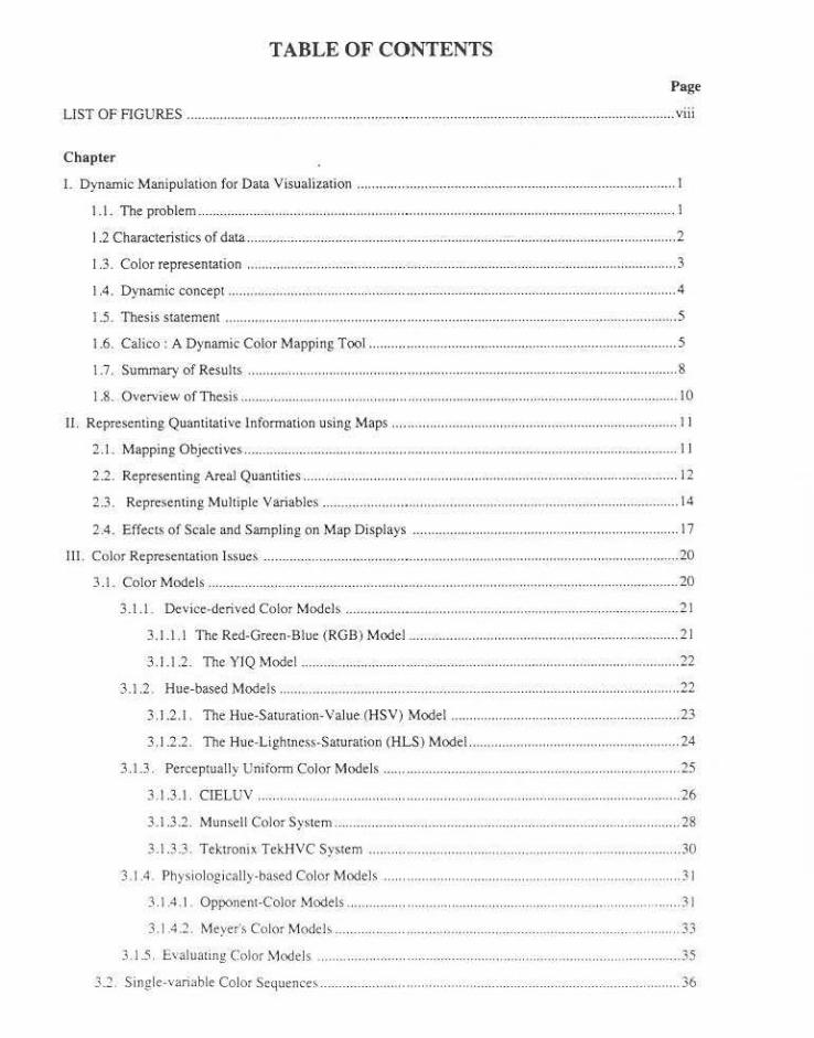
TABLE OF CONTENTS
Page
U ST OF FlGURES .............................................................................................................................. ..... viii
Chapter
I. Dynamic Manipulation for Data Visualization ............. ..................... ............... ........ ............ .... .. .... ...... 1
1.1. The problem ........... .. .... .. .......................................................... ......................................... , .......... 1
I .2 Ch<)J'acteristics of data .. .. ...................... ........ ........ ....................................................................... ... 2
1.3. Color represemarion ...................... ...... .. .... .................................... ............................ ............ ... ... 3
1.4. Dynamic concept ...................... .... ............ .......... ................. ......... ... .. .. .... ...... ............ ................ .4
1.5. Thesis statement ............................................................. .. ............ .... .................... ............ .. ...... . 5
1.6. Calico : A Dynamic Color Mapping Tool ... ............ ........................................ ...................... .. .... 5
1.7. Summary of Results .. .. .................... .. .......... .. .. .................................... ........ ................ ...... ...... .. .. 8
I .8. Overview of Thesis ........... .................................. .......................................................................... 10
II. Representing Quantitative lnfonnation using Maps ...... ................... ................................. .................. 11
2.1. MappingObjectives ........................................... .......... .. .............................................................. l l
2 .2. Representing Areal Quantities ..... ............ .... ....... ............................................... .................. ........ 12
2.3. Representing Multiple Variables ................ .. .......... .................................................................... 14
2.4 . EffectS of Scale and Sampling on Map Displays .............................. .......................................... 17
Il l. Color Representation Issues .. ........ .. .. .. .. ..................... .... ....................................... .. .................. ........... 20
3 .1. Color Models ..... .. .............. .. .. .......... .. ........ ......... ............................................. .. ...................... ..... 20
3.1.1. Dcvicc-dcrivcdColorModeb ............................ .............................................................. 21
3.1 .1.1 The Red-Green-Blue (RGB) Model ........................... .. .......................................... .. 2 1
3. 1.1.2. The YJQ Model ............................ ............ .......................................................... ... 22
3.1 .2 . Hue-based Models .. ........................ ...... .. ......................... .. .. .... .. .... .... .............................. 22
3. I .2.1. The Hue-Saturation-Value (HSV) Model .................... .. .. .... .................................. 23
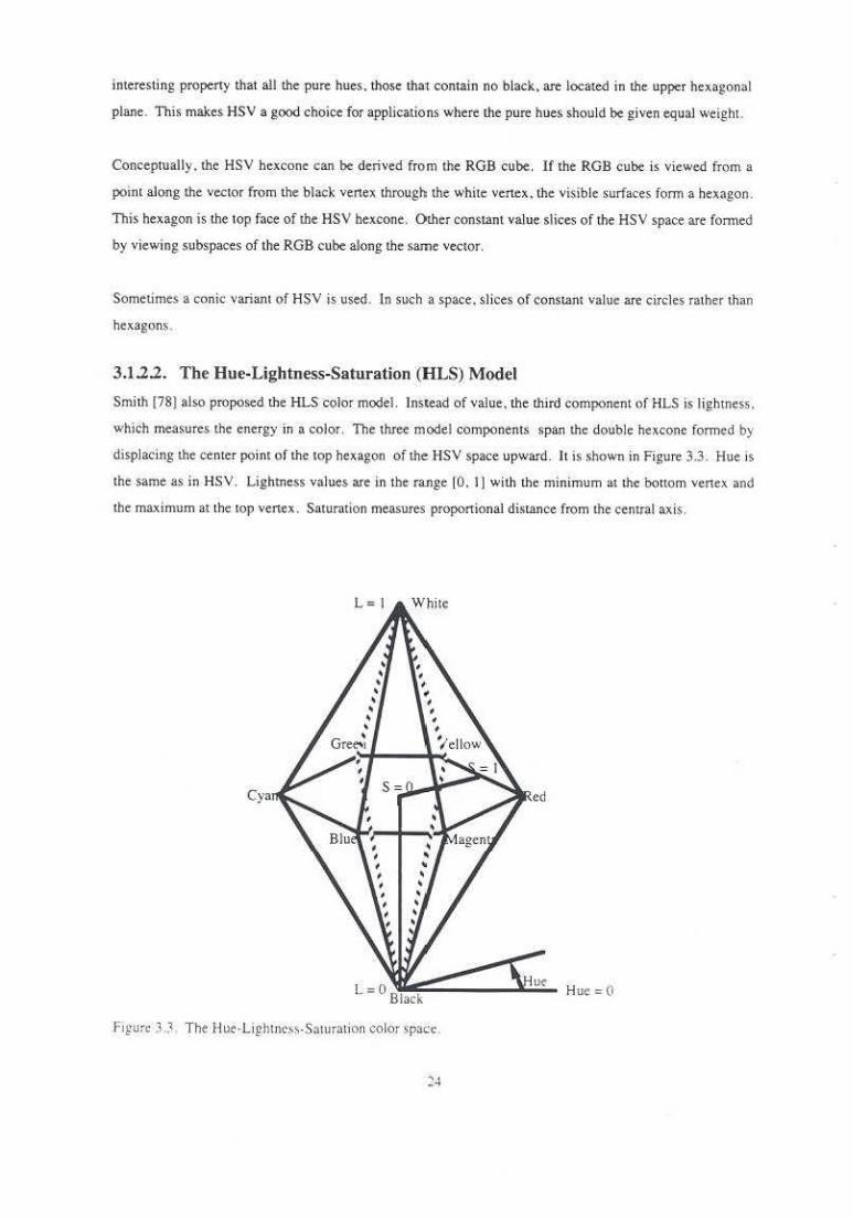
3. I .2.2. The Hue-Lightness-Saturation (HLS) Model ...... .............. .. .................. .... .. ........... 24
3.1.3. Per<•cptually Uniform Color Models ............................. .......... ........ .............................. ... 25
3.1.3.1. CIELUV .......... ......................... .... .......................... ...... ...... .......... .... ....................... 26
3.1.3.2 . Munsell Color Systcm .. .. .. .... ................................................. .................................. 28
3.1 .3.3. Tektronix TekHYC System ..... .... .......................................... ....................... .. .... .... 30
3 . I .4 . Physiologically-based Color Models ...... .............. .......... ................................ .................. 31
3.1 .4 .1 Opponem-Color Models ................ ................ .. .................................................. .. .... 31
3.1.4.2. Meyer'> Color Modch ........ ... .................................................................. .. .......... .... 33
3.1.5. Evaluating Color Models ............. ........... .......... ........ .................. ............ .... ...................... 35
3.2. Single-variable Color ScquenCe$ ... .. ..... ...................... ............ .. .......................... ......................... 36
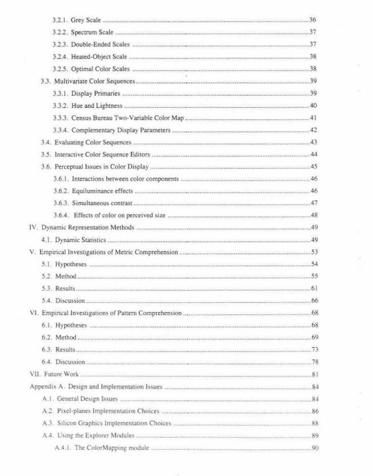
3.2.1. Grey Scale ........................................ .......................................................... ....................... 36
3.2.2. Spectrum Scale ......................................... ......................................................................... 37
3.2.3. Double-Ended Scales ........................................................................................................ 37
3.2.4. Heated-Object Scale .......................................................................................................... 38
3.2.5. Optimal Color Scales ............................................................ ....................... ..................... 38
3.3. Multivariate Color Sequences .......................... ................................................... ...... ... ................ 39
3.3.1. Display Primaries .......... ........................... .............................................. ............. .............. 39
3.3.2. Hue and Lightness ............................................................................................................. 40
3.3.3. Census Bureau Two-Variable Color Map . ........................................................................ 41
3.3.4. Complementary D•splay Parame<ers ................................................................................. 42
3.4. Evaluating Color Sequences ................................................................. .. .................................... 43
3.5. Interactive Color Sequence Editors ............................................................................................. 44
3.6. Perceptual Issues in Color Display ............. ...... ........................................................................... 45
3.6.1. Interactions between color components ... ............................................. ............................ 46
3.6.2. Equiluminance effectS ........................... ........................................................................... 46
3.6.3. Simultaneous contrast ....................................................................................................... .47
3.6.4. Effects of color on percei~ed size .................................................................................... 48
JV Dynamic Representation Methods ................................................................................... ................... 49
4. I. Dynamic Statistics ......................................... ................................ .............................................. 49
V . Empirical Investigations of Meuic Comprehension .... ......................................................................... 53
5.1. Hypotheses .......... ......................... ............................................ .......................................... , ........ 54
5.2 Method .................... , .................................................... ................................................................ 55
5.3. Results ...................................................................................... .................................................... 61
SA Discussion .................................................................................................................................. 66
VI Emp•ncallnvcstigations of Pnuen1 Comprehension ........................................................................... 68
6.1. Hypothc.ses .............. ......... .. .............. .......................................................... ................................. 68
6.2. Method ......................................................................................................................................... 69
6.3. Resuhs ................................................................................................................................. ......... 73
6.4. DISCUSSIOn .................................................................................................................................... 78
\'II l'uturc Work .......................... .. ..................................................................................................... 81
Appcndi• A. Design and Implementation Issues .................................................................................. , 84
,\.I . General Design l%ues .............................................................................. .. .............. ............ .. .... 8~
A.2 . Pi>tl-planes lmplementatJ<>TI Choices .................................................................................... 86
A.3 Silicon Graphics lmplcmentut•on Choices ................................................................................. 88
A -1 l:<ITI£ the E-\plorcr ~lodules ................................................................................. .................. K9
A -1 .I. The ColorMappm~ moduk ............................................................................................. 90

A.4.2. The ColorSpace module ................. ......... ......................... ................... .... ................. ........ 92
Appendix B. Materials and Scores: Metric Experiment ................................ ............................................ 94
Appendix C. Materials and Scores: Panern Experiment ............ .... ........................ ........... ................ .... ... 136
References ....... .. .......... .... ...... _. .... ...... ......... ........ ............ .... .......... .... .................. ..................................... .... 14 7
LIST OF FIGURES
Figure 1.1. Pixel-Planes Cal ico Display .................................................................................... ................ 6
Figure 2.1 . Choropleth. Dasymetric. and Isopleth Maps ............... ........................................................... 12
Figure 2.2. Classless choropleth map . .................................................................................... .. ................. 13
Figu re 2.3. Census Bureau Two-Variable Map . ................ .. ............. ............... .................................. ........ J 5
Figure 2.4 . Example univariate 3-dass maps used in Olson's experiment. ............................... ............... 16
Figure 2.5. Recreation of bivariate 3-class maps used in Olson's experiment .......................................... 17
Figure 2.6. Effects of aggregation unit on perceived distribution ........... ................................................. 19
Figure 3.1 . The Red-Green-Blue color space ................................ ........... ............ .... ................................. 21
Figure 3.2. The Hue-Saturation-Value color space . ............ .. ........ ...................... ................. ............... .. .. .. 2J
Figure 3.3. Jhe Hue-Lightness-Saturation color space .. ........................ .... .............. ............................. .... 24
Figure 3.4. A constant luminance slice of the CIELUV e<.>lor space . .. ....................... ... ............................ 27
Figure 3.5 . CQior Gamut of an Imaginary Monitor. ............. ........... .......................... ....................... ......... 28
Figure 3.6. A constant-hue (5 PB) leaf of the Munsell Color Space ..... ...... ........ .. ....... ...... ..................... . 29
Figure 3.7 . The Tek.HVC Color Space ......... ..................... ............. ...................... .. ...... ............................ 30
Figure 3.8 . The RGBY Color Space. ..... .. ... .... ............. ............... ................. .. ............................. 32
Figure 3.9. SML spectral sensi tivity functions . ................................. .. .... ............... .... .................... .......... 33
Figure 3.10. Meyer 's AC IC2 Space .... .... ............... ...................... ............. .. ...... ...... .. .. .. ............. .... ..... .. ... 35
Figure 3.11. Display Primaries Scheme . .. .. ................. ...... .. ............... .. ..................... ................. ......... ..... ..40
Figure 3 .12. Census Two-Variable Scheme . ................... .... ................. ....................... " ............... ............ 42
Figure 3.13. Modified Census Scheme ... .. ...................................... .............................................. ............ 42
Figure 3.)4 . Complementary Parameters .... ...... ... .......... ... ............................... .. .................. ...................... 43
Figure 3.15. Curved Parameters ............................. .. .... ..... ............................................................ .... ......... 43
Figure 5.1. Experimental variables and representations . .. ... ...................... .. .... .... ... .................................. 55
Figure 5.2. Ordering of trials in pilot experiment. .. .......... ..................................... ...... ............................. 56
Figure 5.3. Ordering of trials in follow-up experiment. .. ,., ... ., ................. .... ......................................... .... 56
Figure 5.4 . Ordering of d~ta sets in pilot experiment ....... .. .................... , .............. ................................... 57
Figure 5.5. Ordering of data sets in follow-up expe.riment ....... ............. .................... ................................ 57
Figure 5.6. Four levels of relative variable contribution . ... ....... ...... ......................................... ., ............... 59
Figure 5.7. l'aucm of means for representa tion preferences ....... ................... .......................... ................. 62
Figure 5 .8. Pauem of means for percem error. follow-up experiment. ......... ..................... ................. .. .... 6~
Figure 5.9. T wo-factor A,"JOVA for onc·\•ariahle accuracy in follow-up experi ment ......... ..................... 6.<
l'igure 5.10. Pauem of mean~ for confidence . follow-up experiment ....................................................... (>;
Fi~llTC 5. I I Two-factor ANOV A for one-,·anable quewon .n follow-up experiment. ............................ 64
F1p1rc 5. I 1 Two-factor A NOVA for t\\ O·variahk question in follow-up expenmcnt ............................ 65
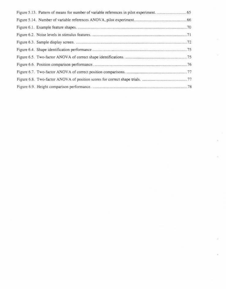
Figure 5.13. Panem of means for number of variable references in pilot experiment. ..... .... ................... . 65
Figure 5.14. Number of variable references ANOV A. pilot experiment. ............................................. .... . 66
Figure 6.1 . Example feature shape.> ................................... ............... ......................................................... 70
Figure 6.2. Noise levels in stimulus features . ................................................................. .. ......................... 71
Figure 6.3. Sample display screen ........................................................................................... .................. 72
Ftgure 6.4 . Shape identification performance ............................................................................................ 75
Ftgure 6.5. Two-factor AN OVA of correct shape identifications ............................................................. 75
Ftgure 6.6. Position comparison performance ........................................................................................... 76
Figure 6.7. Two-factor ANOV A of comect posit•on compansons ............................................................ 77
Figure 6.8. Two-factor ANOV A of posillon scores for comet shape trials ............................................. 77
Figure 6.9. Height comparison performance ............................................................................................. 78

Chapter One
Dynamic Manipulation for Data Visualization
Commonly . a researcher wishes to explore a large set of data in order to develop an understanding of the
structure and relationships within the data. She may have informal or incomplete hypotheses about that
data that she wishes to develop funher. Thi~ son of exploratory process differs from more formal
hypothesis testing in tbat the researcher has not yet formed specific belie.fs .about the precise meaning of the
data. Representing the data visually for this exploratory process is appeal ing because it allows viewers to
harne.ss the powerful processing capabilities of the human visual system~ Some structures in the data.
especially those involving compJex spatial relationships and patterns . are easy to detect visually. but
difficult to specify for computational detection.
I have built a tool. called Calico . that helps a researcher explore multivariate spatial data by representing
data values with colors. Calico allows the. viewer to man ipulate the parameters of the display color
mapping and see the representation change dynamically in response. Calico presents the color mapping
explicitly as a geometric object, so that the relationship between the visual represe.ntation and the data itself
is more easily understood. The mapping obje.cl is manipulated with input devices to change the parameters
or the mapping.
Using Calico. t have perfonned a series of experiments to investigate the advamages that dynamic comrol
of color mapping offers in the c.xploration of multivariate data. These experiments suggest that dynamic
representation is superio r tO static repre-sentations in terms of accuracy of metric j udgements, quality of
judgements about the pattern of va.riable value distributions. confidence about judgements. and accuracy of
judgements in the presence of noise. Dynamic representations are also overwhelmingly preferre.d by use"
over static represemarions.
1.1. The problem
This thesis strivc"s. tn facilitate a researcher's in itial exploration of a data set. This expJoratton begin~ with
informal hypothese' abom the data. s uch as wh.ich variable; are of interest and the general nature of lltc
relationships among variables. Dynamic exploration e>f the data set can help the researcher fun her de"elop
ex isdng hypothe-Se!>. generate new hypothese~. decide whal mathematical measurements are reltvant to
these hypotheses. choose which derived features to consider along with the original variables. decide how
to synthesize multiple variable$ into meaningful composites. and understand how variables covary.
Many types of data have a spatoal component. that is. each data variable value is associated with a location
in some real-world data space. This space could be the extent of the U.S .• a slice through an abdomen. a
sector from a satellite scan.the universe. or the space containing a single molecule. For the purposes of this
research, data values are considered to be samples of an underlying disuibution. Accordingly.there is a
data value, either sampled or interpolated, associated woth each posiuon in the data space. While data
spaces can cenainly be thr..,.<Jimensional (or higher). this thesis primarily considers two-domensional data
spaces.
Multivariate data cont<tins cwo or more variable values for each point in the data •pace. Ahhough chis
do,scnation emphasizes data which has both two dimensions and two variables, these design choices are
independent ( i.e. it would be equnlly meaningful co emphasise two-dimensional , three-variable or three·
domensional. rwo-variable data).
This dossenation assumes that ~ client researcher ts primanly interested in the spatial structure of the
variables under study. especially the spatial structure of the relationships between the variables. A
re>enrcher interested ln under~cand ing the spatial distribution and panem of a data set mighc explore
whether two variables ~cemed co be related over a data space , how the geometry of che data space affects
such a relationship . and whecher points of similar value form some son o f structure . Dynamic
representauons enable tbe researcher to explore the tcmpontl consistency of a pattern over a manopulation.
pro' odong more tnsight onto the nature of the spatial distribuuon of the variables. For example. panems
whsch change linle when the mappong of one variable is manopulated and the mappong of lhc second
variable held constant would seem to be decermined primarily by the variable whose mapping hilS been lleld
constant. Because spati.al correspondence berween the variables is imponant. a representation wich both
variables displayed in the same image is preferable to a repre>cntnuon where each variable is displayed in
11; own image.
1.2 Characteristics of data
Dofferent types of data can be dl\odcd into four scales based on theor descriptive power. These scales are
nomonnl. ordonal. >nterval. and rncio. N()msnal scale.< di.tin~uosh between classes of data ' alues wish no
omplicacion of t>rdcri ng . A medical image where each pixel i~ classified a, conoainin£ • ir. bone. or soic
ti;;uc would employ a nomonal sc:tlc . Ordinal scai<'S om pose n rank for each clas> ba,ed on ;om<:
4uanmati\'e measurr . Data whoch classofies house; a> ;mall . medium. large, or man>ton would he an
e~amplc or an ordinal seal<. /nrefl a/ scales introduce &he concept of dosoance ben• een ordmal clas"'s
Data recording the temperatures of post-surgical patients would have an interval scale. Ratio scales add an
intrinsically meaningful zero point to interval data. The average number of years of schooling for U.S.
counties is measured on a ratio scale. This thesis mainly addresses issues in the display of interval and ratiq
data. Because nominal and ordinal data tend to have a relatively small numbers of discrete classes. I expect
li ttle advantage to be provided by the smooth changes between mappings produced by dynamic
representation.
The variables which make up the data may be the original variables gathered by some data collection
process. derived variables that are the result of some analysis of the original variables. or results calculated
from some hypothetical model. The original variables could be supplied by medical scanners. the Census.
satellite sensors. or many other sources . Derived variables might be the difference. composite, correlation.
covariance. spatial derivative. or regional variance in the original variable.s. In this investigation. no
distinction is drawn between original. derived. and modeled variables. Representation and manipulation
techniques are applied identically to either.
1.3. Color representation
Color ha.~ been used to reliably represent univariate quantitative infornlation for years. Examples appear in
many recent ~cientific journals. Representing quantitati ve dattt using color is attractive because the human
visual system is capable of differe.ntiating easil y among hundreds of colors. Using color to represent
multivariate data is used less frequently and less reliably. Since color sensations are the resu lt of
tristimulus value-s. it should be pos.sible to represent multiple values using only color. In practice. however.
such reprcsenLations have had limited success because co lor components can interfere with one aootber.
Beyond the number of distinct values available. color has other advantages over other display parameters.
For instance. data values can also be displayed ustng .color in a smaller area than they could be using
parameters such as texture or shape. This is a significant advantage in the representation of continuous data
dislribuuons. where !here is a value a.'sociated w1th each point in the data space.
ln this dissenation. I define a representation to be a specific mapping from a data set to a visual display.
Traditionall; . such a mapping is static. that is . it does not change. This document uses a more gcnc.ral
definition of the term. As I use the term. a representation can contain elements which change as the user
watches or interncts with the clisplay Using such f• definition. a representation can be a c1ne loop 10 wluc.h
\!Jew point changes. an antmalion where lhc isosurfaces of a volume are shown in rum. or a dtsplay whtch
can be mantpuJmed by the user. Specifically, the rcprcse ntattons dc$cribed in th is dh:scrtarlon often <:ontam
color mapping!-. which can be manipulated.
1.4. Dynamic concept
While current visualization sysiems often provide an interactive environment for prescribing a mapping
from a data set to a visual representation. they genera.ll y do not dynamically show the change$ to the
resulting image·. for example, VEX {Gelberg 8.9] supplies interactive widgets for manipulating data filters.
mappers, and renderers, but only static images of a single-variable are produced. Other systems provide
some dynamic control over the representation . for example. !CARE {Cox 88] allows control of the
functions determin ing the red, green, and blue componentS of a univariate mapping and provides immediate
visual feedback. NCSA Image [NCSA 89] and Spyglass VIEW provides dynamic control of some
representation parameters. but there is no direct manipulalion paradigm and only a single data variable can
be represented at a time. In all these systems. however. inceractivity serves as ·a means to the end of finding
a good static data visualization .
But what if the goal of interaction with the visualization were insight, rather than just a good color
mapping? lust as viewing a lhree-d imensional object by controlling the viewpoint dynamically is more
illuminating than viewing a still image or even a precomputed film loop [B rooks 77], so dynamic
interaction with a visualization should spark insights that viewing a single representation or movie loop
does not. The feeling of being able to reach in aod directly manipulate !he representation adds an
immediacy 10 the expJoration cxpe.rience. Dynamic manipulation engages a viewer-s kinesthetic sense in
addition to his visual sense.
I define dynamic manipulation to be distinct from interacrive control. With interactive corrrrol of
parameters. the displayed image is only updated periodically . such as wben buuon is released or a menu
selection made. With dynamic manipulation . a displa)·ed image changes as the viewer moves $()me
continuous input device. such as 11 slider. joystick, mouse, or tracker. The researcher not only sees the
initial and final representations. but also the representatio:ns in between . Dynamic manipulation creates an
illusion of directly manipulating the ob;ect under study. rather than that of invoking invisible entities to
alter the object. I believe this process of interacting with the data by moving !he control devices and seeing
the representation change in respon~c will be a useful tool that helps researchers explore data. I believe !hat
it is thi' interaction process. as much as the individua l representat ions seen. which contribute to the
researcher's understanding of the data.
Because I believe th:u dynam~e control of the vrsuahtation is crucial. J am limiting this investigarion lOa
set of representation parameters wh1ch can be manipulated in real-time on avaik'lble- hardware .
Consequemly . thos thesis will explore the power of dyna;m ically chan gin£ the color parameter. of a dat a
rcprc-~cntation rn c>.plorin!; and understanding twn-dimen~ional rwo-variable daw.
1.5. Thesis statement
D.lnamic mampulallOII of rtpresemarion ptzrameter.J a qtlidtltlli\·el)' differ en/ und tluuntitulln:l> morr:
poh:erfulthan viewing Static Jm.ugts.
My assenlon is plausible f(lr lhr..:c rca~ons . First. mult1plc l'cpre:,cr'ltatJons are bcuer 1hun a :--mgh:.
rcprc!)enwtton. For a se1 of data. a ccnah1 represenlali()O muy show a one kind of rl.!lalion~hlp Wl\\cc;:n datn
elemcnb. while another repre\tnlaunn beucr ~how' a c.hffcrcnt rdation.-.;.hip. Dun•'& tt.c c.,pivr.JI\"'f~
proces.\. it v.ould be usdulto view the data "'ing d11feren1 repre-.ntali<>n.\. Dynamic control of the color
parameters ()r 3 rc:present:UIOO nllo'-'~ a re.._-.carchcr to rapidl)' tr) n whole r.mge of color n.:prc:.cnt.unms ot
the datu. showing a greater rnngc of data rclauonships . Muluple representation> >hould •l>o "'ducc the
effect' of perceptual anomalies cnu>cd by the lmeractio'1 of color parumctcrs or of adJaC~ul colors, bfcause
these anomalies should affect diffcrcut represelllations i1> different way;,.
Second. d)namic representation;, present information about variable ;,patial dcnvauvc> and relauve
contribuuons as well"-' mw 'oriablc •·aloes. As the rese.archer manipulates the color mapping. colors move
n<:ross the image surface in a co~tinuqus manner which show> the local rate of change of variable values.
T hird , dynamic control of the mapping builds an intuiti ve link between the control motion> that a user
performs and the visual results of those control motions. 'nus experience of directly manipulating lh~ color
mapping should help the researcher become more involved in the visual representation and may yield a
deeper understanding of the data.
I >et out to prove this thesis by building a dynamic tool fur the creation and manipulatiun of color
mapping;,. called Calico. Additionally. I conducted p;ychophyslcnl experiments u<ing Calico 10 study the
effects of dynamic control on the comprehen~ion of metric und p~ucrn infonnation .
1.6. Calico : A Dynamic Color Mapping Tool
A panicular mapping from data 'ariablcs to display colors. called a color .<cheme. ha; tltrec ba~ic pan>· the
color space. the eurve or surfJCc lonncd by color p:uhfsheet parameters as they trmel through that >pace.
and the parameterizauon of the mapping from variable values to curve or sheet coordinate>. Tbc
os>ignmcnt of data variables 10 color parameters is implicit in the colnr path or sheet. Two ver.ions of
Calico were buill to providu n dynamic tool for the creation and manipulation of color mappings. The first
version i> a Pixel-Platies 4 npplicatic:m buill on top of PPHIGS. The second is a sci of module• ft>r IRIS
Explorer. u general purpose visualization toolkit. The de,criptionl>clow is a generalill!tion from the two
ver,ion>. Specific detaih about the de;,gn and implememauon of Calico can be found m Appendt~ A
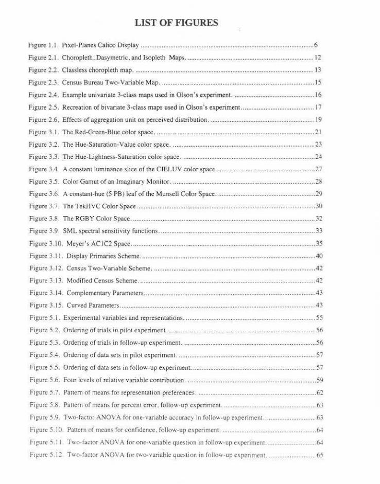
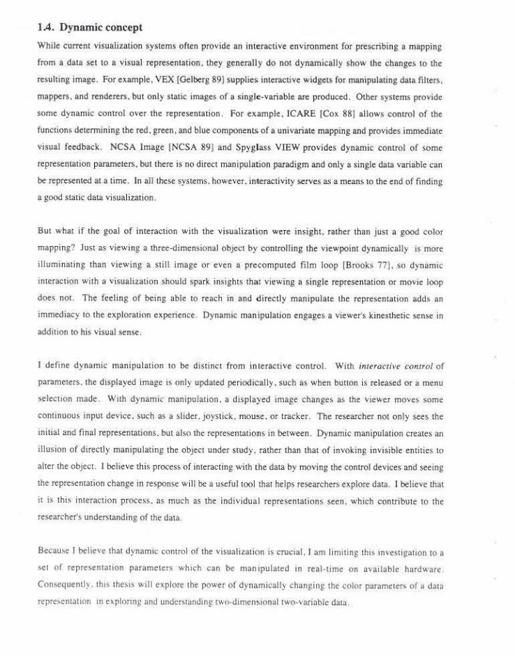
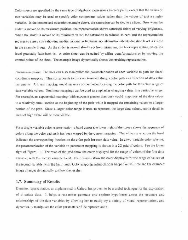
Figure 1.1 shows the Pixel-Planes Calico display for a mapp1ng of two data variables. In Calico. the
sample-< of the color space appears in the center of the screen. the color sequence (path or >heet) is
represented by a curve or sheet within the color space, and the parameterization of the variable-to
parameter mapping appears in the lower right of the screen. The$c three hems define the color scheme
~pocc. The upper left of the screen contains the image opace showing how an example 20 dota set is
represented using the current color scheme. Changes to the mapping arc made in the color scheme ond
immediately reflected in the image space.
Color Modrl. The color model dctermmes the components u>cd to describe a color. such as the hue,
lightness. and saturation components used in the HLS color model. Pour color models arc provided: ROB.
HLS. HSV. nnd CIELUV. A color .<pnce is a visual repre>entotion of a color model, such ns the cube
spanned by the red. green. and blue C<lmponents of the RGD color model. Calico represents u color space
as a U1rcc dimensional cloud of samples where the cloud •hapc b dctcnnined by the color model; for RGB
it is a cube and for HLS it is a double cone. The color space can be rotaled with a joystick or the \p>ce can
be exchanged for one representing another color model.
Color Puth. The color pnth is a geometric object in the color space which can be geometrically
mnnipulnted to change the sequence of colors in the color scheme. As the path curves tltl'oug.h the coiM
figure I l Pjxei-P!anes Cahm P~<plav
space it completely describes the sequence of color.> used in a mapping from a set of values of a single
scalar variable to a set of colors. For example. if media·n family income for U.S. counties is mapped tO a
combination of hue and lightness using a rainbow scale in the HLS model, the color path runs through the
bues in an ascending spiral from black to white. Counties with a low median family income are displayed
in dark reds, those with an average median income in medium gneens, and those with a very high median
income in pale purples ,
Color paths can be generated from parametric expressions which define the color component values as
functions of data variable values and input device positi<ms. Expressions containing input device variables
are tagged a.s dynamic and arc re-evaluated when the corresponding input device is moved. Both the
example image and geometry of the color path change dynamically as the user manipulates the input
devices. In the example above, if hue were specified as the value of median income plus the value of a
slider. the user could spin the color path around the vertical axis, changing the hue component at each point
in the example image, but not the lightness component. The resulting path might stan at the dark blues . run
through medium reds, and end with pale greens. Color paths can be edited by grabbing a control point of
the curve and pulling it with a joysuck whi le selecting the scope of the change with a slider. The entire
color path can be altered by affine transformations (translat ion , rotation. scaling). As the path .is
manipulated, the example image changes dynamically to show how the representation changes in response
to changes in the shape of tbe color path.
The Explorer version of Calico also provides for the parametric specification of surface opacity as a
function of variable values. Opacity is specified in the same way as color components. Using this
mech~nism. the opacity of the surface can carry lnfonnation or can be used to emphasize certam parts of
the data value range. For example. areas with very low values can be visually deemphasized by making
them mort transparcntlhan other area~ .
Color Sheet. The color gamut for a mapping from the values of two scalar variables to a single color is
described by a sheet through the color space. At each point the color sht>et shows the color used to
represe111 a panicular combinauon of the values of the two data variables. When all combinations of values
are considered. a sheet is fonned . For example . a color scheme might map mean education level to hut
and median income to lightness (using an HI.S space). Figure 1.1 shows such a color scheme. The
correspondin£ sheet cou ld be described by two dim~nsions: the curve spannin£ the hues in a single
lightness and saturation and the line from black to white. Areas with low education levels would be reds .
da;lo. when mtditm income is IO\\· and pale \l,··hen it i:> tllgh . Areas. WHh a relative ly average ~ducation level
would be bhles . dar~ whell median m<:<nne 1~ low and p<~lt when il'~ high.
Color sheets are specified by the same type of algebraic e:xpressions as color paths. except that the values of
two vanables may be used to specify color component values n1ther than the values of JUSt a single
vanable. In the income and education example above, the sarun~tion can be tied to a slider. Now when the
slider is moved to its maximum position, the representation shows saturated colors of varying brightness.
When the slider is moved to its minimum value, the saturation is reduced to zero and the representation
reduces to & grey scale showing median income as lightness; no information about education level is visible
an the example image. As the shder is moved slowly up from minimum, the hues representing education
level gradually fade back in . A color sheet can be edited by affine ~n~nsformations or by moving the
control points of the sh""t. The exomple image dynamically shows the resulting representation.
Paramtttrir.ation. The user can also manipulate. the parameterization of each variable-to-path (or sheet)
coordinate mapping. This corresponds to distance traveled along a color path as a function of data value
increments. A linear mapping would mean a constant velocity along the color path for the enure range or
data v3flable values . Nonlinear mappings can be used to emphasize changing values in n panicular range.
For example. an exponenual mapping (with exponent greater than one) would map most of the data values
to a relatively small secuon at the beganning of the path while it mapped the remaming values to a larger
ponion of the path. Since a larger color range is used to represent the large data value>. subtle detail on
areas of high value wW be more visible.
For a single-variable color representation. a band across the lower right of the screen shows the sequence of
colors along the color path as it has been warped by the current mapping. The white curve across the band
indicates the correspondm~ location on the color path for each data ' 'alue. In a two-,·ariable eolor scheme.
the parameterization of the ' 'anable-to-pararneter mapptng IS shown in a 2D !'rid of colors. See the lower
right or F1gure 1.1 . The rows of the grid show the color displayed for the range of values of the first data
variable. with the second variable fixed . The columns show the color displayed for the range of values of
the second variable. with the first fixed. Color mapping manipulations happen in real time and the example
image changes dynamically to show the results.
1.7. Summary of Results
Dynam1c representauon. as tmplemented m Calico. has proven to be a useful technique for the explorauon
of b1vanate data. It helps a researcher generate and explore hypotheses about the Mructure and
relattcmships of the data variable• by allowinp her to ca>ily try a vanety or visual represen tations and
dynamically manipulate the color p:11amcters of the representation.
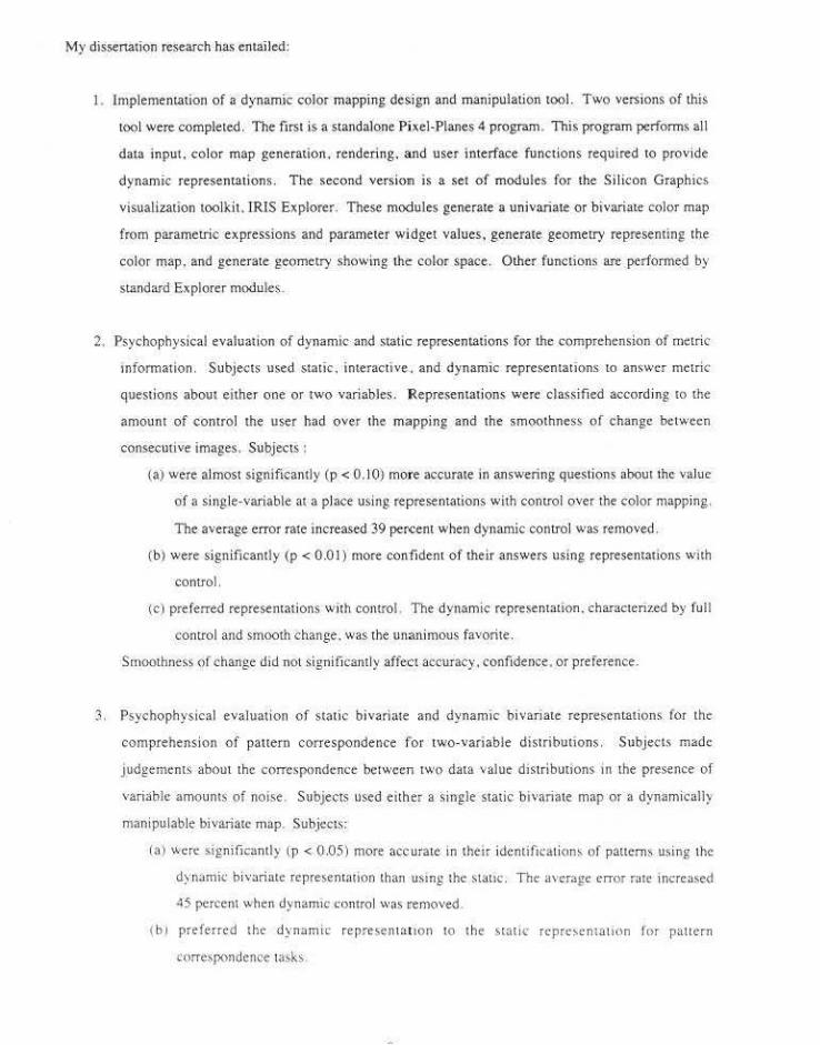
My dissenarion research ha< entailed:
1. lmplememation of a dynamic color mapping design and manipulation tool. Two versions of this
tool were completed. The first is a standalone Pixel-Planes 4 program. This program performs all
data input . color map generation. rendering. and user interface functions required to provide
dynamic representations . T he second version is a set of modules for the Si licon Graphics
visualization toolkit. IRIS Explorer. These modules generate a univariate or bivariate color map
from parametric expressions and parameter wi.dget values, generate geometry representing the
color map, and generate geometry showing the color space. Other functions are performed by
standard Explorer modules.
2. Psychophysical evaluation of dynamic and static representations for the comprehe.nsion of metric
mfonnation. Subjects used static , interactive . and dynamic representations to an~wcr metric
questions about e.ither one or two variables. Representations were classified according to the
amount of control the user had over the mapping and the smoothness of change between
consecutive images . Subjects :
(a} were almost significantly (p < 0. 10) more accurate in answering questions about the value
of a si•tgle-variable at a place using representations with control over the color mapping.
The average error rate increased 39 percent when dynamic control was removed.
(b) were significantly (p < 0 .0 I) more confident of their answers using representations with
control.
(c) preferred representations with control. The dynamic representation. charactcliz.ed by full
control and smooth change . was the unanimous favorite.
Smoothness of change did not significantly affect accuracy. confidence •. or preference.
3. Psychophysical evaluation of static bivariate and dynamic bivariate representations for the
comprehension of pa11ern correspondence for two-variable distribunons. Subjects made
judgements about the corresp<)ndc nce between two data value distribunons in the presence of
variable amoums of noise . Subjects used either a single-static bivariate map or a dynamicaUy
manipulable bivariate map. Subjects:
(a) wen: significantly {p < 0 .05) more accurale. in the-ir idcntifkation~ of patterns using the
dynamk bivariate representation than usmg lhc stattc. The average error rafe increased
45 percent when dynam1c comrol was removed.
( bJ preferred the dynamic represen w.tton to the static rtprc:-.entauon for pauern
correspondence tasks

{c) made correct judgements regarding correspondence of pauern :u higher noise levels using
the dynamic representation .
1.8. Overview of Thesis
Chapter 2 surveys methods for representing quantitative spatial data using maps. emphasizing methods for
representing data which spans the data space (continuous or chonaplethic).
Chapter 3 summarizes issues wh1ch arise in the color representation of quantitative mformation These
issues mclude models for describing color. color gamut selecuon. and peculianties of the human color
vaston s;:ystt:m.
Chapter 4 surveys dynamic approaches to the representation of multivariate data.
Chapter 5 describes two experiment~ which compare da ta exploration using dynamic representation; of
multivariate data to explorations using static and interaction representations . These expetlments
concentrated on subject preferences and accuracy in the comprehension of metric data. These expetlments
were conducted using the Pixel· Planes 4 version of Calico.
C hapter 6 reports on a third exper;ment CMlparing dynamic and static representations for the
comprehension of data value panem and correspondence <>f pauem for two variables. This experiment was
conducted using the IRIS Explorer version of Calico.
Chapter 7 lis~ som~ directions for furure exploration.
Appendix A d1scusses de•ign and implementation issue' from both versions of Calico These 1ssues
1nclude design issues which nrose. cho1ces made. approaches which did not work. and features which
worked particularly well. This append1x also contains documentation of the IRIS Explorer version of
Calico.
Append1A B contains m>t~nals used in the experiments described tn Chapter 5. along "'11h subJects' ra"
M:ores
l\ppend1>. C contains material> u>ed in the CAperimcnts de,cribed 111 Chapter 6. along w11h 'llbjects' raw
~ore~.
Chapter Two
Representing Quantitative Information using Maps
A map is a graphic display of spatial infonnation. A map can show a wide range. of infonnation including
the positions or extents of objects. variable values at places or over areas. relationships among values at
neighboring places. and comparisons of values of different variables at the same. point.
Canography. the srudy of maps. is an extensive and well-developed field. This chapter does not even begm
to summarize the body of cartographic literature. it merely introduce~ a few concepts which may gi ve the
reader a better understanding of some issues in the display of spatial data. In particular, this chapter
introduces the map types which were. used in the experiment described in Chapter 5. The lirst section of
this chapter discusses some objectives of cartographic representation, as well as types of information which
can be gleaned from maps. The scc<md section summarizes some methods for representing areal quantities
with an emphasis on choropleth maps, maps in whicn values are displayed in areas corresponding to
discrete regions. The third section describes methods. for showing more than one variable over the same
domain. with an emphasis on multivariate maps. The founh section discusses some effects of scale on map
displays .
2.1. Mapping Objectives
Bertin (731 proposes that thematic graphic displays can be used to convey three distinct levels of
information. Elementary questions involve simple translations from displayed symbol (or color) tO
underlying value. such as "What is the population of Caneret County?" lmermediol<' questions concern the
geographic trend of a single-variable, such as "How does median income change as distance to the coast
increases?" Superior questions compare geographic strUctures. such as "Do farm size and median income
have the same geographic distriburion across the country''" Pizer and Z immennan (8~] use the terms
quantitative and qualitative to describe the kinds of information available in an image. Qlltmtiwti••e
questions query elementary information in an image. Qualitative questions encompass both intem1ediate
(single-variable qualitative questions) and superior (two-variable qualitative questions). All three leveh of
mforrnation are considered in this thesis . but compre hension of su perior information " of panitular
mterc!~l.
Lavin and Archer [84) distinguish between two distinct philosophies about cartographic objectives .
An<Jiyric cartography empbastzes the role of maps in expl<>ratory analysis. using maps to formulate and test
hypotheses ab<>ut the spatial dtstnbuuon of values. Cartographrc communication corresponds more closely
to presentation graphics. using maps to convey a charactenzation with a minimum of perceptual error. This
dissertation focuses on the role of spatial graphics (such as maps) in the exploration of quantitative data
distributions. whi le the facility with which characterizatiolls are communicated is of secondary imponance.
2.2. Representing Areal Quantities
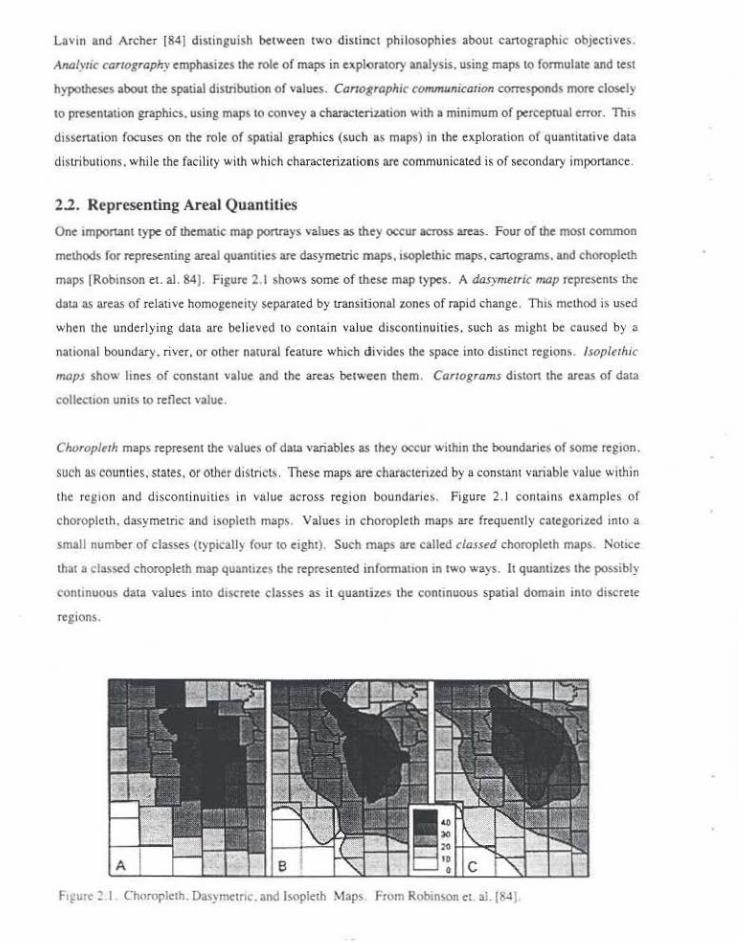
One tmportant type of themauc map ponrays values as they occur across areas. Four of the most common
meth<>ds for representing areal quanuues are dasymetric maps. isoplethi< maps. canograms. and choropleth
maps [Rob~nson et. al. 84). Figure 2.1 shows some oftltese map types. A dasymetric lll(Jp represents the
data as areas of relati ve homoseneity separated by Lransilionalzones of rapid change. Thrs method i~ used
when the underl ying data are believed to contain val ue disconti nuities . such as might be caused by a
national bou ndary. river. or other natural feature which divides the space into distinct region> . lsoplnhic
maps sho" lines of constant value and the areas between them. Cartograms diston the :u-cas of data
collecuon umts to reflect value.
Choropltrh maps represent the value~ of data variables as they occur within the boundaries of some reg1on.
such as counties. states. or other disLnct~. These maps are charactenzed by a consmn1 variable value w11hin
tl\e region and discon tinuities in va lue across regioo boundarie>. Figure 2. 1 contains examples of
choroplcLh. dasymetric and isopleth maps . Values in choroplcth maps are frequen1l y categorized into a
small number of classes (typical!) four to eight}. Such maps arc called classed choropleth maps. Notice
that a classed choropleth map quanll>es the represented information rn two ways. It quantizes the possibly
continuous data value& into d1screte classes as it quantius the continuous spatial domarn rnto di<erc1e
regions.
FrfUI< ~ I. Chu:uplcth. Das~mctnc. and l•opleth Maps From Robinson ct ai.(84)

Representing continuous values on a map by a few classes necessarily results in a loss of information
because places with different values that fall in the same c lass are repre-sented identically. In order to
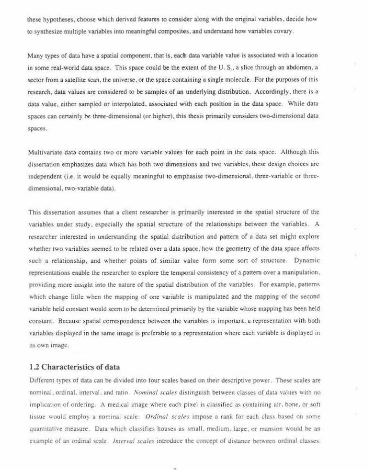
reduce this quantization error. Tobler [73) proposed generating choropleth maps without class intervals. He
produced unclassed choropleth maps on a line plotter by using the variable value for a region to determine
the spacing of cross-hatch lines for that region . More recently, unclassed maps have been produced using
shaded areas on maps which are printed on paper or displayed on C&Ts. See Figure 2.2.
Critics of this approach argue that unelassed maps arc les.s readable than maps with class intervals because
as the number of classes increases. the perceptual error :also increases. lnvestigations of the relationship
between number of classes and magnitude of perceptual errors typically examine how accurately a ••ewer
can look up the value represented by the color of a region using a legend. For example, Gilmartin and
Shelton [89) showed subjects a map in wh ich a single value for each county in the U.S . was mapped to
intensity of either grey, green. or magenta. They asked the subjects to identify the cia" to which a county
belonged. With all three scales. as the number of classes increased. the percent of correct answer.;
1,.. '" .,. '" '" ,, . " M + 11 .. ....
._: ·P J •: .
POPULATION CHANGE
.. ..... ~.
f'igure ~-2 C:las~l"'s choropleth map. From Monmonier [84).
decreased. Mean percent correct decreased from 92 to 68 percent as the number of classes was mcreased
from four to etght. Response times also increased significantly as the number of ci8SS¢5 mcrcased.
The problem with this son of experiment is that since it only measures the difference between displayed
and perceived values. it does not consider the decrease in quantiz,ation error as the number of classes
increases. A more meaningful measure of the communication errors 10 which a map Is prone would be the
difference between the value which a viewer reads from a region and the actUAl vari able value for that
regton . This measure of communication error would account for both perceptual error (which tends to
increase as number of classes increases) and quantization error (which decreases as number of classes
increases). Peterson {79) compared the perceptual error produced by an unclassed crossed-hoe choropleth
map 10 the quantiurion error in maps of the same region with varytng numbers of cla:.sc~. He found that.
for maps with fewer than six classes. quantization error was grenter than median perceptual error for an
unclassed map of the same region. Since Peterson assumed that the classed maps produced no perceptual
error. the nctual optimal number of class intervals for value determination is likely to be htgher. Muller
(791 obtained similar results using continuously shaded maps.
Peter<on also compared classed and unclassed maps for the purpose of conveytng the pauem of a
distribution. Subjects were presented with two maps and asked to judge which was more alike or more
opposite a third map. The results showed no difference between the quality of judgements between
subjects viewing undassed maps and subjects viewing maps with five class intervals. Peterson concluded
that the extra information present '" unclassed maps neither helps nor hinders comparisons between maps.
2.3. Representing Multiple Variables
When more that one vanable is of interest over the same geographic domain, the map maker has three
opuons: display variables on a series of univariate maps with one variable per map. display some derived
'ummary statistic. or display the variables on a single multivariate map. Multivariate map> decrease the
load on the visual memory of the viewer by eli minating the need 10 glance between maps in order to make
comparisons. Although a summary statistic (such as residuals. sum. difference. or vanance) cou ld be
computed from the component variables and displayed on a single composite map. in so doing the
tndl\'tdual \alues or the origmal \'anables would be lost . Muluvanate maps preserve the Independent
contnbuuons of the ori~mal variables while showing their di~tribmional association.
Stnce muhivartate maps can qutckly become too comple> 10 be U>cful. m<)<l of the discus;ton in the
lHernture of mu ltivariate map'" rc\lrkted to the bivari~te (two-variable\ case Much of tht> d"CU>'ton has
been large I) un~upponcd ~tatementlthat one type of map <>r another IS clearly supenor These statements
mdude 'uch senumcnl.\ as "81\anate map' are too comple> to understand.'' ··ai,a.'tate map' fa<:thtate more
accunue posi1iona.l comparisons." ''Univariale maps ure easier tu use." and ''Bivariate maps show joint
distributions more dearly."
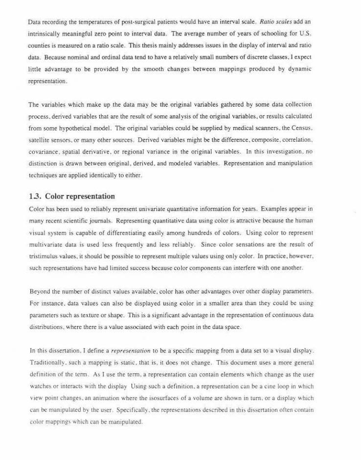
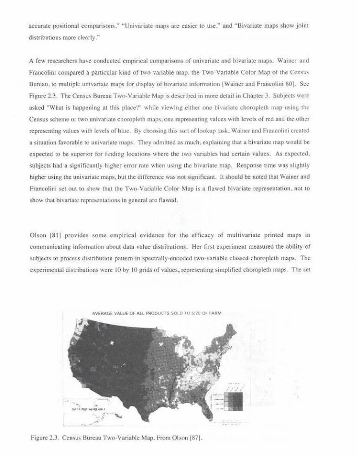
A few researchers have conducted empirical comparisons of univariate and bivari-ate maps. w ·ainer and
Francolini compared a particular kind of two-variable map. the Two-Variable Color Map of the Ccnsu>
Bureau, t<l multi ple univariate maps for display of bivariate infomlation !Wainer and Francolini ~0] . See
Figure 2.3. The Census Bureau Two-Variable Map is described in more d~tail in Chapter 3. Subjects were
asked "\Vhat is happening ~u this place'!" while viewing either one bivariate choropldh map u:;ing lht:
Census scheme OJ' LWO univariate choropleth maps. one representing values with levels of red and the other
representing values w11h levels of blue. Oy choosing this so11 of lookup task. Wainer and Francolini creattd
a sltuation favorable to univaJiate maps . They a<imiuect as much. explaining that a bivariate map would be
expecte{! to be superior for finding locations where the two variable.< had certain values. As expected .
subjects had a significantly higher error rate when using ~1c bivariate map. Response time was slightly
higher us ing the univariate maps, but the difference was not signiticant. It should be noted that Wainer and
Fr.mcoHni set out to show that the Two. Variable Color Map is a nnwcd bivariate representation. not lO
show thal bivariate rcprc:-.cntations in general arc flawed.
Olson [811 provides some empirical evidence for the e fficacy of multivariate printed maps in
communic-ating information nbout data value distributions. Her first experiment measured the ability of
subjects to proces-s dtstributinn pattern in spcctralJy .. encodcd l\\'o~variablc classed choropJeth maps. T he
experimental distributions were 10 by 10 grids of values, representing simplified choropleth maps. T he ~et
AVERAGE VAlUE OF ALl PROOUCTS S<Ji.D 10 517( OF F-ARM
Figure 2.3. C"nsu~ Bureau Two-Variabl" Map. From Olson !871.
of test maps included maps containing either three or four classes. with class intervals deu:nnined by either
quantiles Ot standard deviaJion umL'·
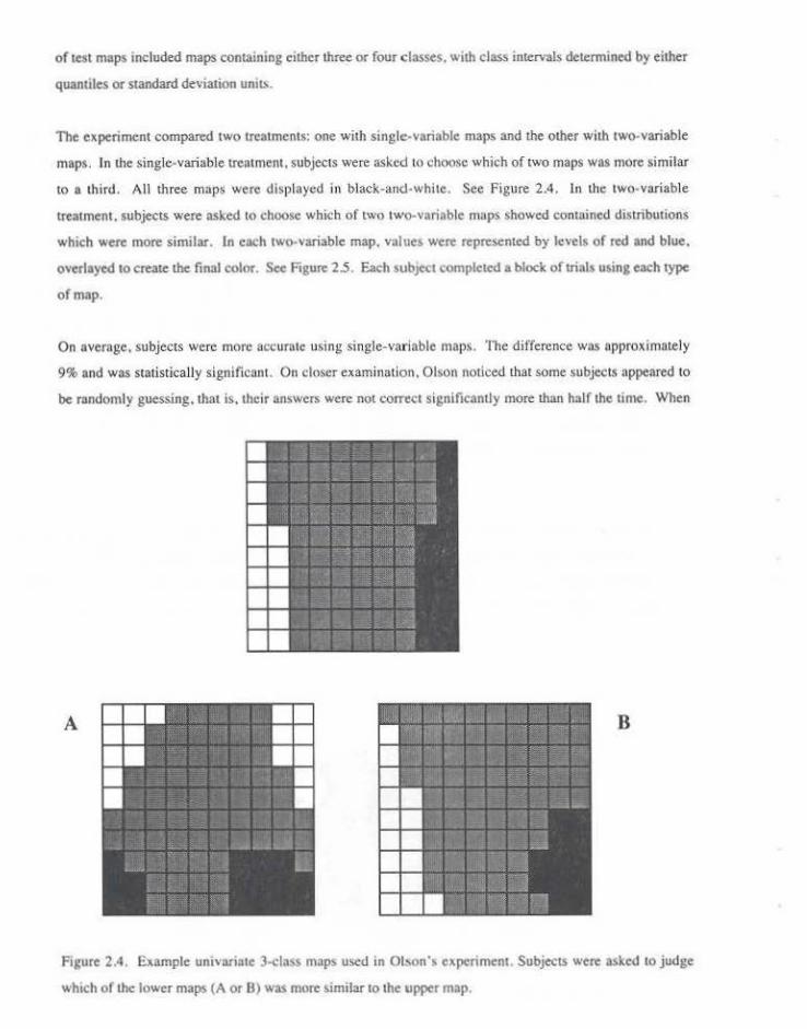
The expenment compared two treatments: one with single-variable maps and lhe other with two-variable
maps. In the single-variable ue:umem. subjects were asked to ~hoosc which of two maps was more similar
to a third. All three maps were displa yed in black-and-white. See Pigure 2.4. In the two-variable
ueatmcnt, subjects were asked to choose whicb of two two-variable maps showed contained distribmions
which were more similar. In each two-variable map, v;alues were repre>Cnted by levels of red and blue.
overlayed to create lhe final color. See Figure 2.5. Each subject completed a block of trials using each type
of map.
On overnge, subjects were more accurate using single-variable maps. The difference was approximately
9% and was statistically significant. On closer examination. Olson noticed that some subjects appeared to
be randomly guessing.lhat i; . lheir answers were not correct significantly more !han hulf the time. When
A B
Figure 2.4. Example univariate 3-<:lass maps used in Ol~on'• experiment. Subjects were asked tO judge
which of !he lower maps (A or B) was more similar to the upper map.

displayed (also called inner scale), the size of lhe mapped area (also called Olll<r scale), or lhe ratio of map
distances to distances in the real world (such as one inch represents one mile) . The first meaning is more
relevant to the currem discussion. Specifically,lhe scale of a map can affect the range. variability. and
distribution of values (Meentemeyer and Box 87;Meentemeyer 89: Turner et al. 89; Chang and Tsat 91] .
Map scale can act to mask features of a data distribution or produce apparent distributions which do not
exist in the original data. Even at a fixed scale, the particular sampling strategy can affect the perceived
distribution.
The effects of scale and sampling strategy can be seen clearly in Figure 2.6. The top map recreates the dot
map of cholera cases used by Dr. John Snow as he worked to understand the source of London's 1854
epidemic. On the basis of such a map. he hypothesized thot the Broad Street pump was the infection
vector. When the pump handle was removed. the number of new cases plummeted. The clustering of
cholera cases around the pump can be seen clearly in the dot map. It would also be clearly seen if the data
were aggregated by city blocks (not shown). In the tbree coarser scale aggregations in the bonom part of
the figure. the true distribution of values is obscured by the aggregation unit. A liner scale aggregation. for
example one based on single blocks or on property boundaries. would not obscure the distribution.
In the experiments described in Chapters 5 and 6, all data variable distributions were represent.ed at the
same scale (in all its meanings). Accordingly. although scale may have affected the pattern perceived. the
effect was constant across trials.
18

Snow' a Dot Map
• Do.>th lmm Cholzn
AtN1 Aggrt'S-'tion• and De11sity Symbols
.. • :
Figure 2.6. Effects of aggregation unit on perceived distribution. The dot map above is aggregated in three
different ways below. resulung in very different perceived patterns. From Monmonier (91] .
i9

Chapter Three
Color Representation Issues
Color has been userl to convey infonnation for thousands of years. Colored areas on maps show land or
water type. Flashing red lights warn o f danger. Black clothing signifies mourning (in some cultures).
Colored lights tell drivers whether they should stop or go. C lothing color has. at times. displayed the rank
of the wearer. We tend to color-<:ode babies in pink or blue.
This chapter discusses several issues imponant to the effective color display of quantitative information.
The first section of this chapter prcsenLs several color models used to describe colors. and a summary of
some research in the evaluation of color models. The second section describes color sequences used to
represent data values, along with some criteria for evaluating color sequences . The third section surveys
extsting interactive color sequence editors. The last section describes some perceptual issues in color
display.
3.1. Color Models
Color models provide a conceptual framework for thinking about color sequences by describing the ways in
which colors can be defined. Specific.ally. a color model specifies the basic components used to describe a
color. Components can be primary colors whict. are added or subtracted from each mher, perceived
quali ties of the color, proposed perceptual mechan isms, C>r something more abstracl. Taken together. the
ranges of the components define a color space, where each component corresponds to a dimension .
Continuous color sequences can be visualized as paths or surfaces within the space .
This section describes and compares color models with respect to how they can be used to describe or
define color sequences for the display of quantitative information on video display devices . Color models
which are concemcd primarily with naming colors or generating prim media are not mcluded. One such
print color specification system is the PANTONE Color Specifier. In this system. color names correspond
to mixture!\ of standard inks which will repmduce the color.
20

3.1.1. De'~<ice-derived Color Models
The componems of a device-derived color model correspond directly to the signals used in the color display
devices themselves. Because of this correspondence. no additional transformations need to be applied
before displaying a color calculated in a device-derived model. Accordingly, the principal attraction of
device-derived models is their ease of use for the applications programmer. The rwo most common video
device-derived models are ROB. used in most color monitors . and YJQ, used in color television broadcast.
3.1.1.1 The Red-Green-Blue (RGB) Model
In the RGB color model, each c.olor is specified by its red, green, and blue components . The gamut of the
ROB color model forms a cube. shown in Figure 3.1. The model is additive in that maximum values for all
three compone.nts produce wh ite. whereas minimum values produce blac~ . The components of t.he ROB
model correspond directly to emittance curves of specific red. green . and blue phosphors used by most
display devices. On these devices color is specified either by a RGB triple or an index into a color lookup
table comaining RGB triples.
Colors defined using other models must usually be translated into RGB componen!S for display. Most of
the drawbacks of device-derived model' such a.~ RGB stem from their lack of an intuitive or physiological
basis. People do not perce1ve color as values of red. green, and blue. but instead in terms of hue, saturation.
and brightness . Neither do people have a deep intuitive grasp of the RGB components of a color. Even
those familiar with the color model find it difficult to estimate RGB values for some difficult colors such as
browns and golds. Another disadvantage of the RGB model is that since the precise meaning of the red.
Blu~--------~Cyan
Black . . . . . ........... ...... . .. . . . .... >rccr
Red Yellow
Figure 3 I. The Red-Green-Blue color space

green . and blue levels differs among display devices. objects displayed wilh lhe sam e RGB values on two
d ifferent monitors do not necessarily appear to be the same color.
3 .1.1.2. The YIQ Model
The YIQ color model defines lhe "transmission primaries " used in colo r television broadcast. It is formed
by a linear transformation of lhe RGB color model. YJQ was designed to be backward compatible wilh
black and white TV. It uses lhe llxed bandwid th of a broadcast signal efficiently by allocating bits within
lhe encoding by the relative importance of the components.
The Y component corresponds to changes in luminance . 1 specifies color along a blue-green to orange
\'ector. Q specifies color along a yellow-green t.o magenta vector. Neither I nor Q have perceptual
correlates in the human visual system. Since the e)'e is more sensitive to luminance, especially when the
colo red area is small, Y contains more bits lhan either I or Q. which carry the chromatic information . A
color in the ROB .space (and based on the standard NTSC RGB phosphor) can be converted to YlQ by the
following affine u-ansforrnatioo(Smith 78].
y O.l:J 0.59 0.11 R
= 0.00 .028 .0.32 G
Q 021 .0.52 031 B
Like RGB, the YlQ color space is non-inrulrive. so specifying colors or identifying the components of a
displayed color can be difficuil . The YIQ model is most useful when images will be broadcast tO television
or recorded onto vide.orape. Colors defined origina lly in other models would need to be first transfom1ed
into YlQ before they could be displayed. Some information might be lost in this process. For example . in
RGB only one th ird of the color bits carry brightness information (only the total of component
contributions, not their relative contributions. affect brightne-ss Ievell while the o ther two thirds speciiy
chroma.. In YIQ. more than one third of the color bits carry brightness in formation . so fewer bits o f
chromatic resolution are available. Digital display devices have a discrete co lor gamut . so when the
number of hitr. a·vail:lble for chrom tltic informuiion djffcr-s . the displayitblc hue:5 fall in different phu,;e~ in
the underlying continuous gamut . This can make colo rs o rig inally encoded in RGB appear different when
transformed to YIQ for broadcast to television o r record ing to videotape .
3.1.2. Hue-based Models
The fam•ly of intuuion· ba>ed color models wh1ch deiine hue as a bas1c qual it) o f color prO\'tde a more
mtu1t1ve way for people to spectfy color!:>. 1l1c hue:- nf a color as~ocimes it with a place in the spccLrum. For
a monochromatic light. the hue corresponds to the wavelength. More precisely , hue Is the "attribute of a
visual sensation according to which an area appears to be similar to one, or to proportions of two. of the
perceived colour.; red, yellow, orange, grec.n, blue, and purple' [Hunt 78]. Hue values are in the range [0.
360] and describe angular distance from red.
The various hue-based models define two additional basic qualities of color : one describing its vividness
(called saturation or chroma) and one de.~cribing the amount of light emitted (called lightness, brightness.
value , or intensity). The members of this color model family are interchangeable. Some of the most
common models are described below.
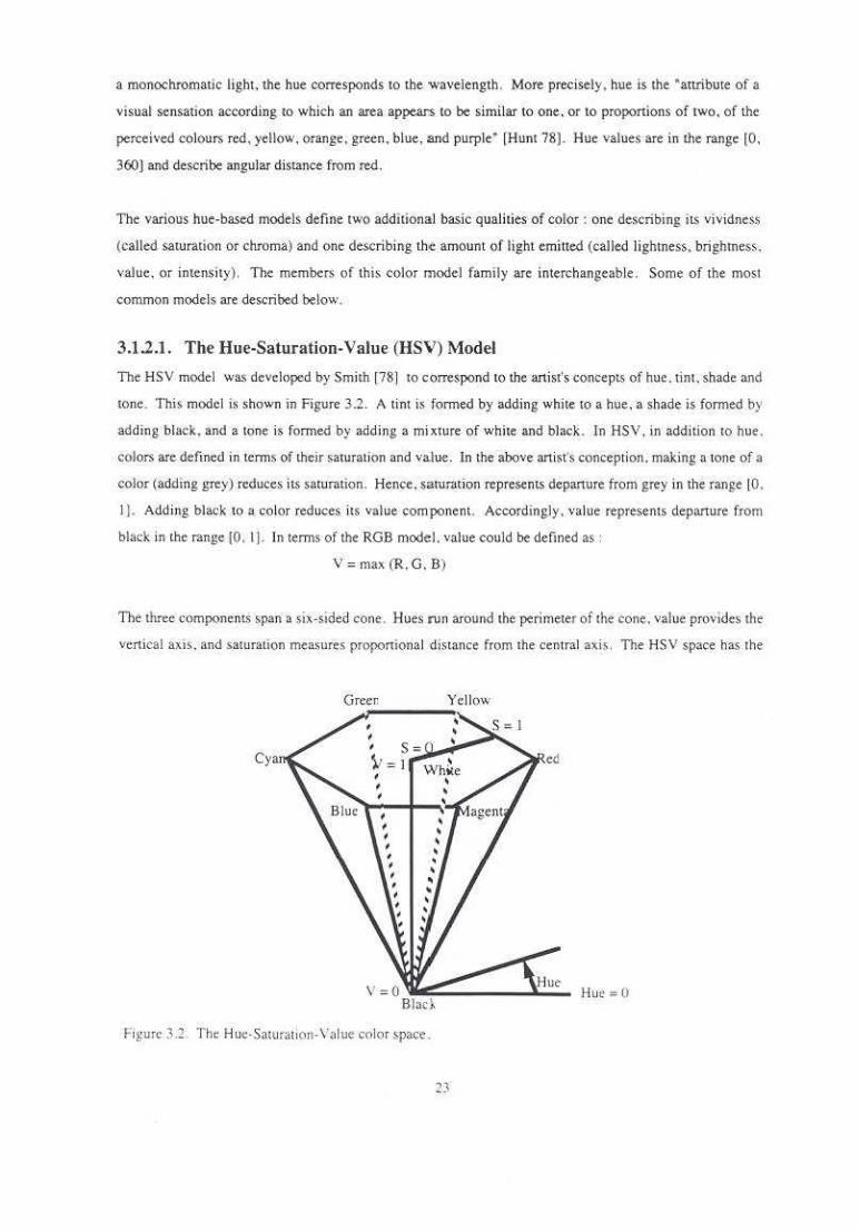
3.1.2.1. The Hue-Saturation· Value (HSV) Model
The HSV model was developed by Smith [78] to correspond to the artist's concepts of hue. tint, sbade and
tone. This model is shown in Figure 3.2. A tint is formed by adding white to a hue, a shade is formed by
adding black. and a tone is formed by add ing a mixture of white and black . In HSV. in addition to hue ,
colors are defined in terms of their saturation and value. In the above anisrs conception. making a tone of a
color (adding grey) reduces its saturation. Hence, saturation represents depanure from grey in the range [0,
1]. Add ing black to a color reduces its value component . Accordingly , value represents depanure from
black in the mnge {0. I j. In terms of the RGB model. value could be defined as :
V = max (R. G. B)
11>< ihrcc components span a six-sided cone. Hues run around the perimeter of the cone, value provides the
venkal axis . and saturation me.asures proportional distance from the central axis . Tne HSV space has the
Cya
Green
v = 0 ~~:...._ __ .,.l:.:.:;_ Bloc~
F-1guro 3.2 . 'the Hue-Saturallorl· Value color space .
23
Hue= 0
interesting property that all the pure hues. those that contain no black. are located in the upper hexagonal
plane. Thi~ makes HSV a good choice for applications where the pure hues should be given equal weight.
Conceptually. the HSV hex cone can be derh·ed from the RGB cube. If the RGB cube is viewed from a
point along the vector from the black vertex through the white vertex. the visible surfaces form a hexagon.
This hexagon is the top face of the HSV bexcone. Other constant value slices of the HSV space are formed
by viewing subs paces of the RGB cube along the same vector.
Sometimes a conic ''ariant of HSV is used. In such a space. slices of constant value are circles rather than
hexagons.
3.1.2.2. The Hue-Lightness-Saturation (HLS) Model
Smith (78} also proposed the HLS color model. Instead of value, the third component of HLS is lightness.
which measures the energy in a color. The three model components span the double hexcone formed by
displacing the center point of the top hexagon of the HSV space upward. It is shown in Figure 3.3. Hue JS
the same as in HSV. Lighmess values are in the range [0 . 1] with the minimum at the bottom vertex and
the maximum at the top vertex . Saturation measures proportional distance from the central axis .
Hue= (1
F1gurc 33. The Hue-Lightntss-Smuration color space.

HLS differ.> from HSV in that the top hexagon of HSV becomes the entire surface of the upper hexcone in
HLS. so some colors with saturJtions less than the maximum in HS V map to colors with maximum
saturation in HLS. ln the HLS space. there is no single plane containing all the pure hues; instead, colors
are grouped in planes by energy level. This recognizes the fact that a red and a yellow with the same va.lue
(V in HS V) have different perceived brightness; the yellow seems brighter. Accordingly. in HLS the
yellow would have a lightness value greater than that of the red. In terms of the RGB model. the lightne>s
component could be defined as :
L=(R +G+ B)/3.
In practice, the three RGB components are usually given different weights.
Some variants of the HLS space form a double cone. That is. constant lightness slices form a circle rather
than a hexagon.
3.1.3. Perceptually Uniform Color Models
For the definition of color sequences for the display of quantitative data. all of the color spaces described so
far have one serious drawback. The Euclidean distance between two colors In the color spaces says little
about the perceived color difference of those colors. For instance in the HSV space, two colors a cenai11
distance apru1 near the bottom venex would be perceived as more similar than two colors the same distance
apart near the top face. If differcnce.s in color ru-e meant to correspond to d.iffe.rences in the value of
interval- or ratio· valued variables, precise interpretation of data displayed using tllese spaces is difficuiL
The tntroducuon of perceptually uniform (or perceptua.lly linear) color models addresses this problem. A
perceplm>lly 11nijorm color model is one in which the perceptual distance between two colors is
proponional to the Euclidean distance between their positions in the color space . 1n practice. even color
spaces which claim tO be pc.rceptua.lly uniform are o nly uniform under cenain locality conditions- For very
large color differences.the linear relationship between geometric distance and perceived difference breaks
down.
The transformation of a nonunifom1 color space inro a uniform one is often difficuiL The tiansformauon is
not lmear over the space and general!)' cannot be done independently for each componenL For example.
independent linearization of the red. green, and blue component~ of the RGB space does not resu lt in a
uniform space [Taj ima 83] .
Even colors defined in un>form color space> are .affected b) their spariol and 1emporal context. Since
human color pe.rception >~ rclat>vc .rather than absolute. the percetved color can differ greatly 1rom the color
a~ it as deJined in Clbsolute terms. Some of these anomaltes of color vision arc discussed in Section 3.0.
3.1.3.1. CIELUV
One major problem with all the color models descri bed so far is that none of them encompasses the emire
visible specuum. The space spanned by each of !hem is the set of possible linear combinations of three
specific pri maries. ln 193 1. !he Commission lntemationale d'Eclairage (CIE) defined a set of imaginary
primarie~ (X, Y, and Z) which would span the emire visible specuum. Each imaginary primary represents
a sum of spectral energy over the range of visible wavelengths.
The parameter Y runs along the vertical dimension ,of the space and corresponds to luminance. Each slice
of constant Y is a warped and rounded triangle. The space is Ulpered at lhe ends where Y is large and
small, so slices of constam large or small Y value have less area than those of a constant imennediate Y
value. The remaining two parameters. X and Z. specify a position in the slice . The parameter X has the
range [0, I), spannmg a green 10 red axis. The para meter Z has the range [0. 1) . spanning a blue 10 yellow
axis. The gamut fom1s a double cone. similar to that of HLS. but irregular rather lhan hexagonal or
circular. Y corresponds roughly 10 L: X corresponds to the hue axis through 0 and 180 degrees: Z
corresponds 10 the hue axis through 120 and 300 degrees. Positions in the CIE XYZ space are either
specified by a !Iiplet giving either XYZ or Yxy where x and yare rectangular coordinates in a slice of
constant luminance. The rectangular positions x andy can be compmed from the XYZ values by:
X y
y = ·------· ---
(X._ Y ._ Z) (X • Y •Z)
The 1931 CIE system came 10 be widely used . but it had one serious drawback. h was not perceptually
unifonn. so the Euclidean distance between two colors in the space said nothing about the perceived color
difference of those colors. For instance. two colors. a certain distance apart in the green range had a much
smaller perceived differenc-e than two colors the sa me distance apart in the purple range. This is because
the human eye is much more sensitive 10 small chnlmatic changes in purples than in greens. Meyer and
Greenberg [87) discuss the nonunifonnity of the CIE XYZ space in greater detail.
In 1976. ClE transformed the 1931 C IE space 10 produce two unifonn spaces. CIELAB for reflected light
(e.g. primed image') and C!ELUV for emined light sources (e.g. video displays). Distances in these
spaces corrcslxmd more closely 10 the percepwal difference,, between colors. A constam luml!lance value
shcc of t he gamut is shown tn Figure 3.4. Hall [891 provides trans fonnations routine$ between the 'arimts
CIE spaces. as well as transformations between XYZ and RGB for a monitor with known chromaticity
characteristics.
:!6
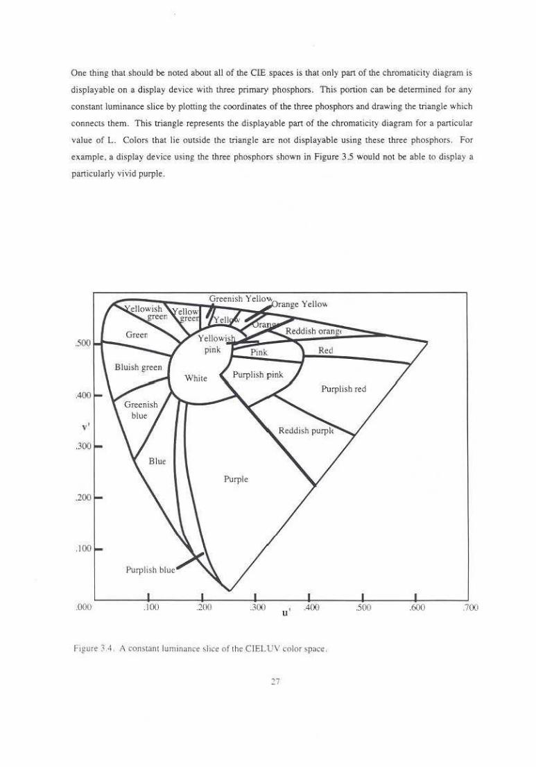
One thing that should be noted about all of !he CIE spaces is !hat only pan of !he chromaticity diagram is
displayable on a display device with three primary phosphors. This portion can be determined for any
constant luminance slice by plotting the coordinates of the three phosphors and drawing !he triangle which
conne.cts them. This triangle represents !he displayable part of the chromaticity diagram for a particular
value of L. Colors that lie outside the triangle 3Sc not displayable using these three phosphors. For
example. a display device using the three ph(>Spho•s shown in Figure 3.5 would nOt be able tO display a
particularly vivid purple.
Greenish Yellow) y 11 range e O"-
Red
Purpllsh red
.000 .IOU 20() 300 u' .400 .500 .600 .700
Figure 3A. Aronstam lum inance shce of the CJELUV color space.
27

Green Phosphor
.000 .100 .200 u ' .400 .500 .600 .700
Figure 3.5. Color Gamut of an lmaglnary Monitor.
3.1.3.2. Munsell Color System
In 1905. Alben H. Munsell 1461 defined a system for describing colors based on hue . value. and chroma.
These concepts correspond to the name. lightness. and s1.rength of a color. He described • spherical space
spanned by these components. See Figure 3.6. The value dimension defines the vertical axis, with middle
color.; on the equator. darker colors below and lighter colors above. Hue varies along latitude lines around
the sphere . the colors along each lalirude line tracing out a full range of hues. but having the same value and
chroma. Chroma increases with diStance from the central ax•s. so that the most saturated color for each hue
and value combination is located on the surface of the sphere. The less s~turated colors make up the
interior of the sphere. with the neutral greys forming the axis extending from pole to pole. Be~ause the
maximum chroma attaimtble using pnnt technolog:,· varies with hue and value. the portion of the space
which is realizable using existing pigmcnb (or phosphor~) fomts a rather irregular 'pheroid. As printing
technology advant6. the ~urfnce of the realizable color solid moves out from the neutral axis to h•£her
ehrorna values
2R
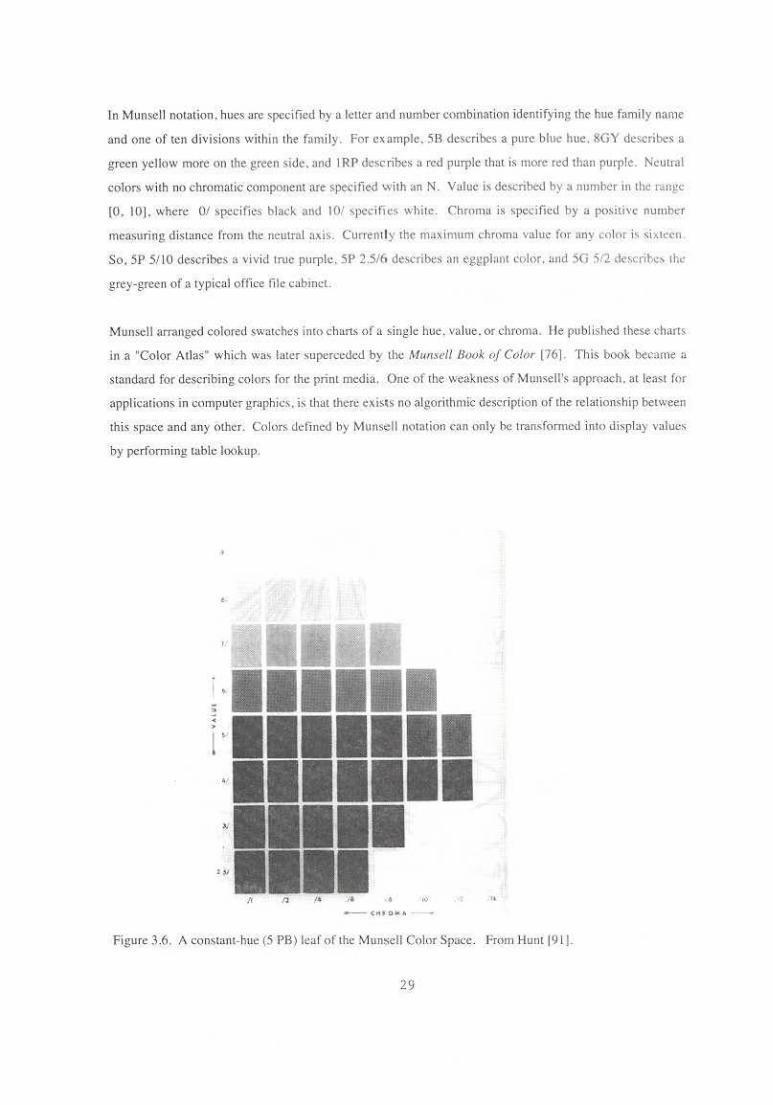
In Munsell notation , hues are specified by u lcncr and number combination identifying th( hue fomily name
and one of ten divisions wilhm the fami ly. For ex ample. 58 describes a pure blue hue. &GY describes a
green yellow more on the green side. and I RP describes a red purple that is more red than purple. Ncuu·al
colors. wilh no chromatic component are specified with anN. Value is dcsc-nbed by a number in th~.: r.u~gc
{0. 10]. where 0/ specifies black and 10/ specifies while. Chroma is specific<! by a positive numhcl'
measuring disLance from lhl' neutral ax b . Curren1ly lh:f' llM:<inmm chroma va.lm: f<''lr any ..:olnr i'. si»lt;!cn
So. 5P 5110 describes a vivid lrtlc purple. 5P 2.5/(1 describes an eggplnnt color. and 5G 512 descrihe> lh<
grey-green of a typical office iile cab met.
Munsell arranged colored swmch~s imn charts of a single hue. value. or chroma. I Je publlshed these d1arts
in a "Color Atlas" which was later superceded by the Mul!se/1 Book of Color [76) This book bec·ame n
standard for describing colors for the print media. One of the weakness of Munsell's approach. at lea>t for
applicalions in computer graphics. is that there cxis\s no algorithmic description uf the relationship between
this space and any other. Color. defined by M\lllS¢11 notation can only he rransfonncd into displa) value'
by performing table lookup.
"
Figure 3.6. A constant-hue (5 I'B) leaf of the Mtm~ell Colnr Sp3ce. From Huntl9 1).
29

Munsell arranged the colors accord111g to his concep1 of balance. Specifically . he believed that when two
colors defined a line whose center point lay on tlte neutral ax is. those colors were visually balanced
according to hue. Similarly . colors could be balanc<!d according to value or chroma. In creating a space
where lhc colon> balanced properly. he also created a 'J>3C" which was ba~ically perceptually uniform. ln
1940. lhe CIE XYZ ''Slues were measured for eact. of the Mun•cll color swatches and their perceptual
spacing was examined. As a result, new hue. value . n.nd chroma designations were assigned to the color
swatches, making the space more nearly perceptually umf<ll'm l Meyer and Greenberg 87).
3.133. Tektronix TekHVC System
A research grt!up at Tektronix derived another perceptually uniform color system from lhe ClELUV color
model [Taylor 881. This space forms an irregular cylinder indexed by hue. value, and chroma. Sec Figure
3.7. The three parameters ha\'e basically the same m.:aning, "' in the Mu nsell color notation. The surface
of the space is formed by triangles extending from the lines connecting maJ<imally saturated colo!'l> for
ailjacent hues tO the white and black point>.
Value 0.0 -100.0
~ao.o·
Hue 0- 360.0"
Figure 3.7. The TekHVC Color Space. From Foley et al.l901.
30
3oo.o· Chroma 0- 100.0
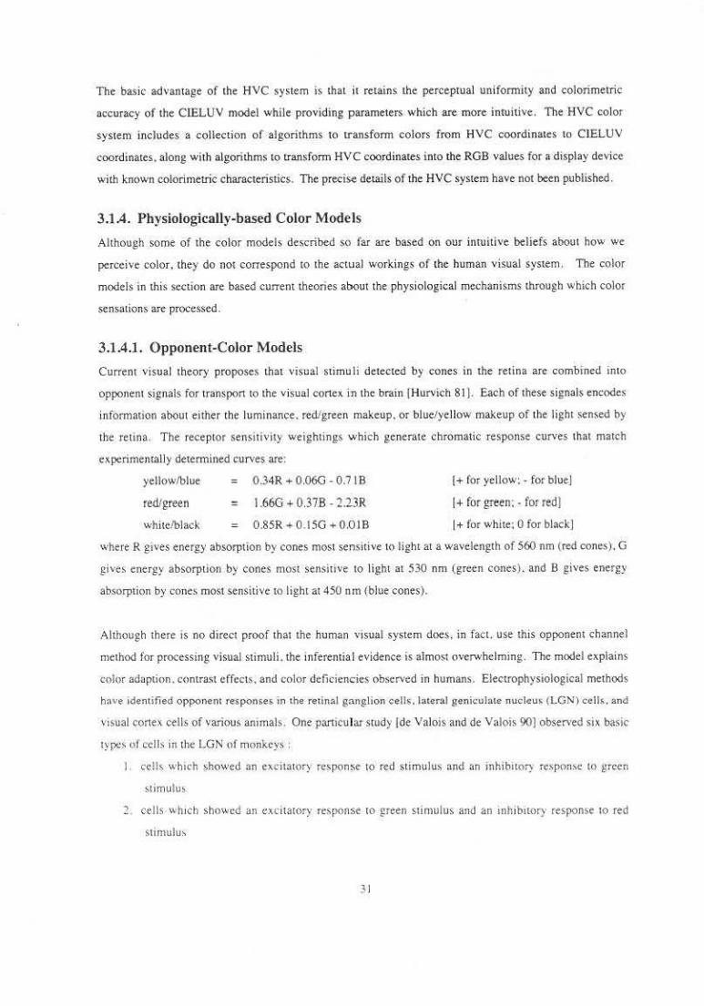
The basic advamage of the HVC system is that it retains the perceptual uniformity and colorimetric
accuracy of the CfELUV model while providing parameters which are more intuitive. The HVC color
system inch>des a collection of algorithms to transform colors from HVC coordinates to ClELU V
coordinates. along wi th algorithms to transform HVC coordinates into the RGB values for a display device
with known colorimetric characteristics. The precise details of the HVC system have not been published .
3.1A. Physiologically-based Color Models
Although some of the color models described so far are based on our intuitive beliefs about how we
perceive color. they do not correspond to the actual workings of the human visual system. The color
models in this section are based current theones about the physiological mechanisms through which color
sensations are proce.ssed .
3.1 .4.1. Opponent-Color Models
Currem visual theory proposes that visual stimu li detected by cones in the retina are combined into
opponent signals for transpon to the visual c.ortex in the brain )Hurvich 81 ]. Each of these signals encodes
infomlation about either the luminance . red/green makeup. or blue/yellow makeup of the light sensed by
the retina. The receptor sensitivity weightings which generate chromatic response curves that match
experimentally detennined curves are:
yeHow/blue = 0.34R + 0.06G - 0.7 I B
red/green = 1.66G + 0.37B - 2.13R
white/black = 0.85R + 0.15G + 0.01 B
!+ for yellow:- for blue)
I+ for green: - for red]
I+ for white: 0 for black]
where R g1ves energy absorption by cones most sensitive tO light at a wavelength of 560 nm (red cones) .. G
gives energy absorption by cones most sensitive to light at 530 nm (green cones) . and B gives energy
absorption by cones most sensitive to light at 450 nm (blue cones).
Although there is no direct proof that the human visual system doe$, in fact. use this opponem channel
method for processing visual stimuli . the inferemial evidence is almost overwhelmmg. The model explains
color adaption. contrast effects. and color deficiencies observed in humans. Electrophysiological methods
have identified opponent responses in the re1inal ganglion ceJJs. l:lter::t1 genicubtc nuclcu" (LGN\ cen~. ~nd
V>Sual cortex cells of various anunals . One panicular stud)· Ide Valois and de Valois 90) observed six basic
types of cel ls in the LGN of monkeys :
ceHs which showed an excit3lQry resp<,m;se 10 red stimulus and an inhibitof) respon~e to grctn
slimulus
2. cells whtch sho"'ed an excitatory response to green stimulus and an uthibttory response to red
sti rnu lu:-.
31

3. cells which showed an excitatory response uo yellow stimulus and an inhibitory response to blue
stimulus
4. cells which showed an excililtory response to blue stimulus and an inhibitory response to yellow
stimulus
5. cells which showed increased excitation with increased luminance levels
6. cells which showed increased excitiltion with decreased luminance levels.
These six types of cells make up two opponent channels (red/green and blue/yellow) and one nonopponent
channel (luminance).
Ware and Cowan 1901 developed a color space based on the opponent channel model of perception . See
Figure 3.8 . The space co~sists of a set of rectangular surfaces, each containing colors oi a single brightness
level. Each surface has a re-d-green axis running along the major diagonal and a blue-yellow axis running
along the minor diagonal. Achromatic colors lie in the middle of the surface. at the intersection of the
diagonals. The parameters A. l;. and· '1 specify which surface (A) and rectangu lar position within the
surface (s and '1 ). These coordinates can be transfonmed into RGB values as follows:
R =!;A
G =rJA
B = (I . max(l;, 1')))
As A increases, the ponion of each surface occupied by realizable colors decreases a< the display primaries
reach sarurmion. One variant of the space scales the realizable gamut to fill the entire surface.
0 0
Figu re .'.8. The RGBY Color Space
32
The CrELUV and YIQ color models could also be considered opponent channel models in the sense that
each roughly decomposes a color into its luminance, red/green. and blue/yellow componenL~.
3.1.4.2. Meyer's Color Models
Meyer [861 proposed a color model based human spectral sensitivity curves . Each of the three color space
components repr<-~nts the sum of spectral energy contributions over a range of wavelengths. Gi ven the
short (s(l)), medium (m(l)). and long 0 (1)) wavelength sensitivity functions. !he three components can be
expressed mathematically as:
s M
L
= J E(l) s(l) dl
= f E(l) m(l) dJ
= f E(l) 1(1) dl
The S component measures the contribution of shon wavelength (blue) light energy, the M component
measures the contribution of medium wavelength (:green) light energy. and the L component measures the
contribution of long wavelength ( red) light energy. See Figure 3.9. This space is a linear transform of the
CIE XYZ, the details of the transformation are given in Meyer (86) .
1.0
Relative o Sensitivity
.5
0.0
400 500 600 700
Wavelength (nm)
F1 gl.lr~ 3,9 SML specLial :o.ensitivi1y function:,.
Most forms of color blindnes~ seem 10 be caused by the absence of one of lhc spectral sensiuvny funcuons.
There are lhree forms of !hi~ dichromacy : protanopa a. deuteranopia. and tritanopia. Protanopia is a Jack of
long wavelength func1ion leading to confusion of reds and greens (commonly called red·green color
blindness). Deuteranopia is a lack of medium wavelenglh function leading 10 confusion of reds and greens
(also called red-green color blindness). In deuteranopes. 1he peak of the luminance sensitivity function
occurs at slightly higher wavelengths than in protanopes. Tritanopia is a lack of shon waveleng1h function
leading to confusion of blues and yellows.
Meyer's SML model provides ansight imo the vasual experiences of dichromats. In each kmd of deficiency,
the three-dimensional gamu1 of colors perceivable by someone with normal color vision is reduced 10 a
plane. For protanopes . !his is 1he SM plane . For deu1eranopes . all colors arc projcclcd onto 1he SL plane.
For triaanopes. the ML plane contains all colors which are chromatically distincl. In general. 1wo colors
will be distinguishable to a dichromal if !heir onhogonal projections onto the color plane are dastincl. A
color display can be made effectave for a dichromatic viewer if all colors used in the d1splay map to disunct
pomts on 1he apptopnate color plane for thai l)lpe of dachromat. In practice. the sensitavity functions for
protanopes and deuteranopes arc similar enough lhal a sangle display could be effective for both.
Meyer proposed a second color space which is a linear transform of SML that minimizes the error produced
by color synthesis in compu1er graphics. The axes o f 1he AC1 C2 space pass through the mos1 densely
populated areas of lhe space and are prioritized according to the proponion of coordinates which lie in that
direction . See Figure 3.10. All areas of lhe SML space are not equally populated because of the high
degree of correlation between the m(l) and 1(1) sensitivity functions . The A axas corresponds to the
dircctaon of correlation betv.een the Land M components. providing luminance anformation . The C 1 aXIs
hes in lhe LM plane and represen1s 1hc difference between the Land M componen~'· providing red/green
discriminalion. The c l QXIS hcs close to lhe s axis . providing ye llow/blue distillctions. In lhis sense. the
AC, cl color model IS an opponent process model
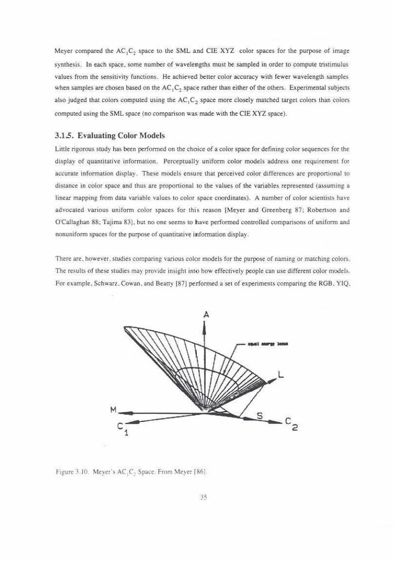
Meyer compared the AC 1C2 space to the SML a nd CIE XYZ color spaces for the purpose of image
synthesis. In each space, some number of wavelengths must be sampled in order to compute tristimulus
v41lues from the sensitivity functions. He achieved better color accuracy with fewer wavelength samples
when samples are chosen based on the AC 1 C2 space rather than either of the others. Experimental subjects
also j udged that colors computed using the AC 1 C2 space more closely matched target colors than colors
computed using the SML space (no comparison was made with the CIE XYZ space).
3.1.5. Evaluating Color Models
Linle rigorous study has been perfom1ed on the choice of a color space for defining color sequences for the
display of quantitative infomlation. Perceptually uniform color models address one requirement for
accurate information display. These models ensu,rc that perceived color differences are proportional tn
distance in color space and thus are proportional to the values of the variables represented (assuming a
linear mapping from data variable values to color space coordinates). A number of color scientists have
advocated various uniform color spaces for this reason [Meyer and Greenberg 87; Robertson and
O'Callaghan 88: Tajima 831. but no one seems to have perfom1ed conrrolled compansons of uniform and
nonuniform spaces for the purpose of quantitative information display.
Then are, however. studies comparing various color models for the. purpose of oarning or matching colors.
The results of these studies may provide insight imo how effectively people can use different color models .
For example. Schwar>.. Cowan. and Beauy 187) perfom1ed a set of experiments comparing the RGB. YIQ,
A
Figure :'l .IU. Meyer's AC 1C: Spate . From Meyer 186].
35
HSV. CIELAB, and Opponent color models for color matching tasks by inexperienced users . Subjects
were asked to manipulate the color of a square until it matched the color of another square as close ly as
possible . SubjeciS manipulated the color by using a tablet and puck to navigate through the color space.
The experiment showed significant effects of the color model on the time required to select the match.
SubjectS matched most quickly using the Opponent and RGB color models, followed by the Cl.ELAB. YlQ.
and HSV models . in that order. Using the CIE color difference equations. color differences were computed
between the target and selected color. Subjects matched most accurately using CIELAB and HSV. and
least accurately using RGB .
Schwarz et. al. identified two distinct pha.~es in the process of matching a color: a con.,ergenct phase .
where subjec ts rapidly approach the neighborhood of the target color, and a refinement phau, where
subjects make small fluctuations in the neighborhood of the target color. In order to assess the. role of the
color model in the separate phases. they measured the time required to reach certain matching threshold~.
For all matching thresholds. RGB was the fastest space and HSV the slowest. but the difference between
times narrowed as the thresholds became small. implying that no color model provided any panicular
benefit during the refinement phase. The researchers also noted a significant increase in both speed and
accuracy between the first and second half of the sessions. This learning was greatest for HSV and
C IELUV and almost negligible for RGB.
3.2. Single-variable Color Sequences
Single-variable color sequences map the value of a single scalar variable at each point in the image. 10 a color representing that \•aluc. Continuous ~equences. those in which adjacent colors are similar to one
another. necessarily form a continuous path throu;gh some color space. Altemati\•ely . color sequences
could contain discontinuities, i.e. places where adjacent colors were not at all similar. Only ct)ntinuous
color sequence are considered here.
There is no one best color sequence . The most appropriate color sequence for a particular repre~entation is
inOuenced by the characteristics of the data , the questions of interest about the data. and the expected
viewers of the representation. This section provides only a starting place for the design of color sequence, .
3.2.1. Grey Scale
Perhaps the s implest color o;equence maps the value of a single scalar variable to brightness. Usuall), black
re·prcscn" the lowest ,,aJue . white represents the highest value. and shades of grey represent the
intermediate \1alues. Viewers who are more used to pnnt medHt . ho\vever. rna) prefer a sequence that
represems mcreassng value by I he appearance of increasin_g amounts of ink, mapping the Jowl!st \'&lul' to
wh1tl' and tht h1ghe~t "alue to black. The br.ggest advantage of a grey :;.cale for rl'prese:ming ~single "calai
36
variable is that there is botb an inherem perceived order to the brighmess levels and a visual z.ero value
(usually black). The main disadvantages are a lim ited number of distinguishable display values
(approximately 100) and a limited contrast between d ifferent levels fPiz.er. et al. 82}.
3.2.2. Spectrum Scale
A spectrum scale is formed by holding saturation and brightness constant and letting hue vary through its
entire range. The scale usua.lly fo .llows the sequc·nce o f colors in the spectrum. first red. then orange.
yellow, green, blue, and finally violet. In general, the problem with the spectrum scale is that many
untrained observers (and some trained obsen•ers} see no inruitive ordering in t.he hues, so t.he scale requires
the ' 'iewer to impose a learned order [Ptzer and Zimmerman 831. This problem can be reduced by using
only a ponion of t.he hue circle. For example, a color sequence might span the hues from red to yellow.
Such a sequence has fewer d.istinguishable display values than a complete spectrum. but has a stronger
inruitive order.
By convention. spectrum scales usually stan at red with the higher wavelength colors following in order.
This convention has the. advantage that the resulting sequence ls intuitive for viewers who have a mental
model of the progression of wavelengths of light. lt has the potential disadvantages that the colors a• the
s tart and end of t.hc scale, red and violet respectively . are very similar and the yellow in the middle of the
scale is very striking. This tends to draw the eye to the places with values represented in yellow. This can
be a disadvantage if extreme values are the primary interest. Since t.he range of hues is circular. a specaum
scale can be staned at a place which positions sttild ng colors over the values of the most interest. Images
which appear together. such as the figures in a paper. should generally use the same sequence in order to
spare. the \'lcwer from havmg to learn a new legend for each figure.
3.23. Double-Ended Scales
Conceptually. a double-ended color scale is created .when two monotonically increasing scales are pasted
together at a shared end point. For instance. a scale from grey to red and a scale from grey to cyan can be
stitched tOgether to form 11 s ingle scak from red 10 grey to cyan. Such color scales have three distinct
groups of colors. representing the high. low. and middle values. The colors in a double-ended scheme
couJd reprc:5c.nt a portion of the hue circle (such as a St.'-ak from red to yellow to gn~c:- 1'1) , a Sll aigllt li ut:
through a color space (such as a scale from green 1 o grey to purple), or some son of curved path through
color space (such as a scale from purple to grey to b r.own). The basic advamage of a double-ended scale is
the clear v,;ual classilication of "alues as either high. low. or middle.
37

3.2.4. Heated-Object Scale
The heated-object scale goes from black through red, orange. and yellow to white. with brightness
increasing monotonically. The resulting color path forms an upward-curving spi.nll in the HLS color space.
The colors of the heated-object scale follow the same sequence as those of a black body when heated. The
heated-object scale has more distinguishable display values and more contrast between different levels than
a grey scale[Pizer and Zimmerman 83]. The heated-object scale has a stronger perceived narural ordering
than the rainbow scale because of the monotonic increase in brightness and because there existS a basis for
remembering the color order that is based in experience.
The heated-object scale represents a compromise between the grey scale and the spectrum scale. It
increases monotonically wi th luminance. but not with any of the other opponent color channels.
Experiments suggest that viewers can d isassociate the chromatic and luminance ponions of color and use
each to discern different types of information. In the heated-object scale. lhey can use hues to infer level
accurately and Jummance to infer the overall field structure[Ware 88].
3.2.5. Optimal Color Scales
Levkowitz [88] introduces the term optimal color scale to describe a scale which maximizes the total
number of JNDs (just noticeable d ifferences) while preserving a natural o rder. Such a color scale is subject
to the following restrictions:
I. It is discretized into a fixed number (N) of equidistant increasing values.
2. In order to maximize the number of Jl'Ds. ct is bl:lek and c11 is white.
3. In order to preserve naturalness. for I<= n <aN. I:
Sn <= &n•l
bn <= bn-1
ra + 8n + bn < rn·1 +- &n ... J + bn-.1
4. Color scales are either entirely achromatiC or enttrely chromatic. In chromattc scales. each hue
represent; a unique value.
5. Saturntions are monotonic.
He conducted expenment> where subjccL< were asked to detect artificially superimposed lesion; in brain
s lices represented us ins either a linearized grey scale. a linenrized heated-object scale. or a linearitcd
opumal color scale. Subjects performed bener using the srey scale (at a statbticully significant level) than
the o ther tv. o. They performed slightly better u>ing the opumal color scale than the heated-ObJeCt scale. but
the difference "a' n01 Mnusucall) SJgmficant. Some subJects. and o thers v.ho uM:d the scale;. did repon
th•t each scale v. as super10< to the others under ><>me cond•uon;.
3.3. Multivariate Color Sequences
Multi variate color sequences map the values of two or more data variables at each point in the image to a
single color representing both values. A continuous two. variable color sequence forms a curved parametric
sheet through a color space. Each of the two sheet parameters corresponds to one of the data variables .
These display parameters can defined by components (or combinations of components} of a color space.
for example . one display parameter might be lightness and the other saturation . Alternatively . one
parameter might be hue, while the other was a combination of lightness and saturation. The figures in this
section show color sheets which have been Jlattened into rectangles. This section discusses primarily
continu<)u~, Lw(}ovariable color sequences.
3.3.1. Display Primaries
One obvious two· variable color scheme maps each variable into one component of the RGB color model of
the display device. Originally. the variable values would be used directly to drive two of the red. green. and
blue guns. A representation using this scheme could map average temperature 10 levels of red and average
rainfall to levels of green. See Figure 3.1 I. Now. cool. dry areas would be almost black . cool. wet areas
would be green, warm , dry areas would be red, and warm. wet areas would be yellow This scheme has the
advantage that the colors representing the extremes of the variable range (black, red. green. and yellow) are
clearly distinguishable . The disadvantage is that some observers have difficu lties decomposing the
displayed colors into their component pans. Tbis can result in difficult ies perceiving similarities berween
areas which differ in the values of one variable , but not the other. for example. an area with fai rly high
rainfall and low temperatures would be colored a fairly bright green, while au area with fai rly htgh rainfall
and very high temperatures would be a slightly oranglsh yellow. T he two areas are stmilar 1n that t.hey
recetvc the same amount of ra1niall. but the colors representing the areas are not perceived as similar.
Clearly, similar representations could be made by mapping variables to red and blue or blue and ~reen. but
red and green seem to be use most often because they produce a gamut with more diStinct extreme values .

pure yellOWish greemsh yellow
green green yellow
dark forest orangeish ta.n
green green yellow
very dark reddish
dark brown brown
orange green
very dark pure
black dark red
red red
Figure 3.11. Display Primaries Scheme. The rows represent levels of green. while the columns represent
Je,el> of red. The color in each square is the sum of the contributions of the red and green di~play
paramete~.
Researchers working with da~a from remote sensing devices frequently use this color scheme or a similar
one representing three variables using all displny primaries. Landsat 'false color' images are commonly
produced by representing multispectral scanner (MSS) bands 4. 5. and 7 with levels of blue. green. and red.
respectively [Robenson and o·callaghan 88). If the bands displayed are highly correlated. most of the
•mage w1ll be shade~ of grey because the red. green. and blue components will be roughly equal.
One solution tO this is to displa~ the lin.t two or three principal components of the set of bands. The first
principal component describes the axis of greatest variation in the data. Each subsequent principal
component describes the axis of greatest variatiOn which is orthogonal to previous pnncipal components.
Each principal component is a linear combmation of the ongmal data variable values. Since the principal
component~ are orthogonal to each other. no redundant information will be displ3yed if principal
components are displayed rather than the original variables . A disadvantage of lh is scheme b that different
tmnges m a series will have different mapping from original variables to displayed color unless the
pnncipal components are the same.
3.3.2. Hue and Lightness
An analo~ous color scheme m thr HLS color modd ~~oould map t~~oo \ariable; to t"o color model
,.,,mp<>ncn". generally hue and hghtne<' For exomple. a color sche.me could map mean education level to
hue and medtan mtorne level 10 bnghrnc" Area- wnh low education levels would be red,, dark when
~(I
median income is low and pale when it is high. A.re.as with a relatively average education level would be
blues, dark when median income is low and pale when it is high.
The two display parameters of this scheme (hue and lightness) have different characteristics in many of the
same ways that the grey scale and spectrum scale have different characteristics. For example . the lighmess
parameter conveys order and magnitude more inwitively over the whole range of values because we
perce1ve them as having a natural order. Specifically . it is easy to tell that a light grey represents a larger
value than a dark grey. Conversely . without a legend, it is difficult to know whether yellow represents
values less than or greater than blue .. It is also easier to judge the relative magnitude of two ligbmess values
than of two hues. Areas with similar hue compon ents. but differing lightness components are somewhat
easier to perceive as related than areas with similar lightness. but diffe.rc.nt hues.
3.3.3. Census Bureau Two-Variable Color Map
The Two-Variable Color Map developed by the Cen.sus Bureau represents bivariate information by
mapping each variable to a four-level color scale and then U>king the Canesian product of ("crossing") the
two scales to produce a sixteen level bivariate scale. [Fienberg 79). One scale uses yellow to represent low
values . dark blue to represent high values, and lighter blues to represem intermediate values. The other
scale also maps low values to yellow. but maps higher values to reds. The product of the two scales
produces a bivariate scale where areas low values of both variables are yellow. areas with high values of
both variables are purple, areas where one variable is larger than the other are either predominant ly blue or
red . See Figure 3.12. Critics of the scheme have noted the lack of an intuitive progression in colors alollg
the rows and columns of the gamut and the great similarity among the nine colors in the upper right of the
gamut.
Wainer and Francolini compared the Two-Variable Color Map to multiple univariate maps for display of
bivariate information [Wainer and Francolini 80}. This experiment was described in Chapter 2. For one
experiment. a legend was provided for both representations. For the other experiment. there was no
legend, forcing subjects to rely on their own internalized legends. The response times of subjects was
similar for both representations. With a legend present, the accuracy of responses by subjects using the two
representations was comparable. When the legend was removed. error ratt$; for the 'I woK VanabJe Color
Map rose drasucally; suggesting that this panicular color scheme is not easily internalized .
Olson (S I] inve>tigated the efficac} of a similar color scheme (Figure 3.1 3j in a ~eries of experiments. The
,cheme ehmltlates yellow at the bonom of the blue rang~ and replace' it with white Yellow and red are
blended to produce the intem1ediate v~lues tn rile red range. The two range.s are muluplted in a manner
~lliltla; to the origmal scheme. resuhmg m an overall scheme not ver)' di ffaent from the onginal. See
4 1
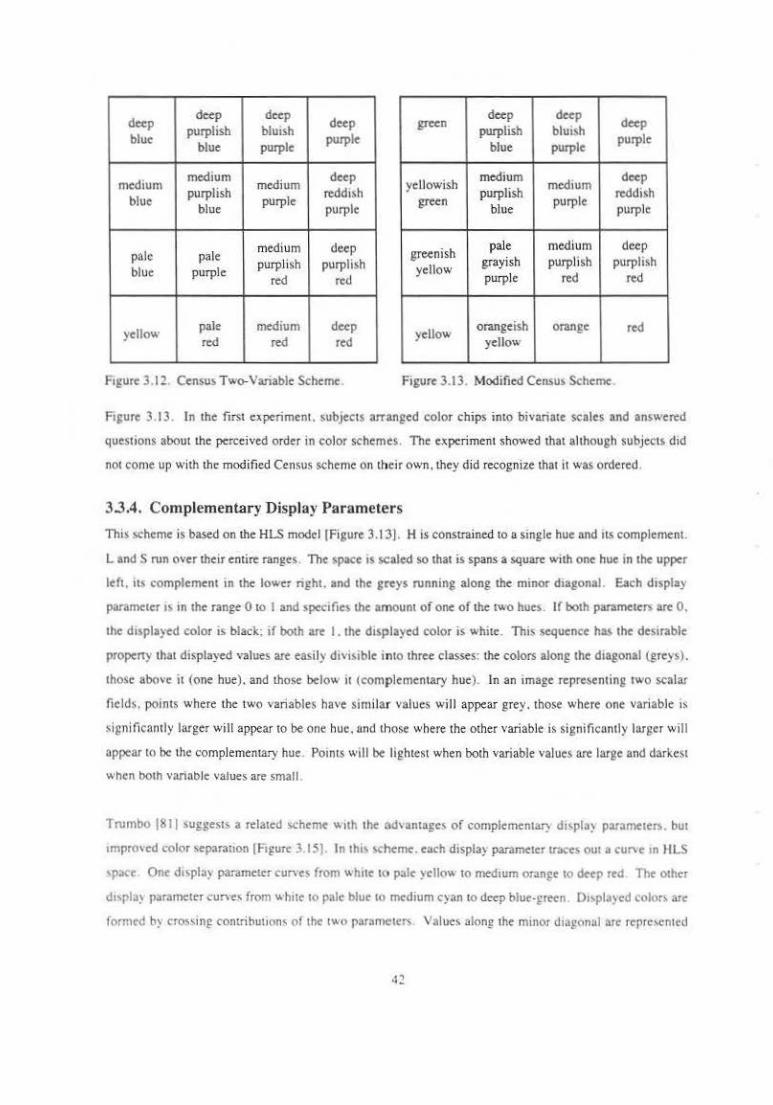
deep deep deep
deep purplish bluish
blue blue purple
purple green
deep deep deep
purplish bluish purple
blue purple
medium medium
medium deep
blue purplish
purple reddiSh
blue purple
yellowish medium
medium deep
purplish reddish green
blue purple
purple
pale pale medium deep purplish purplish
blue purple red red
greenish pale medium deep
yellow grayish purplish purplish purple red red
yellow pale medium deep red red red
yellow orangeish orange red yellow
F1gure 3.12. Census Two-Variable Scheme. Figure 3.13. Modified Censu> Scheme
F1gure 3.13 In the first experiment. subjects arranged color chips into bivariate scales and answered
questions about the perc.eived order in color schemes. The experiment showed that although subjects did
not come up with the modified Census scheme on their own, they did recognize that it was ordered .
3.3.4. Complementary Display Parameters
This scheme is based on the HLS model (Figure 3.1:31. H is constrained to a single hue and ns complement.
Land S run over their entire ran~es . The space IS scaled so that is spans a square with one hue in the upper
left. it.~ complement in the lower nght. and the ereys running along the minor d1agonal. Each displa)
parameter ts m the range 0 to I and spec1fies the amount of one of the t"-O hue;. If both pat3meten. are 0.
the diSplayed color is black: if both are I. the d1splayed color is white. This sequence has the desirable
property that displayed values are easil)' dhiMble into three classes: the colors along the dtagonal (greys).
those above it (one hue). and those below 11 (complementary hue). In an image representing two scalar
fields. points where the two variables have sim ilar values will appear grey. those where one variable 1S
$i~nificnntly larger will appear to be one hue, and those where the other variable is significantly larger will
appear to be the complementary hue. Pomts will be lightest when both variable values are large and darkest
when bOth variable values are small .
Trumbo (81 I suggeSI~ a related scheme "1th the advantage< of complement~ d~>pla) para~te..,.. but
1mprcwed color separa11on (Fi~ure 3.15). In thi< schem<. each displa) parameter traces out a cut"e 1n BLS
<pace One displa) parameter curves from "hne t<:t pal< )cliO'-' to medtum orange to deep red The other
d1,pla) parameter curves from whne to pak blue to medium cyan to deep blue·£reen. 01>pl.l)cd colors are
1ormed by cro5'ing contnbuttons of the t"o parameters Values along the mmor dtJgonul are repre,cnted
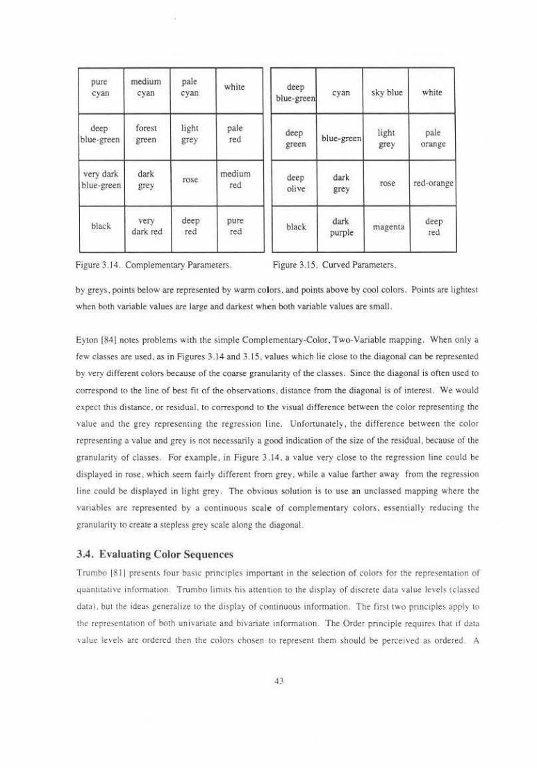
pure medium pale white deep
cyan cyan cyan blue-green
cyan sky blue white
deep forest lighl pale deep lighl pale blue-green green grey red green
blue-green grey orange
very dark dark medium deep dark rose blue-green grey red olive rose red-orange
grey
black very deep pure
black dark deep
dark red red red purple magenta
red
figure 3. 14. Complemenuuy Parameters. Figure 3.15. Curved Parameters.
by greys. points below are represented by warm colors. and points above by cool colors. Points are lightest
when both variable values are large and darkest when both variable values are small .
Eyton [84) notes problems with the simple Complementary-Color, Two-Variable mapping. When only a
few classes are used. as in Figures 3.14 and 3.15. Yalues which lie close to r.he diagonal can be represented
by very different colors because of the coarse granularity of the classes. Since the diagonal is often used to
correspond to the li ne of best fi t of the observations. distance from the diagonal is of interest. We would
expect this distance. or res idual. to correspond to the ''isual difference between the color representing the
value and the grey representing the regression l ine . Unfortunate !) , the difference between the color
representing a value and grey is not necessarily a good indication of the size of the residual. because of the
granularity of classes. For example. in Figure 3.14. a value very close to the regression line could be
displayed io rose . which seem fair ly different from grey. while. a value fan her away from the regression
line could be displayed in light grey. The obvious solution is to use an unclassed mapping where the
variables arc represented by a continuous scale of complementary colors, essentiall y reducing the
granularity to create a steplcss grey scale along r.he diagonal.
3.4. Evaluating Color Sequences
Trurntx) iSl ] presents four basic principles imponant in the selection of colors for the repre.>cntation of
quantu.:ltivc information. Trumbo limits his auemion 10 the display of disc-rete data value l evel!~' (C'Iassed
daw). but the ideas generalize to the display of cominuous infonnation. The firs t two principles apply to
the reprcsetHntion of both un ivariate and bivariate mforrnation. T he Order pnnciple reqUires that 11 daw
value Jc,·els are ordered then the colors chosen to represent them should be perceived as ordered . A
43
spectrum scale would violate the Order principle if the viewer did not perceive the hues to be ordered. The
Separation principle requires that significantly different levels of variables be represented by
diStinguishable colors. A grey scale would violate the Separation principle if daU> variable values with an
important difference were mapped 10 colors with an imperceivable difference. The heated-object scale.
optimal color scale. and spectrum scale appear to satisfy both principles.
Trumbo's IJISI two principles apply only to the display of bivariate infonnation . The Rows and Columns
pnnciple states that if preseNauon of univariate mfonnation is imponant. then the d1splay parameters
should not obscure one another. This condition is satisfied if rows or columns with a consU!nt value of one
variable have constant hue, saturation. or brightnes~. Using two display primaries (such as red and green)
violates the Row~ and Columns principle. The D iagonal principle states that if detection of positive
association of variables is a ~oal. then the displayed colors should be easily identified 3> belonging to one
of three classes: those near the minor diagonal. those above il. and those below. This condition could be
satisfied by a scheme with the major diagonal mode up of greys. elements of maxomum soturation. or a
constant hue. A hue and lightness scheme violates the Diagonal principle. The Census scheme violates
both the Rows and Columns and D1agonal principles. Usmg complementary display parameters satisfies
both principles. Violating one or both of these pnncoples does not necessarily mean that a color scheme is
not useful. only that it might not be appropriate for some representation tasks . For example. a hue and
lightness scheme would not be the best choice for a representation primarily designed to show positiv•
association between variables because 11 violates the Diagonal principle . On the other hand. 11 would be a
reasonable choice for a representation where the goal IS perception as a class of colors represenung simtlar
values of one van able across diffenng values of the other vanablc.
3.5. Interactive Color Sequence Editors
Cox at the National Cemer for Supercomputing Applications {NCSA) developed a tool called ICARE
{Interactive Computer-Aided RGB Editor) for the interactive exploration of single-variable color
mappongs[Cox 8&]. !CARE provides periodic. functional control over the red. green . and blue components
of the color mappmg. The user controls the amplitude. phase. and frequenC) of the color component
function,. Color change> are accomplished by color lookup table manipulatiOn>. so the user receives
immediate visual (c.cdback . All colQJ •nappjug infonmmon. along with the mapped image , JS dJS:played
simultaneously on the screen. ICARE has been used by the scientists and anists of NCSA's Renaissance
team> to explore data from supercomputer somulauon; .
Guttard and Wart built a so molar tool for the design and alteration of <olor sequences to dospl3) "nglc·
'anable information (Guuard and Ware 901 In th.~tr system. colors are de..-nbed on term' of theor hue.
saturauon. and value componen". Tht range ol ea.:h component is shov.n on • colored plot with mm1mum
44

values at the bottom and maximum values at the top. Horizontal position in a plot specifies the color
sequence parameter value (position in tlle color sequence) . while ''enical position in tlle plot determines tlle
color component value used at tllat parameter value. Taken together, tlle three curves describe the color
sequence. shown in a fourth plot beneatll the otllers. The user creates a color sequence by drawing a curve
in each of the bars tlle describe the contributions of each component. Curves can eithe.r be drawn freehand
or generated by interpolating between selected color component values. Like JCARE. the color mapping
manipulations are implemented using lookup table manipulations, so the user sees real-time changes in the
mapped image. The commercial visualization toolkits A VS and IRIS Explorer provide similar color
sequence generation utilities.
Robenson built a system which interactively displays color gamuts of display devices to help data analysts
visualize perceptual color spaces and understand the components!Robenson 88). Gamuts are displayed as
full or panial volumes . 2D cross-sections. or ID paths. The system suppons the choice of individual
colors . the ~eneration of color sequences between specified colors, and the positioning of2D cross-sections
over 2D histograms of the data.
3.6. Perceptual Issues in Color Display
A -number of asymmetries, anomalies. and deficiencies in t.he human visual system can inilucnce how we
perceive data . Some of the associated distortions can be avoided or minimized by carefully designed
vi!\uaJizations. Other distonions have no easy fix . In these cases , an understanding of the mechanisms
involved can at leaSt help explain the gap between e.xpected and actual perceptions.
Perceptual anomalies which can distort j udgements drawn from color representations include:
interactions between color components. such as the effects of hue on perceived brightness or
brightness on perceived hue
• diffcr<,nces be.twecn the way achromatic and c hromatic information is processed by the visual system.
as evidenced by the breakdown of boundary and structure information at equiluminance
• spatial interact ions between the colors of neighboring areas. such as simultaneous contrast
• interactions between color and the perception of other feature characteristics. shown by color-size and
color-depth effects
More dramatic perceptual anomalies are found in the responses of color-defic ient viewers (about 10 percent
of men and I percent of women\. This subject is not addre<Sed here beyond the discussion in Section
-~ l 4.2 See Meyer and Greenberg ]88] for an alial)·~i s nf how the wol'id appear> to tho;e with color
deficient \'l~ion and how computer graph ics di:-.play!-. can be dc:;igned to 4JCConuno<.latc t.hc:m.
45
3.6.1. Interactions between color components
A common strategy of multivariate color schemes is 10 map each variable to a different component of color.
These components could be intuitive (hue. saturation , brightness). physiological (opponent-color channels).
or something else (red, green. blue) . One would ·expect that these color model components would be
perceptually onhogonal. Perceptual studies suggest that this is not entirely the case. Interactions have been
observed between hue and brightness and between saturation and brightness. While these effects may not
be strong enough to make color schemes based on color componentS impractical . they may be expected to
create slightly distorted perceptions.
It has been observed that a saturated color is perceived as brighter than a desaturated color when the rwo are
related in brightness (Helmhohz-Kohlrausch effect). Yaguchi and Ikeda 183] used heterochromatic
brightness matching experiments to show the contribution of the opponent-color channels to bnghtness .
Subjects were asked to match the brightness of a patch containing a mixture of two wavelengths to a patch
containing white light. If brightness is determined entirely by the achromatic channel. perceived
brightnesses should match when the luminances of the two patches are equal. In practice. subjects judged
the patches to match only when the mixed. wavele ngth patch had greater luminance than the. whne patch.
This effect was most prominent when the wavelengths of the mixed-wavelength patch were red and green.
Yaguchi and lkedo hypothesized that a cancellation of hues in the chromatic channels was resulting in a
decreased perceived brightness .
The Bezold-Brucke Phenomenon. describing the changes in perceived hue with increa.~ing illumination
levels. has been observed in experiments where subjects are asked to match the hues of patches with
di ffering luminances IHurvich 81) . As the luminance of the brighter patch was increa.~cd. perceived hue
shi fted away from green and toward blue and yellow.
3.6.2. Equiluminance effects
The human visual system processes achromatic (bri ghtness) and chromatic information using separate
pathways !Livingstone and Hubel 88) . The magnocellu lar system is insensitive to wavelength (hue)
differences. while the parvocellular system is sensi tive tO differences in both wa-velength and brightness.
The magnocctl utar system has relatively large reccp11ve held s1zes and last response umes . It seems to
have primary responsibility for the identification of object boundaries. object motion . object deplh . and
stereo . The parvoccll ular system ha~ comparativel y small receptive field sizes and longer response times .
II seem~ to be pnmarily responsible for the detection of color. pattern, and fine dc.tail.
Accordingly. boundarie~ which are determ ined e1lurely by chromatic dtfierences v.-111 have les~ vtsual
1mpo11ance than boundaries w11h bnghtness differences. Upon close inspec1ion . chromatic boundarie~ can
be determined, but in situations involving brie.f exposures or moving stimuli chromatic boundaries may
appear to disappear entirely. A number of perceptual studies have con finned t.his phenomenon [Gorea and
Papat.homas 89: Triesman 86; Livingstone and Hubel 88) .
3.6.3. SimuJtaneous contrast
The perceived color of an area can be significantly affected by nearby colors. This phenomenon is called
simultaneous contrast. For example, a grey patch on a red background will seem slightly green . while the
same patch on a green background will seem slightly red. A similar effect occurs for achromatic contra.st in
situations where only lu minance differs. Simultaneous contrast seems to occur independently on each of
the opponent channels and have effects of comparable magnlrude[Ware 88) . Ware observes that these
contrast effects are strongest where smooth color gradients are present, i.e. where adjacent colors and color
changes are s imilar. In most applications. data values do form a smooth gradient. Because of this. a scale
which is monotonically increasing in any of the opponent channels will tend to cause contrast effects and
can encourage e rrors in mapping from a displayed color back to the represented value. Simultaneous
contrast does not seem to pose a problem in judging the surface propenies of an image. The human visual
system is experienced at identifying surface tendencies from luminance gradients in the presence of
contrast effects. This suggests that for tasks which requ ire reading metric ''alues from a representation. a
color sequence which does not vary monotonically with any opponent channel (such as the spectn1m scale)
is superior to one which does (such as the grey scale). Cues about surface propenies. however, are best
j udged from lightness differences presented by sc:tles like the grey scale.
WaJe conducted three experiments companng a linear grey scale . a perceptual grey scale . a saturation scale.
a spectrum scale . and a red-to·green scale for un ivanate data representation. In the first expenment.
subjects were asked to j udge the metric value of a colored patch surrounded by a contrasting area. The
spectrum scale produced s ignificantly more accurate metric value readings. In the second experime nt,
subjects were asked to judge the effectiveness of the color scales in revealing information about the surface
properties of simu lated surface. ln general. the grey scales were judged to be more effective. In t.he third
experiment, the five original color scales were compared to an experimental scale which cycled through the
hues while it increased monotonical ly"' lightneS< (commonly called a rainbow scale). In a task like that or
the iirs1 experiment. accuracy with the experimental scale was similar to that of tht spectrum scale (Which
had no monotonJC lightness variation) and significantly better than the others. This suggests that a color
s<oale which varie~ in both luminance and hue can be used to accurately represent both metric and surface
propenies by minimizing the effects of simultaneous contrast. Notice that both the heat~d-objcct scale and
Lt:\kowit2.'f. opwnal colur s.calc a1so meet these requiremem~ .
. .p
3.6A. Effects of color on perceived size
Some visual experiments have suggested that the color of an objec1 can influence the perceived size of that
object. Tedford. BerguisL and Aynn 1711 surveyed srudies of the effec:~ of color on percetved size. noting
that researchers differed in both their conclusions about whether an effect existed and the relative ordenng
of color-size effectS. They concluded that the disagreement could be attributed to lack of consistency of
other stimulus characteristics. such as saturation and brightness. They conducted their own experiments
under precisely controlled conditions and found a significant color-size effect. Specifically. rectangles of
the same size. saturation. and brightness appeared to have different sizes when colored red-purple. yellow
red. purple-blue, or green (in order o f decreasing apparent size). At high saturations. thts effect was
statistically significant for all color pairs except yellow-red and purple-blue . At low saturations. only the
difference between yellow-red and green rectangles was significant. In trials where hue was held constant
and saturation varied. re.ctangles with higher saturauons were consistently judged to be smaller than less
saturated rectangles. Gcneralizmg from the studtes they surveyed. they observed that wann colors (red.
orange. yellow) appear larger than cool colors (blue. green).
Cleveland and McGill 183] investigated the implications of the color-size illusion for statistical map;.
Subjects were shown a map of Nevada in which counties where colored either red or green with the total
area of red and green nearly equal. Subjects were as!<ed to judge which color. If any. represented the larger
land area. Each subject was shown ten maps . On the average. subjects judged that the red areas were
larger more often than they judged the areas the same or the green areas larger. When the experiment was
repeated usmg low-satu ration tones of red and gteen /formed by adding yellow). no such bia~ was
observed Thetr results suggest that the color of a region innuences the perceived stz.e of the region and
that the effect ts strongest for very saturated colors
The nature of human vision suggests that color.., and even shades of grey. are not suitable for conveying
prect~ numeric values. Dynamic changes to the color mapping can help combat some of these difficulties.
For example, in a two-parameter color scheme which maps values tO hue and lightness. the two display
parameters wou ld be expected to interfere with each other to some extent. If dynamic control mttkes the
parameters separable. these effects should cause a smaller perceprual distonion . The variable represented
by lightness can be viewed without the interference of hue variation. A survey of some d) namic
reprc>cntatton techniques and ob~ervations about d) namic displays is preS<:nted in the next chapter
Chapter Four
Dynamic Representation Methods
This research examines a new facet of one of the most basic principles of interactive computer graphics •.
the belief that dynamic manipulation of computer generated objects is a powerful tool. In this context. a
dyntmlic representation (or display) is defined as a display which changes continuously in real-time as
some manipulation is performed by the user. A computer-generated image of a molecule which rotates in
response to joystick deflections is an example of a dynamic display. In contrast. an imtractive display
changes when some discrete event occurs. For example. an architectural walkthrough in which v.nual
lights can be rumed on and off by the viewer is interactive in that respect.
The distinction between an interactive display and a dynamic display can be subtlt.. For example . if
isolevel val ue in a voiume representation is contro lled by manipulating a virtual dial with a mouse, the
display would be interactive if the display updated when the mouse button was released. but would be
dynamic if the display wa.' updated as the virtual dial was turned. While there arc many dtsplay techniques
which employ dynamic e lements. especially those offering dynamic control of viewpoint. only those whtch
involve dynamic manipulation of c.oJor or geomelry arc considered here ..
This chapter examines lhe rote of dynamic displays in the visual exploration of quantitalive information .
The first section of this chapter surveys previous research on dynam ic displays. Much of this work has
been conducted by researchers calling Lhcir field Dynamic Graphics (or Dynamic StaliStics). AILhough.
according to the above definitions . many of Lhe methods employed in dynamic statistics are interactive
rather than dynamic. the emphasis of the field on manipulations and the changes resulting from them make
research in dynamic statistics relevant to this thesis. The second section presents some of the author's
expertences with dynamic displays.
4.1. Dynamic Statistics
Dy11amic swtistics developed as statistic ians began to apply the techniques of compute r graphics to th<'
display of mult ivariate statistical data. Traditionall>-· while one variable could easily be rcprc>tntcd by a
stauc chan or graph and two variables couid he repre>cntcd by • static scauer plot. three or more variables
r.equirccl !-omcthmg more . Dynamic; statisucs. prov ides that somethmg mort •. real-time comrol over the
d1splay. Real· time viewpoint control can give a scaner plot of three variables the appeanance of trUe three
dimenSIOnality that is not possible using a static display. Dynamic control can also facilitate the
exploration high-dimenSJonal data spaces (many variables. rather than many spaual dimensions). The key
elements of dynamic sutistics are direct manipulation of graphkal elements and vinually instantaneous
update of the display [Becker et. al. 88) .
StatiStical displays, along with information displays in many other fields , can provide dynam1c change in
the fom1 of time-series animation. dynamic control in the form of object rotation or viewpoint selection, or
both (Moellering 80). Dynamic control of an animo.ted map enables a viewer to explore !he spatiOtemporal
dynamics of the data distribution .
Data sets in StAtistics can be defined as collecuons of observations. Each observation is a vector 1n a p
dlmensional spae<, with one dimension for each variable. For example. in a data set describmg pollutant
levels. each obserntion could correspond to the readings made at one monitonng stauon at a pan1cular
11me. If each Station monitored levels of sulfur dioxide. sulfa1e. nitrOus oxide. and ozone. each observauon
IS a 4-veclOr. Although the dat.a in !his example also contains a spatial context {i.e. each monnonng station
has a posi1ion in the world. sucb as latitude and longilude coordinate.s). general statistical data usually haJ.
no spatial component. One classic example describes the charae~eristics of irises-- !heir petal length. petal
width. sepal length. and sepal width. 8lch observation in this data set is a 4-vector with no ossocialed
spa11al comext. The whole data set forms a point cloud in a 4-dimensional space.
PRIM-9. one of the first dynamic statisucal d1spla ys. was developed 1n the early 1970's at the Stanford
L10car Accelerator Center (Fisherkellar et al. 88) . The basic function of the system tncludes l'lctunng.
Rotauon. lsolauon. and Masking in a data ~pace of up 10 nine d1mensions. The picturing operation projecL\
data pomts 10t0 the plane formed by any pair of data dimensions. By comparing the patterns vtsible 1n
succe>sive projections. the p-dimensional structure of the data can be discerned . The rotation opera1ion
prov1des continuous rotation of any two of the dimensional axes with !he other coordinate axes fixed. The
most useful rotatiOn$ result when one of the rotation axes is the same as one of the proJeCtion axes (as m
rOtation about the X or Y axis of a standard left·hund coordinate system in computer graphics). lsolauon
tucilltales explorauons on arbnrary subsets 01 the data. In panicular. it allows outliers 10 be eliminated.
show1ng more dclail in the structure of the main body of observations. Ma,kmg allows displa~ of
'ubreg,ons of the data space. U~cr mterface functions :lfe controlled by buuon• and a lit:ht pen .
M<.>>t rec<nl dynamic Statistical diSplays sun InCOrporate the spirit of PRI!\1-9 . "-hiiC addmp a \aTICI~ of
luncuonal embellishment; )Stuctzlc 91 : Donoho et . al 88: Fnedman et. al. S8) . More modem d~nam1c
technique< mcludc multiple Simultaneous v1ev. '· prOJeCtion 1010 arbitrar~ three-dlmenMOn31 sub,pace\.
so
identification , and brushing. Multiple views allow different projections to be compared more directly !.han
!.he successive projections provided by PRJM-9. Identification is the association of labels with data poims.
usually appearing in more !han one view of the data. Brushing is !he dynamic selection and coloring of
data points in one view, wilh a simultaneous coloring of the same points in other views. This helps build
additional cognitive associations between !.he views.
Young and Rheingans 191J added high-dimensional deplh-cuing to a dynamic statistical system named
VISUALS. VISUALS provides arbitrary 30 projections of a 60 data space . Using a joystick the viewer
can rotate the display from one 3D projection to !he remaining 3D projection. The movement of data points
during this rotation indicates their relative positiOJ>S in the 6D space. Similar movement of data points
signals proximity in !he thra dimensions not seen the in the current projection. High-dimensional depth
cuing uses color to encode variation present in the unseen dimensions, suggesting how well the currc.nt
projection captures the variation of the data point. High-dimensional depth cues also change during high
dimensional r<)t.atjon, giving anolher indication of which points are grouped in the high-dimensional data
space.
In general. the field of dynamic statistics differs from the research contained in this dissertation in both the
type,, of data that it addresses and the techniques that it employs. While statistical data can have arbitrarily
many variables. it rarely has a spatial context. The data considered in !.his dissertati.on is primarily bivariate
and exclusively spatial. ihe most common techniques of dynamic statistics are intended to built cognitive
links between different views of the data using projections, high-dimensional rotations. and observation
identification. With the exception of VISUALS. color is used primarily as an Identifier, rather than a
earner of quantitative information . ln contrast. my research addresses the utility of color as a carrier of
mformation and the power of direct manipulation of the color mapping. While the data and techniques may
differ. the vision is the same. Huber [83] describes the power of dynamic statistics by observing that "We
see more when we interact with the picture --especially if it reacts instantaneously-· than when we merely
watch."
4.2. Some Observations Regarding Dynamic Displays
On the ba~b o f my SUPlC)' of dynarnic mc(hods and rny cApcricnccs building , u~ing. aud w~c~hiue otllt:i~
use dynamic represemations, I have developed a number of opinions about dynamtc displa)'S. I have also
made a nu mber of obsen•ations. which have not always matched my expectations . A number of these
opmions and ob~ervations are lisl<.':d belo\v;
• Phnicol input d<••·ices al'e imponam , Physical ~lider~. dials. and joysticks provide valuable
kinesthetic feedback for which vinual de\'iCe> have no substitute . Additionally. for some tasks it
51
is desirable for devices to have clear bounds (such as hard stops on a dial) and a marked zero
point. Users with virtual dials seem to use lhem in an interactive fashion to look at a few views of
the data, rather than dynamically exploring.
• Update rates were not of prirtUJry importance in the tasks studied. Although the Explorer version of
Calico produced only a few updates a second, it was certainly usable . Even on days when network
load slowed the system down to about one update per second. with intermittent longer latencies.
users still preferred and performed better with dynamic conlrol than with a static display. Users
were willing to put up with update rates that I found frustrating in o rder to have control over the
display. The immediate response of the physical input devices. in the absence of display updates,
may have made the system usable.
• Whenever possible, display parameters should represent themsel1•es. For example. if a data set has a
temporal component, it ma.kes more sense to display it with an animation than to map t ime to a
spatial dimcnskm. Representing data va,-iables by d isplay parameters which have other real
meanings (such as position. height. or time ) is possible. but involves a greater cognitive load than
more dire<.·t representations.
• For simple. specific iasks. lht re is lillie d~f!erence between interoctive and dynamic representations.
Although users preferred dynamic control. when answering simple metric questions many users
volunteered that interactive representations were almost a~ good as dynamic.
• Freeform specification and manipulation of color paths and sheets is not really natural. It is difficult
to specify precise. smooth curves in a free form way . In my experience. it is more useful tO
manipulate the display through more global operations. such as increasing or decreasing
saturation. sliding or li miting parameter ran.ges. and blending between single-variable v iews.
• There are large tliff.re"ces between people which affecr their preferences. strategies. and favorite
features. For example. some users used dynamic control primarily to isolate variables in the
display. while others spem most of LheJr time. manipuJ::tting bivariate vie\\'S.
• Seeing gradual rra nsz'li<ms bn wern Single·varlablt! vie ws of rhe dam i,f w cjul Thb make~ il e.asicr 10
integrate the two views Rap1d transiti<')ns between view~ can be distracting. causing lhe viewer to
forge I what ha; gone before .
52
Chapter Five
Empirical Investigations of Metric Comprehension
This chapter describes Lwo experiments investigat ing the effectiveness of dynarn.ic man ipulation •n a set of
simple data exploration tasks on bivariate data. Both experiments addressed comprehension of the
quantitative. or metric . aspects of the data. Specifically. they required the subject to answer questions about
the values of a data variable, or variables. over a region of the data space . Differences in the accuracy of
responses. confidence about responses. features of the data mentioned by subjects. and subject preferences
were analyzed for the effects of various representations.
The first experiment conducted wi II be called the pitm experiment, even though it contained more subjects
than is standard for a pilot. In retrospect. there appeared several problems with the design of the pilot
experiment. The follow-up experimem was conducted to address these problems. Since the. hypotheses ,
procedure . and results of the two experiments were s imilar , they are presented together. When the
procedtlre or results of the two experiments di ffer. separate descriptions are included.
The same type of mapping from data value to display color was used for all representations. Specifically.
the values of one variable were mapped to intensities of purple. and the values of the other variable were
mapped tO intensities of its complement. green. This family of mappings was chosen because it sfttisfie.s
Tnm1bo's criteria of order, separability. preservation of univariate information. and diagonality [Trumbo
81 ]. These criteria are discussed in more dett!il in Section 3.4. Specifically . the use of complementary
colors as th" display parameters ensures that the displayed colors resolve into three basic perceptual classes:
roughly equal magnitUdes of the two variables (greys). u > v (purples) , and ,. > u (grcc.ns).
Representations u~ed in these experiments differed in the amount of control they provided the user over the
di splay and the smoothness of change between dtSplay images. Sec Figure 5.1. Both ex periment;
presemed two level~ of smoothness: discontinuous jumps between images ( 1-5 seconds per frame) and
relatively smooth change between images (10 frames per second). The pilot experiment presemed two
levels of C(>ntrol :no control and full control. for a total of 4 represe.mations. The follow-up cxpcnmcnt
53
presented three levels of control : no control, control over pacing. and control over content. for a total of 6
representations. These representations are described more fully in the methods description below.
5.1. Hypotheses
My a priori hypotheses were:
1. Manipulable represenwrionr convey information mt>re accurately than or her represemations.
Subjects will answer questions more accurately using manipulable representations than using other
representations . The advantages of completely manipu lable representations over other
representations will be greater with respect to representations which are not manipulable at all than
for representations which are somewhat manipulable.
2. Subjecrs will be mor~ confident about judgments made using manipulable representations.
regardless of the smoothne.<.< of change. The more control subjects have, the more confident they
will be.
3. The rw.ruu of the represeman'on used ro d isplay daw a !feelS the types of femures a viewer notices in
that dow. Subjects will be more likely to point out fearures formed by the interaction of both
variables if the represen~11ion presents smooth change but is not manipulable by the viewer.
4. Subjec/S will most prefer representarions which offer bmh smooth change and complete comrol.
Control will be more imponamthan smooth change in determining preference .
The results of the two experiments showed that:
I . Manipulable representations DO (·onvey information more accurately tha11 orher representations.
On one. variable questions. answers gleaned from repre.sentations with contr<JI over pacing were an
average Of 33 percent more accurate than those. gleaned from representations providing no control.
Answers derived from representations with control over both pacing and content were an average
of 41 percent more accurate than those from nonman ipulable representations. These differences
are almost statistically significam ( 0.05 < p < 0.10).
2 . Subjects ARE more confident a how judgmem s made using manipulable representations . Contrary
to expectatiorts . though. more control i·ncreased confidence onl}' with smoothly changing
represent a! ions. Increased conuol had no effect on confidence with jerky representations .
.3 . Til l?" 11aru,·e of rlu: Hpre.wmmion used w clispiuy dara MA.YajjCCtlfle rypes oJj'eawres a wewer
notices in that data. This effect. observed in the results of the ptlot experiment ta Staustically
significant difference with p < 0 .05! was not apparent in the results of the follow.up ex periment.
Either the effect observed in the ptlot study . or its lack in the follow-up study. may he the result of
chance. Alternauvel}. the differenct between 1he representation sets rna~ accoun1 for the
difference in r{'!>Ults .
54
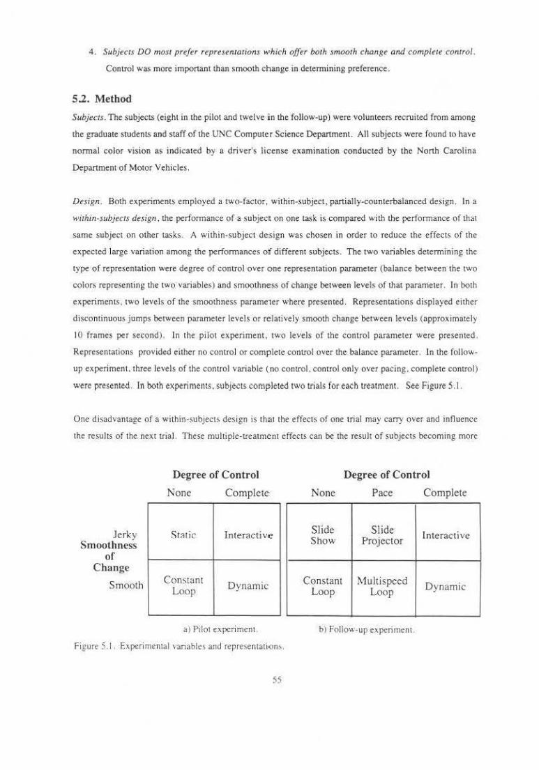
4. Subjeccs DO mosc prefer represenracions k•hich offer boch smooch change and comp/ere conrrol.
Control was more important than smooth change in determining preference.
5.2. Method
Subjeccs. The subjects (eight in the pilot and twelve in the follow-up) were volunteers recruited from among
the graduate studentS and staff of the UNC Computer Science Department. All subjectS were found tO have
normal color vision as indicated by a driver's license examination conducted by the North Carolina
Department of Motor Vehicles.
Design . Both experiment> employed a two-factor, within-subject, partially-counterbalanced design . In a
wichin-subjccrs des ign , the performance of a subject on one task is compared with the. performance of that
same subject on other tasks. A within-subject design was chosen in order to reduce the effects of the
expe.cted large variation among the performances of different subjects. The two variables determining the
type of representation were degree of control over one representation parameter (balaJtce between the two
color$ representing the two variables) and smoothness of change between levels of that parameter. In both
experi ments . two levels of the smoothness parameter where presented. Representations displayed either
discontinuous jumps between parameter levels or relatively smooth change between levels (approximately
10 frames per second). In the pilot experiment. two levels of the control parameter were presented .
Representations provided either no control or complete control over the balance pasameter. Jn the follow
up experiment. three levels of the control vanable (no control. control only over pacing. complete control)
were presented. ln both experimems. S\tbjects completed two trials for each treatmenl. See Figure 5. J.
One disadvantage of a within-subjects design is that the effects of one trial may carry over and influence
the resu lts of the nextltial. These multiple-treatment effects can be the result of subjects becoming more
.Jerky Smoothness
of Change
Smooth
Degree of Control
None Complete
St~tic lnte.racti ve
Constant Dynamic Loop
>) Pilot experiment.
Figure 5.1. Experimental vanabk' and representation,.
55
Degree of Control
None Pace Complete
Slide Slide lnterac£ive Show Projector
Constant Multispeed Dynamic Loop Loop
b) Follow-up experiment.
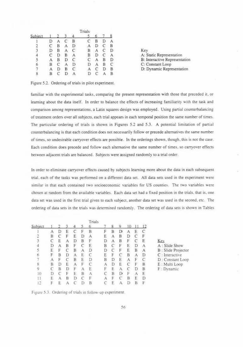
Trials Subit~l I 2 J ~ ~ 6 2 &
I D A c B c B D A 2 c B A D A D c B 3 D B A c B A c D Key 4 c D B A B D c A A: Static Representation 5 A B D c c A B D B: lnteractJV< Representation 6 B c A D D A B c C: Constant loop 1 A D B c A c D B D: Dynamic Representation 8 B c D A D c A B
Ftgure 5.2. Ordering of trials in pilot experiment.
familiar with the experimental tasks. comparing the present representation with those that preceded it. or
leam ing about the data it.self. In order to balance the effects of increasing familiarity wi th the task and
comparison among representations. a Latin squares design was employed. Using partial counterbalancing
of treatment order; over all subjects, each trial appear' in each temporal position the same number of times.
The particular ordering of trials is sho"'n in Figures 5.2 and 5.3. A potenual limitation of partial
counterbalancing is that each condmon does not necessarily follow or precede alternatives the same number
of umes . so undesirable carryover effects arc possible. In the orderings shown. though. thts is not the case.
Each condition does precede and follow each altemauve the same number of times . so carryover effects
between adjacent tri als arc balanced. Subjects were assigned randomly to a trial order.
In order to eliminate carryover effects caused b) subjects learning more about the d3ta in each subsequent
trial. each of the tasks w35 performed on a different data set. All data setS used in the expenment were
Stmilar in tha1 each contained two socioeconomtc vari3blrs for US counties. The two variables \Acre
chosen at random from the available variables. Each data >et had a fixed position tn the trials. that Is. one
datn set was used in the first trial gtven to each subject. another data set was used 111 the second . etc . The
ordering of datn sets in the tnals was determined randomly. The ordering of data sets is shown in Tables
Trials Ss•bi~1 I 2 l ~ s 6 2 s 2 I!! II p
I A D E c F 8 F 8 D A E c 2 8 c F E D A E A B D c F 3 c E A D B F D A B F c E llli ~ D A B F c E B c F E D A A : SIJde Show 5 E F c B A D D c F E B A B : Slide ProJector (, F B D A E c E F c B A D C : Interacti ve 7 A F c B E D B D E A p c D : Con>tnnt Loop ~ 8 D E A F c A D E c F B E : Mulu Loop 9 c B D F A E F E A. c D B F : D)namte 10 D c r 1:. B A c B D I A E 11 E A B I) c F A F (' B E D I~ F E A c I) B c E A D B F
Ftgure 5.3. Ordenn£ of tna1< tn folio" ·up expenme11t
!\6

Trial Tutorial
I 2 3 4 5 6 7 8
First Variable tgreenl average education percent employc:d in manufacturing percent of labor force that is female percent of labor force that is male median age median rent persons per household median home value percentage fannland
Figure 5.4. Ordering <\f data sets in pilot experiment.
Second Variable fpurolel mc:d.ian income percent Gennan ancestry percent employed in agriculture percent of households in poverty percent employc:d in sales percent bom in same state percent workers who drive to work percent workers who carpool to work percent workers who work at home
5.4 and 5.5. In the pilot experiment. there were ·noticeable mean error differences between data sets,
suggesting that some data sets were noticeably more: difficult to interpret Ulan others . While the design of
the pilot study balanced the effects of the order of representations, it did D()t completely balance the effects
of different data sets . The follow-up experiment balanced the effects of data set as well as of trial order.
Display. Stimulus images were displayed on a 512 X 512 Tektron ix model 690SR monitor driven by the
Pixel-Planes 4 graphics system [fuchs et. al. 851. This monitor is particularly stable and <'<msequcntly
repeatable with respect to color. Figure 5.6 shows some sample displays. A thematic map of the
continental United States occupied the upper left quarter of the screen. The thematic map showed two
socioeconomic variables collected by the 1980 Census. Each county was colorc:d to display the value of the
variables using a particular representation scheme. These maps was created by scan-converting
approximately 3000 counties into a 256 X 256 pixel map. Pixels containing more than one county were
colored according to the last one encountered. Slnce no artifacts were apparent. due to the choropleth
organization of the maps. no antialiasing was performed.
A legend showing the gamut of colors usc.d to represent the data vatiable.s occupied the lower right section
of the screen. The center oi the screen contained a wire-frame sheet showing the location or the color
Trial Tutorial
I 2 :l 4 5 6 7 8 9 10 II 12
Ejrst Variable fgreen'
average education percent Irish ancestry percentage farmland med 1an t~ge: doctors per I 00,000 percent employed in manufacturing pcr(;ent employed in sales divorces per 1000 median rent percen1 employed in agriculture perce.nt Polish ancestry percent households in poveny persons per hou>ehold
Second Variable <pum!e)
median income percent households near poverty percent or workers that are male pcrt.enl wnrk~r~ who on,.,_. ro \vorl. median home value pe-rcent born m same state percent workers who carpool to work percem mtxed ancestl') percent German anceslry percent Scottish ancestl') mowr vehicle deaths per I 000 percent workers who work at home percent of workers that are female
Figure 5.5. Ordering of da.ta sets in follow-u p experiment.
gamut tn the HLS color space. This sheet was rumed off if the subject wished. About two-thirds of the
subjects had the sheet turned off for all tnals. The remaming subjects generally left 11 on for all trials.
Stnce the presence. or absence. of the sheet was a consWtt across the trials of most subJCCLS. titS unlikely to
have affected the analysis.
In the pi lot experiment. thematic maps were displayed using one of the four representations shown in
Figure 5 .I.a. ln each representation. one data variable was mapped to levels of green and the other to levels
of purple . In each u ial, many imagc.s were shown. each with a different balance between the relauve
conlributions of the two variables. ranging from only one variable to only the other. Figure 5.6 shows four
images of the data. each with a different balance between the relative conlributions of the two variables.
The first shows just the green parame~er. the next predominantly the green parameter with a small
contribution from the purple parameter. the next shows balanced contributions, and the last shows just the
conlribution of the purple parameter. In all representauons except the Static and constant loop. the sub_Ject
had some control over the relative contribuuons of the two display parameters to the tmage.
The representations differed in how the subject controls the relative contributions and how often updates
occured. "fhe four representations were:
I . Si ngle Static Image: Subjects viewed a single static representation of the data . In this
representation. the two display parameters made equal contributions to the image. This
representation was neither manipulable. nor d)'llamic.
2. Interactive Representation: SubJects viewed multiple static images. Subjects interactively
manipulated the representauon by >clccung values for the balance between the two parameters
U>tng a slider and pressing a button to generate the new representation. This repres.entalton wa.'
manipulable, but not d)natntc.
3. Constant Loop: Subjects viewed a smgle precomputed film loop. This film loop sho,.ed the dfccts
of smoothly varying the relative contnbutions of the two parameters. but did not allow the subject
to control the representation. AccordtnJ:Iy. this representation was dynamic, but not manipulable.
The loop l:>ounced between the two singJe.variable extremes. There were 34 unique. equally
spaced images in the loop wub a complete pass from one extreme to the other repeating each 3.5
>cconds.
4. Oynamtc ~anipulotion: Subjects dynamtcally manipulated the relative contributions wuh a shder
\aluator. The displayed image changed dynamically m response to these mampulatton'
58
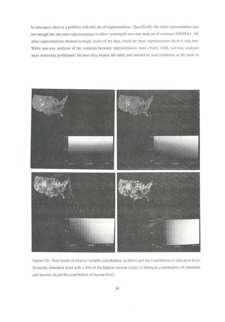
In rt:Lro~pect, there is a problem wi1h this se1 of rcpre.o;cnt:uions. Specifically. the stutic representalion was
not enough like the o ther representations to allow m·eaningful Lwo-way analysis of vari~nce (ANOVA). All
other represem:u ions showed multiple vit!wsof th¢ data. while the static rcpn:scntation :;,howell only one.
\\'hile one-way an~lyses of tht variaUon between represent.rHion"' were dearly v:lHd. IWlH.vay analyses
\\'ere somewhal problem~ltic he,ause they lreatcd the static nnd interactive rcprcscntati(lm, a.~ t.hl! sarnt: in
Figure 5.6. Four lc\'cls of rclulivc. variable contribution . a) shows ju~1 the contribution 0f education level.
b) mostly edth.:ation level with :t hint of th~.; highc!-ot income lc\·cls, r) bfd~utccd l'OllU'tbution::. of educ\ttion
and iucornc. d) just Lhe contribution of income I eve 1.
59
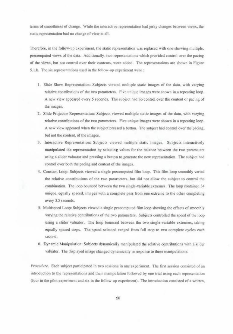
tenns of smoolhness or change. While lhe interactive representation had jerky changes between views. !he
static represenlJltion had no change of view at all.
Therefore . in the follow-up cxpcriment.the Static t'Cprcsenuuion was replaced with one showing multiple.
precomputed views of !he datu. Additionally, two rcprcscntntions which provided control over the pacing
of the views, but not control over their contents. were added. The represenlJltions are shown in Figure
S. l.b. The six rcprcocnlJltions used '" !he follow-up experiment were :
I. Slide Show Representation: Subjects viewed multtple static images of the data. with varying
relative contributions of 1hc two parameters. Five unique images were shown in u repeating loop.
A new view appeared every 5 seconds. The :,object had no control over the content o r pacing of
the images.
2. Slide Projector Representation: Subjects viewed multiple slJlric images of the data. with varying
relative contributions of the two p<lrameter$. Five unique images were sbown in a repeating loop.
A new view appeared when the subject pressed a bunon. The subject had contrOl over !he pacing.
but not the content. of the images.
3. Interactive Representat ion: SubjecL~ viewed multiple static images. Subjects interactively
manipulated the representation by selecting values for the balance between the two parameters
using a slider valuator and pressing a buuon to generme the new representation. The subject had
contrOl over both lhe pacing and content of lhc imoges.
4. Constant Loop: Subjects viewed a single precomputed film loop. This film loop smoothly varied
the relative contributions of the two paranlcters. but did not allow the .ubject to control !he
combination. The loop bounced between the two single-variable extremes. The loop contained 34
unique. equally spaced, images with a complete pass from one extreme to the other completing
every 3.5 seconds.
5. Multispeed Loop: Subjects viewed a single precomputed film loop showing the effects of smoothly
varying the relative contribution~ of the two parameters. Subjects controlled the speed of the loop
using a slider valuator. The loop bounced between the two single-variable extremes. takin~t
equally spaced steps. The speed selected ranged from full stop to two complete cycles each
second.
6. Dynamic Manipuhmon: Subjects dynamicall y manipulated the rela ti ve contributions with a slider
valuato r. The d isplayed Image changed dynamically in response to these lll:lnipulations.
Procedure. Each subject p<1nicipated in two "'"ion" in one experimcnL The fir<t session con>i•tc-d of on
introduction to the n:pre.entattons and !heir manipulation followed by one trial using each representation
(four in the pilot experiment and stx in lhe follow·up experiment). The intrOduction consi<ted of a written.
(i(l

tutorial-like presentation of each type of representation. In each trial. subjects were given a written
description of the data and representation for that !rita! and asked to explore the data set while filling out a
worksheet of questions about the data. Questions asked about both qualitative and quantitative aspects of
the data. The worksheet in each trial was the same except for references to the particular variables
pre.~ented in that trial. After all trials were complete, the subject filled out a final questionnaire comparing
the representations. The second sessi<m consisted of additional trials. one trial using each represenwtion.
followed by another final questionnaire. See Append ix B for a sample set of materials .
5.3. Results
In all analyses. a within-subject analysis was used. T hat is. the scores of a subject using one representation
method were compared with the scores of that same subject using other representation methods . The
analyses performed were:
• comparison of percent error difference bel ween representations for a singlc·variable question
• comparison of percent error difference betweeill representations for a two-variable question
• two-factor analysis of variance (ANOV A) anrlbutable to manipulability and smoothness of change of
a representation
• two-factor ANOV A of confidence data
• comparison of number of variables referenced in descriptions of interesting places.
The details of these analyses are described below. Additionally. subjects' preferences for representations
were examined. In the sections below. mean values for preference. percent error. and confidence are given
to convey a sense of direction and panern of differences . In most cases, the means and A NOVA tables are
from the follow-up experiment. Panems in the pi lot were similar, but less significant. In one case where
there were significant differences in the pilot but no t in the foll.ow-up. pilot results are presented. Subjects'
raw scores are included in Appendix B.
SubJ<'Cl Preferences . Subjects were asked to rank the representations (with I as the most preferred).
Almost without exception . subjects ranked the dynamic representation as the most preferred. usua ll y
followed by the interactive representation. Subjects almost always ranked either the slide show or constant
loop a~ the lca.<:t preferred repre.sentation. Represemations providjng increased contr<)l wer~ preferred.
'Vhllin a pail of r~J.m::!>C-fltation:, wilh the Si:lllle .amoum of cururol. for example SHOe Proje<.aor anc.J
Multispeed Loop. subjects usually ranked the representallon with smooth change higher. Figure. 5.7 shows
lht preference means. lv1osl subjec1s gave identical mnking.s afler the 1wo sess)on~. In the pilot
experiment, the subjects whose rankings changed all ranked the constant loop representation one notch
more preferred than previously In tile follow-up experiment. there was no clear pattern <•f change amOn£
tho~c subjects who changed their ra·ting b<:twe.cn the sessiQns.
61
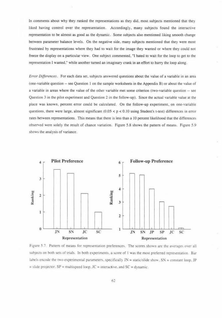
ln comments about why they ranked the representations as they did. most subjects mentioned that they
hked having control over the representation . According!). many subjects found the anteractive
representation to be almost as good as the dynamic. Some subjects also mentioned hlting smooth change
bet..,een parameter balance levels. On the negative side. many subjects mentioned that they were most
frustrated by representations where they had to wait for the image they wanted or where they could not
freeu: the display on a panicular view. One subject commented, ' I hated to wait for the loop 10 get to the
representation I wanted," while another turned an imaginary crank in an effon to hurry the loop along.
Error Differences. For each data set. subjects answered questions about the value of a variable in an area
(one-variable question -see Question I on the sample worksheets in the Appendix B) or about the value of
a vanable in areas where the value of the other vanable met some criterion (two-variable question •· see
Quesuon 3 an the pilot experiment and Question 2 in the follow-up). Since the actual variable value at the
place was known . percent error could be calculated. On the follow-up experiment . on one.variable
quesuons. there were large. almost significant (0.05 < p < 0.10 using Srudent's t•test) differences in error
rates between representations. This means that there is less than a 10 percent likelihood that the dtfferences
ob~erved were solely the result of chance vanatiol\. Figure 5.8 shows the pauern of means. Figure 5.9
shows the analysis of variance.
4 Pilot Preference 6 Follow up Preference . ~
~ s r-~
3
r-
....-- -·-"
~
r-
.----2
• 0 JN JC sc I
J:-l Sr\ JP SP J C SC
Represenu.tion Represenu.tion
hfUCc 57 Pa11em of means for rcprc,entauon preferentt>. The scores shown arc the a'era~t' o'er all
'ubJe<:l' nn both ~ts of eials. 1 n both expenmen". a <orore ni 1 wa~ the mo>t preferred rcpre~nt3tton Bar
label' encode the two experiment~! paramete~. specificall> Jl\' = stallclslide sho". SN = cnn<wnt loop. JP
= 'hde prOJeCtor. SP = multispeed loop. JC = 1ntcracthc. and SC = d)namic.
62
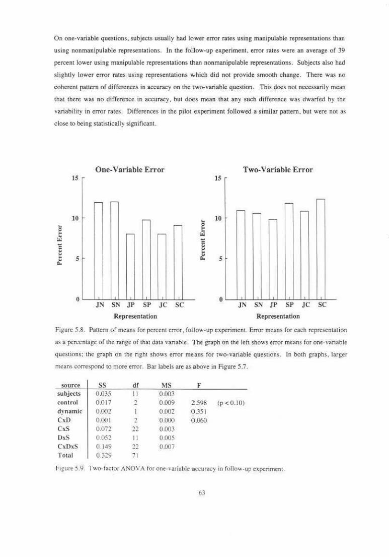
On one-variable questions. subjectS usually had lower error rates using manipulable representations than
using nonmanipulable representations . In the follow-up experiment. error rates were an average of 39
percent lower using manipulable representations than nonmanipulable representations. Subjects also had
slightly lower error rates using representations which did not provide smooth change. There was no
coherent pattern of differences in accuracy on the two-variable question. This does not necessarily mean
that there was no difference in accuracy. but does mean that any such difference was dwarfed by the
variability in error rates. Differences in the pi lot experiment followed a similar pattern. but were not as
close to being statistically significant.
15
10 ~
e ~ ~ ~
c .. '-' ~ s ., ...
0
One-Variable Error
r- r-
r-,-
- r-
' JN SN .JP SP JC SC
Representation
15
~
" .. 10
... "' c .. " .. ~ 5
0
Two-Variable Error
r-r-
r- - r--
JN SN .IP SP JC SC
Representation
Figure 5.&. Pattern of means for percent error. follow-up experiment. Error means for each representation
as a percentage of the range of that data varia·ble. The graph on the left shows error means for one-variable
questions: the graph on the right shows error means for two-variable questions. In both graphs. larger
means correspond to more error. Bar labels are as above in Figure 5.7.
source ss df MS F subjects O.QJ5 I I 0.003 control 0.0 17 2 0.009 2.59& (p<O.IO) dynamic 0.002 0 .002 0 .351 CxD 0.001 0 0.000 0.060 -CxS 0.072 22 0.003 DxS 0.051 II 0.005 CxDxS 0 .149 22 0.007 Total 0.329 71
Figure 5.9. Two- fac1or ANOYA for one-variable accuracy in follow-up expe.riment.
6., _,

Confidence. In the follow-up experiment. subjects were asked to rate their confidence in their answers on a
scale from I to 10. In general. subjects were significantly more confident (p < 0.01 and p < 0.025,
respectively for the one- and two-variable questions) about their answers using manipulable than
nonmanipulable representations. This means that there is less than a I percent chance (less that 25 percent
chance on the two-variable question) that the observed difference is the result of chance variation. The
two-way ANOVA also shows an effect of the interaction between degree of control and smoothness of
change that approaches significance. Specifically. control appeared to be even more important in
representations that were changing smoothly . Figure 5. 10 shows the panem of means while Tables 5.11
and 5.12 show the analysis of variance. There were no questions about confidence in the pilot experiment.
8.5
8 . .0
7.5
7.0
0 v . bl c nfid ne- ana e 0 1 ence ~
,.... r-
r-
.-
~
JN SN JP SP JC SC
Representation
u 1: .. ., "' 1: 0
u"'
7.0
6.5
6.0
5.5
5.0
T o Va ·abl Co fid w. n e n • ence
r-
r-
r-~
~
I , n ' ' JN SN JP SP JC SC
Representation
Figure 5.10. Pauem of means for confidence, follow-up experiment. Subject confidence in responses on a
scale from 1 to 10. ln both graph~. I would show minimal confidence. whereas 10 would show extreme
confidence. Bar labels arc as above in Figure 5.7 .
sourc~ ss df MS ;F subje<-H 34.34 I I 3.12 control 9.08 2 4.54 6.38 (p<O.OI) d~·namic O.Q3 om 0_07 CxD 1.75 2 0.88 1.20 CxS 15.67 22 0 .71 DxS 4.59 II ().4 2
CxUxS 16.00 22 0.73 Total 81.47 71
Fi~ute SJ I. Two-factor A NOVA for one-variable que,uon m follow-up expenmem.
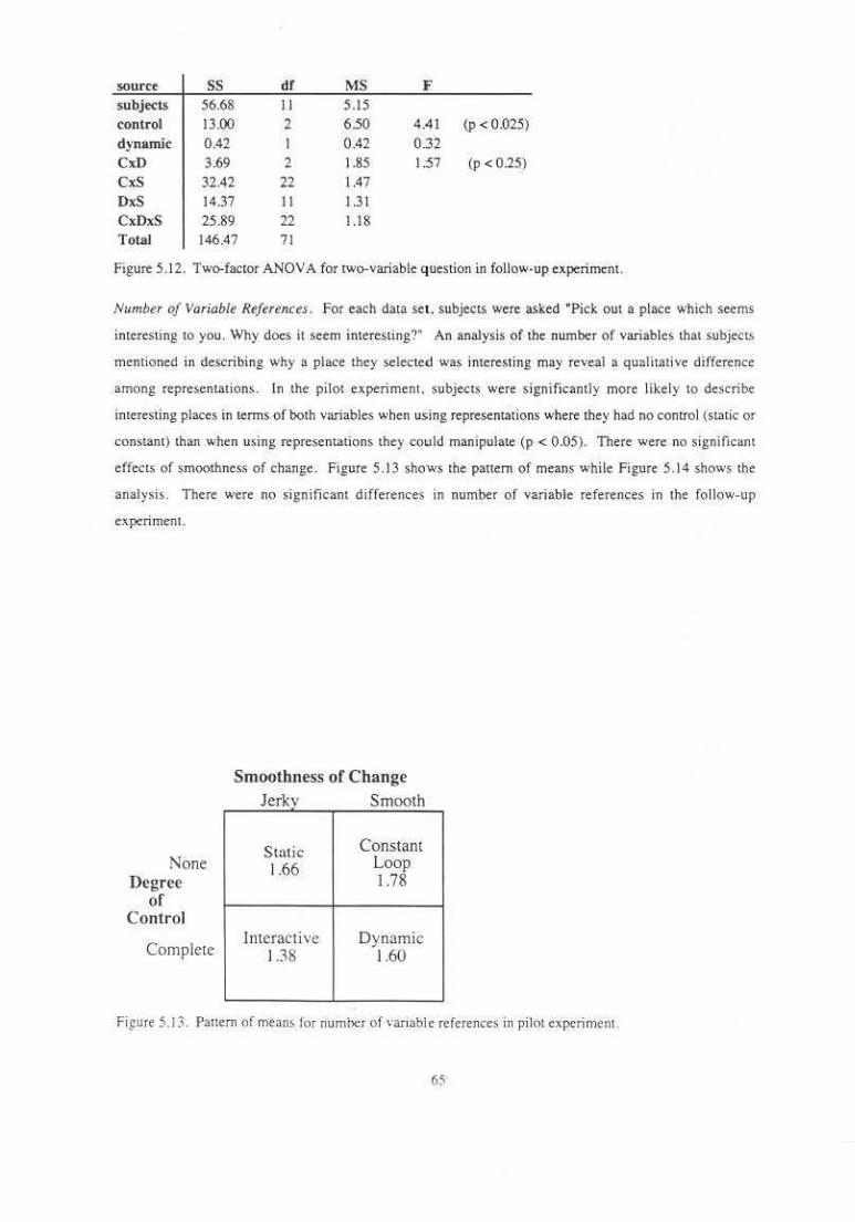
source ss df MS F subjects 56.68 II 5.15 control !3.00 2 6.50 4.41 (p < 0.025) dynamic 0.42 0.42 0.:32
CxD 3.69 2 1.85 1.:57 (p < 0.25)
CxS 32.42 22 1.47 DxS 14.37 II 1.3 1
CxDxS 25.89 22 1.18 Total 146.47 71
Figure 5. 12. Two-factor ANOVA for two-variable question in follow-up experimenL
Number of Variable References. For each data set . subjects were asked "Pick out a place which seems
intere.sting to you. Why does it seem interesting?" An analysis of the number of variables that subjcCL>
mention~d in describing why a place they selected was interesting may re\'eal a qualitat ive difference
among representations. In the piiQI experiment. subjects were s ignificantly m<1re likely to describe
interesting places in terms of oolh variables when using representations where they had no control (static or
constant) than when using representations they CQuld manipu·late (p < 0.05). There were no significant
effects <>f smoothness of change. Figure 5.13 shows the panem of means while Figure 5.14 shows the
analysis. There were no signi ficant differences in number of variable references in the follow-up
experiment.
None Degree
of Control
Complete
Smoothness of Change J k s h er.<y moot
Stat ic Cons tam 1.-66 Loop
1.78
Jnteractive Dynamic 1.38 1.60
Fi£ure 5.1 3. Pattern of means for number of variable references in pi!Qt cxperimcnL
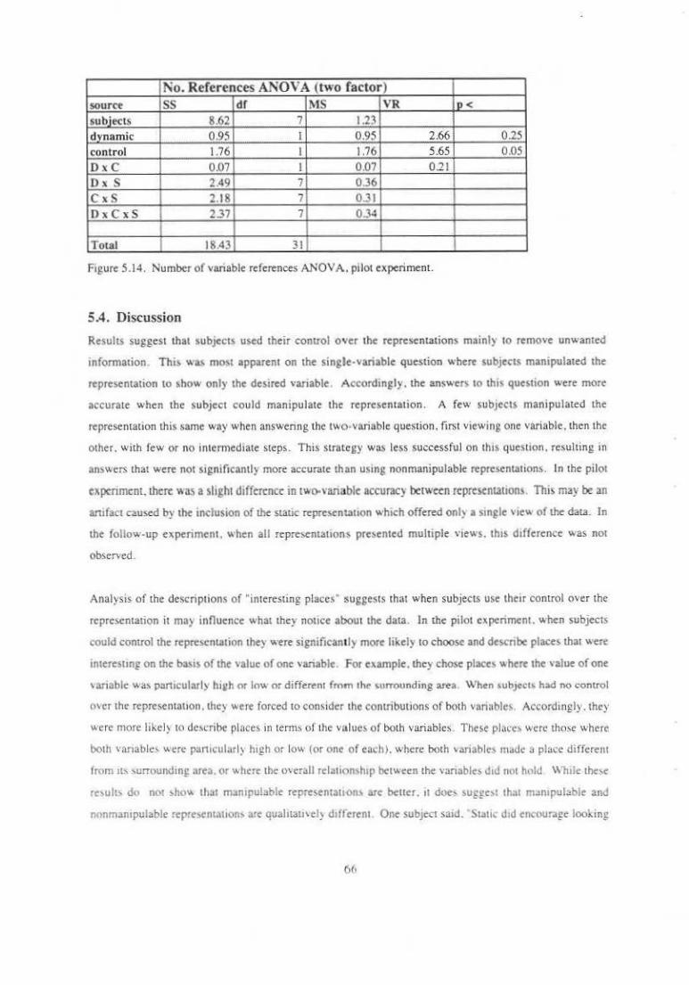
No. References ANOVA (two factor) source ss df MS VR P< subjects 8.62 7 1.23 dynamic ' 0.95 I 0.95 2.66 0.25 control 1.76 1 1.76 5.65 0.05
DxC O.o7 l 0.07 0 .21 DxS 2.49 7 0.36 C x S 2.18 7 0.31 DxCxS 2.37 7 0.34
Total 18.43 31
Figure 5.14. Number of variable references ANOV A. palot experiment.
5.4. Discussion
Resuhs suggest that subjects used their control over ahe representations mainly 10 remove unwanted
information. This w~ most apparent on the single-variable question where subjects manipulated the
representation to show only the desared vanabte . Accordingly. the answers 10 this quesaion were more
accurate when the subject could manipulate the representation . A few subjects manipulated the
representation this same way when answenng the two-variable question . firs• viewing one variable .. then the
other. with few or no inaermediate steps. This strategy was less successful on this questann. resulting in
answers that were not st~;nificantly more accurate than using non manipulable representation,;. In the pilot
experiment. there was a slight difference in two-,·ariable accuracy berween representation~. This may be an
ani fact caused by the anc;lusion of the static reprcsenuuon which offered on I~ a sangle voew of the data. In
the follow-up experiment . when all reprc>entauon6 presented multiple views. th1s dafference was not
observed.
Analysis of the de~criptions of "interesting places" sug~ests that when subjects use their control over the
reprc>entation it may influence what the) notice about the data. In the pilot experiment . when subjects
could control the rcpre>entation they were significantly more like!~ to choose and descnbe places that were
interesung on the basas of the value of one vanablc . For example. they chose places where the value of one
\an able:. was partJcularly his:h or low or different from lht ~urrounding area. When s;ubject~ h~d no control
over the represemauon . they were forced to consider the contributions of both varinble6. Accordingly. they
were more like!) to dc>cribc plnces in terms of the values of both variables. These pl(o<'c> were those where
both vanablc;, were panicularly high or low (or one o f each). where both variable; mJdc a place differem
fmm '" 'urrounding area. or -..here the O\crall relation,hop bet"een the variables Jod not hold While the;,e
rc\Uih do not >ho-.. that manopulal>le representation> are beuer. 11 doe, su~gc" th~t manapulable and
nonmampulable reprc>entauon> are quahtatl\d} daf(trent One SUbJect saad. Stone dad encourage looking
(i(l
at a 'mixed' representation. This might help find information which would have been lost in my te<;hnique
of switching from one end of the scale to the other." T his difference may not have been observed in the
follow-up experiment because all representations in that experiment presented multiple views. some
containing the contributions of only a single variable. Unlike the static representation of the pilot
experiment. none of the~e repre&:ntations forced the: subject to consider the variables together.
Subject comments. Subjects found that different representations and different manipulations were best
suited for answering different types of questions . One subject commented that the interactive and dynamic
representation~ were good for smgling out one variable. whereas the dynamic and loop representations were
good for answering two-variable questions. Presumably this is because con!IOI was important for isolati ng
one vasiable, but smoothness was not helpful. When looking at relationships between variable-s. control
was still important, but smoothness manered as well . A subject said, "I found myself lo<>king mainly at one
variable or the other. but the intermediate balance levels were important tO sec relationships be-tween the
variables - ll would] keep my eye on one while b lending it over to the other." Another subject observed
that slow changes were good for examining detail while fast changes were useful for gaining an overall feel
for the data. During the exploratory phase of data analysis. the researcher may ask a wide range of
questions about the data. A tool providing multiple representations and a variety of manipulations can help
the researcher gain insight that permits formulation of interesting questions for detailed analysis.
The experiments described in this chapter have addressed the effectiveness of dynamic displays for the
comprehension of the quamltative characteristics of data. Consideration of the Impact of dynamic control
on the comprehension of the qualitative charactcris~ics of data should not be overlooked. While it is easier
to judge the accuracy of quantitative questions such as those asked in this experiment. insight into the
qualitative nature of the patten" and interrelationships within the data is probably a more imporulnt product
of data exploration. An in vestigation of the effectiveness of dynamic displays in the comprehension of
these qualitative aspects of data is described in the next chapter.
67
Cbapter Six
Empirical Investigations of Pattern Comprehension
Th1s chapter describes an experiment comparing the effectiveness of static versus dynamic representations
for the exploration of qualitative aspectS Of bivariate distributions. Ln this experiment. subjects made
JUdgmentS about the correspondence of the shape. location. and magnitude of two pauems under eond1uons
with varying amounts of random noise.
Addnionally . this experimenl addresses some problems w1th the firs t se.t of experiments. It seeks tO reduce
the observed variance by using simulated data with more carefully controlled charactenstJcs than the census
da1a of 1he metric study. In order to preserve one characteri<~ic of real data. noise is included in the s1imul i.
Th1S design seeks tO increase the power of lhe analysis and reduce the time required from eoch Subjccl by
reducing I he number of represen1a1ions considered. Specifically. it considers only a single s1a1ic and a
smglt dynamic representation. These 1wo representations correspond more closely 10 lhe claims made in
lhe lhe~i< stalemem.
6.1. Hypotheses
M) n pr10r1 hypotheses were:
I. Dynamic representatiOnj con\·~." information abow feature shopts rn bn:ariatt pautrn.'i more
occurorely tharr static displays. Subjects will idemify feature shape• more accura1ely usm£ a
dynam1c display than a single stallc display. Subjects will accuralely answer questions a1 h1gher
noise levels using dynamic displays than us ing static displays.
2. Dynamic representations com·ey it1jormarion abow she relaril1e posiuons and magr1irudes of
jt'OfUrl"S of bivariatl' distribution-S or 1t<Ut Ol ..... ~u as stall(_ bt\ICJf'hu~ d{lplu,\J, The o.dditi\HI or dynamism does no1 disrupt the perceptual registration of features in bn·anate di<tributions
Specificall} . subjec" will answer quesuons abou1 correspondence of posmons and magmtude> of
features of bn·anate d1stnbuuons at lea<t as accurate!} usmg d}nam1c repre>entauon'"' usmg
\talte representatwns..
' · D\namic c·ontrol ajferu ''pres~mouon prt_fcr~nl't!. Subjects \\-ill prefer d)03mh.: bi\Jriate
repre~emations to s.tauc bivatlate re:prc,entation
The results of the experiment showed that:
I . Dynamic representations DO convey information about feature shapes in Mvariate pauern more
accurately tluln static displays . Subjects made 49 percent more accurate shape identifications with
the dynamic representation than with the static representation. This difference is statistically
significant (p < 0.001).
2. Dynamic "presentations DO convey inform11tion a/xmt the relative positions and magnitudes of
features of bivariate distributions as well as static bivariate displays. Subjects made similar
numbers of correct magnitude comparisons with the two representations. Subjects also made
significantly more correct positions comparisons. but this seems to be primarily the result of more
accurate shape identifications on which to b.ase positions comparisons .
3. Dynamic control DOES affect represemation preference. Subjects almost unanimously preferred
the dynamic representation.
6.2. Method
Subjects. The sixteen subjeC-tS were volunteers recruited from among students of introductory courses in
the UNC· CH Department of Computer Science. All subjects were found to have normal color vision using
standard pseudoisochromatic plate.s llchikawa et al. 78].
Destgfl. The experiment employed a two-factor, within-subject design . wn h the factors bemg
representation type and level of noise. Two different kinds of representations were presented: ~ St.1tic
bivariate display and a dynamic bivariate display . Subjects were randomly assigned to a representation
order. with half of the representation orders presenting the dynamic representation first and half presenting
!be static representation first . Three levels of noise were considered : none , medium. and high.
The bivariate data set used in each trial was built frem two single-variable data distributions. Each single·
variable distribution was generated algorithmically to comain one of the following Gaussian features : peale
well. sadd le. ridge. or trough. These shapes correspond roughly to the three classes defined by
Koenderink's shape index (con vex t.llipt ic, conca.ve elliptic, and hyperbolic) and the boundary cases
bet,veerl. th~m (t ()nvex and concave cy1indets) [Koenderink 90] . The sho.pes are shown in Figure. 6.1 .
Data v~riable values were ~?<tnerated on a 50 X 50 grid. Th is grid was rendered as a color·ul!erpolatcd
polygonal mesh in an 800 X 800 display window. Features were. generated as Gausstan blobs (or
combtM!Ions of Gaussian blobs 111 the saddle case). The standard deviation for peaks. wells. and across
ndges and troughs was th ree grid units. The S(::mdard deviation along ridges and pt.ak~ was Jllne grid urHI$.
69
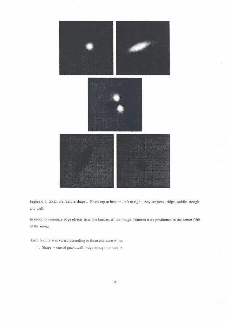
Figure 6.1 . Example feature shapes. From top to bottom, left to right. they are peak, ridge . saddle . trough.
and well.
In order to minimize edge effects from the borders of the image . features were po;itione.d in the center fiflh
of the image.
E.ac:h feature was varied according to three characteristics:
I . Shape-- one of peak. well. ridge.trough. or saddle.
70
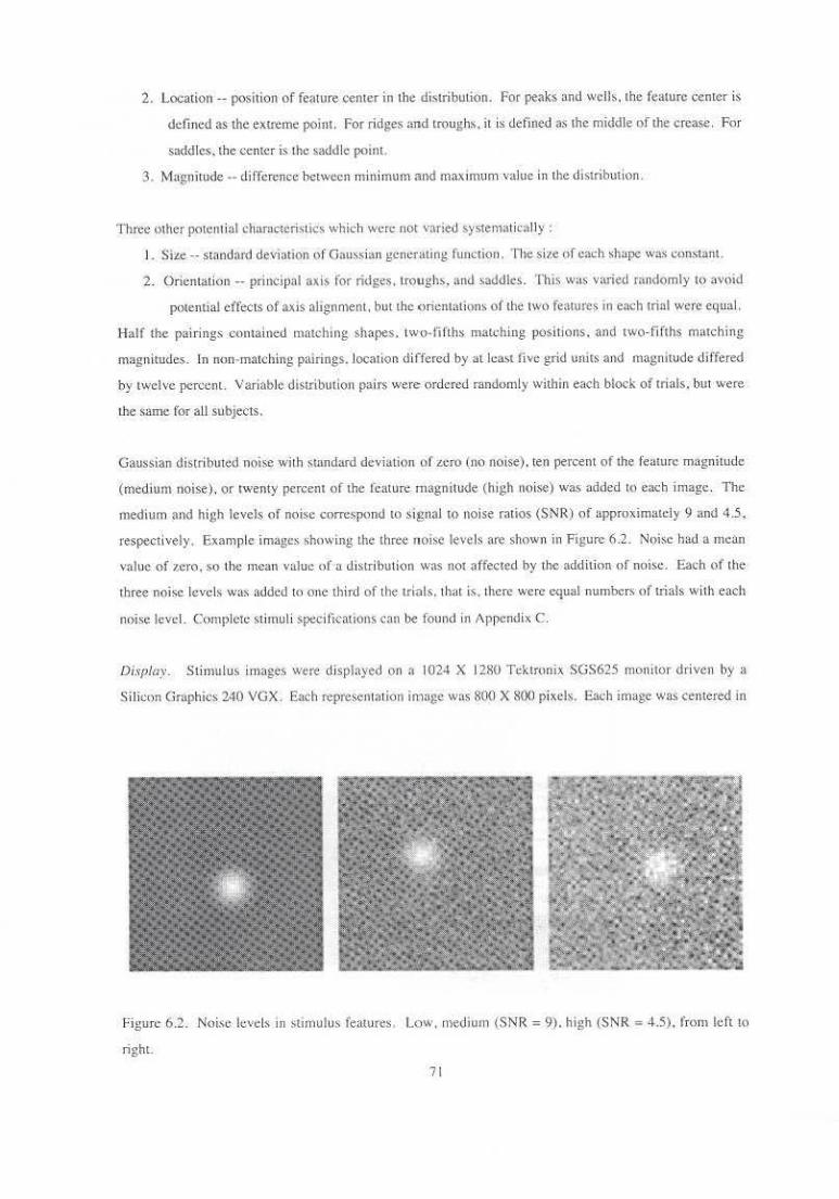
2. Location -position of feature center in the distribution. For peaks and wells. the feature center is
defined as the extreme point. For ridges and troughs. il is defined as the middle of the crease. For
saddlcs. the center is the saddle point.
3. Magoitude 4 • diiTcrence between minimum and maximum value in Lhe distribution.
Three other poten1 ial characterislic::. ,,,:hkh were not varied systema•irally :
I. Siz¢ -- standaJ'd deviation ()f Gaus~ian g_Cn-:rating func1ion. The size of each slmpe was constant.
2. OricntaLion --principal axis for ridges . Lroughs) and ~addles. This was varied randomly to avoid
potenual effects of axis alignment. but the <>ricnt:otinns of the t'"' features in each trial were equal.
Half the pairi ngs contained matehtng shapes. two-lifths matching pos itions. and two-fifths matching
magnitudes. In non-matching pairings. location differed by aLlcast five grid unns and magnitude differed
by twelve percent. Vari11blc distribution pairs were: ordered randomly within each block of trials. but were
the same tor au subjects.
Gaussian distrib\Hed nois-e wirh standard deviation of L.cro (no Jloise). ten percent of 1he feature magnitude
(medium noise) . or twenty percent of the feature magnitude (high noise) was added l<l each image. The
medium and high levels Qf noise correspond to signal to noise ratios (SNR) of approximately 9 and 4.5,
respectively . Example images showing the three noise levels are shown in Figure 6.2. Noise had a mean
vnlue of zero. so the mean value of a disrribution was not ;~ffected by the addition of muse. Each of the
rhree noi~e levels w:J.s added to one third of the trials. Lh<1t is. rhcre were equal numbers of trials with each
noi!'e level. Complete stimuli specifications cru1 be found in Appendix C.
Di.vplay. Stimulus images were displ~yed on a 1024 X 1280 Tcktrunjx SGS625 monitor driven by a
S ilicon Graphics 240 VGX. Each representation irtlnJ!e was 800 X 80() pixels. Eacb image was centered in
Figure 6.2. Noiso levels 11'1 sumulus features Low. medium (SNR = 9). high (SNR ; 4.5). from left to
righl.
71
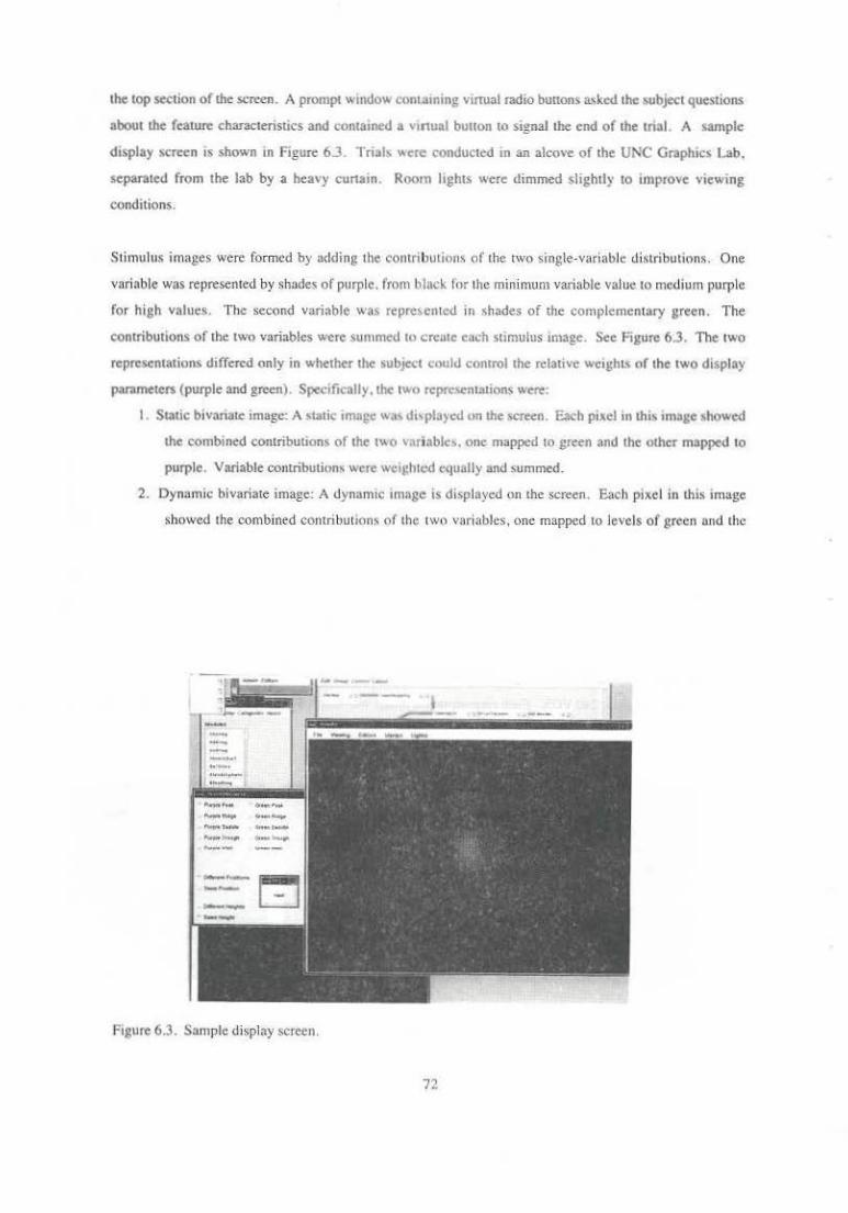
the top section of the screen. A prompt window contaming virrual radio bu[lons asked the subject questions
about the feature characteristics and conta10ed a vinual bunon to signal the end of the trial. A sample
dasplay $Creen is shown in Figure 6.3. Trial' "'ere conducted in an alcove of the UNC Graphics Lab.
separated from the lab by a heavy cunain. Room lights "ere dimmed slightly to improve viewing
conditions.
S timulus images were formed by adding the contrabUlion' of the two single-variable distributions. One
vari able was represented by shades of purple. from black for the minimum variable value to medium purple
for high values. The second variable was repre;entcd in shades of the complementary green. The
contributions ol' the two variables were summed tu creme each stimulus image. See l'igure 6.3. The two
representations differed only in whether the subject could control the relati,·c weights of the two display
parameters (purple and green). Specifically.the two rcprc'ICntaaions were:
I . Static bivariate image: A static imase wa~ di,pla)ed on the screen. Each pixel an this a mage showed
the combined contributions of the two v~riablc•. one mapped to green and the other mapped to
purple. Variable contributions were weighted tqually and summed.
2. Dynamic bivariate image: A uynamic amnse is displayed on the screen. Each pixel in this image
~howed the combined contributions of the two variables, une mapped to levels of green and the
,....... ..... -..-.. ,....._ .... ,.-"'"" _.,. ~-.-.. ------
Figure 6.3. Sample display screen.
--
72

other mapped to levels of purple . Variable contributions were summed . As the subject
manipulated a physical dial. the relative weights of variable contributions were changed.
Consequently, the image could show just the first variable. just the second variable, or any linear
combination of the two variables. The image was updated at two frames per second.
Procedure. Subjects were screened for normal color vision using pseudoisochromatic plates [Ichikawa et.
al. 78]. Subjects then received written instrUctions that explained the experimental procedure and showed
examples of one-variable images containing the five feature shapes. In addition. subjects were shown clay
models of the 3D shape. equivalents . This was done because some pilot subjects had difficulty
understanding the concept of shape height when shown only the 20 examples. Before each block of trials.
subjects received a wri tten description of the representation used in that block. Complete subject
instrUctions can be found in Appendix C.
Each subject performed two blocks of trials . one for each representation type. Each block cons1sted of
eight practice trials and thirty test trials. In each trial, the subject viewed (and in the dynamic case
manipulated) the representation of two-variable distributions. The subject answered the following
questions about the two distributions:
What shape iS represented by the purple parameter?: five-alternative forccd·choice
What shape is represented by the green parameter?: live-alternative forced-choice
Aie they~~ the same location?: two-alternative forcedwchoice
Do they have the same magnitude?: two--alternative forcedwchoicc
After answering the questions. subjects pressed a button to s ignal completion of the trial. In practice trials.
the correct answers appeared in a text window. Trials were timed by the conuol software . After all trials
were completed, the experimenter conducted a sklort interview with the subject about representation
preferences. observations. and strategies that the subject may have used.
6.3. Results
In all analyses. a within-subjects analysis was used . That is, the scores of a subject using one representation
method were compared with the scores of that same subject using other representation methods. The
analySe$ perfonncd were:
• comparison of mean number of correct shape identifications for different representatiOn and noise
level combmations
• two. factor analysis Qf variance (A NOVA) auributable to representation and noise level on a shape
identification task
• comparison of mc.an number of correct pQ.sition comparison~ for different representaliQn and noise
Jc.:vcl combina(ions
"' ' ·'

• two-factor ANOV A of representation and noise !<vel on a position comparison task
• comparison of mean number of COITect hetght comparisons for different representation and notse
level combinations
• two-factor ANOVA of representation and notse level on a height comparison task
• comparison of average uial time for dtfferent representation and noise level combination~
Additionally , subjects' preferences for representations. strategies for task completion. and spontaneous
commentS were examined . SubjectS' raw scores are included in Appendix C.
Preference. Subjects were asked which representauon they preferred . All but one emphatically selected
the dynamic representation. When asked why they chose the representation !hat !hey did. subjects who
prefeiTed the dynamic representation gave such reasons as
• "It gave me more controL If llhoughtl saw a pauem I could explore it to see it bener . It dtd make 11
slower. but I felt it gave me a bener grasp of the panem."
• ''lfs e-asier."
• "I liked !he knob about two hundred umes bencr. I didn't have to thmk as bard. It's easter to sec
each different variable.''
• "It's easier to see the shapes together after you've seen them apan.''
The subject who prefeiTed !he static representation said, "I liked it [the static representation] because it was
more challenging.''
Shop• tdtnti/icarlon. The number of incorrect shape idenuficaMns for each repre:.cntattOn and notse level
wa; recorded for eacb subject. The mean~ for each treatment condJUon are shown tn Ftgure 6.4 .a. Bars
~howmg the mean difference between a sub,tect's performance using the 1wo reprc>enuuons IS shown 10
Figure 6.4.b. Error bars are included to show the 95 percent confidence interval for mean difference.
StnCe !his interval does not contain zero a1 any noise level, we reject the possibility that !here is no accuracy
difference between the two representations. On average. subject> gave fony-five percent more coiTect
identifications using dynamic representations !han u~i ng ~talic. This difference is statisucally significant (p
< 0.001 ), T he analysis of variance is shown m Ftgure 6.5. The analysis also showed significant effect from
both noise level and the representation·noise tnteracuon (p < U.UO I) . !;pecthcally. average accuracy
decreased as notsc increased and !he accuracy dtfference between static and dynamic representations wa;
greater 111 the presence of noise. Thc~T "a.' lillie differenc~ between the medium and hi~h 110 1'< k•d'
74
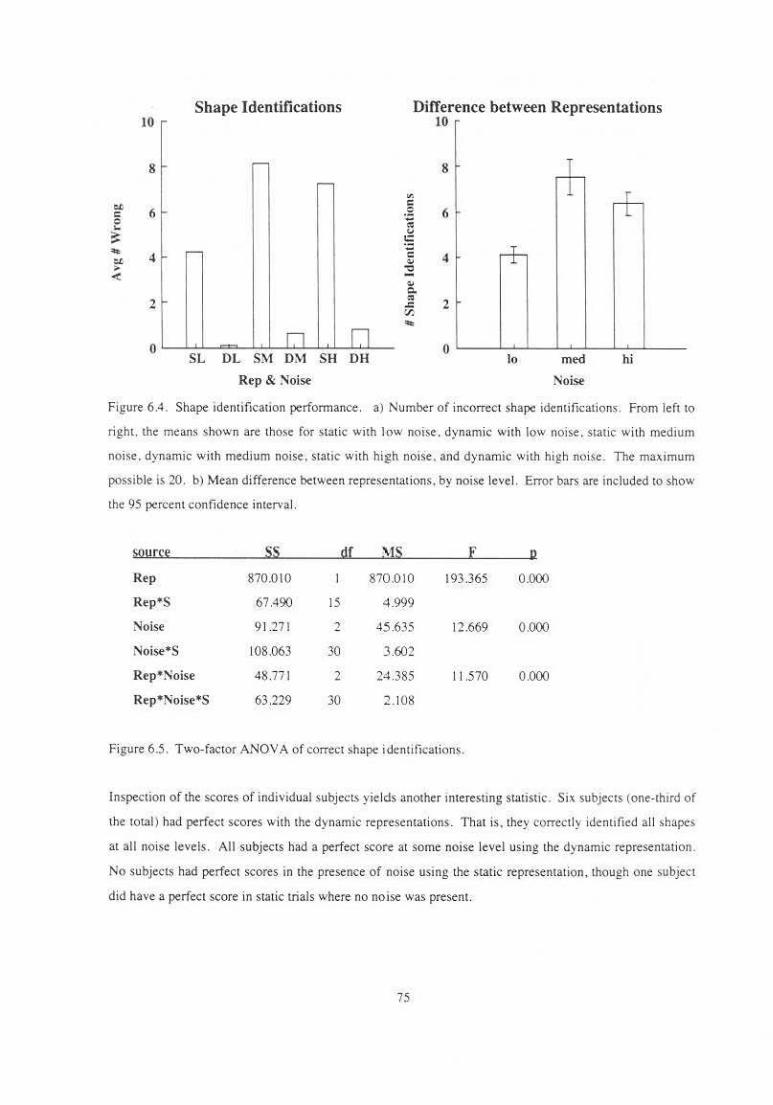
Shape Identifications Difference between Representations 10 lO
8
.. c: 6 0 ,_ :: "" 4 -tl > <
2
0 n SL DL SM DM
Rep & :-Ioise
~ c
.;?: ~ v t:: ·~
" "' ., .. c. ., ~ "" n
SH DH
8
6
4 + 2
0 lo med
Noise
+
hi
Figure 6.4. Shape identificauon performance. a) Number of incorrect shape identilications. From left to
right. the means shown are. thOse for static with low noise. dynamic with low noise. static with medium
noise. dynamic wj1h me-dium noise. slatic with blgh noiSe . and dynamic with high noise. The maximum
possible is 20. b) Mean difference between representat ions, by noise level. Error bars are included to show
the 95 percent confidence interval.
S!lYf~~ ss !I[ ' 1S E ll
Rep 870.010 870.01 0 193.365 0.000
Rep•$ 67.490 15 4.999
Noise 9 1.271 2 45635 12.669 0.000
Noise•s 108.063 30 3.602
Rep• Noise 4$ .771 2 24 .385 II .570 0.000
Rep•Noise•s 63.229 30 2 .1 08
Figure 6.5. T wo-factor ANOVA of correct shape identifications.
Inspection of the scores of indivtdual subjects yields another interesting StatiStiC. Six subjects (one-thtrd of
the totaiJ had perfect scores with the dynamic representations. That is. they correctly identified all shapes
at all noise levels. All subjecls had a perfect score at some noise level using the dynamic representation .
No subjects had perfect scores in the presence of noise using the s1a1ic representation. though one subject
did have a perfect score in static !rials where no noise was present.
75
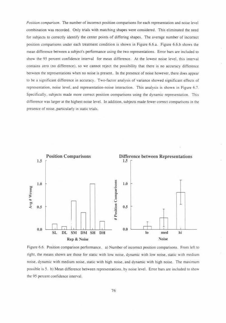
Posirion comparison . The number of incorrect position comparisons for each representation and noise level
combination was recorded. Only trials with matchin.g shapes were considered. This eliminated the need
for subjects to correctly identify the center points of differing shapes. The average number of incorrect
position comparisons under each treatment cond ition is shown in Figure 6.6.a. Figure 6.6.b shows the
mean difference between a subject's perfonnance using the two representations . Error bar.; are included to
show 1he 95 percent confidence interval for mean difference. At the lowest noise level. thts interval
contains zero (uo difference). so we cannot reject the possibi lity that there is no accuracy difference
between the representations when no noise is present. In the presence of noise however, there does appear
to be a significant difference. in accuracy . Two-factor analysis of variance showed significant effects of
represen tation, noise level. and representation-noise interaction. This analysis is shown m Figure 6.7 .
Specifically . subjects made more c.orrect position comparisons using the dynamic representation. This
difference was larger·at the highest noise level. In addition, subjecL~ made fewer correct comparisons in the
presence of noise. particularly in static trials.
1.5
1.0 .. c: 0 .. ::: .. e< > OS <
0.11
Position Comparisons
SL DL SM DM SH O.H
Rep & Noise
"' c: .~ ;; Q.
E :5 c: ·3" ·~ 0 ::.. ..
Difference between Representations 1.5
1.0
- 1-
0.5
- f-
0.0 r+,
lo med hi
~oise
Figure 6.6. Position comparison perfonnru1ce . a) Number of incorrect po~ition comparisons. From left to
right, the means shown are those for static with low noise . dynamic with low noise. static with medium
noise. dynamic with medium noise. static with high noise, and dynamic with high noise. The maximum
possible is 5. b) Mean difference between representations. by noise leveL Error bars are included to show
the 95 percent confidence interval.
76

S<~Yrtt ss !I[ MS E I!
Rep 3.375 3.375 10.946 0 .005
Rep*S 4.625 15 0308
Noise 4.521 2 2.260 6.684 0.008
Noise•s 10.146 30 0.338
Rep *Noise 2.250 2 1.219 3.&24 0.033
Rep*Noise•S 9.563 30 03 19
Figure 6.7. T wo-factor ANOY A of correct position comp:lri~ons.
Thi~ result was unexpected . There is no obvious r-eason why a dynamic representation should be better for
position comparisons than a static one. Additional analysis suggests a possible explanation for this
difference. lf only ~rials in which the subject correct ly identified the shape are considered. tbe effects arc
no longer quite statistically significam (0.05 < p < 0.10). See Figure 6.8. This result suggests that subjects
may make more correct position comparisons in dynamic trials simply because they are more likely to
correctly identify the shapes and can then corr~tl y locate the centers for comparison . In trials where the
shapes have been correctly identified. scores are almost perfect regardless of representation.
Height comparison. The number of incorrect height comparisons for e._·h representation and noise level
combination wa~ recorded . Only trials with matching >hapes were considered in order to e liminate the
need for subjects to compare positive heights (such as those of peaks or ridges) with negative heights (such
as those of wells or troughs). Average number of incorrect comparisons are shown tn Figure 6.9.a. The
mean difference between representations is sbown in Figure 6.9 ,b. The 95 percent confidence interval for
S!!Yr~t ss gf YIS F 11
Rep 0. 124 0 .124 3.902 0 .067
Rep*S 0.477 15 0.032
~ojse 0.129 2 0.065 2.709 0083
Noise•$ 0.715 30 0.024
Rep*Noise 0.038 2 0.190 0.763 0 .475
Rep*Noise*S 0.747 30 0.025
Figure 6.8. Two-factor ANOYA of position scores for correct shape trials .
77
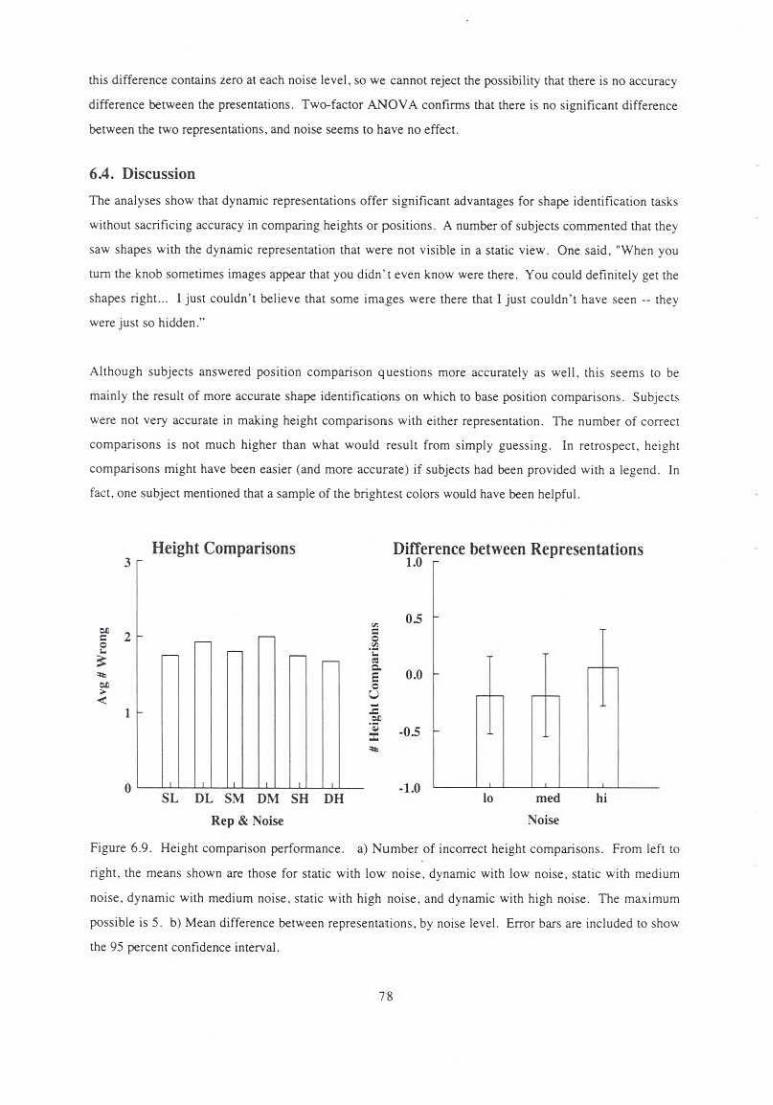
this difference contains zero at each noise level, so we cannot reject the possibility that there is no accuracy
difference between the presentations. Two-factor ANOY A confirms that there is no significant difference
between the two representations, and noise seems to ha,•e no effect.
6.4. Discussion
The analyses show that dynamic representations offer sign ificant advantages for shape identificauon tasks
without sacri ficing accuracy in comparing. heights or positions. A number of subjectS commented that they
saw shapes with the dynamic representation that were not visible in a static view. One said, "When you
tum the knob sometimes images appear that you didn't even know were there. You could definitely get the
shapes tight. .. I just couldn 't believe that some ima_ges were there that J just couldn't have seen ·· they
were just so hidden ...
Although subjects answered position comparison que.stions more accurately as well. this seems to be
mainly the result of more accurate shape identifications on which to base position comparisons. Subject;
were not very accurate in making height compariso1lS with either reprc$entation. The number of correct
comparisons is not much higher than what would result from s imply guessing. In retrospect. height
comparisons might have been easier (and more accurate) if subjects had been provided with a legend. In
fact, one subject mentioned that a sample of the brightest colon; would have been helpful.
3
2
~
0
Height Comparisons
~ .-
~ ~ .-
r-
I ,
SL OL SM OM SH OH
Rep & Noise
v. g .~ ... "' Q.
E 0 u ,;: :t
·~ :c ...
Difference between Representations 1.0
0.5
0.0 ~ 1-
.... 1- .... 1-
-0.5
·1.0 lo med hi
Noise
Figure 6.9 . Height comparison performance . a) Number of incorrect height comparisons. From left to
right. the me;!n$ shown are those for static with low noise., dynamic with low noise, static with medium
noise. d)'namic with medium noise. static with high noise . and dynamic with high noise. The ma•imum
possible is 5. b) Mean difference between representalions. by noise level. Error bars are iJicluded to show
the 95 percent confidence interval.
Two subjects in panicular saw an immediate difference between the represemations. One subject. who
used !he static representation first. was verifying th:e instructions for the dynamic block. he asked. "So the
difference is that now I can tum this knob?' Without waiting for an answer he turned !he knob and said,
"Oh. to see things bener." A second subject. who had used the dynamic representation fi rst. read the
mstructions for the static block and commented. "Oh. So it's harder. Umm."
Confidence and Etue of U.te. Subjet.L~ found shape identifications much easier to make using the dynamic
representation. Consequently, they felt more confident about the accuracy of their answers. One subject
said, "Wi!h static a lot were guesses. I tried to think about what it looked more like . With dynamic I j ust
switched back and fonh -- on about twenty-five I felt .sure." The difference in accuracy between the
representatt(>nS bears out this confidence .. In contrast. many subjects thought that heights were easier to
compare using the static represen tation . Some subjects said they would have liked the dynamic
representation to have an automatic balance feature similar to !he static representation (or a marked zero
point on the dial). Although many subjects thought the static representation was better suited to height
comparisons. no accuracy difference was observed.
Strmegies. The comments that subjects made about the strategies they used to answer the quesuons
illustrates the distinct natures of static and dynamic representations. Although subjecL' described a variety
of strategies for answering questions in the trials . o nly a few general strategies were mentioned frequently
In static trials. su bjects sometimes mentioned that they mentally constructed bivariate images from the
candidate single-variable shapes. In dynamic trials . subjects generall y identified shapes by turn ing the
balance knob to its single-variable extremes. They looked at intermediate mixtures to compare heights,
either trying to find the balanced image. slowly dialing from one. extreme to the other, or manipulating the
Knob with large qu ick motions. Some subjects mentioned that they compared positions by watching the
image change as they moved !he dial back and forth . A few subjects claimed not to look at the intermediate
mixtures at all, comparing heights by counting the number of distinct colors in the single -variable extremes.
There were no discernible differences in perfonnance among the different strategies that subjects described.
In summary. subjects took advantage of the power or dynamic control by manipulating the image tn
different ways to answer different kinds of questions.
Common misrakes. The noise present in some images made shapes di fficult to identify. even for an
experienced viewer. However. observation of subjects revealed a few common mistakes made even when
the features were relatively prominent. One such error is the misjudgment of the sign of a sh3pe.
particularly mistaking a negative shape (such as a well or trough) for its positive equivalent (peak or rid~c .
respectively). Another common mistake was confusion of the two features in the image. particularly when
79
one or both were negative. For example , in trials where the two features were a purple well and a green
trough, it was common for a subject to mistakenly identify the features as a green well and a purple tough.
Such errors are understandable, since the low points of negative features allow more of the other display
parameter tO be seen. One would expect these errors. to be less common in dynamic trials. since dynamic
control allows the subject to s.eparate the contributions of the two variables. However. casual examination
of when such errors occur reveals that they appear mo re frequently in static trials . but not to a greater extent
than do other errors.
Speed. With a single exception. subjects completed s tatic trials in less time than dynamic trials. an average
of twenty-five percent less time . Most subjects viewed the static image for a moment and then answered
the questions as best they could. Using the dynamic representation. subjects s pent additional time
manipulating the image before selecting answers . The one subjec t who was fas ter in dynamic trials
pondered static images for a long time as she mentally added together alternative shapes. On dynamic
trials, she j ust quickly spun the dial to its extremes to isolate the individual shapes. Whi le it would be nice
to say that dynamic representations are both better and faster than static . it seems logical that subjects spent
more time on dynamic trials since there were more things they could do with them.
LRarning effects. Although subject5 felt that there were sufficient practice trials for them to learn the task.
it seems likel y that they continued to improve as they completed more trials. Accordingly. the e.,pcrimcnt
design balanced for representation order. An interest ing question remained. though . It s.eems unlikely that
viewing the static images helped subject$ in subseqllent dynamic trials. but did prior expenence with the
dynamic representation help subject perform static trials? Does seeing tlle two distnoutions apart. and in
various combinations . over the course of dynamuc trial s give subjects a better sense for how two
distributions can combine to form a static image? One subject who did the stauc trials first thoughtS<). She
said. " If I could have done some of the dynamic ones first. I could have done better on tile static pan.
Using the dynamic representation taught me about what to look for in the static pictures: To test th is
theory. I compared the ~tatic mean scores of subjects who performed that block fi rst with those who
performed it second. There was no noticeable difference in performance between the two groups. Still. it
~lands to n~ason that training with dynamic images might be useful for teaching viewers about muluvariate
static displays.
The experimen t described in this chapter has address the effect of dynamtc control on performance of a
pattem comprehension task with a panicular type of representation. There remains room for a variety of
Other experiments in order to isolate effects or general ize tO a wider range of tasks or representations. Some
of thes.e possible experiments are described briefly in the next chapter.
so

Chapter Seven
Future Work
As answers often do, the answers uncovered by this research have given rise to more questions. T hese. new
questions suggest ways in which the research can be extended , .generalized, or applied in different ways, A
few of these new directions are describe-d below.
More experiments. It would be interesting to con duct more experiments comparing statlc and dynamic
representations . Some possibilities inc1ude:
a comparison of pai red bivariate images. single static bivariate image, and a dynamic bivariate
display. Such an experiment would allow more direct comparison with previous experiments
comparing univariate and bivariate displays .
• a comparison of three stauc images (one of each variable and one balanced composi te) with a
d)·namic display. Such ap experiment could separate the effects of dynamic chang~ from the
availability of the three most useful static views.
• experiments similar to the ones performed using different color mappings. such as hue and lightness.
hue+saturation and lightness. or di fferent pairs of complementary colors.
• an experiment comparing dynamic displays controlled by physical input devices with dynamic
displays controlled by virtual input devices. This might help identi fy the importance of the
kinesthetic feedback provided by the physical input device.
3D daw space. Although the Explorer version of Calico supports the application of dynamic bivariate
color mappings tO a wide range of data types, includine 30 surfaces and volumes, the cxpenmcnts have
focused on their use in 20 data spaces. Although the techn iques should generalize to 30 data spaces, the
additional dimension brings with it additional display issues. For example. how do shading effects from
surface lighting and coloring effects from ps.eudo-<::oloring interact? Are there some col.or mappings whi'Cil
work more successfully with lighted surfaces? Can interactive control of the viewpoint be used to separate
the effects of lighting and coloring? I believe that it can.
81

More variables. There is no compelling reason why lhc number of variables displayed by a dynamic
repre_~entation must be limited to rwo. Some researchers advocate using the three dimensions of a color
space tO represent three separate variables. While this has been shown to be useful in a few application
areas (remote sensing. for example). I do not believe it works well in general. In order for three color
components to represent three variables. the three components must be independent. This is not lhe case. at
lhe extremes of most color spaces. In lhe HSV space f(lr example. hue is discernible only in areas where
neither saturation nor lightness values are small. Ac-cordingly . a 3D gamut must be limited to the central
portion of the space . In effect .lhe amount of available infonnation carrier has been truncated since what is
conceptually a cylindrical space (the cross-product of hue . saturation, and lightness) is perceptually conical.
a reduction in volume to one-third of the cylindrical volume. A more promising way to explore more
variables would be to look at them in sequence. In that way. a viewer can explore relationships among the
entire set of variables by viewing and ma_nipulating them pairwise.
Other display parameters. This research has basically been limited to the display of quamitative data using
only color display parameters. The single exception to this was the inclusion of opacity in colormaps
generated by the Explorer version of Calico, but. like the 3D data spaces also included in that version. no
detailed examination of its potential and complicatio ns was performed. Using a wider range of display
parameters could allow more variables to be represented simul taneously . or it could make color
representations more effective by introducing redundant display parametel's . Together with opacity. texture
shows interesting potential for data representation. lt should be noted that intr<,>ducing an\>th~r l!ispl~y
parameter does not necessarily introduce another independent carrier of information. since display
parameters may produce cross-effects and obscure one another.
A!Ullysis of change. Experimental results which show the effectiveness of dynamic color mappmg wou ld
be even more satisfying accompanied by an analysh; of exactly why and how color mapping manipulation
is usefuL Ideally. such an analysis wou ld show that manipulation produces identifiable effects on the
displayed image. would show that these effects emph.asize places of interest in the data. and would suggest
a perceptual explanation for the effects of color mapping manipu lation. One way to conduct such an
a.nal)·sis would be to perform an automated analysis of image change resu lting from manipulat!on of the
color mapping. Since tbe stimulus images and manipulations can be simulated and change metrics
calculated without human intervention, a large number of representations . manipulati(lns. data sets. and
change metrics could be tried. Such an analysis would require a model of visual perception which can be
simulated on a computer.
Expert users. All of the experi ments described here have measured the perfonnance of relatively novice
users on tasks designed to be concrete and easily understood. Anecdotal evidence suggests that bivariate
82

color mappings with dynamic control would also be valuable to data expens engaging in a Jess directed
exploration of the structure of multivariate data. It would be interesting to perform an observational study
of such use.rs as they explore their own data.
83

Appendix A : Design and Implementation Issues
Appendix A
Design and Implementation Issues
This appendix discusses some of the issues involved in the design and implementation of Calico. These
issues include the metaphor chosen to s pecify color schemes . the subset of possible functions included, the
algorithms used to implement these functions . the particular graphic representations chosen, and the
performance goals. Design issues in the general problem of dynamic color mapping c reation and
manipulation are d iscussed in the firs t section of this appendi x.
Two vc.rsions of Cal ico were implemented. The first is a standalone Pixel-Planes 4 program. This program
performs all data inpuL color map generation. color space and sequence representation . color legend
generation, rendering, and user interface functions required to provide dynamic represe-ntations. The
second version is a set of modules for the Silicon Graphics visualization toolkit. IR IS Explorer. These
modules generate a univariate or bivariate color map from parametric expressions and parameter widget
values. generate geometry representing the color map . generate geometry showing the-color space, generate
a bivariate color legend, and map two variables of in input daUl set tO color. Other functions are performed
by standard Explorer modules . Implementation issues particular to these two Cal ico versions are discussed
m the second and third sections of this appendix .
A.l. General Design Issues
Color Mop Memphor. There are many possible metaphors for describing or manipulating color mappings.
At the most basic level. however, most mewphors can be reduced to three parts:
• a color model
• some one- or rwo-dlmensional subspace (color path or sheet) within the space of that color
model.
• a parameterization, or warping, of that subspace
Consider the case of constructing a color mapping for a si ngle continuous variable. The color mode l
defines how individual colors of the color mapping will be described. For example. each color could be
described in terms of its hue, lightness, and saturation components. The color path defines the sequence of
colors used rn the color mapping. Think o f the color path as a rubber band which curves through color
space. each segment of the band taking on the color of the section of space it occupies. For example . one
end of the band may be colored with the blues . followed by greens. yellows. oranges. and finally reds. The
parameterization of the color mapping describes velocity along the color path in terms of the path's
parametric variable . Think of it as a local Stretching of the colored rubber band. By stretch ing the
84
Appendix A : Design and Implementation Issues
beginning of the band. !he blue tones will represent a wider range. of data variable values. while the rest of
the colors will represent a correspondingly small range of values.
The basic choices in the selection of a metaphor for a color map edjwr are :
I . Which color model(s) will be used?
2. How will color subspaces (one- and two-dimensional) be specified'
3. How wi ll color subspaces be manipulated'
4 . How will a parameterization be specified?
5. How will !he parameterization be manipulated?
CQlOr map editors often restrict -cqntroJ to one or tW(> color map part~. holding the others constant. See
section 3.3 for more detail about previous implememations. Metaphor cho1ces made m these prev•ous
implementations include :
L Color model :
• RGB. See !CARE [Cox 88).
• HSV. See AVS.
• HLS. See Pham [90).
• RGB or HSV. See IRIS Explorer.
2. Color Sequence speci!ication/manipulation :
• P~riodi~ func1ions for ea~h ~olor spa~e ~ompone01 . See !CARE. Manipulate by changing the
parameters of tbe functions.
• Freehand curVeS for each color space component. See A VS or IRIS Explorer. Manipuln~ed by
drawing new curves~
• Splines through target pointS. See Pham. Manipulate by specifymg new target point,\ .
• Predefined sequences. See NSCA Image or Sterling Software's FAST [Bancroft et. a!. 90).
3. Parameterization spedficationlmnnipulation:
• Scali ng of em ire parameterization. See NSCA Image.
• Positioning of parameterization control points. See FAST.
• Parameterization cannot be man ipulated separately from color sequence . See most of the listed
implementations.
In selecting a metaphor for Calico. I made the following choices:
1. Color model :
• RGB, This is the color model most familiar to most scientific visualizauon developers and users .
• HLS This model is intuitive to many users since the color components correspond roughly tO
perceptual qualities.
85

Appendix A : Design and Lmplementation Issues
• HSV. This model is intuitive to many users since the color componen!S correspond roughly to
perceptual qualities.
• C IE LUV. Although the LUV model is neither familiar nor intuitive, it is perceptually uniform.
This option was present only in the Explorer version of Calico.
2. Color sequence specification :
• Specify color component<; by parametric expressions. This facility is more general than periodic
functions . generates smoother curves and surfaces that freehand input. and is Jess time
consuming than specifying control points.
• Load predefined sequence . T his al lows preYiously defined color maps to be modified.
3. Color sequence manipulation :
• Dynamically change terms in parametric ex press ions.
• Affine transformations. This facility turned out to be. redundant with the manipulation of·
dynamic terms in the parametr ic expressions. so it was left out of the Explorer
implementation.
• Freeform deformations. This facili ty turned out not to be really useful. so it was left out of the
Explorer implementation.
4 . Parameterization specification/manipulation :
• Position along color sequence specified as e xponential function of color sequence parameter.
• Freehand drawing of parameterization curves using a mouse .
Functional Objecti••es. 'fhe functional objectives of this system were :
I. Display the color space. color path or sheet. parameterization indicator ( legend). and mapped da~a
set.
2. Update the color path and sheet geometry, the parameterizati<m, and the color assignments in the
legend and mapped data set.
3. Update the screen in real· time (defined as 10 frames per second).
Graphics Represemarion . The choice of graphics rep resentation was driven by three factors : the desired
set of functions. the target frame rate. and the wish w use existing graphics software. rathtr than building
new software , whenever possible.
A.2. Pixel-planes Implementation Choices
Plmform . When development of Calico began (early 1989). on ly one platform available at UI'C had
sufficient graphics power to rotate color space and sequence geometry. update color sequence geometry.
and display an example image and legend with dy namically changing color values in realtime. That
platform was Pixel· Piones 4. The first version of Calico on Pixei ·Planes was wriucn in C by Penny
86
Appendix A : Design and Implementation Issues
Rheingans and Brice Tebbs. This version created only one-variable color maps. The second version was
begun in lhe summer of 1989 by Penny Rheingans. This version was writte.n in C++. The second version
added the faci li ty 10 create and manipulate ~wo-variable color maps. along with many vthcr
embellishments. Both Pixel-planes versions of Cal ico were implemented on top of a customized verston of
the Pixel-planes graphics library PPHJGS. Standard PPHIGS provided hierarchical object creation. display.
editing, and user input primitives. Customized additions to PPH IGS provided extremely fast example
image and legend updates .
Color lookup wbl• modificarion. Color lookup t:able indtces describing the example image and legend
were stored in 8 bits of the pixel memory. At the beginning of each frame. these values were mapped
th rough the color lookup table and copied into the frame buffer portion of pixel memory . essentially
painting a background image . Since Pixel-Planes has a processor for each pixel. this operation is done in
paral.lel for each pixel on the screen. During the computationally demanding tasks of color sequence
mampulation, this version of Calico sustamed a frame rate <>f about 10 frames per second. For wsks which
involved no geometry modifications. the frame rate was even faster.
Color parh and :;hce1 rcpresematio11. One criterion in the selection of an algorithm to implement the color
sequence creation and manipu lation was thatlhe user be able to locally modify the shape of the color path
or sheet using 3D interacLive techniques. The obv;ous approach was tO model the 3D curves and surface~
with spl ines. Interpolating spl ines seemed more intuitive for this task than approx imating splines. because
the curve or surface goes through its control points. Accordingly, if key colors are specified and a color
sequence can be generated which includes them. In its first implementation Calico used Catmuii-Rom
splines to represent the color path( Kochanek 84]. This early version did not yet suppon two-variable color
mappings, so only the spline curves representing color palhs were implemented. The user could edit the
curve by manipulating the spli ne control points with a joystick. These splines allowed the user to make
local changes to a curve. but did not let lhe user d.ynamically control the amount of the curve affected by
the editing operation. Also, since Catmuli-Rom splines preserve higher order continuity. they seemed to
behave in non-intuitive ways when a control point was moved far from its original position. Specifically.
they developed loops and kinks that were undemable features in a color sequence.
In order tO address these problems. the final vcrSi(ln of Calico used a variation of a sc.heme that has been
suggested by Allan. Wyvill , and Witten for editing JD polygon meshes [Allan 89]. In this .scheme the color
path was represented a.s a set of c.ontrol poinL~ lhat define a low order spline. A cursor was positioned in 3-
space and the closest point (the selected point) on. the curve was moved to be coincident with lhe cursor.
The other points in the curve. were translated in che same direction by different amounts based on their
distance in the curve's parameter space from the selected point. Calico used a simple cubic wctghting
87

Appendix A ; Design and Implementation Issues
function in order tO keep the edited curve relatively s mooth. A s lider scaled the domain of the weighting
function tO alJow the user to have dynamic control over the amount of the curve that was affected by the
operation . Manipulation of the surfaces representing: two-variable color mappings was perfonned using a
straightforward extension of the curve algorithm to 20.
A.3. Silicon Graphics Implementation Chc>ices
Platform. When Pixel- Planes 4 was retired . Calico needed to be poned to a new archite.cture . Two
machine architectures at UNC offered sufficient graphics power : Pixel-Planes 5 and the S ilicon Graphics
Iris. While Pixel-Planes 5 .offered unmatched graphics perfom1ance. there was only one . Additionally.
although the PPHIGS graphics libra:ry, upon which Calico was built, was poned to Pixel-Planes 5, the
customized image display features would need to be poned separately. S ince there was no longer a
processor pe r pixel . the pon promised to require substantial effort. The Silicon Graphics Iris offered
sufficient graphics power. It also offered the significant advantage of allo.wing Cal ico to be used in
computing environments outside UNC. This advantage compelled the decision to pon to the Silicon
Graphics.
Sofllvare Environmem. Jn order 10 maximize Lhe utility of Calico whi le limiting de,'clopment time to a
manageable level. I chose to implement the Silicon Graphics version of Calico under a general purpose
visualization toolkit. T here were rwo such packages avai lable on the Silicon Graphics : Iris Explorer from
SGI and the Appli,ation Visuali ~;ation System (AVS) from Advanced Yioual Systems (A VS). Inc. U>ing
both packages . researchers link together computationa l units. called modules. to create customized
visualization specifications , called maps (in Explortr) or networks ( in A VS). By taking advantage of the
existing functions of the toolkits.! could make the colonnap creation and manipulation functions of Calico
avai lable in a general purpose visualization tool, without having to develop the entire tool myself. lhe two
toolk its offer similar, though not identical. function sets. each having the advantage in some respects ove'
the other. In the end, I chose tO implement Cali>O as Explorer modules because the Explorer colonnap data
type was general enotlgh to include two-dimensional colormaps. while the A VS colonnap was li mited to
one dimension.
Omiucd Fu11c1i01IS. A number of features of earlier versions of Calico were not included in the Explorer
modu les. some because they were redundant with s tandard feature.s of Explorer. and others because the.y
had not proven to be panicularly useful. Some features or functions omitted because they al ready exi sted
were :
• reading and writing of colonnaps to files
• viewing Lransformations
• rendering
88
• user interface management
Features omitted for lack of usefulness were :
Appendix A : Design and Implementation Issues
• a ffine transformations of paths and sheet.s -- the effects of the most useful affine transformations.
such as scaling of a color component. could be duplicated by dynamic man ipulation of terms
in the parametric expressions .
• freeform deformations of paths and sheets -- it turned out to be easier to adjust paths and curves
using the parameLric expressions.
• modification of the parameterization of the variable-to-parameter mapping -- although this did
prove useful in some circumstances (one user found this to be the most helpful way to
manipu late a color mapping). it was not implemented due to time constraints. lt would most
naturally be included as a separate Explorer module.
New Func1ions. Ca1ico also g_ained some features in the move to Explorer, some added c.xplicitly, while
others came for free . Features added exphcitly to thts version were:
• the CIE LUV color model
• parametric specification of opacity
The generality of Explorer provided additional fearures including :
• visualization of 3D surface data
• visualization of volume data
Although changes to the representation of data are still accomplished through changes to the colormap.
these are translated eventually into geometry changes. Most data is mapped into geometry and then
rendered. requiring a geometry update whenever the colormap is changed. Only image data is displayed
without fi rst being translated into geometry. Restricting oneself to image representation techniques .
however, sacrifices much of the richness of visual ization techniques provided by Explorer. Many of these
techniques result from the generalization to three d imensions. These include height-mapped surf~ces.
isosurfaces. and volume rendering.
A.4 . llsing the Explorer Modules
T he core functions of the Pixel-Planes version of Calico. the abi lity to c reate . man ipulate, and display
colormaps is provided by two Explorer modu les: ColorMapping and ColorSpace . The source code for
these modules is provided in the auached diskette. For more information about creaung Explorer maps
using these modules. see the Iris Explorer User's G uide. ·
89
Appendix A : Design and Implementation Issues
A.4.1. The Color Mapping module
The ColorMapping module generates a one· or two-dimensional colormap Larrice from parametric
equa11ons describing the individual color components . This Larrice has uniform coordinates and a
coordinate range from 0 to 255.
Input
No inputs are expected.
Parameters
The parameters to ColorMapping fall into four group; :
• dimension selection
• color model selection
• parametric color component specification
• dynamic input
Dimension selection . A set of radio bunons selects between one· and tWO· dimensional colormaps. The
options are :
• One-variable map -- create one -dimensional colom1ap
• Two-variable map ·· create two-dimensiona l colonnap
Color model selection. A set of radio buqons selects between color models for the description of individual
colors in the colormap. The options are :
• RGB ·· use the RGB (red. green . blue] model
• HLS · · use the HLS (hue. lightness. saturation) mOdel
• HSV -· use the HSV (hue. saturation . value) model
• LUV ··use the CIE LUV perceptually unif<lrm model
Parametric color component specification. four text entry widgets are used to enter parametnc expre.ssions
descri bing color components in tem1s of the colonnap parameters u and v. constantS. arithmetic operators.
functions. and dynamic variables. The top text widget holds the description of the first color component
(red in RGB. hue in HLS or HSV. or L in LUV) in te rms of the sequence parameters. 11 and''· which have a
range of 0.0 to 1.0. The second widget. Expr2 . describes the second color comp<>nent (green. lightness .
saturation. or U). while 1he Expr3 widget describes the third color component (blue. saturation . value. or
V) . The final text widget. Expr4 . describes the alpha . or opacity. compon~nt of the color. irrespew ve of
color model. The syntax of these parametric expressions is described below. Selecting the Parse bunon
after expressions are entered will trigge.r parsing of the cquations tO generate the colom1ap.
90

Appendix A : Design and Implementation Issues
Dynamic input. Three sliders provide dynamic variables wh ich can be referenced in parametric color
equations. The sliders are labeled Oval. Eval. and Fval, and are referred to as D. E. and Fin parametric
equations. The rru1ges of these sliders can be changed by typing in new minimum or maximum values over
the indicators. but a range of 0 .0 ·· 1.0 is probably most useful for most applications.
Output
The Lattice output of this module can be used by any module expecting a colorrnap input. some examples
are:
LatToCeom ·-generate a pseudo-colored geometric representation from Lattice data
Colorize2V .. assign color values to a scalar Lattice using a 2-dimensional colorrnap
Co/or Space .. construct a geometric represemation of a colomtap in color space
Not all modules which expect a colormap input will accept a two-dimensional colormap.
Describing Colormaps Parametrically
Colormaps can be generated from parametric descriptions of the current color space components. Enter
these functional descriptions in the four text widgets labeled Exprl. Expr1. Expr3. rutd Expr4 (described
above). In the specification of a color path (one-dimensional colorrnap) . only the paramet<r u is used . For
example. a color path generated from the functions
R : u
G=u
B =u
A= I
will be a folly opaque grey scale. while a path generated irom
H = u
L = u
S=u
A=u
will be a rainbow scale oi increasing lightness. saturation, and opacity,
Be sure 10 end each parametric equation with a carriage retum (a linle Explorer idiosyncrasy). After
entering the component descriptions. press the Parse bunon to generate the sequence. Color sequences are
constrained to remain inside the color space.
Parametric descriptions can include:
the curve parameters: u.v. with range: 0.0 tO 1.0
91

constant values:
arithmetic operators:
parenthesis:
function calls:
Appendix A : Design and l.mplementation Issues
2.0 , 3.4, 0.5. etc.
+. -. • ' I
(somethi,g)
sin( something), cos( something), pow(base.exp)
Arguments to trigonometric functions contain an Implicit factor of Pl. For example. sin( I .0) is interpreted
as sin(Pl}.
You can also use dynamic variables in the parametric definitions of color components. These variables
correspond to vinual inpm devices which can be moved to generate new sheets dynamically. Dynamic
variables have a range of 0 .0 to I .0. The dynamic variables available are:
D position -on slider labeled Oval
E
F
pos ition -on slider labeled Eva!
position on slider labeled Fval
For example. a color sheet in which the variables are represented by hue and lightness and the color ranges
of both parameters can be manipulated dynamically would be described by:
H = (u - 0.5) • 0 + 0.5
L = (v - 0.5}* E+ 0 .5
S = l.O
A = 1.0
Both ranges are centered on a parameter value of zero. Moving Oval slider changes the ranse of hues used
the reprt,cnt the first variable. Moving the Eva! slider changes the range of lightness values used to
represent the second variable . Either range can be reduced to zero (so that only information about the other
variable is vis ible in the image) or manipulated to change the balance between the visual contributions of
the two variables . Dynamic input variables are sampled and new sequences generated drnamicall y us.ing
the new values .
A.4.2. The ColorSpace module
The Color Space module c reates a Geometr)' object representing a color space by colored tetrahedral
samples scaue red regularly througb the space. Each sample is colored according to the region of color
space that it occupies. If specified. a colonnap is displayed in the space. A one-dimensional colormap is
displayed as a colored curve through the space. while a two·dimensional colonnap is displayed 3S a colored
sheet.
Input
An optional Larrice argumern describes a one- or two·dimcnsional colorrnap to be displayed in the color
space.
92
Appendix A : Design and Implementation Issues
Parameters
The CModel parameter specifies which color mode l will be used in generating the color space. Since only
one model can be chosen at a time. this parameter is implement with a ·set of radio buttons. The options
are:
• RGB --display the RGB (red. green. blue) cube-shaped color space
• HLS -- display the HLS (hue. lightness . saturation) double cone-shaped color space
• HSV -- display the HSV (hue. saturation, value) cone-shape.d color space
• LUV ·· display the CIE LUV perceptually uniform color space
By Explorc.r convention . all incoming colormaps will be described in terms of the RGB color model. They
will be transiormed into the selected color model by this modu le.
Output
The Lauice input can be created by the following modules :
CenerateColormap .. generates only one-dimensional colormaps
Co/orMapping .. generates one- or two-dimensional colormaps
The Geometry output can be displayed by the Render modu le.
93
Appendix B : Pilot Metric Experiment Materials and Scores
Appendix B
Materials and Scores: Metric Experiment
This appendix contains the materials given to subjects in the pilot followup study of metric comprehension
described in Chapter 5. Following each set of experimental materials are the raw scores of the subjects in
that experiment.
Pilot Metric Experiment
The expenmental materials for the pilot expertment consist of an oral consent form, general instructions, n
tutorial, and worksheets for a single subject for both sessions. Subjects' scores begin after the materials .
Followup Metric Experiment
The experimental materials for the followup experiment consist of an oral consent fonn , general
instructions. a tutorial, and worksheets for a single subject for both sessions. Subjects' scores begin after
the materials.
94
Project: Investigator: faculty Advisor:
Appendix B : Pilot Metric Experiment Materials and Scores
Oral Consent Form
Dynamic Explorations of Two Variables in a 20 Space Penny Rheingans. 962- 1726 Frederick P. Brooks,Jr .. 962-1931
• This study involves research. The purpose of this experiment is to compare different techniques for the Vi$UaJ reprC~enl3tiOn Of quanlitaliVe infonnation.
• There will be two sessions composed of a train ing tutorial and four trial~. each trial using a different representation technique. At the beginning of e3ch trial. you will be provided with wrine.n instructions specific to the representation technique being used in that trial. Atter reading these instructions . you will again be allowed tO ask 4uestions . Each trial will consist of answering works heet questions while viewing and manipulating a representation. In the test trials time to complete the worksheet will be recorded . as we ll as quality of the worksheet responses. After completing the four trials . you will be asked to express any comments or impressions th.at you would iike.
• You are one of approximately e ight subjects to be u~ed in this study.
• Your particopation in this study is expe.cted to require a total of about an hour. There will be no costs to you for your panicopation in this study. You are free to refuse to participate or to withdraw from thi' study at any time without penalty and without jeopardy .
• You will receove no immediate benefit from yolllr participation in this study. neither will there be any inducements . monetary or other. provided to you for your participation in this study .
• Only the Investigator and the Faculty Advisor will have access to the data obtained in the research. Your identity will not be released to others. In the event that some of your speci fic commenos or characteristics prove to be u,eful in the analysis of the research results. they will be used without attribution or identification and only with the your prior approval.
• You may contact the Faculty Advisor. Frederick P. Brooks. Jr .. at 962-193 I ii you have any funher que~tions about the study.
• You may c(mtact the UNC Academic Affairs - lnstituti<)llal Review board at the following address and telephone number at any time during this study should you feel your rights have been violated:
Academic Affairs Institutional Review Board Mark Hollins . Chair CB #41 00. 300 Bynum Hall (919) 966-5625
95

Appendix .B : Pilot Metric Experiment Materials and Score$
General Instructions
In this experimenl. you will be asked to answer questions about socioeconomic pauerns in the US. while using different representation techniques .
The experiment .,.;u consist of two sessions on separate days . Each session will consist of a tuwrial followed by four trials and then a few final questions about your experience in the experi ment. In each u ial . you will answer questions about !he data while u.sing one represemation technique. As you finish each trial (and each sectiOn of the tutorial}. please ask the experimenter to set up the next representation for you.
Try to make your answers as specific as possible. When a question asks for a level or percentage, please give a s ingle number.
You will be timed liS you complete each trial. but d on' t feel that you need to rush. The q~ality of your answers to the questions is more important than how long it lakes you to complete each trial.
Plea~e feel free tO ask about any inStructions. questions, or geographic locations th<Jt are not clear to you .
Thank You
96
Append;x B : Pilot Metric Experiment Material~ and Scores
Tutorial
Please read the following descriptions, try the manipulations described. and answer the questions.
Static Representation Each representa1ion presented to you in this experiment will contain an image of the US in the upper left of the screen and a legend grid io the lower righl. The image that you see now shows average e<:lucation level and median income for US counties. These variables arc rcprese.ntcd by levels of green and purple. Sped fically .
Green Purple
= income level = education level
In this image . each county is colored using the sum of the purple and green contributions . Areas with equivalent education and income are greys, dark when both are low and light when both are large. Areas where income L~ higher than education arc greenish. Areas where education is higher Lhan income are purplish .
The lej!end grid Jll the lower right shows the colo.r that will be d isplayed for various comblllations of the values of cducauon and income. The range of colors used to represent the values of education level ts shown along the venical axis of the legend. The •tumbers to the left of the grid show the value that .each color represen1s . The rnnge of colors use.d to repre.sent Lhe values of income is shown along the hori~ontal axis of th.e legend. The numbers below the grid shows the value that each color represents.
I . What is the income level in Ohio? (Ohi·o is outlined in black)
Interactive Representation Now you can change the balance between the contributions of the two variables. If you move the slider all the way tO the right and hit the space bar. you j ust see the green tomponcnt vihich represc.nts median income. If you move the slider all the way to the left and hit the space ba.r. you just see the purple component which rc.prescnts average education level. Move the slider to s-omewhere in the middle of its range to see the contributions of both vanables together.
2. What is the overal.l pattern of education level?
Cine Loop Representation Now the balance between the contributions of the two variables is being changed automatically in a cine loop. The representation cycles continuously between various combinations of the two display pararnetet s.
3. Do income and education seem to be correlated? How'/
Dynamic Representation Now you have dynamic control over the balance between the contributions of the two variables. As you move the slider.the image changes immediately . When you move. the slider all the way to the righl. you j ust see the green component which represents median income. When you move the slider all the way to
97

Appendix B : Pilot Metric Experiment Materials and Scores
the left. you j ust see the purple component which represents average education level. Move the slider to somewhere in the middle of itS range to see the contributions of both variables together.
4 . What are income levels in places where average ed"cation level is more than 13 years?
98

Appendix B : Pilot Metric Experiment Materials a)ld Scores
Dynamic Representation
The image that you now see shows rwo socioeconomic variables : the percentage of the civilian labor force employed in manufacturing and the percentage of the population with German ancestry. As in the tutorial. these variables are represented by levels of green and purple. Specifically,
Green = Purple =
percentage of labor force employed in manufacturing percentage of population with German ancestry
Move the s lider to select a balance between the two variables . As you move the slider, the image changes immediately. S lider positions to the far right show primarily the green tones representing manufacturing employment. Slider positions tO the far left show p·rimarily the purple tones representing German ancestry. Slider posi tions in the middle show both variables tt>gether.
Please answer the following questions:
I . What percentage of the labor force in Iowa is employed in manufacturing? (Iowa is outlined in blackl
2. What is the overall pattern of German ancestry in the US?
3. What percentage of 1he popu lation ha,s Gennan ances1ry in places where more than 40 percent o f the labor force is employed in manufacturi ng'!
4. Do these 1wo variables seem to be related'? How"
5. PoinL out a pl:lce that seems imeresting to you. Why does it seem imeresting'!
99

Appendix B : Pilot Metric Experiment Materials and Scores
Static Representation
The image that you now see s hows two socioeconomic variables: the percentage of the civilian labor force wltich is female and the percentage of the civilian labor 'force which is employed in agriculture. As in the tutorial, these variables are represented by lev.els of green and purple. Spec ificall y.
Green = Purple =
percentage of labor force which is female percentage of labor force employed in agriculture
Please answer the following questions:
I. What percentage of the labor force in Oklahoma is female? (Oklahoma is outlined in black )
2. WhatJS the overall panern of agricultural employment in the US?
3. What percemage of the labor force is employed in agriculture in places where less than 15 percent of the. labor force is female?
4. Do these 1wo variables seem to be related? How?
S. P01m out a place that seems fnteresting 10 you. Why docs it seem interesting?
)()()
Appendi~ B : Pilot Metric Experiment Materials and Scores
Cine Loop Representation
The image lllat you now see shows two socioeconomic variables : the percentage of the ci vilian labor force which is male and llle percentage of households below the poverty line. AS in the tutorial. these variables arc represented by levels of green and purple. Specifically.
Green = Purple =
percentage of labor force which is male perce.mage of households below poverty line
The balance between Lht contributions of Lhe two variables is being changed automatical.ly in a cine loop. The representation cycles continuously between various combinations of the two display parameters .
Please answer the following questions:
I . What percentage of the labor force in Georgia is male' (Georgia is outlined in black1
2. What is the overall panem of poverty tn the US?
3. What is the poverty rate in places where more than 70 percent of the labor force is male~
4. Do these two variables seem to be related? How?
5. Poim out a place that seems interesting ro you. Why does it seem interesting'?
101

Appendix B : Pilot Metric Experiment Materials and Scores
Interactive Representation
The image that you now see shows two socioeconomic variables : the median age and the percentage of the civilian labor force employed in ~ales. As in the tutorial. these variables are represented by levels of green and purple . Specifically.
Green = Purple =
median aee percentage of labor force employed in sales
Move the slider tO select a balance between the two variables and hit the space bar to see the resulting image. Slider positions tO the far right show primarily the gre.en tone$ representing median age. Slider positions to the far left show primarily the purple tones representing sales employment. Slider positions in the middle $how both variables together.
Please answer the following questions:
I. What is the median age in Mississippi? (Mississippi is outlined"' black)
2. What is the overall pattern of employment in sales in the US?
3. What percentage of the labor force is employed in sales in places where the median age is less than 30?
4. Do these two variables seem to be related'! How'!
5. Point out a place lhat seems interesting to you. Why does il seem interesting?
102

Appendix B: Pilot Metric Experiment Materials and Scores
Final Questions
I . Rate the four representations techniques in order of your preference (where I is most preferred: 4 is least preferred).
_ Static Representation (variable balance can't be changed) _ Interactive Representation (variable balance updated when you hit space bar) _ Cine Loop Representation (representation cycles through variable balances) _ Dynamic Representation (slider directly controls balance between variables)
2. Why did you rate the representations in this way?
3. Did you find any of the representations frustrat ing·? Which?
4. Did any of the representations seem to offer advantages that the Other.< didn't?
103

Appendix B : Pilot Metric Experiment Materials and Scores
Cine Loop Representation
The image that you now see shows two socioeconomic variables : the median dwelling rent and the percentage of the population who where born in the same state where they now live. As in the tutorial. these variables arc represented by levels of green and purple. Specifically.
median rent Green = Purple = percentage of population bam in same state
The balance between the contributions of the two variables is being changed automatically in a c ine loop. The representation cycles continuously between ''arious combinations of the two display parameters.
Pleas<: answer the following questions:
I . What is the median rent in Vermont? (Vermont is outlined in black)
2. What is the overall pattern geographical mobility in the US?
3. What percentage of the population was born in the same state in places where the median rent ts more than $300?
4. Do these two ' 'ariables seem to be related? How?
5. Point out a place that seems interesting to you. W~1y does it seem interesting?
104

Appendix B : Pilot Metric Experiment Materials and Scores
Interactive Representation
The image that you now see shows two socioeconomic variables : the number of persons per household and the percentage of workers who drive to work. As in the tutorial. these variables are represented by levels of green and purple . Specifically.
Green = Purple =
number of persons per household percentage of workers who drive to work
Move the sl ider to select a balance between the two variables and hit the space bar to see the resulting image. Slider positions 10 the far right show primarily the green tones representing household size. Slider positions to the far left ;;how primarily the purple tones representing workers driving to work. Slider positions in the middle show both variables rogethe.r.
Please answer the following question"
I . What is the average number of persons per household in Utah? (Utah is outlined In black)
2. What is the overall panem of driving to work in the US'
3. What percentage of workers drive tO work in places where households average less than 2.5 people0
4. Do these two variables seem 10 be re lated? How~
5. Pomt out a place that seems interesting to you. 'Why does it seem interesting''
105

Appendix B : Pilot MeU"ic Experi ment Materials and Scores
Dynamic Representation
The image that you now see shows two socioeconomic variables : the median value of owner-occupied homes and the percentage of workers who carpool to work. As in the tutorial. these variables arc represented by levels of green and purple. Spedficall y.
Green = Purple =
median home value percentage of carpoolers
Move the slider to select a balance between the two variables As you move the slider, the image changes immediately. Slider positions to the far right show primarily the green tones representing median home value. Slider positions to the far left show primari ly Lhe purple tones representing percentage of carpoolers. Slider positions in the middle show both variables together.
Please answer the following questions:
I. What is the medtan value of a home in Montana? (Montana is outlined in black)
2. What is the overall pattern of carpooling in the US.?
3. What percentage of workers carpool in places where the median home value is more than 150,000?
4. Do these two variables seem to be related? How?
5. Point out a place that seems interesting to you. W'hy does it se.em interesting?
106

Appendix B : Pilot Metric Experiment Materials and Scores
Static Representation
The image that you now see shows two socioeconomic variables : the percentage of land in fanns and the percentage of workers who work at home. As in the tutorial. these variables are represented by levels of green and purple. Specifically.
percentage of farmland Green = Purple = percentage of workers who work at home
Please answer the following questions:
I. What percentage of the land in Wyoming 1s in fanns? (Wyoming is outlined in black)
2. What is the overall pattern of home employment in the US?
3. What percentage of people work at borne in places where less than 25 percent of the land is farmland?
4 . Do these two variables seem to be related? How?
5. Point out a place that seems interesting to you. Why does it seem interesting?
107

Appendix B : Pilot Metric Experiment Materials and Scores
Final Questions
I . Rate lhe four representations techniques in order of your preference (where I is most preferred: 4 is least preferred).
_ Static Representation (variable balance can't be changed) _ Interactive Representation (variable balance updated when you hit space bar) _ Cine Loop Reprtsentation (representation cycles Lhrough variable balances) _ Dynamic Representation (slider directly controls balance between variables)
2. Why did you ratt. the representations in this way?
3. Did you find any of the representations fi1Jstrating'? Which?
4. Did any of the represemations seem to offer advantages that the others didn't?
108
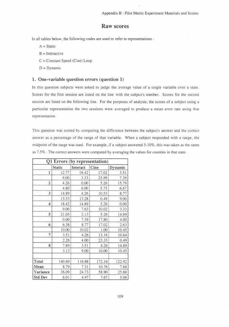
Appendix B : Pilot Metric Experiment Materials and Scores
Raw scores
In all tables below, the following codes are used to refer to representations :
A= Static
B = lnteracli,,e
C = Constam Speed (Cine) Loop
D =Dynamic
1. One-variable question errors (question 1)
In this question subjects were asked to judge the average value of a single variable over a state.
Scores for the first session are listed on the line with the subject's number. Scores for the second
se.ssion are listed on the following line. For the purposes of analysis. the scores of a subject using a
panicular representation tbe two sessions were averaged to produce a me~n error rate using that
rcpresenLaticm .
This question was scored by computing the difference between the subject's answer and the correct
answer as a percentage of the range of that variable. When a subject responded with a range. the
midpoint of the range was used. For example. if a subject answered 5· 10%. this was taken as the same
as 7 .5%. The correct answers were computed by averaging the values for counties in that state.
Q l Errors (by representation) Static anteract Cine o,·namic
I 12.77 18.42 17.02 3.5 1 9.00 3.33 25.99 7.39
2 4.26 0.00 5.26 15.79 4.80 6.00 5.75 6 .67
3 14.89 4.26 10.53 8.77 13.33 13.28 0.49 9.00
4 18.42 14.89 5.26 0.00 9.00 7.63 10.02 3.33
5 21.05 2.13 5.261 14.89 ··-·· 0.00 7.39 17.80! 4.00
6 6.38 8.77 17.Q2l 2.63 10.00 10.02 1.00 10.45
7 3.51 4.26 13. 16 10.64 2.26 4.00 23.33 0.49
8 7.89 ; 3.5 1 4.26 14.89
3.121 9.00 10.00 10.45
i Total 140.69 i I 16.88 172.16 122.92 Mean 8.791 7 3 1 10.76 7.68 Variance 36.091 24.73 58.90 25.60 S td Dev 6.01 4.97 7.67 5.06
109
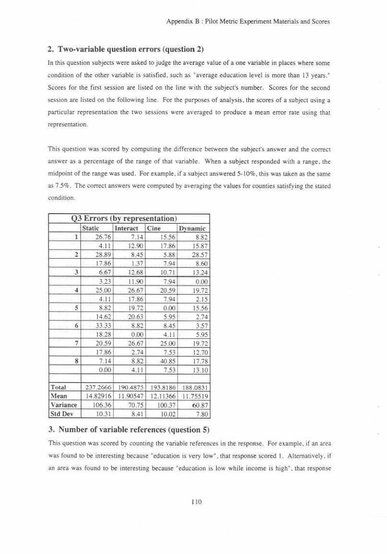
Appendix B : Pilot Mellie Experimem Materials and Scores
2. Two-variable question errors (question 2)
In this question subjects were asked to judge the average value of a one variable in places where some
condition of the other variable is satisfied. such as "average education level is more than 13 years ."
Scores for the first session are listed on the line wilh the subject's number. Scores for the second
session are listed on !he following line , For the purposes of analysis, the scores of a subject using a
particular representation the two sessions were averaged 10 produce a mean error rate using that
representation .
This question was scored by computing the differeuce between the subject's answer and the correct
answer as a percentage of the range of that variable. When a subject responded with a range. the
midpoint of the range was used. For example. if a subject answered 5-10%, this was taken as the same
as 7 .5%. The correct answers were computed by averaging the values for counties satisfying the stated
condition.
Q3 Errors (by representation) Static Interact Cine Dvnamic
1 26.76 7.14 15.56 8.82 4.11 12.90 17.86 15 87
2 28.89 8.45 5.88 28.57 17.86 J .37 7.94 8.60
3 6.67 12.68 10.71 13.24 3.23 11.90 7.94 0.00
4 25.00 26.67 20.59 19.72 4.1 I 17.86 7.94 2.15
5 8.82 19.72 0.00 15.56 14.62 20,63 5.95 2 .74
6 33.33 8.82 8.45 3.57 I 8.28 0.00 4.11! 5.95
7 20.59 26.67 25.00 1 19.72 17.86 2.74 7.53 12.70
8 7.14 8.&2 40.85 17.78 OJKl 4.11 7.53 13.10
Total 237 2666 I 190.4875 193.8186 I 88.0831 Mean 14.82916 I J .90547 12.11366 11.755 19 Variance 106.36 70.75 100.37 6087 Std Dev 10.31 8.41 10.02 7.80
3. Number of variable references (question 5)
This question was scored by counting the variable reference~ in the response. For example, tf an area
was found to be interest ing because ' education is very low". that response scored I. Alternativel y. if
an area wa, found to be interesting because "education is low while income is bigh". that response
110
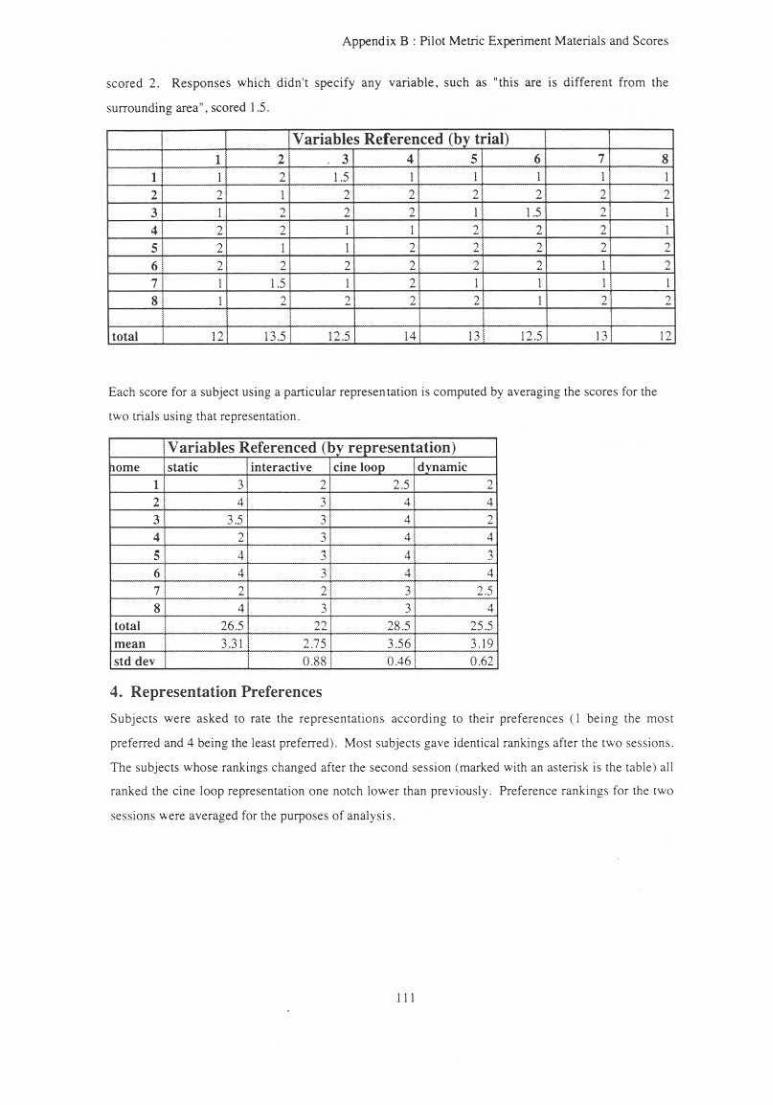
Append ix B: Pilot Metric. Experiment Materials and Scores
scored 1. Responses which didn't specify any variable. such as "this are is different from the
surrounding area". scored 1.5.
Variables Referenced (by trial) I 2 3 4 5 6 7
I I 2 1.5 I I I I
2 2 I 2 2 2 2 2 3 I 2 2 2 I 1.5 2 4 2 2 I I 2 2 2 5 2 I I 2 2 2 2
6i 2 2 2 2 2 2 I 7 I 1.5 I 2 I I I
8 I 2 2 2 2 I 2
total 12 13.5 12.5 14 13 12.5 13
Each score fo r a subject using a paniculat represen tation is computed by averaging the scores for the
two trials using that representation.
Variables Referenced (by representation) orne static interactive cine l(}()p dynamic
1 3 2 2.5 2 2 4 . 3 4 q
3 3.5 3 41 2 4 2 3 4 4
5 4 ' ·' 4 ~
6 4 3 ~ 4
7 2 2! 3 2.5 8 4 3 3 4
total 26.5 22 285 25.5 mean 3.3 1 ; 2.75 3.56 3.19 s td dev I 0.88 0.46 0 .62
4. Representation Preferences
8 I
2 I
I 2
2 I
2
12
Subjects were asked to ra te the represemauons according to their pre ferences ( I being the most
preferred and 4 being tho least p referred). Most subjects gave ident ical rankings after the two session,.
The subjects whose rankings changed after the second sesston (marked with an asterisk is the tablel al l
ranked the cine loop representation one notch lower than previously . Preference rankings for the two
session• o.ere ave.raged for the purposes o f analysis .
I ll

Appendix B : Pilot Metric Experiment Materials and Scores
Representation Preferences '
Subject Static Interactive Cine Loop Dvnarnic
I 3 2 4 I 3 2 4 l
2 4 3 2 1 4 2 3 I •
3 4 2 3 I 4 2 3 I
4 4 3 2 I 4 2 3 I •
s 4 2 3 1
3 2 4 1 •
6 4 2 3 I 4 2 3 I
7 3 2 4 I 3 2 4 I
8 3 21 4 1
3 2 4 I
' Average 3.5625 2 .1 25 J .3 125 d
11 2

Project: Investigator: Faculty Ad,isor:
Appendix B : Followup Mellie Experiment Materials and Scores
Oral Consent Form
Dynamic Explorations of Two Variables in a 20 Space Penny Rheingans. 962-1726 Frederick P. Brooks. Jr .. 962-1 931
• Thi$ study involves research. The purpose of this experi ment is to compare different techniques for the visual representation of quantitative infom1ation.
• There wili be two sessions composed of a training tutorial and six trials . each trial using a different representation technique. At the beginning of each trial. you wi ll be provided with written instroctions specific to the representation technique being used in that trial. After reading these instroctions. you will again be allowed to ask ques11ons. Each trial wi ll consist o f answering worksheet questions while viewing and manipulating a representation. ln. the leSt trials time to complete the worksheet will be recorded. as well as qual ity of the worksheet responses . After compiNing the SIX tnals. you will be asked to express any comments or impressions that you would like.
• You are one of approximately twelve subjects to be used in this study.
• Your panicipation in this study is expected 10 require a total of about two hours. There will be no costs tO you for your panicipntion in this study. You are free to refuse to panicipate or to withdraw from this study ar any time without penalty and without jeopardy.
• You will receive no immediate benetit from your participation in this study . neither will there be any inducements. monetary or O.ther. pro.,·ided to you. for your participation in this smdy .
• Only the Investigator and the Faculty Advisor will have access to the data obtained in the research. Your identity will not be released to others. In 1he event that some of your specific comments or characteristics prove to be useful in the analysis of the research results. they will be used without anribu11on or identifica11on and only wi1h your prior approval.
• You may comact the Facuhy Advisor. Frederick P. Brooks. Jr .. at 962-1931 if you have any further ques11ons about the study.
• You may contact the UNC Academic Affairs- lnstitutional Review board at the following address and telephone number at any time during this study should you feel your rights have bee.n violated:
Academic Affairs Institutional Review Board Mark Holli ns. Chair CB #4100. 300 Bynum Hall (919) 966-5625
113

Appendix B : Followup Metric Experimem Materials and Scores
General Instructions
In this experiment. you will be asked to answer questions about socioeconomic panems in the US. while usmg diffe.rent representation techniques.
The experiment will consist of two sessions on separate days. Each session wi ll consist of a tutorial followed by six trials and then a few final questions about your experience in the experiment. In each trial. you will answer questions about the data while using one representation technique. As you finish each trial (and each section of the tutorial) . please ask the experimenter to set up the next representation for you.
Try to make your answers as specific as possible . When a question asks for a level or percentage, please give a single number.
Please feel free to ask about any instructions. questions . or geographic locations that are not clear to you.
Thank You
114

Appendix B : Followup Metric Experiment Materials and Scores
Tutorial
Please read the following descriptions, try the manipulations described, and answer the questions.
Basic Representation Each representation presented to you in this experiment will contain an image of the US in the upper left of the screen and a legend grid in the lower right. The image that you see now shows average education level and median income for US counties . These variables are represente-d by levels or green and purple. Speciftcally,
Green Purple
= income level = education level
In th1s image, each county IS colored using the sum o f the purple and green contributions. Areas w1th equivalent education and income are greys. dark when both are low and light when both are large. Areas where income is higher than education are greenish. Areas where education is higher than income are purplish.
The legend grid in the lower right shows the color that will be displayed for various combinations of the values of education and income. The range of colors used to represent the values of education level is shown along the vertical axis of the legend. The "umbe.rs to the left of the grid show the value that each color represents. The range of colors used to represent the values of income is shown along the horizontal ax is of the legend . The numbers below the grid shows the value that each color represents.
I. \Vhat :lrea has the highest average c.ducation level?
Slide Show Representation Now )'Ou' ll see a series of images. Each image shows a different balance between the contributions of the two variables to the image you see. When the image is just shades of green. )'Ou're only seemg the value of the income \'ariable. When the image is just shades of purple. you're j ust seeing the \'aloe of !he education variable . When the image IS m1xed green. purple. and grey , you're seeing some mixture of the two variable,. Each image will be shown for 5 seconds and then will be replaced by the next one ·· like watching a slide show in which each slide shows a different view of 1he variables. Like a slide show. after the last image has been shown. the first will follow.
2. What b the income level in Tioga County. Pennsylvania? (Tioga County is outlined in black)
Slide Projector Representation Now you're seeing lhe. same set of image!). but yQu control the advance of the slicks. Press the space bar ro see the ne~t image. As before, the slides wrap around from last to first.
3. What is the average education levels in plates where the median income is less than $ 14.000?
Interactive Representation Now you can set the balance between the contriblltions of the two variables . If you move the slider all the way to the right and hit the space bar. you j ust see the green component which represents median income. If you move the slider all the way to the left and hit the space bar. you just see the purple component which represenL< a"eragc educat ion level. Move the slider to somewhere in the middle of its range to see the contributions of both variable.s together.
4. In what places are both income and education le"els high?
Cine Loop Representation
I JS
Appendix B : Followup Mellie Experiment Materials and Scores
Now the balance between the contributions of the rwo variables is being changed automatically in a cine loop . The representation cycles continuously between various combinations of the two display parameters.
5. What area has the lowest inoome?
Variable-speed Cine Loop Representation Now you can control the speed of the cine loop with the slider. Move the slider to the left to slow the loop or to the right to make the loop go faster.
6. Are there places where education is high ( > II years). but income is relatively low ( < $20.000)?
Dynamic Representation Now you have dynamic control over the balance between the contributions of the two variable; . As you move the slider. the image changes immediately . When you move the slider all the way to the right. you just see the green component which represents median income. When you move the s lider all the wa-y to the left. you just see the purple component which represents average education level. Move the sl ider to somewhere in the middle of iLs range to see the contributions of both variables together.
7. What are income levels in places where average education level is more than 13 years?
116

Appendix B : Followup Meuic Experiment Materials and Scores
Slide Show Representation
The images that you will see show two socioeconomic variables : percentage of the population with Irish ancestry and the percentage of households just above the poverty line. As in the tutorial, these variables are represente<l by levels of green and purple . Specifically,
Green = Purple =
percentage of population with Irish ancestry percentage of households just above the povcrt y I ine
Each image shows a different balance between the two variables. Each will be shown for a few seconds. When all images have been shown,the display will go back to the beginning of the series.
Please answer the following questions:
I . What percentage of the population of Butler County. Kansas has Irish ancestry? (Butler County is outlined in black) How confident are you about this figure'
Not confident I 2 3 4 5 6 7 8 9 10 Very confident
2. What percentage of households are just above the poverty line in places where more than 15 percent of the population has lnsh anceStl)·? How confident are you about this figure?
Not confident I 2 3 4 5 6 7 8 9 10 Very confident
3. How correlated do the rwo variables appear to you? Not correlated
t'e.gatively correlated 5 4 3 2 0 I 2 3 4 5 Positively correlated How conticlent are you about this judgement?
Not confident I 2 3 4 5 6 7 8 9 I 0 Very confident
4. Point om a place that seems interesting to you. Why does it seem interesting"!
117
Appendix B: Followup Metric Experiment Materials and Scores
Cine Loop Representation
The •mages that you will see show two socioeconom.ic variables : percentage of the Jand arc in farms and the percentage of workers who are male. As in the tutorial. these variables are represented by levels of green and purple. Specifically .
Green = Purple =
percentage of farmland percentage of male workers
The balance between the. conlributions .of the tWO variables is being changed automatically in a cine loop. The .representation cycles continuously between various combinations of the two display parameters.
Please answer the following questions:
I. What percentage of the land in Marion County. Florida is farmland? (Marion County is outlined in black)
How confident are you about this figure? Not confident I 2 3 4 5 6 7 8 9 10 Very confident
2. What percentage of workers are male in places where more than 65 percent of the land is farmland7 How confident are you about this figure'
Not confident I 2 3 4 5 6 7 8 9 10 Very confident
3. How correl ated do the two variables appear to you? Not correlated
Negatively correlated 5 4 3 2 0 I 2 3 4 5 Positively correlated How confident are you about this judgement?
Not confident I 2 3 4 5 6 7 8 9 l 0 Very con fidem
4. Point out a place that seems interesting to you. Why does it seem imeresting?·
118
Appendix 8 : Followup Metric Experiment Materials and Scores
Variable-speed Cine Loop Representation
The images that you will see show two socioeconomic variables : median age and percentage of workers who drive to work . As in the tutorial. these variables are represented by levels of green and purple. SpecificaJJy.
Green = Purple =
medi~n age percentage of workers who drive
The balance between the contributions of the two variables is being changed automatically in a cine loop. The representation cycles continuously between various combinations of the rwo display parameters. Move the slider to change the speed -- to the right to speed up the loop or to the left to s low it down.
Please answer the following questions:
I . What is the median age oi Dane County. Wisconsin? (Dane County is outlined in black) How confident are you about this figure?
Not confide.nt I 2 3 4 5 6 7 8 9 10 Very c.onfident
2. What percentage of workers drive to work in places whc;c. the median age is greater than 45? How confident are you about this figure?
Not confident I 2 3 4 5 6 7 8 9 10 Very confident
3. How correlated doth~. two variables appear tO you?
Negauve.ly correlated 5 4 3 2 0 How confident are you about this judgement?
Not confident I 2 3 4 5 6 7
Not correlated I 2 3 4
8 9 10
5 Positively correlated
Very confident
4. PoinL out a place Lhat seem~ interesting to you. Why does it seem interesting?
119
Appendix B : Followup Metric Experiment Materials and Scores
Interactive Representation
The images that you will see show two socioeconomic variables: number of physicians per 100.000 people and the median home value . As in the tutorial. these variables are represented by levels of green and purple. Specifically .
Green = Purple =
doctors per 100.000 median horne value
Move the slider to select a balance between the two variables and hit the space bar to see the resulting image. Sl ider positions to the far right sh<;>w primarily the green tones representing doctors. Slider positions to the far left show primarily the purple tOnes representing home value. Slider positions in the middle sh(>W b<;>th variables together.
Please answer the following questions:
1. How many doctors per 100.000 people are there in Moffat County. Colorado? (Moffat County is outlined in black)
How confident are you about this figure? Not confident I 2 3 4 5 6 7 8 9 10 Very confident
2. What is the median home value in places where there are more than 575 physicians per 100.000 people? How confident are you about th is figure·>
Not confident I 2 3 4 5 6 7 8 9 10 Very confident
3. How correlated do the two variables appear tO you?
Negatively correlated 5 4 3 2 How confident arc you about this judgement'?
No< confident I 2 3 4 5 6
N01 correlated 0 I 2 3 4
7 s 9 10
5 Positively correlated
Very confident
4. Point out a place that seems interesting tO you. Why does it seem interesting?
120

Appendix B : Followup Metric Experiment Materials and Scores
Dynamic Representation
The images that you will see show two socioeconomic variables : percentage of workers employed in manufacturing and the percentage of the population born in the same state. As in the tutorial, these variables are represented by levels of green and purple . Specifically.
Green = Purple =
percentage employed in manufacturing pe..rc.enL..age born in the S3!me state
Move the s lider to sele.ct a balance between the two variables . As you move the slider, the image changes immediately. Slider positions to the far right show primarily the green tones representing manufacturing employment. Slider positions to the far left show primarily the purple tones represeming persons born in (he same s tate . S lider positions in the middle show both variables together.
Please answer the following questions:
I . What percentage of workers in Piscataquis ·County. Maine arc employed in manufacturing? (Piscataquis County is oudined in black}
How confident are you about this figure? Not confident I 2 3 4 5 6 7 8 9 10 Very confident
2. What percentage of the popu lation was bom in the same state tn places where more than 40 percent of workers are employed in manufacturing?
How conftdent are you about this figure? Not confident l '1 3 4 5 6 7 8 9 10 Very conlident
3. Ho" correlated do tbe two variables appear to you·> Not correlated
Negatively correlated 5 4 3 2 0 I 2 3 4 5 Positively correlated How con fidem are you about this judgement?
Not con fidem I 2 J 4 5 6 7 8 9 10 Very con fidem
4 . Point out a place that seems interesting to you. \Vhy docs it seem interesting'!
121
Appendix B : FoUowup Metric Ex periment Materials and Scores
Slide Projector Representation
The images that you Will se.e Show two socioeconomic variables : percentage of workers employed in sales and the percentage of workers who carpool tO work. As in the tutorial. these variables are represented by levels of green and purple. Specific.all y,
Green = Purple =
percentage employed in sales percentage who carpool to work
Each image shows a different balance between the two variables. Press the space bar tO see the next image. Wben all images have been shown, the display will go back to the beginning of the series.
Please answer the following questions:
I. Wha.t percentage of workers are employed in sales in Cimarron County, Oklahoma? (Cimarron County ts outlined in black)
How confident are you about this figure? Not confident I 2 3 4 5 6 7 8 9 10 Very confident
2. What percentage of workers carpool to work in places where more than 20 percen t of the workforce is employed in sales?
How confident are you about this figure? Not confident I 2 3 ~ 5 6 7 8 9 10 Very confident
3. How correlated do the two variables appear tO you'! Not correlated
Negati vely correlated 5 4 3 2 0 I 2 3 4 5 Positively correlated How confident are you about this judgement?
Not confident I 2 3 4 5 6 7 8 9 10 Very confide_nt
4. Point out a place that seems interesting to you . Wby does it seem interesting?
122

Appendix B : followup Metric Experi ment Materials and Sc,ores
FinaJ Questions
I. Rate the six .representations techniques in order of your preference (where I is most preferred; 6 is least preferred) .
_ Slide Show Representation (slides advance automatically) _ Slide Projector Represe.ntation (you advance slides) _ Interactive Represemation (variable balance updated when you hit space ba.r) _ Cine Loop Representation ( representa tion cyeles through variable balances) _ Variable-speed Cine L90p Representation (you control loop speed) _ Dynamic Representation (slider directly controls balance between variables)
2. Why did you rate the representations in this way?
3. Did you find any of the representations frus trating? Which?
4. Did any of the representations seem to offe.r advantages that the oUters didn't?
123
Appendix B : Followup Metric Experiment Materials and Scores
Dynamic Representation
Tht images that you will see show two socioeconomic variables : divorces per 1000 people and the percentage of the population with mixed ance.sLry. As in the tuto.rial. these variables are represented by levels of green and purple. Specifically.
Gree.n = Purple =
divorces per 1000 percentage of population with mixed ancestry
Move the slider to select a balance between the two variables. As you move the slider, the image changes immediately. Slider positions to the far right show primarily the green tones representing divorces. Slider positions tO the far left show primarily the purple tones representing mixed ancesLry. Slider positions in the middle show both variables together.
Please answer the following questions:
I . How many di vorces are the.re per I 000 people in Ouer Tail County. Minnesota? COuer Tail County is outlined in black)
How confident arc you abou t this figure? Not confident I 2 3 4 5 6 7 8 9 10 Very confident
2. What percentage of the population has mixed a01cestry in place~ where there are more than 25 - "orces per 1000 people'/
Ho" "ontidem are you about this figure1
Kot confident I 2 3 4 5 6 7 8 9 10 Very confident
3. How correlated do the two variables appear to you? Not correlated
N~gativcly correlated 5 4 3 2 0 I 2 3 4 5 Positively correlated How confident are you about this judgement'>
Not confident I 2 3 4 5 6 7 8 9 10 Very confident
4. Point out a place that seems interest•ng to you. Why does it seem interesting'!
124

Appendix B : Followup Metric Experiment Materials and Scores
Slide Projector Representation
The images that you will see show two socioeconomic variables : the median rent and the percentage of the population with German ancestry. As in the tutorial. these variables are represented by levels of green and purple. Specifically.
median rent Green = Purple = percen~age of populatiOI~ with German ancestry
Each image shows a different balance between the two variables . Press the space bar to see the next image . When all images have been shown .the display will go back to the beginning of the series.
Please answer the following questions:
I. What is the median rent io Pecos County. Texas" (Pecos County is outlined in black) How confident are you about this figure?
Not confide.nt I 2 3 4 5 6 7 8 9 10 Very confident
2. What percentage o f the population has German ancesuy in places where the median rent is more than $230 per month?
How confident are you about this figure'! Not confident I 2 3 4 5 6 7 8 9 10 Very confident
3. How cQrrelated do the two variables appear to you? Not correlated
Negatively correlated 5 4 3 2 0 ' J 2 J 4 5 Positively correlated How confident are you about thi~ judgement?
Not confident I 2 3 4 5 6 7 8 9 10 Very confident
4. Point out a place that s.eems interesting to you . Why does it seem interesting?
125
Appendix B : Followup Metric Experiment Materials and Scores
Cine Loop Representation
The images that you will see show two socioeconomic variables : percentage of workers employed in agriculture and the percentage of the population w ith Scottish ancestry. As in the tutorial. these variables are represented by levels of green and purple. Specifically.
Green : Purple =
percentage employed in agriculrure percentage with Sconish ancestry
The balance between the contributions of the two variables is being changed automaticall y in a cine loop. The representation cycles continuously between various combinations of the two display parameters.
Please answer the following que.stions:
I. What percentage of the workers of lnyo County, California are employed in agriculture? (lnyo Coumy is outlined in black)
How confident are you about this figure? Not confident I 2 3 4 5 6 7 8 9 10 Very confident
2. What percentage of the population has Scottish ancestry in places where more than 50 percent of workers are employed in agriculture?
How confident are you about this figure? Not confident I 2 3 4 5 6 7 8 9 10 Very confident
~1 . How correlated do the two variables appear to you'> Not correlated
Negatively correlated 5 4 3 2 0 I 2 3 4 5 PoSitively correlated How confide01 are you about this judgement?
Not con.fident I 2 3 4 5 6 7 8 9 10 Very confide01
4. Poim out a place that seems interesting to you. Why <JO<:s it sc~m int~r~sting?
126

Appendix B : Followup Metric Experiment Materials and Scorc.s
Slide Show Representation
The images that you will see show two socioeconomic variables : number of motor vehicle deaths per 1000 people and the percentage of the population wi th Polish ancestry. As in the tutorial. these variables are represented by levels of green and purple. Specifically.
Green = motor vehicle deaths per I 000 Purple = percentage of population with Polish ancestry
Each image shows a different balance between the two variables. Each will be shown for 5 seeonds . When all images have been shown.the display will go back to the beginning of the series.
Please answer the following questions:
I . How many motor vehicle deaths are there for eacn 1000 people in Coconino County, Arizona'> (Coconino County is outlined in black)
How c.onfident arc you about this figure? Not confidem I 2 3 4 5 6 7 8 9 10 Very confident
2. What percentage of the population has Pol ish ancestry in places where there are more than 2.5 motor vehicle deaths per 1000 people?
How confident are you about this figure~ Not confident I 2 3 4 5 6 7 8 9 10 Very confident
3. How correlated do the two variable.s appear to you? Not correlated
Negauvcly correlated 5 4 3 2 0 I 2 3 4 5 Positively correlated How confident are you about this judgement?
Not confident I 2 3 4 5 6 7 8 9 10 Very confiden1
4. Point outs place thai seems imeresting 10 you. Why does il seem interesling?
127
Appendix B : FoUowup Metric Experiment Materials and Scores
Variable-speed Cine Loop Representation
The images that you will see show two socioeconomic variables : percentage of households below the poverty line and the percentage workers who work at home. As in the tutorial , these variables are represented by levels of green and purple. Specifically,
Green = Purple =
percentage of households be.low poverty line percentage of workers who work at home
The balance between the contribution~ of the two variables is being changed automatical ly in a cine loop. The representation cycles continuously between various combinations of the two display parameters. Move the s lider to change the speed -- to the right to speed up lhe loop or to the left to slow it down.
Please answer the following questions:
I . What percentage of households in Beaverhead (Beaverhead County is outlined in biack\
County. Montana are below the poverty lioe?
How confident are you about this figure? Not confident I 2 3 4 5 6 7 8 9 10 Very confident
2. What percentage of workc~> work at home in places where more than 30 percent of households are below the poverty line''
How confident are you about this figure '! Not confident I 2 3 4 5 6 7 8 9 10 Very confident
3. How correlated do lhe two variable,~ appear to you? Not correlated
Negatively correlated 5 4 3 2 0 I 2 3 4 5 Positively correlated How confident are you about this j udgement?
Not con fident I 2 3 4 5 6 7 8 9 10 Very confident
4. Point out a place that se.ems in.tercSling to you . Vlhy does it seem imeresting?
128

Appendi~ B : Followup Metric Experiment Materials and Scores
Interactive Representation
The images that you will see show two socioeconomic variabl~s : the average household size and the perc.entagt of workers who are female . As in the rutorial. these variables are represented by levels of green and purple . Specifically.
Green = Purple =
average number of persons per household percentage of female workers
Move the. slider to select a balance between the two variables and hit the space bar tO see the resulting image. Slider positions to the far right show primarily the green tones representing household size. Slidcr position' to the far left show primarily the purple tones representing female employment. Slider positions in the middle show both variables together. ·
Please answer the following questions:
J . What is the average household size in Pima County, Arizona'! (Pima County is outli ned in black) How confident are you about th1s figure?
Not confident I 1 3 4 5 6 7 8 9 10 Very con fident
2. Wnat percentage of workers are female in household is greater than 4?
How confident are you about this Figure? Not confident J 2 3 4
places where the average number of persons per
5 6 7 8 9 10 Very confident
3 How correlated do the two variables appear to you? Not correlated
Negatively correlated 5 4 3 2 0 I 2 3 4 5 Positively correlated How confident are you about this judgement?
Not con fidem I 2 3 4 5 6 7 8 9 10 Very confident
4 , POint out a place that seems interesting tp you. Why does It seem interesting'
129

Appendix B : Followup Metric Experiment Materials and Scores
Final Questions
I. Rate the six representations techniques in order of you r preference (where 1 is most preferred; 6 is least preferred) .
_ Slide Show Representation (slides advance automatically) _ S lide Projector Representation (you advance slides) _ Interactive Representation (variable balance updated when you hit space bar \ _ Cine Loop Represenwtion (represemation cycles through variable balances)
Variable-speed Cine Loop Representation (you control loop speed) _ Dynamic Represemation (slider directly controls balance between variables)
2. Why d id you rate the representations in this way?
3. Did you find any of the representations frustrating·! Which?
4. Did any of the rcprescntalions seem to offer advantages that the others didn't?
130
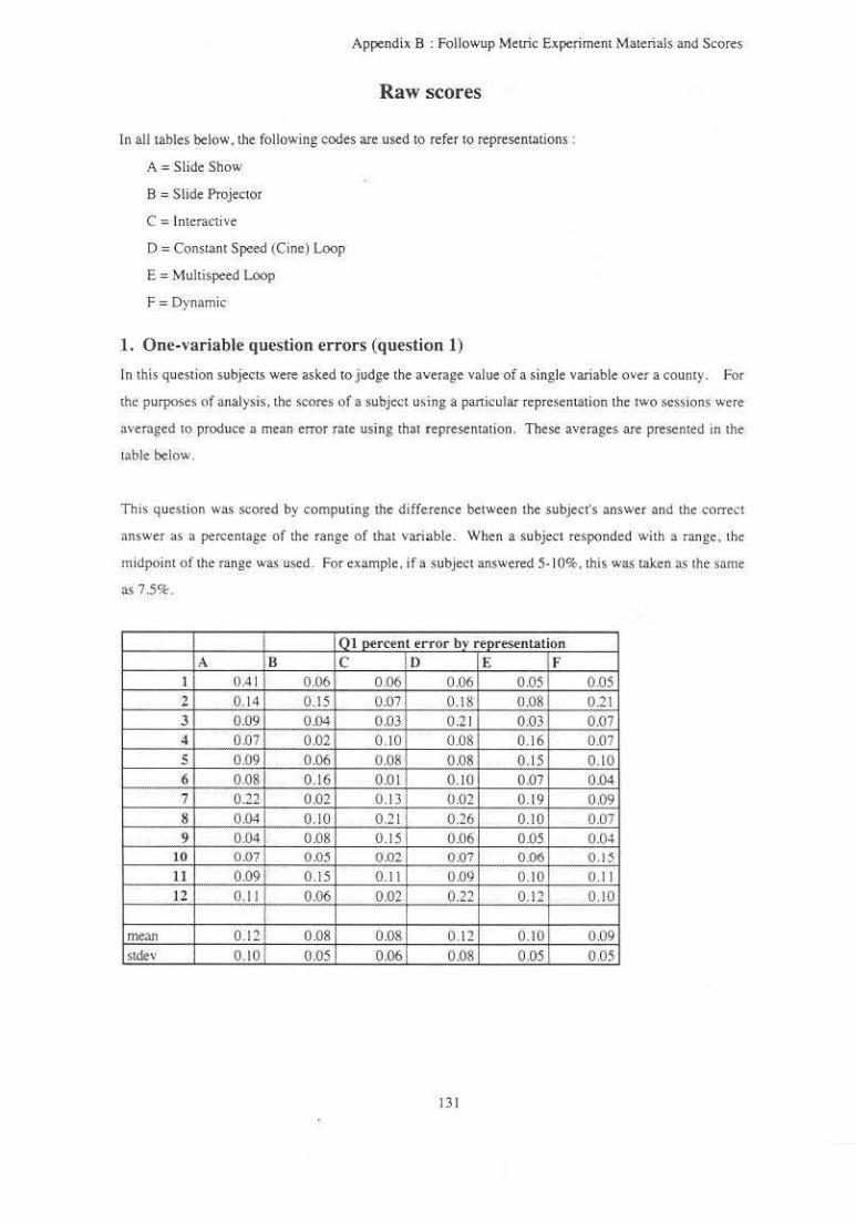
Appendix B : Followup Meuic Experiment M"'terials and Scores
Raw scores
In all tables below. the following codes are used to refer to representations :
A= Slide Show
B = Slide Projector
D =Constan t Speed (Cine) Loop
E = Multispeed Loop
F =Dynamic
l. One-variable question errors (question 1)
In this question subjects were asked to judge the average value of a single variable over a county. For
the purposes of analysis. the scores of a subject using a particular representation the two sessions were
averaged to produce a mean error rate using that representation. These averages are presented in the
table below.
Th1s question was scored by computing the difference between the subject's answer and the correct
answer as a percentage of the range of that variable. When a subject responded with a range . the
midpoint of the range was used. For example. if a subject answered 5- 10%, this was taken as the same
as 7.5%.
I 01 percent error by representation A Il c D E F
I 0.4 1 0.06 006 0.06 0.05 0.05 2 0. 14 0.15 O.o? 0.18 0.08 0 .21 3 0.09 0.04 0,03 0.2 1 0.03 0,07 4 0.07 0.02 0. 10 0 .08 0 .1 6 0.07 5 0.091 006 0.08 0.08 0.15 0.10 6 0.08 0.16 0.01 0 .10 O.Q7 0.04 7 0.22 0 .02 0.13 1 0 .02 0.19 0.09 8 0.04 0.10 0 .21 i 0.26 0.10 0.07 9 0.04 0 .08 0.15 0.06 0.05 0 .0~
10 0,07 0.05 0.02 0.07 0.06 0.15 11 0.09! 0 .15 0.11 0.09 0.1 () 011 12 0.11 0.06 0.02 0.22 0.12 0.10
mean 0.12 0 .08 0.08 0.12 0.101 0 .09 Stdev 0.10 0.05 0.06 0.08 0.051 0.05
131

Appendix B : Followup Metric Experiment Materials and Scores
2. One-variable confidence levels (question 1)
Subjects were asked to rate the confidence they had in their answers to the previous (one-variable)
question . Confidence ratings ranged from I to 10. Confidence ratings for the two trials using each
representation have been averaged togeth.er to produce a single score.
I Qlconfidence rating bv representation A In c 0 E F
1 &.ool 8.00 8.00 6.50 8.50 8.50 2 8.00i 7.50 900 8.00 850 9.50
3 7.50! 8.00 9.50 8.00 8.50 8.50 4 6.001 7.50 150 5.50 7.00 750
5 8.50 9.00 8.00 5.50 9.50 8.50 6 5.50 8.50 8.00 7.00 8.00 8.50 7 8.00 7.00 7.50 8.00 8.00 7.50 8 9.00 10.00 850 8.00 9.50 8.50 9 8.00 9.00 9.00 8.00 9.00 9.00
10 8.50 8.00 9.00 9.00 8 .50 8.50 11 8.00 7.50 8.00. 600 800 8.00 12 6.50 7.00 4.50 1 7.50 5.50 8.50
! mean 7.63 1 8.08 8.04 7.25 8.2 1 8.42 >tdcv 1.07 1 0.90 1.29 1. 14 1.10 0.56
3. Two-variable question errors (question 2)
In this question subjects were asked to judge the average value oi a one variable in places where some
condition of the other variable is satisfied . such as ' average education level is more than 13 years ."
Scores for the two trials using a representation were averaged together for the purposes of analy$is.
These averages are presented In the table below.
This· question was scored by computing the d1fference betwee n the subject'$ answer and the correct
answer as a percentage of the range of that variable. When a subje.ct responded with a range. the
midpoim of the range was used. For example . if a subject answered 5-10%. this was taken as the same
as 7.5%.
132
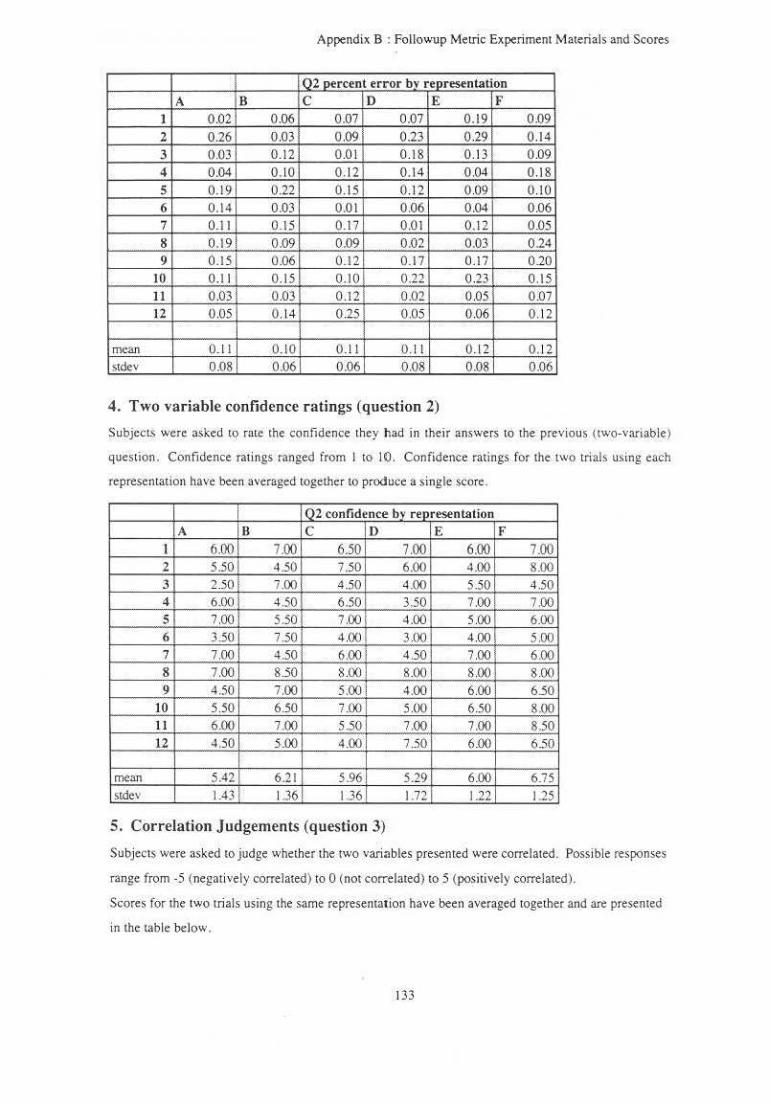
Appendix B : Followup Meuic Experiment Materials and Scores
I Q2 percent error bv representation A B c D E F
I 0.02 0.06 0,07 0,07 0.19 0.09
2 0.26 0,03 0.09 0.23 029 0.14
3 om 0 .12 0 .01 0 .18 0 .13 0 .09 4 0.04 0.10 0 .1 2 0.14 0.04 0.18
5 0.19 0.22 0.15 0 .12 0 09 0 .10
6 0 .1 4 0.03 O.ot 0.06 0.04 0.06 7 0.11 0 .15 0.17 0.01 0.12 0.05
8 0 .19i 0 .09 0.09 0.02 0.03 0 .24
9 0.15 0 .06 0.12 0.17 0 .17 0.20 10 0 .11 0.15 0.10 0 .22 0.23 0.15
II O.Q3 0.03 0 .12 0.02 0 .05 0.07 12 0.05 0 .14 0.25 0.05 0.06 0.12
mean 0.11 0.10 0. 11 0.11 0.12 0 ..12 Sldev 0 .08 . 0.06 0.06 0.08 0.08 0.06
4. Two variable confidence ratings (question 2)
Subject$ were asked to rate the confidence they had in their answers to the previous (two-variable )
question. Confidence ratings ranged from I to 10. Confidence ratings for the rwo trials using each
representation have been averaged together tO produce a single score.
I 02 confidence bv rep resentation A IR c D E F
l 6.00 7.00 6.50 7.00 6.00 7.00 2 5.50 4.50 7.50 6.00 4.00 8.00 3 2 .50 700 4.50 4.00 5.50 4 .50 4 6,00 4.50 6.50 3.50 7.00 7.00 5 7.00 5.50 7.00 4.00 5.00 6.00 6 3.50 7.50 400 3.00 4.00 5.00 7 7.00 4.50 6.00 4 .50 7.00 6.00 8 7.00 8.50 8.00 8 00 800 800 9 4.50 7.00 5.00; 4.00 6.00 6.50
10 5.50 6.50 7.00 5.00 6.50 8 .00 11 6.00 7.00 5.50 7.00 7.00 8.50 12 4.50 5.00 4.00 ' 7.50 6.00 6.50
I mean 5.42 6.2 1 596 5.29 6.00 6.75 stdev 1.43 i 1.36 1.36 1.72 1.22 125
5. Correlation judgements (question 3)
Subjects were asked to j udge whelher the two variables presented were correlated. Possible responses
range from -5 (negatively correlated) to 0 (nor correlated) to 5 ( positively correlated).
Scores for the two trials using the same representation have been averaged together and are presented
in the table below.
133
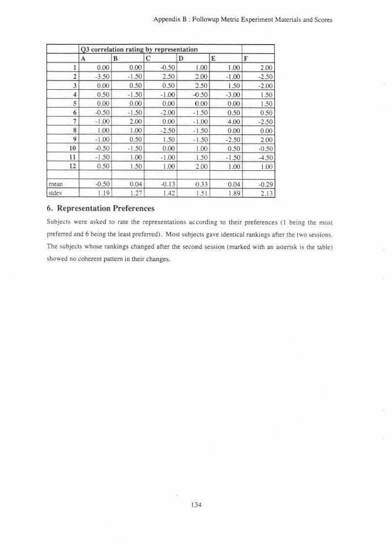
Appendix B : Followup Metric Experiment Materials and Scores
0 3 correlation ratin1 by representation A B c D E f
1 0.00 0.00 -0.50 I.QO 1.00 2.00 2 -3.50 -1.50 2 .50 2.00 -1.00 -2.50 3 0.00 0.50 0.50 2.50 1.50 -2.00 4 0.50 i - 1.50 -1.00 -0.50 -3 .00 1.50 5 0.00 0.00 0 .00, 0 .00 0.00 1.50 6 -0.50 -1.50 -2.00 -1.50 0.50 0.50 7 -1.00 2.00 0 .00 · 1.00 4.00 -2.50 8 1.00 1.00 -2.50 -1 .50 0.00 0.00 9 -1.00 i 0.50 1 50 - 1.50 -2 .50 2.00
10 -0.50 ' -1.50 0.00 1.00 0.50 -0.50 II -1.50 1.00 -1.00 1.50 -1.50 -4.50 12 0.50 1.50 1.00 2.00 1.00 100
mean -0.50 0.04 ·0.13 <().33 0 .04 -0.29 stdcv 1.19 1.27 1.42 1.51 189 2.13
6. Representation Preferences
Subjects were asked to rate the representations according to their preferences ( I being the most
preferred and 6 being the least preftrred) . Most subjects gave identical ran.kings after the two sessions.
The subjects whose rankings changed after the second session (marked with an asterisk is the table)
showed no coherent pattern in their changes.
134
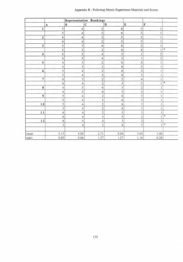
Appendix B : Followup Metric Experiment Materials and Scores
Representation Rankin2S
A B c 0 E F 1 5 4 2 6 3 I
5 4 2 6 3 I
2 6 4 2 5 3 I
6 4 2 5 3 I
3 5 3 4 6 2 I
5 3 2 6i 4 I * 4 6 5 4 3 I 2
6 5 4 3 I 2 5 4 3 2 6 5 I
4 3 2 6 5 I' 6 5 4 2 6 3 I
5 4 2 6 3 I 7 6 3 2 5! ~ I
6 4 2 3 5 I * 8 4 5 6 3 2 I
4 5 6 3 2 I 9 5 4 2 6 3 I
5 4 2 6 3 I 10 5 4 2 6 ~ I
5 4 21 6 . Ji I I I 6 4 2 5i }! I
6 4 3 5 2 I * 12 6 5 4 3. 2 t!
3 4 2 6 s 1. *
mean 5 .13 4.00 2.7 1 5.04 3.04 1.08 ·-stdev I 0 .85 0.66 1.27 1.27 1.16 0.28;
135

Appendix C: Material ~ and Scores: Pattern Experiment
Appendix C
Materials and Scores : Pattern Experiment
This appendix contains tbe materials given to subjects in the study of pattern comprehension described in
Chapter 6. The experimental materials for this study consist of stimu lus image ~pecifications, an oral
consent form. general intructions. and instructions for the two representations. Following !he experimental
materials arc the. raw scores of subjects in this experiment.
136

Appendix C : Materials and Scores : Pattern Experi ment
Stimulus image specifications
Key for image specifications:
Noise:
L = no noise
M = medium noise (SNR = 9}
H = high noise (SNR = 4.5)
Shape I and Shape2:
P = peak
R = ridge
S = saddle
T = trough
W = well
Position:
0 = different positions
I = same positions
Height:
0 = different positions
1 = same pOSition~
Block One: Practice: Noise L H M L L M H M
Test: Noise H H H L M H H L H L M l M
Shape! p w T p R T s R
Shape I w p T T R R p s s R s s T
Shape2 p w R s w T s R
Shape2 s w R w w T p s p p R T T
Position Height 0 I I 0 0 0 0 I I 0 0 0 1 0 0 0
Position Height 0 I 0 0 I 0 I 0 I 0 0 I 0 I I 0 I 0 0 I I 0 0 0 0 I
137
Appendix C : Materials and Scores • Panem Expenment
L p s 0 M w w 0 0 H s s 0 0 L w R 0 I M s s 0 I M p p I 0 M T s 0 0 H w w 0 I H T T I 0 L R R 0 0 L T T 0 I M w p 0 I L p p I 0 L w w 0 I H R R I 0 M p T 0 I M R R I 0
Block Two: Practice: t-:OIM: Shape I Shape2 Posiuon He1ght L p p 0 0 H T R I 0 L R s 0 I L T w 0 0 M T T 0 I L w w I 0 M s s () I H R R 0
Test: Noise Shape I Shape2 Po~ilion Heigh! H p R I 0 H w T I 0 H s w 0 0 L s p I 0 M s p 0 I H T p 0 I H p p 0 I L s s I 0 H R s 0 I L p R I 0 M T R 0 I L R s 0 I M T T 0 0 L T w 0 0 M w w 0 I H s s 0 0 L w T 0 I M s s I 0 M p p I 0 M w s I 0 H w w I 0 H T T 0 I L R R 0 0 L T T 0 I M R T 0 0 L p p 0 I
138

L H M M
w R p R
w R w R
Appendix C : Materials and Scores : Pattem Experiment
I I I 0
139
0 0 0 I

Project: investigator: Faculty Advisor:
Appendix C: Materials and Scores: Pattern Experiment
Oral Consent Form
Dynamic Explorations of Two Variables in a 2D Space Penny Rheingans. 962- 1726 Frederick P. Brooks. Jr .. 9>62-1931
• This study involves research .. The purpose of this experiment is to compare different techniques for the visual representation of quantitative information.
• You will be asked to complete two blocks of tria l ~. e.ach block using a different representation technique. At the beginning of each block. you will be provided wi th written instructions specific to the represenuuion technique being used in that block. Each trial wi ll consist of answering questions while viewing and manipulating a representation. In practice trials you will be told whether your answers were correct or not. In the test trials. time to comple•e the worksheet will be recorded. All trials will be videotaped . After completing the trials . you will be asked 10 express any commeots or impressions that you would like.
• You are one of approximatel y twenty subjecL~ to be used in this study.
• Your participation in this study is expected to require a to tal of about two hours . There will be no costs to you for your participation in this study . You are free to refuse to participate or to withdraw from this study at any time without penalty and without jeopardy.
• You will receive no immediate benefit from your participation in this study. neither will there be any inducements. monetarY or other. provided to you for your participation in thts study.
• Only the Investigator and the Faculty Advisor w ill have access tO the the identies of the subjects participating in this Study. Your identity will not be released 10 others. In the event that some o f your specific comments or characteristics prove to be useful in the analysis of the research results , they wi ll be used without anribution or identification {where possible) and only with your prior approval.
• You may contact the Faculty Advisor. Frederick P. Brooks . Jr .. at 962 -1 931 if you hav< any further questions about the study.
• You may contact the UNC Academic Affairs - Institutional Review board at the following address and telephone number at any time during this study should you feel your rights have been violated:
Academic Affairs lnstituticmal Review Board Dale H. Schunk. Chalf CB 114100.300 Bynum Hall (9 19) 966-5625
140

Appendix C: Materials and Scores · Panem Experiment
General Instructions
In thts experiment. you will be asked 10 odenufy shapes and make Judgements about thetr postUons and heights. Each shape is fonned by the distribuuon of a variable over a rectangular are:.. You can think of each vanable distribution as a surface like one or the clay models viewed from above. Places that are close 10 you are represented by bright colors,. while poonts far away are more darkly colored. Example singlevariable shapes are shown on the next page . The shapes in the trials will not nt<:essarily be the same colors as the ones on the example sheet.
In the experiment. each image will contain two shapes. one made by each variable. One variable is represented by levels of green. more green for closer points. The other variable is represented by levels of purple, more purple for closer points. The contribution' of the two parameters (green and purple) arc added together equally to form the image. Notice that purple aod green cance l each other out (they're complementary colors). so areas where the two variable; have similar values wi ll be colored grey. Dark greys ;how areas in which both variables have low values (far away). light greys show areas where both vanable; have high values (close by). Areas where one variable is significantly greater than the other will <how the color representing that variable. Notice than area can appear gre<:n if the green variable is large. the purple variable is small. or both.
You will be asked 10 compare the shapes of the 1"0 vanables. their positions. and their heoghts. Choose the shapes that the image most resembles. Also. judge v.hether the positions and heights of the shapes are the same The positions of two shapes are the same of theor cetner points lie on top of each mhcr. Hctght is the difference between the lowest and highest value of one variable.
Thos expertment will consist of two groups of tnals u'ing IW<l different ki nds of color representation. Record your answers in the dialogue wondow at the left of the screen. Each column of option• represents one question. Only one button on each column c:m be chosen at a time. Use the mouse tO make a choice by select ing the diamond-shaped button corresponding to your answer. When chosen, the button will high light. For example. if the screen looks like the example screen (the page after the one showing the example shapes). the responses in the dialogue window mean :
I. The shape represented by the purple parameter is a ridge. 2. The shape represented by the green parameter is a peak. 3. The shapes are not in the same locauon 4. The shapes do not ha\e the same height.
Try tO make your answers as accurate a,, posstble. Please call me at 1726 if you have on~ que>llons. Thank You
141

Appendix C : Materials and Sco.res : Pattern Experiment
Representation 1
The first 8 trials of th is block will be practice trials. After each practice trial. the correct answers wi ll appear in the text window at the lower left comer of the screen. The practice trials wi ll be followed by 30 test trials. No answers will appear after the test trials. After you've answered the four que~tions in a trial. select the button labeled Next tO move 10 'the next trial.
You can begin anytime. When you finish this group of trials, please give me a call at 1726.
142

Appendix C: Materials and Scores: Pattern Experiment
Representation 2
The first 8 trials of this block will be practice trials. After each practice trial. the correct answers will appear in the text window at the lower left comer o f the screen. The practice trials will be followed by 30 test trials. No answers will appear after the test trials. After you've answered the four questions in a trial. select the button labeled Next to move to the next trial.
You control the relative weights of the two parameters by turning the dial marked with the red circle. Turning right adds more green. turning left adds more purple. When the marks on the dial line up. the two parameters make equal contributions to the image. When the dial is turned so that one parameter predominates. the variable represented by that parameter will be displayed with little or no contribution from the other variable .
You can begin any time. When you finish this group of trials. please give me a call at 1726.
143
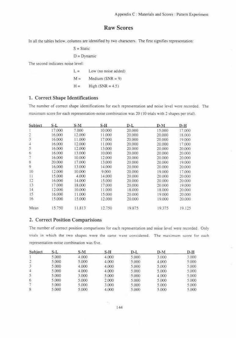
Appendix C : Materials and Scores: Pattern Experi ment
Raw Scores
In all the tables below. columns are identified by two characters. The first signifies representation:
S =Static
0 =Dynamic
The second indicates noise level:
L = Lnw (no noise added)
M = Medium (SNR = 9)
H = High (SNR = 4.~)
1. Correct Shape Identifications
The number of correct shape identifications for each representation and noise level were recorded. The
maximum score for each representation-noise combination was 20 ( 10 trials with 2 shapes pertrial).
Suhittl S·L .S·M s-1:1 12-L Q-\ol !HI 17.000 7.000 10.000 20.000 15.000 17.000
2 16.000 12000 11000 20.000 20.000 18.000 3 16.000 11.000 17.000 QO.OOO 20.000 19.000 4 16.000 12.000 11.000 20.000 20.000 17.000 5 16.000 12.000 13.000 20.000 20.000 20.000 6 16.000 13.()()() 10.000 20.000 20.000 20.000 7 16.000 10.000 12.000 20.000 20.000 20.000 g 20000 17.000 13.000 20.000 20.000 19.000 9 16.000 13.000 14.000 20 (XJO 20.000 20.000 10 12 ()()() 10.000 9.000 20.000 19.000 17.000 11 15.000 4.000 14.000 20000 20.000 20.000 12 16.000 14.000 15.000 20.000 20.000 20.000 13 17.0oo 18.000 17.000 20 000 20.000 19.000 14 12000 10000 11.000 18.000 18.000 20.000 15 16.000 I 1 .000 15 ()()() 20000 19.000 20.000 16 15.000 15.000 12.000 20.000 19 Q()() 20000
Mean 15.750 I 1.813 12.750 19.875 19.375 19.125
2. Correct Position Comparisions
The number of correct position comparisons for eacb representation and noise level were recorded . Only
tri:}JS in whicb the two shapes were the same were con~idercd . T h e ma.ximum sc-ore f<>r each
representation-noise combination was five.
Su!! i~l H :!-M S-H 0-L 12-M 0-H I 5.000 4.000 4.000 5.000 3.000 3.000 2 5.000 5.000 4.000 5.000 4.000 5.000 3 5.000 4.000 4.000 5.000 5.000 5.000 4 5 .000 4.000 4.000 5.000 5.000 5.000 5 5.000 3.000 5.000 5.000 4.000 5.000 6 5 .000 5.000 2.000 5.000 5.000 5.000 7 5.000 5.000 3.000 5.000 5.000 5.000 8 5.000 5.000 4.000 5 .000 5.000 5.000
144

Appendix C: Materials and Scores : Pattern Experiment
9 5.000 4.000 5.000 5.000 5.000 5.000 10 5.000 5.000 3.000 5.000 5.000 5.000 I I 4.000 4.000 4 .000 5000 5.000 5.000 12 5.000 5.000 4.000 5000 5.000 5.000 13 4 .000 4.000 5.000 5.000 4000 4.000 14 5.000 4.000 4.000 5.000 5.000 5000 15 5.000 4.000 5.000 5.000 5.000 5.000 16 5.000 5000 4.000 4.000 4.000 5.000
Mean 4.875 4.375 4.000 4.938 4.625 4.813
3. Correct Height Comparisons
Tite number of correct height comparisons for each representation and noise level were recorded. Only
trials in which the two shapes were the same were considered. This was done to elimutate the need to
compare positive heights (such as those of peaks or ridges) with negative heights (such as those of wells or
troughs) . The maximum score for each representation-noise combination was five.
Suhjtl;! S·l. S·M S·H IH, 12-M 12-H I 3.000 3.000 2.000 4.000 J.QOO 3.000 2 3.000 3.000 5.000 3.000 3.000 3.000 3 2.000 5.000 2.000 1.000 2.000 3.000 4 3.000 2.000 2.000 5.000 4.000 4.000 5 2.000 4.000 3.000 2.000 3.000 4 .000 6 2.000 2.000 3.000 3.000 3.000 3000 7 5.000 5000 3.000 2.000 2.000 2.000 8 3.000 2.000 5.000 5.000 3.000 3000 9 4.000 2.000 3.000 4.000 3.000 3.000 10 3.0C>O 3.000 4.000 1.000 2.000 2000 II 4.000 3.000 3.000 2.000 3.000 3.000 12 4.000 4.000 3.000 4 .000 5.000 4.000 13 4 .000 4.000 4.000 3.000 4.000 4.000 14 3.000 3.000 3.000 3.000 4.000 5.000 15 3.000 3.000 1.000 3.000 3 .000 3.000 16 4.000 3.000 5.000 4.000 3.000 4.000
Mean 3.250 3.188 3.250 3.068 3.0 3.311
3. Total Time
The total t ime for trials with each representation and noise level were recorded. On ly one subject was
fas ter with the dynamic representauon than With the static representation (marked by*).
Subject S-1. S-M S.:H D-L D-M D-H
353.000 256.000 321.000 659.000 624.00o 656.000 2 169.000 106.000 178.000 433.000 424.000 335.000 3 230.000 168.000 218.000 273.000 255.000 233 .000 ~ 328.000 214 .000 307.000 45&.000 457.000 470.000 5 264.000 211.000 21 9.000 191.000 245.000 279.000 6 183.000 149.000 233.000 448000 385.000 361.000 7 356.000 182.000 330.000 313.000 394.000 257 .000 8 321.000 218.000 219.000 353.000 337.000 296.000 9 741.000 556.000 609.000 434 .000 475.000 502.000 • 10 3 17 .000 295.000 614 .000 535.000 557.000 554.000 I I 195.000 165.000 227.000 263.000 233.000 196.000
145

Appendix C : Materials and Scores : Pattern Experiment
12 236.000 169.000 !74.000 383.000 403.000 377.000 13 600.000 462.000 543.000 335.000 337.000 270 .000 14 356.000 272.000 280.000 534.000 442.000 443 .000 15 270.000 238.000 2 13.000 622.000 524.000 583.000 16 420.000 262 .000 404.000 389.00() 478 .000 343.000
Mean 339.938 25 J .438 318.063 4!3.938 410.625 384 688
146
References
Allan. Jeff. Brian Wyvill. and Ian Winen (1 989}. A Methodology for Direct Manipulation of Polygon Meshes, New Advances in CompUier Graphics. Rae Earnshaw and Brian Wyvill, eds .. SpringerVerlag ..
Bancroft. G. F. Merrin. T. Plessel. P. Kelaita , R. McCabe. and A. Globus (1990). FAST: Multi -Processing Environment of Visualization of CFD. Proceedings : Visualizarion '90. fEEE Computer Society Press. pp. !4-27.
Becker. Richard. William Cleveland. and Allan Wilks (1988). Dynamic Graphics for Data Analysis. Dynamic Graphics for Smtistks. William Cleveland and Marylyn McGill . eds .. Wadsworth. pp . 1-50.
Brooks. Frederick P .. Jr. ( 1977). The Computer "Scientist" as Toolsmith ·· Studies in Interactive Computer Graphics . Jnformmion Processing 77. B. Gilchrist, ed .. North Holland Publishing Company. pp. 625-634.
Buja. Andreas, and Paul Tukey ( 1991). Computing and Graphics in Stati.stics. Springer-Verlag.
Chang. Kang-tsung. and Bor-wen Tsai ( 1991). The Effect of OEM Resolution on Slope and Aspect Mapping. Cartography and Geographic lnformmion Systems. vol. 18. no. I. pp. 69-77.
Cleveland. Will iam. and Marylyn McGill (1988), 0\'namic Graphics for Statistiq, Wadsworth.
Cleveland. WilliamS .. and Robert McGill ( 1983). A Color-Caused Opti.callllusion on a Statistical Graph. The American Statistician. vol. 37. no. 2 , pp. I 01 -1 05.
Cox, Donna ( 1988). Using the Supercomputer to Visualize Higher Dimensions: An Artist's Comribuuon to Scientific Yisuali1.ation. Leonardo : Jownol of Art. Science. and Technology. vol. 22, no. 3, pp. 133· 242.
De Valois. Ru>scll L. and Karen K. De Valois ( 1990), Spatial Vision. Oxford University Press.
Donoho. Andrew. David Donoho. and Miriam Gasko (1988\. MACSPIN : Dynamic Graphics on a Desktop Computer. Dynamic Graphics for Statistics. William Ci<:veland and Marylyn McGi II . ed> .. Wadsworth. pp. 33 1-35 I.
Dunn, Richard ( 1989). A l)ynamic Appro~ch 10 Two-Variable Color Mapping. The American Statisticwn , vol. 43. no. 4, pp. 245-252.
Durreu. H. John ( 1987). Color and the Computer. Academic Press .
Eyt<1n. J. Ronald (1984). Complementary-Color Two-Variable Maps . Annals of the Assaciation of American G~ogmphers. vol. 74.no. 3. pp. 477-490.
Fienb!:rg, Stephen E. ( 1979). Graphical Methods in Statistics. The American Sunlstician, vol. 33. no 4. pp. 165-178.
Fisher Keller. Mary Anne. Jerome Friedman. and John Tukey ( 1988). PRI M-9: An Interactive Multidimensional Data Display and Ana lysis System. Dynamic Graphics for Statistics. William Cleveland and Marylyn McGill. eds., Wadsworth. pp. 91 · 109.
Foley, Jamc.s D .. Andries van Dam. Ste,•en K. Feiner. and John F. Hughes ( 1990). Computer Graphics: Principles and Practice. Sec:or.d Edition, AddJSOn· Wesley Publishing Company.
147
Friedman. Jerome H .. John Alan McDonald. and Werner Stueule ( 1988). An lntr()duction to Real Time Graphical Techniques for Analyzing Multivariate Data. Dynamic Graphics fo r Statistics. William Cleveland and Marylyn McGill. eds., Wadsworth .• pp. 121 · 131.
Fuchs. Henry. Jack Gold feather. Jeff P. Hultqu ist, Susan Spach. John D. Austin, Frederick P. Brooks. Jr .. John G. Eyles . and John Poulton (1985). Fast Spheres. Shadows, Textures, Transparencies. and Image Enhancements in Pixel-Planes. Computer Graphics, vo!. 19. no. 3. pp. 111-120.
Gel berg. Larry. David Kamins. and Jeff Vroom (1989). Vex : A Volume Exploratorium. Proceedings: Clwpel Hill Workshop tm Volume Visualization. pp. 21-26.
Gi lmartin. Patricia. and Elisabeth Shelton ( 1989). Choropleth Maps on High Resoluction CRTs •• The Effects of Number of Classes and Hue on Communication. Cartographica, vol. 26. no. 2, pp. 40-52.
Gorea. Andrei and Thomas V. Papathomas (1989). Motion processing by chromatic and achromatic visual pathways . Journal of the Optical Sociery of America. vol. 6, no. 4 , pp. 590-602.
Guitard, Richard and Colin Ware (1990), A Color Seq uence Editor. ACM Transactions on Graphics. vol. 9, no. 3, pp. 338-341.
Hall. Roy ( 1989). Illumination aruf Color in Comptaer Generated Imagery. Springer-Verlag .
Huber. P. l. (1983). Statistical graphics: history and overview. Proceedings of the Fourth Amwal (.'onference and Exposition of the National CompUier Graphics Association, 667-676 , National Computer Graprucs Association.
Hunt. R. W . G. ( l991) . Measuring Color. Ellis Horwood.
Hunt. R. W. G. ( 1978), ColourTenninology. Calor Ri'search and Applications, vol.3. no. 2, pp. 79-87 .
Hurvkh. Leo M. ( 198 1), Color Vision, Sinauer Associates. Inc.
Ichikawa, Hiroshi . Kaitiro Hukami. Shoko Tanabe. and Genro Kawakami (1978). Standard Pseudoisochromatic Plates. Part I For congenital color vision defects. [gaku-Shoin Medical Publishers. Inc.
Kiess. Harold. and Douglas Bloomquist ( 1985). PsydJOiogical Research Methods. Allyn and Bacon. Inc.
Koenderink. Jan ( 1990). Solid Shape. MIT Press.
Kochanek. Doris. and Ricbard Bartels (1'984) . Interpolating Splines with local Tension . Continuity. and Bias Control. Computer Graphics. vol. 18. no. 3. pp. 33-41.
Lavin. Stephen. and J. Clark Archer (1984). Computer-produced Unclassed Bivariate Choropleth Maps . Th~ Ameri<:au Carros,rapher. vol. 11. no. I . pp 49-57.
levkowiu. Haim ( 1988). Color in Computer Graphic Representation of Two-Dimensional Parameter Distributions. Ph. D. dissertation. University of Pennsylvania.
Livingstone . Margaret. and David Hubel ( 1988). Segregation of Form, Color, Movement. and Depth : Anatomy. Physiology., and Perception. Science. \'OI, 240. pp. 740-749.
MaxwelL Scott. and Harold Delaney ( 1990). Designing Experiments and Ana.ly:ing Data. Wadsworth Publishing Company.
Meentemeyer. Vernon ( 1989). Geographical perspectives of space. time. and scale. Landscape Ecology. vol. 3. nos. 3/4. pp. 163- 173.
148
Meentemeyer, Vernon, and Elgene 0. Box ( 1987), Scale Effects in Landscape Studies. Landscape Heterogenerry and Disturbance, Monica GoigeJ Tomer, ed ., Springer· Verlag, pp. 15-34.
Meyer . Gary W, ( 1986). Color Calculations for and Perceptual Assessment of Compmer Graphic Images . Ph.D. dissenauon. Cornell University .
Meyer. Gary W. and Donald P. Greenberg ( 1988). Color-Defective Vision and Computer Graphics Displays. !£££ Compruer Graphics and Applications. Sept. 1988. pp . 28-40.
Meyer. Gary W. and Donald P. Greenberg (1987) . Perceptual Color Spaces for Computer Graphics. Color and tire Computer. H. John Durreu . ed .. Academic Press. Inc., pp. 83-100.
Moellering. Harold (1980). The Real-Time Animation of Three-Dimensional Maps . The American Cartographer . vol. 7. no. I. pp. 67-75.
Monmonier. Mark ( 1991 ), How to Lie with Maps, University of Chicago Press.
Munsell . A. H. ( 1946).A Color Notation , Munse.ll Color Cornpany.lnc .
Munsell Color Company (1976), Munsell Book of C olor. Munsell Color Company .Inc.
NCSA ( 1989), NCSA Image for the Color Macintosh . National Center for Supercomputing Applications . Champaig:n.l ll in<lis.
Nctcr, John. Wi II iarn Wasserman . and Michael Km ner ( 1990), Applied Linear Srarisrit;al Models. Richard D. lrwin. Inc.
Olson . Judy M. ( J<l!\7). Color and the Computer in Canography. Color and tire Compwu. H. John Durrett . ed .. Academic Prtss .lnc .. pp. 205-219.
Ol$<)n, Ju9y M. {198 1), Spem~Jiy Encoded TIVo· Variable Maps. Anrtals of the ... s.wciation of Ameri, an Geographers . vol. 71. no. 2. pp. 259-276.
Peterso n. Yl iohacl P. ( 1979), An Evaluation of Unclassed Crossed-Line Choropletb Mapping . The America" Cartographer. val. 6 . no. I. pp. 21 -37.
Pham. Binh ( 1990). Spline-based Color Sequences for Univariate. Bivariate. and Trivariate Mapping. Proceedings: Visualization '90, IEEE Computer Society Press. pp. 202-208.
Pizer, Stephen M .. R. Eugene Johnston. John B .. Zimmerman. and Francis H. Chan ( 1982\. Contrast perception with video displays , SPI£ Vol 318 .. ficture Archiving and Communicatin Svstems ( PACS/ for Medical Applications (Part I ). Society of Photo-Optical ln&trumentation Engineers.
Pize r. Stephen M .. and John B. Zimmerman (1983) . Color Display in UltrasoMgraphy. /J/trasmmd in Medicine and BioltJgy. vol. 9 . no. 4, pp. 331-345.
Rheingans. Penny . and Brice Tebbs (1990) . A Tool for Dynamic Explorations o f Color Mappings . Computer Graphics. vol. 24.no. 2. pp. 145-14<6.
Robertson . Philip K. ( 1988). Visualizing Color Gamuts : A User Interface for the Effective Use oi Perceptual Color Spaces in Data Displays ./£££ Computer Graphics and Applications. Sept. 1988. pp. 50-64.
RobertSon . Phili p K .. and John F. O'Callaghan ( 1988). The Application of Perceptual Color Spaces to the Display of Remotely Sensed Imagery. !£££ Transactions on Geoscience and Remote Sensing. vol. 26. no. I . pp. 49-59.
149
Robertson. Philip K., and John F. O'Callaghan (1986). The Generation of Color Sequences for Univariate and Bivariate Mapping. IEEE Computer Graphics and Applications. Feb. 1986. pp. 24-32.
Robinson. Arthur H .. Randall D. Sale, Joel L. Morrison . and Phi ll ip C. Muehrcke (1 984) , Elements of Carrographv. Fifth Edition, John Wiley & Sons .
Schwarz. Michael W .. William B. Cowan. and John C. Beauy (1987) . An Experimental Comparison of RGB. YIQ. LAB. HSV, and Opponent Color Mooels, ACM Transactions on Graphics. vol. 6. no. 2, pp 123- 158.
Smith. A ivy Ray ( 1978). Color Gamut Transform Pairs. Computer Graphics. vol. 12. no. 3, pp. 12· 18.
Stuetzle . Werner ( 199 1 ), Odd plots: A graphical aid for finding associations between views of a data set. Computing and Graphics in Statistics. Andrea~ Buja and Paul Tukey , eds .. Springer· Verlag . pp. 207· 217
Tajima. Johji ( 1983), Un iform Color Scale Applications to Computer Graphics. Computer Vision and Image Pr<)Cessing, vol. 2 1. no. 3, pp. 305-325.
Taylor. Joann M .. Gerald M. Murch. and Paul A. McManus (1988). TekHVC : A Uniform Perceptual Color Systerll for Display Users. Tektronix Technical Report No. UIRL-90 1-001 .
Tedford, W. H. Jr. S. L. Gergquist. and W . E. Flynn ( 1977). The Size-Color Ulusion. the Joumol of General Psychology. vol. 97. pp. 145- 149.
Tobler, W. R. ( 1973}. Choropleth Maps Without Class Jnterval.s~, Geographical AMiysis. vol. 5. no. 3. pp . 262-265.
Triesman, Anne ( 1986), Feawres and Objects in Vistoal Processing, Scientijic American. vol. 255, no. 2. pp. 114B-124.
Trumb<l. Brute E. ( 1981), Theory for Coloring Bivariate Statistical Maps. The American Statistician. vol. 35. no. 4. pp. 220-226 .
Tukey. Edward ( 1983). tire Visual Display of Qruwclt(Jrive Informacion, Graphics Press.
Turner. Monica G. ( 1987). Landscape Heterogeneity and Disturbance, Springer· Verlag.
Turner, Monica G .. Robert V. O'Neill . Roben H. Gardner , and Bruce T. Milne ( 1989). EffecL~ of changing spatial scale on the analysis of landscape pattern, Landscape Ecology. vol. 3. nos. 3i4. pp. 153- 162,
Wainer. Howard . and Carl M. Francolini (1 980) , An. Empirical Inquiry Concerning Human Understanding of Two· Variable Color Maps. The American S~acisrician. vol. 34. no. 2. pp. 81 ·93 .
Ware , Colin (1988), Color Sequences for Univariate Maps: Theory, Experiments and Principles./£££ Computer Graphks and Applications. Sept. 1988. pp.41·49.
Ware. Colin. and William Cowan ( 1990). The RGBY Color Geomelry. ACM Transactions on Graphics. vol. 9, no 2 .. pp. 226-232.
Yaguchi. Hiroshisa. and Mitsuo Ikeda ( 1983), Contribution of Opponent-Colour Channels to Brightness. Colour Vision. J.D. Mollon and L. T. Sharpe. eds., Academic Press. Inc .. pp. 353-360.
Young, Forrest, and Penny Rheingans ( 199 1). High-Dimensional Depth-Cui ng for Guided Tours of Multivariate Data. Compuring and Graphics in Statistics. Andreas Buja and Paul Tukey. cd,., Springer· Verlag, pp, 239-252.
150