DRAWING SPACE: FROM EARLY SKETCHES TO FINISHED ...
102
UNIVERSIDADE DE LISBOA FACULDADE DE BELAS-ARTES DRAWING SPACE: FROM EARLY SKETCHES TO FINISHED ARTWORK Research on a personal language through experimentation. Camille Marie Monique Bonneau Trabalho de Projeto Mestrado em Desenho Trabalho de Projeto orientado pelo Prof. Doutor João Jacinto ANO 2018
-
Upload
khangminh22 -
Category
Documents
-
view
1 -
download
0
Transcript of DRAWING SPACE: FROM EARLY SKETCHES TO FINISHED ...
UNIVERSIDADE DE LISBOA FACULDADE DE BELAS-ARTES
!
DRAWING SPACE: FROM EARLY SKETCHES TO
FINISHED ARTWORK
Research on a personal language through experimentation.
Camille Marie Monique Bonneau
Trabalho de Projeto Mestrado em Desenho
Trabalho de Projeto orientado pelo Prof. Doutor João Jacinto
ANO 2018
3
DECLARAÇÃO DE AUTORIA
Eu Camille Marie Monique Bonneau, declaro que a presente dissertação / trabalho de
projeto de mestrado intitulada “Drawing Space: From early sketches to finished artwork”, é
o resultado da minha investigação pessoal e independente. O conteúdo é original e todas as
fontes consultadas estão devidamente mencionadas na bibliografia ou outras listagens de
fontes documentais, tal como todas as citações diretas ou indiretas têm devida indicação ao
longo do trabalho segundo as normas académicas.
O Candidato
Lisboa,
5
RESUMO
Este trabalho de projecto explora a minha obsessão com o ‘espaço’ via o desenvolvimento
de um conjunto de exercícios práticos de desenho. A sua natureza experimental procura
revelar novos caminhos, assim como ajudar-me a superar algumas limitações latentes a
nível de desenho, focando-se nos seguintes temas:
Uma procura de formas mais sensitivas e emotivas de representar o ‘espaço’,
recorrendo a técnicas que evoquem profundidade, perspectiva e movimento, mas
que não sejam técnicas figurativas.
Encontrar a minha própria linguagem gráfica e plástica ligada à experiência física e
psicológica do espaço, explorando outras formas de criatividade e expressão
sensitiva.
O trabalho prático que foi desenvolvido, apoia-se também numa parte escrita que inclui
uma análise crítica da compenente prática, assim como um exercício de pesquisa sobre o
trabalho do artista Português Nadir Afonso, e da artista contemporânea Julie Mehretu de
origem Etíope, e hoje sediada em Nova Iorque; o trabalho de ambos encontra-se
fortemente enraizado na representação do espaço, com linguagens abstratizantes que
conseguem exprimir ao mesmo uma forte sensação de realidade, e transcender a mesma e
mostrando-nos mais do que aquilo que pode ser percepcionado visualmente; características
sobre a representação do espaço que me fascinam e por si só poderiam justificar a minha
escolha por estudar estes dois artistas. Para além desta razão acredito que as suas narrativas
e estilos muito diferentes, criam um confronto muito interessante a explorar.
O resultado da minha imersão no seu trabalho, e o processo de encontrar dentro do
mesmo referências que para o meu próprio desenvolvimento pessoal, permitiu-me abrir a
minha mente a novas formas de ver o espaço, equipando-me com novas ferramentas para o
exprimir, e ajudando-me ainda a clarificar alguns dos paradoxos com que me tenho vindo a
debater sobre o medium. Procurei também neste mesmo trabalho definir melhor o meu
interesse na relação entre as criações do homem e da Natureza, de um ponto de vista mais
metafísico. De uma forma geral este trabalho de projecto, acaba por ser um testemunho da
forma como ganhei confiança para sair da minha zona de conforto, elevando esquiços
iniciais a peças concluídas e autônomas, e de como através de um processo abstratizante

6
abri as portas a todo um novo campo onde posso traduzir sentimentos e emoções
relacionados com a experiência do espaço.
Palavras-Chave:
Espaço
Sentido de Perspectiva
Dimensão psicológica
Experimentação
Abstração
ABSTRACT
This final work explores my obsession about space through personal practice. Its
experimental nature seeks to open new paths, as well as overcome some limitations in
the exercise of drawing, and focuses on the following topics:
The quest for more sensitive means of spatial representations and solutions to
evoke depth, perspective and movement other than the figurative techniques.
Finding my own graphical and plastic language embedded into the physical and
psychological experience of space, exploring other forms of creative and
sensitive expression.
The practical research project that was developed is also supported by a written part
which includes a critical analysis of my work as well as an element of research on the
Portuguese artist Nadir Afonso, and the Ethiopian born, New York based contemporary
artist Julie Mehretu; both of whom´s work is deeply rooted into the expression of space,
and their abstract languages convey a strong presence of physical reality whilst going
beyond our visual perception of the world; characteristics in the representation of space
which I find extremely interesting and justify my choice to study them. Furthermore, I
7
thought that the fact their narrative and style are very different from each other would
make for an interesting confrontation to explore.
The result of my immersion in their work, and the process of finding within it
references for my own personal development, allowed me to open up my mind to a new
way of looking at space, giving me new means by which to express it, and helped me
clarify some underlying paradoxes with which I’ve fought about the medium. At the
same time it helped me refine my interest in the relationship between the man-made and
Nature linked to a more metaphysical dimension. Overall the development of this
project is a testimony of how I gained confidence to break out of my comfort zone,
bringing the initial sketch into becoming a fully autonomous drawing, and how
engaging into the abstract opened for me a door to a whole new plane in which I can
translate feelings and emotions related to the experience of space.
Keywords:
Space.
Sensitive perspective.
Psychological dimension.
Experimentation.
Abstraction.
8
RESUMO ALARGADO EM PORTUGUÊS.
Como conclusão deste ciclo de Mestrado propus realizar um trabalho de projecto sobre
a representação do espaço através da experimentação. Desde pequena, que o espaço é
uma fonte fascínio para mim, e que a sua experiência física desperta em mim fortes
sensações (é provável que tenha sido esta a razão que me levou a tornar-me arquitecta),
parecendo-me ser então no âmbito deste trabalho final a oportunidade certa para
combinar esta sensibilidade e percepção espacial com a minha paixão pelo desenho.
Este trabalho de projecto inclui este relatório onde para além da análise crítica que faço
ao meu próprio trabalho, desenvolvo um estudo de enquandramento e pesquisa sobre
obra de dois artistas; o primeiro destes artistas é o arquitecto e artista plástico português
Nadir Afonso, cujas composições dinâmicas e coloridas são extremamente evocativas
de todos os elementos que compõe uma paisagem arquitectónica e sempre me atraíram.
A segunda artista em estudo é Julie Mehretu, nascida na Etiópia e hoje sediada em Nova
Iorque. A escolha da Julie Mehretu, surge após eu ter tido a oportunidade de ver o seu
trabalho ao vivo, com as suas hipnotizantes e labirínticas composições repletas de
detalhes arquitectónicos, de seres vivos e geometrias abstractas, numa exposição o ano
passado em Londres. Revejo no trabalho de ambos, uma ligação com a representação do
espaço da qual emana um sentido muito forte de 'profundidade' e movimento,
interpretado por linguagem abstractas que os permite apresentar para além de relação
física do espaço, algo que transcende o que pode ser observado apenas visualmente;
características estas que me interessam bastante, e que por si só justificariam a minha
escolha de estudar em mais detalhe a sua obra enquanto desenvolvo o meu próprio
trabalho de experimentação.
Acredito ainda, que pelo facto de serem artistas com narrativas e concepções muito
distintas do espaço físico, e resultados gráficos muitos diferentes, que seria interessante
para mim confrontar o trabalho de ambos, de forma a me ajudar a desenvolver os
objectivos a que me propus:
9
-Pesquisar formas de representar a 'sensação' do espaço, e novas soluções para
criar 'profundidade' e movimento sem recurso a técnicas figurativas. Um desafio
com o qual já me debatia há algum tempo.
-Procura de uma expressão gráfica/plástica própria, que me permita explorar as
dimensões físicas e psicológicas do espaço, assim como desenvolver a
espontaneidade de um esquiço enquanto um desenho autónomo.
A parte escrita do meu trabalho de projecto encontra-se estruturada em quatro capítulos
ou secções. A primeira é uma reflexão pessoal sobre o trabalho dos dois artistas acima
mencionados, e sobre os meus objectivos para este trabalho.
Na análise que faço do trabalho do Nadir Afonso, em vez de explorar a teoria da
harmonização das proporções geométricas que ele desenvolveu, escolhi antes focar-me
na forma como ele avança para uma sintetização do espaço e cria todo um corpo de
trabalho, parte dele totalmente desprovido de referências explicitas ou figurativas,
investigando em paralelo as suas composições dinâmicas que põem em questão os
princípios clássicos da perspectiva, de forma intensificar a nossa percepção de
'profundidade' e movimento.
No estudo da obra da Julie Mehretu investigo as diferentes formas com que ela concebe
uma terceira e quarta dimensões nos seus desenhos através de um súbtil jogo de 'layers',
focando-me também ainda na sua abordagem psicológica através da absorção do
espaço, e na forma como ela o reinterpreta e o põe numa relação imediata diante de
quem as suas obras. Por último, debruço-me ainda sobre a plasticidade e estética híbrida
com a qual esta artista interpreta diversas técnicas e media no seu trabalho de criação
artística, algo que tem uma relação directa com os meus objectivos para a componente
prática deste trabalho.
O segundo capítulo compara e resume as conclusões da pesquisa desenvolvida na
primeira parte, sendo feito um aprofundamento das mesmas em relação á maneira como
10
elas podem influenciar o meu próprio trabalho prático. Uma destas conclusões prende-
se com um paradoxo evidente na obra destes dois artistas; embora a sua linguagem
aparente ser muito intuitiva e com um grande nível de espontaneidade, na realidade ela
é o produto de um processo muito meticuloso e controlado. Interrogo-me ainda neste
capítulo sobre a 'mensagem' do meu trabalho, e sobre o meu interesse pela Natureza e
pelas paisagens urbanas.
A análise do meu trabalho prático é o sujeito da terceira secção deste relatório.
Experimentação essa que, de forma a simplificar o processo geral de pesquisa, se focou
principalmente num único local, o Principe Real, representado em diferentes temas e
séries.
As primeiras quatro series (Series 1 a 4) devem ser vistas apenas como exercícios
prácticos de experimentação, enquanto ensaios sobre a procura da minha própria
linguagem e caminho. Os trabalhos destas séries são fortemente influenciados por uma
análise selectiva do trabalho da Julie Mehretu e do Nadir Afonso. Procurei nestes
mesmos estudos exemplificar diversas formas de criar 'profundidade', utilizando
diferentes técnicas de representação, jogando com o equilíbrio entre os espaços
intersticiais e com os elementos que os definem, assim como através da variação da
intensidade das cores, ou ainda procurando extrair 'marcas/referências' do espaço
urbano (inspirado pela natureza subtractiva e selectiva do trabalho do Nadir Afonso).
Experimentei também nestas séries desenhar emoções e representar experiências,
forçando-me a desenhar de memória os espaços tentando assim fugir à representação
visual do que está figurado diante de nós. É também já possível ver, em alguns
desenhos, o uso de técnicas mistas e de diferentes texturas, inspirado no estilo mais
expansivo da Julie Mehretu.
A meio deste processo de experimentação, realizei que não estava totalmente satisfeita
nem com os resultados do trabalho prático, nem com a direcção que o mesmo estava a
tomar, e decidi reformular o mesmo, redefinindo os meus objectivos. Analisando o meu
trabalho, tornou-se evidente para mim que uma das maiores dificuldades com que me
estava a debater, era a dificuldade de me libertar das técnicas tradicionais e da
perspectiva linear, problema este que creio levou a que certos desenhos pequem por
falta de 'profundidade' e movimento. Outra das minha preocupações era a falta de
sentido de conjunto da composição. Decidi então neste momento, aumentar a minha
auto-disciplina enquanto desenhava, e alarguei o meu campo de pesquisa e de
referências, incluindo no mesmo outras fontes de inspiração tais como a teoria “Push &
Pull” do Hans Hoffman, ou a obra literária Saisir do Henri Michaux, e juntando ainda
novas referências gráficas de artistas contemporâneos como Wardell Milan, Al-Hadid e
Abdelkader Benchamma, cujo trabalho se relaciona de diversas formas com a obra da
Julie Mehretu.
As duas séries (Séries 5 e 6), elaboradas após este exercício de reformulação dos meus
objectivos e re-orientação do trabalho, são muito mais definidas e assertivas da minha
procura. A Série 5 é composta por um conjunto de desenhos principais desenvolvidos
em paralelo com alguns esquiços de processo, com o objectivo de capturar o movimento
da vegetação, assim como resumos dinâmicos dos ritmos criados pela multiplicidade de
planos da cidade construída. Revela-se aqui finalmente, ainda que de forma um pouco
tímida, uma nova linguagem composta por grelhas entrelaçadas de linhas ortogonais
que através da sua densidade trazem para a imagem uma sensação de ‘profundidade'
palpável, e que no seu sobre-posicionamento criam o sentido de movimento que
desejava.
Procurando libertar-me da rigidez de algumas das séries anteriores, comecei um
processo de trabalho a nível da composição, onde utilizei colagens dinâmicas e foto-
projeção de forma a melhor exprimir a procura de experiências efémeras. Neste mesmo
sentido explorei também novos media e realizei trabalhos, onde por exemplo trabalho
com várias folhas de papel vegetal, sobrepondo-as e jogando assim com as
transparências e tentando ampliar a sensação de profundidade. No final da Série 5,
acredito que consegui finalmente começar a 'desmontar' a minha forma de olhar para
um edifício; a grelha permite-me representar ao mesmo tempo a natureza ortogonal e
11
estava a debater, era a dificuldade de me libertar das técnicas tradicionais e da
perspectiva linear, problema este que creio levou a que certos desenhos pequem por
falta de 'profundidade' e movimento. Outra das minha preocupações era a falta de
sentido de conjunto da composição. Decidi então neste momento, aumentar a minha
auto-disciplina enquanto desenhava, e alarguei o meu campo de pesquisa e de
referências, incluindo no mesmo outras fontes de inspiração tais como a teoria “Push &
Pull” do Hans Hoffman, ou a obra literária Saisir do Henri Michaux, e juntando ainda
novas referências gráficas de artistas contemporâneos como Wardell Milan, Al-Hadid e
Abdelkader Benchamma, cujo trabalho se relaciona de diversas formas com a obra da
Julie Mehretu.
As duas séries (Séries 5 e 6), elaboradas após este exercício de reformulação dos meus
objectivos e re-orientação do trabalho, são muito mais definidas e assertivas da minha
procura. A Série 5 é composta por um conjunto de desenhos principais desenvolvidos
em paralelo com alguns esquiços de processo, com o objectivo de capturar o movimento
da vegetação, assim como resumos dinâmicos dos ritmos criados pela multiplicidade de
planos da cidade construída. Revela-se aqui finalmente, ainda que de forma um pouco
tímida, uma nova linguagem composta por grelhas entrelaçadas de linhas ortogonais
que através da sua densidade trazem para a imagem uma sensação de ‘profundidade'
palpável, e que no seu sobre-posicionamento criam o sentido de movimento que
desejava.
Procurando libertar-me da rigidez de algumas das séries anteriores, comecei um
processo de trabalho a nível da composição, onde utilizei colagens dinâmicas e foto-
projeção de forma a melhor exprimir a procura de experiências efémeras. Neste mesmo
sentido explorei também novos media e realizei trabalhos, onde por exemplo trabalho
com várias folhas de papel vegetal, sobrepondo-as e jogando assim com as
transparências e tentando ampliar a sensação de profundidade. No final da Série 5,
acredito que consegui finalmente começar a 'desmontar' a minha forma de olhar para
um edifício; a grelha permite-me representar ao mesmo tempo a natureza ortogonal e

12
repetitiva da malha urbana, com uma consciência dinâmica da relação de espaço-tempo
que surge da decomposição e sobreposição de movimentos.
A última série apresentada, Série 6, tem como ponto de partida as conclusões da série
anterior e desenvolve-as com muito mais confiança. Nesta série final, cada desenho, que
pode agora ser considerado um trabalho concluído e autónomo, é o resultado de
diferentes declinações gráficas que procuram unir e combinar ambas as linguagens,
ligando o espaço urbano e os elementos naturais, e propondo novas dinâmicas e
texturas. Expressam ainda diferentes formas de interpretar as grelhas, partindo de
experiências muito controladas e rigorosas, para processos totalmente espontâneos e
gestuais, brincando com as zonas mais densas e com os vazios dos vãos de forma a
representar novos níveis de energia e gerar uma nova sensação de espaço.
Uma reflexão mais aprofundada dos materiais de suporte, da composição de cada
desenho, e dos tipos de media utilizados permitiu-me conseguir replicar nestes formatos
maiores, a força, expressão e densidade dos traços que estavam na origem dos esquiços
e estudos do movimento da vegetação, conseguindo manter a sua sensação da liberdade
de movimento.
O quarto e último capítulo deste relatório, apresenta as conclusões deste processo
evolutivo que foi o desenvolvimento do trabalho prático. Nele é feita uma reflexão
sobre os objectivos que tinha traçado, confrontando-os com 'descobertas' que foi
fazendo ao longo deste ano de experimentação.
Este trabalho de projecto e toda a pesquisa que lhe foi inerente, assim como o trabalho
desenvolvido no âmbito do mestrado ao longo dos últimos dois anos, fez-me olhar para
o espaço de uma forma diferente, e muniu-me de novas ferramentas e referências para o
poder representar; enveredando pelo abstracto, combinando um 'pano de fundo' mais
'formal' e planeado (uma grelha de composição, ou de estrutura), com a espontaneidade
de 'layers' esquiçados (mais gestuais e expressivos) construo assim uma nova linguagem

13
repetitiva da malha urbana, com uma consciência dinâmica da relação de espaço-tempo
que surge da decomposição e sobreposição de movimentos.
A última série apresentada, Série 6, tem como ponto de partida as conclusões da série
anterior e desenvolve-as com muito mais confiança. Nesta série final, cada desenho, que
pode agora ser considerado um trabalho concluído e autónomo, é o resultado de
diferentes declinações gráficas que procuram unir e combinar ambas as linguagens,
ligando o espaço urbano e os elementos naturais, e propondo novas dinâmicas e
texturas. Expressam ainda diferentes formas de interpretar as grelhas, partindo de
experiências muito controladas e rigorosas, para processos totalmente espontâneos e
gestuais, brincando com as zonas mais densas e com os vazios dos vãos de forma a
representar novos níveis de energia e gerar uma nova sensação de espaço.
Uma reflexão mais aprofundada dos materiais de suporte, da composição de cada
desenho, e dos tipos de media utilizados permitiu-me conseguir replicar nestes formatos
maiores, a força, expressão e densidade dos traços que estavam na origem dos esquiços
e estudos do movimento da vegetação, conseguindo manter a sua sensação da liberdade
de movimento.
O quarto e último capítulo deste relatório, apresenta as conclusões deste processo
evolutivo que foi o desenvolvimento do trabalho prático. Nele é feita uma reflexão
sobre os objectivos que tinha traçado, confrontando-os com 'descobertas' que foi
fazendo ao longo deste ano de experimentação.
Este trabalho de projecto e toda a pesquisa que lhe foi inerente, assim como o trabalho
desenvolvido no âmbito do mestrado ao longo dos últimos dois anos, fez-me olhar para
o espaço de uma forma diferente, e muniu-me de novas ferramentas e referências para o
poder representar; enveredando pelo abstracto, combinando um 'pano de fundo' mais
'formal' e planeado (uma grelha de composição, ou de estrutura), com a espontaneidade
de 'layers' esquiçados (mais gestuais e expressivos) construo assim uma nova linguagem
gráfica com a qual me identifico, e que me permite desprender da realidade e
representar novas dimensões mais expressivas e emocionais.
De uma forma geral, creio que consegui superar um estigma que tinha anteriormente
sobre o desenho enquanto medium, pensando no mesmo principalmente como um
elemento de pesquisa (uma ferramenta de trabalho); aceitando agora o Desenho como
uma disciplina, um medium em si, abre-se todo um novo campo de possibilidades para
aceitar o trabalho que gosto de criar como uma forma válida de expressão e como
representação artística completa. Um campo no qual pretendo continuar trabalhar e a
explorar a relação entre os elementos criados pelo Homem e pela Natureza, trazendo
para esta minha obsessão uma dimensão mais metafísica que se sobrepõe á experiência
física da realidade.
15
I would like to thank my tutor Professor João Jacinto, for working with me in these
last two years of the Masters Degree in the development of my work, pushing new
boundaries and opening for me a new sense of awarenesses in the practice and analysis
of drawing.
I would also like to thank Bernardo Pinto de Almeida for his assistance whilst
researching the work of Nadir Afonso, more especially when trying to get hold of his
book Chaves Para uma Obra (2016). Bernardo Pinto de Almeida also introduced me to
Laura Afonso, for which I am immensely grateful, and whom I would also like to thank
for her kindness, enthusiasm and availability, being of great assistance when looking
for the original version of the watercolour Berge (1956).
Finally, I would like to thank my husband, and partner at our architecture firm, Pedro
Clarke, who has always made sure that I will have sufficient time aside from the
office, and that during the last months of pregnancy did all he could for me to enjoy
this year at Universidade de Lisboa Faculdade de Belas Artes, and without whom this
experience would not have been possible.
I dedicate this work to my newborn son, who’s slight early arrival has meant that I had
to readjust my original plans for this project.
ACKNOWLEDGMENTS

17
0.0 INTRODUCTION
1.0 STUDY OF TWO SIGNIFICANT ARTISTS
1.1 Nadir Afonso: Synthesis of space and new spatial rules
1.1.1 Synthesis of space through a new language
1.1.2 Evocation of depth and movement
1.2 Julie Mehretu: physical and psychological dimensions
1.2.1 Physical depths - third and fourth dimensions
1.2.2 Expression of a psychological dimension
1.2.3 Mix techniques and new plastic boundaries
2.0 INITIAL FINDINGS FROM THE WORK OF OTHERS & OBJECTIVES
2.1 Representation of space
2.2 Graphical expression
2.3 Purpose and meanings
3.0 ANALYSIS OF PRACTICAL WORK
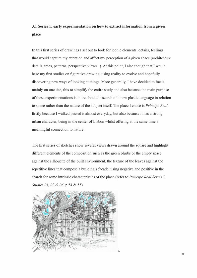
3.1 Series 1: early experimentation on how to extract information from a given place
3.2 Series 2 : drawing through the experience of space and memory
3.3 Series 3 : Creating depth through the use of new techniques and experimentation
on large scale formats
3.4 Series 4 : New grounds of research
3.5 Re-framing my work
3.6 Series 5 : Moving away from the figurative world
3.7 Series 6 : Composition and evolution of a plastic language
4.0 CONCLUSION
BIBLIOGRAPHY & REFERENCES
INDEX
19
0.0 INTRODUCTION
Since my very early years, space has been a real fascination to me. The physical
environment has always been a source of strong sensations, and I believe that our
vision and understanding of the world is not only bound to a physical dimension, but
also to an invisible and more sensitive experience. Clearly, the terminology ´space´
conveys many different interpretations and a multiplicity of phenomenons ranging
from tangible to much more abstract concepts, but amongst many others who have
questioned themselves on the nature and sense of the word, its role and substance, it is
the description of the architect Louis Kahn which I probably relate the most to; ´a result
of a relationship that units form, structure, light ant substance´(Kahn, 2006).
This sensibility and awareness toward space is probably one of the reasons why I
became an architect, deeply attracted since my early days by the unconsciously creative
process embedded into a dialogue between the real and imaginary. If space itself is
still undeniably at the essence of architecture, the profession is nowadays so restricted
by social, financial and political constraints that its relationship with space is mainly
limited to the idea of pure delimitation of ´void´. This explains why since a few years
I have found myself more and more captivated by the very early sketches which
take place at the beginning of a project, the ones that translate the perpetual struggle
between the hand and the head, as they are in many ways a lot more suggestive than the
final architectural drawing and still allow for a certain form of ´escape´.
Space has also been an underlying subject in the transformation and evolution of
the arts, one that played a very strong part in the history of drawing, at least in the
occidental world. In fact one has to travel a long way back to the Renaissance to
find representation of space in drawing; which started with the apparition of Filippo
Brunelleschi’s linear perspective, and later evolved with treaties on perspective and
studies done by Paulo Uccello, Leonardo da Vinci or Albrecht Dürer. Since, perspective
20
became a tool to map out three dimensional objects on a two dimensional surface and
for a long time its main purpose was to depict figurative subjects as well as the beauty
of nature. This form of ´scientific perspective´ is the one that I was taught during my
architectural studies and which I used during the first years of my career to draw space
by hand before computerised drawing took over. This knowledge has given me a very
good basis to dissect and understand the physical rules of space but in recent years, it
has felt like I was missing something, a more sensitive dimension and one of Vieira da
Silva’s quote kept on coming back into my mind; ´I have a passion for perspective...
Not the scientific perspective but a new one made of rhythm, music... (Vieira da Silva
in Daval Béran. D, 1994, p.144).
Since the end of the XIX century, new means of spatial representation have appeared
in the visual arts and to help direct my work from an aesthetic and conceptual point of
view, I have been briefly looking back into history to find references in the different
movements that have challenged the principles of traditional perspective in order to
depict new realities.
From the ´Impressionists´ period, the two artists whom probably fascinate me the
most are Degas and Cezanne. Degas for his avant-garde bird-eyes view compositions,
seeking to generate new spatial feelings, and Cezanne because not only does he break
with the classical laws and academic composition of the Renaissance perspective
but suggests new underlying structures to the visible reality by finding new ways to
represent space; there is no more traditional single point perspective, and each object
seems to be floating independently within the pictorial frame. I also have a great
admiration for the simultaneous viewpoint representations of Braque and Picasso’s
Cubism although I have always felt that their faceted geometrical forms lacked a
certain sense of depth as they somehow emphasized the physical plan of the canvas.
Another movement which paradoxically I never felt very close to, from a plastic point
21
of view, but which has always been a source of wonder is the apparition of the ´grid´
in the middle of the XX century. As an autonomous element in the realm of the arts
the ´grid´ gives a completely new vision of reality and manages to evoke new spatial
phenomenons; ´the grid is the means of crowding out the dimensions of the real and
replacing them with the lateral spread of a single surface...Unlike perspective, the grid
does not map the space of a room or a landscape or a group of figures onto the surface
of a painting. Indeed, if it maps anything, it maps the surface of the painting itself...´
(Krauss, 1979, p.50). Likewise, and as American art critic Rosalind Krauss underlines
in her essays ´Grid´, it carries an interesting duality as the grid can at the same time be
centrifugal, implying continuity beyond the frame and de-materialize the surface of the
painting, or centripetal, focussing on the existence of the work of art as an autonomous
and organic whole (Krauss, 1979, p.63). Nevertheless, the boldness on how the grid
flattens, ´geometrises´ and orders space is probably too radically turned against nature
and generally too abstract for me to follow and explore it in my personal work, at least
as a single element of expression.
Many different movements related to the representation of space have manifested
themselves, and many of them are of interest to me, but the ones which fascinated
me the most are those which re-introduce a sense of depth and movement back into
the work and those which although they may appear to have an abstract language still
convey the presence of a physical reality, whilst going beyond our visual perception
of the world. A place where the mind can flow in between the real and a parallel
universe. Although I can think of many different artists such as Vieira da Silva, or
again contemporary artists such as Abdelkader Benchamma or Diana Al-Hadid whom
all bring these dimensions into their work, I have decided to focus my research on
two different artists, Nadir Afonso, Portuguese artist and architect from the middle of
the XX century and Julie Mehretu, contemporary artist born in Ethiopia and based in
New-York. Firstly because their work are deeply rooted in the expression of space and
evoke simultaneous dynamic performances which have been a real fascination to me
22
since a few years. Secondly, because both have developed two very different abstract
languages to compose with reality; Nadir Afonso’s approach is based on harmonious
geometrical proportions whilst Julie Mehretu’s is more anchored into a psychological
dimension. A very interesting confrontation which I thought would help me developing
the following topics which I proposed to experiment in the practical part of this
dissertation;
1. The quest for new means of spatial representation and solutions not linked
to traditional methods like in architectural drawings but evocative of depth,
perspective and movement. As mentioned above, many other artists have already
pushed these boundaries in the past so the objective is to evolve on a personal level
and detach myself from the figurative techniques I have been using so far.
2. Find my own graphical and plastic language embedded into the physical and
psychological experience of space and to explore other forms of creative and
sensitive expression of space, with the objective that this will allow me to bring
these initial sketches, which for a long time have been a source of inspiration, into
fully autonomous pieces.
3. More generally, this thesis is for me the opportunity to combine my passion for
drawing with my obsession for space.
With regards to the written composition of this dissertation, it is made of two parts. One
composed of the text itself illustrated on the side by the art-pieces I am referring to as
well as a selection of my own work ranging from sketches to more finished drawings.
The second part is a catalogue of all the drawings I have done during this year, as I
believe it is relevant to illustrate the overall development of my work.
As for the structure of the written part, the first chapter is a reflection on the work of
23
the two selected artists in relation to the personal objectives set above, followed by
a second part where I will compare and summarize the different findings, whilst also
reflecting on how these are going influence my work. The third part will be an analysis
of my own work done in parallel with the practical experimentation whilst a fourth
part concludes on the evolution of this personal development and questions the way
forward.
It is also important to note that the chapters of this dissertation have not been written
in a linear way; instead the research on the selected artists was deepened and refined
whilst drawing.
24
1.0 STUDY OF TWO SIGNIFICANT ARTISTS
1.1 Nadir Afonso: Synthesis of space and new spatial rules
Like many other Portuguese artists of the second half of the XX century, Nadir
Afonso’s strong connection with the city of Paris has probably helped me getting
to know his work better over the last decade, having lived in both Paris and Lisbon
and furthermore having the chance to see several of the spaces he represented in
real life. Besides the fact that I have always manifested a strong attraction for his
dynamic and colourful composition, his abstract paintings are highly evocative of all
the different elements that compose an architectural landscape; physical buildings,
squares, movements of the pedestrians, patterns from the elevations, or pavements,
but expressed in a much more poetical way. So the strong connection to the built
environment in his work undoubtedly linked to his architectural background have since
very early on been a source of inspiration.
When Nadir Afonso decides to fully dedicate himself to painting in the 60’s, it was
already a few decades after many experimentations had been developed in Europe in
the strive for a new form of pure art. His body of work, which one could say belongs to
the ´Geometric Abstractionism´ movement is very interesting as it is clearly influenced
by the rigour and structure of the Russian and German ´Abstractionists´ of the first half
of the XX century but presented in a much more expressive way and rooted in a certain
sensitive approach of reality. As such, the different treaties he wrote would always refer
to the ´geometry of art´ against the ´geometry of geometrists’;´geometry is not about
symbols nor anything in particular; rather, it is the spatial law itself...´ (Afonso, 1995,
p.15).
Before studying part of his work, I decided to read several of his treaties and books
to understand the essence of his art which relies on the concept of Harmony; ´unlike
25
the three others qualities of Nature (Perfection, Harmony, Evocation) that correspond
to a specific moment of evolution, Geometrical Harmony is timeless...It is a universal
property of geometric spaces and rhythmic times characterised by the presence of
mathematical proportion´ (Afonso, 1970, p.8). For the Portuguese Artist, composition
itself is governed by pure geometrical rules, mastered by the artist only after a long
process of perceptual practice when he has finally learnt how to disregard the physical
reality. Paradoxically, the search for artistic composition remains essentially intuitive
and art making is not necessarily a conscious process.
Rather than exploring his theory about mathematical proportions, it is in the evolution
of this perceptual and intuitive language that he has developed to mainly represent
spatial arrangements, that I would like to explore further in his work, hoping it could
guide me in my personal development. In fact, representing the built environment
in a non-figurative way has always been a struggle to me so my first objective is to
understand during these following researches the process of how he extracts and
synthesizes forms from architectural landscapes or existing contexts to create a new
body of work which becomes a lot more abstract, some of it de-voided of any explicit
references to the figurative world. In a second part I investigate how these dynamic
compositions challenge the principles of perspective to intensify the feeling of depth
and movement.
1.1.1 Synthesis of space through a new plastic language;
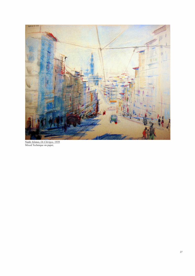
The first two pieces I have chosen to study are Os Clerigos (1939, p.27), a drawing
in pastel Nadir Afonso did at the age of nineteen whilst studying architecture, and the
watercolour Berge (1956, p.29), realised a few years later when he came back to Paris
after his trip to Brazil (the only published version of this image which I found is a black
and white reproduction of it in Les Mechanismes de la Création Artistique (Afonso,
26
1970), I was however fortunate enough to have managed to contact Sra. Laura Afonso,
and to obtain from her a coloured photo of this same work, just as I was putting the
finishing touches to this dissertation. Seeing it in colour adds a whole new dimension to
the work, but does not detract for the principle of simple abstractionism which drew me
to it the first time). Although his early drawings are not as well known as his paintings,
they are plastically very captivating and unmissable to understand the development of
his synthetic language. Later I thought it would also be useful, to add a third artwork, to
refer to some of his later work to understand how he uses a well established graphical
style to compose with space and bring back a certain feeling of depth and movement.
I have chosen for this purpose Figueira da Foz (1970, p.30). The painting belongs to
his emblematic series The Cities and is exhibited in Galleria de São Mamede in Lisbon
which made it easily accessible for study.
Os Clerigos:
The presence of small details such as windows, cornices, the lines of the electric
tramway as well as the typical single-point perspective construction convey to the
drawing a strong figurative nature. However, we can already distinguish a certain desire
to synthesise the graphical expression of this urban landscape. The series of buildings
on the left, expressed via a blue and yellow stains, is very subtractive from reality
whilst the ones on the opposite side of the street would almost disappear if it was not
for the cornices underlining their silhouettes.
The clock tower at the back is also represented with a few blocks of colour stripped
away of any details. As for the graphical expression of the buildings’ elevations, they
are also simplified and reduced to the presence of small colourful lines highlighting
only part of the horizontal elements such as lintels, windows sills or frames, decorative
friezes, as well at the skyline of this typical hillside street of a Portuguese city.
27
Nadir Afonso, Os Clérigos, 1939Mixed Technique on paper,
28
One of the reasons I chose this drawing is that it is on one hand very simplistic, almost
naïve in its representation of space, but the darker and slightly curved lines as well as
the small brush-strokes swirling at the centre convey a strong sense of movement and
already show that the faithful re-transcription of the place was not the main intention.
Instead the rhythm suggested by the different elements of composition as well as the
depth expressed by their intensity and direction seem to be more important to the
young artist. On this subject, Nadir Afonso will write later in his career; ´the role of the
artist is to search for sources of geometric spaces and rhythmic times´(Afonso, 1970,
p.37). We can also start to distinguish the presence of three elements of composition
including the lines, which in this case are used to underline certain objects, the stains
which indicate horizontal or vertical plans like the sky or shades from the street or the
buildings, and finally the small notes inhabiting the urban context such as the cars and
the pedestrians at street level. These three elements will appear more distinctly in his
later work and become the main components of his plastic language to then compose
his own anatomy of space.
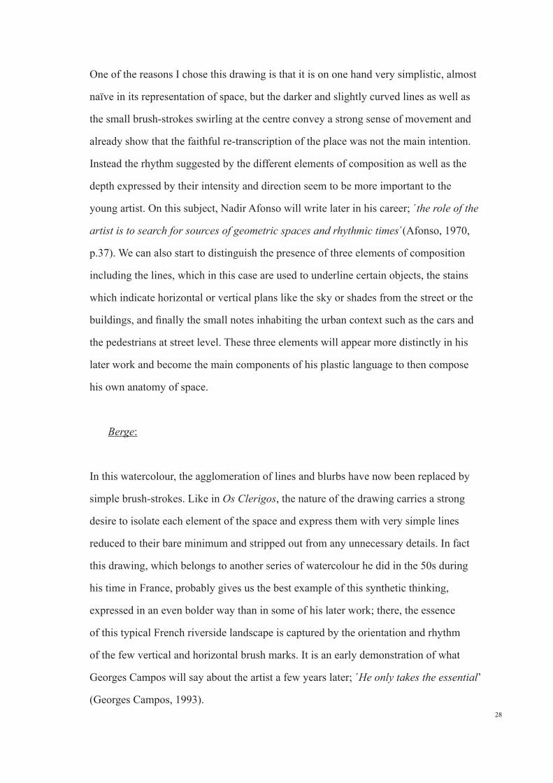
Berge:
In this watercolour, the agglomeration of lines and blurbs have now been replaced by
simple brush-strokes. Like in Os Clerigos, the nature of the drawing carries a strong
desire to isolate each element of the space and express them with very simple lines
reduced to their bare minimum and stripped out from any unnecessary details. In fact
this drawing, which belongs to another series of watercolour he did in the 50s during
his time in France, probably gives us the best example of this synthetic thinking,
expressed in an even bolder way than in some of his later work; there, the essence
of this typical French riverside landscape is captured by the orientation and rhythm
of the few vertical and horizontal brush marks. It is an early demonstration of what
Georges Campos will say about the artist a few years later; ´He only takes the essential’
(Georges Campos, 1993).
29
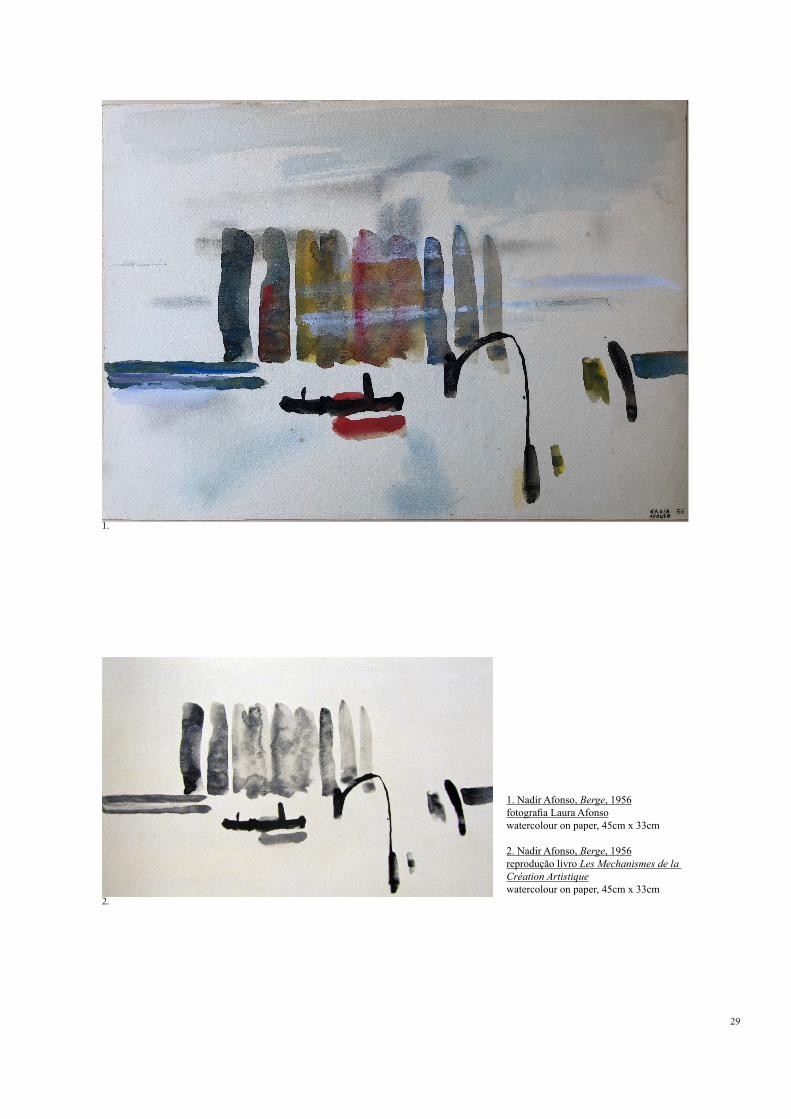
1. Nadir Afonso, Berge, 1956fotografia Laura Afonsowatercolour on paper, 45cm x 33cm
2. Nadir Afonso, Berge, 1956reprodução livro Les Mechanismes de la Création Artistiquewatercolour on paper, 45cm x 33cm
1.
2.
30
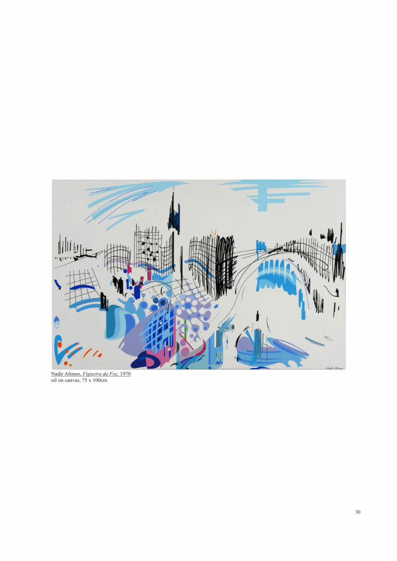
Nadir Afonso, Figueira da Foz, 1970oil on canvas, 75 x 100cm
31
The exaggerated arabesque materialising the bridge stands out from the rest of the
composition made of horizontal and vertical lines and introduces a sense of movement.
This element also already translates a desire to detach himself from the typical frontal
view representation and challenge the traditional principles of perspective which will
disappear in his later work.
Figueira da Foz:
In this painting, his graphical language is now reduced to a subtle interplay between
blurbs and lines and each symbol is expressed in a more assertive way. Like in his
earlier drawings, we find at the back of the composition the evocative silhouette of
a bell tower or a tall building, an icon of the city/space, whilst the organic blurbs of
colours recall either horizontal and vertical plans such as the presence of the sky,
a shadow, a river or a public square. The shapes in the foreground more carefully
modelled and simply executed also seem to suggest the presence of human figures.
New elements, and probably the most iconic and emblematic ones from this series, are
the black vertical lines and hatches suggesting the buildings. Their variable thickness
and strong gestural nature are closed to the expressiveness of an architectural sketch
and for this reason became an obsession to me considering it has been one of my main
objectives for a while. However, when I discovered how his paintings were physically
done, looking at several videos and interviews about the artist, such as the interview
with Luísa Rego in ´O Pensamento e a Obra´ (2012), I was surprised to discover that
each composition is at first very carefully studied on very small formats, using coloured
markers or coloured pencils and that the final artwork is only executed once the perfect
balance between each of the forms has been achieved. In the same way, these black
lines and hatches are the result of a very controlled process leaving very little space to
spontaneity.
32
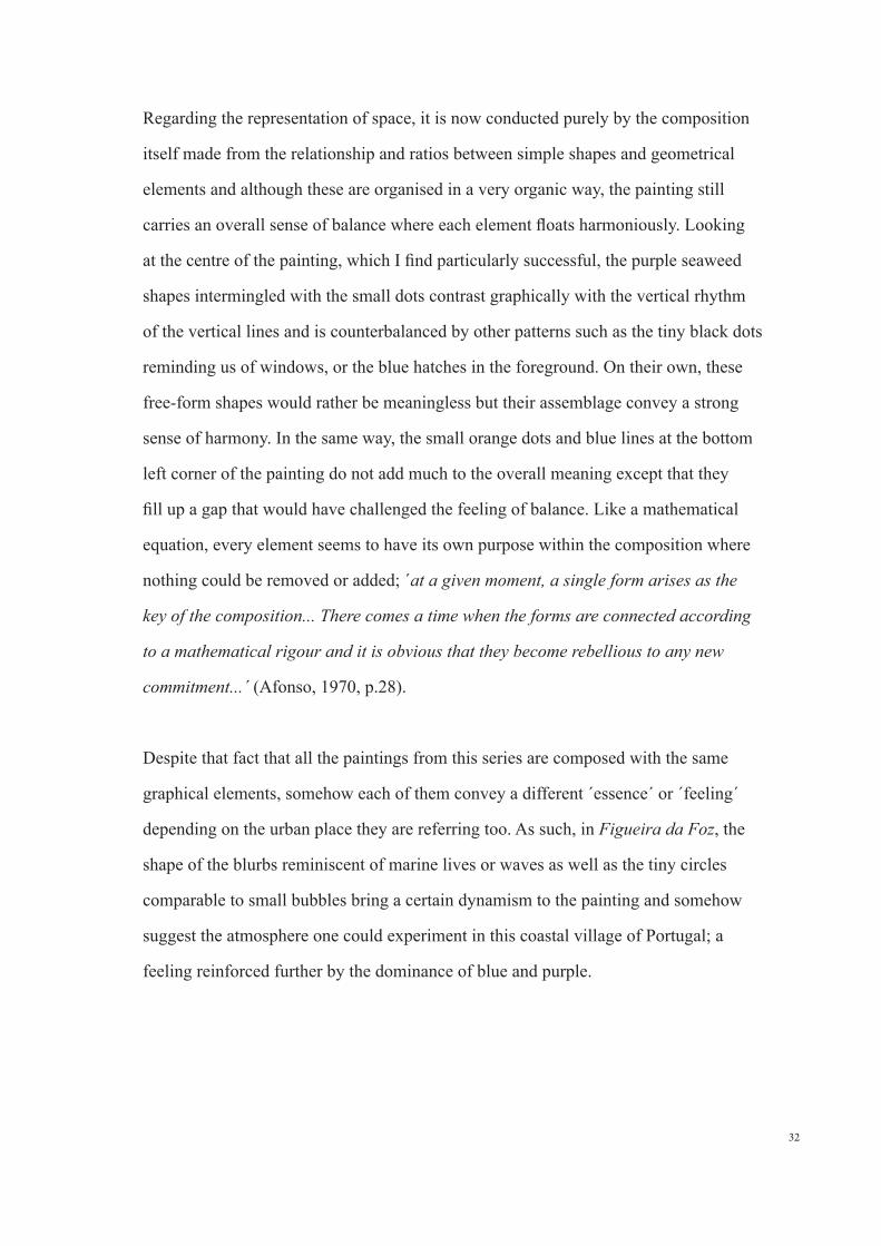
Regarding the representation of space, it is now conducted purely by the composition
itself made from the relationship and ratios between simple shapes and geometrical
elements and although these are organised in a very organic way, the painting still
carries an overall sense of balance where each element floats harmoniously. Looking
at the centre of the painting, which I find particularly successful, the purple seaweed
shapes intermingled with the small dots contrast graphically with the vertical rhythm
of the vertical lines and is counterbalanced by other patterns such as the tiny black dots
reminding us of windows, or the blue hatches in the foreground. On their own, these
free-form shapes would rather be meaningless but their assemblage convey a strong
sense of harmony. In the same way, the small orange dots and blue lines at the bottom
left corner of the painting do not add much to the overall meaning except that they
fill up a gap that would have challenged the feeling of balance. Like a mathematical
equation, every element seems to have its own purpose within the composition where
nothing could be removed or added; ´at a given moment, a single form arises as the
key of the composition... There comes a time when the forms are connected according
to a mathematical rigour and it is obvious that they become rebellious to any new
commitment...´ (Afonso, 1970, p.28).
Despite that fact that all the paintings from this series are composed with the same
graphical elements, somehow each of them convey a different ´essence´ or ´feeling´
depending on the urban place they are referring too. As such, in Figueira da Foz, the
shape of the blurbs reminiscent of marine lives or waves as well as the tiny circles
comparable to small bubbles bring a certain dynamism to the painting and somehow
suggest the atmosphere one could experiment in this coastal village of Portugal; a
feeling reinforced further by the dominance of blue and purple.
33
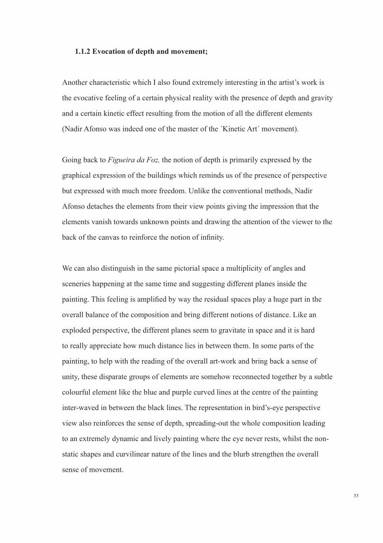
1.1.2 Evocation of depth and movement;
Another characteristic which I also found extremely interesting in the artist’s work is
the evocative feeling of a certain physical reality with the presence of depth and gravity
and a certain kinetic effect resulting from the motion of all the different elements
(Nadir Afonso was indeed one of the master of the ´Kinetic Art´ movement).
Going back to Figueira da Foz, the notion of depth is primarily expressed by the
graphical expression of the buildings which reminds us of the presence of perspective
but expressed with much more freedom. Unlike the conventional methods, Nadir
Afonso detaches the elements from their view points giving the impression that the
elements vanish towards unknown points and drawing the attention of the viewer to the
back of the canvas to reinforce the notion of infinity.
We can also distinguish in the same pictorial space a multiplicity of angles and
sceneries happening at the same time and suggesting different planes inside the
painting. This feeling is amplified by way the residual spaces play a huge part in the
overall balance of the composition and bring different notions of distance. Like an
exploded perspective, the different planes seem to gravitate in space and it is hard
to really appreciate how much distance lies in between them. In some parts of the
painting, to help with the reading of the overall art-work and bring back a sense of
unity, these disparate groups of elements are somehow reconnected together by a subtle
colourful element like the blue and purple curved lines at the centre of the painting
inter-waved in between the black lines. The representation in bird’s-eye perspective
view also reinforces the sense of depth, spreading-out the whole composition leading
to an extremely dynamic and lively painting where the eye never rests, whilst the non-
static shapes and curvilinear nature of the lines and the blurb strengthen the overall
sense of movement.
34
Likewise, graphical expression and colour play a big part in the reading of space.
On this subject, film director Jorge Campos talks in one of his documentaries about;
´relief, volumes that come forward and a space thinking that is extremely close to
architecture but with more freedom´ (Campos, 1993). In this painting, the shapes in the
foreground, made of very strong and dense blurbs of colours are a lot more defined than
the elements in the background. In the same way, Nadir Afonso draws our attention to
certain parts of the painting with the presences of details such as the tiny fuchsia notes
and green lines which stand out from the rest of the composition by their intensity and
very bright colours. Also, we can clearly see that the different tones and shades of blue
and purple in the composition, when overlapped close to each other, convey different
orders of reading. This clearly demonstrates that Nadir Afonso relation with colour does
not have a direct link to real life but instead seek to generate for new senses of depth
and new shapes into the paintings; ´The essence of the colour itself is not important...
Colour only matters in the overall geometric composition and the feeling it invokes’
(Nadir Afonso, 1993).
1.2 Julie Mehretu: physical and psychological dimensions.
The other artist I proposed to study is Julie Mehretu, an artist who I discovered a
few years ago when visiting the Tate Modern in London. Since, her huge structures
characterised by an accumulation of hundreds of precisely defined details, ranging from
architectural rendering to abstract geometrical shapes, have became a real fascination to
me and evoke an encounter with something familiar from my childhood, when I used to
invent and draw imaginary cities.
Another point which also absolutely catches my attention is how she challenges spatial
apprehension to engender a third and fourth dimension in the drawing space; although
her work clearly has a very strong connection to architecture and urban space like in
35
Nadir Afonso’s (even if in her case she does not have an architectural background),
the feeling of movement and depth is not that obvious at first due to the profusion
of details, techniques, references, layering. However, it is when we start looking in
between the different layers of her composition that we discover a subtle interplay of
depths and when suddenly these complexes structures become real living organisms
made of a multiple spaces, times and dimensions.
Furthermore there is something else, like an unconscious phenomenon which somehow
mesmerises me in her work. If Nadir Afonso’s approach which is deeply rooted in
the principle of geometrical harmony, hers confronts pure architectural drawing with
psychological dimensions and mark-making. Space is absorbed psychologically in a
continuous movement engaging directly with the viewer. Indeed, the artist manages to
transform the built environment into explosive domains by capturing a certain vitality
of urban space and bringing together the visible and the invisible, tranquillity and
chaos, the real and the imaginary, all of which are distilled through her own sensitive
spectrum.
Finally, I am interested in her sense of plasticity and hybridized aesthetics which gather
many techniques and media as it is something which I definitively intend to experiment
in my personal work. Even though her plastic language is so diverse and too extensive
to probably belong to one category of medium, in fact art critic T.J Demos says that
´she develops not only a dialectic of matrix and grapheme that is internal to drawing
and painting´ (Demos, 2013, p.60), I am more incline to follow director of MASP
Adriano Pedrosa’s point of view who believes that her ‘emphasis is always on drawing:
sinuous, swirling, straight or erratic lines of different lengths and thickness’ (Pedrosa,
2013, p.196-197).
Therefore, the study of her work follows these different points of interest and is
structured into three parts: the first one explores the different means with how
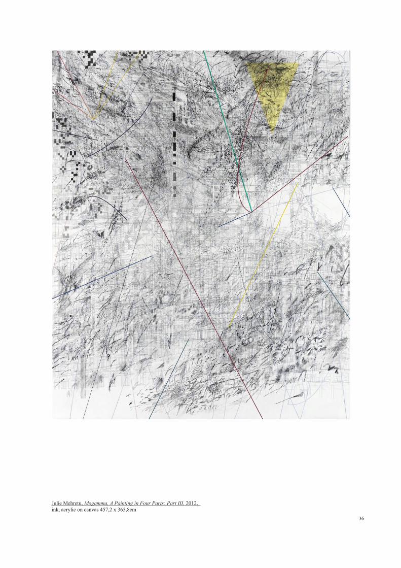
36
Julie Mehretu, Mogamma, A Painting in Four Parts; Part III, 2012, ink, acrylic on canvas 457,2 x 365,8cm
37
she expresses new senses of depth and movement, a second one focusses on her
psychological approach whilst the last one refers to her sense of plasticity. Each of
them will be referring to her masterpiece Mogamma, A Painting in Four Parts (2012,
p.36, p.38 & p.40), although a few other artworks will also be used as points of
reference. The reason I chose this drawing is because it not only displays all the points
I am proposing to research but also because I have had the chance to see Mogamma,
Panel III (2012, p.36) last year when it was exhibited at the London Tate Modern.
1.2.1 Physical depths - third and fourth dimensions;
One characteristic of Julie Mehretu’s work is that it is clearly based on two distinct
processes: ´The early drafting which requires quite a lot of control...Then the very
loose, intuitive investigation thinking’ (Mehretu, 2015). This succession of layers
allows her to express in the same pictorial plane a third and fourth dimension.
Third dimension:
Looking in more detail at this first controlled process of fine pen work, we can
distinguish a multitude of fragmented and discontinuous assemblages of the built
environment including buildings, squares, stadium, arcades, windows, balconies...
represented in two-dimensional techniques such as plans and elevations as well as
perspective and axonometric views. Sometimes elements also appear upside down
like the arcades at bottom of Mogamma, Part III (2012, p.36). Although she clearly
uses linear perspective or bird’s eye view, we can not distinguish any of the vanishing
points as these always seem to be incomplete or blending into the overall frame.
This complexity is emphasized by the use of wire frame technique or ´see-through´
effect which I find very fascinating as this reminds me of the process of drafting an
architectural drawing, capturing at the same time outside and inside spaces and offering
numerous interpretations of the same space.
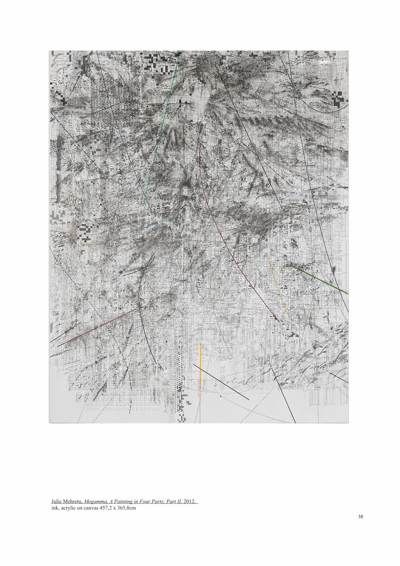
38
Julie Mehretu, Mogamma, A Painting in Four Parts; Part II, 2012, ink, acrylic on canvas 457,2 x 365,8cm
39
Also her ´all-over compositions´, a term that used by T.J Demos (Demos, 2013,
p.57) physically continue beyond the individual canvas’ edges, indicating an endless
infinitude but also dissolving into an endless interiority and therefore emphasizing the
sensation of depth.
Fourth dimension:
Whilst studying Nadir Afonso’s work, I talked about how his graphical style and
composition played a part in the feeling of movement. Julie Mehretu pushes this
dimension further. First of all, it is clearly expressed by these huge clouds made of ink
and acrylic layering which come and sweep the surface of the canvas from left to right.
Graphically, unlike the Portuguese artist where the white and interstitial spaces play an
important part, her intoxicating and vertiginous whirlwind composition orchestrated
with a brave authority shows a dense activity of elements in motion covering the whole
surface; sometimes, it gives way here and there to more open sections but without
interrupting this constant sense of movement.
A more unique experimentation of the fourth dimension engages directly with the
wandering gaze of the moving observer depending on where he stands in relation to
the canvas. As such, from a distance, her composition appears like an intermingling
composition of black and white shades all fused together and punctuated by small
colourful shapes. The architectural layering at the back “melted away” under many
layers, is reduced to a uniform grey wash and it is only when we come closer that we
can distinguish its nature and unimaginable amounts of details: ‘When you start to
come closer to the painting, and you really engage with it, you have got these multiple
experiences in a short amount of time. There are very many different images. As you
process with the image you have to travel through it...It is very cinematic. There is a
time factor in the image...With many perspectives, layers of reading all merged in one
40
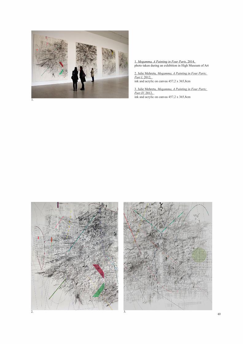
1. Mogamma, A Painting in Four Parts, 2014, photo taken during an exhibition in High Museum of Art
2. Julie Mehretu, Mogamma, A Painting in Four Parts; Part I, 2012, ink and acrylic on canvas 457,2 x 365,8cm
3. Julie Mehretu, Mogamma, A Painting in Four Parts; Part IV, 2012, ink and acrylic on canvas 457,2 x 365,8cm
1.
2. 3.
41
painting’ (Mehretu, 2015). When we start digging even deeper into the drawing, some
singular and significant details also stand out from this architectural grid like. For
example, we can see in the centre of Mogamma Part II & III (2012, p.36 &p.38) some
white circles detaching themselves from the overall background achieved by cutting
down on the transparency effect. These represent the spiral shaped lights of Addis
Ababa’s main square, her native city. The same feeling of surprise happens when we
get closer to these gigantic and beautifully texturised clouds materialised by a swirling
mass of tiny lines and brush-strokes ranging from diluted to very dry brush-strokes.
As for the large coloured bows, their graphical expression also emphasizes the feeling
of movement and infinity as they seem to be fading towards endless vanishing points.
With no real connection the architectural background below, it is not very clear in
which plane, horizontal, vertical or three dimensional space these intervene. On the
opposite, the very defined abstract shapes seem to be completely detached from the
overall composition, floating in space and act as static elements, and allow for the eyes
to rest from the overall chaotic vision. Looking at them from closer, they tend to fade
away and highlight to the viewer part of the architectural layering.
These different levels of readings introducing new temporal and spatial dimensions
are only made possible because of the large scale format, inviting the viewer to dive in
and out of her universe to discover a more complex world like if he had fallen ´through
the other side of the mirror´.The quadriptych nature of Mogamma also emphasizes this
effect (refer to photo p.40) as the viewer needs to cross the whole room in order to read
the full composition; in fact this is a recurrent theme for Julie Mehretu as several of her
works are also spread through several independent canvas.
42
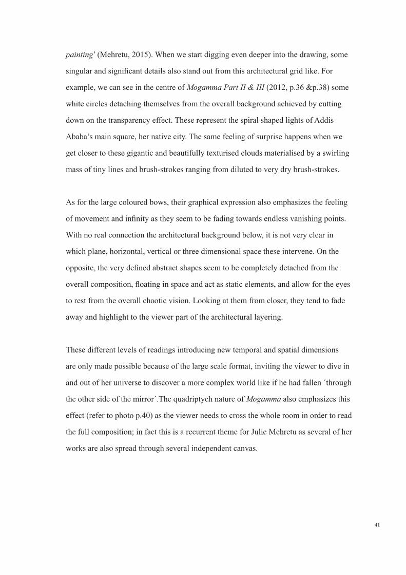
1. Julie Mehretu, Rouge Ascension, 2002, litograph on three sheets 52 x 72.2cm & 62.4 x 81.3cm
2. Julie Mehretu, Mind Breath and Beat Drawing, 2012, graphite on paper 56 × 76cm
1.
2.

43
1.2.2 Expression of a psychological dimension;
Whilst studying her work, I came to understand that none of the places and buildings
part of her architectural assemblage were trivial. Indeed her use of architectural
drawing comes out of a concern with social geopolitics. In the case of Mogamma,
name which refers of the emblematic governmental building of Cairo’s Tahrir Square,
she gathers many different spaces of strong political uprisings inspired from the
´Arab Spring´ and its diverse architectural environment through the inclusion of
various buildings found there like the museums of Egyptians antiquities, Nile Hilton,
Neo-Mamuk styles palaces from the late XIX century; T.J Demos speaks about
her ‘Painterly engagement with networks, social composition and the interrelated
geopolitical sites...Of global conflict, transnational media flows and rebellious
social synergies...` (Demos, 2013, p.55). If her geo-aesthetics or psycho-geography
dimensions occupy a very strong part in her work, their actual meanings is not what I
am proposing to research in this essay. Instead I would like to understand the process
of her intuitive and psychological gestural mark-makings which have become such
a strong characteristic of her work, as they remind me the conceptual language of a
sketch which I have always struggled to bring to finished artwork.
Unlike the architectural grid which is carefully drafted, these abstract and amorphous
swarms of nervous gestures made of pencil, pen, ink and thick streams marks are the
result of a slow and instinctive process done directly on the canvas where no part is
determined beforehand. Julie Mehretu explains that these are the result of `a kind
of intuitive or knowledge underneath the surface that guides me in terms of making
certain type of decision...Feeling the memory of space’ (Mehretu, 2015). In some
places they partially hide or completely obliterated, by quick flicks of a painterly
hand, the architectural drawing like if they wanted to question its status. In fact, these
abstract symbols do not seem to have one but a plurality of meanings; ‘There is a
lot of meanings in the painting but I wouldn’t want to articulate a direct statement...
44
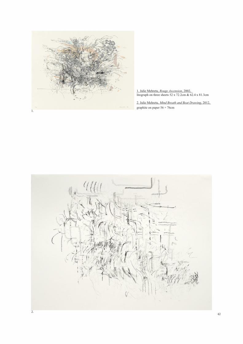
1. Julie Mehretu, Mogamma, A Painting in Four Parts; Part III (Detail) ink & acrylic on canvas 457,2 x 365,8cm
2. Julie Mehretu, Mogamma, A Painting in Four Parts; Part II (Detail)ink & acrylic on canvas 457,2 x 365,8cm
3. Julie Mehretu, Mural, 2010 (Detail)mural for Goldman Sachs lobby, 25 x 7m
1.
2.
3.
45
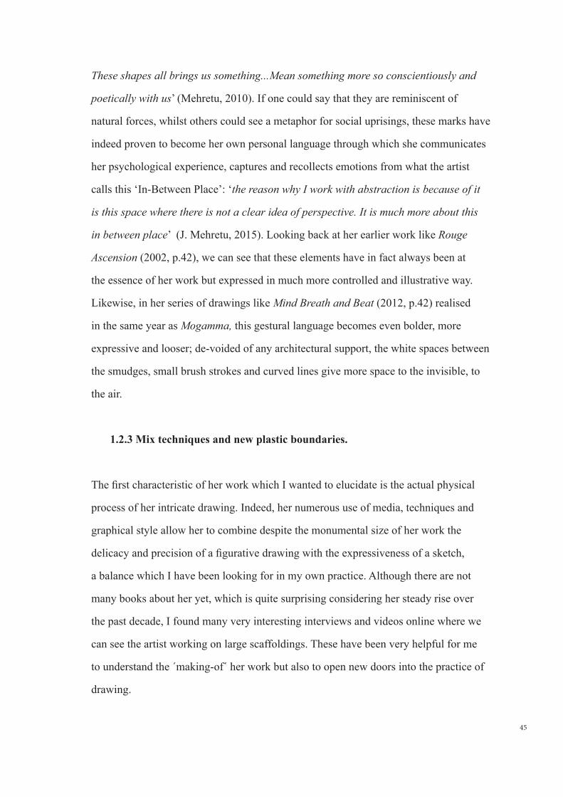
These shapes all brings us something...Mean something more so conscientiously and
poetically with us’ (Mehretu, 2010). If one could say that they are reminiscent of
natural forces, whilst others could see a metaphor for social uprisings, these marks have
indeed proven to become her own personal language through which she communicates
her psychological experience, captures and recollects emotions from what the artist
calls this ‘In-Between Place’: ‘the reason why I work with abstraction is because of it
is this space where there is not a clear idea of perspective. It is much more about this
in between place’ (J. Mehretu, 2015). Looking back at her earlier work like Rouge
Ascension (2002, p.42), we can see that these elements have in fact always been at
the essence of her work but expressed in much more controlled and illustrative way.
Likewise, in her series of drawings like Mind Breath and Beat (2012, p.42) realised
in the same year as Mogamma, this gestural language becomes even bolder, more
expressive and looser; de-voided of any architectural support, the white spaces between
the smudges, small brush strokes and curved lines give more space to the invisible, to
the air.
1.2.3 Mix techniques and new plastic boundaries.
The first characteristic of her work which I wanted to elucidate is the actual physical
process of her intricate drawing. Indeed, her numerous use of media, techniques and
graphical style allow her to combine despite the monumental size of her work the
delicacy and precision of a figurative drawing with the expressiveness of a sketch,
a balance which I have been looking for in my own practice. Although there are not
many books about her yet, which is quite surprising considering her steady rise over
the past decade, I found many very interesting interviews and videos online where we
can see the artist working on large scaffoldings. These have been very helpful for me
to understand the ´making-of´ her work but also to open new doors into the practice of
drawing.
46
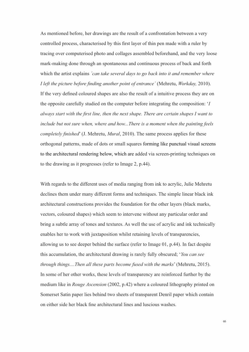
As mentioned before, her drawings are the result of a confrontation between a very
controlled process, characterised by this first layer of thin pen made with a ruler by
tracing over computerised photo and collages assembled beforehand, and the very loose
mark-making done through an spontaneous and continuous process of back and forth
which the artist explains ´can take several days to go back into it and remember where
I left the picture before finding another point of entrance´ (Mehretu, Workday, 2010).
If the very defined coloured shapes are also the result of a intuitive process they are on
the opposite carefully studied on the computer before integrating the composition: ‘I
always start with the first line, then the next shape. There are certain shapes I want to
include but not sure when, where and how...There is a moment when the painting feels
completely finished’ (J. Mehretu, Mural, 2010). The same process applies for these
orthogonal patterns, made of dots or small squares forming like punctual visual screens
to the architectural rendering below, which are added via screen-printing techniques on
to the drawing as it progresses (refer to Image 2, p.44).
With regards to the different uses of media ranging from ink to acrylic, Julie Mehretu
declines them under many different forms and techniques. The simple linear black ink
architectural constructions provides the foundation for the other layers (black marks,
vectors, coloured shapes) which seem to intervene without any particular order and
bring a subtle array of tones and textures. As well the use of acrylic and ink technically
enables her to work with juxtaposition whilst retaining levels of transparencies,
allowing us to see deeper behind the surface (refer to Image 01, p.44). In fact despite
this accumulation, the architectural drawing is rarely fully obscured; ‘You can see
through things....Then all these parts become fused with the marks’ (Mehretu, 2015).
In some of her other works, these levels of transparency are reinforced further by the
medium like in Rouge Ascension (2002, p.42) where a coloured lithography printed on
Somerset Satin paper lies behind two sheets of transparent Denril paper which contain
on either side her black fine architectural lines and luscious washes.
47
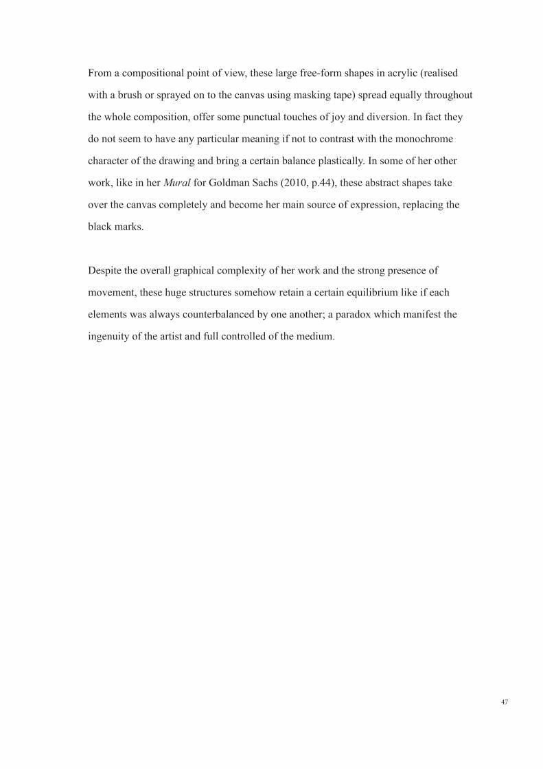
From a compositional point of view, these large free-form shapes in acrylic (realised
with a brush or sprayed on to the canvas using masking tape) spread equally throughout
the whole composition, offer some punctual touches of joy and diversion. In fact they
do not seem to have any particular meaning if not to contrast with the monochrome
character of the drawing and bring a certain balance plastically. In some of her other
work, like in her Mural for Goldman Sachs (2010, p.44), these abstract shapes take
over the canvas completely and become her main source of expression, replacing the
black marks.
Despite the overall graphical complexity of her work and the strong presence of
movement, these huge structures somehow retain a certain equilibrium like if each
elements was always counterbalanced by one another; a paradox which manifest the
ingenuity of the artist and full controlled of the medium.
49
2.0 INITIAL FINDINGS FROM THE WORK OF OTHERS & OBJECTIVES:
2.1 Representation of space
As mentioned earlier, representing the built environment has always been a
preoccupation of mine as I have had difficulty moving away from the static and
traditional rules of perspective and space representation so comparing how these two
artists work with reality to suit their own narratives has been very instructive for me;
Nadir Afonso looks for complementary forms born out from the relationship between
the elements through a subtractive and selective process; ´If the painter is pushed to
express himself by tones, lines, simple surfaces, it is because he has been in the long
run, by working the forms, works by them, sensitive to the specific laws that determine
them and not because he seeks, even if he believes it himself, to express the feelings
of actions or objects’ (Afonso, 1970, p.38), whilst it is via a complex process of
superposition and juxtaposition of figurative elements that Julie Mehretu translates a
new sense of space and recreates her own physical reality. More generally, this research
proved to me that none of them look at abstraction as an end in itself. Instead, the
essence of their own body of work is deeply rooted into the physical world and emerges
through a long process of practice. Julie Mehretu in fact demonstrates that one does not
need to necessary run away from the traditional way of drawing space to engender new
spatial expansiveness; ´I don’t think that any of these drawings are in opposition with
architecture. In fact I think it is about the challenge of one to the other but then there is
other form than can emerge from it and then they merge together....Architecture is this
built environment that we have created overtime’ (Mehretu, 2015).
From a graphical point of view, although I find both languages extremely successful,
Nadir Afonso’s search for new rhythms inside urban-scape is something I would like to
integrate in my personal work as well as his spatial language made of blurbs, lines and
hatches as my early sketches clearly manifest a similar graphical interest. Reflecting on
50
Julie Mehretu’s approach, what interests me the most is this accumulation of details and
layers, bringing at the same time a multiple experiences, dimensions and visions. As an
architect, it is in a way a process which I am very familiar with, working with layers of
tracing papers when designing space.
These studies also demonstrate that there are not one, but many different ways
to express the feeling of depth other than with the traditional rules of perspective
using either graphic style or means of composition. Nadir Afonso plays with the
different ratios between interstitial spaces and elements, as well as with the different
intensities of colour. On the opposite, Julie Mehretu’s sense of depth emanates from
the superposition of her intricate layering process. Thinking about my personal
development, there is not an approach I judge more valid than the other. In fact, I am
more incline to experiment both of them in the hope that it could help me find my own
path.
As for the expression of movement, both works are extremely lively and dynamic.
In their own way they successfully bring the spontaneity and impulsion of a sketch
to a fully autonomous drawing but their processes are paradoxically very controlled
(although Julie Mehretu’s mark-making still allows for some spontaneity); something
to reflect about and decide how to approach this in my personal work. Still on the idea
of movement, Julie Mehretu’s fourth dimension engender by her large scale formats is
an idea which has been recently seducing me as I have sometimes felt quite limited by
the size of paper I normally work with.
2.2 Graphical expression
I intentionally selected two artists with very different plastic styles in order to vary the
references and hopefully reduce the risk to unconsciously replicating or copy one or the
other.
51
Looking at Nadir Afonso’s work and learning about his controlled sense of balance and
harmony have definitively taught me a great deal about composition and have increased
my sense of awareness on this particular subject. Likewise, studying Julie Mehretu
helped me opening doors in my own perception of the medium and understand some
of the challenges I have had in the past when trying to bring my sketches to a finished
drawing; somehow, the finished artworks are always a lot less expressive and evocative
but paradoxically, I have always felt detached from pure gestural drawings. Therefore,
Julie Mehretu proves that one does not need to choose between the two and that
instead, the medium offers a multiplicity of plastic expression, ranging from the very
controlled to very loose mark which when combine, can lead to great outcome.
This research has also freed me up from my previous fears and misconceptions about
colour in the practice of drawing; indeed, I have to admit that I have never felt really
comfortable with it and most of my previous drawings are mainly monochrome (or
limited to one or two tones of colours). Both approaches demonstrate that the use of
colour does not need to have a particular meaning beyond its pure plastic effect.
Furthermore, playing with mix techniques and textures is also another aspect I would
like to investigate through experimentation. In that aspect Julie Mehretu’s expansive
graphical style, mixing, blending and overlaying different media and techniques will be
used a source of inspiration.
2.3 Purpose and meanings
Finally, what these researches made me realised is that prior to finding my own
style, I should first understand what interests me, or what I am trying say through the
representation of space; is it pure plastic effect or harmony like in Nadir Afonso’s
52
work or is it linked to a psychological or political dimension such as Julie Mehretu’s
paintings?
This question is at the moment very hard to respond. Although the sense of graphic
harmony is very important for me, I have been willing to also bring a certain
psychological dimensional into my practice of drawing. Nevertheless, the political,
geopolitical or current social nature of Julie Mehretu’s narrative is not necessarily
something which I feel close to. Instead, the relation between Nature and the
built environment has for the last few years been a source of interest. This might
unconsciously be influenced by today’s discussion about the environmental issues, as
nature always seems to be challenged more and more by the man-made, but it can also
be linked to a more metaphysical question, trying to capture what really lies behind
our pure physical experience and bring to the surface elements of the invisible, such as
movement and sounds of the foliage, silence, light.... Topics which I shall try and define
further through experimentation and make it the guiding theme of my work.
53
3.0 ANALYSIS OF PRACTICAL WORK:
In order to facilitate the experimentation, I have framed the development of my work in
several topics which will be followed in a linear process, one at the time. The first four
series are to be considered purely as experimental ground, trying to find my own path,
whilst the last two series will be analyzed as more defined and assertive work.
It is important to recall that before enrolling into this Master of Drawing at Faculdade
de Lisboa de Belas Artes, most of my drawings were of figurative and illustrative
nature. It was only last year that I started to challenge and try and get out of my zone
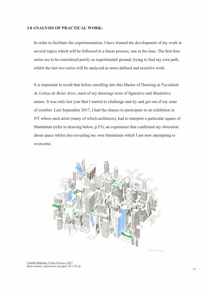
of comfort. Last September 2017, I had the chance to participate in an exhibition in
NY where each artist (many of which architects), had to interpret a particular square of
Manhattan (refer to drawing below, p.53); an experience that confirmed my obsession
about space whilst also revealing my own limitations which I am now attempting to
overcome.
Camille Bonneau, Urban Furrows, 2017black marker, watercolour on paper, 50 x 70 cm
54
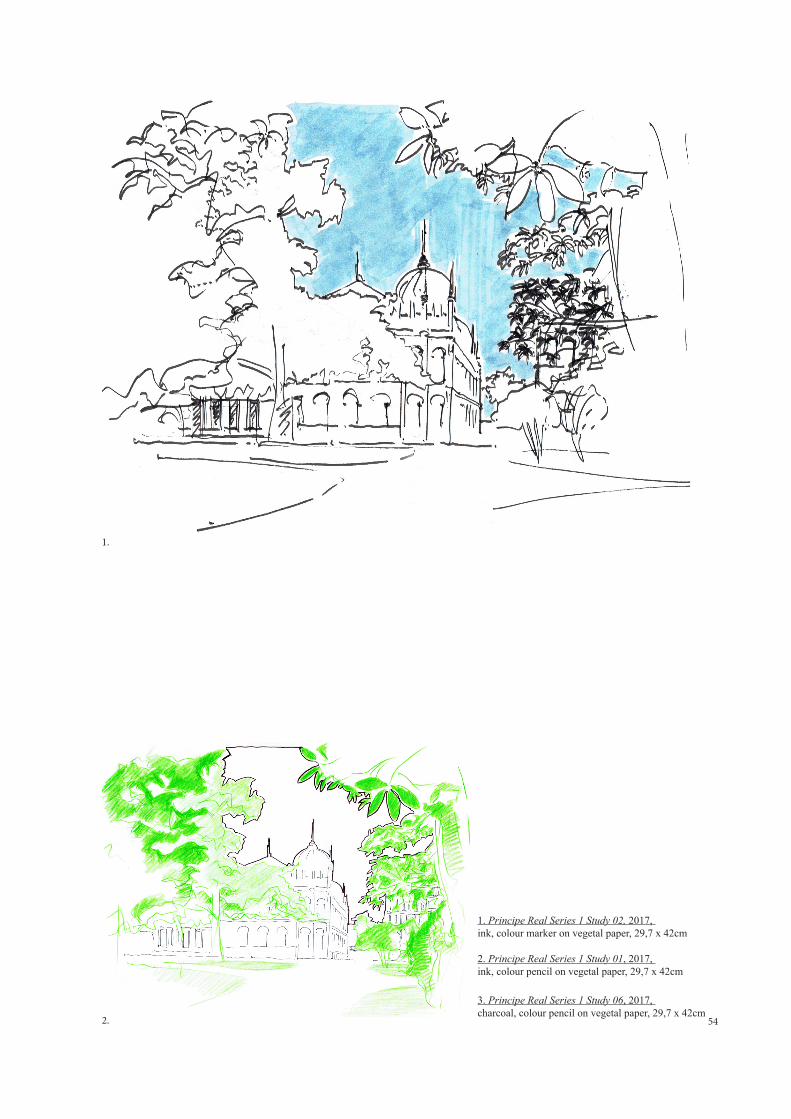
1. Principe Real Series 1 Study 02, 2017, ink, colour marker on vegetal paper, 29,7 x 42cm
2. Principe Real Series 1 Study 01, 2017, ink, colour pencil on vegetal paper, 29,7 x 42cm
3. Principe Real Series 1 Study 06, 2017, charcoal, colour pencil on vegetal paper, 29,7 x 42cm2.
1.
55
1. Principe Real Series 1 Study 02, 2017, ink, colour marker on vegetal paper, 29,7 x 42cm
2. Principe Real Series 1 Study 01, 2017, ink, colour pencil on vegetal paper, 29,7 x 42cm
3. Principe Real Series 1 Study 06, 2017, charcoal, colour pencil on vegetal paper, 29,7 x 42cm
3.1 Series 1: early experimentation on how to extract information from a given
place
In this first series of drawings I set out to look for iconic elements, details, feelings,
that would capture my attention and affect my perception of a given space (architecture
details, trees, patterns, perspective views...). At this point, I also though that I would
base my first studies on figurative drawing, using reality to evolve and hopefully
discovering new ways of looking at things. More generally, I have decided to focus
mainly on one site, this to simplify the entire study and also because the main purpose
of these experimentations is more about the search of a new plastic language in relation
to space rather than the nature of the subject itself. The place I chose is Principe Real,
firstly because I walked passed it almost everyday, but also because it has a strong
urban character, being in the center of Lisbon whilst offering at the same time a
meaningful connection to nature.
The first series of sketches show several views drawn around the square and highlight
different elements of the composition such as the green blurbs or the empty space
against the silhouette of the built environment, the texture of the leaves against the
repetitive lines that compose a building’s facade, using negative and positive in the
search for some intrinsic characteristics of the place (refer to Principe Real Series 1,
Studies 01, 02 & 06, p.54 & 55).
3.
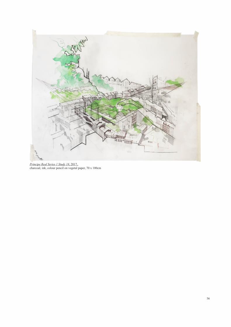
56
Principe Real Series 1 Study 18, 2017, charcoal, ink, colour pencil on vegetal paper, 70 x 100cm

57
Thinking about the work Julie Mehretu and her overlapping of 2D and 3D
representation drawing techniques, I also worked on some axonometric bird-eye studies
(refer to Principe Real Series 1 Studies 18, p.56) based on aerial photographs. There I
was looking for strong guidelines, hidden geometrical relations and important vanishing
points in the city fabric. Using tracing paper as the medium, the transparency allowed
me to recompose, underline, distort certain elements of the composition whilst using
the same base. Some drawings also show an attempt to combine multiple perspectives
views in the same page, a recurrent theme in Nadir Afonso and Julie Merhetu’s work.
Looking back at this first set, the relationship between the different elements of urban-
scape (sky, building, green) I had first proposed to study did not led to any successful
conclusions. In fact, these drawings do not transpire any strong message nor purpose.
Also, from a plastic point of view, they ended up being more illustrative than expected
and the axonometric drawing clearly shows a problem of stylization, with sketchy
architectural lines to represent the building and their elevations in contradiction with
the loose and more organic expression of the green natural blurbs.
On the positive side, they show a growing interest for highlighting the relationship
between natural elements or organic shapes against the built environment, a topic
which as mentioned in the previous chapter has always captivated me. Although very
timidly expressed, the graphic expression of the green foliage manifests a first attempt
to translate depth and layerings which I aimed to develop further in the next studies.
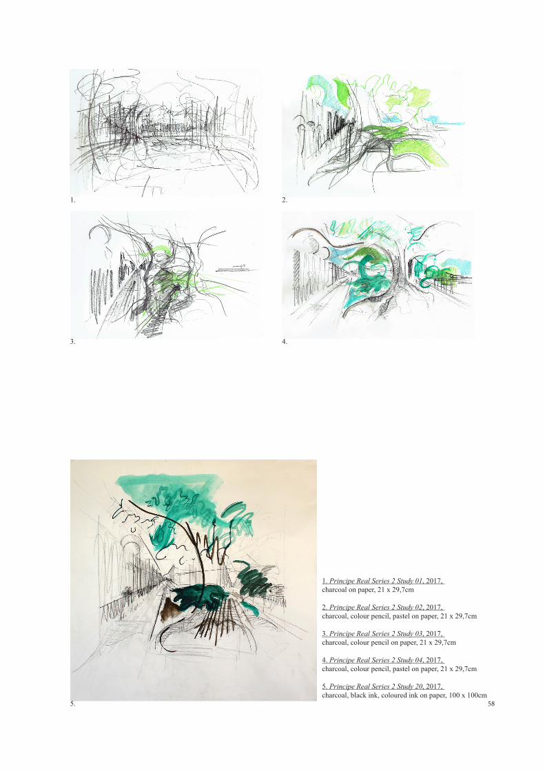
58
2.
4.
1.
3.
1. Principe Real Series 2 Study 01, 2017, charcoal on paper, 21 x 29,7cm
2. Principe Real Series 2 Study 02, 2017, charcoal, colour pencil, pastel on paper, 21 x 29,7cm
3. Principe Real Series 2 Study 03, 2017, charcoal, colour pencil on paper, 21 x 29,7cm
4. Principe Real Series 2 Study 04, 2017, charcoal, colour pencil, pastel on paper, 21 x 29,7cm
5. Principe Real Series 2 Study 20, 2017, charcoal, black ink, coloured ink on paper, 100 x 100cm
5.
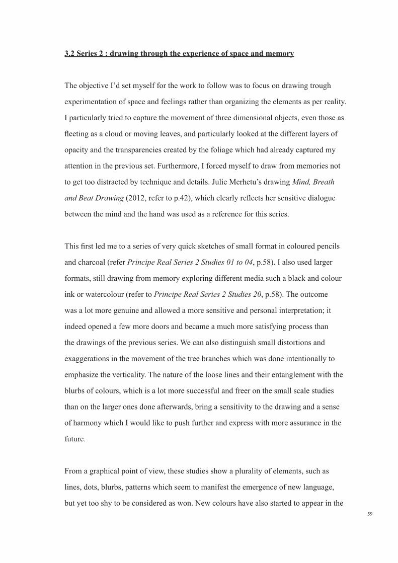
59
3.2 Series 2 : drawing through the experience of space and memory
The objective I’d set myself for the work to follow was to focus on drawing trough
experimentation of space and feelings rather than organizing the elements as per reality.
I particularly tried to capture the movement of three dimensional objects, even those as
fleeting as a cloud or moving leaves, and particularly looked at the different layers of
opacity and the transparencies created by the foliage which had already captured my
attention in the previous set. Furthermore, I forced myself to draw from memories not
to get too distracted by technique and details. Julie Merhetu’s drawing Mind, Breath
and Beat Drawing (2012, refer to p.42), which clearly reflects her sensitive dialogue
between the mind and the hand was used as a reference for this series.
This first led me to a series of very quick sketches of small format in coloured pencils
and charcoal (refer Principe Real Series 2 Studies 01 to 04, p.58). I also used larger
formats, still drawing from memory exploring different media such a black and colour
ink or watercolour (refer to Principe Real Series 2 Studies 20, p.58). The outcome
was a lot more genuine and allowed a more sensitive and personal interpretation; it
indeed opened a few more doors and became a much more satisfying process than
the drawings of the previous series. We can also distinguish small distortions and
exaggerations in the movement of the tree branches which was done intentionally to
emphasize the verticality. The nature of the loose lines and their entanglement with the
blurbs of colours, which is a lot more successful and freer on the small scale studies
than on the larger ones done afterwards, bring a sensitivity to the drawing and a sense
of harmony which I would like to push further and express with more assurance in the
future.
From a graphical point of view, these studies show a plurality of elements, such as
lines, dots, blurbs, patterns which seem to manifest the emergence of new language,
but yet too shy to be considered as won. New colours have also started to appear in the
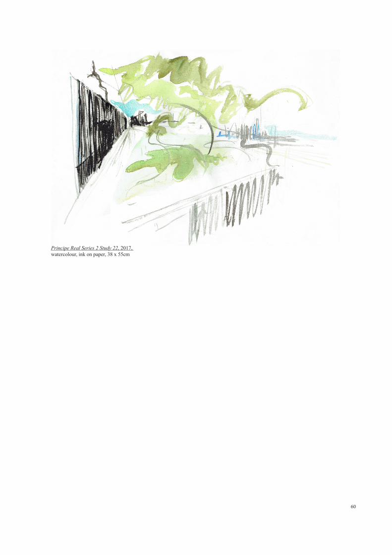
60
Principe Real Series 2 Study 22, 2017, watercolour, ink on paper, 38 x 55cm
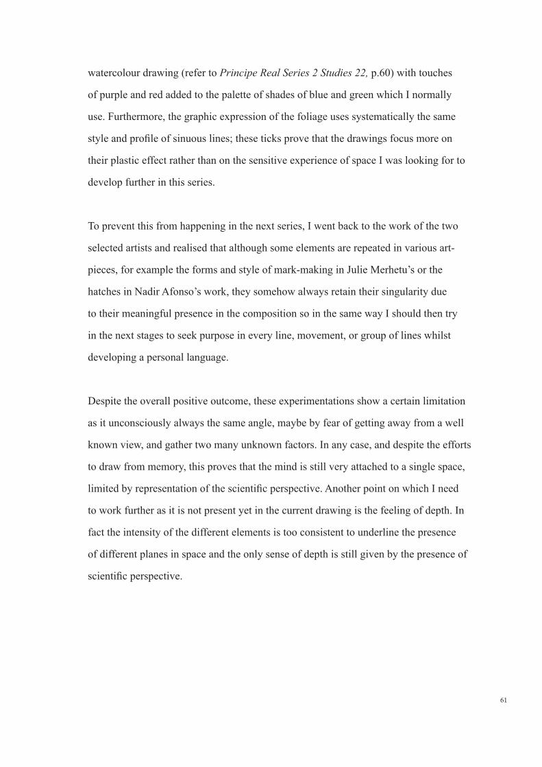
61
watercolour drawing (refer to Principe Real Series 2 Studies 22, p.60) with touches
of purple and red added to the palette of shades of blue and green which I normally
use. Furthermore, the graphic expression of the foliage uses systematically the same
style and profile of sinuous lines; these ticks prove that the drawings focus more on
their plastic effect rather than on the sensitive experience of space I was looking for to
develop further in this series.
To prevent this from happening in the next series, I went back to the work of the two
selected artists and realised that although some elements are repeated in various art-
pieces, for example the forms and style of mark-making in Julie Merhetu’s or the
hatches in Nadir Afonso’s work, they somehow always retain their singularity due
to their meaningful presence in the composition so in the same way I should then try
in the next stages to seek purpose in every line, movement, or group of lines whilst
developing a personal language.
Despite the overall positive outcome, these experimentations show a certain limitation
as it unconsciously always the same angle, maybe by fear of getting away from a well
known view, and gather two many unknown factors. In any case, and despite the efforts
to draw from memory, this proves that the mind is still very attached to a single space,
limited by representation of the scientific perspective. Another point on which I need
to work further as it is not present yet in the current drawing is the feeling of depth. In
fact the intensity of the different elements is too consistent to underline the presence
of different planes in space and the only sense of depth is still given by the presence of
scientific perspective.
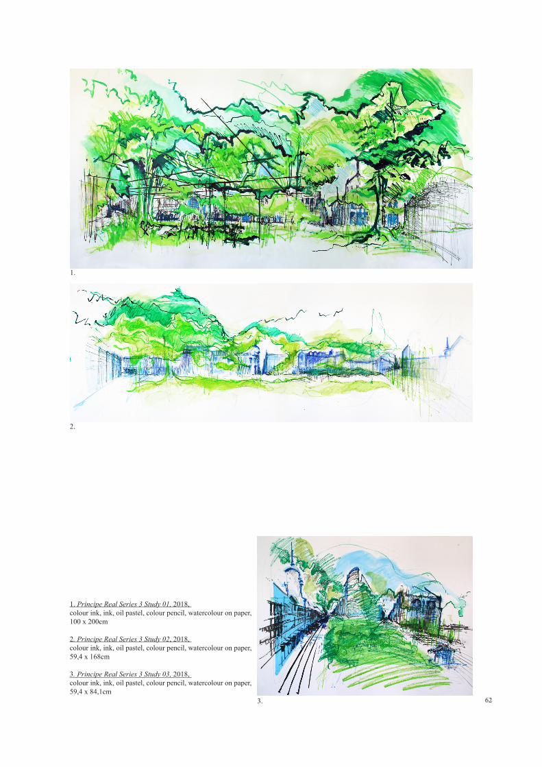
62
1.
2.
3.
1. Principe Real Series 3 Study 01, 2018, colour ink, ink, oil pastel, colour pencil, watercolour on paper, 100 x 200cm
2. Principe Real Series 3 Study 02, 2018, colour ink, ink, oil pastel, colour pencil, watercolour on paper, 59,4 x 168cm
3. Principe Real Series 3 Study 03, 2018, colour ink, ink, oil pastel, colour pencil, watercolour on paper, 59,4 x 84,1cm
63
3.3 Series 3 : Creating depth through the use of new techniques and
experimentation on large scale formats
Keeping in mind the conclusions from the previous set of drawings, as well as the
latest research about Nadir Afonso’s theory on colour to generate new feelings and
representation of space, these next studies reflect on the evocation of depth through
experimentation; concept of drawing which I have in fact proposed to study in the
work of Nadir Afonso and Julie Mehretu and which I have not necessarily been able to
express yet. In parallel, I would like to keep on exploring the mix of techniques started
in the previous exercise as it was also something which attracted me in Julie Mehretu’s
approach.
In this series, I have also felt that it was time to test working on large scale format,
which as explained before, as been an exciting prospect for a long time. Hopefully this
will allow me to free up with hand and release myself from some ‘personal graphic
ticks’ I had started to develop, but also expand my personal development and bring
another dimension to my work by engaging more with the observer like Julie Mehretu’s
large scale pictures (although at this stage I am not yet able to use even larger
dimensions because of a physical limitation of space).
The first set of studies show different formats using mix media including ink, pastel,
watercolour, coloured pencil and charcoal (refer to Principe Real Series 3 Study 01
to 03, p.62). The use of large scale format was in way very thrilling because of the
freedom of graphic movement they allowed. Despite this, the overall result ended-up
being very frustrating; in each of the three of them, and more especially in drawing
Principe Real Series 3 Study 01, the graphic expression for the foliage fails to suggest
depth for multiple reasons; the dark green outlines and hatches which fill up the
underline of some shapes is too intense and their illustrative character breaks with
the harmony of the overall language. Also these have the same thickness regardless

64
1.
2.
1. Principe Real Series 3 Study 05, 2018,pastel, colour pencil, watercolour, charcoal on paper, 59,4 x 84,1cm
2. Principe Real Series 3 Study 08, 2018, colour pencil, colour markers, ink on paper, 59,4 x 84,1cm

65
in which planes they intervene which flattens the whole drawing. This mistake is
also repeated in the expression of the green blurbs, as the different stains have the
same intensity throughout the whole composition. Finally, their superposition does
not allow for any ´gaps´ in between the elements; a technique which I had set as a
reference before starting drawing. The only piece which somehow stands out from the
rest and manages to express a certain type of depth in the expression of the foliage by
preserving the spacing between the blurbs and showing various intensities is Principe
Real Series 3 Study 05 (p.64). Nevertheless, the green shapes at the far back in the
middle of the drawing is too intense and defined for the plane it occupies.
In general, we can still see the same ´ticks´ as before; in fact new ones also started
to appear such as the hatches infilling certain part of the foliage like in architectural
drawings when suggesting a surface or a shading. As for the representation of the
buildings and their construction lines, these are still very much rooted into the
figurative world. In some places, the buildings are suggested by a block or stain of
colour, whilst in others places, their silhouette as well as the different elements of
composition of the facades are very well defined. Somehow, I must have became
overwhelmed with the large scale format and have forgotten all initial intentions.
Despite a feeling of ´defeat´, an element which I find graphically pleasant and
captivating is the overall harmony which emanate from the different shades of green.
If might also be worth to remember at this stage that my use of colour is dominated
if not limited by the use of green and blue tones, a palette I have been using for a few
years and which must be somehow have become an unconscious process rooted when
doing architectural illustrations drawings (blue for the sky and green for the organic
elements). As mentioned before, my previous drawings were mainly monochrome
so although it will probably take some time to use colour in a more confident way, I
should try and free myself from this restriction.
66
This series also has a couple more drawings of a different graphical style (refer to
Principe Real Series 03 Study 08, p.64). However, I do not feel it is necessary to talk
about them in too much detail; firstly because they ended up intentionally stylizing
some of Nadir Afonso’s own graphic language and also because they do not respond to
any of the initial objectives I had set myself.
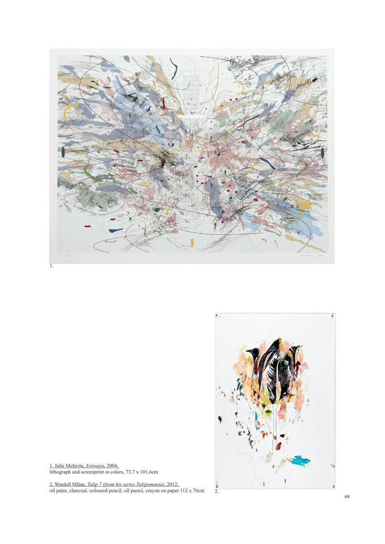
68
1. Julie Mehretu, Entropia, 2004, lithograph and screenprint in colors, 73,7 x 101,6cm 2. Wardell Milan, Tulip 7 (from his series Tulipomania), 2012, oil paint, charcoal, coloured pencil, oil pastel, crayon on paper 112 x 76cm
1.
2.
69
3.4 Series 4 : New grounds of research
At this point, I thought that enlarging my field of research to other sources of
inspirations would help me move away from using involuntary graphical language
similar to the two selected artists.
Whilst deepening my research on Nadir Afonso and Julie Mehretu in relation to the
expression of depth, I started looking at Hans Hoffman’s theory of ´Push & Pull´ on
how to suggest different planes and movement in the picture by contrast of colour and
texture. I also researched the work of contemporary artist Wardell Milan and more
especially his suite of images called Tulipomonia started in 2010 (refer to Tulip 7,
p.68); not necessarily for his concept of drawing which does not have direct link with
space representation and instead depicts flowery elements which expressly recall the
XVII century speculative bubble in Holland (Merjian, 2013, p.184) but purely for
his use of mix techniques and textures. Like in Julie Mehretu’s work Wardell Milan
incorporates everything on paper from oil, to crayon, to colour pencil, oil pastel and
charcoal playing with the different opacity of each medium. In fact, the overall layering
process as well his sense of movement which emanate from the overlapping of many
different brushes, textures and techniques, like a swarming of organic elements swirling
around the flower, reminds me of some of Julie Mehretu’s graphical expression whilst
the small touches smeared and daubed well outside the outline of the object it describes
and some of his purely calligraphic gestures are similar to Nadir Afonso’s attention to
details to bring the viewer attention in certain part of the composition.
In the same way, I also thought that focusing for a while on other sites than Principe
Real would prevent me from always using the same point of views and unblock
the current difficulties I have moving away from figurative representation. I did not
however turned my back on all the different elements or feelings that emerged in the
first experimentations and continued to develop my obsession about the expression of
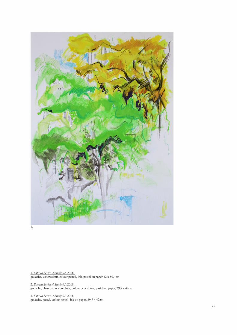
70
1. Estrela Series 4 Study 02, 2018, gouache, watercolour, colour pencil, ink, pastel on paper 42 x 59,4cm
2. Estrela Series 4 Study 05, 2018, gouache, charcoal, watercolour, colour pencil, ink, pastel on paper, 29,7 x 42cm
3. Estrela Series 4 Study 07, 2018, gouache, pastel, colour pencil, ink on paper, 29,7 x 42cm
1.
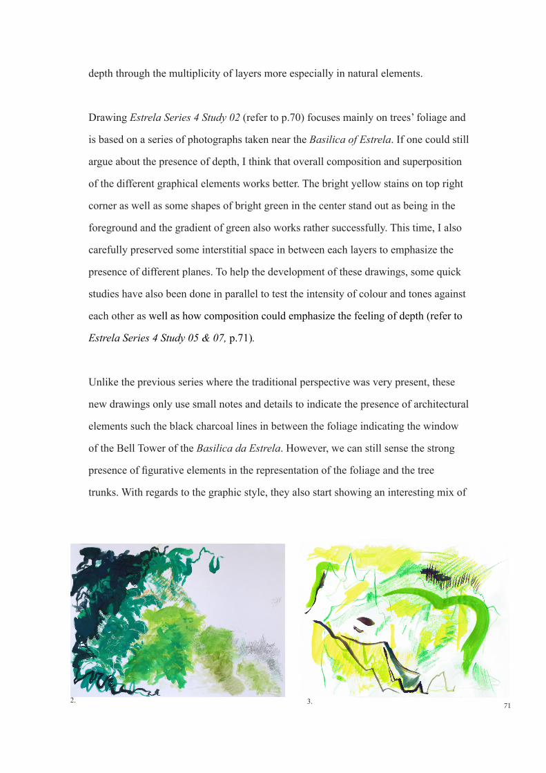
71
depth through the multiplicity of layers more especially in natural elements.
Drawing Estrela Series 4 Study 02 (refer to p.70) focuses mainly on trees’ foliage and
is based on a series of photographs taken near the Basilica of Estrela. If one could still
argue about the presence of depth, I think that overall composition and superposition
of the different graphical elements works better. The bright yellow stains on top right
corner as well as some shapes of bright green in the center stand out as being in the
foreground and the gradient of green also works rather successfully. This time, I also
carefully preserved some interstitial space in between each layers to emphasize the
presence of different planes. To help the development of these drawings, some quick
studies have also been done in parallel to test the intensity of colour and tones against
each other as well as how composition could emphasize the feeling of depth (refer to
Estrela Series 4 Study 05 & 07, p.71).
Unlike the previous series where the traditional perspective was very present, these
new drawings only use small notes and details to indicate the presence of architectural
elements such the black charcoal lines in between the foliage indicating the window
of the Bell Tower of the Basilica da Estrela. However, we can still sense the strong
presence of figurative elements in the representation of the foliage and the tree
trunks. With regards to the graphic style, they also start showing an interesting mix of
3. 2.
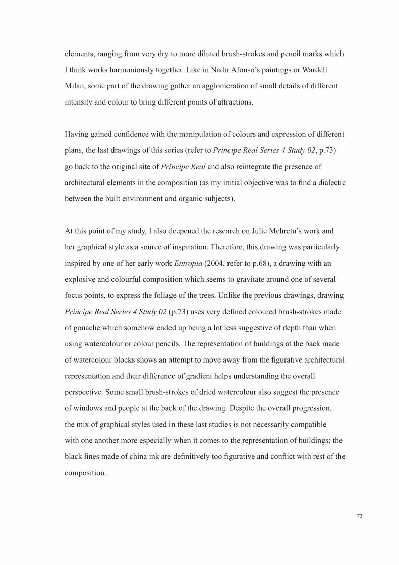
72
elements, ranging from very dry to more diluted brush-strokes and pencil marks which
I think works harmoniously together. Like in Nadir Afonso’s paintings or Wardell
Milan, some part of the drawing gather an agglomeration of small details of different
intensity and colour to bring different points of attractions.
Having gained confidence with the manipulation of colours and expression of different
plans, the last drawings of this series (refer to Principe Real Series 4 Study 02, p.73)
go back to the original site of Principe Real and also reintegrate the presence of
architectural elements in the composition (as my initial objective was to find a dialectic
between the built environment and organic subjects).
At this point of my study, I also deepened the research on Julie Mehretu’s work and
her graphical style as a source of inspiration. Therefore, this drawing was particularly
inspired by one of her early work Entropia (2004, refer to p.68), a drawing with an
explosive and colourful composition which seems to gravitate around one of several
focus points, to express the foliage of the trees. Unlike the previous drawings, drawing
Principe Real Series 4 Study 02 (p.73) uses very defined coloured brush-strokes made
of gouache which somehow ended up being a lot less suggestive of depth than when
using watercolour or colour pencils. The representation of buildings at the back made
of watercolour blocks shows an attempt to move away from the figurative architectural
representation and their difference of gradient helps understanding the overall
perspective. Some small brush-strokes of dried watercolour also suggest the presence
of windows and people at the back of the drawing. Despite the overall progression,
the mix of graphical styles used in these last studies is not necessarily compatible
with one another more especially when it comes to the representation of buildings; the
black lines made of china ink are definitively too figurative and conflict with rest of the
composition.
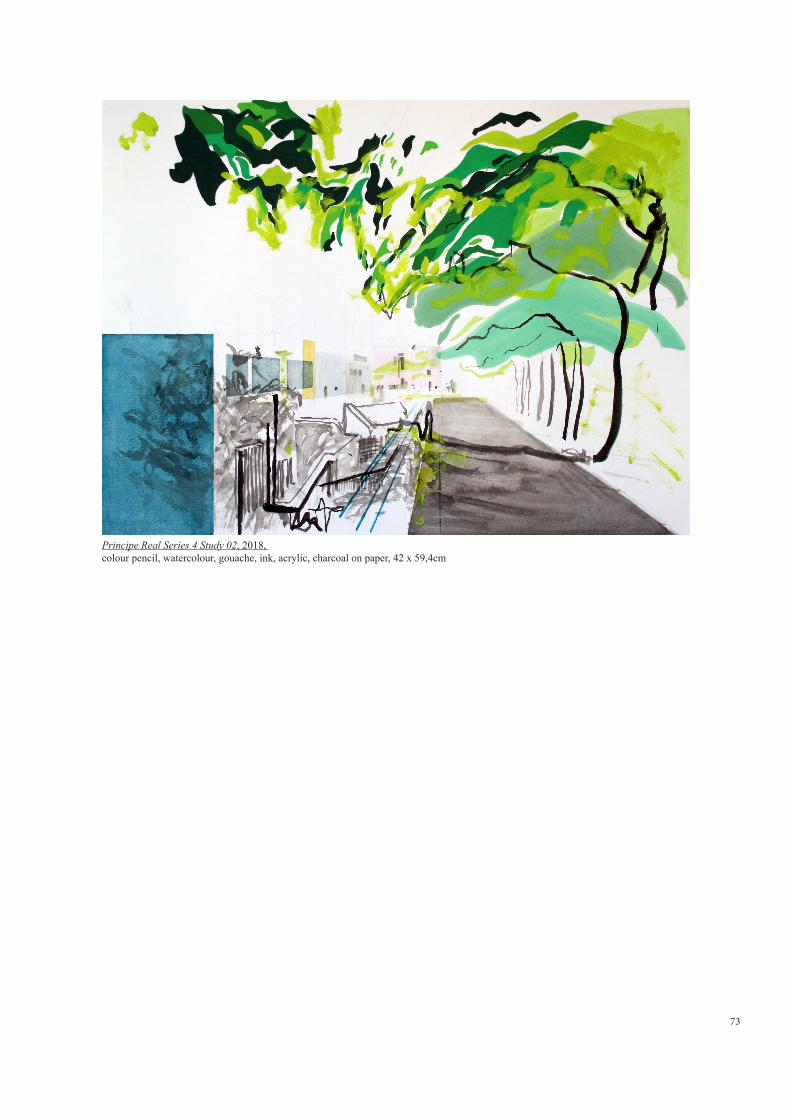
73
Principe Real Series 4 Study 02, 2018, colour pencil, watercolour, gouache, ink, acrylic, charcoal on paper, 42 x 59,4cm
74
3.5 Re-framing my work:
Looking back at these last few months and reflecting on the drawings done so far, I
came to the conclusion that my work was not necessarily taking the direction I was
hoping for. Although I found some enjoyment in the ´practice´, pushing the use of
new media and techniques further, I was not yet satisfied with the results and believe
that I should re-frame my experimentations further, and focus more carefully on the
topics studied in the first chapters whilst analyzing the two selected artists. Thus to
move forward I decided to refine the objectives I had set myself at the beginning of the
dissertation:
1. Spatial representation:
The first objective then set myself was that I should definitively avoid references to
linear perspective, still very present in all of my drawings up to this stage. Also, if
I could see a progression in these last series with the different intensities of colour,
depth and movement are hardly the first elements that emanate from my drawings.
Somehow, letting go of the traditional techniques have been a constant battle since
the beginning, a battle which Nadir Afonso’s words resumes indeed very well;
´The artist is forced at one point in his evolution to fight on two fronts: against the
objective forms which satisfy his emotional feeling, incomprehensibly impede his
plastic sensitivity and against forms which, he agrees not less incomprehensibly, do
not satisfy his reason and his sense of the representation of objects...Struggle takes
place at the level of the pre-consciousness ...The artist then persists in expressing
the subjective, seeking the magic, manipulating the mystery, the supernatural, and
it only reaches a representation of the real more or less disfigured. To fight against
prejudices and beliefs, there is only one weapon, the practice, which informs it
quite differently´ (Afonso, 1970, p32).
One of the main characteristic that attracted me in the two artists is that they both

75
find the right balance between the figurative world and abstraction; in the same
way, it has never been a question for me to completely lose sight of the empirical
reality, but instead to find a language made of signs and symbols to reflect the
various elements and feelings retained by the mind and find a mode of expression
that allows me to transcribe a personal and sensitive vision of space.
2. Plastic language:
Despite the fact that the introduction to new media and colour into my practice of
drawing has been a great mind opening experience, a sense of plastic language is
probably what has proven to be lacking the most. Even though I am conscious that
I might not find a graphic style with which I am fully satisfy at the end of this thesis
(studying the work of artists had also shown that an artistic language is not a fixed
tool, but one that keeps on growing through practice) I should be more careful not
to mix disparate styles and contradictory techniques. As for the dialectic between
the blurbs and the lines which is becoming more and more evident in my work,
I still need to find in them a stronger connection and meaning in their evocation
of space and decide if graphically the nature and built environment should be
expressed using the same or a completely different language?
Finally, the other main concern is the lack of composition and the fact that none
of drawing have their own autonomy yet. Following my research on the previous
chapters and analysis of Nadir Afonso and Julie Mehretu’s work, I should indeed
start to give more importance and reflect further on how to integrate each elements
inside the composition and experiment different ways of filling the paper space to
compare the effects.
With all of the above points, I am sure that they will become easier with time
and practice in looking at things, but before all, I should understand myself what
exactly I am looking for in this relation between Nature and the urban-scape?
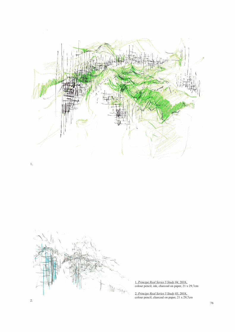
76
1.
2.
1. Principe Real Series 5 Study 04, 2018, colour pencil, ink, charcoal on paper, 21 x 29,7cm 2. Principe Real Series 5 Study 03, 2018, colour pencil, charcoal on paper, 21 x 29,7cm
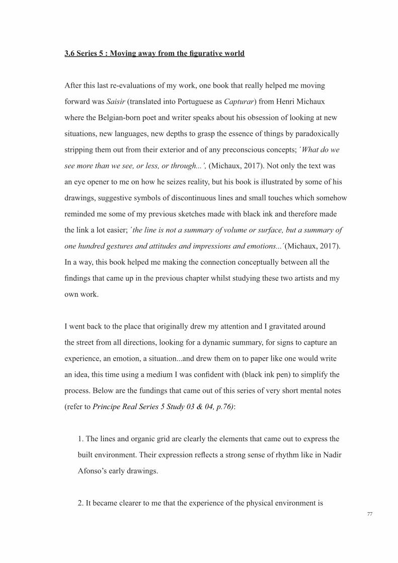
77
3.6 Series 5 : Moving away from the figurative world
After this last re-evaluations of my work, one book that really helped me moving
forward was Saisir (translated into Portuguese as Capturar) from Henri Michaux
where the Belgian-born poet and writer speaks about his obsession of looking at new
situations, new languages, new depths to grasp the essence of things by paradoxically
stripping them out from their exterior and of any preconscious concepts; ´What do we
see more than we see, or less, or through...’, (Michaux, 2017). Not only the text was
an eye opener to me on how he seizes reality, but his book is illustrated by some of his
drawings, suggestive symbols of discontinuous lines and small touches which somehow
reminded me some of my previous sketches made with black ink and therefore made
the link a lot easier; ´the line is not a summary of volume or surface, but a summary of
one hundred gestures and attitudes and impressions and emotions...´(Michaux, 2017).
In a way, this book helped me making the connection conceptually between all the
findings that came up in the previous chapter whilst studying these two artists and my
own work.
I went back to the place that originally drew my attention and I gravitated around
the street from all directions, looking for a dynamic summary, for signs to capture an
experience, an emotion, a situation...and drew them on to paper like one would write
an idea, this time using a medium I was confident with (black ink pen) to simplify the
process. Below are the fundings that came out of this series of very short mental notes
(refer to Principe Real Series 5 Study 03 & 04, p.76):
1. The lines and organic grid are clearly the elements that came out to express the
built environment. Their expression reflects a strong sense of rhythm like in Nadir
Afonso’s early drawings.
2. It became clearer to me that the experience of the physical environment is
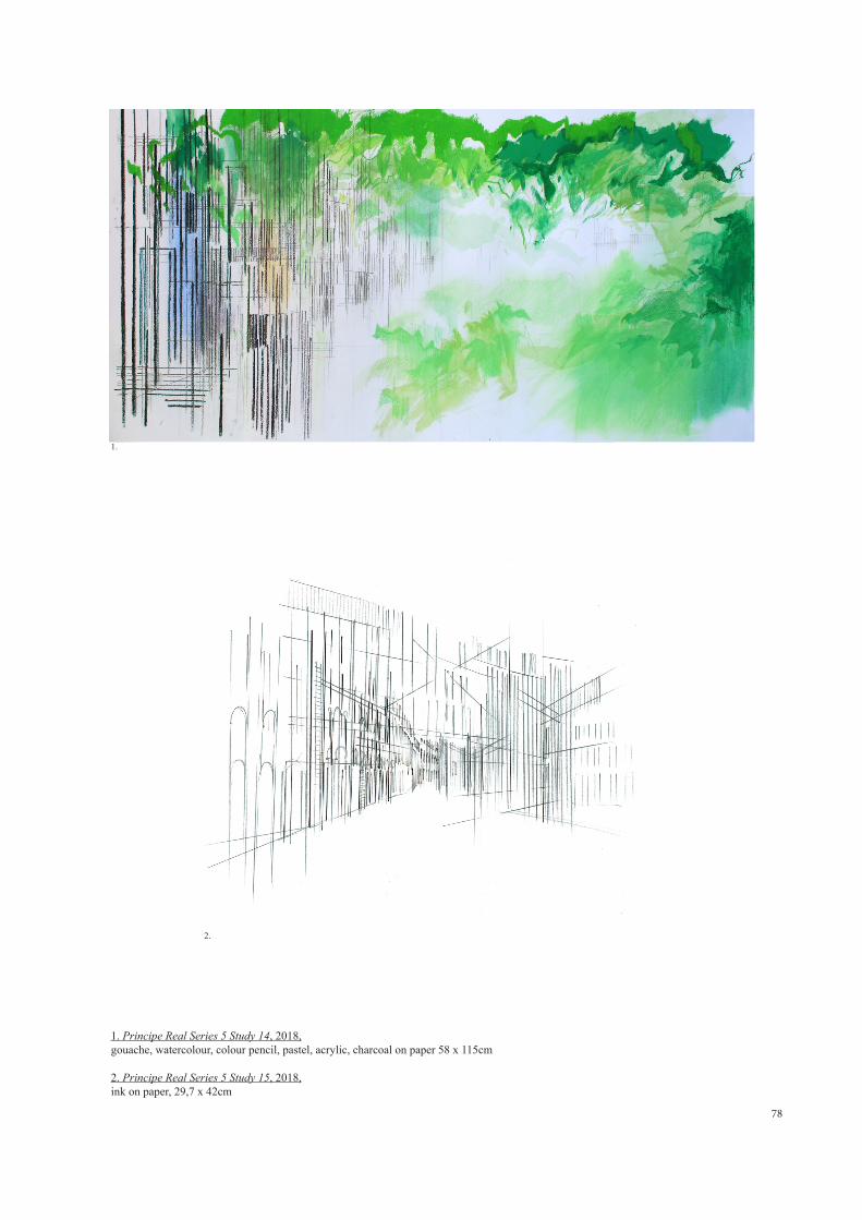
78
1. Principe Real Series 5 Study 14, 2018,gouache, watercolour, colour pencil, pastel, acrylic, charcoal on paper 58 x 115cm
2. Principe Real Series 5 Study 15, 2018,ink on paper, 29,7 x 42cm
1.
2.
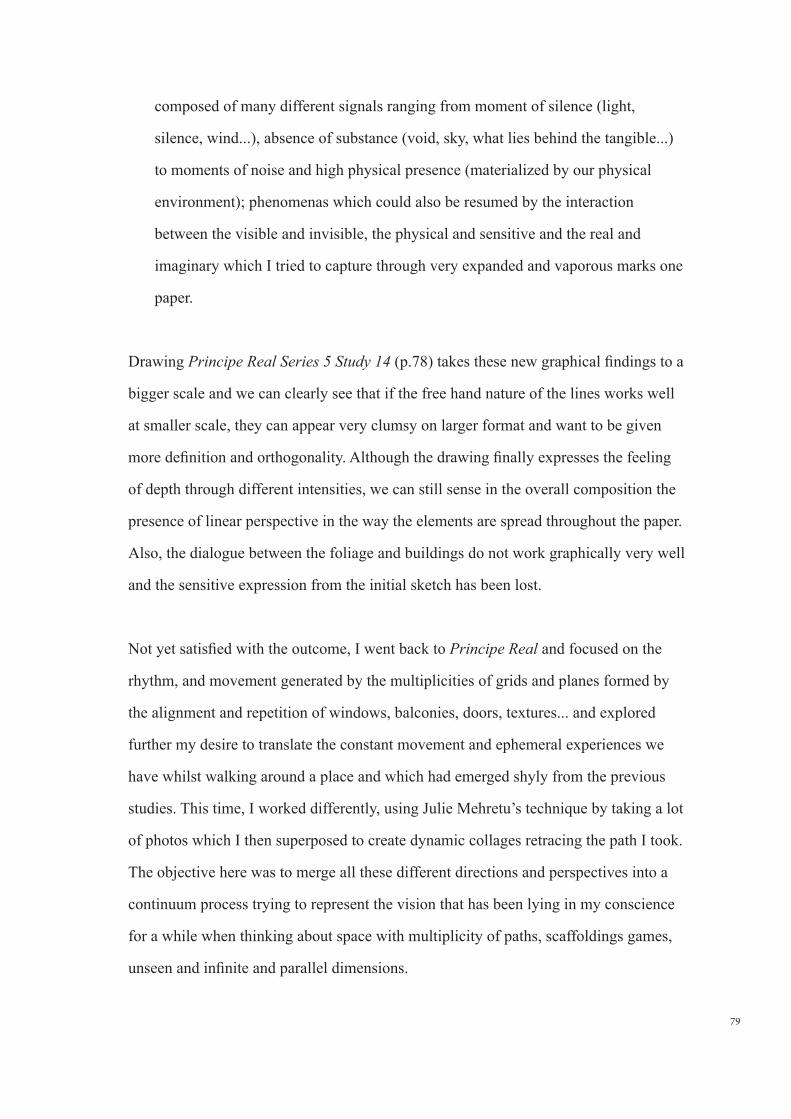
79
composed of many different signals ranging from moment of silence (light,
silence, wind...), absence of substance (void, sky, what lies behind the tangible...)
to moments of noise and high physical presence (materialized by our physical
environment); phenomenas which could also be resumed by the interaction
between the visible and invisible, the physical and sensitive and the real and
imaginary which I tried to capture through very expanded and vaporous marks one
paper.
Drawing Principe Real Series 5 Study 14 (p.78) takes these new graphical findings to a
bigger scale and we can clearly see that if the free hand nature of the lines works well
at smaller scale, they can appear very clumsy on larger format and want to be given
more definition and orthogonality. Although the drawing finally expresses the feeling
of depth through different intensities, we can still sense in the overall composition the
presence of linear perspective in the way the elements are spread throughout the paper.
Also, the dialogue between the foliage and buildings do not work graphically very well
and the sensitive expression from the initial sketch has been lost.
Not yet satisfied with the outcome, I went back to Principe Real and focused on the
rhythm, and movement generated by the multiplicities of grids and planes formed by
the alignment and repetition of windows, balconies, doors, textures... and explored
further my desire to translate the constant movement and ephemeral experiences we
have whilst walking around a place and which had emerged shyly from the previous
studies. This time, I worked differently, using Julie Mehretu’s technique by taking a lot
of photos which I then superposed to create dynamic collages retracing the path I took.
The objective here was to merge all these different directions and perspectives into a
continuum process trying to represent the vision that has been lying in my conscience
for a while when thinking about space with multiplicity of paths, scaffoldings games,
unseen and infinite and parallel dimensions.
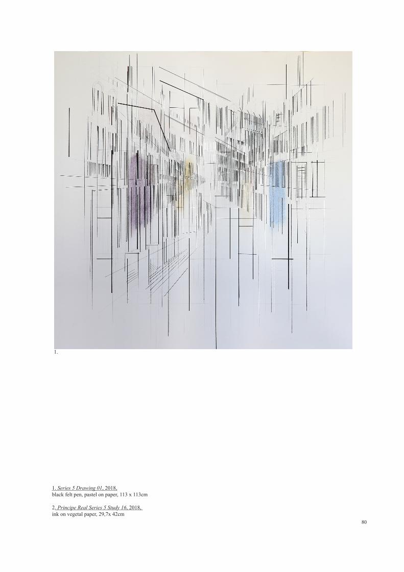
80
1. Series 5 Drawing 01, 2018,black felt pen, pastel on paper, 113 x 113cm
2. Principe Real Series 5 Study 16, 2018, ink on vegetal paper, 29,7x 42cm
1.
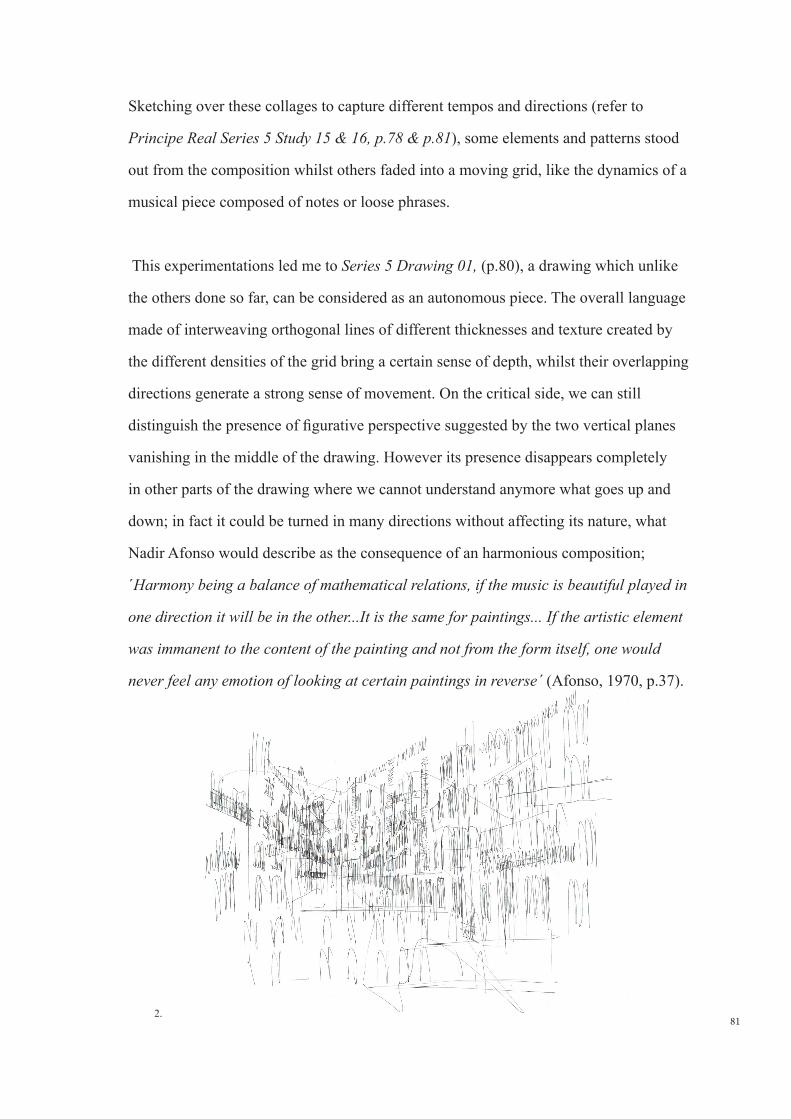
81
Sketching over these collages to capture different tempos and directions (refer to
Principe Real Series 5 Study 15 & 16, p.78 & p.81), some elements and patterns stood
out from the composition whilst others faded into a moving grid, like the dynamics of a
musical piece composed of notes or loose phrases.
This experimentations led me to Series 5 Drawing 01, (p.80), a drawing which unlike
the others done so far, can be considered as an autonomous piece. The overall language
made of interweaving orthogonal lines of different thicknesses and texture created by
the different densities of the grid bring a certain sense of depth, whilst their overlapping
directions generate a strong sense of movement. On the critical side, we can still
distinguish the presence of figurative perspective suggested by the two vertical planes
vanishing in the middle of the drawing. However its presence disappears completely
in other parts of the drawing where we cannot understand anymore what goes up and
down; in fact it could be turned in many directions without affecting its nature, what
Nadir Afonso would describe as the consequence of an harmonious composition;
´Harmony being a balance of mathematical relations, if the music is beautiful played in
one direction it will be in the other...It is the same for paintings... If the artistic element
was immanent to the content of the painting and not from the form itself, one would
never feel any emotion of looking at certain paintings in reverse´ (Afonso, 1970, p.37).
2.
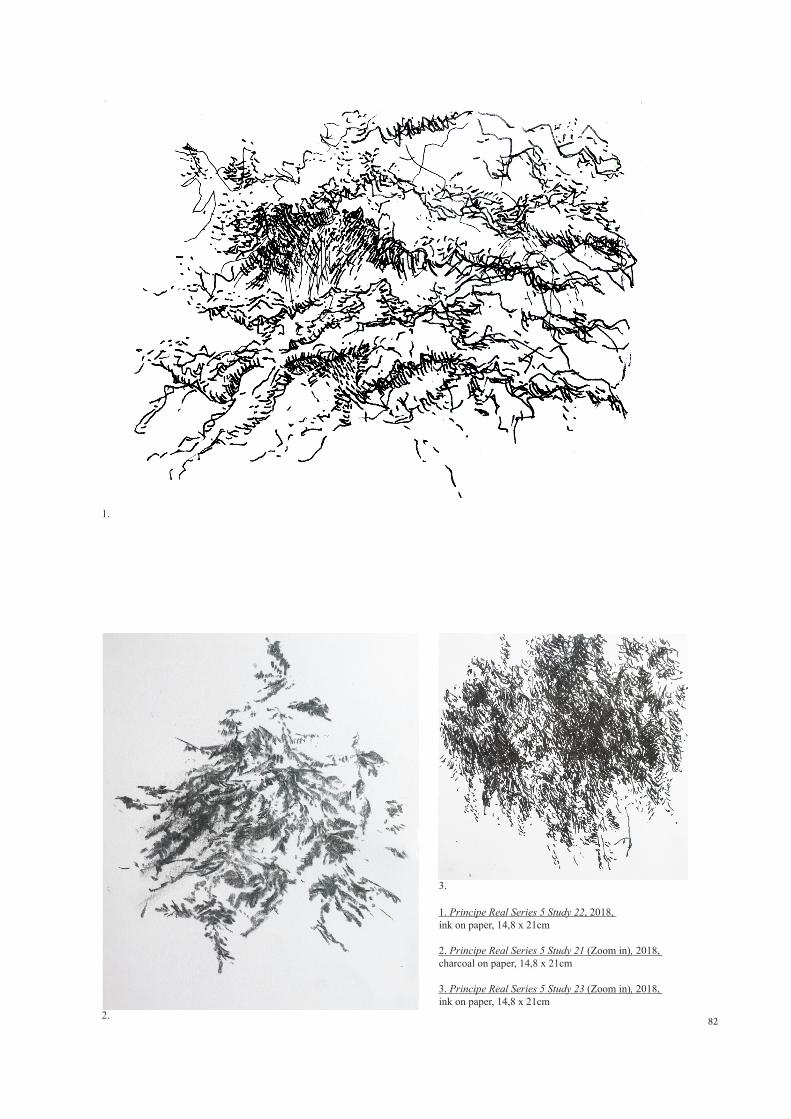
82
1. Principe Real Series 5 Study 22, 2018, ink on paper, 14,8 x 21cm
2. Principe Real Series 5 Study 21 (Zoom in), 2018, charcoal on paper, 14,8 x 21cm
3. Principe Real Series 5 Study 23 (Zoom in), 2018, ink on paper, 14,8 x 21cm
1.
2.
3.
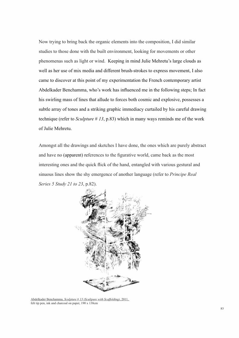
83
Now trying to bring back the organic elements into the composition, I did similar
studies to those done with the built environment, looking for movements or other
phenomenas such as light or wind. Keeping in mind Julie Mehretu’s large clouds as
well as her use of mix media and different brush-strokes to express movement, I also
came to discover at this point of my experimentation the French contemporary artist
Abdelkader Benchamma, who’s work has influenced me in the following steps; In fact
his swirling mass of lines that allude to forces both cosmic and explosive, possesses a
subtle array of tones and a striking graphic immediacy curtailed by his careful drawing
technique (refer to Sculpture # 13, p.83) which in many ways reminds me of the work
of Julie Mehretu.
Amongst all the drawings and sketches I have done, the ones which are purely abstract
and have no (apparent) references to the figurative world, came back as the most
interesting ones and the quick flick of the hand, entangled with various gestural and
sinuous lines show the shy emergence of another language (refer to Principe Real
Series 5 Study 21 to 23, p.82).
Abdelkader Benchamma, Sculpture # 13 (Scultpure with Scaffolding), 2011, felt tip pen, ink and charcoal on paper, 190 x 138cm

842.
1.
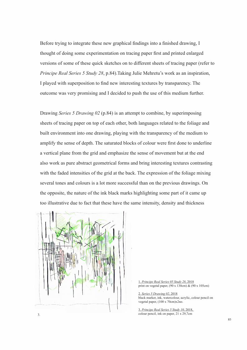
85
Before trying to integrate these new graphical findings into a finished drawing, I
thought of doing some experimentation on tracing paper first and printed enlarged
versions of some of these quick sketches on to different sheets of tracing paper (refer to
Principe Real Series 5 Study 28, p.84).Taking Julie Mehretu’s work as an inspiration,
I played with superposition to find new interesting textures by transparency. The
outcome was very promising and I decided to push the use of this medium further.
Drawing Series 5 Drawing 02 (p.84) is an attempt to combine, by superimposing
sheets of tracing paper on top of each other, both languages related to the foliage and
built environment into one drawing, playing with the transparency of the medium to
amplify the sense of depth. The saturated blocks of colour were first done to underline
a vertical plane from the grid and emphasize the sense of movement but at the end
also work as pure abstract geometrical forms and bring interesting textures contrasting
with the faded intensities of the grid at the back. The expression of the foliage mixing
several tones and colours is a lot more successful than on the previous drawings. On
the opposite, the nature of the ink black marks highlighting some part of it came up
too illustrative due to fact that these have the same intensity, density and thickness
3.
1. Principe Real Series 05 Study 28, 2018print on vegetal paper, (90 x 130cm) & (90 x 105cm)
2. Series 5 Drawing 02, 2018black marker, ink, watercolour, acrylic, colour pencil on vegetal paper, (100 x 70cm)x2no.
3. Principe Real Series 5 Study 10, 2018, colour pencil, ink on paper, 21 x 29,7cm
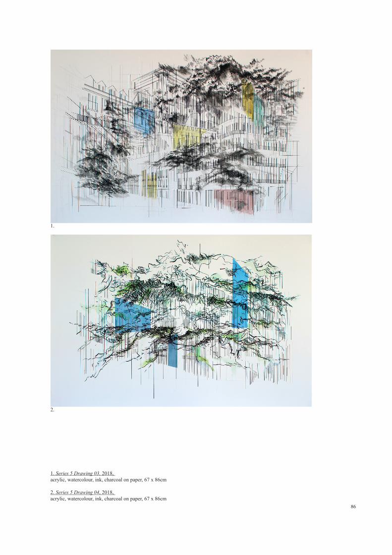
86
1.
2.
1. Series 5 Drawing 03, 2018, acrylic, watercolour, ink, charcoal on paper, 67 x 86cm 2. Series 5 Drawing 04, 2018, acrylic, watercolour, ink, charcoal on paper, 67 x 86cm
87
throughout the whole drawing. In the future, I should also considerate a thinner paper
like film or acetate to emphasize the transparency effect.
Drawings Series 5 Drawing 03 & 04 (p.86), are other attempts to integrate both
languages but this time on paper. Each of them show interesting movements created
by the architectural grid at the back more especially at the center of drawing Series 5
Drawing 03, event-hough we can still distinguish some elements of figurative nature
such as the dormer windows on the top left corner standing out from the composition
in a rather clumsy way. In the same drawing I believe that the vaporous and diffused
effect created by the small ink marks is rather successful, brushing off the paper in
certain areas and very diluted in others, bringing different textures into the drawing. As
for the graded coloured shapes with hard and more diluted sides, these are expressed in
a simplistic way and it would have worked better if they each had a different expression
instead of treating them like repetitive elements. In drawing Series 5 Drawing 04 my
main comment is on the nature of the lines expressing the foliage in which rigid and
frozen nature do not convey any sense of movement
Looking back at this last series of drawings, I believe I have finally managed to undo
the way I used to look at a building; the grid allows me to express at the same time
the repetitive and orthogonal nature of the urban fabric, with a dynamic conscience
of space and time born from the decomposition and superposition of movements.
Obviously there is a strong connection to Julie Mehretu’s first layer although the
orthogonal lines at the back relating to the city’s grid are expressed with a lot more
freedom and dynamism and inspired from Nadir Afonso’s search for new rhythms.
Slowly, the reference to physical reality is disappearing, more especially in the latest
drawings Series 05 Drawing 04, where there is a lot more ‘white spaces’ and where the
gaze is constantly in movement.
At first the overall process felt imposed, with a lot of hesitation but I can sense that I
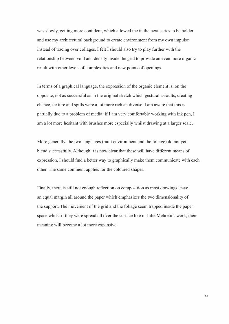
88
was slowly, getting more confident, which allowed me in the next series to be bolder
and use my architectural background to create environment from my own impulse
instead of tracing over collages. I felt I should also try to play further with the
relationship between void and density inside the grid to provide an even more organic
result with other levels of complexities and new points of openings.
In terms of a graphical language, the expression of the organic element is, on the
opposite, not as successful as in the original sketch which gestural assaults, creating
chance, texture and spills were a lot more rich an diverse. I am aware that this is
partially due to a problem of media; if I am very comfortable working with ink pen, I
am a lot more hesitant with brushes more especially whilst drawing at a larger scale.
More generally, the two languages (built environment and the foliage) do not yet
blend successfully. Although it is now clear that these will have different means of
expression, I should find a better way to graphically make them communicate with each
other. The same comment applies for the coloured shapes.
Finally, there is still not enough reflection on composition as most drawings leave
an equal margin all around the paper which emphasizes the two dimensionality of
the support. The movement of the grid and the foliage seem trapped inside the paper
space whilst if they were spread all over the surface like in Julie Mehretu’s work, their
meaning will become a lot more expansive.
90
Series 6 Drawing 01, 2018, charcoal, oil pastel and acrylic on paper 100 x 125cm
91
3.7 Series 6 : Composition and evolution of a plastic language
This final series combined some of the last drawings done during this practical part.
Although they are a lot more assertive and convincing than my previous works, they
should still be seem as experimentations, developing findings made in the previous
studies and more especially looking for new graphical expressions when it comes to the
dialectic between the grid and the natural elements.
Before drawing, I first reflected on the medium itself as I was not fully satisfied with
the type of support previously used, as the lines in the background would always spill
on the surface of the support. Instead, I bought a variety of papers, ranging from pure
cotton to drafting materials but this time with a smooth surface to suit better the linear
grid made of black pen or charcoal. I also found out that Julie Mehretu’s large drawings
were done on canvas prepared with a very thin coat of plaster this to allow for a large
range of medias and textures. A technique which I have not yet had the opportunity to
experiment this time, but which will be kept in mind for the future.
Series 6 Drawing 01 (p.90) combines at the same time controlled but also very
spontaneous processes; the moving grid at the back of the drawing was in one hand
carefully studied using a series of projected collages to generate certain movements I
wanted to introduce into the composition, but also planned which areas should be left
empty or fully covered (like the centered void in the bottom part of the composition).
On the opposite some parts of it were done purely instinctively. In the same way, some
of the organic lines were projected into the drawing using patterns found in previous
studies whilst other were just done as the drawing developed. In fact, this work which
was supposed to be a study only (and for that reason was done on craft paper) ended
in many ways a lot more convincing than any other drawing done before. Like in Julie
Merhetu’s work, its labyrinthine nature and large format allows for lots of curiosity
to creep in creating multiple levels of reading. In the same way, the paper disappears
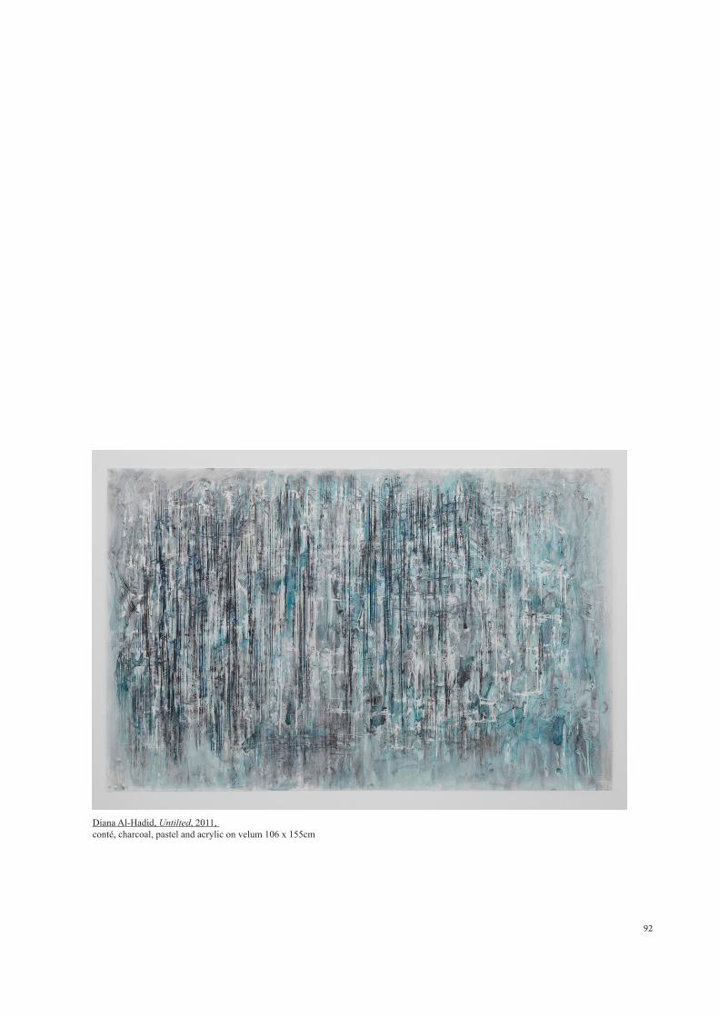
92
Diana Al-Hadid, Untilted, 2011, conté, charcoal, pastel and acrylic on velum 106 x 155cm
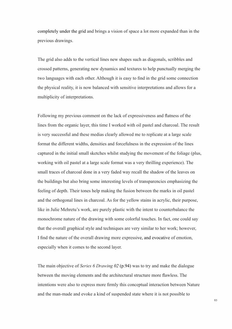
93
completely under the grid and brings a vision of space a lot more expanded than in the
previous drawings.
The grid also adds to the vertical lines new shapes such as diagonals, scribbles and
crossed patterns, generating new dynamics and textures to help punctually merging the
two languages with each other. Although it is easy to find in the grid some connection
the physical reality, it is now balanced with sensitive interpretations and allows for a
multiplicity of interpretations.
Following my previous comment on the lack of expressiveness and flatness of the
lines from the organic layer, this time I worked with oil pastel and charcoal. The result
is very successful and these medias clearly allowed me to replicate at a large scale
format the different widths, densities and forcefulness in the expression of the lines
captured in the initial small sketches whilst studying the movement of the foliage (plus,
working with oil pastel at a large scale format was a very thrilling experience). The
small traces of charcoal done in a very faded way recall the shadow of the leaves on
the buildings but also bring some interesting levels of transparencies emphasizing the
feeling of depth. Their tones help making the fusion between the marks in oil pastel
and the orthogonal lines in charcoal. As for the yellow stains in acrylic, their purpose,
like in Julie Mehretu’s work, are purely plastic with the intent to counterbalance the
monochrome nature of the drawing with some colorful touches. In fact, one could say
that the overall graphical style and techniques are very similar to her work; however,
I find the nature of the overall drawing more expressive, and evocative of emotion,
especially when it comes to the second layer.
The main objective of Series 6 Drawing 02 (p.94) was to try and make the dialogue
between the moving elements and the architectural structure more flawless. The
intentions were also to express more firmly this conceptual interaction between Nature
and the man-made and evoke a kind of suspended state where it is not possible to
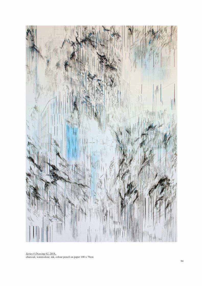
94
Series 6 Drawing 02, 2018, charcoal, watercolour, ink, colour pencil on paper 100 x 70cm
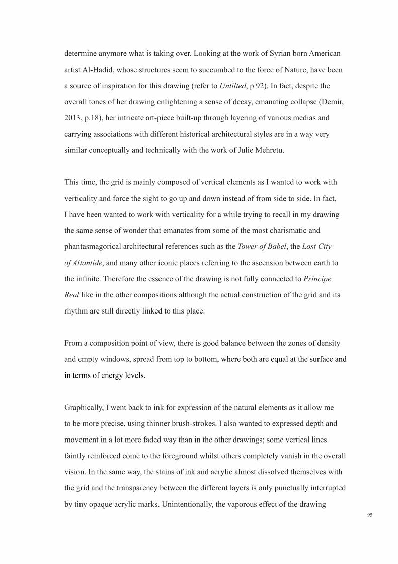
95
determine anymore what is taking over. Looking at the work of Syrian born American
artist Al-Hadid, whose structures seem to succumbed to the force of Nature, have been
a source of inspiration for this drawing (refer to Untilted, p.92). In fact, despite the
overall tones of her drawing enlightening a sense of decay, emanating collapse (Demir,
2013, p.18), her intricate art-piece built-up through layering of various medias and
carrying associations with different historical architectural styles are in a way very
similar conceptually and technically with the work of Julie Mehretu.
This time, the grid is mainly composed of vertical elements as I wanted to work with
verticality and force the sight to go up and down instead of from side to side. In fact,
I have been wanted to work with verticality for a while trying to recall in my drawing
the same sense of wonder that emanates from some of the most charismatic and
phantasmagorical architectural references such as the Tower of Babel, the Lost City
of Altantide, and many other iconic places referring to the ascension between earth to
the infinite. Therefore the essence of the drawing is not fully connected to Principe
Real like in the other compositions although the actual construction of the grid and its
rhythm are still directly linked to this place.
From a composition point of view, there is good balance between the zones of density
and empty windows, spread from top to bottom, where both are equal at the surface and
in terms of energy levels.
Graphically, I went back to ink for expression of the natural elements as it allow me
to be more precise, using thinner brush-strokes. I also wanted to expressed depth and
movement in a lot more faded way than in the other drawings; some vertical lines
faintly reinforced come to the foreground whilst others completely vanish in the overall
vision. In the same way, the stains of ink and acrylic almost dissolved themselves with
the grid and the transparency between the different layers is only punctually interrupted
by tiny opaque acrylic marks. Unintentionally, the vaporous effect of the drawing
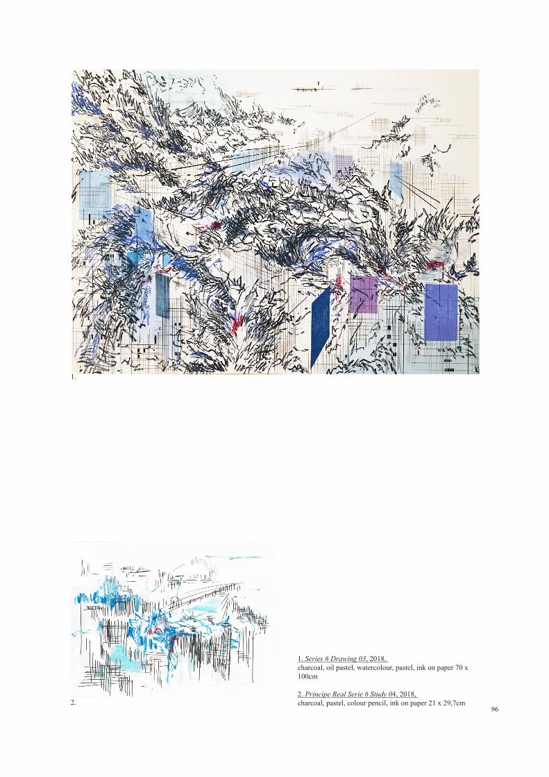
96
1. Series 6 Drawing 03, 2018, charcoal, oil pastel, watercolour, pastel, ink on paper 70 x 100cm 2. Principe Real Serie 6 Study 04, 2018, charcoal, pastel, colour pencil, ink on paper 21 x 29,7cm
1.
2.
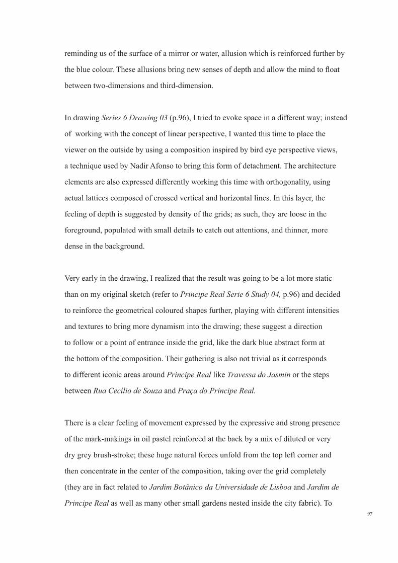
97
reminding us of the surface of a mirror or water, allusion which is reinforced further by
the blue colour. These allusions bring new senses of depth and allow the mind to float
between two-dimensions and third-dimension.
In drawing Series 6 Drawing 03 (p.96), I tried to evoke space in a different way; instead
of working with the concept of linear perspective, I wanted this time to place the
viewer on the outside by using a composition inspired by bird eye perspective views,
a technique used by Nadir Afonso to bring this form of detachment. The architecture
elements are also expressed differently working this time with orthogonality, using
actual lattices composed of crossed vertical and horizontal lines. In this layer, the
feeling of depth is suggested by density of the grids; as such, they are loose in the
foreground, populated with small details to catch out attentions, and thinner, more
dense in the background.
Very early in the drawing, I realized that the result was going to be a lot more static
than on my original sketch (refer to Principe Real Serie 6 Study 04, p.96) and decided
to reinforce the geometrical coloured shapes further, playing with different intensities
and textures to bring more dynamism into the drawing; these suggest a direction
to follow or a point of entrance inside the grid, like the dark blue abstract form at
the bottom of the composition. Their gathering is also not trivial as it corresponds
to different iconic areas around Principe Real like Travessa do Jasmin or the steps
between Rua Cecílio de Souza and Praça do Principe Real.
There is a clear feeling of movement expressed by the expressive and strong presence
of the mark-makings in oil pastel reinforced at the back by a mix of diluted or very
dry grey brush-stroke; these huge natural forces unfold from the top left corner and
then concentrate in the center of the composition, taking over the grid completely
(they are in fact related to Jardim Botânico da Universidade de Lisboa and Jardim de
Principe Real as well as many other small gardens nested inside the city fabric). To
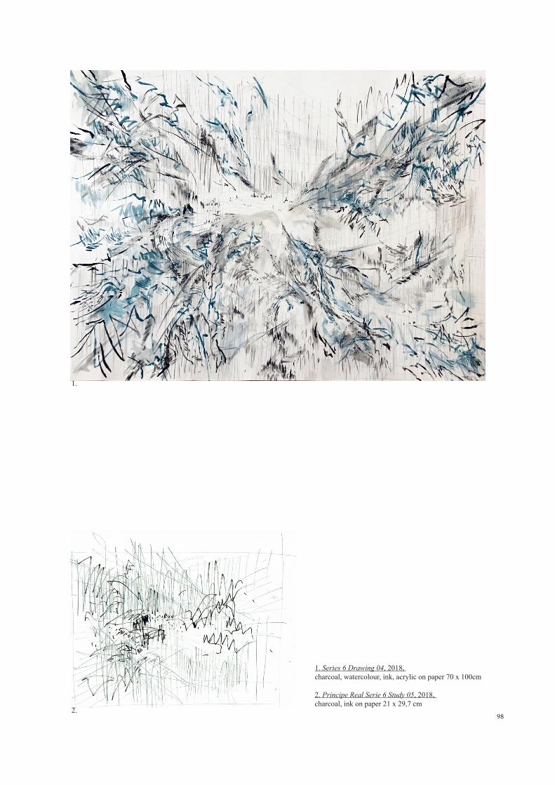
98
1. Series 6 Drawing 04, 2018, charcoal, watercolour, ink, acrylic on paper 70 x 100cm
2. Principe Real Serie 6 Study 05, 2018, charcoal, ink on paper 21 x 29,7 cm
1.
2.
99
counterbalance the strong presence of these marks, the grid is highlighted by some
stronger diagonals which like the coloured shaped, indicate a direction to follow. As for
the use of colour, the dominant of dark blue do not have a particular meaning. In some
areas, these merged with lighter tone of blue and bright touches of red to brighten the
overall theme and bring our attention to certain area of the drawing, a technique which
we have seen is commonly used in the work of Nadir Afonso.
In drawing Series 6 Drawing 04 (p.98), I wanted to graphically replicate in this first
architectural layer the same impulsion of the initial sketch by keeping the overall
process intuitive and accidental. Like with the previous ones, I first did a very quick
sketch to study the composition and then started working straight away on the drawing
without any rulers or projected collages planned beforehand. This drawing is in a way a
kinetic representation of my experience of Principe Real.
From a technical point of view, if the gesture of these charcoal marks is not as assertive
as in the sketch, I can feel that I have gained confidence comparing with my earlier
experiences and managed to keep a certain sense of freedom in the movement. The
expression of the foliage is also expressed differently, a lot more airy and looser than on
the previous drawings.
The various densities and agglomeration of symbols cover most of the grid whilst
sometimes giving a glimpse at the surrounding buildings, giving sight to a window,
a group of windows, perspective... recalling the experience one could have whilst
walking through the park of Principe Real. Regarding the feeling of movement, I have
tried for the two languages to gravitate around the center of the drawing following
different patterns; the natural elements clearly dive towards the center whilst the
organic grid spiral around it. Some also happened accidentally like the small spiral-
shape whirlwind on center left of the composition.
100
To avoid doing the same mistake than previously when using ink for the organic
layer, I have tried to vary and used many types different of brushes, ranging from dry
to very diluted, autonomous lines intermingled with small notes creating patterns, a
layering technique used by Julie Mehretu to suggest depth. The overall gestural nature
of the drawing is curtailed by the careful drawing techniques and the strong attention
to details, like the small dark dots at the center which could be interpreted as pure
abstraction marks part of these clouds or people populating the center of the square.
Although the abstract nature of this drawing is definitively more expansive than
the others, I personally find it less successful from a graphical and conceptual point
of view. I also think that I am now more inclined to follow a different language,
combining the controlled orthogonal grid with a contrasting and stronger gestural layer
like in the other drawings from this series.
101
4.0 CONCLUSION
The principal objective of this work was its experimental nature; as such it has never
been a question to achieve a well defined body of work but instead try to open new
doors, and to overcome some limitations which I had experienced in the past, in the
exercise of drawing and more especially when representing space.
One of them was to go over the fear and difficulties of bringing drawing into a fully
autonomous status, not knowing where to start and where to finish and whilst I might
not be fully satisfied with any one piece of work that I have created, I believe that the
last two series has successfully reached this goal. Throughout the development of my
work, I also came to clarify some underlying paradoxes I had been having for some
time. If I have always been very confident working with rapidity and quick flick of the
hand on small formats and value the immediacy, spontaneity in the creative process, the
intimacy and directness of the initial sketches, I had never felt fully gestural and have
always wanted to somehow retain a certain control over my hand as well as an idea
of intellectual ‘planning’ in the act of making, processes that Berenice Rose resumes
very well when defining the origin of the word Disegno in her exhibition ´Drawing
Now´; “it is both the manual act of drawing and the intellectual process of design as an
activity ideation, that is, of bringing into the world an image previously only imagined”
(Berenice Rose quoted in Rattemeyer, 2013, p.8), a familiarity which is probably
implicitly linked to my architectural training and was also easy for me to identify in the
work of both selected artists.
The researches carried out in this dissertation have allowed me to see beyond the
purely ‘graphic’ content of art, realizing the depth of work, knowledge and technique
which goes into each art piece that Julie Mehretu and Nadir Afonso create, and made
me understood with more clarity and awareness what had captivated me at first in their
work, whilst at the same time reinforcing my admiration for them. Julie Mehretu’s
102
graphical language and narrative transcend the boundaries of both drawing and
painting and clearly belong in this category of ´masterworks´of modern art whilst Nadir
Afonso’s ingenious and poetic way to synthesize and compose with space, bringing
together the seemingly irreconcilable abstraction and figurative art, takes place beyond
his time.
Studying the work of both artists has also opened my mind to a new way of looking at
space and given me new means to express it; working with abstractionism, combining
a ´formal´and planned background (a composed grid, or structure) and the immediacy
of the sketch layers (more gestural and expressive) has allowed me to free my graphical
language from the constraints of reality, bringing a more expressive and sensitive
dimension whilst still enabling me to use precise drawing methods. Thus, the last series
I produced show an accumulation of media, processes and drawing techniques with a
strong reference to Julie Mehretu’s expansive graphical style, a characteristic which I
intent to develop further into my work, whilst the stylisation of the buildings through
colourful free-form floating shapes and stains, as well as the use of colour and sense
of composition one could say is most likely influenced by Nadir Afonso’s work. I
would like to explain, that these were not conscious attempts of a student following a
´master´, but the result of my immersion in their work, and a process of finding within
it references for my own personal development.
Mostly, I realized that the plastic effect is equally important for me as the narrative of
the drawing itself; unlike Julie Mehertu’s geopolitical statement or some of the radical
or influential messages behind the majority of drawings from contemporary artist’s,
I do not yet feel the need for any strong statements, but wish to continue exploring
the relationship between the man-made and Nature in parallel to a more metaphysical
dimension linked to our physical reality, something which became clearer towards the
end of this year of work. However, enlarging my graphical style and sense of plasticity
during this experimentation was one of the most important aspects to me. This probably
103
explains the overly detailed nature of the critical analysis of my personal work, which
I am very well aware highlights thoroughly and exhaustively the least stylistic and
graphical difficulties encountered in each studies or series along the way. But this
was an exercise in which I had to engage, because even if deep down I had always
believed that I had sufficient sensitivity to learn how to absorb space psychologically, I
definitively needed to understand my limitation and gain more practice in training the
hand to respond to these inner feelings and emotions, to train myself to reflect what
Julie Mehretu calls this ´In Between Space´. If before I had felt a strong lack of plastic
expression, stopping me from jumping to another level, now I believe that this barrier
has been broken.
More generally, this work has been an eye opening year long experience on the
media; if I have always preferred drawing from painting, and like the avant-gardist
and drawing master Edgar Degas, believe that drawing feels like one takes a lot more
risk and is more exposed than in painting, ´I do not know of art that can engage more
intelligence than drawing...´ (Degas, quoted in Serullaz, 1979, p.20), I had always until
now fallen into the stigma of looking at drawing as (mainly) an element of research,
a fallacy which Christian Rattemeyer, Associate Curator of Drawings at the Museum
of Modern Art, New York, resumes very well in his introductory essay; ´Almost every
artist has at some point employed drawing as tool or practice in their work, and many
do so consistently and significantly...Yet there are few drawings that are unequivocally
accepted into the pantheon of modern art. We tend to think of drawing as playing
the minor role, serving as the preparatory sketch and recording diagram...Drawings
that are premeditated as statements of significant heft and weight are rare, and more
rarely still do we recognize them as master-works in their won right, as shifters of
historical discourse in a way that no other object could´, (Rattemeyer, 2013, p.8).
Furthermore, discovering the Phaidon Vitamin series (started in 2002) which gather the
work of hundred of artists who have recently became established in the international
art scene and have made a significant contribution to the medium, demonstrated to me
104
that drawing has gained a lot more attention amongst a younger generation of artists
´no longer limited to the notebook or the preparatory sketch, nor to pencil on paper´
(Rattemeyer, 2013, p.8). So accepting Drawing as a medium on its own opens up the
field, and releases me to accept the series that I enjoy producing as valid forms of
expression and artwork.
Finally, this dissertation and the research that it entailed, as well as all the work done
in the last two years, have shown me a clear path which I want to follow. I wish to
continue exploring my obsession about space, now that I have finally gained the
confidence to break out of my comfort zone and engaged into the abstract, allowing me
to find a whole new plane on which I can try and translate feelings and emotions related
to the experience of said space.

105
BIBLIOGRAPHY & REFERENCES
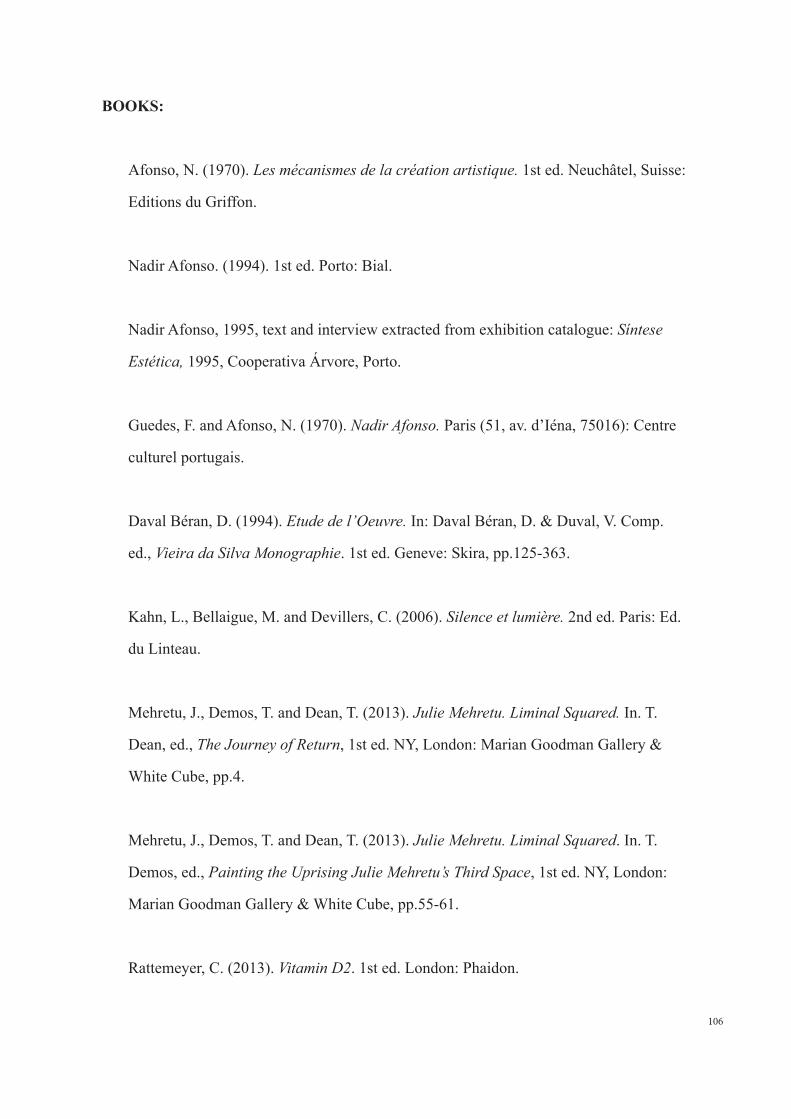
106
BOOKS:
Afonso, N. (1970). Les mécanismes de la création artistique. 1st ed. Neuchâtel, Suisse:
Editions du Griffon.
Nadir Afonso. (1994). 1st ed. Porto: Bial.
Nadir Afonso, 1995, text and interview extracted from exhibition catalogue: Síntese
Estética, 1995, Cooperativa Árvore, Porto.
Guedes, F. and Afonso, N. (1970). Nadir Afonso. Paris (51, av. d’Iéna, 75016): Centre
culturel portugais.
Daval Béran, D. (1994). Etude de l’Oeuvre. In: Daval Béran, D. & Duval, V. Comp.
ed., Vieira da Silva Monographie. 1st ed. Geneve: Skira, pp.125-363.
Kahn, L., Bellaigue, M. and Devillers, C. (2006). Silence et lumiere. 2nd ed. Paris: Ed.
du Linteau.
Mehretu, J., Demos, T. and Dean, T. (2013). Julie Mehretu. Liminal Squared. In. T.
Dean, ed., The Journey of Return, 1st ed. NY, London: Marian Goodman Gallery &
White Cube, pp.4.
Mehretu, J., Demos, T. and Dean, T. (2013). Julie Mehretu. Liminal Squared. In. T.
Demos, ed., Painting the Uprising Julie Mehretu’s Third Space, 1st ed. NY, London:
Marian Goodman Gallery & White Cube, pp.55-61.
Rattemeyer, C. (2013). Vitamin D2. 1st ed. London: Phaidon.
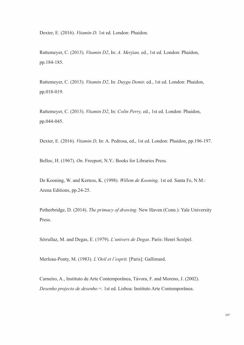
107
Dexter, E. (2016). Vitamin D. 1st ed. London: Phaidon.
Rattemeyer, C. (2013). Vitamin D2, In: A. Merjian, ed., 1st ed. London: Phaidon,
pp.184-185.
Rattemeyer, C. (2013). Vitamin D2, In: Duygu Demir, ed., 1st ed. London: Phaidon,
pp.018-019.
Rattemeyer, C. (2013). Vitamin D2, In: Colin Perry, ed., 1st ed. London: Phaidon,
pp.044-045.
Dexter, E. (2016). Vitamin D, In: A. Pedrosa, ed., 1st ed. London: Phaidon, pp.196-197.
Belloc, H. (1967). On. Freeport, N.Y.: Books for Libraries Press.
De Kooning, W. and Kertess, K. (1998). Willem de Kooning. 1st ed. Santa Fe, N.M.:
Arena Editions, pp.24-25.
Petherbridge, D. (2014). The primacy of drawing. New Haven (Conn.): Yale University
Press.
Sérrullaz, M. and Degas, E. (1979). L’univers de Degas. Paris: Henri Scrépel.
Merleau-Ponty, M. (1983). L’Oeil et l’esprit. [Paris]: Gallimard.
Carneiro, A., Instituto de Arte Contemporânea, Távora, F. and Moreno, J. (2002).
Desenho projecto de desenho =. 1st ed. Lisboa: Instituto Arte Contemporânea.
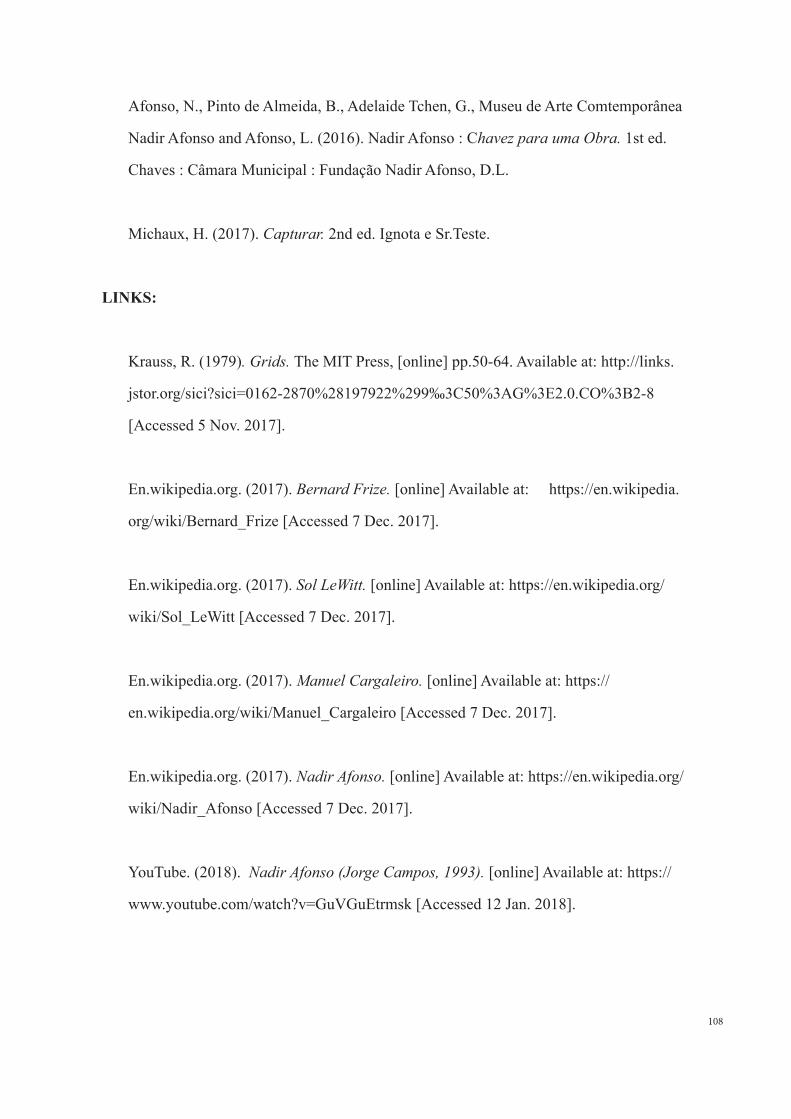
108
Afonso, N., Pinto de Almeida, B., Adelaide Tchen, G., Museu de Arte Comtemporânea
Nadir Afonso and Afonso, L. (2016). Nadir Afonso : Chavez para uma Obra. 1st ed.
Chaves : Câmara Municipal : Fundação Nadir Afonso, D.L.
Michaux, H. (2017). Capturar. 2nd ed. Ignota e Sr.Teste.
LINKS:
Krauss, R. (1979). Grids. The MIT Press, [online] pp.50-64. Available at: http://links.
jstor.org/sici?sici=0162-2870%28197922%299‰3C50%3AG%3E2.0.CO%3B2-8
[Accessed 5 Nov. 2017].
En.wikipedia.org. (2017). Bernard Frize. [online] Available at: https://en.wikipedia.
org/wiki/Bernard_Frize [Accessed 7 Dec. 2017].
En.wikipedia.org. (2017). Sol LeWitt. [online] Available at: https://en.wikipedia.org/
wiki/Sol_LeWitt [Accessed 7 Dec. 2017].
En.wikipedia.org. (2017). Manuel Cargaleiro. [online] Available at: https://
en.wikipedia.org/wiki/Manuel_Cargaleiro [Accessed 7 Dec. 2017].
En.wikipedia.org. (2017). Nadir Afonso. [online] Available at: https://en.wikipedia.org/
wiki/Nadir_Afonso [Accessed 7 Dec. 2017].
YouTube. (2018). Nadir Afonso (Jorge Campos, 1993). [online] Available at: https://
www.youtube.com/watch?v=GuVGuEtrmsk [Accessed 12 Jan. 2018].
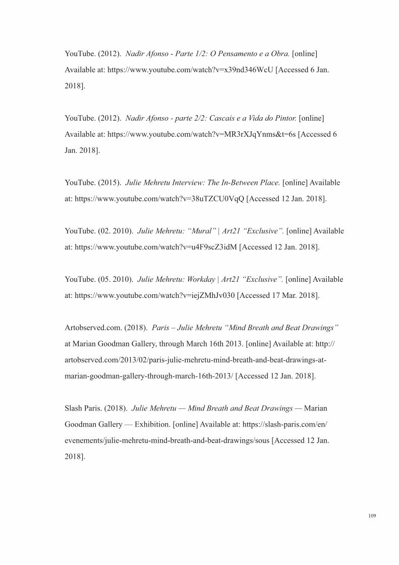
109
YouTube. (2012). Nadir Afonso - Parte 1/2: O Pensamento e a Obra. [online]
Available at: https://www.youtube.com/watch?v=x39nd346WcU [Accessed 6 Jan.
2018].
YouTube. (2012). Nadir Afonso - parte 2/2: Cascais e a Vida do Pintor. [online]
Available at: https://www.youtube.com/watch?v=MR3rXJqYnms&t=6s [Accessed 6
Jan. 2018].
YouTube. (2015). Julie Mehretu Interview: The In-Between Place. [online] Available
at: https://www.youtube.com/watch?v=38uTZCU0VqQ [Accessed 12 Jan. 2018].
YouTube. (02. 2010). Julie Mehretu: “Mural” | Art21 “Exclusive”. [online] Available
at: https://www.youtube.com/watch?v=u4F9scZ3idM [Accessed 12 Jan. 2018].
YouTube. (05. 2010). Julie Mehretu: Workday | Art21 “Exclusive”. [online] Available
at: https://www.youtube.com/watch?v=iejZMhJv030 [Accessed 17 Mar. 2018].
Artobserved.com. (2018). Paris – Julie Mehretu “Mind Breath and Beat Drawings”
at Marian Goodman Gallery, through March 16th 2013. [online] Available at: http://
artobserved.com/2013/02/paris-julie-mehretu-mind-breath-and-beat-drawings-at-
marian-goodman-gallery-through-march-16th-2013/ [Accessed 12 Jan. 2018].
Slash Paris. (2018). Julie Mehretu — Mind Breath and Beat Drawings — Marian
Goodman Gallery — Exhibition. [online] Available at: https://slash-paris.com/en/
evenements/julie-mehretu-mind-breath-and-beat-drawings/sous [Accessed 12 Jan.
2018].
110
YouTube. (2014). Interview Rencontre avec Abdelkader Benchamma pour l’ exposition
“ Le soleil comme une plaque d’argent mat “ au Carré Saint-Anne.. [online] Available
at: https://www.youtube.com/watch?v=1GXxkheNoDw [Accessed 7 Jun. 2018].
YouTube. (2014). expo abdelkader Benchamma au carré ste anne. [online] Available
at: https://www.youtube.com/watch?v=GuuEYkHb4BM [Accessed 7 Jun. 2018].