DRAWING - Digital Library Univ STEKOM
75
FRANCIS D. K. CHING WITH STEVEN P. JUROSZEK DESIGN DRA W ING THIRD EDITION VIDEOS AVAILABLE
-
Upload
khangminh22 -
Category
Documents
-
view
6 -
download
0
Transcript of DRAWING - Digital Library Univ STEKOM

FRANCIS D. K. CHINGWITH STEVEN P. JUROSZEK
DESIGNDRAW ING
T H I R D E D I T I O N
VIDEOSAVAILABLE

DESIGN DRAWINGThird Edition


DESIGN DRAWINGThird Edition
Francis D. K. Chingwith Steven P. Juroszek

∞
Cover Design: WileyCover Illustration: Francis D. K. Ching
This book is printed on acid-free paper.
Copyright © 2018 by John Wiley & Sons, Inc. All rights reserved.
Published by John Wiley & Sons, Inc., Hoboken, New JerseyPublished simultaneously in Canada
No part of this publication may be reproduced, stored in a retrieval system, or transmitted in any form or by any means, electronic, mechanical, photocopying, recording, scanning, or otherwise, except as permitted under Section 107 or 108 of the 1976 United States Copyright Act, without either the prior written permission of the Publisher, or authorization through payment of the appropriate per-copy fee to the Copyright Clearance Center, 222 Rosewood Drive, Danvers, MA 01923, (978) 750-8400, fax (978) 646-8600, or on the web at www.copyright.com. Requests to the Publisher for permission should be addressed to the Permissions Department, John Wiley & Sons, Inc., 111 River Street, Hoboken, NJ 07030, (201) 748-6011, fax (201) 748-6008, or online at www.wiley.com/go/permissions.
Limit of Liability/Disclaimer of Warranty: While the publisher and author have used their best efforts in preparing this book, they make no representations or warranties with respect to the accuracy or completeness of the contents of this book and specifically disclaim any implied warranties of merchantability or fitness for a particular purpose. No warranty may be created or extended by sales representatives or written sales materials. The advice and strategies contained herein may not be suitable for your situation. You should consult with a professional where appropriate. Neither the publisher nor the author shall be liable for damages arising herefrom.
For general information about our other products and services, please contact our Customer Care Department within the United States at (800) 762-2974, outside the United States at (317) 572-3993 or fax (317) 572-4002.
Wiley publishes in a variety of print and electronic formats and by print-on-demand. Some material included with standard print versions of this book may not be included in e-books or in print-on-demand. If this book refers to media such as a CD or DVD that is not included in the version you purchased, you may download this material at http://booksupport.wiley.com. For more information about Wiley products, visit www.wiley.com.
Library of Congress Cataloging-in-Publication Data:
Names: Ching, Francis D. K., 1943- author, illustrator. | Juroszek, Steven P.Title: Design drawing / Francis D.K. Ching ; with Steven P. Juroszek.Description: Third edition. | Hoboken, New Jersey : Wiley, 2019. | Includes index. |Identifiers: LCCN 2018041507 (print) | LCCN 2018042131 (ebook) | ISBN 9781119508533 (Adobe PDF) | ISBN 9781119508588 (ePub) | ISBN 9781119508595 (paperback)Subjects: LCSH: Architectural drawing—Technique. | BISAC: ARCHITECTURE / Design, Drafting, Drawing & Presentation.Classification: LCC NA2708 (ebook) | LCC NA2708 .C49 2019 (print) | DDC 720.28/4—dc23LC record available at https://lccn.loc.gov/2018041507
Printed in the United States of America.
10 9 8 7 6 5 4 3 2 1

CONTENTS
Preface . . . . . . . . . . . . . . . . . . . . . . . . . . . . . . . . . . . . . . . .vii
Introduction . . . . . . . . . . . . . . . . . . . . . . . . . . . . . . . . . . . . 1
Drawing from Observation . . . . . . . . . . . . . . . . . . . . . . . . 13
1 Line and Shape . . . . . . . . . . . . . . . . . . . . . . . . . . . . . . . . 15
2 Tone and Texture . . . . . . . . . . . . . . . . . . . . . . . . . . . . . . 39
3 Form and Structure . . . . . . . . . . . . . . . . . . . . . . . . . . . . 67
4 Space and Depth. . . . . . . . . . . . . . . . . . . . . . . . . . . . . . . 83
Drawing Systems . . . . . . . . . . . . . . . . . . . . . . . . . . . . . . . . . 123
5 Pictorial Systems. . . . . . . . . . . . . . . . . . . . . . . . . . . . . . 125
6 Multiview Drawings . . . . . . . . . . . . . . . . . . . . . . . . . . . 143
7 Paraline Drawings . . . . . . . . . . . . . . . . . . . . . . . . . . . . 207
8 Perspective Drawings. . . . . . . . . . . . . . . . . . . . . . . . . . 239
Drawing from the Imagination. . . . . . . . . . . . . . . . . . . . 303
9 Speculative Drawing . . . . . . . . . . . . . . . . . . . . . . . . . . 305
10 Diagramming. . . . . . . . . . . . . . . . . . . . . . . . . . . . . . . . . 335
11 Drawing Composition. . . . . . . . . . . . . . . . . . . . . . . . . . 367
12 Presentation Drawing . . . . . . . . . . . . . . . . . . . . . . . . . 409
Index . . . . . . . . . . . . . . . . . . . . . . . . . . . . . . . . . . . . . . . . 433

v i / ACKNOWLEDGMENTS
ACKNOWLEDGMENTS
This manual began as a reader for a sequence of design drawing courses offered by the Department of Architecture at the University of Washington. Its subsequent development was largely the result of the many discussions, suggestions, and contributions of a skilled and dedicated group of teachers— Catherine Barrett, Cynthia Esselman, Kevin Kane, Anita Lehmann, Alan Maskin, Ben Sharpe, Judith Swain, Carol Thomas, Mark Wolfe, and Gail Wong. Special thanks go to Nan-Ching Tai, who offered his invaluable expertise and assistance in preparing the examples of digital lighting and the drawing system animations on the companion CD.
This text is also a testimony to the efforts, accomplishments, and critical feedback of the many students who regularly and enthusiastically tested the pedagogical soundness of the material.
Finally, I would like to acknowledge those instructors who have gathered regularly at the conferences of the Design Communication Association to passionately and unselfishly share their thoughts about teaching and drawing. Their insights nurtured the progress and enhanced the dimensions of this work.
The first edition of this book was prepared in part through a grant from the Graham Foundation for Advanced Studies in the Fine Arts.

PREFACE / v i i
PREFACE TO THE THIRD EDIT ION
This is a comprehensive drawing manual for students of architecture, interior design, and related design disciplines. Drawing guides typically range from beginning texts on how to draw certain subjects, such as landscapes or the human figure, to more advanced treatises on drawing as art. Some focus on a specific medium, such as pencil or pen-and-ink; others dwell on a particular technique, such as perspective drawing. Further, the discussion is often limited to learning how to draw from observation. This book is based on the premise that drawing is central to the design process. It therefore focuses on drawing as a medium for visualizing and communicating design ideas.
The work begins with an introduction to the drawing process, which involves seeing, imagining, and representing. The remaining content is divided into three parts. Part 1: Drawing from Observation introduces the graphic elements that constitute the vocabulary of drawing—line, shape, tone, form, and space. This largely remains the province of freehand drawing because we can best learn to see, understand, and represent these elements through direct examination.
Part 2: Drawing Systems describes the formal systems for representing three-dimensional objects and space, which constitute the language of design drawing. Regardless of the drawing medium or technique we use, each system represents a uniquely different way of seeing and describing the visible world that we experience directly, or a future world that we imagine in design.
Part 3: Drawing from the Imagination addresses issues that arise as we think in a speculative manner to stimulate the design process, develop our design ideas through drawing, and plan how to present our design proposals in the best possible light. It is in this arena where digital drawing and modeling tools have made major advances, both in academia and the profession.
Accompanying each section are a series of short exercises for developing skills and suggestions for longer projects that test the understanding and application of concepts. Like any discipline, drawing takes perseverance and regular exercise to develop mastery and fluency. The information in this manual cannot be received passively but must be learned by actively participating in the process of drawing.

v i i i / PREFACE
PREFACE
The emphasis remains on drawing by hand, which is the most direct and intuitive means we have to express our visual thoughts and perceptions. Through the tactile nature of drawing in direct response to our visual thoughts and perceptions, we develop an understanding of spatial concepts and the critical ability to think and visualize in three dimensions.
Nevertheless, we cannot ignore the advances in computer technology that have significantly altered the process of architectural drawing and design. Current graphics software ranges from 2D drawing programs to 3D surface and solid modelers that aid in the design and representation of buildings, from small houses to large and complex structures. It is therefore important to acknowledge the unique opportunities and challenges digital tools offer in the production of architectural graphics. While the second edition augmented the material in the first edition with discussions and examples of digital graphic techniques where appropriate to the task at hand, this third edition goes further and provides more examples of strictly digital as well as hybrid processes of producing drawings in the design process.
Whether a drawing is executed by hand or developed with the aid of a computer, the standards and judgments governing the effective communication of design ideas in architecture remain the same, just as the rules of spelling, grammar and punctuation for the written language remain applicable, whether jotted by hand traditionally, typed on a manual or electric typewriter, or entered by keyboard into a word processor.

IntroductionDrawing is the process or technique of representing something—an object, scene, or idea—by making lines on a surface. This definition implies that delineation is different from painting and the coloring of surfaces. While drawing is generally linear in nature, it may include other pictorial elements, such as dots and brush strokes, which can also be interpreted as lines. Whatever form a drawing takes, it is the principal means by which we organize and express our visual thoughts and perceptions. We therefore regard drawing not only as artistic expression but also as a practical tool for formulating and working through design problems.

2 / INTRODUCT ION
DESIGN DRAWING
The term design drawing brings to mind the presentation drawings used to persuade the viewer of the merits of a design proposal. Also familiar are the construction or working drawings that provide graphic instructions for producing or building a project. But designers use both the process and products of drawing in other ways as well. In design, the role of drawing expands to include recording what exists, working out ideas, and speculating about and planning for the future. Throughout the design process, we use drawing to develop an idea from concept to proposal to constructed reality.
To learn how to draw and to use drawing effectively as a design instrument, it is necessary to acquire certain fundamental skills, such as inscribing lines and laying down tonal values. Over time and with enough practice, anyone can learn these techniques. Skillful technique is of little value, however, unless accompanied by understanding of the perceptual principles on which these techniques are based. Even as digital drawing tools evolve and augment traditional drawing methods, enabling us to transfer ideas onto the computer screen and develop them into three-dimensional models, drawing remains a cognitive process that involves perceptive seeing and visual thinking.

INTRODUCT ION / 3
THE DRAWING PROCESS
At the heart of all drawing is an interactive process of seeing, imagining, and representing images. Seeing creates the images of external reality we perceive with our eyes open, which give rise to our discovery of the world. With our eyes closed, the mind’s eye presents images of an inner reality—visual memories of past events or projections of an imagined future. And then there are the images we create on paper, drawings that we use to express and communicate our thoughts and perceptions.
SeeingVision is the primary sensory channel through which we make contact with our world. It is our best-developed sense, the farthest reaching, and the one we rely on the most for our day-to-day activities. Seeing empowers our ability to draw, while drawing invigorates seeing.
ImaginingThe visual data received by the eye is processed, manipulated, and filtered by the mind in its active search for structure and meaning. The mind’s eye creates the images we see, and these are the images we attempt to represent in drawing. Drawing is therefore more than a manual skill; it involves visual thought that stimulates the imagination, while imagining provides impetus for drawing.
RepresentingIn drawing, we make marks on a surface to graphically represent what we see before us or imagine in the mind’s eye. Drawing is a natural means of expression, creating a separate but parallel world of images that speak to the eye.
The activity of drawing cannot be detached from seeing and thinking about the subject being represented. We cannot draw an object or a scene unless we see it before us as a model, or are sufficiently familiar with it to recreate it from memory or our imagination. Drawing proficiency must therefore be accompanied by knowledge and understanding of what we endeavor to represent in graphic form.

4 / INTRODUCT ION
VISUAL PERCEPTION
The act of seeing is a dynamic and creative process. It is capable of delivering a stable, three-dimensional perception of the moving, changing images that make up our visual world. There are three phases in the swift and sophisticated processing that results in the images we see:
• Reception:oureyesreceiveenergyinputintheformoflight—either its source or its reflection from illuminated surfaces. The optics of the eye form an upside-down image of incoming light rays on the retina, a collection of nerve cells that are an extension of the brain. These photosensitive cells convert electromagnetic energy into electrochemical signals and provide a point-by-point assessment of the intensity of light received.
• Extraction:themindextractsbasicvisualfeaturesfromthis input. The input—basically a pattern of lights and darks—is further processed by other nerve cells in the retina and moves down the optic nerve. After an intermediate stop it arrives at the visual cortex of the brain, which has cells that extract specific features of visual input: the location and orientation of edges, movement, size, and color.
• Inference:onthebasisoftheseextractedfeatures,wemake inferences about our world. Only a very small area of the retina is capable of distinguishing fine detail. Our eyes must therefore continuously scan an object and its environment to see it in its entirety. When we look at something, what we see is actually constructed from a rapid succession of interconnected retinal images. We are able to perceive a stable image even while our eyes are scanning. Our visual system thus does more than passively and mechanically record the physical features of a visual stimulus; it actively transforms sensory impressions of light into meaningful forms.
Bust of Queen NefertitiThe pattern of eye movement of a person viewing a figure, from research by Alfred L. Yarbus of the Institute for Problems of Information Transmission in Moscow.
The eye sees…the mind interprets.
INTRODUCT ION / 5
VISUAL PERCEPTION
Seeing is a vigorous, pattern-seeking process. The mind’s eye uses the input extracted from the retinal image as the basis for making educated guesses about what we encounter. Inference is easy for the mind. The mind’s eye actively seeks those features that fit our image of the world. It looks for closure—for meaning and understanding in the patterns it receives. We are able to form images from the barest scaffolding of visual data, filling out the images if necessary with information that is not really there. For example, we may not understand this incomplete pattern of lights and darks, but once recognized, it cannot not be seen.
Visual perception thus is a creation of the mind’s eye. The eye is blind to what the mind does not see. The picture in our head is not only based on input extracted from the retinal image but is also shaped by our interests and the knowledge and experiences each of us brings to the act of seeing. Our cultural environment also modifies our perceptions and teaches us how to interpret the visual phenomena we experience.
Different ways of perceiving and interpreting the same visual phenomena.
In this illusion designed by psychologist E. G. Boring in 1930, one can see either the profile of a younger woman or the head of an older woman.

6 / INTRODUCT ION
SEE ING & DRAWING
Seeing Facilitates DrawingThe drawing of things we see before us, including the careful copying of a master’s work, has traditionally been fundamental training for artists and designers. Drawing from observation is the classic method for developing eye-mind-hand coordination. Experiencing and examining the visible world in a direct manner through drawing makes us more conscious of the dynamics of sight. This understanding, in turn, helps us to draw.
Drawing Invigorates SeeingWe normally do not see all that we are capable of seeing. Preconceived notions of what we expect or believe to be out there usually direct our seeing. Through familiarity, we tend to pass over things we confront and use every day without really seeing them. These perceptual prejudices make our life simpler and safer. We do not have to pay full attention to each and every visual stimulus as if seeing it for the first time each day. Instead we can select out only those that provide information pertinent to our momentary needs. This expeditious kind of seeing leads to our common use of stereotypical images and visual clichés.
The labeling of visual stereotypes, while necessary to avoid perceptual chaos, can also prevent us from looking anew at what we see as familiar. The visual environment is usually fuller and richer than what we normally perceive at a glance. To make full use of our visual faculty—to see more than symbols—we must learn to see things as if we were going to draw them.
Drawing encourages us to pay attention and to experience the full range of visual phenomena and appreciate the uniqueness of the most ordinary things. In fostering a heightened and critical awareness of the visual environment, drawing also nurtures understanding and improves our visual memory. In drawing from the imagination, we recall past perceptions and draw on these memories.

INTRODUCT ION / 7
IMAGINING
Our perception is not limited to what we can see in the here and now. Images often appear spontaneously in response to a sensory perception—something seen, touched, or smelled. Even without any sort of sensory stimulation, we have the mental faculty of recalling or recreating images. Easily, almost effortlessly, you can imagine something as soon as it is suggested to you. As you read these words, you can easily visualize:
• Places,suchasachildhoodbedroom,thestreetwhereyoulive, or a scene described in a novel.
• Things,suchasatriangleorsquare,aballoonfloatingintheair, or a grandfather’s clock.
• People,suchasaclosefriend,relative,oraTVnewscaster.• Activities,suchasopeningadoor,ridingabicycle,or
throwing a baseball.• Operations,suchasacuberotatinginspace,aballrolling
down an incline, or a bird taking off in flight.
In responding to all of these verbal prompts, we are picturing with the mind’s eye. We are thinking visually.

8 / INTRODUCT ION
VISUAL THINKING
Visual thinking—thinking in images—pervades all human activity. It is an essential part of everyday life. We think in visual terms when we drive down a street looking for an address, set the table for a dinner party, or contemplate a move in a game of chess. Our thought has visual form when we search for constellations in the night sky, build a cabinet from a set of drawings, or design a building. In each of these activities, we actively seek to match the images we see with the images we hold in the mind’s eye.
The images in our head are not limited to what we see in the present. The mind is capable of forming, exploring, and recombining images beyond the normal bounds of time and space. With hindsight we visualize memories of things, places, and events from the past. With foresight, we are also able to look forward in time—to use our imagination to envision a possible future. Imagination therefore enables us to have both a sense of history as well as a plan for the future. It establishes connections—visual bridges—between the past, present, and future.
Which configuration does not match the pattern of the other two?
Rememberingthepast:an8th-centuryJapanesestructure

INTRODUCT ION / 9
DRAWING & IMAGINING
Imagination Inspires DrawingThe images we conjure up in the mind’s eye are often hazy, brief, and all too elusive. Even if vivid and clear, they can come to mind and just as suddenly disappear. Unless captured in a drawing, they can easily be lost in awareness and replaced by others in the stream of consciousness. Drawing thus is a natural and necessary extension of visual thought. As the mental picture guides the movement of our eyes and hand on paper, the emerging drawing simultaneously tempers the image in our head. Further thoughts come to mind and are integrated into the process of imagining and drawing.
Drawing Stimulates the ImaginationDrawing is a medium that influences thought just as thought directs drawing. Sketching an idea on paper enables us to explore and clarify it in much the same way as we can form and order a thought by putting it into words. Making thoughts concrete and visible enables us to act on them. We can analyze them, see them in a new light, combine them in new ways, and transform them into new ideas. Used in this way, design drawings further stimulate the imagination from which they spring.
This type of drawing is essential to the initial and developmental phases of the design process. An artist contemplating various compositions for a painting, a choreographer orchestrating a dance sequence for the stage, and an architect organizing the spatial complexities of a building—all use drawings in this exploratory way to imagine possibilities and speculate on the future.
Imagining the future: a weekend retreat
Imagine how you could transform these circles into other things by simply drawing a few lines.

10 / INTRODUCT ION
REPRESENTING
A drawing can never reproduce reality; it can only make visible our perceptions of that outer reality and the inner visions of the mind’s eye. In the process of drawing, we create a separate reality, which parallels our experiences.
Our perceptions are holistic, incorporating all the information we possess about the phenomena we experience. A single drawing, however, can only express a limited portion of our experience. In drawing from observation, we direct our attention to particular aspects of our vision and we choose either consciously or unconsciously to ignore others. The choice of medium and technique we elect to use also affects what we are able to convey in a drawing.
We can also draw what we know about a subject, which can be expressed in ways other than how it appears to the eye. In drawing from the imagination, for example, we are not limited to the perceptual views of optical reality. We can draw instead a conceptual view of what the mind sees. Both perceptual and conceptual views are legitimate means of representation. They represent complementary ways of seeing and drawing. The choice of one over the other depends on the purpose of the drawing and what we want to communicate of the subject.
Different ways of representing the same objective reality.

INTRODUCT ION / 11
REPRESENTING
Visual CommunicationAll drawings communicate to the extent they stimulate an awareness on the part of those who view them. Drawings must catch the eye before they can communicate or instruct. Once they engage the viewer, they should assist their imagination and invite a response.
Drawings are by nature information-rich. It would be difficult to adequately describe with words what a drawing is able to reveal at a glance. But just as we each see in a different way, we can each view the same drawing and interpret it differently. Even the most realistic drawing is subject to interpretation. Any drawing we use to communicate visual information should therefore represent things in a way that is comprehensible to others. The more abstract a drawing, the more it must rely on conventions and text to communicate a message or convey information.
A common form of visual communication is the diagram, a simplified drawing that can illustrate a process or action, clarify a set of relationships, or describe a pattern of change or growth. Another example is the set of presentation drawings that offer a design proposal to others for their review and evaluation. More utilitarian forms of graphic communication include design patterns, working drawings, and technical illustrations. These visual instructions guide others in the construction of a design or the transformation of an idea into reality.
Examples of drawings that communicate relations, processes, and patterns.

12 / INTRODUCT ION
REPRESENTING
Reading DrawingsWhile we are able to read drawings we do not author or that we are incapable of executing, the converse is not true. We cannot construct a drawing unless we are able to decipher the graphic marks we make and understand the way others might see and interpret them. An essential part of learning how to draw is learning to read the drawings we encounter as well as the ones we execute ourselves.
Being able to read a drawing means that we understand the relationship between a subject and how it is represented in a drawing. For example, any drawing, whether generated on a computer screen or created by hand, can be improperly constructed and misconstrue the three-dimensional idea that it represents. We should be able to recognize when a drawing conveys something that is not possible in reality, even though the graphic image may give the opposite impression.
To better critique and improve our own drawings, we should cultivate the habit of reading them the way others might see them. It is easy to convince our eyes that one of our drawings actually stands for what we believe it represents. It is just as easy to see mistakes in another’s drawing because we see it with fresh eyes. Looking at a drawing upside down, from a distance, or through a mirror causes us to see it in a new way. The sudden changes of view enable us to see problems our minds predisposed us to ignore. Even small errors that appear to be trivial are of some consequence if they muddy the message or meaning of a drawing.
What appears to work on paper may not be possible in objective reality.
A fundamental question in design drawing is how closely what viewers read in a drawing matches the intentions of its author.
object
thought
thought
drawing

Drawing from Observation“Learning to draw is really a matter of learning to see—to see correctly—and that means a good deal more than merely looking with the eye. The sort of ‘seeing’ I mean is an observation that utilizes as many of the five senses as can reach through the eye at one time.”
Kimon NicolaïdesThe Natural Way to Draw

Despite the subjective nature of perception, sight is still the most important sense for gathering information about our world. In the seeing process, we are able to reach out through space and trace the edges of objects, scan surfaces, feel textures, and explore space. The tactile, kinesthetic nature of drawing in direct response to sensory phenomena sharpens our awareness in the present, expands our visual memories of the past, and stimulates the imagination in designing the future.

1Line and ShapeA point has no dimension or scale. When made visible as a dot, the point establishes a position in space. As the dot moves across a surface, it traces the path of a line—the quintessential element of drawing. We rely principally on the line to portray the edges and contours of objects we see in visual space. In delineating these boundaries, the line naturally begins to define shape—the pictorial element that establishes the figures in our visual field and organizes the composition of a drawing.

16 / DRAWING FROM OBSERVAT ION
L INE
Conceptually, a line is a one-dimensional element having a continuous extent of length but no breadth or thickness. Such a line does not actually exist in the physical world of matter. Whatever we regard as a line is in fact a thin, solid volume, such as a strand of wire; or a very narrow depression, such as a crease; or a discontinuity in color or tonal value, such as where an object meets its shadow. Yet our vision perceives all of these as lines. Just as lines are critical to the way we perceive our world, they are essential in representing our perceptions in a drawing.
In drawing, we pull or drag the point of a tool across a receptive surface to produce a line. As a graphic element, the line is a one-dimensional trace on a two-dimensional surface. Yet, it is the most natural and efficient means we have to circumscribe and describe the three-dimensional form of a subject. We construct these lines as we do in sight in order to recreate a sense of the form’s existence in space. And as viewers, we readily associate the drawn lines with the physical boundaries of a form and the edges of parts within it.
In succeeding chapters, we will explore the use of the line in conveying light and shade, texture, and the internal structure of form. For now, we are concerned with the role of the line in delineating edges and contours—the most common form of pictorial representation.

L INE AND SHAPE / 17
CONTOUR
Contours dominate our perception of the visual world. The mind infers the existence of contours from the patterns of light and dark the eyes receive. Our visual system seeks out and creates a cognitive line along the points where two fields of contrasting light or color meet. Some of these edges are clear; others are lost in the background as they change color or tonal value. Still, in its need to identify objects, the mind is able to fabricate a continuous line along each edge. In the seeing process, the mind enhances these edges and sees them as contours.
The most noticeable contours are those that separate one thing from another. These contours give rise to the images of objects we see in visual space. They circumscribe an object and define the outer boundary between the figure and its background. In limiting and defining the edges of things, contours also describe their shape.
But contours do more than describe the outline of a flat, two-dimensional silhouette.• Somecontourstravelinwardatfoldsorbreaksinaplane.• Othersareformedbyoverlappingorprojectingparts.• Stillothercontoursdescribetheshapesofspacesand
shadows within the form.In both seeing and drawing, we are able to follow these contours as they eloquently describe the three-dimensional nature of forms in space.

18 / DRAWING FROM OBSERVAT ION
CONTOUR DRAWING
Contour drawing is one approach to drawing from observation. Its primary purpose is to develop visual acuity and sensitivity to qualities of surface and form. The process of contour drawing suppresses the symbolic abstraction we normally use to represent things. Instead, it compels us to pay close attention, look carefully, and to experience a subject with both our visual and tactile senses.
Our goal in contour drawing is to arrive at an accurate correspondence between the eye as it follows the edges of a form and the hand as it draws the lines that represent those edges. As the eye slowly traces the contours of a subject, the hand moves the drawing instrument at the same slow and deliberate pace and responds to every indentation and undulation of form. This is a meticulous and methodical process that involves working from detail to detail, part to part, and form to form.
The process is as much tactile as visual. Imagine the pencil or pen is in actual contact with the subject as you draw. Do not retrace over lines or erase them. Most importantly, draw slowly and deliberately. Avoid the temptation to move the hand faster than the eye can see; move in pace with the eye and examine the shape of each contour you see in the subject without considering or worrying about its identity.
Contour drawing is best done with either a soft, well-sharpened pencil or a fine-tipped pen that is capable of producing a single incisive line. This fosters a feeling of precision that corresponds to the acuity of vision contour drawing promotes.

L INE AND SHAPE / 19
BLIND CONTOUR DRAWING
Blind contour drawing involves the drawing of contours while looking only at the subject, not the surface upon which we are drawing or the evolving image. Turn your body away from the paper and concentrate all of your attention on the subject. Your eyes should remain on the subject as the hand attempts to record on paper what you see.
Focus the eye on a clearly defined point along a contour of the subject. Place the tip of the pen or pencil on the paper and imagine it is actually touching the subject at that point. Slowly and painstakingly follow the contour with your eyes, observing every minute shift or bend in the contour. As your eyes move, also move your pen or pencil on the paper at the same deliberate pace, recording each variation in contour that you see.
Continue to draw each edge you see, bit by bit, at a slow, even pace. You may have to stop periodically as you continue to scan the subject, but avoid making these stopping points too conspicuous. Strive to record each contour at the very instant you see each point along the contour. Allow the eye, mind, and hand to respond simultaneously to each and every critically perceived event.
In this mode of drawing, distorted and exaggerated proportions often result. The final drawing is not intended to look like the object but rather to document and express your careful perception of its lines, shapes, and volumes.

20 / DRAWING FROM OBSERVAT ION
MODIF IED CONTOUR DRAWING
In modified contour drawing, we begin as in blind contour drawing. But in order to check relationships of size, length, and angle, we allow ourselves to glance at the emerging drawing at certain intervals.
Begin as in blind contour drawing. Select any convenient point along a contour of the subject. Place the tip of the pen or pencil on the sheet of paper and imagine it is in contact with the same point on the subject. Check the relationship of the contour to an imaginary vertical or horizontal line. As your eyes follow the contour in space, carefully draw the contour line at the same slow and deliberate pace.
Work from contour to contour, along, across, or around the edges and surfaces of a form. Respond to each and every surface modulation with equivalent hand movements. At certain points—breaks in planes or folds across contours— a contour line may disappear around a bend or be interrupted by another contour. At these junctures, look at the drawing and realign your pen or pencil with the previously stated edge to maintain a reasonable degree of accuracy and proportion. With only a glance for realignment, continue to draw, keeping your eyes on the subject.
The more we focus on what we see, the more we will become aware of the details of a form—the thickness of a material, how it turns or bends around a corner, and the manner in which it meets other materials. When confronted with a myriad of details, we must judge the relative significance of each detail and draw only those contours that are absolutely essential to the comprehension and representation of the form. Strive for economy of linework.
Do not worry about the proportions of the whole. With experience and practice, we eventually develop the ability to scan each contour of a subject, hold an image of that line in the mind’s eye, visualize it on the drawing surface, and then draw over the projected trace.
While a true contour drawing uses a single line weight, varying the width of a line while drawing enables one to be more expressive. Thickening a line can provide emphasis, create a sense of depth, or imply a shadow. The characteristics of the line used to define a contour can communicate the nature of the form—its materiality, surface texture, and visual weight.

L INE AND SHAPE / 21
MODIF IED CONTOUR DRAWING
Exercise 1.1Pick a subject that has interesting contours, as your own hand, a pair of sneakers, or a fallen leaf. Focus all of your attention on the contours of the subject and draw a series of blind contour drawings. Blind contour drawing develops visual acuity, sensitivity to contours, and hand-eye-mind coordination.
Exercise 1.3Compose a still life of objects having different forms—flowers and a hand tool, several fruit and bottles, leaves and a handbag. Draw a series of modified contour drawings of the composition. Try not to name or identify the things you are drawing, which can lead to the drawing of symbols. Rather, pay close attention to, sense, and record the differing nature of the edges and contours as you see them.
Exercise 1.2Pair up with a friend. Draw a contour drawing of your friend’s left eye using your right-hand. Then draw a contour drawing of your friend’s right eye using your left-hand. Compare the drawing done with your normal drawing hand with that executed with the opposite hand. Drawing with your “unfamiliar hand” forces you to draw more slowly and be more sensitive to the contours you see. This exercise may also be done by looking in a mirror and drawing your own pair of eyes.

22 / DRAWING FROM OBSERVAT ION
CROSS-CONTOUR DRAWING
In cross-contour drawing, we draw lines not as we perceive them but as they would appear if inscribed across the surfaces of an object. So rather than depict the spatial edges of a form, cross-contours emphasize the way its surfaces turn and shift in space.
We use cross-contours to explore and represent the volumetric nature of an object, especially when its form is not composed of flat planes or is organic in character. Cross-contours flow over the ridges and along the hollows of a surface. Where the surface is indented, the cross-contour line indents; where the surface rises, then the cross-contour line rises as well.
To better visualize the spatial turns and shifts that occur along the surfaces of an object, imagine cutting a series of equally spaced, parallel planes through the form. Then draw the series of profiles that result from the cuts. Through the series of closely spaced cross-contour lines, the form of the object will emerge.

L INE AND SHAPE / 23
SHAPE
The lines we see in visual space correspond to discernible changes in color or tonal value. In contour drawing, we use visible lines to represent these lines of contrast that occur along the edges of objects and spaces. The contour lines delineate where one area or volume begins and another apparently ends. Our perception and drawing of the boundary lines that separate one thing from another leads to our recognition and description of shape.
Shape is the characteristic outline or surface configuration of a figure or form. As a visual concept in drawing and design, shape refers specifically to a two-dimensional area enclosed by its own boundaries and cut off from a larger field. Everything we see—every area in our field of vision enclosed by a contour line or bounded by an edge between contrasting colors or tonal values—has the quality of shape. And it is by shape that we organize and identify what we see.
A shape can never exist alone. It can only be seen in relation to other shapes or the space surrounding it. Any line that defines a shape on one side of its contour simultaneously carves out space on the other side of its path. As we draw a line, therefore, we must be conscious not only of where it begins and ends, but also how it moves and the shapes it carves and molds along the way.

24 / DRAWING FROM OBSERVAT ION
SEE ING SHAPES
At the threshold of perception, we begin to see parts of a visual field as solid, well-defined objects standing out against a less distinct background. Gestalt psychologists use the term figure-ground to describe this property of perception. Figure-ground is an essential concept in the ordering of our visual world: without this differentiation of figure from ground, we would see as if through a fog. A figure emerges from a background when it has certain characteristics.
The contour line that borders a figure appears to belong to it rather than to the surrounding background.
The figure appears to be a self-contained object, while its background does not.
The figure appears to advance in front of a continuous, receding background.
The figure appears to be closer and the background more distant.
The figure has a color or tonal value that is more solid or substantial than that of the background.
The figure appears to dominate its field and be more memorable as a visual image.

L INE AND SHAPE / 25
F IGURE-GROUND
The visual environment is in reality a continuous array of figure-ground relationships. No part of a visual field is truly inert. A thing becomes a figure when we pay attention to it. When we fix our gaze on a book on a crowded desk, it becomes a figure while the rest of the desktop dissolves into the background. As we shift our awareness to another book, a stack of papers, or a lamp, each can become a figure seen against the ground of the desktop. Broadening our view, the desk can be seen as a figure against the ground of a wall, and the wall can become a figure seen against the enclosing surfaces of the room.

26 / DRAWING FROM OBSERVAT ION
POSIT IVE AND NEGATIVE SHAPES
A figure that we can see relatively clearly against a background is said to have a positive shape. By comparison, the figure’s rather shapeless background is said to have a negative shape. The positive shapes of figures tend to advance and be relatively complete and substantial, while their background appears to recede and be comparatively incomplete and amorphous.
We are conditioned to see the shapes of things rather than the shapes of the spaces between them. While we normally perceive spatial voids as having no substance, they share the same edges as the objects they separate or envelop. The positive shapes of figures and the shapeless spaces of backgrounds share the same boundaries and combine to form an inseparable whole—a unity of opposites.
In drawing, also, negative shapes share the contour lines that define the edges of positive shapes. The format and composition of a drawing consists of positive and negative shapes that fit together like the interlocking pieces of a jigsaw puzzle. In both seeing and drawing, we should raise the shapes of negative spaces to the same level of importance as the positive shapes of figures and see them as equal partners in the relationship. Since negative shapes do not always have the easily recognizable qualities of positive shapes, they can be seen only if we make the effort.

L INE AND SHAPE / 27
POSIT IVE AND NEGATIVE SHAPES
Exercise 1.4Copy these letter shapes line by line using the guidelines provided. Drawing something upside-down compels us to be less concerned with its identity and more focused on the shapes of the contours and spaces we see.
Exercise 1.6Compose several chairs containing openings within their form. Overlap them to create interesting spaces. Using a sharp, soft pencil or fine-tipped black pen, focus on and draw the shapes of the negative spaces created by the overlapping chairs.
Exercise 1.5Place several paper clips on a sheet of paper, overlapping them to create a number of interesting spaces. Using a sharp, soft pencil or fine-tipped black pen, focus on and draw the shapes of the paper surface you see within and in between the paper clips. Do similar drawings of negative shapes by substituting compositions of small objects that have notched, indented, or complex profiles, such as leaves, keys, or silverware.

28 / DRAWING FROM OBSERVAT ION
DRAWING SHAPES
The perceived shape of an object is necessarily altered or transformed by viewing distance and angle. This may simply be a change in size or a more complex transformation of formal relationships. We can nevertheless identify things even when the particular images we see shift and move in our perception. This phenomenon, known as shape constancy, enables us to grasp the structural features of something irrespective of the perceptual phenomena we experience.
What we know about an object, however, often interferes with our drawing of how its shape appears to the eye. For example, we may be inclined to draw a foreshortened shape in a way that suggests that we are seeing it from above or from the side. Although a round tabletop manifests itself as an elliptical shape, we may be disposed to draw it as a circle. While none of the faces of a cube appear to the eye to be square shapes, we may tend to draw one or more faces as squares.
To avoid drawing a preconceived notion of a class of forms, we need to carefully observe the interconnected nature of positive and negative shapes. As we draw the edges of positive shapes, we should also be aware of the negative shapes we are creating. Focusing on the shapes of these negative spaces prevents us from thinking consciously about what the positive shapes represent, and frees us to draw them purely as two-dimensional figures. In a paradoxical way, temporarily flattening the state of forms into two-dimensional shapes allows us to more accurately record the three-dimensional image we see before us.
•Objectivereality •Opticalreality
What we draw is often a compromise between what we know of an object and the optical image we see.

L INE AND SHAPE / 29
SIGHTING
Sighting is a means of measuring by eye with the aid of any of several devices. A well-known historical example is Albrecht Dürer’s device of a transparent grid through which he viewed his subject. The grid allowed Dürer to transfer specific points or line segments in the subject to the picture plane of the drawing.
A similar but more portable device is a viewfinder constructed by neatly cutting a 3" × 4" rectangle in the middle of an 81/2" × 11" sheet of dark gray or black cardboard. Bisect the opening in each direction with two black threads secured with tape. This viewfinder helps us compose a view and gauge the position and direction of contours. More importantly, looking through the rectangular opening with a single eye effectively flattens the optical image and makes us more conscious of the unity of both the positive shapes of matter and the negative shapes of spaces.
We can also use the shaft of a pencil or pen as a sighting device. With the pencil or pen held out at arm’s length, in a plane parallel with our eyes and perpendicular to our line of sight, we can use it to gauge the relative lengths and angles of lines.

30 / DRAWING FROM OBSERVAT ION
SIGHTING TECHNIQUES
We can use either the viewfinder or the shaft of a pen or pencil to measure and compare the relationships of points, lengths, angles, and alignments in what we see and draw.
Finding the midpoint of the image is a simple matter of using the crosshairs of the viewfinder. Dividing the image into halves helps to place the image on the sheet of paper and sharpens our perception of shapes. To find the midpoint of a shape or group of shapes, we use the shaft of the pen or pencil to first estimate where the center is. Then we check to see if one half equals the other.
To make a linear measurement, we align the pencil’s tip with one end of a line we see and use our thumb to mark the other end. We then shift the pencil to another line and, using the measurement as a unit of length, gauge the second line’s relative length. We normally use a short line segment to establish the unit of measurement so that other, longer line segments are multiples of that unit.

L INE AND SHAPE / 31
SIGHTING TECHNIQUES
To gauge the apparent slopes or angles of lines, we use vertical and horizontal lines. These reference lines may be the edges or crosshairs of the viewfinder, or the shaft of the pen or pencil held horizontally or vertically at arm’s length. We align one end of an angled line with the vertical or horizontal reference line and visually gauge the angle between the two. We then transfer this angular measurement to the drawing, using as guides the edges of the drawing surface that correspond to the horizontal and vertical reference lines.
We can also use the same reference lines to see which points in the image align vertically or horizontally with other points. Checking alignments in this way effectively controls the proportions and relations of both positive and negative shapes.
With training and experience, we can learn sighting techniques without an external device, such as a viewfinder or pencil. Instead, we can develop the ability to measure the dimensions of a form and gauge relationships with our eyes alone. To do this, we must be able to hold in our mind’s eye a visual measuring stick, based on one aspect of a form. We can then project this image over other parts or aspects of what we are drawing. When making visual judgments, it is important that any preliminary assumptions be checked against what we actually see. When drawing from the imagination or memory, we must be able to evaluate what we have drawn in light of what we want to convey.
If line A is one unit length, how many units long is line B? Line C? Line D? If A is a square, what proportion is rectangle B? Rectangle C? The rectangle that encloses the quadrilateral D?

32 / DRAWING FROM OBSERVAT ION
ORGANIZING SHAPES
Organizing the composition of a drawing or design is basically the arrangement of shapes. When we begin to draw on a piece of paper, we face decisions as to how large the image will be, where it will be, and what orientation it will have, relative to the size, shape, and edges of the sheet. We also have to determine what is to be included and what is to be omitted from what we see or envision. These decisions affect the way we perceive the resulting figure-ground relationships between positive and negative shapes.
When a figure floats, isolated in a sea of empty space, its presence is emphasized. This type of figure-ground relationship is easy to see. The figure stands out clearly as a positive shape against an empty, diffuse, and shapeless background.
When a figure crowds its background field or overlaps other figures in its field, it begins to organize the surrounding spaces into recognizable shapes. A more interactive and integrated figure-ground relationship develops. Visual movement occurs between positive and negative shapes and the resulting visual tension creates interest.
When figures and background both have positive shape qualities or when we render overlapping shapes transparently, then the figure-ground relationship becomes ambiguous. Initially, we may see certain shapes as figures. Then, with a shift in view or understanding, we might see what were formerly background shapes as the positive figures. This ambiguous relationship between positive and negative shapes can be desirable in certain situations and distracting in others, depending on the purpose of a drawing. Any ambiguity in a figure-ground relationship should be intentional, not accidental.

L INE AND SHAPE / 33
ORGANIZING SHAPES
Exercise 1.7Arrange a still life of objects and use your viewfinder to study alternative compositions. Vary your viewing distance to create an isolated figure against a shapeless background, an interactive figure-ground pattern of shapes, and finally, a composition of ambiguous figure-ground relationships.
Exercise 1.8Do similar studies of how you might frame an outdoor scene to create a vignette, an interactive figure-ground pattern of shapes, and finally, a composition of ambiguous figure-ground relationships.

34 / DRAWING FROM OBSERVAT ION
GROUPING
A Search for PatternWhat we see and draw often consists of a complex composition of lines and shapes. There may exist not one but a whole array of interrelated sets of figure-ground patterns. How do we make sense of such a complex visual field? We see not individual shapes, but rather a pattern of relationships. According to the Gestalt theory of perception, we tend to simplify what we see, organizing complex stimuli into simpler, more holistic patterns. This grouping can occur according to certain principles.
• Similarity We tend to group things that have some visual
characteristic in common, such as a similarity of shape, size, color, detail, alignment, or orientation.
• Proximity We tend to group elements that are relatively close together,
to the exclusion of those farther away.
• Continuity We tend to group elements that continue along the same line
or in the same direction.
These perceptual tendencies lead us to see the relationships between the graphic elements of a composition. If these relationships form a relatively regular pattern of shapes, then they can organize a complex composition into a perceptually simpler and more comprehensible whole. The principle of grouping thus helps promote the coexistence of unity, variety, and visual richness in a drawing.

L INE AND SHAPE / 35
CLOSURE
A Search for StabilityClosure refers to the tendency for an open or discontinuous figure to be seen as if it were a complete and stable shape. Given a pattern of dots, virtual lines connect the points in such a way that a regular, stable shape results. These lines are similar to the ones that complete a regular shape even when part of that shape is hidden. Incomplete figures tend to complete themselves according to simplicity and regularity of form.
There are situations where, even if a line does not in fact exist, the mind’s eye creates the line in an attempt to regularize a shape and make it visible. These seen but nonexistent lines are illusory and have no physical basis. We see them in visual areas that are completely homogeneous. They can be either straight or curved. While they appear to define opaque shapes, the figures can also be transparent. In any case, what we tend to perceive are the simplest, most regular structure of lines that can complete the shape we see.
The principle of closure prompts the viewers of a drawing to mentally complete interrupted lines and fill in discontinuous shapes. We can therefore use this property of perception to suggest shapes without actually drawing them. This can lead to a more economical use of line and greater efficiency in drawing.

36 / DRAWING FROM OBSERVAT ION
PROJECTION
A Search for MeaningThe grouping principles of similarity, proximity, and continuity operate without regard for representational meaning. They aid us in organizing even the most abstract patterns. Because the mind’s eye constantly searches for meaning in what we see, we also tend to group shapes into familiar images.
Merely looking at an apparently amorphous shape can sometimes bring to a prepared, interested, and searching mind a more specific image. In its search for meaning, the mind’s eye imagines and projects familiar images onto seemingly shapeless patterns until it finds a match that makes sense. It attempts to complete an incomplete pattern, or find a meaningful pattern embedded in a larger one, in accordance with what it already knows or expects to see. Once seen and understood, it is difficult to not see the image.
The manner in which the mind assigns meaning to what it encounters is often unpredictable. We must therefore be continuously aware that others may see something other than what we intend or expect them to see in our drawings.
What do you see in this pattern of light and dark shapes?
Drawings do not speak for themselves. What possible meanings could this drawing have for the viewer?

L INE AND SHAPE / 37
PROJECTION
Exercise 1.9Exercise your mind’s tendency to project meaning onto unfamiliar or ambiguous images. How many different things can you see in this inkblot?
Exercise 1.10A tangram is a Chinese puzzle consisting of a square cut into five triangles, a square, and a rhomboid, which can be reassembled into a great variety of figures. Make a copy of the tangram and cut apart on the heavy lines. Can you arrange the pieces to form the examples? How many other identifiable patterns can you form?

“…when you look at a wall spotted with stains, you may discover a resemblance to various landscapes, beautified with mountains, rivers, rocks, trees…. Or again you may see battles and figures in action, or strange faces and costumes and an endless variety of objects which you could reduce to complete and well-known forms. And these appear on such walls confusedly, like the sound of bells in whose jangle you may find any name or word you choose to imagine.”—Leonardo da Vinci

2Tone and TextureWhile lines are essential to the task of delineating contours and shapes, certain visual qualities of surface and volume cannot be fully described by line alone. Even when we vary the weight of a line to imply a shift in the direction of a surface or an overlapping of forms, the effect is subtle. To accentuate shape and model the surfaces of forms, we rely on the rendering of tonal values. Through the interplay of tonal values we are able to convey a vivid sense of light, mass, and space. And through a combination of lines and tonal values, we create the tactile sensation and appearance we call texture.
40 / DRAWING FROM OBSERVAT ION
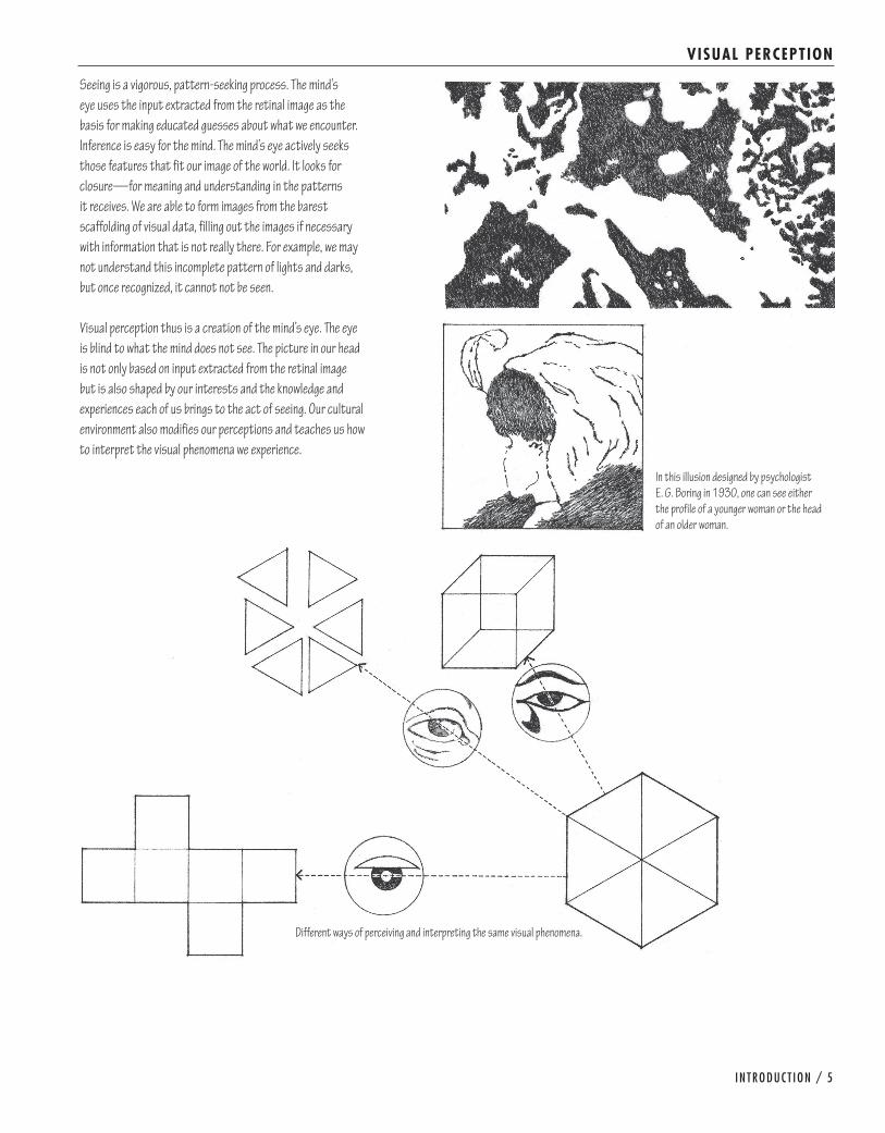
TONAL VALUE
Vision results from the stimulation of nerve cells in the retina of the eye, signaling patterns of light intensity and color. Our visual system processes these patterns of light and dark and extracts specific features of our environment—edges, contours, size, movement, and color. This assessment gives rise to our perception of separate objects in space.
The light and dark patterns we see emanate from the interaction of light with the surfaces of objects around us. The reflection of radiant energy from illuminated surfaces creates areas of light, while comparatively darker areas occur where there is an absence of light, either because surfaces are turned away from a light source or an opaque body intercepts the rays from the light source.
Just as seeing patterns of light and dark is essential to our perception of objects, the representation of tonal values in a drawing is necessary to depict the lightness or darkness of objects, describe the effect of light on their forms, and clarify their arrangement in space. Before creating and using tonal values to model form and convey the presence of light, it is necessary to understand the relationship between color and value.

TONE AND TEXTURE / 41
COLOR AND VALUE
Color is a phenomenon of light and visual perception that may be described in terms of an individual’s perception of hue, saturation, and lightness for objects, and hue, intensity, and brightness for light sources. We refer to the relative lightness or brightness of a color as value. Of the properties of color, value is the most critical in seeing and drawing.
• Somehuesreflectmorelightthanothers,whichiswhyweperceive them as being lighter or paler than others.
• Shadesofthesamehuevaryintonalvalue.Forexample,sky blue and indigo blue are the same hue, but the former is inherently lighter in value than the latter.
• Thewaylightilluminatesacolorandmakesitvisibleaffectsits apparent value. A highlight on a colored surface will appear much lighter than the same hue seen in shade or within a shadow.
• Surroundinghuesorvaluesalterourperceptionofacolororvalue.
Every color has a tonal value, but it is often difficult to discern. If we squint at an object or scene, however, our perception of hues diminishes and patterns of light and dark values begin toemerge.Seeingcolorvaluesinthiswayandbeingabletotranslate them into equivalent tonal values are essential tasks in drawing with the traditional media of pencil and pen.
yelloworange-yellow
orange
red-orange
red
yellow-green
green
blue-green
blue
purple-bluepurple
red-purple

42 / DRAWING FROM OBSERVAT ION
CREATING VALUES
Using the traditional media of pencil and pen-and-ink to make dark marks on a light surface, there are several basic techniques for creating tonal values.
• Hatching• Crosshatching• Scribbling• Stippling
These shading techniques all require a gradual building up or layering of strokes or dots. The visual effect of each technique varies according to the nature of the stroke, the medium, and the texture of the drawing surface. Regardless of the shading technique we use, we must be fully aware of the tonal value being achieved.
Sincetonalvalueisexpressedprimarilythroughtherelativeproportion of light to dark areas on the drawing surface, the most important characteristic of these techniques is thespacinganddensityofthestrokesordots.Secondarycharacteristics include the visual texture, grain, and direction of the strokes. When rendering the darkest values, we should be careful not to lose the white of the paper. Totally obscuring the presence of the paper surface with an opaque technique can cause a drawing to lose depth and vitality.
Spacing
Density
Texture
Direction

TONE AND TEXTURE / 43
CREATING VALUES
HatchingHatchingconsistsofaseriesofmoreorlessparallellines.The strokes may be long or short, mechanically ruled or drawn freehand, and executed with either a pen or a pencil on smooth or rough paper. When spaced closely, the lines lose their individuality and merge to form a tonal value. Therefore, we rely primarily on the spacing and density of lines to control the lightness or darkness of a value. While thickening the linear strokes can deepen the darkest values, using too thick of a line can result in an unintentional coarseness and heaviness of texture.
To produce a range of values with a pencil, we can vary the grade of lead as well as the pressure with which we draw. Be careful not to use too dense a grade of lead or press so hard that the pencil point embosses the drawing surface.
Unlike a pencil line, the tonal value of an ink line remains constant. We can only control the spacing and density of the hatching. When using a pen with a flexible nib, however, we can alter the pressure to subtly alter the thickness of the stroke.
The most flexible freehand technique for hatching uses relatively short, rapid, diagonal strokes. To define a precise edge, fix the beginning of each stroke with slight pressure. Feathertheendsofthestrokestodepictcurvedsurfaces,a texture gradient, or subtleties of light and shade. When extending a tonal value over a large area, avoid the effect of banding by softening the edges and overlapping each set of strokes in a random manner.
By applying additional layers of diagonal strokes at only slightly different angles to the preceding sets, we can build up the density and therefore the tonal value of an area. Maintaining the diagonal direction of the strokes in this manner avoids confusion with the underlying drawing and unifies the various tonal areas of a drawing composition.
The direction of hatching can also follow the contours of a form and emphasize the orientation of its surfaces. Remember, however, that direction alone has no impact on tonal value. With texture and contour, the series of lines can also convey material characteristics, such as the grain of wood, the marbling of stone, or the weave of fabric.

44 / DRAWING FROM OBSERVAT ION
CREATING VALUES
CrosshatchingCrosshatching uses two or more series of parallel lines to create tonal values. As with hatching, the strokes may be be long or short, mechanically ruled or drawn freehand, and executed with either a pen or a pencil on smooth or rough paper.
The simplest crosshatching consists of two perpendicular sets of parallel lines. While the resulting weave may be appropriate for describing certain textures and materials, the pattern can also produce a stiff, sterile, and mechanical feeling, especially when the lines are ruled and widely spaced.
Using three or more sets or layers of hatching provides more flexibility in generating a greater range of tonal values and surface textures. The multidirectional nature of the hatching also makes it easier to describe the orientation and curvature of surfaces.
In practice, we often combine hatching and crosshatching into a single technique. While simple hatching creates the lighter range of values in a drawing, crosshatching renders the darker range.

TONE AND TEXTURE / 45
CREATING VALUES
ScribblingScribblingisashadingtechniquethatinvolvesdrawinganetwork of random, multidirectional lines. The freehand nature of scribbling gives us great flexibility in describing tonal values and textures. We can vary the shape, density, and direction of the strokes to achieve a wide range of tonal values, textures, and visual expression.
The strokes may be broken or continuous, relatively straight or curvilinear, jagged or softly undulating. By interweaving the strokes, we create a more cohesive structure of tonal value. By maintaining a dominant direction, we produce a grain that unifies the various areas and shades of value.
As with hatching, we must pay attention to both the scale and density of the strokes and be aware of the qualities of surface texture, pattern, and material they convey.

46 / DRAWING FROM OBSERVAT ION
CREATING VALUES
StipplingStipplingisatechniqueforshadingbymeansofveryfinedots.The best results occur when using a fine-tipped ink pen on a smooth drawing surface.
Applying stippling is a slow and time-consuming procedure that requires the utmost patience and care in controlling the size and spacing of the dots. Rely on density to control tonal value. Resist the temptation to deepen a value by enlarging the dots. If the scale of the dots is too large for the toned area, too coarse a texture will result.
We use stippling to establish tonal values in pure-tone drawings—drawings that rely on value alone to define edges and contours. We apply stippling over faintly drawn shapes of the areas to be toned. We first cover all shaded areas with an even spacing of dots to create the lightest value. Then we establish the next value step with additional stippling. We continue to add stippling in a methodical manner until the darkest tonal values are established.
Sincetherearenoobjectivelinestodescribecontourandshape in a pure-tone drawing, we must rely on a series of dots to profile spatial edges and define the contours of forms. We use tightly spaced dots to define sharp, distinct edges, and a looser spacing of dots to imply softer, more rounded contours.

TONE AND TEXTURE / 47
CREATING VALUES
Digital FillsIn addition to manual techniques for creating tones with a pen or pencil, there are digital tools for filling the area of a shape or object with color and value. There are two primary types of digital fills: solid andgradient.Solidfillsapplyaconsistentcolororvaluetoashape,while gradient fills create a transition from one color or value to another color or value across a shape.
Gradients can be either linear or radial in nature. By adjusting the location and values of the beginning and ending points of a gradient, we can fine-tune the three-dimensional effect of the fill.
In a manner similar to manual hatching techniques, digital strokes can be used to build up tonal values and texture. The type of brush, pencil, or pen stroke selected, as well as the line width and opacity of the stroke, determine the density and texture of the value created.
Once placed, the fill of a shape or object can be lightened or darkened by adjusting the transparency of the fill, adding transparent layers of white or dark values, or by using digital dodge and burn techniques in a raster-based image.
100% Black
Dodged and burned faces using a textured brush.
0% Black
100% Black 0% Black 75% Black
0% Black
80% Black
Linear Gradient
Radial Gradient
Digital strokes masked to create a boundary.
Linear Gradient

48 / DRAWING FROM OBSERVAT ION
VALUE SCALE
White represents the lightest possible value and black the darkest. In between exists an intermediate range of grays. A familiar form of this range is represented by a value or gray scale having ten equal gradations from white to black.
As we begin to see value relationships, we must develop the ability to create corresponding tones using a variety of media and techniques. To this end, producing both a stepped series and a graduated scale of tonal values is beneficial and rewarding. Explore all of the shading techniques described on the preceding pages. Also investigate the possibility of executing a gray scale on a tinted or colored surface, using a black pencil to define values darker than the tone of the surface and a white pencil to establish the lighter values.
After each attempt, carefully evaluate the tonal order from a distance. Check to see if there are any breaks in value and if an even progression of values exists from white to black. With disciplined practice, we should be able to develop the control necessary to replicate any desired tone and maintain the required value contrasts in a drawing.

TONE AND TEXTURE / 49
MODELING FORM
Modeling refers to the technique of rendering the illusion of volume, solidity, and depth on a two-dimensional surface by meansofshading.Shadingwithtonalvaluesextendsasimpledrawing of contours into the three-dimensional realm of forms arranged in space.
The modeling of values from light to dark can describe the nature of a surface—whether it is flat or curved, smooth or rough. Areas of light can emerge from a dark background like mounds rising from the earth, while dark areas can appear to recede into the depth of the drawing surface. Gradual transitions from light to dark occur along the surfaces of cylinders, cones, and organic forms, whereas abrupt changes in value pronounce the angular meeting of planes in cubes, pyramids, and other prismatic forms.
Sincedefiningedgeshelpsusrecognizeshape,welooktoedges to discover the configuration of the surfaces of a three-dimensional form. We must be careful how we define the nature of the edge or boundary where two shapes of contrasting values meet. The skillful manipulation of tonal edges is critical to defining the nature and solidity of a surface or object.
Hardedgesdelineatesharpbreaksinformordescribecontoursthat are separated from the background by some intervening space. We define hard edges with an abrupt and incisive shift in tonalvalue.Softedgesdescribeindistinctorvaguebackgroundshapes, the gently curving surfaces of rounded forms, and areas of low contrast. We create soft edges with a gradual change in tonal value or diffuse tonal contrast.
Hardedges Softedges Hardandsoftedges

50 / DRAWING FROM OBSERVAT ION
MODELING FORM
Exercise 2.1Use a soft pencil to create a range of tonal values that converts the two-dimensional circle, triangle, and polygon into a three-dimensional sphere, cone, and cube. Experiment with hatching, crosshatching, and scribbling techniques to create the desired range of tonal values.
Exercise 2.2Repeat the above exercise but this time use a fine-tipped black pen and experiment with hatching, crosshatching, and stippling techniques to create the desired range of tonal values.
Exercise 2.3Use a soft pencil to create a range of tonal values that clarifies the three-dimensional form of this object. Experiment with hatching, crosshatching, and scribbling techniques to create the desired range of tonal values. Repeat this exercise using a fine-tipped black pen and experiment with hatching, cross-hatching, and stippling techniques to create the tonal values.

TONE AND TEXTURE / 51
MODELING FORM
Exercise 2.4Scanorreproducethethree-cubedrawingandexperimentusing a range of digital fills and gradients to differentiate the various faces of each cube and distinguish between the areas of shade and shadow. Adjust the transparency of the fills or use dodge and burn techniques to lighten and darken the areas of each shape. If necessary, use selections or masks to define the edges of each shape.
Exercise 2.5Scantheperspectiveviewandrepeattheaboveexercise,this time to depict the variable qualities of daylighting and shadows that might occur in the space.

52 / DRAWING FROM OBSERVAT ION
CONVEYING L IGHT
While tonal values can imply depth on a flat drawing surface, we turn to light to more vividly describe the three-dimensional qualities of forms and spaces in our environment. Light is the radiant energy that illuminates our world and enables us to see three-dimensional forms in space. We do not actually see light but rather the effects of light. The way light falls on and is reflected from a surface creates areas of light, shade, and shadow, giving us perceptual clues about its three-dimensional qualities. Tonal value is the graphic equivalent of shade and shadow and can only indicate light by describing its absence. In rendering the resulting patterns of light and dark shapes, we invest a form with mass and volume and create a sense of spatial depth.
Almost everything we see comprises a combination of one or more relatively simple geometric forms—the cube, the pyramid, the sphere, the cone, and the cylinder. If we understand that light illuminates each of these fundamental solids in a logical and consistent way, we can better render the effects of light on more complicated subjects. When light strikes an object, it creates a light side, a shaded side, and a cast shadow. Within this light-dark pattern, we can recognize the following elements:
• Lightvaluesoccuronanysurfaceturnedtowardalightsource.
• Tonalvaluesshiftasasurfaceturnsawayfromalightsource, with intermediate values occurring on surfaces tangent to the direction of the light rays.
• Highlightsappearasluminousspotsonsmoothsurfacesthat directly face or mirror a light source.
• Shadereferstothecomparativelydarkvaluesofsurfacesturned away from a light source.
• Areasofreflectedlight—lightcastbackfromanearbysurface—lighten the tonal value of a portion of a shaded surface or a shadow.
• Shadowsarethecomparativelydarkvaluescastbyanobjector part of an object upon a surface that would otherwise be illuminated by a light source.

TONE AND TEXTURE / 53
CONVEYING L IGHT
In modeling, we tend to consider first the local value of a surface. Local value describes how light or dark the material of a surface is. It is a constant property of the surface and has nothing to do with light. The quality of light that illuminates a surface,however,modifiesitslocalvalue.Forexample,naturallylight colors can appear darker in shade than those that are normally deeper in value but illuminated by light. In rendering tonal values, we should attempt to communicate this interplay of local value, light, and shade.
It is important to remember that we perceive tonal values relative to their context. The law of simultaneous contrast states that the stimulation of one color or tonal value leads to the sensation of its complement, which is projected instantaneouslyonajuxtaposedcolororvalue.Forexample,when two colors of contrasting value are juxtaposed, the lighter color will deepen the darker color while the darker color will lighten the lighter one. In a similar manner, a tonal value superimposed upon a darker tone will appear lighter than the same value set against a lighter tone.
Local values Light-shade pattern+
= Value pattern

54 / DRAWING FROM OBSERVAT ION
L IGHT, SHADE, AND SHADOW
To render the effects of light, we must be able to comprehend the nature of the light source, its spatial relationship to the objects it illuminates, and the three-dimensional nature of the forms themselves.
The clarity and tonal value of shaded surfaces and cast shadows provide clues to the quality of the light source.
• Brilliantlightproducesstronglight-darkcontrastswithsharply defined shadows.
• Diffusedlightcreateslessvaluecontrastbetweenlitsurfaces and shadows.
Cast shadows disclose the relative position of objects in space.
• Castshadowsanchoranobjecttothesurfaceonwhichitsits.
• Castshadowsrevealthedistancebetweenformsandthesurfaces upon which they are cast.
• Castshadowsclarifytheformofthesurfacesuponwhichthey are cast.
Brilliant light Diffused light
Even when forms are hidden from view, the shadows they cast can reveal their shape.

TONE AND TEXTURE / 55
L IGHT, SHADE, AND SHADOW
The shape and path of a shadow convey both the location of a light source and the direction of its rays.
• Castshadowsretreatinthedirectionoppositethatofthelight source.
• Frontlightingcreatesdeepshadowsbehindthesubjectthatrecede from the viewer.
• Toplightingcreatesshadowsthatareshallowordirectlybeneath the subject.
• Sidelightingthrowsonesideofthesubjectintoshadeandcasts shadows in the direction opposite of the light source.
• Three-quarterlighting,fromaboveandovertheshoulderofthe viewer, creates a strong sense of volume and reveals the surface texture of the subject.
• Backlightingcreatesdeepshadowstowardtheviewerandemphasizes the silhouette of the subject.
Fortheformalconstructionofshadeandshadowsinarchitecturaldrawings,refertoChapter6,“MultiviewDrawings.”
Frontlighting Toplighting
Sidelighting Backlighting
Three-quarter lighting

56 / DRAWING FROM OBSERVAT ION
RENDERING SHADE AND SHADOWS
Shadedsurfacesandcastshadowsareusuallyneitheropaquenor uniform in value. We should avoid employing large areas of solid dark tones that obliterate detail and disrupt our reading of the form of a surface. Instead, apply shades and shadows as transparent washes that belong to the form and through which we can read the texture and local color of the surface.
Shadebecomesshadowalongspatialedgesorshiftsinplanes.To retain a sense of three-dimensional forms occupying space, we should distinguish between the values of surfaces in shade andthoseofcastshadows.Shadedsurfacesareoftenlighterin value than shadows, but this value relationship should be confirmed by careful observation.
Cast shadows are generally darkest where they meet a surface in shade, becoming lighter toward its outer edges.The boundaries of cast shadows are distinct in brilliant light, but softer in diffuse light. In either case, we should define the outer edges of shadows with a contrast in value, never with a drawn line.
Areas of shade or shadow are almost never uniform in value. Light reflecting back from nearby surfaces illuminates surfaces in shade or on which shadows are cast. To depict the modifying effects of reflected light, we vary the tonal value of surfaces in shade and those on which shadows are cast. The effects of reflected light, however, should be suggested in a subtle way so as not to obscure the nature of the surface in shade or shadow.

TONE AND TEXTURE / 57
RENDERING SHADE AND SHADOWS
Exercise 2.6Arrange a still-life composition on a horizontal surface near a window or under a desk lamp so that clear and distinct shadowsarecastbytheobjects.Squintandfocusontheshapes and tonal values of the shaded areas and cast shadows. Use a soft pencil and your choice of modeling technique to render the tonal values you observe.
Exercise 2.7Repeat the above exercise, using a fine-tipped black pen to render the shaded areas and cast shadows.
Exercise 2.8Arrange another still-life composition by a window or under a desk lamp. This time, instead of rendering the darker tones with a graphite pencil or ink pen, draw the lighter values on black construction paper with a white pencil.

58 / DRAWING FROM OBSERVAT ION
MAPPING VALUES
The mapping of light-dark patterns is the easiest way to begin modeling. Mapping involves breaking down all areas of light, shade, and shadow that we see on a subject or in a scene into definite shapes. Decisiveness is necessary. When a shade or shadow seems indistinct, we must impose boundaries anyway. In doing this, we create an organized map of interlocking shapes that serves as a starting point for later refinements.
Mapping requires reducing the many tonal variations that we see into just a few. We begin by sorting the range of tonal values into two groups—light and dark; or three—light, medium, and dark. Within each group, the tonal value can vary to articulate the nature of the surfaces, but the overall mappingofthevaluesshouldremainclear.Squintingthroughhalf-closed eyes makes this task easier. Another method is to view a scene through tinted glass or acetate, which reduces the number of colors and simplifies the values we see.

TONE AND TEXTURE / 59
VALUE PATTERN
The pattern of values establishes the underlying structure that holds a modeled drawing together and gives it unity and strength. If the value pattern is fragmented, then the composition will be incoherent, no matter how carefully rendered or technically competent the individual drawing elements may be. Thumbnail sketches are effective devices for studying alternative value patterns and developing a strategy for the range, placement, and proportion of tonal values in a drawing.
Once the overall value pattern is established, we work from light to dark. We can always darken a tonal value, but once a tone has been darkened, it is difficult to reestablish a lighter value.Hereareafewadditionalpointstorememberinmodeleddrawing:
• Layerareasofvalue.Avoiddrawingvaluessequentiallyfromone part to another part of a drawing. Doing so can fragment a drawing and obscure our reading of a form. Establish broad groupings of tonal value before layering the smaller, more specific tones that constitute them. Establish each increase in value with an additional layer of tone. Continue to add layers of tone until the darkest tonal values are established.
• Establishgrain.Maintainingaconsistentdirectiontothestrokes unifies the various areas of tonal value and infuses a drawing with a cohesive quality.
• Maintainthedistinctionbetweenthesharptonalcontrastsof hard edges and the diffuse contrasts of soft edges.
• Retainhighlights.Itisextremelyimportantnottoloseareas in light. While these areas can be reclaimed in a pencil drawing by erasure, no such opportunity exists when drawing with a pen and ink.

60 / DRAWING FROM OBSERVAT ION
TONAL RANGE
The range of tonal values we use in a drawing influences the weight,harmony,andatmosphereofthecomposition.Sharpcontrasts in value vividly define and draw attention to the tonal shapes. A broad range of tonal values, with intermediate values providing a transition from the lightest to the darkest tones, can be rich and visually active. Too broad a range of values, however, can fragment the unity and harmony of a drawing’s composition. Closely related values tend to produce more restful, subtle, and restrained effects.
The relative proportion of light and dark values defines the dominant tonal value or key of a drawing.
• Apredominantlylightrangeofvaluesorhighkeyconveysdelicacy, elegance, and a sense of illuminating light.
• Amediumrangeoftonalvaluesormiddlekeyimpartsafeeling of harmony and balance. Without some positive contrasts, however, a middle-key drawing can become bland and lifeless.
• Ontheotherhand,thesomberqualityofamoderatelydark tonal range or low key can have a calming effect and establish a feeling of strength and stability.
When an intermediate tone is the dominant value of a drawing, it can be convenient to draw on a gray or colored surface, which automatically establishes the median tonal value. This surface tint can serve as an effective foil for darker values established with a black pencil and lighter values rendered with a white pencil.
Tight range
Broad range
Highcontrast

TONE AND TEXTURE / 61
TONAL RANGE
Exercise 2.9Arrange a still life on a windowsill or under a desk lamp so that a clear pattern of light, shade, and shadow emerges. Using only the white of the paper plus two values—a light and a middle gray—develop a mapping study of the composition.
Exercise 2.10Findanexteriorlandscapecontainingbothnearanddistantelements. Using a viewfinder to establish the limits of your visual field, develop a value pattern that describes the shapes and tonal values you see in the landscape.
Exercise 2.11Repeat the above exercises, but this time develop each drawing further by layering additional, intermediate tonal values within each value area.

62 / DRAWING FROM OBSERVAT ION
TONE AND TEXTURE
Whenever we use hatching or stippling to create a tonal value, we simultaneously create texture. Likewise, as soon as we begin to describe the nature of a material with lines, we simultaneously create a tonal value. We should always be aware of this relationship between tonal value and texture, whether smooth or rough, hard or soft, polished or dull. In most cases, tonal value is more critical than texture to the representation of light, shade, and the way it models forms in space.
We use the term texture most often to describe the relative smoothness or roughness of a surface. It can also describe the characteristic surface qualities of familiar materials, such as the hewn appearance of stone, the grain of wood, and the weave of a fabric. This is tactile texture that can be felt by touch.
Visual texture is the representation of the structure of a surface as distinct from color or form. It can be either felt or perceived in a drawing. All tactile textures provide visual texture as well. Visual texture, on the other hand, may be illusory or real.
Our senses of sight and touch are closely intertwined. As our eyes read the visual texture of a surface, we often respond to its apparent tactile quality without actually touching it. The visual texture prompts memories of past experiences. We remember what certain materials felt like as we ran our hands across their surfaces. We base these physical reactions on the textural qualities of similar materials we have experienced in the past.
Physical texture Visual texture

TONE AND TEXTURE / 63
DESCRIBING TEXTURE
The scale of the strokes or dots we use to create a tonal value, relative to the size of the toned area and the drawing composition, inherently conveys the visual texture of a surface.
Visual texture can also result from the interaction between medium and drawing surface. Drawing on a rough surface breaks up the deposits of ink or graphite. Lightly drawn strokes deposit the medium only on the raised portions of the surface, while increased pressure forces the medium also into the low-lying areas. In effect, the physical texture of the drawing surface bestows a visual grain and texture on the drawing itself.
Another way to impose a textural quality on an area of tonal valueisthroughfrottage.Frottagereferstothetechniqueof obtaining textural effects by rubbing graphite or charcoal over paper laid on a granular, pitted, or other roughly textured surface. This method of producing a textured tonal value is especially useful to prevent overworking a dark tonal value, which can cause a drawing to lose its freshness and spontaneity.
Small-scalestrokesanddots
Smoothstrokes Irregular strokes
Large-scale strokes and dots
Smoothdrawingsurface Coarse drawing surfaceFrottage

64 / DRAWING FROM OBSERVAT ION
DESCRIBING TEXTURE
Modifying FactorsContrast, scale, distance, and light are important modifying factors in our perception of texture and the surfaces they articulate. Whenever representing texture in a drawing, consider the following factors.
Contrast influences how strong or subtle a texture will appear to be. A texture seen against a uniformly smooth background will appear more obvious than when placed in juxtaposition with a similar texture. When seen against a coarser background, the texture will appear to be finer and reduced in scale.
The relative scale of a drawing determines whether we read a texture as blades of grass, a field of grain, or a patchwork quilt of fields. The relative scale of a texture also affects the apparent shape and position of a plane in space. Textures with directional grain can accentuate the length or width of a plane. Coarse textures can make a plane appear closer, reduce its scale, and increase its visual weight. In general, textures tend to visually fill the space they occupy.
All materials have some degree of texture, but the finer the scale of a texture, the smoother it will appear to be. Even coarse textures, when seen from a distance, can appear to be relatively smooth. Only upon closer viewing would the coarseness of a texture become evident.
Light influences our perception of texture and, in turn, is affectedbythetextureitilluminates.Smooth,shinysurfacesreflect light brilliantly, appear sharply in focus, and attract ourattention.Surfaceshavingamattetextureabsorbanddiffuse light unevenly and therefore appear less bright than a similarly colored but smoother surfaces. Coarse surfaces, when illuminated with direct lighting, cast distinct shadow patterns of light and dark upon themselves and disclose their textural quality. Diffused lighting de-emphasizes physical texture and can even obscure the three-dimensional structure of a texture.
Scaleanddistance
Light
Contrast

TONE AND TEXTURE / 65
DESCRIBING TEXTURE
Exercise 2.12Selecttwoormoreobjectshavingdecidedlydifferenttextures.Possibilities include a paper bag and a glass bottle, an egg and a spoon or fork on a piece of fabric, or various fruit in a ceramic bowl. Arrange the objects on a windowsill or under a desk lamp so that the lighting emphasizes the various textures. Describe the contrasting textures using any of the modeling techniques.
Exercise 2.13Repeat the above exercise, but this time move in very close to oneoftheoverlappingedges.Focusonthisedgeanddescribethe enlarged surface textures where they meet.
Exercise 2.14Repeat the above exercises several times, experimenting with both pencil and pen-and-ink media, and working on both smooth as well as rough drawing surfaces.


![Download this - Jurnal - Univ. Bandar Lampung [UBL]](https://static.fdokumen.com/doc/165x107/6314115c15106505030b3038/download-this-jurnal-univ-bandar-lampung-ubl.jpg)