Discovering Data Science with SAS: Selected Topics
170
support.sas.com/bookstore Discovering Data Science with SAS ® Selected Topics Foreword by Wayne Thompson
-
Upload
khangminh22 -
Category
Documents
-
view
1 -
download
0
Transcript of Discovering Data Science with SAS: Selected Topics

support.sas.com/bookstore
Discovering Data Science
with SAS®
Selected Topics
Foreword byWayne Thompson

The correct bibliographic citation for this manual is as follows: Thompson, R. Wayne. 2016. Discovering Data Science with SAS®: Selected Topics. Cary, NC: SAS Institute Inc.
Discovering Data Science with SAS®: Selected Topics
Copyright © 2016, SAS Institute Inc., Cary, NC, USA ISBN 978-1-62960-724-5 (EPUB) ISBN 978-1-62960-725-2 (MOBI) ISBN 978-1-62960-691-0 (PDF)
All Rights Reserved. Produced in the United States of America.
For a hard-copy book: No part of this publication may be reproduced, stored in a retrieval system, or transmitted, in any form or by any means, electronic, mechanical, photocopying, or otherwise, without the prior written permission of the publisher, SAS Institute Inc.
For a web download or e-book: Your use of this publication shall be governed by the terms established by the vendor at the time you acquire this publication.
The scanning, uploading, and distribution of this book via the Internet or any other means without the permission of the publisher is illegal and punishable by law. Please purchase only authorized electronic editions and do not participate in or encourage electronic piracy of copyrighted materials. Your support of others’ rights is appreciated.
U.S. Government License Rights; Restricted Rights: The Software and its documentation is commercial computer software developed at private expense and is provided with RESTRICTED RIGHTS to the United States Government. Use, duplication, or disclosure of the Software by the United States Government is subject to the license terms of this Agreement pursuant to, as applicable, FAR 12.212, DFAR 227.7202-1(a), DFAR 227.7202-3(a), and DFAR 227.7202-4, and, to the extent required under U.S. federal law, the minimum restricted rights as set out in FAR 52.227-19 (DEC 2007). If FAR 52.227-19 is applicable, this provision serves as notice under clause (c) thereof and no other notice is required to be affixed to the Software or documentation. The Government’s rights in Software and documentation shall be only those set forth in this Agreement.
SAS Institute Inc., SAS Campus Drive, Cary, NC 27513-2414
September 2016
SAS® and all other SAS Institute Inc. product or service names are registered trademarks or trademarks of SAS Institute Inc. in the USA and other countries. ® indicates USA registration.
Other brand and product names are trademarks of their respective companies.
SAS software may be provided with certain third-party software, including but not limited to open-source software, which is licensed under its applicable third-party software license agreement. For license information about third-party software distributed with SAS software, refer to http://support.sas.com/thirdpartylicenses.

Table of Contents Chapter 1: Before the Plan: Develop an Analysis Policy Before the Plan: Develop an Analysis Policy Chapter 3 from Data Analysis Plans: A Blueprint for Success Using SAS® by Kathleen Jablonski and Mark Guagliardo Chapter 2: The Ascent of the Visual Organization The Ascent of the Visual Organization Chapter 1 from The Visual Organization by Phil Simon Chapter 3: Introductory Case Studies in Data Quality Introductory Case Studies Chapter 1 from Data Quality for Analytics Using SAS® by Gerhard Svolba Chapter 4: An Introduction to the DS2 Language An Introduction to the DS2 Language Chapter 2 from Mastering the SAS® DS2 Procedure by Mark Jordan Chapter 5: Decision Trees - What Are They? Decision Trees - What Are They? Chapter 1 from Decisions Trees for Analytics Using SAS® Enterprise Miner™ by Barry de Ville and Padraic Neville Chapter 6: Neural Network Models Neural Network Models Excerpt from Chapter 5 from Predictive Modeling with SAS® Enterprise Miner™ by Kattamuri Sarma Chapter 7: An Introduction to Text Analysis An Introduction to Text Analysis Chapter 1 from Text Mining and Analysis by Goutam Chakraborty, Murali Pagolu, and Satish Garla Chapter 8: Models for Multivariate Time Series Models for Multivariate Time Series Chapter 8 from Multiple Time Series Modelling Using the SAS® VARMAX Procedure by Anders Milhoj

iv Discovering Data Science with SAS: Selected Topics

About This Book
Purpose Data science may be a difficult term to define, but data scientists are definitely in great demand!
Wayne Thompson, Product Manager of Predictive Analytics at SAS, defines data science as a broad field that entails applying domain knowledge and machine learning to extract insights from complex and often dark data.
To further help define data science, we have carefully selected a collection of chapters from SAS Press books that introduce and provide context to the various areas of data science, including their use and limitations.
Topics covered illustrate the power of SAS solutions that are available as tools for data science, highlighting a variety of domains including time, data analysis planning, data wrangling and visualization, time series, neural networks, text analytics, decision trees and more.
Additional Help Although this book illustrates many analyses regularly performed in businesses across industries, questions specific to your aims and issues may arise. To fully support you, SAS Institute and SAS Press offer you the following help resources:
● For questions about topics covered in this book, contact the author through SAS Press:
◦ Send questions by email to [email protected]; include the book title in your correspondence.
◦ Submit feedback on the author’s page at http://support.sas.com/author_feedback. ● For questions about topics in or beyond the scope of this book, post queries to the
relevant SAS Support Communities at https://communities.sas.com/welcome. ● SAS Institute maintains a comprehensive website with up-to-date information. One page
that is particularly useful to both the novice and the seasoned SAS user is its Knowledge Base. Search for relevant notes in the “Samples and SAS Notes” section of the Knowledge Base at http://support.sas.com/resources.
● Registered SAS users or their organizations can access SAS Customer Support at http://support.sas.com. Here you can pose specific questions to SAS Customer Support; under Support, click Submit a Problem. You will need to provide an email address to which replies can be sent, identify your organization, and provide a customer site number or license information. This information can be found in your SAS logs.

vi Discovering Data Science with SAS: Selected Topics
Keep in Touch We look forward to hearing from you. We invite questions, comments, and concerns. If you want to contact us about a specific book, please include the book title in your correspondence.
Contact the Author through SAS Press ● By e-mail: [email protected] ● Via the Web: http://support.sas.com/author_feedback
Purchase SAS Books For a complete list of books available through SAS, visit sas.com/store/books.
● Phone: 1-800-727-0025 ● E-mail: [email protected]
Subscribe to the SAS Learning Report Receive up-to-date information about SAS training, certification, and publications via email by subscribing to the SAS Learning Report monthly eNewsletter. Read the archives and subscribe today at http://support.sas.com/community/newsletters/training!
Publish with SAS SAS is recruiting authors! Are you interested in writing a book? Visit http://support.sas.com/saspress for more information.

Foreword Data science is a broad field that entails applying domain knowledge and machine learning to extract insights from complex and often dark data. It really is the science of
● Discovering what we don’t know from data ● Obtaining predictive actionable insight from data ● Creating data products that impact business ● Communicating relevant business stories from data ● Building confidence that drive business value
Just like a master chef who takes great precision in preparing a secret sauce or baking a cake, there is an artistic component to data science. You wrangle all of the data ingredients together to form a representative modeling (training) table. To enrich the data, you slice and dice the data to create new candidate data features (predictors). You iteratively build several candidate descriptive (unsupervised) and predictive (supervised) models drawing from a plethora of possible algorithms. You need to take great care not to over bake your models by training them to the underlying noise in the data. The models are often combined to form a final classifier that squeezes just a bit more juice out of your data.
You commonly have to go back to the data lake to get a forgotten ingredient or two and start the process all over. Just like the TV show MasterChef, you are often competing with other data scientists to build the winning model. Eventually, you and the team collaborate to settle on a winning model as the perfect recipe that generalizes the best on hold-out data. The winning model is applied to new data to make decisions, which is the process known as model scoring. Lastly, you monitor the model for degradation to ensure that your model doesn’t become stale and potentially build new challenger models.
The demand for good data scientists to carry out the data science lifecycle has accelerated in large part because the big data movement has become mainstream. Businesses are increasingly looking for ways to gain new insights from the massive amounts of data that they collect and store.
Machine learning is at the core of data science and requires data and pattern-matching techniques that help "train" the computer program to apply generalized rules to data that produce useful results. With origins in artificial intelligence, machine learning blends together techniques from many other fields, including the following:
● Mathematics––compressive sensing and optimization ● Statistics––maximum likelihood, density estimation, and regression ● Physics––Metropolis-Hastings and simulated annealing ● Operations Research––decision theory and game theory ● Artificial Intelligence––natural language processing and neural networks ● Signal Processing––audio, image, and video processing.

viii Discovering Data Science with SAS: Selected Topics
It is important that you know how to use these machine learning algorithms with a consideration of the practical issues and lessons learned from implementing data science systems. To illustrate these concepts, we have selected the following chapters from our SAS Press library. These chapters cover diverse topics that are relevant to data science, highlighting a variety of domains and techniques.
“Before the Plan” in Data Analysis Plans: A Blueprint for Success Using SAS® by Kathleen Jablonski and Mark Guagliardo helps you prepare the business and analysis objectives for the menu.
“Introductory Case Studies” in Data Quality for Analytics Using SAS® by Gerhard Svolba reviews several techniques––many of which are his personal methods––to ensure your data ingredients are of good quality and just right for building models.
“The Ascent of the Visual Organization” in The Visual Organization by Phil Simon discusses the importance of visualizing data and how new products now allow anyone to make sense of complex data at a glance.
“An Introduction to the DS2 Language” in Mastering the SAS® DS2 Procedure by Mark Jordan provides several useful examples of how you can use the SAS DS2 procedure to collect data from disparate sources and plug into your model.
“Decision Trees - What Are They?” in Decisions Trees for Analytics Using SAS® Enterprise Miner™ by Barry de Ville and Padraic Neville teaches you how to use a decision tree that outputs interpretable rules that you can follow just like a recipe.
“Neural Network Models” in Predictive Modeling with SAS® Enterprise Miner™ by Kattamuri Sarma covers neural networks modeling to find nonlinear combinations of ingredients that can add more lift and accuracy to your models.
“An Introduction to Text Analysis” in Text Mining and Analysis by Goutam Chakraborty, Murali Pagolu, and Satish Garla shows you how to include textual data into your analyses. The vast majority of data is unstructured and requires a special type of processing.
“Models for Multivariate Time Series” in Multiple Time Series Modelling Using the SAS® VARMAX Procedure by Anders Milhoj emphasizes that most data has a timing element associated with it that requires special data science cooking skills.
We hope these selections give you a better picture of the many tools that are available to solve your specific data science problems. In fact, we hope that after you appreciate these clear demonstrations of different data science techniques that you are able to bake the perfect cake.
Wayne Thompson Manager of Data Science Technologies at SAS

Foreword ix
Wayne Thompson is the Manager of Data Science Technologies at SAS. He is one of the early pioneers of business predictive analytics, and he is a globally recognized presenter, teacher, practitioner, and innovator in the field of predictive analytics technology. He has worked alongside the world's biggest and most challenging companies to help them harness analytics to build high-performing organizations. Over the course of his 20-year career at SAS, he has been credited with bringing to market landmark SAS analytic technologies (SAS® Text Miner, SAS® Credit Scoring for SAS® Enterprise Miner™, SAS®
Model Manager, SAS® Rapid Predictive Modeler, SAS® Scoring Accelerator for Teradata, SAS® Analytics Accelerator for Teradata, and SAS® Visual Statistics). His current focus initiatives include easy-to-use, self-service data mining tools for business analysts, deep learning and cognitive computing.
Wayne received his PhD and MS degrees from the University of Tennessee. During his PhD program, he was also a visiting scientist at the Institut Superieur d'Agriculture de Lille, Lille, France.

Before the Plan: Develop an Analysis Policy A data analysis plan presents detailed steps for analyzing data for a particular task. For example, in the way that a blueprint specifies the design for a construction project. But just as local building codes place requirements and limitations on a construction project, so too should data analysis organizations have policies to guide the development of all analysis plans developed by the group. Unfortunately, most data analysis consulting groups do not have written data analysis policies. An analysis policy is a charter or set of rules for planning and conducting analyses. When shared with colleagues and clients early in the collaborative process, the policy document can help to manage client expectations and save time by preventing multiple revisions of an analysis plan. This chapter details the components that might be included in a data analysis policy. For example, your policy may require the creation of a detailed plan before analysis starts. An example of an analysis policy is included.
Kathleen Jablonski, PhD, is an applied statistician in the Milken School of Public Health at George Washington University where she mentors students in research design and methods using SAS for data management and analysis. Her interests include study design, statistics, and epidemiology. She has served as principal investigator, as well as lead statistician, on several multicenter NIH funded studies and networks. She received a PhD in biological anthropology and a Master of Science in Applied Statistics.
http://support.sas.com/publishing/authors/jablonski.html
Mark Guagliardo, PhD, is an analyst with the Veterans Health Administration, U.S. Department of Veterans Affairs and has used SAS for 35 years on a wide variety of data management and analysis tasks. He has been the principal investigator or co-investigator for dozens of federally funded grants and contracts, primarily in the area of health services research. His peer reviewed publications and presentations have been in the areas of health services, public health, pediatrics, geography, and anthropology. He is a certified GIS (geographic information
systems) professional, and specializes in studies of access to health care services locations.
http://support.sas.com/publishing/authors/guagliardo.html
Data Analysis Plans: A Blueprint for Success Using SAS 2
Chapter 1: Before the Plan: Develop an Analysis Policy
Summary ..................................................................................................... 3
The Analysis Policy ..................................................................................... 3 Overview .................................................................................................................... 3
Analysis Policy Components ....................................................................... 4 Mission Statement .................................................................................................... 4 Project Initiation ........................................................................................................ 4 Data Analysis Proposals .......................................................................................... 4 Data Analysis Plans .................................................................................................. 5 Data Policies ............................................................................................................. 5 Statistical Policies .................................................................................................... 5 Reporting Guidelines ................................................................................................ 7
Analysis Policies for Large Projects............................................................ 7
Example Project Analysis Policy ................................................................. 8 Introduction ............................................................................................................... 8 TIAD Study Policies .................................................................................................. 8
References ............................................................................................... 10
Full book available for purchase here. Use EXBDL for a 25% discounted purchase of this book. For International orders please contact us directly.
3 Chapter 1: Before the Plan: Develop an Analysis Policy
Summary This chapter is intended for analysts who work in a consistent setting where multiple analysis plans will be developed over an extended period of time, be they for external clients and large projects, or for clients who are internal to the analysts’ own organization and having smaller projects. Analysis policies govern the rules of engagement between analyst and client, as well as principles of data handling and integrity, and statistical principles under which all analyses for all projects will be conducted.
The Analysis Policy
Overview Before you hang a shingle to announce your services, you should invest the time to develop an analysis policy. If your shingle is already hung, there is no better time than the present to gather your colleagues to formulate policies. These policies will serve as your charter or rules for planning and conducting analyses. Analysis policies outline the standard practices that you, your organization, and all of your projects will follow for all analyses and all clients.
Analysis policies can serve to limit, and, more importantly, to focus client expectations early. Policies are especially important when working with clients who have little background in statistics. They may also prove valuable when working with experienced clients who are accustomed to getting their way, particularly when “their way” may be contrary to your professional principles. Reviewing policies with a client may also give you the opportunity to assess their level of understanding of standards and practices in your field of work. If there is a poor fit between client expectations and your policies, an early review of policies can save time and prevent ill feelings from developing.
A policy document may be cursory or very precise and extensive, depending on the size of your organization and scope of your practice area. The format and content should be customized to suit your needs and environment.
Though the degree of adherence to policy should be high for most projects, it may vary becausethere are some tradeoffs to consider. First, industry norms evolve. For example, the literature on a particular branch of inferential statistical methods may begin to favor previously unpopular approaches. If you find yourself using these methods more often, it may be time to revise your policies to allow or emphasize them. Second, policies that lie stale too long may stifle innovation. For example, strict limitations on data exploration can prevent unexpected yet important discoveries. The right balance must be found between adherence to policy and flexibility. However, for most projects we recommend erring on the side of adherence, particularly when managing the expectations of new clients.
An example of a simple policy document can be found at the end of this chapter. The components of your policy will vary according to your industry and the scope of your work and clientele. However, below are a few key sections that you should consider including.

Data Analysis Plans: A Blueprint for Success Using SAS 4
Analysis Policy Components
Mission Statement A policy document might start with a mission statement that formally and succinctly states your department’s or your institution’s aims and values. A statement or list of goals can also be included. This section allows prospective clients to promptly assess at a high level whether there is a mutual fit with your organization. For example, if your mission statement identifies you as a group that focuses on government sector clients who develop policies to advance the well-being of the general population, a private sector client wishing to create market penetration of a particular product without regard for general well-being will immediately be made aware of a potential mismatch.
Project Initiation Following the mission statement, a policy document should indicate how an interested party should begin communications with your office in order to start a project. It guides clients to your front door and begins the interchange of client needs and policy information in an orderly fashion. Too often, casual conversations between potential clients and non-managerial staff can lead to premature meetings, unreasonable expectations, and implied commitments that must be unknotted before a proper relationship can begin. This is a common problem for law offices and professional consulting groups. Impatient clients wish to get answers or see a light at the end of the tunnel before policies have been conveyed, mutual fit assessed, and level of effort estimated.
Instruments such as information sheets and mandatory intake forms are very helpful in this regard. These are usually followed by a formal meeting where the previously provided written policies are verbally reviewed and explained if necessary. Conveying initiation policies up front, and requiring all staff to follow them will prevent work from launching too early. The vetting process will prevent back-tracking and save analysts from running in circles, wasting everyone’s time and possibly eroding morale.
The project initiation section is also a good place to present your expectations of the roles to be played by all project collaborators. For example, if the analysts in your group intend to be the sole analysts for all projects, then you should say so here. Authorship expectations should also be covered. If you expect that the data analysts will always be cited as co-authors for all peer-reviewed publications stemming from your work, this should be made clear in the project initiation section.
Data Analysis Proposals Your policy document might state that a written proposal from the client to you will be required soon after your initial meeting. In it, the client states any questions they wish to address through the project, the data and general resources they might contribute, and their best description of the services they expect to receive from you.
The format and content of a typical proposal should fit your business scope and clientele. In your policy document, you should avoid making the need for a proposal appear off-putting to small or inexperienced clients. To this end, you might include an outline of a typical proposal in your policy document and make it clear that you are available to guide or participate in its development. Knowing in advance what you would like in a proposal will save both parties considerable time in the long run.

5 Chapter 1: Before the Plan: Develop an Analysis Policy
Depending on your business model, the proposal may lead to a binding contract. It is beyond the scope of this book to cover business contracts. However, data analysts rarely encounter these issues in their formal training and would do well to develop some knowledge and experience in the area of negotiations and business contracting.
Data Analysis Plans Your policy document should state the requirement that an analysis plan will be mutually developed after or in conjunction with the analysis proposal. The analysis policy may also eventually be incorporated into a contract, again depending on your business practices. The development and execution of this plan is the main thrust of this book. An outline or template of a typical analysis plan may be included in your policy document, though it should be clear to potential clients that the plan is not required until after initial meetings.
The policy document should explain the rationale for having an analysis plan. The following should be clear from this section:
● Analyses will not begin until all parties agree to the analysis plan., ● Deviation from the original plan may require amendments to the previous version of the
analysis plan. ● Significant changes to the original plan may require additional negotiations.
Data Policies In this section of your policy document you should make potential clients aware of requirements that govern data handled by your organization, including but not limited to the following:
● privacy and security requirements, as applicable, established by
◦ governments
◦ other relevant non-governmental organizations or project partners
◦ your own organization
● acceptable methods and formats for data exchange between you, the client, and other project partners
● data ownership and stewardship and formal documents that may be required in this regard
● data use and transfer agreements, as required
In the case of human subjects research and in other circumstances, approval for data collection and/or exchange must come from a recognized committee such as an Internal Review Board (IRB). Analysts working in the field of medical research are well acquainted with these requirements, but the public and many inexperienced clients are not well versed in the details. They may not even recognize that data for their proposed project requires IRB approval for inter-party exchange and analysis. You policy document is a good place to raise this issue.
Statistical Policies The section covering statistical policies should not be a statistical primer, but it should lay out general rules for analysis and interpretation. Reviewing these polices with the client before analysis begins serves to control expectations. The policies cover situations that usually are not

Data Analysis Plans: A Blueprint for Success Using SAS 6
part of the analysis proposal, analysis plan, or contracts described above. You should cover topics that have been an issue in the past or are known to crop up frequently in your field of work. Some examples of statistical policies you might consider for inclusion in your policy document are listed below.
● State your policies that govern missing data and imputation. Two examples:
◦ Missing data will not be ignored. At a minimum you will test for how missing data may bias your sample (Sunita Ghosh, 2008). (J.A.C. Sterne, 2009).
◦ Indicate that in longitudinal data analysis, you will shy away from biased procedures such as last observation carried forward (Jones, 2009).
● Describe your position on the appropriateness and circumstances of subgroup analysis and your policy for conducting unplanned post hoc analysis. Clients not trained in statistics often have a great deal of difficulty understanding why it is a violation of statistical assumptions to limit analyses in these ways. If planned analyses fail to give the desired results, some clients will pressure analysts to perform unplanned analyses until desired results are achieved. It is wise to anticipate and address these circumstances in your policy document.
◦ Define the difference between a pre-specified subgroup analysis and a hypothesis-generating, post-hoc analysis and caution against making broad, unconstrained conclusions (Wang, Lagakos, Ware, Hunter, & Drazen, 2007).
◦ Consider referencing one or more journal articles that support your policies. This is a very effective way of lending credence to your positions.
◦ Emphasize that problems with subgroup analysis include increased probability of type I error when the null is true, decreased power when the alternative hypothesis is true, and difficulty in interpretation.
● If you are testing hypotheses,
◦ State how you normally set type I and II error rates.
◦ State that tests are normally 2-sided and under what circumstances you would use a 1-sided test.
◦ Disclose requirements for including definitions of practical importance (referred to as clinical significance in medical research).
◦ Communicate how you typically handle multiple comparisons and adjustment for type-1 error.
◦ Some analysts adjust type-1 errors only for tests of the primary outcome.
◦ In some cases, adjustment for type-1 errors involves a Bonferroni correction or an alternative such as the Holm-Bonferroni method (Abdi, 2010).
● If you are analyzing randomized clinical trials data, it is advisable to state that you will always use intention to treat (ITT) analyses in order to avoid bias from cross-overs, drop-outs, and non-compliance.

7 Chapter 1: Before the Plan: Develop an Analysis Policy
Reporting Guidelines Below are some common examples of reporting guidelines that may be covered in a policy document.
● Address statistical significance and the interpretation of p-values. Note that a p-value cannot determine if a hypothesis is true and cannot determine if a result is important. You may want to reference the American Statistical Association’s statement on this topic (Wasserstein & Lazar, 2016).
● Indicate whether you require reporting of confidence intervals, probability values (p-value), or both. Some clients resist proper reporting when the results are close to what the client does or does not wish them to be.
● Present your conventions for reporting the number of decimal places for data and p-values. For example, is it your policy to report 2 or 3 decimal places? In some fields (e.g. genomics), it is customary to report 10 or even 12 decimal places.
● State that you will report maximum and minimum values to the same number of decimal places than the raw data values, if that is your policy.
● State that means and medians will be reported to one additional decimal place and that standard deviations and standard errors will be reported to two places more than collected, if that is your policy.
Analysis Policies for Large Projects To this point, we have framed analysis planning as having two tiers–the policy document to provide high-level guidance for all clients and all analyses and the analysis plan to provide specific guidance for a single analysis or closely linked analyses. However, well-established analytical centers may serve one or more very large projects spanning years or decades and resulting in dozens or hundreds of individual analyses. Examples abound in the realm of federally funded medical research. A typical case is the Adolescent Medicine Trials Network (ATN) for HIV/AIDS Intervention funded by the National Institute of Child Health and Human Development (NICHD) (NIH Eunice Kennedy Shriver National Institute of Child Health and Human Development, 2015). Another is the Nurses Health Study (www.nurseshealthstudy.org, 2016) which began in 1976, expanded in 1989, and continues into 2016.
In such cases, the two tiers, policy, and plans, may not serve the large project very well. The project may be so large that it functions as a semi-independent entity that requires its own policies to achieve congruency with collaborating institutions. Furthermore, many of the analyses under the project umbrella may share detailed criteria that do not properly belong in an institutional policy, yet it would be awkward to repeat them in all dozens or hundreds of analysis plans. An example would be how body mass index (BMI) is to be categorized in all analyses for a large obesity research program.
The solution is to add a middle tier, the project analysis policy. It should incorporate all key elements of the home institution’s overarching analysis policy, as well as detailed criteria shared by many of the anticipated analyses. These detailed criteria are in essence promoted to the level of policy within the project, and need not be repeated in all analysis plans. Instead, analysis plans should make reference to the project policy. However, it is essential to keep all partners, particularly those who join after the project inauguration, aware of these policies through the life of the project.

Data Analysis Plans: A Blueprint for Success Using SAS 8
Example Project Analysis Policy
Introduction This is an example of a project analysis policy written by a group of analysts at a university-based research data analysis center. They are the statistical consulting group for a federally funded, nationwide, multi-institutional fictional study called Targeting Inflammation Using Athelis for Type 2 Diabetes (TIAD). These policies were written to provide guidance to non-statistical collaborators from around the nation on how to interact with the data coordinating center and what to expect when proposing analyses that will lead to publications in peer-reviewed journals.
The example is briefer than a policy document would be for a larger organization dealing with many clients who are unfamiliar with the service group and/or statistical analyses in general. We have foregone a mission statement because all collaborating institutions are fully aware of TIAD’s purpose.
TIAD Study Policies
Project Initiation All TIAD analyses intended to result in manuscripts will be tracked on the TIAD website. As each manuscript task progresses, its website entry will be populated with an analysis plan; manuscript drafts including all data tables and figures; and all correspondence to and from journals. All documents must have dates and version numbers.
Statisticians from the data coordinating center will always be cited as co-authors on each manuscript. Disagreements about statistical methods or interpretations of statistical results will be openly discussed among co-authors and the publications committee members. However, consistent with the roles identified in the original federal grant application, the statisticians of the study coordinating center will make final determinations on analysis methods and interpretations.
Data Analysis Proposals Proposals for manuscripts must be submitted to our group via the TIAD website and addressed to our group for review by the TIAD publications committee, whose membership is identified on the website. Data Coordinating Center staff are available to assist with proposal development.
Each proposal must include the following:
● Study Title ● Primary Author and contact information ● Collaborators and co-authors who will participate in the work, and what their roles will
be ● Objective (A brief description of the analysis—may include primary and secondary
questions or hypotheses) ● Rationale (Describe how results from this analysis will impact the topic area) ● Study design (Summarize the study design, such as matched case-control, nested case-
control, descriptive, etc.) ● Sample description (Define inclusion and exclusion criteria and outcomes) ● Resources (Describe resources that may be required such as laboratory measurements
that may be beyond what is normally expected)
9 Chapter 1: Before the Plan: Develop an Analysis Policy
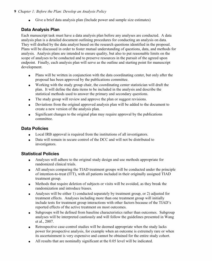
● Give a brief data analysis plan (Include power and sample size estimates)
Data Analysis Plan Each manuscript task must have a data analysis plan before any analyses are conducted. A data analysis plan is a detailed document outlining procedures for conducting an analysis on data. They will drafted by the data analyst based on the research questions identified in the proposal. Plans will be discussed in order to foster mutual understanding of questions, data, and methods for analysis. Analysis plans are intended to ensure quality, but also to put reasonable limits on the scope of analyses to be conducted and to preserve resources in the pursuit of the agreed upon endpoint. Finally, each analysis plan will serve as the outline and starting point for manuscript development.
● Plans will be written in conjunction with the data coordinating center, but only after the proposal has been approved by the publications committee.
● Working with the study group chair, the coordinating center statistician will draft the plan. It will define the data items to be included in the analysis and describe the statistical methods used to answer the primary and secondary questions.
● The study group will review and approve the plan or suggest revisions. ● Deviations from the original approved analysis plan will be added to the document to
create a new version of the analysis plan. ● Significant changes to the original plan may require approval by the publications
committee.
Data Policies ● Local IRB approval is required from the institutions of all investigators. ● Data will remain in secure control of the DCC and will not be distributed to
investigators.
Statistical Policies ● Analyses will adhere to the original study design and use methods appropriate for
randomized clinical trials. ● All analyses comparing the TIAD treatment groups will be conducted under the principle
of intention-to-treat (ITT), with all patients included in their originally assigned TIAD treatment group.
● Methods that require deletion of subjects or visits will be avoided, as they break the randomization and introduce biases.
● Analyses will be either 1) conducted separately by treatment group, or 2) adjusted for treatment effects. Analyses including more than one treatment group will initially include tests for treatment group interactions with other factors because of the TIAD’s reported effects of the active treatment on most outcomes.
● Subgroups will be defined from baseline characteristics rather than outcomes. Subgroup analyses will be interpreted cautiously and will follow the guidelines presented in Wang et al., 2007.
● Retrospective case-control studies will be deemed appropriate when the study lacks power for prospective analysis, for example when an outcome is extremely rare or when its ascertainment is very expensive and cannot be obtained for the entire study cohort.
● All results that are nominally significant at the 0.05 level will be indicated.

Data Analysis Plans: A Blueprint for Success Using SAS 10
● Hochberg’s (1988) improved Bonferroni procedure will be used to adjust for multiple comparisons where appropriate.
Reporting ● We will not report cell sample sizes less than 10 in tables. ● We will use the following categorization for race: African American, American Indian,
Asian American/Pacific Islander, Caucasian. ● Latino ethnicity will be reported separately from race categories. ● Age categories will be defined as follows: <18, 18 to <25, 25 to <30, 30 to <35, and 35
and older. ● We will use the World Health Organization definition for BMI (kg/m2) classification:
◦ <18.5 Underweight
◦ 18.50-24.99 Normal range
◦ 25.00 to <30.00 Overweight
◦ ≥30.00 Obese
References Hochberg, Y. (1988). A sharper Bonferroni procedure for multiple tests of significance.
Biometrika, 75, 800-802. Peduzzi P, Wittes J, Detre K, Holford T. Analysis as-randomized and the problem of non-
adherence: An example from the Veterans Affairs Randomized Trial of Coronary Artery Bypass Surgery. Stat. Med 1993; 12:1185-1195
Wang, R., SW Lagakos, JH Ware, DJ Hunter, and JM Drazen, Statistics in Medicine – Reporting of Sugroup Analysis in Clinical Trials. NEJM 2007 357;21, pp 2189-2194.
Sunita Ghosh, Punam Pahwa. Assessing Bias Associated With Missing Data from Joint Canada/U.S. Survey of Health: An Application. JSM 2008; 3394-3401.
J.A.C. Sterne, Ian r. White, John b. Carlin, Micahel Spratt, Patrick Royston, Michael G. Kenward, Angela M. Wood, and James R. Carpenter. Multiple Imputation for Missing Data in Epidemiological and Clinical Research: Potential and Pitfalls. BMJ 2009; 33.
Jones, Chandan Saha and Miichael P. Bias in the Last Observation Carried Forward Method Under Informative Dropout. Journal of Statistical Planning and Inference, 2009; 246-255.
Wang, Rui; Lagakos, Stephen W.; Ware, James H.; Hunter, David J.; Drazen, Jeffrey M. Statistics In Medicine - Reporting of Subgroup Analyses in Clinical Trials, NEJM, 2007,2189-
2194. Abdi, Herve. Holm's Sequential Bonferroni Procedure. 2010, Sage, Thousand Oaks, CA. Wasserstein, Ronald L; Lazar, Nicole A.. The ASA's statement on p-values; context, process, and
purpose. The American Statistician, 2016.

11 Chapter 1: Before the Plan: Develop an Analysis Policy
Full book available for purchase here.
Use EXBDL for a 25% discounted purchase of this book. Free shipping available in the US. For International orders please contact us directly.
Data Analysis Plans: A Blueprint for Success Using SAS® gets you started on building an effective data analysis plan with a solid foundation for planning
and managing your analytics projects. Data analysis plans are critical to the success of analytics projects and can improve the workflow of your project when implemented effectively. This book provides step-by-step instructions on writing, implementing, and updating your data analysis plan. It emphasizes the concept of an analysis plan as a working document that you update throughout the life of a project.
This book will help you manage the following tasks:
● control client expectations ● limit and refine the scope of the analysis ● enable clear communication and understanding among team members ● organize and develop your final report
SAS users of any level of experience will benefit from this book, but beginners will find it extremely useful as they build foundational knowledge for performing data analysis and hypotheses testing. Subject areas include medical research, public health research, social studies, educational testing and evaluation, and environmental studies.

Data Analysis Plans: A Blueprint for Success Using SAS 12

The Ascent of the Visual Organization Before data scientists can begin to model their data, it is essential to explore the data to help understand what information their data contains, how it is represented, and how best to focus on what the analyst is looking for.
In today’s business world, it is not easy to see what is going on and most people are overwhelmed by the amount of data they are collecting or have access to. Companies are beginning to understand that the use of interactive heat maps and tree maps lend themselves to better data discovery than static graphs, pie charts, and dashboards.
Now products such as SAS® Visual Analytics, mean that anyone can make sense of complex data. Predictive analytics combined with easy-to-use features means that everyone can assess possible outcomes and make smarter, data-driven decisions––without coding.
The following chapter explores some of the social, technological, data, and business trends driving the visual organization. We will see that employees and organizations are representing their data in more visual ways.
Phil Simon is a recognized technology expert, a sought-after keynote speaker, and the author of six books, including the award-winning The Age of the Platform. While not writing and speaking, he consults organizations on strategy, technology, and data management. His contributions have been featured on The Wall Street Journal, NBC, CNBC, The New York Times, InformationWeek, Inc. Magazine,
Bloomberg BusinessWeek, The Huffington Post, Forbes, Fast Company, and many other mainstream media outlets. He holds degrees from Carnegie Mellon and Cornell University.
http://support.sas.com/publishing/authors/simon.html

29
c01 29 February 3, 2014 4:19 PM
C h a P t e r 2The Ascent of the Visual Organization
Where is the knowledge we have lost in information?—T. S. Eliot
Why are so many organizations starting to embrace data visualization?
What are the trends driving this movement? In other words, why are
organizations becoming more visual?
Let me be crystal clear: data visualization is by no means a recent advent.
Cavemen drew primitive paintings as a means of communication. “We have
been arranging data into tables (columns and rows) at least since the sec-
ond century C.E. However, the idea of representing quantitative information
graphically didn’t arise until the seventeenth century.”* So writes Stephen Few
in his paper “Data Visualization for Human Perception.”
In 1644, Dutch astronomer and cartographer Michael Florent van Langren
created the first known graph of statistical data. Van Langren displayed a wide
range of estimates of the distance in longitude between Toledo, Spain, and
Rome, Italy. A century and a half later, Scottish engineer and political econo-
mist William Playfair invented staples like the line graph, bar chart, pie chart,
and circle graph.†
Van Langren, Playfair, and others discovered what we now take for granted:
compared to looking at individual records in a spreadsheet or database table,
it’s easier to understand data and observe trends with simple graphs and charts.
* To read the entire paper, go to http://tinyurl.com/few-perception.† For more on the history of dataviz, see http://tinyurl.com/dv-hist.
Full book available for purchase here. Use EXBDL for a 25% discounted purchase of this book. Free shipping available in the US. For International orders please contact us directly.

30 ▸ B o o k o v e r v i e w a n d B a c k g r o u n d
c01 30 February 3, 2014 4:19 PM
(The neurological reasons behind this are beyond the scope of this book. Suffice
it to say here that the human brain can more quickly and easily make sense
of certain types of information when they are represented in a visual format.)
This chapter explores some of the social, technological, data, and business
trends driving the visual organization. We will see that employees and
organizations are willingly representing—or, in some cases, being forced to
represent—their data in more visual ways.
Let’s start with the elephant in the room.
The Rise Of Big DATA
We are without question living in an era of Big Data, and whether most peo-
ple or organizations realize this is immaterial. As such, compared to even five
years ago, today there is a greater need to visualize data. The reason is simple:
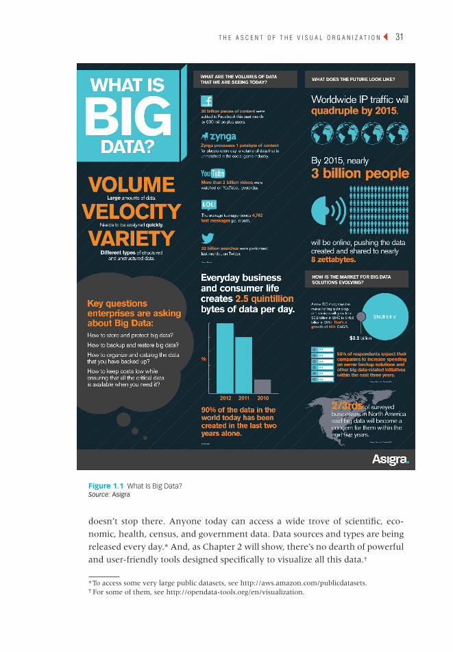
there’s just so much more of it. The infographic in Figure 1.1 represents some
of the many statistics cited about the enormity of Big Data. And the amount of
available data keeps exploding. Just look at how much content people gener-
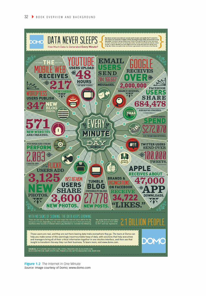
ate in one minute on the Internet, as shown in Figure 1.2.
Figures 1.1 and 1.2 manifest that Big Data is, well, big—and this means
many things. For one, new tools are needed to help people and organizations
make sense of this. In Too Big to Ignore, I discussed at length how relational
databases could not begin to store—much less analyze—petabytes of unstruc-
tured data. Yes, data storage and retrieval are important, but organizations ulti-
mately should seek to use this information to make better business decisions.
Open DATA
Over the past few years, we’ve begun to hear more about another game-
changing movement: open data. (Perhaps the seminal moment occurred when
Sir Tim Berners-Lee gave a 2010 TED talk on the subject.*) Put simply, open
data represents “the idea that certain data should be
freely available to everyone to use and republish as
they wish, without restrictions from copyright, pat-
ents, or other mechanisms of control.”1
Think of open data as the liberation of valuable
information that fosters innovation, transparency,
citizen participation, policy measurement, and bet-
ter, more efficient government. Examples of open or
public datasets include music metadata site Music-
Brainz and geolocation site OpenStreetMap. But it
while critical, the arrival of Big data is far from the only data-related trend to take root over the past decade. The arrival of Big data is one of the key factors explaining the rise of the visual organization.
* To watch the talk, go to http://tinyurl.com/tim-open-data.
T h e a s c e n T o f T h e v i s u a l o r g a n i z a T i o n ◂ 31
c01 31 February 3, 2014 4:19 PM
figure 1.1 What Is Big Data? Source: Asigra
doesn’t stop there. Anyone today can access a wide trove of scientific, eco-
nomic, health, census, and government data. Data sources and types are being
released every day.* And, as Chapter 2 will show, there’s no dearth of powerful
and user-friendly tools designed specifically to visualize all this data.†
* To access some very large public datasets, see http://aws.amazon.com/publicdatasets.† For some of them, see http://opendata-tools.org/en/visualization.
32 ▸ B o o k o v e r v i e w a n d B a c k g r o u n d
c01 32 February 3, 2014 4:19 PM
figure 1.2 the Internet in One Minute Source: Image courtesy of Domo; www.domo.com

T h e a s c e n T o f T h e v i s u a l o r g a n i z a T i o n ◂ 33
c01 33 February 3, 2014 4:19 PM
Figure 1.3 represents a mere fraction of the open datasets currently avail-
able to anyone with an Internet connection and a desire to explore.*
Of course, the benefits of open data are not absolute. Unfortunately, and
not surprisingly, many people use open data for malevolent purposes. For
instance, consider Jigsaw, a marketplace that pays people to hand over other
people’s contact information. (I won’t dignify Jigsaw with a link here.) As of
this writing, anyone can download this type of data on more than 7 million
professionals. Beyond annoying phone calls from marketers and incessant
spam, it’s not hard to imagine terrorist organizations accessing open data for
nefarious purposes. Still, the pros of open data far exceed their cons.
The BuRgeOning DATA ecOsysTem
In the Introduction, I discussed how anyone could easily visualize their Face-
book, Twitter, and LinkedIn data. I used Vizify to create an interesting visual
profile of my professional life, but Vizify and its ilk are really just the tip of the
* For a larger visual of what’s out there, see http://tinyurl.com/open-data-book.
figure 1.3 examples of Mainstream Open Datasets as of 2008 Source: Richard Cyganiak, licensed under Creative Commons
Music-brainz
Audio-Scrobbler
ECSSouth-ampton
Sem-Web-
Central
Flickrexporter
Doap-space
updated
NEW!
NEW!
QDOS
Magna-tune
BBCJohnPeel
BBCLater +TOTP
Jamendo
Geo-names
USCensus
Data
riese
Gov-Track
Wiki-company
Euro-stat Open
Cyc
W3CWordNet
ProjectGuten-berg
flickrwrappr
lingvoj
DBLPHannover
DBLPBerlin
RKBExplorer
RDF BookMashup
Revyu
FOAFprofiles
Onto-world
SWConference
Corpus
SIOCprofiles
Open-Guides
DBpedia
WorldFact-book

34 ▸ B o o k o v e r v i e w a n d B a c k g r o u n d
c01 34 February 3, 2014 4:19 PM
iceberg. Through open APIs, scores of third parties can currently access that
data and do some simply amazing things. For instance, MIT’s Immersion Proj-
ect lets Gmail users instantly visualize their e-mail connections.*
As far as I know, Google has no legal obligation to keep any of its APIs
open. Nor is it compelled to regularly lease or license its user data or meta-
data to an entity. (Government edicts to turn over user data like the 2013
PRISM affair are, of course, another matter.) The company chooses to make
this information available. If you’re curious about what Google permits itself to
do, check out its end-user license agreement (EULA).†
Perhaps Google will incorporate some of the Immersion Project’s features
or technology into Gmail or a new product or service. And maybe Google will
do the same with other third-party efforts. Progressive companies are keeping
tabs on how developers, partners, projects, and start-ups are using their prod-
ucts and services—and the data behind them. This is increasingly becoming the
norm. As I wrote in The Age of the Platform, Amazon, Apple, Facebook, Google,
Salesforce.com, Twitter, and other prominent tech companies recognize the
significance of ecosystems and platforms, especially with respect to user data.
The new weB: VisuAl, semAnTic, AnD Api-DRiVen
Since its inception, and particularly over the past eight years, the Web has
changed in many ways. Perhaps most significantly to laypeople, it has become
much more visual. Behind the scenes, techies like me know that major front-
end changes cannot take place sans fundamental technological, architectural,
and structural shifts, many of which are data driven.
The Arrival of the Visual web
Uploading photos to the Web today is nearly seamless and instant. Most of
you remember, though, that it used to be anything but. I’m old enough to
remember the days of text-heavy websites and dial-up Internet service provid-
ers (ISPs) like Prodigy and AOL. Back in the late 1990s, most people connected
to the Internet via glacially slow dial-up modems, present company included.
Back then I could hardly contain my excitement when I connected at 56 kilo-
bits per second. Of course, those days are long gone, although evidently AOL
still counts nearly three million dial-up customers to this day.2 (No, I couldn’t
believe it either.)
Think about Pinterest for a moment. As of this writing, the company sports
a staggering valuation of $3.5 billion without a discernible business model—or
* Check out https://immersion.media.mit.edu/viz#.† A EULA establishes the user’s or the purchaser’s right to use the software. For more on Google’s
EULA, see http://tinyurl.com/google-eula.

T h e a s c e n T o f T h e v i s u a l o r g a n i z a T i o n ◂ 35
c01 35 February 3, 2014 4:19 PM
at least a publicly disclosed one beyond promoted pins. As J.J. Colao writes on
Forbes.com, “So how does one earn such a rich valuation without the operat-
ing history to back it up? According to Jeremy Levine, a partner at Bessemer
Venture Partners who sits on Pinterest’s board, the answer is simple: ‘People
love it.’”3 (In case you’re wondering, I’ll come clean about Pinterest. It’s not a
daily habit, but I occasionally play around with it.*)
It’s no understatement to say that we are infatuated with photos, and
plenty of tech bellwethers have been paying attention to this burgeoning
trend. On April 9, 2012, Facebook purchased Instagram, the hugely popular
photo-sharing app. The price? A staggering $1 billion in cash and stock. At the
time, Instagram sported more than 30 million users, but no proper revenue, let
alone profits. Think Zuckerberg lost his mind? It’s doubtful, as other titans like
Google were reportedly in the mix for the app.
Thirteen months later, Yahoo CEO Marissa Mayer announced the much-
needed overhaul of her company’s Flickr app. Mayer wrote on the company’s
Tumblr blog, “We hope you’ll agree that we have made huge strides to make
Flickr awesome again, and we want to know what you think and how to fur-
ther improve!”4 And hip news-oriented apps like Zite and Flipboard are heavy
on the visuals.
Facts like these underscore how much we love looking at photos, taking
our own, and tagging our friends. Teenagers and People aficionados are hardly
alone here. Forget dancing cats, college kids partaking in, er, “extracurricular”
activities, and the curious case of Anthony Weiner. For a long time now, many
popular business sites have included and even featured visuals to accompany
their articles. It’s fair to say that those without photos look a bit dated.
Many Wall Street Journal articles include infographics. Many blog posts these
days begin with featured images. Pure text stories seem so 1996, and these sites
are responding to user demand. Readers today expect articles and blog posts to
include graphics. Ones that do often benefit from increased page views and, at
a bare minimum, allow readers to quickly scan an article and take something
away from it.
linked Data and a more semantic web
It’s not just that data has become bigger and more open. As the Web matures and
data silos continue to break down, data becomes increasingly interconnected. As
recently as 2006, only a tiny percentage of data on the Web was linked to other
data.† Yes, there were oodles of information online, but tying one dataset to
another was often entirely manual, not to mention extremely challenging.
* See my pins and boards at http://pinterest.com/philsimon2.† For more on this, see http://www.w3.org/DesignIssues/LinkedData.html.

36 ▸ B o o k o v e r v i e w a n d B a c k g r o u n d
c01 36 February 3, 2014 4:19 PM
Today we are nowhere near connecting all data. Many datasets cannot be
easily and immediately linked to each other, and that day may never come.
Still, major strides have been made to this end over the past eight years. The
Web is becoming more semantic (read: more meaningful) in front of our very
eyes. (David Siegel’s book Pull: The Power of the Semantic Web to Transform Your
Business covers this subject in more detail.)
The term linked data describes the practice of exposing, sharing, and con-
necting pieces of data, information, and knowledge on the semantic Web. Both
humans and machines benefit when previously unconnected data is connected.
This is typically done via Web technologies such as uniform resource identifiers*
and the Resource Description Framework.†
A bevy of organizations—both large and small—is making the Web smarter
and more semantic by the day. For instance, consider import.io, a U.K.-based
start-up that seeks to turn webpages into tables of structured data. As Derrick
Harris of GigaOM writes, the “service lets users train what [CEO Andrew] Fogg
calls a ‘data browser’ to learn what they’re looking for and create tables and
even an application programming interface out of that data. The user dictates
what attributes will comprise the rows and columns on the table, highlights
them, and import.io’s technology fills in the rest.”6
The Relative ease of Accessing Data
Yes, there is more data than ever, and many organizations struggle trying to
make heads or tails out of it. Fortunately, however, all hope is not lost. The
data-management tools available to organizations of all sizes have never been
more powerful.
Prior to the Internet, most large organizations moved their data among
their different systems, databases, and data warehouses through a process
Notesome degree of overlap exists among the terms linked data and open data (discussed earlier in this chapter). That is, some open data is linked and arguably most linked data is open, depending on your definition of the term. despite their increasing intersection, the two terms should not be considered synonyms. as richard MacManus writes on readwriteweb, open data “commonly describes data that has been uploaded to the web and is accessible to all, but isn’t necessarily ‘linked’ to other data sets. [it] is available to the public, but it doesn’t link to other data sources on the web.”5
▲
* In computing, a uniform resource identifier is a string of characters used to identify a name or a
Web resource. It should not to be confused with its two subclasses: uniform resource locator and
uniform resource name.† The Resource Description Framework is a family of World Wide Web Consortium specifications
originally designed as a metadata data model.

T h e a s c e n T o f T h e v i s u a l o r g a n i z a T i o n ◂ 37
c01 37 February 3, 2014 4:19 PM
known as extract, transform, and load, or ETL. Database administrators and other
techies would write scripts or stored procedures to automate this process as
much as possible. Batch processes would often run in the wee hours of the
morning. At its core, ETL extracts data from System A, transforms or converts
that data into a format friendly to System B, and then loads the data into
System B. Countless companies to this day rely upon ETL to power all sorts
of different applications. ETL will continue to exist in a decade, and probably
much longer than that.
Now, ETL has had remarkable staying power in the corporate IT landscape.
Today it is far from dead, but the game has changed. ETL is certainly not the
only way to access data or to move data from Point A to Point B. And ETL is
often not even the best method for doing so. These days, many mature orga-
nizations are gradually supplanting ETL with APIs. And most start-ups attempt
to use APIs from the get-go for a number of reasons. Data accessed via APIs is
optimized for consumption and access as opposed to storage.
In many instances, compared to ETL, APIs are just better suited for hand-
ling large amounts of data. In the words of Anant Jhingran, VP of products at
enterprise software vendor Apigee:
The mobile and apps economy means that the interaction with customers happens in a broader context than ever before. Customers and partners interact with enterprises via a myriad of apps and services. Unlike traditional systems, these new apps, their interaction patterns, and the data that they generate all change very rapidly. In many cases, the enterprise does not “control” the data. As such, traditional ETL does not and will not cut it.7
Jhingran is absolutely right about the power of—and need for—APIs. No,
they are not elixirs, but they allow organizations to improve a number of core
business functions these days. First, they provide access to data in faster and
more contemporary ways than ETL usually does. Second, they allow organi-
zations to (more) quickly identify data quality issues. Third, open APIs tend
to promote a generally more open mind-set, one based upon innovation,
problem solving, and collaboration. APIs benefit not only companies but their
ecosystems—that is, their customers, users, and developers.
In the Twitter and Vizify examples in the Introduction, I showed how real-
time data and open APIs let me visualize data without manual effort. In the
process, I discovered a few things about my tweeting habits. Part III will pro-
vide additional examples of API-enabled data visualizations.
greater efficiency via clouds and Data centers
I don’t want to spend too much time on it here, but it would be remiss not to
mention a key driver of this new, more efficient Web: cloud computing. It is no

38 ▸ B o o k o v e r v i e w a n d B a c k g r o u n d
c01 38 February 3, 2014 4:19 PM
understatement to say that it is causing a tectonic shift in many organizations
and industries.
By way of background, the history of IT can be broken down into three eras:
1. The Mainframe Era
2. The Client-Server Era
3. The Mobile-Cloud Era
Moving from one era to another doesn’t happen overnight. While the trend
is irrefutable, the mainframe is still essential for many mature organizations
and their operations. They’re called laggards for a reason. Over the foreseeable
future, however, more organizations will get out of the IT business. Case in
point: the propulsive success of Amazon Web Services, by some estimates
a nearly $4 billion business by itself.8 (Amazon frustrates many analysts by
refusing to break out its numbers.) Put simply, more and more organizations
are realizing that they can’t “do” IT as reliably and inexpensively as Amazon,
Rackspace, VMware, Microsoft Azure, and others. This is why clunky terms
like infrastructure as a service and platform as a service have entered the business
vernacular.
Students of business history will realize that we’ve seen this movie before.
Remarkably, a century ago, many enterprises generated their own electricity.
One by one, each eventually realized the silliness of its own efforts and turned
to the utility companies for power. Nicholas Carr makes this point in his 2009
book The Big Switch: Rewiring the World, from Edison to Google. Cloud comput-
ing is here to stay, although there’s anything but consensus after that.* For
instance, VMware CEO Pat Gelsinger believes that it will be “decades” before
the public cloud is ready to support all enterprise IT needs.9
Brass tacks: the Web has become much more visual, efficient, and data-friendly.
BeTTeR DATA TOOls
The explosion of Big Data and Open Data did not take place overnight. Scores of
companies and people saw this coming. Chief among them are some established
software vendors and relatively new players like Tableau, Cloudera, and
HortonWorks. These vendors have known for a while that organizations will soon
need new tools to handle the Data Deluge. And that’s exactly what they provide.
Over the past 15 years, we have seen marked improvement in existing busi-
ness intelligence solutions and statistical packages. Enterprise-grade applications
from MicroStrategy, Microsoft, SAS, SPSS, Cognos, and others have upped their
games considerably.† Let me be clear: these products can without question do
* Even the definition of cloud computing is far from unanimous. Throw in the different types of
clouds (read: public, semi-public, and private), and brouhahas in tech circles can result.† IBM acquired both SPSS and Cognos, although each brand remains.
T h e a s c e n T o f T h e v i s u a l o r g a n i z a T i o n ◂ 39
c01 39 February 3, 2014 4:19 PM
more than they could in 1998. However, focusing exclusively on the evolution
of mature products does not tell the full story. To completely understand the
massive wave of innovation we’ve seen, we have to look beyond traditional BI
tools. The aforementioned rise of cloud computing, SaaS, open data, APIs, SDKs,
and mobility have collectively ushered in an era of rapid deployment and mini-
mal or even zero hardware requirements. New, powerful, and user-friendly data-
visualization tools have arrived. Collectively, they allow Visual Organizations to
present information in innovative and exciting ways. Tableau is probably the
most visible, but it is just one of the solutions introduced over the past decade.
Today, organizations of all sizes have at their disposal a wider variety of pow-
erful, flexible, and affordable dataviz tools than ever. They include free Web
services for start-ups to established enterprise solutions.
Equipped with these tools, services, and marketplaces, employees are
telling fascinating stories via their data, compelling people to act, and mak-
ing better business decisions. And, thanks to these tools, employees need not
be proper techies or programmers to instantly visualize different types and
sources of data. As you’ll see in this book, equipped with the right tools, lay-
persons are easily interacting with and sharing data. Visual Organizations are
discovering hidden and emerging trends. They are identifying opportunities
and risks buried in large swaths of data. And they are doing this often without
a great deal of involvement from their IT departments.
Notechapter 2 describes these new, more robust applications and services in much more detail.
▲
Visualizing Big Data: the Practitioner’s PersPectiVe
iT operations folks have visualized data for decades. for instance, employees in network ops centers normally use multiple screens to monitor what’s taking place. Typically of great concern are the statuses of different systems, networks, and pieces of hardware. record-level data was rolled into summaries, and a simple red or green status would present data in an easily digestible format.
This has changed dramatically over the past few years. we have seen a transformation of sorts. Tools like hadoop allow for the easy and inexpensive collection of vastly more data than even a decade ago. organizations can now maintain, access, and analyze petabytes of raw data. next-generation dataviz tools can interpret this raw data on the fly for ad hoc analyses. it’s now easy to call forth thousands of data points on demand for any given area into a simple webpage, spot anomalies, and diagnose operational issues before they turn red.10
scott kahler works as a senior field engineer at Pivotal, a company that enables the creation of Big data software applications.

40 ▸ B o o k o v e r v i e w a n d B a c k g r o u n d
c01 40 February 3, 2014 4:19 PM
gReATeR ORgAnizATiOnAl TRAnspARency
At the first Hackers’ Conference in 1984, American writer Stewart Brand
famously said, “Information wants to be free.” That may have been true two
or three decades ago, but few companies were particularly keen about trans-
parency and sharing information. Even today in arguably most workplaces,
visibility into the enterprise is exclusively confined to top-level executives via
private meetings, e-mails, standard reports, financial statements, dashboards,
and key performance indicators (KPIs). By and large, the default has been
sharing only on a need-to-know basis.
To be sure, information hoarding is alive and well in Corporate America.
There’s no paucity of hierarchical, conservative, and top-down organizations with-
out a desire to open up their kimonos to the rank and file. However, long gone are
the days in which the idea of sharing data with employees, partners, shareholders,
customers, governments, users, and citizens is, well, weird. These days it’s much
more common to find senior executives and company founders who believe that
transparency confers significant benefits. Oscar Berg, a digital strategist and con-
sultant for the Avega Group, lists three advantages of greater transparency:
1. Improve the quality of enterprise data
2. Avoid unnecessary risk taking
3. Enable organizational sharing and collaboration11
An increasing number of progressive organizations recognize that the ben-
efits of transparency far outweigh their costs. They embrace a new default
modus operandi of sharing information, not hoarding it. It’s not hard to envi-
sion in the near future collaborative and completely transparent enterprises
that give their employees—and maybe even their partners and customers—
360-degree views of what’s going on.
Even for organizations that resist a more open workplace, better tools
and access to information are collectively having disruptive and democra-
tizing effects, regardless of executive imprimatur. Now, I am not advocating
the actions of PRISM leaker Edward Snowden. The former technical con-
tractor-turned-whistleblower at Booz Allen Hamilton provided The Guard-
ian with highly classified NSA documents. This, in turn, led to revelations
about U.S. surveillance on cell phone and Internet communications. My
only point is that today the forces advancing freedom of information are
stronger than ever. Generally speaking, keeping data private today is easier
said than done.
Notevisual organizations deploy and use superior dataviz tools and, as we’ll see later in this book, create new ones as necessary.
▲
T h e a s c e n T o f T h e v i s u a l o r g a n i z a T i o n ◂ 41
c01 41 February 3, 2014 4:19 PM
The cOpycAT ecOnOmy: mOnkey see, mOnkey DO
When a successful public company launches a new product, service, or feature,
its competition typically notices. This has always been the case. For instance,
Pepsi launched Patio Diet Cola in 1963, later renaming it Diet Pepsi. Coca-
Cola countered by releasing Diet Coke in 1982. Pharmaceutical companies pay
attention to one another as well. Merck launched the anti-cholesterol drug
Zocor in January 1992. Four years later, the FDA approved Pfizer’s Lipitor, a
drug that ultimately became the most successful in U.S. history.
Depending on things like patents, intellectual property, and government
regulations, launching a physical me-too product could take years. Mimicking
a digital product or feature can often be done in days or weeks, especially if a
company isn’t too concerned with patent trolls.
In The Age of the Platform, I examined Amazon, Apple, Facebook, and
Google—aka the Gang of Four. These companies’ products and services have
become ubiquitous. Each pays close attention to what the others are doing,
and they are not exactly shy about “borrowing” features from one another.
This copycat mentality goes way beyond the Gang of Four. It extends to Twit-
ter, Yahoo, Microsoft, and other tech behemoths. For instance, look at what
happened after the initial, largely fleeting success of Groupon. Soon after its
enormous success, Amazon, Facebook, and Google quickly added their own
daily deal equivalents. Also, as mentioned in the Introduction, Facebook intro-
duced Twitter-like features in June 2013, like video sharing on Instagram, veri-
fied accounts, and hashtags.* Facebook’s 1.2 billion users didn’t have to do a
thing to access these new features; they just automatically appeared.
Social networks aren’t the only ones capable of rapidly rolling out new prod-
uct features and updates. These days, software vendors are increasingly using the
Web to immediately deliver new functionality to their customers. Companies like
Salesforce.com are worth billions in large part due to the popularity of SaaS. As
a result, it’s never been easier for vendors to quickly deploy new tools and fea-
tures. If Tableau’s latest release or product contains a popular new feature, other
vendors are often able to swiftly ape it—and get it out to their user bases. Unlike
the 1990s, many software vendors today no longer have to wait for the next
major release of the product, hoping that their clients upgrade to that version and
use the new feature(s). The result: the bar is raised for everyone. Chapter 2 will
cover data-visualization tools in much more depth.
DATA JOuRnAlism AnD The nATe silVeR effecT
Elon Musk is many things: a billionaire, a brilliant and bold entrepreneur, the
inspiration for the Iron Man movies, and a reported egomaniac. Among the
companies (yes, plural) he has founded and currently runs is Tesla Motors.
* Facebook also borrowed trending topics in January of 2014.

42 ▸ B o o k o v e r v i e w a n d B a c k g r o u n d
c01 42 February 3, 2014 4:19 PM
Tesla is an electric-car outfit that aims to revolutionize the auto industry. Its
Model S sedan is inarguably stunning but, at its current price, well beyond the
reach of Joe Sixpack. Less certain, though, are Musk’s grandiose performance
claims about his company’s chic electric vehicle.
New York Times journalist John Broder decided to find out for himself. In
early 2013, he took an overnight test-drive up Interstate 95 along the U.S.
eastern seaboard, precisely tracking his driving data in the process.*
On February 8, 2013, the Times published Broder’s largely unflattering
review of the Model S. In short, the reporter was not impressed. Chief among
Broder’s qualms was the “range anxiety” he experienced while driving. Broder
claimed that the fully charged Model S doesn’t go nearly as far as Musk and
Tesla claim it does. The reporter worried that he would run out of juice before
he made it to the nearest charging station. In Broder’s words, “If this is Tesla’s
vision of long-distance travel in America’s future . . . and the solution to what
the company calls the ‘road trip problem,’ it needs some work.”
A negative review published in the New York Times has legs; this wasn’t a
teenager’s Tumblr account. Musk quickly went on the offensive, attempting to
prove that Broder got it wrong. Musk’s smoking gun: the data—sort of. In a
piece for the Tow Center for Digital Journalism (an institute within Columbia
University’s Graduate School of Journalism), Taylor Owen wrote that, “Tesla
didn’t release the data from the review. Tesla released [its] interpretation of the
data from the review.”12 [Emphasis mine.]
Musk appeared on a number of television shows to plead his case and to
question Broder’s ability to follow simple instructions. Broder retaliated in a
separate Times piece. The story blew over after a few days, but its impact has
been anything but ephemeral. If this was hardly the first kerfuffle between a
journalist and a public figure, then what was special about this one? In short,
it was the cardinal role that data played in the dispute. Both Musk and Broder
tried to prove their positions by using data.
Broder is one of an increasing cadre of high-profile reporters taking a more
data-oriented approach to journalism these days. Bloomberg Businessweek for-
mally refers to some of its staff as data journalists. New York Times Op-Ed col-
umnist David Brooks has written extensively about the impact, benefits, and
limitations of Big Data. But if there’s a poster boy for contemporary data jour-
nalism, he goes by the name of Nate Silver.
In 2009, Time named the thirty-something statistician, pundit, and blogger
as one of the most influential people on the planet. A picture of the wunder-
kind is presented in Figure 1.4.
From 2010 to July 2013, the New York Times licensed and hosted his blog
FiveThirtyEight, and the results were nothing short of staggering. For instance,
* Read the entire review here: http://tinyurl.com/broder-tesla.

T h e a s c e n T o f T h e v i s u a l o r g a n i z a T i o n ◂ 43
c01 43 February 3, 2014 4:19 PM
on the Monday before the 2012 U.S. presidential election, more than 20 percent
of all visitors to the Times website read some of Silver’s musings. Predictably (pun
intended), his 2012 book The Signal and the Noise: Why So Many Predictions Fail—
But Some Don’t quickly became a bestseller.
In his writing, Silver frequently uses data, statistical models, charts, and
graphs on a veritable bouillabaisse of topics. Beyond politics, Silver opines
about subjects like these:
■ Blogging: “The Economics of Blogging and The Huffington Post”
■ Hockey: “Why Can’t Canada Win the Stanley Cup?”
■ Baseball: “Money on the Bench”
■ Basketball: “Heat’s Clutch Stats Meet Match in Spurs’ Strategy”
Although the subjects change, the general methodology does not. Sil-
ver’s readers observe firsthand how he uses data to support his hypotheses
so convincingly, although he has his detractors. Many FiveThirtyEight fans
read Silver’s data-driven articles while commuting or at work. When making
arguments to their own bosses and colleagues, it’s likely that Silver’s thought
process and articles persuade them to use data and dataviz as well.
In early 2013, Silver spoke to an audience at Washington University
about what Max Rivlin-Nadler of Gawker described as the “statistical pitfalls
figure 1.4 Nate Silver Speaking at SXSWi in 2009 Source: Randy Stewart, Seattle, WA, USA13
44 ▸ B o o k o v e r v i e w a n d B a c k g r o u n d
c01 44 February 3, 2014 4:19 PM
of accruing such a large following.” After the presidential election, Silver had
become so popular that he was starting to exert considerable influence over the
democratic process. For some time, Silver wondered if he should do the unthink-
able: cease blogging, at least about politics and elections. “I hope people don’t
take the forecasts too seriously,” Silver said in February 2013. “You’d rather
have an experiment where you record it off from the actual voters, in a sense,
but we’ll see. If it gets really weird in 2014, in 2016, then maybe I’ll stop doing
it. I don’t want to influence the democratic process in a negative way.”14
The possibility of Silver leaving the Times became a reality on July 19,
2013. Silver announced that he was taking a position with ESPN in August of
that year. (Undue influence was unlikely the sole factor in Silver’s decision;
he probably attracted a colossal contract, and his love of sports is well docu-
mented.) In a statement released by ESPN, Silver said, “This is a dream job for
me. I’m excited to expand FiveThirtyEight’s data-driven approach into new
areas, while also reuniting with my love of sports. I’m thrilled that we’re going
to be able to create jobs for a great team of journalists, writers, and analysts.
And I think that I’ve found the perfect place to do it.”15
In a way, however, Silver’s departure changes nothing. No doubt that
the popularity and data-driven style of his writing will continue to influence
many current and future journalists throughout the world.
DigiTAl mAn
For a bunch of reasons covered in this chapter, we have become increasingly
more comfortable with—and reliant upon—data and technology in our daily
lives. It seems that we are almost always tethered to devices of one kind or
another. This section explains the arrival of the digital man and how it has led
to the Visual Organization. To summarize, as citizens, we have become more
tech savvy, and not just at home. We take this newfound knowledge into the
workplace. If our current employer isn’t providing us with the tools we need
to do our jobs, many of us will just bring our own.
The Arrival of the Visual citizen
Although precise statistics are hard to come by, social
networks and blogging platforms have exploded.
There’s no government agency that releases official or
validated government statistics. For instance, Google
claims that more than 400 million people use Google
Plus, but it’s important to take that claim with more
than a grain of salt. Numbers like these are bogus for
many reasons.
The data deluge is transforming many areas of our lives, including journalism. To be sure, there will still be disputed stories that ultimately hinge upon “he said, she said.” More and more, however, data will be able to tell more of the story.
T h e a s c e n T o f T h e v i s u a l o r g a n i z a T i o n ◂ 45
c01 45 February 3, 2014 4:19 PM
First, consumer-facing companies face a strong incentive to exaggerate
their reported users. Next, it’s not difficult for people, groups, and enterprises
to create multiple accounts on any network. For instance, I created and actively
manage four separate Twitter handles, each with a different purpose:
1. @philsimon: my main handle*
2. @motionpub: the handle for my small publishing company
3. @thenewsmall: the handle for my third book
4. @newsmallapp: the handle for my app, based upon the third book
At least I’m a human being, though. Fake handles are rampant. Fortu-
nately, services like ManageFlitter allow me to detect Twitter handles likely
run by spambots. With a few clicks, I can remove them en masse.
Even if we ignore those considerations, we’re still not out of the woods yet.
The question of what represents an “active user” is open to wide interpretation.
The term is fuzzy; there’s no universally accepted way to define it, much less
monitor it for accuracy. Are you considered active if you create an account? If
you log in every week? Every month? If Google automatically creates a Plus
account when users sign up for Gmail, are they active users even if they never
set up circles or “+1” anything?
I don’t have answers to these questions and, for our purposes, exactitude
doesn’t matter. Social networks are huge, and hundreds of millions of us legiti-
mately spend a great deal of time on them. In the process, we generate and
consume oodles of data. As we do this, we become more comfortable with
it. Increasingly these networks are presenting their data in visual, interactive
formats. Mark Zuckerberg, LinkedIn CEO Reed Hoffman, Twitter boss Dick
Costolo, and others know that we don’t want to stare at raw data in spreadsheets
any more than we have to. We do enough of that at work. We prefer to view
data in more visual ways. This is why these sites allow us to easily see the page
views, impressions, or “engagement” of our status updates, posts, videos, and
photos. This type of data makes many of us more likely to buy Facebook or
Twitter ads, sponsor a story, and promote a tweet.
In the Introduction, I described how Twitter allows users to easily repre-
sent their tweets via interactive and visual means. On October 29, 2013, Twit-
ter went even further. The company announced that it was making its timeline
decidedly more visual via an update that “will insert previews of images and
Vines directly into tweets on the web and in Twitter’s iOS and Android apps.
To see the entire image or Vine, just tap on it.”16
It would be folly, however, to claim that Twitter and its ecosystem collec-
tively hold a monopoly on data visualization for social networks. Nothing could
* True story: I inadvertently deleted @philsimon a few years ago and started a #savephilsimon
campaign under @philsimon2. It worked. The Twitter powers that be gave me @philsimon back.

46 ▸ B o o k o v e r v i e w a n d B a c k g r o u n d
c01 46 February 3, 2014 4:19 PM
be further from the truth. Facebook’s famous social graph provides a visual
means for both users and the company to see who is connected to whom.
Zuckerberg understands that contemporary dataviz requires the deployment
of structurally different technologies. (Behind the scenes, the social graph utilizes
a graph database, not a relational designed for processing backend operations.*
This difference is anything but semantic. Graph databases assume that the rela-
tionships are as important as the records.17)
For its part, LinkedIn launched a major redesign of its member profiles in
June 2013.† The goals were twofold: to make profiles simpler and decidedly
more visual. Premium members can access more advanced analytics, many
of which are visualized. Rather than show my own profile again, let’s look at
part of the new profile of Mark Kelly, the talented keyboardist for the English
progressive rock band Marillion. It is shown in Figure 1.5.
A look at Figure 1.5 reveals the obvious: Kelly is endorsed most frequently
for his expertise in the music industry. Aside from his duties in Marillion, Kelly
serves as head of the Featured Artists Coalition, a group that campaigns for the
protection of performers’ and musicians’ rights. As of this writing, 18 people
have endorsed Kelly for this skill, including yours truly. Clicking on any image
on the right takes the user to that endorser’s profile.
* For more on this, see http://tinyurl.com/fb-graph2.† In November of 2013, Netflix relaunched its home page, making it decidedly more visual.
figure 1.5 LinkedIn endorsements of Marillion Keyboardist Mark Kelly Source: LinkedIn
T h e a s c e n T o f T h e v i s u a l o r g a n i z a T i o n ◂ 47
c01 47 February 3, 2014 4:19 PM
LinkedIn’s recent redesign reflects a much larger Web trend. Today, most
prominent social networks provide users with access to free, powerful, and
increasingly visual analytics and data. Examples include Pinterest, Google, and
Facebook.
Today, laypeople are looking at and working with data more than ever.
More and more business decisions now require data. To make sense of it, data
needs to become visual. Dataviz is becoming the norm. The LinkedIn redesign
was a case in point. Without effective dataviz, how can we cope with the Data
Deluge?
mobility
It would be remiss here to ignore the enormous impact that mobility has had
on our data-consuming and -generation habits. To be sure, the rise of smart-
phones, apps, and near-constant communication has driven an increase in
both the supply of—and demand for—data. Over the past five years, we have
seen the explosion of tablets and other touch-based devices. While not the
only show in town, the iPad reigns supreme, with more than 100 million units
sold as of this writing.18
The full political, economic, and cultural impact of mobility is way beyond
the scope of this book. For now, suffice it to say that, more than ever, mobility
has made data more pervasive, visual, and even touchable.
The Visual employee: A more Tech- and Data-savvy workforce
In his 2008 book Grown Up Digital: How the Net Generation Is Changing Your World,
Don Tapscott discusses how today’s young people are using technology in fas-
cinating and unprecedented ways. Yes, there are slackers within such a large
group; it’s not as if they all spend their time passively watching television, tex-
ting, and eating Cheetos. Rather, “Net Geners” are constantly active. Tethered
to their smartphones, they are almost always viewing, creating, and distributing
data in one form or another via Twitter, Facebook, Snapchat, Vine, YouTube,
Instagram, and a host of other apps and sites. They aren’t just constantly con-
suming information; they are actively generating lots of it. As a group, Millen-
nials are extremely proficient with gadgets.
But don’t think for a minute that Millennials are the only ones interacting
with data and technology on a near-constant basis. Yes, legitimate differences
among generations exist. (Don’t they always?) But the consumerization of IT
has ushered in an entirely new and tech-centric era. We are all becoming
more tech- and data-savvy, not to mention fidgety. According to a 2012 Pew
survey of 2,254 people, 52 percent of all cell phone owners said they had used
their mobile devices to do a variety of things while watching TV.19

48 ▸ B o o k o v e r v i e w a n d B a c k g r o u n d
c01 48 February 3, 2014 4:19 PM
navigating Our Data-Driven world
Knowing that better dataviz tools exist only gets us so far. For any organization
to be as successful as possible, all of its employees need to step up. Truly under-
standing today’s data streams requires more than just purchasing, download-
ing, and creating dataviz tools. Employees must actually use them.
Fortunately, there’s never been greater access to user-friendly and powerful
dataviz applications. The past ten years have brought about a much more
democratic technology ethos into the workplace. Many employees no longer
take as a given that they have to use only programs endorsed by IT. Sure, many
organizations still cling to restrictive policies about the applications that employees
officially can and can’t use while on the clock. This hostility to “nonsanctioned”
technologies, however, is starting to wane. Over the past decade, we’ve seen the
rise of the Freemium model, BYOD (bring your own device), Web-based services,
and open-source software. The success of workplace social networks like Yammer
(acquired by Microsoft for $1.2 billion in June of 2012*) underscores a critical
trend: in many organizations, the adoption of new technologies is becoming much
more organic and bottom up, especially compared to the mid-1990s.
As mentioned earlier in this chapter, employees today are increasingly
tech savvy. If they are dissatisfied with their employer’s current applications
and systems, they can and often will look elsewhere
for superior alternatives. This is true with respect
to many technologies, and dataviz is no exception
to this rule. What’s more, in most instances, there’s
not a great deal that IT can realistically do about
employees “flying under the radar.”
A simple Google search on “best free data-
visualization tools” may confirm what skeptical employ-
ees have long suspected: that their employers are a little
behind the times and better options are available. This
“use whatever tools are needed” mind-set is particu-
larly pronounced at small businesses and start-ups.
* At the time, Microsoft already sold SharePoint, a workplace social network of sorts. Unlike Yammer,
SharePoint needed to be deployed in a top-down manner. In this sense, it was the antithesis of
Yammer.
we are all becoming more comfortable with data. data visualization is no longer just something we have to do at work. increasingly, we want to do it as consumers and as citizens. Put simply, visualizing helps us understand what’s going on in our lives—and how to solve problems.
Noteas a group, consumers are becoming much more familiar with—and skilled at—using, interpreting, and representing data. Tech-savvy citizens take these skills and this data-oriented mind-set with them to work. They don’t leave their brains at the door. This is causing increasing friction in organizations tied to “data-free” ways of doing things.
▲
T h e a s c e n T o f T h e v i s u a l o r g a n i z a T i o n ◂ 49
c01 49 February 3, 2014 4:19 PM
nexT
Chapter 2 looks at the specific dataviz applications, services, and tools that
Visual Organizations are using. We’ll see that the new boss isn’t the same as
the old boss.
nOTes
1. Auer, S. R.; Bizer, C.; Kobilarov, G.; Lehmann, J.; Cyganiak, R.; Ives, Z.
(2007). “DBpedia: A Nucleus for a Web of Open Data.” The Semantic Web.
Lecture Notes in Computer Science 4825. p. 722.
2. Aguilar, Mario, “3 Million Suckers Still Pay for AOL Dial-Up,” Gizmodo,
July 27, 2012, http://gizmodo.com/5929710/3-million-suckers-still-pay-
for-aol-dial+up, Retrieved August 27, 2013.
3. Colao, J.J., “Why Is Pinterest a $2.5 Billion Company? An Early
Investor Explains,” Forbes, May 8, 2013, http://www.forbes.com/sites/
jjcolao/2013/05/08/why-is-pinterest-a-2-5-billion-company-an-early-
investor-explains, Retrieved August 27, 2013.
4. Mayer, Marissa, “Your World, in Full Resolution,” Yahoo’s Tumblr,
May 20, 2013, http://yahoo.tumblr.com/post/50934634700/your-world-
in-full-resolution, Retrieved August 27, 2013.
5. MacManus, Richard, “It’s All Semantics: Open Data, Linked Data &
The Semantic Web,” readwrite.com, March 31, 2010, http://readwrite
.com/2010/03/31/open_data_linked_data_semantic_web, Retrieved
August 26, 2013.
6. Harris, Derrick, “Import.io Wants to Help Turn Web Pages into Data—Fast,”
Gigaom, August 29, 2013, http://gigaom.com/2013/08/29/import-io-
wants-to-help-turn-web-pages-into-data-fast, Retrieved August 29, 2013.
7. Jhingran, Anant, “From ETL to API—A Changed Landscape for Enter-
prise Data Integration,” Apigee blog, October 10, 2012, https://blog
.apigee.com/detail/from_etl_to_api_a_changed_landscape_for_enter-
prise_data_integration, Retrieved, June 27, 2013.
8. Dignan, Larry, “Amazon’s AWS: $3.8 Billion Revenue in 2013, Says Analyst,”
ZDNet, January 7, 2013, http://www.zdnet.com/amazons-aws-3-8-billion-
revenue-in-2013-says-analyst-7000009461, Retrieved August 28, 2013.
9. Hiner, Jason, “We’ve Entered the Third Generation of IT, Says Vmware,”
TechRepublic, August 27, 2013, http://www.techrepublic.com/blog/
tech-sanity-check/weve-entered-the-third-generation-of-it-says-
vmware, Retrieved August 28, 2013.
10. Personal conversation with Kahler, September 25, 2013.
11. Berg, Oscar, “3 Reasons Why Organizations Need to Increase Trans-
parency,” CMS Wire, July 5, 2011, http://www.cmswire.com/cms/
50 ▸ B o o k o v e r v i e w a n d B a c k g r o u n d
c01 50 February 3, 2014 4:19 PM
enterprise-collaboration/3-reasons-why-organizations-need-to-
increase-transparency-011886.php, Retrieved July 20, 2013.
12. Owen, Taylor, “What the Tesla Affair Tells Us About Data Journalism,” Tow
Center blog, February 21, 2013, http://www.towcenter.org/blog/what-the-
tesla-affair-tells-us-about-data-journalism, Retrieved September 15, 2013.
13. Nate Silver—SXSWi 2009. [CC-BY-SA-2.0 (http://creativecommons.org/
licenses/by-sa/2.0)], via Wikimedia Commons http://commons.wikimedia
.org/wiki/File:Nate_Silver_2009.png.
14. Rivlin-Nadler, Max, “Nate Silver Might Stop Blogging if He Starts to ‘Influence
the Democratic Process,’” Gawker, February 16, 2013, http://www.gawker
.com/477097844, Retrieved June 21, 2013.
15. “Nate Silver Makes Move to ESPN,” July 22, 2013. http://espn.go.com/
espn/story/_/id/9499752/nate-silver-joins-espn-multi-faceted-role,
Retrieved July 22, 2013.
16. Newton, Casey, “Twitter Timeline Becomes More Visual with
Previews of Images and Vines,” The Verge, October 29, 2013, http://www
.theverge.com/2013/10/29/4848184/twitter-timeline-becomes-more-
visual-with-previews-of-images-and-vines, Retrieved October 29, 2013.
17. Neo4j, “Social Networks in the Database: Using a Graph Database,” Neo4j
blog, September 15, 2009, blog.neo4j.org/2009_09_01_archive.html,
Retrieved September 6, 2013.
18. Statistic Brain, “Apple Computer Company Statistics,” September 22,
2012, http://www.statisticbrain.com/apple-computer-company-statistics,
Retrieved June 12, 2013.
19. Reardon, Marguerite, “Trend watch: We’re using our cell phones while
watching TV,” CNET, July 17, 2012, http://news.cnet.com/8301-1035_3-
57473899-94/trend-watch-were-using-our-cell-phones-while-watching-tv/.

Full book available for purchase here.
Use EXBDL for a 25% discounted purchase of this book. Free shipping available in the US. For International orders please contact us directly.
The era of Big Data has arrived, and most organizations are woefully unprepared. Amidst all of the hype and confusion surrounding Big Data, a
new type of enterprise is emerging: The Visual Organization. An increasing number of organizations have realized that today’s volume, variety, and velocity of data require new applications. More than technology, though, they have adopted a different mind-set—one based upon data discovery and exploration, not conventional enterprise "reporting." These companies understand that interactive heat maps and tree maps lend themselves to data discovery more than Microsoft Excel, static graphs, pie charts, and dashboards.
The Visual Organization is the sixth book by award-winning author, keynote speaker, and recognized technology expert Phil Simon. Simon demonstrates how a new breed of progressive enterprises has turned traditional data visualization on its head. In their place, they are embracing new, interactive, and more robust tools. And these tools help separate the signals from the noise that is Big Data. As a result, they are asking better questions and making better business decisions.
Rife with real-world examples and practical advice, The Visual Organization is a full-color tour-de-force. Simon deftly explains how organizations can do more than just survive the data deluge; they can thrive in it. His book is required reading for executives, professionals, and students interested in unleashing the power of data.

Introductory Case Studies in Data Quality Data quality is an often neglected topic in data analysis but it is also the most crucial. Analysts often get stuck in the analysis process when they find out that they cannot use the data in the intended way. At first appearance, everything looks fine. The data quality checks do not reveal any problems with the data. But analytic methods often have additional requirements on data quality that go beyond simple data validation checks. Selecting the right data sources and ensuring data quantity, relevancy, and completeness is key to developing effective models and making sense of the results.
Analytic methods are not able to solve every data quality problem. You as an analyst should not just consider the data as a set of technical measurements. You must also consider the business processes that deal with the data and collect the data, because these factors have a strong impact on the interpretability of the data. Data quality checks must consider the underlying business assumptions.
The following chapter relates real-life examples to typical data quality problems, forming an example-oriented introduction to data quality for analytics.
Dr. Gerhard Svolba is a senior solutions architect and analytic expert at SAS Institute Inc. in Austria, where he specializes in analytics in different business and research domains. His project experience ranges from business and technical conceptual considerations to data preparation and analytic modeling across industries. He is the author of Data Preparation for Analytics Using SAS and teaches a SAS training course called "Building Analytic Data Marts."
http://support.sas.com/publishing/authors/svolba.html

Data Quality for Analytics Using SAS 38
Chapter 3: Introductory Case Studies
1.1 Introduction ......................................................................................... 39
1.2 Case Study 1: Performance of Race Boats in Sailing Regattas ............ 40 Overview ................................................................................................................... 40 Functional problem description ............................................................................. 40 Practical questions of interest ............................................................................... 41 Technical and data background ............................................................................ 42 Data quality considerations .................................................................................... 44 Case 1 summary ...................................................................................................... 46
1.3 Case Study 2: Data Management and Analysis in a Clinical Trial ......... 47 General ...................................................................................................................... 47 Functional problem description ............................................................................. 47 Practical question of interest ................................................................................. 48 Technical and data background ............................................................................ 48 Data quality considerations .................................................................................... 49 Case 2 summary ...................................................................................................... 51
1.4 Case Study 3: Building a Data Mart for Demand Forecasting .............. 52 Overview ................................................................................................................... 52 Functional problem description ............................................................................. 52 Functional business questions............................................................................... 52 Technical and data background ............................................................................ 53 Data quality considerations .................................................................................... 53 Case 3 summary ...................................................................................................... 55
Full book available for purchase here. Use EXBDL for a 25% discounted purchase of this book. Free shipping available in the US. For International orders please contact us directly.

39 Chapter 1: Introductory Case Studies
1.5 Summary ............................................................................................. 55 Data quality features ............................................................................................... 55 Data availability ........................................................................................................ 56 Data completeness .................................................................................................. 56 Inferring missing data from existing data ............................................................. 56 Data correctness...................................................................................................... 57 Data cleaning ............................................................................................................ 57 Data quantity ............................................................................................................ 57
1.1 Introduction This chapter introduces data quality for analytics from a practical point of view. It gives examples from real-world situations to illustrate features, dependencies, problems, and consequences of data quality for data analysis.
Not all case studies are taken from the business world. Data quality for analytics goes beyond typical business or research analyses and is important for a broad spectrum of analyses.
This chapter includes the following case studies:
In the first case study, the performance of race boats in sailing regattas is analyzed. During a sailing regatta, many decisions need to be made, and crews that want to improve their performance must collect data to analyze hypotheses and make inferences. For example, can performance be improved by adjusting the sail trim? Which specific route on the course should they sail? On the basis of GPS track point and other data, perhaps these questions can be answered, and a basis for better in-race decisions can be created.
The second case study is taken from the medical research area. In a clinical trial, the performance of two treatments for melanoma patients is compared. The case study describes data quality considerations for the trial, starting from the randomization of the patients into the trial groups through the data collection to the evaluation of the trial.
The last case study is from the demand forecasting area. A retail company wants to forecast future product sales based on historic data. In this case study, data quality features for time series analysis, forecasting, and data mining as well as report generation are discussed.
These case studies illustrate data quality issues across different data analysis examples. If the respective analytical methods and the steps for data preparation are not needed for the data quality context, they are not discussed.
Each case study is presented in a structured way, using the following five subsections:
Short overview Description of the functional question and the domain-specific environment Discussion of practical questions of interest Description of the technical and data background

Data Quality for Analytics Using SAS 40
Discussion of the data quality considerations Conclusion
1.2 Case Study 1: Performance of Race Boats in Sailing Regattas
Overview This case study explores a comprehensive data analysis example from the sailing sport area. Note that these characteristics of data quality not only apply to sailboat analysis, but they also refer to research- and business-related analysis questions. For a specific race boat, the GPS (global positioning system) track point data over different races and the base data (like the size of sails, crew members, and external factors) are collected for one sailing season. These data are then cleaned, combined, and analyzed. The purpose of the analysis is to improve the race performance of the boat by answering questions like the influence of wind and choice of sails or the effect of different tactical decisions.
Functional problem description The name of the boat of interest is Wanda, and the team consists of a helmsman and two crew members. The boat participates in sailboat fleet races, where 10–30 boats compete against each other in 5–10 regattas per sailing season, and each regatta consists of 4–8 races. The race course is primarily a triangle or an “up-and-down” course, where the “up” and the “down” identify whether it is sailed against or with the wind.
The typical race begins with a common start of all participating boats at a predefined time. After passing the starting line, the boats sail upwind to the first buoy, then in most cases they go downwind to one or two other buoy(s), and then upwind again. This route is repeated two to three times until the finishing line is passed. Figure 1.1 illustrates an example race course.
Figure 1.1: Typical course in a sailboat regatta
Sailing is a complex sport. In addition to the optimal sailing technique, the state of the sailing equipment, and the collaboration and physical fitness of the crew, many factors have to be considered to sail a good race. The most important factors are listed here:

41 Chapter 1: Introductory Case Studies
When going upwind, sailboats can sail at an angle of about 45 degrees with the true wind. To reach the upwind buoys, the boats must make one or more tacks (turns). The larger the angle to the wind, the faster the boats sail; however, the distance that has to be sailed increases.
Depending on the frequency and the size of wind shifts, it might be better to do more tacking (changing the direction when going upwind) to sail the shortest possible course. However, tacking takes time and decreases speed.
The specific upwind course of a boat is typically planned to utilize the wind shifts to sail upwind as directly as possible.
The sailboat itself offers many different settings: different sail sizes and different ways to trim the boat. An average race boat has about 20 trim functions to set (for example, changing the angle and shape of the sails).
There is much literature available on sailboat race tactics and sailboat trimming. To successfully compete with other teams, these two areas deserve as much attention as the proper handling of the boat itself.
Based on this situation, many practical questions are of interest to get more knowledge on the boat handling, the impact of different tactical decisions, and the reaction of the boat to different trim techniques.
Practical questions of interest Based on the factors described earlier, there are many practical questions of interest:
How can sailors better understand the handling of their boats? How does the boat react to trim decisions? What are the effects of different tactical decisions? Can the specific route that is sailed for a given course be improved?
A comprehensive list would go far beyond the scope of this book.
For this case study, let us focus on questions that are of practical interest for learning more about boat speed, effects of trim techniques, and tactical decisions. These questions are sufficient to describe the case study from a data quality perspective:
Tacking: how much time and distance are lost when tacking? During a tack, the boat must turn through the wind and, therefore, loses speed. Only when the boat reaches its new course and gets wind from the other side is speed regained. Depending on the time and distance required for a tack under various conditions, the tactical decision to make many or few tacks during a race can be optimized.
How does the upwind speed of the boat depend on influential factors like wind speed, wind direction, and sail size? On various settings of the trim functions or on the crew itself? The boat, for example, gains speed if it is sailed with only 55 degrees to the wind. The question is whether this additional speed compensates for the longer distance that has to be sailed to get to the same effective distance upwind. What data are needed to optimize the angle for sailing to the wind?

Data Quality for Analytics Using SAS 42
How does the maximum possible course angle to the true wind depend on influential factors like wind speed, sail size, and trim function settings? Different trim functions allow changing the shape of the foresail and the mainsail. The effective course angle and speed in setting these trim functions is of special interest. Given the crew members, their physical condition, the boat, its sailing characteristics, the weather conditions, and the sea conditions, what are the optimal trim settings over the route chosen for the given course?
How do different tactical decisions perform during a race? When sailing upwind, for example, tactical decisions can include making only a few tacks and sailing to the left area of the course and then to the buoy, sailing to the right area of the course, or staying in the middle of the course and making many tacks.
How does the actual sailing speed or the angle to the true wind deviate from other boats competing in the race? Comparing the effect of different course decisions between the participating boats is of special interest. We can then see which areas of the course have the best wind conditions or whether different boats perform in a different way under similar conditions.
By comparing the performance across boats in a race, can the sailing abilities of the individual crews and boats be further analyzed and improved?
Technical and data background The boat Wanda uses a Velocitek SC-1 device, which is a GPS device that collects the coordinates from different satellites in 2-second intervals. Based on these data, the device displays in real time the average and maximum speeds and the compass heading. This information is vital during a race to track boat performance. The GPS device also stores the data internally in an XML format. These data can then be transferred to a computer by using a USB cable.
The following data are available in the XML file with one row per 2-second interval: timestamp (date and time), latitude, longitude, heading, and speed. A short excerpt is shown in Figure 1.2.
Figure 1.2: Content of the XML file that is exported by the GPS device
<?xml version="1.0" encoding="utf-8"?> <VelocitekControlCenter xmlns:xsi="http://www.w3.org/2001/XMLSchema-instance" xmlns:xsd="http://www.w3.org/2001/XMLSchema" createdOn="2009-05-25T18:29:02.65625+02:00" xmlns="http://www.velocitekspeed.com/VelocitekControlCenter"> <MetadataTags> <MetadataTag name="BoatName" value="Wanda" /> <MetadataTag name="SailNo" value="0000" /> <MetadataTag name="SailorName" value="xxxx" /> </MetadataTags> <CapturedTrack name="090521_131637" downloadedOn="2009-05-25T18:23:46.25+02:00" numberTrkpts="8680"> <MinLatitude>47.773464202880859</MinLatitude> <MaxLatitude>47.804649353027344</MaxLatitude> <MinLongitude>16.698064804077148</MinLongitude> <MaxLongitude>16.74091911315918</MaxLongitude> <DeviceInfo ftdiSerialNumber="VTQURQX9" /> <SailorInfo firstName="xxxx" lastName="yyyy" yachtClub="zzzz" /> <BoatInfo boatName="wwww" sailNumber="0000" boatClass="Unknown" hullNumber="0" /> <Trackpoints>

43 Chapter 1: Introductory Case Studies
<Trackpoint dateTime="2009-05-21T13:49:24+02:00" heading="68.43" speed="5.906" latitude="47.792442321777344" longitude="16.727603912353516" /> <Trackpoint dateTime="2009-05-21T13:49:26+02:00" heading="59.38" speed="5.795" latitude="47.7924690246582" longitude="16.727682113647461" /> <Trackpoint dateTime="2009-05-21T13:49:28+02:00" heading="65.41" speed="6.524" latitude="47.792495727539062" longitude="16.727762222290039" /> <Trackpoint dateTime="2009-05-21T13:49:30+02:00" heading="62.2" speed="6.631" latitude="47.792518615722656" longitude="16.727849960327148" /> <Trackpoint dateTime="2009-05-21T13:49:32+02:00" heading="56.24" speed="6.551" latitude="47.792549133300781" longitude="16.727928161621094" /> <Trackpoint dateTime="2009-05-21T13:49:34+02:00" heading="60.56" speed="5.978" latitude="47.792579650878906" longitude="16.728004455566406" /> <Trackpoint dateTime="2009-05-21T13:49:36+02:00" heading="61.57" speed="7.003" latitude="47.792606353759766" longitude="16.728090286254883" /> <Trackpoint dateTime="2009-05-21T13:49:38+02:00" heading="52.03" speed="7.126" latitude="47.792636871337891" longitude="16.728176116943359" />
These data can be analyzed by using Velocitek software to visualize the course, speed, and heading of a boat and to perform simple analyses.
Other data processing systems can use these data to perform specific analyses. In this case study, the data have been imported into SAS by using a SAS DATA step to prepare the data for analysis. Different graphical and statistical analyses can be performed to answer the practical questions listed earlier.
Figure 1.3 is a line chart that has been produced using SAS IML Studio. It shows the race course and the specific route that was sailed. The course is similar to the one shown in Figure 1.1. After the start, the boat goes upwind to the first buoy and then downwind to the second buoy. The circuit is repeated a second time, and then the finish line is reached. Note that some annotations are included to identify some features of the specific route that was sailed.
On the first upwind path, the boat obviously experienced a wind shift that slowed the progress to the upwind buoy. From an ex-post tactical viewpoint, the boat should have tacked again or it should have been farther to the right in the course area.

Data Quality for Analytics Using SAS 44
Figure 1.3: Line chart of one race
The second data source, in addition to the GPS track point data, is a logbook that contains crew-recorded data for each race. For example, it includes the names of crew members, the sailing area, the general wind direction, the general wind strength, and other meteorological values as well as the size and type of the sails.
Data quality considerations Based on the practical and technical background, many aspects of the analysis can be discussed, but our focus is data quality:
The GPS track point data are only available for two boats: the boat whose crew wants to perform analyses and for one additional boat. Most of the remaining boat teams either did not save the GPS track point data or they were unwilling to share the data with potential competitors. A few other teams did not use a GPS device. Thus, comparison between boats can only be performed in a limited way.
The GPS device only collects data that are related to the position of the boat itself. Information about the wind direction and wind strength are not collected. In order to collect this information, a separate device is needed. Therefore, the questions that relate to the effect of wind strengths and wind direction shifts cannot be answered with the GPS track point data.
Assuming a constant behavior of the boat itself and the way the helmsman pilots the boat, it is possible to infer the wind direction from the compass heading of the boat. However, if the wind shifts immediately before or during a tack, the analyst might not be able to identify if the tacking angle and the new heading after the tack are caused by a wind shift or by a different helmsman behavior.
There is no timestamped protocol of the different settings of the trim functions of the boat. There is only a rough recording, in many cases based on personal memory, of the main trim function settings at the beginning of the race. It is therefore not possible to identify if a change in speed in the second upwind course is due to a different trim setting or to different wind or helmsman conditions.

45 Chapter 1: Introductory Case Studies
During the sailing season, only the GPS tracking data were recorded in a regular and structured way. Thus, at the end of the season, when the idea to perform this analysis arose, some of the other data, such as participating crew members, size of sails used, average wind speed, average wind direction, and other trim settings, were retrieved based on the memory of the crew members. So, clearly, some information was lost, and given the human factor some data were recorded with potential errors. (The probability of data accuracy and completeness is very high for data that are collected automatically through electronic systems. However, for data that are manually documented and entered into a system, the probability is lower—not because of systematic and malicious bias but due to environmental distractions and fatigue. In practice, the human source of error can be found in many other cases.)
These points reflect the situation of data unavailability. Some data that are desirable for analytical insights are simply not available, which means that some analyses cannot be done at all and other analyses can only be done in a reduced scope.
To analyze the data using SAS software, the data must be exported to a PC from the GPS device as XML files. In this step, the data must have been correctly collected and stored in the GPS device itself and then exported correctly into an XML file.
After the XML file is stored on the PC, it is read into SAS, which then validates that the file was imported correctly. Care has to be taken to correctly separate the individual fields and to correctly represent the date, time, and numeric values. Thus, before the data can be analyzed, there are multiple places where erroneous information can enter the data, but there are also multiple checks to ensure data quality.
The correctness in data collection and the accuracy of their transfer are vital to data preparation for analysis. Before data can be analyzed, data validation must be performed to ensure that the real-world facts, the data, are collected by the device correctly, stored correctly, and transferred correctly to the computer for use by the analysis software.
GPS data for another boat are available, but before these data can be combined with the first boat, the time values must be realigned because the internal clock of the other boat was one hour behind. When the two data sets are aligned by the common factor of time, they can be merged, and the combined information can be used for analysis. Note that in many cases augmenting data can add important information for the analysis, but often the augmenting data must be prepared or revised in some way (for example, time, geography, ID values) so that they can be added to existing data.
If three races are sailed during a day, the log file contains the data for the three races as well as the data for the time before, between, and after the races. To produce a chart as shown in Figure 1.3, the data need to be separated for each race and any unrelated data need to be deleted. Separating the races and clearing the non-race records is frequently quite complicated because the start and end of the race is often not separately recorded. To perform this task, the data need to be analyzed before as a whole and then post-processed with the start and end times.
Data Quality for Analytics Using SAS 46
These points show that prior to the analysis, data synchronization and data cleaning often need to be done.
In a few cases, the GPS device cannot locate the position exactly (for example, due to a bad connection to the satellites). These cases can cause biases in the latitude and longitude values, but they can especially impact the calculated speeds. For example, if a data series contains a lost satellite connection, it can appear that the boat went 5.5 to 6 knots on average for over an hour and then suddenly went 11.5 knots for 2 seconds. These data must be cleaned and replaced by the most plausible value (for example, an average over time or the last available value).
In another case, the device stopped recording for 4 minutes due to very low temperatures, heavy rain, and low batteries. For these 4 minutes, no detailed track point data were recorded. During this interval, the position graph shows a straight line, connecting the last available points. Because this happened when no tacking took place, the missing observations could be inserted by an interpolation algorithm.
In another case, the GPS device was unintentionally turned off shortly before the start and turned on again 9 minutes later. Much tacking took place during this interval, but the missing observations cannot be replaced with any reasonable accuracy.
Some of the above examples for “data unavailability” can also be considered as missing values similar to the case where information like sail types and settings and crew members were not recorded for each race.
These data collection examples show how some values that were intended to be available for the analysis can be missing or incorrect. Note that the wind direction and wind strength data are considered to be not available for the analysis because they were not intended to be collected by a device. The GPS track point data for the first 9 minutes of the race are missing because the intention was to collect them (compare also chapters 3 and 5).
Practical questions to be answered by the analysis involve the consequences of tacking and the behavior of the boat when tacking. The data for all races contain only 97 tacks. If other variables like wind conditions, sail size, and trim function settings are to be considered in the analysis as influential variables, there are not enough observations available to produce stable results.
To answer practical questions with statistical methods, a representative sample of the data and a sufficient amount of data are required. The more quality data that are available, the greater the confidence we can have in the analysis results.
Case 1 summary This example was taken from a non-business, non-research area. It shows that data quality problems are not limited to the business world, with its data warehouses and reporting systems. Many data quality aspects that are listed here are relevant to various practical questions across different analysis domains. These considerations can be easily transferred from sailboat races to business life.
Many analyses cannot be performed because the data were never collected, deleted from storage systems, or collected only in a different aggregation level. Sometimes the data cannot be timely aligned with other systems. Due to this incomplete data picture, it is often impossible to infer the
47 Chapter 1: Introductory Case Studies
reason for a specific outcome—either because the information is not available or because the effects cannot be separated from each other.
These aspects appear again in the following chapters, where they are discussed in more detail.
1.3 Case Study 2: Data Management and Analysis in a Clinical Trial
General This case study focuses on data management and analysis in a long-term clinical trial. In general, the specifics of a clinical trial significantly impact data collection, data quality control, and data preparation for the final analysis. Clinical trials focus on data correctness and completeness because the results can critically impact patient health and can lead, for example, to the registration of a new medication or the admission of a new therapy method.
This case study only discusses the data quality related points of the trial. The complete results of the trial were published in the Official Journal of the American Society of Clinical Oncology 2005 [2].
Functional problem description The clinical trial discussed in this case study is a long-term multicenter trial. More than 10 different centers (hospitals) recruited patients with melanoma disease in stages IIa and IIb into the trial that lasted over 6.5 years. Each patient received the defined surgery and over 2 years of medication therapy A or B. The trial was double-blind; neither the patient nor the investigator knew the actual assignment to the treatment groups. The assignment to the treatment group for each patient was done randomly using a sequential randomization approach.
During and after the 2 years of treatment, patients were required to participate in follow-up examinations, where the patient’s status, laboratory parameters, vital signs, dermatological examinations, and other parameters that describe patient safety were measured. The two main evaluation criteria were the recurrence rate of the disease and the patient survival rate. Depending on their time of recruitment into the trials, patients were expected to participate in follow-up exams at least 3 years after the end of the therapy phase.
Patients were recruited into this trial in different centers (hospitals). All tasks in treatment, safety examinations, trial documentation into case-record forms (CRFs), and evaluation of laboratory values were performed locally in the trial centers. Tasks like random patient allocation into one of the two treatment groups (randomization), data entry, data analysis, and trial monitoring were performed centrally in the trial monitoring center.
The following tasks in the trial took place locally in the trial center:
Recruitment of patients into the trial and screening of the inclusion and exclusion criteria. Medical surgery and dispensing of medication to the patients. Performance of the follow-up examinations and documentation in writing of the findings in
pre-defined CRFs.

Data Quality for Analytics Using SAS 48
Quality control of the accuracy and completeness of the data in the CRFs compared to patient data and patient diagnostic reports. This step was performed by a study monitor, who visited the trial centers in regular intervals.
The CRFs were then sent to the central data management and statistic center of the trial. This center was in charge of the following tasks:
Performing the randomization of the patients into the treatment groups A and B with a software program that supports sequential randomization.
Storing the randomization list, which contained the allocation patient number to treatment, in access-controlled databases.
Maintaining the trial database that stored all trial data. This database was access-controlled and was logging any change to the trial records.
Collecting the CRFs that were submitted from the trial centers and entering them into the trial database.
Performing data quality reports on the completeness and correctness of the trial data. Performing all types of analyses for the trial: safety analyses, adverse event reports, interim
analyses, and recruitment reports.
Practical question of interest The practical question of interest here was the ability to make a well-founded and secure conclusion based on the trial data results.
The main criterion of the trial in the per-protocol and in the intention-to-treat analysis was the comparison of the disease-free intervals between the treatment groups and the comparison of the survival between treatment groups.
To achieve this, a sufficient number of patients, predefined by sample-size calculation methods, were needed for the trial. To check whether the recruitment of patients for the trial was on track, periodic recruitment reports were needed.
Beside the main parameters, recurrence of disease and survival, parameters that describe the safety of the patients, was collected for the safety analysis. Here laboratory and vital sign parameters were analyzed as well as the occurrence of adverse events.
All these analyses demanded correct and complete data.
Technical and data background The randomization requests for a patient to enter the trial were sent by fax to the monitoring center. The trial data were collected on paper in CRFs and entered into an Oracle® database. This database did not only support the data entry, but it also supported the creation of data quality and completeness reports.

49 Chapter 1: Introductory Case Studies
Data quality considerations Based on the scope of a clinical trial presented here, the following aspects of data quality during data collection, data handling, and data analysis are of interest:
To improve the correctness of the data provided through the CRFs, a clinical monitor reviewed and validated the records in each trial center before they were submitted to the monitoring center. In this case, very high data quality was established at the very beginning of the process as possible errors in data collection were detected and corrected before data entry for the records.
Each information item was entered twice (that is, two different persons entered the data). Therefore, the data entry software had to support double data entry and verify the entered data against lists of predefined items, value ranges, and cross-validation conditions. It also had to compare the two entered versions of the data. This was achieved by online verification during data entry and by data quality reports that listed the exceptions that were found during the data checks.
A crucial point of data quality in this clinical trial was the correctness of the values of the randomization lists in the clinical database. This randomization list translates the consecutive numeric patient codes into treatment A and treatment B groups. Obviously, any error in this list, even for a single patient number, would bias the trial results because the patient’s behavior and outcome would be counted for the wrong trial group. Therefore, much effort was used in ensuring the correct transfer of the randomization list into the trial database.
The randomization list was provided to the data monitoring center as hardcopy and as a text file in list form. Thus, the text file had to be manually preprocessed before it could be read into the database. Manual preprocessing is always a source of potential error and unintended data alteration. The final list that was stored in the database was manually checked with the originally provided hardcopy by two persons for correctness.
As an additional check, two descriptive statistics were provided by the agency that assigned the double-blind treatments and prepared the randomization list, the mean and the standard deviation of the patient numbers. For each group A and B, these statistics were calculated by the agency from the source data and then compared with the corresponding statistics that were calculated from the data that were entered in the trial database. This additional check was easy to perform and provided additional confidence in the correctness of the imported data.
These practices indicate that in clinical trials there is an extremely strong emphasis on the correctness of the data that are stored in the clinical database. To achieve and maintain data correctness, the focus must be on validating and cross-checking the data collection, the data transfer, and the data entry of the input data.
To trace changes to any field in the trial database, all data inserts, updates, or deletions of the trial database were logged. Based on this functionality, a trace protocol could be created for any field to track if, and how, values changed over time. An optional comment field enabled the insertion of comments for the respective changes. The commenting, logging, and tracing processes were very important in maintaining high data quality, especially for data fields that were critical for the study: the time until relapse, the survival time, and the patient status in general. The ability to perform an uncontrolled alteration of data does not
Data Quality for Analytics Using SAS 50
comply with external regulations, and it is a potential source of intended or unintended biasing of the trial and the trial results.
From a process point of view, it was defined that any change to the data, based on plausibility checks or corrections received at a later point, would only be made to the trial database itself. No alterations or updates were allowed at a later stage during data preparation for the analysis itself. This requirement was important to create and maintain a single source of truth in one place and to avoid the myriad coordination and validation problems of data preparation logic and data correction processes dispersed over many different analysis programs.
Based on logging data inserts, updates, and deletions, it was also possible to rollback either the database or an individual table to any desired time point in the past. The historical database replication functionality is required by Good Clinical Practice (GCP) [10] requirements. It enables analysts to access the exact status of a database that was used for an analysis in the past.
For security and regulatory reasons, tracing changes in the database was very important. In addition to the support for double data entry, the trial database provided functionality for tracing changes to the data and for enabling the database rollback to any given date.
Because there was no central laboratory for the trial, the determination of the laboratory parameters was done locally in each hospital. But the nonexistence of a central laboratory led to two problems. Some laboratories did not determine all the parameters in the measurement units that were
predefined in the CRF, but they did define them in different units. Thus, to obtain standardized and comparable measurements, the values had to be recalculated in the units specified in the CRF.
The normal laboratory values for the different laboratories differed. Frequently different laboratories have different normal laboratory values. To perform plausibility checks for the laboratory values based on normal laboratory values, a different lookup table for each trial center may have been needed.
As it turned out, the usage of normal laboratory values was not suitable for plausibility checks because roughly 15% of the values fell outside of these limits. If the normal laboratory values had been used, the validation effort required would have been much too high and would result in the acceptance of the slightly out of limit value. The purpose of data validation was not to highlight those values that fell out of the normal clinical range but to detect those values that could have been falsely documented in the CRF or falsely entered into the database. Thus, it was decided to compute validation limits out of the empirical distribution of the respective values and to calibrate the values that way so that a reasonable amount of non-plausible values were identified.
The primary evaluation criterion of the trial was the time until relapse. For each treatment group, a survival curve for this event was calculated and compared by a log rank test. To calculate this survival curve, a length of the period is needed, which is calculated from the patients’ trial start until the date of their last status. In the survival analysis, the status on the patient’s last date, relapse yes or no, was used to censor those observations with no relapse (yet). The important point here is the correct capture of the patient status at or close to the evaluation date. In a long-term trial, which continues over multiple years and contains a number of follow-up visits, the patients’ adherence to the trial protocol decreases over time. Patients do not show up to the follow-up visits according to schedule.

51 Chapter 1: Introductory Case Studies
The reasons can be from both ends of the health status distribution. For some, their health status is good, and they see no importance in attending follow-up meetings; for others, their health status is bad, and they cannot attend the follow-up meetings. Therefore, without further investigation into the specific reason for not adhering to the trial protocol, identifying the patient’s exact status at the evaluation snapshot date is complicated. Should the status at their last seen date be used? That is an optimistic approach, where if no relapse has been reported by those not adhering to the trial protocol, then no relapse has occurred. Or should it be based on the pessimistic assumption that a relapse event occurred immediately after their last seen date?
Also, determining the population to be used for the per-protocol analysis is not always straightforward. The per-protocol analysis includes only those patients who adhered to all protocol regulations. A patient, for example, who did not show up at the follow-up visits for months 18 and 24 might be considered as failing to follow-up at an interim analysis, which is performed after 2.5 years. If, however, they showed up at all consecutive scheduled visits in months 30, 36, and 42, then they might be included in the final analysis after 4 years.
These points focus on the correctness of the data for the analysis. In the following, plausibility checks and rules on how to define a derived variable play an important role:
In the respective study, a desired sample size of 400 patients was calculated using sample-size calculation methods. This number was needed to find a difference that is statistically significant at an alpha level of 0.05 and a power for 80%. Recruitment was planned to happen over 4 years (approximately 100 patients per year).
After 9 months of recruitment, the clinical data management center notified the principal investigator that the actual recruitment numbers were far below the planned values and that the desired number of patients would only be achieved in 6.5 years. Continuing the study at this recruitment pace for the desired sample size would delay the trial completion substantially, about 2.5 years. But stopping recruitment and maintaining the 4-year schedule would result in too few patients in the trial. Based on this dilemma, additional hospitals were included in the trial to increase the recruitment rate.
In clinical research, much financial support, personal effort, and patient cooperation are needed. It is, therefore, important to ensure there is a reasonable chance to get a statistically significant result at the end of the trial, given that there is a true difference. For this task, sample-size planning methods were used to determine the minimum number of patients (data quantity) in the trial to prove a difference between treatments.
Case 2 summary This case study shows the many data quality problems in a very strict discipline of research, clinical trials. There are two strong focuses: the correctness of the data and the sufficiency of the data. To obtain sufficient correct and complete data, substantial effort is needed in data collection, data storage in the database, and data validation. The financial funding and personal effort to achieve this result need to be justified compared to the results. Of course, in medical research, patient safety—and, therefore, the correctness of the data—is an important topic, which all clinical trials must consider. In other areas, the large investment of effort and funding might not be easily justified.
Data Quality for Analytics Using SAS 52
From this case study, it can be inferred that in all analysis areas, there is a domain-specific balancing of costs against the analysis results and the consequences of less than 100% correct and complete data.
1.4 Case Study 3: Building a Data Mart for Demand Forecasting
Overview This last case study shows data quality features for an analysis from the business area. A global manufacturing and retail company wants to perform demand forecasting to better understand the expected demand in future periods. The case study shows which aspects of data quality are relevant in an analytical project in the business area. Data are retrieved from the operational system and made available in analysis data marts for time series forecasting, regression analysis, and data mining.
Functional problem description Based on historic data, demand forecasting for future periods is performed. The forecasts can be sales forecasts that are used in sales planning and demand forecasts, which, in turn, are used to ensure that the demanded number of products is available at the point of sale where they are required. Forecast accuracy is important as over-forecasting results in costly inventory accumulation while under-forecasting results in missed sales opportunities.
Demand forecasts are often created on different hierarchical levels (for example, geographical hierarchies or product hierarchies). Based on monthly aggregated historic data, demand forecasts for the next 12 months can be developed. These forecasts are revised on a monthly basis. The forecasts are developed over all levels of the hierarchies; starting with the individual SKU (stock keeping unit) up to the product subgroup and product group level and to the total company view.
Some of the products have a short history because they were launched only during the last year. These products do not have a full year of seasonal data. For such products, the typical methods of time series forecasting cannot be applied. For these products, a data mining model is used to predict the expected demand for the next months on product base data like price or size. This is also called new product forecasting.
A data mining prediction model has been created that forecasts the demand for the future months based on article feature, historic demand pattern, and calendar month. For products that have a sufficient time history, time series forecasting methods like exponential smoothing or ARIMA models are employed. For many products, the times series models provide satisfactory forecasts. For some products, especially those that are relatively expensive, if they have variables that are known to influence the quantities sold, then regression models can be developed, or the influential variables can be added to ARIMA models to form transfer function models.
Functional business questions The business questions that are of primary interest in this context are as follows:
On a monthly basis, create a forecast for the next 12 months. This is done for items that have a long data history and for items that have a short data history.

53 Chapter 1: Introductory Case Studies
Identify the effect of events over time like sales promotions or price changes. Identify the correlation between item characteristics like price, size, or product group and the
sales quantity in the respective calendar month. Identify seasonal patterns in the different product groups. Beyond the analytical task of time series forecasting, the system also needs to provide the
basis for periodic demand reporting of historic data and forecast data and for planning the insertion of target figures for future periods into the system.
Technical and data background In this case study, the company already had a reporting system in place that reports the data from the operational system. Data can be downloaded from this system as daily aggregates for a few dimensions like product hierarchy or regional hierarchy. These data have two different domains, the order and the billing data. Time series forecasting itself was only performed on the order data. For additional planning purposes, billing data also were provided.
Another important data source was the table that contains the static attributes (characteristics) for each item. This table contained a row for each item and had approximately 250 columns for the respective attribute. However, not all variables were valid for each item. Beside a few common attributes, the clusters of attributes were only relevant to items of the same item group.
Some additional features for each item were not yet stored in the central item table, but they were available in semi-structured spreadsheets. These spreadsheets did contain relevant information for some product groups that could be made available for the analysis.
Data quality considerations The following features of the project had a direct relation to data quality:
Historic order data and historic billing data for the last 4 years were transferred from the operational system to the SAS server. Given all the different dimensions over millions of rows, the data import was several gigabytes in size. This amount of data cannot be checked manually or visually. To verify correctness of the
data that were imported into the SAS system, a checksum over months, weeks, product hierarchies, and so forth was created. The checksum shows the number of rows (records) read in, the number of rows created, and so on. While in SAS virtually any checksum statistic can be calculated, only those statistics that are also available in the original system (for example, a relational database) can be used for comparison. For some dimensions of the data, the checksums differed slightly.
Usually it is a best practice rule to investigate even small differences. In this case, however, most of the small deviations were due to a small number of last-minute bookings and retrospective updates that were shown in the life system on a different day than in the export files. This also made the comparison difficult between the exported data from the life system and the values in the life system itself. There is the possibility that immediately after the data was exported, the numbers had already changed because of new transactions. In a global company, it is not possible to export the data during the night when no bookings are made. From a global perspective, it is never “night.”
Data Quality for Analytics Using SAS 54
These points reflect the control of the data import process and correctness check after transfer and storage in the source system.
In the case described here, the order and billing data were complete. It is reasonable for the billing data to be complete in order to bill customers; otherwise, revenue would be lost.
Static data like item features, other than product start date and price, were not as well-maintained because they are not critical for day-to-day business operations. However, from an analytical perspective, the characteristics of various items are of interest because they can be used to segment items and for product forecasting. The table containing item characteristics had a large number of missing values for many of the variables. Some of the missing values resulted when variables were simply not defined for a specific product group. The majority of the missing values, however, occurred because the values were not stored.
The non-availability of data was especially severe with historic data. Orders from historic periods were in the system, but in many cases it was difficult to obtain characteristics from items that were not sold for 12 months.
Because the company was not only the manufacturer of the goods but also the retailer, point-of-sale data were also available. Point-of-sale data typically provide valuable insight, especially for the business question on how to include short-term changes in customer behavior in the forecasting models. However, capturing these data for the analysis was complicated because only the last 12 months of point-of-sale data were available in the current operational system. For the preceding time period, data were stored in different systems that were no longer online. To capture the historic data from these older systems, additional effort in accessing historic backup files from these systems was required.
Another source of potential problems in data completeness was that for some item characteristics, no responsibility for their maintenance and update was defined. This is especially true for data provided in in the form of spreadsheets. Therefore, in the analyses, because it was uncertain whether an updated version of these data would be available in a year, care had to be taken when using some characteristics.
These points refer to the availability and completeness of the data. While it is important to emphasize that existing data were transferred correctly into the system for analysis, it is also important to clearly identify the completeness status of the data. In this case, what was observed was typical for many data collection situations: Transactional data that are collected by an automatic process, like entering orders, billing customers, and forwarding stock levels, are more complete and reliable. Also, data that control a process are typically in a better completeness state. Data that need to be collected, entered, and maintained manually are, in many cases, not complete and well-maintained.
For demand forecasting of products with a shorter history, classical time series forecasting methods could not be applied. Here, a repository of items was built with the respective historic data and item characteristics. As described earlier, predictive data mining models were built based on these data to forecast demand. The repository initially contained hundreds of items and increased over time as more and more items became available in the database. At first view, it might seem sufficient to have hundreds of items in the database. But in a more detailed view, it turned out that for some product categories only around 30 items were available, which was insufficient to build a stable prediction model.

55 Chapter 1: Introductory Case Studies
Individual product-group forecasting was necessary because products in different groups had different sets of descriptive variables. Also, products in different groups were assumed to have different demand patterns. Thus, separate models were needed. For the whole set of items, only six characteristics were commonly defined, and so the analyst had to balance data quantity against individual forecasting models. The analyst could decide to build a generic model on only the six characteristics, or they could build individual models with more input variables on fewer observations.
In time series forecasting, for products with a long time history, each time series is considered and analyzed independently from the other series. Thus, increasing or decreasing the number of time series does not affect the analytical stability of the forecast model for a single series. However, the number of months of historic data available for each time series has an effect on the observed performance of the model.
These points refer to data quantity. For stable and reliable analytic results, it is important to have a sufficient number of observations (cases or rows) that can be used in the analysis.
Deferring unavailable data. In some cases, data did not exist because it was not stored or it was not retained when a newer value became available or valid. Sometimes it is possible to recalculate the historic versions of the data itself. A short example demonstrates this: To analyze and forecast the number of units expected to be sold each month, the number
of shops selling the items is an influential variable, but it is often unavailable. To overcome the absence of this important variable, an approximate value was calculated
from the data: the number of shops that actually sold the article. This calculation can easily be performed on the sales data.
The content of the variable is, however, only an approximation; the resulting number has a deceptive correlation with the number of items sold because a shop where the item was offered but not sold is not counted. The inclusion of this variable in a model results in a good model for past months, but it might not forecast well for future months.
Case 3 summary This case study shows features of data quality from a time series forecasting and data mining project. Extracting data from system A to system B and creating an analysis data mart involve data quality control steps. This process is different from a set of a few, well-defined variables per analysis subject because there are a large number of observations, hierarchies, and variables in the product base table. Given this large number of variables in the data, it is much more difficult to attain and maintain quality control at a detailed level. The case study also shows that for accuracy of results in analytical projects, the data quantity of the time history and the number of observations is critical.
1.5 Summary
Data quality features This chapter discusses three case studies in the data quality context. These case studies were taken from different domains, but they share the fact that the results depend directly on the data and, thus, also on the quality of the data.

Data Quality for Analytics Using SAS 56
The quality of data is not just a single fact that is classified as good or bad. From the case studies, it is clear that there are many different features of data quality that are of interest. Some of these features are domain-specific, and some depend on the individual analysis question. The different features can be classified into different groups. For each case study, an initial grouping was presented.
These case studies are intended not only to whet your appetite for the data quality topic but also to highlight typical data quality specifics and examples of analyses.
A classification of data quality features that were discussed in the case studies follows. This classification is detailed in chapters 3 through 9.
Data availability GPS data were only available for two boats. No wind data were collected. No recording of the trim setting on the sailboat was done. Static information on the items to be forecasted was not entered into the system or maintained
over time. Historic data or historic versions of the data (like the static information on the items from 12
months ago) were not available. Point-of-sale data from historic periods that were captured in the previous operational system
could not be made available or could only be made available with tremendous effort.
Data completeness Some of the GPS data were missing because the device was turned on late or it did not record
for 4 minutes. For a number of patients, no observations could be made for some follow-up visits because
the patients did not return. Static information on the items to be forecasted was not completely entered into the system or
maintained over time.
Inferring missing data from existing data In some cases, an attempt was made to compensate for the unavailability of data by inferring the information from other data, for example:
Estimating the wind direction from the compass heading on the upwind track. Approximating the unavailable number of shops that offered an item for sale from the
number that actually sold them.
In both cases, a substitute for the unavailable data was found, which should be highly correlated with the missing data. This enables reasonable approximate decisions to be made.

57 Chapter 1: Introductory Case Studies
Data correctness In a few cases, the value of the calculated boat speed from the GPS data appeared to be
wrong. For the sailboat case study, when data for sail size and composition of crew members were
captured post-hoc, the sail sizes could not be recaptured with 100% certainty. In this case, a most likely value was entered into the data.
The source data on the CRFs were manually checked by an additional person. Data entry in the clinical trial was performed twice to ensure accuracy. The transfer of the randomization list for the trial followed several validation steps to ensure
correctness. Transferring data from a GPS device to a PC text file and importing the file into the analysis
software are potential sources of errors if data change. Any change in clinical trial data was recorded in the database to provide a trace log for every
value. For each laboratory parameter, a plausibility range was defined to create an alert list of
potential outliers. Transferring millions of rows from the operational system to the analysis system can cause
errors that are hard to detect (for example, in the case of a read error when a single row is skipped in the data import).
Data cleaning After the GPS were imported, the values of the XML file needed to be decoded. The GPS data for the individual races needed to be separated. Implausible laboratory values were output in a report that the monitor used to compare with
the original data.
Data quantity The database did not contain enough tacking data to analyze the tacking behavior of the boat
in detail. In the clinical trial, a measurement in study control was taken to increase the number of
participating clinical centers. Otherwise, not enough patients for the analysis would have been available.
In the data mining models for the prediction of the future demand for items that have only a short history, only a few items had a full set of possible characteristics.

Data Quality for Analytics Using SAS 58
Full book available for purchase here.
Use EXBDL for a 25% discounted purchase of this book. Free shipping available in the US. For International orders please contact us directly.
Analytics offers many capabilities and options to measure and improve data quality, and SAS is perfectly suited to these tasks. Gerhard Svolba's Data Quality for Analytics Using SAS focuses on selecting the right data sources
and ensuring data quantity, relevancy, and completeness. The book is made up of three parts. The first part, which is conceptual, defines data quality and contains text, definitions, explanations, and examples. The second part shows how the data quality status can be profiled and the ways that data quality can be improved with analytical methods. The final part details the consequences of poor data quality for predictive modeling and time series forecasting.
With this book you will learn how you can use SAS to perform advanced profiling of data quality status and how SAS can help improve your data quality.
Introduction to the DS2 Language Data wrangling––acquiring, transforming, cleaning and enriching source data into a form that can be consumed by statistical modeling processes––is a big part of the data scientist role. Most often, data must be collected from disparate sources and undergo significant processing before it can be plugged into your model. DS2 is a new programming language from SAS that combines the precise procedural power and control of the Base SAS DATA step language with the simplicity and flexibility of SQL. It provides a simple, safe syntax for performing complex data transformations in parallel, while enabling manipulation of ANSI data types at full precision. With its rich palette of available functions and syntax that makes the language easily extensible, DS2 is uniquely suited for data manipulation in today’s big data environments.
The following chapter describes the basic components and construction of DS2 programs.
A self-avowed technophile, Mark Jordan grew up in northeast Brazil as the son of Baptist missionaries. He served 20 years as a US Navy submariner, pursuing his passion for programming as a hobby. Upon retiring from the Navy, he turned his hobby into a dream job, working as a SAS programmer for 9 years in manufacturing and financial services before coming to SAS Institute in 2003. Mark teaches a broad spectrum of Foundation SAS programming classes, and has authored and co-authored the several SAS training courses.
When he isn’t teaching SAS programming, Mark sporadically posts “Jedi SAS Tricks” on the SAS Training Post blog, enjoys playing with his grandchildren and great-grandchildren, hanging out at the beach and reading science fiction novels. His secret obsession is flying toys – kites, rockets, drones – though he tries (unsuccessfully) to convince his wife they are for the grandkids. Mark currently lives in Toano, VA with his wife, Lori, and their cat, the amazing Tiger Man. You can read his blog at http://go.sas.com/jedi and follow him on Twitter @SASJedi.
http://support.sas.com/jordan

Chapter 2: Introduction to the DS2 Language 61
Chapter 4: Introduction to the DS2 Language
2.1 Introduction ........................................................................................ 61
2.2 DS2 Programming Basics ................................................................... 62 2.2.1 General Considerations ................................................................................ 62 2.2.2 Program Structure ......................................................................................... 63 2.2.3 Program Blocks ............................................................................................. 65 2.2.4 Methods .......................................................................................................... 66 2.2.5 System Methods ............................................................................................ 66 2.2.6 User-Defined Methods .................................................................................. 68 2.2.7 Variable Identifiers and Scope ..................................................................... 70 2.2.8 Data Program Execution ............................................................................... 75
2.3 Converting a SAS DATA Step to a DS2 Data Program ......................... 75 2.3.1 A Traditional SAS DATA Step ....................................................................... 75 2.3.2 Considerations ............................................................................................... 76 2.3.3 The Equivalent DS2 Data Program .............................................................. 76
2.4 Review of Key Concepts ..................................................................... 77
2.1 Introduction In this chapter, we will describe the basic components and construction of DS2 programs. Along the way, we’ll note similarities and differences between DS2 data programs and traditional Base SAS DATA steps. We’ll also convert an existing DATA step to a DS2 data program and execute our first DS2 program using PROC DS2.
Full book available for purchase here. Use EXBDL for a 25% discounted purchase of this book. Free shipping available in the US. For International orders please contact us directly.

62 Mastering the SAS DS2 Procedure: Advanced Data Wrangling Techniques
2.2 DS2 Programming Basics
2.2.1 General Considerations I like to describe DS2 as a next-generation language that combines the flexibility, control, and power of DATA step programming, the rich ANSI SQL data palette, and the benefits of object-based code modularity. At first glance, the DS2 language is comfortingly similar to the DATA step. It is fundamentally a high-level imperative, procedural language that is designed for manipulating rectangular data sets and that includes features for working with arrays, hash objects, and matrices. Like the DATA step, most DS2 data program statements begin with a keyword, and all statements end with a semicolon. However, there are significant differences. Table 2.1 highlights those.
Table 2.1: DATA Step versus DS2
DATA Step DS2
There are almost no reserved words. All keywords are reserved words.
Data rows are processed individually and sequentially in single compute threaded.
Several data rows can be processed in parallel, using multiple concurrent compute threads.
All variables referenced in a DATA step are global in scope.
Variables referenced in a data program can be global or local in scope.
All variables referenced in a DATA step are in the program data vector (PDV) and will become part of the result set unless explicitly dropped.
Variables with local scope are not added to the PDV and are never part of the result set.
Creating reusable code with variable encapsulation requires the use of a separate procedure, PROC FCMP, which has its own syntax.
Reusable code modules with variable encapsulation are possible using standard PROC DS2 syntax in a package program.
The DATA step can consume a table produced by an SQL query as input to the SET statement.
DS2 can directly accept the result set of an SQL query as input to the SET statement.
The DATA step can process only double-precision numeric or fixed-width character data. DBMS ANSI SQL data types must be converted to one of these data types before processing can occur.
DS2 processes most ANSI SQL data types in their native format at full precision.

Chapter 2: Introduction to the DS2 Language 63
2.2.2 Program Structure A quick comparison of a DATA step and the equivalent DS2 data program clearly show the languages are closely related, but that DS2 data programs are more rigidly structured:
data _null_; Message='Hello World!'; put Message=; run; proc ds2; data _null_; method run(); Message='Hello World!'; put Message=; end; enddata; run; quit;
The primary structural difference is that DS2 programs are written in code blocks. In Base SAS, the DS2 language is invoked with a PROC DS2 block, which begins with a PROC DS2 statement and ends with a QUIT statement:
proc ds2; <ds2 program blocks> quit;
Within a PROC DS2 block, you can define and execute three fundamental types of program blocks.
Table 2.2: DS2 Program Blocks
Program Block Brief Description
Data The heart of the DS2 language, data programs manipulate input data sets to produce output result sets. They can accept input from tables, thread program result sets, or SQL query result sets.
Package Package programs create collections of variables and methods stored in SAS libraries, enabling an object-oriented approach to development. Easy and effective reuse of proven code modules can ensure standardization of important proprietary processes, decrease time required to write new programs, and improve overall code quality.
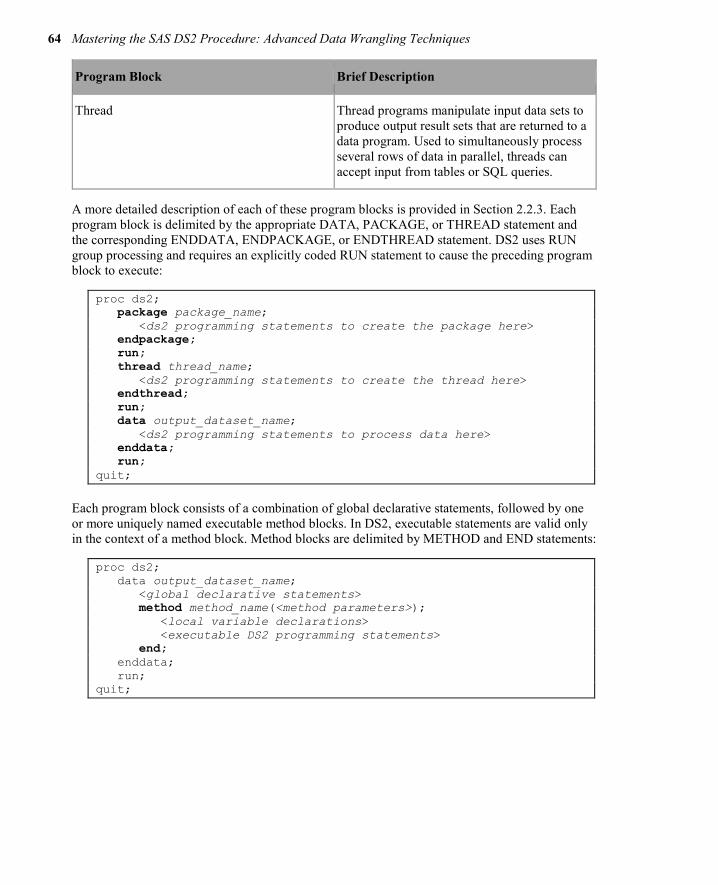
64 Mastering the SAS DS2 Procedure: Advanced Data Wrangling Techniques
Program Block Brief Description
Thread Thread programs manipulate input data sets to produce output result sets that are returned to a data program. Used to simultaneously process several rows of data in parallel, threads can accept input from tables or SQL queries.
A more detailed description of each of these program blocks is provided in Section 2.2.3. Each program block is delimited by the appropriate DATA, PACKAGE, or THREAD statement and the corresponding ENDDATA, ENDPACKAGE, or ENDTHREAD statement. DS2 uses RUN group processing and requires an explicitly coded RUN statement to cause the preceding program block to execute:
proc ds2; package package_name; <ds2 programming statements to create the package here> endpackage; run; thread thread_name; <ds2 programming statements to create the thread here> endthread; run; data output_dataset_name; <ds2 programming statements to process data here> enddata; run; quit;
Each program block consists of a combination of global declarative statements, followed by one or more uniquely named executable method blocks. In DS2, executable statements are valid only in the context of a method block. Method blocks are delimited by METHOD and END statements:
proc ds2; data output_dataset_name; <global declarative statements> method method_name(<method parameters>); <local variable declarations> <executable DS2 programming statements> end; enddata; run; quit;

Chapter 2: Introduction to the DS2 Language 65
2.2.3 Program Blocks A brief description of each of the three program blocks is provided here to help you interpret the simple programs included in this chapter. Most of this book is dedicated to the data program. Package programs are discussed in detail in Chapter 5, and thread programs in Chapter 6.
2.2.3.1 Data Programs A DS2 data program begins with a DATA statement, ends with an ENDDATA statement, includes at least one system method definition, and can generate a result set. It is the fundamental programming tool in the DS2 language. As in a Base SAS DATA step, the DS2 data program DATA statement normally lists the name or names of the table or tables to which the result set will be written. Using the special table name _NULL_ to suppress the result set is optional. If no destination table is named in a Base SAS DATA step, SAS directs the result set to the WORK library, using an automatically generated data set name (DATA1, DATA2, and so on). A DS2 data program without a destination table name sends its results set to the Output Delivery System (ODS) for rendering as a report, much like an SQL query.
data; set crs.banks; run; proc ds2; data; method run(); set crs.banks; end; enddata; run; quit;
The SAS log for the traditional DATA step indicates that the result set was written to a data set named DATA1 in the WORK library:
NOTE: There were 3 observations read from the data set CRS.BANKS. NOTE: The data set WORK.DATA1 has 3 observations and 2 variables.
The output from the DS2 data program appears instead in the Results tab:
Figure 2.1: Output of the DS2 Data Program

66 Mastering the SAS DS2 Procedure: Advanced Data Wrangling Techniques
2.2.3.2 Package Programs A DS2 package program begins with a PACKAGE statement, ends with an ENDPACKAGE statement, and generates a package as a result. DS2 packages are used to store reusable code, including user-defined methods and variables. Packages are stored in SAS libraries and look like data sets. However, the contents of the package are merely a couple of rows of clear text header information followed by more rows containing encrypted source code. Packages make creating and sharing platform-independent reusable code modules easy and secure, and they provide an excellent means for users to extend the capabilities of the DS2 language.
Packages can be used for more than just sharing user-defined methods–they are the “objects” of the DS2 programming language. Global package variables (variables declared outside the package methods) act as state variables for each instance of the package. So, each time you instantiate a package, the instance has a private set of variables that it can use to keep track of its state. Packages can also accept constructor arguments to initialize the package when it is instantiated. DS2 packages allow SAS users to easily create and reuse objects in their DS2 programs.
2.2.3.3 Thread Programs A DS2 thread program begins with a THREAD statement, ends with an ENDTHREAD statement, and generates a thread as a result. Much like DS2 packages, threads are stored in SAS libraries as data sets and their contents consist of clear text header information followed by encrypted source code. Threads are structured much like a DS2 data program, in that they contain at least one system method definition and can include package references and user-defined methods. Once a thread is created, it can be executed from a DS2 data program using the SET FROM statement. The THREADS= option in the SET FROM statement allows several copies of the thread program to run in parallel on the SAS compute platform for easy parallel processing, with each thread returning processed observations to the data program as soon as computations are complete.
2.2.4 Methods Methods are named code blocks within a DS2 program, delimited by a METHOD statement and an END statement. Method blocks cannot contain nested method blocks, and all method identifiers (names) must be unique within their DS2 data, package, or thread program block. There are two types of methods:
1. system methods execute automatically only at prescribed times in a DS2 program. They cannot be called by name.
2. user-defined methods execute only when called by name.
2.2.5 System Methods There are three system methods that are included in every DS2 data program, either implicitly or explicitly. These methods provide a DS2 data program with a more structured framework than the SAS DATA step. In the Base SAS DATA step, the entire program is included in the implicit, data-driven loop. In a DS2 data program, the RUN method provides the implicit, data-driven loop that will be most familiar to the traditional DATA step programmer. The INIT and TERM methods are not included in the loop, and provide a place to execute program initialization and finalization code.

Chapter 2: Introduction to the DS2 Language 67
System methods execute automatically and do not accept parameters. You must explicitly define at least one of these methods into your data or thread program or the program will not execute. If you do not write explicit code for one or more system method blocks, the DS2 compiler will create an empty version of the missing system method for you at compile time. An empty method contains only the appropriate METHOD statement followed by an END statement.
2.2.5.1 The INIT Method The INIT method executes once and only once, immediately upon commencement of program execution. It provides a standard place to execute program initialization routines. The following DATA step and DS2 data programs produce the same results, but the DS2 data program does not require any conditional logic:
DATA step:
data _null_; if _n_=1 then do; put ’Execution is beginning’; end; run;
DS2 data program:
proc ds2; data _null_; method init(); put ’Execution is beginning’; end; enddata; run; quit;
2.2.5.2 The RUN Method The RUN method best emulates the performance of a traditional SAS DATA step. It begins operation as soon as the INIT method has completed execution and acts as a data-driven loop. The RUN method iterates once for every data row (observation) in the input data set. The RUN method is the only method that includes an implicit output at the END statement. This DATA step and DS2 data program produce the same results:
data new_data; if _n_=1 then do; put ’Execution is beginning’; end; set crs.one_day; run;
proc ds2; data new_data; method init(); put ’Execution is beginning’; end; method run();
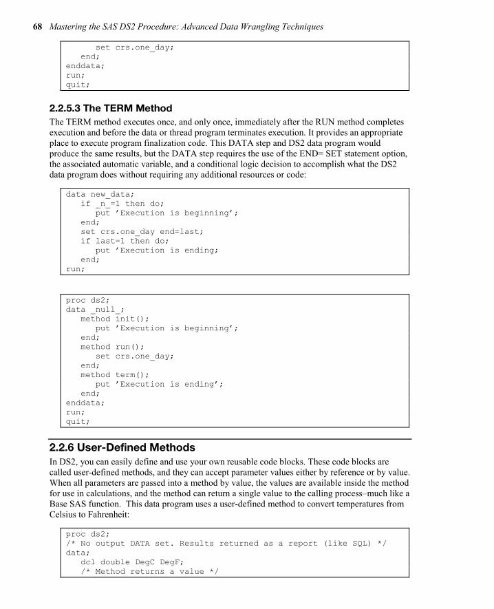
68 Mastering the SAS DS2 Procedure: Advanced Data Wrangling Techniques
set crs.one_day; end; enddata; run; quit;
2.2.5.3 The TERM Method The TERM method executes once, and only once, immediately after the RUN method completes execution and before the data or thread program terminates execution. It provides an appropriate place to execute program finalization code. This DATA step and DS2 data program would produce the same results, but the DATA step requires the use of the END= SET statement option, the associated automatic variable, and a conditional logic decision to accomplish what the DS2 data program does without requiring any additional resources or code:
data new_data; if _n_=1 then do; put ’Execution is beginning’; end; set crs.one_day end=last; if last=1 then do; put ’Execution is ending; end; run;
proc ds2; data _null_; method init(); put ’Execution is beginning’; end; method run(); set crs.one_day; end; method term(); put ’Execution is ending’; end; enddata; run; quit;
2.2.6 User-Defined Methods In DS2, you can easily define and use your own reusable code blocks. These code blocks are called user-defined methods, and they can accept parameter values either by reference or by value. When all parameters are passed into a method by value, the values are available inside the method for use in calculations, and the method can return a single value to the calling process–much like a Base SAS function. This data program uses a user-defined method to convert temperatures from Celsius to Fahrenheit:
proc ds2; /* No output DATA set. Results returned as a report (like SQL) */ data; dcl double DegC DegF; /* Method returns a value */

Chapter 2: Introduction to the DS2 Language 69
method c2f(double Tc) returns double; /* Celsius to Fahrenheit */ return (((Tc*9)/5)+32); end; method init(); do DegC=0 to 30 by 15; DegF=c2f(DegC); output; end; end; enddata; run; quit;
Figure 2.2: Output of Temperature Conversion
If one or more parameters are passed by reference, the values are available inside the method for use in calculations, and those values can be modified by the method at the call site, much like a Base SAS call routine. In DS2, parameters passed by reference are called IN_OUT parameters. A method that has IN_OUT parameters cannot return a value, but can modify several of its IN_OUT parameters during execution.
This data program uses a user-defined method to convert temperatures from Fahrenheit to Celsius, but passes the temperature parameter in by reference:
proc ds2; data; dcl double Tf Tc; /* Method modifies a value at the call site */ method f2c(in_out double T); /* Fahrenheit to Celsius (Rounded) */ T=round((T-32)*5/9); end; method init(); do Tf=0 to 212 by 100; Tc=Tf; f2c(Tc); output; end; end; enddata; run; quit;

70 Mastering the SAS DS2 Procedure: Advanced Data Wrangling Techniques
Figure 2.3: Output of Temperature Conversion Program
When calling this type of method, you must supply a variable name for IN_OUT parameter values; otherwise, constant values will result in a syntax error:
proc ds2; /* No output DATA set. Results returned as a report (like SQL) */ data; dcl double Tf Tc; /* Method modifies a value at the call site */ method f2c(in_out double T); /* Fahrenheit to Celsius (Rounded) */ T=round((T-32)*5/9); end; method init(); /* Method f2c requires a variable as a parameter */ /* Passing in a constant causes an error */ f2c(37.6); end; enddata; run;
quit;
SAS Log:
ERROR: Compilation error. ERROR: In call of f2c: argument 1 is 'in_out'; therefore, the argument must be a modifiable value.
2.2.7 Variable Identifiers and Scope In a DS2 program, all objects, variables, and code blocks must have identifiers (names). Within the DS2 program, an identifier’s scope is either global or local, and identifiers are unique within their scope. An identifier’s scope determines where in the program that identifier can be successfully referenced. Figure 2.4 shows a DS2 data program with variable identifiers of both global and local scope and indicates which values will be returned when referenced.

Chapter 2: Introduction to the DS2 Language 71
Figure 2.4: DS2 Data Program Variable Scope
If the program illustrated in Figure 2.4 is executed, the following results are produced in the SAS log:
INIT method var1=Local INIT method var2=Global RUN method var1=Global RUN method var2=Global TERM method var1=Global TERM method var2=Global
Variable identifiers are also global in scope if the variable is undeclared or is introduced to the program via a SET statement. In DS2, an undeclared variable is created whenever a variable is first referenced in a program statement other than in a SET or DECLARE statement, such as an assignment statement. The use of undeclared variables in DS2 is discouraged; doing so will produce warnings in the SAS log. Although this might at first seem strange to a SAS DATA step programmer, if you’ve ever executed a long-running SAS program only to be greeted by the dreaded NOTE: Variable var is uninitialized in the SAS log, you will understand the benefit of this new behavior. Generally, that message means you’ve mistyped a variable name somewhere in your code, and the processing time for this run of the DATA step has been wasted.
You can control DS2 behavior for undeclared variables with the system option DS2SCOND= or SCOND= option in the PROC DS2 statement. The default is WARNING, but NONE, NOTE, and ERROR are all valid values. When writing, prototyping, or testing code, I prefer to have this option set to ERROR, so that DS2 programs containing undeclared variables will fail to compile, will not execute, and will produce this message in the SAS log:
ERROR: Compilation error. ERROR: Line nn: No DECLARE for referenced variable var; creating it as a global variable of type double.

72 Mastering the SAS DS2 Procedure: Advanced Data Wrangling Techniques
In a DS2 data program, variable scope plays one additional important role: only global variables are included in the PDV, and only PDV variables are eligible to become part of the data program result set. You can explicitly remove global variables from the program result set using DROP or KEEP statements. Variables with local scope are never included in the PDV, so there is no need to drop them–they will never appear in the program result set.
For example, in the following DS2 program, the variables Total and Count are declared globally and have global scope. The variables Category and Amount are introduced via the SET statement and also have global scope. All of these variables can be referenced in both the RUN and TERM methods, and all are included in the program result set.
proc ds2; data; dec double Total Count; method run(); set crs.one_day (keep=(Payee Amount)); Total+Amount; Count+1; end; method term(); put Total= Count=; end; enddata; run; quit;
SAS Log:
Total=7230.5 Count=6
Figure 2.5: Report Produced by the Data Program
In the next DS2 program, the variables Total and Count are locally declared in the RUN method. As a result, they have scope that is local to RUN and can be referenced only by the RUN method. When the TERM method attempts to reference variables Total and Count, they are not available in the PDV, so the DS2 compiler treats these as new, undeclared variables. Warning messages are produced in the SAS log and, because undeclared variables have global scope, Total and Count

Chapter 2: Introduction to the DS2 Language 73
are included in the PDV and the program result set. However, because the global versions of these variables were never assigned a value, Total and Count contain missing values in the output:
proc ds2; data; method run(); declare double Total Count; set crs.one_day (keep=(Payee Amount)); Total+Amount; Count+1; end; method term(); put Total= Count=; end; enddata; run; quit;
SAS Log:
Total=. Count=. WARNING: Line nn: No DECLARE for referenced variable total; creating it as a global variable of type double. WARNING: Line nn: No DECLARE for referenced variable count; creating it as a global variable of type double.
Figure 2.6: Report Produced by the Data Program Showing Missing Values
If we delete the TERM method from the program, the only reference to the variables Total and Count are the local variables in the RUN method, so they will not be included in the PDV at all. No warnings about undeclared variables are issued in the SAS log, and the result set contains only the global variables Payee and Amount:
proc ds2; data; method run(); declare double Total Count; set crs.one_day (keep=(Payee Amount)); Total+Amount; Count+1; end;

74 Mastering the SAS DS2 Procedure: Advanced Data Wrangling Techniques
enddata; run; quit;
Figure 2.7: Report Produced by the Data Program with Local Variables Excluded
User-defined methods can accept parameters. Parameters passed by value are treated as variables with local scope within the method. For example, in the following program, the user-defined method fullname has two parameters, first and last, which act as local variables. There is also one locally declared variable, FinalText. The main data program has three globally declared variables, WholeName, GivenName, and Surname, which will be included in the PDV. The result set contains only the global variables WholeName, GivenName, and Surname.
proc ds2; data; declare varchar(100) WholeName; method fullname(varchar(50) first, varchar(50) last) returns varchar(100); dcl varchar(100) FinalText; FinalText=catx(', ',last,first); Return FinalText; end; method run(); set crs.customer_sample (keep=(GivenName Surname)); WholeName=fullname(GivenName, Surname); end; enddata; run; quit;

Chapter 2: Introduction to the DS2 Language 75
Figure 2.8: Report Produced by the Data Program
If you have ever stored snippets of code in a SAS program file for inclusion in a traditional DATA step, you have probably experienced what I refer to as PDV contamination. When the included code references a variable that already existed in the main program, or when it includes new variable references, PDV values for existing variables can inadvertently be modified by the included code. Also, unwanted variables can be added to the PDV and appear in the output data set.
When reusing DS2 methods, the method’s local variables never affect the PDV, a concept often referred to as variable encapsulation. Because method parameters and locally declared variables are local in scope, they are encapsulated in your method code and won’t contaminate the PDV. In a later chapter, we will store our user-defined methods in a DS2 package for simple reuse in future programs. Because of variable encapsulation, you will never need to worry about PDV contamination when reusing properly written DS2 methods.
2.2.8 Data Program Execution DS2 data programs are delivered to the DS2 compiler for syntax checking, compilation, and execution. At compile time, resources are reserved for the PDV, the code is compiled for execution and, if an output data set is being produced, the output data set descriptor is written. After compilation, execution begins with the INIT method code, and it is automatically followed by the RUN and TERM method code. Only system methods execute automatically; any user-defined methods must be called from the INIT, RUN, or TERM methods or else the user-defined method will not be executed.
2.3 Converting a SAS DATA Step to a DS2 Data Program
2.3.1 A Traditional SAS DATA Step Here is a traditional SAS DATA step with three subsections, which we will convert into a DS2 data program:
data _null_; /* Section 1 */ if _n_=1 then do; put '**********'; put 'Starting';

76 Mastering the SAS DS2 Procedure: Advanced Data Wrangling Techniques
put '**********'; end; /* Section 2 */ set crs.banks end=last; put Bank Rate; /* Section 3 */ if last then do; put '**********'; put 'Ending'; put '**********'; end; run;
2.3.2 Considerations 1. Section 1 consists of a DO group of statements that will be executed only when _N_=1.
The automatic variable _N_ counts the number of times the DATA step has iterated, so this block will execute only one time, when the DATA step first starts execution.
2. Section 2 consists of unconditionally executed statements. These statements should execute once for every observation in the input data set. In this section, the SET statement uses the END= option to create last, a temporary variable containing an end-of-file indicator. The variable last is initialized to zero and remains 0 until the SET statement reads the last observation of the last data set listed, when it is set to 1. As an automatic variable, last is automatically flagged for DROP, and will not appear in the output data set.
3. Section 3 consists of a DO group of statements that will execute only if the variable last contains a value other than 0 or missing.
If we think about this, Section 1 code sounds like a great candidate for the INIT system method, Section 2 for the RUN method, and Section 3 for the TERM method.
2.3.3 The Equivalent DS2 Data Program Here is a DS2 data program equivalent to the original SAS DATA step:
proc ds2 ; data _null_; /* Section 1 */ method init(); put '**********'; put 'Starting'; put '**********'; end; /* Section 2 */ method run(); set crs.banks; put Bank Rate; end;

Chapter 2: Introduction to the DS2 Language 77
/* Section 3 */ method term(); put '**********'; put 'Ending'; put '**********'; end; enddata; run; quit;
2.4 Review of Key Concepts ● All DS2 programs are structured in blocks. ● There are three types of DS2 program blocks: data, package, and thread. ● A program block begins with the appropriate DATA, PACKAGE, or THREAD
statement, and ends with the corresponding ENDDATA, ENDPACKAGE, or ENDTHREAD statement. The remainder of the program consists of a combination of global declarative statements and method definitions. All executable statements must be part of a method block definition.
● There are three system methods: INIT, RUN, and TERM. Every data and thread program must contain explicit coding for one of these methods. System methods execute automatically and do not accept parameters.
● You can write user-defined methods, keeping the following in mind:
◦ User-defined methods do not execute automatically; they execute only when called.
◦ User-defined methods can accept parameters with values passed either by value or by reference (IN_OUT parameters).
◦ A method that has no IN_OUT parameters can return a value, much like a SAS function.
◦ Method IN_OUT parameter values can be modified at the call site, much like a SAS CALL routine.
◦ User-defined methods can be stored for easy reuse in a DS2 package.
● Variables created in a DS2 program should be declared using a DECLARE (DCL) statement. Where the variable is declared determines the variable’s scope.
● Variables introduced to a DS2 program via a SET statement, declared in the global program space (before method definitions begin), or which appear undeclared in the program code will have global scope. Global variables can be referenced anywhere inside the DS2 program, are part of the PDV, and are included in the program result set by default.
● Variables declared inside a METHOD block and method parameter variables are local in scope, and can be referenced only within that method. Local variables are never included in the PDV and cannot become part of the program result set.

78 Mastering the SAS DS2 Procedure: Advanced Data Wrangling Techniques
Full book available for purchase here.
Use EXBDL for a 25% discounted purchase of this book. Free shipping available in the US. For International orders please contact us directly.
Enhance your SAS® data wrangling skills with high precision and parallel data manipulation using the new DS2 programming language.
This book addresses the new DS2 programming language from SAS, which combines the precise procedural power and control of the Base SAS DATA step language with the simplicity and flexibility of SQL. DS2 provides simple, safe syntax for performing complex data transformations in parallel and enables manipulation of native database data types at full precision. It also introduces PROC FEDSQL, a modernized SQL language that blends perfectly with DS2. You will learn to harness the power of parallel processing to speed up CPU-intensive computing processes in Base SAS and how to achieve even more speed by processing DS2 programs on massively parallel database systems. Techniques for leveraging Internet APIs to acquire data, avoiding large data movements when working with data from disparate sources, and leveraging DS2’s new data types for full-precision numeric calculations are presented, with examples of why these techniques are essential for the modern data wrangler.
While working through the code samples provided with this book, you will build a library of custom, reusable, and easily shareable DS2 program modules, execute parallelized DATA step programs to speed up a CPU-intensive process, and conduct advanced data transformations using hash objects and matrix math operations.
Using SAS University Edition? You can use the code and data sets provided with this book. This helpful link will get you started.

Chapter 2: Introduction to the DS2 Language 79

Decision Trees—What Are They? Decision tree analysis is a popular way to characterize variations among the features in data by identifying nested, hierarchical, homogenous subgroups in an interpretable way. The highly interpretable, easy-to-use, powerful mechanisms of decision trees synergize well with analysts’ business knowledge to produce well understood, actionable business and engineering products. The adaptability, power and ease of interpretation of decision trees have made them a popular modeling choice among marketers, for example (who use them to identify different subpopulations for different marketing campaigns).
Groups of decision trees can be combined to form collective models consisting of multiple trees, such as “forests” or “boosted trees.” These collective models increase the predictive power and flexibility of trees considerably and provide benefits that are competitive with benefits that are found in other popular modeling approaches in the areas of data science and cognitive computing.
The following chapter introduces decision trees.
Barry de Ville is a Solutions Architect at SAS. His work with decision trees has been featured during several SAS users’ conferences and has led to the award of a U.S. patent on “bottom-up” decision trees. Previously, Barry led the development of the KnowledgeSEEKER decision tree package. He has given workshops and tutorials on decision trees at such organizations as Statistics Canada, the American Marketing Association, the IEEE, and the Direct Marketing Association.
http://support.sas.com/publishing/authors/deville.html
Padraic Neville is a Principal Research Statistician Developer at SAS. He developed the decision tree and boosting procedures in SAS Enterprise Miner and the high-performance procedure HPFOREST. In 1984, Padraic produced the first commercial release of the Classification and Regression Trees software by Breiman, Friedman, Olshen, and Stone. He since has taught decision trees at the Joint Statistical Meetings. His current research pursues better insight and prediction with multiple trees.
http://support.sas.com/publishing/authors/neville.html

Chapter 1: Decision Trees—What Are They? 81
Chapter 5: Decision Trees—What Are They?
Introduction ............................................................................................... 81
Using Decision Trees with Other Modeling Approaches ............................ 84
Why Are Decision Trees So Useful? ........................................................... 86
Level of Measurement ............................................................................... 89
Introduction Decision trees are a simple, but powerful form of multiple variable analysis. They provide unique capabilities to supplement, complement, and substitute for:
● traditional statistical forms of analysis (such as multiple linear regression) ● a variety of data mining tools and techniques (such as neural networks) ● recently developed multidimensional forms of reporting and analysis found in the field of
business intelligence
Decision trees are produced by algorithms that identify various ways of splitting a data set into branch-like segments. These segments form an inverted decision tree that originates with a root node at the top of the tree. The object of analysis is reflected in this root node as a simple, one-dimensional display in the decision tree interface. The name of the field of data that is the object of analysis is usually displayed, along with the spread or distribution of the values that are contained in that field. A sample decision tree is illustrated in Figure 1.1, which shows that the decision tree can reflect both a continuous and categorical object of analysis. The display of this node reflects all the data set records, fields, and field values that are found in the object of analysis. The discovery of the decision rule to form the branches or segments underneath the root
Full book available for purchase here. Use EXBDL for a 25% discounted purchase of this book. Free shipping available in the US. For International orders please contact us directly.

82 Decision Trees for Analytics Using SAS Enterprise Miner
node is based on a method that extracts the relationship between the object of analysis (that serves as the target field in the data) and one or more fields that serve as input fields to create the branches or segments. The values in the input field are used to estimate the likely value in the target field. The target field is also called an outcome, response, or dependent field or variable.
The general form of this modeling approach is illustrated in Figure 1.1. Once the relationship is extracted, then one or more decision rules that describe the relationships between inputs and targets can be derived. Rules can be selected and used to display the decision tree, which provides a means to visually examine and describe the tree-like network of relationships that characterize the input and target values. Decision rules can predict the values of new or unseen observations that contain values for the inputs, but that might not contain values for the targets.
Figure 1.1: Illustration of the Decision Tree
Each rule assigns a record or observation from the data set to a node in a branch or segment based on the value of one of the fields or columns in the data set.1 Fields or columns that are used to create the rule are called inputs. Splitting rules are applied one after another, resulting in a hierarchy of branches within branches that produces the characteristic inverted decision tree form. The nested hierarchy of branches is called a decision tree, and each segment or branch is called a node. A node with all its descendent segments forms an additional segment or a branch of that node. The bottom nodes of the decision tree are called leaves (or terminal nodes). For each leaf,

Chapter 1: Decision Trees—What Are They? 83
the decision rule provides a unique path for data to enter the class that is defined as the leaf. All nodes, including the bottom leaf nodes, have mutually exclusive assignment rules. As a result, records or observations from the parent data set can be found in one node only. Once the decision rules have been determined, it is possible to use the rules to predict new node values based on new or unseen data. In predictive modeling, the decision rule yields the predicted value.
Figure 1.2: Illustration of Decision Tree Nomenclature
Although decision trees have been in development and use for over 50 years (one of the earliest uses of decision trees was in the study of television broadcasting by Belson in 1956), many new forms of decision trees are evolving that promise to provide exciting new capabilities in the areas of data mining and machine learning in the years to come. For example, one new form of the decision tree involves the creation of random forests. Random forests are multi-tree committees that use randomly drawn samples of data and inputs and reweighting techniques to develop multiple trees that, when combined, provide for stronger prediction and better diagnostics on the structure of the decision tree.
Besides modeling, decision trees can be used to explore and clarify data for dimensional cubes that are found in business analytics and business intelligence.
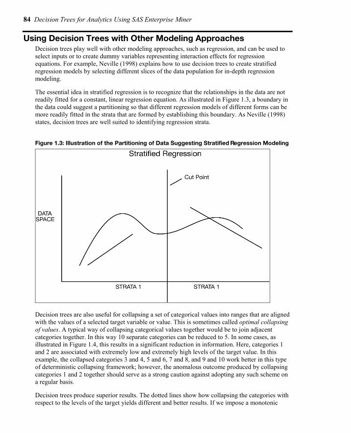
84 Decision Trees for Analytics Using SAS Enterprise Miner
Using Decision Trees with Other Modeling Approaches Decision trees play well with other modeling approaches, such as regression, and can be used to select inputs or to create dummy variables representing interaction effects for regression equations. For example, Neville (1998) explains how to use decision trees to create stratified regression models by selecting different slices of the data population for in-depth regression modeling.
The essential idea in stratified regression is to recognize that the relationships in the data are not readily fitted for a constant, linear regression equation. As illustrated in Figure 1.3, a boundary in the data could suggest a partitioning so that different regression models of different forms can be more readily fitted in the strata that are formed by establishing this boundary. As Neville (1998) states, decision trees are well suited to identifying regression strata.
Figure 1.3: Illustration of the Partitioning of Data Suggesting Stratified Regression Modeling
Decision trees are also useful for collapsing a set of categorical values into ranges that are aligned with the values of a selected target variable or value. This is sometimes called optimal collapsing of values. A typical way of collapsing categorical values together would be to join adjacent categories together. In this way 10 separate categories can be reduced to 5. In some cases, as illustrated in Figure 1.4, this results in a significant reduction in information. Here, categories 1 and 2 are associated with extremely low and extremely high levels of the target value. In this example, the collapsed categories 3 and 4, 5 and 6, 7 and 8, and 9 and 10 work better in this type of deterministic collapsing framework; however, the anomalous outcome produced by collapsing categories 1 and 2 together should serve as a strong caution against adopting any such scheme on a regular basis.
Decision trees produce superior results. The dotted lines show how collapsing the categories with respect to the levels of the target yields different and better results. If we impose a monotonic

Chapter 1: Decision Trees—What Are They? 85
restriction on the collapsing of categories—as we do when we request tree growth on the basis of ordinal predictors—then we see that category 1 becomes a group of its own. Categories 2, 3, and 4 join together and point to a relatively high level in the target. Categories 5, 6, and 7 join together to predict the lowest level of the target. And categories 8, 9, and 10 form the final group.
If a completely unordered grouping of the categorical codes is requested—as would be the case if the input was defined as “nominal”—then the three bins as shown at the bottom of Figure 1.4 might be produced. Here, the categories 1, 5, 6, 7, 9, and 10 group together as associated with the highest level of the target. The medium target levels produce a grouping of categories 3, 4, and 8. The lone high target level that is associated with category 2 falls out as a category of its own.
Figure 1.4: Illustration of Forming Nodes by Binning Input-Target Relationships
Because a decision tree enables you to combine categories that have similar values with respect to the level of some target value, there is less information loss in collapsing categories together. This leads to improved prediction and classification results. As shown in the figure, it is possible to intuitively appreciate that these collapsed categories can be used as branches in a tree. So, knowing the branch—for example, branch 3 (labeled BIN 3), we are better able to guess or predict the level of the target. In the case of branch 2, we can see that the target level lies in the mid-range, whereas in the last branch—here collapsed categories 1, 5, 6, 7, 9, 10—the target is relatively low.

86 Decision Trees for Analytics Using SAS Enterprise Miner
Why Are Decision Trees So Useful? Decision trees are a form of multiple variable (or multiple effect) analyses. All forms of multiple variable analyses enable us to predict, explain, describe, or classify an outcome (or target). An example of a multiple variable analysis is a probability of sale or the likelihood to respond to a marketing campaign as a result of the combined effects of multiple input variables, factors, or dimensions. This multiple variable analysis capability of decision trees enables you to go beyond simple one-cause, one-effect relationships and to discover and describe things in the context of multiple influences. Multiple variable analysis is particularly important in current problem-solving because almost all critical outcomes that determine success are based on multiple factors. Further, it is becoming increasingly clear that while it is easy to set up one-cause, one-effect relationships in the form of tables or graphs, this approach can lead to costly and misleading outcomes.
According to research in cognitive psychology (Miller 1956; Kahneman, Slovic, and Tversky 1982) the ability to conceptually grasp and manipulate multiple chunks of knowledge is limited by the physical and cognitive processing limitations of the short-term memory portion of the brain. This places a premium on the utilization of dimensional manipulation and presentation techniques that are capable of preserving and reflecting high-dimensionality relationships in a readily comprehensible form so that the relationships can be more easily consumed and applied by humans.
There are many multiple variable techniques available. The appeal of decision trees lies in their relative power, ease of use, robustness with a variety of data and levels of measurement, and ease of interpretability. Decision trees are developed and presented incrementally; thus, the combined set of multiple influences (which are necessary to fully explain the relationship of interest) is a collection of one-cause, one-effect relationships presented in the recursive form of a decision tree. This means that decision trees deal with human short-term memory limitations quite effectively and are easier to understand than more complex, multiple variable techniques. Decision trees turn raw data into an increased knowledge and awareness of business, engineering, and scientific issues, and they enable you to deploy that knowledge in a simple but powerful set of human-readable rules.
Decision trees attempt to find a strong relationship between input values and target values in a group of observations that form a data set. When a set of input values is identified as having a strong relationship to a target value, all of these values are grouped in a bin that becomes a branch on the decision tree. These groupings are determined by the observed form of the relationship between the bin values and the target. For example, suppose that the target average value differs sharply in the three bins that are formed by the input. As shown in Figure 1.4, binning involves taking each input, determining how the values in the input are related to the target, and, based on the input-target relationship, depositing inputs with similar values into bins that are formed by the relationship.
To visualize this process using the data in Figure 1.4, you see that BIN 1 contains values 1, 5, 6, 7, 9, and 10; BIN 2 contains values 3, 4, and 8; and BIN 3 contains value 2. The sort-selection mechanism can combine values in bins whether or not they are adjacent to one another (e.g., 3, 4, and 8 are in BIN 2, whereas 7 is in BIN 1). When only adjacent values are allowed to combine to form the branches of a decision tree, the underlying form of measurement is assumed to monotonically increase as the numeric code of the input increases. When non-adjacent values are allowed to combine, the underlying form of measurement is non-monotonic. A wide variety of

Chapter 1: Decision Trees—What Are They? 87
different forms of measurement, including linear, nonlinear, and cyclic, can be modeled using decision trees.
A strong input-target relationship is formed when knowledge of the value of an input improves the ability to predict the value of the target. A strong relationship helps you understand the characteristics of the target. It is normal for this type of relationship to be useful in predicting the values of targets. For example, in most animal populations, knowing the height or weight of the individual improves the ability to predict the gender. In the following display, there are 28 observations in the data set. There are 20 males and 8 females.
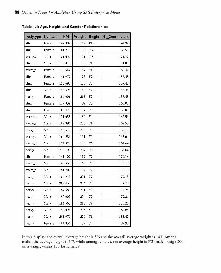
88 Decision Trees for Analytics Using SAS Enterprise Miner
Table 1.1: Age, Height, and Gender Relationships
In this display, the overall average height is 5’6 and the overall average weight is 183. Among males, the average height is 5’7, while among females, the average height is 5’3 (males weigh 200 on average, versus 155 for females).
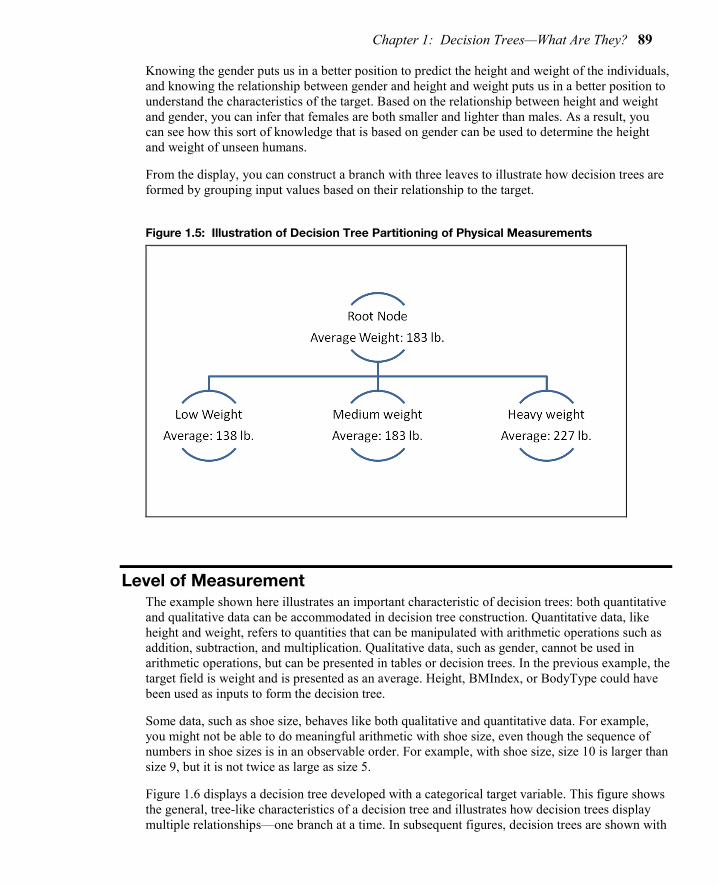
Chapter 1: Decision Trees—What Are They? 89
Knowing the gender puts us in a better position to predict the height and weight of the individuals, and knowing the relationship between gender and height and weight puts us in a better position to understand the characteristics of the target. Based on the relationship between height and weight and gender, you can infer that females are both smaller and lighter than males. As a result, you can see how this sort of knowledge that is based on gender can be used to determine the height and weight of unseen humans.
From the display, you can construct a branch with three leaves to illustrate how decision trees are formed by grouping input values based on their relationship to the target.
Figure 1.5: Illustration of Decision Tree Partitioning of Physical Measurements
Level of Measurement The example shown here illustrates an important characteristic of decision trees: both quantitative and qualitative data can be accommodated in decision tree construction. Quantitative data, like height and weight, refers to quantities that can be manipulated with arithmetic operations such as addition, subtraction, and multiplication. Qualitative data, such as gender, cannot be used in arithmetic operations, but can be presented in tables or decision trees. In the previous example, the target field is weight and is presented as an average. Height, BMIndex, or BodyType could have been used as inputs to form the decision tree.
Some data, such as shoe size, behaves like both qualitative and quantitative data. For example, you might not be able to do meaningful arithmetic with shoe size, even though the sequence of numbers in shoe sizes is in an observable order. For example, with shoe size, size 10 is larger than size 9, but it is not twice as large as size 5.
Figure 1.6 displays a decision tree developed with a categorical target variable. This figure shows the general, tree-like characteristics of a decision tree and illustrates how decision trees display multiple relationships—one branch at a time. In subsequent figures, decision trees are shown with

90 Decision Trees for Analytics Using SAS Enterprise Miner
continuous or numeric fields as targets. This shows how decision trees are easily developed using targets and inputs that are both qualitative (categorical data) and quantitative (continuous, numeric data).
Figure 1.6: Illustration of a Decision Tree with a Categorical Target
The decision tree in Figure 1.6 displays the results of a mail-in customer survey conducted by HomeStuff, a national home goods retailer. In the survey, customers had the option to enter a cash drawing. Those who entered the drawing were classified as a HomeStuff best customer. Best customers are coded with 1 in the decision tree.
The top-level node of the decision tree shows that, of the 8399 respondents to the survey, 57% were classified as best customers, while 43% were classified as other (coded with 0).
Figure 1.6 shows the general characteristics of a decision tree, such as partitioning the results of a 1–0 (categorical) target across various input fields in the customer survey data set. Under the top-level node, the field GENDER further characterizes the best – other (1–0) response. Females (coded with F) are more likely to be best customers than males (coded with M). Fifty-nine percent of females are best customers versus 54% of males. A wide variety of splitting techniques have been developed over time to gauge whether this difference is statistically significant and whether the results are accurate and reproducible. In Figure 1.6, the difference between males and females is statistically significant. Whether a difference of 5% is significant from a business point of view is a question that is best answered by the business analyst.
The splitting techniques that are used to split the 1–0 responses in the data set are used to identify alternative inputs (for example, income or purchase history) for gender. These techniques are based on numerical and statistical techniques that show an improvement over a simple, uninformed guess at the value of a target (in this example, best–other), as well as the reproducibility of this improvement with a new set of data.
Knowing the gender enables us to guess that females are 5% more likely to be a best customer than males. You could set up a separate, independent hold-out or validation data set, and (having determined that the gender effect is useful or interesting) you might see whether the strength and direction of the effect is reflected in the hold-out or validation data set. The separate, independent data set will show the results if the decision tree is applied to a new data set, which indicates the generality of the results. Another way to assess the generality of the results is to look at data

Chapter 1: Decision Trees—What Are They? 91
distributions that have been studied and developed by statisticians who know the properties of the data and who have developed guidelines based on the properties of the data and data distributions. The results could be compared to these data distributions and, based on the comparisons, you could determine the strength and reproducibility of the results. These approaches are discussed at greater length in Chapter 3, “The Mechanics of Decision Tree Construction.”
Under the female node in the decision tree in Figure 1.6, female customers can be further categorized into best–other categories based on the total lifetime visits that they have made to HomeStuff stores. Those who have made fewer than 3.5 visits are less likely to be best customers compared to those who have made more than 4.5 visits: 29% versus 100%. (In the survey, a shopping visit of less than 20 minutes was characterized as a half visit.)
On the right side of the figure, the decision tree is asymmetric; a new field—Net sales—has entered the analysis. This suggests that Net sales is a stronger or more relevant predictor of customer status than Total lifetime visits, which was used to analyze females. It was this kind of asymmetry that spurred the initial development of decision trees in the statistical community: these kinds of results demonstrate the importance of the combined (or interactive) effect of two indicators in displaying the drivers of an outcome. In the case of males, when net sales exceed $281.50, then the likelihood of being a best customer increases from 45% to 77%.
As shown in the asymmetry of the decision tree, female behavior and male behavior have different nuances. To explain or predict female behavior, you have to look at the interaction of gender (in this case, female) with Total lifetime visits. For males, Net sales is an important characteristic to look at.
In Figure 1.6, of all the k-way or n-way branches that could have been formed in this decision tree, the 2-way branch is identified as best. This indicates that a 2-way branch produces the strongest effect. The strength of the effect is measured through a criterion that is based on strength of separation, statistical significance, or reproducibility, with respect to a validation process. These measures, as applied to the determination of branch formation and splitting criterion identification, are discussed further in Chapter 3.
Decision trees can accommodate categorical (gender), ordinal (number of visits), and continuous (net sales) types of fields as inputs or classifiers for the purpose of forming the decision tree. Input classifiers can be created by binning quantitative data types (ordinal and continuous) into categories that might be used in the creation of branches—or splits—in the decision tree. The bins that form total lifetime visits have been placed into three branches:
● < 3.5 … less than 3.5 ● [3.5 – 4.5) … between 3.5 to strictly less than 4.5 ● >= 4.5 … greater than or equal to 4.5
Various nomenclatures are used to indicate which values fall in a given range. Meyers (1990) proposes the following alternative:
● < 3.5 … less than 3.5 ● [3.5 – 4.5[ … between 3.5 to strictly less than 4.5 ● >= 4.5 … greater than or equal to 4.5
The key difference between these alternatives and the convention used in the SAS decision tree is in the second range of values, where the bracket designator ([) is used to indicate the interval that

92 Decision Trees for Analytics Using SAS Enterprise Miner
includes the lower number and includes up to any number that is strictly less than the upper number in the range.
A variety of techniques exist to cast bins into branches: 2-way (binary branches), n-way (where n equals the number of bins or categories), or k-way (where k represents an attempt to create an optimal number of branches and is some number greater than or equal to 2 and less than or equal to n).
Figure 1.7: Illustration of a Decision Tree—Continuous (Numeric) Target
Figure 1.7 shows a decision tree that is created with a continuous response variable as the target. In this case, the target field is Net sales. This is the same field that was used as a classifier (for males) in the categorical response decision tree shown in Figure 1.6.
Overall, as shown in Figure 1.7, the average net sale amount is approximately $250. Figure 1.7 shows how this amount can be characterized by performing successive splits of net sales according to the income level of the survey responders and, within their income level, according to the field Number of Juvenile category purchases. In addition to characterizing net sales spending groups, this decision tree can be used as a predictive tool. For example, in Figure 1.7, high income, high juvenile category purchases typically outspend the average purchaser by an average of $378, versus the norm of $250. If someone were to ask what a relatively low income purchaser who buys a relatively low number of juvenile category items would spend, then the best guess would be about $200. This result is based on the decision rule, taken from the decision tree, as follows:
IF Number of Juvenile category purchases < 1.5 AND INCOME_LEVEL $50,000 - $74,9, $40,000 - $49,9, $30,000 - $39,9, UNDER $30,000 THEN Average Net Sales = $200.14
Decision trees can contain both categorical and numeric (continuous) information in the nodes of the tree. Similarly, the characteristics that define the branches of the decision tree can be both categorical or numeric (in the latter case, the numeric values are collapsed into bins—sometimes

Chapter 1: Decision Trees—What Are They? 93
called buckets or collapsed groupings of categories—to enable them to form the branches of the decision tree).
Figure 1.8 shows how the Fisher-Anderson iris data can yield three different types of branches when classifying the target SETOSA versus OTHER (Fisher 1936). In this case, there are 2-, 3-, and 5-leaf branches. There are 50 SETOSA records in the data set. With the binary partition, these records are classified perfectly by the rule petal width <= 6 mm. The 3-way and 5-way branch partitions are not as effective as the 2-way partition and are shown only for illustration. More examples are provided in Chapter 2, “Descriptive, Predictive, and Explanatory Analyses,” including examples that show how 3-way and n-way partitions are better than 2-way partitions.
Figure 1.8: Illustration of Fisher-Anderson Iris Data and Decision Tree Options
(a) Two Branch Solution
(b) Three Branch Solution
(c) Five Branch Solution

94 Decision Trees for Analytics Using SAS Enterprise Miner
Full book available for purchase here.
Use EXBDL for a 25% discounted purchase of this book. Free shipping available in the US. For International orders please contact us directly.
Decision Trees for Analytics Using SAS Enterprise Miner is the most comprehensive treatment of decision tree theory, use, and applications available in one easy-to-access place. This book illustrates the application
and operation of decision trees in business intelligence, data mining, business analytics, prediction, and knowledge discovery. It explains in detail the use of decision trees as a data mining technique and how this technique complements and supplements data mining approaches such as regression, as well as other business intelligence applications that incorporate tabular reports, OLAP, or multidimensional cubes
An expanded and enhanced release of Decision Trees for Business Intelligence and Data Mining Using SAS Enterprise Miner, this book adds up-to-date treatments of boosting and high-performance forest approaches and rule induction. There is a dedicated section on the most recent findings related to bias reduction in variable selection. It provides an exhaustive treatment of the end-to-end process of decision tree construction and the respective considerations and algorithms, and it includes discussions of key issues in decision tree practice.
Analysts who have an introductory understanding of data mining and who are looking for a more advanced, in-depth look at the theory and methods of a decision tree approach to business intelligence and data mining will benefit from this book.
1 The SAS Enterprise Miner decision tree contains a variety of algorithms to handle missing
values, including a unique algorithm to assign partial records to different segments when the value in the field that is being used to determine the segment is missing.


Neural Network Models to Predict Response and Risk
Being able to extract hidden patterns within data is an important component of data science. Neural networks are complex systems that have similarities with the workings of the neurons of a human brain. They are supervised machine learning tools that can be used with large amounts of data, and are especially useful for extracting patterns from numerical data, images, video, or speech.
This technique is very processor-intensive and can produce results that may be hard to interpret and explain. The payoff for the lack of interpretability is their power, flexibility, and ability to capture highly nonlinear patterns from text, images, and voice.
SAS® Enterprise Miner™ can build a variety of neural network models rapidly. The following chapter shows how to rapidly test a variety of configurations of neural networks and choose the best configuration for making accurate predictions using examples of models to predict response to direct mail and predict risk probabilities of customers of an insurance company. In addition, the chapter explains the theory behind neural networks in a simplified way so that it is transparent and easily understood by beginners as well as experienced data scientists.
Kattamuri S. Sarma, PhD, is an economist and statistician with 30 years of experience in American business, including stints with IBM and AT&T. He is the founder and president of Ecostat Research Corp., a consulting firm specializing in predictive modeling and forecasting. Over the years, Dr. Sarma has developed predictive models for the banking, insurance, telecommunication, and technology industries. He has been a SAS user since 1992, and he has extensive experience with multivariate statistical methods, econometrics, decision trees, and data mining with neural networks. The author of numerous professional papers and publications, Dr. Sarma is a SAS Certified Professional and a SAS Alliance Partner. He received his bachelor's
degree in mathematics and his master's degree in economic statistics from universities in India. Dr. Sarma received his PhD in economics from the University of Pennsylvania, where he worked under the supervision of Nobel Laureate Lawrence R. Klein.
http://support.sas.com/publishing/authors/sarma.html

Chapter 5: Neural Network Models to Predict Response and Risk 97
Chapter 6: Neural Network Models to Predict Response and Risk
5.4 A Neural Network Model to Predict Response ..................................... 97 5.4.1 Setting the Neural Network Node Properties .............................................. 99 5.4.2 Assessing the Predictive Performance of the Estimated Model ........... 104 5.4.3 Receiver Operating Characteristic (ROC) Charts .................................... 108 5.4.4 How Did the Neural Network Node Pick the Optimum Weights for This Model? ............................................................................................................ 112 5.4.5 Scoring a Data Set Using the Neural Network Model .............................. 115 5.4.6 Score Code ................................................................................................... 119
5.4 A Neural Network Model to Predict Response This section discusses the neural network model developed to predict the response to a planned direct mail campaign. The campaign’s purpose is to solicit customers for a hypothetical insurance company. A two-layered network with one hidden layer was chosen. Three units are included in the hidden layer. In the hidden layer, the combination function chosen is linear, and the activation function is hyperbolic tangent. In the output layer, a logistic activation function and Bernoulli error function are used. The logistic activation function results in a logistic regression type model with non-linear transformation of the inputs, as shown in Equation 5.14 in Section 5.2.4. Models of this type are in general estimated by minimizing the Bernoulli error functions shown in Equation 5.16. Minimization of the Bernoulli error function is equivalent to maximizing the likelihood function.
Display 5.1 shows the process flow for the response model. The first node in the process flow diagram is the Input Data node, which makes the SAS data set available for modeling. The next node is Data Partition, which creates the Training, Validation, and Test data sets. The Training data set is used for preliminary model fitting. The Validation data set is used for selecting the optimum weights. The Model Selection Criterion property is set to Average Error.
Full book available for purchase here. Use EXBDL for a 25% discounted purchase of this book. Free shipping available in the US. For International orders please contact us directly.
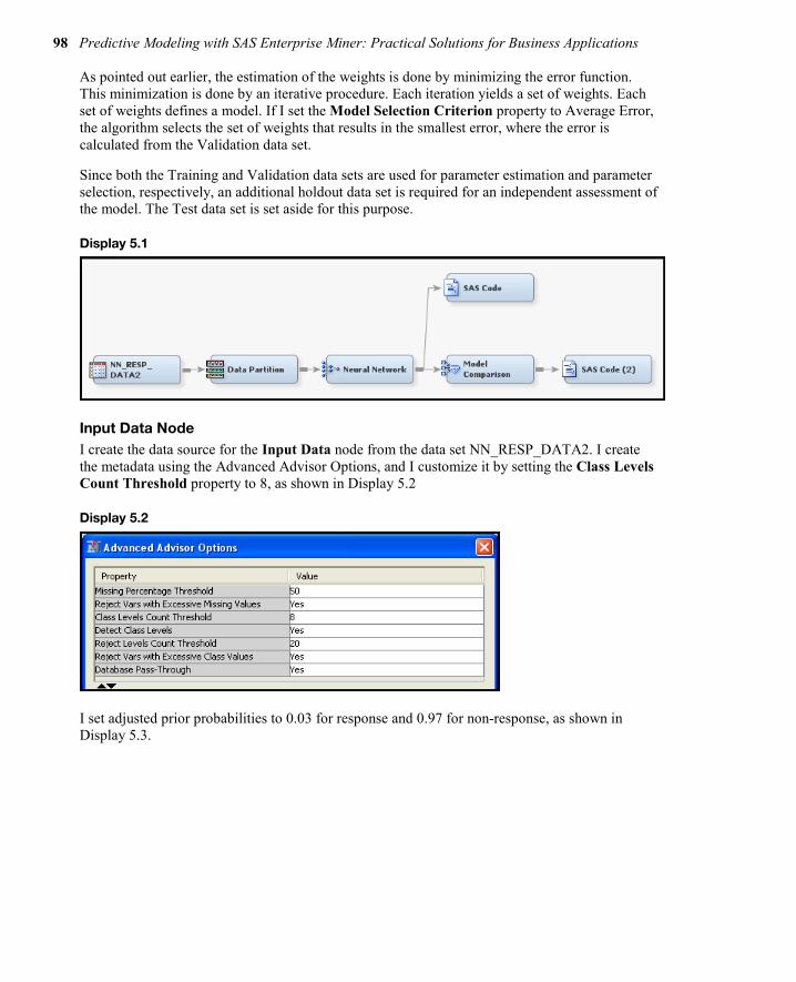
98 Predictive Modeling with SAS Enterprise Miner: Practical Solutions for Business Applications
As pointed out earlier, the estimation of the weights is done by minimizing the error function. This minimization is done by an iterative procedure. Each iteration yields a set of weights. Each set of weights defines a model. If I set the Model Selection Criterion property to Average Error, the algorithm selects the set of weights that results in the smallest error, where the error is calculated from the Validation data set.
Since both the Training and Validation data sets are used for parameter estimation and parameter selection, respectively, an additional holdout data set is required for an independent assessment of the model. The Test data set is set aside for this purpose.
Display 5.1
Input Data Node I create the data source for the Input Data node from the data set NN_RESP_DATA2. I create the metadata using the Advanced Advisor Options, and I customize it by setting the Class Levels Count Threshold property to 8, as shown in Display 5.2
Display 5.2
I set adjusted prior probabilities to 0.03 for response and 0.97 for non-response, as shown in Display 5.3.

Chapter 5: Neural Network Models to Predict Response and Risk 99
Display 5.3
Data Partition Node The input data is partitioned such that 60% of the observations are allocated for training, 30% for validation, and 10% for Test, as shown in Display 5.4.
Display 5.4
5.4.1 Setting the Neural Network Node Properties Here is a summary of the neural network specifications for this application:
● One hidden layer with three neurons ● Linear combination functions for both the hidden and output layers ● Hyperbolic tangent activation functions for the hidden units ● Logistic activation functions for the output units ● The Bernoulli error function ● The Model Selection Criterion is Average Error
These settings are shown in Displays 5.5–5.7.
Display 5.5 shows the Properties panel for the Neural Network node.

100 Predictive Modeling with SAS Enterprise Miner: Practical Solutions for Business Applications
Display 5.5
To define the network architecture, click located to the right of the Network property. The Network Properties panel opens, as shown in Display 5.6.
Display 5.6
Set the properties as shown in Display 5.6 and click OK.
To set the iteration limit, click located to the right of the Optimization property. The Optimization Properties panel opens, as shown in Display 5.7. Set Maximum Iterations to 100.
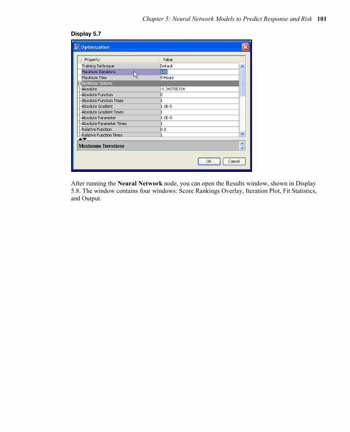
Chapter 5: Neural Network Models to Predict Response and Risk 101
Display 5.7
After running the Neural Network node, you can open the Results window, shown in Display 5.8. The window contains four windows: Score Rankings Overlay, Iteration Plot, Fit Statistics, and Output.

102 Predictive Modeling with SAS Enterprise Miner: Practical Solutions for Business Applications
Display 5.8
The Score Rankings Overlay window in Display 5.8 shows the cumulative lift for the Training and Validation data sets. Click the down arrow next to the text box to see a list of available charts that can be displayed in this window.
Display 5.9 shows the iteration plot with Average Squared Error at each iteration for the Training and Validation data sets. The estimation process required 70 iterations. The weights from the 49th iteration were selected. After the 49th iteration, the Average Squared Error started to increase in the Validation data set, although it continued to decline in the Training data set.
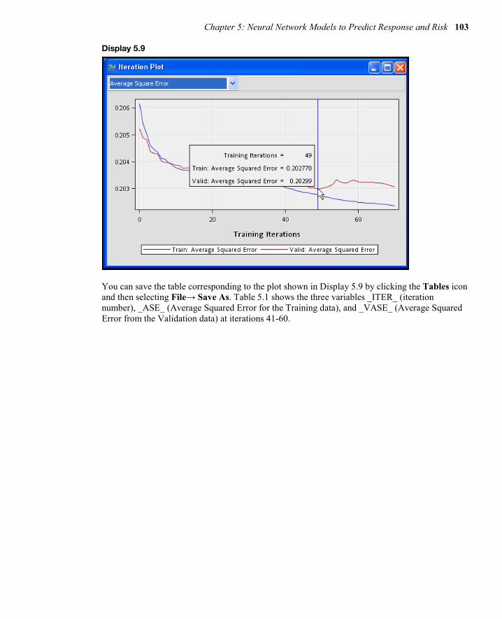
Chapter 5: Neural Network Models to Predict Response and Risk 103
Display 5.9
You can save the table corresponding to the plot shown in Display 5.9 by clicking the Tables icon and then selecting File→ Save As. Table 5.1 shows the three variables _ITER_ (iteration number), _ASE_ (Average Squared Error for the Training data), and _VASE_ (Average Squared Error from the Validation data) at iterations 41-60.

104 Predictive Modeling with SAS Enterprise Miner: Practical Solutions for Business Applications
Table 5.1
You can print the variables _ITER_, _ASE_, and _VASE_ by using the SAS code shown in Display 5.10.
Display 5.10
5.4.2 Assessing the Predictive Performance of the Estimated Model In order to assess the predictive performance of the neural network model, run the Model Comparison node and open the Results window. In the Results window, the Score Rankings Overlay shows the Lift charts for the Training, Validation, and Test data sets. These are shown in Display 5.11.

Chapter 5: Neural Network Models to Predict Response and Risk 105
Display 5.11
Click the arrow in the box at the top left corner of the Score Ranking Overlay window to see a list of available charts.
SAS Enterprise Miner saves the Score Rankings table as EMWS.MdlComp_EMRANK. Tables 5.2, 5.3, and 5.4 are created from the saved data set using the simple SAS code shown in Display 5.12.

106 Predictive Modeling with SAS Enterprise Miner: Practical Solutions for Business Applications
Display 5.12
Table 5.2

Chapter 5: Neural Network Models to Predict Response and Risk 107
Table 5.3
Table 5.4

108 Predictive Modeling with SAS Enterprise Miner: Practical Solutions for Business Applications
The lift and capture rates calculated from the Test data set (shown in Table 5.4) should be used for evaluating the models or comparing the models because the Test data set is not used in training or fine-tuning the model.
To calculate the lift and capture rates, SAS Enterprise Miner first calculates the predicted probability of response for each record in the Test data. Then it sorts the records in descending order of the predicted probabilities (also called the scores) and divides the data set into 20 groups of equal size. In Table 5.4, the column Bin shows the ranking of these groups. If the model is accurate, the table should show the highest actual response rate in the first bin, the second highest in the next bin, and so on. From the column %Response, it is clear that the average response rate for observations in the first bin is 8.36796%. The average response rate for the entire test data set is 3%. Hence the lift for Bin 1, which is the ratio of the response rate in Bin 1 to the overall response rate, is 2.7893. The lift for each bin is calculated in the same way. The first row of the column Cumulative %Response shows the response rate for the first bin. The second row shows the response rate for bins 1 and 2 combined, and so on.
The capture rate of a bin shows the percentage of likely responders that it is reasonable to expect to be captured in the bin. From the column Captured Response, you can see that 13.951% of all responders are in Bin 1.
From the Cumulative % Captured Response column of Table 5.3, you can be seen that, by sending mail to customers in the first four bins, or the top 20% of the target population, it is reasonable to expect to capture 39% of all potential responders from the target population. This assumes that the modeling sample represents the target population.
5.4.3 Receiver Operating Characteristic (ROC) Charts Display 5.13, taken from the Results window of the Model Comparison node, displays ROC curves for the Training, Validation, and Test data sets. An ROC curve shows the values of the true positive fraction and the false positive fraction at different cut-off values, which can be denoted by cP . In the case of the response model, if the estimated probability of response for a customer
record were above a cut-off value cP , then you would classify the customer as a responder; otherwise, you would classify the customer as a non-responder.

Chapter 5: Neural Network Models to Predict Response and Risk 109
Display 5.13
In the ROC chart, the true positive fraction is shown on the vertical axis, and the false positive fraction is on the horizontal axis for each cut-off value ( cP ).
If the calculated probability of response (P_resp1) is greater than equal to the cut-off value, then the customer (observation) is classified as a responder. Otherwise, the customer is classified as non-responder.
True positive fraction is the proportion of responders correctly classified as responders. The false positive fraction is the proportion of non-responders incorrectly classified as responders. The true positive fraction is also called sensitivity, and specificity is the proportion of non-responders correctly classified as non-responders. Hence, the false positive fraction is 1-specificity. An ROC curve reflects the tradeoff between sensitivity and specificity.
The straight diagonal lines in Display 5.13 that are labeled Baseline are the ROC charts of a model that assigns customers at random to the responder group and the non-responder group, and hence has no predictive power. On these lines, sensitivity = 1- specificity at all cut-off points. The larger the area between the ROC curve of the model being evaluated and the diagonal line, the better the model. The area under the ROC curve is a measure of the predictive accuracy of the model and can be used for comparing different models.
Table 5.5 shows sensitivity and 1-specificity at various cut-off points in the validation data.

110 Predictive Modeling with SAS Enterprise Miner: Practical Solutions for Business Applications
Table 5.5
From Table 5.5, you can see that at a cut-off probability ( cP ) of 0.02, for example, the sensitivity is 0.84115. That is, at this cut-off point, you will correctly classify 84.1% of responders as responders, but you will also incorrectly classify 68.1% of non-responders as responders, since 1-specificity at this point is 0.68139. If instead you chose a much higher cut-off point of cP = 0.13954, you would classify 0.284% of true responders as responders and 0.049% of non-responders as responders. In this case, by increasing the cut-off probability beyond which you would classify an individual as a responder, you would be reducing the fraction of false positive decisions made, while, at the same time, also reducing the fraction of true positive decisions made. These pairings of a true positive fraction with a false positive fraction are plotted as the ROC curve for the VALIDATE case in Display 5.13.
The SAS macro in Display 5.14 demonstrates the calculation of the true positive rate (TPR) and the false positive rate (FPR) at the cut-off probability of 0.02.
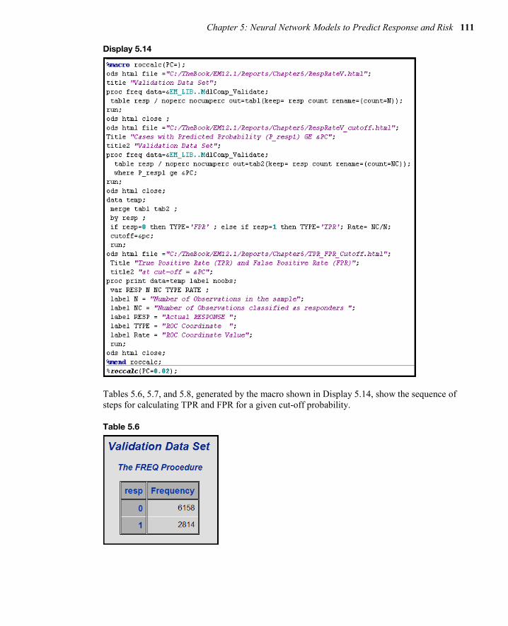
Chapter 5: Neural Network Models to Predict Response and Risk 111
Display 5.14
Tables 5.6, 5.7, and 5.8, generated by the macro shown in Display 5.14, show the sequence of steps for calculating TPR and FPR for a given cut-off probability.
Table 5.6

112 Predictive Modeling with SAS Enterprise Miner: Practical Solutions for Business Applications
Table 5.7
Table 5.8
For more information about ROC curves, see the textbook by A. A. Afifi and Virginia Clark (2004).4
Display 5.15 shows the SAS code that generated Table 5.5.
Display 5.15
5.4.4 How Did the Neural Network Node Pick the Optimum Weights for This Model? In Section 5.3, I described how the optimum weights are found in a neural network model. I described the two-step procedure of estimating and selecting the weights. In this section, I show the results of these two steps with reference to the neural network model discussed in Sections 5.4.1 and 5.4.2.
The weights such as those shown in Equations 5.1, 5.3, 5.5, 5.7, 5.9, 5.11, and 5.13 are shown in the Results window of the Neural Network node. You can see the estimated weights created at each iteration by opening the results window and selecting View→Model→Weights-History. Display 5.16 shows a partial view of the Weights-History window.

Chapter 5: Neural Network Models to Predict Response and Risk 113
Display 5.16
The second column in Display 5.16 shows the weight of the variable AGE in hidden unit 1 at each iteration. The seventh column shows the weight of AGE in hidden unit 2 at each iteration. The twelfth column shows the weight of AGE in the third hidden unit. Similarly, you can trace through the weights of other variables. You can save the Weights-History table as a SAS data set.
To see the final weights, open the Results window. Select View→Model→Weights_Final. Then, click the Table icon. Selected rows of the final weights_table are shown in Display 5.17.
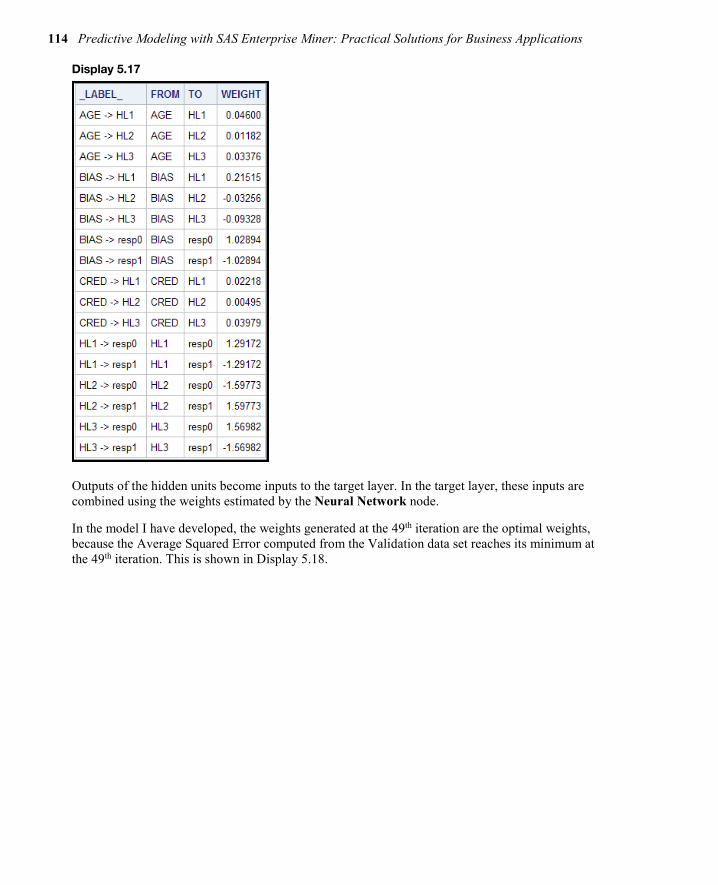
114 Predictive Modeling with SAS Enterprise Miner: Practical Solutions for Business Applications
Display 5.17
Outputs of the hidden units become inputs to the target layer. In the target layer, these inputs are combined using the weights estimated by the Neural Network node.
In the model I have developed, the weights generated at the 49th iteration are the optimal weights, because the Average Squared Error computed from the Validation data set reaches its minimum at the 49th iteration. This is shown in Display 5.18.

Chapter 5: Neural Network Models to Predict Response and Risk 115
Display 5.18
5.4.5 Scoring a Data Set Using the Neural Network Model You can use the SAS code generated by the Neural Network node to score a data set within SAS Enterprise Miner or outside. This example scores a data set inside SAS Enterprise Miner.
The process flow diagram with a scoring data set is shown in Display 5.19.
Display 5.19
Set the Role property of the data set to be scored to Score, as shown in Display 5.20.
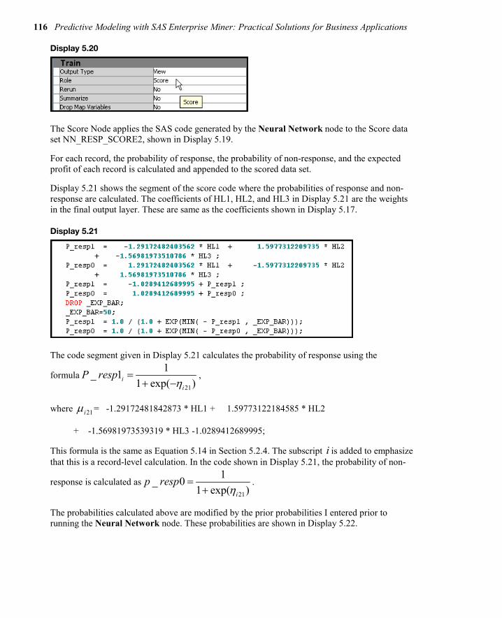
116 Predictive Modeling with SAS Enterprise Miner: Practical Solutions for Business Applications
Display 5.20
The Score Node applies the SAS code generated by the Neural Network node to the Score data set NN_RESP_SCORE2, shown in Display 5.19.
For each record, the probability of response, the probability of non-response, and the expected profit of each record is calculated and appended to the scored data set.
Display 5.21 shows the segment of the score code where the probabilities of response and non-response are calculated. The coefficients of HL1, HL2, and HL3 in Display 5.21 are the weights in the final output layer. These are same as the coefficients shown in Display 5.17.
Display 5.21
The code segment given in Display 5.21 calculates the probability of response using the
formula21
1_ 11 exp( )i
i
P respη
=+ −
,
where 21iµ = -1.29172481842873 * HL1 + 1.59773122184585 * HL2
+ -1.56981973539319 * HL3 -1.0289412689995;
This formula is the same as Equation 5.14 in Section 5.2.4. The subscript i is added to emphasize that this is a record-level calculation. In the code shown in Display 5.21, the probability of non-
response is calculated as21
1_ 01 exp( )i
p respη
=+
.
The probabilities calculated above are modified by the prior probabilities I entered prior to running the Neural Network node. These probabilities are shown in Display 5.22.

Chapter 5: Neural Network Models to Predict Response and Risk 117
Display 5.22
You can enter the prior probabilities when you create the Data Source. Prior probabilities are entered because the responders are overrepresented in the modeling sample, which is extracted from a larger sample. In the larger sample, the proportion of responders is only 3%. In the modeling sample, the proportion of responders is 31.36%. Hence, the probabilities should be adjusted before expected profits are computed. The SAS code generated by the Neural Network node and passed on to the Score node includes statements for making this adjustment. Display 5.23 shows these statements.
Display 5.23

118 Predictive Modeling with SAS Enterprise Miner: Practical Solutions for Business Applications
Display 5.24 shows the profit matrix used in the decision-making process.
Display 5.24
Given the above profit matrix, calculation of expected profit under the alternative decisions of classifying an individual as responder or non-responder proceeds as follows. Using the neural network model, the scoring algorithm first calculates the individual’s probability of response and non-response. Suppose the calculated probability of response for an individual is 0.3, and probability of non-response is 0.7. The expected profit if the individual is classified as responder is 0.3x$5 + 0.7x (–$1.0) = $0.8. The expected profit if the individual is classified as non-responder is 0.3x ($0) + 0.7x ($0) = $0. Hence classifying the individual as responder (Decision1) yields a higher profit than if the individual is classified as non-responder (Decision2). An additional field is added to the record in the scored data set indicating the decision to classify the individual as a responder.

Chapter 5: Neural Network Models to Predict Response and Risk 119
These calculations are shown in the score code segment shown in Display 5.25.
Display 5.25
5.4.6 Score Code The score code is automatically saved by the Score node in the sub-directory \Workspaces\EMWSn\Score within the project directory.
For example, in my computer, the Score code is saved by the Score node in the folder C:\TheBook\EM12.1\EMProjects\Chapter5\Workspaces\EMWS3\Score. Alternatively, you can save the score code in some other directory. To do so, run the Score node, and then click Results. Select either the Optimized SAS Code window or the SAS Code window. Click File→Save As, and enter the directory and name for saving the score code.

120 Predictive Modeling with SAS Enterprise Miner: Practical Solutions for Business Applications
Full book available for purchase here.
Use EXBDL for a 25% discounted purchase of this book. Free shipping available in the US. For International orders please contact us directly.
Learn the theory behind and methods for predictive modeling using SAS Enterprise Miner.
Learn how to produce predictive models and prepare presentation-quality graphics in record time with Predictive Modeling with SAS Enterprise Miner: Practical Solutions for Business Applications, Second Edition
If you are a graduate student, researcher, or statistician interested in predictive modeling; a data mining expert who wants to learn SAS Enterprise Miner; or a business analyst looking for an introduction to predictive modeling using SAS Enterprise Miner, you'll be able to develop predictive models quickly and effectively using the theory and examples presented in this book.
Author Kattamuri Sarma offers the theory behind, programming steps for, and examples of predictive modeling with SAS Enterprise Miner, along with exercises at the end of each chapter. You'll gain a comprehensive awareness of how to find solutions for your business needs. This second edition features expanded coverage of the SAS Enterprise Miner nodes, now including File Import, Time Series, Variable Clustering, Cluster, Interactive Binning, Principal Components, AutoNeural, DMNeural, Dmine Regression, Gradient Boosting, Ensemble, and Text Mining.
Develop predictive models quickly, learn how to test numerous models and compare the results, gain an in-depth understanding of predictive models and multivariate methods, and discover how to do in-depth analysis. Do it all with Predictive Modeling with SAS Enterprise Miner.

Chapter 5: Neural Network Models to Predict Response and Risk 121

Introduction to Text Analytics Big data: It's unstructured, it's coming at you fast, and there's lots of it. In fact, the majority of big data is text-oriented, thanks to the proliferation of online sources such as blogs, emails, and social media. However, having big data means little if you can't leverage it with analytics. Text analytics enables you to gain insights about your customers' behaviors and sentiments.
This chapter presents a short overview of text analytics and introduces techniques to convert free text into structured data, allowing the processing of huge textual data, extracting meanings, sentiment, or patterns.
Dr. Goutam Chakraborty has a B. Tech (Honors) in mechanical engineering from the Indian Institute of Technology, Kharagpur; a PGCGM from the Indian Institute of Management, Calcutta; and an MS in statistics and a PhD in marketing from the University of Iowa. He has held managerial positions with a subsidiary of Union Carbide, USA, and with a subsidiary of British American Tobacco, UK. He is a professor of marketing at Oklahoma State University, where he has taught business analytics, marketing analytics, data mining,
advanced data mining, database marketing, new product development, advanced marketing research, web-business strategy, interactive marketing, and product management for more than 20 years. Goutam has won many teaching awards, including the SAS Distinguished Professor Award from SAS Institute, and he teaches the popular SAS Business Knowledge Series course, "Text Analytics and Sentiment Mining Using SAS."
http://support.sas.com/publishing/authors/chakraborty.html
Murali Pagolu is a Business Analytics Consultant at SAS and has four years of experience using SAS software in both academic research and business applications. His focus areas include database marketing, marketing research, data mining and customer relationship management (CRM) applications, customer segmentation, and text analytics. Murali is responsible for implementing analytical solutions and developing proofs of concept for SAS customers. He has presented innovative applications of text analytics, such as mining text comments from YouTube videos and patent portfolio analysis, at past SAS Analytics conferences.
http://support.sas.com/publishing/authors/pagolu.html
Satish Garla is an Analytical Consultant in Risk Practice at SAS. He has extensive experience in risk modeling for healthcare, predictive modeling, text analytics, and SAS programming. He has a distinguished academic background in analytics, databases, and business administration. Satish holds a master's degree in Management Information Systems at Oklahoma State University and has completed the SAS and OSU Data Mining Certificate program. He has three years of professional experience as an Oracle CRM Consultant, and he is a SAS Certified Advanced Programmer for SAS 9 and a Certified Predictive Modeler
using SAS Enterprise Miner 6.1.
http://support.sas.com/publishing/authors/garla.html
Chapter 1: Introduction to Text Analytics 123
Chapter 7: Introduction to Text Analytics
Overview of Text Analytics ...................................................................... 123
Text Mining Using SAS Text Miner ........................................................... 127
Information Retrieval .............................................................................. 129
Document Classification ......................................................................... 130
Ontology Management ............................................................................ 132
Information Extraction ............................................................................ 132
Clustering ............................................................................................... 133
Trend Analysis ........................................................................................ 135
Enhancing Predictive Models Using Exploratory Text Mining .................. 136
Sentiment Analysis.................................................................................. 137
Emerging Directions ............................................................................... 138 Handling Big (Text) Data ...................................................................................... 139 Voice Mining .......................................................................................................... 139 Real-Time Text Analytics ..................................................................................... 140
Summary ................................................................................................. 140
References ............................................................................................. 141
Overview of Text Analytics Text analytics helps analysts extract meanings, patterns, and structure hidden in unstructured textual data. The information age has led to the development of a wide variety of tools and
Full book available for purchase here. Use EXBDL for a 25% discounted purchase of this book. Free shipping available in the US. For International orders please contact us directly.

124 Text Mining and Analysis: Practical Methods, Examples, and Case Studies Using SAS
infrastructure to capture and store massive amounts of textual data. In a 2009 report, the International Data Corporation (IDC) estimated that approximately 80% percent of the data in an organization is text based. It is not practical for any individual (or group of individuals) to process huge textual data and extract meanings, sentiments, or patterns out of the data. A paper written by Hans Peter Luhn, titled “The Automatic Creation of Literature Abstracts,” is perhaps one of the earliest research projects conducted on text analytics. Luhn writes about applying machine methods to automatically generate an abstract for a document. In a traditional sense, the term “text mining” is used for automated machine learning and statistical methods that encompass a bag-of-words approach. This approach is typically used to examine content collections versus assessing individual documents. Over time, the term “text analytics” has evolved to encompass a loosely integrated framework by borrowing techniques from data mining, machine learning, natural language processing (NLP), information retrieval (IR), and knowledge management.
Text analytics applications are popular in the business environment. These applications produce some of the most innovative and deeply insightful results. Text analytics is being implemented in many industries. There are new types of applications every day. In recent years, text analytics has been heavily used for discovering trends in textual data. Using social media data, text analytics has been used for crime prevention and fraud detection. Hospitals are using text analytics to improve patient outcomes and provide better care. Scientists in the pharmaceutical industry are using this technology to mine biomedical literature to discover new drugs.
Text analytics incorporates tools and techniques that are used to derive insights from unstructured data. These techniques can be broadly classified as the following:
information retrieval exploratory analysis concept extraction summarization categorization sentiment analysis content management ontology management
In these techniques, exploratory analysis, summarization, and categorization are in the domain of text mining. Exploratory analysis includes techniques such as topic extraction, cluster analysis, etc. The term “text analytics” is somewhat synonymous with “text mining” (or “text data mining”). Text mining can be best conceptualized as a subset of text analytics that is focused on applying data mining techniques in the domain of textual information using NLP and machine learning. Text mining considers only syntax (the study of structural relationships between words). It does not deal with phonetics, pragmatics, and discourse.
Sentiment analysis can be treated as classification analysis. Therefore, it is considered predictive text mining. At a high level, the application areas of these techniques divide the text analytics market into two areas: search and descriptive and predictive analytics. (See Display 1.1.) Search includes numerous information retrieval techniques, whereas descriptive and predictive analytics include text mining and sentiment analysis.
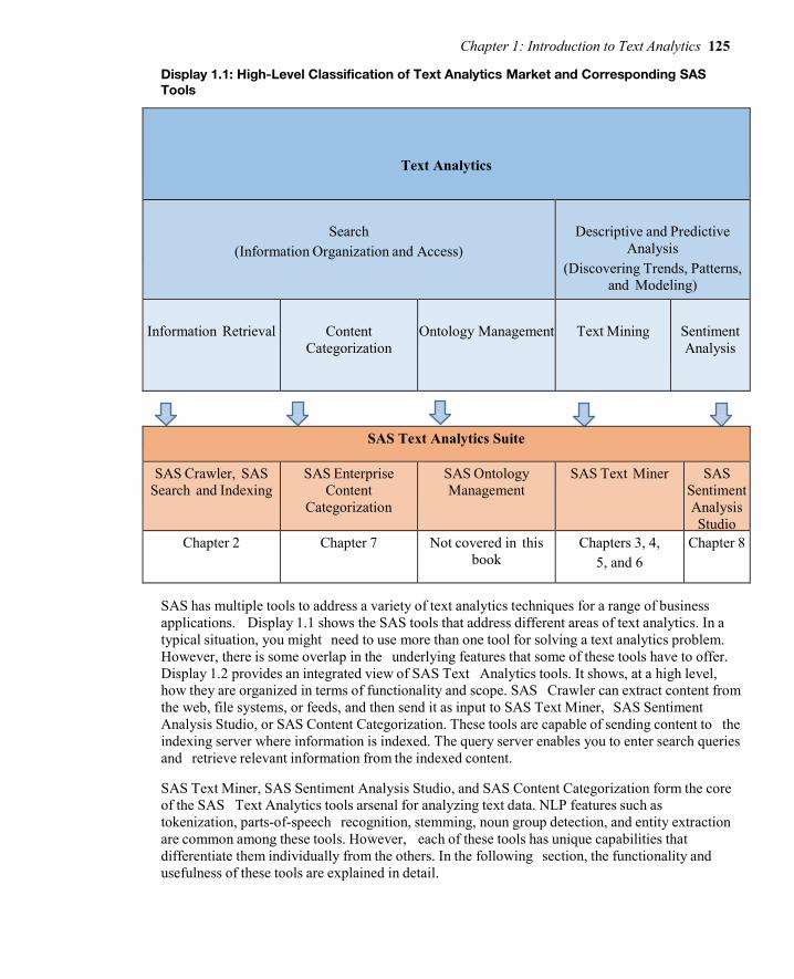
Chapter 1: Introduction to Text Analytics 125
Display 1.1: High-Level Classification of Text Analytics Market and Corresponding SAS Tools
Text Analytics
Search
(Information Organization and Access)
Descriptive and Predictive
Analysis (Discovering Trends, Patterns,
and Modeling)
Information Retrieval
Content
Categorization
Ontology Management
Text Mining
Sentiment Analysis
SAS Text Analytics Suite
SAS Crawler, SAS Search and Indexing
SAS Enterprise Content
Categorization
SAS Ontology Management
SAS Text Miner SAS Sentiment Analysis Studio
Chapter 2 Chapter 7 Not covered in this book
Chapters 3, 4, 5, and 6
Chapter 8
SAS has multiple tools to address a variety of text analytics techniques for a range of business applications. Display 1.1 shows the SAS tools that address different areas of text analytics. In a typical situation, you might need to use more than one tool for solving a text analytics problem. However, there is some overlap in the underlying features that some of these tools have to offer. Display 1.2 provides an integrated view of SAS Text Analytics tools. It shows, at a high level, how they are organized in terms of functionality and scope. SAS Crawler can extract content from the web, file systems, or feeds, and then send it as input to SAS Text Miner, SAS Sentiment Analysis Studio, or SAS Content Categorization. These tools are capable of sending content to the indexing server where information is indexed. The query server enables you to enter search queries and retrieve relevant information from the indexed content.
SAS Text Miner, SAS Sentiment Analysis Studio, and SAS Content Categorization form the core of the SAS Text Analytics tools arsenal for analyzing text data. NLP features such as tokenization, parts-of-speech recognition, stemming, noun group detection, and entity extraction are common among these tools. However, each of these tools has unique capabilities that differentiate them individually from the others. In the following section, the functionality and usefulness of these tools are explained in detail.

126 Text Mining and Analysis: Practical Methods, Examples, and Case Studies Using SAS
Display 1.2: SAS Text Analytics Tools: An Integrated Overview
The following paragraphs briefly describe each tool from the SAS Text Analytics suite as presented in Display 1.2:
SAS Crawler, SAS Search and Indexing – Useful for extracting textual content from the web or from documents stored locally in an organized way. For example, you can download news articles from websites and use SAS Text Miner to conduct an exploratory analysis, such as extracting key topics or themes from the news articles. You can build indexes and submit queries on indexed documents through a dedicated query interface.
SAS Ontology Management – Useful for integrating existing document repositories in enterprises and identifying relationships between them. This tool can help subject matter experts in a knowledge domain create ontologies and establish hierarchical relationships of semantic terms to enhance the process of search and retrieval on the document repositories. Note: SAS Ontology Management is not discussed in this book because we primarily focus on areas where the majority of current business applications are relevant for textual data.
SAS Content Categorization – Useful for classifying a document collection into a structured hierarchy of categories and subcategories called taxonomy. In addition to categorizing documents, it can be used to extract facts from them. For example, news articles can be classified into a predefined set of categories such as politics, sports, business, financial,

Chapter 1: Introduction to Text Analytics 127
etc. Factual information such as events, places, names of people, dates, monetary values, etc., can be easily retrieved using this tool.
SAS Text Miner – Useful for extracting the underlying key topics or themes in textual documents. This tool offers the capability to group similar documents—called clusters—based on terms and their frequency of occurrence in the corpus of documents and within each document. It provides a feature called “concept linking” to explore the relationships between terms and their strength of association. For example, textual transcripts from a customer call center can be fed into this tool to automatically cluster the transcripts. Each cluster has a higher likelihood of having similar problems reported by customers. The specifics of the problems can be understood by reviewing the descriptive terms explaining each of the clusters. A pictorial representation of these problems and the associated terms, events, or people can be viewed through concept linking, which shows how strongly an event can be related to a problem. SAS Text Miner enables the user to define custom topics or themes. Documents can be scored based on the presence of the custom topics. In the presence of a target variable, supervised classification or prediction models can be built using SAS Text Miner. The predictions of a prediction model with numerical inputs can be improved using topics, clusters, or rules that can be extracted from textual comments using SAS Text Miner.
SAS Sentiment Analysis – Useful for identifying the sentiment toward an entity in a document or the overall sentiment toward the entire document. An entity can be anything, such as a product, an attribute of a product, brand, person, group, or even an organization. The sentiment evaluated is classified as positive or negative or neutral or unclassified. If there are no terms associated with an entity or the entire document that reflect the sentiment, it is tagged “unclassified.” Sentiment analysis is generally applied to a class of textual information such as customers’ reviews on products, brands, organizations, etc., or to responses to public events such as presidential elections. This type of information is largely available on social media sites such as Facebook, Twitter, YouTube, etc.
Text Mining Using SAS Text Miner A typical predictive data mining problem deals with data in numerical form. However, textual data is typically available only in a readable document form. Forms could be e-mails, user comments, corporate reports, news articles, web pages, etc. Text mining attempts to first derive a quantitative representation of documents. Once the text is transformed into a set of numbers that adequately capture the patterns in the textual data, any traditional statistical or forecasting model or data mining algorithm can be used on the numbers for generating insights or for predictive modeling.
A typical text mining project involves the following tasks:
1. Data Collection: The first step in any text mining research project is to collect the textual data required for analysis.
2. Text Parsing and Transformation: The next step is to extract, clean, and create a dictionary of words from the documents using NLP. This includes identifying sentences, determining parts of speech, and stemming words. This step involves parsing the extracted words to identify entities, removing stop words, and spell-checking. In
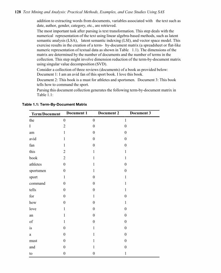
128 Text Mining and Analysis: Practical Methods, Examples, and Case Studies Using SAS
addition to extracting words from documents, variables associated with the text such as date, author, gender, category, etc., are retrieved. The most important task after parsing is text transformation. This step deals with the numerical representation of the text using linear algebra-based methods, such as latent semantic analysis (LSA), latent semantic indexing (LSI), and vector space model. This exercise results in the creation of a term- by-document matrix (a spreadsheet or flat-like numeric representation of textual data as shown in Table 1.1). The dimensions of the matrix are determined by the number of documents and the number of terms in the collection. This step might involve dimension reduction of the term-by-document matrix using singular value decomposition (SVD). Consider a collection of three reviews (documents) of a book as provided below: Document 1: I am an avid fan of this sport book. I love this book. Document 2: This book is a must for athletes and sportsmen. Document 3: This book tells how to command the sport. Parsing this document collection generates the following term-by-document matrix in Table 1.1:
Table 1.1: Term-By-Document Matrix
Term/Document Document 1 Document 2 Document 3
the 0 0 1 I 2 0 0 am 1 0 0 avid 1 0 0 fan 1 0 0 this 2 1 1 book 2 1 1 athletes 0 1 0 sportsmen 0 1 0 sport 1 0 1 command 0 0 1 tells 0 0 1 for 0 1 0 how 0 0 1 love 1 0 0 an 1 0 0 of 1 0 0 is 0 1 0 a 0 1 0 must 0 1 0 and 0 1 0 to 0 0 1
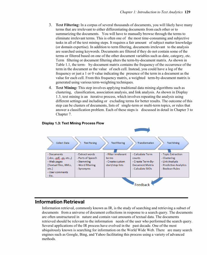
Chapter 1: Introduction to Text Analytics 129
3. Text Filtering: In a corpus of several thousands of documents, you will likely have many
terms that are irrelevant to either differentiating documents from each other or to summarizing the documents. You will have to manually browse through the terms to eliminate irrelevant terms. This is often one of the most time-consuming and subjective tasks in all of the text mining steps. It requires a fair amount of subject matter knowledge (or domain expertise). In addition to term filtering, documents irrelevant to the analysis are searched using keywords. Documents are filtered if they do not contain some of the terms or filtered based on one of the other document variables such as date, category, etc. Term filtering or document filtering alters the term-by-document matrix. As shown in Table 1.1, the term- by-document matrix contains the frequency of the occurrence of the term in the document as the value of each cell. Instead, you could have a log of the frequency or just a 1 or 0 value indicating the presence of the term in a document as the value for each cell. From this frequency matrix, a weighted term-by-document matrix is generated using various term-weighting techniques.
4. Text Mining: This step involves applying traditional data mining algorithms such as clustering, classification, association analysis, and link analysis. As shown in Display 1.3, text mining is an iterative process, which involves repeating the analysis using different settings and including or excluding terms for better results. The outcome of this step can be clusters of documents, lists of single-term or multi-term topics, or rules that answer a classification problem. Each of these steps is discussed in detail in Chapter 3 to Chapter 7.
Display 1.3: Text Mining Process Flow
Information Retrieval Information retrieval, commonly known as IR, is the study of searching and retrieving a subset of documents from a universe of document collections in response to a search query. The documents are often unstructured in nature and contain vast amounts of textual data. The documents retrieved should be relevant to the information needs of the user who performed the search query. Several applications of the IR process have evolved in the past decade. One of the most ubiquitously known is searching for information on the World Wide Web. There are many search engines such as Google, Bing, and Yahoo facilitating this process using a variety of advanced methods.

130 Text Mining and Analysis: Practical Methods, Examples, and Case Studies Using SAS
Most of the online digital libraries enable its users to search through their catalogs based on IR techniques. Many organizations enhance their websites with search capabilities to find documents, articles, and files of interest using keywords in the search queries. For example, the United States Patent and Trademark Office provides several ways of searching its database of patents and trademarks that it has made available to the public. In general, an IR system’s efficiency lies in its ability to match a user’s query with the most relevant documents in a corpus. To make the IR process more efficient, documents are required to be organized, indexed, and tagged with metadata based on the original content of the documents. SAS Crawler is capable of pulling information from a wide variety of data sources. Documents are then processed by parsers to create various fields such as title, ID, URL, etc., which form the metadata of the documents. (See Display 1.4.) SAS Search and Indexing enables you to build indexes from these documents. Users can submit search queries on the indexes to retrieve information most relevant to the query terms. The metadata fields generated by the parsers can be used in the indexes to enable various types of functionality for querying.
Display 1.4: Overview of the IR Process with SAS Search and Indexing
Document Classification Document classification is the process of finding commonalities in the documents in a corpus and grouping them into predetermined labels (supervised learning) based on the topical themes exhibited by the documents. Similar to the IR process, document classification (or text categorization) is an important aspect of text analytics and has numerous applications.
Some of the common applications of document classification are e-mail forwarding and spam detection, call center routing, and news articles categorization. It is not necessary that documents be assigned to mutually exclusive categories. Any restrictive approach to do so might prove to be an inefficient way of representing the information. In reality, a document can exhibit multiple themes, and it might not be possible to restrict them to only one category. SAS Text Miner contains the text topic feature, which is capable of handling these situations. It assigns a document to more than one category if needed. (See Display 1.5.) Restricting documents to only one category might be difficult for large documents, which have a greater chance of containing
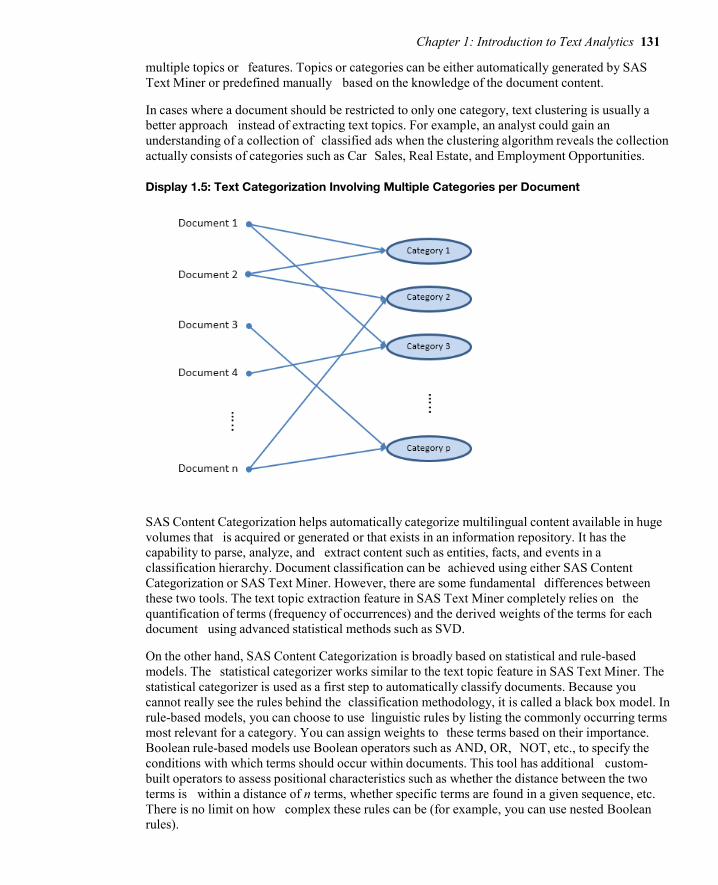
Chapter 1: Introduction to Text Analytics 131
multiple topics or features. Topics or categories can be either automatically generated by SAS Text Miner or predefined manually based on the knowledge of the document content.
In cases where a document should be restricted to only one category, text clustering is usually a better approach instead of extracting text topics. For example, an analyst could gain an understanding of a collection of classified ads when the clustering algorithm reveals the collection actually consists of categories such as Car Sales, Real Estate, and Employment Opportunities.
Display 1.5: Text Categorization Involving Multiple Categories per Document
SAS Content Categorization helps automatically categorize multilingual content available in huge volumes that is acquired or generated or that exists in an information repository. It has the capability to parse, analyze, and extract content such as entities, facts, and events in a classification hierarchy. Document classification can be achieved using either SAS Content Categorization or SAS Text Miner. However, there are some fundamental differences between these two tools. The text topic extraction feature in SAS Text Miner completely relies on the quantification of terms (frequency of occurrences) and the derived weights of the terms for each document using advanced statistical methods such as SVD.
On the other hand, SAS Content Categorization is broadly based on statistical and rule-based models. The statistical categorizer works similar to the text topic feature in SAS Text Miner. The statistical categorizer is used as a first step to automatically classify documents. Because you cannot really see the rules behind the classification methodology, it is called a black box model. In rule-based models, you can choose to use linguistic rules by listing the commonly occurring terms most relevant for a category. You can assign weights to these terms based on their importance. Boolean rule-based models use Boolean operators such as AND, OR, NOT, etc., to specify the conditions with which terms should occur within documents. This tool has additional custom-built operators to assess positional characteristics such as whether the distance between the two terms is within a distance of n terms, whether specific terms are found in a given sequence, etc. There is no limit on how complex these rules can be (for example, you can use nested Boolean rules).

132 Text Mining and Analysis: Practical Methods, Examples, and Case Studies Using SAS
Ontology Management Ontology is a study about how entities can be grouped and related within a hierarchy. Entities can be subdivided based on distinctive and commonly occurring features. SAS Ontology Management enables you to create relationships between pre-existing taxonomies built for various silos or departments. The subject matter knowledge about the purpose and meaning can be used to create rules for building information search and retrieval systems. By identifying relationships in an evolutionary method and making the related content available, queries return relevant, comprehensive, and accurate answers. SAS Ontology Management offers the ability to build semantic repositories and manage company-wide thesauri and vocabularies and to build relationships between them.
To explain its application, consider the simple use case of an online media house named ABC. (The name was changed to maintain anonymity.) ABC uses SAS Ontology Management. ABC collects a lot of topics over a period of time. It stores each of these topics, along with metadata (properties), including links to images and textual descriptions. SAS Ontology Management helps ABC store relationships between the related topics. ABC regularly queries its ontology to generate a web page for each topic, showing the description, images, related topics, and other metadata that it might have selected to show. (See Display 1.6.) ABC uploads the information from SAS Ontology Management to SAS Content Categorization, and then tags news articles with topics that appear in the articles using rules that it’s created. All tagged articles are included in a list on the topic pages.
Display 1.6: Example Application of SAS Ontology Management from an Online Media Website
Information Extraction In a relational database, data is stored in tables within rows and columns. A structured query on the database can help you retrieve the information required if the names of tables and columns are
Chapter 1: Introduction to Text Analytics 133
known. However, in the case of unstructured data, it is not easy to extract specific portions of information from the text because there is no fixed reference to identify the location of the data. Unstructured data can contain small fragments of information that might be of specific interest, based on the context of information and the purpose of analysis. Information extraction can be considered the process of extracting those fragments of data such as the names of people, organizations, places, addresses, dates, times, etc., from documents.
Information extraction might yield different results depending on the purpose of the process and the elements of the textual data. Elements of the textual data within the documents play a key role in defining the scope of information extraction. These elements are tokens, terms, and separators. A document consists of a set of tokens. A token can be considered a series of characters without any separators. A separator can be a special character, such as a blank space or a punctuation mark. A term can be a defined as a token with specific semantic purpose in a given language.
There are several types of information extraction that can be performed on textual data.
Token extraction Term extraction or term parsing Concept extraction Entity extraction Atomic fact extraction Complex fact extraction
Concept extraction involves identifying nouns and noun phrases. Entity extraction can be defined as the process of associating nouns with entities. For example, although the word “white” is a noun in English and represents a color, the occurrence of “Mr. White” in a document can be identified as a person, not a color. Similarly, the phrase “White House” can be attributed to a specific location (the official residence and principal workplace of the president of the United States), rather than as a description of the color of paint used for the exterior of a house. Atomic fact extraction is the process of retrieving fact-based information based on the association of nouns with verbs in the content (i.e., subjects with actions).
Clustering Cluster analysis is a popular technique used by data analysts in numerous business applications. Clustering partitions records in a data set into groups so that the subjects within a group are similar and the subjects between the groups are dissimilar. The goal of cluster analysis is to derive clusters that have value with respect to the problem being addressed, but this goal is not always achieved. As a result, there are many competing clustering algorithms. The analyst often compares the quality of derived clusters, and then selects the method that produces the most useful groups. The clustering process arranges documents into nonoverlapping groups. (See Display 1.7.) Each document can fall into more than one topic area after classification. This is the key difference between clustering and the general text classification processes, although clustering provides a solution to text classification when groups must be mutually exclusive, as in the classified ads example.
In the context of text mining, clustering divides the document collection into mutually exclusive groups based on the presence of similar themes. In most business applications involving large amounts of textual data, it is often difficult to profile each cluster by manually reading and
134 Text Mining and Analysis: Practical Methods, Examples, and Case Studies Using SAS
considering all of the text in a cluster. Instead, the theme of a cluster is identified using a set of descriptive terms that each cluster contains. This vector of terms represents the weights measuring how the document fits into each cluster. Themes help in better understanding the customer, concepts, or events. The number of clusters that are identified can be controlled by the analyst.
The algorithm can generate clusters based on the relative positioning of documents in the vector space. The cluster configuration is altered by a start and stop list.
Display 1.7: Text Clustering Process Assigning Each Document to Only One Cluster
For example, consider the comments made by different patients about the best thing that they liked about the hospital that they visited.
1. Friendliness of the doctor and staff. 2. Service at the eye clinic was fast. 3. The doctor and other people were very, very friendly. 4. Waiting time has been excellent and staff has been very helpful. 5. The way the treatment was done. 6. No hassles in scheduling an appointment. 7. Speed of the service. 8. The way I was treated and my results. 9. No waiting time, results were returned fast, and great treatment.
The clustering results from text mining the comments come out similar to the ones shown in Table 1.2. Each cluster can be described by a set of terms, which reveal, to a certain extent, the theme of the cluster. This type of analysis helps businesses understand the collection as a whole, and it can

Chapter 1: Introduction to Text Analytics 135
assist in correctly classifying customers based on common topics in customer complaints or responses.
Table 1.2: Clustering Results from Text Mining
The derivation of key words is accomplished using a weighting strategy, where words are assigned a weight using features of LSI. Text mining software products can differ in how the keywords are identified, resulting from different choices for competing weighting schemes.
SAS Text Miner uses two types of clustering algorithms: expectation maximization and hierarchical clustering. The result of cluster analysis is identifying cluster membership for each document in the collection. The exact nature of the two algorithms is discussed in detail in “Chapter 6 Clustering and Topic Extraction.”
Trend Analysis In recent years, text mining has been used to discover trends in textual data. Given a set of documents with a time stamp, text mining can be used to identify trends of different topics that exist in the text. Trend analysis has been widely applied in tracking the trends in research from scientific literature. It has also been widely applied in summarizing events from news articles. In this type of analysis, a topic or theme is first defined using a set of words and phrases. Presence of the words across the documents over a period of time represents the trend for this topic. To effectively track the trends, it is very important to include all related terms to (or synonyms of) these words.
For example, text mining is used to predict the movements of stock prices based on news articles and corporate reports. Evangelopoulos and Woodfield (2009) show how movie themes trend over time, with male movies dominating the World War II years and female movies dominating the Age of Aquarius. As another example, mining social networks to identify trends is currently a very hot application area. Google Trends, a publicly available website, provides a facility to identify the trends in your favorite topics over a period of time. Social networking sites such as Twitter and blogs are great sources to identify trends. Here is a screenshot of the trend for the topic “text mining” from Google Trends. It is clearly evident that the growth in search traffic and online posts for the term “text mining” peaked after 2007. This is when the popularity of text mining applications in the business world jump-started.
Cluster No.
Comment Key Words
1 1, 3, 4 doctor, staff, friendly, helpful 2 5, 6, 8 treatment, results, time, schedule 3 2, 7 service, clinic, fast
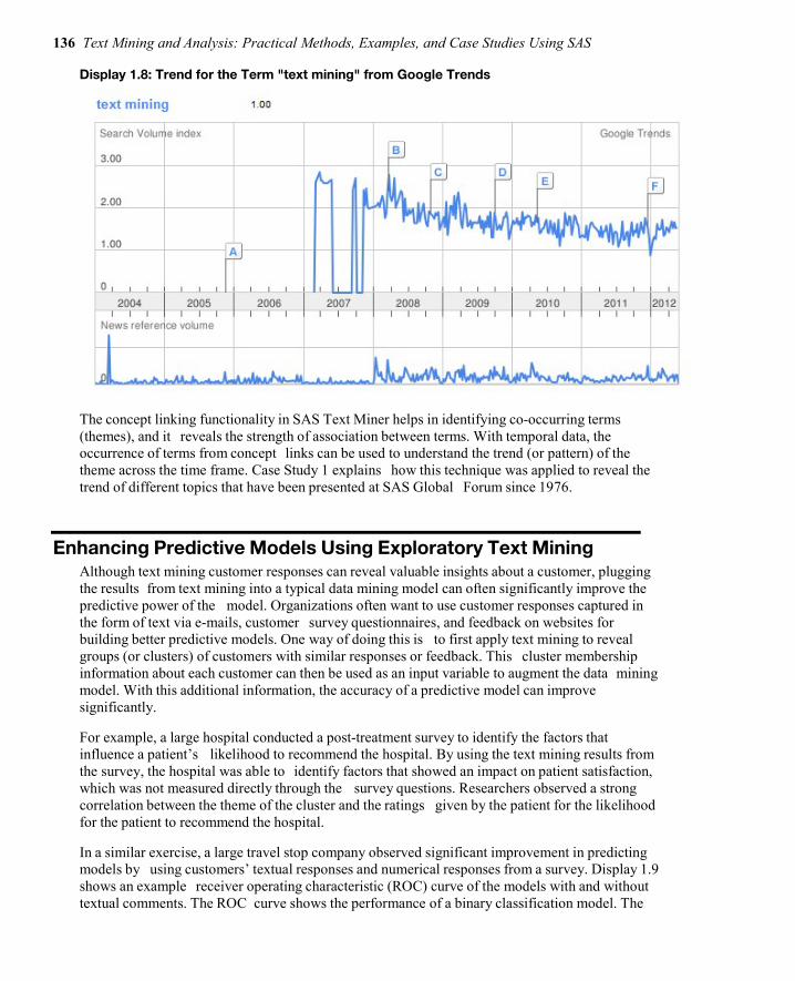
136 Text Mining and Analysis: Practical Methods, Examples, and Case Studies Using SAS
Display 1.8: Trend for the Term "text mining" from Google Trends
The concept linking functionality in SAS Text Miner helps in identifying co-occurring terms (themes), and it reveals the strength of association between terms. With temporal data, the occurrence of terms from concept links can be used to understand the trend (or pattern) of the theme across the time frame. Case Study 1 explains how this technique was applied to reveal the trend of different topics that have been presented at SAS Global Forum since 1976.
Enhancing Predictive Models Using Exploratory Text Mining Although text mining customer responses can reveal valuable insights about a customer, plugging the results from text mining into a typical data mining model can often significantly improve the predictive power of the model. Organizations often want to use customer responses captured in the form of text via e-mails, customer survey questionnaires, and feedback on websites for building better predictive models. One way of doing this is to first apply text mining to reveal groups (or clusters) of customers with similar responses or feedback. This cluster membership information about each customer can then be used as an input variable to augment the data mining model. With this additional information, the accuracy of a predictive model can improve significantly.
For example, a large hospital conducted a post-treatment survey to identify the factors that influence a patient’s likelihood to recommend the hospital. By using the text mining results from the survey, the hospital was able to identify factors that showed an impact on patient satisfaction, which was not measured directly through the survey questions. Researchers observed a strong correlation between the theme of the cluster and the ratings given by the patient for the likelihood for the patient to recommend the hospital.
In a similar exercise, a large travel stop company observed significant improvement in predicting models by using customers’ textual responses and numerical responses from a survey. Display 1.9 shows an example receiver operating characteristic (ROC) curve of the models with and without textual comments. The ROC curve shows the performance of a binary classification model. The
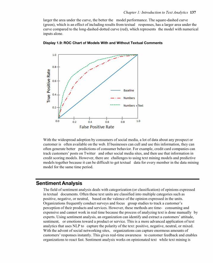
Chapter 1: Introduction to Text Analytics 137
larger the area under the curve, the better the model performance. The square-dashed curve (green), which is an effect of including results from textual responses, has a larger area under the curve compared to the long-dashed-dotted curve (red), which represents the model with numerical inputs alone.
Display 1.9: ROC Chart of Models With and Without Textual Comments
With the widespread adoption by consumers of social media, a lot of data about any prospect or customer is often available on the web. If businesses can cull and use this information, they can often generate better predictions of consumer behavior. For example, credit card companies can track customers’ posts on Twitter and other social media sites, and then use that information in credit scoring models. However, there are challenges to using text mining models and predictive models together because it can be difficult to get textual data for every member in the data mining model for the same time period.
Sentiment Analysis The field of sentiment analysis deals with categorization (or classification) of opinions expressed in textual documents. Often these text units are classified into multiple categories such as positive, negative, or neutral, based on the valence of the opinion expressed in the units. Organizations frequently conduct surveys and focus group studies to track a customer’s perception of their products and services. However, these methods are time- consuming and expensive and cannot work in real time because the process of analyzing text is done manually by experts. Using sentiment analysis, an organization can identify and extract a customers’ attitude, sentiment, or emotions toward a product or service. This is a more advanced application of text analytics that uses NLP to capture the polarity of the text: positive, negative, neutral, or mixed. With the advent of social networking sites, organizations can capture enormous amounts of customers’ responses instantly. This gives real-time awareness to customer feedback and enables organizations to react fast. Sentiment analysis works on opinionated text while text mining is

138 Text Mining and Analysis: Practical Methods, Examples, and Case Studies Using SAS
good for factual text. Sentiment analysis, in combination with other text analytics and data mining techniques, can reveal very valuable insights.
Sentiment analysis tools available from SAS offer a very comprehensive solution to capture, analyze, and report customer sentiments. The polarity of the document is measured at the overall document level and at the specific feature level.
Here is an example showing the results of a sentiment analysis on a customer’s review of a new TV brand:
In the previous text, green color represents positive tone, red color represents negative tone, and product features and model names are highlighted in blue and brown, respectively. In addition to extracting positive and negative sentiments, names of product models and their features are identified. This level of identification helps identify the sentiment of the overall document and tracks the sentiment at a product-feature level, including the characteristics and sub-attributes of features.
“Chapter 8 Sentiment Analysis” discusses sentiment analysis using SAS Sentiment Analysis Studio through an example of tracking sentiment in feedback comments from customers of a leading travel stop company.
Emerging Directions Although the number of applications in text analytics has grown in recent years, there continues to be a high level of excitement about text analytics applications and research. For example, many of the papers presented at the Analytics 2011 Conference and SAS Global Forum 2013 were based on different areas of text analytics. In a way, the excitement about text analytics reminds us of the time when data mining and predictive modeling was taking off at business and academic conferences in the late 90s and early 2000s. The text analytics domain is constantly evolving with new techniques and new applications. Text analytics solutions are being adopted at the enterprise level and are being used to operationalize and integrate the voice of the customer into business processes and strategies. Many enterprise solution vendors are integrating some form of text analytics technology into their product line. This is evident from the rate of acquisitions in this industry. One of the key reasons that is fueling the growth of the field of text analytics is the increasing amount of unstructured data that is being generated on the web. It is expected that 90% of the digital content in the next 10 years will be unstructured data.
Companies across all industries are looking for solutions to handle the massive amounts of data, also popularly known as big data. Data is generated constantly from various sources such as transaction systems, social media interactions, clickstream data from the web, real-time data captured from sensors, geospatial information, and so on. As we have already pointed out, by some estimates, 80% of an organization’s current data is not numeric!
Chapter 1: Introduction to Text Analytics 139
This means that the variety of data that constitutes big data is unstructured. This unstructured data comes in various formats: text, audio, video, images, and more. The constant streaming of data on social media outlets and websites means the velocity at which data is being generated is very high. The variety and the velocity of the data, together with the volume (the massive amounts) of the data organizations need to collect, manage, and process in real time, creates a challenging task. As a result, the three emerging applications for text analytics will likely address the following:
1. Handling big (text) data 2. Voice mining 3. Real-time text analytics
Handling Big (Text) Data Based on the industry’s current estimations, unstructured data will occupy 90% of the data by volume in the entire digital space over the next decade. This prediction certainly adds a lot of pressure to IT departments, which already face challenges in terms of handling text data for analytical processes. With innovative hardware architecture, analytics application architecture, and data processing methodologies, high-performance computing technology can handle the complexity of big data. SAS High-Performance Text Mining helps you decrease the computational time required for processing and analyzing bulk volumes of text data significantly. It uses the combined power of multithreading, a distributed grid of computing resources, and in-memory processing. Using sophisticated implementation methodologies such as symmetric multiprocessing (SMP) and massively parallel processing (MPP), data is distributed across computing nodes. Instructions are allowed to execute separately on each node. The results from each node are combined to produce meaningful results. This is a cost-effective and highly scalable technology that addresses the challenges posed by the three Vs. (variety, velocity, and volume) of big data.
SAS High-Performance Text Mining consists of three components for processing very large unstructured data. These components are document parsing, term handling, and text processing control. In the document parsing component, several NLP techniques (such as parts-of-speech tagging, stemming, etc.) are applied to the input text to derive meaningful information. The term handling component accumulates (corrects misspelled terms using a synonyms list), filters (removes terms based on a start or stop list and term frequency), and assigns weights to terms. The text processing control component manages the intermediate results and the inputs and outputs generated by the document parsing and term handling components. It helps generate the term-by- document matrix in a condensed form. The term-by-document matrix is then summarized using the SVD method, which produces statistical representations of text documents. These SVD scores can be later included as numeric inputs to different types of models such as cluster or predictive models.
Voice Mining Customer feedback is collected in many forms—text, audio, and video—and through various sources—surveys, e-mail, call center, social media, etc. Although the technology for analyzing videos is still under research and development, analyzing audio (also called voice mining) is gaining momentum. Call centers (or contact centers) predominantly use speech analytics to analyze the audio signal for information that can help improve call center effectiveness and efficiency. Speech analytics software is used to review, monitor, and categorize audio content. Some tools use phonetic index search techniques that automatically transform the audio signal into

140 Text Mining and Analysis: Practical Methods, Examples, and Case Studies Using SAS
a sequence of phonemes (or sounds) for interpreting the audio signal and segmenting the feedback using trigger terms such as “cancel,” “renew,” “open account,” etc. Each segment is then analyzed by listening to each audio file manually, which is daunting, time-intensive, and nonpredictive. As a result, analytical systems that combine data mining methods and linguistics techniques are being developed to quickly determine what is most likely to happen next (such as a customer’s likelihood to cancel or close the account). In this type of analysis, metadata from each voice call, such as call length, emotion, stress detection, number of transfers, etc., that is captured by these systems can reveal valuable insights.
Real-Time Text Analytics Another key emerging focus area that is being observed in text analytics technology development is real-time text analytics. Most of the applications of real-time text analytics are addressing data that is streaming continuously on social media. Monitoring public activity on social media is now a business necessity. For example, companies want to track topics about their brands that are trending on Twitter for real-time ad placement. They want to be informed instantly when their customers post something negative about their brand on the Internet. Less companies want to track news feeds and blog posts for financial reasons. Government agencies are relying on real-time text analytics that collect data from innumerate sources on the web to learn about and predict medical epidemics, terrorist attacks, and other criminal actions. However, real time can mean different things in different contexts. For companies involved in financial trading by tracking current events and news feeds, real time could mean milliseconds. For companies tracking customer satisfaction or monitoring brand reputation by collecting customer feedback, real time could mean hourly. For every business, it is of the utmost importance to react instantly before something undesirable occurs.
The future of text analytics will surely include the next generation of tools and techniques with increased usefulness for textual data collection, summarization, visualization, and modeling. Chances are these tools will become staples of the business intelligence (BI) suite of products in the future. Just as SAS Rapid Predictive Modeler today can be used by business analysts without any help from trained statisticians and modelers, so will be some of the future text analytics tools. Other futuristic trends and applications of text analytics are discussed by Berry and Kogan (2010).
Summary Including textual data in data analysis has changed the analytics landscape over the last few decades. You have witnessed how traditional machine learning and statistical methods to learn unknown patterns in text data are now replaced with much more advanced methods combining NLP and linguistics. Text mining (based on a traditional bag-of-words approach) has evolved into a much broader area (called text analytics). Text analytics
is regarded as a loosely integrated set of tools and methods developed to retrieve, cleanse, extract, organize, analyze, and interpret information from a wide range of data sources. Several techniques have evolved, with each focused to answer a specific business problem based on textual data. Feature extraction, opinion mining, document classification, information extraction, indexing, searching, etc., are some of the techniques that we have dealt with in great detail in this chapter. Tools such as SAS Text Miner, SAS Sentiment Analysis Studio, SAS Content Categorization, SAS Crawler, and SAS Search and Indexing are mapped to various analysis methods. This information helps you distinguish and differentiate the specific functionalities and

Chapter 1: Introduction to Text Analytics 141
features that each of these tools has to offer while appreciating the fact that some of them share common features.
In the following chapters, we use SAS Text Analytics tools (except SAS Ontology Management, which is not discussed in this book) to address each methodology discussed in this chapter. Chapters are organized in a logical sequence to help you understand the end-to-end processes involved in a typical text analysis exercise. In Chapter 2, we introduce methods to extract information from various document sources using SAS Crawler. We show you how to deal with the painstaking tasks of cleansing, collecting, transforming, and organizing the unstructured text into a semi-structured format to feed that information into other SAS Text Analytics tools. As you progress through the chapters, you will get acquainted with SAS Text Analytics tools and methodologies that will help you adapt them at your organization.
References Albright, R., Bieringer, A., Cox, J., and Zhao, Z. 2013. “Text Mine Your Big Data: What High
Performance Really Means”. Cary, NC: SAS Institute Inc. Available at: http://www.sas.com/content/dam/SAS/en_us/doc/whitepaper1/text-mine-your-big-data-106554.pdf
Berry, M.W., and Kogan, J. Eds. 2010. Text Mining: Applications and Theory. Chichester, United Kingdom: John Wiley & Sons.
Dale, R., Moisl, H. and Somers, H. 2000. Handbook of Natural Language Processing. New York: Marcel Dekker.
Dorre, J. Gerstl, P., and Seiffert, R. 1999. “Text Mining: Finding Nuggets in Mountains of Textual Data”.
KDD-99: Proceedings of the Fifth ACM SIGKDD International Conference on Knowledge Discovery and Data Mining. San Diego, New York: Association for Computing Machinery, 398-401.
Evangelopoulos, N., and Woodfield, T. 2009. “Understanding Latent Semantics in Textual Data”. M2009 12th Annual Data Mining Conference, Las Vegas, NV.
Feldman, R. 2004. “Text Analytics: Theory and Practice”. ACM Thirteenth Conference on Information and Knowledge Management (CIKM) CIKM and Workshops 2004. Available at: http://web.archive.org/web/20041204224205/http://go.sas.com/65646.002
Grimes, S. 2007. “What’s Next for Text. Text Analytics Today and Tomorrow: Market, Technology, and Trends”. Text Analytics Summit 2007.
Halper, F.,Kaufman, M., and Kirsh, D. 2013. “Text Analytics: The Hurwitz Victory Index Report”. Hurwitz & Associates 2013. Available at: http://www.sas.com/news/analysts/Hurwitz_Victory_Index- TextAnalytics_SAS.PDF
H.P.Luhn. 1958. “The Automatic Creation of Literature Abstracts”. IBM Journal of Research and Development, 2(2):159-165.
Manning, C. D., and Schutze, H. 1999. Foundations of Statistical Natural Language Processing. Cambridge, Massachusetts: The MIT Press.
McNeill, F. and Pappas, L. 2011. “Text Analytics Goes Mobile”. Analytics Magazine, September/October 2011. Available at: http://go.sas.com/65646.003 goes-mobile

142 Text Mining and Analysis: Practical Methods, Examples, and Case Studies Using SAS
Mei, Q. and Zhai, C. 2005. “Discovering Evolutionary Theme Patterns from Text: An Exploration of Temporal Text Mining”. KDD 05: Proceedings of the Eleventh ACM SIGKDD International Conference on Knowledge Discovery in Data Mining, 198 – 207.
Miller, T. W, 2005. Data and Text Mining: A Business Applications Approach. Upper Saddle River, New Jersey: Pearson Prentice Hall.
Radovanovic, M. and Ivanovic, M. 2008. “Text Mining: Approaches and Applications”. Novi Sad Journal of Mathematics. Vol. 38: No. 3, 227-234.
Salton, G., Allan, J., Buckley C., and Singhal, A. 1994. “Automatic Analysis, Theme Generation, and Summarization of Machine-Readable Texts”. Science, 264.5164 (June 3): 1421-1426.
SAS® Ontology Management, Release 12.1. Cary, NC: SAS® Institute Inc. Shaik, Z., Garla, S., Chakraborty, G. 2012. “SAS® since 1976: an Application of Text Mining to
Reveal Trends”. Proceedings of the SAS Global Forum 2012 Conference. SAS Institute Inc., Cary, NC.
Text Analytics Using SAS® Text Miner. Course Notes. Cary, NC, SAS Institute. Inc. Course information: https://support.sas.com/edu/schedules.html?ctry=us&id=1224
Text Analytics Market Perspective. White Paper, Cary, NC: SAS Institute Inc. Available at: http://smteam.sas.com/xchanges/psx/platform%20sales%20xchange%20on%20demand%20%202007%20sessions/text%20analytics%20market%20perspective.doc
Wakefield, T. 2004. “A Perfect Storm is Brewing: Better Answers are Possible by Incorporating Unstructured Data Analysis Techniques.” DM Direct Newsletter, August 2004.
Weiss S, Indurkhya N, Zhang T, and Damerau F. 2005. Text Mining: Predictive Methods for Analyzing Unstructured Information. Springer-Verlag.

Chapter 1: Introduction to Text Analytics 143
Full book available for purchase here.
Use EXBDL for a 25% discounted purchase of this book. Free shipping available in the US. For International orders please contact us directly.
Big data: It's unstructured, it's coming at you fast, and there's lots of it. In fact, the majority of big data is text-oriented, thanks to the proliferation of online sources such as blogs, emails, and social media.
However, having big data means little if you can't leverage it with analytics. Now you can explore the large volumes of unstructured text data that your organization has collected with Text Mining and Analysis: Practical Methods, Examples, and Case Studies Using SAS.
This hands-on guide to text analytics using SAS provides detailed, step-by-step instructions and explanations on how to mine your text data for valuable insight. Through its comprehensive approach, you'll learn not just how to analyze your data, but how to collect, cleanse, organize, categorize, explore, and interpret it as well. Text Mining and Analysis also features an extensive set of case studies, so you can see examples of how the applications work with real-world data from a variety of industries.
Text analytics enables you to gain insights about your customers' behaviors and sentiments. Leverage your organization's text data, and use those insights for making better business decisions with Text Mining and Analysis.

Causality Tests Analyses might begin by exploring, visualizing, and correlating. But ultimately, we'll often want to identify the causes that determine why things are the way they are over time. When modeling events that occur over time and you suspect an underlying pattern, such as a seasonal variation, you can organize your data in a time series.
It is often hard to establish causality relations among variables. However, in a time series context, this can be done by testing that the cause (or reason) occurs before the event (or consequence). The Nobel Prize winner, Clive W. J. Granger, argues that a time series X is said to cause Y if it can be shown that those X values provide statistically significant information about future values of Y; but not vice versa. This testing is done within a time series model that takes care of trend and seasonality, and, if necessary, also the influence of other variables.
The following chapter presents a short example that illustrates that causality in economics can be tested for by measuring the ability to predict the future values of a time series using prior values of another time series.
Anders Milhøj is associate professor in the Department of Economics at the University of Copenhagen, where he conducts research and lectures on applied statistics topics including survey sampling, regression analysis, time series analysis, and factor analysis. A SAS user since 1984, he employs a variety of SAS procedures in his work, such as SAS/STAT, SAS/IML, SAS/ETS, and SAS/OR. He holds university degrees in statistics and mathematics, as well as a Ph.D. in statistics, all from the University of Copenhagen.
http://support.sas.com/publishing/authors/milhoj.html

Chapter 11: Casualty Tests for the Danish Egg Market 147
Chapter 8: Causality Tests for the Danish Egg Market
Introduction ............................................................................................ 147
The Danish Egg Market ........................................................................... 148
Formulation of the VARMA Model for the Egg Market Data ..................... 149 Estimation Results ................................................................................................ 150 Model Fit ................................................................................................................ 151
Causality Tests of the Total Market Series ............................................. 152
Granger Causality Tests in the VARMAX Procedure ................................ 153
Causality Tests of the Production Series ................................................ 154
Causality Tests That Use Extended Information Sets ............................. 156
Estimation of a Final Causality Model ..................................................... 157
Fit of the Final Model .............................................................................. 159
Conclusion .............................................................................................. 160
Introduction In this chapter, some historical time series for the Danish egg market are analyzed. The analysis is intended to study the interdependence between the price of eggs and the production of eggs. Economic theory says that increasing prices lead to increasing production, and increasing production leads to decreasing prices. The example is chosen to demonstrate how the VARMAX procedure is used for testing causality.
You will see that the production series seems to affect the price series and that this effect includes lags but not vice versa. When you see a lagged effect one way but not the other way, the situation
Full book available for purchase here. Use EXBDL for a 25% discounted purchase of this book. For International orders please contact us directly.

148 Multiple Time Series Modeling Using the SAS VARMAX Procedure
is intuitively a causality because the reason comes before the reaction. This situation is a simple example of Granger causality. The hypothesis is easily tested by using PROC VARMAX.
Two series for general Danish agricultural production are included in the analysis, leading to a total of four time series. In this setup, the Granger Causality is extended to allow for different information sets.
The Danish Egg Market In this section, a Vector Autoregressive Moving Average (VARMA) model is estimated for four monthly series that are related to the Danish egg market in the years 1965–1976.
You will find the data series in the data set EGG in the library SASMTS. The data set consists of four series of 144 observations:
● QEGG is an index of the produced quantity of eggs. ● PEGG is an index of the price of eggs. ● QTOT is an index of the quantity of the total agricultural production. ● PTOT is an index of the price of the total agricultural production. ● DATE is the month of the observation in a SAS date variable. The date is programmed as
the 15th of every month, but the format prints only the month. All series are published as indices, so they are all measured in the same unit. In other words, units are of no importance.
Program 11.1 plots the four series in an overlaid plot using PROC SGPLOT. The four series are plotted with different markers and colors.
Program 11.1: Plotting the Four Series Using PROC SGPLOT.
PROC SGPLOT DATA=SASMTS.EGG; SERIES Y=QEGG X=DATE/MARKERS MARKERATTRS=(SYMBOL=CIRCLE COLOR=BLUE); SERIES Y=PEGG X=DATE/MARKERS MARKERATTRS=(SYMBOL=TRIANGLE COLOR=RED); SERIES Y=QTOT X=DATE/MARKERS MARKERATTRS=(SYMBOL=SQUARE COLOR=GREEN); SERIES Y=PTOT X=DATE/MARKERS MARKERATTRS=(SYMBOL=HASH COLOR=BROWN); RUN;
You can see in Figure 11.1 that the series, at least to some extent, have trends and that seasonal effects are present, which is to be expected. Classical Box-Jenkins techniques identify that a first-order difference should be applied to explain the trends, and seasonal AR models can be used for the seasonality. In the following sections, the series are analyzed using the facilities in PROC VARMAX.

Chapter 11: Casualty Tests for the Danish Egg Market 149
Figure 11.1: An Overlaid Plot of the Four Series
Formulation of the VARMA Model for the Egg Market Data In the plot of the price series (Figure 11.1), it is obvious that the price rose rapidly in the first months of 1973. This is a well-established fact because Denmark entered the European Union on January 1, 1973, mainly in order to help the farmers. Events with such a significant and easily understood impact on the time series are best modeled as exogenous. In this situation, the effect is seen in positive changes of the price index series for some months. One way to model this is simply to include dummy variables for the event, by the variable EUDUMMY in Program 11.2. This variable is then applied only for the total price series. The four variables are separated by commas in the MODEL statement to make sure that the right side variable EUDUMMY applies only to the left side variable PTOT.
In this example, the same order of differencing is applied to all four series. This is mainly because it is easier to understand the final model if all the series in the model are of the same integration order. The order of differencing is explicitly stated for each of the four series in the parentheses after the DIF option.
Of course, monthly data for time series from the agricultural sector includes seasonality patterns. An easy way to correct for the seasonality in the model is to include seasonal dummies. This method gives a model for deterministic seasonality. This is in contrast to stochastic seasonal effects, which are modeled by multiplicative seasonal models. In the application of PROC VARMAX in Program 11.2, seasonal dummy variables are included with the option NSEASON=12 to the MODEL statement (in this example, for monthly observations). The option NSEASON=12 establishes 11 dummy variables using the first available month in the estimation data set as the reference. This method of using dummies is usually applied to model seasonality by PROC VARMAX. Multiplicative Seasonal models are not supported by PROC VARMAX because they are too involved in the case of multivariate series.

150 Multiple Time Series Modeling Using the SAS VARMAX Procedure
The option LAGMAX=25 in the MODEL statement states that residual autocorrelations and portmanteau tests of model fit are calculated for lags up to 25 and not just up to the default value, LAGMAX=12. This higher value is chosen because model deficits for seasonal time series are often seen around lags twice the seasonal length, which is 12 in this particular model.
The choice of the order, p, for the autoregressive part and the order, q, for the moving average part of the VARMA(p,q) model can be determined in many ways. The automatic detection of model order is technically hard to perform in this situation because estimating a model that includes both autoregressive and moving average terms, p > 0 and q > 0, produces numerically unstable results. The number of parameters is huge, having 12 seasonal dummies for each of the four series and 16 extra parameters for each lag in the autoregressive model. So the order of the autoregressive is chosen as p = 2. In the DATA step in Program 11.2, the dummy variable EUDUMMY is defined. In Program 11.2, this intervention is allowed to act with up to 3 lags by the option XLAG=3 because the effect was not immediate but rather spread over some months. The application of PROC VARMAX in Program 11.2 includes all these mentioned options.
Program 11.2: Defining a Dummy Variable and a Preliminary Estimation of a VARMA(2,0) Model
DATA DUMMY; SET SASMTS.EGG; EUDUMMY=0; IF YEAR(DATE)=1973 AND MONTH(DATE)=1 THEN EUDUMMY=1; RUN; PROC VARMAX DATA=DUMMY PRINT=ALL PLOTS=ALL ; MODEL QEGG, PEGG, QTOT, PTOT=EUDUMMY/DIF=(QEGG(1) PEGG(1) QTOT(1) PTOT(1)) NSEASON=12 P=2 LAGMAX=25 XLAG=3 METHOD=ML; ID DATE INTERVAL=MONTH; RUN;
Estimation Results The model contains many parameters, but the schematic presentation (Output 11.1) gives the overall picture. In Output 11.1, the periods (.) indicate insignificant parameters; the signs + and - indicate significant parameters at a 5% level. Many parameters are insignificant, which leads to the conclusion that the autoregressive part of the model is over-parameterized. The many stars (*) for the exogenous variable EUDUMMY denote parameters that are excluded from the model because the variable EUDUMMY in Program 11.2 affects only the last variable—that is, the total price variable PTOT. In the output, XL0, XL1, and so on are short for eXogenous at lags 0, 1, and so on.

Chapter 11: Casualty Tests for the Danish Egg Market 151
Output 11.1: Schematic Presentation of the Significant Parameters
Model Fit This second-order autoregressive model, however, gives a satisfactory fit to the first 25 residual autocorrelations and cross-correlations, as displayed schematically in Output 11.2. (Output 11.2 presents the correlations only up to lag 12.) Few elements are significantly different from zero because they are numerically larger than twice their standard error. This is indicated by – or + in the schematic representation of the residual autocorrelations in Output 11.2. The remaining cross-correlations are all insignificant at a 5% level, which is indicated by a period (.) in Output 11.2. The major problem is found at lag 11. Portmanteau tests for cross-correlations in the residuals reject the model fit because the squares of the many minor cross-correlations are accumulated. The output of the portmanteau tests for lags up to 25 are too voluminous to quote in this text.
Output 11.2: Significance of the Cross-Correlations
Of course, the fit gets better if the model is extended by autoregressive parameters for lag 11 and 12, but this would be a severe over-parameterization. The lack of fit can also be mended if some minor outliers are taken into account in the model. But all such remedies for repairing a lack of fit that do not point at specific, important model failures seem to be a waste of energy.
The model includes many parameters that have to be estimated: 2 × 16 autoregressive parameters and 4 × 11 seasonal dummy parameters, 4 parameters for the EUDUMMY, and a residual covariance matrix. So the table of estimates is not shown here because it is evident that the model is heavily over-parameterized, when every series affects all series at lags 1 to 2 in the autoregressive part. Moreover, the seasonal structure is not that significant. Far too many nonsignificant parameters are included in the model.
As in Chapter 9, it is then natural to test whether many parameters are superfluous to the model fit. When judged from Output 11.1, such testing could lead to a four-dimensional autoregressive model of order p = 2 for the QTOT variable. But for the other three series, the model order is probably much lower. The technique behind this form of model selection is demonstrated for the two-dimensional model in Chapter 9, so this will not be pursued in this chapter. Instead, we will

152 Multiple Time Series Modeling Using the SAS VARMAX Procedure
rethink the purpose of the model building and in this way formulate some model simplifications in the next section.
Causality Tests of the Total Market Series The Danish production of eggs is very small compared with the other sectors of Danish agricultural production. This means that it is impossible that the size and pricing at the egg market could have any influence on the size and pricing of the total agricultural production. On the other hand, it is natural to think that the egg market is influenced by the overall state of the total agricultural market.
In econometric terms, the total agricultural production is probably exogenous to the egg market. Intuitively, the term exogenous means that a variable is generated outside the model at hand. A typical example is that the oil price in the world market can affect the price of bus tickets in Copenhagen; but the price of bus tickets in Copenhagen can in no way affect the oil price. But in econometric theory, the discussion of exogeneity is more involved than this simple example.
In the present context, this possible causality means that it is pointless to set up a simultaneous model for all four series. Two models, one for the two-dimensional total agricultural market and one for the two-dimensional egg market, suffice. If only the egg market is of interest, the model for the total agricultural market is of no direct interest. Then the output of the total agricultural market can be taken as input to the model for the egg market. In regression terms, the two series for the total agricultural market can be included as right side variables in the model for the egg market. A model of this kind with the total agricultural market as a right side variable is an example of the X in the name of PROC VARMAX because the right side variable is considered as eXogenous.
However, testing is necessary to determine whether this is the case. According to the model structure, the immediate impact from the total agricultural market of the egg market is modeled by the four-dimensional covariance matrix for the four remainder terms. Such correlations are by nature not directly interpreted as causal, because correlation can be directed both ways. If some of the coefficients that correspond to effects from the egg market series to the total agricultural market series are different from zero, the present status of the egg market has influence on future values of the total market. If this is the case, the total market for agricultural products cannot be exogenous.
The hypothesis of a lagged effect is tested by testing the hypothesis that a particular two-by-two block of every autoregressive coefficient matrix is zero. In a formal mathematical formulation, causality from the series X3 and X4 (the series for the total Danish agricultural production) for the variables X1 and X2 (the series for the Danish egg market) is expressed as follows. The basic model is a VARMA(p,0) model:
1 1 ..t t p t p t− −− − − =X φ X φ X ε
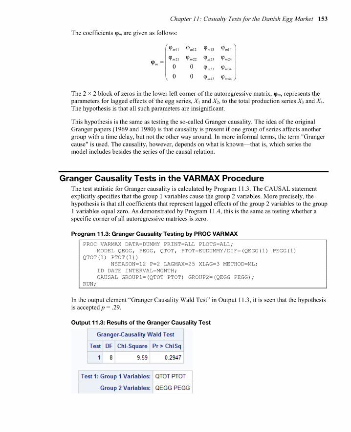
Chapter 11: Casualty Tests for the Danish Egg Market 153
The coefficients φm are given as follows:
11 12 13 14
21 22 23 24
33 34
43 44
φ φ φ φφ φ φ φ
0 0 φ φ0 0 φ φ
m m m m
m m m mm
m m
m m
=
φ
The 2 × 2 block of zeros in the lower left corner of the autoregressive matrix, φm, represents the parameters for lagged effects of the egg series, X1 and X2, to the total production series X3 and X4. The hypothesis is that all such parameters are insignificant.
This hypothesis is the same as testing the so-called Granger causality. The idea of the original Granger papers (1969 and 1980) is that causality is present if one group of series affects another group with a time delay, but not the other way around. In more informal terms, the term "Granger cause" is used. The causality, however, depends on what is known—that is, which series the model includes besides the series of the causal relation.
Granger Causality Tests in the VARMAX Procedure The test statistic for Granger causality is calculated by Program 11.3. The CAUSAL statement explicitly specifies that the group 1 variables cause the group 2 variables. More precisely, the hypothesis is that all coefficients that represent lagged effects of the group 2 variables to the group 1 variables equal zero. As demonstrated by Program 11.4, this is the same as testing whether a specific corner of all autoregressive matrices is zero.
Program 11.3: Granger Causality Testing by PROC VARMAX
PROC VARMAX DATA=DUMMY PRINT=ALL PLOTS=ALL; MODEL QEGG, PEGG, QTOT, PTOT=EUDUMMY/DIF=(QEGG(1) PEGG(1) QTOT(1) PTOT(1)) NSEASON=12 P=2 LAGMAX=25 XLAG=3 METHOD=ML; ID DATE INTERVAL=MONTH; CAUSAL GROUP1=(QTOT PTOT) GROUP2=(QEGG PEGG); RUN;
In the output element “Granger Causality Wald Test” in Output 11.3, it is seen that the hypothesis is accepted p = .29.
Output 11.3: Results of the Granger Causality Test

154 Multiple Time Series Modeling Using the SAS VARMAX Procedure
This test for Granger causality is equivalent to testing the hypothesis that the lower, left 2 × 2 corners of the autoregressive coefficient matrices in Output 11.1 are zero. The hypothesis of Granger causality can alternatively be tested by an explicit specification of the zero elements in the matrices as in Program 11.4.
Program 11.4: Testing Hypothesis of Causality Directly
PROC VARMAX DATA=DUMMY PRINT=ALL PLOTS=ALL; MODEL QEGG, PEGG, QTOT, PTOT=EUDUMMY/DIF=(QEGG(1) PEGG(1) QTOT(1) PTOT(1)) NSEASON=12 P=2 LAGMAX=25 XLAG=3 METHOD=ML; TEST AR(1,3,1)=0,AR(1,4,1)=0,AR(1,3,2)=0,AR(1,4,2)=0, AR(2,3,1)=0, AR(2,4,1)=0,AR(2,3,2)=0,AR(2,4,2)=0; RUN;
In Output 11.4, it is seen that the testing results are equal to the test results of the Granger causality in Output 11.3, although the reported test statistic s is not exactly equal. The notion of Granger causality and the causal statement in PROC VARMAX are, in this light, only a smart way to drastically reduce the number of parameters. But by intuition, this test setup serves two purposes: it reduces the number of parameters, but it it also tells the user something important about the data series.
Output 11.4: Simultaneous Test Results for Program 11.4
The conclusion of this part of the analysis is that the two series relating to the total agricultural production in Denmark, QTOT and PTOT, do Granger-cause the series for the egg production QEGG and PEGG. For this reason, QTOT and PTOT can be specified as independent variables in models for the egg market, because their own statistical variation is of no interest for the models of the eggs. If the series QTOT and PTOT for total production are included as right side variables in a model for the two egg series QEGG and PEGG, then they are considered deterministic in the model, and the model then has nothing to tell about their statistical variation. You could say that these two series for the total agricultural production are exogenous. For proper definitions of various forms of the concept of exogeneity, see Engle, Hendry, and Richard (1983).
Causality Tests of the Production Series In the following application of PROC VARMAX (Program 11.5), the series QTOT and PTOT are used as right side variables in the model statement. Because the exogenous variables apply to both output series, no separation of the right side variables by commas is needed. The number of lags of the input series is specified as 2 by the option XLAG=2 in the model statement. This lag length applies to both input series. In this model, the variable PTOT is used as an independent variable. This is the reason that the dummy variable for EU membership is unnecessary in this application.

Chapter 11: Casualty Tests for the Danish Egg Market 155
Program 11.5: Specifying Exogenous Variables
PROC VARMAX DATA=SASMTS.EGG PRINTALL; MODEL QEGG PEGG = QTOT PTOT/DIF=(QEGG(1) PEGG(1) QTOT(1) PTOT(1)) NSEASON=12 P=2 LAGMAX=25 XLAG=2 METHOD=ML; RUN;
Output 11.5 presents the estimated autoregressive parameters as matrices in a table. The estimated autoregressive parameters tell us that the series PEGG is influenced by the series QEGG at lag one and two because φ121 = AR(1,2,1) = −1.50 and φ221 = AR(2,2,1) = − .61 are both negative. The negative sign tells that if the production increases, then in most cases the price will decrease. In this case, the lower price also is seen to include lagged effects up to lag 2 . But this presentation in matrix form shows that no important lagged influence is present for the price series PEGG to the production series QEGG.
Output 11.5: The Autoregressive Parameters Shown in Matrix Form
This argument says nothing about the correlation at lag zero, which is estimated to ρ = −.23. But this correlation can be directed both ways because no lags are involved. This correlation matrix for the residual series is printed as the lag zero part of the cross-correlation function. The correlation, −.23, is easily calculated from the printed covariance matrix for the innovations (Output 11.6), as follows:
2.56ρ= .234.35 28.05−
= −×
Output 11.6: The Error Covariance Matrix

156 Multiple Time Series Modeling Using the SAS VARMAX Procedure
Causality Tests That Use Extended Information Sets The findings from Output 11.5 can once again be interpreted as a Granger causality, this time showing that the produced quantity of egg Granger-causes the price of egg. This conclusion is drawn because no lagged effect of the price series is included in the model for the produced quantities of the series. In the model, the total market for agricultural products is included as right side variables. So the conclusion is drawn when the egg series are adjusted by observations of the total market for agricultural products. In the notation of Granger causality, it is then said that the causality of the produced quantity of eggs to the price of eggs is present in the information set defined by the two series for the total market for agricultural products.
This hypothesis is tested by Program 11.6, again using a causality statement. For comparison, the opposite hypothesis that the production does not Granger-cause the price is also tested by the second application of PROC VARMAX in Program 11.6.
Program 11.6: Testing the Direction of Causalities Between the Price and the Quantity Series
PROC VARMAX DATA=SASMTS.EGG; MODEL QEGG PEGG = QTOT PTOT/DIF=(QEGG(1) PEGG(1) QTOT(1) PTOT(1)) NSEASON=12 P=2 XLAG=2 METHOD=ML; CAUSAL GROUP1=(QEGG) GROUP2=(PEGG); RUN; PROC VARMAX DATA=SASMTS.EGG; MODEL QEGG PEGG = QTOT PTOT/DIF=(QEGG(1) PEGG(1) QTOT(1) PTOT(1)) NSEASON=12 P=2 XLAG=2 METHOD=ML; CAUSAL GROUP1=(PEGG) GROUP2=(QEGG); RUN;
The Outputs 11.7 and 11.8 show that the p-value for the first test is as high as p = .64, while the hypothesis in the second test is rejected with a p-value below .0001. You can then conclude that the production series, QEGG, does in fact Granger-cause the price series, PEGG, but not vice versa. This conclusion is drawn while controlling for the effect of production and price series for the total agricultural market because they are used as right side variables in the model estimated by Program 11.6 for both egg series.
Output 11.7: Testing Causality of the Quantity Series

Chapter 11: Casualty Tests for the Danish Egg Market 157
Output 11.8: Testing Causality of the Price Series
This direction of the causality is understandable because prices can be quickly adjusted, but the production is difficult to change. This means that high production quickly leads to lower prices; but the production facilities have difficulties in increasing the production when the prices are increasing.
Estimation of a Final Causality Model The model that also uses the produced quantity of eggs, QEGG, as a right side variable is estimated in Program 11.7. It turns out that some of the parameters in this model can be set to zero. For instance, the explanatory variable QTOT for the total Danish agricultural production is unnecessary in the model because it affects none of the egg series. In Program 11.7, a test for this hypothesis is further included in the TEST statement.
In the TEST statement, the (1,2) entries of the matrix of parameters for the exogenous variables at lags 0, 1, and 2 are all hypothesized to 0. The (1,2) entries are the parameters from the second exogenous parameter to the first (the only) endogenous variable. The notation for the exogenous variables is that, for instance, XL(2,1,2) is the coefficient at lag 2 to the first endogenous (the right side variable) from the second exogenous variable (left side variable).
Program 11.7: Testing the Significance of the Total Production Series
PROC VARMAX DATA=SASMTS.EGG PRINTALL; MODEL PEGG = QEGG QTOT PTOT/DIF=(QEGG(1) PEGG(1) QTOT(1) PTOT(1)) NSEASON=12 P=2 XLAG=2 METHOD=ML; TEST XL(0,1,2)=0,XL(1,1,2)=0,XL(2,1,2)=0; RUN;
The hypothesis that the total Danish agricultural production has no impact whatsoever on the Danish market for eggs is clearly accepted. (See Output 11.9.) This means that the series is irrelevant if the effect of the interrelations between the price and production of eggs on the total market is under study. Only the prices at the total agricultural market have some impact on the egg market.

158 Multiple Time Series Modeling Using the SAS VARMAX Procedure
Output 11.9: Test Results for the Exclusion of the Series QTOT from the Egg Market Model
The final model is estimated in Program 11.8 where only a single dependent variable is found on the left side because all other variables are proved to be exogenous right side variables.
Program 11.8: The Final Application of PROC VARMAX for the Egg Market Example
PROC VARMAX DATA=SASMTS.EGG PRINTALL PLOTS=ALL; MODEL PEGG = QEGG PTOT/DIF=(QEGG(1) PEGG(1) PTOT(1)) NSEASON=12 P=2 Q=0 XLAG=2 LAGMAX=25 METHOD=ML; RUN;
The estimated parameters of the resulting model are given in Output 11.10.

Chapter 11: Casualty Tests for the Danish Egg Market 159
Output 11.10: The Estimated Parameters from the Final Model
Fit of the Final Model The model fit is accepted according to the autocorrelations (ACF), the inverse autocorrelations (IACF), and the partial autocorrelations (PACF) of the residuals of the model for the differenced price of eggs series. (See Figure 11.2.) These plots are a part of the output produced by Program 11.8.

160 Multiple Time Series Modeling Using the SAS VARMAX Procedure
Figure 11.2: Residual Autocorrelations in the Model of the Differenced Price Series
This series is the only series that is modeled in this application of PROC VARMAX because the other series are all accepted by statistical tests to be deterministic right side variables in the model for this series. The fit of the model is further accepted by the tests for normality and Autoregressive Conditional Heteroscedasticity (ARCH) effects. (See Output 11.11.)
Output 11.11: Tests for Normality and ARCH Effects
Conclusion In this chapter, a vector time series of dimension 4 is reduced to a model for just a single time series using the other 3 variables as exogenous, right side variables. This is possible because no lagged effects from the single left side variable to the other variables exists in the final model. In other words, no feedback exists in the system. The only possible effects from the left side variables to the right side variables are hidden in the lag 0 covariance matrix because correlations

Chapter 11: Casualty Tests for the Danish Egg Market 161
The reduction of the model is easy to understand with use of the concept of Granger causality. This reduction is similar to a simultaneous testing of the significance of many parameters in an involved 4-dimensional VARMA model. Such testing of causality is possible with use of PROC VARMAX.

162 Multiple Time Series Modeling Using the SAS VARMAX Procedure
Full book available for purchase here.
Use EXBDL for a 25% discounted purchase of this book. Free shipping available in the US. For International orders please contact us directly.
Aimed at econometricians who have completed at least one course in time series modeling, Multiple Time Series Modeling Using the SAS VARMAX Procedure will teach you the time series analytical possibilities that SAS
offers today. Estimations of model parameters are now performed in a split second. For this reason, working through the identifications phase to find the correct model is unnecessary. Instead, several competing models can be estimated, and their fit can be compared instantaneously.
Consequently, for time series analysis, most of the Box and Jenkins analysis process for univariate series is now obsolete. The former days of looking at cross-correlations and pre-whitening are over, because distributed lag models are easily fitted by an automatic lag identification method. The same goes for bivariate and even multivariate models, for which PROC VARMAX models are automatically fitted. For these models, other interesting variations arise: Subjects like Granger causality testing, feedback, equilibrium, cointegration, and error correction are easily addressed by PROC VARMAX.
One problem with multivariate modeling is that it includes many parameters, making parameterizations unstable. This instability can be compensated for by application of Bayesian methods, which are also incorporated in PROC VARMAX. Volatility modeling has now become a standard part of time series modeling, because of the popularity of GARCH models. Both univariate and multivariate GARCH models are supported by PROC VARMAX. This feature is especially interesting for financial analytics in which risk is a focus.
This book teaches with examples. Readers who are analyzing a time series for the first time will find PROC VARMAX easy to use; readers who know more advanced theoretical time series models will discover that PROC VARMAX is a useful tool for advanced model building.

Get
trai
ned
.G
et c
ertifi
ed.
Ad
d v
alue
.
SAS®
Cer
tifica
tions
ava
ilab
le in
big
dat
a,
adva
nced
ana
lytic
s an
d d
ata
scie
nce.
Dis
cove
r m
ore
tod
ay a
tsa
s.co
m/a
cad
emy-
dat
a-sc
ienc
e
© 2
016
SAS
Inst
itu
te In
c. A
ll ri
gh
ts r
ese
rve
d. 3
467
9US.
0716