Different Fonts Increase Reading Speed for Different Individuals
54
[This is a public pre-print of a paper accepted to ACM Transactions on Computer-Human Interaction (TOCHI)] Towards Individuated Reading Experiences: Different Fonts Increase Reading Speed for Different Individuals SHAUN WALLACE, Brown University, Adobe Inc. * ZOYA BYLINSKII, Adobe Inc. JONATHAN DOBRES, Virtual Readability Lab, University of Central Florida BERNARD KERR, Adobe Inc. SAM BERLOW, Typography for Good RICK TREITMAN, Adobe Inc. NIRMAL KUMAWAT, Adobe Inc. KATHLEEN ARPIN, Riverdale Country School DAVE B. MILLER, Virtual Readability Lab, University of Central Florida JEFF HUANG, Brown University BEN D. SAWYER, Virtual Readability Lab, University of Central Florida In our age of ubiquitous digital displays, adults often read in short, opportunistic interludes. In this context of Interlude Reading, we consider if manipulating font choice can improve adult readers’ reading outcomes. Our studies normalize font size by human perception and use hundreds of crowdsourced participants to provide a foundation for understanding which fonts people prefer and which fonts make them more effective readers. Participants’ reading speeds (measured in WPM) increased by 35% when comparing fastest and slowest fonts without affecting reading comprehension. High WPM variability across fonts suggests that one font does not fit all. We provide font recommendations related to higher reading speed and discuss the need for individuation, allowing digital devices to match their readers’ needs in the moment. We provide recommendations from one of the most significant online reading efforts to date. To complement this, we release our materials and tools with this paper. ACM Reference Format: Shaun Wallace, Zoya Bylinskii, Jonathan Dobres, Bernard Kerr, Sam Berlow, Rick Treitman, Nirmal Kumawat, Kathleen Arpin, Dave B. Miller, Jeff Huang, and Ben D. Sawyer. 2021. Towards Individuated Reading Experiences: Different Fonts Increase Reading Speed for Dif- ferent Individuals . ACM Trans. Comput.-Hum. Interact. 1, 1, Article 1 (January 2021), 54 pages. https://doi.org/10.1145/3502222 Authors’ addresses: Shaun Wallace, Brown University, Adobe Inc.; Zoya Bylinskii, Adobe Inc.; Jonathan Dobres, Virtual Readability Lab, University of Central Florida; Bernard Kerr, Adobe Inc.; Sam Berlow, Typography for Good; Rick Treitman, Adobe Inc.; Nirmal Kumawat, Adobe Inc.; Kathleen Arpin, Riverdale Country School; Dave B. Miller, Virtual Readability Lab, University of Central Florida; Jeff Huang, Brown University; Ben D. Sawyer, Virtual Readability Lab, University of Central Florida. Permission to make digital or hard copies of all or part of this work for personal or classroom use is granted without fee provided that copies are not made or distributed for profit or commercial advantage and that copies bear this notice and the full citation on the first page. Copyrights for components of this work owned by others than ACM must be honored. Abstracting with credit is permitted. To copy otherwise, or republish, to post on servers or to redistribute to lists, requires prior specific permission and/or a fee. Request permissions from [email protected]. © 2021 Association for Computing Machinery. Manuscript submitted to ACM Manuscript submitted to ACM 1
-
Upload
khangminh22 -
Category
Documents
-
view
0 -
download
0
Transcript of Different Fonts Increase Reading Speed for Different Individuals
[This is a public pre-print of a paper accepted to ACM Transactions on Computer-Human Interaction (TOCHI)]
Towards Individuated Reading Experiences:Different Fonts Increase Reading Speed for Different Individuals
SHAUN WALLACE, Brown University, Adobe Inc.*
ZOYA BYLINSKII, Adobe Inc.
JONATHAN DOBRES, Virtual Readability Lab, University of Central Florida
BERNARD KERR, Adobe Inc.
SAM BERLOW, Typography for Good
RICK TREITMAN, Adobe Inc.
NIRMAL KUMAWAT, Adobe Inc.
KATHLEEN ARPIN, Riverdale Country School
DAVE B. MILLER, Virtual Readability Lab, University of Central Florida
JEFF HUANG, Brown University
BEN D. SAWYER, Virtual Readability Lab, University of Central Florida
In our age of ubiquitous digital displays, adults often read in short, opportunistic interludes. In this context of Interlude Reading, we
consider if manipulating font choice can improve adult readers’ reading outcomes. Our studies normalize font size by human perception
and use hundreds of crowdsourced participants to provide a foundation for understanding which fonts people prefer and which fonts make
them more effective readers. Participants’ reading speeds (measured in WPM) increased by 35% when comparing fastest and slowest
fonts without affecting reading comprehension. High WPM variability across fonts suggests that one font does not fit all. We provide font
recommendations related to higher reading speed and discuss the need for individuation, allowing digital devices to match their readers’
needs in the moment. We provide recommendations from one of the most significant online reading efforts to date. To complement this,
we release our materials and tools with this paper.
ACM Reference Format:Shaun Wallace, Zoya Bylinskii, Jonathan Dobres, Bernard Kerr, Sam Berlow, Rick Treitman, Nirmal Kumawat, Kathleen Arpin, Dave B.
Miller, Jeff Huang, and Ben D. Sawyer. 2021. Towards Individuated Reading Experiences: Different Fonts Increase Reading Speed for Dif-
ferent Individuals . ACM Trans. Comput.-Hum. Interact. 1, 1, Article 1 (January 2021), 54 pages. https://doi.org/10.1145/3502222
Authors’ addresses: Shaun Wallace, Brown University, Adobe Inc.; Zoya Bylinskii, Adobe Inc.; Jonathan Dobres, Virtual Readability Lab, University ofCentral Florida; Bernard Kerr, Adobe Inc.; Sam Berlow, Typography for Good; Rick Treitman, Adobe Inc.; Nirmal Kumawat, Adobe Inc.; Kathleen Arpin,Riverdale Country School; Dave B. Miller, Virtual Readability Lab, University of Central Florida; Jeff Huang, Brown University; Ben D. Sawyer, VirtualReadability Lab, University of Central Florida.
Permission to make digital or hard copies of all or part of this work for personal or classroom use is granted without fee provided that copies are not madeor distributed for profit or commercial advantage and that copies bear this notice and the full citation on the first page. Copyrights for components of thiswork owned by others than ACM must be honored. Abstracting with credit is permitted. To copy otherwise, or republish, to post on servers or to redistributeto lists, requires prior specific permission and/or a fee. Request permissions from [email protected].
© 2021 Association for Computing Machinery.Manuscript submitted to ACM
Manuscript submitted to ACM 1
2 Wallace et al.
1 INTRODUCTION
We spend more time on our screens now than ever before, trying to consume a rapidly growing amount of information
through digital devices. Reading quickly and comprehending this ever-growing body of information is integral to work,
leisure, social interaction, and personal advancement. The difficulty of coping with this information overload is well
documented [43]. The ability to “keep up” with the proliferation of personal information streams, such as social media,
and workplace information streams, such as email, is vital. Several studies spanning 10 years show adult readers across
the United States and Europe continue to struggle with reading speed and comprehension [3, 4, 54, 62, 63, 102].
We posit that customizing reading experiences with font choice can lead to significant real-world improvements in digital
tools and applications (e.g., e-readers, web-browsers, and reading applications on phones). Prior research has shown that
tuning the font family, character spacing, and line spacing of text can significantly improve the reading performance of
school children [97]. Early results from the same non-profit organization, Readability Matters, show that manipulating
these text formats can increase accurate reading speed among adult readers by 20% or more [30]. Notably, current settings
in e-readers provide options for readers to adjust the font family and size of the text. Motivated by these early but promising
results, in this work we ask:
What gains in reading speed and comprehension are possible by manipulating font choice alone?
To answer this question, we conduct remote readability studies, by recruiting and studying hundreds of paid crowd-
workers aged 18–71, reading in their everyday reading environments. We focus our attention upon Interlude Reading [108],
which we define as an everyday reading context on digital devices where people read a few paragraphs worth of content.
In Interlude Reading, short passages, or subsections of a longer document, are read interleaved with other tasks. Interlude
Reading is a reading context that falls between Glanceable and Long-Form Reading [2, 16, 28, 38, 92, 104].
To systematically compare 16 common fonts, we designed a study to evaluate participants’ preference for fonts and
measure reading speed and comprehension. This design is supported by results from our two preliminary studies. Our first
study “Accelerating Adult Readers with Typeface: A Study of Individual Preferences and Effectiveness” [107], shows initial
evidence that font preference does not predict effectiveness. In this paper we re-analyze the results from our prior work
to show that the size of a font (measured as x-height, average character height or width) affects preference. This new result
shows a need to control for and normalize font size to better understand individual preferences and effectiveness. Our font
normalization process uses Times at 16px as the reference font1. After selecting the reference font, we computed three new
font sizes per font for the 15 remaining fonts. Each new font size corresponds to matching the reference (Times) in x-height,
average character height, and average character width. We then conducted a perceptual task to derive a crowd-driven size
normalization for each font. Next, using an improved study design featuring this set of normalized fonts, we conducted our
large-scale study on Amazon’s Mechanical Turk to evaluate the preference and effectiveness (speed and comprehension)
of our newly normalized fonts.
The results from our remote readability studies focus on reading speed, while we attempt to account for font size,
preference, and familiarity. While our methods sacrifice internal validity by remotely studying reading behaviors, we hope
to provide applied validity by studying participants’ reading behaviors in their everyday environments.
Our results show that no single factor predicts reading speed, and interestingly, preference does not predict speed even
when font size is controlled. Our main takeaway is that different fonts work best for different people. While our results
point to some broad recommendations regarding font choice for older readers, we believe future work is needed to answer
116px is the default font size in Firefox and Chrome.
Manuscript submitted to ACM

Towards Individuated Reading Experiences:Different Fonts Increase Reading Speed for Different Individuals 3
Fig. 1. Reading modes can be viewed on a duration continuum, ranging from the well studied domains of Glanceable Reading(few words, few seconds) to Long Form reading (long documents, minutes to hours). Interlude Reading, as introduced in this paper,falls between these two reading modes. We define Interlude Reading as the kind of reading that happens in a single brief sitting(i.e., a few paragraphs worth) or at short opportunistic interludes.
this question in a more controlled environment. By focusing our results on the individual, we see a potential 35% increase
in reading speed (comparing fastest to slowest fonts) while maintaining comprehension. These potential gains are possible
through changing font alone.
These results inform a discussion about the potential for personalizing font choices, which can guide future reading
applications and, more generally, any other text-heavy digital resource. If the right reading tools are made readily available
to all, the cumulative impacts can be significant and widespread. Potential impacts range from improvements to struggling
readers’ learning outcomes, more effective ingestion of reading material by college students, and quicker information intake
in high-paced business settings. Our results show potential gains in reading performance can be obtained by reading in
one’s personally optimal font, tested with remote crowd-workers using online tests. Further, to help future researchers, we
open-source our web applications and reading materials with this paper2.
2 RELATED WORK
With the rise of remote studies, there is an opportunity to explore, describe, and leverage digital mediums’ flexibility
to improve reading experiences outside the traditional lab setting. Reading in short opportunistic interludes occupies a
central role in textual consumption, as the information age increasingly drives individuals to consume more information.
Our work thus focuses on a specific type of everyday reading we term Interlude Reading, a common everyday reading
context for adults on digital devices, which falls in a continuum between reading at-a-glance and longform reading (Fig. §1).
Researchers have started exploring this reading mode using remote and in-lab study methods [39, 92, 93, 107]. This section
reviews how digital reading research has evolved over two decades, starting with Boyarski’s foundational 1998 paper [21].
We cover relevant work about the effects of font features on reading performance. We end with a discussion of prior work
in the space of font preference, aesthetics, and typography as they relate to reading effectiveness.
2Available at https://github.com/virtual-readability-lab/tochi-paper-materials-towards-individuated-reading
Manuscript submitted to ACM
4 Wallace et al.
2.1 Types of Reading
2.1.1 Long-Form Reading. When reading for long periods, the primary task is reading, and all other tasks may be
considered secondary and possible distractions. A common digital device used for long-form reading are e-readers [81].
In this reading mode, evidence for the impact of font choice on reading efficacy or experience is less available for primarily
methodological reasons: studies linking typography to performance rely on participants reading short passages of text. Such
efforts can nevertheless shed light on considerations for Interlude Reading. For example, Rudnicky and others showed that
letter size and case were influential factors in reading performance [89], a finding reinforced by Bernard and Mills, and
Chatrangsan and Petrie [13, 28].
2.1.2 Glanceable Reading. In contrast to long-form reading, reading at a glance assumes that the reading activity is
the distraction. In glancing at the text, the reader diverts attention from primary tasks: driving, walking, or social interaction.
As such, in glanceable reading, the goal becomes one of imposing a minimal cost on the crucial non-reading activity by
increasing reading effectiveness. In the domain of glanceable reading, performance differences between fonts are well
documented [37, 38, 83]. The concept of legibility in at-a-glance reading revolves around the ability to collect under-
standing of content under time pressure. In both Western and symbolic Eastern languages, others have demonstrated that
psycho-physical methods could differentiate the utility of individually optimal fonts [37]. Sawyer et al. specifically call
out designers’ propensity to focus on aesthetic concerns over performance concerns, especially in contexts where safety
is paramount and the cost of failure high, such as in the automotive context [91].
2.1.3 Interlude Reading. We define Interlude Reading to capture opportunistic reading (during short breaks), quick
information gathering, and content consumption through social media platforms. Examples are reading in a single brief
sitting, on public transport, waiting in line, or taking a brief break to browse news, social media, blog posts, or to read
sections of more extensive work. Information gathering of many types can fall under this umbrella. Increasingly, short,
opportunistic interludes occupy a central role in textual consumption, primarily as information overload drives individuals
to consume more information in smaller chunks and interleaved with other activities. Thus, Interlude Reading cannot be
categorized as either glanceable or long-form, requiring separate research attention.
Interlude Reading aligns with easily digestible reading materials (i.e., a few paragraphs worth) and fits Carver’s recom-
mended range of 138–600 words per minute for reading with comprehension [26]. The reading length of a few paragraphs is
also well-suited for shorter remote crowdsourcing tasks deployed on the web. This web-based naturalistic setting sacrifices
the internal validity of prior in-lab studies [16, 21, 88], in exchange for greater ecological validity. While remote studies
might suffer from reader distractions [98] and uncontrolled variables, such as viewing distance [56] and the physical size
of digital text [120], it is easier to recruit more participants to offset this additional noise. To provide appropriate stimuli
balancing naturalistic and practical considerations, we specifically source short passages of leveled reading material from
a reading specialist (Sec. §5.1).
2.2 Past Efforts on Readability
There is a rich history of research exploring typography as a tool to enhance readability and reader efficacy. While past
work has individually considered font preference, familiarity, comprehension, and reading speed [6, 7, 9, 14, 16, 17, 19,
21, 79, 88, 113], these factors can be tightly coupled. For the first time, our work considers these factors simultaneously,
controlling for some and systematically varying others to address possible confounds.
Manuscript submitted to ACM
Towards Individuated Reading Experiences:Different Fonts Increase Reading Speed for Different Individuals 5
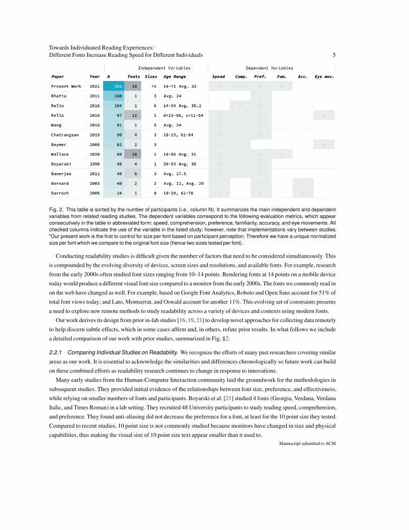
Fig. 2. This table is sorted by the number of participants (i.e., column N). It summarizes the main independent and dependentvariables from related reading studies. The dependent variables correspond to the following evaluation metrics, which appearconsecutively in the table in abbreviated form: speed, comprehension, preference, familiarity, accuracy, and eye movements. Allchecked columns indicate the use of the variable in the listed study; however, note that implementations vary between studies.*Our present work is the first to control for size per font based on participant perception. Therefore we have a unique normalizedsize per font which we compare to the original font size (hence two sizes tested per font).
Conducting readability studies is difficult given the number of factors that need to be considered simultaneously. This
is compounded by the evolving diversity of devices, screen sizes and resolutions, and available fonts. For example, research
from the early 2000s often studied font sizes ranging from 10–14 points. Rendering fonts at 14 points on a mobile device
today would produce a different visual font size compared to a monitor from the early 2000s. The fonts we commonly read in
on the web have changed as well. For example, based on Google Font Analytics, Roboto and Open Sans account for 51% of
total font views today; and Lato, Montserrat, and Oswald account for another 11%. This evolving set of constraints presents
a need to explore new remote methods to study readability across a variety of devices and contexts using modern fonts.
Our work derives its design from prior in-lab studies [16, 19, 21] to develop novel approaches for collecting data remotely
to help discern subtle effects, which in some cases affirm and, in others, refute prior results. In what follows we include
a detailed comparison of our work with prior studies, summarized in Fig. §2.
2.2.1 Comparing Individual Studies on Readability. We recognize the efforts of many past researchers covering similar
areas as our work. It is essential to acknowledge the similarities and differences chronologically so future work can build
on these combined efforts as readability research continues to change in response to innovations.
Many early studies from the Human-Computer Interaction community laid the groundwork for the methodologies in
subsequent studies. They provided initial evidence of the relationships between font size, preference, and effectiveness,
while relying on smaller numbers of fonts and participants. Boyarski et al. [21] studied 4 fonts (Georgia, Verdana, Verdana
Italic, and Times Roman) in a lab setting. They recruited 48 University participants to study reading speed, comprehension,
and preference. They found anti-aliasing did not decrease the preference for a font, at least for the 10 point size they tested.
Compared to recent studies, 10 point size is not commonly studied because monitors have changed in size and physical
capabilities, thus making the visual size of 10 point size text appear smaller than it used to.Manuscript submitted to ACM
6 Wallace et al.
Bernard et al. ran four studies building on Boyarski’s work by expanding the sizes and fonts studied [13–16]. Bernard
et al. [13] studied the effects of font type and size on the reading time and comprehension by older adults aged 62 to 83 in a
lab setting. They recruited 27 participants to compare Times New Roman, Arial, Georgia, and Verdana in two different sizes
per font by reading aloud. Comparing font sizes 12 and 14 points, they found that participants preferred larger fonts. In a
follow-up study, Bernard et al. [14] recruited 60 participants to read text out load to measure reading speed, preference, and
errors. Participants read in eight fonts (Century Schoolbook (Schoolbook), Courier New (Courier), Georgia, Times New
Roman, Arial, Comic Sans MS, Tahoma, Verdana) in three sizes (10, 12, and 14 points). They found fonts at 10 point size
were read significantly slower than fonts at 12 point size. In a subsequent study, Bernard et al. [16] recruited 40 participants
in a lab setting to compare reading speed and preference for Arial and Times at 12 and 14 point sizes. Their results show
that font size affects preference. Our work builds on this previous research by using fonts normalized by human perception
of size to help uncover additional relationships between preference and font attributes.
Prior work has studied an ever-increasing set of font sizes, primarily on desktop computer monitors. With the advent of
smaller screens on mobile devices, Darroch et al. [31] investigated the effect of font sizes ranging from 2 to 16 points on hand-
held computers in a lab setting where participants read silently. They recruited 24 participants (12 old and 12 young) to com-
pare reading speed and self-reported preference. Their results indicated that neither age nor preference affected reading speed.
As eye trackers grew in popularity and became more widely available, several researchers seized this opportunity to
enhance readability research validity. Beymer and Russel [18] developed WebGazeAnalyzer, to monitor reading perfor-
mance using an eye tracker to record fixation duration. Building on this idea of studying readability in a lab setting using
eye tracking, Beymer et al. [17] recruited 82 participants to compare readability and comprehension with Helvetica and
Georgia in sizes 10, 12, and 14 points. They found that for smaller font sizes, fixation durations were significantly longer.
While this resulted in slower reading, the results were not statistically significant. This work with eye trackers in lab settings
conflicts with similar prior results stating that font affects reading speed [16]. While eye trackers add internal validity to
in lab readability studies, accurately tracking eyes remotely is presently impractical. However, this may well change in
the future by combining research that controls for head position and tracks eye movements, making eyetracking research
possible without dedicated hardware [56, 68, 74].
Studies have remained split on the relationships between font size, preference, and reading speed. For example, Bhatia
et al. [19] studied the effect of font sizes (10, 12, and 14), italics, and color on readability and likeability within a group
of 180 undergraduate students in a lab setting. They found participants performed better on pages with no italics and
high italics compared to moderate italics. Contrary to prior work, their survey results showed font size has no statistically
significant effect on participants’ rating of likeability. In contrast, Banerjee et al. [6] found participants read significantly
faster and preferred the largest font size in their study, 14 point. They compared subjective preference and reading speed
and comprehension in a lab setting with 40 young Indian adults. They read aloud in six different fonts (Times New Roman,
Verdana, Georgia, Arial, Courier, and New Tahoma) in sizes 10, 12, and 14 points.
With time, the amount and type of text content consumed on digital devices has increased. Researchers began to inves-
tigate the effect of font familiarity. Beier and Larson [9] studied the relationships between font familiarity, reading speed,
and preference. They recruited 60 participants from a University, aged 20-52 (avg. 28), in a lab setting. Our measures for
font familiarity resemble their condition of studying a participant’s familiarity with common letter shapes.
As the variety of devices grew and the size of screens grew larger, Rello et al. [88] argued that much previous work is
outdated due to early studies using font sizes 14px and below and participants reading aloud. Their study, conducted in a lab
using eye trackers, proved that font size matters and that the technology underpinning readability research has fundamentally
Manuscript submitted to ACM

Towards Individuated Reading Experiences:Different Fonts Increase Reading Speed for Different Individuals 7
altered how we study it. Their study proposes that future research should focus on a wider range of fonts using sizes above
14px. Our study covers 16 fonts with each of their sizes perceptually normalized to Times at a base size of 16px.
Building on Rello et al.’s work, recent research has studied larger font sizes in various languages in lab environments.
Wang et al. [111] studied reading speed, comprehension, and subjective preference using Chinese texts in a lab setting. They
recruited 91 participants with an average age of 24 years, to complete their studies on mobile devices. They considered four
typographic variables: font size (11, 14, 17, 21, 26 points), line spacing, paragraph spacing, and page margin. Notably, they
created models of touch interactions to predict reader satisfaction with typography designs. In their conclusion, they call for
individuated or personalized reading experiences. Chatrangsan and Petrie [28] studied the relationship between font family
and size on reading speed, comprehension, and preference while skim-reading on tablet computers in a lab setting. They
recruited 90 younger and older participants in Thailand and the UK to read in Thai and English, respectively. They compared
3 font sizes (14, 16, and 18 point) in 4 fonts across both groups - UK: Times New Roman and Arial; Thailand: serif (TH
sarabun) and sans-serif typeface (Kanit). Participants picked their most preferred font among 6 possible combinations.
They found that reading speed and comprehension significantly improved at size 18 point in both countries. While our work
studies fonts in the English language, we hope our methods can be replicated and extended in other languages.
2.2.2 Deriving Font Preference and Controlling Font Size to Study Effectiveness. While some fonts are more appro-
priate for headers, body text, or even stylistic headlines, the effectiveness and preference of a font can be subjective [65].
How then can people select their most preferred font among a growing number of possibilities? O’Donovan et al. identified
the difficulty modern graphic designers face selecting their preferred font from many fonts [72].
To derive someone’s definitive ranking for preference, researchers in the HCI Community often use pairwise compar-
isons [46, 75, 80, 119]. Our approach to finding a participant’s preferred fonts builds on the ideas from Boyarski et al. [21]
and Wallace et al. [107] by using a toggle test on a single screen to definitively rank a participant’s font preferences for
body text. Our current work includes one fundamental difference from the past work discussed–our preference test controls
for perceived font size. Past work has shown font size and preference are interdependent [14, 17]. Some fonts have been
designed specifically to appear larger than others when rendered at the same size, to give them an advantage. For example,
typographers have intentionally manipulated font attributes, such as x-height, in the case of Georgia, to give it a larger
perceived size compared to traditional fonts [21]. Prior studies do not control for font size based on human perception and
instead compare fonts in the same fixed pixel size per condition [16, 19, 88, 107]. By controlling font size based on human
perception, our tests decouple font size from our results.
2.2.3 Controlling for Font Aesthetics and Reading Environments. Prior work has identified font as a straightforward
tool to optimize reading performance [2, 103]. As aforementioned, font choice can help mediate reading ability in both
at-a-glance and long-form reading [13, 28, 37, 93].
There are differences in font attributes across individual fonts that we consider but do not control for. For example,
Burmistrov et al. show that light and ultra-light fonts also induce higher cognitive load [24]. While we do not control for this,
our work studies fonts with thinner stroke widths such as Montserrat and Avant-Garde that readability experts recommend
for reading body text [29]. To provide a generally safe line spacing to control for variations in the length of ascenders and
descenders per font [20], we use a fixed-line spacing of 1.5. This decision follows the recommendations of Paterson and
Tinker [76] and Rello et al. [87, 88] to ensure consistent readability and comprehension given a variety of fonts. Our results
point to future work to study the individuated differences for other design choices such as character and word spacing.
In non-lab settings, participants read with the device they have in-hand, thus posing potential validity issues when studying
readers in their natural reading environments. Duchnicky and Kolers [40] investigated the effect of display size on readingManuscript submitted to ACM
8 Wallace et al.
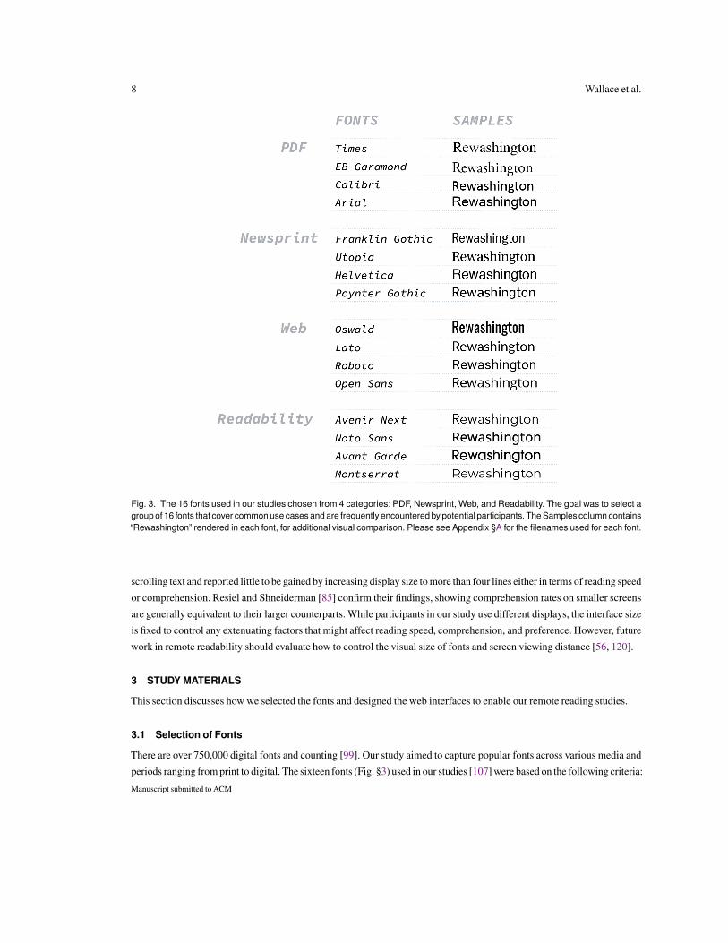
Fig. 3. The 16 fonts used in our studies chosen from 4 categories: PDF, Newsprint, Web, and Readability. The goal was to select agroup of 16 fonts that cover common use cases and are frequently encountered by potential participants. The Samples column contains“Rewashington” rendered in each font, for additional visual comparison. Please see Appendix §A for the filenames used for each font.
scrolling text and reported little to be gained by increasing display size to more than four lines either in terms of reading speed
or comprehension. Resiel and Shneiderman [85] confirm their findings, showing comprehension rates on smaller screens
are generally equivalent to their larger counterparts. While participants in our study use different displays, the interface size
is fixed to control any extenuating factors that might affect reading speed, comprehension, and preference. However, future
work in remote readability should evaluate how to control the visual size of fonts and screen viewing distance [56, 120].
3 STUDY MATERIALS
This section discusses how we selected the fonts and designed the web interfaces to enable our remote reading studies.
3.1 Selection of Fonts
There are over 750,000 digital fonts and counting [99]. Our study aimed to capture popular fonts across various media and
periods ranging from print to digital. The sixteen fonts (Fig. §3) used in our studies [107] were based on the following criteria:
Manuscript submitted to ACM

Towards Individuated Reading Experiences:Different Fonts Increase Reading Speed for Different Individuals 9
Four PDF Fonts: We selected four of the most common fonts used for (digital) documents3. PDFs are a common medium
that contain a vast amount of text that people read in digital environments. Times and Arial are not only common PDF fonts;
they have been frequently studied in prior work [16, 88]. Readers are more likely familiar with fonts selected from this
category, and familiarity is one factor posited to affect preference and reading speed [7].
Four Newsprint Fonts: We selected four of the most popular fonts from newspapers and print media [33, 59]. If fonts
originally designed for newspapers and other print media do not compare favorably with fonts designed for digital screens,
future researchers studying readability on digital devices can leave out these fonts (see Sec. §7.3). Even within this group,
Helvetica is a common font used across devices and software. While it was originally designed in 1961, it has since been
redesigned for screens.
Four Web Fonts: We selected four of the most common fonts used on websites4. Based on Google Fonts Analytics, Roboto
and Open Sans have accounted for more than 50% of all views. While Oswald is commonly used for titles and headers,
it has unique attributes among our selected fonts, including tight character spacing and particularly thick stroke width.
Four Readability Fonts: We selected four fonts recommended by readability experts [29, 96] not otherwise covered by
the other categories. Field studies conducted by these readability experts show these fonts have led to reading speed gains
in children. Also, these fonts possess attributes thought to increase readability, such as larger x-heights than most fonts.
In particular, Noto Sans was specifically designed to be readable on small screens.
Of these fonts, we selected Times as a baseline to study perceived sizes in fonts and reading speed and comprehen-
sion. Times is one of the most common fonts both on screen and in printed text, and appears in many other reading
studies [6, 16, 21, 28]. We also chose Noto Sans as a baseline to compare reading speed and comprehension because it was
the best performing font in our previous study [107].
3.1.1 Typographic Considerations. Every font contains many attributes in its unique anatomy, and the present study
does not attempt to tease apart effects of individual attributes. Instead, we selected 16 fonts with diverse font attributes that
are commonly available across platforms. While there are notable omissions, including monospaced fonts, we believe this
current list covers several unique categories and classifications.
Prior work has studied serif vs. sans-serif fonts in-depth [14, 17]. Our font selection has 3 serif and 13 sans-serif fonts
across different classifications. We include various fonts classified as sans-serif: 3 Neo-Grotesque, 3 Geometric, 3 Humanist,
3 Gothic, and 1 Modern; our serif fonts include: 2 Old Style and 1 Transitional. Future work on serif vs. sans-serif fonts
can focus on fonts from the same family, such as Source Sans Pro, Source Serif Pro, and Source Code Pro.
All of our study fonts have regular character width, while Oswald and Franklin Gothic are condensed. We also have
specific pairs of fonts that share similar design histories and attributes. Arial and Helvetica have similar metrics and anatomy,
such as x-height, ascenders, and descenders. Open Sans is a general use font derived from Noto Sans. Typographers designed
Noto Sans for the small screens on Android devices. Poynter Gothic and Franklin Gothic share a similar origin but are
different widths. Four of our fonts (Arial, Helvetica, Avenir Next, and Times) are likely to be very familiar to readers since
they are pre-installed in macOS and Windows/Office. Also, 5 fonts have hinting (i.e., are engineered for reading on screens
with low resolutions): Arial, Helvetica, Calibri, Noto Sans, and Times.
Half of the study’s fonts have anatomical features that have been associated with improved readability, such as generous
x-height, open apertures, low contrast, wider forms, and short ascenders: Calibri, Noto Sans, Open Sans, Lato, Utopia,
Montserrat, Arial, and Helvetica. Our other study fonts that do not cover these readability features provide a variety of other
3Found by analyzing a corpus of 2302 PDF documents. While we used an internal Adobe corpus, the documents themselves were curated from freely availabledocuments on the web, without topic constraints, so the conclusions should generalize to other general document collections.4https://fonts.google.com/analytics [Accessed August 2019]
Manuscript submitted to ACM
10 Wallace et al.
font anatomies and attributes previously discussed in this section. We provide our large crowdsourced dataset covering
these different fonts to help other researchers expand on our results5.
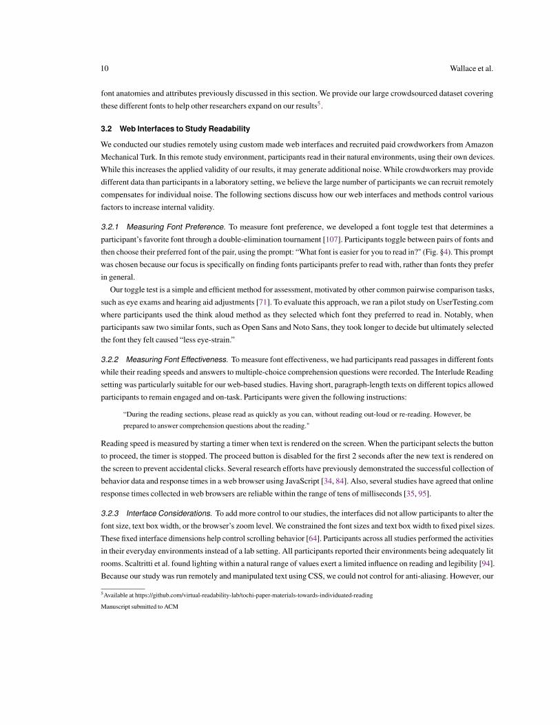
3.2 Web Interfaces to Study Readability
We conducted our studies remotely using custom made web interfaces and recruited paid crowdworkers from Amazon
Mechanical Turk. In this remote study environment, participants read in their natural environments, using their own devices.
While this increases the applied validity of our results, it may generate additional noise. While crowdworkers may provide
different data than participants in a laboratory setting, we believe the large number of participants we can recruit remotely
compensates for individual noise. The following sections discuss how our web interfaces and methods control various
factors to increase internal validity.
3.2.1 Measuring Font Preference. To measure font preference, we developed a font toggle test that determines a
participant’s favorite font through a double-elimination tournament [107]. Participants toggle between pairs of fonts and
then choose their preferred font of the pair, using the prompt: “What font is easier for you to read in?" (Fig. §4). This prompt
was chosen because our focus is specifically on finding fonts participants prefer to read with, rather than fonts they prefer
in general.
Our toggle test is a simple and efficient method for assessment, motivated by other common pairwise comparison tasks,
such as eye exams and hearing aid adjustments [71]. To evaluate this approach, we ran a pilot study on UserTesting.com
where participants used the think aloud method as they selected which font they preferred to read in. Notably, when
participants saw two similar fonts, such as Open Sans and Noto Sans, they took longer to decide but ultimately selected
the font they felt caused “less eye-strain.”
3.2.2 Measuring Font Effectiveness. To measure font effectiveness, we had participants read passages in different fonts
while their reading speeds and answers to multiple-choice comprehension questions were recorded. The Interlude Reading
setting was particularly suitable for our web-based studies. Having short, paragraph-length texts on different topics allowed
participants to remain engaged and on-task. Participants were given the following instructions:
“During the reading sections, please read as quickly as you can, without reading out-loud or re-reading. However, be
prepared to answer comprehension questions about the reading."
Reading speed is measured by starting a timer when text is rendered on the screen. When the participant selects the button
to proceed, the timer is stopped. The proceed button is disabled for the first 2 seconds after the new text is rendered on
the screen to prevent accidental clicks. Several research efforts have previously demonstrated the successful collection of
behavior data and response times in a web browser using JavaScript [34, 84]. Also, several studies have agreed that online
response times collected in web browsers are reliable within the range of tens of milliseconds [35, 95].
3.2.3 Interface Considerations. To add more control to our studies, the interfaces did not allow participants to alter the
font size, text box width, or the browser’s zoom level. We constrained the font sizes and text box width to fixed pixel sizes.
These fixed interface dimensions help control scrolling behavior [64]. Participants across all studies performed the activities
in their everyday environments instead of a lab setting. All participants reported their environments being adequately lit
rooms. Scaltritti et al. found lighting within a natural range of values exert a limited influence on reading and legibility [94].
Because our study was run remotely and manipulated text using CSS, we could not control for anti-aliasing. However, our
5Available at https://github.com/virtual-readability-lab/tochi-paper-materials-towards-individuated-reading
Manuscript submitted to ACM

Towards Individuated Reading Experiences:Different Fonts Increase Reading Speed for Different Individuals 11
Fig. 4. Font preference toggle test: A participant toggles between pairs of fonts to decide which one is easier to read in. The interfaceis a fixed width of 420px regardless of the device. All text is rendered with a line spacing of 1.5. Custom JavaScript is used to ensureparticipants cannot modify the size of the interface or text. This toggle test is done repeatedly within a double-elimination tournamentover pairs of fonts to determine a participant’s preferred font. A participant toggles the font family used to display the sample text,then they stop on the font of the pair they prefer and click to indicate their preference, before moving on to the next pair of fonts.
metrics evaluate how individual experiences differ across fonts, font size, and reading speed. These evaluation metrics
fundamentally differ from other lab studies that focus on the results as a whole [16, 88]. Our work provides approaches
for conducting remote readability at scale.
3.2.4 Incentives for Paid Crowdworkers. Since our study was run remotely with paid crowdworkers, we could not
observe their reading behavior with the same scrutiny as in a lab setting. However, our study methods and recruitment of paid
crowdworkers provide incentives that contribute to the validity of our results. Payment for a task can extrinsically motivate
crowdworkers [50]. Crowdworkers are also extrinsically motivated by the prospect of future payments. For example, if a
crowdworker produces low-quality work, this can result in a rejection. This scenario decreases their approval rate resulting
in fewer paid opportunities in the future [58]. To ensure our participants had prior experience performing remote tasks, our
studies recruited crowdworkers with approval ratings of greater than or equal to 99%, and they must have completed at least
100 tasks on Amazon’s Mechanical Turk. Also, paid crowdworkers may be intrinsically motivated to participate in tasks
they are interested in [66, 67]. Paid crowdworkers might also be motivated to perform the task honestly because they areManuscript submitted to ACM
12 Wallace et al.
provided personal insights about their reading speed and preference in different fonts at the end of the study: (i) Their most
preferred font, and their reading speed, measured in words-per-minute; (ii) Their fastest font, and their reading speed in it;
(iii) An interesting fact about their most preferred font. Providing personal insights to help participants improve and evaluate
themselves has proven to be an important intrinsic motivator in other studies [32, 84]. Further, because of the combination
of 1) splitting texts into short paragraphs across multiple screens, 2) disabling the proceed button for the first few seconds
of every screen, and 3) providing multiple-choice comprehension questions and surveys after every passage, participants
were incentivized to complete the readings rather than just click through them. Given that our reading tasks require only
a few minutes of concentration at a time, Interlude Reading is particularly well suited to study with crowdsourced research.
4 PRELIMINARY INVESTIGATIONS OF FONT SIZE AND PREFERENCE
Motivated by prior work showing that font size can affect readability, this section contains a re-analysis of data from our
prior study [107], investigating the effects of perceived font size on preference. To control for these confounding effects
of font size, we present a crowdsourced approach for normalizing font size that we then apply to the fonts in our main study
on reading effectiveness (Sec. §5).
4.1 Additional Related Work on Font Size
Rello et al. call for future work to address the need to control for the “real size” of letters in a given font [88]. Rudnicky et al.
discussed how readers process text through a normalization process to account for font size discrepancies [89]. This inherent
normalization process can contribute to differences in reading speed between fonts. There is an example of prior work normal-
izing the height of characters to study character legibility from Chinese typefaces [121]. Our work focuses on fonts commonly
used for the English language. These insights and examples from prior work motivate the need to normalize font sizes.
Not all fonts are created equal in terms of anatomies and attributes that affect the perceived size. Prior work has discussed
how x-height can increase legibility [79, 113]. In fact, Georgia was designed to have a larger x-height compared to similar
fonts to give a perceived advantage over Times [21]. At the same time, Times is designed to fit more words on a single page.
We provide starting points for normalizing font sizes below.
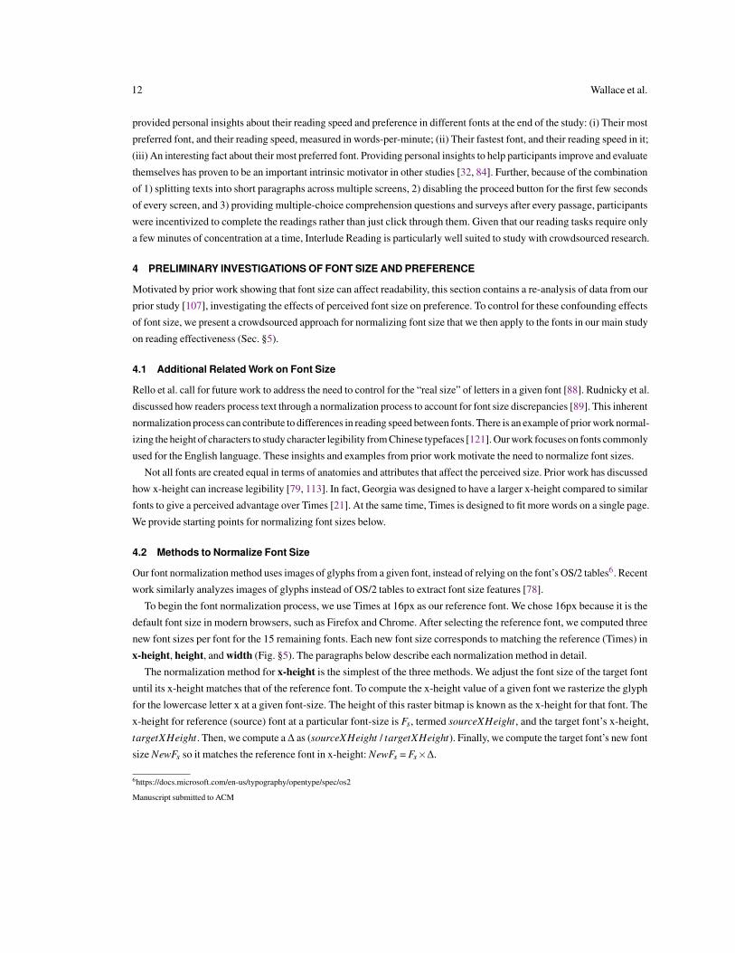
4.2 Methods to Normalize Font Size
Our font normalization method uses images of glyphs from a given font, instead of relying on the font’s OS/2 tables6. Recent
work similarly analyzes images of glyphs instead of OS/2 tables to extract font size features [78].
To begin the font normalization process, we use Times at 16px as our reference font. We chose 16px because it is the
default font size in modern browsers, such as Firefox and Chrome. After selecting the reference font, we computed three
new font sizes per font for the 15 remaining fonts. Each new font size corresponds to matching the reference (Times) in
x-height, height, and width (Fig. §5). The paragraphs below describe each normalization method in detail.
The normalization method for x-height is the simplest of the three methods. We adjust the font size of the target font
until its x-height matches that of the reference font. To compute the x-height value of a given font we rasterize the glyph
for the lowercase letter x at a given font-size. The height of this raster bitmap is known as the x-height for that font. The
x-height for reference (source) font at a particular font-size is Fs, termed sourceXHeight, and the target font’s x-height,
targetXHeight. Then, we compute a∆ as (sourceXHeight / targetXHeight). Finally, we compute the target font’s new font
size NewFs so it matches the reference font in x-height: NewFs = Fs×∆.
6https://docs.microsoft.com/en-us/typography/opentype/spec/os2
Manuscript submitted to ACM
Towards Individuated Reading Experiences:Different Fonts Increase Reading Speed for Different Individuals 13
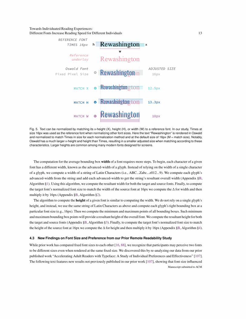
Fig. 5. Text can be normalized by matching its x-height (X), height (H), or width (W) to a reference font. In our study, Times atsize 16px was used as the reference font when normalizing other font sizes. Here the text “Rewashington” is rendered in Oswaldand normalized to match Times in size for each normalization method and at the default size of 16px (M = match size). Notably,Oswald has a much larger x-height and height than Times, resulting in a smaller adjusted size when matching according to thesecharacteristics. Larger heights are common among many modern fonts designed for screens.
The computation for the average bounding box width of a font requires more steps. To begin, each character of a given
font has a different width, known as the advanced-width of a glyph. Instead of relying on the width of a single character
of a glyph, we compute a width of a string of Latin Characters (i.e., ABC...Zabc...z012...9). We compute each glyph’s
advanced-width from the string and add each advanced-width to get the string’s resultant overall width (Appendix §B,
Algorithm §1). Using this algorithm, we compute the resultant width for both the target and source fonts. Finally, to compute
the target font’s normalized font size to match the width of the source font at 16px we compute the ∆ for width and then
multiply it by 16px (Appendix §B, Algorithm §2).
The algorithm to compute the height of a given font is similar to computing the width. We do not rely on a single glyph’s
height, and instead, we use the same string of Latin Characters as above and compute each glyph’s tight bounding box at a
particular font size (e.g., 16px). Then we compute the minimum and maximum points of all bounding boxes. Such minimum
and maximum bounding box points will provide a resultant height of the overall font. We compute the resultant height for both
the target and source fonts (Appendix §B, Algorithm §3). Finally, to compute the target font’s normalized font size to match
the height of the source font at 16px we compute the∆ for height and then multiply it by 16px (Appendix §B, Algorithm §4).
4.3 New Findings on Font Size and Preference from our Prior Remote Readability Study
While prior work has compared fixed font sizes to each other [16, 88], we recognize that participants may perceive two fonts
to be different sizes even when rendered at the same fixed size. We discovered this by re-analyzing our data from our prior
published work “Accelerating Adult Readers with Typeface: A Study of Individual Preferences and Effectiveness” [107].
The following text features new results not previously published in our prior work [107], showing that font size influencedManuscript submitted to ACM

14 Wallace et al.
font preference during our pairwise comparison test. These new results motivate our new studies and study design changes
in the current paper.
We conducted our prior Interlude Reading study remotely with 63 participants recruited from university mailing lists,
UserTesting.com, and Amazon’s Mechanical Turk. All fonts were rendered at size 16px similar to other research [112].
To measure whether perceptual font sizes affect reader font preferences, we first computed each font’s x-height, average
character width, and average character height using our methods described in Section §4.2. Using prior data collected from
the font preference pairwise comparison test, we measured whether the winning font (i.e., the font the participant preferred)
had the larger x-height, width, and height. We ran two-tailed t-tests of unequal variance. When considering which font
had the larger x-height, the winning font was larger 52% of the time (t(6012) = 3.7, p < 0.01), for average character width,
the winning font was larger 56% of the time (t(6012) = 9.7, p < 0.01), and for average character height, the winning font
was larger 53% of the time (t(6012) = 4.1, p < 0.01). While font size proved significant, the relatively small difference in
mean win rate per pairwise comparison indicates size was not the only factor driving font preference. We also consider
qualitative feedback that participants had provided about what made them prefer specific fonts over others:
P3: “I changed my mind multiple times while toggling. I think I prefer serif fonts for reading but prefer the look of sans-serif fonts.”
P6: “I liked bolder and bigger fonts. The fonts had to be linear and not curvy”
P11: “I looked at the size of the fonts”
P13: “It was larger, easier to read, and interestingly modern”
P14: “larger fonts and good kerning and bold”
P18: “I like different fonts based on what I am reading/writing, therefore I would choose the font based on the text and the size”
P22: “I like the slightly bolder and slightly larger letters. these two things combined make the letters jump out of the screen better.”
P23: “I think that spacing between the characters, words, and lines of text and the weight of the texts (bold vs. not) was a huge
indicator for me in terms of legibility and familiarity. Things I was familiar with seemed easier to read at times if they were a
previously preferred font for reading. Size did not necessarily matter as much as spacing.”
P26: “Clear and large. I wear glasses and have neck strain so like large fonts.”
P42: “I thought my preferences were going back and forth depending on if I wanted bigger or darker text in the moment”
P43: “Its easy to read, has a good boldness to it, and isn’t too cluttered.”
P45: “font height seemed to make more readable, to a point, as did thickness”
P51: “During the font (toggle) test, I found that I preferred fonts which were wider and more spaced out over fonts which were
narrower and spaced close together. Therefore, if I found myself able to read faster over a sample text (without having to re-read
it), I knew that this would be my preferred text amongst each set of pairings.”
P54: “It’s a larger font that isn’t too dark.”
While this qualitative feedback provides general evidence that font preference is influenced by size, it also hints at the
possibility of character spacing, stroke width, and several other font attributes. In our preliminary study [107], the two
fonts that achieved the highest reading speed were EB Garamond and Oswald. EB Garamond has the smallest x-height
and Oswald has the second smallest width across all fonts in our study. This might be explained by the fact that smaller fonts
lead to a reduced reading span, which limit the magnitude of eye movements required between words and across lines [82].
These findings suggest a need to normalize font size to help systematically compare the preference and effectiveness of
different fonts by reducing the possible confounds of perceived font size.
4.4 Perceptual Font Size Normalization Study
We designed a perceptual study to correct for how the average participant perceives size differences of fonts. While prior
work proposes to normalize font sizes according to a particular attribute (e.g., x-height [14, 21]), we take a crowdsourcedManuscript submitted to ACM

Towards Individuated Reading Experiences:Different Fonts Increase Reading Speed for Different Individuals 15
approach to finding the attribute, per font, that perceptually normalizes its size the best among four possibilities: matched
(original size 16px), x-height, height, or width, using Times at 16px as a reference.
Fig. 6. To normalize font size, crowdworkers see a control (reference) font in one panel and a target font in the other. They can togglebetween 4 different target font settings, which corresponds to adjusting the font size to match the reference in x-height, width, height,and original size (16px). The settings are shuffled per participant. In this figure, Times is on the left, and Montserrat is on the right.Differences in effective font size become especially apparent when the same piece of text is rendered in two different fonts side by side.
4.4.1 Study Design. Participants completed a perception study to select the best normalization method for each of our
16 study fonts and 4 tutorial fonts – used for practice sessions to familiarize participants with our study (Georgia, Verdana,
Raleway, and Comic Sans). Our interface presented participants with two screens side-by-side, with the same piece of
text rendered in two different fonts (Fig. §6). One of the screens always contained the reference font (Times), and the other
screen contained a target font. Participants could click to toggle between four possible settings of the target font, one of
which was the original font setting, and the rest corresponded to normalizing the font by x-height, height, or width. The four
settings were shuffled per font, per participant. After toggling through all the settings, a participant would click to select
the setting most similar in size to the reference. Participants could also swap the reference and target fonts, which facilitated
quickly toggling back and forth between the fonts. There was also an option to change the underlying text passage.
We recruited 61 participants: 23 via university mailing lists, 18 professionals ranging from designers to engineers, and
20 crowdworkers from Amazon’s Mechanical Turk. We did not collect demographic information for this study. Participants
took, on average, less than 5 minutes to complete this study. The participants from university mailing lists and the profes-
sionals were provided a $5 Amazon Gift Card for completing the study. The university mailing lists consist of undergraduateManuscript submitted to ACM

16 Wallace et al.
Fig. 7. When rendered at the same font size (‘match size’), different fonts can have different perceived sizes. Depending on thecriteria used to normalize font size (matching the x-height, width, or height of a reference font), the adjusted font size can varydrastically. Matching the height to the reference font was the most common normalization method chosen by crowdworkers. However,the assumption that a single criterion can normalize all fonts proves sub-optimal. We choose the optimal normalization strategy on afont-by-font basis, as determined by a population of crowdworkers. For instance, Oswald was left at its original 16px size, Montserratwas matched to Times by x-height, EB Garamond by width, and Avenir Next by height. Using these features to normalize the fontsizes resulted in the final adjusted sizes indicated at the bottom of the figure, which perceptually are closer in size to Times at 16px.
and graduate students and faculty interested in Human-Computer Interaction, Computer Vision, and design. We recruited
the professionals from an industry typography interest group, where it is common for researchers and practitioners to
recruit participants for studies. The crowdworkers from Amazon’s Mechanical Turk were paid $0.50 for their participation,
matching the compensation used in similar tasks.
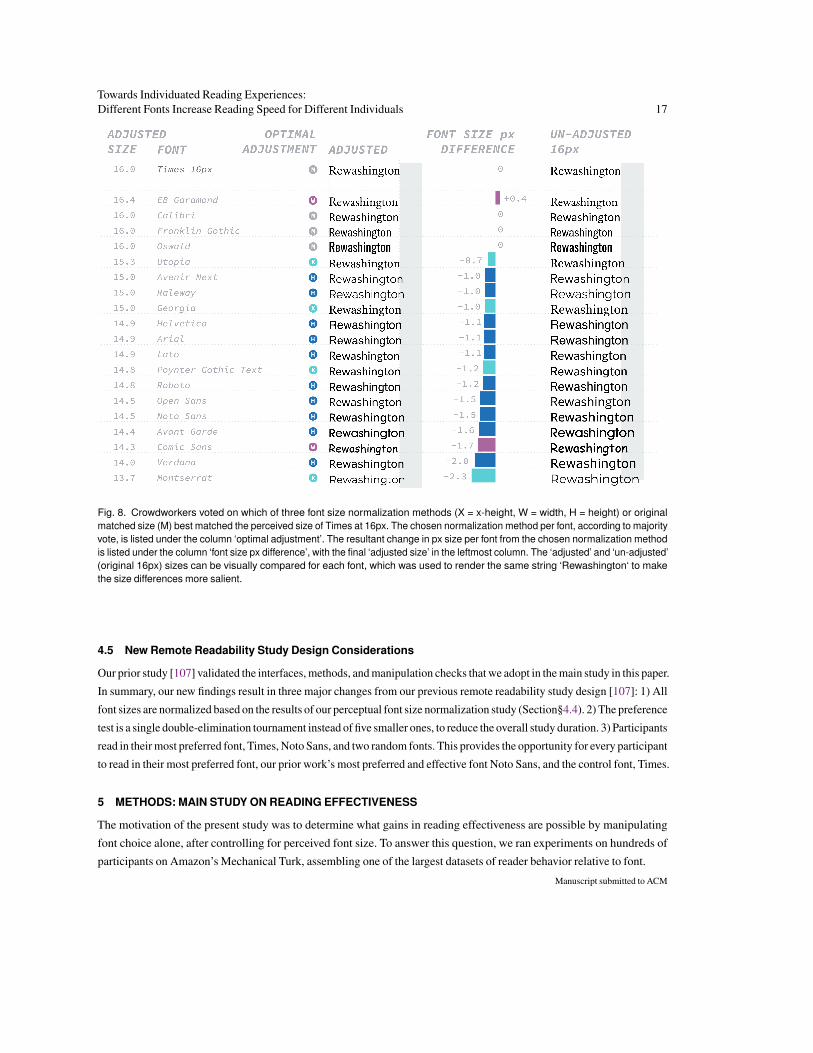
4.4.2 Results. The base font sizes for different fonts vary significantly (Fig. §7). For instance, EB Garamond is a smaller
font, while Montserrat is naturally quite large. Comparing blocks of text rather than individual words demonstrates how the
size difference gets amplified (Fig. §6). Previous papers that have mentioned the need to account for a font’s perceived size
have indicated that x-height should be the criteria used [14, 21]. However, our study results go against this common wisdom
and show that the preferred way to normalize a font actually depends on the font itself. Fig. §8 shows the normalization factor
that a majority of participants picked per font. In most cases, height was the most frequently-picked criterion. However, it is
not always the best. In some cases, the differences between the best normalization factor for a font and another normalization
factor can be quite large (Fig. §7). Rather than choose a single normalization strategy for all the fonts, we selected the most
frequently chosen normalization strategy on a font-by-font basis, as determined by the crowd. This resulted in the final
normalized font sizes plotted in Fig. §8. Despite some of the fonts being reduced in size from 16px, their final sizes are
still above the recommended minimum font size for reading on a digital device [64].
Takeaways: There is not a single effective way to normalize a font’s size. Normalization strategies depend on the font.
Also, contrary to prior work, x-height is not always the best measure to use for size normalization [21, 79, 113]. Our
normalization strategy is font-dependent and perceptually-motivated. We suggest that future work use this method to
explore the impact of font upon reading performance. We used the individually normalized fonts for our main study on
reading effectiveness, described next.
Manuscript submitted to ACM
Towards Individuated Reading Experiences:Different Fonts Increase Reading Speed for Different Individuals 17
Fig. 8. Crowdworkers voted on which of three font size normalization methods (X = x-height, W = width, H = height) or originalmatched size (M) best matched the perceived size of Times at 16px. The chosen normalization method per font, according to majorityvote, is listed under the column ‘optimal adjustment’. The resultant change in px size per font from the chosen normalization methodis listed under the column ‘font size px difference’, with the final ‘adjusted size’ in the leftmost column. The ‘adjusted’ and ‘un-adjusted’(original 16px) sizes can be visually compared for each font, which was used to render the same string ‘Rewashington‘ to makethe size differences more salient.
4.5 New Remote Readability Study Design Considerations
Our prior study [107] validated the interfaces, methods, and manipulation checks that we adopt in the main study in this paper.
In summary, our new findings result in three major changes from our previous remote readability study design [107]: 1) All
font sizes are normalized based on the results of our perceptual font size normalization study (Section§4.4). 2) The preference
test is a single double-elimination tournament instead of five smaller ones, to reduce the overall study duration. 3) Participants
read in their most preferred font, Times, Noto Sans, and two random fonts. This provides the opportunity for every participant
to read in their most preferred font, our prior work’s most preferred and effective font Noto Sans, and the control font, Times.
5 METHODS: MAIN STUDY ON READING EFFECTIVENESS
The motivation of the present study was to determine what gains in reading effectiveness are possible by manipulating
font choice alone, after controlling for perceived font size. To answer this question, we ran experiments on hundreds of
participants on Amazon’s Mechanical Turk, assembling one of the largest datasets of reader behavior relative to font.
Manuscript submitted to ACM

18 Wallace et al.
5.1 Procedure
5.1.1 Reading content. In our prior work [107], we found differences in comprehension scores when participants read
in different fonts. To reduce the confounding effects of topic and question difficulty, we worked with a reading specialist
to carefully control the level and type of content used for this study. Our reading specialist collected a set of 15 text passages
from Project Gutenberg7, a repository of creative commons e-books. The passages were chosen to span different topics
(history of science, biography, botany, etc.), with 12 non-fiction and 3 fiction passages. We believe these easily digestible
topics are indicative of what people might read during Interlude Reading. Passages were curated down to 300–500 words,
with minor adjustments to sentence structure and vocabulary to be at approximately an 8th-grade level (Lexile range8:
800–1200, Flesch score9: 60.5−79.8). The reading specialist also prepared 4–6 similar-level comprehension and inference
questions per passage. As such reading material has not previously been made available in the public domain, we are
releasing it along with our paper for future reading studies10. We selected 9 non-fiction, and 3 fiction passages for the present
study and further cut them down to 160–178 words. Then we split each passage approximately in half to be presented
across 2 consecutive reading screens, without breaking apart sentences (69–93 words each). This allowed us to capture
two measurements of reading speed per passage, to increase data robustness and allow us to filter outliers (Sec. §5.1.3).
We selected 2 multiple-choice comprehension questions per passage, one corresponding to each half of the passage. In
this way, participants would need to read both halves of the passage carefully to answer both comprehension questions
correctly. We did not use inference questions for this study to keep the task difficulty more predictable.
5.1.2 Study design. Participants could complete the study on a device of their choice: desktop computer, laptop computer,
tablet, or mobile device. Across participants, 35.5% used a desktop, 60.2% used a laptop computer, 2.3% used a tablet, and
2.0% used a mobile device. Our web server detects a participant’s device using the commonly used library express-device11.
Participants began the study with a pre-survey asking a range of questions, including about demographics (age, education,
native language), reading experience (frequency, type of content, device of choice), vision (normal/corrected), disabilities
(learning or reading), state (under the influence of drugs, medications, alcohol), and environment (lighting, time of day).
All Pre-Survey questions are provided in Appendix §D and all Post-Survey questions are provided in Appendix §E.
After an instructional screen, participants proceeded to the practice phase, with short versions of both the preference
test and effectiveness test, to get acquainted with the study flow (Fig. §9). The first phase of the main study was a preference
test, run as a double-elimination tournament with 16 study fonts. The preference test was split into a competition block of 30
comparisons, followed by a validation block of 6 comparisons, randomly selected repeat comparisons from the competition
block to measure a participant’s self-consistency. The average preference consistency per participant was 72%. Participants
used the toggle interface (Fig. §4) for the pairwise comparisons.
After the preference test, participants completed 10 rounds of the effectiveness test. Each round consisted of reading a
passage split across two consecutive reading screens (69–93 words per screen), followed by two multiple-choice comprehen-
sion questions, and a mini questionnaire asking participants about their reading technique, as well as familiarity and interest
in the topic matter presented, using a 5-point Likert scale. Each participant read a total of two passages in each of 5 fonts.
Assignment of fonts to passages was randomized per participant. The 5 fonts used were as follows: Noto Sans (best overall
font in term of preference and effectiveness from [107]), Times (commonly used as a baseline font [6, 16, 21, 28, 107]),
7https://www.gutenberg.org8https://hub.lexile.com/analyzer9http://www.readabilityformulas.com/free-readability-formula-tests.php10Available at https://github.com/virtual-readability-lab/tochi-paper-materials-towards-individuated-reading11https://www.npmjs.com/package/express-device
Manuscript submitted to ACM

Towards Individuated Reading Experiences:Different Fonts Increase Reading Speed for Different Individuals 19
Fig. 9. Apart from a pre-survey to gather demographic information and reading experience, and a practice session, this study designconsists of two distinct phases. In the first phase, participants complete a preference test: a double-elimination tournament with16 fonts, leading to 30 pairwise comparisons (competition block) and 6 repeated pairwise comparisons (validation block). In thesecond phase, participants complete an effectiveness test: 10 rounds of reading 2 passages (average 70 words each), answering2 multiple-choice comprehension questions (comprehension test), and answering 2 additional questions about passage interest andpassage familiarity (mini questionnaire). The effectiveness test is run with 5 fonts: the winning font from the preference test, Timesand Noto Sans as common baselines, and another 2 randomly selected fonts per participant. The study ends with a post-surveyto evaluate the task’s difficulty and collect familiarity ratings for the different fonts tested.
the participant’s preferred font (from the preference test), and two randomly-selected fonts out of the remaining 13 study
fonts12. As a result, across the 10 rounds of Interlude Reading, each font was used for two different reading passages
(different topic, similar length). We recorded the time spent per reading screen and the responses to the study questions.
The study ended by showing participants: (i) the font that won the double elimination preference tournament, i.e., their most
preferred font, and their words-per-minute in it; (ii) Their fastest font, and their words-per-minute in it; (iii) An interesting
fact about their most preferred font. A post-survey asked participants about their familiarity with each of the 20 study fonts
(including the 4 practice fonts), their experience with the toggle interface, their reaction to their preferred font, and how
effective they think their preferred font would be to read in.
5.1.3 Data pre-processing. We recruited 500 participants on Amazon’s Mechanical Turk. We removed participants
from the study’s data if they met one of the following exclusion criteria: (i) did not submit pre and post surveys, (ii) did
not self-report being “very comfortable” reading in English, (iii) self-reported being diagnosed with any reading or learning
disability, medical or neurological condition, (iv) self-reported being under the influence of any drugs, medications, or
alcohol, (v) had either of their WPM or reading comprehension scores outside the normal distribution as computed using
the interquartile range method (IQR)13, or (vi) had their preference consistency outside the normal distribution as computed
using the IQR method.
To establish a range of reading speed indicative of Interlude Reading, we expand on Carver’s recommended range of
138–600 WPM to account for standard error and remove any individual WPM measurements outside the range of 100–650
12In cases where the participant’s preferred font was one of Noto Sans or Times, we would sample three, instead of two, randomly-selected fonts out ofthe remaining 14 study fonts.13We removed reading speed measurements outside of the 100–650 WPM threshold before applying IQR for data removal.
Manuscript submitted to ACM
20 Wallace et al.
WPM [25, 26]. Participants with an average reading comprehension score below 0.67 were also excluded (threshold
determined by IQR method). To maximize the available data, WPM exclusions were applied to individual screens as
appropriate. This resulted in an incomplete blocked design, the sparseness of which is handled with appropriate statistical
methods (Sec. §6). After this filtering (removing 30% of participants), the data of 352 participants were used for reporting
the results of this study.
5.1.4 Participants. Participants took on average 35 minutes to complete this study and were compensated $5 for their
time. Of the 352 participants (46.1% female) that remained after data pre-processing, ages ranged from 18 to 71 years
(average = 33): 8 were younger than 20, 139 were in their 20s, 132 in their 30s, 47 in their 40s, and 26 were older than 50.
Data pre-processing did not skew the data’s demographics. For example, after applying data pre-processing, participant’s
age distributions and education backgrounds remained relatively similar, see Table§1 in Appendix§F. Data pre-processing
did not change the average age or minimum and maximum ages of our participants. After applying data pre-processing,
the gender breakdown changed from (45.7% female, 54.3% male) to (46.1% female, 53.9% male).
While all participants reported being “very comfortable” reading English, 22% of participants were bilingual. In total,
bilingual participants self-reported being able to read in 28 different languages. Participants reported reading using different
devices for leisure or personal interest: 40.8% reporting reading on Desktop, 60.9% on Laptop, 35.4% Tablet, 23.8% Kindle
or other e-readers, and 73.9% Paper. The following percentages of participants read using these devices for work or study:
53.8% Desktop, 70.8% Laptop, 18.1% Tablet, 7.1% Kindle or other e-readers, and 56.1% Paper. Participants reported
reading articles written in English for leisure or personal interest: 56.1% Everyday, 7.1% Once a week, 31.7% 2–3 times
a week, 2.8% Once a month, and 2.0% Less than once a month. Participants reported reading articles written in English
for work or study: 36.3% Everyday, 11.3% Once a week, 35.1% 2–3 times a week, 7.1% Once a month, and 9.9% Less than
once a month. Overall, our 352 participants read at different frequencies using a variety of devices for both work and leisure.
While we aimed to recruit a diverse pool of participants from the general population, the age ranges of our demographics
better represent the digital reading population. Our most common age groups are readers in their 20s and 30s. When
excluding readers under 18, the two most common age groups for digital reading are the 18-24 age group, followed by the
30-39 group [36]. Prior research from Pew Research has found that people aged 30 to 39 have the highest e-book usage [36].
Compared to older readers over the age of 65, readers under age 30 are reading more digital content due to its availability [27]
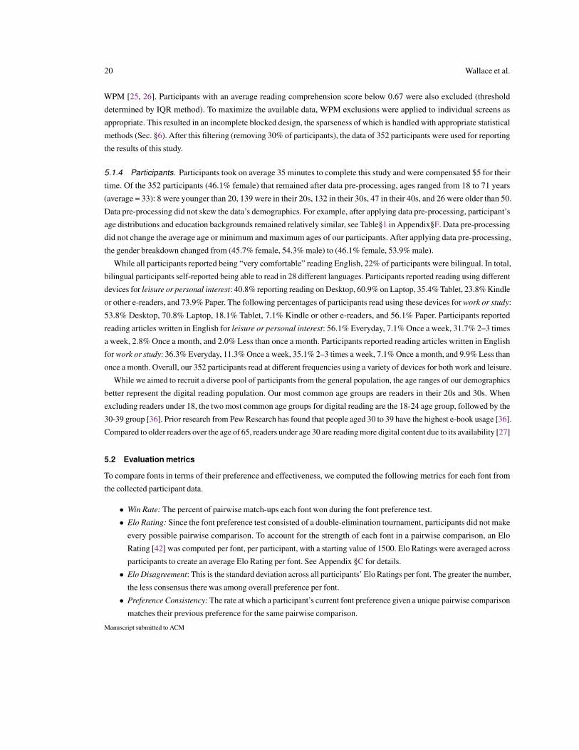
5.2 Evaluation metrics
To compare fonts in terms of their preference and effectiveness, we computed the following metrics for each font from
the collected participant data.
• Win Rate: The percent of pairwise match-ups each font won during the font preference test.
• Elo Rating: Since the font preference test consisted of a double-elimination tournament, participants did not make
every possible pairwise comparison. To account for the strength of each font in a pairwise comparison, an Elo
Rating [42] was computed per font, per participant, with a starting value of 1500. Elo Ratings were averaged across
participants to create an average Elo Rating per font. See Appendix §C for details.
• Elo Disagreement: This is the standard deviation across all participants’ Elo Ratings per font. The greater the number,
the less consensus there was among overall preference per font.
• Preference Consistency: The rate at which a participant’s current font preference given a unique pairwise comparison
matches their previous preference for the same pairwise comparison.
Manuscript submitted to ACM

Towards Individuated Reading Experiences:Different Fonts Increase Reading Speed for Different Individuals 21
• WPM: We measured reading speed in words-per-minute (WPM) computed as w×60s where w is the number of words
in a passage and s is the number of seconds spent reading the passage.
• Speed Rank: Per participant, we compared their WPM on the 5 fonts they read in. We treated this as an implicit
pairwise comparison by sampling each pair of fonts out of the 5 fonts used and tracked which font of the pair had
the higher average WPM. Across all participants, this produced a win percentage of each font against every other
font, which can be interpreted as a speed rank for that font over all other fonts.
• Comprehension score: We measured comprehension as the percent of questions answered correctly. Each participant
read 2 sets of passages per font and answered 2 multiple-choice comprehension questions per passage (selecting
out of 3 possible answers per question). When we report comprehension score as a percentage, it is based on a total
of 4 questions per font, per participant.
6 RESULTS: MAIN STUDY ON READING EFFECTIVENESS
In what follows, we report our analyses of the Interlude Reading behaviors of 352 crowdsourced participants, whose prefer-
ence, reading speed, and comprehension were measured across different fonts. Results for each font, averaged over all partic-
ipants, and measured by the metrics defined in the previous section, are presented in Fig. §10. Next, we consider population-
level results by running a linear mixed effect model to look at how various independent factors (participant age, font, topic,
etc.) affect reading speed and comprehension. Recognizing that averaging across all the participants can obfuscate finer
trends in the data, we dig into individual differences to measure the effects of font choice at the individual participant level.
6.1 Population-level Results
6.1.1 Model design. To discover which factors influence reading speed and comprehension across our whole population
of participants, we ran a linear mixed effect model (LME). Since any participant could potentially be shown any font, and
all participants would be shown all passages, this model specifies participant ID and passage read as crossed random effects
with intercepts per level of participant and passage, and constant slopes for both. The model specifies the following as fixed
effects: participant age, reading device, passage order, screen order, font, non-fiction status, topic familiarity, topic interest,
and font familiarity. Screen order refers to participants reading each passage split across two consecutive screens.
Using all participant data (N=352), we ran two models: one to assess the impact of the predictors on reading speed, and
another for comprehension. We also re-ran both models on the subset of participants aged 35 and older (N=118), owing
to known differences in how older readers process textual information [8, 10, 37, 39, 93, 116].
Effect sizes are reported as the R2β
statistic for all significant effects, following Edwards et al. [41]. Briefly, traditional
R2 is derived by comparing the total residuals of a fitted OLS regression model against the residuals of a null model, usually
containing only an intercept term. Similarly, R2β
compares a fitted LME model against a null model in which all fixed
effects are removed except an intercept, and the random effects are retained (preserving the covariance structure and any
crossed/hierarchical relationships encoded in it). If the R2β
formulation were applied to a univariate OLS regression, it would
in fact be equivalent to classical R2. Since a large share of the variance in the outcome measure is dependent on the model’s
random effects (here, the between-participant differences represented by the participant factor, or the content/interest
differences intrinsic to the passage factor), R2β
estimates for fixed effects will usually be relatively small. Therefore, for
clarity, we also report unstandardized effect size measures (i.e., group differences and other raw measures).
Please refer to Appendix §G for additional details; and to Appendix §H for additional results not covered in this section.
Manuscript submitted to ACM
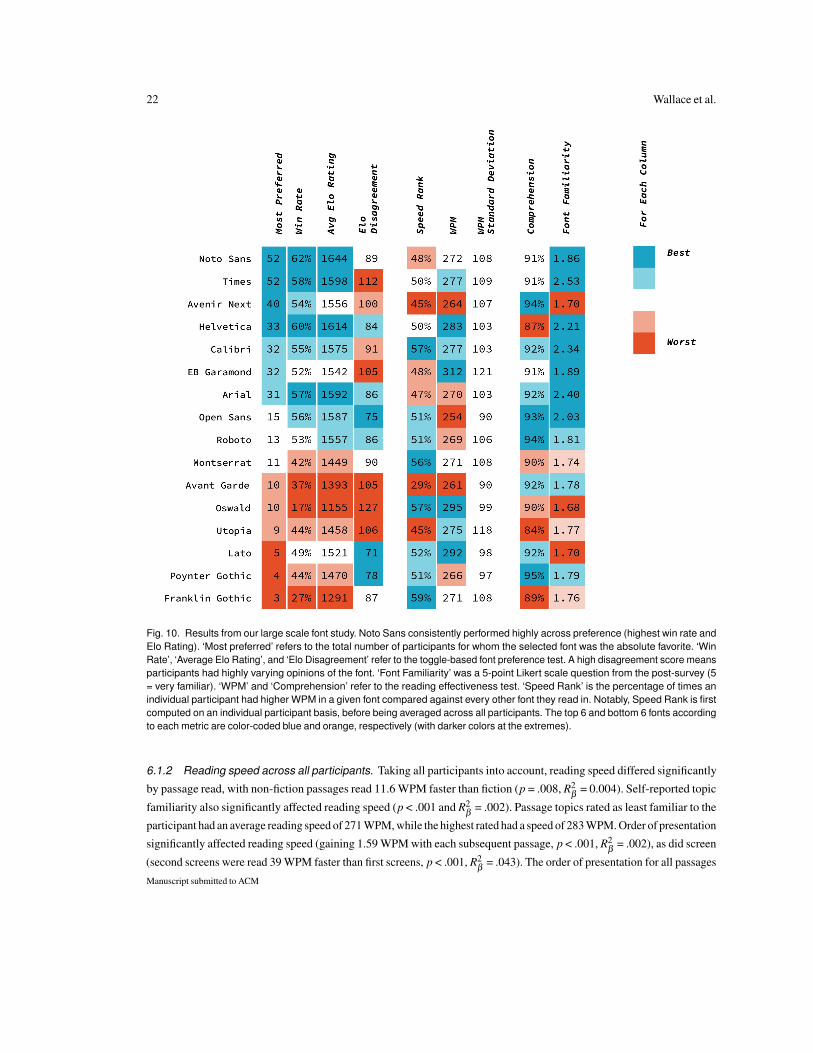
22 Wallace et al.
Fig. 10. Results from our large scale font study. Noto Sans consistently performed highly across preference (highest win rate andElo Rating). ‘Most preferred’ refers to the total number of participants for whom the selected font was the absolute favorite. ‘WinRate’, ‘Average Elo Rating’, and ‘Elo Disagreement’ refer to the toggle-based font preference test. A high disagreement score meansparticipants had highly varying opinions of the font. ‘Font Familiarity’ was a 5-point Likert scale question from the post-survey (5= very familiar). ‘WPM’ and ‘Comprehension’ refer to the reading effectiveness test. ‘Speed Rank’ is the percentage of times anindividual participant had higher WPM in a given font compared against every other font they read in. Notably, Speed Rank is firstcomputed on an individual participant basis, before being averaged across all participants. The top 6 and bottom 6 fonts accordingto each metric are color-coded blue and orange, respectively (with darker colors at the extremes).
6.1.2 Reading speed across all participants. Taking all participants into account, reading speed differed significantly
by passage read, with non-fiction passages read 11.6 WPM faster than fiction (p = .008, R2β
= 0.004). Self-reported topic
familiarity also significantly affected reading speed (p < .001 and R2β
= .002). Passage topics rated as least familiar to the
participant had an average reading speed of 271 WPM, while the highest rated had a speed of 283 WPM. Order of presentation
significantly affected reading speed (gaining 1.59 WPM with each subsequent passage, p < .001, R2β
= .002), as did screen
(second screens were read 39 WPM faster than first screens, p < .001, R2β
= .043). The order of presentation for all passages
Manuscript submitted to ACM

Towards Individuated Reading Experiences:Different Fonts Increase Reading Speed for Different Individuals 23
and fonts was randomly counterbalanced across participants to prevent order effects from confounding outcome measures
(see Appendix C). Reading speed decreased significantly with participant age (-1.51 WPM per year, p < .001, R2β
= .019).
The significant effects found by the LME indicate when reading speed trended in a consistent direction across participants
- e.g., despite our efforts to control the difficulty of passage contents, some passages were generally read faster (conversely,
slower) across the population. However, font, reading device, and self-reported topic interest were found non-significant by
the LME analysis, indicating that for these factors, reading speed did not trend in a consistent direction across the population.
Regarding fonts, this means that there is not a set of consistently faster fonts (conversely, slower) across the population
as a whole. This result hints at a need for looking into individual differences (Section §6.2) to understand the potential for
different fonts to increase speed for different people.
6.1.3 Reading speed across older participants. Across the older participants (age ≥ 35) we found a similar pattern
of results, with the following differences: font was found to significantly affect reading speed (p = 0.01, R2β
= .005). Notably,
the effect of age increased to -2.6 WPM per year (R2β
= .039). Figure §11 visualizes reading speed differences between
younger and older participants per font. While EB Garamond and Open Sans stand out as the best and worst performers
among older participants, the significant effect of font remains even when excluding these fonts from the data. These results
suggest that for older participants we can make population-level recommendations, as reading speeds trend in a consistent
direction depending on the font. However, as we will discuss in later sections, age is only one factor affecting reading speed.
The largest gains in reading speed are evident when someone reads in their more optimal font.
6.1.4 Reading comprehension. Reading comprehension scores were relatively flat as the median was 90%, the 25th and
75th quartiles were 85% and 95% respectively, and the minimum score was 70%. Overall, 24% of participants answered
all questions correctly. There was minimum variation in scores, so there is lower sensitivity in the hypothesis testing for
the comprehension scores. Across all participants, reading comprehension was significantly affected by self-reported topic
interest (85.7% correct for passages rated least interesting vs. 93.5% correct for the most interesting; p < .001, R2β
= .019) and
non-fiction content (89.6% comprehension for non-fiction vs. 94.9% for fiction; p = .013, R2β
= .018), though the passage it-
self was non-significant. No other factors were significant. Among older participants, topic interest was significant (p < .001,
R2β
= .018), as was non-fiction content (90.4% comprehension for non-fiction vs. 97.1% for fiction; p = 0.005, R2β
= .028). Ad-
ditionally, age was significant (p = .047, R2β
= .002), as was device (p = .011, R2β
= .008). However, given the lopsided nature
of the binary outcome, as well as the lopsided distribution of devices, we urge caution in interpreting the effect of device.
6.1.5 Takeaways: Some of the trends that hold across the entire participant population include non-fiction passages being
read faster but achieving lower comprehension scores than fiction passages. Topic interest affected comprehension, while
topic familiarity affected reading speed. Participants generally read faster as the task progressed, increasing significantly
from the first screen in a font to the second screen in the same font and increasing throughout the experiment with each
subsequent passage. These results point to a learning effect. Reading slowed down as the age of participants increased,
especially after 35 years. Regarding fonts, when considering just the older participants (age ≥ 35), we can observe specific
fonts affect reading speed, making it possible to provide some initial recommendations for this age group. For instance, EB
Garamond and Montserrat were faster fonts on average, while Avant Garde and Open Sans were slow fonts. Someone’s age
might be one of many factors affecting how fast or slow an individual reader reads with a specific font. For example, across
all our participants, fonts do not affect people in the same way, and a font that is effective for one person is not necessarily
effective for another person. This observation brings us to our next section, where we scrutinize the individual differences
among fonts and participants.Manuscript submitted to ACM
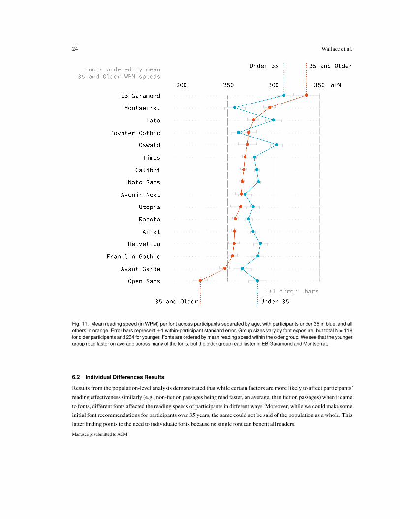
24 Wallace et al.
Fig. 11. Mean reading speed (in WPM) per font across participants separated by age, with participants under 35 in blue, and allothers in orange. Error bars represent ±1 within-participant standard error. Group sizes vary by font exposure, but total N = 118for older participants and 234 for younger. Fonts are ordered by mean reading speed within the older group. We see that the youngergroup read faster on average across many of the fonts, but the older group read faster in EB Garamond and Montserrat.
6.2 Individual Differences Results
Results from the population-level analysis demonstrated that while certain factors are more likely to affect participants’
reading effectiveness similarly (e.g., non-fiction passages being read faster, on average, than fiction passages) when it came
to fonts, different fonts affected the reading speeds of participants in different ways. Moreover, while we could make some
initial font recommendations for participants over 35 years, the same could not be said of the population as a whole. This
latter finding points to the need to individuate fonts because no single font can benefit all readers.
Manuscript submitted to ACM
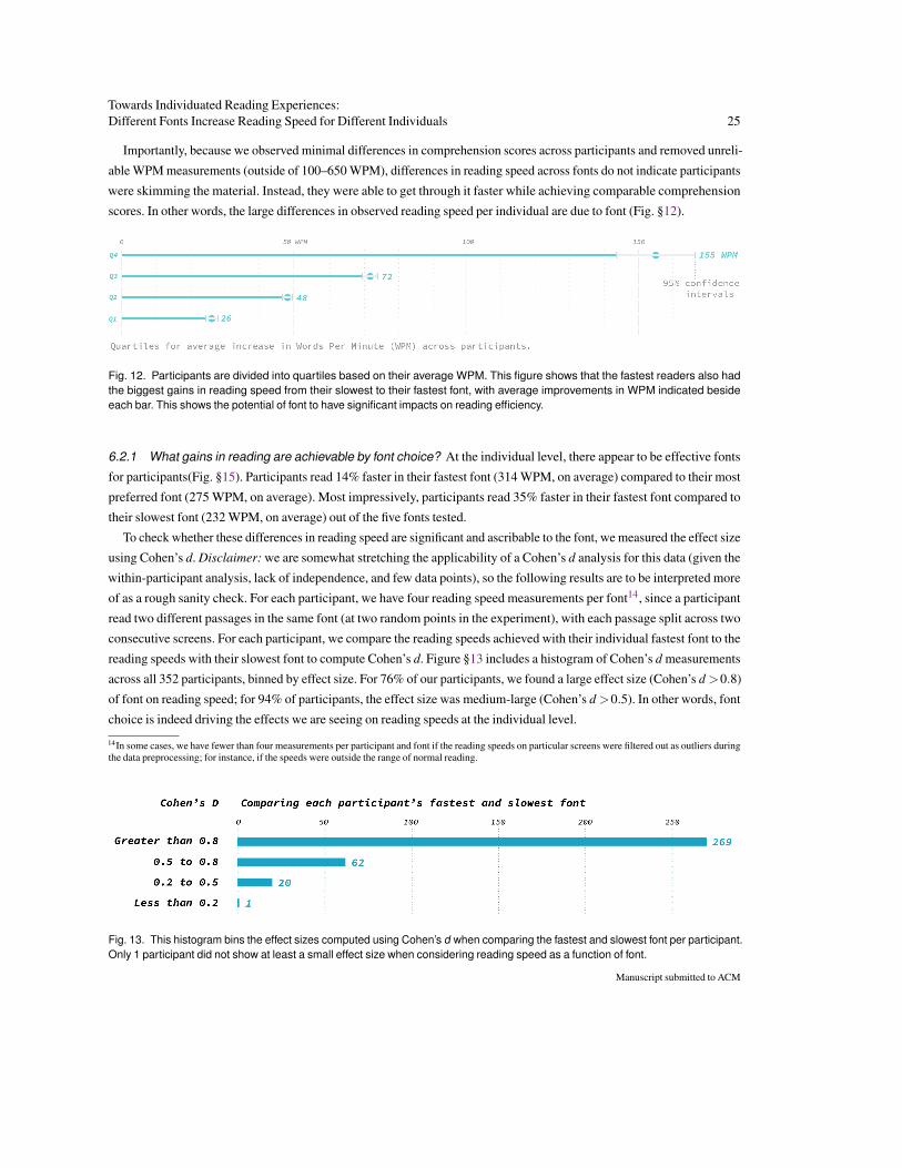
Towards Individuated Reading Experiences:Different Fonts Increase Reading Speed for Different Individuals 25
Importantly, because we observed minimal differences in comprehension scores across participants and removed unreli-
able WPM measurements (outside of 100–650 WPM), differences in reading speed across fonts do not indicate participants
were skimming the material. Instead, they were able to get through it faster while achieving comparable comprehension
scores. In other words, the large differences in observed reading speed per individual are due to font (Fig. §12).
Fig. 12. Participants are divided into quartiles based on their average WPM. This figure shows that the fastest readers also hadthe biggest gains in reading speed from their slowest to their fastest font, with average improvements in WPM indicated besideeach bar. This shows the potential of font to have significant impacts on reading efficiency.
6.2.1 What gains in reading are achievable by font choice? At the individual level, there appear to be effective fonts
for participants(Fig. §15). Participants read 14% faster in their fastest font (314 WPM, on average) compared to their most
preferred font (275 WPM, on average). Most impressively, participants read 35% faster in their fastest font compared to
their slowest font (232 WPM, on average) out of the five fonts tested.
To check whether these differences in reading speed are significant and ascribable to the font, we measured the effect size
using Cohen’s d. Disclaimer: we are somewhat stretching the applicability of a Cohen’s d analysis for this data (given the
within-participant analysis, lack of independence, and few data points), so the following results are to be interpreted more
of as a rough sanity check. For each participant, we have four reading speed measurements per font14, since a participant
read two different passages in the same font (at two random points in the experiment), with each passage split across two
consecutive screens. For each participant, we compare the reading speeds achieved with their individual fastest font to the
reading speeds with their slowest font to compute Cohen’s d. Figure §13 includes a histogram of Cohen’s d measurements
across all 352 participants, binned by effect size. For 76% of our participants, we found a large effect size (Cohen’s d >0.8)
of font on reading speed; for 94% of participants, the effect size was medium-large (Cohen’s d >0.5). In other words, font
choice is indeed driving the effects we are seeing on reading speeds at the individual level.
14In some cases, we have fewer than four measurements per participant and font if the reading speeds on particular screens were filtered out as outliers duringthe data preprocessing; for instance, if the speeds were outside the range of normal reading.
Fig. 13. This histogram bins the effect sizes computed using Cohen’s d when comparing the fastest and slowest font per participant.Only 1 participant did not show at least a small effect size when considering reading speed as a function of font.
Manuscript submitted to ACM

26 Wallace et al.
6.2.2 Using Speed Rank to interpret Faster Fonts for Individuals: Since only Times and Noto Sans were read by all
participants, we cannot study which fonts were commonly the fastest or slowest across individuals. However, we can focus
on the Speed Rank metric (Fig. §10), which compares participants to themselves. The Speed Rank measurements for all
of our fonts except for Avant Garde, range from 45% to 59%, indicating there is no single font that all participants read
consistently faster with. Among our 16 fonts, there is no scenario where a single font has an exceptionally low Speed Rank
yet high average WPM. The Speed Rank for 11/16 fonts ranges from 45% to 52%, indicating that different fonts increase
reading speed for different people.
The following results use our Speed Rank metric to help eliminate noise and individual differences by comparing
individual participants’ achieved reading speeds on pairs of fonts rather than considering absolute reading speeds. Four
fonts had the highest Speed Rank, greater than 55%, Franklin Gothic, Calibri, Oswald, and Monsterrat (i.e., they were faster
than the other fonts they were compared to more than half the time). Stylistically these four fonts differ greatly (Fig. §3).
For example, Monsterrat and Oswald have noticeably different stroke widths. Monsterrat had the tallest x-height among our
fonts. In the past, typographers have designed fonts with taller x-heights to increase readability. For example, typographers
designed Georgia and Verdana to have a taller x-height than Times New Roman [21]. Oswald and Franklin Gothic, have
condensed character spacing, which has been shown to increase reading speed in some studies [11, 100]. Calibri is a familiar
font to most, being the default font in Microsoft Word and Excel. Participants might read faster on average in Calibri due to
their familiarity with the font. This relationship between font familiarity and speed has been hinted at in previous research [9].
Speed Rank helps explain why relying on averages across a population might not be the most accurate representation
of a font’s effect on reading speed. It is also an additional metric to help interpret our reading speed results, which do
contain some variance due to our between-subjects study design. For example, EB Garamond was the fastest on average
at 312 WPM. However, individual participants only read faster in it 48% of the time. This indicates that participants in our
study who read using EB Garamond were generally faster readers. Utopia is another font with a lower Speed Rank (45%)
despite having a similar average WPM to most other fonts. In contrast, Open Sans was the slowest font on average at 254
WPM, while individual participants read faster in it 51% of the time. Poynter Gothic and Roboto also displayed similar
relationships between Speed Rank and average WPM. These discrepancies combined with the large effect sizes reported
in this study show the need for the effect of fonts to be studied per individual. It is possible for individuals to experience
large gains in reading speed regardless of their baseline speed. In fact, the fastest readers in our study demonstrate the gains
possible when reading in their optimal font (Fig. §14).
Of the five fonts, all participants read in Times and Noto Sans as baselines. We observed 87 unique font pairings during
the reading speed tests, excluding Times and Noto Sans. However, different pairs had different sampling rates: 38 of these
pairs appeared less than five times in our data. In contrast, 3 of the pairs (Arial vs. Calibri, Arial vs. Roboto, and Calibri vs.
Roboto) appeared over 100 times each. This probably occurred because the participants generally preferred these fonts. See
Tables§20, §21, and §22 in Appendix §J, for the number of observations per font and unique font pairs during the reading
speed tests. Due to this uneven sampling of pairs, we can expect some noise in the resulting speed rank measurements. Our
study design balanced the study length and amount of conditions we could compare. Future studies can build on our work
by focusing on a subset of these fonts and a within-subjects experimental design.
6.2.3 Which are the highly rated fonts? Our large study features the first font preference test comparing fonts, normalized
by size based on participant perception. Noto Sans and Times were each chosen by 52 (15% of all) participants as the overall
winners in the preference tests (Figure §10, ‘Most Preferred’), with Avenir Next, Helvetica, Calibri, EB Garamond, and
Manuscript submitted to ACM

Towards Individuated Reading Experiences:Different Fonts Increase Reading Speed for Different Individuals 27
Fig. 14. The fastest readers (top quartile) show the potential that a single manipulation, font, can have on reading speed. Each rowrepresents one participant, with the reading speeds achieved in 5 different fonts plotted as color-coded circles: preferred font (black),Times (blue), Noto Sans (yellow), and another 2–3 randomly-selected fonts (grey). On the left-most of the figure are the slowestfonts for each participant, and on the right are the fastest. The horizontal distance between the two ends is the speed increaseachievable by manipulating font. There is no one font or manipulation (preference) that can determine an individual’s fastest font.
Arial also performing favorably according to the preference metrics. Nevertheless, every single font was the preferred font
of at least 3 participants. This points to considerable diversity in font preferences across individuals.Manuscript submitted to ACM

28 Wallace et al.
Fig. 15. This figure contains another view of the data from Fig. §14, zoomed out and replicated four times to show that differentparticipants read fastest using different fonts. The label at the top of each plot is one of the study’s conditions for reading speed:a participant’s most preferred font, Noto Sans, Times, and ‘other’ contains the other fonts participants read in. Highlighted witha black line are all the participants for which the labeled font was the fastest. For example, each black horizontal line in “preferred”corresponds to a participant whose most preferred font was their fastest. In the next two plots, we highlight participants whose fastestfonts were Times and Noto Sans, respectively. The length of each line corresponds to the speed increase between a participant’sslowest and fastest fonts. Participants are sorted by their max reading speeds (fastest readers up top).
Another indication of diversity in preferences are the inter-participant disagreement scores (Figure §10, ‘Elo Disagree-
ment’). For instance, while Times and EB Garamond were highly rated fonts overall, they split opinions across participants,
some of which consistently voted them up (correspondingly, down) in the preference tests. On the other hand, Open Sans
was generally likable based on its pairwise font comparisons and the low inter-participant disagreement scores.
Controlling for size generally led to smaller fonts (Times, EB Garamond, Helvetica, Calibri) performing consistently
better than in our previous study [107]. As a notable example, Times, which was in the bottom 5 fonts according to Elo
Rating in our previous study, is in the top 5 fonts in the present study. In contrast, participant preferences for Noto Sans
were relatively stable across both studies. It was in the top 5 fonts for 80% of participants in our previous study and 77%
of participants in the present study. Overall, with the highest win rate and average Elo Rating, it was the most preferred font.
As in our previous study, familiarity was not predictive of font preference. Participants were familiar with their recom-
mended font only 52% of the time. Pearson’s Correlation shows only a small effect between font familiarity and Elo Rating
per participant (r = 0.18, p<0.05). The most preferred font, Noto Sans, was also among the least familiar fonts to participants.
Please refer to Appendix §I for additional results on how dwell time and font familiarity affect a participant’s font
preferences.Manuscript submitted to ACM
Towards Individuated Reading Experiences:Different Fonts Increase Reading Speed for Different Individuals 29
6.2.4 Is people’s preferred font their most effective font? Our study explicitly considers effectiveness, measured us-
ing WPM and comprehension. However, since comprehension is relatively flat, we look at reading speed only. Overall,
participants read the fastest in their most preferred font 20% of the time, but they also read the slowest in their preferred
font 20% of the time (out of five total fonts tested per participant), which is precisely at chance level. They also read in their
preferred font at an average WPM.
Participants read faster in their most preferred fonts than in Times 50% of the time, and faster than in Noto Sans 51% of
the time. In other words, participants do no better or worse, on average, by reading in their preferred font. These findings run
contrary to participants’ beliefs: 73% of participants believed their most preferred font would also be their most effective
font to read in. Times and Noto Sans, which were generally preferred fonts, were not consistently effective fonts across
participants. Prior work has shown a similar dissociation between preference and reading speed. For instance, Boyarski
et al. found that while participants expressed a preference for Verdana, they read faster with Georgia [21]. Our work builds
on this prior finding by studying and reproducing this relationship across a much wider collection of fonts.
6.2.5 Takeaways: We found that different fonts are effective for different people, leading us to believe that custom reading
experiences can help people read more effectively. Nevertheless, some fonts, including EB Garamond and Montserrat, tend
to increase the reading speeds of readers older than 35 years. For other decisions on font choice, please refer to Fig. §10,
which includes some performance metrics across all the fonts in our study. For instance, Noto Sans, Times, and Calibri
performed quite highly on preference and effectiveness (reading speed and comprehension). Importantly, there was not
a single font that increased reading speed for everyone. Our results show a considerable spread in both preference and
effectiveness for specific fonts across individuals. Furthermore, our results indicate that neither preference nor familiarity
with a font can predict reading speed. Despite this, we witnessed a 35% increase in reading speed, on average, when
comparing a participant’s fastest font to their slowest font of the five individual fonts tested.
7 DISCUSSION
7.1 Takeaways
Here we summarize the takeaways for the investigations presented in this paper.
• Our results show that some fonts, including EB Garamond and Montserrat, tend to increase the reading speeds of
readers older than 35 years, on average; however, such recommendations can not be made for the general population.
• While fonts and typographic considerations generally matter more for older participants, starting at age 35 in our
data, we observe larger reading speed gains when accounting for individual differences per font per participant.
• Different fonts are effective for different people, leading us to believe that custom reading experiences can help
people read more effectively. By designing tools to match individuals to their best font, individual readers can
experience large gains in reading speed.
• Preference , effectiveness. People do not know what is good for them in terms of font choice for reading.
• Preference for fonts is personal. People differ in what they prefer.
• Familiarity with a font does not drive preference, and has a small effect on reading speed. A font need not be chosen
for an application just because people may be used to seeing it.
• A single size does not fit all fonts. If an application has a few font options for the same piece of text, then each font
needs to be adjusted in size according to the font’s characteristics.
• When normalizing fonts based on font attributes, x-height is not the only option, nor was it the most common option
selected based on participant perception.Manuscript submitted to ACM
30 Wallace et al.
7.2 Towards Individuated Reading Experiences
Instantaneous reader improvement is the promise of good information design [12, 45, 52, 115]. Information design, the
process of optimally formatting the elements of the page to convey information, has historically been relegated to professional
practitioners designing for everyone. This is because publishing technologies have historically focused on publishing
one document in one format. While it may be simpler to provide everyone a slight boost in performance, individuating or
personalizing participant experiences can augment human performance even more. Our results indicate fonts exist that can
help readers above the age of 35 read faster. However, the idea that finding the fastest font per individual shows more promise
for participants regardless of their age. The large effect sizes per person we report point to the potential for personalized
reading experiences to help participants overcome the ever-growing burden of information overload. Information design can
affect different areas of our lives, from understanding financial documents to voter registration or even reading for pleasure.
Reading technologies are presently shifting control of information format, shifting it from publisher to reader. Microsoft’s
Immersive Reader15 allows the abstracting and reformatting of all text on a webpage [61]. E-book technologies include
options to reflow typographic and page design in the moment. Now, even historically static digital documents are receiving
similar capabilities. Adobe Acrobat Reader using Liquid Mode can reflow a PDF to the desired format, even for scanned,
optical character recognition (OCR) enriched documents, potentially allowing the entirety of the written word to be flexibly
reformatted to suit the needs of the reader [51]. However, this growing ability for applications such as Liquid Mode or
Mozilla Firefox’s Reader View to automatically reflow text does not allow them to manipulate text based on the reader’s
needs [57]. Efficient evidence-based matching of the reader to specific fonts is a scientific and technological challenge.
Future research should develop innovations to help match people with their most effective font, similar to matching someone
with their most effective prescription to improve their vision.
Our results indicate that readers’ preferences do not predict their fastest fonts to read in. If someone does not know
what they need, perhaps a system could provide it. In our work, familiarity or preference with specific formats had a
limited effect on reading speed. There is also no one-size-fits-all solution that emerged to improve reading speed for all
readers. Matching a reader to information design that can deliver substantial benefit is presently time-consuming, and no
theoretical or computational model exists to assist. Happily, studies with a large participant pool point to how to leverage
a big data approach to resolve the individuation challenge rapidly, as previously successfully undertaken in high individual
difference contexts such as voice and handwriting recognition [1, 60, 90]. Theoretical foundations will be essential to
this approach, and we find the beginnings of these in existing legibility, readability, communication, and vision science
work [48, 93, 107, 108, 117]. Computational models will likewise be necessary, and what little work exists here provides
useful foundations for the geometry, if not the utility, of fonts and typography [9, 55, 101, 114].
Our results provide evidence for font’s vital importance to readability and provide a possibility to help reduce information
overload. Our results show the potential importance of individuation to improve reading speed. Building on prior work, we
can confidently recommend that tailoring content to each reader will ultimately improve readability for all. Secondly, our
results show that age might be an essential factor to consider when individuating font choice to increase reading speed. Third,
we built a new understanding of the role of preference, which does not impact effectiveness but is personal and underscores
the need for individuation. Fourth, we provide a new method to rethink size normalization between fonts based on human
perception. However, there is a growing need for new research at the intersection of these contributions. Our results do not
cover every possible font combination or multiplicative sets of design manipulations per font when considering additional
participant demographics and languages. Researching this information design space will require collecting additional data
15https://education.microsoft.com/en-us/resource/9b010288
Manuscript submitted to ACM
Towards Individuated Reading Experiences:Different Fonts Increase Reading Speed for Different Individuals 31
to create new theoretical and computational models for individuating design. Understanding what individual factors drive
beneficial information design could deliver new impacts to reduce information overload.
7.3 Limitations and Future Work
Participants: While we intended for the paid crowdworkers recruited for our main study to act as a general population
sample, our participants’ demographics (particularly ages) might not be entirely representative for several reasons. First, the
age distributions of our participants closely resemble those of the digital reading population, see Section§5.1.4. Second, prior
research shows that paid crowdworkers on Amazon’s Mechanical Turk are more diverse than standard Internet and American
college samples [22], and sample composition varies dynamically based on study topic, task complexity, recruitment
materials, and the time of day the study is made available [73]. One approach to increase the diversity of the sample is to
recruit participants from multiple crowdsourcing platforms such as Prolific, Crowdflower, and UserTesting and potentially
supplement with unpaid voluntary participation [53, 57, 106, 109, 110]. In addition, only 0.4% of our participants had less
than a high school education compared to the national average of 9.8% for people age 18 and over, see Table §1 in Appendix§F.
Future work should address these populations that were difficult to recruit in our remote opt-in readability studies.
Our paid crowdworkers specifically chose to participate in our readability studies. This self-selection bias may leave
out participants who are not interested in reading or improving their reading. Most of our participants were in their 20s
and 30s, and we specifically excluded participants who reported any learning or reading disabilities (due to small samples).
Because age and ability differences may exert some of the strongest effects on reading outcomes [8, 10, 37], we recommend
more targeted recruiting, to systematically increase the number of samples at different age ranges. In the future, our reading
studies can be extended to additional specialized populations to evaluate our results’ generalization in cases where the most
significant effects of font choice may be achieved.
Language: Our reading passages are in English, and data only includes participants who self-reported being comfortable
reading English, while being located in the US. Thus, our results are not cross-cultural. Future work could extend our
methods to study how font and language can affect readability in different languages, as well as looking at second language
learners. Such efforts will require (sourcing or creating) a new set of properly leveled reading materials with corresponding
comprehension questions, which in our experience was the biggest initial barrier to running readability studies.
Controlling for Visual Font Size: A limitation of conducting our remote readability studies is the variations in the physical
size of screens across devices, participants’ visual angle, and varying font size across monitor types. Prior in-lab readability
research used consistent monitor sizes, and they also used smaller point sizes for fonts because the pixel densities of physical
monitors were lower than they are now. For example, the visual size of fonts rendered at 10-point size in studies in the late
1990s and early 2000s will look smaller on today’s monitors [13, 21]. Our remote readability methods trade the internal
validity of in-lab studies by studying readers in their everyday reading environments. Prior work has suggested controlling
for participants’ visual angle or stimuli for remote readability studies on desktops [8, 120]. Another recent method to control
for viewing distance on desktops is the virtual chinrest [56]. We did not consider these methods because we wanted to
recruit participants regardless of their intended reading device. We also wanted to provide the reader the agency to behave
naturally, similar to Chatrangsan et al. [28]. Ideally, future work could manipulate font size per participant to ensure the
physical font size is similar across all reading experiences and devices.
Font Familiarity: A participant’s familiarity with specific fonts is challenging to test. We showed participants all 16
fonts used in the study and asked them to self-report their familiarity with each using a Likert scale. Since each font name
was rendered in its own font, it is not clear whether participants indicated their familiarity with the font’s name or its
Manuscript submitted to ACM

32 Wallace et al.
visual appearance. Future work should address the subtle relationships between participants and their familiarity with,
recognizability, and everyday exposure to specific fonts.
Measures of reading speed: Our calculation of reading speed was based on when participants clicked to move to the
next study screen. While we took measures to only capture data points that fell within the target range of expected reading
speeds, our calculation is rough and can introduce noisy data. Future remote studies can consider eye movements or voice
recordings for more precise reading speed estimates but will need to evaluate how these additional measurements might
interfere with natural reading. Suppose future studies want to focus on reading speed. In that case, we recommend using
easier passages, for example, 8th-grade level reading passages, since using more difficult passages can introduce a speed
and comprehension trade-off [105].
Choice of fonts: Post-hoc discussions with a typographer revealed nuances regarding font comparisons. Specifically, not
all of our study fonts were designed to display body text on digital devices. For instance, Franklin Gothic was designed for
printing newspapers, Oswald is a popular font for headings, and Noto Sans was specifically optimized for reading on digital
devices with small screens. For a fair comparison, future studies can specifically consider fonts optimized for digital devices.
Variable fonts: Our work compares fonts that differ among multiple properties, including stroke weight, character width,
and optical size. To remove the confounding effects of size, we individually re-normalized all fonts to a standard perceptual
size. In the future, rather than comparing entirely different font families, variable fonts can offer more fine-grained control
over the weight, width, and optical size parameters of a font. This study design choice creates opportunities to study the
anatomical differences of sans and sans-serif, humanist vs. geometric fonts in isolation of other confounding factors. Also,
variable fonts would allow researchers to measure how fine-grained adjustments to the x-height, ascender, or descender
individually contribute to effectiveness.
Reading formats: In studying fonts, there are multiple factors to control for. Future work could investigate additional
format differences beyond font, including character and line spacing, letter spacing, and stroke width. All of these various
font attributes could contribute to a perceived information density. As aforementioned, we recommend using variable fonts
to enable an analogous comparison of weight, width, and optical size. This focus on variable fonts will enable experiments
to determine what anatomical parameters (category, classification, weight, width, or optical size) contribute to effectiveness,
preference, and familiarity.
Within-Subjects Study Design: Our goal was to study as many fonts as possible within a remote setting. While Speed
Rank provides a valuable metric to help provide different interpretations to our results, a within-subjects design provides
stronger analysis methods. Our pilot studies show that having a single participant read in all 16 fonts in a remote setting
is not advisable. Our pilot studies evaluated how behaviors were affected when participants read six or eight fonts after
completing the preference test. Participants were more likely to abandon the test in these pilot studies, and their reading
speed measurements dropped noticeably during the final reading rounds. Our current between-subjects design for reading
speed showed this drop-off did not occur, thus adding validity to our results. However, because font preference does not
predict effectiveness, even when controlling for font size, we believe a within-subjects study design is more appropriate
to study reading speed differences in remote readability studies.
8 CONCLUSION
This work presented the first large-scale remote readability study considering font’s impact on Interlude Reading perfor-
mance, measured by words per minute and comprehension. Our remote study design exchanges internal validity for applied
validity by evaluating participants reading in their naturalistic environments while controlling for font size based on human
perception. Based on evidence from our prior study that participants preferred fonts related to perceived size, we normalizedManuscript submitted to ACM
Towards Individuated Reading Experiences:Different Fonts Increase Reading Speed for Different Individuals 33
font size using a novel size normalization approach. Even with font size normalization, we found that font preference does
not drive effectiveness, despite participants believing it does. While we found initial evidence that specific fonts might help
readers over 35 years, the main takeaway is that different fonts work best for different people. Finding the best font for an
individual is an open question worth exploring.
There is an extensive amount of excellent readability research focusing on reading on digital devices from the past
two decades. Prior research has made recommendations for future work to overcome the challenges of conducting digital
readability studies ranging from recruiting larger or more diverse participant pools [17, 19, 28, 86], to selecting a larger
or more diverse set of fonts [16, 86, 88], to studying reading behaviors in the real world [9, 57, 111]. While our work
incorporates a number of these recommendations, future work is still needed to overcome our methods’ limitations.
Over time prior studies have agreed and disagreed with each other’s results, see Figure §16 in the Appendix. For
example, our work and most prior research have found that font choice and aspects of font size affect participants’ pref-
erences [16, 28, 31, 86, 107]. In contrast, there is a paper that did not replicate this finding [19]. Some researchers have
also found that font choice effects reading speed [5, 6, 28, 86] while others have not [16, 17, 21, 107]. Prior research is also
split on the relationship between font size and reading speed, with some work showing that font size does affect reading
speed [6, 16, 28, 88] while others work showing it does not [17, 19, 31]. Even Boyarski et al.’s seminal study found mixed
results when comparing different factors [21]. It is possible to attribute the cause of these contradictions to a multitude of
factors ranging from the ever-evolving font choices, device types, demographics, and digital technologies. We believe these
contradictions do not invalidate any one research result. Instead, they reinforce the complexity inherent in studying digital
readability. This observation provides further evidence that reading experiences need to be individuated to help as many
readers as possible. We hope that future researchers can expand on our remote readability methods to improve their internal
validity and compare their results directly and empirically with in-person methods.
Our pattern of findings highlights an opportunity to augment reading speed for individual adult readers through different
font choices. In comparison to participants’ average reading speed, the average reader in our study could add 38 words
a minute by changing their font. This increase is equivalent to an additional four to five pages an hour given 500-words
per page. When comparing a participant’s fastest font to their average reading speed, participants in the top quartile for
the delta added 79 WPM, or nine to ten pages an hour. In both cases, average comprehension remains similar and high. In
the context of Interlude Reading, this gain shows individual readers could consume more information in limited windows.
For example, suppose a news article, journal, or forum post is roughly 700 words, requiring around two minutes for an
average reader. For this hypothetical document length, an individual could read it 24% faster in their most effective font
while retaining normal reading comprehension levels. A reader could use these 30 seconds saved to read comments or look
at related posts. Social media companies, which thrive on the volume of interaction, might find font as one mechanism to
increase interactions. Our results point to a future where individuation can boost reading speed for readers of various ability
levels, showing the potential to enhance readability for all.
The transformation of reading by digital devices is at the heart of our work and dictates the subsequent work necessary.
The high variability seen in our studies represents both a challenge and an opportunity. While there is clear potential for
improvement, understanding how to help each individual in various reading contexts and tasks is unsolved, requiring new
collaborations and tools to solve. The potential impacts on individual reading efficacy highlighted here point to a future
where machines can help readers attain their full reading potential. We hope the present reader and the multidisciplinary
communities will continue to perform this work. Let us engineer better reading for everyone.
Manuscript submitted to ACM
34 Wallace et al.
9 ACKNOWLEDGEMENTS
This work is supported by the National Science Foundation under Grant No. IIS-1552663. We have many people to thank
for giving our work the resources and context it needed to bloom: Dr. Benjamin Wolfe for formative discussions about
reading that helped shape some of our initial ideas; Allen Ellison and Emily Seminerio of Adobe Inc. for providing us with
helpful resources; Kathy Crowley and Marjorie Jordan of Readability Matters for helpful discussions of the study results;
Dan Rhatigan and Tim Brown of Adobe Type for insightful discussions about typography; Jing Qian of Brown University
for his thoughtful comments on the paper’s narrative, and Tong Sun of Adobe Research for her support.
REFERENCES
[1] Christoph Amma, Marcus Georgi, and Tanja Schultz. 2014. Airwriting: a wearable handwriting recognition system. Personal and ubiquitous computing18, 1 (2014), 191–203.
[2] Aries Arditi. 2004. Adjustable typography: an approach to enhancing low vision text accessibility. Ergonomics 47, 5 (2004), 469–482.[3] Dana Bachmann and Paul Holdsworth. 2016. DVV International: The new Skills Agenda for Europe. https://www.dvv-international.de/en/adult-education-and-development/editions/aed-832016-skills-and-competencies/section-1-agenda-setting/the-new-skills-agenda-for-europe/. (Accessed on 01/02/2021).
[4] Justin Baer, Mark Kutner, John Sabatini, and Sheida White. 2009. Basic Reading Skills and the Literacy of America’s Least Literate Adults: Results fromthe 2003 National Assessment of Adult Literacy (NAAL) Supplemental Studies. NCES 2009-481. National Center for Education Statistics (2009), 1–83.
[5] Rachel V Ball, Dave B Miller, Shaun Wallace, Kathlyn Camargo Macias, Mahmoud Ibrahim, Ernesto Robalino Gonzaga, Olga Karasik, Dekai R Rohlsen-Neal, Sarah Barrientos, Edward A Ross, et al. 2021. Optimizing Electronic Health Records Through Readability. In Proceedings of the InternationalSymposium on Human Factors and Ergonomics in Health Care, Vol. 10. Sage Publications Sage CA: Los Angeles, CA, Los Angeles, CA, USA, 65–70.
[6] Jayeeta Banerjee, Deepti Majumdar, Madhu Sudan Pal, and Dhurjati Majumdar. 2011. Readability, subjective preference and mental workload studieson young indian adults for selection of optimum font type and size during onscreen reading. Al Ameen Journal of Medical Sciences 4, 2 (2011), 131–143.
[7] Sofie Beier. 2009. Typeface legibility: towards defining familiarity. Ph.D. Dissertation. Royal College of Art.[8] Sofie Beier, Sam Berlow, Esat Boucaud, Zoya Bylinskii, Tianyuan Cai, Jenae Cohn, Kathy Crowley, Stephanie L Day, Tilman Dingler, Jonathan
Dobres, et al. 2021. Readability Research: An Interdisciplinary Approach. arXiv preprint arXiv:2107.09615 (2021).[9] Sofie Beier and Kevin Larson. 2013. How does typeface familiarity affect reading performance and reader preference? Information Design Journal
20, 1 (2013), 16–31.[10] Sofie Beier and Chiron AT Oderkerk. 2019. The effect of age and font on reading ability. Visible Language 53, 3 (2019), 50–68.[11] Sofie Beier, Chiron AT Oderkerk, Birte Bay, and Michael Larsen. 2021. Increased letter spacing and greater letter width improve reading acuity in
low vision readers. Information Design Journal (2021).[12] Dirk Bergemann and Stephen Morris. 2019. Information design: A unified perspective. Journal of Economic Literature 57, 1 (2019), 44–95.[13] Michael Bernard, Chia Hui Liao, and Melissa Mills. 2001. The effects of font type and size on the legibility and reading time of online text by older
adults. In CHI’01 extended abstracts on Human factors in computing systems. ACM, ACM, New York, NY, USA, 175–176.[14] Michael Bernard, Bonnie Lida, Shannon Riley, Telia Hackler, and Karen Janzen. 2002. A comparison of popular online fonts: Which size and type
is best. Usability news 4, 1 (2002), 2002.[15] Michael Bernard and Melissa Mills. 2000. So, what size and type of font should I use on my website. Usability news 2, 2 (2000), 1–5.[16] Michael L Bernard, Barbara S Chaparro, Melissa M Mills, and Charles G Halcomb. 2003. Comparing the effects of text size and format on the
readibility of computer-displayed Times New Roman and Arial text. International Journal of Human-Computer Studies 59, 6 (2003), 823–835.[17] David Beymer, Daniel Russell, and Peter Orton. 2008. An eye tracking study of how font size and type influence online reading. In Proceedings
of the 22nd British HCI Group Annual Conference on People and Computers: Culture, Creativity, Interaction-Volume 2. BCS Learning & DevelopmentLtd., Swindon, United Kingdom, 15–18.
[18] David Beymer and Daniel M Russell. 2005. WebGazeAnalyzer: a system for capturing and analyzing web reading behavior using eye gaze. In CHI’05extended abstracts on Human factors in computing systems. ACM, ACM, New York, NY, USA, 1913–1916.
[19] Sanjiv K Bhatia, Ashok Samal, Nithin Rajan, and Marc T Kiviniemi. 2011. Effect of font size, italics, and colour count on web usability. Internationaljournal of computational vision and robotics 2, 2 (2011), 1–26.
[20] Laura Bix. 2002. The elements of text and message design and their impact on message legibility: A literature review. Journal of Design Communication4 (2002), 1–15.
[21] Dan Boyarski, Christine Neuwirth, Jodi Forlizzi, and Susan Harkness Regli. 1998. A study of fonts designed for screen display. In Proceedings ofthe SIGCHI conference on Human factors in computing systems. ACM Press/Addison-Wesley Publishing Co., ACM, New York, NY, USA, 87–94.
[22] Michael Buhrmester, Tracy Kwang, and Samuel D Gosling. 2016. Amazon’s Mechanical Turk: A new source of inexpensive, yet high-quality data?(2016).
Manuscript submitted to ACM

Towards Individuated Reading Experiences:Different Fonts Increase Reading Speed for Different Individuals 35
[23] US Census Bureau. [n.d.]. Educational Attainment in the United States: 2020. https://www.census.gov/data/tables/2020/demo/educational-attainment/cps-detailed-tables.html. (Accessed on 09/19/2021).
[24] Ivan Burmistrov, Tatiana Zlokazova, Iuliia Ishmuratova, and Maria Semenova. 2016. Legibility of light and ultra-light fonts: Eyetracking study. InProceedings of the 9th Nordic Conference on Human-Computer Interaction. ACM, ACM, New York, NY, USA, 110.
[25] Ronald P Carver. 1990. Reading rate: A review of research and theory. Academic Press, Cambridge, MA, USA.[26] Ronald P Carver. 1992. Reading rate: Theory, research, and practical implications. Journal of Reading 36, 2 (1992), 84–95.[27] Pew Research Center. 2012. Younger AmericansâAZ Reading and Library habits | Pew Research Center. https://www.pewresearch.org/internet/2012/10/23/younger-americans-reading-and-library-habits/. (Accessed on 10/01/2021).
[28] Maneerut Chatrangsan and Helen Petrie. 2019. The effect of typeface and font size on reading text on a tablet computer for older and younger people.In Proceedings of the 16th Web For All 2019 Personalization-Personalizing the Web. ACM, ACM, New York, NY, USA, 5.
[29] Kathy Crowley and Marjorie Jordan. 2019. Base Font Effect on Reading Performance - Readability Matters. https://readabilitymatters.org/articles/font-effect. (Accessed on 09/19/2019).
[30] Kathy Crowley and Marjorie Jordan. 2019. Readability Formats Offer Instantaneous Change - Readability Matters. https://readabilitymatters.org/articles/instantaneous-change. (Accessed on 09/20/2019).
[31] Iain Darroch, Joy Goodman, Stephen Brewster, and Phil Gray. 2005. The effect of age and font size on reading text on handheld computers. In IFIPconference on human-computer interaction. Springer, Springer, New York, NY, USA, 253–266.
[32] Nediyana Daskalova, Eindra Kyi, Kevin Ouyang, Arthur Borem, Sally Chen, Sung Hyun Park, Nicole Nugent, and Jeff Huang. 2021. Self-E:Smartphone-Supported Guidance for Customizable Self-Experimentation. Work 1145 (2021), 3411764–3445100.
[33] Bill Davis. 2004. Fonts on the front page. A study of typefaces on the front pages of AmericanâAZs top newspapers. Chicago: Ascender Corporation(2004).
[34] Joshua R De Leeuw. 2015. jsPsych: A JavaScript library for creating behavioral experiments in a Web browser. Behavior research methods 47, 1(2015), 1–12.
[35] Joshua R de Leeuw and Benjamin A Motz. 2016. Psychophysics in a Web browser? Comparing response times collected with JavaScript andPsychophysics Toolbox in a visual search task. Behavior Research Methods 48, 1 (2016), 1–12.
[36] David DiSalvo. 2012. Who Reads the Most in the US? The Answer Might Surprise You. https://www.forbes.com/sites/daviddisalvo/2012/10/23/who-reads-the-most-in-the-us-the-answer-might-surprise-you/?sh=70617c6528b2. (Accessed on10/01/2021).
[37] Jonathan Dobres, Nadine Chahine, Bryan Reimer, David Gould, Bruce Mehler, and Joseph F Coughlin. 2016. Utilising psychophysical techniquesto investigate the effects of age, typeface design, size and display polarity on glance legibility. Ergonomics 59, 10 (2016), 1377–1391.
[38] Jonathan Dobres, Bryan Reimer, and Nadine Chahine. 2016. The effect of font weight and rendering system on glance-based text legibility. In Proceedingsof the 8th International Conference on Automotive User Interfaces and Interactive Vehicular Applications. ACM, ACM, New York, NY, USA, 91–96.
[39] Jonathan Dobres, Benjamin Wolfe, Nadine Chahine, and Bryan Reimer. 2018. The effects of visual crowding, text size, and positional uncertaintyon text legibility at a glance. Applied ergonomics 70 (2018), 240–246.
[40] Robert L Duchnicky and Paul A Kolers. 1983. Readability of text scrolled on visual display terminals as a function of window size. Human Factors25, 6 (1983), 683–692.
[41] Lloyd J Edwards, Keith E Muller, Russell D Wolfinger, Bahjat F Qaqish, and Oliver Schabenberger. 2008. An R2 statistic for fixed effects in thelinear mixed model. Statistics in medicine 27, 29 (2008), 6137–6157.
[42] Arpad E Elo. 1978. The rating of chessplayers, past and present. Arco Pub.[43] Martin J Eppler and Jeanne Mengis. 2008. The concept of information overload-a review of literature from organization science, accounting, marketing,
mis, and related disciplines (2004). Kommunikationsmanagement im Wandel (2008), 271–305.[44] James Gareth, Witten Daniela, Hastie Trevor, and Tibshirani Robert. 2013. An introduction to statistical learning: with applications in R. Springer,
New York, NY, USA.[45] Lisa Graham. 2012. Basics of design: Layout & Typography for beginners. Cengage Learning.[46] Shengbo Guo and Scott Sanner. 2010. Real-time multiattribute bayesian preference elicitation with pairwise comparison queries. In Proceedings of
the Thirteenth International Conference on Artificial Intelligence and Statistics. JMLR Workshop and Conference Proceedings, Microtome Publishing,Brookline, MA, USA, 289–296.
[47] Severin Hacker and Luis Von Ahn. 2009. Matchin: eliciting user preferences with an online game. In Proceedings of the SIGCHI Conference onHuman Factors in Computing Systems. ACM, ACM, New York, NY, USA, 1207–1216.
[48] Daniel Hannon, Esa Rantanen, Ben Sawyer, Raymond Ptucha, Ashley Hughes, Katherine Darveau, and John D Lee. 2019. A Human FactorsEngineering Education Perspective on Data Science, Machine Learning and Automation. In Proceedings of the Human Factors and ErgonomicsSociety Annual Meeting, Vol. 63. SAGE Publications Sage CA: Los Angeles, CA, SAGE Publications, Los Angeles, CA, USA, 488–492.
[49] Ralf Herbrich, Tom Minka, and Thore Graepel. 2006. TrueSkillâDc: a Bayesian skill rating system. In Proceedings of the 19th international conferenceon neural information processing systems. ACM, New York, NY, USA, 569–576.
[50] Chien-Ju Ho, Aleksandrs Slivkins, Siddharth Suri, and Jennifer Wortman Vaughan. 2015. Incentivizing high quality crowdwork. In Proceedingsof the 24th International Conference on World Wide Web. ACM, New York, NY, USA, 419–429.
Manuscript submitted to ACM
36 Wallace et al.
[51] Adobe Inc. 2020. Enhancing PDF readability with Liquid Mode: Mobile-friendly PDFs through AI, ML & UX design. https://blog.adobe.com/en/2020/10/12/making-pdfs-mobile-friendly-ai-powered-liquid-mode.html. (Accessed on 03/21/2021).
[52] Robert E Jacobson and Robert Jacobson. 1999. Information design. MIT press, Cambridge, MA, USA.[53] Warut Khern-am nuai, Karthik Kannan, and Hossein Ghasemkhani. 2018. Extrinsic versus intrinsic rewards for contributing reviews in an online
platform. Information Systems Research 29, 4 (2018), 871–892.[54] Mark Kutner, Elizabeth Greenberg, and Justin Baer. 2006. A First Look at the Literacy of America’s Adults in the 21st Century. NCES 2006-470.
National Center for Education Statistics (2006).[55] Kevin Larson and Matthew Carter. 2016. Sitka: a collaboration between type design and science. In Digital Fonts and Reading. World Scientific,
Singapore, 37–53.[56] Qisheng Li, Sung Jun Joo, Jason D Yeatman, and Katharina Reinecke. 2020. Controlling for participantsâAZ viewing distance in large-scale,
psychophysical online experiments using a virtual chinrest. Scientific reports 10, 1 (2020), 1–11.[57] Qisheng Li, Meredith Ringel Morris, Adam Fourney, Kevin Larson, and Katharina Reinecke. 2019. The impact of web browser reader views on reading
speed and user experience. In Proceedings of the 2019 CHI Conference on Human Factors in Computing Systems. ACM, New York, NY, USA, 1–12.[58] Andrew Mao, Ece Kamar, Yiling Chen, Eric Horvitz, Megan E Schwamb, Chris J Lintott, and Arfon M Smith. 2013. Volunteering versus work for pay:
Incentives and tradeoffs in crowdsourcing. In First AAAI conference on human computation and crowdsourcing. AAAI, Menlo Park, CA, USA, 94–102.[59] Pedro AS Matos and Regina Delfino. 2014. Newspaper Design Contributions for Sustainable Development. In 46th Annual International Conference
of the International Circle of Educational Institutes for Graphic Arts: Technology and Management, Athens and Corinthia: Greece. InternationalCircle, Stuttgart, Germany.
[60] Ian McGraw, Rohit Prabhavalkar, Raziel Alvarez, Montse Gonzalez Arenas, Kanishka Rao, David Rybach, Ouais Alsharif, Hasim Sak, AlexanderGruenstein, Françoise Beaufays, et al. 2016. Personalized speech recognition on mobile devices. In 2016 IEEE International Conference on Acoustics,Speech and Signal Processing (ICASSP). IEEE, IEEE, Piscataway, NJ, USA, 5955–5959.
[61] Katherine McKnight. 1996. Leveling the playing field with Microsoft learning tools.[62] Gail McKoon and Roger Ratcliff. 2016. Adults with poor reading skills: How lexical knowledge interacts with scores on standardized reading
comprehension tests. Cognition 146 (2016), 453–469.[63] Brett Miller, Peggy McCardle, and Ricardo Hernandez. 2010. Advances and remaining challenges in adult literacy research. Journal of learning
Disabilities 43, 2 (2010), 101–107.[64] Aliaksei Miniukovich, Antonella De Angeli, Simone Sulpizio, and Paola Venuti. 2017. Design guidelines for web readability. In Proceedings of
the 2017 Conference on Designing Interactive Systems. ACM, ACM, New York, NY, USA, 285–296.[65] Aliaksei Miniukovich, Michele Scaltritti, Simone Sulpizio, and Antonella De Angeli. 2019. Guideline-Based Evaluation of Web Readability. In
Proceedings of the 2019 CHI Conference on Human Factors in Computing Systems. ACM, ACM, New York, NY, USA, 508.[66] Meredith Ringel Morris, Jeffrey P. Bigham, Robin Brewer, Jonathan Bragg, Anand Kulkarni, Jessie Li, and Saiph Savage. 2017. Subcontracting
Microwork. In Proceedings of the 2017 CHI Conference on Human Factors in Computing Systems (Denver, Colorado, USA) (CHI ’17). ACM, NewYork, NY, USA, 1867–1876. https://doi.org/10.1145/3025453.3025687
[67] Meredith Ringel Morris, Jaime Teevan, and Katrina Panovich. 2010. What Do People Ask Their Social Networks, and Why?: A Survey Study ofStatus Message Q&A Behavior. In Proceedings of the SIGCHI Conference on Human Factors in Computing Systems (Atlanta, Georgia, USA) (CHI
’10). ACM, New York, NY, USA, 1739–1748. https://doi.org/10.1145/1753326.1753587[68] Madhumitha Murali and Arzu Çöltekin. 2021. Conducting eye tracking studies online. In Proceedings of the Workshop on Adaptable Research Methods
for Empirical Research with Map Users, Virtual Workshop, Vol. 6.[69] Shinichi Nakagawa, Paul CD Johnson, and Holger Schielzeth. 2017. The coefficient of determination R 2 and intra-class correlation coefficient from
generalized linear mixed-effects models revisited and expanded. Journal of the Royal Society Interface 14, 134 (2017), 20170213.[70] Sahand Negahban, Sewoong Oh, and Devavrat Shah. 2016. Rank centrality: Ranking from pairwise comparisons. Operations Research 65, 1 (2016),
266–287.[71] Arlene C Neuman, Harry Levitt, Russell Mills, and Teresa Schwander. 1987. An evaluation of three adaptive hearing aid selection strategies. The
Journal of the Acoustical Society of America 82, 6 (1987), 1967–1976.[72] Peter O’Donovan, Janis Lıbeks, Aseem Agarwala, and Aaron Hertzmann. 2014. Exploratory font selection using crowdsourced attributes. ACM
Transactions on Graphics (TOG) 33, 4 (2014), 92.[73] Gabriele Paolacci and Jesse Chandler. 2014. Inside the Turk: Understanding Mechanical Turk as a participant pool. Current directions in psychological
science 23, 3 (2014), 184–188.[74] Alexandra Papoutsaki, James Laskey, and Jeff Huang. 2017. Searchgazer: Webcam eye tracking for remote studies of web search. In Proceedings
of the 2017 Conference on Conference Human Information Interaction and Retrieval (CHIIR ’17). ACM, New York, NY, USA, 17–26.[75] Dohyung Park, Joe Neeman, Jin Zhang, Sujay Sanghavi, and Inderjit Dhillon. 2015. Preference completion: Large-scale collaborative ranking from
pairwise comparisons. In International Conference on Machine Learning. ICML, San Diego, CA, USA, 1907–1916.[76] Donald G Paterson and Miles A Tinker. 1932. Studies of typographical factors influencing speed of reading. X. Style of type face. Journal of Applied
Psychology 16, 6 (1932), 605.[77] Radek Pelánek. 2016. Applications of the Elo rating system in adaptive educational systems. Computers & Education 98 (2016), 169–179.
Manuscript submitted to ACM
Towards Individuated Reading Experiences:Different Fonts Increase Reading Speed for Different Individuals 37
[78] Sandhya Balakrishnan Poodikkalam and Pavithira Loganathan. 2020. Optical character recognition based on local invariant features. The ImagingScience Journal 68, 4 (2020), 1–11.
[79] Eustace Christopher Poulton. 1965. Letter differentiation and rate of comprehension in reading. Journal of Applied Psychology 49, 5 (1965), 358.[80] Li Qian, Jinyang Gao, and HV Jagadish. 2015. Learning user preferences by adaptive pairwise comparison. Proceedings of the VLDB Endowment
8, 11 (2015), 1322–1333.[81] Lee Rainie, Kathryn Zickuhr, Kristen Purcell, Mary Madden, and Joanna Brenner. 2012. The Rise of E-Reading. Pew Internet & American Life
Project (2012), 1–68.[82] Keith Rayner, Timothy J Slattery, and Nathalie N Bélanger. 2010. Eye movements, the perceptual span, and reading speed. Psychonomic bulletin
& review 17, 6 (2010), 834–839.[83] Bryan Reimer, Bruce Mehler, Jonathan Dobres, Joseph F Coughlin, Steve Matteson, David Gould, Nadine Chahine, and Vladimir Levantovsky. 2014.
Assessing the impact of typeface design in a text-rich automotive user interface. Ergonomics 57, 11 (2014), 1643–1658.[84] Katharina Reinecke and Krzysztof Z Gajos. 2015. LabintheWild: Conducting large-scale online experiments with uncompensated samples. In
Proceedings of the 18th ACM conference on computer supported cooperative work & social computing. ACM, New York, NY, USA, 1364–1378.[85] Joseph F Reisel and Ben Shneiderman. 1986. Is bigger better? The effects of display size on program reading. University of Maryland Computer
Science, College Park, MD, USA.[86] Luz Rello and Ricardo Baeza-Yates. 2016. The effect of font type on screen readability by people with dyslexia. ACM Transactions on Accessible
Computing (TACCESS) 8, 4 (2016), 15.[87] Luz Rello and Mari-Carmen Marcos. 2012. An eye tracking study on text customization for user performance and preference. In 2012 Eighth Latin
American Web Congress. IEEE, IEEE, Piscataway, NJ, USA, 64–70.[88] Luz Rello, Martin Pielot, and Mari-Carmen Marcos. 2016. Make it big!: The effect of font size and line spacing on online readability. In Proceedings
of the 2016 CHI Conference on Human Factors in Computing Systems. ACM, ACM, New York, NY, USA, 3637–3648.[89] Alexander I Rudnicky and Paul A Kolers. 1984. Size and case of type as stimuli in reading. Journal of Experimental Psychology: Human Perception
and Performance 10, 2 (1984), 231.[90] Pragya Paramita Sahu, Vikrant Singh, Indra Kiran, Viswanath Veera, Thanda Abhinav, Ankit Vijay, and Shankar M Venkatesan. 2017. Personalized
Hand Writing Recognition Using Continued LSTM Training. In 2017 14th IAPR International Conference on Document Analysis and Recognition(ICDAR), Vol. 1. IEEE, IEEE, Piscataway, NJ, USA, 218–223.
[91] Ben D Sawyer, Jonathan Dobres, Nadine Chahine, and Bryan Reimer. 2017. The Cost of Cool: Typographic Style Legibility in Reading at a Glance.In Proceedings of the Human Factors and Ergonomics Society Annual Meeting, Vol. 61. SAGE Publications, Los Angeles, CA, USA, 833–837.
[92] Ben D Sawyer, Jonathan Dobres, Nadine Chahine, and Bryan Reimer. 2020. The great typography bake-off: comparing legibility at-a-glance.Ergonomics 63, 4 (2020), 391–398.
[93] Ben D Sawyer, Benjamin Wolfe, Jonathan Dobres, Nadine Chahine, Bruce Mehler, and Bryan Reimer. 2020. Glanceable, legible typography overcomplex backgrounds. Ergonomics 63, 7 (2020), 1–20.
[94] Michele Scaltritti, Aliaksei Miniukovich, Paola Venuti, Remo Job, Antonella De Angeli, and Simone Sulpizio. 2019. Investigating Effects ofTypographic Variables on Webpage Reading Through Eye Movements. Scientific reports 9, 1 (2019), 1–12.
[95] Thomas W Schubert, Carla Murteira, Elizabeth C Collins, and Diniz Lopes. 2013. ScriptingRT: A software library for collecting response latenciesin online studies of cognition. PLoS One 8, 6 (2013), e67769.
[96] Bonnie Shaver-Troup, Kathy Crowley, and Marjorie Jordan. 2019. Optimizing Reading Performance by Manipulating the Shape, Size, and Spacing ofText to Match the Individual’s Visual Processing Capacity. https://readabilitymatters.org/articles/optimizing-reading.(Accessed on 09/20/2019).
[97] Bonnie Shaver-Troup, Kathy Crowley, and Marjorie Jordan. 2019. Optimizing Reading Performance by Manipulating the Shape, Size, and Spacingof Text to Match the Individual’s Visual Processing Capacity - Readability Matters. https://readabilitymatters.org/articles/optimizing-reading. (Accessed on 09/20/2019).
[98] Namrata Srivastava, Rajiv Jain, Jennifer Healey, Zoya Bylinskii, and Tilman Dingler. 2021. Mitigating the Effects of Reading Interruptions by ProvidingReviews and Previews. In Extended Abstracts of the 2021 CHI Conference on Human Factors in Computing Systems. ACM, New York, NY, USA, 1–6.
[99] WHATFONTIS COM SRL. 2021. All fonts - What Font Is. https://www.whatfontis.com/all-fonts.html. (Accessed on 01/08/2021).[100] Yu-Chi Tai, Shun-nan Yang, John Hayes, and James Sheedy. 2012. Effect of Character Spacing on Text Legibility. Technical Report. Vision Performance
Institute, Pacific University, Oregon, USA. 24 pages.[101] Myra Thiessen, Sofie Beier, and Hannah Keage. 2020. A Review of the Cognitive Effects of Disfluent Typography on Functional Reading. The Design
Journal 23, 5 (2020), 797–815.[102] William Thorn. 2009. International Adult Literacy and Basic Skills Surveys in the OECD Region. 26 (2009). https://doi.org/10.1787/
221351213600[103] Miles Albert Tinker. 1963. Legibility of print. Technical Report.[104] Miles Albert TINKER. 1964. Legibility of Print.(Second Printing.). Ames.[105] Shaun Wallace, Jonathan Dobres, and Ben D Sawyer. 2021. Considering the Speed and Comprehension Trade-Off in Reading Mediated by Typography.
Journal of Vision 21, 9 (2021), 2249–2249.
Manuscript submitted to ACM
38 Wallace et al.
[106] Shaun Wallace, Alexandra Papoutsaki, Neilly H Tan, Hua Guo, and Jeff Huang. 2021. Case Studies on the Motivation and Performance of ContributorsWho Verify and Maintain In-Flux Tabular Datasets. Proceedings of the ACM on Human-Computer Interaction 5, CSCW2 (2021), 1–25.
[107] Shaun Wallace, Rick Treitman, Jeff Huang, and Ben D. Sawyer. 2020. Accelerating Adult Readers with Typeface: A Study of Individual Preferencesand Effectiveness. In Proceedings of the 2020 CHI Conference on Human Factors in Computing Systems, Extended Abstracts. ACM, New York,NY, USA, 1–9.
[108] Shaun Wallace, Rick Treitman, Nirmal Kumawat, Kathleen Arpin, Jeff Huang, Ben Sawyer, and Zoya Bylinskii. 2020. Individual Differences inFont Preference & Effectiveness as Applied to Interlude Reading in the Digital Age. Journal of Vision 20, 11 (2020), 412–412.
[109] Shaun Wallace, Lucy Van Kleunen, Marianne Aubin-Le Quere, Abraham Peterkin, Yirui Huang, and Jeff Huang. 2017. Drafty: Enlisting Users tobe Editors who Maintain Structured Data. In Proceedings of the Fifth AAAI Conference on Human Computation and Crowdsourcing (HCOMP). AAAI,Menlo Park, CA, USA, 187–196.
[110] Jing Wang, Gen Li, and Kai-Lung Hui. 2018. Do Monetary Incentives Create a Spillover Effect on Free Knowledge Contribution? Evidence froma Natural Experiment. Evidence from a Natural Experiment (June 25, 2018) (2018), 1–24.
[111] Junxiang Wang, Jianwei Yin, Shuiguang Deng, Ying Li, Calton Pu, Yan Tang, and Zhiling Luo. 2018. Evaluating User Satisfaction with TypographyDesigns via Mining Touch Interaction Data in Mobile Reading. In Proceedings of the 2018 CHI Conference on Human Factors in Computing Systems.ACM, ACM, New York, NY, USA, 113.
[112] Aleena Watson and Shaun Wallace. 2021. Improving Reading Outcomes Using Digital Reading Rulers for Readers With & Without Dyslexia. Journalof Vision 21, 9 (2021), 2650–2650.
[113] Arnold Wilkins, Roanna Cleave, Nicola Grayson, and Louise Wilson. 2009. Typography for children may be inappropriately designed. Journalof Research in Reading 32, 4 (2009), 402–412.
[114] Arnold Wilkins, Katie Smith, and Olivier Penacchio. 2020. The influence of typography on algorithms that predict the speed and comfort of reading.Vision 4, 1 (2020), 18.
[115] Gary L Williamson. 2008. A text readability continuum for postsecondary readiness. Journal of Advanced Academics 19, 4 (2008), 602–632.[116] Benjamin Wolfe, Jonathan Dobres, Anna Kosovicheva, Ruth Rosenholtz, and Bryan Reimer. 2016. Age-related differences in the legibility of degraded
text. Cognitive Research: Principles and Implications 1, 1 (2016), 1–13.[117] Benjamin Wolfe, Ben D Sawyer, and Ruth Rosenholtz. 2020. Toward a theory of visual information acquisition in driving. Human factors (2020),
0018720820939693.[118] Jingwei Xu, Yuan Yao, Hanghang Tong, Xianping Tao, and Jian Lu. 2015. Ice-breaking: mitigating cold-start recommendation problem by rating
comparison. In Twenty-Fourth International Joint Conference on Artificial Intelligence. IJCAI, California, USA, 3981–3987.[119] Jinfeng Yi, Rong Jin, Shaili Jain, and Anil Jain. 2013. Inferring users’ preferences from crowdsourced pairwise comparisons: A matrix completion
approach. In First AAAI Conference on Human Computation and Crowdsourcing. AAAI, Palo Alto, CA, USA, 207–215.[120] Amanda Yung, Pedro Cardoso-Leite, Gillian Dale, Daphne Bavelier, and C Shawn Green. 2015. Methods to test visual attention online. JoVE (Journal
of Visualized Experiments) 96 (2015), e52470.[121] Bing Zhang, Ying Li, Ching Y Suen, and Xuemin Zhang. 2011. Discovering legible Chinese typefaces for reading digital documents. In 2011
International Conference on Document Analysis and Recognition. IEEE, IEEE, Piscataway, NJ, USA, 962–966.
Manuscript submitted to ACM
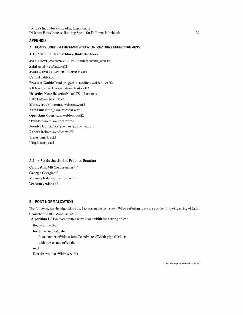
Towards Individuated Reading Experiences:Different Fonts Increase Reading Speed for Different Individuals 39
APPENDIX
A FONTS USED IN THE MAIN STUDY ON READING EFFECTIVENESS
A.1 16 Fonts Used in Main Study Sections
Avenir Next (AvenirNextLTPro-Regular) Avenir_next.ttc
Arial Arial-webfont.woff2
Avant Garde ITCAvantGardePro-Bk.otf
Calibri calibri.otf
Franklin Gothic Franklin_gothic_medium-webfont.woff2
EB Garamond Garamond-webfont.woff2
Helvetica Neue HelveticaNeueLTStd-Roman.otf
Lato Lato-webfont.woff2
Montserrat Montserrat-webfont.woff2
Noto Sans Noto_sans-webfont.woff2
Open Sans Open_sans-webfont.woff2
Oswald oswald-webfont.woff2
Poynter Gothic Text poynter_gothic_text.otf
Roboto Roboto-webfont.woff2
Times Timr45w.ttf
Utopia utopia.otf
A.2 4 Fonts Used in the Practice Session
Comic Sans MS Comicsansms.ttf
Georgia Georgia.ttf
Raleway Raleway-webfont.woff2
Verdana verdana.ttf
B FONT NORMALIZATION
The following are the algorithms used to normalize font sizes. When referring to str we use the following string of Latin
Characters: ABC...Zabc...z012...9.Algorithm 1: How to compute the resultant width for a string of text.
float width = 0.0;
for (i : str.length()) dofloat characterWidth = font.GetAdvancedWidth(glyphIDs[i]);
width += characterWidth;
endResult: resultantWidth = width
Manuscript submitted to ACM
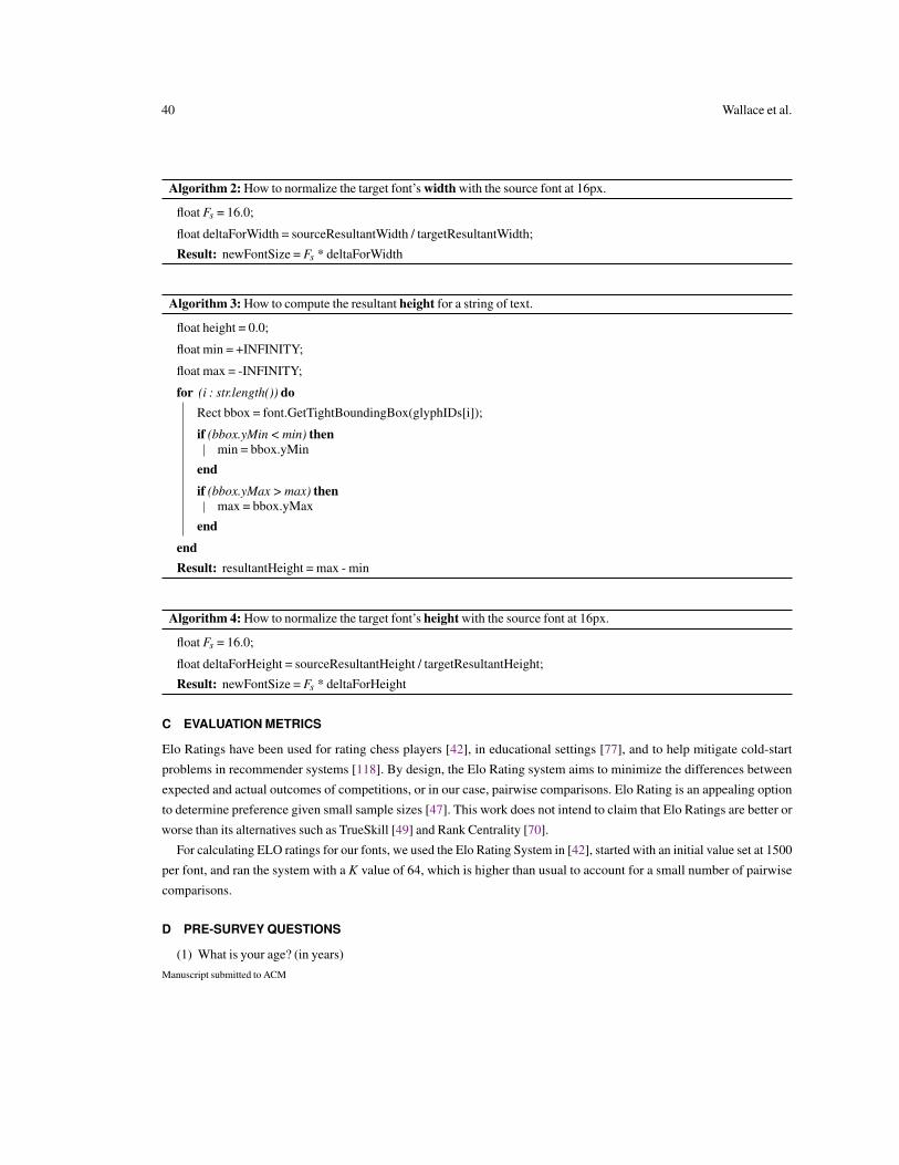
40 Wallace et al.
Algorithm 2: How to normalize the target font’s width with the source font at 16px.
float Fs = 16.0;
float deltaForWidth = sourceResultantWidth / targetResultantWidth;
Result: newFontSize = Fs * deltaForWidth
Algorithm 3: How to compute the resultant height for a string of text.
float height = 0.0;
float min = +INFINITY;
float max = -INFINITY;
for (i : str.length()) doRect bbox = font.GetTightBoundingBox(glyphIDs[i]);
if (bbox.yMin < min) thenmin = bbox.yMin
end
if (bbox.yMax > max) thenmax = bbox.yMax
end
endResult: resultantHeight = max - min
Algorithm 4: How to normalize the target font’s height with the source font at 16px.
float Fs = 16.0;
float deltaForHeight = sourceResultantHeight / targetResultantHeight;
Result: newFontSize = Fs * deltaForHeight
C EVALUATION METRICS
Elo Ratings have been used for rating chess players [42], in educational settings [77], and to help mitigate cold-start
problems in recommender systems [118]. By design, the Elo Rating system aims to minimize the differences between
expected and actual outcomes of competitions, or in our case, pairwise comparisons. Elo Rating is an appealing option
to determine preference given small sample sizes [47]. This work does not intend to claim that Elo Ratings are better or
worse than its alternatives such as TrueSkill [49] and Rank Centrality [70].
For calculating ELO ratings for our fonts, we used the Elo Rating System in [42], started with an initial value set at 1500
per font, and ran the system with a K value of 64, which is higher than usual to account for a small number of pairwise
comparisons.
D PRE-SURVEY QUESTIONS
(1) What is your age? (in years)Manuscript submitted to ACM
Towards Individuated Reading Experiences:Different Fonts Increase Reading Speed for Different Individuals 41
(2) What is your gender?
(3) What is/are your native language(s)
(4) What other languages do you speak?
(5) What is your highest attained education level?
(6) Please describe you current occupation:
(7) Do you feel comfortable with reading articles written in English?
(8) How would you rate your speed as a reader?
(9) How would you rate your proficiency as a reader?
(10) Do you read to young children, under the age of 6?
(11) Have you ever been diagnosed with a reading or learning disability (e.g., dyslexia)? If yes, which one and how long
ago?
(12) Have you ever been diagnosed with any medical and neurological conditions (macular degeneration, diabetes, ADD,
memory disorders, LPD, dyspraxia, etc...) If yes, which one/s and how long ago?
(13) Are you currently under the influence of any drugs, medications, alcohol, or other stimulants (e.g., caffeine, nicotine)
that may affect reading/attention? If yes, which?
(14) Do you have normal or corrected vision?
(15) If your vision is corrected, how was it corrected (glasses, lenses, surgery, etc.)?
(16) What device/s do you read on for leisure or personal interest?
(17) What device/s do you read on for work or study?
(18) What do you read for leisure or personal interest?
(19) What do you read for work or study?
(20) How often do you read English written articles for leisure or personal interest?
(21) How often do you read English written articles for work or study?
(22) Which device are you using right now to participate in this study?
(23) Please describe your current surroundings. For example, are you indoors/outside, by a window, under natural or
artificial light, is the room light/dark, is the room small/large?
E POST-SURVEY QUESTIONS
(1) How mentally demanding was the font (toggle) test?
(2) How physically demanding was the font (toggle) test?
(3) How hurried or rushed was the pace of the font (toggle) test?
(4) How successful were you in accomplishing what you were asked to do in the font (toggle) test?
(5) How hard did you have to work to accomplish your level of performance in the font (toggle) test?
(6) How insecure, discouraged, irritated, stressed, and annoyed were you during the font (toggle) test?
(7) How much fun, satisfaction, and enjoyment did you feel during the font (toggle) test?
(8) Can you comment on any strategies you used to complete this study?
(9) What do you think about the font that was recommended to you at the end of the task?
(10) Do you agree with the final font recommendation?
(11) Do you think you would use the recommended font for reading if you had a choice?
(12) How familiar are you with the recommended font?
(13) Do you feel your preferred font would also be your most effective font to read in?Manuscript submitted to ACM
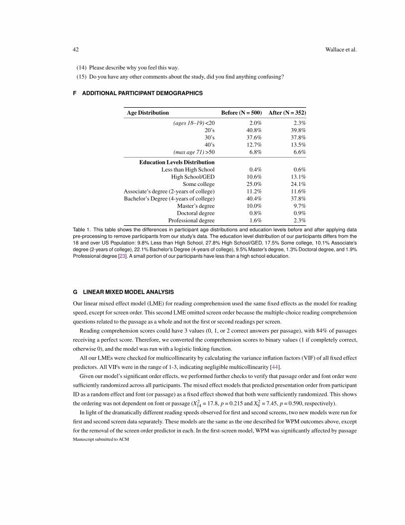
42 Wallace et al.
(14) Please describe why you feel this way.
(15) Do you have any other comments about the study, did you find anything confusing?
F ADDITIONAL PARTICIPANT DEMOGRAPHICS
Age Distribution Before (N = 500) After (N = 352)
(ages 18–19) <20 2.0% 2.3%20’s 40.8% 39.8%30’s 37.6% 37.8%40’s 12.7% 13.5%
(max age 71) >50 6.8% 6.6%
Education Levels DistributionLess than High School 0.4% 0.6%
High School/GED 10.6% 13.1%Some college 25.0% 24.1%
Associate’s degree (2-years of college) 11.2% 11.6%Bachelor’s Degree (4-years of college) 40.4% 37.8%
Master’s degree 10.0% 9.7%Doctoral degree 0.8% 0.9%
Professional degree 1.6% 2.3%
Table 1. This table shows the differences in participant age distributions and education levels before and after applying datapre-processing to remove participants from our study’s data. The education level distribution of our participants differs from the18 and over US Population: 9.8% Less than High School, 27.8% High School/GED, 17.5% Some college, 10.1% Associate’sdegree (2-years of college), 22.1% Bachelor’s Degree (4-years of college), 9.5% Master’s degree, 1.3% Doctoral degree, and 1.9%Professional degree [23]. A small portion of our participants have less than a high school education.
G LINEAR MIXED MODEL ANALYSIS
Our linear mixed effect model (LME) for reading comprehension used the same fixed effects as the model for reading
speed, except for screen order. This second LME omitted screen order because the multiple-choice reading comprehension
questions related to the passage as a whole and not the first or second readings per screen.
Reading comprehension scores could have 3 values (0, 1, or 2 correct answers per passage), with 84% of passages
receiving a perfect score. Therefore, we converted the comprehension scores to binary values (1 if completely correct,
otherwise 0), and the model was run with a logistic linking function.
All our LMEs were checked for multicollinearity by calculating the variance inflation factors (VIF) of all fixed effect
predictors. All VIFs were in the range of 1-3, indicating negligible multicollinearity [44].
Given our model’s significant order effects, we performed further checks to verify that passage order and font order were
sufficiently randomized across all participants. The mixed effect models that predicted presentation order from participant
ID as a random effect and font (or passage) as a fixed effect showed that both were sufficiently randomized. This shows
the ordering was not dependent on font or passage (X214 = 17.8, p = 0.215 and X2
9 = 7.45, p = 0.590, respectively).
In light of the dramatically different reading speeds observed for first and second screens, two new models were run for
first and second screen data separately. These models are the same as the one described for WPM outcomes above, except
for the removal of the screen order predictor in each. In the first-screen model, WPM was significantly affected by passageManuscript submitted to ACM
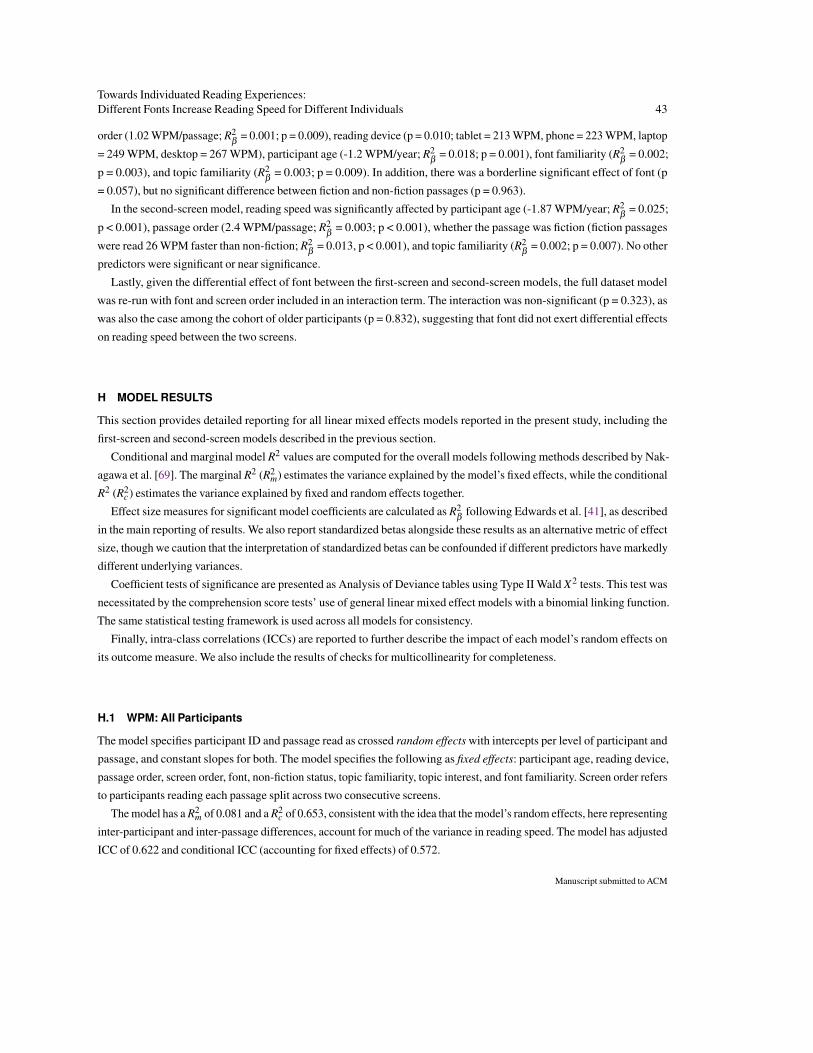
Towards Individuated Reading Experiences:Different Fonts Increase Reading Speed for Different Individuals 43
order (1.02 WPM/passage; R2β
= 0.001; p = 0.009), reading device (p = 0.010; tablet = 213 WPM, phone = 223 WPM, laptop
= 249 WPM, desktop = 267 WPM), participant age (-1.2 WPM/year; R2β
= 0.018; p = 0.001), font familiarity (R2β
= 0.002;
p = 0.003), and topic familiarity (R2β
= 0.003; p = 0.009). In addition, there was a borderline significant effect of font (p
= 0.057), but no significant difference between fiction and non-fiction passages (p = 0.963).
In the second-screen model, reading speed was significantly affected by participant age (-1.87 WPM/year; R2β
= 0.025;
p < 0.001), passage order (2.4 WPM/passage; R2β
= 0.003; p < 0.001), whether the passage was fiction (fiction passages
were read 26 WPM faster than non-fiction; R2β
= 0.013, p < 0.001), and topic familiarity (R2β
= 0.002; p = 0.007). No other
predictors were significant or near significance.
Lastly, given the differential effect of font between the first-screen and second-screen models, the full dataset model
was re-run with font and screen order included in an interaction term. The interaction was non-significant (p = 0.323), as
was also the case among the cohort of older participants (p = 0.832), suggesting that font did not exert differential effects
on reading speed between the two screens.
H MODEL RESULTS
This section provides detailed reporting for all linear mixed effects models reported in the present study, including the
first-screen and second-screen models described in the previous section.
Conditional and marginal model R2 values are computed for the overall models following methods described by Nak-
agawa et al. [69]. The marginal R2 (R2m) estimates the variance explained by the model’s fixed effects, while the conditional
R2 (R2c) estimates the variance explained by fixed and random effects together.
Effect size measures for significant model coefficients are calculated as R2β
following Edwards et al. [41], as described
in the main reporting of results. We also report standardized betas alongside these results as an alternative metric of effect
size, though we caution that the interpretation of standardized betas can be confounded if different predictors have markedly
different underlying variances.
Coefficient tests of significance are presented as Analysis of Deviance tables using Type II Wald X2 tests. This test was
necessitated by the comprehension score tests’ use of general linear mixed effect models with a binomial linking function.
The same statistical testing framework is used across all models for consistency.
Finally, intra-class correlations (ICCs) are reported to further describe the impact of each model’s random effects on
its outcome measure. We also include the results of checks for multicollinearity for completeness.
H.1 WPM: All Participants
The model specifies participant ID and passage read as crossed random effects with intercepts per level of participant and
passage, and constant slopes for both. The model specifies the following as fixed effects: participant age, reading device,
passage order, screen order, font, non-fiction status, topic familiarity, topic interest, and font familiarity. Screen order refers
to participants reading each passage split across two consecutive screens.
The model has a R2m of 0.081 and a R2
c of 0.653, consistent with the idea that the model’s random effects, here representing
inter-participant and inter-passage differences, account for much of the variance in reading speed. The model has adjusted
ICC of 0.622 and conditional ICC (accounting for fixed effects) of 0.572.
Manuscript submitted to ACM
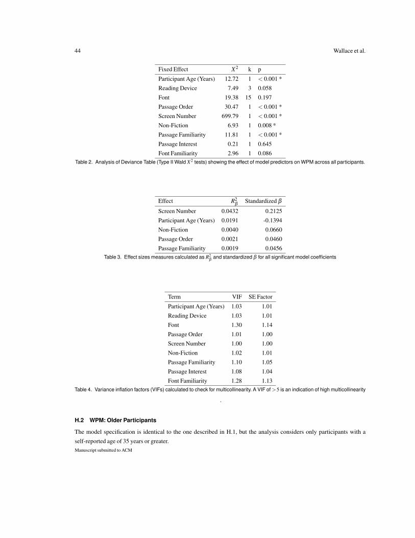
44 Wallace et al.
Fixed Effect X2 k p
Participant Age (Years) 12.72 1 < 0.001 *
Reading Device 7.49 3 0.058
Font 19.38 15 0.197
Passage Order 30.47 1 < 0.001 *
Screen Number 699.79 1 < 0.001 *
Non-Fiction 6.93 1 0.008 *
Passage Familiarity 11.81 1 < 0.001 *
Passage Interest 0.21 1 0.645
Font Familiarity 2.96 1 0.086Table 2. Analysis of Deviance Table (Type II Wald X2 tests) showing the effect of model predictors on WPM across all participants.
Effect R2β
Standardized β
Screen Number 0.0432 0.2125
Participant Age (Years) 0.0191 -0.1394
Non-Fiction 0.0040 0.0660
Passage Order 0.0021 0.0460
Passage Familiarity 0.0019 0.0456Table 3. Effect sizes measures calculated as R2
βand standardized β for all significant model coefficients
Term VIF SE Factor
Participant Age (Years) 1.03 1.01
Reading Device 1.03 1.01
Font 1.30 1.14
Passage Order 1.01 1.00
Screen Number 1.00 1.00
Non-Fiction 1.02 1.01
Passage Familiarity 1.10 1.05
Passage Interest 1.08 1.04
Font Familiarity 1.28 1.13Table 4. Variance inflation factors (VIFs) calculated to check for multicollinearity. A VIF of >5 is an indication of high multicollinearity
.
H.2 WPM: Older Participants
The model specification is identical to the one described in H.1, but the analysis considers only participants with a
self-reported age of 35 years or greater.Manuscript submitted to ACM

Towards Individuated Reading Experiences:Different Fonts Increase Reading Speed for Different Individuals 45
The model has a R2m of 0.128 and a R2
c of 0.705, consistent with the idea that the model’s random effects, here representing
inter-participant and inter-passage differences, account for much of the variance in reading speed. The model has adjusted
ICC of 0.661 and conditional ICC (accounting for fixed effects) of 0.577.
Fixed Effect X2 k pParticipant Age (Years) 9.47 1 0.002 *Reading Device 7.75 3 0.052Font 30.61 15 0.010 *Passage Order 13.20 1 < 0.001 *Screen Number 247.98 1 < 0.001 *Non-Fiction 9.40 1 0.002 *Passage Familiarity 8.48 1 0.004 *Passage Interest 0.83 1 0.362Font Familiarity 1.10 1 0.294
Table 5. Analysis of Deviance Table (Type II Wald X2 tests) showing the effect of model predictors on WPM across older participants.
Effect R2β
Standardized β
Screen Number 0.0396 0.2025Participant Age (Years) 0.0386 -0.2041Non-Fiction 0.0064 0.0867Passage Familiarity 0.0026 0.0550Passage Order 0.0023 0.0481(Font) Avantgarde 0.0016 -0.0426(Font) Oswald 0.0013 -0.0381(Font) Utopia 0.0008 -0.0311(Font) Franklin Gothic 0.0004 0.0234(Font) Calibri 0.0003 0.0232(Font) Open Sans 0.0002 -0.0144(Font) Helvetica 0.0001 -0.0105(Font) Avenir Next 0.0001 -0.0098(Font) Montserrat 0.0001 0.0097(Font) Times 0.0001 0.0124(Font) Lato 0.0000 -0.0073(Font) Poynter Gothic Text 0.0000 0.0053(Font) Garamond 0.0000 -0.0010(Font) Noto Sans 0.0000 0.0013(Font) Roboto 0.0000 0.0004
Table 6. Effect sizes measures calculated as R2β
and standardized β for all significant model coefficients
H.3 Comprehension: All Participants
The model specification is identical to the one described in section H.1, other than the following differences. Screen Number
is removed as a predictor because comprehension questions were associated with whole passages and not their individual
screens. The comprehension score outcome is binarized as either perfect comprehension (84% of comprehension tests)
or not. Lastly, the model was run as a general linear mixed effects model using a logistic linking function.Manuscript submitted to ACM
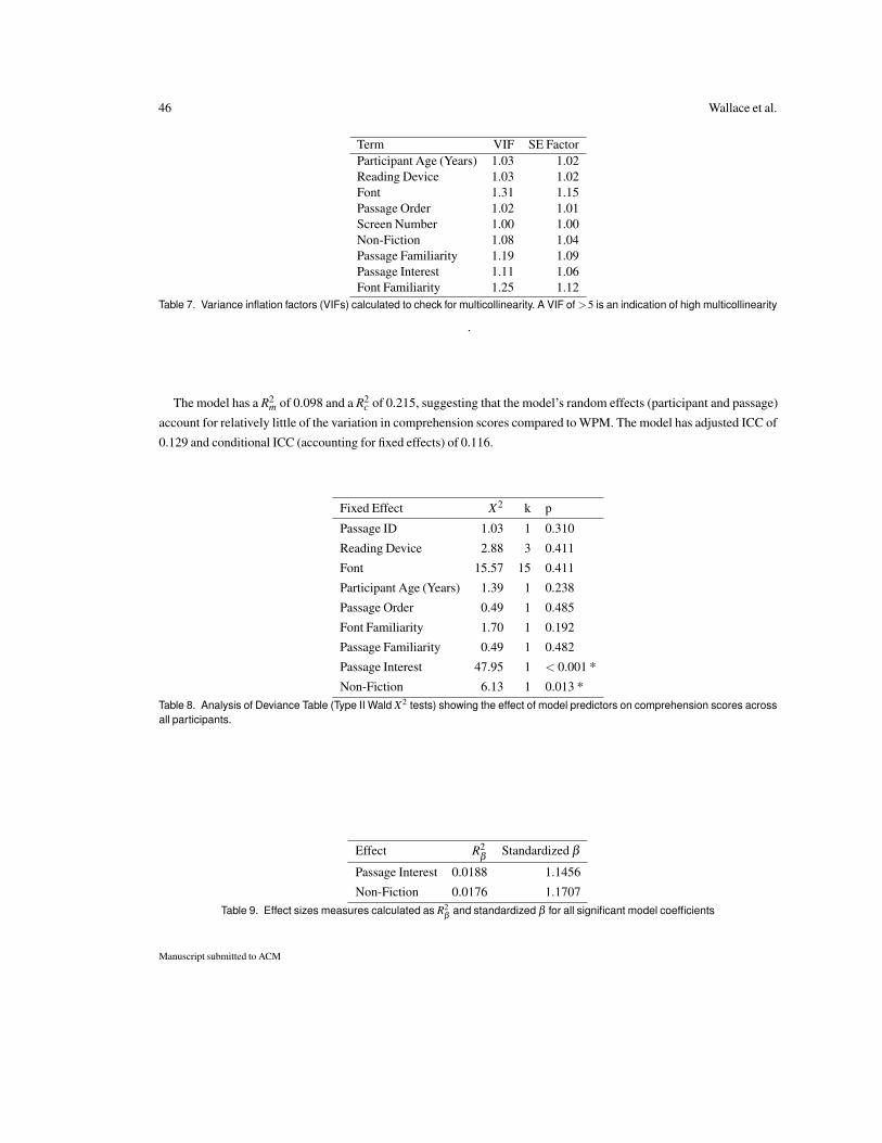
46 Wallace et al.
Term VIF SE FactorParticipant Age (Years) 1.03 1.02Reading Device 1.03 1.02Font 1.31 1.15Passage Order 1.02 1.01Screen Number 1.00 1.00Non-Fiction 1.08 1.04Passage Familiarity 1.19 1.09Passage Interest 1.11 1.06Font Familiarity 1.25 1.12
Table 7. Variance inflation factors (VIFs) calculated to check for multicollinearity. A VIF of >5 is an indication of high multicollinearity
.
The model has a R2m of 0.098 and a R2
c of 0.215, suggesting that the model’s random effects (participant and passage)
account for relatively little of the variation in comprehension scores compared to WPM. The model has adjusted ICC of
0.129 and conditional ICC (accounting for fixed effects) of 0.116.
Fixed Effect X2 k p
Passage ID 1.03 1 0.310
Reading Device 2.88 3 0.411
Font 15.57 15 0.411
Participant Age (Years) 1.39 1 0.238
Passage Order 0.49 1 0.485
Font Familiarity 1.70 1 0.192
Passage Familiarity 0.49 1 0.482
Passage Interest 47.95 1 < 0.001 *
Non-Fiction 6.13 1 0.013 *Table 8. Analysis of Deviance Table (Type II Wald X2 tests) showing the effect of model predictors on comprehension scores acrossall participants.
Effect R2β
Standardized β
Passage Interest 0.0188 1.1456
Non-Fiction 0.0176 1.1707Table 9. Effect sizes measures calculated as R2
βand standardized β for all significant model coefficients
Manuscript submitted to ACM
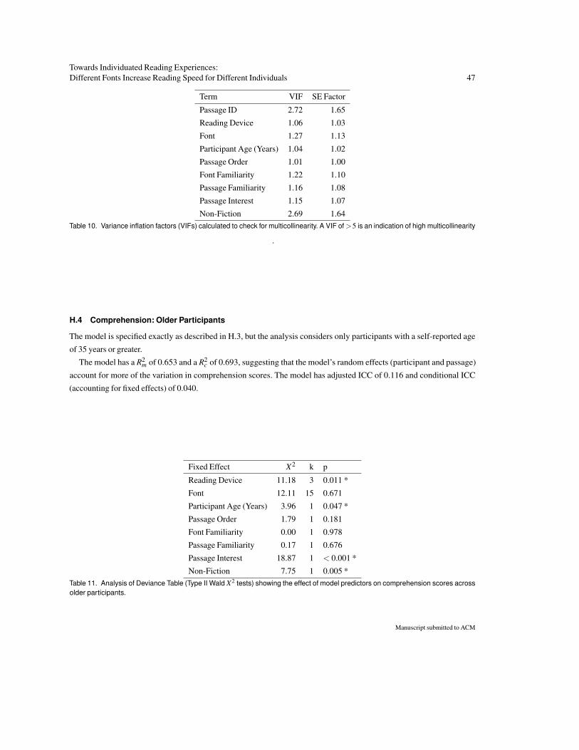
Towards Individuated Reading Experiences:Different Fonts Increase Reading Speed for Different Individuals 47
Term VIF SE Factor
Passage ID 2.72 1.65
Reading Device 1.06 1.03
Font 1.27 1.13
Participant Age (Years) 1.04 1.02
Passage Order 1.01 1.00
Font Familiarity 1.22 1.10
Passage Familiarity 1.16 1.08
Passage Interest 1.15 1.07
Non-Fiction 2.69 1.64Table 10. Variance inflation factors (VIFs) calculated to check for multicollinearity. A VIF of >5 is an indication of high multicollinearity
.
H.4 Comprehension: Older Participants
The model is specified exactly as described in H.3, but the analysis considers only participants with a self-reported age
of 35 years or greater.
The model has a R2m of 0.653 and a R2
c of 0.693, suggesting that the model’s random effects (participant and passage)
account for more of the variation in comprehension scores. The model has adjusted ICC of 0.116 and conditional ICC
(accounting for fixed effects) of 0.040.
Fixed Effect X2 k p
Reading Device 11.18 3 0.011 *
Font 12.11 15 0.671
Participant Age (Years) 3.96 1 0.047 *
Passage Order 1.79 1 0.181
Font Familiarity 0.00 1 0.978
Passage Familiarity 0.17 1 0.676
Passage Interest 18.87 1 < 0.001 *
Non-Fiction 7.75 1 0.005 *Table 11. Analysis of Deviance Table (Type II Wald X2 tests) showing the effect of model predictors on comprehension scores acrossolder participants.
Manuscript submitted to ACM
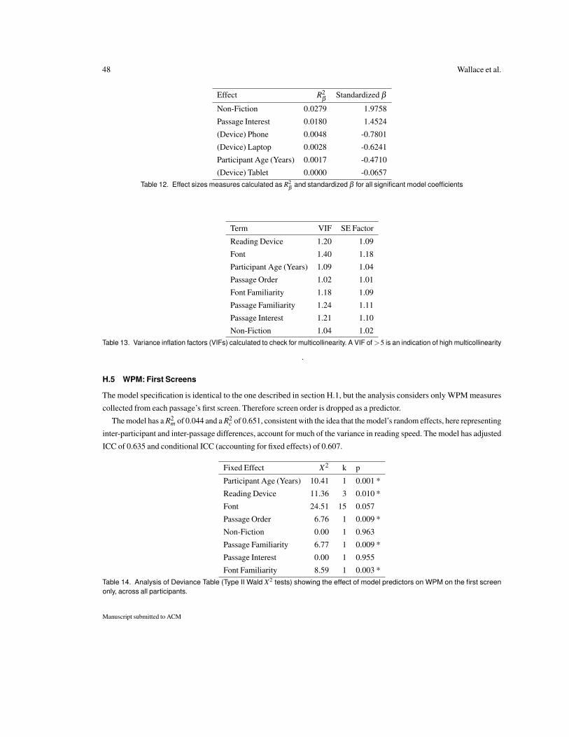
48 Wallace et al.
Effect R2β
Standardized β
Non-Fiction 0.0279 1.9758
Passage Interest 0.0180 1.4524
(Device) Phone 0.0048 -0.7801
(Device) Laptop 0.0028 -0.6241
Participant Age (Years) 0.0017 -0.4710
(Device) Tablet 0.0000 -0.0657Table 12. Effect sizes measures calculated as R2
βand standardized β for all significant model coefficients
Term VIF SE Factor
Reading Device 1.20 1.09
Font 1.40 1.18
Participant Age (Years) 1.09 1.04
Passage Order 1.02 1.01
Font Familiarity 1.18 1.09
Passage Familiarity 1.24 1.11
Passage Interest 1.21 1.10
Non-Fiction 1.04 1.02Table 13. Variance inflation factors (VIFs) calculated to check for multicollinearity. A VIF of >5 is an indication of high multicollinearity
.
H.5 WPM: First Screens
The model specification is identical to the one described in section H.1, but the analysis considers only WPM measures
collected from each passage’s first screen. Therefore screen order is dropped as a predictor.
The model has a R2m of 0.044 and a R2
c of 0.651, consistent with the idea that the model’s random effects, here representing
inter-participant and inter-passage differences, account for much of the variance in reading speed. The model has adjusted
ICC of 0.635 and conditional ICC (accounting for fixed effects) of 0.607.
Fixed Effect X2 k p
Participant Age (Years) 10.41 1 0.001 *
Reading Device 11.36 3 0.010 *
Font 24.51 15 0.057
Passage Order 6.76 1 0.009 *
Non-Fiction 0.00 1 0.963
Passage Familiarity 6.77 1 0.009 *
Passage Interest 0.00 1 0.955
Font Familiarity 8.59 1 0.003 *Table 14. Analysis of Deviance Table (Type II Wald X2 tests) showing the effect of model predictors on WPM on the first screenonly, across all participants.
Manuscript submitted to ACM
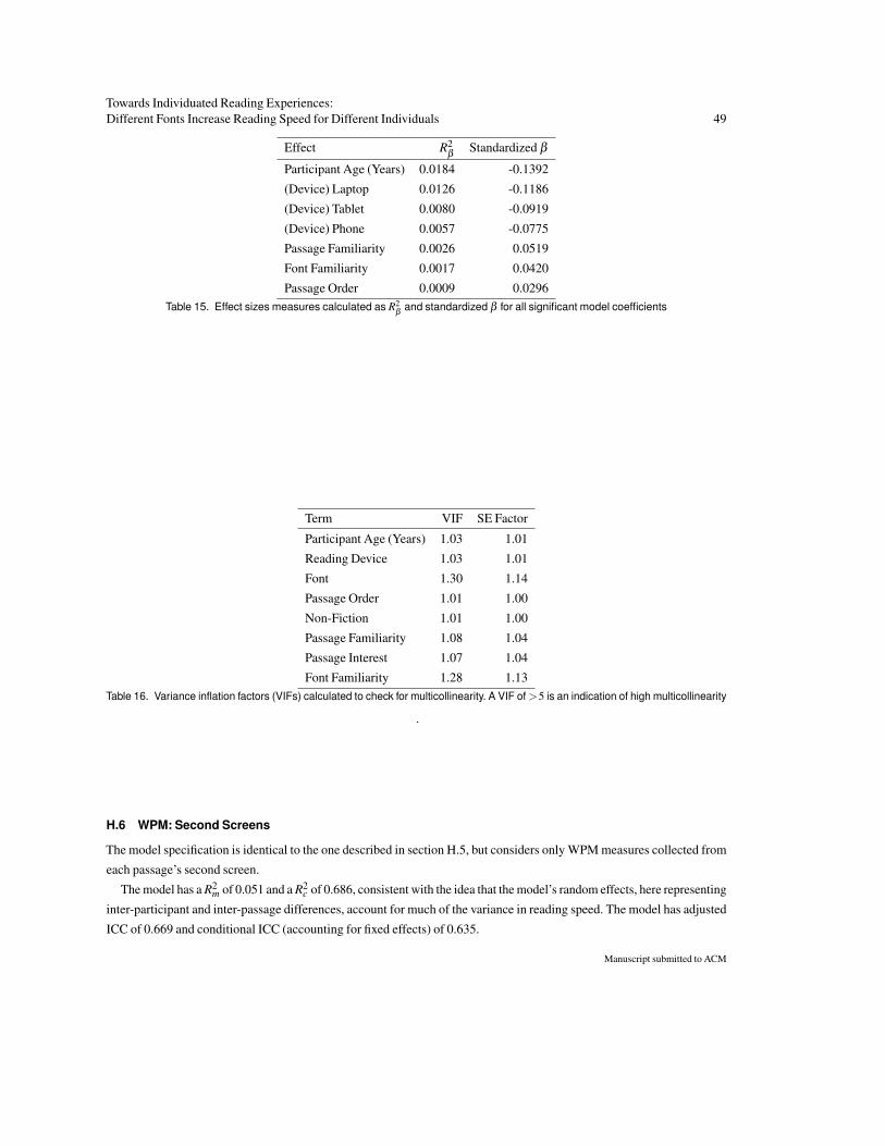
Towards Individuated Reading Experiences:Different Fonts Increase Reading Speed for Different Individuals 49
Effect R2β
Standardized β
Participant Age (Years) 0.0184 -0.1392
(Device) Laptop 0.0126 -0.1186
(Device) Tablet 0.0080 -0.0919
(Device) Phone 0.0057 -0.0775
Passage Familiarity 0.0026 0.0519
Font Familiarity 0.0017 0.0420
Passage Order 0.0009 0.0296Table 15. Effect sizes measures calculated as R2
βand standardized β for all significant model coefficients
Term VIF SE Factor
Participant Age (Years) 1.03 1.01
Reading Device 1.03 1.01
Font 1.30 1.14
Passage Order 1.01 1.00
Non-Fiction 1.01 1.00
Passage Familiarity 1.08 1.04
Passage Interest 1.07 1.04
Font Familiarity 1.28 1.13Table 16. Variance inflation factors (VIFs) calculated to check for multicollinearity. A VIF of >5 is an indication of high multicollinearity
.
H.6 WPM: Second Screens
The model specification is identical to the one described in section H.5, but considers only WPM measures collected from
each passage’s second screen.
The model has a R2m of 0.051 and a R2
c of 0.686, consistent with the idea that the model’s random effects, here representing
inter-participant and inter-passage differences, account for much of the variance in reading speed. The model has adjusted
ICC of 0.669 and conditional ICC (accounting for fixed effects) of 0.635.
Manuscript submitted to ACM
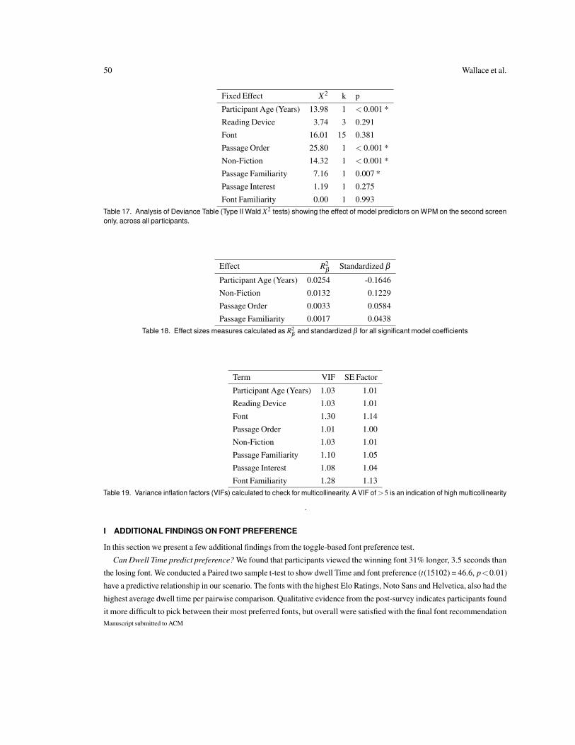
50 Wallace et al.
Fixed Effect X2 k p
Participant Age (Years) 13.98 1 < 0.001 *
Reading Device 3.74 3 0.291
Font 16.01 15 0.381
Passage Order 25.80 1 < 0.001 *
Non-Fiction 14.32 1 < 0.001 *
Passage Familiarity 7.16 1 0.007 *
Passage Interest 1.19 1 0.275
Font Familiarity 0.00 1 0.993Table 17. Analysis of Deviance Table (Type II Wald X2 tests) showing the effect of model predictors on WPM on the second screenonly, across all participants.
Effect R2β
Standardized β
Participant Age (Years) 0.0254 -0.1646
Non-Fiction 0.0132 0.1229
Passage Order 0.0033 0.0584
Passage Familiarity 0.0017 0.0438Table 18. Effect sizes measures calculated as R2
βand standardized β for all significant model coefficients
Term VIF SE Factor
Participant Age (Years) 1.03 1.01
Reading Device 1.03 1.01
Font 1.30 1.14
Passage Order 1.01 1.00
Non-Fiction 1.03 1.01
Passage Familiarity 1.10 1.05
Passage Interest 1.08 1.04
Font Familiarity 1.28 1.13Table 19. Variance inflation factors (VIFs) calculated to check for multicollinearity. A VIF of >5 is an indication of high multicollinearity
.
I ADDITIONAL FINDINGS ON FONT PREFERENCE
In this section we present a few additional findings from the toggle-based font preference test.
Can Dwell Time predict preference? We found that participants viewed the winning font 31% longer, 3.5 seconds than
the losing font. We conducted a Paired two sample t-test to show dwell Time and font preference (t(15102) = 46.6, p<0.01)
have a predictive relationship in our scenario. The fonts with the highest Elo Ratings, Noto Sans and Helvetica, also had the
highest average dwell time per pairwise comparison. Qualitative evidence from the post-survey indicates participants found
it more difficult to pick between their most preferred fonts, but overall were satisfied with the final font recommendationManuscript submitted to ACM
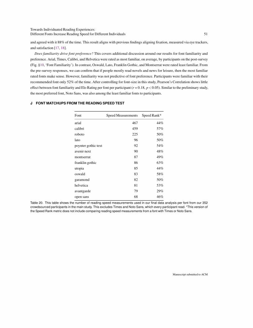
Towards Individuated Reading Experiences:Different Fonts Increase Reading Speed for Different Individuals 51
and agreed with it 88% of the time. This result aligns with previous findings aligning fixation, measured via eye trackers,
and satisfaction [17, 18].
Does familiarity drive font preference? This covers additional discussion around our results for font familiarity and
preference. Arial, Times, Calibri, and Helvetica were rated as most familiar, on average, by participants on the post-survey
(Fig. §10, ‘Font Familiarity’). In contrast, Oswald, Lato, Franklin Gothic, and Montserrat were rated least familiar. From
the pre-survey responses, we can confirm that if people mostly read novels and news for leisure, then the most familiar
rated fonts make sense. However, familiarity was not predictive of font preference. Participants were familiar with their
recommended font only 52% of the time. After controlling for font-size in this study, Pearson’s Correlation shows little
effect between font familiarity and Elo Rating per font per participant (r = 0.18, p<0.05). Similar to the preliminary study,
the most preferred font, Noto Sans, was also among the least familiar fonts to participants.
J FONT MATCHUPS FROM THE READING SPEED TEST
Font Speed Measurements Speed Rank*
arial 467 44%
calibri 459 57%
roboto 225 50%
lato 96 50%
poynter gothic text 92 54%
avenir next 90 48%
montserrat 87 49%
franklin gothic 86 63%
utopia 85 44%
oswald 83 58%
garamond 82 50%
helvetica 81 53%
avantgarde 79 29%
open sans 68 46%
Table 20. This table shows the number of reading speed measurements used in our final data analysis per font from our 352crowdsourced participants in the main study. This excludes Times and Noto Sans, which every participant read. *This version ofthe Speed Rank metric does not include comparing reading speed measurements from a font with Times or Noto Sans.
Manuscript submitted to ACM
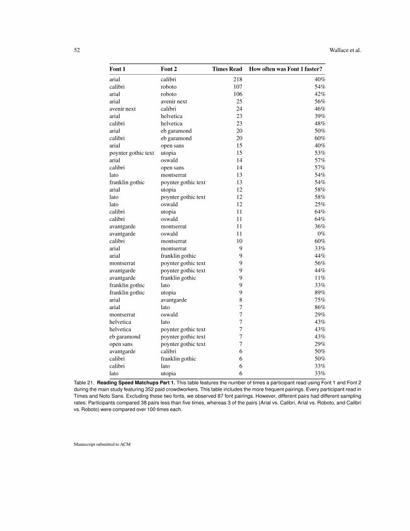
52 Wallace et al.
Font 1 Font 2 Times Read How often was Font 1 faster?
arial calibri 218 40%calibri roboto 107 54%arial roboto 106 42%arial avenir next 25 56%avenir next calibri 24 46%arial helvetica 23 39%calibri helvetica 23 48%arial eb garamond 20 50%calibri eb garamond 20 60%arial open sans 15 40%poynter gothic text utopia 15 53%arial oswald 14 57%calibri open sans 14 57%lato montserrat 13 54%franklin gothic poynter gothic text 13 54%arial utopia 12 58%lato poynter gothic text 12 58%lato oswald 12 25%calibri utopia 11 64%calibri oswald 11 64%avantgarde montserrat 11 36%avantgarde oswald 11 0%calibri montserrat 10 60%arial montserrat 9 33%arial franklin gothic 9 44%montserrat poynter gothic text 9 56%avantgarde poynter gothic text 9 44%avantgarde franklin gothic 9 11%franklin gothic lato 9 33%franklin gothic utopia 9 89%arial avantgarde 8 75%arial lato 7 86%montserrat oswald 7 29%helvetica lato 7 43%helvetica poynter gothic text 7 43%eb garamond poynter gothic text 7 43%open sans poynter gothic text 7 29%avantgarde calibri 6 50%calibri franklin gothic 6 50%calibri lato 6 33%lato utopia 6 33%
Table 21. Reading Speed Matchups Part 1. This table features the number of times a participant read using Font 1 and Font 2during the main study featuring 352 paid crowdworkers. This table includes the more frequent pairings. Every participant read inTimes and Noto Sans. Excluding these two fonts, we observed 87 font pairings. However, different pairs had different samplingrates: Participants compared 38 pairs less than five times, whereas 3 of the pairs (Arial vs. Calibri, Arial vs. Roboto, and Calibrivs. Roboto) were compared over 100 times each.
Manuscript submitted to ACM
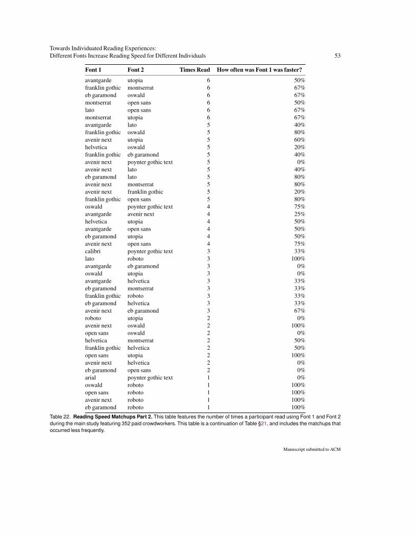
Towards Individuated Reading Experiences:Different Fonts Increase Reading Speed for Different Individuals 53
Font 1 Font 2 Times Read How often was Font 1 was faster?
avantgarde utopia 6 50%franklin gothic montserrat 6 67%eb garamond oswald 6 67%montserrat open sans 6 50%lato open sans 6 67%montserrat utopia 6 67%avantgarde lato 5 40%franklin gothic oswald 5 80%avenir next utopia 5 60%helvetica oswald 5 20%franklin gothic eb garamond 5 40%avenir next poynter gothic text 5 0%avenir next lato 5 40%eb garamond lato 5 80%avenir next montserrat 5 80%avenir next franklin gothic 5 20%franklin gothic open sans 5 80%oswald poynter gothic text 4 75%avantgarde avenir next 4 25%helvetica utopia 4 50%avantgarde open sans 4 50%eb garamond utopia 4 50%avenir next open sans 4 75%calibri poynter gothic text 3 33%lato roboto 3 100%avantgarde eb garamond 3 0%oswald utopia 3 0%avantgarde helvetica 3 33%eb garamond montserrat 3 33%franklin gothic roboto 3 33%eb garamond helvetica 3 33%avenir next eb garamond 3 67%roboto utopia 2 0%avenir next oswald 2 100%open sans oswald 2 0%helvetica montserrat 2 50%franklin gothic helvetica 2 50%open sans utopia 2 100%avenir next helvetica 2 0%eb garamond open sans 2 0%arial poynter gothic text 1 0%oswald roboto 1 100%open sans roboto 1 100%avenir next roboto 1 100%eb garamond roboto 1 100%
Table 22. Reading Speed Matchups Part 2. This table features the number of times a participant read using Font 1 and Font 2during the main study featuring 352 paid crowdworkers. This table is a continuation of Table §21, and includes the matchups thatoccurred less frequently.
Manuscript submitted to ACM
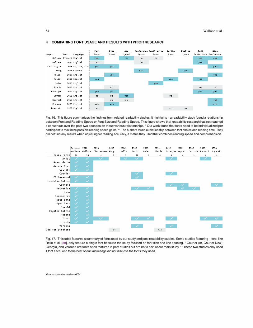
54 Wallace et al.
K COMPARING FONT USAGE AND RESULTS WITH PRIOR RESEARCH
Fig. 16. This figure summarizes the findings from related readability studies. It highlights if a readability study found a relationshipbetween Font and Reading Speed or Font Size and Reading Speed. This figure shows that readability research has not reacheda consensus over the past two decades on these various relationships. * Our work found that fonts need to be individualized perparticipant to maximize possible reading speed gains. ** The authors found a relationship between font choice and reading time. Theydid not find any results when adjusting for reading accuracy, a metric they used that combines reading speed and comprehension.
Fig. 17. This table features a summary of fonts used by our study and past readability studies. Some studies featuring 1 font, likeRello et al. [88], only feature a single font because the study focused on font size and line spacing. * Courier (or, Courier New),Georgia, and Verdana are fonts often featured in past studies but are not a part of our main study. ** These two studies only used1 font each, and to the best of our knowledge did not disclose the fonts they used.
Manuscript submitted to ACM