Developing System Outcomes for Improved Effectiveness
40
Developing System Outcomes for Improved Effectiveness C.J. Johnson L.M.H.P. and L.C.S.W.
-
Upload
khangminh22 -
Category
Documents
-
view
0 -
download
0
Transcript of Developing System Outcomes for Improved Effectiveness

Developing System
Outcomes for Improved
Effectiveness
C.J. Johnson
L.M.H.P. and L.C.S.W.
“If people do not participate in
decisions, there is little to
prevent them from assuming
that things would have been
better, ‘if I’d been in charge’.”
Unknown


Aim/Purpose Knowledge Motivation Resources Action Plan
Execution
Assessment
Feedback/Data
= Happiness
QualityChange
Knowledge Motivation Resources Action Plan
Execution
Assessment
Feedback/Data
= Confusion
Conflict
Aim/Purpose Motivation Resources Action Plan
Execution
Assessment
Feedback/Data
= Fear-Failure
Anxiety
Aim/Purpose Knowledge Resources Action Plan
Execution
Assessment
Feedback/Data
= Passivity
Mediocrity
Aim/Purpose Knowledge Motivation Action Plan
Execution
Assessment
Feedback/Data
= Frustration
Overload
Aim/Purpose Knowledge Motivation Resources Assessment
Feedback/Data
= Resentment
Fragmentation
Aim/Purpose Knowledge Motivation Resources Action Plan
Execution
= Illusion of
Change
2003 Robert Hoglund

Partners
(Associates)Allies
Adversaries Opponents
Ag
ree
me
nt
High Outcome Agreement
Low Respect
High Outcome Agreement
High Respect
Low Outcome Agreement
High Respect
Low Outcome Agreement
Low Respect
Trust
Fence Sitters

Useful Team Processing
Tools
A number of tools have been developed to
provide a structure which facilitates team
discussion, exploration of ideas, and
discussion making. Examples include:
Seven Management and Planning Tools
• Activity Network Diagram
• Interrelationship Digraph
• Prioritization Matrix
• Tree Diagram
• Affinity Diagram
• Matrix Diagram
• Process Decision Program
Chart
Source: The Memory JoggerPlus+, GOAL/QPC, 13 Branch Street,
Methuen, MA 01844, 508-685-3900, Fax 508-685-6151

Useful Team Processing
Tools- Continued
Others
• McNeill’s Agenda Planner
• Brainstorming
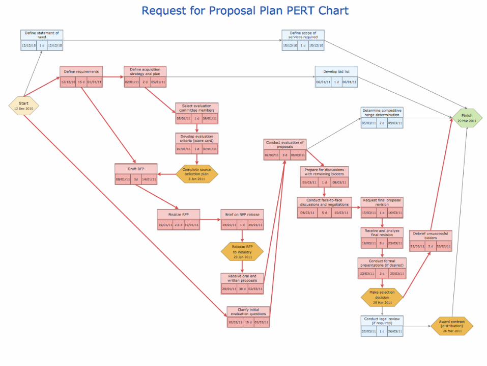
• Deployment Flow Chart
• Force Field Analysis
• Impact/Changeability (9-Block)
• Issue Bin
• Nominal Group Technique
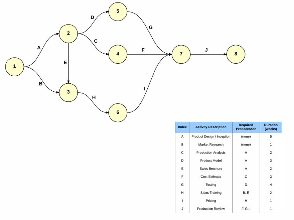
• P.E.R.T. Chart
• Radar Chart
• Stability Chart
• Assignment Matrix
• Consensogram
• Fishbone Diagram
• Histograms
• Integrative Analysis Diagram
• Multivoting
• Pareto Chart
• Progress Check
• Run Charts
Source: The Memory JoggerPlus+, GOAL/QPC, 13 Branch Street,
Methuen, MA 01844, 508-685-3900, Fax 508-685-6151

MISSION & VALUES
STRATEGIC PLAN
APIP*
Corporate
Compliance
Cultural
Diversity
Input from
Persons
Served
Clinical
Quality/Outcomes
Safety
Risk
Financial
HR/Training
Management
Summary
APIP- Annual Performance Improvement Plan
Information Management and Performance Improvement
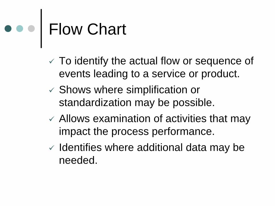
Flow Chart
✓ To identify the actual flow or sequence of
events leading to a service or product.
✓ Shows where simplification or
standardization may be possible.
✓ Allows examination of activities that may
impact the process performance.
✓ Identifies where additional data may be
needed.

Flowchart: Bank Payment
Online
Payment
Payment
Processed
Day 0 Day 1 Day 2 Day 4 Day 10
Withdrawal from
AccountComplete
Paper
CheckComplete
Electronic
PaymentComplete

Flow Chart: How To Do It
1. Determine the frame or boundaries of the process.
2. Determine the steps in the process.
3. Sequence the steps.
4. Draw the Flowchart using consistent symbols.
❍ An oval is used to show the materials, information,
or action (inputs) to start the process or to show
the results at the end (output) of the process.
☐ A box or rectangle is used to show a task or
activity performed in the process. Although
multiple arrows may come into each box, usually
only one output or arrow leaves each activity box.
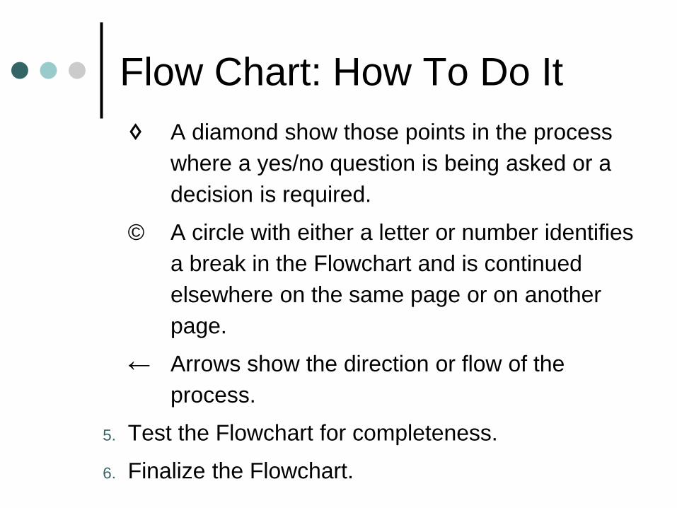
Flow Chart: How To Do It
♢ A diamond show those points in the process
where a yes/no question is being asked or a
decision is required.
© A circle with either a letter or number identifies
a break in the Flowchart and is continued
elsewhere on the same page or on another
page.
← Arrows show the direction or flow of the
process.
5. Test the Flowchart for completeness.
6. Finalize the Flowchart.
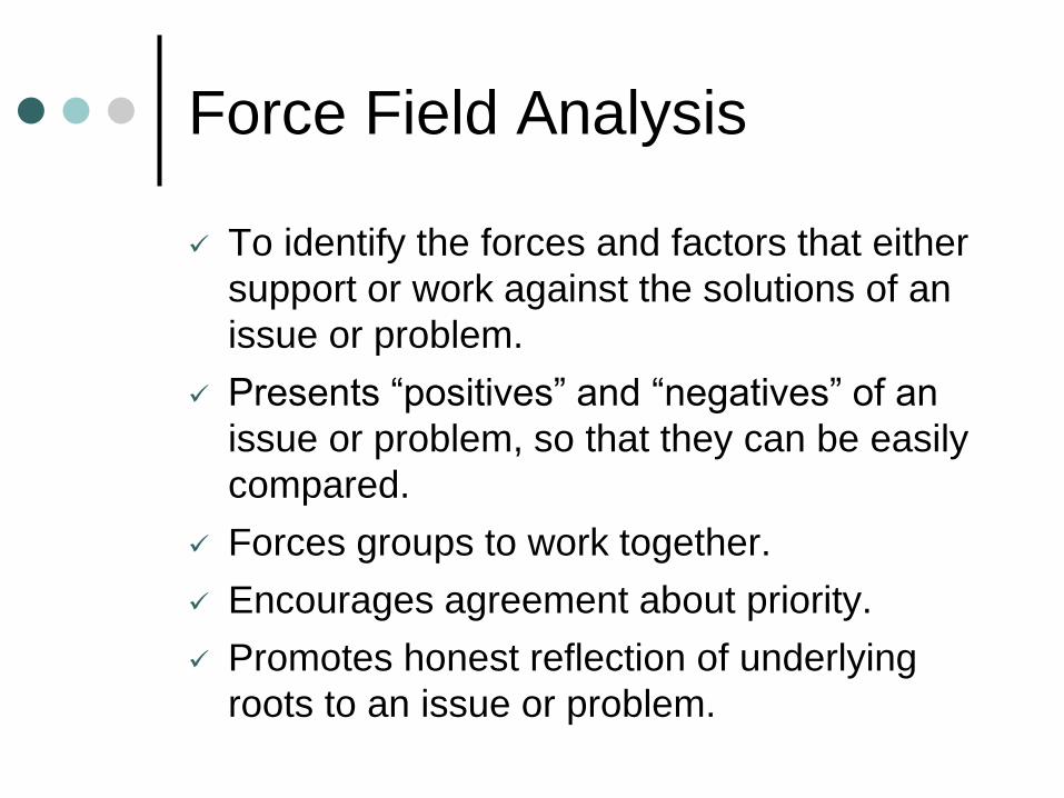
Force Field Analysis
✓ To identify the forces and factors that either
support or work against the solutions of an
issue or problem.
✓ Presents “positives” and “negatives” of an
issue or problem, so that they can be easily
compared.
✓ Forces groups to work together.
✓ Encourages agreement about priority.
✓ Promotes honest reflection of underlying
roots to an issue or problem.
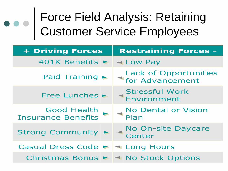
Force Field Analysis: Retaining
Customer Service Employees
+ Driving Forces Restraining Forces -
401K Benefits Low Pay
Paid TrainingLack of Opportunities
for Advancement
Free LunchesStressful Work
Environment
Good Health
Insurance Benefits
No Dental or Vision
Plan
Strong CommunityNo On-site Daycare
Center
Casual Dress Code Long Hours
Christmas Bonus No Stock Options


Force Field Analysis:
How To Do It1. Draw a large letter “T” on a flipchart.
2. At the top of the T, write the issue or problem that
you plan to analyze.
3. To the far right of the top of the T, write a description
of the ideal situation you would like to achieve,
eliminate, avoid, or maintain.
4. Brainstorm the forces that are driving you towards
the ideal situation. List them on the left side.
5. Brainstorm the forces that are restraining movement
toward the ideal state. List them on the right side.
Force Field Analysis:
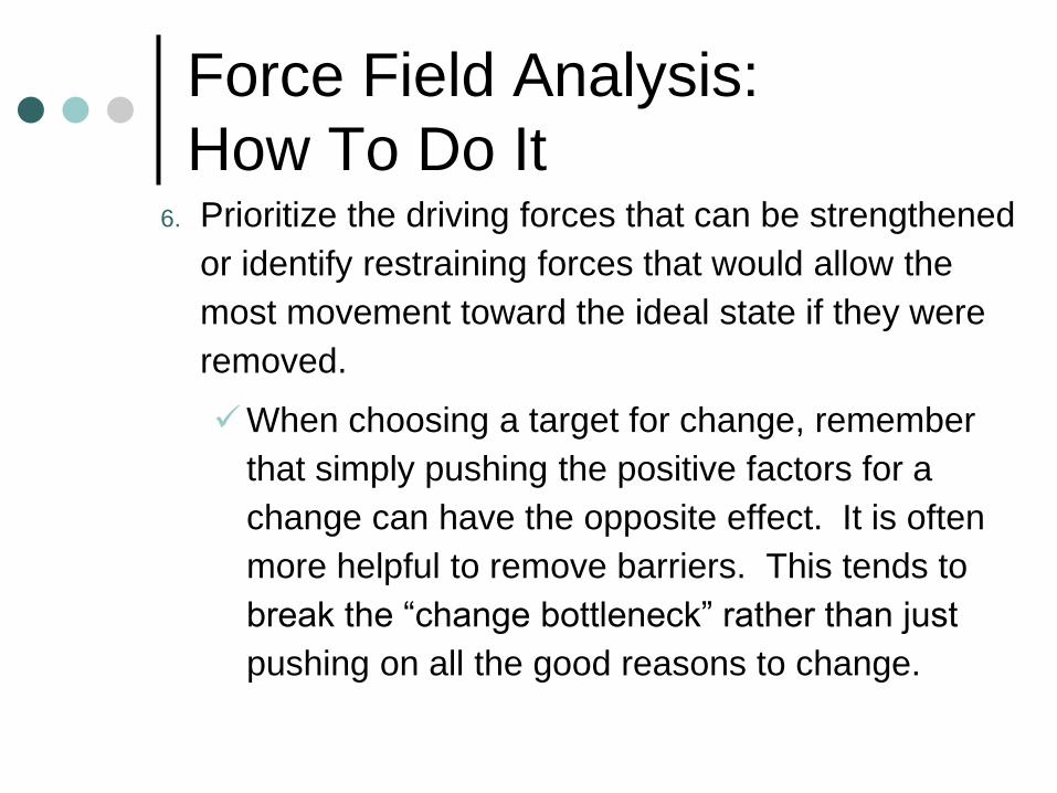
How To Do It6. Prioritize the driving forces that can be strengthened
or identify restraining forces that would allow the
most movement toward the ideal state if they were
removed.
✓When choosing a target for change, remember
that simply pushing the positive factors for a
change can have the opposite effect. It is often
more helpful to remove barriers. This tends to
break the “change bottleneck” rather than just
pushing on all the good reasons to change.
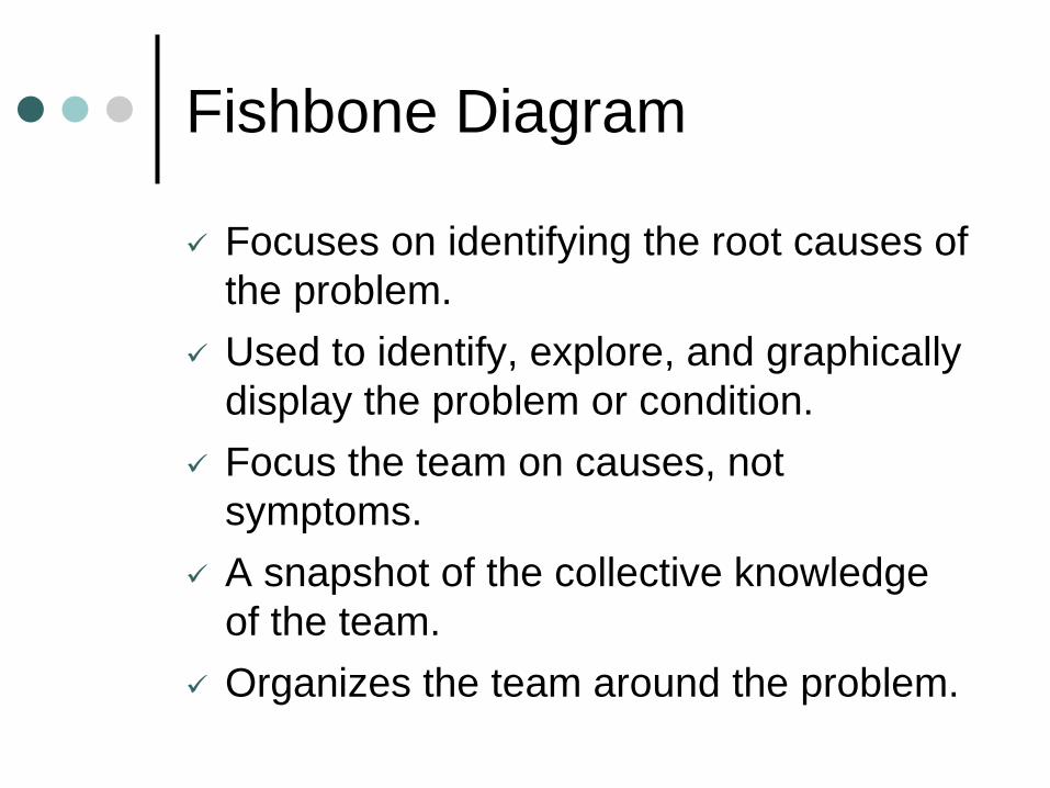
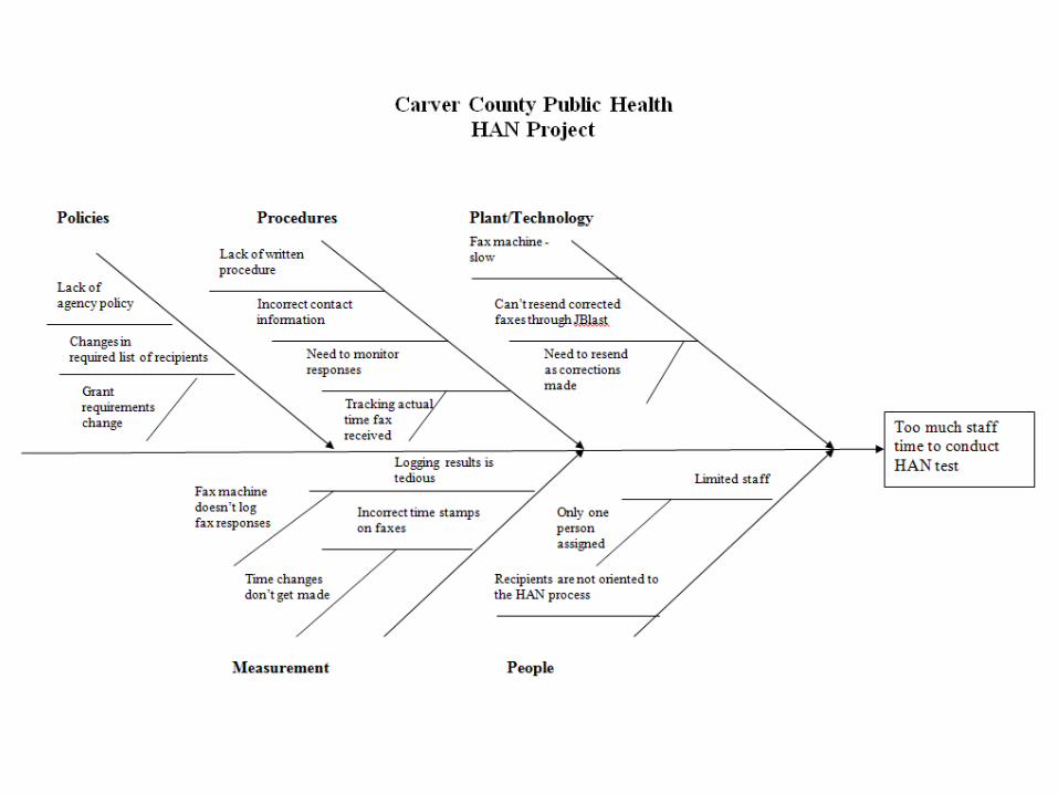
Fishbone Diagram
✓ Focuses on identifying the root causes of
the problem.
✓ Used to identify, explore, and graphically
display the problem or condition.
✓ Focus the team on causes, not
symptoms.
✓ A snapshot of the collective knowledge
of the team.
✓ Organizes the team around the problem.
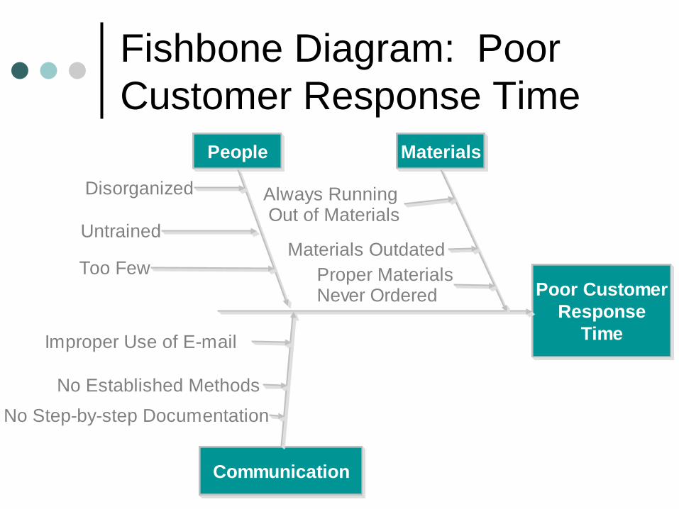
Fishbone Diagram: Poor
Customer Response Time
Poor Customer
Response
Time
Materials
Communication
People
Disorganized
Untrained
Too Few
Improper Use of E-mail
No Established Methods
No Step-by-step Documentation
Always Running Out of Materials
Materials Outdated
Proper MaterialsNever Ordered


Fishbone Diagram:
How To Do It1. Select the most appropriate cause & effect format.
There are two major formats:
✓ Dispersion Analysis Type - Constructed by
placing individual causes within each “major”
cause category and then asking of each individual
cause “Why does this cause happen?”
• This question is repeated for the next level of
detail until the team runs out of causes.
✓ Process Classification Type - Uses the major
steps of the process in place of the major cause
categories. The root cause questioning process is
the same as the Dispersion Analysis Type.

Fishbone Diagram:
How To Do It2. Generate the causes needed to build a Cause &
Effect Diagram.
Choose one method:
✓ Brainstorming
✓ Check Sheets
3. Construct the Cause & Effect/Fishbone Diagram.
Place the problem statement in a box on the right
hand side of the writing surface.
✓ Draw major cause categories or steps in the
production or service process. Connect them to
the “backbone” of the fishbone chart.

Fishbone Diagram:
How To Do It✓ Place the brainstormed or data-based causes in the
appropriate category.
✓ Repeatedly ask one of the two following questions of each cause listed on the “bones”:
• “Why does it happen?”
• “What could happen?”
✓ Interpret or test for root cause(s) by one or more of the following:
• Look for causes that appear repeatedly within or across major cause categories.
• Select through either an unstructured consensus process or one that is structured.
• Gather data to determine the relative frequencies of the different causes.
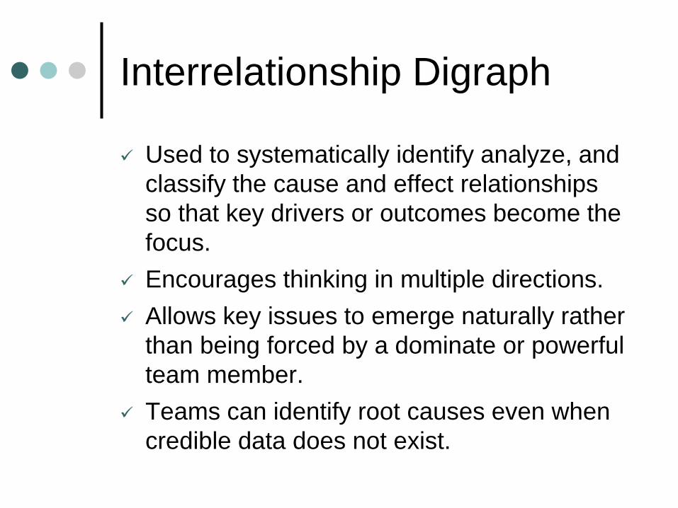
Interrelationship Digraph
✓ Used to systematically identify analyze, and
classify the cause and effect relationships
so that key drivers or outcomes become the
focus.
✓ Encourages thinking in multiple directions.
✓ Allows key issues to emerge naturally rather
than being forced by a dominate or powerful
team member.
✓ Teams can identify root causes even when
credible data does not exist.

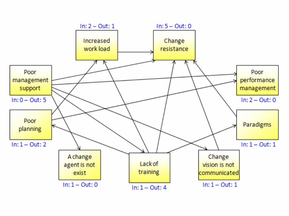
Interrelationship Digraph
High StaffTurnover
In =0 Out =3
Staff Doesn't KnowAbout Advertised
Specials
In =2 Out =1
Poorly TrainedHousekeeping
Staff
In =2 Out =2
Poor CommunicationBetween HotelDepartments
In =1 Out =1
Not EnoughHousekeeping Staff
In =1 Out =2
No CompanyE-mail System
In =0 Out =2
ManyCustomer
Complaints
In =4 Out =0
Room NotAvailable at
Check-in Time
In =2 Out =1
Long Waits ForRoom Service,
Meals Arrive Cold
In =2 Out =1
Not EnoughVacuumCleaners
In =0 Out =1


Interrelationship Digraph:
How To Do It1. Agree on the issue/problem statement.
2. Assemble the right team.
3. Lay out all the idea/issue cards that have either
been brought from other tools or brainstormed.
✓ Arrange the “cards” in a large circular pattern,
leaving as much space as possible for drawing
arrows.
✓ Use large, bold printing, including a large letter
on each idea for quick reference later in the
process.
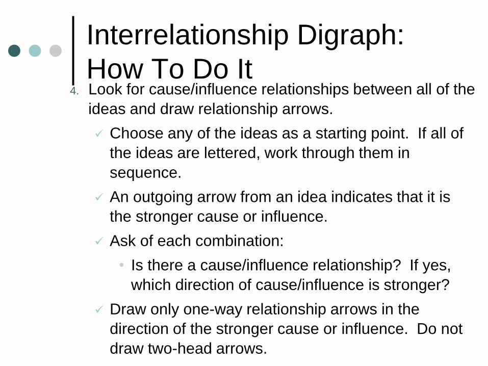
Interrelationship Digraph:
How To Do It4. Look for cause/influence relationships between all of the
ideas and draw relationship arrows.
✓ Choose any of the ideas as a starting point. If all of
the ideas are lettered, work through them in
sequence.
✓ An outgoing arrow from an idea indicates that it is
the stronger cause or influence.
✓ Ask of each combination:
• Is there a cause/influence relationship? If yes,
which direction of cause/influence is stronger?
✓ Draw only one-way relationship arrows in the
direction of the stronger cause or influence. Do not
draw two-head arrows.
Interrelationship Digraph:
How To Do It5. Optional: Review and revise the first round.
6. Tally the number of outgoing and incoming arrows
and select key items for further planning.
✓ Record and clearly mark next to each issue the
number of arrows going in and out of it.
✓ Find the item(s) with the highest number of
outgoing arrows and the item(s) with the highest
number of incoming arrows.
✓ Outgoing arrows- A high number of outgoing
arrows indicates an item that is a root cause or
driver. This is generally the issue that teams
tackle first.
Interrelationship Digraph:
How To Do It✓ Incoming arrows- A high number of incoming
arrows indicates an item that is a key outcome.
This can become a focus for planning either as a
meaningful measure of overall success or as a
redefinition of the original issue under
discussion.
7. Draw the final Interrelationship Digraph.
✓ Identify visually the key drivers (greatest number
of outgoing arrows) and the key outcomes
(greatest number of incoming arrows).

Questions