
Designing in the Advanced Designer - Messenger Stationery
23
1 Designing in the Advanced Designer The Advanced Designer differs from the Fast Track in that it provides the user much more control in terms of editing and customizing your stationery design. Let’s breakdown the various tools and controls available within the Advanced Designer screen. Overview: 1. Menu – displays menu options, including a link to online help resources 2. Back to FastTrack button – returns to editing active design in the FastTrack mode 3. Selection box – selects an element for editing, hold CTRL while clicking to select multiple elements 4. Add elements – displays options to add case fields, text boxes, blank lines, design elements, verses, etc. 5. Element controls – various tools for altering an element – fonts/sizes/styles, image effects, text alignment, etc. 6. Ruler – on screen measurement reference 7. Panel controls – tools for navigating between panels, adding/removing panels, zoom, etc. 8. Save, Save as Template, and Print buttons – saves design and/or template, generates PDF for printing, respectively 9. Grid Overlay/ Grid Toggle Checkbox – turns on or off display of a grid overlay for alignment purposes Panels not Pages In Make It Personal, we refer to a single print surface as a panel, not a page, as the resulting finished product’s actual pagination can vary depending on if they are folded, or have multiple “ups”.
-
Upload
khangminh22 -
Category
Documents
-
view
2 -
download
0
Transcript of Designing in the Advanced Designer - Messenger Stationery

1
Designing in the Advanced Designer
The Advanced Designer differs from the Fast Track in that it provides the user much more control in terms of editing and customizing your stationery design. Let’s breakdown the various tools and controls available within the Advanced Designer screen.
Overview:
1. Menu – displays menu options, including a link to online help resources 2. Back to FastTrack button – returns to editing active design in the FastTrack mode 3. Selection box – selects an element for editing, hold CTRL while clicking to select multiple elements 4. Add elements – displays options to add case fields, text boxes, blank lines, design elements, verses, etc. 5. Element controls – various tools for altering an element – fonts/sizes/styles, image effects, text alignment, etc. 6. Ruler – on screen measurement reference 7. Panel controls – tools for navigating between panels, adding/removing panels, zoom, etc. 8. Save, Save as Template, and Print buttons – saves design and/or template, generates PDF for printing,
respectively 9. Grid Overlay/ Grid Toggle Checkbox – turns on or off display of a grid overlay for alignment purposes
Panels not Pages
In Make It Personal, we refer to a single print surface as a panel, not a page, as the resulting finished product’s actual pagination can vary depending on if they are folded, or have multiple “ups”.

2
Elements on a panel Any element (text or photos… anything that is “selectable”) can be moved and/or resized using familiar drag-and-drop techniques-- Simply mouse over the desired element, and click-hold and drag to move the element. To resize, click on the desired element, then mouse over one of the resizing handles (blue dots) and click-hold and drag to enlarge or shrink the element.
Layers & Layering Any element on a panel can be in front of, or behind any other element. The Send to Back and Send to Front buttons allow you to alter the order of the layering. In the example below we use these buttons to change the layering of the photo with the pink border.
A. Original collage layout. B. Photo is selected. C. Send to Back D. Send to Front
1. Send to Back 2. Send to Front

3
Adding Elements & Editing Case Data New elements can be added to a design’s panel using the Add Case Info / Add Item buttons located in the element controls area on the left of the screen. Clicking on either will reveal a fly-out with context specific options for each.
Clicking Add Case Info will display the Case Profile tabs: Basic, Advanced, and Case Images. These are a mirror of the same sections and fields found in the Case Profile under the Manage Case Info screen.
Various sections reside under each tab, and can be “collapsed” or “expanded” as needed, simply click on the title heading to toggle the view. In the example to the left, the Basic Information is collapsed, and the Funeral Home Information is expanded.
To edit any of the case info fields, simply click into that form, a text cursor will appear for editing. Be aware that some fields are combination fields, such as Full Name (First/Middle/Last/Nickname), Service Location (City/State), etc. You cannot edit the combined field; you must edit the individual component fields.
To add any field to the panel, mouse over the descriptor of that field, notice the cursor will change to a pointed finger, and click on the name of that field. The info will then “drop” onto the center of the panel, and can be moved, resized, styled from there.
Pro-tip: If you are adding a field that’s not present in the template, and it’s something you would use in most designs, it would be advantageous to save as a Custom Template. Refer to page 22 for info on saving as a Custom Template.

4
Clicking Add Item will display four buttons for adding free-form fields to which custom text can be entered: Text Box- a medium size/style for adding custom text Field Label – initially matches the size/style of existing Field Labels in the template. These are the small text descriptions the sit just below blank lines Heading – initially matches the size/style of the larger, often color coordinated Heading items; “In Memory Of”, “Services”, “Obituary”, etc. Blank Line – just a blank line matching the series color, drag from the side to increase the width
Why three separate categories when they are all essentially just text?? With the exception of Blank Lines, it is true that Text Boxes, Field Labels, and Headings are just text fields that accept typed or pasted text, and can be altered to any size, style, and color. The distinction comes into play when using the Global Font Control tool, which changes the font/style/color of ALL fields of a particular type throughout an entire design. More details to follow on the Global Font Control tool in the upcoming section, “Styling Text.”

5
Design Elements & Text Items
In Make It Personal Design Elements refer to graphics and images that are decorative in nature. These pieces of clip art include, but are not limited to decorative lines/flourishes, photo corners/frames, logos, fancy letters, and more. Text Items refer to a library of pre-composed poems, prayers, verses, lyrics, and quotes that exist in a text format, so that any of these when added to a design, can be sized and styled to coordinate with the rest of the design. In addition, you can easily add your own custom Design Elements and Text Items to your MIP account. Due to the large number of items in both, they have been organized under several categories to make finding the appropriate item easier.
Adding either Design Elements or Text Items to a panel is simple, just choose a category to browse, and then click on the title for Text Elements, or on the thumbnail tile for Design Elements. The item will then “drop” onto the current panel, and can be further manipulated from there.
Pro-tip: When resizing Design Element graphics, holding the SHIFT key while you drag to resize will maintain the proportions of the image, and prevent distortion.
Adding Custom Design Elements & Text Items
Adding your own custom item to either library works in relatively the same manner: Click the ADD+ button directly above the category drop-down to open a pop-up in which you can add your custom item.
In both instances, you will need to give the item a name, and choose a category to save it under.
For Design Elements, click Browse to navigate to an image file (.jpg, .png) to upload
For Text Items, simply type or paste in your text
Click Save when done. You will still need to “drop” the new item onto your panel as described at the beginning of this section.

6
Panel View and Navigation
In the Advanced Designer the panel view and navigation controls can be found in the dark blue area on the right side of the screen.
A. Undo/Redo – un-does/re-does last change made to the panel
B. >>> - Hide/Show this control panel
C. Panel Navigation – click a panel number to show/edit
that panel. Design changes are automatically saved each time you navigate to a different panel
D. Add/Delete Panel – Inserts a new blank panel after the currently selected panel / Deletes the currently selected panel
E. Reorder Panel – sends the currently selected panel forward or backwards in the ordered sequence of panels
F. Background – opens a pop-up to choose a new background image (for layout purposes only, non-printing)
G. Grid - Toggles gridlines off or on
H. Field Underline - Toggles placing an underline that extends the entire width of the selected field
I. Field Names - Toggles between displaying case data and the field names
J. Panel View – Toggles between Whole Panel or 1-up view
K. Zoom – reduce/enlarge the display of the panel canvas

7
Styling Text
To change the styling of a text element, first select it by clicking on the desired element. You can select multiple elements by holding the CTRL key on your keyboard, and clicking on additional elements.
Next, on the left side of the screen under the section labeled Tools, click on the icon with the big “T”. This will reveal all the font, size, style, color, and alignment options.
Global Font Control
To change one or more style attributes affecting all text elements (including blank lines) of a particular type throughout the entire design, use the Global Font Control tool (Globe icon).
Navigate to the tab of the category you wish to modify, and then choose the font’s Family, Size, Color, and Style.
Once you have edited the category to your liking, click Update ______ (name of category) to apply the change across the entire design. Click the “x” in the upper right to close the pop-up.
Reset to Series Defaults will return all elements to the templates original styles as originally designed by Messenger.

8
Name Format Make It Personal v2 has introduced a new field to accommodate the use of a nickname. As well, we have made it quick and easy to affect the placement of the nickname within the full name. Select the name field on the panel and click the pencil icon in the upper right corner. This will open a pop-up that will allow you to choose the position of the nickname.
Date Format & Culture In Make It Personal v2, the Date Format/Culture selector has moved, and is now editable by clicking the pencil icon on the top edge of any date field. This will open a pop-up that will allow you to choose from a variety of date styles, and either English or Spanish.

9
A Big Red Warning!
Occasionally, you may notice a particular piece of text appearing with a red coloration, and a small warning triangle in the top left corner. This is meant to indicate that all of the text is not displaying. Typically, this is because the field/selection box is too small for the amount of text at its current font size. This appearance will persist into the PDF, and print as such, so it is important to correct this before rendering your PDF.
It is quite simple to remedy these fields. Either click-hold and drag one of the resizing “dots” and drag outward to expand the size of your field, or decrease the size of the font, or a combination of the two until the field no longer appears with the red colored warning.

10
Field Alignment & Distribution
Make It Personal includes some powerful tools for quickly organizing/aligning/centering multiple elements. These are found under the Alignment Tools and the Distribution Tools icons in the Element Controls area.

11
Alignment Tools The “Align to ____” buttons take an element or elements, and moves them to align to a reference element. The reference element is simply the element you already have positioned as desired. In the example below, we’ll shift the randomly placed elements (1) towards the right to match the reference element at the top of the list (2). How this essentially works, is you have to have more than one element selected, and the element with it’s right edge that is already the furthest right will act as the referring element. In picture number three (3), the added dotted line to help illustrate where we expect the other selected elements’ right border to end up once we click Align to Right.

12
Alignment Tools (continued) This works in essentially the same manner when aligning in other directions. So if you are aligning left, all elements within your selection will move to the left so that their left edges align with the left edge of the element whose left border was already furthest to the left. Note the referring element does not move, rather the other selected elements move to align to it.
Pro-Tip: Make all your elements the same size easily before aligning by using the Same Width and Same Height functions described in the next section.
Distribution Tools
The Distribution Tools let you quickly align multiple elements.
Same Width
The Same Width function takes all elements selected and widens them to match the width of the widest element within that selection. In the example below all the elements expand horizontally, exactly matching the width of the top element.

13
Same Height
The Same Height function takes all elements selected and increases their height to match the tallest element within that selection. In the example below, we would like to make the top flourish exactly match the size of the one near the bottom of the page. First we’ll use Same Width to match the width of the bottom element (middle image). Then, using the Same Height button, the top elements grow taller, exactly matching the height of the bottom element.
A few key things to remember about using the Same Width/Height controls:
- you must have more than one element selected
- both functions will always increase the size of the smaller elements within the selection to match the largest element in that selection
- Same Width/Height and Align to…. functions can be applied to both text and picture elements

14
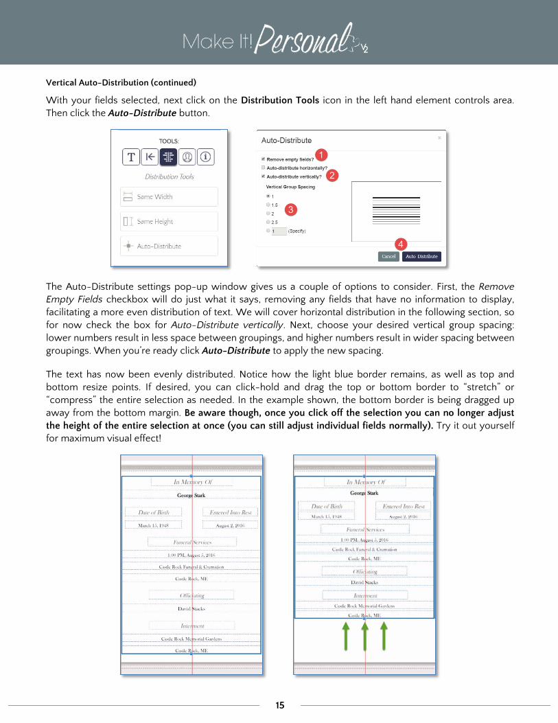
Auto-Distribute
This feature allows you to quickly and easily distribute text fields with even spacing vertically or horizontally on a panel. Note that Auto-Distribute is for text only, and not meant for pictures.
Vertical Auto-Distribution
In this example we’ll navigate to a panel for which we would like to more evenly space the vertical groupings. With your mouse, click-hold and drag your cursor to draw a selection box around all the text fields you wish to redistribute.
NOTE: The top-most and bottom-most fields in your selection will form the upper and lower boundaries, between which the text will be evenly distributed.
15
Vertical Auto-Distribution (continued)
With your fields selected, next click on the Distribution Tools icon in the left hand element controls area. Then click the Auto-Distribute button.
The Auto-Distribute settings pop-up window gives us a couple of options to consider. First, the Remove Empty Fields checkbox will do just what it says, removing any fields that have no information to display, facilitating a more even distribution of text. We will cover horizontal distribution in the following section, so for now check the box for Auto-Distribute vertically. Next, choose your desired vertical group spacing: lower numbers result in less space between groupings, and higher numbers result in wider spacing between groupings. When you’re ready click Auto-Distribute to apply the new spacing.
The text has now been evenly distributed. Notice how the light blue border remains, as well as top and bottom resize points. If desired, you can click-hold and drag the top or bottom border to “stretch” or “compress” the entire selection as needed. In the example shown, the bottom border is being dragged up away from the bottom margin. Be aware though, once you click off the selection you can no longer adjust the height of the entire selection at once (you can still adjust individual fields normally). Try it out yourself for maximum visual effect!

16
Horizontal Distribution
Horizontal Auto-Distribution will not be necessary nearly as often as the vertical Auto-Distribution feature will, as most templates do not entail more than two columns of text. However, with the highly personalized nature of Make It! Personal, there may arise an occasional need for this feature.
In this example, we’ve decided we want to put the Pall Bearers in three columns. Ideally, one would set these up in this manner once, and then save it as a Custom Template.
1. We will start this example from the point where we have already dropped our names onto the panel roughly where we want them.
2. Select all the name fields.
3. Use the Same Height/Width and Auto-Distribute vertically tools, respectively, to dial in our vertical alignment.
All of our names are now vertically aligned, and we can then proceed to apply the horizontal auto-distribution.

17
Horizontal Distribution (continued)
4. Select the names once again.
5. Click the Auto-Distribute button again, and this time in the pop-up select Auto-distribute horizontally, click Auto-Distribute to apply.
6. The names are now distributed evenly. Remember that while the selection is still active, we can use the resize points on the left and right sides of the selection box to proportionally “compress” or “expand” the set of names.
Design Information
The right-most button in the Element Controls area is the Design Information button. Clicking this button will display the product configuration information for the current open design: Case Name, Product, Series, and Template Name.
Note: We have skipped over the Image Tools button. We will come back to this on page 21 in the next section, “Working with Images”.

18
Working with Images
Regardless of where in Make It Personal you choose to upload your photos, they are always saved to the Case Profile you are working in. These remain “staged” there regardless of how they are applied within individual saved designs. You can upload photos in not only in the Advanced Designer, but also in the Fast Track, and under Manage Case Info. For more information on working with images in those contexts, refer to the documents linked below:
Managing Cases and Case Information
Designing in the FastTrack
Pro-tip: Uploading/managing many images at once is most efficiently done from the Manage Case Info screen.
Uploading and Managing Case Images
In the Advanced Designer you can add or maintain images by clicking Add Case Info, which reveals the Case Profile tabs. Navigate to the Case Images tab. First, notice that you will see thumbnail “tiles” of any images that have already been uploaded to the case. The small number in the upper right corner is a count of how many times that image is used in this open stationery design. Clicking on any of the tiles will add that photo to the current panel, centered on the page. You can then move/resize/format the photo as desired.
Default vs. Additional Images
In Make It Personal, uploaded images are designated as either a Default Image (1 per case), or an Additional Image (all the rest). This has to do with how images populate image placeholders in a template. Simply put, the Default Image populates the Default Image placeholder, and the rest of the images populate the Additional Image placeholders in sequence. In register book templates, the first image, or cover photo is a Default placeholder, and the remaining are Additional Image placeholders. In products typically only utilizing a single photo, those placeholders will be the Default Image type. This basically ensures that the primary photo, usually the portrait of the decedent, populates correctly in those single image designs, and on the first page of the register book.
Click Manage Case Images to open a window to upload, delete, reorder or change the default image.

19
The Manage Case Images window
1. Upload New Images button – opens a browse dialog to locate an image file for upload (.jpg or .png only), a new tile with the image thumbnail will appear when the upload is complete
2. Set as Default button – sets the currently selected image as the Default Image
3. Default Picture – The default picture will display the word “Default” in the upper-left of the tile
4. Current Selection – click on any image tile to select an image to manipulate, the tile will be highlighted in blue
5. Delete icon – Clicking the red “X” in the upper-right of the tile permanently deletes that image from the case
6. Save/Cancel buttons – Saves or discards changes, respectively, and returns to the editor screen
7. Reorder button – Reveals the directional buttons (A) for shifting the currently selected image in the sequence of images, click update or cancel (B) to apply or discard the reordering

20
Manipulating images on a panel
You can move and resize images on a panel quite easily using common drag-and-drop techniques: Simply mouse over the desired photo, and click-hold and drag to move the picture. To resize, click on the desired element, then mouse over one of the resizing handles (blue dots) and click-hold and drag to enlarge or shrink the element. You can even rotate images or text by click-hold & dragging the lone blue resize dot the sits just to the right of the selection box. This is circled in purple in the example.
Delete an image from the panel by clicking the red “X” in the upper-right of the image.
G The two buttons that look like small blue and white squares are Send to Back/Send to Front. Refer to the section earlier near the beginning of this document, “Layers and Layering” for an in-depth explanation of how this works.
Edit Pencil
Clicking the edit pencil icon will open a window allowing you to adjust the image’s Brightness and Contrast, and cropping. To adjust Brightness or Contrast, simply use the sliders.
Pro-tip: For best results, as you adjust one, adjust the other value in the opposite direction. In other words, if you are increasing Brightness, decrease Contrast a similar amount, and vice-versa.
The bright center potion of the image is what will actually display on the panel. Just click-hold & drag the bright area to move it, or use the resize points to widen or tighten the shot. This “mask” or cropping only applies to that individual image on that panel, and does not save to the case image itself.

21
Image Tools - photo effects & decoration
Make It Personal includes several easy to use image effects to give your photos that polished, professional look. With a photo or multiple photos selected, find these functions under the portrait icon in the element controls area. All effects are either a single click to toggle on or off, or a slider to increase/decrease the effect.
Border – adds or set the thickness a border around the perimeter of the photo, and sets the color of the border
Drop Shadow – adds the appearance of a shadow along the right and bottom edges of the photo
Feather/Vignette – produces a soft, faded edge
Opacity – adjusts an image from completely opaque (100) to completely transparent (0), and anywhere in between
Crop to Rectangle/Rounded Rectangle/Oval – alters the shape of the picture

22
Saving-- Designs and Templates
In Make It Personal v2, the Auto-Save function has been improved. Just like in the FastTrack, each time you navigate to a new panel any changes you have made are auto-saved, including edits to Case Profile information. Additionally, for those who still prefer a tangible “Save” button, we have you covered there too! This can be found in the bottom-left corner of the Advanced Designer screen.
Notice the small Dropdown Arrow (▼) on the right edge of the Save button. This will reveal the option to either save the design (same as clicking the main body of the button), or to Save as Template. Saving as a template also saves the design as well.
If Save as Template is chosen, a pop-up appears to give the custom template a name.
Custom Templates “belong” to the product configuration under which they were created. For example, if I was working on a Register Book (Product)/ Cameo MIP (Series)/ Oversized (Size), and then saved as a custom template, that’s where you would find the new template name, under the same combination of product/series/size.
You can further edit, copy, and delete your account’s custom templates under Menu > Manage Design Tools (Templates tab).

23
Printing (rendering)
Make It Personal, technically speaking, doesn’t actually print. What it actually does is takes your design, and renders a PDF document that you can then print from.
When you click the Print button, a window will open for you to choose which panels are included in the resulting PDF document. This functions the same way as it does in the FastTrack. Simply click on the thumbnail of a panel to toggle whether or not it gets included. The panels outlined with blue are the only panels that will be included. The salmon colored buttons also give you a quick selection of ALL, NONE, EVEN, or ODD panels.
Note that the default filename given to the rendered PDF follows this format: LastnameFirstname_Product.pdf
You can click into the field and change the resulting filename if you wish to.
When ready, click the Generate PDF button. The system will then render a PDF document that will open in your system’s default PDF viewer.
We highly recommend using the latest version of Adobe Reader as your default PDF viewer.
https://get.adobe.com/reader/
For more on setting your system’s default PDF application, click here.
Certain stationery products, including all Register Books, will need to have their page size entered in your printer’s driver software. For a list of product page sizes and a how-to guide for setting this up, click the appropriate link below:
Custom Page Sizes - PC/Windows
Custom Page Sizes - Mac/OSX