Department of Geography B.A. /B.Sc. (II Semester) Thematic ...
10
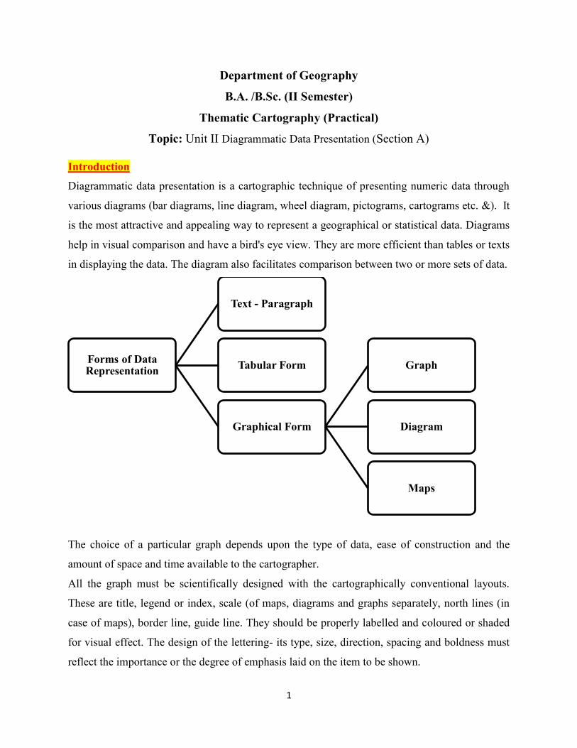
1 Department of Geography B.A. /B.Sc. (II Semester) Thematic Cartography (Practical) Topic: Unit II Diagrammatic Data Presentation (Section A) Introduction Diagrammatic data presentation is a cartographic technique of presenting numeric data through various diagrams (bar diagrams, line diagram, wheel diagram, pictograms, cartograms etc. &). It is the most attractive and appealing way to represent a geographical or statistical data. Diagrams help in visual comparison and have a bird's eye view. They are more efficient than tables or texts in displaying the data. The diagram also facilitates comparison between two or more sets of data. The choice of a particular graph depends upon the type of data, ease of construction and the amount of space and time available to the cartographer. All the graph must be scientifically designed with the cartographically conventional layouts. These are title, legend or index, scale (of maps, diagrams and graphs separately, north lines (in case of maps), border line, guide line. They should be properly labelled and coloured or shaded for visual effect. The design of the lettering- its type, size, direction, spacing and boldness must reflect the importance or the degree of emphasis laid on the item to be shown. Forms of Data Representation Text - Paragraph Tabular Form Graphical Form Graph Diagram Maps
-
Upload
khangminh22 -
Category
Documents
-
view
0 -
download
0
Transcript of Department of Geography B.A. /B.Sc. (II Semester) Thematic ...
1
Department of Geography
B.A. /B.Sc. (II Semester)
Thematic Cartography (Practical)
Topic: Unit II Diagrammatic Data Presentation (Section A)
Introduction
Diagrammatic data presentation is a cartographic technique of presenting numeric data through
various diagrams (bar diagrams, line diagram, wheel diagram, pictograms, cartograms etc. &). It
is the most attractive and appealing way to represent a geographical or statistical data. Diagrams
help in visual comparison and have a bird's eye view. They are more efficient than tables or texts
in displaying the data. The diagram also facilitates comparison between two or more sets of data.
The choice of a particular graph depends upon the type of data, ease of construction and the
amount of space and time available to the cartographer.
All the graph must be scientifically designed with the cartographically conventional layouts.
These are title, legend or index, scale (of maps, diagrams and graphs separately, north lines (in
case of maps), border line, guide line. They should be properly labelled and coloured or shaded
for visual effect. The design of the lettering- its type, size, direction, spacing and boldness must
reflect the importance or the degree of emphasis laid on the item to be shown.
Forms of Data Representation
Text - Paragraph
Tabular Form
Graphical Form
Graph
Diagram
Maps
2
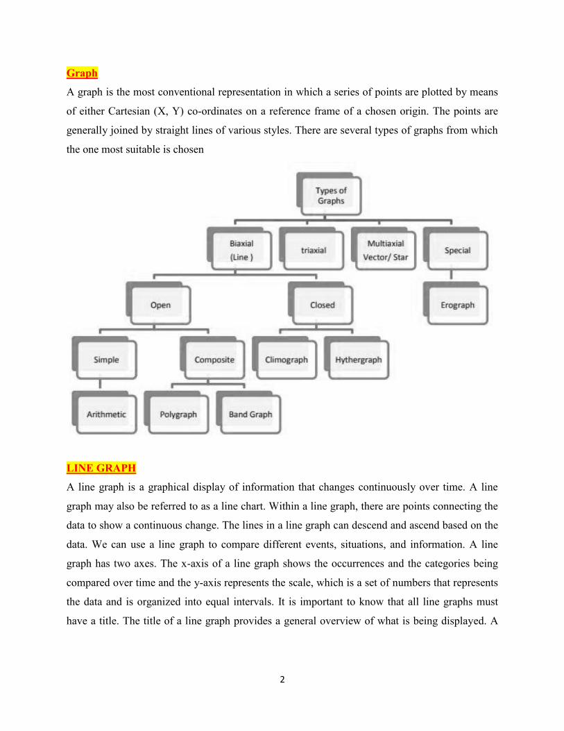
Graph
A graph is the most conventional representation in which a series of points are plotted by means
of either Cartesian (X, Y) co-ordinates on a reference frame of a chosen origin. The points are
generally joined by straight lines of various styles. There are several types of graphs from which
the one most suitable is chosen
LINE GRAPH
A line graph is a graphical display of information that changes continuously over time. A line
graph may also be referred to as a line chart. Within a line graph, there are points connecting the
data to show a continuous change. The lines in a line graph can descend and ascend based on the
data. We can use a line graph to compare different events, situations, and information. A line
graph has two axes. The x-axis of a line graph shows the occurrences and the categories being
compared over time and the y-axis represents the scale, which is a set of numbers that represents
the data and is organized into equal intervals. It is important to know that all line graphs must
have a title. The title of a line graph provides a general overview of what is being displayed. A
3
line graph will also include a key that represents the event, situation, and information being
measured over time.
Advantage of Line graph
Show relationships between 2 or more variables
Good visual impression of trends and changes
Can show positive and negative values
Simple to construct and read
Disadvantage of Line Graph
Plotting too many bars makes it appear cluttered - less easy to interpret
If there is a wide range of data it is difficult to read accurately
Becomes more complicated if there are uneven class intervals
Using too many or too few classes can mask important patterns in the data
Types of Line Graph
1. Simple Line Graph
2. Multiple Line Graph or Polygraph
3. Combined Line Graph or Bar Graph
4. Band graph or Compound Line Graph
5. Climatic Line Graph (Climograph, Hythergraph)
[1] SIMPLE LINE GRAPH
As its name suggests this is a simple graph in which there is only one curve showing only one
element. Simple line graph is very easy to draw and the most widely used type of chart. The
simple line graphs are usually drawn to represent the time series data related to the temperature,
rainfall, population growth, birth rates and the death rates etc.
Steps to draw a simple line graph
Simplify the data by converting it into round numbers
Draw X and Y-axis. Mark the time series variables (years/months) on the X axis and the
data quantity/value to be plotted (e.g. growth of population in per cent or the temperature
in 0C) on Y axis.
Choose an appropriate scale and label it on Y-axis. If the data involves a negative figure
then the selected scale should also show.
4
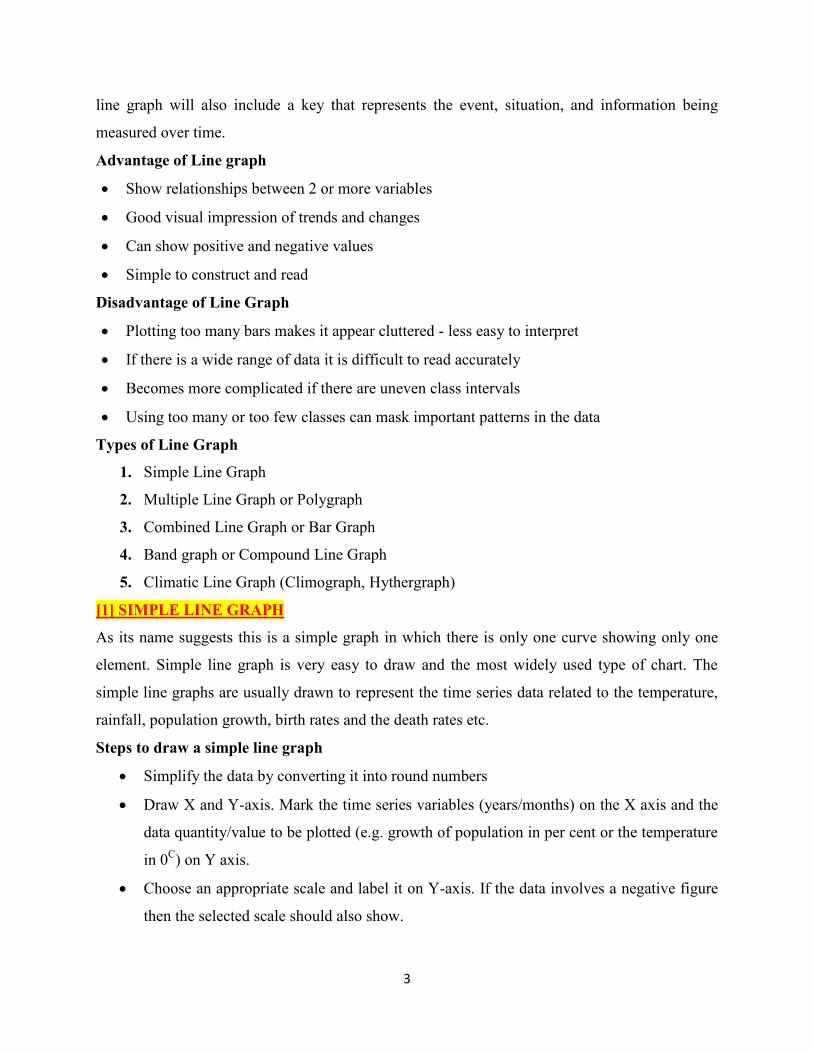
Plot the data to depict year/month-wise values according to the selected scale on Y-axis,
mark the location of the plotted values by a dot and join these dots by a free hand drawn
line.
Example of Simple Line Graph
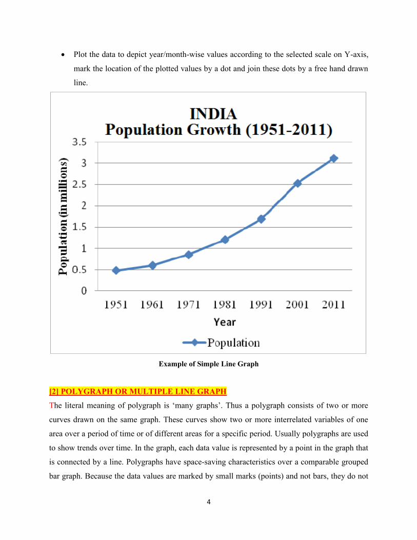
[2] POLYGRAPH OR MULTIPLE LINE GRAPH
The literal meaning of polygraph is ‘many graphs’. Thus a polygraph consists of two or more
curves drawn on the same graph. These curves show two or more interrelated variables of one
area over a period of time or of different areas for a specific period. Usually polygraphs are used
to show trends over time. In the graph, each data value is represented by a point in the graph that
is connected by a line. Polygraphs have space-saving characteristics over a comparable grouped
bar graph. Because the data values are marked by small marks (points) and not bars, they do not
5
have to be offset from each other. This polygraph is useful in showing mean monthly
temperature of a number of stations. Mean maximum and minimum monthly temperature of a
places, birthrate and death rate, male- female, literate- illiterate component of the population,
import as well as export, agricultural products and minerals and power resources. The greatest
advantages of a polygraph are that it helps in drawing comparison. But it lose its utility of a large
number of curves are drawn on same graph. A different line pattern such as straight line (____),
broken line (- - -), dotted line (……) or a combination of dotted and broken line (-.-.-) or line of
different colours may be used to indicate the value of different variables in Polygraph.
Example of Polygraph
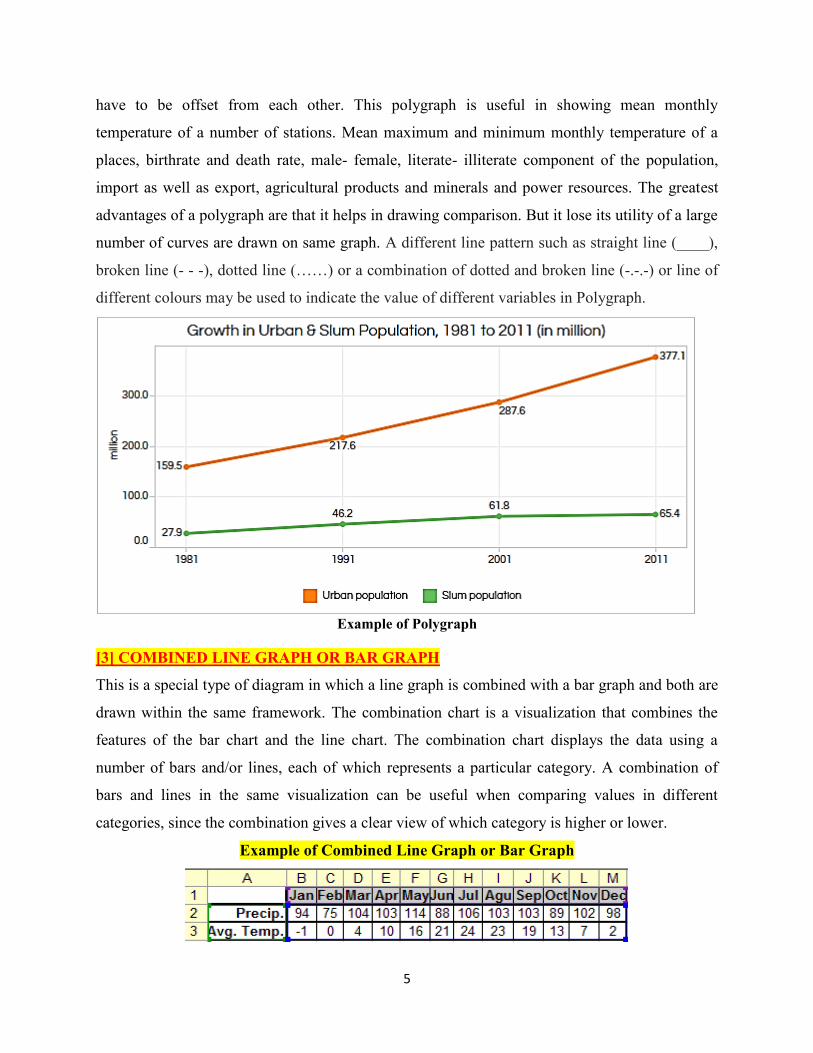
[3] COMBINED LINE GRAPH OR BAR GRAPH
This is a special type of diagram in which a line graph is combined with a bar graph and both are
drawn within the same framework. The combination chart is a visualization that combines the
features of the bar chart and the line chart. The combination chart displays the data using a
number of bars and/or lines, each of which represents a particular category. A combination of
bars and lines in the same visualization can be useful when comparing values in different
categories, since the combination gives a clear view of which category is higher or lower.
Example of Combined Line Graph or Bar Graph
6
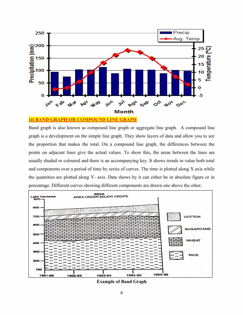
[4] BAND GRAPH OR COMPOUND LINE GRAPH
Band graph is also known as compound line graph or aggregate line graph. A compound line
graph is a development on the simple line graph. They show layers of data and allow you to see
the proportion that makes the total. On a compound line graph, the differences between the
points on adjacent lines give the actual values. To show this, the areas between the lines are
usually shaded or coloured and there is an accompanying key. It shows trends in value both total
and components over a period of time by series of curves. The time is plotted along X axis while
the quantities are plotted along Y- axis. Data shows by it can either be in absolute figure or in
percentage. Different curves showing different components are drawn one above the other.
Example of Band Graph
7
[5] CLIMOGRAPH
According to Monkhouse and Wilkinson, a Climograph is a given twelve sided diagram in which
the data for elements of climate at any one station are plotted one another, and the shape and
position of the resultant graph provides an index to the general climatic character of the place.
This type of diagram was first given by J. Bare (1910), W. Koppen used it to show the variations
in world climatic conditions. Simultaneously, Griffith Taylor devised such a Climograph which
could be used to indicate the physiological effects of climate on man. By using Climograph,
Taylor tried to identify those climates within the tropics which were suitable for white skinned
European settlers in those areas. For this purpose, he proposed Climographs of several cities of
Australia. After Taylor, EE. Faster, E. Huntington and Erwin Raiz also developed Climographs.
Taylor’s view point is universally accepted in cartography and it has become conventional to
study Taylor’s Climograph.
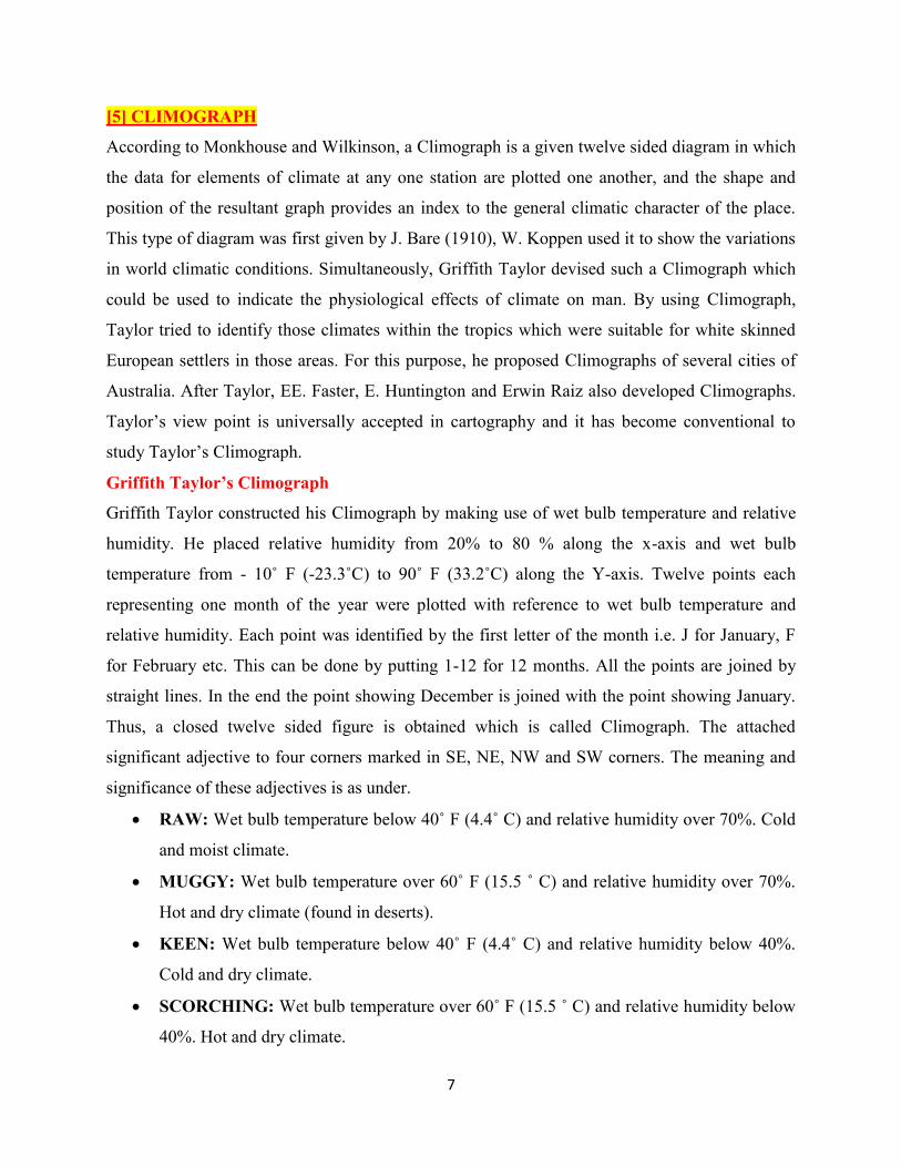
Griffith Taylor’s Climograph
Griffith Taylor constructed his Climograph by making use of wet bulb temperature and relative
humidity. He placed relative humidity from 20% to 80 % along the x-axis and wet bulb
temperature from - 10˚ F (-23.3˚C) to 90˚ F (33.2˚C) along the Y-axis. Twelve points each
representing one month of the year were plotted with reference to wet bulb temperature and
relative humidity. Each point was identified by the first letter of the month i.e. J for January, F
for February etc. This can be done by putting 1-12 for 12 months. All the points are joined by
straight lines. In the end the point showing December is joined with the point showing January.
Thus, a closed twelve sided figure is obtained which is called Climograph. The attached
significant adjective to four corners marked in SE, NE, NW and SW corners. The meaning and
significance of these adjectives is as under.
RAW: Wet bulb temperature below 40˚ F (4.4˚ C) and relative humidity over 70%. Cold
and moist climate.
MUGGY: Wet bulb temperature over 60˚ F (15.5 ˚ C) and relative humidity over 70%.
Hot and dry climate (found in deserts).
KEEN: Wet bulb temperature below 40˚ F (4.4˚ C) and relative humidity below 40%.
Cold and dry climate.
SCORCHING: Wet bulb temperature over 60˚ F (15.5 ˚ C) and relative humidity below
40%. Hot and dry climate.
8
The shape of the Climograph is also helpful in knowing the nature of climate. A spindle shaped
Climograph shows dry continental climate. A Climograph oriented diagonally in NE to SW
direction indicates monsoon type of climate. Similarly, a diagonal climate NW to SE direction
represents Mediterranean climate. The British type of climate is represented by a Climograph
which is fully spread on its Framework.
Taylor also suggested the following tentative scale of discomfort for the white people.
a. 40˚ F - 45˚ F - very rarely uncomfortable
b. 45˚ F - 55˚ F – ideal
c. 55˚ F- 60˚ F - rarely uncomfortable
d. 60˚ F - 65˚ F- Sometimes uncomfortable
e. 65˚ F - 70˚ F- Often uncomfortable
f. Above 70˚ F- Usually uncomfortable
Example of Climograph
9
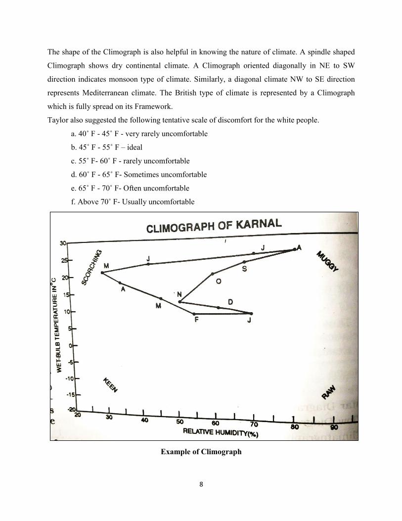
[6] HYTHERGRAPH
This is another type of Climograph devised by G. Taylor in 1949. In this, mean monthly
temperature values are plotted on Y- axis and mean-monthly rainfall values on X- axis. This is
drawn as a 12- sided polygon in the same way as that of the Climograph. These are principally
used in summarising broad climate differences in relation to human activity, more precisely in
the context of settlement. The four quarters naturally denote four distinctive climatic conditions –
cold and dry (SW), cold and wet (SE), hot and dry (NW) and hot and humid (NE).
Example of Hythergraph
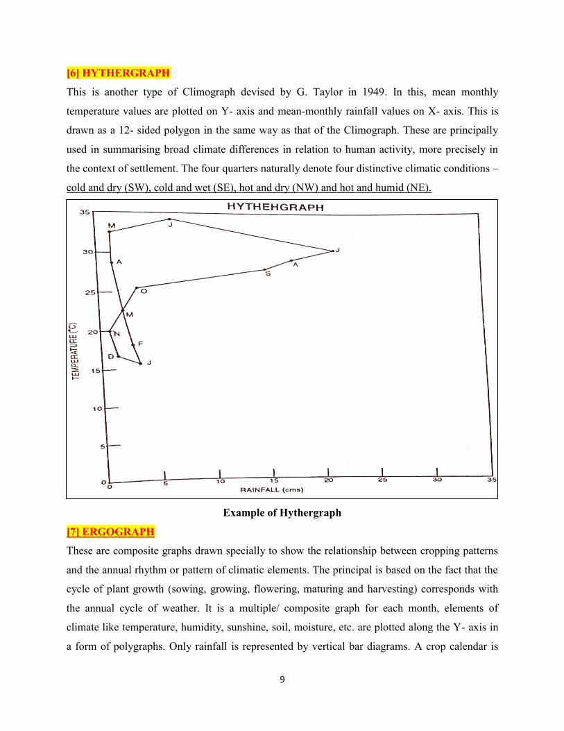
[7] ERGOGRAPH
These are composite graphs drawn specially to show the relationship between cropping patterns
and the annual rhythm or pattern of climatic elements. The principal is based on the fact that the
cycle of plant growth (sowing, growing, flowering, maturing and harvesting) corresponds with
the annual cycle of weather. It is a multiple/ composite graph for each month, elements of
climate like temperature, humidity, sunshine, soil, moisture, etc. are plotted along the Y- axis in
a form of polygraphs. Only rainfall is represented by vertical bar diagrams. A crop calendar is
10
drawn, below the X-axis, by means of horizontal rectangular (that may be divided to indicate the
seasons) proportional to the crop acreage. Thus, being a combination of graphs and diagrams,
Ergographs represented a synthetic graph/ diagram. It may also be drawn in the form of a
circular graphs.
Example of Ergograph
*********************