Corrected & Updated Rankwise Result for Admission to BMS ...
Upload
khangminh22Category
view
1download
0
DATA SCIENCE using R
Dr.Rajeshwari B S
Assistant Professor
Department of Computer Science and Engineering
B.M.S College of Engineering
Bangalore

Data Science: Introduction
• Data Science is an approach of analysing the past or current data and predicting the future outcomes with the
aim of making well-versed decisions.
• Data science is an inter-disciplinary field that uses scientific methods, knowledge of mathematics and
statistics, algorithms, programming skills to extract knowledge and insights from raw data.

Data Science: Introduction
Why Data Science
• Companies have been storing their data. Data has become the most abundant thing today. But, what will we do with this
data? Let’s take an example:
• Say, company which makes mobile phones released their first product became a massive hit its time to come up with
something new, so as to meet the expectations of the users eagerly waiting for next release.
• Here comes Data Science apply various data mining techniques like sentiment analysis, knowledge of mathematical and
statistical methods, scientific methods, algorithms, programming skills on user generated feedback and pick things what
users are expecting in the next release and making well-versed decisions.
• Thus, through Data Science we can make better decisions, we can reduce production costs by coming out with efficient
ways, and give customers what they actually want!
• Thus, there are countless benefits that Data Science can result in, and hence it has become absolutely necessary for the
company to have a Data Science Team.

Data Science: Introduction
• Data science – making effective decision and development of data product
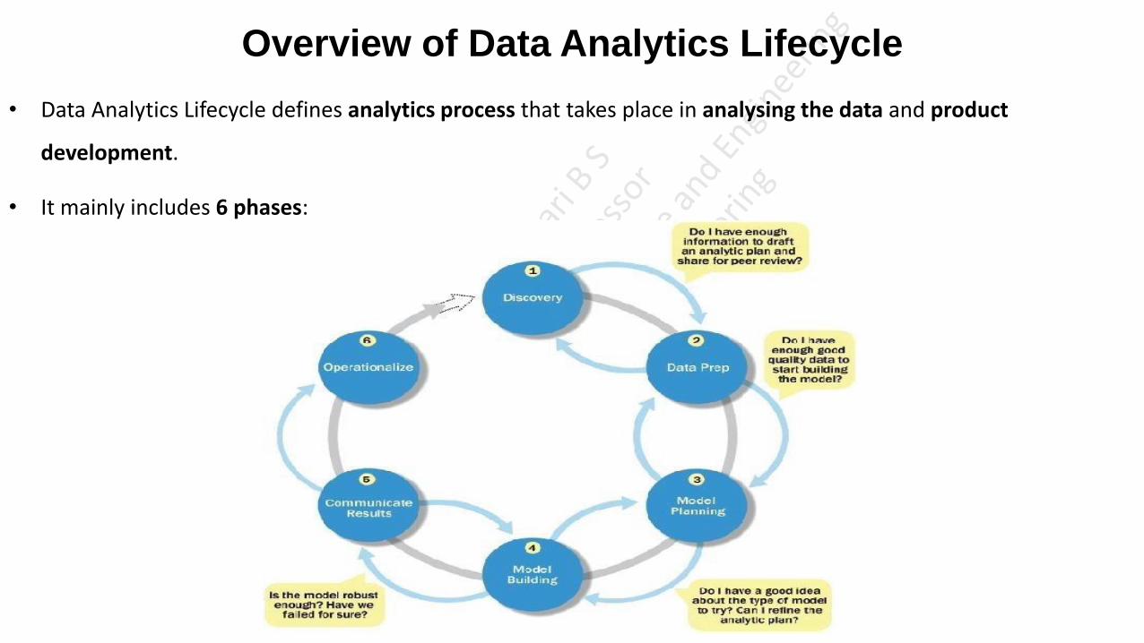
Overview of Data Analytics Lifecycle
• Data Analytics Lifecycle defines analytics process that takes place in analysing the data and product
development.
• It mainly includes 6 phases:

Overview of Data Analytics Lifecycle Phase 1- Discovery:
• In Phase 1, the team learns the business domain, including relevant history such as whether the organization or business unit has
attempted similar projects in the past from which they can learn.
• The team assesses the resources available to support the project in terms of people, technology, time and data.
• Important activities in this phase include framing the business problem as an analytics challenge that can be addressed in subsequent
phases.
Phase 2- Data Preparation:
• Phase 2 requires the presence of an analytic sandbox, in which the team can work with data and perform analytics for the duration of
the project.
• The team needs to execute extract, load, and transform (ELT) or extract, transform and load (ETL) to get data into the sandbox.
• Data should be transformed in the ETLT process so the team can work with it and analyse it.
• In this phase, the team also needs to familiarize itself with the data thoroughly and take steps to condition the data.
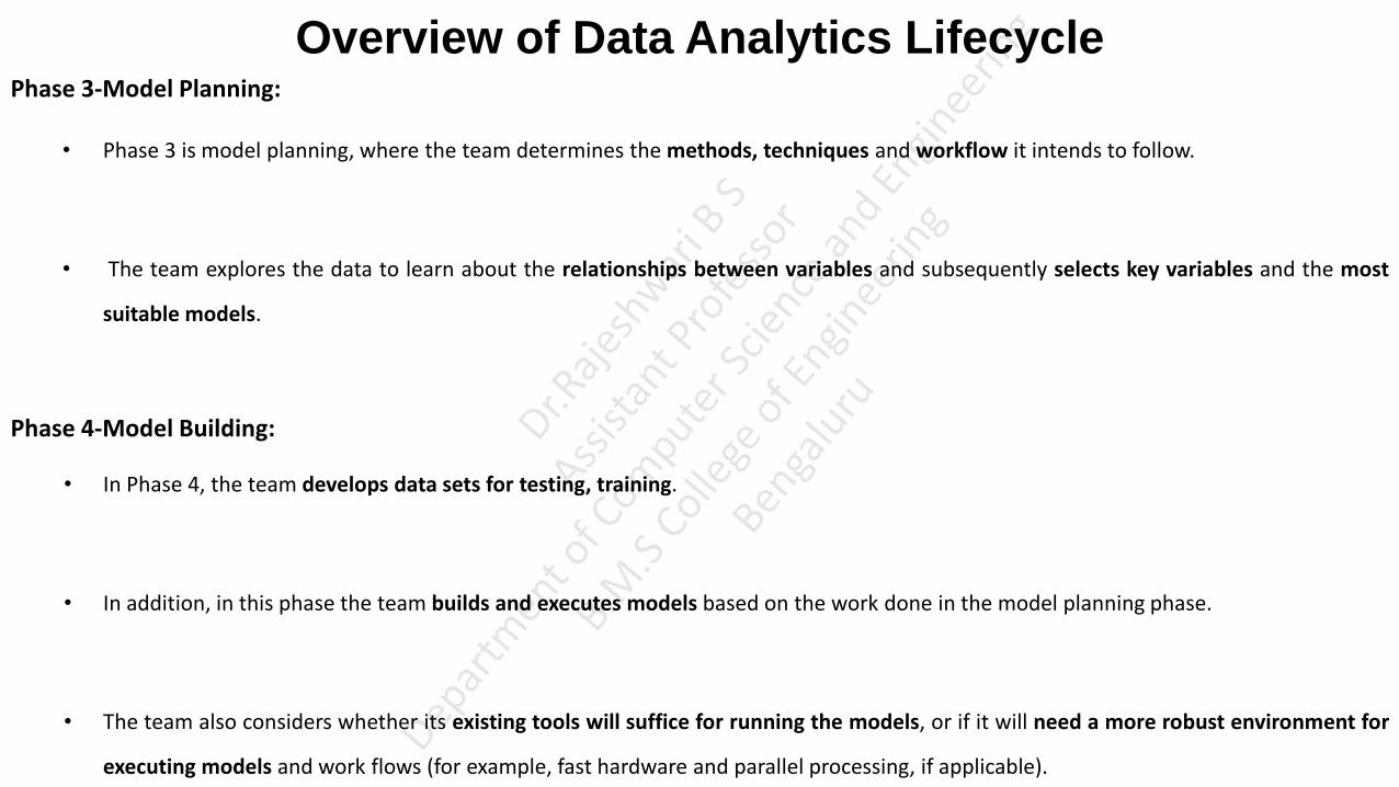
Overview of Data Analytics Lifecycle Phase 3-Model Planning:
• Phase 3 is model planning, where the team determines the methods, techniques and workflow it intends to follow.
• The team explores the data to learn about the relationships between variables and subsequently selects key variables and the most
suitable models.
Phase 4-Model Building:
• In Phase 4, the team develops data sets for testing, training.
• In addition, in this phase the team builds and executes models based on the work done in the model planning phase.
• The team also considers whether its existing tools will suffice for running the models, or if it will need a more robust environment for
executing models and work flows (for example, fast hardware and parallel processing, if applicable).
Overview of Data Analytics Lifecycle
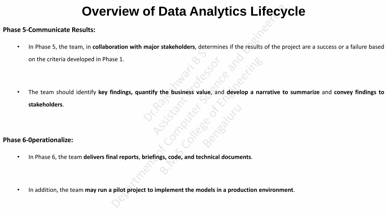
Phase 5-Communicate Results:
• In Phase 5, the team, in collaboration with major stakeholders, determines if the results of the project are a success or a failure based
on the criteria developed in Phase 1.
• The team should identify key findings, quantify the business value, and develop a narrative to summarize and convey findings to
stakeholders.
Phase 6-0perationalize:
• In Phase 6, the team delivers final reports, briefings, code, and technical documents.
• In addition, the team may run a pilot project to implement the models in a production environment.

Overview of Data Analytics Lifecycle: Phase 1: Discovery • The first phase of the Data Analytics Lifecycle involves Discovery. This phase is focusing on the business requirements.
• In this phase, the data science team must learn and investigate the problem, develop context(situation) and understanding, and learn about
the data sources needed and available for the project. Also, the team formulates initial hypotheses(suggestions) that can later be tested with
data. (Tasks) (Suggestions, activities, actions, ideas, predictions Problem Statement)
1. Learning the Business Domain
• Understanding the domain area of the problem is essential.
• In many cases, data scientists will have deep computational and quantitative knowledge that can be broadly applied across many disciplines.
These data scientists have deep knowledge of the methods, techniques, and ways for applying heuristics to a variety of business and conceptual
problems. Others in this area may have deep knowledge of a domain area, coupled with quantitative expertise.
• At this early stage in the process, the team needs to make an assessment and formulates initial hypotheses. The earlier the team can make this
assessment the better, helps to identify the resources needed for the project team and ensures the team in the right direction in development of
project.

Overview of Data Analytics Lifecycle: Phase 1: Discovery 2. Resources
• As part of the discovery phase, the team needs to assess the resources available to support the project. Resources include technology, tools, systems, data,
and people.
• In addition, try to evaluate the level of analytical sophistication(skills) within the organization and gaps that may exist related to tools, technology, and skills.
• In addition to the skills and computing resources, it is advisable to take inventory of the types of data available to the team for the project. The team will
need to determine whether it must collect additional data, purchase it from outside sources, or transform existing data.
• Ensure the project team has the right mix of domain experts, customers, analytic talent, and project management to be effective. In addition, evaluate how
much time is needed and if the team has the right breadth and depth of skills.
3. Framing the Problem
• Framing the problem well is critical to the success of the project.
• Framing is the process of stating the analytics problem to be solved. Essentially, the team needs to clearly articulate the current situation and its main
challenges. As part of this activity, it is important to identify the main objectives of the project, identify what needs to be achieved in business terms, and
identify what needs to be done to meet the needs.
• At this point, it is a best practice to write down the problem statement and share it with the key stakeholders.
• Perhaps equally important is to establish failure criteria. Most people doing projects prefer only to think of the success criteria and what the conditions will
look like when the participants are successful.
Overview of Data Analytics Lifecycle Phase 1: Discovery 4. Identifying Key Stakeholders
• Another important step is to identify the key stakeholders and their interests in the project.
• The team can identify anyone who will benefit from the project or will be significantly impacted by the project.
• When interviewing stakeholders, learn about the domain area and any relevant history from similar analytics projects. For example, the team may identify
the results each stakeholder wants from the project and the criteria it will use to judge the success of the project.
• Depending on the number of stakeholders and participants, the team may consider outlining the type of activity and participation expected from each
stakeholder and participant.
5. Interviewing the Analytics Sponsor
• The team should plan to collaborate with the stakeholders to clarify and frame the analytics problem. At the outset, project sponsors may have a
predetermined solution that may not necessarily realize the desired outcome. In these cases, the team must use its knowledge and expertise to identify the
true underlying problem and appropriate solution.
• When interviewing the main stakeholders, the team needs to take time to thoroughly interview the project sponsor, who tends to be the one funding the
project or providing the high-level requirements. It is critical to thoroughly understand the sponsor's perspective to guide the team in getting started on
the project.

Overview of Data Analytics Lifecycle Phase 1: Discovery
6. Developing Initial Hypotheses(IH)
• Developing a set of IHs is a key facet of the discovery phase. This step involves forming ideas that the team can test with data.
(suggestions, actions, activities ideas)
• This process involves gathering and assessing hypotheses from stakeholders and domain experts who may have their own perspective
on what the problem is, what the solution should be, and how to arrive at a solution. These stakeholders would know the domain
area well and can offer suggestions on ideas to test as the team formulates hypotheses during this phase.
• These suggestions on ideas will also give the team opportunities to expand the project to address the most important interests of the
stakeholders.

Overview of Data Analytics Lifecycle Phase 1: Discovery 7. Identifying Potential Data Sources
• As part of the discovery phase, identify the kinds of data the team will need to solve the problem. Consider the volume, type, and
time span of the data needed to test the hypotheses.
• The team should perform five main activities during this step of the discovery phase:
• Identify data sources: Make a list of datasets currently available and those that can be purchased to test the initial hypotheses
outlined in this phase.
• Capture aggregate data sources: It enables the team to gain a quick overview of the data and perform further exploration on specific
areas. (combine dataset related to same domin)
• Review the raw data: Begin understanding the interdependencies among the data attributes, and become familiar with the content
of the data, its quality, and its limitations.
• Evaluate the data structures and tools needed: The data type and structure dictate which tools the team can use to analyze the
data, which technologies may be good candidates for the project. (How data is stored, in what structure with this team needs to identify what tool can be
used, what technology map reduce, parallel computing can be used)
• Scope the sort of data infrastructure needed for this type of problem: In addition to the tools needed, the data influences the kind of
infrastructure that's required, such as disk storage and network capacity.
Overview of Data Analytics Lifecycle: Phase 2: Data Preparation
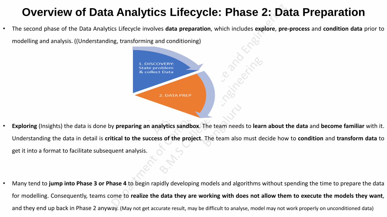
• The second phase of the Data Analytics Lifecycle involves data preparation, which includes explore, pre-process and condition data prior to
modelling and analysis. ((Understanding, transforming and conditioning)
• Exploring (Insights) the data is done by preparing an analytics sandbox. The team needs to learn about the data and become familiar with it.
Understanding the data in detail is critical to the success of the project. The team also must decide how to condition and transform data to
get it into a format to facilitate subsequent analysis.
• Many tend to jump into Phase 3 or Phase 4 to begin rapidly developing models and algorithms without spending the time to prepare the data
for modelling. Consequently, teams come to realize the data they are working with does not allow them to execute the models they want,
and they end up back in Phase 2 anyway. (May not get accurate result, may be difficult to analyse, model may not work properly on unconditioned data)

Overview of Data Analytics Lifecycle: Phase 2: Data Preparation
1. Preparing the Analytic Sandbox
• The first sub phase of data preparation requires the team to obtain an analytic sandbox (also commonly referred to as
a workspace), in which the team can explore the data without interfering with live production databases. (A workspace in
which data assets are gathered from multiple sources and technologies for analysis. Often, this workspace is created by using a sampling of the dataset rather than the entire
dataset.)
• Consider an example in which the team needs to work with a company's financial data. The team should access a copy
of the financial data from the analytic sandbox rather than interacting with the production version of the
organization's main database, because that will be tightly controlled and needed for financial reporting. (Company will put
the data into sandbox from where data science team can explore)
• When developing the analytic sandbox, it is a best practice to collect all kinds of data there, including everything from
summary-level aggregated data, structured data, raw data feeds, and unstructured text data from call logs or web logs,
depending on the kind of analysis the team plans to undertake.

Overview of Data Analytics Lifecycle: Phase 2: Data Preparation 2. Performing ETLT
• In ETL, users perform extract, transform, load processes to extract data from a data store, perform data transformations, and load the
data back into the data store.
• However, the analytic sandbox approach differs slightly; it advocates (ELT) extract, load, and then transform. ln this case, the data is
extracted in its raw form and loaded into the data store, where analysts can choose to transform the data into a new state or leave it in
its original, raw condition. The reason for this approach is that there is significant value in preserving the raw data and including it in
the sandbox before any transformations take place.
• For instance, consider an analysis for fraud detection on credit card usage. Many times, outliers in this data population can represent
higher-risk transactions that may be indicative of fraudulent credit card activity. Using ETL, these outliers may be inadvertently filtered
out and cleaned before being loaded into the data store.
3. Learning About the Data
• A critical aspect of a data science project is to become familiar with the data itself.
Some of the activities in this step are
• Clarifies the data that the data science team has access to at the start of the project
• Highlights gaps by identifying datasets within an organization that the team may find useful but may not be accessible to the team today. As a consequence, this activity can trigger a project to begin building relationships with the data owners and finding ways to share data in appropriate ways.
• Identifies datasets outside the organization that may be useful to obtain through open APis, data sharing, or purchasing data to supplement already existing datasets

Overview of Data Analytics Lifecycle: Phase 2: Data Preparation 4. Data Conditioning
• Data conditioning refers to the process of cleaning data, normalizing datasets, and performing transformations on the data.
• A critical step within the Data Analytics Lifecycle, data conditioning can involve many complex steps to join or merge data sets or
otherwise get datasets into a state that enables analysis in further phases.
• However, it is also important to involve the data scientist in this step because many decisions are made in the data conditioning phase
that affect subsequent analysis. Because teams begin forming ideas in this phase about which data to keep and which data to transform
or discard, it is important to involve multiple team members in these decisions.
• Additional questions and considerations
What are the data sources?
What are the target fields (for example, columns of the tables)?
How consistent are the contents and files? data contains missing or inconsistent values.
Assess the consistency of the data types. For instance, if the team expects certain data to be numeric, confirm it is numeric or if it is a mixture of
alphanumeric strings and text.
Review the content of data columns or other inputs, and check to ensure they make sense. For instance, if the project involves analyzing income levels,
preview the data to confirm that the income values are positive.
Look for any evidence of systematic error. Examples include data feeds from sensors or other data sources causes invalid, incorrect, or missing data
values.

Overview of Data Analytics Lifecycle: Phase 2: Data Preparation
5. Common Tools for the Data Preparation Phase
Several tools are commonly used for this phase:
• Hadoop can perform massively parallel ingest and custom analysis for web traffic parsing, GPS location analytics, genomic analysis, and
combining of massive unstructured data feeds from multiple sources.
• Alpine Miner provides a graphical user interface (GUI) for creating analytic work flows, including data manipulations and a series of
analytic events such as staged data-mining techniques (for example, first select the top 100 customers, and then run descriptive statistics
and clustering) on Postgres SQL and other Big Data sources.
• Open Refine (formerly called Google Refine) is "a free, open source, powerful tool for working with messy data. It is a popular GUI-based
tool for performing data transformations, and it's one of the most robust free tools currently available.
• Similar to Open Refine, Data Wrangler is an interactive tool for data cleaning and transformation. In addition, data transformation outputs
can be put into Java or Python. The advantage of this feature is that a subset of the data can be manipulated in Wrangler via its GUI, and
then the same operations can be written out as Java or Python code to be executed against the full, larger dataset offline in a local
analytic sandbox.
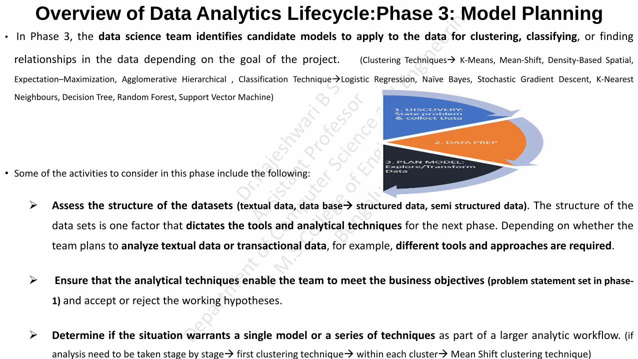
Overview of Data Analytics Lifecycle:Phase 3: Model Planning • In Phase 3, the data science team identifies candidate models to apply to the data for clustering, classifying, or finding
relationships in the data depending on the goal of the project. (Clustering Techniques K-Means, Mean-Shift, Density-Based Spatial,
Expectation–Maximization, Agglomerative Hierarchical , Classification TechniqueLogistic Regression, Naïve Bayes, Stochastic Gradient Descent, K-Nearest
Neighbours, Decision Tree, Random Forest, Support Vector Machine)
• Some of the activities to consider in this phase include the following:
Assess the structure of the datasets (textual data, data base structured data, semi structured data). The structure of the
data sets is one factor that dictates the tools and analytical techniques for the next phase. Depending on whether the
team plans to analyze textual data or transactional data, for example, different tools and approaches are required.
Ensure that the analytical techniques enable the team to meet the business objectives (problem statement set in phase-
1) and accept or reject the working hypotheses.
Determine if the situation warrants a single model or a series of techniques as part of a larger analytic workflow. (if
analysis need to be taken stage by stage first clustering technique within each cluster Mean Shift clustering technique)

Overview of Data Analytics Lifecycle:Phase 3: Model Planning
1. Data Exploration and Variable Selection
• In Phase 3, the objective of the data exploration is to understand the relationships among the variables to inform
selection of the variables and methods and to understand the problem domain. (Diabetic patient information list of
symptoms, blood level and weakness)
• Data science team needs to consider the inputs and data that will be needed, and then it must examine whether
these inputs are actually correlated with the outcomes that the team plans to predict or analyze. (diabetic symptoms
thirsty, weakness, low blood level predicting diabetic or not)
• The key to this approach is to aim for capturing the most essential predictors and variables rather than considering
every possible variable that people think may influence the outcome (Consider only key variables rather than thinking every
variable effects the prediction simply iterates the process)
• Approaching the problem in this manner requires iterations and testing to identify the most essential variables for the
intended analyses. The team should plan to test a range of variables to include in the model and then focus on the
most important and influential variables.

Overview of Data Analytics Lifecycle:Phase 3: Model Planning 2. Model Selection
• In the model selection subphase, the team's main goal is to choose an analytical technique, or a short list of candidate
techniques, based on the end goal of the project. (Finding out list of techniques applicable for the set objectives and finding out most suitable technique)
• In this case, a model simply refers to an abstraction from reality, attempts to construct models that emulate real-
world situation or with live data with a set of rules and conditions.
• In the case of machine learning and data mining, these rules and conditions are grouped into several general sets of
techniques, such as classification, association rules, and clustering. (For eg: analyzing and predicting sales of stationary items at different
places uses clustering technique to divide the zones apply association rule and decision tree techniques to identify % of people who purchase note book will also purchase
pen, Thus depending upon the project identifies set of techniques and tools needed)
• An additional consideration in this area for dealing with Big Data involves determining if the team will be using
techniques that are best suited for structured data, unstructured data, or a hybrid approach. For instance, the team
can leverage Map Reduce to analyse unstructured data. (Structured data but selected Text Analytic technique then
not suitable)
• The team can move to the model building phase once it has a good idea about the type of model to try and the team
has gained enough knowledge to refine the analytics plan.

Overview of Data Analytics Lifecycle:Phase 3: Model Planning
3. Common Tools for the Model Planning Phase
Many tools are available to assist in this phase. (many tools available where a data science team can plan for tools and techniques
in this phase to build the model )
R has a complete set of modelling capabilities (has rich set of built in functions for K-Means clustering, Decision Tree, Naïve
Baisy, Logistic regression etc for structured data) and provides a good environment for building interpretive models
with high-quality code. ln addition, it has the ability to interface with databases via an ODBC connection
and to performing statistical tests and analytics on Big Data.
SQL Analysis services can perform in-database analytics of common data mining functions, involved
aggregations, and basic predictive models. (support aggregate built in functions, predictive built in functions Structured
data)
SAS/ACCESS (Statistical Analysis System programming Language) provides integration between SAS and
the analytics sandbox (Support built in function to integrate with Analytic Sandbox, analyse and predictweb, social media, and
marketing analytics support built in functions to analyse data of any type(structured, files, unstructured) )
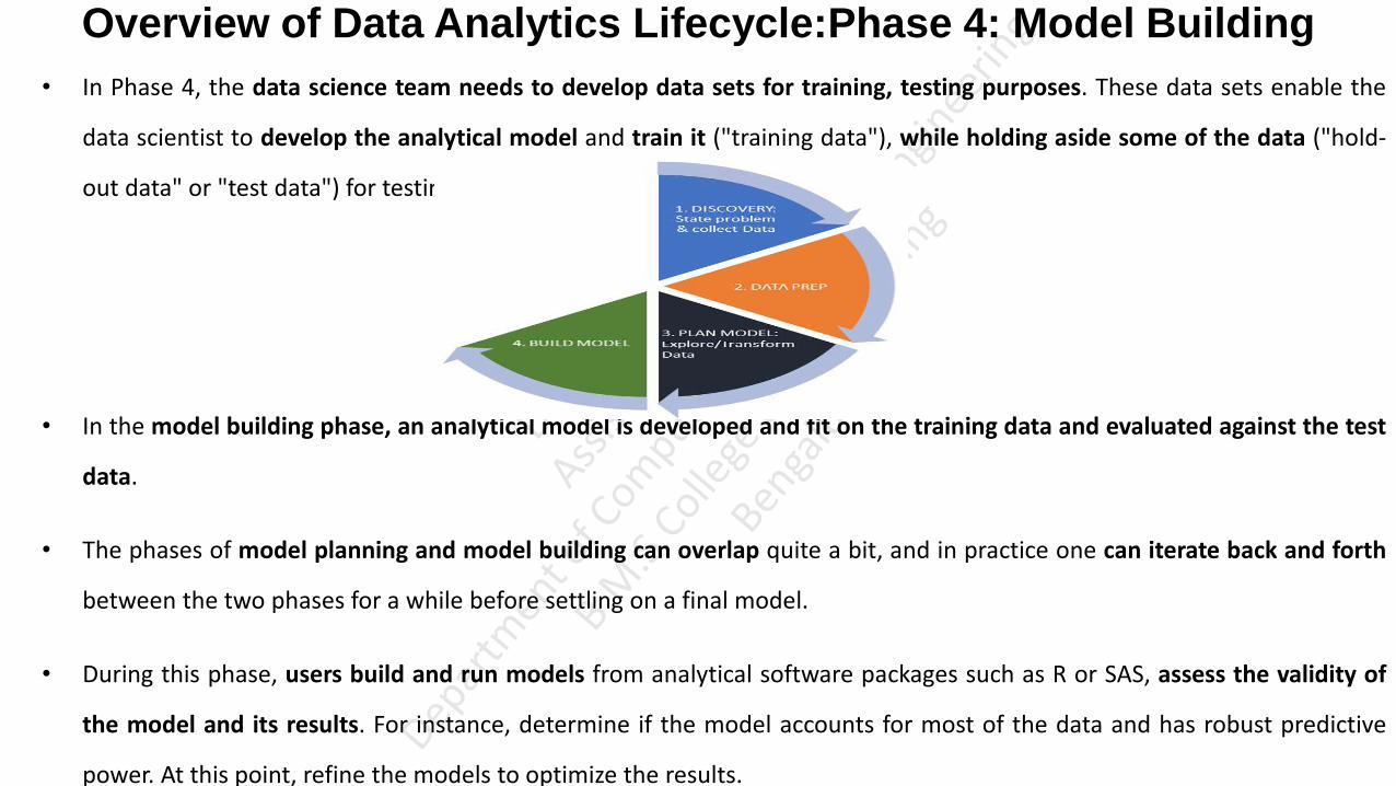
Overview of Data Analytics Lifecycle:Phase 4: Model Building
• In Phase 4, the data science team needs to develop data sets for training, testing purposes. These data sets enable the
data scientist to develop the analytical model and train it ("training data"), while holding aside some of the data ("hold-
out data" or "test data") for testing the model.
• In the model building phase, an analytical model is developed and fit on the training data and evaluated against the test
data.
• The phases of model planning and model building can overlap quite a bit, and in practice one can iterate back and forth
between the two phases for a while before settling on a final model.
• During this phase, users build and run models from analytical software packages such as R or SAS, assess the validity of
the model and its results. For instance, determine if the model accounts for most of the data and has robust predictive
power. At this point, refine the models to optimize the results.

Overview of Data Analytics Lifecycle:Phase 4: Model Building • It is vital to record the results and logic of the model during this phase. In addition, one must take care to record any
operating assumptions that were made in the modeling process regarding the data or the context.
• Questions to consider whether developed models are suitable to a specific situation and ensure the models being developed
ultimately meet the objectives outlined in Phase 1.
Does the model appear valid and accurate on the test data?
Does the model output/behavior make sense to the domain experts? (Output is sensible output what domain expert expecting purchasing
notebook90% purchases pen)
Do the parameter values of the fitted model make sense in the context of the domain?
Is the model sufficiently accurate to meet the goal?
Does the model avoid intolerable mistakes? Depending on context, false positives may be more serious or less serious than false
negatives.(True positive False Positive)
Is a different form of the model required to address the business problem?
• Once the data science team can evaluate either if the model is sufficiently robust to solve the problem or if the team has
failed, it can move to the next phase in the Data Analytics Lifecycle.
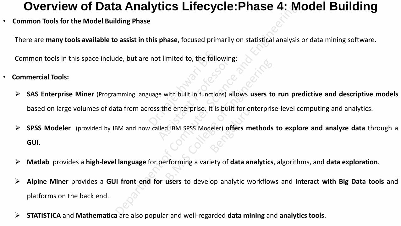
Overview of Data Analytics Lifecycle:Phase 4: Model Building • Common Tools for the Model Building Phase
There are many tools available to assist in this phase, focused primarily on statistical analysis or data mining software.
Common tools in this space include, but are not limited to, the following:
• Commercial Tools:
SAS Enterprise Miner (Programming language with built in functions) allows users to run predictive and descriptive models
based on large volumes of data from across the enterprise. It is built for enterprise-level computing and analytics.
SPSS Modeler (provided by IBM and now called IBM SPSS Modeler) offers methods to explore and analyze data through a
GUI.
Matlab provides a high-level language for performing a variety of data analytics, algorithms, and data exploration.
Alpine Miner provides a GUI front end for users to develop analytic workflows and interact with Big Data tools and
platforms on the back end.
STATISTICA and Mathematica are also popular and well-regarded data mining and analytics tools.

Overview of Data Analytics Lifecycle:Phase 4: Model Building
• Free or Open Source tools:
R and PL/R, R is both a language and an environment for doing statistics and generating graphs. It thinks of data as
matrices, lists and vectors. PL/R is a procedural language (writing database procedures and Triggers (calling automatically when
some incident happens) using R) for PostgreSQL with R. Using this approach means that R commands can be executed in
database.
Octave , a free software programming language for computational modeling, has some of the functionality of Matlab.
Because it is freely available. Octave is used in major universities when teaching machine learning.
WEKA is a free data mining software package with an analytic workbench. The functions created in WEKA can be
executed within Java code.
Python is a programming language that provides toolkits for machine learning and analysis, such as scikit-learn, numpy,
scipy, pandas, and related data visualization using matplotlib.

Overview of Data Analytics Lifecycle:Phase 5: Communicate Results • After executing the model, the team needs to compare the outcomes of the modeling to the criteria established for
success and failure.
• In Phase 5, the team communicate the findings and outcomes to the various team members and stakeholders, taking
into account caveats (cautions), assumptions and any limitations of the results.
• During this step, assess the results and identify which data points may have been surprising and which were in line with
the hypotheses that were developed in Phase 1.
• This is the phase to underscore the business benefits of the work and begin making the case to implement the logic into a
live production environment.
• As a result of this phase, the team will have documented the key findings and major insights derived from the analysis.
The deliverable of this phase will be the most visible portion of the process to the outside stakeholders and sponsors

Overview of Data Analytics Lifecycle:Phase 6: Operationalize
• In the final phase, the team communicates the benefits of the project more broadly and sets up a pilot (Preliminary)
project to deploy the work in a controlled way before broadening the work to a full enterprise or ecosystem of users.
• This approach enables the team to learn about the performance and related constraints of the model in a production
environment on a small scale and make adjustments before a full deployment.

Key outputs from a successful analytics project • Figure portrays the key outputs for each of the main stakeholders of an analytics project and what they usually expect at
the conclusion of a project.
Business User typically tries to determine the benefits and implications of the findings to the business.
Project Sponsor typically asks questions related to the business impact of the project, the risks and return on investment
(ROI), and the way the project can be evangelized within the organization (and beyond).
Project Manager needs to determine if the project was completed on time and within budget and how well the goals
were met.
Key outputs from a successful analytics project
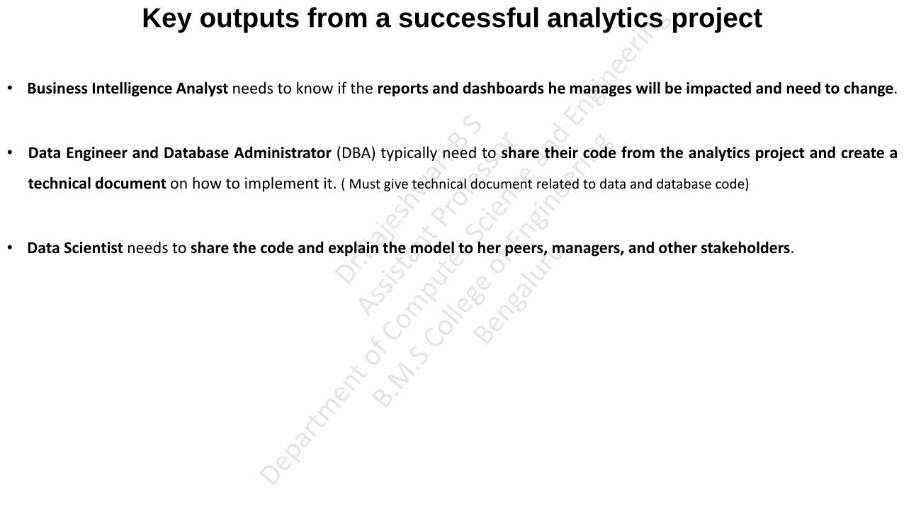
• Business Intelligence Analyst needs to know if the reports and dashboards he manages will be impacted and need to change.
• Data Engineer and Database Administrator (DBA) typically need to share their code from the analytics project and create a
technical document on how to implement it. ( Must give technical document related to data and database code)
• Data Scientist needs to share the code and explain the model to her peers, managers, and other stakeholders.

UNIT-2
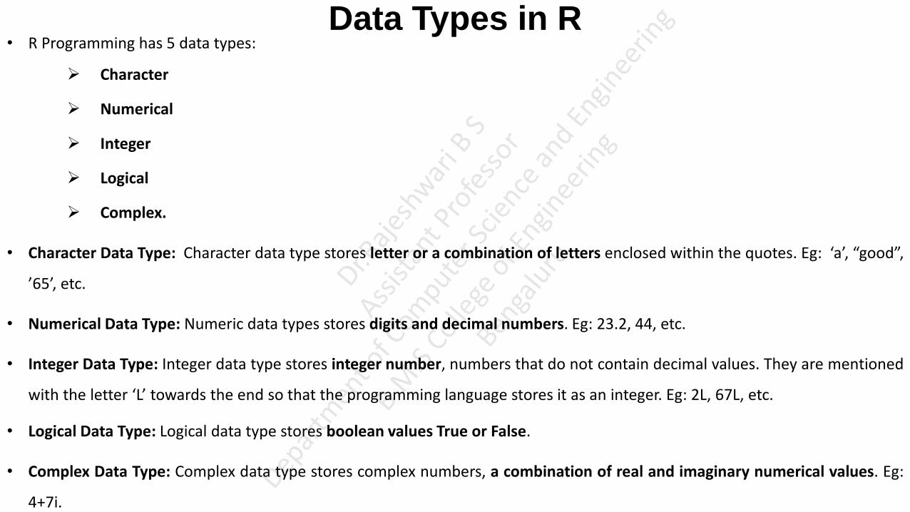
Data Types in R • R Programming has 5 data types:
Character
Numerical
Integer
Logical
Complex.
• Character Data Type: Character data type stores letter or a combination of letters enclosed within the quotes. Eg: ‘a’, “good”,
’65’, etc.
• Numerical Data Type: Numeric data types stores digits and decimal numbers. Eg: 23.2, 44, etc.
• Integer Data Type: Integer data type stores integer number, numbers that do not contain decimal values. They are mentioned
with the letter ‘L’ towards the end so that the programming language stores it as an integer. Eg: 2L, 67L, etc.
• Logical Data Type: Logical data type stores boolean values True or False.
• Complex Data Type: Complex data type stores complex numbers, a combination of real and imaginary numerical values. Eg:
4+7i.

Data Structures/Data Objects/Data Types
• R programming supports 6 types of data objects.
Vector
List
Data Frame
Matrix
Array
Factor
• In programming languages like C, C++ and Java, variables are declared as data type; however, in R the variables are not
declared as some data type. Variable are treated like a data objects. They are particular instance of particular class.
• Objects are nothing but a data structure having few attributes and methods which are applied to its attributes. (Just like in
Python). For eg: Matrix class includes set of attributes and set of methods to be applied on these attributes like dim( ), length( ),
attributes( )
Data Structures/Data Objects/Data Types
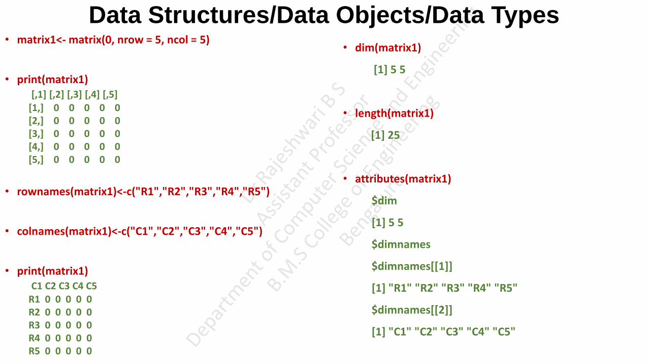
• matrix1<- matrix(0, nrow = 5, ncol = 5)
• print(matrix1) [,1] [,2] [,3] [,4] [,5] [1,] 0 0 0 0 0 [2,] 0 0 0 0 0 [3,] 0 0 0 0 0 [4,] 0 0 0 0 0 [5,] 0 0 0 0 0
• rownames(matrix1)<-c("R1","R2","R3","R4","R5")
• colnames(matrix1)<-c("C1","C2","C3","C4","C5")
• print(matrix1) C1 C2 C3 C4 C5 R1 0 0 0 0 0 R2 0 0 0 0 0 R3 0 0 0 0 0 R4 0 0 0 0 0 R5 0 0 0 0 0
• dim(matrix1)
[1] 5 5
• length(matrix1)
[1] 25
• attributes(matrix1)
$dim
[1] 5 5
$dimnames
$dimnames[[1]]
[1] "R1" "R2" "R3" "R4" "R5"
$dimnames[[2]]
[1] "C1" "C2" "C3" "C4" "C5"

Data Structures/Data Objects/Data Types Vectors
• Vectors are one of the basic R programming data objects containing sequence of data elements of the same data type.
• Members in a vector are officially called components.
• Vectors are generally created using the c( ) function.
• Creating Vector
V1<-c(10,20,30)
V2<-c('a','b','c')
• Printing vector
V1
V2
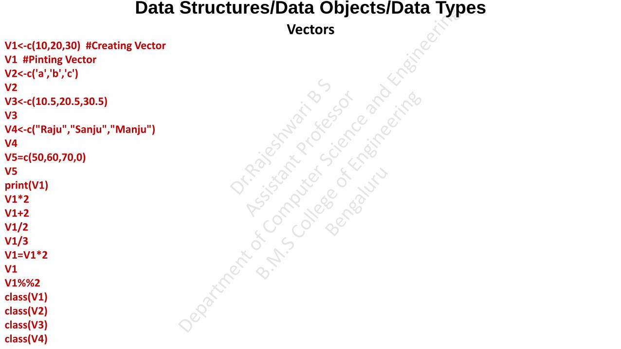
Data Structures/Data Objects/Data Types Vectors
V1<-c(10,20,30) #Creating Vector V1 #Pinting Vector V2<-c('a','b','c') V2 V3<-c(10.5,20.5,30.5) V3 V4<-c("Raju","Sanju","Manju") V4 V5=c(50,60,70,0) V5 print(V1) V1*2 V1+2 V1/2 V1/3 V1=V1*2 V1 V1%%2 class(V1) class(V2) class(V3) class(V4)

Data Structures/Data Objects/Data Types
Vectors xm <- mean(V1) xm str(V1) V6<-c(1:200) V6 V61 <- c(0:10, 50) V61 str(V61) V7<-seq(1, 3, by=0.2) V7 V71<-seq(1, 20, by=2) V71 V8<-LETTERS[1:5] V8 V1 V1[3] V1[c(1, 3)] V1[2:3] V1[-1] V1[-2] V1[6] V1[2] <- 0; # modify 2nd element V1

Data Structures/Data Objects/Data Types Vectors
V8=c(10,-2,20,-4)
V8
V8[V8<0] <- 5
V8
length(V1)
V1=c(V1,40,50,60) #The function c() can also be used to add elements to a vector.
V1
V9 <- c(0.5, NA, 0.7) # R supports missing data in vectors. They are represented as NA (Not Available) and can be used for all the vector types
V9
anyNA(V9) #anyNA() returns TRUE if the vector contains any missing values # The function is.na() indicates the elements of the vectors that represent missing data.
V10=c(1,'a')
V10
dim(V1) #returns NULL because an atomic vector doesn’t have a dimension.
V11 <- cbind(1, 2, 3, 4, 5) #We can create a true vector with cbind()
class(V11)
dim(V11) #This returns the dimension (number of LInes first, the number of Columns).
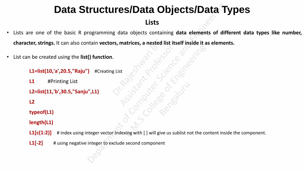
Data Structures/Data Objects/Data Types Lists
• Lists are one of the basic R programming data objects containing data elements of different data types like number,
character, strings. It can also contain vectors, matrices, a nested list itself inside it as elements.
• List can be created using the list() function.
L1=list(10,'a',20.5,"Raju") #Creating List
L1 #Printing List
L2=list(11,'b',30.5,"Sanju",L1)
L2
typeof(L1)
length(L1)
L1[c(1:2)] # index using integer vector Indexing with [ ] will give us sublist not the content inside the component.
L1[-2] # using negative integer to exclude second component

Data Structures/Data Objects/Data Types Lists
L3 <- list("a" = 2.5, "b" = TRUE, "c" = 1:3) # can give tag names, However, tags are optional.
L3
L4 <- list("Name" = "John", "Age" = 20, "Branch" = "CS")
L4
L4["Age"] # However, this approach will allow us to access only a single component at a time.
L4$Age # an alternative approach.
L4[["Name"]] <- "Clair" # We can change components of a list through reassignment
L4
L4[["Married"]] <- FALSE # Adding new components is easy. We simply assign values using new tags and it will pop into action.
L4
L4[["Age"]] <- NULL # We can delete a component by assigning NULL to it.
str(L4)
L1[1]
Data Structures/Data Objects/Data Types Lists
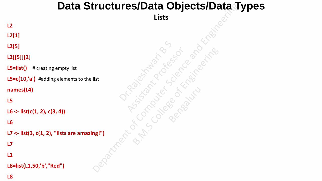
L2
L2[1]
L2[5]
L2[[5]][2]
L5=list() # creating empty list
L5=c(10,'a') #adding elements to the list
names(L4)
L5
L6 <- list(c(1, 2), c(3, 4))
L6
L7 <- list(3, c(1, 2), "lists are amazing!")
L7
L1
L8=list(L1,50,'b',"Red")
L8

Data Structures/Data Objects/Data Types Lists
• Lists can be extremely useful inside functions. Because the functions in R are able to return only a single object, we can
“staple” together lots of different kinds of results into a single object that a function can return.
• A list does not print to the console like a vector. Instead, each element of the list starts on a new line.
• Elements are indexed by double brackets. If the elements of a list are named, they can be referenced by the $ notation (i.e.
xlist$data).

Data Structures/Data Objects/Data Types Matrix
• Matrix is a two dimensional data structure in R programming.
• Same as vector, the components in a matrix must be of the same basic type.
• Matrix can be created using the matrix() function.
• Dimension of the matrix can be defined by passing appropriate value for arguments nrow and ncol.
M1<-matrix(data=7,nrow=3,ncol=3)
M1
M2<-matrix(data=(1:9),nrow=3,ncol=3,byrow=F)
M2
• We can see that the matrix is filled column-wise. This can be reversed to row-wise filling by passing TRUE to the argument
byrow.
M3<-matrix(data=(1:9),nrow=3,ncol=3,byrow=T)
M3
• byrow=TRUE signifies that the matrix should be filled by rows. byrow=FALSE indicates that the matrix should be filled by
columns (the default).

Data Structures/Data Objects/Data Types Matrix
• In all cases, however, a matrix is stored in column-major order internally.
• Providing value for both dimension is not necessary. If one of the dimension is provided, the other is inferred from length of the data.
M4<-matrix(data=(1:9),nrow=3)
M4
• It is possible to name the rows and columns of matrix during creation by passing a 2 element list to the argument dimnames.
M5 <- matrix(1:9, nrow = 3, ncol=3,byrow=F,dimnames = list(c("R1","R2","R3"), c("C1","C2","C3")))
M5
• These row names and column names can be accessed or changed with two helpful functions colnames() and rownames().
rownames(M5)
colnames(M5)

Data Structures/Data Objects/Data Types Matrix
• It is also possible to change row names and column names
rownames(M5) <- c("ROW1","ROW2","ROW3")
colnames(M5) <- c("COL1","COL2","COL3")
M5
rownames(M5)
colnames(M5)
attributes(M1)
dim(M1)
• Another way of creating a matrix is by using functions cbind() and rbind()
M6<-cbind(c(1,2,3),c(4,5,6)) M6 M7<-rbind(c(1,2,3),c(4,5,6)) M7

Data Structures/Data Objects/Data Types Matrix
• Finally, we can also create a matrix from a vector by setting its dimension using dim(). Matrices can also be created
directly from vectors by adding a dimension attribute.
M8 <- c(1,2,3,4,5,6)
M8
class(M8)
dim(M8) <- c(2,3)
M8
class(M8)
• We can access elements of a matrix using the square bracket
M8[2,3]
M8[c(1,2),c(2,3)]
M8[c(1,2),c(1,3)]
M8[c(2),c(2,3)]

Data Structures/Data Objects/Data Types Matrix
• select elements greater than 5
M8
M8[M8>4]
M2
M2[2,] #2nd row of a matrix
M2[,3] #3rd column of a matrix • select even elements
M8[M8%%2 == 0] • We can combine assignment operator with the above learned methods for accessing elements of a matrix to modify it.
M8[2,2] <- 10;
M8 • modify elements less than 5.
M8[M8<5] <- 0
M8 • A common operation with matrix is to transpose it. This can be done with the function t().
t(M8)

Data Structures/Data Objects/Data Types Matrix
We can add row or column using rbind() and cbind() function respectively. Similarly, it can be removed through reassignment. M9<-rbind(c(10, 20, 30),c(40, 50,60),c(70,80,90)) M9 M9<-cbind(M9, c(1, 2, 3)) M9 M9<-rbind(M9,c(1,2,3,4)) M9
• In all cases, however, a matrix is stored in column-major order internally
M10<-rbind(c(10, 20, 30),c(40, 50,60))
M10
[,1] [,2] [,3] [1,] 10 20 30 [2,] 40 50 60
• Dimension of matrix can be modified as well, using the dim() function.
dim(M10) <- c(3,2);
M10
[,1] [,2] [1,] 10 50 [2,] 40 30 [3,] 20 60

Data Structures/Data Objects/Data Types Matrix
• We can perform mathematical operations on matrices
M1
M2
M1+M2
M1-M2
M1*M2
M1%*%M2
M1/M2
M1%%M2

Data Structures/Data Objects/Data Types Data Frames
• Data Frame is a type of data object in R. It is two dimensional object where each column is of one data type i.e, different
column in the frame is of different data type.
• It is a special case of a list.
• DataFrame can be created using the data.frame() function.
num1<- c(1,2,3,4)
char1<-c('a','b','c','d')
real1<-c(10.5,20.5,30.5,40.5)
str1 <- c("Red", "White", "Green","Black")
logical1<- c(TRUE,TRUE,TRUE,FALSE)
F1<-data.frame(num1,char1,real1,str1,logical1)
F1
Output num1 char1 real1 str1 logical1 1 a 10.5 Red TRUE 2 b 20.5 White TRUE 3 c 30.5 Green TRUE 4 d 40.5 Black FALSE

Data Structures/Data Objects/Data Types Frames
• Following are the characteristics of a data frame.
The column names should be non-empty.
The row names should be unique.
The data stored in a data frame can be of numeric, factor or character type.
Each column should contain same number of data items.
• We can print the data frame using print()
print(F1)
• Get the structure of the data frame.
str(F1)
• We can print the names of the data frame using names() names(F1)
• We can print attributes of the data frame using attributes() attributes(F1)
Output $names [1] "num1" "char1" "real1" "str1" "logical1" $class [1] "data.frame" $row.names [1] 1 2 3 4

Data Structures/Data Objects/Data Types Frames
• We can print class of the data frame using class() function
class(F1)
• We can access the class of each column in the data frame using sapply() function
sapply(F1, class)
• We can access number of rows and number of columns in the data frame using nrow() and ncol() function. nrow(F1) ncol(F1)
• Data frames can be accessed like a matrix by providing index for row and column.
F1
F1[2,3]
F1[2,]
F1[,3]
F1[2:4]
• We can access specific column with in the data frame
F1["str1"]
F1$str1

Data Structures/Data Objects/Data Types Frames
• We can modifying the content of a Data Frame in R
F1[2,3]<-100.5
F1
F1[2,"str1"]<-"Yellow"
F1
• We can give row names to the data frame using rownames() or row.names()
F1
names<-c("A","B","C","D")
rownames(F1)<-names
F1
• We can give column names to the data frame using names().
F1
names(F1)<-c("E","F","G","H","I")
F1
Data Structures/Data Objects/Data Types Frames
• Data Frame has been widely used in the reading comma-separated files (CSV), text files. Their use is not only limited to
reading the data, but you can also use them for machine learning problems, especially when dealing with numerical data.
Data Frames can be useful for understanding the data, data wrangling, plotting and visualizing.
• A data frame is a very important data type in R. It’s pretty much the de facto data structure for most tabular data and what
we use for statistics.
• Note that for data frames, there is a separate function for setting the row names, the row.names() function. Also, data
frames do not have column names, they just have names (like lists). So to set the column names of a data frame just use the
names() function.
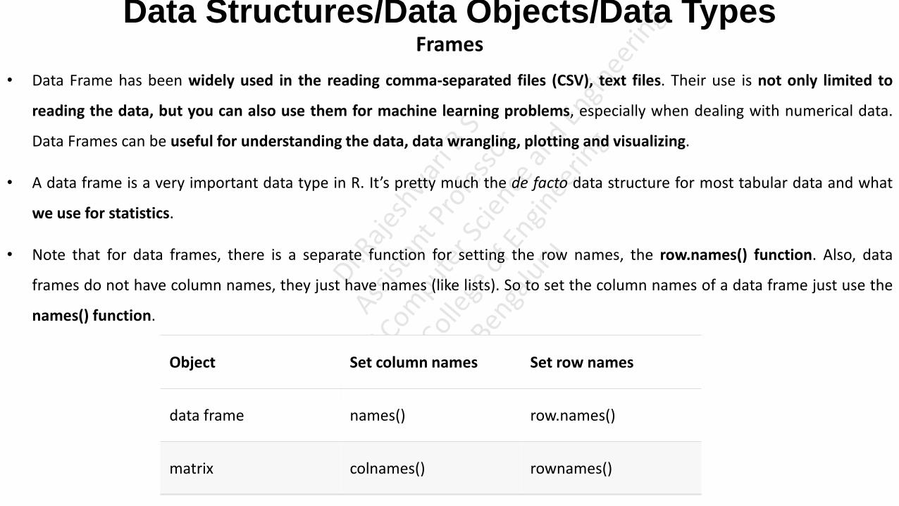
Object Set column names Set row names
data frame names() row.names()
matrix colnames() rownames()
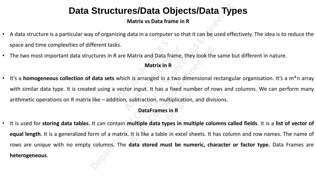
Data Structures/Data Objects/Data Types Matrix vs Data frame in R
• A data structure is a particular way of organizing data in a computer so that it can be used effectively. The idea is to reduce the
space and time complexities of different tasks.
• The two most important data structures in R are Matrix and Data frame, they look the same but different in nature.
Matrix in R
• It’s a homogeneous collection of data sets which is arranged in a two dimensional rectangular organisation. It’s a m*n array
with similar data type. It is created using a vector input. It has a fixed number of rows and columns. We can perform many
arithmetic operations on R matrix like – addition, subtraction, multiplication, and divisions.
DataFrames in R
• It is used for storing data tables. It can contain multiple data types in multiple columns called fields. It is a list of vector of
equal length. It is a generalized form of a matrix. It is like a table in excel sheets. It has column and row names. The name of
rows are unique with no empty columns. The data stored must be numeric, character or factor type. Data Frames are
heterogeneous.

Matrix vs Dataframe in R
Collection of data sets arranged in a two dimensional rectangular organisation.
Stores data tables that contains multiple data types in multiple column called fields.
It’s m*n array with similar data type. It is a list of vector of equal length. It is a generalized form of matrix.
It has fixed number of rows and columns. It has variable number of rows and columns.
The data stored in columns can be only of same data type.
The data stored must be numeric, character or factor type.
Matrix is homogeneous. DataFrames is heterogeneous.

Data Structures/Data Objects/Data Types
Factors
• Factor is a type of data object in R that takes only predefined, finite number of values (categorical data).
• For example, a data field such as marital status may contain only values from the set { Single, Married, Separated, Divorced, ,
Widowed } . Performance field may contain the values from the set { Excellent", "Good", "Average", "Poor }
• These predefined, distinct values are called Levels. They can be strings or integers.
• They are extremely useful in data analytics for statistical modelling.
• A Factor can be created using the function factor(). Levels of a factor are inferred from the data if not provided.
FT1 <- factor(c("Single", "Married", "Married", "Single"));
FT1
FT2 <- factor(c("Single", "Married", "Married", "Single", "Divorced"),levels = c("Single", "Married", "Divorced"));
FT2
Data Structures/Data Objects/Data Types Factors
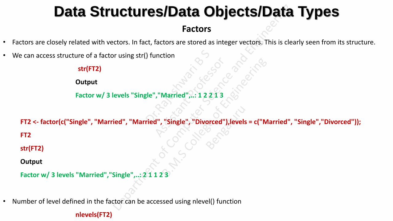
• Factors are closely related with vectors. In fact, factors are stored as integer vectors. This is clearly seen from its structure.
• We can access structure of a factor using str() function
str(FT2)
Output
Factor w/ 3 levels "Single","Married",..: 1 2 2 1 3
FT2 <- factor(c("Single", "Married", "Married", "Single", "Divorced"),levels = c("Married", "Single","Divorced"));
FT2
str(FT2)
Output
Factor w/ 3 levels "Married","Single",..: 2 1 1 2 3
• Number of level defined in the factor can be accessed using nlevel() function
nlevels(FT2)

Data Structures/Data Objects/Data Types Factors
For Eg: A variable gender with 20 "male" entries and 30 "female" entries
gender <- c(rep("male",20), rep("female", 30)) #rep() is a replicate function creates a vector with 20 Male entries and 30 Female entries
gender
gender <- factor(gender, order = TRUE,levels = c("male","female"))
gender
str(gender)
gender[1]>gender[21]
gender[21]>gender[1]
gender <- c(rep("male",20), rep("female", 30))
gender
gender <- factor(gender, order = FALSE,levels = c("male","female"))
gender
str(gender)
gender[1]>gender[21]
gender[21]>gender[1]

Importing and Exporting Data in R
• Exporting data is writing data from R to .txt (tab-separated values) and .csv (comma-separated values) file formats.
• It’s also possible to write csv files using the functions write.csv() and write.csv2().
• write.csv() uses “.” for the decimal point and a comma (“,”) for the separator.
my_data<-c(10.5,20.5,30.5,40.5)
getwd()
write.csv(my_data, file = "my_data.csv")
• write.csv2() uses a comma (“,”) for the decimal point and a semicolon (“;”) for the separator.
write.csv2(my_data, file = "my_data1.csv")
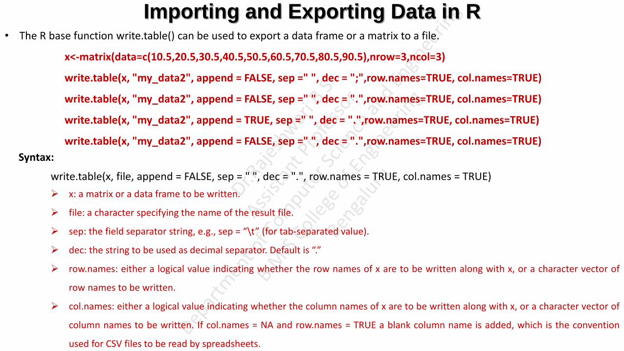
• The R base function write.table() can be used to export a data frame or a matrix to a file.
x<-matrix(data=c(10.5,20.5,30.5,40.5,50.5,60.5,70.5,80.5,90.5),nrow=3,ncol=3)
write.table(x, "my_data2", append = FALSE, sep =" ", dec = ";",row.names=TRUE, col.names=TRUE)
write.table(x, "my_data2", append = FALSE, sep =" ", dec = ".",row.names=TRUE, col.names=TRUE)
write.table(x, "my_data2", append = TRUE, sep =" ", dec = ".",row.names=TRUE, col.names=TRUE)
write.table(x, "my_data2", append = FALSE, sep =" ", dec = ".",row.names=TRUE, col.names=TRUE)
Importing and Exporting Data in R • The R base function write.table() can be used to export a data frame or a matrix to a file.
x<-matrix(data=c(10.5,20.5,30.5,40.5,50.5,60.5,70.5,80.5,90.5),nrow=3,ncol=3)
write.table(x, "my_data2", append = FALSE, sep =" ", dec = ";",row.names=TRUE, col.names=TRUE)
write.table(x, "my_data2", append = FALSE, sep =" ", dec = ".",row.names=TRUE, col.names=TRUE)
write.table(x, "my_data2", append = TRUE, sep =" ", dec = ".",row.names=TRUE, col.names=TRUE)
write.table(x, "my_data2", append = FALSE, sep =" ", dec = ".",row.names=TRUE, col.names=TRUE)
Syntax:
write.table(x, file, append = FALSE, sep = " ", dec = ".", row.names = TRUE, col.names = TRUE)
x: a matrix or a data frame to be written.
file: a character specifying the name of the result file.
sep: the field separator string, e.g., sep = “\t” (for tab-separated value).
dec: the string to be used as decimal separator. Default is “.”
row.names: either a logical value indicating whether the row names of x are to be written along with x, or a character vector of
row names to be written.
col.names: either a logical value indicating whether the column names of x are to be written along with x, or a character vector of
column names to be written. If col.names = NA and row.names = TRUE a blank column name is added, which is the convention
used for CSV files to be read by spreadsheets.
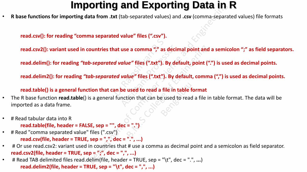
Importing and Exporting Data in R • R base functions for importing data from .txt (tab-separated values) and .csv (comma-separated values) file formats
read.csv(): for reading “comma separated value” files (“.csv”).
read.csv2(): variant used in countries that use a comma “,” as decimal point and a semicolon “;” as field separators.
read.delim(): for reading “tab-separated value” files (“.txt”). By default, point (“.”) is used as decimal points.
read.delim2(): for reading “tab-separated value” files (“.txt”). By default, comma (“,”) is used as decimal points.
read.table() is a general function that can be used to read a file in table format
• The R base function read.table() is a general function that can be used to read a file in table format. The data will be imported as a data frame.
• # Read tabular data into R read.table(file, header = FALSE, sep = "", dec = ".")
• # Read "comma separated value" files (".csv") read.csv(file, header = TRUE, sep = ",", dec = ".", ...)
• # Or use read.csv2: variant used in countries that # use a comma as decimal point and a semicolon as field separator. read.csv2(file, header = TRUE, sep = ";", dec = ",", ...)
• # Read TAB delimited files read.delim(file, header = TRUE, sep = "\t", dec = ".", ...) read.delim2(file, header = TRUE, sep = "\t", dec = ",", ...)

Importing and Exporting Data in R
file: the path to the file containing the data to be imported into R.
sep: the field separator character. “\t” is used for tab-delimited file.
header: logical value. If TRUE, read.table() assumes that your file has a header row, so row 1 is the name of each column. If that’s
not the case, you can add the argument header = FALSE.
dec: the character used in the file for decimal points.

Importing and Exporting Data in R • my_data<-c(10.5,20.5,30.5,40.5) • getwd() • write.csv(my_data, file = "my_data.csv") • write.csv2(my_data, file = "my_data1.csv") • x<-matrix(data=c(10.5,20.5,30.5,40.5,50.5,60.5,70.5,80.5,90.5),nrow=3,ncol=3) • write.table(x, "my_data2", append = FALSE, sep =" ", dec = ";",row.names=TRUE, col.names=TRUE) • write.table(x, "my_data2", append = FALSE, sep =" ", dec = ".",row.names=TRUE, col.names=TRUE) • write.table(x, "my_data2", append = TRUE, sep =" ", dec = ".",row.names=TRUE, col.names=TRUE) • write.table(x, "my_data2", append = FALSE, sep =" ", dec = ".",row.names=TRUE, col.names=TRUE) • a<-read.table("my_data2") • a • b<-read.csv("my_data.csv", header=TRUE, sep =",", dec=".") • b • c<-read.csv2("my_data1.csv", header=TRUE, sep=";", dec=",") • c • read.delim("my_data2") • read.delim("my_data2", header=TRUE, sep="\t", dec=".") • read.delim2("my_data2") • write.table(x, "my_data2", append = FALSE, sep =" ", dec = ";",row.names=TRUE, col.names=TRUE) • read.delim2("my_data2", header=TRUE, sep="\t", dec=";")

Contingency Table
• Contingency table, also known as a cross tabulation or crosstab or frequency distribution table is a type of table in a matrix
format that describes the relationships between two or more categorical variables.
• The contingency table below shows the favourite leisure activities for 50 adults - 20 men and 30 women.
• Contingency table is used to analyse and record the relationship between two or more categorical variables.
• They are heavily used in survey research, business intelligence, engineering and scientific research.
• This Contingency table displays relationship among two different categorical variables that may be dependent or contingent
on one another.
Favourite Leisure Activity
Sex
Dance Sports TV
Men 2 10 8
Women 16 6 8
Total 18 16 16

Contingency Table
• Download iris data set using the following link
https://www.kaggle.com/uciml/iris
dat <- iris
head(dat)
Sepal.Length Sepal.Width Petal.Length Petal.Width Species
5.1 3.5 1.4 0.2 setosa
4.9 3.0 1.4 0.2 setosa
4.7 3.2 1.3 0.2 setosa
4.6 3.1 1.5 0.2 setosa
5.0 3.6 1.4 0.2 setosa
5.4 3.9 1.7 0.4 setosa

Descriptive Statistics
str(dat)
'data.frame': 150 obs. of 5 variables:
$ Sepal.Length: num 5.1 4.9 4.7 4.6 5 5.4 4.6 5 4.4 4.9 ...
$ Sepal.Width : num 3.5 3 3.2 3.1 3.6 3.9 3.4 3.4 2.9 3.1 ...
$ Petal.Length: num 1.4 1.4 1.3 1.5 1.4 1.7 1.4 1.5 1.4 1.5 ...
$ Petal.Width : num 0.2 0.2 0.2 0.2 0.2 0.4 0.3 0.2 0.2 0.1 ...
$ Species : Factor w/ 3 levels "setosa","versicolor",..: 1 1 1 1 1 1 1 1 1 1 ...

Contingency Table
• The dataset iris has only one qualitative variable Sepal.Length, so we create a new qualitative variable just to create
Contingency Table.
• Create the new qualitative variable size which corresponds to “small”, if the length of the petal is smaller than the median of
all flowers, “big” otherwise
dat$size <- ifelse(dat$Sepal.Length<median(dat$Sepal.Length),"small","big")
dat$size
OUTPUT
"small" "small" "small" "small" "small" "small" "small“ …
• The occurrences by size can be found using the function table( )
table(dat$size)
OUTPUT
big small
77 73

Contingency Table
• We can create a contingency table of the two variables Species and size using the table() function
table(dat$Species, dat$size)
OUTPUT
big small
setosa 1 49
versicolor 29 21
virginica 47 3
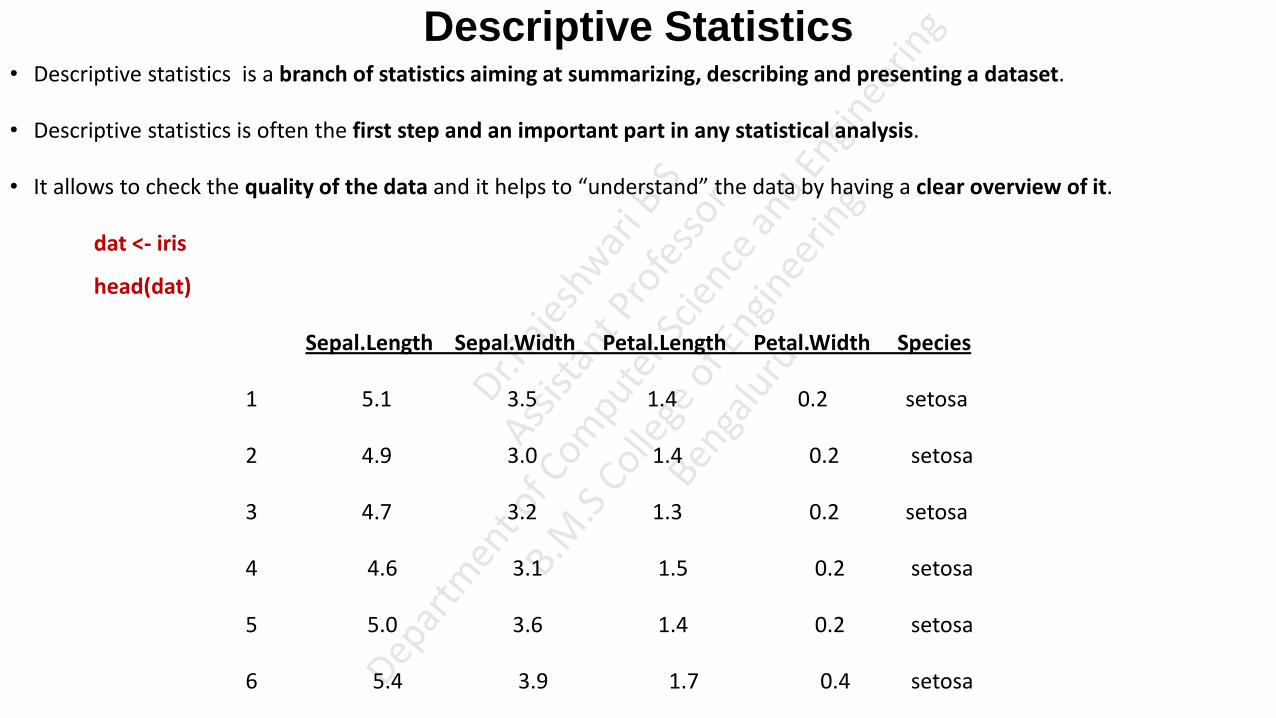
Descriptive Statistics • Descriptive statistics is a branch of statistics aiming at summarizing, describing and presenting a dataset.
• Descriptive statistics is often the first step and an important part in any statistical analysis.
• It allows to check the quality of the data and it helps to “understand” the data by having a clear overview of it.
dat <- iris
head(dat)
Sepal.Length Sepal.Width Petal.Length Petal.Width Species
1 5.1 3.5 1.4 0.2 setosa
2 4.9 3.0 1.4 0.2 setosa
3 4.7 3.2 1.3 0.2 setosa
4 4.6 3.1 1.5 0.2 setosa
5 5.0 3.6 1.4 0.2 setosa
6 5.4 3.9 1.7 0.4 setosa

Descriptive Statistics
• The structure of the dataset can be accessed using the function str( ).
str(dat)
OUTPUT
'data.frame': 150 obs. of 5 variables:
$ Sepal.Length: num 5.1 4.9 4.7 4.6 5 5.4 4.6 5 4.4 4.9 ...
$ Sepal.Width : num 3.5 3 3.2 3.1 3.6 3.9 3.4 3.4 2.9 3.1 ...
$ Petal.Length: num 1.4 1.4 1.3 1.5 1.4 1.7 1.4 1.5 1.4 1.5 ...
$ Petal.Width : num 0.2 0.2 0.2 0.2 0.2 0.4 0.3 0.2 0.2 0.1 ...
$ Species : Factor w/ 3 levels "setosa","versicolor",..: 1 1 1 1 1 1 1 1 1 1 ...
• The iris dataset contains 150 observations (records) and 5 variables (Columns), representing the length and width of the sepal
and petal and the species of 150 flowers. Length and width of the sepal and petal are numeric variables and the species is a
factor with 3 levels: ( setosa, versicolor, virginica)

Descriptive Statistics • Minimum and Maximum value can be found using min( ) and max( ) functions:
min(dat$Sepal.Length)
4.3
max(dat$Sepal.Length)
7.9
• Alternatively the range( ) function can be used to find Minimum and Maximum value.
rng <- range(dat$Sepal.Length)
4.3 7.9
• The minimum value can be accessed using rng[1] and the maximum value can be accessed using rng[2]
• The range can then be easily computed, by subtracting the minimum from the maximum value
max(dat$Sepal.Length) - min(dat$Sepal.Length)
3.6

Descriptive Statistics • There is no default function to compute the range. However, we can create our own function in R to compute the range
range2 <- function(x) { range <- max(x) - min(x) return(range) } range2(dat$Sepal.Length) 3.6
• The Mean value can be computed using mean( ) function:
mean(dat$Sepal.Length)
5.843333
if there is at least one missing value in the dataset, use mean(dat$Sepal.Length, na.rm = TRUE) to compute the mean with the NA excluded.
• The Median can be computed using median( ) function:
median(dat$Sepal.Length)
or
with the quantile() function:
quantile(dat$Sepal.Length, 0.5)
5.8

First and Third Quartile: Example (Just for the Reference)
• The lower half of a data set is the set of all values that are to the left of the median value when the data has been put into increasing order.
• The upper half of a data set is the set of all values that are to the right of the median value when the data has been put into increasing order.
• The first quartile, denoted by Q1 , is the median of the lower half of the data set. This means that about 25% of the numbers in the data set lie below Q1 and about 75% lie above Q1 .
• The third quartile, denoted by Q3 , is the median of the upper half of the data set. This means that about 75% of the numbers in the data set lie below Q3 and about 25% lie above Q3 .
Example: Find the first and third quartiles of the data set {3, 7, 8, 5, 12, 14, 21, 13, 18}.
First, we write data in increasing order: 3, 5, 7, 8, 12, 13, 14, 18, 21.
The median is 12.
Therefore, the lower half of the data is: {3, 5, 7, 8}.
The first quartile, Q1, is the median of {3, 5, 7, 8}.
Since there is an even number of values, we need the mean of the middle two values to find the first quartile:
• Similarly, the upper half of the data is: {13, 14, 18, 21}, so

Descriptive Statistics First and Third Quartile
• As the median, the First and Third Quartiles can be computed using quantile( ) function and by setting the second argument
to 0.25 or 0.75
quantile(dat$Sepal.Length, 0.25) # Calculate Median for the First Quartile i.e, 25% of data (Sepal.Length) in the dataset is less than 5.1
25%
5.1
quantile(dat$Sepal.Length, 0.75) # Calculate Median for the Third Quartile i.e, 75% of data (Sepal.Length) in the dataset is less than 6.4
75%
6.4
Interquartile Range
• The interquartile range, the difference between the first and third quartile can be computed with the IQR() function:
IQR(dat$Sepal.Length)
1.3

Descriptive Statistics Standard Deviation and Variance
• The Standard Deviation and the Variance can be computed with the sd( ) and var( ) functions:
sd(dat$Sepal.Length) # standard deviation
0.8280661
var(dat$Sepal.Length) # variance
0.6856935
• To compute the standard deviation or variance of multiple variables at the same time, we can use lapply() function with the
appropriate statistics as second argument:
lapply(dat[, 1:4], sd) # The command dat[, 1:4] selects the variables 1 to 4
$Sepal.Length
0.8280661
$Sepal.Width
0.4358663
$Petal.Length
1.765298
$Petal.Width
0.7622377

Descriptive Statistics
Coefficient of Variation
• The coefficient of variation can be found by computing manually, which is the standard deviation divided by the mean.
sd(dat$Sepal.Length) / mean(dat$Sepal.Length)
0.1417113

Dirty Data • The figure shows few accounts with account holder age less than 10 are unusual.
• However, the left side of the graph shows a huge spike of customers who are zero years old or have negative ages. This is likely
to be evidence of missing data.
• One possible explanation is that the null age values could have been replaced by 0 or negative values during the data input.
• Therefore, data cleansing needs to be performed over the accounts with abnormal age values.
• Analysts should take a closer look at the records to decide if the missing data should be eliminated or if an appropriate age
value can be determined using other available information for each of the accounts.
• In R, the is . na ( ) function provides tests for missing values.
For Eg: create a vector x where the fourth value is not available (NA). The is . na ( } function returns TRUE at each NA value
and FALSE otherwise.
X<- c(l, 2, 3, NA, 4)
is.na(x)
FALSE FALSE FALSE TRUE FALSE
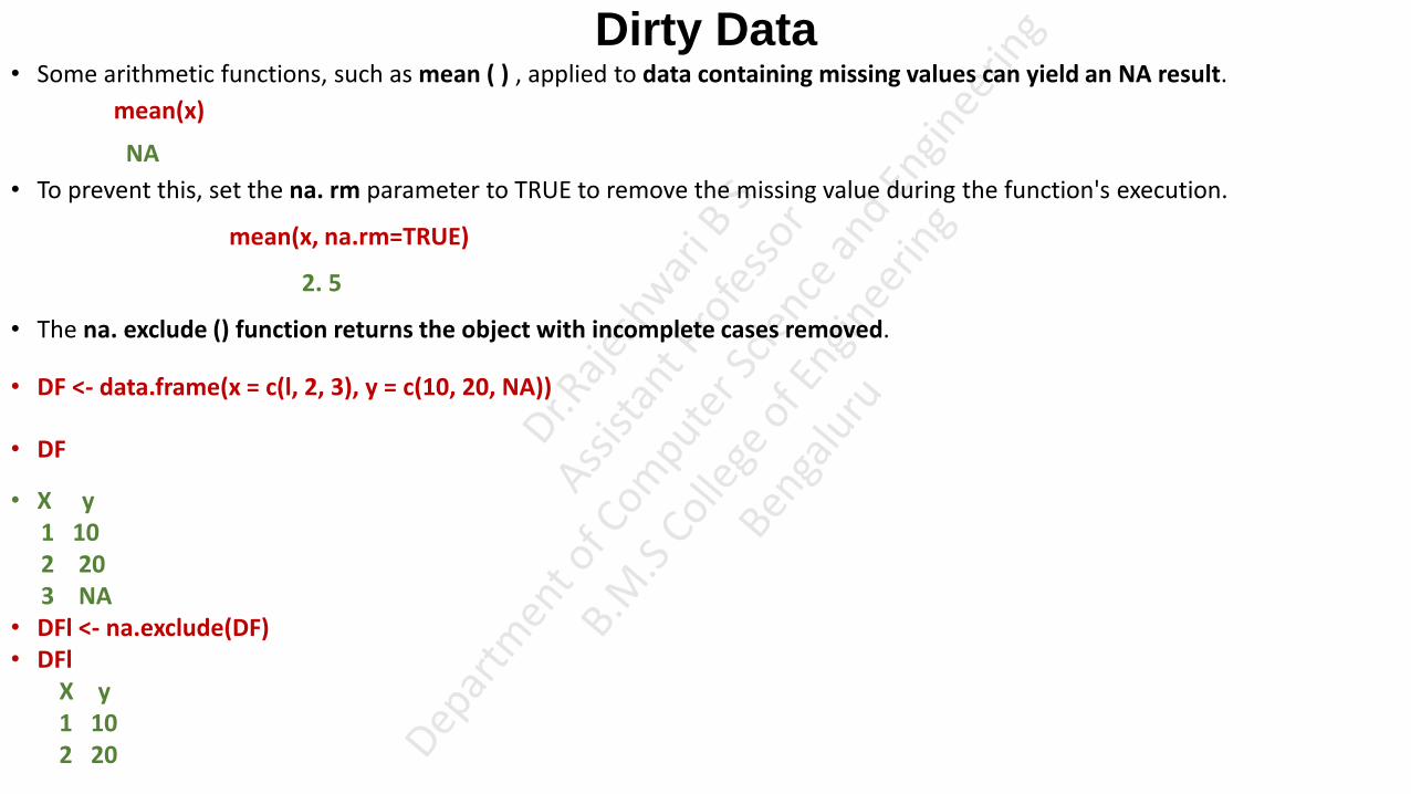
Dirty Data • Some arithmetic functions, such as mean ( ) , applied to data containing missing values can yield an NA result.
mean(x)
NA
• To prevent this, set the na. rm parameter to TRUE to remove the missing value during the function's execution.
mean(x, na.rm=TRUE)
2. 5
• The na. exclude () function returns the object with incomplete cases removed.
• DF <- data.frame(x = c(l, 2, 3), y = c(10, 20, NA))
• DF
• X y 1 10 2 20 3 NA • DFl <- na.exclude(DF) • DFl X y 1 10 2 20
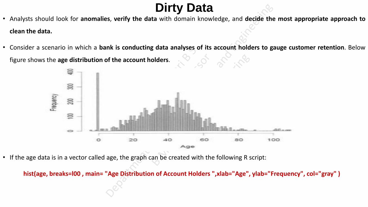
Dirty Data • Analysts should look for anomalies, verify the data with domain knowledge, and decide the most appropriate approach to
clean the data.
• Consider a scenario in which a bank is conducting data analyses of its account holders to gauge customer retention. Below
figure shows the age distribution of the account holders.
• If the age data is in a vector called age, the graph can be created with the following R script:
hist(age, breaks=l00 , main= "Age Distribution of Account Holders ",xlab="Age", ylab="Frequency", col="gray" )
Descriptive Statistics
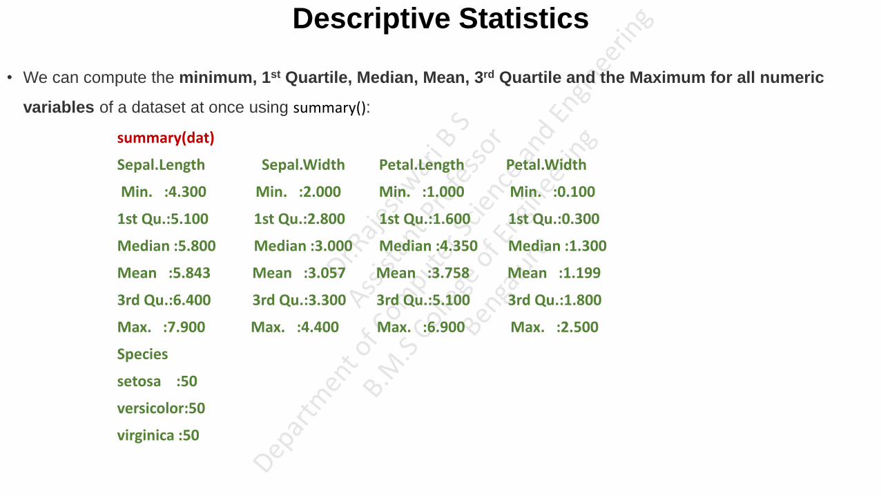
• We can compute the minimum, 1st Quartile, Median, Mean, 3rd Quartile and the Maximum for all numeric
variables of a dataset at once using summary():
summary(dat)
Sepal.Length Sepal.Width Petal.Length Petal.Width
Min. :4.300 Min. :2.000 Min. :1.000 Min. :0.100
1st Qu.:5.100 1st Qu.:2.800 1st Qu.:1.600 1st Qu.:0.300
Median :5.800 Median :3.000 Median :4.350 Median :1.300
Mean :5.843 Mean :3.057 Mean :3.758 Mean :1.199
3rd Qu.:6.400 3rd Qu.:3.300 3rd Qu.:5.100 3rd Qu.:1.800
Max. :7.900 Max. :4.400 Max. :6.900 Max. :2.500
Species
setosa :50
versicolor:50
virginica :50

Exploratory Data Analysis
• So far, discussed generating descriptive statistics.
• Functions such as summary () can help analysts easily get an idea of the magnitude and range of the data, but other aspects
such as linear relationships and distributions are more difficult to see from descriptive statistics.
• For example, the following code shows a summary view of a data frame “iris” with five columns Sepal.Length,
Sepal.Width, Petal.Length, Petal.Width and Species. The output shows the summary of all these five variables, but it's not
clear what the relationship may be between these five variables.
For example: summary(dat)
Sepal.Length Sepal.Width Petal.Length Petal.Width
Min. :4.300 Min. :2.000 Min. :1.000 Min. :0.100
1st Qu.:5.100 1st Qu.:2.800 1st Qu.:1.600 1st Qu.:0.300
Median :5.800 Median :3.000 Median :4.350 Median :1.300
Mean :5.843 Mean :3.057 Mean :3.758 Mean :1.199
3rd Qu.:6.400 3rd Qu.:3.300 3rd Qu.:5.100 3rd Qu.:1.800
Max. :7.900 Max. :4.400 Max. :6.900 Max. :2.500
Species
setosa :50
versicolor:50
virginica :50

Exploratory Data Analysis • A useful way to detect patterns and anomalies in the data is through the exploratory data analysis with visualization.
• Visualization gives a succinct, holistic view of the data that may be difficult to grasp from the numbers and summaries alone.
• Visualization easily depicts the relationship between two variables.
• Exploratory data analysis is a data analysis approach to reveal the important characteristics of a dataset, mainly through
visualization.

Exploratory Data Analysis Visualization Before Analysis
• To illustrate the importance of visualizing data, consider Anscombe's quartet. Anscom be's quartet consists of four datasets,
as shown below. It was constructed by statistician Francis Anscombe to demonstrate the importance of graphs in statistical
analyses.
• The four data sets in Anscom be's quartet have nearly identical statistical properties, as shown in above Table.
• Statistical Properties of Anscombe's Quartet
Exploratory Data Analysis
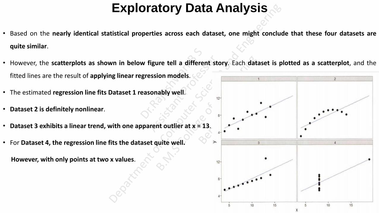
• Based on the nearly identical statistical properties across each dataset, one might conclude that these four datasets are
quite similar.
• However, the scatterplots as shown in below figure tell a different story. Each dataset is plotted as a scatterplot, and the
fitted lines are the result of applying linear regression models.
• The estimated regression line fits Dataset 1 reasonably well.
• Dataset 2 is definitely nonlinear.
• Dataset 3 exhibits a linear trend, with one apparent outlier at x = 13.
• For Dataset 4, the regression line fits the dataset quite well.
However, with only points at two x values.
Exploratory Data Analysis: Visualizing a Single Variable
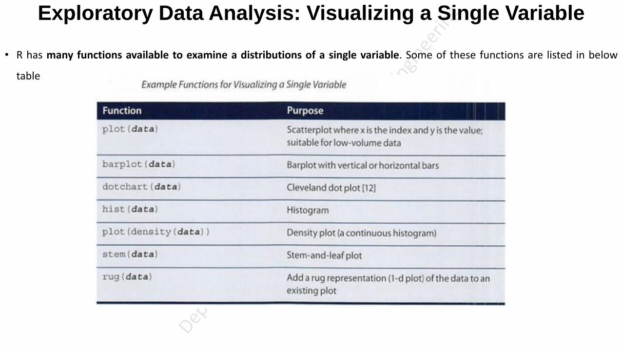
• R has many functions available to examine a distributions of a single variable. Some of these functions are listed in below
table

Exploratory Data Analysis: Visualizing a Single Variable • Quantitative Variables - Variables whose values result from counting or measuring something.
Examples: height, weight, number of items sold to a shopper, Sepal.Length, Sepal.Width, Petal.Length, Petal.Width
• Qualitative Variables - Variables that are not measurement variables. A qualitative variable, also called a categorical variable,
is a variable that isn’t numerical. It describes data that fits into categories.
For example: A qualitative variable size corresponds to “small”, if the length of the petal is smaller than the median
of all flowers, “big” otherwise
dat$size <- ifelse(dat$Sepal.Length<median(dat$Sepal.Length),"small","big")
dat$size
OUTPUT
"small" "small" "small" "small" "small" "small" "small“ …
Example 2: hair color, religion, political party, profession

Exploratory Data Analysis: Visualizing a Single Variable Barplot
• A Barplot is a tool to visualize the distribution of a qualitative variable. Barplots can only be done on qualitative variables.
• Now. we can draw a Barplot on the qualitative variable size
table(dat$size)
big small 77 73
barplot(table(dat$size))

Exploratory Data Analysis: Visualizing a Single Variable Histogram
• A Histogram gives an idea about the distribution of a quantitative variable.
• The idea is to break the range of values into intervals and count how many observations fall into each interval.
• Histograms are a bit similar to Barplots, but Histograms are used for quantitative variables whereas Barplots are used for
qualitative variables.
• To draw a histogram in R, use hist():
hist(dat$Sepal.Length)
• We can see above that there are 8 cells with equally spaced breaks. In this case, the height of a cell is equal to the number of observation falling in that cell.

Exploratory Data Analysis: Visualizing a Single Variable
Histogram
• We can pass in additional parameters to control the way our plot looks. Read about them in the help section ?hist.
• Some of the frequently used ones are, main to give the title, xlab and ylab to provide labels for the axes, xlim and ylim to
provide range of the axes, col to define color etc.
• Additionally, with the argument freq=FALSE we can get the probability distribution instead of the frequency.
hist(dat$Sepal.Length, main="Frequency of Sepal Length", xlab="Sepal Length", xlim=c(1,10),col="darkmagenta", freq=TRUE)

Exploratory Data Analysis: Visualizing a Single Variable
Histogram
• Histogram with different breaks
• With the breaks argument, we can specify the number of cells we want in the histogram. However, this number is just a
suggestion.
• R calculates the best number of cells, keeping this suggestion in mind. Following are two histograms on the same data
with different number of cells.
hist(dat$Sepal.Length, breaks=4, main="With breaks=4",xlim=c(1,10))
hist(dat$Sepal.Length, breaks=20, main="With breaks=20",xlim=c(1,10))

Exploratory Data Analysis: Visualizing a Single Variable
Histogram
• Histogram with non-uniform width
hist(dat$Sepal.Length,main="Frequency of Sepal Length", xlab="Sepal.Length", xlim=c(1,10), col="yellow",border="red",
breaks=c(2,5,7,8,9,10))

• https://www.datamentor.io/r-programming/box-plot/

First and Third Quartile: Example (Just for the Reference)
• The lower half of a data set is the set of all values that are to the left of the median value when the data has been put into increasing order.
• The upper half of a data set is the set of all values that are to the right of the median value when the data has been put into increasing order.
• The first quartile, denoted by Q1 , is the median of the lower half of the data set. This means that about 25% of the numbers in the data set lie below Q1 and about 75% lie above Q1 .
• The third quartile, denoted by Q3 , is the median of the upper half of the data set. This means that about 75% of the numbers in the data set lie below Q3 and about 25% lie above Q3 .
Example: Find the first and third quartiles of the data set {3, 7, 8, 5, 12, 14, 21, 13, 18}.
First, we write data in increasing order: 3, 5, 7, 8, 12, 13, 14, 18, 21.
The median is 12.
Therefore, the lower half of the data is: {3, 5, 7, 8}.
The first quartile, Q1, is the median of {3, 5, 7, 8}.
Since there is an even number of values, we need the mean of the middle two values to find the first quartile:
• Similarly, the upper half of the data is: {13, 14, 18, 21}, so

Exploratory Data Analysis: Visualizing a Single Variable
Boxplot
• In R, boxplot is created using the boxplot() function.
• The boxplot() function takes in any number of numeric vectors, drawing a boxplot for each vector.
• We can also pass in a list (or data frame) with numeric vectors as its components.
• Let us use the built-in dataset airquality which has “Daily air quality measurements in New York, May to
September 1973.”
str(airquality)
'data.frame': 153 obs. of 6 variables: $ Ozone : int 41 36 12 18 NA 28 23 19 8 NA ... $ Solar.R: int 190 118 149 313 NA NA 299 99 19 194 ... $ Wind : num 7.4 8 12.6 11.5 14.3 14.9 8.6 13.8 20.1 8.6 ... $ Temp : int 67 72 74 62 56 66 65 59 61 69 ... $ Month : int 5 5 5 5 5 5 5 5 5 5 ... $ Day : int 1 2 3 4 5 6 7 8 9 10 ...

Exploratory Data Analysis: Visualizing a Single Variable
Boxplot
• Let us create a boxplot for the ozone readings.
boxplot(airquality$Ozone)
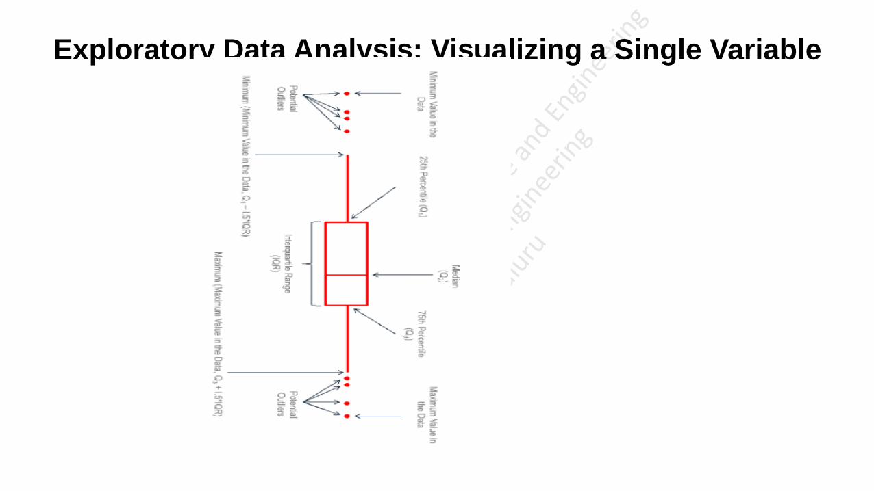
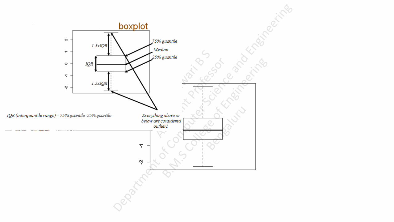
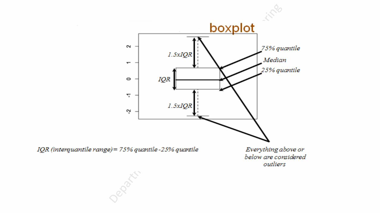
A boxplot gives a nice summary of one or more numeric variables.
The line that divides the box into 2 parts represents the median of the data.
The ends of the box shows the upper (Q3) and lower (Q1) quartiles.
The difference between Quartiles 1 and 3 is called the interquartile range (IQR)
The extreme line shows Q3+1.5xIQR to Q1-1.5xIQR (the highest and lowest value excluding outliers).
Dots beyond the extreme line shows potential outliers.
Exploratory Data Analysis: Visualizing a Single Variable
Boxplot
Exploratory Data Analysis: Visualizing a Single Variable
Boxplot
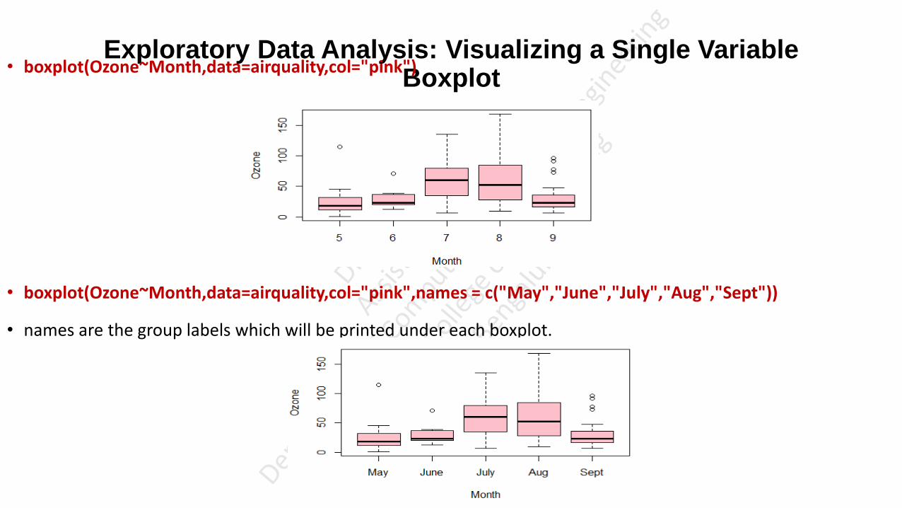
• boxplot(Ozone~Month,data=airquality,col="pink")
• boxplot(Ozone~Month,data=airquality,col="pink",names = c("May","June","July","Aug","Sept"))
• names are the group labels which will be printed under each boxplot.

Exploratory Data Analysis: Visualizing a Single Variable
Boxplot
• boxplot(Ozone~Month,data=airquality,names = c("May","June","July","Aug","Sept"),col = c("green","yellow","purple","blue","grey60"))
• boxplot(Ozone~Month,data=airquality,names = c("May","June","July","Aug","Sept"),col = c("green","yellow","purple","blue","grey60"),varwidth=TRUE)
• varwidth is a logical value. Set as true to draw width of the box proportionate to the sample size.
Exploratory Data Analysis: Visualizing a Single Variable
Boxplot
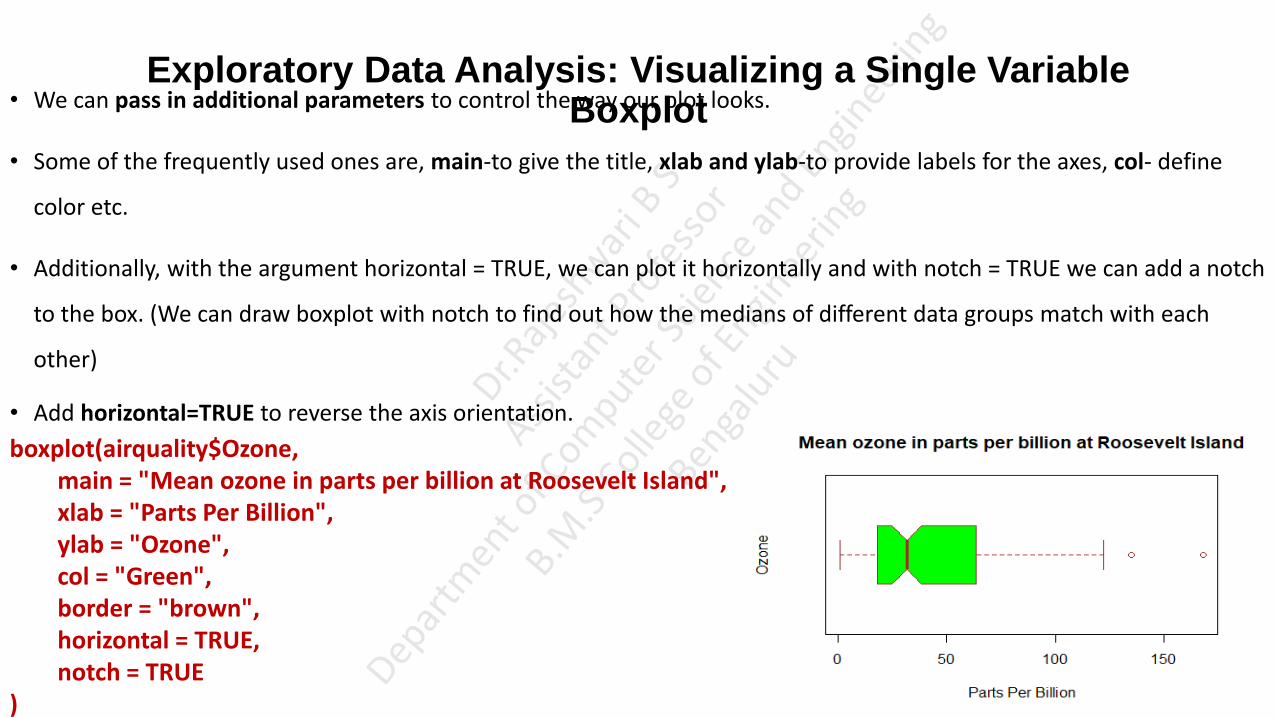
• We can pass in additional parameters to control the way our plot looks.
• Some of the frequently used ones are, main-to give the title, xlab and ylab-to provide labels for the axes, col- define
color etc.
• Additionally, with the argument horizontal = TRUE, we can plot it horizontally and with notch = TRUE we can add a notch
to the box. (We can draw boxplot with notch to find out how the medians of different data groups match with each
other)
• Add horizontal=TRUE to reverse the axis orientation.
boxplot(airquality$Ozone, main = "Mean ozone in parts per billion at Roosevelt Island", xlab = "Parts Per Billion", ylab = "Ozone", col = "Green", border = "brown", horizontal = TRUE, notch = TRUE )
Exploratory Data Analysis: Visualizing a Single Variable
Boxplot
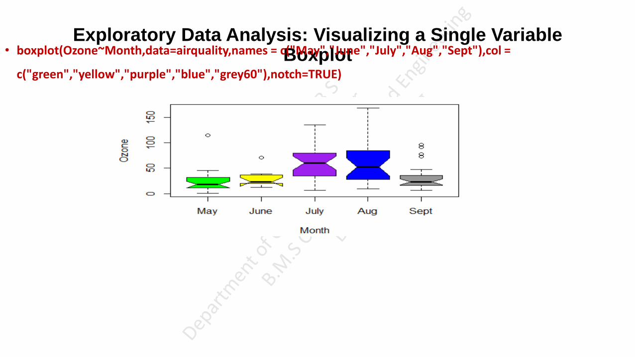
• boxplot(Ozone~Month,data=airquality,names = c("May","June","July","Aug","Sept"),col =
c("green","yellow","purple","blue","grey60"),notch=TRUE)
Exploratory Data Analysis: Visualizing a Single Variable
Boxplot
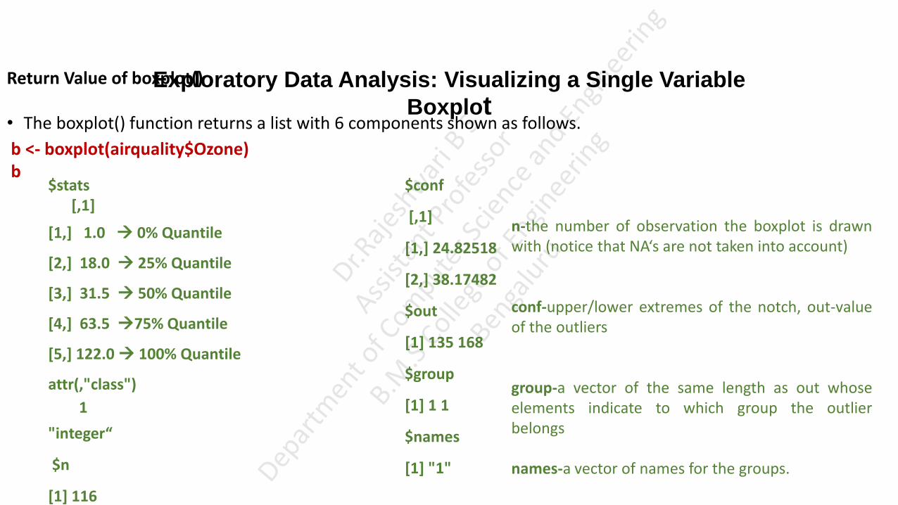
Return Value of boxplot()
• The boxplot() function returns a list with 6 components shown as follows.
b <- boxplot(airquality$Ozone) b $stats
[,1]
[1,] 1.0 0% Quantile
[2,] 18.0 25% Quantile
[3,] 31.5 50% Quantile
[4,] 63.5 75% Quantile
[5,] 122.0 100% Quantile
attr(,"class")
1
"integer“
$n
[1] 116
$conf
[,1]
[1,] 24.82518
[2,] 38.17482
$out
[1] 135 168
$group
[1] 1 1
$names
[1] "1"
n-the number of observation the boxplot is drawn with (notice that NA‘s are not taken into account) conf-upper/lower extremes of the notch, out-value of the outliers group-a vector of the same length as out whose elements indicate to which group the outlier belongs names-a vector of names for the groups.
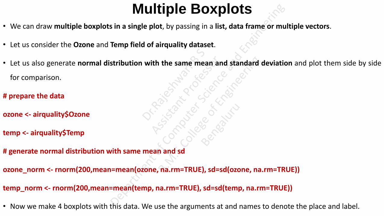
Multiple Boxplots • We can draw multiple boxplots in a single plot, by passing in a list, data frame or multiple vectors.
• Let us consider the Ozone and Temp field of airquality dataset.
• Let us also generate normal distribution with the same mean and standard deviation and plot them side by side
for comparison.
# prepare the data
ozone <- airquality$Ozone
temp <- airquality$Temp
# generate normal distribution with same mean and sd
ozone_norm <- rnorm(200,mean=mean(ozone, na.rm=TRUE), sd=sd(ozone, na.rm=TRUE))
temp_norm <- rnorm(200,mean=mean(temp, na.rm=TRUE), sd=sd(temp, na.rm=TRUE))
• Now we make 4 boxplots with this data. We use the arguments at and names to denote the place and label.
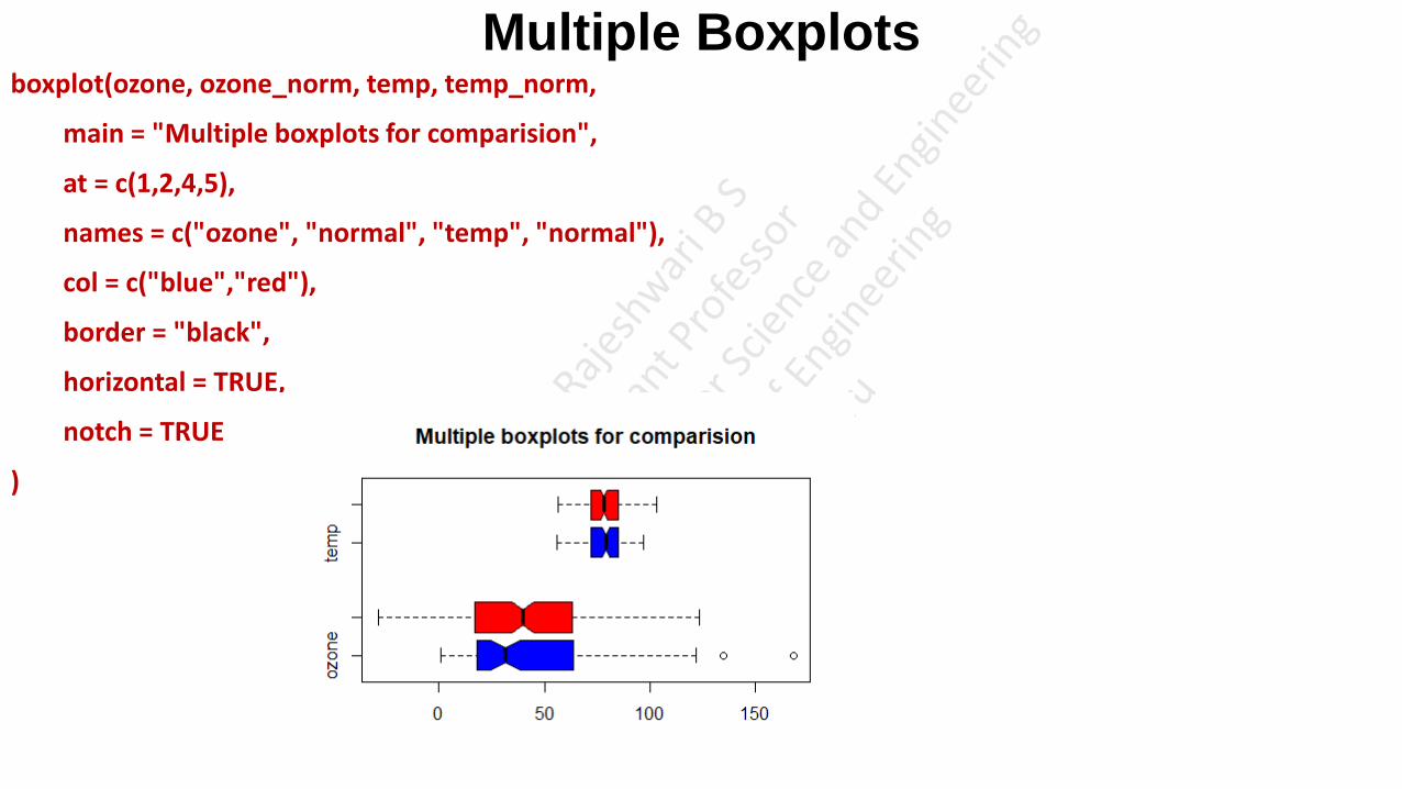
Multiple Boxplots boxplot(ozone, ozone_norm, temp, temp_norm,
main = "Multiple boxplots for comparision",
at = c(1,2,4,5),
names = c("ozone", "normal", "temp", "normal"),
col = c("blue","red"),
border = "black",
horizontal = TRUE,
notch = TRUE
)

Boxplot form Formula • The function boxplot() can also take in formulas of the form y~x where, y is a numeric vector which is grouped
according to the value of x.
• For example, in the dataset airquality, the Temp can be our numeric vector. Month can be our grouping variable,
so that we get the boxplot for each month separately.
• In the dataset airquality, month is in the form of number (1=January, 2-Febuary and so on).
boxplot(Temp~Month,
data=airquality,
main="Different boxplots for each month",
xlab="Month Number",
ylab="Degree Fahrenheit",
col="orange",
border="brown"
)
It is clear from the above figure that the month number 7 (July) is relatively hotter than the rest.

boxplot.matrix( ) • The boxplot.matrix( ) function in the sfsmisc package draws a boxplot for each column (row) in a matrix.
M6<-cbind(c(1,2,3),c(4,5,6))
M6
boxplot.matrix(M6 )

• There are many arguments supported by the Boxplot in R programming language, and the following are some of the arguments:
data: Please specify the DataFrame, or List that contains the data to draw boxplot. In this example, it is airquality
subset: You can restrict the R barplots by specifying the vector of values. In this example, you can restrict the barplot box for August month.
x: Please specify the data from which you want to draw the R box plot. Here, you can use a numeric vector, or a list containing the numeric vector.
range: This R Programming argument decides how far the whisker extends out of the box.
width: It is optional, but you can use this to specify a vector that contains the widths of each box.
varwidth: It is a Boolean argument. If it is TRUE, boxes draw with widths proportional to the square roots of the no. of observations in the group.
border: It is an optional argument. Please specify the vector of color you want to add to the outlines of the boxplot borders.
plot: It is a Boolean argument. If it is FALSE, it returns the summaries on which the R boxplots based on.
log: You have to specify a character string of three options. If X-Axis is to be logarithmic then “x”, If Y-Axis is to be logarithmic “y”, if both X-Axis and Y-Axis are to be logarithmic, then specify either “xy” or “yx”
add: It is a Boolean argument, and by default, it is FALSE. If it is TRUE, the boxplot should add to an already existing plot.
horizontal: It is a Boolean argument. If it is FALSE, the R boxplot drew vertically. If it is TRUE, the boxplot drew horizontally.
at: It is a numeric vector, which gives the locations where the boxplot drew. It is very helpful when we are adding a new boxplot to the existing plot region.
Boxplot in ggplot2 Package • So far, we have created all the graphs and images with the boxplot function of Base R. However, there are also
many packages that provide pretty designs and additional modification possibilities for boxplots.
• In the example, I’ll show you how to create a boxplot with the ggplot2 package. Let’s install and load the package to RStudio:
install.packages("ggplot2") # Install and load ggplot2
library("ggplot2")
http://r-statistics.co/Top50-Ggplot2-Visualizations-MasterList-R-Code.html#Box%20Plot

• str(airquality)
• boxplot(airquality$Ozone)
• boxplot(Ozone~Month,data=airquality,col="pink")
• boxplot(Ozone~Month,data=airquality,col="pink",names = c("May","June","July","Aug","Sept"))
• boxplot(Ozone~Month,data=airquality,names = c("May","June","July","Aug","Sept"),col = c("green","yellow","purple","blue","grey60"))
• boxplot(Ozone~Month,data=airquality,names = c("May","June","July","Aug","Sept"),col = c("green","yellow","purple","blue","grey60"),varwidth=TRUE)
• boxplot(airquality$Ozone,
• main = "Mean ozone in parts per billion at Roosevelt Island",
• xlab = "Parts Per Billion",
• ylab = "Ozone",
• col = "darkGreen",
• border = "brown",
• horizontal = FALSE,
• notch = TRUE
• )
• boxplot(Ozone~Month,data=airquality,names = c("May","June","July","Aug","Sept"),col = c("green","yellow","purple","blue","grey60"),notch=TRUE)
• b <- boxplot(airquality$Ozone)
• b
• # prepare the data
• ozone <- airquality$Ozone
• temp <- airquality$Temp
• # gererate normal distribution with same mean and sd
• ozone_norm <- rnorm(200,mean=mean(ozone, na.rm=TRUE), sd=sd(ozone, na.rm=TRUE))
• temp_norm <- rnorm(200,mean=mean(temp, na.rm=TRUE), sd=sd(temp, na.rm=TRUE))
• boxplot(ozone, ozone_norm, temp, temp_norm,
• main = "Multiple boxplots for comparision",
• at = c(1,2,4,5),
• names = c("ozone", "normal", "temp", "normal"),
• col = c("blue","red"),
• border = "black",
• horizontal = TRUE,
• notch = TRUE
• )
• boxplot(Temp~Month,
• data=airquality,
• main="Different boxplots for each month",
• xlab="Month Number",
• ylab="Degree Fahrenheit",
• col="orange",
• border="brown"
• )
• M6<-cbind(c(1,2,3),c(4,5,6))
• M6
• boxplot.matrix(M6 )

Scatter Plot • Scatterplots show many points plotted in the Cartesian plane. Each point represents the values of two variables.
One variable is chosen in the horizontal axis and another in the vertical axis. (to visualize the distribution of a variable in
terms of points in a Cartesian plane)
• There are many ways to create a scatterplot in R. The basic function is plot(x, y), where x and y are numeric
vectors denoting the x and y points to plot.
Syntax
The basic syntax for creating scatterplot in R is −
plot(x, y, main, xlab, ylab, xlim, ylim)
• x is the data set whose values are the horizontal coordinates. y is the data set whose values are the vertical
coordinates.
• main is the tile of the graph. xlab is the label in the horizontal axis. ylab is the label in the vertical axis.
• xlim is the limits of the values of x used for plotting. ylim is the limits of the values of y used for plotting.

Scatter Plot • To illustrate, first read the Employee data included as part of lessR package.
library("lessR")
d <- Read("Employee")
D
head(d)
Name Years Gender Dept Salary JobSat Plan Pre Post
Ritchie, Darnell 7 M ADMN 53788.26 med 1 82 92
Wu, James NA M SALE 94494.58 low 1 62 74
Hoang, Binh 15 M SALE 111074.86 low 3 96 97
Jones, Alissa 5 F <NA> 53772.58 <NA> 1 65 62
Downs, Deborah 7 F FINC 57139.90 high 2 90 86
Afshari, Anbar 6 F ADMN 69441.93 high 2 100 100
details(d)
Total number of cells in data table: 296
Total number of cells with the value missing: 4

Scatter Plot Plot(Years, Salary)
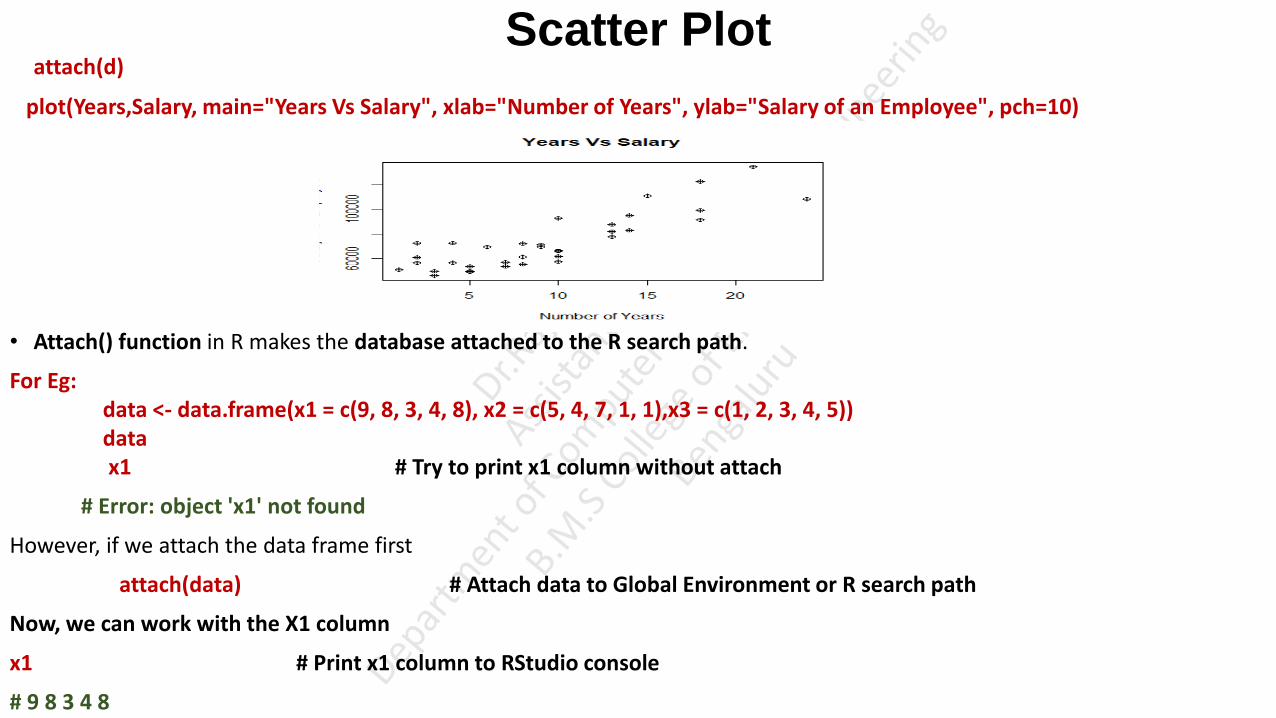
Scatter Plot attach(d)
plot(Years,Salary, main="Years Vs Salary", xlab="Number of Years", ylab="Salary of an Employee", pch=10)
• Attach() function in R makes the database attached to the R search path.
For Eg: data <- data.frame(x1 = c(9, 8, 3, 4, 8), x2 = c(5, 4, 7, 1, 1),x3 = c(1, 2, 3, 4, 5)) data x1 # Try to print x1 column without attach
# Error: object 'x1' not found
However, if we attach the data frame first
attach(data) # Attach data to Global Environment or R search path
Now, we can work with the X1 column
x1 # Print x1 column to RStudio console
# 9 8 3 4 8

Scatter Plot • pch is the graphical argument used to specify point shapes.
• The different points symbols commonly used in R are shown in the figure below :
plot(Years,Salary, main="Years Vs Salary",xlab="Number of Years", ylab="Salary of an Employee",xlim=c(0,25),ylim=c(0,140000),pch=10)

Scatter Plot plot(Years,Salary, main="Years Vs Salary", xlab="Number of Years", ylab="Salary of an Employee",xlim=c(0,25),ylim=c(0,140000),col="darkgreen", cex=2.5,pch=20)
plot(Years,Salary, main="Years Vs Salary", xlab="Number of Years", ylab="Salary of an Employee",xlim=c(0,25),ylim=c(0,140000),col="darkgreen", cex=2.5,pch=">")

Scatter Plot • Plot against levels of categorical variable Gender with the by parameter.
Plot(Years, Salary, by=Gender)
abline(lm(Salary~Years),col="red") # regression line (y~x)
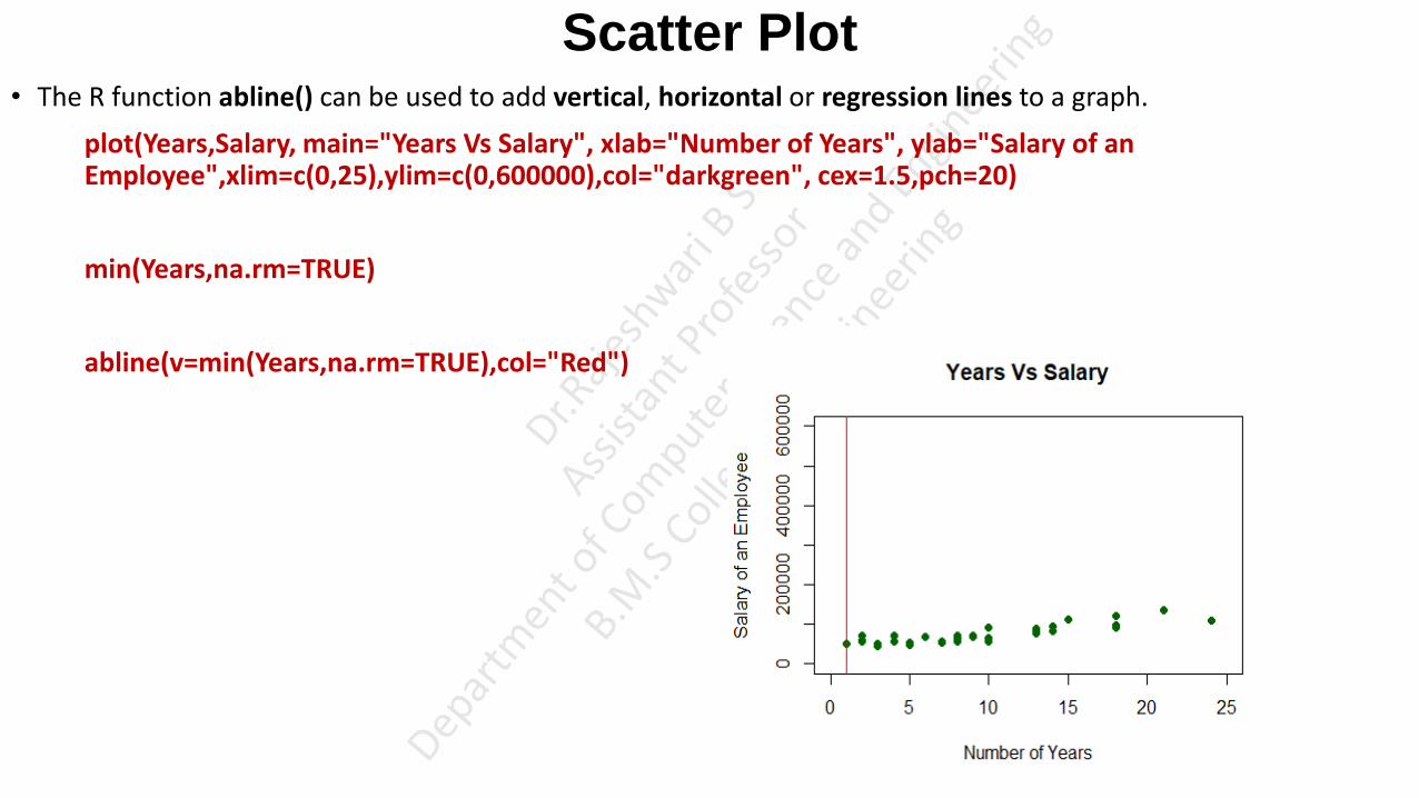
Scatter Plot • The R function abline() can be used to add vertical, horizontal or regression lines to a graph.
plot(Years,Salary, main="Years Vs Salary", xlab="Number of Years", ylab="Salary of an Employee",xlim=c(0,25),ylim=c(0,600000),col="darkgreen", cex=1.5,pch=20)
min(Years,na.rm=TRUE)
abline(v=min(Years,na.rm=TRUE),col="Red")
Scatter Plot
• The scatterplot( ) function in the car package offers many enhanced features, including fit lines, marginal box
plots, conditioning on a factor, and interactive point identification. Each of these features is optional.
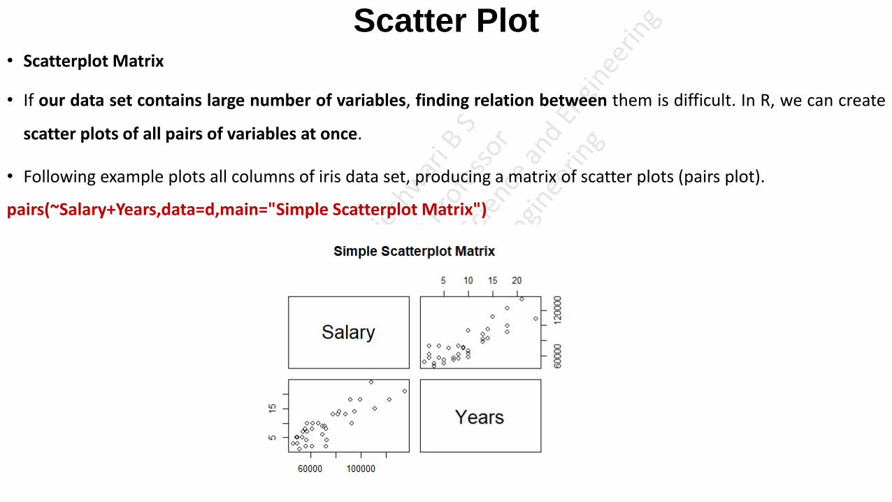
Scatter Plot • Scatterplot Matrix
• If our data set contains large number of variables, finding relation between them is difficult. In R, we can create
scatter plots of all pairs of variables at once.
• Following example plots all columns of iris data set, producing a matrix of scatter plots (pairs plot).
pairs(~Salary+Years,data=d,main="Simple Scatterplot Matrix")
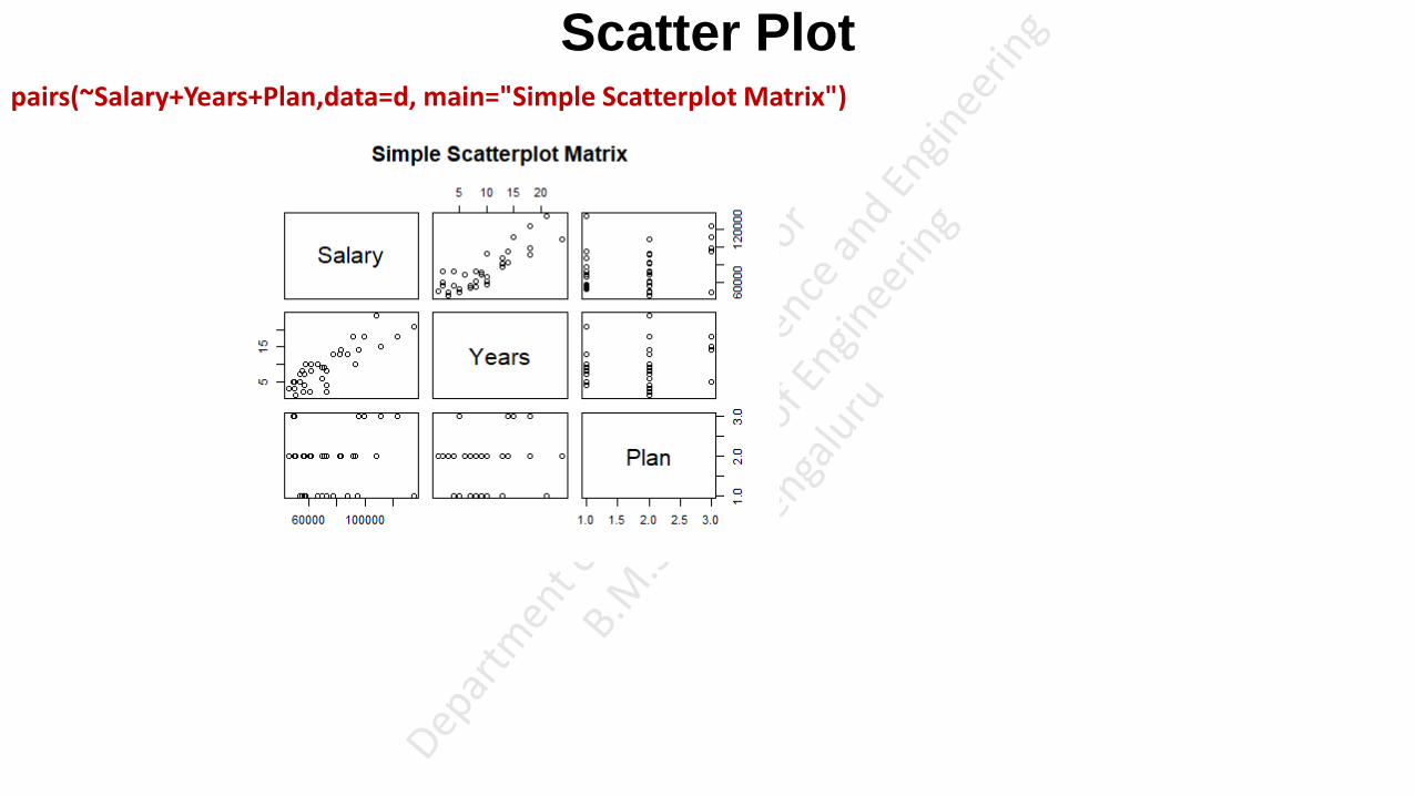
Scatter Plot pairs(~Salary+Years+Plan,data=d, main="Simple Scatterplot Matrix")
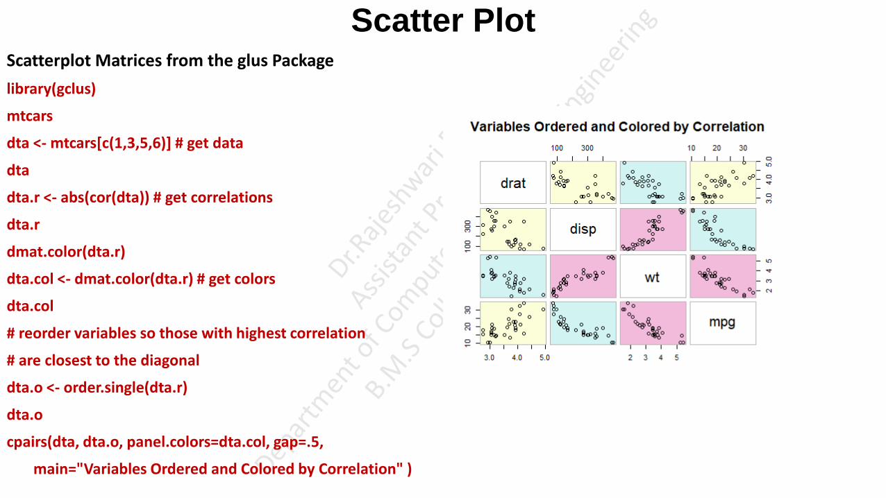
Scatter Plot Scatterplot Matrices from the glus Package
library(gclus)
mtcars
dta <- mtcars[c(1,3,5,6)] # get data
dta
dta.r <- abs(cor(dta)) # get correlations
dta.r
dmat.color(dta.r)
dta.col <- dmat.color(dta.r) # get colors
dta.col
# reorder variables so those with highest correlation
# are closest to the diagonal
dta.o <- order.single(dta.r)
dta.o
cpairs(dta, dta.o, panel.colors=dta.col, gap=.5,
main="Variables Ordered and Colored by Correlation" )

Scatter Plot High Density Scatterplots
When there are many data points and significant overlap, scatterplots become less useful. There are several approaches that be used when this occurs. The hexbin(x, y) function in the hexbin package provides bivariate binning into hexagonal cells (it looks better than it sounds).
https://www.statmethods.net/graphs/scatterplot.html
3D Scatterplots
You can create a 3D scatterplot with the scatterplot3d package. Use the function scatterplot3d(x, y, z).
library(scatterplot3d)
attach(mtcars)
scatterplot3d(wt,disp,mpg, main="3D Scatterplot")
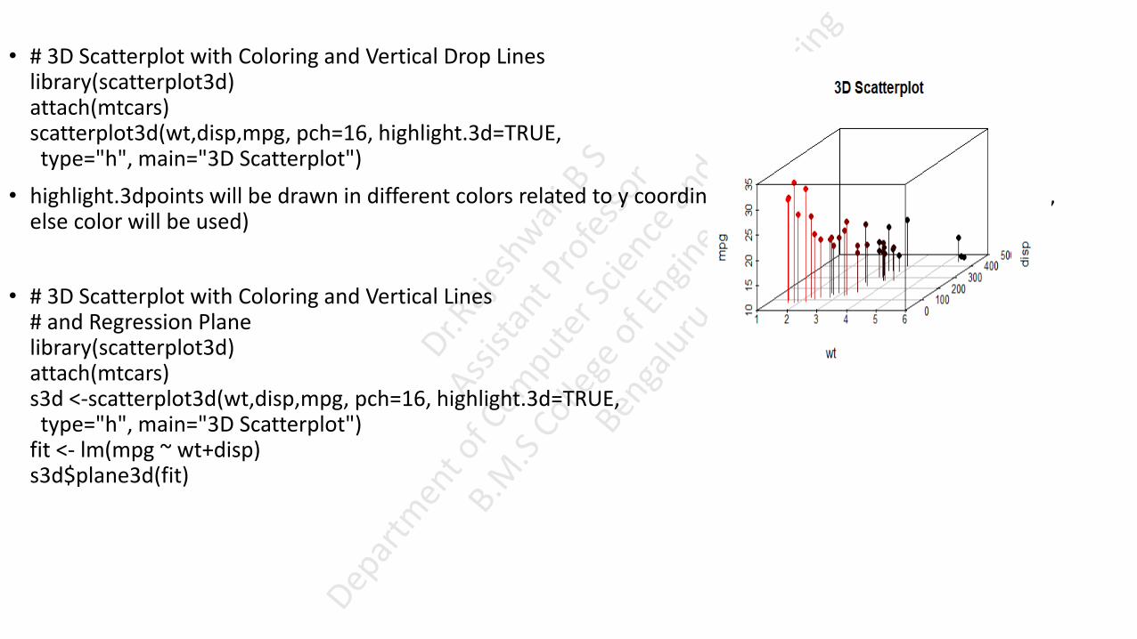
• # 3D Scatterplot with Coloring and Vertical Drop Lines library(scatterplot3d) attach(mtcars) scatterplot3d(wt,disp,mpg, pch=16, highlight.3d=TRUE, type="h", main="3D Scatterplot")
• highlight.3dpoints will be drawn in different colors related to y coordinates (only if type = "p" or type = "h", else color will be used)
• # 3D Scatterplot with Coloring and Vertical Lines # and Regression Plane library(scatterplot3d) attach(mtcars) s3d <-scatterplot3d(wt,disp,mpg, pch=16, highlight.3d=TRUE, type="h", main="3D Scatterplot") fit <- lm(mpg ~ wt+disp) s3d$plane3d(fit)

• Ggplot()
• The R code for generating Figure 3-7 is shown next. It requires the R package ggplot2 [11]. which can be installed simply by running the command install . p ackages ( "ggp lot2" ). The anscombe REVIEW OF BASIC DATA ANALYTIC METHODS USING R dataset for the plot is included in the standard R distribution. Enter data ( ) for a list of datasets included in the R base distribution. Enter data ( Da tase tName) to make a dataset available in the current workspace. In the code that follows, variable levels is created using the gl (} function, which generates factors offour levels (1, 2, 3, and 4), each repeating 11 times. Variable myda ta is created using the with (data, expression) function, which evaluates an expression in an environment constructed from da ta.ln this example, the data is the anscombe dataset, which includes eight attributes: xl, x2, x3, x4, yl, y2, y3, and y4. The expression part in the code creates a data frame from the anscombe dataset, and it only includes three attributes: x, y, and the group each data point belongs to (mygroup). install.packages(''ggplot2") # not required if package has been installed data (anscombe) anscombe x1 x2 x3 x4 1 10 10 10 8 2 8 8 8 8 13 13 13 4 9 9 5 11 11 11 6 14 14 14 8 7 6 6 6 8 8 4 4 4 19 9 12 12 12 8 10 7 7 7 8 11 5 5 5 8 nrow(anscombe) [1] 11 It load the anscombe dataset into the current \'iOrkspace y1 y2 y3 y4 8. O·l 9.14 7.-16 6.58 6.95 8.14 6.77 5.76 7.58 8.74 12.74 7.71 8.81 8.77 7.11 8.84 8.33 9.26 7.81 8.·±7 9. 9G 8.10 8.34 7.04 7.24 6.13 6. •J8 5.25 ·l. 26 3.10 5. 3 9 12.50 10. 8•1 9.13 8.15 5.56 4.82 7.26 6.-12 7.91 5.68 4.74 5.73 6.89 It number of rows # generates levels to indicate which group each data point belongs to levels<- gl(4, nrow(anscombe)) levels [1] 1 1 1 1 1 1 1 1 l l l 2 .; 2 2 2 2 2 2 2 2 2 3 3 3 3 3 3 3 3 3 3 3 * 34+ 4 4 4 4 4 •l ·l 4 4 4 4 Levels: 1 2 3 4 # Group anscombe into a data frame mydata <- with(anscombe, data.frame(x=c(xl,x2,x3,x4), y=c(yl,y2,y3,y4), mygroup=levels)) mydata X y mygroup 10 8.04 2 8 6.95 13 7.58 4 9 8.81 ... 1 1 ... 4 4, B 'i.S6 -l3 8 7 0 l 4 44 B 6 . 89 4 A Ma~f -~atterp "tF ~siny th ruplot~ package library (ggplot2 ) therne_set (therne_bw ()) - s L rlot color :~erne ggplot (rnydata, aes (x, y )) + geom_point (size=4 ) + j\11 ' 1 7 geom_srnooth (rnethod="lrn ", fill=NA, fullrange=TRUE) + facet_wrap (-rnygroup)

Dot Chart • Dot plot in R also known as dot chart is an alternative to bar charts, where the bars are replaced by dots.
• We’ll use mtcars data sets.
mtcars
mpg stands for miles per gallon, and is used to show how far your car is able to travel for every gallon (or 4.55 litres) of fuel it uses. As an example, if you own a car that can return 50mpg and its fuel tank only has one gallon of petrol or diesel in it, you should be able to drive 50 miles before the car runs out of fuel.

Dot Chart • We start by ordering the data set according to mpg variable.
mtcars <- mtcars[order(mtcars$mpg), ]
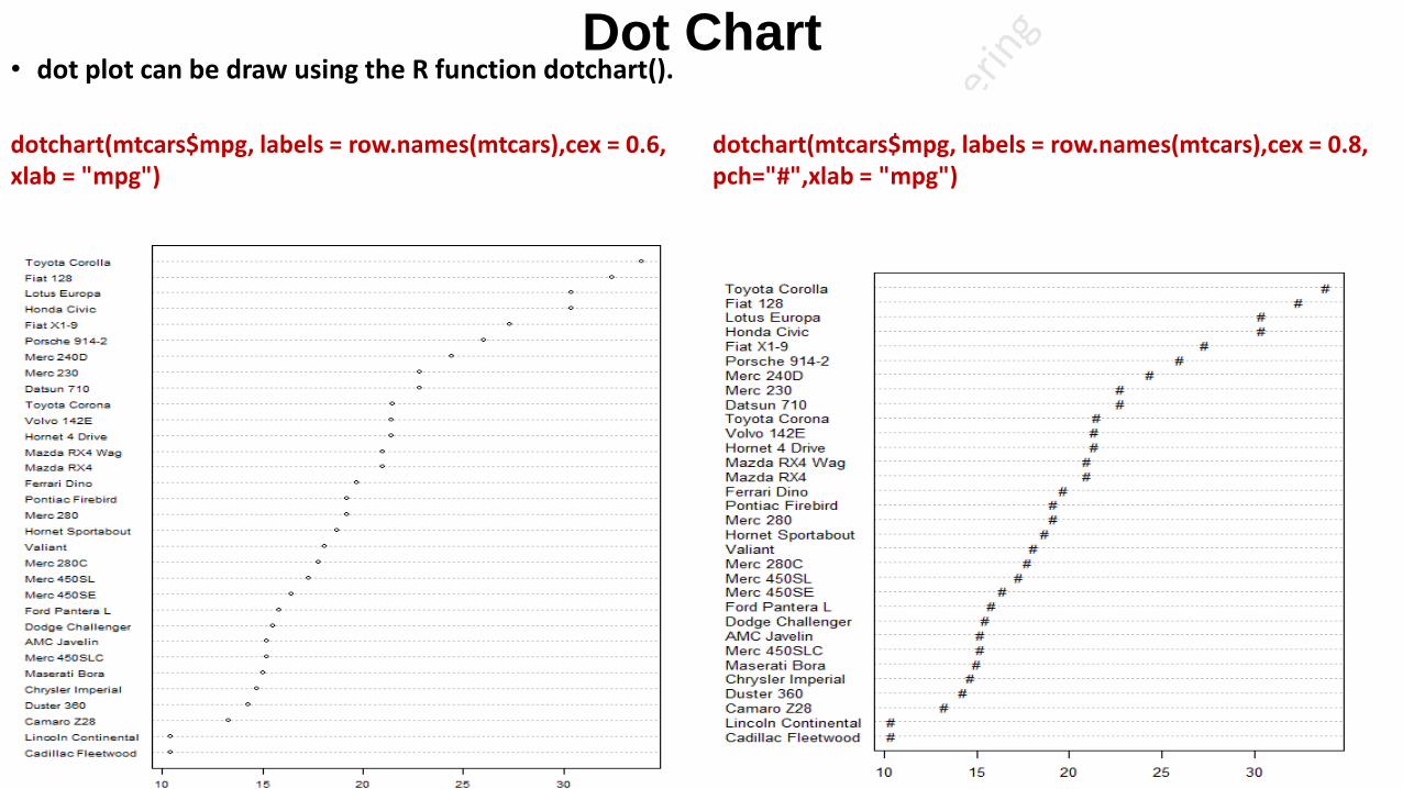
Dot Chart • dot plot can be draw using the R function dotchart().
dotchart(mtcars$mpg, labels = row.names(mtcars),cex = 0.6, xlab = "mpg")
dotchart(mtcars$mpg, labels = row.names(mtcars),cex = 0.8, pch="#",xlab = "mpg")
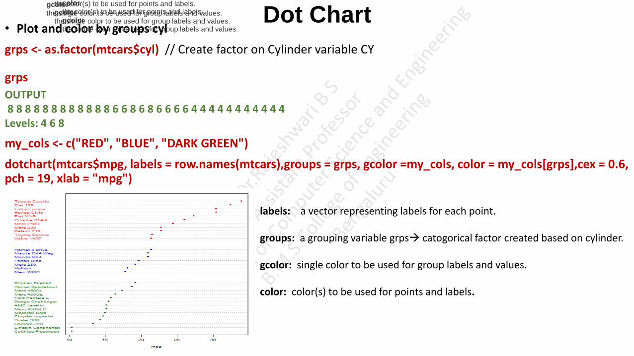
Dot Chart • Plot and color by groups cyl
grps <- as.factor(mtcars$cyl) // Create factor on Cylinder variable CY
grps
OUTPUT 8 8 8 8 8 8 8 8 8 8 8 8 6 6 8 6 8 6 6 6 6 4 4 4 4 4 4 4 4 4 4 4 Levels: 4 6 8
my_cols <- c("RED", "BLUE", "DARK GREEN")
dotchart(mtcars$mpg, labels = row.names(mtcars),groups = grps, gcolor =my_cols, color = my_cols[grps],cex = 0.6, pch = 19, xlab = "mpg")
labels: a vector representing labels for each point.
groups: a grouping variable grps catogorical factor created based on cylinder.
gcolor: single color to be used for group labels and values.
color: color(s) to be used for points and labels.
color
the color(s) to be used for points and labels.
gcolor
the single color to be used for group labels and values.
color
the color(s) to be used for points and labels.
gcolor
the single color to be used for group labels and values.
color
the color(s) to be used for points and labels.
gcolor
the single color to be used for group labels and values.

dotchart(mtcars$mpg,labels=row.names(mtcars),cex=.7,groups= mtcars$cyl, main="Gas Milage for Car
Models\ngrouped by cylinder", xlab="Miles Per Gallon", color=mtcars$color, lcolor = "PINK")
lcolor: color(s) to be used for the horizontal lines.
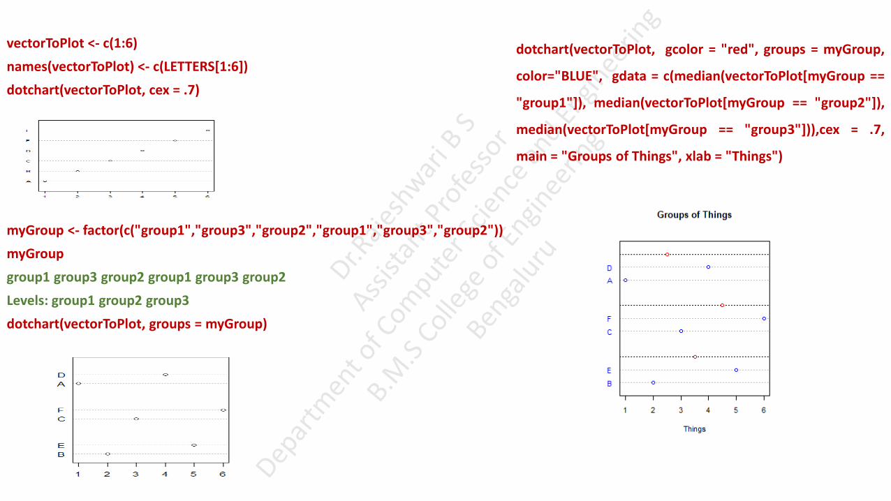
vectorToPlot <- c(1:6)
names(vectorToPlot) <- c(LETTERS[1:6])
dotchart(vectorToPlot, cex = .7)
myGroup <- factor(c("group1","group3","group2","group1","group3","group2"))
myGroup
group1 group3 group2 group1 group3 group2
Levels: group1 group2 group3
dotchart(vectorToPlot, groups = myGroup)
dotchart(vectorToPlot, gcolor = "red", groups = myGroup,
color="BLUE", gdata = c(median(vectorToPlot[myGroup ==
"group1"]), median(vectorToPlot[myGroup == "group2"]),
median(vectorToPlot[myGroup == "group3"])),cex = .7,
main = "Groups of Things", xlab = "Things")
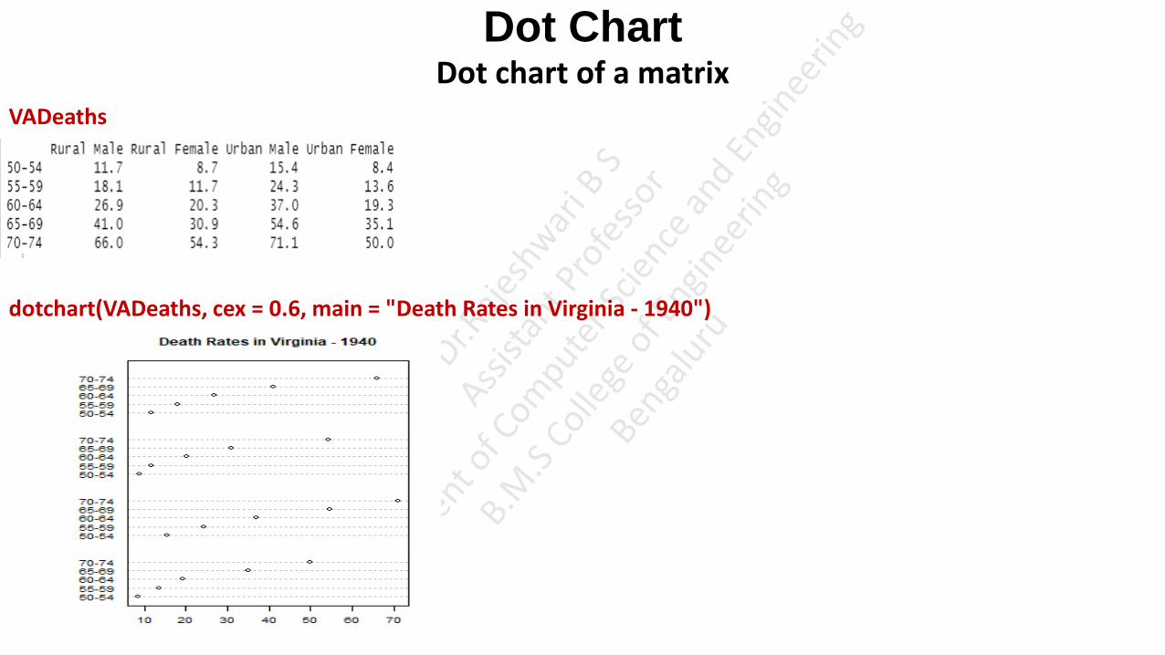
Dot Chart Dot chart of a matrix
VADeaths
dotchart(VADeaths, cex = 0.6, main = "Death Rates in Virginia - 1940")

Density Plot • A density plot shows the distribution of a numeric variable. It is similar to histogram. Histogram represents count where as density represents
probability value equal to each count.
• Density is proportional to the chance that any value in our data is approximately equal to that value.
• In fact, for a histogram, the density is calculated from the counts, so the only difference between a histogram with frequencies and one with
densities, is the scale of the y-axis. For the rest, they look exactly the same.
• we can estimate the density function of a variable using the density() function.
Observation: in both figures shows peak for the count range between 15 to 20 mpg value almost 12 in histogram, but in density graph y axis range is in the form of probability
hist(mtcars$mpg)
d <- density(mtcars$mpg)
plot(d,col="RED",xlim=c(10,35),main="DENSITY GRAPH")

polygon(d, col = "steelblue")

Density Plot # randomly generate 4000 observations from the log normal distribution
income<- rlnorm(4000, meanlog = 4, sdlog = 0.7) // generats logarithmic normal distribution whose logarithm has mean equal to meanlog and standard deviation equal to sdlog.
summary (income)
Min. 1st Qu. Median Mean 3rd Qu. Max.
3.891 33.637 54.353 70.164 89.187 596.477
income <- 1000*income
summary (income)
Min. 1st Qu. Median Mean 3rd Qu. Max.
3891 33637 54353 70164 89187 596477
# plot the histogram
hist(income, breaks=500, xlab="Income", main="Histogram of Income")
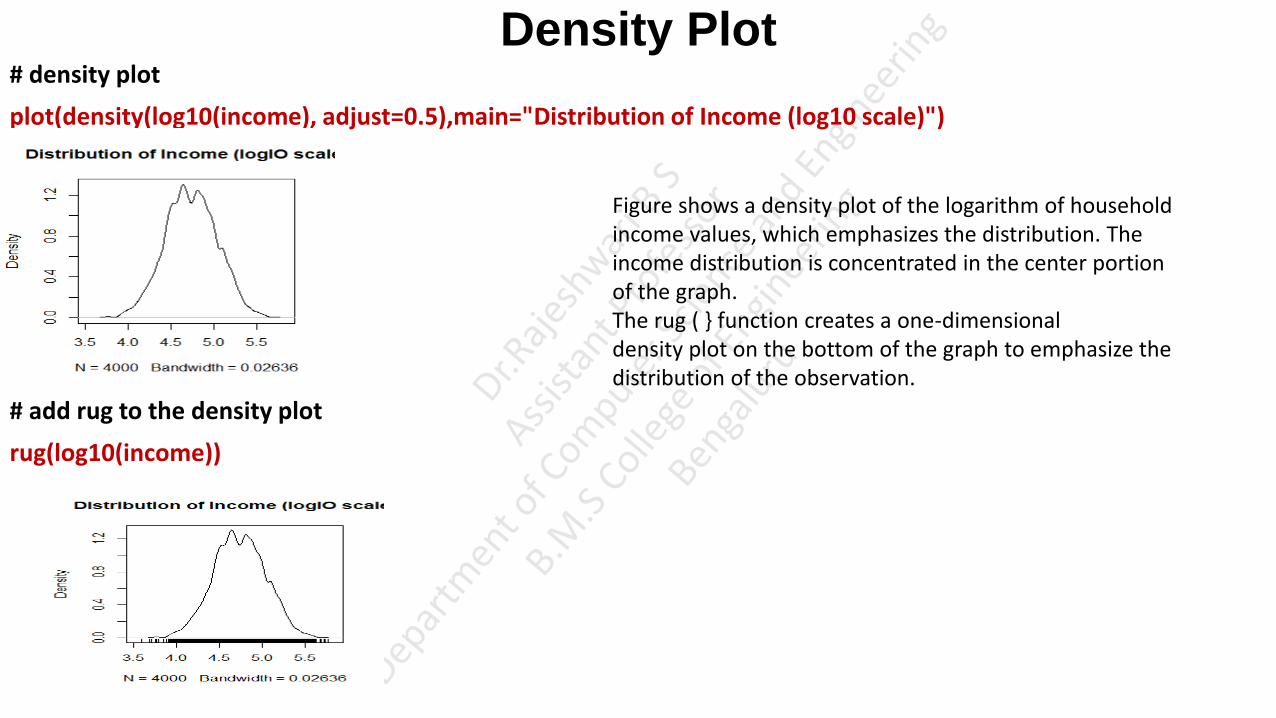
Density Plot # density plot
plot(density(log10(income), adjust=0.5),main="Distribution of Income (log10 scale)")
# add rug to the density plot
rug(log10(income))
Figure shows a density plot of the logarithm of household income values, which emphasizes the distribution. The income distribution is concentrated in the center portion of the graph. The rug ( } function creates a one-dimensional density plot on the bottom of the graph to emphasize the distribution of the observation.
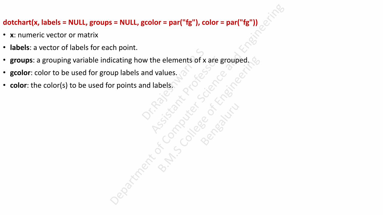
dotchart(x, labels = NULL, groups = NULL, gcolor = par("fg"), color = par("fg"))
• x: numeric vector or matrix
• labels: a vector of labels for each point.
• groups: a grouping variable indicating how the elements of x are grouped.
• gcolor: color to be used for group labels and values.
• color: the color(s) to be used for points and labels.
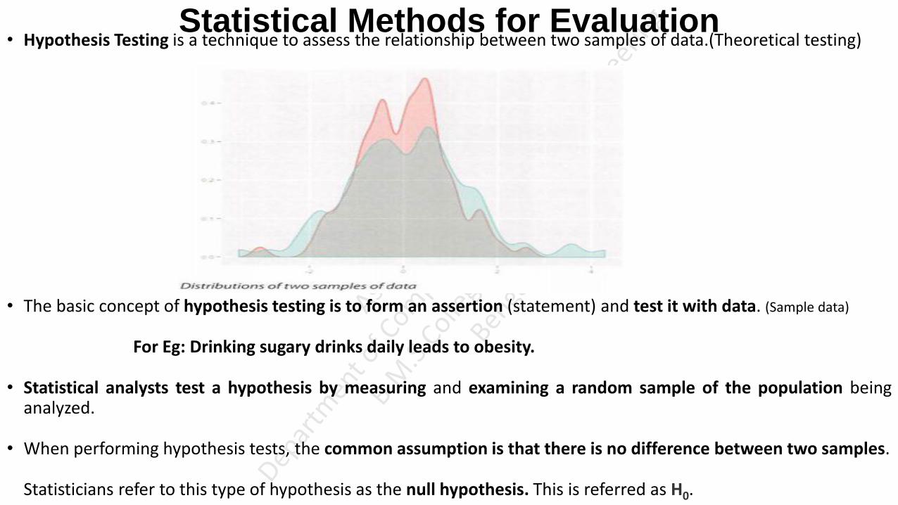
Statistical Methods for Evaluation • Hypothesis Testing is a technique to assess the relationship between two samples of data.(Theoretical testing)
• The basic concept of hypothesis testing is to form an assertion (statement) and test it with data. (Sample data)
For Eg: Drinking sugary drinks daily leads to obesity.
• Statistical analysts test a hypothesis by measuring and examining a random sample of the population being analyzed.
• When performing hypothesis tests, the common assumption is that there is no difference between two samples.
Statisticians refer to this type of hypothesis as the null hypothesis. This is referred as H0.

Hypothesis Testing
Null Hypothesis
• A Null hypothesis H0 exists when a researcher believes there is no relationship between the two variables, or
there is a lack of information to state a scientific hypothesis. This is something to attempt to disprove or
discredit.
Alternative Hypothesis
• The Alternative hypothesis HA is that there is a difference between two samples.
• Example-1
If the task is to identify the effect of drug A compared to drug B on patients, the Null hypothesis and
Alternative hypothesis would be this:
H0 : Drug A and Drug B have the same effect on patients.
HA : Drug A has a greater effect than Drug B on patients.
Hypothesis Testing • Example-2,
If the task is to identify whether advertising Campaign C is effective on reducing customer churn, the Null
hypothesis and Alternative hypothesis would be as follows:
H0 : Campaign C does not reduce customer churn better than the current campaign method.
HA : Campaign C does reduce customer churn better than the current campaign.
• It is important to state the Null hypothesis and Alternative hypothesis, because misstating them is likely to
undermine the subsequent steps of the hypothesis testing process. (it is important to make null hypothesis and alternative
hypothesis, otherwise it will be difficult to prove during model building and testing phase to prove that your built model is better than existing model).
• A hypothesis test leads to either rejecting the Null hypothesis in favor of the Alternative or not rejecting the
Null hypothesis.
• The purpose of a hypothesis testing is to find the answer to a question.
• Basically, we're looking at reject the Null hypothesis with the Alternate hypothesis.

Hypothesis Testing • Below Table includes some examples of Null and Alternative hypotheses that should be answered during the analytic lifecycle.
• Once a model is built over the training data, it needs to be evaluated over the testing data to see if the
proposed model predicts better than the existing model currently being used.
• The Null hypothesis is that the proposed model does not predict better than the existing model. The Alternative
hypothesis is that the proposed model indeed predicts better than the existing model.
• In accuracy forecast, the Null model could be that the sales of the next month are the same as the prior month.
The hypothesis test needs to evaluate if the proposed model provides a better prediction.
Hypothesis Testing • Take a recommendation engine as an example. The Null hypothesis could be that the new algorithm does not
produce better recommendations than the current algorithm being deployed. The alternative hypothesis is that
the new algorithm produces better recommendations than the old algorithm.
• When evaluating a model, sometimes it needs to be determined if a given input variable improves the model.
• In regression analysis, for example, if the regression coefficient for a variable is zero. The Null hypothesis is that
the coefficient is zero, which means the variable does not have an impact on the outcome. The alternative
hypothesis is that the coefficient is nonzero, which means the variable does have an impact on the outcome.

Hypothesis Testing Difference of Means
• A common hypothesis test is to compare the means of two populations.
• Hypothesis testing is a common approach to draw inferences on whether or not the two populations, denoted
pop1 and pop2, are different from each other.
• There are two hypothesis tests to compare the means of the respective populations based on samples
randomly drawn from each population.
• Specifically, the two hypothesis tests consider the following Null and Alternative hypotheses.
µ1 = µ2
µ1 != µ2
• The µ1 and µ2 denote the population means of pop1 and pop2, respectively.
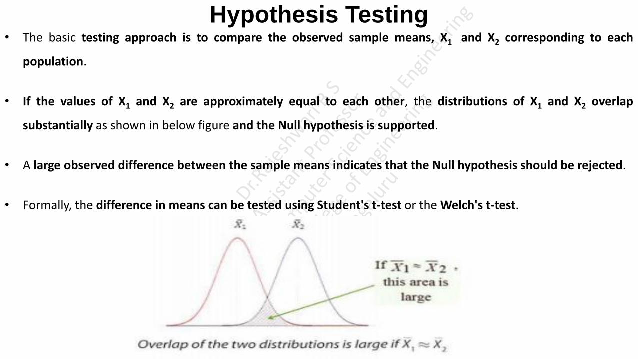
Hypothesis Testing • The basic testing approach is to compare the observed sample means, X1 and X2 corresponding to each
population.
• If the values of X1 and X2 are approximately equal to each other, the distributions of X1 and X2 overlap
substantially as shown in below figure and the Null hypothesis is supported.
• A large observed difference between the sample means indicates that the Null hypothesis should be rejected.
• Formally, the difference in means can be tested using Student's t-test or the Welch's t-test.

Student's t-test • Student's t-test assumes that distributions of the two populations have equal but unknown variances.
• Suppose n1 and n2 samples are randomly and independently selected from two populations pop1 and pop2,
respectively.
• If each population is normally distributed with the same mean (µ1 = µ2) and with the same variance, then T (the t-
statistic), given in below equation, follows a t-distribution with (n1 + n2 – 2) degrees of freedom (df).

Student's t-test • Where N is the number of values in the data set (sample size). Take a look at the sample computation.
• If there is a data set of 4, (N=4).
• Call the data set X and create a list with the values for each data.
• For this example data set X includes: 15, 30, 25, 10
• This data set has a mean, or average of 20. Calculate the mean by adding the values and dividing by N:
• (15+30+25+10)/4= 20
• Using the formula, the degrees of freedom would be calculated as df = N-1:
• In this example, it looks like, df = 4-1 = 3
• This indicates that, in this data set, three numbers have the freedom to vary as long as the mean
remains 20.
• https://www.statisticshowto.com/probability-and-statistics/hypothesis-testing/degrees-of-freedom/

Student's t-test
• The shape of the t-distribution is similar to the normal distribution.
• if the observed value of T is far enough from zero such that the probability of observing such a value of T is
unlikely, one would reject the null hypothesis that the population means are equal.
• Thus, for a small probability, say = 0.05, T* is determined.
• After the samples are collected and the observed value of T is calculated according to equation, the null
hypothesis (µ1 = µ2) is rejected if T> T*.
• In hypothesis testing, in general, the small probability ‘n’ is known as the significance level of the test.
• for n = 0.05, if the means from the two populations are truly equal, then in repeated random sampling, the
observed magnitude of T would only exceed T* 5% of the time.
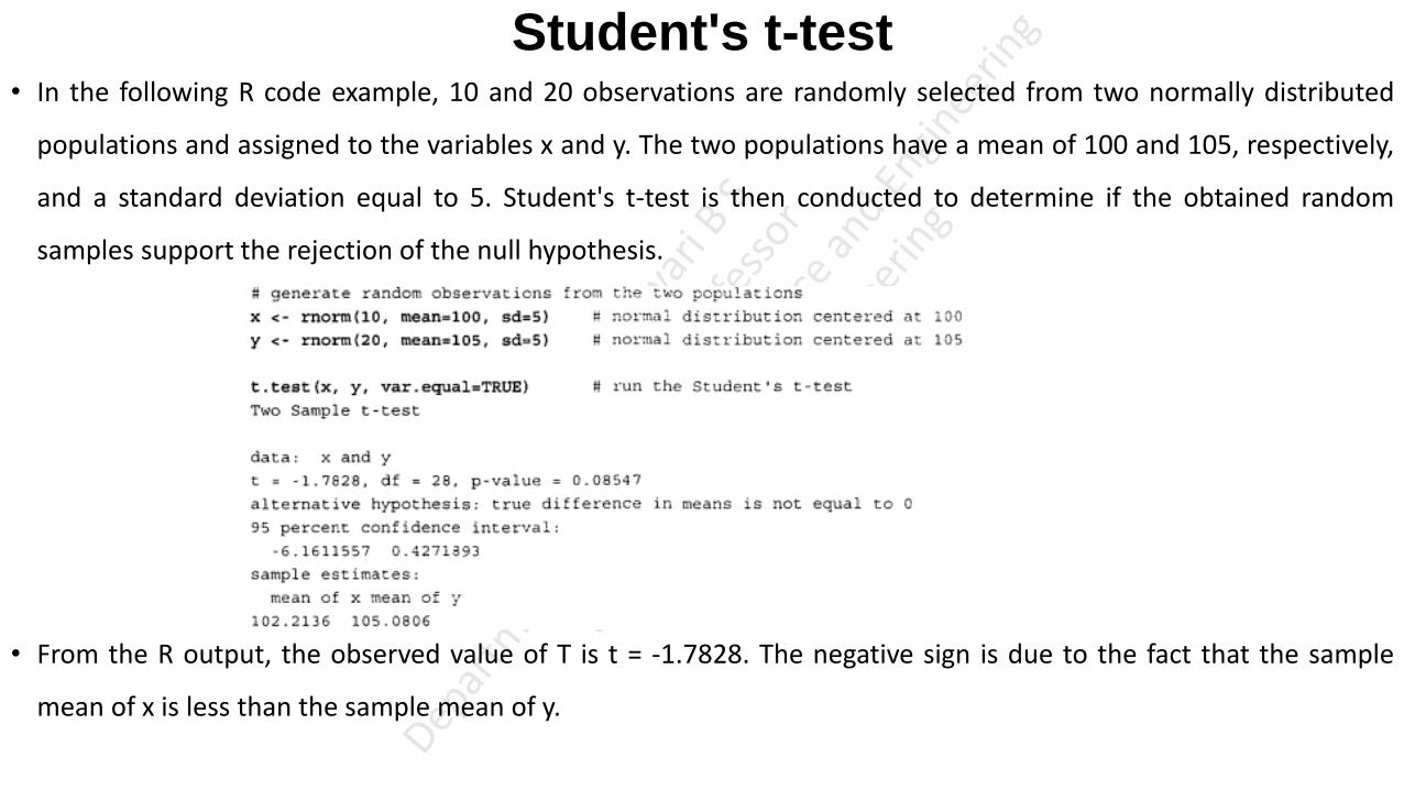
Student's t-test • In the following R code example, 10 and 20 observations are randomly selected from two normally distributed
populations and assigned to the variables x and y. The two populations have a mean of 100 and 105, respectively,
and a standard deviation equal to 5. Student's t-test is then conducted to determine if the obtained random
samples support the rejection of the null hypothesis.
• From the R output, the observed value of T is t = -1.7828. The negative sign is due to the fact that the sample
mean of x is less than the sample mean of y.

Student's t-test • Using the qt () function in R corresponds to a 0.05 significance level, a T value of 2.0484 (qt gives the quantile function, is
used, for example, when constructing confidence intervals, to find the endpoints of an interval)
• Because the magnitude of the observed T statistic is less than the T value corresponding to the 0.05 significance
level T|1.78281|< 2.0484), the null hypothesis is not rejected.
• However, based on the p -value, if the significance level was chosen to be 0.10, instead of 0.05, the null hypothesis
would be rejected. T value of magnitude 1.7828 or greater would occur at higher probability than 0.05.
• Because the alternative hypothesis is that the means are not equal (µ1 != µ2) , the possibilities of both µ1 > µ2 and
µ1 < µ2 need to be considered.
• This form of Student's t-test is known as a two-sided hypothesis test.

• Figure illustrates the t-statistic for the area under the tail of a t-distribution. The –t and t are the observed values
of the t-statistic.
• ln the R output, t = 1.7828. The left shaded area corresponds to the P(T ~ - 1.7828), and the right shaded area
corresponds to the P(T ~ 1.7828).
• Formula for Degrees of Freedom
• The statistical formula to determine degrees of freedom is quite simple. It states that degrees of freedom equal the number of values in a data set minus 1, and looks like this:
• df = N-1
• Where N is the number of values in the data set (sample size). Take a look at the sample computation.
• If there is a data set of 4, (N=4).
• Call the data set X and create a list with the values for each data.
• For this example data, set X includes: 15, 30, 25, 10
• This data set has a mean, or average of 20. Calculate the mean by adding the values and dividing by N:
• (15+30+25+10)/4= 20
• Using the formula, the degrees of freedom would be calculated as df = N-1:
• In this example, it looks like, df = 4-1 = 3
• This indicates that, in this data set, three numbers have the freedom to vary as long as the mean remains 20.
• t-Distribution
• Definition: The t-Distribution, also known as Student’s t-Distribution is the probability distribution that estimates the population parameters when the sample size is small and the population standard deviation is unknown.
•
• It resembles the normal distribution and as the sample size increases the t-distribution looks more normally distributed with the values of means and standard deviation of 0 and 1 respectively.
• The t-distribution describes the standardized distances of sample means to the population mean when the population standard deviation is not known, and the observations come from a normally distributed population.

• The idea is that the null hypothesis generally assumes that there is nothing new or surprising in the population
• https://www.sagepub.com/sites/default/files/upm-binaries/40007_Chapter8.pdf

P Values
• It’s good science to let people know if your study results are solid, or if they could have happened by chance. The
usual way of doing this is to test your results with a p-value. A p value is a number that you get by running a
hypothesis test on your data. A P value of 0.05 (5%) or less is usually enough to claim that your results are
repeatable.

UNIT-3

Advanced Analytical Theory and Methods: Clustering • Clustering is the use of unsupervised techniques for grouping similar objects. (Unsupervised Like not based on some specific constraint, not
straight forward technique like group based on age or group based on salary based on few parameters analysing similarities among the objects and grouping the objects into clusters)
• In machine learning, unsupervised refers to the problem of finding hidden structure within unlabelled data
(unlabelled data data that cannot be categorized).
• Clustering techniques are unsupervised in the sense that the data scientist does not determine, in advance, the
labels to apply to the clusters.
• The structure of the data describes the objects of interest and determines how best to group the objects.
• For example, based on customers' personal income, it is straightforward to divide the customers into three
groups:
Earn less than $10,000
Earn between $ 10,000 and $99,999
Earn $100,000 or more

Clustering • In this case, the income levels were chosen somewhat subjectively based on easy-to-communicate points of
delineation.
• There is no inherent reason to believe that the customer making $90,000 will behave any differently than the
customer making $ 110,000. (In this clustering, there is no inherent reason for clustering that tells behaviour of the customers based on income)
• As additional dimensions are introduced by adding more variables about the customers, the task of finding
meaningful groupings becomes more complex.
• For instance, suppose variables such as age, years of education, household size, and annual purchase
expenditures were considered along with the personal income variable.(What cluster using based on income is not a meaningful cluster)
• Rather, Clustering methods find the similarities between objects according to the object attributes and group
the similar objects into clusters.
• A popular clustering method is k-means.

K-means • Given a collection of objects each with ‘n’ measurable attributes, k-means is an analytical technique that, for a
chosen value of k, identifies k clusters of objects based on the objects' proximity to the center of the k groups.
• The center is determined as the mean of each cluster's n-dimensional vector of attributes.
• Figure illustrates three clusters of objects with two attributes. Each object in the dataset is represented by a
small dot color-coded to the closest large dot, the mean of the cluster.

K-means-Overview of the Method • To illustrate the method to find ‘k’ clusters from a collection of ‘M’ objects with ‘n’ attributes, the two
dimensional case (n = 2) is examined. It is much easier to visualize the k-means method in two dimensions.
• Because each object in this example has two attributes, it is useful to consider each object corresponding to the
point (x,y), where x and y denote the two attributes and i = 1, 2 ... M.
• For a given cluster of m points (m<=M), the point that corresponds to the cluster's mean is called a Centroid.
• In mathematics, a centroid refers to a point that corresponds to the center of mass for an object.
• The k-means algorithm to find k clusters can be described in the following four steps.
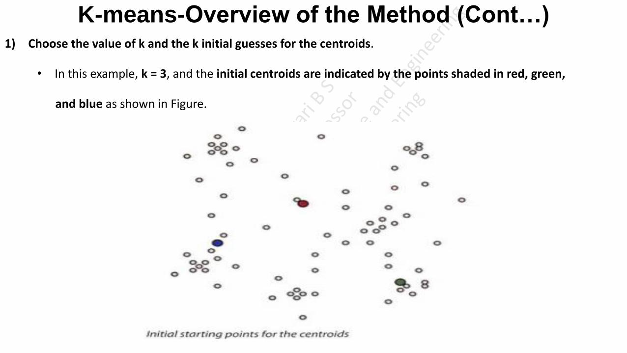
K-means-Overview of the Method (Cont…) 1) Choose the value of k and the k initial guesses for the centroids.
• In this example, k = 3, and the initial centroids are indicated by the points shaded in red, green,
and blue as shown in Figure.

K-means-Overview of the Method (Cont.…) 2) Compute the distance from each data point (x, y) to each centroid. Assign each point to the closest centroid.
This association defines the first k clusters.
• In two dimensions, the distance ‘d’ between any two points (x1 , y1 ) and (x2 , y2 ) in the Cartesian plane is
typically expressed by using the Euclidean distance measure using the Equation
• In the below figure, the points closest to a centroid are shaded with the corresponding color.

K-means-Overview of the Method (Cont…) 3) Compute the centroid (the center of mass) of each newly defined cluster from Step 2.
• In two dimensions, the centroid (XC, YC ) of them m points in a k-means cluster is calculated using the Equation
• In the below figure, the computed centroids in Step 3 are the lightly shaded points of the corresponding color.
• Thus, (XC, YC ) is the ordered pair of the arithmetic means of the coordinates of m points in the cluster.
• In this step, a centroid is computed for each of the k clusters.
K-means-Overview of the Method (Cont…)
4) Repeat Steps 2 and 3 until the algorithm converges to an answer (Assumed:
10,15,20Assign11,16,20Assign10.8,15.8,20.8Assign)
a) Assign each point to the closest centroid computed in Step 3.
b) Compute the centroid of newly defined clusters.
c) Repeat until the algorithm reaches the final answer.
• Convergence is reached when the computed centroids do not change or the centroids and the assigned points
oscillate back and forth from one iteration to the next.

• K-means Overview Before diving into the dataset, let us briefly discuss how k-means works:
• The process begins with k centroids initialised at random.
• These centroids are used to assign points to its nearest cluster.
• The mean of all points within the cluster is then used to update the position of the centroids.
• The above steps are repeated until the values of the centroids stabilise.

Determining the Number of Clusters
• The optimal number of clusters can be defined as follow:
1) Compute clustering algorithm (e.g., k-means clustering) for different values of k.
2) For each k, calculate the total within-cluster sum of square (WSS).
3) Plot the curve of WSS according to the number of clusters k.

Determining the Number of Clusters • Total Within-Cluster-Sum of Squares sounds a bit complex. Let’s break it down:
1) Square the Euclidean distances between each point and the corresponding centroid to which it is assigned.
2) The WSS score is the sum of these squares for all the points within the cluster.
3) Total within-cluster is the sum of WSS score of all the clusters
4) Any distance metric like the Euclidean Distance or the Manhattan Distance can be used.
Determining the Number of Clusters Elbow Method
• Elbow Method is probably the most well-known method for determining the optimal number of clusters.
• The elbow method looks at the percentage of variance explained as a function of the number of clusters:
• One should choose a number of clusters so that adding another cluster doesn’t give much better modeling
of the data. (Customer income and expenditure 30 customers 3 clusters 10,10,10. if 4 clusters not better result
10,10,9,1)
• More precisely, if one plots the percentage of variance explained by the clusters against the number of
clusters, the first clusters will add much information (explain a lot of variance), but at some point the
marginal gain will drop, giving an angle in the graph. The number of clusters is chosen at this point, hence
the “elbow criterion”.
Determining the Number of Clusters Elbow Method
• we can use the following algorithm to define the optimal clusters:
1. Compute clustering algorithm (e.g., k-means clustering) for different values of k. For instance, by
varying k from 1 to 10 clusters.
2. For each k, calculate the Total Within-cluster Sum of Square (WSS).
3. Plot the curve of WSS against the number of clusters k.
4. The location of a bend (knee) in the plot is generally considered as an indicator of the appropriate
number of clusters.
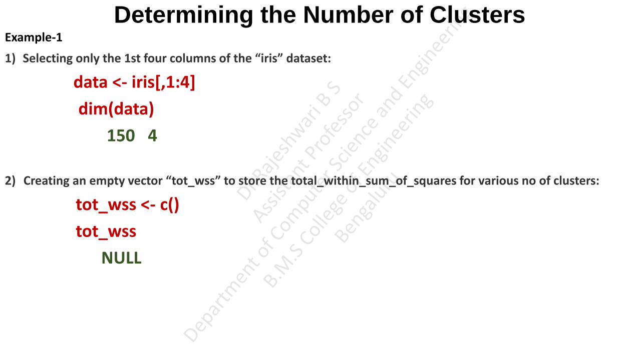
Determining the Number of Clusters Example-1
1) Selecting only the 1st four columns of the “iris” dataset:
data <- iris[,1:4]
dim(data)
150 4
2) Creating an empty vector “tot_wss” to store the total_within_sum_of_squares for various no of clusters:
tot_wss <- c()
tot_wss
NULL
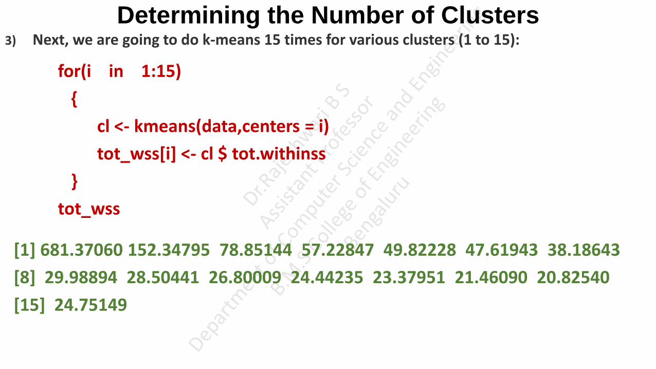
Determining the Number of Clusters 3) Next, we are going to do k-means 15 times for various clusters (1 to 15):
for(i in 1:15)
{
cl <- kmeans(data,centers = i)
tot_wss[i] <- cl $ tot.withinss
}
tot_wss
[1] 681.37060 152.34795 78.85144 57.22847 49.82228 47.61943 38.18643
[8] 29.98894 28.50441 26.80009 24.44235 23.37951 21.46090 20.82540
[15] 24.75149
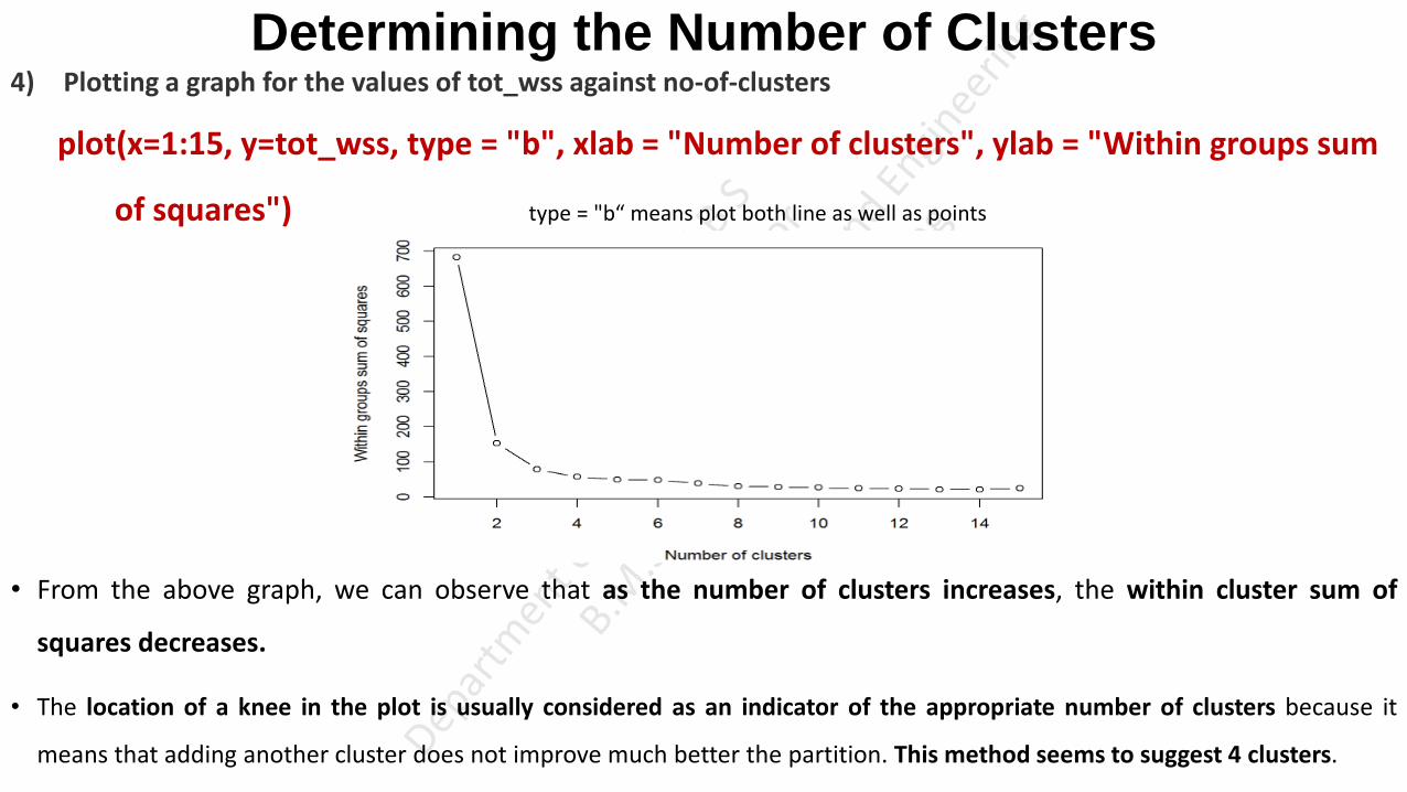
Determining the Number of Clusters 4) Plotting a graph for the values of tot_wss against no-of-clusters
plot(x=1:15, y=tot_wss, type = "b", xlab = "Number of clusters", ylab = "Within groups sum
of squares") type = "b“ means plot both line as well as points
• From the above graph, we can observe that as the number of clusters increases, the within cluster sum of
squares decreases.
• The location of a knee in the plot is usually considered as an indicator of the appropriate number of clusters because it
means that adding another cluster does not improve much better the partition. This method seems to suggest 4 clusters.

https://www.r-bloggers.com/2017/02/finding-optimal-number-of-clusters/
https://rpubs.com/s_ritesh/Deciding_Clusters
https://www.rdocumentation.org/packages/stats/versions/3.6.2/topics/kmeans
https://www.datanovia.com/en/lessons/k-means-clustering-in-r-algorith-and-practical-examples/#estimating-the-optimal-number-of-clusters
https://medium.com/analytics-vidhya/how-to-determine-the-optimal-k-for-k-means-708505d204eb
Diagnostics (Investigating in defining clusters)
• The heuristic using WSS can provide at least several possible k values to consider.
• When the number of attributes is relatively small, a common approach to further refine
the choice of k is to plot the data to determine how distinct the identified clusters are
from each other.
• In general, the following questions should be considered.
Are the clusters well separated from each other?
Do any of the clusters have only a few points?
Do any of the centroids appear to be too close to each other?

Diagnostics
• In the first case, ideally the plot would look like the one shown in figure, when n = 2. The
clusters are well defined, with considerable space between the four identified clusters.

Diagnostics
• However, in other cases, such as figure, the clusters may be close to each other, and the
distinction may not be so obvious(not clear).

Diagnostics • In such cases, it is important to apply some judgment on whether anything different will result by
using more clusters.
• For example, Below figure uses six clusters to describe the same dataset as used in previous figure. If
using more clusters does not better distinguish the groups, it is almost certainly better to go with
fewer clusters.
Reasons to Choose and Cautions-K-means • K-means is a simple and straightforward method for defining clusters.
• Once clusters and their associated centroids are identified, it is easy to assign new objects (for example, new
customers) to a cluster based on the object's distance from the closest centroid.
• Although k-means is considered an unsupervised method (Unsupervised Like not based on some specific constraint, not straight forward technique like group
based on age or group based on salary), there are still several decisions that the practitioner must make:
What object attributes should be included in the analysis?
What unit of measure (for example, miles or kilometers) should be used for each attribute?
Do the attributes need to be rescaled so that one attribute does not have a disproportionate effect on the
results?
What other considerations might apply?
Reasons to Choose and Cautions K-means-Object
Attributes
Object Attributes What object attributes should be included in the analysis?
• Regarding which object attributes (for example, age and income) to use in the analysis, it is important
to understand what attributes will be known at the time a new object will be assigned to a cluster.
• For example, information on existing customers' satisfaction or purchase frequency may be available,
but such information may not be available for potential customers.
• The Data Scientist may have a choice of a dozen or more attributes to use in the clustering analysis.
• Whenever possible and based on the data, it is best to reduce the number of attributes to the extent
possible.
• Too many attributes can minimize the impact of the most important variables.

Reasons to Choose and Cautions K-means-Object
Attributes
• Also, the use of several similar attributes can place too much importance on one type of attribute. For example,
if five attributes related to personal wealth are included in a clustering analysis, the wealth attributes dominate
the analysis and possibly mask the importance of other attributes, such as age.
• When dealing with the problem of too many attributes, one useful approach is to identify any highly correlated
attributes and use only one or two of the correlated attributes in the clustering analysis.
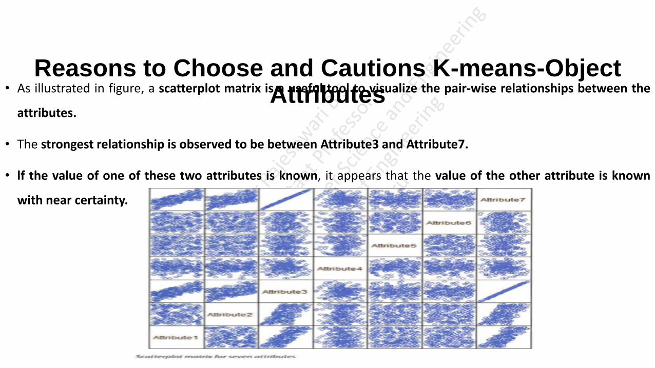
Reasons to Choose and Cautions K-means-Object Attributes
• As illustrated in figure, a scatterplot matrix is a useful tool to visualize the pair-wise relationships between the
attributes.
• The strongest relationship is observed to be between Attribute3 and Attribute7.
• lf the value of one of these two attributes is known, it appears that the value of the other attribute is known
with near certainty.
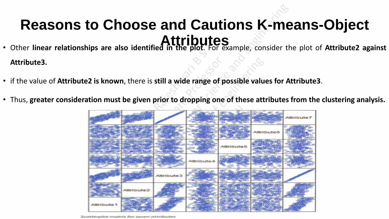
Reasons to Choose and Cautions K-means-Object
Attributes
• Other linear relationships are also identified in the plot. For example, consider the plot of Attribute2 against
Attribute3.
• if the value of Attribute2 is known, there is still a wide range of possible values for Attribute3.
• Thus, greater consideration must be given prior to dropping one of these attributes from the clustering analysis.
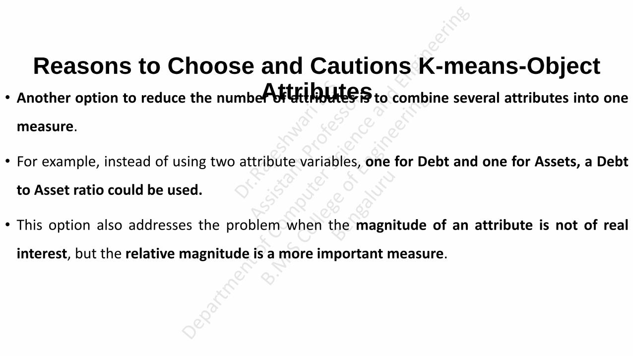
Reasons to Choose and Cautions K-means-Object Attributes
• Another option to reduce the number of attributes is to combine several attributes into one
measure.
• For example, instead of using two attribute variables, one for Debt and one for Assets, a Debt
to Asset ratio could be used.
• This option also addresses the problem when the magnitude of an attribute is not of real
interest, but the relative magnitude is a more important measure.

Reasons to Choose and Cautions K-means-Units of Measure
Units of Measure What unit of measure (for example, miles or kilometers) should be used
for each attribute?
• From a computational perspective, the k-means algorithm is somewhat indifferent to the units of
measure for a given attribute (for example, meters or centimetres for a patient's height).
• However, the algorithm will identify different clusters depending on the choice of the units of
measure.
• For example, suppose that k-means is used to cluster patients based on age in years and height in
centimetres. For n=2, figure illustrates the two clusters that would be determined for a given dataset.

Reasons to Choose and Cautions K-means-Units of Measure
• But if the height was rescaled from centimeters to meters by dividing by 100, the resulting
clusters would be slightly different, as illustrated in figure.
• When the height is expressed in meters, the magnitude of the ages dominates the distance
calculation between two points.

Example-Units of Measure
Example-Units of Measure
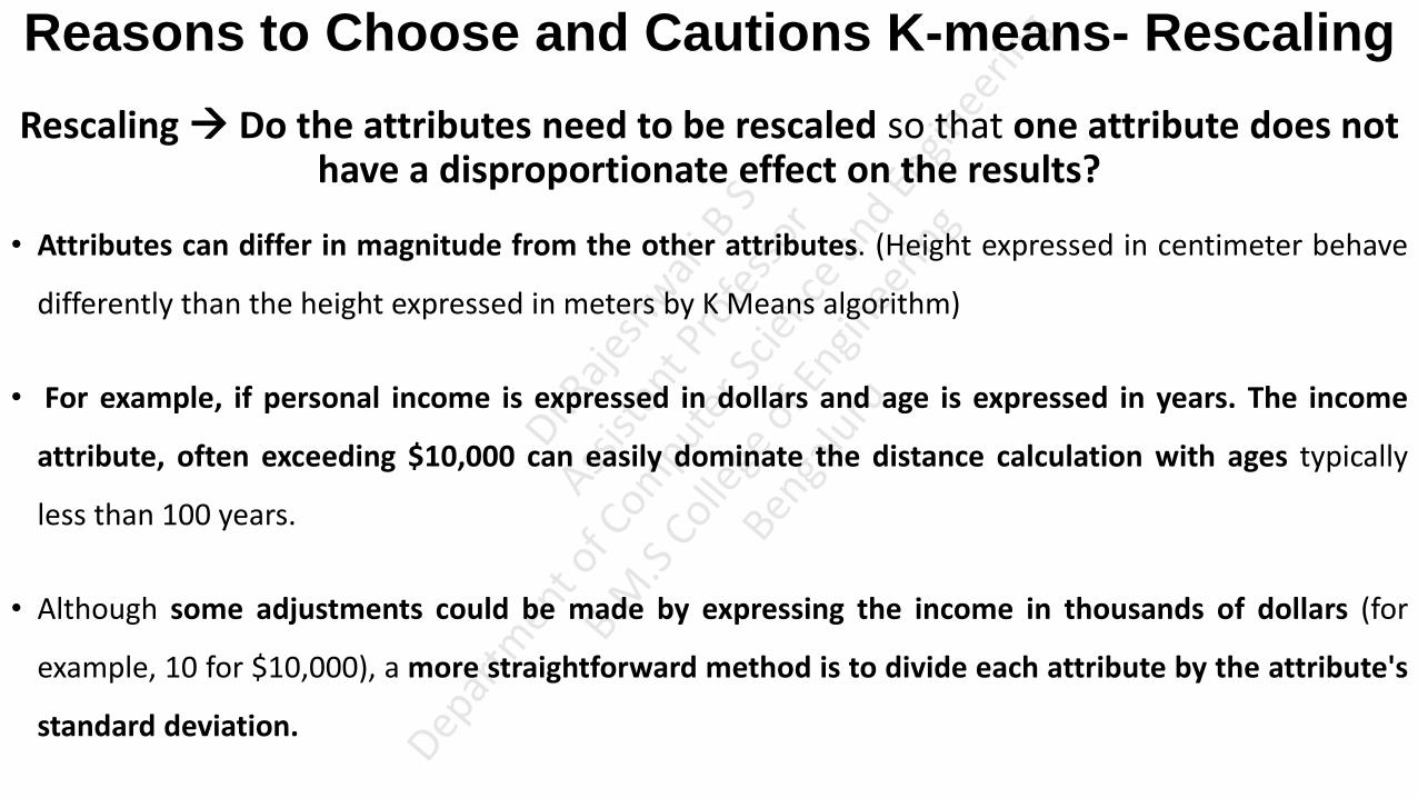
Reasons to Choose and Cautions K-means- Rescaling
Rescaling Do the attributes need to be rescaled so that one attribute does not have a disproportionate effect on the results?
• Attributes can differ in magnitude from the other attributes. (Height expressed in centimeter behave
differently than the height expressed in meters by K Means algorithm)
• For example, if personal income is expressed in dollars and age is expressed in years. The income
attribute, often exceeding $10,000 can easily dominate the distance calculation with ages typically
less than 100 years.
• Although some adjustments could be made by expressing the income in thousands of dollars (for
example, 10 for $10,000), a more straightforward method is to divide each attribute by the attribute's
standard deviation.

Reasons to Choose and Cautions K-means- Rescaling Rescaling
• For example for the age and height, the standard deviations are 23.1 years and 36.4, respectively.
Dividing each attribute value by the appropriate standard deviation and performing the k-means
analysis yields the result shown as shown in figure.
• With the rescaled attributes for age and height, the borders of the resulting clusters now fall
somewhere between the two earlier clustering analyses.
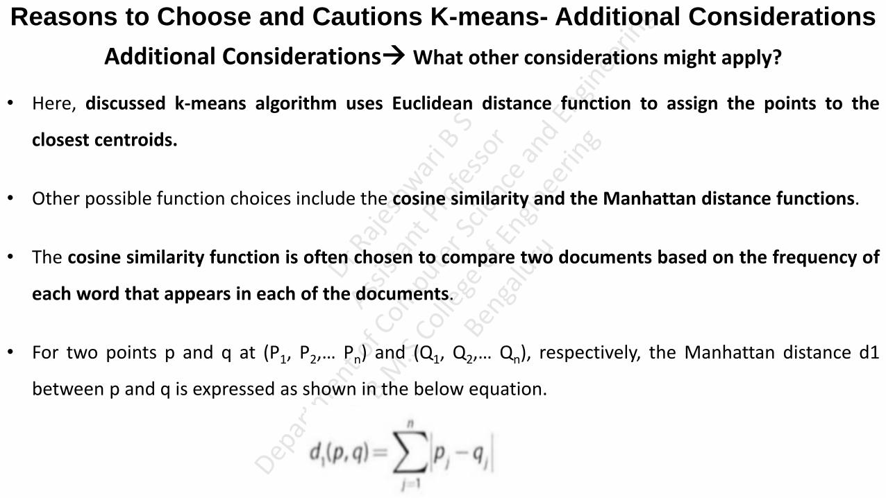
Reasons to Choose and Cautions K-means- Additional Considerations
Additional Considerations What other considerations might apply?
• Here, discussed k-means algorithm uses Euclidean distance function to assign the points to the
closest centroids.
• Other possible function choices include the cosine similarity and the Manhattan distance functions.
• The cosine similarity function is often chosen to compare two documents based on the frequency of
each word that appears in each of the documents.
• For two points p and q at (P1, P2,… Pn) and (Q1, Q2,… Qn), respectively, the Manhattan distance d1
between p and q is expressed as shown in the below equation.

Reasons to Choose and Cautions K-means- Additional Considerations
Additional Considerations What other considerations might apply?
• Using the above equation, the distance from (1, 1) to (4, 5) would be (1 – 4) + (1 – 5) = 7.
• From an optimization perspective, if there is a need to use the Manhattan distance for a clustering
analysis, the median is a better choice for the centroid than use of the mean.
• K-means clustering is applicable to objects that can be described by attributes that are numerical.
with a meaningful distance measure.
• However, k-means does not handle categorical variables well.

Reasons to Choose and Cautions K-means- Additional Considerations
Additional Considerations What other considerations might apply?
• For example, suppose a clustering analysis is to be conducted on new car sales. Among other
attributes, such as the sale price, the color of the car is considered important.
• Although one could assign numerical values to the color such as red = 1, yellow = 2, and green = 3, it
is not useful to consider that yellow is as close to red than yellow is to green from a clustering
perspective.
• In such cases, it may be necessary to use an alternative clustering methodology.

Regression • Regression Analysis is an advanced analytic technique that attempts to explain the influence
that a set of variables has on the outcome of another variable of interest.
For Eg: 1) Relationship between experience and salary. Predicting salary of an employee based
on his experience
2) Relationship between income and happiness of a person.
• The outcome variable is called a dependent variable because the outcome depends on the
other variables.
• These additional variables that have the greatest statistical influence on the outcome are
sometimes called the Input variables or the Independent variables. (Variable that has influence on other variable Independent Variable)

Regression • Mainly there are two types of regression analysis
Linear regression
Logistic regression
• Regression analysis is useful for answering the following kinds of questions:
What is a person's expected income? (Predicted based on the sources Linear Regression)
What is the probability that an applicant will default on a loan?
• Linear regression is a useful tool for answering the first question, and logistic regression is a
popular method for addressing the second.

Linear Regression • Linear regression is an analytical technique used to model the relationship between several
input variables and a continuous outcome variable. (Build model)
• A key assumption is that the relationship between an input variable and the outcome
variable is linear.
• The physical sciences have well-known linear models, such as Ohm's Law, which states that
the electrical current flowing through a resistive circuit is linearly proportional to the voltage
applied to the circuit. Such a model is considered deterministic in the sense that if the input
values are known, the value of the outcome variable is precisely determined.

Linear Regression
• A linear regression model is a probabilistic (Not deterministic) one that accounts for the
randomness that can affect any particular outcome.
• Based on known input values, a linear regression model provides the expected value of the
outcome variable, but some uncertainty may remain in predicting any particular outcome.
• Thus, linear regression models are useful in physical and social science applications where
there may be considerable variation in a particular outcome based on a given set of input
values.

Linear Regression: Use Cases • Linear regression is often used in business, government, and other scenarios. Some common
practical applications of linear regression in the real world include the following:
1) Real Estate:
A simple linear regression analysis can be used to model residential home prices as a
function of the home's living area. Such a model helps set or evaluate the list price of a
home on the market.
The model could be further improved by including other input variables such as
number of bathrooms, number of bed rooms, lot size, school district ran kings, crime
statistics, and property taxes.
Linear Regression: Use Cases
2) Demand Forecasting
Businesses and governments can use linear regression models to predict demand for
goods and services.
For example, restaurant chains can appropriately prepare for the predicted type and
quantity of food that customers will consume based upon the weather, the day of the
week, whether an item is offered as a special, the time of day, and the reservation
volume.
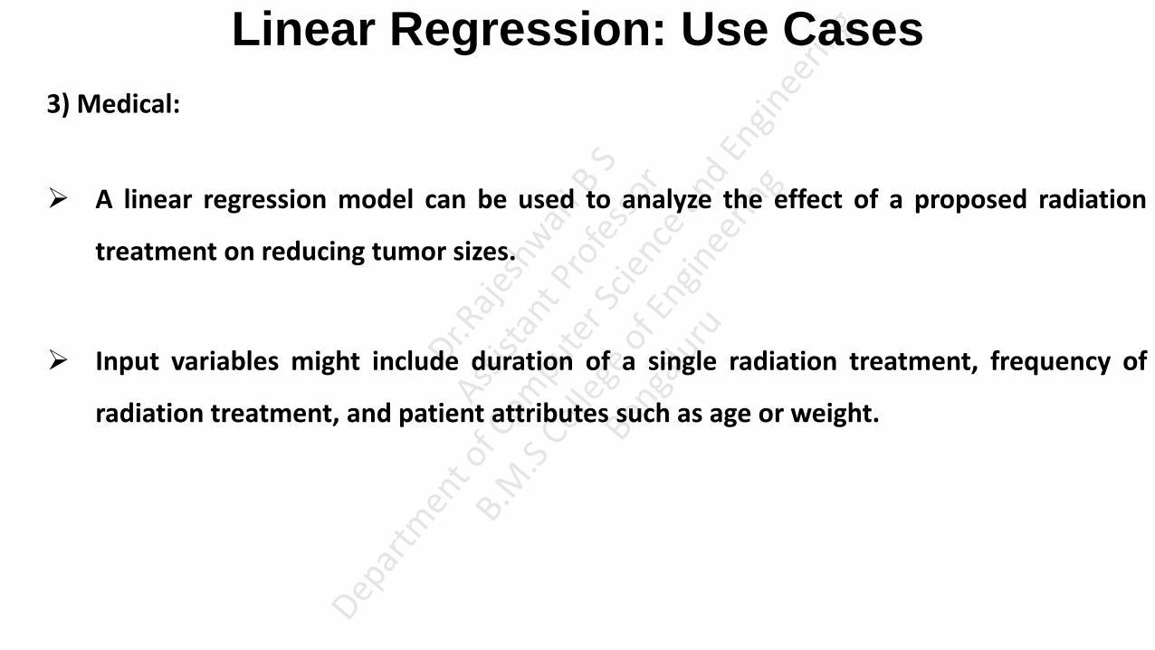
Linear Regression: Use Cases
3) Medical:
A linear regression model can be used to analyze the effect of a proposed radiation
treatment on reducing tumor sizes.
Input variables might include duration of a single radiation treatment, frequency of
radiation treatment, and patient attributes such as age or weight.

Linear Regression: Model Description
• As the name of this technique suggests, the linear regression model assumes that there is a
linear relationship between the input variables and the outcome variable.
• This relationship can be expressed as shown in below equation.

Linear Regression: Model Description
For E.g. Suppose it is desired to build a linear regression model that estimates a person's annual income as a
function of two variables-age and education-both expressed in years.
• In this case, income is the outcome variable, and the input variables are age and education.
• However, it is also obvious that there is considerable variation in income levels for a group of people with
identical ages and years of education. This variation is represented by in the model.
• So, in this example, the model would be expressed as shown in below equation.

Linear Regression: Model Description • In the linear model, the represent the unknown p parameters.
• The estimates for these unknown parameters are chosen so that, on average, the model provides a
reasonable estimate of a person's income based on age and education.
• Ordinary least Squares (OLS) is a common technique to estimate the parameters.
• To illustrate how OLS works, suppose there is only one input variable, x, for an outcome variable y.
Furthermore, n observations of { x, y} are obtained and plotted in shown in figure.

Linear Regression: Model Description • The goal is to find the line that best approximates the relationship between the outcome
variable and the input variables.
• With OLS, the objective is to find the line through these points that minimizes the sum of the
squares of the difference between each point and the line in the vertical direction. I
• In other words, find the values of , such that the summation shown in below equation
is minimized.
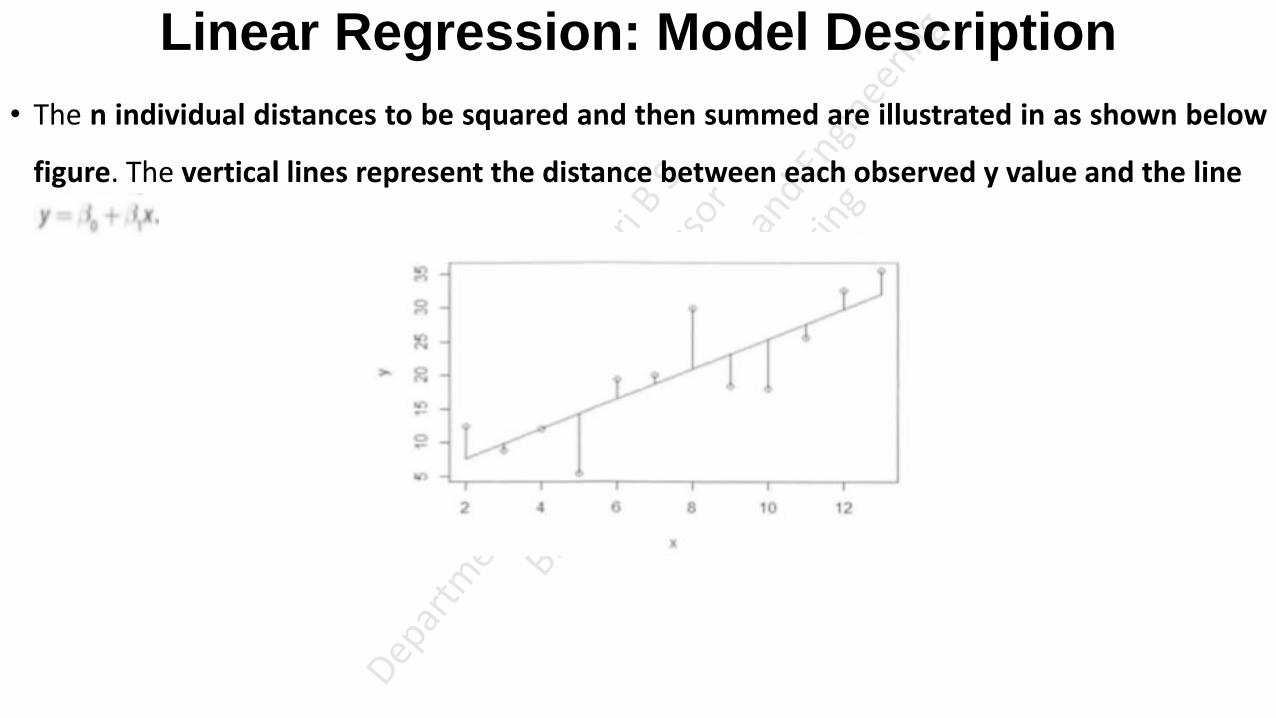
Linear Regression: Model Description
• The n individual distances to be squared and then summed are illustrated in as shown below
figure. The vertical lines represent the distance between each observed y value and the line
Linear Regression Model (with Normally Distributed Errors)
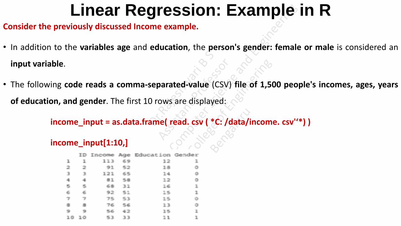
Linear Regression: Example in R Consider the previously discussed Income example.
• In addition to the variables age and education, the person's gender: female or male is considered an
input variable.
• The following code reads a comma-separated-value (CSV) file of 1,500 people's incomes, ages, years
of education, and gender. The first 10 rows are displayed:
income_input = as.data.frame( read. csv ( *C: /data/income. csv'‘*) )
income_input[1:10,]

Linear Regression: Example in R
• Each person in the sample has been assigned an identification number: ID.
• Income is expressed in thousands of dollars. (For example, 113 denotes $113,000.).
• Age and Education are expressed in years.
• For Gender, a 0 denotes female and a 1 denotes male.
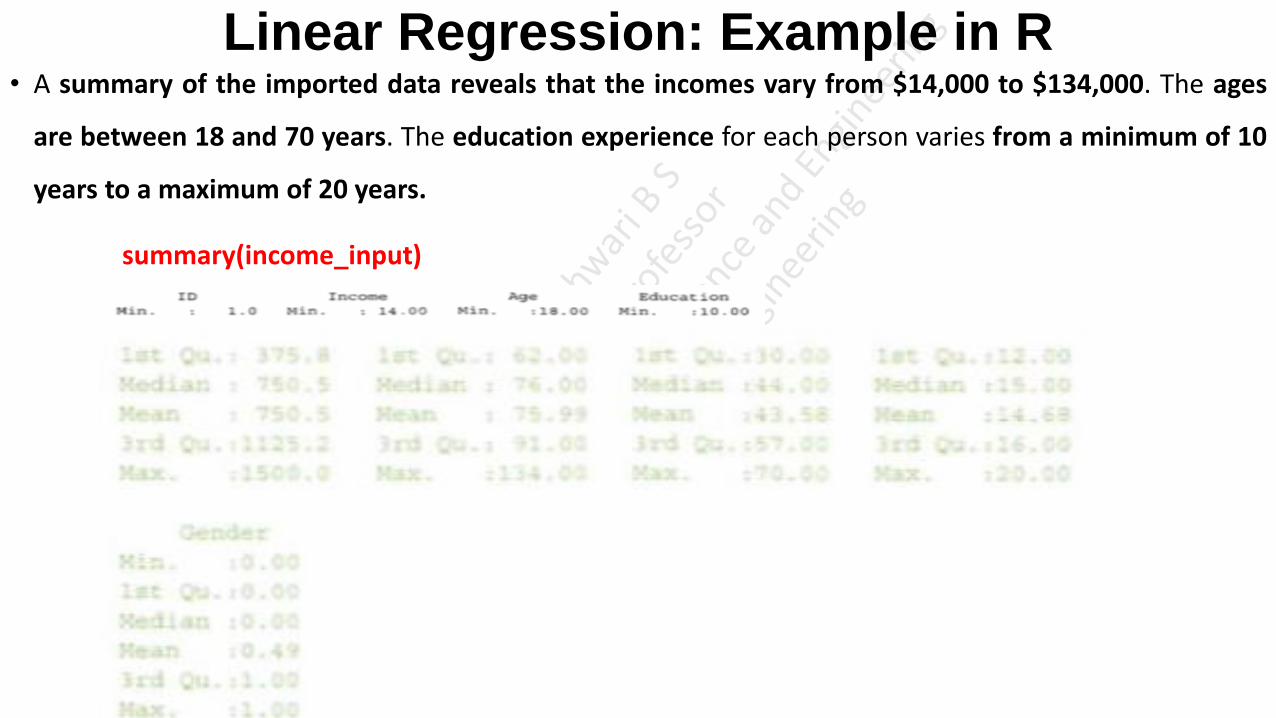
Linear Regression: Example in R • A summary of the imported data reveals that the incomes vary from $14,000 to $134,000. The ages
are between 18 and 70 years. The education experience for each person varies from a minimum of 10
years to a maximum of 20 years.
summary(income_input)

Linear Regression: Example in R
• A scatterplot matrix is an informative tool to view the pair-wise relationships of the variables.
• The basic assumption of a linear regression model is that there is a linear relationship between the
outcome variable and the input variables.
• Using the lattice package in R, the scatterplot matrix as shown in below figure is generated with the
following R code:
library(lattice)
splom(~income_input[c(2:5)], groups=NULL, data=income_input, axis.line.tck=0, axis.text.alpha = 0)

Linear Regression: Example in R
• Because the dependent variable is typically plotted along the y-axis, examine the set of scatterplots
along the bottom of the matrix.
• A strong positive linear trend is observed for Income as a function of Age.
• Against Education, a slight positive trend may exist, but the trend is not quite as obvious as is the case
with the Age variable.
• Lastly, there is no observed effect on Income based on Gender.

Linear Regression: Example in R
• With this qualitative understanding of the relationships between Income and the input variables, it
seems reasonable to quantitatively evaluate the linear relationships of these variables.
• Now, the proposed linear regression model is shown in the below equation.
• Using the linear model function lm( ) in R, the income model can be applied to the data as follows:
results <- lm(Income~Age + Education + Gender, income_input)
summary(results)

Linear Regression: Example in R
•
• The lm () function performs the parameter estimation for the parameters using ordinary least
squares and provides several useful calculations and results that are stored in the variable called
results in this example.
• From the R output, the residuals vary from approximately -37 to +37, with a median close to 0. (A residual is
the vertical distance between a data point and the regression line. Each data point has one residual. Each data point has one residual. They are positive if they are above the regression line
and negative if they are below the regression line. If the regression line actually passes through the point, the residual at that point is zero).

Linear Regression: Example in R
• The output provides details about the coefficients. The column Estimate provides the OLS estimates
of the coefficients in the fitted linear regression model.
• In general, the (Intercept) corresponds to the estimated response variable when all the input
variables equal zero. In this example, the intercept corresponds to an estimated income of $7,263 for a
new born female with no education.

Linear Regression: Example in R
• The coefficient for Age is approximately equal to one. This coefficient is interpreted as follows: For every one
unit increase in a person's age, the person's income is expected to increase by $995. Similarly, for every unit
increase in a person's years of education, the person's income is expected to increase by about $1,758.
• Interpreting the Gender coefficient is slightly different. When Gender is equal to zero, the Gender coefficient
contributes nothing to the estimate of the expected income. When Gender is equal to one, the expected
Income is decreased by about $934.

Linear Regression: Model Description
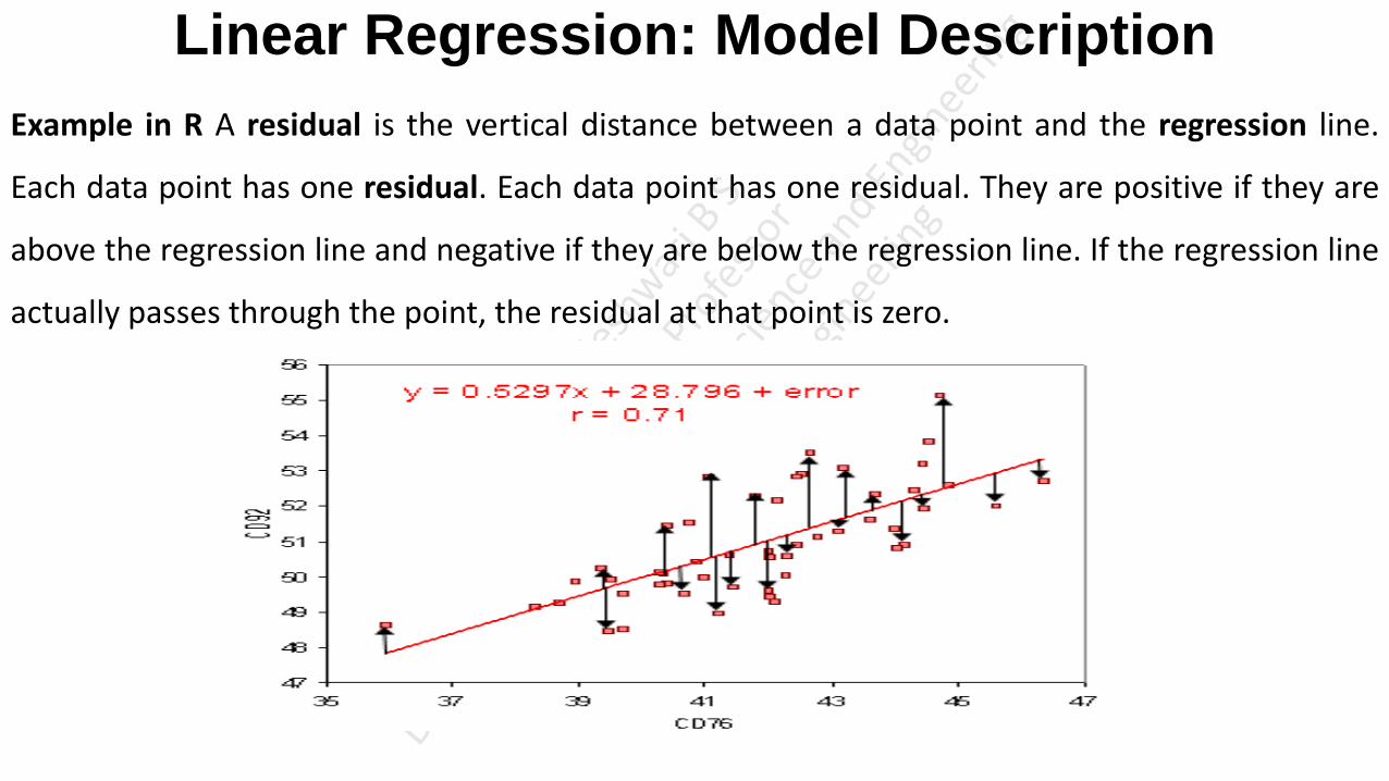
Linear Regression: Model Description
Example in R A residual is the vertical distance between a data point and the regression line.
Each data point has one residual. Each data point has one residual. They are positive if they are
above the regression line and negative if they are below the regression line. If the regression line
actually passes through the point, the residual at that point is zero.

• As residuals are the difference between any data point and the regression line, they are sometimes called “errors.” Error in this context doesn’t mean that there’s something wrong with the analysis; it just means that there is some unexplained difference. In other words, the residual is the error that isn’t explained by the regression line.
• Residual = Observed value – predicted value e = y – ŷ
• mean = the sum of the residuals / the number of items.

Logistic Regression • Linear regression is an analytical technique used to model the relationship between several input
variables and a continuous outcome variable, where a relationship is linear.
For E.g.: 1) Predicting salary of an employee based on his experience.
2) linear regression can be used to model the relationship between age and education to
income.
• Suppose a person's actual income was not of interest, but rather whether someone was wealthy or
poor.
For E.g.: What is the probability that an applicant will default on a loan?
• In such a case, when the outcome variable is categorical in nature, logistic regression can be used to
predict the likelihood of an outcome based on the input variables.

Logistic Regression
For example:
• A logistic regression model can be built to determine if a person will or will not purchase a
new automobile in the next 12 months.
• The training set could include input variables for a person's age, income, and gender as
well as the age of an existing automobile. The training set would also include the outcome
variable on whether the person purchased a new automobile over a 12-month period.
• The logistic regression model provides the likelihood or probability of a person making a
purchase in the next 12 months.
Logistic Regression: Use Cases • The Logistic Regression model is applied to a variety of situations in both the public and the private
sector.
• Some common ways that the logistic regression model is used include the following:
Medical
Develop a model to determine the likelihood of a patient's successful response to a specific
medical treatment or procedure.
Input variables could include age, weight, blood pressure and cholesterol levels.
Finance
Using a loan applicant's credit history and the details on the loan, determine the probability that
an applicant will default on the loan.
Based on the prediction, the loan can be approved or denied, or the terms can be modified.

Logistic Regression: Use Cases Marketing
Determine a wireless customer's probability of switching carriers (known as churning) based on age,
number of family members on the plan, months remaining on the existing contract, and social
network contacts.
With such insight, target the high-probability customers with appropriate offers to prevent churn.
Engineering
Based on operating conditions and various diagnostic measurements, determine the probability of a
mechanical part experiencing a malfunction or failure.
With this probability estimation, schedule the appropriate preventive maintenance activity. (Servicing,
Replacing etc)

Logistic Regression: Model Description • Logistic regression is based on the logistic function f(y), as given in below Equation.
as y∞, f(y) 1 and
as y -∞ , f(y) 0.
• So, as figure illustrates, the value of the logistic function f(y) varies from 0 to 1 as y increases.
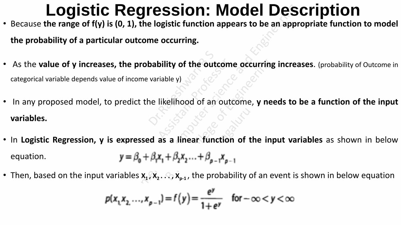
Logistic Regression: Model Description • Because the range of f(y) is (0, 1), the logistic function appears to be an appropriate function to model
the probability of a particular outcome occurring.
• As the value of y increases, the probability of the outcome occurring increases. (probability of Outcome in
categorical variable depends value of income variable y)
• In any proposed model, to predict the likelihood of an outcome, y needs to be a function of the input
variables.
• In Logistic Regression, y is expressed as a linear function of the input variables as shown in below
equation.
• Then, based on the input variables X1 , X2 . . . , Xp-1 , the probability of an event is shown in below equation

Logistic Regression: Model Description
• Logistic Regression equation is comparable to Linear Regression equation used in linear regression
modeling.
• However, one difference is that the values of y are not directly observed. Only the value of f(y) in
terms of success or failure (typically expressed as 1 or 0, respectively) is observed.

Logistic Regression: Model Description Customer Churn Example
• A wireless telecommunications company wants to estimate the probability that a customer will churn
(switch to a different company) in the next six months.
• With a reasonably accurate prediction of a person's likelihood of churning, the sales and marketing
groups can attempt to retain the customer by offering various incentives.
• Data on 8,000 current and prior customers was obtained.
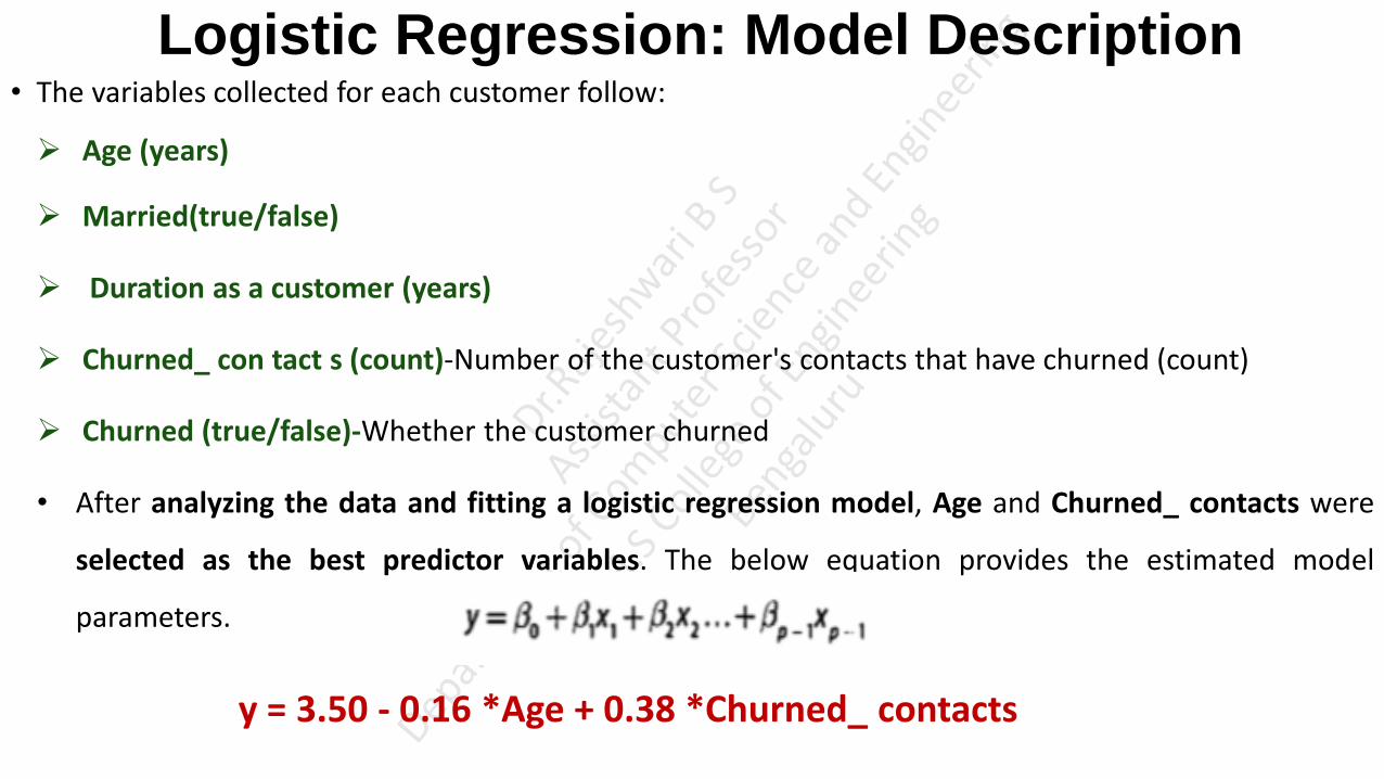
Logistic Regression: Model Description • The variables collected for each customer follow:
Age (years)
Married(true/false)
Duration as a customer (years)
Churned_ con tact s (count)-Number of the customer's contacts that have churned (count)
Churned (true/false)-Whether the customer churned
• After analyzing the data and fitting a logistic regression model, Age and Churned_ contacts were
selected as the best predictor variables. The below equation provides the estimated model
parameters.
y = 3.50 - 0.16 *Age + 0.38 *Churned_ contacts
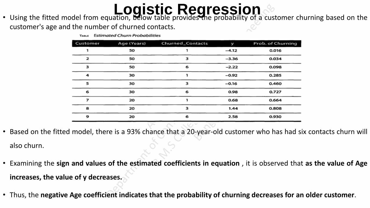
Logistic Regression • Using the fitted model from equation, below table provides the probability of a customer churning based on the
customer's age and the number of churned contacts.
• Based on the fitted model, there is a 93% chance that a 20-year-old customer who has had six contacts churn will
also churn.
• Examining the sign and values of the estimated coefficients in equation , it is observed that as the value of Age
increases, the value of y decreases.
• Thus, the negative Age coefficient indicates that the probability of churning decreases for an older customer.

Logistic Regression: Diagnostics • Take for example, the churn_ input data frame (A wireless telecommunications company wants to estimate the probability
that a customer will churn (switch to a different company) in the next six months. churn_ input includes 8000 current and prior customers data)
head(churn_input)
• A Churned value of 1 indicates that the customer churned. A Churned value of 0 indicates that the
customer remained as a subscriber.
• Out of the 8,000 customer records in this dataset, 1,743 customers (-22%) churned.
sum(churn_input$Churned)
1743

Logistic Regression : Diagnostics
• Using the Generalized Linear Model function, glm (),in R and the specified family/link, a logistic
regression model can be applied to the variables in the dataset as follows:
Churn_logistic1 <- glm (Churned ~ Age + Married + Cust_years + Churned_contacts, data=churn_input,
family=binomial(link="logit"))
Family objects provide a convenient way to specify the details of the models used by functions such as glm().
binomial(link = "logit") binomial is type of family used to specify the details of the logistic regression model, where
reponse from the model to be binary type either 0 or 1, yes/no,pass/fail,defaulter/non-defaulter.
link=“logit" means use logistic function to fit the model ey/(1+ ey)
gaussian(link = "identity") similarly for other type of models
summary(Churn_logisticl)
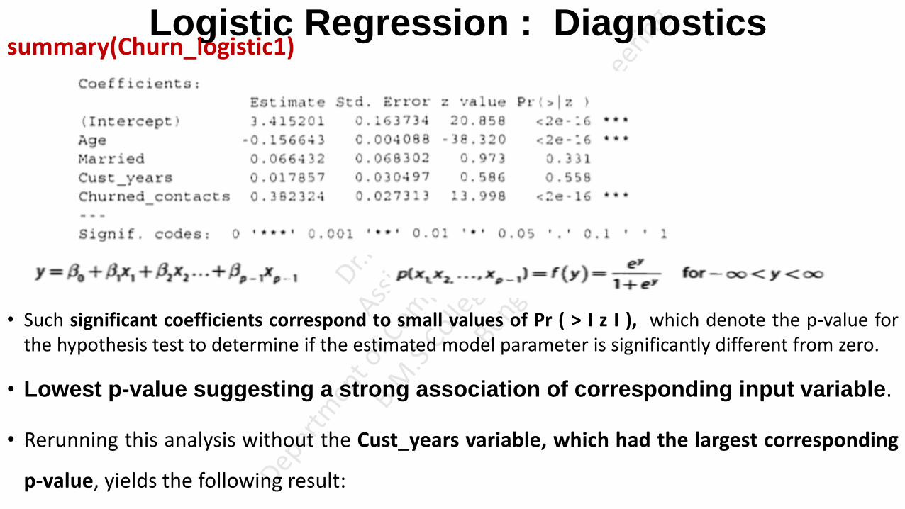
Logistic Regression : Diagnostics summary(Churn_logistic1)
• Such significant coefficients correspond to small values of Pr ( > I z I ), which denote the p-value for the hypothesis test to determine if the estimated model parameter is significantly different from zero.
• Lowest p-value suggesting a strong association of corresponding input variable.
• Rerunning this analysis without the Cust_years variable, which had the largest corresponding
p-value, yields the following result:

Logistic Regression : Diagnostics • Rerunning this analysis without the Cust_years variable, which had the largest corresponding p-value,
yields the following result:
Churn_logistic2 <- glm (Churned ~ Age + Married + Churned_contacts, data=churn_input,
family=binomial(link="logit"))
summary(Churn_logistic2)
• Because the p-value for the Married coefficient remains quite large, the Married variable is dropped
from the model (means Married field not much associated with the output). So remove Married field.
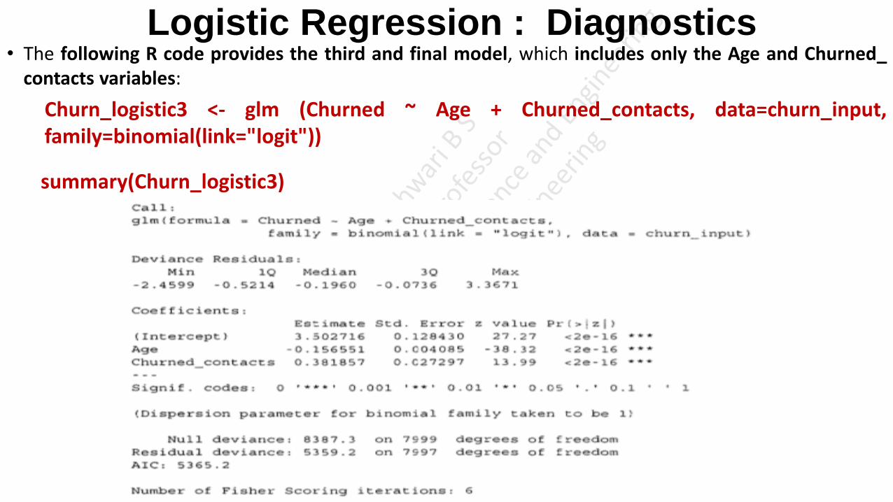
Logistic Regression : Diagnostics • The following R code provides the third and final model, which includes only the Age and Churned_
contacts variables:
Churn_logistic3 <- glm (Churned ~ Age + Churned_contacts, data=churn_input, family=binomial(link="logit"))
summary(Churn_logistic3)
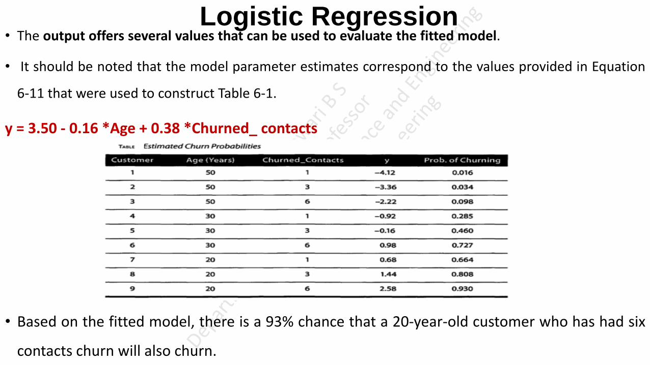
Logistic Regression • The output offers several values that can be used to evaluate the fitted model.
• It should be noted that the model parameter estimates correspond to the values provided in Equation
6-11 that were used to construct Table 6-1.
y = 3.50 - 0.16 *Age + 0.38 *Churned_ contacts
• Based on the fitted model, there is a 93% chance that a 20-year-old customer who has had six
contacts churn will also churn.

Receiver Operating Characteristic (ROC) Curve • Logistic regression is often used as a classifier to assign class labels to a person, item, or transaction
based on the predicted probability provided by the model.
• In the Churn example, a customer can be classified with the label called Churn if the logistic model
predicts a high probability that the customer will churn. Otherwise, a Remain label is assigned to the
customer.
• Commonly, 0.5 is used as the default probability threshold to distinguish between any two class labels.
• However, any threshold value can be used depending on the preference to avoid false positives (for
example, to predict Churn when actually the customer will Remain) or false negatives (for example, to
predict Remain when the customer will actually Churn).

Receiver Operating Characteristic (ROC) Curve • In general, for two class labels: C and , where denotes "not C," some working definitions and
formulas follow:

Receiver Operating Characteristic (ROC) Curve • The plot of the True Positive Rate (TPR) against the False Positive Rate (FPR) is known as the Receiver
Operating Characteristic (ROC) curve.
• Using the ROCR package, the following R commands generate the ROC curve for the Churn example:

Receiver Operating Characteristic (ROC) Curve • The usefulness of this plot as shown in below figure is that the preferred outcome of a classifier is to have a low
FPR and a high TPR.
• So, when moving from left to right on the FPR axis, a good model/ classifier has the TPR rapidly approach values
near 1, with only a small change in FPR.
• The closer the ROC curve tracks along the vertical axis and approaches the upper-left hand of the plot, near the
point (0,1), the better the model/classifier performs.
• Thus, a useful metric is to compute the area under the ROC curve (AUC).

Text analysis • Text analysis, sometimes called Text Analytics, refers to the representation, processing, and modeling
of textual data to derive useful insights.
• An important component of text analysis is text mining, the process of discovering relationships and
interesting patterns in large text collections.
• Text analysis is suffers from the curse of high dimensionality.
For E.g.
Popular children's book Green Eggs and Ham. Author Theodor Geisel was challenged to write an
entire book with just 50 distinct words.
He responded with the book Green Eggs and Ham, which contains 804 total words, only 50 of
them distinct.
There's a substantial amount of repetition in the book. Yet, as repetitive as the book is, modeling
it as a vector of counts, or features, for each distinct word still results in a 50-dimension problem.

Text analysis • Text analysis often deals with textual data that is far more complex.
For E.g.
Google n-gram corpus contains one trillion words from publicly accessible web pages.
Out of the one trillion words in the Google n-gram corpus, there might be one million distinct
words, which would correspond to one million dimensions.
• The high dimensionality of text is an important issue, and it has a direct impact on the complexities of
many text analysis tasks.
• Another major challenge with text analysis is that most of the time the text is not structured.
• This may include unstructured data (Text), semi-structured (HTML page) or quasi-structured (Server
Log, which web pages visited, in what order, how long or reviews about a specific product).
Text Analysis Steps • A Text Analysis problem usually consists of three important steps
Parsing
Search and Retrieval
Text Mining
Parsing
• Parsing is the process that takes unstructured text and imposes a structure for further analysis.
• The unstructured text could be a plain text file, a weblog, an Extensible Markup Language (XML) file,
a HyperText Markup Language (HTML) file, or a Word document. (XML is a markup language which is designed to store
data. HTML is the markup language which helps you to create and design web content. )
• Parsing deconstructs the provided text and renders it in a more structured way for the subsequent
steps.

Text analysis Search and Retrieval
• Search and Retrieval is the identification of the documents in a corpus that contain search items such
as specific words, phrases, topics, or entities like people or organizations. (Filtering taking required documents)
• These search items are generally called key terms.
Text Mining
• Text mining uses the terms and indexes produced by the prior two steps to discover meaningful
insights pertaining to domains or problems of interest.
• With the proper representation of the text, many of the techniques such as clustering and
classification, can be adapted to text mining.
• For example, the k-means can be modified to cluster text documents into groups, where each group
represents a collection of documents with a similar topic. (Clustering customers review documents based on region)

Text Analysis Steps • Classification tasks such as sentiment analysis and spam filtering are prominent use cases for the
naive Bayes classifier. (Classify based on sentimental keywords)
• Note that, in reality, all three steps do not have to be present in a text analysis project.
• If the goal is to construct a corpus or provide a catalog service (just preprocessing prepare structured catalog,
converting one sentence into other forms for further analysis), for example, the focus would be the parsing task using
one or more text preprocessing techniques, such as part-of-speech (POS) tagging, named entity
recognition, lemmatization, or stemming.
• Furthermore, the three tasks do not have to be sequential. Sometimes their orders might even look
like a tree. For example, one could use parsing to build a data store and choose to either search and
retrieve the related documents or use text mining on the entire data store to gain insights.

Text Analysis Steps Part-of-Speech (POS) Tagging, Lemmatization, and Stemming
• The goal of POS tagging is to build a model whose input is a sentence, such as:
he saw a fox
• and whose output is a tag sequence. Each tag marks the POS for the corresponding word, such as:
PRP VBD DT NN
• according to the Penn Treebank POS tags.
• Therefore, the four words are mapped to pronoun (personal), verb (past tense). determiner, and noun
(singular), respectively.

Text Analysis Steps Part-of-Speech (POS) Tagging, Lemmatization, and Stemming
• Both lemmatization and stemming are techniques to reduce the number of dimensions and reduce
inflections or variant forms to the base form to more accurately measure the number of times each
word appears. (Lemmaremove inflectional endings only and to return the base or dictionary form of a
word)
• With the use of a given dictionary, lemmatization finds the correct dictionary base form of a word. For
example, given the sentence:
obesity causes many problems
• the output of lemmatization would be:
obesity cause many problem

Text Analysis Steps Part-of-Speech (POS) Tagging, Lemmatization, and Stemming
• Different from lemmatization, stemming refers to a crude process of stripping affixes based on a set of
heuristics with the hope of correctly achieving the goal to reduce inflections or variant forms. (Synonyms of a
word all represents same stem, Eg: Happy Cheerful, Joyful convert to the same base or root word in dictionary. search engines treat words with the same stem as synonyms )
• After the process, words are stripped to become stems. A stem is not necessarily an actual word
defined in the natural language, but it is sufficient to differentiate itself from the stems of other
words.
• A well-known rule-based stemming algorithm is Porter's stemming algorithm. It defines a set of
production rules to iteratively transform words into their stems. For the sentence shown previously:
obesity causes many problems
• the output of Porter's stemming algorithm is:
obes caus mani problem

A Text Analysis Example • To describe the three text analysis steps, consider the fictitious company ACME, maker of two
products: bPhone and bEbook.
• ACME is in strong competition with other companies that manufacture and sell similar products.
• To succeed, ACME needs to produce excellent phones and eBook readers and increase sales.
• One of the ways the company does this is to monitor what is being said about ACME products in
social media such as Twitter and Facebook, and popular review sites, such as Amazon and
ConsumerReports.

A Text Analysis Example • It wants to answer questions such as these.
Are people mentioning its products?
What is being said? Are the products seen as good or bad? If people think an ACME product is
bad, why? For example, are they complaining about the battery life of the bPhone, or the
response time in their bEbook?
• The text analysis process carrying out by the ACME company is as shown in the below figure

A Text Analysis Example 1) Collect Raw Text
Collect raw text. This corresponds
to Phase 1 and Phase 2 of the Data Analytic Lifecycle.
In this step, the Data Science team at ACME monitors websites for references to specific products.
The websites may include social media and review sites.
The team could interact with social network, use product names as keywords to get the raw data.
Regular expressions are commonly used in this case to identify text that matches certain
patterns.(Use regular expression to identify sentences that includes product name)
Additional filters can be applied to the raw data for a more focused study. For E.g., only retrieving
the reviews originating in New York instead of the entire United States would allow ACME to
conduct regional studies on its products.
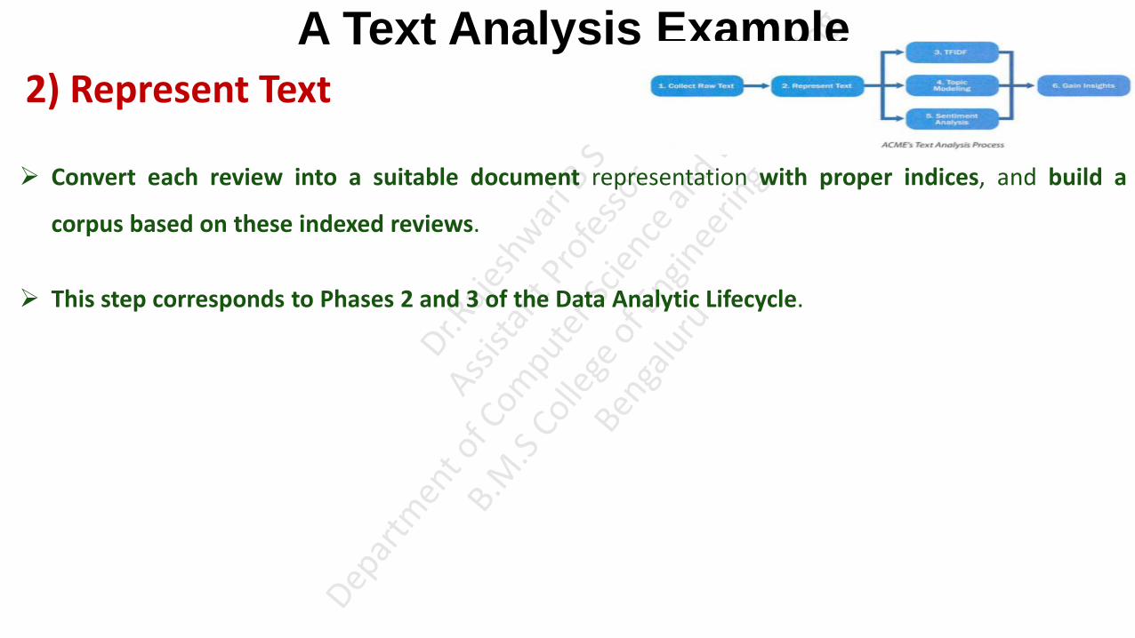
A Text Analysis Example
2) Represent Text
Convert each review into a suitable document representation with proper indices, and build a
corpus based on these indexed reviews.
This step corresponds to Phases 2 and 3 of the Data Analytic Lifecycle.
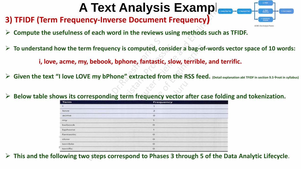
A Text Analysis Example 3) TFIDF (Term Frequency-Inverse Document Frequency) Compute the usefulness of each word in the reviews using methods such as TFIDF.
To understand how the term frequency is computed, consider a bag-of-words vector space of 10 words:
i, love, acme, my, bebook, bphone, fantastic, slow, terrible, and terrific.
Given the text “I love LOVE my bPhone” extracted from the RSS feed. (Detail explanation abt TFIDF in section 9.5not in syllabus)
Below table shows its corresponding term frequency vector after case folding and tokenization.
This and the following two steps correspond to Phases 3 through 5 of the Data Analytic Lifecycle.

A Text Analysis Example 4) Topic Modeling
• Categorize documents by topics.
• This can be achieved through topic models (such as latent Dirichlet allocation).
5) Sentimental Analysis
• Many product review sites provide ratings of a product with each review. If such information is not
available, techniques like sentiment analysis can be used on the textual data to infer the underlying
sentiments.
• Determine sentiments of the reviews.
• Identify whether the reviews are positive or negative.
• People can express many emotions. To keep the process simple, ACME considers sentiments as
positive, neutral, or negative.
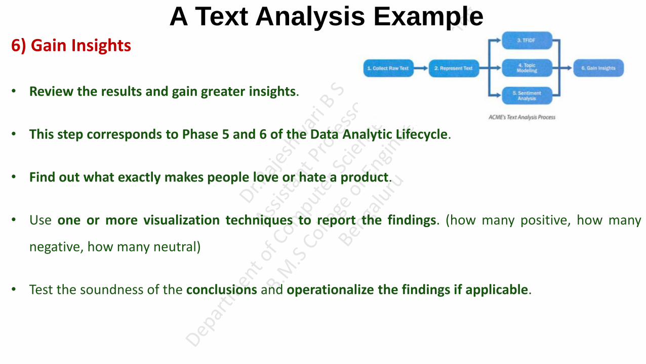
A Text Analysis Example 6) Gain Insights
• Review the results and gain greater insights.
• This step corresponds to Phase 5 and 6 of the Data Analytic Lifecycle.
• Find out what exactly makes people love or hate a product.
• Use one or more visualization techniques to report the findings. (how many positive, how many
negative, how many neutral)
• Test the soundness of the conclusions and operationalize the findings if applicable.

Collecting Raw Text • Data Science team starts collecting the data for data analysis.
• The user-generated contents being collected could be related articles from
Social Media Posts
News Portals and Blogs
Online Shops or Reviews Sites
• Regardless of where the data comes from, it's likely that the team would deal with semi-structured
data such as HTML web pages, Really Simple Syndication (RSS) feeds, XML, or JavaScript Object
Notation (JSON) files.

Collecting Raw Text Social Media Posts
• Many websites and services offer public APis for third-party developers to access their data. For
example, the Twitter API allows developers to retrieve public Twitter posts that contain the
keywords bPhone or bEbook.
• The fetched tweets are in the JSON format.
News Portals and Blogs
• Many news portals and blogs provide data feeds that are in an open standard format, such as RSS
or XML.

Collecting Raw Text Online Shops or Reviews Sites
• If the plan is to collect user comments on ACME's products from online shops and review sites
where APis or data feeds are not provided, the team may have to write web scrapers to parse web
pages and automatically extract the interesting data from those HTML files.
• A web scraper is a software program (bot) that systematically browses the World Wide Web,
downloads web pages, extracts useful information, and stores it somewhere for further study. (in
data store for further analysis)
• Unfortunately, it is nearly impossible to write a one-size-fits-all web scraper. This is because
websites like online shops and review sites have different structures.
• It is common to customize a web scraper for a specific website. In addition, the website formats can
change over time, which requires the web scraper to be updated every now and then.
Collecting Raw Text • It is common to customize a web scraper for a specific website. In addition, the website formats can
change over time, which requires the web scraper to be updated every now and then.
• To build a web scraper for a specific website, one must study the HTML source code of its web
pages (HTML format followed by the website) to find patterns before extracting any useful content.
• The team can then construct the web scraper based on the identified patterns. The scraper can use
the curl tool to fetch HTML source code given specific URLs, use XPath and regular expressions to
select and extract the data that match the patterns, and write them into a data store.

Representing Text • Read from text book

UNIT-4
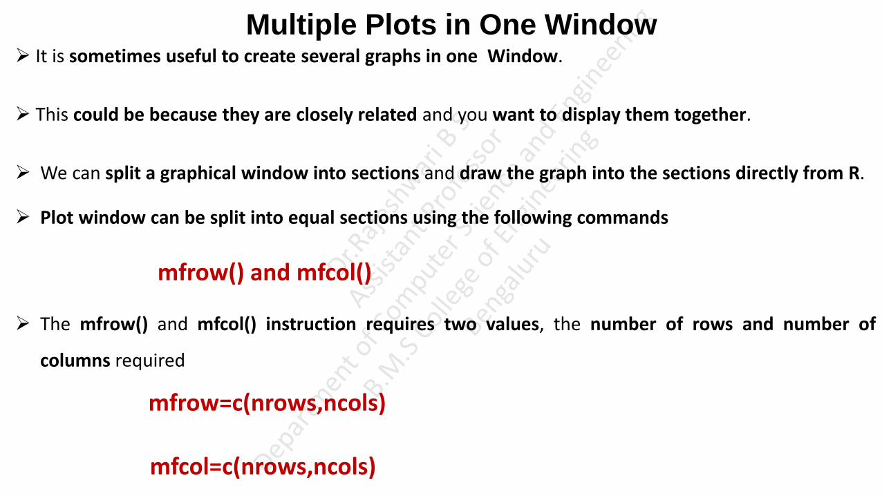
Multiple Plots in One Window It is sometimes useful to create several graphs in one Window.
This could be because they are closely related and you want to display them together.
We can split a graphical window into sections and draw the graph into the sections directly from R.
Plot window can be split into equal sections using the following commands
mfrow() and mfcol()
The mfrow() and mfcol() instruction requires two values, the number of rows and number of
columns required
mfrow=c(nrows,ncols)
mfcol=c(nrows,ncols)
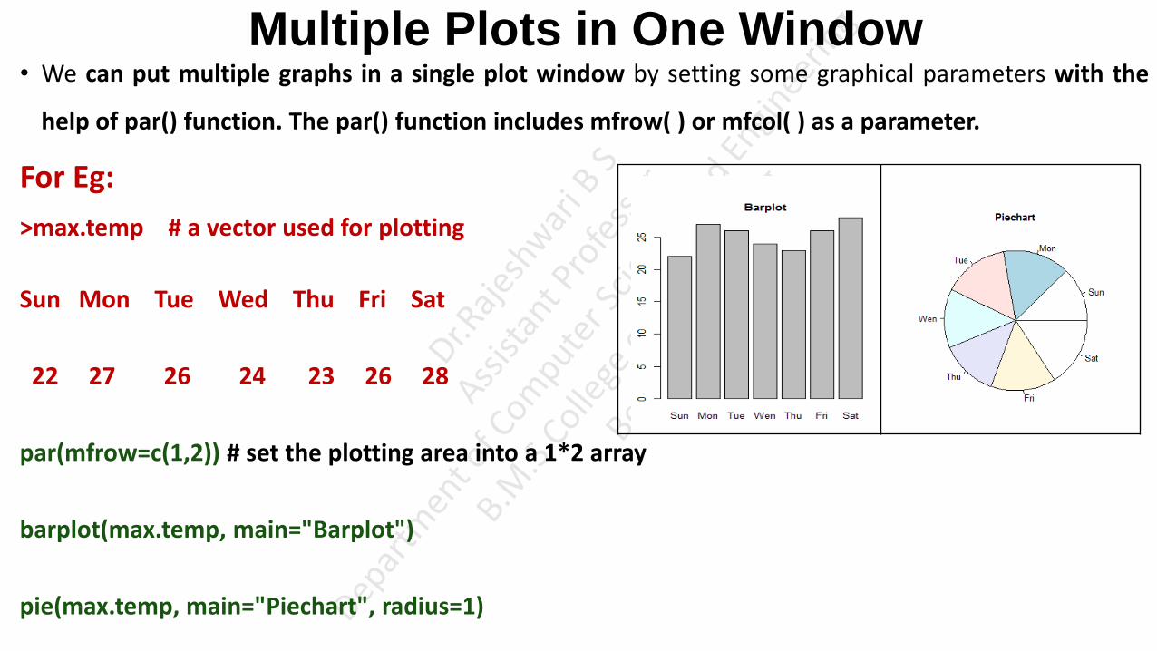
Multiple Plots in One Window • We can put multiple graphs in a single plot window by setting some graphical parameters with the
help of par() function. The par() function includes mfrow( ) or mfcol( ) as a parameter.
For Eg:
>max.temp # a vector used for plotting
Sun Mon Tue Wed Thu Fri Sat
22 27 26 24 23 26 28
par(mfrow=c(1,2)) # set the plotting area into a 1*2 array
barplot(max.temp, main="Barplot")
pie(max.temp, main="Piechart", radius=1)
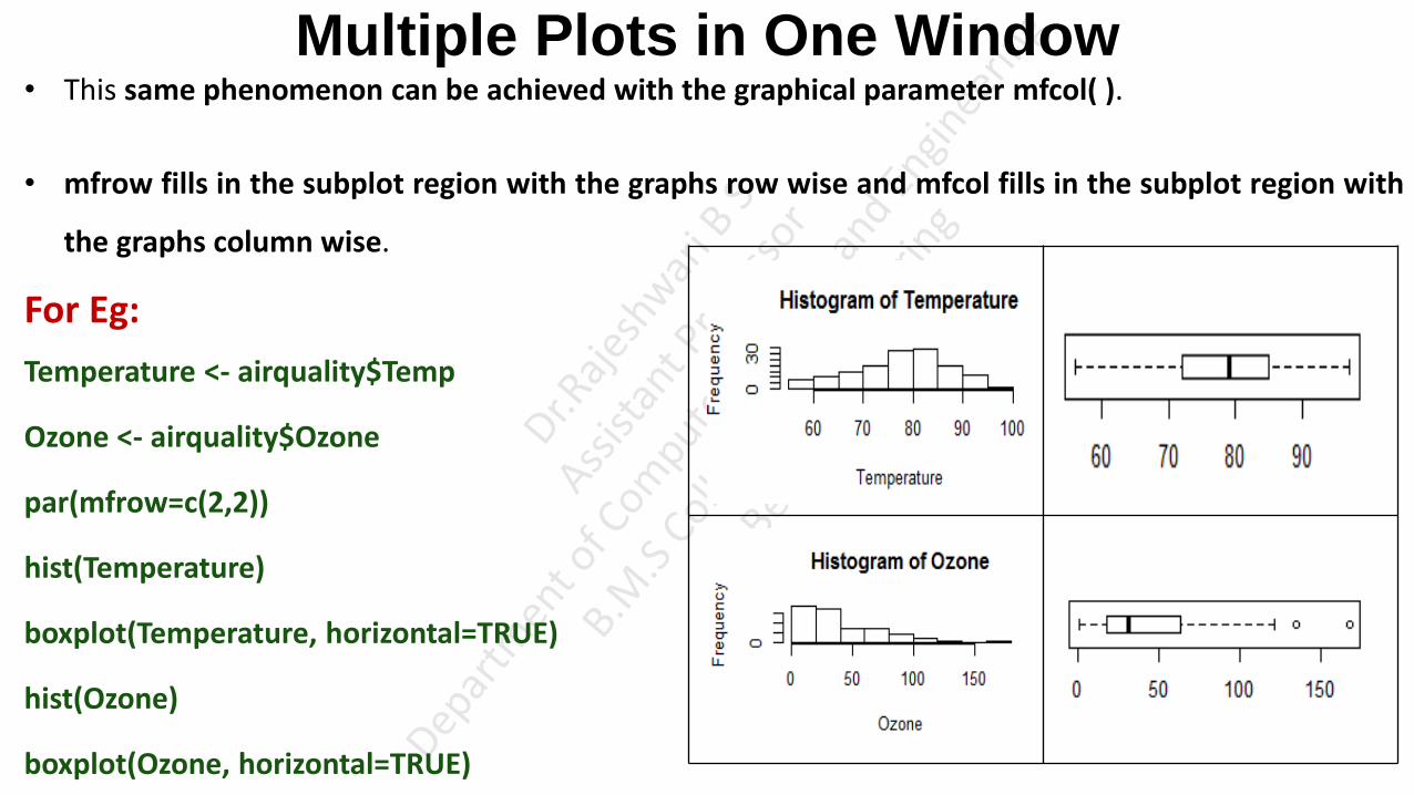
Multiple Plots in One Window • This same phenomenon can be achieved with the graphical parameter mfcol( ).
• mfrow fills in the subplot region with the graphs row wise and mfcol fills in the subplot region with
the graphs column wise.
For Eg:
Temperature <- airquality$Temp
Ozone <- airquality$Ozone
par(mfrow=c(2,2))
hist(Temperature)
boxplot(Temperature, horizontal=TRUE)
hist(Ozone)
boxplot(Ozone, horizontal=TRUE)

Multiple Plots in One Window Same plot with the change par(mfcol = c(2, 2)) would look as follows. Note that only the ordering of the
subplot is different.
For Eg:
Temperature <- airquality$Temp
Ozone <- airquality$Ozone
par(mfcol=c(2,2))
hist(Temperature)
boxplot(Temperature, horizontal=TRUE)
hist(Ozone)
boxplot(Ozone, horizontal=TRUE)

Multiple Plots in One Window • We can combine multiple plots into one overall graph using another function layout( ).
• The layout( ) function has the form:
layout(mat)
Where mat is a matrix object specifying the location of the N figures to plot.
For Eg:
# One figure in row 1 and two figures in row 2
attach(mtcars)
layout(matrix(c(1,1,2,3), 2, 2, byrow = TRUE))
hist(wt)
hist(mpg)
hist(disp)

Multiple Plots in One Window • Optionally, we can include widths= and heights= options in the layout( ) function to control the size
of each figure more precisely. These options have the form
widths= a vector of values for the widths of columns
heights= a vector of values for the heights of rows.
For Eg:
2 Rows and 2 Columns One figure in row 1 and two figures in row 2
# row 1 is 1/3 the height of row 2
# column 2 is 1/4 the width of the column 1
attach(mtcars)
layout(matrix(c(1,1,2,3), 2, 2, byrow = TRUE),
widths=c(3,1), heights=c(1,2)) ; (3/4+1/4) (1/3+2/3)
hist(wt)
hist(mpg)
hist(disp)
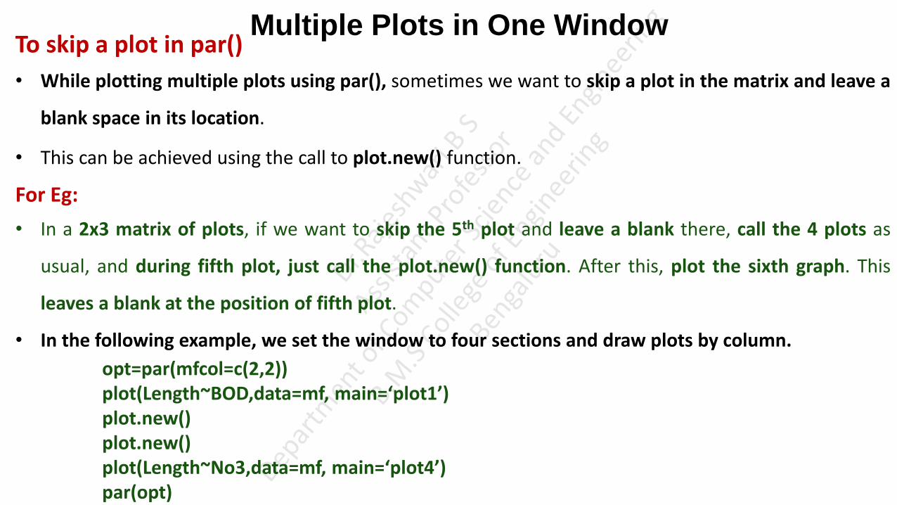
Multiple Plots in One Window To skip a plot in par()
• While plotting multiple plots using par(), sometimes we want to skip a plot in the matrix and leave a
blank space in its location.
• This can be achieved using the call to plot.new() function.
For Eg:
• In a 2x3 matrix of plots, if we want to skip the 5th plot and leave a blank there, call the 4 plots as
usual, and during fifth plot, just call the plot.new() function. After this, plot the sixth graph. This
leaves a blank at the position of fifth plot.
• In the following example, we set the window to four sections and draw plots by column.
opt=par(mfcol=c(2,2)) plot(Length~BOD,data=mf, main=‘plot1’) plot.new() plot.new() plot(Length~No3,data=mf, main=‘plot4’) par(opt)

Multiple Plots in One Window Example Program for multiple plots in one window
Length<-c(20,21,22,23,21,20)
Speed<-c(12,14,12,16,20,21)
Algae<-c(40,45,45,80,75,65)
NO3<-c(2.25,2.15,1.75,1.95,1.95,2.75)
BOD<-c(200,180,135,120,110,120)
mf<-data.frame(Length,Speed,Algae,NO3,BOD)
mf
Opt=par(mfrow=c(2,2))
plot(Length ~ BOD,data=mf,main='plot1')
plot(Length ~ Algae,data=mf,main='plot2')
plot(Length ~ Speed,data=mf, main='plot3')
plot(Length ~ NO3,data=mf,main='plot4')

Matrix Plot • Matrix plot plots the columns of a matrix against other columns.
• Matplot() function in R can be used for quickly plotting multiple sets of observations from the same
object, particularly from a matrix, on the same graph. i.e, Matplot( ) function plots the columns of a
matrix individually as a function of x.
For E.g.: Consider a Matrix containing four sets of random draws, each with a different mean as given
below
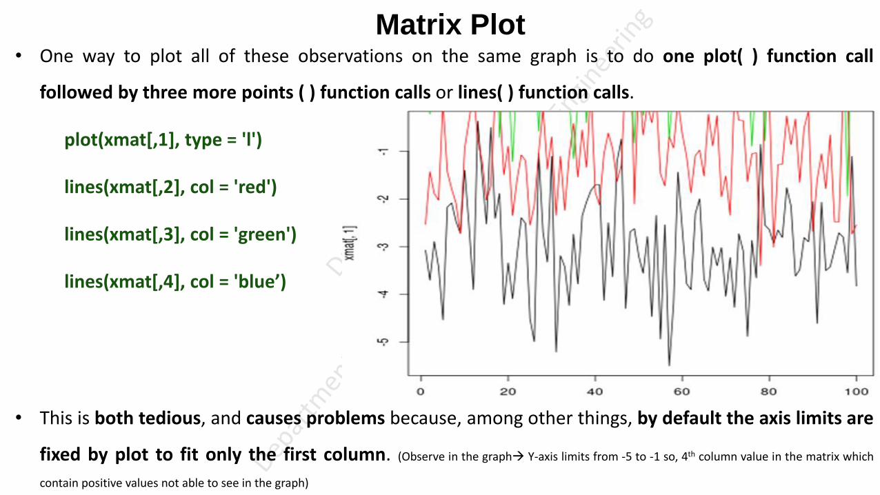
Matrix Plot • One way to plot all of these observations on the same graph is to do one plot( ) function call
followed by three more points ( ) function calls or lines( ) function calls.
plot(xmat[,1], type = 'l')
lines(xmat[,2], col = 'red')
lines(xmat[,3], col = 'green')
lines(xmat[,4], col = 'blue’)
• This is both tedious, and causes problems because, among other things, by default the axis limits are
fixed by plot to fit only the first column. (Observe in the graph Y-axis limits from -5 to -1 so, 4th column value in the matrix which
contain positive values not able to see in the graph)

Matrix Plot • Much more convenient in this situation is to use the matplot( ) function, which only requires one
call and automatically takes care of axis limits and changing the aesthetics for each column to make
them distinguishable.
matplot(xmat, type = 'l’)
• Note that, by default, matplot( ) function varies both color (col) and linetype (lty)

Matrix Plot • However, any (or both) of these aesthetics (color and line type) can be fixed to a single value.
matplot(xmat, type = 'l', col = 'black’)

Matrix Plot
matplot(xmat, type = 'l', col = c('red', 'green', 'blue', 'orange'))
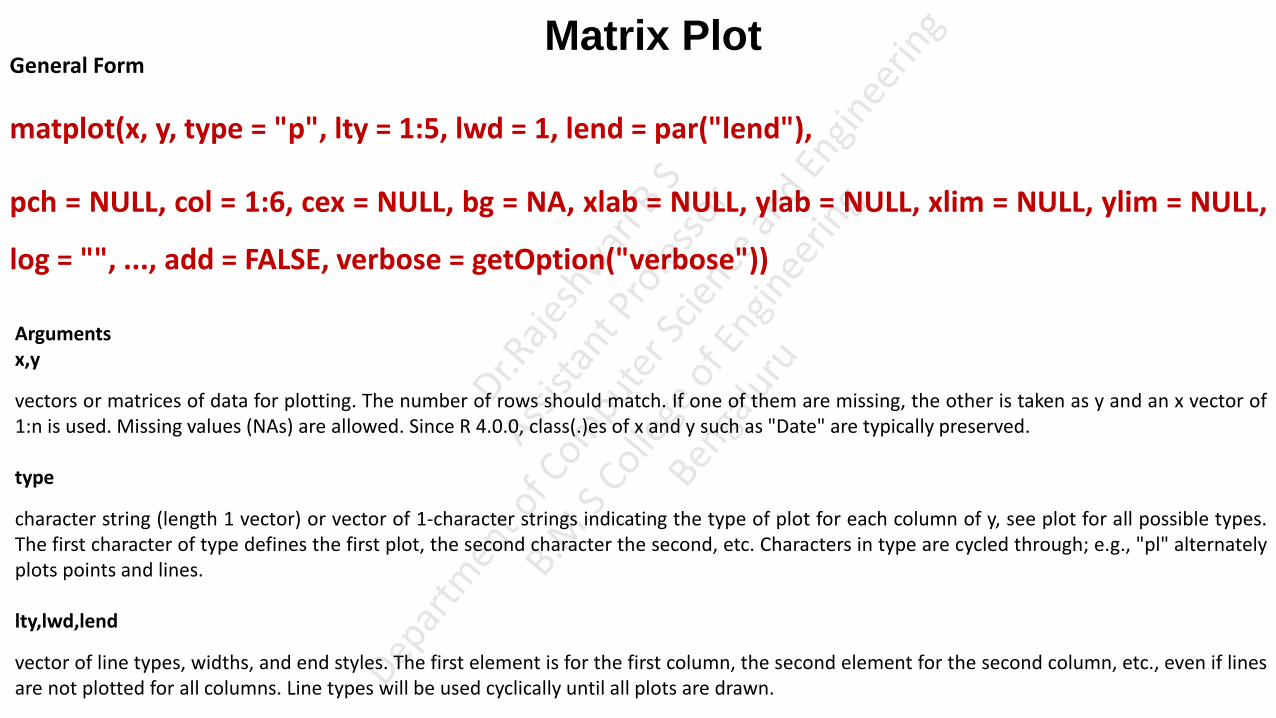
Matrix Plot General Form
matplot(x, y, type = "p", lty = 1:5, lwd = 1, lend = par("lend"),
pch = NULL, col = 1:6, cex = NULL, bg = NA, xlab = NULL, ylab = NULL, xlim = NULL, ylim = NULL,
log = "", ..., add = FALSE, verbose = getOption("verbose"))
Arguments x,y
vectors or matrices of data for plotting. The number of rows should match. If one of them are missing, the other is taken as y and an x vector of 1:n is used. Missing values (NAs) are allowed. Since R 4.0.0, class(.)es of x and y such as "Date" are typically preserved. type
character string (length 1 vector) or vector of 1-character strings indicating the type of plot for each column of y, see plot for all possible types. The first character of type defines the first plot, the second character the second, etc. Characters in type are cycled through; e.g., "pl" alternately plots points and lines. lty,lwd,lend
vector of line types, widths, and end styles. The first element is for the first column, the second element for the second column, etc., even if lines are not plotted for all columns. Line types will be used cyclically until all plots are drawn.

Matrix Plot pch
character string or vector of 1-characters or integers for plotting characters, see points for details. The first character is the plotting-character for the first plot, the second for the second, etc. The default is the digits (1 through 9, 0) then the lowercase and uppercase letters. col
vector of colors. Colors are used cyclically. cex
vector of character expansion sizes, used cyclically. This works as a multiple of par("cex"). NULL is equivalent to 1.0. bg
vector of background (fill) colors for the open plot symbols given by pch = 21:25 as in points. The default NA corresponds to the one of the underlying function plot.xy. xlab, ylab
titles for x and y axes, as in plot. xlim, ylim
ranges of x and y axes, as in plot.

Matrix Plot log
Graphical parameters (see par) and any further arguments of plot, typically plot.default, may also be supplied as arguments to this function; even panel.first etc now work. Hence, the high-level graphics control arguments described under par and the arguments to title may be supplied to this function. add
logical. If TRUE, plots are added to current one, using points and lines. verbose
logical. If TRUE, write one line of what is done.

Matrix Plot Example Program for Matrix Plot
MATPLOT PROGRM (Lab Program)
sfly<-c(26,23,33,6,3,4,20,2)
mfly<-c(4,5,12,9,15,10,8,22)
speed<-c(3,4,4,5,6,7,7,9)
ivert<-cbind(sfly,mfly)
dim(ivert)
spd<-cbind(speed)
spd
dim(spd)
ivert
matplot(spd,ivert,type='b',pch=1:2,col=2,lty=2:3,xlab='Speed',ylab='Invertebrate')+legend(x ='topright',legend=c('Stonefly','MayFly'),col=1,pch=1:2,lty=2:3)
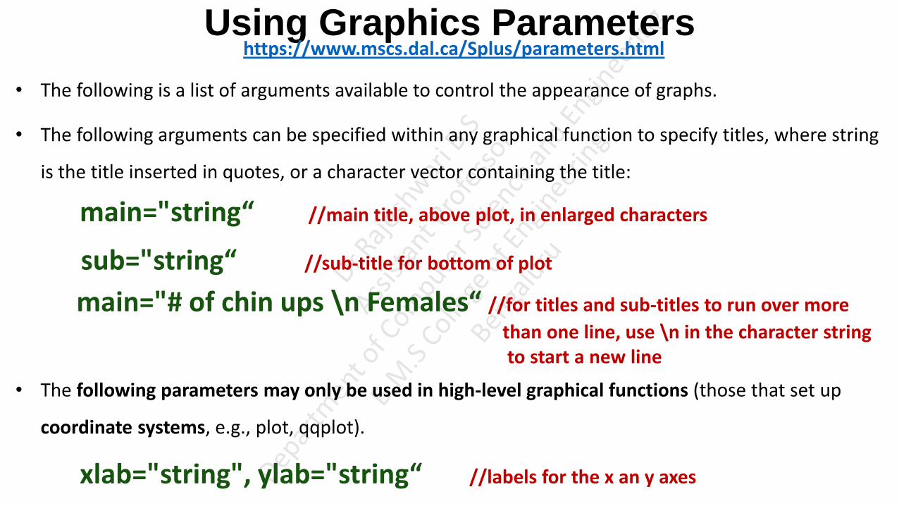
Using Graphics Parameters https://www.mscs.dal.ca/Splus/parameters.html
• The following is a list of arguments available to control the appearance of graphs.
• The following arguments can be specified within any graphical function to specify titles, where string
is the title inserted in quotes, or a character vector containing the title:
main="string“ //main title, above plot, in enlarged characters
sub="string“ //sub-title for bottom of plot
main="# of chin ups \n Females“ //for titles and sub-titles to run over more
than one line, use \n in the character string to start a new line
• The following parameters may only be used in high-level graphical functions (those that set up
coordinate systems, e.g., plot, qqplot).
xlab="string", ylab="string“ //labels for the x an y axes

Using Graphics Parameters axes= logical flag //specifying axes=F forces Splus to omit drawing the axes
xlim=, ylim=vectors //giving the min and max values for the x and y axes
log= //specifies the axes to be logarithmic (ie.: log="xy")
type=type of plot //"p" points, "l" lines, "b" both, "o" both – overstruck, "h" high density, "n"
null (no data plotted)
• The function par() can be used to set graphical parameters which stay in effect throughout all
plotting until they are reset in another call to par or by invoking a new graphic device.

Using Graphics Parameters par(mfrow=c(2,3)) it is possible to specify the number and arrangement of graphs on a page using the mfrow= option.
mfrow=c(2,3) allows 6 plots to appear on a page (2 rows and 6 columns section one plot at each section).
because the mfrow argument was used within the par function, the set up will stay in effect for all
subsequent graphs.
par(mfrow=c(1,1))
restores the normal one-graph-per-page form * this could also be done by invoking a new graphic
device
X11() par(mfcol=c(3,2)) the page is set up as above except that the graphs are printed column wise, mfrow prints graphs row by
row
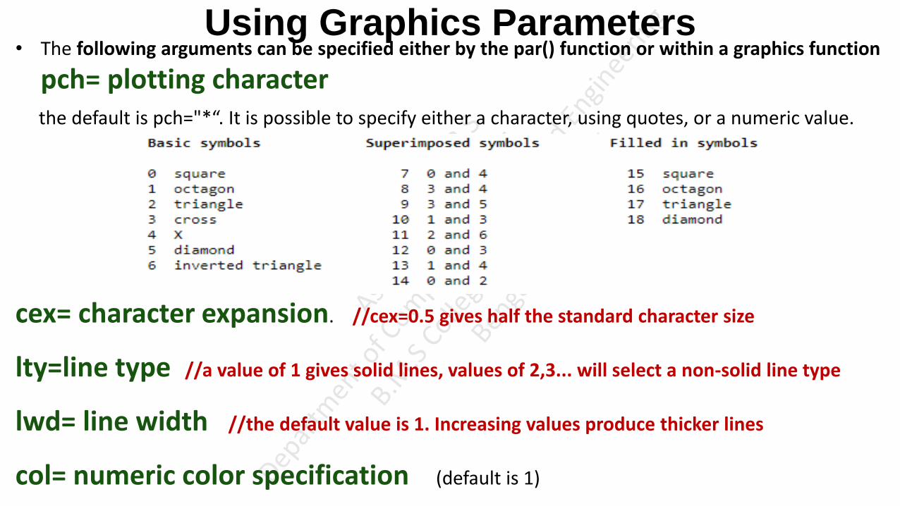
Using Graphics Parameters • The following arguments can be specified either by the par() function or within a graphics function
pch= plotting character the default is pch="*“. It is possible to specify either a character, using quotes, or a numeric value.
cex= character expansion. //cex=0.5 gives half the standard character size
lty=line type //a value of 1 gives solid lines, values of 2,3... will select a non-solid line type
lwd= line width //the default value is 1. Increasing values produce thicker lines
col= numeric color specification (default is 1)

Using Graphics Parameters adj= string justification // 0left justify 1right justify 0.centre or any other fraction
ask= logical value // ask=T means graphical device will prompt before going to the
next page/screen of output (prevents plots from being erased before they are studied)
las= type of axis labels //0 parallel to axis, 1 horizontal, 2 perpendicular to axis
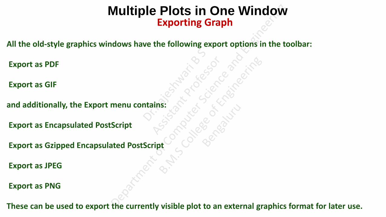
Multiple Plots in One Window Exporting Graph
All the old-style graphics windows have the following export options in the toolbar:
Export as PDF
Export as GIF
and additionally, the Export menu contains:
Export as Encapsulated PostScript
Export as Gzipped Encapsulated PostScript
Export as JPEG
Export as PNG
These can be used to export the currently visible plot to an external graphics format for later use.
Exporting to the pixel-based formats (GIF, JPEG, PNG) is fairly straightforward: each pixel on the screen appears as one pixel in the output file. PNG is the most capable, but it is not supported by all image viewers. GIF works well in most cases, but if there are more than 255 colours some of the colour resolution will be lost. JPEG can preserve a wide range of colours, but does not support transparency and is lossy, so close inspection of image features will reveal blurring.
When exporting to Portable Document Format (PDF), Scalable Vector Graphics (SVG) or Encapsulated PostScript (EPS), which are vector graphics formats, there are a few things to consider:
Positional Quantisation
The output file will render text, lines and markers properly, with smooth edges rather than steps where pixel boundaries would be on the screen. However, the positional resolution is the same as it would be on the screen, so if you have a 400-pixel high plot for instance, there are only 400 possible Y coordinates at which a marker can be plotted. In general this is not obvious by looking at the output plot, but you may find it helpful to increase the size of the plot on the screen by resizing the window before performing an export to EPS. This reduces the effect of the positional quantisation, but note it will also have the effect of making the text labels proportionally smaller to the graphics.
Transparency
For technical reasons transparent markers cannot easily be rendered when a plot is exported to PostScript. In some cases the plot is done using a bitmap in the PostScript output to permit transparency and in some cases the points are just plotted opaque. Try it and see; if the points come out opaque instead of transparent you may need to export to GIF instead. Better workarounds may be provided in future releases.
File Size
In some cases (2D and 3D scatter plots with many thousands of points) output EPS files can get extremely large; the size scales with the number of points drawn, currently with a factor of a few hundred bytes per point. In some cases you can work round this by plotting some points as transparent so that the plot is rendered as a bitmap (see the discussion of transparency above) which scales as the number of pixels rather than the number of points. The Gzipped EPS format helps somewhat (though can be slow); PDF output is better still. Even PDF files may be unmanageably large for very many points however.
Documentation and Deployment (Once discover the drawback or loopholes with the existing model, collection data from the users, cleaning, conditioning, model planning, model building, train the model, test the model with the test data. If it finds model is good, need to produce technical document and present it in front of stat holders, project managers, project sponsors, users etc. How they produce technical document and present will discuss here)
knitr • knitr is an R package that allows the inclusion of text, R code and results inside documents. (allows to
produce a document where explanation abt the model, technical details, code, results/graphs in a single document)
• Using Knitr, allows to create a document where text, code, analysis, results and discussion are all in
one place.
• In practice we maintain a master file that contains both user readable documentation and chunks of
program source code.
• when processed through knitr, the function takes an input file, extracts the R code in it according to
a list of patterns, evaluates the code, the code is replaced by the results and writes the output in
another file.

Documentation and Deployment • The document types supported by knitr include LaTeX, Markdown, and HTML. (Output file from the
function)
LaTeX format is a good choice for detailed typeset technical documents.
Markdown format is a good choice for online documentation and wikis. (The text will be converted into
mark up language with .md extension. if we want to upload in some blog post web sites. It takes .md file and convert it into specific
HTML file through a markdown app )
Direct HTML format may be appropriate for some web applications. (if you are creating web site and psot the
document, can use this .html file)
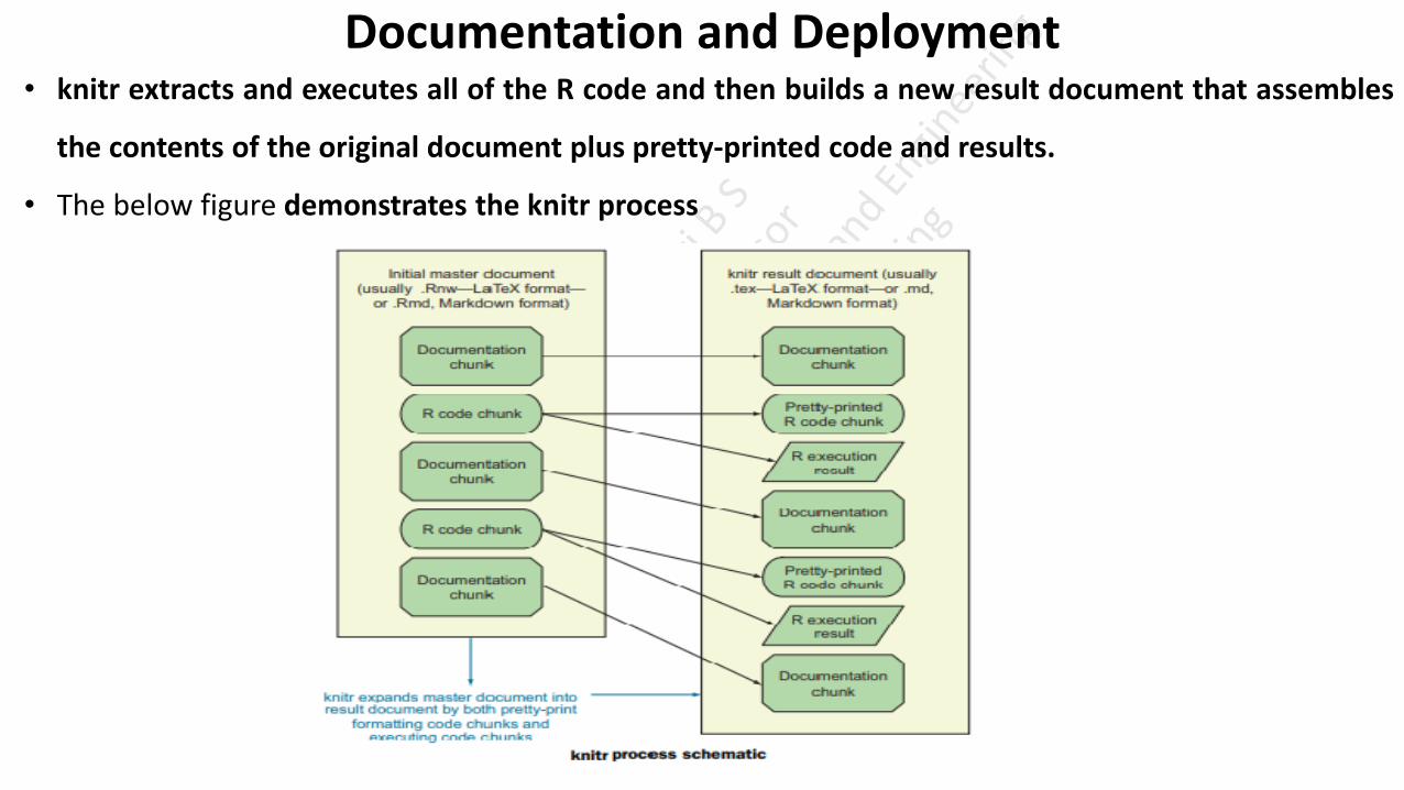
Documentation and Deployment • knitr extracts and executes all of the R code and then builds a new result document that assembles
the contents of the original document plus pretty-printed code and results.
• The below figure demonstrates the knitr process
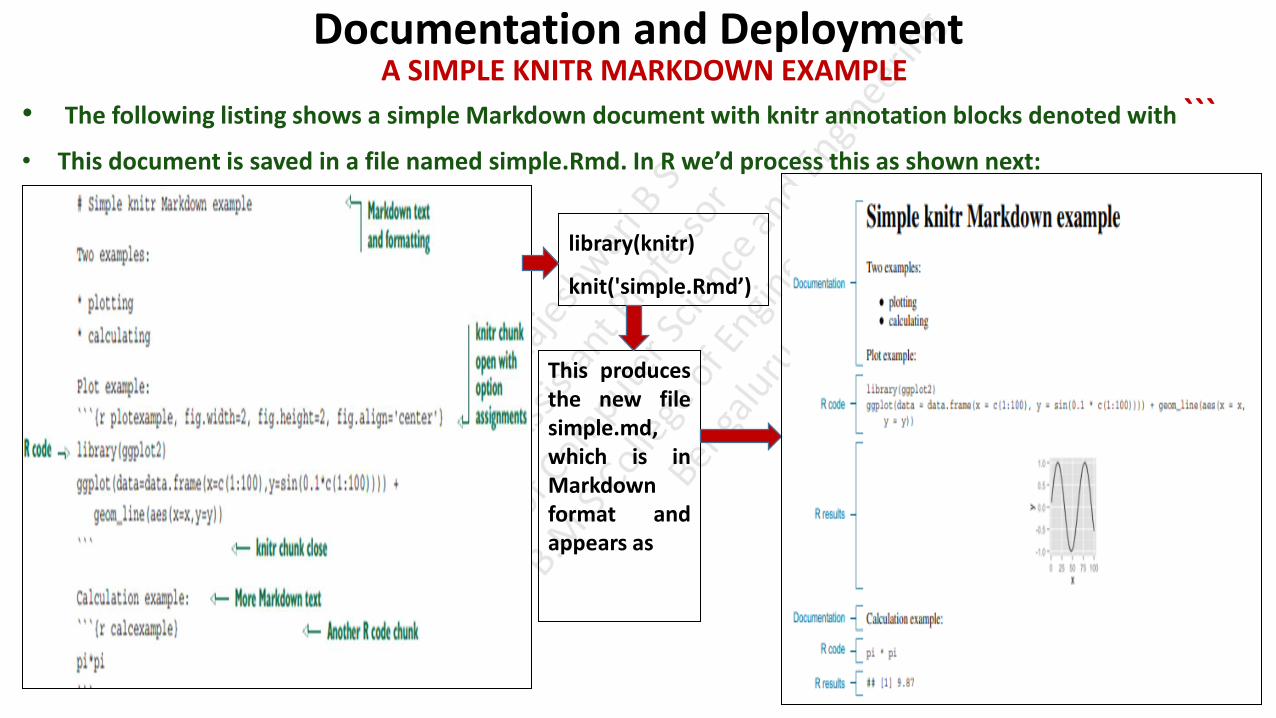
Documentation and Deployment A SIMPLE KNITR MARKDOWN EXAMPLE
• The following listing shows a simple Markdown document with knitr annotation blocks denoted with ``` • This document is saved in a file named simple.Rmd. In R we’d process this as shown next:
library(knitr)
knit('simple.Rmd’)
This produces the new file simple.md, which is in Markdown format and appears as

Documentation and Deployment A SIMPLE KNITR LATEX EXAMPLE
• LaTeX is a powerful document preparation system suitable for publication-quality typesetting both
for articles and entire books.
• The main new feature is that in LaTeX, code blocks are marked with << and @ instead of ```
The content is saved into a file named add.Rnw and then run R in batch to produce the file add.tex. At a shell prompt, then run LaTeX to create the final add.pdf file:
This produces
the PDF as

PURPOSE OF KNITR • The purpose of knitr is to produce reproducible work.(Replicate work)
• When we distribute our work in knitr format, anyone can download our work and, without great
effort, rerun it to confirm they get the same results we did.
• This is the ideal standard of scientific research, but is rarely met, as scientists usually are deficient in
sharing all of their code, data, and actual procedures.
knitr Technical Details KNITR BLOCK DECLARATION FORMAT
• A knitr code block starts with the block declaration (``` in Markdown and << in LaTeX).
• The first string is the name of the block (must be unique across the entire project). After that, a
number of comma-separated option=value chunk option assignments are allowed.

knitr Technical Details KNITR CHUNK OPTIONS
• A sampling of useful option assignments is given in the below table.
knitr Technical Details KNITR TAKEAWAY
• The key point is that because we took the extra effort to do this work in knitr, we have the following:
Nicely formatted documentation (buzz.md and buzz.pdf)
Shared executable code (buzz.Rmd and buzz.Rnw)
• This makes debugging (which usually involves repeating and investigating earlier work), sharing, and
documentation much easier and more reliable.

Using Comments and Version Control for Running Documentation Writing effective comments
• R’s comment style is simple: everything following a # until the end of a line is a comment and ignored
by the R interpreter.
• The following is an example of a well-commented block of R code.
• Good comments include what the function does, what types arguments are expected to be, limits of
domain, why we should care about the function, and where it’s from.
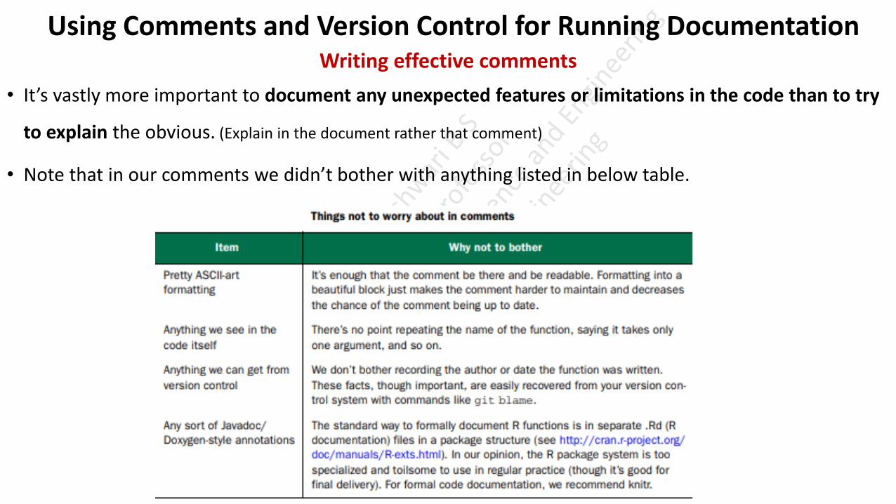
Using Comments and Version Control for Running Documentation Writing effective comments
• It’s vastly more important to document any unexpected features or limitations in the code than to try
to explain the obvious. (Explain in the document rather that comment)
• Note that in our comments we didn’t bother with anything listed in below table.

Using Comments and Version Control for Running Documentation Writing effective comments
• Also, avoid comments that add no actual content, such as in the following table.

Using Comments and Version Control for Running Documentation Using version control to record history
• Version control also known as source control, is a software that keeps track of every modification to
the code in a special kind of database.
• We can use version control software for all code, files, and assets that multiple team members will
collaborate on. It keep every team member working off the latest version.
• Version control can both maintain critical snapshots of your work in earlier states and produce running
documentation of what was done by whom and when in your project.

Using Comments and Version Control for Running Documentation Using version control to record history
• Figure shows a cartoon “version control saves the day” scenario that is in fact common.

Using Comments and Version Control for Running Documentation Using version control to record history
Choosing a Project Directory Structure
• Before starting with source control, it’s important to settle on and document a good project directory
structure.
Using Comments and Version Control for Running Documentation Using version control to record history
Starting a Git Project using the Command Line
• When we’ve decided on our directory structure and want to start a version controlled project, do the
following: (Git is a type of version control system)
1) Start the project in a new directory. Place any work either in this directory or in subdirectories.
2) Move your interactive shell into this directory and type git init. It’s okay if we’ve already started
working and there are already files present. (An interactive shell is simply any shell process that we can use to
type commands, and get back output from those commands.)
3) Exclude any subdirectories that we don’t want under source control with .gitignore control
files.
• The init step sets up in the directory a single hidden file tree called .git and prepares you to keep extra
copies of every file in the directory

Using Comments and Version Control for Running Documentation Using version control to record history
Starting a Git Project using the Command Line
• As often as practical, enter the following two commands into an interactive shell in our project
directory:
• Checking in a file is split into two stages: add and commit.
• Run the add/commit pair of commands after every minor accomplishment on our project.
• Any time we want to know about our work progress, type command
• git status to see if there are any edits you can put through the add/commit cycle.
• git log to see the history of our work (from the viewpoint of the add/commit cycles).

Using Comments and Version Control for Running Documentation Using version control to record history
Using Git Through Rstudio
• The RStudio IDE supplies a graphical user interface to Git that we can be perform add/commit cycle
as follows:
1. Start a new project. From the RStudio command menu, select Project > Create Project, and choose
New Project. Then select the name of the project, what directory to create the new project
directory in, leave the type as (Default), and make sure create a Git repository for this project is
checked, click Create Project.
Using Comments and Version Control for Running Documentation Using version control to record history
Using Git Through Rstudio
2. Do some work in the project. Create new files by selecting File > New > R Script. Type some R code
(like 1/5) into the editor pane and then click the Save icon to save the file. When saving the file, be
sure to choose project directory or a subdirectory of the project.

Using Comments and Version Control for Running Documentation Using version control to record history
Using Git Through Rstudio
3. Commit the changes to version control. Below figure shows how to do this. Select the Git control
pane in the top right of RStudio. This pane shows all changed files as line items. Check the Staged
check box for any files you want to stage for this commit. Then click Commit, and you’re done.
Using Comments and Version Control for Running Documentation Using version control to explore our project
• If we add/commit often enough, Git is ready to help us with any of the following tasks:
Tracking our work over time
Recovering a deleted file
Comparing two past versions of a file
Finding when you added a specific bit of text
Recovering a whole file or a bit of text from the past (undo an edit)
Sharing files with collaborators
Publicly sharing our project (à la GitHub at https://github.com/, or Bitbucket at https://bitbucket.org)
Maintaining different versions (branches) of our work
Using Comments and Version Control for Running Documentation
Using version control to share work • In addition to producing work, we must often share it with peers.
• We advise using version control
• to share work with peers. To do that effectively with Git, we need to start using additional commands
such as git pull, git rebase, and git push.
• The new Git commands are:
git push (usually used in the git push -u origin master variation)
git pull (usually used in the git fetch; git merge -m pull master origin/ master or git pull --rebase
origin master variations)

Using Comments and Version Control for Running Documentation Using version control to share work
• Typically two authors may be working on different files in the same project at the sametime. As you
can see in figure, the second author to push their results to the shared repository must decide how to
specify the parallel work was performed.

Using Comments and Version Control for Running Documentation Using version control to share work
• Either they can say the work was truly in parallel (represented by two branches being formed and then
a merge record joining the work), or they can rebase their own work to claim their work was done
“after” the other’s work (preserving a linear edit history and avoiding the need for any merge records).
Note: before and after are tracked in terms of arrows, not time.
• Merging is what’s really happening, but rebase is much simpler to read. The general rule is that you
should only rebase work you haven’t yet shared (in our example, Worker B should feel free to rebase
their edits to appear to be after Worker A’s edits, as Worker B hasn’t yet successfully pushed their work
anywhere). You should avoidrebasing records people have seen, as you’re essentially hiding the edit
steps they may be basing their work on (forcing them to merge or rebase in the future to catch up with
your changed record keeping).
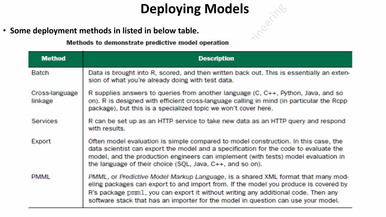
Deploying Models
• Some deployment methods in listed in below table.

Producing Effective Presentation

Thank You

Text analysis (Example for different types of data formats)
• Structured data is highly organized data that is easy to search and is predictable.
• Semi structured data does not have the same level of organization and predictability of structured data.
• Quasi(Self Styled) Quasi-structured Data – This type of data consists of textual content with erratic(irregular) data formats, and its formatted with effort, software system tools, and
time. An example of quasi-structured data is the data about webpages a user visited and in what order.eg: Webserver log
Copyright © 2022 FDOKUMEN