Creative paths - OpenEdition Journals
234
-
Upload
khangminh22 -
Category
Documents
-
view
0 -
download
0
Transcript of Creative paths - OpenEdition Journals


InterfacesImage Texte Language
42 | 2019Creative pathsLes sentiers de la création
Electronic versionURL: http://journals.openedition.org/interfaces/657DOI: 10.4000/interfaces.657ISSN: 2647-6754
Publisher:Université de Bourgogne, Université de Paris, College of the Holy Cross
Printed versionDate of publication: 12 December 2019ISSN: 1164-6225
Electronic referenceInterfaces, 42 | 2019, “Creative paths” [Online], Online since 12 December 2019, connection on 05January 2021. URL: http://journals.openedition.org/interfaces/657; DOI: https://doi.org/10.4000/interfaces.657
Les contenus de la revue Interfaces sont mis à disposition selon les termes de la Licence CreativeCommons Attribution 4.0 International.

VO
L 42 - IN
TE
RFA
CE
S - 2019
INTERFACESIMAGE TEXTE LANGUAGE
CREATIVE PATHSLES SENTIERS DE LA CRÉATION
ParnassusAward 42COLLEGE OF THE HOLY CROSS
UNIVERSITÉ PARIS DIDEROT UNIVERSITÉ DE BOURGOGNE - Dijon
REVUE RECONNUE PAR LE CNRS
PRIX: 40 € / $ 50.00 US - ISBN - 978-1-7341985-2-2
IMAGE TEXTE LANGUAGEINTERFACES
CONTENTSMaurice GÉRACHT and Brittain SMITH
IntroductionAlice SCHEER
Illustrer « les sentiers de la création » : des cheminements singuliersMargaret FIELDS DENTON
Promenades poétiques et daguerriennes—Bellevue : Photography and NarrationEric T. HASKELL
Baudelaire’s “Le Jet d’eau”: Verbal-Visual Inquiry and the Illustrated BookCorentin LAHOUSTE
Donner à voir l’irreprésentable, faire trembler le réel : l’agir symbolique des œuvres d’art reproduites dans Cercle de Yannick Haenel
Nataliya LENINA « Grâce poétique » et œuvre d’art : méditations phénoménologiques dans le Journal de l’analogiste de Suzanne Lilar
Anne-Kathrin MARQUARDT The Mathematician, the Surrealist, and the Poet are of Imagination All Compact: Man Ray’s Shakespearean Equations
Vera FASSHAUER Unharmonious Images Conceived by Troubled Minds: Graphic and Literary Caricatures in Heinrich Heine’s French Affairs and French Painters
Nadia FARTAS « Derrière un grillage » d’Octave Mirbeau et l’hommage des artistes à Picquart
REVIEWSDidier AUBERT
Mathilde Arrivé, Le primitivisme mélancolique d’Edward S. Curtis. Montpellier : Presses universitaires de la Méditerranée, 2019. 322pp
Fabienne GASPARI Evanghelia Stead (ed.). Reading Books and Prints as Cultural Objects. Palgrave Macmillan, New Directions in Book History, 2018 [ISBN 978-3-319-53831-0]
Melissa SCHOENBERGER Charles I: King and Collector, Exhibition Catalogue; Exhibition Curated by Per Rumberg and Desmond Shawe-Taylor, Assisted by Lucy Chiswell and Niko Munz. (Royal Academy of Arts: London, 2018). 256 pp. $65.00
Donald FRIEDMAN Tom Wolfe’s Drawing and Writing
Notes on Contributors
9 781734 198522
55000>ISBN 978-1-7341985-2-2
$50.00

La revue Interfaces a été fondée en 1991 par un groupe d’enseignants du département d’anglais de l’université de Bourgogne qui comprenait Michel Baridon (rédacteur en chef jusqu’en 2001), Yves Carlet (aujourd’hui à Montpellier), Jean-Pierre Durix (Université de Bourgogne), François Pitavy (aujourd’hui Emérite), Jean-Michel Rabaté (aujourd’hui à Philadelphie), Michel Ratié (Université de Bourgogne).
Constatant le rôle de la culture visuelle dans notre civilisation, ces enseignants souhaitaient élargir le champ et les méthodes de leur enseignement en explorant la relation image/langage. Afin d’envisager cette relation sous l’angle le plus large possible, ils souhaitaient ne pas la limiter aux échanges entre les arts et la littérature mais l’étendre à la linguistique et à l’épistémologie.
La revue, qui est bilingue (français/anglais), a bénéficié, dès l’origine, du concours d’enseignants-chercheurs qui approuvaient sa démarche et ses objectifs: Maurice Géracht, professeur au College of the Holy Cross, Worcester, Massachusetts, États-Unis, et Frédéric Ogée (Université Paris Diderot, Institut Charles V) qui reprenait la tradition du séminaire de civilisation d’André Parreaux dans cette université.
La 3° de couverture présentait la revue dans des termes qui la définissent toujours: Interfaces est une revue annuelle, illustrée et bilingue, qui prend pour champ l’interface, la surface de partage, entre deux moyens d’expression différents mais connexes: l’image et le langage.
Interfaces a obtenu la reconnaissance du CNRS en 1995.
In 2010 Interfaces received the “Parnassus Award for Significant Editorial Achievement” from the Council of Editors of Learned Journals.
Editorial boardJournal published by: the College of the Holy Cross (Worcester, Mass., USA), Université Paris-Diderot (France) and Université de Bourgogne-Franche-Comté (UBFC, France)Founding editor: Michel Baridon (Université de Bourgogne)Directors: Sophie Aymes (UBFC), Maurice A. Géracht (Holy Cross)Chief editor: Marie-Odile Bernez (UBFC)Editorial board: Carole Cambray (Paris-Diderot), Madigan Haley (Holy Cross), Véronique Liard (UBFC), Fiona McMahon (UBFC), Christelle Serée-Chaussinand (UBFC), Brittain Smith (Holy Cross), Shannon Wells-Lassagne (UBFC)Book Review Editor: Fiona McMahon (UBFC)Treasurer: Christelle Serée-Chaussinand (UBFC)
Layout design: Sharon Matys (Holy Cross)Cover Art: Cristi Rinklin
Advisory boardStephen Bann (University of Bristol, UK), Catherine Bernard (Université Paris-Diderot, France), Pascale Borrel (Université Rennes 2, France), Johanna Drucker (UCLA, University of California, Los Angeles, USA), Julie Grossman (Le Moyne University, USA)John Dixon Hunt (University of Pennsylvania, USA), Philippe Kaenel (UNIL, Université de Lausanne, Switzerland), Liliane Louvel (Université de Poitiers, France), Frédéric Ogée (Université Paris-Diderot, France), Veronique Plesch (Colby College, USA), Jean-Michel Rabaté (University of Pennsylvania, USA), Gabriele Rippl (UNIBE, University of Bern, Switzerland), Monique Tschofen (Ryerson University, Canada)
Scientific policyInterfaces is a bilingual (English/French) scholarly journal founded by Michel Baridon (University of Burgundy) in 1991, edited by the College of the Holy Cross (Worcester, Massachusetts, USA), the University of Burgundy and the University of Paris-Diderot. It focuses on intermediality, on the relationship between text(s) and image(s), art and literature, history and visual sources as well as extending to the history of the visual arts and the epistemology of images, especially in a comparative perspective in francophone and anglophone domains. The papers appearing in Interfaces focus on contemporary theoretical debates (digital creation and images, theories of adaptation, theoretical advances, etc.) and the journal will broaden its ambit to include geographical areas that are under-represented in our fields of research (Africa, South America, Asia).
Interfaces addresses specialists of various disciplines in the Humanities directly, but might also interest some science departments focusing on classes in epistemology and the history of the sciences, as well as specialists in adjoining fields like publishing.
Interfaces moved online in 2018 and its editorial standards meet the requirements of open digital edition.

i
In t e r fa c e s
Im a g e te x t e La n g u a g e
n° 42
CREATIVE PATHSLES SENTIERS DE LA CRÉATION
Edited by Maurice Géracht and Brittain Smith
College of the Holy Cross, Mass.Université Paris Diderot
Université de Bourgogne-Franche-Comté
Revue reconnue par le CNRS
ParnassusAward

ii Interfaces 42 (2019-2020)

iii
CREATIVE PATHSLES SENTIERS DE LA CRÉATION
taBLe Des matIÈres / taBLe Of cOntents
Maurice GÉRACHT Brittain SMITH
Introduction ............................................................................................................................. 1
Alice SCHEER Illustrer « les sentiers de la création » : des cheminements singuliers .................................... 7
Margaret FIELDS DENTON Promenades poétiques et daguerriennes—Bellevue : Photography and Narration ............... 25
Eric T. HASKELL Baudelaire’s “Le Jet d’eau”: Verbal-Visual Inquiry and the Illustrated Book ....................... 43
Corentin LAHOUSTE Donner à voir l’irreprésentable, faire trembler le réel : l’agir symbolique des œuvres d’art reproduites dans Cercle de Yannick Haenel ................. 55
Nataliya LENINA « Grâce poétique » et œuvre d’art : méditations phénoménologiques dans le Journal de l’analogiste de Suzanne Lilar ................................................................. 73
Anne-Kathrin MARQUARDT The Mathematician, the Surrealist, and the Poet are of Imagination All Compact: Man Ray’s Shakespearean Equations ................................................................................... 99

iv Interfaces 42 (2019-2020)
Vera FASSHAUER Unharmonious Images Conceived by Troubled Minds: Graphic and Literary Caricatures in Heinrich Heine’s French Affairs and French Painters ................................. 129
Nadia FARTAS « Derrière un grillage » d’Octave Mirbeau et l’hommage des artistes à Picquart............... 167
REVIEWS
Didier AUBERT Mathilde Arrivé, Le primitivisme mélancolique d’Edward S. Curtis. Montpellier : Presses universitaires de la Méditerranée, 2019. 322pp. ..................................................... 191
Fabienne GASPARI Evanghelia Stead (ed.). Reading Books and Prints as Cultural Objects. Palgrave Macmillan, New Directions in Book History, 2018 [ISBN 978-3-319-53831-0] ................................................................................................. 197
Melissa SCHOENBERGER Charles I: King and Collector, Exhibition Catalogue; Exhibition Curated by Per Rumberg and Desmond Shawe-Taylor, Assisted by Lucy Chiswell and Niko Munz. (Royal Academy of Arts: London, 2018). 256 pp. $65.00. ................................................. 201
Donald FRIEDMAN Tom Wolfe’s Drawing and Writing ...................................................................................... 205
Notes on Contributors ..................................................................................................................... 209

1
INTRODUCTION
Maurice Géracht Brittain Smith
College of the Holy Cross
Volume 42 of INTERFACES issues is a miscellany, a gathering of articles not explicitly connected by a shared subject or theme. Nevertheless, beyond metonomy, they are united in their focus on the word and image nexus, and they do raise, around different subjects, ever-present verbal-visual issues.
In “Illustrer Les sentier de la creation: des cheminements singuliers,” Alice Scheer selects six samples from Albert Skira’s twenty-three volume series entitled Les sentiers de la creation—texts for which authors also did or selected the graphics, or for which visual artists wrote the texts—and most directly address the question: why, she asks provocatively, did these authors choose to privilege and establish distance and independence between the verbal and graphic texts? Her analysis suggests a number of possibilities: the graphics can suggest an alternate narrative; the decalage, the detachment, between the words and the graphic can indicate creation in the making; the ecart, the gap, can even be the author’s thought on creation, a process of distancing; or it may be a sign of self-examination and self-discovery.
Although hardly known today, one who blazed his own creative path in welding words and images, Louis- August Martin (1811-1875), was one of the early practitioners who incorporated daguerreotypes into verbal texts and thereby transformed traditional 19th-century literary “promenade.” As Margaret Fields Denton deftly demonstrates in “Promenades poétiques et daguerriennes—Bellevue : Photography and Narration,” the transformation was not merely a matter of using a new medium (had recently been transferable to paper); rather, Martin’s interlinear placement of the images raised new questions: did mid-nineteenth century readers/viewers believe that there were significant affective differences between scriptural (ekphrastic) and graphic (e.g. engraving) depictions on the one hand, and, on the other, daguerreotype (photographic) renderings, because of the daguerreotype’s immediacy and assumed direct, actual, authentic viewpoint? How do such images affect the relationship to the words they accompany, and how do they differ in this regard to the other forms of graphic rendering? Mid-19th-century photo technology hardly captured impressions as instantly as they do today, nor were the paper presentation of the daguerreotypes as clear and visibly detailed as claimed (compared,

2 Interfaces 42 (2019-2020)
let’s say, to 17th century Dutch and Flemish painters or Italian baroque). Nevertheless, the belief in the fidelity of the image to the actual, and that these new images allowed viewers to imagine to be in the locale and at that moment, also permitted the viewer to imagine participation in the event. The images, Denton shows, are occasions for pause in the narrative drive, for prolonged looking and meditation, for savoring the moment and comprehending its meaning in the promenade. They are not merely a quick impression for the moment, a quick stop, they are integral to the narrative. Hence Martin’s Promenade is both poétiques (verbal) which describes the trajectory of the promenade and daguerriennes (photographs) which renders the immediate impression, thus allowing for the prolonged experience of the moment to also experience its meanings.
Graphic re-presentations of text are, ineluctably, readings: some limit themselves to reflect and successfully mirror the original text; some readings can be irrelevant; many will focus on and further develop a commonplace aspect of the text; the best will help discover the less obvious, and expand our understanding of even the most familiar text. Eric T. Haskell, in “Baudelaire’s ‘Le Jet d’eau’; Verbal-Visual Inquiry and the Illustrated Book,” offers examples of each. In effect, his succinct yet revealing analysis of six illuminations of Baudelaire’s poem creates a taxonomy of the various ways in general graphics of texts can function. Moreover, Haskell’s graphic readings present six interpretations of the way particular illuminations do (and occasionally don’t) interpret the very particular text that is Baudelaire’s “Le Jet d’eau.”
“The power to guess the unseen from the seen, to trace the implication of things... may almost be said to constitute experience”; and “My point of view, thank God, is personal!”: these citations from Henry James, the first from “The Art of Fiction,” the second from The Portrait of a Lady, together encapsulate Belgian writer Yannik Haenel’s project as it is adroitly presented by Corentin Lahouste in “Donner à voir l’irreprésentable, faire trembler Le réel: l’agir sympolique des oeuvres d’art reproduites dans Cercle de Yannnick Haenel.” Lahouste asserts that for Haenel “art is intimately linked to life, and life to art” and urges us to “live life as a work of art” (editor’s translation), injunctions that echo James’s address to H.G. Wells that “art makes life.” When Haenel privileges the ‘personal’ response to a work of art (or of a reproduction which evokes it) rather than the dictates of this or that ideology or authority, he is not being ‘subjective’ (a subjective point of view looks only inward and has no ‘view’ at all); his personal point of view is widely inclusive, is informed by all the literature he has read, by all the art he has seen, by all the music he has heard, by the places he has been, by the people he has encountered—in short, by all the views he has entertained. Lahouste demonstrates that for Haenel particular works of art (e.g., in Cercle, Bacon’s Three Studies for Figures at the Base of a Crucifixion; Dürer’s Rhinoceros;

3Introduction
Giovan Francesco Caroto’s St. John at Patmos; a XVII Chinese woodblock) offer this author and critic openings onto the world that are at once platforms for discourse, for meditation, for articulation, and, eventually for revelation. It is in these spaces that the unseen is given life and made known.
Haenel had a literary predecessor in his Flemish born compatriot Suzanne Lilar whose major work, Journal de l’analogiste (1954), appeared more than a dozen years before Haenel was born (1967). For all their differences—Lilar’s Journal entries rely heavily on lived experiences, while Haenel’s foundations are fictive events—they share, in common James’s serviceable term, the conviction that “art makes life.” In “‘Grâce poétique’ et ¨œuvre d’art: méditations phénoménologiques dans le Journal de l analogiste de Suzanne Lilar,” Lenina cites Lilar’s stance toward life: “she is not detached from the everyday common place, rather she is detached from the common place way of looking at them” (editor’s translation). The poetry of a painting, of passages of music or verse, or the glimpse of a dog through the widow of a moving car, are phenomena to which Lilar was equally present and valued equally as belonging to the same category. What Lenina admirably describes is Lilar’s habit of mind, the inclusivity of her imagination and creative faculty. Lenina’s article explores the foundations and practice of Lilar’s poetics: how to read a painting, a sculpture, architecture; how to look, to see, perceive, discover. More, she asks what are the ramifications of these interrogations between viewer and artifact and artist? In her analysis of Lilar’s Journal, Lenina notes the Belgian’s fascination with death, with the grotesque, with the baroque: e.g. in her childhood, the death of a family cat and of an uncle, and an adolescent visit to the Villa d’ Este; and her predilections for such works as the crypte des Capucins; and Goya’s Les Vieilles. Lenina teaches us how Lilar’s “uncommon-place” mode of looking also renders the unseen—seen.
In her “The Mathematician, the Surrealists, and the Poet Are of Imagination All Compact: Man Ray’s Shakespearean Equations,” Anne-Kathrin Marquardt does a very skillful job of marrying theory and practice. The first part of her article succinctly delineates some fundamental issues having to do with adaptation and productively links Man Ray’s not immediately transparent use in his paintings of Shakespeare and of math to the surrealist notion of randomness. The second part of the essay provides revealing and nuanced interpretations of three of Man Rays’s paintings from Shakespear’s Equations--”King Lear,” “A Midsummer Night’s Dream, and “Hamlet” whereby the author problematizes the notion of randomness, positing it as a “dialectical poetics [of] opposing poles” that “breed both a new form of knowledge [... and] a ‘convulsive’ beauty.”
In 1831 H. Heine settled in Paris for the rest of his life and earned his living as a foreign correspondent for the Cotta House, whose publications included Allgemeine Zeitung, the leading

4 Interfaces 42 (2019-2020)
political journal in Germany. Heine became a major contributor: he wrote on music, paintings, on the French way of life. He also wrote about Louis-Philippe and French/German politics. In spite of the promises of the 1830 Charter which endorsed republican values, press censorship was in force in Paris, as it was in Prussia, and by extension, the rest of Germany. Heine needed to avoid strictures from both countries, even as he communicated what was and where he in fact stood. This is the context of Vera Faßhauer’s subtle “Unharmonious Images Conceived by Troubled Minds: Graphic and Literary Caricatures in Heinrich Heine’s French Affairs and French Painters.” Heine’s strategy was to distance himself from the ‘offending’ “caricatures and to affirm every aspect of their criticism at the same time.” He detached “the messages of the graphic satires from the form they were presented. Faßhauer’s close analysis of Heine’s ekphrastic renderings of Decamps, Philipon, Daumier, Granville, Paul Gavarni, and other graphic satires, clearly shows that his alleged deprecation of these works are in fact instances of “thought smuggling.” He did so, Faßhauer demonstrates, by “masking his subjective thoughts as [mere] accounts of objective facts,” straight reportage. The project of the satiric magazines La Caricature and Le Charivari was to reclaim the promises of democratic rights and values that the 1830 Revolution, led by Lafayette, made to the Republicans. Expatriated in Paris, Heine was devoted to those ideals and, under the guise of a disinterested critical observer, was in fact smuggling and disseminating the satires of these publications to Germany in broad daylight. His project as a correspondent, Faßhauer’s corrective article clarifies, was to inform and educate his German readers on the new graphic satiric form, as well as on France’s political struggles in a manner that would avoid censorship.
Five decades after the fall of July Monarchy in 1848, France’s Third Republic is in crisis, again confronted with the necessity of living up to its professed ideals as it addresses the ramifications of the Dreyfus Affair. Again, as Nadia Fartas ably demonstrates in “ ‘Derrière un grillage’ d’Octave Mirbeau et l’Hommage des artistes à Picquart,” word and image texts clearly show that the very principles of truth and justice are threatened. An album of twelve lithographs by various artists and necessarily different all share in common the use of light as an indicator of truth. In all these graphic allegories, “truth” does not illuminate. On the other hand, Octave Mirbeau’s ekphrasis of his visits to Picquart in prison is a gradual process of detecting in its darkness, the colonel’s welcoming gesture, of noting his clear eyes, and hearing amidst clamor of mendacity, a truthful voice. Mirbeau’s prefatory text is a rhetorical gesture for uncovering the truth and restoring justice; his narrative, Fartas demonstrates, is a peeling away of obfuscations to reveal, on the one hand, the heroism of Picquart, and, on the other, to expose the treachery of the anti-dreyfusard. While the artists’s images and Mirbeau’s words differ in their perspective, the album attacks the state with the very principles it was founded to defend.

5Introduction
Even in a miscellaneous collection, one finds articles speaking to each other: Faßhauer’s focus on Heine’s French Affairs and French Painters and Fartas’s “ ‘Derrière un grillage’ d’Octave Mirbeau et l’Hommage des artistes à Picquart” both address approaches to political activism. Nataliya Lenina in “‘Grâce poétique’ et ¨œuvre d’art: méditations phénoménologiques dans le Journal de l’analogiste de Suzanne Lilar” and Corentin Lahouste in “Donner à voir l’irreprésentable, faire trembler Le réel: l’agir sympolique des oeuvres d’art reproduites dans Cercle de Yannnick Haenel,” focus on Belgian writers who distance themselves from the plethora of theoretical approaches in their responses to art, literature, and indeed to life—in order to affirm that criticism is the critic.
Alice Scheer in “Illustrer Les sentier de la creation: des cheminements singuliers”, Margaret Fields Denton in “Promenades poétiques et daguerriennes—Bellevue: Photography and Narration,” and Eric T. Haskell in “Baudelaire’s ‘Le Jet d’eau’; Verbal-Visual Inquiry and the Illustrated Book,” each demonstrates how images independent of their associated text can extend its significance.

6 Interfaces 42 (2019-2020)

7
ILLUSTRER « LES SENTIERS DE LA CRÉATION » : DES CHEMINEMENTS SINGULIERS
Alice ScheerUniversité Lyon 2
Résumé
La collection des « sentiers de la création », publiée par Albert Skira et Gaëtan Picon entre 1969 et 1976, a pour principe éditorial d’être illustrée par les auteurs eux-mêmes. Qu’ils aient réalisé leurs propres illustrations (comme Ionesco, Char ou Michaux par exemple) ou qu’ils se soient servis d’images déjà existantes, c’est avec une grande liberté que les auteurs se sont emparés de cette commande. Surprenante, l’iconographie témoigne parfois d’une certaine insubordination de l’image au texte qu’elle est supposée illustrer et manifeste entre eux un décalage. Cette étude interroge la manière singulière dont l’image s’associe aux mots et devient, pour ces écrivains, un moyen d’expression complémentaire pour penser et représenter la création. Elle s’appuie ainsi sur les ouvrages de J. M. G Le Clézio, Jean Tardieu, Octavio Paz, Claude Simon, Roland Barthes, et Yves Bonnefoy.
Abstract
The books published within the “sentiers de la création”, a book series released by the Genevan publisher Albert Skira and the French writer Gaëtan Picon, are singular because they were illustrated by the authors themselves. While some of the latter have made their own images (as Ionesco, Char or Michaux for instance), others submitted a list of pictures they had taken from other artists and other times. All of them interpreted Skira’s request very freely and the reader can sometimes notice a slight discrepancy between the image and the text. This article addresses the way the images associate with words to become, for the writers, a new and complementary medium to reflect on their own creation and represent it. It is based on the books written by J. M. G Le Clézio, Jean Tardieu, Octavio Paz, Claude Simon, Roland Barthes and Yves Bonnefoy.

8 Interfaces 42 (2019-2020)
« Les sentiers de la création », collection parue entre 1969 et 1976 aux éditions d’art Albert Skira et co-dirigée par Gaëtan Picon, réunit des ouvrages de commande singuliers car ils ont été illustrés par leurs auteurs. Là résidaient le principe et l’originalité mêmes d’une collection qui invitait les auteurs à revenir sur leur parcours créateur en mêlant les mots et les images. Écrivains, artistes et penseurs aussi divers qu’Aragon, Jean Dubuffet, Yves Bonnefoy, Joan Miró, Francis Ponge, Henri Michaux, ou Claude Lévi-Strauss, pour n’en citer que quelques-uns, devaient donc fournir, au moment de la remise du manuscrit, une liste d’une trentaine d’illustrations et participaient ensuite à l’élaboration de la maquette, en étroite collaboration avec l’équipe éditoriale. Dans ces ouvrages, l’iconographie devient alors un moyen d’expression complémentaire et c’est dans un double cheminement, visuel et textuel, que les auteurs pensent la création et s’efforcent de la représenter.
Si l’illustration explicative et subordonnée au texte est récurrente, notamment dans les carnets ou les essais consacrés à l’art1, c’est pourtant une certaine insubordination de l’image au texte qui, souvent, nous arrête. L’image surprend au fil de la lecture, paraît gagner en « autonomie » et il semble se dessiner parfois un écart entre l’image et le propos développé dans le texte. Pourquoi ces auteurs choisissent-ils de privilégier et de manifester ainsi l’écart ou le décalage entre le texte et l’image ? Il semble que ces écarts et décalages aient, dans « les sentiers de la création », trois enjeux différents. Le passage du texte à l’image permet d’abord de manifester un profond désir d’altérité et il suggère alors la volonté de l’auteur de « s’écarter de lui-même ». Pour certains auteurs, cet écart est ensuite un moyen de rendre compte des tâtonnements, des tours et des détours d’une création « en train de se faire ». Enfin, il peut participer plus directement d’une pensée de l’auteur sur la création comme écart, vacillement ou appréhension du vide.
L’illustration comme altérité
S’écarter de soi, nécessaire et impossible [Haï, Le Clézio]
Pour Le Clézio, qui consacre son ouvrage aux Indiens du Panama chez lesquels il s’est rendu, il est nécessaire et pourtant fondamentalement impossible de s’écarter de soi pour se tourner vers l’Autre. Dès les première pages de Haï, il présente en effet la tension inhérente à son projet de la façon suivante : « ces pages écrites pour parler de gens dont la grande vertu est d’être inaccessibles et
1 On peut ainsi penser à « La Chute d’Icare » de Picasso (1971), aux Mots dans la peinture de Michel Butor (1969) ou encore aux Carnets catalans de Joan Miró (1976).

9Alice Scheer: Illustrer « les sentiers de la création » : des cheminements singuliers
silencieux, ne savent parler, malheureusement, que de leur auteur » (Le Clézio 8). Ainsi, Le Clézio souligne tantôt l’opposition, tantôt l’analogie entre « Eux », les indiens Embera, et « Nous », les occidentaux. Les illustrations et les relations entre texte et images manifestent et interrogent cette opposition constante entre mouvement vers l’autre et retour à soi. À la fin de l’ouvrage, la table des illustrations classe d’ailleurs les images en deux groupes : pour « Nous » ce sont des photographies et des pages publicitaires arrachées à des magazines ; pour « Eux » ce sont des objets indiens, « vivants », magiques et « périssables » : paniers et colliers tressés, bois gravés etc.
Dans le chapitre « Kakwahaï, Le corps exorcisé », la tension entre texte et illustration manifeste simultanément l’écart et la proximité entre « occidentaux » et « indiens du panama ». Ces pages évoquent la peinture corporelle et éphémère pratiquée par les indiens à l’aide du suc d’un fruit, le genippa.
En s’effaçant avec le temps, avec l’eau de la pluie et l’eau des fleuves, la peinture corporelle oblige à reconnaître à chaque fois ce miracle de la peau, membrane transparente où passent les signes de la vie intérieure, fragile, tendre pellicule qui demande qu’on veille sur elle, qu’on la protège, qu’on la cache, qu’on défende ses secrets. (138)
La peau constitue donc une frontière poreuse entre les mondes intérieur et extérieur. Sur la double-page qui précède cette citation (136-137), la maquette du livre rapproche trois reproductions autour d’un motif récurrent : le cœur dessiné. À gauche de la première page se trouve en effet une publicité pour une bouteille de Perrier sur la condensation de laquelle un cœur a été dessiné au doigt. La page de droite reproduit une photographie de profil du « Vieux Léon », vieil indien Embera, prise par Marina Le Clézio. L’homme porte un chapeau et un fusil et on distingue, parmi les traits qu’il a tracés sur son visage, un cœur peint sur sa joue droite. Au centre enfin, une publicité pour des radiateurs en fonte semble faire le lien entre les deux images précédentes. Deux cœurs y sont dessinés à la craie et percés ensemble par une flèche imitant grossièrement celle des indiens. Ainsi, tandis que l’occidental peint exclusivement sur des surfaces autres, distinctes de lui-même, l’indien, lui, peint sur son propre corps. Pour Le Clézio, cette peinture corporelle manifeste simultanément la conscience de soi et celle de l’autre :
L’indien peint sa peau, et il cesse d’être nu. Sa peau devient toute pareille à un miroir, qui ne renvoie aux yeux des ennemis que leur propre image. Et par chacun des dessins écrits, au même moment la peau se met à voir, miracle, elle se couvre de milliers d’yeux ! (135)
En effet, peindre sur sa peau c’est la rendre voyante, capable de voir, visible et pourtant invisible aux yeux des autres ; c’est peindre à la fois pour protéger le corps des agressions du monde extérieur

10 Interfaces 42 (2019-2020)
et pour se préserver du regard des autres, renvoyés, lorsqu’ils l’observent, à leurs propres corps et conscience. Les dessins publicitaires, certes eux aussi éphémères, paraissent dérisoires en comparaison du rite accompli par les indiens, évoqué dans le texte. Pourtant, si Le Clézio a choisi ces images de notre monde et refusé pour son ouvrage toute reproduction de l’art occidental, muséifié, fossilisé, c’est peut-être précisément parce qu’elles sont plus proches de l’art essentiel des peuples indiens qui ne cherche pas à résister au passage du temps. Ces deux types de dessins éphémères paraissent donc à la fois similaires et fondamentalement opposés. Le travail d’illustration transpose ainsi l’hésitation entre opposition et analogie, signe d’une impossibilité de parler des autres sans parler de soi.
Quand l’écriture jalouse le visuel : Obscurité du jour de Jean Tardieu.
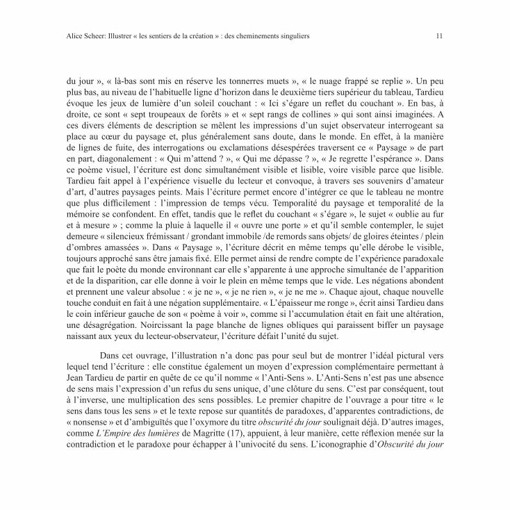
Mais dans la collection, l’ « Autre » que cherchent à approcher un certain nombre d’auteurs est avant tout « un autre moyen d’expression ». L’écriture de Jean Tardieu, par exemple, jalouse les moyens de la peinture et deux d’entre eux tout particulièrement : son immédiate expressivité et sa capacité à se défaire du sens. C’est pourquoi, les relations entre texte et image témoignent parfois des tentatives d’abolition de la frontière entre lisible et visible. On le voit notamment dans les reproductions d’une Calligraphie dédiée à un moineau mort d’Ikkyu Sojun (Tardieu 63), d’un tableau de Jean Cortot intitulé Écritures (64) datant de 1974 et figurant une langue imaginaire, ou encore dans le « poème à voir » de Jean Tardieu ayant pour titre Paysage (68-69) (fig. 1).
Ce dernier est placé sur une double page et les phrases inscrites horizontalement figurent les éléments du paysage en même temps qu’elles rendent compte de l’expérience du sujet au sein de ce décor. Le ciel est évoqué dans les coins supérieurs droit et gauche du tableau, soit à l’endroit même où le peintre le placerait sur sa toile : « demain se prépare au cœur
Fig. 1. TARDIEU, Jean. « Paysage ». Reproduction d’une double page d’Obscurité du jour. Les sentiers de la création. Genève : Albert Skira, 1972. 68-69. © Éditions Albert Skira
11
du jour », « là-bas sont mis en réserve les tonnerres muets », « le nuage frappé se replie ». Un peu plus bas, au niveau de l’habituelle ligne d’horizon dans le deuxième tiers supérieur du tableau, Tardieu évoque les jeux de lumière d’un soleil couchant : « Ici s’égare un reflet du couchant ». En bas, à droite, ce sont « sept troupeaux de forêts » et « sept rangs de collines » qui sont ainsi imaginées. A ces divers éléments de description se mêlent les impressions d’un sujet observateur interrogeant sa place au cœur du paysage et, plus généralement sans doute, dans le monde. En effet, à la manière de lignes de fuite, des interrogations ou exclamations désespérées traversent ce « Paysage » de part en part, diagonalement : « Qui m’attend ? », « Qui me dépasse ? », « Je regrette l’espérance ». Dans ce poème visuel, l’écriture est donc simultanément visible et lisible, voire visible parce que lisible. Tardieu fait appel à l’expérience visuelle du lecteur et convoque, à travers ses souvenirs d’amateur d’art, d’autres paysages peints. Mais l’écriture permet encore d’intégrer ce que le tableau ne montre que plus difficilement : l’impression de temps vécu. Temporalité du paysage et temporalité de la mémoire se confondent. En effet, tandis que le reflet du couchant « s’égare », le sujet « oublie au fur et à mesure » ; comme la pluie à laquelle il « ouvre une porte » et qu’il semble contempler, le sujet demeure « silencieux frémissant / grondant immobile /de remords sans objets/ de gloires éteintes / plein d’ombres amassées ». Dans « Paysage », l’écriture décrit en même temps qu’elle dérobe le visible, toujours approché sans être jamais fixé. Elle permet ainsi de rendre compte de l’expérience paradoxale que fait le poète du monde environnant car elle s’apparente à une approche simultanée de l’apparition et de la disparition, car elle donne à voir le plein en même temps que le vide. Les négations abondent et prennent une valeur absolue : « je ne », « je ne rien », « je ne me ». Chaque ajout, chaque nouvelle touche conduit en fait à une négation supplémentaire. « L’épaisseur me ronge », écrit ainsi Tardieu dans le coin inférieur gauche de son « poème à voir », comme si l’accumulation était en fait une altération, une désagrégation. Noircissant la page blanche de lignes obliques qui paraissent biffer un paysage naissant aux yeux du lecteur-observateur, l’écriture défait l’unité du sujet.
Dans cet ouvrage, l’illustration n’a donc pas pour seul but de montrer l’idéal pictural vers lequel tend l’écriture : elle constitue également un moyen d’expression complémentaire permettant à Jean Tardieu de partir en quête de ce qu’il nomme « l’Anti-Sens ». L’Anti-Sens n’est pas une absence de sens mais l’expression d’un refus du sens unique, d’une clôture du sens. C’est par conséquent, tout à l’inverse, une multiplication des sens possibles. Le premier chapitre de l’ouvrage a pour titre « le sens dans tous les sens » et le texte repose sur quantités de paradoxes, d’apparentes contradictions, de « nonsense » et d’ambiguïtés que l’oxymore du titre obscurité du jour soulignait déjà. D’autres images, comme L’Empire des lumières de Magritte (17), appuient, à leur manière, cette réflexion menée sur la contradiction et le paradoxe pour échapper à l’univocité du sens. L’iconographie d’Obscurité du jour
Alice Scheer: Illustrer « les sentiers de la création » : des cheminements singuliers

12 Interfaces 42 (2019-2020)
complexifie et sature ainsi le sens. Elle est un nouveau moyen pour « chercher ce qui se résout dans sa contradiction » (101). Texte et image figurent ensemble mais aussi indépendamment la réversibilité du langage et des choses2.
Les sentiers de l’illustration : montrer la création en train de se faire.
Le décalage entre texte et image peut aussi constituer un moyen de représenter la création en train de se faire, les tâtonnements, les tours et détours de la création. La portée de ces décalages devient alors plus réflexive encore.
Octavio Paz, Le Singe grammairien : création et analogie.
Le lecteur du Singe grammairien d’Octavio Paz peut, au fil des images, suivre le cheminement réel et intellectuel de l’écrivain et du dieu singe Hanuman en Inde, sur le sentier de Galta au Rajasthan. On distingue deux types d’illustrations dans cet ouvrage : celle qui figure le chemin lui-même ainsi que le temple hindou de Galta, et celle qui témoigne des réflexions et des rêveries du marcheur à propos de la création. La première série d’images – des photographies du sentier, de pèlerins, de la façade du palais de Galta, des cours intérieures du sanctuaire ainsi que des singes qui les peuplent, toutes prises par Eusebio Rojas Guzmán, secrétaire de l’auteur – rythme la progression de l’ouvrage. C’est particulièrement le rôle conféré à la photographie de la façade principale du palais, dont différents tirages sont reproduits à plusieurs reprises dans l’ouvrage. Ces images, qui renvoient à un cheminement circonstanciel et géographiquement situable, côtoient des reproductions d’origines très diverses, empruntées aussi bien à des peintres tels qu’Henri Michaux, Max Ernst, John Constable, Richard Hamilton, Jean Dubuffet ou encore Francis Bacon, qu’au patrimoine hindou (sculptures du dieu singe Hanuman, miniatures tirées du Râmâyana…). Ces deux « lignes » d’illustration s’entrecroisent tout au long du livre et reviennent, in fine à Galta.
2 Voir à ce propos et pour plus de précision, un article que j’ai consacré pour la revue en ligne Textimage à l’illustration de l’ouvrage de Jean Tardieu: Scheer, Alice. « La part des images ou le saisissement de la contradiction dans Obscurité du jour de Jean Tardieu », Textimage, Varia 5, Printemps 2016. https://www.revue-textimage.com/12_varia_5/scheer3.html.

13
Fig. 2. À gauche, Tétraèdre de cristal- Tibet, XVIIIe siècle, Collection John Dugger et David Medalla, Londres. (Photo Arts Council of Great Britain, Londres) (Tous droits réservés). Dans PAZ, Octavio. Le Singe grammairien. Les sentiers de la création. Genève : Albert Skira, 1972. 154. © Éditions Albert Skira. À droite, SIMA, Joseph. Le point Un, 1970. Huile sur toile. (65 x 54). Genève : collection Edwin Engelberts. (Photo Maurice Babey, Bâle). Dans PAZ, Octavio. Le Singe grammairien. Les sentiers de la création. Genève : Albert Skira, 1972. 155. © Adagp, Paris, 2019 .
Si l’on se concentre sur la seconde de ces deux « lignes », on remarque qu’elle compose des réseaux par similitudes de formes. La maquette de l’avant-dernier chapitre du livre (Paz 154-157) est à ce titre révélatrice : elle crée un diptyque à partir d’un tétraèdre en cristal du Tibet et d’une huile de Joseph Sima intitulée Le point Un (fig. 2). L’œil du lecteur-observateur retrouve aisément dans la toile de Sima les formes triangulaires et les arêtes du tétraèdre. Ce diptyque est ensuite prolongé, à la page suivante, par la photographie d’un autre minéral : une stibnite provenant d’une mine de Baia Sprie, en Roumanie (fig. 3). Cette dernière réunit à la fois les faisceaux issus d’un point central, que l’on trouve dans la peinture de Sima, mais qui semblent ici démultipliés, et les formes géométriques et minérales du tétraèdre. Ces rapprochements formels consacrent la création par analogies qu’Octavio Paz évoque par ailleurs dans le texte accompagnant ces images :
Alice Scheer: Illustrer « les sentiers de la création » : des cheminements singuliers

14 Interfaces 42 (2019-2020)
En abordant ces pages j’avais décidé de suivre à la lettre la métaphore du titre de la collection à laquelle elles sont destinées, Les sentiers de la création, et j’avais pensé écrire, tracer un texte qui effectivement fût un chemin et qui pût être lu, parcouru en tant que tel. À mesure que j’écrivais, le chemin de Galta s’effaçait ou bien je m’égarais et me perdais en ses défilés. À plusieurs reprises il me fallut revenir à mon point de départ. Au lieu d’avancer, le texte tournait sur lui-même.
La destruction est-elle création ? Je ne sais, mais je sais que la création est destruction. À chaque tournant le texte se dédoublait en un autre, à la fois sa traduction et sa transposition : une spirale de répétitions et de réitérations qui ont abouti à la négation de l’écriture comme chemin. Je me rends compte à présent que mon texte n’allait nulle part, sinon à la rencontre de soi-même. Je remarque également que les répétitions sont des métaphores et que les réitérations sont des analogies : un système de miroirs qui, peu à peu, ont révélé un autre texte. (156)
Fig. 3. Stibnite provenant de Baia Sprie. Collection privée, Genève (Photo Maurice Babey, Bâle). Dans Paz, Octavio. Le Singe grammairien. Les sentiers de la création. Genève : Albert Skira, 1972. 157. © Éditions Albert Skira (tous droits réservés).

15
Parce que l’écriture ne saurait s’apparenter à une progression sur un chemin direct, dont elle ne peut que détruire l’unité en multipliant écarts et détours, ces trois illustrations, plus analogiques qu’explicatives, rappellent elles-mêmes d’autres images du livre. Ensemble, elles composent un « système de miroirs » : les faisceaux présents dans le tableau de Joseph Sima ainsi que dans la stibnite de Baia se retrouvent dans une photographie de Maria-José Paz prise par l’auteur à l’observatoire de Jaipur (100), mais aussi dans une lithographie d’Odilon Redon, intitulée Vision (113)3.
Moins que d’une illustration asservie, soumise au texte, il s’agit donc plutôt, dans Le Singe grammairien d’Octavio Paz, d’une illustration qui explore le caractère analogique de la création, invitant peut-être le lecteur à imiter le cheminement de l’écrivain sur les sentiers de la création en quittant, à son tour, le fil de la lecture pour revenir sans cesse à d’autres chapitres et à d’autres illustrations.
Claude Simon, Orion aveugle : images éparses rapprochées par l’écriture
L’illustration d’Orion aveugle de Claude Simon montre, elle aussi, la création en train de se faire, mais si l’effet de décalage est plus manifeste encore dans les relations entre le texte et les images, c’est parce que les mots « possèdent ce prodigieux pouvoir de rapprocher et de confronter ce qui, sans eux, resterait épars » (Simon 9). Parfois surprenantes au moment où elles apparaissent au lecteur, les images font partie de ces choses « éparses » rapprochées par l’écriture. Les décalages témoignent autant de l’éloignement initial des mots et des choses que de leur rapprochement, au fil de la création et de la lecture. Le passage suivant évoque le chantier de construction d’un building et le panneau publicitaire qui le présente :
Immédiatement à droite est représentée une vue en élévation du gratte-ciel tel qu’il apparaîtra une fois terminé, côte à côte avec une coupe longitudinale de l’édifice permettant de voir, comme si on en avait retiré la façade, l’intérieur divisé en casiers rectangulaires accolés et entassés les uns sur les autres. Aux divers étages, dans les diverses pièces, des hommes et des femmes se tiennent assis dans des fauteuils ou derrière des bureaux, ou debout, ou encore serrés dans des ascenseurs. (55)
Le lecteur ne peut qu’être surpris lorsqu’il découvre, à la place de la coupe longitudinale évoquée dans le texte, un montage de George Brecht intitulé Repository (56) et réalisé en 1961 (fig. 4). Il s’agit d’une étagère de bois blanc contenant des casiers, des armoires et des tiroirs. Les casiers
3 Cf. p. 100 et 135.
Alice Scheer: Illustrer « les sentiers de la création » : des cheminements singuliers

16 Interfaces 42 (2019-2020)
pourraient pourtant rappeler les divers étages de l’immeuble à naître, séparés par des cloisons, mais ce sont des objets ordinaires qui s’y trouvent, et non des personnages représentés dans des attitudes de travail. Peut-être s’agit-il de souvenirs d’événements dignes d’être gardés en mémoire qui reposent ainsi dans les cases ? On y trouve en effet, de haut en bas, la figurine d’un motard placée devant une petite construction de bois blanc – possible miniature de l’édifice évoqué dans le texte –, une fiole en verre, un ensemble d’objets sphériques et colorés (ampoule bleue, boule de noël, balle de baseball signée, ballon blanc, doré et rouge, dont les étoiles rappellent celles du drapeau américain, pelote de fil blanc etc.). Plus bas encore, dans une petite case située entre deux portes d’armoires fermées, ont été placés un cœur rouge suspendu, sur lequel est gravé le nombre ou la date « 1944 », ainsi qu’un ensemble d’éprouvettes. Enfin, dans la partie inférieure de l’étagère et au-dessus de deux tiroirs fermés eux aussi, une dernière case sur le fond de laquelle ont été fixées une photographie et diverses clefs, contient un verre avec des brosses à dents, un petit miroir et une tomate en plastique. Cette dernière, imputrescible, semble faire de cette œuvre de Brecht une vanité moderne. Nous pourrions en effet rapprocher cette image d’une autre phrase tirée de la description du building : « tout (les peintures des murs et des machines, les meubles, les rideaux, les tissus des fauteuils, les vêtements et les visages des occupants) a un air pimpant, fonctionnel, imputrescible » (57). Gardien d’une mémoire individuelle ou collective à travers des objets devenus symboles, ce dépositaire a en effet quelque chose de « pimpant, fonctionnel, imputrescible » et semble voué à défier le passage du temps.
Pourtant, cette illustration laisse place, lorsque l’on tourne la page, à une œuvre qui semble avoir été appelée par « opposition ». Il s’agit d’un montage de Rauschenberg intitulé Canyon (fig. 5) et composé d’un grand panneau à la surface duquel ont été collés un morceau de taule ainsi que des lambeaux de tissus, d’affiches et de photographies grossièrement badigeonnés de peinture noire et blanche, et sur lequel est fixé un gros rapace noir empaillé. Ce dernier semble surgir du tableau : ses ailes sont « déployées » comme s’il planait, sa tête est tournée et l’inclinaison du cou est accentuée par un trait de peinture blanche. Loin de l’impeccable étagère de Brecht, cette seconde image, plus menaçante, répond en fait à la phrase qui poursuit le texte cité précédemment : « À la recherche sans doute de quelque charogne, de quelque cadavre putréfié d’animal, ses immenses ailes déployées, immobile et impondérable, un oiseau au plumage bleu-noir se laisse porter sur l’air le long des parois glacées de la montagne ». La soudaine rupture présente dans le texte est renforcée par la maquette du livre qui place à la tourne de la page le mot « oiseau » et sur la « belle page », immédiatement visible par le lecteur, la reproduction du montage de Rauschenberg. L’image semble ainsi « aimantée » par le mot, tout comme les deux

17
Fig. 5. RAUSCHENBERG, Robert. Canyon, 1959. Montage. (185,5 x 167,5 x 63). Museum of Modern Art, New York. Collection Mr. And Mrs. Michael Sonnabend (photo Museum of Modern Art, New York). Dans SIMON, Claude. Orion aveugle. Les sentiers de la création. Genève : Albert Skira, 1970. 59. © Éditions Albert Skira © Robert Rauschenberg Foundation / Adagp, Paris, 2019
Alice Scheer: Illustrer « les sentiers de la création » : des cheminements singuliers
œuvres picturales à l’origine du texte de Claude Simon, Charlene de Rauschenberg (page de titre 16-17, 49) et Paysage avec Orion aveugle de Poussin (couverture et 130-131), ont «aimanté» et nourri l’écriture. L’illustration, ici encore, loin de témoigner d’une simple soumission de l’image au texte, réfléchit le processus créateur.
Fig. 4. BRECHT, George. Repository, 1961. Montage. (102,5 x 26,5 x 7,5). Museum of Modern Art, Larry Aldrich Foundation Fund, New York (photo du musée). Dans SIMON, Claude. Orion aveugle. Les sentiers de la création. Genève : Albert Skira, 1970. 56. © Éditions Albert Skira © Adagp, Paris, 2019.

18 Interfaces 42 (2019-2020)
Interroger et représenter l’écart : seuils et vacillements
Certaines manifestations de non subordination immédiate de l’image au texte suggèrent que la réflexion sur l’écart tient une place importante dans le cheminement créateur lui-même. On l’observe notamment, et de manières très différentes, chez Roland Barthes et Yves Bonnefoy.
« Lire le recul des signes » dans les vacillements nés de l’entrelacs du texte et de l’image [Roland Barthes, L’Empire des signes]
Dans L’Empire des signes, texte et images sont comme deux lignes autonomes qui parfois se rejoignent. Le livre débute ainsi :
Le texte ne « commente » pas les images. Les images « n’illustrent » pas le texte : chacune a été seulement pour moi le départ d’une sorte de vacillement visuel, analogue peut-être à cette perte de sens que le Zen appelle un satori ; texte et images, dans leur entrelacs, veulent assurer la circulation, l’échange de ces signifiants : le corps, le visage, l’écriture, et y lire le recul des signes. (Barthes 7)
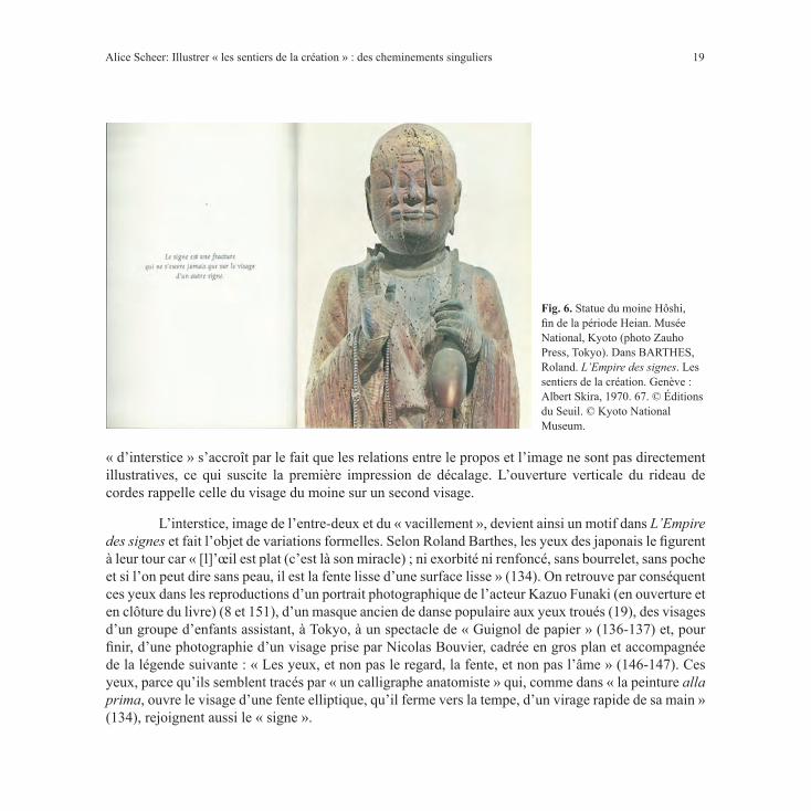
Le décalage entre texte et image rejoue le vacillement éprouvé face aux images, né de l’absence de fixité dans le rapport entre signifié et signifiant. Le signe peut alors s’ouvrir sur un autre signe. Roland Barthes voit dans la statue du moine Hôshi (fig. 6) (67) une expression de cette « fracture du signe » : son visage s’ouvre en effet étrangement sur un autre visage4 tout comme le signe ne retient pas le signifié et s’ouvre sur un autre signe.
Il peut paraître surprenant qu’un chapitre consacré à la tempura, type de friture des aliments, soit illustré par un rideau de cordons que traverse un personnage (fig. 7), reproduction de la partie droite d’un paravent. Mais il peut s’agir en fait de l’image même, quoique retardée, de la circulation des signifiants évoquée dans le préambule. De plus, ce qui lie l’image et le texte peut être l’idée de légèreté et de fragilité de la tempura que Roland Barthes apparente, par rapprochement thématique, à quelque chose qui tient « du léger, de l’aérien, de l’instantané, du fragile, du transparent du frais, du rien mais dont le vrai nom serait l’interstice sans bords pleins, ou encore : le signe vide » (38). L’image est renommée « L’interstice », qui est aussi le titre du chapitre : elle montre un espace de transition, de passage d’un lieu à un autre, suggère la possibilité d’une ouverture sur le vide. Enfin, l’impression
4 Cette statue datant de l’ère Heian (794-1185) représente le moine Baozhi d’où émerge Avalokitesvara, incarnation totalisante des onze précédents bodhisattva.
19
Fig. 6. Statue du moine Hôshi, fin de la période Heian. Musée National, Kyoto (photo Zauho Press, Tokyo). Dans BARTHES, Roland. L’Empire des signes. Les sentiers de la création. Genève : Albert Skira, 1970. 67. © Éditions du Seuil. © Kyoto National Museum.
« d’interstice » s’accroît par le fait que les relations entre le propos et l’image ne sont pas directement illustratives, ce qui suscite la première impression de décalage. L’ouverture verticale du rideau de cordes rappelle celle du visage du moine sur un second visage.
L’interstice, image de l’entre-deux et du « vacillement », devient ainsi un motif dans L’Empire des signes et fait l’objet de variations formelles. Selon Roland Barthes, les yeux des japonais le figurent à leur tour car « [l]’œil est plat (c’est là son miracle) ; ni exorbité ni renfoncé, sans bourrelet, sans poche et si l’on peut dire sans peau, il est la fente lisse d’une surface lisse » (134). On retrouve par conséquent ces yeux dans les reproductions d’un portrait photographique de l’acteur Kazuo Funaki (en ouverture et en clôture du livre) (8 et 151), d’un masque ancien de danse populaire aux yeux troués (19), des visages d’un groupe d’enfants assistant, à Tokyo, à un spectacle de « Guignol de papier » (136-137) et, pour finir, d’une photographie d’un visage prise par Nicolas Bouvier, cadrée en gros plan et accompagnée de la légende suivante : « Les yeux, et non pas le regard, la fente, et non pas l’âme » (146-147). Ces yeux, parce qu’ils semblent tracés par « un calligraphe anatomiste » qui, comme dans « la peinture alla prima, ouvre le visage d’une fente elliptique, qu’il ferme vers la tempe, d’un virage rapide de sa main » (134), rejoignent aussi le « signe ».
Alice Scheer: Illustrer « les sentiers de la création » : des cheminements singuliers

20 Interfaces 42 (2019-2020)
Fig. 7. Le rideau de cordons (Nawa-noren) – partie droite d’un paravent, première moitié du XVIIe siècle. Encre de chine et peinture sur papier avec application de feuilles d’or, 159,6 x 90,3 cm). Collection Taki Hara, Tokyo (photo Hans-D. Weber, Cologne) (tous droits réservés). Dans BARTHES, Roland. L’Empire des signes. Les sentiers de la création. Genève : Albert Skira, 1970. 36. © Éditions Albert Skira.

21
Ces rapprochements pourraient rappeler la création par analogies observée chez Octavio Paz. Pourtant, leurs approches sont essentiellement différentes. Le signe japonais ne retient pas le signifié, ne fixe pas l’essence des choses mais c’est là, justement, ce qui fait, pour Roland Barthes, sa valeur. Il n’y a pas, dans cette expérience, de « destruction » par la création ni de drame mallarméen d’une insaisissable essence. Le vide et l’écart ne constituent pas une absence mais un satori (qui est l’événement zen, une expérience de « vacillement » de la connaissance et du sujet) et s’apparentent plutôt au Mu, signe du vide dans le bouddhisme zen également reproduit dans les premières pages du livre (12). C’est l’expression et l’expérience de ce vide singulier que fait Roland Barthes au contact de ce qu’il nomme signes.
Yves Bonnefoy, L’Arrière-Pays : au « seuil » des mots et des images
L’héritage d’Yves Bonnefoy n’est pas structuraliste et l’expérience qu’il fait de l’écart, du décalage et de l’entre-deux et dont il rend compte, lui aussi, à travers des décalages entre texte et images, est très différente, voire opposée à celle de Barthes, puisqu’il s’agit d’une expérience de l’absence. « L’Arrière-pays » est un ailleurs qui se devine ici mais en tant qu’il semble toujours échapper. C’est la promesse d’un ailleurs harmonieux, où mots et choses coïncideraient, et de la négation presque immédiate de cette promesse. Les carrefours et les seuils sont les lieux où Bonnefoy fait cette expérience car les chemins s’y rejoignent et s’y séparent, simultanément.
L’illustration singulière de l’ouvrage rejoue cette expérience à plusieurs niveaux. Des phrases tirées du texte servent toujours de légendes aux images, mais elles ne sont que rarement issues des pages qui les précèdent ou qui les suivent. La page est toujours indiquée, comme une invitation à revenir en arrière ou à sauter quelques pages. Il se crée donc un décalage et l’image semble alors illustrer deux passages à la fois. Ainsi, au moment où le détail d’une crucifixion d’Arcangelo di Cola da Camerino est reproduit (fig. 8), il illustre en quelque sorte deux passages de l’œuvre : celui dans lequel il s’insère et celui dont est tiré la légende.
Dans les pages précédant l’illustration, Yves Bonnefoy revient sur un livre qu’il avait projeté d’écrire à propos d’un voyageur qui « reparcourrait son chemin » raisonnant sur des œuvres contemplées par l’auteur lui-même en Toscane, à Arezzo (Bonnefoy 82). À la fin du texte, le voyageur devait pénétrer dans une orangerie et retrouver un inconnu rencontré quelque temps auparavant à Florence :
L’inconnu est là sur le seuil à regarder l’horizon. L’air vibre de résurrection au-dessus de la pierre sèche. (96)
Alice Scheer: Illustrer « les sentiers de la création » : des cheminements singuliers

22 Interfaces 42 (2019-2020)
C’est la reprise du mot « seuil », qui crée l’écho et rappelle un autre passage lu vingt pages auparavant. Il y était en effet question de la Madone d’Arcangelo di Cola di Camerino, qui compose, avec cette crucifixion, un diptyque, contemplée par Bonnefoy dans le Burlington magazine : « je me disais, qui est plus que lui sur le seuil, faut-il que je parte à Camerino, pour les derniers pas sur le chemin ? » (75). L’œuvre citée dans le texte n’arrive donc que bien plus tard, retrouvée par l’imagination poétique. Le retard d’insertion de la reproduction permet de réunir ces deux passages. Mais un deuxième terme explique aussi le surgissement du souvenir de l’œuvre du florentin à cet endroit : « résurrection » (« L’air vibre de résurrection »). L’inconnu, dans le livre projeté, est au seuil de deux mondes tout comme l’est le Christ, au seuil du monde des vivants et du monde des morts, de l’Humanité et de la Divinité. Ni mort encore, ni ressuscité mais sur le point d’accomplir le verbe divin. Ce n’est pourtant pas le Christ que l’on voit dans ce détail de cette peinture, reproduite en monochrome, car on le devine seulement, en haut à droite. L’image est centrée sur un ange qui tend un calice devenu presque invisible, afin de recueillir le sang du Christ dont on distingue quelques sombres gouttes. Il détourne le regard
de cet objet ainsi que de la Passion pour regarder, probablement, les hommes en contrebas. C’est ce ciboire, visible en pointillé seulement, qui révèle un sacrifice en train de s’accomplir et qui ne saurait être qu’entrevu, le spectateur voyant ce que l’ange ne peut contempler. Le décadrage permet d’insister sur ce mystérieux transfert. L’expression du visage de l’ange se substitue à celle du Christus dolens désormais hors cadre invitant ainsi à considérer un autre transfert, quant à lui irreprésentable : le sacrifice du christ, mourant pour que les hommes, à leur tour, puissent ressusciter.
Fig. 8. Arcangelo di Cola da Camerino (actif, 1416-1429), Crucifixion, détail d’un diptyque. Huile. Collection Helen C. Frick, Pittsburgh. Dans BONNEFOY, Yves. L’Arrière-pays. Les sentiers de la création. Genève: Albert Skira, 1972. 97. © Éditions Gallimard. © Frick Art & Historical Center, Pittsburgh.

23
Enfin, après l’ange, le Christ et l’inconnu, c’est l’écrivain lui-même qui se trouve sur le « seuil ». Le poète, revenant sur « les sentiers de la création », retrouve alors dans ce livre consacré à un voyageur, la trace d’un précédent « roman », l’Ordalie, brûlé quelques temps auparavant. La suite du passage dit en effet :
[…] je dois reconnaître que c’est à nouveau, dans ces dédoublements, ces quatre présences [le voyageur, une femme qui se dédouble, l’inconnu] où une cinquième n’est pas sans interférer en vibrant comme l’air dehors, L’Ordalie, le « roman » que j’avais écrit puis détruit trois ou quatre années avant parce que ces bifurcations, ces décompositions prismatiques étaient certes irréductibles à toute psychologie, toute vraisemblance, se retirant comme une eau de l’écriture finie. (98)
Ce détail de la Crucifixion illustre donc non seulement et indirectement le titre de ce précédent texte, L’Ordalie (le jugement de Dieu), mais aussi le fait même d’entrevoir dans une œuvre récente, les traces d’une œuvre plus ancienne. L’ « arrière-pays » d’Yves Bonnefoy n’est pas seulement un lieu idéal, un ailleurs promis ici, il est peut-être aussi la manifestation dans l’œuvre présente ou reparcourue de précédents cheminements créateurs. C’est cela que permet de suggérer l’illustration « retardée ».
Finalement, les auteurs évoqués dans cette étude se sont saisis de ce principe de commande original proposé par Albert Skira (mêler les mots et les images pour rendre compte de leur cheminement créateur) pour en faire un moyen d’expression complémentaire et singulier entrant en dialogue avec le texte. L’iconographie n’est, dans ces ouvrages, ni descriptive, ni redondante mais signifiante. Elle transpose la réflexion menée dans le texte, la nuance parfois, la complexifie souvent. Albert Skira était réputé pour ses illustrations narratives, surprenantes, qui dramatisent le propos. Mais les écarts observés entre le texte et l’image montrent bien que la fonction de l’illustration n’est pas, dans cette collection, uniquement « narrative » mais qu’elle prend part au cheminement créateur. Plus qu’un contrepoint et une traduction visuelle du propos développé, elle est un moyen à part entière d’interrogation et de représentation d’un cheminement créateur singulier. Et c’est souvent des décalages et des écarts entre le texte et l’image que naît cette force d’interrogation.
Alice Scheer: Illustrer « les sentiers de la création » : des cheminements singuliers

24 Interfaces 42 (2019-2020)
Ouvrages cItés
BARTHES, Roland. L’Empire des signes. Les sentiers de la création. Genève : Albert Skira, 1970.
BONNEFOY, Yves. L’Arrière-pays. Les sentiers de la création. Genève : Albert Skira, 1972.
LE CLÉZIO, J-M. G. Haï. Les sentiers de la création. Genève : Albert Skira, 1971.
PAZ, Octavio. Le Singe grammairien. Les sentiers de la création. Genève : Albert Skira, 1972.
SIMON, Claude. Orion aveugle. Les sentiers de la création. Genève : Albert Skira, 1970.
TARDIEU, Jean. Obscurité du jour. Les sentiers de la création. Genève : Albert Skira, 1974.
Œuvres cItées
CORTOT, Jean. Ecritures. Toile acrylique. 1974. Collection Jean Tardieu (photo Jacqueline Hyde). Dans TARDIEU, Jean. Obscurité du jour. Les sentiers de la création. Genève : Albert Skira, 1974. 64.
MAGRITTE, René. L’Empire des lumières. Huile sur toile. 1854. Musées Royaux des Beaux-Arts de Belgique, Bruxelles (photo du musée). Dans TARDIEU, Jean. Obscurité du jour. Les sentiers de la création. Genève : Albert Skira, 1974. 17.
POUSSIN, Nicolas. Paysage avec Orion aveugle. Huile. 1658. Metropolitan Museum of Art, New York. Fletcher Fund, 1924 (photo Henry B. Beville, Alexandria, Va.). Dans SIMON, Claude. Orion aveugle. Les sentiers de la création. Genève : Albert Skira, 1970. 130-131.
Publicité pour les eaux minérales Perrier (Langelan & Cerf, photo J. C. Dewolf), publicité pour les radiateurs en fonte Ideal Standard (Mesmer promarket, photo Mardyks), Le vieux Léon (photographie Marina Le Clézio). Dans Le Clézio, J-M. G. Haï, Les sentiers de la création. Genève : Albert Skira, 1971. 136-137.
RAUSCHENBERG, Robert. Charlene, détails. Collage. 1954. Stedelijk Museum, Amsterdam (photo du musée). Dans SIMON, Claude. Orion aveugle. Les sentiers de la création. Genève : Albert Skira, 1970. 16-17. 49.
SOJUN, Ikkyu. Calligraphie dédiée à un moineau mort. Encre sur papier. Rouleau vertical. Collection Hatakeyama, Tokyo (photo Hatakeyama). Dans TARDIEU, Jean. Obscurité du jour. Les sentiers de la création. Genève : Albert Skira, 1974. 63.

25
PROMENADES POÉTIQUES ET DAGUERRIENNES—BELLEVUE : PHOTOGRAPHY AND NARRATION
Margaret Fields DentonUniversity of Richmond in Richmond, Virginia
Abstract
Louis-Auguste Martin’s Promenades poétiques et daguerriennes--Bellevue, a brochure length work that was published in 1850, was regarded at the time as the first publication in France to combine text with photographs. Martin was both author of the poem, which recounts a weekend trip to a village near Paris, and maker of the seven paper photographs inserted between the lines of the poem. His choice of title points to his intention to situate his work within the literary tradition of the Promenade. However, Bellevue is not only a promenade poétique, but also a promenade daguerrienne which signals that the images are not mere illustrations but participants in the narration of the Promenade. This essay argues that while adheres in many ways to the conventions of the Promenade, the insertion of photographs problematizes a key element of the genre, which is the tension between the immediacy of impressions as they are experienced during the activity of travel or walking, and the subsequent composition of these impressions.
Résumé
La courte brochure Promenades poétiques et daguerriennes—Bellevue de Louis-Auguste Martin, publiée en 1850, fut considérée en son temps comme le premier ouvrage en France mêlant texte et photographies. Martin était l’auteur du texte poétique, qui relate une sortie du dimanche aux environs de Paris, et l’auteur des sept photographies insérées dans le poème. Le choix du titre montre qu’il tenait à s’inscrire dans la tradition littéraire de la Promenade. Pourtant, Bellevue n’est pas qu’une promenade poétique, c’est aussi une promenade daguerrienne, qui témoigne que les images ne sont pas seulement des illustrations du texte mais participent pleinement au récit. Cet article avance que, tout en respectant à certains égards les conventions de la Promenade, le récit par l’inclusion des photographies exprime la tension inhérente à ce genre, à savoir celle qui a lieu entre l’immédiateté des impressions telles qu’elles sont ressenties lors de la marche ou du déplacement, et la recomposition de ces impressions par la suite.

26 Interfaces 42 (2019-2020)
The 1865 edition of Louis Gustave Vapereau’s Dictionnaire universel des contemporains identifies Louis-Auguste Martin (1811-1875) as both littérateur and sténographe (1198). As a stenographer Martin was attached to the Collège de France and the Sorbonne, and later the National Assembly. He authored several books on the mores of ancient and modern societies, some of which are listed in Vapereau’s Dictionnaire. There is no mention of his three Promenades poétiques et daguerriennes that were published beginning in 1850.5 They were perhaps omitted because the Promenades were brochures less than twenty pages in length. Another reason may be their atypical combination of text and image for they are poems with paper photographs inserted between their lines.6 This format is unique. Martin was both a writer and an early experimenter of paper photography. In 1851, the writer and critic Francis Wey hailed Martin’s Promenades as the first publications in France illustrated by photography and thus a harbinger of the medium’s future (104).
Elsewhere I have examined Bellevue (fig. 1), the first of Martin’s Promenades, in the context of the aims of the Société héliographique which was founded in Paris in January of 1851 to promote the progress of photography. Martin was an active member of the society that in early 1851 was occupied with the perfection of paper processes and the establishment of a photographic printing firm in France.7 Here, I want to consider Bellevue in relation to the Promenade as a literary form and to examine the idea that the photographs are extensions of the text. Martin’s choice of title clearly points to his intention to situate his work within the tradition of the Promenade; however, Bellevue is not only a Promenade poétique but a Promenade daguerrienne. It is my contention that while Bellevue does adhere in many ways to the conventions of the Promenade in the France of the first half of the nineteenth century, the inclusion of the seven photographs problematizes a key element of the genre: the tension between the immediacy of impressions as they are experienced during the activity of travel or walking, and the
5 Promenades poétiques et daguerriennes – Bellevue was published in 1850. Martin published the other two brochures in 1851. Promenades poétiques et daguerriennes—Chantilly included six photographs on paper, and Promenades poétiques et daguerriennes — Enghien-Les-Bains had six photographs as well.
6 The title is confusing to the reader familiar with the fact that daguerreotypes are unique images on a metal support. Martin’s use of “daguerriennes” points to a period of transition in French photography when many practitioners were turning from daguerreotypes to paper processes. Antoine Claudet, a daguerreotypist in England, states in 1851 that the French at that time used the term “daguerréotype sur papier” (daguerreotype on paper) to refer to paper photographs. See “Société héliographique. Séance du 4 avril,” La Lumière no. 11 (20 avril 1851): 42.
7 See Margaret Denton, “Louis-Auguste Martin’s Promenades poétiques et daguerriennes – Bellevue,” History of Photography 35, no. 3 (August 2011): 207-220.

27
Fig. 1. Louis-Auguste Martin (1811-1875), Cover of Promenades poétiques et daguerriennes – Bellevue, 1850. Paper photograph, 19.0 x 12.5 cm. Paris: Bibliothèque nationale de France.
Margaret Fields Denton: Promenades poétiques et daguerriennes—Bellevue : Photography and Narration

28 Interfaces 42 (2019-2020)
subsequent composition of these impressions. In Quand le Voyage devient Promenade (2011), Philippe Antoine notes that in most cases it is understood that the traveler’s account, which generally conforms to the chronology of his journey, is completed only when he returns home (40). It is not possible, he says, to synchronize the narrative of the voyage with its content or what is being narrated (61). Antoine’s book examines French writers’ accounts of their voyages in the first half of the nineteenth century that foreground characteristics of the Promenade such as authenticity and spontaneity. In fact, these writings display what Antoine refers to as a “rhetoric of spontaneity,” a term that Wendelin Guentner utilizes to describe a mode of writing associated with nineteenth century accounts of voyages that is characterized by discontinuity and incompleteness (Guentner 13). Both Guentner and Antoine identify various strategies authors use to maintain the rhetoric of spontaneity and to mask the gap between experiences and their retelling. These include interjections, auto-corrections, and a seeming disorder of the text, among others. Martin’s text employs some of these efforts to achieve a rhetoric of spontaneity, but it is his photographs that effectively diminish the perceived distance between the experience of the promenade and its relation, the Promenade. The photographs testify to the presence of the author at a specific place, which provides the reader with proof of Martin’s encounter with the world. Such evidence was expected from the Promenade (Antoine 21). They also are evidence of a specific moment in the promenade when the author seemingly stopped, with a camera, to note his impressions. The photographs therefore reference the past, yet their compelling qualities allow the reader/viewer to imagine themselves there in the present. This ability to imagine being present at the places Martin visits is facilitated by the visual clarity of the photographic image, due in a large part to its detail. Text and images treat the same subjects but the photographs resist being illustrations; they fail to map onto the text because of the excess of detail. I suggest that in this visual excess, which is a fundamental quality of photographs as opposed to other mediums such as wood engravings, lies the potential for the reader/viewer to imagine narrative fragments of their own.
In Bellevue, Martin narrates a holiday spent with his wife in a village some ten kilometers southwest of Paris. As Antoine reminds us, not only is pleasure or some form of contentment the primary goal of the promenade, it is the disposition of the promeneur rather than the place that defines the Promenade (15, 11). Martin does mention his companion, but Bellevue is his account of what he calls “mes errantes pensées” (my wandering thoughts) (13). He mentions the books he has with him that he finds conducive to his wanderings: “Un Lamartine ou bien un Jean-Jacque [sic] [. . . ]” (13). He also mentions the materials with which to record his experiences: “du papier, un daguerréotype”

29
(3).8 Martin begins his poem by describing the desire to escape the bustling and noisy city. Soon after the train leaves Paris he is relieved to breath purer air and attentively takes in the countryside. The arc of the train’s path from Paris to Versailles via the Left Bank and the stations it served were mapped out for the traveler, situating him within a prescribed route (fig. 2). Martin makes out the distinct features of the places marked on the map even as they quickly slip by: the fort of Vanves on the right, Issy behind it, and on the left Clamart hidden in the trees (fig. 3). Soon a whistle rings out, the train slows, then stops, and a voice cries out: Bellevue! Inserted below these lines announcing the arrival of the train in Bellevue is a photograph of the train tracks leading to the station (fig. 4). The attempt to visually capture the moment of arrival carries with it the attendant dislocation of train travel that Martin addresses in his verses. Once installed in his lodgings in Bellevue, Martin looks through a window to see Paris in the distance. This prompts him to consider that just a few hours earlier he was there amidst the din of the city trying to avoid the horses and carriages roaring by, and now the only sound he hears is a fly buzzing around a flowering tree. He is keenly aware that the modern city beyond, and the countryside surrounding it, are inextricably linked, in part because of the railroad, and muses about the possibility of a life in Bellevue that would offer him tranquility yet enable him to easily reach the city when necessary.
8 “Daguerréotype” here refers to the instrument or the camera rather than the process.
Fig. 2. Lemercier, Bernard et Cie. Chemin de fer de Paris à Versailles (rive gauche de la Seine).Carte générale, 1838. 106.0 x 62.0 cm. Paris: Bibliothèque nationale de France.
Margaret Fields Denton: Promenades poétiques et daguerriennes—Bellevue : Photography and Narration

30 Interfaces 42 (2019-2020)
The train and its predetermined route are not conducive to the aleatory nature of the promenade. Only when Martin explores Bellevue and its surroundings on foot does this aspect emerge. Walking along a path near the Bellevue station, Martin comes across the small chapel of Notre Dame des Flammes (fig. 1). As in many Romantic accounts of voyages/promenades, encounters with monuments often give rise to philosophical musings, many of them reflections about time and human destiny. For Martin this chapel stands as a reminder of the sudden, tragic loss of human life and the destructive power of the machine. The chapel was erected in memory of those who died in a railway disaster that occurred nearby in 1842. The accident happened on a Sunday when the train, filled with passengers returning to Paris from Versailles, derailed moments after passing Bellevue. Over fifty people died and more than a hundred people were severely hurt. The event, which was the first significant railway disaster in France, traumatized the entire country as witnessed by the many detailed accounts of the accident and several poems that were published in the aftermath. These accounts describe the horror of men, women, and children asphyxiated, incinerated and crushed to death. Martin chose to put the photograph of the chapel on the cover of Bellevue and inserted it in the text where he speaks of those who innocently pursued pleasure and unexpectedly found death.
Fig. 3. Chemin de fer de Paris à Versailles (rive gauche de la Seine). Carte générale. Detail.

31
Fleeing the funerary monument and the melancholy thoughts it engenders, Martin follows the turning path and comes upon a striking view of the Seine enclosing Boulogne in an arc (fig. 5). The lines of verse under the image refer directly to his taking the photograph:
Je braque ma lunette, et tout le paysage/Sur le papier, soudain, incruste son image;/Je l’emporte aussitôt, comme un bien dérobé,/Et dans mon cabinet, un instant absorbé,/Je prépare l’épreuve à passer, belle et fière,/De la lampe blafarde à la grande lumière. (I aim my lens, and the entire landscape suddenly encrusts its image on the paper; I take it straight away, like a stolen object, and in my study, I am for a moment absorbed in preparing the beautiful and proud negative to pass from the pale lamp to the bright light) (11-12).9
Martin here is in essence writing with light: héliographie. As Antoine notes, authors often make reference to writing or to taking notes during their travels in an effort to narrow the gap between the actual experience of travel and the later composition of the Promenade. In Bellevue this tension between the present and the past is heightened because while Martin’s poem points to a post-promenade composition, the photographs claim to be consonant with the activity of the promenade. Martin’s photograph of the Seine and his verses suggest that he was trying to visually match the immediacy and the spontaneity of suddenly coming upon the view. “Suddenly” is the word he uses to describe the rapidity with which the photographic image was made. While no photograph in 1850 was instantaneous, often this was the word used to describe the immediacy with which the image, as opposed to a drawing for example, was made.10 The photograph, understood as an image that encapsulates a specific moment, foregrounds a concept of time that, in the mid-nineteenth century, shaped human experience. The public was increasingly aware that precise timekeeping was replacing solar time, a move that was greatly spurred by the introduction of train travel in the 1840s (Zerubavel 6). Visitors to Bellevue, for example, were obliged to consult train schedules posted in stations or published in guidebooks such as Forgame’s Voyage pittoresque sur le chemin de fer de Paris à Versailles par la rive gauche de la Seine of 1840.
9 Gustave Le Gray, a photographer who, like Martin, was a member of the Société héliographique in early 1851 published a photography manual in which he defined several terms including épreuve. For Le Gray épreuve could refer to either the negative or the positive. He explicitly states that the positive is produced by exposure to the sun. Martin’s refers to preparing his épreuve in dim light. Gustave Le Gray, Nouveau Traité théorique et pratique de photographie sur papier et sur verre (Paris: 1851): 14.
10 The technical demands of making a photograph in 1850 – setting up a tripod, making the exposure, and developing the negative – would necessitate a certain amount of time. Exposure times varied widely, from seconds to minutes depending upon weather and light conditions, the lenses used, and the quality of the paper.
Margaret Fields Denton: Promenades poétiques et daguerriennes—Bellevue : Photography and Narration

32 Interfaces 42 (2019-2020)
Fig. 4. Louis-Auguste Martin (1811-1875), Arrival at Bellevue Station, page 4 of Promenades poétiques et daguerriennes – Bellevue, 1850. Paper photograph, 6.5 x 7.5 cm. Paris: Bibliothèque nationale de France.

33
By the early 1850s photographic images were routinely thought of as tethered to the specific moments they preserved. The writer Pierre-Henri de Lacretelle articulates this linkage in his 1853 statement that photography is the “le prolongement indéfini du regard” (the indefinite prolongation of the look) (25). And because the photograph was able to preserve the photographer’s look, it enabled viewers to partake of that moment in their imaginations.
Those writing about the experience of looking at photographs, whether conscious or not, often utilized the rhetorical figure of hypotyposis to convey this ability to imagine being in the place pictured in the photograph. In his book on rhetorical figures published in 1827, Pierre Fontanier calls this a figure of style by imitation and defines it in terms of painting images:
[. . .] d’une manière si vive et si énergique, qu’elle les met en quelque sorte sous les yeux, et fait d’un récit ou d’une description, une image, un tableau, ou même une scène vivante (in a manner so lively and energetic, that in a way it places them before one’s eyes, and turns an account or a description into an image, a picture, or even a living scene) (188).
Writings on the Diorama in the 1820s, aesthetic discourse in the 1830’s, and accounts of early photography all point to the use of hypotyposis as a means of describing how the viewer’s experience of seeing is amplified to the point that they can imagine moving through the spaces depicted. In 1839 the art critic and writer Jules Janin published two articles, one on the daguerreotype and one on landscape painting, that draw upon descriptions of the spectator’s experience of the Diorama. His article on the daguerreotype appeared early in 1839 before the public had seen examples of Daguerre’s invention. To convey the qualities of the small, detailed image on metal he implicitly links it to the illusionistic qualities of the Diorama. Janin reminds his readers of how the Diorama allows them to enter into the spaces depicted whereas before they only saw the surfaces of paintings:
Vous avez pénétré à sa suite [Daguerre] dans les vieilles églises en ruines; vous avez gravi la montagne, descendu le vallon; vous avez parcouru les fleuves et les mers; l’enchanteur vous a promené sans fatigue dans les plus curieuses capitales [. . . ] (You have followed him [Daguerre] into old churches in ruins; you have climbed the mountain, descended the valley; you have made voyages on rivers and seas; the enchanter [Daguerre] has taken you to the most curious capitals without fatigue) (Janin, “Le Daguerotype”145).
A few months later Janin published his review of the annual Salon in which he described the work of contemporary French landscape painting in much the same way as he described the Diorama, that is,
Margaret Fields Denton: Promenades poétiques et daguerriennes—Bellevue : Photography and Narration

34 Interfaces 42 (2019-2020)
by highlighting the viewer’s ability to imagine being there. Referring to the landscapes of the painter Jules Dupré, Janin reassures his readers that:
Vous pouvez-vous asseoir au pied de ces arbres, l’arbre ne sera pas brisé; vous pouvez marcher dans ces allées sablées, l’allée n’enfoncera pas sous votre marche; vous pouvez vous plongez dans ce lac, l’eau est limpide et profonde […] (You can sit at the foot of these trees, the tree will not break; you can walk along these sandy paths, the path will not sink beneath your step; you can dive into this lake, the water is clear and deep) (Janin, “Salon” 269).
Descriptions of this mode of looking, in which the viewer imagines ‘being there,’ were in France in the years around 1850, carried over into descriptions of photographs.
Photographs taken during travels to places both near and far were particularly conducive to stimulating imagining being there. The photographic album became popular in the early 1850s beginning in 1852 with Maxime du Camp’s Egypte, Nubie, Palestine et Syrie. It contained one hundred and twenty-five photographs that were separate from the introductory and explanatory texts. The idea that these photographs could amplify or enhance what Maynard calls “imagining or visualizing activities” (83) is addressed by Ernest Lacan, contributor to and editor of La Lumière, a weekly publication devoted to photography. In an article published in 1855 in Le Moniteur universel, the official newspaper of the Empire, he writes:
Vous êtes dans votre cabinet de travail, accoudé sur l’appui de votre fenêtre. C’est l’été. Votre regarde cherche, au-dessus des maison qui vous entourent de tous côtés, le coin de ciel bleu qui est tout votre horizon; et vous songez qu’il y a, sous ce même ciel dont vous ne voyez qu’un lambeau, de riantes campagnes où l’oeil se perd dans les lointaines perspectives, où la poitrine se dilate, où la pensée se transforme et s’épure, où l’âme se plonge dans les profondeurs de la rêverie, [. . .]Vous songez que vous pourriez être là au lieu d’être ici. [. . . ] Attendez! . . . Est-ce que la photographie n’est point là? . . . Ouvrez cet album[. . ..] (You are in your study, leaning on your elbows at the window. It is summer. Above the houses that surround you, you search for that corner of blue sky that is your entire horizon; and you reflect that beneath this same sky of which you see only a bit are pleasant landscapes where the eye is lost in distant perspectives, where the chest swells, where thought is transformed and refined, where the soul is immersed in the depths of reverie, [ . . .] You dream that you could be there instead of here. [. . .] Wait! . . . . Is not photography there?. . . Open this album) (1).
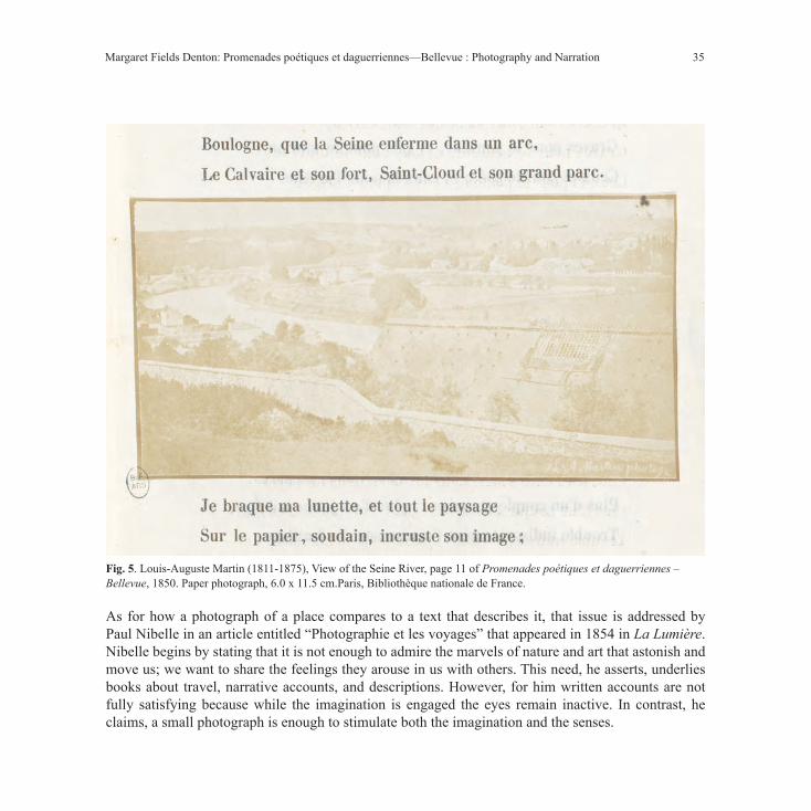
35
As for how a photograph of a place compares to a text that describes it, that issue is addressed by Paul Nibelle in an article entitled “Photographie et les voyages” that appeared in 1854 in La Lumière. Nibelle begins by stating that it is not enough to admire the marvels of nature and art that astonish and move us; we want to share the feelings they arouse in us with others. This need, he asserts, underlies books about travel, narrative accounts, and descriptions. However, for him written accounts are not fully satisfying because while the imagination is engaged the eyes remain inactive. In contrast, he claims, a small photograph is enough to stimulate both the imagination and the senses.
Margaret Fields Denton: Promenades poétiques et daguerriennes—Bellevue : Photography and Narration
Fig. 5. Louis-Auguste Martin (1811-1875), View of the Seine River, page 11 of Promenades poétiques et daguerriennes – Bellevue, 1850. Paper photograph, 6.0 x 11.5 cm.Paris, Bibliothèque nationale de France.
36 Interfaces 42 (2019-2020)
Avec quelques carrés de métal ou de papier sous les yeux, j’ai parcouru des forêts immenses, j’ai entrevu des lointains ravissants, j’ai entendu chanter les oiseaux dans les arbres, j’ai gravi de nouveau les flancs abruptes et sauvages des montagnes, j’ai recommencé les voyages que j’avais faits [sic], j’ait fait ceux que je veux faire un jour.(Looking at a few squares of metal or paper, I have travelled to immense forests, glimpsed ravishing distances, heard birds singing in the trees, climbed again steep and wild mountain slopes, I began again the voyages I had made, I did those that I want to do one day) (139)
Nibelle proposes that the writer replace his pen with a camera because, he insists, in a photograph only a few centimeters in size one may find a complete poem. Martin’s strategy in Bellevue is not to replace the text with photographs but to combine the two. This raises the question about the nature of the relationship between text and photographs within the context of the poem’s narration.
Martin’s Bellevue, of course, is not the first work to combine photographs with text. William Henry Fox Talbot’s The Pencil of Nature (1844-46), which Martin certainly knew, claims this honor. Like Martin, Talbot is both author of the text and maker of the photographs. The two works differ, however, in the presentation of the photographs, the type of text and the ways in which the photographs are linked to it. The twenty-four photographs in Talbot’s six fascicles are referred to as “Plates” and presented as “Illustrations.” Each is framed by a simple ruling in brown ink. Inside this frame, in the lower right corner, is an identifying number. This number corresponds to the plate number that accompanies the title of the photograph. The photographs are placed opposite the texts that refer to them. Many of the photographs are horizontal images, but in the fascicles they are oriented vertically and thus the reader is obliged to rotate the fascicle in order to see the photographs properly. Also, it is thought that there were interleaves or guard tissues placed between the image and the facing page, which would also have made it difficult to look at both image and text together.11 Talbot’s texts in general serve as an inventory of the possible applications of his paper process and include technical information. As Carol Armstrong comments, “in each case it is the text that ‘illustrates’ the image, rather more than the other way around” (125).
Martin’s text – a promenade in poetic form – is quite different from Talbot’s as is the relationship between text and image. Martin’s insertion of the photographs without titles and without captions between the lines of his poem aligns them with the format of the page. This mode of inserting images into the text would have been familiar to French readers at the time. A new type of wood engraving,
11 Larry Schaaf, email to author, October 4, 2017. Professor Schaaf is Director of the William Henry Fox Talbot Catalogue Raisonné, an online resource at Oxford University’s Bodleian Libraries.

37
Fig. 6. Champin, Cover of Album Champin: vues pittoresques du chemin de fer de Paris à Orléans,1840. Bibliothèque municipale de Saint-Pierre-des-Corps.
Margaret Fields Denton: Promenades poétiques et daguerriennes—Bellevue : Photography and Narration
38 Interfaces 42 (2019-2020)
which developed in France in the 1830s, permitted the printing of both image and typography on the same page.12 The historian Maurice Samuels comments that this page layout “breaks down the barrier between the visual and the verbal” (77). The elimination of the plate mark and the manner in which the wood engraved image fades towards its edges facilitates what Samuels describes as an almost seamless transition from text to image and back again to text. The reader, he says, is able “to assimilate both levels of content, the graphic and the scriptural, simultaneously and, as it were, effortlessly” (77). He refers to the way in which they work together as “a symphonic signification in which parallels--and disjunctures--between image and text register simultaneously” (77). Despite the mention of disjuncture Samuels insists “the visual acts as a comprehension aid by immediately translating the text into a more accessible form” (77). In Bellevue the insertion of photographs instead of wood engravings results in a physical and visual break in the continuity between text and image. The materiality of the pasted-in photograph, the thin dark line that frames it, and its tonal qualities inhibit any smooth transition between reading and looking that the inked text and wood engraving facilitate.
The reader’s ability to assimilate the content of both image and text simultaneously is complicated in Bellevue by two related factors. First is the rhetoric of imagining being there that is closely tied to looking at photographs of places in the early 1850s. The force of this rhetoric is due, in part, to the perceived fidelity of the photographic medium. Patrick Maynard argues convincingly that the photograph’s “detail as visual clarity” amplifies our perceiving in ways quite different than with other media such as drawings (199). Precise detail is what led many to characterize the daguerreotype as a reproduction, a facsimile of nature, when it was introduced in 1839. When paper photographs began to appear consistently in France in the early 1850s that idea persisted despite the fact that the detail in paper photographs, including those by Martin, was often less sharp than in daguerreotypes. The second thing that complicates the simultaneous assimilation of photograph and text is the surfeit of visual detail, what Maynard refers to as “detail as incidental representation” (199). I would argue that because these incidental details exceed textual description they have the potential to stimulate the viewer’s imaginings beyond simply imagining seeing. Martin’s view of the Seine (fig. 5) is a good example of how visual clarity suggests to the reader/viewer that they are seeing what the photographer sees: the roof of the glassworks on the right, the Seine as it curves around on the left, and the landscape beyond. In another of Martin’s photographs, that of the train’s arrival in Bellevue (fig. 4), the framing works to enhance the ability of the reader/viewer to imagine being there by positioning them not as
12 On the development of wood engraving in France in the 1820s see Michel Melot, “Le texte et l’image,” in Histoire de l’édition française. Vol. III, Le temps des éditeurs, ed. Roger Chartier and Henri-Jean Martin (Fayard/Promodis, 1990): 337-338.

39
static and detached observers but fellow travelers. Martin’s photograph is highly unusual because it does not depict the train. Most illustrations in guidebooks and other texts from the period tend to represent the train as it wends its way through the countryside, that is, from the point of view of an observer outside of the train. The cover of an 1840 guide book containing views along the rail line from Paris to Orleans is typical of how train travel was represented during this period (fig. 6). The Paris to Orleans guide shows the train coming through a wooded area towards the viewer who is positioned to the side of the tracks. The image conforms to the aesthetic of the “vues pittoresques” that the guide’s title promises. With its unobstructed view of the train tracks and the station of Bellevue Martin’s photograph is unique in its attempt to stimulate the sensation of arriving in the reader/viewer. The details in all the photographs in Bellevue contribute to the ability to imagine being there. They also demand a prolonged looking that essentially interrupts the reading of the text. Furthermore, incidental details are also potential stimuli of imaginings of that extend or elaborate the text: narrative fragments. An example is the photograph of a row of houses in Bellevue that is inserted between the lines in which Martin refers to his lodgings (fig. 7).
He describes the house where he is staying as “Un modeste réduit, dans un coin du village” (a modest lodging in a corner of the village) (5). The line of verse above the photograph refers to the trees that shade the house; in the line below the photograph the author declares: “Nous y voilà blottis comme
Fig. 7. Louis-Auguste Martin (1811-1875), Houses at Bellevue, page 5 of Promenades poétiques et daguerriennes – Bellevue, 1850. Paper photograph, 4.5 x 7.5 cm. Paris: Bibliothèque nationale de France.
Margaret Fields Denton: Promenades poétiques et daguerriennes—Bellevue : Photography and Narration

40 Interfaces 42 (2019-2020)
en un nid d’oiseau” (Here we are curled up as in a bird’s nest) (5). The reader is made to understand that the photograph depicts the house where Martin and his wife stayed, but which one is it? Is it the one in the center? Perhaps, but the viewer may equally be drawn to the details of the houses flanking it and may be stimulated to imagine their interiors and the lives of those who inhabit them. This is different from the process that Wendelin Guentner describes in her discussion of the “esquisse verbale” in travel accounts. She argues that the blanks in seemingly improvised and fragmentary texts solicit the participation of the reader who is invited to imagine the details that are omitted (20). In contrast Martin’s photographs contain a surfeit of detail that exceeds his concise and measured verses and invites the reader/viewer to imagine narrative fragments and append them to the poem.
Bellevue was unique in its combination of text and photographs when it was published in 1850. It was created at a moment when early practitioners of photography such as Martin were simultaneously attempting to situate the medium within existing cultural practices and exploring ways in which it might expand them. Bellevue is a Promenade poétique but also a Promenade daguerrienne. Martin clearly thought that photographs were compatible with a literary form that is characterized by its aleatory nature and the concomitant spontaneity that is part of this wandering. His choice of title and the way in which he placed the photographs in between the lines of the poem without titles speaks to his intent to consider them as more than illustrations of the text. As both an author and a practitioner of photography Martin was in a unique position to think about them as each participating in the narration of his promenade. While Martin’s text maps out the trajectory of the promenade his photographs literally interrupt the text to call attention to those places where the author stopped and looked. This emphasis on the immediacy of experience foregrounds the tension between the promenade and its later retelling. The photographs are compelling invitations to the reader to imagine being there and thus seemingly collapse past and present. As to what stimulated Martin to think about photographs as narrative elements we can only speculate. As a member of the Societé héliographique who often transcribed the minutes of the group’s meetings he was well aware of the discussions taking place about the nature of photography and its potential uses. At the Société’s meeting held on April 4, 1851 the painter and photographer Jules Ziegler took stock of the progress of photography and ventured to situate it with regard to existing modes of communication. Ziegler, encouraged by the prospect of a photographic printing establishment in France and thus the proliferation of photographs, stated that the moment had arrived when photography was becoming, like printing and writing, a third means of conveying our thoughts (38). Lous-Auguste Martin’s Promenades poétiques et daguerriennes—Bellevue may be thought of as one of the earliest attempts to explore that idea.

41
WOrks cIteD
ANTOINE, Philippe. Quand le voyage devient promenade. Ecritures du voyage au temps du romantisme. Paris, PU de Paris-Sorbonne, 2011.
ARMSTRONG, Carol. Scenes in a Library : Reading the Photograph in the Book, 1843-1875. Cambridge, MA and London, MIT Press, 1998.
DU CAMP, Maxime. Egypte, Nubie, Palestine et Syrie. Dessins photographiques recueillis pendant les années 1849, 1850 et 1851, et accompagnés d’un texte explicatif par Maxime du Camp. Paris, Gide et J. Baudry éditeurs, 1852.
FONTANIER, Pierre. Des Figures du discours autres que les tropes. Paris, Maire-Nyon, 1827.
FORGAME, Voyage pittoresque sur le chemin de fer de Paris à Versailles par la rive gauche de la Seine. Paris, 1840.
GUENTNER, Wendelin. Esquisses littéraires: rhétorique du spontané et récit de voyage au XIXe siècle. Saint-Genouph, Librairie Nizet, 1997.
JANIN, Jules. “Beaux-Arts. Le Daguerotype [sic].” L’Artiste 2.2 ,1839, pp.145-148.
JANIN, Jules. “Salon de 1839 (cinquième article).Paysages, Marines.” L’Artiste 2.20, 1839, pp. 269-276.
LACAN, Ernest. «De la photographie et de ses diverses applications aux beaux-arts et aux sciences.» Le Moniteur universel, 12 janvier 1855, pp. 1-3.
LACRETELLE, Pierre-Henri de. “Albums photographiques. No. 1. M. Nègre. “La Lumière, 12 fév. 1853, pp. 25-26.
MARTIN, Louis-Auguste. Promenades poétiques et daguerriennes: Bellevue. Paris, chez Comon et Cie, 1850.
MAYNARD, Patrick. The Engine of Visualization : Thinking Through Photography. Ithaca and London, Cornell UP, 1997.
NIBELLE, Paul. “La photographie et les voyages.” La Lumière, 2 sept. 1854, pp. 138-139.
SAMUELS, Maurice. The Spectacular Past: Popular History and the Novel in Nineteenth-Century France. Ithaca and London, Cornell UP, 2004.
TALBOT, William Henry. The Pencil of Nature. London, Longman, Brown, Green and Longmans, 1844-1846 (facsimile 1989).
VAPEREAU, G. Dictionnaire universel des contemporains contenant toutes les personnes notables de la France et des pays étrangers. Paris, Librairie La Hachette et Cie, 1865.
WEY, Francis. «Publications héliographiques II.» La Lumière, 5 août 1851, pp. 102-104.
Margaret Fields Denton: Promenades poétiques et daguerriennes—Bellevue : Photography and Narration

42 Interfaces 42 (2019-2020)
ZERUBAVEL, Eviatar. “The Standardization of Time: A Sociohistorical Perspective.” American Journal of Sociology, July 1982, pp.1-23.
ZIEGLER, J. [Jules]. “Société héliographique. Séance du 4 avril. Présidence de M. J. Ziegler.” La Lumière, 13 avril 1851, p. 38.

43
BAUDELAIRE’S “LE JET D’EAU”: VERBAL-VISUAL INQUIRY AND THE ILLUSTRATED BOOK
Eric T. HaskellScripps College (Claremont University Consortium, California)
Abstract
A single text illustrated by several artists presents a unique opportunity for image-text inquiry. This is indeed the case with the illustrators of Baudelaire’s “Le jet d’eau” from his celebrated Fleurs du mal. As each illustrator renders the text into images that represent a unique “reading” of it, our understanding of the poetic gesture is frequently enriched by the graphic gesture. Novel critical points of view which may generate a substantial rethinking of the aesthetic contours of the textual entity thus come into focus. The traditional function of illustration as shedding light onto the word, or of actually extending its meaning to transcend habitual mimetic approaches, evolves with the advent of Modernity as modes of representation espouse fresh contours. “Le jet d’eau” has had a prolific career in the twentieth-century livre d’artiste. Offering a rich terrain of interpretative possibilities, this poem has enticed an array of artists to picture it often unexpected ways. Our point of departure will consider both poetic and graphic universes as écritures whose intersections propose uncommon thresholds beyond which are poised new ideas. This notion is central to our concerns. Similarly, the dynamics of IMAGinING ideas, the interfacing of verbal and visual planes, and the move from representation to abstraction are germane to this investigation. Thus, this discussion of how twentieth-century artists have represented this nineteenth-century text will at once re-frame and re-figure the intrinsic value of illustration as interpretation.
Résumé
L’illustration d’un seul texte par plusieurs artistes présente une occasion remarquable d’étudier les rapports texte/image. C’est ce que nous offre l’étude des illustrateurs du poème de Baudelaire, « Le jet d’eau », extrait des Fleurs du mal. Chaque illustrateur apporte sa « lecture » particulière du poème, et notre compréhension de

44 Interfaces 42 (2019-2020)
l’œuvre s’en trouve modifiée. Des éléments critiques nouveaux nous apparaissent et nous conduisent à repenser les contours esthétiques du document. La fonction traditionnelle de l’illustration qui consiste à éclairer le texte, ou à en élargir la portée pour aller au-delà des approches mimétiques, a évolué avec l’avènement de la Modernité. « Le jet d’eau » a inspiré de nombreux livres d’artistes. En raison de ses multiples niveaux d’interprétation, le poème a suscité des illustrations très variées et parfois inattendues. Nous postulerons que les univers poétique et graphique sont chacun des écritures à l’intersection desquelles de nouvelles idées peuvent prendre leur essor. C’est ce qui nous semble central. De même, la manière d’IMAGinER les idées, les ponts entre le visuel et le verbal, et le passage de la représentation à l’abstraction accompagnent notre étude. Ainsi, la façon dont les artistes du vingtième siècle ont représenté le poète du dix-neuvième siècle nous permet de re-cadrer et re-figurer la valeur intrinsèque de l’illustration comme représentation.
A single text illustrated by several artists presents a unique opportunity for verbal-visual inquiry. Such is the case for “Le Jet d’eau,” “The Fountain,” composed shortly before 1853 and included in the third edition of Charles Baudelaire’s iconic Fleurs du mal. The very visual nature of this poem has attracted an array of book artists. As each illustrator has transposed the text into images that represent a unique “reading” of it, our understanding of the verbal entity has been, in one way or another, affected by the graphic gesture. The traditional function of illustration as shedding light onto the word, or of actually extending its meaning to transcend habitual mimetic practices, has evolved with the advent of Modernity as modes of representation have often espoused fresh contours. Indeed, the time frame of the illustrators considered here spans eight decades, from 1916 to 1985, and thus coincides with the 20th-century’s break from customary modes of illustrating text, in general, and of picturing poetry, in particular, as both literary and artistic interpretation have shifted from representation to abstraction.13
“Le Jet d’eau” is fundamentally a descriptive text. Rich in its poetic contours, lush in its languid dialectics, it lends itself readily to re-inscription via graphic modes. The action is restrained, the timbre is subtle, the atmosphere is sensual, and the mood is quietly erotic. The poet describes the essential configurations of his lover in her “pose nonchalente” while, in an adjacent courtyard, a fountain plays into the night. The poem’s form, three stanzas separated by three refrains, and its subject immediately bring to mind Baudelaire’s prodigious “Invitation au Voyage.” In both, the female is the object of the poet’s gaze; she remains pictorially passive while he is verbally aggressive. The result of this “aggression” is, of course, the poem.
13 For further information on Baudelaire and illustration as they relate to image-text inquiry, please see HASKELL.

45
The narrator’s object of desire is introduced to the reader by her “beaux yeux,” her “beautiful eyes.” With no little insistence, he entreats her to keep them closed in order to perpetuate the dream-like state that has been induced by “le plaisir,” or “pleasure,” presumably the result of their love making. Closed eyes, insists the narrator, will serve as a way of retaining nocturnal modes of dream while refusing diurnal lapses back into reality. The poet likens this preferred state to the fountain which possesses the ability to retain ecstasy:
Le jet d’eau qui jase
Et qui ne se tait ni nuit ni jour,
Entretient doucement l’extase
Où ce soir m’a plongé l’amour.
The poet even assigns a language to the fountain as the verb “jaser,” or gossip, is employed to indicate what emanates incessantly from the water’s spray in order to assure retention of the text’s ecstatic aura. Throughout the poem, the five senses are evoked in a series of images that constantly conjure up a melancholic symphony whose tonalities are echoed in the sobbing sonorities -- “sangloter” is the poet’s verb choice -- of the playing fountain. Melancholy is, after all, the principle tenant of Baudelairian spleen. Thus, the unity of the poem is derived from the association of sensual pleasures with falling water, the latter echoing the former into an infinity, which encapsulates the pristine representation of the poem’s “miroir de mon amour,” “the mirror of my love.”
Maggie Monier’s illustration of “Le Jet d’eau” (fig. 1) contains the textual directives in a straightforward visual recounting of Baudelaire’s
Fig. 1: Charles Baudelaire, Les Fleurs du mal, illustrations by Maggie Monier, pseud. for Madeleine Mounier, Paris: Librairie Nilsson, Collection Lotus, 1926.
Eric T. Haskell: Baudelaire’s “Le Jet d’eau”: Verbal-Visual Inquiry and the Illustrated Book

46 Interfaces 42 (2019-2020)
poem. Published in 1926,14 this watercolor, printed on tracing paper, sums up the mildly erotic content of the text. The horizontality of female figure is juxtaposed with the verticality of the fountain. Sumptuous interior and exterior scapes are separated only by a large, black curtain and a line of cushions, on which her body reposes. This theatricality conjures up an opulent stage set, which responds to the textual reverie and evokes an orientalist exoticism in all of its lavish splendor. Appropriately, the female’s eyes are closed. The universe she inhabits is that proscribed by the narrator. However, Monier’s image remains essentially static. Other than a slight tilt of the head in the direction of the fountain, this Art Deco odalisque remains fundamentally decorative. As such, she “decorates” the text but does little more
than please the eye of the beholder. In sum, this is representational illustration in the most traditional sense of the term. There is no attempt on the part of the artist to extend the meaning of the text onto the graphic plane or to transcend mimesis.
Along the same lines as Monier’s illustration, Émile Bernard’s 1916 wood engraving for “Le Jet d’eau”15 (fig. 2) juxtaposes the woman with the fountain. However, Bernard presents a darker version of the same scene in which sensual tonalities suddenly become overtly sexual. In this more daring rendition, we see into the very soul of the reposing female figure who responds graphically to Baudelaire’s textual indications:
Ainsi ton âme qu’incendie
L’éclair brûlant des voluptés
S’élance rapide et hardie.
More symbolically-charged in its appeal is Bernard’s second illustration, an in-text image for “Le Jet d’eau” (fig. 3). Here, within a very small frame, the artist has limited his graphic gesture to an almost
14 Charles Baudelaire, Les Fleurs du mal, illustrations by Maggie Monier, pseud. for Madeleine Mounier, Paris: Librairie Nilsson, Collection Lotus, 1926.
15 Charles Baudelaire, Les Fleurs du mal, illustrations by Émile Bernard, Paris: Ambrose Vollard, editeur; l’Imprimerie Nationale, 1916.
Fig 2: Charles Baudelaire, Les Fleurs du mal, illustrations by Émile Bernard, Paris: Ambrose Vollard, éditeur; l’Imprimerie Nationale, 1916. (First illustration.)

47
Fig. 3: Charles Baudelaire, Les Fleurs du mal, illustrations by Émile Bernard, Paris: Ambrose Vollard, editeur; l’Imprimerie Nationale, 1916. (Second illustration.)
minimalist image. The two essential elements – the woman and the fountain – reign supreme in this illustration. Again, the eyes of the beloved are closed, but as a suggestion of her dream-like state, she appears to be floating slightly above the horizon line of the image. To accentuate the link between woman and water, the reader-viewer is obliged to gaze through the fountain to see her. Cleverly, Bernard has superimposed the two in order to demonstrate the inextricable link that binds them
together in Baudelaire’s text. Left to the viewer’s imagination is the rest of the decor in this image. What interests the artist is the relationship between the poem’s major players as they are synthesized into a single entity of desire, his sole focus. In this way, Bernard’s imagery extrapolates upon the text and provides a way of approaching it with added insight.
If Bernard’s two illustration for “Le Jet d’eau” proposed a transition from the sensual to the sexual, the image created by Jacob Epstein in 194016 rapidly evolves into explicit eroticism (fig. 4). With the addition of the narrator to the graphic plane, the woman-fountain duo assimilates into a trio. At the base of the fountain, the two lovers, facing one another, are pictured rising from the fountain’s bowl. Then suddenly, their bodies are projected into the air by the force of the gushing water, presented here in two distinct arcs that effectively echo the duality of the lovers. Now, having been thrown aloft in their larger forms, one is poised directly above the other in a sort of symphonic suspension. With their closed eyes, both take part in the poem’s dreamscape, which has seamlessly shifted from exotic to ecstatic. In sum, the poet’s indication has been faithfully
16 Charles Baudelaire, Les Fleurs du mal, illustrations by Jacob Epstein, London : The Fanfare Press, 1940.
Eric T. Haskell: Baudelaire’s “Le Jet d’eau”: Verbal-Visual Inquiry and the Illustrated Book

48 Interfaces 42 (2019-2020)
interpreted by the artist’s rendering, which responds to the narrator’s notion of prolonging the ecstasy: “Entretient doucement l’extase.” Epstein extrapolates upon the text, pushing it beyond its borders to provide the reader-viewer with what just might be the narrator’s ultimate aspiration.
Not all illustrators add to a given text. Pausing for a moment to consider an example of such a case can help us understand that illumination of textual essence is not necessarily achieved by all artists. A case in point is Édouard Goerg’s 1944 lithographic illustration for “Le Jeu d’eau”17 (fig. 5). In the first two-page spread of the three-page ensemble, the female figure is portrayed in a vertical position. At the uppermost part of the image, we can just make out the top of the fountain, which resembles a few palm fronds emanating from her head. This doubling up of both woman and fountain on the vertical plane, along with the wide-open eyes of the woman, does little to enhance either the dreamscape or the text. Unlike the classically draped female in Monier’s illustration or the nude figures in the other images treated until now, Goerg’s woman, dressed as she is in a provocative gown, suggests vulgarity. The female in Baudelaire’s text may indeed be sensual, sexual or even erotic, but vulgarity has no place in his elegy of her beauty. Facing the woman on the opposite margin is Goerg’s second rendition of the fountain. Like the first, it lacks grace. In truth, both the woman and the fountain are rather clumsy graphic rendering, ill-suited to portray the grace and refinement expressed so eloquently in the text.
17 Charles Baudelaire, Les Fleurs du mal, illustrations by Édouard Goerg, Paris, Marcel Sautier, 1952.
Fig. 4: Charles Baudelaire, Les Fleurs du mal, illustrations by Jacob Epstein, London : The Fanfare Press, 1940.

49
Fig. 5: Charles Baudelaire, Les Fleurs du mal, illustrations by Édouard Goerg, Paris, Marcel Sautier, 1952. (First two of three- page spread.)
With the turning of the page, we have a second illustration of the female entity, now appearing – for no reason at all -- almost virginal in relation to her first portrayal (fig. 6). How this represents the text in any way, shape or form is unfathomable. Goerg’s illustration seems almost at odds with Baudelaire’s poem. Instead of shedding light upon the text, this image frankly detracts from it, demonstrating that an illustration does not always add force to or even sustain a verbal-visual ensemble.
Goerg singled out the fountain on the second page of his three-page spread. Roger Bezombes, in his 1985 collage illustration for “Le Jet d’eau,”18 choses to focus entirely upon it (fig. 7). The
18 Charles Baudelaire, Les Fleurs du mal, illustrations by Roger Bezombes, Paris: Les Bibliophiles de l’Est, 1985.
Eric T. Haskell: Baudelaire’s “Le Jet d’eau”: Verbal-Visual Inquiry and the Illustrated Book

50 Interfaces 42 (2019-2020)
accordion-format of the book opens to a three-page spread. At its center, with text flanking it on both sides, a single bouquet dominates the visual plane. From the dour blacks of Goerg’s graphism, Bezombe’s colorific configuration explodes onto the page against a bright orange backdrop. A few petals are featured here, but the bouquet is principally composed of antique doll heads whose glass eyes stare out, lending a quazi-Surrealistic tone to the image. A pair of cat heads join in the collage to accentuate the feline qualities associated with the feminine idol. But clearly, female and fountain are combined in what is literally a grebe de fleurs, rather than the anticipated grebe d’eau from the poem’s refrain. In doing so, the artist skillfully insinuates that Les Fleurs du mal, are at the forefront of the author’s intensions.
A closer look at the illustration may help clarify this idea. At first, nothing here seems to address the melancholic tone of the text. And yet, upon further inspection, the stem of the flower appears to be that of a thistle. Furthermore, the doll heads, intermingled as they are with thorns, are set against a black background. Is this the artist’s subtle indication that the ecstatic interlude, so aptly captured in the text, cannot be maintained (“entretenir” is Baudelaire’s verb choice) past the poetic universe in which it is situated? Is this also a reminder that all flowers eventually wither and die? And, finally, is this why “La grebe épanouie / En mille fleurs” of the refrain eventually falls into the base of the fountain in “larges pleurs” or large tears? Bezombes choses to picture a single element from Baudelaire’s text, but his articulation of it proposes a glass through which the entire poetic gesture comes into focus. In doing so, the artist moves beyond mimesis. He brings to the text a visual scape that “reads” it in new ways and thus offers far more than rote reproduction of textual information. Rather than resigning itself to a secondary role of sedentary slavery to the poem, Bezombes’ pictorial
Fig. 6: Charles Baudelaire, Les Fleurs du mal, illustrations by Édouard Goerg, Paris, Marcel Sautier, 1952. Third illustration of three-page spread.)

51
Fig. 7: Charles Baudelaire, Les Fleurs du mal, illustrations by Roger Bezombes, Paris: Les Bibliophiles de l’Est, 1985.
frame extends the textual meaning and allows the reader to muse about the infinite possibilities of the verbal-visual intersections presented here.
Bezombes is the only illustrator of “Le Jet d’eau” to extend his artistic influence directly back onto the Baudelairian text. The refrain’s “mille fleurs” is printed in red, and its “couleurs” appears in blue. Such typographical adjustments are rare. In Bezombes case, however, they serve as a textual prefiguration of the graphic gesture. After all, his focus is entirely devoted to the floral entity and his treatment of it is fervently set on the use of color to distinguish his rendition of the bouquet. In sum, the introduction of color onto the typographical plane is yet another way in which the artist moves beyond the traditional boundaries of illustration.
The final artist for our consideration is André Domin whose pochoir illustration for “Le Jet d’eau”19 appeared in 1926 (fig. 8). This inquiry opened with Maggie Monier’s image which was
19 Charles Baudelaire, Les Fleurs du mal, illustrations by André Domin, Paris: Editions René Kieffer, 1920.
Eric T. Haskell: Baudelaire’s “Le Jet d’eau”: Verbal-Visual Inquiry and the Illustrated Book

52 Interfaces 42 (2019-2020)
clearly rooted in the Art Deco aesthetic. Such is the case with Domin’s. However, as we shall see, the two artists differ vastly in their ways of portraying the poem. Whereas Monier was set on transcribing all of the textual information into a single frame, in which description was the sole goal, Domin seeks to capture the contours of the poem’s essence rather than its precise elements. In this way, his interpretation more skillfully articulates the Symbolist tonalities of Baudelaire’s text than Monier’s replication of the poem’s specifics. Rather than simply imaging the text, Domin imagines it.
An azurine backdrop reminiscent of A Thousand and One Nights serves as Domin’s setting. A stylized fountain gracefully emerges from the center bottom, ascends to the center top, then descends back to its base. Pochoired in gold, the fountain is the epitome of elegance as it reigns at the center of the image. Importantly, we do not see the base of the fountain, nor do we see the top. Both extend past the upper and lower frames of the image. In doing so, the fountain inhabits a space larger than the illustration per se, just as it does in the text by virtue of its repeated refrains. The female body appears as a vision to the right. Again, with neither of her feet attached to the ground, she appears to float in the air much in the same way that the water spray gently rises and descends. The two share the poem’s fluidity; both inhabit the same dreamscape.
In this illustration, the female presence is felt through a series of simple strokes outlining her form. They are more easily visible in the initial version of the poem prior to the addition of the pochoir
Fig. 8: Charles Baudelaire, Les Fleurs du mal, illustrations by André Domin, Paris: Editions René Kieffer, 1920.

53
coloring. With eyes closed and her head turned down toward the fountain’s source, suggestion rather than precision is achieved. As with Matisse’s cut-outs, the viewer is given the opportunity to imagine the precise elements of her beauty. Once the color is added to the illustration, it takes on a whole other dimension in which the nocturnal eclipses the diurnal and the oneiric triumphs. The contours of the demure stance of the female presence suffice for us to fill in the blanks as we share the narrator’s space in which suggestion allows the imagination to flourish in much the same way that the poem’s “grebe” springs forth from the refrain into a floral entity. It is interesting to note that what made “Le Jet d’eau” so popular was not its appearance in the third edition of Les Fleurs du mal, but rather its transcription into tonal poems by Debussy and a host of other composers. More than in any other graphic illustration of the poem, Domin’s azur dreamatorium, highlighted in gold, seems to possess a subtle musicality in its eloquent and refined harmonies that accentuate Baudelaire’s poetic intentionality. In doing so, the text is transposed onto a whole new plane of “luxe, calme et volupté,” where suggestion and even abstraction extend its meaning beyond mere representation.
In conclusion, these six artists have each created a sort of graphic “écriture” whose goal has been to present, in one way or another, a visual snapshot of Baudelaire’s poem. As we have seen, their creations define a vast array of ways in which texts can be pictured, from the purely representational or figurative to the insinuated and the abstract. If the function of book illustration has routinely been to retell, recast or replicate information provided by the author, artists such as Bernard, Epstein and Domin seek, in a Modernist mode, to extend the textual plane into the graphic frame, bringing new interpretive perspectives to the written word. These novel terrains of the illustrative function remind us of the potential riches of verbal-visual inquiry as it relates to the illustrated book. They also bring to mind the often profound and always intriguing implications of picturing ideas. In sum, this discussion of how twentieth-century artists have represented this nineteenth-century text once again re-frames and re-figures the intrinsic value of illustration as interpretation.
Eric T. Haskell: Baudelaire’s “Le Jet d’eau”: Verbal-Visual Inquiry and the Illustrated Book

54 Interfaces 42 (2019-2020)
WOrks cIteD
HASKELL, Eric T. “Illustrations for Baudelaire’s Fleurs du mal : Symbolist Dreams and Decadent Nightmares.” In Baudelaire and His Artists. Special issue of Symposium 38 (1984): 179-95.
___. “Translandschaften anderer Welten” (“Otherworldly Dreamscapes: August Ohm’s Illustrations for Baudelaire’s Fleurs du mal”). Preface. Baudelaires Blumen des Bösen. Göttengen: Bert Schlender, 1985. 5-24.
___. “Reading the Multimedia Book: The Case of Les Fleurs du mal.” In The Artist Book: The Text and its Rivals. Ed. Renée Riese Hubert. Special issue of Visible Language 2-3 (1991): 272-82.
___. “Visibilité/Lisibilité et la Poïétique de l’Illustration.” In Poïétique : Actes du premier colloque de philosophie de la création. Paris: Éditions Poïésis, 1991. 236-41.
___. “Image-Text Intersections: Baudelaire and ‘Bénédiction’.” In Interart Poetics: Essays on the Interrelations of the Arts and Media, ed. U.-B. Lagerroth., H. Lund and E. Hedling. Amsterdam & Atlanta, Georgia: Rodopi B.V., 1997: 211-222.
___. “IMAGinING the Text: Baudelaire’s ‘Parfum Exotique’.” In Text and Visuality, Word & Image, Interactions 3 (selected essays from the Fourth Triennial Conference of the International Association of Word & Image Studies, Trinity College, Dublin). Amsterdam and Atlanta, Georgia: Rodopi, 1999: 219-228.
___. “Picturing Paradise: Baudelaire’s L’Invitation au voyage.” In Elective Affinities: Testing Word and Image Relationships. Ed. C. MacLeod, V. Plesch, C. Schoell-Glass. Amsterdam and New York: Rodopi, 2009. 281-97.
___. “Twentieth-Century Illustrations of Baudelaire’s ‘La Mort des amants’”, (selected essays from the Ninth Triennial Conference of the International Association of Word & Image Studies, Montréal, Canada, August 2011). In The Imaginary: Word and Image / L’Imaginaire: Texte et Image (Word & Image Interactions 8), ed. Claus Clüver, Matthijs Engelberts & Véronique Plesch. Leiden, Boston: Brill / Rodopi, 2015: 47-61.
PICHOIS, Claude. Oeuvres complètes de Baudelaire. Paris: Éditions de la Pléiade, Gallimard, 1961.

55
DONNER À VOIR L’IRREPRÉSENTABLE, FAIRE TREMBLER LE RÉEL : L’AGIR SYMBOLIQUE DES ŒUVRES D’ART REPRODUITES
DANS CERCLE DE YANNICK HAENEL
Corentin LahousteUniversité de Louvain
Puiser l’essence dans la citation – comme on puise l’eau par forage à la source souterraine, cachée dans la profondeur20
Résumé
L’article vise à mettre en lumière la manière dont les quatre œuvres d’art reproduites dans le roman Cercle (2007) de Yannick Haenel, insérées à la trame diégétique, peuvent être appréhendées comme des objets littéraires possédant une signification plus complexe que celle qui pourrait leur être rattachée de prime abord. Plus précisément, il s’agit de voir comment ces dernières, au-delà de contribuer au progrès narratif du roman, premièrement, résonnent avec l’expérience vécue par le narrateur dans la fable et figurent chacune un geste spécifique ; deuxièmement, évoquent quatre puissances de la fiction ; troisièmement, rendent compte d’un discours sur soi de la part de Haenel, de dispositions posturales propres à son œuvre et à l’image d’écrivain qu’il souhaite donner de lui. En somme, il est question de montrer comment les quatre images agissent comme des suppléments au texte, de manière rayonnante et dynamique.
Abstract
The article explores the way in which the four works of art reproduced in the novel Cercle (2007) by Yannick Haenel, and inserted in the narrative, can be seen as literary objects whose meaning is more complex than expected. Beyond their role in the narrative construction of the novel, these art works reflect the narrator’s experience
20 ARENDT Hannah, Walter Benjamin 1892-1940, trad. de l’anglais par Agnès Oppenheimer-Faure et Patrick Lévy, Paris, Allia, 2014, 102.

56 Interfaces 42 (2019-2020)
and signal a specific gesture. They also convene four different fictional devices. Finally, they reflect Haenel’s self-portrayal, telling us something of his relations with his work and his image as writer. The art works supplement the text at different levels, in a dynamic fashion.
Les textes de Yannick Haenel, écrivain français né en 1967 qui a à son actif un essai, trois récits et huit romans, accordent une place prépondérante à l’art, dans sa pluralité – traversant les disciplines, les époques, les civilisations. Ils sont imprégnés de références littéraires et artistiques extrêmement variées, bien que plutôt classiques/canoniques, que l’auteur des Renards pâles réinvestit amplement. Ce dernier, qui ne cesse, à l’instar de Walter Benjamin21, de collectionner les citations, pourrait, sans conteste, reprendre à son compte le fameux aphorisme de Montaigne : Comme quelqu’un pourroit dire de moy que j’ay seulement faict ici un amas de fleurs estrangeres : n’y ayant fourny que le filet à les lier. Au fil des pages, sont ainsi évoquées les œuvres de très nombreux écrivains (Dante, Shakespeare, Pascal, Flaubert, Dostoïevski, Rimbaud, Nietzsche, Melville, Proust, Kafka, Joyce, Bataille, Beckett, Duras, Levé, pour ne citer qu’eux), mais aussi de peintres (Le Caravage, Rembrandt, Modigliani, Opalka, Twombly), de cinéastes (Michael Cimino, Francis Ford Coppola, Alain Resnais, Leos Carax), ou encore de musiciens (John Coltrane, Lou Reed, David Bowie, Bob Dylan, Aphex Twin). Haenel, ou plutôt son double fictionnel, Jean Deichel, narrateur de la quasi totalité de ses textes de fiction qui est fortement influencé par de grandes figures mythologiques et/ou littéraires, est en ce sens atteint d’une boulimie citationnelle, engageant et entretenant un dialogue nourri et constant avec une diversité d’œuvres artistiques qu’il fait par ailleurs s’entrelacer22. Mélangées, croisées, hybridées, elles sont rarement saisies isolément : elles sont la plupart du temps inscrites en regard d’autres – ce qui permet de les intensifier, de les ex-hausser –, mais aussi et avant tout dans un mouvement relié à une subjectivité (celle du narrateur, essentiellement), dans un mouvement vers le soi, instruit par la notion de désir. Ainsi que l’a noté Myriam Watthee-Delmotte dans son article portant sur le musée dans l’œuvre de Yannick Haenel, « c’est donc d’une connivence entre les œuvres qu’il s’agit : elles s’interpénètrent et se répondent » (218).
Dans ses écrits, Haenel diffuse donc l’art qu’il admire et donne à voir ses influences. Ce faisant, il construit un discours sur l’art qui se voit investi d’une portée existentielle, revitalisante :
21 Voir ARENDT Hannah, op. cit., 89 et ss. Notons par ailleurs que l’auteur de L’œuvre d’art à l’époque de sa reproduction technique est représenté dans le roman, aux côtés de Paul Celan et de W.S. Sebald (voir 395).
22 « [L]e télescopage des époques m’intéresse, cette épaisseur du temps, cette simultanéité des paroles », assure Haenel dans un entretien qu’il a réalisé pour la revue Esprit (Entretiens avec Yannick Haenel et al., « Le goût du fait vrai dans le roman français contemporain », Esprit 2017/3 [Mars – Avril], 181).

57
ce dernier, brèche dans le quotidien, « vous ouvr[e] un chemin dans l’existence, et peut-être vous sauv[e] du ravage »23, comme l’a formulé l’auteur dans un entretien. Il peut ainsi être autant un lieu d’émancipation (qui permet d’échapper à la vie quotidienne et à l’harassement qui peut lui être rattaché), qu’un lieu d’accomplissement ; il vient éclairer la vie24. Par ailleurs, l’art chez Haenel permet toujours d’établir et de développer un discours sur le monde ; il agit comme médiation entre le narrateur et son expérience du monde. Il se présente comme une brèche entre le réel et une subjectivité, au sein de laquelle le réel peut être transfiguré afin d’être vécu et appréhendé autrement, nouvellement. Aussi, chez Haenel, l’art est intimement lié à la vie et la vie, à l’art. Il s’agit de vivre sa vie comme une œuvre d’art, ainsi que l’esquisse le narrateur de Je Cherche l’Italie :
Certains matins, à peine levé, je courais voir et revoir ce plein azur parcouru d’or qui monte à la tête dans les chapelles de Florence : la Brancacci aux Carmine, la Sassetti à Santa Trinita, la Tornabuoni à Santa Maria Novella, où les fresques de Masaccio, Filippo Lippi et Ghirlandaio tiennent debout comme des grands morceaux de ciel qui flambent.
Je me disais : je vais apprendre à vivre selon ces chapelles ; je vais faire de chacune de mes journées une chambre peinte, avec ses compartiments de couleur et sa narration étagée ; je vais comprimer pour moi le ciel, les palais et les collines dans un petit volume de lumière ; je vais insérer ma vie dans cet univers sans bords. (37-38, nous soulignons)
Dans Cercle, son quatrième roman dans lequel l’aventure commence significativement, selon les dires du protagoniste-narrateur25, sur le pont des Arts, quatre œuvres visuelles – bien différentes – sont reproduites. Trois études de figures au pied d’une crucifixion de Francis Bacon, une estampe japonaise anonyme, la gravure sur bois Rhinocéros d’Albrecht Dürer et le tableau Saint Jean l’Évangéliste à Patmos de Giovan Francesco Caroto.
Alors qu’un nombre impressionnant d’œuvres sont évoquées, pourquoi avoir choisi de reproduire celles-là ? Telle est la question à laquelle nous comptons répondre, en montrant comment ces œuvres, insérées à la trame diégétique, deviennent des objets littéraires possédant de facto une signification plus complexe que celle qui leur est habituellement rattachée. Plus précisément, il va
23 MAKHLOUF, Georgia, « La littérature s’écrit contre ceux qui croient savoir », entretien avec Yannick Haenel, dans L’orient littéraire, en ligne, 2008. URL : http://www.lorientlitteraire.com/article_details.php?cid=33 &nid =5395.
24 Voir HAENEL Yannick, Je cherche l’Italie, Paris, Gallimard, 2015 (L’infini), 92.25 ID, Cercle, Paris, Gallimard, 2007 (Folio), 40.
Corentin Lahouste: Donner à voir l’irreprésentable, faire trembler le réel : l’agir symbolique des œuvres d’art reproduites dans Cercle de Yannick Haenel

58 Interfaces 42 (2019-2020)
Fig. 1. Francis Bacon (1909-1992), Trois études de figures au pied d’une crucifixion, 1944. Pastel/Peinture à l’huile, 74 x 94 cm. Londres: Tate Britain.

59
Fig. 2. Anonyme, Estampe japonaise, s.d. Estampe, dimension inconnue. s.l.
Corentin Lahouste: Donner à voir l’irreprésentable, faire trembler le réel : l’agir symbolique des œuvres d’art reproduites dans Cercle de Yannick Haenel

60 Interfaces 42 (2019-2020)
Fig. 3. Albrecht Dürer (1471-1528), Rhinocéros, 1515. Gravure sur bois, 21.4 x 29.8 cm. Londres: British Museum.

61
Fig. 4. Giovan Francesco Caroto (1480-1555), Saint Jean l’Évangéliste à Patmos, 1518. Peinture à l’huile, 92 x 77.8 cm. Prague: National Gallery.
Corentin Lahouste: Donner à voir l’irreprésentable, faire trembler le réel : l’agir symbolique des œuvres d’art reproduites dans Cercle de Yannick Haenel

62 Interfaces 42 (2019-2020)
s’agir de mettre en lumière la manière dont les œuvres reproduites, au-delà de contribuer au progrès narratif du roman, premièrement, résonnent avec l’expérience vécue par le narrateur dans la fable et figurent un geste spécifique ; deuxièmement, évoquent quatre puissances de la fiction ; troisièmement, rendent compte d’un discours sur soi de la part de Haenel, de dispositions posturales propres à son œuvre et à l’image d’écrivain qu’il souhaite donner de lui.
Les quatre reproductions sont ainsi ici saisies comme les quatre pannetons d’une des clés interprétatives de l’œuvre. Il s’agit, par ce travail, de voir comment des détails d’un texte peuvent engager une lecture tout particulière d’une œuvre et comment, depuis eux, peuvent se révéler certains de ses aspects déterminants. Et cela est peut-être encore davantage pertinent lorsqu’il s’agit d’aborder l’œuvre de Yannick Haenel qui lui-même évoque et thématise l’importance du détail : « Pris dans de telles sinuosités, certains détails brillaient discrètement, comme si les mots les plus anodins s’ouvraient et se fermaient, comme s’ils ondoyaient dans un pli, à l’abri des regards faciles » (243). J’évoluerai donc à l’abri des regards faciles, pour reprendre les mots de Haenel, en suivant une prescription que l’on retrouve dans Le sens du calme : « Lire consiste à deviner un monde dans les petites choses ; à suivre ces choses dans les plis d’un récit ; à faire étinceler leur solitude » (112).
Quatre gestes
Le premier niveau de lecture des quatre œuvres reproduites dans Cercle concerne l’acte qu’elles donnent à voir. Chacune évoque un geste spécifique. Or, le geste constitue un des concepts, un des motifs centraux (avec le vide ou encore le feu26) qui se trouvent au cœur du roman et qui le structurent. Il est ce qui permet d’atteindre l’« existence absolue » (46). C’est ainsi que les gestes (existentiels) que figurent les œuvres se révèlent déterminants : ils renvoient aux éléments-clés du roman27, en dressent les lignes directrices. Ceux que mettent en lumière les quatre œuvres sont, dans l’ordre : crier ; s’envoler, s’échapper ; se retrancher ; penser.
Le cri renvoie à la deuxième partie du texte où le narrateur, en séjour à Berlin, se confronte à ce qu’il appelle la Destruktion, au cauchemar de l’histoire qu’évoque l’exergue, à la dévastation et à la souffrance, à l’horreur de l’exécution qui est « toujours en train d’avoir lieu » (196), à l’insoutenable
26 Voir LAHOUSTE Corentin, « Du flamboiement », dans LAHOUSTE Corentin et WATTHEE-DELMOTTE Myriam (dir.), Yannick Haenel, la littérature pour absolu, Paris, Hermann, à paraître (2020).
27 Voir ID., « Une épopée sensible : Cercle de Yannick Haenel », dans Fixxion. Revue critique de fiction contemporaine, n°14 – Époque épique, juin 2017, 124-139.

63
sociétal – au « monde envoûté par le spectacle de sa monstruosité » (189) ainsi que le formule le narrateur – auquel fait écho l’extrait de la Nausée de Sartre, longuement cité dans le texte juste avant la reproduction du tableau de Bacon. Ce dernier annonce l’épreuve à laquelle le narrateur va être confronté lors de son périple berlinois. Il introduit à la souffrance, à la blessure qui, comme le note le narrateur, « vous ouvre une voie qui semblait impossible à votre jouissance. [Car] [c]haque point de l’existence se rejoint par le versant de la détresse aussi bien que par celui des émerveillements » (388-389). La douleur, l’expérience du désastre fait donc fondamentalement partie de l’expérience de l’événement que ne cesse de poursuivre et d’investir le protagoniste-narrateur de Cercle, d’où sa mise en lumière par la reproduction du tableau de Bacon.
L’envol ou l’échappée figuré(e) par l’estampe est le mouvement qui porte le narrateur dans la première et la troisième partie du texte qui sont toutes deux marquées par la volonté de l’affranchissement et de l’ouverture à une autre manière de vivre, à un en-dehors, à une Vita Nuova (nom du premier chapitre de la troisième partie du texte). Il n’est pas anodin, en ce sens, que cette gravure se trouve au milieu d’un traité chinois du XVIIe siècle intitulé La Désertion parfaite qui développe une « théorie des liens » où l’auteur explique « comment les briser, un à un » (242) et « encourage à vous séparer toujours plus à vif, à moduler vos décisions à revers des attaches » (244). Ce geste est celui qui transcrit au mieux la posture de déserteur propre aux narrateurs des textes de Haenel, ainsi que l’impératif de liberté qui nourrit tous ses écrits28. Par ailleurs, la convocation des oiseaux est déterminante car ces derniers sont reliés à l’écriture dans le roman, ainsi qu’en témoigne par exemple cet extrait du texte : « J’ai eu cette nuit l’intuition qu’on m’indiquait une voie. Les oiseaux quand j’écris sont dans ma main. Ça se fait tout seul, entre le gris et le vert des plumes, sans moi » (69). L’envol, la liberté, que représentant les volatiles, c’est donc aussi ce que permet l’écriture, ce que permettent les phrases. S’engager dans la voie des oiseaux29, c’est dès lors s’engager et dans l’écriture et dans la liberté : « À peine avais-je fait un pas ce matin le long du fleuve que les oiseaux m’accompagnaient. D’un arbre à l’autre, ils tissaient d’une voix claire les conditions de mon passage ; grâce à eux je glissais dans l’air et les couleurs » (27). Par ailleurs, c’est le surgissement d’une hirondelle dans la salle où se trouve le tableau de Bacon (195) qui va permettre au narrateur de se dépêtrer du « régime du crime » qu’étale le tableau, qui va faire rejaillir les sourires (voir 195-196).
28 Rappelons qu’il est notamment l’auteur, avec François Meyronnis, d’un Prélude à la délivrance (2009). 29 Par ce lien effectué par Haenel, on peut penser à La langue des oiseaux, notamment théorisée par la Grasset
d’Orcet et Fulcanelli, tandis que dans l’imaginaire médiéval/dantesque, cette dernière renvoie à la poésie hermétique.
Corentin Lahouste: Donner à voir l’irreprésentable, faire trembler le réel : l’agir symbolique des œuvres d’art reproduites dans Cercle de Yannick Haenel

64 Interfaces 42 (2019-2020)
Le troisième geste renvoie à la proposition politique alternative mise en avant par plusieurs narrateurs de Haenel30 : Embrasser la solitude et le calme, c’est-à-dire valoriser le retrait (notamment intérieur) plutôt que la mise en visibilité permanente de soi et le perpétuel affairement, devenus de véritables diktats contemporains ; dans cette lignée, privilégier une sensorialité personnelle plutôt que les modèles d’épanouissement à reproduire au sein de la masse indifférenciée, les affects profonds plutôt que la socialité de superficialité ; ou encore, appréhender le temps comme vecteur de construction patiente plutôt que comme ennemi à abattre par le remplissage des agendas de très nombreuses activités. Il s’agit donc de retrouver les besoins négligés par les impératifs du fonctionnement socio-économique qui dominent même les loisirs, de s’opposer au fait, identifié par Antonio Negri, que « les corps sont simplement réduits à l’état de marchandises dans la production et la reproduction de la société capitaliste » (234). À l’instar du Cavalier polonais de Rembrandt pour le Jan Karski de son roman éponyme, l’image du rhinocéros « agit sur lui comme un modèle comportemental, [mais] elle est […] davantage encore une icône qui pointe, au-delà d’elle-même, vers une forme d’idéal atemporel » (Watthee-Delmotte 229). Le geste du rhinocéros, qui permet d’« échapp[er] à la destruction » (387), fait par ailleurs écho au « régime de l’écart » auquel renvoie déjà l’estampe chinoise telle qu’elle est commentée par Deichel (voir 245). Le poète, comme le rhinocéros, prend le large (388). Ainsi, la deuxième et la troisième reproduction peuvent être associées en tant que représentant les deux pôles d’un même continuum : l’estampe chinoise renvoyant au vide, à la dissipation, tandis que le rhinocéros, décrit comme « sorte de volume absolu » (386), constitue du « plein » – ainsi que le note le narrateur : « il est empli une fois pour toutes » (386). On retrouve dès lors par ce rapprochement un élément structurant de l’imaginaire haenelien qui allie volontiers et où il s’agit de trouver la ligne juste dans l’ambivalence, comme peut en témoigner cet extrait du texte : « Parfois, tel mot décolle avec le vent, avec lui vous chevauchez deux, trois, quatre notions dans l’éclaircie. Une autre fois, le mot pue, ça s’enlise. La magie côtoie la platitude, ça frôle l’illimité, et soudain c’est la flaque » (243, nous soulignons).
Finalement, penser, qui est le geste véhiculé par la quatrième œuvre, c’est ce que ne cesse de faire le narrateur qui souhaite ouvrir des perspectives face à l’état critique – perpétuellement parcourus de crises – de la société dans laquelle il évolue. Le roman prend d’ailleurs parfois une forme
30 À ce sujet, lire notamment BLANCKEMAN Bruno, « Yannick Haenel, écrivain impliqué », & CHATELET Cécile, « Un royaume ‘‘sans terre ni pouvoir’’. La politique depuis les marges dans Jan Karski et Les Renards pâles », dans LAHOUSTE Corentin et WATTHEE-DELMOTTE, Myriam (dir.), op. cit.

65
essayistique31, quitte une narrativité romanesque traditionnelle, comme par exemple au trentième chapitre de la première partie du texte, intitulé Le nouveau corps amoureux, où se forme, selon le narrateur, « un petit livre dans le livre » (275). Par ailleurs, à l’instar de l’estampe chinoise et du dessin de Dürer mis en correspondance, le tableau de Bacon et celui de Caroto peuvent être rapprochés. En effet, saint Jean se retrouve au cœur d’un monde dévasté qui pourrait être celui du tableau du peintre anglais. Aussi, le geste de pensée porté par le quatrième tableau peut-être vu comme un cri, comme un geste de résistance, qui, néanmoins et malgré ce à quoi il est confronté, « s’appuie sur le calme absolu de la pensée » (538), pour reprendre les mots du narrateur. Il est ainsi une pensée-cri : « Il y a des nuits de vision qui font signe dans ce tableau — des nuits d’éclairs superposés, où l’abîme et la sérénité parlent le même langage » (538).
Quatre puissances de la fiction
Chacune des œuvres renvoie également – et de manière plus méta- – à un statut, à une fonction, à un possible ou à une puissance particulière de la fiction. En effet, la première engage vers l’abstraction – vers un dépassement du figuratif. La deuxième vers la dématérialisation – s’ouvrir aux signes du dehors pour le dire à la manière de Haenel (247). La troisième vers l’imaginaire, le chimérique, le mythologique. En effet, pour évoquer un rhinocéros, Haenel choisit d’en représenter un « faux » : celui de Dürer n’est pas correct par rapport à la réalité, il possède de nombreuses inexactitudes anatomiques. Comme l’indique l’article de Wikipédia consacré à cette œuvre, « Dürer a interprété son modèle et en a fait une chimère : il a rajouté sur son dos une petite dent de narval (ce que l’on considérait alors comme une corne de licorne), a dessiné les plis de la peau du rhinocéros comme les plaques de la carapace d’un crustacé, a interprété le rendu de la peau de ses pattes comme des écailles de reptile ou de pattes d’oiseau et lui a dessiné une queue d’éléphant »32. Aussi, Haenel, par là, favorise la fiction, le fabulé, à la réalité. Et le dernier tableau engage lui vers le sacré.
Toutes font ainsi voir des choses qu’on ne peut pas montrer. Elles suggèrent, expriment quatre irreprésentables : la dévastation, la prise de liberté, la royauté et la sacralité. Aussi, elles donnent (paradoxalement) à voir ce qui n’a pas d’image établie, ce qu’on ne peut traditionnellement pas voir – ce qui, d’habitude, relève davantage du ressenti ; dynamique que l’on retrouve par exemple et
31 Ce mouvement prend encore davantage d’ampleur dans Je cherche l’Italie, récit de Haenel paru en 2015.32 Voir https://fr.wikipedia.org/wiki/Rhinocéros_de_Dürer, page consultée le 20 juin 2017.
Corentin Lahouste: Donner à voir l’irreprésentable, faire trembler le réel : l’agir symbolique des œuvres d’art reproduites dans Cercle de Yannick Haenel
66 Interfaces 42 (2019-2020)
notamment dans Drancy la muette (Arles, Éditions Photosynthèses, 2013)33, projet « transversal » que l’auteur a mené avec la photographe Claire Angelini. Dans Cercle, des éléments du texte de Haenel qui encadre les œuvres évoquent cet aspect de manière explicite. « [L]e Bacon vous prend à la gorge […] vous bloque la vision » (191), assure le narrateur face à la troublante œuvre du peintre anglais. Le chapitre où apparaît l’estampe chinoise débute sur le sentiment d’étrangeté suivant lequel « les mouvements les plus simples prennen[t] une forme obscure », « [l]es clartés semblent des labyrinthes, comme si le temps lui-même s’était mis à concevoir ses figures en les perdant » (241). La confrontation à l’estampe chinoise donne ainsi lieu à une mystérieuse « expérience » (241), sur laquelle le narrateur ne sait d’abord pas poser de mots. L’étrangeté est également le sentiment évoqué lors de l’épisode du rhinocéros, où, par ailleurs, malgré qu’« [i]l était 10 heures du matin, […] c’était encore presque la nuit ». Le narrateur est donc là aussi à nouveau plongé dans une énigmatique – mais non moins fascinante – obscurité : c’était « comme si l’on avait éteint le ciel, et que la lumière avait disparu vers une autre époque » (385). En ce qui concerne la quatrième œuvre reproduite, c’est le sujet-même du tableau, saint Jean, qui « a vu ce qu’on ne peut pas voir. […] [Il] a vu une voix » (538).
Les quatre reproductions viennent ainsi, à l’instar de toute fiction, faire trembler le réel, faire voler en éclats les notions communes – pour reprendre un syntagme utilisé par le narrateur – et elles engagent dans ce mouvement-même à un au-delà du regard auquel le texte tente d’octroyer un espace. Ce qu’il s’agit de percevoir dépasse le tableau/la représentation. Elles évoquent et touchent, en ce sens, à l’absolu, c’est-à-dire, en paraphrasant Jean-Claude Bologne, à « tout ce qui dépasse notre compréhension rationnelle et qui n’est accessible que par une expérience rare intraduisible » (125, nous soulignons). Et c’est peut-être justement parce que ce à quoi renvoient les tableaux est de l’ordre d’un intraduisible que Haenel les insère dans son roman. Seules de telles images ont leur place dans une œuvre qui thématise notamment l’existence absolue. L’iconique peut alors venir soutenir le textuel, et réciproquement ; les deux régimes sémiotiques étant confrontés au caractère ineffable de l’absolu. Par le texte qui accompagne et commente les œuvres, il s’agit alors de donner à éprouver, ce qui, dans l’image, n’a pas d’image. Les reproductions viennent ainsi prolonger le texte et c’est alors dans le jeu du texte (des mots) et de l’image, dans le jeu du texte avec les images, dans cet entre-deux, que, comme dans Drancy la muette, l’infigurable prend forme, qu’il est donné à voir, à ressentir. C’est la rencontre des deux régimes sémiotiques qui permet alors de potentiellement répondre à la question formulée par le narrateur : « Et puis comment faire voir cette chose qu’on ne peut pas montrer ? » (193).
33 Concernant ce livre qui entremêle texte, dessin et photographie, lire : LAHOUSTE Corentin, « Dérive, secousse, brasillement. La dynamique intermédiale dans Drancy la muette de Yannick Haenel et Claire Angelini », dans Textimages, Varia 6, automne 2018, [en ligne] – http://revue-textimage.com/16_varia_6/lahouste1.html#_ftn10.

67
Dans cette lignée, les quatre reproductions peuvent être saisies comme quatre œuvres de la révélation, qui agissent comme déchirures, pour reprendre le terme employé par le narrateur (388) dans ce que l’on peut supposer être un hommage (citation, renvoi) à Bataille. Pour le premier tableau, s’y trouve, selon la Pina Bausch mise en scène dans le roman, un geste « difficile », presque « impossible », seulement « mental », « dissimulé dans une doublure [du réel] » (186). En ce qui concerne la deuxième œuvre, elle est censée ouvrir au « « trésor-éclair » » (242), cette énigmatique forme de connaissance évoquée par le traité chinois que lit le narrateur et qui permettrait « l’« évasion dans le libre » » (243). Le rhinocéros apparaît quant à lui comme « une apparition de vie qui vous secoue – un diamant soudain » (386) qui, royal, « réveille l’extase » (388) et « catapulte le corps dans la violence du ravissement » (389). Enfin, le dernier tableau est le plus net quant à son lien à la révélation : le saint Jean qui y est représenté étant en train d’écrire l’Apocalypse qui est le Livre de la Révélation, tandis que le narrateur note que saint Jean y découvre que « [l]a fin du monde est contenue dans chaque instant ; [que] chaque instant contient aussi le salut » (538).
Les révélations dont sont porteuses les œuvres ouvrent par ailleurs à la métamorphose, autre motif déterminant du texte34, qui constitue peut-être l’acte le plus fort et le plus concret que peut réaliser une œuvre artistique à l’être qui s’y confronte35. Cela est explicitement évoqué en ce qui concerne l’estampe et le tableau de saint Jean :
J’ai accroché l’estampe au mur de la chambre. Elle donnait un peu d’air à mes pages. La chambre semblait plus fraîche. […] Un vase, des fleurs, un tableau, rien de mieux qu’une chose fixe à méditer. Cette fixité fait naître un mouvement imperceptible entre votre corps et elle. Le rapport s’ajuste. Vous changez. Et lui change : il s’épanouit ; la chambre s’ouvre mieux. (246, nous soulignons)
Avec un manteau et du papier, le monde s’ouvre. Avec un manteau, de l’encre et du papier, vous changez le monde. Et même si personne ne le remarque, cela n’empêche pas le monde d’être changé. Que quelqu’un, à l’instant s’enveloppe d’un manteau, qu’il trouve de l’encre et du papier, qu’il commence à écrire, et l’on verra si le monde reste le même. (538, nous soulignons)
34 Voir LAHOUSTE Corentin, « Une épopée sensible : Cercle de Yannick Haenel », op. cit.35 Haenel dit d’ailleurs percevoir les mythes et les œuvres d’art comme des « provisions de relances ».
Corentin Lahouste: Donner à voir l’irreprésentable, faire trembler le réel : l’agir symbolique des œuvres d’art reproduites dans Cercle de Yannick Haenel

68 Interfaces 42 (2019-2020)
Avec le tableau de Bacon, cela se joue et s’effectue de manière plus métaphorique autour du concept de saut :
Quelque chose a lieu qui est de l’ordre du saut. Le saut n’a pas de visage. Quand on saute, on n’a plus de visage. On n’a plus de corps. On n’appartient plus à rien. On n’est plus dans l’espèce. Quand on saute, on ne fait plus partie des « humains », mais on ne devient pas non plus un animal. On fait un bond hors des humains. Le temps d’un éclair, on est seul de son espèce. (194)
Tandis que l’épisode du rhinocéros donne lieu à une métamorphose plus littérale : « Moi, face au rhinocéros, je n’étais plus un corps, mais une poudre d’atomes jetés au ciel, et qui s’effaçait en myriades de poussière dans les arbres du zoo. Déchiqueté par le large » (389).
Quatre facettes d’une posture auctoriale
Finalement, le troisième niveau de lecture des représentations est leurs liens à la posture (image) que Haenel souhaite donner de lui à travers l’élaboration de son œuvre. Haenel s’établit, établit une image de soi, à partir de ces quatre œuvres qui agissent comme objets de projection identitaire pour l’auteur, comme miroirs symboliques. Toutes parlent de lui, de la posture qu’il souhaite se façonner. La plus explicite est la quatrième qui représente saint Jean – duquel découle le prénom Yannick –, le plus métaphorique des évangélistes, qui, pensant/écrivant au cœur d’un monde ravagé, engage à un au-delà. Myriam Watthee-Delmotte a souligné en ce sens que « [c]e tableau d’art sacré permet […] de suggérer, par la bande, un autoportrait auctorial dans une posture johannique » (222). L’œuvre de Caroto reprend par ailleurs l’ensemble des éléments qui constituent les trois autres reproductions. En effet, elle redouble la figure du poète chinois, qui est déjà en situation de réflexion/méditation, lui aussi étant « entouré de papiers, de livres » (538), ainsi que celle du rhinocéros, marqué par le calme et la solitude, et cela face à un paysage cataclysmique qui rappelle l’œuvre de Bacon. Concernant l’œuvre de Bacon, c’est par ailleurs le difforme et la multiplicité qu’elle donne à voir qui peuvent être rattachés à la posture de Haenel qui investit sans cesse le mouvant et affirme se dissimuler et avancer masqué, tel Renart36.
36 oir HAENEL, Yannick et LAHOUSTE Corentin, « Rencontrer l’indemne, toucher l’irréductible ». Entretien avec Yannick Haenel, Tête-à-tête, n°8, septembre 2017.

69
Conclusion – de l’agir symbolique des quatre reproductions
Les quatre reproductions dépassent donc leur nature indicielle. Elles sont bien plus que de simples incrustations ornementales ou de banals supports à l’écriture. Aussi, par leur convocation, il ne s’agit pas tant, non plus, de renvoyer vers des contextes culturels particuliers – si ce n’est justement pour les faire se mélanger, s’hybrider. Toutes possèdent donc une portée qui excède la fonction illustrative, documentaire ou déictique. Déjà, elles ne sont pas seulement reproduites, mais elles sont décrites, c’est-à-dire refigurées et recréées par les mots. Elles sont donc saisies sur le mode de l’apparaître et non de la simple apparence ; elles ne sont pas juste données à voir de manière surfacielle. Elles sont à nouveau et activement rendues présentes, en étant, d’emblée, poétiquement et symboliquement investies. Les quatre reproductions opèrent donc sur ces deux niveaux et cela de trois façons différentes : elles appuient et témoignent toutes d’un geste métaphorique structurant, d’une puissance de la fiction et d’une disposition posturale de Haenel. Ce dernier, qui redéploye et s’engage dans les possibles herméneutiques et symboliques des œuvres reproduites, qui les ouvre à la fiction, les déplace par conséquent de leur contexte d’origine. Il fait vivre leurs virtualités latentes, en mettant en œuvre « l’émergence d’un autre regard » (Wattthee-Delmotte 219). De ce fait, il les ouvre à une autre dimension, souvent fantasmatique – mais invariablement fabulatoire –, à un ailleurs, auquel il raccroche son propre monde fictionnel.
Participant au jeu d’échos et de reprises dont est tissé le roman et dépeignant certains des aspects déterminants du récit et de son personnage principal, elles agissent comme suppléments au texte, de manière rayonnante et dynamique. Dans les passages de l’œuvre où elles apparaissent – et tout particulièrement en ce qui concerne le chapitre où figure l’estampe chinoise –, texte et image ne sont ainsi plus des « monades parallèles l’une à l’autre » (15), pour reprendre une formule de Jean-Pierre Montier. Régime iconique et régime textuel entrent alors en relation, un dialogue s’établit entre eux qui les emmène tous deux vers un espace tiers, situé à la croisée des deux codes sémiotiques tout autant que dans leur au-delà. Par leur puissance tensive, les quatre reproductions qui s’illuminent mutuellement viennent ainsi densifier et complexifier à la fois le sens et la matérialité du texte. Évènementielles – selon le sens donné par Claude Romano à ce terme –, en tant que points de condensation/de cristallisation, elles viennent arracher le récit à son déroulement, à son écoulement, alors que dans un même temps le texte, les mots déjouent la fixité des images, qui se voient emportées dans le mouvement des phrases. Texte et image, en étant rapprochés et entremêlés, sont par conséquent entrainés dans une instabilité féconde, dans un perpétuel devenir, a(d)venir.
Corentin Lahouste: Donner à voir l’irreprésentable, faire trembler le réel : l’agir symbolique des œuvres d’art reproduites dans Cercle de Yannick Haenel
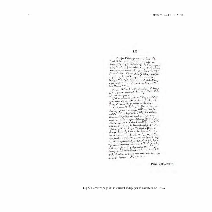
70 Interfaces 42 (2019-2020)
Fig.5. Dernière page du manuscrit rédigé par le narrateur de Cercle.

71
Avant de conclure, il convient de s’arrêter sur un ultime document reproduit (au-delà donc des quatre œuvres évoquées et outre quelques dessins de l’auteur et les photographies de Paul Celan, Walter Benjamin et W. G. Sebald) qui peut être repéré dans le roman : le dernier chapitre du texte qui correspond à un fac-similé de la dernière page du manuscrit de Cercle, roman que rédige le narrateur tout au long du récit.
Cette reproduction évoque quant à elle deux gestes primordiaux. D’une part, l’écriture, qui est à l’origine de tout pour un écrivain et qui est par ailleurs très fréquemment évoquée dans l’œuvre de Haenel qui a recours à ce que René Audet a dénommé une « théâtralisation du texte » : il y « thématise une textualité complexe et la figur[e], de sorte que l’image du texte sort de son invisibilité conventionnelle au profit de sa démonstration » (34). Par et sur cette ultime page, c’est effectivement l’écriture qui est mise en avant, qui est montrée dans son mouvement, dans sa matérialité sensible. D’autre part, c’est la dynamique amoureuse qui est également signifiée par ce dernier chapitre qui est placé sous l’égide d’une approbation heureuse, le “OUI !” final et joycien, qui vient en réalité déjouer l’achèvement du roman et relancer l’aventure : « une nouvelle vie commence peut-être ici [à Prague]. Il y a un fleuve, des îles. Il y aura bientôt Anna Livia. Tout peut recommencer » (537). Ces deux gestes, surinvestis par une spontanéité plus ou moins feinte (que dénote l’écriture manuscrite), renvoient au(x) mouvement(s) de la vie, au cœur qui bat, à la prépondérance de l’élan amoureux qui permet toujours de dépasser le désastrueux37. Cette page, qui fait signe vers le dernier geste (existentiel) déterminant qui n’est pas évoqué par les quatre autres œuvres d’art – AIMER ET JOUIR –, vient d’ailleurs complètement faire s’intriquer monde fictionnel et monde réel, en engageant la fiction dans un mouvement qui la transcende et l’emmène vers la vie, vers le vif. Plus encore, elle accomplit le geste affranchisseur et métamorphique de l’estampe chinoise : la transsubstantiation du corps de l’auteur en une entité verbale et iconique : « [Le poète] devient ce qui est à la fois dehors et dedans. […] [L]a nuée de signes c’est lui » (247). Enfin, elle dit aussi quelque chose de l’écrivain Haenel qui, par cet acte inédit, se fait audacieux, initiateur.
En somme, pour Haenel, à partir de l’œuvre d’art reproduite, il s’agit d’inventer de nouveaux espaces pour dire et vivre le monde, mais aussi pour dire et vivre le soi. Il s’agit, à l’instar du personnage d’Anna-Livia (voir 177), la danseuse dont Deichel est épris, de partir de gestes mille fois répétés, du déjà-donné, du déjà-connu, pour s’engager vers du neuf, de l’inédit, de l’émotion, dans l’optique d’« élargir les possibilités de vivre » (Haenel et Crépu), de même que de « vivre à hauteur de l’événement » (179), c’est-à-dire en touchant à l’existence absolue, que recèlent, pour Haenel, l’art, l’amour et la poésie.
37 À ce sujet, lire LAHOUSTE Corentin, « Toucher au plus vivant. Poétique et politique de l’amour dans Je cherche l’Italie de Yannick Haenel », Essais. Revue interdisciplinaire d’Humanités, dossier : Poétique et politique aujourd’hui, à paraitre à l’automne 2019.
Corentin Lahouste: Donner à voir l’irreprésentable, faire trembler le réel : l’agir symbolique des œuvres d’art reproduites dans Cercle de Yannick Haenel

72 Interfaces 42 (2019-2020)
Ouvrages cItés
ARENDT, Hannah. Walter Benjamin 1892-1940. trad. de l’anglais par Agnès Oppenheimer-Faure et Patrick Lévy. Paris : Allia, 2014.
AUDET, René. « Diffraction. Pour une poétique de la diffraction des textes narratifs ». In BOUJU, Emmanuel (dir.). Fragments d’un discours théorique. Nouveaux éléments de lexique littéraire. Nantes : Éditions Cécile Defaut, 2015, 25-41.
BOLOGNE, Jean-Claude. Le mysticisme athée. Monaco : Éditions du rocher, 1995.
HAENEL, Yannick. Cercle. Paris : Gallimard, 2007 (Folio).
HAENEL, Yannick. Je cherche l’Italie. Paris : Gallimard, 2015 (L’infini).
Entretiens avec Yannick Haenel et al., « Le goût du fait vrai dans le roman français contemporain ». Esprit 2017/3 [Mars – Avril], 175-193.
HAENEL, Yannick et LAHOUSTE, Corentin. « Rencontrer l’indemne, toucher l’irréductible ». Entretien avec Yannick Haenel. Tête-à-tête, n°8, septembre 2017, 48-60.
LAHOUSTE, Corentin. « Une épopée sensible : Cercle de Yannick Haenel ». Fixxion. Revue critique de fiction contemporaine, n°14 – Époque épique, juin 2017, 124-139.
LAHOUSTE, Corentin. « Dérive, secousse, brasillement. La dynamique intermédiale dans Drancy la muette de Yannick Haenel et Claire Angelini ». Textimages, Varia 6, en ligne, automne 2018. URL : http://revue-textimage.com/16_varia_6/lahouste1.html#_ftn10.
LAHOUSTE, Corentin. « Toucher au plus vivant. Poétique et politique de l’amour dans Je cherche l’Italie de Yannick Haenel ». Essais. Revue interdisciplinaire d’Humanités, dossier : Poétique et politique aujourd’hui, à paraître à l’automne 2019.
LAHOUSTE, Corentin et WATTHEE-DELMOTTE, Myriam (dir.), Yannick Haenel, la littérature pour absolu, Paris, Hermann, à paraître (2020).
MAKHLOUF, Georgia. « La littérature s’écrit contre ceux qui croientr savoir ». Entretien avec Yannick Haenel. L’orient littéraire, en ligne, 2008. http://www.lorientlitteraire.com/article_details.php?cid=33&nid=5395.
MONTIER, Jean-Pierre (dir.). Transactions photolittéraires. Rennes. PUR, 2015 (Interférences).
NEGRI, Antonio. Inventer le commun des hommes. Paris : Bayard, 2010.
WATTHEE-DELMOTTE, Myriam. « Le musée dans l’œuvre de Yannick Haenel. L’initiation au regard intérieur », In MAYAUX, Catherine (dir.). Quand les écrivains font leur musée... Bruxelles : P.I.E. Peter Lang, 2017, 215-234.

73
« GRÂCE POÉTIQUE » ET ŒUVRE D’ART : MÉDITATIONS PHÉNOMÉNOLOGIQUES DANS LE JOURNAL DE L’ANALOGISTE
DE SUZANNE LILAR
Nataliya LeninaUniversité York, Collège Universitaire Glendon, Toronto
Résumé
Le présent article explore le « mécanisme du fonctionnement » de la poésie libérée du verbal moyennant une analyse phénoménologique que le lecteur trouve dans le Journal de l’analogiste de Suzanne Lilar. En passant par les concepts de l’original et de la copie, l’écrivaine belge conceptualise ses propres expériences poétiques et leur « agir symbolique » instable (vécus à différentes époques de sa vie) autour des rapports dialogiques entre l’œuvre d’art, le spectateur-lecteur et l’artiste. Ce dialogue mène l’écrivaine belge à la découverte de correspondances entre les rythmes et formes naturels et les rythmes et formes artistiques.
Abstract
This article focuses on the Journal of the analogist (1954) by Suzanne Lilar, Belgian writer of Flemish origin and French expressions. Through the concepts of the original and the copy, the Belgian writer conceptualizes her own poetical experiences lived at different times in her life and their “symbolic act.” The author demonstrates the importance of dialogic relationship between the artwork, the viewer-reader and artist. This dialogue leads the Belgian writer to discover the “liberated verbal” poetry of daily life, as well as the correspondence between the natural rhythms and artistic forms.
Préambule
« Le reproche le plus blessant que l’on p[uisse] faire à une œuvre, c’e[st] qu’elle ne baign[e] point dans l’état de grâce poétique » (Lilar, Journal de l’analogiste 94), note Suzanne Lilar, écrivaine belge

74 Interfaces 42 (2019-2020)
d’origine flamande et d’expression française, dans son Journal de l’analogiste (paru chez Julliard en 1954).38 L’ouvrage a obtenu le prestigieux prix Sainte-Beuve la même année. Le texte du Journal révèle les grandes lignes de la pensée analogiste lilarienne qui traverse, comme un fil rouge, toute son œuvre littéraire (poèmes, romans, pièces de théâtre, écrits autobiographiques), ainsi que de nombreux essais. Quoique considéré par la critique comme son livre majeur, il n’a été réédité qu’une seule fois, chez Grasset en 1979. C’est pour cette édition que Julien Gracq écrit une préface et que Jean Tordeur rédige une introduction. Les deux écrivains soulignent à plusieurs reprises la démarche innovatrice et résolument expérimentale de cet ouvrage iconotextuel qui essaie d’élaborer des principes sous-jacents à la poésie « déconnectée du langage » (Gracq 13). La démarche de l’écrivaine belge est d’autant plus surprenante que son texte est un texte extrêmement poétique en lui-même : « on y passe à chaque instant de la poésie à la réflexion sur la poésie sans changer aucunement de palier. » (Gracq 7) Chez Lilar, la « poésie libérée » du verbal (Gracq 15), poésie de l’Être ayant partie liée avec les bases épistémologiques, met en marche simultanément le sensible et l’intelligible. Il s’agit de cette poésie du quotidien qui « se moque du goût […] [et] des connaissances » (Lilar, Journal 94). Depuis sa tendre enfance, Lilar la retrouve dans la nature, dans le jeu, dans l’Art, dans les choses les plus ordinaires de la vie de tous les jours. Une fois touchée par cette poésie du monde, elle vit ce qu’elle-même appelle des « moments privilégiés » qui la « détach[ent] moins des choses quotidiennes que d’une façon quotidienne de les regarder » (Lilar, Une enfance gantoise 204). La poésie d’un tableau peint ou d’un morceau de musique, la poésie d’une promenade ou « la poésie de l’exemplarité » (Lilar, Journal 73) d’un chien entrevu par la fenêtre de la voiture (l’image sur laquelle s’ouvre le Journal) ne sont-elles pas au fond des phénomènes du même ordre ?39 En effet, en proposant une approche poétique au monde, à l’Art, le Journal de l’analogiste nous apprend à « projet[er] sur [des] accident[s] de notre vie la lumière intemporelle de la poésie » (Lilar, Journal 154-155).
Par l’analyse d’exemples paradigmatiques présentés dans le Journal de l’analogiste de Suzanne Lilar, cet article explore des assises de la poétique de l’œuvre d’art. Comment « lire » un tableau, une sculpture, un monument architectural… ? Comment « regarder » pour voir/percevoir ce qu’ils dévoilent ? Qu’est-ce cet échange mutuel entre l’œuvre d’art et l’homme-spectateur-lecteur-décrypteur ? En passant par les concepts de l’original et de la copie, l’auteur conceptualise ses propres expériences poétiques (vécus à différentes époques de sa vie) et leur « agir symbolique » instable
38 Nous emploierons plus loin dans notre texte le titre abrégé Journal. 39 « Je me souvins que les hasards de la vie quotidienne m’avaient fourni presque autant de rencontres
poétiques que les arts. » (Lilar, Journal 153)

75
autour des rapports dialogiques entre l’œuvre d’art, le spectateur-lecteur et l’artiste. Ce processus implique soit les « reconnaissances visuelles » (Marin 266), soit les reconnaissances conceptuelles de la part du récepteur (lecteur-spectateur) - grâce à la semiosis ad infinitum40 -, soit les deux. Il mène l’écrivaine belge à la découverte des correspondances entre les rythmes et formes naturels et les rythmes et formes artistiques.
Du point de vue de la forme, le Journal de l’analogiste a une architecture complexe et résiste à toute classification. Il s’agit d’un livre illustré oscillant entre deux genres : l’écriture analytique de facture très libre (le genre d’essai à la fois littéraire, philosophique et esthétique) et l’écriture autobiographique (le titre est belle et bien évocateur !). Fondé sur les souvenirs, sur des expériences que l’auteur a vécues, l’ouvrage recèle effectivement certains traits propres à l’autobiographie. Comme dans les textes autobiographiques, la narration se fait à la première personne. Lilar, pour qui la praxis individuelle occupe une place centrale dans ses réflexions, écrit ainsi à propos de ses intentions à la fin du Journal : « J’avais pris le parti de ne pas déborder le cadre de mon expérience personnelle. » (Lilar, Journal 192) À l’instar d’une autobiographie, le texte dessine, quoique d’une manière indirecte ou, comme le dit Julien Gracq dans sa préface, « à SA manière41 », « un portrait très expressif » (préface, 12) de l’auteur. En outre, sa structure même s’approche de celle d’un journal intime. Le lecteur perçoit d’emblée que le livre est écrit de façon fragmentaire : on voit de courts passages séparés par des blancs typographiques, comme s’il s’agissait des entrées non datées d’un journal intime. D’ailleurs, on retrouve dans le livre des extraits des vrais journaux intimes de l’auteur, qui y sont cités en intratextes.42 Cependant, il ne s’agit pas d’un simple « journal » traduisant des événements au jour le jour. Il est une véritable « aventure poétique » (Lilar, Journal 112). Julien Gracq le compare plutôt à « un journal de bord », à un « journal d’une expédition de découverte » qui fraie de nouvelles voies à la perception de la poésie. Le texte progresse, comme le remarque Gracq, « par agglutinations successives […] à la manière d’une boule de neige. » (préface, 15). Le style change au cours du Journal. L’écriture devient de plus en plus abstraite et l’ouvrage ressemble de plus en plus à un essai.
40 Par le terme de sémiosis nous entendons le processus de l’assignation de sens à un signe (entendu comme l’union du signifiant avec le signifié) ; ce processus pourrait être considéré comme ad infinitum lorsque nous prenons en considération le rôle actif du Sujet interprétant, ainsi que le contexte (culturel, social, etc.) dans lequel la sémiosis se déroule.
41 Nous soulignons. 42 Par exemple, le passage décrivant les impressions d’une promenade aux pages 141-142, tiré du journal intime
de 1946, entrée datée du 22 février.
Nataliya Lenina: « Grâce poétique » et œuvre d’art : méditations phénoménologiques dans le Journal de l’analogiste de Suzanne Lilar

76 Interfaces 42 (2019-2020)
Le Journal se termine par une composante qu’on pourrait considérer comme une annexe s’il n’y avait pas à sa fin l’inscription « fin du journal ». Là, on retrouve des souvenirs dits « condensés » (toujours bien précis), ainsi que beaucoup d’intertextes. Cette partie est présentée sous le titre « Récréations analogiques » qui la sépare clairement du texte précédent. La partie finale se distingue aussi typographiquement du reste du livre : elle est mise en page en caractères plus petits que ceux employés pour la partie dite principale. Par ailleurs, ces passages sont découpés non seulement par le blanc du papier, mais aussi par des culs-de-lampe, vignettes qui marquent, habituellement, les hiatus. Ainsi, ces petits textes sont introduits l’un par rapport à l’autre sous le signe de la rupture, c’est-à-dire qu’ils se présentent, avant tout, en tant que textes autonomes, mais liés par des thèmes communs.
L’image se présente dans le livre sous différentes formes. Elle apparaît de la manière la plus directe quand on la voit sous sa forme iconique : plusieurs illustrations photographiques, représentant des détails des œuvres d’art, sont insérées entre les pages du texte, au milieu du livre. L’image est aussi explicitement présente dans le texte par le biais du verbal (par l’ekphrasis notamment).
La poésie étrange des « formes rebutantes »
Ornements muraux de la crypte des Capucins
La première illustration photographique du Journal représente un détail de la décoration murale faite d’ossements humains de la crypte des Capucins. S’il n’y avait pas de description du lieu aux pages 89-90 du Journal et d’inscription dans la « Table des planches », le lecteur aurait des difficultés à reconnaître ce qui figure dans cette photo, ainsi que la matière dont les ornements sont fabriqués. On ne sait pas au juste quel type de lecture de l’image il faut choisir : une lecture horizontale ou verticale. En l’occurrence, si le lecteur tourne la photographie dans la mauvaise direction, il risque d’y voir, par exemple, des grains de verre arrangés selon un motif floral sur une étoffe (fig. 1). En fait, la photo montre une véritable transformation du squelette humain en « fleurons et en acanthes pour aborder le monde abstrait de l’ornemental » (Journal 90). L’image iconique de la crypte des Capucins et sa description peuvent nous faire penser à l’esthétique du carnavalesque chez Bakhtine, où l’ordre établi est transgressé et les valeurs conventionnelles sont renversées. Ces images renvoient en effet moins au pathétique de la mort qu’à son effacement devant le carnavalesque. Bien évidemment, le spectacle, comme le note Lilar, « relève assez bassement du macabre » (Lilar, Journal 89), mais en même temps, il engendre une « étrange poésie » (Lilar, Journal 90) qui « libèr[e] momentanément de l’humain et jett[e] au-delà, dans la confusion de la création » (90). Le décor d’ossements rend visible
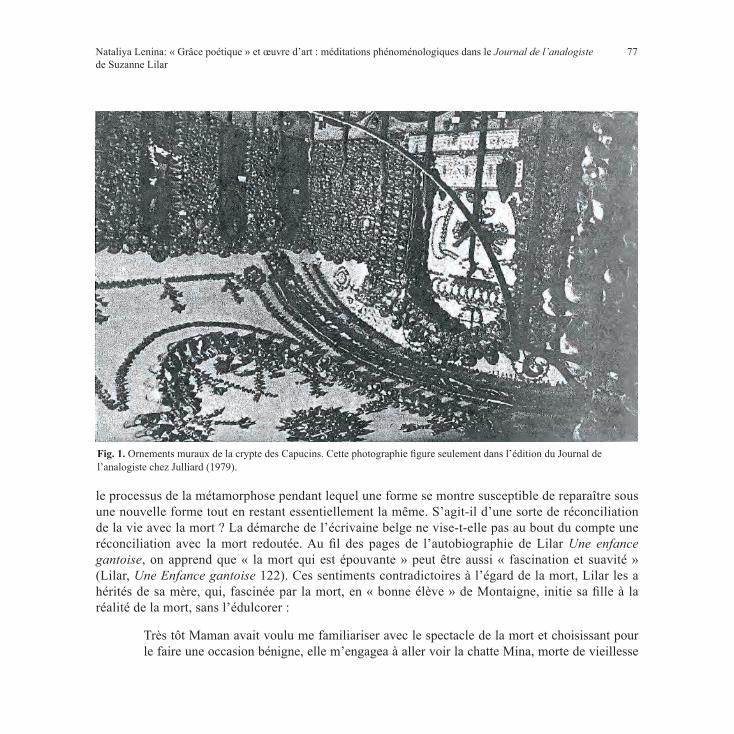
77
le processus de la métamorphose pendant lequel une forme se montre susceptible de reparaître sous une nouvelle forme tout en restant essentiellement la même. S’agit-il d’une sorte de réconciliation de la vie avec la mort ? La démarche de l’écrivaine belge ne vise-t-elle pas au bout du compte une réconciliation avec la mort redoutée. Au fil des pages de l’autobiographie de Lilar Une enfance gantoise, on apprend que « la mort qui est épouvante » peut être aussi « fascination et suavité » (Lilar, Une Enfance gantoise 122). Ces sentiments contradictoires à l’égard de la mort, Lilar les a hérités de sa mère, qui, fascinée par la mort, en « bonne élève » de Montaigne, initie sa fille à la réalité de la mort, sans l’édulcorer :
Très tôt Maman avait voulu me familiariser avec le spectacle de la mort et choisissant pour le faire une occasion bénigne, elle m’engagea à aller voir la chatte Mina, morte de vieillesse
Fig. 1. Ornements muraux de la crypte des Capucins. Cette photographie figure seulement dans l’édition du Journal de l’analogiste chez Julliard (1979).
Nataliya Lenina: « Grâce poétique » et œuvre d’art : méditations phénoménologiques dans le Journal de l’analogiste de Suzanne Lilar

78 Interfaces 42 (2019-2020)
chez ma grand-mère à l’âge de dix-huit ans. Je me revois descendant l’escalier de la cave. Je m’efforçais au courage. Je prenais sur moi. Mina était étendue dans son panier comme endormie. Mais quelque chose dissuadait d’y croire et dénonçait, sous l’apparence du sommeil, une opération sournoise. Bonne-Maman m’y invitant, je caressai la chatte qui avait maintenant la consistance du bois. Mais je ne me laissai pas retenir par l’étrangeté de cette découverte, l’attention captée par quelque chose que je percevais comme une présence. C’était la présence investissante quoique diffuse de la mort. (Lilar, Une Enfance gantoise 124)
L’absence était perçue comme une présence, la mort comme un sommeil. Ce « spectacle », grâce auquel l’enfant découvre de fausses apparences, la bouleverse et incite à approfondir ses réflexions. Le mot « spectacle » qu’emploie Lilar pour désigner les manifestations de la mort est encore plus applicable pour le passage qui parle du « pathétique bouffon » de l’agonie imaginaire de son oncle. Des images atroces de la mort hypothétique de son oncle (qui, étant gravement malade, séjournait chez la famille Verbist) terrorisaient la petite fille :
J’imaginais le pathétique bouffon de ce corps se défendant contre la mort, les sursauts de cette énorme chair rebelle à se laisser prendre, j’imaginais l’agonie, le passage de vie à trépas, le mourir pour parler comme Montaigne. Je n’ai pas cessé de le trouver effroyable et de le distinguer de la grande paix fraternelle de la mort. Au chevet de mes morts les plus chéris, il y eut toujours ce moment atroce où je les abandonnai, où je les laissai se débattre seuls, où m’affaissant, je me suis remise sur un tiers, religieuse ou infirmière, de ces soins qu’un instant auparavant je prodiguais avec tant de ferveur. Toujours il y eut cette désertion, cette minute où je les ai trahis et tandis qu’eux se battaient encore contre la mort, moi je l’espérais, je pariais pour elle. (Lilar, Une enfance gantoise 128)
La petite fille commence à « aimer » la mort,43 et même, entre dans une sorte de connivence avec elle regardant toujours au-delà de la mort. Intelligemment, elle la pratique, comme le conseille le sage Montaigne. Parfois, le lecteur pourrait être étonné par la lucidité du regard de la fillette devant la mort ou choqué par son sang-froid. Elle aide, par exemple, à « achever » les oiseaux blessés par le chat dans le jardin public pour les délivrer de la souffrance ; elle aide également son chien malade à mourir en diminuant la durée de l’agonie. Cette « connivence » dont parle Lilar n’interdit en aucun cas l’effroi devant « le guignol de la mort », devant « les grimaces et convulsions qui l’accompagnent » (Lilar, Une enfance gantoise 125), mais, sans fausse et humiliante pitié, enseigne à réfléchir sur la « dialectique »
43 « J’aimais la mort. J’aimais rêver de mes morts. » (Lilar, Une enfance gantoise 125).

79
de la mort justement pour vivre bien, joyeusement et dignement, donnant à la mort son droit. Et si l’œuvre de Lilar est traversée par la mort, c’est pour témoigner de l’amour insatiable de la vie.
La Villa d’Este
Dans le cadre du Journal, l’image de la crypte des Capucins renvoie aussi à la représentation poétisée de la Villa d’Este et de ses magnifiques jardins (chef-d’œuvre de l’architecture italienne du XVIe siècle, à Tivoli, près de Rome). L’image de ce lieu apparaît dans le texte sous la forme d’une longue description enchâssée dans le souvenir de la visite du site par l’auteur (Lilar, Journal 86-88), lui-même précédé d’un bref souvenir d’enfance décrivant des « sensations étranges » et du plaisir que goûtait la petite Suzanne à contempler « la trace d’une ammonite ou d’une fougère incrustée dans la pierre » (Lilar, Journal 85). Ainsi, à travers une allusion à la notion de métamorphose, ce souvenir annonce la description de la Villa, l’exemple enchanteur d’« une métamorphose sans truquage » (Lilar, Journal 86). Surtout, ce phénomène était très visible dans les jardins où « la nature saisit, pétrit, refaçonne » (Lilar, Journal 88) les formes en marbre, où tout se défait et se désagrège « sous l’assaut » (88) du monde végétal. Le travail de l’architecte et du sculpteur a été repris par la nature et, « [d]ans ce foisonnement de contradictions où l’effusion funèbre s’accordait au rythme de la vie, tout était remis en question » (Lilar, Journal 101). C’est comme si la nature voulait retrouver la forme initiale de la matière. Est-ce de ce combat de deux forces antagonistes que naît cette « étrange poésie » (semblable à celle de la crypte des Capucins) qui apporte un sentiment de sérénité en libérant l’espace (par le mouvement créateur de la transformation) d’un état morbide ?
La Diane d’Ephèse s’efface et semble rentrer dans la pierre. Le corps d’un jeune Bacchus, rongé comme celui d’un ascète, est couvert des pustules grisâtres du lichen. Un Neptune, voilé jusqu’au menton d’un fin réseau de saxifrage, a pris avec sa toison de verdure, l’aspect débonnaire d’un caniche. Le tridacne de la fontaine du Bicchierone, étroitement enserré par une mousse géante, lui dispute désespérément chaque saillie, chaque rainure, chaque filet de son extravagante coquille. Où finit le marbre, où commence le sournois cancer végétal, on ne sait plus. Où l’invention du Bernin, où les retouches insidieuses de la nature ? Une statue intacte, préservée, peut-être belle, laisse curieusement indifférent. Pourquoi ? Serait-ce que la beauté fascine moins que la désagrégation de la beauté ? Et nous deviendrait-elle précieuse dans la mesure où nous la savons périssable ? (Lilar, Journal 88)
Ces questions, colorées par le goût pour le difforme et le grotesque, parcourent toute l’œuvre littéraire de Lilar : « J’étais trop flamande, écrit-elle, pour ne pas subir la fascination d’un art adonné à la
Nataliya Lenina: « Grâce poétique » et œuvre d’art : méditations phénoménologiques dans le Journal de l’analogiste de Suzanne Lilar

80 Interfaces 42 (2019-2020)
monstruosité, à l’anomalie, à la distorsion des formes » (Journal 100) ; « [M]on côté flamand : mon besoin de laideur, d’anormalité, de monstruosité : mon impression alors de remise en place. J’échappais au monde du joli. » (Inédits, Écrits à caractère autobiographiques).44 Les chapeaux de folie, les masques de carnaval, plus encore les infirmes et les fous, les monstres de Bosch, de Grünewald ou de Goya l’attirent mystiquement. En les contemplant, l’écrivaine belge y rejoint sa propre « logique de rêve », ce « carnavalesque » bakhtinien qui dépasse la logique du « comme il faut » et, par conséquent, « ne se réalise pleinement qu’en marge de la culture officielle » (Kristeva 83) :
[J]’aimais le spectacle des anormaux de Lourdes, ceux de Geel où les fous vivent chez l’habitant, j’aimais leur démarche saccadée et parcourue de tics, eux aussi involontaires. Avec les autres enfants je poursuivais Zot Sofietje, non pour m’en moquer comme mes compagnes mais pour jouir de son étrange comportement. J’ai compris plus tard la nature du plaisir que j’éprouvais. Assistant à une fête de gymnastique où, par charité, un anormal avait été admis dans le groupe des athlètes, je ressentis, après un bref malaise, l’étonnement d’une délivrance. Ce dément paraissait habité par quelque chose qui le dépassait. Il y avait dans le déclenchement brusque de ses gestes, dans l’égarement de son regard une sauvagerie, un emportement, un délire qui communiquaient une ivresse, faisant apparaître chez les autres, les normaux, le manque d’envol, l’empêtrement du terrestre dans ce qu’il peut avoir d’étriqué, de réduit au prévisible. (Lilar, Une enfance gantoise 127-128)
Ainsi, des spectacles avec des « anormaux » montrent le manque chez les « normaux », ce « manque d’envol » qui empêtre dans la vie terre à terre. C’est pourquoi, lors de pareils spectacles, la petite Suzanne apprend à jouir de ce qui ne se trouve pas réduit au prévisible ; elle apprend à voir le monde non pas seulement à l’échelle de ses habitudes. C’est presque de la même manière que l’écrivaine jouit de la poésie d’une métamorphose imprévisible du parc de la Villa d’Este. La description de ce lieu magique hors du temps se termine par un passage où chaque phrase pèse lourd :
Il y a dans toute métamorphose, mort, naissance, quelque chose d’insaisissable. La science explique, la philosophie commente. On reste au pied de l’essentiel. Mais la poésie fait faire le saut. Elle éclaire nos curiosités et nous découvre les raisons du saisissement que nous éprouvons à surprendre — si parfaitement encadrée par la pompe baroque de la Villa d’Este — la mort étroitement accolée à la vie, à les concevoir tout à coup comme de simples apparences d’un même devenir. (Lilar, Journal 88-89) (Nous soulignons.)
44 Inédits de Suzanne Lilar : Écrits à caractère autobiographiques : Fragments divers : Lilar sur elle-même et sur son œuvre (Archives, ML 08492/0024).

81
Les Vieilles de Goya. L’espace pictural
La représentation des Vieilles de Goya (Lilar, Journal 159) s’inscrit bien dans la lignée des images troublantes provoquées par la crypte des Capucins. Les Vieilles épousent d’une manière ostentatoire la pensée de Lilar que la mort et la vie, « étroitement accolée », peuvent être perçues (sans être confondues) « comme de simples apparences d’un même devenir » (Lilar, Journal 89). En même temps, ce tableau, semble-t-il, reflète « visuellement » l’esthétique du carnavalesque bakhtinien. Le tableau renvoie, d’ailleurs, au symbolisme des figurines en terre cuite des vieilles femmes enceintes et riantes se trouvant au Musée de l’Ermitage dont Mikhaïl Bakhtine parle dans L’Œuvre de François Rabelais. Bakhtine souligne l’ambivalence et l’expressivité de ce grotesque mis en forme :
[…] [C]’est la mort enceinte, la mort qui donne le jour. Il n’y a rien de parachevé, de stable et de paisible dans le corps de ces vieilles femmes. [...] La vie est révélée dans son processus ambivalent, intérieurement contradictoire. Rien n’est tout prêt, c’est l’inachèvement même. (Bakhtine 35)
Ces propos sont en effet applicables à la poétique complexe et contradictoire des vieilles femmes chez Goya : par la destruction du stable, par la provocation et la négation des apparences, elle dirige l’esprit vers la « re-naissance », vers le renouveau, vers l’« éternel devenir ».
La toile de Goya montre la vieillesse caricaturée, où « le paraître est plaqué sur l’être » (Louvel 153) : sous l’apparence des artifices (des bijoux, des habits, du maquillage) se cachent les corps affaissés, presque squelettiques, des deux vieilles femmes. Deux « monstres dérisoirement parés » (Lilar, Journal 159). Le message que l’image fait passer n’est-il pas l’écho de ce memento mori des vanités du XVIIe siècle qui nous rappellent que personne n’échappe à la mort et que l’on ne sait jamais l’heure de ce passage ? L’image d’un homme avec un balai à l’arrière-plan incarne apparemment la mort elle-même. Ces deux personnages paraissent ridicules au spectateur « omniscient » qui voit derrière leurs épaules cette redoutable figure, capable de « balayer » (ou peut-être déjà en train de « balayer ») ces deux coquettes du monde terrestre. Or, la description dans le Journal ignore sa présence dans le tableau et se concentre principalement sur les deux figures féminines.
La « translation picturale » (Louvel 88) du tableau dans le Journal (c’est-à-dire la traduction d’un code sémiologique à un autre) est construite par antithèse : tous les éléments sont vivement contrastés soit sur le mode de la rupture soit sur le mode du prolongement. Par exemple, les « paupières sanguinolentes » de l’une des femmes s’opposent aux « orbites charbonneuses » de l’autre, « une
Nataliya Lenina: « Grâce poétique » et œuvre d’art : méditations phénoménologiques dans le Journal de l’analogiste de Suzanne Lilar

82 Interfaces 42 (2019-2020)
boîte crânienne écrasée, épatée, ouverte sur l’orifice béant des narines » (Lilar, Journal 159) de l’une, contraste avec le crâne « grotesquement busqu[é], recourb[é] sur le clapet du bec » de l’autre (159). Mais ces contrastes complètent la même image de la sénilité de la vieillesse. Alors que ces mêmes détails de la description contrastent violemment (et cette fois-ci sur le mode de rupture) avec la beauté des robes (la blancheur de la gaze et le « bleu[] si doux […] [des] « vaporeuses dentelles » [Lilar, Journal 160]) et l’exubérance des accessoires (pierreries, rubans, bandelettes). Pourtant, les oppositions entre les couleurs et les valeurs, entre la décrépitude des corps et la fraîcheur et l’extravagance des parures, non seulement dénoncent le jeu des apparences trompeuses, mais vont au-delà de cette fonction. La peinture dépasse de beaucoup toutes ces visées, ou « messages », relevant d’une analyse rationnelle que nous venons de signaler ci-dessus : elle entraîne le lecteur-spectateur dans une entreprise proprement poétique, elle le mène « en un lieu où les contraires cessent d’être perçus contradictoirement » (Lilar, Journal 137).
Lilar souligne dans le Journal que nulle œuvre ne lui avait révélé autant de secrets de la « poésie de l’atroce » (Lilar, Journal 159) comme ce tableau de Goya, perçu, avant tout, comme une « provocation personnelle » (159). Toutefois, le chemin pour saisir sa poésie a été fort long. Avant que la vraie rencontre avec le chef-d’œuvre n’ait lieu, Lilar s’en détournait « comme d’une inconvenance » (159). Et pourtant, elle n’a pas pu se débarrasser des sentiments contradictoires qui l’envahissaient et qui « voulai[ent] être résolu[s] » (Lilar, Journal 160). La toile tout ensemble la « happait » (159) et provoquait l’horreur ; elle se sentait regardée par le tableau. Il s’agit de ce triple échange entre l’artiste, le sujet regardant et le tableau dont parle Jeanette Winterson dans son essai portant sur les objets artistiques et Merleau-Ponty dans « Le langage indirect et voix du silence » :
I move gingerly around the paintings I own because I know they are looking at me as closely as I am looking at them. There is a constant exchange of emotion between us, between the three of us ; the artist […], the painting in its own right, and me, the one who loves it and can no longer live independent of it. The triangle of exchange alters, is fluid, is subtle, is profound and is one of those unverifiable facts that anyone who cares for painting soon discovers. […] I think of something I did, the picture catches me, adds to the thought, changes the meaning of thought and past. The totality of the picture comments on the totality of what I am. The greater the picture the more complete this process is. Process, the energy in being, the refusal of finality, which is not the same thing as the refusal of completeness, sets art, all art, apart from the end-stop world that is always calling ‘Time Please !’. (Winterson 19)

83
L’œuvre accomplie n’est donc pas celle qui existe en soi comme une chose, mais celle qui atteint son spectateur, l’invite à reprendre le geste qui l’a créée et, sautant les intermédiaires, sans autre guide qu’un mouvement de la ligne inventée, un tracé presque incorporel, à rejoindre le monde silencieux du peintre, désormais proféré et accessible. (Merleau-Ponty, « Langage indirect et voix du silence » 1479)
Le texte du Journal explique également que la rencontre dépend essentiellement du regard du spectateur. Comme le note Éliane Escoubas, dans un ouvrage consacré à l’espace pictural, « ce que peint la peinture, ce que donne à “voir” l’espace du tableau, c’est la mise-en-œuvre du regard, la mise en œuvre de l’exercice-extase du regard »45 :
La peinture fait voir ce qu’on ne voit pas ordinairement — ce qu’on ne voit pas du tout : elle peint, à chaque fois, la naissance du monde sous le regard — ce qui a toujours déjà commencé lorsqu’on commence à voir ce qu’il y a à voir. (Escoubas 25)
Escoubas se réfère ici à un passage très connu de Merleau-Ponty cité généralement dans les essais portant sur l’image, à savoir :
Je serais bien en peine de dire où est le tableau que je regarde. Car je ne le regarde pas comme on regarde une chose, je ne le fixe pas en son lieu, mon regard erre en lui comme dans les nimbes de l’être, je vois selon ou avec lui plutôt que je ne le vois. (Merleau-Ponty, L’Œil et l’Esprit 1596) (Nous soulignons.)
Comme le note Escoubas, les expressions « voir selon ou voir avec » « marquent l’écart entre la chose en tant que chose et la chose en tant que tableau » (Escoubas 15). Autrement, le tableau ne dévoile rien, ne révèle pas, mais se présente simplement en tant qu’espace de la représentation : « Une forme n’est rien en soi. Une forme n’est pas, elle existe. » (Maldiney, « L’esthétique des rythmes » 163), écrit le philosophe-phénoménologue français Henri Maldiney.
En parcourant les pages du Journal de l’analogiste, on voit l’auteur belge pratiquer régulièrement cet « exercice-extase du regard » « selon » et « avec » le tableau peint, comme le propose
45 On cite la note d’Éliane Escoubas présentée en bas de la page 16 de L’Espace pictural : « On prendra ces termes au sens étymologique : Exercice vient du latin ex-arceo, où arceo dit : contenir dans des limites, enfermer, arrêter, empêcher d’avancer (des troupes) ; ex-arceo dit alors : mettre ou tenir des troupes en mouvement, ne pas rester en repos, faire sortir des limites où (les troupes) étaient arrêtées. Extase vient du grec ek-stasis : être hors de soi, faire sortir de soi, faire changer de place. »
Nataliya Lenina: « Grâce poétique » et œuvre d’art : méditations phénoménologiques dans le Journal de l’analogiste de Suzanne Lilar
84 Interfaces 42 (2019-2020)
Merleau-Ponty. Dans le cas des Vieilles, le texte dit qu’il faut « suivre le poète à travers la séduction des formes […] dans la difformité, dans la laideur » (Lilar, Journal 157) et le suivre en poète. Le malaise que l’image de Goya provoque « réclame impérieusement le soulagement poétique » (Lilar, Journal 151). La transfiguration des formes se réalise sous le regard « poétique » du spectateur (le sujet regardant) qui les dote d’un « nouveau pouvoir imageant » (Lilar, Journal 164). En l’occurrence, et puisqu’il s’agit de peinture, on doit regarder ce tableau « selon la couleur » (Lilar, Journal 160) et selon les effets des contrastes, allant au-delà de la forme. Auquel cas, le spectateur se déplace sur « un plan où les extravagances de la décrépitude peuvent être inhumainement, sereinement regardées » (160). C’est le miroitement des contrastes des formes et des valeurs mis en parallèle avec le jeu des couleurs qui fait rompre « l’automatisme de la représentation » (Lilar, Journal 164) :
À ce prix, cette vieillesse redoutée […] se dépouill[e] de ses cruautés particulières pour rentrer dans le destin universel des métamorphoses. Et ce n’est pas […] sans intuition de ces transmutations que Goya [mêla] éclat et disgrâce, fraîcheur et décomposition […] ; et même, allant plus loin encore dans la négation de l’apparence, qu’il avait dans le rouge d’un enrubannement de satin établi un écho au rouge répugnant des paupières sanieuses ; mais précisément ce rouge n’était pas répugnant, le peintre nous le prouvait en l’utilisant pour parure. Ainsi l’une après l’autre désarmait-il nos préventions et il n’était aucun détail — si affreux fût-il — de cette peinture admirable qui ne vînt en fin de compte s’apaiser et se résorber dans l’enchantement de la couleur. (Lilar, Journal 160) (Nous soulignons.)
Cet enchantement, cet équilibre sont retrouvés à la fois grâce à une « tension particulière » (Lilar, Journal 158) créée par les « formes rebutantes » (158) qui nous projettent avec violence au-delà d’elles-mêmes et grâce au regard « poétique » du spectateur. C’est exactement le même processus que nous avons pu observer dans le cas des décorations en ossements humains de la crypte des Capucins. Lilar note que de telles œuvres d’art détiennent « le singulier pouvoir » sur le spectateur, et même, sur un point, elle leur accorde un avantage, « celui de ne pas créer de malentendu » (Lilar, Journal 158). La « franchise » de leur provocation nous garde de la passivité, d’une sorte d’« hébétude amoureuse » (158) qui aurait pu être ressentie facilement devant les formes dites trop belles, « formes suaves » (158), comme les nomme le texte du Journal.
Ainsi, chez les Vieilles de Goya, la poésie manifeste le « pouvoir de délivrance » (Lilar, Journal 162) qui se trouve renforcé « en proportion de la distance qui sépare le terrible de l’acquiescement au terrible » (162) : « [c]’est dans l’écart […] entre la sensation et son indice poétique que résidait l’efficacité des formes agressives » (162). L’écart que les « formes rebutantes » donnent

85
à franchir confère à la poésie, qui naît du dialogue entre l’œuvre (le regardé) et le spectateur (le sujet regardant), « un relief particulier » (Lilar, Journal 164). Tout compte fait, deux extrêmes, le beau et le monstrueux, se trouvent dépassés ; le macabre devient le symétriquement inverse. Le spectateur est ainsi « entraîné » (Lilar, Journal 163) par la surprise de cette « poésie de sursaut » (163) et non plus rebuté ou choqué par les formes figurées sur le tableau. La mise en œuvre de « l’exercice-extase du regard » subvertit la stabilité apparente de la réalité invitant à « une relecture phénoménologique de la catégorie de la réalité » (Escoubas 30). Cette subversion déplace ainsi la notion de la réalité « de l’ordre de l’objectivation à celui de la communication » (30). Comme le constate Maldiney, « Est réel ce qui se donne dans la rencontre. » (Maldiney 173)
Rythmes internes des œuvres d’art : du particulier à l’universel à travers l’expérience du poète
Fascinée par le trompe-l’œil, Suzanne Lilar y consacre maintes pages dans le Journal de l’analogiste. Tout en suggérant « la troublante imprécision de la poésie » (Lilar, Journal 106), ce genre pictural lui apporte les découvertes analogues les plus nombreuses :
[L]e trompe-l’œil, ne nous propose pas un simple plaisir visuel copié sur ceux que nous offre la nature ni même un plaisir de virtuosité, mais un plaisir métaphysique, celui de faire entrer les objets de notre contemplation dans un système d’analogies. Je devais voir plus tard, écrit l’auteur belge, que c’est le propre de toute entreprise poétique. […] À vrai dire, des années s’écouleraient avant que je fusse en mesure de discerner et d’identifier les rythmes, car c’est d’eux qu’il s’agissait et, de leur appliquer la réflexion analogique. (Lilar, Journal 108-109)
Lilar termine ce passage par l’introduction de la notion de rythme, applicable non seulement au domaine musical, mais aussi à la peinture, à la sculpture, etc. Elle contemple des tableaux anciens des grands Flamands et se rend compte que la couleur, pareillement à un son, « s’évalue dans une suite » (Lilar, Journal 172-173). Cependant, la couleur, contrairement au son qui, lui, se déploie dans le temps, se trouve “découpée” (Lilar, Journal 173) dans l’espace. La couleur apparaît dans le tableau « à la fois en étendue et en profondeur, […] [et] comme le lieu de croisement d’une série de rythmes » (173). L’espace pictural est ainsi rythmé, comme un morceau de musique ou un poème et, ses rythmes entrent en relation directe avec le spectateur :
Il y avait des rythmes plastiques en dehors des arts du même nom, et inversement des rythmes d’intensité en dehors de la musique — et la chose va de soi pour la danse et la poésie […].
Nataliya Lenina: « Grâce poétique » et œuvre d’art : méditations phénoménologiques dans le Journal de l’analogiste de Suzanne Lilar

86 Interfaces 42 (2019-2020)
Je savais, écrit Lilar, que la première prise de possession du poète […] se traduisait par un rythme figuratif de l’émotion, schéma de l’onde vivante convertie en motif et qui, fidèle représentation des mouvements du cœur dont il était issu, allait projeter à travers le poème ou la musique l’afflux nourricier d’une circulation poétique, perceptible à la fois comme un battement et comme une suite de révolutions cycliques susceptibles […]. (Lilar, Journal 192-193 ; nous soulignons.)
Ainsi, le texte signale que le propre de tout œuvre d’art est d’être traversée par des rythmes non-arbitraires, bien structurés et fondés sur l’analogie. Ses propos s’entrecroisent avec la définition du rythme artistique que propose Henri Maldiney : « le rythme est l’essence de l’art et il est son existence, étant l’acte du style » (Maldiney, « L’esthétique des rythmes » 172). L’acte du style, car issu du cœur de l’artiste, il représente ou traduit son âme, ses émotions, interprète des mouvements de son cœur.
Nous proposons d’étudier quelques expériences poétiques de l’auteur qui mettent en évidence le fait que les œuvres d’art possèdent des rythmes intérieurs, uniques et non fortuits ; ces rythmes « s’étend[ent] bien au-delà du visible » (Lilar, Journal 178) et rejoignent des rythmes et formes naturels.
Les images radiographiques du portrait de Hendrickje Stoffels (Rembrandt) et du Polyptyque de Van Eyck
Le premier exemple concerne le Portrait de Hendrickje Stoffels du pinceau de Rembrandt et montre que l’œuvre d’art se présente comme un entrelacement du visible avec l’invisible, que l’authenticité n’est pas reproductible et que le rythme interne de l’œuvre d’art peut nous aider à distinguer une copie de l’original. Lilar a profité d’une occasion d’examiner et de comparer une image radiographique de l’original d’Hendrickje Stoffels avec « celle d’une excellente copie d’époque probablement exécutée dans l’atelier de l’artiste » (Lilar, Journal 177). Cette copie a été peinte d’une manière parfaite, et le copiste aurait pu être Rembrandt, grâce à la maîtrise de son art égale à celle du grand peintre hollandais. Mais la copie n’a pas supporté l’épreuve des rayons X. En effet, la radiographie trahissait le faux. Il y avait dans ce tableau si bien imité quelque chose qui empêchait de reconnaître le pinceau de Rembrandt :46
46 La pensée esthétique de Lilar rejoint ici celle de Walter Benjamin, pour qui « la véritable œuvre d’art se laisse reconnaître à son “aura”, ce rayon de présence qui émane de l’œuvre et qui est la marque qu’elle est bien venue au visible et au dicible d’un être suprasensible […]. » (Wunenburger 178). D’après Benjamin, « À la plus parfaite reproduction il manquera toujours une chose : le hic et nunc de l’œuvre d’art — l’unicité de son existence au lieu où elle se trouve”. (Benjamin 273) “Le hic et nunc de l’original constitue ce qu’on appelle son authenticité. […] Tout ce qui relève de l’authenticité échappe à la reproduction — et bien entendu pas seulement à la reproduction technique. » (Benjamin 274)

87
[L]a copie se muait en une sorte de masque carnavalesque, dépourvu de toute spiritualité et même d’expressions […]. C’est qu’il avait été peint de l’extérieur, et si parfaite, si mystifiante que fût en lumière directe sa ressemblance, au point que l’attribution à Rembrandt avait longtemps été tenue pour probable, cette hypothèse s’écroulait sous le pouvoir pénétrant des rayons, car la ressemblance n’avait pas été travaillée en profondeur. En effet, le copiste, s’en tenant à l’imitation consciencieuse mais superficielle de l’œuvre, s’était montré impuissant à reproduire son rythme interne, rythme que, dans la lucidité aiguisée de la création, le peintre avait su capter et projeter sur la toile sous forme d’esquisse tracée au moyen de ces blancs de plomb et de ces bruns qui surnageaient maintenant sous l’exposition radiographique, reconstituant pour nous la vision initiale de l’œuvre et la grâce de son départ, quelque chose comme “le vers donné” de la poésie verbale, et que l’élaboration picturale avait peu à peu recouvert (Lilar, Journal 177-178 ; nous soulignons.)
Ce « quelque chose », invisible à l’œil nu, mais perceptible à l’aide des rayons X, d’après l’auteur, n’est rien d’autre que le rythme interne de l’œuvre d’art dont la complexité et la structure sont dues non à un simple caprice de l’auteur (en l’occurrence, le désir de faire une bonne copie), mais à une nécessité créative. Pour citer Rilke, une œuvre d’art est bonne seulement « quand elle est issue de la nécessité » (Rilke 38). Le vrai artiste, qu’il soit artiste majeur ou mineur, crée de la nécessité, de cet appel intérieur qu’est ce besoin viscéral de s’exprimer, de transmettre ou, pour parler comme Merleau-Ponty, de donner à l’invisible une forme visible qui communique le sens47. Contrairement au processus artistique d’un copiste, le vrai processus artistique demande de la part du créateur tout ensemble questionnement, tentatives de résolution et sa participation au monde extérieur et à l’être de l’œuvre en train de naître.
Le deuxième exemple concerne le célèbre Polyptyque de l’Agneau mystique (1432) des frères Hubert et Jean Van Eyck, conservé dans la cathédrale Saint-Bavon à Gand, où Suzanne Lilar a été baptisée. Lilar consacre au Polyptyque trois passages dans le Journal de l’analogiste (tous les trois se trouvent dans différents endroits) qui font écho aux souvenirs d’enfance liés à cette œuvre dans son autobiographie Une enfance gantoise. Dans ces souvenirs, l’écrivaine évoque avec tendresse ses
47 Kandinsky présente des semblables réflexions sur le processus créateur mettant en relief la notion de la « nécessité intérieure », condition d’un art véritable, selon lui: « […] [L]’artiste a non seulement le droit, mais le devoir de manier les formes ainsi que cela est NÉCESSAIRE à ses buts. Et ni l’anatomie, ni les autres sciences du même ordre, ni le renversement par principe de ces sciences ne sont nécessaires, mais ce qui est nécessaire, c’est une liberté totalement illimitée de l’artiste dans le choix de ses moyens. » (Kandinsky 198-199) « Cette liberté illimitée doit être fondée sur la nécessité intérieure (que l’on nomme honnêteté). Et ce principe n’est pas seulement le principe de l’art, mais également celui de la vie. » (Kandinsky 199)
Nataliya Lenina: « Grâce poétique » et œuvre d’art : méditations phénoménologiques dans le Journal de l’analogiste de Suzanne Lilar

88 Interfaces 42 (2019-2020)
premières rencontres avec la peinture de Van Eyck. Sur le plan iconique, le Polyptyque est présenté dans le Journal par un détail. Le visage de Dieu le Père figure sur deux images photographiques : l’une des illustrations est une reproduction de l’image radiographique, l’autre est le même détail en lumière directe (fig. 2).
Fig. 2. Les frères Hubert et Jean Van Eyck, le visage de Dieu le Père, détail du Polyptyque de l’Agneau mystique (vers 1432). Gand: la cathédrale Saint-Bavon. Huile sur bois de chêne. L’image radiographique et l’image en lumière directe. Ces photos figurent dans les deux éditions du Journal de l’analogiste de Suzanne Lilar.

89
L’auteur relate comment elle a pu apercevoir, pendant sa visite du laboratoire du Musée de B. (sans doute le Musée de Bruxelles), la correspondance entre le visible et l’invisible. Au musée, elle a pu revoir les documents de la restauration du Polyptyque, y compris ses images radiographiques :
[P]lus je comparais ces images radiographiques à la peinture, telle qu’elle nous était parvenue après cinq siècles de vieillissement et de métamorphoses, plus je me persuadais qu’elles ne se bornaient pas à nous renseigner sur l’état original de l’œuvre ni même à nous en fournir une sorte de sublime modulation, mais qu’elles nous introduisaient au cœur de son mystère. (Lilar, Journal 175-176)
Nulle part, me semblait-il, je n’avais d’aussi près appréhendé le sacré que dans ce masque divin, que le passage de la lumière blanche aux rayons X avait étrangement dépouillé de toute particularité d’époque ou d’origine. J’en concevais une assurance singulière, car si l’univers de Van Eyck existait si supérieurement dans l’invisible, s’il s’insérait dans les rythmes naturels d’une façon aussi irrécusable, c’est qu’il n’avait pas été arbitrairement façonné par le peintre, mais que préalable à sa recherche, il avait été par lui découvert. (Lilar, Journal 176)
Il s’agit ainsi de l’appréhension du sacré à travers l’apparition du « masque divin » sur l’image radiographique qui a rendu visible l’invisible.48 Cette expérience de l’auteur se perçoit également comme une initiation “pratique” à la poésie qui s’insère « dans les rythmes naturels » du monde. Or il n’est pas toujours nécessaire de recourir aux « moyens scientifiques pour surprendre la parenté des ouvrages de la poésie avec les rythmes naturels » (Lilar, Journal 178).
48 Il n’est pas inutile de rappeler ici la célèbre formule de Paul Klee : « L’art ne reproduit pas le visible, il rend visible. » (Klee 34)
Nataliya Lenina: « Grâce poétique » et œuvre d’art : méditations phénoménologiques dans le Journal de l’analogiste de Suzanne Lilar

90 Interfaces 42 (2019-2020)
Un détail du retable Heller
Fig. 3. Confrontation de détails agrandis de la robe de sainte Lucie, détail de la peinture en grisaille sur un volet du retable Heller, avec un coquillage: le “tissu rythmique” (Lilar, Journal 192) de l’objet artistique se trouve en harmonie avec la “pulsation organique” (Lilar, Journal 193) de la matière. Ce montage photographique est présent dans les deux éditions du Journal de l’analogiste de Suzanne Lilar.

91
Fig. 4. Confrontation de détails agrandis de la robe de sainte Lucie avec un coquillage. Ces photos figurent dans les deux éditions du Journal de l’analogiste.
Révélatrices à cet égard sont les observations que fait l’écrivaine belge en confrontant un détail du retable Heller, œuvre de Dürer et de Grünewald, un coquillage qui lui servait de presse-papier. Lilar aperçoit une parenté frappante entre le « plissement » (Lilar, Journal 180) de la robe de sainte Lucie (détail de la peinture en grisaille sur un volet du retable) et la forme du coquillage (fig. 3 et 4). Étonnée de cette ressemblance, Lilar voulait savoir « s’il s’agissait d’un hasard subi par le peintre ou, au contraire, d’une réalité génialement pressentie » (Lilar, Journal 179). À cette fin, elle commande des photographies du coquillage et de « cette robe bizarrement tournée et contournée, plissée et déplissée » (Lilar, Journal 180). Quelques-unes de ces photographies sont insérées dans le Journal de l’analogiste. La confrontation des détails agrandis a donné un résultat dépassant toutes les attentes :
Nataliya Lenina: « Grâce poétique » et œuvre d’art : méditations phénoménologiques dans le Journal de l’analogiste de Suzanne Lilar

92 Interfaces 42 (2019-2020)
Non seulement la robe se développait et s’infléchissait en forme de valve, […] mais encore son tuyauté imitait le plissement du test, cependant que les cassures de l’étoffe ou ses coutures reproduisaient avec une précision stupéfiante la suture des tours avec leurs cordons de nodosités nommées tubercules. […] Mais plus mystifiante encore dans son analogie tout interne m’apparaissait la manière que cette robe avait de tourner autour d’un axe invisible et de se déployer en hélice. En vérité, plus je comparais cet objet et cette forme […], plus je me sentais encouragée à penser qu’à partir d’un certain degré d’élaboration, de perfection artisanale, le poète opère sa jonction avec les rythmes naturels. Non qu’au niveau de ses émotions, il n’en détienne déjà le module […] mais pour se muer en poésie, ce rythme personnel demandait à travers la forme à fusionner avec d’autres rythmes, à affirmer ses parentés, à se reconnaître pour universel. (Lilar, Journal 180-181)
Ainsi, en faisant fonctionner l’analogie dans le domaine de la création artistique et dans la vie quotidienne, Lilar découvre des correspondances entre les rythmes et les formes de la nature et les rythmes et les formes de l’art. Elle s’émerveille devant l’harmonie du monde où toutes les choses se tiennent et communiquent dans un échange mutuel.
Le Polyptyque de l’Agneau mystique : rencontres et découvertes
Le Polyptyque de l’Agneau mystique fait partie de ce que Suzanne Lilar appelle « ma mythologie personnelle » (Lilar, Journal 96). Ce retable se situe au cœur de la formation sensuelle et spirituelle de l’écrivaine et participe effectivement à l’élaboration de sa théorie des correspondances. Devant ce chef-d’œuvre, elle passe des heures ; littéralement, elle « entr[e] dans la peinture » (Lilar, Journal 211). Ayant médité sur la vocation du Polyptyque dans sa vie, Lilar met des éléments du tableau dans leur rapport particulier avec sa personnalité. Aux différents moments de sa vie, la peinture de Van Eyck a révélé à Lilar des choses différentes. L’espace pictural est sans doute pluriel : il y a toujours « l’opposition de la patence et de la latence » (Escoubas 35). Ainsi, ce qu’on voit en regardant le tableau n’est jamais effectivement vu, mais « quasiment vu » (id., 21-22). Pour Suzanne écolière, le Polyptyque n’était que « cette peinture dont on regarde les fleurs à la loupe et dont les personnages ont un air de famille » (Lilar, Journal 204). En effet, le spectateur peut identifier dans le paysage paradisiaque représenté par Van Eyck quarante-deux espèces de plantes. Tout, dans cette prairie, comme l’écrit Lilar « resplendi[t] de la fraîcheur et de l’évidence de l’archétype » (Lilar, Enfance gantoise 134). En outre, là, dans l’espace pictural du Polyptyque, parmi les personnages de la composition, la petite Suzanne retrouve le visage de sa mère. Elle le retrouve et ne le projette pas :

93
Le jeu des ressemblances, écrit Lilar, est plein de magie. Pour ma part j’ai toujours cru qu’elles impliquent un lien secret et il ne me paraît pas exclu qu’elles inclinent à la poésie. Souvent déjà j’avais été frappée par un air de famille entre le visage de ma mère et celui des personnages de van Eyck. Dans la foule du panneau central du Polyptyque, je la retrouvais parmi les Anges mais aussi les Philosophes, les Ermites et sur le panneau des Juges intègres jusque dans le portrait d’Hubert lui-même. (Lilar, Journal 119)
Comme dans le cas de la sainte Lucie de Grünewald, il s’agit de la fusion des rythmes personnels de l’artiste avec ceux du spectateur : le multiple tend à l’Un et, inversement. Les rythmes individuels épousent les rythmes universels sous « l’afflux nourricier d’une circulation poétique » (Lilar, Journal 192) naissant du dialogue entre le tableau et le sujet regardant. Lilar souligne que l’un des privilèges des grandes œuvres est « d’offrir un système d’analogies si riche, si foisonnant qu’il ne cess[e] de se renouveler » (Lilar Journal 143) :
Mais après les visages, c’était aujourd’hui la composition tout entière qui venait réveiller en moi les plus doux souvenirs, car la prairie de l’Agneau, avec son moelleux et dru gazon des Flandres, était cet herbage proche de la Lys où, me trouvant à l’âge de onze ans avec mes compagnes de classe, j’avais dû m’écarter du groupe afin de dissimuler mes larmes. Et la présence sur la toile de l’agneau au cœur percé n’offrait pas plus de tranquille évidence que n’en avait eu ce jour-là pour moi la présence de Dieu. Mais il m’avait fallu bien des années pour la reconnaître, la prairie mystique, car si je savais, lorsque la classe entière se déplaçait pour aller contempler le chef-d’œuvre, identifier au travers de la loupe la fleur de fraisier, l’ancolie et la violette, […] je n’étais pas alors en mesure de démêler toutes les correspondances secrètement tissées entre cette peinture et moi bien avant ma naissance. (Lilar, Journal 119-120 ; nous soulignons.)
Les phrases de ce passage (mises en italique) où le verbe reconnaître (on songe à la co-naissance de Claudel) est le mot-clé nous plongent directement au cœur du monde des Idées de Platon. Or, pour que ce verbe se remplisse de sens, il faut le temps : pour certains, cela prend des années, pour les autres, des mois ou des jours. C’est en ce sens que l’écrit Rilke, dans une de ses lettres au jeune poète Franz Kappus :
[J]’aimerais vous prier […] d’avoir patience envers tout ce qu’il y a de non résolu dans votre cœur et d’essayer d’aimer les questions elles-mêmes comme des chambres verrouillées, comme des livres écrits dans une langue très étrangère. Ne partez pas maintenant à la recherche
Nataliya Lenina: « Grâce poétique » et œuvre d’art : méditations phénoménologiques dans le Journal de l’analogiste de Suzanne Lilar

94 Interfaces 42 (2019-2020)
de réponses qui ne peuvent pas vous être données parce que vous ne pourriez pas les vivre. Et ce dont il s’agit, c’est de tout vivre. Vivez maintenant les questions. (Rilke 55)
Ainsi, se trouvant devant le Polyptyque sous des circonstances différentes, Lilar « vivait ses questions » avec une ardeur digne des grands mystiques flamands. Or, il a fallu bien des années pour que la poésie l’affranchisse « des conditions habituelles de la perception » et qu’elle re-connaisse la prairie mystique, sa prairie gantoise. Mais comment est-il possible de re-co-nnaître quelque chose qu’on avait déjà vu maintes fois, c’est-à-dire quelque chose que l’on connaît ? Bien plus, comment est-ce que l’auteur belge a pu reconnaître et « démêler » les liens secrets qui l’attachent à la peinture de Van Eyck « bien avant [sa] naissance ? »49 Enfin, comment a-t-elle pu retrouver le visage de sa mère à la fois chez les Anges, chez les Philosophes et chez les Ermites ? Mais c’est « le paradoxe de la poésie, aurait pu répondre Lilar, que, nous délivrant du particulier, elle ne […] s’exerc[e] que sur lui » (Lilar, Journal 166).
D’après Lilar, appréhender l’œuvre d’art n’est possible qu’« à travers l’expérience du poète » (Lilar, Journal 218). C’est bien en poète qu’elle contemple un tableau, une statue, une fleur ou écoute de la musique. Il s’agit en effet de la « contemplation poétique » (Lilar, Journal 158), de « l’appropriation » des formes poétiques, qu’elles soient artistiques ou naturelles. Cette « appropriation » passe par la transfiguration des formes représentées et s’accroche aux représentations mentales, souvenirs, expériences concrètes. L’œuvre d’art demande une adhésion de la part du spectateur. L’œuvre touche individuellement et différemment, car « [c]hacun de nous, comme l’écrit Lilar, [a] ses repères ». (Lilar, Journal 93) C’est lorsque le spectateur éprouve quelque chose devant l’objet d’art que la poésie « intervient » (Lilar, Journal 96). Elle est le fruit de rapports dialogiques et ne peut être acquise une fois pour toutes. Le dialogue doit être constamment renouvelé. C’est pour cela que Lilar constate que « le pouvoir poétique d’un poème, d’une musique, d’un tableau n’[est] pas inépuisable » (Lilar, Journal 142), mais la poésie « s’évente » (142).
Contrairement à la beauté qui « est dans les choses » (Lilar, Journal 98), la poésie « n’est pas un prêt-à-consommer » (Gracq), « c’est nous qui y projetons la poésie » (Lilar, Journal 98) :
49 On retrouve les mêmes idées également chez Henri Maldiney, par exemple, dans « Le faux dilemme de la peinture » : abstraction ou réalité”: « Tout tableau est un événement; et il l’est dans la mesure où il nous offre une surprise. Ici, surprise de voir surgir d’un Rythme unique, imprévu, créé dans l’Instant même, une impression familière reconnue […] qui semble exister depuis toujours parce que l’Instant rythmique où il vient à l’existence est un présent éternel”. (Maldiney, « Le faux dilemme de la peinture » 6).

95
[C]hacun de nous est réduit à distiller sa propre poésie. Image ou rythme attendaient eux aussi le miracle d’une rencontre. Ils aspiraient à être reconvertis, à fusionner avec de nouvelles formes sensibles que nous étions appelés à leur fournir. Faute de cette contribution, leur pouvoir réducteur ne trouvait pas à s’exercer et leur poésie demeurait pour nous lettre morte. (Lilar, Journal 121)
En réalité, l’œuvre d’art peut être belle et pourtant non poétique. L’art « détourné de la poésie » (Lilar, Journal 114) ne fait que nous contenter, il ne déclenche aucun questionnement ni aiguise le regard, il ne remet non plus en question notre rapport au monde. Tandis que la poésie « commen[ce] par nous arracher au bien-être, par nous mettre en état d’alerte », parce qu’elle n’est « qu’accès, ouverture » (114). Cette « ouverture » permet à Lilar de vivre certains moments privilégiés dans lesquels elle perçoit un autre monde au-delà du terrestre. Le dialogue que l’auteur mène avec les œuvres d’art pendant toute sa vie lui sert comme un « moyen supplémentaire de saisir la vie » (Rilke 42) dans toute sa richesse et sa complexité évolutive. Comme le note Paul Klee, des « réalités de l’art » « élargissent les limites de la vie telle qu’elle apparaît d’ordinaire » justement parce que ces réalités « ne reproduisent pas le visible avec plus ou moins de tempérament, mais rendent visible une vision secrète » (Klee 31). Au fond, l’expérience artistique et poétique ne nous détournent aucunement de la vie de tous les jours, mais « éveillent à la réalité » (Maldiney, L’Art 95). Ce n’est pas un hasard si, au seuil du livre, l’auteur belge met en exergue les formules suivantes de Novalis : « La poésie est le réel absolu. […] Plus une chose est poétique, plus elle est réelle ».
Conclusion
En proposant une approche poétique au monde artistique, le Journal de l’analogiste nous éloigne de la vision banalement utilitaire du philistin, dont le regard lourd « pèse » sur le monde contemporain « comme un couvercle » (Baudelaire, LXII. « Spleen », vers 1). L’ouvrage met en évidence le rôle puissant de médiation de l’image qui se présente non seulement comme un appui du savoir, mais aussi comme sa composante motrice. C’est moyennant l’art, moyennant la peinture notamment, que l’écrivaine belge oriente le lecteur vers le questionnement sur l’Être, fondé sur l’entrelacement poétique du visible et de l’invisible. Le texte révèle des aspects sous-jacents à la performance dialogique entre l’œuvre d’art et le sujet regardant. Ce dialogue, cet échange mutuel est lié indissolublement à l’expérience poétique du spectateur qui passe par des recréations et réflexions analogiques en se ressourçant aux souvenirs personnels, expériences vécues, images entrevues et retenues. En outre, il ne cesse jamais, il débouche sur l’ouverture et dévoile des correspondances entre le particulier et le général, entre l’unique et le multiple,
Nataliya Lenina: « Grâce poétique » et œuvre d’art : méditations phénoménologiques dans le Journal de l’analogiste de Suzanne Lilar

96 Interfaces 42 (2019-2020)
entre les rythmes et formes naturels et les rythmes et formes artistiques. Les positions que prend ici Lilar vis-à-vis de l’objet artistique rejoignent celles d’un Maldiney ou d’un Merleau-Ponty, pour lesquels l’œuvre d’art est vouée à une renaissance perpétuelle et ne peut constituer une « téléologie du sens ».
Pour conceptualiser son expérience poétique, l’auteur fait recours à la reproduction radiographique et photographique des détails du Polyptyque de Van Eyck et ceux du retable Heller de Grünewald. Cette démarche fait penser inévitablement à la capacité qu’a la photographie de morceler l’objet d’art, de le fragmenter, et ainsi de le transformer. On ne peut ne pas prononcer, dans ce contexte, le nom de Walter Benjamin dont les textes insistent à maintes reprises sur la dimension destructrice de l’image photographique qui fait « périr l’aura » (Benjamin 273-276) de l’œuvre d’art, car il la prive de ses valeurs d’authenticité et de son intégrité, signe du déclin de l’art dans le monde moderne. Cependant, dans cet ouvrage, ces « morcèlements » et « agrandissements » photographiques remplissent plutôt les fonctions épistémologiques, car ils révèlent ce que l’œil ne voit pas. Par ailleurs, cette mise en fragments est en harmonie complète avec le texte même du Journal, fragmentaire par définition.
Au demeurant, il importe de dire que dans le Journal de l’analogiste, l’image et le texte à la fois se confrontent et collaborent. En lisant et regardant, le lecteur perçoit la théorie en train de s’élaborer (métapicturalité [terme de Liliane Louvel]) : l’image commente le texte et réciproquement. Pour paraphraser Henry Maldiney, c’est le cas où l’acte par lequel une forme se forme est aussi celui par lequel elle nous informe et communique un sens.
Ainsi, en renouvelant l’héritage culturel de la civilisation dite occidentale (qu’il s’agisse de l’ontologie de Platon ou de la poésie du béguinage flamand des XIIIe-XVe siècles [Hadewijch, Marguerite d’Ypres, Ida de Louvain] ou encore des correspondances de Baudelaire), le Journal de l’analogiste de Suzanne Lilar rapproche la poésie, l’art, la philosophie et l’existence : la poésie démasque des situations fausses auxquelles nous faisons face au quotidien et donne l’accès à l’essence des choses et des êtres. Cet ouvrage, illustré par la photographie, s’impose sur la scène bien particulière des lettres belges par son originalité et sa profondeur philosophique, les investissant de nouvelles dimensions. Il n’est donc pas surprenant que dans ses Balises pour l’histoire des lettres belges Marc Quaghebeur, grand connaisseur de la littérature belge, classe à part l’œuvre de Lilar, la mettant sous la rubrique « la vague néo-classique ». Éminemment « irrégulière », elle se démarque également par sa puissance poétique qui permet de conjuguer harmonieusement l’esprit métaphysique flamand et la rigueur des moralistes et écrivains français du XVIIe siècle : toute poésie, selon l’écrivaine belge, nous «mèn[e] en un lieu où les contraires cessent d’être perçus contradictoirement » (Lilar, Journal 137), à cet extrême point terrestre de notre Être qui touche déjà le Ciel et qui s’approche de Dieu.

97
Ouvrages cItés
BAUDELAIRE, Charles. LXII. « Spleen », Les Fleurs du mal. 1857. Anjou (Québec) : Les éditions CEC, 2015, coll. Grands textes.
BENJAMIN, Walter. « Das Kunstwerk im Zeitalter seiner technischen Reproduzierbarkeit ». 1939. Français : « L’œuvre d’art à l’ère de sa reproductibilité technique ». Traduit de l’allemand par Maurice de Gandillac, Pierre Rusch et Rainer Rochlitz. Œuvres III. Paris : Gallimard, coll. folio essais no 374, 2000. 269-316.
ESCOUBAS, Éliane. L’Espace pictural, Fougères/La Versanne : Encre marine, 1995.
GRACQ, Julien. “Préface”. In Journal de l’analogiste. Paris : Bernard Grasset, 1979. 11-17.
KANDINSKY, Wassily. О духовном в искусстве. 1910. Français : Du spirituel dans l’art, et dans la peinture en particulier. Traduit du russe par Bernadette du Crest. Paris : Éditions Denoël, coll. Folio essais no 72, 1989.
KLEE, Paul. Pädagogisches Skizzenbuch. 1925. Français : Théorie de l’art moderne. Traduit de l’allemand par Pierre-Henri Gonthier. Paris : Denoël, coll. Folio essais no 322, 1985.
LILAR, Suzanne. Journal de l’analogiste. Paris : Julliard, 1954.
_____. Journal de l’analogiste, préface de Julien Gracq, introduction de Jean Tordeur. Paris : Bernard Grasset, 1979.
_____. Une enfance gantoise. Paris : Bernard Grasset, 1976.
____. Inédits de Suzanne Lilar : écrits à caractère autobiographiques : fragments divers : Lilar sur elle-même et sur son œuvre (08492/0024), Archives et Musée de la Littérature (AML) de la Bibliothèque Royale de Belgique, Bruxelles.
LOUVEL, Liliane. L’Œil du texte, Toulouse : Presses Universitaires du Mirail, 1998.
MALDINEY, Henri. « Le faux dilemme de la peinture : abstraction ou réalité ». Regard. Parole. Espace. Lausanne : Éditions de l’Âge d’Homme, 1973. 1-20.
____. « L’esthétique des rythmes ». Regard. Parole. Espace. Lausanne : Éditions de l’Âge d’Homme, 1973. 147-172.
____. L’Art, l’éclair de l’être. Paris : Éditions Comp’Act, coll. Scalène, 1993.
MARIN, Louis. De la représentation. Paris : Gallimard / Le Seuil, 1994.
MERLEAU-PONTY, Maurice. Le Visible et l’Invisible, Œuvres, édition établie et préfacée par Claude Lefort. Paris : Gallimard, coll. Quarto, 2010. 1629-1787.
RILKE, Rainer Maria. Briefe an einen jungen Dichter. Français : Lettres à un jeune poète, Traduit de l’allemand par Claude Porcell. Paris : Flammarion, 1994.
TORDEUR, Jean. « Introduction ». In Journal de l’analogiste. Paris : Bernard Grasset, 1979. 21-68.
WUNENBURGER, Jean-Jacques. Philosophie des images. Paris : Presses Universitaires de France, coll. Thémis, 1997.
Nataliya Lenina: « Grâce poétique » et œuvre d’art : méditations phénoménologiques dans le Journal de l’analogiste de Suzanne Lilar

98 Interfaces 42 (2019-2020)
Œuvres cItées
GOYA, Les Vieilles (1820), conservée au Palais des Beaux-Arts de Lille. Huile sur toile.
GRUNEWALD et DÜRER, Retable Heller (vers 1509–1510) Musée Städel, Francfort-sur-le-Main et Kunsthalle, Karlsruhe.
REMBRANDT, Portrait de Hendrickje Stoffels (vers 1654-1656), conservé à Londres, National Gallery. Huile sur toile.
Les frères Hubert et Jean VAN EYCK, Polyptyque de l’Agneau mystique (vers 1432). Gand : la cathédrale Saint-Bavon. Huile sur bois de chêne.

99
THE MATHEMATICIAN, THE SURREALIST, AND THE POET ARE OF IMAGINATION ALL COMPACT: MAN RAY’S
SHAKESPEAREAN EQUATIONS
Anne-Kathrin MarquardtLycée Jeanson de Sailly
Abstract
Man Ray’s series of paintings entitled Shakespearean Equations remains largely unknown even today, despite the artist’s fame. Perhaps that is partly because, like many Surrealist works, it so stubbornly resists interpretation; it is difficult to even grasp what one is looking at. The paintings depict mathematical models and their only Shakespearean characteristics are their titles, taken directly from Shakespeare’s canon. Nevertheless, I argue that a fruitful analysis is possible by understanding the pictures in relation to Shakespeare’s texts, the reception of Shakespeare in the twentieth century, and the reception of non-Euclidean geometry in artistic circles at the time. My study thus hinges on an assessment of the context in which Man Ray produced these works. But it also takes a closer look at two paintings in the series, uncovering the textual and pictorial sources they reference, parsing the layers of meaning which are thus built up. This paper does not set itself the impossible task of producing a definitive interpretation, which would, among other things, be contrary to the Surrealist spirit. I rather hope to explore what this particular act of appropriation uncovers about the reception of Shakespeare and mathematics.
Résumé
La série de peintures intitulée Shakespearean Equations par Man Ray est encore peu connue, malgré la renommée de l’artiste. Peut-être est-ce parce que ces images, comme tant d’œuvres surréalistes, résistent au travail d’interprétation ; il est même difficile de saisir précisément ce qui est représenté. Ces tableaux montrent en réalité des modèles mathématiques ; seuls leurs titres, puisés directement dans le répertoire shakespearien, les lient au dramaturge. Néanmoins, cet article s’appuie

100 Interfaces 42 (2019-2020)
sur l’hypothèse suivante : qu’une étude féconde est possible pour peu que l’on comprenne ces images par le prisme des pièces de Shakespeare, de la façon dont le vingtième siècle s’est approprié ces textes, et la réception de la géométrie non Euclidienne à la même époque. L’analyse proposée se fonde ainsi sur le contexte dans lequel Man Ray produisit ces œuvres. Elle élargit le propos en suggérant une interprétation de deux tableaux de la série ; leurs sources textuelles et picturales sont examinées afin d’extraire les significations multiples portées par ces images. Cet article n’a évidemment pas pour ambition d’imposer une interprétation définitive, ce qui serait entre autres contraire à l’esprit surréaliste. Il se propose plutôt d’apporter un nouvel éclairage sur la question de l’appropriation de l’œuvre shakespearienne et des mathématiques.
Introduction
Must an adaptation necessarily be analysed as such, as a work that derives from another? This question – often raised in academic studies dealing with intertextuality, adaptation and appropriation – is perhaps particularly relevant to an analysis of Man Ray’s Shakespearean Equations, a series of paintings which, prima facie, displays no Shakespearean characteristic whatsoever. The title of the series as a whole is an obvious reference to the Bard. In addition, each individual painting bears the title of a Shakespeare play. However, what they actually depict is a range of mathematical models with no obvious connection to Renaissance theatre. Is it therefore valid, or legitimate, to treat these paintings as adaptations of literary and / or mathematical references – even when the word “adaptation” is understood in its widest possible sense? Linda Hutcheon, in her seminal work A Theory of Adaptation, defines adaptations as “deliberate, announced, and extended revisitations of prior works”, as “both a product and a process of creation and reception” (Hutcheon 2006, xiv). Do these criteria apply? Man Ray announces his theatrical reference clearly and deliberately (this is less true of the mathematical reference, as we shall see). If the definition of “extended” is used flexibly enough to accommodate the change of medium from text to painting, then an entire series using Shakespearean and geometrical references fits the description. Moreover, the paintings are products of a process of creation which involved an examination of texts and mathematics on the artist’s part. The only open question remains that of reception. Here we come full circle to the issue raised above. The problem is that, to some extent, adaptation lies in the eye of the beholder, who may not perceive the relationship between two works. Hutcheon, nevertheless, argues that any meaningful study of adaptation is not only legitimate in analysing two works as connected – such an analysis is in fact a necessity:

101
[…] seen from the perspective of its process of reception, adaptation is a form of intertextuality: we experience adaptations (as adaptations) as palimpsests through our memory of other works that resonate through repetition with variation. (Hutcheon 2006, 8, Hutcheon’s emphasis)
But this approach to the reception of adaptations raises a new question. Indeed the underlying assumption is that the readers and spectators on the receiving end of an adaptation have sufficient “memory” of the first work to see the connection and let it “resonate.” Adaptation can only function as adaptation if received by an “interpretive community” (Fish 1980) both willing and able to perceive it as such. It is in light of these issues that I wish to analyse Man Ray’s Shakespearean Equations series, standing as it does at the crossroads among mathematics, literature and art. What do different interpretive communities make of a body of work that draws on areas of knowledge so widely apart? If one assumes – as I do in this paper – that understanding it as an adaptation is not only legitimate, but also necessary for a full understanding of the series, then what vision of Shakespeare and mathematics emerges in these paintings? I shall start by retracing the story behind Shakespearean Equations, before moving on to an analysis of the place of literature and mathematics in the paintings, based on a study of two pictures in the series.
The story behind Shakespearean Equations
Each painting may bear the title of a Shakespeare play, but what they actually depict is a series of mathematical models which Man Ray found in Paris. Kept at the Institut Henri Poincaré (IHP), the models were produced around 1900 to teach students about complex geometric shapes.50 They had fallen into disuse and were “covered with dust” in a “dim hall” (Man Ray 2016, 183) by the time Max Ernst took his friend Man Ray to see them at some point between 1934 and 1936.Man Ray may have been interested in the models due to his training in technical drawing (Man Ray 1988, 17-18). The Dadaist and Surrealist movements in general had found inspiration in the new kinds of geometry that
50 An interview with art historian Edouard Sebline at the IHP discussing Man Ray’s work enables one to see a few of the objects in three dimensions: www.youtube.com/watch?v=TmYbyuivAfo. A selection of models (not necessarily the ones Man Ray painted) can be seen on the IHP’s Pinterest page: www.pinterest.co.uk/bibliothequeihp/mathematical-models/. An interview with the former IHP Director Cédric Villani features the objects: www.youtube.com/watch?v=HSadET0Gj5E (see also IHP 2017). The IHP also produced a documentary on the subject, directed by Quentin Lazzarotto and entitled Man Ray et les équations shakespeariennes (www.imdb.com/title/tt9868718/?ref_=ttfc_fc_tt). I wish to thank Inès Salas and Quentin Lazzarotto for drawing my attention to Man Ray’s series; my thanks are also due to the wonderful librarians of the Institut National d’Histoire de l’Art, Paris. I would also like to acknowledge Marie-Odile Bernez and the anonymous reviewers who helped improve this paper before publication in Interfaces.
Anne-Kathrin Marquardt: The mathematician, the Surrealist, and the poet are of imagination all compact: Man Ray’s Shakespearean Equations

102 Interfaces 42 (2019-2020)
had developed in the nineteenth century and were fascinated by objects.51 The mathematical models allowed Man Ray to pursue both interests. He then produced a series of photographs of the models.52 Capitalising on his experience as a fashion photographer, he staged the objects in a veritable mise-en-scène. Using dramatic lighting, close cropping, high contrast, an indeterminate background and, sometimes, combinations of models, he took them out of their original context and turned them into what Surrealists termed “found objects.” The photographs were displayed in Paris in 1936, as well as London and New York.53
Forced to leave France in a hurry after the outbreak of the Second World War, Man Ray would not see his pictures again for several years. Having relocated to Hollywood, he managed to retrieve many works in 1947. Between 1947 and 1954, he then produced a series of paintings based on the photographs. As Wendy Grossman points out, precision was highly important to him: “to paint faithful representations of each mathematical model, closely replicating the angles and perspective, Man Ray conceivably used copy negatives mounted into slide film holders to project images in reversed tones” (Grossman and Sebline 2015, 54). In the paintings, he does not only add colour to the pictures, he also combines the mathematical models in new ways, uses a variety of other motifs (a peach, butterflies, the leg of a table…), imagines a background. Often this enhances the anthropomorphic qualities of
51 Duchamp was renowned for his “readymades,” the most famous of which is perhaps a urinal which he turned into his Fountain (1917, www.philamuseum.org/collections/permanent/92488.html). The Surrealists developed the concept of the “found object,” an everyday object transformed by the artist into something incongruous and poetic. Man Ray himself produced a number of such works in his life, which he called “objects of my affection” (Man Ray 1983). Among them his Non-Euclidean Object (1932, www.centrepompidou.fr/id/coXMEr/rdq4LAb/en) betrays an early interest in mathematics. Some of Man Ray’s photographs of the IHP models appeared in a 1936 magazine alongside an article by André Breton entitled “Crise de l’objet” (Breton 1936), which is one of many Surrealist texts on this question.
52 Only two examples shall be given here. Not used in the later series of paintings is this photograph: www.mfah.org/art/detail/16511. Part of the painting Antony and Cleopatra is this picture: www.centrepompidou.fr/id/cgrMnn/rgzKdRK/en.
53 Some of Man Ray’s photographs of the mathematical models were shown at the Exposition surréaliste d’objets (Surrealist Exhibition of Objects), along with some of the models themselves, at the art gallery Charles Ratton in Paris from 22 May to 29 May 1936. This exhibition included a variety of “found objects” such as glasses distorted by a volcanic eruption, stones with astonishing shapes or tribal artefacts. A special issue of Cahiers d’art was published for the occasion and featured essays by Christian Zervos and André Breton, illustrated with Man Ray’s photographs. They were subsequently presented at the International Surrealist Exhibition at London’s New Burlington Galleries from 11 June to 4 July 1936, and they were part of Fantastic Art, Dada, Surrealism which ran at New York’s MoMA from 7 December 1936 to 17 January 1937.

103
the models, which had already been visible in some of the photographs, even further. The series was first shown at the Copley Galleries in Beverly Hills in late 1948.54 The only other major exhibition to display the series would be held 67 years later, in a show that toured the world in 2015-2016 under the title Man Ray, Human Equations, A Journey from Mathematics to Shakespeare.55
Why Shakespeare?
Given that the paintings do not depict anything that looks remotely like a scene from a Shakespeare play, the choice of title may seem surprising and it remains unclear when and why the decision was made. When the photographs were first taken in the 1930s, Breton had endowed them with French titles which, in true Surrealist fashion, he claimed were perfectly random (Breton 1936, 26). But when it came to the paintings, Man Ray evidently rejected these in favour of his own. For the 1948 exhibition, the title of the series became Equations for Shakespeare, later changed to Shakespearean Equations (Baldwin 1989, 263); each individual painting was given the title of a Shakespeare play. This idea may have appeared only quite late into the process. In a postcard to Man Ray’s niece Naomi Siegler (later Savage) dated 28 April 1948, his wife Juliet writes “Man Ray is painting wonderful human equations, that’s what he calls the new series of paintings” (Grossman and Sebline 2015, 16). In his autobiography, the artist states that he gave the series its definitive title after he had completed about fifteen pictures (Man Ray 1988, 291).
54 The show at the Copley Galleries in Beverly Hills ran from 14 December 1948 to 9 January 1949. The Shakespearean Equations series was later displayed at the Furstenberg Gallery in Paris from 1 June to 15 June 1954. Only three of the paintings were produced after the Copley show (Much Ado About Nothing and Hamlet in 1949, Romeo and Juliet in 1954), taking the total number of paintings to twenty-three. For As You Like It, The Merchant of Venice and Hamlet there are two versions each, although the location of the earlier Hamlet, dating to 1948, is now unknown (Grossman and Sebline 2015, 225), which takes the number of extant pictures down to twenty-two. A few paintings appear not to be based on the mathematical models. An odd one out is also Equation (1947), which does not bear a Shakespearean title despite being part of the series. The complete list of Shakespeare plays painted by Man Ray is as follows: All’s Well That Ends Well, Antony and Cleopatra, As You Like It, The Comedy of Errors, Hamlet, Julius Caesar, King Lear, Love’s Labour’s Lost, Macbeth, Measure for Measure, The Merchant of Venice, The Merry Wives of Windsor, A Midsummer Night’s Dream, Much Ado About Nothing, Othello, Romeo and Juliet, The Taming of the Shrew, The Tempest, Twelfth Night.
55 Man Ray, Human Equations, A Journey from Mathematics to Shakespeare could be seen from 7 February to 10 May 2015 at the Phillips Collection in Washington, D.C., from 11 June to 20 September 2015 at the NY Carlsberg Glyptotek in Copenhagen, and from 20 October 2015 to 23 January 2016 at the Israel Museum in Jerusalem. The Phillips’s Pinterest page has numerous examples of the works displayed: www.pinterest.com/phillipsdc/man-ray-human-equations-a-journey-from-mathematics/. The accompanying catalogue remains an invaluable source for research on the series.
Anne-Kathrin Marquardt: The mathematician, the Surrealist, and the poet are of imagination all compact: Man Ray’s Shakespearean Equations

104 Interfaces 42 (2019-2020)
On the other hand, it may well be that Man Ray had conceived of the Shakespeare project much earlier, when he was taking the photographs in the 1930s.56 On the stretcher of his 1954 painting Romeo and Juliet (which is part of the series), he inscribed “projet de 1936” (“project of 1936,” Grossman and Sebline 2015, 46). Moreover, a small album of photographs survives entitled Contacts for Shakespearean Equations, dated 1935-1948, but its mysterious annotations unfortunately offer no definitive clue as to Man Ray’s intentions.57 In an open letter to Breton, Man Ray explains his choice of Shakespearean titles for the paintings. Although he rejects his friend’s earlier ideas for the photographs, Man Ray adds that he hopes his are as arbitrary as Breton’s.
In returning to the mathematical objects as a source of material for my “Shakespearean Equations,” I proposed to myself not only to take liberties with the legends, but with the forms themselves, their composition, and by the addition of colour, to make them as arbitrary as the most creative work could be. I was as free to do this as any painter of fruit or faces is free to choose his subject. I do hope that my choice of the titles is as free and automatic as is yours […]. (Grossman and Sebline 2015, 221)58
56 It seems that Man Ray took the photographs with the intention of producing paintings. He writes in his autobiography that “among the photographs I brought back to Hollywood was a batch of prints I had made in the Thirties as a basis for a series of paintings” (Man Ray 1988, 291). But then again, it may well be that Man Ray stressed the importance of the paintings over the photographs after the fact in his autobiography, wishing to be recognised first and foremost as a painter. These twists and turns have led to a debate among art historians about whether or not the photographs should be understood as artistic works in their own right or merely as preparatory studies (Werner 2002, 85-92; Hoving 2001, 193; Fortuné 1999, 2).
57 Elements of the album may be viewed on the website of the Centre Pompidou, Paris, although the titles attributed to each page appear to be wrong: www.centrepompidou.fr/id/cEBoxA/rny9Agz/en. The date 1935-1948 appears on the back of the cover. The album contains 31 contact prints showing the mathematical models, together with indications for cropping, but also annotations such as the mathematical descriptions of the objects, or the letters “T” or “C” and, crucially, the (French) titles of the Shakespearean paintings in which each model appears. It is unclear who made the annotations. Some are probably by Man Ray himself, for instance those indicating cropping. The mathematical annotations are often attributed to Michel Collinet (1904-1977), a professor of mathematics who rubbed shoulders with the Surrealists. The album now belongs to the collections of the Centre Pompidou in Paris and was exhibited for a show held from 29 April to 29 June 1998, entitled Man Ray: la photographie à l’envers (De l’Ecotais and Sayag 1998, 231). Gabriele Werner attributes at least the mathematical inscriptions to Collinet as well, citing Man Ray’s secretary Lucien Treillard as a source, and discusses the significance of the album (Werner 2002, 85-92). Kirsten Hoving nonetheless seems to assume that all annotations are in Man Ray’s own hand (Hoving 2001, 193). If the annotations are indeed from Man Ray and date back to the 1930s (arguably a lot of “ifs”), it would prove that Man Ray had a Shakespeare project in mind early on.
58 This undated letter from Man Ray to Breton is reproduced by Man Ray in a text entitled “A note on the Shakespearean Equations” (Grossman and Sebline 2015, 220-221), which itself is part of “To be continued unnoticed” (Schwarz 1971, 50-55), an album made by Man Ray for the 1948 Copley exhibition.

105
He claims, for instance, that he called the last painting of the series All’s Well That Ends Well quite simply because it was the last (Man Ray 1988, 292; Schwarz 1977, 78). Much Ado About Nothing appears as a visual pun on the title since the painting works by contrasting emptiness and fullness, but there is no apparent connection with the content of the play.59 Moreover, one cannot exclude the possibility of bilingual puns.60 The specific choice of Shakespeare (rather than, say, Charles Dickens) is not accounted for. Based on this letter, Man Ray’s only motivation was that Shakespeare left him space for the sort of arbitrary randomness that is typical of Surrealist creativity and freedom. Even so, the assertion that the choice of titles is arbitrary can be called into question. For example, Man Ray states that, in his Merry Wives of Windsor, “the group that represented an elliptical function reminded me of the group of merry wives of Windsor getting together to gossip and laugh” (Schwarz 1977, 79). But that means the title relates to the content of the play, which indeed features four female protagonists, and suggests Man Ray must have been familiar with the text.61
In his autobiography, Man Ray does not mention reading Shakespeare or seeing the plays performed. Nevertheless, he must have come into contact with the plays.62 He also read widely and it is likely that his familiarity with Shakespeare may have been greater than the supposed arbitrariness of
59 Man Ray’s painting All’s Well That Ends Well can be seen here, alongside the mathematical model and Man Ray’s photograph: http://blog.phillipscollection.org/2015/05/07/man-rays-shakespearean-equations-alls-ends/. Much Ado about Nothing was sold at auction in 2014 and can be seen here: www.lefigaro.fr/culture/encheres/2014/11/17/03016-20141117ARTFIG00206-man-ray-triomphe-aux-encheres-a-paris.php.
60 If puns on the titles of plays are relevant, then the question of language arises: should the titles traditionally attributed to the plays in France be taken into account? After all, Man Ray produced most of the paintings while in Hollywood, but took the photographs while in Paris. An odd one out is Equation (1947; Grossman and Sebline 2015, 47), which is the only painting not to bear a Shakespearean title although Man Ray incorporated it into the series. It is based on a 1939 ink drawing called Peine perdue (roughly: “waste of time”); the French translation of Love’s Labour’s Lost is Peines d’amour perdues. The painting Love’s Labour’s Lost (which bears no obvious resemblance to Equation; Grossman and Sebline 2015, 75) in turn features the mysterious inscription “la chaleur” (“the heat”) in the bottom left corner. In short, bilingual puns are entirely possible…
61 The painting The Merry Wives of Windsor, alongside the mathematical model, can be seen here: http://blog.phillipscollection.org/2015/04/13/man-rays-shakespearean-equations-merry-wives-windsor/.
62 There is early evidence of interest in Shakespeare with the 1943 painting Romeo or Juliet (which is not part of the series; Grossman and Sebline 2015, 44). Man Ray also photographed the dancer Serge Lifar in his role as Romeo in 1926 (Grossman and Sebline 2015, 160).
Anne-Kathrin Marquardt: The mathematician, the Surrealist, and the poet are of imagination all compact: Man Ray’s Shakespearean Equations

106 Interfaces 42 (2019-2020)
the titles suggests. Yet another theory suggests a connection with art collector Walter Arensberg, who had taken a stance in the Shakespeare authorship question.63
A completely different explanation has to do with Man Ray’s relocation to Hollywood. While he lived there, many film adaptations of Shakespeare were being produced. In 1947 A Double Life, which is loosely based on Othello, earned its male lead, Ronald Colman, an Academy Award. 1948 saw the release of Laurence Olivier’s Hamlet and Orson Welles’s Macbeth. The renewed interest in Shakespeare in the film industry may have given Man Ray the impetus for his choice of title. Finally, Andrew Strauss offers what is perhaps the most prosaic explanation:
While [Breton’s] poetic titles echoed the playful Surrealist spirit of the mid-thirties, Man Ray felt that refreshing new titles in English could add to their potential popularity and commercial appeal in his new environment. The mathematical models would then become specific personalities featured in Shakespeare plays that would be familiar to his audience and invite curiosity. There were over thirty-six plays to choose from and many of their titles were household names. (Grossman and Sebline 2015, 49)
Human Equations?
At any rate, what the viewer is left with is a series of paintings that have nothing recognisably Shakespearean about them except their titles. But if these works are to be understood as adaptations, i.e. as the products of a creative process that involves examination of a first work, then one should explore what meanings Man Ray attributed to Shakespeare’s plays. A first clue probably lies in the provisional title the artist had given to the series as he was painting it: human equations (Grossman and Sebline 2015, 16). As I hope to show below with an analysis of Man Ray’s King Lear, I would argue that Man Ray saw Shakespeare as a quintessentially human, if not humanist, author. Shakespeare’s place high up on the pedestal of Western culture is often justified by Shakespeare’s “humanism,” which is not
63 Man Ray may have wished to poke fun at Walter Arensberg, an idea which goes back to James Byrnes, a curator at the Los Angeles County Museum at the time (Tashjian 1996, 100). Arensberg’s New York salon had attracted many Dadaists, including Man Ray, who attended at least from 1916 onwards until his departure for Paris in 1921. Arensberg had acquired a 1917 collage by Man Ray and discarded it in the 1940s by mistake, leading to tensions between the two men. He had also taken a stance in the Shakespeare authorship question, attributing the plays to Francis Bacon on the basis of secret messages supposedly hidden in the texts by means of cryptography (Naumann 1980, 27). Man Ray would then have wished to take the opposite view as “a snide comment on Walter Arensberg’s preoccupation with Francis Bacon” (Foresta 1988, 303).

107
merely to be understood in reference to the intellectual movement of the Renaissance. More broadly, Shakespeare is often called a “humanist” author because he supposedly represents universal human nature, the depths of human psychology, the complexity of human relationships.
This view emerged together with the phenomenon now dubbed “Bardolatry” in the eighteenth century. Britain and Germany were seeking to establish a national identity and literature by opposition to the then dominant French model, perceived as too rigidly formalistic. Shakespeare, in contrast, was seen as being true to nature and became the ideal tool for this political and cultural project (Bate 2003).64 But other factors were also at play in making Shakespeare the Bard of human nature:
The variety and psychological complexity of [Shakespeare’s] characters invited endless analysis and speculation in accordance with the eighteenth- and nineteenth-century fascination with individuality and the human mind; the rise of Bardolatry coincided with the rise of the novel and the birth of the science of psychology. (Bate 2003, 16)
At least among some scholars, this assessment endures into the present day. Harold Bloom, for instance, believed the eighteenth century had a point: “We owe Shakespeare everything, [Samuel] Johnson says, and means that Shakespeare has taught us to understand human nature” (Bloom 1998, 2); “Shakespeare, according to Johnson, justly imitates essential human nature, which is universal and not a social phenomenon” (Bloom 1998, 3, Bloom’s emphasis). These comments appear in a chapter entitled “Shakespeare’s Universalism,” itself published in a book called Shakespeare: the Invention of the Human. Shakespeare’s humanism and his universalism, by this account, are the same thing. The argument is the following: since he represents human nature, whose essence is purportedly the same beyond differences of time and space, culture, social class, gender, race, etc., Shakespeare can be universally understood and appreciated.65 This assessment of Shakespeare, however, has been rejected
64 Shakespeare painting, which also emerged in the eighteenth century, constituted one more facet of this endeavour, the Bard being regarded “as representative of the instinctive, untutored power that was the essence of the national imagination” (Sillars 2006, 1). This explains, among other things, the treatment of landscape in eighteenth-century Shakespeare painting: “The one strand that runs through almost all later landscapes is a stress on apparently uncultivated natural forms as a reflection of the instinctive, untamed freedom of the English spirit: it is the most complete visualisation of Shakespeare as the instinctive genius whose identity with the English countryside had been established in the 1740s […].” (Sillars 2006, 16).
65 This view can extend to Shakespeare painting as well, as for instance with J. M. W. Turner: “John Ruskin was fond of applying the epithet ‘Shakespearean’ to Turner. He saw the great landscape painter as a supreme genius, comprehending in his titanic vision all of nature and all humanity – all the human condition” (Wilton 1994, 15).
Anne-Kathrin Marquardt: The mathematician, the Surrealist, and the poet are of imagination all compact: Man Ray’s Shakespearean Equations

108 Interfaces 42 (2019-2020)
by most scholars and academics in recent decades, arguing that both author and reader / spectator are caught up in specific circumstances which inform their production and perception of the texts. According to Marjorie Garber, there is even a certain danger in what she calls “the rhetoric of high humanism” (Garber 1990, 244): Shakespeare “has come to stand for a kind of ‘humanness’ that, purporting to be inclusive of race, class, and gender, is in fact the neutralising (or neutering) of those potent discourses” (Garber 1990, 250).
This short summary of course risks oversimplifying both positions. We also find ourselves on somewhat unsafe ground. The humanist view of Shakespeare is today clearly and unambiguously rejected by the vast majority of scholars as a superseded and outdated approach of the past. On this subject, Bloom represented very much the minority view. Writing as I do in the 21st century, I cannot and do not ignore the contributions of newer critical approaches such as new historicism, cultural materialism, feminist studies, postcolonial theory, etc., to name but a few. I would argue that Garber is right in claiming that Shakespeare’s alleged “humanness” neutralises necessary perspectives and discourses.
Nevertheless, even though I do not myself share this view, it should be noted that “Shakespeare as universal, essential and timeless humanist” is an opinion that is still very much alive outside of academic circles, in one form or another. It is often used to explain Shakespeare’s appeal across cultural boundaries, for instance in newspapers.66 This division between interpretive communities has itself become an object of academic study. Peter Erickson, for instance, notes that “it is as though our perceptions of Shakespeare have suddenly split into two opposed images – one critical, the other
66 Only three examples shall be given here, deliberately taken from different cultural backgrounds. Commemorating the 400th anniversary of the Bard’s death, Swiss newspaper Le Temps writes: “But of course, Shakespeare does not only owe his power to his language. That language is used to express a thought which […] remains attuned to a certain approach to reality whose most striking characteristic is, perhaps, its universality.” The article goes on to quote William Hazlitt at length, a critic of the Romantic era whose vision of Shakespeare is now seen as outdated in academic circles. About Hamlet the article says: “The prince’s melancholy, with all its touching lucidity, does not prevent him from understanding both the high and low of man, both his closeness with the gods and his proximity to the dust” (John E. Jackson. 2016. “Shakespeare, les raisons du succès.” Le Temps, 22 April 2016). French newspaper Le Monde, commenting on a 2013 theatre season replete with Molière and Shakespeare, compares the two men’s work and concludes: “If so many directors are putting on their plays, it is because, beyond differences of time and form, they see just how universal both authors are, forever brothers in genius” (Armelle Héliot. 2013. “Shakespeare et Molière: deux visions du monde.” Le Monde, 13 September 2013). German news outlet Deutsche Welle lauds a production of Love’s Labour’s Lost in Afghanistan by Corinne Jaber, a director with German and Syrian roots, quoting her as saying that Shakespeare is universal and timeless, fitting into any culture (Birgit Görtz. 2012. “Was hat Shakespeare mit Afghanistan zu tun?” Deutsche Welle, 14 June 2012).

109
adulatory” (Erickson 1992, 56). The latter is put forth by a group who “are not professional Shakespeare critics, but rely on Shakespeare as a mainstay to bolster a universalised conception of literary heritage.” The critical stance is represented by a group with which Erickson aligns himself and is “composed of Shakespeareans who have turned to historical modes of criticism in order to oppose the image of Shakespeare’s art as the transcendent articulation of universal human concerns.” The result, according to Erickson, is a paradox: “commentators primarily from outside professional Shakespeare studies strive assiduously to defend Shakespeare’s universalism, while major scholars within the field seek with equal ardour to undermine it” (Erickson 1992, 57).67
As we have shown earlier, Man Ray’s knowledge of Shakespeare’s plays was probably better than he himself acknowledged when he claimed to have chosen his titles randomly. Nonetheless, he was clearly not a Shakespeare scholar in the academic sense of the word. Moreover, he was working in the 1940s and 1950s, a time when the humanist view of Shakespeare was still very much alive, even in some academic circles. If “adapters are first interpreters and then creators” (Hutcheon 2006, 18), then the commonly accepted interpretation, with reference to which Man Ray positions his own reading, was the humanist interpretation. So how does Man Ray define his position with respect to this view of Shakespeare? In his paintings, he replaces the human form with mathematical models (albeit anthropomorphised ones), inorganic objects generated automatically as the result of equations. This could be read as a radical gesture: Shakespeare, the unique genius who plumbed the depths of human psychology, replaced with mere objects.68 This interpretation would be in keeping with attitudes to mathematics in artistic circles of the early twentieth century and with Man Ray’s treatment of the human form elsewhere in his work.
Mathematical knowledge was revolutionised in the 1820s with the exploration of n-dimensional and non-Euclidean geometry. These ideas started to be popularised in the 1860s and sparked a debate about their philosophical implications in France from the 1880s onwards, a controversy which extended into the twentieth century with the writings of Henri Poincaré and Gaston Bachelard. These writings circulated widely in artistic circles. The Cubist, Dadaist and Surrealist movements found inspiration in
67 In a similar vein, the calls for papers for the 2020 MLA Annual Convention include a panel organised by Andras Kisery from City University of New York, entitled “Shakespeare: Amateur Hour” to study the “relationship among professionals, enthusiasts, fan cultures […]” and “control of or access to cultural capital” (https://mla.confex.com/mla/2020/webprogrampreliminary/Paper8187.html).
68 Man Ray’s gesture could also be read as subversive with regard to the tradition of Shakespeare paintings, which often focused on humanism and psychology (see notes 15 and 16).
Anne-Kathrin Marquardt: The mathematician, the Surrealist, and the poet are of imagination all compact: Man Ray’s Shakespearean Equations

110 Interfaces 42 (2019-2020)
the idea of the fourth dimension, and non-Euclidean geometry offered new possibilities for abandoning traditional linear perspective (Dalrymple Henderson 1983; Werner 2002; Fortuné 1999).69 Until then, both classical and Renaissance mathematicians had not only believed that space constituted an absolute system of reference, timeless and universal. They had also made this belief the foundation of their definition of beauty and ideal proportion in art. But the new mathematical ideas had a profound influence on artistic circles. Old positivist and rationalist certainties were blown away, which many artists saw as a form of liberation from e.g. the constraints of linear perspective.70
This relativism extends to the treatment of the human form in Man Ray’s work. In his pictures, he often distorts human bodies to create interesting shapes, and he photographs them as though they were sculptures and vice versa, blurring the limit between organic and dead matter. The human body is thus no longer the ideal of perfection and proportion which art must aspire to imitate; it is at the service of art
69 The influence of the new geometry can be traced in the art of Max Ernst, who used the IHP’s mathematical models in some of his own works. It is also found, for instance, in Marcel Duchamp’s The Bride Stripped Bare by Her Bachelors, Even a.k.a. The Large Glass (1915-1923, www.philamuseum.org/collections/permanent/54149.html).
70 The Renaissance and the Enlightenment still believed in absolute truths inherited from Plato and Euclid: “Kepler, Galileo and Newton each saw himself as discovering geometric patterns in nature that had been put there by a Christian God” (Gamwell 2016, 64). But the discovery that space was not an objective given, that for two millennia mankind had worked on a mere fraction of the field of geometry, that what had been taken for timeless truths were in fact mere conventions, shook these beliefs to their core: “Non-Euclidean geometry […] substantially shook the foundations of mathematics and science, branches of learning that for two thousand years had depended on the truth of Euclid’s axioms. As a result, optimistic belief in man’s ability to acquire absolute truth gradually gave way during the later nineteenth century to a recognition of the relativity of knowledge. […] non-Euclidean geometry contributed substantially to the demise of traditional positivism. For certain artists in the early twentieth century, non-Euclidean geometry was to be synonymous with the rejection of tradition and even with revolution” (Dalrymple Henderson 1983, 17). Painting had often relied on mathematics to produce harmony and beauty, for instance with the discovery of linear perspective in fifteenth-century Italy. But this defining feature of Renaissance art was once again called into question by the introduction of non-Euclidean geometry, with its obvious influence on Cubism: “The existence of curved space would necessarily invalidate the linear perspective system, whose dominance since the Renaissance was being challenged by the end of the nineteenth century. Likewise, traditional means of rendering objects could hardly be adequate if no absolute, unchanging form for an object could be posited” (Dalrymple Henderson 1983, 6). Gavin Parkinson retraces in detail how Breton’s understanding of science developed (esp. thanks to his friendship with Paul Valéry and Gaston Bachelard) and influenced his 1936 essay “Crise de l’objet”, alongside which Man Ray’s photographs were first published (Parkinson 2008).

111
and can be cut up or deformed to suit the artist’s needs.71 Shakespeare might be seen as an embodiment of these Renaissance and humanist notions, a writer who puts the drama of a universal and unchanging human nature, the question of man’s relationship with the world, an ideal of universal order against which the state of the world is measured, centre stage. Taking the human form that had been celebrated for centuries as the yardstick of ideal proportion and replacing it precisely with those mathematical models that stood for new geometries and the relativism of human knowledge – this could be read as knocking Shakespeare the icon, and all that it stands for, off its pedestal. The paintings thus illustrate an author who often passes for the embodiment of humanism while doing away with the humans.
71 This treatment of the human form is evident in many of Man Ray’s works, for instance the famous Violon d’Ingres (1924, www.centrepompidou.fr/id/cz9nA9/rxARkqz/en), or the no less famous Noire et Blanche (1926, www.moma.org/collection/works/46738). His mixture of human flesh and inanimate matter can be seen for instance in Nu et Vénus (1937, www.centrepompidou.fr/id/cpXLyG/rpqBnx/en) or Coat-Stand (1920, www.centrepompidou.fr/id/czzAepB/rXKKqz/en). For classical and Renaissance thinkers, the human form and its treatment in sculpture were connected to mathematics through an ideal of proportion and order: “In classical times the Pythagoreans and Plato described the universe as having an elegant geometric order. […] they established the classical ideal of beauty as the harmonic relation of parts within a whole. Ancient and Renaissance systems of proportion were based, in part, on measurements of the human body, whose harmonious parts where seen as an immutable embodiment of beauty in the image of its divine Creator” (Gamwell 2016, 73). But by mixing human and inanimate forms, Man Ray does not necessarily reaffirm this Renaissance ideal of harmonious proportion. The effect is rather to subvert both traditional ideals of the beautiful in sculpture and the primacy of the human form: “No longer ideally separate and aloof, the ancient forms merge with our own […]. Humanising involves lowering and leveling operations that loosen the boundaries between aesthetic idealism and human frailty” (Hoving 2005, 130). Although this approach can be seen as debasing and – when the female form is cut into pieces – misogynistic, it is synonymous with artistic freedom, especially in the context of Surrealism: “the tradition [classical sculpture] represents [is] contained, limited, and fetishised by the modern artist who can choose on what terms to ‘restore’ the antique. […] When Venus can be beheaded, when a neoclassical nude can become a violin, when real bodies can turn into marble or melt into liquidity, the rules that govern the way things are give way to a new universe of possibilities. For Surrealists, it was crucial that beauty not be a fixed concept, as it had been in the past, but that its centre of gravity be constantly shifting, that beauty be open to metamorphosis” (Hoving 2005, 132-133). The exemplary authority of the “model” is also called into question. Just as mathematical objects were used around 1900 to teach students about geometry, models of classical sculptures were used to teach aspiring artists. According to Adina Kamien-Kazhdan, “much like the mathematical casts featured in Man Ray’s work, the plaster casts he utilised as figures reflect his subversion of academic forms for the purpose of creating alternative representations of the human body” (Grossman and Sebline 2015, 161). As a result, “Man Ray concomitantly adopted and undermined fundamental elements of Winckelmann’s Neoclassicism as related to this conception of human perfection” (Grossman and Sebline 2015, 162). My argument is that Man Ray’s treatment of the human form and classical sculpture is similar to his treatment of Shakespeare as a humanist author.
Anne-Kathrin Marquardt: The mathematician, the Surrealist, and the poet are of imagination all compact: Man Ray’s Shakespearean Equations

112 Interfaces 42 (2019-2020)
King Lear: a wheel of fire
Fig. 1. Man Ray. King Lear. 1948. Oil on canvas, mounted in the artist’s frame. 46x61cm. Smithsonian Institution, Washington D. C.

113
Fig. 2. Leonardo da Vinci. Vitruvian Man. Ca. 1490. Pen and ink on paper. 34x25cm. Gallerie dell’Accademia, Venice.
A painting which represents this possible interpretation of Man Ray’s artistic gesture is King Lear. He claimed that “the colour had dripped somewhat, it looked like tears, I called the painting King Lear” (Schwarz 1977, 78). The painting could thus depict the episodes on the heath, an impression further reinforced by the fact that the mathematical model is reminiscent of a human body with arms outstretched, Lear’s traditional pose in those scenes. But what should be made of the square and circle which encase the image? These are in fact three dimensional wooden frames which make the painting jut out from the wall.72 Together with the use of a yellowish colour, they point to the famous Vitruvian Man by Leonardo da Vinci, whom Man Ray calls “my favourite old master” (Man Ray 1988, 292).
In this iconic picture, man is shown as a part of a divine order based on ideal proportions. But as a rational subject, he is also able to discover and reproduce these proportions. One of the most famous depictions of the ideal harmony of the human body in relation
72 The effect is visible in this video presenting the 2015 exhibition: www.phillipscollection.org/multimedia?id=/multimedia/2015-02-07-exhibition-man-ray. There is a clear reference to the mathematical problem of the squaring of the circle, which had been proposed by ancient geometers and proven to be impossible to solve in 1882. Man Ray, however, once dreamed that he had found the solution and thus produced his painting La Quadrature (1938; see Grossman and Sebline 2015, 189; Man Ray 2016, 433).
Anne-Kathrin Marquardt: The mathematician, the Surrealist, and the poet are of imagination all compact: Man Ray’s Shakespearean Equations

114 Interfaces 42 (2019-2020)
to mathematics is used here in a double reference to the Renaissance: the visual art of da Vinci, the literary art of Shakespeare. On the other hand, the circle calls to mind Lear’s description of his woes: “I am bound / Upon a wheel of fire that mine own tears / Do scald like molten lead” (4.7.46-48). The play shows a world without natural or political order. Lear, reduced to being a “poor, bare, forked animal” (3.4.106-107) calls on thunder to destroy everything and “strike flat the thick rotundity o’the world” (3.2.7). The figure of the circle, which is recurrent in the play, underlines the gradual reduction of the king, and by implication of all humanity, to zero (Laroque 2009).
By placing his Lear in a circle, does Man Ray showcase the ideal proportions of man, or does he bind his king on the wheel? He replaces the iconic Vitruvian Man with an inorganic mathematical model whose resemblance to a human body is purely fortuitous. If this is meant to be a representation of ideal mathematical proportion, then it is the ideal proportion of a mathematical object, not of a human being. As the human is removed from the celebration of human proportion, mathematics becomes self-referential. We are, quite literally, running in a circle. As it eliminates the human from humanism, Man Ray’s King Lear thus appears to undercut Renaissance notions linking ideals of man and mathematics.73 That the mathematical model appears to bleed or cry anthropomorphises the object to some extent. It calls to mind Lear’s tears and suffering, his gradual reduction to “an O without a figure” (1.4.183-184). One could also see in the dripping paint a reference to blinded Gloucester’s “bleeding rings / Their precious stones new lost” (5.3.188-189). In both cases, what we are left with is not only a human being reduced to nothing, but the destruction of the very idea of humanity: an empty circle.
Of course, the play itself has been read in widely differing ways by critics and scholars. In some readings, Lear is reduced to his essential humanity, thereby learning to reevaluate his true
73 The subversive power of both Leonardo da Vinci and mathematics is found elsewhere in Surrealism. Duchamp added a moustache and goatee to the iconic Mona Lisa and called his picture L.H.O.O.Q. (1919, www.centrepompidou.fr/id/c5pXdk6/rqy6qz6/fr). When read aloud in French, this title sounds like “elle a chaud au cul,” i.e. “she feels hot in the arse” or “she is horny.” This would in turn inspire Salvador Dalí’s Self-Portrait as Mona Lisa (1954). One of the Surrealists’ favourite poets, Isidore Ducasse, a.k.a. the Comte de Lautréamont, also produced a defence of mathematics as a bulwark against human folly – a defence which Man Ray quotes in his “Note on Shakespearean Equations.” In The Songs of Maldoror (Les Chants de Maldoror, 1869), Lautréamont celebrates mathematics because of its “excessive coldness, consummate prudence and implacable logic,” the “constancy of its iron laws,” its “sublime conceptions, free from passion,” because of its power to reveal “this supreme truth whose trace is visible in the order of the universe.” The poet sees a contrast with “the small-mindedness of humankind and their incomparable folly,” their “false pride and lies,” as he discovers “in humankind, as I swam towards the deepest waters, facing the reef of hatred, their black and hideous meanness, rotting away amid deleterious miasmas, gazing admiringly at its own navel” (Lautréamont 2009, 101-105).

115
needs and experience forgiveness in a new-found unity with his daughter Cordelia. Feminist readings, on the other hand, emphasise Lear’s own responsibility in the tragedy. In yet another tradition (Kott 1964), the play is a Beckettian demonstration of the futility of human endeavour, in which Lear dies without acquiring any knowledge or humanity. Against this critical backdrop, it is tempting to see in Man Ray’s vision an anticipation of this interpretation, which would appear more than a decade after the painting. For Jan Kott, the crucial episode of the play is the cliff scene, grotesquely played out on a perfectly empty stage, forcing both characters and spectators to acknowledge that there is nothing there, probably not even the gods.74 The Kottian Shakespeare is profoundly sceptical about the ability of human beings to make sense of their meaningless existence in an absurd world. Lacking human beings to endow them with meaning, perhaps even bare of humanity or humanism, both Man Ray’s and Shakespeare’s wooden ‘Os’ remain decidedly empty. Shakespeare is thus appropriated as a representative of humanism (in the senses outlined above) and of ideal Renaissance proportion based on traditional Euclidean mathematics… before being kicked out of the frame in a way that radically questions these ideals.
Why mathematics?
So far, we have focused on an interpretation of Man Ray’s paintings from a literary perspective, treating them as adaptations of Shakespeare. But given the nature of these pictures, an analysis from the perspective of mathematics is equally valid. The point of view of this other interpretive community – mathematicians or, more widely, people interested in or with a working knowledge of mathematics
74 What for Jan Kott is the key grotesque scene of the play, Edgar’s description of the cliff of Dover, relies heavily on linear perspective, the great discovery of Renaissance painting. Pretending to look down, he foreshortens the things he feigns to see, claiming that a man halfway down the cliff gathering samphire “seems no bigger than his head,” that the fishermen at the bottom “appear like mice,” and that “yon tall anchoring barque” seems “diminished to her cock, her cock a buoy.” As one might expect, the nonexistent vista ends in a vanishing point “almost too small for sight” where even hearing fails, since the water “cannot be heard so high” (4.6.11-24). Perspective is denounced as a mere optical illusion. The passage is littered with words such as “appear” or “seem.” The illusion works because Gloucester is blind, suggesting that the audience, falling into the trap of the conventions of the Renaissance stage, is equally unseeing. As Jonathan Goldberg brilliantly demonstrates, “the limits that Dover represents in the text are the limits of representation themselves” (Goldberg 1984, 539). Stephen Mead shows that Nicholas Hilliard and other English Renaissance painters believed perspective to be a “device of deceit” (Mead 2012, 229) and argues that Shakespeare shared this view. The logical conclusion would be that it is not necessarily Man Ray who calls into question Renaissance ideals of true proportion and correct optical representation, but Shakespeare himself who – according to all three critics mentioned here – emerges as a profoundly sceptical author.
Anne-Kathrin Marquardt: The mathematician, the Surrealist, and the poet are of imagination all compact: Man Ray’s Shakespearean Equations

116 Interfaces 42 (2019-2020)
– is no less legitimate. But this is where tension between the perceptions of different interpretive communities appears. If Man Ray clearly announces a deliberate Shakespearean reference through his titles, he ipso facto erases the mathematical meaning of his paintings. The fact that the paintings depict mathematical models is buried under the Shakespearean captions. To the untrained eye, it is not necessarily apparent that mathematical models are represented – one could be forgiven for thinking that Man Ray found these shapes in his own imagination.
But even for trained mathematicians the reference might not be immediately obvious. First, because time is a factor. A mathematician working around 1900 would probably have recognised the models for what they are, since they were so prevalent in university teaching at the time. But what about a mathematician working in the 1930s, when the models at the IHP were gathering dust? What about today?
Moreover, mathematics is an extremely wide field with many different sub-specialisations. Some mathematicians might immediately read the paintings as depictions of models, while others might not see the connection right away. Of course, paratext also has a role to play, for instance if the pictures are displayed alongside mathematical explanations.
My previous interpretation, arguing that Man Ray uses a reference to mathematics to undermine the cultural authority of Shakespeare, and everything that is associated with the Bard, relies on an interpretive community which is aware of academic readings of King Lear. However, that interpretation can be turned on its head. From the standpoint of mathematics, the radical gesture might reside in erasing the mathematical meaning of the models. But once again, several questions arise. What was Man Ray’s knowledge of mathematics in general, and of these models in particular? What did mathematics mean in his time and how does Man Ray position himself with regard to these views?
Man Ray himself claimed that “the formulas accompanying [the models] meant nothing to me” (Man Ray 1988, 291). This assertion might once again have to be taken with a pinch of salt. Man Ray referred to the object in his Merry Wives of Windsor as representing an “elliptical function” (Schwarz 1977, 79), suggesting that he might have had some knowledge of its mathematical meaning.75 But the fact remains that Man Ray most obviously invites the spectator to see his paintings through a Shakespearean prism – by means of clear titles – rather than a mathematical one. Should one therefore
75 Here we come back to the question of the annotations in the album entitled Contacts for Shakespearean Equations (see note 8). Some of them refer to the mathematical meaning of the models, specifying which function or equation is represented. If these notes are in Man Ray’s own hand, that would demonstrate a personal interest in this aspect.

117
conclude that Man Ray opposes Shakespeare – with his supposed focus on the irrational nature of human psychology – and mathematics – with its supposed iron logic and rationality? Such a conclusion is suggested by some critics, who argue that these “equations governing rationalism – myths, of sorts, that have so suffused Western consciousness as to win almost universal consent and, hence, ‘legitimacy.’ It was Man Ray’s avowed purpose as an artist to undermine these myths” (Foresta 1988, 254).76
“Things that dream and talk in their sleep” (Tristan Tzara77)
Yet, taking into account Surrealist aesthetics, it becomes clear that the question whether rational mathematics is used to subvert humanist Shakespeare or the other way around is in fact moot. The poet Pierre Reverdy gave the following definition of “image” (a word which, in French, can also mean “metaphor”) – a definition that would be hugely influential in Surrealist circles:
It cannot derive from a comparison, only from the juxtaposition of two realities which are more or less distant. The more the relationship of the juxtaposed realities is distant and true, the stronger the image will be – the more emotive power and poetic reality it will have. (Reverdy 1918, 3)
The poems, images and objects created in this spirit by artists notoriously obsessed with psychoanalysis and the interpretation of dreams often reveal the unconscious workings of the human mind. This endeavour lies at the heart of Man Ray’s approach: “the dream in A Midsummer Night’s Dream is that of two mathematical objects that dream of being transformed into butterflies – a straight line connects the objects to the flying butterflies” (Schwarz 1977, 78-79; Grossman and Sebline 2015, 67). The distant realities that Man Ray juxtaposes are “the mathematician’s rational universe and Shakespeare’s poetical universe” (Schwarz 1977, 78). In a dialectical poetics these opposing poles do not cancel each other out, but rather breed both a new form of knowledge and what Breton called a “convulsive” beauty (Breton 1988, 753). In the “juxtaposition of two realities which are more or less distant,” references to
76 Man Ray’s Julius Caesar (1948, http://blog.phillipscollection.org/2015/04/06/man-rays-shakespearean-equations-julius-caesar/) is evidence of this subversion of mathematics. On a blackboard Man Ray writes the equation “2+2=22” which of course makes no sense mathematically, but does make some form of sense for the Surrealist lateral thinker.
77 Tzara, Tristan. 1971 [1934]. “When Things Dream.” In Man Ray: 60 years of liberties, edited by Arturo Schwarz, 104-108. Paris: Eric Losfeld.
Anne-Kathrin Marquardt: The mathematician, the Surrealist, and the poet are of imagination all compact: Man Ray’s Shakespearean Equations
118 Interfaces 42 (2019-2020)
literature, to puns and language, play a crucial role. The titles of works contribute to the meanings they can bring forth just as much as the works themselves.78
The new kinds of mathematics, with its exploration of non-Euclidean geometries, was seen as a liberation from nineteenth-century rationalism, as forming a path to this truer, more intuitive knowledge of the artist: “the late nineteenth-century resurgence of idealist philosophy provided further support for painters to proclaim the existence of a higher, four-dimensional reality, which artists alone could intuit and reveal” (Dalrymple Henderson 1983, 340). In Man Ray’s photographs of the mathematical objects, “the separation between discovery by scientific means and production of knowledge by artistic means was abolished by asserting a randomness and a poetics inherent to mathematics” (Werner 2002, 22). Whether or not Man Ray commanded detailed knowledge of mathematics, non-Euclidean geometry, or indeed the specific models in front of him, may therefore not be relevant. The new mathematics popularised at the turn of the century rather took a specific place in artistic thinking, and more specifically in what might be called the Surrealist épistémè, as a tool of liberation from old traditions and production of new intuitive knowledge. If it might seem surprising to talk about an “adaptation” of mathematics in Man Ray’s paintings (in the same way one might talk
78 Brigitte Hermann explains how meaning emerges from the interplay of diverse sources in Man Ray’s objects: “This analogical poetry is visible in most of Man Ray’s objects, which can be interpreted using a variety of entry points. The material used provides raw information, the juxtaposition of diverse elements adds a second meaning (often more than one) and the title, which is often a pun or a flourish, imprisons the object’s existence in a tight net where unconscious and consciousness, objective and subjective are placed side by side, fighting and electrifying each other, endowing the object with remarkable power of life and quality of existence.” The emergence of meaning in Man Ray’s objects provides a pattern for understanding the interplay of mathematics and literature in the Shakespearean Equations series: “Man Ray showed […] a small Non-Euclidean Object whose mysterious seductive power resides in the fact that ‘two things that have no obvious connection in and of themselves’ are made to chime together. In this object by Man Ray, the logical element and the subjective element already create a bipolarity which foreshadows the entire mathematico-poetic dream of the Shakespearean Equations” (Man Ray 1983, 9). Jean-Hubert Martin insists on the literary aspect in the emergence of meaning in Man Ray’s objects: “But for a lot of objects, […] the impulse comes from language, or at least from a relationship with language. […] Transposing incongruous associations of concepts into images and objects became one of the driving forces of his work. From then on, connections of meaning were established between words and objects, in both directions, until they snowballed into ever new meanings through wordplay. This ballooning of a particularly perverse kind of logic became extremely popular with Surrealists. […] Even if some themes are directly taken from literature […], these juxtapositions work independently. They are never a mere illustration of a text. If they have a special relationship with the world of words, it is only to disrupt our usual thought patterns and create chains of images and ideas that offer a way of approaching reality which is more stimulating and rich than that proposed by rationalism” (Man Ray 1983, 6; see also Man Ray 2016, 432-433).

119
about an adaptation of Shakespeare in the pictures), I believe this to be justified in this particular case. Man Ray might not reference a specific equation, but he does tap into a field of mathematics which had a precise meaning in the Surrealist context.
The ability of mathematics to produce poetic knowledge is connected to a wider debate about abstract art, which some Surrealists believed was unable to represent human emotion and lacked imagination.79 Man Ray’s paintings are abstract in the sense of being difficult to decipher and understand at first sight. They are not, however, abstract in the more specific sense that art critics and historians associate with this word, since the paintings are figurative representations of real objects. Man Ray was fond of calling these kinds of paintings “non-abstractions” and viewed the mathematical objects as a solution to the dilemma. In the catalogue for a 1944 exhibition organised by a group of abstract painters, Man Ray wrote: “abstract art is […] an adaptation of contemporary materials to serve the human equation. The abstract artist is intent on creating a work, isolated from its casual, immediate surroundings, but confirming the most universal human experience” (Foresta 1988, 303). The Surrealist definition of knowledge and beauty is thus based, not on a Renaissance belief in timeless ideal mathematical proportion and the rationality of man, but on the incongruous juxtaposition of opposite elements, creating a poetic knowledge, a convulsive beauty, allowing the artist to reveal how the human mind works at its most intuitive, unconscious level.
In Man Ray’s paintings, as we have seen, the polar opposites of humanist Shakespeare and rational mathematics are indeed used as such. To some extent, one is invoked to subvert the other. However, that should not lead to the conclusion that one can claim supremacy over the other. In my interpretation of King Lear I have argued that, by removing the human from what has often been read as a humanist play, Man Ray questions the humanism that Shakespeare is often associated with. But from the point of view of a different interpretive community, it is the mathematics that disappears behind an exploration of Shakespeare’s humanism. My previous interpretation therefore needs qualifying. The painting can be read as a celebration of the evocative power of art, mathematics and literature through a juxtaposition which threatens to annihilate them all, yet maintains them in a careful balance that shows the intuitive knowledge they can create together.
79 The inner conflict inside the Surrealist movement and Man Ray’s position is summed up by Edouard Sebline (Grossman and Sebline 2015, 86-90). The 1936 special issue of Cahiers d’art in which Man Ray’s photographs of the mathematical models were first published contained two essays on this subject by Christian Zervos and André Breton.
Anne-Kathrin Marquardt: The mathematician, the Surrealist, and the poet are of imagination all compact: Man Ray’s Shakespearean Equations

120 Interfaces 42 (2019-2020)
Hamlet: the counterfeit presentment of two breasts
How fertile these poetic juxtapositions can be is perhaps best exemplified by Man Ray’s Hamlet. This is how the artist explains his own picture, followed by a short comment from Arturo Schwarz:
Fig. 3. Man Ray. Hamlet. 1949. Oil on canvas. 40.5x51cm. The Cleveland Museum of Art.

121
The white triangular bulging shape that you see in Hamlet reminded me of a white skull, a geometric skull that also looks like Ophelia’s breast. So I added a small pink dot at one of the three corners – an erotical touch, if you will! [This association of Eros and Thanatos, a favourite theme among artists of all periods, is offered here in a quite singular perspective.] (Schwarz 1977, 79)
The association of Hamlet and a skull is obvious, and the black background is reminiscent of the graveyard where the famous scene takes place. But what is usually depicted is Hamlet with a skull, not the skull on its own. The painting thus plays with the visual habits of the viewer: when we see a painting entitled Hamlet, we expect a depiction of the prince. Thus, we are perhaps not looking at Yorick’s skull, but Hamlet’s. The painting would then show what happens after the play has ended, Hamlet has been buried alongside the old jester and his “too too sullied flesh” has indeed melted (1.2.129). Here the memento mori can no longer teach Hamlet about the vanity of human endeavour and the pain of loss – he is the memento mori.
There may also be a reference to an extremely cerebral character, whose skull appears in the painting as “a dull head among windy spaces,” as in T. S. Eliot’s “Gerontion.” He is represented as a character who spent the better part of the play thinking about life and death, wondering if he should be or not be. The great question of the text is here finally answered, and in the negative, perhaps suggesting that its endless back and forth on the question of suicide may have been vain.80 The end of the play and the end of its protagonist are both rendered predictable by the tragic mechanism which makes these moments coincide; the skull symbolises both. And yet, after the curtain has fallen, something remains. This is an object whose insistent materiality seems to deny Hamlet his oft-repeated wish to dissolve into absolute nothingness. It thereby answers Hamlet’s other question in the play, that about the possible existence of “the undiscover’d country, from whose bourn / No traveller returns” (3.1.79-80). The materiality of the skull suggests that the dream which Hamlet fears he will dream after death does not exist, that what is left after consciousness ends is a heap of bones.
The other interpretation offered by Man Ray is no less fecund. According to a 1948 letter by Man Ray, the entire series originated partly in an interest in the erotic: “I’ve been working all year
80 Once again, different interpretive communities might arrive at different conclusions. For many casual readers and spectators of Shakespeare, the skull is not connected to the graveyard scene (5.1), it is rather connected to the famous “To be or not to be” soliloquy (3.1). In fact, the association has become a staple of references to Hamlet in popular culture. As far as Man Ray’s painting is concerned, the association between a skull and the prince’s musings on life and death might therefore appear even more obvious to this audience.
Anne-Kathrin Marquardt: The mathematician, the Surrealist, and the poet are of imagination all compact: Man Ray’s Shakespearean Equations

122 Interfaces 42 (2019-2020)
since my trip to Paris and produced a whole new series of paintings based on mathematical equations from an erotic standpoint – very discreet!” (Grossman and Sebline 2015, 160). Given that the series was successively entitled Human Equations and Shakespearean Equations, this suggests that Man Ray may have seen the exploration of human nature, Shakespeare, and sexuality as overlapping. Schwarz’s remark rightly underscores the association of eroticism (the pink dot with its evanescent suggestiveness) and death (the troubling whiteness of this breast, cut off from its owner). If there is eroticism here, it is that of the blazon, which in order to flatter its object must chop it to pieces. With its Eros and Thanatos motif, Man Ray’s painting echoes the play itself where Gertrude, as she mourns Ophelia, associates sexuality and death: “I hop’d thou shouldst have been my Hamlet’s wife: / I thought
Fig. 4. Sir John Everett Millais. Ophelia. 1851-1852. Oil on canvas. 111.8x76.2cm. Tate Britain, London.
123
thy bride-bed to have deck’d, sweet maid, / And not have strew’d thy grave” (5.1.242-244). It is also reminiscent of this most famous depiction of Ophelia: the painting by Millais, which Olivier used as inspiration for his 1948 film adaptation.
In this Pre-Raphaelite icon, the young woman is dressed in white, a colour which symbolises her virginity. But it is also reminiscent of a wedding dress and thereby suggests the lawful sexual relationship with her lover that Ophelia never experienced. Her arms are outstretched as if to receive him, her lips are parted as if they awaited his kiss, her eyes are open as if she expected to see him at any moment. The young woman is sinking but has not quite sunk yet – her breast is still above the waterline – and she is shown precisely in the second when she is suspended between life and death. By painting something that looks both like a breast and an inorganic object, Man Ray similarly suspends his picture between life and death, Eros and Thanatos. Playing with “objectification of the human and eroticisation of form,” as Alexa Huang puts it (Grossman and Sebline 2015, 174), Man Ray’s painting appears both more explicitly erotic than Millais’s and less so. Almost like a portrait by Julian Opie, which seeks to reduce a face’s features to their bare minimum without making the subject unrecognisable, Millais is reduced to one element which abridges all the rest. Man Ray’s work both belies and reaffirms the iconicity of both Shakespeare and Millais: it relies on their fame to be understood while contending that it is possible to do without them.
But the picture may have had a much more obvious source, as Ophelia’s female attributes are explicitly mentioned in the play. Attempting to prove to Claudius and Gertrude that Hamlet’s strange behaviour has to do with his daughter, Polonius reads to them a letter written by the prince which mentions “her excellent white bosom” (2.2.112). One can easily imagine Polonius’s embarrassment as he realises a little too late just how intimate the letter is. Gertrude saves him by interrupting with a question (“Came this from Hamlet to her?” 2.2.113) and the spectator, regrettably, will never find out exactly what Hamlet had to say about Ophelia’s bosom. Although Polonius ridicules himself by commenting on the letter’s stylistic qualities (or the lack thereof), the scene is evidence of his absolute ruthlessness as a courtier, who does not hesitate to expose his daughter’s private affairs in public to ingratiate himself with the new man in charge.
In a play over-brimming with Freudian slippages, this episode contains the merest hint of an Oedipal proximity between daughter and father as the latter publicly discusses the sexual attributes of the former. Her unfaltering loyalty to her father throughout the play could point in the same direction. On the other hand, Hamlet also uses her as an audience to whom he performs his outer show of madness and cruelly pretends that “I loved you not” (3.1.119). Ophelia finds herself trapped between
Anne-Kathrin Marquardt: The mathematician, the Surrealist, and the poet are of imagination all compact: Man Ray’s Shakespearean Equations

124 Interfaces 42 (2019-2020)
two consummate courtiers who are both willing to sacrifice her in order to survive in the unforgiving world of Elsinore. This makes it impossible for her to transfer any Oedipal tendencies onto a mature sexual relationship with Hamlet. Torn apart by this tension, she dies. Man Ray’s blazon-like picture of her “excellent white bosom” shows her reduced to a mere object. She is the object of the eroticising male gaze of her father, her king and her lover in a scene from which she is, tellingly, absent. She is the object of the eroticising male gaze of Man Ray himself. She is, perhaps, the object of the eroticising (male?) gaze of the viewer. She is a mathematical object which can be handled like a prop.
But the aforementioned scene does not only feature a father discussing his daughter’s sexuality, it also shows a mother hearing about her son’s sexuality and interrupting at the most evidently Freudian moment. The Oedipal overtones of Hamlet’s and Gertrude’s relationship are a well-known classic of Shakespeare scholarship; they influenced Olivier’s performance in his 1948 film adaptation (Donaldson 1987). Why not see Gertrude’s breast in the painting? The Ghost asks his son not to “contrive / Against thy mother aught” and to leave her “to those thorns that in her bosom lodge / To prick and sting her” (1.5.85-88). The young prince spends a sizeable portion of the play trying to figure out what exactly is going on in his mother’s breast, fearing that it has been invaded by the blackness that Man Ray shows in his picture. The painting could thus be read as an allusion to this other Oedipal relationship in the play, and Hamlet’s own failure to transfer his affections onto a more suitable partner. Huang concludes that “the painting symbolises the often objectified and silenced women characters in the play” (Grossman and Sebline 2015, 174). The title of the painting would then refer to, not exactly a portrait of the prince, but rather a portrait of his unconscious mind, dominated by the blackness of mourning, an Oedipal relationship with his mother, a failed erotic relationship with his lover. Is this effect achieved in spite of, or rather thanks to, the mathematical reference? For Surrealists the intuitive knowledge their works produced was often associated with sexuality and psychoanalysis, revealing how the unconscious mind works. Man Ray’s Hamlet yokes together mathematics and literature to do just that.
Conclusion: a portrait of the artist as a young iconoclast
If these paintings are read as adaptations, therefore, they create a dialogue, in the context of Surrealist aesthetics, between the place attributed to Shakespeare and to mathematics in Surrealist thinking and wider twentieth-century culture. Each facet must be taken into account to produce a full understanding of the knowledge – in the Surrealist sense of the word – that is generated by their juxtaposition. According to Man Ray, artists deal with “the most universal human experience” (Foresta 1988, 303). Although this vision of Shakespeare has long been rejected by academia, I would argue that, here, Shakespeare

125
is used as a prism through which the paintings explore the human psyche. Perhaps surprisingly, non-Euclidean geometry, in that it frees the artist from previous constraints of representation, serves a similar purpose.
But these interpretations, enclosed as potentialities in the paintings, are only realised when certain interpretive communities are at work. The mathematician, the Surrealist, the literary scholar or the general public probably do not see the same thing when looking at these pictures. This would be true of any painting, but perhaps even more so in this case, where such diverse areas of knowledge are associated. In the end, they raise the question of the possibility of interpretation itself. Much of the interpretive work is left to the viewers, who must bring their knowledge to bear to make sense (if not “build” sense) out of pictures that provide few clues one can take hold of. Even viewers who know that they are looking at mathematical models would still have to bring their mathematical knowledge to bear, trying to figure out for themselves which function or equation is represented, since the artist does not provide that information. Similarly, although the viewers are provided with Shakespearean titles, in the absence of any other Shakespearean reference in the paintings themselves, the association between picture and text is something the viewers have to construct by themselves. As nondescript objects are placed in an indeterminate background with mysterious titles, the difficult job of the construction of meaning is left to the viewer. As Sebline and Strauss put it, Man Ray “leaves the spectator in charge of interpretation, an invitation which might be considered a profoundly Surrealist act” (IHP 2017, 160). As we are left to project and even read interpretations into the paintings, is relativism the logical result?
In fact, if there truly is a form of iconoclasm here, it is perhaps in the way Man Ray lays bare the mechanisms by which the mind makes sense of a picture. This could be interpreted as a joke: Man Ray mocking viewers who, upon being told that they must see Shakespeare, dutifully perform their job of seeing what the artist tells them to. Just as an object is transformed into art by virtue of an artist’s signature and a display in a museum, a painting acquires all the cultural authority associated with Shakespeare when that name is inscribed in the caption – no matter what it actually depicts.
This in turn lays bare the role of the artist. He may not provide us with an authorial (or authoritative) interpretation, in the sense of a definitive meaning of a specific picture. But there is an authorial gesture in the bringing about of a process of questioning. The spectators are forced into a situation where they have to construct meaning consciously, thereby questioning what elements of the interpretive community to which they belong they bring to bear on that process. There is no right or wrong answer about any particular painting, there is merely a human mind accustomed to making sense of images in a certain way. It is precisely the recalcitrant indeterminacy of the paintings that reveals that
Anne-Kathrin Marquardt: The mathematician, the Surrealist, and the poet are of imagination all compact: Man Ray’s Shakespearean Equations

126 Interfaces 42 (2019-2020)
what we see in the pictures is what we choose to project onto them. Man Ray, at the very least, seems to be having fun: “I used to play games with people who looked at these paintings: ‘what do you think this painting should be titled;’ often they would guess, they would see the association” (Schwarz 1977, 78).
The person on whom the projection game works best is probably the one who has the most to project: the scholar. After spending a lifetime dissecting every last comma in plays, every last figure in equations, the researcher gets sucked most deeply into the vortex trying to make sense of the paintings. It is perhaps only to this category of viewer it would even occur to raise the question of whether Shakespeare’s humanism shines through in Man Ray’s paintings. Educated by a university system that often views universalism with suspicion, it is the Shakespeare scholar who brings their knowledge of this academic debate to bear on their analysis of the paintings. The issue I have chosen to explore in this essay is thus the product of a specific moment in Shakespeare criticism, and it may appear irrelevant to a different set of viewers, or to Man Ray himself. What the paintings do is perhaps “hold as ’twere the mirror up to [the] nature,” not of universal man, but of a specific interpretive community whose obsessions may not be shared by all.
The irony is that an interpretive community with sufficient knowledge to project so much onto the paintings is precisely what Man Ray abolishes, especially when it comes to Shakespeare. Anyone who has heard the titles of Shakespeare plays – arguably a large group – can play the game. There are few authors who would have been famous enough to enable Man Ray to make this a game for everyone. In this sense at least, the paintings reaffirm Shakespeare’s universality and put it to use for their own purposes. The pictures may, rather cheekily, purport to take the Shakespeare out of Shakespeare, the mathematics out of mathematics. But to the question “Is there a Shakespeare (or an equation) in this class?” the answer must be affirmative: it is there as a projection in the viewer’s mind. What is both present and absent in these paintings is Shakespeare and mathematics themselves.
Man Ray could be seen as using mathematics to subvert the cultural authority of literature and vice versa. But in the end the projection game works only as a reaffirmation of the universality of both. If the paintings stubbornly refuse to offer a definitive reading of the plays, they do offer a reading of the way interpretations are constructed in the viewer’s mind, of the way different interpretive communities approach a work, of the way Shakespeare and mathematics have been appropriated and adapted in Surrealist thinking.

127
WOrks cIteD
Unless otherwise stated, all translations from languages other than English are by the author.BALDWIN, Neil. 1989. Man Ray. London: Hamish Hamilton. BATE, Jonathan. 2003. “The Shakespeare Phenomenon.” In Shakespeare in Art, edited by Jane Martineau, 9-20.
London: Dulwich Picture Gallery.BENTON, Michael and Sally BUTCHER. 1998. “Painting Shakespeare.” The Journal of Aesthetic education 32
(3): 53-66.BLOOM, Harold. 1998. Shakespeare: the Invention of the Human. London: Fourth Estate. BRETON, André. 1936. “Crise de l’Objet (Crisis of the Object).” Cahiers d’art 11 (1-2): 21-26.BRETON, André. 1988 [1928]. “Nadja.” In Œuvres Complètes I, edited by Marguerite Bonnet, 643-775. Paris: Gallimard. DALRYMPLE HENDERSON, Linda. 1983. The Fourth Dimension and Non-Euclidean Geometry in Modern Art.
Princeton: Princeton University Press.DE L’ECOTAIS, Emmanuelle and Alain SAYAG, eds. 1998. Man Ray, la Photographie à l’Envers (Man Ray,
Photography Upside Down). Paris: Centre Pompidou, Seuil.DONALDSON, Peter. 1987. “Olivier, Hamlet and Freud.” Cinema Journal 26 (4): 22-48.ELUARD, Paul. 1968 [1929]. “L’amour la poésie (Love Poetry).” In Œuvres Complètes I, edited by Lucien
Scheler and Marcelle Dumas, 227-265. Paris: Gallimard. ERICKSON, Peter. 1992. “The Two Renaissances and Shakespeare’s Canonical Position.” Kenyon Review 14 (2): 56-70.FISH, Stanley. 1980. Is There a Text in This Class? The Authority of Interpretive Communities. Cambridge, MA:
Harvard University Press.FORESTA, Merry et al. 1988. Perpetual Motif: the Art of Man Ray. Washington: National Museum of American
Art; New York: Abbeville Press. FORTUNE, Isabelle. 1999. “Man Ray et les Objets Mathématiques (Man Ray and the Mathematical Objects).”
Etudes Photographiques 6: 100-117.GAMWELL, Lynn. 2016. Mathematics and Art: a Cultural History. Princeton: Princeton University Press.GARBER, Marjorie. 1990. “Shakespeare as fetish.” Shakespeare Quarterly 41 (2): 242-250.GOLDBERG, Jonathan. 1984. “Dover Cliff and the Conditions of Representation: King Lear 4.6 in Perspective.”
Poetics Today 5 (3): 537-547.GROSSMAN, Wendy and Edouard SEBLINE, eds. 2015. Man Ray. Human Equations. A Journey from
Mathematics to Shakespeare. Ostfildern: Hatje Cantz.HOVING, Kirsten. 2001. “Abstract Vision and Satisfied Passion: Man Ray’s Mathematical Objects.” History of
Photography 25 (2): 193-200.
Anne-Kathrin Marquardt: The mathematician, the Surrealist, and the poet are of imagination all compact: Man Ray’s Shakespearean Equations

128 Interfaces 42 (2019-2020)
HOVING, Kirsten. 2005. “Man Ray’s Disarming Venuses: Deconstructing the Classical Torso in Surrealist Photography.” History of Photography 29 (2): 123-134.
HUTCHEON, Linda. 2006. A Theory of Adaptation. New York: Routledge. IHP [Institut Henri Poincaré], ed. 2017. Objets Mathématiques (Mathematical Objects). Prefaced by Cédric Villani
and Jean-Philippe Uzan. Paris: CNRS Editions. KOTT, Jan. 1964. Shakespeare our Contemporary. Translated by Boleslaw Taborski. London: Methuen. LAROQUE, François. 2009. “King Lear as a vicious circle.” In And that’s true too: new essays on King Lear,
edited by François Laroque, Pierre Iselin and Sophie Alatorre, 212-225. Newcastle: Cambridge Scholar. LAUTREAMONT, COMTE DE. 2009 [1869]. “Les Chants de Maldoror (The Songs of Maldoror).” In Œuvres
Complètes, edited by Jean-Luc Steinmetz, 1-255. Paris: Gallimard.MAN RAY. 1983. Objets de mon Affection (Objects of my Affection), edited by Jean-Hubert Martin. Paris: Philippe Sers.MAN RAY. 1988. Self-portrait. Boston: Little, Brown & Company. [autobiography originally published in 1963]MAN RAY. 2016. Man Ray, Writings on Art, edited by Jennifer Mundy. Los Angeles: Getty Research Institute.MEAD, Stephen. 2012. “Shakespeare’s Play with Perspective: Sonnet 24, Hamlet, Lear.” Studies in Philology 109
(3): 225-257.NAUMANN, Francis. 1980. “Walter Conrad Arensberg: Poet, Patron, and Participant in the New York Avant-
garde, 1915-1920.” Philadelphia Museum of Art Bulletin 76 (328): 2-32. PARKINSON, Gavin. 2008. Surrealism, Art and Modern Science. Relativity, Quantum Mechanics, Epistemology.
New Haven: Yale University Press.REVERDY, Paul. 1918. “L’image (The Image).” Nord-Sud 2 (13): 3-7. ROBINSON, Arthur. 2015. “Man Ray’s Human Equations.” Notices of the American Mathematical Society 62
(10): 1192-1198.SCHWARZ, Arturo, ed. 1971. Man Ray: 60 Years of Liberties. Paris: Eric Losfeld.SCHWARZ, Arturo. 1977. Man Ray: Rigour of Imagination. London: Thames and Hudson. SHAKESPEARE, William. 2011. Complete Works, edited by Richard Proudfoot, Ann Thompson and David Scott
Kastan. The Arden Shakespeare. London: Bloomsbury. SILLARS, Stuart. 2006. Painting Shakespeare: the Artist as Critic 1720-1820. Cambridge: Cambridge University Press.TASHJIAN, Dickran. 1996. “‘A clock that forgets to run down:’ Man Ray in Holywood 1940-1951.” In Man Ray:
Paris, LA. Santa Monica, New York: Smart Art Press. WERNER, Gabriele. 2002. Mathematik im Surrealismus. Man Ray, Max Ernst, Dorothea Tanning (Mathematics
in Surrealism. Man Ray, Max Ernst, Dorothea Tanning). Marburg: Jonas Verlag.
WILTON, Andrew. 1994. “Turner and Shakespeare’s Jessica.” History Today 44 (4): 14-19.

129
UNHARMONIOUS IMAGES CONCEIVED BY TROUBLED MINDS: GRAPHIC AND LITERARY CARICATURES IN HEINRICH HEINE’S
FRENCH AFFAIRS AND FRENCH PAINTERS
Vera FaßhauerUniversity of Frankfurt
Abstract
Although the German poet Heinrich Heine, who moved to Paris in 1831, repeatedly declared his commitment to a subjective and politically engaged way of artistic expression, he vehemently professed his dislike of the graphic satires which appeared in La Caricature and represented the “Citizen King” Louis Philippe in the shape of a pear. Nevertheless, Heine’s own accounts of the current French Affairs for the German press exhibit many clear analogies to the seemingly detested satiric drawings: not only did he use them as an important vehicle of his own political criticism, but he also matched them with his own verbal caricatures of the French monarch and his cabinet. After showing that Heine and the caricaturists did indeed share the same butts and means of criticism, the article analyses both the graphic and verbal strategies and techniques they employed to avoid press censorship.
Résumé
Le poète allemand Heinrich Heine, qui s’était installé à Paris en 1831, déclara à plusieurs reprises son soutien à une expression artistique engagée et subjective, mais cela ne l’empêcha pas d’exprimer avec véhémence son aversion pour les satires publiées dans La Caricature, qui représentaient le « roi-citoyen », Louis-Philippe, sous la forme d’une poire. Cependant, les comptes rendus des affaires de la France envoyés par Heine à la presse allemande présentent bien des analogies avec les caricatures apparemment dédaignées. Il s’en servit pour renforcer ses propres critiques politiques, mais également en soutien à ses propres caricatures verbales du monarque et de son cabinet. Après avoir démontré que Heine partage les mêmes cibles et les mêmes procédés que les caricaturistes d’alors, nous analyserons les stratégies graphiques et verbales et les techniques utilisées pour éviter la censure de la presse.

130 Interfaces 42 (2019-2020)
Unequal Weapons? Verbal and Graphic Satire in Heine’s Judgment
Shortly after his move to Paris in May 1831, the German poet Heinrich Heine reviewed that year’s Salon for the Morgenblatt für gebildete Stände, an influential German magazine edited by Johann Friedrich Cotta.81 Of all pictures exhibited, he showed himself most impressed by Alexandre Gabriel Decamps’s Turkish Patrol (figure 1), which appeared to him like a coloured echo of his own heart’s voice (DHA 12.1, 22). The small oil painting shows the Turkish police chief of Smyrna on horseback patrolling through a Christian city quarter in the company of nine armed men on foot. They are watched by four women who, wreathed with flowers, are standing at the windows and on the balcony of the sunlit building while the group is just hurrying past. The French art critics, Heine informs us, condemned this picture severely. Instead of striving for an objective imitation of nature and idealizing his subject, the artist caricatured his figures’ features and represented them in a comic manner. Heine takes this opportunity to submit idealist aesthetics to a fundamental critique. Although idealism continued to predominate in both France and Germany, to his mind it was but a relic from the pre-revolutionary era. Still measuring contemporary art against the outdated standards of Greek and Roman antiquity, neo-classicism hindered the development of fresh artistic forms of expression. In times of political and social upheaval, to be precise, artists should critically deal with current events in an artistically adequate manner instead of secluding themselves from reality and creating ideal artificial worlds for their own sake. The new age, Heine believes, will also give rise to a new art in complete accord with it. Besides, the purpose of art was not the objectivizing imitation of outer nature but rather the subjective representation of the artist’s inner thoughts (DHA 12.1, 47; Betz 11-29; Preisendanz 21-68). In this spirit, Decamps, too, had modelled his subject faithfully according to his own inner vision, and was therefore to be judged solely by his very own aesthetics which any critic had to accept. Moreover, the accusation of having caricatured his figures was easily disproved by the painting’s harmonious colouring, which essentially depended on the artist’s mental disposition and the consistency of his sentiments. Caricaturists, in contrast, suffered from a pathological incongruity of mind (“Gemütszerrissenheit”), which gave rise to their preference of the distorted and exaggerated over the beautiful and harmonious (DHA 12.1, 26). The paintings of William Hogarth, for instance, displayed nothing but coloured blotches screaming at each other and thus merely forming a turmoil of garish colours (“eine Emeute von grellen Farben)” (26).
“Gemütszerrissenheit” was a vogue word of Heine’s day. It denoted an artist’s conflicting sentiments considering the incompatibility of the ideal and actual reality, prompting him to pronounce
81 Heine’s review of the “Gemäldeausstellung in Paris” (Exhibition of Paintings in Paris) appeared in October and November 1831 in the Morgenblatt and was republished under the title Französische Maler (French Painters) in 1834.

131
his subjective consciousness of social or political discrepancy (Rosenkranz 175-76; Vischer, Aesthetik II, § 481, 619-20; Ruge 101-02). In The Baths of Lucca (Die Bäder von Lucca) from 1830, Heine had only just claimed the term for himself and his own idea of poetry. In difficult times like these, a poet’s mind must necessarily be torn apart; whoever professed not to feel this rupture and went on trying to emulate the ancient artists either disgracefully deluded himself or gave away his insensitive and indifferent egotism (DHA 7.1, 95; Preisendanz, Dichtertum 11-20; Betz 11-27). Consequently, Heine’s own works were severely censured by German idealist art critics on account of their preoccupation with political and social matters as well as their all-pervasive self-referentiality. To Hegelian aestheticians
Fig. 1. Alexandre Gabriel Decamps (1803–1860), La Patrouille turque ou La Ronde du Cadjibey de Smyrne (Turkish Patrol or Round of the Hadji-Bey of Smyrna), 1831. Oil on canvas, 115 x 179 cm. London, Wallace Collection. https://www.wga.hu/art/d/decamps/t_patrol.jpg
Vera Faßhauer: Unharmonious Images Conceived by Troubled Minds: Graphic and Literary Caricatures in Heinrich Heine’s French Affairs and French Painters

132 Interfaces 42 (2019-2020)
like Karl Rosenkranz, Friedrich Theodor Vischer and Arnold Ruge, he was the paragon of the frivolous artist who openly confessed to his disbelief in the ideal and, instead, focussed on imperfect reality without ever attempting to reconcile the discrepancies (Vischer, Erhabene 214). Especially Heine’s idea of humour diverged fundamentally from the Hegelians’ demand that the comic be totally harmless and conciliatory (Vischer, Erhabene 174-76). Heine, in contrast, believed that humorous art should always rest on the serious grounds of reality. Now that religion was no longer able to curb the lusts of earthly rulers, it was vital to arm oneself with an offensive wittiness (“Angriffswitz”) in order to retaliate for their despotism: “nothing will protect you from the wantonness of wealth and power – but death and satire” (DHA 10, 241).
Heine’s defence of Decamps against the reproach of caricature is even more puzzling considering the fact that the painter did indeed work as a graphic satirist and caricaturist (figure 2). He belonged to the regular contributors of the French satirical magazine La Caricature, which was founded by Charles Philipon in 1830 and employed draughtsmen like Honoré Daumier, Grandville and Paul Gavarni. As a decidedly political journal, La Caricature incessantly addressed the contradictions between the ideals of the 1830 July Revolution and the actual political and social state of affairs. Its satirical attacks mainly focused on King Louis Philippe and his ministers, who were being accused of opportunism and fraud. The graphic artists ridiculed their butts by distorting their facial and physical features at their own subjective discretion. Moreover, the persons thus caricatured were often accompanied by surreal symbols and allegories or transferred into parabolic situations which existed but in the artist’s mind.82 One might therefore have expected that Heine would acknowledge caricature as a genuinely modern form of expression and the artists employing it as kindred spirits. Instead, he repeatedly pronounced his dislike for this kind of mischief (“Unfug”), which he claimed to find annoying and repulsive (“lästig und widrig”). The fact that most of these engravings were designed to ridicule the King, professedly struck him as especially outrageous. Instead of amusing him, they rather made him feel a certain liking and sympathy (“eine gewisse Sympathie”) for Louis Philippe (DHA 12.1, 124; 207-8).
Heine’s refusal of caricature thus appears as odd as its justification. After all, the political poet Heine was himself no less notorious for his liberal opinions than for his caustic irony and his merciless
82 In this article, the term ‘caricature’ does not refer to pictorial or graphic satire as a genre, but to the artistic means of representing a single figure in an exaggerated manner, which can (but does not necessarily have to) be employed in a satiric drawing (Fasshauer, Wahre Charaktere 19-20). For the varying meanings of the term in different languages and times see Unverfehrt (Karikatur 345-54).

133
Fig. 2. Alexandre Gabriel Decamps (1803–1860), Arrêt de la cour prévotale qui condamne Françoise Liberté, née à Paris en 1790 du Cautionnement et á la Flétrissure des lettres T.R. (timbre Royal) pour crime de Révolte dans les journées des 27, 28, 29 juillet. 1830. (Arrest by the special court which sentences Françoise Liberté, born in Paris in the year 1790, to payment of a bail and to branding with the letters T.R. due to the crime of revolt during the 27, 28 und 29 July 1830), 1831. Lithography, 237 x 189 mm. La Caricature 13 (27 January 1831), Pl. 26. https://gallica.bnf.fr/ark:/12148/bpt6k1048856w/f5.item
Vera Faßhauer: Unharmonious Images Conceived by Troubled Minds: Graphic and Literary Caricatures in Heinrich Heine’s French Affairs and French Painters

134 Interfaces 42 (2019-2020)
satire which neither spared politicians nor monarchs. While he otherwise championed the cause of subjectivity in poetry as well as in painting, he does not seem to have considered French graphic satires proper works of art. Instead, he treated them like anonymous flysheets. Apart from Philipon, he never mentioned any of the artists by name.
Earlier research has made several attempts to explain these contradictions. Werner Hofmann, Susanne Zantop and Peter Uwe Hohendahl held that Heine had remained faithful to idealist aesthetics concerning the visual arts in spite of his progressive idea of poetry (Hofmann 75-86; Zantop 5; Hohendahl 28). Hofmann, moreover, attributed Heine’s dislike of the pear satires to a genuine admiration he had cherished for Louis Philippe (Hofmann 75). Hellmut Thomke again explained it by Heine’s enthusiasm for the Saint-Simonist doctrine in the early 1830s which had led him to consider the distortion of human features incompatible with the sanctification of mankind on earth (Thomke 126-28), and Alexandra Böhm most recently derived it from an indebtedness Heine had felt to the legacy of Enlightenment and its vehement disapproval of personal satire (Böhm 261-63).
The prospect of a much more satisfactory explanation seems to present itself in a more critical approach to Heine’s remarks on graphic satire and their examination for possible intermedial relations. With respect to the French Affairs (Französische Zustände), Bodo Morawe has already identified Heine’s ostentatious monarchism as a simulation which allowed him to conceal his actual democratic convictions and nevertheless articulate them from a seemingly negative point of view (Morawe, Französische Zustände 12-39). Curiously enough, the author has not applied this concept to Heine’s rejection of La Caricature’s graphic satire, which, I argue, is essentially owing to his ironic playacting. Morawe thus misses the manifold analogies between the prints and Heine’s reports from the early 1830s both on a content-related and a methodical level. In his article on the intermedial intertwining of graphic satire and journalism under the July Monarchy, he only points out some thematic analogies between the caricatures and Heine’s writing, which he believes to have been prompted by current political catchwords (Morawe, “Daumiers Sujets” 71-72). Neither do Siegbert S. Prawer, Terence J. Reed and Jacques Voisine spot more specific references than a general reminiscence of French caricature in Heine’s writing which had received an “atmospheric influence” from the satiric drawings (Reed 166; Prawer 4; Voisine 220). Similarly, Michel Espagne finds only associative parallels between the texts and images and underrates the extent of their agreement (Espagne 159-66).83
83 Michel Espagne does, however, show up Heine’s reception of Daumier’s Robert Macaire-satires and Grandville’s animal prints in his political writings of the 1840s. See also Thomke (“Heine und Grandville”).

135
‘Thought Smuggling’ by Censure: Heine as a Critic of French Caricatural Satires
Louis Philippe, Duke of Orléans, had ascended to the French throne as a constitutional monarch after the July Revolution of 1830. The fact that the Republicans consented to his enthronement was chiefly owed to the fact that he was supported and publicly declared the “best republic” by the popular hero Marie-Joseph Motier, Marquis de Lafayette, who had already fought in the American Revolutionary war against the British crown. Lafayette had developed a new constitution including several demands from the republican camp, among them an unrestricted freedom of the press.84 Shortly after its coming into force, however, this assurance was restricted again by the imposition of compulsory levies for political journals. Moreover, a newly enacted law forbade that the King’s person be disrespected or ridiculed in any way (Döring 27-28; Bosch-Abele 1, 41). The republican journalists thus felt betrayed by the Citizen King’s opportunism and abuse of their confidence. After all, their protest against Charles X’s restrictive July Ordinances had essentially contributed to the outbreak of the revolution which had brought Louis Philippe to power. In spite of the new decree, therefore, the King continued to be the favorite butt of their verbal and graphic satire (Unverfehrt, Karikatur 10; Döring 28, Bosch-Abele 1, 24-25; Rütten 84-85).
Philipon, the editor-in-chief of La Caricature, was charged of lese-majesty several times. One of his trials was set off by a print in which he had depicted Louis-Philippe as a plasterer whitewashing a wall and covering up the bullet-holes and paroles of July (figure 3). In his hearing on 14 November 1831, Philipon defended himself as follows: in drawing the King’s features, he had not intended to insult him in person but only to represent the state power in general, the King merely being its first representative. After all, one could find resemblances to the Sovereign in any object if one only tried. In order to prove his thesis, he drew four sketches showing the gradual metamorphosis of the King’s face into a pear (figure 4). Although the artist was still convicted for his plasterer-satire, his strategy of defense caused such a sensation that the pear could soon be seen anywhere: not only did it appear in countless graphic satires, but also as a graffito in the streets of Paris. More importantly, Philipon had found a way to successfully avoid press censorship: an investigator who discovered similarities between the monarch and a pear would only compromise himself, as the analogy would have to be ascribed to his own and obviously willful subjective interpretation (Bosch-Abele 1, 188; Rose 115-17).
84 See the Charte constitutionnelle du 14 août 1830, available at http://www.conseil- constitutionnel. fr/ conseil-constitutionnel/ francais/ la-constitution/ les-constitutions-de-la-france/ charte-constitutionnelle-du-14-aout-1830.5104. html (accessed 21 December 2017).
Vera Faßhauer: Unharmonious Images Conceived by Troubled Minds: Graphic and Literary Caricatures in Heinrich Heine’s French Affairs and French Painters

136 Interfaces 42 (2019-2020)
Fig. 3. Charles Philipon (1800–1861), Untitled, 1831. Lithography, 285 x 235 mm. La Caricature 35 (30 June 1831), Pl. 70. http://gallica.bnf.fr/ark:/12148/bpt6k1048560r/f7.item

137
Fig. 4. Charles Philipon (1800–1861), Untitled (The Pear Sketches), 1831. Ink on paper, 24,7 x 21,7 mm. Bibliothèque nationale de France, Estampes et Photographie, Rés. B-16-Boîte. http://expositions.bnf.fr/daumier/grand/017_2.htm
Vera Faßhauer: Unharmonious Images Conceived by Troubled Minds: Graphic and Literary Caricatures in Heinrich Heine’s French Affairs and French Painters

138 Interfaces 42 (2019-2020)
Heine had observed this trial with interest, as he admits in the first article of his Französische Zustände (French Affairs) which appeared in Cotta’s Allgemeine Zeitung from January to July 1832. It was certainly most reprehensible that the King’s face had been chosen for a subject of countless caricatures which were sold all over the city. In trying to restrain these lampoons, however, the authorities had only made things worse: the trial against Philipon, for instance, had resulted in an even greater and more far-reaching ridicule of the monarch (DHA 12.1, 81). Then again, the discontent and anger of the republicans were quite understandable, as the Citizen King obviously behaved more and more like an absolute monarch:
Ja, täglich geschehen offenbare Rückschritte, und wie man die Pflastersteine, die man in den Juliustagen als Waffe gebrauchte, und die an einigen Orten noch seitdem aufgehäuft lagen, jetzt wieder ruhig einsetzt, damit keine äußere Spur der Revoluzion übrig bleibe: so wird auch jetzt das Volk wieder an seine vorige Stelle, wie Pflastersteine, in die Erde zurückgestampft, und, nach wie vor, mit Füßen getreten (DHA 12.1, 82; Yes, there are certainly every day most evident retrogressions; and just as they are now quietly replacing the paving-stones which were used in the days of July as weapons, so that no external trace of the Revolution may be visible, so the people are again being stamped into their previous place like paving-stones, and trodden as before under foot).85
Heine’s disapprobation of the pear caricatures at the beginning of this passage functions only as a preamble to his own critical statements on the King’s fraudulent ungratefulness. Without a single mention of Philipon’s plasterer-print, he picks up not only its topic but also the image of the construction worker covering the traces of the street-fights. His unreserved approval of this particular, but unmentioned, satire thus makes his wholesale censure of republican caricature appear more than doubtful, and his professed dislike is unmasked as a tongue-in-cheek expression of his own malicious glee.
The first article of the French Affairs did not only appear in the Allgemeine Zeitung, but also in the French republican newspaper Tribune des Républicains. While the editor was subsequently put on trial for lese-majesty, Heine himself evaded prosecution only because the article had been printed anonymously (Morawe, Französische Zustände 25-26). The sensation he had caused induced him to proceed more carefully in the future: Even though he stopped publishing his articles in French papers for the time being, he would still have to face German censorship, severely penalizing all kinds
85 My translations from Heine’s Französische Maler and Französische Zustände are loosely based on those of Charles Godfrey Leland (Leland).

139
Fig. 5. Auguste Bouquet (1810–1846), À quatorze millions! ... à quatorze millions! ... c’est pour rien ... personne ne dit mot? ... quatorze millions!! quatorze millions! à quatorze millions! / Adjugé! (Fourteen millions … fourteen millions, that’s a giveaway ... does anyone bid more? ... Fourteen millions!! Fourteen millions! Gone!), 1832. Lithography, 207 x 196 mm. La Caricature 64 (19 January 1832), Pl. 130. http://gallica.bnf.fr/ark:/12148/bpt6k1048906b/f7.item
Vera Faßhauer: Unharmonious Images Conceived by Troubled Minds: Graphic and Literary Caricatures in Heinrich Heine’s French Affairs and French Painters

140 Interfaces 42 (2019-2020)
of liberal thought. In his second article, he therefore rushes to express his monarchist conviction: a royalist by inborn inclination, he had become even more so in France from conviction; also, he was convinced that the French were not able to tolerate a republic (DHA 12.1, 88). In article five from 25 March 1832, he finally comes back to the pear caricatures which were still to be seen everywhere. Apparently at random, he picks a few examples and describes them briefly with feigned disgust (DHA 12.1, 123-24). However superficial these short accounts may seem at first glance, they turn out to be accurate descriptions of some of the most significant graphic satires which had appeared in La Caricature between January and March 1832. In the first of these prints (figure 5), Auguste Bouquet has depicted the French Prime Minister Périer as an auctioneer selling off the pear he holds in his hand for fourteen million francs, and thus turned against the governmental allowance for the King which the republicans regarded as an absolutist relic. In the second picture, Daumier had the outsmarted Lafayette lie uncomfortably on a sofa and squirm in a nightmare with a huge pear sitting on his chest and the original constitution clutched in his hand (figure 6). In the third one entitled The juste-milieu sullies itself, Joseph-Charles Traviès referred to Louis Philippe’s policy of non-intervention with regard to the liberation movements in Spain, Italy and Poland. Although all of these uprisings had been inspired by the July Revolution, the French government denied them military support and left the revolutions to be suppressed and their leaders to be executed. The artist let Périer and the Foreign Secretary Sebastiani appear as clowns dressed in the French Tricolor, wading through a muddy puddle and carrying a large spattered pear on a staff over their shoulders (figure 7).86
All of these topics had already been treated in the second article from 19 January. With the air of a neutral observer, Heine had critically reviewed the daily press and quoted statements from different political camps concerning the latest political developments. Considering the increasing public criticism of Louis Philippe, the monarchist Journal des Débats had exhorted the republican papers to have at least pity on the King. In reply, the Tribune des Républicains had brought back to mind the lack of compassion Louis Philippe had shown for the other European revolutionaries: “‘Pity on Louis Philippe!’ replied the Tribune. ‘This man asks for fifteen millions and our pity! Did he have pity on Italy, on Poland?’” Without commenting on the diverging opinions he has just quoted, Heine adds:
Ich sah diese Tage die unmündige Waise des Menotti, der in Modena gehenkt worden. Auch sah ich unlängst Senora Luisa de Torrijos, eine arme todblasse Dame, die schnell wieder nach Paris zurückgekehrt ist, als sie an der spanischen Grenze die Nachricht von der Hinrichtung
86 See the commentary on this print in La Caricature 71:8 (March 1832): 566–567http:// gallica. bnf.fr/ ark:/ 12148/ cb344523348/ date (accessed 21 December 2017).

141
Fig. 6. Honoré Daumier (1808–1879), Le Cauchemar (The Nightmare), Lithography, 232 x 293 mm. La Caricature 69 (23 February 1832), Pl. 139. http://gallica.bnf.fr/ark:/12148/bpt6k1048916q/f5.item
Vera Faßhauer: Unharmonious Images Conceived by Troubled Minds: Graphic and Literary Caricatures in Heinrich Heine’s French Affairs and French Painters

142 Interfaces 42 (2019-2020)
Fig. 7. Joseph-Charles Traviès de Villers (1804–1859), Le Juste milieu se crotte (The Juste-Milieu Sullies Itself), 1832. Lithography, 176 x 219 mm. La Caricature 71 (8 March 1832), Pl. 144. http://gallica.bnf.fr/ark:/12148/bpt6k1048920m/f7.item

143
ihres Gatten und seiner zweyundfünfzig Unglücksgefährten erfuhr. Ach, ich habe wirklich Mitleid mit Ludwig Philipp! (DHA 12.1, 86; I saw the other day the under-age orphan of Menotti, who was hung in Modena. I also saw recently Senora Luisa de Torrijos, a poor deathly-pale lady, who quickly returned to Paris when she learned on the Spanish frontier the news of the execution of her husband and of his fifty-two companions in misfortune. Oh, I really pity Louis Philippe!)
Heine’s utterance of sympathy for the King in this context hardly goes back to a feeling of true compassion or benevolence, but solely to a scornful condescension because of the monarch’s inglorious behavior. Although he does not say so on a verbal level and confines himself to an indicating gesture instead, Heine’s true sympathies are unmistakably with the surviving relatives of the revolutionists. Moreover, his exclamation of pity has clear overtones of warning, as Louis Philippe’s betrayal of the revolutionary ideals might eventually lead to new riots and perhaps even to the overthrow of his government.
The ambiguous ring of this remark is emphasized by Heine’s following mention of openly critical articles in radically republican papers. The satirical magazine Le Figaro, for instance, indulged in cruel (“sanglant”) jokes on Lafayette’s declaring Louis Philippe “the best republic,” which had now turned out to be a near-absolute monarchy and was going to cost the French people fourteen million francs annually (DHA 12.1, 87). Again, Heine’s seemingly reluctant quotations almost imperceptibly merge with his own statements, making it nearly impossible to tell whether he is still reporting the opinions of the republican press or stating his private views:
Die Parthey der Republikaner will dem Lafayette seinen Mißgriff in Betreff des empfohlenen Königs nimmermehr verzeihen. Sie wirft ihm vor, daß er den Ludwig Philipp lange genug gekannt habe, um voraus wissen zu können, was von ihm zu erwarten sey. Lafayette ist jetzt krank, kummerkrank. Ach! das größte Herz beider Welten, wie schmerzlich muß es jene königliche Täuschung empfinden! Vergebens, in der ersten Zeit, mahnte Lafayette beständig an das Programme de l’Hôtel de Ville, an die republikanischen Instituzionen, womit das Königtum umgeben werden sollte, und an ähnliche Versprechungen. (DHA 12.1, 87; The Republican party will never forgive Lafayette his mistake concerning the recommended king. They reproach him with having known Louis Philippe long enough to be aware beforehand what was to be expected of him. Lafayette is now sick for grief. Oh! The greatest heart of two worlds, how bitterly it must feel that royal deceit. It was all in vain that he in the beginning continually insisted on the Programme de l’hôtel de ville, on the republican institutions with which the monarchy should be surrounded, and on similar promises.)
Vera Faßhauer: Unharmonious Images Conceived by Troubled Minds: Graphic and Literary Caricatures in Heinrich Heine’s French Affairs and French Painters

144 Interfaces 42 (2019-2020)
Fig. 8. Anonymous, As-tu déjeuné, Jacot? – Valmy ! – as tu déjeuné? – Jemmapes! tu dis toujours la même chose. – Valmy! – Jemmapes! – Valmy! – Jemmapes! (Have you had lunch, Jacot? – Valmy ! – Have you had lunch? – Jemmapes! You always say the same thing. – Valmy! – Jemmapes! – Valmy! – Jemmapes!). Lithography, 202 x 138 mm. La Caricature 43 (25 August 1831), Pl. 86. http://gallica.bnf.fr/ark:/12148/bpt6k1048576m/f5.item

145
A careful re-reading of the second article thus casts a wholly different light on Heine’s descriptions of the satirical prints in article five: it becomes quite obvious that they were by no means picked at random, but in fact chosen very carefully in order to function both as a corroboration and an illustration of the author’s own political remarks. In discussing the foreign revolutions and Lafayette’s deception, Heine adopts the same disapproving air as in describing the prints, and the debates on the royal alimentation are only touched in passing when the seemingly unbiased foreign correspondent quotes from the daily press. Under the same semblance of impartiality Heine then states: “Ich will wahrlich den Unfug dieser Fratzenbilder nicht vertreten, am allerwenigsten, wenn sie die Person des Fürsten selbst betreffen. Ihre unaufhörliche Menge ist aber eine Volksstimme und bedeutet etwas” (DHA 12.1, 124; I really do not want to defend the mischief of these caricatures, least of all when they concern the person of the Prince. Their incessant multitude, however, is a popular voice and means something). Such prints could be thoroughly pardonable and even salutary as long as they did not offend the King’s person but only censured his deception of the people. As an example, Heine mentions the picture of a tri-colored parrot appearing to be a neutral ornithological illustration at first glance (figure 8). According to the caption, however, the bird permanently repeats the words “Valmy” and “Jemmapes”, naming two victorious battles of the year 1792 in which the revolutionary French republic had defeated Austria and Prussia. Louis Philippe, who had taken part in these battles, now never missed an opportunity to point out his patriotism and liberal-mindedness. Since the parrot appeared, however, the King had stopped hinting at them as frequently as before:
Er fühlt wohl, in diesen Worten lag immer ein Versprechen, und wer sie im Munde führte, durfte keine Quasilegitimität nachsuchen, durfte keine aristokratischen Instituzionen beybehalten, [...] durfte nicht die Freyheit der übrigen Welt ihren Henkern preisgeben. Ludwig Philipp mußte vielmehr auf das Vertrauen des Volkes den Thron stützen, den er dem Vertrauen des Volkes verdankte. Er mußte ihn mit republikanischen Instituzionen umgeben wie er gelobt, nach dem Zeugniß des unbescholtensten Bürgers beider Welten (DHA 12.1, 124; He probably feels that there was a promise in these words, and he who had them ever in his mouth could not seek for quasi-legitimacy, could not maintain aristocratic institutions, could not leave the liberty of the rest of the world to its hangmen. Instead, Louis Philippe should base upon the confidence of the people the throne, which the confidence of the people bestowed on him. He must surround it with republican institutions, as he has promised to do, according to the testimony of the most blameless citizen of the two worlds).
Although Heine’s comment on the print goes beyond its immediate message, it does not “shift” its meaning by changing or politicizing it, as Espagne proposes (Espagne 160-61). The parrot
Vera Faßhauer: Unharmonious Images Conceived by Troubled Minds: Graphic and Literary Caricatures in Heinrich Heine’s French Affairs and French Painters

146 Interfaces 42 (2019-2020)
print is already essentially political in itself, aiming at the King’s broken promises and disappointed hopes no less than Heine’s interpretation. Rather, the poet comprehends the King’s parroting of his past heroism as an overall expression of the disappointed hopes the republicans had set in him. The latest significant instances of Louis Philippe’s deceitful behavior, however, have been treated in the graphic satires Heine has mentioned before. After having described them only phenomenally in the first place, he is now turning to their contents at last: the King’s insisting on a civil list, his neglect of the foreign revolutions and his abuse of Lafayette’s confidence. Instead of shifting the meaning of the parrot print, then, Heine rather detaches the messages of the graphic satires from the form they are presented in. This strategy not only enables him to distance himself from the pear caricatures and to affirm every single aspect of their criticism at the same time, but also nullifies his alleged indignation at the pear caricatures which he has in fact never believed to intend merely a personal invective against the King. Similarly, his qualitative distinction between the pear satires and the parrot is overturned: by this time, the pear had long ceased to caricature Louis Philippe exclusively but turned into an impersonal and arbitrary symbol denoting the King along with his parliament and the whole concept of the July Monarchy. The parrot print, on the other hand, is not only taking up one of Louis Philippe’s individual characteristics but also compares him directly to an irrationally screaming animal and therefore results in a far greater personal insult. Heine’s explicit approval of the parrot is thus unmasking his censure of the pear caricatures as a mere charade.
Hence, the assumption suggests itself that Heine’s professed depreciation of French graphic satire caricaturing the monarch was only another instance of what he would later refer to as “thought smuggling” (“Gedankenschmuggel”):
Ich mußte das Schiff meines Gedankens oft mit Flaggen bewimpeln, deren Emblème nicht eben der rechte Ausdruck meiner Gesinnung waren. Aber den publizistischen Freybeuter kümmerte es wenig von welcher Farbe der Lappen war, der am Mastbaum seines Fahrzeugs hing und womit die Winde ihr luftiges Spiel trieben: ich dachte nur an die gute Ladung die ich an Bord hatte und in den Hafen der öffentlichen Meinung hineinschmuckeln wollte (DHA 13.1, 293; I was often obliged to hoist a flag over my boat of thought, which very inaccurately expressed my true political or social views. But the journalistic smuggler does not concern himself much as to the colour of the bit of bunting which he puts on the mast of his vessel, […] and I thought only of the good cargo which I had on board, and which I wished to land in the harbour of public opinion.

147
In order to inform his German readers comprehensively of the political and social developments in France without taking the risk of having his texts mutilated or suppressed by press censorship, it had often been necessary to cover up his true opinions and convey them in disguise. A very effective way of doing so, he found, was masking his subjective thoughts as accounts of objective facts. Sometimes he would therefore have fictitious persons utter his personal opinions, or quote from books and press statements upon which he pretended to look with indifference or even with disapproval (DHA 13.1, 293; Höhn; Hömberg 32-33; Ziegler 144-47; Radlik 460-89). Just like the graphic artists employing the pear symbol, Heine couched his criticism of Louis Philippe in unsuspicious forms and made the detection of offensive statements appear as the censors’ subjective interpretation.
The Pear, the Fir and the “Sponge-bellied Petty Citizen”: Heine’s Literary Caricatures of the Citizen King
The suspicion that Heine’s disparagement of the pear caricatures was nothing but a defensive lie becomes even more evident by the fact that Heine himself had already caricatured Louis Philippe’s head by comparison to a herbal object before the pear symbol was even invented. In his first two articles on the Salon which appeared in the Morgenblatt on 27 and 28 October 1831, he had discussed a painting by Ary Scheffer showing Louis Philippe in his function as Lieutenant General on horseback (figure 9). Although he claimed to have found the picture very like altogether, the head to his mind was rather over-idealized and not tapering so much to a point as it should; for whenever he looked at the original, this characteristic feature reminded him of the folk song: “Es steht eine Tann im tiefen Thal,/ Ist unten breit und oben schmal” (DHA 12.1, 15; A fir-tree in the vale does grow, ‘tis thin above and broad below”). There is indeed a German folksong song containing these lines; it does, however, not mention a fir but a lime tree exhibiting a far less angular silhouette (Busch 157). By tacitly changing the lime into a fir, Heine for one thing travesties a pre-existing work of art, just like Daumier had turned Johann Heinrich Füssli’s Nightmare into a political satire (figure 10). Moreover, his association of the King’s head with a tree outline is as schematizing a simplification as Philipon’s fruit comparison (figure 11 A). By implicitly exaggerating his tree caricature, he furthermore raises it to an even higher degree corresponding with one of the advanced stages of the King’s metamorphosis into a pear (figures 11 B and C).
Heine, however, not only invented his own strategies of caricature but also adopted the pear symbol and allowed it to develop a life of its own. Having turned into an abstract emblem almost immediately after its creation, the pear symbol outgrew its journalistic context and kept reappearing as
Vera Faßhauer: Unharmonious Images Conceived by Troubled Minds: Graphic and Literary Caricatures in Heinrich Heine’s French Affairs and French Painters

148 Interfaces 42 (2019-2020)
Fig. 9. Johann Heinrich Füßli (1741–1825), Le Cauchemar (The Nightmare), 1781. Oil on canvas, 760 x 640 mm. Frankfurt am Main, Freies Deutsches Hochstift, Goethemuseum. https://de.wikipedia.org/wiki/Datei:Johann_Heinrich_F%C3%BCssli_053.jpg

149
Fig. 10. Zachée Prévost (1797–1861) after Ary Scheffer (1795–1858), Le Duc d’Orléans, Lieutenant Général du Royaume reçoit à la barrière du trône le 1er régiment de hussards commandé par le duc de Chartres, 4 août 1830, 1831. Etching, 450 x 295 mm. (Original painting: Oil on canvas, 1190 x 905 mm, Versailles, Châteaux de Versailles et de Trianon). https://gallica.bnf.fr/ark:/12148/btv1b100210069.r=ary%20scheffer%20duc?rk=21459;2
Vera Faßhauer: Unharmonious Images Conceived by Troubled Minds: Graphic and Literary Caricatures in Heinrich Heine’s French Affairs and French Painters

150 Interfaces 42 (2019-2020)
Fig. 11. Tree silhouettes (lime and fir) compared to Philipon’s Pear Sketches (figure 4).

151
a graffito in the public places of Paris. As before with respect to the graphic satires from La Caricature, he also stated his disapproval of these grotesque drawings which most disrespectfully mocked the monarch in his own capital. Instead of laughing at the King, however, the French should rather laugh at themselves: “er denkt, wer zuletzt lacht, lacht am besten; Ihr werdet die Birne nicht fressen, die Birne frißt Euch” (DHA 12.1, 57; he thinks to himself, he who laughs last laughs best; you will not eat the pear, but the pear will eat you). The Citizen King’s progressive transformation into an absolute monarch should by now have taught the doodlers that he was by no means as harmless as they might think, and that they should be prepared for his revenge. What looks like a warning to the French satirists and graffito artists at first glance, reveals itself on closer scrutiny to be a severe condemnation of the King’s deceitful hypocrisy. Again, Heine employs the strategy of apparent disapproval and actual affirmation. From this changing perspective, his warning of any more caricatures turns into the opposite. Their growing number to him is only a symptom of the worsening political situation which necessitates not an appeal for a cessation, but in fact an increased continuation of satirical criticism. The King himself no longer appears as a victim of ill-natured slander, but rather as the most dangerous enemy of his own people, and Heine’s warning turns out not to be meant as a good-hearted mediation in terms of moral behavior and loyalty to the sovereign but, rather, to refer to the King’s vengeance which might be terrible and merciless.
The insincerity of Heine’s warning not to publish any more graphic satires on the King is significantly revealed by the fact that he eventually confirms it with a literary caricature of his own:
Er war nicht mehr der gutmüthige, schwammbäuchige Spießbürger, das lächelnde Fleischgesicht; sogar seine Korpulenz gab ihm plötzlich ein würdiges Ansehn, er warf das Haupt so kühn in die Höhe wie es jemals irgend einer seiner Vorfahren gethan, er erhob sich in dickster Majestät, jedes Pfund ein König (DHA 12.1, 58; He was no longer the good-natured, sponge-bellied petty bourgeois and laughing face of flesh; even his corpulence suddenly gave him a dignified appearance, he raised his head as boldly as any of his ancestors had done, he rose in weightiest majesty, every pound a king).
In singling out his corpulence and overstressing it, Heine employs a classic means of physical caricature consisting in the extreme exaggeration of certain corporeal features and the subsequent distortion of the whole figure (Vischer, Ästhetik I, § 149, 361; Rosenkranz 310-12). The same technique was repeatedly used for instance by Daumier, in whose graphic caricatures Louis Philippe’s exaggerated corpulence not only served as a means of ridicule but often functioned also as a distinguishing mark of the Citizen King whose face he was not allowed to represent. Both artists, then, employ not only
Vera Faßhauer: Unharmonious Images Conceived by Troubled Minds: Graphic and Literary Caricatures in Heinrich Heine’s French Affairs and French Painters

152 Interfaces 42 (2019-2020)
similar satiric means but also analogous methods of avoiding censorship: Heine disguises his physical caricature – just like his satiric critique – as a display of respect and adoration, while Daumier uses his mocking hyperbole as an unambiguous identifier of his butt. Again, in both cases the realization that the representation is intended to be a caricature of Louis Philippe is being accomplished by the recipient’s subjective interpretation.
Other unsuspicious and yet unequivocal symbols Daumier used to denote the King without actually portraying him were a felt hat with a tricolor cockade, an umbrella, the characteristic pointed quiff and over-luxuriant sideburns (figure 12). In order to win the people’s confidence and acquire the crown, Louis Philippe had at first ostensibly demonstrated his bourgeois sentiments by walking the streets of Paris in middle class attire and distributing smiles and handshakes. As they were worn by every second Parisian citizen in those days, the depiction of such fashionable accessories could no more be punished than the use of the pear symbol or the representation of a figure with a stout physique. This means of caricature became more expressive the more the King deviated from this artificial character and revealed his actual self, as it simultaneously ridiculed both the monarch’s feigned bourgeois persona and his actual absolutist endeavors. Just like the pear, all of these significant objects found their way into Heine’s articles where they broke entirely free from the graphic medium. Starting from a hint at the cartoons representing the King by means of his bourgeois outfit, the felt hat and the umbrella turned into stage properties which, along with his handshakes, belonged to the role Louis Philippe had so convincingly played in order to secure his power. The King himself is bestowed with the dubious compliment of being the world’s most skillful and cunning play-actor:
Kein Schauspieler auf dieser Erde hat sein Gesicht so sehr in seiner Gewalt, keiner weiß so meisterhaft seine Rolle durchzuspielen wie unser Bürgerkönig. Er ist vielleicht einer der geschicktesten, geistvollsten und muthigsten Menschen Frankreichs; und doch hat er, als es galt die Krone zu gewinnen, sich ein ganz harmloses, spießbürgerliches, zaghaftes Ansehen zu geben gewußt (DHA 12.1, 57); No actor in the world has his own face so completely at command, no one knows how to play a part through in such masterly manner as our Citizen-King. He is perhaps one of the cleverest, wisest, and bravest men in France, and yet he was perfectly able, when it was necessary to win the crown, to assume a thoroughly harmless, small citizen-like, timid air).
However, when the growing opposition from the republican camp made him realize that his power was not quite so secure after all:

153
Fig. 12. Honoré Daumier (1808–1879), Repos de la France (The Sleep of France). Lithography, 215 x 262 mm. La Caricature 199 (28 August 1834), Pl. 417. https://gallica.bnf.fr/ark:/12148/bpt6k1048734z/f7.item
Vera Faßhauer: Unharmonious Images Conceived by Troubled Minds: Graphic and Literary Caricatures in Heinrich Heine’s French Affairs and French Painters

154 Interfaces 42 (2019-2020)
wie schnell hatte er wieder den alten Filzhut aufgestülpt und seinen alten Regenschirm zur Hand genommen! Wie bürgerlich, einige Tage nachher, bey der großen Revüe, grüßte er wieder Gevatter Schneider und Schuster, wie gab er wieder rechts und links die herzlichsten Poignées de main, und nicht bloß mit der Hand, sondern auch mit den Augen, mit den lächelnden Lippen, ja sogar mit dem Backenbart! (DHA 12.1, 58; how soon he had popped the old felt hat back on his head and took the old umbrella in his hand! How modestly and cordially, a few days later at the great review, he greeted his old acquaintance the tailor and the cobbler, and right and left gave the most heartfelt handshakes; and not only with his hand, but also with the eyes, with the smiling lips, yes, even with the sideburns!)
Daumier, too, repeatedly depicted Louis Philipp as a masked comedian who outwardly performed the opposite of what he really felt and desired. Apart from serving the artist as yet another way of concealing the King’s features, the mask also expressed the very inclination to dissimulation and deceit that Heine attributed to him as well. In a cartoon entitled Principal acteur d’un imbroglio tragico-comique (fig. 13), Louis Philipp is wearing a white silken jacket with a large medal and riding boots in which he is stepping on the charter guaranteeing the prerogatives of the two parliamentary chambers. While leaning on his sword with his left hand, the right one is carrying a scepter wrapped in the monarchist Count Roederer’s Adresse d’un constitutionnel aux constitutionnels defending the King’s personal prerogative in all governmental matters. The umbrella has only just been dropped, as have the citizen’s coat which has been replaced by a princely ermine cloak, the top hat makes room for a large royal crown, and the smiling mask which brings to light an air of unscrupulous fierceness. This cartoon bears a striking resemblance to a passage from the fifth article of Heine’s French Affairs:
Was Ludwig Philipp betrifft, so spielt er noch immer seinen Roi-citoyen, und trägt noch immer das dazu gehörige Bürgerkostüm; unter seinem bescheidenen Filzhute trägt er jedoch, wie männiglich weiß, eine ganz unmaßgebliche Krone von gewöhnlichem Zuschnitte, und in seinem Regenschirme verbirgt er das absoluteste Scepter. Nur wenn die liebsten Interessen zur Sprache kommen, oder wenn einer mit dem gehörigen Stichworte die Leidenschaften aufreitzt, dann vergessen die Leute ihre einstudirte Rolle und offenbaren ihre Persönlichkeit. (DHA 12.1, 120; As for Louis Philippe, he always plays his part of roi-citoyen, and wears the citizen dress appropriate to it; but under his modest felt hat, as is generally known, he wears an altogether insignificant crown of the usual form, and in his umbrella he hides the most absolute scepter. It is only when their nearest and dearest interests are discussed, or when someone awakes their passions with the proper catchword, that men forget their studied parts and reveal their character.)

155
Fig. 13. Honoré Daumier (1808–1879), Principal acteur d’un imbroglio tragico-comique. (Principal Actor in a Tragicomic Farce). Lithography, 213 x 221 mm. Le Charivari (29 March 1835).
Vera Faßhauer: Unharmonious Images Conceived by Troubled Minds: Graphic and Literary Caricatures in Heinrich Heine’s French Affairs and French Painters

156 Interfaces 42 (2019-2020)
Although this passage almost reads like a caption for the above-mentioned cartoon, it is really its senior by about three years, which suggests an opposite line of reception in this case. While Daumier’s cartoon only appeared in March 1835 in Philipon’s second magazine Le Charivari, it can be assumed that it was inspired by Heine’s French Affairs which, after having first been published in 1832, also appeared in a French translation entitled De la France in July 1833.
Ekphrastic Caricature: Heine’s Defence of Decamps’s Turkish Patrol
Although Heine’s professed disapproval of the pear satires has turned out to be a mere subterfuge with regard to censorship, it is still open to question why he thought it necessary to defend Decamps’s Turkish Patrol showing no obvious reference to the Citizen King against the accusation of caricature. It is essentially this passage that creates the impression that Heine’s aversion to the phenomenon of caricature as such was genuine and sincere. Given Heine’s obvious inclination to literary caricature and his spiritual and political affinity to the French political cartoonists, however, it seems appropriate to call his assertions yet again into doubt and, instead, to take a closer look at his description of the Turkish Patrol:
Er [der Hadji-Bey, V.F.] sitzt schwammbauchig hoch zu Roß, in aller Majestät seiner Insolenz, ein beleidigend arrogantes, unwissend stockfinsteres Gesicht, das von einem weißen Turban überschildet wird, in den Händen hält er das Scepter des absoluten Bastonadentums, und neben ihm, zu Fuß, laufen neun getreue Vollstrecker seines Willens quand même, hastige Kreaturen mit kurzen magern Beinen und fast thierischen Gesichtern, katzenhaft, ziegenböcklich, äffisch, ja, eins derselben bildet eine Mosaik von Hundeschnautze, Schweinsaugen, Eselsohren, Kalbslächeln und Hasenangst. In den Händen tragen sie nachläßige Waffen, Piken, Flinten, die Kolbe nach oben, auch Werkzeuge der Gerechtigkeitspflege, nemlich einen Spieß und ein Bündel Bambusstöcke. Da die Häuser, an denen der Zug vorbeykommt, kalkweiß sind und der Boden lehmig gelb ist, so macht es fast den Effekt eines chinesischen Schattenspiels, wenn man die dunkeln putzigen Figuren längs dem hellen Hintergrund und über einen hellen Vorgrund dahineilen sieht. Es ist lichte Abenddämmerung, und die seltsamen Schatten der magern Menschen- und Pferdebeine verstärken die barock magische Wirkung. Auch rennen die Kerls mit so drolligen Kabriolen, mit so unerhörten Sprüngen, auch das Pferd wirft die Beine so närrisch geschwinde, daß es halb auf dem Bauch zu kriechen und halb zu fliegen scheint (DHA 12.1, 23; The sponge-bellied Hadji-Bey is sitting high on his horse, in all the majesty of his insolence, with an offensively arrogant and ignorant gloomy face, shielded by

157
a high white turban. In his hands he holds the sceptre of absolute Bastonadentum, and next to him, on foot, nine faithful executers of his will quand même, hasty creatures with short, skinny legs and almost beastly faces, catlike, goatish, ape-like – yes, one of them is a mosaic of dog’s muzzle, pig’s eyes, ass’s ears, calf’s smile and hare’s fright. In their hands they carry carelessly weapons – pikes, guns, with the butt-ends uppermost, as well as the implements of justice, namely a lance and a bundle of bamboo sticks. As the houses before which the patrol passes are whitewashed and the soil is loamy yellow, it makes the impression of a Chinese shadow play when we see the dark droll figures hurrying along the light back- and foreground. It is clear twilight, and the grotesque shadows of the lean legs of men and horses increase the magical baroque effect. Moreover, the fellows run with such droll caprioles, such incredible leaps, even the horse throws up its legs with such foolish swiftness, that it seems to be half-creeping on its belly and half-flying.)
A quick comparative glance at Decamps’s painting reveals that what is only slightly deformed in the original becomes grotesquely exaggerated in Heine’s ekphrasis: by associating the figures’ facial features with those of various beasts, he conjures up fantastic fable-like creatures, some of which are hybrid monsters composed of several animal species. The optical dimension, however, is constantly transgressed by the ascription of mental attributes, such as arrogance, ignorance and servility. The suggestive comparison of the scene with a Chinese shadow-play moreover increases the contrast between light and dark areas and thus evokes a surreally bizarre scene in the mind of the reader. Heine’s exaggerations become most evident in the insinuation of the figures’ haggard limbs performing puppet-like movements as well as the horse’s odd carriage, which brings to mind a mechanically driven marionette. This clearly caricatural ekphrasis suggests that it was not the technique of exaggeration or comic distortion from which Heine dissociates himself, but only the negatively connoted term “caricature” which he would not tolerate to be associated with Decamps’s style. Not even the mixture of animal with human features (though being not so much part of the picture itself as of Heine’s ekphrasis) is recognized as a classical means of caricature but merely termed a motive for humorous and extraordinary design (“Motiv zu ungewöhnlicher Darstellung”). As such, it had already been employed by the ancient Greeks and Romans who had taken delight in the invention of countless monsters (“unzähligen Mißgebilden”) like satyrs, fauns or centaurs (DHA 21.1, 26). It is conspicuous that Heine generally seems to avoid the term caricature when commenting on comic distortion and resorts to substitute terms like “drollig” (droll, odd), “putzig” (funny, cute), “barock” (baroque) or “närrisch” (foolish), “Missgebilde” (monster) and “Persiflage” instead. In the further course of his discussion, Heine makes it definitely clear that his negative notion of caricature does not derive from
Vera Faßhauer: Unharmonious Images Conceived by Troubled Minds: Graphic and Literary Caricatures in Heinrich Heine’s French Affairs and French Painters

158 Interfaces 42 (2019-2020)
the genre’s tendency to deviate from nature. He himself confesses to his “supernaturalist” conviction that an artist’s most important designs were not inspired by outward nature but rather individually conceived in his own mind. The sounds and words as well as the colours and shapes composers, poets and painters used in their works were thus not dependant on an object’s real appearance and behaviour but only symbols by means of which they expressed their ideas (DHA 12.1, 24-25). The same is true for the hearer, reader or beholder of an artwork, as Heine has just demonstrated in his ekphrastic description. Instead of slavishly sticking to what is objectively depicted on the canvas, a recipient should listen to the subjective repercussions the artwork arouses in his own soul and allow them to bring forth wholly new ideas along with their appropriate original forms.
Another irritating aspect of Heine’s defence of Decamps is that it is obviously conducted at the expense of the English satirist William Hogarth, who is accused not only of really having been a caricaturist but also of “Gemütszerrissenheit” and the resulting inability to paint harmonious pictures. In fact, Hogarth was a decidedly anti-neoclassicist artist who expressly refused to participate in the “tedious repetition of hackneyed, beaten subjects” from ancient mythology so common among his colleagues, and instead turned to the moral problems of the contemporary class society and their manifestations in everyday urban life (Hogarth 11-12; see also Donald, 164-69, and Bindman 53-57, Faßhauer, “O, Hogarth” 170-72). Along with the novelist Henry Fielding, he endeavored to establish a new style of painting and writing devoted to the depravity, absurdity and ugliness of modern manners which had a comic and a tragic effect at the same time. Although he used the artistic means of comic exaggeration no less than Decamps, he had repeatedly protested against the accusation of painting caricatures (Kat. Caricature and its Role in Graphic Satire, 9; Rauser 43-44; Faßhauer, Wahre Charaktere 162-71). “Caricature” to him was a defamatory term denoting an absurdly grotesque image designed exclusively for amusement instead of moral instruction. He himself referred to his urban genre scenes as “modern moral subjects” and situated them halfway between the sublime and the grotesque genres (Hogarth 8), while his friend Fielding even more suggestively called them “comic history paintings” (Fielding 5). Correspondingly, Hogarth replaced the word “caricature” with the French term “outré” when signifying the comic exaggeration of facial and corporeal features. By means of this artifice, he detached the caricatural technique from its traditional association with grotesque contents and pointed out the possibility of its employment in more ambitious artworks (figure 14) (Faßhauer, Wahre Charaktere 163-67).
It is quite unlikely that Heine, having seen Hogarth’s paintings during his stay in London in 1827, should have missed the painter’s predominant concern with imperfect reality. What arouses

159
Fig. 14. William Hogarth (1697–1764), The Bench, 4th state, 1764. Engraving/Etching, 37,2 x 21,4 cm. https://www.bl.uk/collection-items/the-bench-by-william-hogarth
Vera Faßhauer: Unharmonious Images Conceived by Troubled Minds: Graphic and Literary Caricatures in Heinrich Heine’s French Affairs and French Painters

160 Interfaces 42 (2019-2020)
suspicion is his diagnosis of Gemütszerrissenheit in the English satirist. Although in this context a negative connotation attaches to the term, we have already learned that, in Heine’s mind, this mental condition inevitably resulted from the incompatibility of an artist’s aspiration to beauty and objectivity and his subjective sense of the social, political or religious troubles surrounding him. This implicit hint to the artist’s civil conscience is directly followed by the remark that Hogarth’s pictures – apparently in contrast to Decamps’s – displayed a turmoil (Emeute) of garish colors. This revolutionary metaphor suggests that this passage is not primarily intended as a stylistic or technical judgment but rather forms a transition to the final paragraph of Heine’s discussion. In pointing to the sharp contrast between the unveiled Greek women in the background wearing wreaths of flowers and contrasting sharply with the group of Turkish armed men hurrying past, Heine hints at the Ottoman occupation of Greece and its struggle for political independence which was in process since 1821 (Zepf 104-05). With these allusions, he closes the circle of his discussion and refers back to his ekphrasis mentioning the Turkish police chief’s haughty imperiousness as well as the fearful submissiveness of his henchmen carrying with them the weapons of oppression and the instruments of punishment and torture. In this way he leaves no doubt to his conviction that artworks could not sensibly be regarded separately from the historical circumstances that have occasioned them, as the art critic Heine demonstrates throughout his Salon review. After correlating all of the pictures he has chosen for discussion with the social, political and ideological problems of the contemporary world, in the end he explicitly dissociates himself from those egotistic neo-classicists who calmly indulged in their art enjoyment while the streets were sounding with the desperate cries of bitter poverty and public misery (“Nothschrey der erbitterten Armuth, und [...] des öffentlichen Elends”, DHA 21.1, 46). In the very moment he was writing these lines, republicans who had just learned of the suppression of the Polish revolution ran frantically through the streets calling for the dismissal of the French ministry, thus forcing the deeply disturbed author to finish his art review prematurely (DHA 21.1, 44). What Heine experiences and shares here is nothing other than the Gemütszerrissenheit any politically conscientious artist would inescapably fall into in the face of such events. It therefore appears more than questionable if Heine’s negative verdict on Hogarth’s art should be taken literally (Häfner 114) or rather be interpreted as an appreciation of his social awareness and uprightness.
Similarly, Heine’s art-theoretical reflections on subjective ‘supernaturalism’ and the ‘somnambulist’ conception of artistic means must not be misunderstood as a praise of an unworldly romanticist idealism (Häfner 107-14): As he explicitly states in the Romantische Schule (Romantic School) from 1836, art was not to be regarded as an independent second world (“als eine unabhängige zweite Welt”), turned away from the demands of that primary real world, to which precedence is

161
due (“und von den Ansprüchen jener ersten wirklichen Welt, welcher doch der Vorrang gebührt, sich abzuwenden,” DHA 8.1, 152-53). In Heine’s usage of the term, the “supernaturalist” dissociation from reality does therefore not so much refer to the subject as to the stylistic execution of an artwork, which should not be guided by preconceived rules but by an artist’s own subjective discretion. For this reason, he holds the caricatural exaggeration to be as legitimate an artistic means as dreamlike associations of heterogeneous ideas or forms, provided that they are in accord with the artist’s idea and serve its adequate expression. As a matter of fact, the interplay between the idea and its execution should in Heine’s opinion be the only aspect art criticism should be concerned with: “hat er die Mittel, seine Idee auszuführen? hat er die richtigen Mittel angewendet?” (DHA 21.1, 24; Has he the ability to carry out his idea? Has he applied the right means?). Accordingly, it is this perfect interplay between the painter’s concept of despotism and unconditional obedience on the one hand and their artistic expression by means of distorted ugly features that Heine praises about Decamps’s Smyrna street scene.
Besides, the fact that the picture struck the beholder as comical but still harmonious (“zwar komisch, aber doch harmonisch”, DHA 12.1, 26) was essentially owing to the fact that the artist was a citizen of a free state. It seems rather odd that Heine should use this argument to prize Decamps’s freedom of expression over Hogarth’s, knowing that the United Kingdom had been a constitutional monarchy since 1688. It can therefore be assumed that he merely engages in a sham fight with his ally in order to advance their common concern. Like Hogarth one century before, Heine thus performs the detachment of comic exaggeration from its customary equation with the low and absurd and its resulting emancipation as an artistic means in its own right.
Vera Faßhauer: Unharmonious Images Conceived by Troubled Minds: Graphic and Literary Caricatures in Heinrich Heine’s French Affairs and French Painters

162 Interfaces 42 (2019-2020)
WOrks cIteD
BETZ, Albrecht. Ästhetik und Politik: Heinrich Heines Prosa, München: Hanser, 1971.
BINDMAN, David. Hogarth and his Times: Serious Comedy. London: British Museum Press, 1997.
BÖHM, Alexandra. “‘Abbildungen des wirklichen Lebens’ oder ‘Hirngeburten’? Kontinuität und Wandel der Karikatur in Aufklärung und Vormärz”. Der nahe Spiegel: Vormärz und Aufklärung. Eds. Wolfgang Bunzel, Norbert Otto Eke and Florian Vaßen (Vormärz-Studien XIV). Bielefeld: Aisthesis, 2008. 241-264.
BOSCH-ABELE, Susanne. La Caricature (1830–1835): Katalog und Kommentar. 2 vols. Weimar: VDG, 1997.
BUSCH, Wilhelm. Ut ôler Welt: Volksmärchen, Sagen, Volkslieder und Reime. Ed. Otto Nöldeke. München: Lothar Joachim, 1910.
Caricature and its Role in Graphic Satire: An Exhibition by The Department of Art, Brown University, at the Museum of Art, Rhode Island School of Design (April 7-May 9). Providence: Brown University, 1971.
Charte constitutionnelle du 14 août 1830, http://www.conseil- constitutionnel. fr/ conseil-constitutionnel/ francais/ la-constitution/ les-constitutions-de-la-france/ charte-constitutionnelle-du-14-aout-1830.5104. html (accessed 21 December 2017).
DONALD, Diana. “‘This Truly Natural and Faithful Painter’: Hogarth’s Depiction of Modern Life”. Hogarth. Representing Nature’s Machines. Eds. David Bindman, Frédéric Ogée and Peter Wagner. Manchester/New York: Manchester University Press, 2001. 163-191.
DÖRING, Jürgen. “‘Die Presse ist vollkommen frei.’ La Caricature und die Zensur”. La Caricature: Bildsatire in Frankreich 1830–1835 aus der Sammlung von Kritter. Ed. Gerd Unverfehrt. Göttingen: Kunstgeschichtliches Seminar der Universität, 1980. 27-39.
ESPAGNE, Michel. “Bilderverschiebung: Das politische Werk von Heinrich Heine und die Rolle der französischen Karikaturen”. Die Karikatur zwischen Republik und Zensur: Bildsatire in Frankreich 1830 bis 1880 – eine Sprache des Widerstands? Eds. Raimund Rütten et al. Marburg: Jonas, 1991. 159-166.
FASSHAUER, Vera. “‘O, Hogarth, had I thy pencil!’ Henry Fieldings literarische Karikaturen im Verhältnis zu den grafischen Satiren William Hogarths.” Literatur und Malerei (Literatura-Konteksty 3). Eds. Joanna Godlewicz-Adamiec, Paweł Piszczatowski, Tomasz Szybisty, Bruno Arich-Gerz and Angelika Schneider. Kraków/Warszawa: Imedius, 2018. 201-215.
—. Wahre Charaktere, gute Karikaturen, schöne Ungeheuer: Zur Poetik des Hässlichen im 18. Jahrhundert (Jenaer Germanistische Forschungen. Neue Folge, 38). Heidelberg: Winter, 2016.
FIELDING, Henry. The History of the Adventures of Joseph Andrews and His Friend Mr. Abraham Adams. Written in Imitation of The Manner of Cervantes, Author of Don Quixote, and An Apology for the Life of Mrs. Shamela Andrews. Ed. Douglas Brooks. London: Oxford University Press, 1970.

163
HÄFNER, Ralph. Die Weisheit des Silen: Heinrich Heine und die Kritik des Lebens (Spectrum Literaturwissenschaft 7). Berlin; New York: de Gruyter, 2006.
HEINE, Heinrich. Historisch-kritische Gesamtausgabe der Werke (Düsseldorfer Heine-Ausgabe, DHA). Ed. Manfred Windfuhr. Hamburg: Hoffmann und Campe, 1980. 15 vols. http:// www.hhp. uni-trier. de/ Projekte/ HHP/ werke (accessed 21 December 2017).
—. The works. Transl. from German Charles Godfrey Leland. London: William Heinemann, 1893. Vols. IV and VII.
HOFMANN, Werner. “Heine und die Malerei der Zukunft.” Heine-Jahrbuch 20 (1981): 72-89.
HOGARTH, William. Anecdotes of William Hogarth, Written by Himself. With Essays on his Life and Genius, and Criticisms on his Works. Selected from Walpole, Gilpin, J. Ireland, Lamb, Phillips, and Others. London: J.B. Nichols and Son, 1833.
HOHENDAHL, Peter Uwe. “The Emblematic Reader: Heine and French Painting”. Paintings on the Move: Heinrich Heine and the Visual Arts. Ed. Susanne Zantop. Lincoln; London: University of Nebraska Press, 1989. 9-29.
HÖHN, Gerhard. Heine-Handbuch: Zeit, Person, Werk. Stuttgart: Metzler, 2004.
HÖMBERG, Walter. Zeitgeist und Ideenschmuggel: Die Kommunikationsstrategie des Jungen Deutschland. Stuttgart: Metzler, 1975.
LELAND, Charles Godfrey. The works of Heinrich Heine: Translated from the German. London: William Heinemann, 1893. Vols. IV and VII.
PHILIPON, Charles (ed). La Caricature politique, morale, religieuse, littéraire et scénique. Paris: Aubert, 1830-43. http:// gallica. bnf.fr/ ark:/ 12148/ cb344523348/ date (accessed 21 December 2017).
MORAWE, Bodo. “Daumiers ‘Sujets’, Blanquis Rede und der Citoyen Heine: Republikanischer Kairos und intermediales ‘crossover’ im Krisenjahr 1832”. Heinrich Heine und die Kunstkritik seiner Zeit: Akten des Internationalen und interdisziplinären Kolloquiums Paris, 26-30. April 2006. Ed. Ralph Häfner. Heidelberg: Winter, 2010. 71-97.
—. Heines “Französische Zustände”: Über die Fortschritte des Republikanismus und die anmarschierende Weltliteratur. Heidelberg: Winter, 1997.
PRAWER, Siegbert S. Heine’s Jewish Comedy: A Study of his Portraits of Jews and Judaism. Oxford: Clarendon, 1983.
PREISENDANZ, Wolfgang. Heinrich Heine: Werkstrukturen und Epochenbezüge. München: Fink, 1983.
RADLIK, Ute. “Heine in der Zensur der Restaurationsepoche”. Zur Literatur der Restaurationsepoche 1815-1848. Eds. Jost Hermand and Manfred Windfuhr. Stuttgart: Metzler, 1970. 460-489.
RAUSER, Amelia. Caricature Unmasked: Irony, Authenticity and Individualism in Eighteenth-Century English Prints. Newark: University of Delaware Press, 2008.
Vera Faßhauer: Unharmonious Images Conceived by Troubled Minds: Graphic and Literary Caricatures in Heinrich Heine’s French Affairs and French Painters

164 Interfaces 42 (2019-2020)
REED, Terence James. “History in Nutshells: Heine as a Cartoonist.” Heinrich Heine and the Occident: Multiple Identities, Multiple Receptions. Eds. Peter Uwe Hohendahl and Sander L. Gilman. Lincoln and London: University of Nebraska Press, 1991. 163-186.
ROSE, Margaret A. “Karikatur und Parodie: Private und öffentliche Versteckspiele in der deutschen Kunst um 1850”. Europäische Karikaturen im Vor- und Nachmärz. Eds. Hubertus Fischer and Florian Vaßen. Bielefeld: Aisthesis, 2006. 111-140.
ROSENKRANZ, Karl. Zur Geschichte der deutschen Literatur. Königsberg: Bornträger, 1836.
RUGE, Arnold. Neue Vorschule der Ästhetik: Das Komische mit einem komischen Anhange. Halle: Buchhandlung des Waisenhauses, 1837.
RÜTTEN, Raimund. “Die republikanische Opposition und die Zensur.” In Die Karikatur zwischen Republik und Zensur: Bildsatire in Frankreich 1830 bis 1880 – eine Sprache des Widerstands? Eds. Raimund Rütten et al. Marburg: Jonas, 1991. 83-90.
THOMKE, Hellmut. “Heine und Grandville”. Heine-Jahrbuch 17 (1978): 126-151.
UNVERFEHRT, Gerd. “Karikatur: Zur Geschichte eines Begriffs”. Bild als Waffe: Mittel und Motive der Karikatur in fünf Jahrhunderten. Eds. Gerhard Langemeyer and Gerd Unverfehrt. München: Prestel, 1984. 345-354.
—. “La Caricature: Anmerkungen zur Geschichte einer Zeitschrift”. La Caricature: Bildsatire in Frankreich 1830–1835 aus der Sammlung von Kritter. Ed. Gerd Unverfehrt. Göttingen: Kunstgeschichtliches Seminar der Universität, 1980. 9-14.
VISCHER, Friedrich Theodor. Ueber das Erhabene und Komische: Ein Beitrag zu der Philosophie des Schönen. Stuttgart: Imle & Krauß, 1837.
—. Aesthetik oder Wissenschaft des Schönen: Zum Gebrauche für Vorlesungen. Ed. Robert Vischer. München: Meyer & Jessen, 1922-1923. 6 vols.
VOISINE, Jacques. “Heine als Porträtist in der Lutezia.” Internationaler Heine-Kongreß 1972. Ed. Manfred Windfuhr. Hamburg: Hoffmann & Campe, 1973. 219-226.
ZANTOP, Susanne. “Introduction”. Paintings on the Move: Heinrich Heine and the Visual Arts. Ed. Susanne Zantop. Lincoln and London: University of Nebraska Press, 1989. 1-7.
ZEPF, Irmgard. Heinrich Heines Gemäldebericht zum Salon 1831: Denkbilder. Eine Untersuchung der Schrift “Französische Maler”. München: Wilhelm Fink, 1980.
ZIEGLER, Edda. Literarische Zensur in Deutschland 1819-1848: Materialien, Kommentare. München: Allitera, 2006.

165
« DERRIÈRE UN GRILLAGE » D’OCTAVE MIRBEAU ET L’HOMMAGE DES ARTISTES À PICQUART
Nadia FartasDocteure de l’EHESS-Université Paris-Sorbonne
Cet article est issu d’une communication présentée à la session « Ekphrasis : Unfolding the Visual » organisée par Heidrun Führer et Miriam Vieira dans le cadre du Congrès 2017 de l’Association
Internationale pour l’Étude des Rapports entre Texte et Image (AIERTI-IAWIS) intitulé « La reproduction des images et des textes » (université de Lausanne, 10-14 juillet 2017).
Résumé
En janvier 1899, la Société libre d’édition des gens de lettres publie un album grand format de douze lithographies en l’honneur du lieutenant-colonel Georges Picquart alors emprisonné en raison de ses révélations en faveur de l’innocence du capitaine Alfred Dreyfus. Hommage des artistes à Picquart contient deux autres contributions : une préface d’Octave Mirbeau intitulée « Derrière un grillage » et une importante liste de protestataires qui affirment eux aussi leur soutien au colonel. On se propose de considérer la manière dont le recours à l’évidence vient appuyer le principe de justice qui traverse l’ensemble de cette publication entre le verbal et le visuel. Dans son texte l’écrivain cherche en effet à rendre manifeste la situation d’isolement et d’injustice qui frappe Picquart. Les artistes s’attachent également dans leur œuvre à soutenir l’innocence du colonel. Suivre le fil de l’évidence permet ainsi de souligner le primat de la lumière dans les lithographies de l’album qui font usage de l’allégorie de la Vérité, tandis que le principe de vérité est menacé dans le moment décisif de la IIIe République qu’est la décennie 1890. Or l’idée même de justice, son exigence, sont au fondement de l’idée républicaine, si ce n’est de la politique. Dès lors, apparaît la forme originale d’engagement par l’art et la littérature que constitue l’Hommage des artistes à Picquart au moment où en France s’affirme la figure de l’intellectuel associé au dreyfusard. C’est que l’album ainsi constitué retourne contre l’État le principe qui le fonde et qu’il est censé défendre : la justice.

166 Interfaces 42 (2019-2020)
Abstract
In January 1899, the Société libre d’édition des gens de lettres published a large format album of twelve litographs in honour of lieutenant-colonel Georges Picquart: then in jail because of his revelations in favour of the innocence of Captain Alfred Dreyfus. There are two more contributions in Hommage des artistes à Picquart: a preface by Octave Mirbeau entitled “Derrière un grillage” and a significant list of protestors who, they too, claimed their support to the colonel. We propose to consider the way resorting to evidence supports the principle of justice which goes through the whole publication between the verbal and the visual. Indeed, in this text, the writer tries to make the isolation and injustice situation Picquart was being struck obvious. The artists were also concerned with sustaining the innocence of the colonel in their works. Following the thread of evidence thus enables to underline light primacy in the litographs of the album which make use of the allegory of Truth while the principle of Truth was being threatened at the decisive moment of the IIIrd Republic which is the 1890 decade. Now, the idea of justice, its requirement, are at the foundations of the republican idea, if not of politics. That being the case, what is shown is the original form of commitment through art and literature which the Hommage des artistes à Picquart constitutes at the time when the figure of the intellectual associated to the defender of Dreyfus was asserting itself in France. It is that the album thus built up turns back against the state the very principle that founds it and that it is supposed to defend : justice.
En janvier 1899, la Société libre d’édition des gens de lettres publie, en trois cents exemplaires, un album grand format de douze lithographies87 en l’honneur du lieutenant-colonel Georges Picquart alors emprisonné en raison de ses révélations en faveur de l’innocence du capitaine Alfred Dreyfus88. Hommage des artistes à Picquart contient deux autres contributions : d’une part, une préface de
87 Les trois cents exemplaires sont répartis comme suit : « 20 exemplaires de collaborateurs, sur Japon impérial, épreuves signées (numérotés de 1 à 20) ; 30 exemplaires de grand luxe, sur Japon impérial, épreuves signées, à 100 francs l’exemplaire (numérotés de 21 à 50) ; 250 exemplaires de souscripteurs, lithographies sur Hollande à la forme, texte sur pur alfa, à 20 francs l’exemplaire (numérotés de 51 à 300) ». Dimensions : 40,5 x 31 cm. Les illustrations de cet article sont issues de l’exemplaire n°200 conservé à la Bibliothèque de l’Institut National d’Histoire de l’Art à Paris (Fléjou et Poulain). Les lithographies sont reproduites dans Kleeblatt 216-221.
88 Le lieutenant-colonel Georges Picquart a rapproché l’écriture du commandant Ferdinand Walsin-Esterhazy de celle présente sur « le bordereau » qui valut au capitaine Dreyfus d’être injustement accusé de trahison. Picquart sera incarcéré le 13 juillet 1898 et libéré le 13 juin 1899, c’est-à-dire deux mois avant le second procès de Dreyfus à Rennes.

167
l’écrivain et critique Octave Mirbeau89 intitulée « Derrière un grillage », et d’autre part, une importante liste de protestataires90 — entre trente et quarante mille signatures (Charle 142) — qui affirment eux aussi leur soutien au colonel. Dans son texte Mirbeau cherche à rendre évidente la situation d’isolement et d’injustice qui frappe Picquart. Les douze artistes, parmi lesquels se trouvent les plus fervents peintres et dessinateurs du camp dreyfusards (Luce, Vallotton), s’attachent également dans leur œuvre à défendre l’innocence du colonel.91 Le statut singulier de cette préface peut-il dès lors être interrogé par le biais de l’ekphrasis ? En effet, s’il convient davantage d’utiliser le terme de description92 pour aborder les parties du discours qui dans un texte de l’époque contemporaine réfèrent à une œuvre d’art ou bien à des notations visuelles, puisque l’ekphrasis désigne un exercice codifié de la rhétorique antique, l’une des propriétés de l’ekphrasis s’avère toutefois particulièrement pertinente pour analyser l’objet singulier que constitue l’album. Il s’agit de l’enargeia, autrement dit, comme le souligne Bernard Vouilloux, de la « vivacité visuelle (vividness en anglais) », de « l’évidence visuelle » qu’implique l’ekphrasis, celle-ci désignant, selon la définition qu’en donne Hermogène, « un discours détaillé qui rend, pour ainsi dire, évident et qui met sous les yeux ce que l’on veut montrer » (22). À côté de l’aspect sémiotique engagé par la description l’enargeia répond ainsi à l’aspect cognitif de l’ekphrasis (Le Tournant « artiste » 37).
Or il n’est question que de l’évidence dans cet album, puisqu’il s’agit pour les différents acteurs et énonciateurs de défendre avec force l’innocence du colonel Picquart, ceci dans le cadre plus large de la demande de révision du procès du capitaine Dreyfus. C’est pourquoi je m’interrogerai moins sur le statut de la préface de Mirbeau — ce texte constitue-t-il ou non une ekphrasis — que sur la manière dont l’évidence vient appuyer le principe de justice qui traverse l’ensemble de cette publication, entre le verbal et le visuel. Suivre le fil de l’enargeia permet ainsi d’insister sur le primat de la lumière, corollaire de la clarté inhérente à l’enargeia, dans les lithographies de l’album qui font usage de l’allégorie de la Vérité, alors que le principe de vérité est menacé dans le moment décisif de la IIIe République qu’est la décennie 1890. Or l’idée même de justice, son exigence, sont au fondement de
89 La préface est reproduite dans Mirbeau (239-244), édition à laquelle nous nous référons. Paul Brunet et Félix Thureau sont à l’origine de cette publication et de cette invitation faite à Mirbeau d’écrire un texte, celui-ci ayant visité plusieurs fois le colonel Picquart en prison depuis son arrestation le 13 juillet 1898. Voir Mirbeau 33 et 242.
90 Du 25 novembre au vendredi 9 décembre 1898 (pages 24-168 dans l’édition).91 Nous n’avons pas trouvé trace d’une commande spécifique faite aux auteurs des lithographies.92 Voir à ce sujet les travaux de Bernard Vouilloux et notamment Le Tournant « artiste » (chapitre premier,
« Descriptions »).
Nadia Fartas: « Derrière un grillage » d’Octave Mirbeau et l’Hommage des artistes à Picquart

168 Interfaces 42 (2019-2020)
l’idée républicaine, si ce n’est de la politique. La justice sociale est en outre revendiquée par le socialisme et particulièrement par Jaurès (Duclert, Jaurès… 21-23) qui a lui aussi défendu Picquart dans ses écrits. Dès lors, apparaît la forme originale d’engagement par l’art et la littérature que constitue l’Hommage des artistes à Picquart au moment où en France s’affirme la figure de l’intellectuel associé au dreyfusard. C’est que l’album retourne contre l’État le principe qui le fonde et qu’il est censé défendre : la justice.
La Préface-plaidoyer de Mirbeau : dénoncer l’inversion des principes républicains
On sait que dans sa critique d’art, où priment « le dialogue pamphlétaire et la fiction narrative — anecdote, conte — comme vecteurs d’émotions », au regard notamment de la peinture impressionniste, Mirbeau s’avère peu adepte de l’ekphrasis (Bat 109). On peut en revanche constater que cette technique sert la visée de l’auteur : « Derrière un grillage » entend aborder la question de la justice. « Écorché vif, écrivent Pierre Michel et Jean-François Nivet, Mirbeau souffre littéralement de toutes les formes d’injustice » (344). C’est pourquoi, dans son oeuvre, le critique entend « démystifier » la loi afin de démontrer que « l’injustice, l’arbitraire et l’exploitation sont tapis au cœur même du système juridique : faite par les riches et pour les riches, la loi justifie tous les abus et toutes les extorsions » (260) analysent les deux historiens à propos de la pensée de Mirbeau. Dans cette préface particulière, puisqu’elle n’introduit pas un texte93 mais des images et une liste de protestataires, Mirbeau en vient ainsi à dénoncer une véritable inversion des principes républicains. C’est pourquoi « Derrière un grillage » s’offre comme un puissant plaidoyer.
Trois parties distinctes composent la préface. Le ton dominant renvoie tout d’abord à la sphère judiciaire. Le plaidoyer s’ouvre sur une dénonciation virulente :
Voilà plus de six longs mois que le colonel Picquart est en prison. Il est en prison pour avoir refusé de s’associer à un crime ; il est en prison pour avoir crié l’innocence d’un homme, condamné au pire des supplices ; il est en prison pour avoir voulu cette chose, aujourd’hui proscrite de toute la vie : la justice. [...] Voilà plus de six longs mois que le colonel Picquart est en prison et les traîtres, eux, sont bien tranquilles. [...] Par une étonnante perversion du sens patriotique, ils sont protégés, défendus, acclamés. Ils reçoivent l’accolade des princes.
93 « Je nommerai ici préface, par généralisation du terme le plus fréquemment employé en français, toute espèce de texte liminaire (préliminaire ou postliminaire), auctorial ou allographe, consistant en un discours produit à propos du texte qui suit ou qui précède » (Genette 164).

169
Le paradoxe est affirmé par le fait que la justice n’est plus considérée comme un principe universel dans la IIIe République. Il est pourtant bien contraire à l’idée de la république de pratiquer et de soutenir la corruption. Ce monde inversé, où les traîtres sont à la lumière, concerne aussi les intellectuels : « Des écrivains, des artistes, des philosophes, de hauts fonctionnaires, des bâtonniers fraternisent avec eux... » (239-240) Mirbeau s’en distingue avec force et le portrait élogieux qu’il fait de Picquart, « épris de justice », en empruntant à la figure évangélique du Christ outragé, laquelle comptait parmi les figures zoliennes,94 assoit son propre courage de citoyen et d’homme de lettres. De la sorte Mirbeau se présente comme un humaniste convaincu. Le portrait élogieux du colonel vient ainsi donner du relief à la dénonciation :
Le colonel Picquart avait le choix, entre la plus belle carrière qui se fût jamais ouverte devant un officier, et le cachot. On ne lui demandait que de se taire. Il a préféré parler et, de ce fait, il a choisi le cachot. [...] Avec ce calme admirable, ce courage ferme et tranquille qu’il met dans tous les actes de sa vie, il est venu se livrer à ses ennemis (241).
Puis dans un deuxième temps l’auteur se présente face à Picquart. La notion d’évidence devient l’objet même de la description qui s’offre au lecteur par le biais du regard (« Je l’ai vu »). L’idée de tableau est manifeste par le titre de la préface : « Derrière un grillage » suggère un plan et un cadre, lesquels s’ajoutent aux barreaux qu’implique le cachot. L’écrivain souligne l’aspect obscur de cette pièce, d’où va pourtant émerger la vérité incarnée par Picquart. Le processus qui mène à la rencontre des deux hommes s’accomplit dans un cheminement qui conduit au-delà des obstacles constitués par les barreaux et la grille :
Le parloir est sombre. Le jour entre à peine, dans cette pièce où par l’unique fenêtre qui l’éclaire, le regard se heurte au mur très haut, très noir, infiniment triste de la prison. Le prisonnier est au fond du parloir, entre des barreaux, dans une sorte de cage, comme une bête, séparé du visiteur par un assez large couloir grillagé. L’impression est vraiment pénible. Les mailles du double grillage sont si fines, que, tout d’abord, on ne voit rien. Puis, peu à peu, on perçoit une figure indécise, qui va et vient sur le grillage, une figure lointaine, presque sans contours, une figure effacée, comme une forme qui s’enfonce dans la brume... (242)
Le confus domine dans cet emboîtement d’espaces (prison, parloir, couloir, « cage ») : l’ekphrasis semble donc quasi-impossible à mener. C’est qu’il s’agit pour l’auteur d’insister sur la volonté des
94 Voir notamment le tableau d’Henry de Groux, Zola aux outrages, 1898, Médan, Musée Zola. À ce sujet, se reporter à Tillier, Les artistes… 225 et 233.
Nadia Fartas: « Derrière un grillage » d’Octave Mirbeau et l’Hommage des artistes à Picquart
170 Interfaces 42 (2019-2020)
instances politiques de placer Picquart hors du monde, hors de la vue, ce que corrobore la reprise des mêmes termes à la toute fin du texte, en un retour très bref de la description : « Je vois, derrière le grillage, sa main qui m’envoie un affectueux bonjour… Et son visage s’estompe, s’efface, comme s’il s’enfonçait dans le brouillard… » (244). En insistant sur le phénomène qui conduit à distinguer Picquart, le critique donne à voir le processus qui mène à la vérité. La persévérance qui accompagne la difficulté à voir, et qu’induit cette recherche de la vérité jusque dans le cachot, suggère l’idée de discernement, laquelle est, on le sait, au cœur de la démarche critique, comme l’atteste l’étymologie (la signification du verbe grec krinein est « discerner », « trier »). En outre, on peut constater que la description semble aussi être le fait d’un Mirbeau critique d’art : bien qu’ici l’impression s’avère « pénible », on songe aux nombreux écrits que celui-ci a consacrés à Monet et aux impressionnistes qui furent ainsi l’objet des autres combats de l’écrivain, des « combats esthétiques ». Mais l’auteur quitte bientôt le lexique impressionniste pour recourir à celui de la netteté :
En réalité, à de certaines heures, ou par les ciels bas, les jours crasseux, comme hier, on ne distingue que les deux yeux, deux yeux clairs, limpides, heureux et qui vous font un accueil amical.
Nous causons. Et c’est pendant la demi-heure réglementaire, un grand plaisir et un grand charme.... De même que son regard a conservé sa vivacité, de même sa voix a gardé son timbre net. Aucune altération. Pas la moindre fatigue et la moindre nervosité. À mesure qu’il me parle, et mes yeux s’habituant à la pénombre, je le vois mieux, je le vois tout à fait. Il est le même qu’il y a six mois, un peu plus pâle seulement, non d’une pâleur souffrante, mais de cette pâleur spéciale qu’ont les personnes qui ne sortent jamais... (242-243)
Ce passage conduit à la notion d’enargeia. En effet les rhéteurs antiques voyaient en elle « la faculté d’atteindre à la transparence du signe », elle était ainsi « soumise à un critère d’utilité : elle doit procurer une re-présentation crédible d’éléments attenant à la cause, apte à émouvoir le juge [...] » (Galand-Hallyn 100). Perrine Galand-Hallyn évoque également la dimension « exhibitionniste » de l’enargeia littéraire. En effet, « la théorie même de la “vive représentation” prévoit sa propre dénonciation en tant qu’artifice, puisque l’auteur [...] doit intervenir dans son texte, établir un lien personnel avec le sujet traité. Le plus souvent, cette intervention prend la forme d’un éloge ou d’un blâme portés par le descripteur sur l’objet décrit » (101). Dans cet extrait de la préface on notera le terme « vivacité » associé à celui de « regard » comme si l’enargeia, propriété de l’ekphrasis, était désignée. En outre, Mirbeau insiste sur l’intégrité du colonel en soulignant la constance de cette vivacité. La description du personnage, dont les traits physiques n’ont pas changé, permet de soutenir son intégrité morale et

171
ce geste est parallèlement accompagné de la vision de plus en plus nette de l’écrivain95. Ainsi, tout au long de ce morceau, la dénonciation de l’inversion des principes républicains est d’autant plus rendue évidente que le colonel reste le même, en d’autres termes il incarne la vérité inaltérable. Ce trait est corroboré dans le portrait en homme de lettres fin et érudit qui est donné de Picquart dans le passage qui suit, troisième et dernier moment de la préface.
Si le morceau d’ekphrasis est bien identifiable, la notion d’évidence adossée à celle de justice n’en traverse pas moins l’ensemble de ce plaidoyer dont la nature hybride l’apparente davantage encore au genre de l’essai. La préface de Mirbeau peut ainsi autant être considérée comme texte autonome, contenant une ekphrasis, que dépendant des lithographies. Elle prend même valeur d’allégorie,96 cette figure qui est volontiers associée « à la recherche d’une enargeia, d’une evidentia destinée à donner au discours toute sa force » (Garde Tamine, « Avant-Propos » 5), comme en témoigne la définition de Fontanier : « Elle consiste dans une proposition à double sens, à sens littéral et à sens spirituel tout ensemble, par laquelle on présente une pensée sous l’image d’une autre pensée, propre à la rendre plus sensible et plus frappante que si elle était présentée directement et sans aucune espèce de voile » (114). Quelle serait cette pensée ? Ne s’agit-il pas de porter un regard sur les arts, y compris celui de l’avant-garde, comme porteurs de vérité, bien loin de leur disqualification par la réduction classique au domaine de l’illusion trompeuse, bien loin aussi de l’art pour l’art et des artistes peu acquis à la cause dreyfusarde ? Ne s’agit-il pas pour Mirbeau, d’obédience anarchiste, à présent séduit par la pensée socialiste, après avoir résolument tourné le dos à l’antisémitisme,97 d’affirmer le parti des intellectuels
95 On pourrait recourir à d’autres notions de la rhétorique. Juliette Dross a par exemple analysé « à l’époque romaine [l’] établissement d’une relation entre l’enargeia et l’imagination de l’orateur, ou phantasia ». L’auteur souligne le rapprochement entre evidentia et enargeia.
96 Joëlle Gardes Tamine et Marie-Antoinette Pellizza explicitent ainsi l’allégorie, à laquelle elles donnent une « définition restreinte », puisqu’elle prend appui sur le double-sens plutôt que sur la figuration. L’allégorie est une « énigme, qui demande à être résolue par celui qui l’a perçue » (25). Cette énigme, autrement dit le deuxième sens du « double-sens » propre à l’allégorie, peut s’adosser à « une vérité philosophique ou religieuse enfouie sous le sens littéral », tout en ayant la particularité, à la différence de la métaphore, de « repose[r] sur l’absence rigoureuse de contact entre le littéral et le figuré » (28). Sur la place de l’allégorie dans l’art du second XIXe siècle, voir aussi Vouilloux 2006.
97 Sur les positions politiques de Mirbeau, on peut consulter les articles « Anarchie », « Antisémitisme », « Socialisme », dans le dictionnaire en ligne de la Société Octave Mirbeau. L’écrivain explique son abandon des positions antisémites dans les articles suivants : « Palinodies ! » (L’Aurore, 15 novembre 1898), « Un mot personnel » (L’Aurore, 21 décembre 1898) ; repris dans Mirbeau 159-164 et 193-194. Voir aussi les commentaires de Michel et Nivet sur l’antisémitisme qui a cours à cette époque (75 et 193) et ceux de Maurice Agulhon qui met en évidence la complexité de l’« antisémitisme nouveau » issu de « la convergence d’hostilités hétérogènes » (La République I, 122-123).
Nadia Fartas: « Derrière un grillage » d’Octave Mirbeau et l’Hommage des artistes à Picquart

172 Interfaces 42 (2019-2020)
dreyfusards auquel sont associés les écrivains et les artistes ? Dès lors l’évidence de l’enargeia côtoie le double sens de l’allégorie d’où résulte la force de ce texte. La préface assure donc bien son rôle, celui d’orienter la lecture et de préfigurer les éléments à venir : l’enargeia annonce la lumière, objet de figuration et de représentation dans les lithographies de l’album qui s’attachent elles aussi à la question de la justice tout en ayant recours essentiellement à l’allégorie, sous son aspect cette fois iconographique.
« Hommage des artistes à Picquart » : l’évidence par la lumière
L’Affaire Dreyfus est caractérisée par la multiplication des publications et le développement d’une imagerie qui résulte de l’opposition violente entre les dreyfusards et les antidreyfusards. Comme l’a analysé Bertrand Tillier, l’imagerie politique est souvent dénigrée en raison du caractère éphémère des publications et de leur manque de qualité. Les artistes impliqués dans l’Affaire manifestent une volonté d’infléchissement de ce discrédit (Les artistes… 313-314). Le portfolio Hommage des artistes à Picquart s’inscrit dans ce renouvellement de l’imagerie politique par les trois parties qui la constituent et par la qualité esthétique visée par les artistes qui permet d’enter leur œuvre sur l’histoire en dehors de l’affiche politique de circonstance.98 En outre sa cohérence tient au fil de l’évidence qui s’y déploie. Qu’elle soutienne ou non une allégorie, celle de la Vérité, la figuration de la lumière prime dans les douze lithographies, soulignant l’évidence de l’innocence du colonel Picquart, et partant, celle de Dreyfus. Neuf estampes sur douze font particulièrement appel aux ressources multiples offertes par la lithographie en noir et blanc (travail du trait et de la ligne, gamme des gris, jeu sur les contrastes) pour souligner plastiquement le rôle de la vérité au fondement de la justice99. Ces artistes inscrivent d’emblée leur œuvre dans la pensée dreyfusarde, où abondent les références à la vérité.
Un premier ensemble de planches se distingue dans lequel les artistes ont recours au registre
98 Dans son numéro du 16 février 1899 le journal L’Aurore souligne l’originalité et l’importance de l’album : « Cette publication, d’un goût artistique très élevé, contient, en outre de douze lithographies signées : Anquetin, Cornillier, Gumery, Hermann-Paul, Maximilien Luce, Manzana, Perroudon, H. Petitjean, Rault, Rysselberghe, Sunyer et Vallotton, une préface d’Octave Mirbeau, une notice de Henri Raynaldi et les listes complètes des amis de la Vérité qui se sont empressés de signer les protestations en faveur de la mise en liberté de Georges Picquart. Cet album restera comme un des documents les plus curieux et les plus importants de l’affaire qui passionne l’opinion publique depuis plus d’un an ; c’est une page d’histoire » (cité dans Mirbeau 239).
99 On ne mentionnera donc pas les estampes d’Anquetin, Gumery et Perroudon. La planche de Gumery met plutôt en avant l’allégorie de la Gloire, voir Tillier 234.

173
Fig. 1. Pierre-Émile Cornillier (1862-1948), lithographie, Hommage des artistes à Picquart, 1899. Paris : Société libre des gens de lettres, Paul Brunet et Félix Thureau (ed.), 40,5 x 31 cm, n°200 (Fol K 35). Paris : Bibliothèque de l’Institut National d’Histoire de l’Art.
Nadia Fartas: « Derrière un grillage » d’Octave Mirbeau et l’Hommage des artistes à Picquart

174 Interfaces 42 (2019-2020)
Fig. 2. Georges Manzana Pissarro (1871-1961), lithographie, Hommage des artistes à Picquart, 1899. Paris : Société libre des gens de lettres, Paul Brunet et Félix Thureau (ed.), 40,5 x 31 cm, n°200 (Fol K 35). Paris : Bibliothèque de l’Institut National d’Histoire de l’Art.

175
Fig. 3. Hippolyte Petitjean (1854-1929), lithographie, Hommage des artistes à Picquart, 1899. Paris : Société libre des gens de lettres, Paul Brunet et Félix Thureau (ed.), 40,5 x 31 cm, n°200 (Fol K 35). Paris : Bibliothèque de l’Institut National d’Histoire de l’Art.
Nadia Fartas: « Derrière un grillage » d’Octave Mirbeau et l’Hommage des artistes à Picquart

176 Interfaces 42 (2019-2020)
de la peinture d’histoire par la présence de l’allégorie de la Vérité. Celle-ci participe de la construction de l’imaginaire républicain, celle des institutions et des « Grands hommes », sous la IIIe République. Comme l’a bien montré Bertrand Tillier, « quand l’affaire Dreyfus raviva cette figure, [l’allégorie] appartenait [...] surtout au vocabulaire de l’art académique — comme l’indiquent les tableaux de Jules Lefebvre ou de Jean-Léon Gérôme — et de la statuaire publique de la Troisième République » (Les artistes… 240). Elle tient une place essentielle dans les textes produits par Zola, de sorte qu’elle viendra particulièrement nourrir le combat des intellectuels lors de l’affaire Dreyfus. Que l’on songe à la formule qui clôt l’article consacré au sénateur dreyfusard Auguste Scheurer-Kestner : « La vérité est en marche, et rien ne l’arrêtera » (77), reprise quelques semaines plus tard, en janvier 1898, dans la célèbre « Lettre à M. Félix Faure, Président de la République » (139). Dans l’iconographie traditionnelle l’allégorie de la Vérité est incarnée par une femme nue « pour montrer que la naïveté lui est naturelle, et qu’elle n’a pas besoin d’explication pour se faire entendre », selon Cesare Ripa, qui, dans son Iconologie lui attribue un livre ouvert, une branche de palme, et « un soleil qu’elle regarde [...] pour montrer aussi combien elle chérit la clarté » (295), l’astre étant source de Vérité. Mais l’iconographie traditionnelle substitue également le miroir, attribut de la Prudence, de la Sagesse, au soleil. La Vérité est en effet associée à une source lumineuse. Avec Dame Justice, elle accompagne Picquart dans son cachot (Pierre-Émile Cornillier, fig. 1) lequel, entouré de livres, est figuré en intellectuel concentré, plutôt qu’en prisonnier abattu. Notons que Dame Justice, dont l’attribut principal est la balance, et que l’on trouve sur les murs de nombre de tribunaux (Curtis et Resnik) n’est représentée qu’une seule fois dans l’album, comme si l’institution républicaine était décrédibilisée. Dans le dessin de Georges Manzana Pissarro (fig. 2) la Vérité nue est loin de correspondre à une femme idéalisée. Le visage occulté par les ombres, elle se regarde dans un miroir mais aucune lumière n’en émane. C’est que la situation est loin d’être glorifiée : le bateau qui s’apprête à aborder évoque celui qui viendra chercher Picquart pour l’amener en Tunisie100 afin de l’empêcher de poursuivre ses déclarations. Tillier voit dans ce dessin une dénonciation de circonstance : s’attaquant aux antidreyfusards qui s’approprient les valeurs de Justice et de Vérité, Manzana présenterait ainsi « la Vérité hideuse et répugnante vue avec les yeux des antidreyfusards » (Les artistes... 249). A contrario, le soleil que l’allégorie de la Vérité tient de sa main droite produit une intense lumière qui éclaire le monument sur lequel une allégorie de l’Histoire inscrit les noms des intellectuels dreyfusards (Piquart, Zola, Clemenceau, Jaurès…), autrement dit ceux dont la postérité se souviendra (Hippolyte Petitjean, fig. 3). Ils prennent ainsi le statut de « héros intellectuels » selon la formule de Bertrand Tillier (Les artistes… 232) qui souligne ainsi l’alliance
100 Picquart est affecté dans le sud de la Tunisie le 6 janvier 1897 pour rejoindre le 4e régiment de tirailleurs (Agulhon 147 et 192).

177
Fig. 4. René Georges Hermann-Paul (1864-1940), lithographie, Hommage des artistes à Picquart, 1899. Paris : Société libre des gens de lettres, Paul Brunet et Félix Thureau (ed.), 40,5 x 31 cm, n°200 (Fol K 35). Paris : Bibliothèque de l’Institut National d’Histoire de l’Art.
Nadia Fartas: « Derrière un grillage » d’Octave Mirbeau et l’Hommage des artistes à Picquart

178 Interfaces 42 (2019-2020)
Fig. 5. Theo Van Rysselberghe (1862-1926), lithographie, Hommage des artistes à Picquart, 1899. Paris : Société libre des gens de lettres, Paul Brunet et Félix Thureau (ed.), 40,5 x 31 cm, n°200 (Fol K 35). Paris : Bibliothèque de l’Institut National d’Histoire de l’Art.

179
Fig. 6. Joachim Sunyer (1874-1956), lithographie, Hommage des artistes à Picquart, 1899. Paris : Société libre des gens de lettres, Paul Brunet et Félix Thureau (ed.), 40,5 x 31 cm, n°200 (Fol K 35). Paris : Bibliothèque de l’Institut National d’Histoire de l’Art.
Nadia Fartas: « Derrière un grillage » d’Octave Mirbeau et l’Hommage des artistes à Picquart

180 Interfaces 42 (2019-2020)
inédite de « l’action [à] la réflexion ». Dans l’estampe d’Hermann-Paul le réalisme semble vouloir primer l’allégorie. En effet, la Vérité n’est représentée qu’en partie, de manière métonymique : seul le miroir dépasse du puits101 (fig. 4). À la différence de cette planche, dans laquelle se détache la silhouette sombre et imposante du Président Félix Faure qui bâillonne Picquart (le motif de la main est repris dans le dessin de Théo van Rysselberghe figurant de manière énergique, par le dégradé, la Vérité muselée fig. 5), c’est la blancheur, la Vérité désincarnée, qui est mise en relief dans la lithographie de Joachim Sunyer (fig. 6). Isolée dans le dessin où domine le noir, la réserve permet l’identification de cette forme fantomatique et lumineuse qui se dresse au sein d’une foule hurlante hostile. La scène s’apparente à un bûcher qui symbolise le monde inversé dénoncé par Mirbeau : la Vérité est sacrifiée. Ce premier ensemble montre la place originale que tient l’allégorie de la Vérité, entre conventions académiques et inscription dans l’actualité. À la faveur des lignes simples du dessin, mais aussi du traitement des gris, des contrastes appuyés entre le noir et le blanc, l’allégorie vient affirmer l’écart entre la réalité et la vérité.
Le deuxième ensemble de lithographies (Louis Rault, Maximilien Luce, Félix Vallotton) explore lui aussi la figuration de la vérité via la lumière et les ressources du noir et du blanc mais la médiation proprement allégorique ne prime pas. On s’attachera particulièrement à la planche de Vallotton (fig. 7) qui clôt l’album : le domaine du symbole et de l’intimité prévaut sur celui de l’allégorie et de l’histoire. La répartition expressive du noir et du blanc, la simplicité du graphisme qui synthétise formes et objets y contribuent. La scène est éclairée par une simple bougie plutôt que par un attribut allégorique. Le rideau qui borde le lit d’une part, et les ombres portées formées par les aplats de noir d’autre part, permettent à Vallotton de théâtraliser le moment qui conduit le président du Conseil Jules Méline (Kleeblatt 218), antidreyfusard, à une révélation qui le fait sortir de son sommeil : l’innocence de Dreyfus, clamée par Picquart. Vallotton crée une mise en abyme dans le recueil de planches : il emboîte le procès de Dreyfus (objet de son dessin) dans celui de Picquart (objet de l’album), donnant ainsi relief et profondeur à l’Affaire. L’inscription « il est innocent » semble flotter sur la surface du dessin, c’est-à-dire hors de l’espace iconique, ce qui lui confère une valeur de vérité générale. Tournée vers le personnage, autrement dit renversée, l’inscription correspond en outre autant au discours énoncé (ou plutôt au cri proféré) par Picquart qu’au discours intérieur de Méline. La gravité de la révélation est accentuée par l’attitude du personnage traduite par les lignes : buste redressé, bouche ouverte,
101 Le motif du puits qui prend sa source dans l’adage « la vérité sort du puits », attribué à Démocrite, est très présent dans l’iconographie de l’art de la fin du XIXe siècle et de l’affaire Dreyfus (voir notamment le tableau de Jean-Léon Gérôme, La Vérité sortant du puits, 1896, huile sur toile, Moulins, musée Anne-de-Beaujeu). À ce sujet voir le catalogue d’exposition La vérité nue : enquête autour d’une allégorie et Tillier, Les artistes… 240-251.

181
yeux écarquillés, bras en avant. Elle prend une valeur plus générale encore. « Il est innocent » : cette formule est en effet polyphonique, elle résonne entre autres avec le titre d’une célèbre affiche de 1898 (« Dreyfus est innocent ») ou encore avec le titre d’une lithographie (« Histoire d’un innocent »), lesquelles ont leur pendant antidreyfusard où prime le mot « traître ».102 Cette formule résume à elle seule l’ensemble du discours dreyfusard. Mirbeau saura s’en souvenir en la faisant proférer par le personnage du poète au dîner de l’« Illustre écrivain ».103
L’enchaînement des lithographies engage ainsi un passage de l’allégorie au symbole, autrement dit un passage des traits spécifiques à la peinture d’histoire à ceux de l’imagerie plus populaire, liée au dessin de presse et à l’illustration, propre au XIXe siècle. Cette distinction accompagne d’un côté l’héroïsation de Picquart, et de l’autre le parti de l’homme, citoyen d’une République défaillante. En outre, le symbole de la lumière sert la notion d’évidence puisque l’une des manières de distinguer les deux notions consiste à dire que l’allégorie demande davantage d’analyse que le symbole qui frappe d’emblée. Enfin notons que le ton de la gravité domine ces compositions, c’est pourquoi l’album emprunte peu au registre satirique et ne recourt pas à la caricature : il se hisse au-delà du combat dreyfusards-antidreyfusards, il tourne le dos à l’imagerie violente des antidreyfusards (celle par exemple de Bob et de Lenepveu).
Dans cet album, le principe d’évidence est amplifié par un troisième élément : la liste des protestataires. Se pose dès lors la question de la portée politique de cet album et plus précisément de l’idée républicaine qui y est défendue.
102 Affiches, Anonyme, « Histoire d’un innocent », 1898, « Histoire d’un traître », 1899 ; affiches avec photographies, « Dreyfus est un traître », « Dreyfus est innocent », E. Charaire imprimeur, 1898. Voir Kleeblatt, 210-211 et 194-195.
103 « Que peuvent tous les jugements et toutes les sentences d’un conseil de guerre contre cette impression mystérieuse et révélatrice qui me pousse à crier : “il est innocent ! Il est innocent !” […] L’Illustre Écrivain écumait. Il imposa le silence : — Et quand même Dreyfus serait innocent ? vociféra-t-il… il faudrait qu’il fût coupable quand même… il faudrait qu’il expiât, toujours… même le crime d’un autre… C’est une question de vie ou de mort pour la société et pour les admirables institutions qui nous régissent !.. La société ne peut pas se tromper… Les conseils de guerre ne peuvent pas se tromper… L’innocence de Dreyfus serait la fin de tout ! », Octave Mirbeau, « Chez l’Illustre écrivain », Le Journal, 28 novembre 1897 (48-49). Michel et Nivet précisent que « cette opinion sera formulée, entre autres, par Barrès » (49).
Nadia Fartas: « Derrière un grillage » d’Octave Mirbeau et l’Hommage des artistes à Picquart

182 Interfaces 42 (2019-2020)
Fig. 7. Félix Vallotton (1865-1925), lithographie, Hommage des artistes à Picquart, 1899. Paris : Société libre des gens de lettres, Paul Brunet et Félix Thureau (ed.), 40,5 x 31 cm, n°200 (Fol K 35). Paris : Bibliothèque de l’Institut National d’Histoire de l’Art.

183
L’album et la liste de protestataires : quelle idée de la République ?
La mise en avant de l’évidence, on l’a vu, participe de la défense de la justice pour Mirbeau, celle-ci visant la vérité sur laquelle les artistes de l’album insistent quant à eux davantage, les principes de justice et de vérité étant aux fondements du discours dreyfusard. Le texte de Mirbeau constitue également une préface à la liste de protestataires dont une partie a d’abord paru dans le Journal L’Aurore. Avec cette troisième section, la publication s’impose dès lors comme un album républicain en faveur de la justice. Mais cette affirmation ne se fait pas sous le mode de l’idéalisation et ne prend pas les atours de l’allégorisation. Le recours à la protestation met en évidence de manière concrète, par l’entremise de la forme démocratique que représente la pétition, les manquements de la République. Comme le rappelle Vincent Duclert l’affaire Dreyfus révèle « une justice qui s’oppose au droit et rejette le principe de vérité » (Duclert, « La Justice » 77). L’album et la protestation répondent en cela à un moment de crise de la République en tant qu’État de droit.104
La justice est l’un des fondements au centre de l’universalisme républicain hérité des Lumières. Pour les tenants de « la tradition républicaine » il incombe à ce régime politique « libéral, démocratique, laïque et parlementaire », qui s’appuie sur les valeurs de fraternité et d’humanité, de participer à la réalisation du Bien. C’est pourquoi « il allait de soi que la justice réclamée par Dreyfus fût un combat “républicain” » (Agulhon, « La République » 54). L’Affaire Dreyfus met au jour les oppositions politiques entre gauche et droite. Comme l’a rappelé Maurice Agulhon :
On commence à appeler « révisionnistes », en attendant de dire « dreyfusistes » ou « dreyfusards », ceux qui, arguant de la justice, veulent réviser le procès, parce qu’il fut mal conduit, inique, ou simplement douteux. Leur raisonnement implique que la justice, l’échelle des valeurs reconnue comme bonne par la morale universelle, bref la morale, ait quelque chose à voir avec la politique — ce qui est sans doute la plus permanente et la plus essentielle des définitions de la gauche. (La République I 147)
104 « À la fin des années 1880, l’optimisme républicain est donc remis en cause à la fois par les faits (les scandales financiers, les affrontements sociaux croissants, l’instabilité politique liée aux divisions entre républicains modérés et radicaux, la dépression économique) et par de nouvelles idéologies d’inspiration évolutionniste aux conclusions opposées : pour le darwinisme social, l’évolution aboutit au triomphe des plus forts ; pour le socialisme, les plus faibles ne peuvent l’emporter qu’en refusant collectivement l’ordre établi. Pour les uns comme pour les autres, l’élitisme républicain est donc un mensonge, et l’élite républicaine est assimilée par les antisémites et les socialistes à une féodalité financière (à cause des scandales) qui développe un nouveau favoritisme peu différent de celui des orléanistes (référence est faite aux épurations massives des débuts du régime) », Charle (74).
Nadia Fartas: « Derrière un grillage » d’Octave Mirbeau et l’Hommage des artistes à Picquart

184 Interfaces 42 (2019-2020)
Du côté des antidreyfusards nationalistes tel Barrès, ceux qui n’envisagent pas de réviser le procès de Dreyfus, le pays prime l’universalisme abstrait, comme l’explique l’historien, spécialiste de la République :
Le raisonnement antirévisionniste est donc, à son tour, exemplaire de la pensée de droite par ces deux aspects conjoints et solidaires : accepter un non-universel, la France, comme sommet de la hiérarchie des valeurs ; et affirmer la spécificité du politique et de ses règles d’action au lieu de soumettre l’action politique aux règles de la morale générale. (La République I 148)
L’auteur du Siècle des intellectuels insiste quant à lui sur la manière résolument opposée de considérer les relations entre morale, principes et politique : « Vérité ? Justice ? Abstractions… Vérité ? Justice ? Là est justement la question pour Émile Zola » (Winock 19).
Cette question sera partagée par d’autres intellectuels mais pas seulement, comme en témoigne la liste prodigieuse de protestataires qui constitue la troisième partie de l’album. La protestation répond ainsi à l’injustice. Durant l’Affaire, elle sera une forme prisée par les deux camps, et c’est par son biais que se forge le parti des intellectuels. S’il s’agit d’abord de se constituer contre l’élite, les « intellectuels », issus de l’avant-garde « qui se définit par opposition à la littérature de consommation » (Charle 113), en viennent ensuite à intégrer l’élite dans leur regroupement. Cette liste constitue un témoignage particulièrement fort car avec elle une forme nouvelle émerge : les signataires embrassent en effet un large spectre de professions et de classes sociales qui ne sont pas organisées selon une hiérarchie à la manière de la pétition patriotique, c’est-à-dire antidreyfusarde, de la Ligue des Patriotes. On y trouve par exemple le nom d’un garçon boucher, non loin de la mention d’un groupe, les employés de l’Huilerie Provençale, représentés par le directeur de la fabrique, lequel groupe côtoie le nom de Victor Basch, célèbre professeur de la faculté de Lettres (Brunet et Thureau 56-57). Se détachent également les noms des peintres Claude Monet et Édouard Vuillard (Kleebatt 221). Comme le précise Christophe Charle, « dans cette démocratie en listes », « les universitaires, si prééminents dans les premières protestations, sont à présent noyés dans la masse » (148). Les deux aspects de la pétition, selon qu’on l’envisage du point de vue quantitatif ou qualitatif, sont associés. L’auteur de Naissance des intellectuels a souligné les enjeux de cette « arme politique » :
[…] l’affaire Dreyfus renoue avec la tradition des pétitions de masse pour faire contrepoids au pouvoir politique impuissant et substitut à l’opinion publique passive. Les pétitions réalisent ainsi l’alliance insolite des gens de qualité et des gens quelconques, ce qui est apparu aux contemporains comme révolutionnaire et un peu scandaleux puisque étaient ainsi mises

185
en œuvre deux stratégies opposées : une stratégie élitiste où le poids compte plus que le nombre, et une stratégie démocratique ou les gros bataillons sont un argument dans la lutte pour la détention de la vérité politique. Or, dans l’imaginaire politique du temps […] ces oppositions entre les intellectuels et le reste de la société ou entre l’élite et la foule paraissaient indépassables. (142)
Au sein des gauches, d’aucuns ont pu estimer que l’Affaire, n’impliquant que des bourgeois, ne méritait pas qu’on s’y investisse, Dreyfus n’étant « qu’un ennemi de classe parce qu’il était officier, qu’il était riche, et qu’il était juif » (Duclert, Jaurès… 36). La liste de signataires semble donc en partie déjouer ces clivages et oppositions. Immense et massive, autoconstituée autour d’une même cause, ce que « l’effet de clôture » qui découle de l’ordre chronologique et alphabétique — autrement dit « un principe de distribution arbitraire mais fixe » (Hamon 26) — accentue, cette liste se présente d’elle-même, elle énonce l’évidence d’une injustice et la volonté de justice, en instituant le passage de l’opinion individuelle à la « coalition d’opinions collectives » (Charle 140). C’est pourquoi on peut voir dans cette pétition l’expression du principe démocratique.
Mais le lien entre démocratie et république, c’est-à-dire la représentation politique, est aussi présent si l’on se réfère au jury de la cour d’assise qui participe du pouvoir législatif. Pour réaliser les principes républicains de justice et de vérité les jurés constituent en effet un maillon indispensable dans l’institution républicaine. Frédéric Chauvaud rappelle que le jury « est perçu comme le droit donné au peuple de juger. Dans l’affirmation des principes, il est le cadre du civisme, judiciaire et républicain, et l’incarnation de la citoyenneté » (199). Par sa forme même, la liste « Les Noms » désigne la liberté d’expression, soubassement de la démocratie républicaine, et partant, elle incarne la République par ses manquements, puisque « l’affaire Dreyfus […] a incarné l’Erreur » (Chauvaud 200). « Les Noms » s’ajoutent à la préface et aux lithographies, de sorte que l’album se présente comme un ensemble singulier dans les productions engagées de l’époque. Les écrivains et les artistes sont situés sur le même plan que les autres citoyens, celui de la politique, davantage que celui du groupe ou de la communauté. Les différents acteurs et énonciateurs de l’album soulignent les manquements de la République mais pour mieux la défendre. La liste des protestataires qui participe de l’album met au premier plan l’exigence de justice tout en s’imposant comme force démocratique. Il s’agit pour les signataires mais aussi pour tous les participants de l’album de viser la vérité au-delà de la simple juxtaposition d’opinions. Elle insiste sur la séparation entre le domaine de la justice et le domaine de la politique, ce que Mirbeau invoque par le biais du jeune poète présent au dîner de « l’illustre écrivain » à qui il répond en ces termes après que celui-ci a défendu l’ordre et la société : « Je vous parle justice !... Et vous me répondez politique !... Vous êtes de pauvres petits imbéciles !.. » (49).
Nadia Fartas: « Derrière un grillage » d’Octave Mirbeau et l’Hommage des artistes à Picquart

186 Interfaces 42 (2019-2020)
L’Hommage des artistes à Picquart s’offre ainsi comme un album qui met en jeu démocratie et république via la défense de la vérité et de la justice, « deux exigences constamment réaffirmées par les dreyfusards, qui situent leur combat dans le droit fil de celui des Lumières » comme l’analysent Pierre Michel et Jean-François Nivet (Mirbeau 55). Que ce soit par le texte ou par les lithographies les artistes dénoncent l’injustice criante dont est victime le colonel Picquart et partant, le capitaine Dreyfus. La publication illustre l’un des paradoxes féconds de la modernité esthétique : c’est au moment où les arts s’autonomisent que les collaborations entre artistes et écrivains s’intensifient et se diversifient. Si les moyens employés, propres à chaque médium, sont différents, Mirbeau et les dessinateurs ont en commun de privilégier le recours à une certaine gravité comme s’ils souhaitaient ancrer leur œuvre dans l’histoire. C’est pourquoi dans cet album l’on peut défendre, en reprenant les termes de Bernard Vouilloux (« Lire, voir… »), l’idée d’une « co-implication du verbal et du visuel » au service d’une même cause. Avec l’affaire Dreyfus, la IIIe République a oublié ses fondements en privilégiant l’esprit de corps, c’est-à-dire en délaissant le droit. La mise en relief de l’enargeia dans la préface de Mirbeau, laquelle dénonce l’inversion des valeurs, a permis de souligner la cohérence de l’album dont les trois parties sont réunies par la mise en avant de l’évidence. Les principes de vérité et de justice sont au centre d’esthétiques très diverses qui ont pour point commun la figuration de la lumière. En outre, la cohérence de l’album découle de la réunion entre les plans esthétique, poétique et politique qu’autorise l’estampe qui « mobilise les deux champs de l’art et de l’édition » (Melot 25) : par la protestation, troisième temps de cet album, les quarante mille citoyens, dont Mirbeau et les douze illustrateurs, affirment la vivacité de la démocratie républicaine.
Ouvrages cItés
AGULHON, Maurice. « La République ». L’Affaire Dreyfus et le tournant du siècle (1894-1910). Ed. Gervereau, Laurent et Prochasson, Christophe. Nanterre : BDIC, 1994. 49-55.
—— La République I, 1880-1932.1990. Paris : Hachette, Pluriel, 2011.
BAT, Marie-Bernard. « Les ekphraseis dans les Combats esthétiques : “L’écriture à l’épreuve de la peinture” ». Cahiers Octave Mirbeau, n°21 (2014) : 108-124.
BRUNET, Paul, et THUREAU, Félix eds. Hommage des artistes à Picquart. Société libre d’édition des gens de lettres, janvier 1899.
CHARLE, Christophe. Naissance des intellectuels (1880-1900). Paris : Éditions de Minuit, 1990.
CHAUVAUD, Frédéric. Article « La Justice ». Dictionnaire critique de la République. Ed. Vincent Duclert et

187
Christophe Prochasson. Paris : Flammarion, 2002. 196-201.
CURTIS, Dennis et RESNIK, Judith dir. Representing Justice : Invention, Controversy and Rights in City-States and Democratic Courtrooms. New Haven CT, Yale University Press, 2010.
DROSS, Juliette. « Texte, image et imagination : le développement de la rhétorique de l’évidence à Rome ». Pallas 93 (2013) : 269-279.
DUCLERT, Vincent. « La Justice ». L’Affaire Dreyfus et le tournant du siècle (1894-1910). Ed. Gervereau, Laurent et Prochasson, Christophe. Nanterre : BDIC, 1994. 76-90.
—— Jaurès 1859-1914. La politique et la légende. Paris : Éditions Autrement, « Vies parallèles », 2013.
FONTANIER, Pierre. « Allégorie ». Les Figures du discours (1821-1830). Paris : Flammarion, « Champs », 1977. 114. Cité in Vouilloux, Déclins de l’allégorie ?. 67.
FLÉJOU, Lucie et POULAIN, Martine. Notice de l’Hommage des artistes à Picquart, site internet de l’Institut National d’Histoire de l’Art. http://blog.bibliotheque.inha.fr/fr/posts/livres-spolies.html
GALAND-HALLYN, Perrine. « L’enargeia, de l’Antiquité à la Renaissance », Les Yeux de l’éloquence. Poétiques humanistes de l’évidence. Orléans : Paradigme, 1995. 99-121
GARDES TAMINE, Joëlle et PELLIZZA, Marie-Antoinette. « Pour une définition restreinte de l’allégorie ». L’Allégorie corps et âme. Entre personnification et double sens. Ed. Joëlle Gardes Tamine. PU de Provence, 2002. 9-29.
GARDES TAMINE, Joëlle. « Avant-propos ». In L’Allégorie corps et âme. Entre personnification et double sens. Ed. Gardes Tamine Joëlle. PU de Provence, 2002. 5-7.
GENETTE, Gérard. Seuils. Paris : Le Seuil, 1987.
GERVEREAU, Laurent et PROCHASSON, Christophe eds. L’Affaire Dreyfus et le tournant du siècle (1894-1910). Nanterre : BDIC, 1994.
GOYARD-FABRE Simone. Article « République ». Dictionnaire de philosophie politique. Ed. Philippe Raynaud et Stéphane Rials. Paris : PUF, 1996. 657-661.
GRAZIANI, Françoise. « Le miroir de la sagesse ». Miroirs : XVes Entretiens de la Garenne Lemot. Ed. Jackie Pigeaud. Rennes : PU Rennes, 2011. 39-53.
HAMON, Philippe. « La mise en liste. Préambule ». Liste et effet liste en littérature. Ed. Sophie Milcent-Lawson, Michelle Lecolle, Raymond Michel. Paris : Classiques Garnier, 2013. 21-29.
HAYAERT, Valérie. « Allégories de justice ». Imaj-carnets de recherches en Analyse Juridique de l’Image. Billet mis en ligne le 30 juin 2014. http//imaj.hypotheses.org/
HENON Judith, LEYOUDEC Maud dir. La vérité nue : enquête autour d’une allégorie, exposition au musée Anne de Beaujeu, Moulins, du 20 janvier au 29 avril 2012. Moulins : Musée Anne de Beaujeu, 2012.
Nadia Fartas: « Derrière un grillage » d’Octave Mirbeau et l’Hommage des artistes à Picquart
188 Interfaces 42 (2019-2020)
HERMOGÈNE. Rhetores graeci, t. VI, Hermogenis Opera. Ed. H. Rabe. Leipzig : Teubner, 1913. Cité dans Vouilloux, Le Tournant « artiste ». 35-36.
KERVÉGAN, Jean-François. Article « Démocratie ». Dictionnaire de philosophie politique. Ed. Philippe Raynaud et Stéphane Rials. Paris : PUF, 1996. 149-155.
KLEEBLATT, Norman L. ed. The Dreyfus Affair. Art, Truth and Justice. The Jewish Museum. Berkeley, Los Angeles, Londres : University of California Press, 1987.
MELOT, Michel. « Introduction ». L’estampe, un art multiple à la portée de tous ?. Ed. Sophie Raux, Nicolas Surlapierre, Dominique Tonneau-Ryckelynck. Lille : PU Septentrion, 2008. 17-25.
MICHEL, Pierre dir. Dictionnaire en ligne de la Société Octave Mirbeau. http://mirbeau.asso.fr/dicomirbeau
MIRBEAU, Octave. L’Affaire Dreyfus. Ed. Pierre Michel et Jean-François Nivet. Paris : librairie Séguier, 1991.
RIPA, Cesare. Iconologie où les principales choses qui peuvent tomber dans la pensée touchant les vices sont représentées. Trad. Baudoin Jean. 1643.
TILLIER, Bertrand. « Les statuts problématiques de l’estampe politique : l’exemple de l’affaire Dreyfus (1898-1906) ». In L’estampe, un art multiple à la portée de tous ?. Ed. Sophie Raux, Nicolas Surlapierre, Dominique Tonneau-Ryckelynck. Lille : PU Septentrion, 2008. 315-321.
—— Les artistes et l’Affaire Dreyfus, 1898-1908. Paris : Champ Vallon, 2009.
VASSELIN, Martine. « Le corps dénudé de la Vérité ». Rives nord-méditerranéennes, 30 (2008). http://rives.revues.org/2363
VOUILLOUX, Bernard. « Introduction. Le retour de l’allégorie » et « Entre textes et images. Le tournant moderne de l’allégorie ». In Déclins de l’allégorie ?. Ed. Bernard Vouilloux, Modernités, n°22. Bordeaux : PU de Bordeaux, 2006. 7-16 et 17-83.
—— « Descriptions ». Le Tournant « artiste » de la littérature française. Paris : Hermann, 2011. 31-75.
—— « Lire, voir. La co-implication du verbal et du visuel ». Textimage. Revue d’étude du dialogue texte-image. Dir. Barre, Aurélie et Leplatre, Olivier, « Varia n°3 » (2013). http://www.revue-textimage.com/07_varia_3/vouilloux1.html
WINOCK, Michel. Le siècle des intellectuels. Paris : Le Seuil, 1999.
ZOLA, Émile. La Vérité en marche. Textes sur l’affaire Dreyfus. 1901. Ed. Vincent Duclert. Paris : Texto, 2013.

189
REVIEWS

190 Interfaces 42 (2019-2020)

191
MATHILDE ARRIVÉ, LE PRIMITIVISME MÉLANCOLIQUE D’EDWARD S. CURTIS. MONTPELLIER : PRESSES UNIVERSITAIRES DE LA
MÉDITERRANÉE, 2019. 322PP.
Didier AubertUniversité Sorbonne Nouvelle-Paris III
C’est une lettre du photographe Edward S. Curtis au naturaliste et anthropologue George Bird Grinnell qui résume le mieux, sans doute, l’ampleur de la tâche à laquelle s’attelle Mathilde Arrivé dans cet ouvrage. Alors qu’il débute à peine un travail de trois décennies qui donnera forme aux vingt volumes rassemblés sous le titre The North American Indian (TNAI), Curtis reconnaît qu’il s’agit d’un « rêve si grand » qu’il est à peine capable d’en imaginer les contours (« It’s such a big dream, I can’t see it all », cité p. 278). L’auteure s’est elle-même lancée dans l’exploration de cet Ouest ethnographique et fantasmatique depuis sa thèse de doctorat (2009), et démontre à nouveau, dans cet ouvrage foisonnant et précis, sa familiarité avec les territoires culturels, politiques et poétiques arpentés par Curtis. Elle s’adosse aux travaux de Mick Gidley, qui a reconstitué avec minutie le parcours du photographe et de son équipe, ainsi que les conditions économiques et matérielles de la production de TNAI, mais elle tire aussi parti de l’accessibilité de l’ensemble de l’œuvre mise en ligne par l’université Northwestern (14) pour en proposer une lecture à la croisée des « études américaines, de l’histoire culturelle et de l’histoire des images » (17).
Armée de ces sources documentaires, et de son propre travail dans les archives Curtis de l’Université de Washington (Seattle), Mathilde Arrivé relève le défi d’embrasser ce « rêve si grand », et de rendre compte de ce qu’elle qualifie d’emblée « d’iconotope inédit » (11), reprenant sans doute ici la définition qu’en donne Philippe Hamon (« un système de relations mutuelles entre l’image neuve et le cliché, entre l’image industrielle et l’image rare, entre l’imagerie nationale […] et l’image exotique […] »)105. C’est un monument « liquide », pour reprendre un adjectif parfois employé dans cette étude, qui se dessine au gré de l’analyse, et du flottement des images et des représentations entre des régimes visuels et politiques variés. On serait tenté d’ajouter avec Hamon que l’auteure s’efforce de dessiner la carte d’un « imaginaire », c’est-à-dire « l’ensemble des interférences, des systèmes d’images, à un moment donné dans une société donnée et dans la tête d’une personnalité donnée produisent une œuvre
105 Philippe Hamon, « La littérature, un ‘magasin d’images’ », Sociétés & Représentations, 2008/1, n° 25, p. 226.

192 Interfaces 42 (2019-2020)
d’art. »106 Comme le résume Mathilde Arrivé dans la dernière partie de son étude, « le photographe met en dialogue et en travail des imaginaires concurrents, résiduels et émergents, qu’il fait varier dans la répétition » (251). Car si l’analyse proposée ici s’ancre fortement dans le contexte culturel, politique et intellectuel de la période, l’entreprise curtisienne ne se réduit jamais à traduire ce qui serait un regard « anglo » monolithique sur la réalité des peuples amérindiens dans le premier tiers du 20e siècle. L’une des particularités de l’approche développée dans cet ouvrage est de fouiller les contradictions propres à la vision personnelle de Curtis, traversée par les enjeux et les débats de l’Amérique sans pour autant qu’on puisse l’y réduire : le photographe « fabrique une œuvre à son image, caractérisée par un monolithisme de surface et des discontinuités de fond. » (290). Pour Arrivé comme pour Curtis lui-même, il est bien un « auteur » (67).
La première partie de l’ouvrage s’attache à recontextualiser la trajectoire de TNAI, non seulement comme objet complexe de la culture visuelle américaine du tournant du siècle, mais aussi à travers sa réception critique sur l’ensemble du siècle. Ambition encyclopédique et éducative de l’entreprise, objet de consommation ostentatoire des sponsors et des souscripteurs, spectacle populaire, transition vers l’anthropologie culturelle : tout ceci est retracé très efficacement (et, peut-être, de manière un peu trop synthétique pour des non spécialistes) dans le chapitre 2. Mais c’est d’abord sur la réception critique de TNAI que s’ouvre l’étude, et plus précisément sur « l’oubli » dans lequel sombra le travail de Curtis entre les années 30 et les années 70 (23-25). Car c’est bien sous le signe de la disparition que se place l’ensemble de l’analyse proposée par Mathilde Arrivé, et notamment son hypothèse d’un « primitivisme mélancolique » qui marquerait l’entreprise hors-norme de Curtis. Par son ampleur et son prix, celle-ci se place d’emblée dans une position particulière et fondamentalement « anti-photographique » de luxe et de rareté, créant les conditions même de son inaccessibilité alors même qu’il relève d’une logique d’édification de la nation. Ce « contrat impossible » (50) n’est que l’une des nombreuses tensions qui animent et fragilisent, dans un même mouvement, le monument TNAI.
La deuxième partie, titrée « (In)visiblisation : disparitions monumentales », offre une lecture approfondie et contextualisée de l’incontournable « The Vanishing Race - Navaho » (1904), qui ouvre le portfolio accompagnant le premier volume. Si le topos de la disparition est déjà riche, à la fin du XIXe siècle, d’un large répertoire de textes et d’images, il ne correspond plus, de fait, à la réalité des populations indiennes : les photographies réalisées installent une esthétique mélancolique de la reddition et du dernier homme, les traces finissantes d’une indianité qui semble refléter en réalité une sensibilité « fin-de-siècle » (chapitre 3). Pas de documentation de la vie des réserves, chez Curtis, mais
106 op. cit., p. 221.

193
une construction visuelle minutieuse (par le choix des poses, l’assombrissement des tirages, le refus de la couleur notamment) de la téléologie tragique d’un peuple qui s’efface. Alors même qu’il rappelle dans certains textes les violences infligées aux Amérindiens, « la reconnaissance d’une faute historique est […] toujours abolie au profit d’une pensée de la nature ou du destin » (115), du moins dans les premiers volumes. Dans une analyse remarquable de « Princess Angeline » (1896), Mathilde Arrivé articule l’analyse formelle et l’histoire des images pour montrer que le sous-texte critique, qui prend de l’ampleur dans les dernières années du projet, affleure déjà vingt ans plus tôt dans cette « image-source » (121). Mise en image monumentale, et spectaculairement paradoxale, d’un effacement, TNAI se lit aussi à certains égards comme une tentative de réparation, dont le quatrième chapitre s’efforce de repérer les traces : le « glamour indigène » qui caractérise quelques images, et surtout l’ampleur exceptionnelle du projet éditorial (un « abus monumental », pour reprendre les termes de Régis Debray), jouent la mémoire contre l’histoire (136-7). Reste que pour l’auteure, c’est surtout l’omniprésence des fantômes et des spectres qui fait de TNAI une œuvre de sensibilité gothique, où la tache des crimes commis empêche toute catharsis, et marque le monument d’une souillure tenace.
Qu’en est-il de la présence indienne dans la société américaine, puisque TNAI refuse obstinément de documenter la vie des réserves, ou des institutions d’éducation telles que la Carlisle School ? La troisième partie s’attache à décrire la manière dont certains des répertoires visuels choisis par Curtis oscillent entre « relégation et incorporation », normalisation et différenciation, illustrant par le schéma même de l’encyclopédie les « impasses du schéma relationnel colonial » (162). L’intériorité psychologisante de certains portraits très marqués par le pictorialisme introduit une proximité qui s’apparente à un « toucher visuel » (162), mais les réticences visibles des sujets face à cette prédation du regard, et le dispositif taxinomique de l’encyclopédie, tendent à figer un type (culturel) indien comme « autre » de la nation. La diversité ethnographique aboutit souvent à un même qui n’est pas celui des différentes tribus (que Curtis documente précisément), mais celui d’un « pôle identitaire » indien dans une Amérique en quête de redéfinition (176). Le chapitre cinq montre ainsi comment l’encyclopédie se transforme en « réserve » visuelle, qui acculture les Indiens par les conventions de la culture anglo : le portrait est toujours individuel, la violence transformée en pageant est « walter scottifiée » (Leslie Fielder, reprenant Marc Twain, et cité p. 192), et la sédentarité amérindienne domestiquée dans des paysages de pastorale. Mais même lorsqu’il s’attache à peindre l’Indien au travail, c’est avec une sensibilité anti-moderne proche du mouvement Arts and Crafts : « le scénario artisanal est donc une nouvelle illustration de l’appartenance partielle des Amérindiens à la nation et de leur incorporation à sa marge » (209).
Didier Aubert: Mathilde Arrivé, Le primitivisme mélancolique d’Edward S. Curtis. Montpellier : Presses universitaires de la Méditerranée, 2019. 322pp.

194 Interfaces 42 (2019-2020)
Ce qui résiste, dans les images, c’est pourtant un autre indien : le chasseur, le guerrier et le mystique ont la faveur du public, et s’incarnent dans un « sauvage de papier » qui vient s’inscrire en contre-point d’une société de plus en plus régulée et bureaucratique. Le sixième chapitre montre comment cet « homme naturel », qui n’est que « pure image » (213), fait office de symbole d’authenticité alors qu’il est mis en scène dans un Ouest du simulacre, qui est aussi une image du passé. Ce « tribalisme bricolé » (formulation heureuse parmi beaucoup d’autres) illustre la difficulté de Curtis à voir un présent des peuples indiens, et Mathilde Arrivé y voit une différence notable avec son précurseur George Catlin (ou son contemporain Franz Boas). Si l’Indien est intégré à la nation, c’est sur une binarité passé/présent (et non nature/culture, par exemple) : « nationalisée sur le mode du temps, la composante indigène s’articule donc désormais à la nation […] sur le mode […] de la transmission » (222). Au moment où l’American Antiquities Act (1908) est signé, l’Indien devient patrimoine culturel. Cette mutation passe par une convocation de conventions culturelles qui vont de la statuaire antique à l’orientalisme, car c’est un message intra-culturel qui prend forme ici, à destination de l’Amérique « anglo ». Pourtant, à l’examen de certaines images, notamment à partir des années 1910, certains individus photographiés par Curtis semblent se jouer des codes, et l’irruption de la contemporanéité ouvre un espace à l’hétérogène, voire la suggestion d’un horizon multiculturel (247). Sous l’Ouest nostalgique point l’Ouest social (251).
Le dernier chapitre s’interroge la portée civilisationnelle du thème de la « disparition », faisant l’hypothèse que TNAI est aussi « l’expression d’une angoisse culturelle plus large et plus diffuse » (254). L’Ouest héroïque, aujourd’hui parsemé de ruines, n’est plus le territoire d’un destin mais un imaginaire de la finitude, un paysage tari, minéralisé, surexposé (262-3), voire le reflet d’une sensibilité neurasthénique (267-8). Nous voilà revenus, comme l’écrit Hamon, « dans la tête » de l’auteur, et dans l’émergence d’une poétique « fin de siècle » (254) hantée par la perte des signes et des cadres culturels. La « logique de système » cède en partie le pas au « désir d’expression » et prend ses distances avec la science. L’image se fait pensive pour mieux souligner l’écart aux choses : la photographie comme l’anthropologie sont mises à distance comme discours du réel, par le biais du pictorialisme obstiné et presque anachronique de Curtis. Cette contre-science, cette contre-modernité, sont pour Mathilde Arrivé les symptômes forts d’une modernité américaine ambivalente, marquée par le sentiment de la perte autant que par la foi en un destin national.
On aura sans doute deviné que ce court résumé ne saurait rendre la pleine mesure des perspectives multiples ouvertes par « l’anthropologie des imaginaires » (17) proposée ici. Les richesses intericoniques de TNAI, le croisement des champs artistiques, scientifiques et culturels, la manière dont le dispositif encyclopédique « mime les dynamiques à l’œuvre dans le monde social » tracent

195
autant de pistes, parfois sinueuses, qui permettent au lecteur de coller au plus près le « terrain » culturel et politique que constitue l’Ouest de papier mis en image par Curtis. Le lecteur trouvera parfois matière à désaccord sur la lecture de telle ou telle image, et la complexité même du corpus (qui oblige plus d’une fois l’auteure à qualifier l’Ouest curtisien de « compliqué ») fragilise parfois le sens d’une évolution chronologique de l’œuvre, que l’étude suggère pourtant : le « rejet graduel des savoir positifs » illustré page 284 nous semble moins convaincant que l’émergence d’un « Ouest pluriel » évoqué p. 248, ou « l’épuisement du regard » des pages 258-263, par exemple. Il n’en reste pas moins que cet ouvrage relève la gageure de proposer une lecture à la fois cohérente et minutieuse d’une œuvre-monstre, lecture articulée sur le va-et-vient constant entre images singulières et lieux communs visuels. La qualité d’écriture de Mathilde Arrivé, dont le texte est ponctué de formulations à la fois pertinentes et inventives, n’est pas étrangère au sentiment qui se dégage, au fil de la lecture, que Le primitivisme mélancolique d’Edward Curtis contribue avec force au développement de « visual studies à la française » (17).
Didier Aubert: Mathilde Arrivé, Le primitivisme mélancolique d’Edward S. Curtis. Montpellier : Presses universitaires de la Méditerranée, 2019. 322pp.

196 Interfaces 42 (2019-2020)

197
EVANGHELIA STEAD (ED.). READING BOOKS AND PRINTS AS CULTURAL OBJECTS. PALGRAVE MACMILLAN, NEW DIRECTIONS
IN BOOK HISTORY, 2018 [ISBN 978-3-319-53831-0]
Fabienne GaspariUniversité de Pau & Pays Adour, ALTER
Reading Books and Prints as Cultural Objects, edited by Evanghelia Stead, is a sample selection of papers from the Freiburg FRIAS conference. A major contribution to image, media and book studies research, it offers a stimulating interdisciplinary perspective on the function of books and prints, spanning a broad period from medieval manuscript to digital work. The comparative method adopted in this book leads to an insightful cross-exchange of views that connects books, first regarded as objects, with uses and fashions. This approach associates literary analysis and the study of the importance of design and marketing, but also of cultural trends and their impact on reading itself. It shows that books and prints are not simply objects but also media and metaphors, endowed with material and spiritual qualities that evolve and change with the passage of time.
Following a cycle that goes from production to reception, the authors concentrate on the circulation of material things that are also to be regarded as aesthetic and cultural models. Despite its being grounded in Europe, the approach chosen here perfectly reflects not only the differences but also the overlapping of cultures.This work spans threshold periods in the history of the production and reception of prints and books: the late Middle Ages, early humanism, precursors of art publications, illustrated books in the industrial age, book consumerism in the twentieth century, then e-reading. However, instead of being built on a strict chronological order, it is divided into four parts corresponding to different media: manuscripts, prints, mechanically printed books, and e-readers.
Part I, on manuscripts, examines reading practices, monastic and antiquarian, devotional or early humanist. Henrike Lähnemann focuses on the production and dissemination of the Prayer Books of Medingen, precious items composed, copied and illuminated by Cistercian nuns in the late fifteenth century. They functioned both as devotional aids (annotated and corrected by their readers due to the Lutheran reformation, transformed by the addition of signs of ownership, new bindings) and as antiquarian objects taking part in the circulation of knowledge in Europe (sold to collectors, auction houses, and libraries in the 18th century). Yet reading processes evolve and overlap and, in

198 Interfaces 42 (2019-2020)
the 20th century, specialized disciplines for the study of medieval manuscripts emerged, while in the twenty-first these manuscripts became objects ofexhibition and digitization. Devotional manuscripts were built on a dialogue between text and image and the analysis of the cultural techniques related to a German picture book dating from the first half of the fourteenth century and kept in Montpellier (Bibliothèque Universitaire de Médecine) gives a twofold meaning to the word « technique »: Henrike Manuwald both envisages it as the creation of a cultural artefact with the help of technology and as the accomplishment represented by reading, itself a culturally determined procedure. By referring to the actor-network theory making of objects key-elements of action chains that they not only influence but even generate, the author pays close attention to multilayered reading practices and the function of illustrations, the complementary relations between text and image. Testifying to the transformation of reading processes, Michael Stolz’s article on early Italian and German humanism insists on the division between otium (rest, leisure) and negotium (activity, practice, negociation, circulation). Starting from St Augustine’s reading and conversion, exemplary cases of reading are mentioned (Petrarch reading St Augustine and Boccaccio) and St Augustine’s act is presented as embedded in other reading acts. Reading involves social interactions and « negotiations » that entail spiritual and physical movement, a process that culminates in Gossembrot’s practice of annotating texts.
In Part II, the subject of the dissemination of images in Europe is first treated through the fluidity of images evoked by Christina Posselt-Kuhli: the painting collections rendered on copper (Galeriewerke) and numismatic collections or histories métalliques were reproductions arranged in gallery sequence. Though their most obvious role was to glorify rulers, they also introduced a reflection on artistic worth, prefiguring the art book. They were also instances of intermediality and experimentations in pictorial and textual hybridity. With the intensified circulation of printed images through Europe, new uses, new techniques, a new public and new meanings emerged, and Alberto Milano examines how the dissemination of decorative prints, copied and sold, took place in Europe from the sixteenth to the nineteenth century. This circulation led to the creation of a common market and above all to interactions between « high » and « low » culture as compositions adapted from famous artists were transposed into grotesque and comical interpretations.
Part III introduces printed books in the nineteenth century with Barbara Korte’s work on the representation of the figure of the heroic woman in Victorian and Edwardian gift books (1846-1909). The cultural visibility of the heroic in that period becomes obvious in the reward book or prize book, mixing a didactic purpose and the attempt to convey an ambivalent praise of female agency, as the interaction and tension of peritext (notably covers) and text bring forth both gender borders and their transgression. The migration and transformation of images as they travel from one work to another and

199Fabienne Gaspari: Evanghelia Stead (ed.). Reading Books and Prints as Cultural Objects. Palgrave Macmillan, New Directions in Book History, 2018 [ISBN 978-3-319-53831-0]
from one country to another is the topic broached by Giorgio Bacci who explores, chronologically and thematically, the evolution of illustrations of Pinocchio from 1883 to 2005. Going from representations rooted in Tuscany to more archetypal images set in other regions and times, this evolution has eventually resulted in a form of globalization and depersonalization in the contemporary art sphere. In his study of the reinterpretations of Arthur Schnitzler’s works in German and English editions, from Vienna (1900) to New York (1965), Norbert Bachleitner shows that illustrations are not simply depictions of texts, but extensions, supplements or excursions. Comparing M. Coschell’s and Donia Nachshen’s interpretations of the characters’ inner life and treatments of eroticism, the author also focuses on illustrations, format, paper, cover and typography, on the numerous metamorphoses and adaptations to new audiences through a wide spectrum of artistic movements (Romanticism, realism, Art Nouveau, Cubism and pop art). Clearly, illustrations and format, but also size and binding have an impact on the reception of the text. A concluding chapter on book sales Clubs and book ownership in the twentieth century written by Corinna Norrick-Rühl turns to a further demonstration of one of the cultural roles of the book as object in personal book collections, as self-fashioning device and manifestation of social prestige, even becoming an item with which to furnish one’s home from the 1920s.
However, the status of the book as object and the interpersonal relations it creates have been redefined by the digital age and social media have replaced book sales club discussions. The unique chapter in Part IV (the « Epilogue ») reflects on e-readers and digital media, now turning the book into an object absent from the scene of reading, according to Stephan Packard. Yet the kindle reintroduces an imagined community, as readers seem to be viewed by other readers, thanks to the traces left in marginalia and preferences. With his reading activity thus visible, it is now the reader who has become an object to be read, a kind of on-line commodity.
Reading Books and Prints as Cultural Objects is a very rich and insightful interdisciplinary approach. Detailing the « anatomy » of the object implies a study of its reception and examining print culture both literally and figuratively is indeed very fruitful. The interrelation between the analysis of formats, techniques and materials on the one hand and of visual and literary experimentation on the other hand illustrates the metaphor of the book as flesh (formerly explored by Evanghelia Stead in La Chair du Livre. Matérialité, Imaginaire et Poétique du Livre Fin-de-siècle). A cultural object, the book involves not only the readers’ minds but also their bodies, connecting senses and imagination. In a similar vein, the presence of images in illustrated print implies an examination of the process of reading with images and of the intersemiotic relations that the nexus of text and image creates. This emphasis on the book as cross-breed runs through most of the articles and gives unity and coherence to this publication, in spite of the multiple topics that are broached and the wide temporal span that these articles cover.

200 Interfaces 42 (2019-2020)

201
CHARLES I: KING AND COLLECTOR, EXHIBITION CATALOGUE; EXHIBITION CURATED BY PER RUMBERG AND DESMOND SHAWE-TAYLOR, ASSISTED BY LUCY CHISWELL AND NIKO MUNZ. (ROYAL
ACADEMY OF ARTS: LONDON, 2018). 256 PP. $65.00.
Melissa SchoenbergerCollege of the Holy Cross, Massachusetts
Charles I: King and Collector beautifully reproduces paintings and other objects shown in an exhibition by the same name at the Royal Academy of Arts, London. From 27 January to 15 April 2018, visitors could see works of art that had long since been separated: after King Charles I was executed outside the Banqueting House at Whitehall in January of 1649, his magnificent collection was put up for sale. With its more than 200 richly printed images, this volume offers a stunning view of the works collected and commissioned by the king, beginning in the early seventeenth century. The accompanying expert essays, all written in an accessible yet learned style, alternate gracefully between close readings of particular pieces and humanizing accounts of those responsible for making, moving, and maintaining those pieces.
The introductory essay by Per Rumberg and Desmond Shawe-Taylor takes its title, “‘The Greatest Amateur of Paintings Among the Princes of the World,’” from a letter written in January of 1625 by the painter-diplomat Peter Paul Rubens, impressed by the artistic tastes that had developed in the young Charles, who only a few months later would inherit the throne from his father, James I. As Rumberg and Shawe-Taylor note, these tastes were cultivated early, both within the royal family and as a result of Charles’s infamous attempt to court the Spanish Infanta in 1623: “the marriage negotiations failed, but the Habsburg collection made a lasting impression on the future king, who returned to London with works by Titian and Paolo Veronese” (17). Acknowledging important new work by Erin Griffey and others, Rumberg and Shawe-Taylor also emphasize the significant influence of Charles’s French queen, Henrietta Maria, on the “shaping” of the royal collection (17). Although English monarchs had long appreciated the power of visual and material cultures, Charles kept Europe closely in view, modeling his collection after French and Spanish tastes in art and architecture. Drawing in part upon the inventory created by Abraham van der Doort, Surveyor of the King’s Pictures, Rumberg and Shawe-Taylor offer an informative introduction to several especially significant aspects of the collection, including The Great Peece, Anthony Van Dyck’s formidable portrait of the royal family.

202 Interfaces 42 (2019-2020)
They also include a brief but informative account of prevailing conceptions of art in the period, which were grounded in an appreciation for “a classical or Italianate ideal” (24). Moments like this signal the appropriateness of this book for both general and scholarly audiences; frequent notes accommodate the needs of specialists, but this and other gracefully informative sections indicate the kind of inclusive attitude required now more than ever for maintaining broad interest in the humanities.
A useful chronology, assembled by Lucy Chiswell and Niko Munz, follows the introductory essay. Chapter 1, “Artists and Agents,” includes a lively essay by Jeremy Wood, “Connoisseurship at the Caroline Court,” in which many of the people who “fed the royal taste for art” come into view (30). These include the queen; Inigo Jones, Ben Jonson, and Van Dyck; Thomas Howard, Earl of Arundel and Aletheia Talbot, his wife; Nicholas Lanier, Master of the King’s Music; Endymion Porter; George Villiers, Duke of Buckingham, and his agent, Balthasar Gerbier, and many others. Although the title of the exhibition emphasizes the king as the primary collector, Wood makes clear the extent to which his magnificent assemblage depended on the expertise and activity of “a remarkable network of artists, agents, and collectors” (30).
Chapter 2, “Madrid and Mantua,” includes two essays: “Charles I’s Visit to Madrid” by Guido Rebecchini, and “‘Rare and Unique in This World’: Mantegna’s ‘Triumph’ and the Gonzaga Collection,” by Barbara Furlotti and Rebecchini. Together, these essays trace the European origins of the king’s collection: his politically disastrous yet artistically fortuitous visit to Spain in 1623, from which he emerged without a wife but with several paintings, both purchased and granted as gifts; and his acquisition of the stunning collection of “paintings, ancient sculptures, cameos, engraved crystals and tapestries” that had belonged to the Gonzaga court in Mantua. This acquisition ultimately included the nine canvases of Andrea Mantegna’s highly coveted Triumph of Caesar.
In Chapter 3, “The Northern Renaissance,” David Ekserdjian’s essay “Charles I and the Northern Renaissance” offers a clear account of the king’s “eye-wateringly illustrious array of Northern Renaissance paintings”—including the striking Adam and Eve (c. 1520) by Jan Gossaert—at the same time that it explores the question of “whether it is true that [Charles] was surprisingly indifferent to his Northern paintings” (82). Ekserdjian continues to fill in the picture of the king’s personal tastes in the next chapter, which begins with his essay on “Charles I and the Italian Renaissance.” These paintings, suggests Ekserdjian, “seem to have been the King’s true passion,” although he also notes that “as a rule [Charles’s] conception of the pecking order among Italian artists of the sixteenth century was entirely in conformity with the attitudes of his age” (100). This economical essay is rife with fascinating accounts of several works, but perhaps most captivating is the story of how the king came to acquire one of Michelangelo’s sculptures:

203
This was his early Sleeping Cupid, which belonged to the Cardinal Raffaele Riario in Rome as early as 1496, at which point[…] it was masquerading as an antiquity. That very year, letters between Isabella d’Este and an agent prove that she was interested in acquiring it, but in the end did not do so, perhaps because it had been outed as a modern counterfeit. Then, in 1502 it was given to her by Cesare Borgia, the son of the reigning pope, Alexander VI. Isabella was evidently enchanted with it, and commented that ‘for a modern piece it has no equals.’ Tragically, when it reached London from Mantua, its importance appears to have been forgotten, and its ultimate fate is unknown. (102)
From here, the volume moves on to royal portraiture, and the anchoring essay for Chapter 5, “The ‘Act and Power of a Face’: Van Dyck’s Royal Portraits,” by Desmond Shawe-Taylor, offers several informative readings of the paintings made for the royal family. This essay complements Per Rumberg’s account of “Van Dyck, Titian, and Charles I” as well as Gregory Martin’s essay on “Rubens, Painter and Diplomat,” both in the following chapter. Both Van Dyck and Rubens occupied especially central roles at court, and the intensive treatment of them in these three essays results in a vivid account of the larger historical and political forces in play during the period.
The final three chapters in the volume, each featuring a single essay, take us from Queen Henrietta Maria’s house in Greenwich, to the royal tapestry workshop at Mortlake, to the king’s private Cabinet Room. The preceding essays also acknowledge the significance of space—as in Martin’s account of the Rubens ceiling in the Banqueting House at Whitehall—but these concluding essays display in remarkable ways the fundamental connections between works of art and human life, labor, and leisure. In “Henrietta Maria, Charles I and the Italian Baroque,” Karen Serres draws out the Catholic queen’s involvement as a patron, as well as the social and political implications of her actions. In “Charles I and Raphael’s ‘Acts of the Apostles,’” Helen Wyld offers a fascinating account of tapestry making in England, which began under James I with “[t]he decision in 1619 to found a native tapestry workshop, the first of its kind in the British Isles,” and which “coincided with a broadening of ambition in arts patronage at the Stuart Court” (191). Wyld notes—especially helpfully for non-specialists—that although “connoisseurship of paintings was a new phenomenon in early Stuart Britain, the use of tapestries and rich textiles was part of an established mode of display” (190). Wyld’s readings of the Mortlake tapestries in relation to both Raphael’s cartoons and other, earlier tapestries modeled on them are succinct and learned, and I often found myself flipping back and forth between her words, the cartoons, and both sets of tapestries, lingering over a particular shadow or other difference she had observed.
Melissa Schoenberger: Charles I: King and Collector, Exhibition Catalogue; exhibition curated by Per Rumberg and Desmond Shawe-Taylor, assisted by Lucy Chiswell and Niko Munz. (Royal Academy of Arts: London, 2018). 256 pp. $65.00.

204 Interfaces 42 (2019-2020)
Finally, in “A ‘More Solitary Place’: Charles I and his Cabinet,” Vanessa Remington and Lucy Whitaker guide us through the Cabinet Room, “a locked, private enclave at the heart of the King’s private apartments in Whitehall Palace. It was here that he and his closest associates could retreat from the busy public rooms and thoroughfares of the rambling palace to enjoy his most treasured small-scale paintings and works of art” (206). The room held hundreds of objects, some of which he had received after his brother Henry’s premature death: “73 paintings [including Leonardo da Vinci’s St. John the Baptist and Raphael’s St. George and the Dragon], 36 statues, 35 bas-reliefs, 77 limnings and miniatures, 54 books, 4 pieces of gold, 4 agates, about 33 coins and medals, 28 ‘small objects,’ 4 ‘crystals’ (polished lenses used to study small objects), 4 framed engravings, 14 silver pieces of plate, about 4 ivories, 17 drawings, some wax sculptures, and a number of miscellaneous objects” (206). Following their colleagues, Remington and Whitaker capture the humanity and irony that attended various aspects of Charles’s reign and demise; their keen sense of both emerges most poignantly in their conclusion: “Certainly, by the time of Charles I’s death, the fashion for cabinet-room displays had become so entrenched that the regicide Colonel John Hutchinson, having purchased a number of the King’s paintings at the Commonwealth Sale, immediately created a ‘neat cabinett’ for their display at his country home in Nottinghamshire.”
The catalogue included at the end of the volume is itself a formidable piece of scholarship; as a whole, Charles I: King and Collector stands as an important complement to existing conceptions of visual and material culture in the first half of the seventeenth century, a period in which both the acquisition and creation of art were nearly always connected to urgent questions of diplomacy, religion, war, and political power.

205
TOM WOLFE’S DRAWING AND WRITING
Donald Friedman
Donald Friedman interviewed Tom Wolfe in 2002. An edited excerpt of that interview may be viewed at https://www.youtube.com/watch?v=Fqs6rExCGL Below are an introduction to the interview and a full transcript of the excerpt.
Introduction
Tom Wolfe’s determination “to be a writer or an artist when I grew up” came, he says in this 2002 interview with me, by the age of six or seven, from watching his agronomist father write a regular column for industry and from what he admits was a “desire for the attention.” Journalist, novelist, essayist, artist and in all mediums a scathing social critic, Wolfe not only garnered the world’s attention for his vivid, accessible writing and drawings, but for his sartorial elegance—creating a legendary image for himself in his bespoke cream or white (or, as for this interview, black and white houndstooth) suits.
Acknowledging that he was a better artist than a writer in his early years—he didn’t publish his first book until he was 35—he started publishing drawings when he was still a reporter for the Springfield (Mass.) Union, the first ones being courtroom drawings when he was assigned to cover a murder trial. It was in that context when he learned that drawing and listening could not be done simultaneously. When drawing he heard nothing of what was transpiring in the courtroom and if he paid attention to what was said he couldn’t draw. Subsequently Wolfe’s drawings began to appear in The Washington Post and the New York Herald Tribune, and for four years, in Harper’s magazine. Eventually they were collected and published under the title In Our Time (1980).
Wolfe famously used the techniques of fiction to dramatize his New Journalism, and used journalistic truths to create realistic fiction. And we find the same effort for real life accuracy in his drawings as well as his writings. He learned anatomy from studying the boxers in Ring magazine, but unable to see their gloved hands he “became a fiend about hands,” working hard to get them right in every sort of complicated position, and declares that he’s never respected an artist who can’t do hands.

206 Interfaces 42 (2019-2020)
Unsurprisingly, the artists he held in the highest regard were the classically trained contributors to Simplicissimus, the German magazine of social satire.
Echoing dozens of the other subjects in my book, The Writer’s Brush, Paintings, Drawings, and Sculpture by Writers, Wolfe contrasts the pleasures of drawing with the struggle of writing, which he describes as “artificial—taking sounds and converting them to symbols on a page and hoping they’ll resonate with an unknown reader.” Yet, it’s criticism of his art that stings the most. Untroubled by critiques of his writing, if someone found a drawing “awful” it would be “crushing.” That said, the quality of a drawing or painting is, Wolfe observes, quickly apparent and “you don’t fool yourself.” It is very different with writing and many is the night, he admits, when he’s gone to bed thinking he’s produced something of value, only to read it on awaking and wonder “what was I thinking?”
A cum laude graduate of Washington and Lee, Wolfe got a Ph.D. in American Studies from Yale. His life was filled with awards and honors for his reportage, his fiction, and his art, including Washington Newspaper Guild and Columbia Journalism Awards, the National Book Critics Circle Award and the American Institute of Arts and Letters award for excellence in literature. He received D.F.A. degrees from the Minneapolis College of Art (1971) and the School of Visual Arts (1987) and honorary doctorates from Johns Hopkins and Washington and Lee, among others.
Transcript of Tom Wolfe’s Interview, 2002https://www.youtube.com/watch?v=Fqs6rExCGLI
Writing versus Drawing
I find writing so hard, I really do. I can’t imagine anything more difficult. Drawing is a lot more fun because you see the results quickly and you usually don’t fool yourself when you’re drawing or painting whereas in writing…writing is very artificial. You’re taking sounds and converting them to symbols on a page and hoping that this combination of visual symbols which is really auditory in origin, are going to resonate with some unknown reader. As a result it’s easy to fool yourself, and many is the time I’ve gone to bed at night in high spirits thinking I’ve written just…just fabulous stuff during the day, and I wake up in the morning and look at it thinking oh my God what was I thinking?
I don’t feel any terrific vanity about what I write. I think I can take criticism much more easily in what I write but if, you know, if somebody tells me that a drawing is awful – few people will tell

207
you that – it’d be much more crushing. When I was very young – five, six, seven years old – I decided that I wanted to be either a writer or an artist and my mother encouraged me a lot in art. My father was a scientist, was editing a magazine called The Southern Planter, and every week he would write an editorial or something for the magazine, and I thought that was quite magical. I’d see him at home writing on these yellow legal pads. And so these two things were sort of going back and forth.
I learned anatomy by drawing boxers in Ring magazine – you get pretty good except with the hands. Pretty good anatomical drawings, and then I became a fiend about hands, and to this day, I cannot respect an artist who can’t do hands. I keep noticing [what] people do, and so I love to have complicated hands in my drawings – hands that are like this – or like this – or the hand is turned. I just think of it as a test, and oh you should see the number of artists who avoid showing hands – I mean good artists, terrific artists – because they just can’t deal with them.
The Greatest Caricaturists
The greatest artists who ever lived and the greatest caricaturists, are the artists who worked for Simplicissimus magazine in Germany. Simplicissimus was a satirical magazine that dwelt very little on politics – almost all of it was social. It would have drawings of the nobility and the military, styles of sexual approach. It was all… it was all social, and when I first came upon their work, which was in a library, just by accident, in Springfield, Massachusetts, I was electrified. I had never seen any caricature of that much skill. At that time, in the late nineteenth century, all caricaturists came out of fine art, and to make a living they would do caricature. They were trained in anatomy, they were trained in perspective, in doing interiors of rooms, doing landscapes. They had all these great technical skills which so many caricaturists today don’t have.
First Published Drawings
My first published drawings came when I was a newspaper reporter and was sent to cover a murder trial in Springfield, Massachusetts, and I decided that I would also do the courtroom drawings. So I did, and it nearly drove me out of my mind because when I was drawing I could not listen to anything – I could not absorb anything that was being said, and by the same token, if I was listening I couldn’t I couldn’t do any drawing.
Donald Friedman: Tom Wolfe’s drawing and writing
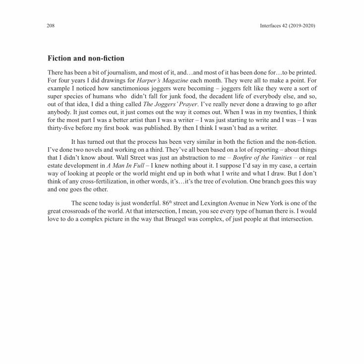
208 Interfaces 42 (2019-2020)
Fiction and non-fiction
There has been a bit of journalism, and most of it, and…and most of it has been done for…to be printed. For four years I did drawings for Harper’s Magazine each month. They were all to make a point. For example I noticed how sanctimonious joggers were becoming – joggers felt like they were a sort of super species of humans who didn’t fall for junk food, the decadent life of everybody else, and so, out of that idea, I did a thing called The Joggers’ Prayer. I’ve really never done a drawing to go after anybody. It just comes out, it just comes out the way it comes out. When I was in my twenties, I think for the most part I was a better artist than I was a writer – I was just starting to write and I was – I was thirty-five before my first book was published. By then I think I wasn’t bad as a writer.
It has turned out that the process has been very similar in both the fiction and the non-fiction. I’ve done two novels and working on a third. They’ve all been based on a lot of reporting – about things that I didn’t know about. Wall Street was just an abstraction to me – Bonfire of the Vanities – or real estate development in A Man In Full – I knew nothing about it. I suppose I’d say in my case, a certain way of looking at people or the world might end up in both what I write and what I draw. But I don’t think of any cross-fertilization, in other words, it’s…it’s the tree of evolution. One branch goes this way and one goes the other.
The scene today is just wonderful. 86th street and Lexington Avenue in New York is one of the great crossroads of the world. At that intersection, I mean, you see every type of human there is. I would love to do a complex picture in the way that Bruegel was complex, of just people at that intersection.

209
NOTES ON CONTRIBUTORS
Maurice A. Géracht, Stephen J Prior Professor of the Humanities, has taught English and American Literature at the College of the Holy Cross since 1966. He has published widely on 18th, 19th and 20th century English, American and French authors and artists including: J. Dryden, D. Defoe, J. Swift, T. Smollett W.M Thackeray, G. Eliot, J.F. Cooper, H. James, G. Sand, H. Balzac, A. Gide, and V. Woolf. The latest “The Color of Things, in Henry James’s The Ambassadors: Complicating The Process of Vision” appeared in Word & Image: A Journal of Verbal/Visual Inquiry, WORD & IMAGE, VOL. 34, NO. 2, 2018 He also has written reviews, catalog essays and notes for and artist exhibition. He has been invested in INTERFACES since its founding, and has served as a co-editor since 1999.
Specializing in German and Russian, Brittain Smith received his Ph.D. in Comparative Literature from the University of Chicago. He has taught film, literature, and philosophy at Loyola University, New Orleans and Boston University. Currently the Director of Study Abroad at the College of the Holy Cross, Smith is the translator and editor of Friedrich Nietzsche’s Dawn, Volume 5 of The Complete Works of Friedrich Nietzsche published by Stanford University Press.
Alice Scheer est agrégée de lettres modernes et consacre actuellement sa thèse de doctorat en Lettres et Arts à la collection des « Sentiers de la création », parue aux Éditions Albert Skira entre 1969 et 1976. Elle effectue ses recherches à l’Université de Lyon (2) sous la direction de Dominique Carlat, au sein du laboratoire Passages XX-XXI. Elle s’est attachée, dans plusieurs articles, à étudier les relations entre texte et images, soit à l’échelle de la collection en s’intéressant notamment aux images recadrées et aux pensées du détails (Quêtes littéraires, n°5, E. Kociubmska et J. Niedokos (eds.), Lublin, Wydawnictwo Werset, 2015, également disponible en ligne : http://www.kul.pl/files/60/quetes_litteraires_n5_2015_alice_scheer.pdf) soit à celle d’un volume en particulier, tels celui de Jean Starobinski (Bulletin du cercle Jean Starobinski, 7/2017, disponible en ligne, ou celui de Jean Tardieu (Revue en ligne Textimage, Varia 5).
Margaret Denton is Associate Professor Emerita of Art History at the University of Richmond in Richmond, Virginia. She received her PhD from New York University’s Institute of Fine Arts where she studied early nineteenth-century French painting. She has published articles on this subject including a study of Nicolas Poussin’s The Arcadian Shepherds and burial reform in France (Eighteenth-Century Studies, 2003), and an examination of the work of Angélique Mongez in relation to the gendering of

210 Interfaces 42 (2019-2020)
genres in late eighteenth-century French painting (Art History,1998). A Gould Fellowship at Princeton University during the 1999-2000 academic year provided the opportunity to pursue research on early photography in France. The results of this research were several talks, an article on the discourse of photography as art in France during the 1850s (Art History , 2002), and an article in History of Photography on Louis-Auguste Martin’s Promenades poétiques et daguerriennes--Bellevue (2011). Her current research project examines the ways in which photography figures into thinking about history in mid-nineteenth-century France.
Eric T. Haskell is Professor Emeritus of French Studies & Interdisciplinary Humanities at Scripps College (Claremont University Consortium, California) where he is also Director Emeritus of the college’s Clark Humanities Museum. His publications cover a wide range of interart topics from nineteenth-century poetry to garden history. A frequent guest lecturer, he has delivered over 550 lectures and papers in twenty-five states and eleven foreign countries. He has also curated a dozen exhibitions and authored numerous exhibition catalogues. His Le Nôtre’s Gardens accompanied an exhibition he curated at the Huntington Library, Art Collections, and Botanical Gardens. His most recent book, Les Jardins de Brécy: Le Paradis Retrouvé, was published in Paris by Les Éditions du Huitième Jour. Recently, two of France’s highest honors were bestowed upon Dr. Haskell. By decree of the French Minister of Culture, he was knighted Chevalier de l’Ordre des Arts et des Lettres. By recommendation of the French Minister of Education, he was also inducted as Chevalier de l’Ordre des Palmes Académiques, the oldest non-military decoration of France and the most prestigious honor for academics.
Corentin Lahouste is a researcher, as aspirant FNRS (Belgian Fonds National de la Recherche Scientifique), at UCLouvain (Belgium), within the Centre de recherche sur l’imaginaire (CRI/INCAL). He is the author of a PhD thesis, under the co-direction of prof. Myriam Watthee-Delmotte (UCLouvain) and prof. Bertrand Gervais (UQÀM, Montréal), dedicated to figures, forms and postures of the anarchic in French speaking contemporary literature. His doctoral research was focused on the works of Marcel Moreau, Yannick Haenel and Philippe De Jonckheere (hypermedia). He had the opportunity to publish the findings of his works in the form of articles in journals such as Studi Francesi, Fixxion or Mémoires du livre/Studies in Book Culture. He co-edited, with Charline Lambert, the issues 3-4 of the 72nd volume of Les Lettres romanes, titled La réappropriation du sensible et du sensoriel dans la littérature française des XXe et XXIe siècles.
Nataliya Lenina (Ph.D., University of Toronto, 2013) teaches French and Belgian literature at York University, Glendon College (Toronto) since September 2014. Nataliya is the author of several articles

211
on Georges Rodenbach and Suzanne Lilar (Belgian authors on whom she devoted her thesis), but also the Satin Slipper by Paul Claudel and the myth of Don Juan in Molière, Da Ponte / Mozart and Pushkin.
Anne-Kathrin Marquardt studied English literature at the ENS de Lyon, France, where she earned the French teaching qualification agrégation. She holds a Master’s degree in English from the ENS de Lyon and a Master’s in European Studies from the FU Berlin. She currently teaches undergraduate English courses in literature, culture and language in Paris. For more information, please see: http://ens-lyon.academia.edu/AnneKathrinMarquardt.
Vera Fasshauer is a postdoctoral research fellow and lecturer in the Department of German Studies at the Goethe University of Frankfurt, Germany. She has studied German and English literature as well as art history at the Friedrich Schiller University of Jena, where she was also awarded her PhD for her study on The Poetics of Ugliness in the 18th Century in 2014. Apart from 18th and 19th century aesthetics and poetics, her research also focuses on Enlightenment and gender studies as well as the history of science and religious dissent. After engaging in several projects devoted to the digital edition and analysis of handwritten early modern ego-documents, she is currently investigating the form, function and contexts of Johann Christian Senckenberg’s journals.
Nadia Fartas est docteure en littérature (EHESS-Université Paris-Sorbonne) associée au Centre de recherches sur les arts et le langage (CRAL), ses travaux portent sur les relations entre poétique, esthétique et politique (XIXe-XXIe siècles) ainsi que sur les rapports entre le visuel et le verbal, le texte et l’image. Professeure de Lettres au lycée, elle enseigne également à l’université de Cergy-Pontoise après avoir assuré des cours à l’École européenne supérieure d’art de Bretagne et à l’École des hautes études en sciences sociales. Elle a auparavant collaboré avec des associations et des structures publiques dans le domaine des arts visuels en tant que chargée des éditions et des expositions.
Didier Aubert est maître de conférences en civilisation américaine en l’université Sorbonne Nouvelle Paris 3 et membre de l’UMR Thalim. Son travail sur la photographie sociale et documentaire dans les Amériques a été publié dans Etudes Photographiques, IdeAs, MondeS, la RFEA, et Visual Studies. Membre des comités de rédaction de L’Amérique des images (2013), Transatlantic Cultures (ANR 2016-2020), Transatlantica. Mavcor Fellow (Yale, 2016-2020).
Fabienne Gaspari is a senior lecturer at the University of Pau where she teaches nineteenth-century British literature. She focuses on the relationships between writing and the body. Her 2012 study, “Morsels for the gods”: l’écriture du visage dans la littérature britannique (1839-1900), examined
Notes on Contributors

212 Interfaces 42 (2019-2020)
novelistic treatments of the visage. She has published papers on nineteenth-century British authors including George Moore, Thomas Hardy and Joseph Conrad.
Melissa Schoenberger is Assistant Professor of English at the College of the Holy Cross, where she specializes in Restoration and eighteenth-century poetry. She is the author of Cultivating Peace: The Virgilian Georgic in English, 1650–1750 (Bucknell, 2019), and has published articles in Restoration: Studies in English Literary Culture, 1660–1700; Translation and Literature; and Philological Quarterly.
Donald Friedman, a novelist, essayist, sometime lawyer, but never a scholar, somehow produced the internationally acclaimed The Writer’s Brush: Paintings, Drawings, and Sculpture by Writers. That book brought together the visual art of more than 200 of the world’s great writers. To celebrate its publication, he planned a modest exhibition of writer-art which, with the assistance of John Wronoski, antiquarian bookseller and art dealer, was enlarged to include dozens of poets and writers somehow omitted from the book, and became a museum-scale show (https://donaldfriedman.com/ books/ the-writers-brush-the-exhibition/ ). Along the way to the book and the exhibition, Friedman interviewed a number of writer-artists on camera. Excerpts of those interviews are being posted on Interfaces’ website, accompanied by transcripts and introductions. The last issue presented Derek Walcott and the current one features Jules Feiffer. For Interfaces contributors, subscribers, and friends interested in acquiring copies of The Writer’s Brush direct from the author at a deep discount, please contact him through his website : https://donaldfriedman.com/ books/ the-writers-brush/ /
Cristi Rinklin received her MFA from the University of Minnesota, Minneapolis in 1999, and her BFA in painting from Maryland Institute, College of Art in 1989. She has exhibited her work in galleries and museums throughout the United States, as well as venues in Rome, Florence, and Amsterdam. Rinklin is represented by Steven Zevitas Gallery in Boston, where she had a recent solo exhibition, The Weight of Ghosts. She has had numerous national and international exhibitions in galleries and museums throughout New England, and venues in New York, Los Angeles, Minneapolis, Madison, Baton Rouge, Seattle, Florence, and Amsterdam. Rinklin is the recipient of grants from the Massachusetts Cultural Council, the Berkshire Taconic Artist’s Resource Trust and the Jerome Foundation Fellowship, and has been a Visiting Artist/Scholar at the American Academy in Rome. Rinklin has been teaching at the College of the Holy Cross, in Worcester, MA, since 2002, and was promoted to Full Professor in 2018. Cristi Rinklin lives and works in Boston, MA.

213
MRT series
Cristi Rinklin

214 Interfaces 42 (2019-2020)
Artist’s StatementOver the past decade, the landscape has been a consistent motif throughout my work. Rather
than being a faithful representation of the natural world we inhabit, it becomes a manifestation of desire and memory imposed upon by the artifice of technology. The work I produce samples from the rich visual language of constructed reality that permeates the history of pictorial space, both in its analog and digital constructions. For example, my work is made with awareness of the tradition of illusion-ism in the historical practice of Painting: its ability to both create a simulated reality that psychically transports the viewer, and to function as a mirror that reflects the subconscious. Alongside this are the conditions of our contemporary viewing experience. We are bombarded by constructed realities that are mediated by the Internet, virtual reality, gaming, and cinema, which create worlds that we psycho-logically inhabit. Like painting, these virtual constructs can become a reflection of our desires, as well as our deep-seated fears, and they profoundly shape the way we experience and imagine reality. These notions have long informed the work that I make.
While earlier iterations of my work evoked more exaggerated artifice and flamboyant abstrac-tion, the recent paintings place the realism of the landscapes more prominently, offering a contemplative space that invites the viewer to explore within. While there is beauty here, there is also a conspicuous human absence in these uninhabited, detached fragments that float in ambiguous, abstract spaces. Much in the way that memories exist in fragments with gaping voids of lost information, these landscapes hover in a state of dreamy and melancholy suspension, as if these apparitions are all that is left of a world that no longer exists. This sense of uncertainty and detachment, or “solastalgia,” is a persistent symptom of our contemporary condition of facing an unknown future. This term, coined by Australian philosopher Glenn Albrecht, describes a form of existential distress caused by drastic environmental changes due to factors such as urban expansion, forest fragmentation, extraction-mining and fracking, which physically disrupt and alter the natural world and threaten its very existence. While the notion of a post-human world may have disturbing implications, I also find poetic beauty in the idea that life and consciousness may exist outside of human experience, and that some echo will persist, with or without our participation.
The paintings represented here. (Remnants II, Os, and Ruinas) make reference to the disrupted landscapes of mountaintop removal. Mountaintop Removal coal mining, described as coal mining on steroids, involves systematically blowing up a mountain to extract coal deposits. This practice is preva-lent in the Appalachian region of the U.S., and is done heavily with machinery and automation rather than manpower. I witnessed this practice during the Summer of 2017 when I travelled to West Virginia to connect with a regional environmental group to document some of these sites with a drone, (and subsequently shared my video footage with them for their outreach purposes). The works were inspired by and informed by that research trip. These works were part of a recent solo exhibition, The Weight of Ghosts, at Steven Zevitas Gallery, in Boston, who also represents my work. You can see more of this work on my website: www.cristirinklin.com

215
Cristi RinklinWorks List
“Remnants,” 2017, Oil and Acrylic on Aluminum, 48" x 60" Photo credit: Stewart Clements Photography
“Remnants II,” 2018, Oil and Acrylic on Aluminum, 48" x 72" Photo credit: Stewart Clements Photography
“Os” 2017, Oil and Acrylic on Aluminum, 40" x 50" Photo credit: Stewart Clements Photography
“Ruinas,” 2017, Oil and Acrylic on Aluminum, 48" x 72" Photo credit: Stewart Clements Photography
“Ghosts,” 2019, Oil and Acrylic on Aluminum, 48" x 46" Photo credit: Stewart Clements Photography
“Fissure,” 2019, Oil and Acrylic on Aluminum, 65" x 48" Photo credit: Stewart Clements Photography
“MTR” 2016, Oil and Acrylic on Aluminum, 48" x 72" Photo credit: Stewart Clements Photography
“MTR II” 2016, Oil and Acrylic on Aluminum, 50" x 48" Photo credit: Stewart Clements Photography

216 Interfaces 42 (2019-2020)
“Remnants,” 2017, Oil and Acrylic on Aluminum, 48" x 60"Photo credit: Stewart Clements Photography

217
“Remnants II,” 2018, Oil and Acrylic on Aluminum, 48" x 72"Photo credit: Stewart Clements Photography

218 Interfaces 42 (2019-2020)
“Os” 2017, Oil and Acrylic on Aluminum, 40" x 50"Photo credit: Stewart Clements Photography

219
“Ruinas,” 2017, Oil and Acrylic on Aluminum, 48" x 72"Photo credit: Stewart Clements Photography

220 Interfaces 42 (2019-2020)
“Ghosts,” 2019, Oil and Acrylic on Aluminum, 48" x 46"Photo credit: Stewart Clements Photography

221
“Fissure,” 2019, Oil and Acrylic on Aluminum, 65” x 48”Photo credit: Stewart Clements Photography

222 Interfaces 42 (2019-2020)
“MTR” 2016, Oil and Acrylic on Aluminum, 48" x 72"Photo credit: Stewart Clements Photography

223
“MTR II” 2016, Oil and Acrylic on Aluminum, 50" x 48"Photo credit: Stewart Clements Photography

224 Interfaces 42 (2019-2020)

La revue Interfaces a été fondée en 1991 par un groupe d’enseignants du département d’anglais de l’université de Bourgogne qui comprenait Michel Baridon (rédacteur en chef jusqu’en 2001), Yves Carlet (aujourd’hui à Montpellier), Jean-Pierre Durix (Université de Bourgogne), François Pitavy (aujourd’hui Emérite), Jean-Michel Rabaté (aujourd’hui à Philadelphie), Michel Ratié (Université de Bourgogne).
Constatant le rôle de la culture visuelle dans notre civilisation, ces enseignants souhaitaient élargir le champ et les méthodes de leur enseignement en explorant la relation image/langage. Afin d’envisager cette relation sous l’angle le plus large possible, ils souhaitaient ne pas la limiter aux échanges entre les arts et la littérature mais l’étendre à la linguistique et à l’épistémologie.
La revue, qui est bilingue (français/anglais), a bénéficié, dès l’origine, du concours d’enseignants-chercheurs qui approuvaient sa démarche et ses objectifs: Maurice Géracht, professeur au College of the Holy Cross, Worcester, Massachusetts, États-Unis, et Frédéric Ogée (Université Paris Diderot, Institut Charles V) qui reprenait la tradition du séminaire de civilisation d’André Parreaux dans cette université.
La 3° de couverture présentait la revue dans des termes qui la définissent toujours: Interfaces est une revue annuelle, illustrée et bilingue, qui prend pour champ l’interface, la surface de partage, entre deux moyens d’expression différents mais connexes: l’image et le langage.
Interfaces a obtenu la reconnaissance du CNRS en 1995.
In 2010 Interfaces received the “Parnassus Award for Significant Editorial Achievement” from the Council of Editors of Learned Journals.
Editorial boardJournal published by: the College of the Holy Cross (Worcester, Mass., USA), Université Paris-Diderot (France) and Université de Bourgogne-Franche-Comté (UBFC, France)Founding editor: Michel Baridon (Université de Bourgogne)Directors: Sophie Aymes (UBFC), Maurice A. Géracht (Holy Cross)Chief editor: Marie-Odile Bernez (UBFC)Editorial board: Carole Cambray (Paris-Diderot), Madigan Haley (Holy Cross), Véronique Liard (UBFC), Fiona McMahon (UBFC), Christelle Serée-Chaussinand (UBFC), Brittain Smith (Holy Cross), Shannon Wells-Lassagne (UBFC)Book Review Editor: Fiona McMahon (UBFC)Treasurer: Christelle Serée-Chaussinand (UBFC)
Layout design: Sharon Matys (Holy Cross)Cover Art: Cristi Rinklin
Advisory boardStephen Bann (University of Bristol, UK), Catherine Bernard (Université Paris-Diderot, France), Pascale Borrel (Université Rennes 2, France), Johanna Drucker (UCLA, University of California, Los Angeles, USA), Julie Grossman (Le Moyne University, USA)John Dixon Hunt (University of Pennsylvania, USA), Philippe Kaenel (UNIL, Université de Lausanne, Switzerland), Liliane Louvel (Université de Poitiers, France), Frédéric Ogée (Université Paris-Diderot, France), Veronique Plesch (Colby College, USA), Jean-Michel Rabaté (University of Pennsylvania, USA), Gabriele Rippl (UNIBE, University of Bern, Switzerland), Monique Tschofen (Ryerson University, Canada)
Scientific policyInterfaces is a bilingual (English/French) scholarly journal founded by Michel Baridon (University of Burgundy) in 1991, edited by the College of the Holy Cross (Worcester, Massachusetts, USA), the University of Burgundy and the University of Paris-Diderot. It focuses on intermediality, on the relationship between text(s) and image(s), art and literature, history and visual sources as well as extending to the history of the visual arts and the epistemology of images, especially in a comparative perspective in francophone and anglophone domains. The papers appearing in Interfaces focus on contemporary theoretical debates (digital creation and images, theories of adaptation, theoretical advances, etc.) and the journal will broaden its ambit to include geographical areas that are under-represented in our fields of research (Africa, South America, Asia).
Interfaces addresses specialists of various disciplines in the Humanities directly, but might also interest some science departments focusing on classes in epistemology and the history of the sciences, as well as specialists in adjoining fields like publishing.
Interfaces moved online in 2018 and its editorial standards meet the requirements of open digital edition.

VO
L 42 - IN
TE
RFA
CE
S - 2019
INTERFACESIMAGE TEXTE LANGUAGE
CREATIVE PATHSLES SENTIERS DE LA CRÉATION
ParnassusAward 42COLLEGE OF THE HOLY CROSS
UNIVERSITÉ PARIS DIDEROT UNIVERSITÉ DE BOURGOGNE - Dijon
REVUE RECONNUE PAR LE CNRS
PRIX: 40 € / $ 50.00 US - ISBN - 978-1-7341985-2-2
IMAGE TEXTE LANGUAGEINTERFACES
CONTENTSMaurice GÉRACHT and Brittain SMITH
IntroductionAlice SCHEER
Illustrer « les sentiers de la création » : des cheminements singuliersMargaret FIELDS DENTON
Promenades poétiques et daguerriennes—Bellevue : Photography and NarrationEric T. HASKELL
Baudelaire’s “Le Jet d’eau”: Verbal-Visual Inquiry and the Illustrated BookCorentin LAHOUSTE
Donner à voir l’irreprésentable, faire trembler le réel : l’agir symbolique des œuvres d’art reproduites dans Cercle de Yannick Haenel
Nataliya LENINA « Grâce poétique » et œuvre d’art : méditations phénoménologiques dans le Journal de l’analogiste de Suzanne Lilar
Anne-Kathrin MARQUARDT The Mathematician, the Surrealist, and the Poet are of Imagination All Compact: Man Ray’s Shakespearean Equations
Vera FASSHAUER Unharmonious Images Conceived by Troubled Minds: Graphic and Literary Caricatures in Heinrich Heine’s French Affairs and French Painters
Nadia FARTAS « Derrière un grillage » d’Octave Mirbeau et l’hommage des artistes à Picquart
REVIEWSDidier AUBERT
Mathilde Arrivé, Le primitivisme mélancolique d’Edward S. Curtis. Montpellier : Presses universitaires de la Méditerranée, 2019. 322pp
Fabienne GASPARI Evanghelia Stead (ed.). Reading Books and Prints as Cultural Objects. Palgrave Macmillan, New Directions in Book History, 2018 [ISBN 978-3-319-53831-0]
Melissa SCHOENBERGER Charles I: King and Collector, Exhibition Catalogue; Exhibition Curated by Per Rumberg and Desmond Shawe-Taylor, Assisted by Lucy Chiswell and Niko Munz. (Royal Academy of Arts: London, 2018). 256 pp. $65.00
Donald FRIEDMAN Tom Wolfe’s Drawing and Writing
Notes on Contributors
9 781734 198522
55000>ISBN 978-1-7341985-2-2
$50.00