Conversion Optimization Checklist for Conversion Uplift
55
Conversion Optimization Checklist for Conversion Uplift A principle based user centric approach to converting more visitors into customers. www.conversionlifters.com
-
Upload
khangminh22 -
Category
Documents
-
view
4 -
download
0
Transcript of Conversion Optimization Checklist for Conversion Uplift

Conversion Optimization Checklist for Conversion Uplift
A principle based user centric approach to converting more visitors into customers.
www.conversionlifters.com

Conversion Optimization Checklist for Conversion Uplift
Published 2014 Conversion Optimization Checklist For Conversion Uplift, by Conversion Lifters Please keep proprietary information contained in this report within your company.
Legal Notice This report identifies product names and services known to be trademarks, registered trademarks, or service marks of their respective holders. They are used throughout this report in an editorial fashion only.
Earnings Disclaimer As with any business, your results may vary, and will be based on your individual capacity, business experience, and level of desire. The use of this information should be based on your own due diligence and you agree that Conversion Lifters is not liable for any success or failure of your business that is directly or indirectly related to the purchase and use of the information in this report.

This is a condensed version of our Comprehensive Optimization Checklist valued at $1,500.
*** Limited Time Offer ***
As an NASE visitor, the full version of the Conversion Optimization Checklist with 88 more pages of conversion lifting recommendations is
available exclusively to you for only $99 for a limited time.
To get the full 140 page Conversion Optimization Checklist, simply email us at [email protected] with discount code “NASE” in the
subject line to receive this exclusive limited time offer.
What Clients Are Saying About the Comprehensive Conversion Optimization Checklist…
“...recommendations were spot on and have proved to be invaluable to our success. We highly recommend...”
- Dan Cohn / Docusearch.com
“I have never seen such a comprehensive list of angles from which to approach the conversion puzzle.”
- Kim Isley / TreesForAChange.com
“My conversion rate went up quickly just by editing the first few items.”
- Karen Brand Roy / Karenville.com

Summary:
The following is an unedited checkpoint list of conversion optimization recommendations.
Typically we analyze a finished website against this check-list to see where changes can be made to improve conversions.
Proven Success Rates
Our clients have seen success in lifting their conversion rates and revenue after using the recommendations listed in the Comprehensive Conversion Optimization Check-list.
Not every recommendation will apply to your website as we never know which type of website we will be analyzing – ecommerce, brochure, etc. However, the most vital elements of this check-list will apply to every site.
Businesses Should Be Continuously Split Testing
Split testing should always be a part of your conversion optimization strategy. While the following is a list of best practices backed by research of proven success – there are some instances where best practice doesn’t win a split test.
Through split testing, you can continuously improve upon your page version.
3rd Party Conversion Lifting Platforms
We’ve also found and included some of the most affordable solutions that we could find that will help to increase your conversions and sales. They all come with free trials so that you can first test them out, gauge the impact on conversions and then weigh the return on investment.
A Referral Program solution – Page 21
A Visitor Abandonment Detection solution – Page 42
A Split Testing Solution – Page 54
At the end of this report, you’ll find information on the bundled Customer Research solution in which access to the private free beta is granted in the full version of the Conversion Optimization Checklist. See page 48.
This solution bundles live chat, website surveys, user tester recruitment, heat mapping, visitor playback sessions and form & funnel analysis.

Why Conversion Optimization Is Vital To Your Business
According to a recent study by Adobe, most companies spend a ratio of $92 to only $1 on online advertising vs. conversion rate optimization. In other words, most businesses spend 92X more on online advertising and bringing in traffic -through Google AdWords and Search Engine Optimization - and then spend miniscule amounts on actually turning that traffic into sales and profit. This is a backwards approach to digital marketing. Businesses should first fine tune their websites to ensure that they are functioning as automated profit making machines. Once that has been accomplished, then they should focus on spending money to open the flood gates of traffic. Otherwise, that traffic inevitably just trickles out – and your money is poured down the drain. As with most businesses, much time is spent focusing on the daily operations – improving website conversion gets put to the side. The opportunity for growth and profit is lost. While this opportunity is lost – competitors are capitalizing on their website’s performance and stealing your market share. Not to mention, your customer acquisition cost gets higher and higher. In contrast, when your conversion rate increases, you can suddenly afford to advertise more aggressively and expand your media channels because cost-per-acquisition has gone down dramatically. With this additional room in your budget, you can now invest in bigger marketing campaigns, get further reach, pay affiliates a higher commission, hire extra staff and do more business building activities that make the business grow and grow. This is why Conversion Rate Optimization is so important for online businesses all around the globe.

Conversion Lifters Methodology
“Pay attention to what users do, not what they say.” -Jakob Nielsen, usability expert
Conversion Lifters Core CRO Principles Our Conversion Lifters methodology was created after studying the success of hundreds of online businesses and delving deep into user research studies. We don’t give opinions. We base our recommendations on ongoing website usability research studies that are conducted around the world. It is website users, themselves, that tell us how they operate while browsing websites – not theory. Core Principle I: Define Value Proposition A value proposition differentiates you from your competitors, stops visitors in their tracks and encourages them to commit to engaging with your website. Core Principle 2: Build Trust Trust must be established before you ask your visitors to take action. Core Principle 3: Increase Relevance It’s vital that you speak to the right prospect in the right way at the right time. Core Principle 4: Provide Clarity Clearly defining your offering with concise copy keeps visitors from becoming confused. Core Principle 5: Amplify Desire By optimizing the offer, your product or service becomes irresistible. Core Principle 6: Reduce Friction By reducing friction you eliminate the obstacles that are keeping visitors from becoming customers. Core Principle 7: Add Urgency Urgency helps to push your visitors to act now, rather than later – which could turn into never.

Core Conversion Principles
By taking a principle-based approach coupled with the findings found in user study research – we’re able to create outstanding results for our clients. The key to achieving the highest results in the shortest amount of time is in knowing what to change.
Rather than make random suggestions – we’ve backed them up with scientific research and expert advice so that you can see why the suggestions are important.

5 Second Test
There’s a rule of thumb in the conversion industry that the average web visitor will evaluate a web page for 5 seconds before deciding to either become another Bounce, or engage the page, and move to another step in the funnel.
In order to decide if they will engage with your website, they must first orient themselves to determine if your website is where they want to be. Testing shows that when people first arrive on your business website, the first place their eyes go is the top left of the page. They’re NOT reading at this point. What they're actually doing is trying to figure out where they are.
You want it to be crystal clear to your visitors, upon arrival, where they are and what you have to offer. Because, if they bounce in the first 5 seconds nothing else in this report will matter. It’s that important.
You can help them quickly ascertain where they are and what you have to offer through your logo, company name, tagline and headlines.
Being so close and involved with your website, it may be difficult for you to conduct a 5 second test yourself. Ask a few people to look at your website for no more than 5 seconds, possibly by conducting user tests, then see if they are able to ascertain what your site is about and what you have to offer within 5 seconds.

Define Value Proposition Without a unique value proposition, your visitors are left wondering - “Why should I buy from you?” What makes you different from your competitors? As they search through the many websites that are available to them – they are looking for something that stands out that helps them feel like they are making the best choice.
Having a strong value proposition is so important that MarketingExperiments created this formula to show its importance in the conversion process.
In this formula:
C represents conversions. M represents how visitor motivation matches the offer. V represents the clarity level of your value proposition. I represents the incentives that reduce friction. F represents friction in the buying process. A represents anxiety in the buying process.
As you can see in this formula, Motivation appears as the most important factor in the conversion sequence. However, Motivation can be influenced by many factors. Therefore, it is out of your control.
However, Value Proposition, the second most important factor, is something that can be controlled by you.
Define your value proposition so that visitors feel that you are the best choice.
Clearly identify your unique value proposition (Evaluate)
Your unique value proposition is what sets you apart from your competition, stops visitors in their tracks and helps prospects to commit to engaging with your website.
What sets you apart from the competition?
Dig deep to determine what sets you apart from your competition. Your unique value proposition should be something that is difficult for your competitors to duplicate. Pinpoint your most powerful value proposition and then position your next two most powerful as your secondary differentiators.

To find your unique value proposition, make a list of everything that potentially makes you and your offering different from that of your competitor.
Write down everything. Even if it’s something that you may not have thought of as different. You’d be surprised at the hidden gem that you may uncover.
To help narrow down how you’re unique value proposition, ask yourself these questions:
1. How exactly are you different from your competition? 2. How easy would it be for your competition to duplicate this difference? 3. Which of these unique value propositions would be most valuable to your particular customer
base? 4. Which of these unique value propositions would be most easily understood by your customer
base? And can they understand it within 5 seconds or less?
Branding
Add a tagline (Evaluate)
A tagline is your immediate opportunity to clearly tell visitors what you have to offer. If they’re not sure what you have to offer – they’ll look for a website where they are sure – your competitor’s.
Your tagline is the most important ad piece you’ll ever create. A tagline must be succinct – meaning it should say as much as possible in as few words as possible. To capitalize on this one line sales pitch, find a way to clearly include your service offering and why your offering is unique to competitors.
Things to remember when creating a tagline:
Clarify your service offering Include a key benefit – ideally, your USP Address a goal or problem Be memorable Impart positive feelings about the brand
Be unusable by competitors

Improve the tagline (Evaluate)
Create a tagline that better clarifies your service offering and how it is unique to competitors.
Your tagline is the most important ad piece you’ll ever create. A tagline must be succinct – meaning it should say as much as possible in as few words as possible. To capitalize on this one line sales pitch, find a way to clearly include your service offering and why your offering is unique to competitors.
Things to remember when creating a tagline:
Clarify your service offering Include a key benefit – ideally, your USP Address a goal or problem Be memorable Impart positive feelings about the brand Be unusable by competitors
Add a headline (Evaluate)
"On the average, five times as many people read the headline as read the body copy. It follows that, if you don’t sell the product in your headline, you have wasted 80% of your money." – David Ogilvy Headlines are the most important element in a copywriting piece. They are what grab your reader’s attention and intrigue them to read further. Without one, you run the risk of visitors skipping right past your copy.
Improve headlines (Evaluate)
"On the average, five times as many people read the headline as read the body copy. It follows that, if you don’t sell the product in your headline, you have wasted 80% of your money." – David Ogilvy Your headline needs to be more compelling in order to intrigue visitors to read further.

The full version of the Conversion Optimization Checklist contains 8 more recommendations that Define Your Value Proposition. Find out…
How to show visitors that you are serious about your unique value proposition.
How to further strengthen and support your value proposition. Other areas where a value proposition should be defined. 2 branding strategies that have been effectively used by big businesses
that you should consider. How to make your brand permeate throughout your website.
Build Trust Visitors are leery when shopping online. Their asked to submit personal and credit card information, trust that online businesses are real and not fraudulent, and believe that their transactions will be handled appropriately in regards to efficiency.
That’s a lot to ask of your visitors. It’s your job to provide elements that show your visitors that they can trust doing business with you. Otherwise, you risk converting them into customers.
Add live chat (Evaluate)
A live chat tool shows visitors that you are a real company with real people standing by right now so they are more confident to make a purchase.
Use a live chat tool to speak with visitors live to find out their most pressing questions. For visitors who have questions or sales objections, a live chat operator will handle that and help the visitor make a purchase.

Not only is this valuable for collecting visitor insights, which you can then inject into the website sales copy, but having a full time sales representative on live chat can increase conversions in itself because they can act as a ‘closer’.
Studies show that 77% of consumers that use live chat consider it a critical communication tool. When participants were asked which is their preferred method of communication with a business, live chat is neck and neck with phone communication.
Of those who prefer live chat- time was a major factor - with 79% saying that it was the most efficient way to get their questions answered quickly and help them move forward with the sale.
Website Magazine reported a study that found that up to 40% of consumers that used live chat made a purchase or became a lead.
The other benefit with live chat is even if visitors don’t need to engage with it, seeing that an operator is standing by gives them confidence in your company – making them more likely to engage with your business.
Correct Example:

Provide results or offer free services (Evaluate)
Providing results in advance, before asking your customers to pay, reduces the sense of risk that your prospects feel before deciding to purchase your products or services.
Crest Media does this well with their SEO services by promising to get their clients to the top of search engines or it’s free.
.
Add a toll-free phone number to the top of every page (Evaluate)
In the best of brick and mortar stores, assistants are readily available to help answer customer’s questions in order to help them make a purchase.
Think about the times when you’ve walked through a store and store assistants could be easily spotted so that you could ask for help – as opposed to the times you’ve walked through a store and weren’t able to find anyone and became irritated and frustrated. Possibly even giving up on what you were looking for.
Your visitors may have a quick question that they need to ask in order to close a sale.

Be easily accessible to your visitors by prominently displaying your toll-free phone number to the top of every page.
Correct example:
Security and Trust Seals
Secure sensitive pages with SSL (Evaluate)
Asking customers to enter sensitive information on pages that are not SSL secured is reckless in the cyber world. SSL encrypts data - such as credit card numbers - so that they cannot be revealed to anyone – especially hackers.
If you think your visitors won’t be able to tell if a page is SSL secured – guess again. As the website address bar below shows, all secured pages are prefaced with ‘https’ – as opposed to ‘http’ for standard pages.
Display security, privacy and business identification seals in footer and checkout area (Evaluate)
If your business isn’t well known, most visitors won’t have complete confidence in your website’s security and credibility. By displaying trust seals, you increase trust and reduce anxiety.
Keep in mind that there is a wide variety in prices for trust seals. Purchasing from the most respected providers is highly recommended. Testing has proven that - seals provided by highly trusted providers yields the highest return on investment.
You may spend a few extra dollars – but the increase in sales will far outweigh the cost.
A study at Baymard Institute verifies these findings. Notice that a VeriSign seal wasn’t included in this test. However, the favored seal – the Norton seal – is powered by VeriSign:

Source: http://baymard.com/blog/site-seal-trust
Display security seals
Security seals serve several purposes:
1. They verify to visitors that your website is secured with SSL and all sensitive information is encrypted.
2. They confirm that your website has been verified to be a legitimate business. 3. Some carry an “insurance” amount to back up their claims – adding more credibility and
reassurance. These amounts can range from $10,000 on up past $250,000.
Use the Norton Shopping Guarantee
Address the increasing concerns of online shoppers regarding information security, product authenticity, merchant reliability and getting a good price. This solution is highly complementary to all the other trust and security solutions referenced in this document.
Online retailers who prominently display the Norton Shopping Guarantee benefits throughout the buying process are guaranteed to increase top line revenue by a minimum of 5%. The average lift in conversion for participating merchants is 7.4%.
Symantec provides a free trial and a/b testing tools so that the online retailer can quantify the conversion impact and optimize the solution to maximize profits.

Display privacy seals
Privacy seals certify the statements in your privacy policy that protect your visitor.
Display the Norton Secured seal
Display business identity seal
The Better Business Bureau seal verifies that your business is in good standing with past customers and that you have had few or no complaints.
If your business is in superior standing, you can show that with your A+ rating.
Credibility Factors
Add a unique company story on the About page (Evaluate)
There are a percentage of visitors who want to know the story and the people behind the business. Satisfy that percentage with an About Us page dedicated to giving the unique background on your business.

Showcase that you’re a long established company (Evaluate)
People automatically trust long-established companies more than new ones (assuming the long-established company doesn’t look dated or poorly maintained).
If you’ve been in business for many years – let visitors know that.. Telling that to your visitors would instil a sense of trust in them. You could add a mention of this to the header or on the home page.
Showcase business awards (Evaluate)
If you’ve won any business awards, don’t be afraid to tell people.
Offer a strong guarantee (Evaluate)
It has been shown by many of the most successful online retailers such as Asos, Kogan and many other online stores – that the longer the money-back guarantee is – the greater positive impact on conversion rate.
The principle is simple: consumers are scared and nothing instills confidence more in them than saying to them: “We’ll happily give you your money back if you’re not happy.”
For many profitable E-Commerce stores, they’ve found the increase in profit and conversion rate as a result of implementing this strategy to far outweigh the cost of the refund rate.
You could also consider offering a guarantee that’s based on results, but that works only if the customers can relatively easily measure the impact the course had.
There is also a way to offer a money back guarantee, if it meets certain conditions.
After adding a 2 year guarantee, Horloges.nl saw a 41% increase in conversions and a 6% increase in average order value.
Social Proof
Add testimonials (Evaluate)
Testimonials are a great way to build trust and amplify desire on your website. They work on the principle of social proof. People will think: “If someone else has bought in the past and had a positive experience, there’s less chance that I’ll regret my purchase down the road.”
Testimonials also add a sense of pressure when people talk about how important something is or how they can’t believe that others can live without it.
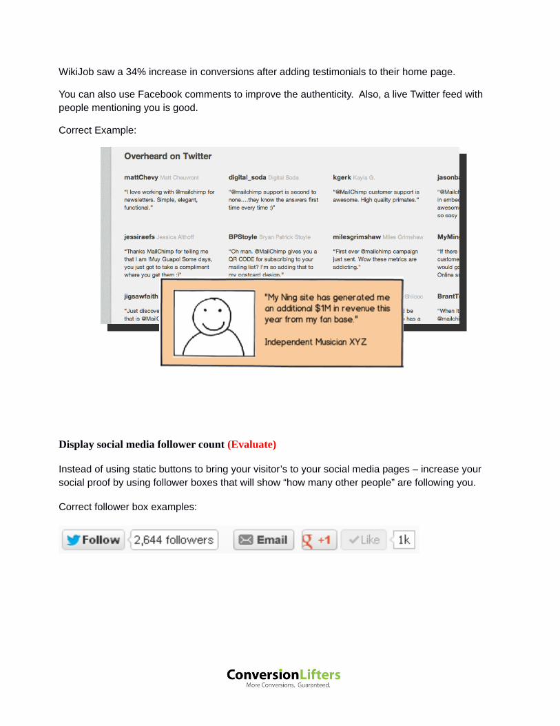
WikiJob saw a 34% increase in conversions after adding testimonials to their home page.
You can also use Facebook comments to improve the authenticity. Also, a live Twitter feed with people mentioning you is good.
Correct Example:
Display social media follower count (Evaluate)
Instead of using static buttons to bring your visitor’s to your social media pages – increase your social proof by using follower boxes that will show “how many other people” are following you.
Correct follower box examples:

Implement a referral program (Evaluate)
Consider adding a referral program to bring in new customers.
Due to its strong social proof, ‘word-of-mouth’ is the most powerful form of advertisement – yet it’s the most neglected. Recommendations from friends and family remain the most valuable and trusted source for most consumers - even more so than the best of advertisements.
An excerpt from the McKinsey Quarterly report states:
“Marketers may spend millions of dollars on elaborately conceived advertising campaigns, yet often what really makes up a consumer’s mind is not only simple but also free: a word-of-mouth recommendation from a trusted source. As consumers overwhelmed by product choices tune out the ever-growing barrage of traditional marketing, word of mouth cuts through the noise quickly and effectively.
Indeed, word of mouth is the primary factor behind 20 to 50 percent of all purchasing decisions. Its influence is greatest when consumers are buying a product for the first time or when products are relatively expensive, factors that tend to make people conduct more research, seek more opinions, and deliberate longer than they otherwise would.”
Therefore, encourage customers to spread the word about your business by rewarding them with cash, prizes or points. Using this method, it’s possible to keep your customer acquisition cost lower than in standard advertising – plus you only pay if a prospect becomes an actual customer.
After implementing the Ambassador referral platform to their website, virtual personal assistant provider, Zirtual now sees 50% of incoming clients coming from referrals.
Ambassador offers a free 14 day trial to gauge referrals and weigh your return-on-investment.
Correct example:

The full version of the Conversion Optimization Checklist contains 24 more recommendations that Build Trust. Find out…
How one big brand optimized their live chat and increased conversions by 211%.
What you can do to make your visitors feel that doing business with you is a good fit.
How you can show visitors that you have serious involvement in your industry and that your expertise can be trusted.
Another technique to use social media to increase social proof. A design element that many businesses use that could actually erode
trust. What one business did to increase social proof that increased conversions
by 102.5%. One technique that would seem to be self defeating but actually helps to
build trust.
Increase Relevance If you get your message to the wrong person at the wrong time – it’s not likely that you’re going to convert them into doing business with you.
Conveying a marketing message that speaks directly to your visitors needs and is presented to the right people at the right time resonates deeper and makes your visitors feel like you’re speaking directly to them.

Speak to your target market (Evaluate)
If you craft your marketing message to speak to everyone – in hopes of getting more sales – you really are speaking to no one at all.
You haven’t tapped into the nerve that speaks to the very specific needs of your specific target market.
If you’re selling baby items and your website’s color scheme is black – you’re missing the mark. If you’re offering a free recipe book when your site sells chainsaws – you’re missing the mark.
Now those are obvious things. But it’s really important that you provide marketing that your target market needs and wants.
Keep copy customer focused (Evaluate)
Visitors really only care about themselves - and they want to know what’s in it for them. Turn your copy around in a way that speaks less about you and focuses more on what’s in it for them.
You can accomplish this by using more instances of the words “you” and “your” rather than using words such as “we”, “use”, “our” or your company name.
Highlight benefits over features (Evaluate)
Since most purchases are primarily an emotional decision, your copy should speak to the visitors emotions through benefits rather than features. Features are great to convey – but your visitors are really interested in knowing how those features will benefit their lives and make them feel. That is the real selling point.
Use copy that focuses on the joy of benefits over the stuffiness of features.
Some of the main reasons consumers make a purchase include:
To solve a problem
To fit in
To be better than others
Greed
To avoid a potential problem – or fear based.

Correct examples:
Feature: Car has 6 side-impact bags. Benefit: Protect your family from side impact accidents.
Feature: Boots have rubber outsole with traction ribbing - Sealed seams render them waterproof. Benefit: Feet won’t get wet if you wear these boots.
Feature: Accounting software that has an online reporting feature. Benefit: Managers have instant, real-time, mission-critical information at a click of a button.
Add a community section (Evaluate)
Community forums are still alive and kicking. Dedicate an area of your site where like-minded visitors can gather and engage in open discussions and give feedback to topics that are of interest to them.
Once they have a place where they know that they can go to do so – they will keep coming back to your site.
Seth Godins’ community at www.triiibes.com is so hot – they aren’t letting anyone else in.
The full version of the Conversion Optimization Checklist contains 12 more recommendations that Increase Relevance. Find out…
An interesting way to get more visitors to fill out your form. It increased form conversions for one business by up to 40%.
How to create buyer personas and why you need them. How to get the most out of something as ordinary as a search bar. How changing 1 image resulted in a 200%-300% increase in purchases for
one business. How to make your visitors feel like you’re talking directly to them. Why it’s important to know where visitors are coming from. How one business increased the relevance of their products and increased
conversions by 95%.

Provide Clarity While it seems obvious – lack of clarity can be a conversion killer as well. Complete clarity helps to dissipate confusion. When there is confusion for your website visitors – you run the risk of losing them as customers.
Keep copy free of spelling and grammatical errors (Evaluate)
Run-on sentences that don’t clearly and concisely get your message across waste valuable space and can leave visitors confused.
Spelling and grammatical errors instantly erode credibility. In your visitor’s minds, a website that contains these errors is amateur – even if the design looks professional.
Provide a clear explanation about your product or service (Evaluate)
Leaving visitors in the dark by not giving as much information as possible about your products or services could hamper your conversions. Provide as much information as possible so that prospects have a clear understanding before they buy.
Tell visitors what to expect (Evaluate)
For most people, the unknown induces anxiety. Even simple requests to take action for a free offering can leave visitors anxious as they are not sure what to expect. They think that maybe they will be pulled into more than what they were prepared for.
By clearly defining and telling your visitors what to expect – you alleviate anxiety and help them to feel more at ease with moving forward.
Make links look like links (Evaluate)
Don’t let your visitors overlook your links. Links are what pull them deeper into your site.
Especially for the people who aren’t tech-savvy, dedicating a color (that doesn’t appear anywhere else on the site) for links makes the site easier to use. Links are also underlined by user standards.

The full version of the Conversion Optimization Checklist contains 5 more recommendations that Provide Clarity. Find out…
How one business changed 1 word to provide better clarity and increased their sales by 89.97%.
One mistake that some websites make that keeps visitors form clicking through.
One thing that some businesses are hiding that could cost them conversions. One business stopped hiding it and displayed it prominently and increased conversions by 100%.
The element that one business moved to a more prominent location and increased sales by 86%
Amplify Desire
Simply putting your products and services out there may convert some visitors – but you’re missing out on valuable opportunities. To maximize conversions, increase the desire and reward of doing business with you throughout your website.
Presentation
Update web design (Evaluate)
“As aesthetically oriented humans, we’re psychologically hardwired to trust beautiful people, and the same goes for websites. Our offline behaviour and inclinations translate to our online existence.” – Dr. Brent Coker Websites that are more attractive and include more trimmings create a greater feeling of trustworthiness and professionalism in consumers.

People judge the book by their cover and your website by its design. The current website looks outdated which leads to some people concluding that the product or service be outdated too. Therefore it is very important to have a modern website to create the perception that your business is on the cutting edge.
Improve the presentation of the product (Evaluate)
Invest in improving the presentation of your products. How you present your products will have a direct impact on how well they sell.
Digital ebooks are more desirable with a professionally designed cover. Clothes look better featured on a human, or a bust, than they do on a hanger.
The small amount of money you invest into your product’s presentation will ultimately translate into higher sales.
Which presentation do you think would result in the most sales?
Bad Better Even Better Best
The first image is a poor depiction of the product.
The second image presents it a little better with hints of the beach – but we still don’t know how it fits on the body.
The third image shows how the suit fits – but it is a cold and impersonal presentation.
The fourth image shows the bathing suit on a tanned model – but most importantly, sells the ultimate benefit of purchasing a swimsuit – wading through the ocean and soaking up the sun.

Add video to your website (Evaluate)
Video adds a deeper dimension to your website.
Explainer videos can go in-depth about your product or services. They also provide the opportunity for an actual demonstration of exactly how your product works in a way that words might not be able to convey.
Dropbox saw a 10% increase in conversions after adding video to their home page and an explainer video increased work.com conversions by 20%.
Use benefit oriented button text (Evaluate)
Text that implies a benefit – such as “Gain Access Now” – is much more powerful than simply saying “Submit”. In fact, buttons that say “Submit” rarely win in split tests.
You can also create a sense of urgency by using action words in your CTA like “Now”, “Today”, “Immediately”, “Instantly”, etc.
Use subtle arrows to guide eye flow (Evaluate)
Humans are curious creatures. They find it difficult not to look at where an arrow is pointing, or even where someone’s gaze is directed. You can use this instance of human nature to guide your visitor’s to look exactly at the elements you want them to look at on your website..
This is proven in the eye tracking technology image below. The areas in red indicate where viewer’s eyes were most focused.
Not only did viewers look at the baby’s line of “line of sight” but the baby’s chin also served as a subtle arrow pointing directly at the text lower in the paragraph.

Below is an eye tracking image of the same baby facing directly at the viewer. Notice that most of the focus is on the baby’s face – not the copy. This is because humans are drawn to people’s faces. Therefore, in order to increase the potential of visitor’s reading your marketing message – put it directly in the “line of someone’s sight”.

You can also generate this same effect with...
People pointing at an object
Actual arrows as shown in the example below helps to guide visitors to scroll down the page and that there is more content below.
And other objects that seem to lead to something such as roads leading off into the distance and shapes – such as triangles create the same effect.

Copywriting
Pump up the emotional connection (Evaluate)
Consumers make spending decisions primarily with their emotions. “How will this purchase make me feel?” – is what typically runs through their minds.
Use copy that will portray how your customer will feel when they do business with you.
Provide at least 3 logical reasons why visitors should buy (Evaluate)
Provide 3 good logical reasons why visitors should buy form you. Write a list of every reason someone should buy from you – then incorporate them into your copy.
Relationship
Add a blog (Evaluate)
Adding a blog and regularly posting articles is an effective way to keep your visitors coming back for new insights. If your posts are of value to readers, you’ll create a strong following.
Keep blog updated (Evaluate)
Outdated blog posts make it seem that you don’t care about your business.
Offer a monthly newsletter (Evaluate)
Second only to SEO and pay-per-click, email is still rated the 2nd best method for bringing traffic to your site.
This is a golden opportunity to regularly arrive in your subscriber’s inbox, continue dialog with your users, remind them about yourself and bring them back to discover other projects and products.
Managing and growing your list and gauging open and bounce rates is an important part of email marketing.
WriteTown.org was able to grow their subscriber list from 50 to 14,000 using the GetResponse email marketing platform.

GetResponse offers a free 30 day trial to test out your email marketing campaign and gauge open rates, click-through rates and bounce rates.
Offer Optimization
Provide insight on the product or service first – before asking them to buy (Evaluate)
Some products and services are more complicated than others. This makes it difficult for consumers to know whether to buy your product or service – or go with your competitor’s version.
By educating visitors about your product or service – they’ll gain a better understanding as to how it will fit their needs and why they must have it.
Here’s how you can do this:
Offer a free report (Evaluate)
Offer your visitors a free report packed with valuable information about your product or service. Reports are an effective way to present your business as ‘the expert’ in the area.
Its also creates an opportunity to ask visitors to submit an email address, take a survey, or follow you on social media in order to acquire the report.
Econsultancy.com does this well:
Offer a Free Consultation (Evaluate)
Give your visitors the opportunity to sit down, one-on-one, with someone who can go in-depth about your product or service and help them move forward to do business with you.

Offer a Free Webinar (Evaluate)
Simplify complicated products or services for your visitors by educating them with a web seminar – also known as a webinar. Webinars create the opportunity to go into great detail in explaining your product or service.
Rightscale.com does this well by teaching clients about their Cloud computing services.
© RightScale. Inc. Used with permission
Offer a Demo (Evaluate)
Offer your visitors a demo that shows how your product or service works.
Offer a Free Trial (Evaluate)
Let your visitors test drive your product or service with a free trial offer. With a trial offer, visitors can put it to use in the real world. If they are satisfied - and have invested enough time to configure – it’s more likely that they will move forward with a purchase.
Give away something for free in exchange for an action (Evaluate)
“The Rule of Seven” is an old marketing adage. It says that “a prospect needs to see or hear your marketing message at least seven times before they take action and buy from you.” Now the number seven isn’t cast in stone, but it is rare for people to sign up upon their first time hearing about you. Some effective ways to keep your name in the forefront of consumer’s minds – and ahead of your competitors - is through regular newsletters, blogs, Facebook fan pages and Twitter tweets.

In order to entice visitors to subscribe or become followers – offer something of value for free as an incentive to do so. Through this connection, you can educate the client on things they are interested in, and plant the sales seeds of why your product or service is the obvious choice for them. A free offering has been seen to lift sign-up conversions tenfold. Branding your free offering also helps you to stay at the top of your prospects mind. You can also encourage recipients to share your free offering with others to help it go viral. Some things you can offer in exchange for an action: Offer a Free Ebook Write an ebook that would be of interest to your target market. “How-to” guides and recipe books do well among many market sectors. Offer a Free E-course An e-course holds a great deal of perceived value. Use it to teach prospects through instruction, interviews and case studies. Offer Free Downloadable Software Provide brandable software that helps your visitors accomplish tasks on their computer. Offer a Free Phone App Let your visitors download your app straight to their mobile device. Mobile apps are a powerful way to allow your prospects to perform actions that add convenience.

The full version of the Conversion Optimization Checklist contains 21 more recommendations that Amplify Desire. Find out…
5 ways to optimize your videos. (And how one factor cost one business 50% less video plays.)
How to make your copy less ordinary and more believable. 3 ways to increase free trial sign ups. An interesting technique to get visitors to make the choice that you want
them to make. The area of a website where many businesses fail to take advantage of
increasing perceived value. A great place to add offers because you’ve already primed visitors to do
business with you.
Eliminate Friction Friction can be one of the biggest reasons for low conversions. If you’ve made it difficult in any way for your visitors to get from the beginning to the end of your sales funnel – you are risk prospects dropping right out of that funnel.
Your visitors are busy people. Anything that slows them down or takes too much time equals frustration.
Doing business on your website should be an utterly seamless process. Any friction along the way can be the kiss of death to closing a sale.

Remove elements for simplicity (Evaluate)
Too much clutter makes it difficult for visitors to find what they need. Keep it simple.
Make copy format scan-able for optimal readability (Evaluate)
Internet reading is very different than any other medium. Most visitors want to quickly ascertain your marketing message and don’t really read online.
A study by usability expert Jakob Nielsen shows that people only read 28% of the text on a web page. That percentage decreases the more text is on a page.
There are 3 types of website readers:
1. Those who will only scan the main points of your marketing message. Make sure that the gist of your entire marketing message is conveyed in these highlighted points.
2. Those who will scan the main points and then read further where their interest is grabbed. Once you’ve grabbed them, keep their interested with good information.
3. Those who will read the entire copy.
It is important that your copy is formatted for each of these types of readers.
Improving scan-ability can easily be accomplished with headlines, bullet points, text color changes and bold & italicized font.
Include a Contact button in the main menu (Evaluate)
Each of your visitors has their own preferred method of contact. Studies show that phone and live chat communication are at a close tie with 23% and 21% of participants stating that it is their preferred way to communicate with a business. However, at 54%, email still remains the #1 way in which visitors wish to communicate.
Although phone numbers and live chat should be visible throughout your website, visitors need a central location where they can immediately find out how to contact you via phone, fax, live chat or email.
Include an immediately visible “Contact” button in the main menu at the top level.
Improve page load speed (Evaluate – if over 2 seconds then improve speed)
Page Load Speed is an important part of conversions rate optimization. There are several formal studies that recognize the loss of sales and conversions correlating directly with load speeds on a website.

A study at Amazon showed a 1% decrease in sales for every 0.1s decrease in response times. (Kohavi and Longbotham 2007)
According to studies by the Aberdeen Research Group the average impact of a 1-second delay meant a 7% reduction in conversions.
Mozilla increased their page load speed by 2.2 seconds which resulted in a 15.4% increase in download conversions which translated to an additional 10.28 million downloads per year.
Psychology of Page Load Speeds
Slow web pages lower perceived credibility (Fogg et al. 2001) and quality (Bouch, Kuchinsky, and Bhatti 2000). Keep your page load times below tolerable attention thresholds, and users will experience less frustration (Ceaparu et al. 2004), lower blood pressure (Scheirer et al. 2002), deeper flow states (Novak, Hoffman, and Yung 2000), higher conversion rates (Akamai 2007), and lower bailout rates (Nielsen 2000).
Test load speed here: https://gtmetrix.com
Here’s an example of the output GTMetrix produces regarding website page load speed.

Remove unnecessary form fields (Evaluate)
Visitors don’t like to be asked to give out too much personal information. They also don’t like the amount of time it takes to fill out so many form fields. When visitors become confused or agitated, they quit the process.
After researching the contact forms of 40,000 clients, Dan Zarella from HubSpot discovered that simply reducing the number of fields from 4 to 3 increased contact conversions by 50%. Therefore, removing some of your form fields will have a direct impact on your conversions.
To eliminate steps and make this a smooth process for potential customers, keep form fields to a minimum
Remove distractions from primary goal (Evaluate)
The only options you should be giving potential customers would be to complete the primary goal. Anything that distracts and potentially pulls your visitor away from completing this goal should be removed.
Use a soothing font for better readability (Evaluate)
Research has shown that if you’re using a font smaller than 12px – Verdana is the most readable
font. Arial is the accepted standard for text over 12px.
Add more payment options (Evaluate)
A survey of 2000 online users, in 2009, revealed that 50% would abandon their purchase if their preferred method of payment was not available.
The number of available payment methods on your site limits your customer’s ability to make a payment.
Some of your visitors may not have access to a credit card - some may prefer Paypal - others may only be able to use an e-check. Offer as many payment options as possible to ensure that your customers are able to proceed with a transaction.
Payment methods include:
Mastercard Visa American Express Discover

PayPal Google Wallet E-check.
You can also make a printable order form available for those who are still leery about ordering online and wish to send a check by postal mail.
Reduce Anxiety
Provide timely point of action assurances (Evaluate)
It is right before clicking your Call-To-Action (CTA) that prospects anxiety levels get raised. Therefore it’s up to you to reassure them that they are making a good decision.
Email submission reassurance (Evaluate)
Address Privacy Concerns (Evaluate)
Add a message of reassurance regarding your privacy policies near call to action buttons on all forms that ask for email addresses.
Adding a “We respect your privacy” message near the CTA button has been proven to have a solid effect on lifting conversion.
Address Spam Concerns (Evaluate)
Under the email field, let people know that you won’t spam them. Communicate this phrase using your unique brand voice – it’ll make you more authentic.
Registration page reassurance (Evaluate)
Just because someone is on the registration page, doesn’t mean they are not feeling any anxiety. Therefore, provide re-assurance that the prospect is indeed making a good decision. Add social proof, guarantee and benefits.
Correct Example:

Assume the sale (Evaluate)
The power of suggestion can be extremely effective in getting your visitors to take the action you desire.
When a car salesman explains how you’ll love how one of the showroom cars drives in the mountains - he is really just shifting focus away from the sale and creating an image in your mind. He’s also talking as though you’ve already agreed to the sale.
When door-to-door salesmen wipe their feet on a prospect’s doormat as they answer the door – they are giving visual cues that they are expecting for you to let them in. You’d be surprised how often this tactic works.
And sometimes – people just feel bad leaving an establishment without purchasing something.
By displaying expectations, immediate reactions can be created where a prospect foregoes thinking and just acts.
You can accomplish this by:

Adding a line at the top of the transaction page, that says “Thank you for choosing (Your business name) – then proceed to mention how they will feel and the benefits they will gain after they complete the action.
Usability
Use a visual hierarchy of menu options (Evaluate)
Make your site easier to use by adding a hierarchy of menu options that helps your visitors easily find what they are looking for. How you arrange main headings and sub-headings plays a factor in how well your visitors will be able to navigate deeper into your site.
Make calls to action stand out (Evaluate)
Resize / position / choose a color that will make your calls-to-action boldly stand out. You can even add an arrow with persuasive text to make clicking the button even more appealing.
The full version of the Conversion Optimization Checklist contains 20 more recommendations that Eliminate Friction. Find out…
What many businesses fail to do– and why it costs them conversions. How one business made it so easy for visitors to fill out their form that it
increased form conversions by 17% A popular design element used by many businesses that research is
showing could be killing your conversions. One common element, that once removed, increased conversions for one
business by 33.3% How to increase the reading comprehension of your marketing message
by 20%. Typical visitor scanning patterns shown in eye tracking images. How one business placed 2 elements closer together on their product
page and increased Add-To-Cart click-throughs by 10%. How to make it easier for your visitors to make a choice. Includes a
technique that increased revenue by 76.1% for one business.

Add Urgency Adding a sense of urgency helps to propel your visitors to do business with you sooner rather than later – which can often result into never.
Adding incentives to do business with you now will help to reduce the number of visitors who may never return.
Provide a“Last Chance”offer (Evaluate)
Exit-Intent technology is a tool that detects the precise moment that visitors are about to abandon and then presents them with a last moment incentive to bring them back onboard. This technology has been seen to lift conversion rates by 30%-100%.
Here’s how it works:
1. Visitor’s activities are tracked as they navigate through your site. 2. Technology detects the moment a visitor is about to abandon your website. This is done
through a predictive algorithm that tracks mouse movements to detect the moment a user is about to exit your website.
3. An attention grabbing “last chance offer” is displayed to connect with your abandoning visitor
Last Chance Offer examples: Xeroshoes offers their visitors a line of barefootware that simulates the effect of being barefoot. Concerned that some of their visitors might be skeptical about such a concept - they used Rooster’s abandonment detection technology to offer abandoning visitors a free report that detailed the benefits of being barefoot.

This “Last Chance Offer” resulted in a 2.5% of abandoning visitors opting in to receive the report. Out of those who opted in to receive the report, 28.4% went on to make a purchase.
Rooster offers a free 30 day trial so that you can first split test the results and weigh a return on investment.
Offer Free Shipping to encourage purchasing (Evaluate)
An E-tailing Group study revealed that unconditional free shipping is the #1 criteria for making a purchase (73% listed it as ‘critical’).
In another study 93% of respondents indicated that free shipping on orders would encourage them to purchase more products.
In yet another study, 47% stated that they would abandon the purchase if there was a shipping charge at checkout.

And just in case you need more proof as to why you should offer free shipping – consider the case of Amazon which author Chris Anderson shares in his book “Free”. After Amazon implemented a free shipping offer, sales went up in each country except for one – France. Why? Because France charged 20 cents instead of free. Even though 20 cents is almost free, it didn’t feel that way to people. When they changed the shipping to free, sales went up in France as well.
Therefore, you would get higher conversions even if you made the product more expensive to factor in the free shipping.
Because as David Bell, a marketing professor at Wharton, states:
“For whatever reason, a free shipping offer that saves a customer $6.99 is more appealing to many than a discount that cuts the purchase price by $10.”
Use promotions (Evaluate)
When conversion rates have dropped due to slow downs in the market, consider running a short promotion. Of course, make it clear when the promotion ends.
This depends on your business model and overall marketing strategy, but the risk of running promotions is that it can lead to your business developing a reputation where no one buys unless you’re having a promotion.
Use seasonal promotions (Evaluate)
Seasonal and topical promotions give a good reason for a discount or a special offer. And since it’s clearly tied to something seasonal (e.g. Christmas), people can easily see that they have to act quickly to take advantage of the offer.
You can also strengthen your brand image by showcasing relevant happenings (e.g. earth day) and associating your brand to good causes.

The full version of the Conversion Optimization Checklist contains 5 more recommendations that Add Urgency. Find out…
The shipping option that increased one business’ conversions by 41%. One way to increase the value of a transaction during checkout. How to stay forefront in your visitors minds after they’ve left your website.
CHECKOUT OPTIMIZATION
According to 3 three separate studies, an average of 59% of all online shopping carts are abandoned.
Trust has been built, desire amplified, ethical urgency added – but in the end, over half of all prospects bail at check-out. Some just aren’t ready to move forward with a purchase, but many bail due to frustrations in the shopping cart itself.
If all of your shopping cart frustrations are addressed, your website has the potential to double its conversion just by perfecting your shopping cart alone.
Recommendations to lift the conversions in your checkout process:
Remove distractions from primary goal (Evaluate)
The only options you should be giving potential customers in the checkout process are to complete the transaction and a link to ‘continue shopping’. Anything else in the checkout area distracts and potentially pulls your visitor away from the primary goal. This also includes removal of the main navigation bar.

State the number of steps in the checkout process (Evaluate)
When visitors are entering information during your checkout process, they may begin to feel that the process is taking too long and wonder how much longer it will take. If you clearly state the number of steps that exist – as well as where they are at in each step of the process – your visitor’s anxiety will be reduced knowing there is not much more to fill out.
Studies have shown that people have a tendancy to gain satisfaction out of completing tasks. By defining the steps throughout the shopping cart process your visitors will feel that they are completing tasks.
Remove fields to streamline the checkout process (Evaluate)
A barrage of form fields can be intimidating to your visitors. Extra steps – means the possibility of added frustration – and a higher risk of shopping cart abandonment.
Where possible, remove form fields that are not necessary.
Use button text that clearly conveys the next step (Evaluate)
If you want visitors to move onto the next step in the checkout process, avoid vague button text such as “Continue” “Continue” does not give your visitors any indication as to the next step in which you are taking them. Therefore, they might be hesitant.
Use button text at each step that clearly defines the next step. For example, “Proceed to Payment Details” or “Proceed to Shipping Information” gives your visitors a clear indication as to the next step.
Add visual security indicators (Evaluate)
Visitors really start to question a website’s security right around the point where they have to enter their credit card information. Use images and formatting to reassure your visitors that your checkout process is secure.
The Baymard Institute shows a good example of how this is done.

Source: http://baymard.com/blog/visually-reinforce-sensitive-fields
The full version of the Conversion Optimization Checklist contains 11 more recommendations for Checkout Optimization. Find out…
The 1 checkout option that increased one business’ conversions by 50% - resulting in a $300,000,000 increase in annual revenue.
The optimal way to lay out form fields so as not to risk confusing shoppers. 1 button that some businesses are using that should not be included in the
checkout process. Form fields that you should exclude from the checkout process. Removing
one of these fields increased revenue for one business by $12,000,000. How to assist shoppers and help them to complete their transaction. The best way to present error messages to ensure that your visitors
resolve them and complete their transaction.

Customer Research
Obtaining valuable visitor data and adjusting your website accordingly, will also have a great impact on lifting your conversion rate.
The full version of the Conversion Optimization Checklist provides exclusive access to the free beta version of a bundled Customer Research solution This bundled solution contains multiple visitor engagement and analytics tools bundled into one solution to help businesses engage and obtain valuable feedback from their visitors.
Purchasing these solutions separately would yield a starting price of $329 per month. Once this beta ends – this bundled solution will be available for only $29 per month.
This bundled solution includes…
Live Chat Website Surveys User Testing Recruitment Heat Mapping Visitor Playback Sessions Funnel & Form Analysis Find out more about each feature below….

Engage visitors with proactive live chat
Proactive live chat is effective in starting a conversation with visitors who may be sitting idle but have yet to start a live chat session. It shows them that someone is actually there and initiating help before they give up and leave your website.

Implement surveys to obtain valuable customer feedback
Adding a survey to your website opens up the opportunity to ask your visitors the questions that you wish you could ask if you were face-to-face. The detailed feedback you obtain from a site survey provides valuable customer insight that helps you to make the changes necessary to convert more visitors into customers.

Recruit user testers directly from your site
User testing gives valuable feedback as to the issues visitors are facing while browsing your site.
akob Nielsen states that 5 user tests will reveal 85% of your website’s usability issues.
J

Use heat mapping technology to visually observe visitor behavior
Heat mapping is a visual representation showing where your visitors are clicking, where they are not
Sometimes a heat map will reveal that visitors are actually clicking on a non-clickable area. This
Sometimes it reveals that visitors are not clicking in a clickable area. This gives you the insight to move this area – as it only gets in the way.
clicking and what they are doing.
gives you the insight and the opportunity to place a clickable link within the area.
re

Use visitor playback sessions to watch visitor actions throughout your website
Visitor playback sessions allow you to watch all of the mouse movements that your visitors are
provides the opportunity to playback and study those movements for patterns on what your visitors re doing.
making while browsing your website. Ita

Conduct a funnel & form analysis
A funnel & form analysis gives you the opportunity to analyse where visitors are dropping out of your nnel and forms.This gives you the opportunity to improve the exact areas where visitors are
in free beta and will transition to $29 per month.
hich results in the highest converting version. here’s no way for marketers to know which ideas will work or which version of a page perform best.
rmine what they prefer and what will trigger them to act. Conducting split tests is e only way to find out those visitor preferences.
ExactTarget conducted a split test to see which image choice would work best with their visitors and propel them to act.
fuslipping through the cracks.
The bundled solution includes all of the features above. It is currently
Run A/B split tests to determine highest converting page versions
A/B split testing takes two versions of a page – the control and the test – and tests them against each other, using tracking software, to determine wT Its visitors who deteth

Visual Website Optimizer offers a free 30 day trial so that marketers can first gauge an impact on conversions.

This is a condensed version of our Comprehensive Optimization Checklist valued at $1,500.
*** Limited Time Offer ***
As an NASE visitor, the full version of the Conversion Optimization Checklist with 88 more pages of conversion lifting recommendations is
available exclusively to you for only $99 for a limited time.
To get the full 140 page Conversion Optimization Checklist, simply email us at [email protected] with discount code “NASE” in the
subject line to receive this exclusive limited time offer.
www.conversionlifters.com