
Contributed Paper Session: Volume 2, 2019
455
-
Upload
khangminh22 -
Category
Documents
-
view
1 -
download
0
Transcript of Contributed Paper Session: Volume 2, 2019


PROCEEDING
ISI WORLD STATISTICS CONGRESS 2019
CONTRIBUTED PAPER SESSION
(VOLUME 2)

Published by:
Department of Statistics Malaysia
Block C6, Complex C
Federal Government Administrative Centre
62514 Putrajaya
MALAYSIA
Central Bank of Malaysia
Jalan Dato' Onn
P.O. Box 10922
50929 Kuala Lumpur
MALAYSIA
Malaysia Institute of Statistics
Department of Mathematical Sciences
Faculty of Sciences and Technology
43600 UKM Bangi, Selangor
MALAYSIA
Portal : https://www.isi2019.org
Email : [email protected]
Published in February 2020
Copyright of individual papers resides with the authors.
Suggested citation:
Department of Statistics Malaysia (DOSM). 2019. Proceeding of the 62nd ISI World
Statistics Congress 2019: Contributed Paper Session: Volume 2, 2019. 453 pages
Disclaimer:
The views expressed in this proceeding are those of the author(s) of the respective
paper and do not necessarily represent the opinions of other participants of the
congress, nor the views or policy of the Department of Statistics Malaysia.

i | I S I W S C 2 0 1 9
Preface
The 62nd International Statistical Institute World Statistics Congress (ISI WSC
2019) has a long tradition since 1887, held for the first time in Kuala Lumpur,
Malaysia on 18 to 23 August 2019. ISI WSC 2019 is a global gathering of
statistical practitioners, professionals and experts from industries, academia
and official authorities to share insights in the development of statistical
sciences.
The congress attracted an overwhelming number of participants across the
regions. The scientific sessions were delivered over five days with parallel
sessions and e-poster sessions running all day long. The scientific program
reaches across the breadth of our discipline that comprised of Invited Paper
Sessions (IPS), Special Topic Sessions (STS) and Contributed Paper Sessions
(CPS). Papers presented exhibit the vitality of statistics and data science in all
its manifestations.
I am very honoured to present the proceedings of ISI WSC 2019 to the authors
and delegates of the congress. The proceedings contain papers presented in
IPS, STS and CPS which were published in fourteen (14) volumes. Scientific
papers were received from August 2018 and were carefully reviewed over few
months by an external reviewer headed by Scientific Programme Committee
(SPC) and Local Programme Committee (LPC). I am pleased that the papers
received cover variety of topics and disciplines from across the world,
representing both developed and developing nations.
My utmost gratitude and appreciation with the expertise and dedication of all
the reviewers, SPC and LPC members for their contributions that helped to
make the scientific programme as outstanding as it has been.
Finally, I wish to acknowledge and extend my sincere thanks to the member
of National Organising Committee of ISI WSC 2019 from Department of
Statistics Malaysia, Bank Negara Malaysia, Malaysia Institute of Statistics and
International Statistical Institute for endless support, commitment and passion
in making the ISI WSC 2019 a great success and congress to be remembered.
I hope the proceedings will furnish the statistical science community around
the world with an outstanding reference guide.
Thank you.
Dr. Mohd Uzir Mahidin
Chairman
National Organising Committee
62nd ISI WSC 2019

ii | I S I W S C 2 0 1 9
Scientific Programme Committee of the
62nd ISI WSC 2019
Chair
Yves-Laurent Grize, Switzerland
Vice-Chairs
Kwok Tsui, Hong Kong, China
Jessica Utts, USA
Local Programme Committee Chair and Co-Chair
Rozita Talha, Malaysia
Ibrahim Mohamed, Malaysia
Representatives of Associations
Rolando Ocampo, Mexico (IAOS)
Cynthia Clark , USA (IASS)
Bruno de Sousa, Portugal (IASE)
Sugnet Lubbe, South Africa (IASC)
Mark Podolskij, Denmark (BS)
Beatriz Etchegaray Garcia, USA (ISBIS)
Giovanna Jona Lasinio, Italy (TIES)
At-Large Members
Alexandra Schmidt, Canada/Brazil
Tamanna Howlader, Bangladesh
Institutional/Ex Officio
Helen MacGillivray, ISI President, Australia
Fabrizio Ruggeri, Past SPC Chair, Italy
Liaison at ISI President’s Office
Ada van Krimpen, ISI Director
Shabani Mehta, ISI Associate Director

iii | I S I W S C 2 0 1 9
Local Programme Committee of the
62nd ISI WSC 2019
Chairperson
Rozita Talha
Co-Chairperson
Prof. Dr. Ibrahim Mohamed
Vice Chairperson
Siti Haslinda Mohd Din
Daniel Chin Shen Li
Members
Mohd Ridauddin Masud
Dr. Azrie Tamjis
Dr. Chuah Kue Peng
Dr. Tng Boon Hwa
Prof. Dr. Ghapor Hussin
Prof. Madya Dr. Yong Zulina Zubairi
Prof. Madya Dr. Wan Zawiah Wan Zin @ Wan Ibrahim
Dr. Nurulkamal Masseran
Siti Salwani Ismail
Rosnah Muhamad Ali
Dr. Ng Kok Haur
Dr. Rossita Mohamad Yunus
Muhammad Rizal Mahmod

iv | I S I W S C 2 0 1 9
TABLE OF CONTENTS
Contributed Paper Session (CPS): Volume 2
Preface ……… i
Scientific Programme Committee ……… ii
Local Programme Committee ……… iii
CPS1407: Measuring the social dimensions of poverty and
deprivation
……… 1
CPS1408: Probabilistic hourly load forecasting ……… 11
CPS1409: Physical vs economic distance, the defining spatial
autocorrelation of Per Capita GDP among 38 cities/ regencies
in East Java
……… 19
CPS1414: Spatial heterogeneity in child labour practices and
its determinants in Ghana
……… 27
CPS1416: A study on the parameter estimation of the
generalized ratio-type estimator in survey sampling
……… 33
CPS1419: A multi-state model for analyzing doubly interval-
censored semi-competing risks data
……… 41
CPS1428: Burr XII distribution and its application in PERT ……… 50
CPS1431: The determining factors of NEET status in Morocco:
From a gender-approach towards a new indicator
……… 59
CPS1437: Formulating sample weight calibration as an
optimisation problem solved using linear programming
techniques
……… 67
CPS1440: Spatial CART Classification Trees ……… 75
CPS1442: Two-way median test ……… 83
CPS1443: Adaptive estimators for noisily observed diffusion
processes
……… 92
CPS1447: Developing novice students’ initial conception of
sample
……… 100
CPS1458: A New Mixed INAR(p) Model for Time Series of
Counts
……… 109
CPS1461: Changepoints in dependent and heteroscedastic
panel data
……… 117

v | I S I W S C 2 0 1 9
CPS1474: Operation and dynamic analysis of Chinese
customer’s confidence index: A survey over the past decade
……… 126
CPS1485: Accessibility statistics to meet the needs of
customers of Statistics Finland
……… 137
CPS1488: EP-IS: Combining expectation propagation and
importance sampling for Bayesian nonlinear inverse problems
……… 145
CPS1494: Assessment of prevalence and associated risk
factors of diabetic retinopathy among known type II Diabetic
Mellitus patients in a territory care hospital in Kochi Kerala: A
hospital based cross sectional study
……… 153
CPS1496: Model ensembles with different response variables
for base and meta models: Malaria disaggregation regression
combining prevalence and incidence data
……… 165
CPS1820: High-dimensional microarray data analysis - First
success of cancer gene analysis and cancer gene diagnosis
……… 175
CPS1823: Regression for doubly inflated multivariate Poisson
distributions
……… 185
CPS1824: Cross-sectional weighting methodology for the
Korean population census longitudinal study
……… 193
CPS1825: Proposing additional indicators for Indonesia Youth
Development Index with smaller level analysis: A study case of
South Kalimantan 2018
……… 200
CPS1834: Rainfall data modeling by SARIMA based on Hijriya
calendar
……… 209
CPS1844: Testing the equality of high dimensional
distributions
……… 216
CPS1845: Bayesian network for risk management of
earthquake damage using R and Genie
……… 224
CPS1846: Monthly data set quantifying uncertainties in past
global temperatures
……… 232
CPS1849: The monetary value of unpaid family work in Egypt
by regions
……… 240
CPS1853: Panel data Regression Modelling of economic
impact on environmental quality: The case of Indonesia
……… 249

vi | I S I W S C 2 0 1 9
CPS1854: Robust estimation and joint selection in Linear
Mixed Models
……… 258
CPS1855: Extended age-environment model for analysing
data on breast cancer death rates for Japanese elderly women
……… 263
CPS1857: Land-use change detection using least median of
squares regression
……… 272
CPS1863: Portfolio selection using cluster analysis and fast
minimum covariance determinant estimation method
……… 281
CPS1871: Bayesian conditional autoregressive model for
mapping human immunodeficiency virus incidence in the
National Capital Region of the Philippines
……… 291
CPS1873: Experiences with the theme coding method of
cognitive questionnaire testing at Hungarian Central Statistical
Office
……… 300
CPS1874: A causal inference approach for model validation ……… 310
CPS1876: Nearest Neighbor Classifier based on Generalized
Inter-point Distances for HDLSS Data
……… 318
CPS1878: Modelling randomization with misspecification of
the correlation structure and distribution of random effects in
a Poisson mixed model
……… 326
CPS1879: Age-adjustment or direct standardization to
compare indicators disaggregated by disability status
……… 333
CPS1885: Sample allocation scheme for Gamma Populations
based on survey cost
……… 339
CPS1887: Modeling for seasonal pattern and trend of land
surface temperature in Taiwan
……… 346
CPS1888: Transforming Stats NZ’s quarterly financial statistics
using administrative data
……… 354
CPS1889: Time series forecasting model by singular spectrum
analysis and neural network
……… 364
CPS1891: A knot selection algorithm for regression splines ……… 372
CPS1899: Investigating drug use among Filipino youth ……… 378
CPS1900: New ways to increase motivation of respondents in
Hungary
……… 387

vii | I S I W S C 2 0 1 9
CPS1911: Modelling wind direction data in Kota Kinabalu
coastal station using simultaneous linear functional
relationship model
……… 395
CPS1914: Study of the role of young entrepreneurs in creative
sector era of industrial revolution 4.0 in Indonesia
……… 402
CPS1915: Neural networks with different activation functions
applied in bank telemarketing
……… 410
CPS1916: Bayesian measurement error models in air pollution
and health studies
……… 419
CPS1917: Estimation of parameters of a mixture of two
exponential distributions
……… 426
CPS1922: Errors of the fourth kind-- A click away...Key lies in
statistical collaboration
……… 435
Index ……… 443

CPS1407 D.Dilshanie Deepawansa et al.
1 | I S I W S C 2 0 1 9
Measuring the social dimensions of poverty and
deprivation D. Dilshanie Deepawansa1, Partha Lahiri2, Ramani Gunatilaka3
1Department of Census and Statistics, Sri Lanka 2University of Maryland, USA
3International Centre for Ethnic Studies, Colombo, Sri Lanka
Abstract
Poverty measurement has long concentrated on measuring and analysing
material deprivation using mainly money metric measures, but following Sen’s
(1992) seminal work, the accepted norm is to measure poverty in its many
dimensions. Non-material dimensions such as dignity, autonomy and self-
respect in particular, condition the functioning of individuals to choose a
fulfilling and rewarding life that is free of poverty (Baulch, 1996). Social capital
is also now regarded as necessary to overcome poverty and vulnerability
(Woolcock, 2001). The social dimensions of poverty are now the focus of a
large literature on poverty and this paper adds to it by assessing non-material
deprivation in poverty along the three dimensions of social capital, dignity and
autonomy. Specifically, the study explores the extent to which people are
deprived in these dimensions and investigates how deprivation along these
dimensions are correlated with material deprivation and consumption poverty.
The analytical strategy involves applying a new analytical method developed
by Deepawansa et al. (2018) that combines the Fuzzy Sets Method (Cerioli &
Zani, 1990) and the Counting Method (Alkire & Foster, Counting and
multidimensional poverty measurement, 2007). The technique, named the
‘Synthesis Method’, is applied to primary sample survey data collected from
Sri Lanka’s Uva Province, where consumption poverty is most prevalent. The
study finds that on average, 53 per cent of people in Uva Province have a
propensity to be deprived along these social dimensions on the basis of Fuzzy
Membership measures, while 86 per cent are deprived in the same dimensions
and are also multidimensionally poor. In contrast, levels of material
deprivation are much lower at 18.6 per cent compared to 88.8 per cent in social
factors. However, deprivation along social dimensions and consumption
poverty are not significantly correlated. The findings of this study confirm that
the monetary approach offers only a very limited perspective on poverty. Most
importantly, it demonstrates that the social dimensions of deprivation should
be included in the measurement of poverty in all its dimensions and used to
design and target policies to help people come out of it.

CPS1407 D.Dilshanie Deepawansa et al.
2 | I S I W S C 2 0 1 9
Keywords
Fuzzy sets; Multidimensional approach; Poverty; Deprivation; Social
Dimensions JEL Classification C43, I31, I32
1. Introduction
Measuring poverty in its many dimensions of has become the standard
approach to quantifying the prevalence of poverty. This follows the emergence
of a general consensus that income or consumption-based criteria cannot
capture the phenomenon of poverty in all its complexity, as well as scholarly
efforts to develop measures more reflective of what poverty actually is (Sen,
1983,1992, 1997; Baulch,1996; Tsui, 2002; Bourguignon & Chakravarty, 2003;
Alkire & Foster, 2007); Asselin (2009); Alkire, et al. (2015). However, there is still
no consensus about which dimensions should be included in a more
comprehensive measure of poverty. While the majority of empirical studies
continue to look at material deprivation, it is nevertheless widely recognized
that non-material deprivation pertaining to the lack of dignity, autonomy and
self-respect are critical aspects of poverty that need investigation (Baulch,
1996). Deprivation in social capital is yet another important characteristic of
poverty and vulnerability (Grootaert 1999; Woolcock 2001; Narayan 2002) and
access to it is regarded as one of the conditioning factors necessary for
individuals and households to overcome poverty.
This research adds to this literature by exploring non-material deprivation
in poverty along the three dimensions of social capital, dignity and autonomy.
Specifically, it explores the extent to which people are deprived in these three
dimensions and investigates how deprivation along with these dimensions are
correlated with material deprivation and consumption poverty. The analytical
strategy involves applying a new analytical method developed by Deepawansa
et al. (2018) that combines the Fuzzy Sets Method (Cerioli & Zani, 1990) and
the Counting Method (Alkire & Foster, 2007). Named the ‘Synthesis Method’,
we apply it to primary sample survey data collected from Sri Lanka’s Uva
Province, where consumption poverty is most prevalent. The analysis found
that social deprivation is strongly correlated with material deprivation but
weak ly correlated with household income and expenditure.
In what follows, we first describe the data and methodology used in the
analysis. Section 3 presents the research findings while section 4 discusses the
results and concludes.
2. Methodology and Data
2.1 Methodology
The relationship between social dimensions of deprivation and poverty can
be investigated by computing relevant indices. To do so, this study deploys a

CPS1407 D.Dilshanie Deepawansa et al.
3 | I S I W S C 2 0 1 9
new method called “Synthesis Method” developed earlier (see Deepawamsa
et al. 2018). The method combines the fuzzy set theory introduced by Cerioli
and Zani (1990) and further developed by Cheli and Lemmi (1995), Betti et al
(2005a, 2005b), Chakravarty (2006), Betti & Verma (2008), Betti et al.
(1999,2002,2004), Belhadj (2012), and Verma, et al. (2017), and the counting
method introduced by Alkire and Santos (2010) followed by Alkire et al. (2015).
The Counting method is an axiomatic approach which has been empirically
implemented worldwide to calculate the Multidimensional Poverty Index (MPI)
and provides a more flexible framework to produce MPI measures. In contrast,
the Synthesis method (Deepavansa et al. 2018) identifies the poor using the
Fuzzy Membership Function and aggregates the Fuzzy Deprivation Score
using the methods introduced by Alkire et al. (2015). The Fuzzy Deprivation
Score extends the methods developed by Foster, Greer and Thorbeck (1984)
to compute the indices denoting deprivation in social factors that in turn
condition poverty.
The Fuzzy Membership Function is estimated as follows. If𝑄 is the set of
elements such that 𝑞 ∈ 𝑄, then the fuzzy sub set 𝐴 𝑜𝑓 𝑄 can be denoted as,
𝐴 = 𝑞, 𝜇𝐴(𝑞). (1)
In this equation 𝜇𝐴(𝑞) is the membership function, (m.f) is a mapping from
𝑄 → [0,1]. The value of 𝜇𝐴 is the degree of membership in the incident of 𝑞 in
𝐴. When 𝜇𝐴 = 1 then 𝑞 completely belongs to 𝐴 . But if 𝜇𝐴 = 0 then 𝑞 does
not belong to 𝐴. However, if the elements q is 0 < 𝜇𝐴(𝑞) < 1 then 𝑞 partially
belongs to 𝐴. So the degree of q’s membership in the fuzzy set increases when
its propensity 𝜇𝐴(𝑞) is closer to 1.
Let the term n of the set of individuals (n; i=1 ……. n) be a sub set 𝐴. Then
the Fuzzy Set Approach describes the poor as follows:
𝜇𝐴𝑖 i= 1,2……………. n. (2)
The value of the membership function is defined by the following
equation.;
𝜇𝐴𝑖(𝑗) = 1 if 0 ≤ 𝑞𝑖𝑗 < 𝑗𝑚𝑖𝑛
𝜇𝐴𝑖(𝑗) = 𝑞𝑗.𝑚𝑎𝑥−𝑞𝑖𝑗
𝑞𝑗.𝑚𝑎𝑥−𝑞𝑗.𝑚𝑖𝑚𝑖𝑓𝑗𝑚𝑖𝑛<𝑞𝑖𝑗 < 𝑗𝑚𝑎𝑥 (3)
𝜇𝐴𝑖(𝑗) = 0 if𝑞𝑖𝑗 ≥ 𝑗𝑚𝑎𝑥,
Where 𝑞𝑗𝑖 is the value of ith individual in jth indicator where (i=1,2……n) and
(j=1,2……k) in the poor set 𝜇𝐴. Then the Membership Function for each
individual is given by equation (4) which averages the membership scores of
all indicators to provide a fundamental product of the fuzzy set of poor of the
ith individual.
CPS1407 D.Dilshanie Deepawansa et al.
4 | I S I W S C 2 0 1 9
𝜇𝐴𝑖 =;∑ 𝜔𝑗×𝜇𝐴𝑖(𝑗)𝑘𝑗=1
∑ 𝜔𝑗𝑘𝑗=1
where 𝜔𝑗 =ln
1
𝑓𝑗
∑ ln1
𝑓𝑗
𝑘𝑗=1
. (4)
In equation (4), the term 𝑓𝑗 denotes the number of individuals who are
completely deprived in the jth indicator. The natural logarithm of the inverse
of frequency is applied in order that a low value of 𝑓𝑗 is not assigned a greater
weight.
There are several methods that can be used to test the robustness of
ranking. The commonly used methods are Spearman rank correlation
coefficient (𝜌) and Kendall rank correlation coefficient (𝜏). In this study, we use
Kendall rank correlation to identify the poverty cut-off (z) because a small
number of subgroups are considered for ranking and Kendall rank correlation
coefficient has lower Gross Error Sensitivity (GES) and smaller asymptotic
variance, making Kendall correlation measure more robust and slightly more
efficient than the Spearman rank correlation (Croux & Dehon, 2010).
Accordingly, we calculate Kendall rank correlation (tau-b) coefficients for
different cut-off points for sub groups of the population we study. is used
In this study, we produce five poverty indices based on the deprivation
scores of individuals as follows:
a) Fuzzy Headcount Index (FHI); b) Fuzzy Intensity (FI);c) Adjusted Fuzzy
Deprivation Index (FM0); d) Normalized Deprivation Gap Index (FM1); and,
e) Squared Normalized Deprivation Gap Index (FM2).
The Fuzzy Headcount Index (FHI) is the percentage of deprived and
multidimensionally poor people. Average Fuzzy Membership Deprivation is
the propensity to be poor. Fuzzy Intensity (FI) is average weighted deprivation
experienced by multidimensionally poor people called intensity of fuzzy
poverty. Adjusted Headcount Index (FM0) is the percentage of deprivation
which poor people experience as a share of possible deprivation that would
be experienced if all the people were deprived in all the dimensions. This is
the key indicator measuring multidimensional deprivation of poverty. The
normalized Deprivation Gap Index (DGI) is sum of aggregated deprivation
difference to poverty cutoff of multidimensional people and divided it by the
deprivation cut-off. It is the depth of deprivation and Squared Deprivation Gap
Index (SDGI) that gives the severity of deprivation. Appendix 1 sets out in detail
how these indices were calculated.
2.2 Data
The analysis uses primary data from the household survey conducted for
the purpose of the study from November 2016 to January 2017 January in the
Uva province of Sri Lanka. According to official statistics on consumption
poverty, Uva has been an economically backward province throughout in the

CPS1407 D.Dilshanie Deepawansa et al.
5 | I S I W S C 2 0 1 9
past. Poverty headcount index for Uva was 27.0 in 2006/07 and when compare
with Western province which is economically advance province in Sri Lanka
poverty headcount index was 8.2 percent for the same period However, after
10 years this province has shown a progress in combating against poverty
resulting the decline of poverty headcount index to 6.5 in 2016 while in
western province it was 1.7 percent. Nevertheless, this province is still the
fourth poorest province among the other nine provinces. The survey used a
two-stage stratified sampling method in which the Primary Sampling Units
(PSUs) were the census blocks prepared in the Census of Population and
Housing in 2011 and the Secondary Sampling Units (SSUs) were housing unit.
Three spatial residential sectors, that is the urban, rural and plantations-based
estate sectors in each district were the main selection domains. Plantation
sector is a special sub economic sector unique to Sri Lanka. This sector is
somewhat unique in its characteristics in all forms which range from
household unit to a political establishment. The origin of the plantation sector
was begun specially with tea plantation on the island by British. The survey
covered 1200 households and the sample was allocated among strata
proportionate to the population.
3. Result
3.1. Social Dimensions of Poverty and Deprivation
The analysis adopted a multidimensional approach to measuring poverty
by computing deprivation indices of three social factors, social capital, dignity
and autonomy. The indicators of each dimension were selected using three
correlation techniques: the Pearson Correlation test, Data Redundancy test
and Point Biserial test. The results of these tests generated 28 continuous
indicator variables for the analysis. We then constructed the Fuzzy
Deprivations Score and the five multidimensional indices defined above using
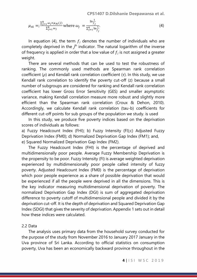
the selected indicators. Table 1 shows the results of all deprivation measures
with coefficient of variations for population sub-groups where the sub-groups
are classified according to characteristics that have been found in the Sri
Lankan literature to be correlated with consumption as well-as
multidimensional poverty (Kariyawasam, et al., 2012; Nanayakkara, 2012;
Semasinghe, 2015).
CPS1407 D.Dilshanie Deepawansa et al.
6 | I S I W S C 2 0 1 9
Table 1: Fuzzy headcount, fuzzy intensity and adjusted headcount deprivation of
social dimension in Uva province by sector, education and employment status of
respondent.
Social
groups
Average
fuzzy
membership
deprivation
Fuzzy
Headcount
index (FHI)
Fuzzy
Intensity
(FI)
Adjusted
Fuzzy
Headcount
index (FH0)
Normalized
Deprivation
Gap index
(DGI)
Squared
Normalized
Deprivation
Gap index
(SDGI)
Uva
53.5 (1.0%)
86.3(2.2%)
55.5(0.8%)
47.9(2.5%)
20.1(5.1%)
6.7(7.7%)
Non-
Plantation
area 53.2(1.0%) 85..9(2.5%) 55.3(0.8%) 47.4(2.8%) 19.6(5.5%) 6.5(8.2%)
Plantation
area
55.5(2.8%) 89.6(4.9%) 57.1(2.4%) 51.1(6.1%) 24.0(13.8%) 8.5(22.8%)
Level
of
Educati
on
No
schooling
58.4 (2.4%) 97.4(2.7%) 58.8(2.3%) 57.3(3.5%) 29.9(10.2%) 12.2(19.2%)
Up to grade
5
56.5(1.5%) 92.6(2.7%) 57.7(1.4%) 53.4(3.1%) 26.1(6.9%) 10.1(11.9%)
Grade 6 to
10
53.1(1.1%) 86.3(2.8%) 55.0(0.9%) 47.5(3.1%) 19.2(5.9%) 6.0(9.5%)
11th year
examination
51.6(2.1%) 80.2(6.7%) 54.1(1.9%) 43.3(7.1%) 16.2(13.4%) 4.8(19.1%)
13th year
and
university
entrance
examination 50.4(1.9%) 78.0(5.2%)
53.3(1.7%)
41.6(5.5%)
14.4(%)
4.2(18.4%)
Employmen
t status
Public
employee
48.9(1.9%) 72.5(8.3%) 51.7(1.6%) 37.4(8.6%) 10.7(15.8%) 2.4(29.4%)
Private
employee
53.7(2.0%) 85.1(4.8%) 55.9(1.7%) 47.6(5.3%) 20.7(10.3%) 7.0(16.3%)
Own
account
workers
50.8 (1.4%) 79.9(5.1%) 53.4(0.9%) 42.7(5.3%) 14.9(8.2%) 3.8(11.7%)
Unpaid
family
workers
54.5(2.1%) 93.8(3.2%) 55.5(1.8%) 52.1(3.9%) 21.9(10.5%) 6.9(17.4%)
Source: Estimated using microdata from Living Standard Survey conducted by researcher -
2016/17 Note: Coefficient of Variance (CV) are in parentheses
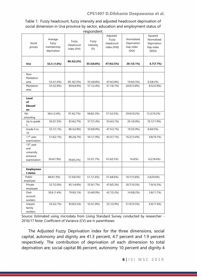
The Adjusted Fuzzy Deprivation index for the three dimensions, social
capital, autonomy and dignity are 41.3 percent, 4.7 percent and 1.9 percent
respectively. The contribution of deprivation of each dimension to total
deprivation are; social capital 86 percent, autonomy 10 percent and dignity 4
CPS1407 D.Dilshanie Deepawansa et al.
7 | I S I W S C 2 0 1 9
percent shown in Figure 1. Among the deprivation of social capital, the highest
contribution is given by deprivation of see or speak with friends every day or
nearly every day and the lowest contribution is talk to the neighbours (Figure
2).
Source: Estimated using microdata from Living Standard Survey conducted by researcher -
2016/17
3.2. Relationship between deprivation along social dimensions and material
deprivation
In an earlier study, Deepawansa et al. (2018) estimated material
deprivation in poverty in Uva Province along three dimensions using the same
data. The dimensions were, housing facilities, consumer durables and basic
lifestyle which include clothing and nutritional food. The study found 18.6
percent (Deepawansa, Dunusingha, & Lahri, 2018) of the population in Uva
province to be materially deprived. In contrast, the Department of Census and
Statistics using the official poverty threshold found 6.5 per cent of the
population of Uva province to be consumption poor (DCS, 2016).
In this study we investigated the relationship between material deprivation
as measured by Deepawansa et al. (2018) and deprivation along social
dimensions in order to see whether people who were materially deprived were
also socially deprived and vice versa. The results of the Data Redundancy test
Social capita l 86 %
Autonomy 10 %
Dignity 4 %
Figure 1: Percentage contribution of
each dimension to Adjusted Fuzzy
Headcount index
Figure 2: Percentage contribution of each
indicator of total social capital dimensions

CPS1407 D.Dilshanie Deepawansa et al.
8 | I S I W S C 2 0 1 9
carried out showed that 88 percent of the poor that we found were deprived
along social dimensions were also poor in terms of material deprivation.
Further, we found that household expenditure and income were negatively
correlated with social factor deprivation, suggesting that wealthier households
are less likely to be deprived along the social dimensions studied here.
However, the correlation coefficient is -0.1841 is very low and statistically
significant at 5 percent significance level.
4. Discussion and Conclusion
Building on the theoretical and empirical advances made in the literature
on measuring multidimensional poverty, this study applied a new
methodology to measure deprivation along three dimensions; social capital,
autonomy and dignity. Using primary data from a household survey
conducted in Uva Province in 2016, he studies found that the average
deprivation in social factors is 53.5 percent in Sri Lanka’s Uva Province. The
study also found that 86.3 percent of people are deprived and
multidimensionally poor in social factors, whereas the consumption poverty
ratio for 2016 based on the official poverty line and data from the household
income and expenditure survey of the Department of Census and Statistics,
found only 6.5 per cent to be consumption poor. Further, average social
deprivation among multidimensionally poor people is 55.5 percent. The
percentage share of deprivation experienced by a multidimensionally poor
person if all people were deprived in all possible dimensions is 20.1 percent.
This last indicator – please name it again here - is the most important measure
of multidimensional poverty as it satisfies many axioms of an ideal poverty
index (Sen A. , 1976). The analysis also shows that deprivation in social factors
in poverty is higher in the plantation sector than elsewhere and declines with
the education level of the respondent. People who work in the government
sector are less deprived while those who work as own account workers are
highly deprived. Deprivation in social capital is far higher than deprivation in
dignity and autonomy. Finally, the analysis found the association between
deprivation in social factors and material deprivation to be very high at 88
percent. There is a very small but negative correlation between social
deprivation and household expenditure.
These results confirm that multidimensional poverty measures present a
more accurate and comprehensive perspective of poverty and that social
dimensions are an important aspect of the phenomenon of poverty. Further,
it can be suggested that the living standard of the individual can be improved
by development of social dimensions of people. In spite of the fact that social
characteristics of individuals are determined by different social policies to
reduce poverty.

CPS1407 D.Dilshanie Deepawansa et al.
9 | I S I W S C 2 0 1 9
References
1. Alkire, S., & Foster, J. (2011). Counting and multidimensional poverty
measurement . Journal of public economics, 95(7), 476-487.
2. Alkire, S., & Foster, J. E. (2007). Counting and multidimensional poverty
measurement.
3. Alkire, S., & Santos, E. M. (2010). Acute Multidimensional Poverty: A New
Index for Developing Countries. University of Oxfor.
4. Alkire, S., Foster, J., Seth, S., Santos, M., Roche, J., & Ballon, P. (2015).
Multidimensional poverty measurement and analysis: Chapter 5–the
Alkire-Foster counting methodology.
5. Alkire, S., Roche, J., Ballon, P., Foster, J., Santos, M., & Seth, S. (2015).
Multidimensional poverty measurement and analysis. USA: Oxford
University Press.
6. Asselin, L. (2009). Analysis of multidimensional poverty: Theory and case
studies (7 ed.). Springer Science & Business Media.
7. Atkinson, A. (2003). Multidimensional deprivation: contrasting social
welfare and counting approaches. The Journal of Economic Inequality,
1(1), 51-65.
8. Baulch, B. (1996). The New Poverty Agenda: A Disputed Consensus. Ids
Bulletin , 1-10.
9. Betti, G., & Verna, V. (1999,2002,2004). Measuring the degree of poverty
in a dynamic and comparative context: A multi-dimensional approach
using fuzzy set theory. Lahore (Pakistan), 27-31.
10. Betti, G., Cheli, B., Lemmi, A., & Verma, V. (2005). On The Construction Of
Fussy Measures For The Analysis of Poverty and Social Exclusion. .
Siena,Italy, University of Siena.
11. Bourguignon, F., & Chakravarty, S. (2003). The measurement of
multidimensional poverty . The Journal of Economic Inequality, 1(1), 25-
49.
12. Cerioli, A., & Zani, S. (1990). A Fuzzy Approach To The Measurement Of
Poverty. Income and Wealth istribution,Inequality and Poverty, 272-284.
13. Chakravarty, S. (2006). An axiomatic approach to multidimensional
poverty measurement via fuzzy sets. In Fuzzy set approach to
multidimensional poverty measurement. Springer, Boston, MA., 49-72.
14. Cheli, B., & Lemmi, A. (1995). A Totally Fuzzy and Relative Approach to
the Multidimentional Analysis of Poverty. Economic Notes, 24(1), 115-
134.
15. Croux, C., & Dehon, C. (2010). Influence functions of the Spearman and
Kendall correlation measures. Statistical methods & applications, 19(4),
497-515.
16. DCS. (2016). Poverty Indicators. p. 4.

CPS1407 D.Dilshanie Deepawansa et al.
10 | I S I W S C 2 0 1 9
17. Deepawansa, Dunusingha, & Lahri. (2018). Deprivation of Well-being in
Terms of Material Deprivation in Multidimensional Approch : Sri Lanka.
Paris: International Association of Official Statisticians (IAOS).
18. Dewilde, C. (2004). The multidimensional measurement of poverty in
Belgium and Britain: A categorical approach. Social Indicators Research,
3(331-369.), 68.
19. Grootaert, C. (1999). Social capital, household welfare, and poverty in
Indonesia. The World Bank.
20. Kariyawasam, S., De Silva, N., & Shivakumaran, S. (2012). Multi-
Dimensional Poverty Among Samurdhi Welfare Recipients in Badulla
District. Sri Lanka.
21. Nanayakkara, W. 2. (2012). Eradicating Poverty in Sri Lanka: Strong
Progress but Much Remains to be Done. Talking Economics.
22. Narayan, D. (2002). Bonds and bridges: social capital and poverty. Social
capital and economic development: well-being in developing countries.
58-81.
23. Semasinghe, W. (2015). Multidimensionality of urban poverty: an inquiry
into the crucial factors affecting well-being of the urban poor in Sri
Lanka.
24. Sen, A. (1976). Poverty: An Ordinal Approach to Measurement.
Econometrica , 44(2), 219-231.
25. Sen, A. (1983). Poor, relatively speaking. Oxford economic papers, 35(2),
153-169.
26. Sen, A. (1992). Inequality reexamine. Oxford: Clarendon.
27. Sen, A. (1997). From income inequality to economic inequality. Southern
Economic Journal, 64(2), 384-401.
28. Siddhisena, K., & Jayatilaka, M. (2003). Identification of thePoor in Sri
Lanka: Development of composite index and regional poverty lines.
Colombo: Institute of Policy Studies, Sri Lanka.
29. Tsui, K. (2002). Multidimensional poverty indices. Social choice and
welfare, 19(1), 69-93.
30. Woolcock, M. (2001). The place of social capital in understanding social
and economic outcomes. Canadian journal of policy research, 2(1), 11-17.

CPS1408 Caston S. et al.
11 | I S I W S C 2 0 1 9
Probabilistic hourly load forecasting
*1Caston Sigauke1, Murendeni Nemukula2, Daniel Maposa3
1Department of Statistics, University of Venda Private Bag X5050, Thohoyandou 0950, South
Africa 2School of Mathematics, Statistics and Computer Science University of KwaZulu-Natal, South
Africa 3Department of Statistics and Operations Research University of Limpopo, South Africa
Abstract
The paper discusses short-term hourly load forecasting using additive quantile
regression (AQR) models. A comparative analysis is done using generalised
additive models (GAMs). In both modelling frameworks, variable selection is
done using least absolute shrinkage and selection operator (Lasso) via
hierarchical interactions. The AQR model with pairwise interactions was found
to be the best fitting model. The forecasts from the models are then combined
using a convex combination model and also using quantile regression
averaging (QRA). The AQR model with interactions is then compared with the
convex combination and QRA models and the QRA model gives the most
accurate forecasts. The QRA model has the smallest prediction interval
normalised average width and prediction interval normalised average
deviation. The modelling framework discussed in this paper has established
that going beyond summary performance statistics in forecasting has merit as
it gives more insight into the developed forecasting models
Keywords
Additive quantile regression; Lasso; load forecasting; generalised additive
models
1. Introduction
Recent work on short-term load forecasting in which hourly data is
modelled separately includes that of ([3, 4, 5, 11]). Goude et al. [5] developed
generalised additive models for forecasting electricity demand. The authors
used hourly load data from 2260 substations across France. Individual models
for each of the 24 hours of the day were developed. The developed models
produced accurate forecasts for the the short and medium term horizons.
Additive quantile regression models for forecasting probabilistic load and
*1 Corresponding author: Tel.: +27 15 962 8135 Email address: [email protected] (C.
Sigauke).

CPS1408 Caston S. et al.
12 | I S I W S C 2 0 1 9
electricity prices are developed by Gaillard et al. [4]. The work done by Gaillard
et al. [4] is extended by Fasiolo et al. [3] who developed fast calibrated additive
quantile regression models. An online load forecasting system for very-short-
term load forecasts is proposed by Laouafi et al. [7]. The proposed system is
based on a forecast combination methodology which gives accurate forecasts
in both normal and anomalous conditions. Zhang et al. [11] developed a
hybrid model to short-term load forecasting based on singular spectrum
analysis and support vector machine which is optimized by the heuristic
method they refer to as the Cuckoo search algorithm. The new proposed
model outperformed the other heuristic models used in the study.
Joint modelling of hourly electricity demand using additive quantile
regression with pairwise inter- actions including an application of quantile
regression averaging (QRA) is not discussed in detail in the literature. The
current study intends to bridge this gap. The study focuses on an application
of additive quantile regression (AQR) models. A comparative analysis is then
done with the generalized additive models (GAMs) which are used as
benchmark models. In this study we discuss an application of pairwise
hierarchical interactions discussed in Bien et al. [2] and Laurinec [8] who
showed that the inclusion of interactions improves forecast accuracy. A
discussion of the models is presented in Section 2, with Section 3 discussing
the results of the study. The conclusion is given in Section 4.
2. Models
2.1 Additive quantile regression model
An additive quantile regression (AQR) model is a hybrid model which is a
combination of GAM and QR models. AQR models were first applied to short-
term load forecasting by Gaillard et al. [4] and extended by Fasiolo et al. [3].
Let 𝑦t denote hourly electricity demand where t = 1,...,n, n is the number of
observations and let the number of days be denoted by nd. Then n = 24nd
where 24 is the number of hours in a day and the corresponding p
covariates,𝑥𝑡1, 𝑥𝑡2, … , 𝑥𝑡𝑝. The AQR model is given in equation (1) ([3, 4]).
y𝑡,𝜏 =∑𝑆𝑗,𝜏
𝑝
𝑗=1
(𝑥𝑡𝑗) + 휀𝑡,𝜏; 𝜏 𝜖 (0,1), (1)
where 𝑠𝑗,𝜏 are smooth functions and 휀𝑡,𝜏 is the error term. The smooth
function, 𝑠 is written as
𝑠𝑗(𝑥) = ∑𝛽𝑘𝑗
𝑞
𝑘=1
𝑏𝑘𝑗(𝑥𝑡𝑗), (2)

CPS1408 Caston S. et al.
13 | I S I W S C 2 0 1 9
where 𝛽𝑗 denotes the 𝑗𝑡ℎ parameter, 𝑏𝑗(𝑥) represents the 𝑗𝑡ℎ basis function
with the dimension of the basis being denoted by q. The parameter estimates
of equation (1) are obtained by minimising the function given in equation (3).
𝑞𝑌|𝑋(𝜏) =∑𝜌𝜏
𝑛
𝑡=1
(y𝑡,𝜏 −∑𝑠𝑗,𝜏(𝑥𝑡𝑗)
𝑝
𝑗=1
), (3)
where ρτ is the pinball loss function. The AQR models are given in equation
(4).
𝜙(𝐵)Φ(𝐵𝑠) [𝑦𝑡,𝜏 − ∑𝑠𝑗,𝜏(𝑥𝑡𝑗)
𝑝
𝑗=1
+∑∑𝛼𝑗𝑘𝑠𝑗(𝑥𝑡𝑗
𝐽
𝑗=1
𝐾
𝑘=1
)𝑠𝑘(𝑥𝑡𝑘)] = 휃(𝐵)Θ(𝐵𝑠)𝑣𝑡,𝜏. (4)
Selection of variables is done using the least absolute shrinkage and
selection operator (Lasso) for hierarchical interactions method developed by
Bien et al. [1] and implemented in the R package “hierNet” ([2]). The objective
is to include an interaction where both variables are included in the model.
The restriction known as the strong hierarchy constraint is discussed in detail
in Ben and Tibshirani [2] and Lim and Hastie [9].
2.2 Forecast error measures
There are several error measures for probabilistic forecasting which include
among others the continuous rank probability score, the logarithmic score and
the quantile loss that is also known as the pinball loss. In this paper we use the
pinball loss function which is relatively easy to compute and interpret ([6]). The
pinball loss function is given as
𝐿(𝑞𝜏 , 𝑦𝑡) = 𝜏(𝑦𝑡 − 𝑞𝑡) if 𝑦𝑡 > 𝑞𝜏(1 − 𝜏)(𝑞𝜏 − 𝑦𝑡) if 𝑦𝑡 > 𝑞𝜏
, (5)
where 𝑞𝑡 is the quantile forecast and 𝑦𝑡 is the observed value of hourly
electricity demand.
2.3 Prediction intervals
For each of the models, 𝑀𝑗,𝑗 = 1,… , 𝑘 we compute the prediction interval
widths (PIWs) which we shall abbreviate as 𝑃𝐼𝑊𝑖𝑗,𝑖 = 1,… , 𝑛, 𝑗 = 1,… , 𝑘 as
follows:
PIW𝑖𝑗 = UL𝑖𝑗 − LL𝑖𝑗, (6)
where ULij and LLij are the upper and lower limits of the prediction interval,
respectively. The analysis for determining the model which yields narrower
PIW is done in this study using box and whisker plots, together with the
probability density plots.

CPS1408 Caston S. et al.
14 | I S I W S C 2 0 1 9
2.4 Forecast combination
QRA is based on forecasting the response variable against the combined
forecasts which are treated as independent variables. QRA was first introduced
by Nowotarski and Weron ([10]). Let 𝑦𝑡,𝜏 be hourly electricity demand as
discussed in Section 2.1 and let there be M methods used to predict the next
observations of 𝑦𝑡,𝜏 which shall be denoted by 𝑦𝑡+1, 𝑦𝑡+2, … , 𝑦𝑡+𝑀 . Using m =
1,...,M methods, the combined forecasts will be given by
𝑡,𝜏𝑄𝑅𝐴
= 𝛽0 +∑𝛽𝑗
𝑘
𝑗=1
𝑡𝑗 + 휀𝑡,𝜏 , (7)
where 𝑡,𝜏 represents forecasts from method 𝑗, 𝑡,𝜏𝑄𝑅𝐴
is the combined
forecasts and 휀𝑡,𝜏 is the error term. We seek to minimise
𝑎𝑟𝑔min𝛽
∑𝜌𝜏(𝑡𝑄𝑅𝐴
𝑛
𝑡=1
− 𝛽0 −∑𝛽𝑗
𝑘
𝑗=1
𝑡𝑗). (8)
3. Empirical Result
3.1 Forecasting results
The data used is hourly electricity demand from 1 January 2010 to 31
December 2012 giving us n = 26281 observations. The data is split into
training data, 1 January 2010 to 2 April 2012, i.e. n1 = 19708 and testing data,
from 2 April 2012 to 31 December 2012, i.e. n2 = 6573, which is 25% of the
total number of observations. The models considered are M1 (GAM), M2 (GAMI)
which are GAM models without and with interactions respectively, and M3
(AQR), M4 (AQRI) which are additive quantile regression models without and
with interactions, respectively. The four models M1 to M4 are then combined
based on the pinball losses, resulting in M5 and also combined using QRA,
resulting in M6.
3.2 Out of sample forecasts
After correcting for residual autocorrelation we then use the model for out
of sample forecasting (testing). A comparative analysis of the models given in
Table 1 shows that M4 is the best model out of the four models, M1 to M4,
based on the pinball loss. The average losses suffered by the models based on
the pinball losses are given in Table 1 with model M6 having the smallest
average pinball loss.
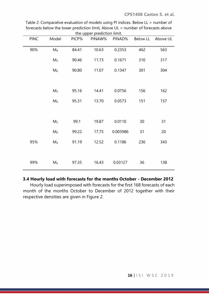
Table 1: Average pinball losses for M1 to M6 (2 April 2012 to 31 Dec 2012).
M1 M2 M3 M4 M5 M6
Average Pinball
loss
284.363 258.087 274.768 249.842 229.723 222.584

CPS1408 Caston S. et al.
15 | I S I W S C 2 0 1 9
3.3 Evaluation of prediction intervals
Empirical prediction intervals (PIs) are constructed using the forecasts from
the models M4 to M6. The constructed PIs are then used to find PIWs, PINAWs,
PINADs and calculation of the number of forecasts below and above the PIs
from each model. Boxplots of widths of the PIs for the forecasting models M4,
M5 and M6 are given in Figure 1. The figure shows that the PI from model M5
are narrower compared to those from M4 and M6.
Figure 1: Prediction interval widths for models M4 (PIAQRI), M5 (PIConvex) and M6
(PIQRA).
In order to choose the best model based on the analysis of the PIWs, we
need to calculate the PICPs, PINAWs and PINADs including a count of the
number of forecasts below and above the PIs. This is done for various PINC
values which are 90%, 95% and 99%, respectively. A comparative evaluation of
the models using PI indices for PINC values of 90%, 95% and 99% are given in
Table 2. Models M5 and M6 have valid PICPs for the three PINC values, with
M6 having the highest PICP. Model M6 has the smallest PINAD values and
fewer number of forecasts falling below and above the PIs. Model M4 has the
smallest PINAW value for all the three PINC values. All the three models could
be used in the construction of PIs. Although M4 does not give a valid PICP, the
PINAW and PINAD are reasonably small. The performance of model M6 seems
to be the best amongst these three models. However, this analysis is not
enough and as a result, we need further analysis using residuals of the three
models.
CPS1408 Caston S. et al.
16 | I S I W S C 2 0 1 9
Table 2: Comparative evaluation of models using PI indices. Below LL = number of
forecasts below the lower prediction limit, Above UL = number of forecasts above
the upper prediction limit.
PINC Model PICP% PINAW% PINAD% Below LL Above UL
90% M4 84.41 10.63 0.2353 462 563
M5 90.46 11.73 0.1671 310 317
M6 90.80 11.07 0.1347 301 304
M5 95.16 14.41 0.0756 156 162
M6 95.31 13.70 0.0573 151 157
M5 99.1 19.87 0.0110 30 31
M6 99.22 17.75 0.005986 31 20
95% M4 91.19 12.52 0.1186 236 343
99% M4 97.35 16.43 0.03127 36 138
3.4 Hourly load with forecasts for the months October - December 2012
Hourly load superimposed with forecasts for the first 168 forecasts of each
month of the months October to December of 2012 together with their
respective densities are given in Figure 2.

CPS1408 Caston S. et al.
17 | I S I W S C 2 0 1 9
Figure 2
4. Conclusion
Four models considered in this study were GAMs and AQR models with
and without interactions. The AQR model with pairwise interactions was found
to be the best fitting model. The forecasts from the four models were then
combined using an algorithm based on the pinball loss (convex combination
model) and also using quantile regression averaging (QRA). The AQR model
with interactions was then compared with the convex combination and QRA
models and the QRA model gave the most accurate forecasts. The QRA model
had the smallest prediction interval normalised average width and prediction
interval normalised average deviation.
References
1. Bien, J.; Taylor, J.; Tibshirani, R. A lasso for hierarchical interactions. The
Annals of Statistics. 2013, 41(3), 1111-1141.
https://arxiv.org/ct?url=http3A2F2Fdx.doi. org2F10252E12142F13-
AOS1096&v=3d4226e4
2. Bien, J.; Tibshirani, R. R package “hierNet”, version 1.6. 2015,
https://cran.r-project.org/ web/packages/hierNet/hierNet.pdf (Accessed
22 May 2017).
3. Fasiolo, M.; Goude, Y.; Nedellec, R.; Wood, S.N. Fast calibrated additive
quantile regression. 2017. Available
online:https://github.com/mfasiolo/qgam/blob/master/draftqgam. pdf
(Accessed on 13 March 2017).
4. Gaillard, P.; Goude, Y.; Nedellec, R. Additive models and robust
aggregation for GEFcom2014 probabilistic electric load and electricity

CPS1408 Caston S. et al.
18 | I S I W S C 2 0 1 9
price forecasting. International Journal of Forecasting. 2016, 32, 1038-
1050. https://doi.org/10.1016/j.ijforecast.2015.12.001
5. Goude, Y.; Nedellec, R.; Kong, N. Local short and middle term electricity
load forecasting with semi-parametric additive models. IEEE Transactions
on Smart Grid. 2014, 5(1), 440-446. https:
//doi.org/10.1109/TSG.2013.2278425
6. Hong, T.; Pinson, P.; Fan, S.; Zareipour, H.; Troccoli, A.; Hyndman, R.J.
Probabilistic energy forecasting: Global Energy Forecasting Competition
2014 and beyond. International Journal of Forecasting. 2016, 32(3), 896-
913.
7. Laouafi, A.; Mordjaoui, M.; Haddad, S.; Boukelia, T.E.; Ganouche, A. Online
electricity demand forecasting based on effective forecast combination
methodology. Electric Power Systems Research. 2017, 148, 35-47.
8. Laurinec, P. Doing magic and analyzing seasonal time series with GAM,
(Generalized Additive Model) in R. 2017. Available online:
https://petolau.github.io/Analyzing-double-seasonal-timeseries-with-
GAM-in-R/ (Accessed on 23 February 2017).
9. Lim, M.; Hastie, T. Learning interactions via hierarchical group-lasso
regularization. J. Comput Graph Stat. 2015, 24(3), 627-654.
https://doi.org/10.1080/10618600.2014.938812
10. Liu, B.; Nowotarski, J.; Hong, T.; Weron, R. Probabilistic load forecasting via
quantile regression averaging of sister forecasts. IEEE Transactions on
Smart Grid. 2017, 8(2), 730-737.
11. Zhang, X.; Wang, J.; Zhang, K. Short-term electric load forecasting based
on singular spectrum analysis and support vector machine optimized by
Cuckoo search algorithm. Electric Power Systems Research. 2017, 146,
270-285.

CPS1409 Rahma F.
19 | I S I W S C 2 0 1 9
Physical vs economic distance, the defining
spatial autocorrelation of Per Capita GDP among
38 cities/regencies in East Java
Rahma Fitriani Department of Statistics, University of Brawijaya Malang, Indonesia
Abstract
The interdependence of economic activity among nearby regions has been an
issue which also takes place among cities/regencies of East Java. This
phenomenon has also known as spatial interaction. Its significance depends
on the chosen distance to define the neighboring regions. When the
phenomenon understudy is economic productivity, it is reasonable to use an
economic based distance, instead of the geographical distance between
two regions. The objective of this study is to show that different distance
concepts of forming a neighboring cities/regencies in East Java leads to
different strength of spatial interaction of the economic productivity (per
capita GDP). Both geographic and economic based distances are used to
define the k nearest neighbors. It also defines neighbors within a specified
radius of geographical distance. The strength of the spatial interaction is
indicated by the significance of the spatial auto orrelation of the GDP among
the neighboring cities/regencies, based on the Moran’s I test. The result shows
that there is no significant spatial autocorrelation of the per capita GDP among
the k nearest neighbors economically and geographically. However, the strong
spatial autocorrelation presents among the cities/regencies within 125 km
radius, an average distance between cities/regencies in East Java. The
cities/regencies within that geographical distance are the cities/regencies
which have the shortest economic distance.
Keywords
Economic cost; spatial autocorrelation; Moran I; nearest neighbours; economic
distance
1. Introduction
The interdependence of economic activity among nearby regions has
invited more attention (Fingleton and López-Bazo 2006; Ertur and Koch 2007;
Tian, Wang et al. 2010). Similar geographic conditions, the advance of
transportation and communication technology, are assumed as the trigger of
the interdependence. Motivated by this issue, recent studies regarding local
economic productivity must include the effect of neighboring economic
activity. East Java is one of the provinces in Indonesia which has experienced
strong economic growth. It reaches the above national level of economic
CPS1409 Rahma F.
20 | I S I W S C 2 0 1 9
growth at the fourth quarter of 2017. Industry, trade, agriculture, forestry and
fishery are the dominant economic sectors in this province, which contribute
60.24% of the total 2016 GDP (BPS 2017).
The province consists of 38 regencies/cities. The southern – western
region is mountainous area with mining potential, the central part is
dominated by fertile volcanic zones and the northern area is less fertile – lower
region. This geographical condition more or less contributes in shaping the
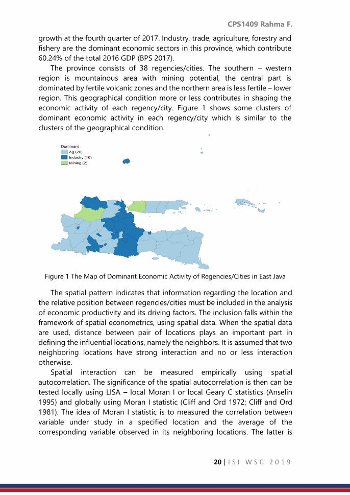
economic activity of each regency/city. Figure 1 shows some clusters of
dominant economic activity in each regency/city which is similar to the
clusters of the geographical condition.
Figure 1 The Map of Dominant Economic Activity of Regencies/Cities in East Java
The spatial pattern indicates that information regarding the location and
the relative position between regencies/cities must be included in the analysis
of economic productivity and its driving factors. The inclusion falls within the
framework of spatial econometrics, using spatial data. When the spatial data
are used, distance between pair of locations plays an important part in
defining the influential locations, namely the neighbors. It is assumed that two
neighboring locations have strong interaction and no or less interaction
otherwise.
Spatial interaction can be measured empirically using spatial
autocorrelation. The significance of the spatial autocorrelation is then can be
tested locally using LISA – local Moran I or local Geary C statistics (Anselin
1995) and globally using Moran I statistic (Cliff and Ord 1972; Cliff and Ord
1981). The idea of Moran I statistic is to measured the correlation between
variable under study in a specified location and the average of the
corresponding variable observed in its neighboring locations. The latter is
CPS1409 Rahma F.
21 | I S I W S C 2 0 1 9
known as a spatial lag variable, which is defined by attaching a spatial weight
matrix to the variable under study.
The spatial weight matrix is defined by considering the set of neighboring
locations of each location. The set of locations 𝑗 which are influential to
location 𝑖 in terms of the variables under study, are defined as the neighbors
of 𝑖. Most of regional studies have used contiguity concept and geographical
distance to define the neighboring locations. Some definitions of the
neighbors can be found in Arbia (2006). The contiguity concept is based on
the administrative boundary, in which two locations that share common
administrative border are considered neighbors. There are two types of
neighbors based on distance, the critical cut off neighbors and 𝑘 nearest
neighbors. Both use any measure of distance between two locations. Physical
distance is generally represented by the Euclidian distance between the central
of two locations.
Due to the advance of transportation and communication technology,
economic interaction does not occur only between two adjacent locations.
While in terms of distance, it is not the flat physical distance which is
considered in the mobility of goods and labors. The distance in terms of the
transportation costs should be taken into account instead (Conley and Ligon
2002; Conley and Topa 2002). This concept of distance is defined as “economic
distance”. Conley and Ligon (2002) show that spatial interaction of the
economic growth among geographically neighboring countries is less intense
than the interaction among “economically” neighboring countries.
The weaknesses of the geographical – physical distance concepts motivate
this study to use other distance measure which includes the transportation
cost to capture the intensity of economic interaction between regencies/cities
in East Java. The “economic distance” is used to define the k nearest neighbors
for each 38 regencies/cities of East Java. The intensity of the spatial interaction
–spatial autocorrelation of economic productivity (GDP) will be tested based
on the defined distance. It compares the significance of the spatial
autocorrelation of the GDP among regencies/cities, when the neighbours are
defined by the physical distance and the economic distance. The better
distance measure should capture the spatial interaction better in terms of the
significance of the Moran I’s spatial autocorrelation test. Using the chosen
distance measure, this study also provides some analysis regarding the nature
of the spatial interaction of the economic productivity of East Java. It will be
useful for the policy maker to direct the growth in terms of interaction among
regencies/cities in this province.
2. Methodology
This study is based on regency/city as unit of observation and there are 38
regencies/cities in total. 2016 GDP of each regency/city (in thousand Rupiah)

CPS1409 Rahma F.
22 | I S I W S C 2 0 1 9
is used as a proxy for economic productivity. The significance of the spatial
autocorrelation of GDP among the regencies/cities is tested based on the
Moran I index, which can be interpreted as the intercept of the fitted line based
on the scatter plot between the spatial lagged GDP (Y axis) and the original
GDP (X axis) (Anselin 1993).
The spatial lagged of GDP is the product of the n × n spatial weight matrix
(W) and GDP. W is defined as follows:
W=
[ 𝑐11
𝑐1⁄𝑐11
𝑐1⁄ …𝑐1𝑛
𝑐1⁄𝑐21
𝑐2⁄
⋮𝑐𝑛1
𝑐𝑛⁄
𝑐22𝑐2⁄ …
𝑐2𝑛𝑐1⁄
⋮𝑐𝑛2
𝑐𝑛⁄ …⋮
𝑐𝑛𝑛𝑐𝑛⁄ ]
= [
𝑤11𝑤12 … 𝑤1𝑛
𝑤21
⋮𝑤𝑛1
𝑤22 … 𝑤2𝑛
⋮𝑤𝑛2
…⋮
𝑤𝑛𝑛
]𝑐𝑖𝑗 = 1, if 𝑖 and 𝑗 are neighbors 0, otherwise
This study first considers the k nearest neighbors to build the spatial
weight matrix. The concept forms the k locations with shortest distance from
𝑖 as a set of neighbors of 𝑖, for every 𝑖= 1, ⋯ , n. Two distance measures are
used, the first one is the physical – geographical Euclidian distance, the second
one is the economic distance. This study uses the delivery cost per kg, between
two regencies/cities (based on JNE’s tariff at 2018). This approach is similar to
the work of Conley and Topa (2002). The cheaper the cost implies that in
addition to the short distance between the two locations, there is a big
possibility of intensive economic activity between those regencies/cities.
Table 1. Descriptive Statistics of Euclidian Distance between Regencies/Cities
in East Java
Geographic Euclidian distance (km)
Average Standard Deviation Min Max
124.578 68.134 8.058 337.375
Table 2 Descriptive Statistics of Delivery Cost between Regencies/Cities in East Java
Delivery Cost per kg (Rp)
Average Standard Deviation Min Max
8896 3788 4000 32000
Among 38 regencies and cities, there are 703 pairs of Euclidian distance
and economic distance. The distribution of each distance is presented in
Figure 2 and Figure 3 respectively for Euclidian and economic distance. The
distance between regencies/cities on average is 124.6 km, and the average
delivery cost between regencies/cities is Rp. 8896. Figure 3 indicate that the
delivery cost is mainly Rp 8000. This value is applied for 78.8% pairs of
regencies/cities.

CPS1409 Rahma F.
23 | I S I W S C 2 0 1 9
Figure 2 Histogram of Euclidian Distance between Regencies/Cities in East Java
Figure 3 Histogram of Delivery Cost between Regencies/Cities in East Java
3. Result
For each distance measures, the spatial weight of k (k = 2, ⋯ ,5) nearest
neighbours is defined, followed by the (global) Moran I test. The significance
of the spatial autocorrelation of GDP among the k (k = 2, ⋯ ,5) nearest
regencies/cities in East Java are presented in Table 3 and 4 respectively for the
physical – geographical Euclidian distance and the “economic” distance. The
significance of the test presented in those two tables indicates that the spatial
autocorrelation of GDP among the nearest regencies/cities in East Java is not
significant even the neighbours are extended up to 5 nearest neighbours, both
for the physical – geographical distance and the economic distance. This initial
result motivates this study to use another concept of distance to form the
neighbours, namely the critical cut off neighbours.
CPS1409 Rahma F.
24 | I S I W S C 2 0 1 9
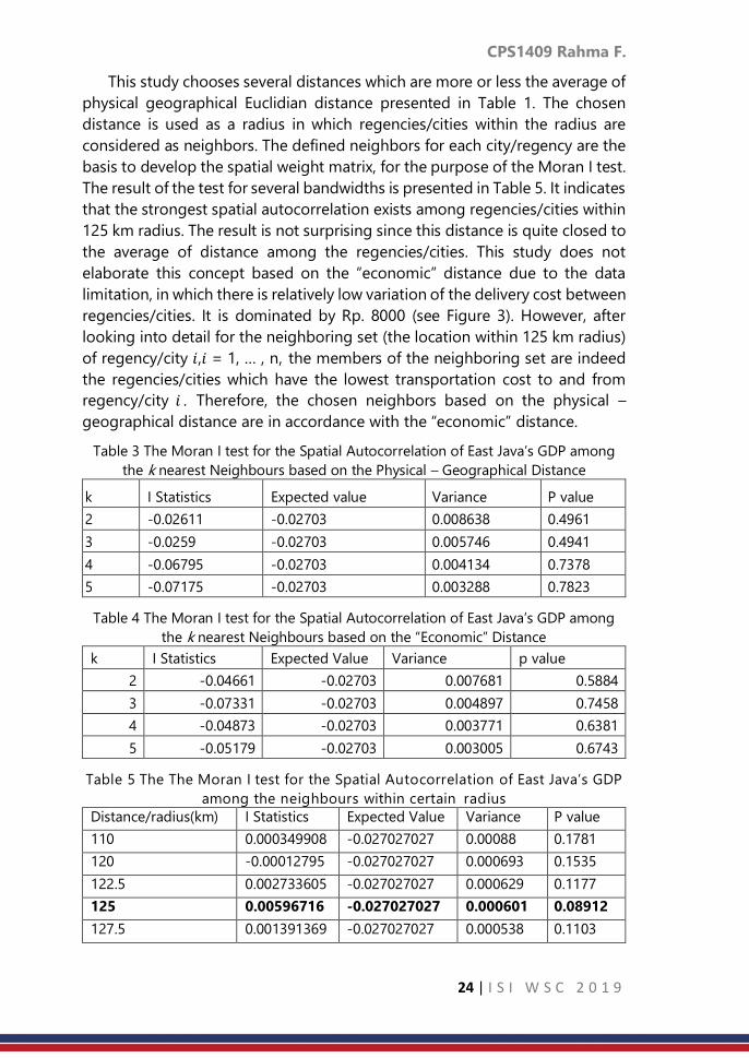
This study chooses several distances which are more or less the average of
physical geographical Euclidian distance presented in Table 1. The chosen
distance is used as a radius in which regencies/cities within the radius are
considered as neighbors. The defined neighbors for each city/regency are the
basis to develop the spatial weight matrix, for the purpose of the Moran I test.
The result of the test for several bandwidths is presented in Table 5. It indicates
that the strongest spatial autocorrelation exists among regencies/cities within
125 km radius. The result is not surprising since this distance is quite closed to
the average of distance among the regencies/cities. This study does not
elaborate this concept based on the “economic” distance due to the data
limitation, in which there is relatively low variation of the delivery cost between
regencies/cities. It is dominated by Rp. 8000 (see Figure 3). However, after
looking into detail for the neighboring set (the location within 125 km radius)
of regency/city 𝑖,𝑖 = 1, … , n, the members of the neighboring set are indeed
the regencies/cities which have the lowest transportation cost to and from
regency/city 𝑖 . Therefore, the chosen neighbors based on the physical –
geographical distance are in accordance with the “economic” distance.
Table 3 The Moran I test for the Spatial Autocorrelation of East Java’s GDP among
the k nearest Neighbours based on the Physical – Geographical Distance
k I Statistics Expected value Variance P value
2 -0.02611 -0.02703 0.008638 0.4961
3 -0.0259 -0.02703 0.005746 0.4941
4 -0.06795 -0.02703 0.004134 0.7378
5 -0.07175 -0.02703 0.003288 0.7823
Table 4 The Moran I test for the Spatial Autocorrelation of East Java’s GDP among
the k nearest Neighbours based on the “Economic” Distance
k I Statistics Expected Value Variance p value
2 -0.04661 -0.02703 0.007681 0.5884
3 -0.07331 -0.02703 0.004897 0.7458
4 -0.04873 -0.02703 0.003771 0.6381
5 -0.05179 -0.02703 0.003005 0.6743
Table 5 The The Moran I test for the Spatial Autocorrelation of East Java’s GDP
among the neighbours within certain radius
Distance/radius(km) I Statistics Expected Value Variance P value
110 0.000349908 -0.027027027 0.00088 0.1781
120 -0.00012795 -0.027027027 0.000693 0.1535
122.5 0.002733605 -0.027027027 0.000629 0.1177
125 0.00596716 -0.027027027 0.000601 0.08912
127.5 0.001391369 -0.027027027 0.000538 0.1103
CPS1409 Rahma F.
25 | I S I W S C 2 0 1 9
4. Discussion and Conclusion
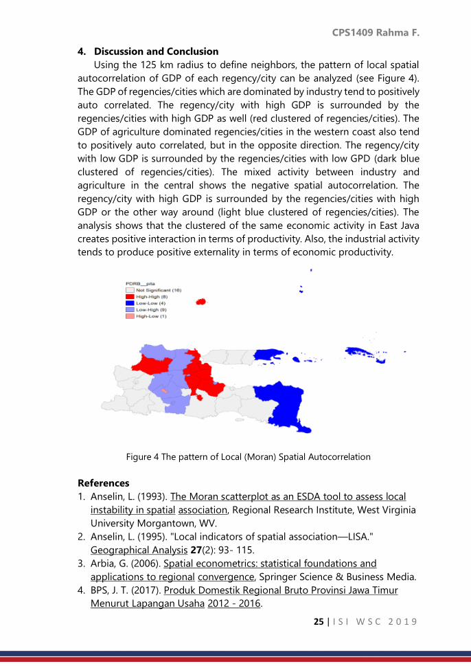
Using the 125 km radius to define neighbors, the pattern of local spatial
autocorrelation of GDP of each regency/city can be analyzed (see Figure 4).
The GDP of regencies/cities which are dominated by industry tend to positively
auto correlated. The regency/city with high GDP is surrounded by the
regencies/cities with high GDP as well (red clustered of regencies/cities). The
GDP of agriculture dominated regencies/cities in the western coast also tend
to positively auto correlated, but in the opposite direction. The regency/city
with low GDP is surrounded by the regencies/cities with low GPD (dark blue
clustered of regencies/cities). The mixed activity between industry and
agriculture in the central shows the negative spatial autocorrelation. The
regency/city with high GDP is surrounded by the regencies/cities with high
GDP or the other way around (light blue clustered of regencies/cities). The
analysis shows that the clustered of the same economic activity in East Java
creates positive interaction in terms of productivity. Also, the industrial activity
tends to produce positive externality in terms of economic productivity.
Figure 4 The pattern of Local (Moran) Spatial Autocorrelation
References
1. Anselin, L. (1993). The Moran scatterplot as an ESDA tool to assess local
instability in spatial association, Regional Research Institute, West Virginia
University Morgantown, WV.
2. Anselin, L. (1995). "Local indicators of spatial association—LISA."
Geographical Analysis 27(2): 93- 115.
3. Arbia, G. (2006). Spatial econometrics: statistical foundations and
applications to regional convergence, Springer Science & Business Media.
4. BPS, J. T. (2017). Produk Domestik Regional Bruto Provinsi Jawa Timur
Menurut Lapangan Usaha 2012 - 2016.

CPS1409 Rahma F.
26 | I S I W S C 2 0 1 9
5. Cliff, A. and K. Ord (1972). "Testing for spatial autocorrelation among
regression residuals." Geographical Analysis 4(3): 267-284.
6. Cliff, A. D. and J. K. Ord (1981). Spatial processes: models & applications,
Taylor & Francis.
7. Conley, T. G. and E. Ligon (2002). "Economic distance and cross-country
spillovers." Journal of Economic Growth 7(2): 157-187.
8. Conley, T. G. and G. Topa (2002). "Socio‐economic distance and spatial
patterns in unemployment." Journal of Applied Econometrics 17(4): 303-
327.

CPS1414 Bashiru. I.I S. at el.
27 | I S I W S C 2 0 1 9
Spatial heterogeneity in child labour practices
and its determinants in Ghana
Bashiru I.I. Saeed, Lucy Twumwaah Afriyie, Abukari Alhassan
Kumasi Technical University
Abstract
Child labour practices is considered as one of the problems pertaining to
children in many countries in the world and Ghana is no exception. To combat
the situation, many research studies have been undertaken using different
modelling techniques with the framework of generalized linear model (GLM).
However, the GLM approach fails to capture the spatial heterogeneity that
exists in the relationship between the child labour practices and related
factors. The study addresses this gap by exploring the spatial heterogeneity in
child labour practices and its determinant in Ghana using geographically
weighted linear model (GWLM). This study used Ghana Living Standard Survey
Round 6 (GLSS6) data collected in 2012 by Ghana Statistical Services. The
target population was children aged 5‒17 years. GLM was used as a starting
point for selecting the appropriate predictors. Moran’s I statistics was tested
to ensure the presence of the spatial autocorrelation in the dataset under the
null hypothesis of spatial auto correlation. Several factors including proportion
of children in school, proportion of aged household head, number of
household head in construction sector and proportion of household head in
agricultural sector were considered in the models. It was showed that the
GWLM was useful and established that there is a spatially non-stationary
relationships between the proportion of child labour and the covariate at the
district level. The findings highlight the importance of taken the spatial
heterogeneity into consideration.
Keywords
Child labour; Spatial heterogeneity; Geographically Weighted Linear Model;
Ghana
1. Introduction
Child labour is a phenomenon that exists in the world (ILO-IPEC & Diallo,
2013; International Labour Organization, 2013).
Thus, the estimates of such conventional models may be bias and could
lead to misleading conclusion that may not be beneficial when addressing
policy issues that have a wider impact (Li, Wang, Loiu, Bigham, & Raglad,
2013). It is important to consider spatial variations in the analysis of child
labour practices and its determinants in a wider study area. Such analysis will

CPS1414 Bashiru. I.I S. at el.
28 | I S I W S C 2 0 1 9
be important to allow decision makers to delineate areas where the situation
is rampant and also for effective allocation of limited resources (Li et al., 2013).
This study addresses this gap by examining the spatial pattern of child
labour practices and its determinants among various districts in Ghana using
geographically weighted linear model (GWLM). The use of GWLM approach
provides a deterministic tool that is capable of assessing spatial variation in
the contributing factors of child labour practices.
2. Materials and Methods
Figure 1: Maps of Ghana showing the centroid of the various districts
2.2 Geographically Weighted Linear Model Specification
iikii
k
kiii xvuvuy ++= ),(),(0 (1)
where ),( ii vu denoting the two dimensional geographical coordinates
of the thi district (centroid of the district), ),(0 ii vu represent the
intercept at location ),( ii vu , ikx denote the thk independent variable,
),( iik vu represent the model coefficient associated with explanatory
variable at location ),( ii vu and i represent error term ),0( 2
iN .This
means the parameter ),...,,( 10 k = estimated in (4) are allowed to
be different between districts. Thus, the spatial heterogeneity is
addressed in the GWLM modelling framework. The parameter 𝛽 can be
expressed in the matrix notation as

CPS1414 Bashiru. I.I S. at el.
29 | I S I W S C 2 0 1 9
=
)(
...
)(
)(
...
...
...
...
)(
...
)(
)(
)(
...
)(
)(
22
11
1
221
111
0
220
110
nnk
k
k
nnnn vu
vu
vu
vu
vu
vu
vu
vu
vu
(2)
The parameter for each district, which forms a row in the matrix in (2)
is estimated as (Lutz et al., 2014; Pedro, Fabio, & Alan, 2016):
YvuWXXvuWX ii
T
ii
T
k ),(),(( 1−=
(3)
In (3), ),( ii vuW is a diagonal spatial weight matrix containing the
weights 𝑤𝑖𝑗 at main diagonal and 0 at off diagonal elements. This can
be conveniently expressed as 𝑊(𝑖):
=
in
i
i
w
w
w
iW...
0
0
...
...
...
...
...
...
0
0
...
0)(
2
1
(4)
where, 𝑤𝑖𝑗(𝑗 = 1,2,… , 𝑛) is the weight given to districts 𝑗 during the
calibration of model for ith district. There are several approaches in
dealing with weighting in the GWLM modelling but the two main
weighting functions commonly used are the Gaussian and the adaptive
bi-square function, weighting scheme. In this study, the adaptive bi-
square weighting function was used. The choice of this function was
influenced by the fact that the other methods tends to generate more
extreme coefficients which may affect interpretation (Cho, Lambert,
Kim, & Jung, 2009). The adaptive bi-square weighting function is
defined as:
=
− 22max ])/(1[
0
dd
ijijw
if maxddij , and 𝑤𝑖𝑗 = 0 otherwise (5)
where, maxd is the max distance from the farthest district to the district.
In this study, the GWLM was constructed by assuming all explanatory

CPS1414 Bashiru. I.I S. at el.
30 | I S I W S C 2 0 1 9
variables to vary locally. Prior to the GWLM modelling, a GLM which
assumes fixed parameter was first specified. A Moran I test was then
used to determine the presence of spatial autocorrelation in the
residuals of the model.
2.3 Moran’s I test for spatial autocorrelation
Moran’s I
=
= =
−
−−=
n
i i
n
i
n
j jiij
xx
xxxxw
SumW
n
1
2
1 1
)(
))(( (6)
where n is the number of cases indexed by i and j , x is the variable
of interest, x is the mean of sxi ' , ijw is the weight between cases i
and j , and SumW is the sum of all swij '
= =
=n
i
n
j
ijwSumW1 1
(7)
3. Results and Discussions
Table 2: parameter estimates of the conventional model (GLM)
Parameter Estimate Std.
error
t-value P-value
Intercept -0.2069 0.1784 -1.1600 0.2479
Schild 0.0017 0.0009 1.8690 0.0634*
Aged
0.0026 0.0011 2.2980
0.0228*
*
log(Const)
-0.0230 0.0102 -2.2490
0.0259*
*
log(Agric)
0.0416 0.0194 2.1440
0.0335*
*
HSabove -0.0002 0.0008 -0.2090 0.8348
Unemployed -0.0015 0.0012 -1.2440 0.2152
Poor 0.0006 0.0005 1.1440 0.2545
log(Bschool) -0.0144 0.0292 -0.4930 0.6227
Mining 0.0000 0.0000 0.3610 0.7188
R2 0.25
Adj. R2 0.21
AICc -321.26
Moran’s I
Test 0.001
p≤ 0.001 ***, p≤ 0.05 **, p≤ 0.010*
CPS1414 Bashiru. I.I S. at el.
31 | I S I W S C 2 0 1 9
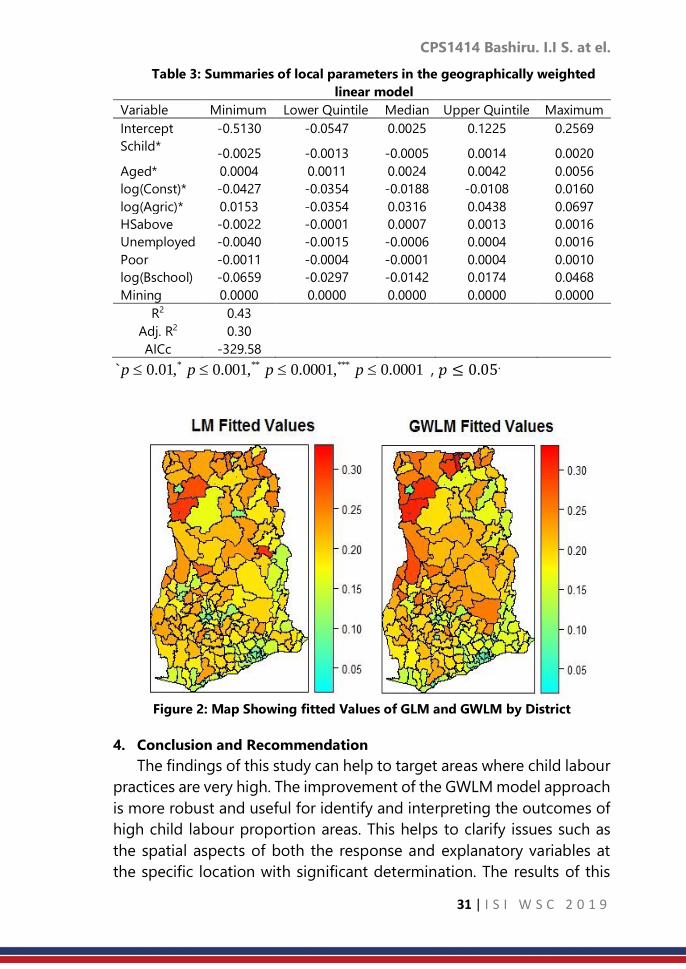
Table 3: Summaries of local parameters in the geographically weighted
linear model
Variable Minimum Lower Quintile Median Upper Quintile Maximum
Intercept -0.5130 -0.0547 0.0025 0.1225 0.2569
Schild* -0.0025 -0.0013 -0.0005 0.0014 0.0020
Aged* 0.0004 0.0011 0.0024 0.0042 0.0056
log(Const)* -0.0427 -0.0354 -0.0188 -0.0108 0.0160
log(Agric)* 0.0153 -0.0354 0.0316 0.0438 0.0697
HSabove -0.0022 -0.0001 0.0007 0.0013 0.0016
Unemployed -0.0040 -0.0015 -0.0006 0.0004 0.0016
Poor -0.0011 -0.0004 -0.0001 0.0004 0.0010
log(Bschool) -0.0659 -0.0297 -0.0142 0.0174 0.0468
Mining 0.0000 0.0000 0.0000 0.0000 0.0000
R2 0.43
Adj. R2 0.30
AICc -329.58
0001.0,0001.0,001.0,01.0` ****** pppp , 𝑝 ≤ 0.05.
Figure 2: Map Showing fitted Values of GLM and GWLM by District
4. Conclusion and Recommendation
The findings of this study can help to target areas where child labour
practices are very high. The improvement of the GWLM model approach
is more robust and useful for identify and interpreting the outcomes of
high child labour proportion areas. This helps to clarify issues such as
the spatial aspects of both the response and explanatory variables at
the specific location with significant determination. The results of this

CPS1414 Bashiru. I.I S. at el.
32 | I S I W S C 2 0 1 9
study will also assist planners and policy makers in developing good
intervention policies for planning and implementation of controlling or
minimizing proportion of child labour in each district. These issues can
greatly affect the performance and effectiveness of education and
health status of these children and also provide a clear plan for helping
and also better understand the results in depth.
It is recommend that the free compulsory universal basic education
and free senior high school policy currently running in the country
should be intensified to allow every child to benefit. In addition, since
the current policies of Ghana includes promotion of agricultural
activities, it is recommended that other policies that will control children
involvement should be in place.
CPS1416 Jungtaek O. et al.
33 | I S I W S C 2 0 1 9
A study on the parameter estimation of the
generalized ratio-type estimator in survey
sampling
Jungtaek OH, Key-Il Shin Hankuk University of Foreign Studies, Yongin, Rep. of Korea
Abstract
In order to improve the accuracy and the precision of estimation in a sample
survey, a ratio estimator and a regression estimator using auxiliary information
have been widely used. The ratio estimator is simple in its form, convenient to
use, and easy to use for sample weight adjustment. However, the ratio
estimator gives good results only when the variance structure is suitable for
the use. Whereas the regression estimator is relatively complex in form and
difficult to use although the regression estimator gives highly accurate and
robust result for the various distribution types in a survey sampling. In this
study, we propose a generalized ratio-type estimator obtained by
approximating the regression estimator to a ratio-type estimator in case with
several auxiliary variables. Therefore, the generalized ratio-type estimator has
the features of the multiple regression estimator and it has the form of the
ratio-type estimator so the form is simple and easy to use. Through simulation
studies, we confirm the theoretical results and the Korea financial statement
analysis data are used for real data analysis.
Keywords
Sample survey; weighted least squares estimator; ratio estimator; Taylor
approximation; Maximum likelihood estimator
1. Introduction
A sample design is carried out using various methods for an optimal
sample survey. Using the optimal sample design can accurately estimate the
parameters of population while reducing costs. Recent decades, the accuracy
and the precision of the estimation have been improved by using
administrative data. Especially in case of business survey, the ratio and the
ratio-type estimator using administrative data are widely used. The ratio and
the ratio-type estimator are known to improve the accuracy and the precision
of parameter estimation using the population parameter values of the auxiliary
variables obtained from administrative data. As is well known, the ratio
estimator is optimized for the ratio model where the variance of the error
satisfies 𝑉𝑎𝑟(𝜖𝑖) = 𝑥𝑖𝑣𝜎2, 𝑣 = 1 with the 𝑖-th auxiliary variable 𝑥𝑖.
Therefore, if the error variance of the data does not satisfy this assumption,
the efficiency of the ratio estimator decreases. Hence the ratio estimator

CPS1416 Jungtaek O. et al.
34 | I S I W S C 2 0 1 9
should be used after identifying the characteristics of the data. Eventually the
accuracy and the precision of the estimation is dependent on the parameter 𝜈
which is included in the variance. Therefore the better results are expected if
the estimated value of 𝜈 is used when 𝑉𝑎𝑟(𝜖𝑖) = 𝑥𝑖𝜈σ2, 0 < ν and 𝜈 ≠ 1. The
simple way to estimate 𝜈 is using MLE method. However it is necessary to know
the population distribution, so there is a limitation in general use.
Consequently, if there is an estimator that maintains the good properties of
the regression estimator and also has a simple expression like the ratio-type
estimator, this estimator may be very useful in the actual data analysis.
In this paper, we suggest a generalized ratio-type estimator which has the
advantages of the regression estimator, also has a good features of the ratio
estimator. So this estimator has good properties such as relatively accuracy,
robustness and convenience of calculation, ease of use. In addition, a method
of estimating 𝜈 using MLE is studied under the assumption that the error
follows the normal distribution.
2. Generalized regression estimator
Consider the regression model with p auxiliary variables following as
𝑦𝑖 = 𝛽0 + 𝛽1𝑥1𝑖 + 𝛽2𝑥2𝑖 + ⋯ + 𝛽𝑝𝑥𝑝𝑖+ 𝜖𝑖 (1)
Where 𝜖𝑖~𝑁(0,∏ 𝑥𝑘𝑖𝑣𝑘𝜎2)𝑝
𝑘=1 and 0 ≤ 𝑣𝑘 , 𝑘 = 1,… , 𝑝.
Then from equation (1), if 𝜈𝑘 = 0, 𝑘 = 1, ⋯ , 𝑝 the usual multiple regression
estimator is obtained by
Y𝑀𝐿𝑅 = 0 + 1X1 + 2X2 +⋯+ 𝑝X𝑝 (2)
where 0 = 𝑦 − 1𝑥 1 − 𝑥 2 − ⋯ − 𝑝𝑥 𝑝 and 𝑥 𝑘, 𝑘 = 1, ⋯ , 𝑝 are sample means
and 𝑋 𝑘, 𝑘 = 1, ⋯ , 𝑝 are known population means of auxiliary variables. Also if
νk, 𝑘 = 1, ⋯ , 𝑝 are unknown, we can estimate the 𝛽0, 𝛽𝑘,𝜈𝑘, 𝑘 = 1, ⋯ , 𝑝 and σ2
using MLE with the following log-likelihood function defined by
𝑙(𝑦|𝛽0, 𝛽1, … , 𝛽𝑝, 𝑣1, … , 𝑣𝑝 , 𝜎2) =
−∑log (∏ 𝑥𝑘𝑖
𝑣𝑘2
𝑝
𝑘=1)
𝑛
𝑖=1
−1
2𝜎2∑
(𝑦𝑖 − 𝛽0 − 𝛽1𝑥1𝑖 −⋯− 𝛽𝑝𝑥𝑝𝑖)2
∏ 𝑥𝑘𝑖𝑣𝑘𝑝
𝑘=1
𝑛
𝑖=1
,
Eventually the following regression estimator is obtained by
Y𝐺𝐿𝑅𝑀 = 0𝑀𝐿𝐸 + 1𝑀𝐿𝐸 X1 +⋯+ 𝑝𝑀𝐿𝐸X𝑝, (4)
using 𝑀𝐿𝐸 = (0𝑀𝐿𝐸 + 1𝑀𝐿𝐸 +⋯+ 𝑝𝑀𝐿𝐸)𝑇 obtained from equation (3).
Therefore, several auxiliary variables can be used for the mean estimation in
order for improving the precision and the accuracy of parameter estimation.
(3)
CPS1416 Jungtaek O. et al.
35 | I S I W S C 2 0 1 9
3. Suggested generalized ratio-type estimator
3.1 Ratio-type estimator with p auxiliary variables
Cochran (1977) studied in detail about the ratio estimator. Also Srivastava
(1967) proposed the ratiotype estimator following as
Y𝑅𝑇 = (
𝑥 )𝑎
. (5)
Now we suggest a generalized ratio-type estimator defined by
Y𝐺𝑅𝑇 = ∏ (𝑘
𝑥 𝑘)𝑎𝑘𝑝
𝑘=1 . (6)
Then using the first order Taylor approximation, we obtain
Y𝐺𝑅𝑇 ≈ (1 +∑𝑎𝑘 (𝑘𝑥 𝑘
− 1)
𝑝
𝑘=1
) = (1 −∑𝑎𝑘
𝑝
𝑘=1
)+∑
𝑥 𝑘
𝑝
𝑘=1
𝑎𝑘𝑘 .
Therefore by comparing (2) and (7) we have 𝑘 =
𝑥 𝑘𝑎𝑘 = 𝑘𝑎𝑘 . Taking 𝑘 =
𝑘
𝑘, the generalized ratio-type estimator becomes approximately equal to the
multiple regression estimator. Also we obtain the relationship of 0 =
y (1 − ∑ 𝑘𝑝𝑘=1 ) . For the simple regression case, =
1
is well known to
minimize the first order approximate MSE where =
𝑥 . It can be confirmed by
the results of Srivastava (1967) and Tailor et al (2015).
Also as a generalized version of the ratio estimator, a multiple ratio
estimator with p auxiliary variables which is suitable for the multiple regression
model without intercept can be simply obtained by taking ∑ 𝑘 = 1𝑝𝑘=1 . As
results, we suggest two estimators, the multiple ratio estimator and the
generalized ratio-type estimator, Y𝐺𝑅𝑇 defined by
Y𝑀𝑅 = ∏ (𝑘
𝑥 𝑘)𝑘𝑀𝑅
𝑝𝑘=1 , (8)
Y𝐺𝑅𝑇 = ∏ (𝑘
𝑥 𝑘)𝑘,𝑝
𝑘=1 (9)
where 𝑘𝑀𝑅 =𝑘
∑ 𝑘𝑝𝑘=1
, 𝑘 =𝑘
𝑘, =
𝑥 𝑘 and 𝑘 , 𝑘 = 1,… , 𝑝 are estimated
regression coefficients.
(7)

CPS1416 Jungtaek O. et al.
36 | I S I W S C 2 0 1 9
4. Simulation
4.1 Generating data
In this section, we perform simulation studies in order to confirm the
theoretical results and compare the proposed estimator to the existing
estimators. Population data is generated by the following regression model
𝑦𝑖 = 𝛽0 + 𝛽1𝑥1𝑖 + 𝛽2𝑥2𝑖 + 𝜖𝑖 𝜖𝑖~𝑖𝑖𝑑 . (0, 𝑥1𝑖
𝑣1 , 𝑥2𝑖𝑣2𝜎2), 0 ≤ 𝑣1, 𝑣2 (10)
Auxiliary variables 𝑥1𝑖 and 𝑥2𝑖 are independently generated by Gamma(2,4)
and Gamma(3,3), respectively, since the auxiliary variables often follow
positively skewed distributions in usual sample survey. Also the distributions
of error are 𝑁(0,1) and t5 distribution. Here we use 𝜎 = 5. Therefore, as an
extent we expect to get similar results since both distributions are symmetric.
The intercept 𝛽0 = 0, 200 are used to compare the cases of with intercept and
with no intercept. The slope parameters 𝛽1 = 20, 𝛽2 = 5,−7 are used to compare
the suggested ratio-type estimator with so called the ratio-cumproduct type
estimator. Combinations of 𝜈𝑖 = 0, 0.5,1, 1.3,1.5 are used to investigate the
change of results as parameters 𝜈1,𝜈2 change. The slopes 𝛽1 and 𝛽2 are both
positive when 𝛽0 = 0. Number of population data is about 50,000 and all the
generated 𝑦 is positive. The sampled data with 𝑛 = 500 is extracted from the
population using simple random sampling. Finally, population mean is
estimated with extracted sample data using 5 estimators which are mentioned
before. The definitions of the used estimators are as follows.
M1. Multiple linear regression estimator : Y𝑀𝐿𝑅 = 0 + 1X1 + 2X2
M2. Multiple ratio estimator : Y𝑀𝑅 = (1
𝑥 1)1𝑀𝑅
(2
𝑥 2)2𝑀𝑅
in equation (8)
where 1𝑀𝑅 =1
1+2, 2𝑀𝑅 =
2
1+2 and 1 =
1
1, 2 =
2
2, 1 =
𝑥 1, 2 =
𝑥 2.The
1, 2 are the same as in M1.
M3. Generalized ratio-type estimator : Y𝐺𝑅𝑇 = (1
𝑥 1)1 (
2
𝑥 2)2
in (9) where
1, 2, 1, 2 and 1, 2 are the same as in M2.
M4. Generalized ratio-type estimator using MLE : Y𝐺𝑅𝑇 = (1
𝑥 1)1∗
(2
𝑥 2)2∗
where 1∗=
1𝑀𝐿𝐸
1, 2
∗=2𝑀𝐿𝐸
2 and 1 =
𝑥 1, 2 =
𝑥 2.
M5. Generalized linear regression estimator using MLE:
Y𝐺𝐿𝑅𝑀 = 0𝑀𝐿𝐸 + 1𝑀𝐿𝐸1 + 2𝑀𝐿𝐸2in equation (4). Here 0𝑀𝐿𝐸 , 1𝑀𝐿𝐸 , 2𝑀𝐿𝐸
are estimated from equation (3).

CPS1416 Jungtaek O. et al.
37 | I S I W S C 2 0 1 9
Finally, these five estimators are compared using the comparison statistics
which are Bias, Absolute bias and Root mean squared error(RMSE) defined by
Bias:1
𝑅∑(Y
(𝑟)− Y
(𝑟))
𝑅
𝑟=1
, RMSE: 1
𝑅∑(Y
(𝑟)− Y
(𝑟))2
𝑅
𝑟=1
12
Where the number of iteration, R is 5,000. For reducing the specific
population effect, we generate population data with different seed for each
iteration. Therefore the notation of 𝑌 (𝑟) is used for 𝑟th population mean.
4.2 Simulation result
First, the estimates of (𝜈1,𝜈2) are summarized to examine whether the
parameters are estimated properly under the assumption of each distribution.
Then the estimates, ( 1, 2) and ( 1∗ , 2
∗) are summarized to examine the
properties of parameters of the generalized ratio-type estimator. And the
simulation results are summarized according to the distributions of error that
are normal distribution and t5 distribution.
Table 1. Parameter estimation for normal dist.
𝛽0 (𝛽1 , 𝛽2) (𝑣1, 𝑣2) Estimates
(𝑣1, 𝑣2) (1, 2) (1∗, 2
∗)
0
(20,5) (0,0.5) 0.0004 0.4836 0.7803 0.2197 0.7803 0.2197
(0.5,1) 0.4913 0.9835 0.7803 0.2194 0.7804 0.2196
(1,1.3) 0.9937 1.2666 0.7795 0.2217 0.7798 0.2210
(1,1.5) 1.0060 1.4232 0.7751 0.2334 0.7767 0.2276
200
(20,5) (0,0.5) 0.0009 0.4838 0.3950 0.1111 0.3950 0.1112
(0.5,1) 0.4888 0.9798 0.3951 0.1110 0.3951 0.1110
(1,1.3) 0.9879 1.2815 0.3945 0.1116 0.3947 0.1115
(1,1.5) 0.9870 1.4775 0.3951 0.1117 0.3948 0.1112
(20,-7) (0.5,1) 0.4912 0.9796 0.5386 -0.2115 0.5387 -0.2117
(1,1.3) 0.9864 1.2552 0.5371 -0.2021 0.5375 -0.2074
(1,1.5) 0.9897 1.4202 0.5344 -0.1856 0.5357 -0.2004

CPS1416 Jungtaek O. et al.
38 | I S I W S C 2 0 1 9
Table 2. Bias for normal dist.
𝜷𝟎 (𝜷𝟏 , 𝜷𝟐) (𝒗𝟏 , 𝒗𝟐) Estimates
M1 M2 M3 M4 M5
0
(20,5) (0,0.5) -0.0069 -0.0361 -0.0361 -0.0360 -0.0084
(0.5,1) 0.0194 -0.0117 -0.0109 -0.0120 0.0202
(1,1.3) -0.0480 -0.0767 -0.0774 -0.0778 0.0352
(1,1.5) 0.0232 -0.0074 -0.0052 -0.0091 0.1219
200
(20,5) (0,0.5) -0.0085 0.0925 -0.0700 -0.0700 -0.0066
(0.5,1) -0.0193 -0.0417 -0.0798 -0.0798 -0.0169
(1,1.3) 0.0773 0.2164 0.0182 0.0171 0.0171
(1,1.5) 0.0365 0.1623 -0.0261 -0.0231 -0.0036
(20,-7) (0.5,1) 0.0073 0.9204 -0.0052 -0.0049 0.0143
(1,1.3) 0.0362 0.9074 0.0234 0.0312 0.0419
(1,1.5) 0.0204 0.8878 0.0050 0.0129 -0.1501
Table 3. RMSE for normal dist.
𝜷𝟎 (𝜷𝟏 , 𝜷𝟐) (𝒗𝟏 , 𝒗𝟐) Estimates
M1 M2 M3 M4 M5
0
(20,5) (0, 0.5) 0.3835 0.3872 0.3863 0.3863 0.3947
(0.5, 1) 1.0956 1.0940 1.0954 1.0934 1.0918
(1, 1.3) 2.6657 2.6666 2.6667 2.6637 2.3820
(1, 1.5) 3.3622 3.3606 3.3613 3.3536 2.8835
200
(20,5) (0, 0.5) 0.3793 5.0640 0.3927 0.3929 0.3928
(0.5, 1) 1.1067 5.1660 1.1114 1.1087 1.0976
(1, 1.3) 2.7314 5.6891 2.7300 2.7188 2.4525
(1, 1.5) 3.4654 6.1965 3.4654 3.4534 2.9887
(20,-7) (0.5, 1) 1.0975 11.3523 1.0994 1.0981 1.0887
(1, 1.3) 2.6645 11.0368 2.6609 2.6559 2.3854
(1, 1.5) 3.3100 10.5690 3.3087 3.3036 2.8642
Table 4. Parameter estimation for 𝑡5 dist.
𝛽0 (𝛽1 , 𝛽2) (𝑣1, 𝑣2) Estimates
(𝑣1, 𝑣2) (1, 2) (1∗, 2
∗)
0
(20,5) (0, 0.5) 0.0096 0.4827 0.7804 0.2195 0.7804 0.2195
(0.5, 1) 0.5178 0.9627 0.7796 0.2203 0.7790 0.2206
(1, 1.3) 1.0183 1.1927 0.7727 0.2341 0.7751 0.2339
(1, 1.5) 1.0237 1.3590 0.7644 0.2552 0.7684 0.2482
200
(20,5) (0, 0.5) 0.0047 0.4776 0.3950 0.1111 0.3949 0.1111
(0.5, 1) 0.4877 0.9754 0.3951 0.1111 0.3951 0.1110
(1, 1.3) 0.9722 1.2438 0.3952 0.1142 0.3951 0.1130
(1, 1.5) 0.9643 1.3961 0.3969 0.1217 0.3956 0.1166
(20,-7) (0.5, 1) 0.4992 0.9514 0.5380 -0.2094 0.5381 -0.2097
(1, 1.3) 0.9776 1.1355 0.5347 -0.1790 0.5357 -0.1898
(1, 1.5) 0.9737 1.2867 0.5317 -0.1461 0.5328 -0.1701
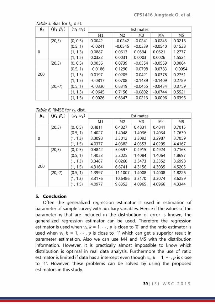
CPS1416 Jungtaek O. et al.
39 | I S I W S C 2 0 1 9
Table 5. Bias for 𝑡5 dist.
𝜷𝟎 (𝜷𝟏 , 𝜷𝟐) (𝒗𝟏 , 𝒗𝟐) Estimates
M1 M2 M3 M4 M5
0
(20,5) (0, 0.5) 0.0042 -0.0242 -0.0241 -0.0243 0.0216
(0.5, 1) -0.0241 -0.0545 -0.0539 -0.0540 0.1538
(1, 1.3) 0.0887 0.0613 0.0594 0.0621 1.2777
(1, 1.5) 0.0322 0.0031 0.0003 0.0026 1.5524
200
(20,5) (0, 0.5) 0.0056 0.0739 -0.0554 -0.0559 0.0064
(0.5, 1) -0.0186 0.1290 -0.0798 -0.0783 -0.0054
(1, 1.3) 0.0197 0.0205 -0.0421 -0.0378 0.2751
(1, 1.5) -0.0817 0.0708 -0.1439 -0.1409 0.2789
(20,-7) (0.5, 1) -0.0336 0.8319 -0.0455 -0.0434 0.0759
(1, 1.3) -0.0645 0.7156 -0.0802 -0.0744 0.5521
(1, 1.5) -0.0026 0.6347 -0.0213 -0.0096 0.6396
Table 6. RMSE for 𝑡5 dist.
𝜷𝟎 (𝜷𝟏 , 𝜷𝟐) (𝒗𝟏 , 𝒗𝟐) Estimates
M1 M2 M3 M4 M5
0
(20,5) (0, 0.5) 0.4811 0.4827 0.4831 0.4841 0.7015
(0.5, 1) 1.4027 1.4048 1.4036 1.4034 1.7630
(1, 1.3) 3.3098 3.3012 3.3092 3.2987 3.7059
(1, 1.5) 4.0377 4.0382 4.0353 4.0295 4.4167
200
(20,5) (0, 0.5) 0.4842 5.0597 0.4915 0.4924 0.7163
(0.5, 1) 1.4053 5.2025 1.4084 1.4064 1.8697
(1, 1.3) 3.3487 6.0260 3.3473 3.3352 3.6998
(1, 1.5) 4.3164 6.6741 4.3156 4.3035 4.5205
(20,-7) (0.5, 1) 1.3997 11.1007 1.4008 1.4008 1.8226
(1, 1.3) 3.3176 10.6486 3.3170 3.3074 3.6259
(1, 1.5) 4.0977 9.8352 4.0965 4.0966 4.3344
5. Conclusion
Often the generalized regression estimator is used in estimation of
parameter of sample survey with auxiliary variables. Hence if the values of the
parameter 𝜈𝑖 that are included in the distribution of error is known, the
generalized regression estimator can be used. Therefore the regression
estimator is used when 𝜈𝑘, 𝑘 = 1, ⋯ , 𝑝 is close to ‘0’ and the ratio estimator is
used when 𝜈𝑘, 𝑘 = 1, ⋯ , 𝑝 is close to ‘1’ which can get a superior result in
parameter estimation. Also we can use M4 and M5 with the distribution
information. However, it is practically almost impossible to know which
distribution is optimal in real data analysis. Furthermore the use of ratio
estimator is limited if data has a intercept even though 𝜈𝑘, 𝑘 = 1, ⋯ , 𝑝 is close
to ‘1’. However, these problems can be solved by using the proposed
estimators in this study.

CPS1416 Jungtaek O. et al.
40 | I S I W S C 2 0 1 9
In this paper, we propose the new multiple ratio estimator and the
generalized ratio-type estimator using the Taylor series approximation. In
particular, the generalized ratio-type estimator has the advantages of the
regression estimator which is accuracy, robustness. This estimator also has the
advantages of the ratio estimator which is convenience of calculation, ease of
use. Also these estimators can be used without estimation of 𝜈𝑘, 𝑘 = 1,⋯ , 𝑝.
References:
1. Cochran, W.G. 1977. Sampling Techniques. John Wiley. NY.
2. Srivastava. S.K. 1967. “An Estimator using Auxiliary Information in Sample
Surveys.” Calcutta Statistical Association Bulletin 16: 121-132
3. Tailor, R., H.A. Lone, and R. Pandey. 2015. “Generalized ratio-cum-product
type estimator of finite population mean in double sampling for
stratification.” Communications for Statistical Application and Methods
22: 255-264.

CPS1419 Jinheum K. et al.
41 | I S I W S C 2 0 1 9
A multi-state model for analyzing doubly
interval-censored semi-competing risks
Jinheum Kim1, Jayoun Kim2 1Jinheum Kim, Department of Applied Statistics, University of Suwon, Suwon, 18323, South
Korea 2Jayoun Kim, Medical Research Collaborating Center, Seoul National University Hospital,
Seoul, 03080, South Korea
Abstract
In biomedical or clinical studies, we often encounter semi-competing risks
data in which one type of event may censor another event, but not vice versa.
We propose a multi-state model for analyzing these semi-competing risks
data in the presence of interval censoring on both intermediate and terminal
events, so-called doubly censored scenarios. In this article, we utilize the
conventional Cox proportional hazards model by incorporating a frailty effect.
Thus, the proposed model can reflect diversities for which real data might
frequently possess. Marginalization of the full likelihood is accomplished using
adaptive importance sampling, and the optimal solution of the regression
parameters is achieved through the iterative quasi-Newton algorithm. The
proposed methodology is illustrated on several simulation studies and real
data.
Keywords
Doubly interval-censored; Illness-death model; Intermediate event; Multi-
state model; Normal frailty; Semi-competing risks data
1. Introduction
In time-to-event or survival analysis, patients with certain diseases are
asked to make clinic visits and are monitored during periodic follow-up. This
makes it virtually impossible to observe the event time exactly. Under these
situations the event time is at least known to lie on a time interval, i.e., the
interval between the last and current visits; this is often called interval
censoring. Further, in a considerable number of medical studies, we encounter
situations in which two series of events are interval censored, which is known
as doubly interval-censored (DIC). The most well-known DIC data are acquired
immunodeficiency syndrome (AIDS) data which motivated several papers,
including Gruttola and Lagakos (1989), Kim et al. (1993), and Zeng et al. (2006).
The study was designed to analyze the doubly interval-censored incubation
time between the originating event, infection with the human
immunodeficiency virus (HIV) and onset of the terminating event, AIDS.

CPS1419 Jinheum K. et al.
42 | I S I W S C 2 0 1 9
It is well known that standard survival models such as the Cox proportional
hazards (PH) model can be used for analyzing exact or right-censored data.
However, this model is not applicable to DIC data, so some ad hoc approaches
have used midpoints or right points (Law and Brookmeyer, 1992) in the
censored interval as a heuristic. Since then, many researchers have developed
various statistical methods for analyzing DIC data that make procedures more
feasible and provide more powerful results. Among them, Kim et al. (1993)
considered the method of discretizing the distribution into prespecified mass
points and estimating parameters with the Cox PH model. Sun et al. (1999)
extended the result of Kim et al. (1993) to circumvent the non-identifiability
problem and have simpler forms based on an estimating equation method. In
addition, Goggins et al. (1999) focused on the technique of imputing survival
times based on the joint likelihood and estimated effects of covariates using
a Monte Carlo EM algorithm. Meanwhile, Pan (2000) and Pan (2001) extended
multiple imputation methods to assess more accurate survival times from
interval-censored data and to estimate the regression coefficients with the Cox
regression model. Dejardin and Lesaffre (2013) described a stochastic EM
algorithm for evaluating the impact of covariates in the presence of DIC
survival times through a semi-parametric Cox's model.
In clinical trials or cohort studies, subjects are often at risk for one terminal
event. However, in some applications, subjects do not fail from only a single
type of event, but instead are at risk of failing from two or more mutually
exclusive types of events. When an individual is at risk of failing from two
different types of events, these events are called competing risks. Thus, in this
framework, one of the events censors the other and vice versa (Tsiatis, 2005;
Andersen et al., 2012; Putter et al., 2007). On the other hand, many clinical
trials reveal that a subject can experience both an intermediate event, such as
a disease or relapse, and a terminal event, such as death, in which the terminal
event censors the non-terminal event but not vice versa. These types of data
are known as semi-competing risks data (Fine et al., 2001; Xu, et al., 2010;
Barrett, et al., 2010). There has been some work on analysis of semi-competing
risks data by assuming interval censoring only on the intermediate events. For
instance, Siannis et al. (2007) considered a multi-state model to estimate the
regression coefficients in the presence of informative lost-to-follow-up and
interval-censoring. Later, this model was extended by Barret et al. (2011) who
incorporated an illness-death model to deal with a more complicated model
structure. Kim and Kim (2016) employed an extension of the illness-death
model to estimate transition intensities when an intermediate event is interval-
censored.
However, to the best of our knowledge, there has not been any published
research for which both intermediate and terminal events are interval-
censored. We extend previous approaches for analyzing semi-competing risks

CPS1419 Jinheum K. et al.
43 | I S I W S C 2 0 1 9
data for which interval censoring is assumed only on intermediate events
(Barret et al., 2011). Thus, our proposed model can provide a little more
flexibility in dealing with data in a semi-competing framework. In this article,
we utilize the Cox PH model with the incorporation of a frailty effect.
Moreover, our proposed method enables us to grasp the dependency of
related events using frailty and yields estimates of meaningful transition
intensities. The results will be illustrated from simulation studies and real data
analysis as well.
The rest of the paper is organized as follows. Section 2 explains the
structure of the proposed model, along with notations, and computation
procedures for parameter estimation. In particular, the quasi-Newton
optimization is used to estimate the parameters in the model. In Section 3, we
conduct extensive simulation studies to demonstrate the performance of the
proposed model. We calculate commonly used measures such as the relative
bias and coverage probability of the parameter estimates. Section 4 presents
real data analysis as an illustration. Finally, Section 5 provides a summary with
concluding remarks, including some drawbacks of the proposed models and
directions for future research.
2. Method
We consider an illness-death model (Anderson et al., 1993) that is one of
the most commonly used semi-competing risks models. As mentioned in the
previous section, the proposed model assumes that both non-fatal and fatal
events may be interval-censored, i.e., DIC. The model in our study has three
states: healthy (H), non-fatal (NF), and fatal (F), which denote by the numbers
0, 1, and 2, respectively. Under the illness-death model, there exist three
possible transitions between states: 0 → 1, 0 → 2, and 1 → 2. Thus, we have
four possible routes that a subject can experience from the beginning to the
end of study, i.e., route 1: 0 → 0 , route 2: 0 → 2 , route 3: 0 → 1 , and route
4: 0 → 1 → 2.
Let 𝑡 be the time from study entry and define 𝑆𝑡 as the state of each
subject at time 𝑡 ≥ 0 . So, 𝑆𝑡 ∈ 0,1,2 in our model setup. Now let 𝒜 =
(𝑟, 𝑠): (𝑟, 𝑠) = (0,1), (0,2), (1,2) represent the possible transitions from state
𝑟 to state 𝑠. Given covariates 𝒙 = (𝑥1, 𝑥2, … , 𝑥𝑝)′ and frailty 휂, define 𝜆𝑟𝑠(𝑡|𝒙, 휂)
as the transition intensity from state 𝑟 to state 𝑠 at time 𝑡. That is,
𝜆𝑟𝑠(𝑡|𝒙, 휂) = lim𝑑𝑡→0
𝑃𝑟 ( 𝑆𝑡+𝑑𝑡 = 𝑠|𝑆𝑡 = 𝑟, 𝒙, 휂)
𝑑𝑡, (𝑟, 𝑠) ∈ 𝒜,
and 𝜆𝑟𝑠(𝑡|𝒙, 휂) = 0 for (𝑟, 𝑠) ∉ 𝒜. Furthermore, through the Cox (Cox, 1975)
regression model, the transition intensity 𝜆𝑟𝑠(𝑡|𝒙, 휂) can be expressed as

CPS1419 Jinheum K. et al.
44 | I S I W S C 2 0 1 9
𝜆𝑟𝑠(𝑡|𝒙, 휂) = 휃𝑟𝑠𝛾𝑟𝑠𝑡𝛾𝑟𝑠−1 exp ( 𝜷′
𝑟𝑠𝒙 + 휂), (𝑟, 𝑠) ∈ 𝒜, (1)
where 𝜷𝑟𝑠 = (𝛽𝑟𝑠,1, 𝛽𝑟𝑠,2, … , 𝛽𝑟𝑠,𝑝)′ is the vector of the regression coefficients.
Note that we assume a Weibull distribution for the baseline transition intensity
and take into account frailty in order to incorporate dependency between
transitions. Thus, the parameter vector in our model is 𝜻 =
(휃01 , 휃02, 휃12 , 𝛾01 , 𝛾02 , 𝛾12 , 𝜷01 , 𝜷02, 𝜷12 , 𝜎2)′ , where 𝜎2 is the variance of
anormal frailty 휂 with a mean of 0.
Let 𝑒𝑖 be the entry time of study, 𝑎𝑖 be the time of last visit before a
non-fatal event is not observed, 𝑏𝑖 be the first time that a non-fatal
event is observed, 𝑢𝑖 be the time of last visit before a fatal event is not
observed, and 𝑣𝑖 be the first time that a fatal event is observed for the
𝑖𝑡ℎ subject, where 𝑖 = 1,2,… , 𝑛. Consider an indicator function 𝐼𝑖ℎ, which
is 1 if subject 𝑖 follows the route ℎ and 0 otherwise for ℎ = 1,2,3,4. Let
ℬℎ = 𝑖: 𝐼𝑖ℎ = 1 denote the set of subjects for which subject 𝑖 follows
the route ℎ. Therefore, the likelihood function for the parameter vector
𝜻 is
𝐿(𝜻) =∏∏𝑄𝑖ℎ
𝐼𝑖ℎ
4
ℎ=1
𝑛
𝑖=1
𝜙(0, 𝜎2; 휂𝑖),
where 𝜙(⋅) is the probability density function of a normal distribution
with a mean of zero and variance 𝜎2, denoted by 𝑁(0, 𝜎2). In our
analysis, we use the NLMIXED procedure of the SAS software to
estimate 𝜻. First, we define the marginal likelihood as
𝑚(𝜻) = ∫⋯∫𝐿 (𝜻)𝑑휂1⋯𝑑휂𝑛 . (2)
Numerical computation is needed to integrate out frailty parts in (2).
We use the adaptive importance sampling method proposed by
Pinheiro and Bates (1995) to get the marginal distribution of 𝜻. Second,
we let 𝑓(𝜻) = − log 𝑚 (𝜻). Then, we find the value of 𝜻 for which 𝑓(𝜻) is
minimized, referred to as . We note that the quasi-Newton
optimization is employed by utilizing the gradient vector and the
Hessian matrix of 𝑓(𝜻) , to achieve the optimal solution of 𝜻 .
Consequently, the inverse of the Hessian matrix evaluated at is
defined as the estimated variance-covariance matrix of .

CPS1419 Jinheum K. et al.
45 | I S I W S C 2 0 1 9
3. Simulation studies
Extensive simulations are performed to investigate the finite-sample
properties of the estimators proposed in Section 2. We assume a
Weibull distribution with a common shape parameter of 1 as the
baseline transition intensities. However, different values of the scale
parameter of the Weibull distribution are used to impose some
influence on relevant transitions: 휃01 = 0.006, 휃02 = 0.003, and 휃12 =
0.004. We assume a normal distribution with a mean of zero and a
variance of0.1 for the frailty. For generation on covariates, we use a
Bernoulli trial with a success probability of 0.5 on a binary covariate 𝑥1
and a standard normal random variate on a continuous covariate 𝑥2.
We fix the sample size 𝑛 at 200 and the censoring time 𝑐 at 365. A total
of 500 replications is performed in our simulations.
Table provides the relative bias (‘r.Bias’), standard deviation (‘SD’),
average of the standard errors (‘SEM’), and coverage probability (‘CP’)
of 95% confidence intervals for the regression parameters, and the
variance estimate of the frailty distribution. The SD and SEM are very
close to each other and the CPs of the regression parameters are close
to a nominal level of 0.95 regardless of the types of the regression
coefficients considered in the simulations. Sensitivity analysis is also
conducted to investigate how the parameter estimates behave in
response to different frailty distributions. For simplicity of computation,
we consider only the ‘even’ case for the regression parameters. Three
different frailty distributions are used, along with 𝑁(0,0.1) : uniform,
double exponential (𝐷𝐸 ), and gamma (𝐺 ) distributions with specific
parameter value(s) set to keep the mean and variance of each
distribution equal to those of the normal distribution. We compare the
results of the three distributions with those of the normal distribution.
The uniform and double exponential distributions are symmetric, like a
normal distribution. However, the uniform distribution has thinner tails
than the normal distribution, while the double exponential distribution
has heavier tails than the normal distribution. Unlike the normal
distribution, the gamma distribution is asymmetric. Despite the
differences among these distributions, overall, there are no differences
in the values of r. Bias and CP when comparing the three distributions
to the normal distribution. This implies that the proposed estimators are
robust to the misspecification of the frailty distribution.
CPS1419 Jinheum K. et al.
46 | I S I W S C 2 0 1 9
4. Illustrative real example
PAQUID data were collected to investigate the effects of dementia
on mortality. Samples were taken from community residents of two
southwestern regions (Gironde and Dordogne) of France (Helmer et al.,
2001). The population consists of residents aged65 or above between
1988 and 1990, whose socio-demographic characteristics and mental
health status were recorded every two to three years. Among a total of
3,675 persons selected to participate in the study, 832 (22.6%) were
diagnosed with dementia, 639 of whom died. The remaining 2,843
participants (77.4%) did not experience dementia but 2,298 of them
died.
In this article, we performed an analysis based on ‘paq1000’ data,
which included 1,000 randomly selected observations from the PAQUID
data (Touraine et al., 2015). The paq1000 data consist of several pieces
of information, such as the mental health status (diagnosed with
dementia or dementia-free), dead or alive status, ages (including a
participant’s age at the start of study (𝑒𝑖), their age at the last dementia-
free visit (𝑎𝑖), their age when they were diagnosed with dementia (𝑏𝑖),
their age at their time of death (𝑡𝑖), their age at censoring (𝑐𝑖), gender,
and educational background (educated or non-educated in terms of
graduation from elementary school, say certificate). For an illustration
of the proposed method, we assume a subject’s age at death to be
censored in an interval around the observed value. To this end,
assuming that 𝑡𝑖 is age-at-death of subject 𝑖, the endpoints of the
interval (𝑢𝑖, 𝑣𝑖] for subject 𝑖 are defined as 𝑢𝑖 = 𝑡𝑖 − 𝜖1𝑖 and 𝑣𝑖 = 𝑡𝑖 +
𝜖2𝑖 , where 𝜖1𝑖 and 𝜖2𝑖 are random variates generated from 𝑈(0,3).
When a subject’s age at death is censored at time 𝑐𝑖 , we set 𝑢𝑖 = 𝑐𝑖 and
𝑣𝑖 = ∞, i.e., right-censored at 𝑐𝑖.
For the 0 → 1 transition, men showed intensity that was 1.899 times
higher than that of women, yielding a decently significant result with a
𝑃-value of 0.0016. The non-educated group showed an intensity that
was 1.277 times higher than the educated group, although this was not
significant (a 𝑃-value of 0.3293). For the 1 → 2 transition, the intensity
for women is 1.222 times higher than it is for men, but this is not
significant (a 𝑃-value of 0.711). The intensity for the educated group is
1.248 times higher than the non-educated group, but this is not
significant (a 𝑃-value of 0.6808). Finally, for the 0 → 2 transition, the
intensity for women is 6.816 times higher than it is for men with a very
CPS1419 Jinheum K. et al.
47 | I S I W S C 2 0 1 9
significant 𝑃-value of <0.0001. The intensity of the educated group is
3.874 times higher than that of the non-educated group with a 𝑃-value
of <0.0001. The estimate of the variance 𝜎2 of the normal frailty is
1.1039, showing non-homogeneity between individuals with a 𝑃-value
of <0.0001. Furthermore, Figure 1 displays the estimated transition
intensities between states such as 0 → 1, 0 → 2, and 1 → 2 under the
combinations of two risk factors, gender and education background.
Figure 2 shows the estimated individual frailty. As expected, for the 0 →
1 transition, the intensities of men (long-dashed and dotted-and-long-
dashed curves) are greater than those of women (solid and dotted
curves) irrespective of educational background; for the 0 → 2 transition,
the intensity of educated women is significantly greater than those of
the rest of combinations of gender and educational background.
5. Concluding remarks
In this article, we extend the approach of the methods proposed
under interval censoring only on a non-fatal event to analyzing semi-
competing risks data with interval censoring on both non-fatal and fatal
events. In our proposed model, we assume a Weibull distribution for
the baseline transition intensity and take into account frailty in order to
incorporate dependency between transitions. Regarding manipulation
of interval-censored event time, Barrett et al. (2011) assumed that the
exact event time can be observed uniformly over all time points in the
interval. Instead, we employed the method proposed by Collett (2015)
by partitioning the interval into several sub-intervals in which events can
occur. Subsequently, weight allocations on sub-intervals are imposed to
construct the modified likelihood functions. For parameter estimation,
numerical integration for the frailty distribution was executed by using
adaptive importance sampling, followed by quasi-Newton optimization
in the maximization step.
In simulation studies, we considered three types of regression
coefficients to compare the effects of the covariates on the hazard rate
of a fatal event before and after experiencing a non-fatal event. Both
SD and SEM are very close to each other and the CPs of the regression
parameters are close to a nominal level of 0.95 irrespective of types of
the regression coefficients considered. In addition, sensitivity analysis
was conducted to investigate how the parameter estimates behave to
the misspecificationof the frailty distribution. There were no differences

CPS1419 Jinheum K. et al.
48 | I S I W S C 2 0 1 9
in the values of r.Bias and CP between the three distributions considered
in simulations and the normal distribution. Through the analysis of
augmented PAQUID data, we found that non-homogeneity between
individuals exists. Men transitioned from healthy to diagnosed-with-
dementia states with an intensity that was 1.899 times higher than that
of women. For the transition from healthy to dead states, the intensity
for women was 6.816 times higher than it was for men, and the intensity
of the educated group was 3.874 times higher than that of the non-
educated group. However, there was no significant difference in the
transition intensity of dignosed-with-dementia to dead states between
men and women or between educated and non-educated groups.
Acknowledgement
This research was supported by Basic Science Research Program through the
National Research Foundation of Korea (NRF) funded by the Ministry of
Education (NRF-2017R1D1A1B03028535).
References
1. Andersen, P. K., Geskus, R. B., de Witte, T., and Putter, H. (2012).
Competing risks in epidemiology: possibilities and pitfalls. International
journal of epidemiology, 41, 861-870.
2. Barrett, J. K., Siannis, F., and Farewell, V. T. (2011). A semi-competing risks
model for data with interval-censoring and informative observation: An
application to the MRC cognitive function and ageing study. Statistics in
Medicine, 30, 1-10.
3. De Gruttola, V., and Lagakos, S. W. (1989). Analysis of doubly-censored
survival data, with application to AIDS. Biometrics, 45, 1-11.
4. Dejardin, D., and Lesaffre, E. (2013). Stochastic EM algorithm for doubly
interval-censored data. Biostatistics, 14, 766-778.
5. Fine, J. P., Jiang, H., and Chappell, R. (2001). On semi-competing risks
data. Biometrika, 88, 907-919.
6. Goggins, W. B., Finkelstein, D. M., and Zaslavsky, A. M. (1999). Applying
the Cox proportional hazards model for analysis of latency data with
interval censoring. Statistics in Medicine, 18, 2737-2747.
7. Kim, J., and Kim, J. (2016). Regression models for interval-censored semi-
competing risks data with missing intermediate transition status. The
Korean Journal of Applied Statistics, 29, 1311-1327.
8. Kim, M. Y., De Gruttola, V. G., and Lagakos, S. W. (1993). Analyzing doubly
censored data with covariates, with application to AIDS. Biometrics, 49,
13-22.

CPS1419 Jinheum K. et al.
49 | I S I W S C 2 0 1 9
9. Law, C. G., and Brookmeyer, R. (1992). Effects of midpoint imputation on
the analysis of doubly censored data. Statistics in medicine, 11, 1569-
1578.
10. Pan, W. (2000). A multiple imputation approach to Cox regression with
interval-censored data. Biometrics, 56, 199-203.
11. Pan, W. (2001). A multiple imputation approach to regression analysis for
doubly censored data with application to AIDS studies. Biometrics, 57,
1245-1250.
12. Putter, H., Fiocco, M., and Geskus, R. B. (2007). Tutorial in biostatistics:
competing risks and multistate models. Statistics in Medicine, 26, 2389-
2430.
13. Siannis, F., Farewell, V. T., and Head, J. (2007). A multi-state model for
joint modelling of terminal and non-terminal events with application to
Whitehall II. Statistics in Medicine, 26, 426-442.
14. Sun, J., Liao, Q., and Pagano, M. (1999). Regression analysis of doubly
censored failure time data with applications to AIDS studies. Biometrics,
55, 909-914.
15. Tsiatis, A. A. (2005). Competing risks. Encyclopedia of Biostatistics, 2,
1025-1035.
16. Xu, J., Kalbfleisch, J. D., and Tai, B. (2010). Statistical analysis of illness-
death processes and semicompeting risks data. Biometrics, 66, 716-725.

CPS1428 Enobong F. U.
50 | I S I W S C 2 0 1 9
Burr XII distribution and its application in PERT
Enobong Francis Udoumoh
University of Agriculture, Makurdi, Nigeria
Abstract
Project Evaluation and Review Technique (PERT) in conjunction with Monte
Carlo simulation is no doubt a useful and an acceptable tool for project
network analysis. However, a common challenge in practice is the inability to
confidently select appropriate input distribution to represent activity duration
owing to scarcity of project data. In this research, Burr XII distribution is
introduced as an input duration distribution in the analysis of project network.
Some desirable properties that qualify Burr XII distribution as input duration
distribution are presented. The classical quantile estimation approach is
adopted to estimate activity parameters based on judgmental estimates. To
illustrate the procedure, activity duration data from a survey of bore hole
drilling projects in Benue State, Nigeria was used. Initial results based on
goodness of fit test shows that Burr distribution is well suited to model activity
duration. A program written in MATLAB codes is used to Monte Carlo the
project network to estimate the Project Completion Time (PCT). Further results
revealed that the new approach which uses Burr XII distribution performs well
especially when the activity distribution is heavily tailed to the right.
Keywords
Activity Duration; Quantile Estimation; Project
1. Introduction
Management of projects has become increasingly complex owing to the
sophisticated nature of our environment and management systems. This has
led to the adoption and formulation of efficient management techniques for
effective management of projects. The Critical Path Method (CPM)/Project
Evaluation and Review Technique (PERT) is one of the management techniques
which has been use extensively in project management,Tavares (2002),
PMBOK (2008). The originators of PERT (Malcom et al. 1959) assumed that
project activity time follows the generalized beta distribution with probability
density function
𝑓(𝑥0 =Γ(𝛼+𝛽)
Γ(𝛼)Γ(𝛽)
(𝑥−𝛼)𝛼−1(𝑏−𝑥)𝛽−1
(𝑏−𝑎)𝛼+𝛽−1 ; 𝑎 < 𝑥 < 𝑏, 𝛼, 𝛽 > 0 (1)

CPS1428 Enobong F. U.
51 | I S I W S C 2 0 1 9
where 𝛼 and 𝛽 are the shape parameters, Γ(. ) is the gamma function. The
mean, variance and skewness are given as 𝜇𝑥 = 𝑎 + (𝑏 − 𝑎)𝛼
𝛼+𝛽′𝜎𝑥2 =
(𝑏 − 𝑎)2𝛼𝛽
(𝛼+𝛽)2(𝛼+𝛽+1) respectively.
However, the mean and variance were estimated as 𝜇 𝑥 = (𝑎 + 4𝑚 + 𝑏)⁄6
and 𝜎 𝑥2 = (𝑏 − 𝑎)2⁄36 , where 𝑎, 𝑚 and 𝑏 are optimistic, most likely and
pessimistic times respectively. Then the central limit theorem was applied to
approximate the cumulative distribution of the project completion time to
normal. It is known that Malcom’s PERT underestimate project completion
time and some of the sources of this bias as documented in literature (see
MacCrimmon & Ryavec (1964), Elmaghraby (1977), McCombs, et. al. (2009))
include: (i) Inability to accurately estimate the pessimistic, optimistic and most
likely times. (ii) The seemingly intuitive choice of the Beta distribution. (iii)
Method of estimation of the parameters of the activity time. (iv) The critical
path method of computing project completion time which ignores near critical
paths. (v) The possibility of wrong approximation of the project duration by
normal distribution. Previous works (Premachandra (2001), Herrerias-Velasco
(2011)) revealed that Malcom’s PERT formulae of the mean and variance
restrict us to only three members of the beta family, namely, (i) 𝛼 = 𝛽 = 4
(ii)𝛼 = 3 − √2 ;𝛽 = 3 + √2 (iii) 𝛼 = 3 + √2 ; 𝛽 = 3 − √2 . . In which case, the
skewness captured by the model is 0, 1
2 and −
1
2 respectively. In other words,
the estimates are unreliable when activity times are heavily tailed.
Consequently, researchers have suggested other probability distributions as
proxies for the beta distribution as well as adopting other estimation
techniques to circumvent items (ii) and (iii) above.
Some of the distributions suggested include: the normal by Cottrell (1999);
the lognormal by Mohan et al (2007), Trietsch, et. al.(2012); the weibull by
McCombs et. al. (2009); the exponential by Magott and Skudlarski (1993),
Kwon, et. al. (2010); the truncated exponential by Abd-el-Kader (2006); the
compound Poisson by Parks & Ramsing (1969); the triangular by
Elmaghraby(1977), Johnson (1997); the gamma by Lootsma (1966),
Abdelkader (2004b); the beta-rectangular by Hahn (2008); the tiltedbeta by
Hahn and Martín (2015); the uniform by MacCrimmon & Rayvec(1964) and
Abdelkader and Al-Ohali(2013); the Erlang by Bendell, et. al. (1995) and
Abdelkader (2003).
The aim of this paper is to introduce Burr XII distribution as activity time
distribution in PERT. We will present a method for the estimation of the
parameters of activity time with Burr XII distribution, and thereafter Monte
Carlo the project network to obtain PCT using MATLAB Codes. It is believed
that our method will significantly address issues in items (i), (ii) and (iii) as listed
above.

CPS1428 Enobong F. U.
52 | I S I W S C 2 0 1 9
2. Burr XII Activity Duration Distribution: Parameter Elicitation
A random variable X is said to follow a 3 parameter Burr XII distribution
with scale (𝛼) and shape parameters c and k if the probability density function
is given as
𝑓(𝑥) = 𝑐𝑘𝑥𝑐−1
𝑎𝑐(1 + (
𝑥
𝑎)𝑐)−(𝑘+1)
; 𝑥 ≥ 0, 𝑐 > 0, 𝑘 > 0, 𝑎 > 0 (2)
(see Burr, 1942)
The cumulative density function is
𝐹(𝑥) = 1 − (1 + (𝑥
𝑎)𝑐)−𝑘
(3)
The 𝑟𝑡ℎ moment is given as
𝐸(𝑋𝑟) =𝑘𝑎𝑟Γ(𝑘−𝑟 𝑐⁄ )Γ(𝑟 𝑐⁄ +1)
Γ(𝑘+1) ; 𝑐𝑘 > 𝑟
Hence, the mean is
𝐸(𝑋) =𝑘𝑎𝑟Γ(𝑘−1 𝑐⁄ )Γ(1 𝑐⁄ +1)
Γ(𝑘+1) ; 𝑐𝑘 > 1 (4)
Variance of 𝑋 is defined as
𝑉(𝑋) = 𝐸(𝑋2) − [𝐸(𝑋)]2
𝑉(𝑋) =𝑘𝑎2Γ(𝑘−2 𝑐⁄ )Γ(2 𝑐⁄ +1)
Γ(𝑘+1) − (
𝑘𝑎Γ(𝑘−1 𝑐⁄ )Γ(1 𝑐⁄ +1)
Γ(𝑘+1))2
(5)
From equation (3)
𝑋𝑞 = 𝛼[(1 − 𝐹(𝑥))1
𝑘 − 1] 1
𝑐 (6)
Equation (6) is the qth quantile of the 3P-Burr XII distribution.
Let 𝑥𝑎 , 𝑥𝑚 and 𝑥𝑏 represent the lower, median and upper expert judgment
percentiles of a 3-P Burr XII distribution. Consequently, the lower, median and
upper quantiles of a 3P Burr XII distribution are respectively.
𝑋𝑎 = 𝛼[(1 − 𝐹(𝑥𝑎))1
𝑘 − 1] 1
𝑐 (7)
𝑋𝑚 = 𝛼[(1 − 𝐹(𝑥𝑚))1
𝑘 − 1] 1
𝑐 (8)
𝑋𝑏 = 𝛼[(1 − 𝐹(𝑥𝑏))1
𝑘 − 1] 1
𝑐 (9)
Note that the choice of the median quantile is based on the fact that the
median as a measure of location is not affected by outliers in the data; hence
it is well suited for positively skewed distribution. To estimate 𝑐, 𝑘 and 𝛼, we
solved equations (7), (8) and (9) simultaneously to obtain the following results:

CPS1428 Enobong F. U.
53 | I S I W S C 2 0 1 9
𝑐 = 𝑙𝑛((𝑒𝑄 + 1)
𝑙𝑛𝑅(𝑥𝑏)𝑙𝑛𝑅(𝑥𝑎) − 1
(𝑒𝑄 + 1)𝑙𝑛𝑅(𝑥𝑚)𝑙𝑛𝑅(𝑥𝑎) − 1
) 𝑙𝑛 (𝑥𝑚𝑥𝑏)⁄
𝑘 =𝑙𝑛𝑅(𝑋𝑎)
𝑙𝑛 (𝑒𝑄 + 1)
α=
xa
‐ ln [(eQ+1)lnR(xb)lnR(xa)‐1] ln (
xm
xb) ‐ln (
xb
xa) ln [(eQ+1)
lnR(xm)lnR(xa) ‐1]+ln (
xb
xa) ln [(eQ+1)
lnR(xb)lnR(xa)‐1] e
ln
[ (eQ+1)
lnR(xb)
lnR(xa)‐1
(eQ+1)
lnR(xb)
lnR(xa)‐1]
⁄
where Q is the root of
𝑥𝑙𝑛 (𝑥𝑚𝑥𝑏) − 𝑙𝑛 (𝑒
𝑙𝑛𝑅(𝑥𝑏) 𝑙𝑛(𝑒𝑥+1)
𝑙𝑛𝑅(𝑥𝑎) − 1) 𝑙𝑛 (𝑥𝑚𝑥𝑏) + 𝑙𝑛 (
𝑥𝑏𝑥𝑎) 𝑙𝑛 (𝑒
𝑙𝑛𝑅(𝑥𝑚) 𝑙𝑛(𝑒𝑥+1)𝑙𝑛𝑅(𝑥𝑎) − 1) −
𝑙𝑛 (𝑥𝑏𝑥𝑎) 𝑙𝑛 (𝑒
𝑙𝑛𝑅(𝑥𝑏) 𝑙𝑛(𝑒𝑥+1)
𝑙𝑛𝑅(𝑥𝑎) − 1) = 0
Observe that the only variable in equation (13) is x, which can easily be
obtained using appropriate iterative technique. Given the solution of equation
(13), values of c, k, and α are easily computed using equations (10), (11), and
(12) respectively. The values of c, k, and α can then be used to compute exact
values for activity mean and variance using equations (4) and (5). However, we
need the values of xa, xm, xb, with their corresponding probabilities F(xa) or R(xa)
, F(xm) or R(xm) and F(xb) or R(xb) for the computation of 𝑐, 𝑘 and 𝛼. These
quantities can be supplied by the expert as judgmental estimates or chosen
by the project manager based on apriori information.
One of the advantages of using the classical quantile technique to estimate
the parameters of Burr XII distribution is that the user has the liberty to choose
whatever quantile(s) he feels are appropriate. However, there is need to be
guided by the fact that the assessments of extreme quantiles like 0.0 and 1.0,
0.01 and 0.99 are difficult and almost unrealistic, since these extremes has to
do with the rare events. Quantiles like 0.10 and 0.90, 0.05 and 0.95 are found
to be more reliable and easy to assess, Moder et. al. (1983).
Some well known probability distributions that have been used as input
distributions in stochastic risk analysis are special cases of Burr XII distribution.
Table I presents these distributions in comparison with a 2P-Burr XII
distribution. Moreover, Burr XII also have a defined mode at 𝑋 =
[(𝑐 − 1) ⁄ (𝑐𝑘 + 1)] 1
𝑐 ,if 𝑐 > 1. Tadikamalla (1980) have demonstrated that
Burr(XII) can fit a wide range of empirical data because it possesses a broad
range of skewness and kurtosis. Particularly, Burr (XII) region covers sections

CPS1428 Enobong F. U.
54 | I S I W S C 2 0 1 9
of the areas corresponding to the Pearson Type I, IV, and VI on the skewness-
Kurtosis plane. Some sections of normal, exponential, logistic, extreme value
and lognormal distributions are also covered. Burr XII accommodates a
positive longer tail probability than the PERT-beta distribution. Lewis (1981)
further presented the Weibull, Exponential, Generalized Logistic, Logistic,
Normal, Pareto, and Gompertz distributions as special cases of Burr XII
distribution.
3. Illustration and Discussions
In a study of water bore hole drilling projects in Makurdi, North Central
region of Nigeria by Nile Drill Tech, limited, a total of 20 drilling sites were
observed. The project was divided into 9 activities.
A description of the activities in the project is given in table 1.
Table1: Activity Description with Duration times (in minutes)
Activity Description Mean Median Mode Variance Skewness Min Max
A Geographical
Survey
32.95 31 30 22.3658 1.4976 28 45
B Analysis of
data
63.1 61 60 34.7263 1.7203 56 80
C Punching 315.55 305.5 300 811.8394 0.9950 280 380
D Casing 30.75 30 30 3.25 1.1940 28 35
E Gravel
Packing
16.55 16 15 6.7868 1.6038 14 24
F Connection
of pipes to
pump 202.25 185 180 1782.8289 1.3595 150 300
G Connection
of cables to
pump 23.95 24 25 7.8395 1.0320 20 32
H Lowering of
pump
3 3 3 0.6316 0.6991 2 5
I Plumbing 103.7 100 100 113.8 1.0126 90 130
In table 2 we present the estimates of the mean duration of activities A-I
using quantile estimation method (new method). traditional PERT, Gollenko-
Ginzburg method, and Shankar approximation, and simulated results. From
table 2, it could be observed that the mean estimates obtained using the new
method are generally higher than those obtained using the three previous
methods with exception of activity H. However we note from table I that
activity H has almost symmetric distribution with coefficient of skewness =
0.6991.

CPS1428 Enobong F. U.
55 | I S I W S C 2 0 1 9
Table 2: Estimates of Mean Duration of Activities
Activity New
Method
Classical
PERT
Shankar &
Sireesha
Gollenko-
Ginzburg
Simulated
A 32.945 32.1667 32.4074 32 32.938
B 63.112 62.6667 62.9630 62.4615 63.099
C 315.81 310 311.1111 309.2308 315.79
D 30.759 30.5000 30.5556 30.4615 30.756
E 16.594 16.3333 16.4815 16.2308 16.591
F 202.66 195 196.6664 193.8462 202
G 23.966 25.3333 25.3704 25.3077 23.96
H 3.0057 3.1667 3.1852 3 3.0051
I 103.81 103.3333 103.7037 103.0769 103.8
Table 3 presents variances computed from each of the methods
mentioned above. Table 3 shows that the variances obtained using the three
previous methods are smaller than the ones from the new method as well as
the simulated estimates.
Table 3: Estimates of Variance of Activities
Activity New
Method
Classical
PERT
Shankar &
Sireesha
Gollenko-
Ginzburg
Simulated
A 20.385 8.0278 8.2571 7.0578 20.433
B 31.367 16 16.4571 15.1041 30.1137
C 883.57 277.7778 285.7143 275.7085 879.93
D 2.8948 1.3611 25.7142 1.4873 3.1909
E 8.8245 2.7778 2.8571 2.3099 8.8741
F 1994.6 625 642.8571 620.3470 1985.9
G 7.1126 4 1.8286 4.7342 7.054
H 0.6240 0.25 0.2571 0.2840 0.6182
I 133.69 44.4444 140 46.9232 132.95
To assess the performance of the new approach, we compute the absolute
percentage error of mean using the simulated result as a standard for
comparison. Results shows that on the average, the percentage error for mean
estimates using the new method, classical PERT, Shankar & Sireesha and
Gollenko-Ginzburg are 0.0508 ± 0.0345, 2.4745± 0.6593, 2.1369± 0.7651, and
2.1762±0.5878 respectively. Similarly, the absolute percentage error of the
variance for the new method, classical PERT, Shankar & Sireesha and Gollenko-
Ginzburg are 1.9347 ± 1.002, 60.0007 ± 3.1664, 127.9705 ± 72.5683 and
59.0826 ± 4.2634 respectively. This results present the new method as the best
among these methods.

CPS1428 Enobong F. U.
56 | I S I W S C 2 0 1 9
Figure 1 presents the precedence diagram for the bore hole drilling
project. The network has two paths, namely 1-2-3-4-5-6-7-8-9 and 1-2-3-4-5-
6-7-9 that connects the start and the end node. Results from Monte Carlo
simulation shows that path I is critical with mean 796.2736.
Figure 1: Network Diagram for bore hole drilling project
4. Conclusion
In this research, we proposed the Burr XII distribution as an input activity
duration distribution for project network analysis. The quantile estimation
method was adapted to develop a procedure for the estimation of Burr XII
activity parameters. A comparison of the new method with some existing
methods (classical PERT, Shankar & Sireesha (2009) and Gollenko-Ginzburg
(1988) approximations) presents the Burr XII distribution as a good input
activity duration distribution. In particular, Burr XII distribution can serve as a
very good approximation for activity durations in project network analysis;
especially if the underlying activity distributions are positively skewed.
References
1. Abdelkader, Y (2006). Stochastic Activity Networks with Truncated
Exponential Activity Times. J. Appl. Math. & Computing. Vol. 20, No. 1-2,
119-132.
2. Abdelkader, Y. H.(2004(b)). Computing the Moments of Order Statistics
from non Identically Distributed Gamma Variables with Applications.
International Journal of Mathematics, Game Theory and Algebra, 14, 1-
8.
3. Abdelkader, Y. H. (2010).Adjustment of the Moments of the Project
Completion Times when Activity Times are Exponentially Distributed.
Annals of Operations Research. 181, 503-514.
4. Abdelkader, Y. H. (2003). Erlang Distributed Activity Times in Stochastic
Activity Networks. Kybernetica, 39, 347-358.
1
2
3 4
5 6 7 8
9 A
B
C D
H I

CPS1428 Enobong F. U.
57 | I S I W S C 2 0 1 9
5. Abdelkader, Y. H., Al-Ohali, M. (2013) Estimating the Completion Time of
Stochastic Activity Networks with Uniform Distributed Activity Times.
Archives Des Sciences, 66, No.4, 115-134.
6. Bendell, A. Solomon, D, and Carter, J. M.(1995). Evaluating Project
Completion Times when Activity times are Erlang Distributed. Journal of
operational Research Society. 46, 867-882. Burr, Irving W. (1942).
Cummulative Frequency Functions. Annals of Mathematical Statistics 13,
215-232.
7. Cottrell, P. E. and Wayne, D. (1999). Simplified program Evaluation and
Review Technique (PERT). Journal of Construction Engineering and
Management. Vol. 125, No.1. 16-22.
8. Elmaghraby, S. E. (1977). Activity Networks: Project Planning and Control
by Networks. John Wiley & Sons, New York.
9. Golenko-Ginzburg, D. (1988). On the Distribution of Activity Times in
PERT. J. Opns Res. Soc. , 39, 767-771.
10. Hahn, E. (2008). Mixture of Densities for Project Management Activity
Times: A Robust Approach to PERT. European journal of Operational
Res. 18; 450-459.
11. Hahn, E. D., and Martín, M. M. L. (2015). Robust Project Management
with the Tilted Beta Distribution. SORT 39(2); 253-272.
12. Healy, T. H. (1961). Activity Subdivision and PERT Probability Statements.
Operations Research. 9; 341-348.
13. Herrerias-Velasco, J. M. ; Herrerias-Pleguezuelo, R. ; and Dorp, J. R. V.
(2011). Revisiting the PERT Mean and Variance. European Journal of
Operational Research. 210, 448-451.
14. Johnson, David (1997). The Triangular Distribution as a Proxy for Beta
Distribution in Risk Analysis. The Statistician, 46, No. 3. 387-398.
15. Kwon, H. D. ,Lippman, A. S. , McCCardle, K. F. and Tang, C. S. (2010).
Project Management Contracts with delayed Payment. Mamufacturing
and Service Operations Research. 12, No. 4.692-707.
16. Lewis, A.W. (1981). The Burr distribution as a general parametric family in
survivorship and reliability theory applications. Ph.D., Thesis.
Department of Biostatistics, University of North Carolina, Chapel Hill.
17. Lootsma, F. A. (1966). Network Planning with Stochastic Activity
Durations: An Evaluation of PERT. Statistica Neerlandica. 20; 43-69.
18. MacCrimmon, K. & Ryavec, C. A. (1964). An Analytical study of the PERT
assumptions. Operations Research 12(1), 16-37.
19. Maggot, J and Skudlarski, K. (1993). Estimating the Mean Completion
Time of PERT Network with Exponentially Distributed Duration of
Activities. European J. of Operations Reseacrh, 71, 70-79.

CPS1428 Enobong F. U.
58 | I S I W S C 2 0 1 9
20. Malcom, D., Roseboom, J. ,Clark, C.(1959). Application of a technique for
Research and Development Program Evaluation. Operations Research
7, 646-669.
21. McCombs, Edward L. Elam, Matthew, E., and Pratt, David B.(2009).
Estimating Task duration in PERT using the Weibull Probability
Distribution. Journal of Modern Applied Statistical Methods. 8, No. 1,
282-288.
22. Mohan, S., Gopalakrishnan, M.,Balasubramanian, H., Chandrashekar, A.
(2007). A Lognormal Approximation of Activity Duration in PERT Using
Two Time Estimates. Journal of the Operational Research Society. 58,
827-831.
23. Moder. J., Phillips, C. and Davis, E. (1983). Project Management with
CPM, PERT, and Precedence Diagramming, 3rd edition, Van Nostrand
Reinhold, New York.
24. Moder, J. J. and Rodgers, E. G. (1968). Judgement Estimates of the
Moments of PERT Type Distributions. Management Science. 15; 76-83.
25. Parks, W. and Ramsing, K. (1969). The Use of Compound Poisson in
PERT. Management Science. Vol. 15, No. 8.
26. PMBOK (2008). A Guide to the Project Management Body of Knowledge.
4th Ed., Project Management Institute Inc., USA.
27. Premachandra M. (2001).An Approximation of The Activity Duration
Distribution in PERT.Computing and Operations Research. 28; 443-452.
28. Shankar, N. Ravi and Sireesha, V(2009). An Approximation for the
Activity Duration distribution, Supporting Original PERT. Applied
Mathematical Sciences, 57, 3, 2823-2834.
29. Tadikamalla, P. R. (1980). A look at the Burr and related distributions.
International Statist. Rev. 48, 337-344.
30. Tavares, L. (2002). A Review of the Contribution of Operational Research
to Project Management. European Journal of Operational Research. 136,
1-18.
31. Trietsch, Dan;Mazmanyan, Lilit; Gevorgyan, Lilit; Baker, Kenneth R. (2012);
Modeling Activity Times by the Parkinson distribution with a Lognormal
Core: Theory and Validation. European Journal Of operational Research
216, 386-396.

CPS1431 Salima M.
59 | I S I W S C 2 0 1 9
The determining factors of NEET status in
Morocco: from a gender-approach towards a new
indicator
Salima Mansouri High-Commission for Planning, Rabat, Morocco
Abstract
Youth aged from 15 to 29 years old represent the quarter (25.2%) of the
Moroccan population in 2017, where more than the third of them (35%) were
Not in Employment, Education or Training (NEET). A first distribution of NEET
youth aged from 15 to 29 by sex shows that 78.5% are women, furthermore,
55.2% of young women find themselves in the NEET population while only
15% of men do, which means that being NEET is a female phenomenon.
Moreover, detailed analysis shows a great gender related heterogeneity of the
NEET young population when it comes to economic activity: 89.2% of NEET
women are inactive when 73.9% of NEET men are unemployed. The present
study tries to draw the determining factors of falling in NEET category taking
gender into account, and discussing eventually the need of a new indicator to
monitor the goal number 8 of the 2030 Agenda for Sustainable Development.
Keywords
NEET; Gender; Logistic regression; SDGs; Youth.
1. Introduction
Youth represents a demographic potential to be valued for a sustainable
development. In Morocco, according to the Labour Force Survey (LFS) in
2017, about a quarter (25.2%) of the population is aged from 15 to 29 years
old, this part of the population is unfortunately characterised by a low level
of education, as about the third don’t have any diploma, moreover, barely 4
out of 10 are economically active; with an unemployment rate that is around
24%. Furthermore, 35% of youth find themselves in NEET (Not in
Employment, Education or Training) situation. This alarming situation is
urging the country to establish many policies and a National Strategy to
improve youth employability and their integration into society. On an
international scale, reducing the NEET rate1 is one of the major targets of the
2030 Agenda for sustainable development. In-depth analysis of the LFS data
reveals some structural disparities that make the NEET population far from
being homogeneous: 78.5% of NEET are women, 89.2% of NEET women are
inactive and 73.9% of NEET men are unemployed, more than two-thirds of
1 The NEET rate is “the percentage of the population of a given age group and sex who is not
employed and not involved in further education or training” (International Labour Office)

CPS1431 Salima M.
60 | I S I W S C 2 0 1 9
NEET who are unemployed are men (65.1%) and 9 economically inactive (EI)
NEET out of 10 are women (92.6%). Therefore, in this essay we will focus on
two sub-populations of the NEET population: NEET men and NEET women. In
this study, we will initially present an overview of the socio-demographic,
cultural and economic situation of EI young women and unemployed young
men by NEET status since these categories represent the most homogenous
and the biggest parts of our main sub-populations, in order to extract the
variables that will help us discover how some factors affect differently the
likelihood of young men and women becoming NEET using logistic
regression. Lastly, we will attempt to discuss the need of a new indicator to
complement the NEET rate as a measuring tool of the achievement of
sustainable development goals.
NB: It is important to note that in this study the terms “youth” and “young”
refers to the population aged from 15 to 29 years old.
2. Methodology
To make detecting the key factors that affect the likelihood of becoming
NEET for young men and women easier, we will start by displaying the profile
of the EI young women and the unemployed young men, since these two
categories correspond to the largest parts of NEET population (cf. Figure.1).
Then we will run two logistic regression analyses to find the similarities and
disparities regarding factors that increase the possibility of falling in the NEET
population for young men and women (NB : only the young women model
will be displayed generously (methodology and SPSS output in Table.2)).
Figure.1: Distribution of NEET population by sex and activity status (%)
The study is based on the data issued from the Moroccan LFS for the year
2017. The analysis covers the variables in Table.1. The choice of the variables
that will be included in the econometric analysis will be defined according to
the descriptive analysis results. The choice of the Reference category for each
variable will also be defined in a way that will simplify the interpretation of
results (cf. Table.2)).

CPS1431 Salima M.
61 | I S I W S C 2 0 1 9
Table.1: Variables included in the analysis
Names (in SPSS) Description
Dependent variable neet NEET Status In
dep
end
en
t vari
ab
les
Socio-
demographic
AGE Age
milieu Area of residence
etat matr Marital status
HHGender Sex of the head of the household
HSize Household size
Cultural EducLevel Education level
HHDip Diploma of the head of the
household
Economic HHAct Activity status of the head of the
household
InacTYpe Type of inactivity (for Women)
duree chom Type of unemployment (long-term
/short-term) (for men)
type de chomage Experience / first-time job seeker
(for men)
The goodness of fit of the model n°1 (for young Women):
Both the “Variables not in the Equation” table in block 0 and the Omnibus
Tests of Model Coefficients in block 1 shows that all of the variables included
and the regression equation have some predictive capacity. The Nagelkerke R
Square shows that 44.1% of the variability in the dependent variables comes
from the independent variables. And according to the Classification Table, the
model can predict 79.4% of the data. And compared to the predictive capacity
of the null model (55.2%), we have risen the predictive capacity of about 23.3
points (78.5%).
Conclusions about predictors for model n°1:
All the variables included in the model are statistically significant variables.
Besides, none of these variables falls out of the C.I.for EXP(B) (confidence
interval for odds ratios), this means that there is a significant relation between
the NEET status and all the included variables, in other words, all predictors
are significant contributors to the model.
3. NEET men and women in Morocco: Profile and determining factors:
Since EI women and unemployed men constitute a great proportion of
NEET population, it was decided at first to explore the components of NEET
population and the prevalence of NEET in these two categories, however,
giving that almost all unemployed young men are NEET (95%), it would be

CPS1431 Salima M.
62 | I S I W S C 2 0 1 9
meaningless to study the prevalence of NEET for this sub-population. For that
reason, the prevalence analysis will cover all young men and women (to
guarantee comparability). First, it is important to keep in mind through the
analysis that: 1. the NEET rate for young women equals 55.2%, 2. the majority
of EI NEET women are housewives (97.1%), 3. the NEET rate for young men is
15%, 4. about three quarters of unemployed NEET men suffer from Long-term2
unemployment (73.7%) and 5. more than two-thirds of young men have never
had a job (67.5%).
The descriptive and econometric analyses reveal the following:
Age: the older they get, the more they risk to fall in NEET population
Almost all EI NEET women and unemployed NEET men are adult young (18
to 29 y/o), they represent respectively 88.5% and 93%. For both young women
and young men, the older they get the higher their NEET rate gets, jumping
respectively from 26.4% and 6.2% within those aged from 15 to 17 y/o, to
55.4% and 16.6% within those aged from 18 to 24 y/o, to 74.6% and 19.2%
within those aged from 25 to 29 y/o. Young women (and men) aged from 18
to 24 and from 25 to 29 have respectively 3.8 (and 3.3) and 5.7 (and 4.8) times
more chance to be NEET than children (15 to 17 y/o). This is probably due to
the government’s efforts trying to keep children in school more than anywhere
else, but, as for bringing young little girls to school, the matter is still pending.
Urban/rural residence: a determining factor for young men
While half of EI NEET women live in the rural area (48.6%), more than three
quarters of unemployed NEET men live in urban areas (77.9%), this sends us
back to the structural fact that unemployment is an urban phenomenon. The
structural effect is still observed when it comes to NEET rate among young
men, as the NEET rate is higher in urban area compared to rural one (18.2%
against 10.1%). At the contrary, compared to the higher rate observed within
young women living in rural area (64.8%), the NEET rate is lower than the
average (55.2%) in urban area (49.3%). Area of residence is a determining
factor of becoming NEET for young men: those living in cities risk 2 times more
being NEET-affected than those who live in rural area. However, this factor
doesn’t affect young women becoming NEET as the Odds ratio is closed to the
unit.
2 Long-term unemployment: the unemployment for more than 12 months.

CPS1431 Salima M.
63 | I S I W S C 2 0 1 9
Marital status: single young men and married young women are the most
NEET-affected
Among EI NEET women, more than a third is single (36%) and about two-
thirds are married (62%), on the other side, almost all unemployed NEET men
are single (97.1%). Married young women find themselves in NEET population
more than those who are single (85.8% against 36.9%). At the contrary, young
single men are more likely to be NEET than young married men (16.2% against
3.9%). A married woman has 4.5 times more chance to fall in NEET group than
a single woman. On the other side, a single man has 7.7 times more chance to
become NEET than a married one.
Household size: living alone saves young men and women from falling in
the NEET situation
Young EI NEET women and unemployed NEET men who live in families of
“4 or 5 people” are the most numerous (respectively 40.7% and 47.7%). The
NEET rate among young women and young men fluctuates around the
average value, except for those living alone where it registers the lower values
(28.3% and 5.6% respectively); its higher value is recorded among women
living with two people maximum (66.2%). Living alone lowers the chances to
become NEET, as young women living in households of 2 to 3 or 4 to 5 or 6
people and more have respectively 2.8, 2.2 and 2.3 times more chance to fall
in NEET group. The bigger is the family the more a young men risk to become
NEET (4.2 and 4.9 times more chance for those living in families of 2 to 3
people and of 4 to 5 people compared to those living alone).
Educational level: a good educational level reduces the likelihood of
falling in NEET group
Both EI NEET women and unemployed NEET men are poorly qualified,
more than half of them have fundamental level (respectively 63.1% and 52.9%).
Still, compared to EI NEET women, a significant part of unemployed men have
tertiary level (18.8% against 2.9%). The more a young woman is educated the
less she risks falling in NEET group (NEET rate registers 25.5%, 30.5% and
69.3% for respectively women with tertiary, secondary, fundamental level and
78.6% for those with no educational level). Almost the same structure is
observed within young men, except that the NEET rate for men with tertiary
level is higher compared to those with primary or secondary level (16.1%
against 15.3% and 12.9% respectively). Young women with no educational
level have 5.6 times more chance to be NEET-affected than those having
tertiary level. Same effect as for young men, the less a young man is educated
the more he risks to be NEET: compared to those with tertiary level, those with
no education and with primary level have respectively 3.5 and 1.7 times more
chance to be NEET.

CPS1431 Salima M.
64 | I S I W S C 2 0 1 9
Who young men and women live with:
• Young women living in a male-headed household tend to be more
NEET
The majority of EI NEET women and unemployed NEET men live in male-
headed households (87.3% and 81.3% respectively). A young woman living in
a male-headed household is more likely to be NEET than a woman living in a
female-headed household (56.2% against 49.4%). At the contrary, a young
man living in a female-headed household is more likely to be NEET than a man
living in a male-headed household (20.5% against 14.1%). While living with a
male head of household increases the likelihood of being NEET for a young
woman by 1.4 times compared to living in female-headed household, the
gender of the head of household, unexpectedly, doesn’t affect NEET status for
young men (Odds ratio is lightly higher than 1).
• Youth living in a household run by a person with good educational
level are less likely to be NEET
About three quarters of EI NEET women and unemployed NEET men live
where the head of household has no diploma (74.4% and 72.2%). Young men
and women who live where the head of household has an advanced diploma
are less exposed to NEET situation (11.8% and 37.3% compared to the average
NEET rates). For both men and women, living with a head of household with
no diploma increases the likelihood of being NEET by 1.3 times compared to
living in with a head of household with advanced diploma.
• Young men living in a household run by an unemployed are more
likely to be NEET
The majority of EI NEET women and unemployed NEET men live where head
of households have a job or is economically inactive (respectively 98.6% and
95.2%), with the big shares registered for heads of households who have a job.
Young men tend more to be NEET when the head of household is
economically inactive (NEET rate equals 21.5%), while the type of economic
activity of the head of household doesn’t seem to affect the risk of falling in
NEET situation for young women, as the NEET rate fluctuate around the
average for all types. With Odds ratios nearly equal to 1, we can conclude that
the type of economic activity of the head of household doesn’t affect the
likelihood of young women becoming NEET. On the other hand, a young man
living with an unemployed head of household registers 5 times more chance
to fall in the NEET group compared to those who live with economically
inactive head of household.

CPS1431 Salima M.
65 | I S I W S C 2 0 1 9
Table 2: Variables in the Equation
a. Variable(s) entered on step 1: AGE, milieu, etat matr, HSize, EducLevel, HHGender, HHDip,
HHAct
4. Discussion and Conclusion
As a conclusion we can say that falling in the NEET population is defined
by many factors depending on which side a young person stands on, and that
giving the heterogeneity of the NEET population, policies should be
established based on gender-approach; this will automatically lead decision
makers to two essential goals: increasing young women’s economic
participation and eradicating young men’s unemployment while giving both
of them the skills to tackle big challenges. As for the Moroccan government,
many policies and strategies have been implemented to improve the
employability of youth, such as The National Employment Strategy (NES)
2015-2025, The National Integrated Youth Strategy (SNIJ) which covers the
period 2015-2030 and The National Strategy for Professional Training (SNFP)
2017-2021, etc.. However, the question is how the gender split is included in
the making process of an efficient policy for integration? And to what extent

CPS1431 Salima M.
66 | I S I W S C 2 0 1 9
would we be able to achieve the “target3 8.6: By 2020, substantially reduce the
proportion of youth not in employment, education or training” of the SDGs
(Sustainable Development Goals) if we are content with a global indicator that
hides many facts and realities as a measurement tool? Maybe we should
propose new indicators; let me suggest the share of Economically Inactive Not
in Education or Training women and call it WEIET. What about the cultural and
economic point of view, do we have to push housewives to get into the labour
market? Are our economies ready to welcome them in the labour force and
guarantee them decent work? Perhaps the whole picture will change if we
showcase the Education aspect.
References
1. David W. Hosmer, JR. Stanley Lemeshow, Rodney X. STURDIVANT.
(2013). Applied Logistic Regression. Wiley.
2. Johann Bacher, Dennis Tamesberger, Heinz Leitgöb & Thomas
Lankmayer. (April 2014). Not in Education, Employment or Training:
Causes, Characteristics of NEET-affected Youth and Exit Strategies in
Austria, working paper. A study for the Federal Ministry of Labour, Social
Affairs and Consumer Protection, (BMASK).
3. Maguire, S and McKay, E. (2016). Young, Female and Forgotten? London:
Young Women’s Trust.
4. Ricco Rakotomalala. (2015). Pratique de la Régression Logistique,
Régression Logistique Binaire et Polytomique. Version 2.0.
3 It’s the sixth target of Goal 8 of the SDGs: Promote sustained, inclusive and sustainable
economic growth, full and productive employment and decent work for all. The proposed
Indicator for monitoring is 8.6.1: Proportion of youth (aged 15-24 years) not in education,
employment or training (UNSD, United Nation Statistics Division).

CPS1437 Thanyani M.
67 | I S I W S C 2 0 1 9
Formulating sample weight calibration as an
optimisation problem solved using linear
programming techniques
Thanyani Maremba1,2 1Statistics South Africa 2University of Limpopo
Abstract
In the analysis of survey samples, the sample elements are assigned a number,
most commonly referred to as a ‘sampling weight’ which is subsequently used
to produce estimates. Calibration is a technique that adjusts these sample
weights with the aim of improving estimates. The creation of final weights is
an iterative process. In addition, the process employs weight optimisation
models using linear programming. Mathematically, calibration is a large-scale
convex optimisation problem with linear constraints. The purpose of using
optimisation methods is attempting to minimise the difference between the
weighted sample distributions of known population distributions across a set
of control variables at both the household and person-levels. Such constraints
can be embedded into a linear programming problem, with an artificially
chosen linear objective function, and solved (at least in principle) by general
linear programming method, that is, the Simplex Algorithm. While the relaxed
methods of formulating constraints are available, it is of utmost importance
that it does not distort sampling distribution. Within StatMx linear
programming was used to achieve the above objective.
Keywords
Calibration; weighting; optimisation; linear programming; generalised
regression
1. Introduction
Calibration is a technique that adjusts sample weights with the aim of
improving estimates. To adjust the sample weights, additional information is
used. Based upon Census data, population register, or other large surveys, it
is often possible to know the population total, mean or proportion for other
variables measured in the survey, as well as the values recorded for the
members of the sample. Typical examples include the proportion of males and
females, the mean number of bedrooms in a household or total income.
The variables for which this additional information is known are referred
to as auxiliary variables. The mathematical problem of calibration can be
defined informally as follows. Suppose there are some initial weights (often
referred to as design weights 𝑑𝑙… , 𝑑𝑛 assigned to 𝑛 objects of a survey.
Furthermore assume that there are 𝑚 auxiliary variables and that for these

CPS1437 Thanyani M.
68 | I S I W S C 2 0 1 9
auxiliary variables the sample values are known, either exactly or
approximately. The calibration problem seeks to improve the initial weights by
finding new weights 𝑤𝑙 … ,𝑤𝑛 that incorporate the auxiliary information. In a
typical practical problem, the sample size 𝑛 is rather large (Davies, 2018). The
number of auxiliary variables 𝑚 can also be large although it is usually much
smaller than 𝑛.
Sample weight calibration in this paper is described as an optimisation
problem. Calibration is an important methodological instrument in the
production of statistics. Calibration estimation can be used to an advantage
in a range of different survey conditions, including estimation for domains in
one‐phase sampling, estimation for two‐phase sampling, and estimation for
two‐stage sampling with integrated weighting. Typical of those situations is
complex auxiliary information, a term used for information made up of
several components.
An example occurs when a two‐stage sample survey has information both
for units and for clusters of units, or when estimation for domains relies on
information from different parts of the population. The problem of estimating
survey weights can indeed be formulated as a constrained optimisation
problem, where one is attempting to minimise the difference between the
weighted sample distributions and known population distributions across a
set of control variables at both the household and person-levels (Bar-Gera et
al., (2009).
2. Methodology
The methodology employed assumed that sample data were already
adjusted for unequal probability of selection as well as for non-response. The
condition was also set to ensure that the weights are equal at household-
level and as a result both households and person weights will be estimated
using one procedure. To satisfy the major condition set, the integrated
method of calculating estimates is implemented. Several methods have been
proposed for producing his single weight, including generalised regression
methods (Wu et al., 1997). Wallace and Rust (1996) also compared post
stratification and raking using National Assessment for Educational Progress
(NAEP).
The final survey weights were constructed using regression estimation to
calibrate to the known population counts at the national-level by cross-
classification of age, gender and race, and the population counts at the
individual metros and non-metro within the provinces by two age groups (0-
14, and 15 years and over). Datasets used are South African Census 2011, the
Community Survey 2016 and simulated survey data. The computer program
called StatMx developed by Statistics Canada was used to implement
calibration.
CPS1437 Thanyani M.
69 | I S I W S C 2 0 1 9
Fuller (2002) provides an excellent review of the regression related
methods for survey estimation. Regression estimation was first used at
Statistics Canada in 1988 for the Canadian Labour Force Survey. Regression
estimation is now used to construct composite estimators for the Canadian
Labour Force Survey (Gambino, Kennedy and Singh; 2001).
In order to meet the above condition of weight equalisation, constraints
need to be formulated using auxiliary information. This formulation of the
constraints as a set of linear equations with non-negativity requirements
provides important insights into the nature of the problem. In particular, while
in some cases, this set of constraints may have a unique solution, in many
cases there will either be infinite number of possible solutions or there will be
no solution at all.
One of the goals of weighting survey data is to reduce variances in the
estimation procedure by using auxiliary information that is known with a high
degree of accuracy (Mohadjer et al., 1996). Incorporating auxiliary totals to
survey estimates, characteristics in the survey that are correlated with the
auxiliary totals can be estimated with accuracy. Calibration weighting offers a
way to incorporate auxiliary information into survey estimates so that, in
general, characteristics that are correlated with the auxiliary variables are
estimated with greater precision (Reid and Hall, 2001).
The information required for calibration is a set of population control totals
∑ 𝑥𝑘𝑈 , where 𝑈 is the finite population universe and the 𝑥𝑘 are vectors of
auxiliary information that are known individually only for elements in the
respondent sample.
Calibration uses this information by constructing weights such that
∑ 𝑤𝑘 𝑥𝑘𝑠 = ∑ 𝑥𝑘𝑈 , where 𝑠 represents the respondent sample and 𝑤𝑘 is the
calibrated weight for element 𝑘. Typically, there are many possible choices of
weights that satisfy this benchmarking constraint. Calibration, by its classical
definition, produces the one that is closest to the design weights, with
closeness determined by a suitable distance function (see Deville et al. (1993),
for details). So selecting a calibration estimator reduces to the selection of a
distance function.
The problem of estimating survey weights can indeed be formulated as a
constrained optimisation problem, when one is attempting to minimise the
difference between the weighted sample distributions of known population
distributions across a set of control variables at both the household and
person-levels. Such constraints can be embedded into a linear programming
problem, with an artificially chosen linear objective function, and solved (at
least in principle) by general linear programming method, such as the Simplex
Algorithm. Within StatMx linear programming is used to achieve the above
objective.

CPS1437 Thanyani M.
70 | I S I W S C 2 0 1 9
Bar-Gera et al. (2009) introduced the entropy maximisation method to
estimate household survey weights to match the exogenously given
distributions of the population, including both households and persons. Bar-
Gera et al. (2009) also presents a Relaxed Formulation to deal with cases when
constraints are not feasible and convergence is not achieved. The goal through
this optimisation procedure is to find a weight for each household so that the
distributions of characteristics in the weighted sample match the exogenously
given distribution in the population, for both household characteristics as well
as person characteristics.
The process to accurately handle the procedure is iterative to find weight
which is as close as possible to the target distribution. There are obvious
situations where the constraints are not met. In sample surveys some samples
from the sample may be too small to an extent that distributions do not match
right away. In those instances the calibration classes may need to be redefined
by creating broader and comparable classes between sample data and
auxiliary data.
Further proposed method by Bar-Gera et al. (2009) is that of relaxing the
constraints while maintaining the distribution. Relaxed formulation can be
used to estimate weights when the constraints are infeasible such that
distributions of the population characteristics are satisfied to within
reasonable limits. There may be cases where a perfect match between the
weighted sums and the exogenous distributions of population characteristics
cannot be found because of infeasibility in the constraints. The issues of
infeasibility can be addressed by using the relaxed convex optimisation.
Different artificially chosen objective functions are likely to lead to many
different solutions. The solutions found by the Simplex method, while
satisfying the conditions on marginal distributions, are corner solutions and
potentially unsuitable as survey weights. The weights estimated will be a
combination of zero weights and non-zero weights. The number of non-zero
weights in any corner solution will be equal (at most) to the number of
constraints, meaning that the weight of most households will be zero. This
kind of weighting scheme may be undesirable for survey weighting even
though they satisfy the marginal distributions. Linear programming theory can
also be used to analyse the conditions under which the problem is infeasible.
3. Result
Survey estimates results
The final survey weights were constructed using regression estimation to
calibrate survey estimates to the known population counts at the national-
level by cross-classification of age, gender and race, and the population counts
at the individual metros and non-metros within the provinces by two age
groups (0-14, and 15 years and over). The computer program StatMx
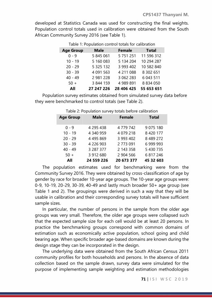
CPS1437 Thanyani M.
71 | I S I W S C 2 0 1 9
developed at Statistics Canada was used for constructing the final weights.
Population control totals used in calibration were obtained from the South
African Community Survey 2016 (see Table 1).
Table 1: Population control totals for calibration
Age Group Male Female Total
0 - 9 5 845 061 5 751 251 11 596 312
10 - 19 5 160 083 5 134 204 10 294 287
20 - 29 5 325 132 3 993 402 10 582 840
30 - 39 4 091 563 4 211 088 8 302 651
40 - 49 2 981 228 3 062 283 6 043 511
50 + 3 844 159 4 989 891 8 834 050
All 27 247 226 28 406 425 55 653 651
Population survey estimates obtained from simulated survey data before
they were benchmarked to control totals (see Table 2).
Table 2: Population survey totals before calibration
Age Group Male Female Total
0 - 9 4 295 438 4 779 742 9 075 180
10 - 19 4 340 959 4 079 218 8 420 177
20 - 29 4 495 869 3 993 402 8 489 272
30 - 39 4 226 903 2 773 091 6 999 993
40 - 49 3 287 377 2 143 358 5 430 735
50 + 3 912 680 2 904 566 6 817 246
All 24 559 226 20 673 377 45 32 603
The population estimates used for benchmarking were from the
Community Survey 2016. They were obtained by cross-classification of age by
gender by race for broader 10-year age groups. The 10-year age groups were:
0-9, 10-19, 20-29, 30-39, 40-49 and lastly much broader 50+ age group (see
Table 1 and 2). The groupings were derived in such a way that they will be
usable in calibration and their corresponding survey totals will have sufficient
sample sizes.
In particular, the number of persons in the sample from the older age
groups was very small. Therefore, the older age groups were collapsed such
that the expected sample size for each cell would be at least 20 persons. In
practice the benchmarking groups correspond with common domains of
estimation such as economically active population, school going and child
bearing age. When specific broader age-based domains are known during the
design stage they can be incorporated in the design.
The underlying data were obtained from the South African Census 2011
community profiles for both households and persons. In the absence of data
collection based on the sample drawn, survey data were simulated for the
purpose of implementing sample weighting and estimation methodologies

CPS1437 Thanyani M.
72 | I S I W S C 2 0 1 9
for the complex survey sample design (CSSD). Statistics South Africa published
Census 2011 unit record data at SAL level. Data are made available through
SuperCROSS software which is a family of SuperSTAR Suite applications
developed by the Australian based Space Time Research. The software allows
downloading of records. However, records were without addresses and other
identifiers.
The resulting files do not exactly give details of one individual or one
household, but the records represent a group of persons or households with
given characteristics. Without identifiers of the exact persons and household
characteristics, it was not possible to obtain the direct match between persons
and households. Although maximum matches could not be achieved with
certainty, few available variables were used to match persons to households.
There was information about the household-head which was also available in
person-level file. The common variables included demographics, geography,
level of education, school attendance and language.
The results below illustrate the results of applying linear programming
method in calibration. There were two sets of constraints created, one at
national-level and the other at provincial-level. In this paper the auxiliary
totals were created from the large sample survey carried out in South Africa
called the community survey done in 2016. The cells were simply the
demographic variables (age, race and gender) and geography variable
(province). At national-level 48 constraints were formed as an input to linear
programming.
At provincial-level 27 constraints in Table 4 were formed as an input to
linear programming. Table 5 and 6 below show the results from StatMx where
calibration was implemented using generalised regression methods and linear
programing. From the imputs provided all the constraints that were defined
Country 1
_n1 5 052 737
_n2 4 976 100
_n3 430 977
… …
… …
… ...
_n46 172 302
_n47 767 194
_n48 914 222
Province 1
_p1 2 130 698
_p2 2 960 819
_p3 1 188 213
… …
… …
… …
_p25 2 597 746
_p26 2 394 846
_p27 806 498
Table 3: Calibration cells for
national estimates
Table 4: Calibration cells for
provincial estimates

CPS1437 Thanyani M.
73 | I S I W S C 2 0 1 9
where satisfied. At national-level all 48 equations were satisfied while at
provincial-level 27 constraints were satisfied.
Feasible constraints
N1
N2
N3
…
…
…
…
N46
N47
_N48
Number of calibration equations 48
Number of calibration equations
satisfied
48
Number of calibration equations
removed
0
The process started with more equations than those that were used to
calculate the final weights. The strict constraints were constraints were
formulated and none of the relaxed formulation was used. In the initial stage
not all equations converged. In order to achieve convergence the cells where
reduced as a way of increasing sample sizes within weighting cells.
4. Discussion and Conclusion
In household surveys, it is common to have weights for households as well
as the weights for persons separately. It is also common that the auxiliary
totals are available for persons, and not for households. Several papers
proposed methods of producing one weight which can be used to estimate
households and persons, and they called those methods integrated weighting.
In some literature these are referred to as weight equalisation where the
weights are made to be the same at household level, that is, each person in a
household has the same weight, which is the household weight. The
integrated weighting approach was applied in this paper using generalised
regression methods and implemented through the SAS-based StatMx
software developed by Statistics Canada.
In this paper, the calibration problem has been presented as a problem in
optimisation. Whilst existing calibration literature has already described the
problem, it has not been clearly formulated as a problem in optimisation. This
paper formulated the notation required to describe the calibration problem.
The main calibration constraints were described, along with additional
constraints that weights must be equal at household-level.
Feasible constraints
P1
P2
P3
…
…
…
…
_P25
_P26
_P27
Number of calibration equations 27
Number of calibration equations
satisfied
27
Number of calibration equations
removed
0
Table 5: Linear programming (LP) results for
calibration for national estimates
Table 6: Linear programming (LP) results
for calibration for provincial estimates

CPS1437 Thanyani M.
74 | I S I W S C 2 0 1 9
It was clearly stated that calibration aims at improving estimated of sample
surveys. Furthermore calibration should bring sample weight distribution
closer to the distribution of auxiliary totals. While the methods of relaxing
constraints to achieve such objective there is eminent danger of distorting
sampling distribution, therefore quality of auxiliary variables is of utmost
importance.
References
1. Bar-Gera, H., Konduri, K. C., Sana, B., Ye, X., and Pendyala, R. M., (2009).
Estimating survey weights with multiple constraints using entropy
optimization methods. Technical report.
2. Davies, G., (2018). Examination of approaches to calibration in survey
sampling. (Doctoral dissertation, Cardiff University).
3. Deville, J.C. and Särndal, C.E., (1992). Calibration estimators in survey
sampling. Journal of the American statistical Association, 87(418),
pp.376-382.
4. Deville, J.C. and Särndal, C.E., and Sautory, O., (1993). Generalized raking
procedures in survey sampling. Journal of the American Statistical
Association, 88 (423), 1013–1020.
5. Fuller, W.A. (2002). Regression Estimation for Survey Samples. Survey
Methodology, Vol. 28, pp. 5-23.
6. Gambino, J., Kennedy, B. and Singh, M.P. (2001). Regression Composite
Estimation for the Canadian Labour Force Survey. Survey Methodology,
Vol. 27, pp. 65-74.
7. Mohadjer, L., Montaquila, J. M., Waksberg, J., Bell, B., James, P., Flores-
Cervantes, I., and Montes, M., (1996). National Health and Nutrition
Examination Survey III: Weighting and estimation methodology.
Rockville, MD: Westat.
8. Reid, A. and Hall, D. W., (2001). Using equalisation constraints to find
optimal calibration weights. U.S. Bureau of the Census.
9. Wallace, L. and Rust, K., (1996). A Comparison of raking and
poststratification using 1994 NAEP Data. Westat. Rockville.
10. Wu, S., Kennedy, B., AND Singh, A. C., (1997). Household-level versus
person-level regression weight calibration for household survey. SSC
Annual Meeting, June 1997.

CPS1440 Avner Bar-Hen et al.
75 | I S I W S C 2 0 1 9
Spatial CART classification trees
Avner Bar-Hen1, Servane Gey2, Jean-Michel Poggi3 1CNAM, Paris, France
2Laboratoire MAP5, Univ. Paris Descartes, Paris, France 3Laboratoire de Math_ematiques, Univ. Paris Sud, Orsay, France
Abstract
Based on links between partitions induced by CART classification trees and
marked point processes, we propose a spatial variant of CART method,
SpatCART, focusing on the two populations case. While usual CART tree
considers marginal distribution of the response variable at each node, we
propose to take into account the spatial location of the observations. We
introduce a dissimilarity index based on Ripley's intertype K-function
quantifying the interaction between two populations. This index used for the
growing step of the CART strategy, leads to a heterogeneity function
consistent with the original CART algorithm. The proposed procedure is
implemented, illustrated on classical examples and compared to direct
competitors. SpatCART is finally applied to a tropical forest example. This text
is an extended abstract of a full paper submitted for publication.
Keywords
Decision Tree; Classification; Point process; Spatial data
1. Introduction
CART (Classification And Regression Trees) is a statistical method, see
Breiman et al. [3], and designing tree predictors for both regression and
classification. We restrict our attention on the classification case with two
populations. Each observation is characterized by some input variables
gathered in vector X and a binary label Y which is the response variable. The
general principle of CART is to recursively partition the input space using
binary splits and then to determine an optimal partition for prediction. The
classical representation of the model relating Y to X is a tree representing the
underlying process of construction of the model. If the explanatory variables
are spatial coordinates, we get a spatial decision tree and this induces a
tessellation of the space (of the X variables). A cell of this tessellation
corresponds to a leaf of the decision tree. For a leaf of this tree, the response
variable Y is constant and corresponds to the majority class of the observations
belonging to this leaf.
The aim of this work is to adapt CART decision trees within the framework
of binary marked point processes by considering that the points inside the

CPS1440 Avner Bar-Hen et al.
76 | I S I W S C 2 0 1 9
cells defined by the partition are a realization of a spatial point process, where
the response variable Y can be seen as a mark of the point of position given
by X. Following this idea, the variant of the CART algorithm that we propose
takes into account the spatial dimension of the marked processes, and thus
makes it possible to provide the user a partition of the plan defining
homogeneous areas of interaction between the two marks.
While a classical assumption for CART is to consider a sample of i.i.d.
observations, our variant takes into account spatial dependence through the
quantification of the interaction between the two considered populations, i.e.
the link between the labels of the points. Indeed, if CART is often limited to
the one most commonly used and implemented, presented in [3], there exist
several ways to build CART type decision trees, by changing the family of
admissible splits, the cost function or the stopping rule. We consider here the
spatial dependence using the Ripley's intertype K-function to suitably redefine
the splitting criterion in CART. Instead of being based only on the respective
proportions of the marks, the splits will be selected according to the strength
of interaction between the two populations.
Among the various extensions of CART, Bel et al. ([2]) proposed a variant
for spatial data, but in the regression context. They consider the observations
as a sample of regionalized variables, which can be modeled as random fields
with spatial dependence. They propose various reweighting schemes to
equalize the contribution of each surface unit for the choices of splits. It is not
adapted to the classification case.
2. Methodology
a. Classical Classi_cation And Regression Trees (CART)
The data are considered as an independent sample of the random
variables (X1,...,Xp,Y ), where the Xks are the explanatory variables and Y is the
categorical response variable. CART is a rule-based method that generates a
binary tree through recursive partitioning that splits a subset (called a node)
of the data set into two subsets (called sub-nodes) according to the
minimization of a heterogeneity criterion computed on the resulting sub-
nodes. Each split involves a single variable. Some variables may be used
several times while others may not be used at all.
Let us consider a decision tree T. When Y is a categorical variable a class
label is assigned to each terminal node (or leaf) of T. Hence T can be viewed
as a mapping to assign a value𝑖 = 𝑇(𝑋𝑖1, …… , 𝑋𝑖
𝑝) to each observation.
The growing step leading to a deep maximal tree is obtained by recursive
partitioning of the training sample by selecting the best split at each node
according to some heterogeneity index, such that it is equal to 0 when there
is only one class represented in the node to be split, and is maximum when all

CPS1440 Avner Bar-Hen et al.
77 | I S I W S C 2 0 1 9
classes are equally frequent. The two most popular heterogeneity criteria are
the Shannon entropy and the Gini index. The growing procedure is stopped
when there is no more admissible splitting. Each leaf is assigned to the most
frequent class of its observations.
Of course, such a maximal tree (denoted by Tmax) generally overfits the
training data and the associated prediction error R(Tmax), with
𝑅(𝑇) = ℙ(𝑇(𝑋1, … . , 𝑋𝑝) ≠ 𝑌) (1)
is typically large. Since the goal is to build from the available data a tree T
whose prediction error is as small as possible, in a second stage the tree Tmax
is pruned to produce a subtree T0 whose expected performance is close to the
minimum of R(T0) over all binary subtrees T0 of Tmax. Since the joint distribution
P of (X1,...,Xp,Y ) is unknown, the pruning is based on the penalized empirical
risk Rˆpen(T) to balance optimistic estimates of empirical risk by adding a
complexity term that penalizes larger subtrees. More precisely the empirical
risk is penalized by a complexity term, which is linear in the number of leaves
of the tree:
𝑝𝑒𝑛(𝑇) =1
𝑛∑ 𝟙𝑇(𝑋𝑖
1,….,𝑋𝑖𝑝)≠𝑌𝑖
+ 𝛼|𝑇|𝑛𝑖=1 (2)
where 𝟙 is the indicator function, n the total number of observations, α a
positive penalty constant, |𝑇| denotes the number of leaves of the tree 𝑇 and
𝑌𝑖 is the 𝑖th random realization of 𝑌
2.2 Intertype K-function
A point process is a random variable that gives the localization of events
in a set W ⊂ Rd. Another way to define a given point process is to consider,
for each B ⊂ W, the number of events φ(B) occurring in B, where φ is the
distribution of the occurrences of the point process.
Since characterization of a spatial repartition is strongly dependent on the
scale of observation, the repartition has to be characterized for each scale.
A marked point process is a point process such that a random mark is
associated with each localization. Here, we only consider bivariate point
processes, i.e. the mark is a qualitative random variable with two possible
issues. Equivalently, the bivariate point process can be viewed as the
realization of two point processes (one par level of the mark).
There are several ways to consider the relationships between two clouds
of points, mainly related to three aspects: independence, association and
random labelling (see [1] for example). It ends up that relationships between
two clouds of points can be described in various ways and therefore many
indices can be defined. Each index will give a specific information about these
relationships and will greatly depends on the point process that leads to the

CPS1440 Avner Bar-Hen et al.
78 | I S I W S C 2 0 1 9
observed repartition. For bivariate point processes, many tools based, using
first-order characteristics of the point processes, may be used to quantify
departure from independence (see [4] for example).
Under the assumptions of stationarity and isotropy, the intertype Kij-
function is a bivariate extension of Ripley’s K-function, proposed in [8], and
defined as
𝐾𝑖𝑗(𝑟) = λ−j 1𝔼(number of points of type 𝑗 within distance 𝑟 of a (3)
randomly chosen point of type i)
(
where the intensity parameters λi and λj correspond to the expected numbers
of type 𝑖 and type j points per unit area, respectively. While Ripley’s K-function
characterizes the spatial structure of a univariate pattern at various scales, the
intertype 𝐾𝑖𝑗-function characterizes the spatial structure of a bivariate pattern,
and more precisely the spatial relationship between two types of points
located in the same study area. The intertype 𝐾𝑖𝑗-function is defined so that
𝜆𝑗𝐾𝑖𝑗(𝑟) is the expected number of type j points in a circle of radius r centered
on an arbitrary type 𝑖 point of the pattern. Symmetrically, we can define an
intertype 𝐾𝑗𝑖-function so that 𝜆𝑗𝐾𝑗𝑖(𝑟) is the expected number of type 𝑖 points
in a circle of radius r centered on an arbitrary type j point.
The estimator of the intertype 𝐾𝑖𝑗-function can be defined by:
𝑖𝑗(𝑟) = (𝑖𝑗𝐴)−1∑ 𝟙𝑑𝑖𝑘 ,𝑗𝑙<𝑟𝑘,𝑙 (4)
where 𝑑𝑖𝑘, 𝑗𝑙 is the distance between the 𝑘th location of type 𝑖 point and the
𝑙th location of type 𝑗 point, A is the area of the region of interest and 𝑖 and
𝑗 are the estimated intensities.
3. Result
a. Spatial CART method
The key idea is to take into account in the splitting strategy, the spatial
dependency of the data. It is done by modifying the original impurity loss,
which is usually the entropy index. We introduce a dissimilarity index based
on Ripley’s intertype K-function quantifying the interaction between two
populations within a rectangular window of finite area A.
Let focus on the impurity loss associated with 𝑖𝑗 as defined in Equation 4.
For a node t and a split s splitting t into two child nodes tL and tR, we define
𝑖𝑗𝑡 (𝑟), the estimation of the Ripley’s intertype K function restricted to node t:

CPS1440 Avner Bar-Hen et al.
79 | I S I W S C 2 0 1 9
𝑖𝑗𝑡 (𝑟) =
𝐴𝑡𝐿
𝐴𝑡
𝑖𝑡𝐿𝑗
𝑡𝐿
𝑖𝑡𝑗
𝑡𝑖𝑗𝑡𝐿(𝑟) +
𝐴𝑡𝑅
𝐴𝑡
𝑖𝑡𝑅𝑗
𝑡𝑅
𝑖𝑡𝑗
𝑡𝑖𝑗𝑡𝑅(𝑟)
+1
𝑖𝑡𝑗
𝑡𝐴𝑡[ ∑ ∑ 𝟙
𝑑𝑖𝑘𝑗𝑙<𝑟+ ∑ ∑ 𝟙
𝑑𝑖𝑘𝑗𝑙<𝑟
𝑗𝑙𝜖𝑡𝑅𝑖𝑘𝜖𝑡𝐿𝑗𝑙𝜖𝑡𝐿𝑖𝑘𝜖𝑡𝑅
]
where the notations are as follows:
𝐴𝑡 the area of node t
∗𝑡 , the estimation of the density of mark ∗ in node 𝑡(∗
= 𝑖, 𝑗) 𝑑𝑖𝑘𝑗𝑙 the euclidean distance between 𝑖 -marked
individual 𝑖𝑘 and 𝑗-marked individual 𝑗𝑙
This leads to the natural definition of ∆Iij(s,t,r) as the variation of heterogeneity
coming from the split of node t using s, at radius r:
∆𝐼𝑖𝑗(s,t,r) := 𝑖𝑗𝑡 (𝑟) − 𝛼𝑠
𝑖
𝑡𝐿𝑗
𝑡𝐿
𝑖𝑡𝑗
𝑡 𝑖𝑗𝑡𝐿(𝑟) − (1 − 𝛼𝑠)
𝑖
𝑡𝑅𝑗
𝑡𝑅
𝑖𝑡𝑗
𝑡 𝑖𝑗𝑡𝑅(𝑟) (5)
where 𝛼𝑠 =𝐴𝑡𝐿
𝐴𝑡. The area factor αs is natural when dealing with spatial data
since it leads to reweight properly the impurity of the two nodes tR and tL.
We propose an algorithm using impurity loss ∆𝐼𝑖𝑗defined by (5) to develop
the maximal tree Tmax. The estimator Kˆij of the intertype function Kij is
computed at each node t, the value of r is fixed as the one for which the
estimated intertype K-function is the farthest from the one of random
labelling.
A maximal tree Tmax is computed via recursive partitioning, and then
pruned with the penalized criterion based on misclassification rate defined in
(2), or based on Gini index. This produces a decreasing sequence of K subtrees
pruned each one from another, denoted by𝑇1 ≻ ⋯ ≻ 𝑇𝐾 = 𝑡1, and associated
with an increasing sequence of K complexities, denoted by 0 = α1 < ... < αK.
Rephrasing the algorithm in spatial terms, we could say that starting from
the whole original region, for which we compute r0, which can be considered
as the characteristic scale at this resolution. Then before splitting, we consider
for r = r0 the quantity ∆Iij(s,t,r) and we seek to the best split. After splitting we
seek to the best r ≤ r0 maximizing ∆Iij(s,t,rˆ ). Then after splitting, the two child
are considered in parallel in the same way, recomputing r0,L and r0,R. It turns
out that ∆Iij(s,t,r) is decreasing along any branch of the tree. So the reordered
sequence of ri can be used to define a sequence of nested subtrees.
We use two R packages to implement the SpatCART algorithm and to
display the results: spatstat to deal with point processes, and in particular to
compute ∆Iij in the construction of the maximal tree and tree to deal with tree
structures.

CPS1440 Avner Bar-Hen et al.
80 | I S I W S C 2 0 1 9
So, we first use two simulated examples to check that CART and SpatCART
behave as expected: (a) a control example where the Bayes classifier is a
classification tree. In this case, the two algorithms must find a partition close
to the partition defined by the underlying model. (b) an example where the
classification problem is trivial, and where the interaction between marks plays
an important role. In this case, SpatCART must produce splits significantly
different from those produced by CART.
b. An application
We applied these methods to a tropical rain-forest located at Paracou, 40
km west from Kourou in French Guiana (5°15'N, 52°55'W). It is an experimental
site that is devoted to studying the effects of logging damage on stock
recovery. A more precise description of the Paracou plots may be found in [7].
We focus on two species Vouacapoua americana and Oxandra asbeckii
selected at Paracou because their spatial distribution is linked to the relief:
they are both located on hill tops and slopes. Elevation is the environmental
factor that drives their spatial distribution and this creates a strong interaction
between both repartitions. The data consists of seventy lines (one per tree)
and four columns: the 3-D coordinates (longitude, latitude and elevation) as
well as the specie indication.
SpatCART highlights the presence of Oxandra asbeckii at the hill of left top
of the plot as well as the competition between both species for the hill at the
bottom of the plot. A contrario, CART results are really poor with only two
leaves. Basically it separates the hill at the bottom of the plot from the rest but
cannot catch the mixed structure of species with this hill or the hill at the top
left of the plot. The spatial structure as well as the ecology of the two species
on this plot cannot be inferred from CART results.
4. Discussion and Conclusion
For a marked spatial point process, we consider the problem to segment
the space into homogeneous areas for interaction between marks. The original
CART constructs homogeneous zones with respect to the distribution of the
variable of interest (here, the mark) conditionally to the explanatory variables
(here, the position in space). By modifying the splitting criterion in the CART
algorithm, using an empirical version of the intertype function, we obtain a
new procedure, called SpatCART, adapted to the problem at hand. The
intertype function itself depends on a parameter r which must be carefully
chosen: not to set it once and for all, but rather to start from a rather large
value (at the root of the tree) and gradually decrease it as the tree is built by
SpatCART.
Let us now sketch some perspectives for future work.

CPS1440 Avner Bar-Hen et al.
81 | I S I W S C 2 0 1 9
It should be noted that the model selection method used in this paper has
the advantage of selecting a tree on the basis of all points, unlike many
conventional methods requiring splitting the sample into one or more sub-
samples. Given the spatial nature of the data and the splitting criterion,
removing points would introduce too much bias into the estimate. However
the structural instability with respect to the set observations is obvious and
even more critical in the spatial situation. A key point in our approach is the
choice of r and a simulation study would be useful to determine if different
values of r lead to different results. Additionally, some other classical point
process topics can be addressed such as the type or the intensity of the point
process.
Instability is one of the main drawbacks of CART and many classical ways
to contain it are avail- able. Ensemble methods like bagging, boosting and
random forests (see [6] for example) can then be similarly defined in the spatial
case but the aggregation part should be defined. To introduce and experiment
a bagging-like scheme could be of interest for a future work.
This paper is strongly dependent on the binary case, some extensions to
handle the multiclass case can be sketched. One possibility is to adopt the
strategy used to handle multiclass Support Vector Machines (SVMs) which are
intrinsically two-class classifiers (see [6]). A technique widely used in practice
is to build one-versus-rest classifiers. Then we could obtain several
tessellations and select the final partition by taking into account some criterion
maximizing some global measure of heterogeneity between cells.
Another possible extension is to modify, not only the growing step of the
CART algorithm, but also the pruning strategy in order to drive it by point
processes properties. This requires defining some additive measure of
heterogeneity of the partitions. An intermediate solution could be to use a
classical pruning step to simplify and avoid spurious useless splits but the final
choice could be to select the final tree among the nested sequence of tree by
maximizing the same kind of heterogeneity criterion mentioned before.
References
1. A Bar-Hen and N Picard. Simulation study of dissimilarity between point
process Computational Statistics, 21(3-4):487-507, 2006
2. L Bel, D Allard, JM Laurent, R Cheddadi and A Bar-Hen. CART algorithm
for spatial data: application to environmental and ecological data,
Computat. Stat. and Data Anal., 53(8):3082-3093, 2009
3. L Breiman, JH Friedman, RA Olshen and CJ Stone. Classification and
regression trees. Chapman & Hall, 1984
4. N Cressie. Statistics for Spatial Data, John Wiley & Sons, New York, 1991

CPS1440 Avner Bar-Hen et al.
82 | I S I W S C 2 0 1 9
5. V Favrichon. Classification des especes arborees en groupes fonctionnels
en vue de la realisation d'un modele de dynamique de peuplement en
foret guyanaise. Rev. Ecol., 49, 379403, 1994
6. T Hastie, R Tibshirani et J Friedman, The elements of statistical learning:
data mining, inference, and prediction, Springer, 2009, Second edition.
7. S Gourlet-Fleury, JM Guehl and O Laroussinie (eds). Ecology and
Management of a Neotropical Rainforest: Lessons Drawn from Paracou,
a Long-term Experimental Research Site in French Guiana. Paris: Elsevier,
2004.
8. HW Lotwick and BW Silverman. Methods for analysing spatial processes
of several types of points, Journal of the Royal Statistical Society, Series
B, 44(3):406–413, 1982

CPS1442 Uzuke C.A. et al.
83 | I S I W S C 2 0 1 9
Two-way median test
Uzuke, C. A., Oyeka I. C. A Department of Statistics, Nnamdi Azikiwe University, Awka, Nigeria
Abstract
This paper proposes a two way median test to analyse data when the
assumptions of normality and homogeneity of variance are not satisfied as in
parametric two analysis of variance. In this case the criterion variable is
numeric with out replication and the study is based on the overall median of
the data when pulled together. The proposed method is illustrated with some
data. A comparison with the Friedman two way analysis of variance showed
that the proposed two way median test is more powerful than the Friedman
two way analysis of variance test.
Keywords
Median test; Friedman’s ANOVA; P-value; Chi-square test of independence
1. Introduction
In the conventional two way parametric analysis of variance (ANOVA) test
involving two factors A and B, Daniel, (1990); Esinga et al, (2017), interest is
often in testing the null hypothesis that the levels of factor A and the levels of
factor B do not differ statistically in their effects on the criterion variable of
interest which is usually assumed to be continuous Dixon, (1990). Factors A
and B may both be fixed, both random, or one fixed and the other random. If
in addition there are more than one observation per cell, interest may also be
in testing for the absence of any interaction effects between factors A and B.
Here we present a non-parametric alternative to the two-way parametric
ANOVA test in the case when they are only one observation per cell, which
means there are no replications. We assume that the factor A has levels and
factor B has levels and that the criterion variable being studied is numeric
measured on at least the ordinal scale Siegel & Castellan (1988); Zar, (1999).
The method is based on the median test and makes provision for the possible
presence of ties between the observations and their assumed common
median.
2. Methodology
In the non-parametric Friedmans’ two-way ANOVA by ranks, Zar, (1999) it
is usually assumed that this data set if treated as a parametric two-way ANOVA

CPS1442 Uzuke C.A. et al.
84 | I S I W S C 2 0 1 9
would conform to a mixed effect model with one observation per cell that is
without replications, Esinga et al, (2017). Here this assumption is not necessary.
As in the Friedmans two-way ANOVA by ranks, the data being analysed
may be presented in the form of a two-way cr table with the row say
representing one factor A with r levels say and the columns say representing
the other factor B with c levels Daniels, (1990). Factors A and B may both be
fixed, both random, or one of the factor fixed and the other random. Here two
null hypotheses are to be tested. One is that there are no differences between
the c treatment effects for the column factor B and the second is that there
are no differences between the effects of the r levels of the row factor A.
To develop the test statistics for the column factor B based on the median
test we first pull all the observation in the table together and determine the
common median M as usual Oyeka & Uzuke, (2011).. Now if the jth level of
factor B has median jM for j = I, 2, …, c then the null hypothesis to be tested
for factor B is
Ho: M1 = M2 = … = Mj … = Mc = M
(1)
Now let ijx be the score on observation on a randomly selected subject at
the ith level of factor A and jth level of factor B on a certain numeric criterion
variable X, measured in at least the ordinal scale for I = 1, 2 , …, r; j = 1, 2, …, c
Let
−
=
=
Mxif
Mxif
Mxif
U
ij
ij
ij
ij
,1
,0
,1
(2)
For i=1, 2, …, r; j = 1, 2, …, c
Let
( ) ( ) ( )1;0;0
−=====−+
ijjijjijj UPUPUP (3)
Where
10
=++−+
jjj (4)
And
=
=r
i
ijj UU1
(5)
Finally, let
= ==
==c
j
r
i
ij
c
j
j UUW1 11
(6)

CPS1442 Uzuke C.A. et al.
85 | I S I W S C 2 0 1 9
A test statistic for the null hypothesis of equation (i) based on W may be
developed by complete enumeration following the specifications in Equations
2 – 6. This approach is however tedious. A rather less cumbersome approach
based on the chi-square test for independence is adopted here.
Now let +
jt , 0
jt , and −
jt be respectively the number of 1’s, 0’s and -1’s
obtained in the frequency distribution of the r values of these numbers in ijU
of Equation 2; that is, the number of times observations ijx in the jth level of
factor B are greater than , equal to or less than the common median M for i =
1, 2, …, r; j = 1, 2, …, c
Let +t , 0t and −t be respectively the total number of 1’s, 0’s and -1’s in
all the c levels of factor B. that is
=
++ =c
ij
jtt , =
−− =c
j
jtt1
; −+
=
−−== ttrcttc
j
j
1
00 (7)
The total number of 1’s, -1’s and 0’sin the data set is rcttt =++ −+ 0
Note that the observed number of 1’s, -1’s and 0’s in the jth level of factor B
are respectively += jj tO1 ; −= jj tO2 and −+ −−== jjjj ttrtO 0
3 (8)
The corresponding expected frequencies if the null hypothesis of Equation 1
is true are
rc
rtE j
+
=1 ;rc
rtE j
−
=2 ; ( )
rc
ttrcr
rc
rtE j
−+ −−==
0
3 (9)
Also the proportions 1’s, -1’s and 0’s in the jth level of factor B are
r
tPj
++ = ;
r
tPj
−− = ;
−+ −−== jjj PPr
tP 1
00
(10)
The overall proportion of 1’s, -1’s and 0’s are
rc
tP
++ = ;
rc
tP
−− = ;
−+ −−== PPrc
tP 1
00
(11)
Under the null hypothesis of equal factor B level effects the test statistic
( )= =
−=
r
i
c
j ij
ijij
E
EO
1 1
2
2 = =
+
++
−
c
j
j
rc
rt
rc
rtt
1
2
+ =
−
−−
−
c
j
j
rc
rt
rc
rtt
1
2
+ =
−
c
j
j
rc
rt
rc
rtt
10
20
0
has approximately a chi-square distribution with 2(c-1) degrees of freedom.
This expression when simplified using Equation 10 and 11 yields
( )=
+
++ −=
c
j
j
P
PPr
1
2
2 +
( )=
−
−− −c
j
j
P
PPr
1
2
+ ( ) ( )( )
=
−+
−+−+
−−
−−−−−c
j
jj
PP
PPPPr
1
2
1
11

CPS1442 Uzuke C.A. et al.
86 | I S I W S C 2 0 1 9
= ( )
( )( ) ( )
( ) ( ) ( ) ( )( ) )1
1(1
1
2
1
2
1
2
=
−−++−+
=
−−−++
=
++−+−
−+−+
−+−+−−−+
−−−−−
c
j
jj
c
j
j
c
j
j
PPPPPPPPPPP
PPPPPPPPP
r
This when further simplified yield the test statistic
( )
( )( ) ( ) ( )( ) ( ) ( ) ( )( )( )
−−+−−+−−
−−=
= =
−−++−+
=
−−++++−−
−+−+
c
j
c
j
jj
c
j
jj PPPPPPPPPPPPPP
PPPP
r
1 11
22
2
211
1
(12)
which under the null hypothesis approximately has a chi-square distribution
with 2(c-1) degrees of freedom for sufficiently large sample r and c and may
be used to test the null hypothesis for equation 1
Ho is rejected at the level of significance if 2
)1(2;1
2
−− c otherwise Ho is
accepted.
Note that if no observations are exactly equal to the common median M then
00
= j so that from equation 4 1=+−+
jj for all j = 1, 2, …, c. hence also
1=+ −+ PP so that qPPP =−=−= +− 11 . In this case equation 12 is easily
seen to reduce to
−−
=
−
−
=
qP
PPrc
j
j
1
2
2 = qP
PrcPrc
j
j
2
1
2 −=
(13)
Where jj PP =+ and PP =+, Pq −=1 a similar test statistic may also be
developed to test for the equality of the effects of r levels of the row factor A
by redefining equations 5 and 6 appropriately for the levels of factor A. note
that although the levels of factor A may have different medians iM (I = 1, 2,
…, r) from the medians jM (j = 1, 2, …, c) of factor B, they will nevertheless
have the same common median M since they are one data set. Therefore the
null hypothesis to be tested for the r levels of factor A would be
MMMMHo r ===== ...21 (14)
To help test this null hypothesis we simply let +
it ,0
it and −
it be respectively the
number of 1s, 0s and -1s in the ith level of factor A consistent with the
specifications in equation2 and +
ip , 0
ip and −
ip be the corresponding
probabilities. Clearly the total number of 1s, 0s, and -1s as well as their
corresponding+p ,
0p and −p remain unchanged.

CPS1442 Uzuke C.A. et al.
87 | I S I W S C 2 0 1 9
Now following a similar approach as above we note that the observed
frequencies of occurrence of 1s, 0s and -1s in the ith level of factor A are
respectively += ii tO 1
; −= ii tO 2; −+ −−== iiii ttctO 0
3 (15)
The expected frequencies under the null hypothesis of equation 14 are
respectively
rc
ctEi
+
=1 ; rc
ctEi
−
=2 ; ( )
rc
ttrcc
rc
ctEi
−+ −−==
0
3 (16)
As above if the null hypothesis of equation 14 is true, then the test statistic
2 = ( )
= =
−r
i j ij
ijij
E
EO
1
3
1
2
==
+
++
−
r
i
i
rc
ct
rc
ctt
1
2
+=
−
−−
−
r
i
i
rc
ct
rc
ctt
1
2
+=
−
r
i
i
rc
ct
rc
ctt
10
20
0
which has approximately chi-square distribution with 2(r-1) degrees of
freedom
Now using equations 15 and 16 and the corresponding probabilities with the
above expression we have as before
2 = ( )
=
+
++ −r
i
i
p
ppc
1
2
+ ( )
=
−
−− −r
i
i
p
ppc
1
2
+( ) ( )( )
=
−+
−−++
−−
−+−r
i
ii
pp
ppppc
1
2
1 (17)
When equation 17 is further simplified and evaluated as before we obtain the
test statistics for the null hypothesis in equation 14 as
2 = ( )
( ) ( ) ( ) ( ) ( )( )
−−+
−−+
−−
−−=
−−++−+
=
−−++
=
++−−
−+−+
r
i
ii
r
i
i
r
i
i pppppppppppppppppp
c
1
2
1
2211
1(18)
which under the null hypothesis has approximately a chi-square distribution
with 2(r-1) degrees of freedom for sufficiently large r and c
Note as before that if no observations are exactly equal to the common
median M then the test statistic of equation 17 now reduces to simply
( )
( )++
=
++
−
−
=
pp
ppcn
i
i
1
1
2
2
That is
( )
qp
prcpc
qp
ppcr
i
i
r
i
i ==
−
=
−
= 1
22
1
2
2 (19)
Now with only r-1 degrees of freedom where pqpppppi −==== ++ 1;;

CPS1442 Uzuke C.A. et al.
88 | I S I W S C 2 0 1 9
3. Illustration
In a clinical, 15 male patients were given Three (3) different doses (A, B, C)
of a certain drug to lower their heart beat, which the clinician believe that
lowers heart beat. The reduction in heart beat of these male patient following
the administration of three different dose levels of the drug is presented in
Table 1.
Table 1 Reduction on heart beat of Male Patient when administered
withThree (3) different doses of a certain Drug
Patient Number A B C
1 5 6 3
2 6 4 8
3 2 3 8
4 2 5 7
5 3 5 4
6 4 5 3
7 12 7 7
8 6 12 7
9 7 5 3
10 3 4 4
11 4 3 3
12 8 6 7
13 2 7 7
14 13 7 8
15 5 8 10
Interest is in testing the null hypothesis that the reduction in heart beat is
the same on each of the three dose level of the drug. Also, we will further look
at the situation that the reduction in heart beat is the same for the different
male patients
In order to obtain the test statistic to test the hypothesis of Equations 1
and 14 for both conditions, the common median (M) for the observations was
obtained as M = 5. These observations were replaced by the values of 1 if the
observation is grater than M, -1 if the observation is less than M and 0 if the
observation is equal to M. Furthermore the values of p+j , p
-j and p0
j were also
obtained and presented in table 2

CPS1442 Uzuke C.A. et al.
89 | I S I W S C 2 0 1 9
Table 2 The Values of p+j , p
-j and p0
j and their frequencies
Patients Dose Level Observed values >, < or = to
Median M
Proportions of
the observed jth
levels of Factor A
A B C A B C p+j p-
j p0j
1 5 6 3 0 1 -1 0.33 0.33 0.33
2 6 4 8 1 -1 1 0.67 0.33 0.00
3 2 3 8 -1 -1 1 0.33 0.67 0.00
4 2 5 7 -1 0 1 0.33 0.33 0.33
5 3 52 4 -1 -1 -1 0.00 1.00 0.00
6 4 5 3 -1 0 -1 0.33 0.33 0.33
7 12 7 7 1 1 1 1.00 0.00 0.00
8 6 12 7 1 1 1 1.00 0.00 0.00
9 7 5 3 1 0 -1 0.33 0.33 0.33
10 3 4 4 -1 -1 -1 0.00 1.00 0.00
11 4 3 3 -1 -1 -1 0.00 1.00 0.00
12 8 6 7 1 1 1 1.00 0.00 0.00
13 2 7 7 -1 1 1 0.67 0.33 0.00
14 13 7 8 1 = 1 1 1.00 0.00 0.00
15 5 8 10 0 0 1 0.33 0.00 0.67
The proportions of 1’s ,
-1’s and 0’s in the jth
level of factor B
p+j=0.40
p-j=0.47
p0j=0.13
p+j=0.40
p-j=0.33
p0j=0.27
p+j=0.60
p-j =0.40
p0j=0.00
The overall proportions of 1’s, - 1’s and 0’s are as follows p+= 0.47, p- = 0.40,
p0 = 0.13.
Under the null hypothesis of equal factor B (dose levels) levels effect we obtain
the test statistic using Equation 12 as
( )( ) ( ) ( )0036848.0002441.0006408.0
13.0)40.0)(47.0(
152 ++=
= 7.69
( )
( )( ) ( ) ( )( ) ( ) ( ) ( )( )( )
−−+−−+−−
−−=
= =
−−++−+
=
−−++++−−
−+−+
c
j
c
j
jj
c
j
jj PPPPPPPPPPPPPP
PPPP
r
1 11
22
2
211
1

CPS1442 Uzuke C.A. et al.
90 | I S I W S C 2 0 1 9
with 2(c – 1) degrees of freedom, 2
4;95.0 = 9.488 with a p-value of 0.093054
the null hypothesis of equal median reduction of heart beat among the
different dose levels of drug is not rejected.
Furthermore, the null hypothesis of equal median reduction in heart beat of
male patients under study was equally tested by obtaining the test statistic
using Equation 18 as:
2 = ( )
( ) ( ) ( ) ( ) ( )( )
−−+
−−+
−−
−−=
−−++−+
=
−−++
=
++−−
−+−+
r
i
ii
r
i
i
r
i
i pppppppppppppppppp
c
1
2
1
2211
1
Using data of Table 2 we have that the test statistic is:
( )( )( )( ) ( ) ( )( )6531872.0421054.0529344.0
13.040.047.0
32 −+=
2 = 36.4825.
with 2(r – 1) degrees of freedom, 2
28;95.0 = 42.557 with a p-value of 0.13073,
the null hypothesis of equal median reduction of heart beat among the male
patients under study is not rejected.
Also the friedman Two – way Analysis of variance by ranks used to test the
hypothesis of equal treatment effect was used to compare the result obtained.
The test statistic is as follows
( )13)1(
12
1
22 +−+
= =
crRcrc
c
j
j
For equal reduction of heart beat among the dose level of the drug, the test
statistic is
433.02 = with a p-value of 0.805333.
For equal reduction of heart beat among male patients, the test statistic is
8.182 = with a p-value of 0.172330
The results were summarized in table 3
Table 3 Summary of the result
TEST Factors 2 Test
Statistic
Degrees
of
Freedom
2 Critical
Value
p-value
Friedmann Dose level 0.433 2 5.991 0.805333
Patients 18.8 14 23.685 0.172330
Two Way
Median Test
Dose level 7.69 4 9.488 0.093054
Patients 36.48 28 42.557 0.130730
4. Summary and Conclusion

CPS1442 Uzuke C.A. et al.
91 | I S I W S C 2 0 1 9
Note that from the illustration, the probability that a randomly selected
patient has heart beat reduction equal to the overall median is 0.13 that is
13%. Also the attained probability of rejecting a true null hypothesis of equal
median reduction of heart beat with respect to the different drug dose, that is
type 1 error is 0.093 for the two way median test and 0.805333 for the
Friedmann two – way ANOVA. Furthermore, for different male patients, the
probability of rejecting a true null hypothesis of reduction in heart beat equals
the median reduction of heart beat is 0.13073 and 0.17233 for the Friedmann
test indicating that the two-way median test is more powerful than the
Friedmann Two-way ANOVA test. This is further vindicated by the fact that
even though the two chi-square values here both leads to non rejection of the
null hypothesis, the chi-square value obtained using the Two way Median test
( )482.362 = for male patients, which is nearly twice the Chi-square value
obtained using the Friemann two-way ANOVA ( )8.182 = . An indication that
the former yields more statistically significant result than the later.
References
1. Daniel, Wayne W. (1990). Friedman two-way analysis of variance by ranks".
Applied Nonparametric Statistics (2nd ed.). Boston: PWS-Kent. pp. 262–
74.
2. Dixon, W.J. (1990). A criterion for testing the hypothesis that two samples
are from the same population. Annals of Math. Statist, 11: 199–205.
3. Eisinga, R.; Heskes, T.; Pelzer, B.; Te Grotenhuis, M. (2017). "Exact p-values
for pairwise comparison of Friedman rank sums, with application to
comparing classifiers". BMC Bioinformatics. 18: 68.
4. Oyeka I. C. A & Uzuke C. A. (2011) Modified extended median test, African
Journal of mathematics and Computer Science ResearchVol. 4 (1), 27 - 31
5. Shoemaker, L.H. (1986). A nonparametric method for analysis of variance.
Communication in Statistics, B15(3): 609–632.
6. Siegel, S., & Castellan, N. J. Jr. (1988). Nonparametric statistics for the
behavioral sciences. New York: McGraw–Hill. 2nd ed.
7. Zar, Jerrold H. (1999) Biostatistical Analysis, 4th ed. Upper Saddle River,
NJ. Prentice-Hall.

CPS1443 Shogo H.N. et al.
92 | I S I W S C 2 0 1 9
Adaptive estimators for noisily observed
diffusion processes
Shogo H Nakakita1; Masayuki Uchida1,2 1Graduate School of Engineering Science, Osaka University
2Center for Mathematical Modeling and Data Science, Osaka University and CREST JST
Abstract
We propose adaptive quasi-likelihood functions and adaptive maximum-
likelihood-type estimators for discretely and noisily observed ergodic diffusion
processes, and show the consistency, asymptotic normality and convergence
of moments of the estimators. We also demonstrate computational simulation
study with the proposed method and compare the result with that of an
existent method which does not concern noise existence.
Keywords
Diffusion processes; high-frequency data; observation noise; quasi-likelihood
analysis
1. Introduction
Let us define the 𝑑-dimensional ergodic diffusion process 𝑋𝑡𝑡≥0 defined
by the following stochastic differential equation (SDE):
d𝑋𝑡 = 𝑏(𝑋𝑡 , 𝛽)d𝑡 + 𝑎(𝑋𝑡 , 𝛼)d𝑤𝑡 , 𝑋0 = 𝑥0,
where 𝑤𝑡𝑡≥0 is an 𝑟 -dimensional Wiener process, 𝑥0 is a 𝑑 -dimensional
random variable independent of 𝑤𝑡𝑡≥0, 𝛼 ∈ Θ1 ⊂ 𝐑𝑚1 and 𝛽 ∈ Θ2 ⊂ 𝐑𝑚2 are
unknown parameters, Θ𝑖 is bounded, open and convex sets in 𝐑𝑚𝑖 admitting
Sobolev’s inequalities (see Adams and Fournier, 2003; Yoshida, 2011) for 𝑖 =
1, 2, 휃⋆ = (𝛼⋆, 𝛽⋆) is the true value of the parameter, and 𝑎: 𝐑𝑑 ×Θ1 → 𝐑𝑑 ⊗
𝐑𝑟 and 𝑏: 𝐑𝑑 × Θ2 → 𝐑𝑑 are known functions.
Our purpose is to model some phenomena observed at high frequency
such that stock prices, wind velocity and EEG with the parametric diffusion
process 𝑋𝑡𝑡≥0. Let us denote the discretisation step of observation time as
ℎ𝑛 > 0 and statistical inference for discretely observed diffusion processes
𝑋𝑖ℎ𝑛𝑖=0,…,𝑛 has been enthusiastically researched for the last few decades (e.g.,
see Bibby and Sørensen, 1995; Florens-Zmirou, 1989; Kessler, 1995, 1997,
Uchida and Yoshida, 2012, 2014; Yoshida, 1992, 2011). Although these
researches are about inference based on observation of 𝑋𝑖ℎ𝑛𝑖=0,…,𝑛
indicating that we can obtain correct values of 𝑋𝑖ℎ𝑛𝑖=0,…,𝑛 on the time mesh
𝑖ℎ𝑛𝑖=0,…,𝑛 , sometimes there exist exogenous noises contaminating our
observation for the phenomena of interest known as microstructure noise in

CPS1443 Shogo H.N. et al.
93 | I S I W S C 2 0 1 9
high-frequency financial data analysis. Here we define our observation
𝑌𝑖ℎ𝑛𝑖=0,…,𝑛 for all 𝑖 = 0,… , 𝑛,
𝑌𝑖ℎ𝑛 = 𝑋𝑖ℎ𝑛 + Λ12휀𝑖ℎ𝑛
where Λ is a 𝑑 × 𝑑-dimensional positive semi-definite matrix and 휀𝑖ℎ𝑛𝑖=0,…,𝑛
is an i.i.d. sequence of 𝐑𝑑 -valued random variables such that 𝐄[휀0] = 𝟎 =
[0,… ,0]𝑇 and Var(휀0) = 𝐼𝑑 where 𝑇 indicates the transpose and 𝐼𝑑 is the
𝑑 × 𝑑-dimensional identity matrix. Hence for all 𝑖 = 0,… , 𝑛, 𝑌𝑖ℎ𝑛 is defined as
the summation of the true value of the latent process at 𝑖ℎ𝑛 and the random
noise with mean 𝟎 and variance Λ. The parametric inference for a diffusion
parameter 𝛼 and/or a drift parameter 𝛽 based on this noised observation
sequence also has drawn the interest of researchers (e.g., see Favetto, 2014,
2016; Gloter and Jacod, 2001a, 2001b; Jacod et al., 2009; Ogihara, 2018;
Podolskij and Vetter, 2009). In this paper, we focus on the long-term and high-
frequency observation scheme such that ℎ𝑛 → 0 and 𝑇𝑛: = 𝑛ℎ𝑛 → ∞ as 𝑛 → ∞
as same as Favetto (2014, 2016) which enables us to estimate both 𝛼 and 𝛽.
Favetto (2014) proposes a quasi-likelihood function simultaneously optimised
with respect to both 𝛼 and 𝛽, and shows consistency of the corresponding
maximum-likelihood-type estimator; and Favetto (2016) proves asymptotic
normality of the estimator when the variance of the noise term Λ is known.
Our contributions upon these researches consist of two parts as follows: (i) our
adaptive quasi-likelihood functions and estimators require less computational
burden compared to the simultaneous ones because we can optimise the
functions with respect to 𝛼 and 𝛽 separately; (ii) the theoretical results for
convergence such that asymptotic normality holds even if the variance of the
noise term Λ is unknown and convergence of moments as Yoshida (2011),
which are not shown in Favetto (2016).
The contents of this paper are as follows: in the Methodology section, we
show how to extract the information of the latent process 𝑋𝑡𝑡≥0 from noisy
observation and propose adaptive quasi-likelihood functions based on noisy
observation; in the Result section, we show theoretical properties and
simulation of the adaptive maximum-likelihood-type estimators
corresponding to the adaptive quasi-likelihood functions; in the final section,
we summarise these discussions of advantages of our proposal in comparison
to the existent literatures.
2. Methodology
Firstly we discuss the construction of local means which are used as like
the observation of the latent process 𝑋𝑡𝑡≥0 in quasi-likelihood functions.
Taking sample means of noisy observation is the core idea to remove the

CPS1443 Shogo H.N. et al.
94 | I S I W S C 2 0 1 9
influence of exogenous noise and extract the information of the latent process.
Simple illustration of this idea can be shown as follows: if we denote the
sample mean of a sufficiently large number of 𝑌𝑖ℎ𝑛 as , then = + Λ1
2휀 =
+ 𝑜𝑃(1) due to 𝐄[휀0] = 𝟎 and Var(휀0) = 𝐼𝑑 . What matters here is the way to
take the sample mean: when we take the sample mean of the whole
observation, what we have is a 𝑑 -dimensional random variable useless in
estimation. Therefore, it is necessary to separate the observation into a
sufficiently large number of blocks consisting of also a sufficiently large
number of observation. We denote the number of blocks as 𝑘𝑛 and that of
samples in each block as 𝑝𝑛 such that 𝑘𝑛𝑝𝑛 = 𝑛, 𝑘𝑛 → ∞ and 𝑝𝑛 → ∞ as 𝑛 →
∞ . Here the local means 𝑗 , 𝑗 = 0,… , 𝑘𝑛 − 1 are defined as the random
variables such that for all 𝑗 = 0,… , 𝑘𝑛 − 1,
𝑗 =1
𝑝𝑛∑ 𝑌𝑗Δ𝑛+𝑖ℎ𝑛
𝑝𝑛−1
𝑖=0
where Δ𝑛 ≔ 𝑝𝑛ℎ𝑛 indicates the bandwidth of each block with respect to time
such that Δ𝑛 → 0 as 𝑛 → ∞ . Frankly speaking, 𝑗 is the sample mean of 𝑝𝑛
sampled data in (𝑗 + 1) -th block and this idea can be illustrated in the
following figure.
Figure: illustration of local means
We also illustrate how this approach recovers the latent state from the
noisy observation in the following three diagrams: the first plot is the latent
Ornstein-Uhlenbeck (OU) process, and the second one is the noisy observation
obtained by adding exogenous Gaussian noise to the latent OU process, and

CPS1443 Shogo H.N. et al.
95 | I S I W S C 2 0 1 9
the final one is the local means generated from the noisy observation. We can
see that indeed the local means recover the information of the latent process
to some extent in comparison to the original observation.
Figure: the latent OU process, noisy observation, and local means
In the second place, we define the adaptive Gaussian-type quasi-likelihood
functions ℍ1,𝑛𝜏 (𝛼|Λ) and ℍ2,𝑛(𝛽|𝛼) such that
ℍ1,𝑛𝜏 (𝛼|Λ) = −
1
2∑ [(
2Δ𝑛3
𝐴𝑛𝜏 (𝑗−1, 𝛼, Λ))
−1
[(𝑗+1 − 𝑗)⊗2
]
𝑘𝑛−2
𝑗=1
+ log det 𝐴𝑛𝜏 (𝑗−1 , 𝛼, Λ)] ,
ℍ2,𝑛(𝛽|𝛼) = −1
2∑ (Δ𝑛𝐴(𝑗−1 , 𝛼))
−1[(𝑗+1 − 𝑗 − Δ𝑛𝑏(𝑗−1 , 𝛽))
⊗2]
𝑘𝑛−2
𝑗=1
,
where for any matrix 𝑀, 𝑀⊗2 ≔ 𝑀𝑀𝑇 , for any same size matrix 𝑀1 and 𝑀2 ,
𝑀1[𝑀2] ≔ tr(𝑀1𝑀2𝑇), 𝐴(𝑥, 𝛼) ≔ 𝑎⊗2(𝑥, 𝛼), 𝐴𝑛
𝜏 (𝑥, 𝛼, Λ) ≔ 𝐴(𝑥, 𝛼) + 3Δ𝑛
2−𝜏
𝜏−1Λ, and
𝜏 ∈ (1,2] is a tuning parameter controlling the balance between 𝑘𝑛 and 𝑝𝑛 .
The corresponding adaptive maximum-likelihood-type estimators 𝑛 and 𝑛
are defined as the random variables satisfying
ℍ1,𝑛𝜏 (𝑛|Λ𝑛) = sup
𝛼∈Θ1
ℍ1,𝑛𝜏 (𝛼|Λ𝑛) ,
ℍ2,𝑛(𝑛|𝑛) = sup𝛽∈Θ2
ℍ2,𝑛(𝛽|𝑛),
where Λ𝑛 is the estimator of Λ defined as

CPS1443 Shogo H.N. et al.
96 | I S I W S C 2 0 1 9
Λ𝑛 ≔1
2𝑛∑(𝑌(𝑖+1)ℎ𝑛 − 𝑌𝑖ℎ𝑛)
⊗2𝑛−1
𝑖=0
.
Note that this adaptive procedure of optimisation has an advantage to less
the computational burden in comparison to the simultaneous quasi-likelihood
function ℍ𝑛𝜏 (𝛼, 𝛽|Λ) proposed in Favetto (2014, 2016) especially when
parameter spaces have high-dimensionality.
3. Result
In the first place, we give some theoretical results for the adaptive
estimators. Let →𝑃 and →ℒ denote convergence in probability and
convergence in law, respectively. The true value of variance of noise Λ is Λ⋆
and vech𝑀 means the half vectorisation of a symmetric matrix 𝑀. The first
theorem states the consistency of the estimators.
Theorem 1 (Nakakita and Uchida, 2018b). Under the regularity conditions
in Nakakita and Uchida (2018b), Λ𝑛 →𝑃 Λ⋆, 𝑛 →
𝑃 𝛼⋆, and 𝑛 →𝑃 𝛽⋆.
The next theorem shows asymptotic normality of the estimators.
Theorem 2 (Nakakita and Uchida, 2018b). Under the regularity conditions
in Nakakita and Uchida (2018b), the following convergence in law holds.
[
√𝑛vech(Λ𝑛 − Λ⋆)
√𝑘𝑛(𝑛 − 𝛼⋆)
√𝑇𝑛(𝑛 − 𝛽⋆)
] →ℒ 휁 ∼ 𝑁𝑑(𝑑+1)/2 +𝑚1+𝑚2(𝟎,𝑉𝜏(Λ⋆, 𝛼
⋆, 𝛽⋆)),
where 𝑉𝜏(Λ⋆, 𝛼⋆, 𝛽⋆) is the same one defined in Nakakita and Uchida
(2018b).
The following theorem gives the result for convergence of moments, which
can be obtained through the framework of quasi-likelihood analysis (QLA)
discussed in Yoshida (2011).
Theorem 3 (Nakakita and Uchida, 2018a). Under the regularity conditions
in Nakakita and Uchida (2018a), for all continuous and at most polynomial
growth function 𝑓: 𝐑𝑑(𝑑+1)/2 +𝑚1+𝑚2 → 𝐑, the following convergence holds:
𝐄 [𝑓 (√𝑛vech(Λ𝑛 − Λ⋆), √𝑘𝑛(𝑛 − 𝛼⋆), √𝑇𝑛(𝑛 − 𝛽⋆))] → 𝐄[𝑓(휁)].
Secondly we computationally demonstrate the performance of the
adaptive estimators in comparison with the estimators by the existent method,

CPS1443 Shogo H.N. et al.
97 | I S I W S C 2 0 1 9
e.g., Uchida and Yoshida (2012). The 2-dimensional latent process 𝑋𝑡𝑡≥0 is
defined by the following SDE:
d [𝑋𝑡(1)
𝑋𝑡(2)] = ([
𝛽1 𝛽3𝛽2 𝛽4
] [𝑋𝑡(1)
𝑋𝑡(2)] + [
𝛽5𝛽6])d𝑡 + [
𝛼1 𝛼2𝛼2 𝛼3
] d𝑤𝑡 , 𝑋0 = [11],
where 𝑤𝑡𝑡≥0 is a 2-dimensional Wiener process. Our observation 𝑌𝑖ℎ𝑛𝑖=0,…,𝑛
is defined as
𝑌𝑖ℎ𝑛 = 𝑋𝑖ℎ𝑛 + Λ1/2휀𝑖ℎ𝑛 , 𝑖 = 0,… , 𝑛,
where Λ is a 2 × 2 -dimensional positive semi-definite matrix, and
휀𝑖ℎ𝑛 ∼𝑖.𝑖.𝑑. 𝑁2(𝟎, 𝐼2). Let us set the parameters in the simulation by Λ⋆ = 10−4𝐼𝑑,
𝜶⋆ = (1, 0.1, 1) , 𝜷⋆ = (−1,−0.1, −0.1, −1, 1, 1) , 𝑛 = 106 , ℎ𝑛 = 6.310 × 10⁻⁵ ,
𝑇𝑛 = 63.096, 𝜏 = 1.9, 𝑘𝑛 = 6172, 𝑝𝑛 = 162, Δ𝑛 = 1.022 × 10⁻². The number of
iteration is 1000. The following table summarises the result of the simulation:
the left column shows the target parameters and their true values, the middle
column corresponds to our proposal method and the right one is for the
existent method called local Gaussian approximation (LGA) (Uchida and
Yoshida, 2012). The value without brackets indicate the mean in 1000
iterations and that with brackets is the root-mean-squared error (RMSE).
Parameter Our proposal LGA (existent method)
target true
value mean RMSE mean RMSE
Λ⋆(1,1)
10−4 1.32 × 10⁻⁴ (3.21 ×
10−5)
Λ⋆(1,2)
0 6.29 × 10⁻⁶ (6.31 ×
10−6)
Λ⋆(2,2)
10−4 1.33 × 10⁻⁴ (3.25 ×
10−5)
𝛼1⋆ 1 0.997493 (0.0101) 2.045903 (1.0459)
𝛼2⋆ 0.1 0.095540 (0.0073) 0.048684 (0.0514)
𝛼3⋆ 1 0.997770 (0.0103) 2.049110 (1.0491)
𝛽1⋆ −1 −1.073397 (0.2056) −4.587123 (3.6698)
𝛽2⋆ −0.1 −0.097747 (0.1964) 0.237936 (0.6836)
𝛽3⋆ −0.1 −0.095846 (0.1931) 0.238196 (0.6808)
𝛽4⋆ −1 −1.064302 (0.2009) −4.559194 (3.6493)
𝛽5⋆ 1 1.060123 (0.2802) 3.936379 (3.1035)
𝛽6⋆ 1 1.055244 (0.2784) 3.911360 (3.0893)

CPS1443 Shogo H.N. et al.
98 | I S I W S C 2 0 1 9
Although the contaminating noise has small variance such as 10−4𝐼2, we
can see the serious influence on the performance of the existent method (LGA)
for the noisy diffusion model, and our proposal overwhelms in terms of both
mean and RMSE compared to LGA.
4. Discussion and Conclusion
We propose the adaptive estimation procedure for discretely and noisily
observed ergodic diffusion processes and show the theoretical results such as
consistency, asymptotic normality and convergence of moments of the
estimators. Our method has advantages such as asymptotic normality without
assuming that the variance of noise is known, convergence of moments
discussed in Yoshida (2011), and smaller computational burden for high-
dimensional parameters in optimisation compared to the existent
simultaneous approach. In simulation, we see unstable behaviour of the
estimator based on the LGA not considering the noise and the significance to
use our method when the data is contaminated by exogenous noise.
References
1. Adams, R. A. and Fournier, J. J. F. (2003). Sobolev spaces. Second edition.
Elsevier/Academic Press, Amsterdam.
2. Bibby, B. M. and Sørensen, M. (1995). Martingale estimating functions
for discretely observed diffusion processes. Bernoulli, 1:17–39.
3. Favetto, B. (2014). Parameter estimation by contrast minimization for
noisy observations of a diffusion process. Statistics, 48(6):1344–1370.
4. Favetto, B. (2016). Estimating functions for noisy observations of ergodic
diffusions. Statistical Inference for Stochastic Processes, 19:1–28.
5. Florens-Zmirou, D. (1989). Approximate discrete time schemes for
statistics of diffusion processes. Statistics, 20(4):547–557.
6. Gloter, A. and Jacod, J. (2001a). Diffusions with measurement errors. I.
local asymptotic normality. ESAIM: Probability and Statistics, 5:225–242.
7. Gloter, A. and Jacod, J. (2001b). Diffusions with measurement errors. II.
optimal estimators. ESAIM: Probability and Statistics, 5:243–260.
8. Jacod, J., Li, Y., Mykland, P. A., Podolskij, M., and Vetter, M. (2009).
Microstructure noise in the continuous case: the pre-averaging
approach. Stochastic Processes and their Applications, 119(7):2249–
2276.
9. Kessler, M. (1995). Estimation des parametres d’une diffusion par des
contrastes corriges. Comptes rendus de l’Académie des sciences. Série 1,
Mathématique, 320(3):359–362.
10. Kessler, M. (1997). Estimation of an ergodic diffusion from discrete
observations. Scandinavian Journal of Statistics, 24:211–229.

CPS1443 Shogo H.N. et al.
99 | I S I W S C 2 0 1 9
11. Nakakita, S.H., & Uchida, M. (2018a). Quasi-likelihood analysis of an
ergodic diffusion plus noise. arXiv:1806.09401 [math.ST]. Submitted.
12. Nakakita, S.H., & Uchida, M. (2018b). Inference for ergodic diffusions
plus noise. To appear in Scandinavian Journal of Statistics.
13. Ogihara, T. (2018). Parametric inference for nonsynchronously observed
diffusion processes in the presence of market microstructure noise.
Bernoulli, 24(4B): 3318–3383.
14. Podolskij, M. and Vetter, M. (2009). Estimation of volatility functionals in
the simultaneous presence of microstructure noise and jumps. Bernoulli,
15(3):634–658.
15. Uchida, M., & Yoshida, N. (2012). Adaptive estimation of an ergodic
diffusion process based on sampled data. Stochastic Processes and their
Applications, 122(8):2885–2924.
16. Uchida, M. and Yoshida, N. (2014). Adaptive Bayes type estimators of
ergodic diffusion processes from discrete observations. Statistical
Inference for Stochastic Processes, 17(2):181–219.
17. Yoshida, N. (1992). Estimation for diffusion processes from discrete
observation. Journal of Multivariate Analysis, 41(2):220–242.
18. Yoshida, N. (2011). Polynomial type large deviation inequalities and
quasi-likelihood analysis for stochastic differential equations. Annals of
the Institute of Statistical Mathematics, 63:431–479.

CPS1447 Russasmita S.P. et al.
100 | I S I W S C 2 0 1 9
Developing novice students’ initial conception of
sample
Russasmita Sri Padmi1, Yosep Dwi Kristanto2 1SEAMEO QITEP in Mathematics, Yogyakarta, Indonesia
2Department of Mathematics Education, Universitas Sanata Dharma, Yogyakarta, Indonesia
Abstract
Sample and population are central ideas in statistics. However, these topics
receive little attention in national mathematics curriculum in Indonesia and
often do not go beyond terminological definitions. This study proposes a
hypothetical learning trajectory developed through design research to
support students in developing big ideas that are important in sample and
population. Findings indicated that the students were beginning to formulate
informal ideas about sample and population i.e. representativeness, sample
variability, and effect of sample size. The result suggests the progression of
idea surfacing from the students that needed to be attended in order to
support strong conceptual growth and how each features of this HLT can
contribute to it.
Keywords
Sample; sampling variability; effect of sample size, statistics education
1. Introduction
The concept of sample and sampling is the core of statistics. It is
important to introduce the idea of sample and sampling to students early in
statistics curriculum because it provides foundation for more advanced topic
in statistics, especially inferential statistics (Garfield and Ben-zvi, 2008).
Outside of school settings, sample and sampling is also crucial for
statistical literacy in navigating everyday life. Even in the case where the
students do not study inferential statistics in formal education, they still need
to understand the underpinning concepts of it to digest research results often
cited in news and articles.
In Indonesia, statistics for primary and secondary education is
incorporated into mathematics curriculum. Even though data handling has
been introduced to students as young as sixth grade, the concepts of
inferential statistics do not start until high school. The word sample and
population appeared for the first time in grade 11 and the content do not go
beyond introducing the terminologies. The national textbook introduced the
concepts through students survey problem, by simply describing sample as a
specific group thought to be capable in representing the entire students in the
state (Kanginan and Kartiwa, 2010). The textbook makes no attempt to discuss

CPS1447 Russasmita S.P. et al.
101 | I S I W S C 2 0 1 9
why it is possible to only use a group of students to represent the whole or
the necessary considerations in determining its representativeness. As a
comparison, the statistics content of Common Core State Standards (National
Governors Association, 2010) specifically states “…begin informal work with
random sampling to generate data sets and learn about the importance of
representative samples for drawing inferences.” Mathematics curriculum of
Japan (Takahashi, Watanabe and Yoshida, 2008) lists “to understand the need
for and the meaning of sampling” as prerequisite for making inference from
sample.
It is concerning that mathematics curriculum of Indonesia do not see the
need to expand sample and sampling content beyond terminological
definition because this topic is prone to misconception. Research by Tversky
and Kahneman (1971) suggested that people tend to believe that a sample is
inherently representative to the population and be oblivious to the effect of
sample size. They also tend to think that representative sample is all about
being a certain large percentage of a population (Garfield, 2002) which is
deemed as one of the challenge in developing statistical reasoning.
Literature has attempted to address this problem by proposing two crucial
yet counterintuitive ideas: sampling representativeness and sampling
variability. Focusing on sampling representativeness too much leads the
students to believe that a sample provides all information about a population,
while focusing on sampling variability leads the students to believe that
sample is unreliable (Rubin, Bruce and Tenney, 1991). The balance between
the two ideas are needed for comprehensive understanding of sample and
sampling.
In response to this, research-based activities have emerged, designed
specifically to address the need for balance between sampling
representativeness and sampling variability. Sampling variability can be
introduced by taking repeated samples from a population and comparing
sample statistics (Garfield and Ben-zvi, 2008). Computer software have grown
in popularity, for example TinkerPlot in “growing sample” activities by Bakker
(2004) to introduce the effect of sample size and in activities by Brown and
delMas (2018) which is designed as informal introduction to Central Limit
Theorem. On the contrary, some research opt for hands-on activity to provide
more concrete experience, such as pieces of paper inside a bag called
“population bag” (Arnold et al., 2011) from which the students physically draw
the sample themselves to compare two groups of data. Hands-on activities
are also used prior to computer simulation, to make it easier for the students
to believe the result of the simulation (Garfield and Ben-zvi, 2008).
We feel like mathematics curriculum of Indonesia can learn something
from the extensive body of research in this area. Therefore, we propose a
sequence of activities designed for upper primary or lower secondary schools

CPS1447 Russasmita S.P. et al.
102 | I S I W S C 2 0 1 9
that are compatible with Indonesian context and the supporting hypothetical
learning trajectory. The research question that directs this paper is how can we
support novice students to develop reasoning about sample variability and
sample representativeness?
2. Methodology
The study reported in this paper is a part of a larger design research aimed
to support the students in developing informal inferential reasoning. A set of
activities and accompanying hypothetical learning trajectory (HLT) are
developed based on literature review, before being implemented to a small
group of students as pilot research. The design was then refined based on the
findings from pilot research, before entering the first cycle of design research
which is an implementation to a larger group of students.
The main data collected in this study is video recording. The video
recording was transcribed to acquire the students’ actual learning trajectory
(ALT). The transcript of video recording and the students’ working were
analysed using matrix proposed by Dierdorp (2011). HLT and ALT are
compared to find background data to support or reject HLT. The result of
analysis contributes to the refinement of the lesson design and the HLT.
Due to space constraint, this paper will leave out the pilot study and report
the result from the first cycle only. The participants of this study were thirty
7th grade students in a public school in Indonesia. The students are novice in
a way that they have limited statistical background, comprising only collecting
and representing data which they previously learned in 6th grade. The cycle
consisted of two meetings spanning two weeks and taught by the
mathematics teacher who normally teaches the students.
3. Result
The preparation and design phase of design research resulted in design of
activities and the accompanying HLT. The activities consist of two lessons, each
built around a big idea that is the main topic of the activity. The big idea aimed
for the first lesson is a part of data can represent the whole data, while the big
idea for the second lesson is all samples taken from a population provides
different information and the larger the samples, the more likely it represent
the population.
Both lessons are set in real-life context, which is investigating whether or
not the length of scout staff is compatible to the height of the student in their
class. Due to the varying heights of the students in the classroom, it is
necessary for them to determine one number that is the typical height of
everyone in the classroom to be compared to the length of the scout staff. The
urgency in the context engages and motivate the students as well as give them
to playground to apply statistics in solving real life problems. During the

CPS1447 Russasmita S.P. et al.
103 | I S I W S C 2 0 1 9
lesson, teachers made a point to never instruct the students to calculate the
arithmetical mean, but to ask questions like “what is the typical height of the
students in the classroom?”. To save time, the students measured their heights
prior to the lessons and submitted the data to the teachers.
In the first lesson, the students worked in groups, forming a total of seven
groups in the classroom. They were presented by a box containing pieces of
paper, on which the height and sex of each student is written. The students
had to take an instructed numbers of papers from the box, which is different
for each group and ranged from 8 to 12. They presented it as dot plot, with
red dots represent girls and blue represent boys. Each group then summarize
their dot plot, which is referred as ‘group plot’ from this point onward. To
emphasise that the data they collected is a part of a whole, the students were
asked to predict what the class dot plot would look like and explain why. After
working in groups, the students constructed the class dot plot together. Each
student got a sticky notes; red for girls and blue for boys, and stuck it on a
provided blank poster paper in front of the classroom. From this point onward,
this chart will be referred to as ‘class plot’.
The conjecture of the students’ reaction was that the students will
summarize the dot plot visually without employing arithmetic mean. In
predicting the class chart, we predicted that the students will use the
characteristic of the group plot (for example extreme points or modal values)
and build the class chart around it. In the second lesson, every group was
provided with one copy of the class plot and one copy of each of the group
plot – seven in total. The students summarized the sample, compared it to the
class chart, and determined which group plot can represent the plot of the
whole class the best. The students then took the group plot that is the least
representative and predict what would happen if more data points are added
into the group plot, before physically taking more pieces of paper from the
population box and add it to the group plot.
We conjectured that the students will stick to visual analysis when
comparing the group dot plots, for example the shape of the plot or the modal
values, or to characterize the group plot based on the height difference
between boys and girls. The different samples that exhibit varying degree of
similarity to the class chart will help to expose the students to the idea of
sampling variability. Since each group plot has different data size, we
predicted that the students will notice that dot plots with larger data size will
resemble the class chart more, which will be their reason when asked to predict
what happens when more data points added to the group dot plot.
Physically drawing sample from population and predicting class plot based
on the information provided in the group plot are designed to give the
students concrete imagery of sample being a part of population. On the other
hand, comparing different samples taken from the same population is

CPS1447 Russasmita S.P. et al.
104 | I S I W S C 2 0 1 9
designed to expose sampling variability, while adding more data points to the
least representative group plot, modified from Bakker (2004), is aimed to help
the students construct the idea of data size affecting representativeness of a
sample.
In contrast to most of activities shown in literature that seems to favour
computer simulation, we opted for hands-on activity for several reasons. First,
Indonesia is a developing country where not all schools are equipped with
sufficient facilities to conduct computer-enhanced lessons. We hoped that the
lessons will be more appealing for larger demographic, especially teachers in
rural areas and less financially-advantaged schools. Second, physical
manipulative and concrete representation of data is more engaging and
motivating for the students (Hunt, Nipper and Nash, 2011).
The design of activity was then consulted to the class teachers, before
being finalized and finally implemented in the classroom. During the
implementation, we took note of the students’ reasoning and how they
respond to the task. We were interested in the students’ informal reasoning,
that’s it, without employing any formulas, and how they use the data to
support their argument. For example in the first meeting, when asked to
describe and summarize their group chart, the students chose the data value
with the highest frequency, the maximum or minimum data value, as well as
any outlier that stands out. In the case that there are multiple modal values,
the students simply mentioned two numbers.
Figure 1 The original group plot (above) and the predicted class plot (below)
When asked to predict what the class group plot look likes suppose they
collect data from the whole class, the students did not built their class plot
according to the characteristics of the group plot.

CPS1447 Russasmita S.P. et al.
105 | I S I W S C 2 0 1 9
Instead, the students kept the modal values in their original frequency and
added dots around it (Figure 1). They were more concerned with being fair
and filling in the empty space to make the dot plot appear more ‘even’.
In the second meeting, the students compared group plot to the class plot,
which can be seen in Figure 3. Their answer for the most representative plot is
plot 1, while the least representative plot is plot 3. As predicted, the students
determined the characteristics of the group visually, similar to the first
meeting. However, in this task they also compared the shape of the plots
against each other and to the class plot, as depicted in the following fragment.
Figure 2 Compare the dots: the class plot and the group plots
Teacher : Explain to the others why the chart of group 1 is the one that fits
the class chart the best.
P : Because they are both of equal size or have similar shape.
P1 : The heights of the students in the group and class chart are similar. And
then ... the tallest heights are the same. Then, the typical heights are also the
same. And then ... who is taller, boys or girls? Boys, for both charts.
Teacher : A lot of things are similar, right? While for other charts, we can’t say
the same thing. Why not the chart of group 3, for example?
P1 : Because it’s just only...it’s just a straight line *makes gesture*
Teacher : Okay, why is it like that, then?
P1 : Because the height is just one (data point)

CPS1447 Russasmita S.P. et al.
106 | I S I W S C 2 0 1 9
During the ‘growing sample’ activity, the teacher made a mistake of not
asking the prediction from the students and instead directly instructed the
students to add more data points to the plot.
While the students were able to notice the change in the group plot right
away and described that it is getting ‘higher’, they were unable to connect the
change that they see to the characteristics of the class chart. Only after
prompting by the teacher, for example the difference in typical values before
and after adding more data points, that the students could see that the larger
the plots, the more they resemble the class plot.
4. Discussion and Conclusion
The question that leads the study is how can we support novice students
to develop reasoning about sample variability and sample representativeness?
Several activities conducted in this study reveals what work and what do not
work in regard to the question posed above, which will be explained as follows.
The predicting activity revealed interesting way of the students thinking
about sample and population. The fact that they did not consider sample
characteristics a possibility for population parameter show that the notion of
part of data can represent the whole does not come naturally to the students.
Therefore, the traditional approach of introducing sample and population
simply through the terminological definition is proven to be insufficient.
In predicting the class plot, the students were more concerned in
spreading out the dots and filling in empty spaces to make the plot look more
‘even’. Even after summarizing the sample and discussing the characteristics,
including the variation, the students did not transfer this finding to the
predicted class plot. This is one of the common misconception people have
about statistics, which is believing that there is no variability in the real world
(Shaughnessy, Garfield and Greer, 1996).
The second meeting showed that the students can acknowledge and
describe the variation in different samples taken from a population. At the
same time, they can identify that some samples are better at representing the
population than the others.
The fragment from the second meeting showed that the students opted
for an interesting way to describe the dot plots, i.e. to use shape. This can be
interpreted as a budding understanding of data as an aggregate (a whole that
has characteristics that are not visible in individual cases), which is a common
challenge with young students who tend to see data as a series of individual
cases (Ben-zvi, Bakker and Makar, 2015).
However, reasoning involving shape can possess dangerous turnabout.
Even though it enables the students to see data as an aggregate, they seem
to view the dot plot as a geometric figure. P1’s remark about the size of the
graph did not refer to the number of data points in the set, like the formal

CPS1447 Russasmita S.P. et al.
107 | I S I W S C 2 0 1 9
definition in statistics, but the colloquial meaning as in how much space the
plot takes on the paper. P1’s statement about height also reveals similar
situation. This finding need to be met with caution because according to the
findings of Wijaya, Robitzsch, Doorman, and Heuvel-Panhuizen (2014),
treating graph as a picture is one of the common errors in solving context-
based mathematics task.
Even though the students needed teacher’s prompting, the growing
sample activity while comparing it to the population is proven to be a simple
yet effective and engaging way for the students to learn about the effect of
sample size on representativeness. The students can experience by themselves
what happens as the sample grow larger and larger, which support stronger
understanding of effect of sample size.
To summarize, the activities designed and conducted in this study can
support novice students in developing reasoning about sample and
population. This activity is also low in cost and does not demand much in
facilities. We hope that the result of this study can revolutionize the way
sample and population being introduced in Indonesian mathematics
curriculum.
There is several suggestion that we offer for future researchers interested
in this topic or teachers interested to implement this lesson design in their
classroom. Regarding the first lesson, we suggest the teacher to prompt the
students to choose one number that best represent the whole class, especially
in situation where there are two modal values. We also did not further inquire
the students’ reasoning in predicting the class plot, which we strongly suggest
the future researchers to do. Inquiring the students’ reasoning about their
preference to ‘fill-in’ the plot might provide more insight on typical
misconception about sample and population that might occur with novice
students.
For the second lesson, we suggest the teachers to provide a list of question
that can help the students to identify the characteristics of each group plot
(i.e. sample statistics). It might prevent them to view the plot as picture.
Teachers should also emphasis in the end of the lesson about what sampling
variability is, or ask the students to do so. The list of question might also help
during the growing sample activity. Next step for future research that we think
will be interesting is to analyse the students’ utterance during classroom
activities or pre- and post-test according to the framework proposed by
Watson and Moritz (2000).
References
1. Arnold, P. et al. (2011) ‘Enhancing Students ’ In ferential Reasoning :
From Hands-On To “ Movies’, Journal of Statistics Education, 19(2), pp.
1–32.

CPS1447 Russasmita S.P. et al.
108 | I S I W S C 2 0 1 9
2. Bakker, A. (2004) ‘Reasoning About Shape As a Pattern in Variability’,
Statistics Education Research Journal, 3(2), pp. 64–83.
3. Ben-zvi, D., Bakker, A. and Makar, K. (2015) ‘Learning to reason from
samples’, (February), pp. 291–303. doi: 10.1007/s10649-015-9593-3.
4. Brown, E. C. and delMas, R. (2018) ‘Developing Students’ Causal
Understanding of Sampling Variability: A Design Research Study’, in
Sorto, M. A., White, A., and Guyot, L. (eds) Looking back, looking
forward. Proceedings of the Tenth International Conference on Teaching
Statistics (ICOTS10, July, 2018), Kyoto, Japan. Voorburg, Netherlands.
5. Dierdorp, A. et al. (2011) ‘Authentic practices as contexts for learning to
draw conclusions from correlated data’, Mathematical Thinking and
Learning, 13(1–2), pp. 132–151.
6. Garfield, J. (2002) ‘The Challenge of Developing Statistical Reasoning’,
Journal of St, 10(3), pp. 1–12. doi: 10.1080/10691898.2002.11910676.
7. Garfield, J. B. and Ben-zvi, D. (2008) ‘Learning to Reason About Samples
and Sampling Distributions’, in Garfield, J. B. and Ben-Zvi, D. (eds)
Developing Students’ Statistical Reasoning: Connecting Research and
Teaching Practice, p. 235.
8. Hunt, A. W., Nipper, K. L. and Nash, L. E. (2011) ‘Virtual vs. Concrete
Manipulatives in Mathematics Teacher Education: Is One Type More
Effective Than the Other?’, Current Issues in Middle Level Education,
16(2), pp. 1–6.
9. Kanginan, M. and Kartiwa, A. (2010) Aktif Belajar Matematika untuk kelas
XI (Actively Learning Mathematics for Grade 11). Jakarta: Publication
Center Department of National Education.
10. Rubin, A., Bruce, B. and Tenney, Y. (1991) ‘Learning About Sampling :
Trouble at the Core of Statistics’, in Proceedings of the third
international conference on teaching statistics vol. 1.
11. Shaughnessy, J. M., Garfield, J. and Greer, B. (1996) ‘Data Handling’, in
Bishop, A. J. (ed.) International Handbook of Mathematics Education, pp.
205–237.
12. Takahashi, A., Watanabe, T. and Yoshida, M. (2008) English Translation of
the Japanese Mathematics Curricula in the Course of Study. New Jersey:
Global Education.
13. Tversky, A. and Kahneman, D. (1971) ‘Belief in the Law of Small
Numbers’, Psychological Bulletin, 76(2), pp. 105–110.
14. Watson, J. M. and Moritz, J. B. (2000) ‘Developing Concepts of Sampling’,
Journal for Research in Mathematics Education, 31(1), pp. 44–70.
15. Wijaya, A. et al. (2014) ‘Difficulties in solving context-based PISA
mathematics tasks : An analysis of students ’ errors’, The Mathematics
Enthusiast, 11(3), pp. 555–584.

CPS1458 KHOO W.C et al.
109 | I S I W S C 2 0 1 9
A new mixed INAR(p) model for time series of
counts KHOO Wooi Chen1, ONG Seng Huat2
1Department of Applied Statistics, School of Mathematical Sciences, Sunway University,
Malaysia 2Institute of Mathematical Sciences, University Malaya, Malaysia
Abstract
This paper investigates a new mixed AR )( p model for time series of count.
Some structural properties such as conditional moments and autocorrelation
have been derived. For model fitting maximum likelihood estimation via the
Expectation-Maximization (EM) algorithm is used to estimate the parameters.
A real life crime data set is used to demonstrate the practical performance of
the proposed model.
Keywords
Mixture model; Thinning operator; Discrete-valued time series; Maximum
likelihood estimation
1. Model Background
Box and Jenkins’ (1976) ARMA processes have been widely applied for real
data in continuous time series community. However, the theory of ARMA
models is no longer applicable to discrete time series because the discreteness
of the values is not preserved. Discrete-time series modelling has been
receiving much interest over the past thirty years. There are many real life
discrete data, such as the number of insurance claims, number of abstract
reviews, frequency of crime and so on. Recently a discrete-valued time series
model has been constructed by Khoo et al. (2017) as a mixture of Pegram and
thinning (MPT) models. The motivation for proposing the MPT model is that
it provides much flexibility for modelling time series of count data. The first
order MPT (MPT(1)) model is defined as follows. Consider two independent
non-negative integer-valued variables 1−tX and t , the initial value of the
process 0X , has initial distribution ( ) 00 == iXP , then for every
...,2,1,0 t , the MPT(1) process is defined by
( ) ( )ttt XX ,1, 1 −= − (1)
Where the mixing weight ( )1,0 , and the innovation term t is a
sequence of identical and independent distributed (i.i.d) non-negative
integer-valued random variables and mutually independent with mean

CPS1458 KHOO W.C et al.
110 | I S I W S C 2 0 1 9
and finite variance 2
. The mixture operator ‘ ’ mixes two independent
random variables with the mixing weight and −1 respectively. The
thinning (or binomial thinning) operator ‘ ’, is defined by
−
=
− =1
1
1
tX
i
it YX (2)
Where iY is a Bernoulli random variable with probability of success , that
is, 1−tX is a Binomial random variable with the parameter ( ),1−tX . This
thinning operator replaces the scalar multiplication in Box and Jenkins’ ARMA
models to yield an integer random variable. For 1z , the corresponding
probability generating function (pgf) is given by
( ) )(1)1()(1
zPzPzPttt XX −++−=
−
MPT(1) has the following interpretation. Suppose the number of crime in
a district town is represented by tX and is the probability that a crime
happens in the time interval )1,t t− , and the new criminal case happens at
time t , the process is mixed by the mixing weight of and −1 respectively.
The construction of the MPT(1) model is based on the integer-valued
Autoregressive (INAR) and the Pegram’s AR processes. A brief description of
the model is given next.
The first integer-valued time series model was introduced by McKenzie
(1985), namely first order integer-valued Autoregressive (INAR(1)) model. The
INAR(1) process is in the form of
ttt XX += −1 (3)
Where the random variable 1−tX is defined in Equation (2). However
the INAR(1) model can only accommodate self-decomposable distributions
(DSD) such as Poisson and negative binomial. For non DSD, see McKenzie
(1985). Many significant findings such as model generalization and properties
development of the INAR(1) model can be found in Joe (1996), Freeland (1998)
and Wei β (2008). Jacobs and Lewis (1987a, b) introduced a more general
discrete ARMA (DARMA) processes, which support not only DSD but any
discrete distribution. Pegram (1980) developed an Autoregressive Markov
chain model, which is similar to the Jacobs-Lewis’s approach. This has inspired
Biswas and Song (2009) to present a unified framework for stationary ARMA

CPS1458 KHOO W.C et al.
111 | I S I W S C 2 0 1 9
processes in discrete-valued time series modelling. The Pegram’s mixture is
defined as follows. For two independent discrete random variables U and V ,
and for a given mixing weight ( )1,0 , Pegram’s operator ‘ ’ mixes U and
V with the respective mixing weights of and −1 to produce a random
variable
( ) ( )VUZ ,1, −=
With the marginal probability function given by
( ) ( ) ( ) ( ) ...,2,1,0,1 ==−+=== iiVPiUPiZP
Pegram’s model has a simple interpretation and is easily adapted for any
discrete marginal distributions. However, the process may produce constant
values which may not be applicable to model some of the real life data.
In this paper we consider the modelling of crime data by the MPT(p)
process. Let tX be the number of criminal case in the town district, the
counting may be generated at one time interval or after a certain time, say
𝑋𝑡−𝑗 , 𝑗 = 1,2, … , 𝑝 which represent the number of the murder case up to time
𝑡 − 𝑗. Also, 𝜙𝑗 , 𝑗 = 1,2, … , 𝑝 represents the probability of getting the murder
case at the respective time. The proposed model may naturally reflect the
dynamic illustration for the criminal activities in town. When this scenario
happens, the MPT(1) process is no longer suitable for the illustration.
Therefore, the construction of new MPT(p) process is necessary to cater this
scenario, and this becomes our great motivation to extend the MPT(1) to
MPT(p) processes.
2. Literature Review
A literature survey shows that much research works that have been done
for higher order discrete-valued time series model, were focused on thinning
based time series models. The first piece of work on thinning operation pth -
order time series model was perhaps initiated by Alzaid and Al-Osh (1990).
The INAR(p) model is defined as
𝑋𝑡 = ∑ 𝛼𝑖 ∘ 𝑋𝑡−𝑖𝑝𝑖=1 + 휀𝑡 (4)
Where 휀𝑡 is a sequence of i.i.d. non-negative integer-valued random
variables with mean 𝜇𝑥 and 𝜎𝑥2; and 𝛼𝑖 , 𝑖 = 1,… , 𝑝 are non-negative constants
such that ∑ 𝛼𝑖𝑝𝑖=1 < 1 . This model emphasizes the multinomial conditional
distributions. Du and Li (1991) simplified the model by proposing conditional
independence. However, for 𝑝 ≥ 2 , it involves calculations of large and

CPS1458 KHOO W.C et al.
112 | I S I W S C 2 0 1 9
complex matrices. Zhu and Joe (2006) considered an alternative representative
of INAR(p) model by probability mass function, specifically discussing the case
of 𝑝 = 2. Then, Weiß (2008) extended the approach of Zhu and Joe (2006) to
the pth -order model by using probability generating function. A general
result on autocorrelation structure was also presented. If 𝑋𝑡 is a stationary
combined INAR(p) process, abbreviated by CINAR, then its probability
generating function (pgf) satisfies )()1()(1
zGzGzGp
i XiX +−= =.
However, the CINAR(p) model only accommodates the DSD family. Unlike the
proposed MPT(p) model, it covers wider range of marginal distributions
including non DSD family such as Binomial distribution. Recent discussion in
Ristic and Nastic (2012) provided a different interpretation of the mixed
INAR(p) model. In this work a study of geometric mixed integer-valued
autoregressive INAR models was carried out. They considered the
combination of Bernoulli and Negative Binomial random variables for the
thinned counting time series. Such models involved intractable expressions
which are difficult to apply in practice. It is shown that the proposed MPT(p)
possesses great flexibility and has a simpler expression which is beneficial for
model interpretation. The construction of the MPT(p) model and its properties
will be discussed in the following Section.
3. Mixture of Pegram and thinning pth-order integer-valued
autoregressive (MPT(p)) process:
The construction of the pth -order integer-valued autoregressive model is
simple and is a natural extension of Equation (1). The mixture of Pegram-
INAR(p) model is defined as follows. Let 𝑋𝑡 be a discrete-valued stochastic
process and 휀𝑡 be an i.i.d process with range 𝑁0. Let 𝛼 ∈ (0,1) and 𝜙𝑗 be the
mixing weights where 𝜙𝑗 ∈ (0,1), 𝑗 = 1,… , 𝑝 , ∑ 𝜙𝑗𝑝𝑗=1 ∈ (0,1) . For every 𝑡 =
0,±1,±2,…. The process of (𝑋𝑡)𝑍 is defined by
𝑋𝑡 = (𝜙1 , 𝛼 ∘𝑡 𝑋𝑡−1) ∗ (𝜙2 , 𝛼 ∘𝑡 𝑋𝑡−2) ∗ …∗ (𝜙𝑝 , 𝛼 ∘𝑡 𝑋𝑡−𝑝)
∗ (1 − 𝜙1 −⋯−𝜙𝑝 , 휀𝑡) (5)
The time index 𝑡 below the thinning operation indicates that the
corresponding thinning is used to defined the discrete-valued stochastic
process 𝑋𝑡, and the notation * indicates Pegram's mixing operator. Equation
(5) is called mixture of Pegram and thinning of pth-order processes (MPT(p))
process if it satisfies the following assumptions:
(i) 휀𝑡 is independent with thinning at time 𝑡(∘𝑡) , 𝛼 ∘𝑡 𝑋𝑡 is
independent with 𝛼 ∘𝑡 (𝑋𝑠)𝑠<𝑡,
(ii) the mixing weights 𝜙𝑗 , 𝑗 = 1,… , 𝑝 is independent with 휀𝑡 and the
thinning at time 𝑡, and

CPS1458 KHOO W.C et al.
113 | I S I W S C 2 0 1 9
(iii) the conditional distribution on 𝑋𝑡𝑃(𝛼 ∘𝑡+1 𝑋𝑡 , … , 𝛼 ∘𝑡+𝑝 𝑋𝑡|𝑋𝑡 =
𝑥𝑡 , 𝐻𝑡−1) is equal to 𝑃(𝛼 ∘𝑡+1 𝑋𝑡 , … , 𝛼 ∘𝑡+𝑝 𝑋𝑡|𝑋𝑡 = 𝑥𝑡), where 𝐻𝑡−1
abbreviates the process history of all 𝑋𝑠 and 𝛼 ∘𝑠+𝑗 𝑋𝑠 for 𝑠 ≤ 𝑡 − 1
and 𝑗 = 1,… , 𝑝.
The MPT(p) process has been shown to be stationary and due to space
constrain will be omitted. For model fitting in this paper the Poisson marginal
distribution is considered. Let 𝑋𝑡 be Poisson process with mean 𝜆, which fulfils
the Definition of Equation (5), the conditional pgf of 𝑋𝑡 with Poisson marginal
is given by
𝐺𝑋𝑡|𝑋𝑡−1,…,𝑋𝑡−𝑝(𝑧) =∑𝜙𝑖
𝑝
𝑖=1
(1 − 𝑎 + 𝛼𝑧)𝑋𝑡−𝑖 + 𝑒𝜆(𝑧−1) −∑𝜙𝑖𝑒𝜆𝛼(𝑧−1)
𝑝
𝑖=1
To ensure model validity, the parameters must fulfill 1
∑ 𝜙𝑖𝑝𝑖=1
> 𝑒𝜆(1−𝛼) for 𝑖 =
1,…, with 𝜇 =(1−𝛼∑ 𝜙𝑖
𝑝𝑖=1
)𝜇𝑋
1−∑ 𝜙𝑖𝑝𝑖=1
.
Next, we show the statistical and regression properties of the model. The
conditional moments of Poisson MPT(p) process is defined as follows. Let 𝑋𝑡
be a MPT(p) process with Poisson marginal distribution. The conditional
moments are given by
(a) 𝐸(𝑋𝑡|𝑋𝑡−1 , … , 𝑋𝑡−𝑝) = 𝛼∑ 𝜙𝑖𝑋𝑡−𝑖𝑝𝑖=1 + (1 − ∑ 𝜙𝑖
𝑝𝑖=1 )𝜇
(b) 𝑉𝑎𝑟(𝑋𝑡|𝑋𝑡−1, … , 𝑋𝑡−𝑝)
= 𝛼∑𝜙𝑖𝑋𝑡−𝑖
𝑝
𝑖=1
+∑𝛼2𝜙𝑖𝑋𝑡−𝑖(𝑋𝑡−𝑖 − 1) +
𝑝
𝑖=1
(1 −∑𝜙𝑖
𝑝
𝑖=1
) (𝜎2 + 𝜇2)
− 𝛼2∑𝜙𝑖2𝑋𝑡−𝑖
2
𝑝
𝑖=1
−(1 −∑𝜙𝑖
𝑝
𝑖=1
)
2
𝜇2
− 2𝛼∑𝜙𝑖
𝑝
𝑖=1
𝑋𝑡−𝑖 (1 −∑𝜙𝑖
𝑝
𝑖=1
)𝜇
The autocorrelation structure of Poisson MPT(p) process given next. Let
𝛾(𝑘) = 𝐶𝑜𝑣(𝑋𝑡 , 𝑋𝑡−𝑘) denote the autocovariance function. It is given by
𝛾(𝑘) = 𝛼 ∙∑𝜙𝑖 ∙ 𝛾(|𝑘 − 𝑖|)
𝑝
𝑖=1

CPS1458 KHOO W.C et al.
114 | I S I W S C 2 0 1 9
for 𝑖 ≤ 𝑘. Therefore, the autocorrelation function is
𝜌(𝑘) = 𝛼 ∙∑𝜙𝑖 ∙ 𝜌(|𝑘 − 𝑖|)
𝑝
𝑖=1
for 𝑖 ≤ 𝑘, 𝑘 = 1,2, … , 𝑝, 𝑖 = 1,2, … , 𝑘.
4. Result
A set of real data has been fitted by the Poisson MPT(p) model. The data is
available at www.forecastingprinciple.com. The mean and variance of the data
are 0.3333 and 0.3155, respectively. The index of dispersion is 0.94 which is
close to 1 suggests that the Poisson marginal distribution is appropriate. The
autocorrelation value is 0.1263. In Figure 4.1 we notice that the third order
time series model is appropriate. We fitted the data to Poisson MPT(p) process
for 𝑝 = 2,3,4 and compare the results with the CINAR(p) process of Weiß
(2008). Table 4.1 shows the parameter estimates, AIC and BIC values for both
the MPT(p) and CINAR(p) models.
Figure 4.1: Time series plot of murder crime
Table 4.1: Comparative studies for murder crime data Model Parameter Estimates
α ϕ1 ϕ2 ϕ3 ϕ4 ϕ5 ϕ6 λ AIC BIC
MPT(1) 0.1406 0.5630 0.3266 199.64 208.28
0 20 40 60 80 100 120-1
0
1
2
3
4
Time series plot of murder crime in Highland town
month
2 4 6 8 10
-0.2
0
0.2
0.4
Lag
Sam
ple
Aut
ocor
rela
tion
Sample autocorrelation
2 4 6 8 10
-0.2
0
0.2
0.4
Lag
Sam
ple
Par
tial A
utoc
orre
latio
ns
Sample partial autocorrelation

CPS1458 KHOO W.C et al.
115 | I S I W S C 2 0 1 9
MPT(2) 0.1311 0.4305 0.4463 0.3484 196.66 208.19
MPT(3) 0.2705 0.2688 0.2431 0.4831 0.3337 192.64 207.05
MPT(3)* 0.3061 - - 0.6845 0.3133 189.48 198.12
MPT(4) 0.3340 0.2542 0.1504 0.2720 0.2565 0.3268 193.54 210.84
CINAR(1) 0.1259 0.2936 194.48 200.24
CINAR(2) 0.1709 0.6341 0.2793 194.79 203.44
CINAR(3) 0.2506 0.0001 0.00001 0.2557 191.75 203.29
CINAR(4) 0.2645 0.0000 0.0001 0.9501 0.2528 192.93 207.34
Parameter estimation is done by MLE via EM algorithm for Poisson MPT(p)
model. First, the mean parameter 𝜆 can be estimated via the sample mean,
subsequently, the estimation of the parameter 𝛼 can be obtained. Then, the
mixing proportions 𝜙𝑖 , 𝑖 = 1,2,3,4 are estimated recursively until the tolerance
level reaches 0.001. The fitting results of pth -order of MPT and CINAR models
are tabulated in Table 4.1. It provides significant information for the real data
analysis. For CINAR(3) model, the parameters 𝜙1 and 𝜙2 have trivial roles here.
It means that the possibility is low (almost not possible) for the murder case
to happen in the time interval 1, −tt and 2, −tt . In contrast, it is highly
possible that the murder case would happen in the time interval 3, −tt as
𝜙3 = 0.99 (remember that for CINAR model, the parameter 𝜙3 = 1 − 𝜙1 −𝜙2).
Similar observation is made for the CINAR(4) model, where it can be noticed
that there is 95% that the murder case would happen in time interval 3, −tt
and another 5% that the murder case would occur in 4, −tt . It is important
to highlight that the MPT(3)* model with 𝜙1 = 0 and 𝜙2 = 0 gives the lowest
AIC and BIC values among others, which are 189.48 and 198.12 respectively. It
can be concluded that the MPT(p) model is a competitive and viable model
for pth -order processes.
5. Discussion and Conclusion
In discrete-time series modelling many new models have been introduced
to fit different phenomena. And to address various drawbacks of the existing
models. This paper proposed a new mixture AR(p) model based on Pegram’s
and thinning operators, abbreviated as MPT(p) model. The model with Poisson
marginal distribution has considered for empirical modelling of crime data.
The results showed that the proposed model is a viable and competitive model
for discrete-valued time series modelling.
References
1. Alzaid, A. A. and Al-Osh, M. (1990). An Integer-Valued pth-Order
Autoregressive Structure (INAR(p)) Process. Journal of Applied
Probability, 27(2), 314-324.

CPS1458 KHOO W.C et al.
116 | I S I W S C 2 0 1 9
2. Box, G. E. P. and Jenkins, G. M. (1976). Time Series Analysis: Forecasting
and Control, San Francisco: Holden-Day.
3. Biswas, A., Song, P. X. -K. (2009). Discrete-Valued ARMA Processes.
Statistics and Probability Letters, 79, 1884-1889.
4. Du, J. G. and Li, Y. (1991). The Integer-Valued Autoregressive (INAR(p))
Model. Journal of Time Series Analysis, 12(2), 129-142.
5. Freeland, R. K. (1998). Statistical analysis of discrete time series with
applications to the analysis of workers compensation claims Data. Ph.D.
Thesis, The University of British Columbia, Canada.
6. Joe, H. (1996). Time Series Models with Univariate Margins in the
Convolution-Closed Infinitely Divisible Class. Journal of Applied
Probability 33 (3), 664-677.
7. Jacobs, P. A., Lewis, P. A. W. (1978b). Discrete Time Series Generated by
Mixture II: Asymptotic Properties. Journal of Royal Statistical Society B,
40, 222-228.
8. Jacobs, P. A., Lewis, P. A. W. (1978a). Discrete Time Series Generated by
Mixtures I: Correlation and Run Properties. Journal of Royal Statistical
Society B, 40, 94-105.
9. Khoo, W. C., Ong, S. H. and Biswas, A. (2017). Modeling Time Series of
Counts with A New Class of INAR(1) Model. Statistical Papers 58(2), 393-
416.
10. McKenzie, E. (1985). Some Simple Models for Discrete Variate Time
Series. Water Resources Bulletin 21 (4), 645-650.
11. Ristic, M. M. and Nastic, A. S. (2012). A mixed INAR(p) model. Journal of
Time Series Analysis 33, 903-915.
12. Weiß, C. H. (2008). The Combined INAR(p) Models for Time Series of
Counts. Statistics and Probability Letters 78, 1817-1822.
13. Weiß, C.H. (2008). Thinning operations for modeling time series of counts
– a survey. AStA Advances in Statistical Analysis 92 (3), 319-341.
14. Pegram, G. G. (1980). An Autoregressive Model for Multilag Markov
Chains. J. Appl. Probab, 17, 350-362.
15. Zhu, R., Joe, H. (2006). Modeling count data time series with Markov
processes based on Binomial Thinning. Journal of Time Series Analysis 27
(5), 725-738.
CPS1461 Michal P. et. al
117 | I S I W S C 2 0 1 9
Changepoints in dependent and heteroscedastic
panel data Michal Pešta11, Matúš Maciak1, Barbora Peštová2
1Charles University, Faculty of Mathematics and Physics, Department of Probability and
Mathematical Statistics, Czech Republic 2The Czech Academy of Sciences, Institute of Computer Science, Department of Medical
Informatics and Biostatistics, Czech Republic
Abstract
Detection procedures for a change in means within a very general panel data
structure are proposed. Unlike classical inference tools used for the
changepoint problem in the panel data framework, we allow for mutually
dependent panels, unequal variances across the panels, and possibly an
extremely short follow up period. Two competitive self-normalized test
statistics are introduced and their asymptotic properties are derived for a large
number of available panels. The proposed tests are shown to be consistent
and their empirical properties are investigated.
Keywords
panel data; dependence; changepoint; heteroscedasticity; self-normalized test
statistics
1. Introduction
Panel data typically occurs in situations where some covariate of interest
is repeatedly measured over time simultaneously on multiple subjects—panels
(for instance, a financial development of a set of companies, economic growth
of some specific countries, or some qualitative performance of various
industrial businesses). For such data generating mechanisms, it is also
common that sudden changes can occur in the panels and especially the
common breaks in means are wide spread phenomena. These changes are
caused by some known or unknown causes and the statistical models used for
the panel data estimation should have the ability to detect and estimate these
structural breaks. Another crucial task is to decide whether the changepoints
are indeed present in the underlying panels, or not.
1 Corresponding author ([email protected]).
The research of Michal Pešta was supported by the Czech Science Foundation project GACˇ R
No. 18-01781Y. Institutional support to
Barbora Peštová was provided by RVO:67985807. Financial support through the Czech Science
Foundation project GACˇ R No. 18-00522Y
is gratefully acknowledged by Matúš Maciak.

CPS1461 Michal P. et. al
118 | I S I W S C 2 0 1 9
From the statistical point of view, the panel data with changepoints are
represented as some multivariate data points across different subjects and
they are usually assessed using an ordinary least squares approach.
Hypothetical changepoints are firstly detected, they are tested for their
significance, and then the overall model structure is estimated using the
knowledge about the existing changepoints. The available literature falls into
two main categories: in the first one, the authors consider the changepoint
detection problem within homogeneous panel data (see, for instance, De
Watcher and Tzavalis, 2012; Qian and Su, 2016) and, in the second category,
they deal with the changepoint detection and estimation in heterogeneous
panel data (Baltagi et al., 2016; Kim, 2011; Pesaran, 2006). In all these
situations, however, the authors firstly need to detect existing changepoints
and, later, they can adopt some tests to decide whether these structural breaks
in the panels are statistically significant or not. Moreover, the panels are
considered to be independent in the aforementioned literature.
On the other hand, the changepoint detection problem is mostly
considered for situations where the number of panels N𝜖N and the number of
observations in each panel T𝜖N are both sufficiently large—they are both
supposed to tend to infinity (see Horvath and Huskova, 2012; Chan et al.,
2013). For practical applications, however, it may not be possible to have a
long follow up period. Therefore, the changepoint estimation is also studied
for the panel data, where the number of observations in the panel is fixed and
does not depend on N (for instance, Bai, 2010) or it is even extremely small
(Pestova and Pesta, 2015, 2017).
In this paper, we propose a statistical test where no changepoint
estimation is needed apriori and the panel data are assumed to form a very
general structure: the panels are allowed to be dependent with some common
dependence factor; the panels are heteroscedastic; the follow-up period is
extremely short; and different jump magnitudes are possible across the panels
accounting also for a situation that only some panels contain the jump and
the remaining ones do not. Finally, the observations within each panel may
preserve some form of dependence (for instance, an autoregresive process or
even GARCH sequence). We are specifically interested in testing the null
hypothesis that there is no common change in the means of such general
panels: the no changepoint situation can be expressed as 𝜏 = T and the
corresponding alternative hypothesis is that there is at least one panel
i𝜖1,…,N with the jump in its mean, located at 𝜏 < T, with a nonzero magnitude
𝛿i ≠ 0.
2. Methodology
The motivation for the model presented in this paper can be taken, for
instance, from a non-life insurance business, where multiple insurance

CPS1461 Michal P. et. al
119 | I S I W S C 2 0 1 9
companies in various countries collect claim amounts paid by every insurance
company each year. The data are represented by cumulative claim payments,
which can be seen in terms of the panel data structure, where the given
insurance company i𝜖1,…,N provides the overall claim amount Yi,t paid at the
given time t𝜖 1,…,T (i.e., annual payments). The follow-up period may be
relatively very short (only 10–15 years) and it is not reasonable to assume that
T tends to infinity as it can be assumed for the number of available companies
N.
The model which we assume for the scenario described above can be
expressed as
𝑌𝑖,𝑡 = 𝜇𝑖 + 𝛿𝕀𝑡 > 𝜏 + 휁𝑖𝜉𝑖 + 𝜎𝑖휀𝑖,𝑡 , 𝑖 = 1,… . , 𝑁, 𝑡 = 1,… , 𝑇; (1)
where µi 𝜖 R are the panel specific mean parameters, τ 𝜖1,… , 𝑇 is some
common changepoint time (same for all considered panels) with the
corresponding jump magnitudes δi 𝜖 R. Thus, if there is some common
changepoint in model (1) present at time τ < T, then the corresponding panel
specific means change from µi before the change to µi +δi after the change.
This formulation also allows for a specific case where δi =0 meaning no jump
is present for some given panel i. The panel specific variance scaling
parameters σi > 0 mimic heteroscedasticity of the panels. The random factors
ξt’s are used to introduce a mutual dependence between individual panels
where the level of dependence is modeled by the magnitude of unknown
loadings ζi 𝜖 R.
Assumption A 1. The vectors [휀𝑖,1, … , 휀𝑖,𝑇] ⊺ and [𝜉𝑖,1, … , 𝜉𝑖,𝑇]
⊺ exist on a
probability space (Ω,ℱ ,P) and are independent for 𝑖 = 1, . . . , 𝑁. Moreover,
[휀𝑖,1, … , 휀𝑖,𝑇] ⊺are iid for 𝑖 = 1, . . . , 𝑁 with Eεi,t = 0 and Varεi,t = 1, having the
autocorrelation function
ρt =Corr (휀𝑖,𝑠, 휀𝑖,𝑠+𝑡) = Cov (휀𝑖,𝑠 , 휀𝑖,𝑠+𝑡),∀s 𝜖 1, . . . , 𝑇 − 𝑡,
which is independent of the time s, the cumulative autocorrelation function
𝑟(𝑡) = Var ∑ 휀𝑖,𝑠 =𝑡𝑠=1 ∑ (𝑡 − |𝑠|)𝜌𝑠|𝑠|<𝑡 ,
and the shifted cumulative correlation function
𝑅(𝑡, 𝑣) = Cov(∑휀𝑖,𝑠 ,
𝑡
𝑠=1
∑ 휀𝑖,𝑢
𝑣
𝑢=𝑡+1
) = ∑ ∑ 𝜌𝑢−𝑠 , 𝑡 < 𝑣;
𝑣
𝑢=𝑡+1
𝑡
𝑠=1
for all 𝑖 = 1, . . . , 𝑁 and 𝑡, 𝑣 = 1, . . . , 𝑇.

CPS1461 Michal P. et. al
120 | I S I W S C 2 0 1 9
The sequence 휀𝑖,𝑡𝑡=1𝑇 can be viewed as a part of a weakly stationary
process. Note that the dependent errors within each panel do not necessarily
need to be linear processes. For example, GARCH processes as error sequences
are allowed as well. The heteroscedastic random noise is modeled via the
nuisance variance parameters σi’s. For instance, they reflect the situation in
actuarial practice, where bigger insurance companies are expected to have
higher variability in the total claim amounts paid. The common factors 𝜉𝑡 ’s
introduce dependence among the panels. They can be though of outer drivers
influencing the stochastic panel behavior in the common way. E.g., the
common factors can represent impact of the economic/political/social
situation on the market. On one hand, there are no moment conditions on 𝜉𝑡 ’s
whatsoever. On the other hand, if the common factors have finite variance,
then the correlation between panel observations at the same time t, for i ≠ j,
becomes
𝐶𝑜𝑟𝑟(𝑌𝑖,𝑡 , 𝑌𝑗,𝑡) =𝐶𝑜𝑣( 𝑖𝜉𝑡 , 𝑗𝜉𝑡)
√(𝜎𝑖2+ 𝑖
2𝑉𝑎𝑟𝜉𝑡)(𝜎𝑗2+ 𝑗
2𝑉𝑎𝑟𝜉𝑡)=
𝑖 𝑗
√(𝜎𝑖2/𝑉𝑎𝑟𝜉𝑡+ 𝑖
2)(𝜎𝑗2/𝑉𝑎𝑟𝜉𝑡+ 𝑗
2).
Hence, the sign and the magnitude of the panel factor loadings ζi and ζj affect
the correlation between panels i ≠ j. If there is ζi =0 for some panel i, then the
panel is independent of the remaining ones due to Assumption A 1.
3. Result
Let us consider the model described in (1). For the practical utilization of
the model, we would like to construct a statistical test to decide whether there
is some common changepoint (with the corresponding jumps in the means
located at the changepoint time 𝜏 < 𝑇) across the given panels 𝑖 = 1,… ,𝑁, or
not. The null hypothesis can be formulated as
(2) 𝐻0: 𝜏 = 𝑇
Against a general alternative
(3) 𝐻𝐴: 𝜏 = 𝑇 and ∃𝑖 ∈ 1,… ,𝑁 such that 𝛿𝑖 ≠ 0
A graphical illustration of the change point model (1) in panel data under the
alternative, where the means change, can be seen in Figure 1.

CPS1461 Michal P. et. al
121 | I S I W S C 2 0 1 9
Figure 1. Illustration of the common changepoint problem in panel data.
There are various types of test statistics which can be employed to perform
the test given by the set of hypothesis in (2) and (3) (cumulative sum statistics,
maximum type statistics, Cramer-von Mises statistics, etc.). For some practical
reasons, we propose a self-normalized statistic to test H0 against HA, because
this type of statistic does not require estimation of the nuisance parameters
for the common variance (only mutual ratios of σi’s are sufficient to be known
or estimated). We aim to construct a valid and completely data driven testing
procedure without interfering any estimation and plugging-in estimates
instead of the nuisance parameters. For a more detailed surveys on the self-
normalized test statistics, we refer to, e.g., Pe sta and Wendler (2018). Our
particular panel changepoint test statistics are defined as
R N (𝑇) = max𝑡=1,…,𝑇−1
|∑ [∑ (𝑌𝑖,𝑠−𝑖,𝑇)𝑡𝑠=1 ]𝑁
𝑖=1 |
max𝑠=1,…𝑡
|∑ [∑ (𝑌𝑖,𝑟−𝑖,𝑡)𝑠𝑟=1 ]𝑁
𝑖=1 |+ max𝑠=𝑡,…,𝑇−1
|∑ [∑ (𝑌𝑖,𝑟−𝑖,𝑡)𝑠𝑟=𝑠+1 ]𝑁
𝑖=1 |
and
S N (𝑇) =
∑∑ [∑ (𝑌𝑖,𝑠 − 𝑖,𝑇)
𝑡𝑠=1 ]𝑁
𝑖=1 2
∑ ∑ [∑ (𝑌𝑖,𝑟 − 𝑖,𝑡)𝑠𝑟=1 ]𝑁
𝑖=1 2+∑ ∑ [∑ (𝑌𝑖,𝑟 − 𝑖,𝑡)
𝑠𝑟=𝑠+1 ]𝑁
𝑖=1 2𝑇−1
𝑠=𝑡𝑡𝑠=1
𝑇−1
𝑡=1
where 𝑖,𝑡 is the average of the first 𝑡 observations in panel 𝑖 and 𝑖,𝑡 is the
average of the last 𝑇 − 𝑡 observations in panel 𝑖, i.e.,
𝑖,𝑡 =1
𝑡∑𝑌𝑖,𝑠
𝑡
𝑠=1
and 𝑖,𝑡 =1
𝑇 − 𝑡∑ 𝑌𝑖,𝑠
𝑇
𝑠=𝑡+1

CPS1461 Michal P. et. al
122 | I S I W S C 2 0 1 9
An alternative way for testing the change in panel means could be a usage
of CUSUM type statistics. For example, a maximum or minimum of a sum (not
a ratio) of properly standardized or modified sums from our test statistics R N
(𝑇) or S N (𝑇). The theory, which follows, can be appropriately rewritten for
such cases.
Prior to deriving asymptotic properties of the test statistics, we provide
assumptions on the relationship between the heterogeneous volatility and the
mutual dependence of the panels.
Assumption A 2. For some 𝑥 > 0,
lim𝑁→∞
(∑ 𝜎𝑖2+𝑥𝑁
𝑖=1 )2
(∑ 𝜎𝑖2𝑁
𝑖=1 )2+𝑥 = 0
and 𝐸|휀1,𝑡|2+𝑥 < ∞, for 𝑡 ∈ 1,… , 𝑇.
Assumption A 3.
lim𝑁→∞
(∑ 휁𝑖𝑁𝑖=1 )
2
(∑ 𝜎𝑖2𝑁
𝑖=1 )= 0
If there exist constants 𝜎, 𝜎 > 0, not depending on 𝑁, such that
𝜎 ≤ 𝜎𝑖 ≤ 𝜎, 𝑖 = 1…𝑁;
then the first part of Assumption A 2 is satisfied. Additionally, suppose that,
e.g.,|휁𝑖| ≤ 𝐶𝑁−1/2−𝐾 for all 𝑖’s and some𝐶,𝐾 > 0, then Assumption A 3 holds
as well.
Now, we derive the behavior of the test statistics under the null hypothesis.
Theorem 3.1 (Under null). Under Assumptions A 1 – A 3 and hypothesis H0,
R N (𝑇)𝑁→∞→ max
𝑡=1,…,𝑇−1
|𝑋𝑡− 𝑡
𝑇𝑋𝑇|
max𝑠=1,…,𝑡
|𝑋𝑠−𝑠
𝑡𝑋𝑡|+ max
𝑠=𝑡,…𝑇−1|𝑍𝑠−
𝑇−𝑠
𝑇−𝑡𝑍𝑡|
and
S N (𝑇)𝑁→∞→
∑(𝑋𝑡 −
𝑡𝑇 𝑋𝑇
)2
∑ (𝑋𝑠 −𝑠𝑡 𝑋𝑡
)2+ ∑ (𝑍𝑠 −
𝑇 − 𝑠𝑇 − 𝑡 𝑍𝑡
)2
𝑇−1𝑠=𝑡
𝑡𝑠=1
𝑇−1
𝑡=1
where 𝑍𝑡: 𝑋𝑇 − 𝑋𝑡 and [𝑋1,… , 𝑋𝑇]⊺ is a multivariate normal random vector with
zero mean and covariance matrix Λ = 𝜆𝑡,𝑣𝑡,𝑣=1𝑇,𝑇 such that
D
D

CPS1461 Michal P. et. al
123 | I S I W S C 2 0 1 9
𝜆𝑡,𝑡 = 𝑟(𝑡) 𝑎𝑛𝑑 𝜆𝑡,𝑣 = 𝑟(𝑡) + 𝑅(𝑡, 𝑣), 𝑇 < 𝑣.
The limiting distribution depends on the unknown correlation structure of
the panel changepoint model, which has to be estimated for testing purposes.
The way of its estimation is shown in Maciak et al. (2018). Theorem 3.1 could
be extended for the bootstrap version of the test, where the correlation
structure need not to be known neither estimated. Thus, Theorem 3.1 can also
be viewed as a theoretical mid-step for justification of the bootstrap add-on.
Note, that in case of independent observations within the panel, the
correlation structure and, hence, the covariance matrix Λ, are both simplified
such that 𝑟(𝑡) = 𝑡 and 𝑅(𝑡, 𝑣) = 0.
We proceed to the assumption that is needed for deriving the asymptotic
behaviour of the proposed test statistics under the alternative.
Assumption A 4
lim𝑁→∞
(∑ 𝛿𝑖𝑁𝑖=1 )
2
∑ 𝜎𝑖2𝑁
𝑖=1
= ∞
Next, we show how the test statistics behave under the alternative.
Theorem 3.2 (Under alternative). If 𝑡 ≤ 𝑇 − 2, then under Assumptions A 1–
A 4, and alternative 𝐻𝐴 ,
(4) R N (𝑇)𝑁→∞→ ∞
𝑁→∞← S N (𝑇)
Assumption A 4 controls the trade-off between the size of breaks and the
variability of errors. It may be considered
as a detectability assumption, because it specifies the value of signal-to-noise
ratio. Assumption A 4 is satisfied, for instance, if 0 < 𝛿 ≤ 𝛿𝑖 , ∀𝑖 (a common
lower changepoint threshold) and 𝜎𝑖 ≤ 𝜎, ∀𝑖 (a common upper variance
threshold). Another suitable example of 𝛿𝑖’s, for the condition in Assumption
A 4, can be 0 < 𝛿𝑖 = 𝐾𝑁−1/2+ for some 𝐾 > 0 and 휂 > 0 together with
lim𝑁→∞
1
𝑁∑ 𝜎𝑖
2 < ∞.𝑁𝑖=1 Or, a sequence ∑ 𝜎𝑖
2 𝑁⁄𝑁𝑖=1 𝑁 equibounded away from
infinity with 𝛿𝑖 = 𝐶𝑖𝛼−1√𝑁 may be used as well, where 𝛼 ≥ 0 and 𝐶 > 0. The
assumption 𝜏 ≤ 𝑇 − 2 means that there are at least two observations in the
panel after the changepoint.
Theorem 3.2 says that in presence of a structural change in the panel
means, the test statistics explode above all bounds. Hence, the procedures are
consistent and the asymptotic distributions from Theorem 3.1 can be used to
construct the tests.
p p

CPS1461 Michal P. et. al
124 | I S I W S C 2 0 1 9
4. Discussion and Conclusion
The changepoint location problem for a very general panel data structure
is considered in this paper: the observations within each panel are dependent,
the given panels are allowed to be heteroscedastic, and even dependent
among each other. The mutual dependence is modeled using some common
random factors and some unknown panel specific loadings. The follow up
period is allowed to be extremely short and the changepoint magnitudes may
differ across the panels accounting also for a specific situation that some
magnitudes are equal to zero (thus, no jump is present in such case). Another
advantage of the proposed approach is that it does not require an apriori
estimation of the changepoint location. We considered two competitive self-
ormalized test statistics and their asymptotic properties are derived. Under the
null hypothesis of no change, the
test statistics weakly converge to a functional of the multivariate normal
random vector with the zero mean vector and the covariance structure
depending on the intra-panel covariances. Under the alternative hypothesis,
both test statistics are shown to converge to infinity with the increasing
number of panels and, thus, both procedures are proved to be consistent.
From the practical point of view, the general structure with heteroscedastic
and possibly dependent panels with extremely short follow up periods is a lot
more realistic scenario for practical utilization of the proposed changepoint
tests than a situation with independent or even homoscedastic panels.
A simulation study (which is not presented here) illustrates that even for
an extremely small panel size (10 observations only), both competitive test
statistics perform quite well: the empirical specificity of both tests is very close
to the theoretical value of one minus the significance level, but a slightly better
performance is observed for the test statistic R N (𝑇) when considering some
heavy tailed common factors for the mutual panel dependence. On the other
hand, S N (𝑇) slightly outperforms the previous one in terms of the power,
which is still comparable among various error dependence and panel
dependence structures. The power increases as the number of panels gets
higher. Furthermore, the sensitivity is also affected by the length of the follow
up period, the proportion of panels for which a non-zero jump magnitude is
observed, and the changepoint location. Longer follow up periods and higher
proportions of the panels with jumps in their means imply better powers for
both tests. When considering the changepoint location, then the highest
power is observed for the changepoint located close to the middle of the
follow up period.
The theory can be further extended to propose a consistent changepoint
estimate, which is otherwise not needed for the tests based on the self-
normalized statistics. Such estimate can be used to obtain a bootstrapped
counterpart for the asymptotic distribution of both test statistics. The self-

CPS1461 Michal P. et. al
125 | I S I W S C 2 0 1 9
normalized test statistic allows us to omit the variance estimation and the
bootstrap technique overcomes the estimation of the correlation structure.
Hence, neither nuisance nor smoothing parameters are present in the whole
testing process, which makes it very simple for practical use. Moreover, the
whole stochastic theory behind requires relatively simple assumptions, which
are not too restrictive. The whole setup can be also modified by considering a
large panel size accounting also for situations with T tending to infinity.
Consequently, the whole theory would lead to convergences to functionals of
Gaussian processes with a covariance structure derived in a similar fashion as
for fixed and small T.
References
1. J. Bai (2010): Common breaks in means and variances for panel data. J.
Econometrics, 157, 78–92.
2. B.H. Baltagi, Q. Feng, and C. Kao (2016): Estimation of heterogeneous
panels with structural breaks. J. Econometrics, 191, 176–195.
3. J. Chan, L. Horvath, and M. Huskova (2013): Change-point detection in
panel data.´ J. Statist. Plann. Inference, 143, 955–970.
4. L. Horvath, and M. Huskova (2012): Change-point detection in panel
data. J. Time Series Anal., 33, 631–648.
5. D. Kim (2011): Estimating a common deterministic time trend break in
large panels with cross section dependence. J. Econometrics, 164, 310–
330.
6. M. Maciak, B. Pestova, and M. Pesta (2018): Structural breaks in
dependent, heteroscedastic, and extremal panelˇ data. Kybernetika, 54,
1106–1121.
7. M. Pesaran (2006): Estimation and inference in large heterogeneous
panels with a multifactor error structure. Econometrica, 74, 967–1012.
8. M. Pesta and M. Wendler (2018): Nuisance parameters free changepoint
detection in non-stationary series. arXiv:1808.01905.
9. B. Pestova and M. Pesta (2015): Testing structural changes in panel data
with small fixed panel size and bootstrap. Metrika, 78, 665–689.
10. B. Pestova and M. Pesta (2017): Change point estimation in panel data
without boundary issue. Risks, 5, 7.
11. J. Qian and L. Su (2016): Shrinkage estimation of regression models with
multiple structural changes. Econometric Theory, 32, 1376–1433.
12. S. De Watcher and E. Tzavalis (2012): Detection of structural breaks in
linear dynamic panel data models. Comput. Statist. Data Anal., 56, 3020–
3034.

CPS1474 Jing R. et al.
126 | I S I W S C 2 0 1 9
Operation and dynamic analysis of Chinese
customer’s confidence index:
A survey over the past decade Jing Ruan, Yanan Liu
School of Statistics, Capital University of Economics and Business, Beijing, China
Abstract
Survey, measurement and release of Chinese Customer’s Confidence Index
(CCCI) have gone through nearly a decade, which in order to look forward to
reflecting the confidence of Chinese in an all-round way to public and world.
This paper presents an operation and dynamic analysis of CCCI in the past
decade for comprehensively demonstrating the significance and values of our
survey data and compilation results. We mainly study the following two
aspects: conducting an analysis of the time varying influence of each sub-index
on the total index; discussing whether the CCCI plays a leading role in
predicting the macro-economic trends of the Chinese mainland from the
perspective of frequency domain. We find that the variation tendencies of
different sub-index have their own characteristics and their marginal impacts
on CCCI also show time-varying features. CCCI is closely related to most
majority indicators of macro-economy in different resonance periods and can
be used as a leading indicator of these phenomena.
Keywords
Chinese Customer’s Confidence Index; sub-index; time-varying features;
leading indicator
1. Introduction
As we all know, investment, consumption and exports are the three troikas
that are driving the zoom of the Chinese economy. At the meeting of the
Political Bureau of the CPC Central Committee in 2015, it was first proposed
to "continuously expand domestic demand". After a three-year interval, it once
again emphasized to "combine accelerating structural adjustment with
continuously expanding domestic demand". This shows that expanding
domestic demand has become a top priority, and the stability of consumer
confidence is critical to expanding domestic demand. Not only that, customer
confidence is usually reflected by a composite indicator that receives
considerable attention in daily life, because it is seen as a leading indicator
that can be used to predict macro-economic trends. It can reflect all aspects
of customer sentiment, which may affect their consumption tendency [1], also
can inevitably have an important impact on expanding domestic demand.
With continuous enhancement of Chinese economic strength, the customer

CPS1474 Jing R. et al.
127 | I S I W S C 2 0 1 9
confidence has gradually matured, and their ability to withstand pressure has
gradually increased. Chinese Customer’s Confidence Index, including the
Chinese mainland, Hong Kong, Macao and Taiwan, has increasingly
become an important reference for predicting the economic situation [2]. Even
more remarkably, this index has been surveyed, compiled and released for
nearly ten years, and has caused a great social sense.
Consumers as economic agents, whether their confidence affects macro-
economic fluctuations have always been a controversial issue [3-7]. However,
the research on the relationship between confidence and China's macro-
economy is not only of theoretical values, but also of great application values.
China's unique national conditions determine that the study of this issue has
strong theoretical significance. China's market-oriented reform has not been
fully implemented. The socialist market economic system needs to be
improved, and consumers’ behaviour is not fully rational. Moreover, China's
macro-economy has been in a stable structural imbalance of high investment,
high export and low consumption. The proportion of investment and
consumption in GDP is significantly different from that of developed countries,
which lead to a great difference in the way and extent of the impact of
consumer confidence on macro-economy between China and capitalist
countries. Therefore, it is necessary to study whether Chinese Customer’s
Confidence Index can provide information on the economic operation earlier.
Built on the above considerations, this paper mainly studies the following
two aspects. First, conducting a comprehensive analysis of the time-varying
influence of each sub-index on the total index. So as to understand in detail
the level of consumer confidence in the economic environment and actual
socio-economic status. Secondly, from the frequency domain to discuss
whether the CCCI plays a leading role in predicting the macro-economic
trends of Chinese mainland and to further examine the relationship between
CCCI and Investment, Domestic Demand and Export, which also has certain
significance guidance for the Chinese government to formulate macro-
economic policies correctly. This paper also comprehensively demonstrates
the significance and values of our survey data and compilation results in the
past ten years.
2. Methodology
Materials and Data
The design of the CCCI survey program was based on traditional consumer
confidence index developed by University of Michigan in the USA. And
questionnaire adjusted by the actual situation in China, then conducts surveys
in Chinese Mainland, Hong Kong, Macao and Taiwan respectively. In order to
ensure the randomness of samples, meet the timeliness of data, and reflect

CPS1474 Jing R. et al.
128 | I S I W S C 2 0 1 9
the scientific nature of the collection method, computer-aided telephone
survey (CATI) is adopted.
The survey questions about the above six aspects, and asked consumers
about their current situation and expectations for the next three months for
each. Our questionnaire is located in the form of a five-level scale, that is, each
question has five responses: extremely positive, more positive, neutral,
negative, and extremely negative. The actual results of surveys over the years
show that the reliability of each dimension in the customer’s confidential
questionnaire is higher than 0.8, indicating that the questionnaire has a high
reliability. The absolute estimation error also can be controlled within ±1.3 on
the condition of 95% confidence level.
By summarizing the survey data covering six aspects, the total customer’s
confidence index and each sub-item eventually obtained. Where, the total
index is the weighted average of satisfied index and expected index:
CCI = Satisfied index ×40%+ Expected index×60%
The weights are also applicable for sub-items of economy, employment,
price, living, real assets and investment. Total satisfied index is obtained by
evaluating mean of six sub-satisfied index, the same is true for expected index.
Each sub-satisfied index is obtained by the follow equation:
Sub-satisfied (expected) index = 100 + [ (100×extremely positive%) +
(50×more positive%) – (50×negative%) + (100×extremely negative%)]
It is thus obvious that, the value of CCCI ranges from 0-200, 0 ≤CCI≤200,
with 0 being no confidence and 200 being most confident. And CCI = 100 is
the demarcation line of customer’s confidence, more than 100 shows
confidence is positive, otherwise is negative. The larger the value, the stronger
confidence of consumers, and the weaker the opposite.
State Space Model
The existing research analysed the trends of CCCI and its relationships with
each sub-item by descriptive statistics [2,8]. However, cause of repeated
information between each sub-item, their respective status and roles in the
CCCI are different [9]. So, this paper inspects relationships between CCCI and
each sub-item, to demonstrating the evolution of CCCI and its causes in the
past decade. As time progresses, these relationships are constantly changing,
it is impossible to simply calculate the "on average" influence of sub-items on
CCCI. Therefore, we introduce a State Space Model (SSM) with variable
parameter to reflect dynamic relationships between them.
SSM consists of a set of state equations and observation equations. The
main advantages are: SSM can integrate observable and unobservable
variables in observation equations, and then estimating them together; the

CPS1474 Jing R. et al.
129 | I S I W S C 2 0 1 9
estimation results have elastic and effectiveness, it can intuitively explain the
relationship between current period and lag period of the selected variables,
also through the sequence of time-varying coefficients can explain the degree
and directions of impact between them at each period. In this paper
observation equations and state equations are:
𝑦𝑡 = 𝜇𝑡 + 𝜆𝑡𝑥𝑡 + 𝜖𝑡 , 𝜖𝑡~𝑁(0, 𝜎𝜖2) Formula 1
𝜇𝑡 = 𝜇𝑡−1 + 𝜉𝑡 , 𝜉𝑡~𝑁(0, 𝜎𝜉2) Formula 2
𝜆𝑡 = 𝜆𝑡−1 + 휁𝑡 , 휁𝑡~𝑁(0, 𝜎2), t = 1, 2, …, T Formula 3
The state vector is 𝛼" = (𝜇𝑡 , 𝜆𝑡)⊺ , where both components vary over time.
The full set of each variables is: 𝑦" is the CCCI of each period; 𝑥𝑡 is the sub-
item at the same time, we analysis influences of each sub-item respectively;
𝜇𝑡 indicates the influence for CCCI of other factors ; 𝝀′𝒕=(𝜆𝑡,0, 𝜆𝑡,1, … , 𝜆𝑡,𝑇) is
a vector of time-varying coefficients called state vector, 𝜆𝑡,0 not a “constant
term” but as “local level”; error terms 𝜖𝑡 , 𝜉𝑡 and 휁𝑡 are, which are
independent identically distributed, corresponding variance are 𝜎𝜖2, 𝜎𝜉
2 and
𝜎2.
Cross-Spectrum Analysis
A large number of studies have empirically pointed out the "average"
influence of consumer confidence on macro-economic trends. Nevertheless,
the evidence of causality is found in the frequency domain is much more
powerful than the time domain [7]. So, we attempt to explore if CCCI have a
leading effect to the macro-economy from a frequency domain perspective
by using cross-spectrum analysis. The time difference given by cross-spectrum
technique is relative to the whole fluctuation process of CCCI and macro-
economy indicators time series is relative to whole fluctuation process, rather
than determining leading and lagging relationship by only some points.
If the spectral density peak of two sequences appears at a similar
frequency, cross-spectrum technique is used to analyse the spectral
correlation of multivariable sequences. A simple definition of cross-spectrum
can be expressed as:
ℎ𝑋,𝑌(𝑓) =∑ 𝑅𝑋,𝑌(𝑘)𝑒−2𝜋𝑖𝑓𝑘 ,
∞
𝑘=−∞|𝑓| ≤
1
2
Obviously, the cross-spectrum is a Fourier series about the covariance of 𝑋
and 𝑌. For convenience, it is usually expressed in polar coordinates:
ℎ𝑋,𝑌(𝑓) = |ℎ𝑋,𝑌(𝑓)|𝑒−2𝜋𝑖𝜑𝑋,𝑌(𝑓)
In the above formula, 𝜑𝑋,𝑌(𝑓) express phase spectrum to reflect leading and
lagging relationship between CCCI and macro-economy indicators time
series. Furthermore, coherence spectrum can be calculated with cross-
spectrum to reflect the correlation degree of fluctuations among them:
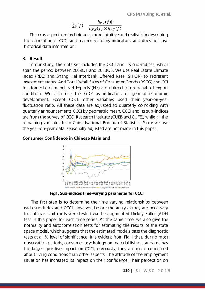
CPS1474 Jing R. et al.
130 | I S I W S C 2 0 1 9
𝑟𝑋,𝑌2 (𝑓) =
|ℎ𝑋,𝑌(𝑓)|2
ℎ𝑋,𝑋(𝑓) × ℎ𝑌,𝑌(𝑓)
The cross-spectrum technique is more intuitive and realistic in describing
the correlation of CCCI and macro-economy indicators, and does not lose
historical data information.
3. Result
In our study, the data set includes the CCCI and its sub-indices, which
span the period between 2009Q1 and 2018Q3. We use Real Estate Climate
Index (REC) and Shang Hai Interbank Offered Rate (SHIOR) to represent
investment status. And Total Retail Sales of Consumer Goods (RSCG) and CCI
for domestic demand. Net Exports (NE) are utilized to on behalf of export
condition. We also use the GDP as indicators of general economic
development. Except CCCI, other variables used their year-on-year
fluctuation ratio. All these data are adjusted to quarterly coinciding with
quarterly announcements CCCI by geometric mean. CCCI and its sub-indices
are from the survey of CCCI Research Institute (CUEB and CUFE), while all the
remaining variables from China National Bureau of Statistics. Since we use
the year-on-year data, seasonally adjusted are not made in this paper.
Consumer Confidence in Chinese Mainland
Fig1. Sub-indices time-varying parameter for CCCI
The first step is to determine the time-varying relationships between
each sub-index and CCCI, however, before the analysis they are necessary
to stabilize. Unit roots were tested via the augmented Dickey-Fuller (ADF)
test in this paper for each time series. At the same time, we also give the
normality and autocorrelation tests for estimating the results of the state
space model, which suggests that the estimated models pass the diagnostic
tests at a 1% level of significance. It is evident from Fig 1 that, during most
observation periods, consumer psychology on material living standards has
the largest positive impact on CCCI, obviously, they are more concerned
about living conditions than other aspects. The attitude of the employment
situation has increased its impact on their confidence. Their perception on

CPS1474 Jing R. et al.
131 | I S I W S C 2 0 1 9
the regional economy has no discernable swings effect on confidence.
Although consumers have insufficient confidence in housing prices, this has
not an excessive impact on their general confidence. We find that in
2009Q4, in addition to the investment sub-index, others all had surged
positive shock. However, investment sub-index has maintained a positive
act on CCCI since 2010, and it fluctuated around 0.4. At different times,
customer cognitive of price has a great difference of effect on their general
confidence, but this effect is not obvious. Lasting a long time, their attitude
towards prices ran counter to their general confidence. The above
observations were based on analysis with individual and whole angle. More
informative conclusions were drawn below from the significant time
variation in the relation between CCCI and macro-economy.
Relationship between CCCI and Economic Situation
Before cross-spectral analysis of CCCI and economic variables, white
noise tests should be carried out. Each sequence completely reject the null
hypothesis at a 1% level of significance that these sequences are not white
noise sequences. In order to estimate cross-spectrum and reduce estimation
variance of these non-white noise sequences, it is necessary to employ the
window function technique for weighted smoothing around the observed
series. According to Bloomfeild [10], Daniell window as a smoothing filter
for generating. Therefore, to examine the leading and lag relationships
between CCCI and economic variables, we prefer Daniell process with one
window that width equal to 3.
CCCI and General Economy Summarizing the presentations from
Table 1 reveals several important conclusions. At frequencies between 0.5-
1.3 (about 2.32-6 months), the coherences are within a fairly narrow range
0.52-0.66, which indicating there is a significant correlation between CCCI
and GDP with a short resonant period. The phases measure between 1.17-
1.71 at these periods manifest a lead of CCCI ahead of GDP by about 0.43 -
1.17 months. A phase lead of 0.93 at a long resonant period of 30 months,
which means CCCI over GDP by 4.5 months. In addition, over a medium
resonant period of 15 months, CCCI is about 2.1 months ahead of GDP
variation Results means that CCCI plays an important role in predicting GDP
in the short, medium and long term resonant period. It can be seen that
Chinese consumers ’willingness to consume has a high impact on the
general economic trends.

CPS1474 Jing R. et al.
132 | I S I W S C 2 0 1 9
Table 1. Results of cross-spectrum analysis between CCCI and GDP
Frequency Monthly Resonance
Period a
Coherencyb Phase Monthly Time-
delaysc
0.7 4.29 0.6506 1.7123 1.1679
0.6 5.00 0.6423 1.5278 1.2158
1.1 2.73 0.6100 1.0338 0.4487
0.5 6.00 0.5356 1.5463 1.4766
0.1 30.00 0.5350 0.9323 4.4513
1.3 2.32 0.5222 1.1687 0.4292
0.2 15.00 0.5068 0.8693 2.0752
a Monthly resonance period are calculated from: 1/ Frequency*3 b This paper lists the relatively high results (coherency >=0.5) c Monthly time-delays are calculated from: Phase*(Monthly Resonance Period / 2*pi)
For above, the same below
CCCI and Exports As far as export are concerned, we use Net Exports
as its representative indicator. There is an important resonance relationship
between CCCI and NE with short, medium and long variation period, which
are interdependent and mutually restrictive. In the short resonance period
of 4 months, the phase leads of CCCI is nearly one month ahead of NE. In
the medium resonance period of 15 months, CCCI has a phase of 2.03
(about 4.8 months) leading variation trend of NE. Furthermore, a phase
leads about 10.7 months occurs in the long resonance period of 30 months.
However, in the resonance periods of 6-8 months, CCCI lags behind NE for
less than one month. The moral is that, there is a strong correlation between
CCCI and NE, and CCCI has a certain explanatory power to the future
variations of Net Exports.
Table 2. Results of cross-spectrum analysis between CCCI and NE
Frequency Monthly
Resonance Period a
Coherency Phase Monthly
Time-delaysb
0.9 3.33 0.8040 0.9580 0.5083
0.5 6.00 0.7552 -0.7503 -0.7165
1.3 2.31 0.7188 1.9443 0.7141
0.8 3.75 0.6164 1.7361 1.0361
0.4 7.50 0.6155 -0.2380 -0.2840
0.2 15.00 0.5395 2.0298 4.8457
0.1 30.00 0.5336 2.2343 10.6681
CCCI and Domestic Demand In terms of domestic demand, this paper
considers two important representative variables, RSCG and CPI. RSCG is the
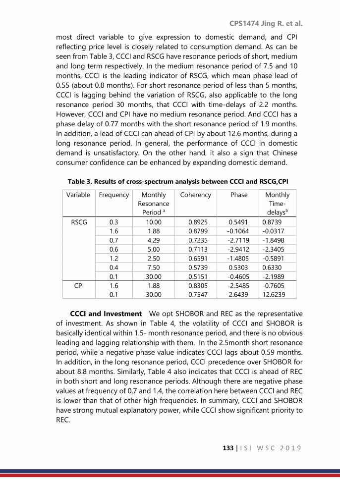
CPS1474 Jing R. et al.
133 | I S I W S C 2 0 1 9
most direct variable to give expression to domestic demand, and CPI
reflecting price level is closely related to consumption demand. As can be
seen from Table 3, CCCI and RSCG have resonance periods of short, medium
and long term respectively. In the medium resonance period of 7.5 and 10
months, CCCI is the leading indicator of RSCG, which mean phase lead of
0.55 (about 0.8 months). For short resonance period of less than 5 months,
CCCI is lagging behind the variation of RSCG, also applicable to the long
resonance period 30 months, that CCCI with time-delays of 2.2 months.
However, CCCI and CPI have no medium resonance period. And CCCI has a
phase delay of 0.77 months with the short resonance period of 1.9 months.
In addition, a lead of CCCI can ahead of CPI by about 12.6 months, during a
long resonance period. In general, the performance of CCCI in domestic
demand is unsatisfactory. On the other hand, it also a sign that Chinese
consumer confidence can be enhanced by expanding domestic demand.
Table 3. Results of cross-spectrum analysis between CCCI and RSCG,CPI
Variable Frequency Monthly
Resonance
Period a
Coherency Phase Monthly
Time-
delaysb
RSCG 0.3 10.00 0.8925 0.5491 0.8739
1.6 1.88 0.8799 -0.1064 -0.0317
0.7 4.29 0.7235 -2.7119 -1.8498
0.6 5.00 0.7113 -2.9412 -2.3405
1.2 2.50 0.6591 -1.4805 -0.5891
0.4 7.50 0.5739 0.5303 0.6330
0.1 30.00 0.5151 -0.4605 -2.1989
CPI 1.6 1.88 0.8305 -2.5485 -0.7605
0.1 30.00 0.7547 2.6439 12.6239
CCCI and Investment We opt SHOBOR and REC as the representative
of investment. As shown in Table 4, the volatility of CCCI and SHOBOR is
basically identical within 1.5- month resonance period, and there is no obvious
leading and lagging relationship with them. In the 2.5month short resonance
period, while a negative phase value indicates CCCI lags about 0.59 months.
In addition, in the long resonance period, CCCI precedence over SHOBOR for
about 8.8 months. Similarly, Table 4 also indicates that CCCI is ahead of REC
in both short and long resonance periods. Although there are negative phase
values at frequency of 0.7 and 1.4, the correlation here between CCCI and REC
is lower than that of other high frequencies. In summary, CCCI and SHOBOR
have strong mutual explanatory power, while CCCI show significant priority to
REC.
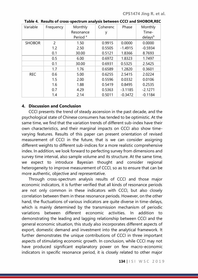
CPS1474 Jing R. et al.
134 | I S I W S C 2 0 1 9
Table 4. Results of cross-spectrum analysis between CCCI and SHOBOR,REC
Variable Frequency Monthly
Resonance
Period a
Coherenc
y
Phase Monthly
Time-
delaysb
SHOBOR 2 1.50 0.9915 0.0000 0.0000
1.2 2.50 0.5505 -1.4915 -0.5934
0.1 30.00 0.5121 1.8366 8.7693
0.5 6.00 0.6972 1.8323 1.7497
0.1 30.00 0.6931 0.5325 2.5425
1.7 1.76 0.6589 1.2820 0.3601
REC 0.6 5.00 0.6255 2.5415 2.0224
1.5 2.00 0.5596 0.0332 0.0106
1.6
0.7
1.4
1.88
4.29
2.14
0.5419
0.5363
0.5011
0.8495
-3.1185
-0.3472
0.2535
-2.1271
-0.1184
4. Discussion and Conclusion
CCCI presents the trend of steady ascension in the past decade, and the
psychological state of Chinese consumers has tended to be optimistic. At the
same time, we find that the variation trends of different sub-index have their
own characteristics, and their marginal impacts on CCCI also show time-
varying features. Results of this paper can present orientation of revised
measurement of CCCI in the future, that is we can consider assigning
different weights to different sub-indices for a more realistic comprehensive
index. In addition, we look forward to perfecting survey from dimensions and
survey time interval, also sample volume and its structure. At the same time,
we expect to introduce Bayesian thought and consider regional
heterogeneity to improve measurement of CCCI, so as to ensure that can be
more authentic, objective and representative.
Through cross-spectrum analysis results of CCCI and those major
economic indicators, it is further verified that all kinds of resonance periods
are not only common in these indicators with CCCI, but also closely
correlation between them in these resonance periods. However, on the other
hand, the fluctuations of various indicators are quite diverse in time-delays,
which is mainly determined by the transmission mechanism of periodic
variations between different economic activities. In addition to
demonstrating the leading and lagging relationship between CCCI and the
general economic situation, this study also incorporates different aspects of
export, domestic demand and investment into the analytical framework. It
further demonstrates the unique contributions of CCCI in three important
aspects of stimulating economic growth. In conclusion, while CCCI may not
have produced significant explanatory power on few macro-economic
indicators in specific resonance period, it is closely related to other major

CPS1474 Jing R. et al.
135 | I S I W S C 2 0 1 9
indicators in different resonance periods and can be used as a leading
indicator of these phenomena. By measuring the confidence and its
variations of consumers in different resonance periods, which can not only
provide effective monitoring of the future trends of major economic
variables, but also can be used to anticipate market fluctuations.
However, there are still some several limitations in our study. First,
because of month-on-month figures which would normally be inaccessible,
we calculated year-on-year values on the raw data as the representative of
economic variables separately. Secondly, whether the seasonal adjustment
of consumer confidence index is needed in the process of analysis needs
further discussion. Considering that consumer confidence index reflects the
mental state of consumers, which are subjective judgment of them on
economic phenomena, and there are also no obvious seasonal variations.
Finally, this article only examines leading and lagging relationships between
CCCI and various variables, but has not verified the extent of impact and
effectiveness of prediction of CCCI. This is a convinced step toward our future
research framework.
References
1. Roos. M. W. M. (2008). Willingness to consume and ability to consume.
Journal of Economic Behavior & Organization.
2. Ji. H., Ren. T.. &Ruan. J.(2010). Analysis of Consumer Confidence in
China-Originated from Chinese Customer’s Confidence Index Among
Four Regions Across the Strait in China. Economics Information.
3. Matsusaka. J. G.. Sbordone. A.M. (2010). Consumer Confidence and
Economic Fluctuations. Economic Inquiry.
4. Taylor. K.. Mcnabb. R. (2010). Business Cycles and the Role of
Confidence: Evidence for Europe. Oxford Bulletin of Economics &
Statistics.
5. Smith. M.. Bidder. R.(2012). Robust Animal Spirits. Journal of Monetary
Economics.
6. Mazurek. J.. Mielcová. E. (2017). Is consumer confidence index a suitable
predictor of future economic growth? An evidence from the USA.
Ekonomie & Management.
7. Sorić. P.(2018). Consumer confidence as a GDP determinant in New EU
Member States: a view from a time-varying perspective. Empirica.
8. Xie. B. C., Wei. J. R.. &Zhu. J. P. (2011). Comparison and Enlightenment of
Chinese Customer’s Confidence Index Among the Four Regions Across
the Strait in China. Taiwan Studies.
9. Guo. H.W., Wu. Q. F.. & Zhang. Y. C. (2013). Suspicion of Confidence
Index. Statistics & Information Forum.

CPS1474 Jing R. et al.
136 | I S I W S C 2 0 1 9
10. Sergeant. K.(2011). Consumer confidence and economic growth: case
studies of Jamaica and Trinidad and Tobago. Sede Subregional De La
Cepal Para El Caribe.

CPS1485 Pasi P.
137 | I S I W S C 2 0 1 9
Accessibility statistics to meet the needs of
customers of Statistics Finland
Pasi Piela Statistics Finland
Abstract
Accessibility research has been a relevant part of today’s geographic
information science. The data sources of official statistics offer plenty of
relevant administrative data on the population itself and on various services
available to the population. These are also combined into statistical products
for customers of Statistics Finland. Many aspects of accessibility are taken into
account. Naturally, the road network based application is better than the
linear approach. First, the enrichment proposal for the remoteness (index)
estimation for the Ministry of Finance is presented. Studies funded by the
ministry clearly promote the use of a road network based estimation. The
need for cultural accessibility statistics has also been raised recently at
Statistics Finland. In this case the challenge comes from the many data
sources required: theatres, libraries, orchestras, museums, festivals etc. The
elementary school accessibility is presented as well. This kind of approach
offers valuable information for the municipal authorities. Statistical
commuting remains as the most challenging accessibility concept at Statistics
Finland. It targets on travel time estimation and requires data integration from
many data sources. In this paper the specific experimental sustainable
commuting model is presented as well. Green commuting, bicycling, has
received the most attention, however. Besides sharing concrete examples this
paper motivates the future accessibility research in which UN SDG indicators
are taken into account too.
Keywords
Accessibility, proximity, network analysis, sustainable development goals.
1. Introduction
Statistical accessibility has been at the centre of geographic information
science for quite a long time. Alasia, A. et al (2017) noted that some of the
existing indices of accessibility and remoteness developed in the 1989s have
been used with only minor revisions.
It is obvious that the development of communication technologies and
transportation itself have changed the meaning of perception of distance. But
geographic proximity remains an important determinant of socioeconomic
outcomes.

CPS1485 Pasi P.
138 | I S I W S C 2 0 1 9
In this paper the concept of accessibility refers to distance metrics and
travel time itself between points: pair of points, group of points, “service
areas” around points.
It should be noted that at the global level United Nations’ actions form a
base for the estimation of accessibility to services. Statistics Finland is also
cooperating with other public administration institutions in order to make
production of some of the most challenging indicators of the sustainable
development goals (SDG) possible, especially the indicator 11.2.1 Proportion
of population that has convenient access to public transport, by sex, age and
persons with disabilities. It is obvious that people with disabilities have
individual burdens that would require high quality data in order to measure
accessibility correctly. This kind of application is passed in this paper.
SDG perspective on the other hand is presented in specific examples
of sustainable commuting and cultural accessibility.
2. Data sources
These applications extensively use the Population Statistics Data
Warehouse of Statistics Finland and other registers that are constructed from
several administrative datasets and statistical data files (Statistics Finland,
1/2016 and 2/2016).
These are integrated with many other datasets such as the extensive
National Road and Street Database, Digiroad (Digiroad.fi), produced by The
Finnish Transport Agency. Agency’s data from automatic traffic measuring
devices are also applied (Piela, P. 1/2016) having obvious big data features.
Specifically, the public transport accessibility requires open public
transport web service platforms (Pasila, A. 2016).
Some applications even require customers’ own “service point” data due
to limits of the Business Register, either surveyed or register-type of data.
3. Remoteness index estimation
The Municipal remoteness index of Finland (in Finnish: syrjäisyysluku, in
Swedish: kommunernas fjärrortstal) has been decreed with the Government
decree on statutory government transfers to municipalities for basic services
1446/2014. It defines a simplified system based on certain relative population
counts within 25 kilometres and 50 kilometres (Euclidean) circle buffers around
municipal (statistical) population centres, by applying one square kilometre
population grids.
The Ministry of Finance has supported studies on enrichment proposals
for the remoteness index. The most popular is the one that simply replaces
linear distances by route network based ones. It is obvious that such measure
takes better into account geographical differences especially in a sparsely
populated country.

CPS1485 Pasi P.
139 | I S I W S C 2 0 1 9
The non-mountainous geography of Finland involves plenty of lakes and
waters. This can be seen in Figure 1 which presented the service area polygons
of 25 and 50 kilometres around statistical population centres. However the
southern municipality have roads to all the directions even if surrounded by
lakes. But the new type of index would make a considerable difference for the
northern municipality: accessibility by applying the route network reveals only
very sparsely populated areas within 50 kilometres from its centre.
4. Cultural accessibility
Cultural accessibility has been studied at Statistics Finland recently as well.
Some statistics have been published and some specifically ordered by the
Finnish Center for Cultural Policy Research CUPORE as a customer.
Here the methodology is similar to the previous service areas, but the
challenge is the number of very different cultural institutions and events that
should be targeted. Manual geocoding is sometimes required. Also the
location itself can be difficult to define (e.g. orchestras).
So far accessibility statistics have been provided for public libraries, movie
theatres, theatres, museums, festivals, orchestras and children’s cultural
centres. About 72.4 percent of the Finnish population lives within three
kilometres of their nearest public library and half of the population actually
within 1500 meters only (Piela, P. 2/2016). Theatres are not reached by walking
distance for many: 20 percent lives within three kilometres and half of the
population within 10 kilometres.
However, most of the population can reach any of the mentioned
institutions and some cultural event within a short drive distance of 30
kilometres.

CPS1485 Pasi P.
140 | I S I W S C 2 0 1 9
Figure 1. Municipalities of Savonlinna and Rääkkylä of Finnish Lakeland with
their service area polygons (25 and 50 km) around their statistical population
centres. Town hall locations have been marked for reference.
Source: Statistics Finland and National Land Survey open data Creative Commons 4.0
5. Elementary school accessibility
Municipal elementary school proximity by road has been estimated
annually due to demand. This has been estimated by point-to-point road
distance (pedestrian roads allowed) within the same municipality in each age
class and school type. Private schools in Finland are few and thus irrelevant
from this perspective.
Figure 2 represents preliminary school proximity in a small (by population)
municipality of Salo. 30,7 percent of the preliminary age group, 7 to 12 years,
live within one kilometre of their nearest school, 77,4 percent within three
kilometres accordingly.
6. Experimental sustainable commuting model
Statistical commuting is currently the most sophisticated statistical
accessibility example of Statistics Finland. It has been targeting the challenging
travel time estimation to enrich the existing official statistics. The commuting
time and distance can be calculated as a point-to-point estimate from almost
every employee’s home to a corresponding workplace – the national
coordinate coverage being about 93 percent.
Models are built for both commuting time and distance by driving, cycling
and using public transport within the national route network. This requires
different datasets of which automatic traffic measuring devices and public
0 2
5
1
, 5 K

CPS1485 Pasi P.
141 | I S I W S C 2 0 1 9
transport timetables and routing estimation platforms represent here the data
integration task (see: Piela 2017).
The actual travel time and distance estimation is computationally a
complex procedure. Here it has been solved by parallel computing:
PythonTM programs calling ESRI ArcGIS® Network Analyst Route Solver for
estimations of the shortest, travel time optimised, paths (hierarchical routing,
nonhierarchical in the case of walking or cycling). In the case of public
transport, web services’ (such as the nationwide Journey.fi, FTA (2018)) large
datasets have been retrieved via application programming interface.
All of the estimates are compiled to a micro level database. The database
includes the following variables to be merged with other demographic data:
Commuting distance and time by private vehicle, Cycling distance and time,
Public transport commuting distance and time (in the whole country), Helsinki
Region Public Transport commuting distance and time and Corrected
commuting time for trips to and from the central Helsinki area (Piela, P. and
Pasila, A., 2017).
Among these, bicycle commuting statistics have received most publicity.
Cycle commuting time median in Finland is 27 minutes (30 minutes in the
Capital Region): half of the population can cycle to their workplace within half
an hour.
Figure 2. Preliminary school accessibility in Salo municipality (2017): the
shortest path from a dwelling (grid) to a school is simplified here as a direct
line for presentation purposes.
Source: Statistics Finland and National Land Survey open data Creative Commons 4.0.

CPS1485 Pasi P.
142 | I S I W S C 2 0 1 9
The contribution of Statistics Finland to the Walk This Way 2017 seminar
can be seen as a Youtube video on bicycle commuting: Statistics Finland
(2017).
In the analysis of commuting time, the area type is a relevant factor to be
taken into account. This kind of analysis requires a detailed urban-rural
classification to be applied (Piela, P. and Pasila, A. 2017). For example, the
median commuting time by private car is about 12 minutes according to
these statistics. In the inner urban area it is 11 minutes with lesser deviation
and in the rural area close to urban area it is almost 20 minutes. In the rural
heartland area, 12 percent have less than 100 meters to their workplace and
the median becomes nine minutes only. However, non-commuting
employed population is included in the given statistics of this paper.
One example of applying the commuting time and distance database is
presented here in short. It takes into account the sustainable development
perspective by promoting walking, bicycling and public transport. It is not
based on any other existing research and, as such, remains experimental
(Piela, P., and Pasila, A. 2017).
1) Here, every employed whose commuting distance is less than 1,000
meters is expected to walk to the workplace 70 meters per minute
(similar to FTA 2018).
2) The maximum cycling time to a work place is given as 30 minutes by
the earlier given speed of 17 kilometres per minute.
3) Other commuters will use the public transport option if it takes
less than the drive time to work plus 30 minutes, and given that it
is available.
4) Those who are not able to walk, cycle or use public transport in this
model are expected to drive to their workplaces as usual.
The median commuting time becomes 17.6 minutes. It is about six minutes
higher than the estimated drive time median for the whole study population.
In this model, 36.8 percent use private cars. Half of the population could walk
or cycle to their workplaces within half an hour according to Table 1.
There is considerable missingness in the public transport data. Among
private car commuters in this model, 33.6 percent has unknown public
transport commuting estimate. The coverage of Journey.fi is expected to
become better in the future. This might affect to the proportions.
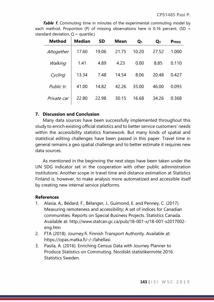
CPS1485 Pasi P.
143 | I S I W S C 2 0 1 9
Table 1. Commuting time in minutes of the experimental commuting model by
each method. Proportion (P) of missing observations here is 0.16 percent. (SD =
standard deviation, Q = quartile.)
Method Median SD Mean Q1 Q3 PFREQ
Altogether 17.60 19.06 21.75 10.20 27.52 1.000
Walking 1.41 4.89 4.23 0.00 8.85 0.110
Cycling 13.34 7.48 14.54 8.06 20.48 0.427
Public tr. 41.00 14.82 42.26 35.00 46.00 0.093
Private car 22.80 22.98 30.15 16.68 34.26 0.368
7. Discussion and Conclusion
Many data sources have been successfully implemented throughout this
study to enrich existing official statistics and to better service customers’ needs
within the accessibility statistics framework. But many kinds of spatial and
statistical editing challenges have been passed in this paper. Travel time in
general remains a geo spatial challenge and to better estimate it requires new
data sources.
As mentioned in the beginning the next steps have been taken under the
UN SDG indicator set in the cooperation with other public administration
institutions. Another scope in travel time and distance estimation at Statistics
Finland is, however, to make analysis more automatized and accessible itself
by creating new internal service platforms.
References
1. Alasia, A., Bédard, F., Bélanger, J., Guimond, E. and Penney, C. (2017).
Measuring remoteness and accessibility: A set of indices for Canadian
communities. Reports on Special Business Projects. Statistics Canada.
Available at: http://www.statcan.gc.ca/pub/18-001-x/18-001-x2017002-
eng.htm
2. FTA (2018). Journey.fi. Finnish Transport Authority. Available at:
https://opas.matka.fi/-/-/lahellasi
3. Pasila, A. (2016). Enriching Census Data with Journey Planner to
Produce Statistics on Commuting. Nordiskt statistikermöte 2016.
Statistics Sweden.

CPS1485 Pasi P.
144 | I S I W S C 2 0 1 9
4. Piela, P. (1/2016). Feasibility report: implementation of traffic
measuring devices for travel time network analysis on commuting.
Statistics Finland.
5. Piela, P. (2/2016). Festivaalien läheisyys – tilastollinen
saavutettavuusanalyysi. Festivaalien Suomi. Cupore’s publications 29.
Center for Cultural Policy Research CUPORE. Only in Finnish.
6. Piela, P. (2017). Merging big data and official statistics for smarter
statistics on commuting. NTTS 2017 proceedings. Eurostat. Available
at: https://ec.europa.eu/eurostat/cros/ntts2017programme/
7. Piela P. and Pasila, A. (2017). Statistics on Commuting: merging
big data and official statistics. Project Report. Statistics Finland.
8. Statistics Finland (1/2016). Population census statistics. Available at:
http://www.stat.fi/tup/vl2010/tilastotietoa en.html
9. Statistics Finland (2/2016). Register and archive services. Available at:
https://www.stat.fi/tup/rekisteripalvelut en.html
10. Statistics Finland (2017). Polkisitko puolessa tunnissa töihin?
English subtitles. Available at:
https://www.youtube.com/watch?v=js6OdyC6VBY

CPS1488 Willem van den B. et al.
145 | I S I W S C 2 0 1 9
EP-IS: Combining expectation propagation and
importance sampling for bayesian
nonlinear inverse problems
Willem van den Boom, Alexandre H. Thiery National University if Singapore, Singapore
Abstract
Bayesian analysis of inverse problems provides principled measures of
uncertainty quantification. However, Bayesian computation for inverse
problems is often challenging due to the high-dimensional or functional
nature of the parameter space. We consider a setting with a Gaussian process
prior in which exact computation of nonlinear inverse problems is too
expensive while linear problems are readily solved. Motivated by the latter, we
iteratively linearize nonlinear inverse problems. Doing this for data subsets
separately yields an expectation propagation (EP) algorithm. The EP cavity
distributions provide proposal distributions for an importance sampler that
refines the posterior approximation beyond what linearization yields. The
result is a hybrid between fast, linearization-based approaches, and sampling
based methods, which are more accurate but usually too slow.
Keywords
Bayesian computation; Gaussian process; Linearization; Monte Carlo
1. Introduction
Consider the inverse problem
𝑦~𝑁ℎ(𝑓), 𝜎2𝐼𝑛 (1)
where y is an n-dimensional vector of observations, h : F → Rn a known
forward map for some function space 𝐹, 𝑓 ∈ 𝐹 the unknown state space of
interest, and σ2 the error variance. An example of an inverse problem is when f
is the temperature distribution at time zero while y contains noisy temperature
measurements at a set of locations at a later point in time. Then, the heat
equation determines the map h. Our goal is to do Bayesian inference on (1).
That is, we consider a prior distribution 𝑃(𝑓) on f and aim to compute the
posterior on f,
𝑃(𝑓|𝑦)=𝑃(𝑓)𝑃(𝑦|𝑓)
𝑃(𝑦), (2)
where 𝑃(𝑦 | 𝑓) is given by (1). This is intractable for general 𝑃(𝑓) and
forward maps h. Approximations are therefore used but deterministic
approximations like Laplace’s method can be too inaccurate while Monte Carlo
sampling from the posterior is too computationally expensive. We therefore

CPS1488 Willem van den B. et al.
146 | I S I W S C 2 0 1 9
propose a hybrid approach combining ideas from deterministic and sampling
approaches that is more accurate than fast approximations currently used
while being computationally less expensive than Monte Carlo sampling. Our
method applies to inverse problems with Gaussian priors 𝑃(𝑓), Gaussian errors
as in (1), and differentiable forward maps h.
Inverse problems are widespread with applications including computer
graphics (Aristidou et al., 2017), geology (Reid et al., 2013), medical imaging
(Bertero and Piana, 2006), and robotics (Duka, 2014). The Bayesian approach
to inference on f in (1) is increasingly receiving attention (Kaipio and
Somersalo, 2005; Reid et al., 2013) as it provides natural uncertainty
quantification on f. It is analytically attractive to take the prior 𝑃(𝑓) to be
Gaussian. If in addition the forward map h is linear, then the posterior
computation in (2) is tractable as in Reid et al. (2013). For nonlinear h, the
posterior often does not have an analytical solution. While Markov Chain
Monte Carlo (MCMC) methods can approximate the posterior using sampling,
this is computationally infeasible for the scale of most real-world applications
of inverse problems. As a result, deterministic posterior approximations for
nonlinear inverse problems are popular. For instance, Steinberg and Bonilla
(2014) obtain a Gaussian approximation to 𝑃(𝑓 | 𝑦) by solving (2) using a
linearization of h. Through linearizing h iteratively, they obtain a Gauss-
Newton algorithm that converges to a Laplace approximation of 𝑃(𝑓 | 𝑦) with
a Gauss-Newton approximation to the Hessian. Gehre and Jin (2014) provide
another example of a fast posterior approximation in inverse problems. They
use expectation propagation (EP, Minka, 2001). As is common in EP, the
approximating distribution is factorized. Then, matching the moments or
expectations between the true posterior 𝑃(𝑓 | 𝑦) and the approximating
factors is done via numerical integration, which is feasible because of the low
dimensionality of each factor.
Our method is at the highest level an EP algorithm but employs sampling
inside the steps of the EP iterations: For each of the factors of the
approximating posterior, we employ linearization of h as in Steinberg and
Bonilla (2014), but only as an intermediate step: The resulting Laplace
approximation is used as the proposal distribution for importance sampling
(IS) to further refine the approximation. We regularize the posterior covariance
estimates from the importance sampler based on the structure implied by the
inverse problem in (1). This use of EP at a high level and iterative application
of importance sampling relates to ideas in Gelman et al. (2014) and adaptive
importance sampling (Cornuet et al., 2012). Gianniotis (2019) also obtains an
improved approximation starting from a Laplace approximation but uses
variational inference for this rather than importance sampling and does not
consider an EP type factorization. We name our method EP-IS.

CPS1488 Willem van den B. et al.
147 | I S I W S C 2 0 1 9
2. Methodology
Let 𝑆𝑘𝑘=1𝐾 denote a partition of 1,...,n into K ≥ 1 parts such that
𝑈𝑘=1𝐾 𝑆𝑘 =1,….,n and Sj ∩Sk =∅ for j 6= k. Denote the number of elements in Sk
by nk = |Sk|. Let ySk denote the nk dimensional vector obtained by selecting the
elements from y with indices in Sk. Since the observation errors in (1) are
independent, the density of y given f factorizes as
𝑝(𝑦|𝑓) =∏𝑝(𝑦𝑆𝑘|𝑓) =
𝐾
𝑘=1
∏𝑁𝑦𝑆𝑘 |ℎ𝑆𝑘(𝑓), 𝜎2𝐼𝑛𝑘 ∝∏exp −
1
2𝜎2||𝑦𝑆𝑘 − ℎ𝑆𝑘(𝑓)||
2
𝐾
𝑘=1
𝐾
𝑘=1
where the vectorℎ𝑆𝑘(𝑓) relates to the vector ℎ(𝑓) like ySk relates to y. Consider
an embedding F ∈ Rd of the function f such that a Gaussian 𝑃(𝑓) implies the
prior F ∼ N(µ0, Σ0) for some d-dimensional mean vector µ0 and an d×d
covariance matrix Σ0. For instance, if f : R → R and 𝑃(𝑓) is a Gaussian process,
then a discretization of f stored in a vector is a suitable F, and µ0 and Σ0 follow
from the parameters of the Gaussian process. Define H : Rd → Rn such that 𝐻(𝐹)
= ℎ(𝑓). Using that F ∼ N(µ0, Σ0), the posterior density on F follows by the last
display as
𝑝(𝐹|𝑦) ∝ 𝑁(𝐹|𝜇0, ∑0)𝑝(𝑦|𝐹) ∝ exp −1
2(𝐹 − 𝜇0)
𝑇 ∑ (𝐹 − 𝜇0−10
∏ exp −1
2𝜎2||𝑦𝑆𝑘 − 𝐻𝑆𝑘(𝐹)||
2𝐾𝑘=1 .
This expression for 𝑝(𝐹 | 𝑦) suggests a factorized approximating
distribution for use in EP. Denote the approximation to the posterior density
𝑝(𝐹 | 𝑦) by
𝑞(𝐹) = 𝑁(𝐹|𝜇, ∑) ∝ ∏ 𝑞𝑘(𝐹) =𝐾𝑘=0 ∏ 𝑁(𝐹|𝜇𝑘 , ∑𝑘)
𝐾𝑘=0 (3)
with the d-dimensional mean vectors µ and µk and the d × d covariance
matrices Σ and Σk. This sets 𝑞0(𝐹) = 𝑝(𝐹) = N(F | µ0, Σ0) while 𝑞𝑘(𝐹), 𝑘 =
1, . . . , 𝐾, are learnt from the data. EP repeatedly updates µk and Σk for each 𝑘 =
1, . . . , 𝐾 such that the moments of the unnormalized densities
𝑞\𝑘(𝐹)𝑞𝑘(𝐹) and 𝑞\𝑘(𝐹) 𝑒𝑥𝑝 −1
2𝜎2||𝑦
𝑆𝑘− 𝐻𝑆𝑘(𝐹)||
2 (4)
match, where𝑞\𝑘(𝐹) ∝ 𝑞(𝐹)/𝑞𝑘(𝐹) is the density of the cavity distribution.
For notational convenience, define the natural parameters of the Gaussian
distributions: Λ = Σ−1, Λ𝑘 = ∑𝑘−1, 𝑣 = Λ𝜇, and 𝜈𝑘 = 𝛬𝑘µ𝑘 . Then, expanding the
squares inside the exponentials and collecting the terms in (3) reveals Λ =
∑ Λ𝑘𝐾𝑘=0 and. 𝑣 = ∑ 𝑣𝑘
𝐾𝑘=0 . Define Λ\𝑘 = Λ − Λ𝑘 and 𝑣\𝑘 = 𝑣 − 𝑣𝑘 . Then,

CPS1488 Willem van den B. et al.
148 | I S I W S C 2 0 1 9
Algorithm 1 EP-IS.
Input: Data y, forward map H, and data partition𝑆𝑘𝑘=1
𝐾
1. Initialize µk = 01×d and Λk = 0d×d for 𝑘 = 1, . . . , 𝐾.
2. Iterate the EP updates in (6) derived from the linearization for 𝑘 =
1, . . . , 𝐾 repeatedly for a fixed number of times or until convergence.
3. Iterate the EP updates in (7) derived from importance sampling with
regularization of choice on ΣIS for 𝑘 = 1, . . . , 𝐾 repeatedly for a fixed
number of times or until convergence.
Output: The approximate posterior 𝑞(𝐹)
𝑞\𝑘(𝐹) = 𝑁(Λ\𝑘
−1𝑣\𝑘 , Λ\𝑘−1)
Computation of the mean and variance of 𝑞\𝑘(𝐹) 𝑒𝑥𝑝 − ||𝑦𝑆𝑘− 𝐻𝑆𝑘(𝐹)||
2
/2𝜎2
in (4) is often intractable unless 𝐻𝑠𝑘 is linear. Consider therefore the first-order
Taylor series expansion of 𝐻𝑠𝑘 around the current approximation µ of the
posterior mean,
𝐻𝑆𝑘(𝐹) = 𝐻𝑆𝑘(𝜇) + 𝐽𝜇(𝐹 − 𝜇) (5)
where 𝐽𝜇 is the nk×d Jacobian matrix of 𝐻𝑆𝑘. Under this approximation,
𝑞\𝑘(𝐹) 𝑒𝑥𝑝 −||𝑦𝑆𝑘 − 𝑆𝑘(𝐹)||2 is Gaussian such that the EP updates of
matching the moments in (4) follow as
𝑣𝑘 =1
𝜎2𝐽𝜇𝑇 𝑦 − 𝐻𝑆𝑘(𝜇) + 𝐽𝜇𝜇 and Λ𝑘 = ∑ −Λ\𝑘
−1𝐼𝑆 (6)
Iterating these updates yields a linearization based posterior approximation
𝑞(𝐹). Aside from the data partition, this scheme is similar to the Gauss-Newton
algorithm obtained in Steinberg and Bonilla (2014) for a Laplace
approximation to 𝑝(𝐹 | 𝑦).
To obtain an approximation that is more accurate than the limitations of
the linearization in (5), we consider importance sampling with the exact 𝐻𝑆𝑘 for
finding the mean and covariance of the right-hand side in (4). As proposal
distribution, we choose the right-hand side of (4) with the approximation (5),
that is 𝑞\𝑘(𝐹) 𝑒𝑥𝑝 −1
2𝜎2||𝑦
𝑆𝑘− 𝑆𝑘(𝐹)||
2 up to a proportionality constant. This
is a Gaussian and thus easy to sample from. Moreover, it is expected to be
reasonably close to the right-hand side of (4), 𝑞\𝑘(𝐹) 𝑒𝑥𝑝 −1
2𝜎2||𝑦𝑆𝑘 −
𝐻𝑆𝑘(𝐹)||2, up to a proportionality constant.
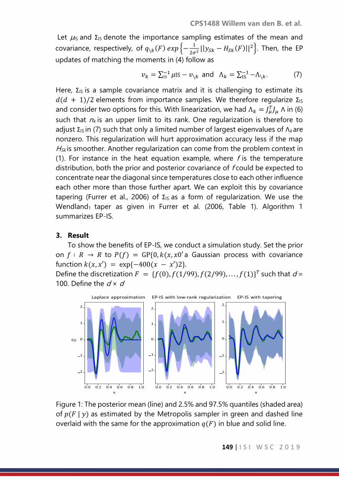
CPS1488 Willem van den B. et al.
149 | I S I W S C 2 0 1 9
Let µIS and ΣIS denote the importance sampling estimates of the mean and
covariance, respectively, of 𝑞\𝑘(𝐹) 𝑒𝑥𝑝 −1
2𝜎2||𝑦𝑆𝑘 −𝐻𝑆𝑘(𝐹)||
2. Then, the EP
updates of matching the moments in (4) follow as
𝑣𝑘 = ∑ 𝜇IS− 𝑣\𝑘−1IS and Λ𝑘 = ∑ −Λ\𝑘
−1IS . (7)
Here, ΣIS is a sample covariance matrix and it is challenging to estimate its
𝑑(𝑑 + 1)/2 elements from importance samples. We therefore regularize ΣIS
and consider two options for this. With linearization, we had Λ𝑘 = 𝐽𝜇𝑇𝐽𝜇 Λ in (6)
such that nk is an upper limit to its rank. One regularization is therefore to
adjust ΣIS in (7) such that only a limited number of largest eigenvalues of Λk are
nonzero. This regularization will hurt approximation accuracy less if the map
HSk is smoother. Another regularization can come from the problem context in
(1). For instance in the heat equation example, where f is the temperature
distribution, both the prior and posterior covariance of f could be expected to
concentrate near the diagonal since temperatures close to each other influence
each other more than those further apart. We can exploit this by covariance
tapering (Furrer et al., 2006) of ΣIS as a form of regularization. We use the
Wendland1 taper as given in Furrer et al. (2006, Table 1). Algorithm 1
summarizes EP-IS.
3. Result
To show the benefits of EP-IS, we conduct a simulation study. Set the prior
on 𝑓 ∶ 𝑅 → 𝑅 to 𝑃(𝑓) = GP0, 𝑘(𝑥, 𝑥0′a Gaussian process with covariance
function 𝑘(𝑥, 𝑥′) = exp−400(𝑥 − 𝑥′)2.
Define the discretization 𝐹 = 𝑓(0), 𝑓(1/99), 𝑓(2/99), . . . , 𝑓(1)𝑇 such that d =
100. Define the d × d
Figure 1: The posterior mean (line) and 2.5% and 97.5% quantiles (shaded area)
of 𝑝(𝐹 | 𝑦) as estimated by the Metropolis sampler in green and dashed line
overlaid with the same for the approximation 𝑞(𝐹) in blue and solid line.
f(x)

CPS1488 Willem van den B. et al.
150 | I S I W S C 2 0 1 9
blurring matrix 𝐺 by first setting 𝐺𝑖𝑗 = exp−min(𝑖 + 𝑗, 𝑑 − 𝑖 − 𝑗)2/25, 𝑖, 𝑗 =
1, . . . , 𝑑, and then scaling its rows to sum up to one. Take the forward map H(F)
to consist of n = 30 elements selected at random with replacement from the
elements with odd indices, as a type of subsampling, of the d-dimensional
vector 𝐺(𝐹 ⊙ 𝐹 ⊙𝐹) where ‘⊙ ’ denotes the elementwise or Hadamard
product. Set σ2 = 1 and generate y according to (1) with F fixed to a prior draw.
We approximate 𝑝(𝐹 | 𝑦) using a Laplace approximation via Taylor series
linearization as in Steinberg and Bonilla (2014), and using EP-IS based on
randomly partitioning y into 𝐾 = 2 vectors of length nk = 15, 20 iterations of
Step 2 of Algorithm 1 and 10 iterations of Step 3 with 10,000 importace
samples each. The very first computation of the Jacobian matrix Jµ is not done
at the initialization µ = 01×d but rather at a µ drawn from the prior 𝑃(𝐹) since
the forward map H has a saddle point at zero such that Step 2 of Algorithm 1
would remain stuck at its initialization. EP-IS is run separately for the low-rank
based regularization of ΣIS such that Λk is of rank nk, and the covariance tapering
with a Wendland1 taper function of width 2/5. For comparison, we draw
100,000 posterior samples using a random walk Metropolis algorithm which
does not approximate the forward map H.
Figure 1 summarizes the results of one run of the simulation. We see that
the Laplace approximation has most trouble capturing the posterior mean
while both applications of EP-IS perform similarly when it comes to the
posterior mean. The uncertainty quantification of the Laplace approximation is
also cruder than that of EP-IS. Covariance tapering in EP-IS leads to virtually
spot on uncertainty quantification while the low-rank matrix regularization
yields slight overestimation of uncertainty in this simulation. EP-IS succeeds in
improving on the posterior approximation provided by linearization through
sampling at a computational cost in between that of the Laplace
approximation and the Metropolis algorithm. See Table 2 for the
computational cost.
We repeat this simulation 20 times and compute the Wasserstein-2
distance between the d = 100 marginals of the empirical MCMC distribution
on F from the Metropolis algorithm and the Gaussian approximations. We then
average this distance over the d marginals for each simulation and
approximation method. The results are in Table 1. Unlike in Figure 1, the
covariance tapering does not outperform the low-rank regularization:
Sometimes the tapering leads to divergence resulting in the large third quartile
shown.
Table 2 summarizes the computation times of the 20 simulations. The
Laplace approximation is fastest. Both EP-IS algorithms take a similar amount
of time but the increased accuracy comes at a computational cost. Importantly,
EP-IS is about twice as fast in this setup as the Metropolis algorithm.

CPS1488 Willem van den B. et al.
151 | I S I W S C 2 0 1 9
Table 1: Quartiles of the average Wasserstein distance between the Gaussian
approximations and the MCMC approximation.
Method Q1 Median Q3
Laplace approximation 0.80 0.92 1.03
EP-IS with low-rank
regularization
0.73 0.83 0.95
EP-IS with tapering 0.73 0.85 83.21
Table 2: Quartiles of the computation times in seconds for the 20 simulations.
Method Q1 Median Q3
Metropolis algorithm 25.2 25.4 26.9
Laplace approximation 0.2 0.4 1.2
EP-IS with low-rank
regularization
13.6 13.9 14.2
EP-IS with tapering 13.5 13.8 14.4
4. Discussion and Conclusion
The EP factorization exploited that the likelihood from (1) factorized. This
factorization is only required along the partitions. The error covariance, σ2In in
(1), is therefore not required to be proportional to an identity matrix but can
be any block diagonal matrix whose block structure corresponds with the data
partition used.
EP-IS combines ideas from deterministic and sampling-based posterior
approximations to obtain an accuracy that is closer to the sampling-based
methods with computational cost closer to deterministic methods.
References
1. Aristidou, A., J. Lasenby, Y. Chrysanthou, and A. Shamir (2017). Inverse
kinematics techniques in computer graphics: A survey. Computer
Graphics Forum 37(6), 35–58.
2. Bertero, M. and M. Piana (2006). Inverse problems in biomedical
imaging: Modeling and methods of solution, pp. 1–33. Milano: Springer
Milan.
3. Cornuet, J.-M., J.-M. Marin, A. Miro, and C. P. Robert (2012). Adaptive
multiple importance sampling. Scandinavian Journal of Statistics 39(4),
798–812.
4. Duka, A.-V. (2014). Neural network based inverse kinematics solution for
trajectory tracking of a robotic arm. Procedia Technology 12, 20–27.

CPS1488 Willem van den B. et al.
152 | I S I W S C 2 0 1 9
5. Furrer, R., M. G. Genton, and D. Nychka (2006). Covariance tapering for
interpolation of large spatial datasets. Journal of Computational and
Graphical Statistics 15(3), 502–523.
6. Gehre, M. and B. Jin (2014). Expectation propagation for nonlinear
inverse problems – with an application to electrical impedance
tomography. Journal of Computational Physics 259, 513–535.
7. Gelman, A., A. Vehtari, P. Jyl¨anki, C. Robert, N. Chopin, and J. P.
Cunningham (2014). Expectation propagation as a way of life.
arXiv:1412.4869v3.
8. Gianniotis, N. (2019). Mixed variational inference. arXiv:1901.04791v1.
9. Kaipio, J. and E. Somersalo (2005). Statistical and Computational Inverse
Problems. Springer-Verlag.
10. Minka, T. P. (2001). Expectation propagation for approximate Bayesian
inference. In Proceedings of the Seventeenth Conference on Uncertainty
in Artificial Intelligence, pp. 362–369.
11. Reid, A., S. O’Callaghan, E. V. Bonilla, L. McCalman, T. Rawling, and F.
Ramos (2013). Bayesian joint inversions for the exploration of earth
resources. In Proceedings of the Twenty-Third International Joint
Conference on Artificial Intelligence, pp. 2877–2884.
12. Steinberg, D. M. and E. V. Bonilla (2014). Extended and unscented
Gaussian processes. In Advances in Neural Information Processing
Systems 27, pp. 1251–1259.

CPS1494 Senthilvel V. et al.
153 | I S I W S C 2 0 1 9
Assessment of prevalence and associated risk
factors of diabetic retinopathy among known
Type II Diabetic Mellitus patients in a territory
care hospital in Kochi Kerala: Hospital based
cross sectional study
Senthilvel Vasudevan1, Amitha Prasad2, Sumathi Senthilvel3, Jayanthi
Sureshbabu4
1Assistant Professor of Statistics, Department of Pharmacy Practice, College of Pharmacy, King
Saud Bin Abdulaziz University for Health Sciences, Riyadh, Saudi Arabia. 2Final Year Student, Department of Biostatistics, Amrita Institute of Medical Sciences and
Research Centre, Amrita Vishwa Vidyapeetham, AIMS-Ponekkara, Kochi, Kerala, South India. 3Formerly Assistant Professor in Nursing, Amrita College of Nursing, Amrita Vishwa
Vidyapeetham, AIMS-Ponekkara, Kochi, Kerala, South India. 4Formerly Tutor in Medical Entomology, Pondicherry Institute of Medical Sciences, Kalapet,
Puducherry, South India.
Abstract
Background: Diabetic Mellitus is a metabolic disorder and it affects about
180 million people worldwide. Diabetic Retinopathy is considered to be the
main morbidity as it threatens vision in human beings. Objectives: To
determine the prevalence of Diabetic Retinopathy and to find the associated
risk factors of DR among known Type II DM patients. Materials and
Methods: A hospital-based cross-sectional study was conducted among
Type II DM patients with and without DR in the department of Endocrinology
with a sample size of 150 with DM patients in 2018. Data were expressed as
Mean±SD, proportions, Chi-Square, t-test test and Binary Logistic Regression
analysis. Results: Out of 350 patients were screened in our study. In that, 200
were DM patients 150 were identified as Type II DM as per inclusion criteria.
Among 150 Diabetic patients, 39(26%) patients had Diabetic Retinopathy and
111(74%) patients were not having Diabetic Retinopathy. The association
between groups (with and no DR) and duration of DM were very highly
significant with p-value<0.01. DR prevalence is higher in female when
compared with male population. Conclusion: From our study, we have
concluded that DR is strongly associated with HbA1c, FBS, duration of DM,
medication, duration of hypertension and smoking. Hence, there is a need for
regular screening check-up once in a year for retinopathy with properly
trained ophthalmologist to prevent diabetic retinopathy or to prolong or to
escape from the vision loss.
Keywords
type II diabetic mellitus; diabetic retinopathy; prevalence; risk factors; Kochi

CPS1494 Senthilvel V. et al.
154 | I S I W S C 2 0 1 9
1. Introduction
Diabetes mellitus (DM) is commonly called as diabetes, it is a chronic
disease World Health Organization and it is caused by the deficiency in the
production of insulin by the pancreas or by a deficit of the insulin produced in
the human body. DM is a metabolic disorder in which there are high blood
sugar levels over a long period in the human blood. DM causes considerable
morbidity and mortality, affecting about 180 million people worldwide World
Health Organization and the Royal College of Ophthalmologists
(2013). In some of the studies, the blindness from diabetes is almost entirely
preventable with early diagnosis, controlling the risk factors and timely
treatments with ophthalmologist the Diabetic Retinopathy Study Research
Group (1981) and Early Treatment Diabetic Retinopathy Study Research Group
(1991). It is a public health problem both in developing and developed
countries. The disease is classified into two according to the distinct groups
of patients. They are type I diabetes and type II diabetes. Its prevalence is
getting increased day by day due to variations have taken place in both
demographic and epidemiology as a result of urbanization, industrialization,
and globalization. Its prevalence is calculated to increase from 4% in 1995 to
5.4% by 2025. While considering diabetes prevalence, there is a 42% increase
in developed countries and 170% increase in the developing countries. As per
the new statistical result, there are approximately 33 million diabetic adults in
India. India is becoming as diabetes mellitus patients’ capital of the world
within the year 2025 predicted by Wild, S. et al (2004).
Diabetic Retinopathy (DR) is a microvascular complication of diabetes
mellitus Cheung, N et al. (2010) [6]. DR causes complete blindness in both
developing and developed countries. There is 25 times chance of getting
blindness in diabetics than non-diabetics. Though Diabetes Mellitus causes
many microvascular complications, retinopathy is considered to be the main
morbidity as it threatens vision. DR is causing blindness in the world level and
70% people were affected those who were living in under developing income
countries Diabetic Retinopathy PPP – Updated (2017) and Tapp, R.J. et al.
(2003). Diabetic Retinopathy is a dreadful complication and every part of the
eye will be affected. The factors responsible for the development of Diabetic
Retinopathy are the duration of diabetes, poor glycemic control, age and
gender, hypertension, nephropathy, genetics, serum lipids, anemia, puberty,
socioeconomic status, pregnancy The Diabetic Retinopathy Study Research
Group (1981), Chakrabarti, R. et al. (2012), Kim J.H, et al. (2011), and
Vasudevan, S. (2017). Duration of Diabetes Mellitus and glycemic control has
a direct and indirect relationship between DR. Hypertension is also increases
the risk of DR in a Type II DM patients. The main objectives of our present
study were to determine the prevalence of Diabetic Retinopathy among

CPS1494 Senthilvel V. et al.
155 | I S I W S C 2 0 1 9
known Type II DM patients and to find the associated risk factors of DR among
known Type II DM patients.
2. Materials and Methods
We have conducted a hospital-based cross-sectional study among known
Type II DM patients on DR in the Department of Endocrinology, Amrita
Institute of Medical Sciences and Research Institute, Kochi, Kerala from
1st February to 2nd March, 2018 with a sample size of 150 Type II DM
patients. Patient’s selection for the study: 350 patients were attended and
took treatment in the Department of Endocrinology. Patients those who were
under treatment for DM was consecutively selected by an ophthalmologist
were included in our present study. An inclusion criteria of the patients with
aged 30 years and above those who were having DM for at least 1 year and
above and who are all the residence of Kochi area, Kerala, South India and with
an exclusion criteria the patients those who were having chronic diseases.
Major divisions of Diabetic Retinopathy: Normal human eye with clear
retina and those who are affected by eye threatening disease DR in the Type
II DM patients’ eye is having black dots and hemorrhages as shown in Figure
– 1. Diabetic Retinopathy can be divided into two broader areas: (1). Non-
proliferative Diabetic retinopathy (NPDR) and (2). Proliferative Diabetic
retinopathy (PDR). Retinal edema characterized by the accumulation of fluid
between the outer plexiform layer and inner nuclear layer, which may later
involve the entire layers of the retina, The Diabetic Retinopathy Study Research
Group (1981). Patients with severe NPDR will soon get affected by PDR within
one year. PDR is defined as the presence of neovascularization the Royal
College of Ophthalmologists (2013).
Figure – 1 Black dots and hemorrhages in Type II DM patient’s eye
Classifications of Diabetic Retinopathy in the study: In our study, we
have divided DR stages as No DR, Mild DR, Moderate DR, Severe DR and PDR
Diabetic Retinopathy PPP – Updated (2017). With the advancement of DR, the
quality of life of patients diminishes, and the financial burden of society rises,
both in the DR screening and treatment groups. DR has been found to be
correlated with many other diabetes-related complications like nephropathy,

CPS1494 Senthilvel V. et al.
156 | I S I W S C 2 0 1 9
peripheral neuropathy, low bone density, and cardiovascular events, all of
which decreases the quality of life and cause a high rate of mortality Early
Treatment Diabetic Retinopathy Study Research Group (1991). Hence, it is
recommended for early diagnosis and proper management [5]. Variables
were included in the study: Gender, age, Educational Status, Family History
of DM, Smoking Habit, Alcohol Consumption, History of Hypertension,
Medication, Total Cholesterol Level, Duration of Hypertension, Body Mass
Index (BMI), Duration of DM, Fasting Blood Sugar (FBS), and HbA1C. Study
Tool: The data were collected by using a structured and tested
questionnaire. Data entry and its Management: The collected data were
compiled by using Micro Soft Excel 2010 (Office 365, Microsoft Ltd., USA) and
analyzed by using Statistical Package for Social Sciences 20.0 version (SPSS
Inc. Chicago, USA). Statistical Analysis: The continuous data were
mentioned as Mean ± Standard Deviation and categorical data were
mentioned as frequency and proportions. Univariate Analysis: to compare
the mean difference between continuous variables between groups by using
independent samples t-test, to find the association between variables by using
Chi-Square test and found the significant variables. Multivariate Analysis:
Binary Logistic Regression Analysis:- Significant variables were obtained by
Bivariate analysis and the P – value ≤ 0.20 were taken and included in the
Binary Logistic Regression analysis back ward elimination method and found
the risk factors to develop DR among known Type II DM patients. Statistical
Significance: The statistical significance was fixed at P-value < 0.05.
3. Result
Totally, 350 patients were screened by a trained ophthalmologist in our
study. Among 350 patients, 200 were Diabetic Mellitus only and 150 were
various other diseases of Type II DM patients. Among 150 Type II DM patients,
85 (56.7%) were males and 65 (43.3%) were females. The mean age of the
participants was found as 58.15 ± 10.46 (Range: 31 to 87) years. Out 150 Type
II DM patients 39 (26.0%) were identified as Diabetic Retinopathy (DR) and 111
(74.0%) weren’t had DR. So, the overall prevalence of DR was found as 26% in
the study population and other socio economic variables were as shown
in Table – 1.

CPS1494 Senthilvel V. et al.
157 | I S I W S C 2 0 1 9
Table: 1 Distribution of basic characteristics among Type II Diabetes Mellitus
patients (N=150)
Variables Classifications No. of
Patients Diabetic Retinopathy
P – value$ With DR Without DR
Gender Male 85 (56.7) 20 (23.5) 65 (76.5) 0.430#
Female 65 (43.3) 19 (29.2) 46 (70.8)
Age (in years) Age (Mean ±
SD) 58.15 ± 10.46 (Range: 31 – 87) years
Age groups
(in years) ≤ 50 34 (22.7)
60.38 9.06 0.122#†
> 50 116 (77.3) 57.37 10.84
Educational
Status School
91 (60.7) 23 (25.3) 68 (74.7) 0.801#
College 59 (39.3) 16 (27.1) 43 (72.9)
Family
History of
DM
Yes
47 (31.3) 9 (19.1) 38 (80.9) 0.196#
No 103 (68.7) 30 (29.1) 73 (70.9)
Smoking
Habit
Yes 136 (90.7) 33 (24.3) 103 (75.7)
0.131#
No 14 (9.3) 6 (42.9) 8 (57.1)
Alcohol
Consumption
Yes 127 (84.7) 32 (25.2) 95 (74.8)
0.598#
No 23 (15.3) 7 (30.4) 16 (69.6)
History of
hypertension
Yes 55 (36.7) 8 (14.5) 47 (85.5)
0.616#
No 95 (63.3) 31 (32.6) 64 (67.4)
Medication
Type
Tablet Users 93 (62.0) 11 (11.8) 82 (88.2)
0.0001**
Insulin Users 57 (16.0) 28 (49.1) 29 (50.9)
Duration of
DM
< 10 years 64 (42.7) 16.62 7.57
0.0001**†
≥ 10 years 86 (57.3) 10.21 6.65
BMI
Classifications
18.5 – 24.9
(Normal) 68 (45.3) 17 (24.6) 52 (75.4)
0.726# 25.0 – 29.9
(Over Weight) 82 (54.7) 22 (27.2) 59 (72.8)
Total
Cholesterol
Normal (< 200
mg/dL) 123 (82.0) 36 (29.3) 87 (70.7)
0.056* Abnormal (>
201 mg/dL) 27 (18.0) 3 (11.1) 24 (88.9)
HbA1C (in %) ≤ 6.5 30 (20.0) 8.94 2.12 0.007**†
> 6.5 120 (80.0) 7.97 1.83
Fasting Blood
Sugar~
Normal (< 100
mg/dL) 14 (10.4) 2 (14.3) 12 (85.7)
0.013* Abnormal (>
101 mg/dL) 121 (89.6) 33 (27.3) 88 (72.7)
$Chi Square test P – value; †t – test P – value; **P – value < 0.01 Highly Significant; *P –
value < 0.05 Significant; #P – value > 0.05 Not Significant; ~Missing value occurred
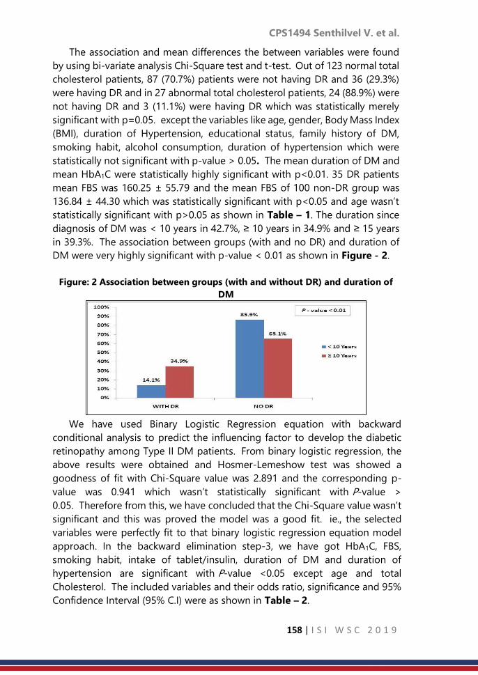
CPS1494 Senthilvel V. et al.
158 | I S I W S C 2 0 1 9
The association and mean differences the between variables were found
by using bi-variate analysis Chi-Square test and t-test. Out of 123 normal total
cholesterol patients, 87 (70.7%) patients were not having DR and 36 (29.3%)
were having DR and in 27 abnormal total cholesterol patients, 24 (88.9%) were
not having DR and 3 (11.1%) were having DR which was statistically merely
significant with p=0.05. except the variables like age, gender, Body Mass Index
(BMI), duration of Hypertension, educational status, family history of DM,
smoking habit, alcohol consumption, duration of hypertension which were
statistically not significant with p-value > 0.05. The mean duration of DM and
mean HbA1C were statistically highly significant with p<0.01. 35 DR patients
mean FBS was 160.25 ± 55.79 and the mean FBS of 100 non-DR group was
136.84 ± 44.30 which was statistically significant with p<0.05 and age wasn’t
statistically significant with p>0.05 as shown in Table – 1. The duration since
diagnosis of DM was < 10 years in 42.7%, ≥ 10 years in 34.9% and ≥ 15 years
in 39.3%. The association between groups (with and no DR) and duration of
DM were very highly significant with p-value < 0.01 as shown in Figure - 2.
Figure: 2 Association between groups (with and without DR) and duration of
DM
We have used Binary Logistic Regression equation with backward
conditional analysis to predict the influencing factor to develop the diabetic
retinopathy among Type II DM patients. From binary logistic regression, the
above results were obtained and Hosmer-Lemeshow test was showed a
goodness of fit with Chi-Square value was 2.891 and the corresponding p-
value was 0.941 which wasn’t statistically significant with P-value >
0.05. Therefore from this, we have concluded that the Chi-Square value wasn’t
significant and this was proved the model was a good fit. ie., the selected
variables were perfectly fit to that binary logistic regression equation model
approach. In the backward elimination step-3, we have got HbA1C, FBS,
smoking habit, intake of tablet/insulin, duration of DM and duration of
hypertension are significant with P-value <0.05 except age and total
Cholesterol. The included variables and their odds ratio, significance and 95%
Confidence Interval (95% C.I) were as shown in Table – 2.
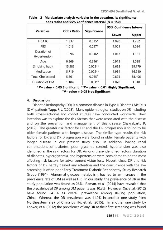
CPS1494 Senthilvel V. et al.
159 | I S I W S C 2 0 1 9
Table – 2 Multivariate analysis variables in the equation, its significance,
odds ratios and 95% Confidence Interval (N = 150)
Variables
Odds Ratio
Significance
95% Confidence Interval
Lower Upper
HbA1C 1.337 0.035* 1.020 1.752
FBS 1.013 0.027* 1.001 1.024
Duration of
Hypertension 1.096 0.016* 1.017 1.181
Age 0.969 0.296# 0.915 1.028
Smoking habit 15.386 0.002** 2.655 89.179
Medication 5.719 0.002** 1.934 16.910
Total Cholesterol 5.861 0.065# 0.895 38.406
Duration of DM 1.184 0.001** 1.070 1.310
*P – value < 0.05 Significant; **P – value < 0.01 Highly Significant; #P – value > 0.05 Not Significant
4. Discussion
Diabetic Retinopathy (DR) is a common disease in Type II Diabetes Mellitus
(DM) patients Tapp, R. J. (2003). Many epidemiological studies on DR including
both cross-sectional and cohort studies have conducted worldwide. Their
intention was to explore the risk factors that were associated with the disease
and on the prevention and management of this disease Chakrabarti, R.
(2012). The greater risk factor for DR and the DR progression is found to be
older female patients with longer disease. The similar type results the risk
factors for DR and DR progression were found in older female patients with
longer disease in our present study also. In addition, having renal
complications of diabetes, poor glycemic control, hypertension was also
identified as the risk factors for DR. Among these identified factors, duration
of diabetes, hyperglycemia, and hypertension were considered to be the most
affecting risk factors for advancement vision loss. Nevertheless, DR and risk
factors of DR hardly gained any attention and the concurrence with the eye
screening is often poor Early Treatment Diabetic Retinopathy Study Research
Group (1991). Abnormal glucose metabolism has led to an increase in the
prevalence rate of DM as well as DR. In our study, the prevalence of DR in the
study population was found as 26%. Raman, et al. (2014) have revealed that
the prevalence of DR among DM patients was 10.3%. However, Xu, et al. (2012)
have found 24.7% as overall prevalence among Beijing population,
China. Whereas the DR prevalence was 11.9% in another one study from
Northeastern area of China by Hu, et. al. (2015). In another one study by
Looker, et al (2012) the prevalence of any DR at their first screening was found
CPS1494 Senthilvel V. et al.
160 | I S I W S C 2 0 1 9
as 19.3%. Moreover, in some other studies the prevalence of DR was 41% by
Pamu, N. J. et al. (2014), 44.4% Giri, P. A. et al. (2012), 34.08% Liu, Y. et al. (2017),
36.4% Ahmed, R. A. et al., and 27.9% by Zhang, G et al. (2017). Furthermore,
the prevalence of DR in our study was higher than those documented in other
studies 21.7% by Gadkari, S. S. et al. (2016) and 18% by Kim, J. H. et al.
(2011). The difference in the prevalence rate is due to the fact in that many of
the studies were population-based and due to the different screening
techniques adopted.
The mean age of the participants was a little bit high than a study was
conducted in Pondicherry, South India by Vasudevan, S. et. al.
(2017). Furthermore, the similar type of results was mentioned in another one
study on the prevalence of DR and its associated factors in a rural area of Tamil
Nadu, South India was done by Nadarajan, B. et. al. (2017). Whereas the mean
age of the participants was found as very high 69.2 ± 8.5 years in a study by
Wang, J. et al. (2013) in Guangzhou, China. DR prevalence is higher in the
female when compared with male population. The similar type of results have
been mentioned in a Chennai Urban Rural Epidemiology Study (CURES) Eye
Study I by Rema, M. et al. (2005). In our study, we have found that the mean
duration of DM was 16.62 ± 7.57 years. In our present study, 34.9% of DM
patients had DR for 10 years and above and 14.1% of DM patients had DR less
than or equal to 10 years. The test was statistically highly significant with p-
value < 0.01 as shown in Figure – 3. Whereas one study from Karnataka by
Nayak, S. et al. (2017) have mentioned the very high prevalence of DR as
mentioned half percentage for more than 10 years and a similar percentage
were having DM more than 5 years. Retinopathy increases with younger age
at onset of diabetes and showed a significant association between DR and
duration of diabetes, which is consistent with most of the previous studies
Pamu, N. J. et al. (2014), Giri, P. A. et al. (2012), Liu, Y. et al. (2017), and Ahmed,
R. A. et al., (2016). The risk factors like duration of DM, HbA1C, FBS, history of
hypertension and medication also showed a higher significance with
DR. However, we didn’t find any significant association between DR and age,
gender, education, family history of DM, total cholesterol and BMI. Similarly, a
study by Liu, Y. et al. (2017) also didn’t find any association with gender but
showed association with duration of the disease.
Out of the 150 Type II DM patients, 85 were males and 55 were
females. Among that 23.5% of the males and 29.2% of the females were
affected by DR. The age group of the study ranged from 31 – 84
years. Majority of the patients in our study were aged above 50 years and DR
was also found in the mean age of 60.38 ± 9.06. But the study by Pamu, N. J.
et al. (2014) has shown a slight male preponderance in all age groups and the
majority of diabetic patients in the age group of 41 – 50 years. Risk factors like
BMI, hypertension, HbA1C, duration of DM and microalbuminuria were

CPS1494 Senthilvel V. et al.
161 | I S I W S C 2 0 1 9
identified as statistically significant in their study. A similar type of results was
found in our study that hypertension, HbA1C, and duration of DM were
statistically significant. More than half of the study population was having
hypertension and higher proportion of DR was seen among hypertensive
patients (32.6%) than non-hypertensive patients (14.5%), which was statistically
significant with p – value < 0.05. Similar result was found in the study by Giri,
P. A. et al. (2012) also. In addition to that gender, age, duration of DM, history
of addiction, family history of DM was also statistically significant in their
study. In univariate analysis, the smoking habit was not significant with DR in
our study. But, smoking habit has been found as significant in multivariate
analysis and it was found that the chance of getting DR in smokers was 15
times than that of non-smokers.
We have estimated the strongest predictors of DR through binary logistic
regression. Some of the variables which were not significant in univariate
analysis but significant in multivariate analysis and one variable were
eliminated. The strongest predictors were HbA1C, FBS, smoking habit,
medication (intake of tablet/insulin), duration of DM and duration of
hypertension and history of hypertension was eliminated from the third step
of logistic regression. A similar study was conducted to estimate the strongest
predictors by Ahmed R.A. et al. (2016) and Pradeepa, R. et al. (2008). A study
by Gadkari, S. S. et al. (2016) have resulted that the prevalence was found more
in males, DM was happened after 5 years, DM patients was in above 40 years,
insulin users and history of vascular accidents. But, our study resulted that
prevalence was more among females, diabetics more than 10 years, those aged
above 50 years. We didn’t take into an account of the history of vascular
accidents. A Korean study by Kim, J. H. et al. (2011) have showed that odds
ratio of the DR increased with duration of DM, postprandial glucose levels, and
HbA1C and in our study odds ratio of the study increased with smoking habit,
medication, and HbA1C. Kohner, E. M. et al. (1998) have mentioned in their
study that the presence of retinopathy was the same percentage in both the
male and female and fasting plasma glucose level was the risk factor for
developing DR. We have also found the same type of results in our present
study. So, the ophthalmologic examination is needed for all diabetic patients
with minimum routine follow-up is needed with a trained ophthalmologist and
who he is well experienced in the management and treatment of DR for every
year from the diagnosis date of DM.
5. Conclusion
The overall prevalence of DR in Type II DM patients was high in the
study. Retinopathy is strongly associated with Hemoglobin A1c, fasting blood
sugar (FBS), duration of diabetes mellitus, medication, duration of
hypertension and smoking by Binary Logistic Regression approach. Hence,

CPS1494 Senthilvel V. et al.
162 | I S I W S C 2 0 1 9
there is a need for regular screening check-up schedule of retinopathy with a
properly trained ophthalmologist and control the important risk factors to
prevent diabetic retinopathy or to prolong or to maintain or retain in their
same stage of DR or to escape from the vision loss.
Acknowledgment: Authors are very much thankful to the Medical Director,
HOD and the study participants.
References
1. World Health Organization: Diabetes Mellitus. Available on:
http://www.who.int/mediacentre/factsheets/fs138/en/
2. The Royal College of Ophthalmologists: Diabetic Retinopathy Guidelines.
Section 1: Terminology and Disease Definition. Available on:
https://www.rcophth.ac.uk/wp-content/uploads/2014/12/2013-SCI-301-
FINAL-DR-GUIDELINES-DEC-2012-updated-July-2013.pdf
3. The Diabetic Retinopathy Study Research Group (1981).
Photocoagulation treatment of proliferative diabetic retinopathy: Clinical
application of Diabetic Retinopathy Study (DRS) findings, DRS Report
Number 8. Ophthalmology;88(7):583-600.
DOI: http://doi.org/10.1016/So161-6420(81)34978-1
4. Early Treatment Diabetic Retinopathy Study Research Group (1991).
Early phogocoagulation for diabetic retinpathy. ETDRS report number 9.
Ophthalmology;98(Suppl. 5):766-785.
DOI: https://doi.org/10.1016/S0161-6420(13)38011-7
5. Wild S, Roglic G, Green A, Sincree R, King H (2004). Global prevalence of
diabetes: Estimates for the year 2000 and projections for 2030. Diabetes
Care;27(5):1047-1053. PMID: 1511519
6. Cheung N, Mitchell P, Wong TY (2010). Diabetic Retinopathy.
Lancet;376(9735):124-136. PMID: 20580421
DOI: https://doi.org/10.1016/S0140-6736(09)62124-3
7. Diabetic Retinopahty: Diabetic Retinopahty PPP – Updated (2017). AAO
PPP Retina/Vitreous Panel, Hoskins Center for Quality Eye Care Avaiable
on: https://www.aao.org/preferred-practice-pattern/diabetic-
retinopathy-ppp-updated-2017
8. Tapp RJ, Shaw JE, Harper CA et al (2003). The prevalence and factors
associated with Diabetic Retinopathy in the Australian population.
Diabetes Care;26:1731-1737 PMID: 12766102
9. Chakrabarti R, Harper CA, Keeffe JE (2012). Diabetic Retinopathy
management guidelines. Exper Rev. Ophthalmol;7(5):417-439.
DOI: https://doi.org/10.1586/eop.12.52
10. Raman R, Ganesan S, Pal SS et al (2014). Prevalence and risk factors for
diabetic retinopathy in rural India. Sankara Nethralaya Diabetic

CPS1494 Senthilvel V. et al.
163 | I S I W S C 2 0 1 9
Retinopathy Epidemiology and Molecular Genetic Study II (SN-DREAMS
III), report no 2. BMJ Open Diabetes Research and Care;2:1-8. PMID:
25452856 PMCID: PMC 4212556
11. Xu J, Wei WB, Yuan MX, Yuan SY, Wan G. et al (2012). Prevalence and
risk factors for diabetic retinopathy: the Beijing Communities Diabetes
Study 6. Retina;32(2):322-329 PMID: 21886023
12. Hu Y, Teng W, Liu L, Chen K, Liu L. et al (2015). Prevalence and risk
factors of Diabetes and Diabetic Retinopathy in Liaoning Province,
China: A Population-Based Cross-sectional Study. PLOS
ONE;10(3):e0121477.
DOI: https://doi.org/10.1371/journal.pone.0121477 .
13. Looker HC, Nyangoma SO, Cromie D, Olson JA, Leese GP. et al (2012).
Diabetic retinopathy at diagnosis of type 2 diabetes in Scotland.
Diabetologia;55:2335-2342
DOI: https://doi.org/10.1007/s00125-012-2596-z PMID: 22688348
14. Pamu NJ, Avvaru K, Vijaya Kumar NP, Sagar KV (2014). Diabetic
Retinopathy & its associated risk factors among patients attending a
tertiary care hospital in Visakhapatnam, Andhra Pradesh. IOSR Journal
of Dental and Medical Sciences;13; 5(3):62-64.
DOI: https://doi.org/10.9790/0853-13536264
15. Giri PA, Bangal SV, Phalke DB (2012). Prevalence of diabetic retinopathy
and associated risk factors among diabetic patients attending Pravara
Rural Hospital, Loni, Maharashtra. Journal of Academy of Medical
Sciences;2(2):64-67. DOI: https://doi.org/10.4103/2249-4855.118662
16. Liu Y, Song Y, Tao L et al (2017). Prevalence of diabetic retinopathy
among 13474 patients with diabetes mellitus in China: a cross-sectional
epidemiological survey in six provinces. BMJ Open;7(8):e015473. DOI:
https://doi.org/10.1136/bmjopen-2016-015473 PMID: 28855199
17. Ahmed RA, Khalil SN, Al-Qahtani MA (2016). Diabetic retinopathy and
the associated risk factors in Diabetes Type 2 patients in Abha, Saudi
Arabia. Journal of Family and Community Medicine;23(1):18-24. DOI:
https://doi.org/10.4103/2230-8229.172225 PMID: 26929725
18. Zhang G, Chen H, Chen W, Zhang M (2017). Prevalence and risk factors
for diabetic retinopathy in China: a multi-hospital-based cross sectional
study. Br J Ophthalmol;101(12):1591-1595. PMID: 28855195 DOI:
https://doi.org/10.1136/bjophthalmol-2017-310316
19. Gadkari SS, Maskati QB, Nayak BK (2016). Prevalence of diabetic
retinopathy in India: The all India Ophthalmologist Society Diabetic
Retinopathy Eye Screening Study 2014. Indian J of
Ophthalmology;64(1):38-44. DOI: https://doi.org/10.4103/0301-
4738.178144 PMID: 26953022

CPS1494 Senthilvel V. et al.
164 | I S I W S C 2 0 1 9
20. Kim JH, Kwon HS, Park YM, Lee JH, Kim MS. et al (2011). Prevalence and
Associated Factors of Diabetic Retinopathy in Rural Korea: The Chungju
Metabolic Disease Cohort Study. J Korean Med Sci;26(8):1068-1073.
PMID: 21860558 DOI: https://doi.org/10.3346/jkms2011.26.8.1068
21. Vasudevan S, Senthilvel S, Sureshbabu J (2017). Study on risk factors
associated with diabetic retinopathy among the patients with Type 2
Diabetic Mellitus in South India. Int Eye Sci;17(9):1615-1619.
DOI: https://doi.org/10.3980/j.issn.1672-5123.2017.9.03
22. Nadarajan B, Saya GK, Krishna RB, Lakshminarayanan S (2017).
Prevalence of Diabetic Retinopathy and its Associated Factors in a Rural
Area of Villupuram District of Tamil Nadu, India. J Clin Diagn
Res;11(7):LC23-LC26. PMC: 5583923.
23. Wang J, Zhang RY, Chen RP, Sun J, Yang R. et al (2013). Prevalence and
risk factors for diabetic retinopathy in a high-risk Chinese population.
BMC Public Health;1-7 PMC: 3733656
24. Rema M, Premkumar S, Anitha B, Deepa R, Pradeepa R, Mohan V (2005).
Prevalence of diabetic retinopathy in urban India: the Chennai Urban
Rural Epidemiology Study (CURES) Eye Study I. Invest Ophthalmol Vis
Sci;46(7):2328-2333. PMID: 15980218
DOI: https://doi.org/10.1167/iovs.05-0019
25. Nayak S, Rao K, Patil N, Jayaprakash B, Amita PD. et al (2017).
Prevalence of diabetic retinopathy in type 2 diabetes mellitus: An
Observational Study in Southern India. Asian J Pharm Cln Res;10(8):201-
203.DOI: https://doi.org/10.22159/ajpcr.2017.v10i8.19088
26. Pradeepa R, Anitha B, Mohan V et al (2008). Risk factors for diabetic
retinopathy in a South Indian Type 2 diabetic population – the Chennai
Urban Rural Epidemiology Study (CURES) Eye Study 4. Diabet
Med;25(5):536-542. PMID:18346159
DOI: https://doi.org/10.1111/j.1464-5491.2008.02423.x
27. Kohner EM, Aldington SJ, Stratton IM, Manley SE, Holman RR. et al
(1998). United Kingdom Prospective Diabetes Study, 30: diabetic
Retinopathy at diagnosis of non-insulin-dependent diabetes mellitus and
associated risk factors. Arch Ophthalmol;116(3):297-303 PMID:
9514482.
CPS1496 Tim Christopher D.L et al.
165 | I S I W S C 2 0 1 9
Model ensembles with different response
variables for base and meta models: Malaria
disaggregation regression combining prevalence
and incidence data
Tim Christopher David Lucas, Chantal Hendriks, Andre Python, Anita Nandi,
Penelope Hancock, Michele Nguyen, Peter Gething, Susan Rumisha, Daniel
Weiss, Katherine Battle, Ewan Cameron, Rosalind Howes
Malaria Atlas Project, Big Data Institute, University of Oxford, Oxford, UK
Abstract
Maps of infection risk are a vital tool for the elimination of malaria. Routine
surveillance data of malaria case counts, often aggregated over administrative
regions, is becoming more widely available and can better measure low
malaria risk than prevalence surveys. However, aggregation of case counts
over large, heterogeneous areas means that these data are often
underpowered for learning relationships between the environment and
malaria risk. A model that combines point surveys and aggregated surveillance
data could have the benefits of both but must be able to account for the fact
that these two data types are different malariometric units. Here, we train
multiple machine learning models on point surveys and then combine the
predictions from these with a geostatistical disaggregation model that uses
routine surveillance data. We find that, in tests using data from Colombia and
Madagascar, using a disaggregation regression model to combine predictions
from machine learning models trained on point surveys improves model
accuracy relative to using the environmental covariates directly.
Keywords
Spatial statistics; Ensemble; Stacking; Epidemiology
1. Introduction
High-resolution maps of malaria risk are vital for elimination but mapping
malaria in low burden countries presents new challenges as traditional
mapping of prevalence from cluster-level surveys (Gething et al., 2011; Bhatt
et al., 2017; Gething et al., 2012; Bhatt et al., 2015) is often not effective
because, firstly, so few individuals are infected that most surveys will detect
zero cases, and secondly, because of the lack of nationally representative
prevalence surveys in low burden countries (Sturrock et al., 2016, 2014).
Routine surveillance data of malaria case counts, often aggregated over
administrative regions defined by geographic polygons, is becoming more
reliable and more widely available (Sturrock et al., 2016) and recent work has
focussed on methods for estimating high-resolution malaria risk from these
data (Sturrock et al., 2014; Wilson and Wake field, 2017; Law et al., 2018; Taylor

CPS1496 Tim Christopher D.L et al.
166 | I S I W S C 2 0 1 9
et al., 2017; Li et al., 2012). However, the aggregation of cases over space
means that the data may be relatively uninformative, especially if the case
counts are aggregated over large or heterogeneous areas, because it is unclear
where within the polygon, and in which environments, the cases occurred. This
data is therefore often under-powered for fitting flexible, non-linear models
as is required for accurate malaria maps (Bhatt et al., 2017, 2015). A model that
combines point surveys and aggregated surveillance data, and therefore
leverages the strength of both, has great potential. One approach for
combining these data is to use prevalence point-surveys to train a suite of
machine learning models, and then use predictions from these models as
covariates in a model trained on polygon-level incidence data. This process of
stacking models has proven effective in many realms however typical stacking
uses a single dataset on a consistent scale (Sill et al., 2009; Bhatt et al., 2017).
Here we propose training the level zero machine learning models on point-
level, binomial prevalence data and stacking these models with a polygon-
level, Poisson incidence model.
2. Methodology
We used two data sources that reflect Plasmodium falciparum malaria
transmission; point-prevalence surveys and polygon-level, aggregated
incidence data. We selected Colombia and Madagascar as case examples as
they both have fairly complete, publicly available, surveillance data at a finer
geographical resolution than admin 1. The prevalence survey data were
extracted from the Malaria Atlas Project prevalence survey database using only
data from 1990 onwards (Bhatt et al., 2015; Guerra et al., 2007). For Colombia
we used all points from South America (n = 522) while for Madagascar we
used only Malagasy data (n = 1505). We chose these geographic regions
based on a trade-o between wanting a large sample size but wanting data
from geographically similar areas. The prevalence points were then
standardised to an age range of 210 using the model from (Smith et al., 2007).
The polygon incidence data were collected from government reports and
standardised using methods defined in Cibulskis et al. (2011). This
standardisation step accounts for missed cases due to lack of treatment
seeking, missing case reports, and cases that sought medical attention outside
the public health systems (Battle et al., 2016). For reports where cases were
not reported at the species level, national estimates of the ratio between P.
falciparum and P. vivax cases were used to calculate
P. falciparum only cases. To minimise temporal effects we selected, for each
country, one year of surveillance data. We used annual surveillance data from
2015 for Colombia (952 municipalities) and data from 2013 for Madagascar
(110 districts) as these years had the most data in each case.
CPS1496 Tim Christopher D.L et al.
167 | I S I W S C 2 0 1 9
We considered an initial suite of environmental and anthropological
covariates, at a resolution of approximately 55 kilometres that included the
annual mean and log standard deviation of land surface temperature,
enhanced vegetation index, malaria parasite temperature suitability index,
elevation, tasseled cap brightness, tasseled cap wetness, log accessibility to
cities, log night lights and proportion of urban land cover (Weiss et al., 2015).
Tasseled cap brightness and urban land cover were subsequently removed as
they were highly correlated with other variables. The covariates were
standardised to have a mean of zero and a standard deviation of one. These
covariates were used for both the machine learning models and the polygon-
level models. Raster surfaces of population for the years 2005, 2010 and 2015,
were created using data from WorldPop (Tatem, 2017) and from GPWv4
(NASA, 2018) where WorldPop did not have values. Population rasters for the
remaining years were created by linear interpolation.
For each country we fitted five models via caret (Kuhn et al., 2017): elastic
net (Zou and Hastie, 2012), Random Forest (Wright and Ziegler, 2015),
projection pursuit regression (Friedman and Stuetzle, 1981), neural networks
(Venables and Ripley, 2002) and boosted regression trees (Ridgeway et al.,
2017). Our response variable was prevalence and we weighted the data by
sample size (i.e. the number of people tested for malaria in each survey. For
each model we ran five-fold cross-validation to select hyperparameters using
random search for Random Forest and boosted regression trees and grid
search for the other models. Predictions from these models were then made
across Colombia and Madagascar respectively. These predictions were finally
inverse logit transformed so that they are on the linear predictor scale of the
top level model. The top level model was a disaggregation regression model
(Sturrock et al., 2014; Wilson and Wake field, 2017; Law et al., 2018; Taylor et
al., 2017; Li et al., 2012). This model is defined by likelihood at the level of the
polygon with covariates and a spatial random field at the pixel-level. Values at
the polygon-level are given the subscript a while pixel level values are indexed
with b. The polygon case count data, 𝑦𝛼 is given a Poisson likelihood
ya ∼ Pois(iapopa)
where ia is the estimated polygon incidence rate and popa is the observed
polygon population-at-risk. This polygon-level likelihood is linked to the pixel
level prevalence
𝑖𝑎 =∑(𝑖𝑏𝑝𝑜𝑝𝑏)
∑𝑝𝑜𝑝𝑏
ib = p2i(pb)
where p2i is from a model that was published previously (Cameron et al., 2015)
which defines a function

CPS1496 Tim Christopher D.L et al.
168 | I S I W S C 2 0 1 9
p2i ∶ 𝑓(𝑃) = 2.616𝑃 − 3.596𝑃2 + 1.594𝑃3
The fact that the model passes through prevalence space ensures that the
predictions from the machine learning models can be appropriately scaled.
The linear predictor of the model is related to prevalence by a typical logit link
function and includes an intercept, β0, covariates, X with regression parameters
β, a spatial, Gaussian, random field, u(s,ρ,σu), and an iid random effect, vj(σv).
pb = logit−1 (β0 + βX + u(s,ρ,σu) + vj(σv))
The Gaussian spatial effect has a Mat´ern covariance function and two
hyperparameters: ρ, the nominal range (beyond which correlation is < 0.1) and
σu, the marginal standard deviation. The iid random effect models both
missing covariates and extra-Poisson sampling error.
Finally, we complete the model by setting priors on the parameters β0,β,ρ
and σu and σv. We assigned ρ and σu a joint penalised complexity prior (Fuglstad
et al., 2018) such that P(ρ < 1) = 0.00001 and P(σu > 1) = 0.00001. This prior
encoded our a priori preference for a simpler, smoother random field. We set
this prior such that the random field could explain most of the range of the
data if required.
We assigned σv a penalised complexity prior (Simpson et al., 2017) such
that P(σv > 0.05) = 0.0000001. This was based on a comparison of the variance
of Poisson random variables, with rates given by the number of polygon-level
cases observed, and an independently derived upper and lower bound for the
case counts using the approach defined in (Cibulskis et al., 2011). We found
that an iid effect with a standard deviation of 0.05 would be able to account
for the discrepancy between the assumed Poisson error and the independently
derived error. Finally, we set regularising priors on the regression coefficients
βi ∼ Norm(0,0.4). The models were implemented and fitted using Template
Model Builder (Kristensen et al., 2016) in R (R Core Team, 2018).
We compared the performance of the models with three sets of covariates,
X. Firstly, we used the environmental and anthropogenic covariates, centered
and standardised. Secondly, we used the predictions from the machine
learning models. Finally we combined these two sets of covariates.
To compare the three models we used two cross-validation schemes. In
the first, polygon incidence data was randomly split into six cross-validation
folds. In the second, polygon incidence data was split spatially into three folds
(via k-means clustering on the polygon centroids). This spatial cross-validation
scheme is testing the models' ability to make predictions far from data where
the spatial random field is not informative. Our primary performance metric
was correlation between observed and predicted data.

CPS1496 Tim Christopher D.L et al.
169 | I S I W S C 2 0 1 9
3. Result
Figure 1 shows the model performance under random and spatial cross-
validation for both Madagascar and Colombia. The poor model performance
in Colombia under spatial cross-validation indicates that the covariates alone
cannot explain malaria incidence in this area. For all other models that use the
machine learning predictions as covariates, correlations between observed
and predicted data of 0.54 0.76 were achieved (Table 1). Input data and
mapped out-of-sample predictions of the best performing model, in
Colombia, are shown in in Figure 2.
Table 1: Pearson correlations between observed and predicted values
Cross-validation
scheme
Country covariates ML Covs + ML
Random Colombia 0.45 0.55 0.54
Random Madagascar 0.70 0.76 0.75
Spatial Colombia 0.05 0.18 0.10
Spatial Madagascar 0.22 0.63 0.61
The model using only machine learning predictions as covariates was the
best performing model in both countries and both cross-validation schemes
(Table 1). As expected, models performed better in the random cross-
validation scheme than the spatial cross-validation scheme. The difference
between the covariate only model and the machine learning predictions only
model was greater in the spatial cross-validation scheme than in the random
cross-validation. The improvement in performance between the worst and
best models was always smaller than the difference between the random and
spatial cross-validation schemes. Predictive performance of machine learning
models was similar, with Random Forest performing best in Madagascar and
neural networks, Random Forests and elastic net performing equally well in
Colombia (Table 2). The means (across folds) of the regression coefficients (i.e.
the weights of the machine learning models in the level zero model) from the
polygon-level models that used only predictions from machine learning
models as covariates can also be seen in Table 2. The estimated regression
parameters are similar between the random and spatial cross-validation
schemes. However, the best performing machine learning models do not have
the largest estimated regression coefficients as would be expected if
prevalence and incidence were completely correlated. Also of note is that
some models were estimated to have a negative relationship with incidence

CPS1496 Tim Christopher D.L et al.
170 | I S I W S C 2 0 1 9
(conditional on the inclusion of predictions from other machine learning
models).
(a) Random cross-validation (b) Spatial cross-validation
Figure 1: Observed data against predictions for cross-validation hold-out
samples on a square root transformed scale. a) Six-fold random cross-
validation. b) Three-fold spatial cross-validation with folds indicated by
colour.
Table 2: Machine learning model results and means of fitted parameters
(i.e.model weights) across cross-validation folds of the machine learning
predictions only model. Madagascar Colombia
Model ML RMSE Random CV βi Spatial CV βi ML RMSE Random CV βi Spatial CV βi
nnet 0.113 0.031 0.025 0.058 -0.250 -0.246
RF 0.100 0.337 0.350 0.058 0.782 0.742
gbm 0.109 0.450 0.402 0.066 0.835 0.775
enet 0.116 0.326 0.307 0.058 -0.563 -0.369
ppr 0.110 -0.233 -0.204 0.059 0.210 0.166
4. Conclusion
Overall, our experiments suggest that using predictions from machine
learning models trained on prevalence points provides more accurate
predictions than using environmental covariates when fitting disaggregation
models of malaria incidence. This increased performance comes despite the
data being on different scales, the data being measurements of different
aspects of malaria transmission and despite the imperfect model we have used
to translate between the two scales. However, the reduced model accuracy in

CPS1496 Tim Christopher D.L et al.
171 | I S I W S C 2 0 1 9
the spatial cross-validation schemes, relative to the random cross-validation
scheme, highlights that better spatial coverage of data would improve
predictions more than the improved model we have suggested.
Due to the low power of typical aggregated incidence datasets, previous
analyses using disaggregation regression used a small number of covariates
(Sturrock et al., 2014). However, as models such as Random Forest and elastic
net can robustly handle high dimensional data, future work could include
many more covariates, potentially increasing predictive performance.
While the approach presented here is related to stacking, it differs in that
we have not constrained the regression parameters to be positive nor included
a sum-to-one constraint i.e. the result is not simply a weighted average of the
level zero model predictions. We did not include these constraints because the
base models and the meta model are trained on response data on different
scales. However, future work could examine whether using a positive
constraint on the regression parameters improves performance.
Another area of potential improvement is varying the data used to train
the base level learners. Here we only used data from the region of interest.
However, the global dataset is much larger than these subsets. Training some
base level models on local data and some on the global dataset and then
combining predictions from all these models has potential to further improve
model performance.
Figure 2: Left: Observed data for Colombia (grey for zero incidence). Right:
Out-of-sample predictions for the random cross-validation, machine learning
only model. For each cross-validation fold, predictions are made for the held
out data which are then combined to make a single surface.

CPS1496 Tim Christopher D.L et al.
172 | I S I W S C 2 0 1 9
References
1. Battle, K. E., Bisanzio, D., Gibson, H. S., Bhatt, S., Cameron, E., Weiss, D. J.,
Mappin, B., Dalrymple, U., Howes, R. E., Hay, S. I., et al. (2016). Treatment-
seeking rates in malaria endemic countries. Malaria Journal, 15(1):20.
2. Bhatt, S., Cameron, E., Flaxman, S. R., Weiss, D. J., Smith, D. L., and
Gething, P. W. (2017). Improved prediction accuracy for disease risk
mapping using Gaussian process stacked generalization. Journal of The
Royal Society Interface, 14(134):20170520.
3. Bhatt, S., Weiss, D., Cameron, E., Bisanzio, D., Mappin, B., Dalrymple, U.,
Battle, K., Moyes, C., Henry, A., Eckho, P., et al. (2015). The effect of
malaria control on Plasmodium falciparum in Africa between 2000 and
2015. Nature, 526(7572):207.
4. Cameron, E., Battle, K. E., Bhatt, S., Weiss, D. J., Bisanzio, D., Mappin, B.,
Dalrymple, U., Hay, S. I., Smith, D. L., Grin, J. T., et al. (2015). Defining the
relationship between infection prevalence and clinical incidence of
Plasmodium falciparum malaria. Nature communications, 6.
5. Cibulskis, R. E., Aregawi, M., Williams, R., Otten, M., and Dye, C. (2011).
Worldwide incidence of malaria in 2009: estimates, time trends, and a
critique of methods. PLoS medicine, 8(12):e1001142.
6. Friedman, J. H. and Stuetzle, W. (1981). Projection pursuit regression.
Journal of the American statistical Association, 76(376):817823.
7. Fuglstad, G.-A., Simpson, D., Lindgren, F., and Rue, H. (2018).
Constructing priors that penalize the complexity of Gaussian random
fields. Journal of the American Statistical Association, pages 18.
8. Gething, P. W., Elyazar, I. R., Moyes, C. L., Smith, D. L., Battle, K. E., Guerra,
C. A., Patil, A. P., Tatem, A. J., Howes, R. E., Myers, M. F., et al. (2012). A
long neglected world malaria map: Plasmodium vivax endemicity in
2010. PLoS neglected tropical diseases, 6(9):e1814.
9. Gething, P. W., Patil, A. P., Smith, D. L., Guerra, C. A., Elyazar, I. R.,
Johnston, G. L., Tatem, A. J., and Hay, S. I. (2011). A new world malaria
map: Plasmodium falciparum endemicity in 2010. Malaria Journal,
10(1):378.
10. Guerra, C. A., Hay, S. I., Lucioparedes, L. S., Gikandi, P. W., Tatem, A. J.,
Noor, A. M., and Snow, R. W. (2007). Assembling a global database of
malaria parasite prevalence for the Malaria Atlas Project. Malaria Journal,
6(1):17.
11. Kristensen, K., Nielsen, A., Berg, C. W., Skaug, H., and Bell, B. M. (2016).
TMB: Automatic differentiation and Laplace approximation. Journal of
Statistical Software, 70(5):121.
12. Kuhn, M., Wing, J., Weston, S., Williams, A., Keefer, C., Engelhardt, A.,
Cooper, T., Mayer, Z., Kenkel, B., the R Core Team, Benesty, M.,
Lescarbeau, R., Ziem, A., Scrucca, L., Tang, Y., Candan, C., and Hunt., T.

CPS1496 Tim Christopher D.L et al.
173 | I S I W S C 2 0 1 9
(2017). caret: Classification and Regression Training. R package version
6.0-76.
13. Law, H. C. L., Sejdinovic, D., Cameron, E., Lucas, T. C., Flaxman, S., Battle,
K., and Fukumizu, K. (2018). Variational learning on aggregate outputs
with Gaussian processes. arXiv preprint arXiv:1805.08463.
14. Li, Y., Brown, P., Gesink, D. C., and Rue, H. (2012). Log Gaussian Cox
processes and spatially aggregated disease incidence data. Statistical
methods in medical research, 21(5):479507.
15. NASA (2018). Gridded Population of the World (GPW), v4.
16. R Core Team (2018). R: A Language and Environment for Statistical
Computing. R Foundation for Statistical Computing, Vienna, Austria.
17. Ridgeway et al. (2017). gbm: Generalized Boosted Regression Models. R
package version 2.1.3.
18. Sill, J., Takacs, G., Mackey, L., and Lin, D. (2009). Feature-weighted linear
stacking. arXiv preprint arXiv:0911.0460.
19. Simpson, D., Rue, H., Riebler, A., Martins, T. G., Srbye, S. H., et al. (2017).
Penalising model component complexity: A principled, practical
approach to constructing priors. Statistical Science, 32(1):128.
20. Smith, D. L., Guerra, C. A., Snow, R. W., and Hay, S. I. (2007).
Standardizing estimates of the Plasmodium falciparum parasite rate.
Malaria Journal, 6(1):131.
21. Sturrock, H. J., Bennett, A. F., Midekisa, A., Gosling, R. D., Gething, P. W.,
and Greenhouse, B. (2016). Mapping malaria risk in low transmission
settings: challenges and opportunities. Trends in parasitology,
32(8):635645.
22. Sturrock, H. J., Cohen, J. M., Keil, P., Tatem, A. J., Le Menach, A.,
Ntshalintshali, N. E., Hsiang, M. S., and Gosling, R. D. (2014). Fine-scale
malaria risk mapping from routine aggregated case data. Malaria
Journal, 13(1):421.
23. Tatem, A. J. (2017). Worldpop, open data for spatial demography.
Scientific data, 4:170004170004.
24. Taylor, B. M., Andrade-Pacheco, R., and Sturrock, H. J. (2017). Continuous
inference for aggregated point process data. Journal of the Royal
Statistical Society: Series A (Statistics in Society).
25. Venables, W. N. and Ripley, B. D. (2002). Modern Applied Statistics with
S. Springer, New York, fourth edition. ISBN 0-387-95457-0.
26. Weiss, D. J., Mappin, B., Dalrymple, U., Bhatt, S., Cameron, E., Hay, S. I.,
and Gething, P. W. (2015). Re-examining environmental correlates of
Plasmodium falciparum malaria endemicity: a data-intensive variable
selection approach. Malaria journal, 14(1):68.
27. Wilson, K. and Wake field, J. (2017). Pointless continuous spatial surface
reconstruction. arXiv preprint arXiv:1709.09659.

CPS1496 Tim Christopher D.L et al.
174 | I S I W S C 2 0 1 9
28. Wright, M. N. and Ziegler, A. (2015). Ranger: a fast implementation of
Random Forests for high dimensional data in C++ and R. arXiv preprint
arXiv: 1508.04409.
29. Zou, H. and Hastie, T. (2012). elasticnet: Elastic-Net for sparse estimation
and sparse PCA. R package version 1.1.

CPS 1820 Shuichi S.
175 | I S I W S C 2 0 1 9
High-dimensional microarray data analysis
- First success of cancer gene analysis and cancer
gene diagnosis -
Shuichi Shinmura
Emeritus Professor, Seikei University
Abstract
From October 28 to December 20, 2015, we discriminated six microarrays by
Revised IP-OLDF (RIP) based on the minimum number of misclassifications
(Minimum NM, MNM) criterion. All data are linear separable data (LSD,
MNM=0). We call linearly separable space and subspaces as Matryoshka. LSD
has the Matryoshka structure that includes smaller Matryoshka in it. We
developed a Matryoshka feature selection method (Method2) that could
decompose each microarray into many small Matryoshkas (SMs) and noise
subspace (MNM>=1). Because all SMs are small samples, statistical methods
can analyze all SMs. However, we cannot find the linearly separable facts. Thus,
we make new signal data by RIP discriminant scores (RipDSs) instead of genes.
We think RipDSs are malignancy indexes for cancer gene diagnosis. In this
paper, we explain the cancer gene diagnosis using Alon’s microarray that
consists of 62 patients by 2,000 genes. Method2 decomposes Alon microarray
into 64 SMs. Thus, we make the new data that consists of 62 patients and 64
RipDSs instead of 2,000 genes. We make 64 RipDSs signal data from 2,000
high-dimensional gene data. If we analyze this signal data by Ward cluster,
two classes become two clusters. Moreover, we can make cancer class into
over two clusters. Next, if Principal Component Analysis (PCA) analyses the
signal data, we can examine several clusters those explain the new sub-class
of cancer pointed by Golub et al. Many researchers could not solve the high-
dimensional microarray because of several reasons. 1) They could not find six
microarrays are LSD (Fact3). However, RIP and a hard-margin SVM (H-SVM)
find Fact3 easily.2) Method2 by RIP decomposes each microarray into many
SMs and other noise subspace (Fact4). However, Method2 by H-SVM cannot
find SMs. Although all SMs are small samples, statistical methods cannot show
the linear separable facts. Thus, we make a signal data using RipDSs instead
of genes. Cluster analysis shows two classes become two clear clusters and
PCA shows two classes are separate on the first principal component (Prin1)
that becomes another malignancy index in addition to many RipDSs. Our
approach is beneficial for cancer gene diagnosis by microarray.
Keywords
Linear Separable Data (LSD); Small Matryoshka (SM); Revised IP-OLDF (RIP);
Malignancy Index; Matryoshka Feature Selection Method (Method2)

CPS 1820 Shuichi S.
176 | I S I W S C 2 0 1 9
1. Introduction
Golub et al. (1999) published their paper on Science and opened their
microarray on the Internet. Until 2004, Alon et al. (1999), Shipp et al. (2002),
Sing et al. (2002), Tian et al. (2003) and Chiaretti et al. (2004) published their
papers and opened their microarrays, also. Below is an abstract of Golub:
“Although cancer classification has improved over the past 30 years, there has
been no general approach for identifying new cancer classes (class discovery)
or for assigning tumors to known classes (class prediction). Here, a generic
approach to cancer classification based on gene expression monitoring by
DNA microarrays is described and applied to human acute leukemias as a test
case. A class discovery procedure automatically discovered the distinction
between acute myeloid leukemia (AML) and acute lymphoblastic leukemia
(ALL) without previous knowledge of these classes. An automatically derived
class predictor was able to determine the class of new leukemia cases. The
results demonstrate the feasibility of cancer classification based solely on
gene expression monitoring and suggest a general strategy for discovering
and predicting cancer classes for other types of cancer, independent of
previous biological knowledge.” We can understand their research theme as
follows.
1) Their research theme is to specify oncogenes from microarrays and to
forecast the new sub-class of cancer.
2) Alon’s and Singh's microarrays consist of two classes such as normal
patients and cancer patients. Other four microarrays consist of two
different types of cancer patients. Therefore, two-classes discrimination is
the most proper method for this thema.
Efforts of medical research are also vain, the NIH has stopped expenditure
on research expenses, and these types of research have ended. That is, they
could not solve the cancer gene analysis using microarray which was studied
from around 1970. This fact indicates that the statistical discriminant function
was entirely useless and RIP is the best LDF for high-dimensional microarray
data analysis (Problem5).
On the other hand, statistical and machine-learning researchers
approached this research teme as big data analysis or high-dimensional data
analysis because medical project offered high-quality microarrays after
ending their projects. Many papers were published and pointed out three
difficulties or excuses of Problem5 as follows: 1) The difficulties of high-
dimensional (small n and large p) data 2) Statistical feature selection is NP-
hard 3) The signal is buried in noise.
We downloaded these six microarrays on October 28, 2015 [4], and solved
Problem5 entirely on December 20, 2015. We had already developed a new
theory of discriminant analysis [9] and solved four problems of discriminant
analysis. Thus, Problem5 was solved as an applied problem of the theory. RIP

CPS 1820 Shuichi S.
177 | I S I W S C 2 0 1 9
discriminated six microarrays and found those are LSD (Fact3). This new fact
is crucial for Problem5, and no papers pointed this vital signal. Furthermore,
Method2 decomposed microarray into many linearly separable gene spaces
(SMs) and noise gene subspace. In this paper, we introduce the cancer gene
diagnosis to analyze all SMs by standard statistical methods.
2. Methodology
At first, we introduce four problems [7][8] found through our many kinds
of research of discriminant analysis. Next, we explain the theory and Method2.
2.1 Four Problems of Discriminant Analysis
Problem1: The discrimination rule is straightforward. However, most
researchers believe in the wrong rule. The values of yi are 1 for class1 and -1
for class2. Let f(x) be LDF and yi*f(xi) be an extended discriminant score (DSs)
for xi. The following rule is correct.
1) If yi *f(xi) > 0, xi is classified to class1 /class2 correctly.
2) If yi *f(xi) < 0, xi is misclassified to class1 /class2 correctly.
3) We cannot properly discriminate xi on the discriminant hyperplane (f(xi) =
0).
Problem2: Only H-SVM [18] and RIP can recognize LSD theoretically. Other
LDFs cannot discriminate LSD correctly, and those error rates are high.
Problem3: Problem3 is the defect of the generalized inverse matrix
technique.
Problem4: Fisher never formulated the equation of SE of discriminant
coefficients and error rates. We propose the 100-fold cross validation for a
small sample (Method1). It offers the 95% CIs of error rates and discriminant
coefficients.
2.2 New Theory of Discriminant Analysis
We developed IP-OLDF and RIP by LINGO [6]. Only RIP and H-SVM are
essential in this research. Integer programming (IP) defines RIP in (1). The ei
are 0/1 decision variables. If a case is classified correctly, ei =0. Otherwise, ei
=1. Thus, object function becomes MNM. N constraints define the feasible
region.
MIN = Σei ;
yi* ( txib + b0) >= 1 - M* ei ; (1)
xi: n cases. b: p-coefficients. b0: free decision variables.
ei: 0/1 decision variables. M: 10,000 (Big M constant).
Quadratic programming (QP) defines H-SVM in (2). Although QP finds only
one minimum value on the whole domain, we restrict the domain to the same

CPS 1820 Shuichi S.
178 | I S I W S C 2 0 1 9
feasible region as RIP. For LSD, all MNMs corresponding to the feasible region
become zero. If MNM is over one, it is QP-solver does not work correctly. It
can find a unique solution to minimize the objective function that is the
quadratic function.
Thus, it cannot find SMs [12-14].
MIN = ||b||2/2; yi × (txib + b0) >= 1; (2)
IP-OLDF based on MNM criterion found two facts:
1) The relation of NMs and all LDFs (Fact1)
If we set b0=1 and M=0 in (1), the Eq. (3) becomes the constraints of
IP-OLDF.
yi* ( txib + 1) >= 1 ; (3)
If we consider linear hyperplane Hi of (4), the hyperplanes divide p-
discriminant coefficients space into a finite convex polyhedron. All interior
points have the unique NMi, and all corresponding LDFs misclassify the same
NMi cases. If LDF corresponds to the vertex or edge of some convex, its NM
may increase. Thus, all NMs of LDFs, except for RIP, may not be correct. RIP
find the interior point of the optimal convex polyhedron having MNM.
Hi: yi* ( txib + 1) = 1 (4)
2) MNM monotonic decrease (Fact2)
MNM decreases monotonously (MNMk >= MNM(k+1)). If MNMk =0, all
models including this k- variables are LSD (MNM=0). Swiss banknote data
consists of 100 genuine and 100 counterfeit bills having six variables. Because
two variable model (X4, X6) is MNM=0, 16 models including (X4, X6) are LSD,
and other 47 models are not LSD. Six-variables model is a big Matryoshka that
includes smaller 15 Matryoshkas. We call (X4, X6) is a Basic Gene Set (BGS).
Thus, because microarrays are LSD and big Matryoshka, those have the
Matryoshka structure. Because microarray is a big data, we developed
Method2 by LINGO. LINGO Program3 finds all SMs and Program4 finds all
BGSs.
2.3 Method2 and Cancer Gene Analysis
We explain Method2 by Japanese car data that consist of the 29 regular
cars and 15 small cars. Because the emission rate (X1) and capacity (X3) of
small cars are less than those of regular cars, two MNMs of these one-variable
models are zero, and those are BGSs and SMs. Thus, 48 MNMs including (X1)
or (X3) are zero. Other 15 MNMs are not zero. When LINGO Program3
discriminates this data, we obtain the result in Table 1. “SM (big loop)” column
is the sequential number of SM found by Program3. “IT (small loop)” column
shows the iteration.

CPS 1820 Shuichi S.
179 | I S I W S C 2 0 1 9
Table 1 Results by RIP
Matryoshka 1 - 2 - - -
SM IT MNM SUM X1 X2 X3 X4 X5 X6 c
1 1 0 6 1 1 1 1 1 1 1
1 2 0 1 1 0 0 0 0 0 1
1 3 0 1 1 0 0 0 0 0 1
2 1 0 5 0 1 1 1 1 1 1
2 2 0 1 0 0 1 0 0 0 1
2 3 0 1 0 0 1 0 0 0 1
3 1 4 4 0 1 0 1 1 1 1
In the three steps of repeated discrimination of SM=1, Program3 finds the
first SM1. From the fifth column to the tenth column, because the third row
(SM=IT=1) is 1s, Program3 discriminates against six variables-model at first.
“SUM” column shows the number of selected variables. The last column “c”
means that the constant is always included in the model. In the first
discrimination, MNM=0.
Because only the coefficient of X1 in IT=2 is not zero, the other five values
from X2 to X6 become to 0s in the second step. When Program3 discriminates
one-variable model again, there is no change. In “IT=3,” Program3
discriminates one-variable model again and stop the first big loop SM=1. We
obtain SM1 including X1 that is the first BGS1. In the second big loop,
Program3 drop X1 and discriminates five-variables model in the first step.
Moreover, the only third coefficient is not zero. In the second and third steps,
Program3 discriminate against this model and stop the second big loop. Thus,
Program3 finds the second SM2. In the third big loop, because of MNM=4,
Method2 terminates. The first row indicates Program3 finds two SMs (BGSs)
as follows: SM1 = (X1), SM2 = (X3). Thus, Method2 is used for common data
in addition to the microarray. If H-SVM analyses the data by Method2, it stops
the SM=1 and IT=1 because all coefficients are not zero.
Method2 found all SMs of six microarrays and established cancer gene
analysis that indicated us two points. 1) Method2 decompose high-
dimensional microarray to small samples. 2) We can analyze all SMs by
statistical methods. However, six error rates of JMP Fisher’s LDF [5] are 8, 2,
11, 4, 10 and 17%, respectively. Although all data are LSD, the error rate of
Tien is 17%. This fact tells us statistical LDFs are entirely useless for LSD
discrimination that is one reason why no researchers solved Problem5
(Problem6).

CPS 1820 Shuichi S.
180 | I S I W S C 2 0 1 9
3. Cancer Gene Diagnosis
We analyze all SMs by statistical methods because all SMs are small
samples. However, we cannot obtain good results. Only RIP and H-SVM can
discriminate all SMs correctly. We realize RipDSs, and H-SVM discriminant
scores (HsvmDSs) express the signal of microarrays. Thus, we make signal data
using RipDSs and H-SVM DSs instead of genes. If we analyze these signal data
by Ward cluster, it can separate two classes into two clusters. Next, we analyze
signal data by PCA, and we propose the malignancy index by PCA in addition
to RipDSs and HsvmDSs [10-11]. Moreover, we develop RatioSV to evaluate
SM and BGS that is vital second statistics in addition to MNM for
LSDdiscrimination. Now, we open the new frontier of cancer gene diagnosis
[10-12].
a. Evaluation of Alon’s SMs
We introduce the evaluation of 64 SMs found in 2017. Table 2 is two ranges
of two classes, the range of DS, RatioSV (= 200 /DS) and two t-values. The
range of 22 cases in class1 (Min and Max columns) are less than equal -1, and
the range of 40 cases in class2 (MIN and MAX columns) are greater than equal
1. SV separates two classes of 64 SMs. We consider “RatioSV of RIP” is the
most important statistics for cancer gene diagnosis because it shows the ease
of classification by two classes. This table is sorted in descending order of the
value of “RatioSV of RIP.” The SV distance is two that is 26.27 % of RipDS8's
range. SV becomes a wide window and separate two classes completely. The
last three rows are the maximum, mean and minimum of eight statistics. The
range of DS, RatioSV and two tvalues are [7.47, 84.94], [2.35, 26.76], [4.22, 15.5]
and [3.12, 14.76], respectively.
Table 2 The 64 RipDSs, range of DS, RatioSV (= 200 /DS) and t-values RipDS Min Max MIN MAX DS RatioSV t (≠) t ( = )
RipDS8 -3.35 -1 1 4.12 7.47 26.76 15.50 14.76
RipDS35 -2.58 -1 1 5.92 8.51 23.52 13.02 9.94
RipDS11 -4.15 -1 1 5.52 9.67 20.68 12.71 11.17
RipDS53 -3.72 -1 1 6.40 10.13 19.75 11.98 10.20
RipDS27 -3.75 -1 1 6.45 10.20 19.62 13.19 11.58
RipDS59 -15.25 -1 1 21.91 37.17
5.38 6.17 5.53
RipDS14 -21.94 -1 1 17.85 39.79 5.03 7.16 7.42
RipDS64 -3.94 -1 1 81.00 84.94 2.35 4.22 3.12
MAX -2.58 -1 1 81.00 84.94 26.76 15.50 14.76
MEAN -7.35 -1 1 11.69 19.04 12.84 9.49 8.63
MIN -21.94 -1 1 4.12 7.47 2.35 4.22 3.12

CPS 1820 Shuichi S.
181 | I S I W S C 2 0 1 9
Table 2 shows that the 64 discriminations by RIP are very easy. However,
statistical methods are difficult to obtain the linear separable fact (Problem6).
This fact implies the difficulties of cancer gene analysis until now and answer
why researchers could not succeed cancer gene analysis from 1970 because
these methods are useless for microarrays and those SMs. We must choose
proper methods for cancer gene diagnosis as same as cancer gene analysis.
b. Summary of Six Microarrays
Table 3 is the summary of six microarrays. RatioS are the ratio of (the
number of genes included in all SMs / total genes). ">=5%" is the number of
SMs, RatioSVs of those are over than 5%. The RatioSV over 5% are 98.4%,
18.8%, 99.2%, 21.2%, 16.9% and 100%, respectively. Alon, Shipp, and Chiaretti
microarrays are 98.4% over. RatioSV of PCA is greater than the maximum of
RipDSs. Last three columns are the number of linearly separable SMs of QDF,
LDF1, and LDF2. These numbers indicate two classes are well separable in all
SMs as same as the trend of ">=5%." The last row shows that LINGO Program4
finds 130 BGSs of Alon. Because all RatioSVs are less than 1%, we judge BGSs
are not used for cancer gene diagnosis.
Table 3 Summary of six Microarrays
SM:Gene RatioS RatioSV >=5%
RatioSV
of PCA QDF=0 LDF11 LDF22
Alon 64:1999 99.950 [2.4,26.8] 63(98.4%) 30.40% 64 13 12
Golb 69:1,238 17.366 [0.004,15.69] 13(18.8%) 34.88% 16 1 1
Shipp 130:3,827 53.682 [4.99,30.67] 129(99.2%) 31.69% 121 53 46
Singh 179:1238 9.805 [0.28,11.67] 38(21.2%) 14.35% 26 0 0
Tien 159:7222 57.204 [0.63,19.13] 27(16.9%) 24% 158 1 0
Chiaretti 95:5,162 72.422 [10.73,38.93] 95(100%) 51.46% 95 94 92
Alon BGS:Gene RatioS RatioSV >=5% of PCA QDF=0 LDF1 LDF2
130 :
1995 99.750
[0.001,
0.901] 0 4.50% 58 0 3
1: Prior probabilities are 0.5 vs. 0.5. 2: Prior probabilities are proportional to the case number.
c. Ward Cluster Analysis and PCA of Signal Data made by RipDSs
The medical research group used a self-organizing map (SOP), but we
need to define an appropriate number of clusters. On the other hand, by using
signal data, Ward cluster can easily separate two classes into two clusters.

CPS 1820 Shuichi S.
182 | I S I W S C 2 0 1 9
Furthermore, when we request for three or more clusters, the cancer class is
often divided into two or more clusters. If we attach the color to these clusters,
the scatter plot of PCA shows color segmented groups. We can easily find
subclass of cancer pointed out by Golub et al.
Fig. 1 PCA Three Plots of 18 RipDSs
Fig. 2 shows the results of Shipp's PCA of two different cancers. Eight colors
tell us that class1 has one cluster and class2 has seven clusters. From the left
eigenvalue, the first eigenvalue is 17.97, and the contribution rate is 59.9%.
The second eigenvalue is 1.588, the contribution rate is 5.295%, and the
cumulative contribution rate is 65.195%. That is, the Prin1 almost represents
18 RipDSs. From the score plot in the middle, because the second eigenvalue
is small and the fluctuation is small, it can be seen that the class1 is almost on
the axis of -5 or less of the Prin1. Class2 is in the range of approximately 1 to
7. As the distance from class1 increases, the dispersion of the Prin2 becomes
large. This result is relatively similar to the results of Alon and Singh those
consist of cancer and healthy patients. However, it is a slightly different point
that class1 cases are in the fan shape as same as class2.
4. Discussion and Conclusion
Since around 1970, Golub et al., with a high ideal, tried to find Oncogenes
systematically from the microarray, not the traditional medical approach, and
to find a subclass of new cancer. As only cluster analysis, Kaplan-Meier
method, etc. are only useful, they developed a new method of genetic analysis.
On the other hand, cancer gene analysis could be easily solved with RIP
according to MNM standard. We had already found that the variance of the
signal is small compared to the noise. This fact is the second reason why
cluster analysis, PCA, one-way ANOVA, and t-test are not useful for the
analysis of SM at all (Problem6).
If six research groups validate our many results, especially malignancy
indexes, they will be able to show their research are very useful for cancer
gene diagnosis.

CPS 1820 Shuichi S.
183 | I S I W S C 2 0 1 9
References
1. Alon U. et al. (1999) Broad patterns of gene expression revealed by
clustering analysis of tumor and normal colon tissues probed by
oligonucleotide arrays. Proc. Natl. Acad Sci USA, 96(1.1): 6745-6750
2. Chiaretti S. et al. (2004) Gene expression profile of adult T-cell acute
lymphocytic leukemia identifies distinct subsets of patients with
different response to therapy and survival. Blood April 1, 2004, 103/7:
2771-2778
3. Golub TR. et al. (1999) Molecular Classification of Cancer: Class
Discovery and Class Prediction by Gene Expression Monitoring. Science
286(5439): 531-537
4. Jeffery IB, Higgins DG, Culhane C (2006) Comparison and evaluation of
methods for generating differentially expressed gene lists from
microarray data. BMC Bioinformatics 7:359: 1.16 (doi: 101.186/1471-
2105-7-359)
5. Sall JP, Creighton L, Lehman A (2004) JMP Start Statistics, Third Edition.
SAS Institute Inc. USA (Shinmura S. edits Japanese version)
6. Schrage L (2006) Optimization Modeling with LINGO. LINDO Systems
Inc. (Shinmura S translates Japanese version)
7. Shinmura S (2015c) Four Serious Problems and New Facts of the
Discriminant Analysis. In: Pinson E, Valente F, Vitoriano B (ed.)
Operations Research and Enterprise Systems: 15-30. Springer,
Berlin (ISSN: 1865-0929, ISBN: 978-3-319-17508-9, DOI: 10.1007/978-3-
319-17509-6)
8. Shinmura S (2015d) Four Problems of the Discriminant Analysis. ISI
2015: 1-6
9. Shinmura S (2016) New Theory of Discriminant Analysis after R. Fisher,
Springer, Dec. 2016.
(ISBN 978-981.10-2163-3 ISBN 978-981.10-2164-0 (eBook) DOI
10.1007/978-981.10-2164-0)
10. Shinmura S (2017a) From Cancer Gene to Cancer Gene Diagnosis.
Amazon Kindle Version.
11. Shinmura S (2017b) Cancer Gene Analysis by Singh et al. Microarray
Data. ISI2017: 1-6.
12. Shinmura S (2018a) Cancer Gene Analysis of Microarray Data. 3rd
IEEE/ACIS International Conference on BCD’18: 1-6.
13. Shinmura S (2018b) First Success of Cancer Gene Analysis by
Microarrays. Biocomp’18: 1-7.
14. Shinmura S (2019) High-dimensional Microarray Data Analysis, Springer,
Mar. 2019.

CPS 1820 Shuichi S.
184 | I S I W S C 2 0 1 9
15. Shipp MA. et al. (2002) Diffuse large B-cell lymphoma outcome
prediction by gene-expression profiling and supervised machine
learning. Nature Medicine 8(1.1): 68-74. (Doi:10.1038/nm01026)
16. Singh D. et al. (2002) Gene expression correlates of clinical prostate
cancer behavior. Cancer Cell 1(1.1): 203-209
17. Tian E. et al. (2003) The Role of the Wnt-signaling Antagonist DKK1 in
the Development of Osteolytic Lesions in Multiple Myeloma. The New
England Journal of Medicine, Vol. 349, 26: 2483-2494
18. Vapnik V (1995) The Nature of Statistical Learning Theory. Springer-
Verlag.

CPS1823 Ishapathik D. et al.
185 | I S I W S C 2 0 1 9
Regression for doubly inflated multivariate
poisson distributions
Ishapathik Das1, Sumen Sen2, N Rao Chaganty3, Pooja Sengupta4 1Department of Mathematics, Indian Institute of Technology Tirupati, Tirupati,India
2Department of Mathematics and Statistics, Austin Peay State University, Clarksville, TN, USA 3Department of Mathematics and Statistics, Old Dominion University, Norfolk, VA, USA
4International Management Institute, Kolkata, India
Abstract
Dependent multivariate count data occur in several research studies. These
data can be modeled by a multivariate Poisson or Negative binomial
distribution constructed using copulas. However, when some of the counts are
inflated, that is, the number of observations in some cells are much larger than
other cells, then the copula based multivariate Poisson (or Negative binomial)
distribution may not fit well and it is not an appropriate statistical model for
the data. There is a need to modify or adjust the multivariate distribution to
account for the inflated frequencies. In this article, we consider the situation
where the frequencies of two cells are higher compared to the other cells, and
develop a doubly inflated multivariate Poisson distribution function using
multivariate Gaussian copula. We also discuss procedures for regression on
covariates for the doubly inflated multivariate count data. For illustrating the
proposed methodologies, we present a real data containing bivariate count
observations with inflations in two cells. Several models and linear predictors
with log link functions are considered, and we discuss maximum likelihood
estimation to estimate unknown parameters of the models.
Keywords
Multivariate Poisson; Gaussian copula; inflated count
1. Introduction
Count data are ubiquitous in scientific investigations. Count data could be
univariate as well as multivariate. Data with multivariate count responses occur
in many contemporary applications, such as purchase of different products,
different types of faults in manufacture process and sports data. In practice
bivariate count data are encountered more often than multivariate count data,
and bivariate Poisson models are appropriate for these data to account for the
correlation between the pairs. Although the Poisson distribution has been
widely accepted as a primary modeling approach for the distribution of the
number of event occurrence, several researchers (see, for example, Lee et al.
(2009) and the references therein) have shown the existence of a correlation
between bivariate counts, this has been ignored in most modeling approaches

CPS1823 Ishapathik D. et al.
186 | I S I W S C 2 0 1 9
since incorporating dependence for discrete data demands more
sophisticated techniques.
When we have a data with small counts or several zero counts, the normal
approximation is not adequate and multivariate Poisson models would be
more appropriate. Karlis and Meligkotsidou (2005) gave a method to construct
a multivariate Poisson random vector 𝑦=(𝑦1,𝑦2,…,𝑦𝑚) with equi-correlation
structure, and this can be described by the stochastic representation
𝑦1 =𝑧1 +𝑧0,𝑦2 =𝑧2 +𝑧0,…,𝑦𝑚 =𝑧𝑚 +𝑧0
where 𝑧1,𝑧2,…,𝑧𝑚 and 𝑧0 are 𝑚+1 independent Poisson random variables with
means 𝜆1,…,𝜆𝑚 and 𝜆0. The counts 𝑦1,𝑦2,…,𝑦𝑚 are dependent and the covariance
matrix of 𝑦 is given by
(
𝜆1 𝜆0 … 𝜆0𝜆0 𝜆2 … 𝜆0
… 𝜆0 𝜆0 … 𝜆𝑚
)
which is completely specified by the parameters 𝜆0,𝜆2,𝜆3,…,𝜆𝑚 of the
distribution. This simplistic model has several limitations even in the bivariate
case because of the structure. Several authors have proposed variations of the
bivariate Poisson to model correlated bivariate count data with inflated zero
observations. For situations where counts of (0,0) are inflated beyond
expectation, the proposed zero-inflated bivariate Poisson distribution by
Maher (1982) is appropriate. Sen et al. (2018) introduced two bivariate Poisson
distributions that would account for inflated counts in both the (0,0) and (𝑘,𝑘)
cells for some 𝑘>0. The two bivariate doubly inflated Poisson distributions
(BDIP) are parametric models determined either by four (𝑝,𝜆1,𝜆2,𝜆3) or five
(𝑝1,𝑝2,𝜆1,𝜆2,𝜆3) parameters. The authors have discussed distributional properties
of the BDIP model such as identifiability, moments, conditional distributions,
and stochastic representations, and provide two methods for parameter
estimation. Wang (2017) built an alternative tractable statistical model. This
model which uses the Gaussian copula extends easily to the multivariate
doubly inflated Poisson distribution. Maximum likelihood estimation of the
parameters for this copula based model was also studied in Wang (2017). In
this paper we further extend the Gaussian copula model of Wang (2017) to the
regression set up in the presence of covariates.
2. Doubly-inflated Multivariate Poisson Distribution
In this section we will discuss an extension of the multivariate Poisson
distribution that accounts for the inflated frequencies at zero and some other
value 𝐤=[𝑘1,𝑘2,…,𝑘𝑞]′. This extension known as the doubly-inflated multivariate
Poisson distribution is constructed using a latent variable 𝑍 having the PMF

CPS1823 Ishapathik D. et al.
187 | I S I W S C 2 0 1 9
𝑓𝑧(𝑧) =
𝑝1 ifz = 2,
𝑝2 ifz = 2,
1 − 𝑝1 − 𝑝2 ifz = 2,
0 elsewhere,
(2.1)
where 𝑝1, 𝑝2 ∈ (0,1) with 𝑝1 +𝑝2 <1. Using the properties of joint and
conditional probability we arrive at the final form of the marginal PMF of Y.
The marginal PMF of 𝐘 is then given by;
𝑔𝑅(𝑦) = ∑ 𝑓𝑌,𝑍(𝑦, 𝑧)𝑧
=
𝑝1 + (1 − 𝑝1 − 𝑝2)𝑓𝑅(𝑦) ify = [0,0, … ,0]′
𝑝2 + (1 − 𝑝1 − 𝑝2)𝑓𝑅(𝑦) ify = [𝑘1 , 𝑘2, … , 𝑘𝑞]′
(1 − 𝑝1 − 𝑝2)𝑓𝑅(𝑦) elsewhere.
(2.2)
The distribution 𝑔𝑅(𝐲) is known as a doubly inflated multivariate Poisson
distribution (DIMP) with parameters (𝑝1,𝑝2,𝜆1,𝜆2,…,𝜆𝑞,𝑅) , where 0<𝑝1 <𝑝1 +𝑝2 <1
and 𝜆𝑗 >0 for 𝑗= 1,2,…,𝑞. If the correlation matrix 𝑅 is a structured matrix 𝑅(𝜌),
we will write 𝜌 as the parameter instead of 𝑅. The marginal distribution of the
𝑗 th component 𝑌𝑗 of 𝐘 can be obtained as
𝑔𝑗(𝑦𝑗) =∑ … ∑ ∑ …∑ 𝑔𝑅𝑦𝑞𝑦𝑗+1𝑦𝑗−1𝑦1
(𝑦)
=
𝑝1 + (1 − 𝑝1 − 𝑝2)𝑓𝑗(𝑦𝑗) ifyj = 0,
𝑝2 + (1 − 𝑝1 − 𝑝2)𝑓𝑗(𝑦𝑗) ifyj = 𝑘𝑗
(1 − 𝑝1 − 𝑝2)𝑓𝑗(𝑦𝑗) elsewhere.
(2.3)
where 𝑓𝑖(𝑦𝑗) is the PMF of Poisson with mean 𝜆𝑗. Using (2.3), we can see that
𝜇𝑗 =𝐸(𝑌𝑗)
=𝑝2𝑘𝑗 +(1−𝑝1 −𝑝2)𝜆𝑗, (2.4)
and this reduces to 𝜆𝑗 when 𝑝1 and 𝑝2 converge to zero.
3. Regression with DIMP Distribution
Here we discuss performing regression for multivariate count data that
has inflated frequencies at a positive count besides zero. To set up the
regression, let us assume that associated with the 𝑖th multivariate count
response 𝐲𝑖 =[𝑦𝑖1,𝑦𝑖2,…,𝑦𝑖𝑞]′ there is a vector of covariates 𝐱𝑖 = [𝑥𝑖1,𝑥𝑖2,…,𝑥𝑖𝑚]′
observed. The goal of the regression is to study the relation between 𝐲𝑖 and
𝐱𝑖. Assuming that the sample data consists of inflated frequencies for count
zero and another count 𝐤. In this case it is reasonable to assume that 𝐲𝑖 is

CPS1823 Ishapathik D. et al.
188 | I S I W S C 2 0 1 9
distributed as DIMP(𝑝𝑖1,𝑝𝑖2,𝜆𝑖1,𝜆𝑖2,…,𝜆𝑖𝑞,𝜌), where 𝑝𝑖1 ≡𝑝1(𝐱𝑖) , 𝑝𝑖2 ≡𝑝2(𝐱𝑖) and 𝜆𝑖𝑗 ≡𝜆𝑗(𝐱𝑖) for 𝑖=1,2,…𝑛 ; 𝑗=1,2…𝑞 . The mean vector of this distribution is
𝝁(𝐱𝑖)=[𝜇1(𝐱𝑖),𝜇2(𝐱𝑖),…,𝜇𝑞(𝐱𝑖)]′
where
𝜇𝑗(𝐱𝑖) = 𝑝2(𝐱𝑖)𝑘𝑗 +[1−𝑝1(𝐱𝑖)−𝑝2(𝐱𝑖)]𝜆𝑗(𝐱𝑖), (3.1)
as given in equation (2.4). For relating the mean vector 𝝁(𝐱𝑖), we use the log
link function given by
log[𝜇𝑗(𝐱𝑖)] = 휂𝑗(𝐱𝑖), (3.2)
or equivalently
𝜆𝑗(𝐱𝑖)= exp [ 𝑗(𝑥𝑖)]−𝑝2(𝑥𝑖)𝑘𝑗
[1−𝑝1(𝑥𝑖)−𝑝2(𝑥𝑖)], (3.3)
where 𝑝1(𝐱𝑖)+𝑝2(𝐱𝑖)<1 for 𝑗=1,2,…,𝑞. Further we assume 휂𝑗(𝐱𝑖)’s are linear
functions of the covariates,
휂1(𝐱𝑖)=𝔣′1(𝐱𝑖)𝜷1
휂2(𝐱𝑖)=𝔣′2(𝐱𝑖)𝜷2
…
휂𝑞(𝐱𝑖)=𝔣′𝑞(𝐱𝑖)𝜷𝑞, (3.4)
where 𝔣1,𝔣2,…,𝔣𝑞 are vector functions of 𝐱𝑖 , and 𝜷1,𝜷2,…,𝜷𝑞 are unknown
regression parameter vectors of order 𝔭1 ×1, 𝔭2 ×1, …, 𝔭𝑞 ×1 respectively. Let us
denote the combined regression parameter vector as 𝜷=[𝜷1′,𝜷2′,…,𝜷𝑞′]′ of order
𝔭×1 with 𝔭=𝔭1 +𝔭2 +⋯+𝔭𝑞. Our regression problem involves estimating the
regression parameter 𝜷 from the observed data. For estimating 𝑝1(𝐱𝑖) and 𝑝2(𝐱𝑖)
from the data, we define a latent variable 𝑧(𝐱𝑖) given by
𝑧(𝑥𝑖) =
2 ifyi= 0,
2 ifyi = k,
0 otherwise.
Now, we fit the multivariate logit model given by
𝑝1 (𝐱𝑖)=𝑃[𝑧(𝐱𝑖)=2] = exp [𝜉1(𝑥𝑖)]
1+exp[𝜉1(𝑥𝑖)]+exp [𝜉2(𝑥𝑖)],
𝑝2 (𝐱𝑖)=𝑃[𝑧(𝐱𝑖)=1] = exp [𝜉2(𝑥𝑖)]
1+exp[𝜉1(𝑥𝑖)]+exp [𝜉2(𝑥𝑖)], (3.5)
so that 𝑝1(𝐱𝑖)+𝑝2(𝐱𝑖)<1, where 𝜉1(𝐱𝑖)=𝔤1′(𝐱𝑖)𝜸1 and 𝜉2(𝐱𝑖)=𝔤2′(𝐱𝑖)𝜸2 are the
corresponding linear predictors of the model with unknown parameter vectors
𝜸1, and 𝜸2 of order 𝔯1 and 𝔯2 respectively and 𝔤1(⋅) and 𝔤2(⋅) are the
corresponding vector functions of 𝐱𝑖. We denote the combine vector as
𝜸=[𝜸1′,𝜸2′]′ of order 𝔯=𝔯1 +𝔯2. In the next section, we discuss maximum likelihood

CPS1823 Ishapathik D. et al.
189 | I S I W S C 2 0 1 9
estimation of the unknown parameters 𝜷 and 𝜸 and the Gaussian copula
parameter 𝜌 in the above model.
3.1 Parameter Estimation
Let 𝚯=[𝜷,𝜸,𝜌] be the vector of parameters in the regression model
described in the previous section. We will use maximum likelihood estimation
(MLE) method to estimate Θ. The likelihood function is given by
𝐿(𝚯|𝐲,𝐱)=∏𝑖:𝐲𝑖=𝟎 [𝑝1 +(1−𝑝1 −𝑝2)𝑓𝑅(𝟎)]×∏𝑖:𝐲𝑖=𝐤 [𝑝2 +(1−𝑝1 –
𝑝2)𝑓𝑅(𝐤)]
×∏𝑖:𝐲𝑖∉𝟎,𝐤 [(1−𝑝1 −𝑝2)𝑓𝑅(𝐲𝑖)], (3.1.1)
and the log-likelihood is
𝑙(𝚯|𝐲,𝐱)=∑𝑖:𝐲𝑖=𝟎 log[𝑝1 +(1−𝑝1 −𝑝2)𝑓𝑅(𝟎)]+∑𝑖:𝐲𝑖=𝐤 log[𝑝2 +(1−𝑝1 –
𝑝2)𝑓𝑅(𝐤)]
+∑𝑖:𝐲𝑖∉𝟎,𝐤 log[(1−𝑝1 −𝑝2)𝑓𝑅(𝐲𝑖)], (3.1.2)
where 𝑝1 ≡𝑝1(𝐱𝑖) and 𝑝2 ≡𝑝2(𝐱𝑖) are as given in (3.5), 𝑓𝑅(⋅) is the multivariate
Poisson PMF with parameters 𝝀(𝐱𝑖)=[𝜆1(𝐱𝑖),𝜆2(𝐱𝑖),…,𝜆𝑞(𝐱𝑖)]′ constructed using
Gaussian copula with correlation function 𝑅 as in Section 3, and 𝜆𝑗(𝐱𝑖) is defined
in (3.3). The MLE of 𝚯 is found by maximizing the log-likelihood function (3.1.2)
with respect to 𝚯. However, due to complex nature of the model, it is not easy
to get an explicit form. Below we describe an iterative procedure to find the
MLE of 𝚯. The iteration continues incrementing the value of 𝑠 starting from
some initial guess of the parameters at 𝑠=0.
4. Example: Real data
For illustrating the proposed methodology in Section 3, we consider an
example of a real data known as DoctorAUS that is available in the R-package
“Ecdat" [2]. The data contains information on patients visiting doctors at a
hospital in Australia during 1977 – 1978. Response variable is the number of
times patients visit doctors (𝐷𝑉𝐼𝑆𝐼𝑇𝑆) and the number of prescribed medicines
( 𝑀𝐸𝐷𝐼𝐶𝐼𝑁𝐸𝑆 ) for those patients. There are 𝑛=5190 number of observations
including the patients’ information such as 𝑆𝐸𝑋,𝐴𝐺𝐸, and 𝐴𝑁𝑁𝑈𝐴𝐿 𝐼𝑁𝐶𝑂𝑀𝐸.
We denote the bivariate responses as 𝐲=[𝑦1,𝑦2]′ with 𝑦1 ≡𝐷𝑉𝐼𝑆𝐼𝑇𝑆 and 𝑦2
≡𝑀𝐸𝐷𝐼𝐶𝐼𝑁𝐸𝑆, and covariates as 𝐱=[𝑥1,𝑥2,𝑥3]′, where 𝑥1 ≡𝑆𝐸𝑋, 𝑥2 ≡𝐴𝐺𝐸, and 𝑥3
≡𝐴𝑁𝑁𝑈𝐴𝐿 𝐼𝑁𝐶𝑂𝑀𝐸.
From the dataset, we observe that the number of observations in cells (0,0)
and (0,1) are much higher than the other cells. For this, any multivariate model
ignoring the inflation of the respective cells may not be appropriate to fit for
this data. To test the performance of the proposed doubly inflated multivariate
Poisson regression discussed in Section 3, we consider three different types of

CPS1823 Ishapathik D. et al.
190 | I S I W S C 2 0 1 9
regression models, (i) Model 0, (ii) Model 1, and (iii) Model 2 to fit the data
and then compare them using AIC as a criteria. The descriptions of these three
regression models are given below. Note that since we have only two response
variables, the Gaussian copula parameter 𝑅 is of dimension 2, and it is
determined by a single correlation parameter 𝜌 in all of the three models.
• Model 0: This model is the multivariate Poisson model using Gaussian
copula ignoring the information regarding the inflation in two cells. It
serves as a baseline to see whether the doubly inflated multivariate
Poisson model provides significantly better fit than this model which does
not consider the cell inflations. We assume the linear predictor 𝜼(𝐱) is
given by
휂1(𝐱)=𝛽10 +𝛽11𝑥1 +𝛽12𝑥2 +𝛽13𝑥3
휂2(𝐱)=𝛽20 +𝛽21𝑥1 +𝛽22𝑥2 +𝛽23𝑥3,
where 𝑥1, 𝑥2 and 𝑥3 represent the covariates sex, age, and income
respectively.
• Model 1: Here we consider the doubly inflated multivariate Poisson
model that is given in Section 4. However, we assume the mixture
probabilities 𝑝1(𝐱) and 𝑝2(𝐱) given in (4.5) do not depend on the covariates.
Thus in this model we have
𝜉1(𝐱)=𝛾10
𝜉2(𝐱)=𝛾20,
and
휂1(𝐱)=𝛽10 +𝛽11𝑥1 +𝛽12𝑥2 +𝛽13𝑥3
휂2(𝐱)=𝛽20 +𝛽21𝑥1 +𝛽22𝑥2 +𝛽23𝑥3.
• Model 2: In this model, we assume the doubly inflated multivariate
Poisson model with the first order polynomial functions for the linear
predictors given by
𝜉1(𝐱)=𝛾10+𝛾11𝑥1+𝛾12𝑥2+𝛾13𝑥3
𝜉2(𝐱)=𝛾20+𝛾21𝑥1+𝛾22𝑥2+𝛾23𝑥3,
and
휂1(𝐱)=𝛽10 +𝛽11𝑥1 +𝛽12𝑥2 +𝛽13𝑥3
휂2(𝐱)=𝛽20 +𝛽21𝑥1 +𝛽22𝑥2 +𝛽23𝑥3.
From the results of the regression models we observed that the AIC for
Model 2 is lowest among the three models described above. Hence, according
to the minimum values of the AIC as a criteria the Model 2 is best among the
three models. Also, the difference between the deviances of Model 0 and
Model 2 is 863.66 with 8 degrees of freedom (𝑝-value<0.001) which shows that

CPS1823 Ishapathik D. et al.
191 | I S I W S C 2 0 1 9
the doubly inflated multivariate Poisson model provides significantly better fit
over multivariate Poisson model. So, we get a significantly better fit using the
doubly inflated multivariate Poisson models instead of using the multivariate
Poisson model which ignores the information of the inflation in the respective
cells for this data.
5. Summary
In this paper, we studied regression method for multivariate count data
having inflations in two cells. The responses are assumed to follow a doubly
inflated multivariate Poisson distribution. A method to find a probability mass
function for a doubly inflated multivariate Poisson random variate using a
Gaussian copula is described and an algorithm to estimate the unknown
parameters of the model using the MLE is also provided. The proposed
method is illustrated using a real data containing multivariate count data
having inflation in two cells. We observe that the regression using the doubly
inflated multivariate Poisson model provides significantly better fit over the
multivariate Poisson model ignoring the cells inflation in the data with respect
to the AIC criteria.
References
1. N. R. Chaganty. An alternative approach to the analysis of longitudinal
data via generalized estimating equations. Journal of Statistical Planning
and Inference, 63:39–54, 1997.
2. Yves Croissant. Ecdat: Data Sets for Econometrics, 2016. R package
version 0.3-1.
3. Harry Joe. Dependence Modeling with Copulas. Chapman & Hall. CRC
Press, 2014.
4. Norman Lloyd Johnson and Samuel Kotz. Distribution in statistics:
discrete distribution. Wiley, 1969.
5. Dimitris Karlis and Loukia Meligkotsidou. Multivariate poisson regression
with covariance structure. Statistics and Computing, 15(4):255–265, 2005.
6. Dimitris Karlis and Ioannis Ntzoufras. Analysis of sports data by using
bivariate poisson models. Journal of the Royal Statistical Society: Series
D (The Statistician), 52(3):381–393, 2003.
7. Subrahmaniam Kocherlakota and Kathleen Kocherlakota. Regression in
the bivariate poisson distribution. 2001.
8. Alan J Lee. Modeling scores in the premier league: is manchester united
really the best? Chance, 10(1):15–19, 1997.
9. JungBok Lee, Byoung Cheol Jung, and Seo Hoon Jin. Tests for zero
inflation in a bivariate zero-inflated poisson model. Statistica
Neerlandica, 63(4):400–417, 2009.

CPS1823 Ishapathik D. et al.
192 | I S I W S C 2 0 1 9
10. Michael J Maher. Modelling association football scores. Statistica
Neerlandica, 36(3):109–118, 1982.
11. Roger B. Nelsen. An introduction to copulas. Springer series in statistics.
Springer, 2nd ed edition, 2006.
12. Olkin and J. W. Pratt. Unbiased estimation of certain correlation
coefficients. The Annals of Mathematical Statistics, 29:201–211, 1958.
13. Pooja Sengupta, N. R. Chaganty, and Roy T. Sabo. Bivariate doubly
inflated poisson models with applications. Journal of Statistical Theory
and Practice, 10(1):202–215, 2016.
14. Sumen Sen, Pooja Sengupta, and Norou Diawara. Doubly inflated
poisson model using gaussian copula. Communications in Statistics -
Theory and Methods, 47(12):2848–2858, 2018.
15. Yang Wang. Multivariate zero-inflated poisson regression. Retrieved
from the University of Minnesota Digital Conservancy, 2017.
16. Yiwen Zhang, Hua Zhou, Jin Zhou, and Wei Sun. Regression models for
multivariate count data. Journal of Computational and Graphical
Statistics, 26(1):1–13, 2017.

CPS 1824 Sanggi L.
193 | I S I W S C 2 0 1 9
Cross-sectional weighting methodology for the
Korean population census longitudinal study
Sanggi Lee Statistics Korea, Daejeon, Korea
Abstract
With introducing of registered census in 2015 we are providing a three-year
Korean Population Census Longitudinal Study(KPCLS) from 2015 to 2017. In
the general household panel surveys, the method of assigning the initial
weight to the household members newly entering the household after wave 1
as the wave progresses is problematic. This paper shows several approaches
to solve this issue and a methodology that can be applied to the KPCLS
considering the characteristics of being based on administrative data.
Keywords
panel; cross-sectional weight; longitudinal study; shared weight
1. Introduction
There was a paradigm shift in the 2015 Korea Population and Housing
Census unlike before. Shortform was performed by using about twenty four
administrative data and long-form was performed by field survey. Short-form
has basic items of population, household and housing as sex, age, type of
household and type of house, etc. Long-form was performed by face-to-face
interview including the internet survey. As the census is produced every year
based on the administrative data, the census longitudinal data can be
constructed every year. We are currently providing a three-year Korean
Population Census Longitudinal Study(KPCLS) from 2015 to 2017, and plan to
link it every year in order to increase the utilization of the census data.
In section 2, we briefly explain the sample design and following rules of
the KPCLS. In section 3, we explore the theoretical discussions on the
weighting method of new household entrants in the panel survey and discuss
ways we can apply to the KPCLS.
2. Summary of the KPCLS
2.1 Sample Design
The KPCLS was selected from the general households in 2015 census by
about 2%, and it is produced and managed according to the following rules
every year. It was stratified by 252 regions and households was selected
directly by strata by balanced sampling method(cube method). The variables

CPS 1824 Sanggi L.
194 | I S I W S C 2 0 1 9
used are household size, type of living quarters, occupancy type, apartment
area, sex, age, etc.
2.2 Following rules
The panel sample has evolved over time with household structure changes.
Some individuals move out to form their own household, others move
overseas or die, and other individuals move in, or are born. All members of
sample household in 2015 are considered Permanent Sample Members(PSM).
All other members are Temporary Sample Members(TSM), and are considered
part of the sample for as long as they share a household with a PSM. It
corresponds to ‘initial population plus current cohabiters’ of type suggested
Lynn(2006).
Figure-1: Examples of the longitudinal development of a panel (Lynn, 2006)
Table-1 : Number of samples in the KPCLS
(unit : households, persons, %)
wave 1
(A) wave 2
wave 3
(B) (B-A)/A
Cross-
sectional
Household 382,218 411,215 427,839 11.9
HH members 953,430 1,045,631 1,083,501 13.6
Longitudinal HH members 929,808 908,105
Population changes by immigration, emigration, births and deaths.
Emigrants, births and deaths can be captured by following rules, but it is
difficult to find immigrants after the wave 1 by following rules. Therefore as
time goes on, the sample will gradually differ from the target population,
which affects the reliability of the cross-sectional estimates. To solve this
problem, there are methods such as introducing rotational panels or top-up
samples.

CPS 1824 Sanggi L.
195 | I S I W S C 2 0 1 9
3. Cross-sectional weighting methodology
3.1. General steps in weighting
There are four general steps in weighting.
① Determine which sample units are in-scope of population
② Calculate the initial weights
③ Adjust for unit non-response
④ Calibrate to known benchmarks
In the KPCLS, the above third step (non-response adjustment) is omitted
due to the use of administrative data. Cross-sectional weights for households
and individuals and longitudinal weight are produced, but due to the
ambiguity of the household concept we do not produce longitudinal weights
for household.
3.2. Cross-sectional weight after wave 2
There have been many discussions on how to assign the initial weight for
new household entrants from the wave 2. We can know the probability of
selection for the PSM in wave 1, but for new entrants it is common to not
know their previous histories. For example, suppose persons A and B each was
in separate households during wave 1. Prior to the second wave A and B move
in together and form a two-person household. Then there are two paths
through which this household may be included in wave 2: by sampling A or B
in wave 1. If we do not calculate the selection probability of this household
properly, we would overstate the number of households with new entrants.
3.3. Approaches : M. Schonlau, M. Kroh and N. Watson (2013)
An estimate for the population total in wave t is given by
=∑𝑤𝑖𝑌𝑖
𝑁
𝑖=1
Taking the expectation yields 𝐸() = ∑ 𝐸(𝑤𝑖)𝑌𝑖𝑁𝑖=1 . This estimate is
unbiased if the weights are constructed such that 𝐸(𝑤𝑖) = 1. The standard way
of constructing weights is to choose inverse selection probabilities. The
constituent household refers to entrants that moved together from their old
household to the new household. The probability of selecting household 𝐻𝑖
at wave t is the probability of selecting one or more constituent households.
P(𝐻𝑖) = 𝑃(ℎ1 ∪ ℎ2 ∪ ⋯ ∪ ℎ𝐿) = 1 − (1 − 𝑝1)(1 − 𝑝2) ⋯ (1 − 𝑝𝐿) ⋯ ⋯ (1)

CPS 1824 Sanggi L.
196 | I S I W S C 2 0 1 9
where ℎ1,⋯ , ℎ𝐿 are the constituent households in wave 1 which jointly form
the new household at a later wave, and where 𝑝1, ⋯ , 𝑝𝐿 are the corresponding
selection probabilities. Because the wave 1 selection probabilities are only
known for respondents that were actually sampled and not for those
respondents that later joined into existing households, the following two
approaches are discussed to approximate it.
(The shared weights approach)
The shared weights approach keeps the sum of individual weights within
a household, redistributing the weights among the individuals as new
individuals enter a household. The weight of person i as follows.
𝑤𝑖 =∑𝑎𝑖𝑗𝑢𝑗
𝑁
𝑗=1
where the 𝑢𝑗 are the traditional Horvitz-Thompson weights, 𝑢𝑗 = 1/𝑃(𝐼𝑗), if
individual 𝐼𝑗 was in the wave 1 sample and 𝑢𝑗 = 0 otherwise. The 𝑎𝑖𝑗 are
weights that sum to one and 𝑎𝑖𝑗 is independent of
𝑢𝑗.
We can restrict the above equation to person household. Let the size
of the household be 𝑛ℎ and
𝑎𝑖𝑗 = 1/𝑛ℎ . Then for a given household
This is called “equal person weight” and is the method implemented in
BHPS, EU-SILC, PSID, etc... The sum of household members was part of the
wave 1 is distributed evenly among all household members. Other weight
sharing schemes exist but are not used in practice.
(The modeling approach)
Even though the wave 1 selection probabilities of entrants who enter in
later waves are generally not known, it is possible to estimate them. The
estimation procedure implemented in HILDA and SOEP is to use ordinary least
squares regression with logit(p) as a dependent variable, where p refers to the
selection probability in wave 1. The independent variables are those thought
to be linked to the probability of selection and response. For HILDA, these are

CPS 1824 Sanggi L.
197 | I S I W S C 2 0 1 9
region, age, sex, dwelling type, number of adults, number of children, marital
status, etc. (for HILDA). The regression model is estimated with wave 1
respondents only. This model is used to estimate wave 1 selection
probabilities for every new wave. After estimating probabilities for constituent
households using regression, the household selection probabilities as
indicated in equation (1) are then computed in HILDA. But the approach taken
in the SOEP is simpler by removing joint probabilities. Equation (1) can be
rewritten as
P(𝐻𝑖) = 𝑝1 + 𝑝1 + ⋯ + 𝑝𝑘
The SOEP approach is less complex to implement in practice.
3.4. Weighting methodology in the KPCLS
Notwithstanding the two previous approaches, the KPCLS is based on
administrative data, so the wave 1 selection probabilities of all household and
individuals who had the opportunity to be sampled at wave 1 can be known.
Therefore it is possible to calculate equation (1) directly. Because the
registration census manages the unique numbers of all households and
individuals annually, it is possible to associate the wave 1 region and
household identification number of new entrants. When the composition of a
household H1 at wave t is as shown in the table-2 below, we can merge wave
1 region and household numbers of all individuals who existed in population
at wave 1. The fourth member was not in the population at wave 1(births,
immigration). Therefore,
P(H1) = 1 − (1 − 0.2)(1 − 0.05) = 0.24
The initial weight is 𝑤(H1) =1
0.24≈ 4.2 .On the other hand, the initial
weight of the weight sharing method is 𝑤𝑠ℎ𝑎𝑟𝑒(H1) =(5+5)
0.24≈ 3.3. Also, in the
case of the weight sharing method, the problem that the initial weight value
becomes smaller than 1 may occur when the number of new entrants is large.
However this problem does not occur if the selection probabilities are directly
calculated.
Table-2 : data structure
wave t
HH numbers
wave t
HH member
numbers
PSM ⋯ wave 1
region
wave 1
HH numbers
H1 1 Y A h1
H1 2 Y A h1
H1 3 N B h2
H1 4 N
∗ P(A) = 0.2, P(B) = 0.05

CPS 1824 Sanggi L.
198 | I S I W S C 2 0 1 9
Table-3 shows estimation results of net addition of population by birth in
shared weights method and direct calculation method. There is no significant
difference in the 0 years old by 2016, but the difference is significant in the 0-
1 years old by 2017. Direct calculation method includes 99.3% of the
population, but shared weights method includes only 84.1%. Also in shared
weights method, weights less than 1 occur.
Table-3 : estimation results
(unit : persons, %)
Reference
year classification pop.(A)
shared weights direct calculations
est.(B) B/A min max est.(C) C/A min max
2016 0 years old 410,052 402,203 98.1 1.0 99.0 403,140 98.3 2.0 104.6
2017 0-1 years
old
771,317 648,560 84.1 0.7 111.2 765,758 99.3 2.1 104.2
3.5. Examples
Figure 2 shows that the initial weights for household with general entrants
who were in the population at wave 1 are assigned as 𝑤(H1) =1
1−(1−𝑝1)(1−𝑝2).
And figure 3 shows that the initial weights for births or recent immigrants who
were not in the population at wave 1 are assigned as 𝑤(H1) =1
𝑝1.
Figure-2: General entry Figure-3: Birth, Recent immigrants
Those for household split are calculated as 𝑤(H2) =1
1−(1−𝑝1)(1−𝑝2). For
household merge, the initial weights are computed as 𝑤(H1) =1
1−(1−𝑝1)(1−𝑝2).
As a result in the method of directly calculating the selection probability and
assigning the initial weight, the only wave 1 selection probability is important
regardless of the type of variation of the household composition such as
household split, merging household, birth, etc.

CPS 1824 Sanggi L.
199 | I S I W S C 2 0 1 9
Figure-4: Household split Figure-5: Household merge
4. Conclusion
The wave 1 selection probabilities of new entrants are generally unknown
in household panel surveys. To solve this problem the weight sharing method
and the modeling method have been implemented in most panel surveys. But
in the administrative data-based KPCLS, the histories of the household and the
individual are managed annually so that the selection probability for the
current household can be calculated directly which is theoretically and
empirically more accurate method. And this method makes it possible to make
the various cross-sectional and longitudinal weighting schemes simpler. As
using administrative data became more important, we hope that this paper
will be a good reference in other administrative panels in the future.
References
1. Schonlau. M., Kroh. M. and Watson. N. (2013). The implementation of
cross-sectional weights in household panel surveys. Statistics Surveys,
Vol. 7, 37-57.
2. Watson. N. (2012). Longitudinal and Cross-sectional Weighting
Methodology for the HILDA Survey. HILDA Project technical paper
series.

CPS1825 Suryo A.R.
200 | I S I W S C 2 0 1 9
Proposing Additional Indicators for Indonesia
Youth Development Index
with Smaller Level Analysis: A Study Case of
South Kalimantan 2018
Suryo Adi Rakhmawan BPS-Statistics Indonesia, Tanah Laut Regency, Indonesia
Abstract
South Kalimantan is a province in Indonesia with a large number of youths and
has the lowest score in Indonesia Youth Development Index (YDI) 2017.
However, the lowest score is gender and discrimination dimension which
incomplete to be analysed because there are some indicators which are not
included in the dimension. In order to solve the problems, it is necessary to
build a measurement which can monitor the smaller level. By this research, the
author provides a measurement for describing the level of youth development
in classifications for South Kalimantan in 2018. This index is built with analysis
factor method. It consists of five dimensions used in Indonesian YDI 2017 with
some additional indicators. The result of this research shows that the index is
valid measure due to its significant correlation with Indonesia YDI 2017. The
other result is the youth living in urban areas tend to have higher index than
youth who live in rural areas. While the youth who are male, also have a
tendency to have a highver development index than the female population.
The suggestion for South Kalimantan government is in order to improve the
youth, the development priority for every classification can be started from the
classification and dimension of youth index with the lowest achievement.
Keywords
Indonesia; Factor Analysis, Odds Ratio, Disability
1. Introduction
Youth development is a strategic agenda to prepare future generations
who are strong and take a part in national development, and take advantage
of demographic opportunities. Youth development index is an instrument to
provide an overview of the progress of youth development. The Indonesian
Youth Development Index in 2017 contains the achievements of 15 indicators
of youth development in 2015 and 2016 as outlined in five domains namely
education, health and well-being, employment and opportunity, leadership
and participation, as well as gender and discrimination.
In general, the Indonesian Youth Development Index has increased from
2015 to 2016, from 47,33 percent to 50,17 percent. It shows that youth
development which is one of the national goals is successful. The index was

CPS1825 Suryo A.R.
201 | I S I W S C 2 0 1 9
then consulted with representatives of youth organizations to obtain a
number of inputs. One of the issues raised is that the Indonesian Youth
Development Index has not given full attention to the domains and indicators
that have specific targets such as marginalized youth in various aspects
(gender, youth with disabilities, religious minorities, migrants, refugees, etc).
The issue of marginalized youth in various aspects needs to be included in
the youth development index because it is in accordance with the slogan of
sustainable development goals namely “no one left behind”. Issues that are
quite vulnerable to occur in Indonesia but are still hidden and many disparities
in access and support are disabled. Indonesian Law No. 8 of 2016 shows that
the Indonesian government should be principled to oppose discrimination
against persons with disabilities as stated in the 2011 United Nations
convention on the rights of persons with disabilities.
It has been estimated that between 4 percent and 11 percent of the
Indonesian population is affected by a disability that limits their ability to
participate in society. This wide range in the prevalence rate arises from
different surveys defining and measuring disability differently. Although there
are differences in the number of people who are classified as disabled by the
various surveys, there are patterns that are consistent across the various
surveys. For example, people with a hearing difficulty participate more in the
labour market than any other disabled group, and households with a person
with a disability have lower expenditure per capita (as a measurement for
income per capita).
One survey in Indonesia that can find out the prevalence of people with
disabilities is Socio-Economic National Survey or Survei Sosial Ekonomi
Nasional (SUSENAS). This survey is also one of the surveys used to scoring the
youth development index. With this survey, youth with disabilities can be used
as an indicator in calculating the youth development index so that the index
can increasingly describe youth development including marginalized youth.
The province of South Kalimantan is a province that has the lowest youth
development index in Indonesia. The gender and discrimination dimension
also become dimensions with the smallest values among the other
dimensions. With this in mind, the South Kalimantan government needs to
know in more detail the measurement of the youth development index in the
area mainly by including indicators of marginalized youth. Analysis at a lower
level is also done to get a better picture of youth and make the government
more focuses to intervene the youth so that the steps taken can be more
effective and efficient. In this research, a lower level of analysis was carried out
by dividing youth into gender groups and the classification of urban-rural
residences.
At the end, the development of youth can be monitored and prioritized on
indicators that better describe the actual conditions. Moreover, the youth

CPS1825 Suryo A.R.
202 | I S I W S C 2 0 1 9
development index can be used to compare the development of youth with
certain conditions, to capture gaps, trends, and to be a guide for governments
to make a right policy for youth in South Kalimantan so as to increase their
youth development index.
2. Methodology
Defining Youth and Youth Development
Youth in the initial sense refers to the age group of demographics.
However, these demographic age groups by institutions and organizations are
defined differently. This study defines youth to adjust to the definitions used
in the Indonesian Youth Development Index 2017 as stated in Indonesian Law
No. 40 of 2009, namely residents with age limit of 16-30 years.
The Commonwealth (2016) defines youth development as enhancing the
status of young people, empowering them to build on their competencies and
capabilities for life. It will enable them to contribute and benefit from a
politically stable, economically viable and legally supportive environment,
ensuring their full participation as active citizens in their countries. The
definition shows that youth development includes various domains or
dimensions that need to be adequately addressed by relevant sector policies
or ministries.
Measuring Youth Development
Domain and Indicator Determination
The domain used in this research follows the domain that has been used
in the Indonesian Youth Development Index 2017 with additional indicators
obtained from the Global Youth Development Index. The additional indicator
used in this research are showed in the table 1. The index is formulated to help
the government, decision-makers, and stakeholders identify and learn from
areas of success, pinpoint priority areas for investment and track progress over
time based on regional data. Therefore, this index uses individual data from 5
domains with indicators as below.

CPS1825 Suryo A.R.
203 | I S I W S C 2 0 1 9
Table 1. Domains and indicators used in this research
No Dimension Indicators
1 Education Mean years of schooling
Digital Natives*
Literacy
Vocational Experience
2 Health and well-being Smoking behaviour
Morbidity
Exercise activity*
Frequency of consuming protein
3 Employment and
opportunity
Youth in a white collar
Not in education, employment, or training
(NEET)
Account at a financial institution
4 Participation and
leadership
Volunteering
Organizational participation
Forum participation
5 Gender and
discrimination
Access for the disability*
Child marriage
Access for the youth migrant*
*new indicators
The importance of the indicators to be added in the index because it is
important to compare the youth index in Indonesia to the other countries. The
most highlighted indicator which is added in this research is access for the
disability. Disability is an issue that touches many lives in Indonesia. There are
at least 10 million of people with some form of disability, and much of them
are youth. The disabilities in Indonesia have lower educational attainment,
worse health, fewer economic opportunities and lesser access to public
services than people without disabilities (Cameron & Suarez, 2017). This
indicator calculated by the youth with disabilities who can accessing formal
education and economic opportunity (work).
Calculation of scores for each indicator
The score calculation for each indicator starts from two forms of data. First
is the initial data which is data from BPS-Statistics Indonesia which are
presented in the form of interval values. The second is transformation data,
namely changes in nominal data that are changed in the form of interval data
according to the level of categorization in the indicator.
Furthermore, the score is obtained based on the maximum and minimum
limits of each predetermined indicator. For indicators that are positive, the

CPS1825 Suryo A.R.
204 | I S I W S C 2 0 1 9
higher the value of the indicator, the higher the score, while the negative
indicator applies otherwise. After that, the value of each indicator is
normalized. Normalization used in this research is standardization (z-score).
Calculation of scores for each dimension
Scores in each dimension are calculated with reference to the Indonesian
Youth Development Index 2017. The index of each dimension is calculated by
the equal weighting.
Calculation of Youth Development Index
Youth Development Index is obtained by averaging each dimension score.
The equal weight of each dimension means that the five dimensions have the
same role to the development of youth. The use of equal weight because it
can answer all arguments ethically or morally in the future about determining
the more important aspects for youth development in South Kalimantan, even
though in each dimension there are indicators that have the biggest role in
shaping the dimension score (Bappenas, 2017).
Measurement of disability in this research using Washington Group on
Disability Statistics (WG) which is included in Socio-Economic National Survey
in Indonesia. WG short set questions are not designed to measure all aspects
of difficulty in functioning that people may experience, but rather those
domains of functioning that are likely to identify the majority of people at risk
of participation restrictions, such as difficulty seeing, hearing, walking,
remembering or concentrating, self-care, and communicating.
Factor Analysis
Factor analysis is a statistical method used to describe variability among
observed, correlated variables in terms of a potentially lower number of
unobserved variables called factors (Johnson & Wichern, 2007). In factor
analysis there is random vector X with p component which has mean µ and
covariance matrix ∑ factor model states X linearly dependent with some
unobserved variables which are called common factors (F1, F2, …, Fm), and other
source of variation which is summed up as p (e1, e2, …, ep) or called error or
specific factor.
In this research, X is a variance-covariance matrix and p(max) for indicators
in dimension education, health and well-being, employment and opportunity,
participation and leadership, gender and discrimination are 4, 4, 3, 3, and 3
with condition that m ≤ p. λ is the eigen value of variance-covariance matrix ∑
or correlation matrix R. hi2 is communalities which shows the variance
proportion of indicator/variable i which can be explained in general factor.
While a variance which cannot be explained by general factor will be explained
by a specific factor with specific variance. lij is loading which shows a

CPS1825 Suryo A.R.
205 | I S I W S C 2 0 1 9
correlation between general factor formed and each indicator. The bigger lij
means the bigger correlation between them.
There are some steps in factor analysis. First, identify the purpose of using
factor analysis and fulfil its requirements. Secondly, checking the correlation
matrix in two ways. Bartlett test of sphericity and measuring Keiser-Meyers-
Oklin (KMO) or Measure of Sampling Adequate (MSA) to assess the data
appropriateness. The third step is factor extraction with methods principal
component analysis. The fourth step is factor rotation, and the last is getting
factors score to construct the index.
Data used in this research are from Socio-Economic National Survey
Indonesia (SUSENAS) conducted by BPS-Statistics Indonesia. All the indicators
used are based on the survey in 2018 so this index will capture the
development of youth in 2018.
3. Result
Construction of Youth Development Index of South Kalimantan 2018
Indicator Selection and factor construction
The selection process of indicators uses anti-image matrix to decide
whether an indicator deserves to be analysed further or not. The cut point of
MSA score is 0,5. If the MSA score of an indicator more than 0,5, it means that
the indicator deserves to be analysed further in factor analysis.
In the first step, indicator vocational experience and literacy in education
dimension and indicator access for the youth migrant in gender and
discrimination must be reduced because they have the lowest MSA which are
less than 0,5. It means that the other three dimensions have indicators which
are good to be analysed without any reduction. After the indicators having
MSA less than 0,5 are reduced, the education dimension and gender and
discrimination dimension are good to be analysed using factor analysis.
Factor analysis will produce dominant factors in every dimension of the
index. The number of dominant factors which characterize the dimension
could be decided based on the Kaiser criteria. Kaiser criteria is when factor
whose eigen value is more than one would be the dominant factor (OECD,
2008). The factor score would be the dimension score in this research, because
every dimension has one factor left after rotating the component score. The
dominant indicators in every dimension are mean years of schooling,
morbidity, white collar, participating on the forum, and access for the
disability.
The most highlighted new indicator, access for the disability can be the
most dominant indicator for gender and participation dimension. It means
that access for the disability has an impact in the dimension which can reflect
one of the aspects used for government evaluate and plan the development

CPS1825 Suryo A.R.
206 | I S I W S C 2 0 1 9
of youth. The reason of this finding is because disability affects some aspects
of youth in developing themselves. The study from Australia-Indonesia
Partnership (2017) found that the youth with disability have lower educational
attainment than others, very few youths with disability are studying beyond
age 18. Youth with disability also seem to be more at risk of common health
problems. Lower education and training, lower health status and limited access
to services and infrastructure hampers their economic opportunities.
The Index Result
In this research, analysis factor is done using transformative data (z-score),
the transformative data of each individual data and each indicator could be
positive if the original data is more than the average, and could be negative If
the original data is less than the average. Therefore, the composite index result
could be positive, zero (if it is the same as the average), and negative. The
youth with index score more than zero means that in the aggregate, their
development index is above the national average development.
The index score with the transformative data is not easy to compare as
there is no clear minimum and maximum score. Thus, the composite index
score would be transformed into cumulative probability with approach that
the distribution of the data is standardized normal (mean 0 and variance 1).
This kind of transformation has been used beforehand by BPS-Statistics
Indonesia in Regional Development Index. After that, the score is multiplied
by 100 so the index score will be in the range 0-100. Youth with index score
100 means that the youth are perfectly developed.
After all, to assess the validity of this index, it can be correlated with
another valid index (OECD, 2008). In this research, the youth development
index 2018 in South Kalimantan will be correlated with South Kalimantan
youth development index published by Bappenas 2017 as shows in the Table
2.
Table 2. Result of correlating two indices
Spearman Correlation 0,622*
Sig. (2 tailed) 0,050
Based on the table above, the index has a strong, positive, and significant
correlation. It indicates that youth development index using factor analysis in
south Kalimantan are strong and sensitive enough to capture the youth
development in South Kalimantan.
Classification of Youth in South Kalimantan, 2018
Classification of youth in South Kalimantan based on the youth
development index is made to simplify the analysis. By far, there is no fixed

CPS1825 Suryo A.R.
207 | I S I W S C 2 0 1 9
method for classifying youth based on their development, but this research
classifies every youth in South Kalimantan in two groups; higher and lower
index.
Table 3. Odds Ratio (OR) of the dimensions
Dimension Classification OR CI
Lower Upper
Youth Development Index
Rural-Urban 0,657 0,529 0,816
Female-Male 0,747 0,603 0,924
Education
Rural-Urban 0,346 0,270 0,444
Female-Male 0,888 0,812 0,932
Health and well-being
Rural-Urban 0,857 0,772 0,944
Female-Male 1,146 1,111 1,165
Employment and opportunity
Rural-Urban 0,812 0,654 0,974
Female-Male 0,685 0,553 0,848
Participation and leadership
Rural-Urban 1,964 1,566 2,463
Female-Male 0,735 0,553 0,848
Gender and discrimination
Rural-Urban 0,437 0,319 0,600
Female-Male 0,529 0,394 0,711
Youth living in urban areas tend to have higher indexes than youth who
live in rural areas, with an OR of 1,5 higher. While young men who are male,
also have a tendency to have a higher development index than the female
population.
If the ratio analysis is carried out on each dimension, it can be seen that
OR for each dimension, for urban residents it will have a higher index than the
rural population, except for dimension participation and leadership. The
participation and leadership dimension show that the rural population tends
to have a higher development index of two times than the urban population.
Then if based on sex, the female population will have an index that tends
to be higher than the male population in the health and well-being dimension.
Whereas the other dimensions, the female tend to have lower indices than
male. From the existence of these facts indicates that the government of South
Kalimantan should have a more detailed picture to build its youth according
to gender and urban-rural classification.

CPS1825 Suryo A.R.
208 | I S I W S C 2 0 1 9
4. Discussion and Conclusion
The sustainable development goals have placed youth and their role in the
process towards sustainable development. A large number of youths in South
Kalimantan is a major challenge to the importance of this development, which
is equal to 24,41 percent of the population. Youth development needs to be
sustained by a variety of policies and data-based policies to the lowest level.
The youth development index that incorporates disability indicators can be a
first step towards realizing this, in line with one of the sustainable
development goals that echo the jargon of leaving no one behind - including
youth with disabilities. Because disability is a complex, heterogeneous
phenomenon that reduces participation in education and employment,
disproportionately impacts the lives, and has far-reaching consequences for
affected families, but about which much remains unknow, which are have
impact to the development of the youth.
This youth development index is one way to find out more about youth
development in the region. Included are classified according to house
classification and gender. With this classification, the government is expected
to be more accurate in determining the policies and steps to be taken.
After all, the preparation of this youth development index is only the
beginning of a step that varies data on disability in Indonesia can be included
in the index. Although deeper analysis needs to be done so that it will create
a deeper understanding and provide a sound basis for policy aimed at
increasing youth development with no one left behind
References
1. Bappenas, Kementerian Perencanaan Pembangunan Nasional. (2017).
Indeks Pembangunan Pemuda Indonesia 2017. Jakarta: Bappenas.
2. Cameron, Lisa & Suarez, Diana Contreras. (2017). Disability in Indonesia:
What can we learn from the data?. Australian government.
3. Commonwealth. (2016a). Global Youth Development Index and Report
2016. London. Commonwealth Secretariat.
4. Commonwealth. (2016b). Commonwealth Youth Development Index.
National and Regional Toolkit: A Guide for Developing Regional and
National Youth Development Indices. The Commonwealth Secretariat.
5. Johnson, R.A. & Wichern, D.W. (2007). Applied Multivariate Statistical
Analysis. New Jersey: Pearson Education.
6. Organization for Economic Co-operation and Development. (2008).
Handbook for Constructing Composite Indicators: Methodology and
User Guide. Accessed in November 2018 by
http://www/oecd/org/publishing.

CPS1834 Gumgum D. et al.
209 | I S I W S C 2 0 1 9
Rainfall data modeling by SARIMA based on
Hijriya calendar
Gumgum Darmawan1,2, Dedi Rosadi2, Budi N Ruhyana1, Danardono2,
Hermansah3 1Universitas Padjadjaran
2Universitas Gadjahmada 3Universitas Riau Kepulauan
Abstract
ARIMA modelling procedure is well known developed by G.E.P.Box and
G.M.Jenkins. Using this procedure, We are able to obtain ARIMA model that
can represent past and future patterns of time series. These patterns are
random, seasonal, trend, cycle, or combination patterns. In standard model,
we use Gregorian Calendar to analysis the data in time domain. Here, in this
paper we consider the analysis of the data using what we call Hijri calendar In
particular ,we apply the method to rainfall data. Based on the empirical
analysis we found that SARIMA based on Hijri calendar has lower MAPE than
SARIMA analysis in Gregorian calendar especially in forecast in three future
observations (short-term forecast). However, when we extend the analysis to
long-term forecast, the forecast based on Gregorian calendar , SARIMA model
has better performance.
Keywords
Hijriya Calendar; Sarima Modeling; Rainfall; Opensource Software
1. Introduction
In the time series analysis known for various methods in forecasting,
several classical forecasting methods such as Moving Average, Exponential
Smoothing, ARIMA, and Classical Decomposition are often used in forecasting
the future. Different methods have advantages and disadvantages of each
which will be adjusted to the characteristics of the data to be predicted.
Moving averages use the average value in the previous period data as a
forecast for future data.
The time series data models above are widely used to forecast rainfall such
as [1], [2] and [3] using singular spectrum analysis. Whereas [3] and [4] use
Ensemble methods and [6] use ARMA method to predict rainfall. [7] build a
software to predict rainfall [8] forecast rainfall with Artificial Neural Network.
[9] and [10] using probabilistic forecasting and [11], [12], [13] and [14] using
other model models such as machine learning to forecast rainfall.
From the research above, rainfall data uses time series data with the
Gregorian calendar. While according to Tsubatsa Kohyama (2016), variations

CPS1834 Gumgum D. et al.
210 | I S I W S C 2 0 1 9
in rainfall are influenced by the gravity of the moon. Based on Tsubatsa
Kohyama's research, the authors consider the use of calendar based on the
rotation of the moon compared to the rotation of the Sun.
What is interesting to examine from the problems above is, whether
rainfall data using the Hijri calendar will provide good results compared to
rainfall data using the Gregorian calendar (AD). If the extent to which the
difference occurs if both are modelled with the same model (SARIMA).
2. Method
This research use Seasonal Model of ARIMA (autoregressive Integrated
moving Average),the general ARIMA model can be write as follows;
( ) ( ) ( )0
1 1 1
1i
i
dM K Ns
j k t
j i k
B B B a = = =
− = +
Thus, the model may contain K differencing factors, M autoregressive
factors, and N moving average factors. This extension is useful in describing
many non-standard time series that, for example, may contain a mixture of
seasonal phenomena of different periods. Since it is this general form that
most time series software use, we now explain this general model in more
detail.
The ith differencing factor is
( )1i
id
sB−
With the order si (the power B) and the degree di. If K=0, then t tZ Z = − .
Otherwise, t tZ Z= , as the mean of time series, does not exist. The parameter
0 represents the deterministic trend and is considered only when 0K . The
jth autoregressive factor
( ) ( )2
1 21 ... j
j
p
j j j jpB B B B = − − − −
Contains one more autoregressive parameter, jm . The kth moving average
factor is
( ) ( )2
1 21 ... k
k
q
k k k kqB B B B = − − − −
And contains one or more moving average parameter, kn . In most
applications, the value of K, M and N are usually less than or equal to 2.
Parameters in autoregressive and moving average factors beyond the first
factor of each kind are normally considered seasonal parameters in the model.
The well-known Box Jenkins multiplicative seasonal ARIMA model
( ) ( )( ) ( ) ( ) ( )1 1Dds s s
P p t q Q tB B B B Z B B a − − =
Where

CPS1834 Gumgum D. et al.
211 | I S I W S C 2 0 1 9
, 0
,
t
t
t
Z if d DZ
Z otherwise
− = ==
For convenience, we often call ( )p B and ( )p B the regular
autoregressive and moving average factors (polynomial) and ( )s
P B and
( )s
Q B the seasonal autoregressive and moving average factors (or
plynomials), respectively. This model is often denoted as
( ) ( ), , , ,s
ARIMA p d q x P D Q where the sub index s refers to the seasonal
period.
For model selection, this research uses four types of models selections
there are MAPE (Mean Absolute Percentage Error, MAD (Mean Absolute
Deviation), MSE (Mean Square Error) and AIC (Akaike Information Criteria).
1. MAPE (Mean Absolute Percentage Error)
1 1
1100%
Mt
t n
eMAPE x
M Z= +
=
2. MSE (Mean Square Error)
2
1
1 M
t
t
MSE eM =
=
3. MAD (Mean Absolut Deviation)
1
1 M
t
t
MAD XM
=
= −
M is the number of out sample
4. AIC ( Akaike Information Criteria)
2
( ) 2ln 2
ˆln 2a
AIC K Maximum likelihood K
n K
= − +
= +
K is the number of parameters in the models.
The optimal order of model is chosen by the value of M, which is a function
of p,q, so that AIC(K) is minimum.
3. Methodology
There are six step in comparison of SARIMA modelling based on Hijri and
Gregorian calendar. The first step is collecting data of rainfall data usually
available in Gregorian Calendar. The rainfall data obtained is secondary data
obtained at BMKG Aceh. The time series data obtained is daily data in the
Christian calendar. The researcher obtained data from March 1, 2000 to
December 31, 2017. Data processed for analysis is the sum of daily data into
monthly. The second step is converting rainfall data from Hijri to Gregorian
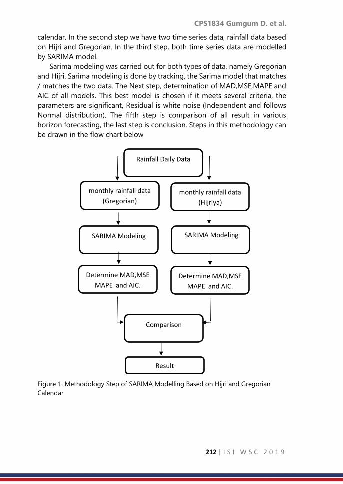
CPS1834 Gumgum D. et al.
212 | I S I W S C 2 0 1 9
Rainfall Daily Data
monthly rainfall data
(Hijriya)
SARIMA Modeling SARIMA Modeling
Determine MAD,MSE
MAPE and AIC.
Determine MAD,MSE
MAPE and AIC.
Comparison
Result
calendar. In the second step we have two time series data, rainfall data based
on Hijri and Gregorian. In the third step, both time series data are modelled
by SARIMA model.
Sarima modeling was carried out for both types of data, namely Gregorian
and Hijri. Sarima modeling is done by tracking, the Sarima model that matches
/ matches the two data. The Next step, determination of MAD,MSE,MAPE and
AIC of all models. This best model is chosen if it meets several criteria, the
parameters are significant, Residual is white noise (Independent and follows
Normal distribution). The fifth step is comparison of all result in various
horizon forecasting, the last step is conclusion. Steps in this methodology can
be drawn in the flow chart below
Figure 1. Methodology Step of SARIMA Modelling Based on Hijri and Gregorian
Calendar
monthly rainfall data
(Gregorian)

CPS1834 Gumgum D. et al.
213 | I S I W S C 2 0 1 9
4. Result
<The result of fit SARIMA modeling based on two calendars can be seen below.
Tabel 1. List of fit SARIMA models for Gregorian and Hijri Calendar
No Model
Gregorian Hijri
Independency Normality Independency Normality
1 SARIMA(0,0,1)(1,0,0)12 X X X √
2 SARIMA(1,0,0)(0,0,1)12 X X X X
3 SARIMA(1,1,0)(1,0,0)12 X X X X
4 SARIMA(0,1,1)(1,0,0)12 X X X X
5 SARIMA(0,0,1)(1,1,0)12 X X X √
6 SARIMA(1,0,1)(1,0,0)12 X X X X
7 SARIMA(1,0,1)(1,0,1)12 √ √ √ √
8 SARIMA(2,0,2)(2,0,2)12 √ √ X X
9 SARIMA(1,0,2)(1,0,1)12 √ √ X X
10 SARIMA(2,0,1)(1,0,1)12 √ √ X X
11 SARIMA(1,0,1)(1,0,2)12 √ √ X X
12 SARIMA(2,0,1)(2,0,0)12 √ √ √ √
Symbol “x” is not fit and symbol “ ” fit, according to that tracking
processes there are two models that fit for two models SARIMA(1,0,1)(1,0,1)12
and SARIMA(2,0,1)(2,0,0)12. However, after calculating the data, the fit models
are SARIMA(1,0,1)(1,0,1)12 and SARIMA(2,0,1)(2,0,2)12, so we compare two
models. The result can be seen below;
Table 2. Best models based on Gregorian and Hijri Calendar
Criteria Horizon
SARIMA(1,0,1)(1,0,1)12 SARIMA(1,0,1)(1,0,2)12
Gregorian Hijri Gregorian Hijri
MSE
P=3 2760.57 2382.6 2412.94 2451.28
P=6 1412.11 1476.63 1627.12 1825.7
P=12 4333.97 5192.83 5090.02 5425.61
MAD
P=3 50.93 30.81 5090.02 48.71
P=6 33.36 30.81 36.6 37.69
P=12 47.8 41.36 36.6 48.71
MAPE
P=3 23.14 19.36 19.84 23.1
P=6 17.32 17.43 19.91 21.78
P=12 21.01 25.41 31.64 27.86
AIC
P=3 2358.52 2451.28 2376.38 2458.03
P=6 2419.8 2419.8 2345.07 2426.24
P=12 2256.55 2451.28 2458.03 2353.68

CPS1834 Gumgum D. et al.
214 | I S I W S C 2 0 1 9
Based on the MSE value for P = 3 the hijri calendar is better than the
Gregorian calendar represented by the SARIMA (1,0,1) model (1,0,1) 12, while
for P = 6 and 12 the Christian calendar is better than the hijri calendar
represented by the same model.
Based on the MAPE value for P = 3 the hijri calendar is better than the
Gregorian calendar represented by the SARIMA (1,0,1) model (1,0,1) 12, while
for P = 6 and 12 the Gregorian calendar is better than the hijri calendar
represented by the same model.Based on the AIC Value for all periods the
Gregorian Calendar is better than the Hijri calendar, for P = 3 and P = 12
represented by the SARIMA (1,0,1) (1,0,1) 12 model while for P = 6 represented
by the SARIMA model (1,0,1) (1,0,2) 12.
From the results of tracking in the previous step, the best model for the
two data above is selected. The two best models are the SARIMA (1,0,1) (1,0,1)
12 and SARIMA (1,0,1) (1,0,2) models 12.
Comparisons are made based on the smallest values of the four criteria
above (MSE, MAD, MAPE and AIC). The smaller the value of the criteria, the
better the model is obtained. The chosen horizon is P = 3.6 and 12 according
to the length of the period.
5. Discussion and conclusion
Both of these data (Gregorian and Hijri) have the same pattern and period,
namely, seasonal patterns and periods of 12.SARIMA modeling based on the
Gregorian Calendar is better than SARIMA based on the Hijri Calendar for
forecasting at 12 and 6 future observations. SARIMA modeling based on the
Hijri Calendar is better than SARIMA based on the Gregorian Calendar for
forecasting on the 3 future observations.
References
1. C.Sivapragasam,shie-yui liong and m.f.k.Pasha (2001),” Rainfall and
Runoff forecasting with SSA-SVM approach”,Journal of
Hydroinformatics,141-152.
2. Asce,upsm and Jothiprakash,V (2015)” Extraction of Nonlinear Rainfall
Trends Using Singular Spectrum Analysis”, Journal of Hydrologic
Engineering,20(12):05015007.
3. C.L Wu and K.W.Chau (2011),”Rainfall-ruoff modelling using artificial
neural network coupled with singular spectrum analysis”,Journal of
Hyidrology,399,394-409.
4. D.Baratta,G Cicion,F.Masulli and L.Studer (2003),”Application of an
ensemble technique based on singular spectrum analysis to daily rainfall
forecasting”,Neural Networks,16,375-387.

CPS1834 Gumgum D. et al.
215 | I S I W S C 2 0 1 9
5. D.Baratta,G.Cicioni,F.Masulli and L.Stuber (2004),” An ensemble
Technique based on singular spectrum analysis applied to daily rainfall
forecasting”, Neural Network.
6. Barlando,P.Rosso,R.,Cadavid,L.G & Salas,J.D (1993),”Forecasting of short-
term rainfall using ARMA models. Journal of Hydrology,144,193-211.
7. Cicioni,G & Massaulli,F.A “software tollbox for time series prediction and
its application to daily rainfall forecasting in a geographic
basin”.Economics & Complexity (in press).
8. Luk,K.C.,Ball,J.E.,& Sharma,A. (2001),”An application of artificial neural
networks for rainfall forecasting”, Mathematical and Computer
Modelling,33,683-693.
9. Sharma,A (2000a). “Seasonal to interannual rainfall probabilistic forecast
for improved water supply management. Part 1-A strategy for system
prediction identification”. Journal of Hydrology, 239,232-239.
10. .Sharma,A (2000b). “Seasonal to interannual rainfall probabilistic forecast
for improved water supply management. Part 3-A strategy for system
prediction identification”. Journal of Hydrology, 249,232-258.
11. Toth,E.,Brath,A & Montanari,A (2000),” Comparison of short-term rainfall
prediction models for real-time flood forecasting”, Journal of
Hydrology,239,132-147.
12. Jawardena,A.W & Lai,F. 1994. “ Analysis and prediction of chaos in
rainfall and stream flow time series”,Journal Hydrology,153,23-52.
13. Dibike,Y.B.(2000),” Machine learning paradigms for rainfall-runoff
modelling”, Hydroinformatics 2000,Iowa Institute of Hydraulic
Research,Iowa,USA (CD-ROM).
14. Sivakumar,.,Liaong,S.Y & Liaw,C.Y.(1998) “Evidence of chaotic behaviour
in Singapore rainfall”,Journal Am Water Res.Assoc. 34(2),301-310.
15. Sharifi,M.B., Georgakakos,K.P & Rodriguez-Iturbe,I.(1990),”Evidence of
deterministic chaos in the pulse of storm rainfall.”, J.Atmos.Sci.47(7),888-
893.
16. T.Kohyama and J.M.Wallace (2016),”Raifall Variations induces by Lunar
gravitational atmospheric tide and their implications for the relationship
between tropical rainfall and humidity”,Geophysical Research
Letters,vol.43,Issue.2,page.918-923.

CPS1844 Reza M.
216 | I S I W S C 2 0 1 9
Testing the equality of high dimensional
distributions
Reza Modarres
Department of Statistics, the George Washington University, Washington, DC., USA
Abstract
We consider two groups of observations in Rd and present a simultaneous
plot of the empirical cumulative distribution functions of the within and
between interpoint distances (IPDs) to visualize and examine the equality of
the underlying distribution functions of the observations. We provide several
examples to illustrate how such plots can be utilized to envision and canvass
the relationship between the two distributions under location shift, scale and
shape changes. We extend the simultaneous plots to compare k > 2
distributions.
Keywords
Graphical Comparison; Interpoint Distance; High Dimension; Homogeneity
1. Introduction
Cleveland, Kleiner, and Tukey (1983) state "there is no statistical tool that
is as powerful as a well- chosen graph". The purpose of this paper is to
introduce a method for the visualization of high dimensional data sets, and
provide a basis for their comparison. Many methods of displaying data in
higher dimensions have been suggested. Andrews plot (Andrews, 1992) is
constructed using a Fourier transformation of the multivariate data. While it
can represent data many dimensions the display depends on the order of the
observations. High-dimensional data are frequently transformed onto a plane,
whose coordinate axes are formed by the first two principal components.
However, one needs to estimate the covariance matrix of the observations,
which is singular when the number of variables is larger than group sample
sizes and the method rarely discriminate between patterns from different
groups.
Suppose 𝕏 = 𝑥𝑖𝑖=1𝑛𝑥 𝕐 = 𝑦𝑖𝑖=1
𝑛𝑦 represents i.i.d. observation vectors in ℝ𝑑
from distribution functions (DFs) G1 and G2, respectively. We are interested in
a visual aid to examine the null hypothesis 𝐻0 ∶ 𝐺1 = 𝐺2 against 𝐻𝑎 ∶ 𝐺1 ≠ 𝐺2.
Both parametric and non-parametric tests have been proposed to investigate
𝐻0. Let ||X|| = (X’X)1/2 be the Euclidean norm of X. Consider i.i.d. vectors Xi and
Xj in ℝ𝑑 that are taken from G1 and i.i.d. vectors Yi and Yj in ℝ𝑑 that are taken
from G2. The IPD between Xi and Xj is given by 𝑑(𝑥𝑦)𝑖𝑗= ||𝑿𝒊 − 𝑿𝒋||, the IPD
between Yi and Yj is given by 𝑑(𝑥𝑦)𝑖𝑗= ||𝒀𝒊 − 𝒀𝒋|| and the IPD between Xi and Yj

CPS1844 Reza M.
217 | I S I W S C 2 0 1 9
is given by 𝑑(𝑥𝑦)𝑖𝑗= ||𝑿𝒊 − 𝒀𝒋 ||. We will call 𝑑(𝑥)𝑖𝑗 and 𝑑(𝑦)𝑖𝑗 the within and
𝑑(𝑥𝑦)𝑖𝑗 the between sample IPDs.
2. Comparing Two Groups
Let 𝑄𝑥, 𝑄𝑦 and 𝑄𝑥𝑦 denote the DFs of Dx = ||X1 −X2||, Dy = ||Y1 −Y2|| and Dxy
= ||X1 −Y2||, respectively. Maa et al. (1996) advance the study of IPDs
substantially by proving that two distributions are equal, if and only if, the
interpoint distances within and between samples have the same univariate
distribution. Hence, instead of testing 𝐻0 ∶ 𝐺1 = 𝐺2 , we can consider an
equivalent null hypothesis 𝐻′0 ∶ 𝑄𝑥 = 𝑄𝑦 = 𝑄𝑥𝑦 , which holds if and only if
𝐺1 = 𝐺2. Let µG1G1 and µG2G2 represent the expected value of within sample IPDS
, respectively and µG1G2 denote the expected value of the between samples IPD.
We compute the average IPD of X and Y using 𝑑 (𝑥) =2
𝑛𝑥(𝑛𝑥−1)∑ ∑ 𝑑(𝑥)𝑖𝑗
𝑛𝑥𝑗=𝑖+1
𝑛𝑥−1𝑖=1 and 𝑑 (𝑦) =
2
𝑛𝑦(𝑛𝑦−1)∑ ∑ 𝑑(𝑦)𝑖𝑗
𝑛𝑦𝑗=𝑖+1
𝑛𝑦−1
𝑖=1, respectively.
The average IPD between X and Y is 𝑑 (𝑥𝑦) =1
𝑛𝑥𝑛𝑦∑ ∑ 𝑑(𝑥𝑦)𝑖𝑗
𝑛𝑦𝑗=1
𝑛𝑥𝑖=1 . We estimate
µG1G1, µG2G2 and µG1G2 with 𝑑 (𝑥), 𝑑 (𝑦) and 𝑑 (𝑥𝑦), respectively.
Suppose observations in X and Y samples are taken from distributions with
means µx, µy and covariances Σx, Σy, respectively. Using quadratic forms, it is not
difficult to show that 𝐷𝑥2 = ∑ 𝜆𝑟𝑈𝑟
2𝑑𝑟=1 , is the standardized version of 𝑋𝑟, the 𝑟-
th component of the vector X1, for r = 1,...,d and λ1,...,λd are the eigenvalues of
2𝚺𝒙 . Hence, 𝔼(𝐷𝑥2 = ∑ 𝜆𝑟 = 2𝑡𝑟(𝑑
𝑟=1 𝚺𝒙) and one estimates 𝔼(𝐷𝑥2) with twice
the total sample variance. Similarly, one can show 𝔼(𝐷𝑥2) = 𝑡𝑟(𝚺𝒙 + 𝚺𝒚) + ||µx
−µy||2. Using Jensen’s inequality, it follows that 𝔼(𝐷𝑥) ≤ √2𝑡𝑟(𝚺𝒙), and 𝔼(𝐷𝑦) ≤
√2𝑡𝑟(𝚺𝒚) . Similarly, one can show that 𝔼(𝐷𝑥𝑦) ≤ √𝑡𝑟(𝚺𝒙 + 𝚺𝒚) + ||µ𝑥 − µ𝑦||2 .
Consider the distance matrix D(𝕏,𝕐) where all within and between sample IPDs
are listed. There are 𝑚𝑥 = (𝑛𝑥2) pairs of IPDs in X, 𝑚𝑦 = (𝑛𝑦
2) pairs of IPDs in Y,
and mxy = nxny pairs of IPDS between samples. Let R = maxD(𝕏,𝕐) − minD(𝕏,𝕐)
denote the range of all IPDs that appear below the main diagonal of D(𝕏,𝕐).
We will divide the range into s evaluation points denoted by δ(t) for t = 1,...s.
Denote the cumulative distributions of 𝑑(𝑥)𝑖𝑗, 𝑑(𝑦)𝑖𝑗 , and 𝑑(𝑥𝑦)𝑖𝑗 evaluated at
δ(t) by Hx(t) = ℙ(𝑑(𝑥)𝑖𝑗 ≤ δ(t)), Hy(t) = ℙ(𝑑(𝑦)𝑖𝑗 j ≤ δ(t)) and Hxy(t) = ℙ(𝑑(𝑥𝑦)𝑖𝑗 ≤ δ(t)),
respectively. Let 𝐼(.) denote the indicator function and estimate the DFs by
𝑥(𝑡) =1
𝑚𝑥∑ ∑ 𝐼 (𝑑(𝑥)𝑖𝑗 ≤ 𝛿(𝑡)) ,
𝑛𝑥
𝑗=𝑖+1
𝑛𝑥−1
𝑖=1
𝑦(𝑡) =1
𝑚𝑦∑ ∑ 𝐼(𝑑(𝑦)𝑖𝑗 ≤ 𝛿(𝑡))
𝑛𝑦
𝑗=𝑖+1
𝑛𝑦−1
𝑖=1
,

CPS1844 Reza M.
218 | I S I W S C 2 0 1 9
𝑥𝑦(𝑡) =1
𝑚𝑥𝑦∑ ∑ 𝐼(𝑑(𝑦)𝑖𝑗 ≤ 𝛿(𝑡))
𝑛𝑦
𝑗=𝑖+1
𝑛𝑥
𝑖=1
,
We obtain a simultaneous plot of
(𝛿(𝑡), 𝑥(𝛿(𝑡))) , (𝛿(𝑡), 𝑦(𝛿(𝑡))) , (𝛿(𝑡), 𝑥𝑦(𝛿(𝑡))) , 𝑓𝑜𝑟 𝑡 = 1,… . . , 𝑠. (2)
With applications in statistical decision theory, clinical trials, experimental
design, and portfolio analysis, stochastic orderings of random vectors is of
interest when comparing several multivariate distributions. While there is a
rich literature on testing for stochastic ordered among univariate distributions
the literature dealing with inference on nonparametric multivariate
distributions is sparse. Giovagnoli and Wynn (1995) define the multivariate
dispersive order (weak D-ordering) for two random vectors X and Y in Rd as
follows. Define X ≤D Y if and only if Dx ≤St Dy, where ≤St is the stochastic ordering
between two random variables. One can show that Dx ≤St Dy holds if and only
if 𝑄𝑥(𝑡) ≥ 𝑄𝑦(𝑡) for all t ∈ℝ. Giovagnoli and Wynn (1995) show that Dx ≤St Dy if
and only if the average probability content of balls of a given radius with center
having the same distribution (independently), is more for X than for Y.
Under K0 : X ≤D Y, it follows that Dx ≤St Dy with probability 1. One can estimate
P(Dx ≤ Dy) and reject K0 for small values of this probability. It is not difficult to
show that the estimated probability is a U-statistic with a normal limiting
distribution for large sample sizes. The hypothesis K0 : X ≤D Y is equivalent to
𝐾′0: 𝑄𝑥(𝑡) ≥ 𝑄𝑦(𝑡) for all t ∈R. It follows from X ≤D Y, that E(r(Dx)) ≤E(r(Dy)) for
all non-decreasing functions r on [0,∞) and 𝑡𝑟(𝐶𝑜𝑣(X)) ≤ 𝑡𝑟(𝐶𝑜𝑣(Y)).
Furthermore, the dispersion order ≤D is location and rotation free. If Dx ≤St Dy,
then 𝚪X + a ≤D ΛY + b for all orthogonal matrices 𝚪 and Λ and for all vectors
a and b.
Lemma 1 When the 𝕏 and 𝕐 groups differ in location µ only; i.e. 𝐺1(𝑋) =
𝐺2(𝑌 − µ), we have 𝑄𝑥 = 𝑄𝑦 ≥ 𝑄𝑥𝑦 with equality holding if and only if µ = 0.
If µ = 0, then the result follows since G1 = G2 is equivalent to 𝑄𝑥 = 𝑄𝑦 = 𝑄𝑥𝑦.
One can verify that the within sample IPDs are invariant with respect to
location shift so that 𝑄𝑥 = 𝑄𝑦 . Moreover, the between sample IPDs will
become larger than within sample IPDs when µ ≠ 0 since X−Y is no longer
centered at zero. Hence, 𝑄𝑥 = 𝑄𝑦 ≥ 𝑄𝑥𝑦 . As the following example shows,
when ECDFs 𝑥(𝑡) and 𝑦(𝑡) are closer together than the ECDF 𝑥𝑦(𝑡); i.e.
𝑄𝑥 = 𝑄𝑦 ≥ 𝑄𝑥𝑦, one can say that the two distributions G1 and G2 have a location
shift difference.
(1)

CPS1844 Reza M.
219 | I S I W S C 2 0 1 9
To illustrate the utility of such simultaneous display of the ECDFs, we
present the following examples where d = 100, s = 100 and nx = ny = 50.
Example 1 We generate nx and ny observations from N(0,σx2Id) and N(µ,σy
2Id),
respectively. Figure 1 Panel (a) displays the simultaneous plot of (2) when 𝐻0 ∶
𝐺1 = 𝐺2, is true, with 𝜎𝑥2 = 𝜎𝑦
2 = 1 𝑎𝑛𝑑 𝜇 = 0. As one expects, the ECDFs of
the three IPDs concentrate in a narrow band since 𝐻′0 ∶ 𝑄𝑥 = 𝑄𝑦 = 𝑄𝑥𝑦is true.
Equivalently, 𝐷𝑥 =(L)𝐷𝑦 =
(L)𝐷𝑥𝑦 where (𝐿)=
stands for equality in law. Figure 1 Panel
(b) displays the simultaneous plot of (2) under multivariate normal
distributions with 𝜎𝑥2 = 𝜎𝑦
2 = 1 and µ = 1. Here, 𝐻0 ∶ 𝐺1 = 𝐺2 is false, and we
expect the ECDFs to differ. Moreover, the distribution 𝑄𝑥𝑦 of the between
sample IPDs is stochastically larger than the within sample IPDs. Hence, 𝑄𝑥 =
𝑄𝑦 = 𝑄𝑥𝑦 . Equivalently, 𝐷𝑥 =(L)𝐷𝑦 ≤𝑆𝑡 𝐷𝑥𝑦 with probability 1 under a location
shift.
a) G1 = G2 ∼N(0,Id). b) G1 ∼N(0,Id) and G2 ∼N(1,Id).
Figure 1: Panel a: Empirical CDFs of 𝕏 sample IPDs (red, top), 𝕐 sample IPDs
(black, bottom), and between sample IPDs (blue, middle) when 𝐺1 =
𝐺2∼ℕ(0,Id). Panel b: Empirical CDFs of X sample IPDs (red, next to top), Y
sample IPDs (black, top), and between sample IPDs (blue, bottom) when G1
∼ ℕ(0,Id) and G2 ∼ ℕ(1,Id).
Lemma 2 When the X and Y groups differ in scale only; i.e. 𝐺1(𝑋) = 𝐺2 (1
𝜎𝑌),
we have min(𝑄𝑥, 𝑄𝑦) ≤ 𝑄𝑥𝑦 ≤ max(𝑄𝑥, 𝑄𝑦) with equality holding if and only if σ
= 1.
If σ = 1, then the result follows since 𝐺1 = 𝐺2 is equivalent to 𝑄𝑥 = 𝑄𝑦 = 𝑄𝑥𝑦 .
Furthermore, 𝑄𝑦 ≤𝑄𝑥𝑦 and 𝑄𝑥𝑦 ≤ 𝑄𝑥 when σ < 1. Similarly, 𝑄𝑥 ≤ 𝑄𝑥𝑦 and𝑄𝑥𝑦≤
𝑄𝑦 when σ > 1 Equivalently, 𝐷𝑥 ≤St 𝐷𝑥𝑦 ≤St 𝐷𝑦 if σ > 1 and 𝐷𝑦 ≤St 𝐷𝑥𝑦 ≤St 𝐷𝑥 if σ <
1 with probability 1 under a scale change.
Example 2 To see the effects of a change in scale, consider Panel (a) in Figure
2 where we display the simultaneous plot of (2) under multivariate normal
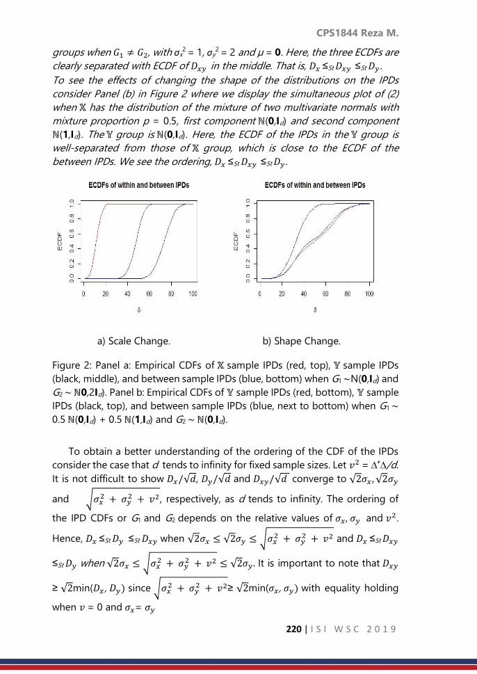
CPS1844 Reza M.
220 | I S I W S C 2 0 1 9
groups when 𝐺1 ≠ 𝐺2, with σx2 = 1, σy
2 = 2 and µ = 0. Here, the three ECDFs are
clearly separated with ECDF of 𝐷𝑥𝑦 in the middle. That is, 𝐷𝑥 ≤St 𝐷𝑥𝑦 ≤St 𝐷𝑦 .
To see the effects of changing the shape of the distributions on the IPDs
consider Panel (b) in Figure 2 where we display the simultaneous plot of (2)
when 𝕏 has the distribution of the mixture of two multivariate normals with
mixture proportion p = 0.5, first component ℕ(0,Id) and second component
ℕ(1,Id). The 𝕐 group is ℕ(0,Id). Here, the ECDF of the IPDs in the 𝕐 group is
well-separated from those of 𝕏 group, which is close to the ECDF of the
between IPDs. We see the ordering, 𝐷𝑥 ≤St 𝐷𝑥𝑦 ≤St 𝐷𝑦 .
a) Scale Change. b) Shape Change.
Figure 2: Panel a: Empirical CDFs of 𝕏 sample IPDs (red, top), 𝕐 sample IPDs
(black, middle), and between sample IPDs (blue, bottom) when G1 ∼N(0,Id) and
G2 ∼ ℕ0,2Id). Panel b: Empirical CDFs of 𝕐 sample IPDs (red, bottom), 𝕐 sample
IPDs (black, top), and between sample IPDs (blue, next to bottom) when G1 ∼
0.5 ℕ(0,Id) + 0.5 ℕ(1,Id) and G2 ∼ ℕ(0,Id).
To obtain a better understanding of the ordering of the CDF of the IPDs
consider the case that d tends to infinity for fixed sample sizes. Let 𝑣2 = ∆’∆/d.
It is not difficult to show 𝐷𝑥/√𝑑, 𝐷𝑦/√𝑑 and 𝐷𝑥𝑦/√𝑑 converge to √2𝜎𝑥 , √2𝜎𝑦
and √𝜎𝑥2 + 𝜎𝑦
2 + 𝑣2, respectively, as d tends to infinity. The ordering of
the IPD CDFs or G1 and G2 depends on the relative values of 𝜎𝑥, 𝜎𝑦 and 𝑣2.
Hence, 𝐷𝑥 ≤St 𝐷𝑦 ≤St 𝐷𝑥𝑦 when √2𝜎𝑥 ≤ √2𝜎𝑦 ≤ √𝜎𝑥2 + 𝜎𝑦
2 + 𝑣2 and 𝐷𝑥 ≤St 𝐷𝑥𝑦
≤St 𝐷𝑦 when √2𝜎𝑥 ≤ √𝜎𝑥2 + 𝜎𝑦
2 + 𝑣2 ≤ √2𝜎𝑦 . It is important to note that 𝐷𝑥𝑦
≥ √2min(𝐷𝑥 , 𝐷𝑦) since √𝜎𝑥2 + 𝜎𝑦
2 + 𝑣2≥ √2min(𝜎𝑥, 𝜎𝑦) with equality holding
when 𝑣 = 0 and 𝜎𝑥= 𝜎𝑦

CPS1844 Reza M.
221 | I S I W S C 2 0 1 9
Suppose ℤ = 𝑧𝑖𝑖=1𝑛𝑥 is a third group of observations and define the ECDFs
of 𝑑(𝑧)𝑖𝑗, 𝑑(𝑥𝑧)𝑖𝑗, and 𝑑(𝑦𝑧)𝑖𝑗similar with equations (1).
Example 3 We consider the Iris dataset where four characteristic are measured
on three species of Iris plant. The data contains observations on sepal length,
sepal width, petal length, and petal width of Iris Setosa X, Iris Versicolor Y, and
Iris Z . There are 50 observations per group. Is there evidence that the mean
vectors are significantly different across the 3 species? A MANOVA test rejects
the equality of the mean vectors and we have strong evidence that the mean
vectors differ across the 3 species. Is there evidence that the covariance
matrices are significantly different across the 3 species? Box’s M-test rejects
the hypothesis of the homogeneity of covariance matrices. Bivariate plots of
petal and sepal length and width show that while Setosa species are distinctly
different from Versicolor and Virginica, the two species Virginica and
Versicolor cannot easily be separated.
How do the groups differ in terms of their IPD structures? Figure 3 shows the
ECDF of the six comparison groups. The IPD means 𝑑 𝑥, 𝑑 𝑧, 𝑑 𝑦 , 𝑑 𝑥𝑦 , 𝑑 𝑦𝑧, 𝑎𝑛𝑑 𝑑 𝑥𝑧
are 0.69,0.71,0.99,3.3,8.9, and 6.99, respectively. The three groups do not differ
much in terms of their average within sample IPDs. This is not the case for the
between group average IPDs.
Figure 3 shows the IPD ordering (𝐷𝑥(𝐿)= 𝐷𝑦
(𝐿)= 𝐷𝑧) ≤St 𝐷𝑥𝑦 ≤St 𝐷𝑦𝑧 ≤St 𝐷𝑥𝑧 . By
comparing the IPD means and the ECDFs, one infers that Iris Setosa is different
from Versicolor and Virginica. With 𝑑 𝑥𝑦 = 3.3 and 𝑑 𝑦𝑧 = 8.9, the plot of the
ECDFs further show that Versicolor has an IPD structure that is different from
Setosa and Virginica. It is interesting that all the between sample IPDs are
larger than the within sample IPDs. This is reminiscent of the location shift
model where the between group IPDs tend to be larger than the within group
IPDs.
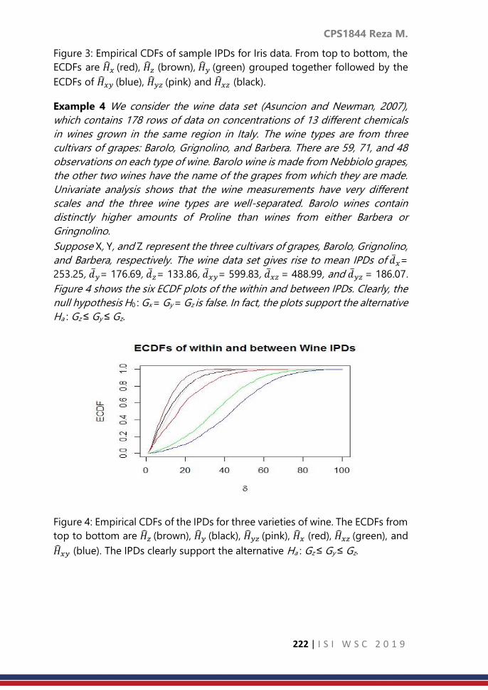
CPS1844 Reza M.
222 | I S I W S C 2 0 1 9
Figure 3: Empirical CDFs of sample IPDs for Iris data. From top to bottom, the
ECDFs are 𝑥 (red), 𝑧 (brown), 𝑦 (green) grouped together followed by the
ECDFs of 𝑥𝑦 (blue), 𝑦𝑧 (pink) and 𝑥𝑧 (black).
Example 4 We consider the wine data set (Asuncion and Newman, 2007),
which contains 178 rows of data on concentrations of 13 different chemicals
in wines grown in the same region in Italy. The wine types are from three
cultivars of grapes: Barolo, Grignolino, and Barbera. There are 59, 71, and 48
observations on each type of wine. Barolo wine is made from Nebbiolo grapes,
the other two wines have the name of the grapes from which they are made.
Univariate analysis shows that the wine measurements have very different
scales and the three wine types are well-separated. Barolo wines contain
distinctly higher amounts of Proline than wines from either Barbera or
Gringnolino.
Suppose X, Y, and Z represent the three cultivars of grapes, Barolo, Grignolino,
and Barbera, respectively. The wine data set gives rise to mean IPDs of 𝑑 𝑥=
253.25, 𝑑 𝑦= 176.69, 𝑑 𝑧= 133.86, 𝑑 𝑥𝑦= 599.83, 𝑑 𝑥𝑧 = 488.99, and 𝑑 𝑦𝑧 = 186.07.
Figure 4 shows the six ECDF plots of the within and between IPDs. Clearly, the
null hypothesis H0 : Gx = Gy = Gz is false. In fact, the plots support the alternative
Ha : Gz ≤ Gy ≤ Gz.
Figure 4: Empirical CDFs of the IPDs for three varieties of wine. The ECDFs from
top to bottom are 𝑧 (brown), 𝑦 (black), 𝑦𝑧 (pink), 𝑥 (red), 𝑥𝑧 (green), and
𝑥𝑦 (blue). The IPDs clearly support the alternative Ha : Gz ≤ Gy ≤ Gz.

CPS1844 Reza M.
223 | I S I W S C 2 0 1 9
References
1. Andrews, D. F. (1972). Plots of High-Dimensional Data. Biometrics, Vol. 28,
No. 1, 125-136.
2. Asuncion, A. and Newman, D.J. (2007). UCI Machine Learning Repository
[http://www.ics.uci.edu/ mlearn/MLRepository.html]. Irvine, CA: University
of California, School of Information and Computer Science.
3. Chambers, J.M., Cleveland, W.S., Kleiner, B. and Tukey, P.A. (1983).
Graphical Methods for Data Analysis. Wadsworth, Bellmont.
4. Giovagnoli, A. and Wynn, H. P. (1995). Multivariate dispersion orderings.
Statistics and Probability Letters, 22, 325-332.
5. Maa, J. F., Pearl, D. K. and Bartoszynski, R. (1996). Reducing
multidimensional two-sample data to one-dimensional interpoint
comparisons. The Annals of Statistics, 24(3), 10691074.

CPS1845 Devni P.S. et al.
224 | I S I W S C 2 0 1 9
Bayesian network for risk management of
earthquake damage using R and Genie
Devni Prima Sari1,2,*; Dedi Rosadi1, Adhitya Ronnie Effendie1, Danardono1
1Department of Mathematics, Universitas Gadjah Mada, Yogyakarta, Indonesia 2Department of Mathematics, Universitas Negeri Padang, Padang, Indonesia
Abstract
The occurrence of an earthquake in an area is often unexpected. Disaster risk
management is needed to minimize disaster risk. One way to reduce the
impact of disasters is to know the level of risk of damage to buildings in an
area. The level of risk of damage to buildings can we value the variables that
participate in determining the size or smallness of a risk. The tool we will use
to deduce a causal relationship between variables is called the Bayesian
Network. The formation of the Bayesian Network model is a complex and
time-consuming task. It is difficult to get a complete and consistent model. To
simplify work while struggling with BN, we use the famous R package with BN
called "bnlearn" and GeNIe Software. The process of forming BN is faster and
more efficient with the role of bnlearn and GeNIe.
Keywords
Earthquake; Risk; Bayesian Network; bnlearn; GeNIe
1. Introduction
Earthquake disasters that hit a country often occur unexpectedly, so that
people who are in the location of the disaster, do not have time to anticipate
the prevention of the disaster. Earthquakes certainly cause destruction, also
cause suffering and loss both for society and the country. Therefore, disaster
risk management is needed to minimize the risk of disaster. The problem that
arises is that there is still a lack of knowledge of citizens about what a disaster
is, how to anticipate and reduce the impact of disasters. One way to reduce
the impact of disasters is to know the level of risk of damage to buildings in
an area. The level of risk of damage to buildings can we value from the
variables that influence it.
The tool we will use to infer the relationship of the causal variable from
correlation is called a Probabilistic Graphic Model (PGM). PGM is a graph that
encodes a causal relationship between events. Each node represents a random
variable, and arrows represent a dependency relationship between variables.
PGM with directional and non-cycle edges is specifically called a Bayesian
Network (BN), and that is the type of PGM that I will focus on. BN has been
developed in various fields, including in medical (Flores, Nicholson, Brunskill,
Korb, & Mascaro, 2011), financial (Neil, Marquez, & Fenton, 2008). As well as

CPS1845 Devni P.S. et al.
225 | I S I W S C 2 0 1 9
Bayesian networking applications in terms of minimizing the risk of natural
disasters: floods (Zhang, Yang, & Wang, 2002), tsunamis (Blaser, Ohrnberger,
Riggelsen, Babeyko, & & Scherbaum, 2011), earthquakes (Bayraktarli, Ulfkjaer,
Yazgan, & Faber, 2005) (Bayraktarli, Baker, & Faber, 2011) (Li, Wang, & Leung,
2010) (Sari, Rosadi, Effendie, & Danardono, 2018).
The formation of a BN model is a complex and time-consuming task. It is
difficult to get a complete and consistent model. Usually, there are two
methods for entering probability values into opportunity nodes of the
Bayesian network model. The first method is to consult with experts for
probability values and put them in the model. The second method is to get
probability values from statistical data (Druzdzel & Flynn, 2002). To simplify
work while struggling with BN, we use R, we can use an algorithm in
programming R. The R package which is famous for BN is called "bnlearn".
This package contains various algorithms for BN structure learning, parameter
learning, and inference. In addition, we also use GeNIe to enhance the
appearance of the network. Using CPT output obtained from R, a network will
be built using GeNIe. It is a reasoning machine used for graphical probabilistic
models and provides functionality for making diagnoses. Users can also do
Bayesian inference in the model and they can calculate the impact of
observing the subset value of the model variable on the remaining variable
probability distribution based on real-time data.
2. Methodology
Bayesian Network (BN) is an explicit description of depending directly
between a set of variables. This description is in the form of a Directed Acyclic
Graph (DAG) and a set of Node Probability Tables (NPT) (Zhou, Fenton, & Neil,
2014). A directed graph, also called a BN structure, consists of a set of nodes
and arcs. The formation of BN is divided into two, namely the construction of
structures and Conditional Probability Tables (CPT). BN structure is a DAG that
represents a pattern from a set of data. Graph representation can be done by
identifying concepts of information that are relevant to the problem.
Furthermore, the concept is called set variables. The set is then represented as
nodes in the graph. The influence between variables is stated explicitly using
edge on a graph. To get a beneficial relationship between nodes is done using
expert knowledge or algorithms.
(The chain rule for Bayesian networks). Suppose BN is the Bayesian
network above 𝑈 = 𝑋1, ⋯ , 𝑋𝑛 . Then the BN determines the unique joint
probability distribution 𝑃(𝑈) given by the multiplication of all the conditional
probability tables specified in BN:
𝑃(𝑈) =∏𝑃(𝑋𝑖|pa(𝑋𝑖))
𝑛
𝑖=1
,

CPS1845 Devni P.S. et al.
226 | I S I W S C 2 0 1 9
where pa(𝑋𝑖) is the parent of 𝑋𝑖 in BN, and 𝑃(𝑈) reflects the properties of BN
(Fenton & Neil, 2013).
3. Result
We will conduct a simple and hypothetical survey that aims to determine
the level of damage to houses due to earthquakes. The results of this survey
can later be used as one of the disaster mitigation efforts and basic guidelines
for insurance companies in determining the mount of premium rates. The data
used is the data on building damage, especially the residence in the city of
Padang due to the earthquake in September 2009 which was 7.9 on the scale
of SR and centered on the coast of West Sumatra. The earthquake caused
severe damage in several areas in West. Data was obtained from the Regional
Disaster Management Agency of Padang (BPBD Padang City) and the
Indonesian Meteorology, Climatology and Geophysics Agency. The data to be
used as a case study consists of 61344 building data. The research data
consists of three independent variables (close to faults, slope, and epicenter
distance) and four dependent variables (construction, landslide risk, PGA, and
damage). In the Figure 2, we present summary data on the level of damage
for each District that we obtained from BPBD Padang City. In this example
application, we will pay attention to the data for each building, in the Table 3
the details of the seven discrete variables used are detailed.
There are two types of relationships between variables, namely direct
relationships and indirect relationships (relationships mediated by other
variables). Both types of relationships can be represented effectively using
directed graphs. Each node in the graph represents each variable in the study.
So, the graph generated from this example consists of seven nodes,
symbolized by C, P, E, L, S, F, and D. The relationship between variables can be
seen in Figure 1, where the connection in this picture is formed based on
expert opinion with reference in a previous research paper (Li, Wang, & Leung,
2010).
Examples of direct dependence are E → P means that P depends on E. It
can be said that node E is the parent (parent) of node P and node P is the child
/ descendant (descendant) of node E. Indirect dependency relationship can be
seen from the graph, i.e. the sequence of arcs that lead from one variable to
another through one or more mediating variables. For example, S → L → D
means that D depends on S through L. However, we must note that the arrow
line only goes in one direction and does not turn back towards its original
node. The arc implies, that for each arc one variable is interpreted as a cause
and the other variable as an effect (eg E → P means that E causes P).
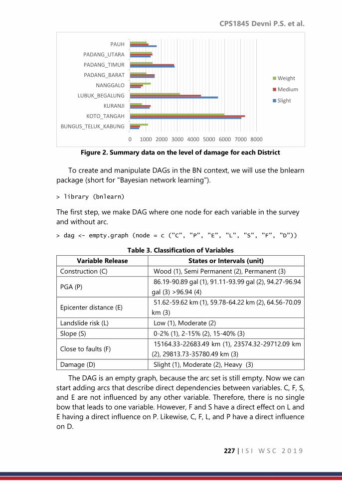
CPS1845 Devni P.S. et al.
227 | I S I W S C 2 0 1 9
Figure 2. Summary data on the level of damage for each District
To create and manipulate DAGs in the BN context, we will use the bnlearn
package (short for "Bayesian network learning").
> library (bnlearn)
The first step, we make DAG where one node for each variable in the survey
and without arc.
> dag <- empty.graph (node = c ("C", "P", "E", "L", "S", "F", "D"))
Table 3. Classification of Variables
Variable Release States or Intervals (unit)
Construction (C) Wood (1), Semi Permanent (2), Permanent (3)
PGA (P) 86.19-90.89 gal (1), 91.11-93.99 gal (2), 94.27-96.94
gal (3) >96.94 (4)
Epicenter distance (E) 51.62-59.62 km (1), 59.78-64.22 km (2), 64.56-70.09
km (3)
Landslide risk (L) Low (1), Moderate (2)
Slope (S) 0-2% (1), 2-15% (2), 15-40% (3)
Close to faults (F) 15164.33-22683.49 km (1), 23574.32-29712.09 km
(2), 29813.73-35780.49 km (3)
Damage (D) Slight (1), Moderate (2), Heavy (3)
The DAG is an empty graph, because the arc set is still empty. Now we can
start adding arcs that describe direct dependencies between variables. C, F, S,
and E are not influenced by any other variable. Therefore, there is no single
bow that leads to one variable. However, F and S have a direct effect on L and
E having a direct influence on P. Likewise, C, F, L, and P have a direct influence
on D.
0 1000 2000 3000 4000 5000 6000 7000 8000
BUNGUS_TELUK_KABUNG
KOTO_TANGAH
KURANJI
LUBUK_BEGALUNG
NANGGALO
PADANG_BARAT
PADANG_TIMUR
PADANG_UTARA
PAUH
Weight
Medium
Slight

CPS1845 Devni P.S. et al.
228 | I S I W S C 2 0 1 9
> dag <- set.arc(dag, from = "F", to = "L")
> dag <- set.arc(dag, from = "S", to = "L")
Dependency is directly listed for each variable, denoted by a bar (|) and
replaced by a semicolon (: ). For example, [𝐿 | 𝐹: 𝑆] means 𝐹 → 𝐿 and 𝑆 → 𝐿;
while [𝐹] and [𝑆] mean there is no arc that leads to F also S. Representation of
this graph structure is designed to represent the multiplication of conditional
problems, and can be used with string model functions.
> modelstring(dag)
[1] "[C][E][S][F][P|E][L|S:F][D|C:P:L:F]"
The two primary functions contained in the package are vertices and arcs.
> nodes(dag)
[1] "C" "P" "E" "L" "S" "F" "D"
> arcs(dag)
from to
[1,] "F" "L" [2,] "S" "L" [3,] "F" "D" [4,] "C" "D" [5,] "E" "P" [6,] "L" "D" [7,] "P" "D"
To complete BN model, we will determine the joint probability distribution
of the variables. All discrete variables will be defined in the set status (called
the level in 𝑅). Like the example below, we will call state for the 𝐶 variable.
> C.lv <- levels(Data[, "C"])
[1] "1" "2" "3"
In the context of BN, this shared distribution is called global distribution.
Using global distribution directly, will be difficult because the number of
parameters is very high. In this case, based on the combination of the levels
of all variables, the number of parameter sets is 647 probabilities. The
advantage in DAG is that we can simplify global distribution into smaller sets
of local distributions for each variable. Variables that are not connected by
arcs are conditional independent. We can factor global distribution as follows:
𝑝(𝐷,𝑃, 𝐸, 𝐿, 𝐹, 𝑆, 𝐶) = 𝑝(𝐷|𝑃, 𝐿, 𝐹, 𝐶). 𝑝(𝑃|𝐸). 𝑝(𝐸). 𝑝(𝐿|𝐹, 𝑆). 𝑝(𝐹). 𝑃(𝑆). 𝑝(𝐶)
In this case, the parameter for estimation is the conditional probability in
the local distribution. Local probability can be estimated with empirical
frequency in a data set, for example

CPS1845 Devni P.S. et al.
229 | I S I W S C 2 0 1 9
𝑝(𝐸 = 1|𝑃 = 2) =𝑝 (𝐸 = 1, 𝑃 = 2)
𝑝 (𝑃 = 2)=𝑁𝑢𝑚𝑏𝑒𝑟 𝑜𝑓 𝑜𝑏𝑠𝑒𝑟𝑣𝑎𝑡𝑖𝑜𝑛𝑠 𝑤ℎ𝑒𝑟𝑒 𝐸 = 1 𝑎𝑛𝑑 𝑃 = 2
𝑁𝑢𝑚𝑏𝑒𝑟 𝑜𝑓 𝑜𝑏𝑠𝑒𝑟𝑣𝑎𝑡𝑖𝑜𝑛𝑠 𝑤ℎ𝑒𝑟𝑒 𝑃 = 2
By using the bnlearn package, we can calculate it with the function bn.fit.
The method for determining which estimator to use in this case is "mle", which
is the maximum likelihood estimator.
> bn.mle <- bn.fit(dag, data = Data, method = "mle")
> nparams(bn.mle)
[1] 135
In this case, we will get a CPT for each node. Like the CPT of P that we have
shown below
> bn.mle$P
Parameters of node P (multinomial distribution)
Conditional probability table: E P 1 2 3 1 0.00000000 0.10810258 1.00000000 2 0.01919482 0.89189742 0.00000000 3 0.98080518 0.00000000 0.00000000
Then the CPT will be used to establish a network in GeNIe. GeNIe is a
reasoning machine used for graphical probabilistic models and provides the
functionality to make a diagnosis. Users can also do Bayesian inference in the
model and they can calculate the impact of observing the subset values of the
model variables on the probability distribution of the remaining variables
based on real-time data.
Display of Bayesian Network output at GeNIe will be seen in Figure 3.

CPS1845 Devni P.S. et al.
230 | I S I W S C 2 0 1 9
Figure 3. Graphical Bayesian network model in GeNIe
From Figure 3 we can conclude that the level of damage to buildings for
state Slight, Moderate, and Heavy are 35.46%, 35.14%, and 29.4%
respectively.
4. Discussion and Conclusion
We can conclude from the results section above that the formation of the
BN model is faster and more efficient with the role of bnlearn and GeNIe
packages. Package bnlearn is an R package that is very suitable for dealing
with cases of analysis in experimental data. For both discrete and continuous
data, as well as combination data, this package is very flexible to use. This
package is good for learning structure and parameters. Whereas GeNIe, the
Graphical Network Interface, is designed to enhance the appearance of BN
Models. This software can also increase flexibility for model. Users can also use
GeNIe to choose alternative decisions that have the highest profit or utility
expected.
References
1. Bayraktarli, Y. Y., Ulfkjaer, J. P., Yazgan, U., & Faber, M. H. (2005). On the
application of Bayesian probabilistic networks for earthquake risk
management. Safety and reliability of engineering systems and
structures : proceedings of the Ninth International Conference on
Structural Safety and Reliability (hal. 3505-3512). Rome: Millpress.
2. Bayraktarli, Y., Baker, J., & Faber, M. (2011). Uncertainty treatment in
earthquake modeling using Bayesian probabilistic networks. Georisk,
5(1), 44-58.
3. Blaser, L., Ohrnberger, M., Riggelsen, C., Babeyko, A., & & Scherbaum, F.
(2011). Bayesian networks for tsunami early warning. Geophysical
Journal International, 185(3), 1431–1443. doi:10.1111/j.1365-
246X.2011.05020.x
4. Druzdzel, M., & Flynn, R. (2002). Decision Support Systems. Encyclopedia
of Library and Information Science (2nd ed.). New York: Marcel Dekker,
Inc.
5. Fenton, N., & Neil, M. (2013). Risk Assessment and Decision Analysis with
Bayesian Networks. CRC Press.
6. Flores, M. J., Nicholson, A. E., Brunskill, A., Korb, K. B., & Mascaro, S.
(2011). Incorporating expert knowledge when learning Bayesian network
structure: A medical case study. Artificial Intelligence In Medicine, 53,
181– 204.

CPS1845 Devni P.S. et al.
231 | I S I W S C 2 0 1 9
7. Li, L., Wang, J.-F., & Leung, H. (2010). Using spatial analysis and Bayesian
network to model the vulnerability and make insurance pricing of
catastrophic risk. International Journal of Geographical Information
Science, 24(12), 1759-1784.
8. Neil, M., Marquez, D., & Fenton, N. (2008). Using Bayesian networks to
Model the Operational Risk to Information Technology Infrastructure in
Financial Institutions. Journal of Financial Transformation., 22, 131–138.
9. Sari, D. P., Rosadi, D., Effendie, A. R., & Danardono. (2018). Application of
Bayesian network model in determining the risk of building damage
caused by earthquakes. Information and Communications Technology
(ICOIACT). Yogyakarta: IEEE.
10. Zhang, S. Z., Yang, N. H., & Wang, X. K. (2002). Construction and
application of Bayesian networks in flood decision supporting system.
Machine Learning and Cybernetics. Beijing: IEEE.
11. Zhou, Y., Fenton, N., & Neil, M. (2014). Bayesian network approach to
multinomial parameter learning using data and expert judgments.
International Journal of Approximate Reasoning, 55, 1252–1268.

CPS1846 Maryam I. et al.
232 | I S I W S C 2 0 1 9
Monthly Data Set Quantifying Uncertainties in
Past Global Temperatures
Maryam Ilyas1,2, Serge Guillas1, Chris Brierleyc3 1Department of Statistical Science, University College London, London, U.K
2College of Statistical and Actuarial Sciences, University of the Punjab, Lahore, Pakistan 3Department of Geography, University College London, London, U.K
Abstract
Instrumental temperature records are derived from the network of in situ
measurements of land and sea surface temperatures. This observational
evidence is seen as fundamental to climate science. Therefore, the accuracy of
these measurements is of prime importance for the analysis of temperature
variability. There are spatial gaps in the distribution of instrumental
temperature measurements across the globe. This lack of spatial coverage
introduces coverage error. An approximate Bayesian computation based
multi-resolution lattice kriging is used to quantify the coverage errors. It
accounts for the variation in the model parameters and variance of the spatial
process at multiple spatial scales. These coverage errors are combined with
the existing estimates of uncertainties due to observational issues at each
station location. It results in an ensemble of monthly temperatures over the
entire globe that samples the combination of coverage, parametric and
observational uncertainties.
Keywords
multi-resolution kriging; ABC; uncertainties in temperatures
1. Introduction
The instrumental surface temperature data sets are widely used to monitor
climate. For example, for climate change assessment (e.g. Hansen et al., 2010;
Morice et al., 2012; Good, 2016) and to evaluate the numerical weather
prediction and climate models (e.g. Milton and Earnshaw, 2007; Edwards et al.,
2011; Suklitsch et al., 2011). Raw data are obtained from thousands of
meteorological stations around the globe. The stations are based on land and
ships and buoys in the oceans (Kennedy et al.,2011b). Temperature data bases
are generally created by blending the land and sea surface temperature
records. The land component of the data sets is mostly collected from the
global historical network of meteorological stations (e.g. Jones et al., 2012).
These are obtained from World Meteorological Organization (WMO) and
Global Climate Observation System (GCOS). On the other hand, sea surface
temperatures are largely compiled by International Comprehensive Ocean-
Atmosphere Data Set (ICOADS) (Woodruff et al., 2011). These are collected

CPS1846 Maryam I. et al.
233 | I S I W S C 2 0 1 9
from ships and drifting buoys (e.g. Kennedy et al., 2011b). The raw data initially
undergo quality control process followed by a homogenization assessment
(Dunn et al., 2014). In quality control, the data are subject to removing the
random noise resulting from instrumental or observer error (Dunn et al., 2016).
After this, systematic biases are removed (Dunn et al., 2016) that arise from
station movements or incorrect station merges, changes in instruments and
observing practices and land use changes around stations (more commonly
known as urbanization impacts). The process of getting rid of these systematic
biases is referred as homogenization (Domonkos and Coll, 2017). The purpose
of homogenization techniques is to remove or at least reduce the non-climatic
signals that will likely affect the true data characteristics (e.g. Hausfather et al.,
2016; Cao et al., 2017). Blended land and sea surface temperature data are
generated by a variety of organizations. These include Merged Land-Ocean
Surface Temperature (MLOST) by the National Oceanic and Atmospheric
Administration (NOAA) (Smith et al., 2008), Goddard Institute for Space
Studies (GISS) surface temperature anomalies by the National Aeronautics and
Space Administration (NASA) (Hansen et al., 2010), temperature anomalies
provided by Japanese Meteorological Agency (JMA) (Ishii et al., 2005),
HadCRUT temperature anomalies by the Met Office Hadley Centre and the
University of East Anglia Climatic Research Unit (Morice et al., 2012), and
Berkeley Earth Surface Temperature (BEST) by Rhode et al. (2013). Each group
compiles these monthly temperature products using somewhat different input
data, and extensively different quality control and homogenization procedures
(e.g. Rohde, 2013; Jones, 2016). For instance, GISS makes substantial use of
satellite data (Hansen et al., 2010); MLOST only uses satellite data in a limited
capacity (Smith et al., 2008); and HadCRUT and BEST use no satellite data at
all (Morice et al., 2012; Rhode et al., 2013). These data sets are different in
terms of their starting years: 1850-present for HadCRUT and BEST; 1880-
present for GISS and NOAA; and 1891-present for JMA. The spatial resolution
is different as well. Each group also employ different methods of averaging to
derive gridded temperature products from in situ measurements (Jones, 2016;
McKinnon et al., 2017). In addition to these methodological differences, spatial
coverage is also being treated differently by these groups.
The HadCRUT4 and JMA datasets do not interpolate over grid boxes
having missing observations. It is important to note that JMA records are
produced using optimally interpolated (i.e. kriging) sea surface temperature
anomalies (Ishii et al., 2005; Kennedy, 2014). On the other hand, no spatial
interpolation is performed on HadSST3 (Rayner et al., 2006) and CRUTEM4
(Jones et al., 2012) that are the land and sea components of HadCRUT4 data
set. The MLOST performs linear spatial interpolation using nearby stations in
areas lacking stations (Smith et al., 2008). For broader spatial coverage, the
GISS uses a linear inverse distance weighting with data from all the stations up

CPS1846 Maryam I. et al.
234 | I S I W S C 2 0 1 9
to 1200 km of the prediction location (Hansen et al., 2010). The weight of each
sample point decreases linearly from unity to zero. This interpolation scheme
computes estimates by weighting the sample points closer to the prediction
location greater than those farther away without considering the degree of
autocorrelation for those distances. On the other hand, the JMA (Ishii et al.,
2005) records use covariance structure of spatial data and are based on
traditional kriging. Formal Gaussian process regression is used by the BEST to
produce spatially complete temperature estimates (Rhode et al., 2013). It is
worth noting that these interpolation approaches do not consider the multi-
scale feature of geophysical processes. Additionally, regional coverage
uncertainty estimates are not available for these data sets. Recently, a new
monthly temperature data set (Ilyas et al., 2017) is created. It results from the
application of the multi-resolution lattice kriging approach (Nychka et al.,
2015) that captures variation at multiple scales of the spatial process. This
multi-resolution model quantifies gridded uncertainties in global
temperatures due to the gaps in spatial coverage. It results in a 10,000 member
ensemble of monthly temperatures over the entire globe. These are spatially
dense equally plausible fields that sample the combination of observational
and coverage uncertainties. The data are open access and freely available at:
https://oasishub.co/dataset/global-monthly-temperature-ensemble-1850-
to-2016. This paper provides an update on Ilyas et al. (2017) data set. Here, a
new version of this data is produced that incorporates the parametric
uncertainties in addition to the observational and coverage errors. To account
for the model parametric uncertainties, an approximate Bayesian inference
methodology is proposed for multi-resolution lattice kriging (Nychka et al.,
2015). It is based on variogram that is a measure of spatial variability between
spatial observations as a function of spatial distance.
2. Methodology
2.1 Multi-resolution lattice kriging using ABC
Multi-resolution lattice kriging (MRLK) has been introduced by Nychka et
al. (2015). It is a linear approach that models spatial observations in terms of
a Gaussian process, linear trend and measurement error term. This
methodology extends spatial methods to very large data sets accounting for
all scales. It is a methodology for spatial inference and prediction. This
approach has the advantage of being computationally feasible for large data
sets by the virtue of sparse covariance matrices. The MRLK models the
underlying spatial process as the sum of independent processes each of which
is the linear combination of the basis functions. The basis functions are fixed
and co-efficients of the basis functions are random. Consider observations 𝒴
at 𝑛 spatial locations 𝑥1, 𝑥2, … . , 𝑥𝑛 in the spatial domain 𝐷 . The aim is to

CPS1846 Maryam I. et al.
235 | I S I W S C 2 0 1 9
predict the underlying process at an arbitrary location 𝑥 ∈ 𝐷 and to estimate
the uncertainty in the prediction. For 𝑥 ∈ 𝐷,
𝑦(𝑥) = 𝑑 + 𝑔(𝑥)+ ∈ (𝑥)
where 𝑑 is mean and ∈ is the error term. The unknown spatial process 𝑔(𝑥) is
assumed to be the sum of 𝐿 independent processes having different scales of
spatial dependence. Each process is alinear combination of 𝑚 basis functions
where 𝑚(𝑙) is the number of basis function at level 𝑙.
𝑔(𝑥) = ∑𝑔𝑙(𝑥) =
𝐿
𝑙=1
∑∑ 𝑐𝑗𝑙
𝑚(𝑙)
𝑗=1
𝐿
𝑙=1
𝜙𝑗,𝑙 (𝑥)
The basis function (𝜙𝑗,𝑙 ) are fixed. These are constructed at each level using
the unimodal and symmetric radial basis functions. Radial basis functions are
functions that depend only on the distance from the center. The inference
methodology of multi-resolution lattice kriging Nychka et al. (2015) is the
direct consequence of maximizing the likelihood function. This inference
framework does not account for the uncertainty in the parameters of multi-
resolution lattice kriging (Nychka et al., 2015). Here, a different approach is
proposed to estimate the multi-resolution lattice kriging model parameters.
This methodology makes use of the uncertainty in the parameters. For this, a
Bayesian framework is considered in which the posterior densities of the multi-
resolution lattice kriging parameters are estimated using Approximate
Bayesian Computation (ABC). In addition to this, it allows the spatial
predictions and quantification of standard errors in these predictions
accounting for the uncertainties in the multi-resolution lattice kriging model
parameters. The primary data used in this thesis are the respected HadCRUT4
(version 4.5.0.0) temperature anomalies (Morice et al., 2012). It is a
combination of global land surface air temperature (CRUTEM4) (Jones et al.,
2012) and sea surface monthly temperatures (HadSST3) (Kennedy et al., 2011b,
a; Kennedy, 2014). The HadCRUT4 database consists of temperature anomalies
with respect to the baseline (1961-1990). Monthly temperatures are provided
beginning from 1850 over a 5o x 5o grid. The average temperature anomalies
of the stations falling within each grid are provided (Morice et al., 2012).
3. Result
The ensemble temperature data set created by Ilyas et al. (2017) presumed
perfect knowledge of multi-resolution lattice kriging covariance parameters.
The approximate Bayesian computation based multi-resolution lattice kriging
developed in Section 2.1 is applied to the sparse HadCRUT4 ensemble data

CPS1846 Maryam I. et al.
236 | I S I W S C 2 0 1 9
(Morice et al., 2012). As a result of this, a 10,000 member ensemble data is
created. It is an update to the data set discussed in Ilyas et al. (2017). It was
generated using multi-resolution lattice kriging (Nychka et al., 2015) that
estimated the model covariance parameters using a likelihood approach. The
key difference between the two data sets is the inference methodology. The
updated data set is produced by using the ABC based posterior densities of
the multi-resolution lattice kriging covariance parameters. The use of posterior
distribution of the model parameters creates a data set that accounts for the
multi-resolution lattice kriging parametric uncertainties. The ABC posterior
distributions and model parameters of multiresolution lattice kriging are used
to generate an ensemble. This ensemble data is based on HadCRUT4
temperature data. The HadCRUT4 monthly data set consists of 100 sparse
ensemble members. For each of 100 monthly spatial fields of HadCRUT4, a
spatially complete 100 member ensemble is created that samples the
coverage and parametric uncertainties of multi-resolution lattice kriging. It
results in 10,000 ensemble members. These ensemble members are referred
as a hyperparameter temperature ensemble data set. The 100 members of
ensemble generated from a HadCRUT4 ensemble member are the random
fields from the multivariate conditional normal distribution. These sample
fields are drawn by conditioning on the HadCRUT4 available field
measurements, multi-resolution lattice kriging covariance model, and
variogram based ABC posteriors of autoregressive weights and smoothing
parameter. In other words, 10 fields are drawn from the multivariate
conditional normal distribution. These are sampled corresponding to each of
the 10 draws from the ABC posterior distributions of smoothing parameter
and autoregressive weights. This ensemble data set is generated using UCL
High-Performance Computing (HPC) facility.
4. Discussion and Conclusion
This paper proposes a spatial model that can cope with large data settings.
It is based on multi-resolution lattice kriging and variogram based ABC. Multi-
resolution lattice kriging provides flexible framework to handle large data
settings and it is straight forward to paralellize the rejection algorithm of
variogram based ABC. As each iteration of acceptance rejection algorithm is
independent of the remaining iterations. Hence, each iteration can in principle
be carried out to one CPU core. Therefore, variogram based multi-resolution
lattice kriging provides flexible modeling framework for large data settings.
This ABC methodology for multi-resolution lattice kriging is used to create a
temperature data product that accounts for observational, coverage and
multi-resolution parametric uncertainties. This is the updated version of the
data set created in the second chapter. It should be borne in mind that
parametric uncertainties are based on 10 samples drawn from ABC posteriors.

CPS1846 Maryam I. et al.
237 | I S I W S C 2 0 1 9
As it appears to be the viable initial approach in terms of ease of
implementation and time taken to obtain the results for this large problem.
However, it will be well worth making the effort to quantify these uncertainties
over larger samples.
References
1. L. Cao, Z. Yan, P. Zhao, Y. Zhu, Y. Yu, G. Tang, and P. Jones. Climatic
warming in China during 1901–2015 based on an extended dataset of
instrumental temperature records. Environmental Research Letters,
12(6):064005, 2017. URL http://stacks.iop.org/1748-
9326/12/i=6/a=064005.
2. P. Domonkos and J. Coll. Homogenisation of temperature and
precipitation time series with ACMANT3: Method description and
efficiency tests. International Journal of Climatology, 37(4):1910–1921,
2017.
3. R.J.H. Dunn, K.M. Willett, C.P. Morice, and D.E. Parker. Pairwise
homogeneity assessment of HadISD. Climate of the Past, 10(4):1501,
2014.
4. R.J.H. Dunn, K.M. Willett, D.E. Parker, and L. Mitchell. Expanding HadISD:
Quality-controlled, sub-daily station data from 1931. Geoscientific
Instrumentation, Methods and Data Systems, 5(2):473, 2016.
5. J.M. Edwards, J.R. McGregor, M.R. Bush, and F.J. Bornemann. Assessment
of numerical weather forecasts against observations from Cardington:
seasonal diurnal cycles of screen-level and surface temperatures and
surface fluxes. Quarterly Journal of the Royal Meteorological Society,
137(656):656–672, 2011.
6. Elizabeth Jane Good. An in situ-based analysis of the relationship
between land surface “skin” and screen-level air temperatures. Journal of
Geophysical Research: Atmospheres, 121(15):8801–8819, 2016.
7. J. Hansen, R. Ruedy, M. Sato, and K. Lo. Global surface temperature
change. Reviews of Geophysics, 48(4), 2010.
8. Z. Hausfather, K. Cowtan, M.J. Menne, and C.N. Williams. Evaluating the
impact of us historical climatology network homogenization using the us
climate reference network. Geophysical Research Letters, 43(4):1695–
1701, 2016.
9. M. Ilyas, C.M. Brierley, and S. Guillas. Uncertainty in regional
temperatures inferred from sparse global observations: Application to a
probabilistic classification of El Niño. Geophysical Research Letters,
44(17):9068–9074, 2017.
10. M. Ishii, A. Shouji, S. Sugimoto, and T. Matsumoto. Objective analyses of
sea-surface temperature and marine meteorological variables for the

CPS1846 Maryam I. et al.
238 | I S I W S C 2 0 1 9
20th century using ICOADS and the Kobe collection. International
Journal of Climatology, 25(7):865–879, 2005.
11. P. Jones. The reliability of global and hemispheric surface temperature
records. Advances in Atmospheric Sciences, 33(3):269–282, 2016.
12. P.D. Jones, D.H. Lister, T.J. Osborn, C. Harpham, M. Salmon, and C.P.
Morice. Hemispheric and large-scale land-surface air temperature
variations: An extensive revision and an update to 2010. Journal of
Geophysical Research: Atmospheres, 117(D5), 2012.
13. J.J Kennedy. A review of uncertainty in in situ measurements and data
sets of sea surface temperature. Reviews of Geophysics, 52(1):1–32,
2014.
14. J.J. Kennedy, N.A. Rayner, R.O. Smith, D.E. Parker, and M. Saunby.
Reassessing biases and other uncertainties in sea surface temperature
observations measured in situ since 1850: 2. Biases and homogenization.
Journal of Geophysical Research: Atmospheres, 116(D14), 2011a.
15. J.J. Kennedy, N.A. Rayner, R.O. Smith, D.E. Parker, and M. Saunby.
Reassessing biases and other uncertainties in sea surface temperature
observations measured in situ since 1850: 1. Measurement and sampling
uncertainties. Journal of Geophysical Research: Atmospheres, 116(D14),
2011b.
16. K.A. McKinnon, A. Poppick, E. Dunn-Sigouin, and C. Deser. An
“Observational Large Ensemble” to compare observed and modelled
temperature trend uncertainty due to internal variability. Journal of
Climate, 30(19):7585–7598, 2017.
17. S.F. Milton and P. Earnshaw. Evaluation of surface water and energy
cycles in the Met Office global NWP model using CEOP data. Journal of
the Meteorological Society of Japan. Ser. II, 85:43–72, 2007.
18. C.P. Morice, J.J. Kennedy, N.A. Rayner, and P.D. Jones. Quantifying
uncertainties in global and regional temperature change using an
ensemble of observational estimates: The HadCRUT4 data set. Journal of
Geophysical Research: Atmospheres (1984–2012), 117(D8), 2012.
19. D. Nychka, S. Bandyopadhyay, D. Hammerling, F. Lindgren, and S. Sain. A
multi-resolution Gaussian process model for the analysis of large spatial
data sets. Journal of Computational and Graphical Statistics, 24(2):579–
599, 2015.
20. N.A. Rayner, P. Brohan, D.E. Parker, C.K. Folland, J.J. Kennedy, M. Vanicek,
T.J. Ansell, and S.F.B. Tett. Improved analyses of changes and
uncertainties in sea surface temperature measured in situ since the mid-
nineteenth century: The HadSST2 dataset. Journal of Climate, 19 (3):446–
469, 2006.
21. R. Rhode, R.A. Muller, R. Jacobsen, E. Muller, S. Perlmutter, A. Rosenfeld,
J. Wurtele, D. Groom, and C. Wickham. A new estimate of the average

CPS1846 Maryam I. et al.
239 | I S I W S C 2 0 1 9
earth surface land temperature spanning 1753 to 2011. Geoinformatics
& Geostatistics: An Overview, 2013.
22. R. Rohde. Comparison of Berkeley Earth, NASA GISS, and Hadley CRU
averaging techniques on ideal synthetic data. Berkeley Earth Memo,
January, 2:013, 2013.
23. T.M. Smith, R.W. Reynolds, T.C. Peterson, and J. Lawrimore.
Improvements to NOAA’s historical merged land-ocean surface
temperature analysis (1880-2006). Journal of Climate, 21(10):2283–2296,
2008.
24. M. Suklitsch, A. Gobiet, H. Truhetz, N. K. Awan, H. Göttel, and D. Jacob.
Error characteristics of high resolution regional climate models over the
Alpine area. Climate Dynamics, 37(1-2):377–390, 2011.
25. S.D. Woodruff, S.J. Worley, S.J. Lubker, Z. Ji, J. Eric F., D.I. Berry, P. Brohan,
E.C. Kent, R.W. Reynolds, S.R. Smith, et al. ICOADS Release 2.5:
extensions and enhancements to the surface marine meteorological
archive. International journal of climatology, 31(7): 951–967, 2011.

CPS1849 Shaymaa Wael A.R.
240 | I S I W S C 2 0 1 9
The monetary value of unpaid family work in
Egypt by regions
Shaymaa Wael Abdelhakim Rabie Central Agency for Public Mobilization and Statistics (CAPMAS), Cairo, Egypt
Abstract
One of the significant structural barriers to women’s economic empowerment
is women’s disproportionate burden of unpaid domestic work that restricts
women from taking up paid jobs, undertaking advanced education and skills
training, and participation in public life. The household chores have economic
value but are not counted in traditional measures of the Growth Domestic
Products (GDP). Although unpaid care is a global issue, it has the most impact
on those living in poverty as Women’s unpaid work subsidizes the cost of care
that sustains families and often fills in the roll of social services. This paper tries
to estimate the unpaid family work regionally in Egypt according to Egypt
Time Use Survey (ETUS 2015) and bring visibility to the contribution of
women’s unpaid work in the household and community. The study will
promote analytical research aiming at reducing gender inequalities and
achieve the Sustainable Development Goals (SDGs).
Keywords
Time Use; domestic work; economic value; inequality; SDGs
1. Introduction
Unpaid care work can include domestic activities such as cooking,
housework and collecting fuel; direct care of people such as children or older
people; and other work inside the household or the wider the community. It is
often unrecognized and undervalued in policy and legislation. Women who
are less likely to have access to public services and afford private services or
technology to make their lives easier. As a result, they have less time to engage
in paid labour, work longer hours, or combining paid and unpaid labour. These
activities contribute to human welfare in several ways and are essential for
human survival as the basic physiological and psychological needs of human
beings are met with through his domestic unpaid work. Secondly, these
activities contribute to the production of human capital by improving health,
nutrition and education of family members. Thirdly, these activities contribute
to human development by improving human capabilities in other areas like
physiological and psychological care and good nurturing. Fourthly, some of
these activities provide social security to the old, sick and disabled persons.

CPS1849 Shaymaa Wael A.R.
241 | I S I W S C 2 0 1 9
Lastly, these activities contribute to physical well-being of people by
improving their consumption of goods and services.
Unpaid care has gained a little visibility in international policy over recent
years. In 1995, The Beijing Declaration and Platform for Action, which came
out of the World Conference on Women specifically references it. In 2013 a
report from the United Nations Special Rapporteur on Extreme Poverty and
Human Rights, Magdalena Sepúlveda Carmona helped propel the issue
further into the minds of the international development community. The
report analyzed the relationship between unpaid care and poverty, and that it
is a barrier to women’s equal enjoyment of human rights. 'Unpaid care work
underpins and underlies all of development progress,' says Deepta Chopra, a
Research Fellow at the Institute of Development Studies (IDS). 'It's
disproportionately distributed towards women and girls which then restricts
their freedom and participation in social and economic life, affects their health
negatively and keeps them in this cycle of low income and high poverty.'
IDS, along with Action Aid International, have been exploring the global
political, economic and social conditions under which policy actors recognize
or ignore the significance of unpaid care, and helping to advocate for unpaid
care work to be part of the Sustainable Development Goals (SDGs). At present,
Goal 5 in the SDGs focuses on gender equality and the empowerment of
women and girls with one of the targets being on unpaid care: 'by 2030,
recognize, reduce and redistribute unpaid domestic and care work through
the provision of public services, infrastructure and social protection, and the
promotion of shared responsibility between men and women.'
Proper valuation of unpaid work would show that women should also be
considered as main breadwinners if the number of hours worked rather than
the money earned is considered. Time- use surveys are considered very useful
tools in this context since they provide detailed information on how individuals
spend their time on a daily or weekly basis with a combination of specificity
and comprehensiveness not achieved in any other type of surveys (Hirway
1999). The survey helps in understanding the time use pattern in relation to
some important household characteristics like female/male headed
households, income/consumption level of the household, occupation of the
household and also relating time use patterns to individual characteristics,
such as, age, gender, marital status, education etc.
The paper is structured as follows: section one will be on the differentials
of unpaid family workers among the main three regions of Egypt. Section two
will analyze the determinants of unpaid family work in the three main regions
of Egypt. Finally, the paper will try to estimate the monetary value of unpaid
family work in the three main regions of Egypt.

CPS1849 Shaymaa Wael A.R.
242 | I S I W S C 2 0 1 9
2. Methodology
Most studies use the costs of the production inputs to valuate household
production. This method is common in Standard National Accounts (SNA) and
is the approach adopted in relation to valuing production by government and
non-profit institutions. The alternative method is to value output, which is the
preferred method in both GDP and satellite calculations. However, it is difficult
when the goods and services produced are not sold on the market (PAHO
2010).
The ETUS 2015 evolved values for unpaid work depending on the answer
of all participants, who performed unpaid work, in the survey on a direct
question included in the survey questionnaire: If you hire a person to perform
this work, how much would you pay him? According to the results of this
question, the present paper tries to estimate the cost of unpaid family work
among the three main regions of Egypt (Urban governorates, Lower Egypt,
Upper Egypt) according to what so called the Replacement Cost Approach
which was used by CAPMAS in the ETUS 2015.
The datum that should be provided for measuring this approach is the
annual average cost of unpaid family work per person and total population
aged (10-64) who performed unpaid work. The estimation of population for
governorates done by CAPMAS in two ways: either a breakdown by age
according to sex, or estimation by region (urban/rural) the issue that will limit
the study on only three regions (Urban governorates, Lower Egypt, Upper
Egypt).
This study is an attempt to estimate the monetary value for the unpaid
family work by region in Egypt 2015. In addition, this study applies descriptive
approach including percentages through cross tabulation in addition to chi-
square test in order to test the relation between unpaid work and the different
demographic variables among regions. Bi-variate analysis will be utilized to
throw light on the main influencing factors that explain the variation in the
value of the unpaid work among regions by applying the binary logistic
regression and fitting the suitable model for each dependant variable.
3. Result
Nationally, the percentage of individuals who participate in unpaid family
work reached 68.3% in urban governorates then it decreases to 62.8% in lower
Egypt and 59.2% in upper Egypt; this reflects that citizens of urban
governorates are involved in family activities regardless the socio-economic
or educational level and especially among women as clarified in the upcoming
analysis and seen in the following table (1). However there are some
differences by sex, age, educational status, working status and marital status
in the proportion of unpaid family work.
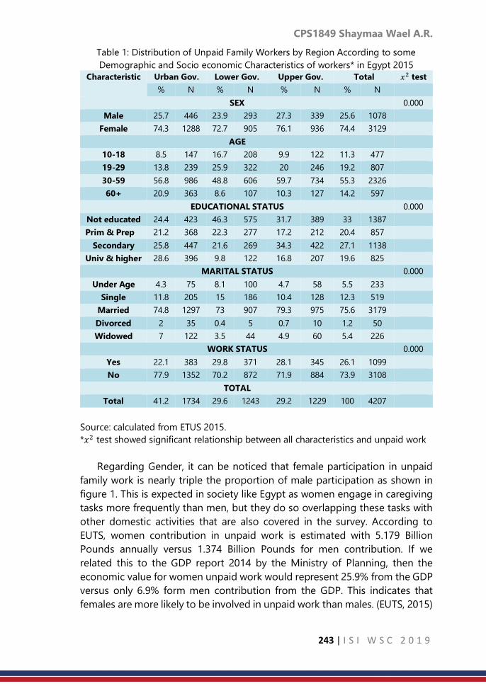
CPS1849 Shaymaa Wael A.R.
243 | I S I W S C 2 0 1 9
Table 1: Distribution of Unpaid Family Workers by Region According to some
Demographic and Socio economic Characteristics of workers* in Egypt 2015
Characteristic Urban Gov. Lower Gov. Upper Gov. Total 𝑥2 test
% N % N % N % N
SEX 0.000
Male 25.7 446 23.9 293 27.3 339 25.6 1078
Female 74.3 1288 72.7 905 76.1 936 74.4 3129
AGE
10-18 8.5 147 16.7 208 9.9 122 11.3 477
19-29 13.8 239 25.9 322 20 246 19.2 807
30-59 56.8 986 48.8 606 59.7 734 55.3 2326
60+ 20.9 363 8.6 107 10.3 127 14.2 597
EDUCATIONAL STATUS 0.000
Not educated 24.4 423 46.3 575 31.7 389 33 1387
Prim & Prep 21.2 368 22.3 277 17.2 212 20.4 857
Secondary 25.8 447 21.6 269 34.3 422 27.1 1138
Univ & higher 28.6 396 9.8 122 16.8 207 19.6 825
MARITAL STATUS 0.000
Under Age 4.3 75 8.1 100 4.7 58 5.5 233
Single 11.8 205 15 186 10.4 128 12.3 519
Married 74.8 1297 73 907 79.3 975 75.6 3179
Divorced 2 35 0.4 5 0.7 10 1.2 50
Widowed 7 122 3.5 44 4.9 60 5.4 226
WORK STATUS 0.000
Yes 22.1 383 29.8 371 28.1 345 26.1 1099
No 77.9 1352 70.2 872 71.9 884 73.9 3108
TOTAL
Total 41.2 1734 29.6 1243 29.2 1229 100 4207
Source: calculated from ETUS 2015.
*𝑥2 test showed significant relationship between all characteristics and unpaid work
Regarding Gender, it can be noticed that female participation in unpaid
family work is nearly triple the proportion of male participation as shown in
figure 1. This is expected in society like Egypt as women engage in caregiving
tasks more frequently than men, but they do so overlapping these tasks with
other domestic activities that are also covered in the survey. According to
EUTS, women contribution in unpaid work is estimated with 5.179 Billion
Pounds annually versus 1.374 Billion Pounds for men contribution. If we
related this to the GDP report 2014 by the Ministry of Planning, then the
economic value for women unpaid work would represent 25.9% from the GDP
versus only 6.9% form men contribution from the GDP. This indicates that
females are more likely to be involved in unpaid work than males. (EUTS, 2015)

CPS1849 Shaymaa Wael A.R.
244 | I S I W S C 2 0 1 9
Figure 1: The Percentage of Unpaid Workers among Regions by Gender in Egypt
2015
Concerning age, the highest participation is among the age group (30-59)
because most of them are housewives. This participation tends to decrease in
younger age because more time is directed to education. Also, less
involvement from older age is due to fewer responsibilities but sometimes
grandparents, if available, often spend time caring for grandchildren when
parents spend more time in paid work.
Figure 2: The Percentage of Unpaid Workers among Regions by Age in Egypt 2015
The effect of education on the participation in unpaid work is revealed in urban
governorates among university graduates by 28.6%; this might be due to
higher wages for housekeeping especially in urban areas. On the other hand,
the highest proportion of participation in lower Egypt is among non-educated
by 46.3% versus 34.3% in upper Egypt in the secondary stage. In general, it
can be noticed that individuals in all educational stages have to participate in
the unpaid family work even those of university education.

CPS1849 Shaymaa Wael A.R.
245 | I S I W S C 2 0 1 9
Figure 3: The Percentage of Unpaid Workers among Regions by Educational Status
in Egypt 2015
Figure 4 shows that the highest proportion of unpaid workers is among
married people as it reaches about 80% in upper Egypt then decreases slightly
in urban governorates and lower Egypt (74% against 73% respectively). This
might be due to more concerns in family responsibilities such as caregiving
that makes a major contribution to human development, particularly by
offering personalized care for family members.
Figure 4: The Percentage of Unpaid Workers among Regions by Marital Status in
Egypt 2015
Figure 5 represents the inverse relation between unpaid work and work status.
The highest proportion of unpaid workers is among the unemployed and it
reaches its peak among urban governorates by about 80% then declines to
about 72% in upper Egypt and 70% in lower Egypt. When people undertake
care responsibilities and stay out of the labour force, they make large
sacrifices, perhaps missing the chance to expand their capabilities in the
workplace. They also often compromise their economic independence and
personal autonomy, which can be crucial for them and their children. (UNDP,
2015)

CPS1849 Shaymaa Wael A.R.
246 | I S I W S C 2 0 1 9
Figure 5: The Percentage of Unpaid Workers among Regions by Work Status in
Egypt 2015
Estimation Procedures
Step 1: according to the survey data, it is indicated that 68.3% of urban
governorates citizens are involved in unpaid work versus 59.2% in Lower Egypt
and 62.8% in Upper Egypt. According to the Department of Population
Projection in CAPMAS the total population aged (10-64) reached 11455653 in
urban governorates, 28165267 in Lower Egypt and 24874313in Upper Egypt
in 1/7/2015. In this step estimation is made for the number of unpaid workers
by multiplying the targeted population in every region by the percentage of
unpaid work regionally as follows:
Region Population % of Unpaid work # of unpaid workers
Urban governorates 11455653 0.683 7824211
Lower Egypt 28165267 0.628 17687787
Upper Egypt 24874313 0.592 14725593
Total Egypt 65709358 0.622 40739802
Step 2: from the survey data, the average value of unpaid work per person/day
is calculated and the results show that average value of unpaid work reached
75.2 LE in urban governorates versus 40.2 LE in Lower Egypt and 29.1 LE in
Upper Egypt. In order to estimate the annual cost of unpaid work among
regions, the value of unpaid work per day is multiplied by the days of the year
as follows:
Region Unpaid work
value per day
Days of the year # of unpaid workers
Urban governorates 75.2 LE 365 27448 LE
Lower Egypt 40.2 LE 365 14673 LE
Upper Egypt 29.1 LE 365 10621 LE
Total Egypt 44 LE 365 16060 LE

CPS1849 Shaymaa Wael A.R.
247 | I S I W S C 2 0 1 9
Step 3: according to the previous steps, the study can conduct the equation
of estimating the monetary value of the unpaid work that is equivalent to the
annual cost of unpaid work multiplied by the target population in each region
as follows:
Region Annual cost
per person
# of Unpaid workers Value of unpaid
work in Billion
Pounds
Urban governorates 27448 7824211 2.147
Lower Egypt 14673 17687787 2.595
Upper Egypt 10621 14725593 1.564
Total Egypt 16060 40739802 6.543
4. Discussion and Conclusion
Globally, according to the World Bank, women are responsible for 60 to
80 percent of all house and care work and 58 percent of unpaid work in
general. It is estimated that unpaid work being undertaken by women today
“amounts to as much as $10 trillion of output per year. ILO highlighted the
contribution that such efforts would make towards achieving Sustainable
Development Goal (SDG) 8 with regard to decent work, and called for no
worker to be left behind. A recent Harvard study found that gender equality
in the labour force could add US$28 trillion to the global economy by 2025.
Nationally in Egypt, the percentage of individuals who participate in
unpaid family work reached 68.3% in urban governorates with estimated
contribution of about 2.147 Billion EGP, then it decreases to 62.8% in lower
Egypt with estimated contribution of about 2.595 Billion EGP, and 59.2% in
upper Egypt with estimated contribution of about 1.564 Billion EGP. The total
annual contribution of unpaid family work in Egypt GDP is estimated to be
6.543 Billion Pounds.
References
1. CAPMAS, (2015), Egyptian Time Use Survey Report, Cairo, Egypt.
2. CAPMAS, (2015), Governorates Population Estimation by Age. Cairo,
Egypt.
3. UNDP, (2015), Human Development Report on Imbalances in Paid and
Unpaid Work
4. PAHO, (2010), the Invisible Economy and Gender Inequalities. The
Importance of Measuring and Valuing Unpaid Work. Washington, D.C.
5. Hirway Indira (1999): “Time Use Survey”, Integrating paid and unpaid
work into national policies: Selected papers, UNDP.

CPS1849 Shaymaa Wael A.R.
248 | I S I W S C 2 0 1 9
6. Swiebel, J. (1999), Unpaid work and policy-making towards a broader
perspective of work and employment, Department of Economic and
Social Affairs, United Nations, New York

CPS1853 M. Irsyad Ilham
249 | I S I W S C 2 0 1 9
Panel data regression modelling of economic
impact on environmental quality: The case of
Indonesia
M. Irsyad Ilham
Badan Pusat Statistik Republik Indonesia
Abstract
This study examines the impact of economic development, population density,
and number of vehicles on environmental degradation from 31 provinces in
Indonesia for the period 2011-2014. Panel data analysis, which widely used to
examine issues that could not be studied in either cross-section or time-series
settings alone, is used herein. Our empirical results support the hypothesis on
the direction of causality those three factors of environmental damage in the
country. The smallest cross-section random effect is holds for Banten and Riau
provinces which indicates the lowest environmental quality when all factors
are fixed. Our empirical findings provide important analysis for the country
being studied.
Keywords
Environmental Quality Index; Economic Development; Population Density;
Number of Vehicles; Panel Data Analysis
1. Introduction
Recent day, one of the most important issue for developing countries is
environmental degradation (Kojima, 2007; Todaro and Smith, 2013; Warren
and McCarthy, 2012). The issue of environmental degradation is still much
needed important research agenda because of its global significance
(Rahman, 2017). The United Nations argues that environmental problems had
to be overcome by implementing sustainable development program for all
countries (United Nations General Assembly, 2015).The economic impact on
environment tend to be less pay attention may result in negative externalities
of environmental damages (Pearson, 2000). Those impacts finally could effect
by reducing economic output by sectors (Hussen, 2004). According to
Indonesia’s Ministry of Environment and Forest, during 2011-2014, the
average environmental quality index poses in low-level and has decreased by
3,56% in four years. The data also shows the trend of deterioration in water
and forest coverage albeit air quality tends to be stagnant in good-level. This
capture concludes that environmental still become urge due to the impact
arises such as endanger ecosystem balance and even human health risk.
There are several factors that affect environmental degradation in a
county. Economic development is also known as a factor that declines
environmental quality. Besides the meaning of that term which an activity to
improve the performance of every sector of the economy, however, the

CPS1853 M. Irsyad Ilham
250 | I S I W S C 2 0 1 9
economic development activities often exclude residues that can pollute the
environment (Sutomo, 2016). In addition, population density considered as
one factor that will trigger environmental degradation. (Todaro and Smith,
2013) states that if population density and world income levels increase, the
net environment will continue to deteriorate in degradation. The population
problem is not only about the number, density, or migration but also the
quality of human life, namely poverty, backwardness, environmental
conditions, illness, and death. Due to environmental degradation issue, which
can be pictured from declining environmental quality, increase in total carbon
dioxide emission, destroying the forest, and water contamination (Vaclav Smil,
1996), many governments have engaged in addressing seriously and
prudently unless doomed disasters and tragedies. Therefore, analysing the
causal relationship between environmental degradation and several socio-
economic determinants has been a popular topic in the recent environmental
literature (Adams, 2008). This study analyse the environmental degradation in
Indonesia by a view from its Environmental Quality Index (EQI) by provinces.
This research use panel data in order to get more information about
environmental problems and discuss the factors that influenced
environmental degradation. Due to many factors, we considered defining
factors that triggered environmental degradation with economic
development, population density, and number of motor vehicles. This study is
expected to be a reference and evaluation of environmental degradation
issues in Indonesia along with several factors that affect it. If it turns out that
these factors actually proved significant in causing environmental
degradation, it is necessary to change the pattern of development towards the
development of more attention to environmental sustainability. This study
aims to: (1) describe environmental degradation, economic development,
population density, and number motor vehicle in Indonesia during 2011-2014,
and (2) examines the impact of economic development, population density,
and number of vehicles on environmental degradation in Indonesia during
2011-2014.
2. Methodology
This empirical study uses annual data on 31 provinces that located on six
bigger island in Indonesia (i.e. Sumatera, Java, Kalimantan, Sulawesi, Bali and
Nusa Tenggara, Maluku, and Papua) over the period 2011-2014. The variables
in this study include Indonesia’s environmental quality index (IEQI), gross
domestic regional product per capita (GDRPC), population density (POP), and
number of motor vehicles (MOTOR). Environmental quality index measured by
aggregation three aspect of environmental quality. Economic development,
measured as gross domestic regional product per capita, uses constant price
2010 in million rupiah. Population density, calculated by rationing between
number of populations and area, expressed by people per kilometer square.

CPS1853 M. Irsyad Ilham
251 | I S I W S C 2 0 1 9
Number of motor vehicles signed as unit. The source of data is Indonesia
Statistical Agency and Ministry of Environment and Forest. Panel data was
combination form of time series and cross section data. The combination of
time series and cross section data was used to prevent such lacking of time
series and cross section data itself. Moreover, panel data were capable in order
to answer the questions which time series or cross section data cannot
answered. Besides, some advantages in using panel data according to Baltagi
(2005):
1. Panel data would controlling about individual heterogeneity;
2. Panel data give more informative data, more variability, less collinearity
among the variables, more degrees of freedom, and more efficiency;
3. Panel data are better able to study the dynamics of adjustment;
4. Panel data are better able to identify and measure effects that are
simply not detectable in pure cross section or pure time series data;
and
5. Panel data models allow us to construct and test more complicated
behavioral models than purely cross section or time series data.
To determine the most appropriate model used in the study conducted
model significance test. Model selection can be done informally or formally.
According to Gujarati and Porter (2008) there are four considerations that can
be used to choose the best model between fixed effect or random effect
model, namely:
- If the amount of time series (T) data is large and the number of cross
section (N) data is small, the difference between the fixed effect and
the random effect model is very small, so the choice is based on the
ease of calculation, ie the fixed effect model.
- When the amount of time series (T) data is small and the number of
large cross section (N) data, the estimates obtained by the two
methods can differ significantly. In the random effect model, α_i = "" α
+ μ_i where μ_i is the component of individual error and αi in fixed
effect model is not random. If the individual or unit of the cross section
of the sample used is not random, then the fixed effect model is more
appropriate to use. Whereas, if the cross section unit is random, the
random effect model is more appropriate to use.
- If the individual error components μ_i and one or more regressor are
correlated, the estimator derived from the random effect model is
biased, whereas the fixed effect model is unbiased so that the fixed
effect model is better used.
- If the number of large cross section (N) data and the number of small
time series (T) data and the assumption of the random effect model
are met, the random effect model estimator is more efficient than the
fixed effect model estimator.

CPS1853 M. Irsyad Ilham
252 | I S I W S C 2 0 1 9
In addition to informal testing, there are three formal testing procedures
that can be used, namely Chow Test to choose between common effects
models and fixed effects models; Hausman test used to select between fixed
effects model and random effects model; as well as the Breusch-Pagan
Lagrange Multiplier (BP-LM) test to choose between common effects models
and random effects models.
The test used to check whether FEM better that CEM. This test obtaining
residual sum square to calculate. The null hypothesis is common effect model
is better than fixed effect model. The pattern of chow test is
𝐹𝑡𝑒𝑠𝑡 =(𝑅𝑅𝑆𝑆 − 𝑈𝑅𝑆𝑆)/(𝑛 − 1)
(𝑈𝑅𝑆𝑆)/(𝑛𝑇 − 𝑛 − 𝐾)
RRSS is residual sum of squares from common effect model. URSS is residual
sum of squares from fixed effect model. Whether n is number of observation,
k is number of independent variable, and T is period of time. If F bigger than
𝐹(𝛼;𝑛−1,𝑛𝑇−𝑛−𝑘), it conclude to reject null hypothesis, which means that fixed
effect model better than common effect model.
In order to test random effect model better than fixed effect model,
Hausman test should be used. The null hypothesis of the test state that no
correlation between individual error and independent variable. In other words,
the null hypothesis says that random effect model better than fixed effect
model. The formula is
𝑊 = [𝒃 − ]′−1[𝒃 − ]~𝜒𝑘2
Where is covariance matrix of 𝒃 − estimation, shows random effect
model regression coefficient vector. The vector 𝒃 indicate the array of fixed
effect model regression coefficient. The letter n and k mean number of
observation and number of independent variable. If the value of W bigger than
𝜒2(𝛼;𝑘), it conclude to reject null hypothesis so fixed effect model better than
random effect model.
To know whether random effect model better than common effect model,
it uses Breuch-Pagan Lagrange Multiplier (LM) test, which developed by
Breuch-Pagan. The test base on the value of residual from common effect
model. The null hypothesis is intercept is not random variable or common
effect model is better than random effect model. The formula of the test is
𝐿𝑀 =𝑛𝑇
2(𝑇 − 1)[∑ (∑ 휀𝑖
𝑇𝑖=1 )2𝑛
𝑖=1
∑ ∑ 휀𝑖2𝑇
𝑖=1𝑛𝑖=1
− 1]2~𝜒1
Where n and T are number of observation and total period of time. The symbol
휀𝑖 is residual from common effect model. If the value of LM bigger than
𝜒2(𝛼; 1), it conclude to reject null hypothesis which means that random effect
model better than common effect model.
Building the appropriate panel data regression model from econometric
criteria, are needed a test and deal with several problems according to the
model assumption. If the selected model is fixed effect model or common
effect model, the assumption which should be full-filled are normality,

CPS1853 M. Irsyad Ilham
253 | I S I W S C 2 0 1 9
homoscedasticity, non-autocorrelation, and non-multi-collinearity. Special
case if the selected model is random effect, the harnessing of Generalized
Least Square (GLS) or Feasible GLS to estimate parameters has accommodate
the homoscedasticity and non-autocorrelation assumption. Hence, random
effect model uses assumption of normality and multi-collinearity (Heshmati et
al., 2015; Singer and Willett, 2003)
3. Result
First step is testing between CEM and FEM using Chow test. The F test
bring out panel data technique between common and fixed effect model.
Based on calculation in Table 1, F-Statistic value is 30.426 which more than F-
critical value 1.59. The p-value also smaller than five percent significance level
which means that reject Null hypothesis. By five percent significance level, the
intercept across provinces unequal or FEM is better than CEM. The second step
is testing whether REM and FEM using Hausman test. Based on the test below,
it cannot reject null hypothesis because the value of Hausman statistic is 6.78
which smaller than the value of Chi-Square critical value 7.81. Therefore, by
five percent significance level, random effect model is better to use on
explaining the effect of independent variable to the environmental quality.
Table 1. Chow Test dan Hausman Test of the model
Redundant Fixed Effects Tests
Pool: SKRIPSI
Test cross-section fixed effects
Effects Test Statistic d.f. Prob.
Cross-section F 30.425948 (30,90) 0.0000
Cross-section Chi-square 298.929303 30 0.0000
Correlated Random Effects - Hausman Test
Pool: SKRIPSI
Test cross-section random effects
Test Summary
Chi-Sq.
Statistic Chi-Sq. d.f. Prob.
Cross-section random 6.788311 3 0.0790
Thus, the Breuch-Pagan LM test is used to search the best model between
CEM and REM. Having calculate the statistic LM test, the value is more than
Chi-Square critical table 3.841 and can be concluded that REM is better than
CEM to analyse the affect independent variable on environmental
degradation. Thus, the decision is to teject Ho because LM = 127.0284 >
𝜒(0.05,1)2 = 3.841
Statistical test :

CPS1853 M. Irsyad Ilham
254 | I S I W S C 2 0 1 9
𝐿𝑀 =𝑁𝑇
2(𝑇 − 1)[∑ (∑ 𝑒𝑖𝑡
𝑇𝑖=1 )
2𝑁𝑖=1
∑ ∑ 𝑒𝑖𝑡2𝑇
𝑖=1𝑁𝑖=1
− 1]
2
Calculation :
𝐿𝑀 = (31)(4)
2(4 − 1)[3.0785
0.8848− 1]
2
= 127.0284
The panel data regression model to analyse the effect of economic
development, population density, and number of vehicle on environmental
quality is random effect as seen in Table 5. Based estimation result from the
best model, it reject null hypothesis since Prob (F-Stat) is 0.00 below five
percent. Then, it can be stated that by five percent significance level all
independent variables simultaneously affect environmental quality index of
provinces in Indonesia. The partial test of independent variables shows that
the Prob (t-stat) smaller than 0.05 which means that reject Null hypothesis.
Hence, it can be concluded that by five percent significance level, partially
GRDP per capita, population density, and number of vehicles significantly
affect the environmental quality index (EQI). The empirical model that have
been estimated is:
ln(EQI)it = 5,272858 ‐ 0,061763 ln(GDRPC)it
*‐ 0,071430 ln(DEN)it
*‐0,043757 ln(NV)it
*
* Significant at 5 percent
Table 5. Estimation result of panel regression
Dependent Variable: ln(EQI)
Variable Coefficie
nt
Std. Error P-value
C 5.2729 0.298705 0.0000
ln(GDRPC) -0.0618 0.029043 0.0355
ln(DEN) -0.0714 0.012546 0.0000
ln(NV) -0.0438 0.016374 0.0086
Random Effects (Cross)
Province Effect Province Effect Province Effect
Aceh 0.097147 East Kalimantan 0.118507 North Sumatera 0.055236
Bali 0.058845 Riau Islands 0.129586
Bangka
Belitung
-0.130372 Lampung -0.11052
Banten -0.148431 Maluku -0.03397
Bengkulu -0.028395 North Maluku -0.07251
Yogyakarta -0.05612 West
Nusatenggara
0.063185
Jakarta -0.01694 East
Nusatenggara
-0.07497

CPS1853 M. Irsyad Ilham
255 | I S I W S C 2 0 1 9
Gorontalo 0.047408 Papua 0.038041
Jambi -0.035125 Riau -0.13799
West Java -0.070697 South Sulawesi 0.041691
Central Java 0.133403 Central Sulawesi 0.128072
East Java 0.114054 Southeast
Sulawesi
0.048738
West
Kalimantan
-0.020404 North Sulawesi 0.028231
South
Kalimantan
-0.112617 West Sumatera 0.073993
Central
Kalimantan
-0.057693 South Sumatera -0.06938
R-squared 0.459677
Adjusted R-squared 0.446169
F-statistic 34.02983
Prob(F-statistic) 0.0000
4. Discussion and Conclusion
According to the model, the value of adjusted R-Square is 0.45 that can be
interpreted that the variable economic development (GDRP per
capita/GDRPC), population density (DEN), and the number of vehicles (NV) is
able to explain the variation in environmental degradation (EQI) about 45
percent while the rest is affected by the other variables outside the model.
Moreover, normality test in Table 2 shows that the error' followed normal
distribution. Besides, multi-collinearity check-in from the model shows that
the relationship between independent variables relative more safe from multi-
collinearity. Therefore, environmental degradation model has full-filled the
required assumptions. This condition indicate that the model is relatively
accurate and be used for analysis.
Estimation result shows that by five percent significance level, when GRDP
per capita increase by one percent, environmental quality of Indonesia's
provinces will leads to decrease by 0.06 percent, ceteris paribus. The result on
line with Kuznets hypothesis on EKC that economic activity in early
development progress tend to decline natural quality. Moreover, the research
by Paudel and Pandit (2013) also explain that income per capita has positive
impact on environmental degradation in a county.
Another factor is population density. Estimation result point out with five
percent significance level the increase of population density by one percent
will decrease environmental quality index by 0.07 percent, ceteris paribus. The
result has equal with some literatures, such as Abesamis et al. (2013), Alam
(2010) and Rahman (2017).

CPS1853 M. Irsyad Ilham
256 | I S I W S C 2 0 1 9
In addition, increasing number of motor vehicles indicates high
combustion that produce pollutant dangerous gas. Whereas there's not
development eco-friendly motor combustion machine or changing public
behaviour to use public transportation it will leads to be high pollute in the
air. This condition will make environmental degradation of air. The result from
panel regression infer that by five percent significance level, the environmental
quality index of Indonesia will decrease by 0.04 percent when number of
vehicles increased by one percent, ceteris paribus. The result also supported
by research from Sadullah (2003), Zainordin, Ramli, Sulaiman, dan Awang
(2014), Andong and Sajor (2015).
The effect distinction of individual Cases from each provinces can be
identified by random effect model if all independent variables has the same
value or constant. Based on estimation result Banten is the province which has
the smallest individual effect. It means that when economic growth,
population density, and number of vehicles in all Indonesian provinces is
constant so Banten will has the lowest environmental quality index.
References
1. Abesamis, J., Campos, J.C., Castell, C., 2013. Estimating the Effects of
Urbanization on Carbon Emissions: Evidence in the Philippines. Policy Br.
VII, 1–4.
2. Adams, W.M., 2008. Green Development Environment and Sustainability
in a Developing World, GREEN DEVELOPMENT.
3. Alam, S., 2010. Globalization, Poverty and Environmental Degradation:
Sustainable Development in Pakistan. J. Sustain. Dev.
https://doi.org/10.5539/jsd.v3n3p103
4. Andong, R.F., Sajor, E., 2015. Urban sprawl, public transport, and
increasing CO2 emissions: the case of Metro Manila, Philippines. Environ.
Dev. Sustain. https://doi.org/10.1007/s10668-015-9729-8
5. Gujarati, D.N., Porter, D.C., 2008. Basic Econometrics, Fifth. ed. McGraw-
Hill Education, New York.
6. Gunawan, H., Ruslinda, Y., Alfionita, A., 2017. Relationship models
between hydrocarbon concentrations in roadway ambient airwith traffic
characteristics. Int. J. Civ. Eng. Technol.
7. Hussen, A.M., 2004. Principles of Environmental Economics: Economics,
Ecology and Public Policy.
8. Kojima, S., 2007. Sustainable development in water-stressed developing
countries: a quantitative policy analysis, Sustainable development in
water-stressed developing countries: a quantitative policy analysis.
9. Ministry of Environment and Forest, 2015. Indeks kualitas lingkungan
hidup 2014.

CPS1853 M. Irsyad Ilham
257 | I S I W S C 2 0 1 9
10. Paudel, K.P., Pandit, M., 2013. ENVIRONMENTAL KUZNETS CURVE IN
STOCK AND FLOW WATER. Agric. L S U 1–45.
11. Pearson, C.S., 2000. Economics and The Global Environment. Cambridge
University Press, Cambridge.
12. Rahman, M.M., 2017. Do population density, economic growth, energy
use and exports adversely affect environmental quality in Asian
populous countries? Renew. Sustain. Energy Rev.
https://doi.org/10.1016/j.rser.2017.04.041
13. Sadullah, a. F.M., 2003. Air pollution from motor vehicles A
mathematical model analysis: Case study in Ipoh City, Perak, Malaysia. J.
East. ….
14. Singer, J.D., Willett, J.B., 2003. Applied Longitudinal Data Analysis :
Modeling Change and Event Occurence., ISBN0195152964.
https://doi.org/10.1093/acprof
15. Todaro, M.P., Smith, S.C., 2013. Economic Development. Econ. Dev. 797.
https://doi.org/http://dx.doi.org/10.1257/jel.50.4.1051
16. United Nations General Assembly, 2015. Transforming our world: The
2030 agenda for sustainable development,
https://sustainabledevelopment.un.org/content/documents/7891Transfo
rming%20Our%20World. pdf. https://doi.org/10.1007/s13398-014-0173-
7.2
17. Warren, C., McCarthy, J.F., 2012. Community environment and local
governance in Indonesia: Locating the commonweal, Community
Environment and Local Governance in Indonesia: Locating the
Commonweal. https://doi.org/10.4324/9780203888995

CPS1854 Shonosuke S. et al.
258 | I S I W S C 2 0 1 9
Robust estimation and joint selection in
linear mixed models
Shonosuke Sugasawa1; Francis Hui2; Alan Welsh2 1Center for Spatial Information Science, the University of Tokyo 2Mathematical Science Institute, Australian National University
Abstract
Linear mixed models have been widely used for analyzing clustered or
longitudinal data. Conventional methods assume normality for both random
effects and error terms, which could be sensitive to outliers and may produce
biased and inefficient estimates of the model parameters as well as inaccurate
prediction of random effects or future values. Although several robust
methods have been developed, they still suffer from their unstable
performances when the contamination is heavy. In this work, we modify the
estimating equations for both regression coefficients and random effects by
introducing normalized density weights, and propose robust estimator of the
model parameters as well as random effects. We provide MM-algorithm to
compute the minimizer of the objective function. Moreover, we consider the
joint selection of regression coefficients and random effects by introducing
adaptive lasso and adaptive group lasso penalty, respectively, and propose an
efficient algorithm to compute the robust and sparse estimator. We
demonstrate the proposed methods together with existing methods through
simulations studies and applications to real datasets.
Keywords
clustered data; estimating equation; divergence; linear mixed models; robust
estimation
1. Introduction
For analyzing clustered or longitudinal data, linear mixed models that can
adequately account for variability among clusters or individuals are widely
used. Conventionally, normality is assume for distributions of both random
effects and error terms, which often leads to unstable performance when there
exists outliers. In this work, we propose a new robust approach to estimation
in linear mixed models by modifying likelihood (estimating) equations for
regression coefficients and random effects with use of density weights. We
demonstrate that the modification is the same as considering an objective
function based on two-divergence. We provide a MM-algorithm for
calculating robust estimates of model parameters as well as random effects.

CPS1854 Shonosuke S. et al.
259 | I S I W S C 2 0 1 9
We also consider regularized estimation of regression coefficients and random
effects by putting penalties on the objective function.
2. Robust Estimation of Linear Mixed Models
2.1 Weighted estimating equations and objective functions
We consider the following linear mixed model:
𝑦𝑖𝑗 = 𝑥𝑖𝑗𝑡 𝛽 + 𝑧𝑖𝑗
𝑡 𝑏𝑖 + 휀𝑖𝑗, 𝑗 = 1, . . . , 𝑛𝑖 , 𝑖 = 1, . . . , 𝑚, (1)
where xij and zij are p- and q-dimensional vectors of covariates, 𝛽 is a
𝑝 −dimensional vector of regression coefficients, bi is a vector of random
effects and εij is an error term. Here we assume that bi and εij are independent
and distributed as bi ∼ 𝑁(0, 𝑅) and εij ∼ 𝑁(0,σ2), where R and σ2 are unknown
variance-covariate matrix and variance parameter, respectively.
We first assume that both R and σ2 are known. Then, the maximum
likelihood estimators of 𝛽 and bi are the solution of the following estimating
equations:
1
𝜎2∑∑𝑥𝑖𝑗(𝑦𝑖𝑗 − 𝑥𝑖𝑗
𝑡 𝛽 + 𝑧𝑖𝑗𝑡 𝑏𝑖) = 0
𝑛𝑖
𝑗=1
𝑚
𝑖=1
1
𝜎2∑𝑧𝑖𝑗(𝑦𝑖𝑗 − 𝑥𝑖𝑗
𝑡 𝛽 + 𝑧𝑖𝑗𝑡 𝑏𝑖) −
𝑛𝑖
𝑗=1
𝑅−1𝑏𝑖 = 0, 𝑖 = 1,… ,𝑚. (2)
When there exist outliers in yij, the estimating equations may produce poor
estimates of 𝛽 as well as 𝑏𝑖.
We introduce weights wij = w(yij;bi, 𝛽 ,σ2) and ui = 𝑢(𝑏𝑖;𝑅) to modify the
estimating functions in (2) to
𝐹𝛽 =1
𝜎2∑∑𝑤𝑖𝑗𝑥𝑖𝑗(𝑦𝑖𝑗 − 𝑥𝑖𝑗
𝑡 𝛽 + 𝑧𝑖𝑗𝑡 𝑏𝑖)
𝑛𝑖
𝑗=1
𝑚
𝑖=1
𝐹𝑏𝑖 = 1
𝜎2∑𝑤𝑖𝑗𝑧𝑖𝑗(𝑦𝑖𝑗 − 𝑥𝑖𝑗
𝑡 𝛽 + 𝑧𝑖𝑗𝑡 𝑏𝑖)
𝑛𝑖
𝑗=1
− 𝜇𝑖𝑅−1𝑏𝑖 , 𝑖 = 1,… ,𝑚 (3)
Specifically, we consider the following forms of the weights:
𝑤𝑖𝑗 =𝑓(𝑦𝑖𝑗|𝑏𝑖; 𝛽, 𝜎
2)𝛾
𝑁−1 ∑ ∑ 𝑓(𝑦𝑖𝑗|𝑏𝑖; 𝛽, 𝜎2)𝛾𝑛𝑖𝑗=1
𝑚𝑖=1
, 𝑢𝑖 =𝜋(𝑏𝑖; 𝑅)
𝛾
𝑚−1∑ 𝜋(𝑏𝑖; 𝑅)𝛾𝑚𝑖=1
,

CPS1854 Shonosuke S. et al.
260 | I S I W S C 2 0 1 9
where 𝑁 = ∑ 𝑛𝑖𝑚𝑖=1 , 𝑓(𝑦𝑖𝑗|𝑏𝑖;𝛽, 𝜎
2) is the conditional distribution of 𝑦𝑖𝑗 under
the model (1), that is, 𝑦𝑖𝑗|𝑏𝑖 ~ 𝑁(𝑥𝑖𝑗𝑡 𝛽 + 𝑧𝑖𝑗
𝑡 𝑏𝑖 , 𝜎2), and π(𝑏𝑖; 𝑅) is the marginal
distribution of 𝑏𝑖 , i.e. 𝑏𝑖 ∼ 𝑁(0, 𝑅) . If 𝑦𝑖𝑗 is a outlier, the weight for the
information of 𝑦𝑖𝑗 would be very small, so that the information of such outliers
are automatically ignored in (3). The tuning parameter 𝛾 controls the effects
of outliers, and the larger value 𝛾 leads to the smaller weight for 𝑦𝑖𝑗when 𝑦𝑖𝑗is
an outlier. The value of 𝛾 is specified by the user or choose in a objective way
as discussed later. Note that if 𝛾 = 0, the weights are 1, so that the modified
estimating functions (3) reduce to the conventional ones. Since the estimating
functions 𝐹𝛽 and 𝐹𝑏𝑖 are not necessarily unbiased, the modified estimating
equations are 𝐹𝛽 − E[𝐹𝛽 ] = 0 and 𝐹𝑏𝑖 − E[𝐹𝑏𝑖 ] = 0, 𝑖 = 1, . . . , 𝑚, where the
expectations are taken with respect to the conditional distribution
𝑓(𝑦𝑖𝑗𝑏𝑖; 𝛽, 𝜎2) and the marginal distribution π(𝑏𝑖; 𝑅), respectively.
The modified estimating equations can be derived by considering the
following objective function:
𝑁
𝛾log ∑∑𝑓(𝑦𝑖𝑗|𝑏𝑖; 𝛽, 𝜎
2)𝛾
𝑛𝑖
𝑗=1
𝑚
𝑖=1
−𝑁
1 + 𝛾log ∑∑𝑓(𝑡|𝑏𝑖; 𝛽, 𝜎
2)1+𝛾
𝑛𝑖
𝑗=1
𝑚
𝑖=1
𝑑𝑡
+𝑚
𝛾log ∑𝜋(𝑏𝑖; 𝑅)
𝛾
𝑚
𝑖=1
−𝑚
1 + 𝛾log ∑∫𝜋(𝑠; 𝑅)1+𝛾𝑑𝑠
𝑚
𝑖=1
,
It is easy to show that the partial derivatives of (4) with respect to β and bi
are the modified estimating functions Fβ and Fbi given in (3), respectively. Note
that the objective function (4) can be seen as a weighted combination of two
𝛾-divergence (Fujisawa and Eguchi, 2008).
From the forms of f(𝑦𝑖𝑗|bi;β,σ2) and π(bi;R), we may evaluate the integrals
appeared in (4). By ignoring irrelevant terms, we have the following function
to be minimized:
𝑄(휃, 𝑏) = −𝑁
𝛾log ∑∑𝑓(𝑦𝑖𝑗|𝑏𝑖;𝛽, 𝜎
2)𝛾
𝑛𝑖
𝑗=1
𝑚
𝑖=1
−𝑁𝛾
2(1 + 𝛾)log𝜎2
−𝑚
𝛾log ∑𝜋(𝑏𝑖; 𝑅)
𝛾
𝑚
𝑖=1
−𝑚𝛾
2(1 + 𝛾)log|𝑅|,
where 휃 = (𝛽𝑡 , 𝑣𝑒𝑐(𝑅)𝑡 , 𝜎2) is a vector of unknown parameters. Then, the new
robust
(4)
(5)

CPS1854 Shonosuke S. et al.
261 | I S I W S C 2 0 1 9
estimators of 휃 and b are defined as the minimizer of 𝑄(휃, 𝑏). Although it
seems hard to minimize 𝑄(휃, 𝑏) due to its complicated structure, we can easily
carry it out by employing MM-algorithm (Hunter and Lange, 2004).
2.2 MM-algorithm
Our MM-algorithm entails the following iteration processes:
𝛽(𝑘+1) ← (∑∑𝑤𝑖𝑗(𝑘)𝑥𝑖𝑗𝑥𝑖𝑗
𝑡
𝑛𝑖
𝑗=1
𝑚
𝑖=1
)
−1
∑∑𝑤𝑖𝑗(𝑘)𝑥𝑖𝑗(𝑦𝑖𝑗 − 𝑧𝑖𝑗
𝑡 𝑏𝑖(𝑘))
𝑛𝑖
𝑗=1
𝑚
𝑖=1
𝜎2(𝑘+1) ←1+ 𝛾
𝑁∑∑𝑤𝑖𝑗
(𝑘)𝑥𝑖𝑗(𝑦𝑖𝑗 − 𝑥𝑖𝑗𝑡 𝛽(𝑘+1) − 𝑧𝑖𝑗
𝑡 𝑏𝑖(𝑘))2
𝑛𝑖
𝑗=1
𝑚
𝑖=1
𝑏𝑖(𝑘+1) ← 𝜎−2(𝑘+1)∑𝑤𝑖𝑗(𝑘)𝑧𝑖𝑗𝑧𝑖𝑗
𝑡 + 𝑢𝑖(𝑘)𝑅(𝑘)−1
𝑛𝑖
𝑗=1
−1
𝜎−2(𝑘+1)∑𝑤𝑖𝑗(𝑘)𝑧𝑖𝑗(𝑦𝑖𝑗 − 𝑥𝑖𝑗
𝑡 𝛽(𝑘+1))
𝑛𝑖
𝑗=1
𝑅(𝑘+1) ←1+ 𝛾
𝑚∑𝑢𝑖
(𝑘)𝑏𝑖(𝑘+1)
𝑚
𝑖=1
𝑏𝑖(𝑘+1)𝑡
This updating process ensures that the value of the objective function (5)
monotonically decreases in each step.
3. Robust Joint Selection via Reguralization
We may add some penalty terms to 𝑄(휃, 𝑏) for robust and joint sparse
estimation of β and b. Following Hui et al. (2017), we consider the following
function:
𝑄𝐽𝑆(휃, 𝑏) = 𝑄(휃, 𝑏) + 𝜆∑𝐶𝑘|𝛽𝑘| + 𝜆∑𝑑ℓ ∥ 𝑏°ℓ ∥,
𝑞
ℓ=1
𝑝
𝑘=1
where 𝐶𝑘 and 𝑑ℓ are adaptive weights based on preliminary estimates of 𝛽𝑘
and 𝑅 , respectively, 𝑏 ℓ = (𝑏1ℓ, . . . , 𝑏𝑚ℓ) denotes all the coefficients
corresponding to the ℓ th random effect, and ∥ · ∥ denotes its L1 norm. We use
an adaptive lasso penalty with weights 𝐶𝑘 for the fixed effects, and an adaptive
group lasso penalty with weights 𝑑ℓ for the random effects, linked by one
tuning parameter λ > 0.
We may again use MM-algorithm to obtain the minimizer of 𝑄𝐽𝑆(휃, 𝑏). We get
the majorization function of 𝑄𝐽𝑆(휃) as follows:
(6)

CPS1854 Shonosuke S. et al.
262 | I S I W S C 2 0 1 9
𝑄𝐽𝑆(𝑘)𝑀 (휃, 𝑏) =
𝑁
2(1 + 𝛾)log𝜎2 +
1
2𝜎2∑∑𝑤𝑖𝑗
(𝑘)(𝑦𝑖𝑗 − 𝑥𝑖𝑗𝑡 𝛽 − 𝑧𝑖𝑗
𝑡 𝑏𝑖)2
𝑛𝑖
𝑗=1
𝑚
𝑖=1
+𝑚
2(1 + 𝛾)log|𝑅| +
1
2∑𝑢𝑖
(𝑘)
𝑚
𝑖=1
𝑏𝑖𝑡𝑅−1𝑏𝑖 + 𝜆∑𝐶𝑘|𝛽𝑘| + 𝜆∑𝑑ℓ ∥ 𝑏°ℓ ∥,
𝑞
ℓ=1
𝑝
𝑘=1
This minimization problem is almost the same as minimizing the
regularized likelihood of linear regression.
References
1. Hui, F. K. C., Mueller, S., and Welsh, A. H. (2017). Joint Selection in Mixed
Models Using Regularized PQL. Journal of the American Statistical
Association 112, 13231333.
2. Fujisawa, H. and Eguchi, S. (2008). Robust parameter estimation with a
small bias against heavy contamination. Journal of Multivariate Analysis
99, 2053-2081.
3. Hunter, D. R. and Lange, K. A tutorial on MM algorithms. American
Statistician 58, 0-37.

CPS1855 Nobutane H.
263 | I S I W S C 2 0 1 9
Extended age-environment model for analysing
data on breast cancer death rates for
Japanese elderly women
Nobutane Hanayama Shobi University, Kawagoe, Japan
Abstract
The breast cancer death rate for Japanese women aged 70-74 in 2010-14 is
almost twice of the rate in 1985-89, while the rate for women aged 50-54 has
been slightly decreased since 2000. Such trend may be due to that age and
environment factors, which include advancing medical technology,
socioeconomic condition and government policy for public health, intricately
affect Japanese women. In this study, to project such age and environmental
factors, a newly proposed statistical model, which is alternative to the age-
period-cohort model, is fitted to the data for breast cancer deaths for Japanese
women aged 50 and older in 1985-2014. The result shows that the proposed
model provides a better fit to the data than the age-period-cohort model in
terms of Akaike's Information Criterion. Besides the result of estimating
environmental factors suggests that effects of westernized food culture, low
fertility, increase of woman’s first pregnancy over 40 or working women,
westernized food culture since 1960s and low fertility rates in these several
decades in Japan. In addition, the result of comparison of estimated
environment effects on breast cancer and those on food preference rates
suggests that that change of food reference from beef stew to Hamburger or
beef stake increase the breast cancer risks.
Keywords
Age-period-cohort model; Breast cancer; Death rates given by age and period;
Environmental factor
1. Introduction
Breast cancer has become a big socio-economic problem in Japan
(Matsumoto, et al. 2015). Especially among elderly women, the death rates
from the disease have been increasing over the past three decades, though
the death rate remain relatively low compared with the United States, Canada
and England and Wales (Yang, et al., 2010). Now let’s see the Table 1 for the
numbers of deaths in 10,000 for Japanese women aged 50-79. Then it is found
the rate for women aged 70-74 in 2010-14 is almost twice of those in 1985-
89 also in Japan. However, for women aged 50-54, the rate has been slightly
decreased since 2000. More specifically, the age-specific breast cancer death
rates in 2010-14 are entirely almost double of those in 1985-89 for all age
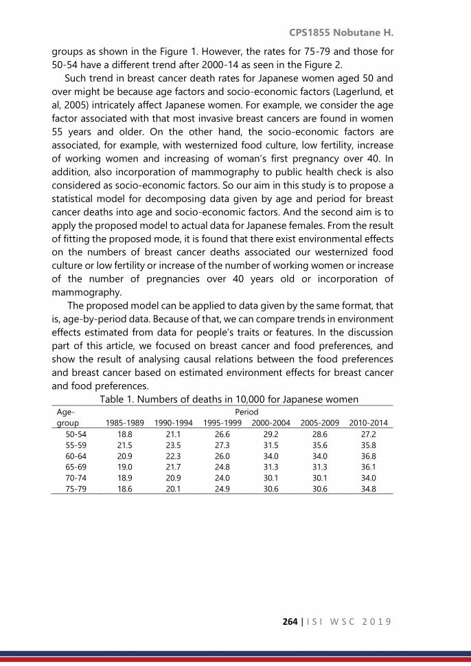
CPS1855 Nobutane H.
264 | I S I W S C 2 0 1 9
groups as shown in the Figure 1. However, the rates for 75-79 and those for
50-54 have a different trend after 2000-14 as seen in the Figure 2.
Such trend in breast cancer death rates for Japanese women aged 50 and
over might be because age factors and socio-economic factors (Lagerlund, et
al, 2005) intricately affect Japanese women. For example, we consider the age
factor associated with that most invasive breast cancers are found in women
55 years and older. On the other hand, the socio-economic factors are
associated, for example, with westernized food culture, low fertility, increase
of working women and increasing of woman’s first pregnancy over 40. In
addition, also incorporation of mammography to public health check is also
considered as socio-economic factors. So our aim in this study is to propose a
statistical model for decomposing data given by age and period for breast
cancer deaths into age and socio-economic factors. And the second aim is to
apply the proposed model to actual data for Japanese females. From the result
of fitting the proposed mode, it is found that there exist environmental effects
on the numbers of breast cancer deaths associated our westernized food
culture or low fertility or increase of the number of working women or increase
of the number of pregnancies over 40 years old or incorporation of
mammography.
The proposed model can be applied to data given by the same format, that
is, age-by-period data. Because of that, we can compare trends in environment
effects estimated from data for people’s traits or features. In the discussion
part of this article, we focused on breast cancer and food preferences, and
show the result of analysing causal relations between the food preferences
and breast cancer based on estimated environment effects for breast cancer
and food preferences.
Table 1. Numbers of deaths in 10,000 for Japanese women
Age-
group
Period
1985-1989 1990-1994 1995-1999 2000-2004 2005-2009 2010-2014
50-54 18.8 21.1 26.6 29.2 28.6 27.2
55-59 21.5 23.5 27.3 31.5 35.6 35.8
60-64 20.9 22.3 26.0 34.0 34.0 36.8
65-69 19.0 21.7 24.8 31.3 31.3 36.1
70-74 18.9 20.9 24.0 30.1 30.1 34.0
75-79 18.6 20.1 24.9 30.6 30.6 34.8

CPS1855 Nobutane H.
265 | I S I W S C 2 0 1 9
Figure 1. Age-specific breast cancer
death rates in 1985-89 and that in 2010-
14
Figure 2. Trend in breast cancer
death rates for 75-79 and that for
50-54
2. Methodology
Our data to be analyzed in this study is given by age and period as
indicated in Table 1. The Lexis diagram (Keiding, 1990) indicated in Figure 3 is
useful tool for understanding the properties of this type of data. In the figure
the vertical axis indicates age and the horizontal axis indicates time (year). And
those oblique lines indicate individuals who are alive and they die at the
endpoints of those oblique lines.
Figure 3. Lexis diagram Figure 4. Death rates on the Lexis
diagram
On the Lexis diagram the number of deaths given by 5-year age and
period, say 𝐷𝑖𝑗; 𝑖 = 1,2, … , 𝐼; 𝑗 = 1,2, … , 𝐽, equals the number of end points of
those oblique lines within the squared area [𝐴𝑖−1, 𝐴𝑖) × [𝑃𝑗−1 , 𝑃𝑗), where
𝐴𝑖−1, 𝐴𝑖 = 𝑃𝑗−1, 𝑃𝑗 = 5, and death rate given by age and period, that is given
for [𝐴𝑖−1, 𝐴𝑖) × [𝑃𝑗−1, 𝑃𝑗) say 𝑖𝑗, equals the expectation of 𝐷𝑖𝑗 divided by the
total of individuals’ survival time with in [𝐴𝑖−1, 𝐴𝑖) × [𝑃𝑗−1 , 𝑃𝑗) say 𝑋𝑖𝑗. Because
15.0
20.0
25.0
30.0
35.0
40.0
1985-1989 2010-2014
15
20
25
30
35
40
50-54 75-79

CPS1855 Nobutane H.
266 | I S I W S C 2 0 1 9
it is impossible to observe 𝑋𝑖𝑗, it is conventionally approximated by sum of
survivors every year in [𝑃𝑗−1, 𝑃𝑗), which is called person-years.
For analysing data given by age and period, the age-period-cohort model
(Kupper et al., 1985) has enjoyed considerable popularity. The age-period-
cohort model is one expressed as this formula.
log 𝜆𝑖𝑗 = 𝜇 + 𝛼𝑖 + 𝛽𝑗 + 𝛾𝑗−𝑖 (1)
In this formula 𝛼𝑖 indicates the age effect and 𝛽𝑗 indicates the period effect
and 𝛾𝑗−𝑖 indicates the cohort effect. As illustrated in the Figure 5 𝛼𝑖 and 𝛽𝑗 are
common for data associated with horizontally and vertically aligned squared
areas on the Lexis diagram, while, 𝛾𝑗−𝑖 is common for data associated with
people who were in the ages [𝐴0, 𝐴1) in the period [𝑃𝑗−1, 𝑃𝑗) which is called
birth cohort (Glenn, 1977).
Figure 5. Age, period and cohort effects on the Lexis diagram
As long as the birth cohort is concerned, 𝛾𝑗−𝑖 is associated with event
occurred in [𝑃𝑗−1, 𝑃𝑗) which affect people (babies or children) in the ages
[𝐴0, 𝐴1). However our concern in this study is the socioeconomic factors on
breast cancer, and socio-economic events may affect not only people in the
ages [𝐴0 , 𝐴1) but also other people as the Figure 6 (left). In addition it may be
plausible to consider that socio-economic events make effect on people who
experience them afterward as illustrated in the Figure 6 (center). Based on
those idea Hanayama (2004) suggested a model with age and environment
effects called age-environment model, which are illustrated in the Figure 6
(right).
Figure 6. Idea environment effect

CPS1855 Nobutane H.
267 | I S I W S C 2 0 1 9
The age-environment model is expressed as follows.
log 𝜆𝑖𝑗 = 𝜇 + 𝛼𝑖 + ∑ 𝜉𝑘 , (2)
𝑗−1
𝑘=𝑗−𝑖−𝐴0/5
where 𝛼𝑖 is the age effect, which is common for the age-period-cohort model,
and 𝜉𝑘 is the environment effect associated with events occurred in [𝑃𝑘−1 , 𝑃𝑘),
which affect all people who experience them. Because people who are alive in
the period [𝑃𝑗−1, 𝑃𝑗) in the ages [𝐴𝑖−1, 𝐴𝑖) are affected all events occurred
[𝑃𝑗−𝑖 , 𝑃𝑗−𝑖+1), [𝑃𝑗−𝑖−1, 𝑃𝑗−𝑖), … , [𝑃𝑗−1, 𝑃𝑗) as illustrated in the Figure 7,
𝜉𝑗−𝑖 ,… , 𝜉𝑗−1 are cumulated in the age-environment model. In addition.
Figure 7. Cumulative 𝜉𝑘 Figure 8. the youngest and the oldest
age-group who are affected by the
environment and duration that socio-
economic events take effect
Though the age-environment model is successfully fitted to age-by-period
data for breast cancer death rates, it may not be natural to assume that people
who are alive in the period [𝑃𝑗−1, 𝑃𝑗) in the ages [𝐴𝑖−1 , 𝐴𝑖). Further it may not
be natural as well to assume that affected all events and those take effects
ever after they experience them. So, we introduce indices indicating the
youngest and the oldest age-group who are affected by socio-economic
events and an index indicating duration that socio-economic events take
effect after people experience them into the age-environment model and
suggest an extended model like
log 𝜆𝑖𝑗 = 𝜇 + 𝛼𝑖 + ∑ 𝜉𝑘 , (3)
min (𝑗,𝑗−𝑖−𝐿+𝑈)
𝑘=max𝑗−𝑖+2−𝐿,𝑗−𝐷
where 𝐿 = 1,2, … , 𝐴1/5 and 𝑈 = 1,2,… , 𝐼 indicate the youngest and the
oldest age-group who are affected by the environment respectively, and 𝐷 =

CPS1855 Nobutane H.
268 | I S I W S C 2 0 1 9
1,2, … , 𝐼 + 𝐴0/5 indicates duration that socioeconomic events take effect after
people experience them
3. Result
A summary of fitting the proposed model are indicated in the Table 2. As
seen from the table the extended age-environment model provides a better
fit to the data that the age-period-cohort model in terms of Akaike's
Information Criterion (AIC).
Table 2. Summary of fitting the proposed model to the data on Table 1
The youngest age-group who are affected by the environment 40-44 years
The oldest age-group who are affected by the environment 65-69 years
Duration that exposure to the environment take effect 30 years
AIC 3324082.66
Difference of AICs between EAE and APC models 13.16
Figure 11 indicate estimated age effect. From the figure we can conclude
that the risk of breast cancer death does not increase after 55 which is around
the period of menopause. Age effect
Figure 9. Estimates of age effects
Figure 12 indicates the estimated environment effects. From the figure it is
suggested that there exist the effects of westernized food culture, low fertility,
increase of the number of pregnancies over 40 and working women, which are
discussed by Minami, et al. (2004). In addition it is also suggested that the
effects of incorporation of mammography to health check for public, which is
consistent with the conclusion by SAIKA and SOBUE (2009).
-0.2
-0.1
-0.1
0.0
0.1
0.1 The risk of breast
cancer death does
not increase after 55
(menopause)
Most invasive breast
cancers are found in
women aged 55 and
older.

CPS1855 Nobutane H.
269 | I S I W S C 2 0 1 9
Figure 10. Estimates of environment effects
4. Discussion and Conclusion
In the above, a newly proposed model was fitted to the data given by age
and period for breast cancer deaths obtained from the Japan Vital Statistics.
The result of fitting the model to the data showed that the proposed model
provides a better fit to the data than the age-period-cohort model in terms of
AIC. The proposed model can be applied to data given by the same format,
that is, age-by-period data. Because of that, we can compare trends in
environment effects estimated from data for people’s traits or features. In this
section, we focused on breast cancer and food preferences, and show the
result of analysing causal relations between the food preferences and breast
cancer based on estimated environment effects for breast cancer and food
preferences. As described in the Introduction, the socio-economic factors for
breast cancer are associated, for example, with westernized food culture, low
fertility, increase of working women, increasing of pregnancies over
incorporation of mammography to public health check is also considered as
socioeconomic factors. Because changing of food culture might be considered
independent from other factors for breast cancer, it may be appropriated to
consider a regression model where the environment effect on breast cancer is
a regressand and those on food preferences are regressors (Figure 11). From
the result of regression analysis for the environment effect on breast cancer
and food preferences (Table 3), it is found that change of food reference from
beef stew to Hamburger or beef stake increase the breast cancer risks.
-0.15 -0.1
-0.05 0
0.05 0.1
0.15
year
Environment effect Effect of
incorporation of
mammography to
health check for
public
Effect of
westernized food
culture, low
fertility, increase
of woman’s first
pregnancy over
40 or working
women

CPS1855 Nobutane H.
270 | I S I W S C 2 0 1 9
Figure 11. Regression analysis for the environment effect on breast cancer
and food preferences
Table 3. Result of Regression analysis for the environment effect on breast
cancer and food preferences
Regression Statistics
R square 0.79
Adjusted R
square
0.69
Multi regression
Coefficient Standard
Coefficient
F-
value
p-
value
Significancy
Hamburger stake 0.38 0.75 14.57 0.01 [**]
Beef stake, Roast
beef
0.23 0.53 7.85 0.03 [* ]
Beef stew -0.16 -0.41 4.14 0.08 [ ]
Constant 0.00 0.08 0.79 [ ]
Westernized
food culture
Environmental factor on Breast cancer
⊥
Westernized
food culture
Environmental factor on Breast cancer
disturbance
term • Low
• Increase of working women
• Increase of first child birth
over 40 may
• Incorporation of
mammography to the pubic
health check

CPS1855 Nobutane H.
271 | I S I W S C 2 0 1 9
References
1. Kunichika Matsumoto, Kayoko Haga, Takefumi Kitazawa, Kanako Seto,
Shigeru Fujita and Tomonori Hasegawa (2015). Cost of illness of breast
cancer in Japan trends and future projections. BMC Res Notes, 2015,
8:539
2. L. Yang J. Fujimoto D. Qiu N. Sakamoto (2010). Trends in cancer
mortality in the elderly in Japan, 1970–2007. Annals of Oncology,
Volume 21, Issue 2, 1 February 2010, Pages 389–396.
3. Lagerlund, M., Bellocco, R., Karlsson, P. et al. (2005). Socio-economic
factors and breast cancer survival – a population-based cohort study
(Sweden). Cancer Causes Control 16: 419. doi:10.1007/s10552-004-6255-
7
4. Keiding, Niels (1990). Statistical inference in the Lexis diagram.
Philosophical Transactions of the Royal Society of London Series A 332:
487-509.
5. Kupper, Lawrence L., Joseph M. Janis, Azza Karmous and Bernard G.
Greenberg. (1985). Statistical age-period-cohort analysis: A review and
critique.” Journal of Chronic Disease 38: 811-30.
6. Nobutane Hanayama (2004). Age–environment model for breast cancer.
Environmetrics; 15: 219–232
7. Minami, Y. T., Y. Tsubono, et al. (2004). The increase of female breast
cancer incidence in Japan: emergence of birth cohort effect. Int J Cancer
108: 901–906.
8. Kumiko SAIKA, Tomotaka SOBUE (2009). Epidemiology of Breast Cancer
in Japan and the US. JMAJ 52(1): 39–44.

CPS1857 Nicholas J. et al.
272 | I S I W S C 2 0 1 9
Land-Use change detection using least median of
squares regression
Nicholas Jovianto, Janson Hendryli, Dyah Erny Herwindiati Tarumanagara University, Jakarta, Indonesia
Abstract
This paper proposes a simple least median of squares regression algorithm to
perform a high performance computation for classifying land types and
mapping the land-use changes in a certain period of time. The main land-use
changes classification process is done with a conventional two phase
processes: training and mapping process. The outcome of the training process
is the regression model that will be used for classifying the land-use changes.
The regression model is built from the least median of squares estimator from
each subset of data. The case study of this research is the Jabodetabek which
is a metropolitan area consisting of megacities surrounding Jakarta, using the
Landsat-8 satellite image bands 1, 2, 3, 4, and 5 as the input data. The
classification results or the land types consist of impervious and non-
impervious land (green land, water, and soil land). The mapping evaluation
shows that the least median of squares regression is a simple and effective
method for the land-use changes mapping of the Jabodetabek area.
Keywords
Land-use Change; Impervious; Non-Impervious; Least Median of Squares
Regression; Outlier.
1. Introduction
Urban development is a process of transferring land functions to meet
community needs for infrastructure and facilities in the development of the
city [1]. In the process, urban development often sacrifices the ecological value
of land to fulfil the needs of human life. This will eventually cause the land to
experience a change in function. Changes in land functions or land-use
changes can be interpreted as changes in the function of all or part of the land
area from its original function to another function that can have a certain
impact on the environment and the potential of the land itself.
One of the famous megapolitan areas in Indonesia is the Jakarta, Bogor,
Depok, Tangerang and Bekasi (Jabodetabek) area (Fig. 1). In the Jabodetabek
area, there have been many changes in land function throughout the year. This
research is conducted with the aim to observe and determine the pattern of
land-use change of the Jabodetabek area, especially in the period of 2014 to
2017.

CPS1857 Nicholas J. et al.
273 | I S I W S C 2 0 1 9
This paper proposes a simple least median of squares regression algorithm
to performa a high performance computation for classifying land types and
mapping the land-use changes. The least median square of regression is a
method for estimating the regression models that works by minimizing the
median value of the squares error of an observation [2]. The method is suitable
for data with outliers [2]. The least median of squares regression method will
produce the regression models for each land type. The response of the model
are the limited multi-dependent variables associated with the category of land
types. A limited dependent variable is defined as a dependent variable whose
range in substantively restricted [1].
The outcome of the training process is the four regression models
associated with the four land types category (impervious, green, water, and
soil land). These models are used in the mapping process where all the pixels
of the Landsat 8 bands data will be calculated by regression models for each
land type. The land classification result will be represented in a thematic map.
This map shows the land-use changes detected in the Jabodetabek area for
an annual observation of the changes.
The good performance of the regression models will produces a good
land-use change mapping. The land-use change mapping of the Jabodetabek
megacities illustrates the real condition in the area. Regarding the evaluation,
the least median squares of squares regression is found to be a simple and
realiable method that can be considered for classifying and mapping the land-
use changes from the Landsat satellite imagery.
Figure 1. The Multispectral Landsat 8 Satellite Image of Jabodetabek (source:
Landsat 8 - https://glovis.usgs.gov/)
2. Methods
2.1 Vegetation Index
The Normalized Difference Vegetation Index (NDVI) is a method for
calculating the vegetation density of a region by comparing the Near-Infrared
(NIR) value which is usually reflected by vegetation and the value of red light
which is usually absorbed by vegetation. The NDVI value will range from -1 to
1. The value -1 indicates that an area is covered by water and value 1 indicates
that an area is covered by green vegetation. When the NDVI value approaches

CPS1857 Nicholas J. et al.
274 | I S I W S C 2 0 1 9
0 it can be said that an area is covered by a building. The NDVI calculation
formula is as follows [3]:
NDVI =(NIR − Red)
(NIR + Red)
(1)
NDVI value empirically is still less stable for classifying vegetation because
it is influenced by a variety of factors such as soil color, soil moisture, and
saturation effects of high density vegetation. The Soil Adjusted Vegetation
Index (SAVI) method was developed as the improvement of NDVI when
vegetation cover is low on a soil. The SAVI calculation formula is as follows [3]:
SAVI =
(NIR − Red)
(NIR + Red + L)∗ (1 + L)
(2)
where NIR denotes every pixels in the band 5 of Landsat 8 imagery. RED
denotes every pixels in the band 4 of Landsat 8 imagery and L denotes the soil
calibration factor, that usually calculated as 0.5 which indicates the land cover
is not fully covered by the vegetation [3].
2.2 Least Median of Squares Regression
The existance of outliers in linear regression models can be a problem
because outliers can cause the formation of regression parameter models to
be less accurate. Classical least squares regression consists of minimizing the
sum of the squared residuals. Many authors have produced more robust
versions of this estimator by replacing the square by something else, such as
the absolute value [2]. One of the methods suggested to perform robust
regression models is Least Median of Squares (LMS) regression [2]. The LMS
regression is a different approach to calculate the robust regression by
replacing the sum with the median of the squared residuals [2]. This method
predicts the regression models by minimizing the value of the square errors
of the ℎ observation. The method is suitable for data with outliers. The LMS
estimator is defined as follows [2]:
𝐿𝑀𝑆 = argmin𝑄𝐿𝑀𝑆(𝑏) (3)
where 𝑄𝐿𝑀𝑆(𝑏) denotes the median square of error for ℎ observation
(𝑚𝑒𝑑 𝑒ℎ2). In general, the algorithm for applying the LMS regression method
can be summarized in the following steps [2]:
1. Determine the size of the subset 𝑛 and the number of subset 𝑀 according
to the number of classes. In this research, we will use four subset that
indicates the four land types (impervious, green, water, and soil land.
2. We will take the 𝑀 subset of size 𝑛 from the 𝑁-sized example and find the
estimated regression coefficient for each subset to generate the

CPS1857 Nicholas J. et al.
275 | I S I W S C 2 0 1 9
regression models for the i-th observation (i = 1, 2, ..., n), p-varieties, and
the j-land types categorical (j = 1, 2, 3, 4) in every subset, which can be
formulated as:
𝑖𝑗 = 𝑏1𝑥1𝑖 + 𝑏2𝑥2𝑖 +⋯+ 𝑏𝑝𝑥𝑝𝑖 (4)
The estimator of regression coefficient for the j-land types can be
formulated as:
𝑗 = (𝑋′𝑋)−1(𝑋′ 𝑗) (5)
where
𝑋 = [
𝑥11 𝑥21𝑥12⋮𝑥1𝑛
𝑥22⋮𝑥2𝑛
… 𝑥𝑝1…⋱…
𝑥𝑝2⋮
𝑥𝑝𝑛
] ; and = [
𝑏1𝑏2⋮𝑏𝑛
]
𝑋 denotes the independent variable. In this research, four different
independent variables (𝑋) will be used to define the parameter to classify
the land types: band 1 (𝑋1), band 2 (𝑋2), band 3 (𝑋3), NDVI (𝑋4), and SAVI
(𝑋5). 𝑌 denotes the dependent variable. There will be five categorical land
types which will be represented by the limited multi-dependent variable
𝑌1, 𝑌2, 𝑌3 , 𝑌4, and 𝑌5. They are taken from the value of either 0 or 1 (Table
1). The value of 0 means that the response is zero. Conversely, the value
of 1 means that the response has a significant value. We assume that 𝑌1
is impervious defined as (1, 0, 0, 0, 0), 𝑌2 is green land defined as (0, 1, 0,
0, 0), 𝑌3 is water defined as (0, 0, 1, 0, 0), and 𝑌4 is soil land defined as (0,
0, 0, 1, 0) [4].
Table 1. The Limited Multi Dependent for Four Land Types
Category of Land Types 𝑌1 𝑌2 𝑌3 𝑌4
Impervious 1 0 0 0
⋮ ⋮ ⋮ ⋮ ⋮
Green Land 0 1 0 0
⋮ ⋮ ⋮ ⋮ ⋮
Water 0 0 1 0
⋮ ⋮ ⋮ ⋮ ⋮
Soil Land 0 0 0 1
⋮ ⋮ ⋮ ⋮ ⋮
3. Calculate the error value 𝑒𝑖𝑗 for every observation and classes in each
subset. The error itself can be formulated as [4]:
𝑒 = 𝑌𝑖𝑗 − 𝑖𝑗 (6)
4. Calculate for the median square of error 𝑒𝑖𝑗2 of each subset and define [2]:

CPS1857 Nicholas J. et al.
276 | I S I W S C 2 0 1 9
𝑚 = arg min𝑚𝑒𝑑 𝑒𝑖𝑗2 (7)
So that the subset 휃𝑚 is a subset with the median least squares error and
𝑒𝑖𝑚 is the error vector produced by that subset.
5. Calculate the robust standard deviation (𝑆0) that can be formulated as [2]:
𝑆0 = 1.4826 (1 +
5
𝑁 − 𝑝)√𝑚𝑒𝑑𝑖𝑒𝑖𝑚
2 (8)
where the constant 1.4826 is chosen to provide better efficiency for
the clean data with Gaussian noise, and the factor is to compensate the
effect of small sample size [2]. The robust standard deviation calculated
after each network training determines the border between outliers and
majority of the clean data. In the next step the data set is reduced, so the
training process can be more accurate.
6. Calculate the weight of 𝑤𝑖 , for example with 𝑤𝑖 = 1, |𝑒𝑖
𝑆0| ≤ 𝑚𝑒𝑑𝑖𝑎𝑛(𝑒)
and 𝑤𝑖 = 𝑆0|𝑒𝑖|
.
7. Do the data fitting by the weighted least squares method with 𝑤𝑖 to get
the final 휃. The Weighted Least Squares (WLS) method is the same as the
Ordinary Least Square (OLS) method. The difference in the WLS method
is that there is a new additional variable 𝑊 which denotes the diagonal
matrix containing 𝑤𝑖𝑗 .The equation can be written [4]:
= (𝑋𝑇𝑊𝑋)−1𝑋𝑇𝑊𝑌 (9)
where
𝑊 = [
𝑤1 00⋮0
𝑤2
⋮0
… 0…⋱…
0⋮𝑤𝑛
]
(10)
8. As the goal of the LMS Regression method is to minimize the outliers, we
will evaluate the models using the Cook’s distance method for detecting
the outliers. The Cook’s distance method can be formulated as [5]:
𝐷𝑖 = 𝑆𝑖2
𝑝
ℎ𝑖𝑖1 − ℎ𝑖𝑖
(11)
where 𝑆𝑖 denotes the studentized residuals and ℎ𝑖𝑖 denotes the
diagonal of the Hatt matrix. The Hatt matrix can be formulated as [5]:
𝐻 = 𝑋(𝑋′𝑋)−1𝑋′ (12)

CPS1857 Nicholas J. et al.
277 | I S I W S C 2 0 1 9
3. Result
3.1 The Training Process
The training data are acquired from the Landsat 8 satellite imagery and
consist of pixels of the impervious, green, water, and soil land. We obtain the
data by looking through the coordinates of the location of each land types
using the Google Earth. The pixels of the location of each land types are
located in the Landsat 8 images by cropping the longitude and latitude
coordinates of the coresponding area. The cropped images of each land types
will be used as the training data (input). The regression model using the limited
dependent variable will be estimated based on the robust subsample n. The
model estimation cannot be interpreted as the change in response y given
one unit increased of 𝑥𝑗 because of 𝑦 ∈ 1,0. The outcome of the training
process is four regression models of four land types, i.e. 𝑌𝑖𝑚𝑝 for impervious,
𝑌𝑔𝑟𝑒 for green, 𝑌𝑤𝑡𝑟 for water, and 𝑌𝑠𝑜𝑖 for soil land.
𝑌𝑖𝑚𝑝 = −0.2879 + 0.0012 𝑋1 + 0.0105 𝑋2 – 0.0081 𝑋3 + 598.2345
𝑋4 − 400.127 𝑋5
(13)
𝑌𝑔𝑟𝑒𝑒 = 0.7005 + 0.0109 𝑋1 – 0.0112 𝑋2 – 0.0013 𝑋3 – 38.0647
𝑋4 + 25.9631 𝑋5
(14)
𝑌𝑤𝑡𝑟 = −0.0496 + 0.0002 𝑋1 – 0.0002 𝑋2 + 0.0003 𝑋3 – 332.0284
𝑋4 + 221.7376 𝑋5
(15)
𝑌𝑠𝑜𝑖 = 0.595 – 0.0172 𝑋1 + 0.0068 𝑋2 + 0.0082 𝑋3 – 262.6767 𝑋4 +
175.4784 𝑋5
(16)
The outlier detection using the Cook’s distance method shows that the
distance is below the 0.05 critical of F table value (FTable = 2.2151). With that
result, there are no outliers detected by the LMS regression (Fig. 2). It shows
that the LMS regression is a simple method to perform a high performance
computation for minimizing the outliers.
Figure 2. The Scatter Plot of Cook’s Distance For Each Land Types
3.2 The Mapping Process
The LMS Regression is a potential method for mapping the land
classification and land-use change. Assumming that 𝑍1, 𝑍2, … , 𝑍𝑛 are the pixels
of the Jabodetabek area, we will mapping the land classification using the four
regression models that are already generated before on each pixel 𝑍𝑗 , 𝑗 =
1, 2, … , 𝑛. Each pixel is classified into one of the four classes based on the
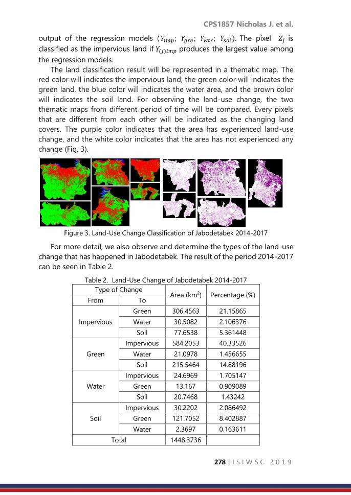
CPS1857 Nicholas J. et al.
278 | I S I W S C 2 0 1 9
output of the regression models (𝑌𝑖𝑚𝑝; 𝑌𝑔𝑟𝑒 ; 𝑌𝑤𝑡𝑟; 𝑌𝑠𝑜𝑖). The pixel 𝑍𝑗 is
classified as the impervious land if 𝑌(𝑗)𝑖𝑚𝑝 produces the largest value among
the regression models.
The land classification result will be represented in a thematic map. The
red color will indicates the impervious land, the green color will indicates the
green land, the blue color will indicates the water area, and the brown color
will indicates the soil land. For observing the land-use change, the two
thematic maps from different period of time will be compared. Every pixels
that are different from each other will be indicated as the changing land
covers. The purple color indicates that the area has experienced land-use
change, and the white color indicates that the area has not experienced any
change (Fig. 3).
Figure 3. Land-Use Change Classification of Jabodetabek 2014-2017
For more detail, we also observe and determine the types of the land-use
change that has happened in Jabodetabek. The result of the period 2014-2017
can be seen in Table 2.
Table 2. Land-Use Change of Jabodetabek 2014-2017
Type of Change Area (km2) Percentage (%)
From To
Impervious
Green 306.4563 21.15865
Water 30.5082 2.106376
Soil 77.6538 5.361448
Green
Impervious 584.2053 40.33526
Water 21.0978 1.456655
Soil 215.5464 14.88196
Water
Impervious 24.6969 1.705147
Green 13.167 0.909089
Soil 20.7468 1.43242
Soil
Impervious 30.2202 2.086492
Green 121.7052 8.402887
Water 2.3697 0.163611
Total 1448.3736

CPS1857 Nicholas J. et al.
279 | I S I W S C 2 0 1 9
For testing the accuracy of the regression models, we wil map the training
data (input) and represent the mapping result for each pixels of the training
data into the multi-dependent variable. We compare the results of the
classification to the initial multi-dependent variables that has been
determined in the training process. The result of the testing process indicates
that the models provide a high accuracy for the training data. The models give
the average accuracy of 96.60% (Table 3).
Table 3. Accuracy Regression Models
Land Type Accuracy (%) Error (%)
Impervious 99.20 0.80
Table 3. Accuracy Regression Models
Land Type Accuracy (%) Error (%)
Green 89.16 10.83
Water 98.96 1.04
Soil 99.32 0.68
Average 96.60 3.40
4. Conclusion
An evaluation process is needed to evaluate wheter the mapping process
provides a good and realible result. The evaluation will be conducted in Jakarta
area to show the accuracy of land-use change mapping (Fig. 4). The mapping
shows that the Jakarta area is covered by most of the impervious land. The
land-use change classification using the least median of squares regression
shows a good result where there are no outliers that detected. The mapping
result also shows a good land classification result if it’s compared with the real
condition. The figures provide good evidence that the least median of squares
regression is a reliable method that can be considered to performa a high
performance computation for classifying land types and mapping the land-
use changes from a satellite imagery.

CPS1857 Nicholas J. et al.
280 | I S I W S C 2 0 1 9
Figure 4. The Evaluation of Land and Land-Use Change Mapping of Jakarta 2014-
2017 (Case study: AEON Mall, Cakung)
References
1. Herwindiati, Dyah E., Hendryli, Janson, & Hiryanto, Lely. (2017).
Impervious Surface Mapping Using Robust Depth Minimum Vector
Variance Regression. European Journal of Sustainable Development,
6(3), 29-39.
2. Rousseeuw, P. J. (1984). Least Median of Squares Regression. American
Statistical Association, 79(388), 871-880.
3. U. S. Geological Survey. (2016). Landsat 8 Data User Handbook.
Retrieved from
https://landsat.usgs.gov/sites/default/files/documents/Landsat8DataUse
rsHandbook.pdf.
4. Draper, N. R. & Smith, Harry. (2014). Applied Regression Analysis, Third
Edition. New York: John Wiley.
5. Rousseeuw, P. J. & Leroy, A.M. (1987). Robust Regression and Outlier
Detection. New York: John Wiley.

CPS1863 La Gubu et al.
281 | I S I W S C 2 0 1 9
Portfolio selection using cluster analysis and fast
minimum covariance determinant estimation
method
La Gubu1,2, Dedi Rosadi1, and Abdurakhman1 1 Mathematic Department Gadja Mada University, Yogyakarta Indonesia
2 Mathematic Department Halu Oleo University, Kendari Indonesia
Abstract
In this paper a robust and efficient portfolio selection method is presented.
The stocks is firstly grouped into several clusters. Here in this paper, in
particular we apply the hierarchy agglomerative complete linkage clustering
method. After the clustering process, stocks are chosen to represent each
cluster to build a portfolio. The selected stocks for each cluster are the stocks
which has the best Sharpe ratio. The optimum portfolio is determined using
the Fast Minimum Covariance Determinant (FMCD) estimation method. Using
this procedure, we may obtain the best portfolio efficiently when there are
large number of stocks involved in the formulation of the portfolio. On the
other hands, this procedure also robust against the possibility of outlier
existence in the data. For empirical study, we use the stocks from the
Indonesia Stock Exchange, which included in the LQ-45 indexed, contain 45
stocks, which will give relatively large portfolio combination. The results
showed that after the clustering, LQ-45 stocks can be grouped into 7 groups
of stocks. Furthermore, it was also found that portfolio performance built on
the robust FMCD estimation method was better than the portfolio
performance of the classic MV model for all risk aversion value.
Keywords
Portfolio; Cluster analysis ; FMCD; Markowitz model; Sharpe ratio.
1. Introduction
The strategy in utilizing statistical measures from historical return data,
namely the mean, variance and covariance, has become a basic principle in the
formation of the classic mean-variance (MV) portfolio model by Markowitz
(1952). Markowitz proposes a portfolio model that uses the mean and variance
of asset returns to express the trade-off between portfolio returns and risks.
This model is expressed as an optimization problem with two conflicting
objectives. That is, the expected return on results from the portfolio needs to
be maximized, on the other hand, portfolio risk represented by the variance of
returns from different assets, needs to be minimized.
Various studies have been carried out to solve and develop the Markowitz
portfolio model. All of that is done to adapt the existing model to the
conditions of financial market factors and the demands of capital market

CPS1863 La Gubu et al.
282 | I S I W S C 2 0 1 9
practitioners. One of the focuses of research in portfolio selection is the
efficiency of optimum portfolio selection time. This is understandable because
the greater the number of securities involved in portfolio selection, the more
likely the portfolio can be formed. The large number of securities involved in
portfolio selection can be tackled by grouping stock data using cluster
analysis. Cluster analysis is a statistical analysis that aims to separate objects
into clusters of similar characteristics.
In the past few years, a lot of research on the portfolios selection has used
cluster analysis. Guan and Jiang (2007) proposed a portfolio selection method
using clustering techniques to optimize portfolio selection. Tola et al. (2008)
proposed a portfolio optimization model based on two clustering techniques,
namely average lingkage and single lingkage clustering. Chen and Huang
(2009) proposed portfolio optimization using clustering techniques and fuzzy
optimization models. In this approach, clustering techniques are used to group
stock data into different groups, then a fuzzy optimization model is applied to
determine the optimal proportion of investment for each cluster. Nanda et al.
(2010) investigated portfolio selection models based on the clustering
algorithm and the Markowitz model. K-means clustering, fuzzy c-means (FCM)
techniques, and self organizing maps (SOM) are used to group stock data into
different clusters. Long et al. (2014) proposed a portfolio selection model
based on the FCM clustering algorithm and multi-objective genetic algorithm
(MOGA). However, none of the above literatures has considered the
robustness of the methods against the possibility of the outlier existence in
the data.
From the literature review, it can be concluded that for the time efficiency
to make the optimum portfolio, there are three steps that must be done. The
first stage is to group stoks into different clusters. The second stage is to
choose stocks that will form the optimum portfolio. The third stage is to
determine the weight of each stock that forms the optimum portfolio. In this
paper, as our new contribution, in the third stage we consider Fast Minimum
Covariance Determinant (FMCD) estimation method for the mean and the
variance of the data.
The remainder of this paper is organized as follows. In Section 2 we give
Methodology. Results are given in Section 3. Finally in Section 4 we give
Discussion and Conclusion.
2. Methodology
Based on the literature review, it can be seen that portfolio selection
problem can be resolved more efficiently by grouping stocks into clusters and
then selecting stocks in clusters to form efficient portfolios. The problem
framework in this study is shown in Figure 1.

CPS1863 La Gubu et al.
283 | I S I W S C 2 0 1 9
First, stocks are grouped into several clusters using the hierarchy
agglomerative complete linkage method described in Section 2.2. From the
calculation of return and risk in each cluster, it can be determined the
performance of each stock in each cluster using Sharpe ratio. The next step is
to choose stocks that will represent each cluster to form the optimum
portfolio. The stock chosen as representations of a cluster are stock with the
highest Sharpe ratio. After the stocks that build the optimum portfolio are
selected, the next step is to determine the weight of each stock that builds the
portfolio using robust Fast Minimimum Covariance Determinant (FMCD)
estimation method. To see the advantages of this method, portfolio
performance formed using robust FMCD estimation method will be compared
with portfolio performance formed using the classical mean variance (MV)
method.
2.1 Mean Variance Portfolio
Markowitz's portfolio theory is based on the mean and variance approach,
where the mean is a measurement of the level of the expected return and
variance is a measurement of the level of risk. Therefore, Markowitz's portfolio
theory is also called the mean-variance model (MV). This model emphasizes
efforts to maximize expected return and minimize risk to choose and build an
optimal portfolio.
The mean-variance portfolio can be formulated by solving the following
optimization problems:
max𝑤
𝑤′𝜇 −𝛾
2𝑤′Σ𝑤 (1)
𝑤′𝑒 = 1 (2)
where w denotes the weight of the portfolio, 𝜇 is the mean vector, Σ is
covariance matrix, e is the column matrix where all the elements are 1 and 𝛾 ≥
Figure 1 Optimal portfolio selection
process
Stocks
Data
Clastering
Cluster
Cluster
Cluster
Data
Stock 1
1 Data
Stock 2
...
Stock n
Data
Sharpe
Ratio
𝑤1
𝑤2
𝑤𝑛
Optimal
Portfolio
...

CPS1863 La Gubu et al.
284 | I S I W S C 2 0 1 9
0 are the risk aversion parameters, namely the relative measure of risk
avoidance.
The optimum solution to equation (1) with constraint of equation (2) is
𝑤(𝜇, Σ) =1
𝛾(Σ−1 − Σ−1𝑒(𝑒′Σ−1𝑒)−1𝑒′Σ−1)𝜇 + Σ−1𝑒(𝑒′Σ−1𝑒)−1 (3)
Equation (3) shows that the optimal portfolio (w) depends on inputs 𝜇 and Σ.
2.2 Clustering stocks
Because the number of stocks available in the capital market is quite large,
it is very difficult to determine the proportion of investment for each stock.
Therefore, it is necessary to use data mining techniques to deal with this. One
of the data mining techniques that can be used is cluster analysis. Cluster
analysis is a statistical analysis that aims to separate objects into several
groups that have the same/different characteristics from one group to another
group. In this analysis each group is homogeneous between members in
groups or variations of objects in groups that are formed as small as possible.
Cluster analysis, also called segmentation, has various purposes. Everything is
related to grouping or segmenting several objects into subsets or clusters.
Objects in a cluster will have a closer relationship compared to objects in other
clusters.
There are many cluster techniques in the literature. In this study, the
hierarchy complete lingkage clustering technique will be applied. Hierarchical
complete lingkage clustering technique is a clustering method based on the
farthest distance between objects. If two objects are separated by long
distances, then the two objects will be in one cluster, and so on.
2.3 Sharpe ratio
After the clusters are formed, then the performance of each stock will be
assessed in each cluster using the Sharpe ratio. Sharpe ratio or Sharpe index
is a measure of excess return (or risk premium) perunit risk in an asset. Sharpe
ratio is used to characterize how well asset returns compensate investors for
the risks taken. Sharpe ratio (𝑆𝑅) is calculated by comparing the difference
between stock returns (𝑅 ) and risk return free rate (𝑅𝑓 ) with a standard
deviation of stock return (𝜎) or can be written as follows:
𝑆𝑅 =𝑅−𝑅𝑓
𝜎 (4)
In general, it can be said that the greater the value of the Sharpe ratio of a
stock, the better the performance of the stock.

CPS1863 La Gubu et al.
285 | I S I W S C 2 0 1 9
2.4 Portfolio selection using robust estimation FMCD
In this study, the weight of the selected stocks that formed the optimum
portfolio is determined using the robust FMCD estimation method. To see the
advantages of this method, the results will be compared with the classic MV
method. The following will be briefly presented the procedure for determining
portfolio weights using the robust FMCD estimation method.
The minimum covariance determinant (MCD) estimation aims to find robust
estimates based on the observations of total observations (n), where the
covariance matrix has the smallest determinant. The MCD estimation is a pair
of 𝜇 ∈ ℝ𝑝 and Σ is a symmetric positive definite matrix with a dimension of
𝑝𝑥𝑝 from a sample of h observation, where (𝑛+𝑝+1)
2≤ ℎ ≤ 𝑛 with
𝜇 =1
ℎ∑ 𝑟𝑖ℎ𝑖=1
(5)
The estimation of the covariance matrix can be obtained by solving the
following equation:
Σ =1
ℎ∑ (𝑟𝑖 − 𝜇 )(𝑟𝑖 − 𝜇 )′ℎ𝑖=1
(6)
MCD calculations can be very complicated if the data dimensions are
getting bigger, this is because this method must examine all possible subsets
of h from a number of n data. Therefore, Roesseeuw and Van Driessen (1999)
found a faster calculation algorithm for calculating MCD called Fast MCD
(FMCD). The FMCD method is based on the C-Step theorem described below.
Theorem 1 (Rousseeuw and Driessen,1999)
If 𝐻1 is the set of size h taken from data of size n, the sample statistics are:
𝜇 1 =1
ℎ∑ 𝑟𝑖𝑖∈𝐻1
(7)
Σ1 =1
ℎ∑ (𝑟𝑖 − 𝜇 1)(𝑟𝑖 − 𝜇 1)𝑖∈𝐻1 ′
(8)
If |Σ1| > 0 than distance 𝑑𝑖 = (𝑟𝑖; 𝜇 1, Σ1). Next, specify 𝐻2 is subset consist of
the observation with the smallest distance 𝑑𝑖 , namely 𝑑1(𝑖)|𝑖 ∈ 𝐻2 =
(𝑑1)1, … , (𝑑1)ℎ where (𝑑1)1 ≤ (𝑑1)2 ≤ ⋯ ≤ (𝑑1)𝑛 is a sequential distance.
Based on 𝐻2, using equations (7) and (8), we obtained
|Σ2| ≤ |Σ1|
(9)
Equation (9) will be the same if 𝜇 1 = 𝜇 2 dan Σ1 = Σ2
C-Step theorem is done repeatedly until | Σ𝑛𝑒𝑤| > 0 or | Σ𝑛𝑒𝑤| = | Σ𝑜𝑙𝑑|.
CPS1863 La Gubu et al.
286 | I S I W S C 2 0 1 9
3. Result
3.1 Stocks Data
In this paper, daily data of 45 stocks from the Indonesia Stock Exchange
(IDX) that are members of the LQ-45 stock group are collected for the period
August 2017 - July 2018. The LQ-45 stock group is a stock group containing
45 selected stocks that have high liquidity so easy to trade. Based on this data,
then the average return, risk and Sharpe ratio of each stock can be calculated,
and are presented in Table 1.
Table 1. return, risk and Sharpe ratio of LQ-45
No Symbol Retun Risk Sharpe Ratio
1 AALI -0.00105 0.01452 -0.08672
2 ADHI -0.00094 0.02079 -0.05522
3 ADRO 0.00049 0.02807 0.01017
... ... ... ... ...
44 WIKA -0.00075 0.02392 -0.04013
45 WSKT -0.00006 0.02545 -0.01033
3.2 Clustering results and analysis
In this study, the cluster analysis used was the hierarchy agglomerative
complete linkage method. By using R 3.4.1 software, it was found that LQ-45
stocks grouped into seven clusters as presented in Table 2.
Table 2. Cluster of Stocks
Cluster Stocks
1 GGRM HMSP ASII BBCA ICBP KLBF TLKM UNVR SCMA PWON INDF JSMR
2 LPPF MNCN BRPT EXCL PGAS BBTN BMRI BBNI BBRI
3 BUMI PTBA ANTM INCO UNTR
4 BJBR SSMS
5 MYRX BMTR SRIL
6 AALI LSIP
7 INTP LKPR SMGR SMRA BSDE PPRO AKRA ADHI PTPP WIKA WSKT
After clusters are formed the next step is to calculate the Sharpe ratio of
each stock in each cluster. In calculating this Sharpe ratio, the risk return free
rate used is the latest Bank Indonesia rate of 5.25% per year. Based on the
calculation of the Sharpe ratio of each stock in each cluster, we obtained stocks
which represent each clusters to form the optimum portfolio as presented in
Table 3.

CPS1863 La Gubu et al.
287 | I S I W S C 2 0 1 9
Table 3. Stock Representation of Cluster
Cluster Representation Return Risk Sharpe Ratio
1 BBCA 0.00089 0.01285 0.05233
2 BRPT 0.00042 0.02296 0.00954
3 INCO 0.00258 0.02673 0.08885
4 BJBR 0.00023 0.02246 0.00087
5 MYRX 0.00043 0.03291 0.00675
6 AALI -0.00105 0.01452 -0.08672
7 WSKT -0.00006 0.02545 -0.01033
3.3 Comparison of performance of robust FMCD portfolio with MV classic
portfolio
In this study the optimum portfolio is determined using robust FMCD
estimation. The first step is determining the portfolio weight of the two models
for various risk aversion values γ. The stocks used are stocks which represent
each cluster as presented in Table 3. The obtained results are presented in
Table 4.
Table 4. Weight of Classic MV Portfolio and Robust FMCD Estimasi Portfolio
Model 𝛾 BBCA BRPT INCO BJBR MYRX AALI WSKT
0.5 8.65424
32
-0.81845
21
7.974449
2
0.03969
75
1.025810
1
-13.87264
14
-2.00310
66
1 4.52648
34
-0.36936
62
4.006589
4
0.08761
00
0.526658
3
-6.787882
7
-0.99009
24
𝑀𝑉𝐶𝑙𝑎𝑠𝑠𝑖𝑐 2 2.46260
36
-0.14482
32
2.022659
5
0.11156
62
0.277082
5
-3.245503
4
-0.48358
52
5 1.22427
56
-0.01009
74
0.832301
5
0.12593
99
0.127336
9
-1.120075
8
-0.17968
09
10 0.81149
96
0.03481
128
0.435515
6
0.13073
12
0.077421
8
-0.411599
9
-0.07837
95
0.5 26.5172
582
4.53087
83
5.574959
4
-6.63125
01
-10.96117
34
-7.453084
3
-10.5775
876
1 13.4356
034
2.28352
67
2.779775
3
-3.21909
54
-5.42067
43
-3.616097
4
-5.24303
83
𝑀𝑉𝐹𝑀𝐶𝐷 2 5.87394
06
0.97671
75
0.887080
8
-0.52740
61
-2.41538
48
-0.936475
3
-2.85847
26
5 2.49954
148
0.54940
04
0.456122
4
-0.01991
51
-1.22892
03
-0.420828
6
-0.83540
04
10 1.41850
350
0.29914
37
0.218470
1
0.19410
29
-0.55959
83
-0.030863
9
-0.53975
79
*𝑀𝑉𝐶𝑙𝑎𝑠𝑠𝑖𝑐 : MV classic portofolio; 𝑀𝑉𝐹𝑀𝐶𝐷: Robust FMCD estimation portfolio
CPS1863 La Gubu et al.
288 | I S I W S C 2 0 1 9
Based on portfolio weights, mean vectors and covariance matrices, we can
then determine the return, risk and Sharpe ratio of the two portfolio models
as presented in Table 5.
Table 5 Return, Risk and Sharpe Ratio of Classic MV Portfolio and Robust FMCD
Estimasi Portfolio
𝛾 Return Risk Sharpe Ratio
𝑀𝑉𝐶𝑙𝑎𝑠𝑠𝑖𝑐 𝑀𝑉𝐹𝑀𝐶𝐷 𝑀𝑉𝐶𝑙𝑎𝑠𝑠𝑖𝑐 𝑀𝑉𝐹𝑀𝐶𝐷 𝑀𝑉𝐶𝑙𝑎𝑠𝑠𝑖𝑐 𝑀𝑉𝐹𝑀𝐶𝐷
0.5 0.0430095 0.1022346 0.0856715 0.2060775 0.1464506 0.2248905
1 0.0216108 0.0507269 0.0214754 0.0515543 0.1464871 0.2227779
2 0.0109114 0.0161286 0.0054264 0.0085656 0.1461718 0.1727134
5 0.0044918 0.0070372 0.0009326 0.0016471 0.1423737 0.1698539
10 0.0023519 0.0032753 0.0002907 0.0004736 0.1295127 0.1438972
4. Discussion and Conclusion
4.1 Discussion
From the results obtained through cluster analysis, it was found that LQ-
45 stocks can be grouped into 7 clusters as shown in Table 2, where each
cluster had a different number of stocks. In cluster 1, BBCA have the best
performance compared to other stocks in the cluster which are marked with
the highest Sharpe ratio in the cluster, which is 0.0523. So that BBCA are taken
as a representation of cluster 1. Furthermore, in cluster 2, BRPT stock with
Sharpe ratio 0.00953 are representations of cluster 2. And so on, WSKT stock
with Sharpe ratio -0.01033 are representations of cluster 7. Therefore, it is
enough to consider stocks as presented in table 3 for investment decisions.
From Table 4, it can be seen that stocks with negative returns namely AALI
and WSKT have a negative weight (short selling) for all risk aversion values 𝛾
both in the classic MV portfolio model and in the MV portfolio model with
robust FMCD estimates. Conversely, stocks with large returns, namely BBCA
and INCO stocks always have positive weights in both portfolio models.
Measuring portfolio performance not only base on the return but also
must pay attention to the risks that will be borne by investors. There are several
measures that can be used to measure portfolio performance, one of which is
Sharpe ratio. Table 5 shows the return, risk and Sharpe ratio of the portfolio
formed using the classic MV portfolio model and portfolio model with robust
FMCD estimation. From Table 5, it can be seen that for 𝛾 = 0.5, portfolio return
with robust FMCD estimation is 0.1022346 and risk is 0.2060775, while classic
MV portfolio return is only 0.0430095 and risk is 0.0856715. So the MV

CPS1863 La Gubu et al.
289 | I S I W S C 2 0 1 9
portfolio Sharpe ratio with FMCD estimation is 0.2248905 and the classic MV
portfolio ratio Sharpe is 0.1464506. So for risk aversion 𝛾 = 0.5, the
performance of the MV portfolio with robust FMCD estimation is better than
the classic MV portfolio. If we look further, it turns out that for all risk aversion
values γ, FMCD's estimated portfolio return is higher than the classic MV
portfolio return. Unlike risk, for all values of 𝛾, the classic MV portfolio risk is
better than FMCD's portfolio. However, the Sharpe ratio of FMCD's portfolio
ratio is higher than the classic MV portfolio for all values 𝛾. Therefore, we can
concluded that the performance of the MV portfolio with robust FMCD
estimation was better than the classic MV portfolio.
4.2 Conclusions
This paper shows how to integrate clustering techniques into portfolio
management and building systems to get an efficient portfolio. The clustering
process can reduce very significantly the time required to select the best stocks
for the portfolio because stocks from similar categories can be easily grouped
into one cluster. The best performing stocks from each cluster are then chosen
as representations of the cluster to build the portfolio. The results showed that
45 stocks included in the LQ-45 group was into 7 clusters. Stock as a
representation of each cluster then used to form a portfolio using the MV
model with FMCD estimation. The portfolio performance formed by using the
MV portfolio model with robust FMCD estimation is then compared with the
portfolio performance formed using the classic MV portfolio model. The
results showed that the performance of the MV portfolio with robust FMCD
estimation was better than the classic MV portfolio for all risk aversion values
γ.
For future research, it will be interesting to use other robust estimates and
compare portfolio performance that builds up using these estimates.
Acknowledgments
I thank to Indonesia Endownment Fun for Education (Lembaga Pengelola
Dana Pendidikan, LPDP) Ministry of Finance of the Republic of Indonesia for
the scholarship funds given for my Doctoral program at the Mathematics
Department of Gadjah Mada University.
References
1. Chen, L.H., and Huang, L. (2009). Portfolio optimization of equity mutual
funds with fuzzy return rates and risks, Expert Systems with Applications,
36, 3720-3727.

CPS1863 La Gubu et al.
290 | I S I W S C 2 0 1 9
2. Guan,H.S., and Jiang, Q.S. (2007). Cluster Financial time series for
portfolio, in Int. Conf. on Wavelet Analysis and Pattern Recognition,
ICWAPR, Beijing, China, Vol. 2, 851–856.
3. Long, N.C., Wisitponghan, N., Meesad, P. (2014). Clustering Stock Data
For Multi-Objective Portfolio Optimization, International Journal of
Computational Intelligence and Applications, 13(2), 1-13
4. Markowitz, H. (1952). Portfolio selection, J. Finance 7(1) (1952) 77–91.
5. Nanda, R., Mahanty, B. and Tiwari, M.K. (2010). Clustering Indian stock
market data for portfolio management, Expert Syst. Appl. 37(12), 8793–
8798.
6. Rousseeuw, P.J., Van Driessen, K. (1999). A Fast Algorithm for The
Minimum Covariance Determinant Estimator. Technometrics, 41, 212 -
223.
7. Supandi, E.D., Rosadi. D., dan Abdurakhman (2017b). A Construction of
MeanVariance Portfofolio: Robust Estimation versus Robust
Optimization. Journal of Modern Applied Statistical Methods. 16(1), 589
- 611.
8. Tola, V., Lillo, F., Gallegati, M. and Mantegna, R.N. (2008). Cluster
analysis for portfolio optimization, J. Econ. Dyn. Control. 32(1), 235–258.

CPS1871 Natividad J.M. et al.
291 | I S I W S C 2 0 1 9
Bayesian conditional autoregressive model for
mapping human immunodeficiency virus
incidence in the national capital region of the
Philippines
Natividad Jochelle Maan, Necesito Reinna Mae, Ocampo Shirlee, Leong
Robert Neil
Mathematics and Statistics Department, De La Salle University, Philippines
Abstract
Human Immunodeficiency Virus (HIV) infection continues to increase
in the Philippines and exhibit public health threat in contrast to the worldwide
trend that new HIV cases had gone down. New HIV cases in the Philippines
had surged by 3,147% from 2007 to 2017. The concentration of such increase
of HIV cases is in the National Capital Region (NCR) composed of sixteen cities
and 1 municipality which are considered as spatial units in this study. The aim
of this study is to provide a Bayesian spatial Conditional Autoregressive (CAR)
model that gives shrinkage and spatial smoothing of the raw relative risk
estimates of HIV in NCR. Using Moran’s I, results showed that sexually active
male population of NCR exhibits significant spatial autocorrelation. It was
observed that percentage of sexually active male individuals (15-85 years of
age) is found to be correlated to the incidence of HIV in NCR. Bayesian CAR
model that takes spatial autocorrelation into account was then used. In line
with this, Poisson-Gamma model with covariate was also used, together with
the Bayesian CAR, to identify the best fitted model for the estimated HIV
relative risk. Results revealed that Bayesian CAR was the best model as it
involves spatial autocorrelation and has the lowest value of DIC compared to
the Poisson-Gamma model. It was found out that in Bayesian CAR, eight areas
in NCR have high relative risk estimates namely Mandaluyong, Makati, Manila,
Marikina, Pasay, Pasig, Pateros, and San Juan. It would be best for health public
officials to provide health programs and to allocate funds in the said areas to
reduce the incidence of HIV cases.
Keywords
HIV relative risk, Bayesian CAR mapping; spatial autocorrelation; Poisson-
Gamma model; Moran’s I
1. Introduction
The Human Immunodeficiency Virus (HIV) that slowly attacks the immune
system which serves as defense against illness has become a public threat to
people. Acquired Immune Deficiency Syndrome (AIDS) is a syndrome caused
by HIV and such illness alters the immune system, making people much more
vulnerable to infections and diseases. This susceptibility worsens as the

CPS1871 Natividad J.M. et al.
292 | I S I W S C 2 0 1 9
syndrome progresses. The virus is transferred from one person to another
through blood-to-blood, sexual contact, and infected pregnant women to
their babies.
The Philippines had one of the ‘fastest growing HIV epidemics in the world’
according to the World Health Organization (Rappler, 2015). It has
tremendously increased by 3,147% increase in 10 years from 342 reported
HIV infections in 2007 to 11,103 new HIV reported cases in 2017 (Regencia
2018). It is further reported that as many as 32 people were diagnosed with
HIV-AIDS every day in the Philippines (Rappler, 2018). From January 1984 to
June 2016, the region with the most number of reported cases was National
Capital Region (NCR) with 15,053 (43%) cases. Majority (95%) of those HIV
infected in the said years were male. It is alarming in 2018 that many of the
new HIV infections were reported likely to be young adults and teen-agers
aged 15 to 24 years old and were transmitted sexually (Rappler, 2018).
Despite that the number of HIV new cases had gone down worldwide from
2.1 million to 1.8 million according to WHO, the number of HIV new cases in
the Philippines had surged up which would likely reach up to 133,300 by 2022
(Rappler, 2015) and might even exceed a quarter of a million by 2030 (Rappler,
2018). Hence, there is a continuous need to study spatial patterns of HIV
infections in order to control and to stop it from spreading.
In line with the United Nations (UN) sustainable development goals (SDG)
3 on good health and well-being, this study aims to provide a Bayesian
Conditional Autoregressive (CAR) model in estimating the relative risks of
infection in each city/municipality of NCR. Moreover, a comparison between
the mixed effect Poisson Gamma model with covariate and the Bayesian CAR
is presented for this serves as a support that Bayesian CAR is the better model.
Bayesian Conditional Autoregressive model also provides a clear
representation of relative risks through maps.
Performing Bayesian analysis intends to assist HIV prevention policy
formulation in the Philippines as this could help the local government towards
its goal of declining the incidence of HIV cases in the country. Knowing where
the needing high risk areas of HIV are, government officials would have an
idea where to allocate health funds more. Additionally, it would provide better
attention on the distribution of HIV cases in NCR compared to the distribution
of cases in the entire Philippines since it only covers a smaller area being
observed. It would give a better implementation in controlling the prevalence
of HIV cases because of the spatial patterns shown by the models. The scope
includes only the sexually active population (15 to 85 years old) and is only
limited on the 2014 HIV count data/cases in each city/municipality in NCR
which was the available data during the time of this study.

CPS1871 Natividad J.M. et al.
293 | I S I W S C 2 0 1 9
2. Methodology
The data were obtained from the HIV Regional Epidemiology Surveillance
Unit (HIV RESU) of Department of Health (DOH). The data include all HIV cases
in each municipality/city of NCR for the year 2014. The sexually active
population data (15 to 85 years old) in each NCR municipality/city was from
the year 2010 since it is the most recent Census of the Population and Housing
(CPH) from the Philippine Statistics Authority (PSA) available. Moreover, DOH
has stated that most HIV cases are men. In July 2015, 94% of the 682 cases
registered in HIV/AIDS Registry of the Philippines (HARP) were male. Reported
from January to May of 2016 are 3,132 new cases of HIV involving male to
male sex and sex with both males and females. This led to the only covariate
used in this study which was the sexually active male population of NCR from
the year 2010.
Standardized Incidence Ratio (SIR) is the most common statistic used to
estimate the relative risk in disease mapping (Samat & Ma'arof, 2013). In
disease mapping, suppose that the areas to be mapped is divided into m sub-
areas (i = 1,2,…, m). The common risk r is defined to be
𝑟 = 𝑦
𝑁
where y is the total count of HIV cases and N is the total population exposed
to risk in NCR. The estimator of relative risk 휃𝑖 for region i with respect to the
common risk relative risk r is
휃𝑖 = 𝑦𝑖
𝑒𝑖 ; 𝑒𝑖 = 𝑟𝑁𝑖
where 𝑦𝑖 is the count of cases in region i, 𝑁𝑖 is the population exposed to risk
in region i and 𝑒𝑖 is the expected count which is computed with respect to the
common risk r. SIR is greatly affected when the expected count is small and
very small spatial units are involved. There are more variations of SIR in small
cities compared to large cities (Tango, 2010). Hence, SIR does not always
provide an appropriate measure for disease mapping. This happens when the
difference in population exposed to risk among areas are large, and hence,
causing a misleading estimation of the relative risk.
Utilizing Bayesian models provide more stable relative risk estimate due to
prior information, shrinkage, and spatial smoothing. There are two Bayesian
models applied in this study, namely, Poisson-Gamma model with covariate
and Bayesian CAR model to cope with the drawback of the SIRs.
For the Poisson-gamma model, 𝑦𝑖 is the observed count of HIV cases in
the ith area, and has a Poisson distribution. The parameter of interest is 휃𝑖 is
the relative risk that quantifies whether the area 𝑖 has a higher risk or lower
occurrence of cases than that expected from the reference rates, the intercept
term is 𝛽0 denotes the baseline log relative risk of disease across the region
being studied, and 𝑏𝑖 that serve as the random effects used for smoothing.
With the addition of the covariate 𝑋1 which is the percentage of sexually active
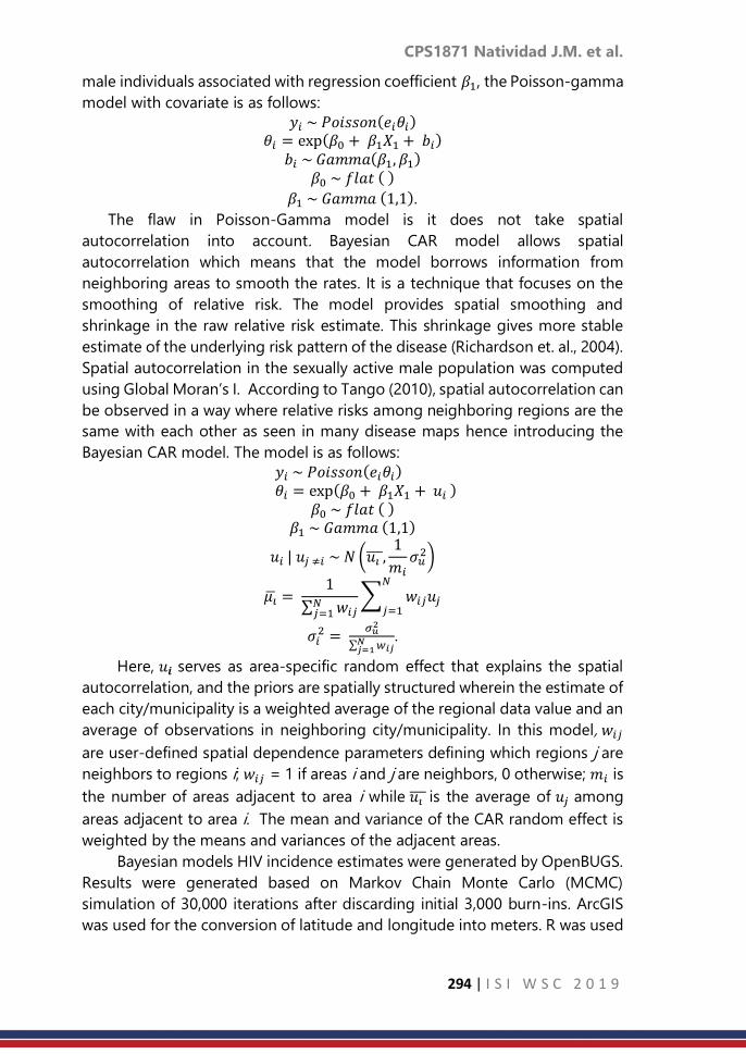
CPS1871 Natividad J.M. et al.
294 | I S I W S C 2 0 1 9
male individuals associated with regression coefficient 𝛽1, the Poisson-gamma
model with covariate is as follows:
𝑦𝑖 ~ 𝑃𝑜𝑖𝑠𝑠𝑜𝑛(𝑒𝑖휃𝑖) 휃𝑖 = exp(𝛽0 + 𝛽1𝑋1 + 𝑏𝑖)
𝑏𝑖 ~ 𝐺𝑎𝑚𝑚𝑎(𝛽1, 𝛽1) 𝛽0 ~ 𝑓𝑙𝑎𝑡 ( )
𝛽1 ~ 𝐺𝑎𝑚𝑚𝑎 (1,1).
The flaw in Poisson-Gamma model is it does not take spatial
autocorrelation into account. Bayesian CAR model allows spatial
autocorrelation which means that the model borrows information from
neighboring areas to smooth the rates. It is a technique that focuses on the
smoothing of relative risk. The model provides spatial smoothing and
shrinkage in the raw relative risk estimate. This shrinkage gives more stable
estimate of the underlying risk pattern of the disease (Richardson et. al., 2004).
Spatial autocorrelation in the sexually active male population was computed
using Global Moran’s I. According to Tango (2010), spatial autocorrelation can
be observed in a way where relative risks among neighboring regions are the
same with each other as seen in many disease maps hence introducing the
Bayesian CAR model. The model is as follows:
𝑦𝑖 ~ 𝑃𝑜𝑖𝑠𝑠𝑜𝑛(𝑒𝑖휃𝑖) 휃𝑖 = exp(𝛽0 + 𝛽1𝑋1 + 𝑢𝑖 )
𝛽0 ~ 𝑓𝑙𝑎𝑡 ( ) 𝛽1 ~ 𝐺𝑎𝑚𝑚𝑎 (1,1)
𝑢𝑖 | 𝑢𝑗 ≠𝑖 ~ 𝑁 (𝑢𝑖 ,1
𝑚𝑖𝜎𝑢2)
𝜇 = 1
∑ 𝑤𝑖𝑗𝑁𝑗=1
∑ 𝑤𝑖𝑗𝑢𝑗𝑁
𝑗=1
𝜎𝑖2 =
𝜎𝑢2
∑ 𝑤𝑖𝑗𝑁𝑗=1
.
Here, 𝑢𝒊 serves as area-specific random effect that explains the spatial
autocorrelation, and the priors are spatially structured wherein the estimate of
each city/municipality is a weighted average of the regional data value and an
average of observations in neighboring city/municipality. In this model, 𝑤𝑖𝑗
are user-defined spatial dependence parameters defining which regions j are
neighbors to regions i; 𝑤𝑖𝑗 = 1 if areas i and j are neighbors, 0 otherwise; 𝑚𝑖 is
the number of areas adjacent to area i while 𝑢𝑖 is the average of 𝑢𝑗 among
areas adjacent to area i. The mean and variance of the CAR random effect is
weighted by the means and variances of the adjacent areas.
Bayesian models HIV incidence estimates were generated by OpenBUGS.
Results were generated based on Markov Chain Monte Carlo (MCMC)
simulation of 30,000 iterations after discarding initial 3,000 burn-ins. ArcGIS
was used for the conversion of latitude and longitude into meters. R was used

CPS1871 Natividad J.M. et al.
295 | I S I W S C 2 0 1 9
to convert the shapefile to S-PLUS format needed in GeoBUGS and GeoDa to
produce maps.
Deviance Information Criterion (DIC is commonly used in Bayesian model
selection. Lawson (2013) stated that the lower value of DIC is preferred in
comparing and selecting the best Bayesian model to fit the data.
3. Result
Seven cities in NCR have SIR greater than 1 implying that more HIV
incidence occurred than expected in these areas. Areas with SIR greater than
1 are Mandaluyong (2.2953) with the highest relative risk of infection followed
by Makati (1.8925), Pasig (1.4432), Pasay (1.4114), Marikina (1.1584), Manila
(1.0849), and San Juan (1.0233), respectively. The remaining cities, on the other
hand, experienced less HIV cases than expected as shown in Table 1.
The association between the SIR of HIV cases and the spatial units in
condition to the covariate, percentage of sexually active male population, is
shown in Figure 1. The conditional map shows that spatial units with higher
percentages of sexually active male individuals are expected to experience
higher HIV incidences. Specifically, the cities of Mandaluyong and Makati were
observed to have high reported incidences of HIV infection while exhibiting
high percentages of sexually active male individuals as well.
Figure 1. Conditional plot map for the SIRs of HIV based on quartiles of sexually
active male population
Global Moran’s I was used to see if there is a spatial autocorrelation which
looks into how related the values of the sexually active male population are
based on the locations where they are measured. Results show that the
Moran’s I p-value (0.0206) is statistically significant at α = 0.05. This concluded
that there is a sufficient evidence to say that there is a positive spatial
autocorrelation in the values of the covariate. In support of this, the value of
the Moran’s I (0.314714) exceeds the expected value which is - 1
𝑛−1 (n=17)
equal to -0.0625 and therefore Bayesian CAR model can be appropriately used.
Posterior relative risk estimates of HIV for each city/municipality based on
the Bayesian CAR and Poisson-gamma models were obtained as shown in
Table 1.

CPS1871 Natividad J.M. et al.
296 | I S I W S C 2 0 1 9
Table 1. Relative risks under SIR, Poisson-Gamma model, and CAR
Bayesian CAR is the better model since it has less DIC (118.5) compared to
the Poisson-Gamma model with DIC 149.4. This further supports that Bayesian
CAR model is the most appropriate model in estimating relative risk of HIV
infection in NCR for it also takes into account spatial autocorrelation.
Under Bayesian CAR model, there were eight cities observed having
relative risk greater than one which means these areas have higher occurrence
of HIV cases, whereas the remaining places experienced less than expected.
The relative risks varied from 0.5786 to 2.1970. Mandaluyong still had the
highest HIV relative risk estimate with 2.1970. Furthermore, its neighboring
areas like Makati (1.8530), Pasig (1.4340), Pasay (1.3870), Marikina (1.1580),
Manila (1.0840), San Juan (1.0930), and Pateros (1.0760) had high estimates of
HIV relative risk. The municipality of Pateros, which is a nearby area of
Mandaluyong, obtained a relative risk estimate greater 1 due to spatial
autocorrelation under Bayesian CAR as compared to the SIR and Poisson-
Gamma model. HIV relative risk of Mandaluyong is associated with those in
the neighboring cities due to the implications of the positive spatial
autocorrelation.
NCR Cities/
Municipality
HIV
Cases
(yi)
Population
Exposed
to Risk (Ni) SIR
Poisson-
Gamma
Relative
Risk
Bayesian
CAR
Relative
Risk
Caloocan 159 1,017,262 0.5721 0.5685 0.5818
Las Piñas 68 390,644 0.6371 0.6279 0.6414
Makati 206 398,383 1.8925 1.884 1.8530
Malabon 49 246,188 0.7285 0.7121 0.7088
Mandaluyong 149 237,586 2.2953 2.281 2.2040
Manila 348 1,173,946 1.0849 1.082 1.0840
Marikina 97 306,470 1.1584 1.147 1.1580
Muntinlupa 64 312,838 0.7488 0.7378 0.7511
Navotas 16 167,691 0.3492 0.6651 0.4232
Parañaque 85 422,804 0.7358 0.7282 0.7482
Pasay 109 282,651 1.4114 1.399 1.3870
Pasig 188 476,765 1.4432 1.436 1.4340
Pateros 12 45,149 0.9728 0.8948 1.0760
Quezon City 526 1,948,715 0.9879 0.9861 0.9905
San Juan 26 92,993 1.0233 0.9883 1.0930
Taguig 113 443,167 0.9332 0.9248 0.9490
Valenzuela 70 399,792 0.6408 0.6330 0.6488
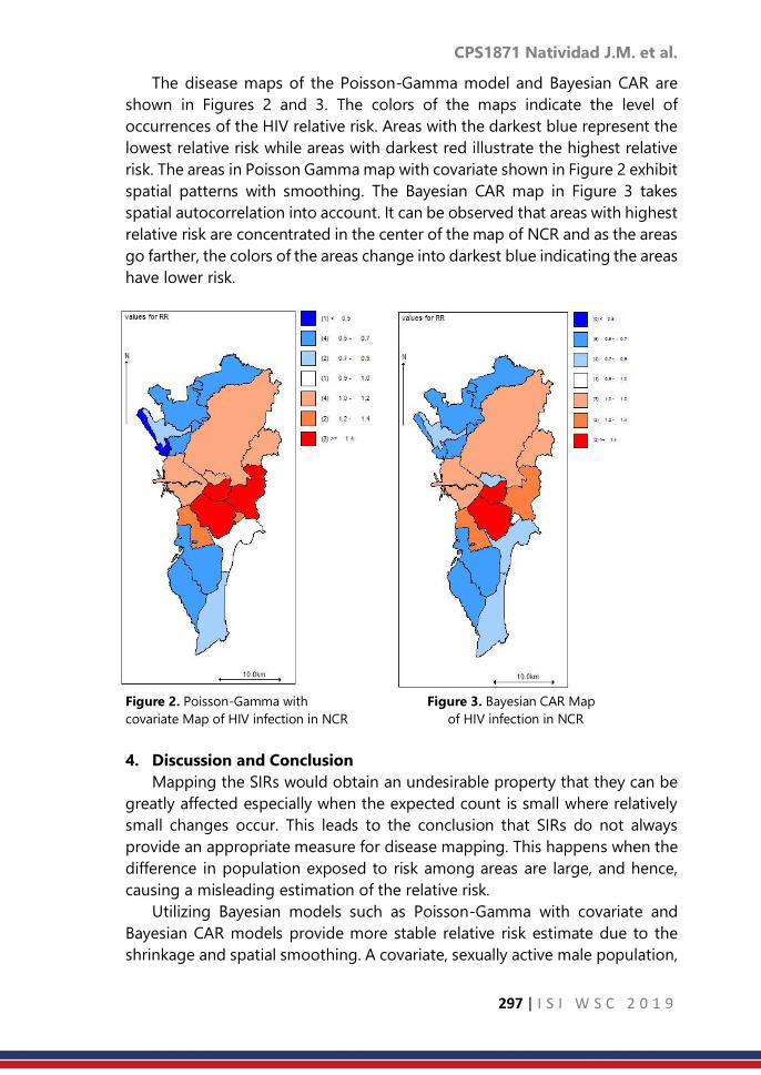
CPS1871 Natividad J.M. et al.
297 | I S I W S C 2 0 1 9
The disease maps of the Poisson-Gamma model and Bayesian CAR are
shown in Figures 2 and 3. The colors of the maps indicate the level of
occurrences of the HIV relative risk. Areas with the darkest blue represent the
lowest relative risk while areas with darkest red illustrate the highest relative
risk. The areas in Poisson Gamma map with covariate shown in Figure 2 exhibit
spatial patterns with smoothing. The Bayesian CAR map in Figure 3 takes
spatial autocorrelation into account. It can be observed that areas with highest
relative risk are concentrated in the center of the map of NCR and as the areas
go farther, the colors of the areas change into darkest blue indicating the areas
have lower risk.
Figure 2. Poisson-Gamma with Figure 3. Bayesian CAR Map
covariate Map of HIV infection in NCR of HIV infection in NCR
4. Discussion and Conclusion
Mapping the SIRs would obtain an undesirable property that they can be
greatly affected especially when the expected count is small where relatively
small changes occur. This leads to the conclusion that SIRs do not always
provide an appropriate measure for disease mapping. This happens when the
difference in population exposed to risk among areas are large, and hence,
causing a misleading estimation of the relative risk.
Utilizing Bayesian models such as Poisson-Gamma with covariate and
Bayesian CAR models provide more stable relative risk estimate due to the
shrinkage and spatial smoothing. A covariate, sexually active male population,

CPS1871 Natividad J.M. et al.
298 | I S I W S C 2 0 1 9
was introduced and found out to exhibit significant spatial autocorrelation.
This indicates that HIV cases in a certain area are correlated with the incidences
of nearby areas. Bayesian CAR is found to be the better model taking into
account spatial autocorrelation and having the lowest value of DIC. Under the
Bayesian CAR, HIV relative risk estimates shrunk in majority of the cities and
municipality based on the neighborhood structure.
The map of Bayesian CAR model revealed that Mandaluyong and Makati
appeared to be the areas with highest relative risk of infection. The reasons as
to why these cities possess the highest estimates of HIV relative risk are
because of the numerous number of clubs, motels, affordable condominiums,
call centers, companies, and industries found in these areas. Furthermore, it is
assumed that due to a high cost of living in Makati, people tend to find houses
in its neighboring cities resulting to these areas to have high HIV relative risk
as well. These are followed by Pasig, Pasay, Marikina, Manila, San Juan, and
Pateros. Moreover, as cities and municipality go farther from these areas, the
relative risks of HIV lessen. Health organizations may be able to use these
results and start to provide health programs and to allocate funds more in
areas with high HIV relative risks.
References
1. Lawson, A. B. (2013). Bayesian disease mapping: hierarchical modeling in
spatial epidemiology. CRC press.
2. Lawson, A. B. (2013). Statistical methods in spatial epidemiology. John
Wiley & Sons.
3. Lawson A., Biggeri A., Bohning D., Lesaffre E., Biggeri A., Viel J.F., & Best
N. ( 1999). Disease mapping and risk assessment for public health. John
Wiley & Sons.
4. Marchetti, S., Dolci, C., Riccadonna, S., & Furlanello, C. (2010). Bayesian
Hierarchical Model for Small Area Disease Mapping: a Breast Cancer
Study. SIS2010 Scientific Meeting. Italy.
5. Neyens, T., Faes, C., & Molenberghs, G. (2012). A generalized Poisson-
gamma model for spatially overdispersed data. Spatial and spatio-
temporal epidemiology, 3(3), 185-194.
6. Rappler (2018) 32 Filipinos Test Positive for HIV-AIDS Everyday. Retrieved
from https://www.rappler.com/nation/212851-daily-hiv-aids-new-cases-
2018-philippines
7. Rappler (2015, May) WHO: PH has the fastest growing HIV epidemic in
the world. Retrieved from https://www.rappler.com/nation/93839-who-
ph-response-hiv.
8. Regencia, T. (2018, February). Philippines: HIV Cases Up to 3,147 percent
in 10 Years. https://www.aljazeera.com/news/2018/02/philippines-hiv-
cases-3147-percent-10-years-180219090618348.html.

CPS1871 Natividad J.M. et al.
299 | I S I W S C 2 0 1 9
9. Richardson, S., Thomson, A., Best, N., & Elliott, P. (2004). Interpreting
posterior relative risk estimates in disease-mapping studies.
Environmental Health Perspectives, 1016-1025.
10. Samat, N. A., & Ma'arof, S. M. I. (2013). Dengue Disease Mapping with
Standardized Morbidity Ratio and Poisson-gamma Model: An Analysis of
Dengue Disease in Perak, Malaysia. In Proceedings of World Academy of
Science, Engineering and Technology (No. 80, p. 571). World Academy of
Science, Engineering and Technology (WASET).
11. Tango, T. (2010). Statistical methods for disease clustering. Springer
Science & Business Media.
12. Venkatesan, P., Srinivasan, R., & Dharuman, C. (2012). Bayesian
Conditional Auto Regressive Model for Mapping Tuberculosis
Prevalence in India. IJPSR, 3(1), 1-3.
13. Philippine Statistics Authority. (2012). Retrieved from
https://psa.gov.ph/sites/default/files/attachments/hsd/pressrelease/Phili
ppines_0.pdf.
14. HIV/AIDS & ART Registry of the Philippines. (2016). Retrieved from
www.doh.gov.ph/sites/default/files/statistics/EB_HIV_June-
AIDSreg2016_0.pdf.

CPS1873 Ferenc M. et al.
300 | I S I W S C 2 0 1 9
Experiences with the theme coding method of
cognitive questionnaire testing at Hungarian
Central Statistical Office
Ferenc Mújdricza, Mónika Földvári Hungarian Central Statistical Office
Abstract
Cognitive testing aims at better understanding of the question-response
process. It provides a basis for exploring and reducing sources of response
error, thereby it enables the design of survey questions that fit better to the
research goal as well as the ultimate enhancement of survey data quality. Our
presentation focuses on the experiences of the 2017-2018 cognitive test
project of Household Budget and Living Conditions Survey (HBLS) at
Hungarian Central Statistical Office (HCSO), with a special attention to the
recent methodological questions of designing, conducting, and analysing
cognitive interviews. These experiences contribute to the improvement of
questionnaire testing methodologies of surveys utilising internationally
harmonised, extensive questionnaires, with particular regard to the
possibilities of questionnaire testing at NSIs.
Keywords
cognitive testing methodology; Theme Coding method; complex, extensive
questionnaire testing at NSIs
1. Introduction
The cognitive testing of the HBLS questionnaire1 served a twofold purpose:
questionnaire testing and Hungarian pilot for the recently adapted, Grounded
Theory-based Theme Coding approach of cognitive testing methodology. The
purpose of the pilot was to gain valuable experiences that enable the
improvement of the HCSO’s questionnaire testing protocols. Cognitive
interviewing (CI) studies provide means for revealing how respondents
interpret and answer the questions in the light of their own lives and
experiences. Furthermore, interpretational pattern and response process
characteristics of particular social groups can be discovered. The usability of
the questions can be analysed, enhanced, and, if necessary, repaired based on
the knowledge of these factors.
The aim of the HBLS is to collect data on income and living conditions of
Hungarian households. Working with representative probability samples, the
1 The final report (Földvári, Dorkó & Mújdricza, 2018, p. 1-508) contains the description of the
entire testing process and its results in full detail.

CPS1873 Ferenc M. et al.
301 | I S I W S C 2 0 1 9
HBLS collects data on approximately 8,000 households and 20,000 persons of
the target population annually. As EU-SILC statistics (European Union Statistics
on Income and Living Conditions) are based on the data from the HBLS, a
significant share of the research questions (variables) are internationally
harmonised. Even in these cases, it is of great importance to find the best
Hungarian formulation possible, that is, whose interpretation by the
respondents and elicitation of responses is the closest to the intention of the
researchers.
2. Methodology
The cognitive questionnaire testing methodology used in the project will
be described in detail below, for its Hungarian adaptation is an important
achievement of the project. Due to the qualitative nature and special purpose
of cognitive testing, the selection of participants typically follows such
selection strategies whose primary aims include not only reaching a certain
degree of heterogeneity but also ensuring that the sample covers an
adequately wide range of the target population (Willis, 2005).
The recommendations on sample size typically range between 5-50 people
in the literature. (Snijkers, 2002, Willis, 2005, Blair et al. 2006, Beatty & Willis,
2007, Blair & Conrad, 2011, etc.). The major factors to be considered in the
composition of the sample should be the characteristics of the respondents
the survey focuses on and the complexity of the questions (Miller et al. 2014).
In case of the cognitive testing of the HBLS questionnaire we aimed at a small
sample qualitative analysis of the cognitive processes in the question-
response process.
Sampling for cognitive questionnaire test studies is usually done in a non-
representative, purposive way. In the case of the present study, interlocked
quota sample design was used (see Collins, 2015). The selection criteria
(quotas) were fitted to the characteristics of the HBLS. The final sampling
criteria were thus the following: level of education, residence (capital versus
small rural village), and main activity status. The size of the sample designed
with these carefully chosen aspects in mind was 12 people. Regarding sample
size, the budget allocated for the study was determinative, the sample design
had to be tailored to it (number of selection criteria and test subjects per
quota).
Weighing the alternatives, two of the possible recruitment channels were
deemed befitting the target population of the cognitive testing of the HBLS
questionnaire: the combination of (online) advertisement and recruitment
through personal network could ensure optimal results. Thus our criteria
enabled including hard-to-reach populations (such as residents of small rural
villages as well as active urban residents with low level education) in the study
as well as filling each quota. A reserve sample of one reserve person assigned

CPS1873 Ferenc M. et al.
302 | I S I W S C 2 0 1 9
to each quota cell was also created to ensure replacement in case of an
unforeseeable absence of any selected test subject (Mújdricza, 2018).
During the cognitive test semi-structured in-depth interviews were
conducted on the subjects’ mental processes and considerations as they form
answers to survey questions (understanding what the question is asking,
recalling relevant information, formulating an answer, mapping the answer
onto the provided response categories). Of the two main practices used in
cognitive interviewing (think aloud and verbal probing approach), the verbal
probing method was chosen for the testing of the HBLS questionnaire. In
verbal probing, the interviewer facilitates the revealing of thought processes
by composing situation-specific or post-situation questions as probes. There
are two different practical approaches within the verbal probing method:
concurrent or retrospective probing. They can also be used in combination,
enabling the separate testing of the questions as well as getting an overall
general picture on the questionnaire at the same time (Willis, 1999, 2015,
Collins, 2015). Such combined probing was done in the testing of the HBLS
questionnaire. On the one hand, probes on specific questions were
administered concurrently with the asked questions of the questionnaire, on
the other hand, retrospective probes were administered after finishing the
questionnaire about how it was to answer the questions in general. Some
probes (especially for questions difficult to understand) were designed pre-
interview (scripted probes), however, the each interviewer was authorised to
ask spontaneous probes in the entire course of the interview to further clarify
certain topics in case s/he deemed it necessary. In line with the most recent
methodological recommendations (Miller et al. 2014, Willis, 2015, Collins,
2015), the pre-composed probes, too, were flexibly modified simultaneously
with the progress of the interviewing phase when sufficient experience was
gathered on the usability of the pre-scripted probes, and also during the
interviews in order to make them appropriate to the actual interview situation.
During the (usually) semi-structured interviews, the success of acquiring
relevant information depends on the active, ‘on-the-spot’ analytic attention of
the researcher in case of the verbal probing method. So the researcher has to
provide adequate, facilitative frames and support for the interviewees so that
they can reveal how they interpret and reply a question in the light of their
experiences. Only the interviewees can give information on it, but it is of great
importance to ask their experiences rather than their opinions on the
questions. Asking the interviewees’ opinion on the questionnaire is
unreasonable and might well be misleading, for they usually lack the necessary
expertise to assess the quality of a questionnaire or its questions. Interviewees
should be treated as knowledgeable informants rather than evaluators (Miller
et al. 2014, Willis, 2015). If multiple researchers do the cognitive interviewing,
the consistency of the interviewing must be maintained. The opportunity to

CPS1873 Ferenc M. et al.
303 | I S I W S C 2 0 1 9
prior rehearsal of the interview protocol of a given questionnaire is important
even for experienced cognitive interviewers. The researchers can get feedback
on how to adjust the test protocol by summarising the experiences gained
during the initial interviews (Willis, 1999, Shafer & Lohse, n.d., Gray, 2015).
All three researchers conducting the CIs of the HBLS questionnaire were
experienced in qualitative interviewing, and all of them took part in the design
process of the interview protocol. In the initial phase of the project, the
researchers did a prior research on the methodology of cognitive
questionnaire testing, and they gathered knowledge on the HBLS survey.
Before proceeding to the cognitive interviewing phase, practical experience
was built up by discussing the practical issues in regular meetings and by
conducting a rehearsal interview with a volunteering colleague. After each CI,
the major experiences and issues were discussed that gave a continuous
feedback of practical information for the team as well as it facilitated the
consistency across the interviews conducted by the three researchers.
Furthermore, as interview experiences built up, the discussions enabled
harmonised, flexible modifications of the probes (see Földvári & Mújdricza,
2018).
Our initial goal was to test the entire questionnaire. However, it became
apparent during the rehearsal interview that administering the full interview
protocol would far exceed the maximum of 1.5 hours timeframe per interview
recommended by the literature (e.g. Willis, 1999). Hence, given the fact that
the CI is rather burdensome for the interviewees as well as for the interviewers,
the pool of the tested questions had to be reduced. To this end, based on
expert review of the complexity and difficulty of understanding of the
questions, each was sorted into one of the following categories:
1. easy to understand questions assumed not to cause any hardships;
2. questions expected to cause problems;
3. especially difficult to understand questions that were expected to
require more attention.
In the test project of the HBLS questionnaire, scripted probes were
composed to the questions sorted in the third category, that is, to the ones
that had been assumed to be especially difficult to understand. As described
above, the scripted probes were treated flexibly, though, and whenever it
seemed necessary, either different, additional spontaneous probes were
composed befitting to the actual interview situation or topic, or irrelevant
scripted probes were simply skipped. For the questions sorted in the second
category, no scripted probes were composed. Probing was only done if the
researcher sensed difficulties in the response process, and these probes were
composed as spontaneous probes adequate to the sensed difficulty.
The first category questions that were deemed unproblematic for the
respondents were not tested. This expert categorisation served design

CPS1873 Ferenc M. et al.
304 | I S I W S C 2 0 1 9
purposes primarily, so it was treated flexibly in the light of the interview
experiences. However, our pre-categorisation of the questions proved to be
typically correct with a few exceptions in the course of the testing, that is, the
prior categorisation was quite efficient. The analysis of the interviews and,
based on the results of the analysis, elaboration of the revisions to develop
the tested questionnaire is of major importance in every questionnaire pre-
test using cognitive interviewing methods. Based on the advantages and
disadvantages, we applied the latest inductive interview analysis method,
namely, Theme Coding based on Grounded Theory (GT) elaborated by the
interpretive school of cognitive interviewing. The main steps of data reduction
and data analysis (they have two be carried out simultaneously) are the
following in this method (based on Miller et al. 2014):
1. Conducting the interviews, recording narratives of how the interviewees
answer the questions.
2. Making interview excerpts and then summaries based on the recordings:
how did the subjects answer the questions, were there any difficulties?
The starting point of the analytic phase of the HBLS questionnaire test
project was the audio recordings. Two steps lead from the recordings to the
summaries on the level of the individual questions. First, the seemingly
relevant parts of the recording regarding a question were transcribed
verbatim, and then the experiences on the question were summarised in three
analytic categories: (1) interpretations, (2) difficulties in the response process,
and (3) issues with the question. This two-step process was re-done with each
question. The first step (the transcription of the interview excerpts) was done
by the researcher who had conducted the given interview, thus s/he could also
record reflections on her/himself and on the interviewee regarding the specific
situation that were important supplementary information for the analysis. The
second step, the actual analysis was done by the researcher responsible for
the analysis of the given topic of the HBLS questionnaire.
3. Comparison of the summaries: developing a thematic schema, that is, can
common interpretational patterns be discovered concerning a given question?
The common themes (Willis, 2015 refer to them as ‘codes’) across the test
subjects’ personal narratives (represented by the interview summaries) were
identified by reviewing the specific section on a particular question in all
interview summaries searching for interpretive patterns. In case of a given
question, typically multiple themes emerge during the comparison process.
These themes represent the key elements of the question. In the HBLS
questionnaire testing – which was a special project due to the vast number of
tested questions, so the analysis, too, demanded unique solutions – the
majority of the themes were written down in text. The themes were only
visualised in tree diagrams – recommended by Miller et al. (2014) – in case the
complexity of the interpretive patterns necessitated it.

CPS1873 Ferenc M. et al.
305 | I S I W S C 2 0 1 9
4. Comparison of specific respondent groups: do the experiences of
respondents with different economic/social/cultural background differ?
(Developing an advanced schema)
On the fourth level of analysis, systematic comparison of test subject
groups was carried out in order to discover whether any particular themes are
more apparent among specific groups. By performing cross-group
comparison of the themes, advanced schemas were developed (see Miller et
al. 2014) in text format or in complex cases, with tree diagram visualisation.
5. Summary of the overall functioning of each question among respondents
with different economic/social/cultural backgrounds
It is important to note that the first three analytic steps occur, to a certain
degree, simultaneously, because the identification of the themes (step 3) may
spontaneously begin during interviewing (step 1) or when the analyst is
summarising the interview excerpts (step 2). The ‘constant comparison’
principle of GT (Glaser & Strauss, 1967) requires the analyst to continuously
move back and forth between raw textual data, themes, and conceptual claims
(Miller et al. 2014, Mújdricza & Földvári, 2018).
3. Result
The cognitive questionnaire testing method presented above produced
plenty of valuable results for the HBLS questionnaire testing project as well as
for the general purpose of the pilot: the improvement of the HCSO’s
methodological protocols for questionnaire testing. Numerous directions for
improvement were outlined in both aspects, of such efficiency, quality, and
quantity that is unprecedented in previous similar test programmes of the
HCSO.
Almost half of the total HBLS questionnaire: 171 questions were tested in
the project, with pre-scripted probes for 31 questions. Spontaneous probes
were used by the rest of the tested questions (140 questions) in case of any
respondent uncertainty. Based on the experiences of the cognitive testing,
recommendations for modification, for altering the composition, or for
rewriting were made – staying within the frames of the EU-SILC Description2 –
in case of 99 questions total in order to enhance their interpretability and
answerability (i.e. ease of response). The results clearly demonstrate that if the
ultimate goal of a cognitive test is to formulate a question that serves the
purpose of the survey research as best as possible, the methodology for
exploring the respondents’ thought processes applied in the present study
outperforms alternative testing opportunities by far.
2 Methodological Guidelines and Description of EU-SILC Target Variables, hereinafter referred
to as: Description.

CPS1873 Ferenc M. et al.
306 | I S I W S C 2 0 1 9
A good example is the HBLS question on unmet need for medical
examination that is practically equivalent with the recommended formulation
of the EU-SILC PH040 variable (‘unmet need for medical examination or
treatment [during the last 12 months]’). The structure and wording of the
Hungarian translation follows the recommended formulation of the English
Description perfectly. Still, the experiences of the cognitive testing has shown
that the interviewees tended to interpret the question differently from the
intended meaning, that is, they recalled the events when they consulted a
doctor instead of issues requiring medical care. Consequently, it is reasonable
to assume that on a Hungarian target population, valid responses can be
elicited by a different question formulation than the recommended version in
the Description. The research team’s suggested solution was therefore to
compose the question so that it refers explicitly to health issues instead of
events needing medical care.
The team came to the conclusion by analysis of the interpretive patterns
that a brief supplementary instruction is necessary to facilitate proper
interpretation of the question. Table 1 shows the original and the proposed
question variation (the English translation of the latter follows the sentence
structure and carries the same meaning as the proposed question in
Hungarian).
Table: Original and proposed question formulation of the EU-SILC PH040 variable for
the HBLS questionnaire
Original version following the Description Proposed Hungarian version after the testing
Was there any time during the past 12
months when you really needed medical
examination or treatment for yourself?
Have you had any health problems that really
needed medical examination or treatment
during the past 12 months?
Please take into account every such problem,
even if you did not seek medical care.
Among the many interesting and beneficial results, a somewhat unsettling
experience of the research team should be paid particular attention to.
Namely, some of the interviewees were less able to reflect on their own
thought processes and they could only express their experiences and situation
much less nuanced than others. Typically, but not exclusively, it was observed
among the test subjects with low level education. The question arises: was it
us who could not find the appropriate tone (i.e. develop a proper rapport)
because of the different cultural background, or were our test subjects truly
incapable of such a degree of reflexive thought that the CI required? In their
case, the question is particularly acute: do the collected survey data represent
the researchers’ intention? Lack of understanding or misunderstanding of

CPS1873 Ferenc M. et al.
307 | I S I W S C 2 0 1 9
questions, random choice from response categories, substantial subjective
reduction of scale granularity was particularly common among these
interviewees.
The other important result on which our presentation focuses addresses
the question of usability of the presented interpretive cognitive questionnaire
testing methodology when the goal is the regular testing of complex and
extensive survey questionnaires. Besides all the advantages of the method, it
is highly time and resource consuming. The entire duration of the full project
was a whole year, of which the cognitive testing itself took six months’ work
of three researchers from the design phase till the completion of the Final
Report. Apart from the demanding methodology, it was also due to the
characteristics of the tested questionnaire. Even a simple field interview with
the HBLS questionnaire imposes huge burden on the interviewer as well as the
respondent owing to its extreme length and the sensitive nature of the
majority of the questions. In contrast, the time to be spent on a single question
in a CI is multiple times more than simply asking it, and this additional burden,
mutatis mutandis, demands the same scale of additional work in the analysis,
too. It follows from the experiences of this pilot project that implementing the
interpretive cognitive testing methodology in the Office requires further
consideration.
4. Discussion and Conclusion
Although the aim of the presentation is to show the experiences of a particular
questionnaire testing project, the results are relevant for any statistical office
or NSI with respect to methodological protocols, design, and organisation
practices of cognitive test projects on extensive and internationally
harmonised questionnaires. Based on our experiences with the pilot project
on the HBLS questionnaire, the following suggestions and possible solutions
can be outlined with respect to the issues of cognitive testing of extensive and
complex questionnaires at statistical offices/NSIs:
1. establishing a permanent, dedicated researcher team of
approximately 10-15 researchers (‘test laboratory’) capable of
successful execution of simultaneous cognitive questionnaire tests;
2. outsourcing specific tasks that do not require expert knowledge (e.g.
typing the interview transcriptions);
3. less interviews per a testing programme (not recommended, only if
nothing else can be done);
4. abandoning the practice of the complete testing of such extensive
questionnaires, and designing individual test projects focusing on
particular question blocks or selected (key) questions;
5. after devising a simpler testing protocol yielding valid and controlled
results, elaborating a ‘mixed’ model: performing the majority of the

CPS1873 Ferenc M. et al.
308 | I S I W S C 2 0 1 9
tests following this simpler protocol and the minority with proper
cognitive questionnaire testing;
6. further improving cognitive interviewing methodology focusing on
interviewees with poor ability to reflexive thinking.
The ideal solution depends on the characteristics of a given survey, on the
profile and potential resources of the research institute as well as on the
surrounding social-cultural conditions
References
1. Beatty, P. C. & Willis, G. B. (2007). Research Synthesis: The Practice of
Cognitive Interviewing. Public Opinion Quarterly, 71(2), 287-311.
2. Blair, J., Conrad, F., Ackermann, A. C. & Claxton, G. (2006). The Effect of
Sample Size on Cognitive Interview Findings. Presentation delivered at
the annual meeting of the American Association of Public Opinion
Research. Montreal, Canada.
https://pdfs.semanticscholar.org/208f/7cf2ad491e7a40a48a2d6564e3cb
3b40fe74.pdf Accessed on. 02. 01. 2019
3. Blair, J. & Conrad, F. G. (2011). Sample Size for Cognitive Interview
Pretesting. The Public Opinion Quarterly, 75(4), 636-658.
4. Collins, D. (ed.) (2015a). Cognitive Interviewing Practice, London: SAGE
Publications.
5. Földvári M., Dorkó N., Mújdricza F. (2018). A HKÉF 2017-es kérdőívének
komplex tesztelése és értékelése. Záróriport [The Complex Testing and
Evaluation of the 2017 Questionnaire of the HBLS. Final Report].
Internally used document within the HCSO. Budapest, Hungary.
6. Földvári M. & Mújdricza F. (2018). A kognitív kérdőívtesztelés
módszertana: A kognitív interjúfelvétel [Cognitive Questionnaire Testing
Methodology: The Cognitive Interview]. Statisztikai Szemle, 96(5), 449-
467.
7. Glaser, B. G. & Strauss, A. L. (1967). The Discovery of Grounded Theory:
Strategies for Qualitative Research, New Brunswick & London:
AldineTransaction.
8. Gray, M. (2015). Conducting Cognitive Interviews. Cognitive Interviewing
Practice, Ed. D. Collins, pp. 126-141. London: SAGE Publications.
9. Methodological Guidelines and Description of EU-SILC Target Variables,
2018 operation (Version August 2017), European Comission, EUROSTAT,
Directorate F: Social Statistics, Unit F-4: Quality of Life.
10. Miller, K., Willson, S., Chepp, V. & Padilla, J-L. (2014). Cognitive
Interviewing Methodology, Hoboken, New Jersey: John Wiley&Sons.
11. Mújdricza F. (2018), A kognitív kérdőívtesztelés módszertana:
Mintaválasztás és toborzás [Cognitive Questionnaire Testing

CPS1873 Ferenc M. et al.
309 | I S I W S C 2 0 1 9
Methodology: Sampling and Recruitment]. Szociológiai Szemle, 28(2), 4-
27.
12. Mújdricza F. & Földvári M. (2018). A kognitív kérdőívtesztelés
módszertana: A kognitív interjúk elemzése [Cognitive Questionnaire
Testing Methodology: The Analysis of the Cognitive Interview].
Statisztikai Szemle, 96(6), 545-574.
13. Shafer, K. & Lohse, B. (n.d.). How to Conduct a Cognitive Interview. A
Nutrition Education Example,
http://www.au.af.mil/au/awc/awcgate/usda/cog_interview.pdf Accessed
on 27. 10. 2017.
14. Snijkers, G. J. M. E. (2002). Cognitive Laboratory Experiences: On Pre-
testing Computerised Questionnaires and Data Quality, Utrecht:
Universiteit Utrecht.
15. Willis, G. B. (1999), Cognitive Interviewing. A „How To” Guide. Reducing
Survey Error through Research on the Cognitive and Decision Process in
Surveys. Short course presented at the Meeting of the American
Statistical Association.
http://www.chime.ucla.edu/publications/docs/cognitive/interviewing/gui
de.pdf Accessed on 19. 10. 2017.
16. Willis, G. B. (2005). Cognitive Interviewing. A Tool for Improving
Questionnaire Design, Thousand Oaks, CA, London & New Delhi, SAGE
Publications.
17. Willis, G. B. (2015). Analysis of the Cognitive Interview in Questionnaire
Design, New York: Oxford University Press.

CPS1874 Yiyao Chen et al.
310 | I S I W S C 2 0 1 9
A causal inference approach for model validation
Yiyao Chen1, Donna P. Ankerst1,2 1Department of Life Sciences, Technical University of Munich, Freising, Germany
2 Department of Mathematics, Technical University of Munich, Garching b. Munich, Germany
Abstract
External validation of clinical risk models on independent populations is a
necessary procedure for ensuring such models are ready for public use.
Limited procedures exist for quantifying the difference between training data
sets used to develop risk models and test sets to validate them, as well as how
to translate these differences to explain differences in operating characteristics
across test sets. We propose a novel validation method based on causal
inference theory that identifies a principal stratum of patients that would have
had their disease status ascertained in both the training and test sets. We
propose evaluation of the risk model on this stratum to provide an
unblemished evaluation of the reproducibility of the model that can be
compared with the observed operating characteristics on the test set. We
illustrate the method with a risk model for predicting prostate cancer by
biopsy developed on the Prostate, Lung, Colorectal, and Ovarian Trial and
tested on the Selenium and Vitamin E Cancer Prevention Trial.
Keywords
potential outcome framework; principal stratum; true positive rate
1. Introduction
External validation results of a risk model developed on a training set and
evaluated on a test set are a mixture of the quality of the risk model as well as
the homogeneity between the training and test sets, the latter often referred
to as the case-mix difference. In construction of a contemporary online
prostate cancer risk calculator based on multiple international heterogeneous
cohorts, Ankerst et al. (2018) described the divergence between cohorts in
terms of statistical tests of differences in risk factors distributions as well as
graphical displays of odds ratios of outcome prevalence by risk factor
prevalence across cohorts. Debray et al. (2015) applied multivariate logistic
regression with cohort assignment as the response to detect heterogeneity in
risk factor distribution between training and test cohorts to better understand
the validation results. van Klaveren et al. (2016) introduced a model-based
c−statistic that did not rely on observed outcomes from the test set, with the
motivation that the change in values from the training to test set only

CPS1874 Yiyao Chen et al.
311 | I S I W S C 2 0 1 9
depended on heterogeneity of the data sets. These methods remain largely
descriptive.
We propose a more formal method for quantifying validation that borrows
philosophy from casual inference theory and principal stratum analysis for
analyzing effects of treatments based on observational studies (Rubin, 1974;
Frangakis & Rubin, 2002). Our method requires training and test sets that
include both patients that did undergo the diagnostic procedure for outcome
determination as well as the patients that did not, the latter of which are
typically not included in the training nor test set. The method assumes a risk
model built on the patients that underwent the diagnostic procedure in the
training set, with the risk factors required for the model available for all
patients, in both the training and test sets, ascertained or not. Conditional on
observed covariates we define the principal stratum of patients who would
have undergone disease ascertainment in either the training or test set, and
propose operating characteristics of the risk model be evaluated on this
stratum in addition to just the test set of ascertained patients.
We illustrate the method with a risk model for predicting prostate cancer
on biopsy developed on the Prostate, Lung, Colorectal, and Ovarian Trial
(PLCO, Andriole et al. (2009)) and tested on the Selenium and Vitamin E Cancer
Prevention Trial (SELECT, Klein et al. (2011)).
2. Methods
Suppose there are a total of N participants, assumed to be independent,
for which some will be used in a training set to develop a prediction model
and the remaining to test the model. For 𝑖 in 1,2, … ,𝑁, let 𝑍𝑖 be the indicator
equal to one for patients belonging to the test set and 0 for the training set,
and 𝑋𝑖 the vector of risk factors assumed to be the fixed for participants
irrespective of whether they were in the training or test set. Therefore, for any
risk model R depending on only these risk factors, the individual patient risk
𝑅(𝑋𝑖) is identical regardless of whether the patient falls in the test or training
set. We will here presume the risk model R was built on the training set, using
established risk factors that would be ordinarily assessed in any cohort, and
thus monotonic functions of the fixed risk factors X observed in the cohorts.
Let 𝑆𝑖(𝑋𝑖) be the biopsy indicator equal to 1 if the participant had a biopsy
performed and 0 otherwise, and 𝑌𝑖(𝑍𝑖) the indicator equal to 1 if the patient
has prostate cancer and 0 otherwise. Note that 𝑌𝑖(𝑍𝑖) is only observed for
𝑆𝑖(𝑍𝑖) = 1 and we assume no measurement error in the biopsy.
We translate the first assumption typically used in causal inference, Stable-
Unit-Treatment-Value Assumption, in this case that the biopsy and cancer
outcomes of a participant are not affected by the training versus test set
assignment of the other participants (Rubin, 1980).

CPS1874 Yiyao Chen et al.
312 | I S I W S C 2 0 1 9
Assumption 1 𝐿𝑒𝑡 𝑍 = (𝑍1, 𝑍2, … , 𝑍𝑖 , … , 𝑍𝑁)𝑇 𝑎𝑛𝑑 𝑍′ =
(𝑍1, 𝑍2, … , 𝑍′𝑖 ,… , 𝑍𝑁)𝑇, 𝑎𝑛𝑑 𝑠𝑢𝑝𝑝𝑜𝑠𝑒 𝑍 𝑎𝑛𝑑 𝑍′𝑜𝑛𝑙𝑦 𝑑𝑖𝑓𝑓𝑒𝑟 𝑖𝑛 𝑡ℎ𝑒𝑖𝑟 𝑖𝑡ℎ𝑒𝑛𝑡𝑟𝑖𝑒𝑠.
𝐼𝑓 𝑍𝑖 = 𝑍′𝑖 , 𝑡ℎ𝑒𝑛 𝑆𝑖(𝑍) = 𝑆𝑖(𝑍′) 𝑎𝑛𝑑 𝑌𝑖(𝑍) = 𝑌𝑖(𝑍
′).
We now leave out the foot mark 𝑖 in the biopsy and outcome indicators to
avoid notation redundancy and use 𝑆(𝑧)and 𝑌(𝑧) as biopsy and outcome
indicator with group assignment 𝑍 be 𝑧. We focus on the joint potential biopsy
outcomes (𝑆(0), 𝑆(1)) for each patient, of which only one outcome can ever
be observed, and which stratifies patients into four categories. The first is the
always biopsy group (1,1) of patients that would have undergone biopsy no
matter which cohort, training versus test. Patients in this strata are of interest
for assessing reproducibility of the risk tool developed on the training set. The
next strata of interest (1,0) represents patients who would be biopsied in the
training set but not the test set, and thus would be useful for assessing the
generalizability of the risk tool developed on the training set. The remaining
two strata, (0,1) and (0,0), comprise patients who would not have formed the
risk tool in the training set of which validation is of interest, so are not of
interest here. For this report, we focus on the always biopsy stratum to assess
reproducibility of the tool.
With 𝑅 denoting 𝑅(𝑋) to simplify notation, the true positive rate at
threshold 𝑐 ∈ (0,1) evaluated on the test set is given by
𝑇𝑃𝑅(𝑐) = 𝑃(𝑅 > 𝑐|𝑆(1) = 1, 𝑌(1), 𝑍 = 1).
The 𝑇𝑃𝑅𝑎𝑏(𝑐) is fully observable as it is measured on the biopsied
participants on the test set. The test set, however, comprises a mixture of
patients exchangeable to those in the training set as well as those divergent
from the training set in an unknown ratio. It is this lack of clarity that leads to
the differences in operating characteristics of single risk tools across
populations and subsequent confusion in the literature. Therefore, we
recommend as an additional pure estimate of the reproducibility of 𝑅 the 𝑇𝑃𝑅
on the always biopsied stratum:
𝑇𝑃𝑅(𝑐) = 𝑃(𝑅 > 𝑐|𝑆(1) = 1, 𝑆(0) = 1, 𝑌(1), 𝑍 = 1).
The 𝑇𝑃𝑅𝑎𝑏(𝑐) is not estimable from the observed data and not identifiable
without additional restrictions. In the following we propose the simplest of
such restrictions as well as sensitivity analyses over plausible violations of the
restrictions. The conditional probability representing 𝑇𝑃𝑅𝑎𝑏(𝑐) can be written
as fraction with numerator and denominator equal to 𝑃(𝑅 ∈ 𝐴, 𝑌(1) =
1, 𝑆(0) = 1, 𝑆(1) = 1, 𝑍 = 1) for 𝐴 = (𝑅 > 𝑐) and (0, 1), respectively. The
probabilities can be decomposed as 𝑃(𝑆(0) = 1|𝑅 ∈ 𝐴, 𝑌(1) = 1, 𝑆(1) = 1, 𝑍 =
1) × 𝑃(𝑅 ∈ 𝐴|𝑌(1) = 1, 𝑆(1) = 1, 𝑍 = 1) × 𝑃(𝑌(1) = 1, 𝑆(1) = 1, 𝑍 = 1), where
the last term cancels from the numerator and denominator, leaving
𝑇𝑃𝑅𝑎𝑏(𝑐) =𝑃(𝑆(0) = 1|𝑅 > 𝑐, 𝑌(1) = 1, 𝑆(1) = 1, 𝑍 = 1
𝑃(𝑆(0) = 1|𝑌(1) = 1, 𝑆(1), 𝑍 = 1𝑇𝑃𝑅(𝑐).

CPS1874 Yiyao Chen et al.
313 | I S I W S C 2 0 1 9
The fraction before 𝑇𝑃𝑅(𝑐) is unidentifiable from the observed test set
data. For c ∈ [0, 1], we let 𝜋1(𝑐) be the numerator of the unidentifiable fraction,
𝑃(𝑆(0) = 1|𝑅 > 𝑐, 𝑌(1) = 1, 𝑆(1) = 1, 𝑍 = 1. which represents the probability
of being biopsied in the training set for participants with risks larger than c
who would be biopsied in the test set, and diagnosed with cancer. Similarly,
we let 𝜋2(𝑐) denotes 𝑃(𝑆(0) = 1|𝑅 ≤ 𝑐, 𝑌(1) = 1, 𝑆(1) = 1, 𝑍 = 1 . The
𝑇𝑃𝑅𝑎𝑏(𝑐) becomes
𝑇𝑃𝑅𝑎𝑏(𝑐) =𝜋1(𝑐)𝑇𝑃𝑅(𝑐)
𝜋1(𝑐)𝑇𝑃𝑅(𝑐) + 𝜋2(𝑐)(1 − 𝑇𝑃𝑅(𝑐)).
We assume that regardless of cohort or strata membership, patients with
higher risks should have a greater chance of being biopsied than patients with
lower risks.
Assumption 2 For any 𝑐 ∈ [0,1], 𝜋1(𝑐) ≥ 𝜋2(𝑐).
Note that as 𝑐 ranges from 0 to 1, and 𝑇𝑃𝑅(𝑐) and 𝑇𝑃𝑅𝑎𝑏(𝑐) range from 1
to 0, with 𝑇𝑃𝑅𝑎𝑏(𝑐) ≥ 𝑇𝑃𝑅(𝑐) in the middle of the range of 𝑐; 𝑇𝑃𝑅𝑎𝑏(𝑐)
increases as 𝜋2(𝑐) decreases, obtaining its maximum value of 1 at 𝜋2(𝑐) =
0. When 𝜋1(𝑐) = 𝜋2(𝑐) i.e. the probabilities of being biopsied in training are
the same for biopsied participants with risk larger than the threshold or less
than or equal to the threshold, the 𝑇𝑃𝑅𝑎𝑏 equals to 𝑇𝑃𝑅. For evaluation at
multiple thresholds, we further assume the following.
Assumption 3 For any 𝑐1, 𝑐2 ∈ [0,1] 𝑎𝑛𝑑 𝑐1 ≥ 𝑐2, 𝜋1(𝑐1) ≥𝜋1(𝑐2)𝑎𝑛𝑑𝜋2(𝑐1) ≥ 𝜋2(𝑐2).
In addition to true positive rates, validation also considers the false positive
rate per threshold 𝑐, 𝐹𝑃𝑅(𝑐), which evaluates the proportion of patients
without cancer in the test set that tested positive: 𝐹𝑃𝑅(𝑐) =
𝑃(𝑅 > 𝑐|𝑆(1) = 1, 𝑌(1) = 0, 𝑍 = 1). Similar to the derivation for the 𝑇𝑃𝑅, we
set 𝜋3(𝑐) = 𝑃(𝑆(0) = 1|𝑅 > 𝑐, 𝑌(1) = 0, 𝑆(1) = 1, 𝑍 = 1) and 𝜋4(𝑐) =
𝑃(𝑆(0) = 1|𝑅 ≤ 𝑐, 𝑌(1) = 0, 𝑆(1) = 1, 𝑍 = 1) and define this rate on the always
biopsied stratum as:
𝐹𝑃𝑅𝑎𝑏(𝑐) =𝜋3(𝑐)𝐹𝑃𝑅(𝑐)
𝜋3(𝑐)𝐹𝑃𝑅(𝑐) + 𝜋4(𝑐)(1 − 𝐹𝑃𝑅(𝑐)), 𝜋3(𝑐), 𝜋4(𝑐), 𝑐 ∈ [0,1].
The area under the receiver operating curve (AUC) is calculated by integral
under the curve of TPR on the y-axis versus FPR on the x-axis:
𝐴𝑈𝐶𝑎𝑏(𝑐) = ∫ 𝑇𝑃𝑅𝑎𝑏 (𝐹𝑃𝑅𝑎𝑏−1(𝑥)) 𝑑𝑥 = ∫ 𝑇𝑃𝑅𝑎𝑏(𝑐)𝐹𝑃𝑅
′𝑎𝑏(𝑐)𝑑𝑐,
1
0
1
0
where 𝐹𝑃𝑅𝑎𝑏−1(∙) is the inverse function of 𝐹𝑃𝑅𝑎𝑏 and 𝐹𝑃𝑅′𝑎𝑏(∙) is the first-
degree derivative of 𝐹𝑃𝑅𝑎𝑏 .
95% confidence intervals for the observed as well as the principal stratum
measured TPRs and FPRs were calculated using asymptotic approximations,
and for all the AUCs using the bootstrap with 2000 samples.

CPS1874 Yiyao Chen et al.
314 | I S I W S C 2 0 1 9
3. Results
To illustrate the methodology we consider a risk model for prostate cancer
that would use as training and test sets, the 18727 participants from the PLCO
Trial and 26408 participants of SELECT, respectively. The prediction model
would be implemented with logistic regression using the covariates prostate-
specific antigen (PSA), race, age, family history, prior biopsy and prior benign
prostatic hyperplasia (BPH), respectively. Table 1 presents the comparison of
characteristics between PLCO and SELECT. Participants from the PLCO and
SELECT differ significantly in race, family history, prior biopsy and BPH, but not
in terms of age and PSA.
Table 1: Characteristics of risk factors, biopsy and prostate cancer
diagnoses of PLCO and SELECT. The 𝑝 values are given by Wilcoxon tests for
age and PSA values, while for categorical variables, by chi-square tests.
PLCO
18727
SELECT
26408
p values
Age (year)
Median
(Min., Max.)
62
(49, 75)
62
(50, 93)
0.30
PSA (ng/ml)
Median
(Min., Max.)
1.1
(0, 1137.5)
1.1
(0, 4.1)
0.06
Race, n(%)
African ancestry
Others
775 (4.1 %)
17952 (95.9 %)
3542 (13.4 %)
22866 (86.6 %)
< 0.001
1st-degree family history,
n(%)
Yes
No
1453 (7.8%)
17274 (92.2%)
4568 (17.3%)
21840 (82.7%)
< 0.001
Prior negative biopsy, n(%)
Yes
No
889 (4.7%)
17838 (95.3%)
2322 (8.8%)
24086 (91.2%)
< 0.001
Prior BPH, n(%)
Yes
No
3541 (18.9%)
15186 (81.1%)
4460 (16.9%)
21948 (83.1%)
< 0.001
Biopsy, n(%)
Yes
No
3480 (18.6%)
15247 (81.4%)
3984 (15.1%)
22424 (84.9%)
< 0.001
Prostate cancer, n(%)
Yes
No
2155 (11.5%)
16572 (88.5%)
1866 (7.1%)
24542 (92.9%)
< 0.001
We guide the choice of 𝜋1(𝑐) − 𝜋4(𝑐) by examining the observed
proportions of participants that received biopsy among those in the PLCO and
SELECT with risk greater than the threshold versus less than the threshold,
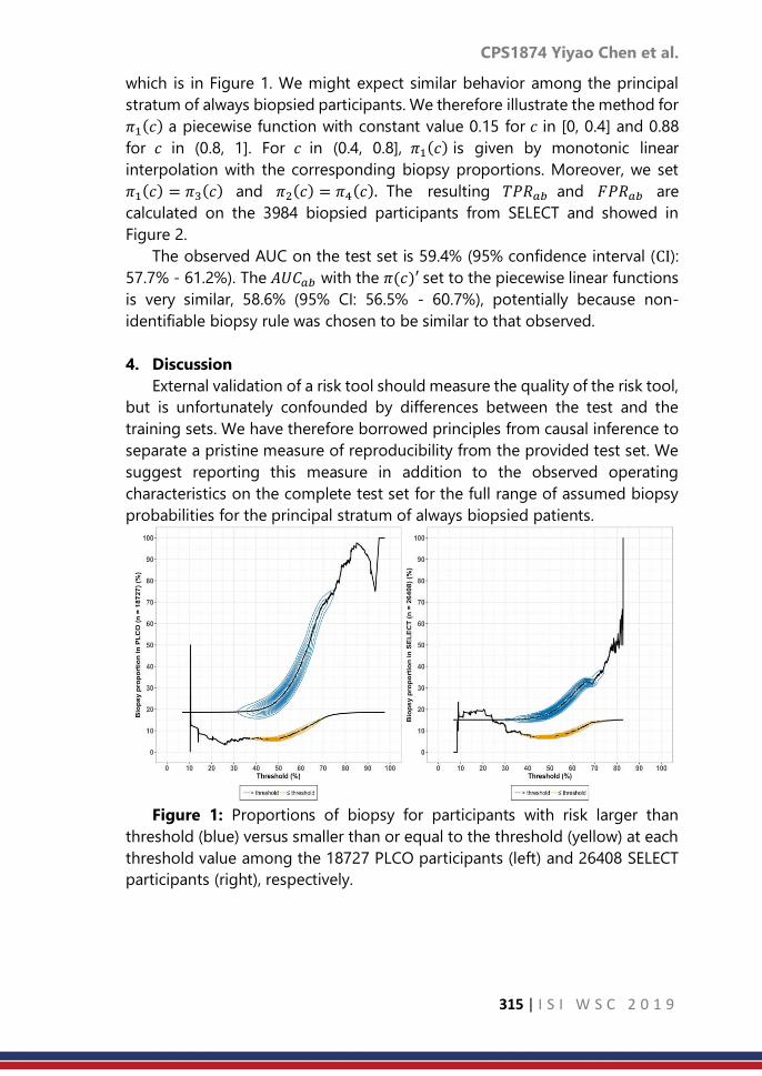
CPS1874 Yiyao Chen et al.
315 | I S I W S C 2 0 1 9
which is in Figure 1. We might expect similar behavior among the principal
stratum of always biopsied participants. We therefore illustrate the method for
𝜋1(𝑐) a piecewise function with constant value 0.15 for 𝑐 in [0, 0.4] and 0.88
for 𝑐 in (0.8, 1]. For 𝑐 in (0.4, 0.8], 𝜋1(𝑐) is given by monotonic linear
interpolation with the corresponding biopsy proportions. Moreover, we set
𝜋1(𝑐) = 𝜋3(𝑐) and 𝜋2(𝑐) = 𝜋4(𝑐). The resulting 𝑇𝑃𝑅𝑎𝑏 and 𝐹𝑃𝑅𝑎𝑏 are
calculated on the 3984 biopsied participants from SELECT and showed in
Figure 2.
The observed AUC on the test set is 59.4% (95% confidence interval (CI):
57.7% - 61.2%). The 𝐴𝑈𝐶𝑎𝑏 with the 𝜋(𝑐)′ set to the piecewise linear functions
is very similar, 58.6% (95% CI: 56.5% - 60.7%), potentially because non-
identifiable biopsy rule was chosen to be similar to that observed.
4. Discussion
External validation of a risk tool should measure the quality of the risk tool,
but is unfortunately confounded by differences between the test and the
training sets. We have therefore borrowed principles from causal inference to
separate a pristine measure of reproducibility from the provided test set. We
suggest reporting this measure in addition to the observed operating
characteristics on the complete test set for the full range of assumed biopsy
probabilities for the principal stratum of always biopsied patients.
Figure 1: Proportions of biopsy for participants with risk larger than
threshold (blue) versus smaller than or equal to the threshold (yellow) at each
threshold value among the 18727 PLCO participants (left) and 26408 SELECT
participants (right), respectively.

CPS1874 Yiyao Chen et al.
316 | I S I W S C 2 0 1 9
Figure 2: Observed (blue) and principal stratum (green) true positive rates
(left) and the false positive rates (right) for a model built on the 3480 biopsied
participants of the PLCO and validated on the 3984 biopsied participants of
SELECT. Pointwise 95% confidence intervals for the curves are shown on the
graph.
We have herein only reported on the operating characteristics
comprising the AUC under the simplest restrictions for biopsy in the always
biopsied stratum. For future work we plan to extend the approach to more
realistic biopsy schemes, such as those based only on PSA, the leading
indicator used for biopsy referral in clinical practice, as well as to other
measures of validation, such as calibration.
References
1. Andriole, G. L., et al. (2009). Mortality results from a randomized prostate-
cancer screening trial. New England Journal of Medicine, 360(13), 1310–
1319.
2. Ankerst, D. P., et al. (2018). A contemporary prostate biopsy risk
calculator based on multiple heterogeneous cohorts. European Urology,
74(2), 197–203.
3. Debray, T. P., Vergouwe, Y., Koffijberg, H., Nieboer, D., Steyerberg, E. W.,
& Moons, K. G. (2015). A new framework to enhance the interpretation of
external validation studies of clinical prediction models. Journal of Clinical
Epidemiology, 68(3), 279–289.
4. Frangakis, C. E., & Rubin, D. B. (2002). Principal stratification in causal
inference. Biometrics, 58(1), 21–29.
5. Klein, E. A., et al. (2011). Vitamin e and the risk of prostate cancer: the
selenium and vitamin e cancer prevention trial (select). Journal of the
American Medical Association, 306(14), 1549–1556.

CPS1874 Yiyao Chen et al.
317 | I S I W S C 2 0 1 9
6. Rubin, D. B. (1974). Estimating causal effects of treatments in randomized
and nonrandomized studies. Journal of Educational Psychology, 66(5),
688–701.
7. Rubin, D. B. (1980). Randomization analysis of experimental data: The
fisher randomization test comment. Journal of the American Statistical
Association, 75(371), 591–593.
8. van Klaveren, D., Gönen, M., Steyerberg, E. W., & Vergouwe, Y. (2016). A
new concordance measure for risk prediction models in external
validation settings. Statistics in Medicine, 35(23), 4136–4152.

CPS1876 Sarbojit R. et al.
318 | I S I W S C 2 0 1 9
Nearest neighbor classifier based on generalized
inter-point distances for HDLSS data
Sarbojit Roy1, Subhajit Dutta1, Anil K. Ghosh2, Soham Sarkar2
1Department of Mathematics and Statistics, IIT Kanpur, Kanpur - 208016, India. 2Theoretical Statistics and Mathematics Unit, Indian Statistical Institute, Kolkata 700108, India.
Abstract
In high dimension low sample size (HDLSS) settings, distance based classifiers
suffer from curse of dimensionality if the competing populations are similar in
terms of their location and scale parameters. In this article, we propose a
classifier which can discriminate between populations having different
marginal distributions. A generalization of the proposed classifier has further
been developed to differentiate between populations having different joint
distributions of groups of component variables. Performances of the proposed
classifiers are demonstrated using a variety of simulated data sets.
Keywords
Classification; Convergence in Probability; HDLSS asymptotics; Mean absolute
difference of distances
1. Introduction
Nearest neighbor (NN) classification is among the most popular
supervised classification methods because of its simplicity and computational
speed. For an appropriate choice of 𝑘 ∈ ℕ, the misclassification probability of
the 𝑘NN classifier converges to the Bayes risk as the size of the training sample
(say, 𝑛) grows to infinity keeping the dimensionality of data (say, 𝐷) to be fixed
(see, e.g., Devroye et al. (2013)).
Consider a classification problem involving 𝐹1 and 𝐹2 , two unknown
probability distribution functions on ℝ𝐷 . Assuming appropriate moments
exist, let 𝜇𝐷(𝑗)
and ∑𝐷(𝑗)
denote the mean vector and the dispersion matrix
corresponding to 𝐹𝑗, respectively, for 𝑗 = 1, 2. Define the following constants:
𝑣122 = lim
𝐷→∞𝐷−1 ‖𝝁𝐷
(1)− 𝝁𝐷
(2)‖2and 𝜎𝑗
2 = lim𝐷→∞
𝐷−1 𝑡𝑟𝑎𝑐𝑒 (∑𝐷(𝑗)) 𝑓𝑜𝑟 𝑗 = 1,2.
Here, ‖∙‖ denotes the Euclidean norm on ℝ𝐷 and 𝑡𝑟𝑎𝑐𝑒(𝐴) = ∑𝑖=1𝐷 𝑎𝑖𝑖 (sum
of the diagonal elements) for a 𝐷 × 𝐷 matrix 𝐴 . Let us denote the 𝑘NN
classifier on ℝ𝐷 by 𝛿𝐷𝑘 , and its misclassification probability by ∆𝐷
𝑘 for a fixed 𝑘 ∈
ℕ. Under appropriate distributional assumptions, Hall et al. (2005) showed that
∆𝐷𝑘 converges to zero as 𝐷 → ∞ if we have 𝑣12
2 > |𝜎12 − 𝜎2
2|. Intuitively, this
means that the competing populations have their difference in scales
dominated by the differences in their locations. Some methods exist in the

CPS1876 Sarbojit R. et al.
319 | I S I W S C 2 0 1 9
literature that improve the performance of the 𝑘NN classifier in HDLSS
settings. Chan and Hall (2009) developed some scale adjustments to the usual
1NN classifier, and this method performs well under the weaker condition that
𝑣122 > 0. A non-linear transformation of covariate space followed by the 1NN
classification was proposed by Dutta and Ghosh (2016). Recently, Pal et al.
(2016) used a new dissimilarity index instead of the usual Euclidean distance
for 1NN classification. However, all these methods require either of the
conditions 𝑣122 > 0 or 𝜎1
2 ≠ 𝜎22 to yield good results for high-dimensional data.
So, they can deal with distributions that differ either in their locations or scales.
Consider a two class classification problem (say, Example 1) with the
competing distributions as 𝐹1 ≡ 𝑁𝐷(𝟎𝐷 , ∑𝐷(1)) and 𝐹2 ≡ 𝑁𝐷(𝟎𝐷 , ∑𝐷
(2)) . Here,
𝑁𝐷 denotes the 𝐷 − dimensional Gaussian distribution, 𝟎𝐷 is the
𝐷 −dimensional vector of zeros, and ∑𝐷(1)
and ∑𝐷(2)
are described below:
∑𝐷(1)
= [
𝐈[𝐷
2]
𝟎[𝐷
2]×(𝐷−[
𝐷
2])
𝟎(𝐷−[
𝐷
2])×[
𝐷
2]
0.5𝐈𝐷−[
𝐷
2]
] and ∑𝐷(2)
= [0.5𝐈
𝐷−[𝐷
2]
𝟎(𝐷−[
𝐷
2])×[
𝐷
2]
𝟎[𝐷
2]×(𝐷−[
𝐷
2])
𝐈[𝐷
2]
] ,
with 𝐈𝑑 being the 𝑑 × 𝑑 identity matrix and 𝟎𝑙 × 𝑚 being the 𝑙 × 𝑚 matrix of
zeros. As Example 2, we consider 𝐹1 ≡ 𝑁𝐷(𝟎𝐷 ,5
3𝐈𝐷) and 𝐹2 ≡ ∏ 𝐹2𝑑
𝐷𝑑=1 with
𝐹2𝑑 = 𝑡5(0,1) for each 1 ≤ 𝑑 ≤ 𝐷 . Throughout this article, we follow the
convention that if we write 𝐗 = (𝑋1,… , 𝑋𝐷)𝑇~ 𝐹, then 𝑋𝑑~𝐹𝑑 for all 1 ≤ 𝑑 ≤
𝐷. It is easy to check that 𝑣122 = 0 and 𝜎1
2 = 𝜎22 = 0.75 for Example 1. For
Example 2, the parameters are 𝝁𝐷(1)
= 𝝁𝐷(2)
= 𝟎𝐷 and ∑𝐷(1)
= ∑𝐷(2)
= 5
3𝐈𝐷 ,
hence we obtain 𝑣122 = 0 and 𝜎1
2 = 𝜎22 =
5
3. Despite having different
populations, both these examples end up with 𝑣122 = 0 and 𝜎1
2 = 𝜎22. The
existing NN classifiers fail to yield promising results in high-dimensional
spaces. Similar arguments hold for any 𝑘 in the 𝑘NN classifier as 𝐷 → ∞ (with
a fixed value of 𝑘 ∈ ℕ). In Figure 1, we report the empirical misclassification
probability of the Bayes classifier and 1NN classifier.
(𝑎)𝐹1 ≡ 𝑁𝐷(0𝐷 , ∑𝐷
(1)) and 𝐹2 ≡ 𝑁𝐷(0𝐷 , ∑𝐷
(2)) (𝑏)𝐹1 ≡ 𝑁𝐷(𝟎𝐷 ,
5
3𝐈𝐷) and 𝐹2 ≡ ∏ 𝑡5(0,1)
𝐷𝑑=1
Figure 1: Error rates of classifiers in Examples 1 and 2.

CPS1876 Sarbojit R. et al.
320 | I S I W S C 2 0 1 9
In this article, we focus on the 𝑘NN classifier based on Mean Absolute
Differences of Distances (MADD) proposed by Pal et al. (2016) and make
appropriate adjustments to the Euclidean distance function to discriminate
among populations under more general settings. A transformation of the
usual MADD is proposed in Section 2. Section 3 further generalizes the
proposed classifier to address cases where discriminative information comes
from the joint distribution of groups of component variables. Numerical
performance of the proposed classifiers on simulated datasets is evaluated in
Section 4.
2. Transformation of MADD
Let us denote the training data set (𝐗1, 𝑌1), (𝐗2, 𝑌2), … , (𝐗𝑛 , 𝑌𝑛) by 𝜒𝑛 (a
random sample of size 𝑛). Here, 𝐗𝑖s are 𝐷 −dimensional random vectors and
𝑌𝑖 ∈ 1,… , 𝐽 denotes the class label associated with 𝐗𝑖 for 1 ≤ 𝑖 ≤ 𝑛. Let 𝑛𝑗
be the number of observations from the 𝑗 − th class for 1 ≤ 𝑗 ≤ 𝐽 and
𝑛 = ∑𝑗=1 𝐽 𝑛𝑗 . For a fixed 𝑖, suppose that 𝑃[𝑌𝑖 = 𝑗] = 𝜋𝑗 with 0 < 𝜋𝑗 <
1, 𝐗𝑖|𝑌𝑖 = 𝑗~𝐹𝑗 for 1 ≤ 𝑗 ≤ 𝐽 and ∑𝑗=1 𝐽
𝜋𝑗 = 1. Our objective is to predict the
class label 𝑌Z of a new observation 𝐙 ∈ ℝ𝐷.
For a given training sample 𝜒𝑛 and test point 𝐙 ∈ ℝ𝐷 , Pal et al. (2016)
defined the dissimilarity index MADD between 𝐙 and 𝐗𝑖0 for a fixed index
1 ≤ 𝑖0 ≤ 𝑛 as follows:
𝜓1,𝐷(𝒁,𝐗𝑖0) =1
𝑛 − 1∑ |𝐷−
12‖𝒁 − 𝐗𝑖‖ − 𝐷−
12‖𝐗𝑖0 − 𝐗𝑖‖| .
1≤𝑖≠≤𝑛
(1)
MADD uses the usual Euclidean (also known as 𝑙2) distance to compute
dissimilarity between two vectors. However, one may use any other distance
function instead of the 𝑙2-distance to define a measure of dissimilarity like
𝜓1,𝐷 . It is established that MADD performs well when 𝑣𝑗,𝑗,2 > 0 or 𝜎𝑗
2 ≠ 𝜎𝑗2, for
1 ≤ 𝑗 ≠ 𝑗′ ≤ 𝐽 (see Pal et al. (2016)), but fails under more general conditions
(see Figure 2). Observe that these limiting values 𝑣𝑗,𝑗,2 𝜎𝑗
2 and 𝜎𝑗2, come into
the picture as a consequence of using the Euclidean distance in 𝜓1,𝐷 . We
propose some adjustments to the Euclidean norm that will lead to better
performance compared to usual MADD under more general situations.
Let 𝛾 ∶ [0,∞) ↦ [0,∞) and 𝜙 ∶ [0,∞) ↦ [0,∞) be two continuous,
monotonically increasing functions with 𝛾(0) = 𝜙(0) = 0 . For 𝐮, 𝐯 ∈ ℝ𝐷 ,
define
𝛽𝐷(𝐮, 𝐯) = 𝜙[𝐷−1 ∑𝛾(|𝑢𝑑 − 𝑣𝑑|2)
𝐷
𝑑=1
]. (2)
It is clear that by considering 𝛾(𝑡) = 𝑡𝑝
2 and 𝜙(𝑡) = 𝑡1
2 for 𝑝 ≥ 1, we get
𝛽𝐷(𝐮, 𝐯) =1
√𝐷𝑝 ‖𝐮, 𝐯‖𝑝, i.e., the 𝑙𝑝 distance between u and v scaled by √𝐷
𝑝. For
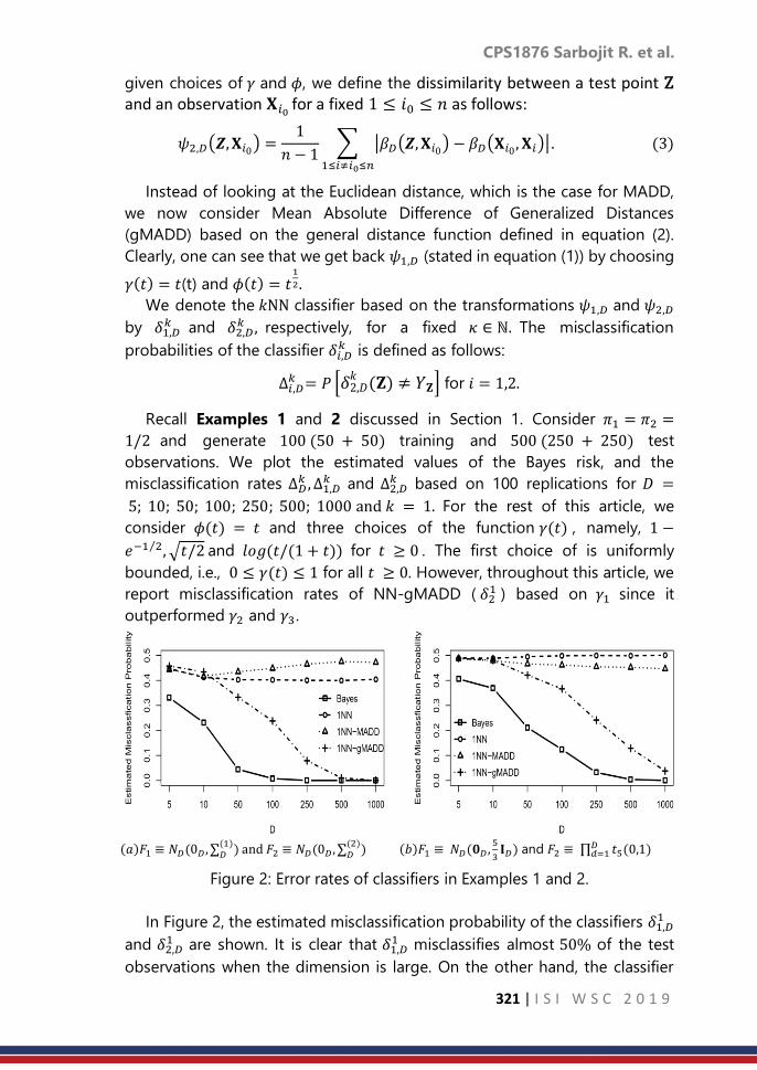
CPS1876 Sarbojit R. et al.
321 | I S I W S C 2 0 1 9
given choices of 𝛾 and 𝜙, we define the dissimilarity between a test point Z and an observation 𝐗𝑖0 for a fixed 1 ≤ 𝑖0 ≤ 𝑛 as follows:
𝜓2,𝐷(𝒁,𝐗𝑖0) =1
𝑛 − 1∑ |𝛽𝐷(𝒁,𝐗𝑖0) − 𝛽𝐷(𝐗𝑖0 , 𝐗𝑖)|
1≤𝑖≠𝑖0≤𝑛
. (3)
Instead of looking at the Euclidean distance, which is the case for MADD,
we now consider Mean Absolute Difference of Generalized Distances
(gMADD) based on the general distance function defined in equation (2).
Clearly, one can see that we get back 𝜓1,𝐷 (stated in equation (1)) by choosing
𝛾(𝑡) = 𝑡(t) and 𝜙(𝑡) = 𝑡1
2.
We denote the 𝑘NN classifier based on the transformations 𝜓1,𝐷 and 𝜓2,𝐷
by 𝛿1,𝐷𝑘 and 𝛿2,𝐷
𝑘 , respectively, for a fixed 𝜅 ∈ ℕ. The misclassification
probabilities of the classifier 𝛿𝑖,𝐷𝑘 is defined as follows:
∆𝑖,𝐷𝑘 = 𝑃 [𝛿2,𝐷
𝑘 (𝐙) ≠ 𝑌𝐙] for 𝑖 = 1,2.
Recall Examples 1 and 2 discussed in Section 1. Consider 𝜋1 = 𝜋2 =
1/2 and generate 100 (50 + 50) training and 500 (250 + 250) test
observations. We plot the estimated values of the Bayes risk, and the
misclassification rates ∆𝐷𝑘 , ∆1,𝐷
𝑘 and ∆2,𝐷𝑘 based on 100 replications for 𝐷 =
5; 10; 50; 100; 250; 500; 1000 and 𝑘 = 1. For the rest of this article, we
consider 𝜙(𝑡) = 𝑡 and three choices of the function 𝛾(𝑡) , namely, 1 −
𝑒−1 2⁄ , √𝑡/2 and 𝑙𝑜𝑔(𝑡/(1 + 𝑡)) for 𝑡 ≥ 0 . The first choice of is uniformly
bounded, i.e., 0 ≤ 𝛾(𝑡) ≤ 1 for all 𝑡 ≥ 0. However, throughout this article, we
report misclassification rates of NN-gMADD ( 𝛿21 ) based on 𝛾1 since it
outperformed 𝛾2 and 𝛾3.
(𝑎)𝐹1 ≡ 𝑁𝐷(0𝐷 , ∑𝐷(1)) and 𝐹2 ≡ 𝑁𝐷(0𝐷 , ∑𝐷
(2)) (𝑏)𝐹1 ≡ 𝑁𝐷(𝟎𝐷 ,
5
3𝐈𝐷) and 𝐹2 ≡ ∏ 𝑡5(0,1)
𝐷𝑑=1
Figure 2: Error rates of classifiers in Examples 1 and 2.
In Figure 2, the estimated misclassification probability of the classifiers 𝛿1,𝐷1
and 𝛿2,𝐷1 are shown. It is clear that 𝛿1,𝐷
1 misclassifies almost 50% of the test
observations when the dimension is large. On the other hand, the classifier

CPS1876 Sarbojit R. et al.
322 | I S I W S C 2 0 1 9
𝛿2,𝐷1 yields good performance. In fact, under certain assumptions, we proved
that ∆2,𝐷1 converges to zero as 𝐷 → ∞.
3. Identifying Joint Structures
In Section 2, we observed that the 𝑘NN classifier based on 𝜓2,𝐷 (namely,
𝛿2,𝐷𝑘 ) can discriminate populations that have difference in their one-
dimensional marginal distributions. But, if the one-dimensional marginals are
same, gMADD will fail to differentiate between populations. Such scenarios
impose further challenges on the proposed classifier 𝛿2,𝐷1 . Consider two class
classification problems. Let ∑𝐷(1)
and ∑𝐷(2)
denote the 𝐷 × 𝐷 dispersion matrices
of the first and second populations F1 and F2, respectively, as follows:
∑𝐷(𝑗)
=
[ 𝐇𝑗
𝐇𝑗
⋱𝐇𝑗]
and 𝐇𝑗 =
[ 1 𝜌𝑗 … 𝜌𝑗
𝜌𝑗 1 … 𝜌𝑗
⋮𝜌𝑗 𝜌𝑗
⋱… 1 ]
for 𝑗 = 1,2.
Here, 𝐇1 and 𝐇2 are 𝑟 × 𝑟 positive definite matrices with 𝜌𝑗 > 1 = (1 + 𝑟)
(constant correlation matrices). In other words, ∑𝐷(1)
and ∑𝐷(2)
are block
diagonal positive definite matrices with block size 𝑟 (a fixed positive integer)
and the number of blocks is 𝐵 satisfying 𝐷 = 𝑟𝐵. We consider 𝜌1 = 0.3 and
𝜌2 = 0.7 as particular choices. Take 𝐹1 ≡ 𝑁𝐷(0𝐷 , ∑𝐷(1)) and 𝐹2 ≡ 𝑁𝐷(0𝐷 , ∑𝐷
(2)),
respectively and consider this as Example 3. Note that 𝝁𝐷(1)
= 𝝁𝐷(2)
= 𝟎𝐷 and
𝑡𝑟𝑎𝑐𝑒 (∑𝐷(1)) = 𝑡𝑟𝑎𝑐𝑒 (∑𝐷
(2)) = 𝐷, i.e., 𝑣12
2 = 0 and 𝜎12 = 𝜎2
2. The usual 𝑘NN
classifier (namely, 𝛿𝐷𝑘 and the MADD based 𝑘NN classifier (namely, 𝛿1,𝐷
𝑘 ) fails
to work in this example. Moreover, there is no difference between the marginal
distributions of these two populations as the component variables are all
standard normal.
a. Improvements to gMADD
In Examples 3, we can observe that the competing populations have
the same one-dimensional marginal distributions, and 𝜓2,𝐷 does not
contain any discriminatory information between the distributions 𝐹1 and
𝐹2 . But, the joint distribution of the individual groups of component
variables are clearly different for these two populations. This motivates the
idea of capturing differences between the population distributions
through appropriate joint distributions of the groups of components. We
formalize this idea as follows.
Let us write any 𝐷 × 1 vector 𝐔 as (𝐔1⊤, … , 𝐔𝐵
⊤)⊤, where 𝐔𝑏 is a D𝑏 × 1
vector for 1 ≤ 𝑏 ≤ 𝐵, and ∑𝑏=1𝐵 𝐷𝑏 = 𝐷. Here, the D-dimensional vector 𝐔
has been partitioned into smaller groups 𝐔𝑏 for 1 ≤ 𝑏 ≤ 𝐵. For a random
vector 𝐔 = (𝐔1⊤, … , 𝐔𝐵
⊤)⊤~𝐹𝑗, we denote the distribution of 𝐔𝑏/√𝐷𝑏 by 𝐹𝑗,𝑏

CPS1876 Sarbojit R. et al.
323 | I S I W S C 2 0 1 9
for 1 ≤ 𝑏 ≤ 𝐵 and 1 ≤ 𝑗 ≤ 𝐽. Analogous to the quantities 𝛽𝐷(𝒁,𝐗𝑖0) and
𝜓3,𝐷(𝒁,𝐗𝑖0) for 𝒁, 𝐗𝑖0 ∈ ℝ𝐷 with a fixed 1 ≤ 𝑖0 ≤ 𝑛 (see Section 2), we now
define the following two transformations:
𝛽𝐷(𝒁,𝐗𝑖0) = 𝜙[𝐵−1∑ 𝛾
𝐵
𝑏=1
(𝐷𝑏−1‖𝐙𝑏 − 𝐗𝑖0𝑏‖)
2, 𝑎𝑛𝑑 (4)
𝜓3,𝐷(𝒁,𝐗𝑖0) =1
𝑛 − 1∑ |𝛽𝐷(𝒁,𝐗𝑖) − 𝛽𝐷(𝐗𝑖0 , 𝐗𝑖)|
1≤𝑖≠𝑖0≤𝑛
. (5)
This transformation 𝜓𝐵 is the Mean Absolute Difference of the
generalized group based Distances (ggMADD). We denote the 𝑘NN
classifier based on ggMADD as 𝛿3,𝐵𝑘 . Under appropriate conditions,
we proved that the misclassification probability of 𝛿3,𝐵𝑘
converges to
zero as 𝐵 → ∞. 4. Results from the Analysis of Simulated Data Sets
We analyze several high-dimensional simulated data sets to compare the
performance of the proposed classifiers. Recall the examples introduced in
Section 1 (Examples 1, 2) and also the examples introduced later in Section 3
(Example 3). Along with these three data sets, we now consider one more
example in this section.
Recall the two scale matrices 𝐇1 and 𝐇2 defined in Example 3 (see Section
3). Let 𝐔1,…,𝐔𝐵 be independent 𝑟 × 1 random vectors, identically distributed as
the multivariate Cauchy distribution with location parameter 𝟎𝑟 and scale
matrix 𝐇1 (say, 𝑀𝑡1(𝟎𝑟, 𝐇1)). Consider a 𝐷 × 1 random vector from the first
population 𝐔 = (𝐔1⊤ , … , 𝐔𝐵
⊤)⊤ .The distribution function of 𝐔 is 𝐹1(𝐮) =
∏ 𝐹2,𝑏(𝐮𝑏)𝐵𝑏=1 , where 𝐹2,𝑏 ≡ 𝑀𝑡1(𝟎𝑟, 𝐇1). Similarly, a 𝐷 × 1 random vector 𝐕
from the second population follows 𝐹1(𝐯) = ∏ 𝐹2,𝑏(𝐯𝑏)𝐵𝑏=1 , where 𝐹2,𝑏 ≡
𝑀𝑡1(𝟎𝑟, 𝐇1). We consider this as Example 4. Since moments do not exist for
the multivariate Cauchy distribution, the constants 𝑣12,2 𝜎1
2 and 𝜎22 do not exist
in this examples. So, we cannot comment on the performances of the usual
NN or NNMADD as 𝐷 → ∞. But, the proposed classifier can deal with such
heavy-tailed distributions if we choose the 𝛾 function to be bounded.
However, in Example 4, the one-dimensional marginals for both 𝐹1 and 𝐹2 are
all Cauchy distribution with location zero and scale one (i.e., 𝐶(0, 1)) .
Therefore, gMADD cannot differentiate between 𝐹1 and 𝐹2. This pushes us to
capture the differences between 𝐹1 and 𝐹2 through the joint distributions of
the groups.
In each example, we generated 50 observations from each of the two
classes to form the training sample, while a test set of size 500 (250 from each
class) was used. This procedure was repeated 100 times to compute the
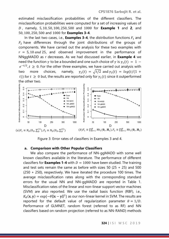
CPS1876 Sarbojit R. et al.
324 | I S I W S C 2 0 1 9
estimated misclassification probabilities of the different classifiers. The
misclassification probabilities were computed for a set of increasing values of
𝐷 , namely, 5, 10, 50, 100, 250, 500 and 1000 for Example 1 and 2, and
50, 100, 250, 500 and 1000 for Examples 3-4.
In the last two cases, i.e., Examples 3-4, the distribution functions 𝐹1 and
𝐹2 have differences through the joint distributions of the groups of
components. We have carried out the analysis for these two examples with
𝑟 = 5, 10 𝑎𝑛𝑑 25, and observed improvement in the performance of
NNggMADD as r decreases. As we had discussed earlier, in Example 4 we
need the function 𝛾 to be a bounded and one such choice of 𝛾 is 𝛾1(𝑡) = 1 −
𝑒−𝑡/2 , 𝑡 ≥ 0. For the other three examples, we have carried out analysis with
two more choices, namely, 𝛾2(𝑡) = √𝑡/2 and 𝛾3(𝑡) = 𝑙𝑜𝑔(𝑡/(1 +
𝑡)) for 𝑡 ≥ 0 but, the results are reported only for 𝛾1(𝑡) since it outperformed
the other two.
D D
(𝑎)𝐹1 ≡ 𝑁𝐷(0𝐷 , ∑𝐷(1)),𝐹2 ≡ 𝑁𝐷(0𝐷, ∑𝐷
(2))
(𝑏)𝐹1 ≡ ∏𝑏=1𝐵 𝑀𝑡1(𝟎𝑟 ,𝐇1),𝐹2 ≡ ∏𝑏=1
𝐵 𝑀𝑡1(𝟎𝑟 ,𝐇2)
Figure 3: Error rates of classifiers in Examples 3 and 4.
a. Comparison with Other Popular Classifiers
We also compare the performance of NN-ggMADD with some well
known classifiers available in the literature. The performance of different
classifiers for Examples 1-4 with 𝐷 = 1000 have been studied. The training
and test sets remain the same as before with sizes 50 (25 + 25) and 500
(250 + 250), respectively. We have iterated the procedure 100 times. The
average misclassification rates along with the corresponding standard
errors for the usual NN and NN-ggMADD are reported in Table 1.
Misclassification rates of the linear and non-linear support vector machines
(SVM) are also reported. We use the radial basis function (RBF), i.e.,
𝐾 (𝐱, 𝐲) = exp −휃‖𝐱 − 𝐲‖2 as our non-linear kernel in SVM. The results are
reported for the default value of regularization parameter 휃 = 1/𝐷.
Performance of GLMNET, random forest (referred to as RF) and NN
classifiers based on random projection (referred to as NN-RAND) methods
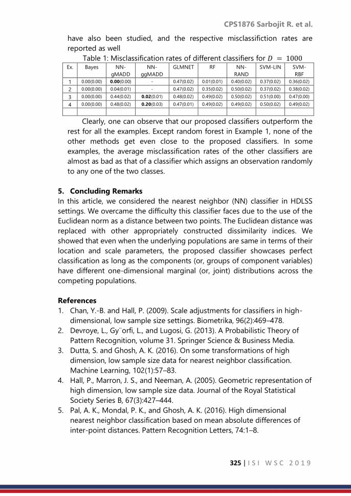
CPS1876 Sarbojit R. et al.
325 | I S I W S C 2 0 1 9
have also been studied, and the respective misclassifiction rates are
reported as well
Table 1: Misclassification rates of different classifiers for 𝐷 = 1000 Ex. Bayes NN-
gMADD
NN-
ggMADD
GLMNET RF NN-
RAND
SVM-LIN SVM-
RBF
1 0.00(0.00) 0.00(0.00) - 0.47(0.02) 0.01(0.01) 0.40(0.02) 0.37(0.02) 0.36(0.02)
2 0.00(0.00) 0.04(0.01) - 0.47(0.02) 0.35(0.02) 0.50(0.02) 0.37(0.02) 0.38(0.02)
3 0.00(0.00) 0.44(0.02) 0.02(0.01) 0.48(0.02) 0.49(0.02) 0.50(0.02) 0.51(0.00) 0.47(0.00)
4 0.00(0.00) 0.48(0.02) 0.20(0.03) 0.47(0.01) 0.49(0.02) 0.49(0.02) 0.50(0.02) 0.49(0.02)
Clearly, one can observe that our proposed classifiers outperform the
rest for all the examples. Except random forest in Example 1, none of the
other methods get even close to the proposed classifiers. In some
examples, the average misclassification rates of the other classifiers are
almost as bad as that of a classifier which assigns an observation randomly
to any one of the two classes.
5. Concluding Remarks
In this article, we considered the nearest neighbor (NN) classifier in HDLSS
settings. We overcame the difficulty this classifier faces due to the use of the
Euclidean norm as a distance between two points. The Euclidean distance was
replaced with other appropriately constructed dissimilarity indices. We
showed that even when the underlying populations are same in terms of their
location and scale parameters, the proposed classifier showcases perfect
classification as long as the components (or, groups of component variables)
have different one-dimensional marginal (or, joint) distributions across the
competing populations.
References
1. Chan, Y.-B. and Hall, P. (2009). Scale adjustments for classifiers in high-
dimensional, low sample size settings. Biometrika, 96(2):469–478.
2. Devroye, L., Gy¨orfi, L., and Lugosi, G. (2013). A Probabilistic Theory of
Pattern Recognition, volume 31. Springer Science & Business Media.
3. Dutta, S. and Ghosh, A. K. (2016). On some transformations of high
dimension, low sample size data for nearest neighbor classification.
Machine Learning, 102(1):57–83.
4. Hall, P., Marron, J. S., and Neeman, A. (2005). Geometric representation of
high dimension, low sample size data. Journal of the Royal Statistical
Society Series B, 67(3):427–444.
5. Pal, A. K., Mondal, P. K., and Ghosh, A. K. (2016). High dimensional
nearest neighbor classification based on mean absolute differences of
inter-point distances. Pattern Recognition Letters, 74:1–8.

CPS1878 Zakir H. et al.
326 | I S I W S C 2 0 1 9
Modelling randomization with misspecification
of the correlation structure and distribution of
random effects in a poisson mixed model
Zakir Hossain1, Heiko Grossmann2, Steven Gilmour3 1Department of Statistics, University of Dhaka, Bangladesh
2School of Mathematical Sciences, University of Magdeburg, Germany 3School of Mathematical Sciences, Kings College London, UK
Abstract
We consider the generalized linear mixed model (GLMM) for the randomized
complete block design (RCBD) with random block effects. The variance-
covariance matrices for the random effects are derived from the
randomization. The randomization of blocks and units within each block has
been modelled by using the wreath product of two symmetric groups.
Typically, the random effects in a GLMM are uncorrelated and assumed to
follow a normal distribution. However, in our case, the random effects are
found to be correlated due to randomization. The impact of misspecification
of the correlation structure and distribution of the random effects upon the
estimation of fixed effects and variance components in a Poisson mixed model
has been investigated via simulation studies. The simulation results show that
misspecification of both the correlation structure and the random effects
distribution has hardly any effect on the estimates of the fixed effects
parameters. However, the estimated variance components are frequently
severely biased and standard errors of these estimates are found to be
substantially higher.
Keywords
Generalized linear mixed model; Randomized complete block design;
Symmetric group; Wreath product
1. Introduction
The random effects in a GLMM are usually assumed to have a normal
distribution. However, inferences that are based on the normality assumption
may be incorrect if the actual distribution of the random effects is not normal.
Recently it has been investigated how misspecification of the random effects
distribution affects the estimates of the model parameters. To this end,
simulation studies have been performed which have lead to conflicting
conclusions. Some studies report that misspecification has a strong effect
[Heagerty and Kurland (2001), Agresti et al. (2004), Litière et al. (2007, 2008),
Hernández and Giampaoli (2018)] while others claim the contrary [Neuhaus et
al. (2011), McCulloch and Neuhaus (2011), Neuhaus et al. (2011), Neuhaus et
al. (2013)].

CPS1878 Zakir H. et al.
327 | I S I W S C 2 0 1 9
In this paper, the randomization approach of Brien and Bailey (2006) is
used for deriving the variance-covariance matrices of the random effects in a
GLMM. It is shown that the random effects are correlated. We then study the
impact of misspecification of both the correlation structure and the random
effects distribution on the estimated model parameters via simulation studies,
which has not been considered in the previous studies.
2. Methodology
Let Y be the bt × 1 vector of responses and X be the bt × (t + 1) design
matrix for the fixed treatment effects. We then write the GLMM for the RCBD
with random blocks in matrix notation as
𝑔(𝐸(𝑌|𝜖, 𝐵)) = 𝑋𝛽 + 𝑍𝐵 + 𝜖 (1)
where 𝛽 = (µ, 𝛼1, . . . , 𝛼𝑡)⊺ is the (t + 1) × 1 vector of fixed treatment effect
parameters, Z is the model matrix of order bt × b corresponding to random
block effects, B is the b × 1 vector of random block effects, 𝜖 is the bt × 1
vector of random errors, 𝐸(𝑌|𝜖, 𝐵) is the conditional expectation, and g is the
link function.
For the RCBD with random blocks, we consider the randomization for
deriving moments of the random effects which is in line with the approach of
Brien and Bailey (2006). Let St and Sb be the two symmetric groups of
permutations of the sets 1,2, . . . , 𝑡 and 1,2, . . . , 𝑏 respectively. The
corresponding randomization of b blocks and t units within each block is
modelled by elements of the wreath product St ≀ Sb of two symmetric groups
St and Sb. In this setup, the symmetric group St represents the randomization
of units and Sb stands for the randomization of blocks.
We derive from the randomization 𝐸(𝜖) = 0 and the variance-covariance
matrix 𝑉(𝜖) = 0 diag(Q,...,Q) with Q = 𝜎𝑤2
𝑡−1 (𝑡𝐼𝑡 − 1𝑡1𝑡
Τ) = 𝜎𝑤2𝑝𝑡 , where 𝑃𝑡 =
1
𝑡−1(𝑡𝐼𝑡 − 1𝑡1𝑡
Τ) is a matrix of order t×t. We also derive 𝐸(𝐵) = 0 and 𝑉(𝐵) =
𝜎𝐵2
𝑏−1 (𝑏𝐼𝑏 − 1𝑏1𝑏
Τ) = 𝜎𝐵2𝑝𝑏 with the b×b matrix 𝑃𝑏 =
1
𝑏−1(𝑏𝐼𝑏 − 1𝑏1𝑏
⊺ ). It follows
that the random blocks and errors are correlated due to randomization.
3. Simulation study and results
The vector of linear predictors η, corresponding to a GLMM (M1) with
correlated random effects is de ned as
𝑀1 ∶ 휂 = 𝑋𝛽 + 𝑍𝐵 + 𝜖
and for a standard GLMM (M2) with uncorrelated random effects as
𝑀2 ∶ 휂 = 𝑋𝛽 + 𝑍𝐵∗ + 𝜖∗.
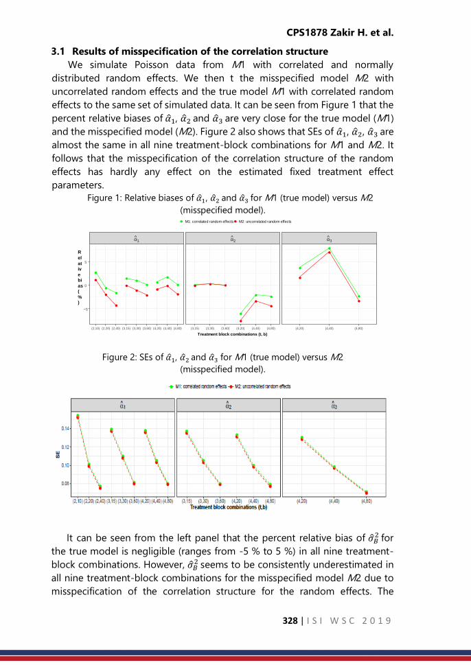
CPS1878 Zakir H. et al.
328 | I S I W S C 2 0 1 9
3.1 Results of misspecification of the correlation structure
We simulate Poisson data from M1 with correlated and normally
distributed random effects. We then t the misspecified model M2 with
uncorrelated random effects and the true model M1 with correlated random
effects to the same set of simulated data. It can be seen from Figure 1 that the
percent relative biases of 1, 2 and 3 are very close for the true model (M1)
and the misspecified model (M2). Figure 2 also shows that SEs of 1, 2, 3 are
almost the same in all nine treatment-block combinations for M1 and M2. It
follows that the misspecification of the correlation structure of the random
effects has hardly any effect on the estimated fixed treatment effect
parameters.
Figure 1: Relative biases of 1, 2 and 3 for M1 (true model) versus M2
(misspecified model).
Figure 2: SEs of 1, 2 and 3 for M1 (true model) versus M2
(misspecified model).
It can be seen from the left panel that the percent relative bias of 𝐵2 for
the true model is negligible (ranges from -5 % to 5 %) in all nine treatment-
block combinations. However, 𝐵2 seems to be consistently underestimated in
all nine treatment-block combinations for the misspecified model M2 due to
misspecification of the correlation structure for the random effects. The
α ^ 1 α ^
2 α ^ 3
(2,10) (2,20) (2,40) (3,15) (3,30) (3,60) (4,20) (4,40) (4,80) (3,15) (3,30) (3,60) (4,20) (4,40) (4,80) (4,20) (4,40) (4,80)
−5
0
5
Treatment block combinations (t, b)
R
el
at
iv
e
bi
as
(
%
)
M1: correlated random effects M2: uncorrelated random effects
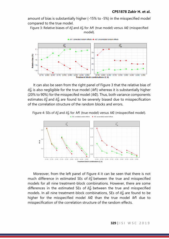
CPS1878 Zakir H. et al.
329 | I S I W S C 2 0 1 9
amount of bias is substantially higher (-15% to -5%) in the misspecified model
compared to the true model.
Figure 3: Relative biases of 𝐵2 and 𝑊
2 for M1 (true model) versus M2 (misspecified
model).
It can also be seen from the right panel of Figure 3 that the relative bias of
𝑊2 is also negligible for the true model (M1) whereas it is substantially higher
(20% to 90%) for the misspecifed model (M2). Thus, both variance components
estimates 𝐵2 and 𝑊
2 are found to be severely biased due to misspecification
of the correlation structure of the random blocks and errors.
Figure 4: SEs of 𝐵2 and 𝑊
2 for M1 (true model) versus M2 (misspecified model).
Moreover, from the left panel of Figure 4 it can be seen that there is not
much difference in estimated SEs of 𝐵2 between the true and misspecified
models for all nine treatment-block combinations. However, there are some
differences in the estimated SEs of 𝑊2 between the true and misspecified
models. In all nine treatment-block combinations, SEs of 𝑊2 are found to be
higher for the misspecified model M2 than the true model M1 due to
misspecification of the correlation structure of the random effects.
σ ^ B 2
σ ^ W 2
(2,10) (2,20) (2,40) (3,15) (3,30) (3,60) (4,20) (4,40) (4,80) (2,10) (2,20) (2,40) (3,15) (3,30) (3,60) (4,20) (4,40) (4,80)
0.05
0.10
0.15
0.20
0.4
0.6
0.8
Treatment block combinations (t, b)
S
E
M1: correlated random effects M2: uncorrelated random effects

CPS1878 Zakir H. et al.
330 | I S I W S C 2 0 1 9
3.1.1 Results of misspecification of the random effects distributions
We simulate Poisson data from M1 with correlated random effects (block
effects and errors) those are generated from normal, uniform and transformed
t3 with the same mean and variance but different shapes. We t M1 under the
assumption that random effects are normally distributed to the same set of
simulated data. From Figure 5 it can be seen that there is no substantial
differences in the relative biases of 1, 2 and 3 for all nine treatment-block
combinations under three different random effects distributions (normal,
uniform, t3).
Figure 5: Percent relative biases of 1, 2 and 3 among normal, uniform and t3
distributions.
Figure 6: SEs of 1, 2 and 3 among normal, uniform and t3 distributions.
For normal, uniform and t3 random effects distributions, it can be seen
from Figure 6 that the empirical SEs of 1, 2 and 3αˆ3 do not differ in all nine
treatment-block combinations. From both panels it can be seen that the
percent relative biases of 𝐵2 and 𝑊
2 are very close to each other in the case of
normal and uniform random effects distributions. However, it seems that 𝐵2
and 𝑊2 are severely biased and underestimated in all treatment-block
combinations when random effects are generated from t3 (t-distribution with
3 degrees of freedom). The amount of bias is substantially higher (-40% to -
10%) for t3 than for normal and uniform random effects distributions.

CPS1878 Zakir H. et al.
331 | I S I W S C 2 0 1 9
Figure 7: Comparison of percent relative biases of 𝐵2 and 𝑊
2 among normal, uniform
and t3 distributions.
Figure 8: Comparison of SEs of 𝐵2 and 𝑊
2 among normal, uniform and t3
distributions.
From both panels it can be seen that SEs of 𝐵2 and 𝑊
2 are very close when
random block effects and errors are generated from normal and uniform
distributions. However, SEs of 𝐵2 and 𝑊
2 seem to be substantially higher when
random effects are simulated from t3 than when simulated from normal and
uniform distributions.
4 Conclusion
From the simulation results we conclude that misspecification of both the
correlation structure and the distribution of the random effects has hardly any
effect on estimates of fixed treatment effect parameters (1, 2, 3) in terms
of their biases and empirical SEs. Similar results were reported by Neuhaus et
al. (2013) and McCulloch and Neuhaus (2011). However, it has shown by Litière
et al. (2008) that maximum likelihood estimates of fixed effect parameters are
inconsistent due to misspecification of the random effects distribution which
is not in agreement with this study findings. The estimates of variance
components (𝐵2 , 𝑊
2 ) are frequently severely biased and their SEs are mostly

CPS1878 Zakir H. et al.
332 | I S I W S C 2 0 1 9
higher due to misspecification of both random effects distribution and
correlation structure. The estimated variance components were also found to
be biased by Litière et al. (2008) and Hernández and Giampaoli (2018) when
the misspecification of the random effects distribution was present.
References
1. Agresti, A., B. Ca o, and P. Ohman-Strickland (2004). Examples in which
misspecification of a random effects distribution reduces efficiency, and
possible remedies. Computational Statistics & Data Analysis 47, 639 653.
2. Brien, C. J. and R. Bailey (2006). Multiple randomizations. Journal of the
Royal Statistical Society: Series B 68, 571 609.
3. Heagerty, P. J. and B. F. Kurland (2001). Misspecified maximum likelihood
estimates and generalised linear mixed models. Biometrika 88, 973 985.
4. Hernández, F. and V. Giampaoli (2018). The impact of misspecified
random e ect distribution in a weibull regression mixed model. Stats 1(1),
48 76.
5. Litière, S., A. Alonso, and G. Molenberghs (2007). Type I and type II errors
under random-effects misspecification in generalized linear mixed
models. Biometrics 63, 1038 1044.
6. Litière, S., A. Alonso, and G. Molenberghs (2008). The impact of a
misspeci ed random-effects distribution on the estimation and the
performance of inferential procedures in generalized linear mixed
models. Statistics in Medicine 27, 3125 3144.
7. McCulloch, C. E. and J. M. Neuhaus (2011). Misspecifying the shape of a
random effects distribution: why getting it wrong may not matter.
Statistical Science 26, 388 402.
8. Neuhaus, J. M., C. E. McCulloch, and R. Boylan (2011). A note on type II
error under random effects misspecification in generalized linear mixed
models. Biometrics 67, 654 660.
9. Neuhaus, J. M., C. E. McCulloch, and R. Boylan (2013). Estimation of
covariate effects in generalized linear mixed models with a misspecified
distribution of random intercepts and slopes. Statistics in Medicine 32,
2419 2429.

CPS1879 Zineb El O.T.
333 | I S I W S C 2 0 1 9
Age-adjustment or direct standardization to
compare indicators disaggregated by disability
status
Zineb El Ouazzani Touhami
Statistician, Division of Population Census and Vital, Statistics, Directorate of Statistics
High Commission for Planning
Rabat, Moroco
Abstract
The Convention on the Rights of Persons with Disabilities (CRPD), and the
recently adopted 2030 Agenda, emphasize the need to guarantee the rights
of persons with disabilities to equal and accessible education; social, economic
and political inclusion. One of the main purposes of collecting data on
disability is to assess equalization of opportunities. To track whether society is
becoming more inclusive, also to determine whether the opportunity gap
between persons with disabilities and those without disabilities is closing. To
assess whether those with and without disabilities have equal opportunities to
participate in society. But the task of comparing indicators of persons with
disabilities against those without disabilities is not easy one, if we consider the
difference of age structure of both populations disabled and not disabled. A
population with a higher proportion of elderly people will have a lower overall
crude labour force participation rate and a higher illiteracy because the risk of
being disabled is greater with increasing age. Because of the strong
connection between disability prevalence and age, and the impact of age of
onset on the impact of disability, clearly, age adjustment should be made. In
this paper we suggest the use of the direct method of standardization which
is a way to make fairer comparisons between groups with different age
distributions. Age adjustment can make the different groups more
comparable.
Keywords
disability; rate; gap; equalization; adjustment
1. Introduction
Recently the question of disability is increasingly seen as a human rights
problem, especially after the ratification of the United Nation Convention on
the Rights of Persons with Disabilities (CRPD). The Convention is a human
rights instrument, to protect and ensure the full and equal enjoyment of all
human rights and fundamental freedoms by all persons with disabilities, and
to promote respect for their inherent dignity.
Consequently, it was felt necessary to collect information on person with
disabilities, and all United Nation disability documents have stressed the

CPS1879 Zineb El O.T.
334 | I S I W S C 2 0 1 9
importance of appropriate data collection to protect, promote and fulfill all
human rights of persons with disabilities. Therefore Governments have begun
to recognize the urgency and importance of disability statistics, in all areas of
policy-making, and in every stage from development and implementation, to
monitoring and assessment of effectiveness,
The recently adopted 2030 Agenda for Sustainable Development Goals
calls on governments around the world to promote full participation of the
persons with disabilities, Disability is referenced in various parts of the SDGs
and specifically in parts related to education, growth and employment,
inequality, accessibility of human settlements. The Agenda highlights the
importance of data collection and monitoring, moreover emphasis on
disability disaggregated data.
But to assess the equalization of opportunities between people with and
without disabilities, we tend to compare indicators between them, without
taking into account the demographic structure of the two populations, which
can give a false conclusion on the gap between disabled and non- disabled
people, With the new approach of disability and the tools proposed by
Washington Group on Disability Statistics, It stands out from the 2014
Population and Housing Census of Morocco, that almost half of the people
with disabilities are people aged 60 years and over.
Disability prevalence can vary dramatically by age so if the age structure
of the two populations is very different comparisons can be very misleading
without Age-Adjustment, things that are often overlooked while making
comparison between people with and without disabilities. In this article we
suggest the use of the Age-Adjustment in order to compare illiteracy rate,
unemployment rate, the labor force participation rate.
Figure1: Population by disability status and age groups
Source: 2014 Population and Housing Census of Morocco
0%
5%
10%
15%
20%
25%With disability
without disability
Total

CPS1879 Zineb El O.T.
335 | I S I W S C 2 0 1 9
2. Methodology
In epidemiology and demography, age adjustment, also called age
standardization, is a technique used to allow populations to be compared
when the age profiles of the populations are quite different. The direct method
of standardization involves the application of age-specific rates in a
population of interest to a standard age distribution in order to eliminate
differences in observed rates that result from differences in population
composition. The resulting age standardized rate may be named Age Adjusted
Rate.
An age-adjusted rate adjusted by the direct method produces a rate that
would occur if the observed age-specific rates in the study population were
present in a population with an age distribution equal to that of the standard
population. Similarly, the age adjusted rate is the rate that would occur if the
observed age specific rates in the study population were present in a
population with the age distribution of the standard.
The requirements for this calculation are:
• Number of events for each age group in the study population
• Population estimates for each age group in the study population
• Population for each age group in the standard population
Formulae
𝑒𝑖 is the observed number of events in age group i in the study population
𝑝𝑖 is the number of persons in age group i in the study population
𝑟𝑖 is the event rate in study population for the persons in age group i
𝑃𝑖 is the number of persons in age group i in the standard population
𝐸𝑖 is the expected number of events in age group i in the standard
population
For each age category, the age-specific (crude) rate is calculated by dividing
the number of events by the study population for that age category.
Age-specific crude rate = 𝑟𝑖= 𝑒𝑖/ 𝑝𝑖
For each age category, the age-specific crude rate is multiplied by the age-
specific standard population to obtain the expected number of events.
Age-specific expected events = Ei = ri * Pi
The Standardized Rate is the sum of all expected events divided by the
total standard population
∑𝐸𝑖∑𝑃𝑖

CPS1879 Zineb El O.T.
336 | I S I W S C 2 0 1 9
3. Result
In this paper the empirical analysis is based on the 2014 Population and
Housing Census of Morocco, we consider the total populations of disabled
and non-disabled as the standard population, In general, the greater the
difference between the age distributions of the standard population and the
study population, the greater the difference in the crude and adjusted rates
for the study population.
Figure 2: Adjusted and unadjusted illiteracy rate for people with and without
disability
Source: 2014 Population and Housing Census of Morocco
By applying the age adjustment technique to calculate the illiteracy rate
for both disabled and non-disabled population, we have as a result an illiteracy
rate that declines significantly from 67.1% to 50.4% for disabled people,
however, there is a slight difference between the adjusted and unadjusted
illiteracy rate for people without disability. Using the age adjustment
technique, the gap between disabled and non-disabled peers in terms of
illiteracy rate, moves from 37.1% to approximately 20%.
Figure 3: Adjusted and unadjusted labour force participation rate for people with
and without disability
Source: 2014 Population and Housing Census of Morocco
67.1%
50.4%
30.0%
31.4%
0.0% 20.0% 40.0% 60.0% 80.0%
Unadjusted illiteracy
rate
Adjusted illiteracy rate
Without disability With disability
14.6%20.0%
49.9% 49.0%
Unadjusted labour force participation rate Adjusted labour force participation rate
With disability Without disability

CPS1879 Zineb El O.T.
337 | I S I W S C 2 0 1 9
The adjusted labour force participation rate increases to 20.0%, the gap
between disabled and non-disabled in terms of labour force participation rate
moves from 35.3% to approximately 29.0%. which means that a part of the
disabled population is out of the labour market not only because of disability,
but it is the combined effect of age and disability.
Figure 4: Adjusted and unadjusted unemployement rate for peolple with and
without disability
Source: 2014 Population and Housing Census of Morocco
The unemployment rate is also influenced by the age structure, eleven
percentage point difference in unemployment rate between people with and
without disability, working age individuals with a disability experience higher
rate of unemployment than their non-disabled peers, it is important to
determine the real gap and to understand exactly why they face greater
constraints in finding a job.
4. Discussion and Conclusion
Because of the strong connection between disability prevalence and age,
and the changing nature of barriers, and the impact of age of onset on the
impact of disability, clearly, age adjustment should be made, for clarification
purpose, let’s take the example of education, access to education in general is
increasing over time. Just looking at people without disabilities, you would
expect to see primary school completion to be falling as you look at older
cohorts. Add to that the fact that, hopefully, the barriers to education for
disabled people should be falling. So we might think we will have lower overall
education rates for older people but bigger gaps because there were barriers
long ago. But probably not, because this is even more complicated because
most older people with disabilities acquired their disability after their
20%
27%
16% 16%
Unadjuste unemployement rate Adjusted unemployement rate
with disability Without disability

CPS1879 Zineb El O.T.
338 | I S I W S C 2 0 1 9
education was complete -- so you might see very small gaps in primary school
completion between people aged 40 and over with and without disabilities.
The same thing for marriage, we might expect that people with disabilities
are less likely to get married, and the proportion of married people with
disability is lower than those without disability, therefore wide gap between
people with and without disability, but the comparison of global rate shows
slight difference, because of age structure of population with disability, half
of disabled people get marriage before being affected by disability.
It is highly recommended to proceed with a cohort analysis. Even for
something like poverty -- bigger impact on the life of the persons if they are
disabled while a child, than If they become disabled at age 70 after a lifetime
of building up assets and raising children who can maybe support them in old
age, the impact of disability may not be as great. Unfortunately we rarely have
data on onset of disability. A cohort analysis doesn't totally correct for this, but
it does lessen the effect.
So how can we accurately compare disaggregated indicators by disability
status when the age distributions are so different? Can the age-adjusted rate
solve the problem? If yes, which standard population we should consider? And
what are the indicators that should be adjusted ?
References
1. Namrata Bains, (March 2009), Standardisation of rates
2. Kerr, C., Taylor, R., & Heard, G. (1997). Handbook of Public Health
Methods. Sydney: McGraw-Hill.
3. Kitagawa, E.M. (1964). Standardized comparisons in population research.
Demography. 1, 296-315.
4. Klein, R.J., & Schoenborn, C.A. (January 2001). Age adjustment using the
2000 projected U.S.population. Healthy People 2010, Statistical Notes-
Centres for Disease Control and Prevention, U.S. Department of Health
and Human Services. Number 20.

CPS1885 Karuna G. R. et al.
339 | I S I W S C 2 0 1 9
Sample allocation scheme for gamma
populations based on survey cost
Karuna G. Reddy1, M.G.M. Khan2 1Centre for Survey Research and Methods, Australian National University, Australia
2School of Computing, Information and Mathematical Sciences, The University of South
Pacific, Fiji
Abstract
Under stratified sampling design, surveyors usually aim to estimate certain
charateristics, such as mean for a study variable, for a survey population. With
the intention of producing precise estimates, efforts are usually based on a
fixed total sample size (𝑛) where the stratum costs are kept to a constant of
$1/𝑢𝑛𝑖𝑡. However, with most sample surveys nowadays governed by a total
cost or budget, this paper presents a method of determining the stratum
sample sizes based on fixed sampling cost (𝐶) with varying per unit stratum
costs (𝑐ℎ). Incorporating the cost factor, the idea of constructing optimum
strata boundaries are subsequently used to determine stratum sample sizes
under Neyman allocation. To illustrate the applicability of the method, we
utilize the home equity loan data set and consider a study variable called
mortdue (mortgage due) that follows Gamma distribution.
Keywords
Stratified random sampling; survey cost; optimum strata boundaries; optimum
sample sizes; mathematical programming problem; dynamic programming
technique; gamma distribution.
1. Introduction
The determination of optimum strata boundaries (OSB) is inherently
linked to determining the stratum sample allocations. Considering that the
stratification variable is a continuous study variable (𝑦), a parametric-based
approach can be utilized to determine optimal sample sizes (OSS) by cutting
the distribution of the data into OSB points. When data is not available, it’s
distribution and parameters can be hypothesized apriori based on previous or
past surveys. The basic idea involved is to determine the OSB in such a manner
that the strata becomes as internally homogenous as possible. Obtaining the
OSB points with minimum total stratum variances [4] enables surveyors
achieve maximum precision with reasonably low stratum sample sizes, thereby
reducing the cost of sampling.
To determine the OSB, some notable techniques that have been widely
used are the Cumulative Root Frequency method (𝐶𝑢𝑚 √𝑓) of [5, 6], the

CPS1885 Karuna G. R. et al.
340 | I S I W S C 2 0 1 9
iterative algorithm by [8] which minimizes the total sample size required to
achieve a target level of precision, the Geometric method by [7] and the
Random Search method of [9]. All methods stated herein depend on a fixed
total sample size (𝑛) and do not consider the cost of sampling (𝐶), which is
divided into stratum costs (𝐶ℎ ; ℎ = 1, 2, . . . , 𝐿) . They also do not achieve
optimality in OSB points or optimal sample allocations.
In this paper, we employ the method of stratification proposed by [11],
which is based on the probability distribution functions of the continuous
study variable. The problem of determining OSS based on cost is formulated
as a mathematical programming problem (MPP) and solved by the dynamic
programming (DP) technique proposed by [10]. The method computes OSS
which depends on the estimated frequency distribution of the study variable
if data is known and can even be hypothesized if it is not available to the
surveyor especially when sampling is at the planning stage. The number of
strata (𝐿) and per unit stratum costs (𝐶ℎ; 𝐿 = 1, 2, . . . , 𝐿) are fixed in advance.
2. Methodology
In designing a stratified sampling survey using past or recent survey data,
this technique uses the stratum cost to determine the OSB and OSS based on
a study variable. Methodologies involved in the formulation of the
stratification problem into an MPP will be depicted using a real home equity
loans credit data set called HMEQ [15], which presents information on 5, 960
home equity loans where the obligor uses the equity of his or her home as the
underlying collateral. We will consider the study variable mortdue, which is the
amount due on the existing mortgage, as the main study variable.
Let the target population of mortdue (𝑦) be stratified into 𝐿 strata where
the estimation of its mean is of interest. If a simple random sample of size 𝑛ℎ
is to be drawn from ℎ𝑡ℎ stratum with sample mean ℎ , then the stratified
sample mean, 𝑠𝑡 , is given by
𝑠𝑡 = ∑𝑊ℎ
𝐿
ℎ=1
ℎ, (1)
where 𝑊ℎ is the proportion of the population contained in the ℎ𝑡ℎ
stratum. Equation (1) is an unbiased estimate of the population mean ℎ with
variance
𝑉(𝑠𝑡) = ∑ (1
𝑛ℎ−
1
𝑁ℎ)𝑊ℎ
2𝑆ℎ2 . (2)
𝐿
ℎ=1
The total cost 𝐶 of a survey may be expressed as
𝐶 = 𝑐0 +∑𝑐ℎ𝑛ℎ , (3)
𝐿
ℎ=1
CPS1885 Karuna G. R. et al.
341 | I S I W S C 2 0 1 9
where, 𝑐0 represents the overhead cost, i.e., costs for administration and
conducting training for interviewers. The term 𝑐0 gives the cost of collecting
information per unit in ℎ𝑡ℎ stratum.
Then the problem of determining the optimum allocation of sample size
𝑛ℎ; ℎ = 1, 2, . . . , 𝐿 for which 𝑉(𝑠𝑡) in (2) is minimum for a fixed total cost 𝐶 is
given by
Minimize ∑ (1
𝑛ℎ−
1
𝑁ℎ)𝑊ℎ
2𝑆ℎ2
𝐿
ℎ=1
subject to 𝑐0 +∑𝑐ℎ𝑛ℎ , = 𝐶 (4)
𝐿
ℎ=1
Ignoring finite population correction, (4) reduces into a more simplified
objective function, which is the same as minimizing
∑𝑊ℎ𝑆ℎ√𝑐ℎ (5)
𝐿
ℎ=1
Let 𝑓(𝑦); 𝑎 ≤ 𝑦 ≤ 𝑏 be the frequency function of the mortdue variable on
which OSB are to be constructed and OSS to be determined. Since the study
variable is known and integrable, 𝑊ℎ, 𝜎ℎ2 and 𝜇ℎ can be obtained as a function
of the boundary points 𝑦ℎ and 𝑦ℎ−1 by using the following expressions:
𝑊ℎ = ∫ 𝑓(𝑦)𝑑𝑦;𝑦ℎ
𝑦ℎ−1
(6)
𝜎ℎ2 =
1
𝑊ℎ∫ 𝑦2𝑓(𝑦)𝑑𝑦 − 𝜇ℎ
2 (7) 𝑦ℎ
𝑦ℎ−1
where 𝜇ℎ =1
𝑊ℎ∫ 𝑦𝑓(𝑦)𝑑𝑦 𝑦ℎ
𝑦ℎ−1
(8)
and (𝑦ℎ−1, 𝑦ℎ) are the boundaries of ℎ𝑡ℎ stratum.
Using maximum likelihood (MLE) approach, Gamma (2P) happens to be
the best-fit statistical distribution of the mortdue study variable. Notably,
researchers have found that real-life quantities such as income/wealth,
insurance claims, credit risk of loans losses and sugarcane production happen
to generally have statistical properties of the Gamma distribution [2, 3, 12, 14].
Thus, mortdue is estimated with the following Gamma 2P density function with
parameters:
𝑓(𝑦; 𝑟; 휃) =1
휃𝑟Γ(𝑟)𝑦𝑟−1𝑒−
𝑦
, 𝑦 > 0; 𝑟 = 2.923291, 휃 = 25228.35, (9)
where 𝑟 is a shape parameter and θ is the scale parameter and Γ(𝑟) is a
Gamma function defined by

CPS1885 Karuna G. R. et al.
342 | I S I W S C 2 0 1 9
Γ(𝑟) = ∫ 𝑡𝑟−1𝑒−𝑡𝑑𝑡, 𝑟 > 0.∞
0
(10)
The objective function in (5) could be expressed as a function of boundary
points 𝑦ℎ and 𝑦ℎ−1 where 𝑙ℎ = 𝑦ℎ − 𝑦ℎ−1; 𝑙ℎ ≥ 0, ℎ = 1, 2, . . . , 𝐿 denotes
the width of the h th stratum within the range of the distribution, 𝑑 = 𝑏 − 𝑎.
Using (5), the problem given in (4) could be expressed as an MPP as given
below:
Minimize∑
𝑆𝑄𝑅𝑇휃2𝑟(𝑟 + 1) [𝑄 (𝑟,
𝑦ℎ−1휃
) − 𝑄 (𝑟,𝑦ℎ−1 + 𝑙ℎ
휃)]
× [𝑄 (𝑟 + 2,𝑦ℎ−1휃
) − 𝑄 (𝑟 + 2,𝑦ℎ−1 + 𝑙ℎ
휃 )]
−휃2𝑟2 [𝑄 (𝑟 + 1,𝑦ℎ−1휃
) − 𝑄 (𝑟 + 1,𝑦ℎ−1 + 𝑙ℎ
휃 )2
] × 𝑐ℎ
𝐿
ℎ=1
subject to ∑ 𝑙ℎ = 𝑑,
𝐿
ℎ=1
and 𝑙ℎ ≥ 0;ℎ = 1,2, … , 𝐿. (11)
where 𝑑 = 𝑦𝐿 − 𝑦0 = 𝑏 − 𝑎, 휃 and 𝑟 are parameters of the Gamma
distribution, and 𝑄(·) is the Upper Regularized Incomplete Gamma function.
To solve the MPP (11) using the DP solution procedure [1] implemented
by [10, 11], where the stratifyR package [13] has been customised further
to handle stratum costs. After substituting the value of 𝑦ℎ−1 from equation
𝑥ℎ−1 = 𝑥0 + 𝑦1 + 𝑦2 +⋯+ 𝑦ℎ−1 the following recurrence relations are
obtained. They are solved using the DP procedure which determines the
optimum solution by decomposing the MPP into stages, where each stage
comprises of a single variable subproblem. The recurrence relations of the DP
procedure in each case is given below:
For the first stage, 𝑘 = 1, at 𝑙1∗ = 𝑑1:
Φ1𝑑1 = 𝑆𝑞𝑟𝑡 휃2𝑟(𝑟 + 1) [𝑄 (𝑟,𝑦0휃) − 𝑄 (𝑟,
𝑑1 + 𝑦0휃
)]
× [𝑄 (𝑟 + 2,𝑦0휃) − 𝑄 (𝑟 + 2,
𝑑1 + 𝑦0휃
)]
− 휃2𝑟2 [𝑄 (𝑟 + 1,𝑦0휃) − 𝑄 (𝑟 + 1,
𝑑1 + 𝑦0휃
)]2
× 𝑐ℎ (12)
And for the stages 𝑘 ≥ 2:

CPS1885 Karuna G. R. et al.
343 | I S I W S C 2 0 1 9
Φ𝑘𝑑𝑘 = min0≤𝑙𝑘≤𝑑𝑘
𝑆𝑞𝑟𝑡 휃2𝑟(𝑟 + 1) [𝑄 (𝑟,𝑑𝑘 − 𝑙𝑘 + 𝑦0
휃) − 𝑄 (𝑟,
𝑑𝑘 + 𝑦0휃
)]
× [𝑄 (𝑟 + 2,𝑑𝑘 − 𝑙𝑘 + 𝑦0
휃) − 𝑄 (𝑟 + 2,
𝑑𝑘 + 𝑦0휃
)]
− 휃2𝑟2 × [𝑄 (𝑟 + 1,𝑑𝑘 − 𝑙𝑘 + 𝑦0
휃) − 𝑄 (𝑟 + 1,
𝑑𝑘 + 𝑦0휃
)]2
× 𝑐ℎ
+Φ𝑘−1(𝑑𝑘 − 𝑙𝑘). (13)
Substituting the value of 𝑟, 휃, 𝑦0, 𝑑 and 𝑐ℎ , the optimum strata width
(OSW)(𝑙ℎ∗ ) and the OSB (𝑦ℎ
∗ = 𝑦ℎ−1∗ − 𝑙ℎ
∗ ) are obtained.
3. Results
We intend to carry out a stratified random sampling on home equity loans
using prior information from the HMEQ data set mentioned in Section 2. To
demonstrate the application of the method, we consider the mortdue study
variable which is found to best-fit Gamma (2P) distribution, with the histogram
and overlay density curve given by Figure 1.
The R package stratifyR [13] was customized by appropriately including
the stratum cost aspect of sample surveys in order to solve the recurrence
relation (12) and (13) to obtain the OSW (𝑙ℎ∗ ) and hence the OSB. These results
together with the OSS (𝑛ℎ) and the optimum Values of the Objective Function
(VOF) for 𝐿 = 2,3, . . ,6 with different stratum measurement costs (𝑐ℎ =
2,3, . . .,etc. depending on the number of strata) are presented in the Table 1
below.
4. Discussion and Conclusion
This paper presents a method of obtaining the OSB and OSS in stratified
sampling design while taking into account the cost factor with a fixed budget
(𝐶) and varying measurement cost in each stratum (𝑐ℎ). The procedure is
illustrated with a real-world example when the study variable, mortdue, follows
Gamma 2P. The proposed method successfully determines OSB and OSS based
on the stratum costs.

CPS1885 Karuna G. R. et al.
344 | I S I W S C 2 0 1 9
Figure 1: Histogram and Gamma Curve for mortdue
Efficiency of the proposed method could not be tested against other
established methods as they tend to only consider fixed sample sizes and not
the cost, i.e., they consider the per unit stratum cost to be a constant of
$1/𝑢𝑛𝑖𝑡.
References
1. Bellman, R. E. (1957). Dynamic Programming, Princeton University Press,
New Jersey.
2. Boland, P. J. (2007). Statistical and probabilistic methods in actuarial
science. Chapman and Hall/CRC.
3. Chakraborti, A., and Patriarca, M. (2008). Gamma-distribution and
wealth inequality. Pramana, 71(2), 233-243.
4. Cochran, W. G. (1977). Sampling Techniques: 3rd Ed. New York:
Wiley.
5. Dalenius, T. (1950). The problem of Optimum Stratification-II, 33:203-
213. Skand. Aktuartidskr.
6. Dalenius, T. and Gurney, M. (1951). The Problem of Optimum
Stratification, Almqvist & Wiksell, Stockholm.
7. Gunning, P., Horgan, J. M. and Yancey, W. (2004). Geometric
stratification of accounting data, Contadur´ıa y Administraci´on, (214).
8. Lavall´ee, P. (1988). Two-way Optimal Stratification Using Dynamic
Programming, 646-651. Proceedings of the Section on Survey Research
Methods, ASA, Virginia.
9. Kozak, M. (2004). Optimal Stratification Using Random Search Method
in Agricultural Surveys, 6(5):797-806. Statistics in Transition.

CPS1885 Karuna G. R. et al.
345 | I S I W S C 2 0 1 9
Table 1: OSB, OSS and VOF for Gamma Distribution with Varying Stratum Costs
Strata (𝐿) Cost (𝑐ℎ) OSB (𝑥ℎ) OSS (𝑛ℎ) VOF (∑ 𝑾𝒉𝑺𝒉√𝒄𝒉𝑳𝒉=𝟏 )
2 2 90334.26 529 41707.46
3 471
3 2 68710.61 394 31903.89
3 122154.42 260
4 347
4 2 58134.52 311
3 95280.69 248 26796.37
4 143734.12 174
5 268
5 2 51601.88 270
3 81388.33 233 21911.25
4 114143.44 153
5 160051.74 117
6 226
6 2 47070.99 229
3 72546.29 209
4 98321.26 167 19986.07
5 128838.89 106
6 173141 96
7 193
10. Khan, E. A., Khan, M. G. M. and Ahsan, M. J. (2002). Optimum stratification:
A Mathematical Programming Approach, 52(special):205-208. Calcutta
Statistical Association Bulletin.
11. Khan, M. G. M., Nand, N. and Ahmad, N. (2008). Determining the Optimum
Strata Boundary Points Using Dynamic Programming, 34(2):205-214.
Survey Methodology.
12. Mori, S., Nakata, D., and Kaneda, T. (2015). An Application of Gamma
Distribution to the Income Distribution and the Estimation of Potential
Food Demand Functions. Modern Economy, 6(09), 1001.
13. Reddy, K. G. and Khan, M. G. M. (2018). stratifyR: Optimal Stratification of
Univariate Populations. R package version 1.0-1. https://CRAN.R-project.
org/package=stratifyR.
14. Khan, M. G. M., Reddy, K. G., and Rao, D. K. (2015). Designing stratified
sampling in economic and business surveys. Journal of applied statistics,
42(10), 2080-2099.
15. Scheule, H., Rosch, D. and Baesens, B. (2017). Credit Risk Analytics: The R
Companion, Create Space Independent Publishing Platform.
16. Neyman, J. (1934). On the two different aspects of the representative
method: the method of stratified sampling and the method of purposive
selection. Journal of the Royal Statistical Society, 97(4), 558-625.
17. R Core Team (2017). R: A language and environment for statistical
computing. R Foundation for Statistical Computing, Vienna, Austria.
https://www.R-project.org/.

CPS1887 Sahidan A. et al.
346 | I S I W S C 2 0 1 9
Modeling for seasonal pattern and trend of land
surface temperature in Taiwan
Sahidan Abdulmana, Apiradee Lim Department of Mathematics and Computer Science, Faculty of Science and Technology, Prince
of Songkla University, Pattani, Thailand
Abstract:
Land surface temperature (LST) is one of the most significant factors of surface
atmospheric interaction. It is dramatically changed on an adequate
distribution and temporal evolution in time and space. Moreover, LST might
change the pattern from natural disaster in such cases of landslide, forest fire
and rainfall. This study focused in Taiwan which lies in northern tropic of cancer
and circles on earth at which the sun can be directly overhead. The aim of this
study was to examine the seasonal pattern and trend of average increase in
LST in Taiwan. The data was downloaded from Terra eight-day MODIS land
surface temperature product have ~ 1km2 pixels with 18 years. The natural
cubic spline was used to extract annual LST seasonal pattern without checking
to estimate the missing values. The result of this study showed that the
significant of using cubic spline was an appropriate number of the knots which
was eight knots. The seasonal patterns of different sub-regions in the same
region had similar patterns. In addition, there was a steady increase of LST in
June and the peak was in summer which was in July. From August, it was
rapidly declined and reached the lowest point in winter during December and
January. The trend indicated accelerate decrease in some regions at northern
part of Taiwan but, the northern and central part of Taiwan the trend is
accelerate increase in most regions.
Keywords
Land surface temperature; temperature pattern; trend analysis; natural cubic
spline
1. Introduction
The temperature of the land surface skin is known as Land Surface
Temperature (LST). Its could be measured at the interface between surface
materials such as roof of building, grass, snow, ice, water, soil, top of plant and
the atmosphere. LST is the hot or warm of the ground surface in the world
would feel to the touch in a particular location. LST is being increasingly
recognized and interested in developing methodologies to measure
temperature change from surface. Scientists monitor LST because the warmth
rising off world’s surface effects our world’s climate patterns and weather.
Moreover, they need to screen how growing land surface temperatures

CPS1887 Sahidan A. et al.
347 | I S I W S C 2 0 1 9
influence glaciers and ice sheets and how rising atmospheric greenhouse
gases influence land surface temperature (Przyborski, 2018).
The processes of water balance and the surface energy through global
scales is one of the most significant parameters in measuring LST (Kustas and
Anderson, 2009; Karnieli et al., 2010). LST knowledge delivers information on
the spatial variations on the equilibrium surface temporal state and
fundamental importance in many applications (Kerr et al., 2000). Therefore,
there were different area that regularly used of LST including, urban climate,
hydrological cycle, vegetation monitoring, evapotranspiration and
environmental studies, climate change and others (Hansen et al., 2010).
Additionally, it has been accepted as one of the high-priority parameters for
the International Geosphere and Biosphere Program (IGBP) (Townshend et al.,
1994).
Land surface characteristics have a strong heterogeneity such as in
vegetation, land cover, land use soil and topography (Liu et al., 2006; Neteler,
2010). In term of land cover change and land use growth was large-scaled in
transformation that leads to substantial losses in plant diversity, animal,
ecosystem functions and changed in microclimatic condition (Dislich et al.,
2016). Moreover, LST might change the pattern from natural disaster in such
cases of landslide, forest fire and rainfall. Tan (2007) illustrated that the growth
of agricultural land raises and the development cycle of vegetation influence
the ground temperature which shows rice paddies absorb heat from their
adjacent areas and affects in the cooling. In addition, according to Prata et al.
(1995) LST dramatically change on an adequate distribution and temporal
evolution in time and space. Hence, the measurements requires temporal and
spatial sampling with detailed. Given the complication of surface temperature
over terrestrial, land measurements only cannot basically gives values over
wide coverage areas. Recently, the improvement of satellite data from remote
sensing, offer the probability for measuring LST over the world with a sufficient
and high temporal resolution.
In this study, we used data from the Moderate Resolution Imaging
Spectroradiometer (MODIS). Terra and Aqua satellite system are installed on
MODIS sensors. Both satellite system records day-time and night-time for a
given location within 24 hours period. The study includes only day-time data
from 2000-2018. The study area focus in Taiwan which lies in northern tropic
of cancer and circles on earth at which the sun can be directly overhead.
Furthermore, in every summer in June, the sun directs over the tropic of cancer.
The effect of the sun while directing over the tropic of cancer is called
"shadowless" which takes place at noon in the tropic of cancer. The heat in
summer effect on worker health in Taiwan (Ro-Ting and Chang-Chuan, 2009).
Furthermore, the northern part of Taiwan has a lot of industries, such as the
petrochemical industry. On the other hand, the southern region is where the

CPS1887 Sahidan A. et al.
348 | I S I W S C 2 0 1 9
agricultural area for rice paddy, fruit and vegetables. Those two areas have the
largest population and construction projects ongoing for instance
underground transportation systems, commercial centers and new high-rise
apartments (Ro-Ting and Chang-Chuan, 2009). As a result, those factors might
have an effect on the land surface temperature in the future. Thus, our study
emphasis on seasonal pattern and trend of average increase in LST in Taiwan.
2. Methodology
Cubic spline function was the method that applied in this study. A spline
function is also recognized as, derivatives with numeric curve fitting function
that developers able state as essential for its applications (Wahba, 1990). Not
only the degree of the spline function, but other parameters for example a
number of polynomial points for connecting with other pieces which known
as knots, the position of the knots and the free coefficients of the spline
function are the user’s choices (Wold, 1974). In order to choose an appropriate
number of the knots to be applied with LST data, it has to compromise
between smoothness of the seasonal curve and goodness of fit (Wongsai et
al., 2017).
An order 3 of cubic spline was the most commonly-used. Moreover, it is a
piecewise cubic polynomial with continuous second derivatives and is
smoothest among all functions in the sense that it has a minimal integrated
squared second derivative. Natural cubic spline was used to extract an annual
seasonal trend in temporal daytime (Wongsai et al., 2017). Furthermore, it has
been widely used for smoothing data in different areas of study for instance
real-time digital signal processing (Feng, 1998), interactive computer graphics
(Smith et al, 1994) and satellite-based time series data (Mao et al., 2017). In
addition, cubic spline can be used to fit by using linear least squares
regression. The continuous of the first and second derivatives are the key
advantages of the spline fit (Smith et al, 1994), comprising its high precision,
smoothness, good stability and simple calculation (Zhang et al, 2016).
Actually, the data from MODIS fluctuated in every season. Mostly the
seasonal pattern of LST is presumed to be the same for every year and they
have some change in other factors for example land use and land cover
change that might has a direct or indirect influence to the LST. Therefore, LST
of construction land, the development of agricultural land and the natural
disaster might change LST pattern. From those reason we suggest that the
cubic spline model is an appropriate model in modelling LST change pattern
and trend because they provide continuous seasonal pattern for each day of
the year with specific boundary conditions that certify smooth periodicity.
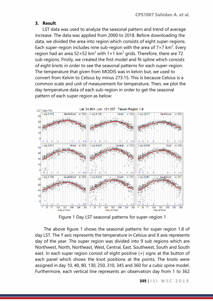
CPS1887 Sahidan A. et al.
349 | I S I W S C 2 0 1 9
3. Result
LST data was used to analyze the seasonal pattern and trend of average
increase. The data was applied from 2000 to 2018. Before downloading the
data, we divided the area into region which consists of eight super-regions.
Each super-region includes nine sub-region with the area of 7×7 km2. Every
region had an area 52×52 km2 with 1×1 km2 grids. Therefore, there are 72
sub-regions. Firstly, we created the first model and fit spline which consists
of eight knots in order to see the seasonal patterns for each super-region.
The temperature that given from MODIS was in kelvin but, we used to
convert from Kelvin to Celsius by minus 273.15. This is because Celsius is a
common scale and unit of measurement for temperature. Then, we plot the
day temperature data of each sub-region in order to get the seasonal
pattern of each super region as below:
Figure 1 Day LST seasonal patterns for super-region 1
The above figure 1 shows the seasonal patterns for super region 1.8 of
day LST. The Y axis represents the temperature in Celsius and X axis represents
day of the year. The super region was divided into 9 sub regions which are
Northwest, North, Northeast, West, Central, East, Southwest, South and South
east. In each super region consist of eight positive (+) signs at the button of
each panel which shows the knot positions at the points. The knots were
assigned in day 10, 40, 80, 130, 250, 310, 345 and 360 for a cubic spine model.
Furthermore, each vertical line represents an observation day from 1 to 362

CPS1887 Sahidan A. et al.
350 | I S I W S C 2 0 1 9
and the black dots illustrates the temperature points plotted consequently of
each day over 18 years. The red line demonstrates of a smoothest spline curve
that was fitted from cubic spline model. From the figure above, we can notice
that the seasonal patterns for different sub-regions in the same region were
quite similar pattern. There was a steady increase in June and the peak was
during July in summer. From August it was rapidly declined and leached the
lowest point in winter during December and January.
Secondly, we create another model for seasonal adjusted LST by day and
year with fitted model in order to estimate autocorrelation. In order to adjust
the seasonal for each series of data, seasonally-adjusted temperatures are
computed by subtracting the seasonal pattern from the data and adding a
constant (mean) to ensure that the resulting mean is the same as the mean of
the data over the whole period. The formula took the form as,
𝑦𝑡 = 𝑥𝑡 − 𝑥𝑡 + 𝑥
Where, 𝑦𝑡 is the seasonal adjusted LST at observation 𝑡, 𝑥𝑡 is the observed
value, 𝑥𝑡 is the fitted value from natural cubic spline model and 𝑥 is the overall
mean of observed data. The data were fitted with the linear regression model
as shows in the figure 2 below:
Figure 2 Trend of the seasonal adjusted LST within the same region
Figure 2 represents the trend of seasonal adjusted LST within the same
region 1. The Y axis represents the temperature in Celsius and X axis represents
year after 2000. The graph illustrates a total of 10 panels of central regions.
Nine of them show the linear trends (red line) of the temperature in sub
regions during 18 years. This graph clearly shows that the trends vary largely

CPS1887 Sahidan A. et al.
351 | I S I W S C 2 0 1 9
within the same region. For the last panel represents the quadratic patterns of
all nine sub regions.
Lastly, the polynomial model of second degree was fitted. It results
represent the quadratic curves of the temperature for each sub region. The
quadratic curves of the temperature within 72 sub regions were categorized
into five groups based on their shapes as show in Figure 3.
Figure 3 Trend within the same region
Figure 3 shows the day LST trend within Taiwan which classify the trend
into five colours and shapes. The green colour shows the stable pattern, red
colour shows increase accelerate pattern, aqua colour represents increase
decelerate pattern, blue colour represents decrease decelerated pattern and
grey colour represents decrease accelerate pattern. Furthermore, the plot were
further categorized into binomial terms, accelerating (accelerated-increased,
decelerated-increased) and non-accelerating curves based on the overall
change of LST, whether it is positive or negative. The graph illustrates that the
northern and central part of Taiwan the trend is accelerate increase. Moreover,
the trend accelerated decrease in some northern part of Taiwan.
CPS1887 Sahidan A. et al.
352 | I S I W S C 2 0 1 9
4. Discussion and Conclusion
There are many missing values of the data used. One of the main cause of
missing data from the satellite is cloud. In order to solve the missing issue, we
indicated the missing value as zero. Even though, the missing data problems
and the fluctuation of LST data, another issue of using cubic spline function to
extract the annual LST seasonality was the optimal number of the knots. This
study, we applied cubic spline model to extract the seasonality and trend in
MODIS LST time series data in Taiwan. The results show that by using an
optimal number of knots and their placement were a high potential for using
a cubic spline function with annual periodic boundary conditions. The study
model, we fit spline which consists of eight knots. The results illustrate
smoothest trend and seasonality of the data used.
The result from the day LST seasonal patterns for super-region, we can
notice that the seasonal patterns for different sub-regions in the same region
were quite similar pattern for every year. Even there were many missing data
in the data sets, the cubic spline function satisfactorily extracted the seasonal
pattern and trend. The result from the trend within the same region graph in
northern and central part of Taiwan show stable trend in some super regions
but, there is an accelerate increase in both part. Moreover, the trend look
accelerate decrease in some northern part of Taiwan. In addition, cubic spline
able to be used in every LST data in any coverage area and time. Moreover, it
is one of an alternative method that could be considered to describe the
seasonality by using satellite and climate data.
References
1. Dislich, C., Keyel, A.C., Salecker, J., Kisel, Y., Meyer, K.M., Auliya, M.,
Barnes, A.D., Corre, M.D., Darras, K., Faust, H., Hess, B., Klasen, S., Knohl,
A., Kreft, H., Meijide, A., Nurdiansyah, F., Otten, F., Pe’er, G., Steinebach,
S., Tarigan, S., Tölle, M.H., Tscharntke, T. and Wiegand, K. 2016. A review
of the ecosystem functions in oil palm plantations, using forests as a
reference system, Biological Reviews, 92, 1539-1569.
2. Karnieli, A., Agam, N., Pinker, R.T., Anderson, M., Imhoff, M.L., Gutman,
G.G. and Panov, N. 2010. Use of NDVI and land surface temperature for
drought Assessment: merits and limitations. Journal of Climate, 23, 618-
633.
3. Kerr, Y.H., Lagouarde, J.P., Nerry, F. and Ottlé, C. 2000. Land surface
temperature retrieval techniques and applications. Quattrochi D. and J.
Luwall, Boca Raton, pp. 33–109.
4. Kustas, W. and Anderson, M. 2009. Advances in thermal infrared remote
sensing for land surface modeling. Agricultural and Forest Meteorology,
149, 2071–2081.

CPS1887 Sahidan A. et al.
353 | I S I W S C 2 0 1 9
5. Liu, Y., Hiyama, T. and Yamaguchi, Y. 2006. Scaling of land surface
temperature using satellite data: A case examination on ASTER and
MODIS products over a heterogeneous terrain area. Remote Sensing of
Environment, 105, 115–128.
6. Mao, F., Li, X., Du, H., Zhou, G., Han, N., Xu, X., Liu, Y., Chen, L. and Cui, L.
2017. Comparison of two data assimilation methods for improving
MODIS LAI time series for bamboo forests. Remote Sensing, 9(5), 401.
7. Neteler, M. 2010. Estimating daily land surface temperatures in
mountainous environments by reconstructed MODIS LST Data. Remote
Sensing, 2, 333–351.
8. Prata, A.J., Caselles, V., Coll, C., Sobrino, J.A. and Ottlé, C. 1995. Thermal
remote sensing of land surface temperature from satellites: Current
status and future prospects. Remote Sensing Reviews, 12, 175–224.
9. Przyborski, P. 2018, Land surface temperature. Available online:
https://earthobservatory.nasa.gov/global-maps/MOD11C1_M_LSTDA
10. Ro-Ting, L. and Chang-Chuan, C. 2009. Effects of heat on workers' health
and productivity in Taiwan. Global Health Action, 2, 10.3402. Available
online: https://www.ncbi.nlm.nih.gov/pmc/articles/PMC2799321
11. Smith, R.E., Price, J.M., Howser, L.M. 1994. A Smoothing Algorithm Using
Cubic Spline Functions; Technical Note: NASA TN D-7397; National
Aeronautics and Space Administration (NASA):Washington, DC, USA.
12. Tan, C.H. 2007. Effects of temperature variation induced and economic
assessment from paddy cultivation, (in Chinese). Presented at
Agricultural
Engineering Research Center, Chungli, Taiwan.
13. Townshend, J.R.G., Justice, C.O., Skole, D., Malingreau, J.P., Cihlar, J.,
Teillet,
P. 1994. The 1 km resolution global data set: Needs of the International
Geosphere Biosphere Programme. International Journal of Remote
Sensing, 15, 3417–3441.
14. Wahba, G. 1990. Spline Models for Observational Data; CBMS-NSF
Regional Conference Series in Applied Mathematics; Society for
Industrial and Applied Mathematics (SIAM): Philadelphia, PA, USA., pp.
1–20.
15. Wold, S. 1974. Spline function in data analysis. Technometrics, 16, 1–11.
16. Wongsai, N., Wongsai, S. and Huete, A.R. 2017. Annual seasonality
extraction using the cubic spline function and decadal trend in temporal
daytime MODIS LST data. Remote sensing, 9, 1254.
17. Zhang, H., Pu, R. and Liu, X. 2016. A New image processing procedure
integrating PCI-RPC and ArcGIS-Spline tools to improve the
orthorectification accuracy of high-resolution satellite imagery. Remote
Sensing, 8, 827.

CPS1888 Chen C. et al.
354 | I S I W S C 2 0 1 9
Transforming stats NZ’s quarterly financial
statistics using administrative data
Chen Chen, Mathew Page Stats NZ, Christchurch, New Zealand
Abstract
Stats NZ has moved to an ‘administrative data first’ paradigm in the
production of economic statistics. This was driven by the increased demand
for business data and the pressure to reduce respondent burden and create
statistical efficiency. In this paper we introduce a new statistical design, which
maximises the use of administrative data in producing business statistical
outputs. We outline a model assessing where and how the New Zealand
Goods and Services Tax (GST) administrative data can be used as the primary
data source for quarterly financial statistics, as well as discuss the statistical
challenges faced in making greater use of GST data. We also present
applications with results that allow us to expand the design to a wider range
of economic outputs.
Keywords
administrative data; financial statistics; statistical design
1. Introduction
Stats NZ has been using administrative data in the production of economic
statistics for several decades. However, prior to 2015 administrative data
sources have been predominantly used to supplement survey data. In recent
years, a number of our key economic outputs have moved towards an
‘administrative data first’ paradigm. The development and implementation of
an administrative data first approach for quarterly financial statistics is one of
our major achievements in making greater use of administrative data in
economic statistics.
As figure 1 illustrates, before 2001 Statistics NZ’s quarterly financial
collections used a sample survey design. In 2001, a small amount of Goods
and Services Tax (GST) administrative data (less than 10% or 15% of the sales
value depending on different outputs) was added to the design for the first
time as a supplement to the survey data. GST is a comprehensive ‘value added’
tax collection undertaken by New Zealand’s Inland Revenue Department (IRD).
In the last few years, as part of Stats NZ’s business data transformation we
have developed an approach to maximise the use of GST data in the
production of quarterly business financial statistics. This has resulted a new
design for quarterly financial collections, where GST data (direct or modified
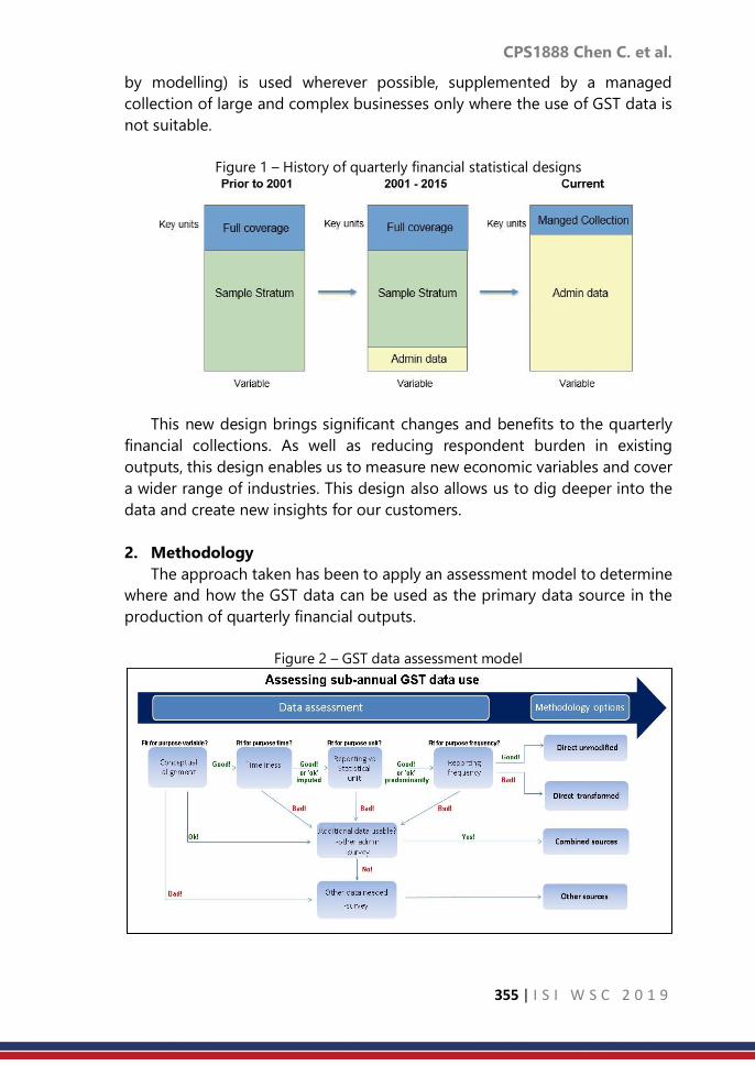
CPS1888 Chen C. et al.
355 | I S I W S C 2 0 1 9
by modelling) is used wherever possible, supplemented by a managed
collection of large and complex businesses only where the use of GST data is
not suitable.
Figure 1 – History of quarterly financial statistical designs
This new design brings significant changes and benefits to the quarterly
financial collections. As well as reducing respondent burden in existing
outputs, this design enables us to measure new economic variables and cover
a wider range of industries. This design also allows us to dig deeper into the
data and create new insights for our customers.
2. Methodology
The approach taken has been to apply an assessment model to determine
where and how the GST data can be used as the primary data source in the
production of quarterly financial outputs.
Figure 2 – GST data assessment model

CPS1888 Chen C. et al.
356 | I S I W S C 2 0 1 9
2.1 Data assessment
Various aspects of GST data are examined within this model, such as
reporting structures, timeliness, conceptual alignment, and reporting
frequency. These are shown as decision boxes in Figure 2.
Conceptual alignment - Administrative data has not been collected for
statistical purposes, therefore its alignment to the conceptual and definitional
requirements of our outputs needs to be assessed. We take the annualised
GST values and compare it with our annual financial data and found that in
most case the GST data can be used in the production of quarterly outputs.
We also developed a GST outlier strategy to effectively remove sales of large
capital items, which may have material impact on levels and movements in
some industries.
Timelines –To use administrative data in our quarterly outputs we must
have timely data. A significant finding in our assessment is the fact that at least
85 to 95 percent of GST data by value is available within current quarterly
production timeframes. Wherever the GST data is unavailable, we developed
a GST imputation strategy to obtain fit-for-purpose data.
Reporting structures - Administrative data is usually collected from legal
units and this is also the case with GST. Legal units that are most likely to be
statistically fit for use are those that correspond to statistical units with activity
predominately in a single industry. As the unit structures become more
complex, e.g. legal units linked by ownership to provide (referred to as GST
groups), the use of GST data becomes more problematic. With the assessment
model, we found that over 95% businesses by count have a simple reporting
structure and the GST data can be used directly.
Reporting frequency – Businesses in New Zealand can file GST data on a
monthly, two-monthly (referred to as TA if file in odd months and as TB if file
in even months) and six-monthly basis depending on turnover size. For
quarterly outputs, a monthly reporting frequency is ideal as data can be easily
added up to a quarterly value. Businesses with a reporting frequency of more
than a month require some form of transformation to enable the publication
of quarterly data.
2.2 Transformation methodology
Depending on the data assessment and its fitness for use, the most
appropriate transformation methodology is established for the various ‘parts’
of the business population.
Direct unmodified approach - The direct unmodified approach uses the
GST data as it is received (with imputation and capital adjustment in place).
This is applied to GST monthly filers with a simple structure, and small GST
monthly groups where the reporting unit or a single legal unit within the group
accounted for greater than 80 percent of the group value. The sales measures

CPS1888 Chen C. et al.
357 | I S I W S C 2 0 1 9
are obtained by adding up the three-month GST value of these units. We
assume there is no uncertainty arising from the use of modelling and/or
sampling, as actual data is used.
Direct transformed approach - The direct transformed approach uses one
part of the GST data that is fit for use, to estimate another part of the data
which can meet most our quality criteria, but the reporting frequency is not fit
for the purpose of producing quarterly outputs. This method is applied to the
GST two-monthly and six-monthly filers with simple reporting structures.
• For two monthly filers we always have one month of GST data for the
reference quarter missing, either the first month data or the third month
data, depending on the reporting type of the filer. Modelling in
conjunction with monthly filers is used transform the two-monthly data
to quarterly data, with no other data sources involved. The estimated
quarterly GST value of a two-monthly filer can be calculated as follows
𝑥𝑖𝑞𝑡𝑟
= 𝑖𝑥𝑖𝑡𝑤𝑜
Where 𝑖 is a ratio of the total GST value of eligible monthly filers for the three
months of the reference quarter, to their GST value for the two months where
the two-monthly filer files a GST return.
𝑖 =∑ ∑ 𝑥𝑖,𝑡,𝑘
𝑚𝑡ℎ𝑛𝑘=1
3𝑞𝑡=3𝑞−2
∑ ∑ 𝑥𝑖,𝑡,𝑘𝑚𝑡ℎ𝑛
𝑘=1𝑚𝑡=𝑚−1
Where
𝑥𝑚𝑡ℎ = 𝐺𝑆𝑇 𝑟𝑒𝑡𝑢𝑟𝑛 𝑜𝑓 𝑚𝑜𝑛𝑡ℎ𝑙𝑦 𝑓𝑖𝑙𝑒𝑟
𝑥𝑡𝑤𝑜 = 𝐺𝑆𝑇 𝑟𝑒𝑡𝑢𝑟𝑛 𝑜𝑓 𝑡𝑤𝑜 𝑚𝑜𝑛𝑡ℎ𝑙𝑦 𝑓𝑖𝑙𝑒𝑟
𝑞 = 𝑡ℎ𝑒 𝑟𝑒𝑓𝑒𝑟𝑒𝑛𝑐𝑒 𝑞𝑢𝑎𝑟𝑡𝑒𝑟 𝑎𝑛𝑑 𝑞 𝜖 [1~4]
𝑚 = 𝑡ℎ𝑒 𝑚𝑜𝑛𝑡ℎ 𝑜𝑓 𝑡ℎ𝑒 𝑦𝑒𝑎𝑟 𝑤ℎ𝑒𝑟𝑒 𝑡𝑤𝑜 𝑚𝑜𝑛𝑡ℎ𝑙𝑦 𝑓𝑖𝑙𝑒𝑟𝑠 𝑓𝑖𝑙𝑒 𝑡ℎ𝑒𝑖𝑟 𝐺𝑆𝑇
𝑟𝑒𝑡𝑢𝑟𝑛𝑠 𝑎𝑛𝑑 𝑚 𝜖 [1~12] 𝑡 = 𝑝𝑒𝑟𝑖𝑜𝑑 𝑜𝑓 𝑖𝑛𝑡𝑒𝑟𝑒𝑠𝑡𝑠
𝑖 = 𝑟𝑒𝑝𝑜𝑟𝑡𝑖𝑛𝑔 𝑡𝑦𝑝𝑒 𝑜𝑓 𝑡𝑤𝑜 𝑚𝑜𝑛𝑡ℎ𝑙𝑦 𝑓𝑖𝑙𝑒𝑟𝑠 𝑎𝑛𝑑 𝑖 = 𝑇𝐴 𝑖𝑓 𝑚 𝑖𝑠 𝑜𝑑𝑑𝑇𝐵 𝑖𝑓 𝑚 𝑖𝑠 𝑒𝑣𝑒𝑛
𝑘 = 𝑘𝑡ℎ 𝑢𝑛𝑖𝑡 𝑎𝑛𝑑 𝑘 𝜖 1, … , 𝑛, 𝑤ℎ𝑒𝑟𝑒 𝑖𝑠 𝑡ℎ𝑒 𝑛𝑢𝑚𝑏𝑒𝑟 𝑜𝑓 𝑒𝑙𝑖𝑔𝑖𝑏𝑙𝑒 𝑚𝑜𝑛𝑡ℎ𝑙𝑦
𝑓𝑖𝑙𝑒𝑟𝑠
For the two-monthly data we have implemented a quality indicator in selected
outputs, measuring the variability in the aggregate estimates that occurs in
the data transformation.
• Six monthly filers can file GST returns in any two months of the year that
are six months apart. That means we always have to deal with data filed
for six different months and which contains the reference quarter. Firstly,
we disaggregate six-monthly data to two-monthly data based on the

CPS1888 Chen C. et al.
358 | I S I W S C 2 0 1 9
distribution of the two-monthly data, in the same industry, over the
same reporting period.
𝑥𝑎,𝑡0𝑡𝑤𝑜 = 𝑥𝑎
𝑠𝑖𝑥 ∗∑ 𝑥𝑗,𝑡0
𝑡𝑤𝑜𝑙𝑗=1
∑ 𝑥𝑗,𝑡0𝑡𝑤𝑜 +∑ 𝑥𝑗,𝑡−1
𝑡𝑤𝑜 + ∑ 𝑥𝑗,𝑡−2𝑡𝑤𝑜𝑙
𝑗=1𝑙𝑗=1
𝑙𝑗=1
Where
𝑥𝑠𝑖𝑥 = 𝑚𝑜𝑠𝑡 𝑟𝑒𝑐𝑒𝑛𝑡 𝐺𝑆𝑇 𝑟𝑒𝑡𝑢𝑟𝑛 𝑜𝑓 𝑡ℎ𝑒 𝑢𝑛𝑖𝑡 𝑜𝑓 𝑖𝑛𝑡𝑒𝑟𝑒𝑠𝑡𝑠
𝛼 = 𝑡ℎ𝑒 𝛼𝑡ℎ 𝑢𝑛𝑖𝑡 𝑎𝑛𝑑 𝛼 𝜖 1, … , 𝑟 𝑤ℎ𝑒𝑟𝑒 𝑟 𝑖𝑠 𝑡ℎ𝑒 𝑛𝑢𝑚𝑏𝑒𝑟 𝑜𝑓 𝑠𝑖𝑥 𝑚𝑜𝑛𝑡ℎ𝑙𝑦
𝑓𝑖𝑙𝑒𝑟𝑠
𝑗 = 𝑗𝑡ℎ 𝑢𝑛𝑖𝑡 𝑎𝑛𝑑 𝑗 𝜖 1, … , 𝑙, 𝑤ℎ𝑒𝑟𝑒 𝑙 𝑖𝑠 𝑡ℎ𝑒 𝑛𝑢𝑚𝑏𝑒𝑟 𝑜𝑓 𝑒𝑙𝑖𝑔𝑖𝑏𝑙𝑒 𝑡𝑤𝑜 𝑚𝑜𝑛𝑡ℎ𝑙𝑦
𝑓𝑖𝑙𝑒𝑟𝑠
𝑡0 = 𝑡ℎ𝑒 𝑡𝑤𝑜 𝑚𝑜𝑛𝑡ℎ 𝑝𝑒𝑟𝑖𝑜𝑑 𝑤ℎ𝑒𝑟𝑒 𝑡ℎ𝑒 2𝑛𝑑 𝑚𝑜𝑛𝑡ℎ 𝑖𝑠 𝑤ℎ𝑒𝑛 𝑡ℎ𝑒 𝑠𝑖𝑥 𝑚𝑜𝑛𝑡ℎ𝑙𝑦
𝑓𝑖𝑙𝑒𝑠 𝑖𝑡𝑠 𝐺𝑆𝑇 𝑟𝑒𝑡𝑢𝑟𝑛
𝑡−1 = 𝑡ℎ𝑒 𝑡𝑤𝑜 𝑚𝑜𝑛𝑡ℎ 𝑝𝑒𝑟𝑖𝑜𝑑 𝑏𝑒𝑓𝑜𝑟𝑒 𝑡0; 𝑡−2 = 𝑡ℎ𝑒 𝑡𝑤𝑜 𝑚𝑜𝑛𝑡ℎ 𝑝𝑒𝑟𝑖𝑜𝑑 𝑏𝑒𝑓𝑜𝑟𝑒 𝑡1
Secondly, where GST data has not yet been received, we forwardcast the two-
monthly equivalent GST values using the corresponding movements derived
from the simple two-monthly filers, until the reference quarter in which the
two monthly filers have filed their GST returns.
𝑥𝑎𝑡𝑤𝑜 =
𝑥𝑎,𝑡0𝑡𝑤𝑜 𝑖𝑓 𝑓𝑖𝑙𝑒 𝑖𝑛 𝑡ℎ𝑒 2𝑛𝑑 𝑜𝑟 3𝑟𝑑 𝑚𝑜𝑛𝑡ℎ 𝑜𝑓 𝑡ℎ𝑒 𝑟𝑒𝑓𝑒𝑟𝑒𝑛𝑐𝑒 𝑞𝑡𝑟
𝑥𝑎,𝑡0𝑡𝑤𝑜(1+ ∆𝑡1
𝑡𝑤𝑜) 𝑖𝑓 𝑓𝑖𝑙𝑒 𝑖𝑛 𝑡ℎ𝑒 1𝑠𝑡 𝑚𝑜𝑛𝑡ℎ 𝑜𝑓 𝑡ℎ𝑒 𝑟𝑒𝑓𝑒𝑟𝑒𝑛𝑐𝑒 𝑞𝑡𝑟 𝑜𝑟 1 𝑚𝑜𝑛𝑡ℎ 𝑝𝑟𝑖𝑜𝑟
𝑥𝑎,𝑡0𝑡𝑤𝑜(1+ ∆𝑡1
𝑡𝑤𝑜)2(1+ ∆𝑡2
𝑡𝑤𝑜) 𝑖𝑓 𝑓𝑖𝑙𝑒 2 𝑜𝑟 3 𝑚𝑜𝑛𝑡ℎ𝑠 𝑝𝑟𝑖𝑜𝑟 𝑡𝑜 𝑡ℎ𝑒 𝑟𝑒𝑓𝑒𝑟𝑒𝑛𝑐𝑒 𝑞𝑡𝑟
Where
∆𝑡𝑤𝑜= 𝑡𝑤𝑜 𝑚𝑜𝑛𝑡𝑙𝑦 𝑚𝑜𝑣𝑒𝑚𝑒𝑛𝑡𝑠
𝑡1 = 𝑡ℎ𝑒 𝑡𝑤𝑜 𝑚𝑜𝑛𝑡ℎ 𝑝𝑒𝑟𝑖𝑜𝑑 𝑎𝑓𝑡𝑒𝑟 𝑡0
𝑡2 = 𝑡ℎ𝑒 𝑡𝑤𝑜 𝑚𝑜𝑛𝑡ℎ 𝑝𝑒𝑟𝑖𝑜𝑑 𝑎𝑓𝑡𝑒𝑟 𝑡1
Then we apply the modelling ratio, which have already been derived for
transforming two-month filers to obtain the estimated quarter GST value of
the six-monthly filer of interests. The six-monthly data has been through
several data manipulations, therefore evaluating the quality of the estimates
is complicated. However, as the contribution of six-monthly filers subject to
this method is generally very small, the estimates do not have material impact
at output level.
Combined sources approach - The combined sources approach uses the
GST data in conjunction with data from other sources (either administrative or

CPS1888 Chen C. et al.
359 | I S I W S C 2 0 1 9
directly collected), which can provide reliable benchmarks or useful auxiliary
information to the GST data use. The method is mainly applied to small and
medium-sized GST groups where employment data can be used to apportion
GST data to the individual group members. As quality of the apportionment
process cannot be easily measured, we constrain the use of the method to less
than 5 percent of total industry value.
Other sources approach - This method is used when the GST data is
deemed as not suitable for use, therefore non-administrative data sources are
used to produce statistical output, e.g. a quarterly managed collection. This is
further discussed in the next section.
2.3 Statistical Challenges
The major issues that needed to be resolved was for businesses where GST
use was not suitable, and variables are required that are not in GST or other
administrative datasets.
Managed collection strategy - The strategy was developed to provide a
framework that identifies businesses in which administrative data are not
suitable for our statistical use. These businesses are included in a Stats NZ
quarterly managed collection where we will continue to collect key economic
variables that are required on a quarterly basis. A managed collection can be
established using three guiding principles: significance, dominance, and
complexity. For example, the business rules implemented in the current
quarterly outputs are listed below.
• A $100-million significance rule - if an enterprise, or group of enterprises
linked by ownership, have an annual GST turnover of more than $100
million.
• A 3 percent industry dominance rule - if an enterprise makes more than a
3 percent contribution to annual total income for an industry.
• A structure complexity rule - all enterprises that have a significant level of
activity across more than one industry.
Approaches for missing variables - A statistical challenge we had moving
to the ‘administrative data first’ approach is how to produce statistical outputs
for variables not in administrative datasets, such as inventories (or stocks).
Quarterly inventory measures are required for the National Accounts (NA) in
the production of GDP, but there is no quarterly inventories data available in
GST or other administrative sources. We established several methods for
measuring the missing variables. The ones have been implemented to produce
inventories include:
• Benchmark to annual approach – estimates are obtained by ‘rating up’ the
aggregate managed collection inventory series using annual financial
data. This method is applicable where the managed collection capture

CPS1888 Chen C. et al.
360 | I S I W S C 2 0 1 9
quarterly change in inventories and a significant proportion of inventory
levels.
• Model from annuals approach – estimates are obtained by statistical
models using the relationship between GST data and inventories in our
annual financial collection. This method is suitable for some smaller
industries where the inventory levels remain relatively consistent over
time.
• Sample survey approach – If the above methods are not fit for purpose, a
stratified random sample survey is required. The sample only collects
inventories data. This is applicable to larger industries where the managed
collection inventory contribution is low.
3. Application
a. Producing efficiencies in existing outputs
The new approach was successfully implemented in the existing retail
trade, manufacturing and wholesale trade outputs. GST sales data is used
wherever possible, supplemented by a managed collection of large and
complex businesses where we continue to collect sales, inventories, and
salaries and wages on a quarterly basis.
Table 1 – businesses directly collected vs. modelled by admin data (March 2018
quarter)
Industry Managed
Collection
Stocks only
survey
admin data population
Manufacturing 295 75 20,760 21,130
Wholesale trade 260 230 16,590 17,080
Retail trade 380 - 48,440 48,820
Selected services 75 - 43,165 43,240
Rest of economy 730 - 394,780 395,510
Total 1,740 305 523,735 525,780
This has resulted in a sizeable reduction in respondent burden. As table 1
shows, we achieved a 50% sample reduction across the Manufacturing,
Wholesale Trade and selected Services outputs. The direct collection for the
Retail Trade sector is reduced from close to 3000 business to around 380.We
also found evidence that the series produced by the new design are of better
quality.
3.2 Extending variable and industry coverage
The success of implementing the new approach in existing quarterly
outputs has built a solid foundation for expanding the methodologies to cover
more industries and to measure new variables. An opportunity for a greater
50%
40%
90%
60%

CPS1888 Chen C. et al.
361 | I S I W S C 2 0 1 9
expansion was provided by a significant development in NA to create a
quarterly income measure of GDP (GDPI).
New variables and wider industry coverage were needed to support the
development. Instead of creating a separate collection, we extended our
quarterly managed collection of large and complex businesses to additional
industries in the economy. For the remaining business population, we
investigated the use of GST sales and purchases in combination with salaries
and wages from the Employee Monthly Schedule (EMS) administrative data to
derive estimates for new variables. EMS is a monthly payroll return covering
all employees, capturing taxable and non-taxable earnings.
With the existing methods and systems, we created a new experimental
Business Data Collection. The expanded collection provides additional
quarterly financial indictors including purchases, salaries and wages, and
profit. It also covers most industries in New Zealand’s economy. At the stage,
we are working on officially publishing the collection in 2019 and the data will
feed into NA’s new GDPI measures in 2020.
3.3 Creating new statistical insights
The comprehensive coverage of the GST data has allowed us to produce
estimates at lower levels of detail, therefore delivering new statistical insights
to our customers.
For example, a major earthquake occurred in November 2016 on the
upper east coast of New Zealand’s South Island, centred near the town of
Kaikoura. The earthquake caused damage to many roads on the east coast
of the South Island – isolating the Kaikoura area highlighted in Figure 3 and
lowering their retail activity. However, traffic volumes increased on
alternative routes through the centre of the South Island resulting in
improved sales for businesses in these areas.
Stats NZ produced a map of the affected region, showing retail and
tourism-related sales increases and decreases for small urban areas (e.g.
towns). This analysis would be difficult with a sample-based survey deign, as
a limited sample of businesses drawn at national level would not provide
enough information for us to make statistical inferences for such a small
geographic area.

CPS1888 Chen C. et al.
362 | I S I W S C 2 0 1 9
Figure 3 – sales activity in Kaikoura
4. Current Work
Following the realisation of an administrative data first approach in the
quarterly financial statistics, we are currently redeveloping our quarterly
labour demand statistics. Stats NZ’s Quarterly Employment Survey (QES)
produces a range of employment information, including filled jobs, earnings,
and paid hours. At present it is a sample survey of employing businesses in
New Zealand.
In the new QES design, we are applying similar thinking to leverage off
the existing methods and systems described for quarterly financial statistics
in section 2. This includes:
• Expanding the variables in the managed collection to collect
employment data from large and complex businesses. For the remaining
employing businesses, we will use EMS data from IRD.
• Assessing the conceptual alignment of EMS earnings information with
salaries and wages data in our annual financial collection.
• Measuring variables not in the EMS data, such as paid hours and full-
time and part-time employee counts
5. Conclusion
Stats NZ has developed an administrative data first approach for the
production of economic statistics. This has resulted in a new design for our
quarterly financial collections. A range of methodologies was developed to
maximise the use of administrative data.
The new approach has created great efficiency in our existing outputs,
we have achieved significant reduction in response burden. The new
approach has also enabled us to create new financial indicators for most
industries in the economy, to support Stats NZ’s key developments. And the

CPS1888 Chen C. et al.
363 | I S I W S C 2 0 1 9
comprehensive coverage of administrative data has allowed us to produce
new statistical insights to our customers.
We are currently expanding the new approach to labour market outputs,
creating a range of employment measure preliminarily using administrative
data.
References
1. Chen, C, Page, M & Stewart, J (2016). Creating new and improved
business statistics by maximising the use of administrative data.
International Conference on Establishment Surveys, Geneva, Switzerland.
2. Craig, L, Page, M & Stewart, J (2018). Realisation of ‘administrative data
first’ in quarterly business statistics. Statistical journal of the IAOS 34
(2018) 567-576.

CPS1889 Subanar
364 | I S I W S C 2 0 1 9
Time series forecasting model by singular
spectrum analysis and neural network
Subanar1,2 1Department of Mathematics, Universitas Gadjah Mada, Indonesia 2Study Program of Statistics, Universitas Sebelas Maret, Indonesia
Abstract
The aim of this study is to present the decomposition based method for
enhancing forecasting accuracy. A hybrid neural network (NN) model is
established based on several aggregate components obtained by SSA
decomposition. We work with an hourly electricity load data series to show
that the proposed method can handle the complex pattern in the data. The
result shows that the proposed method outperforms SSA with linear recurrent
formula (LRF) and single NN model.
Keywords
SSA; hybrid; NN; electricity; complex
1. Introduction
Neural network (NN) is a flexible modeling tool due to its capability in
approximating any type of relationship in data without requiring specifics
assumptions. There were many successful examples of NN implementation in
solving forecasting problem (see (Adhikari & Agrawal, 2012; Di Persio &
Honchar, 2016; Khashei & Bijari, 2010; Yolcu, Egrioglu, & Aladag, 2013; G. P.
Zhang & Qi, 2005).
Various NN based methods are developed to improve forecasting
accuracy. Researchers began to pay attention to improve NN performance by
employing a decomposition-based method. (see Huang & Wang, 2018; Wu,
Chau, & Li, 2009; Wu & Chau, 2011). Wu et al. (2009) used SSA and DWT as a
data processing tool to improve mapping relationship between input and
output of the NN model. Both SSA and discrete wavelet transform (DWT) were
implemented to decompose original series which the results are then used as
a basis for generating the inputs of the NN model. Meanwhile, Wu & Chau
(2011) showed that SSA as data pre-processing can eliminate the lag effect in
the NN model. Both Wu et al. (2009) and Wu & Chau (2011) employed the
decomposition-based method in the field of rainfall-runoff modeling where
the architecture of NN has more than one variable input.
Recently, Huang & Wang (2018) discussed a hybrid DWT and stochastic
recurrent wavelet neural network (SRWNN). DWT is used to decompose the
original series into several subseries and then modeling each subseries by

CPS1889 Subanar
365 | I S I W S C 2 0 1 9
SRWNN. The forecast value was obtained by aggregating process for all
subseries.
Inspired by those previous study, we proposed a hybrid NN method by
combining NN with singular spectrum analysis (SSA). In the case of forecasting
value, it is obtained from an ensemble of neural network models for several
components that are determined based on SSA decomposition.
The aim of this study is to show that the proposed hybrid approach
improves the forecasting accuracy comparing with results obtained from the
SSA with linear recurrent formula (LRF) and single NN. We select an hourly
electricity load series as the case study to lead that the method is able to solve
such a complex series forecasting problem.
2. Methodology
The methods we use in this work are briefly presented below.
2.1. SSA decomposition
As declared in many references, i.e. Elsner (2002), Golyandina & Zhigljavsky
(2013), Golyandina, Nekrutkin, & Zhigljavsky (2001), and Hassani (2007), SSA
is a decomposition tool that consists of four steps, namely embedding,
singular value decomposition (SVD), grouping and diagonal averaging. The
detail discussion for the four steps can be found in Golyandina & Zhigljavsky
(2013). The two important things in SSA that we need to pay attention are the
window length and the grouping selection. In selecting the window length we
can take a value that is proportional to the seasonal period but no more than
a half of the sample size (Golyandina, 2010). Steps in SSA decomposition are
displayed in Figure 1.
Figure 1: Steps in SSA decomposition

CPS1889 Subanar
366 | I S I W S C 2 0 1 9
2.2. Neural network for time series modeling
The capability of NN in approximating any types of relationships in data
makes this method received great attention in complex time series forecasting.
NN is not only powerful in modeling nonlinear processes but also in the linear
one (Zhang, Patuwo, & Hu, 1998).
Figure 2: Architecture of NN (24-10-1)
In this study, the architecture of NN (see Figure 2) which consists of a
number of input nodes, hidden nodes and one output node is trained by
backpropagation algorithm based on the Levenberg Marquardt method. The
activation function for the hidden nodes is tansig while for the output node is
purelin/identity function.
As described in Figure 2, the forecast value of the ith subseries (𝑡(𝑖)) can
be calculated by formula
𝑡(𝑖)
= ∑ 𝑣𝑘𝑍𝑘(𝑖)
10
𝑘=1
where is the weight that connects the 𝑘th hidden node to the output node
and
𝑍𝑘(𝑖)= 𝑓(𝑤0 + ∑ 𝑤𝑘𝑗𝑌𝑗
(𝑖)24𝑗=1 ) = 2/1 − exp[−2(𝑤0 + ∑ 𝑤𝑘𝑗𝑌𝑗
(𝑖)24𝑗=1 )] − 1.
Notation 𝑤𝑘𝑗 denotes the weight connecting the 𝑗th input node to the 𝑘th
hidden node while 𝑤0 is the weight for the bias node. The function 𝑓 is tansig
function provided in Matlab.

CPS1889 Subanar
367 | I S I W S C 2 0 1 9
2.3. Proposed hybrid approach
The procedure of the proposed hybrid approach is presented below and
the diagram is displayed in Figure 3.
a. Applying SSA to decompose the original series 𝑌𝑡 , 𝑡 = 1,2, … ,𝑁 into
n subseries, namely 𝑌𝑡(1), 𝑌𝑡
(2), … , 𝑌𝑡
(𝑛) 𝑡 = 1,2, … ,𝑁 where𝑌𝑡 = ∑ 𝑌𝑡(𝑖)𝑛
𝑖=1 .
b. Constructing the NN model to forecast each group components
c. Defining the final forecast value by aggregating each forecast value
obtained from the previous step.
Figure 3: Procedure of the proposed hybrid approach
Finally, the forecast accuracy is evaluated by RMSE and MAPE,
√1
𝑚∑ (𝑌𝑡 − 𝑡)
2ℎ+𝑚−1
𝑡=ℎ
1
𝑚∑ |
𝑌𝑡 − 𝑡𝑌𝑡
| × 100%
ℎ+𝑚−1
𝑡=ℎ
Symbol 𝑚 shows the number of observations involved in the calculation and
ℎ is the time where the calculation is started.
RMSE =
MAPE =

CPS1889 Subanar
368 | I S I W S C 2 0 1 9
3. Result
The proposed hybrid approach is implemented to an hourly electricity load
series for period 1 October to 1 December 2016, which the pattern is shown
in Figure 4(a). Based on the w-correlation matrix described in Figure 4(b), we
can define four groups, namely G1, G2, G3, and G4. The first group, G1, consists
of the eighty-six first eigentriples. The second group, G2, is formed from the
87th eigentriple to the 140th eigentriple while the third, G3, is constructed from
the 141st eigentriple to 289th eigentriple and the rest is the last group. The
separability between groups can be seen in Figure 4(c). The four subseries
depicted in Figure 4(d), i.e. 𝑌𝑡(1), 𝑌𝑡
(2), 𝑌𝑡
(3) and 𝑌𝑡(4)
, are then can be determined
by the diagonal averaging process from the corresponding groups, G1, G2, G3,
and G4, respectively.
(a) (b)
(c) (d)

CPS1889 Subanar
369 | I S I W S C 2 0 1 9
Figure 4: (a) An hourly electricity load Jawa-Bali for period 1 October -1
December 2016; (b) wcorrelation matrix for L = 672; (c) w-correlation matrix
between groups;and (d) four subseries as a result of SSA decomposition
Each subseries, 𝑌𝑡(𝑖)for 𝑖 = 1,… ,4 and 𝑡 = 1,2, … ,𝑁 − 24 , is modeled by
NN. A number of input nodes (6, 12, and 24) and hidden nodes (1 to 10) are
combined to find the best fit model, that is produce the smallest RMSE and
MAPE. The final forecast value is the sum of the forecast value obtained by the
four NN model.
The results are summarized in Table 1. In this case, we consider 1464
observations (1 October – 30 November 2016) as the training data and 24
observations (1 December 2016) as the testing data. SSALRF(86, 672) means
that the model is reconstructed by the 86 first eigentriples and window length
is 672. NN(24-10-1) denotes that the network has 24 input nodes, 10 hidden
nodes, and 1 output. Results show that the proposed hybrid method
outperforms SSA-LRF(86,672) and NN(24-10-1).
Table 1: Comparison of RMSEs and MAPEs for the training and testing data obtained
by SSA-LRF, NN, and the proposed hybrid NN method
No Method Training Testing
RMSE MAPE RMSE MAPE
1 SSA-LRF(86,672) 153.02 0.57% 236.78 0.96%
2 NN(24-10-1) 137.09 0.50% 116.15 0.41%
3 Proposed hybrid NN* 76.24 0.29% 64.29 0.24%
*obtained from NN(24-9-1)+NN(24-9-1)+NN(24-10-1)+NN(24-10-1)
4. Discussion and Conclusion
The proposed hybrid NN approach is built based on SSA decomposition
method. The hourly electricity load of Jawa-Bali is considered in this study due
to its complex pattern and thus we can show that the proposed method
overcomes this forecasting problem. The same data has also been used by
Sulandari, Subanar, Lee, & Rodrigues (2019). Sulandari et al. (2019) also
discussed the SSA-based method for the load forecasting with a different
approach where NN was applied to model the residuals of the SSA-LRF model.
Meanwhile, in this study, NN is implemented to model each component of the
SSA decomposition result and then combine them as an ensemble NN. This
proposed method can improve the forecasting accuracy of SSA-LRF and single
NN for the load series.
Based on the experimental result, we find that the best input nodes for all
subseries are 24. This is perhaps related to the seasonal period of the original
series, although the subseries does not show a seasonal pattern. The choice of
window length and how we group eigentriples of course influence the results.

CPS1889 Subanar
370 | I S I W S C 2 0 1 9
Further investigations will be conducted and presented in the extended
version of this paper.
References
1. Adhikari, R., & Agrawal, R. K. (2012). Forecasting strong seasonal time
series with artificial neural networks. Journal of Scientific and Industrial
Research, 71(October 2012), 657–666.
2. Di Persio, L., & Honchar, O. (2016). Artificial neural networks approach to
the forecast of stock market price movements. International Journal of
Economics and Management Systems, 1.
3. Elsner, J. B. (2002). Analysis of Time Series Structure: SSA and Related
Techniques. Journal of the American Statistical Association, 97(460),
1207–1208. https://doi.org/10.1198/jasa.2002.s239
4. Golyandina, N. (2010). On the choice of parameters in singular spectrum
analysis and related subspace-based methods. Stat Interface, 3(3), 259–
279.
5. Golyandina, N., Nekrutkin, V., & Zhigljavsky, A. (2001). Analysis of Time
Series Structure: SSA and related techniques. Chapman & Hall/CRC, Boca
Raton, FL.
6. Golyandina, N., & Zhigljavsky, A. (2013). Singular Spectrum Analysis for
time series. Springer Science & Business Media.
7. Hassani, H. (2007). Singular Spectrum Analysis: Methodology and
Comparison. Journal of Data Science, 5, 239–257.
8. Huang, L., & Wang, J. (2018). Forecasting energy fluctuation model by
wavelet decomposition and stochastic recurrent wavelet neural network.
Neurocomputing.
9. Khashei, M., & Bijari, M. (2010). An artificial neural network (p, d, q)
model for timeseries forecasting. Expert Systems with Applications,
37(1), 479–489.
10. Sulandari, W., Subanar, S., Lee, M. H., & Rodrigues, P. C. (2019).
Indonesian electricity load forecasting using singular spectrum analysis,
fuzzy systems, and neural networks. Manuscript submitted for
publication.
11. Wu, C. L., & Chau, K. W. (2011). Rainfall–runoff modeling using artificial
neural network coupled with singular spectrum analysis. Journal of
Hydrology, 399(3-4), 394–409.
12. Wu, C. L., Chau, K. W., & Li, Y. S. (2009). Methods to improve neural
network performance in daily flows prediction. Journal of Hydrology,
372(1-4), 80–93.
13. Yolcu, U., Egrioglu, E., & Aladag, C. H. (2013). A new linear & nonlinear
artificial neural network model for time series forecasting. Decision
Support Systems, 54(3), 1340–1347.

CPS1889 Subanar
371 | I S I W S C 2 0 1 9
14. Zhang, G., Patuwo, B. E., & Hu, M. Y. (1998). Forecasting with artificial
neural networks:: The state of the art. International Journal of
Forecasting, 14(1), 35–62.
15. Zhang, G. P., & Qi, M. (2005). Neural network forecasting for seasonal
and trend time series. European Journal of Operational Research, 160(2),
501–514.

CPS1891 Tzee-Ming Huang
372 | I S I W S C 2 0 1 9
A knot selection algorithm for regression splines
Tzee-Ming Huang Department of Statistics, National Chengchi University, Taipei City 11605, Taiwan
(R.O.C.)
Abstract
In nonparametric regression, splines are commonly used to approximate the
unknown regression function since they are known to have good
approximation power. However, to use splines for function approximation, it
is necessary to set the knots and the order of splines, and knot locations are
crucial to the approximation results. A novel knot selection algorithm based
on statistical testing is proposed. Simulation results are also included to
demonstrate the performance of the proposed algorithm.
Keywords
knot screening; unequally spaced knots
1. Introduction
In this study, we consider the estimation problem in nonparametric
regression using spline approximation. Suppose that we have observations
(𝑋𝑖 , 𝑌𝑖): 𝑖 = 1,… , 𝑛 from the following nonparametric regression model:
𝑌𝑖 = 𝑓(𝑋𝑖) + 휀𝑖, 𝑖 = 1,… , 𝑛, (1)
where 𝑓 is the regression function to be estimated and 휀𝑖s are errors. There
are different approaches for estimating 𝑓 such as kernel estimation or basis
approximation. In this study, we focus on estimating 𝑓 based on spline
approximation.
A univariate spline function of order m and knots 𝜉1 , … , 𝜉𝑘 is a piecewise
polynomial that can be expressed as a linear combination of the functions
𝑥0 , … , 𝑥𝑚−1, (𝑥 − 𝜉1)+𝑚−1, … , (𝑥 − 𝜉𝑘)+
𝑚−1, where for ℓ = 1,… , 𝑘,
(𝑥 − 𝜉1)+𝑚−1 =
(𝑥 − 𝜉1)𝑚−1 𝑖𝑓 𝑥 ≥ 𝜉ℓ
0 otherwise.
Let 𝐵1(𝑥), … , 𝐵𝑚+𝑘(𝑥) denote the basis functions 𝑥0 , … , 𝑥𝑚−1, (𝑥 −
𝜉1)+𝑚−1, … , (𝑥 − 𝜉𝑘)+
𝑚−1 respectively. When 𝑓 is approximated by the spline
∑ 𝑎𝑗𝐵𝑗,𝑘𝑗=1 the coefficients 𝑎1,… , 𝑎𝑘 can be estimated using their least square
estimators 1, … , 𝑘 . Then, the resulting estimator for 𝑓 is 𝑓 ≝ ∑ 𝑗𝐵𝑗 .𝑘𝑗=1
To approximate 𝑓 using 𝑓 one needs to specify the order and knots for the
spline, and the knot choice is known to be crucial. A simple approach for
determining the knots is to use equally spaced knots and determine the

CPS1891 Tzee-Ming Huang
373 | I S I W S C 2 0 1 9
number of knots. For this approach, Stone (1994) showed that, under certain
conditions, if the number of knots grows at a proper rate as the sample size 𝑛
grows, then then 𝑓 attains the optimal convergence rate in the sense of Stone
(1982).
It is also possible to use unequally spaced knots for 𝑓 and there are two
types of approaches for doing so. In the first type of approach, the knot
locations are estimated as parameters, such as in Lindstrom (1999) and Zhou
and Shen (2001). In the other type of approach, a set of knots is considered
and knot selection is performed, such as in Yuan et al. (2013) and Kaishev et
al. (2016). While allowing the knot locations to be estimated gives more
flexiblity, the knot selection approach can be less time-consuming.
In this study, the order 𝑚 is fixed and the focus is on knot selection. A knot
selection algorithm is proposed. In Section 2, the proposed algorithm is
introduced. In Section 3, results for a simulation experiment are reported to
demonstrate the performance of the proposed algorithm. Concluding remarks
are given in Section 4.
2. Methodology
The proposed algorithm for knot selection is to first consider a large set of
candidate knots and then perform knot screening to remove knots that are
not needed. The knot screening is based on a statistical test. In this section, I
will first describe the idea and details of such a test, and then gives the
proposed algorithm.
Suppose that the regression 𝑓 in (1) can be approximated well using a
spline of order 𝑚 and knot 𝜉1 , … , 𝜉𝑘 . Then an approximate model for (1) is
𝑌𝑖 =∑𝑎𝑖𝑋𝑖𝑗−1 + ∑ 𝑎𝑗(𝑋𝑖 − 𝜉𝑗)+
𝑚−1+ 휀𝑖 , 𝑖 = 1,… , 𝑛,
𝑚+𝑘
𝑗=𝑚+1
𝑚
𝑗=1
(2)
where m is given and 𝜉1 , … , 𝜉𝑘 are unknown knots. Note that for ℓ ∈
1,… , 𝑘, we have
𝑌𝑖 =∑𝑎1,𝑗𝑋𝑖𝑗−1 + 휀𝑖
𝑚
𝑗=1
(3)
for (𝑋𝑖 , 𝑌𝑖)s such that 𝑋𝑖 < 𝜉ℓ and 𝑋𝑖 > 𝜉ℓ−1 (if ℓ > 1), and
𝑌𝑖 =∑𝑎2,𝑗𝑋𝑖𝑗−1 + 휀𝑖
𝑚
𝑗=1
(4)
for (𝑋𝑖 , 𝑌𝑖)s such that 𝑋𝑖 > 𝜉ℓ and 𝑋𝑖 < 𝜉ℓ+1 (if ℓ < 𝑛). If the coefficient vectors
(𝑎1,1, … , 𝑎1,𝑚) and (𝑎2,1, … , 𝑎2,𝑚) are the same, then (2 remains the same with

CPS1891 Tzee-Ming Huang
374 | I S I W S C 2 0 1 9
the knot 𝜉ℓ removed. Therefore, we can construct a test for testing the null
hypothesis:
𝐻0 = 𝜉ℓ is not needed (5)
based on estimated difference between (𝑎1,1, … , 𝑎1,𝑚) and (𝑎2,1, … , 𝑎2,𝑚).
To construct a test for testing (5), we take 𝛿 > 0 and perform least square
estimation for (𝑎1,1,… , 𝑎1,𝑚) and (𝑎2,1, … , 𝑎2,𝑚) based on (𝑋𝑖 , 𝑌𝑖)s such that
𝑋𝑖 ∈ (𝜉ℓ − 𝛿, 𝜉ℓ) and (𝑋𝑖 , 𝑌𝑖)s such that 𝑋𝑖 ∈ (𝜉ℓ , 𝜉ℓ + 𝛿) respectively. Let
(1,1, … , 1,𝑚) and (2,1,… , 2,𝑚) be the least square estimators for
(𝑎1,1, … , 𝑎1,𝑚) and (𝑎2,1, … , 𝑎2,𝑚) respectively. Let
∆= (1,1,… , 1,𝑚)𝑇− (2,1, … , 2,𝑚)
𝑇,
then the 𝐻0 in (5) should be rejected if
𝑊 ≝1
2∆𝑇Σ−1Δ (6)
is large, where is an estimator for 𝜎 given by
= (1
√2𝓏0.25) . median of |𝑌2𝑖 − 𝑌2𝑖−1|: 𝑖 = 1,… , 𝑛,
and 𝓏0.25 is the 0.75 quantile of the standard normal distribution. If we assume
that 휀𝑖s are IID N(0, 𝜎2) and
𝛿 ≤ min(𝜉ℓ − 𝜉ℓ−1, 𝜉ℓ+1 − 𝜉ℓ), (7)
then under the 𝐻0 in (5), the distribution of ∆𝑇Σ−1Δ/𝜎2 is 𝜒2(𝑚), the chi-
squared distribution with 𝑚 degrees of freedom. Thus the distribution of the
statistic 𝑊 in (6) is approximately 𝜒2(𝑚) under the 𝐻0 in (5) if is close to 𝜎.
Let 𝜙𝛼,𝛿,𝜉ℓ be the test that rejects the 𝐻0 in (5) at level 𝛼 if 𝑊 exceeds the (1 −
𝛼) quantile of 𝜒2(𝑚), then 𝜙𝛼,𝛿,𝜉ℓ is an approximate size 𝛼 test.
To apply 𝜙𝛼,𝛿,𝜉ℓ for knot selection, the following algorithm is proposed.
Algorithm 1.
• For 𝑗 = 1,… , 𝐽, take 𝛿 = 1/2𝑗 .
(i) For 𝑖 = 1,… , 𝑛, conduct the test 𝜙0.05,𝛿,𝜉ℓ with 𝜉ℓ = 𝑋𝑖 and 𝑚 = 2. If
the 𝑝 −value is less than 0.05, then 𝑋𝑖 is considered as a potential
knot.
(ii) Let 𝑇 be the set of potential knots from (i). Take 𝑆𝑗 = Ø.
(a) Let 𝜉 be the knot in 𝑇 with the smallest p-value when
conducting the test 𝜙0.05,𝛿,𝜉. Add 𝜉 to 𝑆𝑗 .
(b) Remove knots in T that are in the range [𝜉 − 𝛿, 𝜉 + 𝛿].
(c) Repeat (a)(b) until 𝑇 is empty.
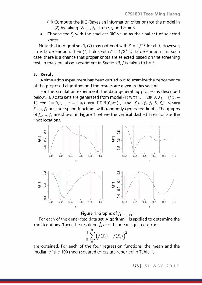
CPS1891 Tzee-Ming Huang
375 | I S I W S C 2 0 1 9
(iii) Compute the BIC (Bayesian information criterion) for the model in
(2) by taking 𝜉1, … , 𝜉𝑘 to be 𝑆𝑗 and 𝑚 = 3.
• Choose the 𝑆𝑗 with the smallest BIC value as the final set of selected
knots.
Note that in Algorithm 1, (7) may not hold with 𝛿 = 1/2𝑗 for all 𝑗. However,
if 𝐽 is large enough, then (7) holds with 𝛿 = 1/2𝑗 for large enough j. in such
case, there is a chance that proper knots are selected based on the screening
test. In the simulation experiment in Section 3, 𝐽 is taken to be 5.
3. Result
A simulation experiment has been carried out to examine the performance
of the proposed algorithm and the results are given in this section.
For the simulation experiment, the data generating process is described
below. 100 data sets are generated from model (1) with 𝑛 = 2000, 𝑋𝑖 = 𝑖/(𝑛 −
1) for 𝑖 = 0,1, … , 𝑛 − 1, 휀𝑖s are IID N(0, 𝜎2) , and 𝑓 ∈ 𝑓1, 𝑓2, 𝑓3, 𝑓4, where
𝑓1, … , 𝑓4 are four spline functions with randomly generated knots. The graphs
of 𝑓1, … , 𝑓4 are shown in Figure 1, where the vertical dashed linesindicate the
knot locations.
Figure 1: Graphs of 𝑓1 , … , 𝑓4
For each of the generated data set, Algorithm 1 is applied to determine the
knot locations. Then, the resulting 𝑓s and the mean squared error
1
𝑛∑(𝑓(𝑋𝑖) − 𝑓(𝑋𝑖))
2𝑛
𝑖=1
are obtained. For each of the four regression functions, the mean and the
median of the 100 mean squared errors are reported in Table 1.

CPS1891 Tzee-Ming Huang
376 | I S I W S C 2 0 1 9
For comparison purpose, two other knot selection methods: Method 2 and
Method 3, are applied to the same 100 data sets, and the results are also
reported in Table 1, where the details of Method 2 and Method 3 are given
below. Method 2 is a modified version of the knot selection scheme in Zhou
and Shen (2001). There are four steps in the scheme in Zhou and Shen (2001).
To save computation time, the number of iterations between Step 2 and Step
3 is limited to three, and in Step 4, the algorithm does not go back to Step 2
for refinement. The initial knot set is 0: 5 and the spline order is 3.
For Method 3, five sets of equally spaced knots: 𝑆1 , … , 𝑆5 are considered,
where
𝑆𝑗 = ℓ/2𝑗: ℓ = 1,… , 2𝑗
for 𝑗 = 1, … , 5, and then BIC is used to choose one of the five sets as the
selected knot set. All knots in the selected knot set are used.
The mean and median values for mean squared errors are given in Table 1.
The median values are in parentheses.
Algorithm 1 Method 2 Method 3
𝑓1 5.05 × 10⁻⁴(4.44 × 10⁻⁴) 1.77× 10⁻³(9.68 × 10⁻⁴) 3.14× 10⁻⁴(3.01 × 10⁻⁴) 𝑓2 2.16 × 10⁻³(1.80 × 10⁻³) 1.37× 10⁻³(1.28 × 10⁻³) 1.77× 10⁻³(1.87 × 10⁻³) 𝑓3 4.06 × 10⁻⁴(3.49 × 10⁻⁴) 1.24× 10⁻³(1.07 × 10⁻³) 4.73× 10⁻⁴(4.61 × 10⁻⁴) 𝑓4 3.85 × 10⁻⁴(3.28 × 10⁻⁴) 1.15× 10⁻³(5.07 × 10⁻⁴) 2.29× 10⁻³(2.22 × 10⁻³)
Table 1: Mean and median values for mean squared errors
The frequencies that one method outperforms the other two for the 100
data sets are reported in Table 2.
Algorithm 1 Method 2 Method 3
𝑓1 24 3 73
𝑓2 27 60 13
𝑓3 75 9 16 𝑓4 81 19 0
Table 2: Frequencies of being the outperforming method
From Tables 1 and 2, when the regression function 𝑓 is a smooth function
like 𝑓1 or 𝑓3, Algorithm 1 and Method 3 perform better than Method 2. When
𝑓 = 𝑓1 , Method 3 outperforms the other two methods. When 𝑓 = 𝑓3 ,
Algorithm 1 performs slightly better than Method 3. When f is a function with
sharp change like 𝑓2 or 𝑓4 , Algorithm 1 and Method 2 perform better than
Method 3. When 𝑓 = 𝑓2, Method 2 outperforms Algorithm 1 since it allows for
_ner adjustment of knot locations. When 𝑓 = 𝑓4 , Algorithm 1 outperforms
Method 2, which is not quite as expected. In such case, Method 2 sometimes
selects extra knots near 1, which makes the mean squared error a little larger
than Algorithm 1.
To examine the stablity of the performance for each of the three methods,
the standard deviations of the mean squared errors are reported in Table 3.
From the results in Table 3, for most cases, Method 3 is the most stable
method and Algorithm 1 is the second most stable method.

CPS1891 Tzee-Ming Huang
377 | I S I W S C 2 0 1 9
In summary, for a smooth 𝑓, a simple knot selection algorithm using equally
spaced knots like Method 3 is sufficient for giving a satisfactory estimator 𝑓.
For 𝑓 with a sharp change, a
Algorithm 1 Method 2 Method 3
𝑓1 2.76× 10⁻⁴ 1.75× 10⁻³ 8.45× 10⁻⁵
𝑓2 0.00149 0.00113 0.000289 𝑓3 2.51× 10⁻⁴ 7.69× 10⁻⁴ 8.53× 10⁻⁵ 𝑓4 1.70× 10⁻⁴ 1.86× 10⁻³ 2.44× 10⁻⁴
Table 3: Standard deviations of the mean squared errors
more flexible knot selection algorithm such as Algorithm 1 or Method 2, is
needed. Algorithm 1 is more stable than Method 2.
4. Discussion and conclusion
In this article, a knot selection algorithm (Algorithm 1) based on a statistical
test is proposed. Based on the simulation results in Section 3, overall, the
performance of Algorithm 1 is satisfactory. When 𝑓 has a sharp change,
Algorithm 1 outperforms Method 3, which uses equally spaced knots only, and
Algorithm 1 sometimes even performs better than Method 2, which allows for
more flexible knot selection. This satisfactory result is probably due to the fact
that Algorithm 1 is flexible enough to use unequally spaced knots yet not too
flexible to allow for arbitrary knot locations, which makes it more stable than
a knot estimation method such as Method 2.
For future work, a possible direction is to extend Algorithm 1 to the case
where 𝑓 is multi-variate and tensor basis functions are used. Given that
Algorithm 1 does not require searching for best knot locations, it is expected
that the extension to the multivariate case is feasible.
References
1. Kaishev, V. K., Dimitrova, D. S., Haberman, S., and Verrall, R. J. (2016).
Geometrically designed, variable knot regression splines. Computational
Statistics, 31(3):10791105.
2. Lindstrom, M. J. (1999). Penalized estimation of free-knot splines. Journal
of Computational and Graphical Statistics, 8(2):333352.
3. Stone, C. J. (1982). Optimal global rates of convergence for
nonparametric regression. Ann. Statist., 10(4):10401053.
4. Stone, C. J. (1994). The use of polynomial splines and their tensor
products in multivariate function estimation. Ann. Statist., 22(1):118171.
5. Yuan, Y., Chen, N., and Zhou, S. (2013). Adaptive B-spline knot selection
using multi-resolution basis set. IIE Transactions, 45(12):12631277.
6. Zhou, S. and Shen, X. (2001). Spatially adaptive regression splines and
accurate knot selection schemes. Journal of the American Statistical
Association, 96:247259.

CPS1899 Ira Joy H.M.
378 | I S I W S C 2 0 1 9
Investigating drug use among Filipino youth
Ira Joy Hernandez Martin University of the Philippines
Abstract
In this study significant factors associated with drug use among Filipino youth
were determined and a model was generated to predict the odds of a Filipino
youth to engage in drug use activity. The data used was from 2013 Young
Adult Fertility and Sexuality survey which covers youths in the Philippines
aging from 15 to 24 years. Appropriate tests were applied to find the
significantly associated variables with drug use and 11 out of the 152
significantly associated variables were included in the final binary logistic
model where among these categories, the following factors protects a youth
from using drugs: often attends religious services at least once a week, family
members frequently or almost always eat together at least one meal a day,
sees gambling as wrong activity, and life satisfaction. While the following
factors increases the risk of a youth in using drugs: single male; married male;
from regions Central Visayas, Northern Mindanao, Davao Region,
SOCCSKSARGEN, and ARMM; from birth up to age 18, 2nd person approves
having a romantic relationship before age 18; member of a fraternity/sorority;
had been suspended from attending classes; worked for pay in cash or in kind;
and read pornographic or sexually explicit books/magazines/tabloids. The
results of this study could be used to improve existing policies and programs
on drug use among youth.
Keywords
Odds; binary logistic model; illegal drug use
1. Introduction
One of the most dangerous and destructive risks taken among youths of
today is the use of drugs. Researches show that youths who engage in drug
use often have multiple problems, including problems on health, family and
community, and education and employment.
The Demographic Research and Development Foundation (DRDF) and
University of the Philippines Population Institute (UPPI) reported that one out
of 25 or 4% among 18,045,895 youth aged 15-24 had used drugs, and this
number does not include street children where drug use is suspected to be
more prevalent. Lately, the Philippines face social and even political problems
arising from rampant use of illegal drugs. In a national effort to curb the heavy

CPS1899 Ira Joy H.M.
379 | I S I W S C 2 0 1 9
drugs scourge, preventive measures especially for the next generation is
equally important. Prevention can be done by setting a protective
environment and monitoring present risk behavior of the youth. Hence, it is
necessary to have knowledge and understanding on the factors of drug use
and to examine the risks so the government agencies can rebuild and develop
programs that will aid and secure Filipino youth’s drug use behavior.
This study’s aim is to determine the significant factors associated with drug
use behaviors of Filipino youth. The specific objectives are:
1. to identify the factors associated with drug use behaviors;
2. to generate a model to predict the likelihood of a Filipino youth to
engage in drug use activity; and
3. to determine the odds of drug use behavior of Filipino youth.
This research can lead to further studies and investigations on what can
be done in preventing or reducing the effect of drugs. It could also help to
improve existing policies and programs that entail drug use among youth.
2. Methodology
Data Source
To achieve the objectives of this study the 2013 Young Adult Fertility and
Sexuality study (YAFS 4) was used. YAFS 4, a series of surveys on youths in the
Philippines aging from 15 to 24 years, was conducted by the Demographic
Research and Development Foundation (DRDF) and the University of the
Philippines Population Institute (UPPI). It contains 10 survey instruments – 8
main questionnaires for the youth respondents, 1 household questionnaire,
and 1 community questionnaire.
Covering the 17 regions, 78 provinces, 1,121 barangays, and 18, 547
households, the YAFS 4 has regions as its sampling domain with at least 1000
respondents for each region. This survey is a probability sample survey that
used a multistage stratified cluster sampling technique. In each of the regions,
barangays were stratified using the size of the youth population. The
barangays within a stratum are selected using probability proportional to
population size and for each barangay, systematic sampling was used to select
15 households. For each household, all the eligible members (15-24 years old)
were interviewed (Natividad, 2014). Appropriate survey weights were included
in the data file provided by UPPI.
Data Analysis
The main questionnaire is divided into the following blocks:
A. Individual characteristics
B. Family characteristics and relationships
C. Self-esteem and values
D. School, work, and community

CPS1899 Ira Joy H.M.
380 | I S I W S C 2 0 1 9
E. Media
F. Friends and peers
G. Health and lifestyle
H. Marriage
I. Puberty, dating, and sex
J. Fertility and contraception
K. Knowledge and attitude towards marriage, sex and related issues
L. Reproductive health
For each block except blocks for marriage and reproductive health, several
data items are included in the questionnaire that are analyzed to determine
the factors that significantly affect the behavior of drug use, these data Items
are listed in Table 1 of the Appendix. Using the weights that was calculated by
the UPPI and DRDF statistical division, the YAFS 4 data set was weighted to
consider the multi-stage sampling design of the survey. The weighted
percentage distributions were used in describing the demographic and socio-
economic status of the respondents and then the response variable (ever used
drugs) was cross-tabulated with urbanity, region, respondent type, and age to
further describe the data set.
The Rao-Scott Chi-square test, an adjusted version of the Pearson Chi-
square test for association between two variables that deals with the
correction of the survey design, was used to find significant variables that
could be associated with drug use to account for the complex design of the
YAFS survey. Significant variables were then included in the construction of
the model. In addition to this, Cramer’s V was computed using the computed
Rao-Scott Chi-square to measure the strength of association among the
weighted variables.
To generate the final model binary logistic regression analysis, which is
considered to be an important tool used to analyze the relationship between
several explanatory variables and the qualitative response variables, was fitted
for the likelihood to engage in drug use. The stepwise regression model was
used in generating the possible best model.
Several tests were performed to assess the model. First, the Likelihood
ratio test was used to assess if the generated model is better than the model
without the predictors. Second, the receiver operating characteristic (ROC)
curve was used to asses if the model has a good predictive power or if the
model can predict new cases given the predictors. Third, the Hosmer-
Lemeshow goodnessof- fit test was used to asses if model is well-fitted. Lastly,
classification tests were used to assess if the model can correctly identify those
who actually use drugs (sensitivity) and if the model can correctly identify
those who actually do not use drugs (specificity). In addition to this,
multicollinearity and parsimony were also considered. The odds was estimated

CPS1899 Ira Joy H.M.
381 | I S I W S C 2 0 1 9
and interpreted in relation to the use of drugs. All analysis will be generated
using STATA 13.
3. Result
A total of 290 independent variables was tested for association with the
dependent variable, have or have not tried using drugs, using Rao-Scott.
Among these tested variables, 152 were significantly associated with drug use.
These variables are checked for multicollinearity then regressed to the
independent variable.
Table 1 shows the coefficients, standard errors, p-values, and odds ratios
of the fitted model regressors. There were a total of 16 significant predictors
for drug use.
Table 1. Estimated coefficients, Odds ratios and p-values in weighted
binary logistic model of drug use (Have ever used drugs)
Predictors Coefficient Odds Ratio
Single Male 1.7028 5.4894
Married Male 1.9523 7.0449
From Region 7 1.2486 3.4854
From Region 10 1.4388 4.2158
From Region 11 1.8654 6.4586
From Region 12 0.8888 2.4322
From ARMM 1.3380 3.8114
Often attends religious services (at least once a week) -0.6080 0.5445
From birth up to age 18, 2nd person approves having a
bf/gf before age 18
0.6342 1.8855
Family members frequently or almost always eat
together at least one meal a day
-0.1911 0.8260
Sees gambling as wrong -0.3696 0.6910
Rated Satisfied with life, all things considered -0.2915 0.7471
Member of a fraternity/sorority 1.3429 3.8301
Had been suspended from attending classes 0.9211 2.5122
Have ever worked for pay, in cash or in kind 0.8068 2.2406
Had ever read pornographic or sexually explicit
books/magazines/tabloids
0.9926 2.6982
constant -5.8863 0.0028
**base category of the dependent variable: Never used drugs

CPS1899 Ira Joy H.M.
382 | I S I W S C 2 0 1 9
4. Discussion and Conclusion
This study determined the significant factors that affect the independent
variable from YAFS 4 dataset with the response variable Y = Ever used drugs.
Out of the 290 variables tested for association, 152 were significant and 11
variables were included in the final model which fitted adequately. These 11
variables included 16 categories in the final model, namely: type of respondent
(single male and married male); regions (Regions 7, 10, 11, 12, and ARMM),
”often attends religious services (at least once a week)”; “from birth up to age
18, 2nd person approves having a boyfriend/girlfriend before age 18”; “family
members frequently or almost always eat together at least one meal a day”;
“sees gambling as wrong activity”; “Satisfied with life”; “member of a
fraternity/sorority”; “Had been suspended from attending classes”; “Have ever
worked for pay, in cash or in kind”; “Had ever read pornographic or sexually
explicit books/magazines/tabloids”.
From the table, the odds of engaging in drug use for single males is 5.49
times higher than the odds for non-single males or those who are single male,
single female, or married female, assuming all other factors being equal. The
odds of engaging in drug use for married males is 7.04 times higher than the
odds for non-married males, this implies that males are more likely to use
drugs than females and among males, the married males are more likely to
use drugs. This may be due to greater risk-taking behaviors and greater
freedom of experimenting and becoming involved in risky situations of males.
Aside from this, a study conducted by Van and Anthony (2001) showed that
males have higher opportunity to access and use drugs than females. Some
regions in the Philippines was also included in the model where residents of
Central Visayas, Northern Mindanao, Davao Region, and SOCCSKSARGEN
have higher odds of engaging in drug use compare to the odds of those who
live do not live among these regions.
Considering another factor, attending religious activities at least once a
week reduces the risk of engaging in drug use by 46% compared to those who
attend less frequently or those who do not attend at all. This result is consistent
with a study conducted in Baltimore where it was concluded that religious
participation is a key factor between religion and drug behavior (Billioux et al,
2014). It further reasoned that religious participation influences drug use
behavior by imbibing moral order and helpful competencies and by providing
relational and social bonds.
Respondents who have an approval of him/her entering a romantic
relationship before age 18 have higher risk of drug use than those without
approval from the second person who raised him/her. Aside from the
permissive attitude of the parents on their approval of early romantic
relationships, a study in by Miller et. al (2009) showed that youth who dates
early are more likely to participate in drug use and delinquency, in fact, the

CPS1899 Ira Joy H.M.
383 | I S I W S C 2 0 1 9
study showed that those who are dating are 3.42 times more likely to try drugs
than those who do not date.
Another variable included in the model is having a family that eats
together at least once a day, where those who reported that they frequently
or almost always eat together at least once a day have lower odds of using
drugs having an odds ratio of 0.83 compared to those who reported that they
almost never eat together as family. Family meal offers an avenue for better
communication with family members and an opportunity for parents to
monitor their children, this may lower the risk of the youth in using drugs. The
same association was found out in the study of Meier and Musick where more
frequent family meals, especially dinner, resulted to a lower probability of
substance abuse. The study further stated that high-family relationships are
related to the well-being of the adolescent.
A youth who perceives gambling as wrong activity are less prone to drug
use compared to one who perceives it as right. The odds of engaging in drug
use is 31% lower for those who disapprove gambling relative to those who
approves. Several studies like Steinberg et al. reported high correlations
between problems on gambling and substance abuse, this association can be
attributed to the idea that gambling and drug use are both functions of
underlying behaviors like impulsiveness, low parental supervision, and
influential deviant friends.
Life satisfaction as a whole was also a significant factor where those who
are more satisfied if their life has a lower risk of using drugs compared to those
who rated dissatisfied. This result agrees with previous studies. A graduate
study conducted by Rooks showed that life satisfaction has a negative
correlation with substance abuse. The study further reasoned that youth may
respond to decrease in life satisfaction and associated emotions by opting to
engage in various risky behaviors, like drug use, in an attempt to improve the
way that they feel about their lives.
The membership to a fraternity or sorority also increases the risk of a youth
to use drugs by 3.83 times than those who are not affiliated with such
organizations. This result agrees with previous study in USA published by
National Institute of Health (Scott-Sheldon, et al.). Findings showed that Greek
members, or fraternity/sorority members, have higher rates of drug use aside
from cigarette and alcohol use, the paper stated that the result is not
surprising since alcohol and drugs play a central role in some of the
organization’s socialization and bonding activities. Peer influence and the
need to be socially accepted within the fraternity and sorority also promotes
greater drug use.
The table also shows that students who experienced being suspended in
the school are 2.51 times more prone to using drugs than those who have not
been suspended. A study (Kelly et al., 2015) also shows the increased odds of

CPS1899 Ira Joy H.M.
384 | I S I W S C 2 0 1 9
a polydrug user to school non-completion (OR= 1.62). This association can be
expected as a result of school disengagement or loss of interest in going to
school among drug users.
The odds of engaging in drug use is 2.24 times higher for those who have
worked for pay in cash or in kind relative to those who have not. Other studies
whose population involves those are in labor force, however, shows that drug
use reduces job employment. But in this study which involves 15 to 24 years
old, youths who are working for pay can indicate independence and
opportunity of handling their own money. Having a money of your own can
be an added opportunity to access vices, especially expensive vices like drugs,
compared to youths who have no work yet or no other source of income other
than their allowances from parents.
Lastly, youths who had ever read pornographic or sexually explicit
books/magazines/tabloids have a higher risk of engaging in the use of drugs
than those who do not (OR= 2.7). A study (Sacop, 2006) on sexual risk also
showed that using drugs has one the highest associations with engaging in
sexual activities. This association could be explained by the knowledge that
both behaviors are a byproduct of a behavioral problem on the loss of control
and compulsiveness.
In assessing the model, several tests were performed. The Likelihood ratio
test yielded a p-value <.0001, hence the generated model is better than the
model without the predictors. The receiver operating characteristic (ROC)
curve also covered an area that is approximately 87.6% which is greater than
70%. This implies that the model has a good predictive power. Hosmer-
Lemeshow goodness-of-fit test also showed that the model is well-fitted with
p-value=0.1064. About 79.94% of the observations were also correctly
predicted by the model with sensitivity and specificity 79.44% and 79.96%
respectively.
Drug use prevention programs for Filipino youth can incorporate the
factors identified by targeting modifiable risk factors, and strengthening the
identified protective factors. These results may help the parents to develop
positive preventive actions, the educators to strengthen learning and work
with others in their school system to review their current programs, the media
to have thorough classification and reviews to media materials accessible to
the youth, the community leaders to assess and monitor community risks, and
the government to partner with people in schools, clubs, faith-based
organizations, and media to reduce the risks and to build, develop, and
implement programs and policies preventing or reducing the drug use among
Filipino youth.

CPS1899 Ira Joy H.M.
385 | I S I W S C 2 0 1 9
References
1. Billioux, V. G., Sherman, S. G., & Latkin, C. A. (2014). Religiosity and HIV-
related drug risk behavior: a multidimensional assessment of individuals
from communities with high rates of drug use. Journal of Religion and
Health, 53(1), 37–45. http://doi.org/10.1007/s10943-012-9587-8
2. Centers for Disease Control and Prevention. CDC health disparities and
inequalities report: United States, 2011. MMWR. 2011;60(suppl).
Available from http://www.cdc.gov/mmwr/pdf/other/su6001.pdf
3. Demographic Research and Development Foundation (DRDF) and
University of the Philippines PopulationInstitute (UPPI). 2014. 2013
YAFS4 Key Findings. Quezon City: DRDF and UPPI.
4. Hocka, R. et al. (2016). Parenting styles and emerging adult drug use in
Cebu, the Philippines. Retrieved October 26, 2016 from
https://www.ncbi.nlm.nih.gov/pubmed/27330559
5. M. A. Steinberg, T. A. Kosten, and B. J. Rounsaville, “Cocaine abuse and
pathological gambling,” The American Journal on Addictions, vol. 1, pp.
121–132, 1992.
6. Meier, A., & Musick, K. (2014). Variation in Associations Between Family
Dinners and Adolescent Well-Being. Journal of Marriage and the Family,
76(1), 13–23. http://doi.org/10.1111/jomf.12079
7. Miller, S., Gorman-Smith, D., Sullivan, T., Orpinas, P., & Simon, T. R.
(2009). Parent and Peer Predictors of Physical Dating Violence
Perpetration in Early Adolescence: Tests of Moderation and Gender
Differences. Journal of Clinical Child and Adolescent Psychology : The
Official Journal for the Society of Clinical Child and Adolescent
Psychology, American Psychological Association, Division 53, 38(4), 538–
550. http://doi.org/10.1080/15374410902976270
8. Nguyen, V. (2008). Drug Abuse Among Young Adults In Vietnam: The
Influence Of Family, Peers, and Society Retrieved October 22, 2016 from
https://uta-ir.tdl.org/uta-ir/handle/10106/1803
9. Rooks, L. (2010). The relationship between life satisfaction and substance
use in adolescence. Graduate thesis for Degree of Education Specialist
Department of Psychological and Social Foundations. Retrieved 22nd of
April 2017 from
http://scholarcommons.usf.edu/cgi/viewcontent.cgi?article=2753&conte
xt=etd
10. Scott-Sheldon, L. A. J., Carey, K. B., & Carey, M. P. (2008). Health Behavior
and College Students: Does Greek Affiliation Matter? Journal of
Behavioral Medicine, 31(1), 61–70. http://doi.org/10.1007/s10865-007-
9136-1

CPS1899 Ira Joy H.M.
386 | I S I W S C 2 0 1 9
11. Squeglia, L., Jacobus, J., & Tapert, S. (2009). The Influence of Substance
Use on Adolescent Brain Development: Clin EEG Neurosci, 40(1): 31–38.
Available from
http://www.ncbi.nlm.nih.gov/pmc/articles/PMC2827693/pdf/nihms17774
5.pdf
12. Steinberg, L. (2007). Risk Taking in Adolescence: New Perspectives from
Brain and Behavioral Science. Retrieved September 27, 2016 from
http://www.wou.edu/~tbolsta/web/texbook/08_Risk_Taking.pdf
13. United Nations International Drug Control Programme (UNDCP). The
Social Impact of Drug Abuse. Retrieved October 22, 2016 fron
https://www.unodc.org/pdf/technical_series_1995-03-01_1.pdf
14. Winters, K. Amelia, A. (2012). Adolescent Brain Development and Drugs.
Retrieved October 22, 2016 from
https://www.ncbi.nlm.nih.gov/pmc/articles/PMC3399589/

CPS1900 Ágnes P.
387 | I S I W S C 2 0 1 9
New ways to increase motivation of
respondents in Hungary
Ágnes Patay Hungarian Central Statistical Office
Abstract
Based on Regulation (EU) No 1337/2011 Orchard Survey, 2017 was
conducted in Hungary between 14 February 2018-16 April 2018.
Beside the regular communication techniques (advertisements, press
conferences) the data collection had several new aspects to increase response
rate, level of interaction with the respondents and their willingness for
cooperation:
- before the online period a storytelling application was prepared to
promote the already available free data on the website of the
Hungarian Central Statistical Office,
- on conferences and other professional events high-level management
presentations of the Ministry contained information on the importance
of Orchard survey, 2017 to promote farmers involvement (data needed
for evidence-based decision making),
- at the end of the questionnaire respondents were asked whether they
would like a feedback on the survey results and related publications.
The project has closed with very good results in several aspects:
- a record high share of self-administered questionnaires during the
two-week long period. More than 50% of the respondents filled the
questionnaire online. Before this data collection the highest rate in
case of agricultural data collections was 16%,
- the overall response rate was also extremely high. More than 99% of
the farmers filled the questionnaire by the deadline,
- more than 50% of the respondents asked for feedback, and
information on publications based on the results,
- at the time of the first publication a newsletter was sent out to these
farmers, the result was that the publication of the preliminary results
in May attracted record high number of visitors.
As a summary during these couple of months official statistics on agriculture
got higher public and media attention. More users became aware of the
available agricultural statistics, and different data collections on this field. We
have analysed the data collection in detail and as preparation for the
Agricultural Census 2020 have started already in Hungary we would like to use
all the experiences, lessons learned and best practices originated from this
Orchard Survey.

CPS1900 Ágnes P.
388 | I S I W S C 2 0 1 9
Keywords
data collection; response rate; users; cost-effective; agriculture
1. Introduction
Based on Regulation (EU) No 1337/2011 1 Orchard Survey, 2017 was
conducted in Hungary by Hungarian Central Statistical Office (HCSO) from
14th February 2018 to 16th April 2018. Regulation describes what variables
must be collected in connection with given fruit species and what kind of cross
tables need to be transferred to Eurostat.
2. Methodology
The planning phase of the project was carried out in strong cooperation
with the stakeholders: professional bodies and the Ministry of Agriculture. A
cooperation agreement was signed with the ministry in order to share
information and costs.
Beside the compulsory fruit species (apple, pear, peach, apricot) it was
decided to collect information on five more species as they represent
significant share of the total orchard area in Hungary. Therefore data collection
covered apple, pear, peach, apricot, cherry, sour cherry, plum, walnut and
elderberry plantations. Furthermore as the last orchard census was carried out
in 2001 this data collection were also carried out as a census for these nine
fruit species. As a result almost 15 thousand farmers (subsidy applicants) were
contacted, who had to report their fruit area. The covered area altogether
represented 80% of total Hungarian orchard area.
The frame included farms that applied for Single Area Payment (SAPS) for
any of the nine fruit species that had a parcel at least 2500 m2. All the register
information for the data collection came from the Integrated Administration
and Control System (IACS), which is the register of the application of subsidies.
The data to be collected, and the survey design was developed in close
cooperation with experts, so that the most relevant data were collected in
connection with Hungarian fruit production. Before finalizing the
questionnaire tests were carried out so that the logic and the type of question
became easily interpreted by farmers.
The survey period was divided into two phases:
(1) CAWI: two-week online data collection phase for self-filling (between 14th
February 2018-28th February 2018),
1 https://eur-lex.europa.eu/legal-content/EN/ALL/?uri=CELEX%3A32011R1337

CPS1900 Ágnes P.
389 | I S I W S C 2 0 1 9
(2) CAPI: a longer data collection phase with the involvement of surveyors
(from 1st March 2018- to 18th April 2018).
Main goals of the project:
(1) Beside of the collection of good-quality data by the deadline, one of the
main goals of the project was to increase the share of CAWI in order to
reduce the cost of the data collection. It was planned to have at least as
high share of CAWI as in case of the last Farm Structure Survey, which was
16%.
(2) The other major goal of the data collection was to reach at least 95%
response rate.
Promotion of data collection
Beside the regular communication techniques (advertisements, press
conferences) the data collection also had several new aspects to increase
response rate, level of interaction with the respondents and their willingness
for cooperation.
Main forms of communications were the followings:
(1) Press communication
Before the data collection five press conferences were organized to inform
respondents, and increase their participation. Press conferences were held
in Budapest and in four other regions, where fruit production is significant
in the country. Press conferences generated 153 news in the media, and
beside that there were also some online and offline advertisements in
major agricultural newspapers.
(2) Story telling application
It was very important to increase the motivation of respondents. It was
considered to be an effective tool to present all the stake holders how
many data available for analysis and use, so that to prove that HCSO data
collection can provide valuable resource for evidence-based decision
making. Therefore before the online period, a storytelling application was
prepared, to promote the already available free data of the HCSO’s
website. The data on area, yield and price on the fruit species were
organized in a structural way, so that the interlinkages between the
different datasets were explained.
http://www.ksh.hu/interaktiv/storytelling/gyumolcs/index.html?lang=en
The link reached altogether 31 thousands of visitors, which was a great
success as previously no other agricultural publication had got so much
attention. Number of visitors peaked two times (Figure 1.). Once before
the data collection, and once at the time of publishing the preliminary
results of the survey in May.

CPS1900 Ágnes P.
390 | I S I W S C 2 0 1 9
Figure 1. When was the storytelling application the most visited?
(3) Cooperation with experts
On conferences and other professional events high-level management
presentations of the Ministry provided information on the importance of
Orchard survey, 2017 to promote farmers involvement (data needed for
evidence-based decision making). It was explained in details that data is
needed to plan future agricultural policies. Members of the Hungarian
Chamber of Agriculture and Fruit Producer Association were also informed
by newsletter, and online information.
(4) Feedback for respondents
To make data collection more interactive, at the end of the questionnaire
respondents were asked whether they would like a feedback on the survey
results and related publications. 50.7% of the farmers asked for future
publication, which number showed how big interest were generated
towards the result of the data collection. First information emails were sent
out at the time of releasing the preliminary results in html format, which
contained maps and interactive diagrams. As a result: the publication in
May also attracted record high number of visitors, much higher than in
case of the last Farm Structure Survey in 2016.
http://www.ksh.hu/elemzesek/gyumolcs2017_elozetes/index.html
(5) Online help
Respondents could reach our office in connection with the data collection
using an email address dedicated to only this survey. They could also ask
for help by telephone.
(6) Email reminder
Emails were sent out several times during CAWI period to remind farmers,
that they have an opportunity to fill questionnaire by themselves online.
3. Result:
Before the data collection it was planned that around 16% of farmers
would complete questionnaire online. But as a result of the active
communication and increased involvement, this goal was reached on the 6th
day of the two-week long CAWI period (Figure 2.). At the end, the online
completion was 50.5%, which was record in case of agricultural data collection
(before that the maximum was 16%).

CPS1900 Ágnes P.
391 | I S I W S C 2 0 1 9
On the next chart it can be seen that activity during the CAWI period
showed periodicity (Figure 2.). The least active day was Saturdays, but
weekend started on Friday. Response rate was the lowest on the last 3 days of
the week. The time of the reminder emails are also indicated on the figure by
points. They also helped to increase the completion of the questionnaire on
the following days.
Figure 2. CAWI respondents per day during the two-week period (green
bars are week-ends)
Some analysis was also made, to find out which part of the day is the most
active. Intensity of completion is the lowest during night (Figure 3.). Most
respondents filled out the questionnaire during the afternoon between 12.00-
18.00 though the two most active hours fell before noon between 10.00-11.00
and 11.00-12.00. In the future these experiences can be used to a more
effective media plan.
Figure 3. Intensity of completion of online surveys during the two-week
CAWI period
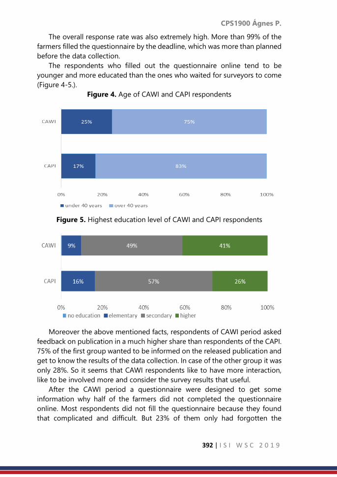
CPS1900 Ágnes P.
392 | I S I W S C 2 0 1 9
The overall response rate was also extremely high. More than 99% of the
farmers filled the questionnaire by the deadline, which was more than planned
before the data collection.
The respondents who filled out the questionnaire online tend to be
younger and more educated than the ones who waited for surveyors to come
(Figure 4-5.).
Figure 4. Age of CAWI and CAPI respondents
Figure 5. Highest education level of CAWI and CAPI respondents
Moreover the above mentioned facts, respondents of CAWI period asked
feedback on publication in a much higher share than respondents of the CAPI.
75% of the first group wanted to be informed on the released publication and
get to know the results of the data collection. In case of the other group it was
only 28%. So it seems that CAWI respondents like to have more interaction,
like to be involved more and consider the survey results that useful.
After the CAWI period a questionnaire were designed to get some
information why half of the farmers did not completed the questionnaire
online. Most respondents did not fill the questionnaire because they found
that complicated and difficult. But 23% of them only had forgotten the
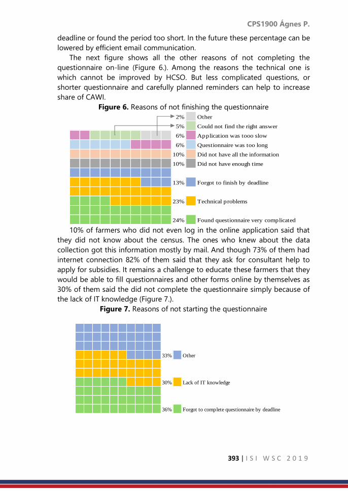
CPS1900 Ágnes P.
393 | I S I W S C 2 0 1 9
deadline or found the period too short. In the future these percentage can be
lowered by efficient email communication.
The next figure shows all the other reasons of not completing the
questionnaire on-line (Figure 6.). Among the reasons the technical one is
which cannot be improved by HCSO. But less complicated questions, or
shorter questionnaire and carefully planned reminders can help to increase
share of CAWI.
Figure 6. Reasons of not finishing the questionnaire
10% of farmers who did not even log in the online application said that
they did not know about the census. The ones who knew about the data
collection got this information mostly by mail. And though 73% of them had
internet connection 82% of them said that they ask for consultant help to
apply for subsidies. It remains a challenge to educate these farmers that they
would be able to fill questionnaires and other forms online by themselves as
30% of them said the did not complete the questionnaire simply because of
the lack of IT knowledge (Figure 7.).
Figure 7. Reasons of not starting the questionnaire
2% Other
5% Could not find the right answer
6% Application was tooo slow
6% Questionnaire was too long
10% Did not have all the information
10% Did not have enough time
13% Forgot to finish by deadline
23% Technical problems
24% Found questionnaire very complicated
33% Other
30% Lack of IT knowledge
36% Forgot to complete questionnaire by deadline

CPS1900 Ágnes P.
394 | I S I W S C 2 0 1 9
4. Discussion and Conclusion
The analysis of the two data collection phases helps to prepare for the
Agricultural Census 2020. The work connection with that has started already
in Hungary. We would like to use all the experiences, lessons learned and best
practices originated from this Orchard Survey, as Agricultural Census will
involve much higher number of farmers. And it can be only cost efficient if
more farmers fill the questionnaire online than during the last Farm Structure
Survey, when it was only 16%.
As a summary during these couple of months as a by-product of the data
collection official statistics on agriculture got higher public and media
attention. More users became aware of the available agricultural statistics, and
different data collections on this field. It turned out it is important for the
respondents to be engaged and to be involved more into the data collection.
It helps if data respondents are data users at the same time, because this can
also increase significantly their commitment.
CPS1911 Nurkhairary A. M. et al.
395 | I S I W S C 2 0 1 9
Modelling Wind Direction Data in Kota Kinabalu
Coastal Station Using Simultaneous Linear
Functional Relationship Model
Nurkhairany Amyra Mokhtar1, Yong Zulina Zubairi2, Abdul Ghapor Hussin1,
Rossita Mohamad Yunus2 1National Defence University of Malaysia
2University of Malaya
Abstract
Wind direction data is important in meteorological studies as the knowledge
of wind direction may contribute to accurate estimation of real power
transmission capacity. The nature of the data is circular and is represented in
the form of degree or radians. This paper discusses on modelling simultaneous
linear functional relationship for multivariate circular wind direction data in
Kota Kinabalu coastal station in Malaysia during northeast monsoon for three
consecutive years. The three variables of the wind direction data are
considered with the von Mises distribution. The rotation parameter and the
concentration parameter are estimated using the maximum likelihood
estimation. It is found that the error concentration of wind direction is less
concentrated and dispersed over the three-year period.
Keywords
wind direction data; multivariate circular data; rotation parameter; error
concentration parameter; statistical modelling
1. Introduction
Unlike many other linear variables such as the wind speed and ozone level,
the wind direction has to be dealt differently in statistical analysis
(Jammalamadaka and Lund (2006)). The circumference of circular random
variables is a bounded closed space and different from the usual Euclidean
type variables (Hussin et al. (2004)). This is because a two-dimensional
direction of circular variable is represented as a point on the circumference of
a circle. The application of the conventional linear techniques on circular data
may result paradoxes (Lovell et al. (1991)). A circular observation may be
regarded as a unit vector in a plane, or as a point on a circle of unit radius.
Each circular observation may be specified by the angle from the initial
direction to the point on the circle corresponding to the observation once an
initial direction and an orientation of the circle have been chosen. Data are
usually measured in degrees or in radians. Because of the wrapped around
nature of angles, circular data cannot escape very far from each other and
certainly not able to hide from view (Fisher (1993), Mardia and Jupp (2000)).

CPS1911 Nurkhairary A. M. et al.
396 | I S I W S C 2 0 1 9
The Von Mises distribution is said to be the most useful distribution on the
circle (Mardia and Jupp (2000)). Fisher (1987) noted that the Von Mises
distribution is a symmetric unimodal distribution and characterised by a mean
direction and concentration parameter . The probability density function of
the distribution is
𝑔(휃; 𝜇, 𝜅) = 1
2𝜋𝐼0 (𝜅)𝑒𝜅 cos( −𝜇) (1)
where 𝐼0 (𝜅) is the modified Bessel function of the first kind and order zero,
which can be defined by
𝐼0 (𝜅) = 1
2𝜋∫ 𝑒𝜅 cos 𝑑휃
2𝜋
0
(2)
for 0 𝑥 2 , 0 2 and 0 where is the mean direction and is the
concentration parameter. The concentration parameter influences the Von
Mises distribution 𝑉𝑀 (,) inversely as 𝜎2 influences the normal distribution
𝑁( , 𝜎2). Thus, a concentrated Von Mises distribution will have large
concentration parameter, and a dispersed Von Mises distribution will have a
small concentration parameter (Caires and Wyatt (2003)).
In this paper, we attempt to describe the relationship of wind direction for
three consecutive years using simultaneous linear functional relationship
model. The beauty of this model is that it allows the error term in the model.
We use the wind direction of Kota Kinabalu coastal station in Malaysia during
northeast monsoon for three consecutive years from 2015 to 2017.
Kota Kinabalu is located at the Borneo Island of Malaysia where it is the
capital of Sabah state with the latitude and longitude of 6.0367°N, 116.1186°E.
The climate in Kota Kinabalu is classified as equatorial climate with high
humidity, a considerable amount of sun, abundant rainfall, due to its
geographical location (Djamila et al., 2011). It is named after the highest
mount in Malaysia, Mount Kinabalu. The weather in Kota Kinabalu is influenced
by the northeast monsoons between November and March, the southwest
monsoon from May to September and two intermonsoons, which happen in
April and October (Mojiol, 2006). Figure 1 shows the location of Kota Kinabalu.

CPS1911 Nurkhairary A. M. et al.
397 | I S I W S C 2 0 1 9
Figure 1. Location of Kota Kinabalu
2. Methodology
Mokhtar et al. (2015) proposed simultaneous linear functional relationship
model for circular variables. The model is given by
𝑌𝑗 = 𝛼𝑗 + 𝑋(mod 2𝜋) (3)
where 𝑥𝑖 = 𝑋𝑖 + 𝛿𝑖 and 𝑦𝑗𝑖 = 𝑌𝑗𝑖 + 휀𝑖𝑗 , for 𝑗 = 1,… , 𝑞; 𝑖 = 1,… , 𝑛.
The estimation of the parameters in model are obtained by the method of
maximum likelihood. The estimates of the rotation parameter is given by
𝑗 =
tan−1 (
𝑆
𝐶) 𝑤ℎ𝑒𝑛 𝑆 > 0, 𝐶 > 0
tan−1 (𝑆
𝐶) + 𝜋 𝑤ℎ𝑒𝑛 𝐶 < 0
tan−1 (𝑆
𝐶) + 2𝜋 𝑤ℎ𝑒𝑛 𝑆 < 0, 𝐶 > 0
where

CPS1911 Nurkhairary A. M. et al.
398 | I S I W S C 2 0 1 9
The values of the 𝑥 variable in the model are estimated with iteration
procedure and given by
The concentration parameter is derived based on the maximum likelihood
method as well. It is given by
In 2003, Caires and Wyatt noted that the correction factor for the estimate
of concentration parameter. Thus the correction factor of the concentration
for this model becomes 𝑞
(𝑞+1) where 𝑞 is the number of equations in the
simultaneous relationship. Therefore, the estimation of the error concentration
parameter is
3. Result
In the preliminary analysis, we perform univariate analysis where the
distribution of the north east wind direction is described graphically using rose
diagram. Figures 2 to 4 show the rose diagram for the years 2015 to 2017.
From the plots, the pattern is different for each of the year. If our aim is to
study the relationship of the three data sets, one can consider the
simultaneous linear functional relationship model.
For the three consecutive years of 2015, 2016 and 2017, the wind direction
data of Kota Kinabalu in northeast monsoon is plotted in rose diagram in
Figure 2, 3 and 4, respectively. Rose diagram is a circular chart to display data
that contain direction. It looks like a pie chart but the observations fall in the
range of angles.
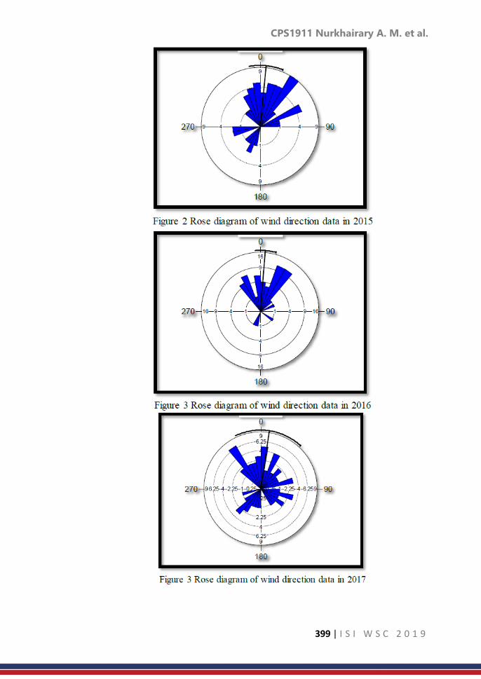
CPS1911 Nurkhairary A. M. et al.
399 | I S I W S C 2 0 1 9

CPS1911 Nurkhairary A. M. et al.
400 | I S I W S C 2 0 1 9
The simultaneous functional relationship model for circular variables
proposed by Mokhtar et al. (2015) is applied to these data and resulting the
parameter estimates of the data. The result is shown in Table 1.
Table 1. Parameter estimates of wind direction data
1 0.146597
2 6.099307
variance (𝑗) 0.018729
1.082606
variance () 0.055049
Therefore, from Table 1, it can be said that the model of wind direction
data in Kota Kinabalu during northeast monsoon from 2015 to 2017 is
𝑦1 = 0.146597 + 𝑋(mod 2𝜋) and 𝑦2 = 6.099307 + 𝑋(𝑚𝑜𝑑 2𝜋)
with the error concentration parameter of 1.018729 where 𝑦1 is the wind
direction of 2016, 𝑦2 is the wind direction of 2017 and x represents the wind
direction of 2015.
From the parameter estimates, the rotation parameters 1 and 2 are very
close to each other and small error concentration
. This is in agreement with the representation of the rose diagrams.
4. Discussion and Conclusion
To conclude, this paper discusses about modelling wind direction data in
Kota Kinabalu coastal station in Malaysia during northeast monsoon for three
consecutive years using the simultaneous linear functional relationship for
multivariate circular. The wind direction data are considered with the von
Mises distribution in which the rotation parameter and the concentration
parameter are estimated using the maximum likelihood estimation. From this
model, we can say that the rotation parameter is very near to zero radian and
error concentration parameter of wind direction is less concentrated and
dispersed. Using the simultaneous linear functional relationship model, we
may conclude that the relationship between the three years is not strong with
relatively low value.
Acknowledgement
We would like to thank National Defence University of Malaysia and University
of Malaya (grant number: GPF006H-2018) for supporting this work.

CPS1911 Nurkhairary A. M. et al.
401 | I S I W S C 2 0 1 9
References
1. Caires, S. and Wyatt, L. R. (2003). A Linear Functional Relationship Model
for Circular Data with an Application to the Assessment of Ocean Wave
Measurement. American Statistical Association and the Internal Biometric
Society Journal of Agricultural, Biological and Environmental Statistics: 8
(2),153-169.
2. Djamila, H., Ming, C. C. & Kumaresan, S. (2011). Estimation of Exterior
Vertical Daylight for the Humid Tropic of Kota Kinabalu City in East
Malaysia. Renewable Energy, 36(1), 9-15.
3. Fisher, N. I. (1993). Statistical Analysis of Circular Data, Cambridge
University Press.
4. Hussin, A. G., Fieller, N. R. J. and Stillman, E. C. (2004). Linear regression
for circular variables with application to directional data, Journal of
Applied Science & Technology (JAST): 9, 1-6
5. Jammalamadaka, S. R., & Lund, U. J. (2006). The effect of wind direction
on ozone levels: a case study. Environmental and Ecological Statistics,
13(3), 287-298.
6. Lovell, B. C., Kootsookos, P. J., & Williamson, R. C. (1991, April). The
circular nature of discrete-time frequency estimates. In Acoustics, Speech,
and Signal Processing, 1991. ICASSP-91, 1991 International Conference
on (pp. 3369-3372). IEEE.
7. Mardia, K. V. and Jupp, P. E. (2000). Directional Statistics, John Wiley &
Sons.
8. Mojiol, A. R. I. (2006). Ecological landuse planning and sustainable
management of urban and sub-urban green areas in Kota Kinabalu,
Malaysia. Cuvillier Verlag.
9. N. A. Mokhtar, Y. Z. Zubairi & A. G. Hussin. (2015). Parameter Estimation
of Simultaneous Linear Functional Relationship Model for Circular
Variables Assuming Equal Error Variances. Pakistan Journal of Statistics.
Vol. 31(2): 251-265.

CPS1914 Ayu P.
402 | I S I W S C 2 0 1 9
Study of the role of young entrepreneurs in
creative sector era of industrial revolution 4.0 in
Indonesia
Ayu Paramudita
Statistics Indonesia-BPS, Jakarta, Indonesia
Abstract
Indonesia is preparing for the era of digital information technology, known as
the 4.0 Industrial Revolution. The 4.0 Industrial Revolution will bring Indonesia
to be the world's 10 largest economy. Pursuing this great vision, the main
resource that should be developed is human capital. In recent demographic
bonus period, Indonesia has abundantly young-age population. The
abundance of Indonesian youth treasure great potential for the growth of the
nation’s economy. On the other hand, unwell-prepared of youth in facing
information technology era can be a threat. In the 4.0 Industrial Revolution
era, labour rivalry is no longer only with human, but also even with robot.
Instead of contributing for the nation, the youth who are not ready to evolve
can be a burden of the nation. Therefore, this study aims to analyse the
potential role of Indonesian youth in boosting the nation's economy in the 4.0
Industrial Revolution era. This study is only focusing on the 4.0 Industrial
Revolution issue in terms of youth as entrepreneurs in creative economy
sector (henceforth named youthpreneur). Descriptive analysis is used as the
methodology in this study to present how potential of creative youthpreneur
in graphs. In general, the positive signal of Indonesian youth contribution in
achieving the 4.0 Industrial Revolution goal, being the world’s 10 greatest
economy, has actually been existed. Through creative economy sector,
dominant role of youthpreneur in the 4.0 Industrial Revolution era tends to
be on novelty subsector, such as application and game developer, visual
communication design, and photography. The youthpreuner is also superior
on managing computer and internet-based business and developing the
business by partnership compared to the non-youthpreuner. Moreover,
workers who work for business managed by youthpreneur are more certified
than those who work in non-youthpreneur’s business. In spite of it, the
excellence of youth, the millennial generation of Indonesia, is a potential that
must be developed continually along with global revolution. Both government
and stakeholders should be in charge and work together to build education
system leading to the 4.0 Industrial Revolution. In addition, the youth have to
prepare the self-sufficient youthpreneurs mental as the nation’s economy
foundation in the era of the 4.0 Industrial Revolution.

CPS1914 Ayu P.
403 | I S I W S C 2 0 1 9
Keywords
creative economy; descriptive statistics; youth; 4.0 Industrial Revolution
1. Introduction
Indonesia is preparing for the era of digital information technology,
known as the 4.0 Industrial Revolution. The 4.0 Industrial Revolution will bring
Indonesia to be the world's 10 largest economy. Pursuing this great vision, the
main resource that should be developed is human capital.
In recent demographic bonus period, Indonesia has abundantly young-
age population. Statistics Indonesia-BPS (2018b) states Indonesian youth
population in 2018 was 63,82 million people. Based on The Law number 40 of
2019, youth is a group of 16-30 years old people. The abundance of
Indonesian youth treasures a great potential of the growth of the nation’s
economy.
On the other hand, unwell-prepared of youth in facing information
technology era can be a threat. In the 4.0 Industrial Revolution era, labour
rivalry is no longer only with human, but also even with robot. Instead of
contributing for the nation, the youth who are not ready to evolve can be a
burden of the nation. Therefore, this study aims to analyse the potential role
of Indonesian youth in boosting the nation's economy in the 4.0 Industrial
Revolution era.
2. Methodology
This paper uses descriptive analysis to present how potential of creative
youthpreneur in graphs. The data that is used is Economic Census 2016-
Continued of BPS. It is selected based on 16 creative economy subsectors; 1.
Architecture; 2. Interior Design; 3. Visual Communication Design; 4. Product
Design; 5. Film, Animation, and Video; 6. Photography; 7. Crafting; 8. Culinary;
9. Music; 10. Fashion; 11. Application and Game Developer; 12. Publishing; 13.
Advertising; 14. Television and Radio; 15. Performing Arts; 16. Arts.
3. Result
Discussing about youth, the idea, creativity, and innovation can’t be
separated from young people. These elements are extra values for the youth
in contributing creative economy sector. Creative economy sector is relevantly
associated with the 4.0 Industrial Revolution. The Director of Distribution
Statistics of Statistics Indonesia-BPS, Anggoro Dwitjahyono, states that
creativity in creative economy is not only about creating artistic and cultural
work, but also creating work based on science and technology, engineering,
innovation, and information technology. Lai (2007) also interprets creativity as
the generation of new ideas that were harnessed by thoughtful design to
produce innovation for the economy.

CPS1914 Ayu P.
404 | I S I W S C 2 0 1 9
Based on BPS (2017), Indonesia had 8 million creative establishments in
2016. More than 90 percent of them were classified to micro and small
establishments whose workers were in average 1-4 workers.
In creative economy sector, the number youth as entrepreneurs has not
dominated both in micro and small establishment (MSE) and medium and
large establishment (MLE). Creative youthpreneur, 16-30 years old, was only
8,73 percent in 2016. The low dominance of young entrepreneur is indicated
by the age factor of young people who tend to be still in school age. Graph 1
shows that in range 16-30 years old, the number of creative youthpreneur is
increasing in line with the increasing of age’s entrepreneur. Although the
dominance of youthpreneur was generally low, the MLE (8,90 percent) had
higher dominance of youthpreneur than the MSE (8,71 percent).
Graph 1. Distribution of Creative Establishments by Entrepreneur Age, 2016
(in percent)
Assessing creative economy sector in term of the perspective of the 4.0
Industrial Revolution can be conducted through the use of technology. BPS
(2018a) reveals that MSE in Indonesia still run the business conventionally.
This is shown by the low use of computer and internet in managing the
business. On the other hand, MLE shows higher use of computer and internet.
Graph 2 shows that young entrepreneur of MSE who uses computer and
internet for business is 21,58 percent. Otherwise, it is only 11,48 percent of the
group of non- young entrepreneur, whose age is over 30 years old, that uses
computer and internet. Although the number of youthpreneur hasn’t
dominated in creative economy sector, the use of computer and internet by
this group is higher than the non-youthpreneur group, both in MSE and MLE.
The higher use of computer and internet indicates that young entrepreneur is
more competent in applying technology to do the business than the non-
young entrepreneur group.

CPS1914 Ayu P.
405 | I S I W S C 2 0 1 9
Graph 2. Percentage of Creative Establishment in Using Computer and
Internet by Entrepreneur Age, 2016
The scope of information technology in 4.0 Industrial Revolution is
broader than the use of computer and internet. It is related to computation,
internet of things, automation, and robotization. However, the use of
computer and internet can be simply used as the 4.0 Industrial Revolution
indicator, especially for the MSE. Computer and internet can be utilized for
not only making business report, but also designing product, marketing, and
e-commerce as well. Moreover, it can help the business to reach international
market so that the creative product export will raise.
In terms of creative economy subsector, Indonesia is dominated by
culinary, crafting, and fashion establishments. Yet, the use of computer and
internet on these subsectors in MSE is the lowest as shown by Graph 3.
Youthpreneur of MSE tends to use computer and internet on application and
game developer, visual communication design, and photography subsector.
In MLE, youthpreneur on culinary, fashion, and film, animation, and video
subsector use computer and internet the most in running the business.
Generally, the low use of computer and internet can be seen as a challenge
for young generation to improve the skill in technology.
Graph 3. Percentage of the Use of Computer and Internet of Establishment
Conducted by Young Entrepreneur by Creative Economy Subsector, 2016

CPS1914 Ayu P.
406 | I S I W S C 2 0 1 9
Operating creative business conventionally won’t optimize the profit. An
effort that can be taken in order to improve business performance is
establishing partnership. There are some benefits of engaging partnership in
business i.e. mentoring, capital assistance, marketing assistance, and
procurement of raw materials. Partnership can also urge technology transfer
from MLE to MSE.
The creative establishment which had been already in partnership in 2016
seemed insignificant. It was only 9,83 percent in general. Graph 4 presents
that 9,05 percent of youthpreneur’s MSE and 32,83 percent of youthpreneur’s
MLE were in partnership with others business in 2016. It signifies that the MSE
needs to be seriously encouraged to raise its business partnership.
Interestingly, the percentage of partnership engagement both in MSE and
MLE conducted by youthpreneur is higher than the nonyouthpreneur. It
implies the superiority of young Indonesian entrepreneurs in perceiving
business collaboration as an opportunity to enlarge the business.
Graph 4. Percentage of Creative Establishment in Engaging Partnership by
Entrepreneur Age, 2016
Graph 5 gives a view about partnership of establishments run by
youthpreneur in 16 subsectors of creative economy. The MLE has the highest
partnership engagement on film, animation, and video, counted for 4,68
percent, while the MSE is on application and game developer, counted for
5,52 percent. Through this kind of business, a collaboration is a profitable way
to urge the others business. In example, a start-up that provides food service
will not only boost income on culinary subsector, but also insist technology
inclusion.
Graph 5. Percentage of Partnership Engagement of Establishment Conducted
by Young Entrepreneur by Creative Economy Subsector, 2016

CPS1914 Ayu P.
407 | I S I W S C 2 0 1 9
Competing in the 4.0 Industrial Revolution era, human resource is required
to be expert in their fields. Expertise can be in form of managerial skill,
production technical, and marketing. Workers can get certified by attending
training and course for improving their skill.
Graph 6. Percentage of Creative Establishment related to Labour
Certification by Entrepreneur Age, 2016
Graph 6 shows the extremely low of labour certification in creative
economy sector. The MLE tends to have higher proportion of certified labour
than the MSE. In terms of entrepreneur age, establishment managed by
youthpreneur shows higher level of certified labour than establishment
managed by nonyouthpreneur. It is 1,06 percent for MSE and 21,58 percent
for MLE of youthpreneur group compared to 0,99 percent for MSE and 14,41
percent for MLE of non-youthpreneur group. While in terms of creative
economy subsector, the MSE conducted by youthpreneur tends to have high
certified labour on application and game developer than others subsectors.
Otherwise, culinary is the most of MLE managed by youthpreneur who has
high labour certified. However in general, it is only 2,29 percent of creative
establishment which has more than and equal to 50 percent of certified
labour. This low competence of workers in Indonesia should have been serious
concern, especially for the young workers.
Graph 7. Percentage of Establishment Conducted by Young Entrepreneur
with more than and equal to 50 percent Certified Labour by Creative
Economy Subsector, 2016

CPS1914 Ayu P.
408 | I S I W S C 2 0 1 9
4. Discussion and Conclusion
Creative MSE can be seen as a potential economic generator for Indonesia.
Its amount is numerous compared to MLE because it is easily established.
Although MSE’s share of gross domestic product is relative small, it can
employ many workers in facing bonus of demography. Comparing to MLE,
creative MSE needs more improvement on technology use, partnership, and
guidance in operating business. Due to the importance MSE’s role, the
ministry of industry takes MSE as one of national priority in Making Indonesia
4.0 roadmap.
On the other side, positive signal of Indonesian youth contribution in
pursuing goal of the 4.0 Industrial Revolution; the world's 10 largest economy,
has actually been existed. Through creative economy sector, the dominance
of young entrepreneur in the 4.0 Industrial Revolution era tends to be on
novelty subsectors, such as application and game developer, visual
communication design, photography, culinary, fashion, film, animation, and
video as well. The youthpreneur is better than nonyouthpreneur in conducting
technology-based business and developing the business through partnership
system. Besides in terms of level of labour certification, youthpreneur tends
to hire more certified workers.
The superiority of Indonesian young generation is a potential that must
be continually built up along with global development. Therefore, the Minister
of Industry, Airlangga Hartarto, said that education curriculum of Indonesia
would be changed by emphasizing on Science, Technology, Engineering, the
Arts, and Mathematics (STEAM) and improving the quality of vocational
school. So, the youth will be better prepared for facing 4.0 Industrial
Revolution.
In addition to formal education, encouraging youth mentality is also
important to form the selfsufficient youth. Entrepreneurship can be a solution
to the youth unemployment rate that is higher than the national
unemployment rate, as revealed by the World Bank Lead Economist, Vivi
Alatas, in Kompas.com. Young age can’t be an excuse as barrier to be a
successful entrepreneur. Research of Javier Miranda from Statistics Bureau of
USA and Pierre Azoulay from MIT stated that most of the founders of business
in the United States in the past few years have been successful at an average
age of 45 years and founders in their 20s are the most likely to succeed in
building their company.
At least, there are some things that young people need to embed inside
themself in the era of the 4.0 Industrial Revolution. First, youth shouldn’t
hesitate to become tough independent entrepreneur by having idea,
innovation, and creativity. Second, youth should have initiative to develop
selfimprovement through education, training, and course. Third, youth should
be open and ready to the fast evolving of information technology. Thus,

CPS1914 Ayu P.
409 | I S I W S C 2 0 1 9
Indonesia will have many creative young entrepreneurs to strengthen the
resilience of creative economy sector which is dominated by the MSEs as a
pillar of the nation's economy in the era of 4.0 Industrial Revolution.
References
1. Badan Pusat Statistik. (2018a). Potensi Usaha Mikro Kecil. Jakarta. Badan
Pusat Statistik.
2. Badan Pusat Statistik. (2018b). Statistik Pemuda Indonesia 2018. Jakarta.
Badan Pusat Statistik.
3. Badan Pusat Statistik. (2017). Profil Usaha/Perusahaan 16 Subsektor Ekraf
Berdasarkan Sensus Ekonomi 2016 (SE2016). Jakarta. Badan Pusat Statistik.
4. Lai. Ricky. (2007). From Creative Industry to Creative Economy: The Role of
Education. Hong Kong Design Centre and the Asia Case Research Centre.
5. http://www.kemenperin.go.id/artikel/19169/Pemerintah-Keluarkan-10-
Jurus-Jitu-HadapiRevolusi-Industri-4.0 (18 January 2019)
6. https://www.cnbcindonesia.com/entrepreneur/20180510215858-25-
14442/di-usia-berapa-parapengusaha-menuai-kesuksesannya
(18 January 2019)
7. https://ekonomi.kompas.com/read/2018/11/12/174242726/penciptaan-
lapangan-kerja-baru-ri-ratarata-21-juta-per-tahun (19 January 2019)

CPS1915 Han G. et al.
410 | I S I W S C 2 0 1 9
Neural networks with different activation
functions applied in bank telemarketing
Han Gao1; Pei Shan Fam1; Heng Chin Low1; Xinwu Pan2,3 1School of Mathematical Sciences,Universiti Sains Malaysia
2School of Computer Sciences, Harbin Institute of Technology, Harbin, China 3Senior Front-End Developer, Alibaba Local Services Company, Hangzhou, China
Abstract
Telemarketing is broadly used in bank sector. It is a convenient and cost-
effective approach to selling products and services to the clients. An accurate
and reliable method for customer segmentation is essential in marketing.
Neural network is gaining more and more attention in classification area. The
objective of this research is to create a neural network model to single out
those who possibly will buy the term deposit, which will facilitate the decision
making in bank telemarketing. After the training process, the optimal
prediction accuracy (73.11%) for Model I occurred when the hidden layer with
50 neurons and the learning rate of 0.1. For Model II, it outperformed when
the hidden layer with 20 neurons and the learning rate of 1.2. Overall, the
proposed neural network model showed a promising prediction power for the
given data.
Keywords
Decision making; bank deposit; sigmoid function; tanh function
1. Introduction
Telemarketing, as a direct marketing, is an effective and convenient way to
sell products as well as services in several industries, such as medicine,
insurance and finance. With the rise of predictive dialer technology,
telemarketing began in the early 1990s (Hurst, 2008). It facilitates the way for
buyers and sellers to make a transaction. In banking sector, telemarketing
plays an irreplaceable role in marketing. Bank-telemarketing is a quite popular
way around the globe.
Effective decision-making matters a lot in marketing campaign. Decision
support systems (DSSs) are a set of useful tools to support the managerial
decision-making, which includes several sub-fields, such as personal DSS and
intelligent DSS (Moro et al., 2014). In Power’s (2008) research, he found out
that it can enhance the efficiency and accuracy in decision making when using
DSSs. Using artificial intelligence (AI) techniques to process the consumer data
is gaining more and more popularity (Alon et al., 2001; Huang et al., 2007;
Mazhar et al., 2007; Moro et al., 2014; Moro et al.,2015). Data mining (DM),
widely applied in AI and statistics, plays a vital role in DSSs, which allows the

CPS1915 Han G. et al.
411 | I S I W S C 2 0 1 9
semi-automatic extraction of key information from raw data (Written & Frank,
2005; Moro et al.,2014). Kukar et al. (2010) proposed an integrative approach
of data mining and decision support: data mining based decision support
system, which facilitate the users to make more beneficial decisions.
In Moro et al.’s (2014) research, they compared four DM models, namely,
logistic regression (LR), decision tree (DT), artificial neural network (ANN) as
well as support vector machine (SVM), and the results showed that ANN
outperformed other models. However, they failed to specify the activation
function used in their ANN model. In this research, we applied ANN models
with two different activation functions in the hidden layer, namely, sigmoid
function and hyperbolic tangent (tanh) function, to predict and compare the
bank client’s behaviour, i.e. whether the client will subscribe a term deposit or
not.
The rest of the paper is organized as follows: Section 2 presents the
methodology (ANN) and dataset (bank telemarketing data) used in this
research, and Section 2.1 and 2.2 discuss the sigmoid and tanh functions,
respectively; Section 3 describes the results from two ANN models with two
different activation functions; a brief discussion and conclusion are drawn in
Section 4.
2. Methodology
ANN is a highly popular technique in machine learning area, such as image
recognition (Sun et al., 2005) and natural language processing (Petitto et al.,
2000). The idea of ANN was inspired by the biological neural networks (Jain et
al. 1996). Artificial and biological NN share some similarities, especially the
transmission mechanism (see Figure 1).
Figure 1. Biological (left) and artificial (right) neural networks
Building a NN model contains a training and testing procedure. During the
training process, it is vital to select the initial hyperparameter values and keep
adjusting them in order to obtain a reliable and robust model. In the testing
procedure, the model performance should be evaluated using some indices,
such as confusion matrix. The entire model-building process can be divided
into five major steps:
(1) Defining the neural network structure;

CPS1915 Han G. et al.
412 | I S I W S C 2 0 1 9
(2) Initializing the model’s parameters;
(3) Implementing the forward propagation as well as computing the cost
function;
(4) Implementing the backward propagation and using gradient decent
algorithm to update the model parameters;
(5) Predicting the accuracy of the classification problem.
In an ANN model, the hyperparameters include the choice of activation
function, the number of hidden layer, the number of hidden neuron (n_h),
learning rate and so on. Selecting a suitable activation function for the hidden
layer is significant for an ANN model to learn and make sense of complicated
problems. The activation functions can be classified as linear (considered as
without activation functions) and non-linear ones, such as tanh, sigmoid,
rectified linear unit (ReLU) and leaky ReLU. Sigmoid and tanh functions are
most popular in classification problems. An ANN without activation function
or with a linear one would simply be a linear regression model, which
possesses very limited power and cannot perform well in most cases. Non-
linear activation functions play a role to conduct the non-linear transformation
to the input features. In this research, we create two models, both with one
hidden layer, to predict the bank clients’ choice on the term deposit. The
model activated by tanh function in the hidden layer and sigmoid function in
the output layer is referred to Model I. The other model activated by sigmoid
function in both hidden layer and output layer is referred to Model II.
2.1 Sigmoid function
In a broad sense, sigmoid function is a kind of mathematical function
having a characteristic “S” shaped curve. The sigmoid function in neural
network usually refers to the logistic function, which can be expressed as
follows:
𝑎𝑠𝑖𝑔𝑚𝑜𝑖𝑑(𝑧) = 1/(1 + 𝑒−𝑧) (1)
where 𝑎𝑠𝑖𝑔𝑚𝑜𝑖𝑑(𝑧) ranges from 0 through 1 no matter what value 𝑧 takes. 𝑧
can be regarded as a linear function. The first derivative of sigmoid function is
shown in Equation (2),
𝑎𝑠𝑖𝑔𝑚𝑜𝑖𝑑′ (𝑧) = 𝑒−𝑧/(1 + 𝑒−𝑧)2, (2)
which can be used in backward propagation. In order to make more sense of
the relationship between sigmoid function and its derivative, Equation (2) can
be rewritten as follows:
𝑎𝑠𝑖𝑔𝑚𝑜𝑖𝑑′ (𝑧) = 𝑎𝑠𝑖𝑔𝑚𝑜𝑖𝑑(𝑧) ∗ (1 − 𝑎𝑠𝑖𝑔𝑚𝑜𝑖𝑑(𝑧)) (3)
2.2 Tanh function
Tanh function is also sigmoidal. But unlike sigmoid, the output values are
zero-centered ranging from -1 through 1. It can be expressed as follows:

CPS1915 Han G. et al.
413 | I S I W S C 2 0 1 9
𝑎𝑡𝑎𝑛ℎ(𝑧) = (𝑒𝑧 − 𝑒−𝑧) / (𝑒𝑧 + 𝑒−𝑧). (4)
In order to make more sense of the relationship between sigmoid and tanh
function, we describe the relationship mathematically shown below:
𝑎𝑡𝑎𝑛ℎ(𝑧) = 2𝑎𝑠𝑖𝑔𝑚𝑜𝑖𝑑(2𝑧) − 1, (5)
which indicates that tanh is a rescaled sigmoid function. The first derivative of
tanh function can be expressed as follows:
𝑎𝑡𝑎𝑛ℎ′ (𝑧) = 1 − ((𝑒𝑧 − 𝑒−𝑧)/(𝑒𝑧 + 𝑒−𝑧))2 (6)
which can be rewritten as Equation (7) in order to embody the relationship
between tanh function and its derivative,
𝑎𝑡𝑎𝑛ℎ′ (𝑧) = 1 − 𝑡𝑎𝑛ℎ2(𝑧). (7)
In order to have a more clear sense of the sigmoid and tanh function, Figure
2 gave a description as follows:
Figure 2. Sigmoid and tanh functions
The dataset used in this research is from UCI Machine Learning Repository
contributed by Moro et al. (2014). The dataset is related to the bank clients’
information collected from a Portuguese banking institution from May 2008
to November 2010. It includes 41188 samples, which were divided into a
training set (80%) and a test set (20%) in a chronological order. There are
totally 20 input features. The inputs can be classified into 4 categories: bank
client data (including 7 features), variables related with the last contact of the
current campaign (including 4 features), social and economic context
attributes (including 5 features) and other attributes (including 4 features). The
output feature is a binary variable: whether a client will subscribe a term
deposit or not. Due to the limited space, we failed to give a detailed
description of all input variables, which can be referred to the website:
https://archive.ics.uci.edu/ml/datasets/bank+marketing. For the same reason,
the detailed information, such as means and standard deviation for the
quantitative variables and the quartiles for the categorical variables, of the
dataset also failed to be displayed in the text, which is available from the
corresponding author. In order to standardize the range of the input features,
feature scaling was used to map the raw dataset to [0,1], which can be
expressed as follows:
𝑋𝑖′ = (𝑋𝑖 − 𝑋𝑚𝑖𝑛,𝑖)/(𝑋𝑚𝑎𝑥,𝑖 − 𝑋𝑚𝑖𝑛,𝑖), 𝑖 = 1,2, … , 𝑛, (8)

CPS1915 Han G. et al.
414 | I S I W S C 2 0 1 9
where 𝑋𝑖 denotes an input feature vector, and 𝑋𝑚𝑎𝑥,𝑖 and 𝑋𝑚𝑖𝑛,𝑖 denote the
maximum and minimum in the 𝑖𝑡ℎ input vector, respectively.
3. Result
The experiments were all performed using Python 3.7 and Sklearn library,
which relies on Numpy, Scipy, and matplotlib, and conducted in a Linux server
with an Intel Core i7 2.2 GHz processor. The neural network models for the
bank telemarketing data included one input layer with 20 input features and
output layer with one node. The optimal size of the hidden layer was
determined by tuning the number of nodes. The number of choice ranges
from 0 to 50. The number of iteration was set to be 10000 for all experiments.
The initial value of the learning rate is 1.2. Due to the limited space, the table
for the prediction accuracy values failed to show in the text which is available
from the corresponding author.
In Model I, the best prediction performance (71.72%) occurred when the
hidden layer with 20 neurons while the worst performance (57.21%) was
obtained when the number of hidden neuron is 2. In Model II, the best and
worst performance occurred when the number of hidden neurons were 44 and
3, respectively. The accuracy trend for Model II is more stable whereas Model
I has two sharp declines in the number of 2 and 15 of hidden neurons. The
trendlines for Model I and Model II demonstrate that the more the hidden
units, the better the model fits the data, which embodied more obviously for
Model II (see Figure 3).
Figure 3. Prediction accuracy for Model I and Model II
Confusion matrix is a simple but powerful tool to evaluate the classification
performance. It contains four values, such as true negative (TN), false positive
(FP), false negative (FN) and true positive (TP). Table 1 showed the confusion
matrix of Model I when the number of hidden layer neuron was 20.

CPS1915 Han G. et al.
415 | I S I W S C 2 0 1 9
Table 1. Confusion matrix of Model I and Model II when n_h is 20
Model I Model II
Actual values Actual values
No Yes No Yes
Predicted No 5436 262 5403 295
values Yes 2068 472 2122 418
Several indices can be derived from the confusion matrix, such as recall
and precision. The recall denotes the ability of the model to find all the positive
samples. The precision denotes the ability to label as positive when a sample
that is negative. The definitions of recall and precision are shown as follows:
recall = TP/(TP+FN) (9)
precision= TP/(TP+FP) (10)
From the equations above, the values of recall and precision were 18.58%
and 64.31% for Model I, respectively. For Model II, the recall and precision
values were 16.46% and 58.63%, respectively. The values of recall are quite
low, which denotes that the ability of Model I and Model II to find positive
samples is poor. The reason may be due to that the raw dataset is not
balanced. In other words, there are too much negative samples in the training
set. The comparable results were obtained when the number of hidden neuron
is 44, at which Model II showed the best performance of 71.34% (see Table 2).
Table 1. Confusion matrix of Model I and Model II when n_h is 44
Model I Model II
Actual values Actual values
No Yes No Yes
Predicted No 5403 295 5521 177
values Yes 2122 418 2184 356
In order to make more sense of the relationship between the choice of
activation function and other hyperparameters, more experiments were
conducted. We singled out several number of hidden neuron, such as 10, 20,
30, 40 and 50 and learning rate, such as 2.0, 0.5, 0.1, 0.05, 0.01 and 0.005. The
results were expressed in Figure 4. The difference of the prediction accuracy
between Model I and Model II was quite small when the learning rates were
2.0 and 0.5, respectively. Whereas, the difference was relatively large when the
learning rates 415nalyse415 to 0.1 and 0.05. Interestingly, the accuracy lines
of Model I and Model II seemed identical when the learning rate was 0.01 and
0.005. The optimal prediction accuracy (73.11%) for Model I occurred when
the hidden layer with 50 neurons and the learning rate of 0.1. For Model II, it
outperformed with the accuracy of 71.34% when the hidden layer with 20
neurons and the learning rate of 1.2. On the whole, the prediction accuracy
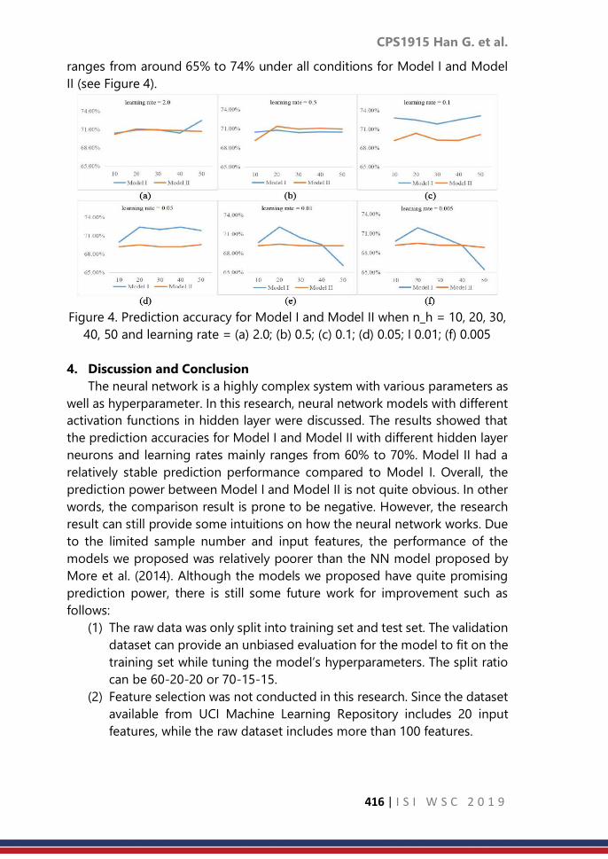
CPS1915 Han G. et al.
416 | I S I W S C 2 0 1 9
ranges from around 65% to 74% under all conditions for Model I and Model
II (see Figure 4).
Figure 4. Prediction accuracy for Model I and Model II when n_h = 10, 20, 30,
40, 50 and learning rate = (a) 2.0; (b) 0.5; (c) 0.1; (d) 0.05; I 0.01; (f) 0.005
4. Discussion and Conclusion
The neural network is a highly complex system with various parameters as
well as hyperparameter. In this research, neural network models with different
activation functions in hidden layer were discussed. The results showed that
the prediction accuracies for Model I and Model II with different hidden layer
neurons and learning rates mainly ranges from 60% to 70%. Model II had a
relatively stable prediction performance compared to Model I. Overall, the
prediction power between Model I and Model II is not quite obvious. In other
words, the comparison result is prone to be negative. However, the research
result can still provide some intuitions on how the neural network works. Due
to the limited sample number and input features, the performance of the
models we proposed was relatively poorer than the NN model proposed by
More et al. (2014). Although the models we proposed have quite promising
prediction power, there is still some future work for improvement such as
follows:
(1) The raw data was only split into training set and test set. The validation
dataset can provide an unbiased evaluation for the model to fit on the
training set while tuning the model’s hyperparameters. The split ratio
can be 60-20-20 or 70-15-15.
(2) Feature selection was not conducted in this research. Since the dataset
available from UCI Machine Learning Repository includes 20 input
features, while the raw dataset includes more than 100 features.

CPS1915 Han G. et al.
417 | I S I W S C 2 0 1 9
(3) All experiments were conducted between tanh-sigmoid combo (Model
I) and sigmoid-sigmoid combo (Model II). The activation function
combos can be more multiple, for example, tanh-tanh, ReLU-sigmoid.
(4) In this research, only NN models were applied and compared to
417 nalyse the bank clients’ data. Several other machine learning
models, like DT and SVM, also have quite good prediction capacity. In
the future, the comparison experiments between different kinds of
models can be conducted. After conducting these several work goals,
the NN model performance may have a more satisfactory and robust
performance.
References
1. Alon, I., et al. (2001). Forecasting aggregate retail sales: a comparison of
artificial neural networks and traditional methods. Journal of Retailing
and Consumer Services 8(3): 147-156.
2. Huang, C. L., et al. (2007). Credit scoring with a data mining approach
based on support vector machines. Expert systems with applications
33(4): 847-856.
3. Hurst, S. A. (2008). Vulnerability in research and health care; describing
the elephant in the room? Bioethics 22(4): 191-202.
4. Jain, A. K., et al. (1996). Artificial neural networks: A tutorial. Computer
29(3): 31-44.
5. Karlik, B. and A. V. Olgac (2011). Performance analysis of various
activation functions in generalized MLP architectures of neural networks.
International Journal of Artificial Intelligence and Expert Systems 1(4):
111-122.
6. Kukar, M. (2010). Data mining and decision support: An integrative
approach. Decision Support Systems, InTech.
7. Mazhar, M., et al. (2007). Remaining life estimation of used components
in consumer products: Life cycle data analysis by Weibull and artificial
neural networks. Journal of operations management 25(6): 1184-1193.
8. Moro, S., et al. (2014). A data-driven approach to predict the success of
bank telemarketing. Decision Support Systems 62: 22-31.
9. Moro, S., et al. (2015). Using customer lifetime value and neural networks
to improve the prediction of bank deposit subscription in telemarketing
campaigns. Neural Computing and Applications 26(1): 131-139.
10. Petitto, L. A., et al. (2000). Speech-like cerebral activity in profoundly deaf
people processing signed languages: implications for the neural basis of
human language. Proceedings of the National Academy of Sciences
97(25): 13961-13966.
11. Power, D. J. (2008). Decision support systems: a historical overview.
Handbook on decision support systems 1, Springer: 121-140.

CPS1915 Han G. et al.
418 | I S I W S C 2 0 1 9
12. Sun, Q. S., et al. (2005). A new method of feature fusion and its
application in image recognition. Pattern Recognition 38(12): 2437-2448.
13. Witten, I. H., et al. (2005). Data mining: Practical machine learning tools
and techniques, (morgan kaufmann series in data management
systems). Morgan Kaufmann, June 104: 113.

CPS1916 Erica P. et al.
419 | I S I W S C 2 0 1 9
Bayesian measurement error models in air
pollution and health studies
Erica Ponzi1, Marta Blangiardo2, Paolo Vineis2 1University of Zurich, Hirschengraben 84, CH-8001 Zurich, Switzerland
2Imperial College London, London, United Kingdom
Abstract
Measurement error can bias relevant parameters in studies on the effects of
air pollution and more generally environmental exposures on health and can
lead to inaccurate conclusions when evaluating associations among
pollutants, disease risk and biomarkers. Although the presence of
measurement error in such studies has been recognized as a potential
problem, it is rarely considered in applications and practical solutions are still
lacking. In particular, taking into account measurement error in environmental
exposures can become quite challenging when considering their association
with high-throughput molecular data, which are nowadays becoming more
and more popular in biomedical research. In this work, we formulate Bayesian
measurement error models and apply them to study the link between air
pollution and chronic cardiovascular diseases, focusing on how this link is
mediated by omics measurements. The data stem from the “Oxford Street II
Study”, a randomized crossover trial in which 60 volunteers walked for two
hours in a traffic-free area (Hyde Park) and in a busy shopping street (Oxford
Street) of London. Omics measurements are taken on each individual as well
as air pollution measurements, in order to investigate the association between
short-term exposure to traffic related air pollution and perturbation of
metabolic pathways.
Keywords
Bayesian hierarchical models; bias correction; environmental exposure; omic
signals
1. Introduction
The reliable estimation of associations between environmental exposures
and health conditions requires the collection of considerable amounts of
exposure data, which is often subject to several sources of error or imprecision.
This can lead not only to bias in the estimation of parameters relevant to the
study but also to inaccurate conclusions when evaluating associations among
pollutants, disease risk and biomarkers. Although the presence of
measurement error in such studies has been recently discussed (Rhomberg et
al. 2011; Edwards and Keil 2017; Shaw et al. 2018), it is often not accounted for

CPS1916 Erica P. et al.
420 | I S I W S C 2 0 1 9
in standard analyses. In particular, the measurement of environmental and
pollutant variables is often very likely to be affected by error, due to
instrumental imprecision as well as spatial variability (Goldman et al., 2011).
Some methods have been proposed to correct for ME in environmental and
pollution exposure variables (Dominici et al., 2000; Strand et al., 2006) and
calibration is starting to be performed thanks to the availability of personal
monitoring exposures (PEM), but the problem still needs further thinking and
methodology.
Thanks to their general applicability and lack of strong assumptions,
Bayesian approaches to the problem may provide a general framework to
work on and software like INLA (Rue et al., 2009), STAN (STAN Development
Team, 2017) and JAGS (Plummer, 2003) could promote their use in practical
applications also among scientists without a strong statistical background. The
Bayesian framework provides a very flexible way to account for measurement
error and to model different error types and dependency structures in the
data. Moreover, the possibility to include prior knowledge on the error
components can result in better models and more accurate estimations and
the possibility to model several fixed and random effects, as well as different
link functions, adds flexibility and general applicability to the methods.
Examples of Bayesian approaches used in ME problems can be found in
Wilkinson (2013); Stoklosa et al. (2014); Velasquez-Tibata et al. (2015), Muff et
al. (2015, 2017).
In the present study, we propose to apply these techniques to correct for
measurement error in environmental exposures when considering their
association with high-throughput molecular data. We apply our methods to a
randomized crossover trial, the Oxford Street II Study, whose aim was to
investigate the association between short-term exposure to traffic related air
pollution and perturbation of metabolic pathways.
2. Methodology
The data we use here stem from the Oxford Street Study, a randomized
crossover trial in which 60 volunteers walked for two hours in a traffic-free area
(Hyde Park) and in a busy shopping street (Oxford Street) of London. The
walking experiments were performed on non-rainy weekdays only, from
November to March 2003-2005, to avoid confounding from rain or pollen.
Information on age, sex, BMI, blood pressure, distance walked, diet and
medication use was collected for each participant. For each individual and
each exposure session, three blood samples were collected: two hours before
walking, two hours after walking and 24 hours after walking, on which
untargeted metabolomics analyses were performed.
Finally, real-time measurements of noise, temperature and relative
humidity were obtained at each exposure session. A more detailed description

CPS1916 Erica P. et al.
421 | I S I W S C 2 0 1 9
of the study is given in Sinharay et al. (2017). The association between
metabolite levels and TRAP exposures was assessed in van Veldhoven et al.
(2018) in a mixed model framework, including random effects for the
individual, as well as for the location and time point of each measurement.
Fixed effects were sex, age, body mass index (BMI), caffeine intake and health
group, as well as annual and instantaneous measurements of the exposure of
interest. Five exposures were considered separately, namely black carbon
(CBLK), nitrogen dioxide (NO2), particulate matter (PM10 and PM25) and ultra-
fine particles (UFP).
The model was fitted on each of the 5749 measured metabolic features
and results were then corrected for multiple testing using a Bonferroni-
corrected significance level. We formulated the same model using a Bayesian
framework and included an additional component to model the presence of
measurement error. We assumed a classical measurement error for the
different pollutants, i.e. that the exposure variable Z can be observed only via
a proxy W, such that
W = Z + U
With 𝑼 ~ 𝑵 (0, 𝜎𝑢2)
Such formulation was included in the model by adding a latent variable for
the exposure, namely a normally distributed variable with mean equal to 0 and
variance equal to the error variance and resulting in the following hierarchical
structure:
A vague gamma prior was used for the error variance, with shape and scale
parameters equal to 0.0001. Informative priors were used as well, based on
previous knowledge of the error variance on similar pollutants.
To model the presence of a Berkson measurement error, we assumed that
Z=W+U. It is a different scenario than the one depicted in the previous section,
as the observed variance is actually less than the real one, as opposed to a
classical framework where the presence of the error leads to an increase in the
observed variance of a variable. In the presence of a Berkson measurement
error, the expected attenuation of the effect of the error-prone variable is
lower, as the bias is not expected to propagate to the estimates of the
regression parameters (Carroll et al., 2006).

CPS1916 Erica P. et al.
422 | I S I W S C 2 0 1 9
Such formulation was included in the model by adding a latent variable for
the exposure, namely a normally distributed variable with mean equal to 0 and
variance equal to the error variance, and modelling the error variance with a
Berkson framework. The same priors were used as in the classical case.
Another source of imprecision and possible bias in the assessment of the
association between omic signals and TRAP exposure is potentially given by
the formulation of independent models for each omic feature. Dependency
across metabolic features is very likely to occur in practice, first of all because
5749 different features are sampled and analysed from the same 60
individuals, and second because they all reflect metabolic pathways and
phenomena that are highly correlated in each individual. The resulting model
was formulated as follows:
where the response variable followed a multivariate normal distribution
𝐦 ~ 𝐍 (0, ∑𝒆) , with ∑𝑒 denoting the covariance matrix of the omics signals
and all variances were given a gamma prior with shape and scale equal to 0.01,
in consistency with the univariate model.
Finally, the Bayesian hierarchical structures were further generalized to
account for correlation among exposure to different pollutants. The resulting
model was formulated as follows:
3. Result
As expected, the inclusion of a classical measurement error term resulted
in different estimates of the association between omic signals and TRAP
measurements, compared to the naive model which does not include such
term. Note that the presence of classical measurement error in pollutant
measures can cause bias in different directions, and that the effect, as well as
the direction of the error correction, is not evident a priori.
On the other hand, including a Berkson measurement error did not change
the estimates quantitatively, as expected from theory. See Figure (1) for the
distribution of regression coefficients using the three models, using JAGS.
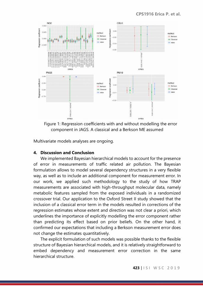
CPS1916 Erica P. et al.
423 | I S I W S C 2 0 1 9
Figure 1: Regression coefficients with and without modelling the error
component in JAGS. A classical and a Berkson ME assumed
Multivariate models analyses are ongoing.
4. Discussion and Conclusion
We implemented Bayesian hierarchical models to account for the presence
of error in measurements of traffic related air pollution. The Bayesian
formulation allows to model several dependency structures in a very flexible
way, as well as to include an additional component for measurement error. In
our work, we applied such methodology to the study of how TRAP
measurements are associated with high-throughput molecular data, namely
metabolic features sampled from the exposed individuals in a randomized
crossover trial. Our application to the Oxford Street II study showed that the
inclusion of a classical error term in the models resulted in corrections of the
regression estimates whose extent and direction was not clear a priori, which
underlines the importance of explicitly modelling the error component rather
than predicting its effect based on prior beliefs. On the other hand, it
confirmed our expectations that including a Berkson measurement error does
not change the estimates quantitatively.
The explicit formulation of such models was possible thanks to the flexible
structure of Bayesian hierarchical models, and it is relatively straightforward to
embed dependency and measurement error correction in the same
hierarchical structure.

CPS1916 Erica P. et al.
424 | I S I W S C 2 0 1 9
This is certainly a major advantage of using Bayesian hierarchical models,
which provide a general adaptable way to formulate a broad range of models
and structures, as in our case measurement error or dependency structures,
and more generally any additional random effect which might be needed in
the analysis. Moreover, the use of a Bayesian framework allows to incorporate
prior knowledge in the analysis, for example about the error component and
parameters, as well as to reflect the prior uncertainty in the posterior
distributions of parameters of interest. Of course, this requires some
knowledge about the error component, in order to properly formulate the
measurement error level and to assign reasonable priors. Note that this
requirement is not specific to the Bayesian framework, but rather to any error
modelling strategies. In fact, it is always necessary to know the error structure
(i.e. classical measurement error and its distribution), as well as the error
variance, in order to formulate an identifiable error model (Gustafson, 2005).
In practice, it is not always straightforward to obtain such information, and
often assumptions about the error distribution and parameters are vague or
potentially incorrect. The advantage of Bayesian models is that the uncertainty
in such assumptions can easily be accounted for and propagated to posterior
distributions of corrected estimates.
References
1. Carroll, R.J., D. Ruppert, L.A. Stefanski, and C.M. Crainiceanu. 2006.
Measurement Error in Nonlinear Models, a Modern Perspective. Boca
Raton: Chapman; Hall.
2. Dominici, F., S. Zeger, and J. Samet (2000). “A measurement error model
for time- series studies of air pollution and mortality.” Biostatistics 1 (2),
157–175
3. Edwards, J.K., and A.P. Keil. 2017. “Measurement Error and Environmental
Epidemiology: A Policy Perspective.” Current Environmental Health
Reports 4 (1): 79–88.
4. Goldman, G.T., J.A. Mulholland, A. G. Russell, M.J. Strickland, M. Klein, L.A.
Waller, and P.E. Tolbert. 2011. “Impact of Exposure Measurement Error in
Air Pollution Epidemiology: Effect of Error Type in Time-Series Studies.”
Environmental Health 10 (61).
5. Gustafson, P. 2005. “On Model Expansion, Model Contraction,
Identifiability and Prior Information: Two Illustrative Scenarios Involving
Mismeasured Variables.” Statistical Science 20: 111–40.
6. Muff, S., M. Ott, J. Braun, and L. Held (2017). “Bayesian two-component
measurement error modelling for survival analysis using INLA - A case
study on cardiovascular disease mortality in Switzerland.” Computational
Statistics and Data Analysis 113, 177–193.

CPS1916 Erica P. et al.
425 | I S I W S C 2 0 1 9
7. Muff, S., A. Riebler, L. Held, H. Rue, and P. Saner (2015). “Bayesian analysis
of measurement error models using integrated nested Laplace
approximations.” Journal of the Royal Statistical Society, Applied Statistics
Series C 64, 231–252.
8. Plummer, M. (2003). “JAGS: A program for analysis of Bayesian graphical
models using Gibbs sampling.”
9. Rhomberg, L.R., J.K. Chandalia, C. Long, and J.E. Goodman. 2011.
“Measurement Error in Environmental Epidemiology and the Shape of
Exposure-Response Curves.” Critical Reviews in Toxicology 41 (8): 651–71.
10. Rue, H, S Martino, and N Chopin. 2009. “Approximate Bayesian Inference
for Latent Gaussian Models by Using Integrated Nested Laplace
Approximations (with Discussion).” Journal of the Royal Statistical Society
Series B (Statistical Methodology) 71: 319–92.
11. Shaw, P. A., Deffner, V., Keogh, R. H., Tooze, J. A., Dodd, K. W.,
Küchenhoff, H., Kipnis, V., Freedman, L.S. (2018). “Epidemiologic analyses
with error-prone exposures: review of current practice and
recommendations” Annals of Epidemiology 28, 821-828.
12. Sinharay, R., J. Gong, B. Barratt, P. Ohman-Strickland, S. Ernst, F. Kelly, J.J.
Zhang, P. Collins, P. Cullinan, and K.F. Chung. 2017. “Respiratory and
Cardiovascular Responses to Walking down a Traffic-Polluted Road
Compared with Walking in a Traffic-Free Area in Participants Aged 60
Years and Older with Chronic Lung or Heart Disease and Age-Matched
Healthy Controls: A Randomised, Crossover Study.” Lancet 391: 339–49.
13. STAN Development Team (2017). The Stan core library, Version 2.16.0.
STAN Development Team. Stoklosa, J., C. Daly, S. Foster, M. Ashcroft, and
D. Warton (2014). “A climate of uncertainty: accounting for error in
climate variables for species distribution models.” Methods in Ecology
and Evolution 6, 412–423.
14. Strand, M., S. Vedal, C. Rodes, S. Dutton, E. Gelfand, and N. Rabinovitch
(2006). “Estimating effects of ambient PM2.5 exposure on health using
PM2.5 component measurements and regression calibration.” Journal of
Exposure Science and Environmental Epidemiology 16, 30–38.
15. Veldhoven, K. van, P. Keksi-Rahkonen, A. Kiss, A. Scalbert, P. Cullinan, F.
Chung, B. Barrat, et al. 2019. “Impact of Short-Term Traffic-Related Air
Pollution on the Metabolome- Results from Two Metabolome-Wide
Experimental Studies.”, Environment International 123: 124-131.
16. Velasquez-Tibata, J., C. H. Graham, and S. Munch (2015). “Using
measurement error models to account for georeferencing error in species
distribution models.” Ecography 39, 305–316.
17. Wilkinson, R. (2013). “Approximate bayesian computation (ABC) gives
exact results under the assumption of model error.” Statistical
Applications in Genetics and Molecular Biology 12, 129–141.

CPS1917 Trijya S.
426 | I S I W S C 2 0 1 9
Estimation of parameters of a mixture of two
exponential distributions
Trijya Singh Le Moyne College, Syracuse, U.S.A
Abstract
For estimating the parameters of a mixture of two exponential distributions,
the method of moments, which uses roots of a quadratic equation involving
the estimates of the first three raw moments, has been used in the past.
Because of poor estimates of these moments, in many situations roots of the
quadratic equation turnout to be complex and hence the method fails. In this
paper, a methodology based on a quadrature formula of numerical integration
is proposed for estimation of the moments. The peak and tail characteristics
of a distribution are explained by the standardized fourth central moment, that
is, the coefficient of kurtosis. To incorporate information about these
characteristics, a methodology based on the first four sample moments is also
proposed here. We have applied the proposed methodology to obtain initial
estimates of parameters of an extremely useful model used in
pharmacokinetic analysis and illustrated this using a drug concentration data
set. It has been shown that methods using all four moments perform better
than those based on only the first three moments. We have also demonstrated
the superiority of the proposed methods over an existing method of finding
initial estimates for an exponential mixture distribution.
Keywords
Trapezoidal curvature formula; method of moments; two-compartment
model; pharmacokinetic analysis
1. Introduction
A mixture of two exponential distributions as an underlying distribution of
a data generating process may arise in many areas of application. In life testing
and reliability analysis, when failures of components occur due to two
prominent causes, the distribution of failure times in some cases turns out to
be the mixture of two exponential distributions. We may also encounter this
mixture model in actuarial studies for the distribution of losses (settled claims)
in the case of insured events if the accidents have two major causes like road
accidents and fires as shown in Hogg & Klugman (1984). Harrison & Millard
(1991) reported yet another interesting example from hospital management.
They found that the distribution of duration of hospital stay of geriatric
patients suffering from two levels of severity of a disease was a mixture of two

CPS1917 Trijya S.
427 | I S I W S C 2 0 1 9
exponential distributions. The two-component mixture of exponential
distributions is given by,
𝑓(𝑥|휃1휃2𝑝) = 𝑝 ∙1
1∙ 𝑒𝑥𝑝 (−
𝑥
1) + (1 − 𝑝) ∙
1
2)𝑒𝑥𝑝 (−
𝑥
2), (1)
where 𝑥 ≥ 0, 휃1휃2 > 0, 0 ≤ 𝑝 ≤ 1.
With the availability of efficient optimization algorithms and easy access
to high speed computers, the method of maximum likelihood gained
popularity for the purpose of estimating parameters of mixture models.
Nevertheless, since parameters occur nonlinearly in the likelihood function,
several problems arise due to the rough surface of the likelihood and the
singularities therein. There could be instances where the likelihood function is
unbounded and maximum likelihood estimates (MLE's) may not exist. Kiefer
& Wolfowitz (1956) cited an example involving a mixture of two univariate
normal densities for which MLE's do not exist. Hosmer (1973, 1974) showed
through simulation that even for reasonable sample sizes and initial estimates,
iterative sequence of MLE's does not converge to particular values associated
with singularities. In the case of a mixture of two univariate normal
distributions, Hosmer (1973) asserted that if the sample size is small and
component distributions are poorly separated, then maximum likelihood
estimates should be `used with extreme caution or not at all'. Hosmer (1978)
has demonstrated that estimates obtained by the method of moments and
the method of moment generating functions outperform maximum likelihood
estimates in such situations.
One of the iterative procedures which is popular in the case of mixture
models is the non-derivative based expectation-maximization (EM) algorithm.
The second category of iterative procedures includes derivative based
algorithms like the Newton-Raphson and Marquardt-Levenberg algorithms.
Whichever algorithm is used, it would need good initial estimates for fast
convergence to the global maxima. If initial estimates are poor, convergence
may be slow, or the algorithm may converge to a local maxima. It is also
possible that in some ill-conditioned situations, convergence may not occur
at all. Thus, we need at least two sets of good initial estimates to ensure that
convergence occurs to the same values which provide the global maxima.
For the model in (1), Rider (1961) proposed the method of moments for
estimating parameters 휃1 , 휃2, and 𝑝. Considering 𝑥1, . . . , 𝑥1 to be a random
sample from the distribution in (1), Rider equated the first three theoretical
raw moments of (1) to the corresponding sample raw moments 𝑚1, 𝑚2,, and
𝑚3, and after extensive algebra, obtained the following quadratic equation,
6(2𝑚12 − 𝑚2)휃
2 + 2(𝑚3 − 3𝑚1𝑚2)휃 + 3𝑚22 − 2𝑚1𝑚3 = 0 (2)
The two real roots 휃1 and 휃2 of equation (2), if they exist, will yield estimates

CPS1917 Trijya S.
428 | I S I W S C 2 0 1 9
of 휃1 and 휃2 and consequently, an estimate of the mixing proportion 𝑝 as
follows:
𝑝 = 𝑚1 − 휃2
휃1 − 휃2
However, in mixture models, the behavior of tails is important, since these
are normally long or thicker tail distributions. By considering only the first
three raw moments, Rider ignored the long tail effect of the mixture model.
To incorporate information about the tail behavior, use of the fourth moment
is essential. In this paper, a methodology is proposed to address these issues.
We propose to obtain the estimates of theoretical moments based on a simple
quadrature formula of numerical integration and the extrapolated tail end
contributions to the moments. We further incorporate the nature of tail
behavior by using the fourth moment in the estimation of the parameters of
equation (1). We have applied the proposed methodology to estimate the
parameters of an extremely useful model used in pharmacokinetic analysis
that is used to study the behavior of drugs in the bodies of human beings and
animals. We have also compared the performance of our methods to that of
an existing method used by Shah (1973), for which the data and estimates are
available.
2. Methodology
Without loss of generality, we assume that in (1),
휃2 > 휃1. The 𝑗𝑡ℎ raw moment of (1) is given by
𝜇𝑗′ = ∫ 𝑥𝑗
∞
0
𝑓(𝑥|휃1, 휃2 , 𝑝)𝑑𝑥.
We propose to estimate the integral involved in (3) using a simple trapezoidal
interpolation formula of numerical integration. For this we use an estimate of
density based on a histogram of the data 𝑥𝑖, 𝑖 = 1, . . . , 𝑛 . We divide the
domain space of data values into bins (class intervals) and count the number
of sample points falling in each bin. Let ℎ (𝑥) be a smooth function
representing the curve on which top mid points of the bars erected on the
bins lie. The function ℎ (𝑥) would be close to the kernel function of density
from which the sample has been drawn for all 𝑥𝑖 . Let 𝐾 = ∫ ℎ (𝑥) 𝑑𝑥∞
0 be the
area under curve (AUC). Now, if we know the estimate of AUC, say , then ℎ (𝑥𝑖)
𝐾 is the estimate of the density at point 𝑥𝑖 . The AUC is given by
𝐾 = ∫ ℎ (𝑥) 𝑑𝑥∞
0
= 𝑎1 + 𝑎2 (4)
(3)

CPS1917 Trijya S.
429 | I S I W S C 2 0 1 9
where 𝑎1 = ∫ ℎ (𝑥)𝑑𝑥𝑥𝑛0
and 𝑎2 = ∫ ℎ (𝑥)𝑑𝑥.∞
𝑥𝑛 The integral 𝑎1 could be
estimated using the data 𝑥𝑖 , ℎ(𝑥𝑖), 𝑖 = 1, . . . , 𝑛, and the trapezoidal
formula as follows:
1 = ∑(𝑥𝑖+1 − 𝑥𝑖)
𝑛−1
𝑖=0
ℎ(𝑥𝑖+1) + ℎ(𝑥𝑖)
2
Since the data is available up to point 𝑥𝑛 only, for estimating the tail correction
𝑎2 we will have to extrapolate using the given data. To this end, we represent
the right-hand tail part of ℎ (𝑥) by an exponential decay function given by,
𝑢(𝑥) = 𝑐𝑧𝑒−𝜆𝑧(𝑥 − 𝑥𝑛), 𝑥 ≥ 𝑥𝑛
The justification for this could be given as follows. The quantity ℎ(𝑥)
𝐾 remains
close to the probability density function (p.d.f.) given in (1) even for large
values of x and the p.d.f. could be written as,
𝑓(𝑥|휃1,휃2,𝑝) =𝑞
휃2 𝑒
−𝑥
2 [1 + 𝑝
𝑞 휃2휃1𝑒−𝑥(
1
1, −
1
2,)].
Hence, for 휃2, > 휃1 𝑎nd large values of 𝑥𝑖 , the second term within square
brackets will vanish in the equation above and we will be left with an
exponential decay function. Now, for estimating 𝑎2, we estimate 𝑐𝑧 and 𝜆𝑧 of
𝑢 (𝑥) in (6) using the last 𝑚 (≥ 3) sample points at the end of the data. We
obtain the least squares estimates using the regression for the log-
transformed data. It is easy to see that from (6) we get,
∫ 𝑢 (𝑥) 𝑑𝑥∞
𝑥𝑛
= 𝑐𝑧
𝜆𝑧
Thus, the estimate of 𝑎2, is given by 𝑐 𝑧
𝑧 . Adding
𝑐 𝑧
𝑧 to equation (5) we obtain
the estimate of the area under the curve ℎ (𝑥). Along the lines followed for
estimation of AUC, to estimate 𝜇𝑗′ , 𝑗 = 1, 2, 3, 4 given in (3), we can write
𝜇𝑗′ = ∫ 𝑥𝑗
∞
0
𝑓(𝑥|휃1, 휃2 , 𝑝)𝑑𝑥 = 𝐴𝑗 + 𝐶𝑗
where 𝐴𝑗 = ∫ 𝑥𝑗 𝑓(𝑥|휃1 , 휃2, 𝑝) 𝑑𝑥𝑥𝑛0
and 𝐶𝑗 = ∫ 𝑥𝑗 𝑓(𝑥|휃1, 휃2 , 𝑝) 𝑑𝑥∞
𝑥𝑛 and use a
similar approach to estimate 𝐴𝑗 using the quadrature formula and 𝐶𝑗 using the
exponential decay function. The estimates of four raw moments 𝜇𝑗′ are given
by 𝑚𝑥 = 𝑗 + 𝑗 , 𝑗 = 1,2,3,4. We then use 𝑚1, 𝑚2 and 𝑚3 in (2) and obtain its
roots which give the estimates 휃1 and 휃2, which are then used for estimating
the mixing proportion p as described in the previous section.
However, in a mixture of two exponential distributions tail behavior of the
distribution is important. Hence, inclusion of the fourth moment in parameter
(5)
(6)
(7)

CPS1917 Trijya S.
430 | I S I W S C 2 0 1 9
estimation of (1) is essential. Let 휃1 = 𝑧1 and 휃2 = 𝑧2 be the estimates which
satisfy (2). Then after extensive algebra, it can be shown that,
𝑧13 + 𝑎𝑧1 + 𝑏 = 0
where 𝑎 =(𝑚4−4𝑚1𝑚3)
12(2𝑚12 − 𝑚2)
and 𝑏 =(2𝑚2𝑚3−𝑚1𝑚4)
12(2𝑚12 − 𝑚2)
It is well known that the cubic equation (8) will have three real roots if 𝑎 < 0
and 4𝑎3 + 27𝑏2 < 0. Therefore, if these conditions are satisfied and we get a
real root of (8), the second root can be obtained using the following
expression from Rider (1961),
휃2 =
𝑚22 − 𝑚1휃1
𝑚1 − 휃1
Using the estimates 휃1 and 휃2 thus obtained, the estimate of mixing
proportion can be obtained as well. It is important to note that the exact
distributional properties of the estimators are difficult to obtain in general.
However, Rider (1961) showed that the estimators are consistent and obtained
the expressions for the asymptotic variances of the estimators assuming 𝑝 to
be known. For estimating the asymptotic standard errors, we use our estimates
of moments in Rider’s formulas.
A major advantage of the proposed method lies in its application for
estimating parameters of the widely used two-compartment model in
pharmacokinetics. Pharmacokinetic analysis reveals the rates (amount per unit
time) of drug movement into, within and exiting from the body. A commonly
used model in such analyses is the two compartment model given by 𝐶 (𝑡) =
𝐴𝑒−𝛼𝑡 + 𝐵𝑒−𝛽𝑡 , 𝑡 ≥ 0, where 𝐶 (𝑡) ≥ 0 is concentration of drug, that is, the
amount of drug per milliliter in the blood stream at time 𝑡. Here, 𝛼 = 1
1, and
𝛽 = 1
2, . The first term of the model, 𝐴𝑒−𝛼𝑡 , corresponds to the drug
absorption stage and dominates, so 𝛼 > 𝛽. The second term corresponds to
the drug elimination phase. Integrating 𝐶 (𝑡) over 𝑡, we obtain the area under
the curve, 𝐾 = ∫ 𝐶 (𝑡) 𝑑𝑥∞
0 =
𝐴
𝛼 +
𝐵
𝛽. Dividing 𝐶 (𝑡) by 𝐾, we have
𝑓(𝑡|휃1,휃2,𝑝) = 𝑝 ∙1
휃1 𝑒
−𝑡
1 + (1 − 𝑝) ∙ 1
휃2 ∙ 𝑒
−𝑡
2 ,
where 𝑝 =𝐴
𝛼(𝐴
𝛼 +
𝐵
𝛽)−1
. If both A and B are positive, then 𝑓 (𝑡) could be
treated as a mixture of two exponential densities of random observation time
𝑡. If A is negative, 𝑓 (𝑡) shall still be a probability density function as 𝑓 (𝑡) ≥ 0
for all 𝑡 and ∫ 𝑓 (𝑡) 𝑑𝑡 = 1∞
0. Therefore, the methods described could be
applied without any technical problem.
(8)
(9)
(9)

CPS1917 Trijya S.
431 | I S I W S C 2 0 1 9
3. Result
Result In order to compare the performance of the proposed method to
the one proposed by Shah (1973) we have used the data reported in his paper.
The model being considered is as follows. After administering a dose of the
drug, its concentrations 𝐶(𝑡0), 𝐶(𝑡1)..., 𝐶(𝑡𝑛) are measured by taking a sample
from the central compartment at times 𝑡0, 𝑡1, . . . , 𝑡𝑛 . For this sample, the model
could be written as
𝐶(𝑡𝑖) = 𝐴𝑒−𝛼𝑡𝑖 + 𝐵𝑒−𝛽𝑡𝑖 + 𝜖𝑡𝑖 ,
where 𝑖 = 0, 1, . . . , 𝑛 . We assume that 𝜖𝑡𝑖 ’s are independently distributed
with 𝐸(𝜖𝑡𝑖) = 0 and 𝑉𝑎𝑟(𝜖𝑡𝑖 ) = 𝜎2 for all 𝑖. The data set in Shah (1973) can
be described as follows. A panel of 8 subjects was administered 250 milligrams
(mg) of the drug Tetracycline Hyrdochloride after a specified breakfast. The
concentration of the drug in blood stream was measured at different points
of time. The time and the lowest concentration for all time points are given in
the first two columns of Table 1. Using the last six points of the elimination
phase, we obtain the decay function as
𝑢(𝑡) = 0.2793𝑒 −0.1331(𝑡−15), 𝑡 ≥ 15.
Therefore, 𝑐 𝑧 = 0.2793 , 𝑧 = 0.1331 and = 𝐴𝑈 = 14.1349 . Using the
methodology given in the previous section, the estimates of the first four raw
moments are given by 𝑚1 = 8.1648, 𝑚2 = 123.4072, 𝑚3 = 2782.1156 and
𝑚4 = 83634.2720. The quadratic equation (2) for this data set turns out to be
59.5243휃2 − 481.3506휃 + 257.2676 = 0 . The roots of this equation are
휃2 = 7.5112 and 휃1 = 0.5754 since the smaller root is taken to be휃1.
The first approach (Method 1) used to estimate A, B, 𝛼 and 𝛽 in (10) utilizes
only the first three moments and can be described as follows. Given the
estimates 휃1 and 휃2 , the estimates of 𝛼 and 𝛽 are obtained as, = 1
1 and
= 1
2 . We know that 𝑝 is the coefficient of the first term of (9). Therefore, 𝑝
is the estimate of 𝐴
𝛼(𝐴
𝛼 +
𝐵
𝛽)−1
. But 𝐴
𝛼 +
𝐵
𝛽 = 𝐾 so given the estimate we can
find the estimate of 𝐴
𝛼 as 𝑝 𝐾 and the estimate of A as = 𝑝 . Using the
estimate of 𝐴
𝛼 , we can obtain the estimate of
𝐵
𝛽 as (1 − 𝑝 ), and hence the
estimate of B is given by 𝐵 = (1 − 𝑝 ).
The second approach (Method 2) uses a two stage procedure of estimation
which also utilizes the first four moments. In the first stage we estimate 휃1
and 휃2 using the cubic equation (8), which, in this case is given by
𝑧13 − 60.7012𝑧 + 31.3279 = 0 . Since 4𝑎3 + 27𝑏2 = −867125.8 < 0 , all
roots are real. Two roots are given by estimate 휃1 and 휃2 are obtained as
0.4835 and 7.5190 which are then used to obtain estimates and . In the
second stage, given the estimates and we transform the data as follows.
We define 𝑋1(𝑡) = 𝑒𝑥𝑝(−𝑡) and 𝑋2(𝑡) = 𝑒𝑥𝑝(− 𝑡). Using
𝐶(𝑡𝑖), 𝑋1(𝑡𝑖), 𝑋2(𝑡𝑖), 𝑖 = 0, 1, . . . , 𝑛, we regress 𝐶(𝑡𝑖) on 𝑋1(𝑡𝑖) and
(10)

CPS1917 Trijya S.
432 | I S I W S C 2 0 1 9
𝑋2(𝑡𝑖) without an intercept term. That is, 𝐶(𝑡) = 𝐴𝑋1(𝑡) + 𝐵𝑋2(𝑡). This
provides the estimates and .
The fitted values of the observations obtained using the method in Shah
(1973), method 1, method 2 and the ‘nls’ package in R version 3.2.2 are given
in the top half of Table 1. The initial estimates of the parameters,
corresponding residual sum of squares (RSS) and the number of iterations
required for convergence to the global optimum values for all four methods
are given in the bottom half of Table 1. For obtaining fitted values and
parameter estimates using the ‘nls’ R package, we have employed estimates
obtained from method
Table 1: Parameter estimates, fitted values, residual sum of squares (RSS),
mean absolute percent error (MAP E) and number of iterations for the Shah’s
method, proposed methods and ‘nls’ R package.
t Observations Shah’s
Method
Method 1 Method 2 ‘nls’ Package
0 0.7000 -0.7910 -0.6309 0.6572 0.6879
1 1.2000 0.6807 1.4576 1.5327 1.2420
2 1.4000 1.2398 1.5302 1.4628 1.3869
3 1.4000 1.3819 1.3718 1.2959 1.3496
4 1.2380 1.3417 1.2050 1.1365 1.2383
5 1.1000 1.2276 1.0554 0.9952 1.1038
6 0.9650 1.0947 0.9241 0.8713 0.9691
7 0.8000 0.9608 0.8090 0.7628 0.8441
8 0.7312 0.8368 0.7083 0.6678 0.7314
9 0.6000 0.7257 0.6201 0.5846 0.6323
10 0.5456 0.6280 0.5428 0.5118 0.5455
11 0.5000 0.5426 0.4752 0.4481 0.4709
12 0.4057 0.4686 0.4161 0.3923 0.4060
13 0.3497 0.4045 0.3642 0.3434 0.3499
14 0.3013 0.3491 0.3189 0.3007 0.3016
15 0.3000 0.3012 0.2792 0.2632 0.2599
Parameters
A -3.5483 -2.3190 -1.2780 -1.7354 (0.1304)
α 0.7369 1.7379 2.0682 1.8362 (0.0665)
B 2.7573 2.0592 1.9352 1.7485 (0.1316)
β 0.1476 0.1331 0.1330 0.1488 (0.0062)
RSS 2.6336 1.8629 0.1684 0.0101
MAPE (%) 26.8191 12.8614 7.7026 2.5529
Iterations 9 8 5
Figures in parentheses represent estimates of standard errors.

CPS1917 Trijya S.
433 | I S I W S C 2 0 1 9
2 as initial estimates. We have also included the mean absolute percent error
(MAP E) of each method, which is given by
𝑀𝐴𝑃 𝐸 = 1
𝑛∑
|𝐶(𝑡𝑖) − (𝑡𝑖)|
𝐶(𝑡𝑖)
𝑛
𝑖=1
× 100.
This measures the predictive power of the method. The estimates of the
asymptotic standard errors of the estimates obtained using the `nls' R package
are also given within parentheses in Table 1.
4. Discussion and Conclusion
Shah (1973) suggested a regression-difference equation method for
obtaining initial parameter estimates needed to start an iterative estimation
procedure in the case of a mixture of exponential distributions. However, this
method is of limited use since it is applicable only to equally spaced data. In
pharmacokinetic analysis, observations are rarely measured at equal intervals.
Our proposed methods are not only applicable to unequally spaced
observations, but have also been shown to yield remarkably lower RSS and
MAPE values compared to Shah's method, as is evident from Table 1.
Moreover, important pharmacokinetic parameters of interest like drug
transfer rates, volume of a drug in a patient's blood stream at time t and
clearance of the drug from the body are all functions of A, B, 𝛼 𝑎𝑛𝑑 𝛽 as
discussed in Appleton (1995). Hence, these parameters need to be estimated
with as much precision as possible. A close examination of the RSS and MAPE
values in Table 1 also reveals that although initial estimates obtained by all
methods give convergence to same optimum values, the performance of the
method incorporating information regarding tail behavior (that is, method 2)
is better. The initial estimates of parameters obtained using method 2 are, in
general, closer to the optimum values compared to those obtained by Shah's
method or method 1 and, as such, convergence is attained in a much smaller
number of iterations for method 2.
An undesirable feature which has been noticed in the findings is that the
fitted values corresponding to the first time point are negative for Shah's
method and method 1. This is another reason that method 2 should be used
in preference to method 1 or Shah's method in order to obtain initial
estimates.

CPS1917 Trijya S.
434 | I S I W S C 2 0 1 9
References
1. Appleton, D. R. (1995). \What do we mean by a statistical model?",
Statistics in Medicine, 14, 185-197.
2. Harrison, G. & Millard, P. (1991). \Balancing acute and long term care:
The mathematics of throughput in department of geriatric medicine",
Methods of Information in Medicine, 30, 221-228.
3. Hogg, R. V. & Klugman, S. A. (1984). \Loss Distributions", John Wiley &
Sons, New York.
4. Hosmer, D. W., Jr. (1973). \On MLE of the parameters of a mixture of two
normal distributions when the sample size is small", Communications in
Statistics, 1, 217-227.
5. Hosmer, D. W., Jr. (1974). \Maximum likelihood estimates of the
parameters of a mixture of two regression lines", Communications in
Statistics, 3, 995-1006.
6. Hosmer, D. W., Jr. (1978). Comment on \estimating mixtures of normal
distributions and switching regressions". Journal of the American
Statistical Association, 73, 741-744.
7. Kiefer, J. & Wolfowitz, J. (1956). \Consistency of the maximum likelihood
estimator in the presence of infinitely many incidental parameters", The
Annals of Mathematical Statistics, 27, 887-906.
8. Rider, P. R. (1961). \The method of moments applied to a mixture of two
exponential distributions", The Annals of Mathematical Statistics, 32, 143-
147.
9. Shah, B. K. (1973). \Obtaining preliminary estimates to fit two term
exponential model to blood concentration data", Journal of
Pharmaceutical Sciences, 62, 1208-1209.
CPS1922 Imran K. et al.
435 | I S I W S C 2 0 1 9
Errors of the fourth kind - A click away…key lies
in statistical collaboration
Imran Khan1; Eric A. Vance2 1Sher-e-Kashmir University of Agricultural Sciences and Technology of Kashmir, Srinagar,
Jammu and Kashmir, India 2University of Colorado Boulder, USA
Abstract
Statistical software is nowadays widely available to researchers not well-
trained in statistical analysis and therefore is often used recklessly and blindly.
These researchers may commit errors in their research, simply with a click of
the mouse, which we call “Errors of the fourth kind” or “Type IV errors.” Such
errors give the wrong answer to the right research question and have been
observed by the authors while examining research problems in other
disciplines. Errors of the fourth kind can spring from poor statistical know-how
among researchers while using statistical software on their research data and
lead to erroneous results and incorrect conclusions. Statistical collaborators
seek to help researchers to answer their research questions correctly by
applying the right statistical tool to the right problem in the right manner. This
paper highlights six case studies from the literature and the authors’
experience that show how Type IV errors were committed and how they could
have been avoided through improved statistical collaboration.
Keywords
errors; software; collaboration
1. Introduction
Observations are innocent and, we should avoid torturing them. To play
with observations, by using a friendly software in a friendly way can prove
dangerous, without proper knowledge of statistics. Many of the scientists who
use designed experiments in their research have had little or no exposure to
more than elementary statistical methods. The exposure they have had has
been concerned largely with the process of applying statistical techniques in
the analysis of data. Little attention has been paid to the consideration of what
the data can tell the scientist about whether the experiment has met its
objectives or about what the results really mean within the context of the
problem. As a consequence, too often the data are subject to procedures with
which the scientist is familiar, whether they are appropriate are not (Petersen
1985). This is particularly true of pair wise multiple comparison procedures,
which are frequently used in situations where they are entirely inappropriate
(Petersen 1977).

CPS1922 Imran K. et al.
436 | I S I W S C 2 0 1 9
Statistics has certainly benefited from the developments in computer
technology and statistical software is now accessible to a wide audience,
however, the complexity of the questions under study in most disciplines
requires at least some form of expertise related to data analysis. The problem
is that most researchers don’t have time to acquire this specialized knowledge
along with the practical experience to apply it appropriately. There is a need
to involve someone who understands the scientific process and has the
quantitative skills to full fill this important role: the statistical consultant
(Cabrera and McDougall, 2002).
The researchers conduct the experiments or surveys to answer their
research question (RQ). To answer the RQ different types of errors are
committed like errors of Type I or Type II and Type III. In statistical hypothesis
testing while making a decision on the basis of a sample sometimes we may
fail to accept a correct null hypothesis (H0). Thus rejecting H0 when it’s true is
called Type I error e.g. a subject is declared having the disease (false positive)
when in fact it’s healthy. Similarly, if a researcher fails to reject an incorrect
H0i.e. accept H0 when in fact it’s false is called Type II error e.g., a subject is
declared healthy (false negative) when in fact it’s having the disease. Errors of
Type I and Type II are due to lack of evidence in the sample while the error of
Type III (Kemball 1957) is due to lack of communication between researcher
and the collaborator and, results in right answer to the wrong query. For the
Type-IV error, the questions posed can be right but the answers can be wrong,
the reasons for which are discussed in this paper.
In the earlier days, everyone used to consult the specialists possessing the
in-depth knowledge to get an answer to a particular problem, with a
threadbare discussion. But with the advent of computers along with internet
everyone has become self-styled specialists in almost all fields, and statistics
is not an exception. Google like other search engine sites is full of information
but as far as knowledge is concerned it is way behind. As Rutherford has rightly
said “we are drowning in information but lack knowledge”, the reason seems
to be searching everything on the internet instead collaborating with the
expert. The specialists have both information and knowledge. The drive for
writing this paper is to make researchers aware of the Type IV error which they
can commit, and in turn, leads to wastage of their hard work and resources
they put in while conducting the research. Researchers can possess knowledge
of their field but they can have only the information about other fields like
statistics.
2. Methodology
In this study 352 research papers were screened and 81 research papers
were found to have Type-IV error. Since it is not possible to present all the
findings hence a few cases have been discussed as an example. To maintain

CPS1922 Imran K. et al.
437 | I S I W S C 2 0 1 9
the privacy of the names of authors and the journals from which the Type-IV
error has been found have been deliberately hidden.
3. Result
“Error of the Fourth kind or Type IV error”
Before the availability of free and friendly statistical software, the
researchers would collaborate with the statistical consultant for collection,
analysis and interpretation of data as it was not possible for them to perform
analysis of their own. In the last 10years, use of statistical software has grown
tremendously among the researchers, academicians of government and non-
government organizations. With the mushrooming of many user-friendly and
free statistical software, the statistical analysis is done badly by the researcher
who doesn’t have knowledge of statistics and hence given birth, by a click, to
a new type of error. Statistical software is nowadays used recklessly by the
researchers and hence commit an error, by clicking the mouse, we call “Error
of the fourth kind or Type IV error”, thus give the wrong answer to the right
question. Such type of errors has been observed by the authors while dealing
with the research problems of other disciplines. Almost every researcher is a
statistician in today’s world. Using statistics without collaborating with the
statistical expert is just like taking a medicine without consulting a doctor. With
the availability of free online statistical software and videos, most of the
researchers analyze and interpret their research data/findings of their own
without collaborating with the statistical expert.
Type IV error is mostly committed due to improper use of user-friendly
statistical software like entering data in a wrong way, filling data cells wrongly
(like filling blank cells by 0), no/poor knowledge about outliers and extreme
observations or we can say improper handling of problem data, inappropriate
use of statistical tools, incorrect interpretation of statistical results. Statistical
software like data are innocents and they dance the way researcher makes
them dance rather the way they should. Statistical software will definitely
analyze the data and give the results, it’s the statistical expert/collaborator
who knows the correct way of extracting useful information from precious data
of the research. The reasons for not collaborating with statistical experts are
three-fold(i) researcher assumes he has enough information regarding the
statistics, (ii) Unavailability of Stat Labs in the university or the research
institute, (iii) researcher dislikes to incorporate another author to his
publication. Research is a team work and if conducted in collaboration will lead
to a correct and high-quality product. It’s very difficult for the researcher to
discover where he has gone wrong. Though Type IV error is difficult to
calculate but from our experience its probability is more than 0.80 (found in
publications where the statistical expert has not been consulted). The
statistical errors that can spoil the research work while using Statistical

CPS1922 Imran K. et al.
438 | I S I W S C 2 0 1 9
software without the supervision of statistical collaborator are discussed
below.
Case 1) Assigning value zero in the blank cells makes the sample sizes as equal
which in turn increases the degrees of freedom, balances the data, and
decreases standard error. The increase in degrees of freedom has an effect on
the probability value (p-value) and can lead to Type-II error (rejecting false H0).
Treating sample sizes equal will result in inappropriate use of the statistical
tool. In some cases assigning value zero to a blank cell can act as an outlier
and can have a drastic effect on the entire results which can lead to wrong
research answer to the right research question.
Case 2) Since the type of statistical tool to be used is governed by the type of
dependent and independent variable many times it has been observed that
researchers use incorrect statistical tools and thus spoiling the data of good
quality and publish their research in a low ranked journal instead. For example,
while studying Dead/Alive as the dependent variable which is binary along
with other independent variables the researcher apply t-test rather than a
logistic regression.
Case 3) Factorial experiments: In single factor experiments, it has been
observed that in post hoc tests critical difference is used in unplanned pairwise
comparison which increases the probability of significance thus leads to invalid
conclusions. In Factorial experiments, it has been observed that in presence of
significant interaction the main effects are discussed which leads to wrong
information.
Case 4) We know that to calculate odds ratio is easy but its inference is very
tricky and quite often leads to irrelevant inferences/conclusions/
interpretations. By interchanging the rows or columns or both, results in a
change in interpretation of odds ratio.
Case 5) Since for calculating the correlation coefficient we should have a
paired observation on the same unit, sometimes the researcher records the
paired observations but doesn’t place them in pairs while entering the data.
Thus, calculating an invalid correlation.
Case 6) It has been found in the publications that author presents very low R2,
high standard error hence significant regression coefficients. The reason being
that while applying regression models the researcher hardly has any idea of
autocorrelation or multicollinearity or homoscedasticity and makes inferences
about coefficients which are much inflated than actual. Since the innocent
Software has no knowledge about all these things hence can make researcher
SIGNIFICANTLY happy or unhappy as the case may be.
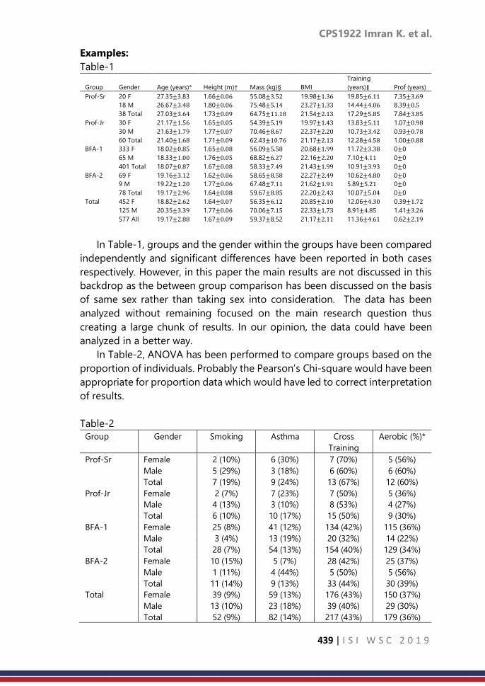
CPS1922 Imran K. et al.
439 | I S I W S C 2 0 1 9
Examples:
Table-1 Training
Group Gender Age (years)* Height (m)† Mass (kg)§ BMI (years)∥ Prof (years)
Prof-Sr 20 F 27.35±3.83 1.66±0.06 55.08±3.52 19.98±1.36 19.85±6.11 7.35±3.69
18 M 26.67±3.48 1.80±0.06 75.48±5.14 23.27±1.33 14.44±4.06 8.39±0.5
38 Total 27.03±3.64 1.73±0.09 64.75±11.18 21.54±2.13 17.29±5.85 7.84±3.85
Prof-Jr 30 F 21.17±1.56 1.65±0.05 54.39±5.19 19.97±1.43 13.83±5.11 1.07±0.98
30 M 21.63±1.79 1.77±0.07 70.46±8.67 22.37±2.20 10.73±3.42 0.93±0.78
60 Total 21.40±1.68 1.71±0.09 62.43±10.76 21.17±2.13 12.28±4.58 1.00±0.88
BFA-1 333 F 18.02±0.85 1.65±0.08 56.09±5.58 20.68±1.99 11.72±3.38 0±0
65 M 18.33±1.00 1.76±0.05 68.82±6.27 22.16±2.20 7.10±4.11 0±0
401 Total 18.07±0.87 1.67±0.08 58.33±7.49 21.43±1.99 10.91±3.93 0±0
BFA-2 69 F 19.16±3.12 1.62±0.06 58.65±8.58 22.27±2.49 10.62±4.80 0±0
9 M 19.22±1.20 1.77±0.06 67.48±7.11 21.62±1.91 5.89±5.21 0±0
78 Total 19.17±2.96 1.64±0.08 59.67±8.85 22.20±2.43 10.07±5.04 0±0
Total 452 F 18.82±2.62 1.64±0.07 56.35±6.12 20.85±2.10 12.06±4.30 0.39±1.72
125 M 20.35±3.39 1.77±0.06 70.06±7.15 22.33±1.73 8.91±4.85 1.41±3.26
577 All 19.17±2.88 1.67±0.09 59.37±8.52 21.17±2.11 11.36±4.61 0.62±2.19
In Table-1, groups and the gender within the groups have been compared
independently and significant differences have been reported in both cases
respectively. However, in this paper the main results are not discussed in this
backdrop as the between group comparison has been discussed on the basis
of same sex rather than taking sex into consideration. The data has been
analyzed without remaining focused on the main research question thus
creating a large chunk of results. In our opinion, the data could have been
analyzed in a better way.
In Table-2, ANOVA has been performed to compare groups based on the
proportion of individuals. Probably the Pearson’s Chi-square would have been
appropriate for proportion data which would have led to correct interpretation
of results.
Table-2
Group Gender Smoking Asthma Cross
Training
Aerobic (%)*
Prof-Sr Female 2 (10%) 6 (30%) 7 (70%) 5 (56%)
Male 5 (29%) 3 (18%) 6 (60%) 6 (60%)
Total 7 (19%) 9 (24%) 13 (67%) 12 (60%)
Prof-Jr Female 2 (7%) 7 (23%) 7 (50%) 5 (36%)
Male 4 (13%) 3 (10%) 8 (53%) 4 (27%)
Total 6 (10%) 10 (17%) 15 (50%) 9 (30%)
BFA-1 Female 25 (8%) 41 (12%) 134 (42%) 115 (36%)
Male 3 (4%) 13 (19%) 20 (32%) 14 (22%)
Total 28 (7%) 54 (13%) 154 (40%) 129 (34%)
BFA-2 Female 10 (15%) 5 (7%) 28 (42%) 25 (37%)
Male 1 (11%) 4 (44%) 5 (50%) 5 (56%)
Total 11 (14%) 9 (13%) 33 (44%) 30 (39%)
Total Female 39 (9%) 59 (13%) 176 (43%) 150 (37%)
Male 13 (10%) 23 (18%) 39 (40%) 29 (30%)
Total 52 (9%) 82 (14%) 217 (43%) 179 (36%)

CPS1922 Imran K. et al.
440 | I S I W S C 2 0 1 9
* There were differences between groups in aerobic training [F(3,514) = 3.588, p = 0.014]
Table-3
Age (years) Height (cm) Weight (kg)
Group N M SD M SD M SD
Active 6 27.0 (9.7) 161.8 (5.9) 57.1 (4.7)
Passive 6 22.3 (2.3) 163.9 (5.9) 62.5 (15.6)
Control 6 26.3 (5.3) 175.3 (6.4)* 71.6 (15.3)
M = Mean; SD = Standard Deviation; *p<0.05.
In Table-3 the baseline character (Height) is found to be significant which
is believed to act as confounding variable and has not been taken care of while
discussing the main results.
Table-4
Total Turnout
Measurements
Professionals Collegiate Academy
RI (Mean ± SD) 127.61° ± 14.39° 105.35° ± 16.54° 123.93° ± 17.56°
Floor (Mean ± SD) 142.7° ± 13.88° 115.12° ± 16.54° 134.98° ± 12.39°
While discussing Table-4 in the results section of the paper the author
explains interaction as Non-Sig. and the main effects are found to be
significant which are nowhere displayed in the table.
Table-5
Non-Dancer
Control
Thai Classical
Dancer
P-Value
Age (years) 21.16 ± 0.38 21.23 ± 0.46 0.087
Weight (kg) 51.42 ± 5.07 45.67 ± 2.09 0.049*
Height (cm) 156.73 ± 3.46 158.01 ± 3.50 0.568
Years Dancing 0 11.36 ± 2.91
Controls are taken as non-dancers who have never attended any dance
classes. The controls have not been selected as per scientific/statistical criteria.
Hence, the comparison is definitely biased/incorrect
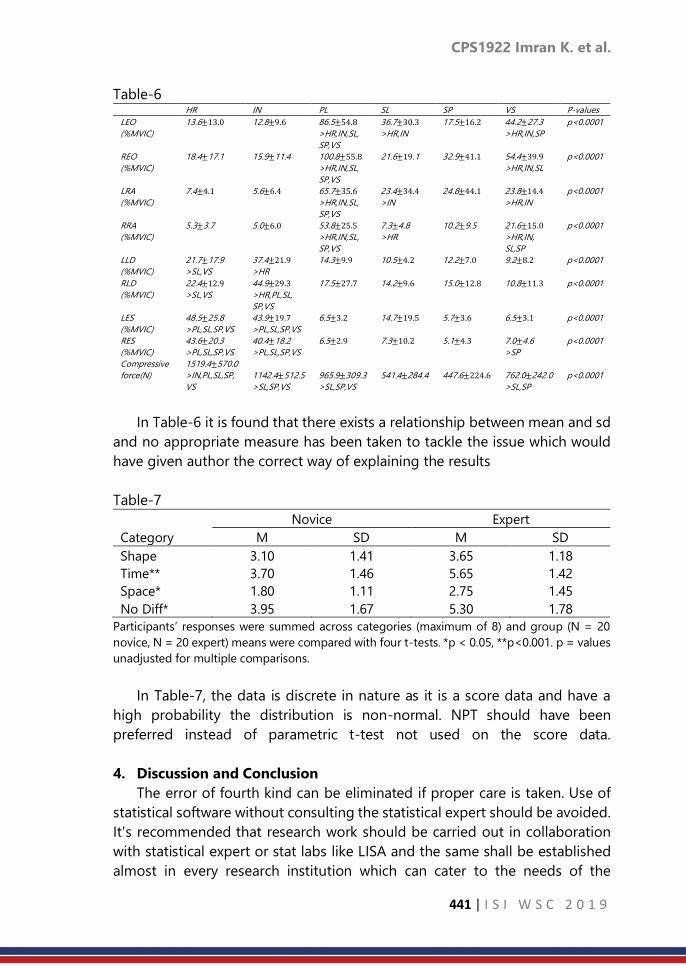
CPS1922 Imran K. et al.
441 | I S I W S C 2 0 1 9
Table-6 HR IN PL SL SP VS P-values
LEO 13.6±13.0 12.8±9.6 86.5±54.8 36.7±30.3 17.5±16.2 44.2±27.3 p<0.0001
(%MVIC) >HR,IN,SL, >HR,IN >HR,IN,SP
SP,VS
REO 18.4±17.1 15.9±11.4 100.8±55.8 21.6±19.1 32.9±41.1 54.4±39.9 p<0.0001
(%MVIC) >HR,IN,SL, >HR,IN,SL
SP,VS
LRA 7.4±4.1 5.6±6.4 65.7±35.6 23.4±34.4 24.8±44.1 23.8±14.4 p<0.0001
(%MVIC) >HR,IN,SL, >IN >HR,IN
SP,VS
RRA 5.3±3.7 5.0±6.0 53.8±25.5 7.3±4.8 10.2±9.5 21.6±15.0 p<0.0001
(%MVIC) >HR,IN,SL, >HR >HR,IN,
SP,VS SL,SP
LLD 21.7±17.9 37.4±21.9 14.3±9.9 10.5±4.2 12.2±7.0 9.2±8.2 p<0.0001
(%MVIC) >SL,VS >HR
RLD 22.4±12.9 44.9±29.3 17.5±27.7 14.2±9.6 15.0±12.8 10.8±11.3 p<0.0001
(%MVIC) >SL,VS >HR,PL,SL,
SP,VS
LES 48.5±25.8 43.9±19.7 6.5±3.2 14.7±19.5 5.7±3.6 6.5±3.1 p<0.0001
(%MVIC) >PL,SL,SP,VS >PL,SL,SP,VS
RES 43.6±20.3 40.4±18.2 6.5±2.9 7.3±10.2 5.1±4.3 7.0±4.6 p<0.0001
(%MVIC) >PL,SL,SP,VS >PL,SL,SP,VS >SP
Compressive 1519.4±570.0
force(N) >IN,PL,SL,SP, 1142.4±512.5 965.9±309.3 541.4±284.4 447.6±224.6 762.0±242.0 p<0.0001
VS >SL,SP,VS >SL,SP,VS >SL,SP
In Table-6 it is found that there exists a relationship between mean and sd
and no appropriate measure has been taken to tackle the issue which would
have given author the correct way of explaining the results
Table-7
Novice Expert
Category M SD M SD
Shape 3.10 1.41 3.65 1.18
Time** 3.70 1.46 5.65 1.42
Space* 1.80 1.11 2.75 1.45
No Diff* 3.95 1.67 5.30 1.78
Participants’ responses were summed across categories (maximum of 8) and group (N = 20
novice, N = 20 expert) means were compared with four t-tests. *p < 0.05, **p<0.001. p = values
unadjusted for multiple comparisons.
In Table-7, the data is discrete in nature as it is a score data and have a
high probability the distribution is non-normal. NPT should have been
preferred instead of parametric t-test not used on the score data.
4. Discussion and Conclusion
The error of fourth kind can be eliminated if proper care is taken. Use of
statistical software without consulting the statistical expert should be avoided.
It's recommended that research work should be carried out in collaboration
with statistical expert or stat labs like LISA and the same shall be established
almost in every research institution which can cater to the needs of the

CPS1922 Imran K. et al.
442 | I S I W S C 2 0 1 9
researchers and where the future statisticians can horn their statistical skills
while working on real problems and can be of great benefit to the mankind.
Besides data analysis tables, the method of data collection should be
discussed in detail and graphical display of the data is recommended which
can be of great help to the reviewer to identify the properties of data. Hence,
the right time to collaborate with a statistical expert is before data collection
or before starting the experiment till the end of the study. By not doing so, a
simple analysis can become complicated as more information about the
research comes to light.
References
1. Kimball.A.W(1957). Error of the Third Kind in Statistical Consulting.
Journal of American Statistical Association, 52,133-142.
2. Cabrera J. and McDougall A. (2002), Statistical Consulting, Springer.
3. Petersen R.G. (1985), Design and Analysis of Experiments, Marcel Dekker.
4. Petersen R.G. (1977), Use and Misuse of Multiple Comparison
Procedures, Agron.J.69:205-20

Index
443 | I S I W S C 2 0 1 9
A
Abdul Ghapor Hussin, 395
Abdurakhman, 281
Abukari Alhassan, 27
Adhitya Ronnie Effendie, 224
Ágnes Patay, 387
Alan Welsh, 258
Alexandre H. Thiery, 145
Amitha Prasad, 153
Andre Python, 165
Anil K. Ghosh, 318
Anita Nandi, 165
Apiradee Lim, 346
Avner Bar-Hen, 75
Ayu Paramudita, 402 B
Barbora Peštová, 117
Bashiru I.I. Saeed, 27
Budi N Ruhyana, 209 C
Caston Sigauke, 11
Chantal Hendriks, 165
Chen Chen, 354
Chris Brierleyc, 232 D
D. Dilshanie Deepawansa, 1
Danardono, 209, 224
Daniel Maposa , 11
Daniel Weiss, 165
Dedi Rosadi, 209, 224, 281
Devni Prima Sari, 224
Donna P. Ankerst, 310
Dyah Erny Herwindiati, 272 E
Enobong Francis Udoumoh, 50
Eric A. Vance, 435
Erica Ponzi, 419
Ewan Cameron, 165 F
Ferenc Mújdricza, Mónika Földvári, 300
Francis Hui, 258 G
Gumgum Darmawan, 209 H
Han Gao, 410
Heiko Grossmann, 326
Heng Chin Low, 410
Hermansah, 209 I
Imran Khan, 435
Ira Joy Hernandez Martin, 378
Ishapathik Das, 185 J
Janson Hendryli, 272
Jayanthi Sureshbabu, 153
Jayoun Kim, 41
Jean-Michel Poggi, 75
Jing Ruan, 126
Jinheum Kim, 41
Jungtaek OH, 33 K
Karuna G. Reddy, 339
Katherine Battle, 165
Key-Il Shin, 33
KHOO Wooi Chen, 109 L
La Gubu, 281
Leong Robert Neil, 291
Lucy Twumwaah Afriyie, 27 M
M. Irsyad Ilham, 249
M.G.M. Khan, 339
Marta Blangiardo, 419
Maryam Ilyas, 232
Masayuki Uchida, 92
Mathew Page, 354
Matúš Maciak, 117
Michal Pešta, 117
Michele Nguyen, 165
Murendeni Nemukula, 11 N
N Rao Chaganty, 185
Natividad Jochelle Maan, 291
Necesito Reinna Mae, 291
Nicholas Jovianto, 272
Nobutane Hanayama, 263
Nurkhairany Amyra Mokhtar, 395 O
Ocampo Shirlee, 291
ONG Seng Huat, 109
Oyeka I. C. A, 83 P
Paolo Vineis, 419
Partha Lahiri, 1
Pasi Piela, 137
Pei Shan Fam, 410
Penelope Hancock, 165
Peter Gething, 165
Pooja Sengupta, 185

Index
444 | I S I W S C 2 0 1 9
R
Rahma Fitriani, 19
Ramani Gunatilaka, 1
Reza Modarres, 216
Rosalind Howes, 165
Rossita Mohamad Yunus, 395
Russasmita Sri Padmi, 100 S
Sahidan Abdulmana, 346
Salima Mansouri, 59
Sanggi Lee, 193
Sarbojit Roy, 318
Senthilvel Vasudevan, 153
Serge Guillas, 232
Servane Gey, 75
Shaymaa Wael Abdelhakim Rabie, 240
Shogo H Nakakita, 92
Shonosuke Sugasawa, 258
Shuichi Shinmura, 175
Soham Sarkar, 318
Steven Gilmour, 326
Subanar, 364
Subhajit Dutta, 318
Sumathi Senthilvel, 153
Sumen Sen, 185
Suryo Adi Rakhmawan, 200
Susan Rumisha, 165 T
Thanyani Maremba, 67
Tim Christopher David Lucas, 165
Trijya Singh, 426
Tzee-Ming Huang, 372 U
Uzuke, C. A, 83 W
Willem van den Boom, 145 X
Xinwu Pan, 410 Y
Yanan Liu, 126
Yiyao Chen, 310
Yong Zulina Zubairi, 395
Yosep Dwi Kristanto, 100 Z
Zakir Hossain, 326
Zineb El Ouazzani Touhami, 333

MINISTRY OF TOURISM,ARTS & CULTURE MALAYSIA
ISBN 978-967-2000-68-6


![10 11 Session HR Session Seri Management[1]](https://static.fdokumen.com/doc/165x107/6314ba61fc260b71020fb0ee/10-11-session-hr-session-seri-management1.jpg)