CA-Visual Objects 2.7 IDE User Guide
578
Visual Objects For Windows 2000® and Windows XP® IDE User Guide Version 2.7
-
Upload
khangminh22 -
Category
Documents
-
view
0 -
download
0
Transcript of CA-Visual Objects 2.7 IDE User Guide
Visual Objects For
Windows 2000® and Windows XP®
IDE User Guide
Version 2.7

Contents iii
Contents
Chapter 1: IntroductionWhat You Need to Know ....................................................................... 14General Typographic Conventions .............................................................. 15Getting Help .................................................................................. 16
Chapter 2: Working in the DesktopDesktop Basics ................................................................................ 17
Arranging and Manipulating Windows ...................................................... 18The Toolbars .............................................................................. 19The Status Bars ............................................................................ 19Saving, Building, and Executing............................................................. 19
The IDE Tools ................................................................................. 21Repository Explorer ........................................................................ 22Editors.................................................................................... 23Command Line ............................................................................ 28UDC Tester ............................................................................... 29Debugger ................................................................................. 31Reindexing the Repository .................................................................. 31Automation Server......................................................................... 32
Setting System-Wide Options ................................................................... 34Selecting Fonts ............................................................................ 34Setting Editor Options...................................................................... 35Selecting Source Code Editor Colors ......................................................... 36Setting Compiler Options................................................................... 38Setting System Options ..................................................................... 42Saving the Current Desktop................................................................. 44
iv CA-Visual Objects IDE User Guide
Chapter 3: Using the Repository ExplorerThe Repository Explorer ........................................................................ 45
Repository Explorer Graphics ............................................................... 47The Toolbar................................................................................ 48
Navigating Basics .............................................................................. 49Browsing Projects, Applications, and Modules .................................................... 51
Expanding the Initial Tree................................................................... 51Collapsing the Tree ......................................................................... 54
Browsing Entities .............................................................................. 54Viewing Entities at the Module Level ........................................................ 55Viewing Entities at the Application Level ..................................................... 57
Browsing Classes .............................................................................. 59Expanding the Display...................................................................... 60Collapsing the Tree ......................................................................... 62Showing Additional Classes ................................................................. 63Viewing Inherited Properties and Classes..................................................... 64
Customizing the Repository Explorer ............................................................ 64Icons ...................................................................................... 65List and Details Toolbar Buttons ............................................................. 66Setting View Options ....................................................................... 67
Managing Projects ............................................................................. 71Creating a Project .......................................................................... 72Deleting Projects ........................................................................... 73Adding a Project ........................................................................... 74Renaming a Project ......................................................................... 75
Creating a New Application .................................................................... 76Using the Wizard .......................................................................... 76Modifying Your Application’s Properties ..................................................... 88Creating Libraries and DLLs ................................................................ 96Manipulating Applications .................................................................. 98Importing and Exporting Applications and Libraries ......................................... 100
Creating Modules ............................................................................. 100Creating an Internal Module ............................................................... 100Creating an External Module ............................................................... 101Setting Module Properties.................................................................. 104Editing Modules .......................................................................... 107Manipulating Modules .................................................................... 108Importing and Exporting Modules .......................................................... 111
Creating Entities .............................................................................. 112Editing Entities ........................................................................... 112Setting Entity Properties ................................................................... 113
Contents v
Printing in the Repository Explorer............................................................. 115Printing the CA-Visual Objects 2.7 Tree ..................................................... 115Printing Lists ............................................................................. 115
Chapter 4: Using the Window EditorWindow Types ............................................................................... 118Workspace Overview ......................................................................... 121
Window Forms ........................................................................... 121The Tool Palette .......................................................................... 122The Toolbar .............................................................................. 122The Properties Window ................................................................... 123
Creating a Window ........................................................................... 125Specifying Window Properties ............................................................. 128Generating Code.......................................................................... 143
Control Types ................................................................................ 143Placing Controls on a Form .................................................................... 144
Using the Tool Palette ..................................................................... 144Using the Select from Palette Menu Commands.............................................. 145Using the Grid............................................................................ 146
Specifying Control Properties and Style Settings ................................................. 147Common Properties....................................................................... 148Check Box Properties and Style Settings..................................................... 155List Box Properties and Style Settings ....................................................... 159Combo Box Properties and Style Settings.................................................... 162Push Button Properties and Style Settings ................................................... 165Radio Button Properties and Style Settings .................................................. 168Radio Button Group Properties and Style Settings............................................ 170Single-Line Edit Properties and Style Settings................................................ 172Multi-Line Edit Properties and Style Settings ................................................ 175Group Box Properties and Style Settings .................................................... 178Fixed Icon Properties and Style Settings ..................................................... 179Fixed Text Properties and Style Settings ..................................................... 179Fixed Bitmap Properties and Style Settings .................................................. 181Horizontal Scroll Bar Properties and Style Settings ........................................... 182Vertical Scroll Bar Properties and Style Settings .............................................. 184Sub-Data Window Properties and Style Settings ............................................. 185Column Properties Window and Styles Settings ............................................. 188List View Properties and Style Settings...................................................... 190Tree View Properties and Style Settings ..................................................... 194Rich Edit Control Properties and Style Settings .............................................. 196Animation Control Properties and Style Settings ............................................. 199
vi CA-Visual Objects IDE User Guide
Hotkey Edit Control Properties and Style Settings ............................................ 200Progress Bar Properties and Style Settings ................................................... 201Horizontal Slider Properties and Style Settings ............................................... 202Vertical Slider Properties and Style Settings .................................................. 205Horizontal Spinner Properties and Style Settings ............................................. 207Vertical Spinner Properties and Style Settings ................................................ 209Tab Control Properties and Style Settings .................................................... 212OLE Object Control Properties and Style Settings ............................................. 215
Defining Arrays for List and Combo Boxes ...................................................... 218Push Button Controls and Actions .............................................................. 219Manipulating Tab Control Pages ............................................................... 220Linking and Embedding OLE Objects and Controls .............................................. 224
Basic Terms ............................................................................... 224Inserting an OLE Object.................................................................... 226Inserting an OLE Control .................................................................. 229
Modifying a Window.......................................................................... 234Editing Window Properties ................................................................ 235Editing Controls .......................................................................... 236Changing Tab Order by Reordering Controls ................................................ 240
Printing Windows ............................................................................ 243Using the Window in an Application ........................................................... 243
Chapter 5: Using the Menu EditorMenu Terms .................................................................................. 246Workspace Overview.......................................................................... 247Defining a Menu .............................................................................. 249
Creating a Menu .......................................................................... 250Adding Predefined Menus ................................................................. 265Modifying a Menu ........................................................................ 266
Printing Menu ................................................................................ 268Using the Menu in an Application .............................................................. 268
Chapter 6: Using the Source Code EditorWorkspace Overview.......................................................................... 269Accessing the Source Code Editor .............................................................. 273
Creating New Entities ..................................................................... 273Loading Single Entities .................................................................... 276Loading All Entities ....................................................................... 277Importing a File ........................................................................... 278
Contents vii
Editing and Saving........................................................................ 278Editing Source Code .......................................................................... 279
Deleting Lines of Code .................................................................... 280Inserting a New Line ...................................................................... 280Going Directly to an Entity ................................................................ 280Viewing Prototypes ....................................................................... 281Filling in Prototypes ...................................................................... 282Finding Matching Tokens ................................................................. 283Presetting Breakpoints .................................................................... 283
Printing Source Code ......................................................................... 284
Chapter 7: Defining Data Servers and Field SpecificationsWhat Is a Data Server? ........................................................................ 286What Is a Field Specification? .................................................................. 287What Is a Hyperlabel? ........................................................................ 288The Data Server Editors ....................................................................... 288Using the DB Server Editor .................................................................... 289
The DB Server Editor...................................................................... 289Defining a Data Server in the DB Server Editor .............................................. 292Generating Code.......................................................................... 313Modifying a Data Server................................................................... 314Importing Database and Index Files ........................................................ 320Exporting Database and Index Files ........................................................ 322
Using the SQL Editor ......................................................................... 323The SQL Editor ........................................................................... 324Defining an SQL Server ................................................................... 325Generating Code.......................................................................... 329Modifying an SQL Server .................................................................. 329
Using the FieldSpec Editor .................................................................... 331The FieldSpec Editor ...................................................................... 332Defining a Field Specification .............................................................. 333Generating Code.......................................................................... 334Editing Field Specifications ................................................................ 334
Printing ..................................................................................... 337
Chapter 8: Creating Data-Aware WindowsCreating a Data-Aware Window ............................................................... 340
Associating Data Servers .................................................................. 342Using Auto Layout ....................................................................... 342
viii CA-Visual Objects IDE User Guide
Customizing a Data-Aware Window ........................................................ 348Browse and Form View ........................................................................ 349
Working in Browse View .................................................................. 350Form View ............................................................................... 353
Sub-Data Windows ........................................................................... 353Creating a Sub-Data Window Using Auto Layout ............................................ 353Manually Creating a Sub-Data Window ..................................................... 354Modifying a Sub-Data Window ............................................................. 362
Chapter 9: Using the Report EditorReport Styles and Definitions .................................................................. 364Workspace Overview.......................................................................... 366
The Toolbar............................................................................... 367The Rulers ................................................................................ 368
Creating a Report ............................................................................. 368Creating a New Report .................................................................... 368Opening a Report ......................................................................... 373Generating Code .......................................................................... 374
Viewing Report Data .......................................................................... 374Customizing Report Definitions ................................................................ 377
Tabular Reports ........................................................................... 377Form Reports ............................................................................. 379Label Reports ............................................................................. 380Form Letter Reports[ ...................................................................... 382Free Style Reports ......................................................................... 383Cross Tabular Reports ..................................................................... 383
Setting Report Properties ...................................................................... 386Working with Queries in Reports ............................................................... 387
Associating Multiple Queries with a Report Definition ........................................ 387Changing the Default Query Name ......................................................... 390Editing a Query ........................................................................... 391Exporting a Report Query .................................................................. 393
Designing Reports ............................................................................ 393Working with Sections ........................................................................ 394
Report Section Types ...................................................................... 395Adding a Section to a Report ............................................................... 397Working with Group Headers and Footers................................................... 398Adding Report Details to Sections .......................................................... 401Formatting Sections ....................................................................... 402Deleting a Section ......................................................................... 405
Working with Tables .......................................................................... 406
Contents ix
Defining Table Styles...................................................................... 406Deleting a Table Style ..................................................................... 408Using Columns in Tables .................................................................. 409Working with Rows....................................................................... 413Selecting a Table Cell for Editing ........................................................... 416
Formatting a Report’s Appearance ............................................................. 417Aligning Paragraph Text .................................................................. 418Formatting Text Displays .................................................................. 419Adding Borders to Paragraphs ............................................................. 420Changing Font, Font Size, Style, and Color .................................................. 420Creating a Report Title Page ............................................................... 421Controlling Page Breaks ................................................................... 422
Using Conditions to Determine Report Data .................................................... 425Using a Subreport in a Conditional Paragraph ............................................... 426
Determining Page Layout ..................................................................... 427Setting Page Size, Orientation, and Margins ................................................. 427Snaking Columns on a Page ............................................................... 428Using Horizontal Pagination ............................................................... 429
Adding Graphics ............................................................................. 430Drawing Lines............................................................................ 431Drawing Rectangles....................................................................... 432Inserting Graphic Images in a Report ....................................................... 434Working with Overlapping Graphics ....................................................... 439
Using Report Fields........................................................................... 440Types of Fields ........................................................................... 440Data Types ............................................................................... 441
Viewing and Editing Field Definitions .......................................................... 442Inserting, Moving, and Deleting Fields ......................................................... 444
Inserting a Field in a Report Definition...................................................... 444Moving a Field ........................................................................... 445Deleting a Field........................................................................... 445
Defining Computed Fields .................................................................... 448Defining a Simple Computed Field ......................................................... 449Using Functions to Define a Computed Field ................................................ 450Defining a Computed Field Using a Function ................................................ 452Defining a Sum Field with the Sum Button .................................................. 454
Using Parameter Fields ....................................................................... 455Formatting Fields............................................................................. 455
Applying Formatting to a Field ............................................................ 456Editing the Format of a Field ............................................................... 457Formatting Numbers ...................................................................... 457Formatting Dates ......................................................................... 459
x CA-Visual Objects IDE User Guide
Saving Reports................................................................................ 459Printing a Report.............................................................................. 460
Previewing a Report as It Prints ............................................................ 460Adding Print Status Messages .............................................................. 461
Using the Report in an Application ............................................................. 464Exporting a Report to a File .................................................................... 465
Chapter 10: Using the Image EditorStarting the Image Editor ...................................................................... 467Workspace Overview.......................................................................... 468
Image Editor Components ................................................................. 469Customizing the Image Editor.................................................................. 471Loading Images............................................................................... 472Using the Color Indicator ...................................................................... 474
Solid Colors .............................................................................. 474Transparent Colors ........................................................................ 475
Using Drag-and-Drop ......................................................................... 476Using the Edit Area ........................................................................... 477
Setting Colors ............................................................................. 477Using the Tool Palette ..................................................................... 478Clearing the Edit Area ..................................................................... 483
Creating a Ribbon ............................................................................. 484Saving Images ................................................................................ 486Using Images in Applications .................................................................. 487
Chapter 11: Debugging Your ApplicationsA Sample Debugging Application .............................................................. 491Resolving Compiler Errors ..................................................................... 492
Building the Application ................................................................... 493Using the Error Browser ................................................................... 493Correcting the Errors ...................................................................... 494
Setting Debugging Options .................................................................... 497Resolving Runtime Errors...................................................................... 499
Using the Online Help Reference to Isolate an Error .......................................... 500Correcting an Error Using the Source Code Editor ............................................ 501The Error Dialog Box ...................................................................... 501Correcting Errors Using the Debugger....................................................... 502The Debugger Workspace .................................................................. 504Execution Commands ..................................................................... 506
Contents xi
Analyzing the Problem .................................................................... 507More Debugging.......................................................................... 511Correcting the Final Error ................................................................. 518Viewing Local and Private Variables........................................................ 519Modifying Local and Private Variables...................................................... 520Viewing Global and Public Variables ....................................................... 520Using Watch Expressions .................................................................. 521Viewing the Call Stack .................................................................... 523Viewing Sets ............................................................................. 524Other Debugging Techniques .............................................................. 525
Chapter 12: Importing and Exporting ApplicationsExporting Applications and Modules ........................................................... 527
Exporting Applications .................................................................... 528Exporting a Module ....................................................................... 529
Exporting Source Files ........................................................................ 530Importing Applications and Modules........................................................... 531
Import Options ........................................................................... 531Importing an Application.................................................................. 533Importing a Module....................................................................... 535
Importing Source Files ........................................................................ 536Exchanging Projects .......................................................................... 538
Appendix A: File Types
Appendix B: CA-Visual Objects Registry EntriesThe Multi-Tiered Registry ..................................................................... 541Adam Options Key ........................................................................... 542Compiler Key ................................................................................ 542DBServerEditor Key .......................................................................... 543Directories Key ............................................................................... 544EnvironmentOpt Key ......................................................................... 545Tools Key .................................................................................... 546Window Key ................................................................................. 546Dynamic Memory ............................................................................ 546

xii CA-Visual Objects IDE User Guide
Appendix C: Using the Install MakerProgram Components ......................................................................... 548Floppy Disk Utilization ........................................................................ 554Project Files .................................................................................. 554Producing Install Disks ........................................................................ 555
Appendix D: Using the CA-Uninstall UtilityStarting CA-Uninstall ......................................................................... 557Uninstalling CA-Visual Objects................................................................. 558
Chapter 1: Introduction 13
Chapter
1 Introduction
This guide explains how to use the various features of the CA-Visual Objects 2.7integrated development environment (IDE). It is organized into the followingchapters:
Chapter 1: Introduction, details the conventions and symbols used in presentingthe information in this guide. Because they are vital to your understanding ofthis guide, it is highly recommended that you take the time to familiarizeyourself with them.
Chapter 2: Working in the Desktop, presents the IDE and its variouscomponents, explains how to customize and save the current desktop, anddescribes how to set default system options.
Chapter 3: Using the Repository Explorer, explains how to use the RepositoryExplorer to create, view, and modify your projects, applications, modules, andentities, as well as view their class hierarchy.
Chapter 4: Using the Window Editor, explains how to create various types ofapplication windows and define their GUI and common controls.
Chapter 5: Using the Menu Editor, describes how to create custom menus andtoolbars, as well as standard, predefined ones, and how to add them to yourapplications.
Chapter 6: Using the Source Code Editor, demonstrates how to enter and editsource code in CA-Visual Objects.
Chapter 7: Defining Data Servers and Field Specifications, describes how tocreate and maintain data servers and all ancillary information like index files,field lists, and so on for the data server objects in your applications, using thefollowing editors: DB Server, SQL, and FieldSpec.
Chapter 8: Creating Data-Aware Windows, explains how to create data, datadialog, and sub-data windows that utilize your data servers and field specs.
Chapter 9: Using the Report Editor, provides instructions for creatingsophisticated reports using CA-Visual Objects Report Editor.
What You Need to Know
14 CA-Visual Objects IDE User Guide
Chapter 10: Using the Image Editor, describes how to create and modify images,such as icons, cursors, and ribbons, for your applications.
Chapter 11: Debugging Your Applications, demonstrates how to set variousdebugging options, and to test and debug your applications at any level usingadvanced debugging tools.
Chapter 12: Importing and Exporting Applications, explains how to import andexport common types of files, including text-based source files.
Appendix A: File Types, lists the different types of files generated or used byCA-Visual Objects.
Appendix B: CA-Visual Objects Registry Entries, explains key entries in thesystem registry.
Appendix C: Using the Install Maker, describes how to use the CA-VisualObjects Install Maker to generate installation disks for a selected application.
Appendix D: Using the CA-Uninstall Utility, explains how to use theCA-Uninstall utility to remove CA-Visual Objects from your PC.
Index
What You Need to KnowIn addition to an understanding of basic programming concepts, this guideassumes that you are familiar with Microsoft Windows terminology andnavigational techniques, including how to work with standard Windows itemslike menus, dialog boxes, the Clipboard, and the Control Panel. If you areunfamiliar with Windows, please refer to your Windows documentation beforeusing CA-Visual Objects.
Note: In general, when this guide indicates a procedure using toolbar buttonsor mouse actions, it takes for granted that you know the alternative procedure,using only the keyboard. For example, you will be directed in most cases to“click the Find toolbar button,” rather than “select the Edit Find command,press Alt+F3, or press Alt+E, F.”
This guide also assumes that you have read the Getting Started guide and are,therefore, familiar with its various features, and that you have worked throughits “hands-on” tutorial.
General Typographic Conventions
Chapter 1: Introduction 15
General Typographic ConventionsThis guide also employs several typographic conventions (such as capitalization
or italic formatting) to distinguish between language elements and discussion ofthem.
Key Names The names of keys, such as Enter, Ctrl, and Del, appear in the document as theydo on your keyboard, where possible.
Note that when referring to the four arrow keys as a group, they are referred toas Direction keys; however, the name of each Direction key (for example, Uparrow or Left arrow) is used when referring to them individually.
Key Combinations Whenever two keys are joined together with a plus (+) sign (for example,Ctrl+R), you should hold down the first key while pressing the second key tocomplete the command. Release the second key first.
Key Sequences When keys are separated by a comma (,), press them in the sequence indicated.The keystroke sequence Alt+E, C, for example, indicates that you should hold theAlt key down while pressing the E key, release them both, and then press andrelease the C key.
User Input Examples The following conventions are used for user input:
■ Literal information (text that the user must enter exactly as shown) is shownin bold:
Insert the diskette into drive A and type a:\install.
■ Placeholder text (variable information a user must enter) is denoted by abold and italic typeface:
Enter login username.
UPPERCASE The following appear in uppercase:
■ Commands (like CLEAR MEMORY)
■ Keywords (for example, AS, WORD, and INT)
■ Reserved words (for example, NIL, TRUE, and FALSE)
■ Constants (for example, NULL_STRING and MAX_ALLOC)
Mixed Case / InitialCapitalization
The following are displayed using mixed case:
■ Function, method, and procedure names (like SetDoubleClickTime() andAbs())
■ Class names (for example, TopAppWindow and DBServer)
Getting Help
16 CA-Visual Objects IDE User Guide
■ Variable names (for example, oTopAppWindow and nLoopCounter)
Italic Variable names are displayed in italic in syntax (for example, Abs(<nValue>))and when referring to them in the discussion text.
Cross References The following conventions are used:
■ Guide name in italic:
See the IDE User Guide.
■ Part name in single quotes:
See ‘Database Programming’ in the Programmer’s Guide.
■ Chapter name in double quotes:
See “Using the Source Code Editor” in the IDE User Guide.
■ Section name as it appears in the document:
Also see the Setting the Search Path section.
Getting HelpCA-Visual Objects provides online help, which can be used to displayinformation on your PC as you work. You can use any of the following Helpmenu commands:
Menu Command Description
Index Displays an index of available help topics about theCA-Visual Objects language and IDE.
Context Help Allows you to get context-sensitive help for an itemor area currently displayed on your screen.
How to Use Help Describes how to use the Windows online Helpsystem.
In the IDE you can also receive context-sensitive help for a menu or menucommand by pressing either the F1 key or the Shift+F1 key combination. PressShift+F1 to receive context-sensitive help for most dialog boxes and windows.
Additionally, when the Source Code Editor is open, you can receivecontext-sensitive help for the keywords, commands, classes, and functions in aselected module or entity. Simply highlight the keyword, command, class, orfunction and press the Shift+F1 key combination.
Chapter 2: Working in the Desktop 17
Chapter
2 Working in the Desktop
This chapter introduces you to the CA-Visual Objects IDE and its variouscomponents, explains how to customize and save the current desktop, anddescribes how to set default system options.
Note: For an overview of all the innovative changes to the IDE in CA-VisualObjects, version 2.7, see either Getting Started Guide. Also, forassistance with specific topics, refer to CA-Visual Objects 2.7 Help—the onlinehelp system.
Desktop BasicsThe IDE is a flexible, intuitive, and powerful environment for creatingapplications, libraries, and dynamic link libraries (DLLs). Almost all features ofthe IDE—the Repository Explorer, the visual editors, the Source Code Editor, thebackground compiler, the Debugger, and the Error Browser—are available at thetouch of a button from almost any window. For example, you can:
■ Open and work with multiple applications
■ Double-click on any entity—function, class, menu, form, report, data server,field spec, etc.—to launch the editor associated with that entity
■ Modify a single entity and click the Build button to rebuild the necessaryparts of the application based on that change
■ Start up two editor sessions and copy and paste information from one to theother
■ Execute a compiled application or generate an executable file
Desktop Basics
18 CA-Visual Objects IDE User Guide
Arranging and Manipulating Windows
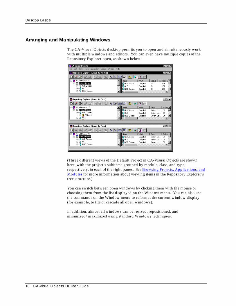
The CA-Visual Objects desktop permits you to open and simultaneously workwith multiple windows and editors. You can even have multiple copies of theRepository Explorer open, as shown below!
(Three different views of the Default Project in CA-Visual Objects are shownhere, with the project’s subitems grouped by module, class, and type,respectively, in each of the right panes. See Browsing Projects, Applications, andModules for more information about viewing items in the Repository Explorer’stree structure.)
You can switch between open windows by clicking them with the mouse orchoosing them from the list displayed on the Window menu. You can also usethe commands on the Window menu to reformat the current window display(for example, to tile or cascade all open windows).
In addition, almost all windows can be resized, repositioned, andminimized/maximized using standard Windows techniques.
Desktop Basics
Chapter 2: Working in the Desktop 19
The Toolbars
Almost every window and editor contains a customized toolbar that providesbuttons as shortcuts for commonly used menu commands. Most toolbars havethe same set of common buttons on the left, and buttons specific to the particulareditor or browser on the right.
For example, the toolbar in the Repository Explorer contains buttons for creatinga new application, importing an existing application, and setting defaultapplication options. Other toolbar buttons allow you to group items in theRepository Explorer tree by module, type, or class. The buttons in the MenuEditor toolbar, on the other hand, allow you to add predefined menusautomatically; cut, copy, paste, and insert menu items; promote and demoteitems in a menu’s hierarchy, and so on.
Tip: If you want to know what a toolbar button does, simply point to it—atooltip window with descriptive text pops up right next to it.
The Status Bars
In addition, the status bar of almost every window and editor displays helpful,informative text about various system features, giving you a quick summary orreminder about their contents or the actions that they perform.
For example, move the mouse over the entities displayed in the RepositoryExplorer to view the first line of each entity in the status bar; or highlight a menucommand to display a description of what it does in the status bar.
Saving, Building, and Executing
Note: CA-Visual Objects now provides version control for managingapplications with its new Source Code Control Interface. See the online help fordetailed information about this new feature.
At almost any time and location, you can save, build, and/or test the currentapplication, because in almost every browser and editor, toolbar buttons andmenu commands are provided for saving, building, and executing.
Saving Your Work
When you create a new entity, you should store it in the repository and then saveany additional edits on a frequent basis.
Desktop Basics
20 CA-Visual Objects IDE User Guide
To initially save a new entity in the repository, click the Save toolbar button inany editor.
To save any subsequent changes, just click the Save toolbar button again.
Building an Application
Note: See the online help for detailed information about the new Rebuild Allmenu command.
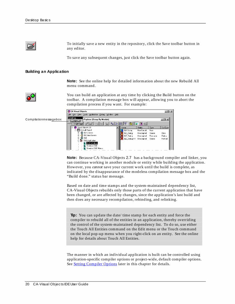
You can build an application at any time by clicking the Build button on thetoolbar. A compilation message box will appear, allowing you to abort thecompilation process if you want. For example:
Compilationmessagebox
Note: Because CA-Visual Objects 2.7 has a background compiler and linker, youcan continue working in another module or entity while building the application.However, you cannot save your current work until the build is complete, asindicated by the disappearance of the modeless compilation message box and the“Build done.” status bar message.
Based on date and time stamps and the system-maintained dependency list,CA-Visual Objects rebuilds only those parts of the current application that havebeen changed, or are affected by changes, since the application’s last build andthen does any necessary recompilation, rebinding, and relinking.
Tip: You can update the date/time stamp for each entity and force thecompiler to rebuild all of the entities in an application, thereby overridingthe control of the system-maintained dependency list. To do so, use eitherthe Touch All Entities command on the Edit menu or the Touch commandon the local pop-up menu when you right-click on an entity. See the onlinehelp for details about Touch All Entities.
The manner in which an individual application is built can be controlled usingapplication-specific compiler options or project-wide, default compiler options.See Setting Compiler Options later in this chapter for details.
The IDE Tools
Chapter 2: Working in the Desktop 21
Executing an Application
After building an application, the easiest way to execute it is to select the Executetoolbar button when the desired application is selected.
You can also execute an application by choosing the Command Line commandfrom the Tools menu. See the Command Line section later in this chapter fordetails.
The third option is to create an executable file that can be run independently ofthe IDE. This is discussed in detail next in Generating an EXE.
Generating an EXE
CA-Visual Objects allows you to generate quickly and easily a stand-aloneexecutable file (.EXE) for an application. This .EXE can then be runindependently of the IDE. Simply choose the Make EXE toolbar button or theApplication Make EXE menu command when the desired application is selected.
When creating an .EXE file, CA-Visual Objects also creates a folder and icon forthe Windows Start menu—you can use system-supplied defaults for these orcustomize them for each application. (See Creating a New Application in“Using the Repository Explorer” for details.)
If the selected application is a DLL, this toolbar button corresponds to theApplication Make DLL command, generating a .DLL and an .AEF file with thesame name. The .AEF file defines the public protocol, or interface, for the DLL.
The IDE ToolsCA-Visual Objects provides a host of tools for its integrated developmentenvironment. There are browsers, which let you organize and view the layout ofyour applications, and editors, which allow you to create windows, menus,source code, data servers, reports, and icons. Other tools include a compiler,debugger, UDC tester, and command-line utility.
In the IDE, all development tools are closely integrated with the repository. Forexample, double-clicking on an entity in a browser invokes the appropriateeditor for that entity: the Window Editor or Menu Editor for form or binarymenu entities, respectively; the Report Editor for report entities; and the SourceCode Editor for code (functions, classes, methods, and so on).
The IDE Tools
22 CA-Visual Objects IDE User Guide
Repository Explorer
The Repository Explorer allows you to view and manipulate the code that iscurrently stored in your repository in a convenient and organized way. InCA-Visual Objects, you can browse:
■ Projects
■ Applications, libraries, and DLLs
■ Modules
■ Entities
■ Classes
■ Errors
Tip: You can customize the Repository Explorer by specifying whatparticular items and subsets of information are displayed in itscollapsible/expandable tree structure. See Customizing the RepositoryExplorer in the “Using the Repository Explorer” chapter for detailedinformation.
Browsing Projects, Applications, and Modules
Projects represent the highest level in the CA-Visual Objects hierarchy: projectsconsist of applications, applications consist of modules, which in turn consist ofentities. The Repository Explorer follows this top-down hierarchy.
Group By Module When you start CA-Visual Objects, the Repository Explorer is automaticallyloaded, displaying all of the various projects, applications, libraries, DLLs, andmodules that currently exist.
Note: This default view is referred to as module view and is indicated by thedepressed Group By Module toolbar button.
Double-clicking on a project displays the applications, libraries, or DLLs definedfor it, while double-clicking on an application displays the modules defined forit. Similarly, double-clicking on a module displays the entities defined for thatmodule.
The IDE Tools
Chapter 2: Working in the Desktop 23
Browsing Entities
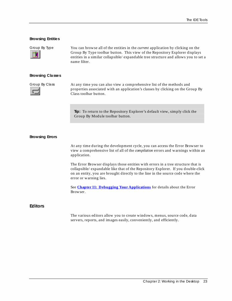
Group By Type You can browse all of the entities in the current application by clicking on theGroup By Type toolbar button. This view of the Repository Explorer displaysentities in a similar collapsible/expandable tree structure and allows you to set aname filter.
Browsing Classes
Group By Class At any time you can also view a comprehensive list of the methods andproperties associated with an application’s classes by clicking on the Group ByClass toolbar button.
Tip: To return to the Repository Explorer’s default view, simply click theGroup By Module toolbar button.
Browsing Errors
At any time during the development cycle, you can access the Error Browser toview a comprehensive list of all of the compilation errors and warnings within anapplication.
The Error Browser displays those entities with errors in a tree structure that iscollapsible/expandable like that of the Repository Explorer. If you double-clickon an entity, you are brought directly to the line in the source code where theerror or warning lies.
See Chapter 11: Debugging Your Applications for details about the ErrorBrowser.
Editors
The various editors allow you to create windows, menus, source code, dataservers, reports, and images easily, conveniently, and efficiently.
The IDE Tools
24 CA-Visual Objects IDE User Guide
Accessing the Editors
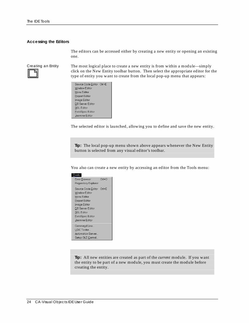
The editors can be accessed either by creating a new entity or opening an existingone.
Creating an Entity The most logical place to create a new entity is from within a module—simplyclick on the New Entity toolbar button. Then select the appropriate editor for thetype of entity you want to create from the local pop-up menu that appears:
The selected editor is launched, allowing you to define and save the new entity.
Tip: The local pop-up menu shown above appears whenever the New Entitybutton is selected from any visual editor’s toolbar.
You also can create a new entity by accessing an editor from the Tools menu:
Tip: All new entities are created as part of the current module. If you wantthe entity to be part of a new module, you must create the module beforecreating the entity.
The IDE Tools
Chapter 2: Working in the Desktop 25
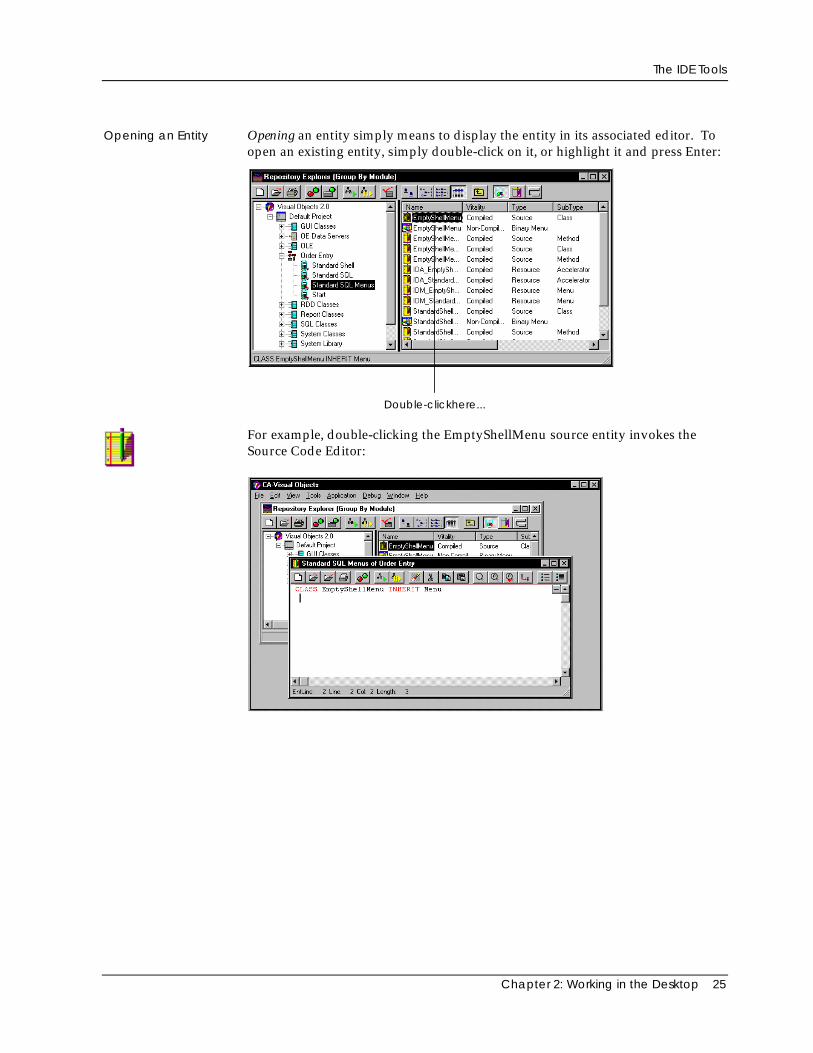
Opening an Entity Opening an entity simply means to display the entity in its associated editor. Toopen an existing entity, simply double-click on it, or highlight it and press Enter:
Double-clickhere...
For example, double-clicking the EmptyShellMenu source entity invokes theSource Code Editor:
The IDE Tools
26 CA-Visual Objects IDE User Guide
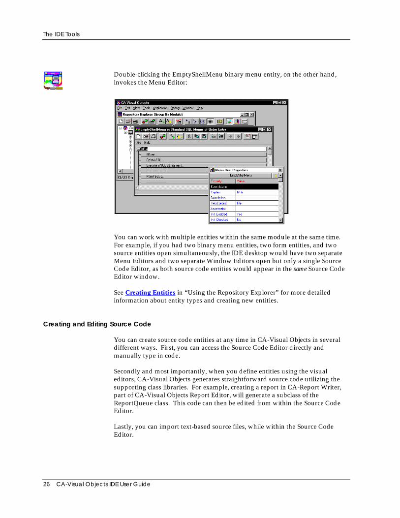
Double-clicking the EmptyShellMenu binary menu entity, on the other hand,invokes the Menu Editor:
You can work with multiple entities within the same module at the same time.For example, if you had two binary menu entities, two form entities, and twosource entities open simultaneously, the IDE desktop would have two separateMenu Editors and two separate Window Editors open but only a single SourceCode Editor, as both source code entities would appear in the same Source CodeEditor window.
See Creating Entities in “Using the Repository Explorer” for more detailedinformation about entity types and creating new entities.
Creating and Editing Source Code
You can create source code entities at any time in CA-Visual Objects in severaldifferent ways. First, you can access the Source Code Editor directly andmanually type in code.
Secondly and most importantly, when you define entities using the visualeditors, CA-Visual Objects generates straightforward source code utilizing thesupporting class libraries. For example, creating a report in CA-Report Writer,part of CA-Visual Objects Report Editor, will generate a subclass of theReportQueue class. This code can then be edited from within the Source CodeEditor.
Lastly, you can import text-based source files, while within the Source CodeEditor.
The IDE Tools
Chapter 2: Working in the Desktop 27
The Source Code Editor in all cases displays various information in the sourcecode, such as keywords, literals, and comments, in different colors of your choicefor your convenience while editing.
Refer to Chapter 6: Using the Source Code Editor for details about editing yourapplications’ source code.
The Visual Editors
Many of the editors are visual, that is, you can lay out various GUI controls—likepush buttons, check boxes, and scroll bars—on a window, design a report, andcreate a custom menu using point-and-click, drag-and-drop techniques. Visualfeedback is immediate when designing objects in the Menu Editor, WindowEditor, and Report Editor.
See the following chapters for more information about these editors: Chapter 5:Using the Menu Editor, Chapter 4: Using the Window Editor, Chapter 8:Creating Data-Aware Windows, and Chapter 9: Using the Report Editor.
The Data Server Editors
CA-Visual Objects provides a set of data server editors: the DB Server and SQLEditors.
DB Server andSQL Editors
The DB Server Editor allows you to create data servers based on the traditionalXbase model of a .DBF file, whereas data servers created with the SQL Editorare based on the SQL paradigm. Data servers are high-level objects used toprovide an object-oriented interface for a database whose structure is known atcompile-time. Information about the database, such as its file name and sortorder, is stored in the data server along with detailed field information stored inthe form of FieldSpec objects. You can create automatic layouts for data serversin the Window Editor that you can easily modify.
Note: With both editors, you can import an existing database structure andgenerate a default set of field specifications that you can optionally modify. Inaddition, the DB Server Editor allows you to design a data server “from scratch”and generate a database file (and index files) from the data server definition.
The IDE Tools
28 CA-Visual Objects IDE User Guide
The FieldSpec Editor
Although both data server editors have built-in mechanisms for defining fieldspecs, the FieldSpec Editor is independent of them and is used to set propertiesfor common field types that can be accessed by multiple data servers. Forexample, if you specify properties for a Salary field in the FieldSpec Editor, youcan simply reuse those properties when creating a Salary field in a new table.
See Chapter 7: Defining Data Servers and Field Specifications for moreinformation about these editors.
Creating and Editing Images
Using the Image Editor you can create custom icons, cursors, bitmaps, andribbons for your applications using a drag-and-drop interface that allows you towork with several images at the same time.
See Chapter 10: Using the Image Editor for more information.
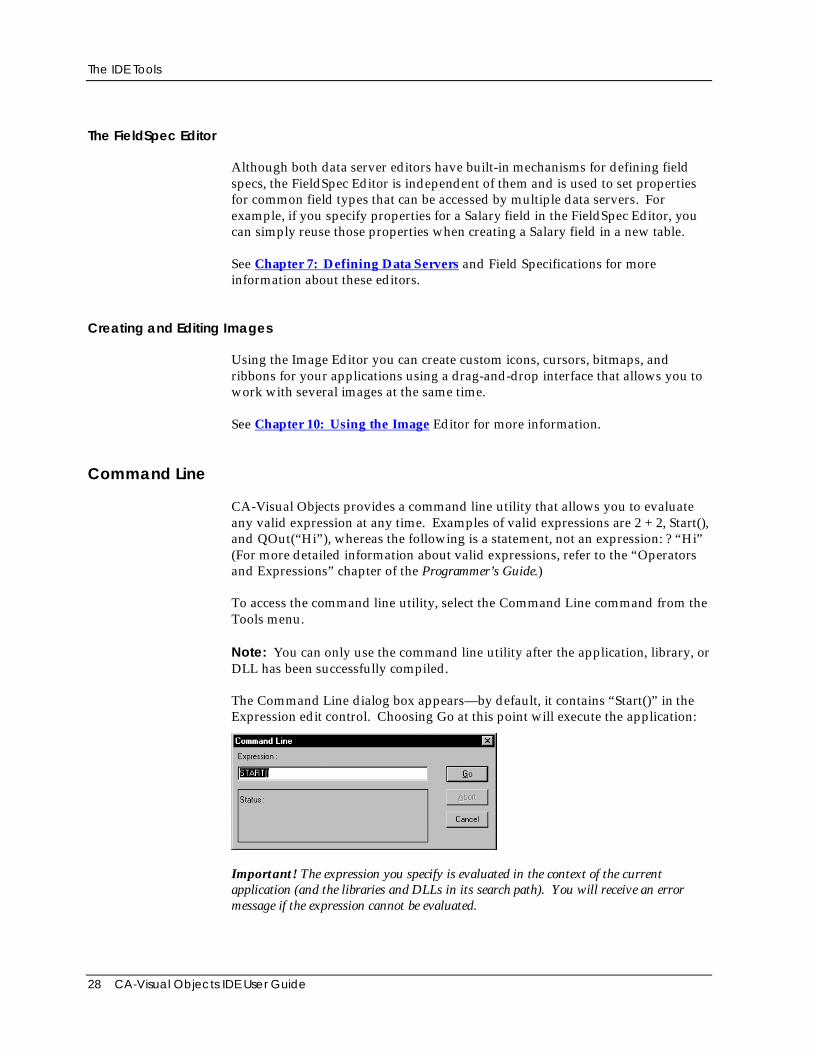
Command Line
CA-Visual Objects provides a command line utility that allows you to evaluateany valid expression at any time. Examples of valid expressions are 2 + 2, Start(),and QOut(“Hi”), whereas the following is a statement, not an expression: ? “Hi”(For more detailed information about valid expressions, refer to the “Operatorsand Expressions” chapter of the Programmer’s Guide.)
To access the command line utility, select the Command Line command from theTools menu.
Note: You can only use the command line utility after the application, library, orDLL has been successfully compiled.
The Command Line dialog box appears—by default, it contains “Start()” in theExpression edit control. Choosing Go at this point will execute the application:
Important! The expression you specify is evaluated in the context of the currentapplication (and the libraries and DLLs in its search path). You will receive an errormessage if the expression cannot be evaluated.
The IDE Tools
Chapter 2: Working in the Desktop 29
Refer to the Chapter 11: Debugging Your Applications chapter for moreinformation about evaluating expressions.
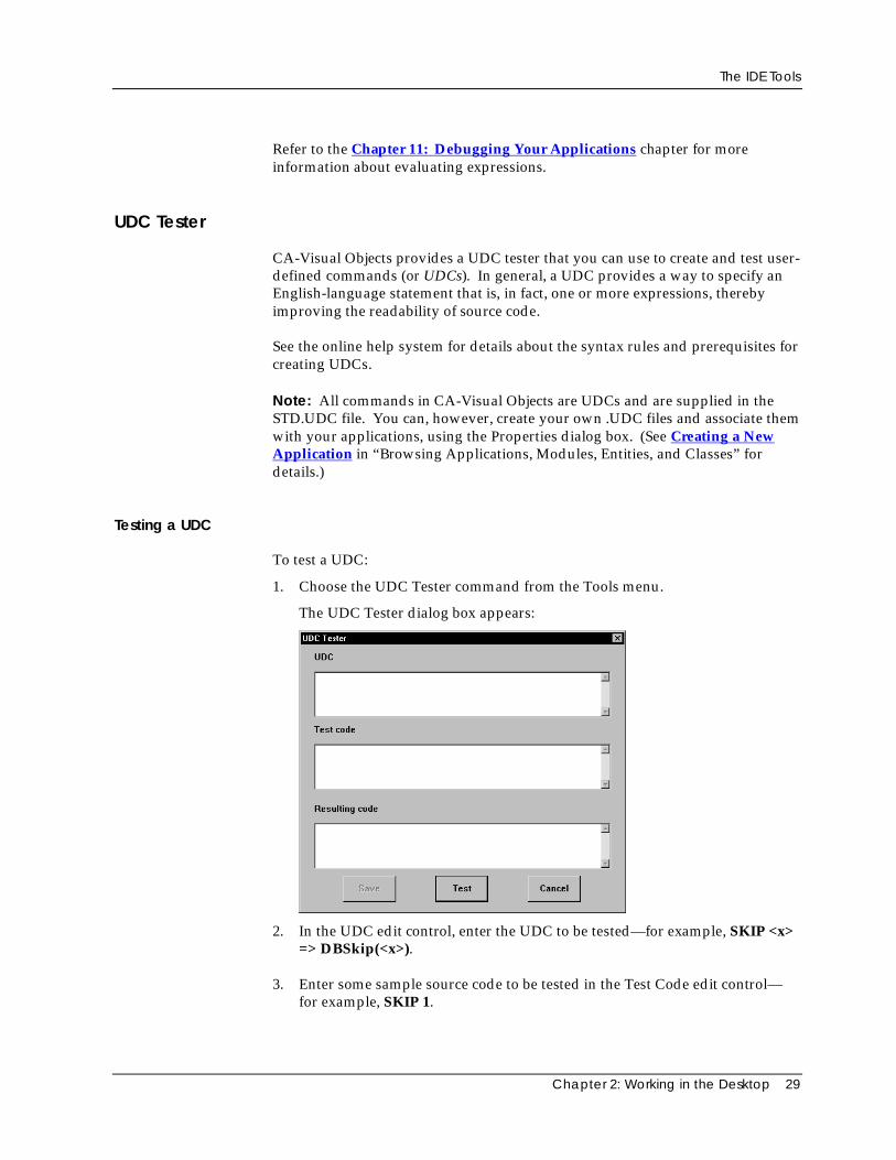
UDC Tester
CA-Visual Objects provides a UDC tester that you can use to create and test user-defined commands (or UDCs). In general, a UDC provides a way to specify anEnglish-language statement that is, in fact, one or more expressions, therebyimproving the readability of source code.
See the online help system for details about the syntax rules and prerequisites forcreating UDCs.
Note: All commands in CA-Visual Objects are UDCs and are supplied in theSTD.UDC file. You can, however, create your own .UDC files and associate themwith your applications, using the Properties dialog box. (See Creating a NewApplication in “Browsing Applications, Modules, Entities, and Classes” fordetails.)
Testing a UDC
To test a UDC:
1. Choose the UDC Tester command from the Tools menu.
The UDC Tester dialog box appears:
2. In the UDC edit control, enter the UDC to be tested—for example, SKIP <x>=> DBSkip(<x>).
3. Enter some sample source code to be tested in the Test Code edit control—for example, SKIP 1.
The IDE Tools
30 CA-Visual Objects IDE User Guide
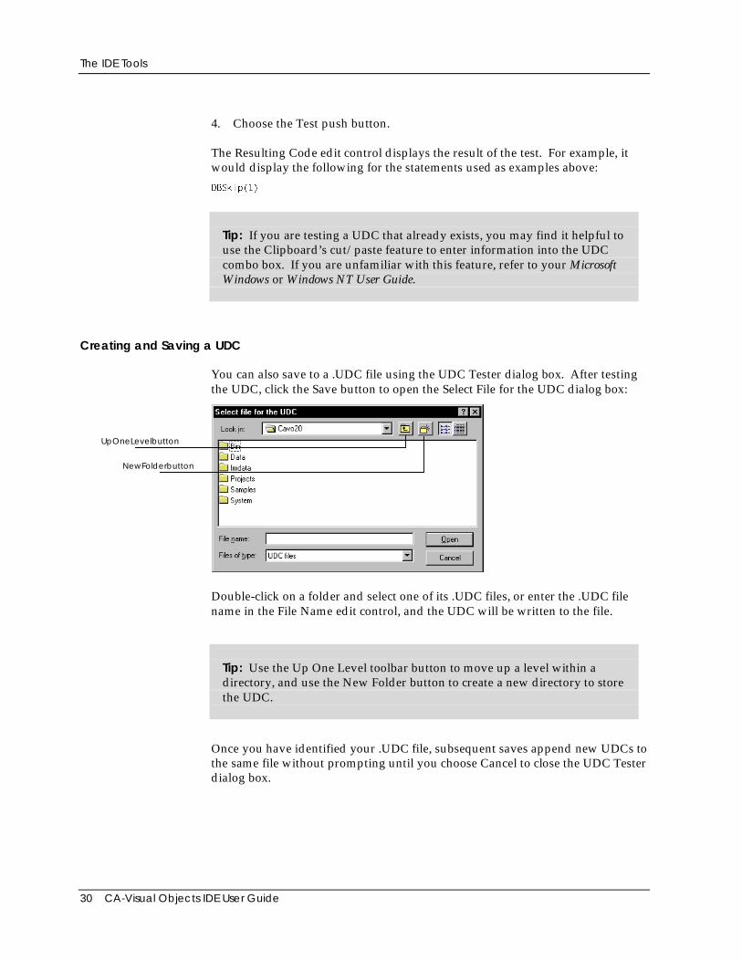
4. Choose the Test push button.
The Resulting Code edit control displays the result of the test. For example, itwould display the following for the statements used as examples above:
DBSkip(1)
Tip: If you are testing a UDC that already exists, you may find it helpful touse the Clipboard’s cut/paste feature to enter information into the UDCcombo box. If you are unfamiliar with this feature, refer to your MicrosoftWindows or Windows NT User Guide.
Creating and Saving a UDC
You can also save to a .UDC file using the UDC Tester dialog box. After testingthe UDC, click the Save button to open the Select File for the UDC dialog box:
UpOneLevelbutton
NewFolderbutton
Double-click on a folder and select one of its .UDC files, or enter the .UDC filename in the File Name edit control, and the UDC will be written to the file.
Tip: Use the Up One Level toolbar button to move up a level within adirectory, and use the New Folder button to create a new directory to storethe UDC.
Once you have identified your .UDC file, subsequent saves append new UDCs tothe same file without prompting until you choose Cancel to close the UDC Testerdialog box.
The IDE Tools
Chapter 2: Working in the Desktop 31
Debugger
Not only can you build and execute applications at the touch of a button, but youcan also debug them just as easily. To start the CA-Visual Objects Debugger,select the Debug toolbar button from within the Repository Explorer or the TraceExpression toolbar button in any of the editors. Naturally, you can also accessthe Debugger using the Debug Run menu command.
Note: For detailed information about the Debugger’s , such asAutoStart debugging and DLL debugging,see the online help.
The Debugger allows you to:
■ Set debugging options at the application, module, and entity levels
■ Use one of several execution modes to control the execution of yourapplication while viewing the source code in the Debug source code window
■ Evaluate and trace expressions
■ Set, reset, and clear breakpoints
■ View and modify variables
■ Create watch expressions
■ View the call stack
■ View database, index, and other work area information in a separatewindow and modify database field values
■ View and modify system settings
To utilize debugging in your application, the Enable Debug option must bechecked in the Properties dialog box. You can also control debugging at themodule and entity level by highlighting the module or entity and then pressingthe right mouse button. This opens a local pop-up menu with debugging optionsthat you can select.
See Chapter 11: Debugging Your Applications for complete information aboutthe Debugger.
Reindexing the Repository
If you receive a message about index corruption while working in the IDE, youshould completely rebuild and synchronize your index files by reindexing therepository. To do so, highlight the project and then select the Reindex Projectcommand from the Repository Explorer’s File menu.
The IDE Tools
32 CA-Visual Objects IDE User Guide
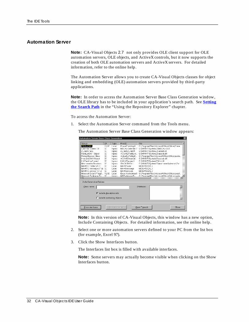
Automation Server
Note: CA-Visual Objects 2.7 not only provides OLE client support for OLEautomation servers, OLE objects, and ActiveX controls, but it now supports thecreation of both OLE automation servers and ActiveX servers. For detailedinformation, refer to the online help.
The Automation Server allows you to create CA-Visual Objects classes for objectlinking and embedding (OLE) automation servers provided by third-partyapplications.
Note: In order to access the Automation Server Base Class Generation window,the OLE library has to be included in your application’s search path. See Settingthe Search Path in the “Using the Repository Explorer” chapter.
To access the Automation Server:
1. Select the Automation Server command from the Tools menu.
The Automation Server Base Class Generation window appears:
Note: In this version of CA-Visual Objects, this window has a new option,Include Containing Objects. For detailed information, see the online help.
2. Select one or more automation servers defined to your PC from the list box(for example, Excel 97).
3. Click the Show Interfaces button.
The Interfaces list box is filled with available interfaces.
Note: Some servers may actually become visible when clicking on the ShowInterfaces button.
The IDE Tools
Chapter 2: Working in the Desktop 33
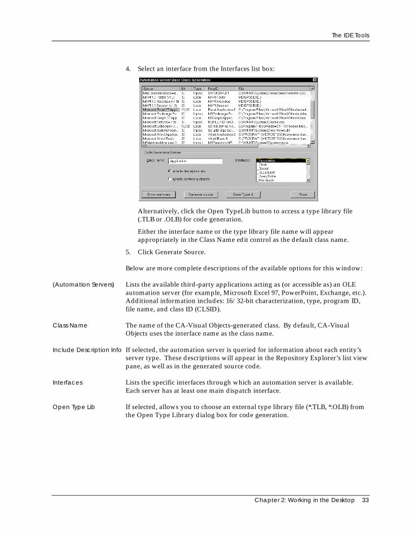
4. Select an interface from the Interfaces list box:
Alternatively, click the Open TypeLib button to access a type library file(.TLB or .OLB) for code generation.
Either the interface name or the type library file name will appearappropriately in the Class Name edit control as the default class name.
5. Click Generate Source.
Below are more complete descriptions of the available options for this window:
(Automation Servers) Lists the available third-party applications acting as (or accessible as) an OLEautomation server (for example, Microsoft Excel 97, PowerPoint, Exchange, etc.).Additional information includes: 16/32-bit characterization, type, program ID,file name, and class ID (CLSID).
Class Name The name of the CA-Visual Objects-generated class. By default, CA-VisualObjects uses the interface name as the class name.
Include Description Info If selected, the automation server is queried for information about each entity’sserver type. These descriptions will appear in the Repository Explorer’s list viewpane, as well as in the generated source code.
Interfaces Lists the specific interfaces through which an automation server is available.Each server has at least one main dispatch interface.
Open Type Lib If selected, allows you to choose an external type library file (*.TLB, *.OLB) fromthe Open Type Library dialog box for code generation.
Setting System-Wide Options
34 CA-Visual Objects IDE User Guide
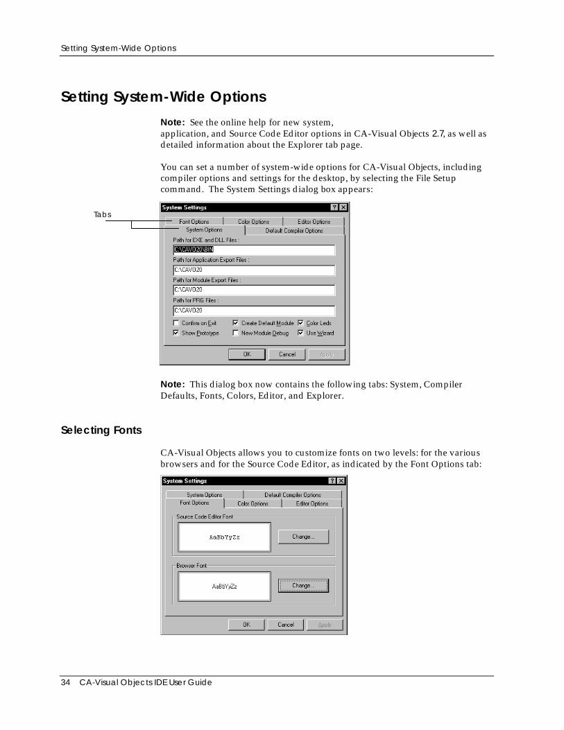
Setting System-Wide Options
Note: See the online help for new system,application, and Source Code Editor options in CA-Visual Objects 2.7, as well asdetailed information about the Explorer tab page.
You can set a number of system-wide options for CA-Visual Objects, includingcompiler options and settings for the desktop, by selecting the File Setupcommand. The System Settings dialog box appears:
Tabs
Note: This dialog box now contains the following tabs: System, CompilerDefaults, Fonts, Colors, Editor, and Explorer.
Selecting Fonts
CA-Visual Objects allows you to customize fonts on two levels: for the variousbrowsers and for the Source Code Editor, as indicated by the Font Options tab:
Setting System-Wide Options
Chapter 2: Working in the Desktop 35
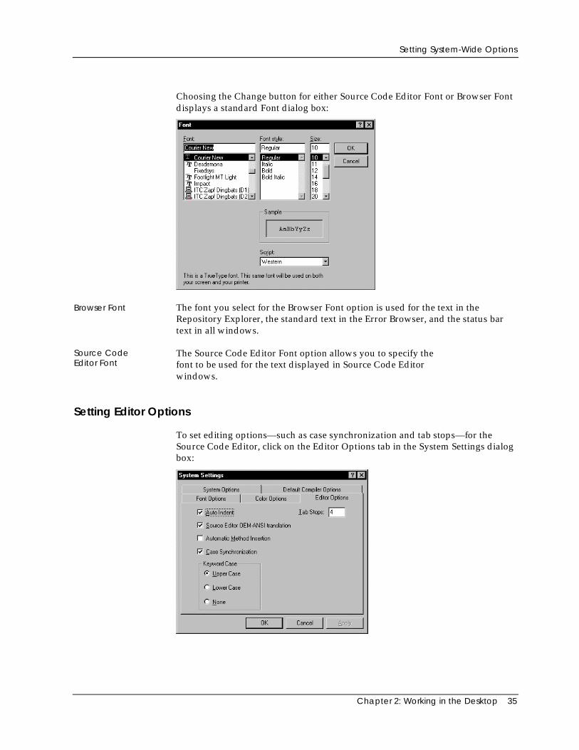
Choosing the Change button for either Source Code Editor Font or Browser Fontdisplays a standard Font dialog box:
Browser Font The font you select for the Browser Font option is used for the text in theRepository Explorer, the standard text in the Error Browser, and the status bartext in all windows.
Source CodeEditor Font
The Source Code Editor Font option allows you to specify thefont to be used for the text displayed in Source Code Editorwindows.
Setting Editor Options
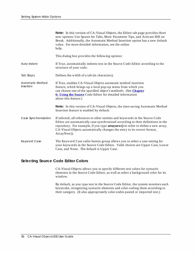
To set editing options—such as case synchronization and tab stops—for theSource Code Editor, click on the Editor Options tab in the System Settings dialogbox:
Setting System-Wide Options
36 CA-Visual Objects IDE User Guide
Note: In this version of CA-Visual Objects, the Editor tab page provides threenew options: Use Spaces for Tabs, Show Parameter Tips, and Activate IDE onBreak. Additionally, the Automatic Method Insertion option has a new defaultvalue. For more detailed information, see the onlinehelp.
This dialog box provides the following options:
Auto Indent If True, automatically indents text in the Source Code Editor according to thestructure of your code.
Tab Stops Defines the width of a tab (in characters).
Automatic MethodInsertion
If True, enables CA-Visual Objects automatic method insertionfeature, which brings up a local pop-up menu from which youcan choose one of the specified object’s methods. (See Chapter6: Using the Source Code Editor for detailed informationabout this feature.)
Note: In this version of CA-Visual Objects, the time-saving Automatic MethodInsertion feature is enabled by default.
Case Synchronization If selected, all references to other entities and keywords in the Source CodeEditor are automatically case-synchronized according to their definitions in therepository. For example, if you type arraynew() in order to define a new array,CA-Visual Objects automatically changes the entry to its correct format,ArrayNew().
Keyword Case The Keyword Case radio button group allows you to select a case setting foryour keywords in the Source Code Editor. Valid choices are Upper Case, LowerCase, and None. The default is Upper Case.
Selecting Source Code Editor Colors
CA-Visual Objects allows you to specify different text colors for syntacticelements in the Source Code Editor, as well as select a background color for itswindow.
By default, as you type text in the Source Code Editor, the system monitors eachkeystroke, recognizing syntactic elements and color-coding them according totheir category. (It also appropriately color-codes pasted or imported text.)
Setting System-Wide Options
Chapter 2: Working in the Desktop 37
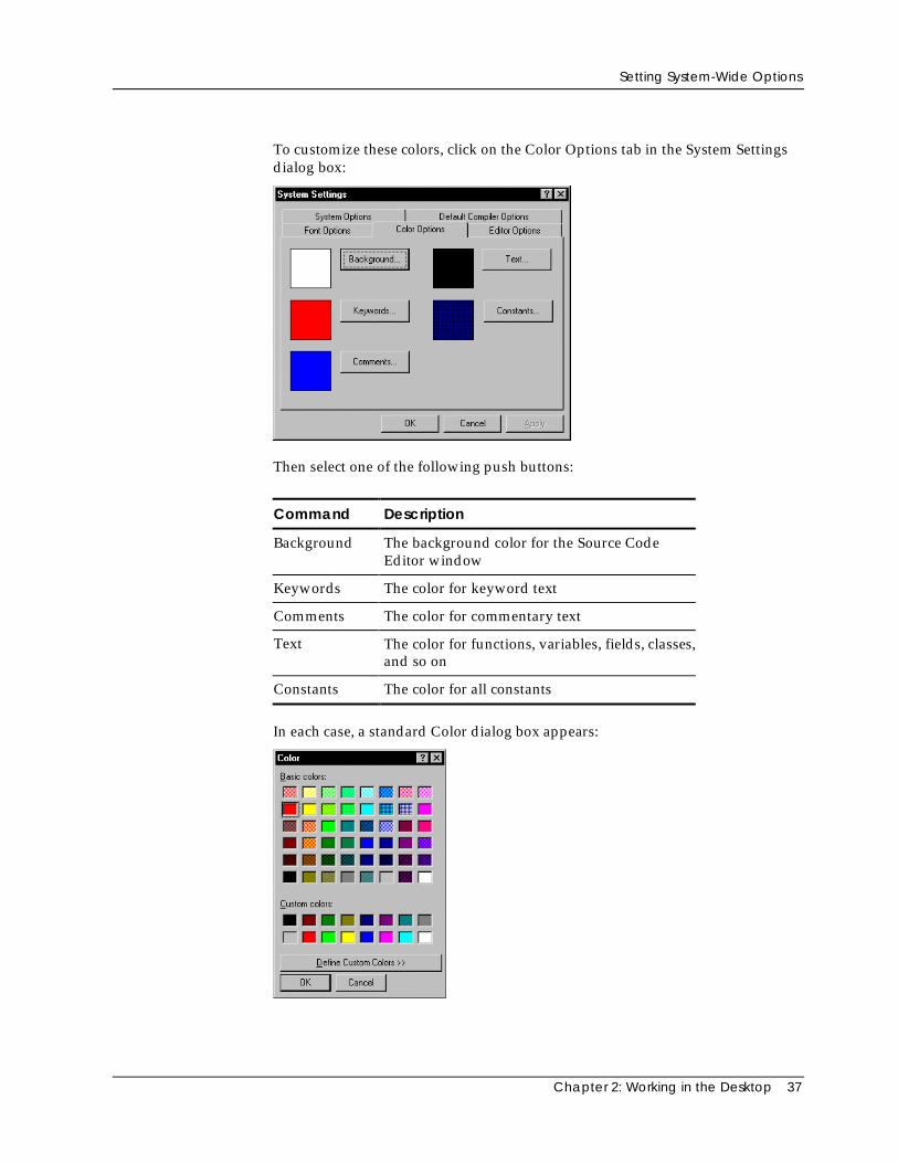
To customize these colors, click on the Color Options tab in the System Settingsdialog box:
Then select one of the following push buttons:
Command Description
Background The background color for the Source CodeEditor window
Keywords The color for keyword text
Comments The color for commentary text
Text The color for functions, variables, fields, classes,and so on
Constants The color for all constants
In each case, a standard Color dialog box appears:
Setting System-Wide Options
38 CA-Visual Objects IDE User Guide
Setting Compiler Options
CA-Visual Objects provides a set of default compiler options, which can bechanged on a project-wide basis, thereby affecting all new applications within aproject from that point forward, or changed at the application-level, affectingonly the current application.
Default CompilerSettings
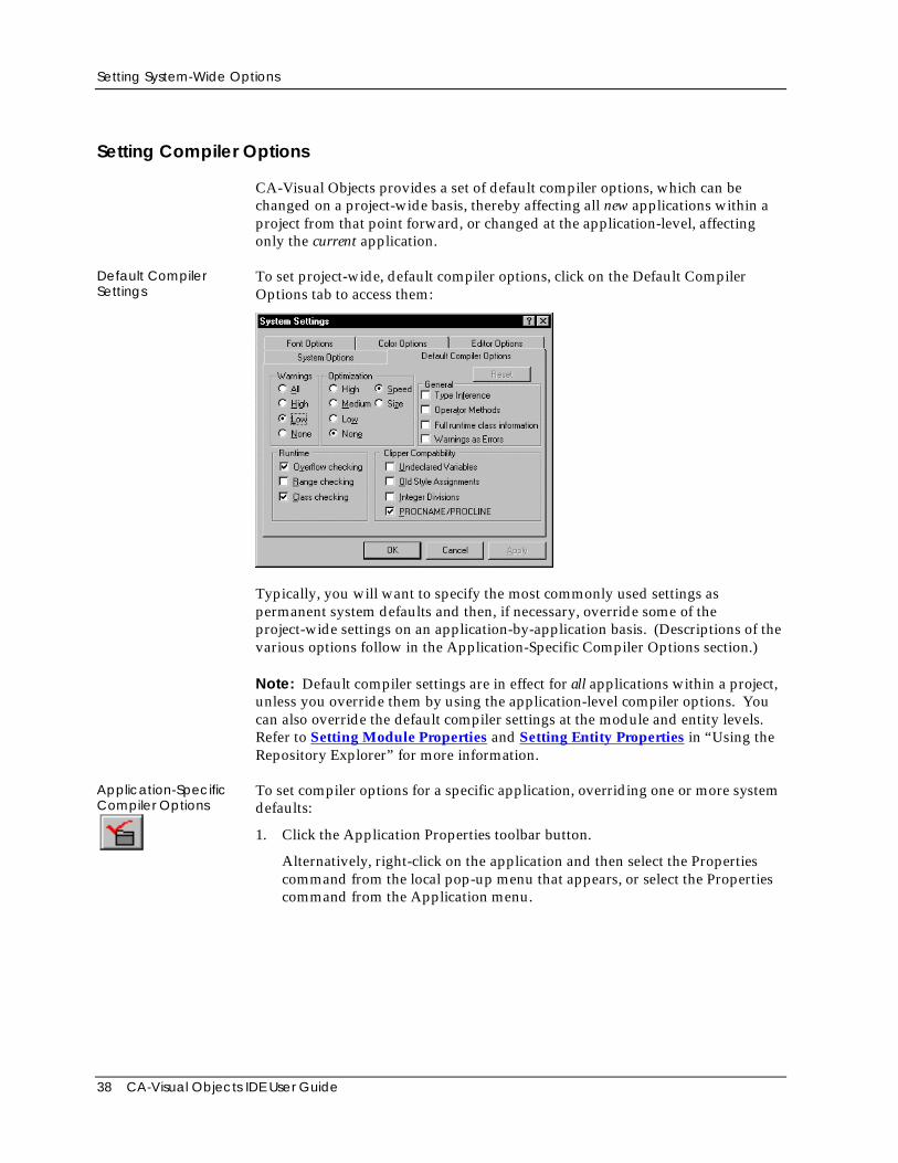
To set project-wide, default compiler options, click on the Default CompilerOptions tab to access them:
Typically, you will want to specify the most commonly used settings aspermanent system defaults and then, if necessary, override some of theproject-wide settings on an application-by-application basis. (Descriptions of thevarious options follow in the Application-Specific Compiler Options section.)
Note: Default compiler settings are in effect for all applications within a project,unless you override them by using the application-level compiler options. Youcan also override the default compiler settings at the module and entity levels.Refer to Setting Module Properties and Setting Entity Properties in “Using theRepository Explorer” for more information.
Application-SpecificCompiler Options
To set compiler options for a specific application, overriding one or more systemdefaults:
1. Click the Application Properties toolbar button.
Alternatively, right-click on the application and then select the Propertiescommand from the local pop-up menu that appears, or select the Propertiescommand from the Application menu.
Setting System-Wide Options
Chapter 2: Working in the Desktop 39
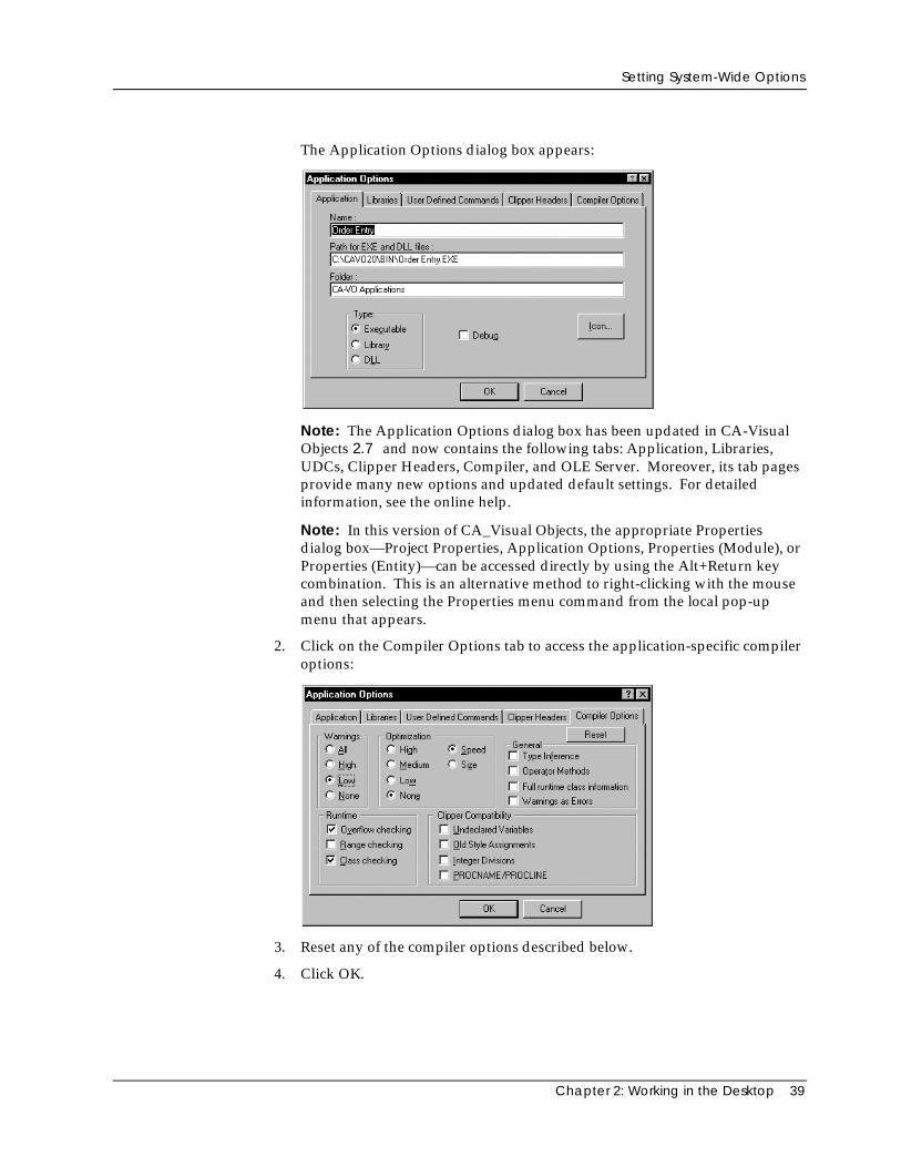
The Application Options dialog box appears:
Note: The Application Options dialog box has been updated in CA-VisualObjects 2.7 and now contains the following tabs: Application, Libraries,UDCs, Clipper Headers, Compiler, and OLE Server. Moreover, its tab pagesprovide many new options and updated default settings. For detailedinformation, see the online help.
Note: In this version of CA_Visual Objects, the appropriate Propertiesdialog box—Project Properties, Application Options, Properties (Module), orProperties (Entity)—can be accessed directly by using the Alt+Return keycombination. This is an alternative method to right-clicking with the mouseand then selecting the Properties menu command from the local pop-upmenu that appears.
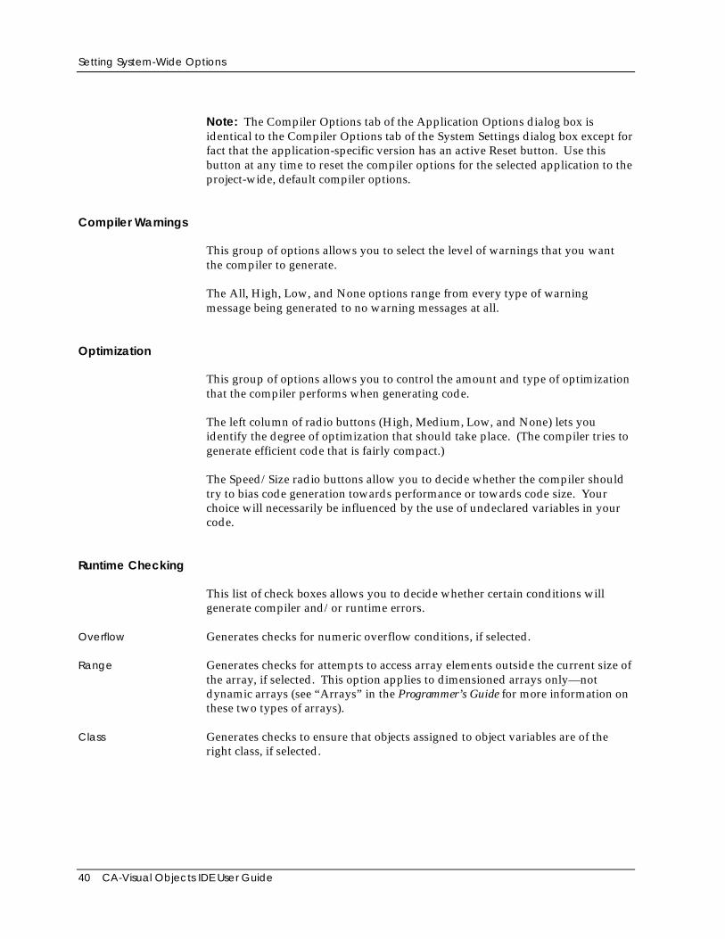
2. Click on the Compiler Options tab to access the application-specific compileroptions:
3. Reset any of the compiler options described below.
4. Click OK.
Setting System-Wide Options
40 CA-Visual Objects IDE User Guide
Note: The Compiler Options tab of the Application Options dialog box isidentical to the Compiler Options tab of the System Settings dialog box except forfact that the application-specific version has an active Reset button. Use thisbutton at any time to reset the compiler options for the selected application to theproject-wide, default compiler options.
Compiler Warnings
This group of options allows you to select the level of warnings that you wantthe compiler to generate.
The All, High, Low, and None options range from every type of warningmessage being generated to no warning messages at all.
Optimization
This group of options allows you to control the amount and type of optimizationthat the compiler performs when generating code.
The left column of radio buttons (High, Medium, Low, and None) lets youidentify the degree of optimization that should take place. (The compiler tries togenerate efficient code that is fairly compact.)
The Speed/Size radio buttons allow you to decide whether the compiler shouldtry to bias code generation towards performance or towards code size. Yourchoice will necessarily be influenced by the use of undeclared variables in yourcode.
Runtime Checking
This list of check boxes allows you to decide whether certain conditions willgenerate compiler and/or runtime errors.
Overflow Generates checks for numeric overflow conditions, if selected.
Range Generates checks for attempts to access array elements outside the current size ofthe array, if selected. This option applies to dimensioned arrays only—notdynamic arrays (see “Arrays” in the Programmer’s Guide for more information onthese two types of arrays).
Class Generates checks to ensure that objects assigned to object variables are of theright class, if selected.
Setting System-Wide Options
Chapter 2: Working in the Desktop 41
Note that whether error messages are displayed at compile time or runtime candepend on the code. For example, if you have selected Range Checking, thefollowing code generates a compiler error:
LOCAL DIM x[1]x[2]:= 5
However, this code results in a runtime error since it is only at runtime that thecompiler checks to see that the value of i is within the bounds of the array:
LOCAL DIM x[1]i := 2x[i] := 5
CA-Clipper Compatibility
This group of check boxes allows you to specify what level of CA-Clippercompatibility the compiler should allow.
Undeclared Variables Allows the use of CA-Clipper-style variables without declaring them first. If thisbox is not checked, any reference to an undeclared variable is flagged as acompiler error.
Old Style Assignments Allows you to have the equal sign (=) as an assignment operator. If this box isnot checked, any use of “=” is considered the equality comparison operator.
For a list of valid assignment operators, see the “Operators and Expressions”chapter of the Programmer’s Guide.
Integer Divisions Permits the division of two integers to yield a floating point result. If this box isnot checked, the division of two integers will always be an integer, and theremainder will be discarded.
PROCNAME/PROCLINE Enables runtime support of ProcName() and ProcLine() function calls. If the boxis not checked, these function calls will be compiled but will not run.
Note: Selecting the Debug option in the Properties dialog box causes theapplication to behave as if the PROCNAME/PROCLINE option is selected, evenif it is not.
Important! You must set this option if you wish to use the error messages displayed bythe runtime system to lead you to bugs in your code.
General Options
This group of check boxes controls additional compiler options.
Setting System-Wide Options
42 CA-Visual Objects IDE User Guide
Type Inference If checked, enables the compiler to infer the data type of undeclared variables bylooking at their usage; the compiler attempts to determine the data type of avariable and generate more efficient code for it, if possible.
Operator Methods If checked, the compiler will convert certain operations to method invocations.For details, refer to the “Objects, Classes, and Methods” chapter in theProgrammer’s Guide.
Full Runtime ClassInformation
If checked, includes symbolic runtime information in theexecutable for the PROTECT and HIDDEN instance variables,allowing functional access to these instance variables using theIVarGet() and IVarPut() functions.
Warning as Errors If checked, treats warnings as errors—that is, an entity is not considered to besuccessfully compiled if a warning has occurred.
Setting System Options
Note: As mentioned earlier, the System Settings dialog box has been updated inCA-Visual Objects 2.7, providing new system, application, and Source CodeEditor options. The System tab page, for example, now offers a new systemoption, Debug AutoStart. Another option, Use Wizard, has a new value, and stillanother, Show Prototype, has been moved to the new Explorer tab page. Formore detailed information, see the online help.
CA-Visual Objects provides a set of default system options, such as definingdefault paths and creating default modules. You can also select or deselect othersystem options, such as debugging new modules and showing prototypes.
To set or override the default system options, select the System Options tab in theSystem Settings dialog box:
Setting System-Wide Options
Chapter 2: Working in the Desktop 43
Default Path Options
Path for EXE andDLL Files
Contains the default directory in which to place generated .EXEand .DLL files.
Path for ApplicationExport Files
Contains the default directory in which to place generated .AEFfiles.
Path for ModuleExport Files
Contains the default directory in which to place generated.MEF files.
Path for PRG Files Contains the default directory in which to look for .PRG fileswhen importing and exporting within the Source Code Editor.This setting also determines where the compiler searches foricon (.ICO) files declared with the RESOURCE ICONstatement.
Miscellaneous System Options
Confirm on Exit By default, the Confirm on Exit feature is not enabled. Select this option if youwant a verification dialog box to display when you exit CA-Visual Objects.
Show Prototype By default, CA-Visual Objects displays prototypes for entities (like classes,methods, and functions) in the status bar. You can suppress this display bydeselecting this option.
Create Default Module By default, CA-Visual Objects creates and loads an empty default moduleautomatically every time you create a new application. You can override thisoption by deselecting it.
New Module Debug By default, the system does not turn debugging on for all new modules. Selectthis option if you do want the system to automatically debug any new modules.
Color LEDs By default, CA-Visual Objects displays LED-style indicators for the compilationstatus of entities, modules, and applications in the Error Browser. You canoverride this option by deselecting it; compilation status will then be indicatedappropriately by a character. The following table describes the status for eachindicator in the Error Browser:
Indicator Status
Red LED or “X” Entity contains compilation errors.
Yellow LED or “?” Warning messages were generated duringcompilation.
Use Wizard If selected, this option takes advantage of CA-Visual Objects wizard technologyfor creating applications.
Setting System-Wide Options
44 CA-Visual Objects IDE User Guide
Note: One of the more noticeable changes in CA-Visual Objects 2.7 is that theApplication Wizard has been replaced by the new Application Gallery as thepreferred method for creating applications. Therefore, the Use Wizard option isnow disabled by default. For detailed information about the Application Galleryfeature and the many new predefined application frameworks that it offers, seethe online help.
Saving the Current Desktop
The Save Desktop command on the File menu allows you to save the currentconfiguration of all open browsers and editors. The next time you start CA-VisualObjects, all browsers in the current configuration will be opened and arranged asthey were when you selected the Save Desktop command.
Chapter 3: Using the Repository Explorer 45
Chapter
3 Using the Repository Explorer
This chapter explains how to use CA-Visual Objects Repository Explorer. Youwill learn how to:
■ Navigate within the Repository Explorer
■ Customize the Repository Explorer
■ Create, view, and modify projects, applications, modules, and entities
The Repository ExplorerTop-Down Hierarchy In CA-Visual Objects, projects consist of applications, applications consist of
modules, and modules consist of entities. As explained earlier, the RepositoryExplorer tree structure follows this same top-down hierarchy. When you startCA-Visual Objects, the Repository Explorer is automatically loaded.
Clicking on a project in the Repository Explorer’s tree view pane displays theapplications defined for it, while clicking on an application displays the modulesdefined for that application. Similarly, clicking on a module displays the entitiesdefined for that module in the Repository Explorer’s list view pane.
Lastly, you can control the overall display by using the Group By Module, GroupBy Type, and Group By Class toolbar buttons. Note that you can customize theRepository Explorer’s list view pane by using the Large Icons, Small Icons, List,and Details toolbar buttons. You can also use the View Options menu commandto limit the display by name and type. (See Customizing the Repository Explorerfor details.)
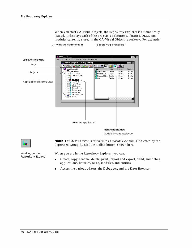
The Repository Explorer
46 CA-Product User Guide
When you start CA-Visual Objects, the Repository Explorer is automaticallyloaded. It displays each of the projects, applications, libraries, DLLs, andmodules currently stored in the CA-Visual Objects repository. For example:
CA-VisualObjectsmenubar
Selectedapplication
Root
Project
Applications,libraries,DLLs
RepositoryExplorertoolbar
LeftPane:TreeView
RightPane:ListView
Modulesincurrentselection
Note: This default view is referred to as module view and is indicated by thedepressed Group By Module toolbar button, shown here.
Working in theRepository Explorer
When you are in the Repository Explorer, you can:
■ Create, copy, rename, delete, print, import and export, build, and debugapplications, libraries, DLLs, modules, and entities
■ Access the various editors, the Debugger, and the Error Browser
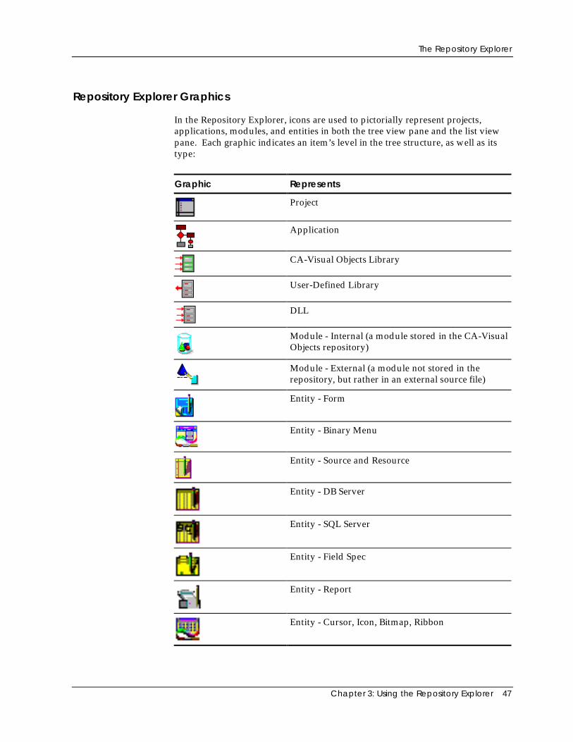
The Repository Explorer
Chapter 3: Using the Repository Explorer 47
Repository Explorer Graphics
In the Repository Explorer, icons are used to pictorially represent projects,applications, modules, and entities in both the tree view pane and the list viewpane. Each graphic indicates an item’s level in the tree structure, as well as itstype:
Graphic Represents
Project
Application
CA-Visual Objects Library
User-Defined Library
DLL
Module - Internal (a module stored in the CA-VisualObjects repository)
Module - External (a module not stored in therepository, but rather in an external source file)
Entity - Form
Entity - Binary Menu
Entity - Source and Resource
Entity - DB Server
Entity - SQL Server
Entity - Field Spec
Entity - Report
Entity - Cursor, Icon, Bitmap, Ribbon
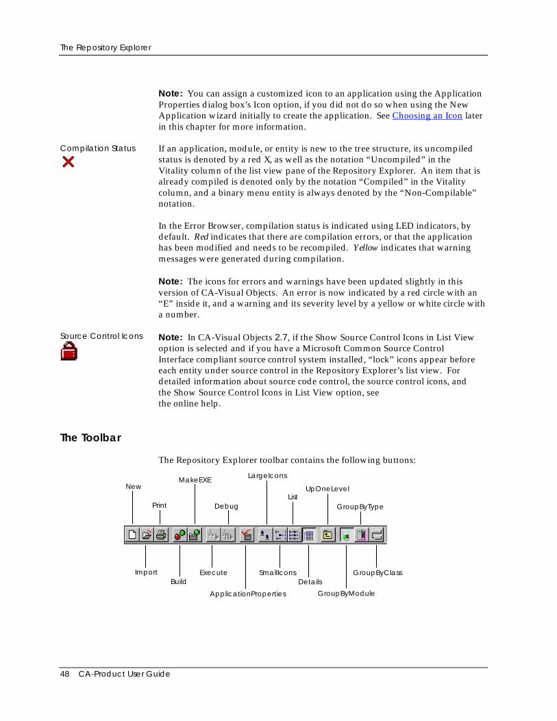
The Repository Explorer
48 CA-Product User Guide
Note: You can assign a customized icon to an application using the ApplicationProperties dialog box’s Icon option, if you did not do so when using the NewApplication wizard initially to create the application. See Choosing an Icon laterin this chapter for more information.
Compilation Status If an application, module, or entity is new to the tree structure, its uncompiledstatus is denoted by a red X, as well as the notation “Uncompiled” in theVitality column of the list view pane of the Repository Explorer. An item that isalready compiled is denoted only by the notation “Compiled” in the Vitalitycolumn, and a binary menu entity is always denoted by the “Non-Compilable”notation.
In the Error Browser, compilation status is indicated using LED indicators, bydefault. Red indicates that there are compilation errors, or that the applicationhas been modified and needs to be recompiled. Yellow indicates that warningmessages were generated during compilation.
Note: The icons for errors and warnings have been updated slightly in thisversion of CA-Visual Objects. An error is now indicated by a red circle with an“E” inside it, and a warning and its severity level by a yellow or white circle witha number.
Source Control Icons Note: In CA-Visual Objects 2.7, if the Show Source Control Icons in List Viewoption is selected and if you have a Microsoft Common Source ControlInterface compliant source control system installed, “lock” icons appear beforeeach entity under source control in the Repository Explorer’s list view. Fordetailed information about source code control, the source control icons, andthe Show Source Control Icons in List View option, seethe online help.
The Toolbar
The Repository Explorer toolbar contains the following buttons:
New
Import
Build
MakeEXE
Execute
Debug
ApplicationProperties
LargeIcons
SmallIconsDetails
UpOneLevel
GroupByType
GroupByModule
GroupByClass
List
Navigating Basics
Chapter 3: Using the Repository Explorer 49
The New, Import, Print, Application Properties, Large Icons, Small Icons, List,Details, Up One Level, Group By Module, Group By Type, and Group By Classbuttons are described later in this chapter. See Chapter 2: Working in theDesktop for information about Build, Make EXE, and Execute. See Chapter 11:Debugging Your Applications for information about Debug.
Tip: For a quick description of any toolbar button, simply point to it—atooltip window with descriptive text pops up right next to the button.
Note: Some of the Repository Explorer’s commands are also available on localpop-up menus. Others, such as Rename, List, and Edit All Source in Module, areavailable only via the local pop-up menus.
Navigating BasicsNavigation within the Repository Explorer is flexible and easy!
Up One Level You can use the Up One Level toolbar button at any time to move up a level inthe Repository Explorer’s hierarchy and display that level’s items. (Note thatthis button is also available in many dialog boxes as an aid in locating files,directories, and drives.)
Scrolling You can use the scroll bars and/or the Direction keys to scroll through the listsof items displayed in both the left (Tree View) and right (List View) panes of theRepository Explorer.
Moving from Paneto Pane
You can move from pane to pane by clicking the desired side with the mouse.
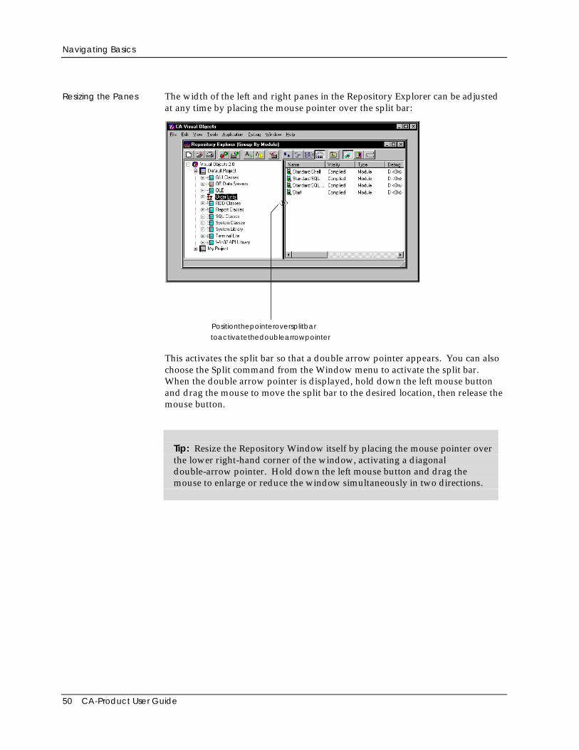
Navigating Basics
50 CA-Product User Guide
Resizing the Panes The width of the left and right panes in the Repository Explorer can be adjustedat any time by placing the mouse pointer over the split bar:
Positionthepointeroversplitbar
toactivatethedoublearrowpointer
This activates the split bar so that a double arrow pointer appears. You can alsochoose the Split command from the Window menu to activate the split bar.When the double arrow pointer is displayed, hold down the left mouse buttonand drag the mouse to move the split bar to the desired location, then release themouse button.
Tip: Resize the Repository Window itself by placing the mouse pointer overthe lower right-hand corner of the window, activating a diagonaldouble-arrow pointer. Hold down the left mouse button and drag themouse to enlarge or reduce the window simultaneously in two directions.
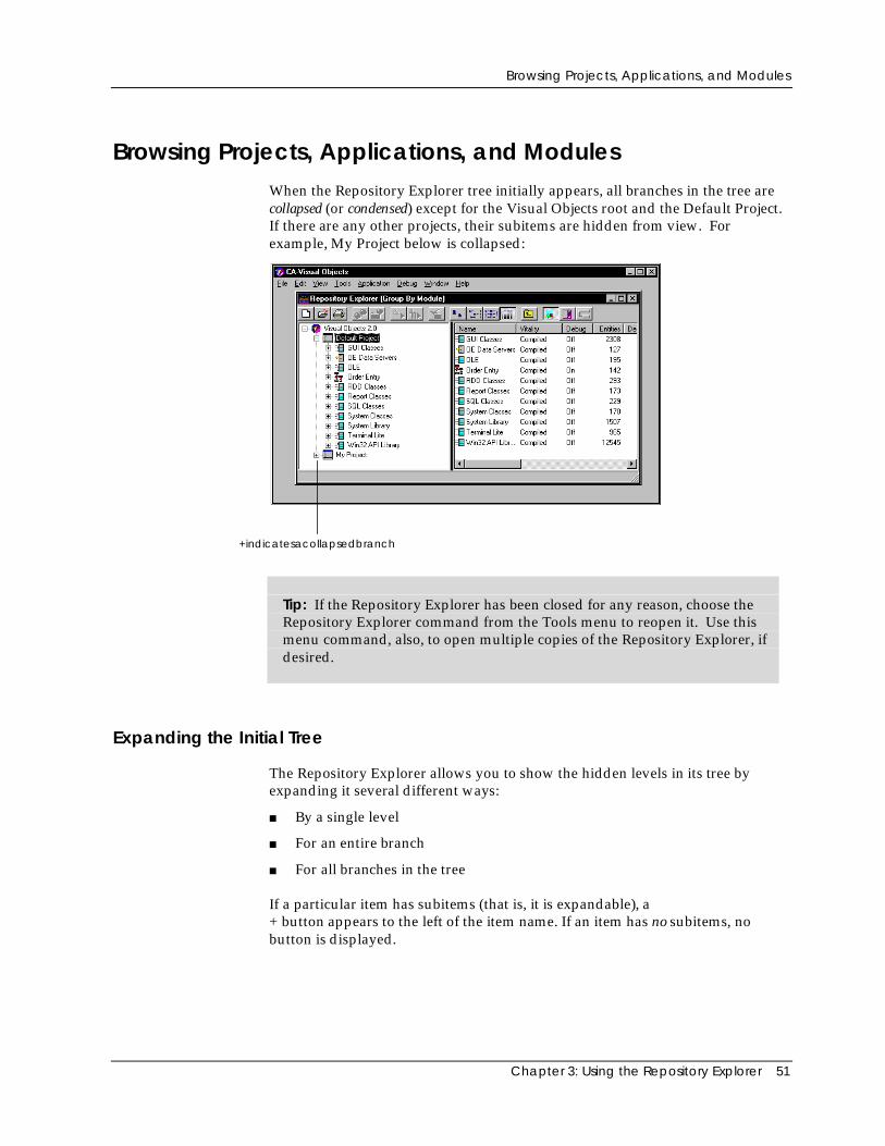
Browsing Projects, Applications, and Modules
Chapter 3: Using the Repository Explorer 51
Browsing Projects, Applications, and ModulesWhen the Repository Explorer tree initially appears, all branches in the tree arecollapsed (or condensed) except for the Visual Objects root and the Default Project.If there are any other projects, their subitems are hidden from view. Forexample, My Project below is collapsed:
+indicatesacollapsedbranch
Tip: If the Repository Explorer has been closed for any reason, choose theRepository Explorer command from the Tools menu to reopen it. Use thismenu command, also, to open multiple copies of the Repository Explorer, ifdesired.
Expanding the Initial Tree
The Repository Explorer allows you to show the hidden levels in its tree byexpanding it several different ways:
■ By a single level
■ For an entire branch
■ For all branches in the tree
If a particular item has subitems (that is, it is expandable), a+ button appears to the left of the item name. If an item has no subitems, nobutton is displayed.
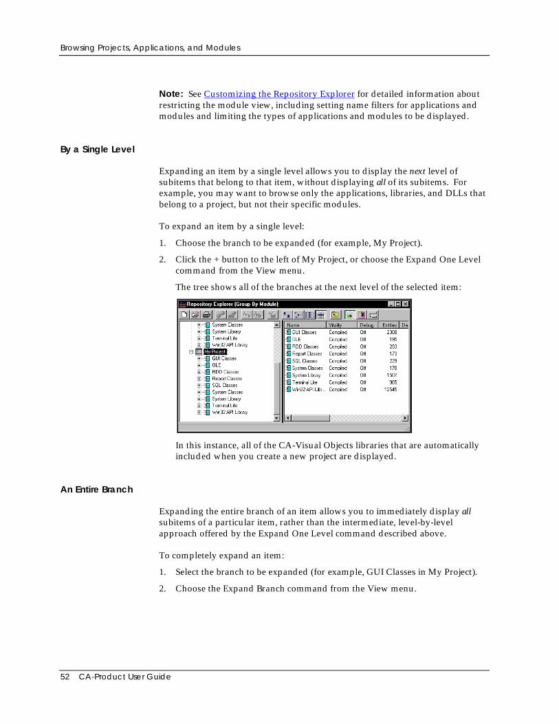
Browsing Projects, Applications, and Modules
52 CA-Product User Guide
Note: See Customizing the Repository Explorer for detailed information aboutrestricting the module view, including setting name filters for applications andmodules and limiting the types of applications and modules to be displayed.
By a Single Level
Expanding an item by a single level allows you to display the next level ofsubitems that belong to that item, without displaying all of its subitems. Forexample, you may want to browse only the applications, libraries, and DLLs thatbelong to a project, but not their specific modules.
To expand an item by a single level:
1. Choose the branch to be expanded (for example, My Project).
2. Click the + button to the left of My Project, or choose the Expand One Levelcommand from the View menu.
The tree shows all of the branches at the next level of the selected item:
In this instance, all of the CA-Visual Objects libraries that are automaticallyincluded when you create a new project are displayed.
An Entire Branch
Expanding the entire branch of an item allows you to immediately display allsubitems of a particular item, rather than the intermediate, level-by-levelapproach offered by the Expand One Level command described above.
To completely expand an item:
1. Select the branch to be expanded (for example, GUI Classes in My Project).
2. Choose the Expand Branch command from the View menu.
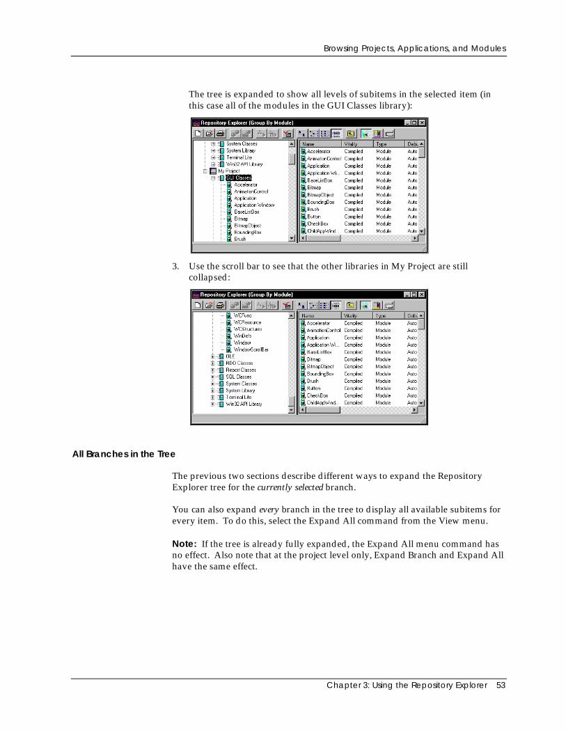
Browsing Projects, Applications, and Modules
Chapter 3: Using the Repository Explorer 53
The tree is expanded to show all levels of subitems in the selected item (inthis case all of the modules in the GUI Classes library):
3. Use the scroll bar to see that the other libraries in My Project are stillcollapsed:
All Branches in the Tree
The previous two sections describe different ways to expand the RepositoryExplorer tree for the currently selected branch.
You can also expand every branch in the tree to display all available subitems forevery item. To do this, select the Expand All command from the View menu.
Note: If the tree is already fully expanded, the Expand All menu command hasno effect. Also note that at the project level only, Expand Branch and Expand Allhave the same effect.
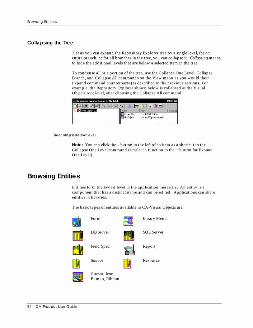
Browsing Entities
54 CA-Product User Guide
Collapsing the Tree
Just as you can expand the Repository Explorer tree by a single level, for anentire branch, or for all branches in the tree, you can collapse it. Collapsing meansto hide the additional levels that are below a selected item in the tree.
To condense all or a portion of the tree, use the Collapse One Level, CollapseBranch, and Collapse All commands on the View menu as you would theirExpand command counterparts (as described in the previous section). Forexample, the Repository Explorer shown below is collapsed at the VisualObjects root level, after choosing the Collapse All command:
Treecollapsedatrootlevel
Note: You can click the – button to the left of an item as a shortcut to theCollapse One Level command (similar in function to the + button for ExpandOne Level).
Browsing EntitiesEntities form the lowest level in the application hierarchy. An entity is acomponent that has a distinct name and can be edited. Applications can shareentities in libraries.
The basic types of entities available in CA-Visual Objects are:
Form Binary Menu
DB Server SQL Server
Field Spec Report
Source Resource
Cursor, Icon,Bitmap, Ribbon
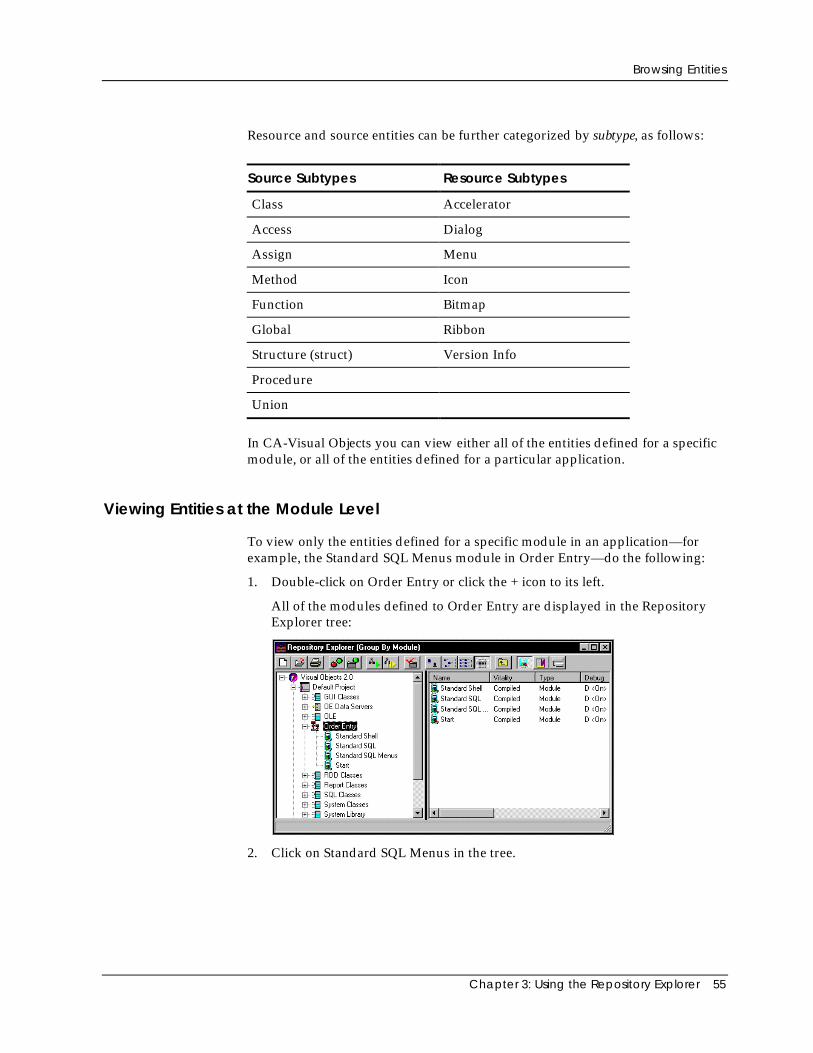
Browsing Entities
Chapter 3: Using the Repository Explorer 55
Resource and source entities can be further categorized by subtype, as follows:
Source Subtypes Resource Subtypes
Class Accelerator
Access Dialog
Assign Menu
Method Icon
Function Bitmap
Global Ribbon
Structure (struct) Version Info
Procedure
Union
In CA-Visual Objects you can view either all of the entities defined for a specificmodule, or all of the entities defined for a particular application.
Viewing Entities at the Module Level
To view only the entities defined for a specific module in an application—forexample, the Standard SQL Menus module in Order Entry—do the following:
1. Double-click on Order Entry or click the + icon to its left.
All of the modules defined to Order Entry are displayed in the RepositoryExplorer tree:
2. Click on Standard SQL Menus in the tree.
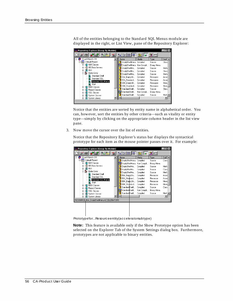
Browsing Entities
56 CA-Product User Guide
All of the entities belonging to the Standard SQL Menus module aredisplayed in the right, or List View, pane of the Repository Explorer:
Notice that the entities are sorted by entity name in alphabetical order. Youcan, however, sort the entities by other criteria—such as vitality or entitytype—simply by clicking on the appropriate column header in the list viewpane.
3. Now move the cursor over the list of entities.
Notice that the Repository Explorer’s status bar displays the syntacticalprototype for each item as the mouse pointer passes over it. For example:
Prototypefor...Resourceentity(acceleratorsubtype)
Note: This feature is available only if the Show Prototype option has beenselected on the Explorer Tab of the System Settings dialog box. Furthermore,prototypes are not applicable to binary entities.
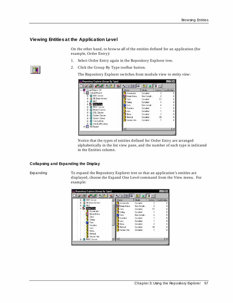
Browsing Entities
Chapter 3: Using the Repository Explorer 57
Viewing Entities at the Application Level
On the other hand, to browse all of the entities defined for an application (forexample, Order Entry):
1. Select Order Entry again in the Repository Explorer tree.
2. Click the Group By Type toolbar button.
The Repository Explorer switches from module view to entity view:
Notice that the types of entities defined for Order Entry are arrangedalphabetically in the list view pane, and the number of each type is indicatedin the Entities column.
Collapsing and Expanding the Display
Expanding To expand the Repository Explorer tree so that an application’s entities aredisplayed, choose the Expand One Level command from the View menu. Forexample:
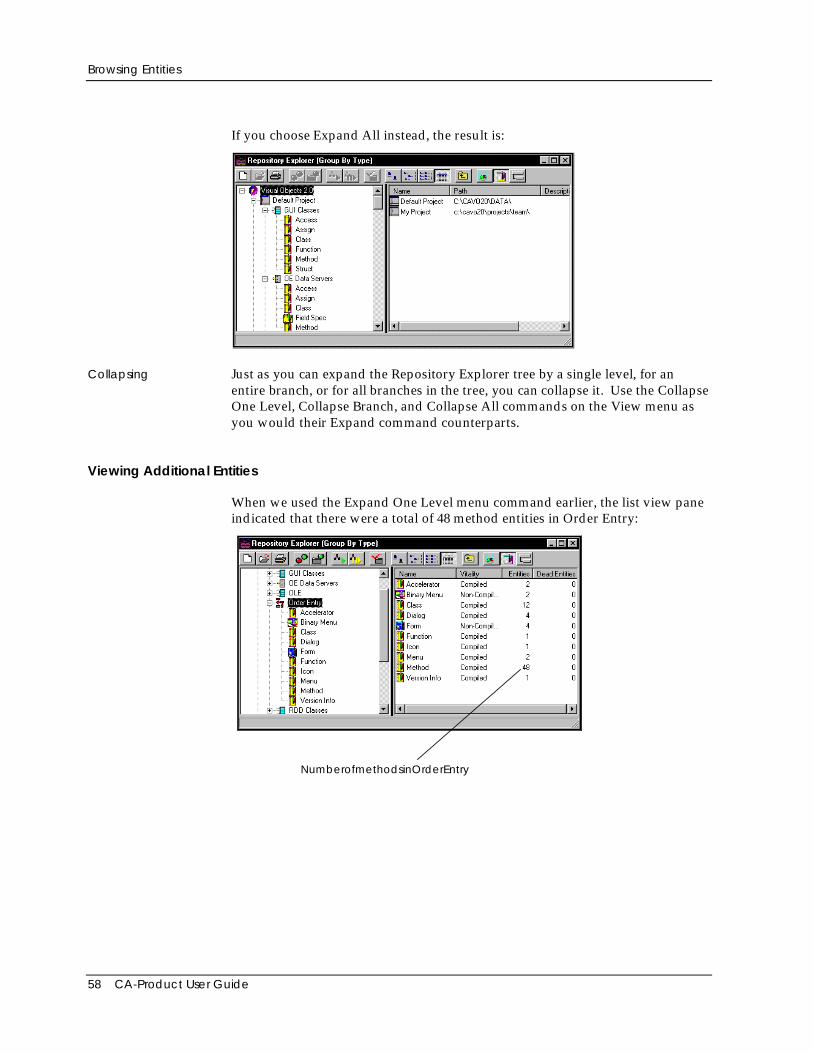
Browsing Entities
58 CA-Product User Guide
If you choose Expand All instead, the result is:
Collapsing Just as you can expand the Repository Explorer tree by a single level, for anentire branch, or for all branches in the tree, you can collapse it. Use the CollapseOne Level, Collapse Branch, and Collapse All commands on the View menu asyou would their Expand command counterparts.
Viewing Additional Entities
When we used the Expand One Level menu command earlier, the list view paneindicated that there were a total of 48 method entities in Order Entry:
NumberofmethodsinOrderEntry
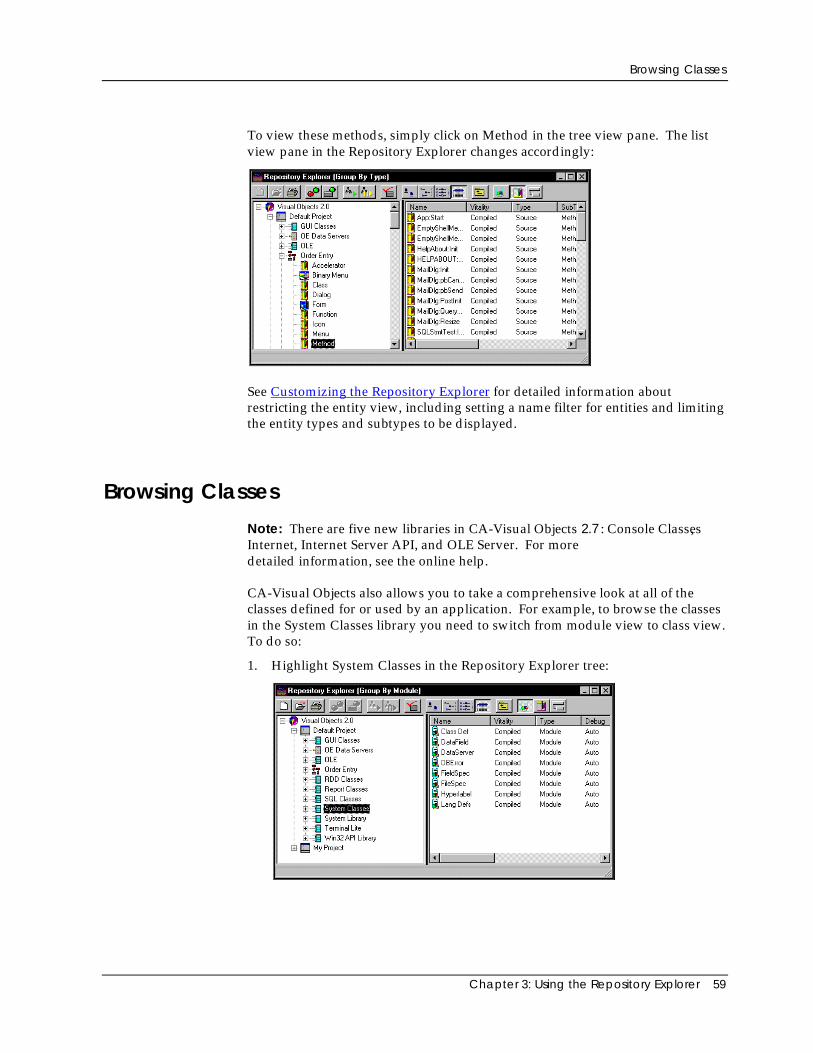
Browsing Classes
Chapter 3: Using the Repository Explorer 59
To view these methods, simply click on Method in the tree view pane. The listview pane in the Repository Explorer changes accordingly:
See Customizing the Repository Explorer for detailed information aboutrestricting the entity view, including setting a name filter for entities and limitingthe entity types and subtypes to be displayed.
Browsing Classes
Note: There are five new libraries in CA-Visual Objects 2.7 : Console Classes,Internet, Internet Server API, and OLE Server. For moredetailed information, see the online help.
CA-Visual Objects also allows you to take a comprehensive look at all of theclasses defined for or used by an application. For example, to browse the classesin the System Classes library you need to switch from module view to class view.To do so:
1. Highlight System Classes in the Repository Explorer tree:
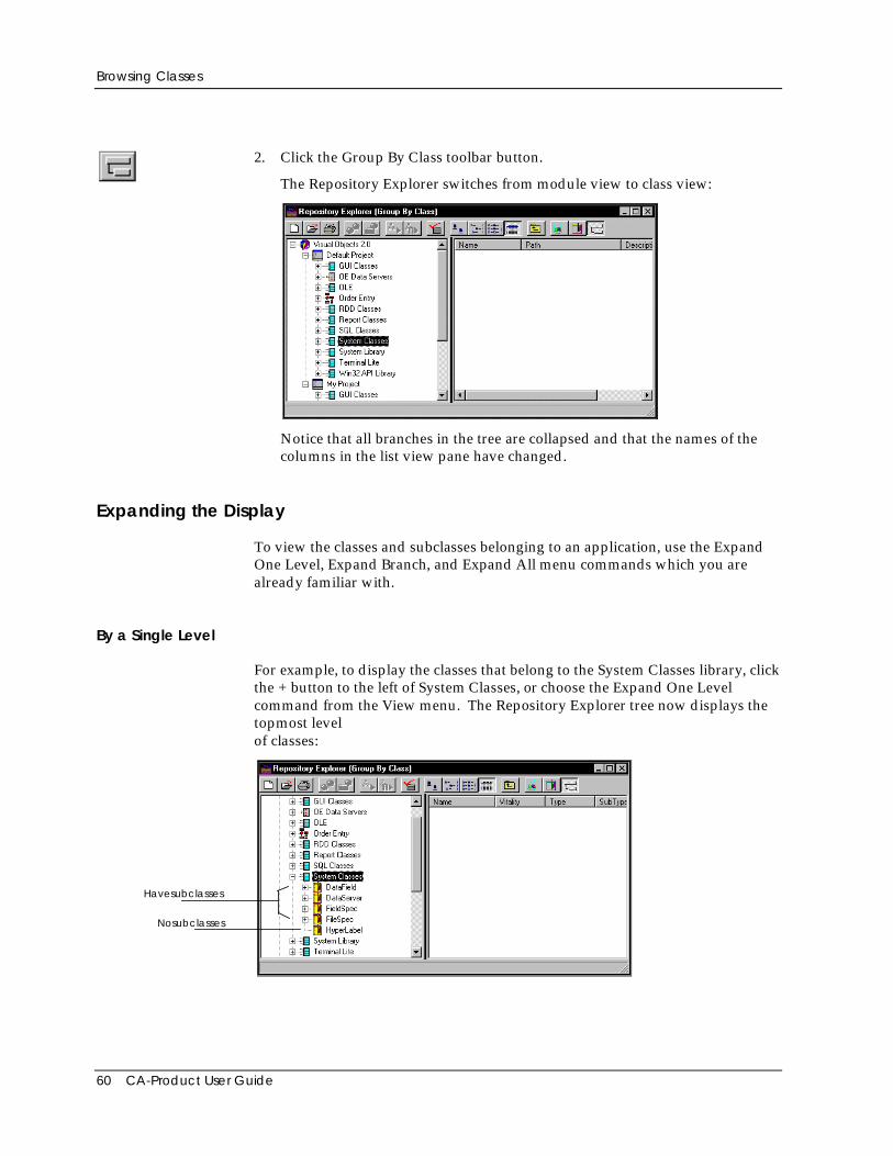
Browsing Classes
60 CA-Product User Guide
2. Click the Group By Class toolbar button.
The Repository Explorer switches from module view to class view:
Notice that all branches in the tree are collapsed and that the names of thecolumns in the list view pane have changed.
Expanding the Display
To view the classes and subclasses belonging to an application, use the ExpandOne Level, Expand Branch, and Expand All menu commands which you arealready familiar with.
By a Single Level
For example, to display the classes that belong to the System Classes library, clickthe + button to the left of System Classes, or choose the Expand One Levelcommand from the View menu. The Repository Explorer tree now displays thetopmost levelof classes:
Havesubclasses
Nosubclasses
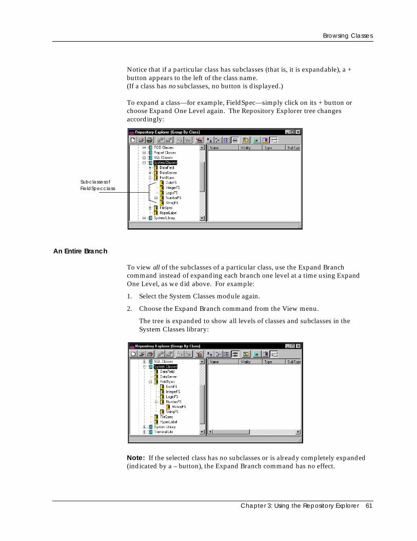
Browsing Classes
Chapter 3: Using the Repository Explorer 61
Notice that if a particular class has subclasses (that is, it is expandable), a +button appears to the left of the class name.(If a class has no subclasses, no button is displayed.)
To expand a class—for example, FieldSpec—simply click on its + button orchoose Expand One Level again. The Repository Explorer tree changesaccordingly:
SubclassesofFieldSpecclass
An Entire Branch
To view all of the subclasses of a particular class, use the Expand Branchcommand instead of expanding each branch one level at a time using ExpandOne Level, as we did above. For example:
1. Select the System Classes module again.
2. Choose the Expand Branch command from the View menu.
The tree is expanded to show all levels of classes and subclasses in theSystem Classes library:
Note: If the selected class has no subclasses or is already completely expanded(indicated by a – button), the Expand Branch command has no effect.
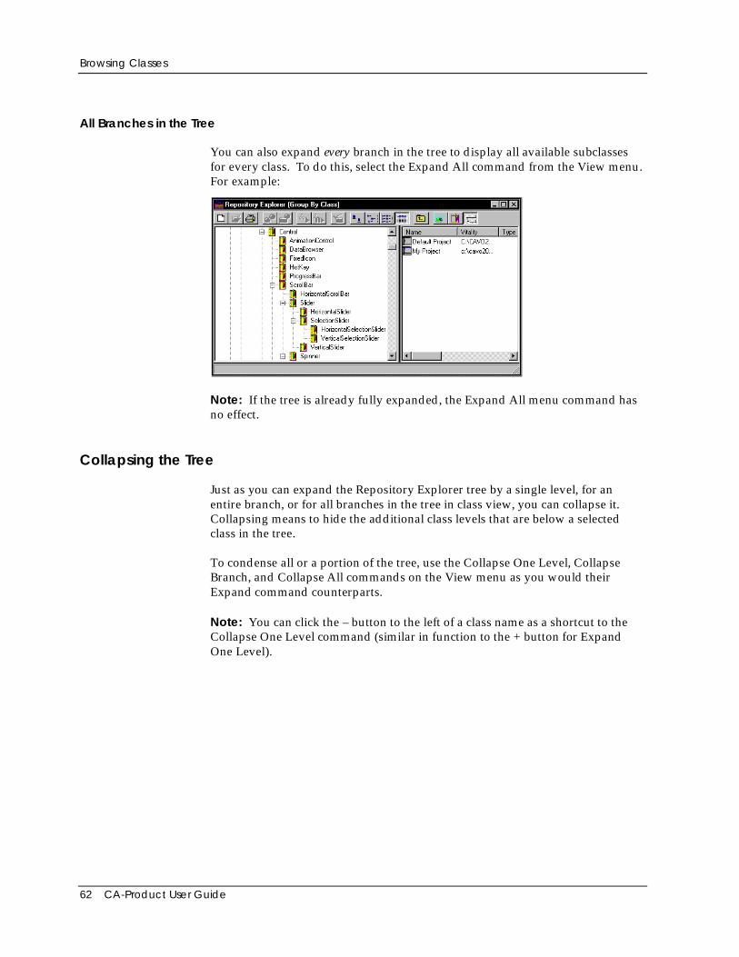
Browsing Classes
62 CA-Product User Guide
All Branches in the Tree
You can also expand every branch in the tree to display all available subclassesfor every class. To do this, select the Expand All command from the View menu.For example:
Note: If the tree is already fully expanded, the Expand All menu command hasno effect.
Collapsing the Tree
Just as you can expand the Repository Explorer tree by a single level, for anentire branch, or for all branches in the tree in class view, you can collapse it.Collapsing means to hide the additional class levels that are below a selectedclass in the tree.
To condense all or a portion of the tree, use the Collapse One Level, CollapseBranch, and Collapse All commands on the View menu as you would theirExpand command counterparts.
Note: You can click the – button to the left of a class name as a shortcut to theCollapse One Level command (similar in function to the + button for ExpandOne Level).
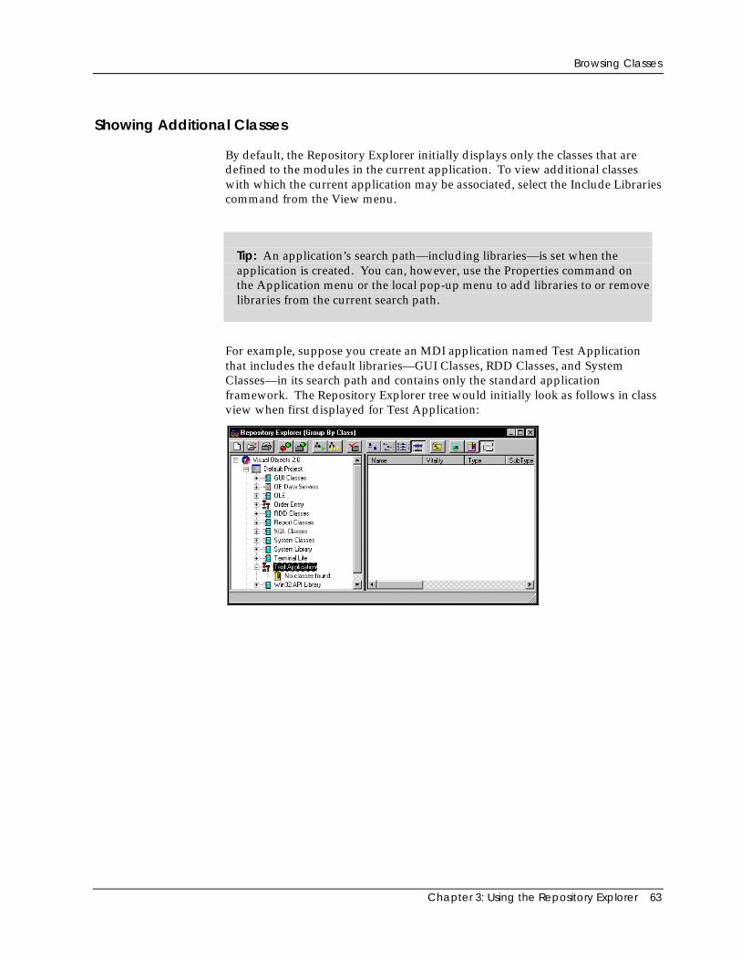
Browsing Classes
Chapter 3: Using the Repository Explorer 63
Showing Additional Classes
By default, the Repository Explorer initially displays only the classes that aredefined to the modules in the current application. To view additional classeswith which the current application may be associated, select the Include Librariescommand from the View menu.
Tip: An application’s search path—including libraries—is set when theapplication is created. You can, however, use the Properties command onthe Application menu or the local pop-up menu to add libraries to or removelibraries from the current search path.
For example, suppose you create an MDI application named Test Applicationthat includes the default libraries—GUI Classes, RDD Classes, and SystemClasses—in its search path and contains only the standard applicationframework. The Repository Explorer tree would initially look as follows in classview when first displayed for Test Application:
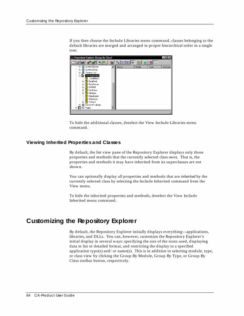
Customizing the Repository Explorer
64 CA-Product User Guide
If you then choose the Include Libraries menu command, classes belonging to thedefault libraries are merged and arranged in proper hierarchical order in a singletree:
To hide the additional classes, deselect the View Include Libraries menucommand.
Viewing Inherited Properties and Classes
By default, the list view pane of the Repository Explorer displays only thoseproperties and methods that the currently selected class owns. That is, theproperties and methods it may have inherited from its superclasses are notshown.
You can optionally display all properties and methods that are inherited by thecurrently selected class by selecting the Include Inherited command from theView menu.
To hide the inherited properties and methods, deselect the View IncludeInherited menu command.
Customizing the Repository ExplorerBy default, the Repository Explorer initially displays everything—applications,libraries, and DLLs. You can, however, customize the Repository Explorer’sinitial display in several ways: specifying the size of the icons used, displayingdata in list or detailed format, and restricting the display to a specifiedapplication type(s) and/or name(s). This is in addition to selecting module, type,or class view by clicking the Group By Module, Group By Type, or Group ByClass toolbar button, respectively.
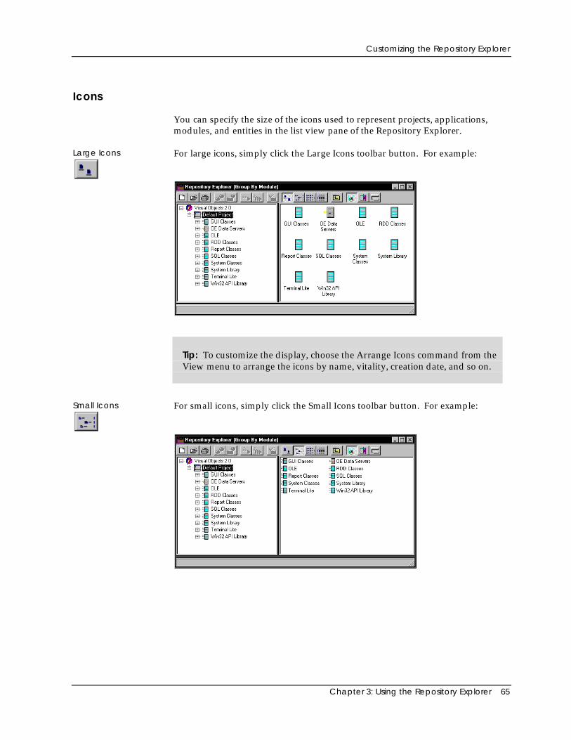
Customizing the Repository Explorer
Chapter 3: Using the Repository Explorer 65
Icons
You can specify the size of the icons used to represent projects, applications,modules, and entities in the list view pane of the Repository Explorer.
Large Icons For large icons, simply click the Large Icons toolbar button. For example:
Tip: To customize the display, choose the Arrange Icons command from theView menu to arrange the icons by name, vitality, creation date, and so on.
Small Icons For small icons, simply click the Small Icons toolbar button. For example:
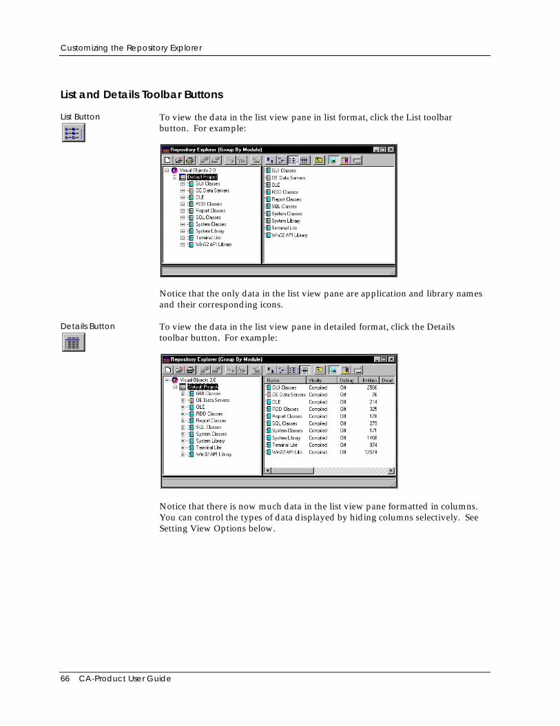
Customizing the Repository Explorer
66 CA-Product User Guide
List and Details Toolbar Buttons
List Button To view the data in the list view pane in list format, click the List toolbarbutton. For example:
Notice that the only data in the list view pane are application and library namesand their corresponding icons.
Details Button To view the data in the list view pane in detailed format, click the Detailstoolbar button. For example:
Notice that there is now much data in the list view pane formatted in columns.You can control the types of data displayed by hiding columns selectively. SeeSetting View Options below.
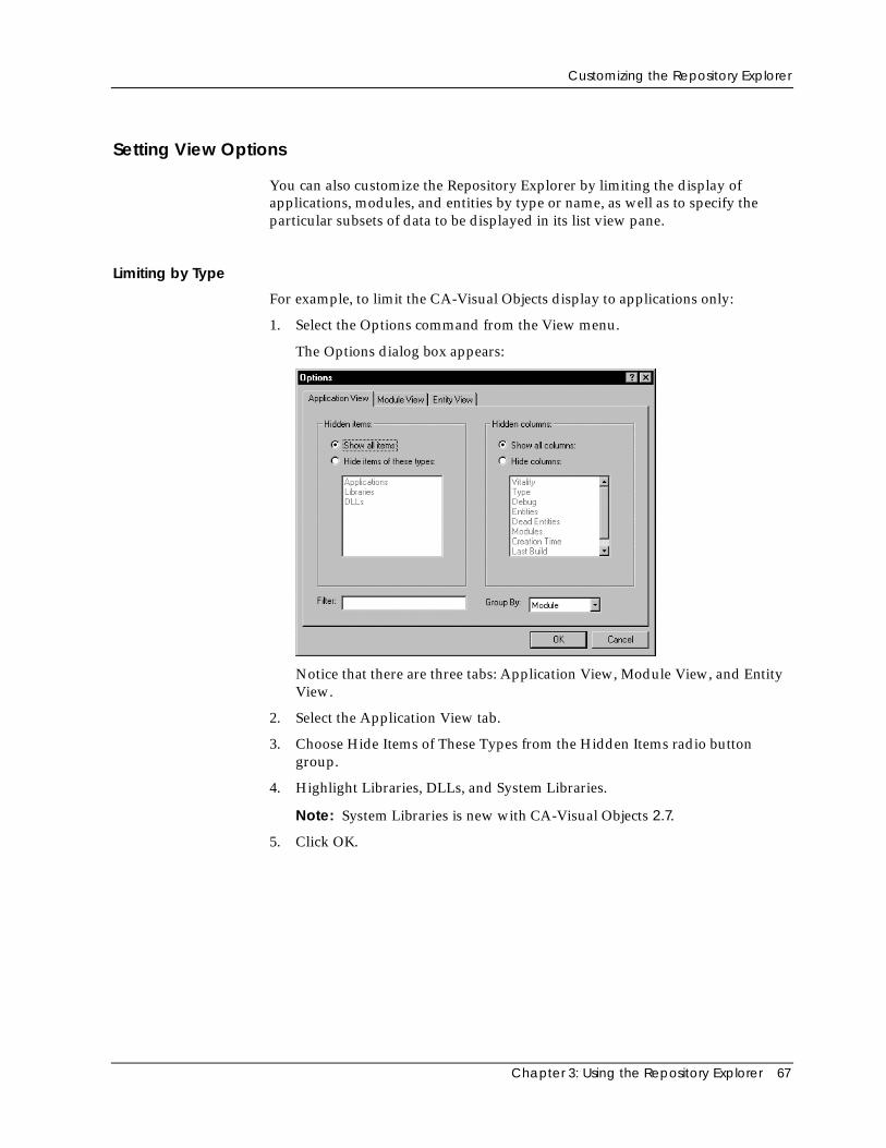
Customizing the Repository Explorer
Chapter 3: Using the Repository Explorer 67
Setting View Options
You can also customize the Repository Explorer by limiting the display ofapplications, modules, and entities by type or name, as well as to specify theparticular subsets of data to be displayed in its list view pane.
Limiting by Type
For example, to limit the CA-Visual Objects display to applications only:
1. Select the Options command from the View menu.
The Options dialog box appears:
Notice that there are three tabs: Application View, Module View, and EntityView.
2. Select the Application View tab.
3. Choose Hide Items of These Types from the Hidden Items radio buttongroup.
4. Highlight Libraries, DLLs, and System Libraries.
Note: System Libraries is new with CA-Visual Objects 2.7.
5. Click OK.
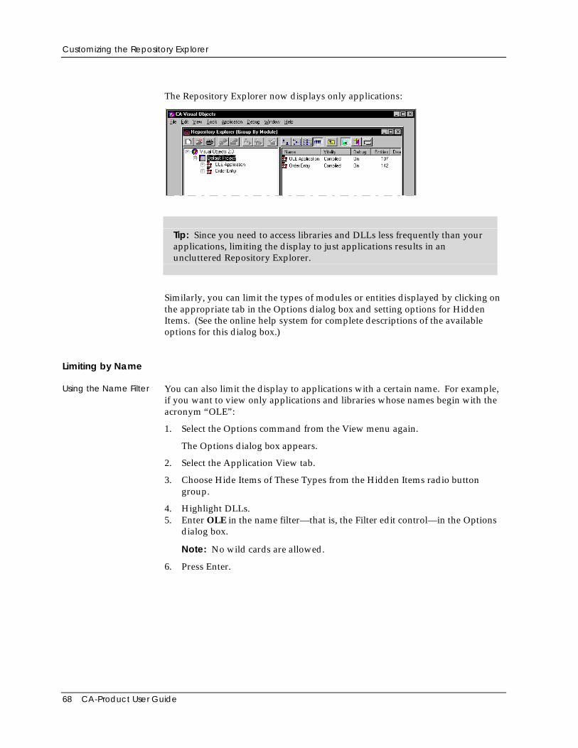
Customizing the Repository Explorer
68 CA-Product User Guide
The Repository Explorer now displays only applications:
Tip: Since you need to access libraries and DLLs less frequently than yourapplications, limiting the display to just applications results in anuncluttered Repository Explorer.
Similarly, you can limit the types of modules or entities displayed by clicking onthe appropriate tab in the Options dialog box and setting options for HiddenItems. (See the online help system for complete descriptions of the availableoptions for this dialog box.)
Limiting by Name
Using the Name Filter You can also limit the display to applications with a certain name. For example,if you want to view only applications and libraries whose names begin with theacronym “OLE”:
1. Select the Options command from the View menu again.
The Options dialog box appears.
2. Select the Application View tab.
3. Choose Hide Items of These Types from the Hidden Items radio buttongroup.
4. Highlight DLLs.5. Enter OLE in the name filter—that is, the Filter edit control—in the Options
dialog box.
Note: No wild cards are allowed.
6. Press Enter.
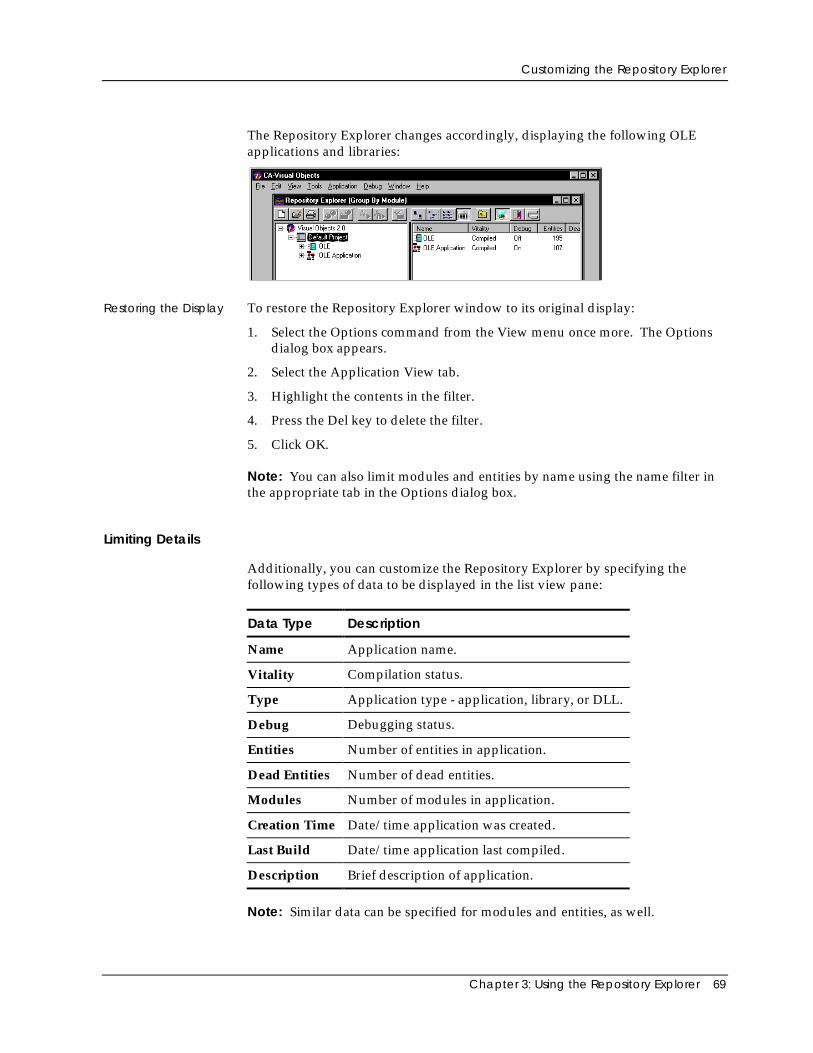
Customizing the Repository Explorer
Chapter 3: Using the Repository Explorer 69
The Repository Explorer changes accordingly, displaying the following OLEapplications and libraries:
Restoring the Display To restore the Repository Explorer window to its original display:
1. Select the Options command from the View menu once more. The Optionsdialog box appears.
2. Select the Application View tab.
3. Highlight the contents in the filter.
4. Press the Del key to delete the filter.
5. Click OK.
Note: You can also limit modules and entities by name using the name filter inthe appropriate tab in the Options dialog box.
Limiting Details
Additionally, you can customize the Repository Explorer by specifying thefollowing types of data to be displayed in the list view pane:
Data Type Description
Name Application name.
Vitality Compilation status.
Type Application type - application, library, or DLL.
Debug Debugging status.
Entities Number of entities in application.
Dead Entities Number of dead entities.
Modules Number of modules in application.
Creation Time Date/time application was created.
Last Build Date/time application last compiled.
Description Brief description of application.
Note: Similar data can be specified for modules and entities, as well.
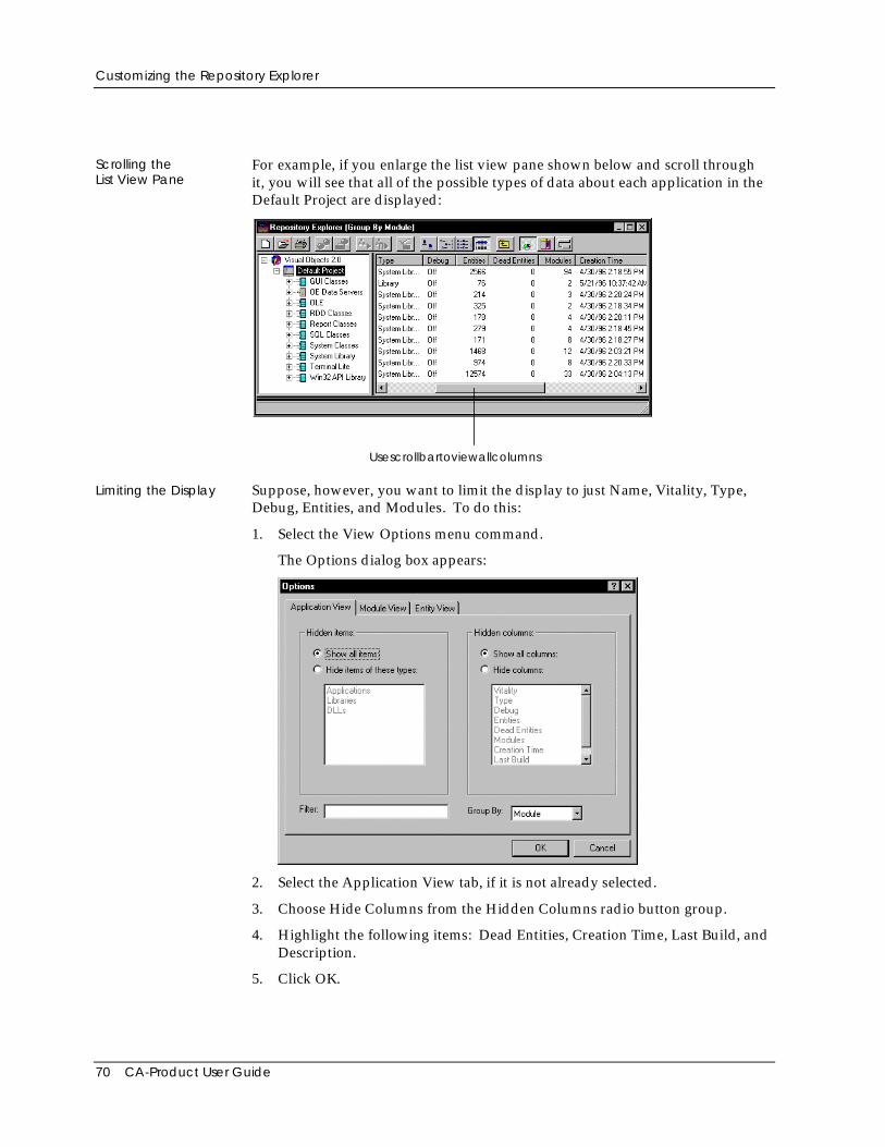
Customizing the Repository Explorer
70 CA-Product User Guide
Scrolling theList View Pane
For example, if you enlarge the list view pane shown below and scroll throughit, you will see that all of the possible types of data about each application in theDefault Project are displayed:
Usescrollbartoviewallcolumns
Limiting the Display Suppose, however, you want to limit the display to just Name, Vitality, Type,Debug, Entities, and Modules. To do this:
1. Select the View Options menu command.
The Options dialog box appears:
2. Select the Application View tab, if it is not already selected.
3. Choose Hide Columns from the Hidden Columns radio button group.
4. Highlight the following items: Dead Entities, Creation Time, Last Build, andDescription.
5. Click OK.
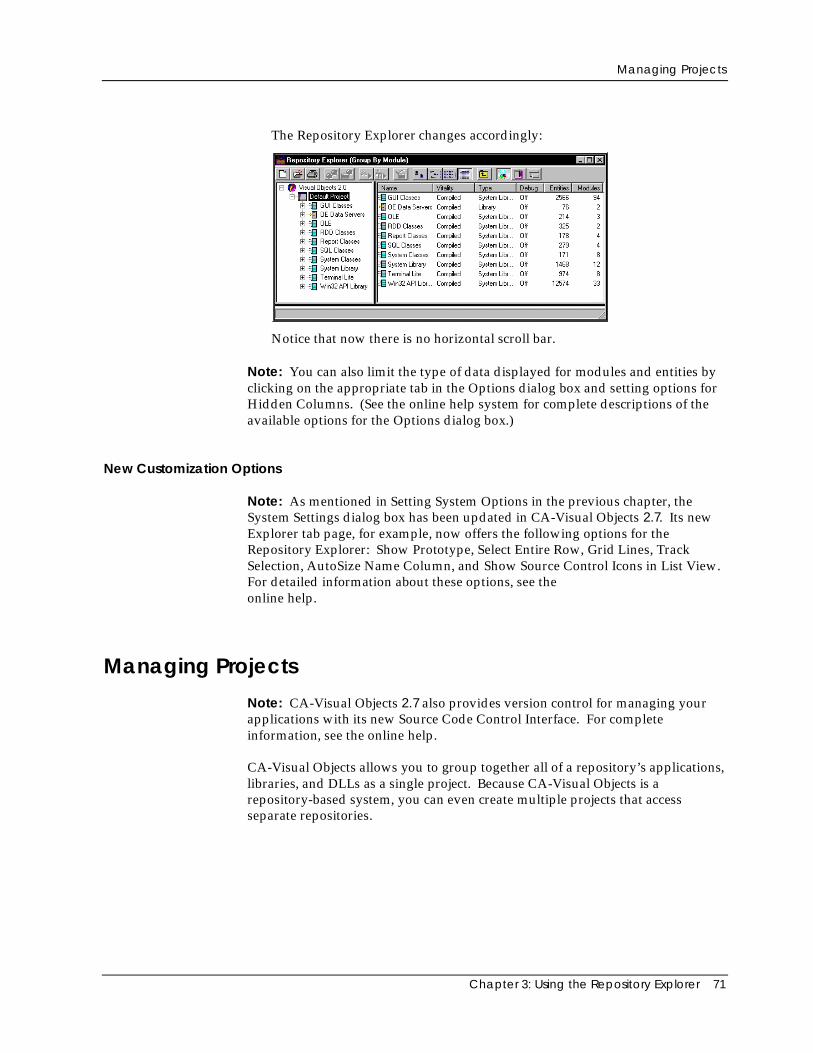
Managing Projects
Chapter 3: Using the Repository Explorer 71
The Repository Explorer changes accordingly:
Notice that now there is no horizontal scroll bar.
Note: You can also limit the type of data displayed for modules and entities byclicking on the appropriate tab in the Options dialog box and setting options forHidden Columns. (See the online help system for complete descriptions of theavailable options for the Options dialog box.)
New Customization Options
Note: As mentioned in Setting System Options in the previous chapter, theSystem Settings dialog box has been updated in CA-Visual Objects 2.7. Its newExplorer tab page, for example, now offers the following options for theRepository Explorer: Show Prototype, Select Entire Row, Grid Lines, TrackSelection, AutoSize Name Column, and Show Source Control Icons in List View.For detailed information about these options, see theonline help.
Managing Projects
Note: CA-Visual Objects 2.7 also provides version control for managing yourapplications with its new Source Code Control Interface. For completeinformation, see the online help.
CA-Visual Objects allows you to group together all of a repository’s applications,libraries, and DLLs as a single project. Because CA-Visual Objects is arepository-based system, you can even create multiple projects that accessseparate repositories.
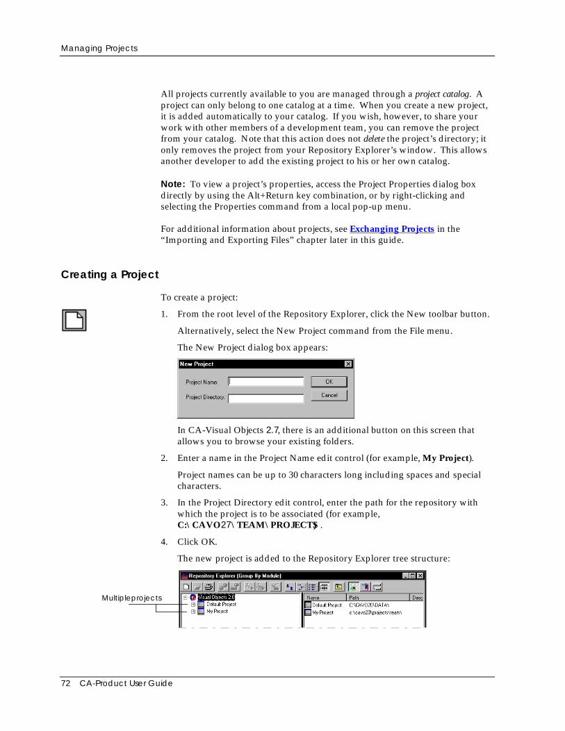
Managing Projects
72 CA-Product User Guide
All projects currently available to you are managed through a project catalog. Aproject can only belong to one catalog at a time. When you create a new project,it is added automatically to your catalog. If you wish, however, to share yourwork with other members of a development team, you can remove the projectfrom your catalog. Note that this action does not delete the project’s directory; itonly removes the project from your Repository Explorer’s window. This allowsanother developer to add the existing project to his or her own catalog.
Note: To view a project’s properties, access the Project Properties dialog boxdirectly by using the Alt+Return key combination, or by right-clicking andselecting the Properties command from a local pop-up menu.
For additional information about projects, see Exchanging Projects in the“Importing and Exporting Files” chapter later in this guide.
Creating a Project
To create a project:
1. From the root level of the Repository Explorer, click the New toolbar button.
Alternatively, select the New Project command from the File menu.
The New Project dialog box appears:
In CA-Visual Objects 2.7, there is an additional button on this screen thatallows you to browse your existing folders.
2. Enter a name in the Project Name edit control (for example, My Project).
Project names can be up to 30 characters long including spaces and specialcharacters.
3. In the Project Directory edit control, enter the path for the repository withwhich the project is to be associated (for example,C:\CAVO27\TEAM\PROJECTS) .
4. Click OK.
The new project is added to the Repository Explorer tree structure:
Multipleprojects
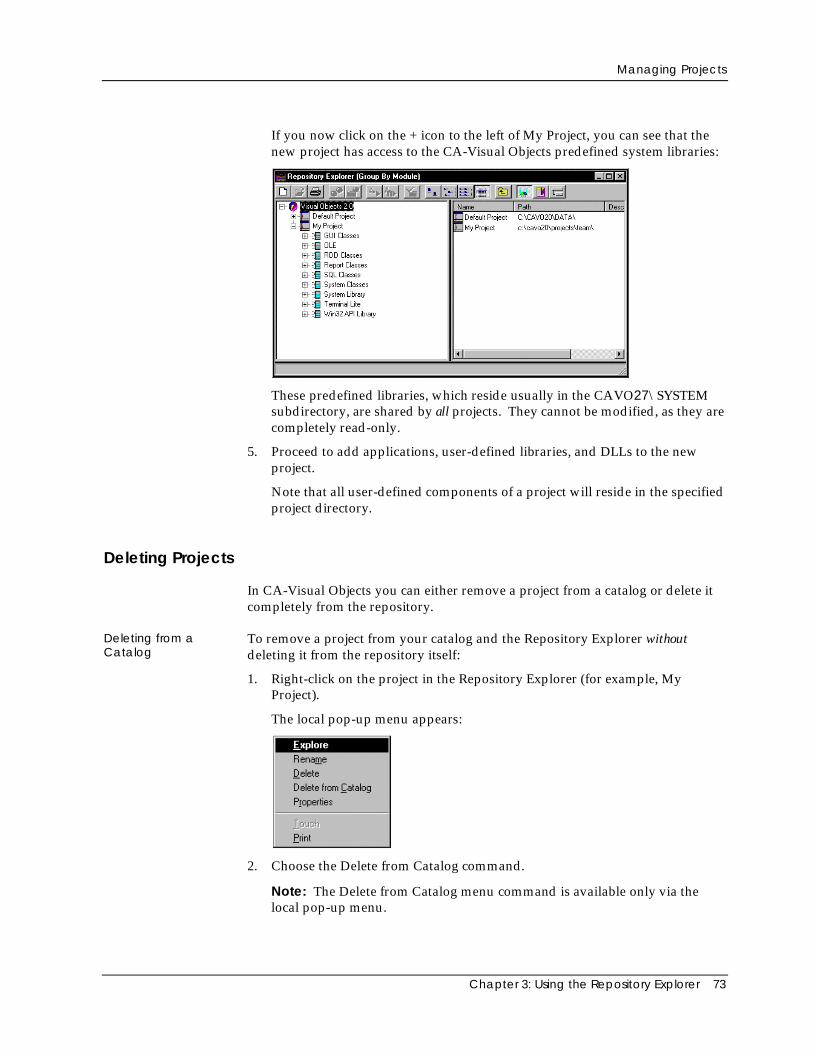
Managing Projects
Chapter 3: Using the Repository Explorer 73
If you now click on the + icon to the left of My Project, you can see that thenew project has access to the CA-Visual Objects predefined system libraries:
These predefined libraries, which reside usually in the CAVO27\SYSTEMsubdirectory, are shared by all projects. They cannot be modified, as they arecompletely read-only.
5. Proceed to add applications, user-defined libraries, and DLLs to the newproject.
Note that all user-defined components of a project will reside in the specifiedproject directory.
Deleting Projects
In CA-Visual Objects you can either remove a project from a catalog or delete itcompletely from the repository.
Deleting from aCatalog
To remove a project from your catalog and the Repository Explorer withoutdeleting it from the repository itself:
1. Right-click on the project in the Repository Explorer (for example, MyProject).
The local pop-up menu appears:
2. Choose the Delete from Catalog command.
Note: The Delete from Catalog menu command is available only via thelocal pop-up menu.
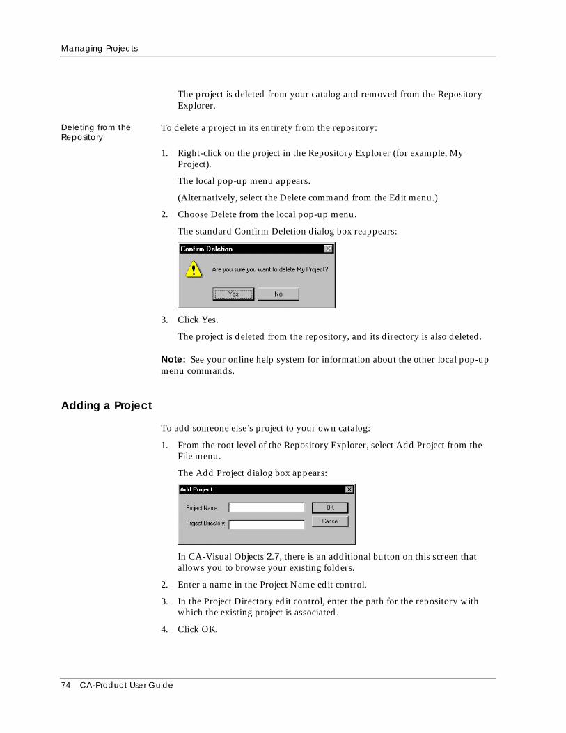
Managing Projects
74 CA-Product User Guide
The project is deleted from your catalog and removed from the RepositoryExplorer.
Deleting from theRepository
To delete a project in its entirety from the repository:
1. Right-click on the project in the Repository Explorer (for example, MyProject).
The local pop-up menu appears.
(Alternatively, select the Delete command from the Edit menu.)
2. Choose Delete from the local pop-up menu.
The standard Confirm Deletion dialog box reappears:
3. Click Yes.
The project is deleted from the repository, and its directory is also deleted.
Note: See your online help system for information about the other local pop-upmenu commands.
Adding a Project
To add someone else’s project to your own catalog:
1. From the root level of the Repository Explorer, select Add Project from theFile menu.
The Add Project dialog box appears:
In CA-Visual Objects 2.7, there is an additional button on this screen thatallows you to browse your existing folders.
2. Enter a name in the Project Name edit control.
3. In the Project Directory edit control, enter the path for the repository withwhich the existing project is associated.
4. Click OK.
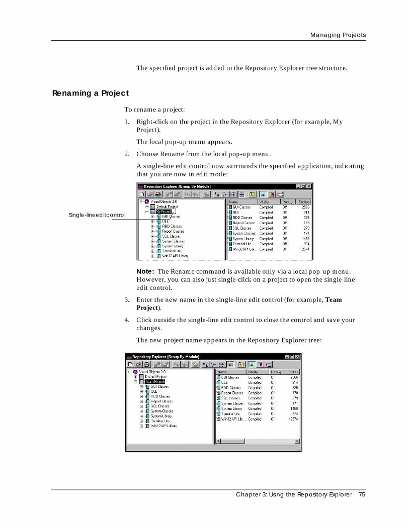
Managing Projects
Chapter 3: Using the Repository Explorer 75
The specified project is added to the Repository Explorer tree structure.
Renaming a Project
To rename a project:
1. Right-click on the project in the Repository Explorer (for example, MyProject).
The local pop-up menu appears.
2. Choose Rename from the local pop-up menu.
A single-line edit control now surrounds the specified application, indicatingthat you are now in edit mode:
Single-lineeditcontrol
Note: The Rename command is available only via a local pop-up menu.However, you can also just single-click on a project to open the single-lineedit control.
3. Enter the new name in the single-line edit control (for example, TeamProject).
4. Click outside the single-line edit control to close the control and save yourchanges.
The new project name appears in the Repository Explorer tree:
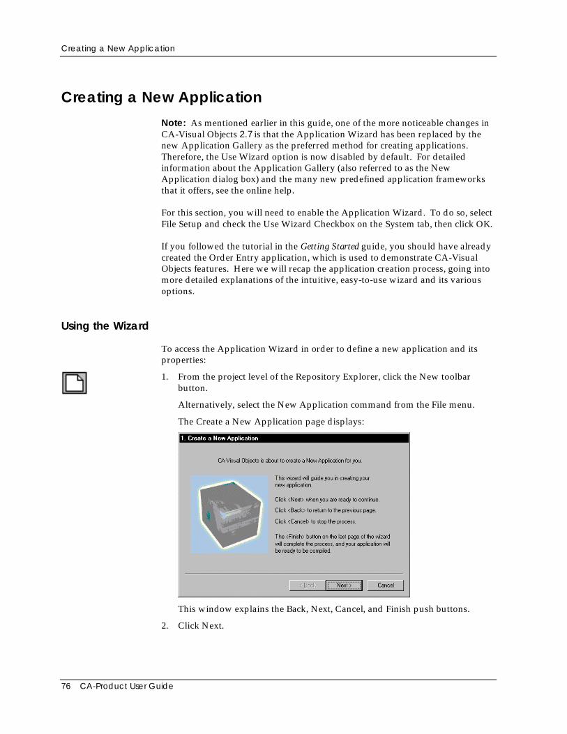
Creating a New Application
76 CA-Product User Guide
Creating a New Application
Note: As mentioned earlier in this guide, one of the more noticeable changes inCA-Visual Objects 2.7 is that the Application Wizard has been replaced by thenew Application Gallery as the preferred method for creating applications.Therefore, the Use Wizard option is now disabled by default. For detailedinformation about the Application Gallery (also referred to as the NewApplication dialog box) and the many new predefined application frameworksthat it offers, see the online help.
For this section, you will need to enable the Application Wizard. To do so, selectFile Setup and check the Use Wizard Checkbox on the System tab, then click OK.
If you followed the tutorial in the Getting Started guide, you should have alreadycreated the Order Entry application, which is used to demonstrate CA-VisualObjects features. Here we will recap the application creation process, going intomore detailed explanations of the intuitive, easy-to-use wizard and its variousoptions.
Using the Wizard
To access the Application Wizard in order to define a new application and itsproperties:
1. From the project level of the Repository Explorer, click the New toolbarbutton.
Alternatively, select the New Application command from the File menu.
The Create a New Application page displays:
This window explains the Back, Next, Cancel, and Finish push buttons.
2. Click Next.
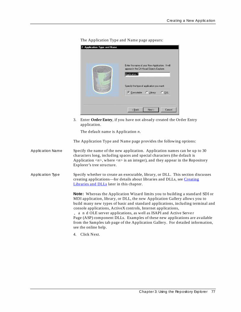
Creating a New Application
Chapter 3: Using the Repository Explorer 77
The Application Type and Name page appears:
3. Enter Order Entry, if you have not already created the Order Entryapplication.
The default name is Application n.
The Application Type and Name page provides the following options:
Application Name Specify the name of the new application. Application names can be up to 30characters long, including spaces and special characters (the default isApplication <n>, where <n> is an integer), and they appear in the RepositoryExplorer’s tree structure.
Application Type Specify whether to create an executable, library, or DLL. This section discussescreating applications—for details about libraries and DLLs, see CreatingLibraries and DLLs later in this chapter.
Note: Whereas the Application Wizard limits you to building a standard SDI orMDI application, library, or DLL, the new Application Gallery allows you tobuild many new types of basic and standard applications, including terminal andconsole applications, ActiveX controls, Internet applications,, a n d OLE server applications, as well as ISAPI and Active ServerPage (ASP) component DLLs. Examples of these new applications are availablefrom the Samples tab page of the Application Gallery. For detailed information,see the online help.
4. Click Next.
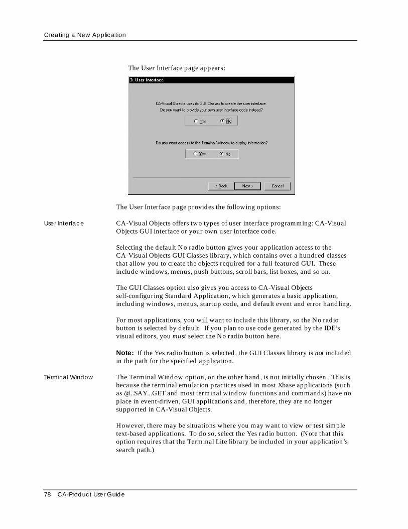
Creating a New Application
78 CA-Product User Guide
The User Interface page appears:
The User Interface page provides the following options:
User Interface CA-Visual Objects offers two types of user interface programming: CA-VisualObjects GUI interface or your own user interface code.
Selecting the default No radio button gives your application access to theCA-Visual Objects GUI Classes library, which contains over a hundred classesthat allow you to create the objects required for a full-featured GUI. Theseinclude windows, menus, push buttons, scroll bars, list boxes, and so on.
The GUI Classes option also gives you access to CA-Visual Objectsself-configuring Standard Application, which generates a basic application,including windows, menus, startup code, and default event and error handling.
For most applications, you will want to include this library, so the No radiobutton is selected by default. If you plan to use code generated by the IDE’svisual editors, you must select the No radio button here.
Note: If the Yes radio button is selected, the GUI Classes library is not includedin the path for the specified application.
Terminal Window The Terminal Window option, on the other hand, is not initially chosen. This isbecause the terminal emulation practices used in most Xbase applications (suchas @...SAY...GET and most terminal window functions and commands) have noplace in event-driven, GUI applications and, therefore, they are no longersupported in CA-Visual Objects.
However, there may be situations where you may want to view or test simpletext-based applications. To do so, select the Yes radio button. (Note that thisoption requires that the Terminal Lite library be included in your application’ssearch path.)
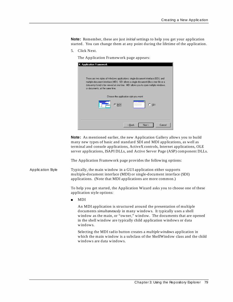
Creating a New Application
Chapter 3: Using the Repository Explorer 79
Note: Remember, these are just initial settings to help you get your applicationstarted. You can change them at any point during the lifetime of the application.
5. Click Next.
The Application Framework page appears:
Note: As mentioned earlier, the new Application Gallery allows you to buildmany new types of basic and standard SDI and MDI applications, as well asterminal and console applications, ActiveX controls, Internet applications, OLEserver applications, ISAPI DLLs, and Active Server Page (ASP) component DLLs.
The Application Framework page provides the following options:
Application Style Typically, the main window in a GUI application either supportsmultiple-document interface (MDI) or single-document interface (SDI)applications. (Note that MDI applications are more common.)
To help you get started, the Application Wizard asks you to choose one of theseapplication style options:
■ MDI
An MDI application is structured around the presentation of multipledocuments simultaneously in many windows. It typically uses a shellwindow as the main, or “owner,” window. The documents that are openedin the shell window are typically child application windows or datawindows.
Selecting the MDI radio button creates a multiple windows application inwhich the main window is a subclass of the ShellWindow class and the childwindows are data windows.
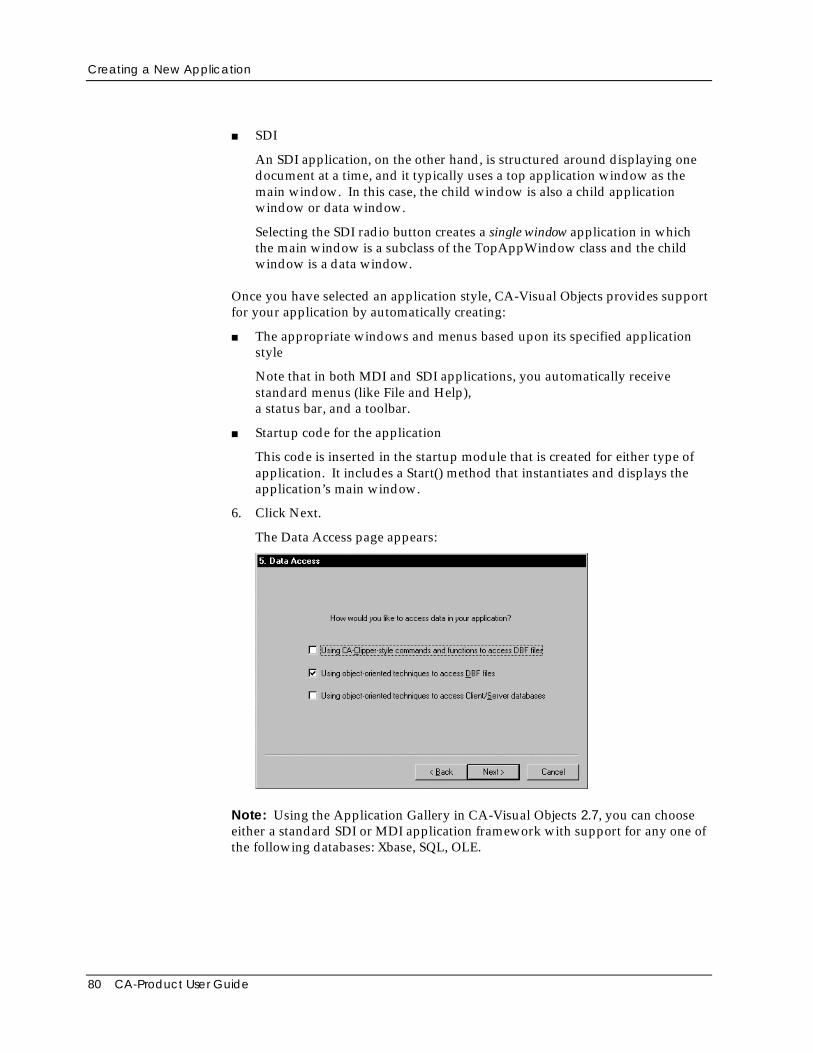
Creating a New Application
80 CA-Product User Guide
■ SDI
An SDI application, on the other hand, is structured around displaying onedocument at a time, and it typically uses a top application window as themain window. In this case, the child window is also a child applicationwindow or data window.
Selecting the SDI radio button creates a single window application in whichthe main window is a subclass of the TopAppWindow class and the childwindow is a data window.
Once you have selected an application style, CA-Visual Objects provides supportfor your application by automatically creating:
■ The appropriate windows and menus based upon its specified applicationstyle
Note that in both MDI and SDI applications, you automatically receivestandard menus (like File and Help),a status bar, and a toolbar.
■ Startup code for the application
This code is inserted in the startup module that is created for either type ofapplication. It includes a Start() method that instantiates and displays theapplication’s main window.
6. Click Next.
The Data Access page appears:
Note: Using the Application Gallery in CA-Visual Objects 2.7, you can chooseeither a standard SDI or MDI application framework with support for any one ofthe following databases: Xbase, SQL, OLE.
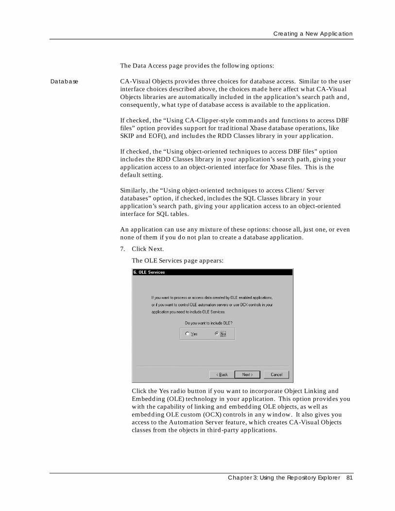
Creating a New Application
Chapter 3: Using the Repository Explorer 81
The Data Access page provides the following options:
Database CA-Visual Objects provides three choices for database access. Similar to the userinterface choices described above, the choices made here affect what CA-VisualObjects libraries are automatically included in the application’s search path and,consequently, what type of database access is available to the application.
If checked, the “Using CA-Clipper-style commands and functions to access DBFfiles” option provides support for traditional Xbase database operations, likeSKIP and EOF(), and includes the RDD Classes library in your application.
If checked, the “Using object-oriented techniques to access DBF files” optionincludes the RDD Classes library in your application’s search path, giving yourapplication access to an object-oriented interface for Xbase files. This is thedefault setting.
Similarly, the “Using object-oriented techniques to access Client/Serverdatabases” option, if checked, includes the SQL Classes library in yourapplication’s search path, giving your application access to an object-orientedinterface for SQL tables.
An application can use any mixture of these options: choose all, just one, or evennone of them if you do not plan to create a database application.
7. Click Next.
The OLE Services page appears:
Click the Yes radio button if you want to incorporate Object Linking andEmbedding (OLE) technology in your application. This option provides youwith the capability of linking and embedding OLE objects, as well asembedding OLE custom (OCX) controls in any window. It also gives youaccess to the Automation Server feature, which creates CA-Visual Objectsclasses from the objects in third-party applications.
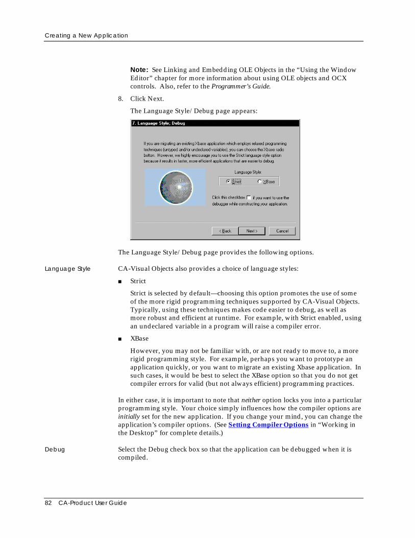
Creating a New Application
82 CA-Product User Guide
Note: See Linking and Embedding OLE Objects in the “Using the WindowEditor” chapter for more information about using OLE objects and OCXcontrols. Also, refer to the Programmer’s Guide.
8. Click Next.
The Language Style/Debug page appears:
The Language Style/Debug page provides the following options.
Language Style CA-Visual Objects also provides a choice of language styles:
■ Strict
Strict is selected by default—choosing this option promotes the use of someof the more rigid programming techniques supported by CA-Visual Objects.Typically, using these techniques makes code easier to debug, as well asmore robust and efficient at runtime. For example, with Strict enabled, usingan undeclared variable in a program will raise a compiler error.
■ XBase
However, you may not be familiar with, or are not ready to move to, a morerigid programming style. For example, perhaps you want to prototype anapplication quickly, or you want to migrate an existing Xbase application. Insuch cases, it would be best to select the XBase option so that you do not getcompiler errors for valid (but not always efficient) programming practices.
In either case, it is important to note that neither option locks you into a particularprogramming style. Your choice simply influences how the compiler options areinitially set for the new application. If you change your mind, you can change theapplication’s compiler options. (See Setting Compiler Options in “Working inthe Desktop” for complete details.)
Debug Select the Debug check box so that the application can be debugged when it iscompiled.
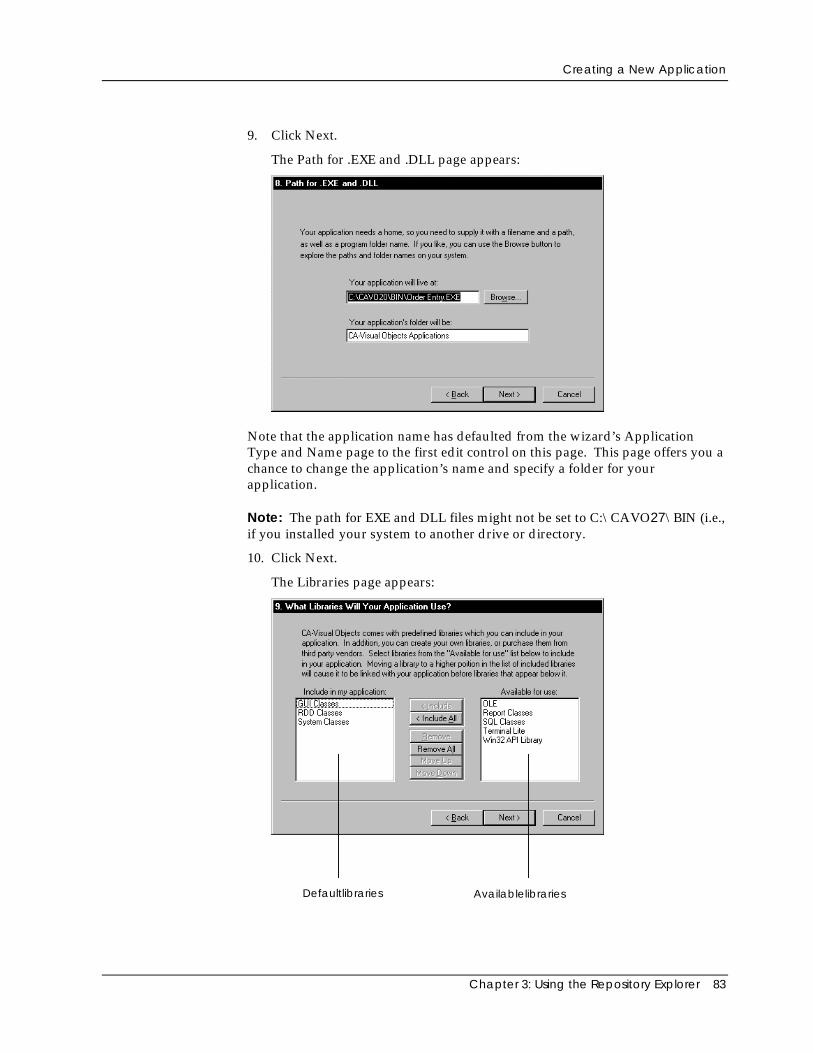
Creating a New Application
Chapter 3: Using the Repository Explorer 83
9. Click Next.
The Path for .EXE and .DLL page appears:
Note that the application name has defaulted from the wizard’s ApplicationType and Name page to the first edit control on this page. This page offers you achance to change the application’s name and specify a folder for yourapplication.
Note: The path for EXE and DLL files might not be set to C:\CAVO27\BIN (i.e.,if you installed your system to another drive or directory.
10. Click Next.
The Libraries page appears:
Defaultlibraries Availablelibraries
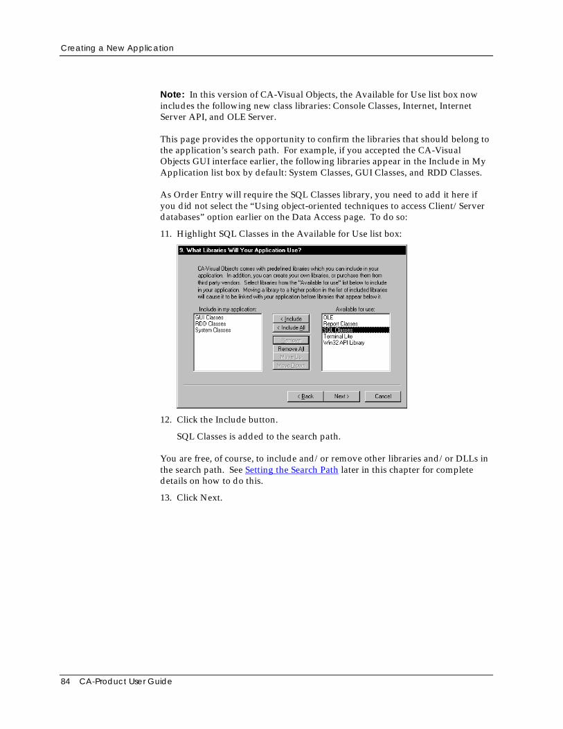
Creating a New Application
84 CA-Product User Guide
Note: In this version of CA-Visual Objects, the Available for Use list box nowincludes the following new class libraries: Console Classes, Internet, InternetServer API, and OLE Server.
This page provides the opportunity to confirm the libraries that should belong tothe application’s search path. For example, if you accepted the CA-VisualObjects GUI interface earlier, the following libraries appear in the Include in MyApplication list box by default: System Classes, GUI Classes, and RDD Classes.
As Order Entry will require the SQL Classes library, you need to add it here ifyou did not select the “Using object-oriented techniques to access Client/Serverdatabases” option earlier on the Data Access page. To do so:
11. Highlight SQL Classes in the Available for Use list box:
12. Click the Include button.
SQL Classes is added to the search path.
You are free, of course, to include and/or remove other libraries and/or DLLs inthe search path. See Setting the Search Path later in this chapter for completedetails on how to do this.
13. Click Next.
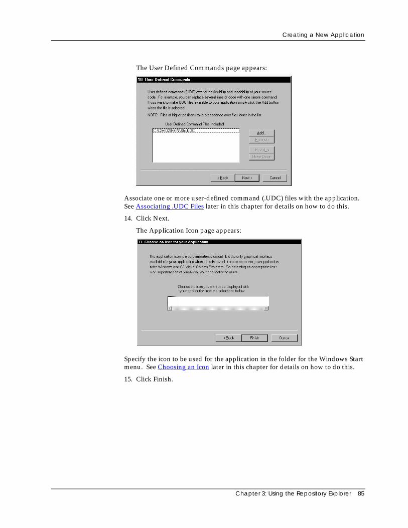
Creating a New Application
Chapter 3: Using the Repository Explorer 85
The User Defined Commands page appears:
Associate one or more user-defined command (.UDC) files with the application.See Associating .UDC Files later in this chapter for details on how to do this.
14. Click Next.
The Application Icon page appears:
Specify the icon to be used for the application in the folder for the Windows Startmenu. See Choosing an Icon later in this chapter for details on how to do this.
15. Click Finish.
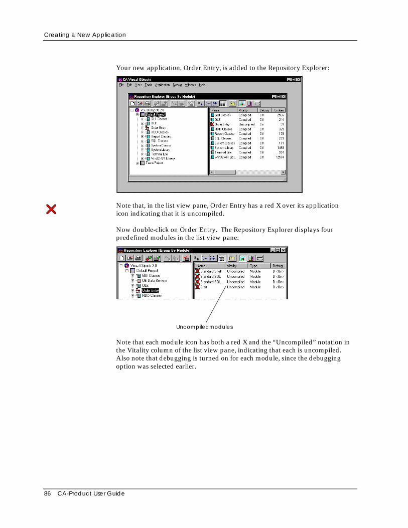
Creating a New Application
86 CA-Product User Guide
Your new application, Order Entry, is added to the Repository Explorer:
Note that, in the list view pane, Order Entry has a red X over its applicationicon indicating that it is uncompiled.
Now double-click on Order Entry. The Repository Explorer displays fourpredefined modules in the list view pane:
Uncompiledmodules
Note that each module icon has both a red X and the “Uncompiled” notation inthe Vitality column of the list view pane, indicating that each is uncompiled.Also note that debugging is turned on for each module, since the debuggingoption was selected earlier.
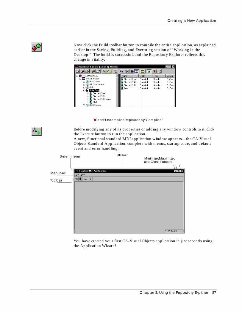
Creating a New Application
Chapter 3: Using the Repository Explorer 87
Now click the Build toolbar button to compile the entire application, as explainedearlier in the Saving, Building, and Executing section of “Working in theDesktop.” The build is successful, and the Repository Explorer reflects thischange in vitality:
and"Uncompiled"replacedby"Compiled"
Before modifying any of its properties or adding any window controls to it, clickthe Execute button to run the application.A new, functional standard MDI application window appears—the CA-VisualObjects Standard Application, complete with menus, startup code, and defaultevent and error handling:
Systemmenu
Menubar
Toolbar
TitlebarMinimize,Maximize,andClosebuttons
You have created your first CA-Visual Objects application in just seconds usingthe Application Wizard!
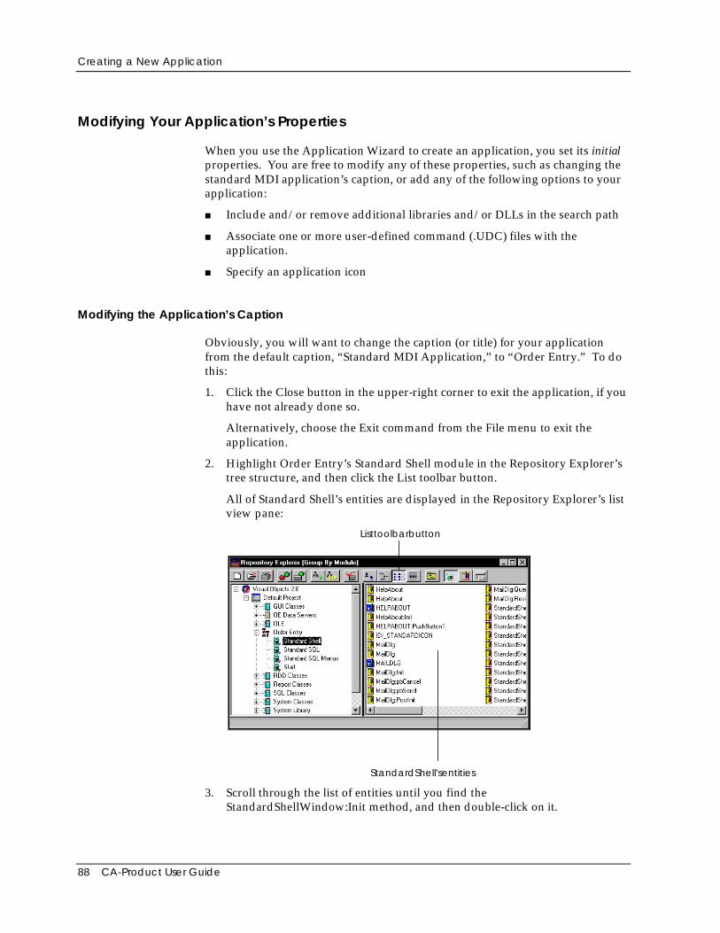
Creating a New Application
88 CA-Product User Guide
Modifying Your Application’s Properties
When you use the Application Wizard to create an application, you set its initialproperties. You are free to modify any of these properties, such as changing thestandard MDI application’s caption, or add any of the following options to yourapplication:
■ Include and/or remove additional libraries and/or DLLs in the search path
■ Associate one or more user-defined command (.UDC) files with theapplication.
■ Specify an application icon
Modifying the Application’s Caption
Obviously, you will want to change the caption (or title) for your applicationfrom the default caption, “Standard MDI Application,” to “Order Entry.” To dothis:
1. Click the Close button in the upper-right corner to exit the application, if youhave not already done so.
Alternatively, choose the Exit command from the File menu to exit theapplication.
2. Highlight Order Entry’s Standard Shell module in the Repository Explorer’stree structure, and then click the List toolbar button.
All of Standard Shell’s entities are displayed in the Repository Explorer’s listview pane:
Listtoolbarbutton
StandardShell'sentities
3. Scroll through the list of entities until you find theStandardShellWindow:Init method, and then double-click on it.
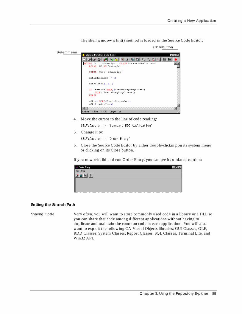
Creating a New Application
Chapter 3: Using the Repository Explorer 89
The shell window’s Init() method is loaded in the Source Code Editor:
Systemmenu
Closebutton
4. Move the cursor to the line of code reading:
SELF:Caption := "Standard MDI Application"
5. Change it to:
SELF:Caption := "Order Entry"
6. Close the Source Code Editor by either double-clicking on its system menuor clicking on its Close button.
If you now rebuild and run Order Entry, you can see its updated caption:
Setting the Search Path
Sharing Code Very often, you will want to store commonly used code in a library or a DLL soyou can share that code among different applications without having toduplicate and maintain the common code in each application. You will alsowant to exploit the following CA-Visual Objects libraries: GUI Classes, OLE,RDD Classes, System Classes, Report Classes, SQL Classes, Terminal Lite, andWin32 API.
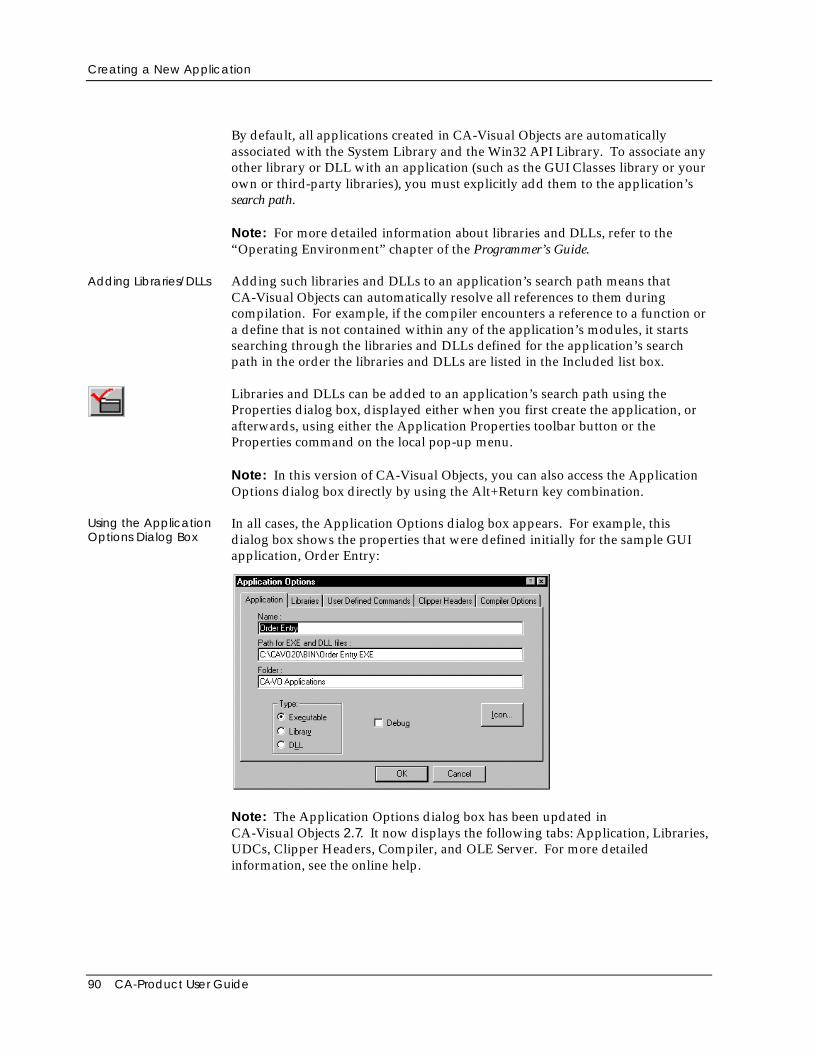
Creating a New Application
90 CA-Product User Guide
By default, all applications created in CA-Visual Objects are automaticallyassociated with the System Library and the Win32 API Library. To associate anyother library or DLL with an application (such as the GUI Classes library or yourown or third-party libraries), you must explicitly add them to the application’ssearch path.
Note: For more detailed information about libraries and DLLs, refer to the“Operating Environment” chapter of the Programmer’s Guide.
Adding Libraries/DLLs Adding such libraries and DLLs to an application’s search path means thatCA-Visual Objects can automatically resolve all references to them duringcompilation. For example, if the compiler encounters a reference to a function ora define that is not contained within any of the application’s modules, it startssearching through the libraries and DLLs defined for the application’s searchpath in the order the libraries and DLLs are listed in the Included list box.
Libraries and DLLs can be added to an application’s search path using theProperties dialog box, displayed either when you first create the application, orafterwards, using either the Application Properties toolbar button or theProperties command on the local pop-up menu.
Note: In this version of CA-Visual Objects, you can also access the ApplicationOptions dialog box directly by using the Alt+Return key combination.
Using the ApplicationOptions Dialog Box
In all cases, the Application Options dialog box appears. For example, thisdialog box shows the properties that were defined initially for the sample GUIapplication, Order Entry:
Note: The Application Options dialog box has been updated inCA-Visual Objects 2.7. It now displays the following tabs: Application, Libraries,UDCs, Clipper Headers, Compiler, and OLE Server. For more detailedinformation, see the online help.
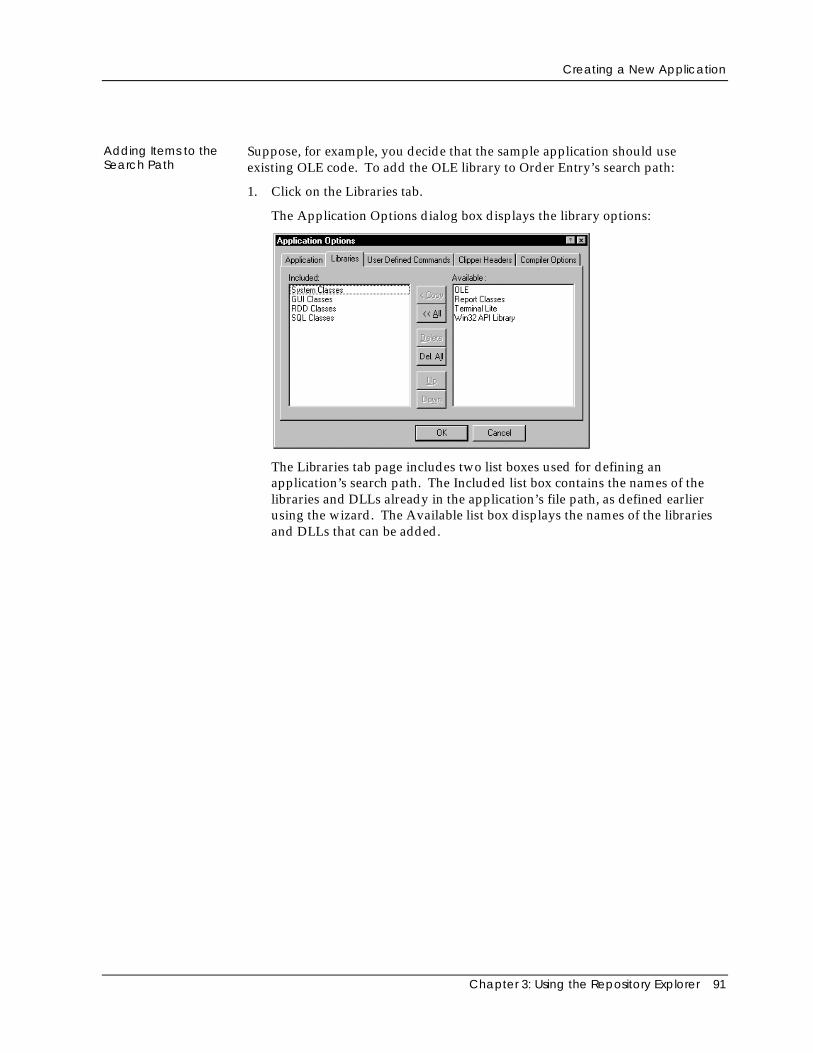
Creating a New Application
Chapter 3: Using the Repository Explorer 91
Adding Items to theSearch Path
Suppose, for example, you decide that the sample application should useexisting OLE code. To add the OLE library to Order Entry’s search path:
1. Click on the Libraries tab.
The Application Options dialog box displays the library options:
The Libraries tab page includes two list boxes used for defining anapplication’s search path. The Included list box contains the names of thelibraries and DLLs already in the application’s file path, as defined earlierusing the wizard. The Available list box displays the names of the librariesand DLLs that can be added.
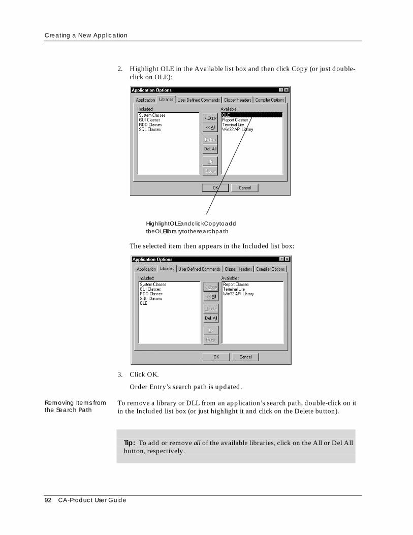
Creating a New Application
92 CA-Product User Guide
2. Highlight OLE in the Available list box and then click Copy (or just double-click on OLE):
HighlightOLEandclickCopytoaddtheOLElibrarytothesearchpath
The selected item then appears in the Included list box:
3. Click OK.
Order Entry’s search path is updated.
Removing Items fromthe Search Path
To remove a library or DLL from an application’s search path, double-click on itin the Included list box (or just highlight it and click on the Delete button).
Tip: To add or remove all of the available libraries, click on the All or Del Allbutton, respectively.
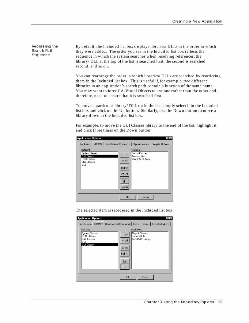
Creating a New Application
Chapter 3: Using the Repository Explorer 93
Reordering theSearch PathSequence
By default, the Included list box displays libraries/DLLs in the order in whichthey were added. The order you see in the Included list box reflects thesequence in which the system searches when resolving references: thelibrary/DLL at the top of the list is searched first, the second is searchedsecond, and so on.
You can rearrange the order in which libraries/DLLs are searched by reorderingthem in the Included list box. This is useful if, for example, two differentlibraries in an application’s search path contain a function of the same name.You may want to force CA-Visual Objects to use one rather than the other and,therefore, need to ensure that it is searched first.
To move a particular library/DLL up in the list, simply select it in the Includedlist box and click on the Up button. Similarly, use the Down button to move alibrary down in the Included list box.
For example, to move the GUI Classes library to the end of the list, highlight itand click three times on the Down button:
The selected item is reordered in the Included list box:
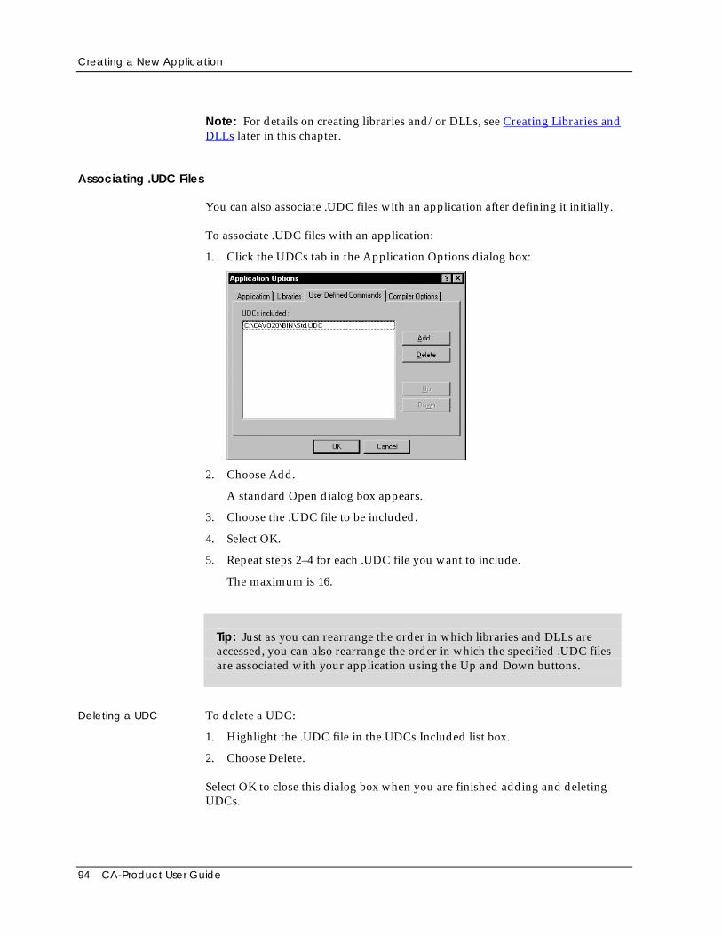
Creating a New Application
94 CA-Product User Guide
Note: For details on creating libraries and/or DLLs, see Creating Libraries andDLLs later in this chapter.
Associating .UDC Files
You can also associate .UDC files with an application after defining it initially.
To associate .UDC files with an application:
1. Click the UDCs tab in the Application Options dialog box:
2. Choose Add.
A standard Open dialog box appears.
3. Choose the .UDC file to be included.
4. Select OK.
5. Repeat steps 2–4 for each .UDC file you want to include.
The maximum is 16.
Tip: Just as you can rearrange the order in which libraries and DLLs areaccessed, you can also rearrange the order in which the specified .UDC filesare associated with your application using the Up and Down buttons.
Deleting a UDC To delete a UDC:
1. Highlight the .UDC file in the UDCs Included list box.
2. Choose Delete.
Select OK to close this dialog box when you are finished adding and deletingUDCs.
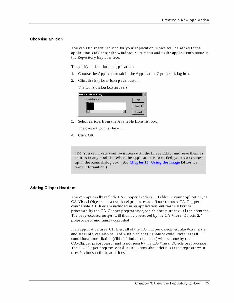
Creating a New Application
Chapter 3: Using the Repository Explorer 95
Choosing an Icon
You can also specify an icon for your application, which will be added to theapplication’s folder for the Windows Start menu and to the application’s name inthe Repository Explorer tree.
To specify an icon for an application:
1. Choose the Application tab in the Application Options dialog box.
2. Click the Explorer Icon push button.
The Icons dialog box appears:
3. Select an icon from the Available Icons list box.
The default icon is shown.
4. Click OK.
Tip: You can create your own icons with the Image Editor and save them asentities in any module. When the application is compiled, your icons showup in the Icons dialog box. (See Chapter 10: Using the Image Editor formore information.)
Adding Clipper Headers
You can optionally include CA-Clipper header (.CH) files in your application, asCA-Visual Objects has a two-level preprocessor. If one or more CA-Clipper-compatible .CH files are included in an application, entities will first beprocessed by the CA-Clipper preprocessor, which does pure textual replacement.The preprocessed output will then be processed by the CA-Visual Objects 2.7preprocessor and finally compiled.
If an application uses .CH files, all of the CA-Clipper directives, like #xtranslateand #include, can also be used within an entity’s source code. Note that allconditional compilation (#ifdef, #ifndef, and so on) will be done by theCA-Clipper preprocessor and is not seen by the CA-Visual Objects preprocessor.The CA-Clipper preprocessor does not know about defines in the repository: ituses #defines in the header files.
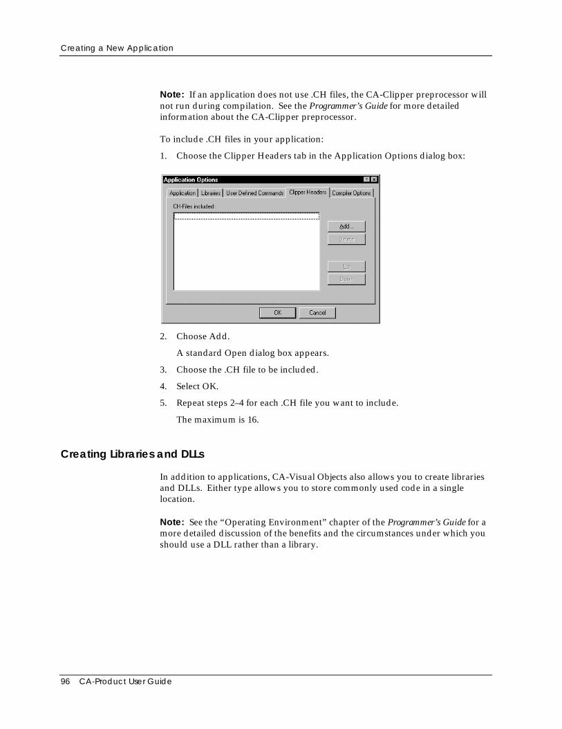
Creating a New Application
96 CA-Product User Guide
Note: If an application does not use .CH files, the CA-Clipper preprocessor willnot run during compilation. See the Programmer’s Guide for more detailedinformation about the CA-Clipper preprocessor.
To include .CH files in your application:
1. Choose the Clipper Headers tab in the Application Options dialog box:
2. Choose Add.
A standard Open dialog box appears.
3. Choose the .CH file to be included.
4. Select OK.
5. Repeat steps 2–4 for each .CH file you want to include.
The maximum is 16.
Creating Libraries and DLLs
In addition to applications, CA-Visual Objects also allows you to create librariesand DLLs. Either type allows you to store commonly used code in a singlelocation.
Note: See the “Operating Environment” chapter of the Programmer’s Guide for amore detailed discussion of the benefits and the circumstances under which youshould use a DLL rather than a library.
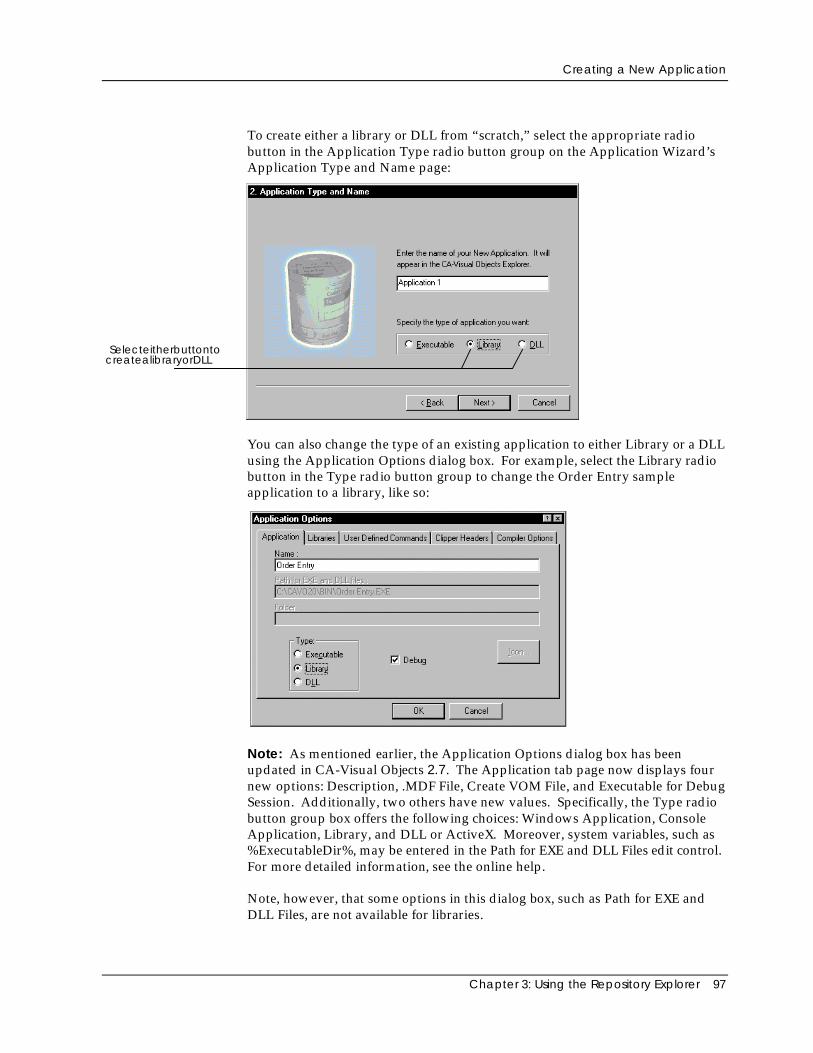
Creating a New Application
Chapter 3: Using the Repository Explorer 97
To create either a library or DLL from “scratch,” select the appropriate radiobutton in the Application Type radio button group on the Application Wizard’sApplication Type and Name page:
SelecteitherbuttontocreatealibraryorDLL
You can also change the type of an existing application to either Library or a DLLusing the Application Options dialog box. For example, select the Library radiobutton in the Type radio button group to change the Order Entry sampleapplication to a library, like so:
Note: As mentioned earlier, the Application Options dialog box has beenupdated in CA-Visual Objects 2.7. The Application tab page now displays fournew options: Description, .MDF File, Create VOM File, and Executable for DebugSession. Additionally, two others have new values. Specifically, the Type radiobutton group box offers the following choices: Windows Application, ConsoleApplication, Library, and DLL or ActiveX. Moreover, system variables, such as%ExecutableDir%, may be entered in the Path for EXE and DLL Files edit control.For more detailed information, see the online help.
Note, however, that some options in this dialog box, such as Path for EXE andDLL Files, are not available for libraries.
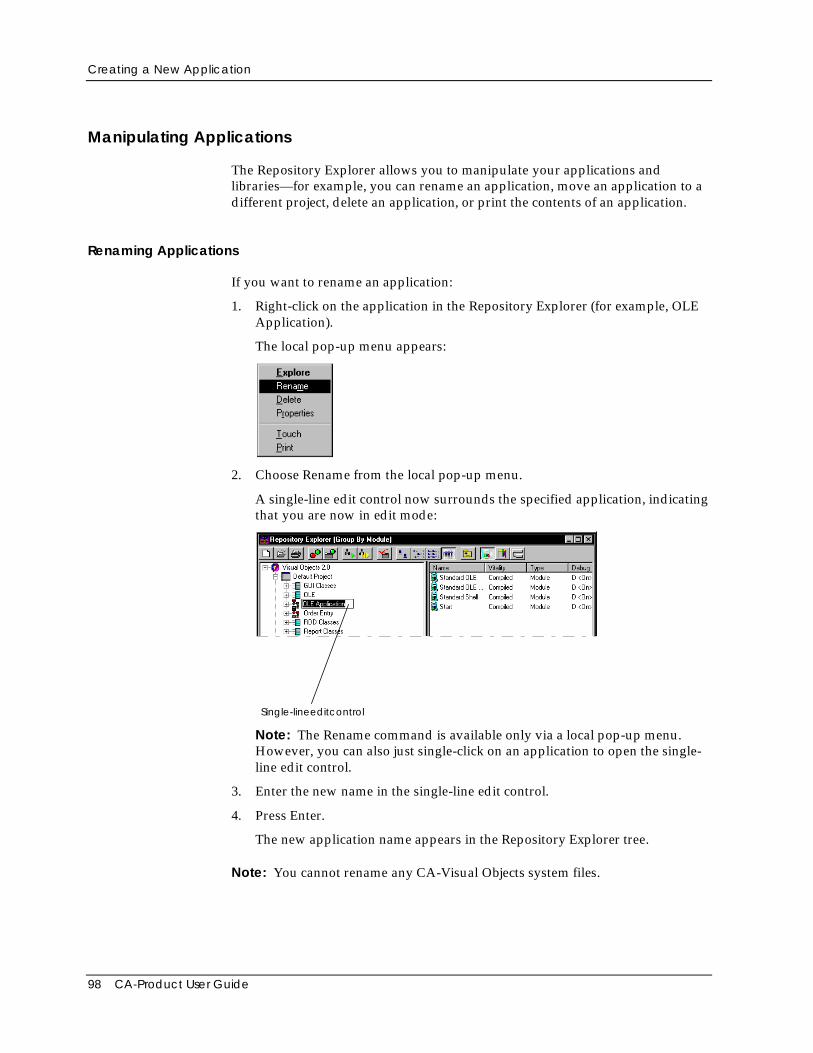
Creating a New Application
98 CA-Product User Guide
Manipulating Applications
The Repository Explorer allows you to manipulate your applications andlibraries—for example, you can rename an application, move an application to adifferent project, delete an application, or print the contents of an application.
Renaming Applications
If you want to rename an application:
1. Right-click on the application in the Repository Explorer (for example, OLEApplication).
The local pop-up menu appears:
2. Choose Rename from the local pop-up menu.
A single-line edit control now surrounds the specified application, indicatingthat you are now in edit mode:
Single-lineeditcontrol
Note: The Rename command is available only via a local pop-up menu.However, you can also just single-click on an application to open the single-line edit control.
3. Enter the new name in the single-line edit control.
4. Press Enter.
The new application name appears in the Repository Explorer tree.
Note: You cannot rename any CA-Visual Objects system files.
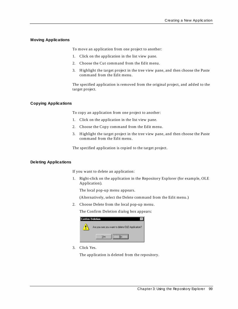
Creating a New Application
Chapter 3: Using the Repository Explorer 99
Moving Applications
To move an application from one project to another:
1. Click on the application in the list view pane.
2. Choose the Cut command from the Edit menu.
3. Highlight the target project in the tree view pane, and then choose the Pastecommand from the Edit menu.
The specified application is removed from the original project, and added to thetarget project.
Copying Applications
To copy an application from one project to another:
1. Click on the application in the list view pane.
2. Choose the Copy command from the Edit menu.
3. Highlight the target project in the tree view pane, and then choose the Pastecommand from the Edit menu.
The specified application is copied to the target project.
Deleting Applications
If you want to delete an application:
1. Right-click on the application in the Repository Explorer (for example, OLEApplication).
The local pop-up menu appears.
(Alternatively, select the Delete command from the Edit menu.)
2. Choose Delete from the local pop-up menu.
The Confirm Deletion dialog box appears:
3. Click Yes.
The application is deleted from the repository.
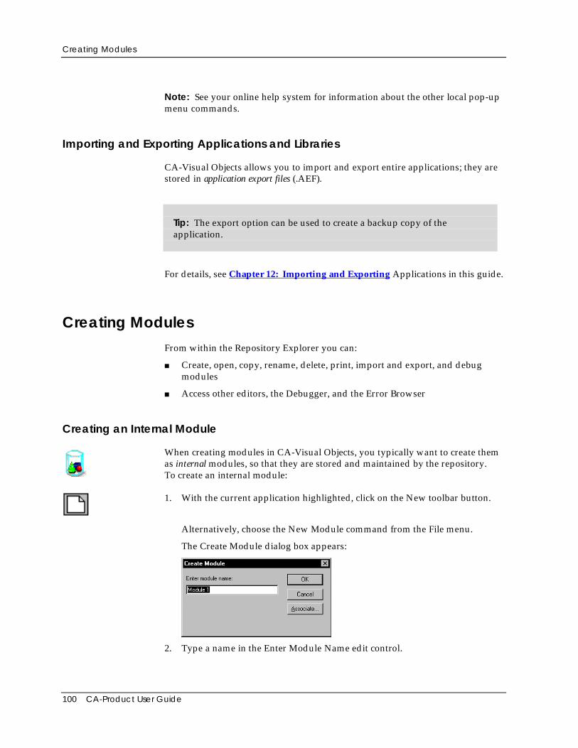
Creating Modules
100 CA-Product User Guide
Note: See your online help system for information about the other local pop-upmenu commands.
Importing and Exporting Applications and Libraries
CA-Visual Objects allows you to import and export entire applications; they arestored in application export files (.AEF).
Tip: The export option can be used to create a backup copy of theapplication.
For details, see Chapter 12: Importing and Exporting Applications in this guide.
Creating ModulesFrom within the Repository Explorer you can:
■ Create, open, copy, rename, delete, print, import and export, and debugmodules
■ Access other editors, the Debugger, and the Error Browser
Creating an Internal Module
When creating modules in CA-Visual Objects, you typically want to create themas internal modules, so that they are stored and maintained by the repository.To create an internal module:
1. With the current application highlighted, click on the New toolbar button.
Alternatively, choose the New Module command from the File menu.
The Create Module dialog box appears:
2. Type a name in the Enter Module Name edit control.
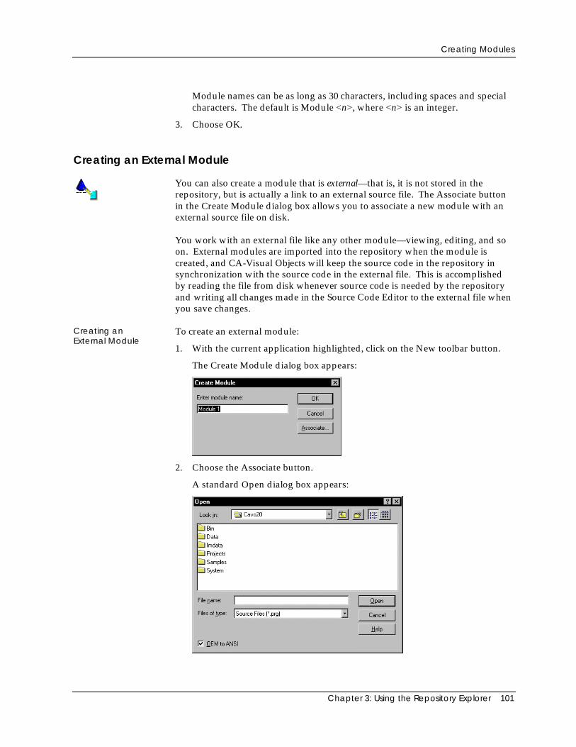
Creating Modules
Chapter 3: Using the Repository Explorer 101
Module names can be as long as 30 characters, including spaces and specialcharacters. The default is Module <n>, where <n> is an integer.
3. Choose OK.
Creating an External Module
You can also create a module that is external—that is, it is not stored in therepository, but is actually a link to an external source file. The Associate buttonin the Create Module dialog box allows you to associate a new module with anexternal source file on disk.
You work with an external file like any other module—viewing, editing, and soon. External modules are imported into the repository when the module iscreated, and CA-Visual Objects will keep the source code in the repository insynchronization with the source code in the external file. This is accomplishedby reading the file from disk whenever source code is needed by the repositoryand writing all changes made in the Source Code Editor to the external file whenyou save changes.
Creating anExternal Module
To create an external module:
1. With the current application highlighted, click on the New toolbar button.
The Create Module dialog box appears:
2. Choose the Associate button.
A standard Open dialog box appears:
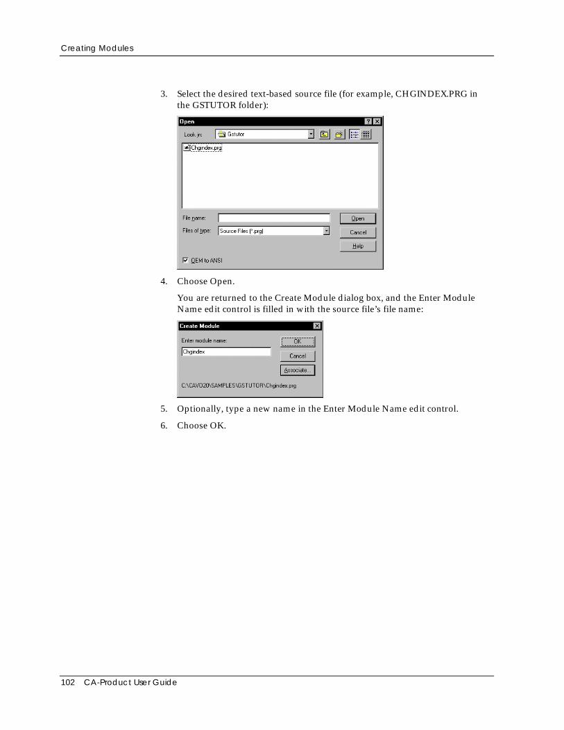
Creating Modules
102 CA-Product User Guide
3. Select the desired text-based source file (for example, CHGINDEX.PRG inthe GSTUTOR folder):
4. Choose Open.
You are returned to the Create Module dialog box, and the Enter ModuleName edit control is filled in with the source file’s file name:
5. Optionally, type a new name in the Enter Module Name edit control.
6. Choose OK.
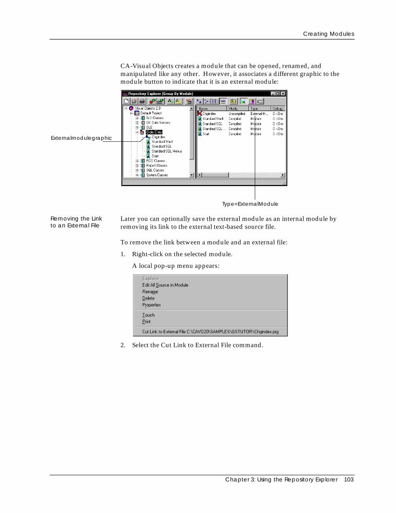
Creating Modules
Chapter 3: Using the Repository Explorer 103
CA-Visual Objects creates a module that can be opened, renamed, andmanipulated like any other. However, it associates a different graphic to themodule button to indicate that it is an external module:
Externalmodulegraphic
Type=ExternalModule
Removing the Linkto an External File
Later you can optionally save the external module as an internal module byremoving its link to the external text-based source file.
To remove the link between a module and an external file:
1. Right-click on the selected module.
A local pop-up menu appears:
2. Select the Cut Link to External File command.
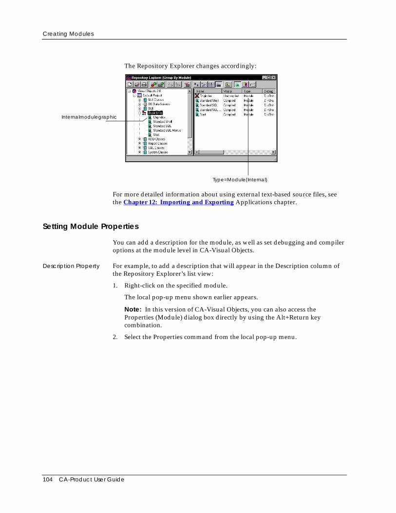
Creating Modules
104 CA-Product User Guide
The Repository Explorer changes accordingly:
Internalmodulegraphic
Type=Module(Internal)
For more detailed information about using external text-based source files, seethe Chapter 12: Importing and Exporting Applications chapter.
Setting Module Properties
You can add a description for the module, as well as set debugging and compileroptions at the module level in CA-Visual Objects.
Description Property For example, to add a description that will appear in the Description column ofthe Repository Explorer’s list view:
1. Right-click on the specified module.
The local pop-up menu shown earlier appears.
Note: In this version of CA-Visual Objects, you can also access theProperties (Module) dialog box directly by using the Alt+Return keycombination.
2. Select the Properties command from the local pop-up menu.
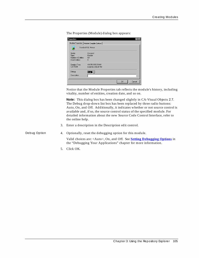
Creating Modules
Chapter 3: Using the Repository Explorer 105
The Properties (Module) dialog box appears:
Notice that the Module Properties tab reflects the module's history, includingvitality, number of entities, creation date, and so on.
Note: This dialog box has been changed slightly in CA-Visual Objects 2.7.The Debug drop-down list box has been replaced by three radio buttons:Auto, On, and Off. Additionally, it indicates whether or not source control isavailable and, if so, the source control status of the specified module. Fordetailed information about the new Source Code Control Interface, refer tothe online help.
3. Enter a description in the Description edit control.
Debug Option 4. Optionally, reset the debugging option for this module.
Valid choices are: <Auto>, On, and Off. See Setting Debugging Options inthe “Debugging Your Applications” chapter for more information.
5. Click OK.
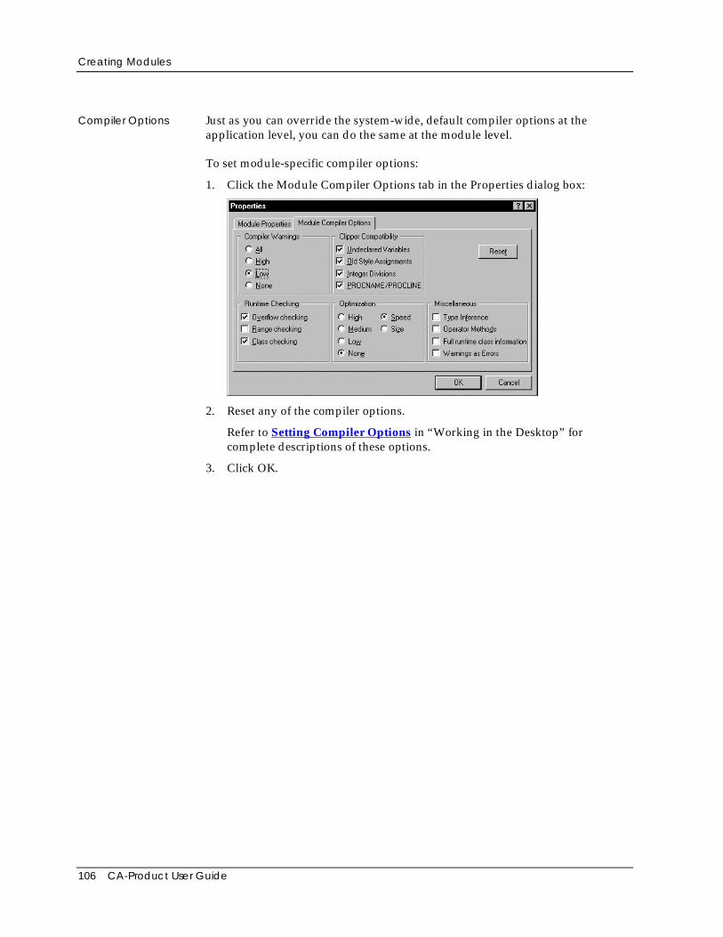
Creating Modules
106 CA-Product User Guide
Compiler Options Just as you can override the system-wide, default compiler options at theapplication level, you can do the same at the module level.
To set module-specific compiler options:
1. Click the Module Compiler Options tab in the Properties dialog box:
2. Reset any of the compiler options.
Refer to Setting Compiler Options in “Working in the Desktop” forcomplete descriptions of these options.
3. Click OK.
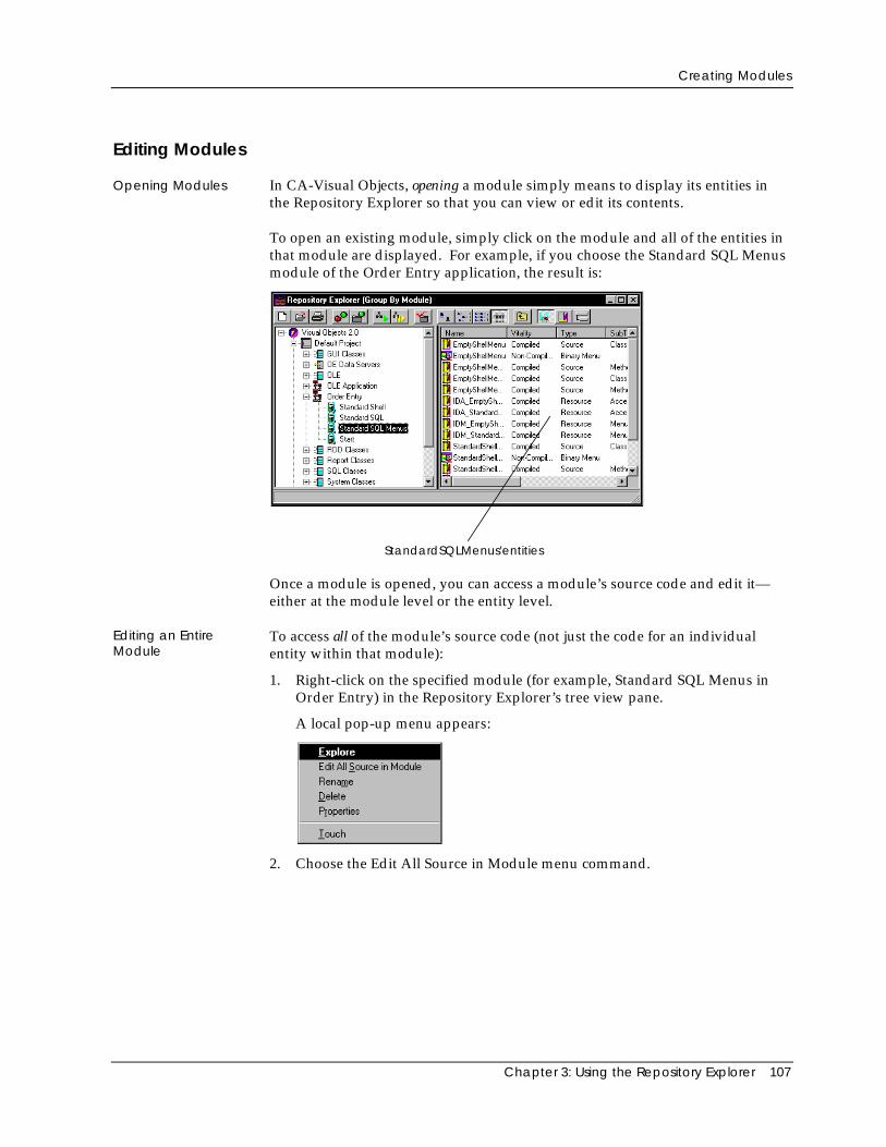
Creating Modules
Chapter 3: Using the Repository Explorer 107
Editing Modules
Opening Modules In CA-Visual Objects, opening a module simply means to display its entities inthe Repository Explorer so that you can view or edit its contents.
To open an existing module, simply click on the module and all of the entities inthat module are displayed. For example, if you choose the Standard SQL Menusmodule of the Order Entry application, the result is:
StandardSQLMenus'entities
Once a module is opened, you can access a module’s source code and edit it—either at the module level or the entity level.
Editing an EntireModule
To access all of the module’s source code (not just the code for an individualentity within that module):
1. Right-click on the specified module (for example, Standard SQL Menus inOrder Entry) in the Repository Explorer’s tree view pane.
A local pop-up menu appears:
2. Choose the Edit All Source in Module menu command.
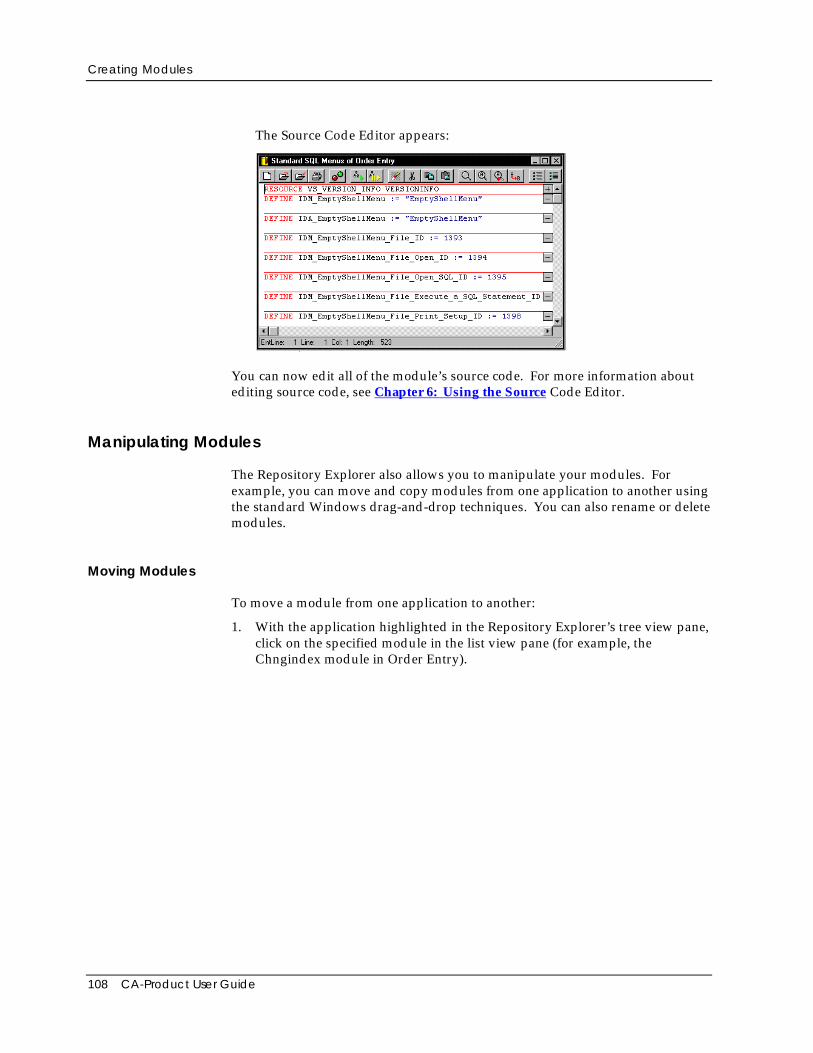
Creating Modules
108 CA-Product User Guide
The Source Code Editor appears:
You can now edit all of the module’s source code. For more information aboutediting source code, see Chapter 6: Using the Source Code Editor.
Manipulating Modules
The Repository Explorer also allows you to manipulate your modules. Forexample, you can move and copy modules from one application to another usingthe standard Windows drag-and-drop techniques. You can also rename or deletemodules.
Moving Modules
To move a module from one application to another:
1. With the application highlighted in the Repository Explorer’s tree view pane,click on the specified module in the list view pane (for example, theChngindex module in Order Entry).
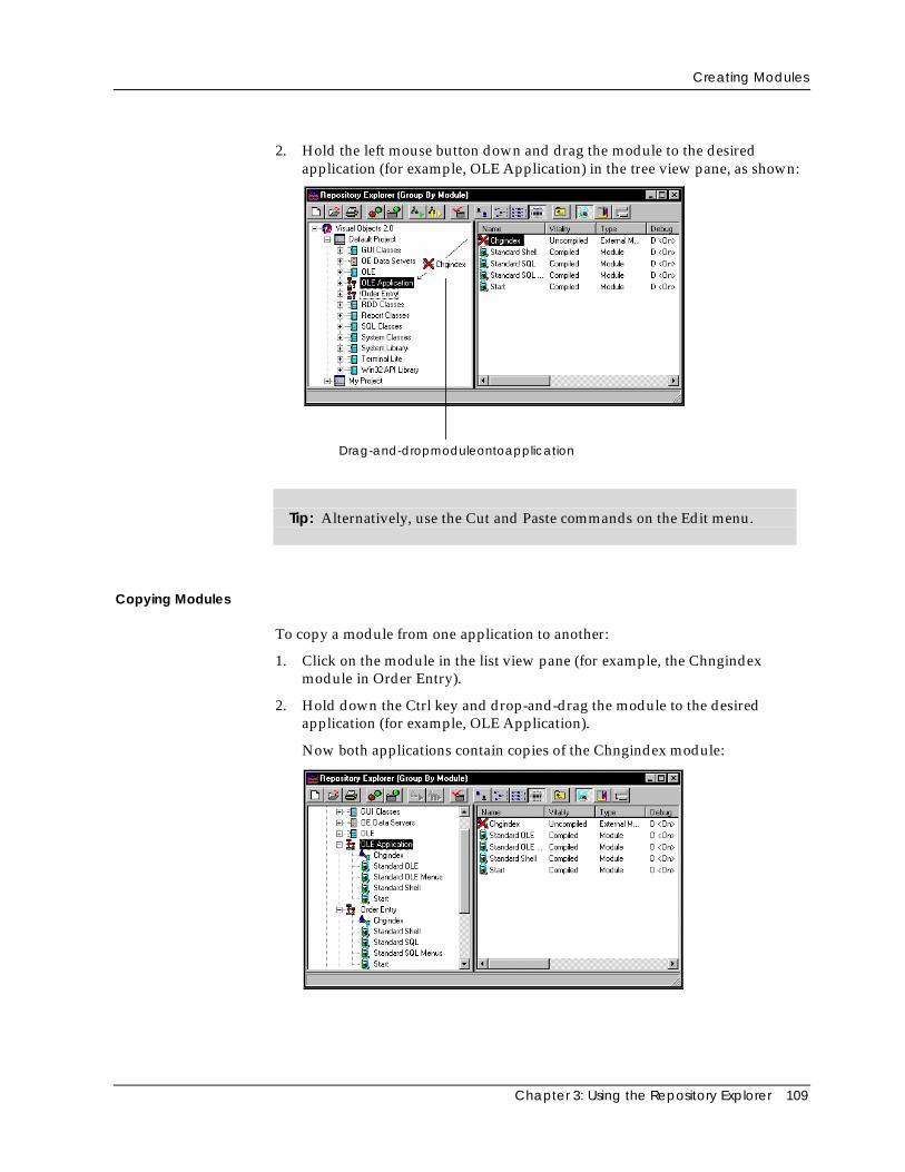
Creating Modules
Chapter 3: Using the Repository Explorer 109
2. Hold the left mouse button down and drag the module to the desiredapplication (for example, OLE Application) in the tree view pane, as shown:
Drag-and-dropmoduleontoapplication
Tip: Alternatively, use the Cut and Paste commands on the Edit menu.
Copying Modules
To copy a module from one application to another:
1. Click on the module in the list view pane (for example, the Chngindexmodule in Order Entry).
2. Hold down the Ctrl key and drop-and-drag the module to the desiredapplication (for example, OLE Application).
Now both applications contain copies of the Chngindex module:
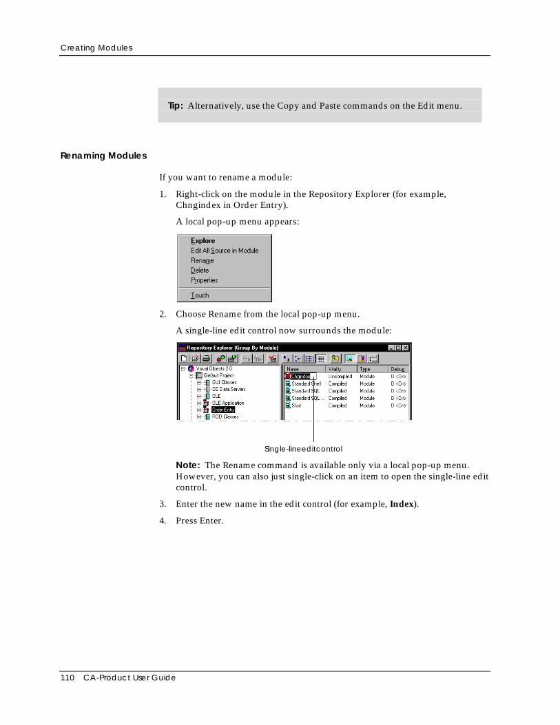
Creating Modules
110 CA-Product User Guide
Tip: Alternatively, use the Copy and Paste commands on the Edit menu.
Renaming Modules
If you want to rename a module:
1. Right-click on the module in the Repository Explorer (for example,Chngindex in Order Entry).
A local pop-up menu appears:
2. Choose Rename from the local pop-up menu.
A single-line edit control now surrounds the module:
Single-lineeditcontrol
Note: The Rename command is available only via a local pop-up menu.However, you can also just single-click on an item to open the single-line editcontrol.
3. Enter the new name in the edit control (for example, Index).
4. Press Enter.
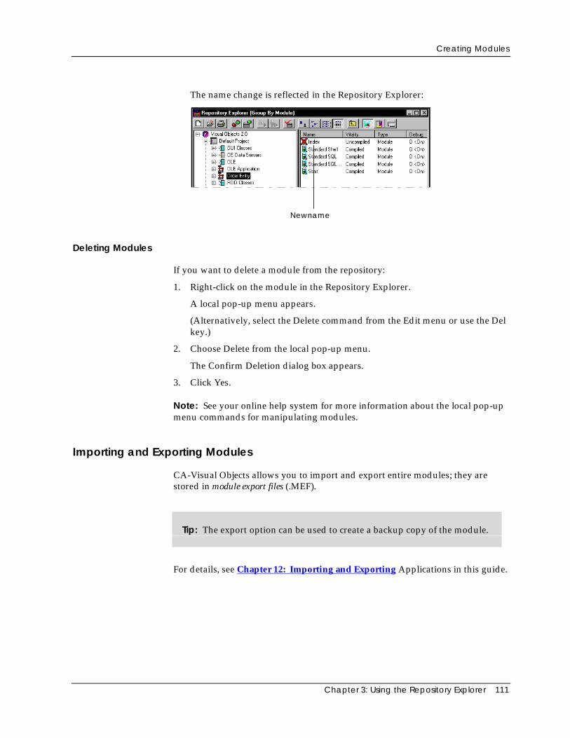
Creating Modules
Chapter 3: Using the Repository Explorer 111
The name change is reflected in the Repository Explorer:
Newname
Deleting Modules
If you want to delete a module from the repository:
1. Right-click on the module in the Repository Explorer.
A local pop-up menu appears.
(Alternatively, select the Delete command from the Edit menu or use the Delkey.)
2. Choose Delete from the local pop-up menu.
The Confirm Deletion dialog box appears.
3. Click Yes.
Note: See your online help system for more information about the local pop-upmenu commands for manipulating modules.
Importing and Exporting Modules
CA-Visual Objects allows you to import and export entire modules; they arestored in module export files (.MEF).
Tip: The export option can be used to create a backup copy of the module.
For details, see Chapter 12: Importing and Exporting Applications in this guide.
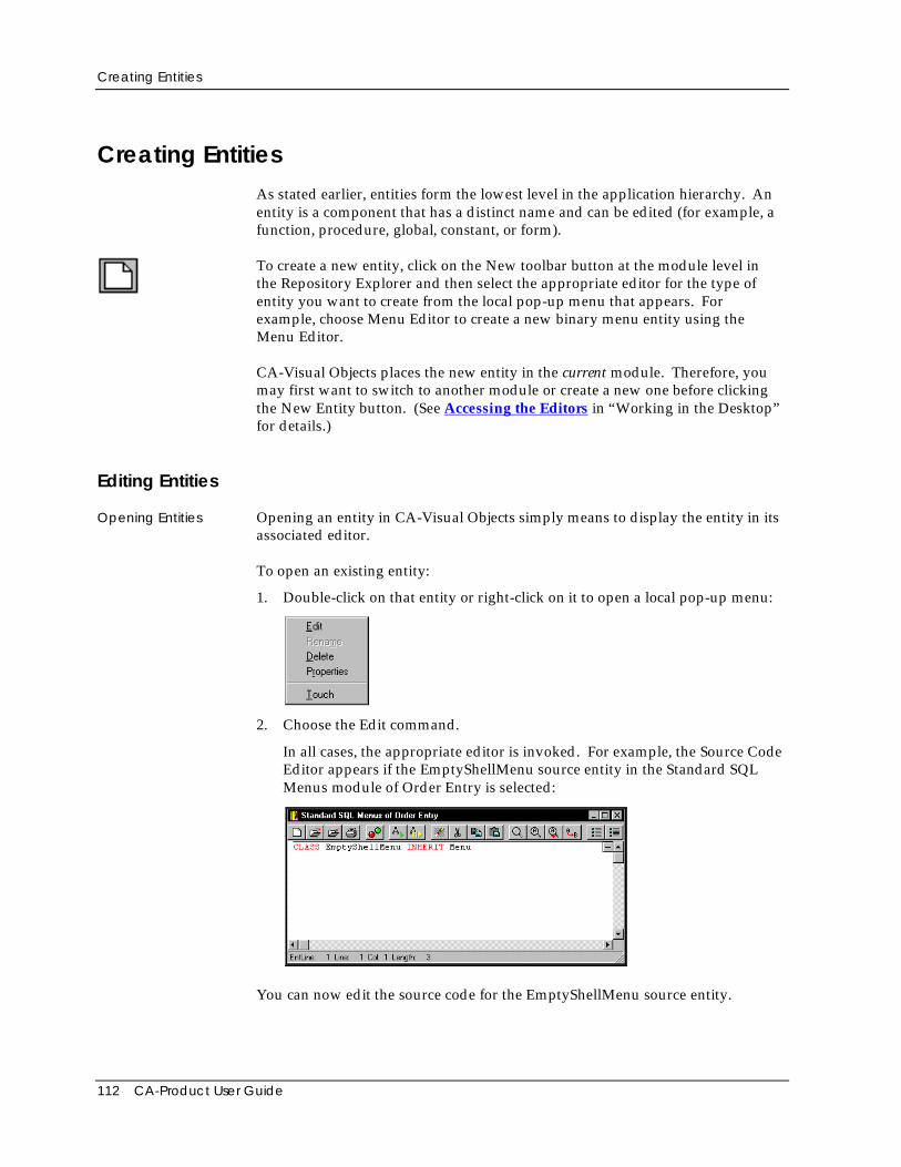
Creating Entities
112 CA-Product User Guide
Creating EntitiesAs stated earlier, entities form the lowest level in the application hierarchy. Anentity is a component that has a distinct name and can be edited (for example, afunction, procedure, global, constant, or form).
To create a new entity, click on the New toolbar button at the module level inthe Repository Explorer and then select the appropriate editor for the type ofentity you want to create from the local pop-up menu that appears. Forexample, choose Menu Editor to create a new binary menu entity using theMenu Editor.
CA-Visual Objects places the new entity in the current module. Therefore, youmay first want to switch to another module or create a new one before clickingthe New Entity button. (See Accessing the Editors in “Working in the Desktop”for details.)
Editing Entities
Opening Entities Opening an entity in CA-Visual Objects simply means to display the entity in itsassociated editor.
To open an existing entity:
1. Double-click on that entity or right-click on it to open a local pop-up menu:
2. Choose the Edit command.
In all cases, the appropriate editor is invoked. For example, the Source CodeEditor appears if the EmptyShellMenu source entity in the Standard SQLMenus module of Order Entry is selected:
You can now edit the source code for the EmptyShellMenu source entity.
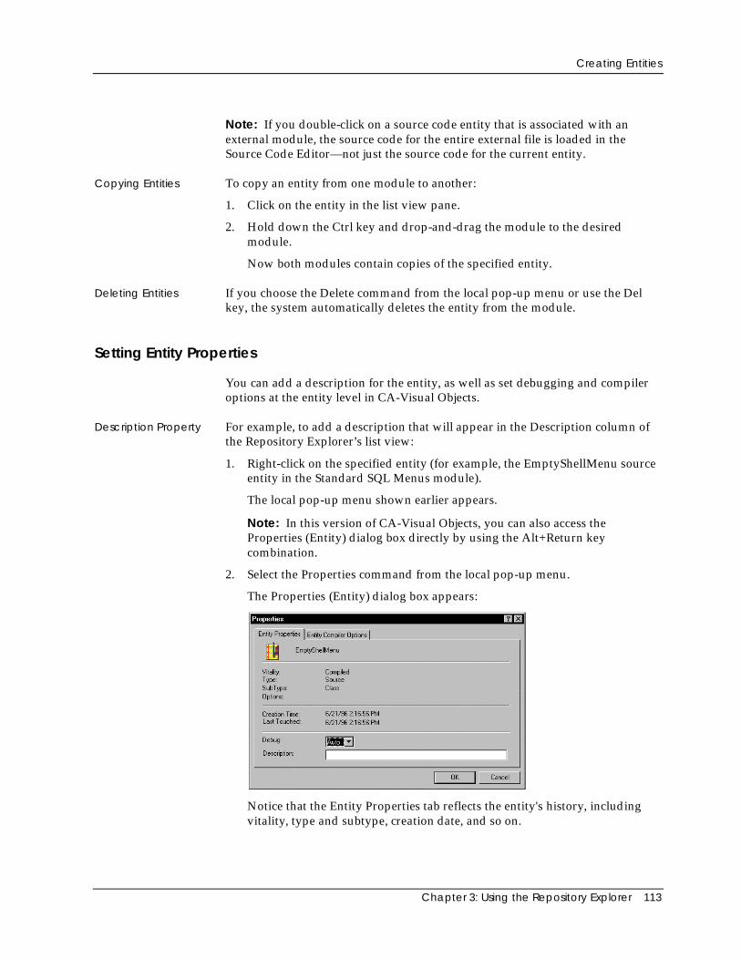
Creating Entities
Chapter 3: Using the Repository Explorer 113
Note: If you double-click on a source code entity that is associated with anexternal module, the source code for the entire external file is loaded in theSource Code Editor—not just the source code for the current entity.
Copying Entities To copy an entity from one module to another:
1. Click on the entity in the list view pane.
2. Hold down the Ctrl key and drop-and-drag the module to the desiredmodule.
Now both modules contain copies of the specified entity.
Deleting Entities If you choose the Delete command from the local pop-up menu or use the Delkey, the system automatically deletes the entity from the module.
Setting Entity Properties
You can add a description for the entity, as well as set debugging and compileroptions at the entity level in CA-Visual Objects.
Description Property For example, to add a description that will appear in the Description column ofthe Repository Explorer’s list view:
1. Right-click on the specified entity (for example, the EmptyShellMenu sourceentity in the Standard SQL Menus module).
The local pop-up menu shown earlier appears.
Note: In this version of CA-Visual Objects, you can also access theProperties (Entity) dialog box directly by using the Alt+Return keycombination.
2. Select the Properties command from the local pop-up menu.
The Properties (Entity) dialog box appears:
Notice that the Entity Properties tab reflects the entity's history, includingvitality, type and subtype, creation date, and so on.
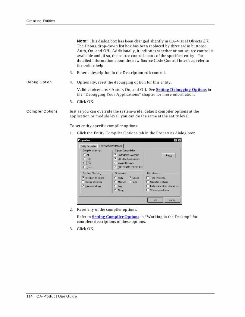
Creating Entities
114 CA-Product User Guide
Note: This dialog box has been changed slightly in CA-Visual Objects 2.7.The Debug drop-down list box has been replaced by three radio buttons:Auto, On, and Off. Additionally, it indicates whether or not source control isavailable and, if so, the source control status of the specified entity. Fordetailed information about the new Source Code Control Interface, refer tothe online help.
3. Enter a description in the Description edit control.
Debug Option 4. Optionally, reset the debugging option for this entity.
Valid choices are: <Auto>, On, and Off. See Setting Debugging Options inthe “Debugging Your Applications” chapter for more information.
5. Click OK.
Compiler Options Just as you can override the system-wide, default compiler options at theapplication or module level, you can do the same at the entity level.
To set entity-specific compiler options:
1. Click the Entity Compiler Options tab in the Properties dialog box:
2. Reset any of the compiler options.
Refer to Setting Compiler Options in “Working in the Desktop” forcomplete descriptions of these options.
3. Click OK.
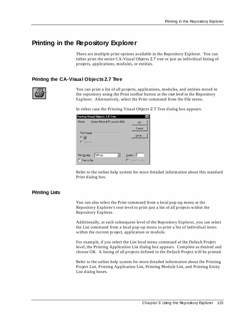
Printing in the Repository Explorer
Chapter 3: Using the Repository Explorer 115
Printing in the Repository ExplorerThere are multiple print options available in the Repository Explorer. You caneither print the entire CA-Visual Objects 2.7 tree or just an individual listing ofprojects, applications, modules, or entities.
Printing the CA-Visual Objects 2.7 Tree
You can print a list of all projects, applications, modules, and entities stored inthe repository using the Print toolbar button at the root level in the RepositoryExplorer. Alternatively, select the Print command from the File menu.
In either case the Printing Visual Objects 2.7 Tree dialog box appears:
Refer to the online help system for more detailed information about this standardPrint dialog box.
Printing Lists
You can also select the Print command from a local pop-up menu at theRepository Explorer's root level to print just a list of all projects within theRepository Explorer.
Additionally, at each subsequent level of the Repository Explorer, you can selectthe List command from a local pop-up menu to print a list of individual itemswithin the current project, application or module.
For example, if you select the List local menu command at the Default Projectlevel, the Printing Application List dialog box appears. Complete as desired andchoose OK. A listing of all projects defined to the Default Project will be printed.
Refer to the online help system for more detailed information about the PrintingProject List, Printing Application List, Printing Module List, and Printing EntityList dialog boxes.

Chapter 4: Using the Window Editor 117
Chapter
4 Using the Window Editor
The Window Editor allows you to create several types of windows based onsubclassing the Window classes from the GUI Classes library. It providespredefined forms and drag-and-drop placement of buttons, edit controls, listboxes, combo boxes, toolbars, sliders, and other GUI and common controls. Youcan then specify properties for your forms and their controls, including color,font, annotation, online help keyword, and data server links. When you designand save a form, the Window Editor automatically generates object-orientedcode that you can use in your application to create and activate the window.
This chapter describes how to use the Window Editor. In it, you will learn howto:
■ Create a window by selecting a window type and customizing thecorresponding predefined form
■ Specify properties for the form (such as caption, description, type of mousepointer, and help keyword)
■ Place controls (such as push buttons and list boxes) on the form and specifyproperties for them
■ Create predefined data and data dialog windows linked to data serversusing the Auto Layout feature
■ Make controls on data and data dialog windows data-aware, binding them todata server fields
■ Modify form and control properties
■ Print the form using the Window Editor
■ Use the window you have created in an application
Important! The GUI Classes and System Classes libraries must be included in thesearch path of your application in order to use a form generated by the Window Editor.The proper data server library, RDD Classes or SQL Classes, must also be included if theform is linked to a data server. See Setting the Search Path in “Using the RepositoryExplorer” for more information.
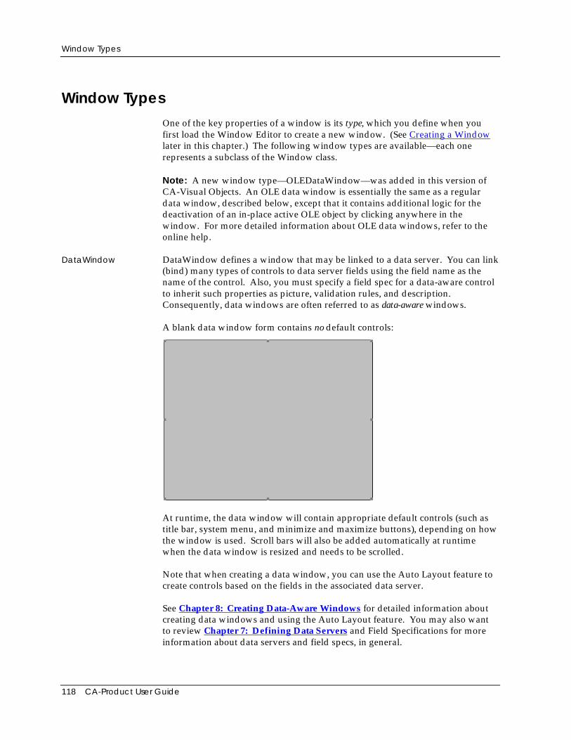
Window Types
118 CA-Product User Guide
Window TypesOne of the key properties of a window is its type, which you define when youfirst load the Window Editor to create a new window. (See Creating a Windowlater in this chapter.) The following window types are available—each onerepresents a subclass of the Window class.
Note: A new window type—OLEDataWindow—was added in this version ofCA-Visual Objects. An OLE data window is essentially the same as a regulardata window, described below, except that it contains additional logic for thedeactivation of an in-place active OLE object by clicking anywhere in thewindow. For more detailed information about OLE data windows, refer to theonline help.
DataWindow DataWindow defines a window that may be linked to a data server. You can link(bind) many types of controls to data server fields using the field name as thename of the control. Also, you must specify a field spec for a data-aware controlto inherit such properties as picture, validation rules, and description.Consequently, data windows are often referred to as data-aware windows.
A blank data window form contains no default controls:
At runtime, the data window will contain appropriate default controls (such astitle bar, system menu, and minimize and maximize buttons), depending on howthe window is used. Scroll bars will also be added automatically at runtimewhen the data window is resized and needs to be scrolled.
Note that when creating a data window, you can use the Auto Layout feature tocreate controls based on the fields in the associated data server.
See Chapter 8: Creating Data-Aware Windows for detailed information aboutcreating data windows and using the Auto Layout feature. You may also wantto review Chapter 7: Defining Data Servers and Field Specifications for moreinformation about data servers and field specs, in general.
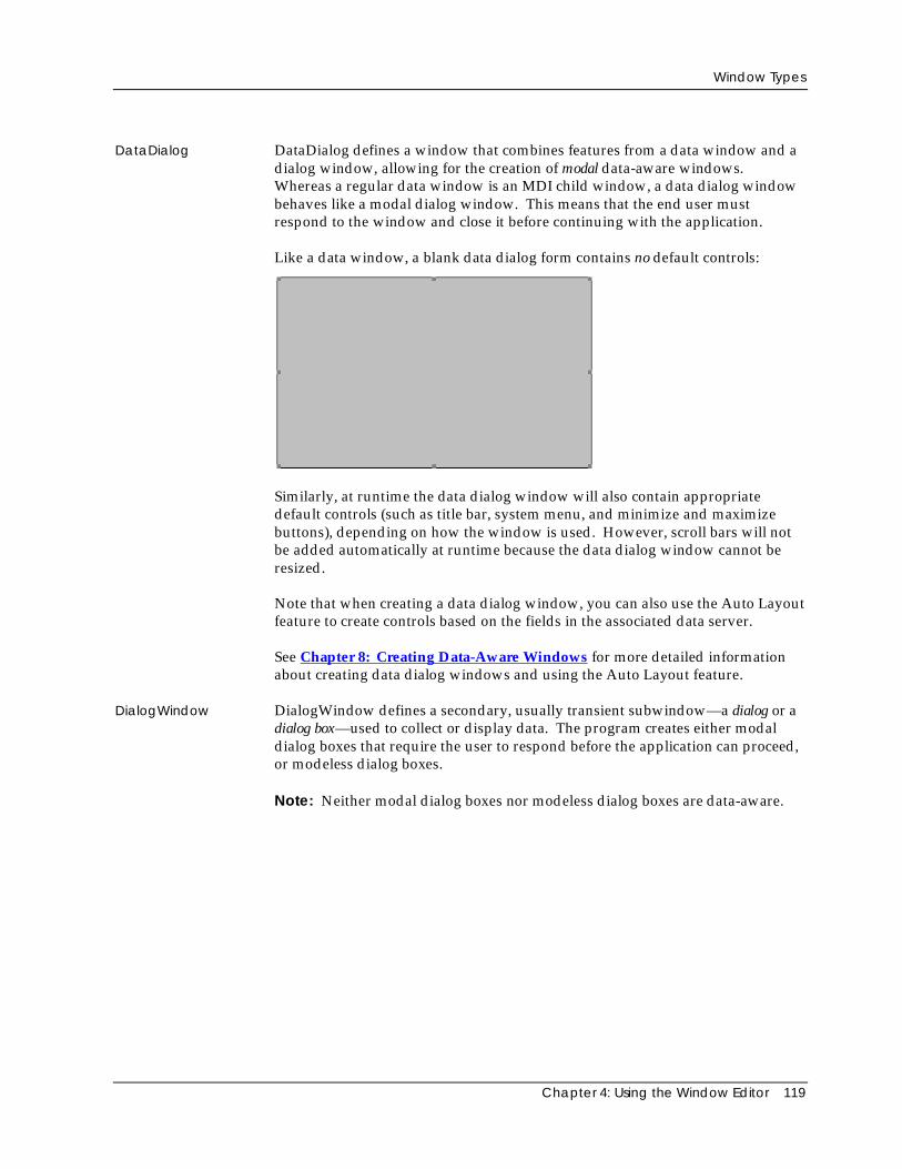
Window Types
Chapter 4: Using the Window Editor 119
DataDialog DataDialog defines a window that combines features from a data window and adialog window, allowing for the creation of modal data-aware windows.Whereas a regular data window is an MDI child window, a data dialog windowbehaves like a modal dialog window. This means that the end user mustrespond to the window and close it before continuing with the application.
Like a data window, a blank data dialog form contains no default controls:
Similarly, at runtime the data dialog window will also contain appropriatedefault controls (such as title bar, system menu, and minimize and maximizebuttons), depending on how the window is used. However, scroll bars will notbe added automatically at runtime because the data dialog window cannot beresized.
Note that when creating a data dialog window, you can also use the Auto Layoutfeature to create controls based on the fields in the associated data server.
See Chapter 8: Creating Data-Aware Windows for more detailed informationabout creating data dialog windows and using the Auto Layout feature.
DialogWindow DialogWindow defines a secondary, usually transient subwindow—a dialog or adialog box—used to collect or display data. The program creates either modaldialog boxes that require the user to respond before the application can proceed,or modeless dialog boxes.
Note: Neither modal dialog boxes nor modeless dialog boxes are data-aware.
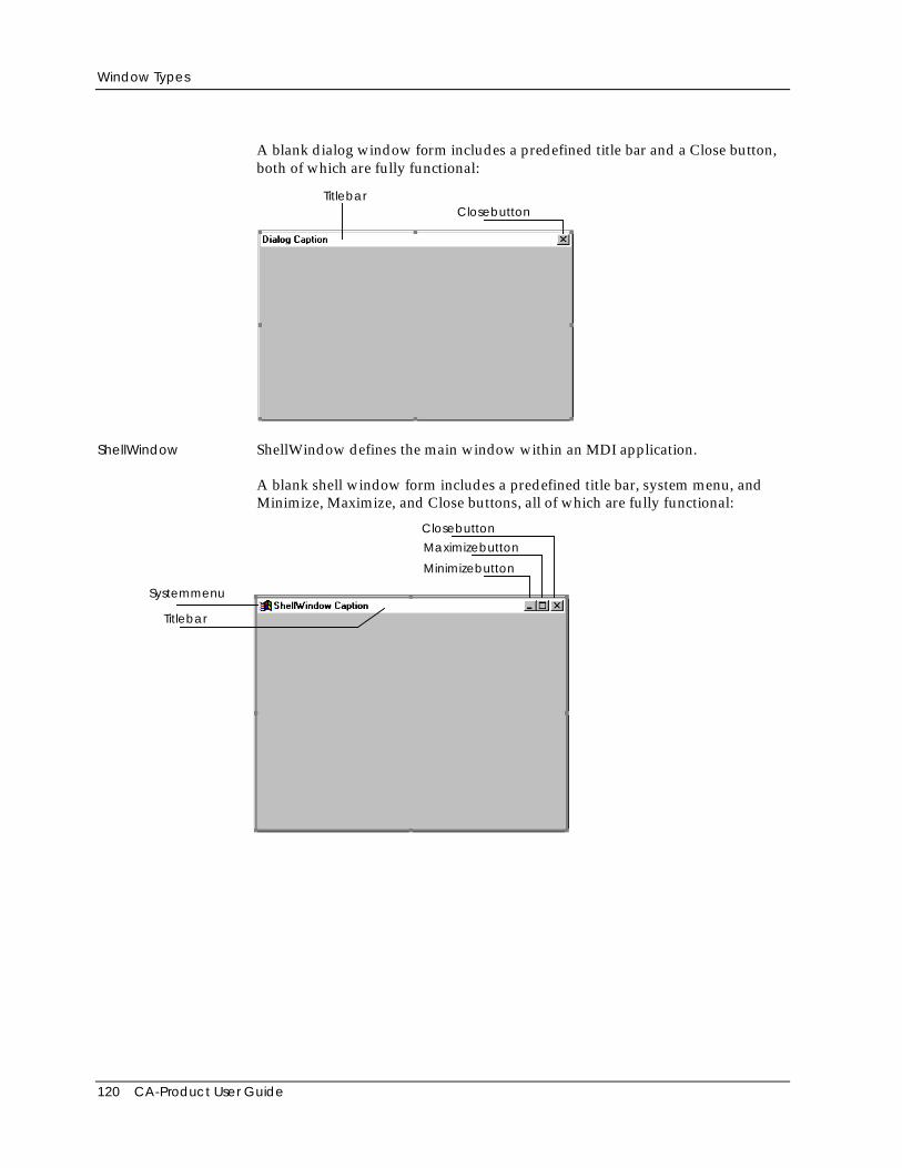
Window Types
120 CA-Product User Guide
A blank dialog window form includes a predefined title bar and a Close button,both of which are fully functional:
TitlebarClosebutton
ShellWindow ShellWindow defines the main window within an MDI application.
A blank shell window form includes a predefined title bar, system menu, andMinimize, Maximize, and Close buttons, all of which are fully functional:
Systemmenu
Titlebar
Minimizebutton
Maximizebutton
Closebutton
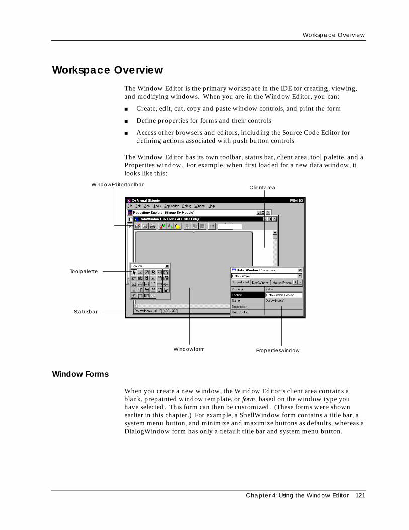
Workspace Overview
Chapter 4: Using the Window Editor 121
Workspace OverviewThe Window Editor is the primary workspace in the IDE for creating, viewing,and modifying windows. When you are in the Window Editor, you can:
■ Create, edit, cut, copy and paste window controls, and print the form
■ Define properties for forms and their controls
■ Access other browsers and editors, including the Source Code Editor fordefining actions associated with push button controls
The Window Editor has its own toolbar, status bar, client area, tool palette, and aProperties window. For example, when first loaded for a new data window, itlooks like this:
WindowEditortoolbar
PropertieswindowWindowform
Toolpalette
Statusbar
Clientarea
Window Forms
When you create a new window, the Window Editor’s client area contains ablank, prepainted window template, or form, based on the window type youhave selected. This form can then be customized. (These forms were shownearlier in this chapter.) For example, a ShellWindow form contains a title bar, asystem menu button, and minimize and maximize buttons as defaults, whereas aDialogWindow form has only a default title bar and system menu button.
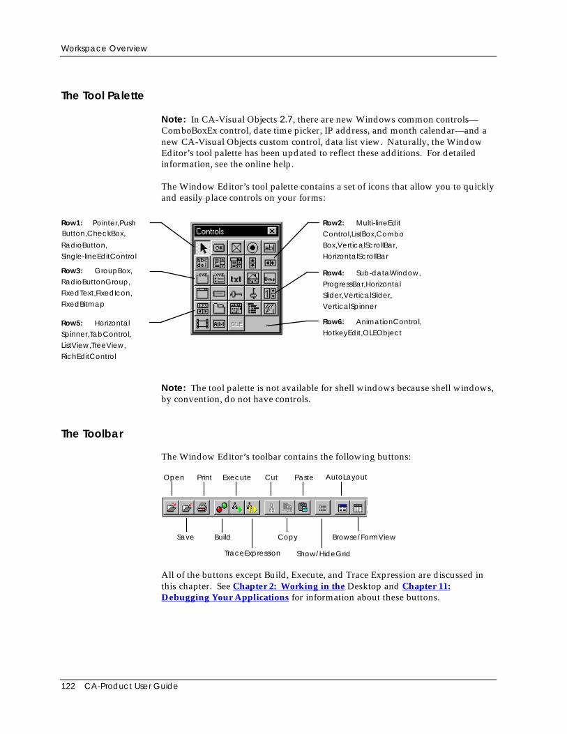
Workspace Overview
122 CA-Product User Guide
The Tool Palette
Note: In CA-Visual Objects 2.7, there are new Windows common controls—ComboBoxEx control, date time picker, IP address, and month calendar—and anew CA-Visual Objects custom control, data list view. Naturally, the WindowEditor’s tool palette has been updated to reflect these additions. For detailedinformation, see the online help.
The Window Editor’s tool palette contains a set of icons that allow you to quicklyand easily place controls on your forms:
Row1: Pointer,PushButton,CheckBox,
RadioButton,
Single-lineEditControl
Row3: GroupBox,
RadioButtonGroup,
FixedText,FixedIcon,
FixedBitmap
Row2: Multi-lineEdit
Control,ListBox,Combo
Box,VerticalScrollBar,
HorizontalScrollBar
Row4: Sub-dataWindow,
ProgressBar,Horizontal
Slider,VerticalSlider,
VerticalSpinner
Row6: AnimationControl,
HotkeyEdit,OLEObjectRow5: Horizontal
Spinner,TabControl,
ListView,TreeView,
RichEditControl
Note: The tool palette is not available for shell windows because shell windows,by convention, do not have controls.
The Toolbar
The Window Editor’s toolbar contains the following buttons:
Open Print Execute Cut Paste AutoLayout
Save Build Copy
Show/HideGridTraceExpression
Browse/FormView
All of the buttons except Build, Execute, and Trace Expression are discussed inthis chapter. See Chapter 2: Working in the Desktop and Chapter 11:Debugging Your Applications for information about these buttons.
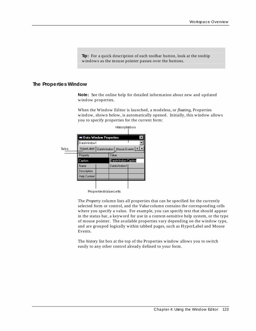
Workspace Overview
Chapter 4: Using the Window Editor 123
Tip: For a quick description of each toolbar button, look at the tooltipwindows as the mouse pointer passes over the buttons.
The Properties Window
Note: See the online help for detailed information about new and updatedwindow properties.
When the Window Editor is launched, a modeless, or floating, Propertieswindow, shown below, is automatically opened. Initially, this window allowsyou to specify properties for the current form:
PropertiesValuecells
Tabs
Historylistbox
The Property column lists all properties that can be specified for the currentlyselected form or control, and the Value column contains the corresponding cellswhere you specify a value. For example, you can specify text that should appearin the status bar, a keyword for use in a context-sensitive help system, or the typeof mouse pointer. The available properties vary depending on the window type,and are grouped logically within tabbed pages, such as HyperLabel and MouseEvents.
The history list box at the top of the Properties window allows you to switcheasily to any other control already defined to your form.
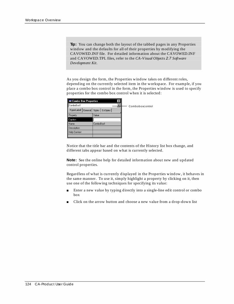
Workspace Overview
124 CA-Product User Guide
Tip: You can change both the layout of the tabbed pages in any Propertieswindow and the defaults for all of their properties by modifying theCAVOWED.INF file. For detailed information about the CAVOWED.INFand CAVOWED.TPL files, refer to the CA-Visual Objects 2.7 SoftwareDevelopment Kit.
As you design the form, the Properties window takes on different roles,depending on the currently selected item in the workspace. For example, if youplace a combo box control in the form, the Properties window is used to specifyproperties for the combo box control when it is selected:
Comboboxcontrol
Notice that the title bar and the contents of the History list box change, anddifferent tabs appear based on what is currently selected.
Note: See the online help for detailed information about new and updatedcontrol properties.
Regardless of what is currently displayed in the Properties window, it behaves inthe same manner. To use it, simply highlight a property by clicking on it, thenuse one of the following techniques for specifying its value:
■ Enter a new value by typing directly into a single-line edit control or combobox
■ Click on the arrow button and choose a new value from a drop-down list
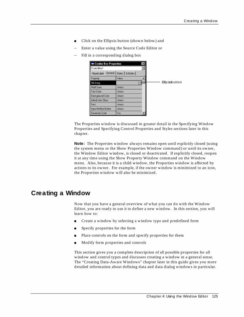
Creating a Window
Chapter 4: Using the Window Editor 125
■ Click on the Ellipsis button (shown below) and
– Enter a value using the Source Code Editor or
– Fill in a corresponding dialog box
Ellipsisbutton
The Properties window is discussed in greater detail in the Specifying WindowProperties and Specifying Control Properties and Styles sections later in thischapter.
Note: The Properties window always remains open until explicitly closed (usingthe system menu or the Show Properties Window command) or until its owner,the Window Editor window, is closed or deactivated. If explicitly closed, reopenit at any time using the Show Property Window command on the Windowmenu. Also, because it is a child window, the Properties window is affected byactions to its owner. For example, if the owner window is minimized to an icon,the Properties window will also be minimized.
Creating a WindowNow that you have a general overview of what you can do with the WindowEditor, you are ready to use it to define a new window. In this section, you willlearn how to:
■ Create a window by selecting a window type and predefined form
■ Specify properties for the form
■ Place controls on the form and specify properties for them
■ Modify form properties and controls
This section gives you a complete description of all possible properties for allwindow and control types and discusses creating a window in a general sense.The “Creating Data-Aware Windows” chapter later in this guide gives you moredetailed information about defining data and data dialog windows in particular.
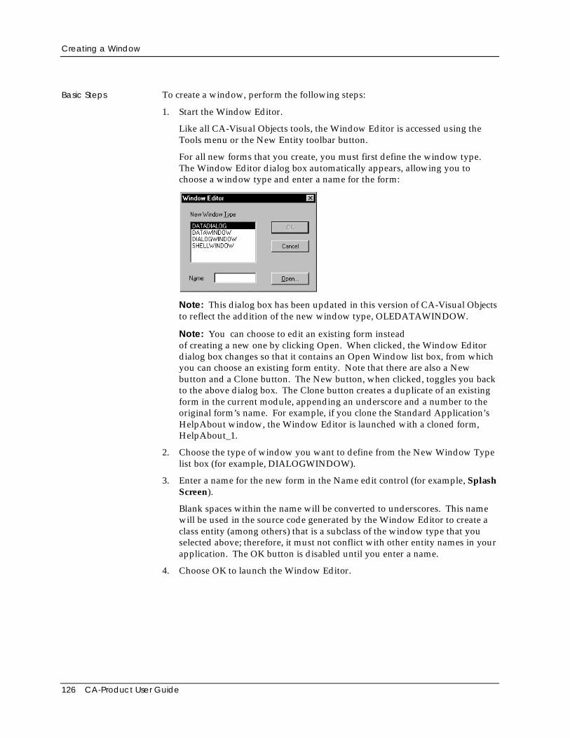
Creating a Window
126 CA-Product User Guide
Basic Steps To create a window, perform the following steps:
1. Start the Window Editor.
Like all CA-Visual Objects tools, the Window Editor is accessed using theTools menu or the New Entity toolbar button.
For all new forms that you create, you must first define the window type.The Window Editor dialog box automatically appears, allowing you tochoose a window type and enter a name for the form:
Note: This dialog box has been updated in this version of CA-Visual Objectsto reflect the addition of the new window type, OLEDATAWINDOW.
Note: You can choose to edit an existing form insteadof creating a new one by clicking Open. When clicked, the Window Editordialog box changes so that it contains an Open Window list box, from whichyou can choose an existing form entity. Note that there are also a Newbutton and a Clone button. The New button, when clicked, toggles you backto the above dialog box. The Clone button creates a duplicate of an existingform in the current module, appending an underscore and a number to theoriginal form’s name. For example, if you clone the Standard Application’sHelpAbout window, the Window Editor is launched with a cloned form,HelpAbout_1.
2. Choose the type of window you want to define from the New Window Typelist box (for example, DIALOGWINDOW).
3. Enter a name for the new form in the Name edit control (for example, SplashScreen).
Blank spaces within the name will be converted to underscores. This namewill be used in the source code generated by the Window Editor to create aclass entity (among others) that is a subclass of the window type that youselected above; therefore, it must not conflict with other entity names in yourapplication. The OK button is disabled until you enter a name.
4. Choose OK to launch the Window Editor.
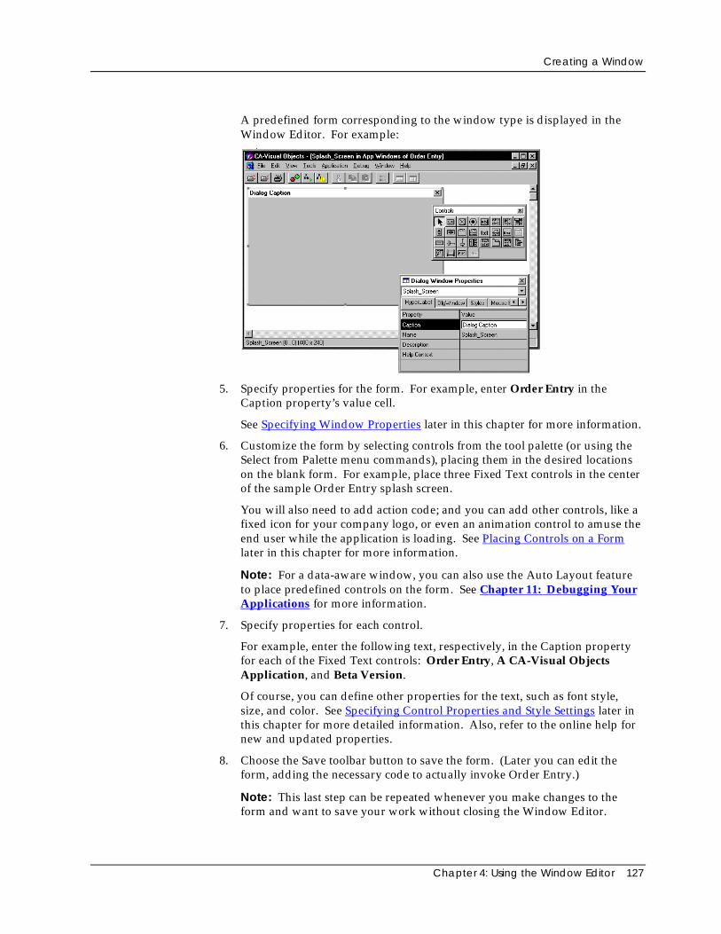
Creating a Window
Chapter 4: Using the Window Editor 127
A predefined form corresponding to the window type is displayed in theWindow Editor. For example:
5. Specify properties for the form. For example, enter Order Entry in theCaption property’s value cell.
See Specifying Window Properties later in this chapter for more information.
6. Customize the form by selecting controls from the tool palette (or using theSelect from Palette menu commands), placing them in the desired locationson the blank form. For example, place three Fixed Text controls in the centerof the sample Order Entry splash screen.
You will also need to add action code; and you can add other controls, like afixed icon for your company logo, or even an animation control to amuse theend user while the application is loading. See Placing Controls on a Formlater in this chapter for more information.
Note: For a data-aware window, you can also use the Auto Layout featureto place predefined controls on the form. See Chapter 11: Debugging YourApplications for more information.
7. Specify properties for each control.
For example, enter the following text, respectively, in the Caption propertyfor each of the Fixed Text controls: Order Entry, A CA-Visual ObjectsApplication, and Beta Version.
Of course, you can define other properties for the text, such as font style,size, and color. See Specifying Control Properties and Style Settings later inthis chapter for more detailed information. Also, refer to the online help fornew and updated properties.
8. Choose the Save toolbar button to save the form. (Later you can edit theform, adding the necessary code to actually invoke Order Entry.)
Note: This last step can be repeated whenever you make changes to theform and want to save your work without closing the Window Editor.
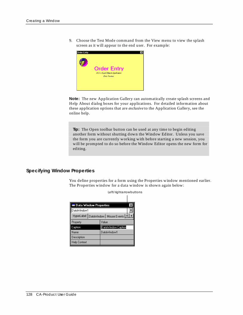
Creating a Window
128 CA-Product User Guide
9. Choose the Test Mode command from the View menu to view the splashscreen as it will appear to the end user. For example:
Note: The new Application Gallery can automatically create splash screens andHelp About dialog boxes for your applications. For detailed information aboutthese application options that are exclusive to the Application Gallery, see theonline help.
Tip: The Open toolbar button can be used at any time to begin editinganother form without shutting down the Window Editor. Unless you savethe form you are currently working with before starting a new session, youwill be prompted to do so before the Window Editor opens the new form forediting.
Specifying Window Properties
You define properties for a form using the Properties window mentioned earlier.The Properties window for a data window is shown again below:
Left/rightarrowbuttons
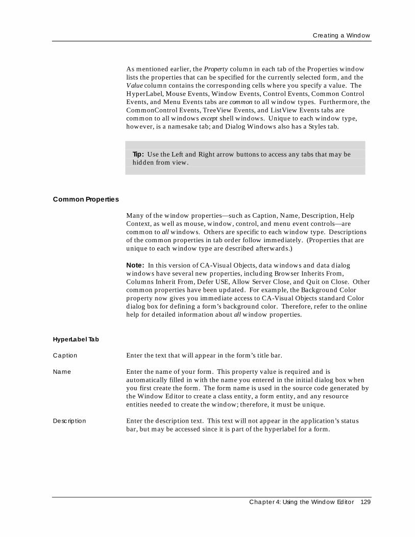
Creating a Window
Chapter 4: Using the Window Editor 129
As mentioned earlier, the Property column in each tab of the Properties windowlists the properties that can be specified for the currently selected form, and theValue column contains the corresponding cells where you specify a value. TheHyperLabel, Mouse Events, Window Events, Control Events, Common ControlEvents, and Menu Events tabs are common to all window types. Furthermore, theCommonControl Events, TreeView Events, and ListView Events tabs arecommon to all windows except shell windows. Unique to each window type,however, is a namesake tab; and Dialog Windows also has a Styles tab.
Tip: Use the Left and Right arrow buttons to access any tabs that may behidden from view.
Common Properties
Many of the window properties—such as Caption, Name, Description, HelpContext, as well as mouse, window, control, and menu event controls—arecommon to all windows. Others are specific to each window type. Descriptionsof the common properties in tab order follow immediately. (Properties that areunique to each window type are described afterwards.)
Note: In this version of CA-Visual Objects, data windows and data dialogwindows have several new properties, including Browser Inherits From,Columns Inherit From, Defer USE, Allow Server Close, and Quit on Close. Othercommon properties have been updated. For example, the Background Colorproperty now gives you immediate access to CA-Visual Objects standard Colordialog box for defining a form’s background color. Therefore, refer to the onlinehelp for detailed information about all window properties.
HyperLabel Tab
Caption Enter the text that will appear in the form’s title bar.
Name Enter the name of your form. This property value is required and isautomatically filled in with the name you entered in the initial dialog box whenyou first create the form. The form name is used in the source code generated bythe Window Editor to create a class entity, a form entity, and any resourceentities needed to create the window; therefore, it must be unique.
Description Enter the description text. This text will not appear in the application’s statusbar, but may be accessed since it is part of the hyperlabel for a form.
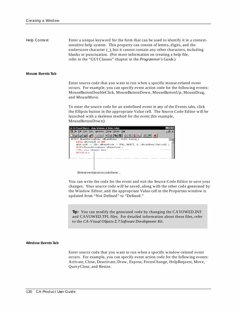
Creating a Window
130 CA-Product User Guide
Help Context Enter a unique keyword for the form that can be used to identify it in a context-sensitive help system. This property can consist of letters, digits, and theunderscore character (_), but it cannot contain any other characters, includingblanks or punctuation. (For more information on creating a help file,refer to the “GUI Classes” chapter in the Programmer’s Guide.)
Mouse Events Tab
Enter source code that you want to run when a specific mouse-related eventoccurs. For example, you can specify event action code for the following events:MouseButtonDoubleClick, MouseButtonDown, MouseButtonUp, MouseDrag,and MouseMove.
To enter the source code for an undefined event in any of the Events tabs, clickthe Ellipsis button in the appropriate Value cell. The Source Code Editor will belaunched with a skeleton method for the event (for example,MouseButtonDown):
Entereventsourcecodehere...
You can write the code for the event and exit the Source Code Editor to save yourchanges. Your source code will be saved, along with the other code generated bythe Window Editor; and the appropriate Value cell in the Properties window isupdated from “Not Defined” to “Defined.”
Tip: You can modify the generated code by changing the CAVOWED.INFand CAVOWED.TPL files. For detailed information about these files, referto the CA-Visual Objects 2.7 Software Development Kit.
Window Events Tab
Enter source code that you want to run when a specific window-related eventoccurs. For example, you can specify event action code for the following events:Activate, Close, Deactivate, Draw, Expose, FocusChange, HelpRequest, Move,QueryClose, and Resize.
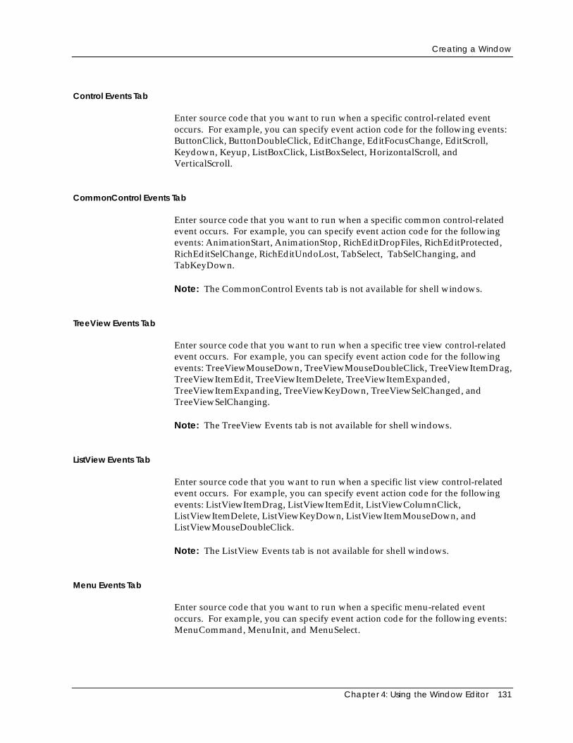
Creating a Window
Chapter 4: Using the Window Editor 131
Control Events Tab
Enter source code that you want to run when a specific control-related eventoccurs. For example, you can specify event action code for the following events:ButtonClick, ButtonDoubleClick, EditChange, EditFocusChange, EditScroll,Keydown, Keyup, ListBoxClick, ListBoxSelect, HorizontalScroll, andVerticalScroll.
CommonControl Events Tab
Enter source code that you want to run when a specific common control-relatedevent occurs. For example, you can specify event action code for the followingevents: AnimationStart, AnimationStop, RichEditDropFiles, RichEditProtected,RichEditSelChange, RichEditUndoLost, TabSelect, TabSelChanging, andTabKeyDown.
Note: The CommonControl Events tab is not available for shell windows.
TreeView Events Tab
Enter source code that you want to run when a specific tree view control-relatedevent occurs. For example, you can specify event action code for the followingevents: TreeViewMouseDown, TreeViewMouseDoubleClick, TreeViewItemDrag,TreeViewItemEdit, TreeViewItemDelete, TreeViewItemExpanded,TreeViewItemExpanding, TreeViewKeyDown, TreeViewSelChanged, andTreeViewSelChanging.
Note: The TreeView Events tab is not available for shell windows.
ListView Events Tab
Enter source code that you want to run when a specific list view control-relatedevent occurs. For example, you can specify event action code for the followingevents: ListViewItemDrag, ListViewItemEdit, ListViewColumnClick,ListViewItemDelete, ListViewKeyDown, ListViewItemMouseDown, andListViewMouseDoubleClick.
Note: The ListView Events tab is not available for shell windows.
Menu Events Tab
Enter source code that you want to run when a specific menu-related eventoccurs. For example, you can specify event action code for the following events:MenuCommand, MenuInit, and MenuSelect.
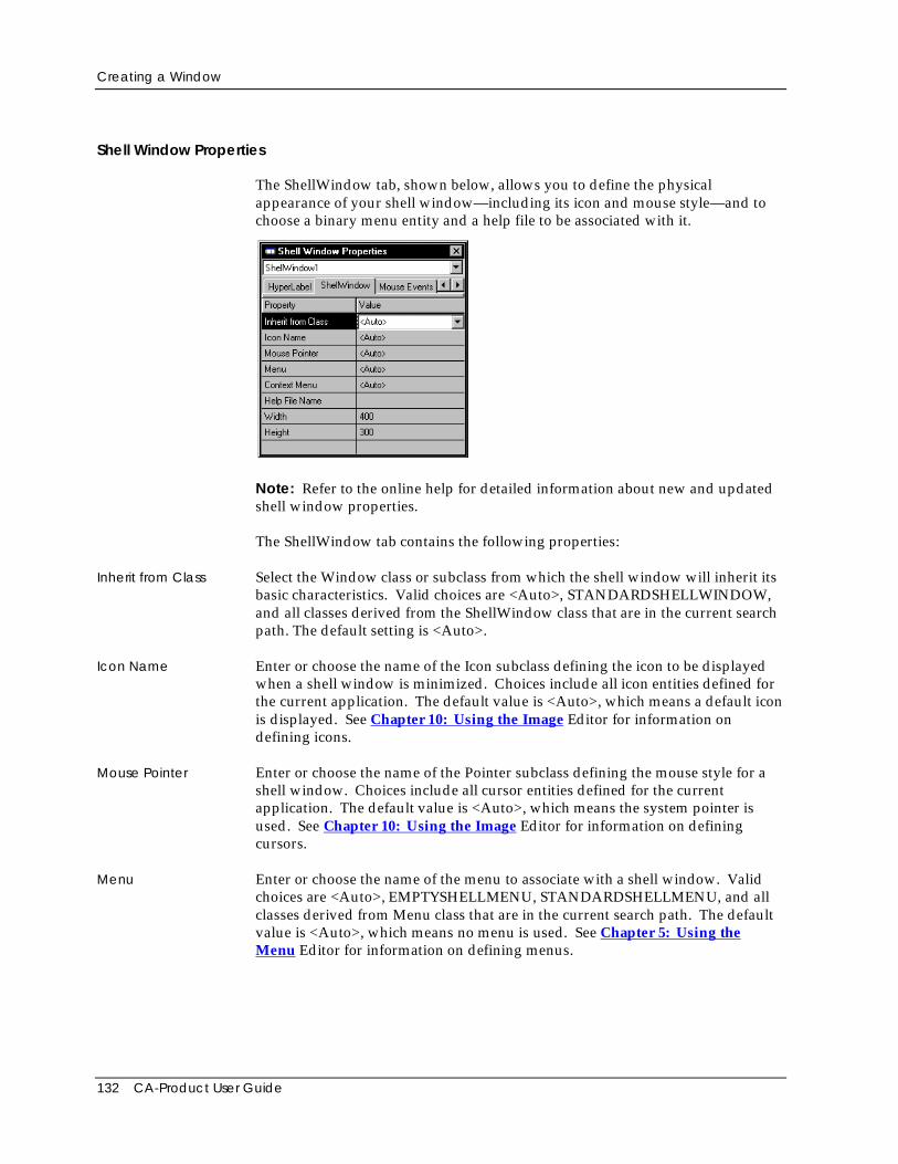
Creating a Window
132 CA-Product User Guide
Shell Window Properties
The ShellWindow tab, shown below, allows you to define the physicalappearance of your shell window—including its icon and mouse style—and tochoose a binary menu entity and a help file to be associated with it.
Note: Refer to the online help for detailed information about new and updatedshell window properties.
The ShellWindow tab contains the following properties:
Inherit from Class Select the Window class or subclass from which the shell window will inherit itsbasic characteristics. Valid choices are <Auto>, STANDARDSHELLWINDOW,and all classes derived from the ShellWindow class that are in the current searchpath. The default setting is <Auto>.
Icon Name Enter or choose the name of the Icon subclass defining the icon to be displayedwhen a shell window is minimized. Choices include all icon entities defined forthe current application. The default value is <Auto>, which means a default iconis displayed. See Chapter 10: Using the Image Editor for information ondefining icons.
Mouse Pointer Enter or choose the name of the Pointer subclass defining the mouse style for ashell window. Choices include all cursor entities defined for the currentapplication. The default value is <Auto>, which means the system pointer isused. See Chapter 10: Using the Image Editor for information on definingcursors.
Menu Enter or choose the name of the menu to associate with a shell window. Validchoices are <Auto>, EMPTYSHELLMENU, STANDARDSHELLMENU, and allclasses derived from Menu class that are in the current search path. The defaultvalue is <Auto>, which means no menu is used. See Chapter 5: Using theMenu Editor for information on defining menus.
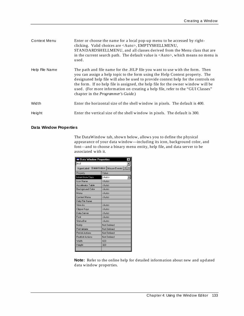
Creating a Window
Chapter 4: Using the Window Editor 133
Context Menu Enter or choose the name for a local pop-up menu to be accessed by right-clicking. Valid choices are <Auto>, EMPTYSHELLMENU,STANDARDSHELLMENU, and all classes derived from the Menu class that arein the current search path. The default value is <Auto>, which means no menu isused.
Help File Name The path and file name for the .HLP file you want to use with the form. Thenyou can assign a help topic to the form using the Help Context property. Thedesignated help file will also be used to provide context help for the controls onthe form. If no help file is assigned, the help file for the owner window will beused. (For more information on creating a help file, refer to the “GUI Classes”chapter in the Programmer’s Guide.)
Width Enter the horizontal size of the shell window in pixels. The default is 400.
Height Enter the vertical size of the shell window in pixels. The default is 300.
Data Window Properties
The DataWindow tab, shown below, allows you to define the physicalappearance of your data window—including its icon, background color, andfont—and to choose a binary menu entity, help file, and data server to beassociated with it.
Note: Refer to the online help for detailed information about new and updateddata window properties.
Creating a Window
134 CA-Product User Guide
The DataWindow tab contains the following properties:
Inherit from Class Select the Window class or subclass from which the data window will inherit itsbasic characteristics. Valid choices are <Auto>, STDDATAWINDOW, and allclasses derived from the DataWindow class that are in the current search path.The default setting is <Auto>.
Icon Name Enter or choose the name of the Icon subclass defining the icon to be displayedwhen a data window is minimized. Choices include all icon entities defined forthe current application. The default value is <Auto>, which means a default iconis displayed. See Chapter 10: Using the Image Editor for information ondefining icons.
Accelerator Table This property is available for data-aware windows only. If you do not want amenu to be associated with the form, you may still want to designate a table ofaccelerator keys that can be used. Valid choices are: <Auto>,EMPTYSHELLMENU, STANDARDSHELLMENU, and all classes derived fromthe Menu class that are in the current search path.
Note: If a menu is associated with the form, then the accelerator keys defined inthe Menu Editor will be used; in this case the default <Auto> setting should beused.
Background Color Enter or choose the color for a data window background from a drop-down listbox. The default value is <Auto>, which means the currently selected systemcolor is used.
Menu Enter or choose the name of the menu to associate with a data window. Choicesinclude <Auto>, EMPTYSHELLMENU, STANDARDSHELLMENU, and allclasses derived from the Menu class that are in the current search path. Thedefault value is <Auto>, which means the no menu is used. See Chapter 5:Using the Menu Editor for information on defining menus.
Context Menu Enter or choose the name for a local pop-up menu to be accessed by right-clicking. Valid choices are <Auto>, EMPTYSHELLMENU,STANDARDSHELLMENU, and all classes derived from the Menu class that arein the current search path. The default value is <Auto>, which means no menu isused.
Help File Name The path and file name for the .HLP file you want to use with the form. Thenyou can assign a help topic to the form using the Help Context property. Thedesignated help file will also be used to provide context help for the controls onthe form. If no help file is assigned, the help file for the owner window will beused. (For more information on creating a help file, refer to the “GUI Classes”chapter in the Programmer’s Guide.)
Creating a Window
Chapter 4: Using the Window Editor 135
View As This property is available for data-aware windows only. Choose the defaultview to use when the data window is initially accessed. Every data window canoperate in either form view, displaying multiple fields for a single record as fixedtext and data controls, or browse view, using a spreadsheet-like data browser thatdisplays multiple fields and records in a table in the data window. The availablechoices for this property, therefore, are #FormView or #BrowseView.
The default value is <Auto>, which means #BrowseView is used for all datawindows placed as controls, such as a detail window nested within another datawindow, and #FormView is used for all other data windows.
Note: Clicking the Browse/Form View toolbar button changes the WindowEditor display to a different view, as well as changing the value of this property.
Tip: Data windows are different from other windows in that they can beplaced on other forms as controls (similar to a check box or push button).When used as controls, they are referred to as sub-data windows. (SeeChapter 8: Creating Data-Aware Windows for more information about sub-data window controls.)
Note: You can give the end user the option of switching back and forth betweenform and browse view at runtime by associating a standard menu with the datawindow using the Menu property. The commands for switching betweenbrowse and form view are part of the View menu defined in the defaultStandardShellMenu binary menu entity, which is included automatically inevery GUI application that you create based on the Standard Application. SeeChapter 8: Creating Data-Aware Windows for more information oncustomizing these two views.
Clipper Keys If True, allows the user to navigate through a form by using the Direction andReturn keys. Otherwise the Windows default navigation keys (Tab key) areeffective. Valid values are: <Auto>, True, and False. The default is <Auto>.
Data Server This property is available for data-aware windows only. In it, you enter orchoose the name of the data server that is associated with this form. Thisproperty is required and is automatically filled in when you choose the Edit AutoLayout menu command. See Chapter 8: Creating Data-Aware Windows formore information.
Font Choose a font to use for the form text. A standard Font dialog box appears,displaying those fonts available on your system. The default value is <Auto>,which means the system font is used.
StatusBar If Yes, adds a status bar to the data window. The default value is <Auto>.
Creating a Window
136 CA-Product User Guide
Notify Event Optionally enter additional source code for the skeleton Notify event. Thedefault setting is Not Defined.
See the online help system for detailed information about the Notify event.
PreValidate Event Optionally enter additional source code for the skeleton PreValidate event. Thedefault setting is Not Defined.
See the online help system for detailed information about the PreValidate event.
PreInit Actions Optionally enter additional source code for the skeleton PreInit method. Thedefault setting is Not Defined.
See the online help system for detailed information about the PreInit method.
PostInit Actions Optionally enter additional source code for the skeleton PostInit method. Thedefault setting is Not Defined.
See the online help system for detailed information about the PostInit method.
Width Enter the horizontal size of the data window in pixels. The default is 420.
Height Enter the vertical size of the data window in pixels. The default is 320.
Creating a Window
Chapter 4: Using the Window Editor 137
DataDialog Window Properties
The DataDialog tab, shown below, allows you to define the physical appearanceof your data dialog window—including its icon, background color, and font—and to choose a binary menu entity, help file, and data server to be associatedwith it.
Note: Refer to the online help for detailed information about new and updateddata dialog window properties.
The DataDialog tab contains the following properties:
Inherit from Class Select the Window class or subclass from which the data dialog window willinherit its basic characteristics. Valid choices are <Auto>,DATADIALOGWINDOW, and all classes derived from the DataDialog class thatare in the current search path. The default setting is <Auto>.
Icon Name Enter or choose the name of the Icon subclass defining the icon to be displayedwhen a data dialog window is minimized. Choices include all icon entitiesdefined for the current application. The default value is <Auto>, which means adefault icon is displayed. See Chapter 10: Using the Image Editor forinformation on defining icons.
Accelerator Table This property is available for data-aware windows only. If you do not want amenu to be associated with the form, you may still want to designate a table ofaccelerator keys that can be used. Valid choices are: <Auto>,EMPTYSHELLMENU, STANDARDSHELLMENU, and all classes derived fromthe Menu class that are in the current search path.
Creating a Window
138 CA-Product User Guide
Note: If a menu is associated with the form, then the accelerator keys defined inthe Menu Editor will be used; in this case the default <Auto> setting should beused.
Background Color Enter or choose the color for a data dialog window’s background from a drop-down list box. The default value is <Auto>, which means the currently selectedsystem color is used.
Context Menu Enter or choose the name for a local pop-up menu to be accessed by right-clicking. Valid choices are <Auto>, EMPTYSHELLMENU,STANDARDSHELLMENU, and all classes derived from the Menu class that arein the current search path. The default value is <Auto>, which means no menu isused.
Help File Name The path and file name for the .HLP file you want to use with the form. Thenyou can assign a help topic to the form using the Help Context property. Thedesignated help file will also be used to provide context help for the controls onthe form. If no help file is assigned, the help file for the owner window will beused. (For more information on creating a help file, refer to the “GUI Classes”chapter in the Programmer’s Guide.)
View As This property is available for data-aware windows only. Choose the defaultview to use when the data dialog window is initially accessed. Every data dialogwindow can operate in either form view, displaying multiple fields for a singlerecord as fixed text and data controls, or browse view, using a spreadsheet-likedata browser that displays multiple fields and records in a table in the datadialog window. The available choices for this property, therefore, are#FormView or #BrowseView.
The default value is <Auto>, which means #BrowseView is used for all datadialog windows placed as controls and #FormView for all other data dialogwindows.
Note: Clicking the Browse/Form View toolbar button changes the WindowEditor display to a different view, as well as changing the value of this property.
Note: You can give the end user the option of switching back and forth betweenform and browse view at runtime by associating a standard menu with the datadialog window using the Menu property. The commands for switching betweenbrowse and form view are part of the View menu defined in the defaultStandardShellMenu binary menu entity, which is included automatically inevery GUI application that you create based on the Standard Application. SeeChapter 8: Creating Data-Aware Windows for more information oncustomizing these two views.
Clipper Keys If True, allows the user to navigate through a form by using the Direction andReturn keys. Otherwise the Windows default navigation keys (Tab key) areeffective. Valid values are: <Auto>, True, and False. The default is <Auto>.
Creating a Window
Chapter 4: Using the Window Editor 139
Data Server This property is available for data-aware windows only. In it, you enter orchoose the name of the data server that is associated with this form. Thisproperty is required and is automatically filled in when you choose the Edit AutoLayout menu command. See Chapter 8: Creating Data-Aware Windows formore information.
Font Choose a font to use for the form text. A standard Font dialog box appears,displaying those fonts available on your system. The default value is <Auto>,which means the system font is used.
StatusBar If Yes, adds a status bar to the data dialog window. The default value is <Auto>.
Notify Event Optionally enter additional source code for the skeleton Notify event. Thedefault setting is Not Defined.
See the online help system for detailed information about the Notify event.
PreValidate Event Optionally enter additional source code for the skeleton PreValidate event. Thedefault setting is Not Defined.
See the online help system for detailed information about the PreValidate event.
PreInit Actions Optionally enter additional source code for the skeleton PreInit method. Thedefault setting is Not Defined.
See the online help system for detailed information about the PreInit method.
PostInit Actions Optionally enter additional source code for the skeleton PostInit method. Thedefault setting is Not Defined.
See the online help system for detailed information about the PostInit method.
Width Enter the horizontal size of the data dialog window in pixels. The default is 400.
Height Enter the vertical size of the data dialog window in pixels. The default is 240.
Dialog Window Properties
The Properties window for dialog windows has two additional tabs that areunique: DlgWindow and Styles.
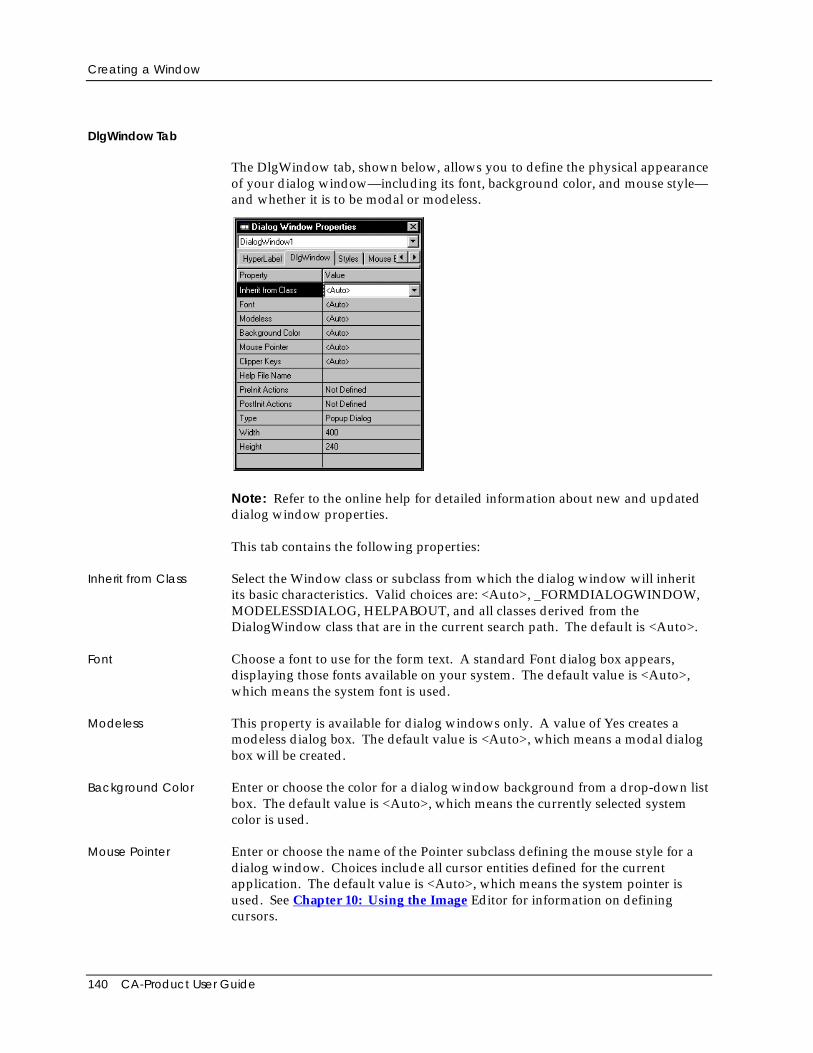
Creating a Window
140 CA-Product User Guide
DlgWindow Tab
The DlgWindow tab, shown below, allows you to define the physical appearanceof your dialog window—including its font, background color, and mouse style—and whether it is to be modal or modeless.
Note: Refer to the online help for detailed information about new and updateddialog window properties.
This tab contains the following properties:
Inherit from Class Select the Window class or subclass from which the dialog window will inheritits basic characteristics. Valid choices are: <Auto>, _FORMDIALOGWINDOW,MODELESSDIALOG, HELPABOUT, and all classes derived from theDialogWindow class that are in the current search path. The default is <Auto>.
Font Choose a font to use for the form text. A standard Font dialog box appears,displaying those fonts available on your system. The default value is <Auto>,which means the system font is used.
Modeless This property is available for dialog windows only. A value of Yes creates amodeless dialog box. The default value is <Auto>, which means a modal dialogbox will be created.
Background Color Enter or choose the color for a dialog window background from a drop-down listbox. The default value is <Auto>, which means the currently selected systemcolor is used.
Mouse Pointer Enter or choose the name of the Pointer subclass defining the mouse style for adialog window. Choices include all cursor entities defined for the currentapplication. The default value is <Auto>, which means the system pointer isused. See Chapter 10: Using the Image Editor for information on definingcursors.
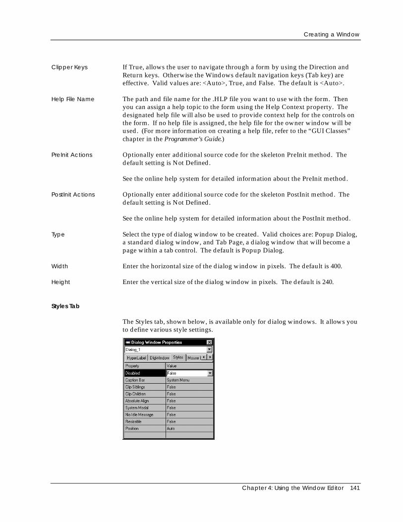
Creating a Window
Chapter 4: Using the Window Editor 141
Clipper Keys If True, allows the user to navigate through a form by using the Direction andReturn keys. Otherwise the Windows default navigation keys (Tab key) areeffective. Valid values are: <Auto>, True, and False. The default is <Auto>.
Help File Name The path and file name for the .HLP file you want to use with the form. Thenyou can assign a help topic to the form using the Help Context property. Thedesignated help file will also be used to provide context help for the controls onthe form. If no help file is assigned, the help file for the owner window will beused. (For more information on creating a help file, refer to the “GUI Classes”chapter in the Programmer’s Guide.)
PreInit Actions Optionally enter additional source code for the skeleton PreInit method. Thedefault setting is Not Defined.
See the online help system for detailed information about the PreInit method.
PostInit Actions Optionally enter additional source code for the skeleton PostInit method. Thedefault setting is Not Defined.
See the online help system for detailed information about the PostInit method.
Type Select the type of dialog window to be created. Valid choices are: Popup Dialog,a standard dialog window, and Tab Page, a dialog window that will become apage within a tab control. The default is Popup Dialog.
Width Enter the horizontal size of the dialog window in pixels. The default is 400.
Height Enter the vertical size of the dialog window in pixels. The default is 240.
Styles Tab
The Styles tab, shown below, is available only for dialog windows. It allows youto define various style settings.
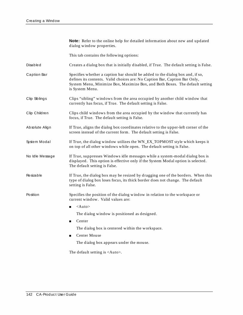
Creating a Window
142 CA-Product User Guide
Note: Refer to the online help for detailed information about new and updateddialog window properties.
This tab contains the following options:
Disabled Creates a dialog box that is initially disabled, if True. The default setting is False.
Caption Bar Specifies whether a caption bar should be added to the dialog box and, if so,defines its contents. Valid choices are: No Caption Bar, Caption Bar Only,System Menu, Minimize Box, Maximize Box, and Both Boxes. The default settingis System Menu.
Clip Siblings Clips “sibling” windows from the area occupied by another child window thatcurrently has focus, if True. The default setting is False.
Clip Children Clips child windows from the area occupied by the window that currently hasfocus, if True. The default setting is False.
Absolute Align If True, aligns the dialog box coordinates relative to the upper-left corner of thescreen instead of the current form. The default setting is False.
System Modal If True, the dialog window utilizes the WN_EX_TOPMOST style which keeps iton top of all other windows while open. The default setting is False.
No Idle Message If True, suppresses Windows idle messages while a system-modal dialog box isdisplayed. This option is effective only if the System Modal option is selected.The default setting is False.
Resizable If True, the dialog box may be resized by dragging one of the borders. When thistype of dialog box loses focus, its thick border does not change. The defaultsetting is False.
Position Specifies the position of the dialog window in relation to the workspace orcurrent window. Valid values are:
■ <Auto>
The dialog window is positioned as designed.
■ Center
The dialog box is centered within the workspace.
■ Center Mouse
The dialog box appears under the mouse.
The default setting is <Auto>.
Control Types
Chapter 4: Using the Window Editor 143
Generating Code
When you save a form, the Window Editor automatically generates:
■ A form entity for the window; you can double-click on this entity in theRepository Explorer’s list view pane to begin editing it with the WindowEditor
■ A subclass using the window name and the appropriate subclass of theWindow class: DataWindow, DialogWindow, DataDialog Window, orShellWindow
■ Other default source code that can be modified, including instance variablesrelated to the controls on the form (code will be generated to declare aninstance variable for each control object unless its Generate Code property isset to No)
Note that for an MDI application, the generated code automatically supports theability to open the same window multiple times.
Also, the Init() methods for all generated forms take an additional parameter,<uExtra>. This allows you to pass additional data to a window or dialog. For anexample using these extra parameters, see the OptionDlgs module in the PrivateEye sample application (CAVO27\SAMPLES\WINSDK\PE). These sameparameters are also passed to the PreInit() and PostInit() methods of thesewindows, if defined.
Tip: You can modify the generated code by changing the CAVOWED.INFand CAVOWED.TPL files. For detailed information about these files, referto the CA-Visual Objects 2.7 Software Development Kit.
Control TypesOther key properties of a window are its controls, which the end usermanipulates while interacting with the graphical user interface (GUI).Experienced users of CA-Visual Objects are already familiar with the followingGUI control types: check box, combo box, list box, single-line edit control, multi-line edit control, push button, radio button, radio button group, group box, fixedtext, fixed icon, fixed bitmap, vertical scroll bar, horizontal scroll bar, and sub-data window.
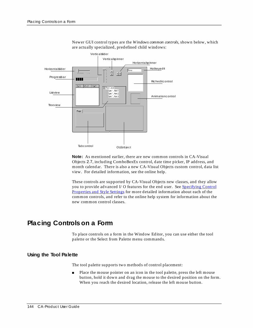
Placing Controls on a Form
144 CA-Product User Guide
Newer GUI control types are the Windows common controls, shown below, whichare actually specialized, predefined child windows:
Progressbar
Tabcontrol
Listview
Hotkeyedit
Animationcontrol
Richeditcontrol
Treeview
OLEobject
Horizontalspinner
Horizontalslider
Verticalslider
Verticalspinner
Note: As mentioned earlier, there are new common controls in CA-VisualObjects 2.7, including ComboBoxEx control, date time picker, IP address, andmonth calendar. There is also a new CA-Visual Objects custom control, data listview. For detailed information, see the online help.
These controls are supported by CA-Visual Objects new classes, and they allowyou to provide advanced I/O features for the end user. See Specifying ControlProperties and Style Settings for more detailed information about each of thecommon controls, and refer to the online help system for information about thenew common control classes.
Placing Controls on a FormTo place controls on a form in the Window Editor, you can use either the toolpalette or the Select from Palette menu commands.
Using the Tool Palette
The tool palette supports two methods of control placement:
■ Place the mouse pointer on an icon in the tool palette, press the left mousebutton, hold it down and drag the mouse to the desired position on the form.When you reach the desired location, release the left mouse button.
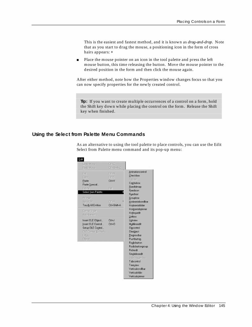
Placing Controls on a Form
Chapter 4: Using the Window Editor 145
This is the easiest and fastest method, and it is known as drag-and-drop. Notethat as you start to drag the mouse, a positioning icon in the form of crosshairs appears: +
■ Place the mouse pointer on an icon in the tool palette and press the leftmouse button, this time releasing the button. Move the mouse pointer to thedesired position in the form and then click the mouse again.
After either method, note how the Properties window changes focus so that youcan now specify properties for the newly created control.
Tip: If you want to create multiple occurrences of a control on a form, holdthe Shift key down while placing the control on the form. Release the Shiftkey when finished.
Using the Select from Palette Menu Commands
As an alternative to using the tool palette to place controls, you can use the EditSelect from Palette menu command and its pop-up menu:
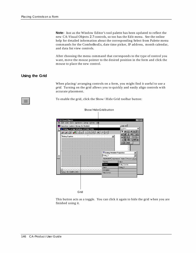
Placing Controls on a Form
146 CA-Product User Guide
Note: Just as the Window Editor’s tool palette has been updated to reflect thenew CA-Visual Objects 2.7 controls, so too has the Edit menu. See the onlinehelp for detailed information about the corresponding Select from Palette menucommands for the ComboBoxEx, date time picker, IP address, month calendar,and data list view controls.
After choosing the menu command that corresponds to the type of control youwant, move the mouse pointer to the desired position in the form and click themouse to place the new control.
Using the Grid
When placing/arranging controls on a form, you might find it useful to use agrid. Turning on the grid allows you to quickly and easily align controls withaccurate placement.
To enable the grid, click the Show/Hide Grid toolbar button:
Show/HideGridbutton
Grid
This button acts as a toggle. You can click it again to hide the grid when you arefinished using it.
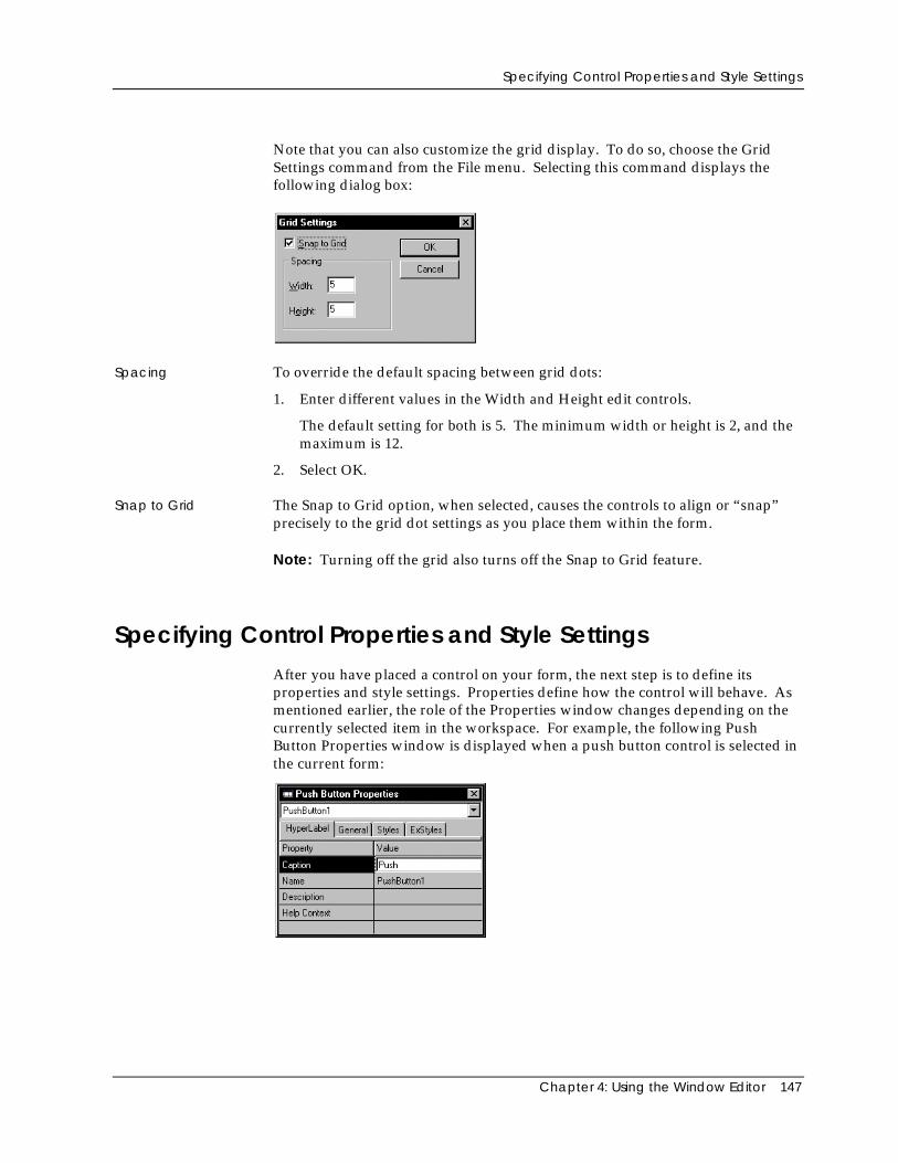
Specifying Control Properties and Style Settings
Chapter 4: Using the Window Editor 147
Note that you can also customize the grid display. To do so, choose the GridSettings command from the File menu. Selecting this command displays thefollowing dialog box:
Spacing To override the default spacing between grid dots:
1. Enter different values in the Width and Height edit controls.
The default setting for both is 5. The minimum width or height is 2, and themaximum is 12.
2. Select OK.
Snap to Grid The Snap to Grid option, when selected, causes the controls to align or “snap”precisely to the grid dot settings as you place them within the form.
Note: Turning off the grid also turns off the Snap to Grid feature.
Specifying Control Properties and Style SettingsAfter you have placed a control on your form, the next step is to define itsproperties and style settings. Properties define how the control will behave. Asmentioned earlier, the role of the Properties window changes depending on thecurrently selected item in the workspace. For example, the following PushButton Properties window is displayed when a push button control is selected inthe current form:
Specifying Control Properties and Style Settings
148 CA-Product User Guide
The Window Editor will generate default settings for many of the property andstyle settings when you place the control on a form. These defaults are sufficientto save the form; however, there are other properties that you must define tomake certain a control is fully operational at runtime.
Note: An object variable is associated with each control, unless the control isalready associated with a field (such as a single-line edit). The control nameappears as part of the object name in the Init() method for the variable.
Common Properties
Note: See the online help for detailed information about new commonproperties, such as Left, Right, and Use for Tooltip. Other common propertieshave been updated. For example, the Background Color property gives youimmediate access to CA-Visual Objects standard Color dialog box for defining acontrol’s background color. Additionally, all text controls are now data aware(see the AWARE.AEF application in theCAVO27\SAMPLES\CONTROLS\AWARE directory for examples). Fordetailed information about all control properties, refer to the online help.
Many of the control properties—such as Generate Code and Tab Stop—arecommon to all controls, and others—such as Caption and Inherit from Class—arecommon to all with the exception of the sub-data window control. Still others,such as Background Color, are common to a majority of the controls. Therefore,descriptions of these common properties in tab page order follow immediately.(Properties that are unique to a specific type of control are described later in thischapter.)
HyperLabel Tab
The HyperLabel tab contains the following options, common to all controls:
Caption Enter the caption text that identifies a control in the form display. This propertyis available for all controls except sub-data windows, and is used differently,depending on the control type.
For a push button, for example, this is the label that is displayed on the button.
For a fixed icon, the caption is used to specify the icon file to associate with thecontrol. Icon files are identified as resource entities in your application. The iconis assigned a name or number. You enter the resource name or its number(which must be preceded by a # symbol) as the caption.
Note: It is typical to have code similar to the following to define an iconresource:
DEFINE MY_ICON := 101RESOURCE MY_ICON ICON myicon.ico
Specifying Control Properties and Style Settings
Chapter 4: Using the Window Editor 149
In this case, the icon resource is defined using a number, and you would enter#101 as the caption because the Window Editor would not recognize the constantMY_ICON.
If you use an icon created with the Image Editor, you will use the name you gavethe icon. To gain a better understanding of how icons are declared in CA-VisualObjects, you may want to take a look at the code generated for an icon.
For other controls, such as scroll bars, the caption text is not used; you can usethe caption property to store information that can be accessed from yourapplication. The default value is defined by the control type when you place iton the form (for example, the default caption for all push buttons is “Push”).This property is available for all controls except sub-data windows.
Tip: Push buttons and other controls sometimes feature a single underlinedletter indicating how to select the control with the keyboard. To add thisfunctionality to your controls, simply preface the letter that is to beunderlined with an ampersand (&).
Note: The Caption property has a hierarchical nature like the Descriptionproperty described below.
Name Enter the name of the control. This property value is required for all controls andis automatically filled in with a default name when you place a control on a form.For example, when you place the first push button on a form, it is named“PushButton1.”
Every type of control has a Name property that is used in the generated sourcecode to identify individual controls within the form. For push buttons, this namealso determines the method, Window, or ReportQueue name that is invokedwhen the control is clicked. Therefore, control names must be unique within asingle form design.
Note: For sub-data window controls only, this property can be found on theGeneral tab of its Properties window.
Description The Description property is available for all controls except sub-data windows.Enter the text that should appear in the status bar when the control has focus inthe form display. If a control cannot have focus, the description will not bedisplayed in the status bar; instead, it may be accessed through the control’shyperlabel. Note that a control may use either its own descriptive text or that ofan associated field specification or field. Therefore, the default value of <Auto>means that the system should use a description from a lower level of thehierarchy.
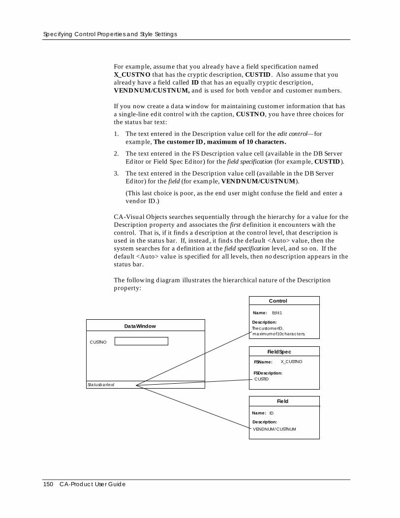
Specifying Control Properties and Style Settings
150 CA-Product User Guide
For example, assume that you already have a field specification namedX_CUSTNO that has the cryptic description, CUSTID. Also assume that youalready have a field called ID that has an equally cryptic description,VENDNUM/CUSTNUM, and is used for both vendor and customer numbers.
If you now create a data window for maintaining customer information that hasa single-line edit control with the caption, CUSTNO, you have three choices forthe status bar text:
1. The text entered in the Description value cell for the edit control—forexample, The customer ID, maximum of 10 characters.
2. The text entered in the FS Description value cell (available in the DB ServerEditor or Field Spec Editor) for the field specification (for example, CUSTID).
3. The text entered in the Description value cell (available in the DB ServerEditor) for the field (for example, VENDNUM/CUSTNUM).
(This last choice is poor, as the end user might confuse the field and enter avendor ID.)
CA-Visual Objects searches sequentially through the hierarchy for a value for theDescription property and associates the first definition it encounters with thecontrol. That is, if it finds a description at the control level, that description isused in the status bar. If, instead, it finds the default <Auto> value, then thesystem searches for a definition at the field specification level, and so on. If thedefault <Auto> value is specified for all levels, then no description appears in thestatus bar.
The following diagram illustrates the hierarchical nature of the Descriptionproperty:
DataWindow
FieldSpec
Field
FSName:
FSDescription:
Name:
Description:
CUSTNO
maximumof10characters.
VENDNUM/CUSTNUM
X_CUSTNO
CUSTIDStatusbartext
Control
Name:
Description:
Edit1
ThecustomerID,
ID
Specifying Control Properties and Style Settings
Chapter 4: Using the Window Editor 151
See Specifying Control Properties and Style Settings in “Defining Data Serversand Field Specs” for more information about field and field specificationproperties.
Help Context The Help Context property is available for all controls except sub-data windows.Enter a unique keyword for the control. This keyword will be used to identifythe control in a context-sensitive help system. A help file can be specified usingthe Help File Name property for the form. See the Help Context and Help FileName properties in Specifying Window Properties earlier in this chapter forspecifics.
Note: The Help Context property has a hierarchical nature like the Caption andDescription properties.
General Tab
The General tab contains the following properties that are common to all controlswith the exception of sub-data window controls. Other options that are specificto each control type are described later under the General tab for thecorresponding control.
Inherit from Class Select the Control class or subclass from which the specified window control willinherit its basic characteristics. For example, a value of <Auto> for a push buttongenerates an instance of CA-Visual Objects PushButton class. If, however, youhave a derived, specialized class (for example, OKButton), this class also appearsin the Inherit from Class list box and you can use it instead.
The default value is <Auto>.
Context Menu Enter or choose the name for a local pop-up menu to be accessed by right-clicking a control. Valid choices are <Auto>, EMPTYSHELLMENU,STANDARDSHELLMENU, and all classes derived from the Menu class that arein the current search path. The default value is <Auto>, which means no menu isused.
Generate Code Specify whether certain source code will be generated for the control. This is aYes/No option that you change by selecting a value from a drop-down list. Thedefault value of Yes indicates that source code will be generated.
Changing this property to No can cut down on the resources needed to use thewindow, but you can only do this if you do not need access to the control in yourapplication. For example, controls that are not data-aware (such as fixed text andfixed icon) are seldom referenced in your application source code, so you canchange the Generate Code property to No to prevent the Window Editor fromgenerating unnecessary code.
Note: The code to display a control is always generated, regardless of the statusof this property.
Specifying Control Properties and Style Settings
152 CA-Product User Guide
Width Enter a value for the horizontal size of the specified window control.
Height Enter a value for the vertical size of the specified window control.
Note: See the online help system for the default Width and Height settings foreach specific control type. Also, refer to the CA-Visual Objects 2.7 SoftwareDevelopment Kit for information about changing the default settings for Widthand Height for any control type, as well as any other property.
Additionally, the following two options are common to the push button, checkbox, radio button, radio button group, list box, group box, fixed text, single-lineedit, multi-line edit, and rich edit controls:
Font Enter or choose the name of the font used to display text directly associated withthe control (for example, a push button label or an item in a list box). Theavailable fonts are the same as those for the window Font property (seeSpecifying Window Properties).
Input Method Editor If set to #ON, allows foreign language users to edit fields using an independenteditor. Valid choices are: <Auto>, #ON, and #OFF.
See the Microsoft Win32 Software Development Kit for more information.
The following option, Text Color, is common to the check box, combo box, listbox, radio button, radio button group, group box, fixed text, single-line edit,multi-line edit, and rich edit controls:
Visible If Yes, specifies that the control be displayed. If set to No, the control is hiddenfrom view. The default value is Yes.
Text Color Enter or choose the color used to display text directly associated with the control.The default value is <Auto>, which means the currently selected system textcolor is used. If you click on the right side of this cell, you can select a color froma list of choices.
Note: Text for push buttons and some of the new common controls—such as listviews, tree views, tab controls, and hot key edit controls—use the default systemtext color.
Background Color Choose the color to be used for shading the background of the control display.The default value is <Auto>, which means the currently selected systembackground color is used.
Note: This option is common to all window controls except push button,horizontal scroll bar, vertical scroll bar, sub-data window, and OLE objectcontrols.
Specifying Control Properties and Style Settings
Chapter 4: Using the Window Editor 153
Tip: In the case of radio buttons, check boxes, group boxes, and radio buttongroup boxes, only the character area is shaded. Therefore, for aestheticpurposes you may want to use spaces to pad the character area of each radiobutton or check box within a group.
Styles Tab
The Styles tab contains the following options that are common to all controls,with the exception of the sub-data window control:
Disabled If True, creates a control that is initially disabled, or grayed. The default settingis False.
Tab Stop If True (the default option), allows the user to press the Tab key to move throughany number of controls defined with this option.
Note: By default, the cursor tabbing order follows a left-to-right, top-to-bottomprogression, based on the position on the controls on the form. You can,however, change the tab order using the Control Order dialog box. (SeeChanging Tab Order by Reordering Controls later in this chapter for moreinformation.)
Group If True, indicates the first control in a group of controls that can be accessedusing the Direction keys. Successive controls belong to the same group untilanother control is defined with the Group option. That is, the next controlspecified with the Group option defines the end of the previous style group andthe beginning of a new style group. The default setting is False.
ExStyles Tab
The ExStyles tab contains the following extended window options that arecommon to all controls:
Right-To-Left Reading If True, specifies that form text be displayed using left-to-right reading orderproperties. The default setting is False.
No Parent Notify If True, specifies that a child window not send the WM_PARENTNOTIFYmessage to its parent window when it is created or destroyed. The defaultsetting is False.
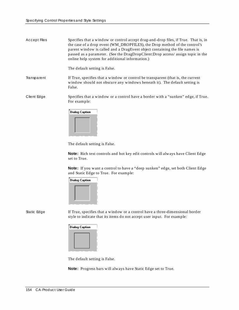
Specifying Control Properties and Style Settings
154 CA-Product User Guide
Accept Files Specifies that a window or control accept drag-and-drop files, if True. That is, inthe case of a drop event (WM_DROPFILES), the Drop method of the control’sparent window is called and a DragEvent object containing the file names ispassed as a parameter. (See the DragDropClient:Drop access/assign topic in theonline help system for additional information.)
The default setting is False.
Transparent If True, specifies that a window or control be transparent (that is, the currentwindow should not obscure any windows beneath it). The default setting isFalse.
Client Edge Specifies that a window or a control have a border with a “sunken” edge, if True.For example:
The default setting is False.
Note: Rich text controls and hot key edit controls will always have Client Edgeset to True.
Note: If you want a control to have a “deep sunken” edge, set both Client Edgeand Static Edge to True. For example:
Static Edge If True, specifies that a window or a control have a three-dimensional borderstyle to indicate that its items do not accept user input. For example:
The default setting is False.
Note: Progress bars will always have Static Edge set to True.
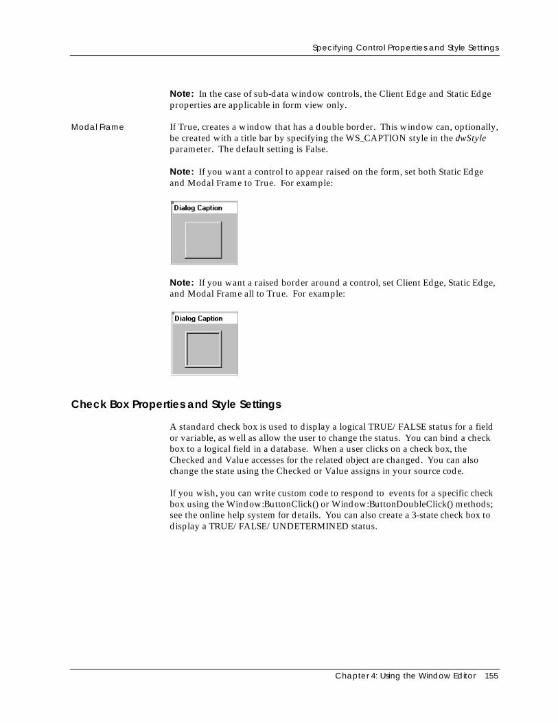
Specifying Control Properties and Style Settings
Chapter 4: Using the Window Editor 155
Note: In the case of sub-data window controls, the Client Edge and Static Edgeproperties are applicable in form view only.
Modal Frame If True, creates a window that has a double border. This window can, optionally,be created with a title bar by specifying the WS_CAPTION style in the dwStyleparameter. The default setting is False.
Note: If you want a control to appear raised on the form, set both Static Edgeand Modal Frame to True. For example:
Note: If you want a raised border around a control, set Client Edge, Static Edge,and Modal Frame all to True. For example:
Check Box Properties and Style Settings
A standard check box is used to display a logical TRUE/FALSE status for a fieldor variable, as well as allow the user to change the status. You can bind a checkbox to a logical field in a database. When a user clicks on a check box, theChecked and Value accesses for the related object are changed. You can alsochange the state using the Checked or Value assigns in your source code.
If you wish, you can write custom code to respond to events for a specific checkbox using the Window:ButtonClick() or Window:ButtonDoubleClick() methods;see the online help system for details. You can also create a 3-state check box todisplay a TRUE/FALSE/UNDETERMINED status.
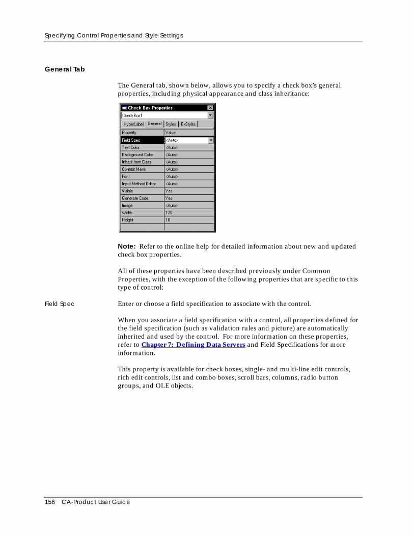
Specifying Control Properties and Style Settings
156 CA-Product User Guide
General Tab
The General tab, shown below, allows you to specify a check box’s generalproperties, including physical appearance and class inheritance:
Note: Refer to the online help for detailed information about new and updatedcheck box properties.
All of these properties have been described previously under CommonProperties, with the exception of the following properties that are specific to thistype of control:
Field Spec Enter or choose a field specification to associate with the control.
When you associate a field specification with a control, all properties defined forthe field specification (such as validation rules and picture) are automaticallyinherited and used by the control. For more information on these properties,refer to Chapter 7: Defining Data Servers and Field Specifications for moreinformation.
This property is available for check boxes, single- and multi-line edit controls,rich edit controls, list and combo boxes, scroll bars, columns, radio buttongroups, and OLE objects.
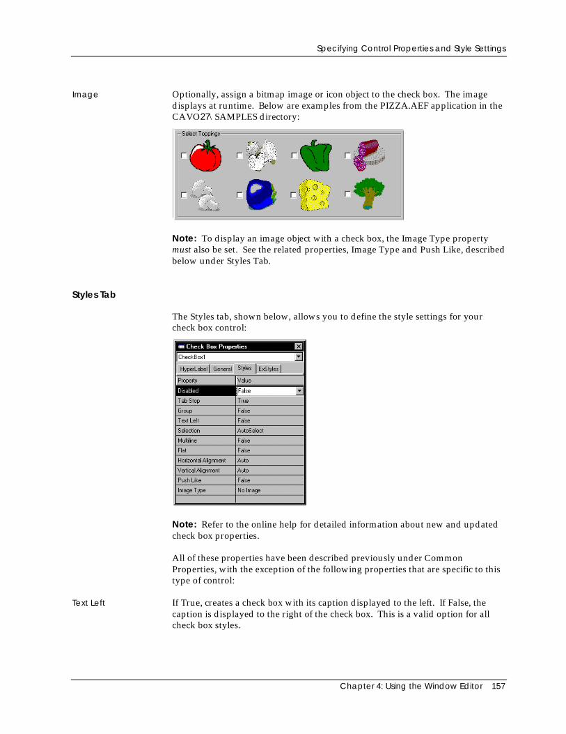
Specifying Control Properties and Style Settings
Chapter 4: Using the Window Editor 157
Image Optionally, assign a bitmap image or icon object to the check box. The imagedisplays at runtime. Below are examples from the PIZZA.AEF application in theCAVO27\SAMPLES directory:
Note: To display an image object with a check box, the Image Type propertymust also be set. See the related properties, Image Type and Push Like, describedbelow under Styles Tab.
Styles Tab
The Styles tab, shown below, allows you to define the style settings for yourcheck box control:
Note: Refer to the online help for detailed information about new and updatedcheck box properties.
All of these properties have been described previously under CommonProperties, with the exception of the following properties that are specific to thistype of control:
Text Left If True, creates a check box with its caption displayed to the left. If False, thecaption is displayed to the right of the check box. This is a valid option for allcheck box styles.
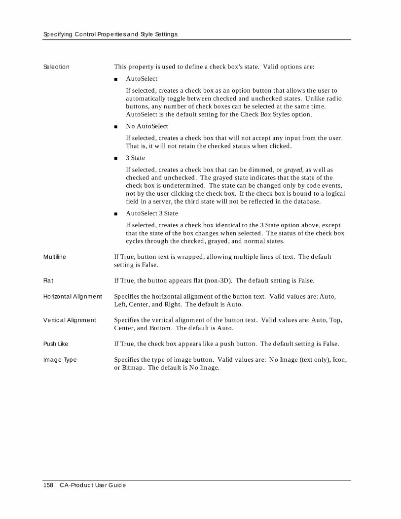
Specifying Control Properties and Style Settings
158 CA-Product User Guide
Selection This property is used to define a check box’s state. Valid options are:
■ AutoSelect
If selected, creates a check box as an option button that allows the user toautomatically toggle between checked and unchecked states. Unlike radiobuttons, any number of check boxes can be selected at the same time.AutoSelect is the default setting for the Check Box Styles option.
■ No AutoSelect
If selected, creates a check box that will not accept any input from the user.That is, it will not retain the checked status when clicked.
■ 3 State
If selected, creates a check box that can be dimmed, or grayed, as well aschecked and unchecked. The grayed state indicates that the state of thecheck box is undetermined. The state can be changed only by code events,not by the user clicking the check box. If the check box is bound to a logicalfield in a server, the third state will not be reflected in the database.
■ AutoSelect 3 State
If selected, creates a check box identical to the 3 State option above, exceptthat the state of the box changes when selected. The status of the check boxcycles through the checked, grayed, and normal states.
Multiline If True, button text is wrapped, allowing multiple lines of text. The defaultsetting is False.
Flat If True, the button appears flat (non-3D). The default setting is False.
Horizontal Alignment Specifies the horizontal alignment of the button text. Valid values are: Auto,Left, Center, and Right. The default is Auto.
Vertical Alignment Specifies the vertical alignment of the button text. Valid values are: Auto, Top,Center, and Bottom. The default is Auto.
Push Like If True, the check box appears like a push button. The default setting is False.
Image Type Specifies the type of image button. Valid values are: No Image (text only), Icon,or Bitmap. The default is No Image.
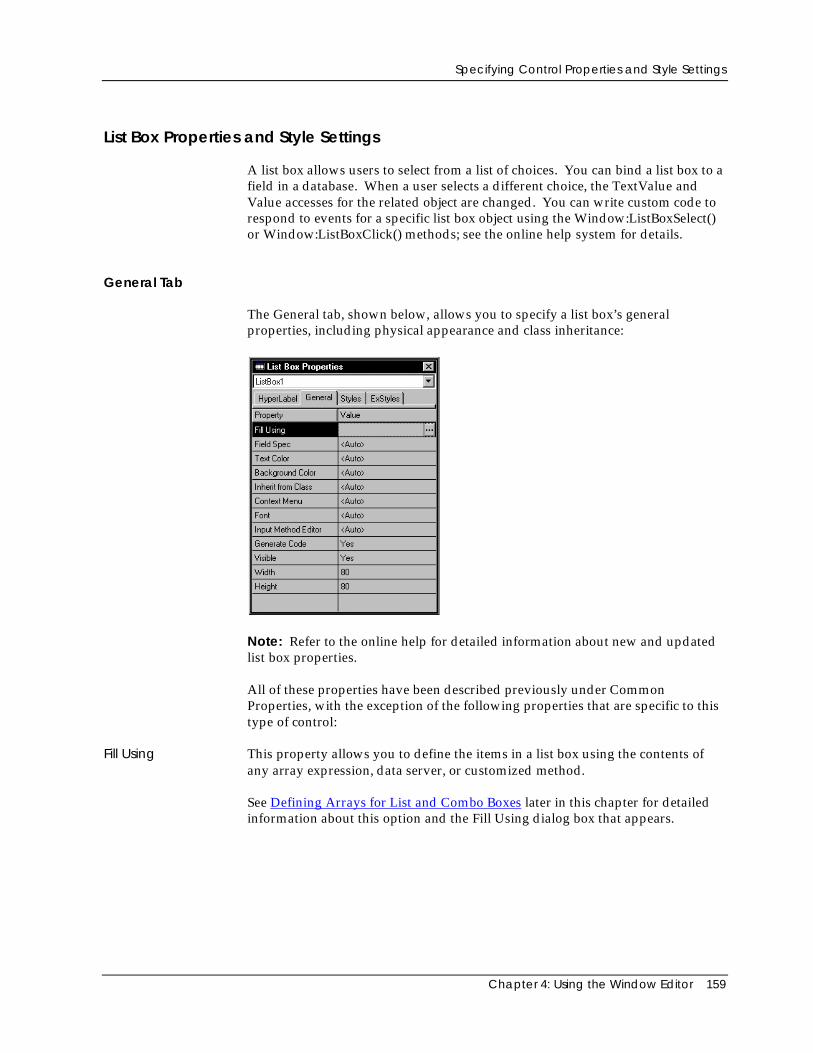
Specifying Control Properties and Style Settings
Chapter 4: Using the Window Editor 159
List Box Properties and Style Settings
A list box allows users to select from a list of choices. You can bind a list box to afield in a database. When a user selects a different choice, the TextValue andValue accesses for the related object are changed. You can write custom code torespond to events for a specific list box object using the Window:ListBoxSelect()or Window:ListBoxClick() methods; see the online help system for details.
General Tab
The General tab, shown below, allows you to specify a list box’s generalproperties, including physical appearance and class inheritance:
Note: Refer to the online help for detailed information about new and updatedlist box properties.
All of these properties have been described previously under CommonProperties, with the exception of the following properties that are specific to thistype of control:
Fill Using This property allows you to define the items in a list box using the contents ofany array expression, data server, or customized method.
See Defining Arrays for List and Combo Boxes later in this chapter for detailedinformation about this option and the Fill Using dialog box that appears.
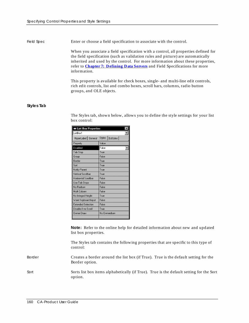
Specifying Control Properties and Style Settings
160 CA-Product User Guide
Field Spec Enter or choose a field specification to associate with the control.
When you associate a field specification with a control, all properties defined forthe field specification (such as validation rules and picture) are automaticallyinherited and used by the control. For more information about these properties,refer to Chapter 7: Defining Data Servers and Field Specifications for moreinformation.
This property is available for check boxes, single- and multi-line edit controls,rich edit controls, list and combo boxes, scroll bars, columns, radio buttongroups, and OLE objects.
Styles Tab
The Styles tab, shown below, allows you to define the style settings for your listbox control:
Note: Refer to the online help for detailed information about new and updatedlist box properties.
The Styles tab contains the following properties that are specific to this type ofcontrol:
Border Creates a border around the list box (if True). True is the default setting for theBorder option.
Sort Sorts list box items alphabetically (if True). True is the default setting for the Sortoption.
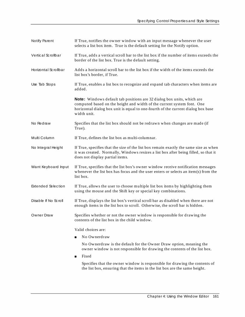
Specifying Control Properties and Style Settings
Chapter 4: Using the Window Editor 161
Notify Parent If True, notifies the owner window with an input message whenever the userselects a list box item. True is the default setting for the Notify option.
Vertical Scrollbar If True, adds a vertical scroll bar to the list box if the number of items exceeds theborder of the list box. True is the default setting.
Horizontal Scrollbar Adds a horizontal scroll bar to the list box if the width of the items exceeds thelist box’s border, if True.
Use Tab Stops If True, enables a list box to recognize and expand tab characters when items areadded.
Note: Windows default tab positions are 32 dialog box units, which arecomputed based on the height and width of the current system font. Onehorizontal dialog box unit is equal to one-fourth of the current dialog box basewidth unit.
No Redraw Specifies that the list box should not be redrawn when changes are made (ifTrue).
Multi Column If True, defines the list box as multi-columnar.
No Integral Height If True, specifies that the size of the list box remain exactly the same size as whenit was created. Normally, Windows resizes a list box after being filled, so that itdoes not display partial items.
Want Keyboard Input If True, specifies that the list box’s owner window receive notification messageswhenever the list box has focus and the user enters or selects an item(s) from thelist box.
Extended Selection If True, allows the user to choose multiple list box items by highlighting themusing the mouse and the Shift key or special key combinations.
Disable If No Scroll If True, displays the list box’s vertical scroll bar as disabled when there are notenough items in the list box to scroll. Otherwise, the scroll bar is hidden.
Owner Draw Specifies whether or not the owner window is responsible for drawing thecontents of the list box in the child window.
Valid choices are:
■ No Ownerdraw
No Ownerdraw is the default for the Owner Draw option, meaning theowner window is not responsible for drawing the contents of the list box.
■ Fixed
Specifies that the owner window is responsible for drawing the contents ofthe list box, ensuring that the items in the list box are the same height.
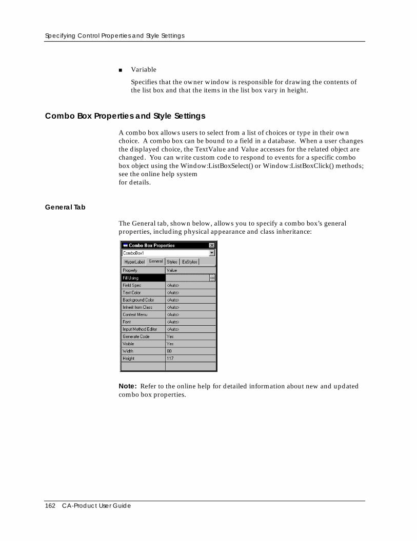
Specifying Control Properties and Style Settings
162 CA-Product User Guide
■ Variable
Specifies that the owner window is responsible for drawing the contents ofthe list box and that the items in the list box vary in height.
Combo Box Properties and Style Settings
A combo box allows users to select from a list of choices or type in their ownchoice. A combo box can be bound to a field in a database. When a user changesthe displayed choice, the TextValue and Value accesses for the related object arechanged. You can write custom code to respond to events for a specific combobox object using the Window:ListBoxSelect() or Window:ListBoxClick() methods;see the online help systemfor details.
General Tab
The General tab, shown below, allows you to specify a combo box’s generalproperties, including physical appearance and class inheritance:
Note: Refer to the online help for detailed information about new and updatedcombo box properties.
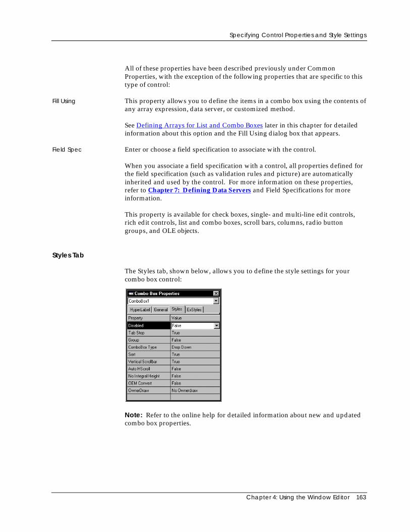
Specifying Control Properties and Style Settings
Chapter 4: Using the Window Editor 163
All of these properties have been described previously under CommonProperties, with the exception of the following properties that are specific to thistype of control:
Fill Using This property allows you to define the items in a combo box using the contents ofany array expression, data server, or customized method.
See Defining Arrays for List and Combo Boxes later in this chapter for detailedinformation about this option and the Fill Using dialog box that appears.
Field Spec Enter or choose a field specification to associate with the control.
When you associate a field specification with a control, all properties defined forthe field specification (such as validation rules and picture) are automaticallyinherited and used by the control. For more information on these properties,refer to Chapter 7: Defining Data Servers and Field Specifications for moreinformation.
This property is available for check boxes, single- and multi-line edit controls,rich edit controls, list and combo boxes, scroll bars, columns, radio buttongroups, and OLE objects.
Styles Tab
The Styles tab, shown below, allows you to define the style settings for yourcombo box control:
Note: Refer to the online help for detailed information about new and updatedcombo box properties.
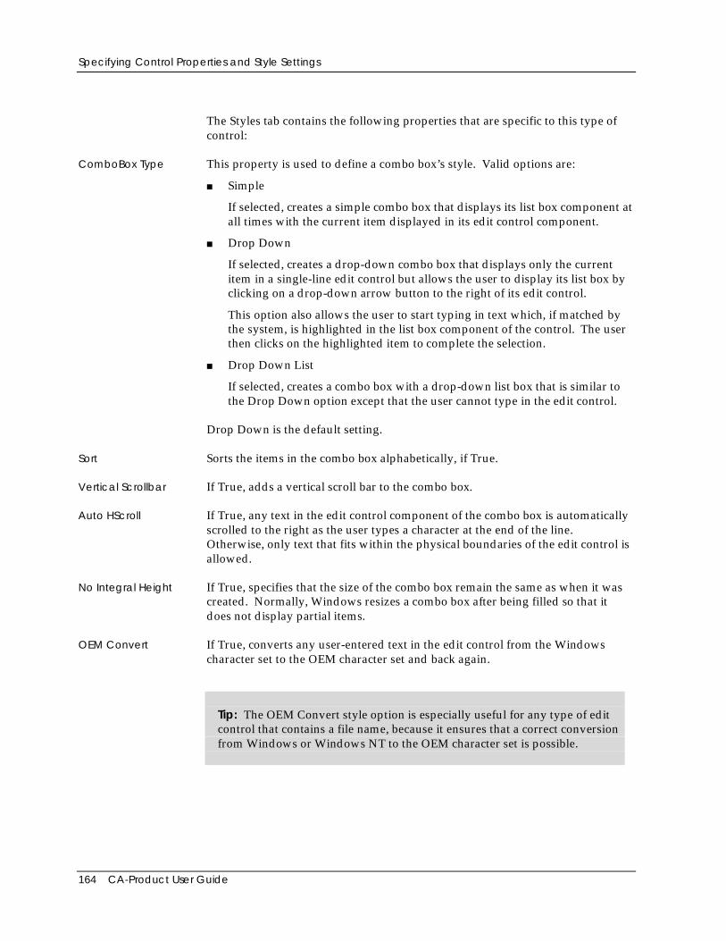
Specifying Control Properties and Style Settings
164 CA-Product User Guide
The Styles tab contains the following properties that are specific to this type ofcontrol:
ComboBox Type This property is used to define a combo box’s style. Valid options are:
■ Simple
If selected, creates a simple combo box that displays its list box component atall times with the current item displayed in its edit control component.
■ Drop Down
If selected, creates a drop-down combo box that displays only the currentitem in a single-line edit control but allows the user to display its list box byclicking on a drop-down arrow button to the right of its edit control.
This option also allows the user to start typing in text which, if matched bythe system, is highlighted in the list box component of the control. The userthen clicks on the highlighted item to complete the selection.
■ Drop Down List
If selected, creates a combo box with a drop-down list box that is similar tothe Drop Down option except that the user cannot type in the edit control.
Drop Down is the default setting.
Sort Sorts the items in the combo box alphabetically, if True.
Vertical Scrollbar If True, adds a vertical scroll bar to the combo box.
Auto HScroll If True, any text in the edit control component of the combo box is automaticallyscrolled to the right as the user types a character at the end of the line.Otherwise, only text that fits within the physical boundaries of the edit control isallowed.
No Integral Height If True, specifies that the size of the combo box remain the same as when it wascreated. Normally, Windows resizes a combo box after being filled so that itdoes not display partial items.
OEM Convert If True, converts any user-entered text in the edit control from the Windowscharacter set to the OEM character set and back again.
Tip: The OEM Convert style option is especially useful for any type of editcontrol that contains a file name, because it ensures that a correct conversionfrom Windows or Windows NT to the OEM character set is possible.
Specifying Control Properties and Style Settings
Chapter 4: Using the Window Editor 165
OwnerDraw Specifies whether or not the owner window is responsible for drawing thecontents of the combo box in the child window.
Valid choices are:
■ No Ownerdraw
No Ownerdraw is the default for the Owner Draw option, meaning theowner window is not responsible for drawing the contents of the combo box.
■ Fixed
Specifies that the owner window is responsible for drawing the contents ofthe combo box, ensuring that the items in the combo box are the same height.
■ Variable
Specifies that the owner window is responsible for drawing the contents ofthe combo box and that the items in the combo box vary in height.
Push Button Properties and Style Settings
A push button (also called a command button) allows users to interactively triggeractions by activating the button. Either a key press or mouse click can be used toinitiate a window, report, or other related source code that you specify using thepush buttons Click Event property.
You can also write custom code to respond to events for a specific push buttonusing the Window:ButtonClick() or Window:ButtonDoubleClick() methods. SeePush Button Controls and Actions later in this chapter for more information.Also, refer to the online help system for complete information about theWindow:ButtonClick() or Window:ButtonDoubleClick() methods.
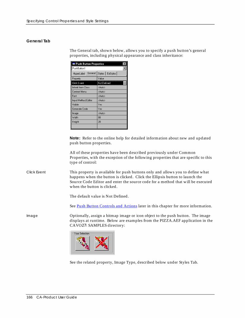
Specifying Control Properties and Style Settings
166 CA-Product User Guide
General Tab
The General tab, shown below, allows you to specify a push button’s generalproperties, including physical appearance and class inheritance:
Note: Refer to the online help for detailed information about new and updatedpush button properties.
All of these properties have been described previously under CommonProperties, with the exception of the following properties that are specific to thistype of control:
Click Event This property is available for push buttons only and allows you to define whathappens when the button is clicked. Click the Ellipsis button to launch theSource Code Editor and enter the source code for a method that will be executedwhen the button is clicked.
The default value is Not Defined.
See Push Button Controls and Actions later in this chapter for more information.
Image Optionally, assign a bitmap image or icon object to the push button. The imagedisplays at runtime. Below are examples from the PIZZA.AEF application in theCAVO27\SAMPLES directory:
See the related property, Image Type, described below under Styles Tab.
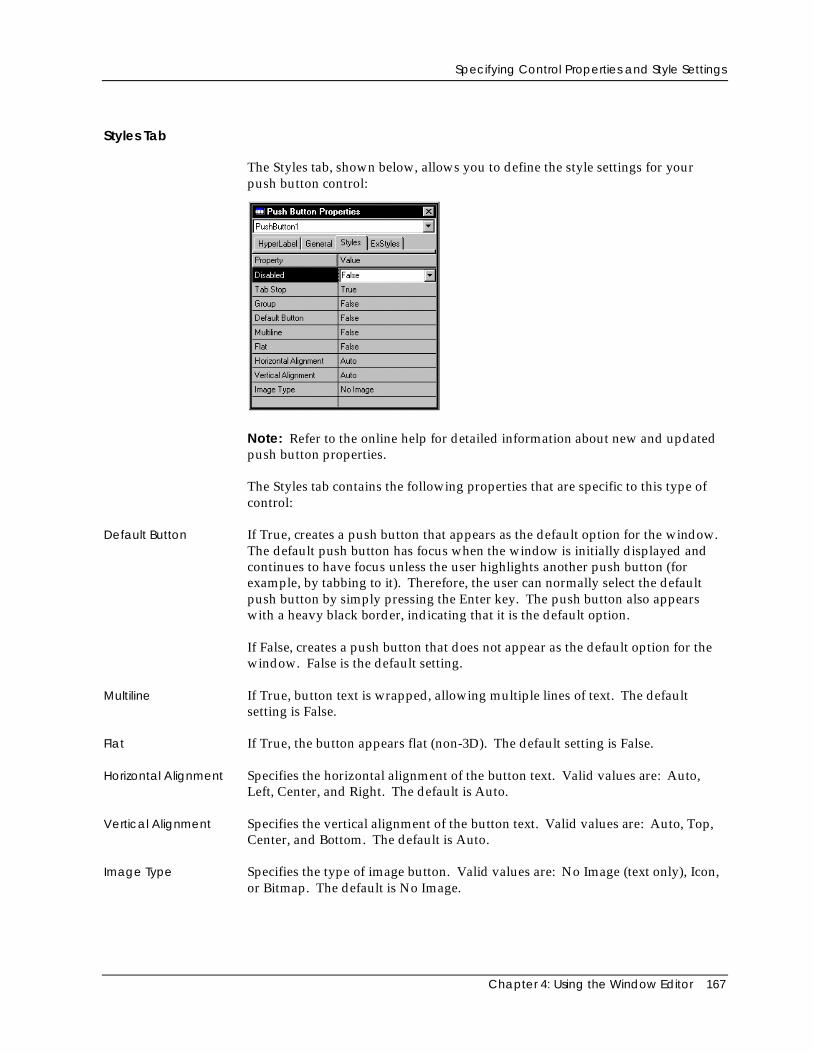
Specifying Control Properties and Style Settings
Chapter 4: Using the Window Editor 167
Styles Tab
The Styles tab, shown below, allows you to define the style settings for yourpush button control:
Note: Refer to the online help for detailed information about new and updatedpush button properties.
The Styles tab contains the following properties that are specific to this type ofcontrol:
Default Button If True, creates a push button that appears as the default option for the window.The default push button has focus when the window is initially displayed andcontinues to have focus unless the user highlights another push button (forexample, by tabbing to it). Therefore, the user can normally select the defaultpush button by simply pressing the Enter key. The push button also appearswith a heavy black border, indicating that it is the default option.
If False, creates a push button that does not appear as the default option for thewindow. False is the default setting.
Multiline If True, button text is wrapped, allowing multiple lines of text. The defaultsetting is False.
Flat If True, the button appears flat (non-3D). The default setting is False.
Horizontal Alignment Specifies the horizontal alignment of the button text. Valid values are: Auto,Left, Center, and Right. The default is Auto.
Vertical Alignment Specifies the vertical alignment of the button text. Valid values are: Auto, Top,Center, and Bottom. The default is Auto.
Image Type Specifies the type of image button. Valid values are: No Image (text only), Icon,or Bitmap. The default is No Image.
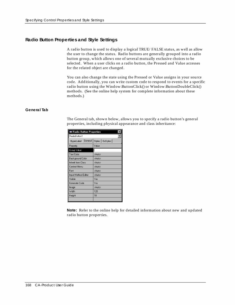
Specifying Control Properties and Style Settings
168 CA-Product User Guide
Radio Button Properties and Style Settings
A radio button is used to display a logical TRUE/FALSE status, as well as allowthe user to change the status. Radio buttons are generally grouped into a radiobutton group, which allows one of several mutually exclusive choices to beselected. When a user clicks on a radio button, the Pressed and Value accessesfor the related object are changed.
You can also change the state using the Pressed or Value assigns in your sourcecode. Additionally, you can write custom code to respond to events for a specificradio button using the Window:ButtonClick() or Window:ButtonDoubleClick()methods. (See the online help system for complete information about thesemethods.)
General Tab
The General tab, shown below, allows you to specify a radio button’s generalproperties, including physical appearance and class inheritance:
Note: Refer to the online help for detailed information about new and updatedradio button properties.
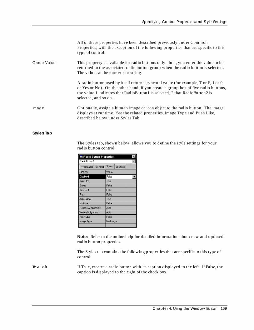
Specifying Control Properties and Style Settings
Chapter 4: Using the Window Editor 169
All of these properties have been described previously under CommonProperties, with the exception of the following properties that are specific to thistype of control:
Group Value This property is available for radio buttons only. In it, you enter the value to bereturned to the associated radio button group when the radio button is selected.The value can be numeric or string.
A radio button used by itself returns its actual value (for example, T or F, 1 or 0,or Yes or No). On the other hand, if you create a group box of five radio buttons,the value 1 indicates that RadioButton1 is selected, 2 that RadioButton2 isselected, and so on.
Image Optionally, assign a bitmap image or icon object to the radio button. The imagedisplays at runtime. See the related properties, Image Type and Push Like,described below under Styles Tab.
Styles Tab
The Styles tab, shown below, allows you to define the style settings for yourradio button control:
Note: Refer to the online help for detailed information about new and updatedradio button properties.
The Styles tab contains the following properties that are specific to this type ofcontrol:
Text Left If True, creates a radio button with its caption displayed to the left. If False, thecaption is displayed to the right of the check box.
Specifying Control Properties and Style Settings
170 CA-Product User Guide
AutoSelect If True, creates an option radio button that automatically highlights itself andclears any other buttons in the same group of related but mutually exclusivechoices. True is the default setting for the AutoSelect option.
If False, creates a radio button that will not accept any input. That is, it will notretain the selected status when clicked.
Multiline If True, button text is wrapped, allowing multiple lines of text. The defaultsetting is False.
Flat If True, the button appears flat (non-3D). The default setting is False.
Horizontal Alignment Specifies the horizontal alignment of the button text. Valid values are: Auto,Left, Center, and Right. The default is Auto.
Vertical Alignment Specifies the vertical alignment of the button text. Valid values are: Auto, Top,Center, and Bottom. The default is Auto.
Push Like If True, the radio button appears like a push button. The default setting is False.
Image Type Specifies the type of image button. Valid values are: No Image (text only), Icon,or Bitmap. The default is No Image.
Radio Button Group Properties and Style Settings
A radio button group is used to allow one selection out of a set of related, butmutually exclusive, choices. Each radio button in the group is assigned a GroupValue as one of its properties. Then, the Value access for the radio button groupindicates which of the button values has been selected.
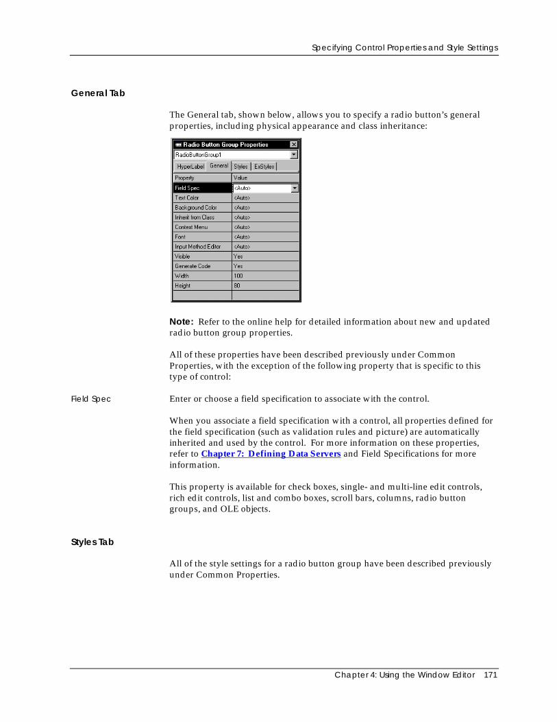
Specifying Control Properties and Style Settings
Chapter 4: Using the Window Editor 171
General Tab
The General tab, shown below, allows you to specify a radio button’s generalproperties, including physical appearance and class inheritance:
Note: Refer to the online help for detailed information about new and updatedradio button group properties.
All of these properties have been described previously under CommonProperties, with the exception of the following property that is specific to thistype of control:
Field Spec Enter or choose a field specification to associate with the control.
When you associate a field specification with a control, all properties defined forthe field specification (such as validation rules and picture) are automaticallyinherited and used by the control. For more information on these properties,refer to Chapter 7: Defining Data Servers and Field Specifications for moreinformation.
This property is available for check boxes, single- and multi-line edit controls,rich edit controls, list and combo boxes, scroll bars, columns, radio buttongroups, and OLE objects.
Styles Tab
All of the style settings for a radio button group have been described previouslyunder Common Properties.
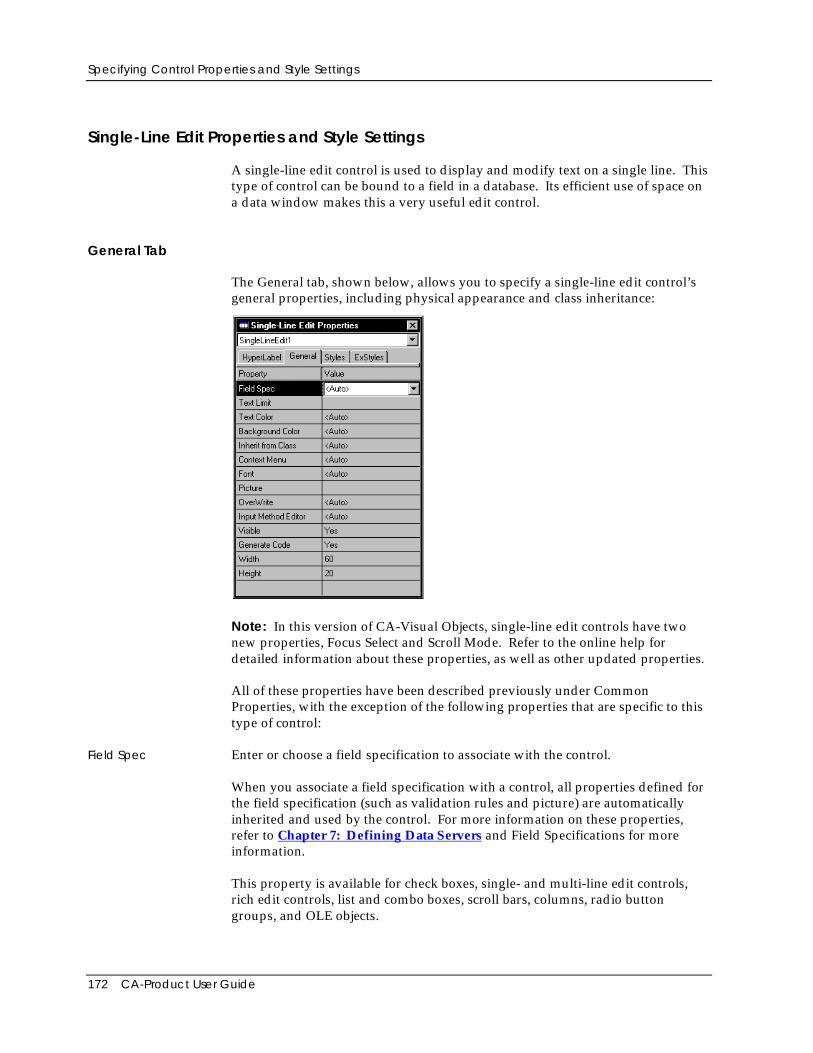
Specifying Control Properties and Style Settings
172 CA-Product User Guide
Single-Line Edit Properties and Style Settings
A single-line edit control is used to display and modify text on a single line. Thistype of control can be bound to a field in a database. Its efficient use of space ona data window makes this a very useful edit control.
General Tab
The General tab, shown below, allows you to specify a single-line edit control’sgeneral properties, including physical appearance and class inheritance:
Note: In this version of CA-Visual Objects, single-line edit controls have twonew properties, Focus Select and Scroll Mode. Refer to the online help fordetailed information about these properties, as well as other updated properties.
All of these properties have been described previously under CommonProperties, with the exception of the following properties that are specific to thistype of control:
Field Spec Enter or choose a field specification to associate with the control.
When you associate a field specification with a control, all properties defined forthe field specification (such as validation rules and picture) are automaticallyinherited and used by the control. For more information on these properties,refer to Chapter 7: Defining Data Servers and Field Specifications for moreinformation.
This property is available for check boxes, single- and multi-line edit controls,rich edit controls, list and combo boxes, scroll bars, columns, radio buttongroups, and OLE objects.
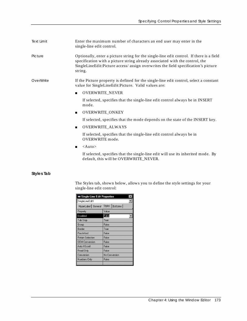
Specifying Control Properties and Style Settings
Chapter 4: Using the Window Editor 173
Text Limit Enter the maximum number of characters an end user may enter in thesingle-line edit control.
Picture Optionally, enter a picture string for the single-line edit control. If there is a fieldspecification with a picture string already associated with the control, theSingleLineEdit:Picture access/assign overwrites the field specification’s picturestring.
OverWrite If the Picture property is defined for the single-line edit control, select a constantvalue for SingleLineEdit:Picture. Valid values are:
■ OVERWRITE_NEVER
If selected, specifies that the single-line edit control always be in INSERTmode.
■ OVERWRITE_ONKEY
If selected, specifies that the mode depends on the state of the INSERT key.
■ OVERWRITE_ALWAYS
If selected, specifies that the single-line edit control always be inOVERWRITE mode.
■ <Auto>
If selected, specifies that the single-line edit will use its inherited mode. Bydefault, this will be OVERWRITE_NEVER.
Styles Tab
The Styles tab, shown below, allows you to define the style settings for yoursingle-line edit control:
Specifying Control Properties and Style Settings
174 CA-Product User Guide
Note: The single-line edit control does not have an alignment property as doesthe multi-line edit control; by default it has left alignment. If you want a controlwith center or right alignment, use the multi-line edit control with its height setappropriately.
Note: Refer to the online help for detailed information about new and updatedsingle-line edit control properties.
The Styles tab contains the following properties that are specific to this type ofcontrol:
Border Creates a single-line edit control with a border (if True). True is the defaultsetting for the Border option.
Password If True, displays all characters as asterisks (*) as they are entered in the single-line edit control.
Retain Selection If False, the highlighting will be removed when the edit control loses focus (forexample, if you Tab to another control). When the edit control regains focus, theprevious selection will not be highlighted. False is the default choice.
If True, the highlighted or selected text will remain highlighted when you Tab toanother control. In this fashion, any edit control you have edited stays marked(until you move to another record in a database or close the window).
OEM Conversion If True, converts any user-entered text in the single-line edit control from theWindows character set to the OEM character set and back again.
Auto HScroll If True, any text in the edit control is automatically scrolled 10 characters to theright when the user reaches the end of the line while typing. True is the defaultsetting for the Auto HScroll option.
Tip: If you want a horizontal scroll bar to assist in scrolling the text, thencreate a multi-line edit control with the Horz. Scroll style setting checked.Adjust the height of the multi-line edit control to display the single line oftext.
Read Only If True, this option stops the user from entering/editing text in the single-lineedit control.
Conversion Specifies whether or not characters are converted to uppercase or lowercase.Valid choices are:
■ No Conversion
If No Conversion is selected (the default option), characters are notconverted.
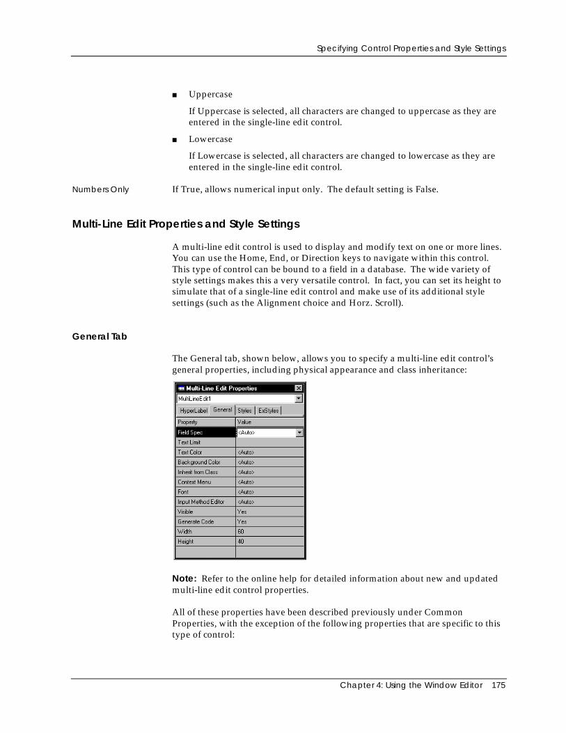
Specifying Control Properties and Style Settings
Chapter 4: Using the Window Editor 175
■ Uppercase
If Uppercase is selected, all characters are changed to uppercase as they areentered in the single-line edit control.
■ Lowercase
If Lowercase is selected, all characters are changed to lowercase as they areentered in the single-line edit control.
Numbers Only If True, allows numerical input only. The default setting is False.
Multi-Line Edit Properties and Style Settings
A multi-line edit control is used to display and modify text on one or more lines.You can use the Home, End, or Direction keys to navigate within this control.This type of control can be bound to a field in a database. The wide variety ofstyle settings makes this a very versatile control. In fact, you can set its height tosimulate that of a single-line edit control and make use of its additional stylesettings (such as the Alignment choice and Horz. Scroll).
General Tab
The General tab, shown below, allows you to specify a multi-line edit control’sgeneral properties, including physical appearance and class inheritance:
Note: Refer to the online help for detailed information about new and updatedmulti-line edit control properties.
All of these properties have been described previously under CommonProperties, with the exception of the following properties that are specific to thistype of control:
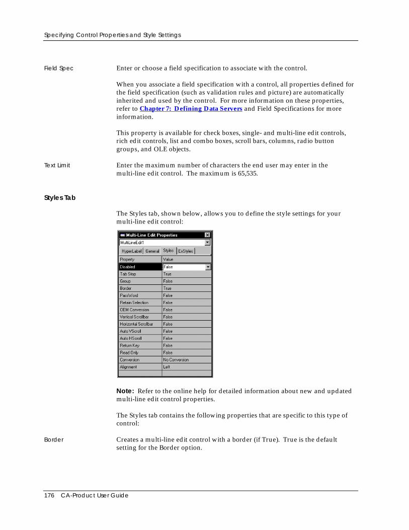
Specifying Control Properties and Style Settings
176 CA-Product User Guide
Field Spec Enter or choose a field specification to associate with the control.
When you associate a field specification with a control, all properties defined forthe field specification (such as validation rules and picture) are automaticallyinherited and used by the control. For more information on these properties,refer to Chapter 7: Defining Data Servers and Field Specifications for moreinformation.
This property is available for check boxes, single- and multi-line edit controls,rich edit controls, list and combo boxes, scroll bars, columns, radio buttongroups, and OLE objects.
Text Limit Enter the maximum number of characters the end user may enter in themulti-line edit control. The maximum is 65,535.
Styles Tab
The Styles tab, shown below, allows you to define the style settings for yourmulti-line edit control:
Note: Refer to the online help for detailed information about new and updatedmulti-line edit control properties.
The Styles tab contains the following properties that are specific to this type ofcontrol:
Border Creates a multi-line edit control with a border (if True). True is the defaultsetting for the Border option.
Specifying Control Properties and Style Settings
Chapter 4: Using the Window Editor 177
Password If True, displays all characters as asterisks (*) as they are entered in the multi-lineedit control.
Retain Selection If False, the highlighting will be removed when the edit control loses focus (forexample, if you Tab to another control). When the edit control regains focus, theprevious selection will not be highlighted. False is the default choice.
If True, the highlighted or selected text will remain highlighted when you Tab toanother control. In this fashion, any edit control you have edited stays marked(until you move to another record in a database or close the window).
OEM Conversion If True, converts any user-entered text in the multi-line edit control from theWindows character set to the OEM character set and back again.
Vertical Scrollbar Creates a multi-line edit control with a vertical scroll bar (if True).
Horizontal Scrollbar Creates a multi-line edit control with a horizontal scroll bar, where all the text ison the first line. In effect, this can be used to create a single-line edit control witha horizontal scroll bar.
Auto VScroll If True, text is automatically scrolled up or down one line when the cursorreaches the beginning or end of a line.
Auto HScroll If True, any text in the multi-line edit control is automatically scrolled 10characters to the right when the user reaches the end of the line while typing.
Return Key If True, the Enter key acts as a return key, moving the cursor to the next line ofthe multi-line edit control. If False, the Enter key activates the default pushbutton for the window and has no effect on the edit control.
Read Only If True, this option stops the user from entering/editing text in the multi-line editcontrol.
Conversion Specifies whether or not characters are converted to uppercase or lowercase.Valid choices are:
■ No Conversion
If No Conversion is selected (the default option), characters are notconverted.
■ Uppercase
If Uppercase is selected, all characters are changed to uppercase as they areentered in the multi-line edit control.
■ Lowercase
If Lowercase is selected, all characters are changed to lowercase as they areentered in the multi-line edit control.
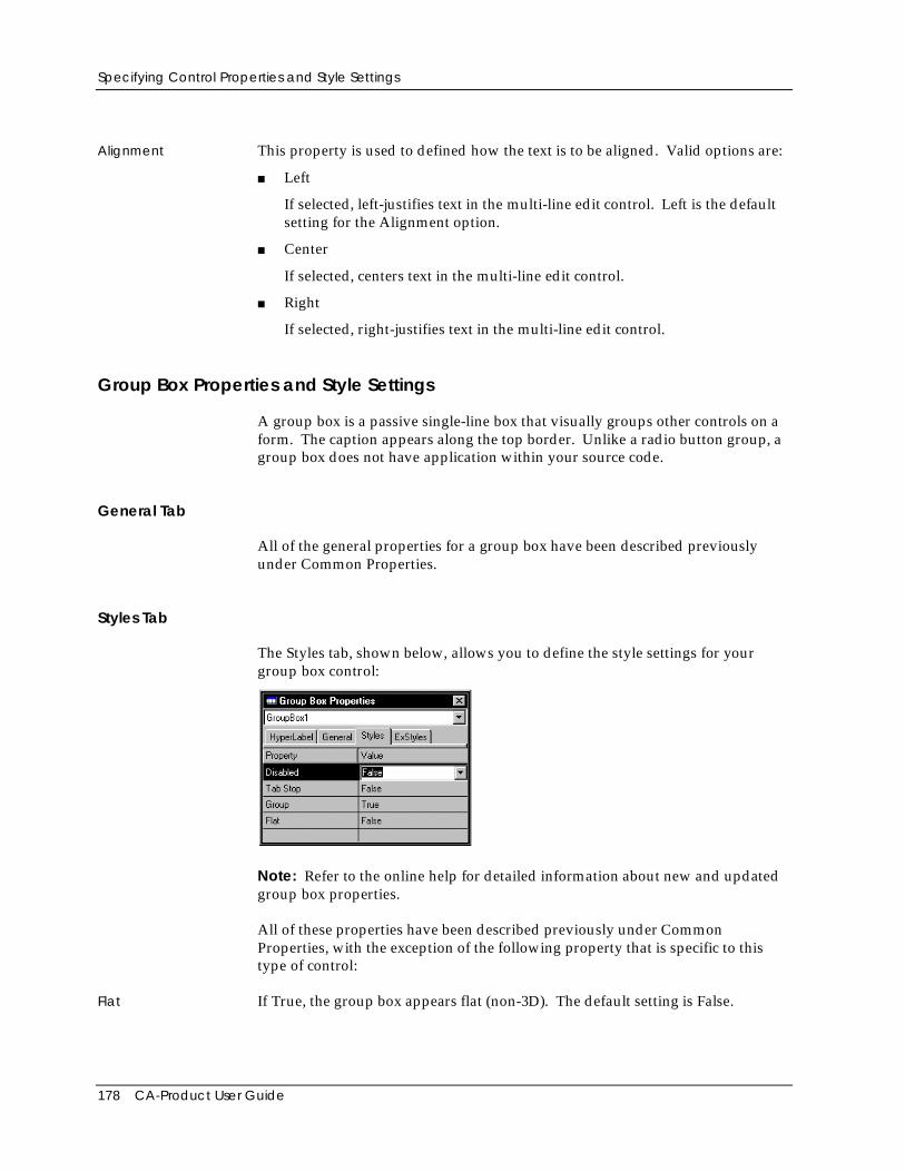
Specifying Control Properties and Style Settings
178 CA-Product User Guide
Alignment This property is used to defined how the text is to be aligned. Valid options are:
■ Left
If selected, left-justifies text in the multi-line edit control. Left is the defaultsetting for the Alignment option.
■ Center
If selected, centers text in the multi-line edit control.
■ Right
If selected, right-justifies text in the multi-line edit control.
Group Box Properties and Style Settings
A group box is a passive single-line box that visually groups other controls on aform. The caption appears along the top border. Unlike a radio button group, agroup box does not have application within your source code.
General Tab
All of the general properties for a group box have been described previouslyunder Common Properties.
Styles Tab
The Styles tab, shown below, allows you to define the style settings for yourgroup box control:
Note: Refer to the online help for detailed information about new and updatedgroup box properties.
All of these properties have been described previously under CommonProperties, with the exception of the following property that is specific to thistype of control:
Flat If True, the group box appears flat (non-3D). The default setting is False.
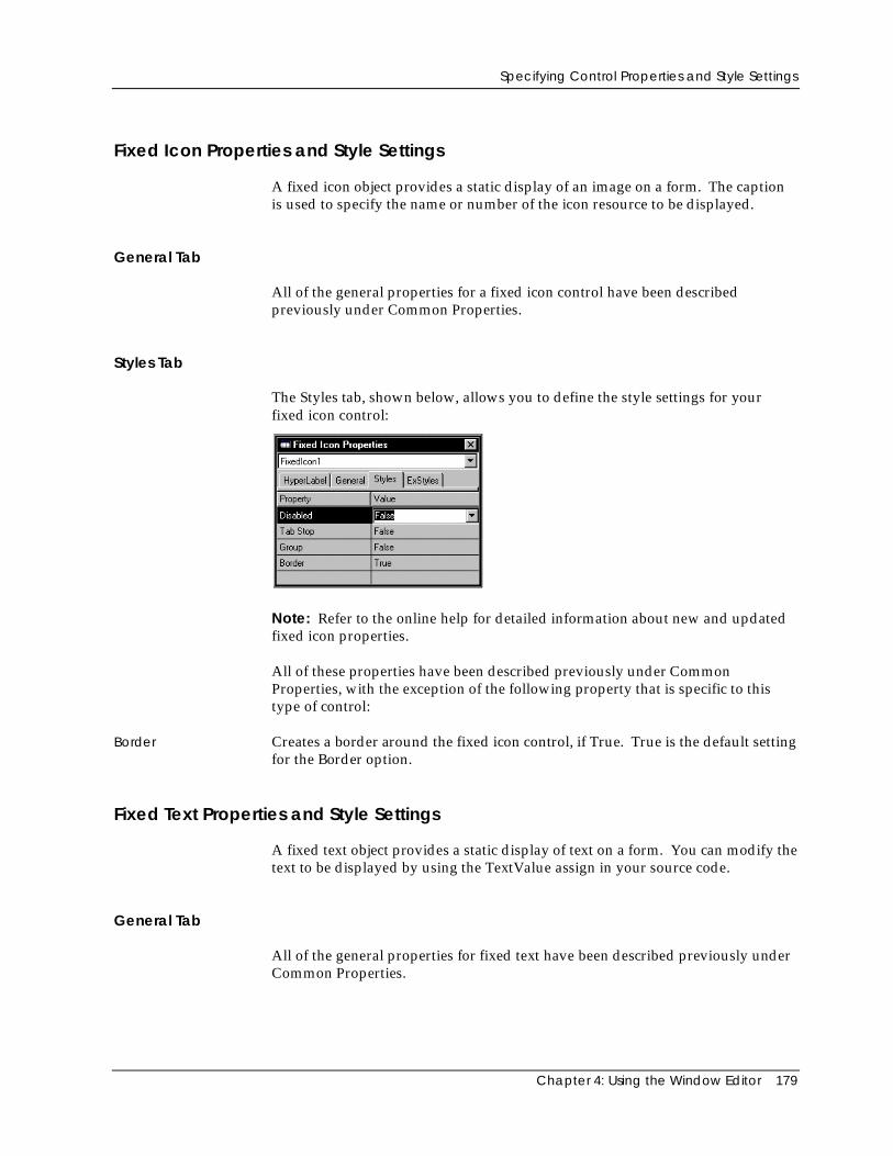
Specifying Control Properties and Style Settings
Chapter 4: Using the Window Editor 179
Fixed Icon Properties and Style Settings
A fixed icon object provides a static display of an image on a form. The captionis used to specify the name or number of the icon resource to be displayed.
General Tab
All of the general properties for a fixed icon control have been describedpreviously under Common Properties.
Styles Tab
The Styles tab, shown below, allows you to define the style settings for yourfixed icon control:
Note: Refer to the online help for detailed information about new and updatedfixed icon properties.
All of these properties have been described previously under CommonProperties, with the exception of the following property that is specific to thistype of control:
Border Creates a border around the fixed icon control, if True. True is the default settingfor the Border option.
Fixed Text Properties and Style Settings
A fixed text object provides a static display of text on a form. You can modify thetext to be displayed by using the TextValue assign in your source code.
General Tab
All of the general properties for fixed text have been described previously underCommon Properties.
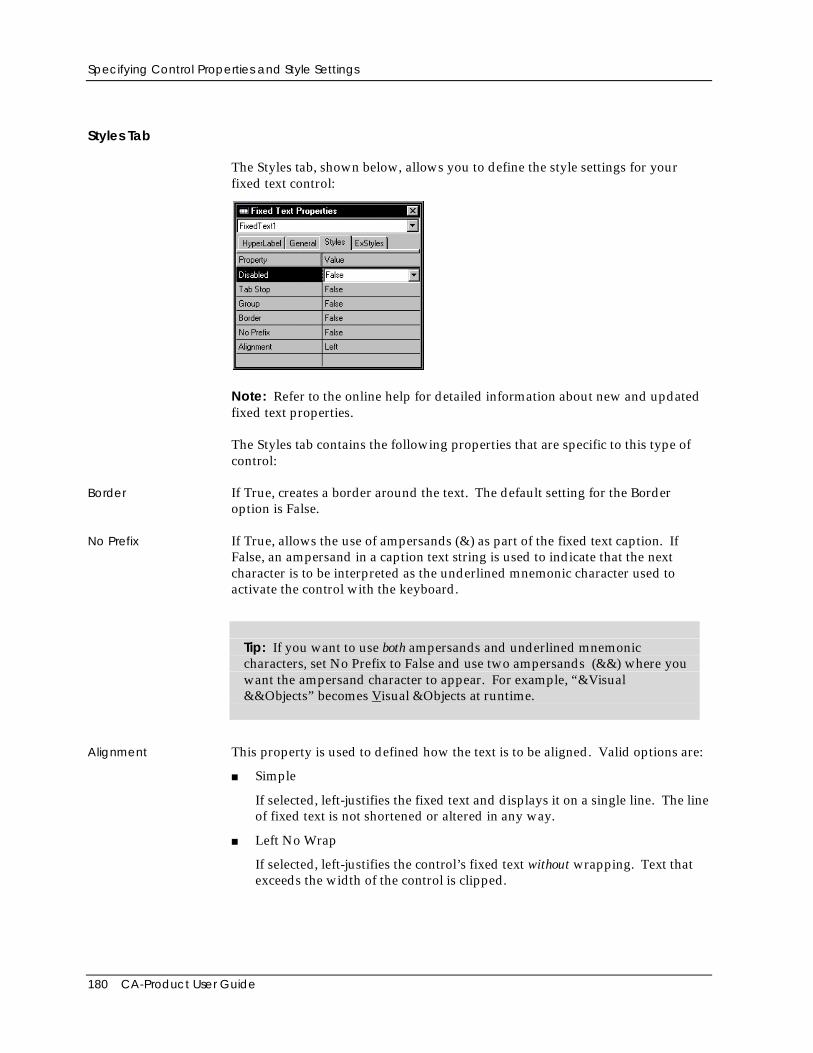
Specifying Control Properties and Style Settings
180 CA-Product User Guide
Styles Tab
The Styles tab, shown below, allows you to define the style settings for yourfixed text control:
Note: Refer to the online help for detailed information about new and updatedfixed text properties.
The Styles tab contains the following properties that are specific to this type ofcontrol:
Border If True, creates a border around the text. The default setting for the Borderoption is False.
No Prefix If True, allows the use of ampersands (&) as part of the fixed text caption. IfFalse, an ampersand in a caption text string is used to indicate that the nextcharacter is to be interpreted as the underlined mnemonic character used toactivate the control with the keyboard.
Tip: If you want to use both ampersands and underlined mnemoniccharacters, set No Prefix to False and use two ampersands (&&) where youwant the ampersand character to appear. For example, “&Visual&&Objects” becomes Visual &Objects at runtime.
Alignment This property is used to defined how the text is to be aligned. Valid options are:
■ Simple
If selected, left-justifies the fixed text and displays it on a single line. The lineof fixed text is not shortened or altered in any way.
■ Left No Wrap
If selected, left-justifies the control’s fixed text without wrapping. Text thatexceeds the width of the control is clipped.
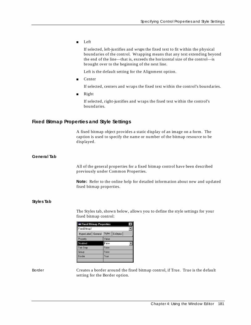
Specifying Control Properties and Style Settings
Chapter 4: Using the Window Editor 181
■ Left
If selected, left-justifies and wraps the fixed text to fit within the physicalboundaries of the control. Wrapping means that any text extending beyondthe end of the line—that is, exceeds the horizontal size of the control—isbrought over to the beginning of the next line.
Left is the default setting for the Alignment option.
■ Center
If selected, centers and wraps the fixed text within the control’s boundaries.
■ Right
If selected, right-justifies and wraps the fixed text within the control’sboundaries.
Fixed Bitmap Properties and Style Settings
A fixed bitmap object provides a static display of an image on a form. Thecaption is used to specify the name or number of the bitmap resource to bedisplayed.
General Tab
All of the general properties for a fixed bitmap control have been describedpreviously under Common Properties.
Note: Refer to the online help for detailed information about new and updatedfixed bitmap properties.
Styles Tab
The Styles tab, shown below, allows you to define the style settings for yourfixed bitmap control:
Border Creates a border around the fixed bitmap control, if True. True is the defaultsetting for the Border option.
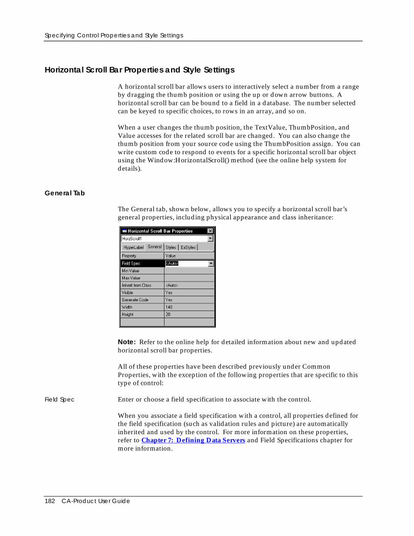
Specifying Control Properties and Style Settings
182 CA-Product User Guide
Horizontal Scroll Bar Properties and Style Settings
A horizontal scroll bar allows users to interactively select a number from a rangeby dragging the thumb position or using the up or down arrow buttons. Ahorizontal scroll bar can be bound to a field in a database. The number selectedcan be keyed to specific choices, to rows in an array, and so on.
When a user changes the thumb position, the TextValue, ThumbPosition, andValue accesses for the related scroll bar are changed. You can also change thethumb position from your source code using the ThumbPosition assign. You canwrite custom code to respond to events for a specific horizontal scroll bar objectusing the Window:HorizontalScroll() method (see the online help system fordetails).
General Tab
The General tab, shown below, allows you to specify a horizontal scroll bar’sgeneral properties, including physical appearance and class inheritance:
Note: Refer to the online help for detailed information about new and updatedhorizontal scroll bar properties.
All of these properties have been described previously under CommonProperties, with the exception of the following properties that are specific to thistype of control:
Field Spec Enter or choose a field specification to associate with the control.
When you associate a field specification with a control, all properties defined forthe field specification (such as validation rules and picture) are automaticallyinherited and used by the control. For more information on these properties,refer to Chapter 7: Defining Data Servers and Field Specifications chapter formore information.
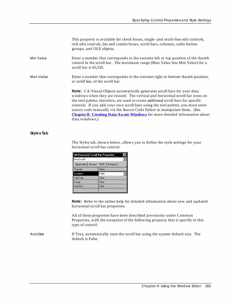
Specifying Control Properties and Style Settings
Chapter 4: Using the Window Editor 183
This property is available for check boxes, single- and multi-line edit controls,rich edit controls, list and combo boxes, scroll bars, columns, radio buttongroups, and OLE objects.
Min Value Enter a number that corresponds to the extreme left or top position of the thumbcontrol in the scroll bar. The maximum range (Max Value less Min Value) for ascroll bar is 65,535.
Max Value Enter a number that corresponds to the extreme right or bottom thumb position,or scroll box, of the scroll bar.
Note: CA-Visual Objects automatically generates scroll bars for your datawindows when they are resized. The vertical and horizontal scroll bar icons onthe tool palette, therefore, are used to create additional scroll bars for specificcontrols. If you add your own scroll bars using the tool palette, you must entersource code manually via the Source Code Editor to manipulate them. (SeeChapter 8: Creating Data-Aware Windows for more detailed information aboutdata windows.)
Styles Tab
The Styles tab, shown below, allows you to define the style settings for yourhorizontal scroll bar control:
Note: Refer to the online help for detailed information about new and updatedhorizontal scroll bar properties.
All of these properties have been described previously under CommonProperties, with the exception of the following property that is specific to thistype of control:
AutoSize If True, automatically sizes the scroll bar using the system default size. Thedefault is False.
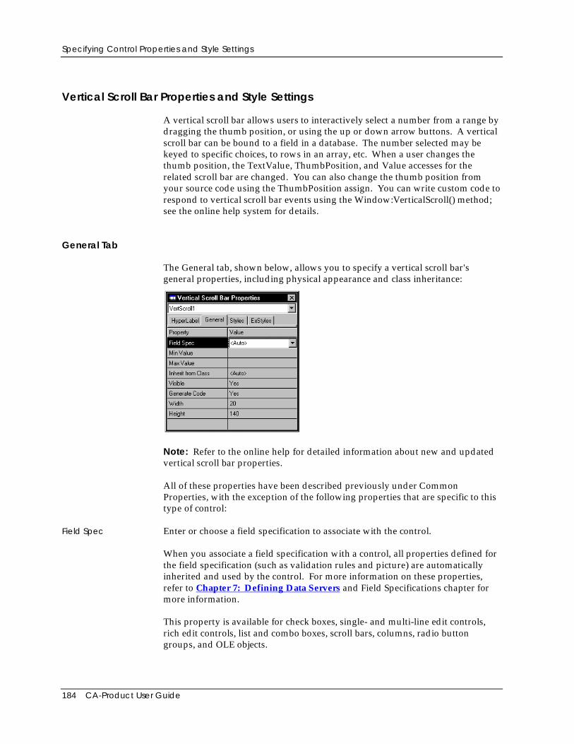
Specifying Control Properties and Style Settings
184 CA-Product User Guide
Vertical Scroll Bar Properties and Style Settings
A vertical scroll bar allows users to interactively select a number from a range bydragging the thumb position, or using the up or down arrow buttons. A verticalscroll bar can be bound to a field in a database. The number selected may bekeyed to specific choices, to rows in an array, etc. When a user changes thethumb position, the TextValue, ThumbPosition, and Value accesses for therelated scroll bar are changed. You can also change the thumb position fromyour source code using the ThumbPosition assign. You can write custom code torespond to vertical scroll bar events using the Window:VerticalScroll() method;see the online help system for details.
General Tab
The General tab, shown below, allows you to specify a vertical scroll bar'sgeneral properties, including physical appearance and class inheritance:
Note: Refer to the online help for detailed information about new and updatedvertical scroll bar properties.
All of these properties have been described previously under CommonProperties, with the exception of the following properties that are specific to thistype of control:
Field Spec Enter or choose a field specification to associate with the control.
When you associate a field specification with a control, all properties defined forthe field specification (such as validation rules and picture) are automaticallyinherited and used by the control. For more information on these properties,refer to Chapter 7: Defining Data Servers and Field Specifications chapter formore information.
This property is available for check boxes, single- and multi-line edit controls,rich edit controls, list and combo boxes, scroll bars, columns, radio buttongroups, and OLE objects.
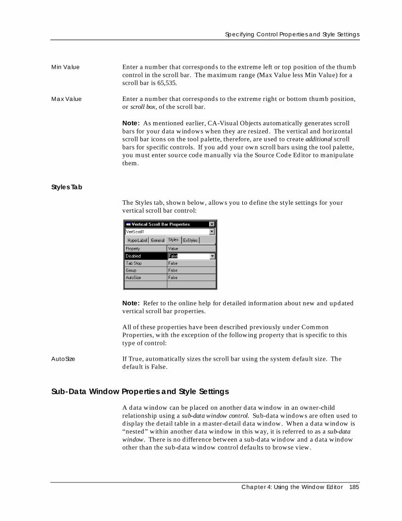
Specifying Control Properties and Style Settings
Chapter 4: Using the Window Editor 185
Min Value Enter a number that corresponds to the extreme left or top position of the thumbcontrol in the scroll bar. The maximum range (Max Value less Min Value) for ascroll bar is 65,535.
Max Value Enter a number that corresponds to the extreme right or bottom thumb position,or scroll box, of the scroll bar.
Note: As mentioned earlier, CA-Visual Objects automatically generates scrollbars for your data windows when they are resized. The vertical and horizontalscroll bar icons on the tool palette, therefore, are used to create additional scrollbars for specific controls. If you add your own scroll bars using the tool palette,you must enter source code manually via the Source Code Editor to manipulatethem.
Styles Tab
The Styles tab, shown below, allows you to define the style settings for yourvertical scroll bar control:
Note: Refer to the online help for detailed information about new and updatedvertical scroll bar properties.
All of these properties have been described previously under CommonProperties, with the exception of the following property that is specific to thistype of control:
AutoSize If True, automatically sizes the scroll bar using the system default size. Thedefault is False.
Sub-Data Window Properties and Style Settings
A data window can be placed on another data window in an owner-childrelationship using a sub-data window control. Sub-data windows are often used todisplay the detail table in a master-detail data window. When a data window is“nested” within another data window in this way, it is referred to as a sub-datawindow. There is no difference between a sub-data window and a data windowother than the sub-data window control defaults to browse view.
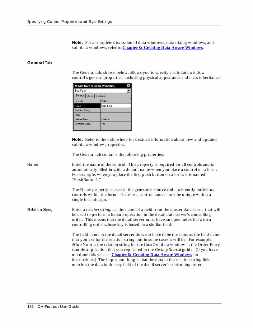
Specifying Control Properties and Style Settings
186 CA-Product User Guide
Note: For a complete discussion of data windows, data dialog windows, andsub-data windows, refer to Chapter 8: Creating Data-Aware Windows.
General Tab
The General tab, shown below, allows you to specify a sub-data windowcontrol’s general properties, including physical appearance and class inheritance:
Note: Refer to the online help for detailed information about new and updatedsub-data window properties.
The General tab contains the following properties:
Name Enter the name of the control. This property is required for all controls and isautomatically filled in with a default name when you place a control on a form.For example, when you place the first push button on a form, it is named“PushButton1.”
The Name property is used in the generated source code to identify individualcontrols within the form. Therefore, control names must be unique within asingle form design.
Relation String Enter a relation string, i.e. the name of a field from the master data server that willbe used to perform a lookup operation in the detail data server’s controllingorder. This means that the detail server must have an open index file with acontrolling order whose key is based on a similar field.
The field name in the detail server does not have to be the same as the field namethat you use for the relation string, but in some cases it will be. For example,#CustNum is the relation string for the CustOrd data window in the Order Entrysample application that you replicated in the Getting Started guide. (If you havenot done this yet, see Chapter 8: Creating Data-Aware Windows forinstructions.) The important thing is that the data in the relation string fieldmatches the data in the key field of the detail server’s controlling order.
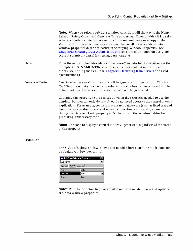
Specifying Control Properties and Style Settings
Chapter 4: Using the Window Editor 187
Note: When you select a sub-data window control, it will show only the Name,Relation String, Order, and Generate Code properties. If you double-click on thesub-data window control, however, the program launches a new copy of theWindow Editor in which you can view and change all of the standard datawindow properties described earlier in Specifying Window Properties. SeeChapter 8: Creating Data-Aware Windows for more information on using thesub-data window control for nesting data windows.
Order Enter the name of the index file with the controlling order for the detail server (forexample, CUSTNAME.NTX). (For more information about index files andorders, see Adding Index Files in Chapter 7: Defining Data Servers and FieldSpecifications.)
Generate Code Specify whether certain source code will be generated for the control. This is aYes/No option that you change by selecting a value from a drop-down list. Thedefault value of Yes indicates that source code will be generated.
Changing this property to No can cut down on the resources needed to use thewindow, but you can only do this if you do not need access to the control in yourapplication. For example, controls that are not data-aware (such as fixed text andfixed icon) are seldom referenced in your application source code, so you canchange the Generate Code property to No to prevent the Window Editor fromgenerating unnecessary code.
Note: The code to display a control is always generated, regardless of the statusof this property.
Styles Tab
The Styles tab, shown below, allows you to add a border and to set tab stops fora sub-data window box control:
Note: Refer to the online help for detailed information about new and updatedsub-data window properties.
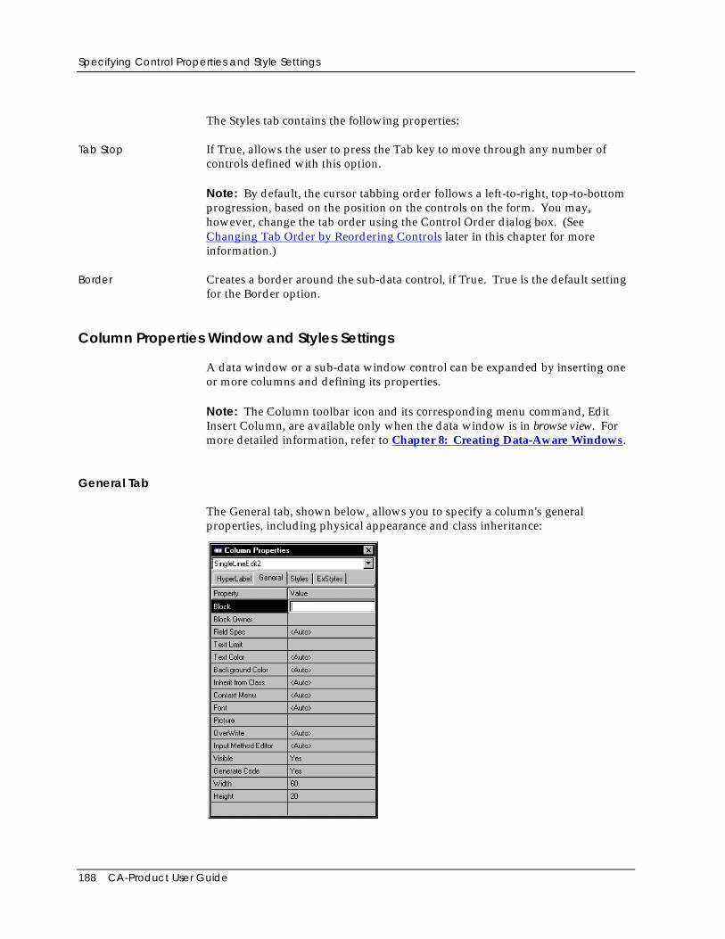
Specifying Control Properties and Style Settings
188 CA-Product User Guide
The Styles tab contains the following properties:
Tab Stop If True, allows the user to press the Tab key to move through any number ofcontrols defined with this option.
Note: By default, the cursor tabbing order follows a left-to-right, top-to-bottomprogression, based on the position on the controls on the form. You may,however, change the tab order using the Control Order dialog box. (SeeChanging Tab Order by Reordering Controls later in this chapter for moreinformation.)
Border Creates a border around the sub-data control, if True. True is the default settingfor the Border option.
Column Properties Window and Styles Settings
A data window or a sub-data window control can be expanded by inserting oneor more columns and defining its properties.
Note: The Column toolbar icon and its corresponding menu command, EditInsert Column, are available only when the data window is in browse view. Formore detailed information, refer to Chapter 8: Creating Data-Aware Windows.
General Tab
The General tab, shown below, allows you to specify a column's generalproperties, including physical appearance and class inheritance:
Specifying Control Properties and Style Settings
Chapter 4: Using the Window Editor 189
Note: Refer to the online help for detailed information about new and updatedcolumn properties.
The General tab contains the following properties that are specific to this type ofcontrol:
Block Optionally specify the code block to be associated with the column. This optionis used to filter the data in/out of the data column.
Block Owner Enter the owner of the code block associated with a column, if specified. Theowner would typically be the data server or SELF:Server .
Field Spec Enter or choose a field specification to associate with the column.
When you associate a field specification with a column control, all propertiesdefined for the field specification (such as validation rules and picture) areautomatically inherited and used by the control. For more information on theseproperties, refer to Chapter 7: Defining Data Servers and Field Specificationsfor more information.
This property is available for check boxes, single- and multi-line edit controls,rich edit controls, list and combo boxes, scroll bars, columns, radio buttongroups, and OLE objects.
Text Limit Enter the maximum number of characters allowed in the column control.
Picture Optionally, enter a picture string for the single-line edit control. If there is a fieldspecification with a picture string already associated with the control, theSingleLineEdit:Picture access/assign overwrites the field specification’s picturestring.
OverWrite If the Picture property is defined for the single-line edit control, select a constantvalue for SingleLineEdit:Picture. Valid values are:
■ OVERWRITE_NEVER
If selected, specifies that the single-line edit control always be in INSERTmode.
■ OVERWRITE_ONKEY
If selected, specifies that the mode depends on the state of the INSERT key.
■ OVERWRITE_ALWAYS
If selected, specifies that the single-line edit control always be inOVERWRITE mode.
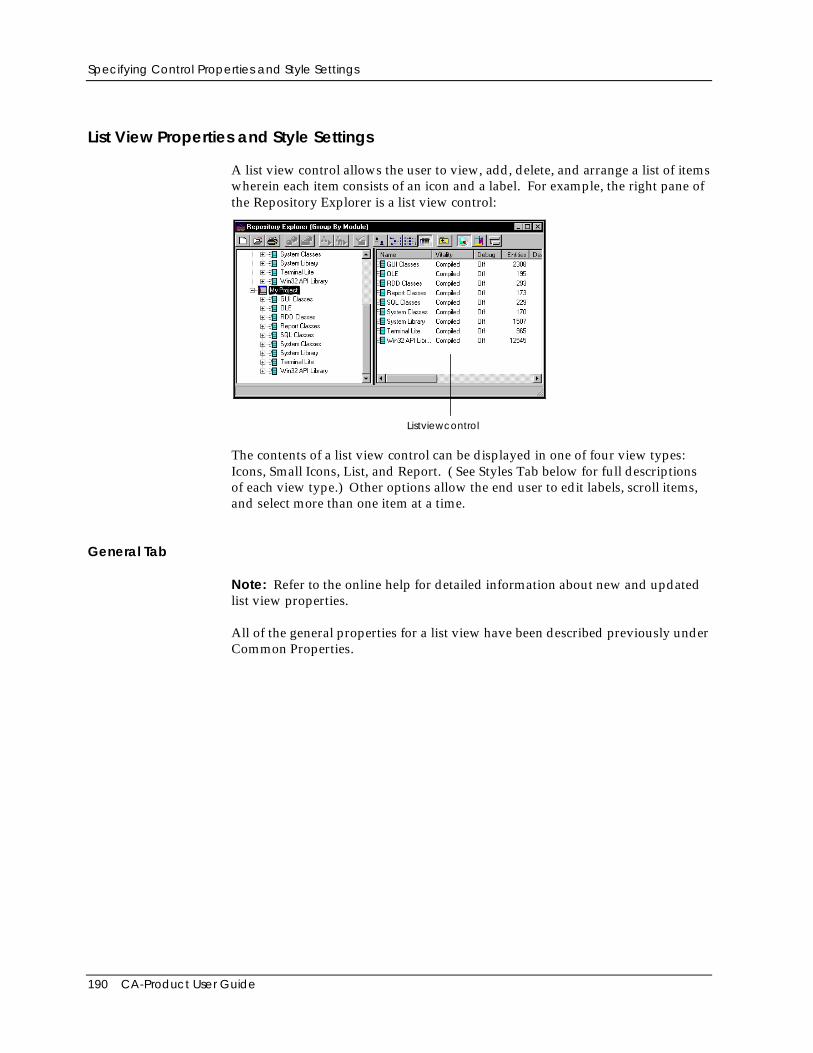
Specifying Control Properties and Style Settings
190 CA-Product User Guide
List View Properties and Style Settings
A list view control allows the user to view, add, delete, and arrange a list of itemswherein each item consists of an icon and a label. For example, the right pane ofthe Repository Explorer is a list view control:
Listviewcontrol
The contents of a list view control can be displayed in one of four view types:Icons, Small Icons, List, and Report. ( See Styles Tab below for full descriptionsof each view type.) Other options allow the end user to edit labels, scroll items,and select more than one item at a time.
General Tab
Note: Refer to the online help for detailed information about new and updatedlist view properties.
All of the general properties for a list view have been described previously underCommon Properties.
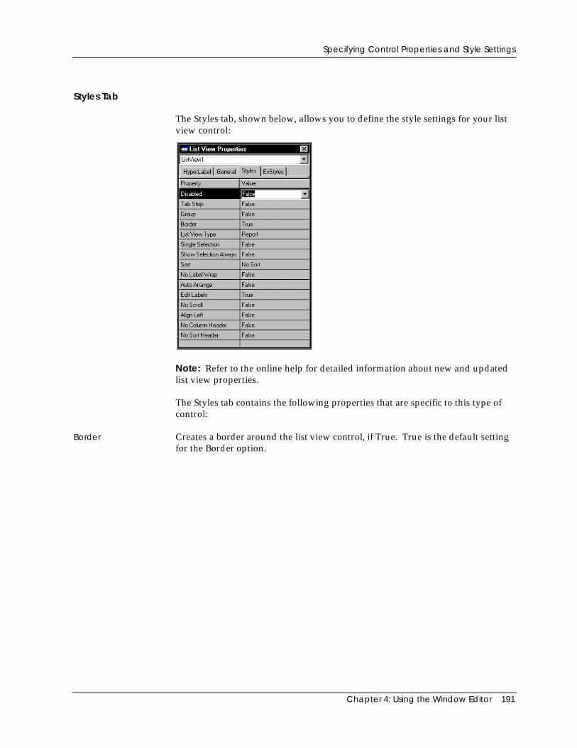
Specifying Control Properties and Style Settings
Chapter 4: Using the Window Editor 191
Styles Tab
The Styles tab, shown below, allows you to define the style settings for your listview control:
Note: Refer to the online help for detailed information about new and updatedlist view properties.
The Styles tab contains the following properties that are specific to this type ofcontrol:
Border Creates a border around the list view control, if True. True is the default settingfor the Border option.
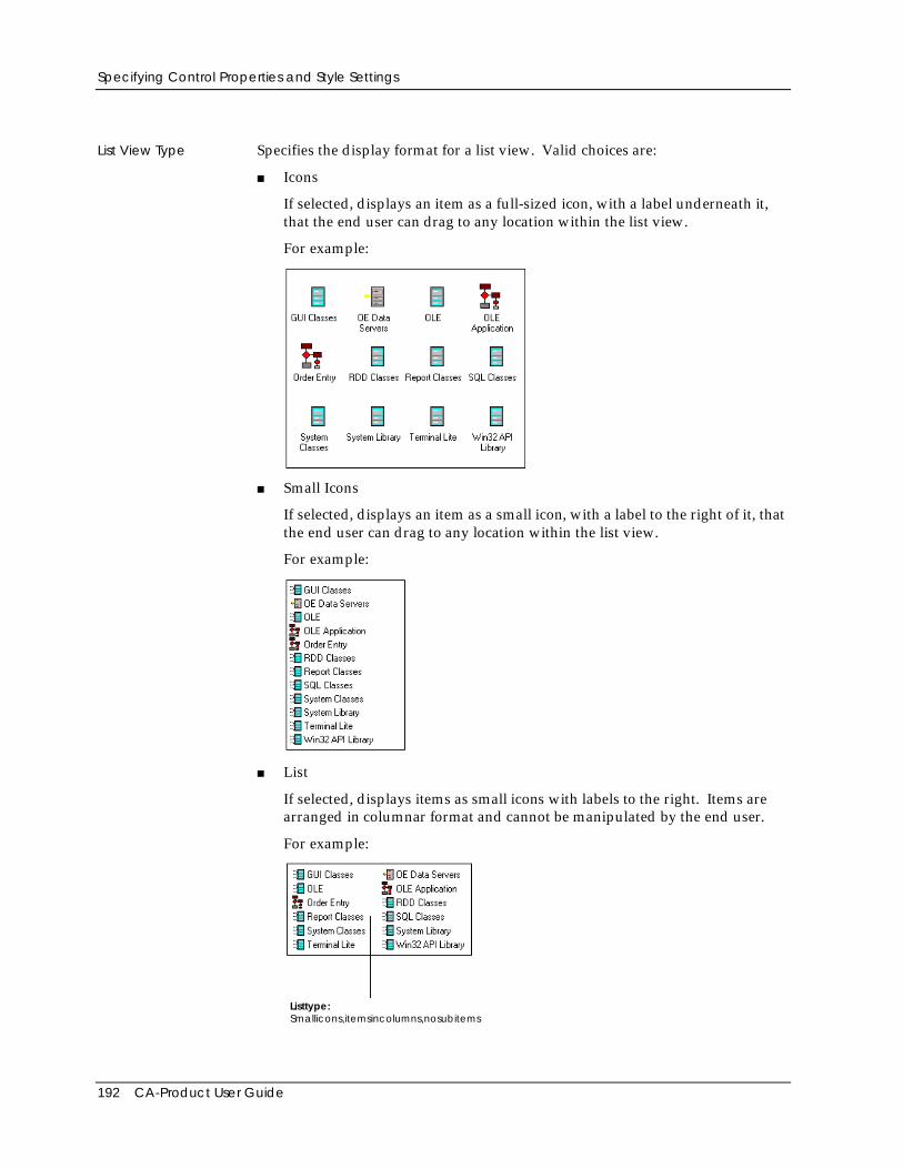
Specifying Control Properties and Style Settings
192 CA-Product User Guide
List View Type Specifies the display format for a list view. Valid choices are:
■ Icons
If selected, displays an item as a full-sized icon, with a label underneath it,that the end user can drag to any location within the list view.
For example:
■ Small Icons
If selected, displays an item as a small icon, with a label to the right of it, thatthe end user can drag to any location within the list view.
For example:
■ List
If selected, displays items as small icons with labels to the right. Items arearranged in columnar format and cannot be manipulated by the end user.
For example:
Listtype:Smallicons,itemsincolumns,nosubitems
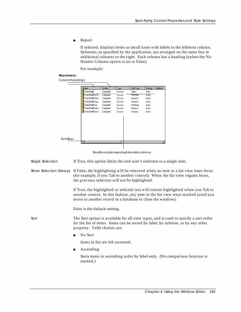
Specifying Control Properties and Style Settings
Chapter 4: Using the Window Editor 193
■ Report
If selected, displays items as small icons with labels in the leftmost column.Subitems, as specified by the application, are arranged on the same line inadditional columns to the right. Each column has a heading (unless the NoHeader Column option is set to False).
For example:
Reportview:
Smallicons,itemsandsubitemsincolumns
Columnheadings
Scrollbar
Single Selection If True, this option limits the end user’s selection to a single item.
Show Selection Always If False, the highlighting will be removed when an item in a list view loses focus(for example, if you Tab to another control). When the list view regains focus,the previous selection will not be highlighted.
If True, the highlighted or selected text will remain highlighted when you Tab toanother control. In this fashion, any item in the list view stays marked (until youmove to another record in a database or close the window).
False is the default setting.
Sort The Sort option is available for all view types, and is used to specify a sort orderfor the list of items. Items can be sorted by label, by subitem, or by any otherproperty. Valid choices are:
■ No Sort
Items in list are left unsorted.
■ Ascending
Sorts items in ascending order by label only. (No comparison function isneeded.)
Specifying Control Properties and Style Settings
194 CA-Product User Guide
■ Descending
Sorts items in descending order by label only. (No comparison function isneeded.)
The default is No Sort.
No Label Wrap If True, specifies that label text should not wrap to the next line in Icons or SmallIcons view only. Rather, text that exceeds a column’s width will not wrap.
Auto Arrange If True, repositions items on a grid at all times.
Edit Labels If True, this option allows the end user to edit the item labels. The default isTrue.
No Scroll If True, the end user cannot scroll to view any items that do not fit in the clientarea of the control window. The default is False.
Align Left If True, items in either the Icons or Small Icons view are aligned along the leftedge of the list view window. If False, the items are aligned along the top of thelist view window. The default is False.
No Column Header Specifies that columns in Report view do not have headings, if True. If False,column headers appear for item and subitem. False is the default setting.
Note: Columns can be resized by the end user by dragging the column guidesbetween columns.
No Sort Header If False, column headers do not act like buttons. This is useful when there shouldbe no actions triggered by clicking on a column's header.
Tree View Properties and Style Settings
A tree view control presents the end user with a hierarchical list of items in a treestructure that can be expanded or collapsed. Each item in the tree consists of alabel with an optional icon and may have an associated list of subitems. Forexample, the left pane of the Repository Explorer is a tree view that lists projects,applications, modules, and entities in a top-down hierarchy.
The contents of a tree view control can be displayed with buttons that expandand collapse subitems (also called child items) and lines that link subitems to theirparent items and/or to the hierarchy’s root level. Other options allow the enduser to select more than one item at a time and to edit item labels.
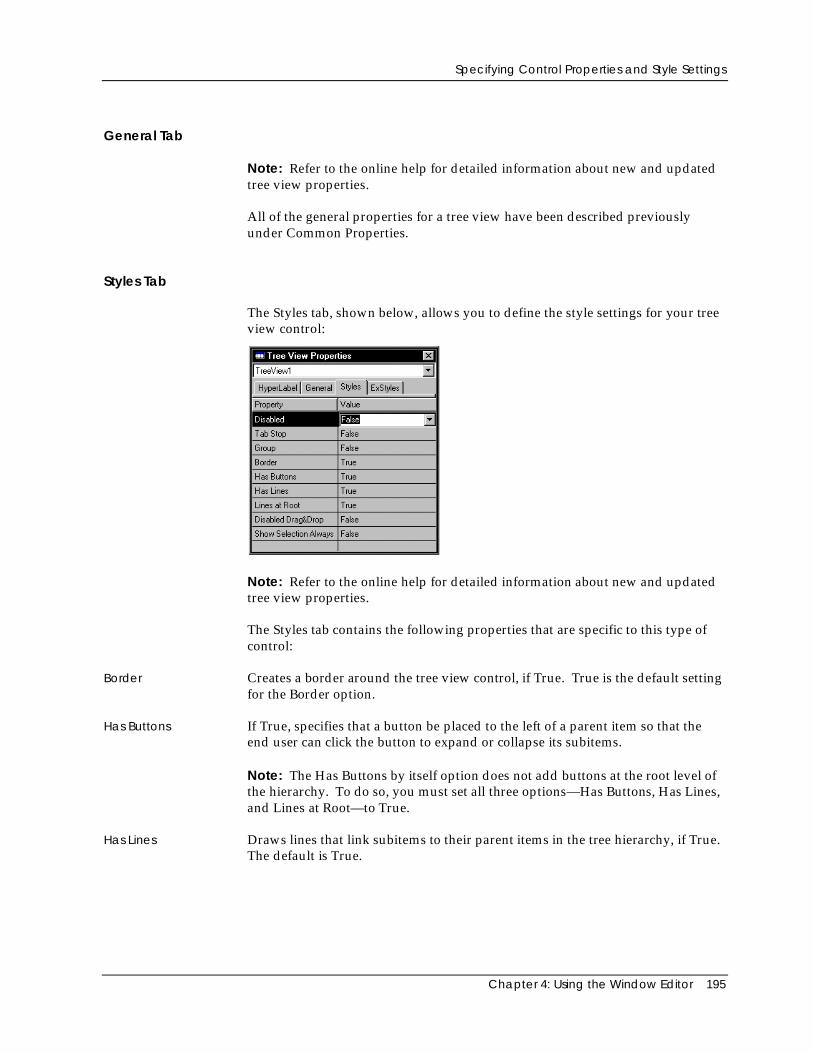
Specifying Control Properties and Style Settings
Chapter 4: Using the Window Editor 195
General Tab
Note: Refer to the online help for detailed information about new and updatedtree view properties.
All of the general properties for a tree view have been described previouslyunder Common Properties.
Styles Tab
The Styles tab, shown below, allows you to define the style settings for your treeview control:
Note: Refer to the online help for detailed information about new and updatedtree view properties.
The Styles tab contains the following properties that are specific to this type ofcontrol:
Border Creates a border around the tree view control, if True. True is the default settingfor the Border option.
Has Buttons If True, specifies that a button be placed to the left of a parent item so that theend user can click the button to expand or collapse its subitems.
Note: The Has Buttons by itself option does not add buttons at the root level ofthe hierarchy. To do so, you must set all three options—Has Buttons, Has Lines,and Lines at Root—to True.
Has Lines Draws lines that link subitems to their parent items in the tree hierarchy, if True.The default is True.
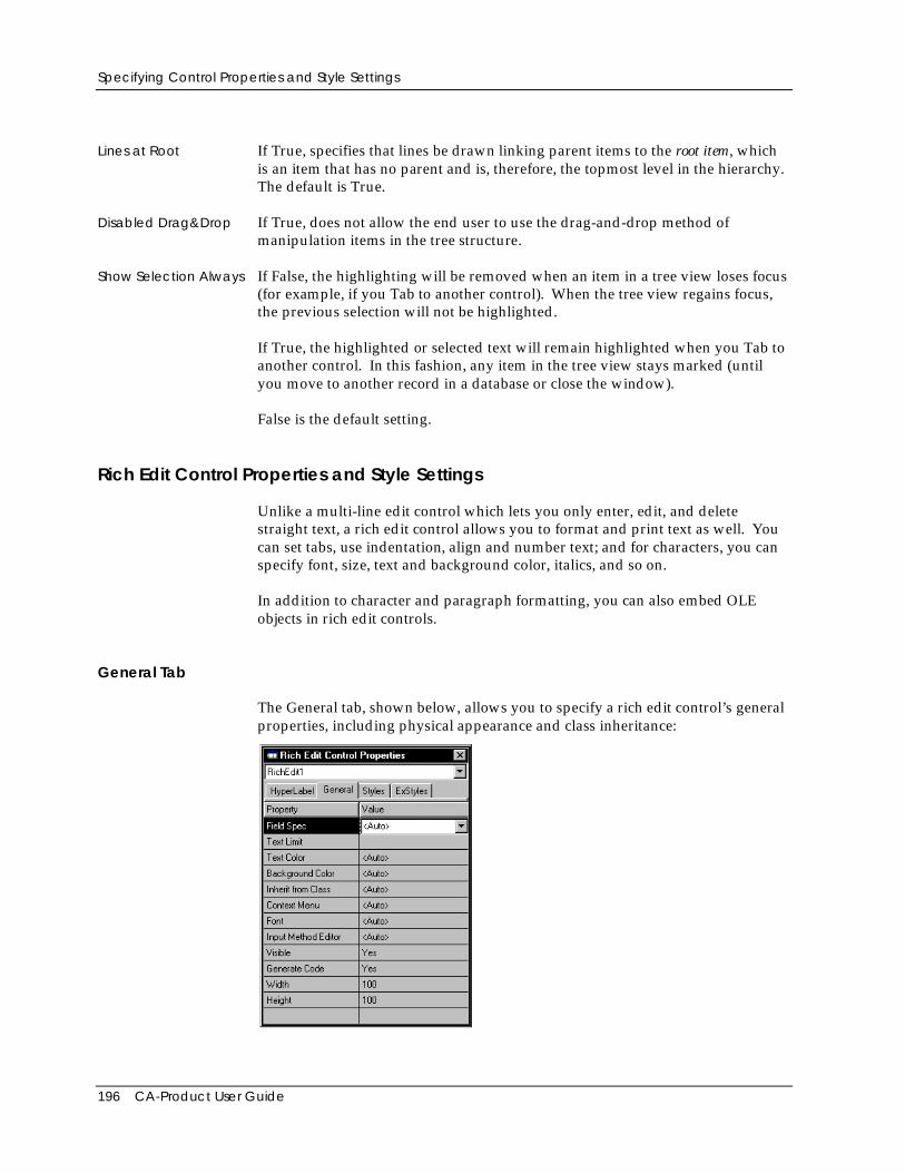
Specifying Control Properties and Style Settings
196 CA-Product User Guide
Lines at Root If True, specifies that lines be drawn linking parent items to the root item, whichis an item that has no parent and is, therefore, the topmost level in the hierarchy.The default is True.
Disabled Drag&Drop If True, does not allow the end user to use the drag-and-drop method ofmanipulation items in the tree structure.
Show Selection Always If False, the highlighting will be removed when an item in a tree view loses focus(for example, if you Tab to another control). When the tree view regains focus,the previous selection will not be highlighted.
If True, the highlighted or selected text will remain highlighted when you Tab toanother control. In this fashion, any item in the tree view stays marked (untilyou move to another record in a database or close the window).
False is the default setting.
Rich Edit Control Properties and Style Settings
Unlike a multi-line edit control which lets you only enter, edit, and deletestraight text, a rich edit control allows you to format and print text as well. Youcan set tabs, use indentation, align and number text; and for characters, you canspecify font, size, text and background color, italics, and so on.
In addition to character and paragraph formatting, you can also embed OLEobjects in rich edit controls.
General Tab
The General tab, shown below, allows you to specify a rich edit control’s generalproperties, including physical appearance and class inheritance:
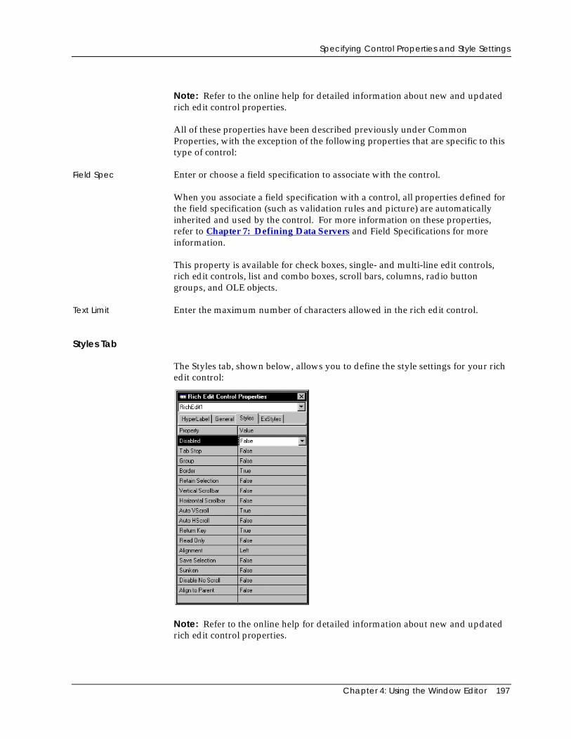
Specifying Control Properties and Style Settings
Chapter 4: Using the Window Editor 197
Note: Refer to the online help for detailed information about new and updatedrich edit control properties.
All of these properties have been described previously under CommonProperties, with the exception of the following properties that are specific to thistype of control:
Field Spec Enter or choose a field specification to associate with the control.
When you associate a field specification with a control, all properties defined forthe field specification (such as validation rules and picture) are automaticallyinherited and used by the control. For more information on these properties,refer to Chapter 7: Defining Data Servers and Field Specifications for moreinformation.
This property is available for check boxes, single- and multi-line edit controls,rich edit controls, list and combo boxes, scroll bars, columns, radio buttongroups, and OLE objects.
Text Limit Enter the maximum number of characters allowed in the rich edit control.
Styles Tab
The Styles tab, shown below, allows you to define the style settings for your richedit control:
Note: Refer to the online help for detailed information about new and updatedrich edit control properties.
Specifying Control Properties and Style Settings
198 CA-Product User Guide
The Styles tab contains the following properties that are specific to this type ofcontrol:
Border If True, creates a rich edit control with a border.
Retain Selection If False, the highlighting will be removed when the edit control loses focus (forexample, if you Tab to another control). When the edit control regains focus, theprevious selection will not be highlighted. False is the default setting.
If True, the highlighted or selected text will remain highlighted when you Tab toanother control. In this fashion, any edit control you have edited stays marked(until you move to another record in a database or close the window).
Vertical Scrollbar Creates a rich edit control with a vertical scroll bar (if True).
Horizontal Scrollbar Creates a rich edit control with a horizontal scroll bar, where all the text is on thefirst line.
Auto VScroll If True, text is automatically scrolled up or down one line when the cursorreaches the beginning or end of a line.
Auto HScroll If True, any text in the rich edit control is automatically scrolled 10 characters tothe right when the user reaches the end of the line while typing.
Return Key If True, the Enter key acts as a return key, moving the cursor to the next line ofthe multi-line edit control. If False, the Enter key activates the default pushbutton for the window and has no effect on the edit control.
Read Only If True, this option stops the user from entering/editing text in the rich editcontrol.
Alignment This property is used to defined how the text is to be aligned. Valid options are:
■ Left
If selected, left-justifies text in the rich edit control. Left is the default settingfor the Alignment option.
■ Center
If selected, centers text in the rich edit control.
■ Right
If selected, right-justifies text in the rich edit control.
Save Selection If True, saves the current selection when the rich edit control loses focus. Whenit regains focus, the entire contents of the control appear.
Sunken Draws the rich edit control with a sunken border so that it appears recessedwithin the window, if True.
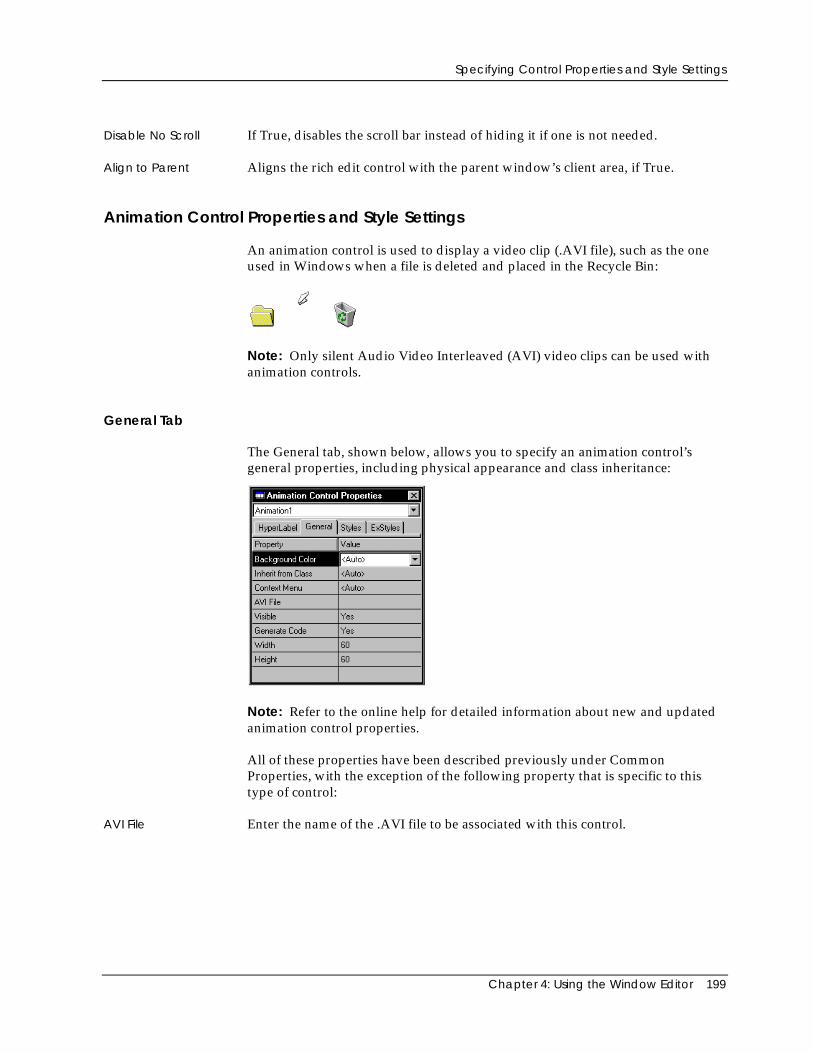
Specifying Control Properties and Style Settings
Chapter 4: Using the Window Editor 199
Disable No Scroll If True, disables the scroll bar instead of hiding it if one is not needed.
Align to Parent Aligns the rich edit control with the parent window’s client area, if True.
Animation Control Properties and Style Settings
An animation control is used to display a video clip (.AVI file), such as the oneused in Windows when a file is deleted and placed in the Recycle Bin:
Note: Only silent Audio Video Interleaved (AVI) video clips can be used withanimation controls.
General Tab
The General tab, shown below, allows you to specify an animation control’sgeneral properties, including physical appearance and class inheritance:
Note: Refer to the online help for detailed information about new and updatedanimation control properties.
All of these properties have been described previously under CommonProperties, with the exception of the following property that is specific to thistype of control:
AVI File Enter the name of the .AVI file to be associated with this control.
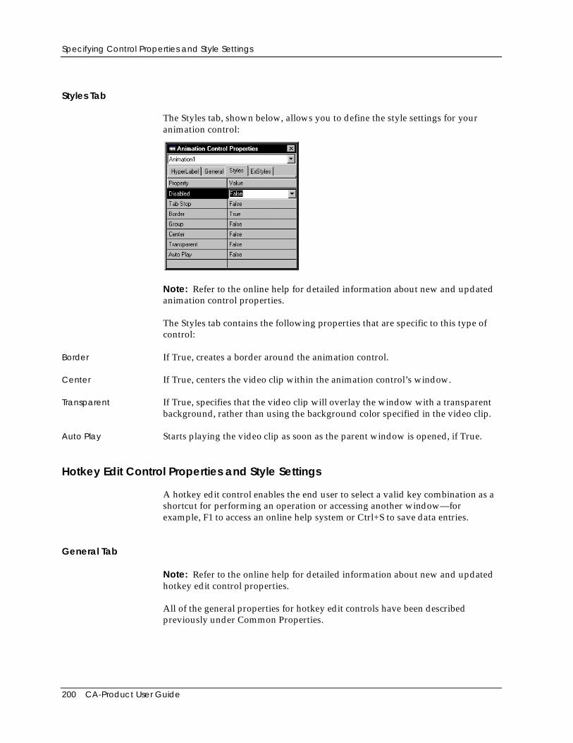
Specifying Control Properties and Style Settings
200 CA-Product User Guide
Styles Tab
The Styles tab, shown below, allows you to define the style settings for youranimation control:
Note: Refer to the online help for detailed information about new and updatedanimation control properties.
The Styles tab contains the following properties that are specific to this type ofcontrol:
Border If True, creates a border around the animation control.
Center If True, centers the video clip within the animation control’s window.
Transparent If True, specifies that the video clip will overlay the window with a transparentbackground, rather than using the background color specified in the video clip.
Auto Play Starts playing the video clip as soon as the parent window is opened, if True.
Hotkey Edit Control Properties and Style Settings
A hotkey edit control enables the end user to select a valid key combination as ashortcut for performing an operation or accessing another window—forexample, F1 to access an online help system or Ctrl+S to save data entries.
General Tab
Note: Refer to the online help for detailed information about new and updatedhotkey edit control properties.
All of the general properties for hotkey edit controls have been describedpreviously under Common Properties.
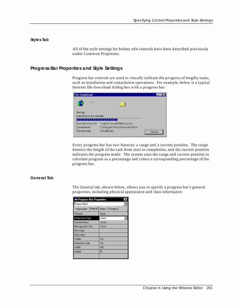
Specifying Control Properties and Style Settings
Chapter 4: Using the Window Editor 201
Styles Tab
All of the style settings for hotkey edit controls have been described previouslyunder Common Properties.
Progress Bar Properties and Style Settings
Progress bar controls are used to visually indicate the progress of lengthy tasks,such as installation and compilation operations. For example, below is a typicalInternet file download dialog box with a progress bar:
Every progress bar has two features: a range and a current position. The rangedenotes the length of the task from start to completion, and the current positionindicates the progress made. The system uses the range and current position tocalculate progress as a percentage and colors a corresponding percentage of theprogress bar.
General Tab
The General tab, shown below, allows you to specify a progress bar’s generalproperties, including physical appearance and class inheritance:
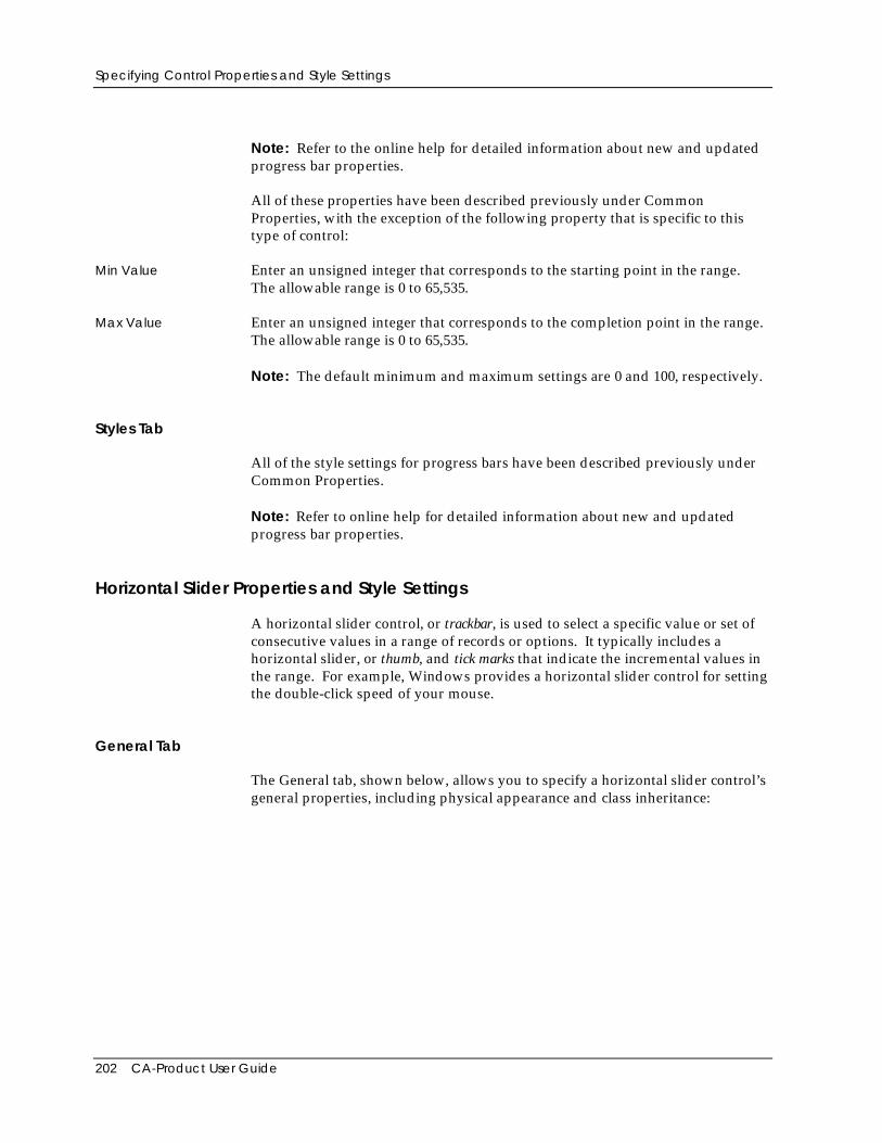
Specifying Control Properties and Style Settings
202 CA-Product User Guide
Note: Refer to the online help for detailed information about new and updatedprogress bar properties.
All of these properties have been described previously under CommonProperties, with the exception of the following property that is specific to thistype of control:
Min Value Enter an unsigned integer that corresponds to the starting point in the range.The allowable range is 0 to 65,535.
Max Value Enter an unsigned integer that corresponds to the completion point in the range.The allowable range is 0 to 65,535.
Note: The default minimum and maximum settings are 0 and 100, respectively.
Styles Tab
All of the style settings for progress bars have been described previously underCommon Properties.
Note: Refer to online help for detailed information about new and updatedprogress bar properties.
Horizontal Slider Properties and Style Settings
A horizontal slider control, or trackbar, is used to select a specific value or set ofconsecutive values in a range of records or options. It typically includes ahorizontal slider, or thumb, and tick marks that indicate the incremental values inthe range. For example, Windows provides a horizontal slider control for settingthe double-click speed of your mouse.
General Tab
The General tab, shown below, allows you to specify a horizontal slider control’sgeneral properties, including physical appearance and class inheritance:
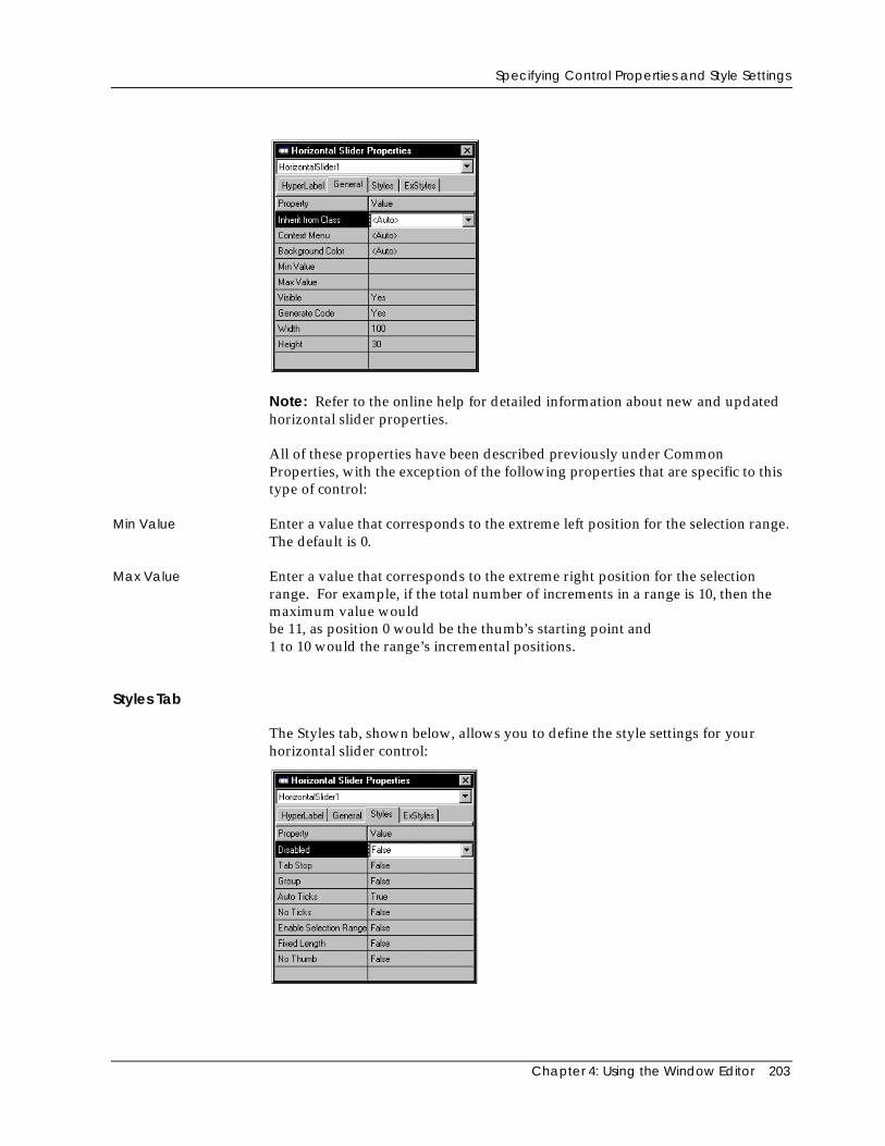
Specifying Control Properties and Style Settings
Chapter 4: Using the Window Editor 203
Note: Refer to the online help for detailed information about new and updatedhorizontal slider properties.
All of these properties have been described previously under CommonProperties, with the exception of the following properties that are specific to thistype of control:
Min Value Enter a value that corresponds to the extreme left position for the selection range.The default is 0.
Max Value Enter a value that corresponds to the extreme right position for the selectionrange. For example, if the total number of increments in a range is 10, then themaximum value wouldbe 11, as position 0 would be the thumb’s starting point and1 to 10 would the range’s incremental positions.
Styles Tab
The Styles tab, shown below, allows you to define the style settings for yourhorizontal slider control:
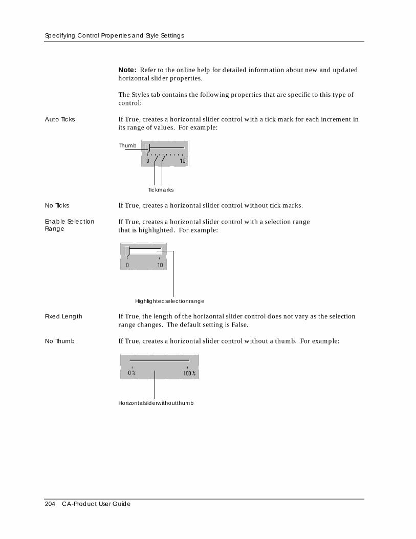
Specifying Control Properties and Style Settings
204 CA-Product User Guide
Note: Refer to the online help for detailed information about new and updatedhorizontal slider properties.
The Styles tab contains the following properties that are specific to this type ofcontrol:
Auto Ticks If True, creates a horizontal slider control with a tick mark for each increment inits range of values. For example:
Thumb
Tickmarks
No Ticks If True, creates a horizontal slider control without tick marks.
Enable SelectionRange
If True, creates a horizontal slider control with a selection rangethat is highlighted. For example:
Highlightedselectionrange
Fixed Length If True, the length of the horizontal slider control does not vary as the selectionrange changes. The default setting is False.
No Thumb If True, creates a horizontal slider control without a thumb. For example:
Horizontalsliderwithoutthumb
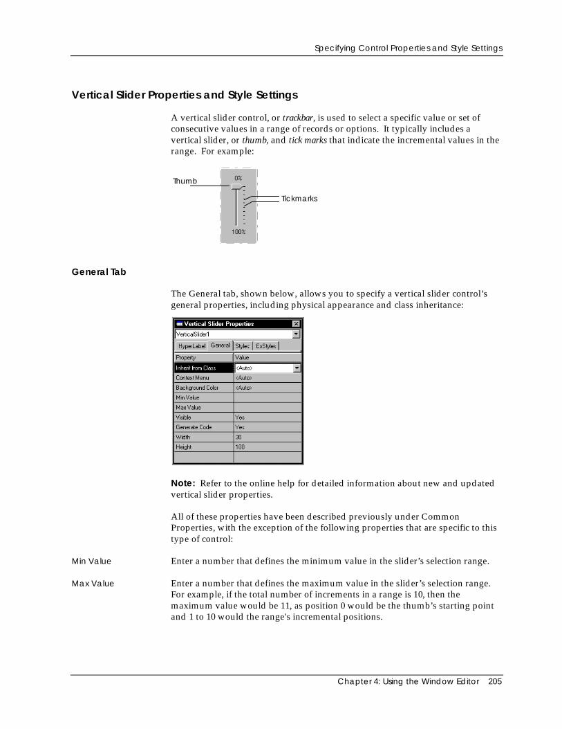
Specifying Control Properties and Style Settings
Chapter 4: Using the Window Editor 205
Vertical Slider Properties and Style Settings
A vertical slider control, or trackbar, is used to select a specific value or set ofconsecutive values in a range of records or options. It typically includes avertical slider, or thumb, and tick marks that indicate the incremental values in therange. For example:
Thumb
Tickmarks
General Tab
The General tab, shown below, allows you to specify a vertical slider control’sgeneral properties, including physical appearance and class inheritance:
Note: Refer to the online help for detailed information about new and updatedvertical slider properties.
All of these properties have been described previously under CommonProperties, with the exception of the following properties that are specific to thistype of control:
Min Value Enter a number that defines the minimum value in the slider’s selection range.
Max Value Enter a number that defines the maximum value in the slider’s selection range.For example, if the total number of increments in a range is 10, then themaximum value would be 11, as position 0 would be the thumb’s starting pointand 1 to 10 would the range's incremental positions.

Specifying Control Properties and Style Settings
206 CA-Product User Guide
Styles Tab
The Styles tab, shown below, allows you to define the style settings for yourvertical slider control:
Note: Refer to the online help for detailed information about new and updatedvertical slider properties.
The Styles tab contains the following properties that are specific to this type ofcontrol:
Auto Ticks If True, creates a vertical slider control with a tick mark for each increment in itsrange of values. The default setting is True.
No Ticks If True, creates a vertical slider control without tick marks. The default setting isFalse.
Enable SelectionRange
If True, creates a vertical slider control with a selection range that is highlighted.The default setting is False.
Fixed Length If True, the length of the vertical slider control does not vary as the selectionrange changes. The default setting is False.
No Thumb If True, creates a vertical slider control without a thumb. The default setting isFalse.
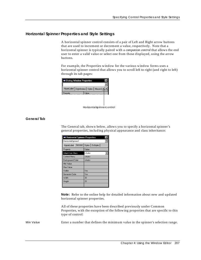
Specifying Control Properties and Style Settings
Chapter 4: Using the Window Editor 207
Horizontal Spinner Properties and Style Settings
A horizontal spinner control consists of a pair of Left and Right arrow buttonsthat are used to increment or decrement a value, respectively. Note that ahorizontal spinner is typically paired with a companion control that allows the enduser to enter a valid value or select one from those displayed, using the arrowbuttons.
For example, the Properties window for the various window forms uses ahorizontal spinner control that allows you to scroll left to right (and right to left)through its tab pages:
Horizontalspinnercontrol
General Tab
The General tab, shown below, allows you to specify a horizontal spinner’sgeneral properties, including physical appearance and class inheritance:
Note: Refer to the online help for detailed information about new and updatedhorizontal spinner properties.
All of these properties have been described previously under CommonProperties, with the exception of the following properties that are specific to thistype of control:
Min Value Enter a number that defines the minimum value in the spinner's selection range.
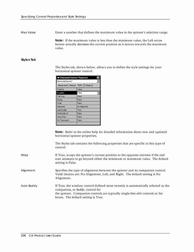
Specifying Control Properties and Style Settings
208 CA-Product User Guide
Max Value Enter a number that defines the maximum value in the spinner's selection range.
Note: If the maximum value is less than the minimum value, the Left arrowbutton actually decreases the current position as it moves towards the maximumvalue.
Styles Tab
The Styles tab, shown below, allows you to define the style settings for yourhorizontal spinner control:
Note: Refer to the online help for detailed information about new and updatedhorizontal spinner properties.
The Styles tab contains the following properties that are specific to this type ofcontrol:
Wrap If True, wraps the spinner's current position to the opposite extreme if the enduser attempts to go beyond either the minimum or maximum value. The defaultsetting is False.
Alignment Specifies the type of alignment between the spinner and its companion control.Valid choices are: No Alignment, Left, and Right. The default setting is NoAlignment.
Auto Buddy If True, the window control defined most recently is automatically selected as thecompanion, or buddy, control forthe spinner. Companion controls are typically single-line edit controls or listboxes. The default setting is True.
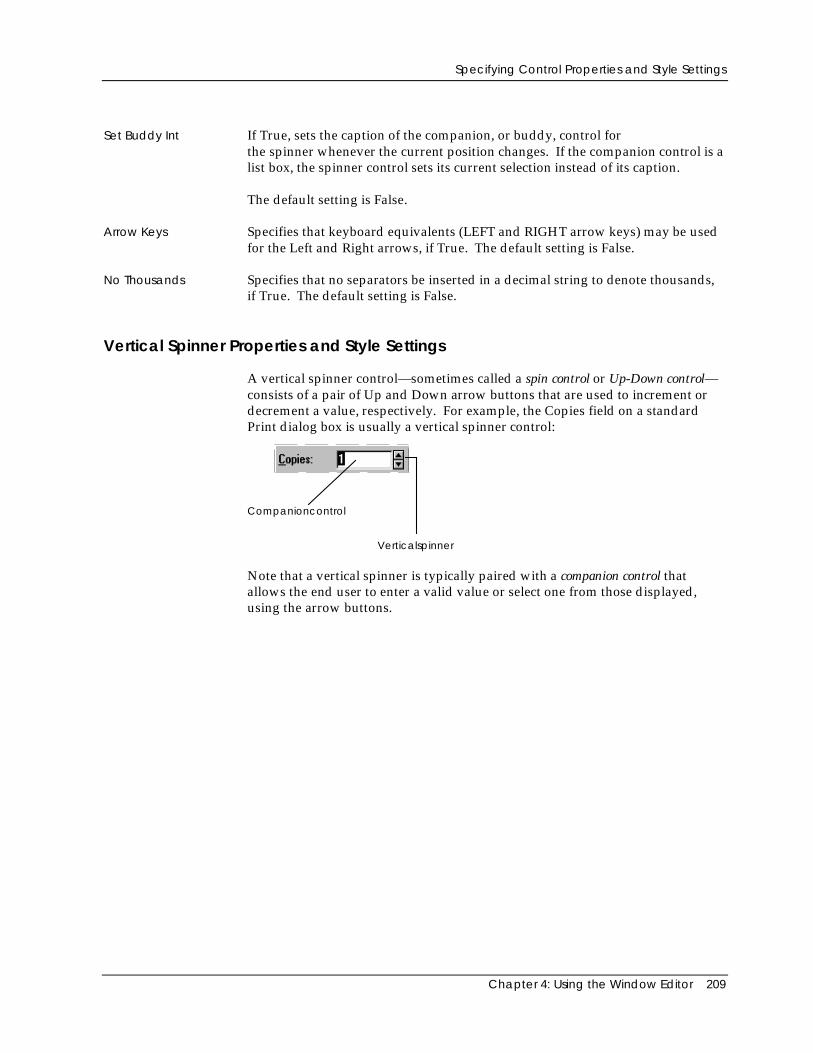
Specifying Control Properties and Style Settings
Chapter 4: Using the Window Editor 209
Set Buddy Int If True, sets the caption of the companion, or buddy, control forthe spinner whenever the current position changes. If the companion control is alist box, the spinner control sets its current selection instead of its caption.
The default setting is False.
Arrow Keys Specifies that keyboard equivalents (LEFT and RIGHT arrow keys) may be usedfor the Left and Right arrows, if True. The default setting is False.
No Thousands Specifies that no separators be inserted in a decimal string to denote thousands,if True. The default setting is False.
Vertical Spinner Properties and Style Settings
A vertical spinner control—sometimes called a spin control or Up-Down control—consists of a pair of Up and Down arrow buttons that are used to increment ordecrement a value, respectively. For example, the Copies field on a standardPrint dialog box is usually a vertical spinner control:
Verticalspinner
Companioncontrol
Note that a vertical spinner is typically paired with a companion control thatallows the end user to enter a valid value or select one from those displayed,using the arrow buttons.
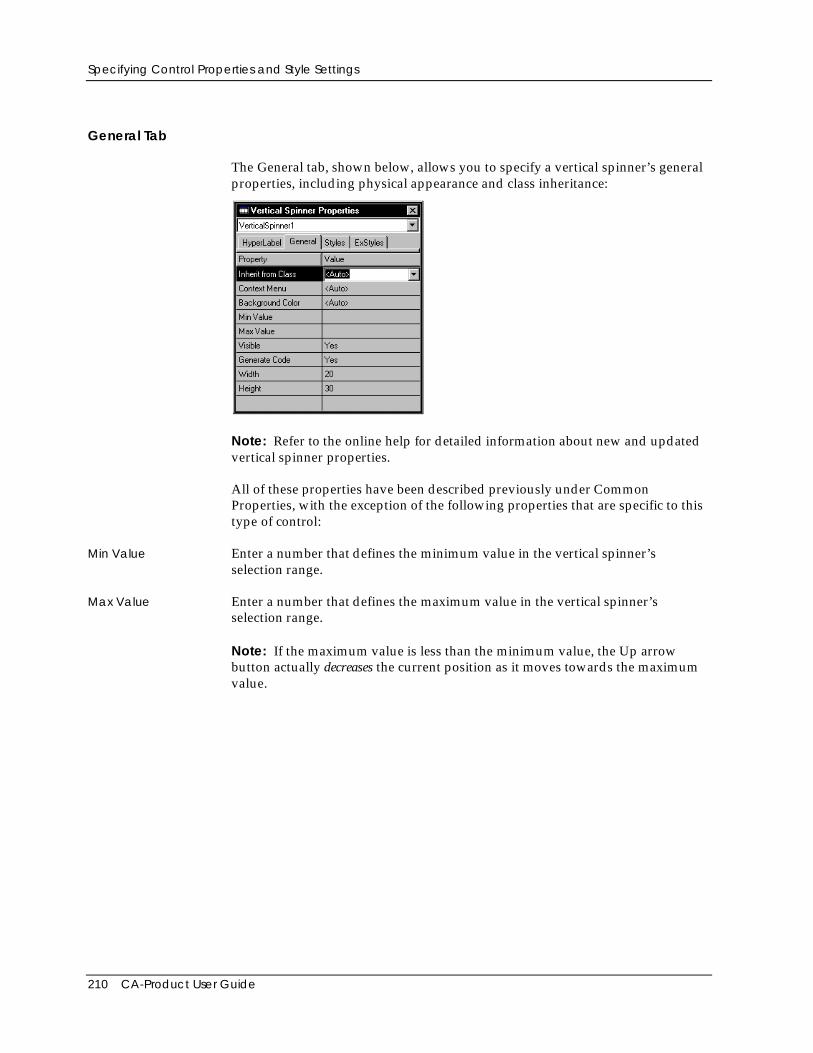
Specifying Control Properties and Style Settings
210 CA-Product User Guide
General Tab
The General tab, shown below, allows you to specify a vertical spinner’s generalproperties, including physical appearance and class inheritance:
Note: Refer to the online help for detailed information about new and updatedvertical spinner properties.
All of these properties have been described previously under CommonProperties, with the exception of the following properties that are specific to thistype of control:
Min Value Enter a number that defines the minimum value in the vertical spinner’sselection range.
Max Value Enter a number that defines the maximum value in the vertical spinner’sselection range.
Note: If the maximum value is less than the minimum value, the Up arrowbutton actually decreases the current position as it moves towards the maximumvalue.
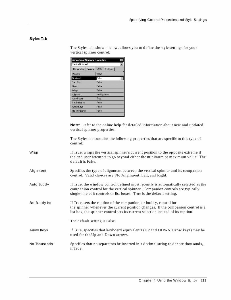
Specifying Control Properties and Style Settings
Chapter 4: Using the Window Editor 211
Styles Tab
The Styles tab, shown below, allows you to define the style settings for yourvertical spinner control:
Note: Refer to the online help for detailed information about new and updatedvertical spinner properties.
The Styles tab contains the following properties that are specific to this type ofcontrol:
Wrap If True, wraps the vertical spinner’s current position to the opposite extreme ifthe end user attempts to go beyond either the minimum or maximum value. Thedefault is False.
Alignment Specifies the type of alignment between the vertical spinner and its companioncontrol. Valid choices are: No Alignment, Left, and Right.
Auto Buddy If True, the window control defined most recently is automatically selected as thecompanion control for the vertical spinner. Companion controls are typicallysingle-line edit controls or list boxes. True is the default setting.
Set Buddy Int If True, sets the caption of the companion, or buddy, control forthe spinner whenever the current position changes. If the companion control is alist box, the spinner control sets its current selection instead of its caption.
The default setting is False.
Arrow Keys If True, specifies that keyboard equivalents (UP and DOWN arrow keys) may beused for the Up and Down arrows.
No Thousands Specifies that no separators be inserted in a decimal string to denote thousands,if True.
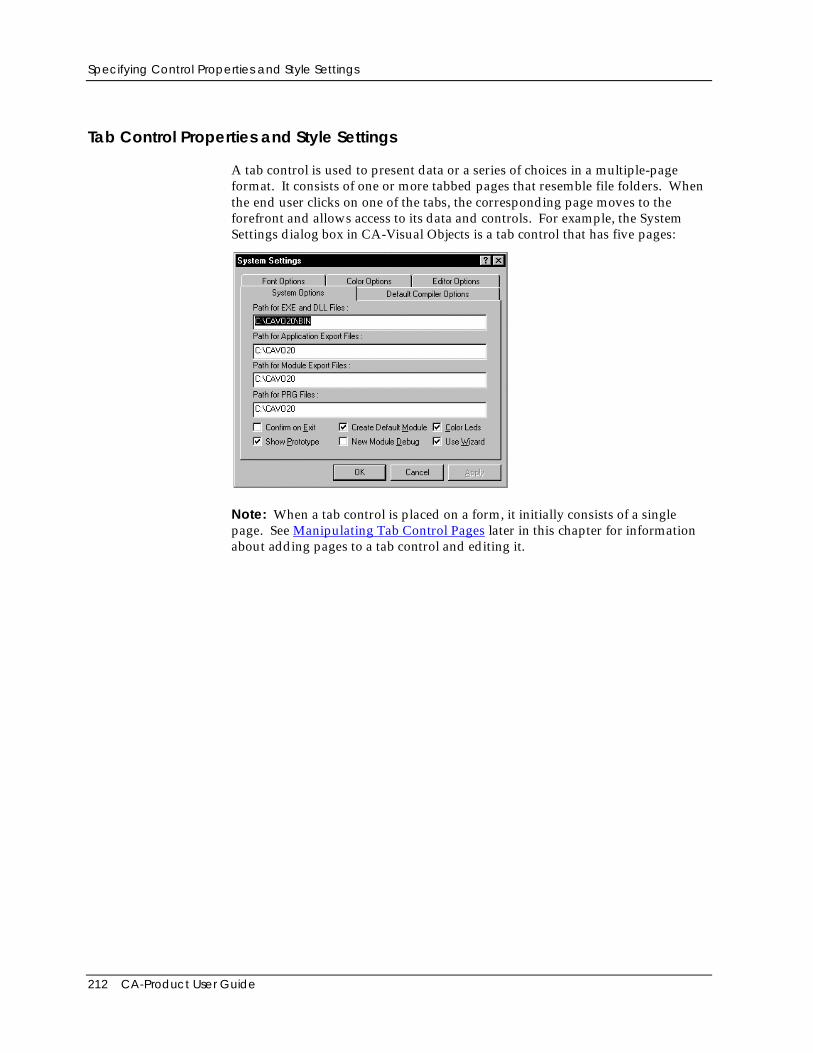
Specifying Control Properties and Style Settings
212 CA-Product User Guide
Tab Control Properties and Style Settings
A tab control is used to present data or a series of choices in a multiple-pageformat. It consists of one or more tabbed pages that resemble file folders. Whenthe end user clicks on one of the tabs, the corresponding page moves to theforefront and allows access to its data and controls. For example, the SystemSettings dialog box in CA-Visual Objects is a tab control that has five pages:
Note: When a tab control is placed on a form, it initially consists of a singlepage. See Manipulating Tab Control Pages later in this chapter for informationabout adding pages to a tab control and editing it.
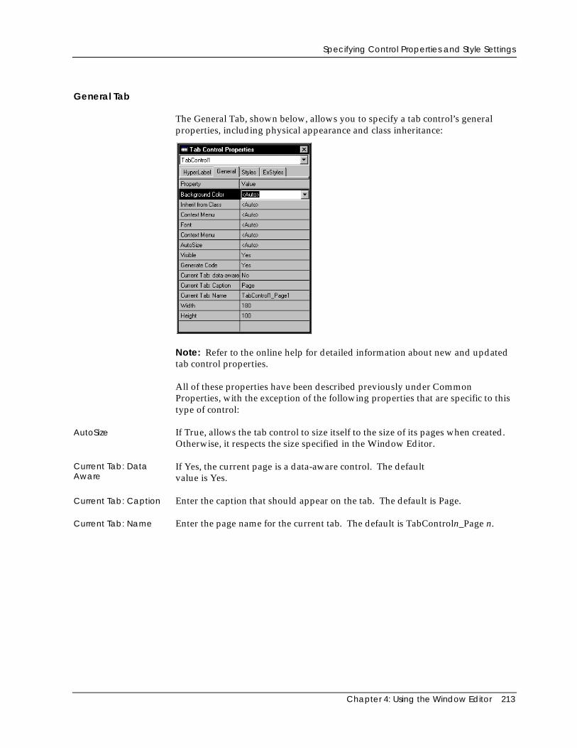
Specifying Control Properties and Style Settings
Chapter 4: Using the Window Editor 213
General Tab
The General Tab, shown below, allows you to specify a tab control’s generalproperties, including physical appearance and class inheritance:
Note: Refer to the online help for detailed information about new and updatedtab control properties.
All of these properties have been described previously under CommonProperties, with the exception of the following properties that are specific to thistype of control:
AutoSize If True, allows the tab control to size itself to the size of its pages when created.Otherwise, it respects the size specified in the Window Editor.
Current Tab: DataAware
If Yes, the current page is a data-aware control. The defaultvalue is Yes.
Current Tab: Caption Enter the caption that should appear on the tab. The default is Page.
Current Tab: Name Enter the page name for the current tab. The default is TabControln_Page n.
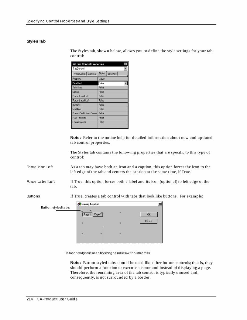
Specifying Control Properties and Style Settings
214 CA-Product User Guide
Styles Tab
The Styles tab, shown below, allows you to define the style settings for your tabcontrol:
Note: Refer to the online help for detailed information about new and updatedtab control properties.
The Styles tab contains the following properties that are specific to this type ofcontrol:
Force Icon Left As a tab may have both an icon and a caption, this option forces the icon to theleft edge of the tab and centers the caption at the same time, if True.
Force Label Left If True, this option forces both a label and its icon (optional) to left edge of thetab.
Buttons If True, creates a tab control with tabs that look like buttons. For example:
Button-styledtabs
Tabcontrol(indicatedbysizinghandles)withoutborder
Note: Button-styled tabs should be used like other button controls; that is, theyshould perform a function or execute a command instead of displaying a page.Therefore, the remaining area of the tab control is typically unused and,consequently, is not surrounded by a border.
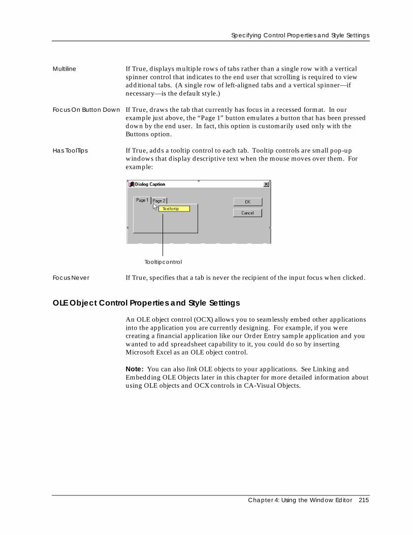
Specifying Control Properties and Style Settings
Chapter 4: Using the Window Editor 215
Multiline If True, displays multiple rows of tabs rather than a single row with a verticalspinner control that indicates to the end user that scrolling is required to viewadditional tabs. (A single row of left-aligned tabs and a vertical spinner—ifnecessary—is the default style.)
Focus On Button Down If True, draws the tab that currently has focus in a recessed format. In ourexample just above, the “Page 1” button emulates a button that has been presseddown by the end user. In fact, this option is customarily used only with theButtons option.
Has ToolTips If True, adds a tooltip control to each tab. Tooltip controls are small pop-upwindows that display descriptive text when the mouse moves over them. Forexample:
Textfortip
Tooltipcontrol
Focus Never If True, specifies that a tab is never the recipient of the input focus when clicked.
OLE Object Control Properties and Style Settings
An OLE object control (OCX) allows you to seamlessly embed other applicationsinto the application you are currently designing. For example, if you werecreating a financial application like our Order Entry sample application and youwanted to add spreadsheet capability to it, you could do so by insertingMicrosoft Excel as an OLE object control.
Note: You can also link OLE objects to your applications. See Linking andEmbedding OLE Objects later in this chapter for more detailed information aboutusing OLE objects and OCX controls in CA-Visual Objects.
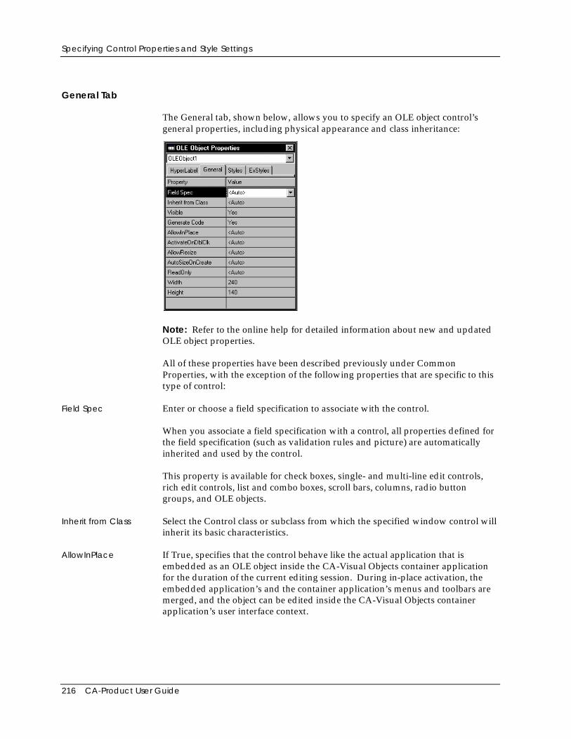
Specifying Control Properties and Style Settings
216 CA-Product User Guide
General Tab
The General tab, shown below, allows you to specify an OLE object control’sgeneral properties, including physical appearance and class inheritance:
Note: Refer to the online help for detailed information about new and updatedOLE object properties.
All of these properties have been described previously under CommonProperties, with the exception of the following properties that are specific to thistype of control:
Field Spec Enter or choose a field specification to associate with the control.
When you associate a field specification with a control, all properties defined forthe field specification (such as validation rules and picture) are automaticallyinherited and used by the control.
This property is available for check boxes, single- and multi-line edit controls,rich edit controls, list and combo boxes, scroll bars, columns, radio buttongroups, and OLE objects.
Inherit from Class Select the Control class or subclass from which the specified window control willinherit its basic characteristics.
AllowInPlace If True, specifies that the control behave like the actual application that isembedded as an OLE object inside the CA-Visual Objects container applicationfor the duration of the current editing session. During in-place activation, theembedded application’s and the container application’s menus and toolbars aremerged, and the object can be edited inside the CA-Visual Objects containerapplication’s user interface context.
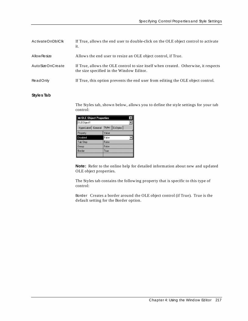
Specifying Control Properties and Style Settings
Chapter 4: Using the Window Editor 217
ActivateOnDblClk If True, allows the end user to double-click on the OLE object control to activateit.
AllowResize Allows the end user to resize an OLE object control, if True.
AutoSizeOnCreate If True, allows the OLE control to size itself when created. Otherwise, it respectsthe size specified in the Window Editor.
ReadOnly If True, this option prevents the end user from editing the OLE object control.
Styles Tab
The Styles tab, shown below, allows you to define the style settings for your tabcontrol:
Note: Refer to the online help for detailed information about new and updatedOLE object properties.
The Styles tab contains the following property that is specific to this type ofcontrol:
Border Creates a border around the OLE object control (if True). True is thedefault setting for the Border option.
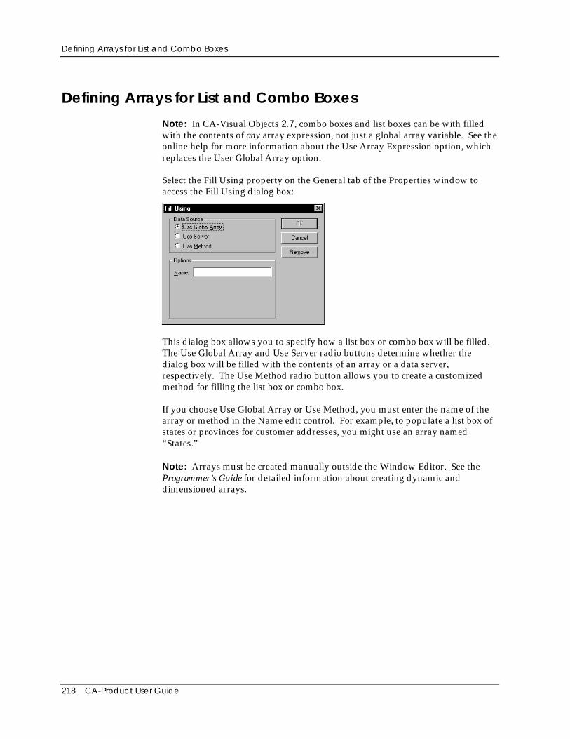
Defining Arrays for List and Combo Boxes
218 CA-Product User Guide
Defining Arrays for List and Combo Boxes
Note: In CA-Visual Objects 2.7, combo boxes and list boxes can be with filledwith the contents of any array expression, not just a global array variable. See theonline help for more information about the Use Array Expression option, whichreplaces the User Global Array option.
Select the Fill Using property on the General tab of the Properties window toaccess the Fill Using dialog box:
This dialog box allows you to specify how a list box or combo box will be filled.The Use Global Array and Use Server radio buttons determine whether thedialog box will be filled with the contents of an array or a data server,respectively. The Use Method radio button allows you to create a customizedmethod for filling the list box or combo box.
If you choose Use Global Array or Use Method, you must enter the name of thearray or method in the Name edit control. For example, to populate a list box ofstates or provinces for customer addresses, you might use an array named“States.”
Note: Arrays must be created manually outside the Window Editor. See theProgrammer’s Guide for detailed information about creating dynamic anddimensioned arrays.
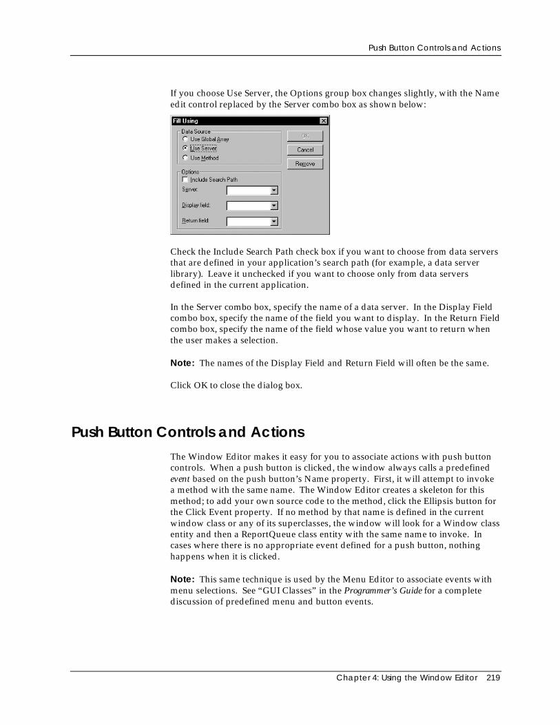
Push Button Controls and Actions
Chapter 4: Using the Window Editor 219
If you choose Use Server, the Options group box changes slightly, with the Nameedit control replaced by the Server combo box as shown below:
Check the Include Search Path check box if you want to choose from data serversthat are defined in your application’s search path (for example, a data serverlibrary). Leave it unchecked if you want to choose only from data serversdefined in the current application.
In the Server combo box, specify the name of a data server. In the Display Fieldcombo box, specify the name of the field you want to display. In the Return Fieldcombo box, specify the name of the field whose value you want to return whenthe user makes a selection.
Note: The names of the Display Field and Return Field will often be the same.
Click OK to close the dialog box.
Push Button Controls and ActionsThe Window Editor makes it easy for you to associate actions with push buttoncontrols. When a push button is clicked, the window always calls a predefinedevent based on the push button’s Name property. First, it will attempt to invokea method with the same name. The Window Editor creates a skeleton for thismethod; to add your own source code to the method, click the Ellipsis button forthe Click Event property. If no method by that name is defined in the currentwindow class or any of its superclasses, the window will look for a Window classentity and then a ReportQueue class entity with the same name to invoke. Incases where there is no appropriate event defined for a push button, nothinghappens when it is clicked.
Note: This same technique is used by the Menu Editor to associate events withmenu selections. See “GUI Classes” in the Programmer’s Guide for a completediscussion of predefined menu and button events.
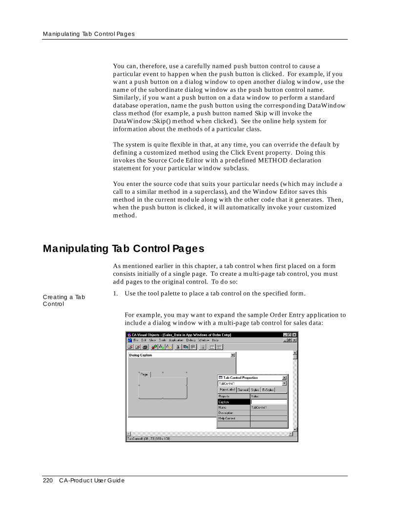
Manipulating Tab Control Pages
220 CA-Product User Guide
You can, therefore, use a carefully named push button control to cause aparticular event to happen when the push button is clicked. For example, if youwant a push button on a dialog window to open another dialog window, use thename of the subordinate dialog window as the push button control name.Similarly, if you want a push button on a data window to perform a standarddatabase operation, name the push button using the corresponding DataWindowclass method (for example, a push button named Skip will invoke theDataWindow:Skip() method when clicked). See the online help system forinformation about the methods of a particular class.
The system is quite flexible in that, at any time, you can override the default bydefining a customized method using the Click Event property. Doing thisinvokes the Source Code Editor with a predefined METHOD declarationstatement for your particular window subclass.
You enter the source code that suits your particular needs (which may include acall to a similar method in a superclass), and the Window Editor saves thismethod in the current module along with the other code that it generates. Then,when the push button is clicked, it will automatically invoke your customizedmethod.
Manipulating Tab Control PagesAs mentioned earlier in this chapter, a tab control when first placed on a formconsists initially of a single page. To create a multi-page tab control, you mustadd pages to the original control. To do so:
Creating a TabControl
1. Use the tool palette to place a tab control on the specified form.
For example, you may want to expand the sample Order Entry application toinclude a dialog window with a multi-page tab control for sales data:
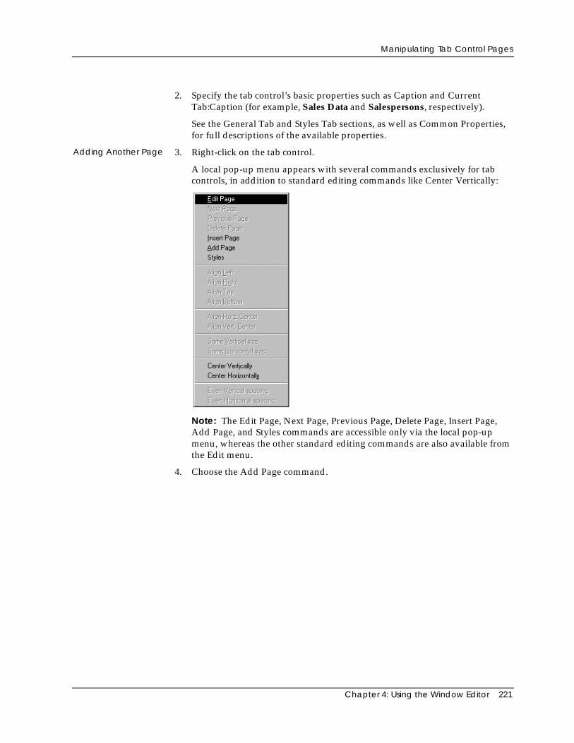
Manipulating Tab Control Pages
Chapter 4: Using the Window Editor 221
2. Specify the tab control’s basic properties such as Caption and CurrentTab:Caption (for example, Sales Data and Salespersons, respectively).
See the General Tab and Styles Tab sections, as well as Common Properties,for full descriptions of the available properties.
Adding Another Page 3. Right-click on the tab control.
A local pop-up menu appears with several commands exclusively for tabcontrols, in addition to standard editing commands like Center Vertically:
Note: The Edit Page, Next Page, Previous Page, Delete Page, Insert Page,Add Page, and Styles commands are accessible only via the local pop-upmenu, whereas the other standard editing commands are also available fromthe Edit menu.
4. Choose the Add Page command.
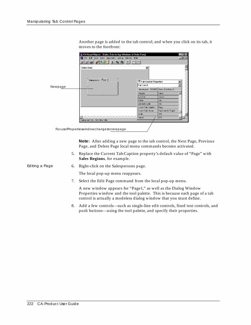
Manipulating Tab Control Pages
222 CA-Product User Guide
Another page is added to the tab control; and when you click on its tab, itmoves to the forefront:
Newpage
FocusofPropertieswindowchangestonewpage
Note: After adding a new page to the tab control, the Next Page, PreviousPage, and Delete Page local menu commands become activated.
5. Replace the Current Tab:Caption property’s default value of “Page” withSales Regions, for example.
Editing a Page 6. Right-click on the Salespersons page.
The local pop-up menu reappears.
7. Select the Edit Page command from the local pop-up menu.
A new window appears for “Page1,” as well as the Dialog WindowProperties window and the tool palette. This is because each page of a tabcontrol is actually a modeless dialog window that you must define.
8. Add a few controls—such as single-line edit controls, fixed text controls, andpush buttons—using the tool palette, and specify their properties.
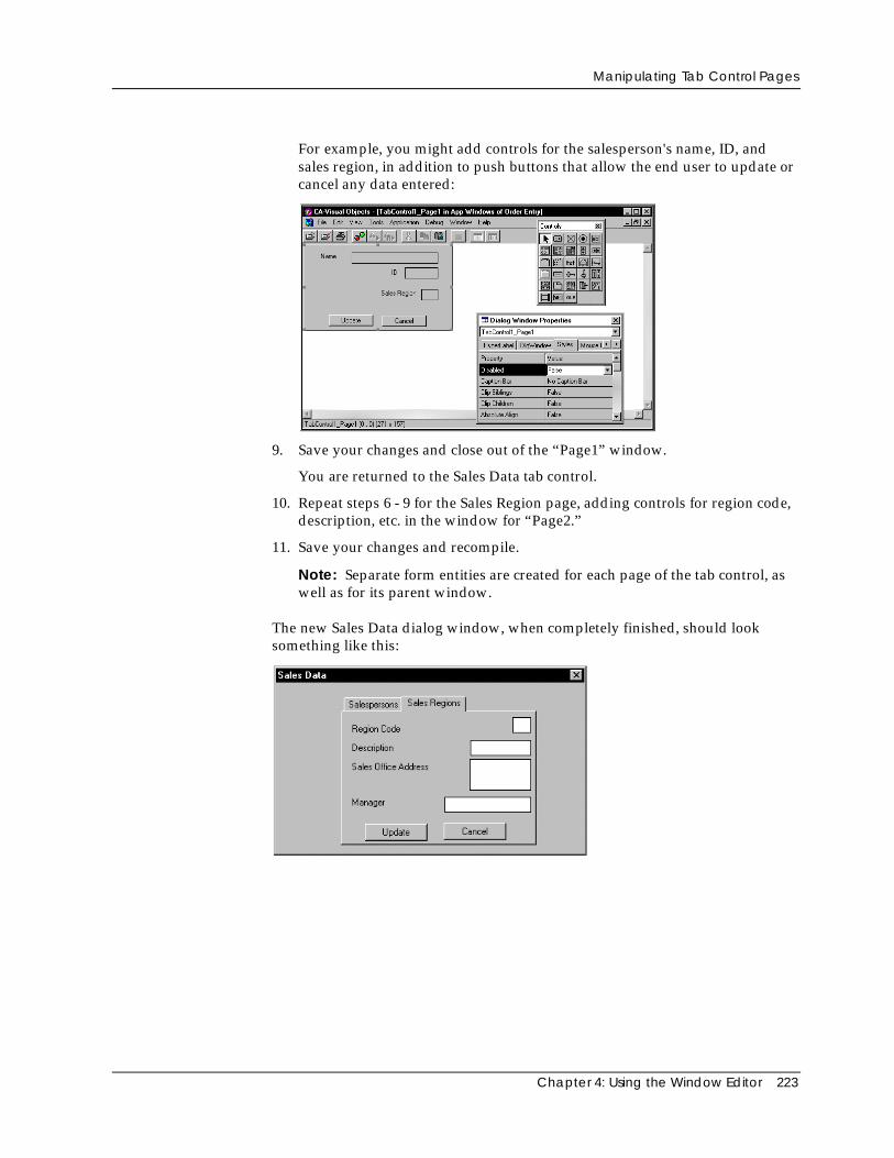
Manipulating Tab Control Pages
Chapter 4: Using the Window Editor 223
For example, you might add controls for the salesperson's name, ID, andsales region, in addition to push buttons that allow the end user to update orcancel any data entered:
9. Save your changes and close out of the “Page1” window.
You are returned to the Sales Data tab control.
10. Repeat steps 6 - 9 for the Sales Region page, adding controls for region code,description, etc. in the window for “Page2.”
11. Save your changes and recompile.
Note: Separate form entities are created for each page of the tab control, aswell as for its parent window.
The new Sales Data dialog window, when completely finished, should looksomething like this:
Linking and Embedding OLE Objects and Controls
224 CA-Product User Guide
Linking and Embedding OLE Objects and ControlsObject linking and embedding (OLE) is not a new technology. It has beenaround before the birth of Windows, and was used mostly in Microsoft Officeapplications to create compound documents or to embed one or more foreignapplications inside another application. With Microsoft OLE 2.0, a full 32-bittechnology that is a central component of Windows, OLE is now an umbrellaterm that includes many subtechnologies—automation, data transfer, memoryallocation, file management, and OLE custom controls (OCXs).
Note: CA-Visual Objects 2.7 is a full-fledged OLE client/server application, andsupports all of OLE 2.0 technologies. For detailed information about creatingActiveX controls and OLE server applications, see theonline help.
Basic Terms
Before showing you how to use OLE objects and controls in CA-Visual Objects, abrief discussion of some basic terms is in order.
Linking and Embedding
Linking and embedding objects into compound documents or containerapplications is the basic foundation of OLE. These two methods store items,which were created by one application, inside a document of anotherapplication. The application that created the object is called the server applicationand the application that stores the object is called the container or clientapplication.
Embedding Embedding is the more common of the two methods, and there are several waysof embedding an object into a container application. For example, you couldcreate a spreadsheet in MS Excel, and then place it inside your CA-Visual Objectsapplication by using the Window Editor’s Edit Paste or Paste Special menucommand and standard drag-and-drop editing techniques. You could insert itusing the Edit Insert OLE Object menu command. (The CA-Visual ObjectsWindow Editor fully supports OLE 2.0 features.)
After the object is placed in the container application, it is in a passive state. Anobject will stay in this state until it is necessary to make modifications to it, inwhich case it will become active by some user action defined by the client.Activating the object launches the application used to create the object (forexample, MS Excel).
Linking and Embedding OLE Objects and Controls
Chapter 4: Using the Window Editor 225
The application can be launched in two ways, depending on how the clientapplication has implemented activation support. The first way is for the client tostart the server as a separate application in a separate window. The second wayis for the client to become the server application for the duration of the objectediting session. In this case, which is called in-place activation, the client willchange itself into the server. This change encompasses menus, toolbars, statusbars, and any palette windows.
In-place activation requires no extra user interaction; simply placing the cursoron the object will activate it. Thus, embedded objects are indistinguishable fromthe client application’s native data. This model can be used when the overheadof activating the object is small.
Linking An object can also be linked to the client application. A linked object is arepresentation of (or pointer to) the actual object which resides elsewhere (eitherin the same application or in a different application).
An object can be linked by choosing the Window Editor’s Edit Paste Specialmenu command and selecting the Paste Link option in the Paste Special dialogbox that appears. The Paste Link option creates a link to the source file for theembedded object, so that changes to the source file will be reflected in yourapplication. The Insert Object dialog box also supports linking of objects (seeInserting an OLE Object below).
Editing a linked object is very similar to editing an embedded object. The onlydifference is that the data for a linked object remains in the application whichcreated the object, whereas the data for an embedded object travels with theobject to the client application. Additionally, editing a linked object is alwaysdone “out-of-place.”
Controls and Control Containers
An OLE custom control is a special kind of embedded OLE 2.0 object that has anextended interface that lets it behave like a Windows control. OCXs are a set ofextensions that turn simple OLE 2.0 containers and objects into more powerfultools.
The OLE 2.0 standard for compound documents meets many of the requirementsfor both controls and control containers, but not all of them. Creating a controlinvolves some other issues, primarily those dealing with OLE automation. Acontrol must expose its events, methods, and properties to a control container;and a control container must expose ambient properties and its own events to thecontrol. Ambient properties are named characteristics or values of the containeritself that generally apply to all controls in the container. Some examples ofambient properties are default colors, font, and whether the container is in designmode or run mode.
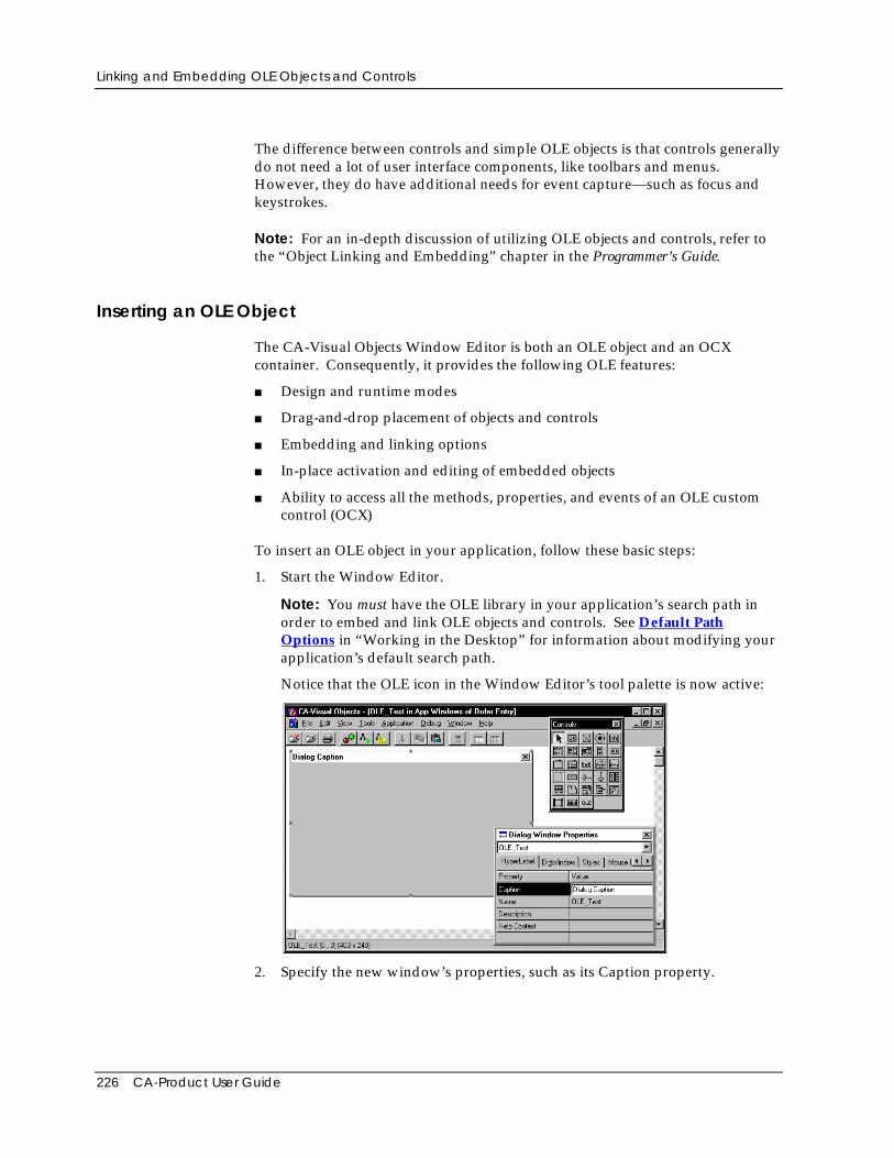
Linking and Embedding OLE Objects and Controls
226 CA-Product User Guide
The difference between controls and simple OLE objects is that controls generallydo not need a lot of user interface components, like toolbars and menus.However, they do have additional needs for event capture—such as focus andkeystrokes.
Note: For an in-depth discussion of utilizing OLE objects and controls, refer tothe “Object Linking and Embedding” chapter in the Programmer’s Guide.
Inserting an OLE Object
The CA-Visual Objects Window Editor is both an OLE object and an OCXcontainer. Consequently, it provides the following OLE features:
■ Design and runtime modes
■ Drag-and-drop placement of objects and controls
■ Embedding and linking options
■ In-place activation and editing of embedded objects
■ Ability to access all the methods, properties, and events of an OLE customcontrol (OCX)
To insert an OLE object in your application, follow these basic steps:
1. Start the Window Editor.
Note: You must have the OLE library in your application’s search path inorder to embed and link OLE objects and controls. See Default PathOptions in “Working in the Desktop” for information about modifying yourapplication’s default search path.
Notice that the OLE icon in the Window Editor’s tool palette is now active:
2. Specify the new window’s properties, such as its Caption property.
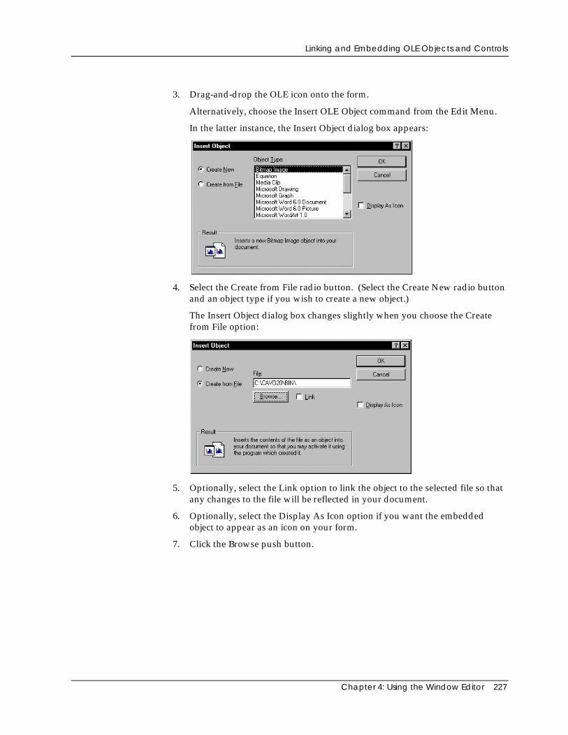
Linking and Embedding OLE Objects and Controls
Chapter 4: Using the Window Editor 227
3. Drag-and-drop the OLE icon onto the form.
Alternatively, choose the Insert OLE Object command from the Edit Menu.
In the latter instance, the Insert Object dialog box appears:
4. Select the Create from File radio button. (Select the Create New radio buttonand an object type if you wish to create a new object.)
The Insert Object dialog box changes slightly when you choose the Createfrom File option:
5. Optionally, select the Link option to link the object to the selected file so thatany changes to the file will be reflected in your document.
6. Optionally, select the Display As Icon option if you want the embeddedobject to appear as an icon on your form.
7. Click the Browse push button.
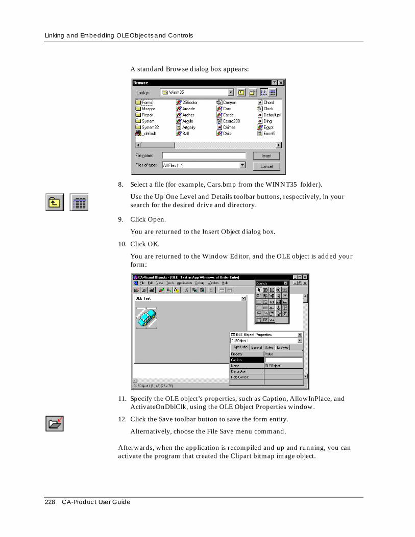
Linking and Embedding OLE Objects and Controls
228 CA-Product User Guide
A standard Browse dialog box appears:
8. Select a file (for example, Cars.bmp from the WINNT35 folder).
Use the Up One Level and Details toolbar buttons, respectively, in yoursearch for the desired drive and directory.
9. Click Open.
You are returned to the Insert Object dialog box.
10. Click OK.
You are returned to the Window Editor, and the OLE object is added yourform:
11. Specify the OLE object’s properties, such as Caption, AllowInPlace, andActivateOnDblClk, using the OLE Object Properties window.
12. Click the Save toolbar button to save the form entity.
Alternatively, choose the File Save menu command.
Afterwards, when the application is recompiled and up and running, you canactivate the program that created the Clipart bitmap image object.
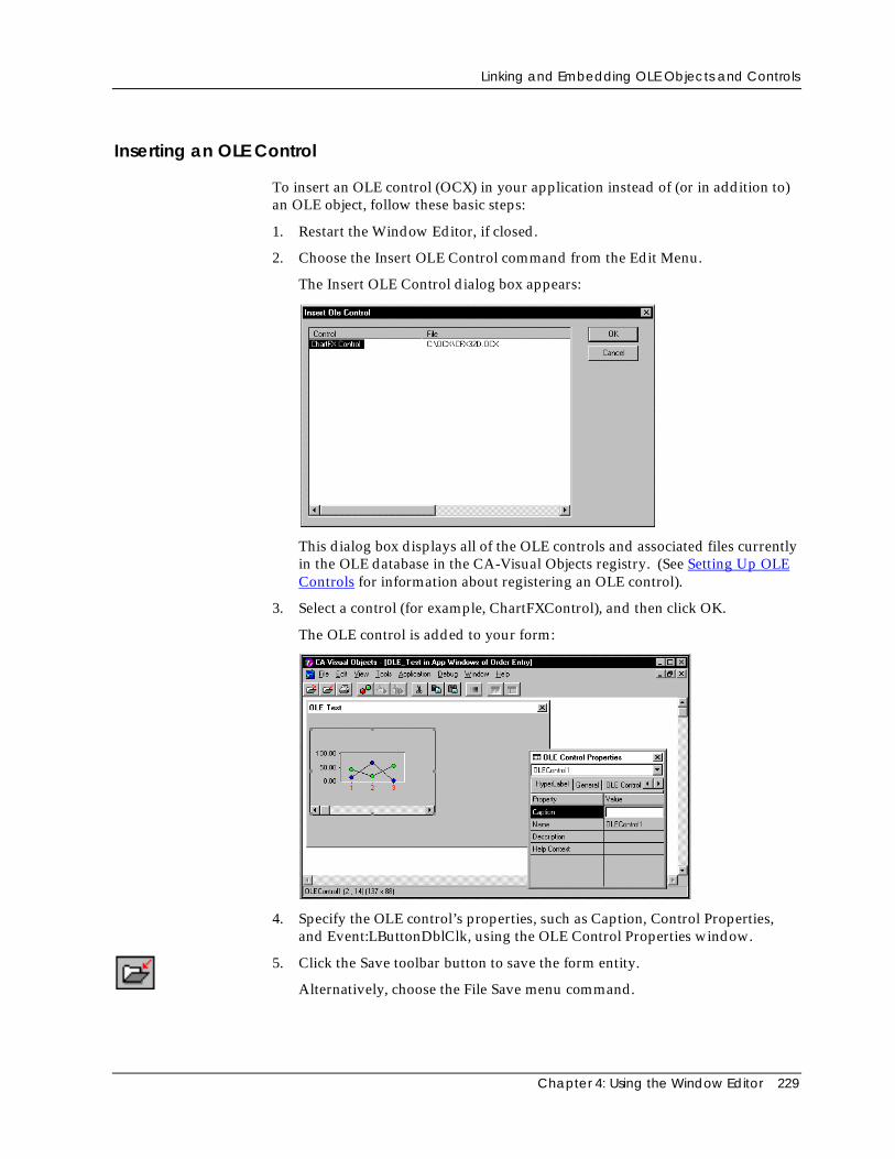
Linking and Embedding OLE Objects and Controls
Chapter 4: Using the Window Editor 229
Inserting an OLE Control
To insert an OLE control (OCX) in your application instead of (or in addition to)an OLE object, follow these basic steps:
1. Restart the Window Editor, if closed.
2. Choose the Insert OLE Control command from the Edit Menu.
The Insert OLE Control dialog box appears:
This dialog box displays all of the OLE controls and associated files currentlyin the OLE database in the CA-Visual Objects registry. (See Setting Up OLEControls for information about registering an OLE control).
3. Select a control (for example, ChartFXControl), and then click OK.
The OLE control is added to your form:
4. Specify the OLE control’s properties, such as Caption, Control Properties,and Event:LButtonDblClk, using the OLE Control Properties window.
5. Click the Save toolbar button to save the form entity.
Alternatively, choose the File Save menu command.
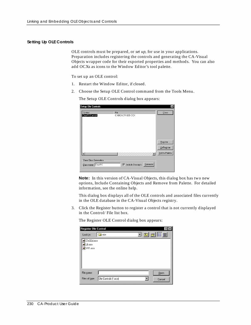
Linking and Embedding OLE Objects and Controls
230 CA-Product User Guide
Setting Up OLE Controls
OLE controls must be prepared, or set up, for use in your applications.Preparation includes registering the controls and generating the CA-VisualObjects wrapper code for their exported properties and methods. You can alsoadd OCXs as icons to the Window Editor’s tool palette.
To set up an OLE control:
1. Restart the Window Editor, if closed.
2. Choose the Setup OLE Control command from the Tools Menu.
The Setup OLE Controls dialog box appears:
Note: In this version of CA-Visual Objects, this dialog box has two newoptions, Include Containing Objects and Remove from Palette. For detailedinformation, see the online help.
This dialog box displays all of the OLE controls and associated files currentlyin the OLE database in the CA-Visual Objects registry.
3. Click the Register button to register a control that is not currently displayedin the Control/File list box.
The Register OLE Control dialog box appears:
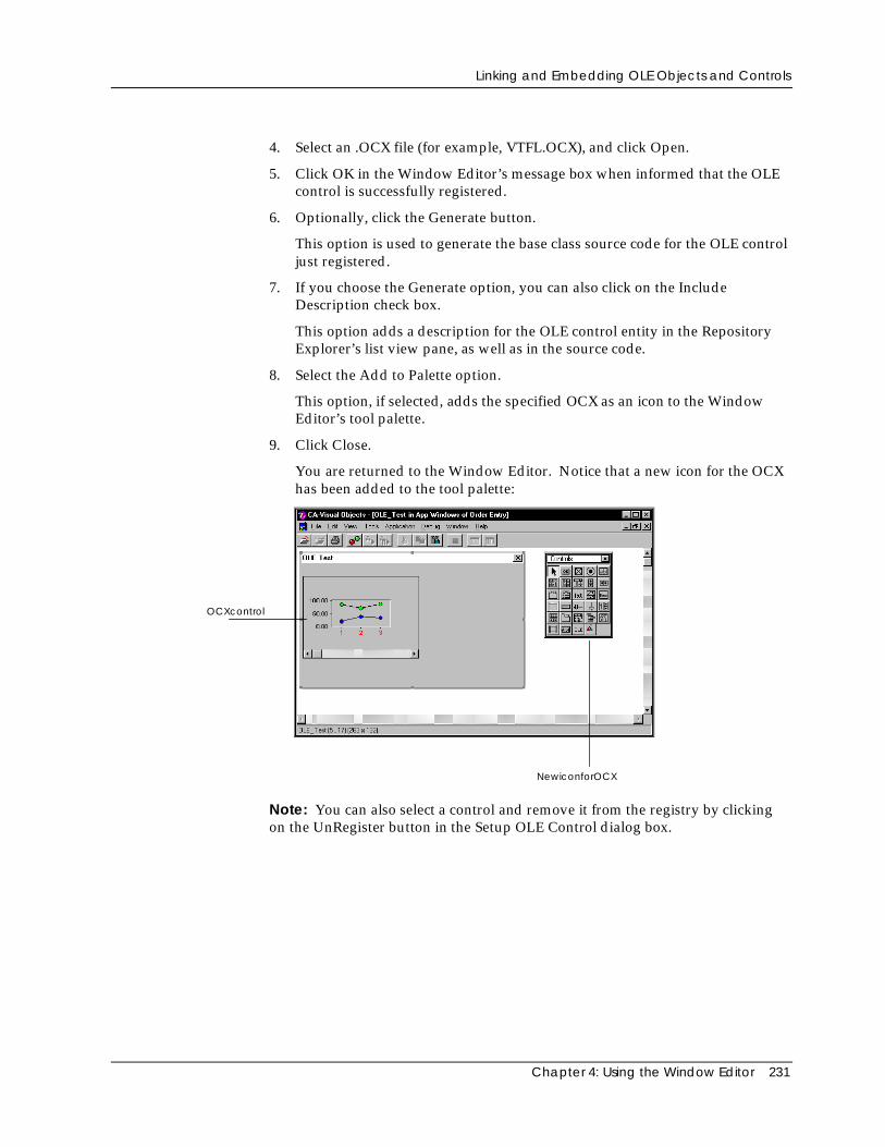
Linking and Embedding OLE Objects and Controls
Chapter 4: Using the Window Editor 231
4. Select an .OCX file (for example, VTFL.OCX), and click Open.
5. Click OK in the Window Editor’s message box when informed that the OLEcontrol is successfully registered.
6. Optionally, click the Generate button.
This option is used to generate the base class source code for the OLE controljust registered.
7. If you choose the Generate option, you can also click on the IncludeDescription check box.
This option adds a description for the OLE control entity in the RepositoryExplorer’s list view pane, as well as in the source code.
8. Select the Add to Palette option.
This option, if selected, adds the specified OCX as an icon to the WindowEditor’s tool palette.
9. Click Close.
You are returned to the Window Editor. Notice that a new icon for the OCXhas been added to the tool palette:
NewiconforOCX
OCXcontrol
Note: You can also select a control and remove it from the registry by clickingon the UnRegister button in the Setup OLE Control dialog box.
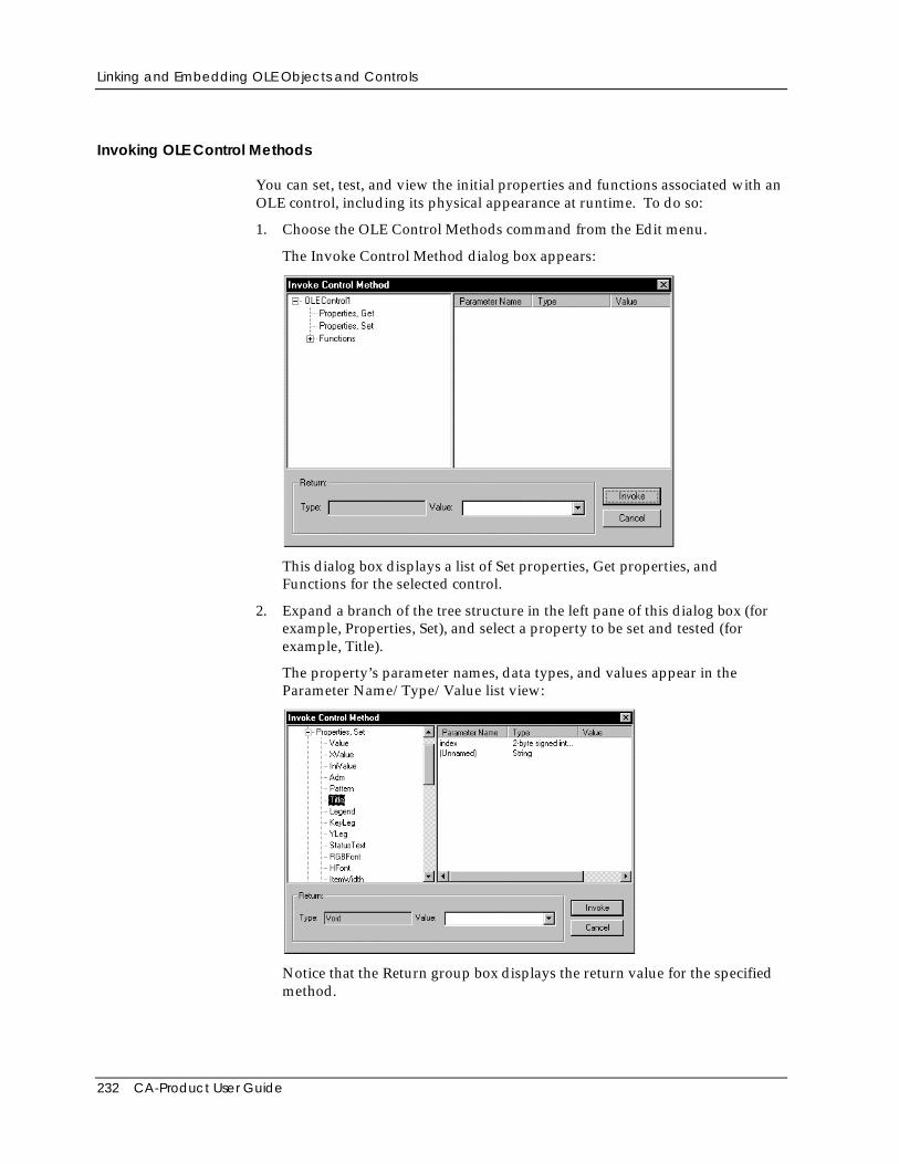
Linking and Embedding OLE Objects and Controls
232 CA-Product User Guide
Invoking OLE Control Methods
You can set, test, and view the initial properties and functions associated with anOLE control, including its physical appearance at runtime. To do so:
1. Choose the OLE Control Methods command from the Edit menu.
The Invoke Control Method dialog box appears:
This dialog box displays a list of Set properties, Get properties, andFunctions for the selected control.
2. Expand a branch of the tree structure in the left pane of this dialog box (forexample, Properties, Set), and select a property to be set and tested (forexample, Title).
The property’s parameter names, data types, and values appear in theParameter Name/Type/Value list view:
Notice that the Return group box displays the return value for the specifiedmethod.
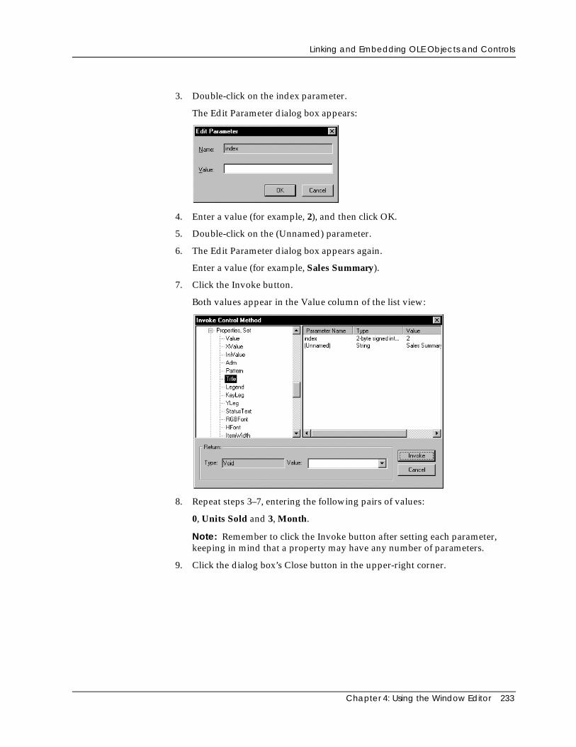
Linking and Embedding OLE Objects and Controls
Chapter 4: Using the Window Editor 233
3. Double-click on the index parameter.
The Edit Parameter dialog box appears:
4. Enter a value (for example, 2), and then click OK.
5. Double-click on the (Unnamed) parameter.
6. The Edit Parameter dialog box appears again.
Enter a value (for example, Sales Summary).
7. Click the Invoke button.
Both values appear in the Value column of the list view:
8. Repeat steps 3–7, entering the following pairs of values:
0, Units Sold and 3, Month.
Note: Remember to click the Invoke button after setting each parameter,keeping in mind that a property may have any number of parameters.
9. Click the dialog box’s Close button in the upper-right corner.
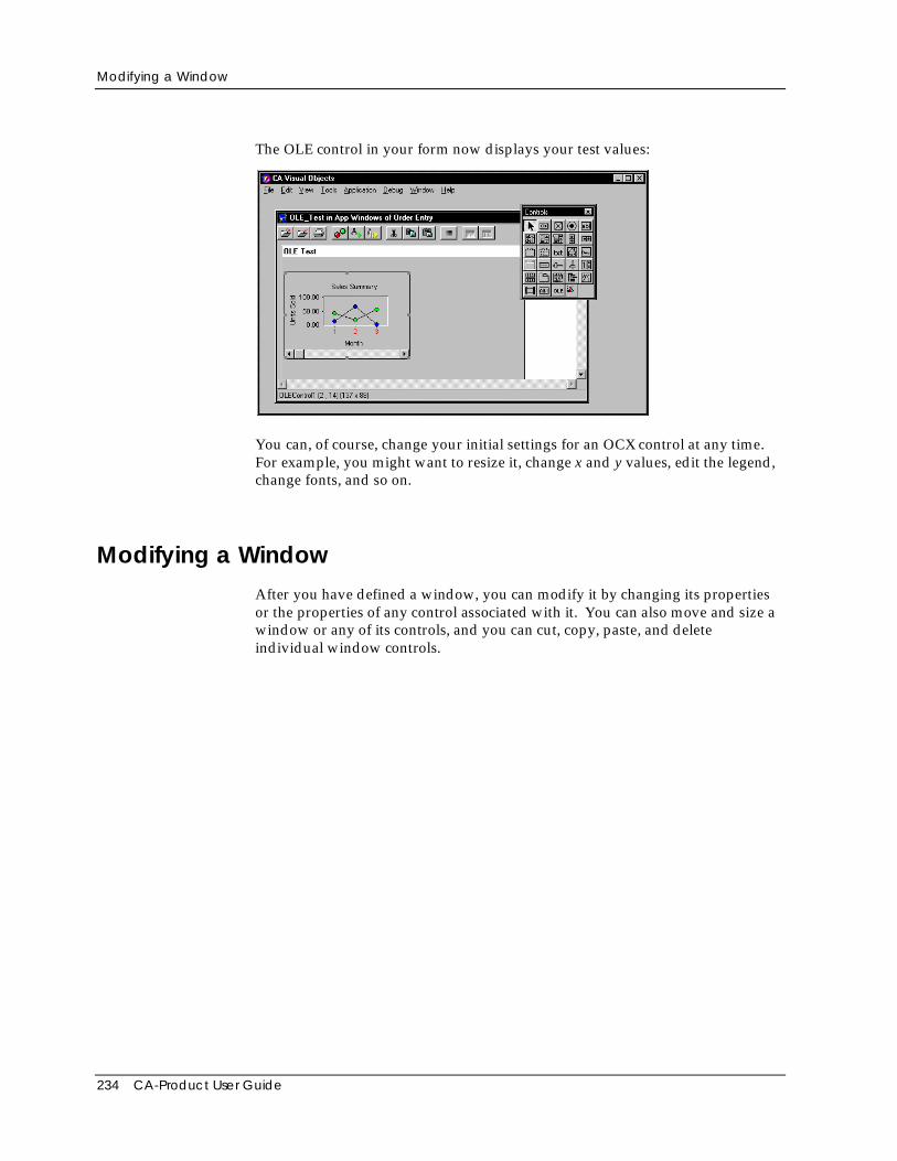
Modifying a Window
234 CA-Product User Guide
The OLE control in your form now displays your test values:
You can, of course, change your initial settings for an OCX control at any time.For example, you might want to resize it, change x and y values, edit the legend,change fonts, and so on.
Modifying a WindowAfter you have defined a window, you can modify it by changing its propertiesor the properties of any control associated with it. You can also move and size awindow or any of its controls, and you can cut, copy, paste, and deleteindividual window controls.
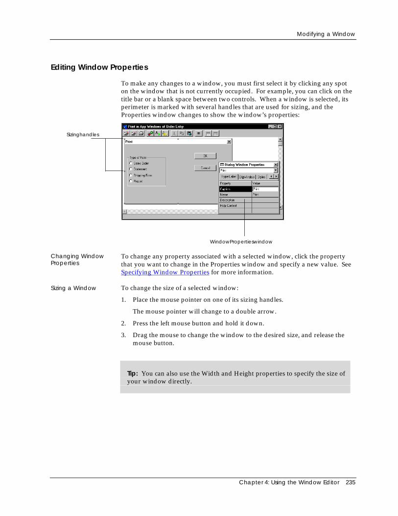
Modifying a Window
Chapter 4: Using the Window Editor 235
Editing Window Properties
To make any changes to a window, you must first select it by clicking any spoton the window that is not currently occupied. For example, you can click on thetitle bar or a blank space between two controls. When a window is selected, itsperimeter is marked with several handles that are used for sizing, and theProperties window changes to show the window’s properties:
Sizinghandles
WindowPropertieswindow
Changing WindowProperties
To change any property associated with a selected window, click the propertythat you want to change in the Properties window and specify a new value. SeeSpecifying Window Properties for more information.
Sizing a Window To change the size of a selected window:
1. Place the mouse pointer on one of its sizing handles.
The mouse pointer will change to a double arrow.
2. Press the left mouse button and hold it down.
3. Drag the mouse to change the window to the desired size, and release themouse button.
Tip: You can also use the Width and Height properties to specify the size ofyour window directly.
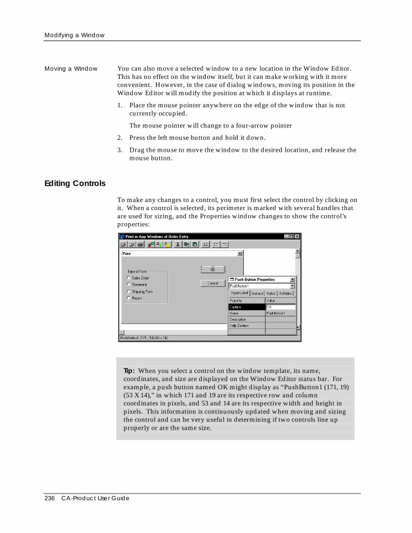
Modifying a Window
236 CA-Product User Guide
Moving a Window You can also move a selected window to a new location in the Window Editor.This has no effect on the window itself, but it can make working with it moreconvenient. However, in the case of dialog windows, moving its position in theWindow Editor will modify the position at which it displays at runtime.
1. Place the mouse pointer anywhere on the edge of the window that is notcurrently occupied.
The mouse pointer will change to a four-arrow pointer
2. Press the left mouse button and hold it down.
3. Drag the mouse to move the window to the desired location, and release themouse button.
Editing Controls
To make any changes to a control, you must first select the control by clicking onit. When a control is selected, its perimeter is marked with several handles thatare used for sizing, and the Properties window changes to show the control’sproperties:
Tip: When you select a control on the window template, its name,coordinates, and size are displayed on the Window Editor status bar. Forexample, a push button named OK might display as “PushButton1 (171, 19)(53 X 14),” in which 171 and 19 are its respective row and columncoordinates in pixels, and 53 and 14 are its respective width and height inpixels. This information is continuously updated when moving and sizingthe control and can be very useful in determining if two controls line upproperly or are the same size.
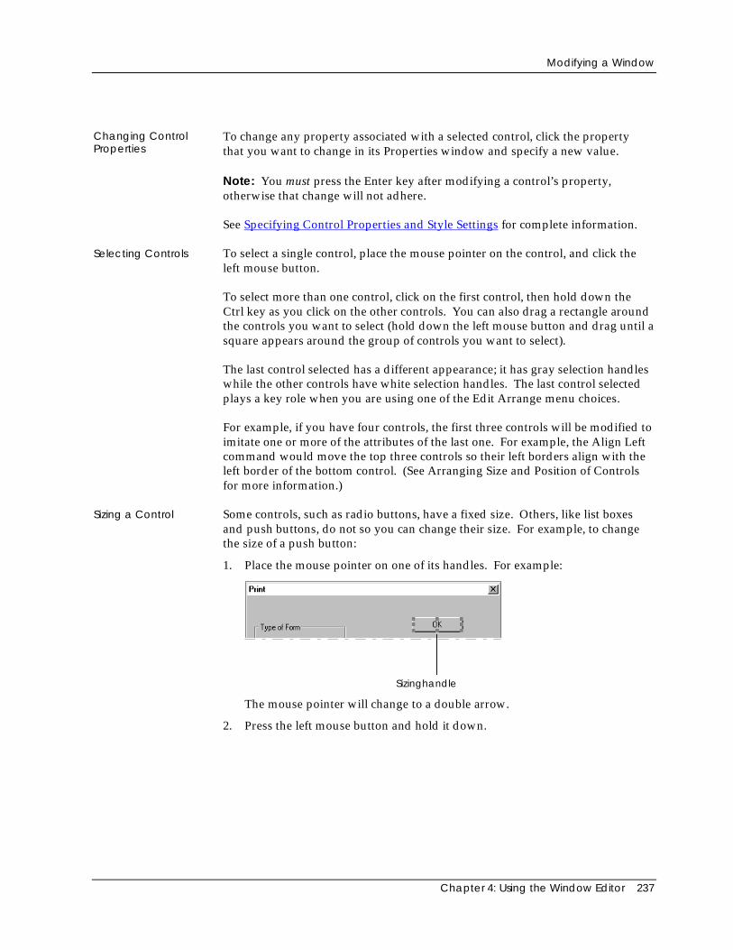
Modifying a Window
Chapter 4: Using the Window Editor 237
Changing ControlProperties
To change any property associated with a selected control, click the propertythat you want to change in its Properties window and specify a new value.
Note: You must press the Enter key after modifying a control’s property,otherwise that change will not adhere.
See Specifying Control Properties and Style Settings for complete information.
Selecting Controls To select a single control, place the mouse pointer on the control, and click theleft mouse button.
To select more than one control, click on the first control, then hold down theCtrl key as you click on the other controls. You can also drag a rectangle aroundthe controls you want to select (hold down the left mouse button and drag until asquare appears around the group of controls you want to select).
The last control selected has a different appearance; it has gray selection handleswhile the other controls have white selection handles. The last control selectedplays a key role when you are using one of the Edit Arrange menu choices.
For example, if you have four controls, the first three controls will be modified toimitate one or more of the attributes of the last one. For example, the Align Leftcommand would move the top three controls so their left borders align with theleft border of the bottom control. (See Arranging Size and Position of Controlsfor more information.)
Sizing a Control Some controls, such as radio buttons, have a fixed size. Others, like list boxesand push buttons, do not so you can change their size. For example, to changethe size of a push button:
1. Place the mouse pointer on one of its handles. For example:
Sizinghandle
The mouse pointer will change to a double arrow.
2. Press the left mouse button and hold it down.
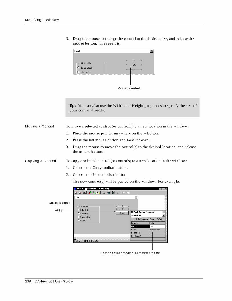
Modifying a Window
238 CA-Product User Guide
3. Drag the mouse to change the control to the desired size, and release themouse button. The result is:
Resizedcontrol
Tip: You can also use the Width and Height properties to specify the size ofyour control directly.
Moving a Control To move a selected control (or controls) to a new location in the window:
1. Place the mouse pointer anywhere on the selection.
2. Press the left mouse button and hold it down.
3. Drag the mouse to move the control(s) to the desired location, and releasethe mouse button.
Copying a Control To copy a selected control (or controls) to a new location in the window:
1. Choose the Copy toolbar button.
2. Choose the Paste toolbar button.
The new control(s) will be pasted on the window. For example:
Copy
Originalcontrol
Samecaptionasoriginal,butdifferentname
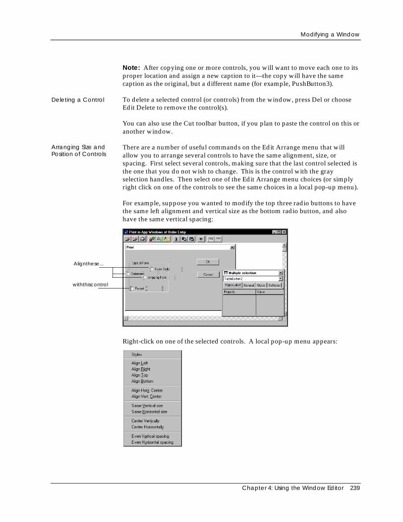
Modifying a Window
Chapter 4: Using the Window Editor 239
Note: After copying one or more controls, you will want to move each one to itsproper location and assign a new caption to it—the copy will have the samecaption as the original, but a different name (for example, PushButton3).
Deleting a Control To delete a selected control (or controls) from the window, press Del or chooseEdit Delete to remove the control(s).
You can also use the Cut toolbar button, if you plan to paste the control on this oranother window.
Arranging Size andPosition of Controls
There are a number of useful commands on the Edit Arrange menu that willallow you to arrange several controls to have the same alignment, size, orspacing. First select several controls, making sure that the last control selected isthe one that you do not wish to change. This is the control with the grayselection handles. Then select one of the Edit Arrange menu choices (or simplyright click on one of the controls to see the same choices in a local pop-up menu).
For example, suppose you wanted to modify the top three radio buttons to havethe same left alignment and vertical size as the bottom radio button, and alsohave the same vertical spacing:
Alignthese...
withthiscontrol
Right-click on one of the selected controls. A local pop-up menu appears:
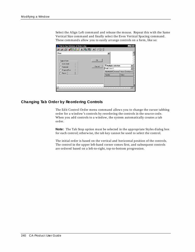
Modifying a Window
240 CA-Product User Guide
Select the Align Left command and release the mouse. Repeat this with the SameVertical Size command and finally select the Even Vertical Spacing command.These commands allow you to easily arrange controls on a form, like so:
Changing Tab Order by Reordering Controls
The Edit Control Order menu command allows you to change the cursor tabbingorder for a window’s controls by reordering the controls in the source code.When you add controls to a window, the system automatically creates a taborder.
Note: The Tab Stop option must be selected in the appropriate Styles dialog boxfor each control; otherwise, the tab key cannot be used to select the control.
The initial order is based on the vertical and horizontal position of the controls.The control in the upper left-hand corner comes first, and subsequent controlsare ordered based on a left-to-right, top-to-bottom progression.
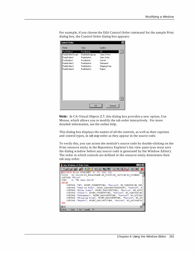
Modifying a Window
Chapter 4: Using the Window Editor 241
For example, if you choose the Edit Control Order command for the sample Printdialog box, the Control Order dialog box appears:
Note: In CA-Visual Objects 2.7, this dialog box provides a new option, UseMouse, which allows you to modify the tab order interactively. For moredetailed information, see the online help.
This dialog box displays the names of all the controls, as well as their captionsand control types, in tab stop order as they appear in the source code.
To verify this, you can access the module’s source code by double-clicking on thePrint resource entity in the Repository Explorer’s list view pane (you must savethe dialog window before any source code is generated by the Window Editor).The order in which controls are defined in the resource entity determines theirtab stop order:
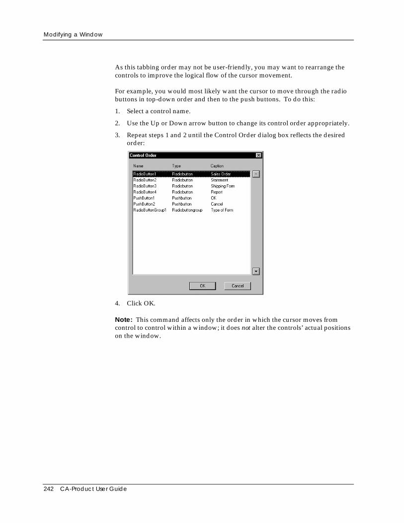
Modifying a Window
242 CA-Product User Guide
As this tabbing order may not be user-friendly, you may want to rearrange thecontrols to improve the logical flow of the cursor movement.
For example, you would most likely want the cursor to move through the radiobuttons in top-down order and then to the push buttons. To do this:
1. Select a control name.
2. Use the Up or Down arrow button to change its control order appropriately.
3. Repeat steps 1 and 2 until the Control Order dialog box reflects the desiredorder:
4. Click OK.
Note: This command affects only the order in which the cursor moves fromcontrol to control within a window; it does not alter the controls’ actual positionson the window.
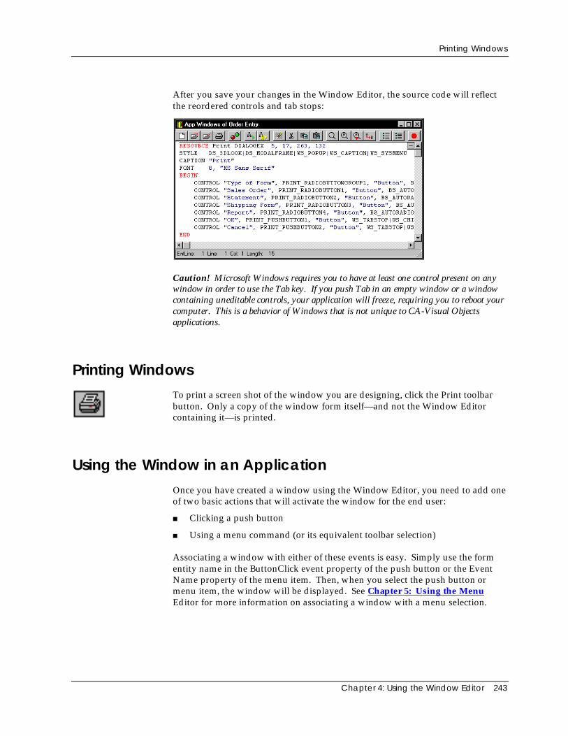
Printing Windows
Chapter 4: Using the Window Editor 243
After you save your changes in the Window Editor, the source code will reflectthe reordered controls and tab stops:
Caution! Microsoft Windows requires you to have at least one control present on anywindow in order to use the Tab key. If you push Tab in an empty window or a windowcontaining uneditable controls, your application will freeze, requiring you to reboot yourcomputer. This is a behavior of Windows that is not unique to CA-Visual Objectsapplications.
Printing WindowsTo print a screen shot of the window you are designing, click the Print toolbarbutton. Only a copy of the window form itself—and not the Window Editorcontaining it—is printed.
Using the Window in an ApplicationOnce you have created a window using the Window Editor, you need to add oneof two basic actions that will activate the window for the end user:
■ Clicking a push button
■ Using a menu command (or its equivalent toolbar selection)
Associating a window with either of these events is easy. Simply use the formentity name in the ButtonClick event property of the push button or the EventName property of the menu item. Then, when you select the push button ormenu item, the window will be displayed. See Chapter 5: Using the MenuEditor for more information on associating a window with a menu selection.

Chapter 5: Using the Menu Editor 245
Chapter
5 Using the Menu Editor
Most windows designed for use in a GUI application have an associated menuand/or toolbar, defining the available choices for the window and the actionsassociated with those choices. In a GUI application, all logic, navigation, anddatabase operations depend on visual controls, so naturally menus make up alarge part of the user interface.
The Menu Editor makes it easy to design custom menus, providing a host ofuseful properties (such as associating action code with a menu item) andimmediate visual feedback by previewing menus as you design them. You caneasily associate a toolbar with any menu that you create and can quickly addstandard, predefined File, Edit, View, Window, and Help menus—that are fullyoperational—at the click of a button.
This chapter describes how to use the Menu Editor, including how to:
■ Create a custom menu structure, complete with toolbar
■ Add predefined, standard menus at the touch of a button
■ Modify an existing menu structure
■ Print using the Menu Editor
■ Use the menu you have created in an application
Important! The GUI Classes and System Classes libraries must be included in thesearch path of your application in order to use a menu generated by the Menu Editor.See Setting the Search Path in “Using the Repository Explorer” for more information.
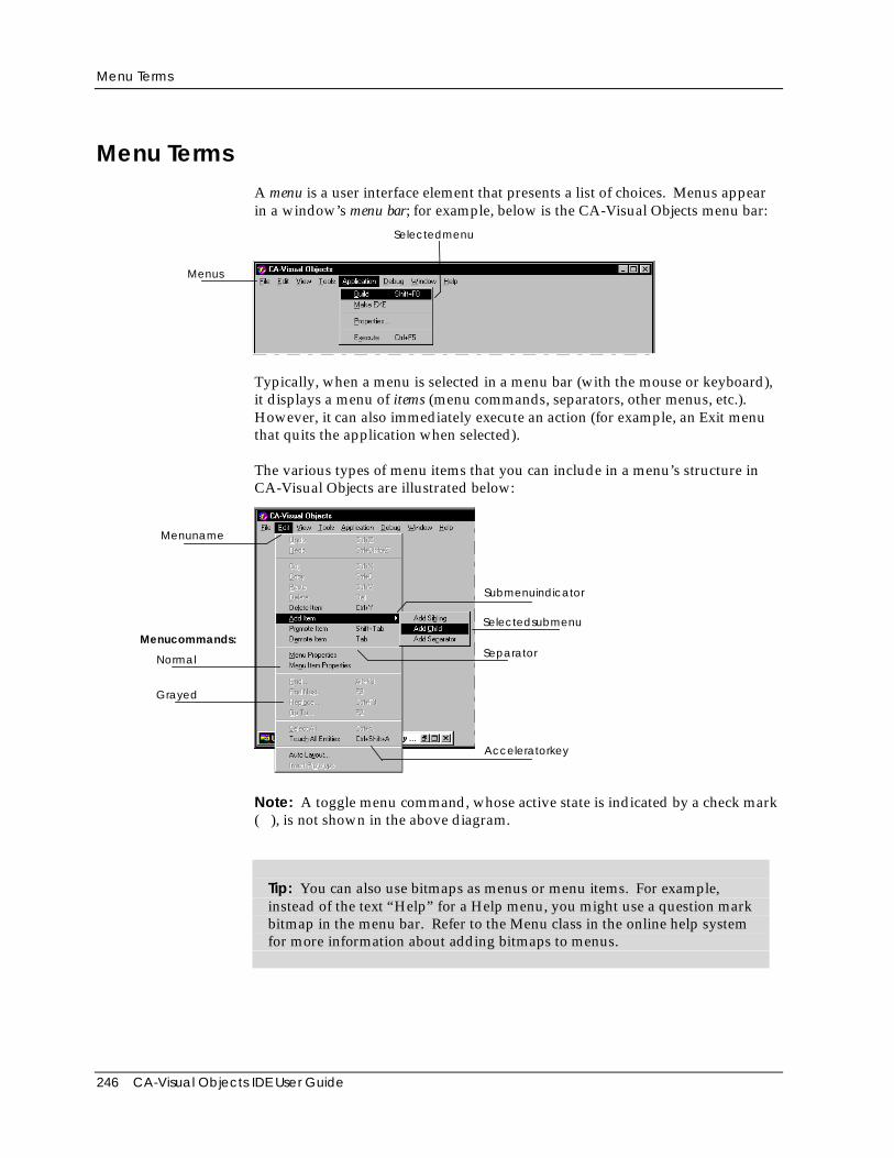
Menu Terms
246 CA-Visual Objects IDE User Guide
Menu TermsA menu is a user interface element that presents a list of choices. Menus appearin a window’s menu bar; for example, below is the CA-Visual Objects menu bar:
Menus
Selectedmenu
Typically, when a menu is selected in a menu bar (with the mouse or keyboard),it displays a menu of items (menu commands, separators, other menus, etc.).However, it can also immediately execute an action (for example, an Exit menuthat quits the application when selected).
The various types of menu items that you can include in a menu’s structure inCA-Visual Objects are illustrated below:
Menucommands:
Normal
Grayed
Menuname
Acceleratorkey
Separator
Selectedsubmenu
Submenuindicator
Note: A toggle menu command, whose active state is indicated by a check mark( ), is not shown in the above diagram.
Tip: You can also use bitmaps as menus or menu items. For example,instead of the text “Help” for a Help menu, you might use a question markbitmap in the menu bar. Refer to the Menu class in the online help systemfor more information about adding bitmaps to menus.
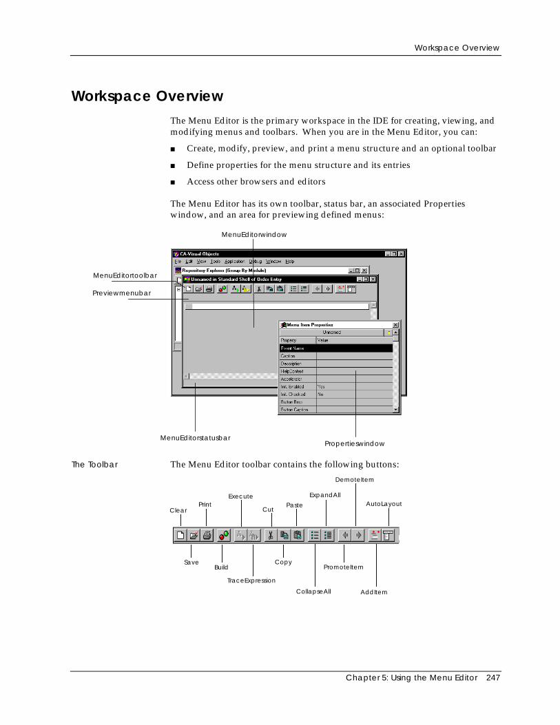
Workspace Overview
Chapter 5: Using the Menu Editor 247
Workspace OverviewThe Menu Editor is the primary workspace in the IDE for creating, viewing, andmodifying menus and toolbars. When you are in the Menu Editor, you can:
■ Create, modify, preview, and print a menu structure and an optional toolbar
■ Define properties for the menu structure and its entries
■ Access other browsers and editors
The Menu Editor has its own toolbar, status bar, an associated Propertieswindow, and an area for previewing defined menus:
MenuEditortoolbar
Propertieswindow
MenuEditorwindow
MenuEditorstatusbar
Previewmenubar
The Toolbar The Menu Editor toolbar contains the following buttons:
AutoLayout
Save
Build
Execute
TraceExpression
Cut
Copy
Paste
AddItem
PromoteItem
DemoteItem
Clear
ExpandAll
CollapseAll
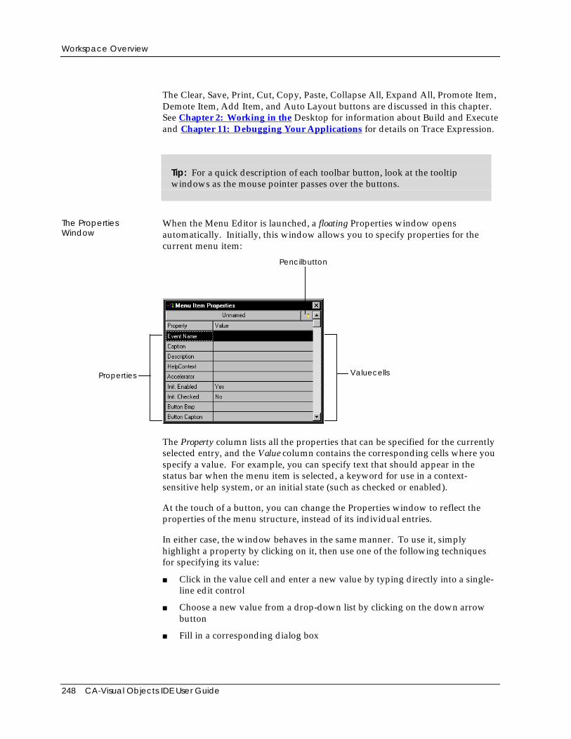
Workspace Overview
248 CA-Visual Objects IDE User Guide
The Clear, Save, Print, Cut, Copy, Paste, Collapse All, Expand All, Promote Item,Demote Item, Add Item, and Auto Layout buttons are discussed in this chapter.See Chapter 2: Working in the Desktop for information about Build and Executeand Chapter 11: Debugging Your Applications for details on Trace Expression.
Tip: For a quick description of each toolbar button, look at the tooltipwindows as the mouse pointer passes over the buttons.
The PropertiesWindow
When the Menu Editor is launched, a floating Properties window opensautomatically. Initially, this window allows you to specify properties for thecurrent menu item:
ValuecellsProperties
Pencilbutton
The Property column lists all the properties that can be specified for the currentlyselected entry, and the Value column contains the corresponding cells where youspecify a value. For example, you can specify text that should appear in thestatus bar when the menu item is selected, a keyword for use in a context-sensitive help system, or an initial state (such as checked or enabled).
At the touch of a button, you can change the Properties window to reflect theproperties of the menu structure, instead of its individual entries.
In either case, the window behaves in the same manner. To use it, simplyhighlight a property by clicking on it, then use one of the following techniquesfor specifying its value:
■ Click in the value cell and enter a new value by typing directly into a single-line edit control
■ Choose a new value from a drop-down list by clicking on the down arrowbutton
■ Fill in a corresponding dialog box
Defining a Menu
Chapter 5: Using the Menu Editor 249
The Properties window is discussed in greater detail in the Specifying MenuProperties and Specifying Menu Item Properties sections later in this chapter.
Note: The Properties window always remains open until explicitly closed (usingthe system menu) or until its owner, the Menu Editor window, is closed. Ifexplicitly closed, you can reopen it at any time using the Show Property Windowcommand on the Window menu. Also, the Properties window is affected byactions to its owner window. For example, if the owner window is minimized toan icon, the Properties window will also be minimized.
The Preview Menu Bar As you define a menu structure in the Menu Editor, each new entry is added to aprototypical menu bar, called the preview menu bar, at the top of the Menu Editorwindow just below the Menu Editor’s menu bar. The preview menu bar ispartially operational allowing submenus to be pulled down—but nothingactually happens when you make a selection. Its purpose is to give you visualfeedback while you are designing a menu structure.
See Previewing the Menu Bar later in this chapter for details.
Defining a MenuNow that you have a general overview of the Menu Editor workspace, you areready to use it to define a new menu structure. In this section, you will learnhow to:
■ Create a menu structure by manually adding entries, specifying a hierarchyamong them, and specifying properties for the menu structure and its entries
■ Create a predefined menu using the Auto Layout feature
■ Modify an existing menu structure
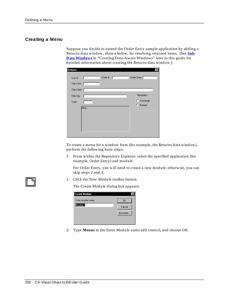
Defining a Menu
250 CA-Visual Objects IDE User Guide
Creating a Menu
Suppose you decide to extend the Order Entry sample application by adding aReturns data window, shown below, for resolving returned items. (See Sub-Data Windows in “Creating Data-Aware Windows” later in this guide fordetailed information about creating the Returns data window.)
To create a menu for a window form (for example, the Returns data window),perform the following basic steps:
1. From within the Repository Explorer, select the specified application (forexample, Order Entry) and module.
For Order Entry, you will need to create a new module; otherwise, you canskip steps 2 and 3.
2. Click the New Module toolbar button.
The Create Module dialog box appears:
3. Type Menus in the Enter Module name edit control, and choose OK.
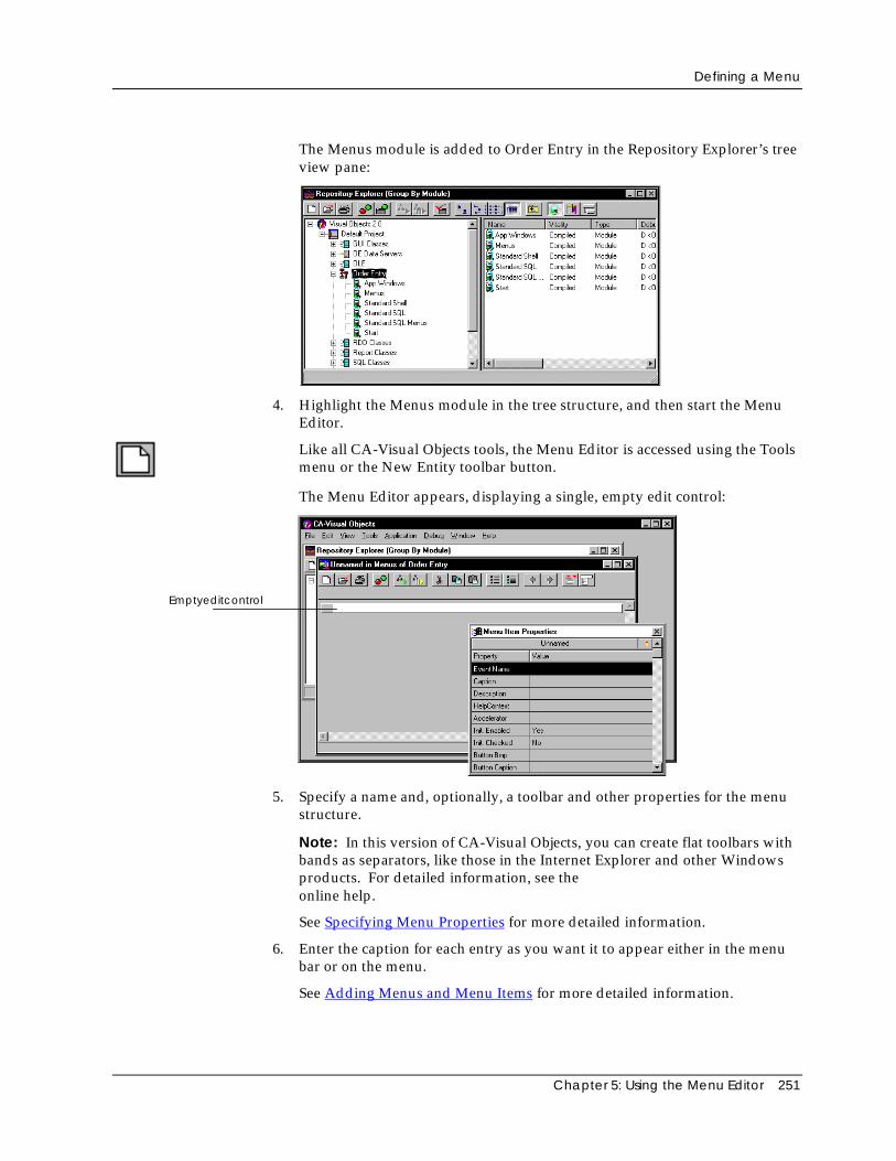
Defining a Menu
Chapter 5: Using the Menu Editor 251
The Menus module is added to Order Entry in the Repository Explorer’s treeview pane:
4. Highlight the Menus module in the tree structure, and then start the MenuEditor.
Like all CA-Visual Objects tools, the Menu Editor is accessed using the Toolsmenu or the New Entity toolbar button.
The Menu Editor appears, displaying a single, empty edit control:
Emptyeditcontrol
5. Specify a name and, optionally, a toolbar and other properties for the menustructure.
Note: In this version of CA-Visual Objects, you can create flat toolbars withbands as separators, like those in the Internet Explorer and other Windowsproducts. For detailed information, see theonline help.
See Specifying Menu Properties for more detailed information.
6. Enter the caption for each entry as you want it to appear either in the menubar or on the menu.
See Adding Menus and Menu Items for more detailed information.
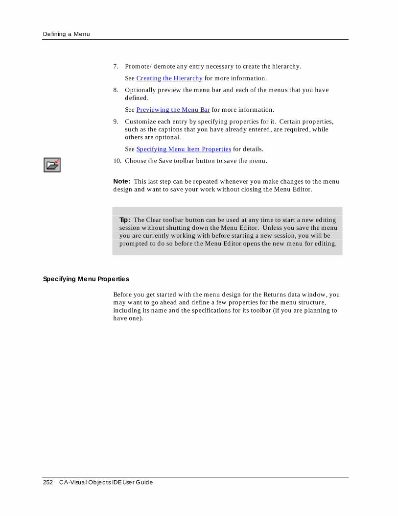
Defining a Menu
252 CA-Visual Objects IDE User Guide
7. Promote/demote any entry necessary to create the hierarchy.
See Creating the Hierarchy for more information.
8. Optionally preview the menu bar and each of the menus that you havedefined.
See Previewing the Menu Bar for more information.
9. Customize each entry by specifying properties for it. Certain properties,such as the captions that you have already entered, are required, whileothers are optional.
See Specifying Menu Item Properties for details.
10. Choose the Save toolbar button to save the menu.
Note: This last step can be repeated whenever you make changes to the menudesign and want to save your work without closing the Menu Editor.
Tip: The Clear toolbar button can be used at any time to start a new editingsession without shutting down the Menu Editor. Unless you save the menuyou are currently working with before starting a new session, you will beprompted to do so before the Menu Editor opens the new menu for editing.
Specifying Menu Properties
Before you get started with the menu design for the Returns data window, youmay want to go ahead and define a few properties for the menu structure,including its name and the specifications for its toolbar (if you are planning tohave one).
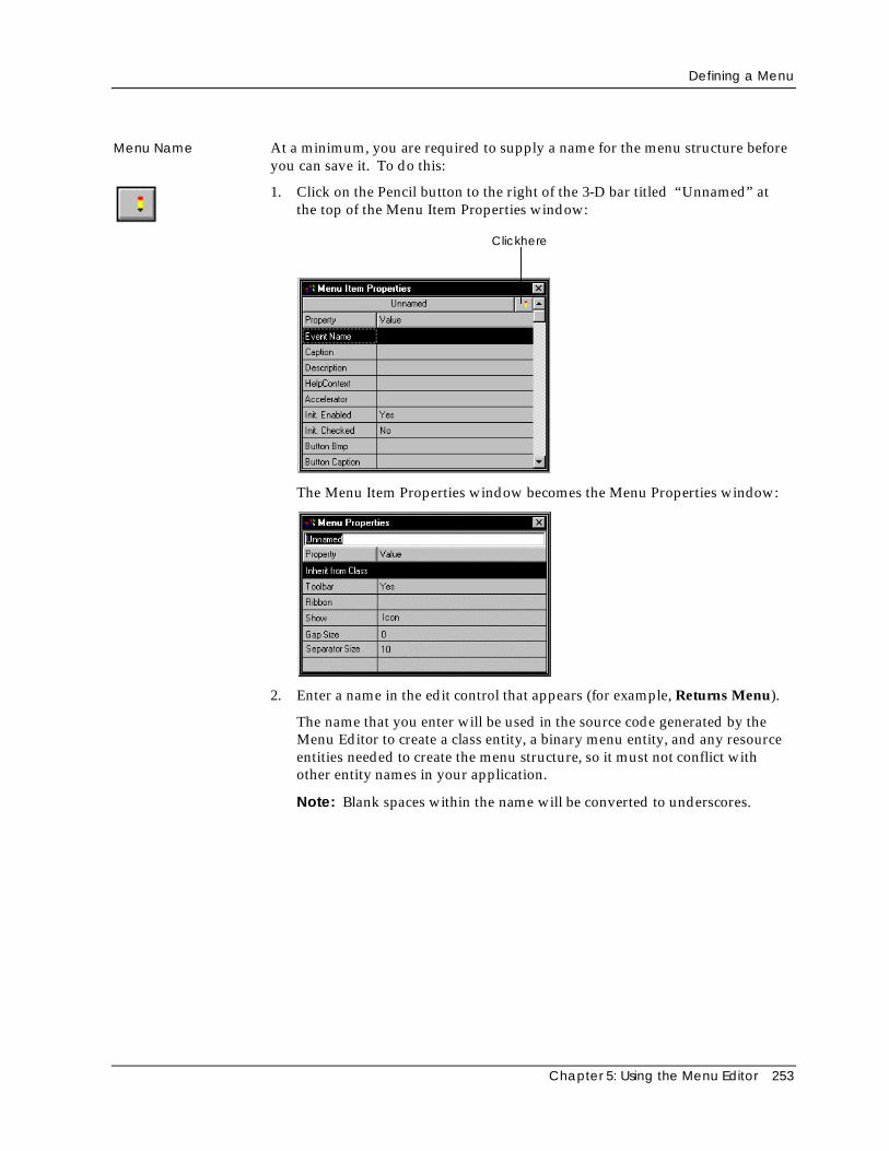
Defining a Menu
Chapter 5: Using the Menu Editor 253
Menu Name At a minimum, you are required to supply a name for the menu structure beforeyou can save it. To do this:
1. Click on the Pencil button to the right of the 3-D bar titled “Unnamed” atthe top of the Menu Item Properties window:
Clickhere
The Menu Item Properties window becomes the Menu Properties window:
2. Enter a name in the edit control that appears (for example, Returns Menu).
The name that you enter will be used in the source code generated by theMenu Editor to create a class entity, a binary menu entity, and any resourceentities needed to create the menu structure, so it must not conflict withother entity names in your application.
Note: Blank spaces within the name will be converted to underscores.
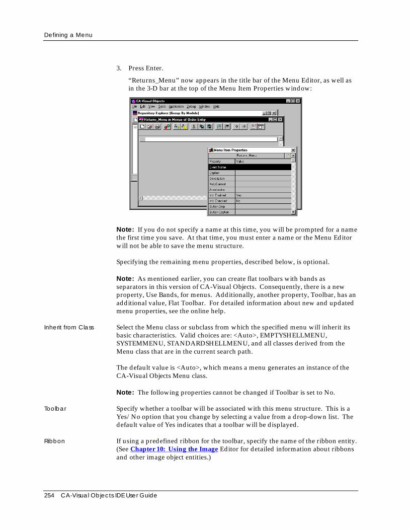
Defining a Menu
254 CA-Visual Objects IDE User Guide
3. Press Enter.
“Returns_Menu” now appears in the title bar of the Menu Editor, as well asin the 3-D bar at the top of the Menu Item Properties window:
Note: If you do not specify a name at this time, you will be prompted for a namethe first time you save. At that time, you must enter a name or the Menu Editorwill not be able to save the menu structure.
Specifying the remaining menu properties, described below, is optional.
Note: As mentioned earlier, you can create flat toolbars with bands asseparators in this version of CA-Visual Objects. Consequently, there is a newproperty, Use Bands, for menus. Additionally, another property, Toolbar, has anadditional value, Flat Toolbar. For detailed information about new and updatedmenu properties, see the online help.
Inherit from Class Select the Menu class or subclass from which the specified menu will inherit itsbasic characteristics. Valid choices are: <Auto>, EMPTYSHELLMENU,SYSTEMMENU, STANDARDSHELLMENU, and all classes derived from theMenu class that are in the current search path.
The default value is <Auto>, which means a menu generates an instance of theCA-Visual Objects Menu class.
Note: The following properties cannot be changed if Toolbar is set to No.
Toolbar Specify whether a toolbar will be associated with this menu structure. This is aYes/No option that you change by selecting a value from a drop-down list. Thedefault value of Yes indicates that a toolbar will be displayed.
Ribbon If using a predefined ribbon for the toolbar, specify the name of the ribbon entity.(See Chapter 10: Using the Image Editor for detailed information about ribbonsand other image object entities.)
Defining a Menu
Chapter 5: Using the Menu Editor 255
Show Choose how the toolbar should be displayed. The options are: Text, Icon, or Textand Icon. The default is Icon.
See the Button Bmp property under Specifying Menu Item Properties later in thischapter for more information.
Gap Size Enter the distance in points between individual buttons. The default is zero (0).
Separator Size Enter the width in points between groups of buttons. The default is ten (10).
See the Button Pos property under Specifying Menu Item Properties later in thischapter for more information.
These options specify whether you want to include a toolbar and, if so, what itsgeneral characteristics are. See the Button Bmp and Button Pos properties underSpecifying Menu Item Properties later in this chapter for more information onhow to create the actual toolbar buttons.
Adding Menus and Menu Items
The remaining Menu Editor features are demonstrated using a simple menustructure for the Returns data window. In it, a single View menu allows the userto view customer records, sales orders, inventory items, and shipping records,and to print several types of reports using a submenu.
Tip: Each menu and menu item in a Windows application typically featuresa single underlined letter that indicates how to select it with the keyboard.For example, the “F” in the CA-Visual Objects File menu and the “x” in theExit command are underlined, indicating that you can select the File Exitcommand by pressing the Alt+F, X key combination. To add this type offunctionality to your menus, simply preface the letter that is to be underlinedwith an ampersand (&).
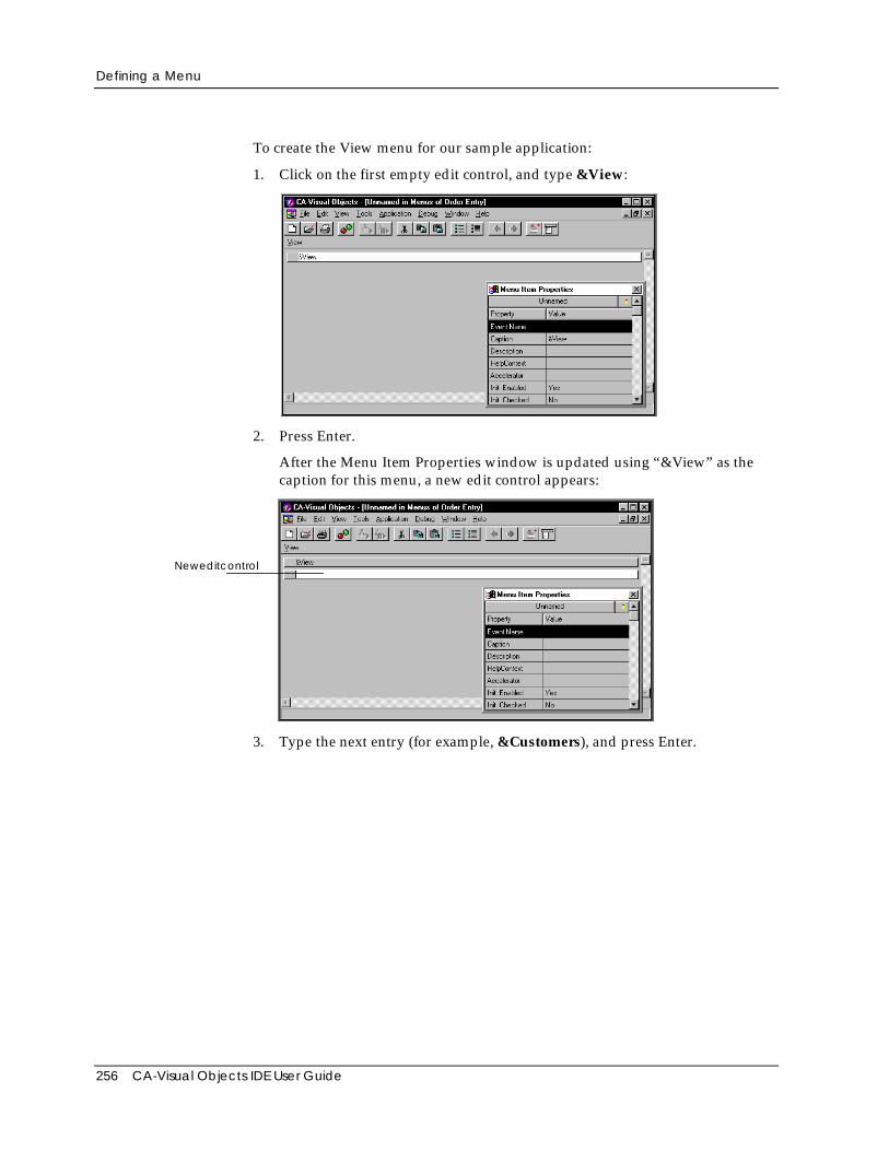
Defining a Menu
256 CA-Visual Objects IDE User Guide
To create the View menu for our sample application:
1. Click on the first empty edit control, and type &View:
2. Press Enter.
After the Menu Item Properties window is updated using “&View” as thecaption for this menu, a new edit control appears:
Neweditcontrol
3. Type the next entry (for example, &Customers), and press Enter.
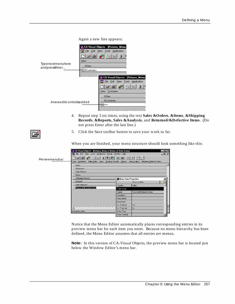
Defining a Menu
Chapter 5: Using the Menu Editor 257
Again a new line appears:
TypenextmenuhereandpressEnter...
Aneweditcontrolisadded
4. Repeat step 3 six times, using the text Sales &Orders, &Items, &ShippingRecords, &Reports, Sales &Analysis, and Returned/&Defective Items. (Donot press Enter after the last line.)
5. Click the Save toolbar button to save your work so far.
When you are finished, your menu structure should look something like this:
Previewmenubar
Notice that the Menu Editor automatically places corresponding entries in itspreview menu bar for each item you enter. Because no menu hierarchy has beendefined, the Menu Editor assumes that all entries are menus.
Note: In this version of CA-Visual Objects, the preview menu bar is located justbelow the Window Editor’s menu bar.
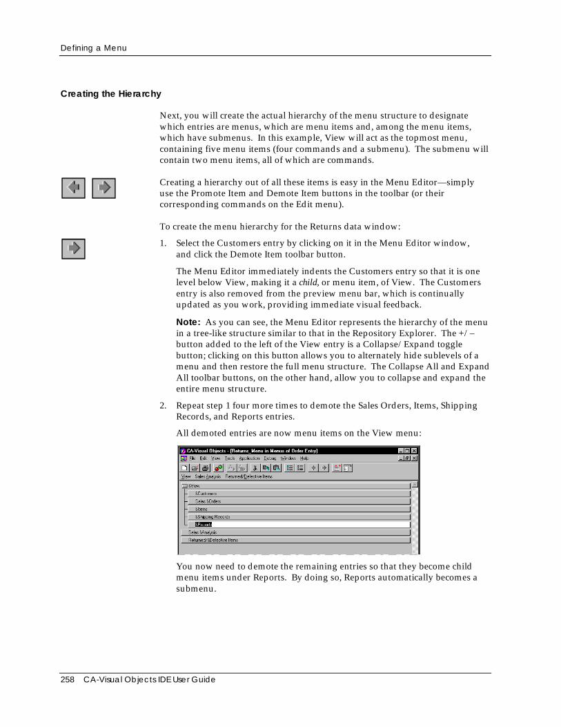
Defining a Menu
258 CA-Visual Objects IDE User Guide
Creating the Hierarchy
Next, you will create the actual hierarchy of the menu structure to designatewhich entries are menus, which are menu items and, among the menu items,which have submenus. In this example, View will act as the topmost menu,containing five menu items (four commands and a submenu). The submenu willcontain two menu items, all of which are commands.
Creating a hierarchy out of all these items is easy in the Menu Editor—simplyuse the Promote Item and Demote Item buttons in the toolbar (or theircorresponding commands on the Edit menu).
To create the menu hierarchy for the Returns data window:
1. Select the Customers entry by clicking on it in the Menu Editor window,and click the Demote Item toolbar button.
The Menu Editor immediately indents the Customers entry so that it is onelevel below View, making it a child, or menu item, of View. The Customersentry is also removed from the preview menu bar, which is continuallyupdated as you work, providing immediate visual feedback.
Note: As you can see, the Menu Editor represents the hierarchy of the menuin a tree-like structure similar to that in the Repository Explorer. The +/–button added to the left of the View entry is a Collapse/Expand togglebutton; clicking on this button allows you to alternately hide sublevels of amenu and then restore the full menu structure. The Collapse All and ExpandAll toolbar buttons, on the other hand, allow you to collapse and expand theentire menu structure.
2. Repeat step 1 four more times to demote the Sales Orders, Items, ShippingRecords, and Reports entries.
All demoted entries are now menu items on the View menu:
You now need to demote the remaining entries so that they become childmenu items under Reports. By doing so, Reports automatically becomes asubmenu.
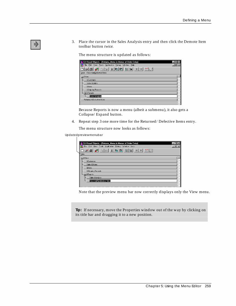
Defining a Menu
Chapter 5: Using the Menu Editor 259
3. Place the cursor in the Sales Analysis entry and then click the Demote Itemtoolbar button twice.
The menu structure is updated as follows:
Because Reports is now a menu (albeit a submenu), it also gets aCollapse/Expand button.
4. Repeat step 3 one more time for the Returned/Defective Items entry.
The menu structure now looks as follows:
Updatedpreviewmenubar
Note that the preview menu bar now correctly displays only the View menu.
Tip: If necessary, move the Properties window out of the way by clicking onits title bar and dragging it to a new position.
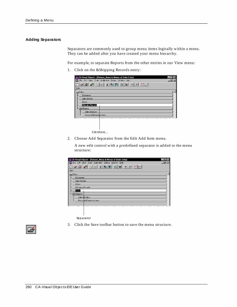
Defining a Menu
260 CA-Visual Objects IDE User Guide
Adding Separators
Separators are commonly used to group menu items logically within a menu.They can be added after you have created your menu hierarchy.
For example, to separate Reports from the other entries in our View menu:
1. Click on the &Shipping Records entry:
Clickhere...
2. Choose Add Separator from the Edit Add Item menu.
A new edit control with a predefined separator is added to the menustructure:
Separator
3. Click the Save toolbar button to save the menu structure.
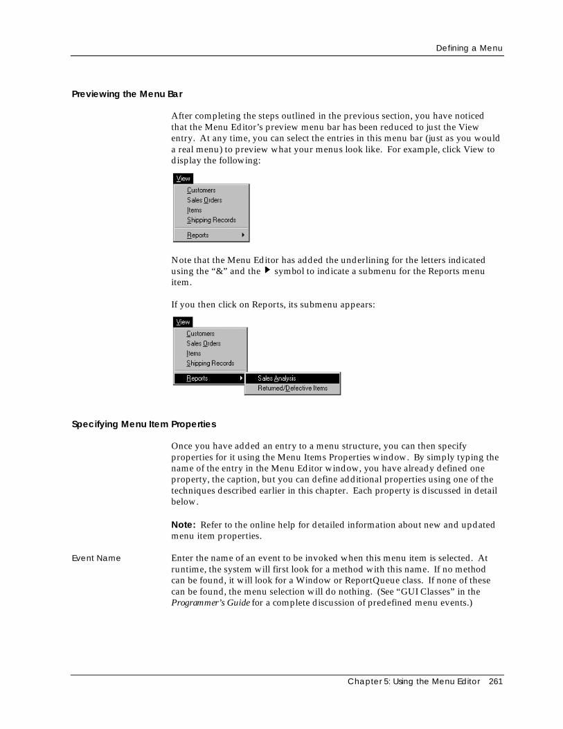
Defining a Menu
Chapter 5: Using the Menu Editor 261
Previewing the Menu Bar
After completing the steps outlined in the previous section, you have noticedthat the Menu Editor’s preview menu bar has been reduced to just the Viewentry. At any time, you can select the entries in this menu bar (just as you woulda real menu) to preview what your menus look like. For example, click View todisplay the following:
Note that the Menu Editor has added the underlining for the letters indicatedusing the “&” and the symbol to indicate a submenu for the Reports menuitem.
If you then click on Reports, its submenu appears:
Specifying Menu Item Properties
Once you have added an entry to a menu structure, you can then specifyproperties for it using the Menu Items Properties window. By simply typing thename of the entry in the Menu Editor window, you have already defined oneproperty, the caption, but you can define additional properties using one of thetechniques described earlier in this chapter. Each property is discussed in detailbelow.
Note: Refer to the online help for detailed information about new and updatedmenu item properties.
Event Name Enter the name of an event to be invoked when this menu item is selected. Atruntime, the system will first look for a method with this name. If no methodcan be found, it will look for a Window or ReportQueue class. If none of thesecan be found, the menu selection will do nothing. (See “GUI Classes” in theProgrammer’s Guide for a complete discussion of predefined menu events.)
Defining a Menu
262 CA-Visual Objects IDE User Guide
Note: Event Name cannot be defined for a menu bar item or a menu item thatdefines a submenu. Selecting this property in these cases will produce an errormessage.
Caption Enter the text that will appear in the menu bar (for a menu) or on the menu (for amenu item). This property is required and is automatically filled in when youtype a value in the Menu Editor window.
Captions can include text, blanks, punctuation, an ampersand (to underline aletter and enable an equivalent key command), and the underscore character (_).With the exception of the ampersand, all characters will appear exactly as typed.
Note: Accelerator key name, check mark, and the symbol to indicate asubmenu are not part of the caption. These indicators are added automaticallyby the system. If, on the other hand, you want to use the standard ellipsis (...)indicator for a menu item that opens a dialog box, you must include the ellipsisas part of the caption.
Tip: Since you can add captions and edit them directly on the Menu Editorwindow, it is never necessary to use this property value cell; however, youcan use it as an alternative means for entering and editing captions if youprefer.
Description Enter the text that will appear in the status bar when the entry has focus.
HelpContext Enter a unique keyword for the entry that can be used to identify it in a context-sensitive help system. This property can consist of letters, digits, and theunderscore character (_), but it cannot contain any other characters, includingblanks or punctuation. (For more information on creating a help file using thisproperty, refer to “GUI Classes” in the Programmer’s Guide.)
Accelerator To define an accelerator (or shortcut key), press the corresponding keys for amodifier and the accelerator key from within this property’s Value column. Forexample, press the Shift plus the F8 key to specify Shift+F8 as a menu item’saccelerator.
Note: To activate the edit control in the Value column, click the Acceleratorproperty column first. Also, for this property to take effect, do not press Enterafter entering the accelerator key. Instead, move the cursor and click outside theValue column.
At runtime, the accelerator that you define will appear to the right of the menuitem caption on the menu and will be operational (that is, the user can press theaccelerator as a shortcut to selecting the menu and then choosing the item).
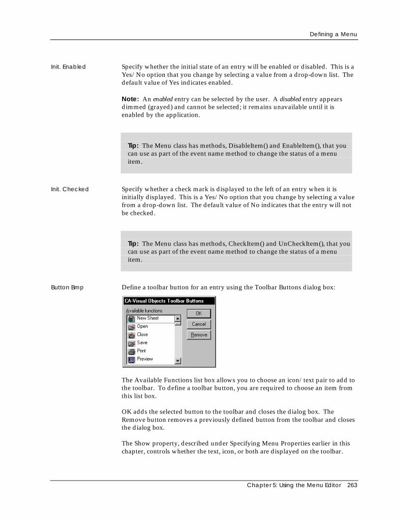
Defining a Menu
Chapter 5: Using the Menu Editor 263
Init. Enabled Specify whether the initial state of an entry will be enabled or disabled. This is aYes/No option that you change by selecting a value from a drop-down list. Thedefault value of Yes indicates enabled.
Note: An enabled entry can be selected by the user. A disabled entry appearsdimmed (grayed) and cannot be selected; it remains unavailable until it isenabled by the application.
Tip: The Menu class has methods, DisableItem() and EnableItem(), that youcan use as part of the event name method to change the status of a menuitem.
Init. Checked Specify whether a check mark is displayed to the left of an entry when it isinitially displayed. This is a Yes/No option that you change by selecting a valuefrom a drop-down list. The default value of No indicates that the entry will notbe checked.
Tip: The Menu class has methods, CheckItem() and UnCheckItem(), that youcan use as part of the event name method to change the status of a menuitem.
Button Bmp Define a toolbar button for an entry using the Toolbar Buttons dialog box:
The Available Functions list box allows you to choose an icon/text pair to add tothe toolbar. To define a toolbar button, you are required to choose an item fromthis list box.
OK adds the selected button to the toolbar and closes the dialog box. TheRemove button removes a previously defined button from the toolbar and closesthe dialog box.
The Show property, described under Specifying Menu Properties earlier in thischapter, controls whether the text, icon, or both are displayed on the toolbar.
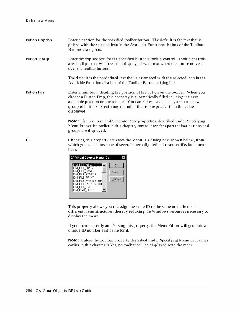
Defining a Menu
264 CA-Visual Objects IDE User Guide
Button Caption Enter a caption for the specified toolbar button. The default is the text that ispaired with the selected icon in the Available Functions list box of the ToolbarButtons dialog box.
Button ToolTip Enter descriptive text for the specified button’s tooltip control. Tooltip controlsare small pop-up windows that display relevant text when the mouse movesover the toolbar button.
The default is the predefined text that is associated with the selected icon in theAvailable Functions list box of the Toolbar Buttons dialog box.
Button Pos Enter a number indicating the position of the button on the toolbar. When youchoose a Button Bmp, this property is automatically filled in using the nextavailable position on the toolbar. You can either leave it as is, or start a newgroup of buttons by entering a number that is one greater than the valuedisplayed.
Note: The Gap Size and Separator Size properties, described under SpecifyingMenu Properties earlier in this chapter, control how far apart toolbar buttons andgroups are displayed.
ID Choosing this property activates the Menu IDs dialog box, shown below, fromwhich you can choose one of several internally-defined resource IDs for a menuitem:
This property allows you to assign the same ID to the same menu items indifferent menu structures, thereby reducing the Windows resources necessary todisplay the menu.
If you do not specify an ID using this property, the Menu Editor will generate aunique ID number and name for it.
Note: Unless the Toolbar property described under Specifying Menu Propertiesearlier in this chapter is Yes, no toolbar will be displayed with the menu.
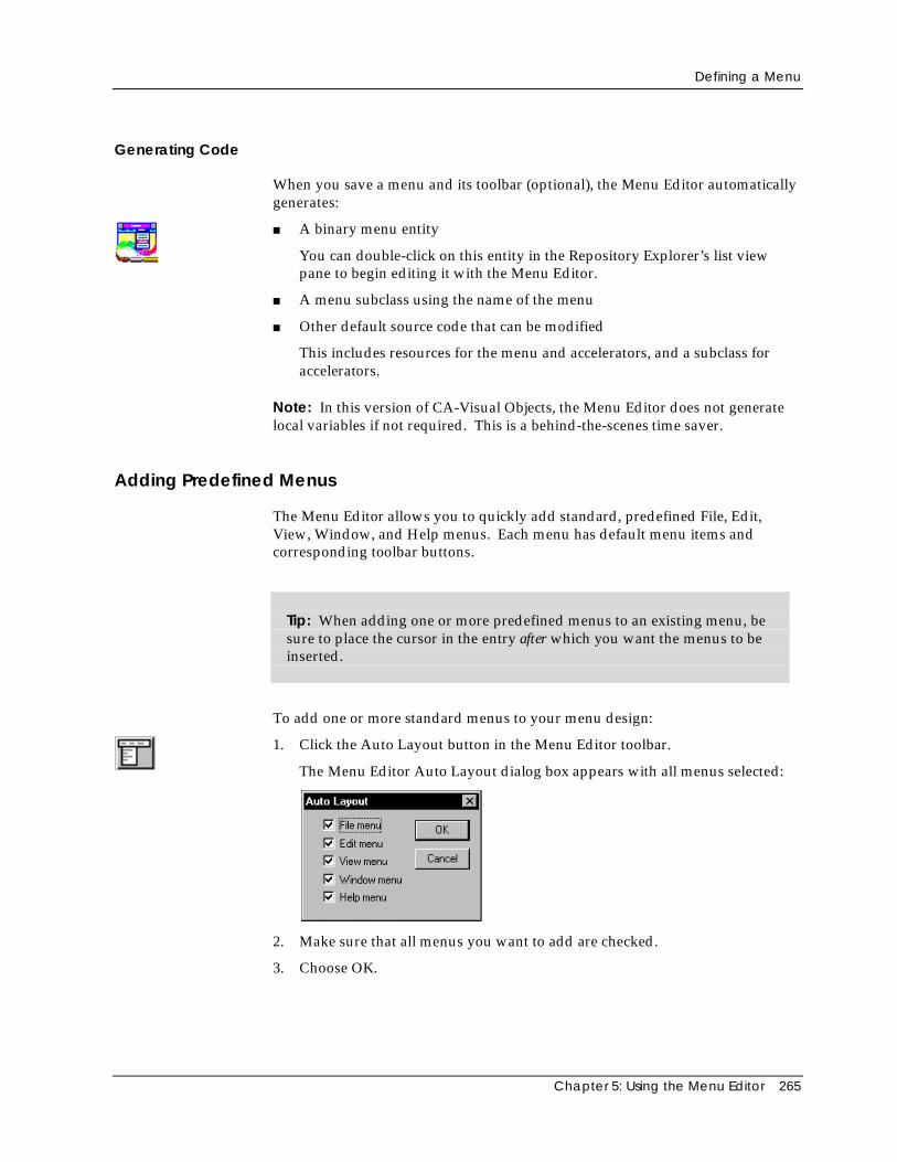
Defining a Menu
Chapter 5: Using the Menu Editor 265
Generating Code
When you save a menu and its toolbar (optional), the Menu Editor automaticallygenerates:
■ A binary menu entity
You can double-click on this entity in the Repository Explorer’s list viewpane to begin editing it with the Menu Editor.
■ A menu subclass using the name of the menu
■ Other default source code that can be modified
This includes resources for the menu and accelerators, and a subclass foraccelerators.
Note: In this version of CA-Visual Objects, the Menu Editor does not generatelocal variables if not required. This is a behind-the-scenes time saver.
Adding Predefined Menus
The Menu Editor allows you to quickly add standard, predefined File, Edit,View, Window, and Help menus. Each menu has default menu items andcorresponding toolbar buttons.
Tip: When adding one or more predefined menus to an existing menu, besure to place the cursor in the entry after which you want the menus to beinserted.
To add one or more standard menus to your menu design:
1. Click the Auto Layout button in the Menu Editor toolbar.
The Menu Editor Auto Layout dialog box appears with all menus selected:
2. Make sure that all menus you want to add are checked.
3. Choose OK.
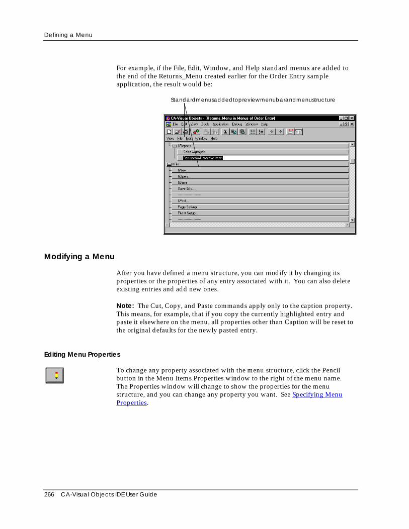
Defining a Menu
266 CA-Visual Objects IDE User Guide
For example, if the File, Edit, Window, and Help standard menus are added tothe end of the Returns_Menu created earlier for the Order Entry sampleapplication, the result would be:
Standardmenusaddedtopreviewmenubarandmenustructure
Modifying a Menu
After you have defined a menu structure, you can modify it by changing itsproperties or the properties of any entry associated with it. You can also deleteexisting entries and add new ones.
Note: The Cut, Copy, and Paste commands apply only to the caption property.This means, for example, that if you copy the currently highlighted entry andpaste it elsewhere on the menu, all properties other than Caption will be reset tothe original defaults for the newly pasted entry.
Editing Menu Properties
To change any property associated with the menu structure, click the Pencilbutton in the Menu Items Properties window to the right of the menu name.The Properties window will change to show the properties for the menustructure, and you can change any property you want. See Specifying MenuProperties.
Defining a Menu
Chapter 5: Using the Menu Editor 267
Editing Menus and Menu Items
To make changes to an entry on the Menu Editor window, you must first select itby clicking on it. When an entry is selected, it is highlighted, and the Propertieswindow changes to show its properties.
Changing Menu ItemProperties
You can change the caption by simply editing the currently highlighted entrydirectly on the Menu Editor window. You can also change any property in theProperties window. See Specifying Menu Item Properties for moreinformation.
Adding a Sibling To add an entry at the sibling (or same) level after the currently selected entry:
1. Select the Add Item toolbar button.
Alternatively, choose the Edit Add Item command and select Add Sibling.
2. When the new edit control appears, type the caption name.
3. Define the menu properties for the new entry as discussed in SpecifyingMenu Item Properties earlier in this chapter.
Adding a Child To add an entry at the child (or submenu) level after the currently selected entry:
1. Choose the Edit Add Item command and select Add Child.
2. When the new edit control appears, type the caption name.
3. Define the menu properties for the new entry as discussed in SpecifyingMenu Item Properties earlier in this chapter.
Deleting To delete the currently selected entry, including all its properties and childentries, use the Edit Delete Item menu command.
If you want to delete the caption only, choose the Edit Delete command (or pressthe Del key).
Printing Menus
268 CA-Visual Objects IDE User Guide
Printing MenusUse the Print toolbar button to print copies of your menu designs.
Using the Menu in an ApplicationMenus that you create using the Menu Editor must be attached to a windowform of some type. The easiest way to make this connection (and to create theform itself) is using the Window Editor. There, the menu name is a property ofthe form that you can choose from a drop-down list. See Chapter 5: Using theMenu Editor and Chapter 8: Creating Data-Aware Windows for moreinformation.
Tip: The Standard Application contains two predefined binary menuentities: EmptyShellMenu and StandardShellMenu. These are located in aseparate module, and you can easily customize them using the Menu Editorto meet the specifications of your application.
Chapter 6: Using the Source Code Editor 269
Chapter
6 Using the Source Code Editor
The Source Code Editor provides a powerful environment for writing andediting code, drawing much of its strength from its close integration with theCA-Visual Objects repository. It can even complete a partially entered statementwith the parameters defined in the prototype of the function or method. (This avery useful feature if you have forgotten the correct syntax!)
This chapter describes how to use the Source Code Editor, including how to:
■ Create new entities
■ Modify selected entities within a module
■ Modify all entities within a module
■ Import source code from a text file for editing
■ Use some of its special editing features, such as inserting prototypes, findingmatching tokens, and presetting breakpoints for debugging sessions
■ Print copies of your source code
Workspace OverviewThe Source Code Editor is the primary workspace in the IDE for viewing,creating, and modifying source code entities, such as functions, classes, methods,and resources. When you are in the Source Code Editor, you can:
■ Perform standard editing features such as cut, copy, paste, delete, search fortext, replace text, undo, and redo using standard Windows techniques forany entity currently loaded
■ Create new entities
■ Go immediately to a specific entity for editing
■ Insert a prototype for incomplete statements
■ View a source code entity’s definition while editing and jump to itsprototype in the appropriate class library
■ Import and export text-based files
■ Print the source code for all entities currently loaded
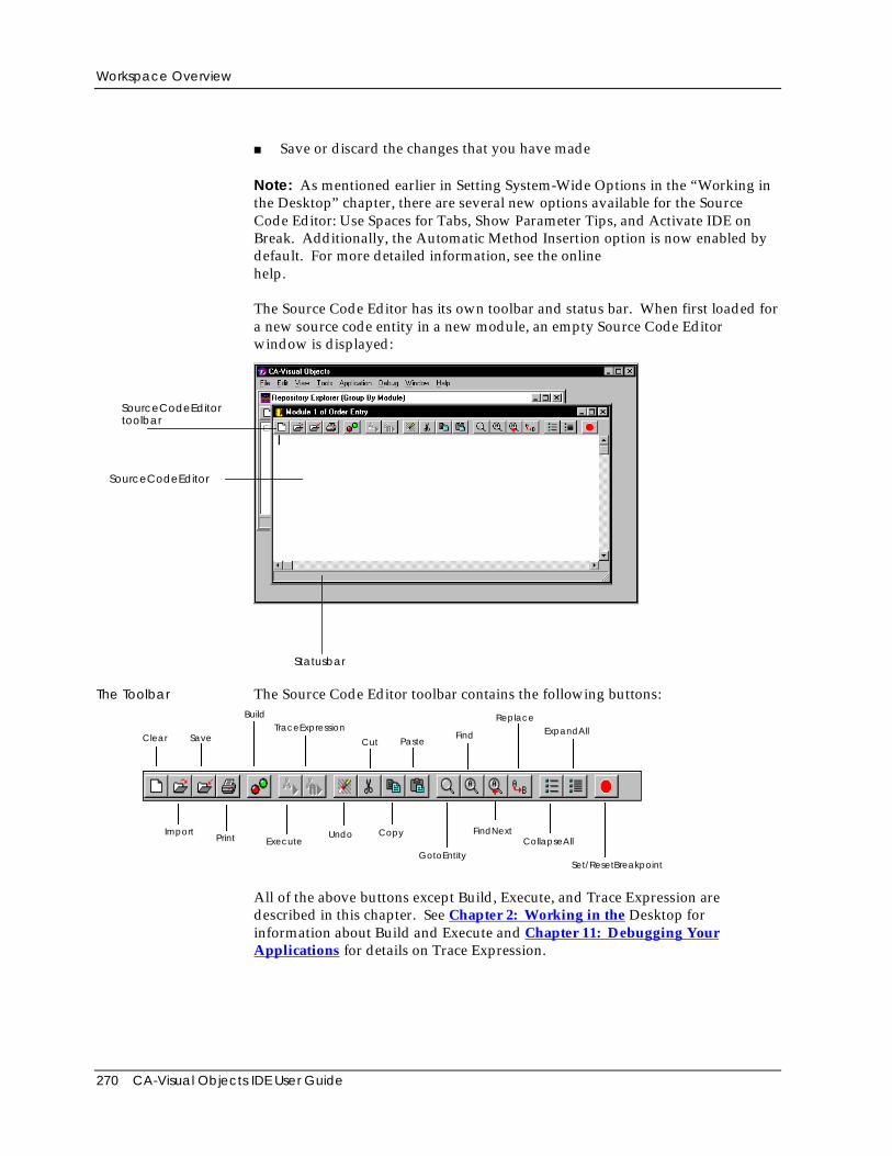
Workspace Overview
270 CA-Visual Objects IDE User Guide
■ Save or discard the changes that you have made
Note: As mentioned earlier in Setting System-Wide Options in the “Working inthe Desktop” chapter, there are several new options available for the SourceCode Editor: Use Spaces for Tabs, Show Parameter Tips, and Activate IDE onBreak. Additionally, the Automatic Method Insertion option is now enabled bydefault. For more detailed information, see the onlinehelp.
The Source Code Editor has its own toolbar and status bar. When first loaded fora new source code entity in a new module, an empty Source Code Editorwindow is displayed:
SourceCodeEditor
SourceCodeEditor
Statusbar
toolbar
The Toolbar The Source Code Editor toolbar contains the following buttons:
ImportPrint Execute
Clear Save
BuildTraceExpression
Cut PasteFind
ReplaceExpandAll
Undo Copy
GotoEntity
FindNextCollapseAll
Set/ResetBreakpoint
All of the above buttons except Build, Execute, and Trace Expression aredescribed in this chapter. See Chapter 2: Working in the Desktop forinformation about Build and Execute and Chapter 11: Debugging YourApplications for details on Trace Expression.
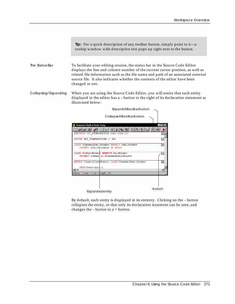
Workspace Overview
Chapter 6: Using the Source Code Editor 271
Tip: For a quick description of any toolbar button, simply point to it—atooltip window with descriptive text pops up right next to the button.
The Status Bar To facilitate your editing session, the status bar in the Source Code Editordisplays the line and column number of the current cursor position, as well asrelated file information such as the file name and path of an associated externalsource file. It also indicates whether the contents of the editor have beenchanged or not.
Collapsing/Expanding When you are using the Source Code Editor, you will notice that each entitydisplayed in the editor has a – button to the right of its declaration statement asillustrated below:
Expandedentity-button
CollapseAlltoolbarbutton
ExpandAlltoolbarbutton
By default, each entity is displayed in its entirety. Clicking on the – buttoncollapses the entity, so that only its declaration statement can be seen, andchanges the – button to a + button.
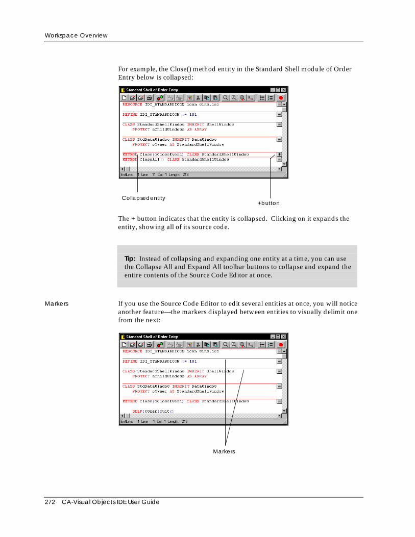
Workspace Overview
272 CA-Visual Objects IDE User Guide
For example, the Close() method entity in the Standard Shell module of OrderEntry below is collapsed:
Collapsedentity+button
The + button indicates that the entity is collapsed. Clicking on it expands theentity, showing all of its source code.
Tip: Instead of collapsing and expanding one entity at a time, you can usethe Collapse All and Expand All toolbar buttons to collapse and expand theentire contents of the Source Code Editor at once.
Markers If you use the Source Code Editor to edit several entities at once, you will noticeanother feature—the markers displayed between entities to visually delimit onefrom the next:
Markers
Accessing the Source Code Editor
Chapter 6: Using the Source Code Editor 273
You can toggle these markers on or off by alternately checking and uncheckingthe Entity Markers command on the View menu. The +/- buttons for collapsingand expanding the entities remain on display in either case.
Color Coding Additionally, the Source Code Editor continually parses each keystroke to color-code text based on its structure. Keywords, literals, and comments, for example,are all displayed in different colors for immediate visual feedback, based on thecolors you selected when setting up your system. See Setting Editor Options in“Working in the Desktop” earlier in this guide for detailed information about theSystem Settings dialog box and the color, auto indentation, keyword casing, casesynchronization, and other options for the Source Code Editor.
Accessing the Source Code EditorNow that you have a general overview of what you can do with the Source CodeEditor, you are ready to use it to create and edit source code entities. In thissection, you will learn how to:
■ Create one or more new source code entities
■ Load individual entities for editing
■ Load all entities defined in a module for editing
■ Import a text file for editing
Creating New Entities
To create a new source code entity, you need to perform the following basicsteps:
1. In the Repository Explorer’s tree view pane, select the desired applicationand module (for example, Standard SQL Menus in Order Entry).
2. Right-click on the Standard SQL Menus module and select Edit All Source inModule from the pop-up menu.
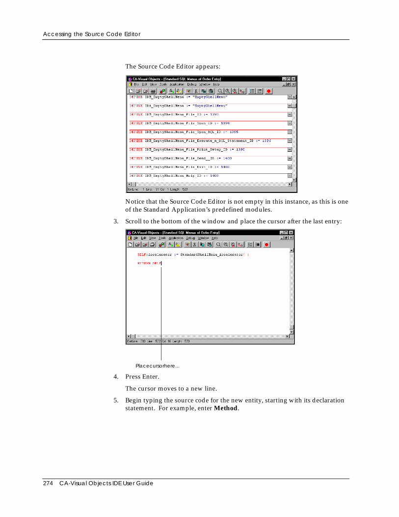
Accessing the Source Code Editor
274 CA-Visual Objects IDE User Guide
The Source Code Editor appears:
Notice that the Source Code Editor is not empty in this instance, as this is oneof the Standard Application’s predefined modules.
3. Scroll to the bottom of the window and place the cursor after the last entry:
Placecursorhere...
4. Press Enter.
The cursor moves to a new line.
5. Begin typing the source code for the new entity, starting with its declarationstatement. For example, enter Method.
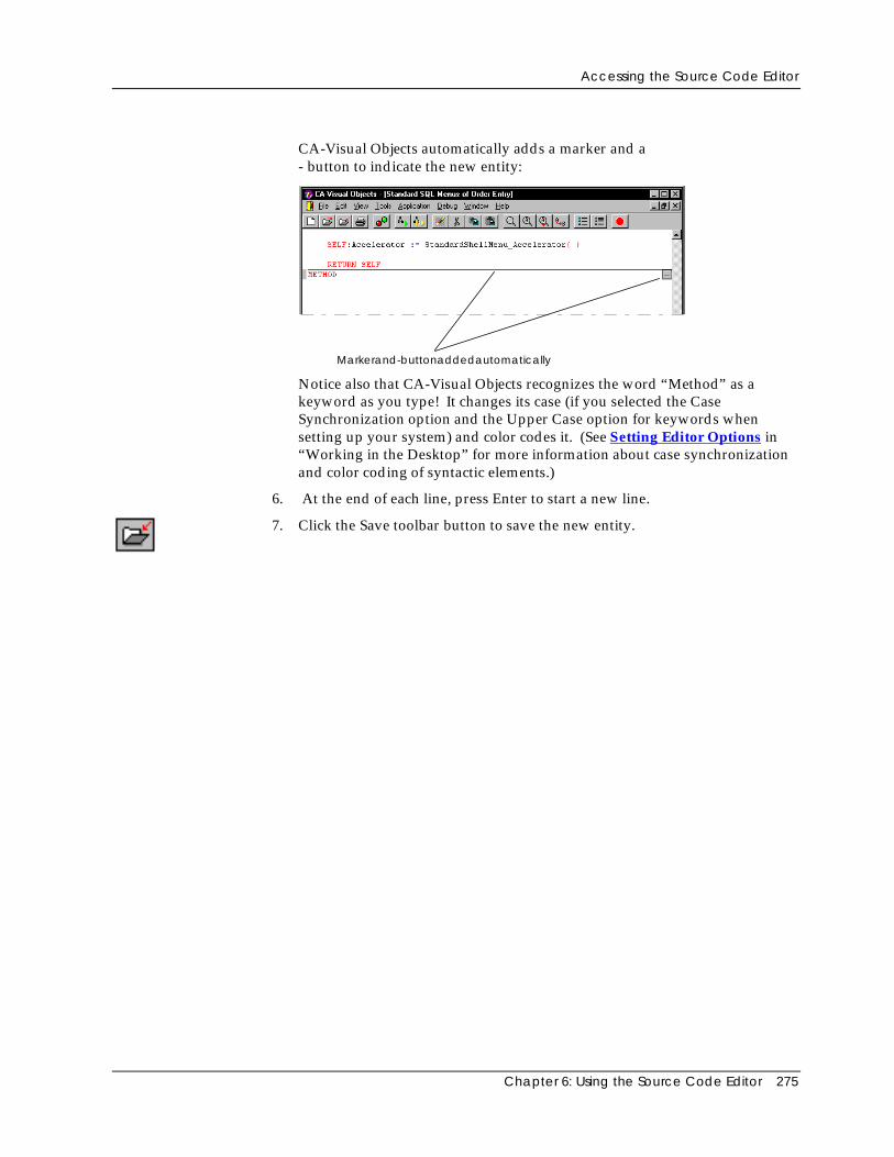
Accessing the Source Code Editor
Chapter 6: Using the Source Code Editor 275
CA-Visual Objects automatically adds a marker and a- button to indicate the new entity:
Markerand-buttonaddedautomatically
Notice also that CA-Visual Objects recognizes the word “Method” as akeyword as you type! It changes its case (if you selected the CaseSynchronization option and the Upper Case option for keywords whensetting up your system) and color codes it. (See Setting Editor Options in“Working in the Desktop” for more information about case synchronizationand color coding of syntactic elements.)
6. At the end of each line, press Enter to start a new line.
7. Click the Save toolbar button to save the new entity.
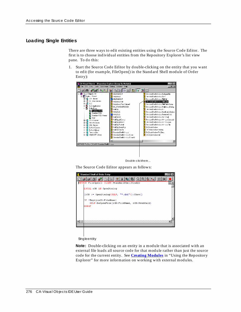
Accessing the Source Code Editor
276 CA-Visual Objects IDE User Guide
Loading Single Entities
There are three ways to edit existing entities using the Source Code Editor. Thefirst is to choose individual entities from the Repository Explorer’s list viewpane. To do this:
1. Start the Source Code Editor by double-clicking on the entity that you wantto edit (for example, FileOpen() in the Standard Shell module of OrderEntry):
Double-clickhere...
The Source Code Editor appears as follows:
Singleentity
Note: Double-clicking on an entity in a module that is associated with anexternal file loads all source code for that module rather than just the sourcecode for the current entity. See Creating Modules in “Using the RepositoryExplorer” for more information on working with external modules.
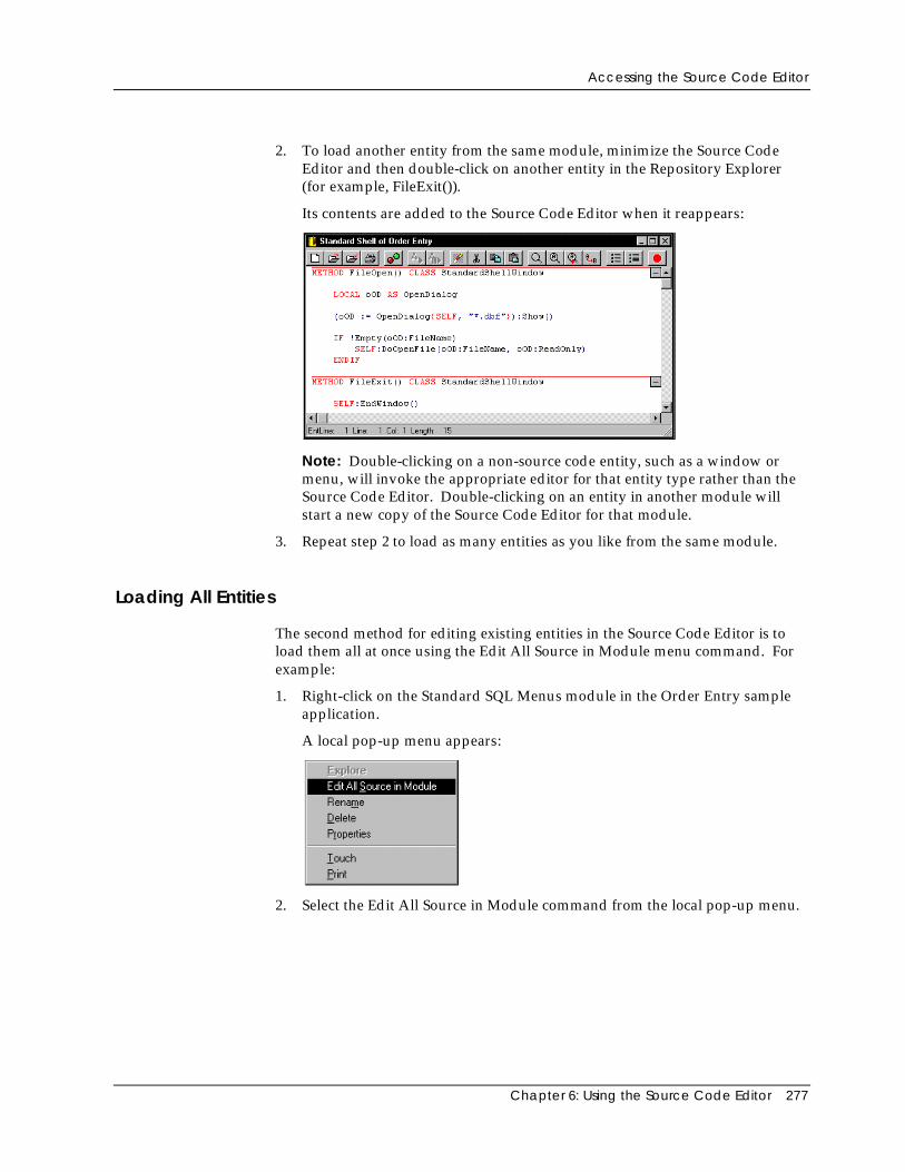
Accessing the Source Code Editor
Chapter 6: Using the Source Code Editor 277
2. To load another entity from the same module, minimize the Source CodeEditor and then double-click on another entity in the Repository Explorer(for example, FileExit()).
Its contents are added to the Source Code Editor when it reappears:
Note: Double-clicking on a non-source code entity, such as a window ormenu, will invoke the appropriate editor for that entity type rather than theSource Code Editor. Double-clicking on an entity in another module willstart a new copy of the Source Code Editor for that module.
3. Repeat step 2 to load as many entities as you like from the same module.
Loading All Entities
The second method for editing existing entities in the Source Code Editor is toload them all at once using the Edit All Source in Module menu command. Forexample:
1. Right-click on the Standard SQL Menus module in the Order Entry sampleapplication.
A local pop-up menu appears:
2. Select the Edit All Source in Module command from the local pop-up menu.
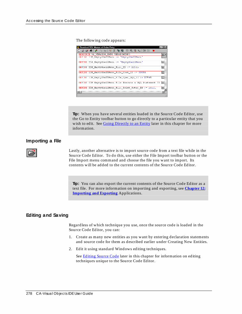
Accessing the Source Code Editor
278 CA-Visual Objects IDE User Guide
The following code appears:
Tip: When you have several entities loaded in the Source Code Editor, usethe Go to Entity toolbar button to go directly to a particular entity that youwish to edit. See Going Directly to an Entity later in this chapter for moreinformation.
Importing a File
Lastly, another alternative is to import source code from a text file while in theSource Code Editor. To do this, use either the File Import toolbar button or theFile Import menu command and choose the file you want to import. Itscontents will be added to the current contents of the Source Code Editor.
Tip: You can also export the current contents of the Source Code Editor as atext file. For more information on importing and exporting, see Chapter 12:Importing and Exporting Applications.
Editing and Saving
Regardless of which technique you use, once the source code is loaded in theSource Code Editor, you can:
1. Create as many new entities as you want by entering declaration statementsand source code for them as described earlier under Creating New Entities.
2. Edit it using standard Windows editing techniques.
See Editing Source Code later in this chapter for information on editingtechniques unique to the Source Code Editor.
Editing Source Code
Chapter 6: Using the Source Code Editor 279
3. Choose the Save toolbar button to save the source code. Any new entitiesthat you have created during the editing session will be added to theRepository Explorer’s List View pane for the appropriate module.
Note: This last step can be repeated whenever you make changes to the sourcecode and want to save your work without closing the Source Code Editor.
Tip: The Clear toolbar button can be used at any time to start a new editingsession without shutting down the Source Code Editor. Unless you save thesource code you are currently working with before starting a new session,you will be prompted to do so before the Source Code Editor is cleared.
Editing Source CodeThe Source Code Editor provides you with all of the standard editing featuresthat you have come to expect. For example, there are toolbar buttons for cut,copy, paste, undo, find, find next, and replace. All of these operations areperformed using standard Windows techniques, like drag-and-drop, and are,therefore, not described in this section.
If you are unfamiliar with standard editing techniques such as the operationsmentioned above, cursor movement, toggling between insert and overwritemode, and selecting text, refer to the online help system for more information.
The following editing features, however, are unique to the Source Code Editorand are described in this section:
■ Deleting individual lines of code
■ Inserting a new line
■ Going directly to an entity
■ Filling in prototypes
■ Matching tokens
■ Presetting breakpoints
Note: In CA-Visual Objects 2.7, there are a number of very useful aids forediting source code, like automatic insertion of methods, parameter tips, andbookmarks. Additionally, the Source Code Editor’s Find dialog box displays itssearch history, making it easier to repeat a recent search for specified text. Formore detailed information, see the the online help.
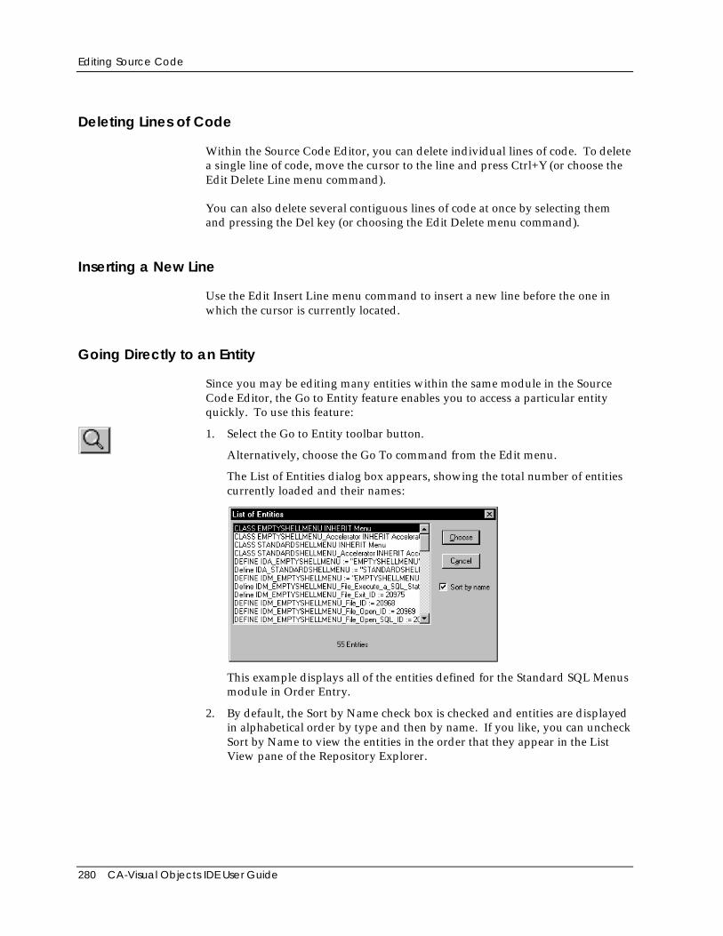
Editing Source Code
280 CA-Visual Objects IDE User Guide
Deleting Lines of Code
Within the Source Code Editor, you can delete individual lines of code. To deletea single line of code, move the cursor to the line and press Ctrl+Y (or choose theEdit Delete Line menu command).
You can also delete several contiguous lines of code at once by selecting themand pressing the Del key (or choosing the Edit Delete menu command).
Inserting a New Line
Use the Edit Insert Line menu command to insert a new line before the one inwhich the cursor is currently located.
Going Directly to an Entity
Since you may be editing many entities within the same module in the SourceCode Editor, the Go to Entity feature enables you to access a particular entityquickly. To use this feature:
1. Select the Go to Entity toolbar button.
Alternatively, choose the Go To command from the Edit menu.
The List of Entities dialog box appears, showing the total number of entitiescurrently loaded and their names:
This example displays all of the entities defined for the Standard SQL Menusmodule in Order Entry.
2. By default, the Sort by Name check box is checked and entities are displayedin alphabetical order by type and then by name. If you like, you can uncheckSort by Name to view the entities in the order that they appear in the ListView pane of the Repository Explorer.
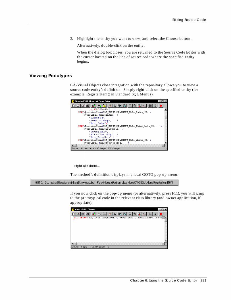
Editing Source Code
Chapter 6: Using the Source Code Editor 281
3. Highlight the entity you want to view, and select the Choose button.
Alternatively, double-click on the entity.
When the dialog box closes, you are returned to the Source Code Editor withthe cursor located on the line of source code where the specified entitybegins.
Viewing Prototypes
CA-Visual Objects close integration with the repository allows you to view asource code entity’s definition. Simply right-click on the specified entity (forexample, RegisterItem() in Standard SQL Menus):
Right-clickhere...
The method’s definition displays in a local GOTO pop-up menu:
If you now click on the pop-up menu (or alternatively, press F11), you will jumpto the prototypical code in the relevant class library (and owner application, ifappropriate):
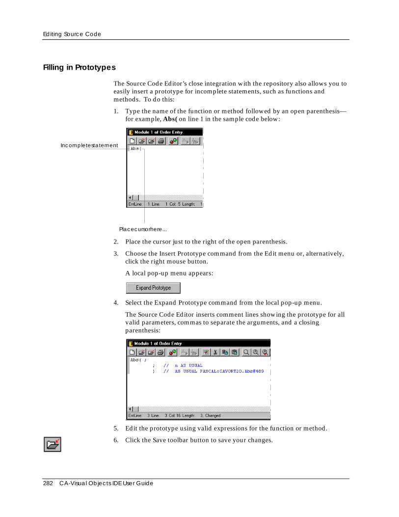
Editing Source Code
282 CA-Visual Objects IDE User Guide
Filling in Prototypes
The Source Code Editor’s close integration with the repository also allows you toeasily insert a prototype for incomplete statements, such as functions andmethods. To do this:
1. Type the name of the function or method followed by an open parenthesis—for example, Abs( on line 1 in the sample code below:
Placecursorhere...
Incompletestatement
2. Place the cursor just to the right of the open parenthesis.
3. Choose the Insert Prototype command from the Edit menu or, alternatively,click the right mouse button.
A local pop-up menu appears:
4. Select the Expand Prototype command from the local pop-up menu.
The Source Code Editor inserts comment lines showing the prototype for allvalid parameters, commas to separate the arguments, and a closingparenthesis:
5. Edit the prototype using valid expressions for the function or method.
6. Click the Save toolbar button to save your changes.
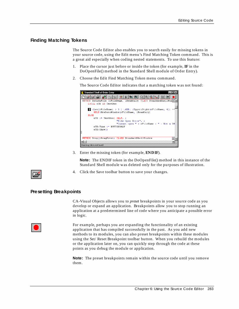
Editing Source Code
Chapter 6: Using the Source Code Editor 283
Finding Matching Tokens
The Source Code Editor also enables you to search easily for missing tokens inyour source code, using the Edit menu’s Find Matching Token command. This isa great aid especially when coding nested statements. To use this feature:
1. Place the cursor just before or inside the token (for example, IF in theDoOpenFile() method in the Standard Shell module of Order Entry).
2. Choose the Edit Find Matching Token menu command.
The Source Code Editor indicates that a matching token was not found:
3. Enter the missing token (for example, ENDIF).
Note: The ENDIF token in the DoOpenFile() method in this instance of theStandard Shell module was deleted only for the purposes of illustration.
4. Click the Save toolbar button to save your changes.
Presetting Breakpoints
CA-Visual Objects allows you to preset breakpoints in your source code as youdevelop or expand an application. Breakpoints allow you to stop running anapplication at a predetermined line of code where you anticipate a possible errorin logic.
For example, perhaps you are expanding the functionality of an existingapplication that has compiled successfully in the past. As you add newmethods to its modules, you can also preset breakpoints within these modulesusing the Set/Reset Breakpoint toolbar button. When you rebuild the modulesor the application later on, you can quickly step through the code at thesepoints as you debug the module or application.
Note: The preset breakpoints remain within the source code until you removethem.
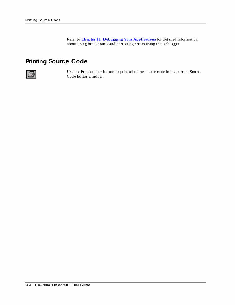
Printing Source Code
284 CA-Visual Objects IDE User Guide
Refer to Chapter 11: Debugging Your Applications for detailed informationabout using breakpoints and correcting errors using the Debugger.
Printing Source CodeUse the Print toolbar button to print all of the source code in the current SourceCode Editor window.
Chapter 7: Defining Data Servers and Field Specifications 285
Chapter
7Defining Data Servers and FieldSpecifications
One of the primary tasks of any GUI database application is to enter, modify,view, and utilize the information stored in databases. This is facilitated by theuse of ancillary information, like filters and index files in the Xbase model andWHERE and ORDER BY clauses in the SQL model.
CA-Visual Objects provides a set of editors—the DB Server Editor and the SQLEditor—that let you create and modify data servers. A data server is a high-level,abstract entity designed to give you a consistent object-oriented interface foryour database. The DB Server Editor creates data servers based on thetraditional Xbase model of a database file, while the SQL Editor creates dataservers based on the SQL model of a table or view.
This chapter explains how to create and modify data servers, providinginstructions on how to accomplish these tasks in both the DB Server Editor andthe SQL Editor. You will also learn how to define field specifications using theFieldSpec Editor.
Note: Many of the properties that you define for a data server and its fieldspecifications are designed to be used by data windows that you design and linkto the data server. See Chapter 4: Using the Window Editor for moreinformation on creating data windows and how to link field specificationproperties to data controls.
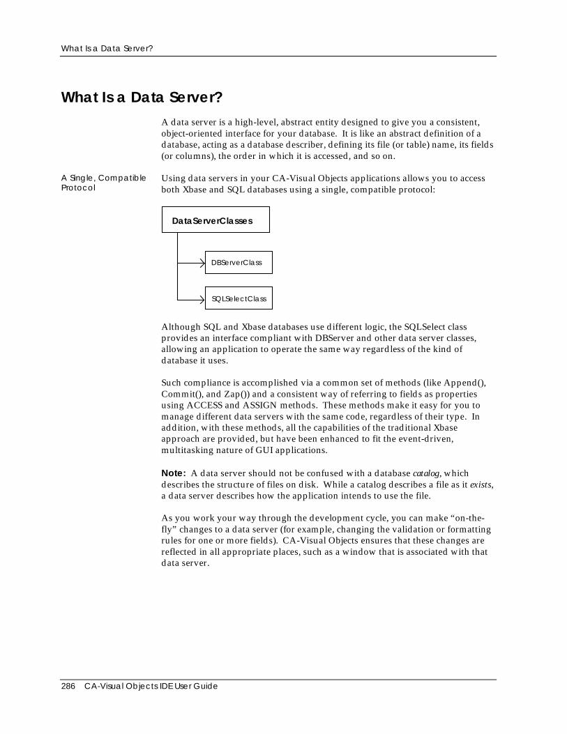
What Is a Data Server?
286 CA-Visual Objects IDE User Guide
What Is a Data Server?A data server is a high-level, abstract entity designed to give you a consistent,object-oriented interface for your database. It is like an abstract definition of adatabase, acting as a database describer, defining its file (or table) name, its fields(or columns), the order in which it is accessed, and so on.
A Single, CompatibleProtocol
Using data servers in your CA-Visual Objects applications allows you to accessboth Xbase and SQL databases using a single, compatible protocol:
DBServerClass
SQLSelectClass
DataServerClasses
Although SQL and Xbase databases use different logic, the SQLSelect classprovides an interface compliant with DBServer and other data server classes,allowing an application to operate the same way regardless of the kind ofdatabase it uses.
Such compliance is accomplished via a common set of methods (like Append(),Commit(), and Zap()) and a consistent way of referring to fields as propertiesusing ACCESS and ASSIGN methods. These methods make it easy for you tomanage different data servers with the same code, regardless of their type. Inaddition, with these methods, all the capabilities of the traditional Xbaseapproach are provided, but have been enhanced to fit the event-driven,multitasking nature of GUI applications.
Note: A data server should not be confused with a database catalog, whichdescribes the structure of files on disk. While a catalog describes a file as it exists,a data server describes how the application intends to use the file.
As you work your way through the development cycle, you can make “on-the-fly” changes to a data server (for example, changing the validation or formattingrules for one or more fields). CA-Visual Objects ensures that these changes arereflected in all appropriate places, such as a window that is associated with thatdata server.
What Is a Field Specification?
Chapter 7: Defining Data Servers and Field Specifications 287
Tip: You may want to refer to the “Data Server Classes” chapter in theProgrammer’s Guide for an overview of the various built-in data serverclasses. You may also want to refer to the entries for the DBServer,FieldSpec, HyperLabel, and SQLSelect classes in the online help system tolearn more about the methods and properties defined for these classes.
What Is a Field Specification?A field specification is a unique, independent entity in the CA-Visual Objectsarchitecture. It allows you to specify and store a wide variety of properties for anitem in your application, all in a single, manageable location. (Note that it isderived from the FieldSpec class.)
Typically, a field specification is “associated” with a field in a data server. Someof the properties you might define for such a field specification are type, length,picture clause, validation checks, etc. In fact, when you create a data server inthe DB Server Editor or the SQL Editor, the system automatically generates afield specification for every field in that server.
However, field specifications do not need to be associated with data server fields.For example, when designing a form in the Window Editor, you might add anedit control for which you want to specify a picture clause, a required flag, and avalidation check. Even though the control is not linked to a data server field, youcan attach a field specification to it to define these properties.
Field specifications, therefore, are useful in a variety of ways. And, because ofthe nature of repository-based development, field specifications can easily beselected and reused throughout the system.
For example, multiple data servers can access the same property values forcommon fields: If you create a Salary field specification, you can simply reuse itsproperties when creating an EmpSalary field in a data server for an Employeedatabase. You can then reuse its properties again when creating a similar field fora data server for a Payroll database.
Using field specifications, therefore, saves you both time and resources. Anotheradvantage is that any changes made to a field specification are automaticallypropagated to all the appropriate places. For example, if you add extravalidation to the AcctNum field specification to require that its second digit mustbe zero or 5, then all data servers that use that field specification would performthat validation.
What Is a Hyperlabel?
288 CA-Visual Objects IDE User Guide
What Is a Hyperlabel?A hyperlabel (derived from the HyperLabel class) stores information aboutanother object in an application. Using hyperlabels enables your application todisplay appropriate messages and help topics for the end user about the variousobjects in the application.
CA-Visual Objects automatically creates a hyperlabel for each data server youcreate in the DB Server and the SQL Editors. In fact, many of the properties youcan set for a data server—like its Name, Caption, Description, and HelpContext—are part of its associated hyperlabel.
Similarly, CA-Visual Objects creates a hyperlabel for each data server field orcolumn included, and several of the field properties (Name, Caption,Description, and Help Context) are actually part of its associated hyperlabel. Allother field properties are associated with the field specification, which also has ahyperlabel.
The Data Server EditorsWith both the DB Server and the SQL Editors, you can import an existingdatabase structure and generate a default set of field specifications that you canoptionally modify. This is probably the easiest way to create a data server for anexisting database.
The DB Server Editor also lets you generate a database file (and index files) fromthe data server definition. Thus, you can design a data server “from scratch” andcreate new files, or you can import existing files and make modifications to them,such as adding a new field to the database file structure, changing a keyexpression, or creating an additional index file. When you select the File Exportmenu command, the DB Server Editor will generate the new database and indexfiles.
Warning! The File Export command overwrites existing files. When working with anexisting database file, you should make a backup of the file before using this command.
When you save the data server, CA-Visual Objects automatically generatesobject-oriented code within the current module using the appropriate class—DBServer or SQLSelect. (The system also generates object-oriented code for fieldspec entities based on the FieldSpec class.) The data server is an abstract entity—it is not written to disk as a database file or table, although you can generate filesfrom within the DB Server Editor, as mentioned above.
Using the DB Server Editor
Chapter 7: Defining Data Servers and Field Specifications 289
Using the DB Server EditorIn this section, you will learn how to:
■ Define a data server based on the traditional Xbase model of a .DBF file
■ Add new fields to a data server and specify properties for them
■ Add index files to a data server and specify properties for them
■ Modify a data server by editing its properties, fields, and index files
■ Import the structure of an existing database file and associated index files
■ Create a database file and index files by exporting a data server definition
Important! The following libraries must be included in the search path defined for yourapplication in order to use a data server created using the DB Server Editor: RDDClasses and System Classes. (For more information on setting a search path, see Settingthe Search Path in “Using the Repository Explorer.”)
The DB Server Editor
Similar to the Window or Menu Editor, the DB Server Editor has its own toolbarand an associated Properties window, in addition to the menu commandsavailable on the CA-Visual Objects menu bar.
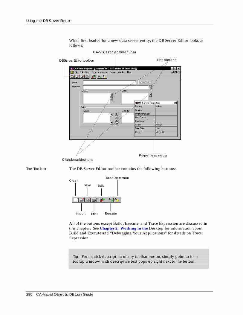
Using the DB Server Editor
290 CA-Visual Objects IDE User Guide
When first loaded for a new data server entity, the DB Server Editor looks asfollows:
DBServerEditortoolbar
CA-VisualObjectsmenubar
Findbuttons
CheckmarkbuttonsPropertieswindow
The Toolbar The DB Server Editor toolbar contains the following buttons:
ClearSave Build
TraceExpression
Print ExecuteImport
All of the buttons except Build, Execute, and Trace Expression are discussed inthis chapter. See Chapter 2: Working in the Desktop for information aboutBuild and Execute and “Debugging Your Applications” for details on TraceExpression.
Tip: For a quick description of any toolbar button, simply point to it—atooltip window with descriptive text pops up right next to the button.
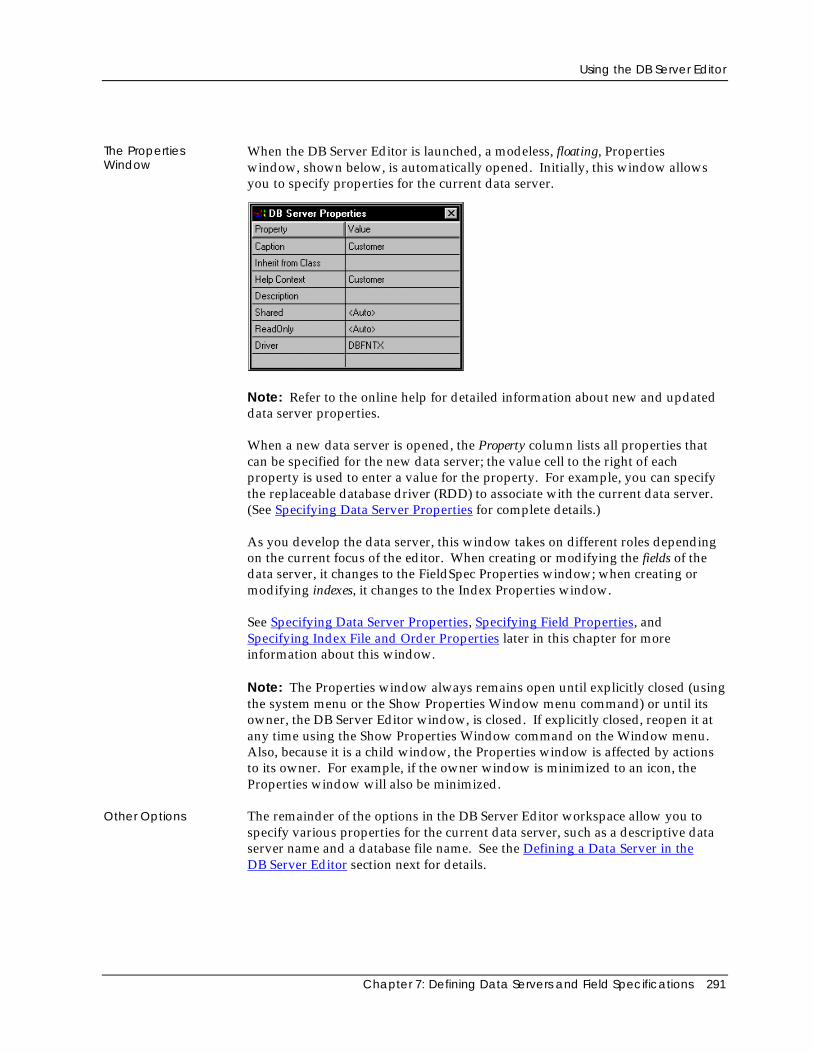
Using the DB Server Editor
Chapter 7: Defining Data Servers and Field Specifications 291
The PropertiesWindow
When the DB Server Editor is launched, a modeless, floating, Propertieswindow, shown below, is automatically opened. Initially, this window allowsyou to specify properties for the current data server.
Note: Refer to the online help for detailed information about new and updateddata server properties.
When a new data server is opened, the Property column lists all properties thatcan be specified for the new data server; the value cell to the right of eachproperty is used to enter a value for the property. For example, you can specifythe replaceable database driver (RDD) to associate with the current data server.(See Specifying Data Server Properties for complete details.)
As you develop the data server, this window takes on different roles dependingon the current focus of the editor. When creating or modifying the fields of thedata server, it changes to the FieldSpec Properties window; when creating ormodifying indexes, it changes to the Index Properties window.
See Specifying Data Server Properties, Specifying Field Properties, andSpecifying Index File and Order Properties later in this chapter for moreinformation about this window.
Note: The Properties window always remains open until explicitly closed (usingthe system menu or the Show Properties Window menu command) or until itsowner, the DB Server Editor window, is closed. If explicitly closed, reopen it atany time using the Show Properties Window command on the Window menu.Also, because it is a child window, the Properties window is affected by actionsto its owner. For example, if the owner window is minimized to an icon, theProperties window will also be minimized.
Other Options The remainder of the options in the DB Server Editor workspace allow you tospecify various properties for the current data server, such as a descriptive dataserver name and a database file name. See the Defining a Data Server in theDB Server Editor section next for details.
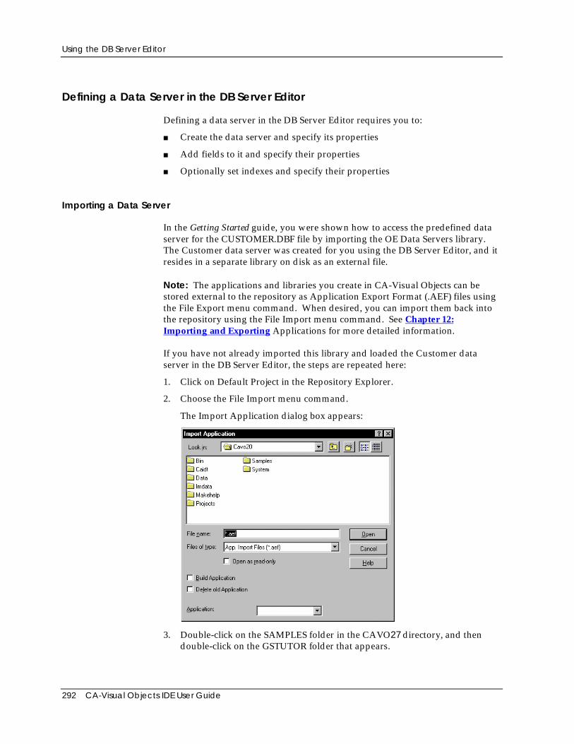
Using the DB Server Editor
292 CA-Visual Objects IDE User Guide
Defining a Data Server in the DB Server Editor
Defining a data server in the DB Server Editor requires you to:
■ Create the data server and specify its properties
■ Add fields to it and specify their properties
■ Optionally set indexes and specify their properties
Importing a Data Server
In the Getting Started guide, you were shown how to access the predefined dataserver for the CUSTOMER.DBF file by importing the OE Data Servers library.The Customer data server was created for you using the DB Server Editor, and itresides in a separate library on disk as an external file.
Note: The applications and libraries you create in CA-Visual Objects can bestored external to the repository as Application Export Format (.AEF) files usingthe File Export menu command. When desired, you can import them back intothe repository using the File Import menu command. See Chapter 12:Importing and Exporting Applications for more detailed information.
If you have not already imported this library and loaded the Customer dataserver in the DB Server Editor, the steps are repeated here:
1. Click on Default Project in the Repository Explorer.
2. Choose the File Import menu command.
The Import Application dialog box appears:
3. Double-click on the SAMPLES folder in the CAVO27 directory, and thendouble-click on the GSTUTOR folder that appears.
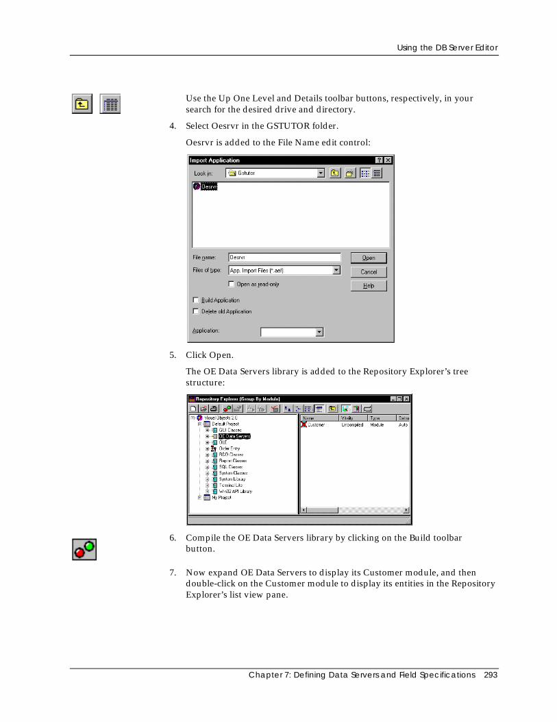
Using the DB Server Editor
Chapter 7: Defining Data Servers and Field Specifications 293
Use the Up One Level and Details toolbar buttons, respectively, in yoursearch for the desired drive and directory.
4. Select Oesrvr in the GSTUTOR folder.
Oesrvr is added to the File Name edit control:
5. Click Open.
The OE Data Servers library is added to the Repository Explorer’s treestructure:
6. Compile the OE Data Servers library by clicking on the Build toolbarbutton.
7. Now expand OE Data Servers to display its Customer module, and thendouble-click on the Customer module to display its entities in the RepositoryExplorer’s list view pane.
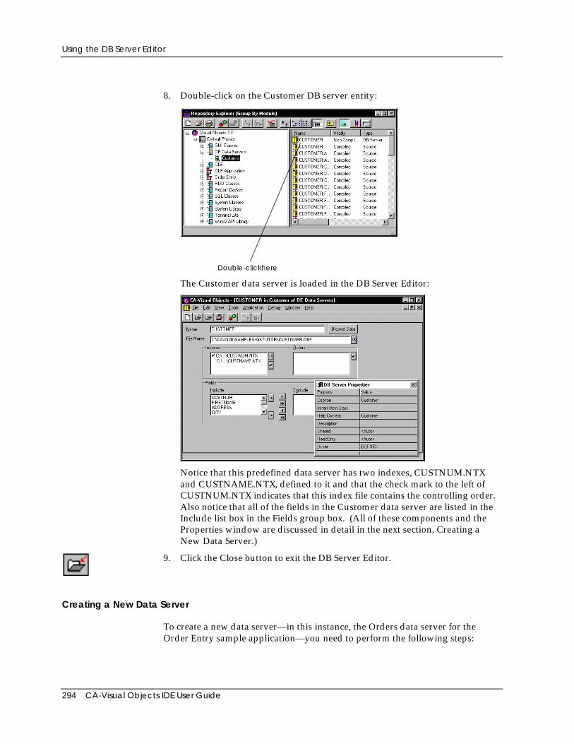
Using the DB Server Editor
294 CA-Visual Objects IDE User Guide
8. Double-click on the Customer DB server entity:
Double-clickhere
The Customer data server is loaded in the DB Server Editor:
Notice that this predefined data server has two indexes, CUSTNUM.NTXand CUSTNAME.NTX, defined to it and that the check mark to the left ofCUSTNUM.NTX indicates that this index file contains the controlling order.Also notice that all of the fields in the Customer data server are listed in theInclude list box in the Fields group box. (All of these components and theProperties window are discussed in detail in the next section, Creating aNew Data Server.)
9. Click the Close button to exit the DB Server Editor.
Creating a New Data Server
To create a new data server—in this instance, the Orders data server for theOrder Entry sample application—you need to perform the following steps:
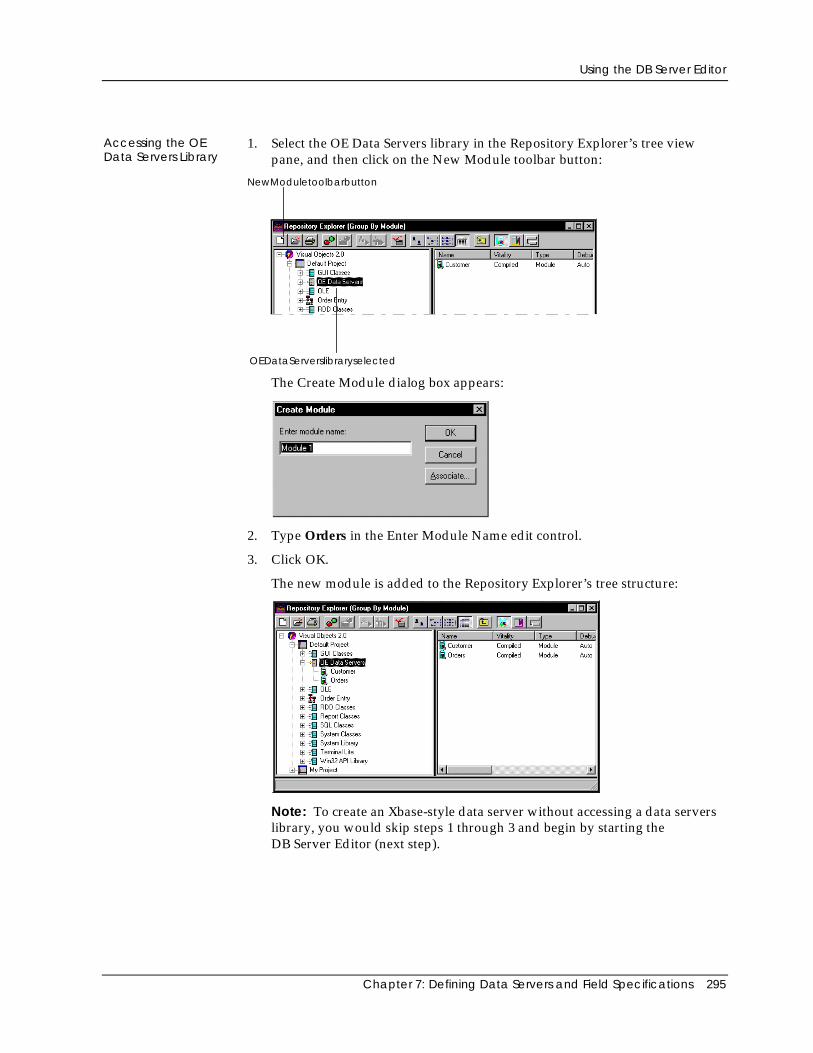
Using the DB Server Editor
Chapter 7: Defining Data Servers and Field Specifications 295
Accessing the OEData Servers Library
1. Select the OE Data Servers library in the Repository Explorer’s tree viewpane, and then click on the New Module toolbar button:
NewModuletoolbarbutton
OEDataServerslibraryselected
The Create Module dialog box appears:
2. Type Orders in the Enter Module Name edit control.
3. Click OK.
The new module is added to the Repository Explorer’s tree structure:
Note: To create an Xbase-style data server without accessing a data serverslibrary, you would skip steps 1 through 3 and begin by starting theDB Server Editor (next step).
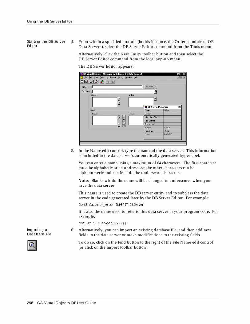
Using the DB Server Editor
296 CA-Visual Objects IDE User Guide
Starting the DB ServerEditor
4. From within a specified module (in this instance, the Orders module of OEData Servers), select the DB Server Editor command from the Tools menu.
Alternatively, click the New Entity toolbar button and then select theDB Server Editor command from the local pop-up menu.
The DB Server Editor appears:
5. In the Name edit control, type the name of the data server. This informationis included in the data server’s automatically generated hyperlabel.
You can enter a name using a maximum of 64 characters. The first charactermust be alphabetic or an underscore; the other characters can bealphanumeric and can include the underscore character.
Note: Blanks within the name will be changed to underscores when yousave the data server.
This name is used to create the DB server entity and to subclass the dataserver in the code generated later by the DB Server Editor. For example:
CLASS Customer_Order INHERIT DBServer
It is also the name used to refer to this data server in your program code. Forexample:
oDBCust := Customer_Order{}
Importing aDatabase File
6. Alternatively, you can import an existing database file, and then add newfields to the data server or make modifications to the existing fields.
To do so, click on the Find button to the right of the File Name edit control(or click on the Import toolbar button).
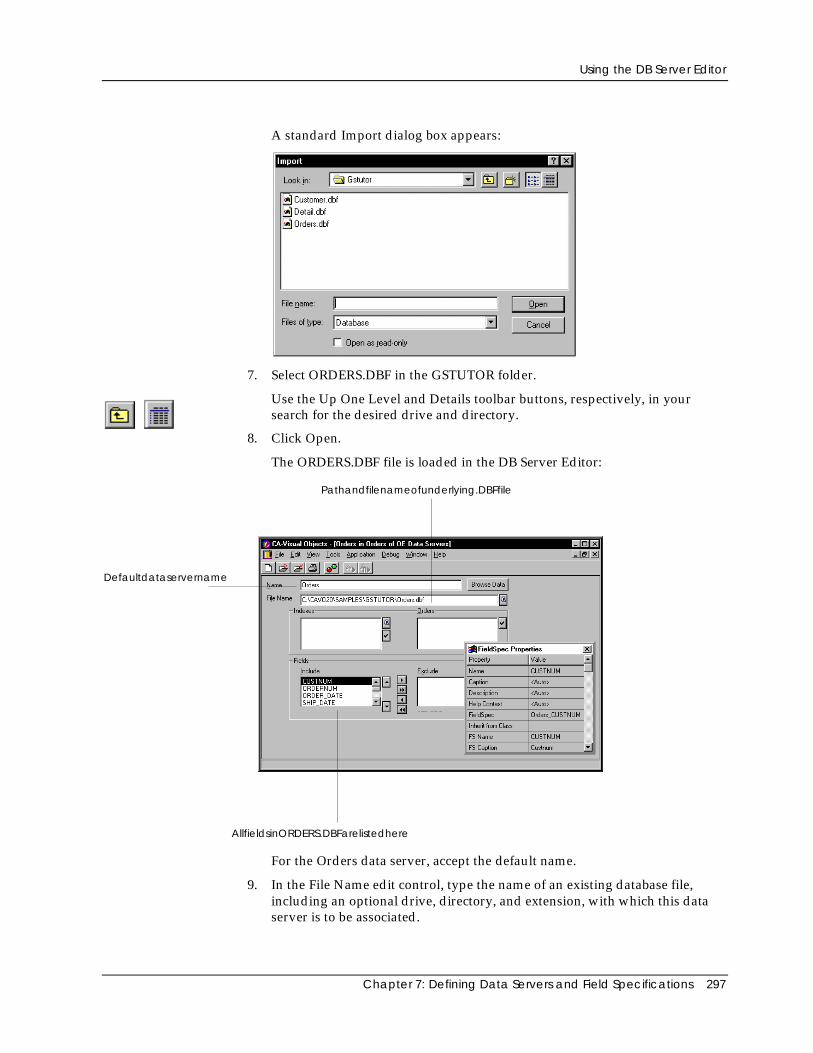
Using the DB Server Editor
Chapter 7: Defining Data Servers and Field Specifications 297
A standard Import dialog box appears:
7. Select ORDERS.DBF in the GSTUTOR folder.
Use the Up One Level and Details toolbar buttons, respectively, in yoursearch for the desired drive and directory.
8. Click Open.
The ORDERS.DBF file is loaded in the DB Server Editor:
Defaultdataservername
Pathandfilenameofunderlying.DBFfile
AllfieldsinORDERS.DBFarelistedhere
For the Orders data server, accept the default name.
9. In the File Name edit control, type the name of an existing database file,including an optional drive, directory, and extension, with which this dataserver is to be associated.
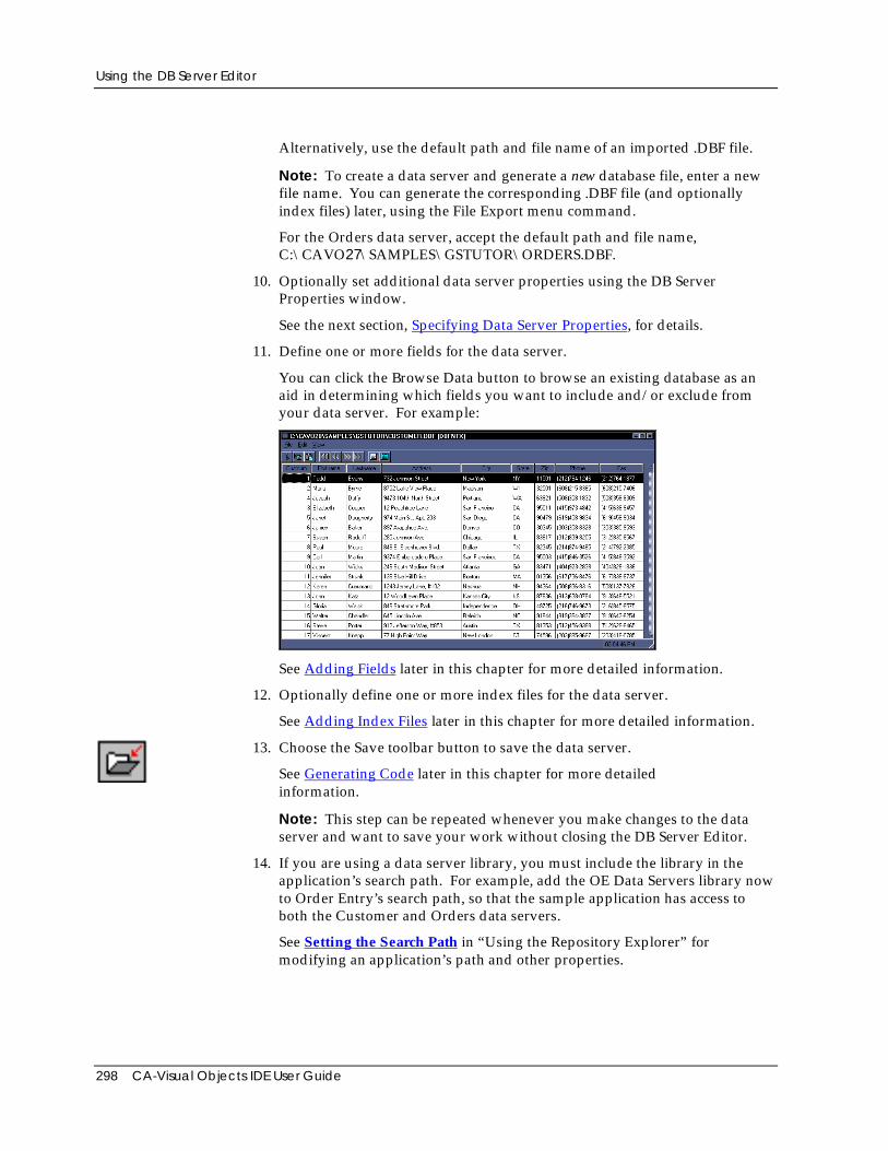
Using the DB Server Editor
298 CA-Visual Objects IDE User Guide
Alternatively, use the default path and file name of an imported .DBF file.
Note: To create a data server and generate a new database file, enter a newfile name. You can generate the corresponding .DBF file (and optionallyindex files) later, using the File Export menu command.
For the Orders data server, accept the default path and file name,C:\CAVO27\SAMPLES\GSTUTOR\ORDERS.DBF.
10. Optionally set additional data server properties using the DB ServerProperties window.
See the next section, Specifying Data Server Properties, for details.
11. Define one or more fields for the data server.
You can click the Browse Data button to browse an existing database as anaid in determining which fields you want to include and/or exclude fromyour data server. For example:
See Adding Fields later in this chapter for more detailed information.
12. Optionally define one or more index files for the data server.
See Adding Index Files later in this chapter for more detailed information.
13. Choose the Save toolbar button to save the data server.
See Generating Code later in this chapter for more detailedinformation.
Note: This step can be repeated whenever you make changes to the dataserver and want to save your work without closing the DB Server Editor.
14. If you are using a data server library, you must include the library in theapplication’s search path. For example, add the OE Data Servers library nowto Order Entry’s search path, so that the sample application has access toboth the Customer and Orders data servers.
See Setting the Search Path in “Using the Repository Explorer” formodifying an application’s path and other properties.
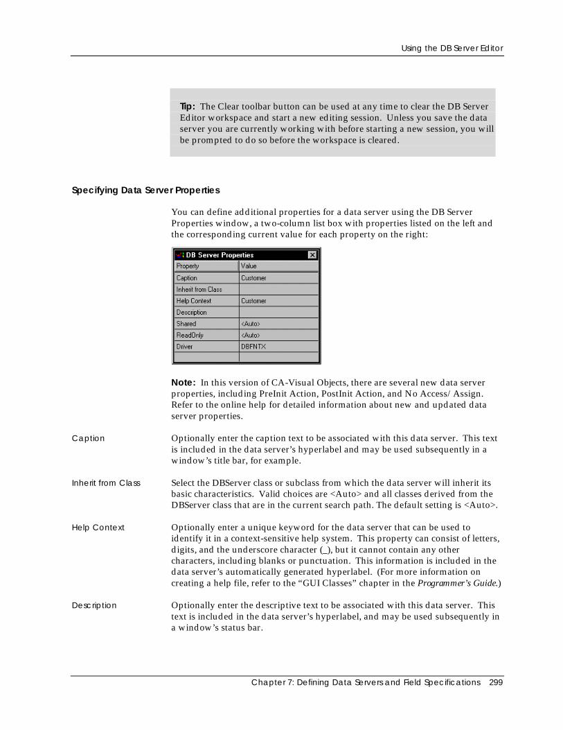
Using the DB Server Editor
Chapter 7: Defining Data Servers and Field Specifications 299
Tip: The Clear toolbar button can be used at any time to clear the DB ServerEditor workspace and start a new editing session. Unless you save the dataserver you are currently working with before starting a new session, you willbe prompted to do so before the workspace is cleared.
Specifying Data Server Properties
You can define additional properties for a data server using the DB ServerProperties window, a two-column list box with properties listed on the left andthe corresponding current value for each property on the right:
Note: In this version of CA-Visual Objects, there are several new data serverproperties, including PreInit Action, PostInit Action, and No Access/Assign.Refer to the online help for detailed information about new and updated dataserver properties.
Caption Optionally enter the caption text to be associated with this data server. This textis included in the data server’s hyperlabel and may be used subsequently in awindow’s title bar, for example.
Inherit from Class Select the DBServer class or subclass from which the data server will inherit itsbasic characteristics. Valid choices are <Auto> and all classes derived from theDBServer class that are in the current search path. The default setting is <Auto>.
Help Context Optionally enter a unique keyword for the data server that can be used toidentify it in a context-sensitive help system. This property can consist of letters,digits, and the underscore character (_), but it cannot contain any othercharacters, including blanks or punctuation. This information is included in thedata server’s automatically generated hyperlabel. (For more information oncreating a help file, refer to the “GUI Classes” chapter in the Programmer’s Guide.)
Description Optionally enter the descriptive text to be associated with this data server. Thistext is included in the data server’s hyperlabel, and may be used subsequently ina window’s status bar.
Using the DB Server Editor
300 CA-Visual Objects IDE User Guide
Shared Specify whether the data server will open the associated database in shared (Yes)or exclusive (No) mode. The default is <Auto>, which enables you to waive anexplicit setting and let the open mode be determined by the application’sSetExclusive() flag. See the online help system for more information about theSetExclusive() function.
Read Only Choose whether the data server will open the associated database file as a read-only (Yes) or read-write (No). The default is <Auto>, which means the systemdefault setting, read-write, is used as the file open mode.
Driver Choose the name of the database driver to be used with this data server. Thedrop-down list displays the RDDs currently installed on your system; the defaultis the DBFNTX driver.
Adding Fields
Techniques Once a data server’s properties are specified, you can continue defining the dataserver by adding fields to it. When creating fields, there are a number oftechniques you can use, such as:
■ Creating a new field, specifying all required properties and, optionally,additional properties
The DB Server Editor generates a default field specification for the new field.
■ Creating a new field and associating it with an existing field specification
Instead of specifying properties for the new field, you can use those of theassociated field specification.
■ Creating a new field, associating it with an existing field specification, andthen customizing the properties automatically imported with the fieldspecification
These three techniques are described in greater detail in the following sections.
Note that no matter which technique you use, there are several requiredproperties that must be specified. The steps described below focus on therequirements; additional properties are summarized in the next section,Specifying Field Properties.
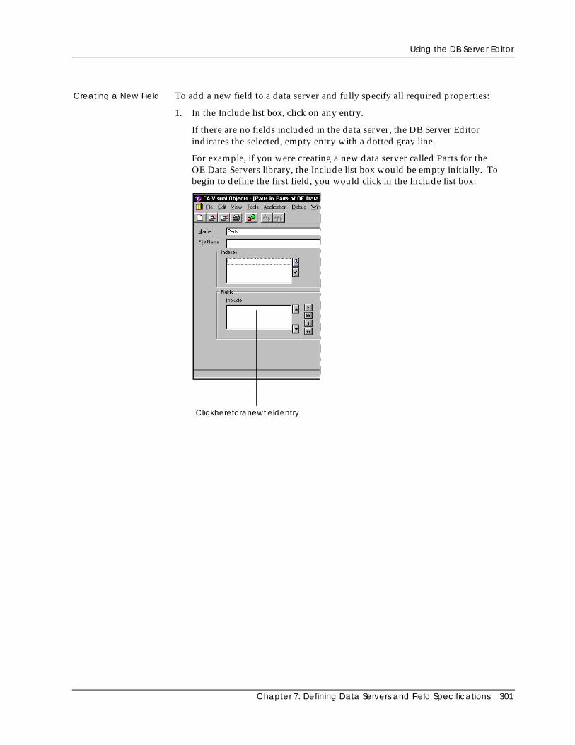
Using the DB Server Editor
Chapter 7: Defining Data Servers and Field Specifications 301
Creating a New Field To add a new field to a data server and fully specify all required properties:
1. In the Include list box, click on any entry.
If there are no fields included in the data server, the DB Server Editorindicates the selected, empty entry with a dotted gray line.
For example, if you were creating a new data server called Parts for theOE Data Servers library, the Include list box would be empty initially. Tobegin to define the first field, you would click in the Include list box:
Clickhereforanewfieldentry
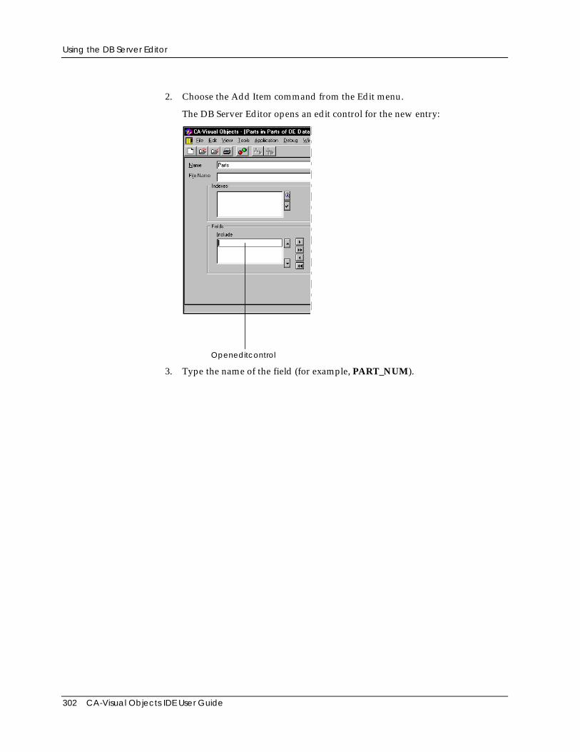
Using the DB Server Editor
302 CA-Visual Objects IDE User Guide
2. Choose the Add Item command from the Edit menu.
The DB Server Editor opens an edit control for the new entry:
Openeditcontrol
3. Type the name of the field (for example, PART_NUM).
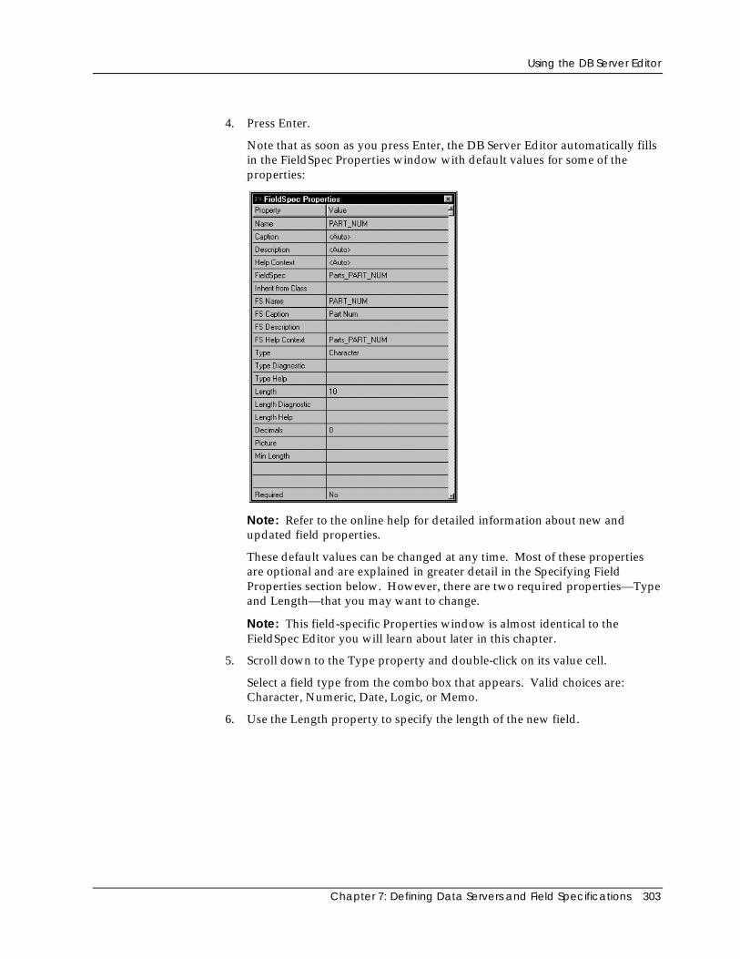
Using the DB Server Editor
Chapter 7: Defining Data Servers and Field Specifications 303
4. Press Enter.
Note that as soon as you press Enter, the DB Server Editor automatically fillsin the FieldSpec Properties window with default values for some of theproperties:
Note: Refer to the online help for detailed information about new andupdated field properties.
These default values can be changed at any time. Most of these propertiesare optional and are explained in greater detail in the Specifying FieldProperties section below. However, there are two required properties—Typeand Length—that you may want to change.
Note: This field-specific Properties window is almost identical to theFieldSpec Editor you will learn about later in this chapter.
5. Scroll down to the Type property and double-click on its value cell.
Select a field type from the combo box that appears. Valid choices are:Character, Numeric, Date, Logic, or Memo.
6. Use the Length property to specify the length of the new field.
Using the DB Server Editor
304 CA-Visual Objects IDE User Guide
Using a FieldSpecification
To create a new field that uses all of the properties of an existing fieldspecification:
1. Add a new field according to steps 1-3 above.
2. Double-click on the FieldSpec property’s value cell, and choose the desiredfield specification from the combo box that appears.
The DB Server Editor fills in the FieldSpec Properties window with thevalues assigned to the selected field specification.
Customizing aField Specification
To create a new field that uses only some of the properties of an existing fieldspecification, follow the steps outlined in the previous section, Using a FieldSpecification. Then, simply customize any of the properties pulled in with theselected field specification.
Important! If you are customizing an existing field specification, you may want to usea different name for the modified version and leave the existing field specification intact.To do this, type a new FieldSpec name in the FieldSpec Properties window before savingthe customized field specification.
No matter which technique you used to create the field, at this point allrequirements have been met and the new field is complete. You can specifyadditional properties for this field by referring to the Specifying Field Propertiessection below.
You can also define additional fields by repeating the steps in one of the threepreceding sections. Each subsequent field is added to the end of the list and willbe included in the database file structure if you issue a File Export menucommand. See the Editing Fields section for details on repositioning the order ofthe fields in the Include list box.
Specifying Field Properties
The FieldSpec Properties window allows you to specify the following propertiesfor fields. Unless indicated otherwise, these properties are optional.
Note: In CA-Visual Objects 2.7, there are many new field properties, includingLength Diagnostic, Length Help, Min Length Diagnostic, Min Length Help,Range Diagnostic, and Range Help. Refer to the online help for detailedinformation about new and updated field properties.
Name The name of the currently selected field. (This is a required property.)
If you newly created this field, this property contains the name you enteredwhen creating the field. If this field was imported, this property contains thename of the field as it was defined in the DBF file structure (see ImportingDatabase and Index Files later in this chapter).
Using the DB Server Editor
Chapter 7: Defining Data Servers and Field Specifications 305
Field names must be 1 to 10 characters in length, the first character cannot be anumber, and the rest can only contain letters, numeric digits, and the underscorecharacter.
If you later use the File Export menu command to create a .DBF file from thisdata server definition, this name will be used to create this field.
Caption The text used to label the field. (For example, if you use Auto Layout in theWindow Editor for this server, the system will use the caption to create the fixedtext control for this field.)
This property is initially set to <Auto>, which means that, by default, the systemwill use the value in the FS Caption property for this field’s caption. You shouldenter a value in the Caption property only if you wish to override the valuedefined in FS Caption without changing it. If you do not care about modifyingthe value held in FS Caption, simply enter the desired text there.
Note: Refer to Specifying Control Properties and Style Settings in the “Usingthe Window Editor” chapter for an example and accompanying diagram of thehierarchical nature of the Caption, Description, and Help Context properties.
Description The text displayed in a window’s status bar when this field has focus in yourapplication (for example, in a data window). (See the Data-Aware Windowssection in “Using the Window Editor” for information on creating datawindows.)
This property is initially set to <Auto>, which means that, by default, the systemwill use the value in the FS Description property for this field’s description. Youshould enter a value in the Description property only if you wish to override thevalue defined in FS Description without changing it. If you do not care aboutmodifying the value held in FS Description, simply enter the desired text there.
Help Context The unique keyword to be associated with this field for use in a context-sensitivehelp system. See the Help Context entry in Specifying Data Server Propertiesearlier in this chapter for specifics.
This property is initially set to <Auto>, which means that, by default, the systemwill use the value in the FS Help Context property for this field’s help keyword.You should enter a value in the Help Context property only if you wish tooverride the value defined in FS Help Context without changing it. If you do notcare about modifying the value held in FS Help Context, simply enter the desiredkeyword there.
FieldSpec The name of the field spec entity associated with this field, if any. If youdesignate a field specification, then all of the properties listed below will besaved to that entity. All entities must have unique names to be stored in therepository. Therefore, the entity name generally includes the name of the serveras well as the field.
Using the DB Server Editor
306 CA-Visual Objects IDE User Guide
By default, the system creates a unique field specification for every field youcreate or import (using the pattern <DataServerName>_<FieldName>). When yousave a data server, this name is used to create the field spec entity and to subclassthe field specification in the code generated by the DB Server Editor. Forexample:
CLASS ZipCodeSpec INHERIT FieldSpec
If desired, you can use this property to associate a different, existing fieldspecification, instead of the default, unique one automatically associated by thesystem. To do this, click on this property, click on the Down arrow button thatappears, and then choose the desired field specification from the displayed list.
For example, if you created an LNAME field in your Customer data server, itwould be associated with a field specification of CUSTOMERS_LNAME bydefault. Assuming you had a LASTNAME field specification you preferred touse for this field, you could import it here by choosing it from the drop-down listbox.
Inherit from Class Select the FieldSpec class or subclass from which the field will inherit its basiccharacteristics. Valid choices are <Auto> and all classes derived from theFieldSpec class that are in the current search path. The default setting is <Auto>.
FS Name The name of the field described in the field specification. (All entities must haveunique names to be stored in the repository.)
Initially, for newly created or imported fields, this property contains the samevalue as the Name property.
FS Caption The text used to label the field. (For example, if you use Auto Layout in theWindow Editor for this server, the system will use the caption to create the fixedtext control for this field.)
By default, the value in this property will be used for this field’s caption, unlessyou enter a value in the Caption property (in which case the value in thatproperty will be used instead).
Initially, for newly created or imported fields, this property contains a mixed-case version of the value in the Name property.
Note: Refer to Specifying Control Properties and Style Settings in the “Usingthe Window Editor” chapter for an example and accompanying diagram of thedefaulting behavior of the FS Caption, FS Description, and FS Help Contextproperties.
FS Description The text displayed in a window’s status bar when this field has focus in yourapplication (for example, in a data window).
By default, the value in this property will be used for this field’s description,unless you enter a value in the Description property (in which case the value inthat property will be used instead).
Using the DB Server Editor
Chapter 7: Defining Data Servers and Field Specifications 307
FS Help Context The unique keyword to be associated with this field in the specified fieldspecification. This keyword is intended for use in a context-sensitive helpsystem. See the Help Context entry in Specifying Data Server Properties earlierin this chapter for specifics.
By default, the value in this property will be used for this field’s help keyword,unless you enter a value in the Help Context property (in which case the value inthat property will be used instead).
For newly created or imported fields, the default keyword for this property iscreated using the pattern <DataServerName>_<FieldName>.
Type The data type of the field. You can choose Character, Numeric, Logical, Date,OLE, or Memo. (This is a required property).
If you newly created this field, the type is initially set to Character. If this fieldwas imported, this property contains the type of the field as defined in the .DBFfile structure.
Type Diagnostic The message that should appear in the status bar when an error occurs related tothis field’s type.
Type Help The unique keyword for use in a context-sensitive help system that identifies thehelp message for the Type property. See the Help Context entry in SpecifyingData Server Properties earlier in this chapter for specifics.
Length The length of the field. (This is a required property).
If you newly created this field, the length is initially set to 10. If this field wasimported, this property contains the length of the field as defined in the DBF filestructure.
Note: For new fields, the different types you might choose have differentdefault lengths associated with them. They are as follows: Character = 10,Numeric = 12 with 2 decimals, Date = 8, Logic = 1, OLE=10, and Memo = 10.
Length Diagnostic The message that should appear when an error occurs related to this field’slength.
Length Help The unique keyword for use in a context-sensitive help system that identifies thehelp message for the Length property. See the Help Context entry in SpecifyingData Server Properties earlier in this chapter for specifics.
Using the DB Server Editor
308 CA-Visual Objects IDE User Guide
Decimals The number of decimal places to be used for this field if it is numeric.
If you newly created this field and you specified a type of Numeric, this propertyis initially set to 2. If this field was imported as a Numeric, this property containsthe decimal of the field as defined in the DBF file structure.
Note: For all other types, this property is unused (set to 0).
Picture The picture clause to be used to format this field. This is a standard Xbasepicture clause, such as “@!” or “999-99-9999”. Note that the quotation marks areoptional.
Min Length The minimum number of characters that can be entered in the field (for example,a state field can be defined with Length and Min Length of 2, while a passwordfield can have a Length of 10 and a Min Length of 4).
Required Select Yes or No, respectively, to indicate whether the field is required or not. Bydefault, this property is set to No.
Required Diagnostic The message that should appear when an error occurs related to a required field.
Required Help The unique keyword for use in a context-sensitive help system that identifies thehelp message for the Required property. See the Help Context entry inSpecifying Data Server Properties earlier in this chapter for specifics.
Minimum A minimum value for a numeric or date field.
Maximum A maximum value for a numeric or date field.
Validation The rule to be used to determine if entered data is valid. This is a code block thattakes the field name as an argument. The code block must return a logical valuethat must evaluate to TRUE before the data entered will be accepted in the field.You might, for example, use a table lookup function to determine if a key value isvalid, as in {|KeyField| ValKeys->DBSeek(KeyField)}.
Validation Diagnostic The message that should appear when an error occurs related to the validationrule.
Validation Help The unique keyword for use in a context-sensitive help system that identifies thehelp message for the Validation property. See the Help Context entry inSpecifying Data Server Properties earlier in this chapter for specifics.
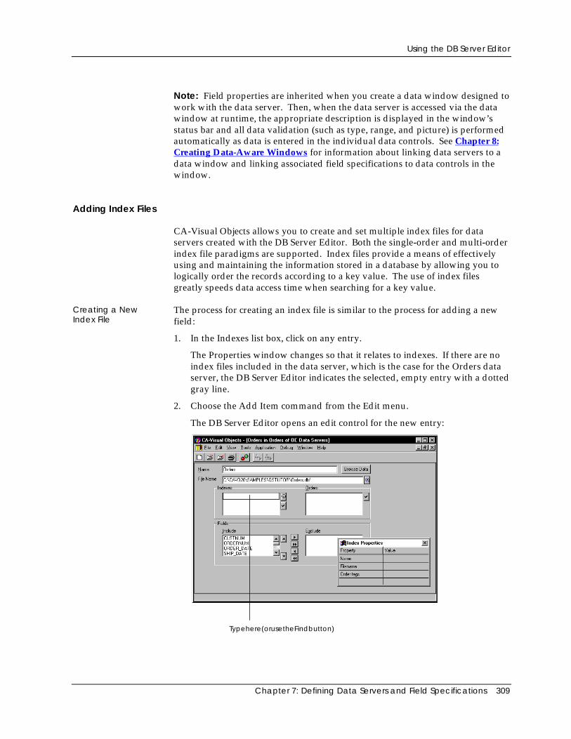
Using the DB Server Editor
Chapter 7: Defining Data Servers and Field Specifications 309
Note: Field properties are inherited when you create a data window designed towork with the data server. Then, when the data server is accessed via the datawindow at runtime, the appropriate description is displayed in the window’sstatus bar and all data validation (such as type, range, and picture) is performedautomatically as data is entered in the individual data controls. See Chapter 8:Creating Data-Aware Windows for information about linking data servers to adata window and linking associated field specifications to data controls in thewindow.
Adding Index Files
CA-Visual Objects allows you to create and set multiple index files for dataservers created with the DB Server Editor. Both the single-order and multi-orderindex file paradigms are supported. Index files provide a means of effectivelyusing and maintaining the information stored in a database by allowing you tologically order the records according to a key value. The use of index filesgreatly speeds data access time when searching for a key value.
Creating a NewIndex File
The process for creating an index file is similar to the process for adding a newfield:
1. In the Indexes list box, click on any entry.
The Properties window changes so that it relates to indexes. If there are noindex files included in the data server, which is the case for the Orders dataserver, the DB Server Editor indicates the selected, empty entry with a dottedgray line.
2. Choose the Add Item command from the Edit menu.
The DB Server Editor opens an edit control for the new entry:
Typehere(orusetheFindbutton)
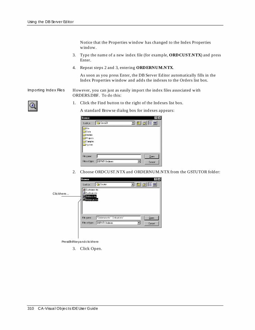
Using the DB Server Editor
310 CA-Visual Objects IDE User Guide
Notice that the Properties window has changed to the Index Propertieswindow.
3. Type the name of a new index file (for example, ORDCUST.NTX) and pressEnter.
4. Repeat steps 2 and 3, entering ORDERNUM.NTX.
As soon as you press Enter, the DB Server Editor automatically fills in theIndex Properties window and adds the indexes to the Orders list box.
Importing Index Files However, you can just as easily import the index files associated withORDERS.DBF. To do this:
1. Click the Find button to the right of the Indexes list box.
A standard Browse dialog box for indexes appears:
2. Choose ORDCUST.NTX and ORDERNUM.NTX from the GSTUTOR folder:
Clickhere...
PressShiftkeyandclickhere
3. Click Open.
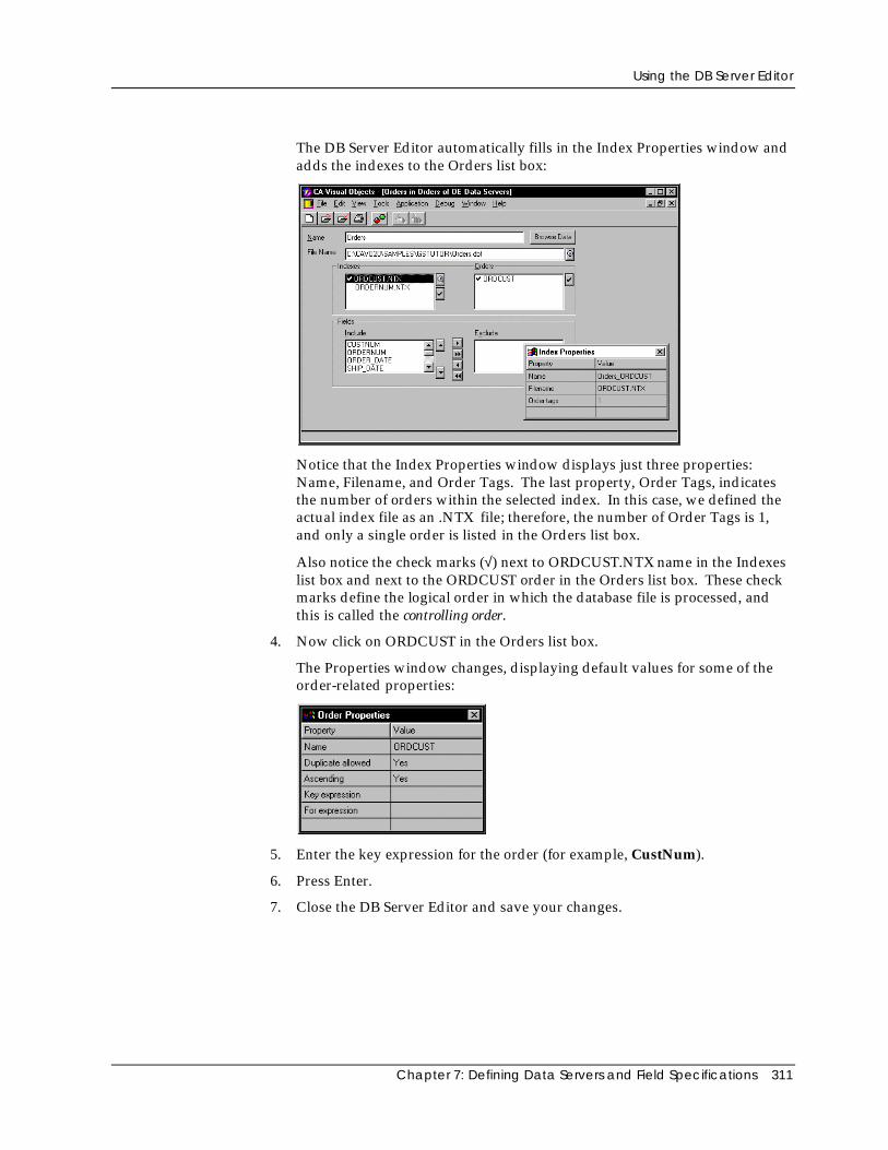
Using the DB Server Editor
Chapter 7: Defining Data Servers and Field Specifications 311
The DB Server Editor automatically fills in the Index Properties window andadds the indexes to the Orders list box:
Notice that the Index Properties window displays just three properties:Name, Filename, and Order Tags. The last property, Order Tags, indicatesthe number of orders within the selected index. In this case, we defined theactual index file as an .NTX file; therefore, the number of Order Tags is 1,and only a single order is listed in the Orders list box.
Also notice the check marks (√) next to ORDCUST.NTX name in the Indexeslist box and next to the ORDCUST order in the Orders list box. These checkmarks define the logical order in which the database file is processed, andthis is called the controlling order.
4. Now click on ORDCUST in the Orders list box.
The Properties window changes, displaying default values for some of theorder-related properties:
5. Enter the key expression for the order (for example, CustNum).
6. Press Enter.
7. Close the DB Server Editor and save your changes.
Using the DB Server Editor
312 CA-Visual Objects IDE User Guide
At this point all requirements have been met and the index file specification iscomplete. You can specify additional properties for this order by referring to theSpecifying Index File and Order Properties section below. You can also addadditional index files by repeating steps 1–6. Each subsequent index file is addedto the end of the list.
Adding an Order When working with multi-order index files, the process for creating the firstorder is the same as described above. To add subsequent orders to a multi-orderindex file:
1. In the Orders list box, click on any entry. Then, choose the Edit Add Itemmenu command.
The DB Server Editor opens an edit control for a new entry.
2. Type the name of the order (for example, ORDNUM) and press Enter.
3. Enter the key expression for the order (for example, OrdNum).
Note: Whether an index file supports single or multiple orders per file dependson the RDD, which you determine using the data server’s Driver property.Unless the driver you have specified supports multiple orders, you will not beable to define more than one order. See Specifying Data Server Properties earlierin this chapter for more information.
Specifying Index File and Order Properties
Index files can have the following properties in the DB Server Editor:
Name A unique name for the index, such as ORDERS_ORDCUST.
Filename The path (drive, directory, and file name) of the actual index file. This file namewill be used, for example, by the File Export or File Export Index menucommands.
Order Tags Displays the total number of orders (or tags) defined in an index file. This is aread-only field.
An index file’s orders can have the following properties in the DB Server Editor:
Name A unique name for the order, such as ORDCUST.
Duplicate Allowed Indicates whether the order will have unique key values. The default is Yes,indicating that all records will be included in the order. If you change it to No,only records with unique key values will be included in the order.
Ascending Indicates whether the key values in the order will be sorted as ascending ordescending. The default is Yes, indicating ascending order. If you change it toNo, the key values will be sorted in descending order.
Using the DB Server Editor
Chapter 7: Defining Data Servers and Field Specifications 313
Key Expression The key expression on which the order is based. Its resultant key valuedetermines the logical position of the associated record in the database when thisis the controlling order (for example, CustNum).
For Expression A condition on which to base this order (for example, Amount_Due > 1000.00).By default, none is specified and all records are included in the order. If youspecify a For Expression, only records that meet the condition are included in theorder.
Generating Corresponding Files
After creating a new data server according to the instructions in this section, thenext logical step is to generate the associated database and index files. Togenerate all associated files at once, choose the File Export menu command. Togenerate only one index file, highlight it in the Indexes list box and choose theFile Export Index menu command. (For more information, see ExportingDatabase and Index Files later in this chapter.)
Generating Code
When you save a data server, CA-Visual Objects automatically generates:
■ A DB server entity for the data server
You can double-click on this entity in the Repository Explorer’s list viewpane to begin editing it with the DB Server Editor.
■ A DBServer subclass using the data server name
■ A field spec entity for each field specification defined for the data server
You can double-click on any field spec entity in the Repository Explorer’s listview pane to begin editing it with the FieldSpec Editor.
■ A FieldSpec subclass for each field specification in the data server
■ Other default source code that can be modified
Note: Code generation in the DB Server Editor is now template-based. Forcomplete details, refer to the CA-Visual Objects 2.7 Software Development Kit.
Using the DB Server Editor
314 CA-Visual Objects IDE User Guide
Modifying a Data Server
After you have defined a data server, you can modify it by changing itsproperties or the properties of any fields or index files associated with it. Youcan also change the data server name and its associated database file. Certainchanges that you make may be reflected in the associated index files anddatabase file structures if you issue a File Export menu command, all of whichare explained in the following sections.
Editing Data Server Properties
Name To change the name of the data server, click on the Name edit control and type anew name.
File Name To change the associated database file, click on the File Name edit control andeither type a new name or import a new file using the Find button.
Other Properties To change any other property associated with a data server:
1. Click on the Name or File Name edit controls.
The Properties window changes so that it relates to the data server.
2. Click on the property that you want to change in the Properties window andspecify the new value.
See Specifying Data Server Properties for more information.
Editing Fields
If there are fields in the Include list box, you can change their properties, changetheir order, delete them from the list, or exclude them from use by the dataserver.
Changing FieldProperties
To change any property associated with a field, follow these basic steps:
1. Click on the field name in the Include list box.
The DB Server Editor highlights the field and updates the Properties windowaccordingly.
2. Click on the property that you want to change in the FieldSpec Propertieswindow and specify the new value.
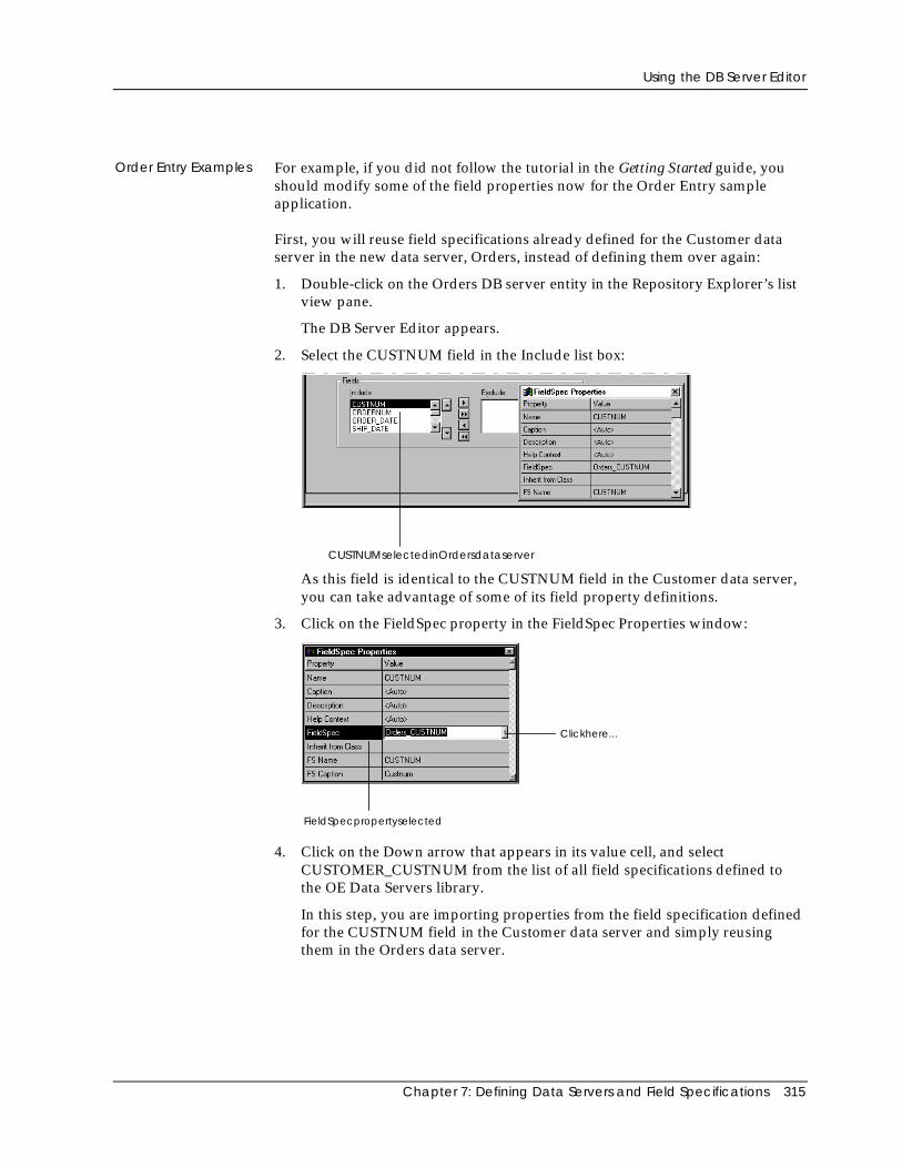
Using the DB Server Editor
Chapter 7: Defining Data Servers and Field Specifications 315
Order Entry Examples For example, if you did not follow the tutorial in the Getting Started guide, youshould modify some of the field properties now for the Order Entry sampleapplication.
First, you will reuse field specifications already defined for the Customer dataserver in the new data server, Orders, instead of defining them over again:
1. Double-click on the Orders DB server entity in the Repository Explorer’s listview pane.
The DB Server Editor appears.
2. Select the CUSTNUM field in the Include list box:
CUSTNUMselectedinOrdersdataserver
As this field is identical to the CUSTNUM field in the Customer data server,you can take advantage of some of its field property definitions.
3. Click on the FieldSpec property in the FieldSpec Properties window:
FieldSpecpropertyselected
Clickhere...
4. Click on the Down arrow that appears in its value cell, and selectCUSTOMER_CUSTNUM from the list of all field specifications defined tothe OE Data Servers library.
In this step, you are importing properties from the field specification definedfor the CUSTNUM field in the Customer data server and simply reusingthem in the Orders data server.
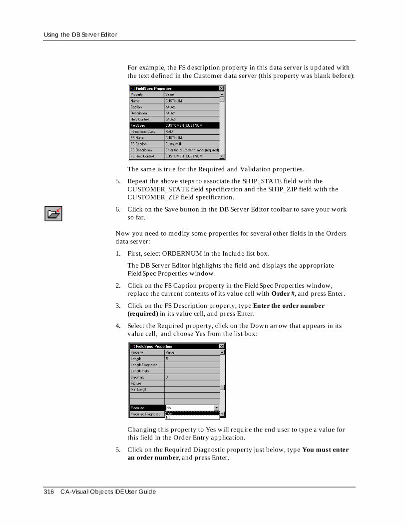
Using the DB Server Editor
316 CA-Visual Objects IDE User Guide
For example, the FS description property in this data server is updated withthe text defined in the Customer data server (this property was blank before):
The same is true for the Required and Validation properties.
5. Repeat the above steps to associate the SHIP_STATE field with theCUSTOMER_STATE field specification and the SHIP_ZIP field with theCUSTOMER_ZIP field specification.
6. Click on the Save button in the DB Server Editor toolbar to save your workso far.
Now you need to modify some properties for several other fields in the Ordersdata server:
1. First, select ORDERNUM in the Include list box.
The DB Server Editor highlights the field and displays the appropriateFieldSpec Properties window.
2. Click on the FS Caption property in the FieldSpec Properties window,replace the current contents of its value cell with Order #, and press Enter.
3. Click on the FS Description property, type Enter the order number(required) in its value cell, and press Enter.
4. Select the Required property, click on the Down arrow that appears in itsvalue cell, and choose Yes from the list box:
Changing this property to Yes will require the end user to type a value forthis field in the Order Entry application.
5. Click on the Required Diagnostic property just below, type You must enteran order number, and press Enter.
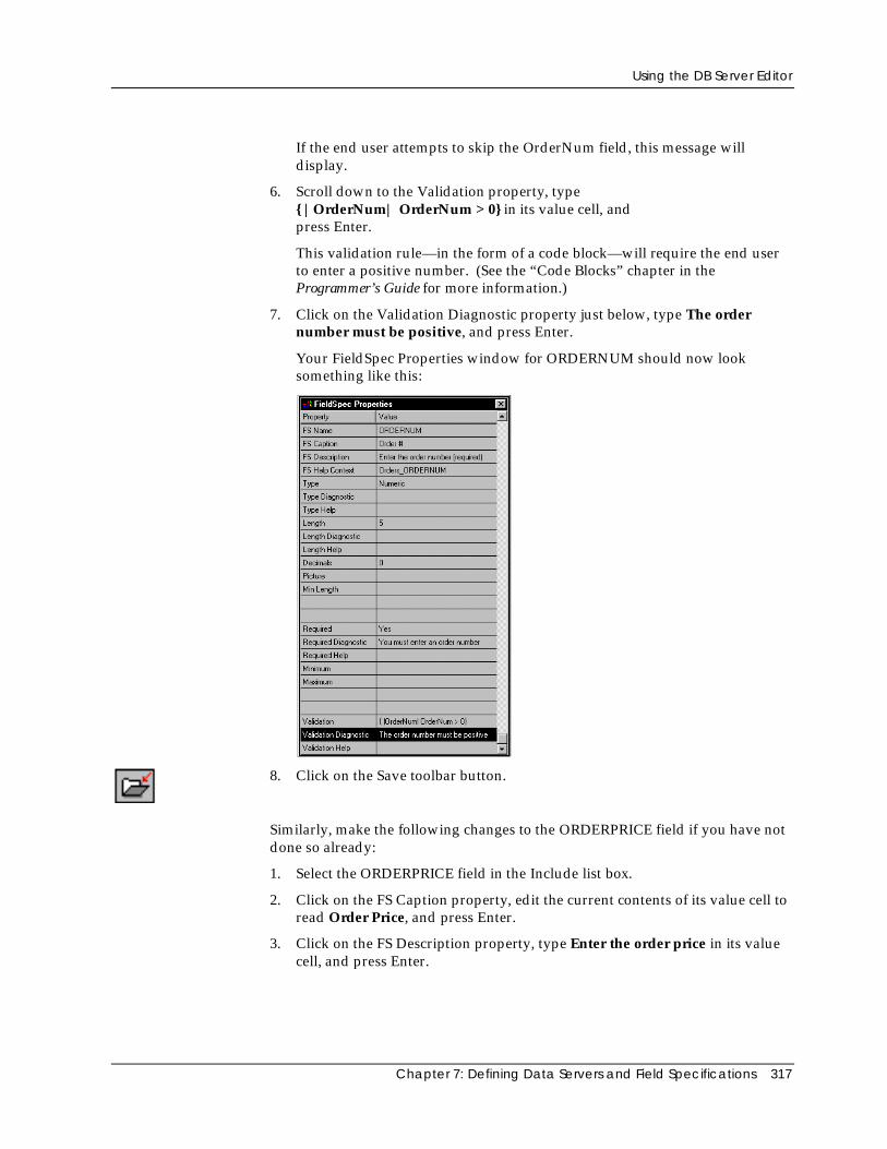
Using the DB Server Editor
Chapter 7: Defining Data Servers and Field Specifications 317
If the end user attempts to skip the OrderNum field, this message willdisplay.
6. Scroll down to the Validation property, type{ |OrderNum| OrderNum > 0} in its value cell, andpress Enter.
This validation rule—in the form of a code block—will require the end userto enter a positive number. (See the “Code Blocks” chapter in theProgrammer’s Guide for more information.)
7. Click on the Validation Diagnostic property just below, type The ordernumber must be positive, and press Enter.
Your FieldSpec Properties window for ORDERNUM should now looksomething like this:
8. Click on the Save toolbar button.
Similarly, make the following changes to the ORDERPRICE field if you have notdone so already:
1. Select the ORDERPRICE field in the Include list box.
2. Click on the FS Caption property, edit the current contents of its value cell toread Order Price, and press Enter.
3. Click on the FS Description property, type Enter the order price in its valuecell, and press Enter.
Using the DB Server Editor
318 CA-Visual Objects IDE User Guide
4. Scroll down to the Picture property, click on its value cell, type $$$$$$$.99,and press Enter.
The specified picture clause will cause the value to display with leadingdollar signs.
5. Click on the Save toolbar button.
See Specifying Field Properties for more information about each availableproperty.
Ordering Fields To change the order of the fields within the Include list box:
1. Click on the field name in the Include list box.
2. Click the Up arrow button to move the currently highlighted field up oneposition in the Include list, or click the Down arrow button to move thecurrently highlighted field down one position in the Include list.
The order in which the fields appear in the Include list box determines the orderin which they will appear when you use the Auto Layout feature to define a datawindow for this data server. (See Chapter 8: Creating Data-Aware Windowsfor information about the Window Editor’s Auto Layout feature.) This Includelist box order also determines the order in which the fields are created if yougenerate a .DBF file using the File Export menu command.
Deleting a Field To delete a field from the Include list box:
1. Click on the field name in the Include list box.
2. Choose the Edit Delete Item menu command.
Alternatively, press Esc and then press Del.
Excluding a Field Deleting the field from the Include list box, however, is not necessary. You cansimply exclude the field from use by this data server:
1. Click on the field name in the Include list box.
2. Click the Right arrow button to move the currently highlighted field to theExclude list.
This process works the other way around using the Left arrow button to move ahighlighted field from the Exclude list to the Include list. As a shortcut, you canmove all fields from one list to the other by clicking the appropriate doublearrow button.
Fields that are in the Exclude list box will be inaccessible when using this dataserver. A reference to an excluded field in your application will result in aruntime error.
Using the DB Server Editor
Chapter 7: Defining Data Servers and Field Specifications 319
Note: Changes that you make to the Name, Type, Length, and Decimals fieldproperties, as well as deletions from the Include list box, will be reflected in thedatabase file structure if you issue a File Export menu command. Excludedfields, however, will not.
Editing Index Files and Orders
You can change the properties of an index file, delete an index file from theIndexes list box, change the controlling order, change the properties of an order,and delete an order from an index file. This section describes each of theseprocesses.
Changing Index Fileand Order Properties
To change any property associated with an index file or one of its orders:
1. Click on the index file name in the Indexes list box.
The DB Server Editor highlights the file and updates the Properties windowaccordingly.
2. Click on the property that you want to change in the Properties window, andspecify the new value.
See Specifying Index File and Order Properties for more information.
Changing theControlling Order
As stated earlier in this chapter, CA-Visual Objects allows you to set multipleindex files for a single data server and, depending on the RDD, several orderscan be defined for a single index file. All index files that are set will be openedautomatically whenever you access the associated database file via this dataserver, and all orders in all of these index files will be properly maintained aschanges to the database file are made.
However, there can only be one controlling order (indicated with a √ in theIndexes and Orders list boxes). If you want, you can change the logical order inwhich the database file is processed by changing the controlling order. To dothis:
1. In the Indexes list box, select the index file that defines the order you want tomake the controlling order (either click on it with the mouse or scroll to itwith the Direction keys).
2. Click on the check mark button next to the Indexes list box.
The system will place a √ next to that index.
3. If the index defines only one order, it will automatically become thecontrolling order. If the index has multiple orders, the first order in theindex will be the default controlling order. Optionally highlight a differentorder in the Orders list box.
4. Click on the check mark button to the right of the Orders list box.
The system will place a √ next to the new controlling order.
Using the DB Server Editor
320 CA-Visual Objects IDE User Guide
Deleting an Index File To delete a file from the Indexes list box so that it will no longer be used by thisdata server:
1. Click on the index file name in the Indexes list box.
2. Choose the Edit Delete Item menu command.
Alternatively, press Esc and then press Del.
Deleting an Order To delete a file from the Indexes list box so that it will no longer be used by thisdata server:
You can remove individual orders from a multi-order index file:
1. Click on the order name in the Orders list box.
2. Choose the Edit Delete Item menu command.
Alternatively, press Esc and then press Del.
Note: Changes that you make to orders, including Key Expression, ForExpression, deletions, and additions will be reflected in the index file if you issuea File Export or File Export Index menu command. Deleting an index file fromthe Indexes list box, however, does not delete it from the disk, it simply preventsthis data server from accessing the index file.
Importing Database and Index Files
So far, you have learned how to create data servers, fields, and indexes using theDB Server Editor, with the idea in mind that you could later generate thecorresponding database and index files based on the properties defined in thedata server. Greater emphasis has been given, however, to importing predefineddata servers from a library, database files, and index files; importing saves youvaluable time.
Database Files For example, after importing an existing database file, all of the fields in thedatabase structure are included in the data server that you are defining. Youare free to include and exclude any of these predefined fields, modify them, andadd new fields (as shown earlier in Adding Fields and Editing Fields).
Furthermore, you can even import fields from another database file to add to thecurrent data server. For example, you could add the fields in DETAIL.DBF to theOrders data server:
1. Double-click on the Orders DB server entity in the list view pane of theRepository Explorer to start the DB Server Editor.
2. Click the Find button associated with the File Name edit control.
The Import dialog box appears.
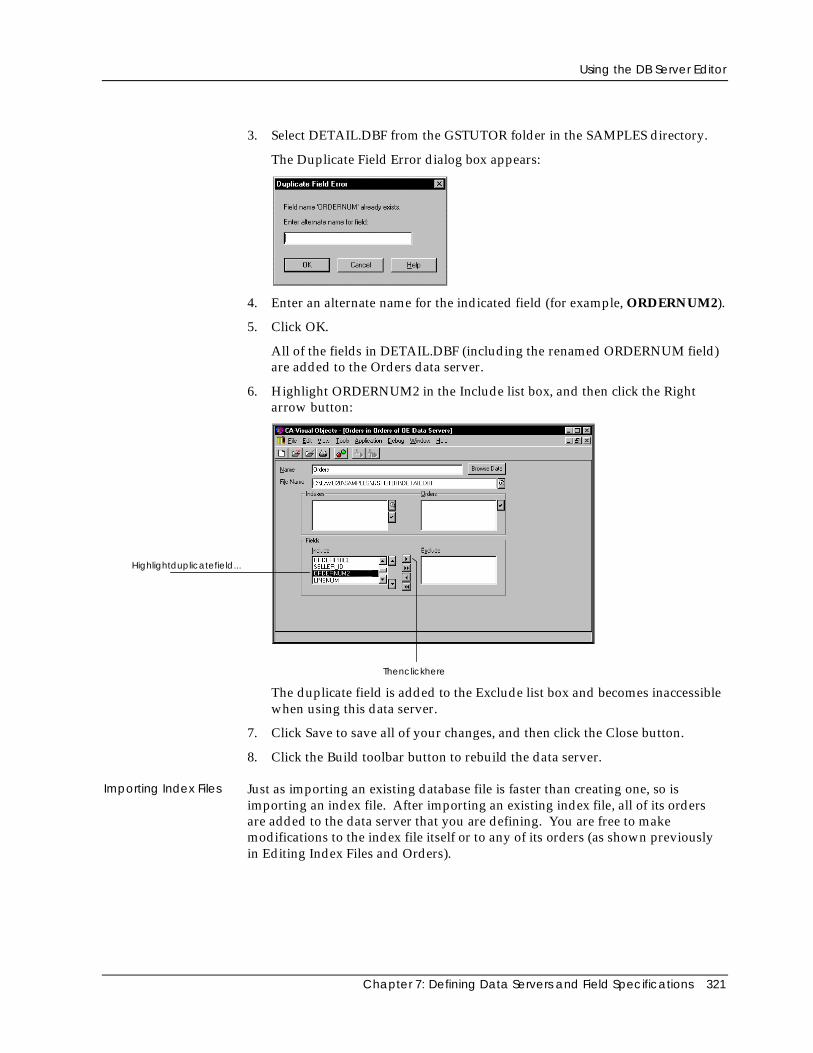
Using the DB Server Editor
Chapter 7: Defining Data Servers and Field Specifications 321
3. Select DETAIL.DBF from the GSTUTOR folder in the SAMPLES directory.
The Duplicate Field Error dialog box appears:
4. Enter an alternate name for the indicated field (for example, ORDERNUM2).
5. Click OK.
All of the fields in DETAIL.DBF (including the renamed ORDERNUM field)are added to the Orders data server.
6. Highlight ORDERNUM2 in the Include list box, and then click the Rightarrow button:
Highlightduplicatefield...
Thenclickhere
The duplicate field is added to the Exclude list box and becomes inaccessiblewhen using this data server.
7. Click Save to save all of your changes, and then click the Close button.
8. Click the Build toolbar button to rebuild the data server.
Importing Index Files Just as importing an existing database file is faster than creating one, so isimporting an index file. After importing an existing index file, all of its ordersare added to the data server that you are defining. You are free to makemodifications to the index file itself or to any of its orders (as shown previouslyin Editing Index Files and Orders).
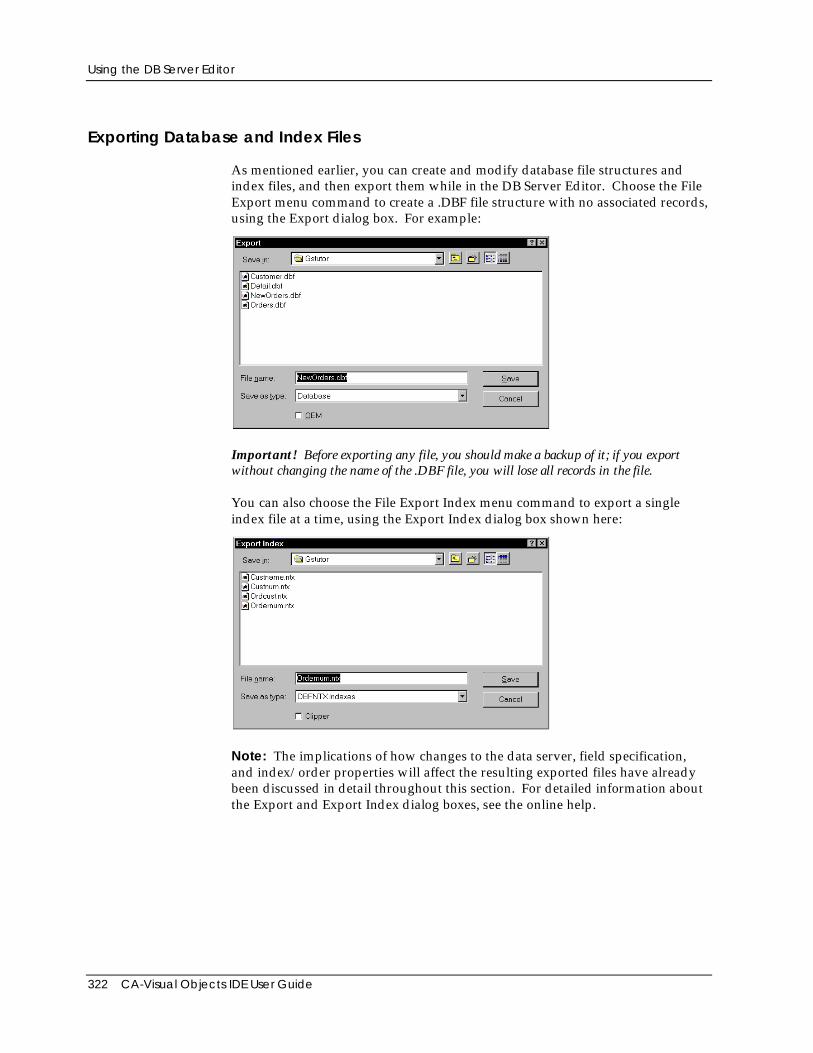
Using the DB Server Editor
322 CA-Visual Objects IDE User Guide
Exporting Database and Index Files
As mentioned earlier, you can create and modify database file structures andindex files, and then export them while in the DB Server Editor. Choose the FileExport menu command to create a .DBF file structure with no associated records,using the Export dialog box. For example:
Important! Before exporting any file, you should make a backup of it; if you exportwithout changing the name of the .DBF file, you will lose all records in the file.
You can also choose the File Export Index menu command to export a singleindex file at a time, using the Export Index dialog box shown here:
Note: The implications of how changes to the data server, field specification,and index/order properties will affect the resulting exported files have alreadybeen discussed in detail throughout this section. For detailed information aboutthe Export and Export Index dialog boxes, see the online help.
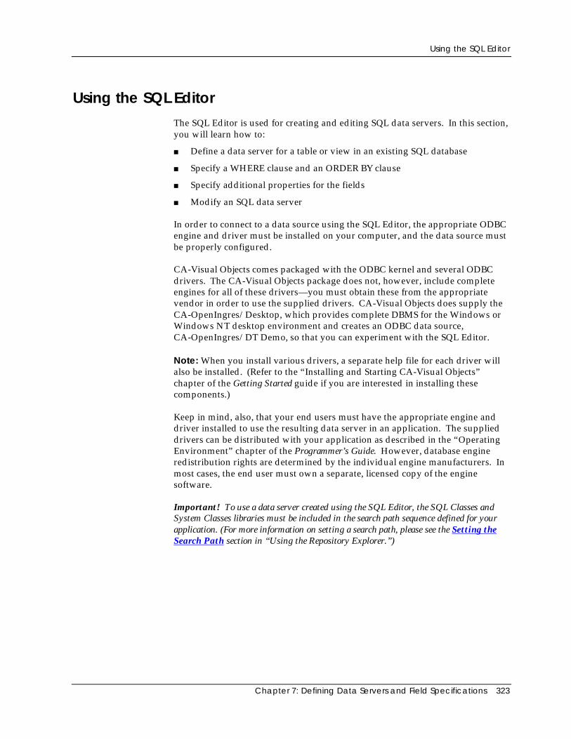
Using the SQL Editor
Chapter 7: Defining Data Servers and Field Specifications 323
Using the SQL EditorThe SQL Editor is used for creating and editing SQL data servers. In this section,you will learn how to:
■ Define a data server for a table or view in an existing SQL database
■ Specify a WHERE clause and an ORDER BY clause
■ Specify additional properties for the fields
■ Modify an SQL data server
In order to connect to a data source using the SQL Editor, the appropriate ODBCengine and driver must be installed on your computer, and the data source mustbe properly configured.
CA-Visual Objects comes packaged with the ODBC kernel and several ODBCdrivers. The CA-Visual Objects package does not, however, include completeengines for all of these drivers—you must obtain these from the appropriatevendor in order to use the supplied drivers. CA-Visual Objects does supply theCA-OpenIngres/Desktop, which provides complete DBMS for the Windows orWindows NT desktop environment and creates an ODBC data source,CA-OpenIngres/DT Demo, so that you can experiment with the SQL Editor.
Note: When you install various drivers, a separate help file for each driver willalso be installed. (Refer to the “Installing and Starting CA-Visual Objects”chapter of the Getting Started guide if you are interested in installing thesecomponents.)
Keep in mind, also, that your end users must have the appropriate engine anddriver installed to use the resulting data server in an application. The supplieddrivers can be distributed with your application as described in the “OperatingEnvironment” chapter of the Programmer’s Guide. However, database engineredistribution rights are determined by the individual engine manufacturers. Inmost cases, the end user must own a separate, licensed copy of the enginesoftware.
Important! To use a data server created using the SQL Editor, the SQL Classes andSystem Classes libraries must be included in the search path sequence defined for yourapplication. (For more information on setting a search path, please see the Setting theSearch Path section in “Using the Repository Explorer.”)
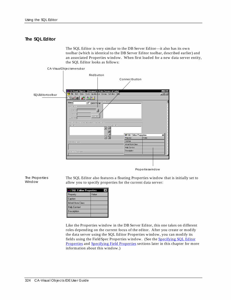
Using the SQL Editor
324 CA-Visual Objects IDE User Guide
The SQL Editor
The SQL Editor is very similar to the DB Server Editor—it also has its owntoolbar (which is identical to the DB Server Editor toolbar, described earlier) andan associated Properties window. When first loaded for a new data server entity,the SQL Editor looks as follows:
SQLEditortoolbar
Propertieswindow
FindbuttonConnectbutton
CA-VisualObjectsmenubar
The PropertiesWindow
The SQL Editor also features a floating Properties window that is initially set toallow you to specify properties for the current data server:
Like the Properties window in the DB Server Editor, this one takes on differentroles depending on the current focus of the editor. After you create or modifythe data server using the SQL Editor Properties window, you can modify itsfields using the FieldSpec Properties window. (See the Specifying SQL EditorProperties and Specifying Field Properties sections later in this chapter for moreinformation about this window.)
Using the SQL Editor
Chapter 7: Defining Data Servers and Field Specifications 325
Other Options The remainder of the options in the SQL Editor workspace allow you to specifyvarious properties for the current data server. See Defining an SQL Server nextfor details.
Defining an SQL Server
Defining a data server in the SQL Editor requires you to do the following:
■ Create the data server by specifying its properties, connecting to an SQLdatabase, and choosing a table to use
■ Optionally specify a WHERE clause
■ Optionally specify an ORDER BY clause
■ Optionally specify additional properties for the fields
Creating an SQL Server
Creating an SQL data server requires that you have an existing SQL databaseavailable. To create a data server based on an existing SQL database, you need toperform the following steps:
1. Start the SQL Editor.
Like all CA-Visual Objects tools, the SQL Editor is accessed using either theTools menu or the New Entity toolbar button.
The SQL Editor appears.
2. In the Name edit control, type the name of the data server (for example,Customer_Order). This information is included in the data server’sautomatically generated hyperlabel.
You can enter a name using a maximum of 64 characters. The first charactermust be alphabetic or an underscore; the other characters can bealphanumeric and can include the underscore character. Blanks within thename will be changed to underscores when you save the data server.
This name is used to create the SQL server entity and to subclass the dataserver in the code generated by the SQL Editor. For example:
CLASS Customer_Order INHERIT SQLSelect
It is also the name used to refer to this data server in your program code. Forexample:
oSQLCust := Customer_Order{}
3. Optionally set additional data server properties using the SQL EditorProperties window.
See Specifying SQL Editor Properties below.
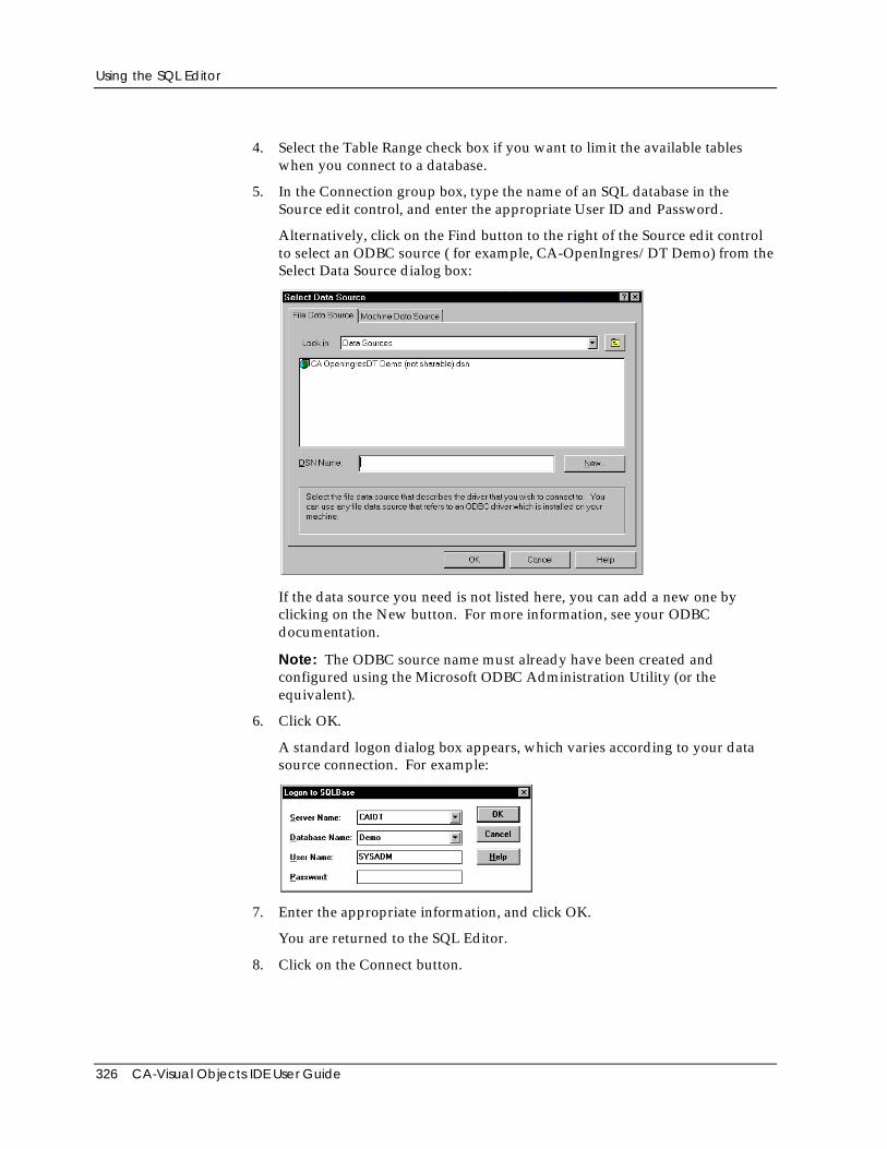
Using the SQL Editor
326 CA-Visual Objects IDE User Guide
4. Select the Table Range check box if you want to limit the available tableswhen you connect to a database.
5. In the Connection group box, type the name of an SQL database in theSource edit control, and enter the appropriate User ID and Password.
Alternatively, click on the Find button to the right of the Source edit controlto select an ODBC source ( for example, CA-OpenIngres/DT Demo) from theSelect Data Source dialog box:
If the data source you need is not listed here, you can add a new one byclicking on the New button. For more information, see your ODBCdocumentation.
Note: The ODBC source name must already have been created andconfigured using the Microsoft ODBC Administration Utility (or theequivalent).
6. Click OK.
A standard logon dialog box appears, which varies according to your datasource connection. For example:
7. Enter the appropriate information, and click OK.
You are returned to the SQL Editor.
8. Click on the Connect button.
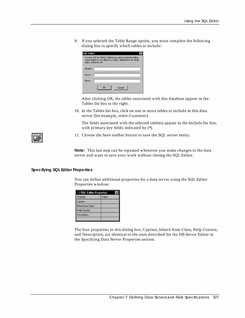
Using the SQL Editor
Chapter 7: Defining Data Servers and Field Specifications 327
9. If you selected the Table Range option, you must complete the followingdialog box to specify which tables to include:
After clicking OK, the tables associated with this database appear in theTables list box to the right.
10. In the Tables list box, click on one or more tables to include in this dataserver (for example, order.Customer).
The fields associated with the selected table(s) appear in the Include list box,with primary key fields indicated by (*).
11. Choose the Save toolbar button to save the SQL server entity.
Note: This last step can be repeated whenever you make changes to the dataserver and want to save your work without closing the SQL Editor.
Specifying SQL Editor Properties
You can define additional properties for a data server using the SQL EditorProperties window:
The four properties in this dialog box, Caption, Inherit from Class, Help Context,and Description, are identical to the ones described for the DB Server Editor inthe Specifying Data Server Properties section.
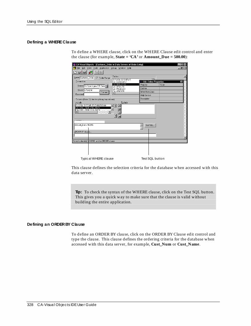
Using the SQL Editor
328 CA-Visual Objects IDE User Guide
Defining a WHERE Clause
To define a WHERE clause, click on the WHERE Clause edit control and enterthe clause (for example, State = ‘CA’ or Amount_Due = 500.00):
T ypical WHERE claus e Tes t S QL button
This clause defines the selection criteria for the database when accessed with thisdata server.
Tip: To check the syntax of the WHERE clause, click on the Test SQL button.This gives you a quick way to make sure that the clause is valid withoutbuilding the entire application.
Defining an ORDER BY Clause
To define an ORDER BY clause, click on the ORDER BY Clause edit control andtype the clause. This clause defines the ordering criteria for the database whenaccessed with this data server, for example, Cust_Num or Cust_Name.
Using the SQL Editor
Chapter 7: Defining Data Servers and Field Specifications 329
Specifying Field Properties
Using the FieldSpec Properties window, you can specify any field property thatis not directly associated with the database. The Field Properties are the same asthose described under Specifying Field Properties in Using the DB Server Editor.
Note: You cannot, however, change properties that would affect the structure ofthe underlying SQL table; that is, Name, Type, Length, Decimals, and Requiredare read-only fields.
Generating Code
When you save a data server, CA-Visual Objects automatically generates:
■ An SQL server entity for the data server
You can double-click on this entity in the Repository Explorer’s list viewpane to begin editing it with the SQL Editor.
■ An SQLSelect subclass using the data server name
■ A field spec entity for each field specification defined for the data server
You can double-click on any field spec entity in the Repository Explorer’s listview pane to begin editing it with the FieldSpec Editor.
■ A FieldSpec subclass for each field specification in the data server
■ Other default source code that can be modified
Modifying an SQL Server
After you have defined a data server, you can modify it by changing itsproperties or the properties of its fields. You can also change the data servername, its associated table or source database, and its WHERE and ORDER BYclauses.
Editing SQL Editor Properties
Name To change the name of the data server, type a new name in the Name editcontrol.
Connection To change the associated source database, either type a new Source, User ID, andPassword in the Connection group box and click on the Connect button, orconnect to a new source database by clicking on the Find button. This will clearthe Include field list and replace the Tables list with the table names from thenew source database.
Using the SQL Editor
330 CA-Visual Objects IDE User Guide
Note: You can optionally check the Table Range check box before connecting toa new database to limit the table selection using the SQL Editor dialog box.
Tables To associate another table, click on the new table name in the Tables list box.This will add the field list from the selected table to the prior Include field list.
To remove an associate table that is currently highlighted in the Tables list box,click on the table name. The fields from the table will be removed from theInclude field list.
WHERE/ORDER BYClauses
To change the WHERE or ORDER BY clause, click on the appropriate editcontrol and type the new clause.
Other Properties To change any other property associated with a data server:
1. Click on the Name edit control.
The Properties window changes so that it relates to the data server.
2. Click on the property that you want to change in the Properties window andspecify the new value.
See Specifying Data Server Properties for more information.
Editing Fields
If there are fields in the Include list box, you can change certain properties,change their order, or exclude them from use by the data server. Except for thefact that you cannot delete fields and cannot make structural changes to theunderlying database in the SQL Editor, the instructions for making these changesare the same as those described in the Editing Fields section for the DB ServerEditor earlier in this chapter.
Using the FieldSpec Editor
Chapter 7: Defining Data Servers and Field Specifications 331
Using the FieldSpec EditorA field specification is a unique, independent entity in the CA-Visual Objectsarchitecture. It allows you to specify and store a wide variety of properties for anitem in your application, all in a single, manageable location. (Note that it isderived from the FieldSpec class.)
Typically, a field specification is “associated” with a field in a data server. Someof the properties you might define in such a field specification are a type, alength, a picture clause, and validation checks. In fact, when you create a dataserver in the DB Server Editor or the SQL Editor, the system automaticallygenerates a field specification for every field in that server.
The automatic association of field specifications with data server fields is quiteuseful, because many of your fields will require formatting, validation, etc., andfield specifications provide a convenient and intuitive way to define theseproperties.
In addition, many databases have similar (if not identical) fields, which requirethe same formatting, validation, etc. With the CA-Visual Objects architecture,you can design a single field specification that can be “attached” to each commonfield. For example, if you create a Salary field specification, you can simply reuseits properties when creating an EmpSalary field in a data server for an Employeedatabase. You can then reuse its properties when creating a similar field for adata server for a Payroll database.
However, field specifications do not need to be associated with data server fields.For example, when designing a form in the Window Editor, you might add anedit control for which you want to specify a picture clause, a required flag, and avalidation check. Even though the control is not linked to a data server field, youcan attach a field specification to it to define these properties.
Field specifications, therefore, are useful in a variety of ways, saving you bothtime and resources. And, because of the nature of repository-baseddevelopment, field specifications can easily be selected and reused throughoutthe system.
This section describes the FieldSpec Editor and explains how to:
■ Define a new field specification
■ Modify an existing field specification
■ Copy properties from one field specification to another
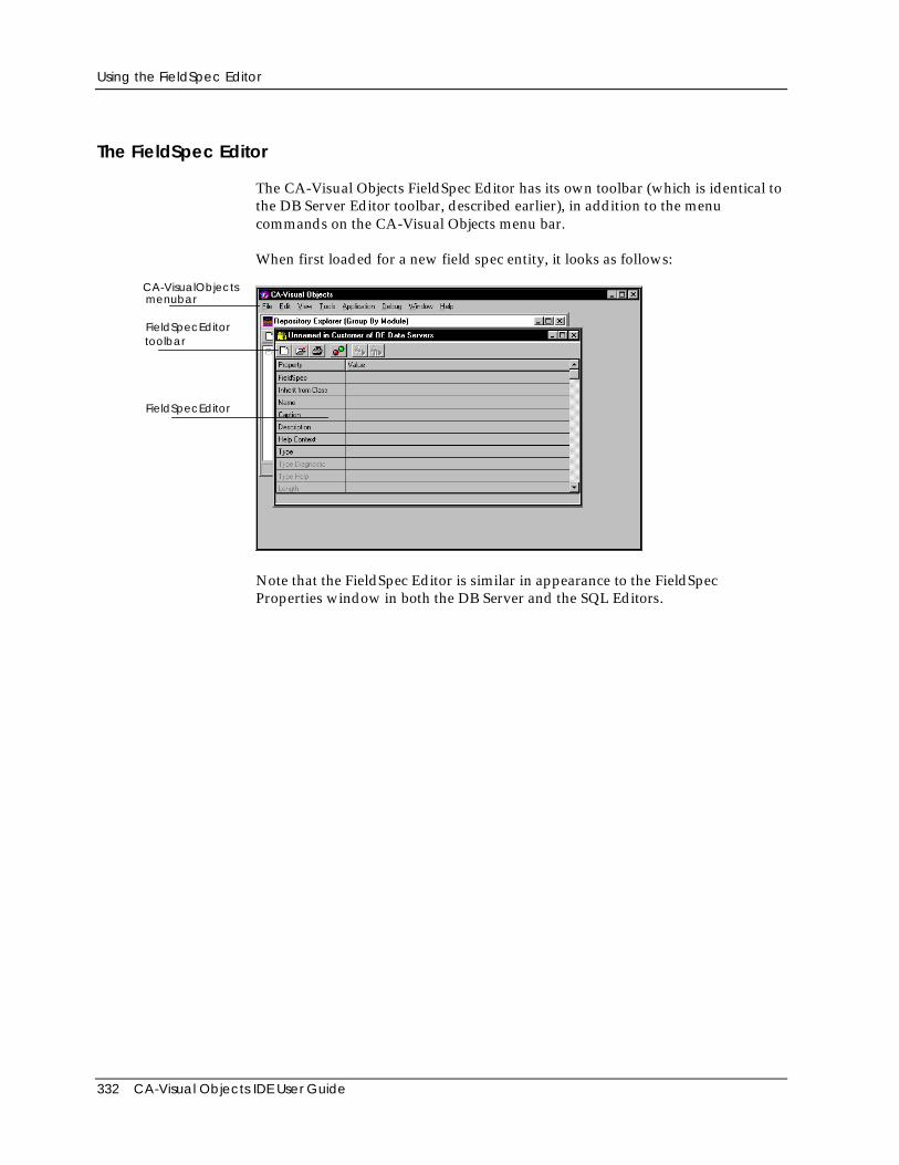
Using the FieldSpec Editor
332 CA-Visual Objects IDE User Guide
The FieldSpec Editor
The CA-Visual Objects FieldSpec Editor has its own toolbar (which is identical tothe DB Server Editor toolbar, described earlier), in addition to the menucommands on the CA-Visual Objects menu bar.
When first loaded for a new field spec entity, it looks as follows:
FieldSpecEditor
FieldSpecEditortoolbar
CA-VisualObjectsmenubar
Note that the FieldSpec Editor is similar in appearance to the FieldSpecProperties window in both the DB Server and the SQL Editors.
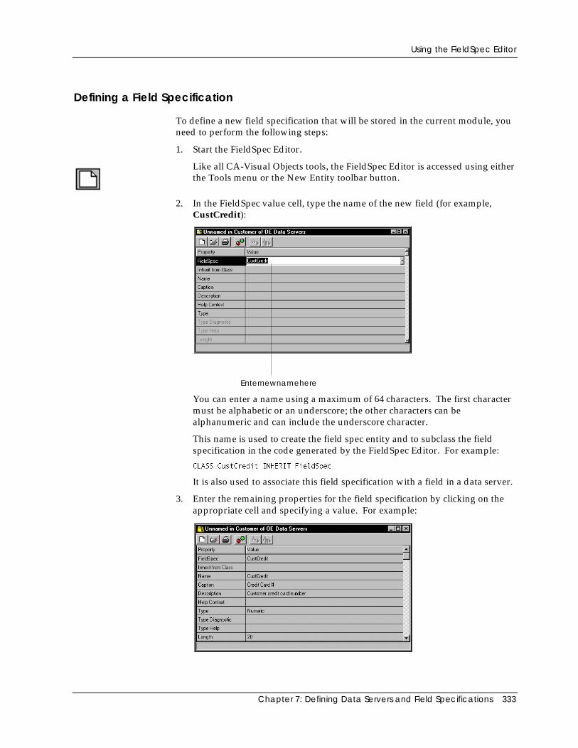
Using the FieldSpec Editor
Chapter 7: Defining Data Servers and Field Specifications 333
Defining a Field Specification
To define a new field specification that will be stored in the current module, youneed to perform the following steps:
1. Start the FieldSpec Editor.
Like all CA-Visual Objects tools, the FieldSpec Editor is accessed using eitherthe Tools menu or the New Entity toolbar button.
2. In the FieldSpec value cell, type the name of the new field (for example,CustCredit):
Enternewnamehere
You can enter a name using a maximum of 64 characters. The first charactermust be alphabetic or an underscore; the other characters can bealphanumeric and can include the underscore character.
This name is used to create the field spec entity and to subclass the fieldspecification in the code generated by the FieldSpec Editor. For example:
CLASS CustCredit INHERIT FieldSpec
It is also used to associate this field specification with a field in a data server.
3. Enter the remaining properties for the field specification by clicking on theappropriate cell and specifying a value. For example:
Using the FieldSpec Editor
334 CA-Visual Objects IDE User Guide
Note: Refer to the online help for detailed information about new andupdated field specification properties.
Type and Length are required, and all other properties are optional. For acomplete description of these properties, refer to Specifying Field Propertiesin the Using the DB Server Editor section earlier in this chapter. Note,however, that Name, Caption, and Description correspond to FS Name, FSCaption, and FS Description, respectively.
4. Choose the Save toolbar button to save the field specification.
Note: This last step can be repeated whenever you make changes to a fieldspecification and want to save your work without closing the FieldSpec Editor.
Generating Code
When you save a field specification, CA-Visual Objects automatically generatesa field spec entity. You can double-click on this entity in the RepositoryExplorer’s list view pane to begin editing it with the FieldSpec Editor.
CA-Visual Objects also creates a subclass of the FieldSpec class using this samename, and an Init() method to initialize all the properties you defined.
Editing Field Specifications
Within the FieldSpec Editor, you can edit a field specification and copyproperties from one field specification to another.
Modifying a Field Specification
Basic Steps To modify any field specification defined for an application, follow these basicsteps:
1. Start the FieldSpec Editor.
2. Click on the FieldSpec cell.
3. Type the name of an existing field specification, or click on the Down arrowbutton to display a drop-down list box and choose the one you want.
4. Change any property by clicking on it, and entering or selecting a new value.
5. Choose Save.
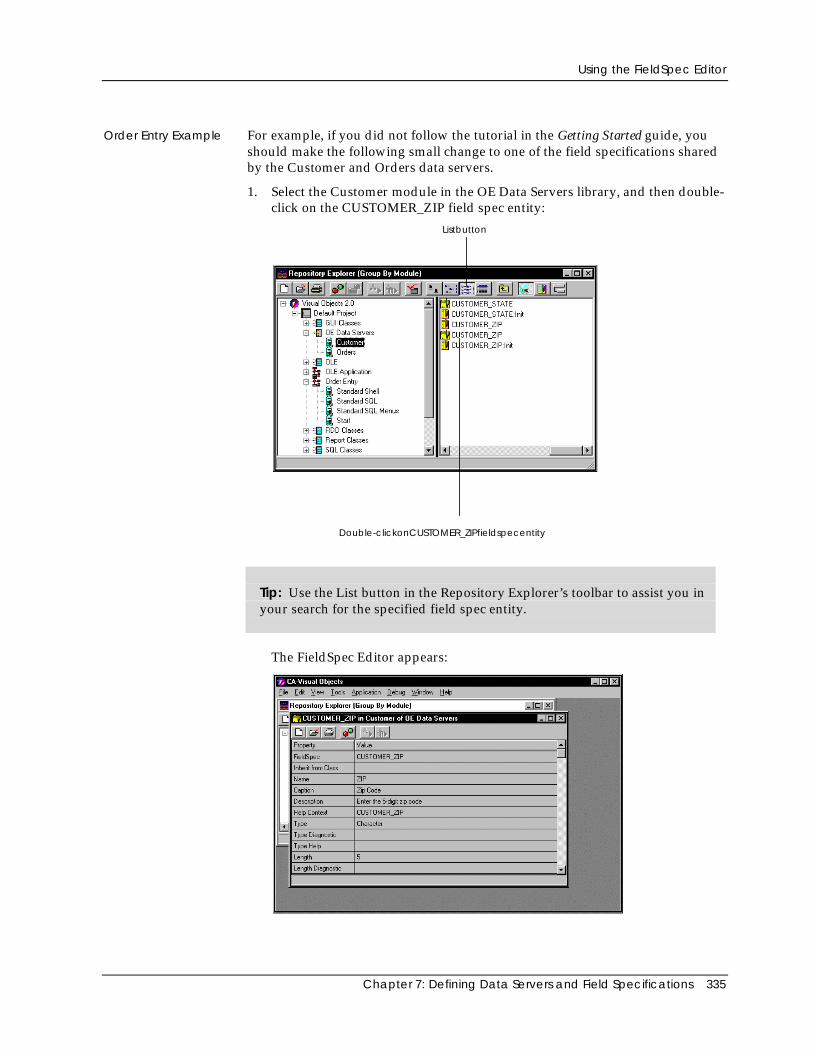
Using the FieldSpec Editor
Chapter 7: Defining Data Servers and Field Specifications 335
Order Entry Example For example, if you did not follow the tutorial in the Getting Started guide, youshould make the following small change to one of the field specifications sharedby the Customer and Orders data servers.
1. Select the Customer module in the OE Data Servers library, and then double-click on the CUSTOMER_ZIP field spec entity:
Double-clickonCUSTOMER_ZIPfieldspecentity
Listbutton
Tip: Use the List button in the Repository Explorer’s toolbar to assist you inyour search for the specified field spec entity.
The FieldSpec Editor appears:
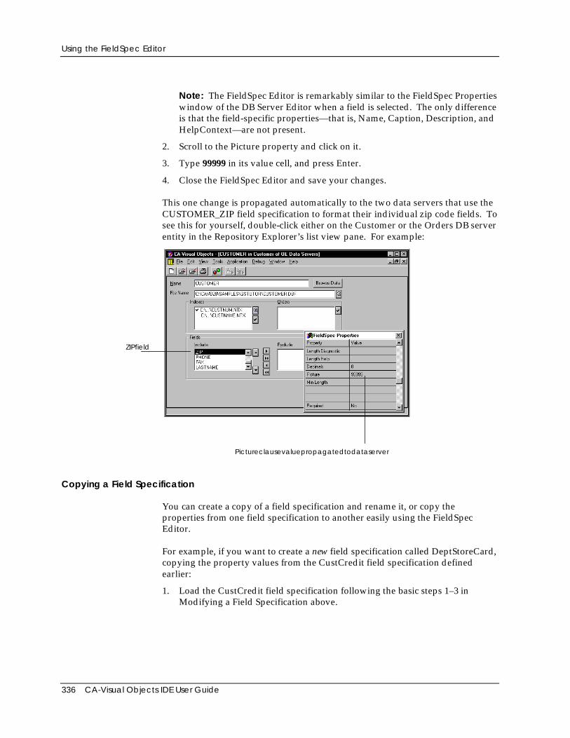
Using the FieldSpec Editor
336 CA-Visual Objects IDE User Guide
Note: The FieldSpec Editor is remarkably similar to the FieldSpec Propertieswindow of the DB Server Editor when a field is selected. The only differenceis that the field-specific properties—that is, Name, Caption, Description, andHelpContext—are not present.
2. Scroll to the Picture property and click on it.
3. Type 99999 in its value cell, and press Enter.
4. Close the FieldSpec Editor and save your changes.
This one change is propagated automatically to the two data servers that use theCUSTOMER_ZIP field specification to format their individual zip code fields. Tosee this for yourself, double-click either on the Customer or the Orders DB serverentity in the Repository Explorer’s list view pane. For example:
Pictureclausevaluepropagatedtodataserver
ZIPfield
Copying a Field Specification
You can create a copy of a field specification and rename it, or copy theproperties from one field specification to another easily using the FieldSpecEditor.
For example, if you want to create a new field specification called DeptStoreCard,copying the property values from the CustCredit field specification definedearlier:
1. Load the CustCredit field specification following the basic steps 1–3 inModifying a Field Specification above.
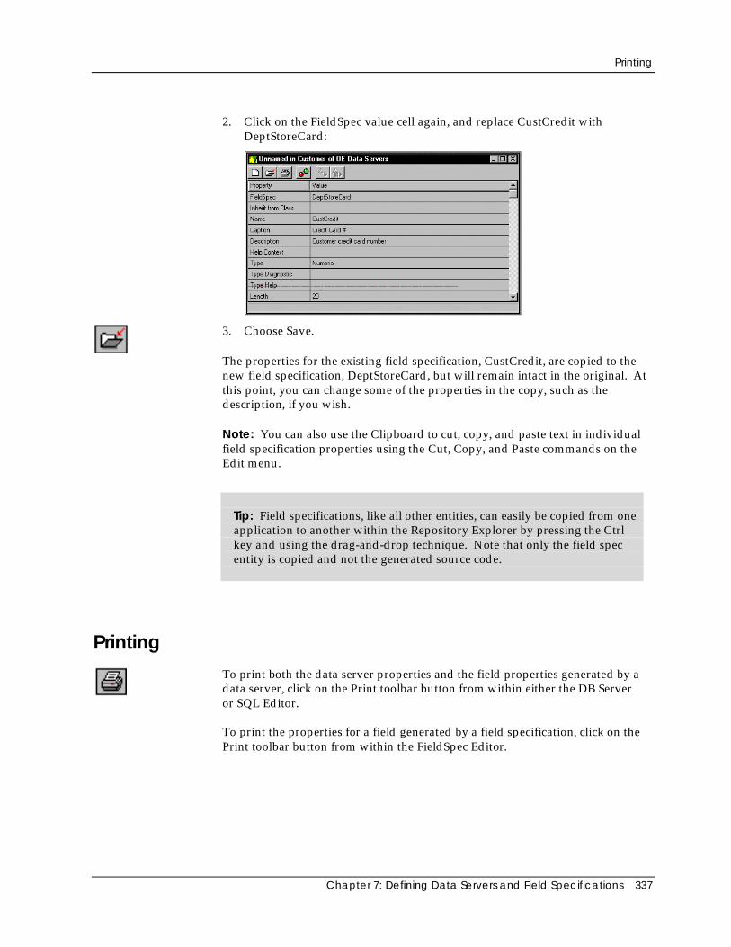
Printing
Chapter 7: Defining Data Servers and Field Specifications 337
2. Click on the FieldSpec value cell again, and replace CustCredit withDeptStoreCard:
3. Choose Save.
The properties for the existing field specification, CustCredit, are copied to thenew field specification, DeptStoreCard, but will remain intact in the original. Atthis point, you can change some of the properties in the copy, such as thedescription, if you wish.
Note: You can also use the Clipboard to cut, copy, and paste text in individualfield specification properties using the Cut, Copy, and Paste commands on theEdit menu.
Tip: Field specifications, like all other entities, can easily be copied from oneapplication to another within the Repository Explorer by pressing the Ctrlkey and using the drag-and-drop technique. Note that only the field specentity is copied and not the generated source code.
PrintingTo print both the data server properties and the field properties generated by adata server, click on the Print toolbar button from within either the DB Serveror SQL Editor.
To print the properties for a field generated by a field specification, click on thePrint toolbar button from within the FieldSpec Editor.

Chapter 8: Creating Data-Aware Windows 339
Chapter
8 Creating Data-Aware Windows
Data windows and data dialog windows are data entry windows that areassociated with data servers. Both are data-aware—each type “knows” about thedata with which it is intended to operate via properties that you specify for eachdata control in its window.
As described earlier in the “Using the Window Editor” chapter, data windowsand data dialog windows are quite similar. However, whereas a regular datawindow is an MDI child window, a data dialog window behaves like a modaldialog window. This means that the end user must respond to the window andclose it before continuing with the application. Data dialog windows aretypically used for small data entry tasks, such as password entry.
Note: In CA-Visual Objects 2.7, a new window type—OLEDataWindow—wasadded. An OLE data window is essentially the same as a regular data window,except that it contains additional logic for the deactivation of an in-place activeOLE object by clicking anywhere in the window. Additionally, all text controlsare now data aware. For more detailed information about OLE data windowsand data aware controls, refer to the online help.
The Window Editor allows you to create data dialog windows and datawindows using one of the following techniques:
■ Customizing a DataWindow or DataDialog form by choosing a data server,manually placing controls on the form, and specifying properties for thosecontrols
■ Using the Auto Layout feature to choose a data server (or two related dataservers) and automatically place fixed text and single-line edit controls onthe form whose properties are based on the data server
Using either technique, the key to designing a data-aware window is in linkingindividual controls to fields defined in the data server.
Creating a Data-Aware Window
340 CA-Visual Objects IDE User Guide
In addition, you can specify a field specification for each control. You bind acontrol to a specific field using the field name as the name of the control.Because the field specifications store information designed specifically for usewith a data window (such as captions, descriptions, help keywords, pictureformatting, and validation rules), such links are quite useful. Data windowsautomatically inherit and use the property values from the field specifications,eliminating the need for you to specify this information repeatedly. The onlycontrols you cannot make data-aware are fixed icons, fixed text, group boxes,push buttons, and radio buttons.
Creating a Data-Aware WindowTo create a window that is linked to a data server, such as the data window that“links” the Customer and Orders data servers in the Order Entry sampleapplication, you need to perform the following steps:
1. Select the desired application in the Repository Explorer (for example, OrderEntry).
2. Click the New Module toolbar button.
The Create Module dialog box appears.
3. Type App Windows in the Enter Module name edit control, and choose OK.
The App Windows module is added to Order Entry in the RepositoryExplorer’s tree view pane.
4. Highlight the App Windows module in the tree structure, and then select theWindow Editor command from the Tools menu.
The Window Editor dialog box appears:
Note: This dialog box has been updated in this version of CA-Visual Objectsto reflect the addition of the new window type, OLEDATAWINDOW.
See Creating a Window in “Using the Window Editor” for details about thisdialog box.
5. In this instance, select DATAWINDOW in the New Window Type list box.
6. Enter CustOrd in the Name edit control.
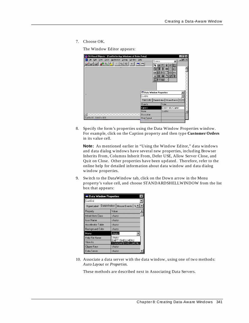
Creating a Data-Aware Window
Chapter 8: Creating Data-Aware Windows 341
7. Choose OK.
The Window Editor appears:
8. Specify the form’s properties using the Data Window Properties window.For example, click on the Caption property and then type Customer Ordersin its value cell.
Note: As mentioned earlier in “Using the Window Editor,” data windowsand data dialog windows have several new properties, including BrowserInherits From, Columns Inherit From, Defer USE, Allow Server Close, andQuit on Close. Other properties have been updated. Therefore, refer to theonline help for detailed information about data window and data dialogwindow properties.
9. Switch to the DataWindow tab, click on the Down arrow in the Menuproperty’s value cell, and choose STANDARDSHELLWINDOW from the listbox that appears:
10. Associate a data server with the data window, using one of two methods:Auto Layout or Properties.
These methods are described next in Associating Data Servers.
Creating a Data-Aware Window
342 CA-Visual Objects IDE User Guide
11. Choose the Save toolbar button to save the form.
12. Close the Window Editor.
(You will return to the CustOrd data window shortly.)
Associating Data Servers
You can associate a data server with a data window or data dialog window ineither one of two ways:
■ Using the Auto Layout feature
Choose the Auto Layout toolbar button to specify a data server (or tworelated data servers), creating a predefined data window based on the dataserver(s) definition. You are then free to move the predefined controlsaround within the form and modify them as you see fit. This is described inthe next section, Using Auto Layout.
■ Using the Properties window
Choose a data server using the Properties window and add your owncontrols manually one by one, creating a customized data window or datadialog form. This is described in the section Customizing a Data-AwareWindow later in this chapter.
Using Auto Layout
Using the Window Editor’s Auto Layout feature is much easier than creating acustomized data-aware window “from scratch.” At the touch of a button, AutoLayout automatically creates a fixed text caption and single-line edit datacontrol for every available field in the associated data server(s).
Tip: If you have an Xbase or SQL database on disk that is not yet known tothe repository, simply bring up theDB Server or SQL Editor using the appropriate command from within theTools menu, import the database structure, save it in the repository, andswitch back to the Window Editor. See Chapter 7: Defining Data Serversand Field Specifications for more information on how to do this and on dataservers and field specifications, in general.
The Auto Layout feature presents you with two options for defining the type ofdata server link, Single Server or Master Detail Servers.
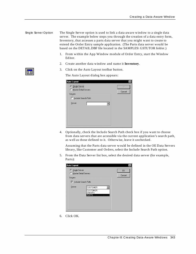
Creating a Data-Aware Window
Chapter 8: Creating Data-Aware Windows 343
Single Server Option The Single Server option is used to link a data-aware window to a single dataserver. The example below steps you through the creation of a data entry form,Inventory, that accesses a parts data server that you might want to create toextend the Order Entry sample application. (The Parts data server would bebased on the DETAIL.DBF file located in the SAMPLES\GSTUTOR folder.)
1. From within the App Window module of Order Entry, start the WindowEditor.
2. Create another data window and name it Inventory.
3. Click on the Auto Layout toolbar button.
The Auto Layout dialog box appears:
4. Optionally, check the Include Search Path check box if you want to choosefrom data servers that are accessible via the current application’s search path,as well as those defined to it. Otherwise, leave it unchecked.
Assuming that the Parts data server would be defined in the OE Data Serverslibrary, like Customer and Orders, select the Include Search Path option.
5. From the Data Server list box, select the desired data server (for example,Parts):
6. Click OK.
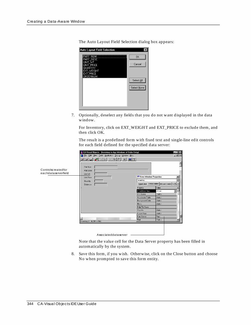
Creating a Data-Aware Window
344 CA-Visual Objects IDE User Guide
The Auto Layout Field Selection dialog box appears:
7. Optionally, deselect any fields that you do not want displayed in the datawindow.
For Inventory, click on EXT_WEIGHT and EXT_PRICE to exclude them, andthen click OK.
The result is a predefined form with fixed text and single-line edit controlsfor each field defined for the specified data server:
Controlscreatedforeachdataserverfield
Associateddataserver
Note that the value cell for the Data Server property has been filled inautomatically by the system.
8. Save this form, if you wish. Otherwise, click on the Close button and chooseNo when prompted to save this form entity.
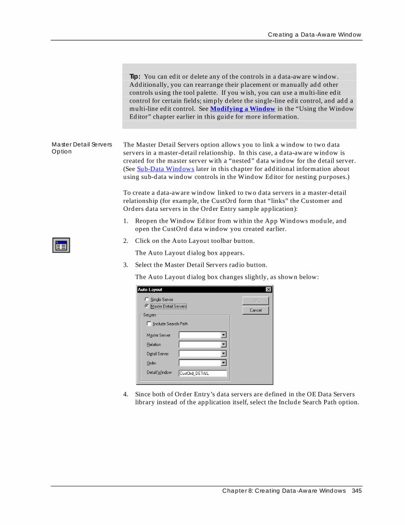
Creating a Data-Aware Window
Chapter 8: Creating Data-Aware Windows 345
Tip: You can edit or delete any of the controls in a data-aware window.Additionally, you can rearrange their placement or manually add othercontrols using the tool palette. If you wish, you can use a multi-line editcontrol for certain fields; simply delete the single-line edit control, and add amulti-line edit control. See Modifying a Window in the “Using the WindowEditor” chapter earlier in this guide for more information.
Master Detail ServersOption
The Master Detail Servers option allows you to link a window to two dataservers in a master-detail relationship. In this case, a data-aware window iscreated for the master server with a “nested” data window for the detail server.(See Sub-Data Windows later in this chapter for additional information aboutusing sub-data window controls in the Window Editor for nesting purposes.)
To create a data-aware window linked to two data servers in a master-detailrelationship (for example, the CustOrd form that “links” the Customer andOrders data servers in the Order Entry sample application):
1. Reopen the Window Editor from within the App Windows module, andopen the CustOrd data window you created earlier.
2. Click on the Auto Layout toolbar button.
The Auto Layout dialog box appears.
3. Select the Master Detail Servers radio button.
The Auto Layout dialog box changes slightly, as shown below:
4. Since both of Order Entry’s data servers are defined in the OE Data Serverslibrary instead of the application itself, select the Include Search Path option.
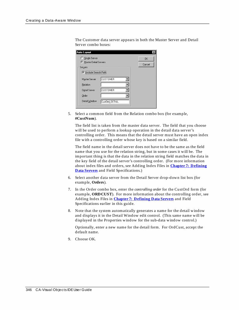
Creating a Data-Aware Window
346 CA-Visual Objects IDE User Guide
The Customer data server appears in both the Master Server and DetailServer combo boxes:
5. Select a common field from the Relation combo box (for example,#CustNum).
The field list is taken from the master data server. The field that you choosewill be used to perform a lookup operation in the detail data server’scontrolling order. This means that the detail server must have an open indexfile with a controlling order whose key is based on a similar field.
The field name in the detail server does not have to be the same as the fieldname that you use for the relation string, but in some cases it will be. Theimportant thing is that the data in the relation string field matches the data inthe key field of the detail server’s controlling order. (For more informationabout index files and orders, see Adding Index Files in Chapter 7: DefiningData Servers and Field Specifications.)
6. Select another data server from the Detail Server drop-down list box (forexample, Orders).
7. In the Order combo box, enter the controlling order for the CustOrd form (forexample, ORDCUST). For more information about the controlling order, seeAdding Index Files in Chapter 7: Defining Data Servers and FieldSpecifications earlier in this guide.
8. Note that the system automatically generates a name for the detail windowand displays it in the Detail Window edit control. (This same name will bedisplayed in the Properties window for the sub-data window control.)
Optionally, enter a new name for the detail form. For OrdCust, accept thedefault name.
9. Choose OK.
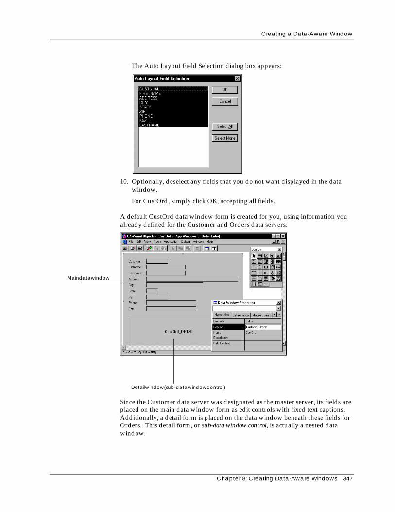
Creating a Data-Aware Window
Chapter 8: Creating Data-Aware Windows 347
The Auto Layout Field Selection dialog box appears:
10. Optionally, deselect any fields that you do not want displayed in the datawindow.
For CustOrd, simply click OK, accepting all fields.
A default CustOrd data window form is created for you, using information youalready defined for the Customer and Orders data servers:
Maindatawindow
Detailwindow(sub-datawindowcontrol)
Since the Customer data server was designated as the master server, its fields areplaced on the main data window form as edit controls with fixed text captions.Additionally, a detail form is placed on the data window beneath these fields forOrders. This detail form, or sub-data window control, is actually a nested datawindow.
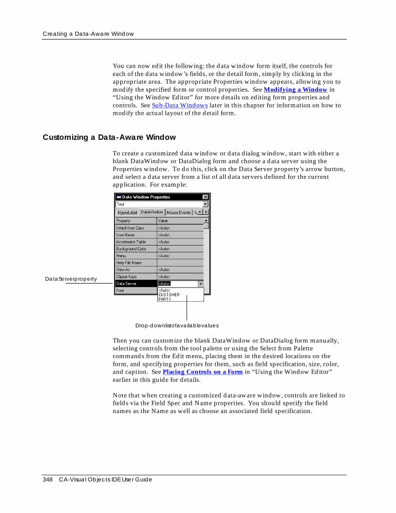
Creating a Data-Aware Window
348 CA-Visual Objects IDE User Guide
You can now edit the following: the data window form itself, the controls foreach of the data window’s fields, or the detail form, simply by clicking in theappropriate area. The appropriate Properties window appears, allowing you tomodify the specified form or control properties. See Modifying a Window in“Using the Window Editor” for more details on editing form properties andcontrols. See Sub-Data Windows later in this chapter for information on how tomodify the actual layout of the detail form.
Customizing a Data-Aware Window
To create a customized data window or data dialog window, start with either ablank DataWindow or DataDialog form and choose a data server using theProperties window. To do this, click on the Data Server property’s arrow button,and select a data server from a list of all data servers defined for the currentapplication. For example:
DataServerproperty
Drop-downlistofavailablevalues
Then you can customize the blank DataWindow or DataDialog form manually,selecting controls from the tool palette or using the Select from Palettecommands from the Edit menu, placing them in the desired locations on theform, and specifying properties for them, such as field specification, size, color,and caption. See Placing Controls on a Form in “Using the Window Editor”earlier in this guide for details.
Note that when creating a customized data-aware window, controls are linked tofields via the Field Spec and Name properties. You should specify the fieldnames as the Name as well as choose an associated field specification.
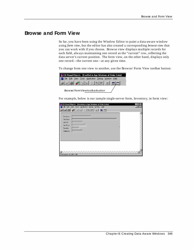
Browse and Form View
Chapter 8: Creating Data-Aware Windows 349
Browse and Form ViewSo far, you have been using the Window Editor to paint a data-aware windowusing form view, but the editor has also created a corresponding browse view thatyou can work with if you choose. Browse view displays multiple records foreach field, always maintaining one record as the “current” row, reflecting thedata server’s current position. The form view, on the other hand, displays onlyone record—the current one—at any given time.
To change from one view to another, use the Browse/Form View toolbar button:
Browse/FormViewtoolbarbutton
For example, below is our sample single-server form, Inventory, in form view:
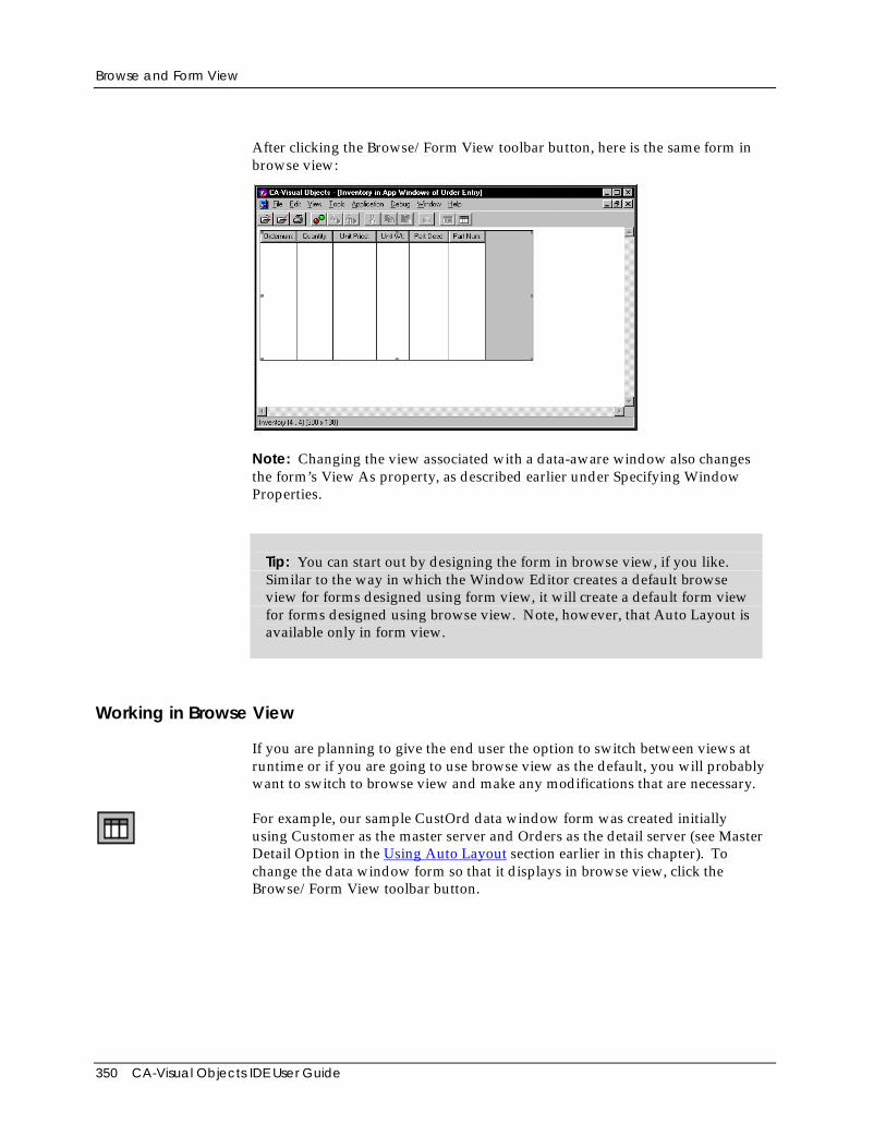
Browse and Form View
350 CA-Visual Objects IDE User Guide
After clicking the Browse/Form View toolbar button, here is the same form inbrowse view:
Note: Changing the view associated with a data-aware window also changesthe form’s View As property, as described earlier under Specifying WindowProperties.
Tip: You can start out by designing the form in browse view, if you like.Similar to the way in which the Window Editor creates a default browseview for forms designed using form view, it will create a default form viewfor forms designed using browse view. Note, however, that Auto Layout isavailable only in form view.
Working in Browse View
If you are planning to give the end user the option to switch between views atruntime or if you are going to use browse view as the default, you will probablywant to switch to browse view and make any modifications that are necessary.
For example, our sample CustOrd data window form was created initiallyusing Customer as the master server and Orders as the detail server (see MasterDetail Option in the Using Auto Layout section earlier in this chapter). Tochange the data window form so that it displays in browse view, click theBrowse/Form View toolbar button.
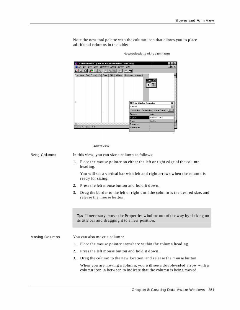
Browse and Form View
Chapter 8: Creating Data-Aware Windows 351
Note the new tool palette with the column icon that allows you to placeadditional columns in the table:
Browseview
Newtoolpalettewithcolumnicon
Sizing Columns In this view, you can size a column as follows:
1. Place the mouse pointer on either the left or right edge of the columnheading.
You will see a vertical bar with left and right arrows when the column isready for sizing.
2. Press the left mouse button and hold it down.
3. Drag the border to the left or right until the column is the desired size, andrelease the mouse button.
Tip: If necessary, move the Properties window out of the way by clicking onits title bar and dragging it to a new position.
Moving Columns You can also move a column:
1. Place the mouse pointer anywhere within the column heading.
2. Press the left mouse button and hold it down.
3. Drag the column to the new location, and release the mouse button.
When you are moving a column, you will see a double-sided arrow with acolumn icon in between to indicate that the column is being moved.
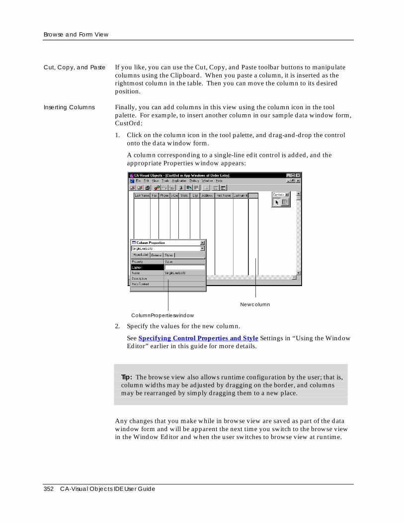
Browse and Form View
352 CA-Visual Objects IDE User Guide
Cut, Copy, and Paste If you like, you can use the Cut, Copy, and Paste toolbar buttons to manipulatecolumns using the Clipboard. When you paste a column, it is inserted as therightmost column in the table. Then you can move the column to its desiredposition.
Inserting Columns Finally, you can add columns in this view using the column icon in the toolpalette. For example, to insert another column in our sample data window form,CustOrd:
1. Click on the column icon in the tool palette, and drag-and-drop the controlonto the data window form.
A column corresponding to a single-line edit control is added, and theappropriate Properties window appears:
ColumnPropertieswindow
Newcolumn
2. Specify the values for the new column.
See Specifying Control Properties and Style Settings in “Using the WindowEditor” earlier in this guide for more details.
Tip: The browse view also allows runtime configuration by the user; that is,column widths may be adjusted by dragging on the border, and columnsmay be rearranged by simply dragging them to a new place.
Any changes that you make while in browse view are saved as part of the datawindow form and will be apparent the next time you switch to the browse viewin the Window Editor and when the user switches to browse view at runtime.
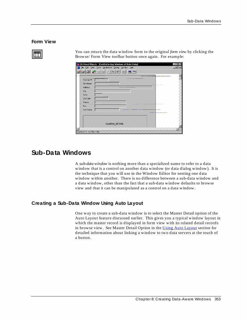
Sub-Data Windows
Chapter 8: Creating Data-Aware Windows 353
Form View
You can return the data window form to the original form view by clicking theBrowse/Form View toolbar button once again. For example:
Sub-Data WindowsA sub-data window is nothing more than a specialized name to refer to a datawindow that is a control on another data window (or data dialog window). It isthe technique that you will use in the Window Editor for nesting one datawindow within another. There is no difference between a sub-data window anda data window, other than the fact that a sub-data window defaults to browseview and that it can be manipulated as a control on a data window.
Creating a Sub-Data Window Using Auto Layout
One way to create a sub-data window is to select the Master Detail option of theAuto Layout feature discussed earlier. This gives you a typical window layout inwhich the master record is displayed in form view with its related detail recordsin browse view. See Master Detail Option in the Using Auto Layout section fordetailed information about linking a window to two data servers at the touch ofa button.
Sub-Data Windows
354 CA-Visual Objects IDE User Guide
Manually Creating a Sub-Data Window
Instead of using the Auto Layout feature, however, you can create a datawindow and manually place one or more sub-data windows within it, using thesub-data window icon on the tool palette.
Using this technique, you can either insert an existing data window as a sub-datawindow control or create a new sub-data window that you customize. Afterplacing the control on the data window form, you then specify its Nameproperty. To use an existing data window as your sub-data window control,simply type its window name in the Properties window. To create a new sub-data window, specify a new name.
Tip: You can manually convert an existing single server data form to onethat is linked to two data servers in a master-detail relationship using thissame technique.
The relationship between the sub-data window and its owner data window isspecified using the Relation String property, discussed previously in this chapter.(For more information about the Relation String property, see SpecifyingControl Properties and Style Settings in “Using the Window Editor” earlier inthis guide.)
Note: If the data window that you are using as a sub-data window is larger thanthe owner window, the sub-data window will be clipped to fit within the ownerwindow. This is a useful feature since the data window defining the sub-datawindow will be displayed full size when used alone.
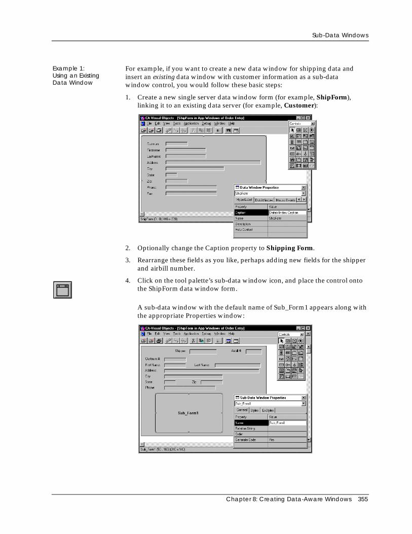
Sub-Data Windows
Chapter 8: Creating Data-Aware Windows 355
Example 1:Using an ExistingData Window
For example, if you want to create a new data window for shipping data andinsert an existing data window with customer information as a sub-datawindow control, you would follow these basic steps:
1. Create a new single server data window form (for example, ShipForm),linking it to an existing data server (for example, Customer):
2. Optionally change the Caption property to Shipping Form.
3. Rearrange these fields as you like, perhaps adding new fields for the shipperand airbill number.
4. Click on the tool palette’s sub-data window icon, and place the control ontothe ShipForm data window form.
A sub-data window with the default name of Sub_Form1 appears along withthe appropriate Properties window:
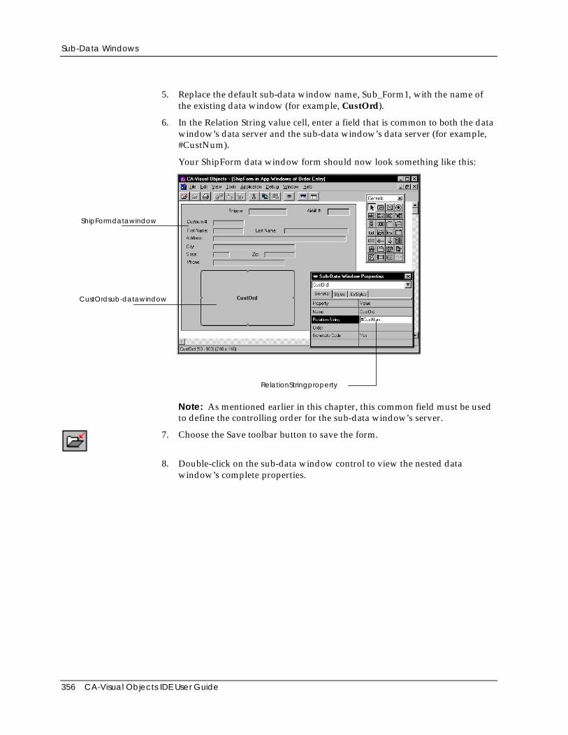
Sub-Data Windows
356 CA-Visual Objects IDE User Guide
5. Replace the default sub-data window name, Sub_Form1, with the name ofthe existing data window (for example, CustOrd).
6. In the Relation String value cell, enter a field that is common to both the datawindow’s data server and the sub-data window’s data server (for example,#CustNum).
Your ShipForm data window form should now look something like this:
ShipFormdatawindow
CustOrdsub-datawindow
RelationStringproperty
Note: As mentioned earlier in this chapter, this common field must be usedto define the controlling order for the sub-data window’s server.
7. Choose the Save toolbar button to save the form.
8. Double-click on the sub-data window control to view the nested datawindow’s complete properties.
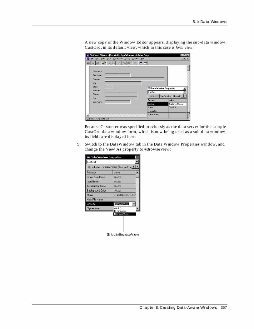
Sub-Data Windows
Chapter 8: Creating Data-Aware Windows 357
A new copy of the Window Editor appears, displaying the sub-data window,CustOrd, in its default view, which in this case is form view:
Because Customer was specified previously as the data server for the sampleCustOrd data window form, which is now being used as a sub-data window,its fields are displayed here.
9. Switch to the DataWindow tab in the Data Window Properties window, andchange the View As property to #BrowseView:
Select#BrowseView
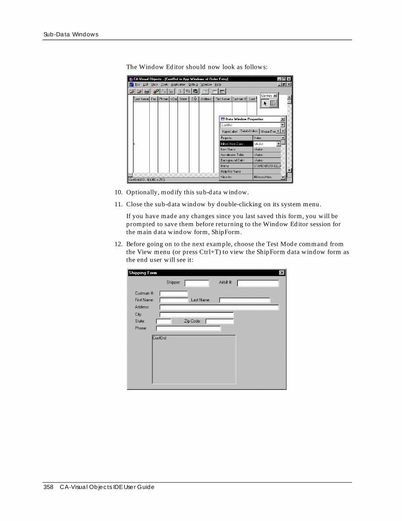
Sub-Data Windows
358 CA-Visual Objects IDE User Guide
The Window Editor should now look as follows:
10. Optionally, modify this sub-data window.
11. Close the sub-data window by double-clicking on its system menu.
If you have made any changes since you last saved this form, you will beprompted to save them before returning to the Window Editor session forthe main data window form, ShipForm.
12. Before going on to the next example, choose the Test Mode command fromthe View menu (or press Ctrl+T) to view the ShipForm data window form asthe end user will see it:
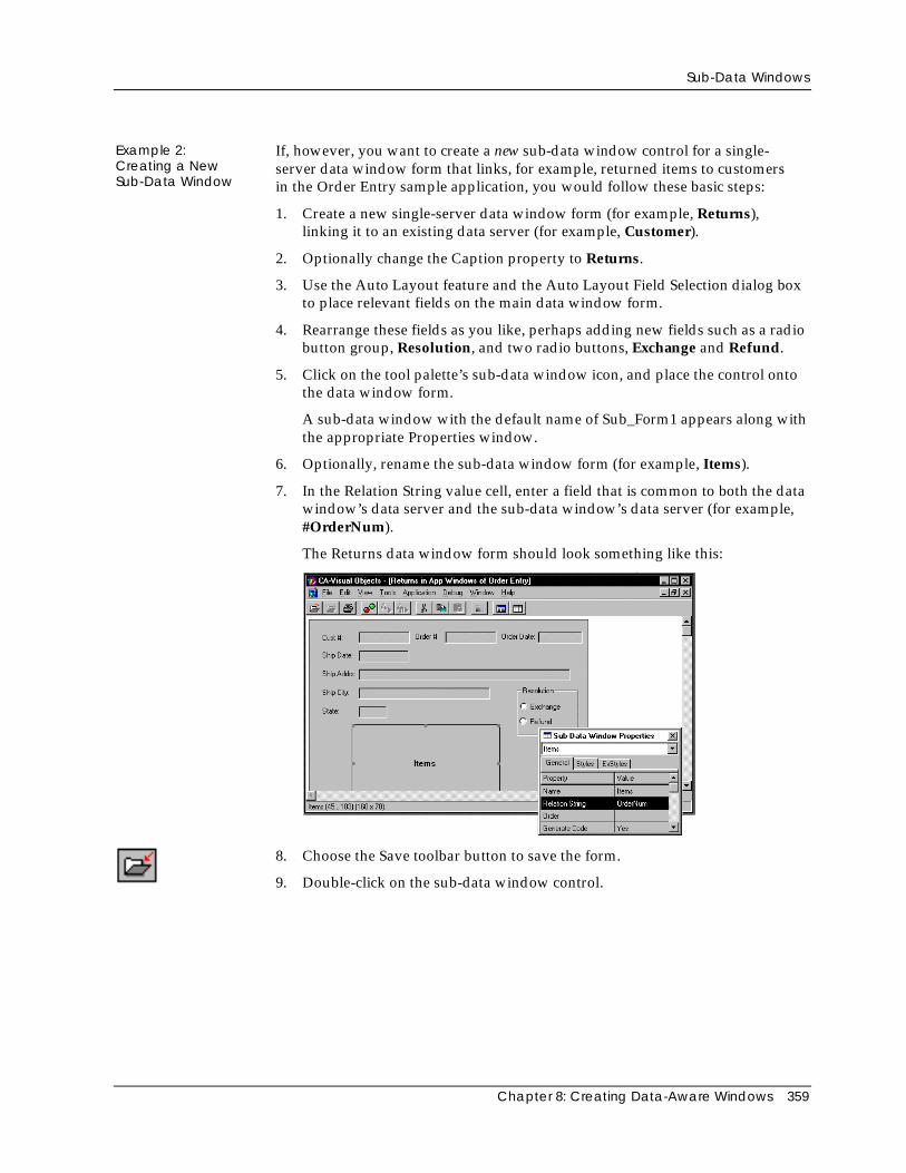
Sub-Data Windows
Chapter 8: Creating Data-Aware Windows 359
Example 2:Creating a NewSub-Data Window
If, however, you want to create a new sub-data window control for a single-server data window form that links, for example, returned items to customersin the Order Entry sample application, you would follow these basic steps:
1. Create a new single-server data window form (for example, Returns),linking it to an existing data server (for example, Customer).
2. Optionally change the Caption property to Returns.
3. Use the Auto Layout feature and the Auto Layout Field Selection dialog boxto place relevant fields on the main data window form.
4. Rearrange these fields as you like, perhaps adding new fields such as a radiobutton group, Resolution, and two radio buttons, Exchange and Refund.
5. Click on the tool palette’s sub-data window icon, and place the control ontothe data window form.
A sub-data window with the default name of Sub_Form1 appears along withthe appropriate Properties window.
6. Optionally, rename the sub-data window form (for example, Items).
7. In the Relation String value cell, enter a field that is common to both the datawindow’s data server and the sub-data window’s data server (for example,#OrderNum).
The Returns data window form should look something like this:
8. Choose the Save toolbar button to save the form.
9. Double-click on the sub-data window control.
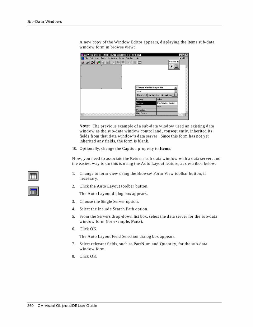
Sub-Data Windows
360 CA-Visual Objects IDE User Guide
A new copy of the Window Editor appears, displaying the Items sub-datawindow form in browse view:
Note: The previous example of a sub-data window used an existing datawindow as the sub-data window control and, consequently, inherited itsfields from that data window’s data server. Since this form has not yetinherited any fields, the form is blank.
10. Optionally, change the Caption property to Items.
Now, you need to associate the Returns sub-data window with a data server, andthe easiest way to do this is using the Auto Layout feature, as described below:
1. Change to form view using the Browse/Form View toolbar button, ifnecessary.
2. Click the Auto Layout toolbar button.
The Auto Layout dialog box appears.
3. Choose the Single Server option.
4. Select the Include Search Path option.
5. From the Servers drop-down list box, select the data server for the sub-datawindow form (for example, Parts).
6. Click OK.
The Auto Layout Field Selection dialog box appears.
7. Select relevant fields, such as PartNum and Quantity, for the sub-datawindow form.
8. Click OK.
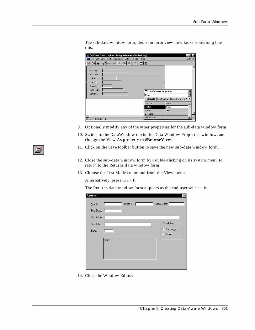
Sub-Data Windows
Chapter 8: Creating Data-Aware Windows 361
Thesub-data window form, Items, in form view now looks something likethis:
9. Optionally modify any of the other properties for the sub-data window form.
10. Switch to the DataWindow tab in the Data Window Properties window, andchange the View As property to #BrowseView.
11. Click on the Save toolbar button to save the new sub-data window form.
12. Close the sub-data window form by double-clicking on its system menu toreturn to the Returns data window form.
13. Choose the Test Mode command from the View menu.
Alternatively, press Ctrl+T.
The Returns data window form appears as the end user will see it:
14. Close the Window Editor.
Sub-Data Windows
362 CA-Visual Objects IDE User Guide
Modifying a Sub-Data Window
Modifying a sub-data window form is the same as modifying the layout of anyother data-aware window. You can customize the sub-data window form inbrowse view as described earlier under Working in Browse View, or you canwork with it in form view.
You can also change any of the sub-data window properties. When it isdisplayed as a control, a sub-data window has limited properties. These includeits name and its relationship to the master data server, as described earlier in theSpecifying Window Properties section in “Using the Window Editor.”
Tip: Remember, you can gain access to a sub-data window form’s full set ofproperties by double-clicking on its sub-data window control. A new copyof the Window Editor will be invoked, allowing you to edit any of theproperties displayed.
Chapter 9: Using the Report Editor 363
Chapter
9 Using the Report Editor
The CA-Visual Objects Report Editor is a state-of-the-art, database publishingtool that allows you to create sophisticated reports. It consists of the CA-ReportWriter and the CA-Report Viewer.
The CA-Report Writer’s WYSIWYG environment allows you to design andproduce custom database reports at the press of a button directly from within theIDE. You can mix text, graphics, and data using a wide variety of publishingfeatures. Use or customize a predefined report style or design your own reportfrom scratch. Group related data together and perform mathematicalcalculations, such as group and report totals. Then preview your report onlineusing the CA-Report Viewer to see how it looks and make any necessarymodifications before printing it.
Once a report has been designed and saved, CA-Visual Objects automaticallygenerates object-oriented code for it, using the appropriate classes, and adds it tothe repository. When executing the application, you can preview the reportusing the Report Editor’s runtime engine. With a minor source codemodification, you can also print the report.
Tip: Since the Report Editor includes a royalty-free runtime version, you canship this report engine with any of your CA-Visual Objects applications. Seethe “Operating Environment” chapter in the Programmer’s Guide for moreinformation about preparing your application for delivery.
This chapter describes how to use the Report Editor. In it you will learn how to:
■ Access the CA-Report Writer window and set its properties
■ Use queries in a report
■ Create reports, including working with report sections and tables, formattingthe report, determining page layout, and adding graphics
■ Using report fields
■ Preview reports online using the CA-Report Viewer
■ Print reports and export reports to files
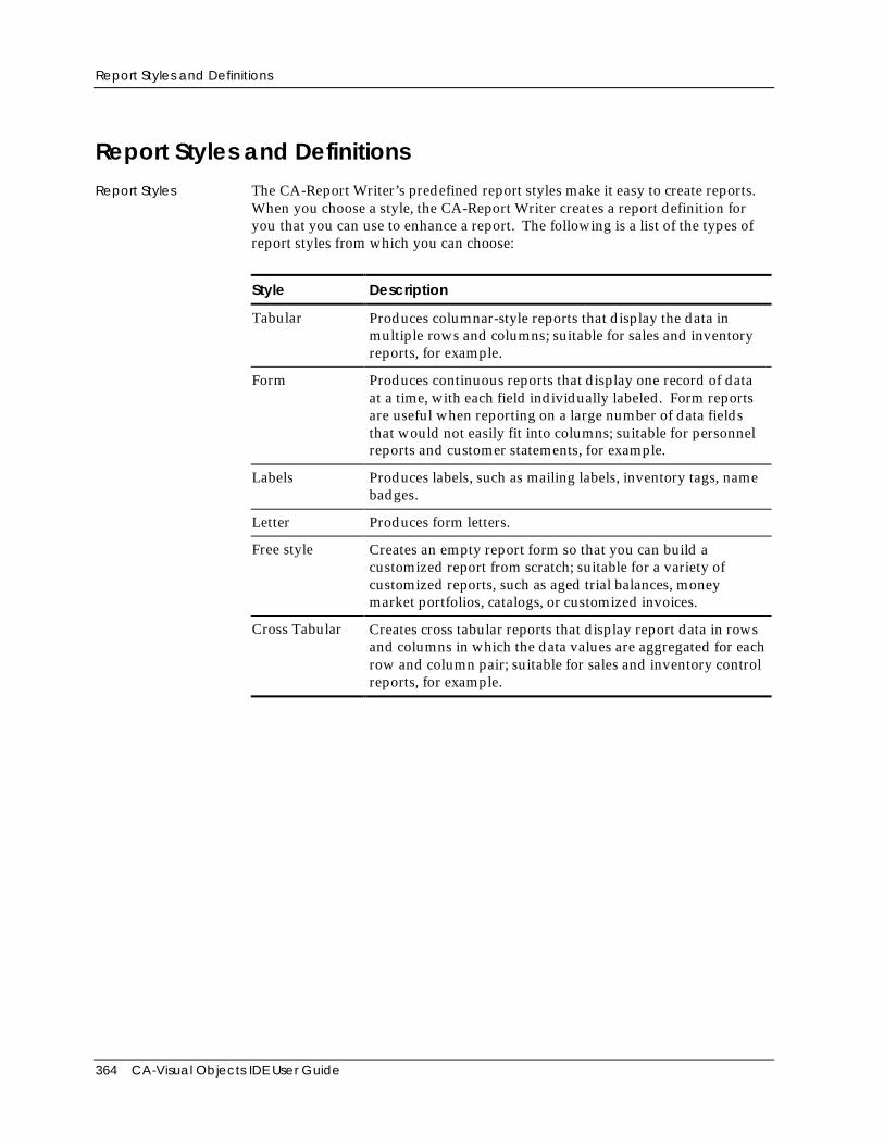
Report Styles and Definitions
364 CA-Visual Objects IDE User Guide
Report Styles and DefinitionsReport Styles The CA-Report Writer’s predefined report styles make it easy to create reports.
When you choose a style, the CA-Report Writer creates a report definition foryou that you can use to enhance a report. The following is a list of the types ofreport styles from which you can choose:
Style Description
Tabular Produces columnar-style reports that display the data inmultiple rows and columns; suitable for sales and inventoryreports, for example.
Form Produces continuous reports that display one record of dataat a time, with each field individually labeled. Form reportsare useful when reporting on a large number of data fieldsthat would not easily fit into columns; suitable for personnelreports and customer statements, for example.
Labels Produces labels, such as mailing labels, inventory tags, namebadges.
Letter Produces form letters.
Free style Creates an empty report form so that you can build acustomized report from scratch; suitable for a variety ofcustomized reports, such as aged trial balances, moneymarket portfolios, catalogs, or customized invoices.
Cross Tabular Creates cross tabular reports that display report data in rowsand columns in which the data values are aggregated for eachrow and column pair; suitable for sales and inventory controlreports, for example.
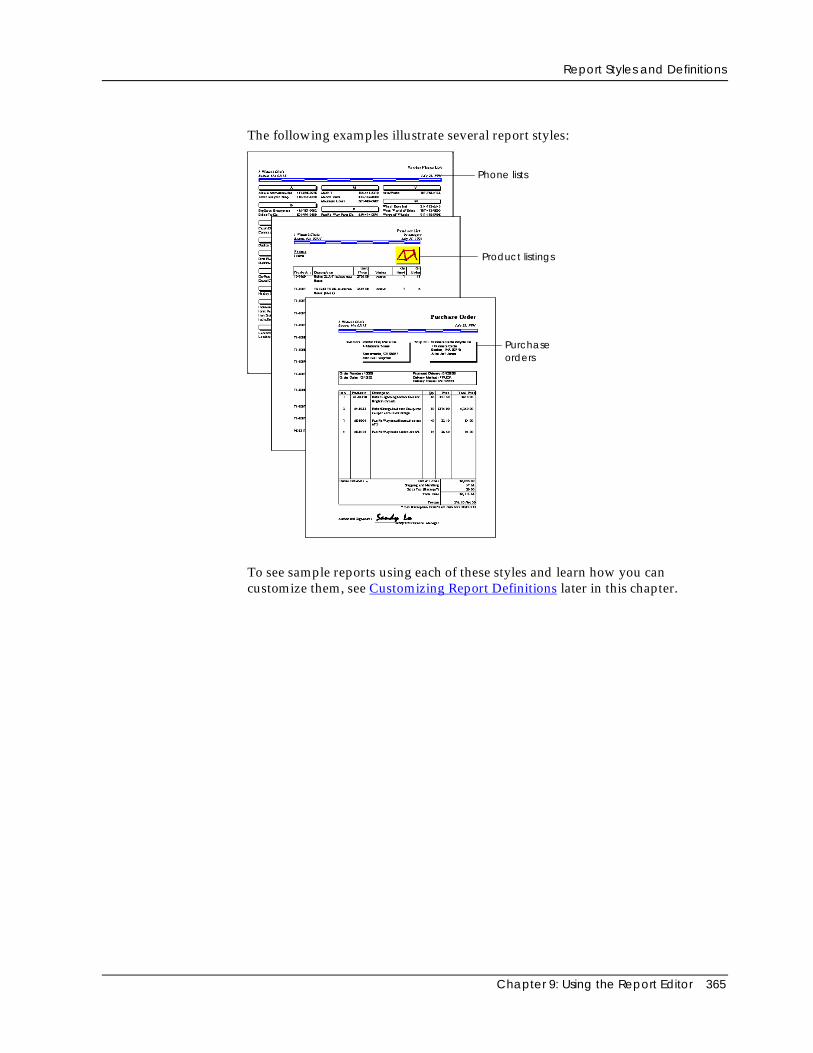
Report Styles and Definitions
Chapter 9: Using the Report Editor 365
The following examples illustrate several report styles:
Phone lists
Product listings
Purchaseorders
To see sample reports using each of these styles and learn how you cancustomize them, see Customizing Report Definitions later in this chapter.
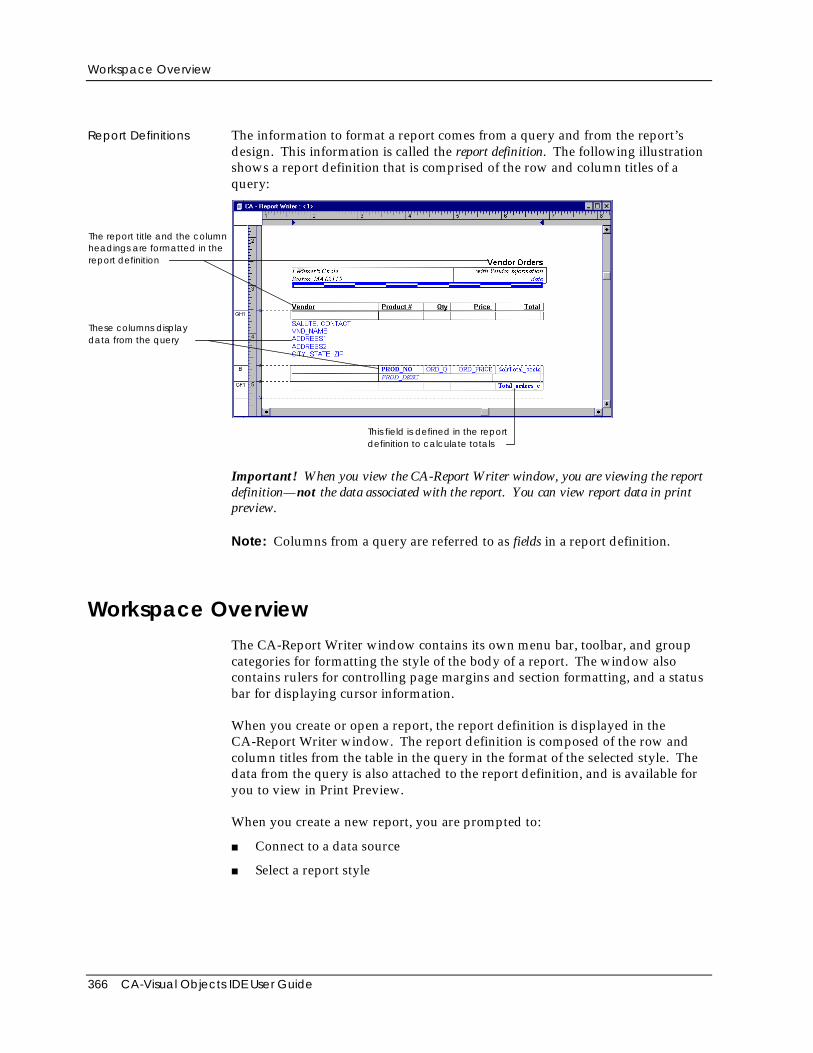
Workspace Overview
366 CA-Visual Objects IDE User Guide
Report Definitions The information to format a report comes from a query and from the report’sdesign. This information is called the report definition. The following illustrationshows a report definition that is comprised of the row and column titles of aquery:
The report title and the columnheadings are formatted in thereport definition
These columns displaydata from the query
This field is defined in the reportdefinition to calculate totals
Important! When you view the CA-Report Writer window, you are viewing the reportdefinition—not the data associated with the report. You can view report data in printpreview.
Note: Columns from a query are referred to as fields in a report definition.
Workspace OverviewThe CA-Report Writer window contains its own menu bar, toolbar, and groupcategories for formatting the style of the body of a report. The window alsocontains rulers for controlling page margins and section formatting, and a statusbar for displaying cursor information.
When you create or open a report, the report definition is displayed in theCA-Report Writer window. The report definition is composed of the row andcolumn titles from the table in the query in the format of the selected style. Thedata from the query is also attached to the report definition, and is available foryou to view in Print Preview.
When you create a new report, you are prompted to:
■ Connect to a data source
■ Select a report style
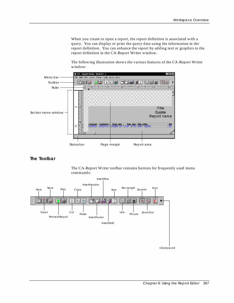
Workspace Overview
Chapter 9: Using the Report Editor 367
When you create or open a report, the report definition is associated with aquery. You can display or print the query data using the information in thereport definition. You can enhance the report by adding text or graphics to thereport definition in the CA-Report Writer window.
The following illustration shows the various features of the CA-Report Writerwindow:
Menu bar
Toolbar
Ruler
Status bar
Section name window
Page margin Report area
The Toolbar
The CA-Report Writer toolbar contains buttons for frequently used menucommands:
NewSave Print Copy
InsertHeader
InsertRow
SumRectangle
ZoomIn Font
Open
PreviewReport
CutPaste
InsertFooter
InsertField
LinePicture
ZoomOut
Clicktoscroll
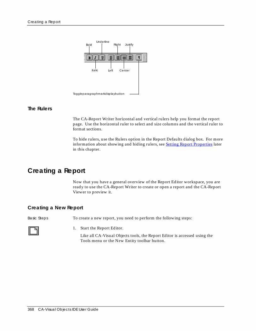
Creating a Report
368 CA-Visual Objects IDE User Guide
BoldUnderline
Right Justify
Italic Left Center
Toggleparagraphmarkdisplaybutton
The Rulers
The CA-Report Writer horizontal and vertical rulers help you format the reportpage. Use the horizontal ruler to select and size columns and the vertical ruler toformat sections.
To hide rulers, use the Rulers option in the Report Defaults dialog box. For moreinformation about showing and hiding rulers, see Setting Report Properties laterin this chapter.
Creating a ReportNow that you have a general overview of the Report Editor workspace, you areready to use the CA-Report Writer to create or open a report and the CA-ReportViewer to preview it.
Creating a New Report
Basic Steps To create a new report, you need to perform the following steps:
1. Start the Report Editor.
Like all CA-Visual Objects tools, the Report Editor is accessed using theTools menu or the New Entity toolbar button.
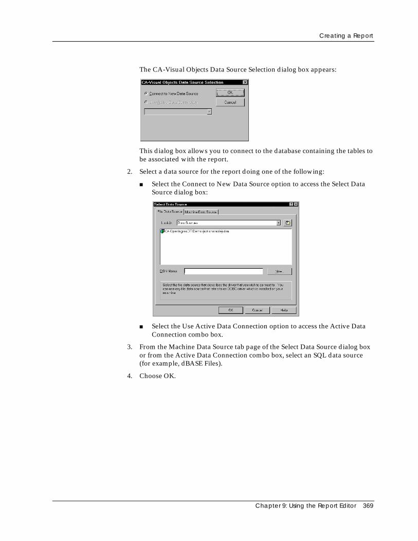
Creating a Report
Chapter 9: Using the Report Editor 369
The CA-Visual Objects Data Source Selection dialog box appears:
This dialog box allows you to connect to the database containing the tables tobe associated with the report.
2. Select a data source for the report doing one of the following:
■ Select the Connect to New Data Source option to access the Select DataSource dialog box:
■ Select the Use Active Data Connection option to access the Active DataConnection combo box.
3. From the Machine Data Source tab page of the Select Data Source dialog boxor from the Active Data Connection combo box, select an SQL data source(for example, dBASE Files).
4. Choose OK.
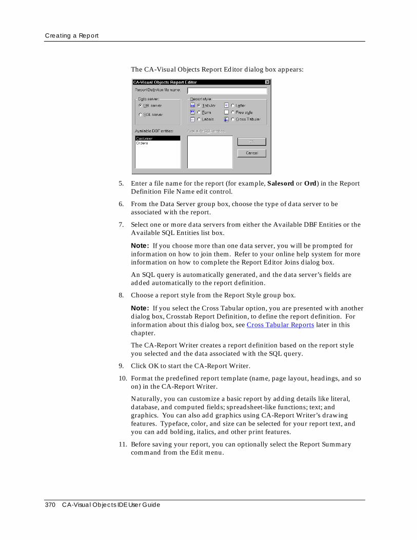
Creating a Report
370 CA-Visual Objects IDE User Guide
The CA-Visual Objects Report Editor dialog box appears:
5. Enter a file name for the report (for example, Salesord or Ord) in the ReportDefinition File Name edit control.
6. From the Data Server group box, choose the type of data server to beassociated with the report.
7. Select one or more data servers from either the Available DBF Entities or theAvailable SQL Entities list box.
Note: If you choose more than one data server, you will be prompted forinformation on how to join them. Refer to your online help system for moreinformation on how to complete the Report Editor Joins dialog box.
An SQL query is automatically generated, and the data server’s fields areadded automatically to the report definition.
8. Choose a report style from the Report Style group box.
Note: If you select the Cross Tabular option, you are presented with anotherdialog box, Crosstab Report Definition, to define the report definition. Forinformation about this dialog box, see Cross Tabular Reports later in thischapter.
The CA-Report Writer creates a report definition based on the report styleyou selected and the data associated with the SQL query.
9. Click OK to start the CA-Report Writer.
10. Format the predefined report template (name, page layout, headings, and soon) in the CA-Report Writer.
Naturally, you can customize a basic report by adding details like literal,database, and computed fields; spreadsheet-like functions; text; andgraphics. You can also add graphics using CA-Report Writer’s drawingfeatures. Typeface, color, and size can be selected for your report text, andyou can add bolding, italics, and other print features.
11. Before saving your report, you can optionally select the Report Summarycommand from the Edit menu.
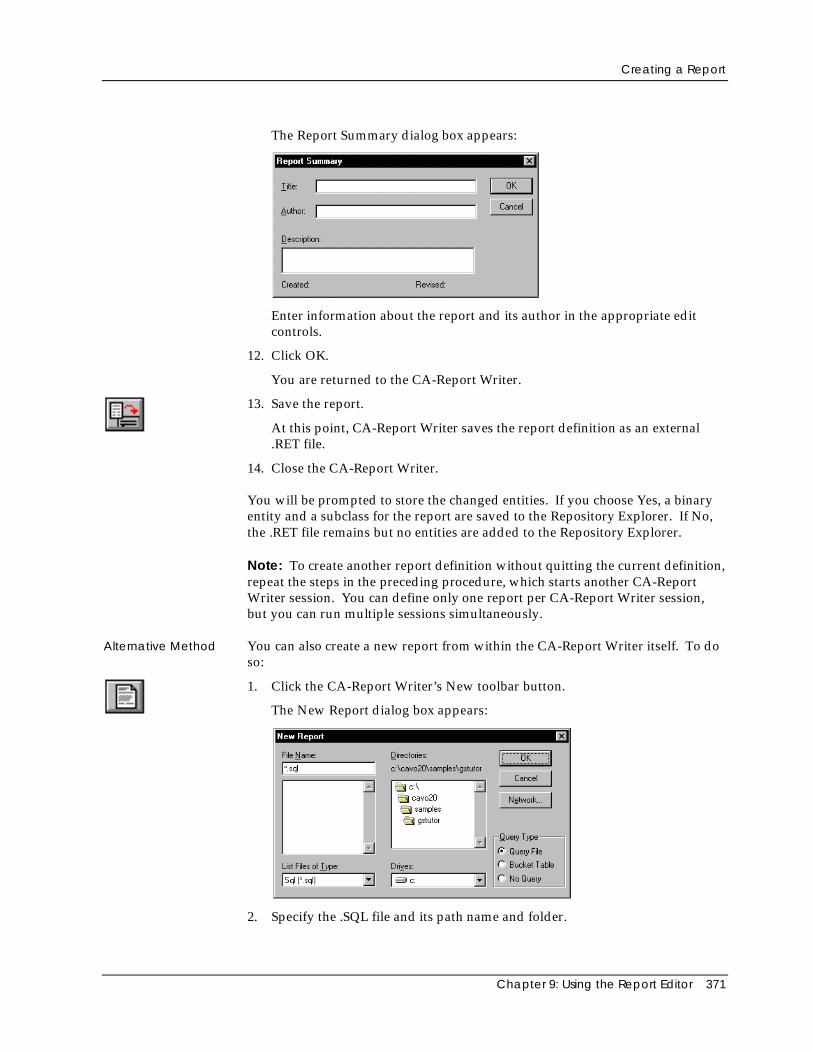
Creating a Report
Chapter 9: Using the Report Editor 371
The Report Summary dialog box appears:
Enter information about the report and its author in the appropriate editcontrols.
12. Click OK.
You are returned to the CA-Report Writer.
13. Save the report.
At this point, CA-Report Writer saves the report definition as an external.RET file.
14. Close the CA-Report Writer.
You will be prompted to store the changed entities. If you choose Yes, a binaryentity and a subclass for the report are saved to the Repository Explorer. If No,the .RET file remains but no entities are added to the Repository Explorer.
Note: To create another report definition without quitting the current definition,repeat the steps in the preceding procedure, which starts another CA-ReportWriter session. You can define only one report per CA-Report Writer session,but you can run multiple sessions simultaneously.
Alternative Method You can also create a new report from within the CA-Report Writer itself. To doso:
1. Click the CA-Report Writer’s New toolbar button.
The New Report dialog box appears:
2. Specify the .SQL file and its path name and folder.
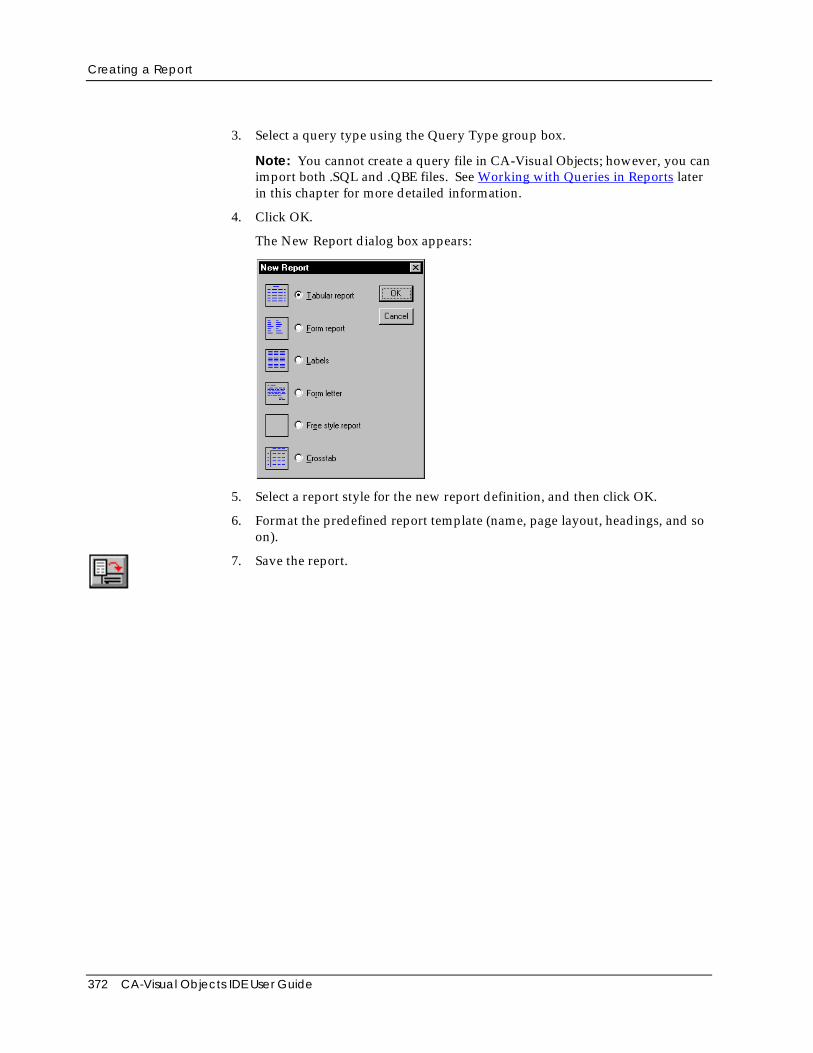
Creating a Report
372 CA-Visual Objects IDE User Guide
3. Select a query type using the Query Type group box.
Note: You cannot create a query file in CA-Visual Objects; however, you canimport both .SQL and .QBE files. See Working with Queries in Reports laterin this chapter for more detailed information.
4. Click OK.
The New Report dialog box appears:
5. Select a report style for the new report definition, and then click OK.
6. Format the predefined report template (name, page layout, headings, and soon).
7. Save the report.
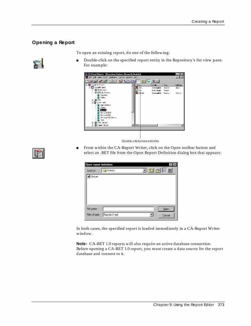
Creating a Report
Chapter 9: Using the Report Editor 373
Opening a Report
To open an existing report, do one of the following:
■ Double-click on the specified report entity in the Repository’s list view pane.For example:
Double-clickonreportentity
■ From within the CA-Report Writer, click on the Open toolbar button andselect an .RET file from the Open Report Definition dialog box that appears:
In both cases, the specified report is loaded immediately in a CA-Report Writerwindow.
Note: CA-RET 1.0 reports will also require an active database connection.Before opening a CA-RET 1.0 report, you must create a data source for the reportdatabase and connect to it.
Viewing Report Data
374 CA-Visual Objects IDE User Guide
Generating Code
When you save a report—responding Yes to the prompt to store entity changes—CA-Visual Objects creates the following:
■ A report entity
You can double-click on this entity in the Repository Explorer’s list viewpane to begin editing it with the CA-Report Writer.
■ A ReportQueue subclass, using the report name
It is the Init( ) method of this subclass that determines the action to takewhen the end user chooses to run the report. By default, it displays apreview of the report. Refer to Printing a Report later in this chapter and tothe ReportQueue class in the online help system for detailed information onhow to customize this code.
■ An external .RET file
Viewing Report DataWhen you create a new report or open an existing one, the CA-Report Writerdisplays the report definition. You can view the actual data via the CA-ReportViewer when you use the Print Preview option.
To preview a report, do one of the following in the CA-Report Writer window:
■ Click the Preview Report toolbar button.
■ Choose the Print Preview command from the File menu.
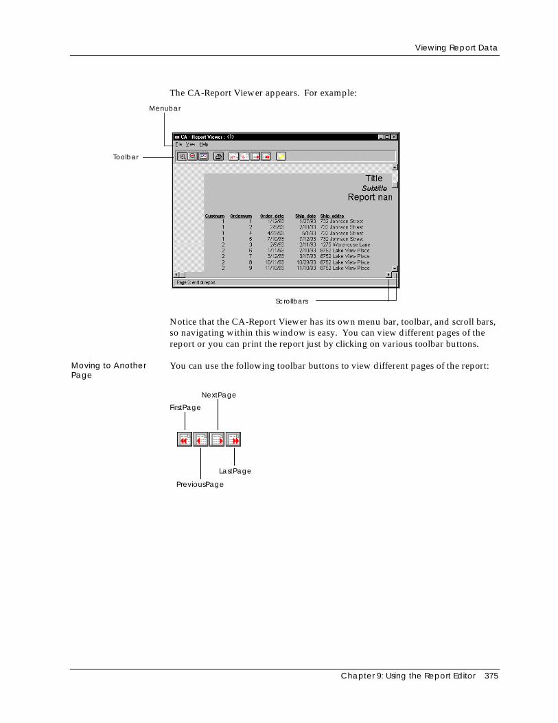
Viewing Report Data
Chapter 9: Using the Report Editor 375
The CA-Report Viewer appears. For example:
Toolbar
Menubar
Scrollbars
Notice that the CA-Report Viewer has its own menu bar, toolbar, and scroll bars,so navigating within this window is easy. You can view different pages of thereport or you can print the report just by clicking on various toolbar buttons.
Moving to AnotherPage
You can use the following toolbar buttons to view different pages of the report:
FirstPage
NextPage
PreviousPage
LastPage
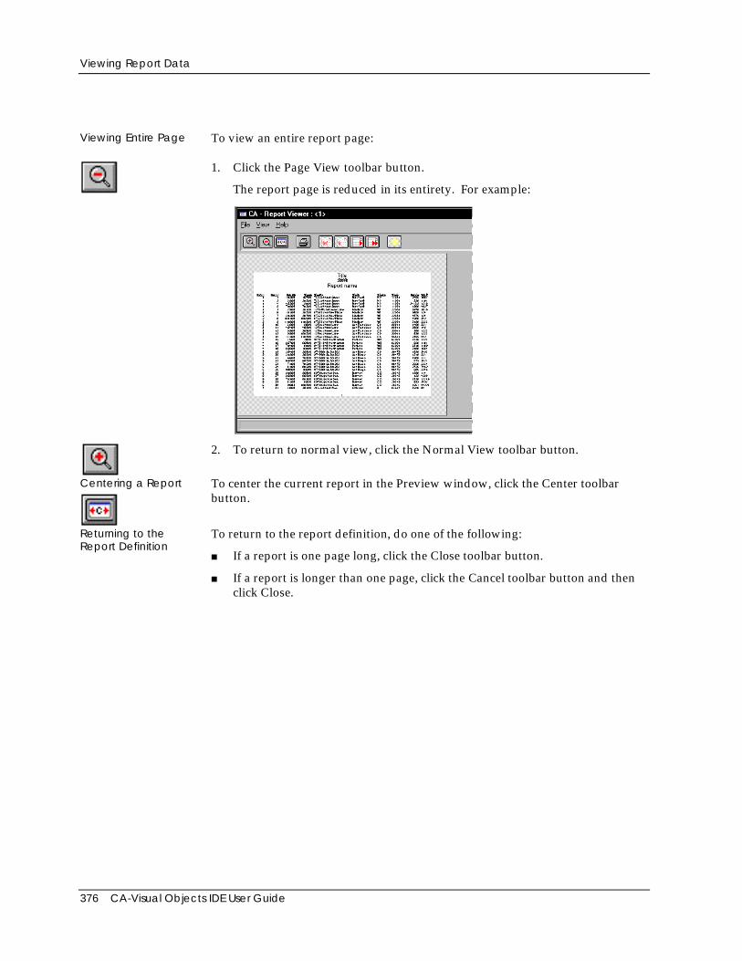
Viewing Report Data
376 CA-Visual Objects IDE User Guide
Viewing Entire Page To view an entire report page:
1. Click the Page View toolbar button.
The report page is reduced in its entirety. For example:
2. To return to normal view, click the Normal View toolbar button.
Centering a Report To center the current report in the Preview window, click the Center toolbarbutton.
Returning to theReport Definition
To return to the report definition, do one of the following:
■ If a report is one page long, click the Close toolbar button.
■ If a report is longer than one page, click the Cancel toolbar button and thenclick Close.
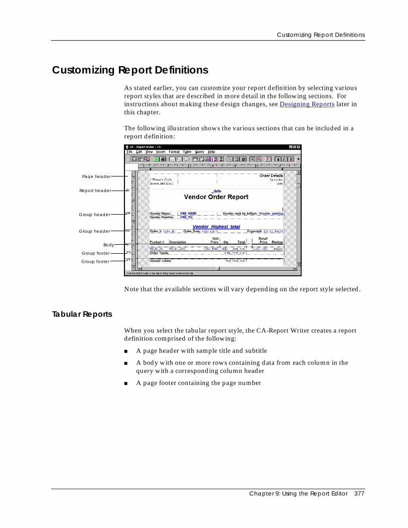
Customizing Report Definitions
Chapter 9: Using the Report Editor 377
Customizing Report DefinitionsAs stated earlier, you can customize your report definition by selecting variousreport styles that are described in more detail in the following sections. Forinstructions about making these design changes, see Designing Reports later inthis chapter.
The following illustration shows the various sections that can be included in areport definition:
Page header
Report header
Group header
Body
Group footer
Group footer
Group header
Note that the available sections will vary depending on the report style selected.
Tabular Reports
When you select the tabular report style, the CA-Report Writer creates a reportdefinition comprised of the following:
■ A page header with sample title and subtitle
■ A body with one or more rows containing data from each column in thequery with a corresponding column header
■ A page footer containing the page number
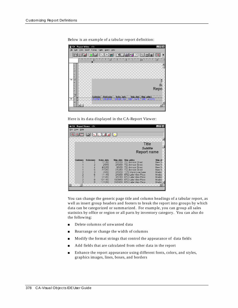
Customizing Report Definitions
378 CA-Visual Objects IDE User Guide
Below is an example of a tabular report definition:
Here is its data displayed in the CA-Report Viewer:
You can change the generic page title and column headings of a tabular report, aswell as insert group headers and footers to break the report into groups by whichdata can be categorized or summarized. For example, you can group all salesstatistics by office or region or all parts by inventory category. You can also dothe following:
■ Delete columns of unwanted data
■ Rearrange or change the width of columns
■ Modify the format strings that control the appearance of data fields
■ Add fields that are calculated from other data in the report
■ Enhance the report appearance using different fonts, colors, and styles,graphics images, lines, boxes, and borders
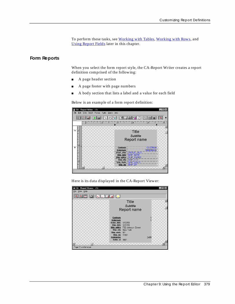
Customizing Report Definitions
Chapter 9: Using the Report Editor 379
To perform these tasks, see Working with Tables, Working with Rows, andUsing Report Fields later in this chapter.
Form Reports
When you select the form report style, the CA-Report Writer creates a reportdefinition comprised of the following:
■ A page header section
■ A page footer with page numbers
■ A body section that lists a label and a value for each field
Below is an example of a form report definition:
Here is its data displayed in the CA-Report Viewer:
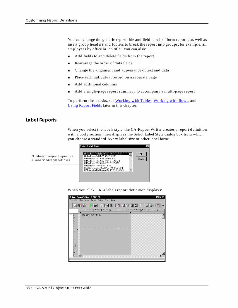
Customizing Report Definitions
380 CA-Visual Objects IDE User Guide
You can change the generic report title and field labels of form reports, as well asinsert group headers and footers to break the report into groups; for example, allemployees by office or job title. You can also:
■ Add fields to and delete fields from the report
■ Rearrange the order of data fields
■ Change the alignment and appearance of text and data
■ Place each individual record on a separate page
■ Add additional columns
■ Add a single-page report summary to accompany a multi-page report
To perform these tasks, see Working with Tables, Working with Rows, andUsing Report Fields later in this chapter.
Label Reports
When you select the labels style, the CA-Report Writer creates a report definitionwith a body section, then displays the Select Label Style dialog box from whichyou choose a standard Avery label size or other label form:
NumberscorrespondtoproductnumbersonAverylabelboxes
When you click OK, a labels report definition displays:
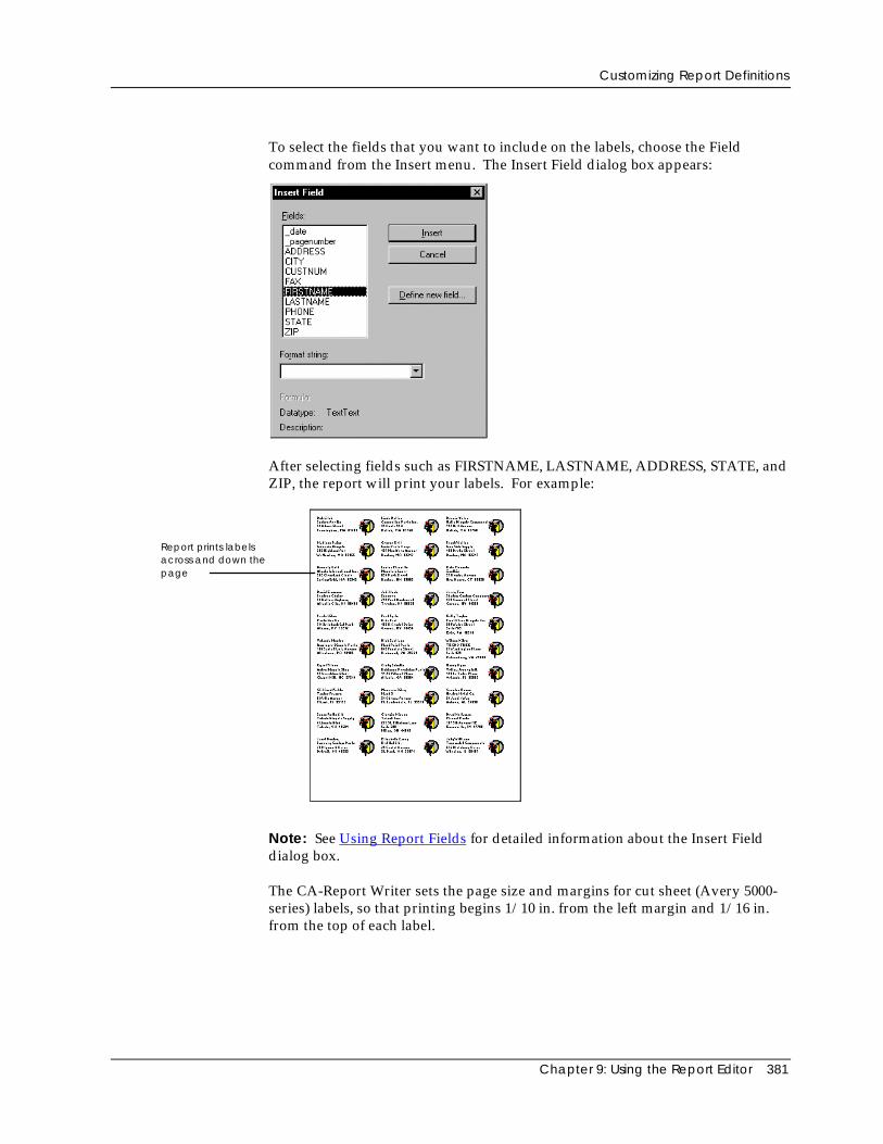
Customizing Report Definitions
Chapter 9: Using the Report Editor 381
To select the fields that you want to include on the labels, choose the Fieldcommand from the Insert menu. The Insert Field dialog box appears:
After selecting fields such as FIRSTNAME, LASTNAME, ADDRESS, STATE, andZIP, the report will print your labels. For example:
Report prints labelsacross and down thepage
Note: See Using Report Fields for detailed information about the Insert Fielddialog box.
The CA-Report Writer sets the page size and margins for cut sheet (Avery 5000-series) labels, so that printing begins 1/10 in. from the left margin and 1/16 in.from the top of each label.
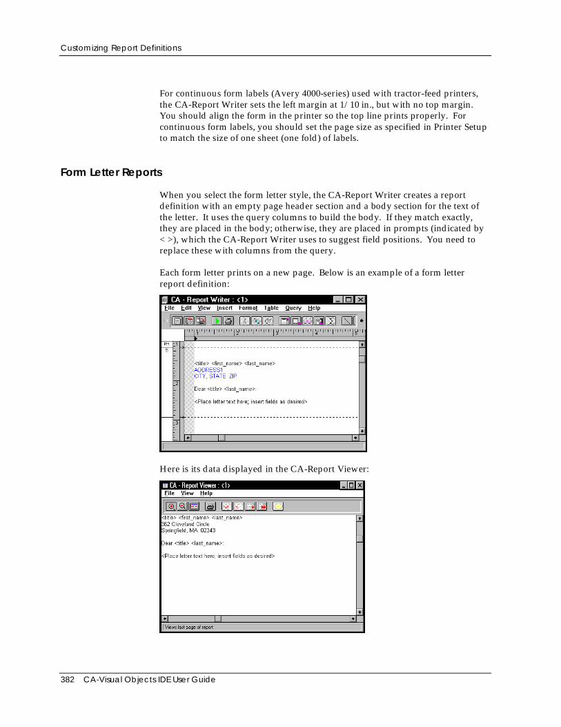
Customizing Report Definitions
382 CA-Visual Objects IDE User Guide
For continuous form labels (Avery 4000-series) used with tractor-feed printers,the CA-Report Writer sets the left margin at 1/10 in., but with no top margin.You should align the form in the printer so the top line prints properly. Forcontinuous form labels, you should set the page size as specified in Printer Setupto match the size of one sheet (one fold) of labels.
Form Letter Reports
When you select the form letter style, the CA-Report Writer creates a reportdefinition with an empty page header section and a body section for the text ofthe letter. It uses the query columns to build the body. If they match exactly,they are placed in the body; otherwise, they are placed in prompts (indicated by< >), which the CA-Report Writer uses to suggest field positions. You need toreplace these with columns from the query.
Each form letter prints on a new page. Below is an example of a form letterreport definition:
Here is its data displayed in the CA-Report Viewer:
Customizing Report Definitions
Chapter 9: Using the Report Editor 383
You can make the following changes to customize a form letter:
■ Insert name and address fields at the beginning of the body section
■ Insert an appropriate salutation
■ Enter the text of the letter
■ Place database fields within the text of your letter and/or create a table ofdata fields to include data from your database in the body of your form letter
To perform these tasks, see Working with Tables, Working with Rows, andUsing Report Fields later in this chapter.
Free Style Reports
When you select the free style report style, the CA-Report Writer creates a reportdefinition with an empty body section. It does not add any other report sectionsor features, and it does not place any data fields or columns on the reportdefinition.
You add sections and other desired features to create a report definition.
Cross Tabular Reports
Cross tabular reports display report data in rows and columns. Data values areaggregated for each row and column pair. This report style is useful forinventory control, manufacturing control, and sales performance reports.
You could create a report to produce the same results as the preceding report bycreating two group breaks, one on product and the other on date. The crosstabular report presents the same results in a compact, easy-to-read table.
Creating a Cross Tabular Report
To create a cross tabular report:
1. Access the Report Editor, connect to a data source, and then select or create aquery.
The CA-VO Report Editor dialog box appears.
See Creating a Report earlier in this chapter for details.
2. Select the Crosstab report style option.
The Crosstab Report Definition dialog box appears:
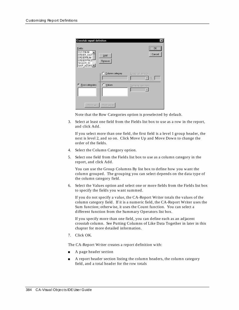
Customizing Report Definitions
384 CA-Visual Objects IDE User Guide
Note that the Row Categories option is preselected by default.
3. Select at least one field from the Fields list box to use as a row in the report,and click Add.
If you select more than one field, the first field is a level 1 group header, thenext is level 2, and so on. Click Move Up and Move Down to change theorder of the fields.
4. Select the Column Category option.
5. Select one field from the Fields list box to use as a column category in thereport, and click Add.
You can use the Group Columns By list box to define how you want thecolumn grouped. The grouping you can select depends on the data type ofthe column category field.
6. Select the Values option and select one or more fields from the Fields list boxto specify the fields you want summed.
If you do not specify a value, the CA-Report Writer totals the values of thecolumn category field. If it is a numeric field, the CA-Report Writer uses theSum function; otherwise, it uses the Count function. You can select adifferent function from the Summary Operators list box.
If you specify more than one field, you can define each as an adjacentcrosstab column. See Putting Columns of Like Data Together in later in thischapter for more detailed information.
7. Click OK.
The CA-Report Writer creates a report definition with:
■ A page header section
■ A report header section listing the column headers, the column categoryfield, and a total header for the row totals
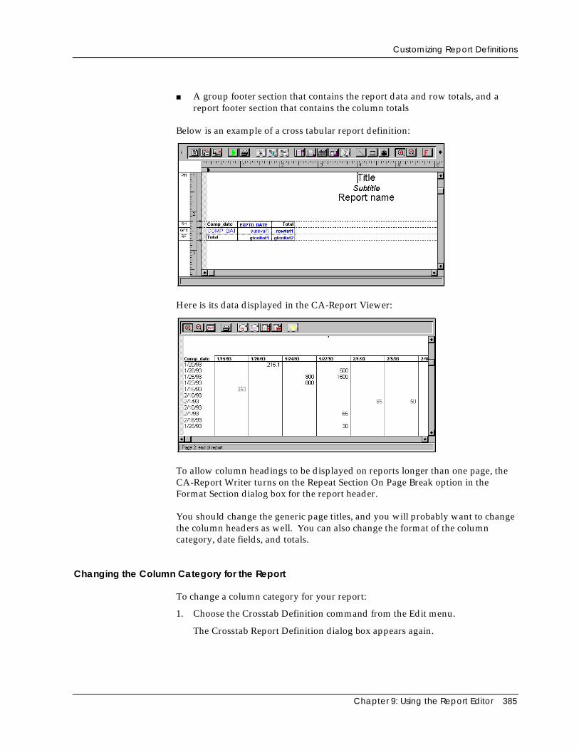
Customizing Report Definitions
Chapter 9: Using the Report Editor 385
■ A group footer section that contains the report data and row totals, and areport footer section that contains the column totals
Below is an example of a cross tabular report definition:
Here is its data displayed in the CA-Report Viewer:
To allow column headings to be displayed on reports longer than one page, theCA-Report Writer turns on the Repeat Section On Page Break option in theFormat Section dialog box for the report header.
You should change the generic page titles, and you will probably want to changethe column headers as well. You can also change the format of the columncategory, date fields, and totals.
Changing the Column Category for the Report
To change a column category for your report:
1. Choose the Crosstab Definition command from the Edit menu.
The Crosstab Report Definition dialog box appears again.
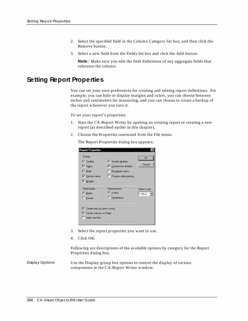
Setting Report Properties
386 CA-Visual Objects IDE User Guide
2. Select the specified field in the Column Category list box, and then click theRemove button.
3. Select a new field from the Fields list box and click the Add button.
Note: Make sure you edit the field definitions of any aggregate fields thatreference the column.
Setting Report PropertiesYou can set your own preferences for creating and editing report definitions. Forexample, you can hide or display margins and rulers, you can choose betweeninches and centimeters for measuring, and you can choose to create a backup ofthe report whenever you save it.
To set your report’s properties:
1. Start the CA-Report Writer by opening an existing report or creating a newreport (as described earlier in this chapter).
2. Choose the Properties command from the File menu.
The Report Properties dialog box appears:
3. Select the report properties you want to use.
4. Click OK.
Following are descriptions of the available options by category for the ReportProperties dialog box.
Display Options Use the Display group box options to control the display of variouscomponents in the CA-Report Writer window.
Working with Queries in Reports
Chapter 9: Using the Report Editor 387
Field Display Options Use Field Display group box options to control whether a field in the reportdefinition appears as a field name or as a format string, such as decimalplacement or number display.
MeasurementOptions
Use the Measurement group box options to choose inches or centimeters to useon rulers in the CA-Report Writer window and in the object snap feature.
Object Snap Option Use the Object Snap option to specify the density of the snap grid. CA-ReportWriter uses the grid to align objects you move in the report definition.
Other Options Miscellaneous options appear at the bottom of the Report Properties dialog boxas described below:
■ Select Create Backup when Saving to back up the report definition
■ Select Center Columns on Page to center table columns on the page
■ Choose Select Text First to be able to select text
Deselect this option for graphics.
Working with Queries in ReportsYou can associate more than one query with a report definition, but you can useonly one query at a time, however, as the main report query. You can work withthe query in the CA-Report Writer window and perform the following tasks:
■ Associate multiple queries with a report definition
■ Rename a query
■ Edit a query
■ Export a query to a query window
Associating Multiple Queries with a Report Definition
If you want to be able to create different reports from a single report definition,you can associate multiple queries with it. For example, you can create a reportdefinition that has one query that accesses dBASE files, another query thataccesses Btrieve files, and a third query that retrieves all records from a text file.By selecting which query to use before you print the report, you get differentreports from the same report definition.
To associate multiple queries with a report definition:
1. Open or create a report definition as described earlier in this chapter.
2. Choose the Import Query command from the Query menu.
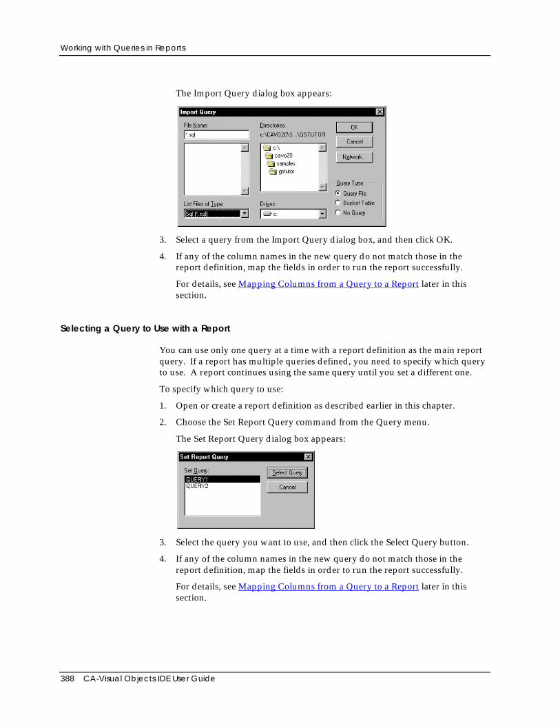
Working with Queries in Reports
388 CA-Visual Objects IDE User Guide
The Import Query dialog box appears:
3. Select a query from the Import Query dialog box, and then click OK.
4. If any of the column names in the new query do not match those in thereport definition, map the fields in order to run the report successfully.
For details, see Mapping Columns from a Query to a Report later in thissection.
Selecting a Query to Use with a Report
You can use only one query at a time with a report definition as the main reportquery. If a report has multiple queries defined, you need to specify which queryto use. A report continues using the same query until you set a different one.
To specify which query to use:
1. Open or create a report definition as described earlier in this chapter.
2. Choose the Set Report Query command from the Query menu.
The Set Report Query dialog box appears:
3. Select the query you want to use, and then click the Select Query button.
4. If any of the column names in the new query do not match those in thereport definition, map the fields in order to run the report successfully.
For details, see Mapping Columns from a Query to a Report later in thissection.
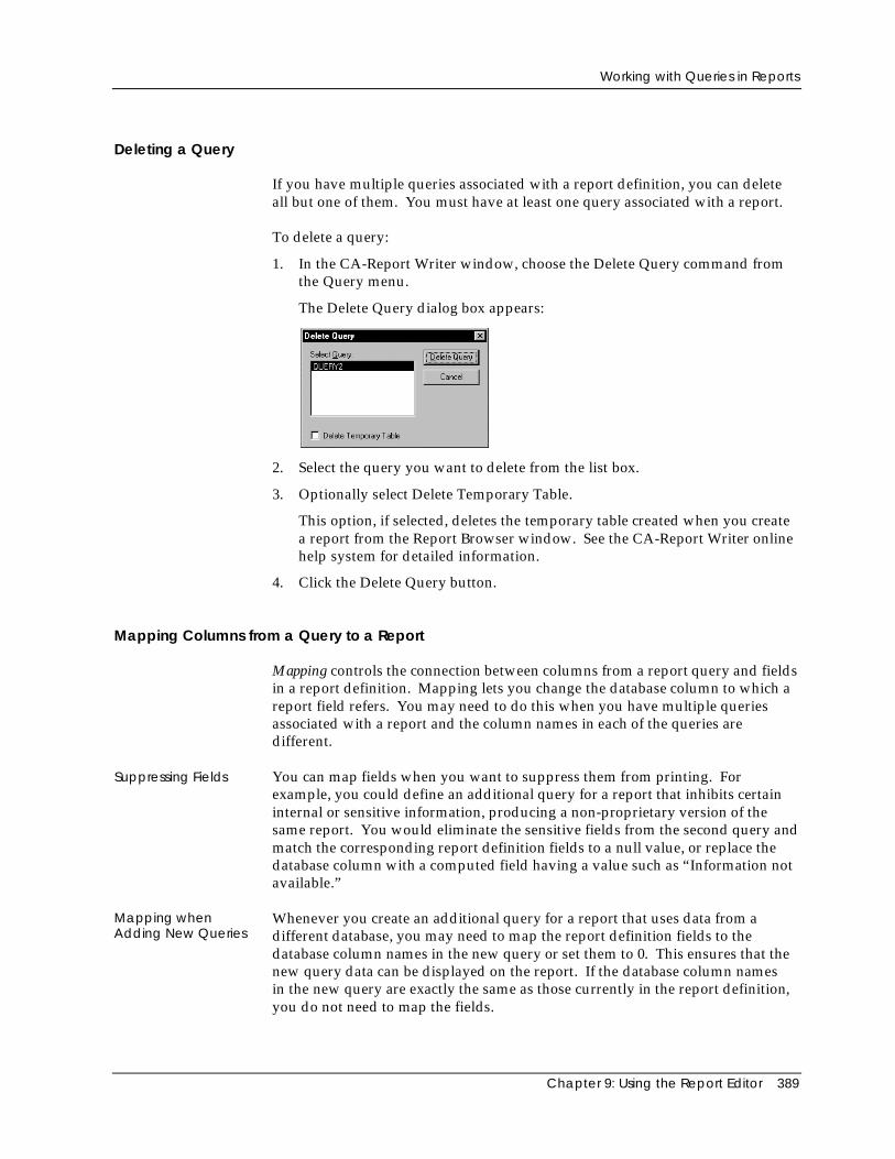
Working with Queries in Reports
Chapter 9: Using the Report Editor 389
Deleting a Query
If you have multiple queries associated with a report definition, you can deleteall but one of them. You must have at least one query associated with a report.
To delete a query:
1. In the CA-Report Writer window, choose the Delete Query command fromthe Query menu.
The Delete Query dialog box appears:
2. Select the query you want to delete from the list box.
3. Optionally select Delete Temporary Table.
This option, if selected, deletes the temporary table created when you createa report from the Report Browser window. See the CA-Report Writer onlinehelp system for detailed information.
4. Click the Delete Query button.
Mapping Columns from a Query to a Report
Mapping controls the connection between columns from a report query and fieldsin a report definition. Mapping lets you change the database column to which areport field refers. You may need to do this when you have multiple queriesassociated with a report and the column names in each of the queries aredifferent.
Suppressing Fields You can map fields when you want to suppress them from printing. Forexample, you could define an additional query for a report that inhibits certaininternal or sensitive information, producing a non-proprietary version of thesame report. You would eliminate the sensitive fields from the second query andmatch the corresponding report definition fields to a null value, or replace thedatabase column with a computed field having a value such as “Information notavailable.”
Mapping whenAdding New Queries
Whenever you create an additional query for a report that uses data from adifferent database, you may need to map the report definition fields to thedatabase column names in the new query or set them to 0. This ensures that thenew query data can be displayed on the report. If the database column namesin the new query are exactly the same as those currently in the report definition,you do not need to map the fields.
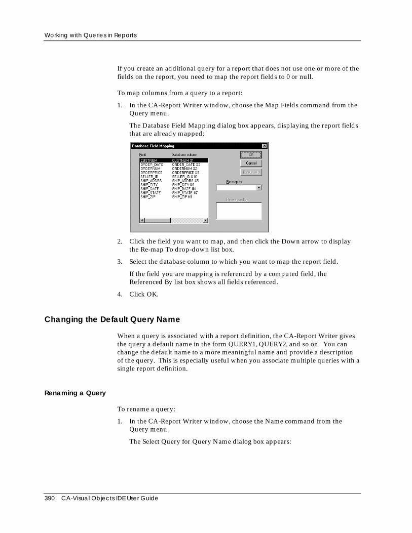
Working with Queries in Reports
390 CA-Visual Objects IDE User Guide
If you create an additional query for a report that does not use one or more of thefields on the report, you need to map the report fields to 0 or null.
To map columns from a query to a report:
1. In the CA-Report Writer window, choose the Map Fields command from theQuery menu.
The Database Field Mapping dialog box appears, displaying the report fieldsthat are already mapped:
2. Click the field you want to map, and then click the Down arrow to displaythe Re-map To drop-down list box.
3. Select the database column to which you want to map the report field.
If the field you are mapping is referenced by a computed field, theReferenced By list box shows all fields referenced.
4. Click OK.
Changing the Default Query Name
When a query is associated with a report definition, the CA-Report Writer givesthe query a default name in the form QUERY1, QUERY2, and so on. You canchange the default name to a more meaningful name and provide a descriptionof the query. This is especially useful when you associate multiple queries with asingle report definition.
Renaming a Query
To rename a query:
1. In the CA-Report Writer window, choose the Name command from theQuery menu.
The Select Query for Query Name dialog box appears:
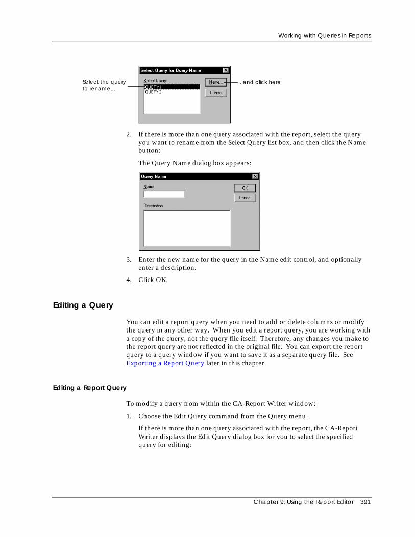
Working with Queries in Reports
Chapter 9: Using the Report Editor 391
Select the queryto rename...
...and click here
2. If there is more than one query associated with the report, select the queryyou want to rename from the Select Query list box, and then click the Namebutton:
The Query Name dialog box appears:
3. Enter the new name for the query in the Name edit control, and optionallyenter a description.
4. Click OK.
Editing a Query
You can edit a report query when you need to add or delete columns or modifythe query in any other way. When you edit a report query, you are working witha copy of the query, not the query file itself. Therefore, any changes you make tothe report query are not reflected in the original file. You can export the reportquery to a query window if you want to save it as a separate query file. SeeExporting a Report Query later in this chapter.
Editing a Report Query
To modify a query from within the CA-Report Writer window:
1. Choose the Edit Query command from the Query menu.
If there is more than one query associated with the report, the CA-ReportWriter displays the Edit Query dialog box for you to select the specifiedquery for editing:
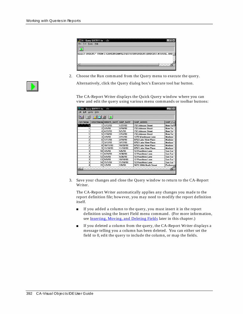
Working with Queries in Reports
392 CA-Visual Objects IDE User Guide
2. Choose the Run command from the Query menu to execute the query.
Alternatively, click the Query dialog box’s Execute tool bar button.
The CA-Report Writer displays the Quick Query window where you canview and edit the query using various menu commands or toolbar buttons:
3. Save your changes and close the Query window to return to the CA-ReportWriter.
The CA-Report Writer automatically applies any changes you made to thereport definition file; however, you may need to modify the report definitionitself.
■ If you added a column to the query, you must insert it in the reportdefinition using the Insert Field menu command. (For more information,see Inserting, Moving, and Deleting Fields later in this chapter.)
■ If you deleted a column from the query, the CA-Report Writer displays amessage telling you a column has been deleted. You can either set thefield to 0, edit the query to include the column, or map the fields.
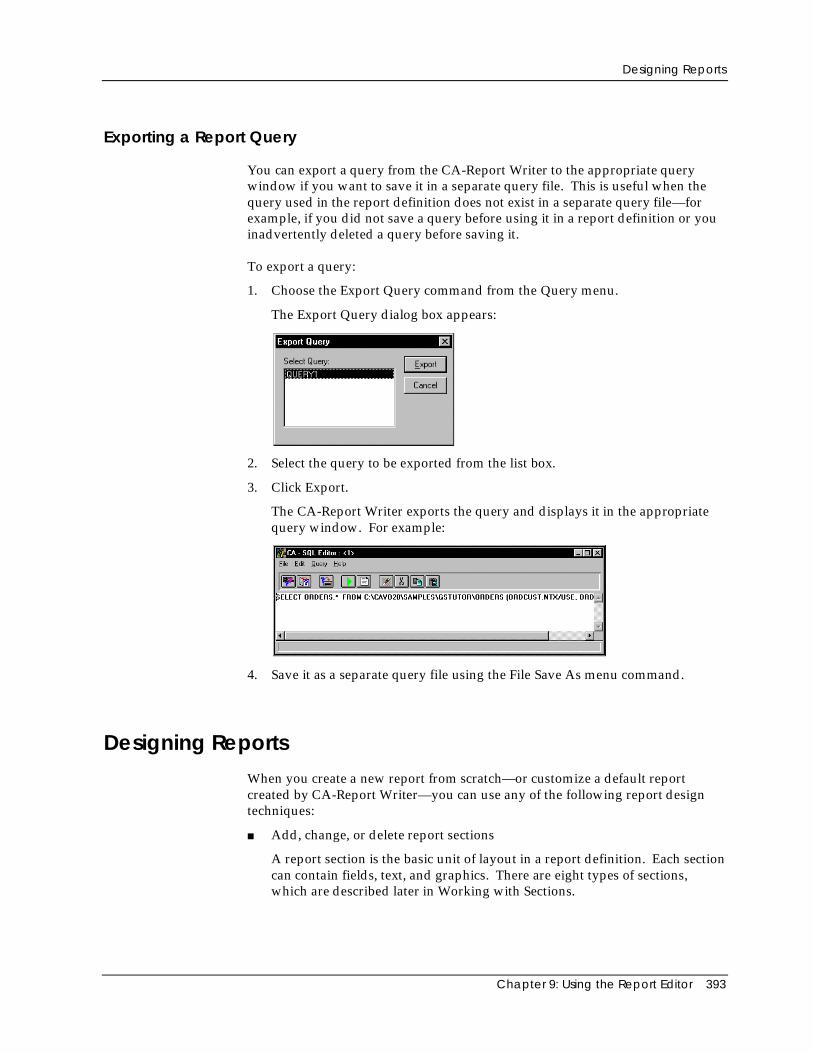
Designing Reports
Chapter 9: Using the Report Editor 393
Exporting a Report Query
You can export a query from the CA-Report Writer to the appropriate querywindow if you want to save it in a separate query file. This is useful when thequery used in the report definition does not exist in a separate query file—forexample, if you did not save a query before using it in a report definition or youinadvertently deleted a query before saving it.
To export a query:
1. Choose the Export Query command from the Query menu.
The Export Query dialog box appears:
2. Select the query to be exported from the list box.
3. Click Export.
The CA-Report Writer exports the query and displays it in the appropriatequery window. For example:
4. Save it as a separate query file using the File Save As menu command.
Designing ReportsWhen you create a new report from scratch—or customize a default reportcreated by CA-Report Writer—you can use any of the following report designtechniques:
■ Add, change, or delete report sections
A report section is the basic unit of layout in a report definition. Each sectioncan contain fields, text, and graphics. There are eight types of sections,which are described later in Working with Sections.
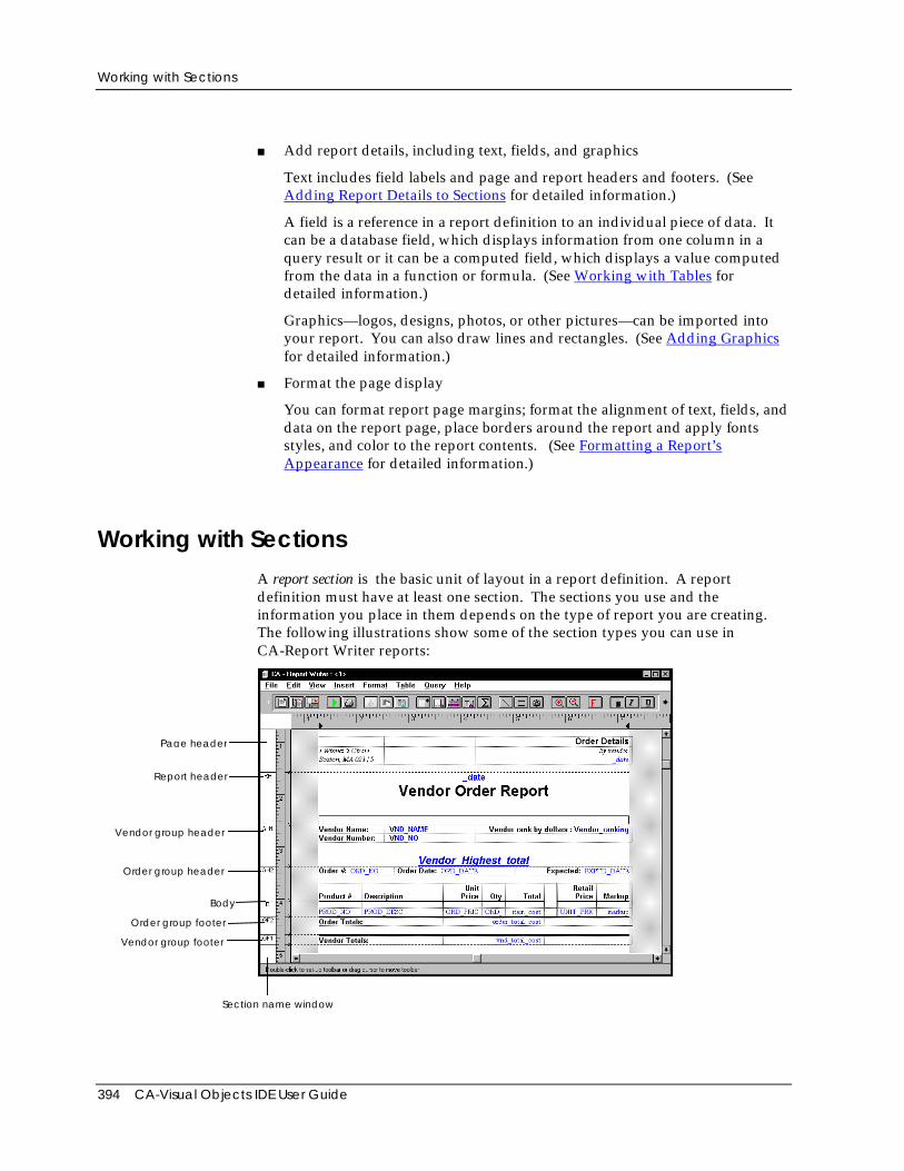
Working with Sections
394 CA-Visual Objects IDE User Guide
■ Add report details, including text, fields, and graphics
Text includes field labels and page and report headers and footers. (SeeAdding Report Details to Sections for detailed information.)
A field is a reference in a report definition to an individual piece of data. Itcan be a database field, which displays information from one column in aquery result or it can be a computed field, which displays a value computedfrom the data in a function or formula. (See Working with Tables fordetailed information.)
Graphics—logos, designs, photos, or other pictures—can be imported intoyour report. You can also draw lines and rectangles. (See Adding Graphicsfor detailed information.)
■ Format the page display
You can format report page margins; format the alignment of text, fields, anddata on the report page, place borders around the report and apply fontsstyles, and color to the report contents. (See Formatting a Report’sAppearance for detailed information.)
Working with SectionsA report section is the basic unit of layout in a report definition. A reportdefinition must have at least one section. The sections you use and theinformation you place in them depends on the type of report you are creating.The following illustrations show some of the section types you can use inCA-Report Writer reports:
Page header
Report header
Order group header
Body
Order group footer
Vendor group footer
Vendor group header
Section name window
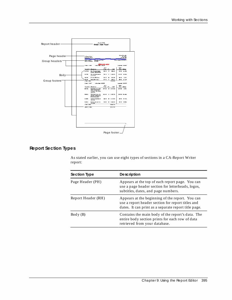
Working with Sections
Chapter 9: Using the Report Editor 395
Report header
Page header
Group headers
Body
Group footers
Page footer
Report Section Types
As stated earlier, you can use eight types of sections in a CA-Report Writerreport:
Section Type Description
Page Header (PH) Appears at the top of each report page. You canuse a page header section for letterheads, logos,subtitles, dates, and page numbers.
Report Header (RH) Appears at the beginning of the report. You canuse a report header section for report titles anddates. It can print as a separate report title page.
Body (B) Contains the main body of the report’s data. Theentire body section prints for each row of dataretrieved from your database.
Working with Sections
396 CA-Visual Objects IDE User Guide
Section Type Description
Group Header (GH) Appears at the beginning of a group of sections. Agroup header section can identify a group of datathat appears in another section following the groupheader. For example, a customer transaction reportwould need a group header for each customername in the database, so that all transactions for aparticular customer are grouped together in thebody section of the report. For more information,see Grouping Data later in this chapter.
Group Footer (GF) Appears at the end of a group of sections. You canuse a group footer to display summary information,including group subtotals.
Report Footer (RF) Appears at the end of the report. If there is a pagefooter, the report footer appears before it. You canuse it to display report summary information, suchas grand totals.
Page Footer (PF) Appears at the bottom of each report page. You canuse a page footer for page numbers and companyinformation.
Background Spans the background of the entire report page. Abackground section is independent of all othersections; you can use this type of section to displaybackground graphics.
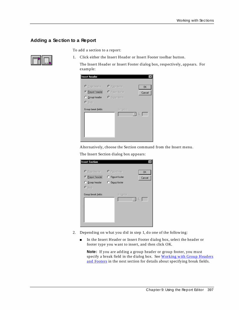
Working with Sections
Chapter 9: Using the Report Editor 397
Adding a Section to a Report
To add a section to a report:
1. Click either the Insert Header or Insert Footer toolbar button.
The Insert Header or Insert Footer dialog box, respectively, appears. Forexample:
Alternatively, choose the Section command from the Insert menu.
The Insert Section dialog box appears:
2. Depending on what you did in step 1, do one of the following:
■ In the Insert Header or Insert Footer dialog box, select the header orfooter type you want to insert, and then click OK.
Note: If you are adding a group header or group footer, you mustspecify a break field in the dialog box. See Working with Group Headersand Footers in the next section for details about specifying break fields.
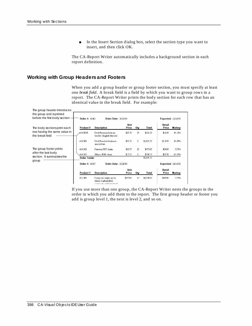
Working with Sections
398 CA-Visual Objects IDE User Guide
■ In the Insert Section dialog box, select the section type you want toinsert, and then click OK.
The CA-Report Writer automatically includes a background section in eachreport definition.
Working with Group Headers and Footers
When you add a group header or group footer section, you must specify at leastone break field. A break field is a field by which you want to group rows in areport. The CA-Report Writer prints the body section for each row that has anidentical value in the break field. For example:
The body sections print eachrow having the same value inthe break field
The group footer printsafter the last bodysection. It summarizes thegroup
The group header introducesthe group and is printedbefore the first body section
If you use more than one group, the CA-Report Writer nests the groups in theorder in which you add them to the report. The first group header or footer youadd is group level 1, the next is level 2, and so on.
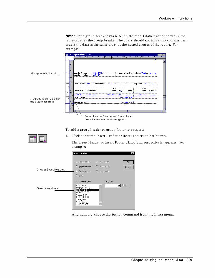
Working with Sections
Chapter 9: Using the Report Editor 399
Note: For a group break to make sense, the report data must be sorted in thesame order as the group breaks. The query should contain a sort column thatorders the data in the same order as the nested groups of the report. Forexample:
Group header 1 and . . .
. . . group footer 1 definethe outermost group
Group header 2 and group footer 2 arenested inside the outermost group.
To add a group header or group footer to a report:
1. Click either the Insert Header or Insert Footer toolbar button.
The Insert Header or Insert Footer dialog box, respectively, appears. Forexample:
ChooseGroupHeader...
Selectabreakfield
Alternatively, choose the Section command from the Insert menu.
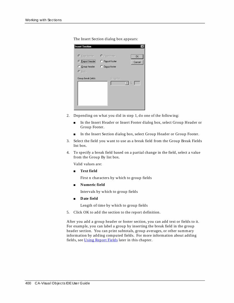
Working with Sections
400 CA-Visual Objects IDE User Guide
The Insert Section dialog box appears:
2. Depending on what you did in step 1, do one of the following:
■ In the Insert Header or Insert Footer dialog box, select Group Header orGroup Footer.
■ In the Insert Section dialog box, select Group Header or Group Footer.
3. Select the field you want to use as a break field from the Group Break Fieldslist box.
4. To specify a break field based on a partial change in the field, select a valuefrom the Group By list box.
Valid values are:
■ Text field
First n characters by which to group fields
■ Numeric field
Intervals by which to group fields
■ Date field
Length of time by which to group fields
5. Click OK to add the section to the report definition.
After you add a group header or footer section, you can add text or fields to it.For example, you can label a group by inserting the break field in the groupheader section. You can print subtotals, group averages, or other summaryinformation by adding computed fields. For more information about addingfields, see Using Report Fields later in this chapter.
Working with Sections
Chapter 9: Using the Report Editor 401
Tip: Use care when placing data fields into group headers or footers toensure that the result makes sense. If you insert a field that is not the breakfield, the value displayed in the report is taken from one of the rows in thegroup. The field’s value may be merely a random example, rather than acharacteristic value in common with all rows for that group.
Adding Report Details to Sections
You can add fields, text, and graphics to each section. Here are some guidelinesand restrictions you should be aware of when adding details to a report section.
Page Headersand Footers
Page header and page footer sections can include page number functions, dateand time fields, and database fields. They cannot include other functions orcomputed fields. A page footer section has a fixed length. It truncates any textor fields that extend beyond the bottom page margin.
Report Headersand Footers
If you want to print a title page for a report, you can format a report header toprint before the page header. If you want to print a calculated field in thereport header on each page, you can format a report header to print onsubsequent pages.
Group Headersand Footers
When you insert a group header or footer into the report definition, you mustspecify one or more fields by which you want to group records in the report.See Grouping Data later in this chapter for more information.
Background To insert information into the background section, select the View PageBackground menu command. You can add page number functions, date andtime fields, and database fields. You cannot add any other functions orcomputed fields. The CA-Report Writer prints information defined in thebackground section the same way on each page of the report.
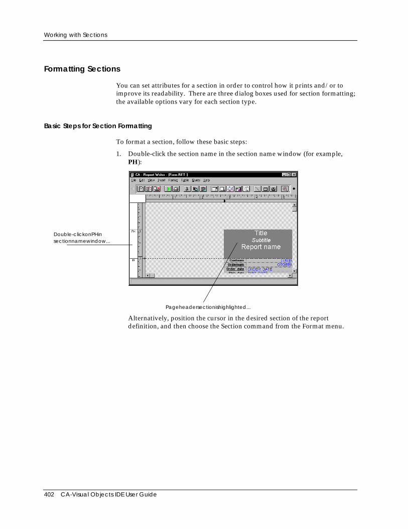
Working with Sections
402 CA-Visual Objects IDE User Guide
Formatting Sections
You can set attributes for a section in order to control how it prints and/or toimprove its readability. There are three dialog boxes used for section formatting;the available options vary for each section type.
Basic Steps for Section Formatting
To format a section, follow these basic steps:
1. Double-click the section name in the section name window (for example,PH):
Double-clickonPHinsectionnamewindow...
Pageheadersectionishighlighted...
Alternatively, position the cursor in the desired section of the reportdefinition, and then choose the Section command from the Format menu.
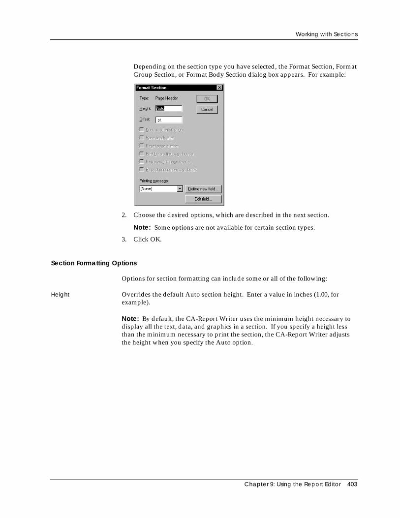
Working with Sections
Chapter 9: Using the Report Editor 403
Depending on the section type you have selected, the Format Section, FormatGroup Section, or Format Body Section dialog box appears. For example:
2. Choose the desired options, which are described in the next section.
Note: Some options are not available for certain section types.
3. Click OK.
Section Formatting Options
Options for section formatting can include some or all of the following:
Height Overrides the default Auto section height. Enter a value in inches (1.00, forexample).
Note: By default, the CA-Report Writer uses the minimum height necessary todisplay all the text, data, and graphics in a section. If you specify a height lessthan the minimum necessary to print the section, the CA-Report Writer adjuststhe height when you specify the Auto option.
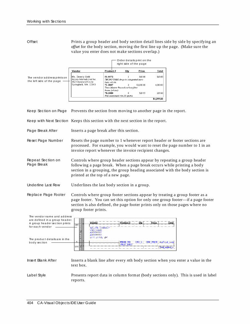
Working with Sections
404 CA-Visual Objects IDE User Guide
Offset Prints a group header and body section detail lines side by side by specifying anoffset for the body section, moving the first line up the page. (Make sure thevalue you enter does not make sections overlap.)
The vendor address prints onthe left side of the page
Order details print on theright side of the page
Keep Section on Page Prevents the section from moving to another page in the report.
Keep with Next Section Keeps this section with the next section in the report.
Page Break After Inserts a page break after this section.
Reset Page Number Resets the page number to 1 whenever report header or footer sections areprocessed. For example, you would want to reset the page number to 1 in aninvoice report whenever the invoice recipient changes.
Repeat Section onPage Break
Controls where group header sections appear by repeating a group headerfollowing a page break. When a page break occurs while printing a bodysection in a grouping, the group heading associated with the body section isprinted at the top of a new page.
Underline Last Row Underlines the last body section in a group.
Replace Page Footer Controls where group footer sections appear by treating a group footer as apage footer. You can set this option for only one group footer—if a page footersection is also defined, the page footer prints only on those pages where nogroup footer prints.
The vendor name and addressare defined in a group header.A group header section printsfor each vendor
The product details are in thebody section
Insert Blank After Inserts a blank line after every nth body section when you enter a value in thetext box.
Label Style Presents report data in column format (body sections only). This is used in labelreports.
Working with Sections
Chapter 9: Using the Report Editor 405
Printing Message Specifies a printing message to use when printing a report.
Break Fields Specifies the break field for a group section. When you change a break field in areport, you must also revise the sort order in the query used in the report.
Group Level Changes the relative nesting level of a group section. For example, you canchange a report that displays orders by product within vendor to one thatdisplays orders by vendor within product. Nesting level 1 represents theoutermost group; level 2 the first group, and so on. If there is a correspondinggroup header or footer, you must also change the nesting level for that section.
Group By Specifies the group intervals for group sections.
Deleting a Section
To delete a section:
1. Position the cursor on the appropriate section in the section name window orin the section area of the vertical ruler in the CA-Report Writer window.
2. Choose the Delete command from the Edit menu.
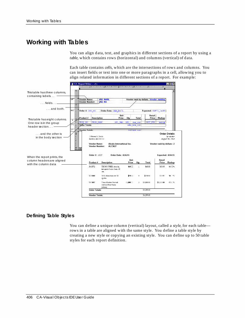
Working with Tables
406 CA-Visual Objects IDE User Guide
Working with TablesYou can align data, text, and graphics in different sections of a report by using atable, which contains rows (horizontal) and columns (vertical) of data.
Each table contains cells, which are the intersections of rows and columns. Youcan insert fields or text into one or more paragraphs in a cell, allowing you toalign related information in different sections of a report. For example:
This table has three columns,containing labels. . .
. . . fields. . .
. . . and both.
This table has eight columns.One row is in the groupheader section. . .
. . . and the other isin the body section
When the report prints, thecolumn headers are alignedwith the column data
Defining Table Styles
You can define a unique column (vertical) layout, called a style, for each table—rows in a table are aligned with the same style. You define a table style bycreating a new style or copying an existing style. You can define up to 50 tablestyles for each report definition.
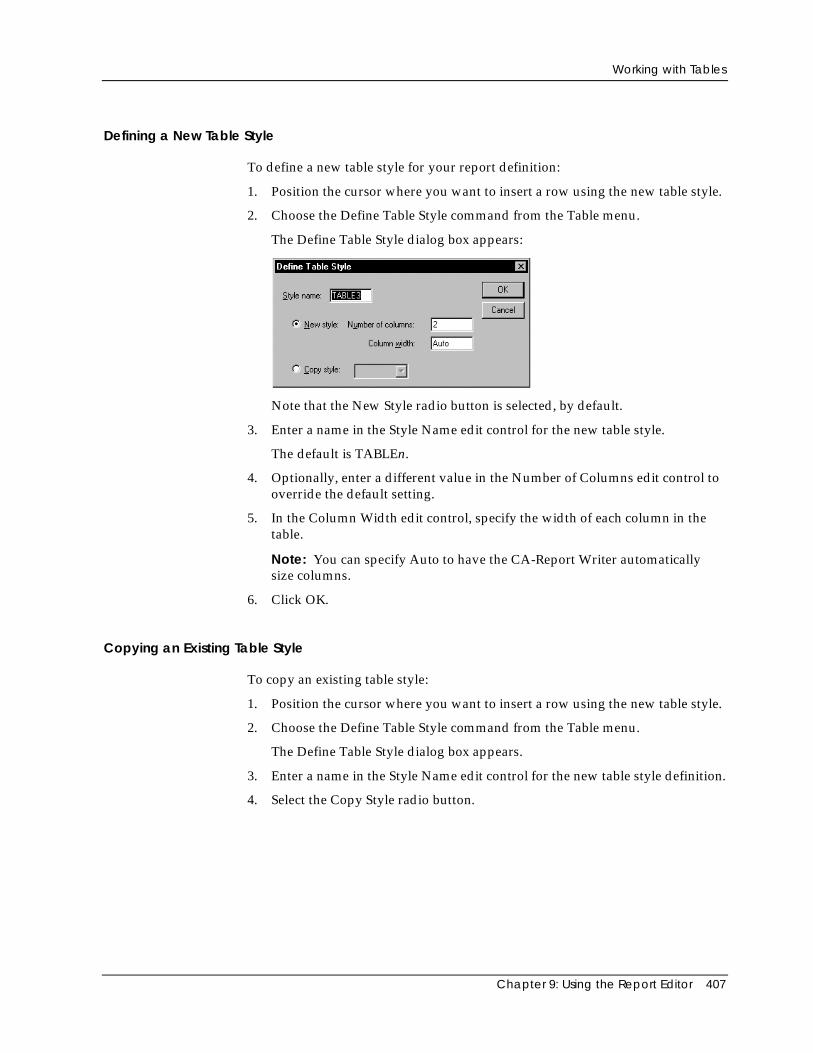
Working with Tables
Chapter 9: Using the Report Editor 407
Defining a New Table Style
To define a new table style for your report definition:
1. Position the cursor where you want to insert a row using the new table style.
2. Choose the Define Table Style command from the Table menu.
The Define Table Style dialog box appears:
Note that the New Style radio button is selected, by default.
3. Enter a name in the Style Name edit control for the new table style.
The default is TABLEn.
4. Optionally, enter a different value in the Number of Columns edit control tooverride the default setting.
5. In the Column Width edit control, specify the width of each column in thetable.
Note: You can specify Auto to have the CA-Report Writer automaticallysize columns.
6. Click OK.
Copying an Existing Table Style
To copy an existing table style:
1. Position the cursor where you want to insert a row using the new table style.
2. Choose the Define Table Style command from the Table menu.
The Define Table Style dialog box appears.
3. Enter a name in the Style Name edit control for the new table style definition.
4. Select the Copy Style radio button.
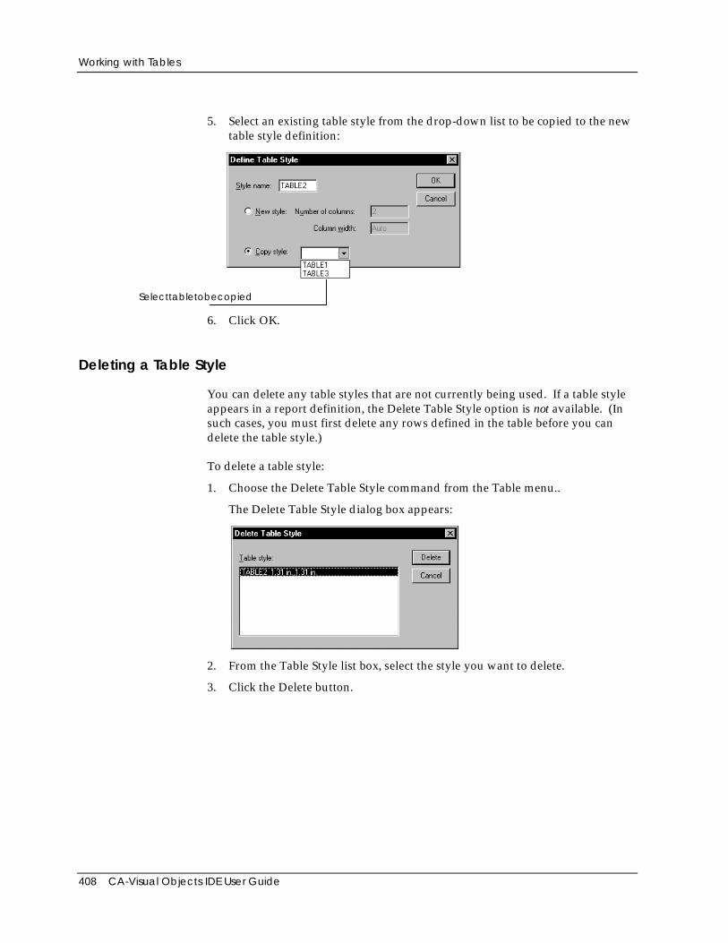
Working with Tables
408 CA-Visual Objects IDE User Guide
5. Select an existing table style from the drop-down list to be copied to the newtable style definition:
Selecttabletobecopied
6. Click OK.
Deleting a Table Style
You can delete any table styles that are not currently being used. If a table styleappears in a report definition, the Delete Table Style option is not available. (Insuch cases, you must first delete any rows defined in the table before you candelete the table style.)
To delete a table style:
1. Choose the Delete Table Style command from the Table menu..
The Delete Table Style dialog box appears:
2. From the Table Style list box, select the style you want to delete.
3. Click the Delete button.
Working with Tables
Chapter 9: Using the Report Editor 409
Using Columns in Tables
The columns in a table function like tab stops to align text. Text you enter in areport section normally wraps at the right page margin. In a column, text alsowraps, starting a new line when the width of the text exceeds the space betweenthe column margins. This section tells you how to add columns to a table style,format the columns, move columns, and delete columns.
The CA-Report Writer indicates where columns and rows appear in a reportdefinition by displaying vertical and horizontal divider lines respectively. Youcan change the display of column and row dividers by choosing theColumn/Row Dividers command from the Table menu.
Tip: Use your keyboard to move around in a table. The Tab key places thecursor at the start of the next cell in a row (or paragraph). To move thecursor to the start of the previous cell in a row (or paragraph), use Shift+Tab.
Adding Columns to a Table
To add a column to a table in your report definition:
1. Position the cursor in the column after which you want to insert a newcolumn.
2. Choose the Insert Column command from the Table menu.
The CA-Report Writer inserts a new column in all occurrences of the tablestyle, including those in different sections.
Changing Column Width
Columns are separated by an area called the gutter. You can adjust the width ofany column or column gutter in a report style. When you change a columnwidth, it changes for all rows of the same table style in the report.
Note: Increasing the column width may cause other columns to extend beyondthe page margins—you may need to decrease the width of these columns.
You can change the width of a column using either the Format Columns dialogbox or the ruler method.
Dialog Box Method To change column width in a report definition:
1. Position the cursor in the desired column.
2. Double-click between the column markers for the column in the ruler.
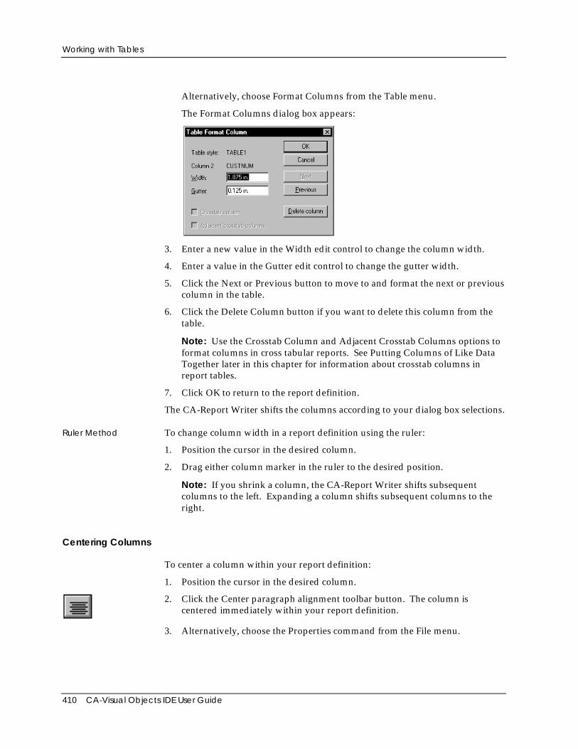
Working with Tables
410 CA-Visual Objects IDE User Guide
Alternatively, choose Format Columns from the Table menu.
The Format Columns dialog box appears:
3. Enter a new value in the Width edit control to change the column width.
4. Enter a value in the Gutter edit control to change the gutter width.
5. Click the Next or Previous button to move to and format the next or previouscolumn in the table.
6. Click the Delete Column button if you want to delete this column from thetable.
Note: Use the Crosstab Column and Adjacent Crosstab Columns options toformat columns in cross tabular reports. See Putting Columns of Like DataTogether later in this chapter for information about crosstab columns inreport tables.
7. Click OK to return to the report definition.
The CA-Report Writer shifts the columns according to your dialog box selections.
Ruler Method To change column width in a report definition using the ruler:
1. Position the cursor in the desired column.
2. Drag either column marker in the ruler to the desired position.
Note: If you shrink a column, the CA-Report Writer shifts subsequentcolumns to the left. Expanding a column shifts subsequent columns to theright.
Centering Columns
To center a column within your report definition:
1. Position the cursor in the desired column.
2. Click the Center paragraph alignment toolbar button. The column iscentered immediately within your report definition.
3. Alternatively, choose the Properties command from the File menu.
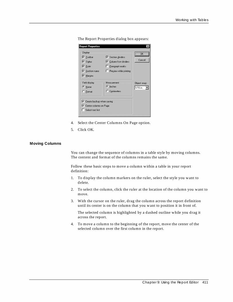
Working with Tables
Chapter 9: Using the Report Editor 411
The Report Properties dialog box appears:
4. Select the Center Columns On Page option.
5. Click OK.
Moving Columns
You can change the sequence of columns in a table style by moving columns.The content and format of the columns remains the same.
Follow these basic steps to move a column within a table in your reportdefinition:
1. To display the column markers on the ruler, select the style you want todelete.
2. To select the column, click the ruler at the location of the column you want tomove.
3. With the cursor on the ruler, drag the column across the report definitionuntil its center is on the column that you want to position it in front of.
The selected column is highlighted by a dashed outline while you drag itacross the report.
4. To move a column to the beginning of the report, move the center of theselected column over the first column in the report.
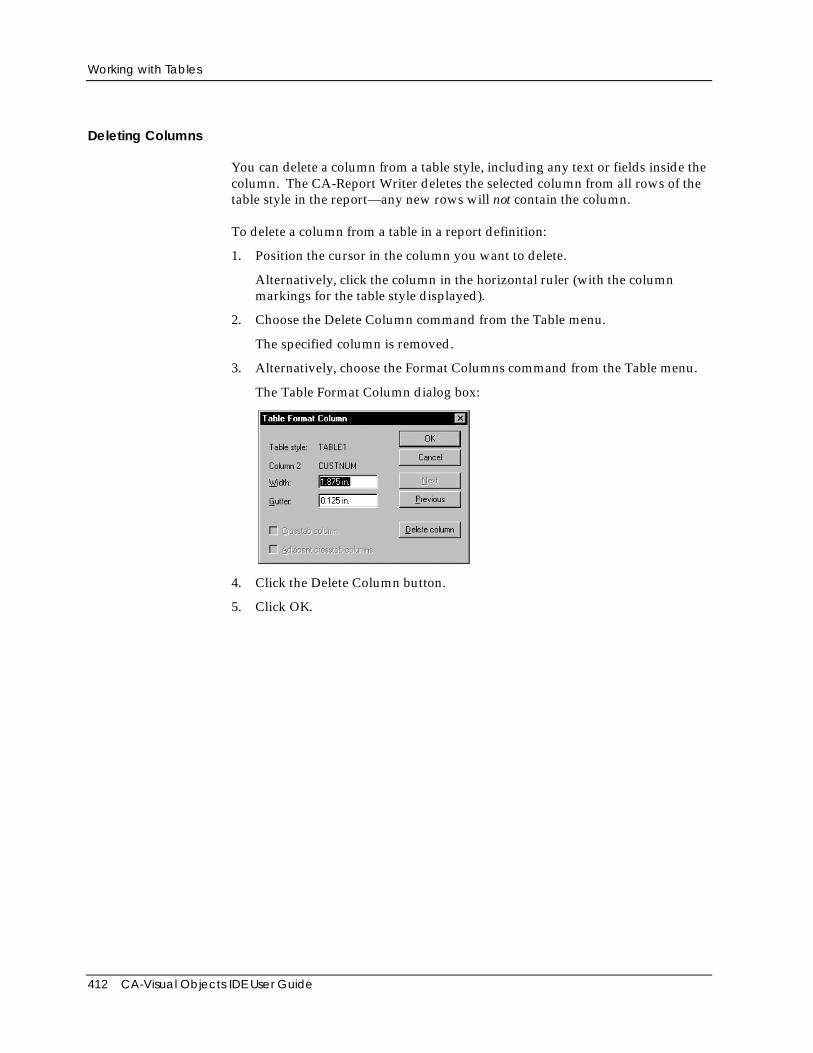
Working with Tables
412 CA-Visual Objects IDE User Guide
Deleting Columns
You can delete a column from a table style, including any text or fields inside thecolumn. The CA-Report Writer deletes the selected column from all rows of thetable style in the report—any new rows will not contain the column.
To delete a column from a table in a report definition:
1. Position the cursor in the column you want to delete.
Alternatively, click the column in the horizontal ruler (with the columnmarkings for the table style displayed).
2. Choose the Delete Column command from the Table menu.
The specified column is removed.
3. Alternatively, choose the Format Columns command from the Table menu.
The Table Format Column dialog box:
4. Click the Delete Column button.
5. Click OK.
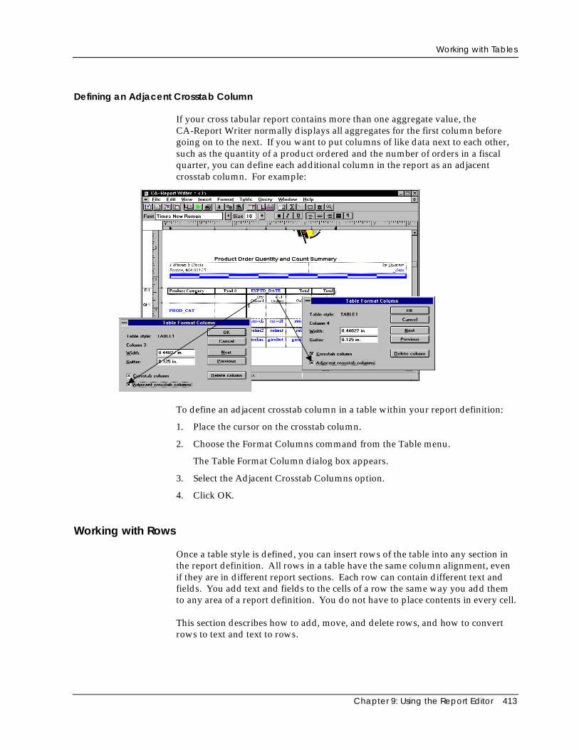
Working with Tables
Chapter 9: Using the Report Editor 413
Defining an Adjacent Crosstab Column
If your cross tabular report contains more than one aggregate value, theCA-Report Writer normally displays all aggregates for the first column beforegoing on to the next. If you want to put columns of like data next to each other,such as the quantity of a product ordered and the number of orders in a fiscalquarter, you can define each additional column in the report as an adjacentcrosstab column. For example:
To define an adjacent crosstab column in a table within your report definition:
1. Place the cursor on the crosstab column.
2. Choose the Format Columns command from the Table menu.
The Table Format Column dialog box appears.
3. Select the Adjacent Crosstab Columns option.
4. Click OK.
Working with Rows
Once a table style is defined, you can insert rows of the table into any section inthe report definition. All rows in a table have the same column alignment, evenif they are in different report sections. Each row can contain different text andfields. You add text and fields to the cells of a row the same way you add themto any area of a report definition. You do not have to place contents in every cell.
This section describes how to add, move, and delete rows, and how to convertrows to text and text to rows.
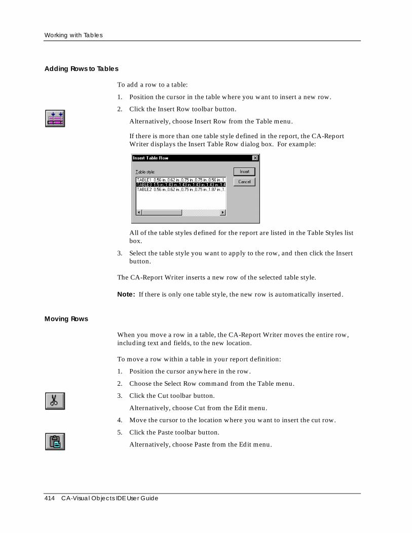
Working with Tables
414 CA-Visual Objects IDE User Guide
Adding Rows to Tables
To add a row to a table:
1. Position the cursor in the table where you want to insert a new row.
2. Click the Insert Row toolbar button.
Alternatively, choose Insert Row from the Table menu.
If there is more than one table style defined in the report, the CA-ReportWriter displays the Insert Table Row dialog box. For example:
All of the table styles defined for the report are listed in the Table Styles listbox.
3. Select the table style you want to apply to the row, and then click the Insertbutton.
The CA-Report Writer inserts a new row of the selected table style.
Note: If there is only one table style, the new row is automatically inserted.
Moving Rows
When you move a row in a table, the CA-Report Writer moves the entire row,including text and fields, to the new location.
To move a row within a table in your report definition:
1. Position the cursor anywhere in the row.
2. Choose the Select Row command from the Table menu.
3. Click the Cut toolbar button.
Alternatively, choose Cut from the Edit menu.
4. Move the cursor to the location where you want to insert the cut row.
5. Click the Paste toolbar button.
Alternatively, choose Paste from the Edit menu.
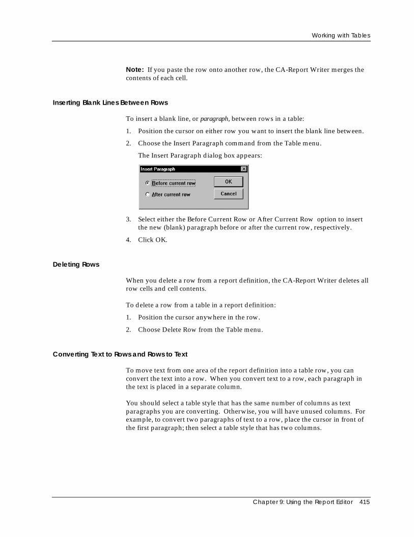
Working with Tables
Chapter 9: Using the Report Editor 415
Note: If you paste the row onto another row, the CA-Report Writer merges thecontents of each cell.
Inserting Blank Lines Between Rows
To insert a blank line, or paragraph, between rows in a table:
1. Position the cursor on either row you want to insert the blank line between.
2. Choose the Insert Paragraph command from the Table menu.
The Insert Paragraph dialog box appears:
3. Select either the Before Current Row or After Current Row option to insertthe new (blank) paragraph before or after the current row, respectively.
4. Click OK.
Deleting Rows
When you delete a row from a report definition, the CA-Report Writer deletes allrow cells and cell contents.
To delete a row from a table in a report definition:
1. Position the cursor anywhere in the row.
2. Choose Delete Row from the Table menu.
Converting Text to Rows and Rows to Text
To move text from one area of the report definition into a table row, you canconvert the text into a row. When you convert text to a row, each paragraph inthe text is placed in a separate column.
You should select a table style that has the same number of columns as textparagraphs you are converting. Otherwise, you will have unused columns. Forexample, to convert two paragraphs of text to a row, place the cursor in front ofthe first paragraph; then select a table style that has two columns.
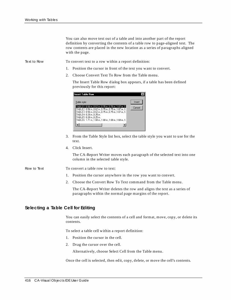
Working with Tables
416 CA-Visual Objects IDE User Guide
You can also move text out of a table and into another part of the reportdefinition by converting the contents of a table row to page-aligned text. Therow contents are placed in the new location as a series of paragraphs alignedwith the page.
Text to Row To convert text to a row within a report definition:
1. Position the cursor in front of the text you want to convert.
2. Choose Convert Text To Row from the Table menu.
The Insert Table Row dialog box appears, if a table has been definedpreviously for this report:
3. From the Table Style list box, select the table style you want to use for thetext.
4. Click Insert.
The CA-Report Writer moves each paragraph of the selected text into onecolumn in the selected table style.
Row to Text To convert a table row to text:
1. Position the cursor anywhere in the row you want to convert.
2. Choose the Convert Row To Text command from the Table menu.
The CA-Report Writer deletes the row and aligns the text as a series ofparagraphs within the normal page margins of the report.
Selecting a Table Cell for Editing
You can easily select the contents of a cell and format, move, copy, or delete itscontents.
To select a table cell within a report definition:
1. Position the cursor in the cell.
2. Drag the cursor over the cell.
Alternatively, choose Select Cell from the Table menu.
Once the cell is selected, then edit, copy, delete, or move the cell’s contents.
Formatting a Report’s Appearance
Chapter 9: Using the Report Editor 417
Note: Pasting a selected cell onto another cell adds to the contents of that cell.You can also paste cell contents to a non-table area. However, if you paste morethan one cell into a non-table area, the CA-Report Writer inserts a row with thecontents of the selected cells copied.
Formatting a Report’s AppearanceYou can customize the display of your reports by:
■ Aligning data
■ Formatting the display of text on the page
■ Adding borders around parts of a report
■ Using conditional paragraphs
■ Changing fonts and point sizes
■ Applying bold, italics, and underlining
■ Applying color
■ Creating a report title page
■ Controlling page breaks
When you format the appearance of the report, you are formatting paragraphsand characters.
Paragraph Formatting A paragraph is any area in a report definition that ends with a paragraph mark(¶). For example, each column heading in a report header is a separateparagraph. A paragraph can be the contents of one cell or an entire section of areport. Pressing the Enter key inserts a paragraph mark. You can have manyparagraphs within a block of text, and one cell can contain multiple paragraphs.
With paragraph formatting, you can do the following:
■ Left-justify, right-justify, center, or justify the contents of a paragraph in areport
■ Wrap, truncate, and specify line spacing for text displays in reports
■ Place borders around selected paragraphs in reports
Tip: When formatting paragraphs, turn on the display of paragraph marksby clicking the Paragraph Mark toolbar button or by turning on theParagraph Marks option in the Report Properties dialog box (Propertiescommand in the File menu).
Formatting a Report’s Appearance
418 CA-Visual Objects IDE User Guide
You can specify the format of a paragraph before you enter information in it.The CA-Report Writer applies the formatting as you enter text, and continues touse this formatting on new paragraphs until you reset it or reposition the cursor.For example, if you start a new paragraph, it has the same attributes as theprevious one. Whenever you copy or move a paragraph, the CA-Report Writeralso copies or moves the formatting.
Character Formatting Character formatting determines how report text—including letters, numbers,punctuation, and symbols—appears on the screen and in print. Characterformatting lets you choose:
■ Fonts and point sizes
■ Underlined, bold, or italic styles
■ Color
You can select character formatting before you type, or selectively after you havetyped text in your report. Select any number of characters, and then apply orremove character formatting. The current character formatting is displayed onthe status bar (at the bottom of the CA-Report Writer window) and is highlightedon the toolbar.
Aligning Paragraph Text
You can align paragraph text with the left margin, the right margin, bothmargins simultaneously (justified), or you can center the text between the rightand left margins. Column data aligns with the column margins. Data outside acolumn aligns with the page margins of the report.
To align text within the report definition:
1. Position the cursor in the paragraph you want to align.
2. Click one of the following toolbar buttons:
Left Center
Right Justify
Tip: Drag the cursor to select more than one paragraph.
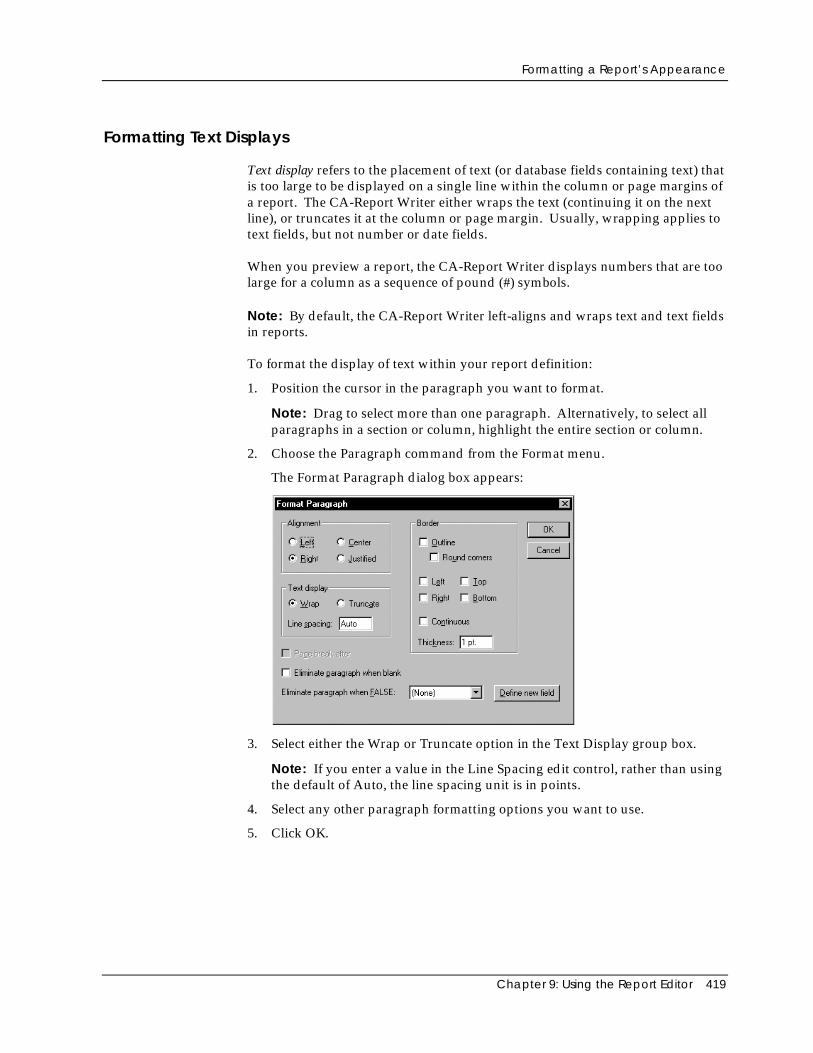
Formatting a Report’s Appearance
Chapter 9: Using the Report Editor 419
Formatting Text Displays
Text display refers to the placement of text (or database fields containing text) thatis too large to be displayed on a single line within the column or page margins ofa report. The CA-Report Writer either wraps the text (continuing it on the nextline), or truncates it at the column or page margin. Usually, wrapping applies totext fields, but not number or date fields.
When you preview a report, the CA-Report Writer displays numbers that are toolarge for a column as a sequence of pound (#) symbols.
Note: By default, the CA-Report Writer left-aligns and wraps text and text fieldsin reports.
To format the display of text within your report definition:
1. Position the cursor in the paragraph you want to format.
Note: Drag to select more than one paragraph. Alternatively, to select allparagraphs in a section or column, highlight the entire section or column.
2. Choose the Paragraph command from the Format menu.
The Format Paragraph dialog box appears:
3. Select either the Wrap or Truncate option in the Text Display group box.
Note: If you enter a value in the Line Spacing edit control, rather than usingthe default of Auto, the line spacing unit is in points.
4. Select any other paragraph formatting options you want to use.
5. Click OK.
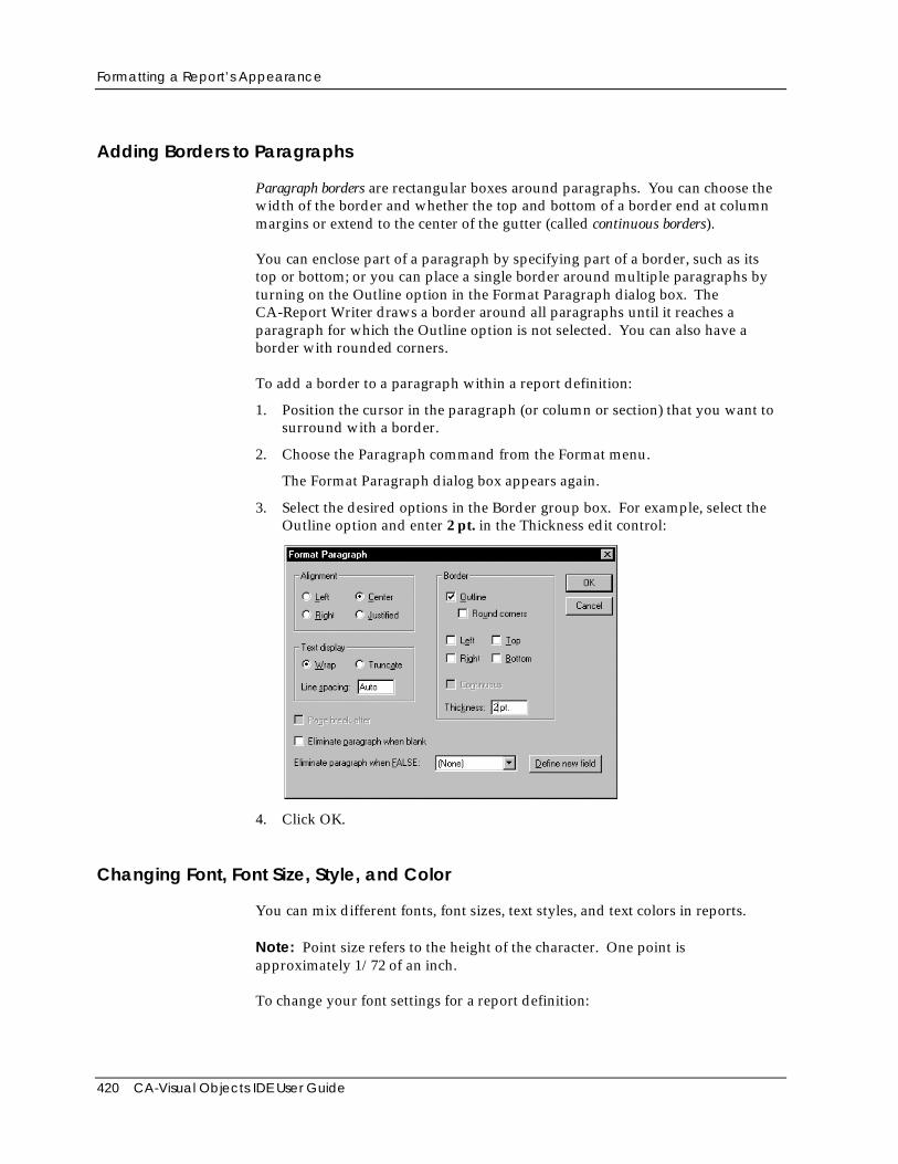
Formatting a Report’s Appearance
420 CA-Visual Objects IDE User Guide
Adding Borders to Paragraphs
Paragraph borders are rectangular boxes around paragraphs. You can choose thewidth of the border and whether the top and bottom of a border end at columnmargins or extend to the center of the gutter (called continuous borders).
You can enclose part of a paragraph by specifying part of a border, such as itstop or bottom; or you can place a single border around multiple paragraphs byturning on the Outline option in the Format Paragraph dialog box. TheCA-Report Writer draws a border around all paragraphs until it reaches aparagraph for which the Outline option is not selected. You can also have aborder with rounded corners.
To add a border to a paragraph within a report definition:
1. Position the cursor in the paragraph (or column or section) that you want tosurround with a border.
2. Choose the Paragraph command from the Format menu.
The Format Paragraph dialog box appears again.
3. Select the desired options in the Border group box. For example, select theOutline option and enter 2 pt. in the Thickness edit control:
4. Click OK.
Changing Font, Font Size, Style, and Color
You can mix different fonts, font sizes, text styles, and text colors in reports.
Note: Point size refers to the height of the character. One point isapproximately 1/72 of an inch.
To change your font settings for a report definition:
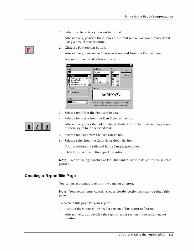
Formatting a Report’s Appearance
Chapter 9: Using the Report Editor 421
1. Select the characters you want to format.
Alternatively, position the cursor at the point where you want to insert textusing a new character format.
2. Click the Font toolbar button.
Alternatively, choose the Character command from the Format menu.
A standard Font dialog box appears:
3. Select a font from the Font combo box.
4. Select a font style from the Font Style combo box.
Alternatively, click the Bold, Italic, or Underline toolbar button to apply oneof these styles to the selected text.
5. Select a font size from the Size combo box.
6. Select a color from the Color drop-down list box.
Your selections are reflected in the Sample group box.
7. Click OK to return to the report definition.
Note: To print using a particular font, the font must be installed for the selectedprinter.
Creating a Report Title Page
You can print a separate report title page for a report.
Note: Your report must contain a report header section in order to print a titlepage.
To create a title page for your report:
1. Position the cursor in the header section of the report definition.
Alternatively, double-click the report header section in the section namewindow.
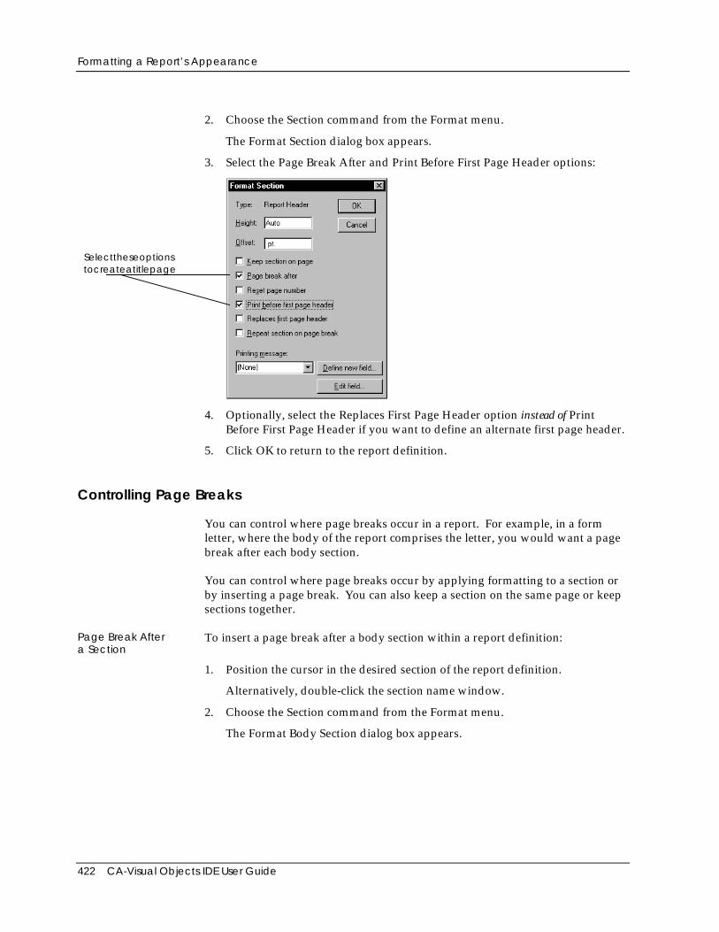
Formatting a Report’s Appearance
422 CA-Visual Objects IDE User Guide
2. Choose the Section command from the Format menu.
The Format Section dialog box appears.
3. Select the Page Break After and Print Before First Page Header options:
Selecttheseoptionstocreateatitlepage
4. Optionally, select the Replaces First Page Header option instead of PrintBefore First Page Header if you want to define an alternate first page header.
5. Click OK to return to the report definition.
Controlling Page Breaks
You can control where page breaks occur in a report. For example, in a formletter, where the body of the report comprises the letter, you would want a pagebreak after each body section.
You can control where page breaks occur by applying formatting to a section orby inserting a page break. You can also keep a section on the same page or keepsections together.
Page Break Aftera Section
To insert a page break after a body section within a report definition:
1. Position the cursor in the desired section of the report definition.
Alternatively, double-click the section name window.
2. Choose the Section command from the Format menu.
The Format Body Section dialog box appears.
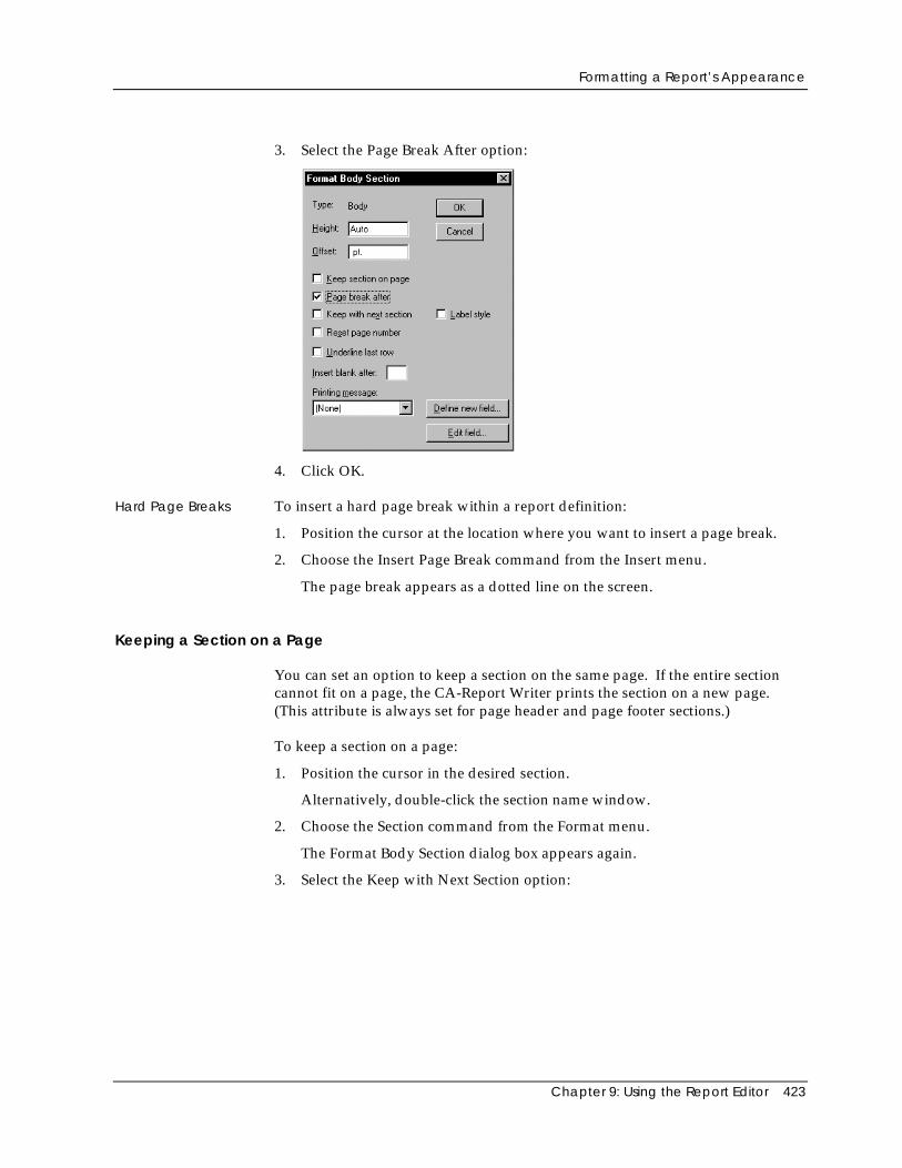
Formatting a Report’s Appearance
Chapter 9: Using the Report Editor 423
3. Select the Page Break After option:
4. Click OK.
Hard Page Breaks To insert a hard page break within a report definition:
1. Position the cursor at the location where you want to insert a page break.
2. Choose the Insert Page Break command from the Insert menu.
The page break appears as a dotted line on the screen.
Keeping a Section on a Page
You can set an option to keep a section on the same page. If the entire sectioncannot fit on a page, the CA-Report Writer prints the section on a new page.(This attribute is always set for page header and page footer sections.)
To keep a section on a page:
1. Position the cursor in the desired section.
Alternatively, double-click the section name window.
2. Choose the Section command from the Format menu.
The Format Body Section dialog box appears again.
3. Select the Keep with Next Section option:
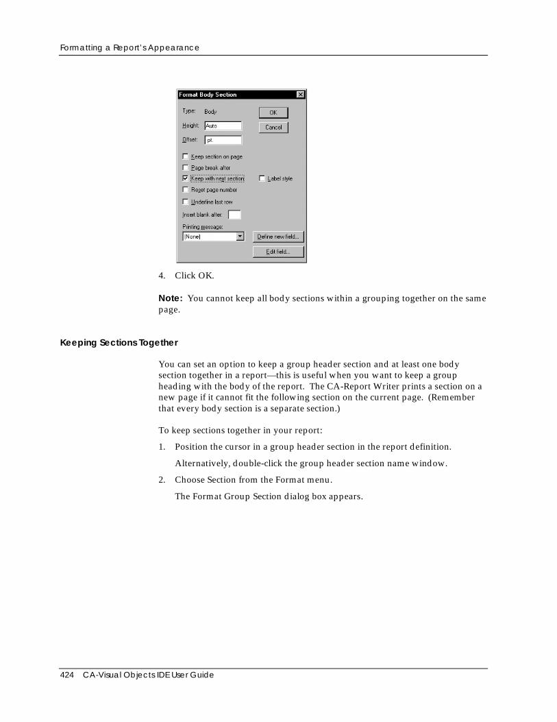
Formatting a Report’s Appearance
424 CA-Visual Objects IDE User Guide
4. Click OK.
Note: You cannot keep all body sections within a grouping together on the samepage.
Keeping Sections Together
You can set an option to keep a group header section and at least one bodysection together in a report—this is useful when you want to keep a groupheading with the body of the report. The CA-Report Writer prints a section on anew page if it cannot fit the following section on the current page. (Rememberthat every body section is a separate section.)
To keep sections together in your report:
1. Position the cursor in a group header section in the report definition.
Alternatively, double-click the group header section name window.
2. Choose Section from the Format menu.
The Format Group Section dialog box appears.
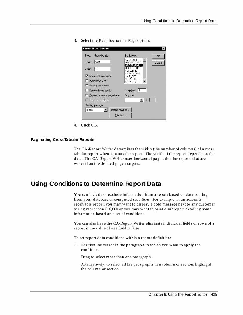
Using Conditions to Determine Report Data
Chapter 9: Using the Report Editor 425
3. Select the Keep Section on Page option:
4. Click OK.
Paginating Cross Tabular Reports
The CA-Report Writer determines the width (the number of columns) of a crosstabular report when it prints the report. The width of the report depends on thedata. The CA-Report Writer uses horizontal pagination for reports that arewider than the defined page margins.
Using Conditions to Determine Report DataYou can include or exclude information from a report based on data comingfrom your database or computed conditions. For example, in an accountsreceivable report, you may want to display a bold message next to any customerowing more than $10,000 or you may want to print a subreport detailing someinformation based on a set of conditions.
You can also have the CA-Report Writer eliminate individual fields or rows of areport if the value of one field is false.
To set report data conditions within a report definition:
1. Position the cursor in the paragraph to which you want to apply thecondition.
Drag to select more than one paragraph.
Alternatively, to select all the paragraphs in a column or section, highlightthe column or section.
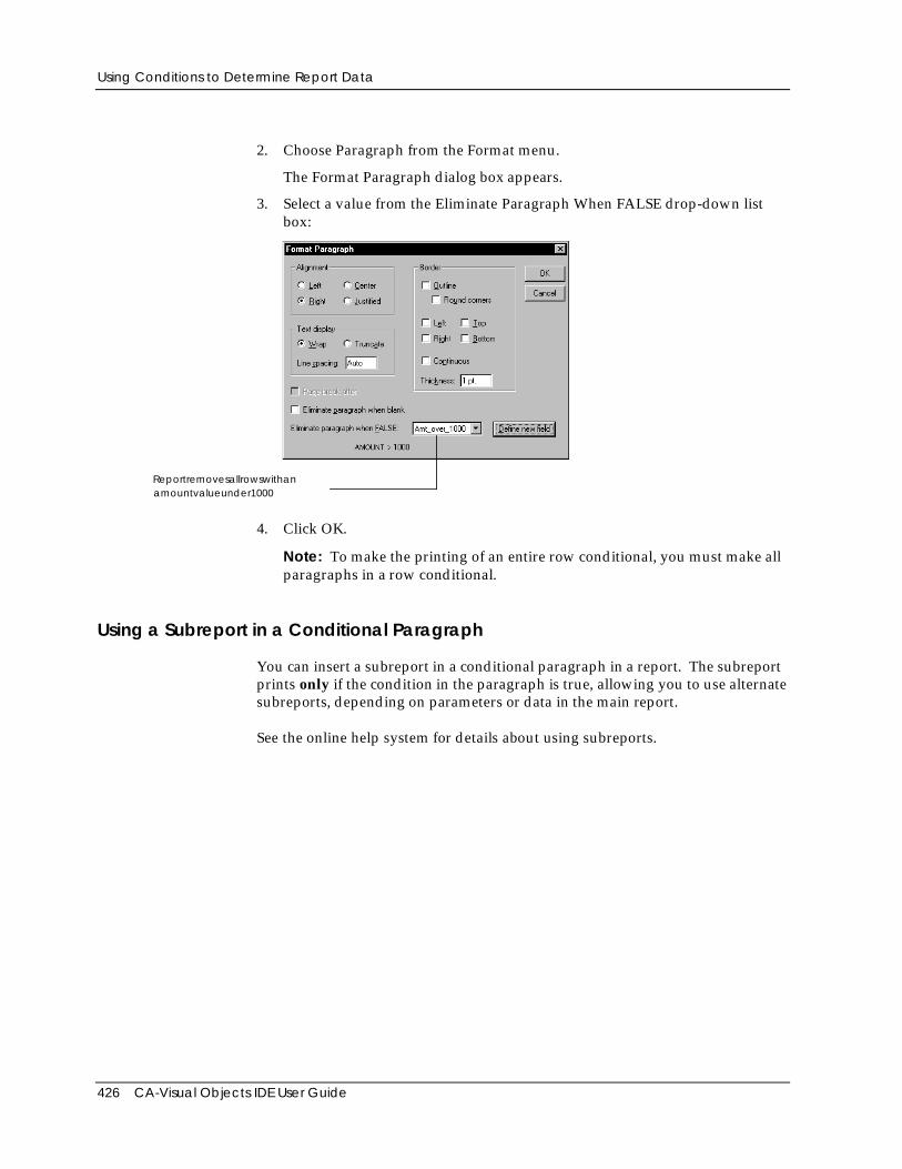
Using Conditions to Determine Report Data
426 CA-Visual Objects IDE User Guide
2. Choose Paragraph from the Format menu.
The Format Paragraph dialog box appears.
3. Select a value from the Eliminate Paragraph When FALSE drop-down listbox:
Reportremovesallrowswithanamountvalueunder1000
4. Click OK.
Note: To make the printing of an entire row conditional, you must make allparagraphs in a row conditional.
Using a Subreport in a Conditional Paragraph
You can insert a subreport in a conditional paragraph in a report. The subreportprints only if the condition in the paragraph is true, allowing you to use alternatesubreports, depending on parameters or data in the main report.
See the online help system for details about using subreports.
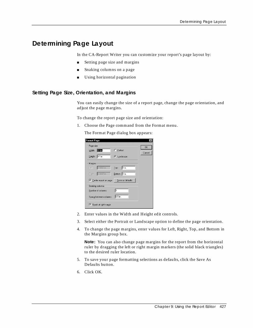
Determining Page Layout
Chapter 9: Using the Report Editor 427
Determining Page LayoutIn the CA-Report Writer you can customize your report’s page layout by:
■ Setting page size and margins
■ Snaking columns on a page
■ Using horizontal pagination
Setting Page Size, Orientation, and Margins
You can easily change the size of a report page, change the page orientation, andadjust the page margins.
To change the report page size and orientation:
1. Choose the Page command from the Format menu.
The Format Page dialog box appears:
2. Enter values in the Width and Height edit controls.
3. Select either the Portrait or Landscape option to define the page orientation.
4. To change the page margins, enter values for Left, Right, Top, and Bottom inthe Margins group box.
Note: You can also change page margins for the report from the horizontalruler by dragging the left or right margin markers (the solid black triangles)to the desired ruler location.
5. To save your page formatting selections as defaults, click the Save AsDefaults button.
6. Click OK.
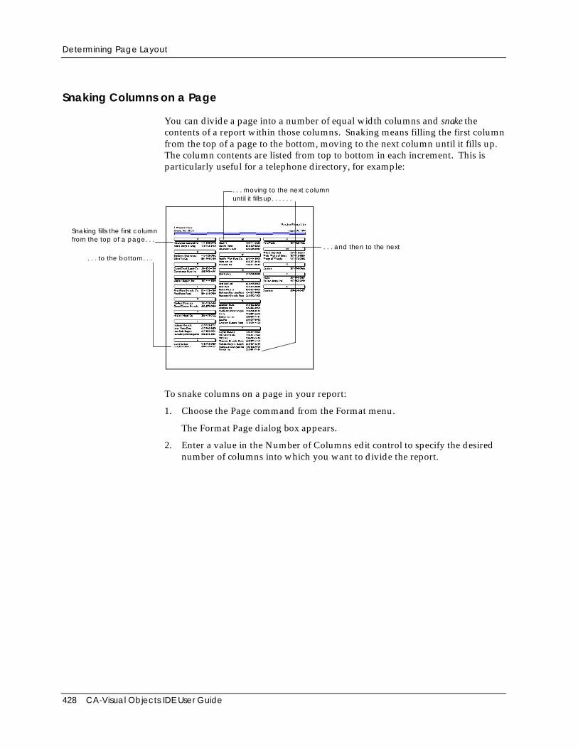
Determining Page Layout
428 CA-Visual Objects IDE User Guide
Snaking Columns on a Page
You can divide a page into a number of equal width columns and snake thecontents of a report within those columns. Snaking means filling the first columnfrom the top of a page to the bottom, moving to the next column until it fills up.The column contents are listed from top to bottom in each increment. This isparticularly useful for a telephone directory, for example:
Snaking fills the first columnfrom the top of a page. . .
. . . moving to the next columnuntil it fills up. . . . . .
. . . and then to the next
. . . to the bottom. . .
To snake columns on a page in your report:
1. Choose the Page command from the Format menu.
The Format Page dialog box appears.
2. Enter a value in the Number of Columns edit control to specify the desirednumber of columns into which you want to divide the report.
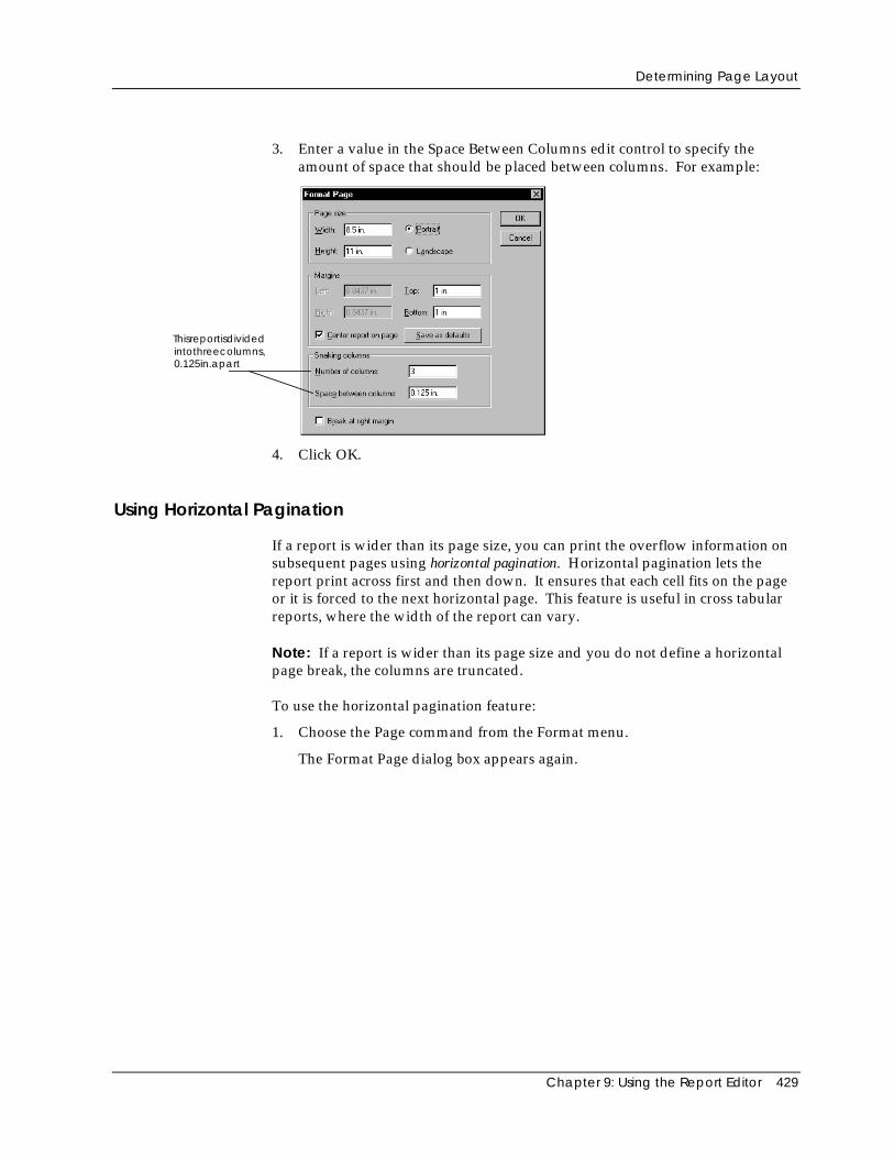
Determining Page Layout
Chapter 9: Using the Report Editor 429
3. Enter a value in the Space Between Columns edit control to specify theamount of space that should be placed between columns. For example:
Thisreportisdivided
0.125in.apartintothreecolumns,
4. Click OK.
Using Horizontal Pagination
If a report is wider than its page size, you can print the overflow information onsubsequent pages using horizontal pagination. Horizontal pagination lets thereport print across first and then down. It ensures that each cell fits on the pageor it is forced to the next horizontal page. This feature is useful in cross tabularreports, where the width of the report can vary.
Note: If a report is wider than its page size and you do not define a horizontalpage break, the columns are truncated.
To use the horizontal pagination feature:
1. Choose the Page command from the Format menu.
The Format Page dialog box appears again.
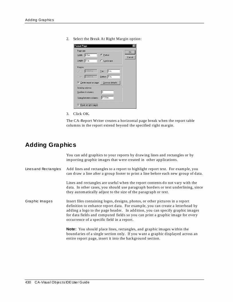
Adding Graphics
430 CA-Visual Objects IDE User Guide
2. Select the Break At Right Margin option:
3. Click OK.
The CA-Report Writer creates a horizontal page break when the report tablecolumns in the report extend beyond the specified right margin.
Adding GraphicsYou can add graphics to your reports by drawing lines and rectangles or byimporting graphic images that were created in other applications.
Lines and Rectangles Add lines and rectangles to a report to highlight report text. For example, youcan draw a line after a group footer to print a line before each new group of data.
Lines and rectangles are useful when the report contents do not vary with thedata. In other cases, you should use paragraph borders or text underlining, sincethey automatically adjust to the size of the paragraph or text.
Graphic Images Insert files containing logos, designs, photos, or other pictures in a reportdefinition to enhance report data. For example, you can create a letterhead byadding a logo to the page header. In addition, you can specify graphic imagesfor data fields and computed fields so you can print a graphic image for everyoccurrence of a specific field in a report.
Note: You should place lines, rectangles, and graphic images within theboundaries of a single section only. If you want a graphic displayed across anentire report page, insert it into the background section.
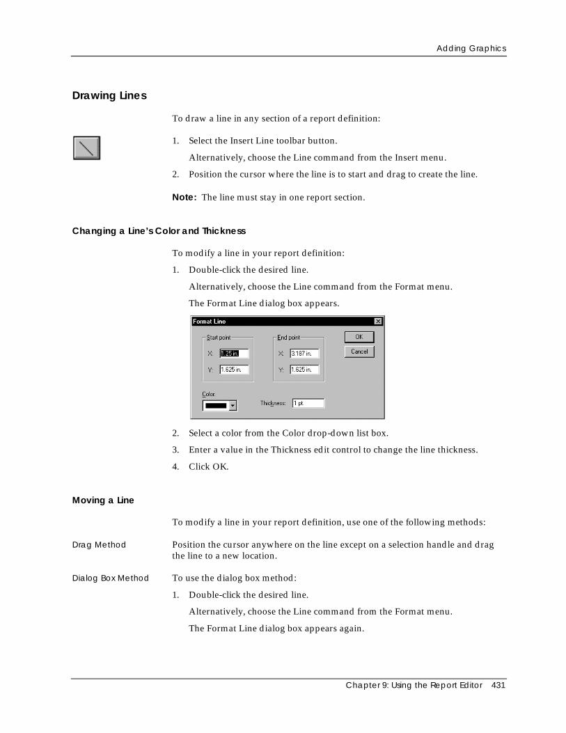
Adding Graphics
Chapter 9: Using the Report Editor 431
Drawing Lines
To draw a line in any section of a report definition:
1. Select the Insert Line toolbar button.
Alternatively, choose the Line command from the Insert menu.
2. Position the cursor where the line is to start and drag to create the line.
Note: The line must stay in one report section.
Changing a Line’s Color and Thickness
To modify a line in your report definition:
1. Double-click the desired line.
Alternatively, choose the Line command from the Format menu.
The Format Line dialog box appears.
2. Select a color from the Color drop-down list box.
3. Enter a value in the Thickness edit control to change the line thickness.
4. Click OK.
Moving a Line
To modify a line in your report definition, use one of the following methods:
Drag Method Position the cursor anywhere on the line except on a selection handle and dragthe line to a new location.
Dialog Box Method To use the dialog box method:
1. Double-click the desired line.
Alternatively, choose the Line command from the Format menu.
The Format Line dialog box appears again.
Adding Graphics
432 CA-Visual Objects IDE User Guide
2. Enter values in the X and Y edit controls to specify the new position.
3. Click OK.
Resizing a Line
To resize a line in your report definition, use one of the following methods:
Drag Method Drag a selection handle on one end of the line to a new position.
Dialog Box Method To use the dialog box method:
1. Double-click the desired line.
Alternatively, choose the Line command from the Format menu.
The Format Line dialog box appears again.
2. Enter values in the X and Y edit controls in the Start Point and End Pointgroup boxes.
3. Click OK.
Drawing Rectangles
You can draw rectangles in any section of a report definition. You can applyrounded corners and shadows to rectangles. You can also fill the backgroundand foreground of a rectangle with various colors and patterns.
To draw a rectangle in your report definition:
1. Select the Insert Rectangle toolbar button.
Alternatively, choose Rectangle from the Insert menu.
2. Position the cursor where you want the line to start and drag to create therectangle.
Note: The rectangle must fit in one report section.
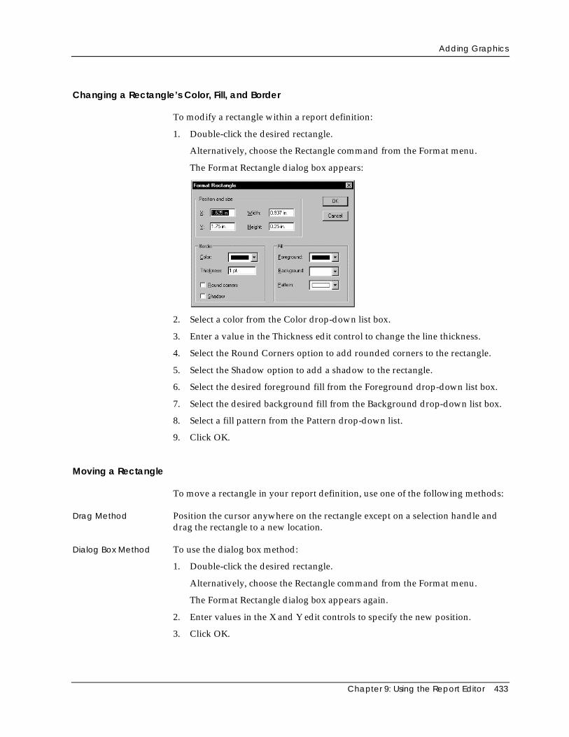
Adding Graphics
Chapter 9: Using the Report Editor 433
Changing a Rectangle’s Color, Fill, and Border
To modify a rectangle within a report definition:
1. Double-click the desired rectangle.
Alternatively, choose the Rectangle command from the Format menu.
The Format Rectangle dialog box appears:
2. Select a color from the Color drop-down list box.
3. Enter a value in the Thickness edit control to change the line thickness.
4. Select the Round Corners option to add rounded corners to the rectangle.
5. Select the Shadow option to add a shadow to the rectangle.
6. Select the desired foreground fill from the Foreground drop-down list box.
7. Select the desired background fill from the Background drop-down list box.
8. Select a fill pattern from the Pattern drop-down list.
9. Click OK.
Moving a Rectangle
To move a rectangle in your report definition, use one of the following methods:
Drag Method Position the cursor anywhere on the rectangle except on a selection handle anddrag the rectangle to a new location.
Dialog Box Method To use the dialog box method:
1. Double-click the desired rectangle.
Alternatively, choose the Rectangle command from the Format menu.
The Format Rectangle dialog box appears again.
2. Enter values in the X and Y edit controls to specify the new position.
3. Click OK.
Adding Graphics
434 CA-Visual Objects IDE User Guide
Resizing a Rectangle
To resize a rectangle in your report definition, use one of the following methods:
Drag Method Drag a selection handle on a rectangle to a new position.
Dialog Box Method To use the dialog box method:
1. Double-click the rectangle.
Alternatively, choose the Rectangle command from the Format menu.
The Format Rectangle dialog box appears again.
2. Enter values in the Height and Width edit controls.
3. Click OK.
Inserting Graphic Images in a Report
You can insert graphic images into any section of a report definition, but first youmust specify the following:
■ Where in the report you want the graphic image to appear
■ Where the graphic image comes from
■ How the graphic should be sized in the report
Graphics, like other report contents, appear in a report in accordance withsection type. For example, a graphic inserted in the report header prints once atthe top of the report, whereas a graphic inserted in the body section prints oncefor each row of data. Graphics inserted into the background section appear oneach report page, creating a constant backdrop, such as on a form.
You can insert a graphic using a data field or computed field whose value is thefile name of the graphic. Use this feature if you want to associate a graphicimage with specific field values.
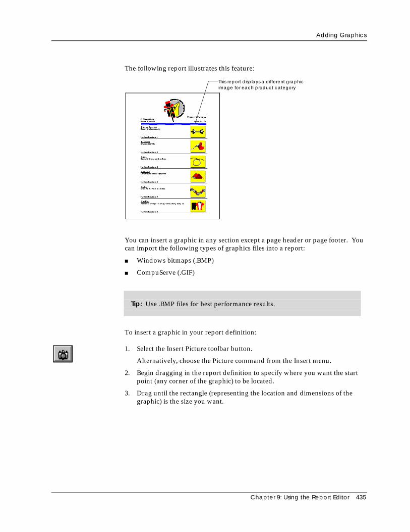
Adding Graphics
Chapter 9: Using the Report Editor 435
The following report illustrates this feature:
This report displays a different graphicimage for each product category
You can insert a graphic in any section except a page header or page footer. Youcan import the following types of graphics files into a report:
■ Windows bitmaps (.BMP)
■ CompuServe (.GIF)
Tip: Use .BMP files for best performance results.
To insert a graphic in your report definition:
1. Select the Insert Picture toolbar button.
Alternatively, choose the Picture command from the Insert menu.
2. Begin dragging in the report definition to specify where you want the startpoint (any corner of the graphic) to be located.
3. Drag until the rectangle (representing the location and dimensions of thegraphic) is the size you want.
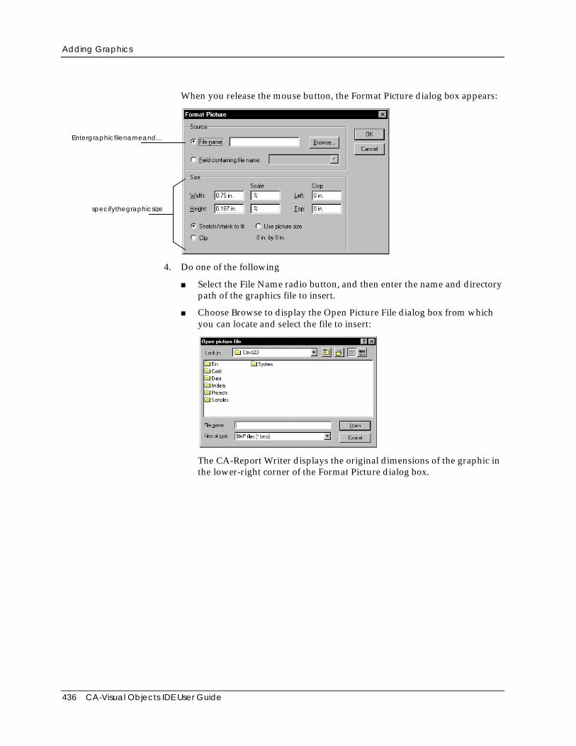
Adding Graphics
436 CA-Visual Objects IDE User Guide
When you release the mouse button, the Format Picture dialog box appears:
Entergraphicfilenameand...
specifythegraphicsize
4. Do one of the following
■ Select the File Name radio button, and then enter the name and directorypath of the graphics file to insert.
■ Choose Browse to display the Open Picture File dialog box from whichyou can locate and select the file to insert:
The CA-Report Writer displays the original dimensions of the graphic inthe lower-right corner of the Format Picture dialog box.
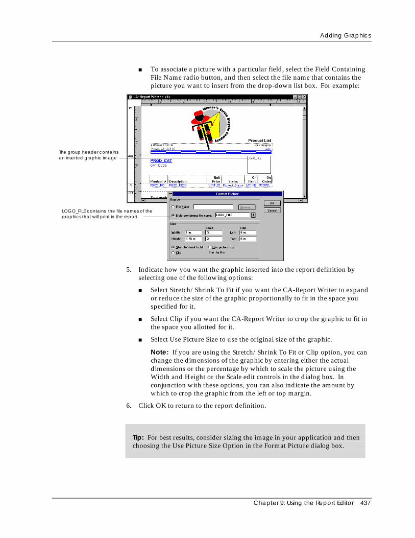
Adding Graphics
Chapter 9: Using the Report Editor 437
■ To associate a picture with a particular field, select the Field ContainingFile Name radio button, and then select the file name that contains thepicture you want to insert from the drop-down list box. For example:
The group header containsan inserted graphic image
LOGO_FILE contains the file names of thegraphics that will print in the report
5. Indicate how you want the graphic inserted into the report definition byselecting one of the following options:
■ Select Stretch/Shrink To Fit if you want the CA-Report Writer to expandor reduce the size of the graphic proportionally to fit in the space youspecified for it.
■ Select Clip if you want the CA-Report Writer to crop the graphic to fit inthe space you allotted for it.
■ Select Use Picture Size to use the original size of the graphic.
Note: If you are using the Stretch/Shrink To Fit or Clip option, you canchange the dimensions of the graphic by entering either the actualdimensions or the percentage by which to scale the picture using theWidth and Height or the Scale edit controls in the dialog box. Inconjunction with these options, you can also indicate the amount bywhich to crop the graphic from the left or top margin.
6. Click OK to return to the report definition.
Tip: For best results, consider sizing the image in your application and thenchoosing the Use Picture Size Option in the Format Picture dialog box.
Adding Graphics
438 CA-Visual Objects IDE User Guide
Moving a Graphic
To move a graphic, simply drag the graphic to its new location in the reportdefinition.
You can also move a graphic from one section to another using the Cut and Pastetoolbar buttons or menu commands.
Resizing a Graphic
To resize a graphic, use one of the following methods:
Drag Method Drag a selection handle at one corner of the picture.
Dialog Box Method To use the dialog box method:
1. Double-click on a picture.
Alternatively, choose the Picture command from the Format menu.
The Format Picture dialog box appears again.
2. Enter new values in the Width and Height edit controls.
Alternatively, enter new values in the Scale edit controls.
3. Click OK to return to the report definition.
Moving Graphics to the Background
If you are editing an area of a report definition in which one or more graphics areoverlaid on text, you can move the graphics to the background so that you canselect and edit the text.
To move a graphic to the background:
1. Choose the Properties command from the File menu.
The Report Properties dialog box appears.
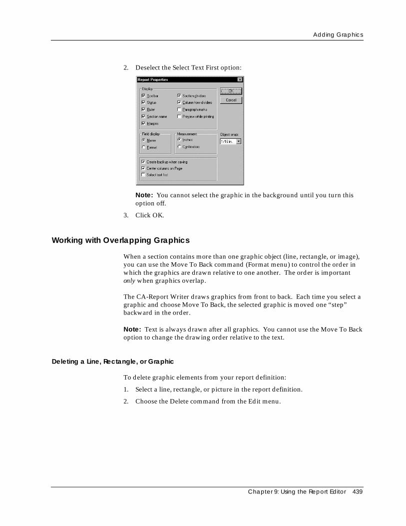
Adding Graphics
Chapter 9: Using the Report Editor 439
2. Deselect the Select Text First option:
Note: You cannot select the graphic in the background until you turn thisoption off.
3. Click OK.
Working with Overlapping Graphics
When a section contains more than one graphic object (line, rectangle, or image),you can use the Move To Back command (Format menu) to control the order inwhich the graphics are drawn relative to one another. The order is importantonly when graphics overlap.
The CA-Report Writer draws graphics from front to back. Each time you select agraphic and choose Move To Back, the selected graphic is moved one “step”backward in the order.
Note: Text is always drawn after all graphics. You cannot use the Move To Backoption to change the drawing order relative to the text.
Deleting a Line, Rectangle, or Graphic
To delete graphic elements from your report definition:
1. Select a line, rectangle, or picture in the report definition.
2. Choose the Delete command from the Edit menu.
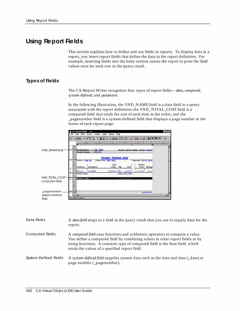
Using Report Fields
440 CA-Visual Objects IDE User Guide
Using Report FieldsThis section explains how to define and use fields in reports. To display data in areport, you insert report fields that define the data to the report definition. Forexample, inserting fields into the body section causes the report to print the fieldvalues once for each row in the query result.
Types of Fields
The CA-Report Writer recognizes four types of report fields—data, computed,system-defined, and parameter.
In the following illustration, the VND_NAME field is a data field in a queryassociated with the report definition; the VND_TOTAL_COST field is acomputed field that totals the cost of each item in the order; and the_pagenumber field is a system-defined field that displays a page number in thefooter of each report page:
_pagenumbersystem-definedfield
VND_NAME field
VND_TOTAL_COSTcomputed field
Data Fields A data field maps to a field in the query result that you use to supply data for thereport.
Computed Fields A computed field uses functions and arithmetic operators to compute a value.You define a computed field by combining values in other report fields or byusing functions. A common type of computed field is the Sum field, whichtotals the values of a specified report field.
System-Defined Fields A system-defined field supplies system data such as the date and time (_date) orpage number (_pagenumber).
Using Report Fields
Chapter 9: Using the Report Editor 441
Parameter Fields A parameter field prompts the user to enter a value each time the report is run.You define the prompt and the data type for the parameter field. You can alsodefine a parameter field in a subreport that you use to pass values from a mainreport or bucket table. Subreports and bucket tables are described fully in theonline help system.
Steps for creating computed and parameter fields are described in detail later inthis chapter.
Data Types
The CA-Report Writer recognizes and assigns three data types: text, date, andnumber. For data fields, it uses the data types of data in the database table todetermine what data type to assign. For computed fields, the CA-Report Writerautomatically assigns the data type based on the field definition.
The following table describes each data type:
Data Type Description
Text Character strings
Character strings cannot contain null values; the maximumlength is 65K.
Number Decimal and integer numbers
The range is 1.7e +/- 308 with 15 digits of accuracy (doublefloating point).
Date Date and time values
The acceptable range is Jan. 1, 0001–Dec. 31, 9999.
An example of each data type is shown in the following table:
Data Type Field Sample Data
Text VND_NAME Pacific Way Parts Co.
Date ORD_DATE 8/4/93
Number ORD_PRICE 89.95
A variety of standard format strings are available for each data type. You canchoose one of these or create a format using format characters. For moreinformation, see Formatting Fields later on in this chapter.
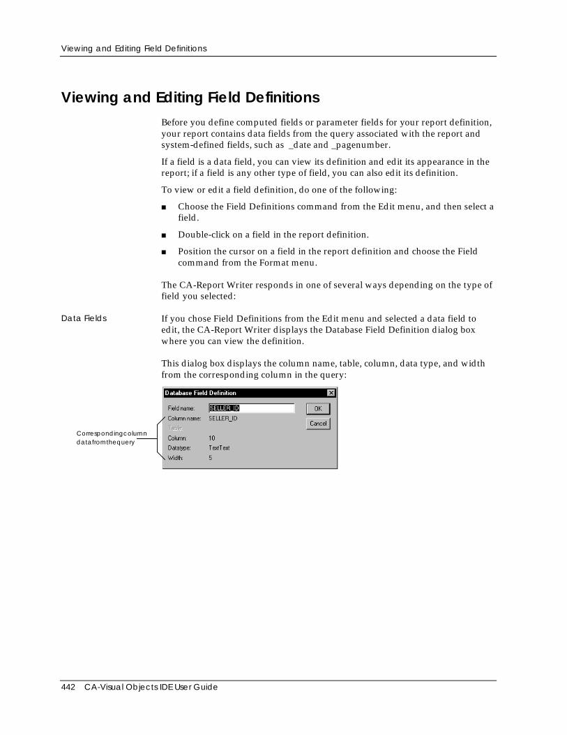
Viewing and Editing Field Definitions
442 CA-Visual Objects IDE User Guide
Viewing and Editing Field DefinitionsBefore you define computed fields or parameter fields for your report definition,your report contains data fields from the query associated with the report andsystem-defined fields, such as _date and _pagenumber.
If a field is a data field, you can view its definition and edit its appearance in thereport; if a field is any other type of field, you can also edit its definition.
To view or edit a field definition, do one of the following:
■ Choose the Field Definitions command from the Edit menu, and then select afield.
■ Double-click on a field in the report definition.
■ Position the cursor on a field in the report definition and choose the Fieldcommand from the Format menu.
The CA-Report Writer responds in one of several ways depending on the type offield you selected:
Data Fields If you chose Field Definitions from the Edit menu and selected a data field toedit, the CA-Report Writer displays the Database Field Definition dialog boxwhere you can view the definition.
This dialog box displays the column name, table, column, data type, and widthfrom the corresponding column in the query:
Correspondingcolumndatafromthequery
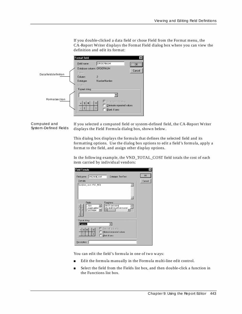
Viewing and Editing Field Definitions
Chapter 9: Using the Report Editor 443
If you double-clicked a data field or chose Field from the Format menu, theCA-Report Writer displays the Format Field dialog box where you can view thedefinition and edit its format:
Datafielddefinition
Formatsection
Computed andSystem-Defined Fields
If you selected a computed field or system-defined field, the CA-Report Writerdisplays the Field Formula dialog box, shown below.
This dialog box displays the formula that defines the selected field and itsformatting options. Use the dialog box options to edit a field’s formula, apply aformat to the field, and assign other display options.
In the following example, the VND_TOTAL_COST field totals the cost of eachitem carried by individual vendors:
You can edit the field’s formula in one of two ways:
■ Edit the formula manually in the Formula multi-line edit control.
■ Select the field from the Fields list box, and then double-click a function inthe Functions list box.
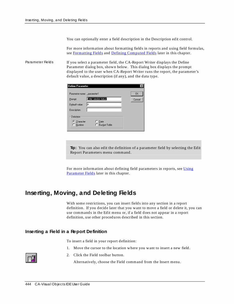
Inserting, Moving, and Deleting Fields
444 CA-Visual Objects IDE User Guide
You can optionally enter a field description in the Description edit control.
For more information about formatting fields in reports and using field formulas,see Formatting Fields and Defining Computed Fields later in this chapter.
Parameter Fields If you select a parameter field, the CA-Report Writer displays the DefineParameter dialog box, shown below. This dialog box displays the promptdisplayed to the user when CA-Report Writer runs the report, the parameter’sdefault value, a description (if any), and the data type.
Tip: You can also edit the definition of a parameter field by selecting the EditReport Parameters menu command.
For more information about defining field parameters in reports, see UsingParameter Fields later in this chapter.
Inserting, Moving, and Deleting FieldsWith some restrictions, you can insert fields into any section in a reportdefinition. If you decide later that you want to move a field or delete it, you canuse commands in the Edit menu or, if a field does not appear in a reportdefinition, use other procedures described in this section.
Inserting a Field in a Report Definition
To insert a field in your report definition:
1. Move the cursor to the location where you want to insert a new field.
2. Click the Field toolbar button.
Alternatively, choose the Field command from the Insert menu.
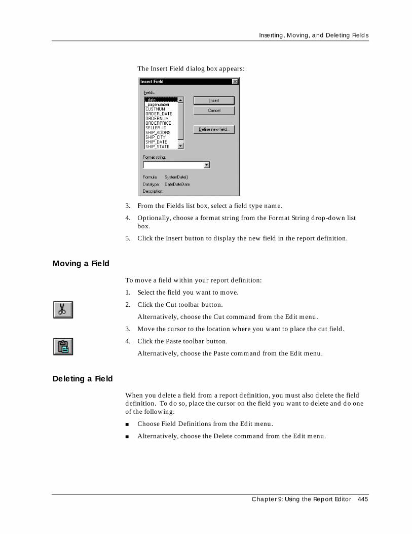
Inserting, Moving, and Deleting Fields
Chapter 9: Using the Report Editor 445
The Insert Field dialog box appears:
3. From the Fields list box, select a field type name.
4. Optionally, choose a format string from the Format String drop-down listbox.
5. Click the Insert button to display the new field in the report definition.
Moving a Field
To move a field within your report definition:
1. Select the field you want to move.
2. Click the Cut toolbar button.
Alternatively, choose the Cut command from the Edit menu.
3. Move the cursor to the location where you want to place the cut field.
4. Click the Paste toolbar button.
Alternatively, choose the Paste command from the Edit menu.
Deleting a Field
When you delete a field from a report definition, you must also delete the fielddefinition. To do so, place the cursor on the field you want to delete and do oneof the following:
■ Choose Field Definitions from the Edit menu.
■ Alternatively, choose the Delete command from the Edit menu.
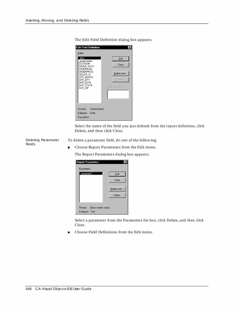
Inserting, Moving, and Deleting Fields
446 CA-Visual Objects IDE User Guide
The Edit Field Definition dialog box appears:
Select the name of the field you just deleted from the report definition, clickDelete, and then click Close.
Deleting ParameterFields
To delete a parameter field, do one of the following:
■ Choose Report Parameters from the Edit menu.
The Report Parameters dialog box appears:
Select a parameter from the Parameters list box, click Delete, and then clickClose.
■ Choose Field Definitions from the Edit menu.
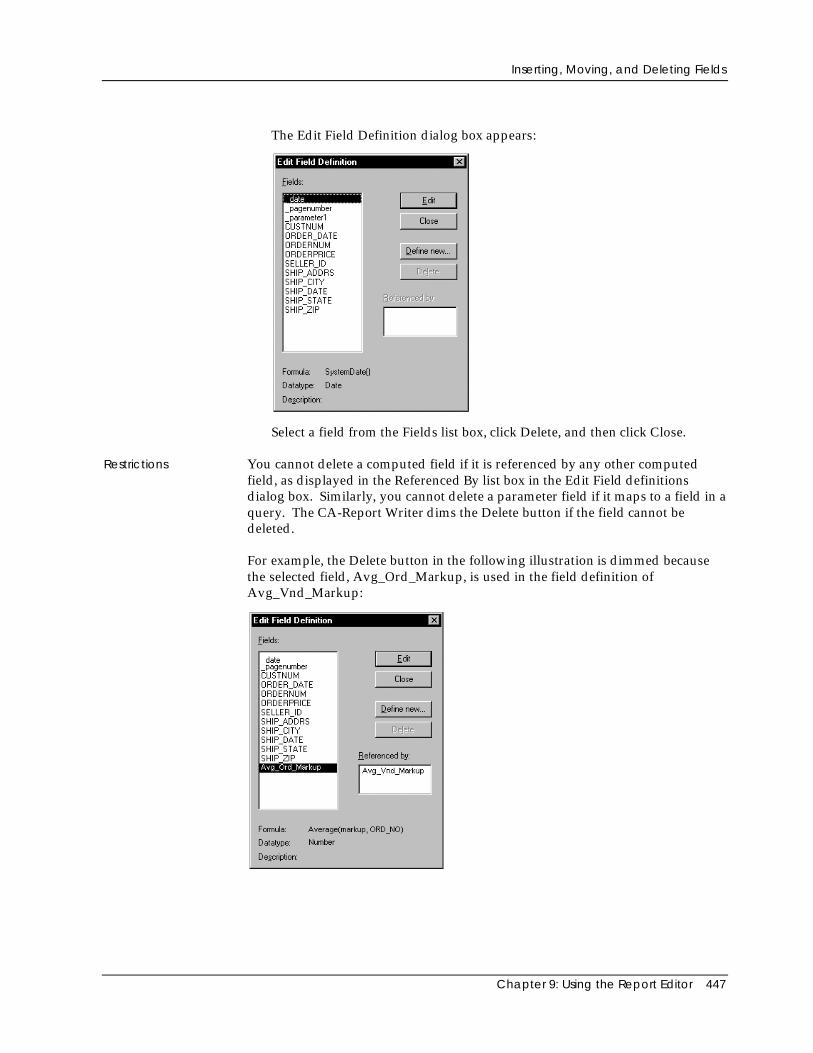
Inserting, Moving, and Deleting Fields
Chapter 9: Using the Report Editor 447
The Edit Field Definition dialog box appears:
Select a field from the Fields list box, click Delete, and then click Close.
Restrictions You cannot delete a computed field if it is referenced by any other computedfield, as displayed in the Referenced By list box in the Edit Field definitionsdialog box. Similarly, you cannot delete a parameter field if it maps to a field in aquery. The CA-Report Writer dims the Delete button if the field cannot bedeleted.
For example, the Delete button in the following illustration is dimmed becausethe selected field, Avg_Ord_Markup, is used in the field definition ofAvg_Vnd_Markup:
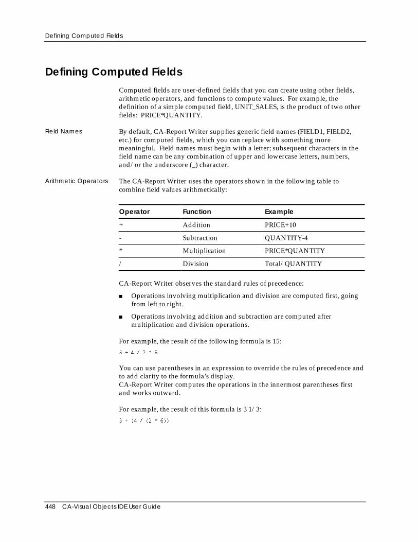
Defining Computed Fields
448 CA-Visual Objects IDE User Guide
Defining Computed FieldsComputed fields are user-defined fields that you can create using other fields,arithmetic operators, and functions to compute values. For example, thedefinition of a simple computed field, UNIT_SALES, is the product of two otherfields: PRICE*QUANTITY.
Field Names By default, CA-Report Writer supplies generic field names (FIELD1, FIELD2,etc.) for computed fields, which you can replace with something moremeaningful. Field names must begin with a letter; subsequent characters in thefield name can be any combination of upper and lowercase letters, numbers,and/or the underscore (_) character.
Arithmetic Operators The CA-Report Writer uses the operators shown in the following table tocombine field values arithmetically:
Operator Function Example
+ Addition PRICE+10
- Subtraction QUANTITY-4
* Multiplication PRICE*QUANTITY
/ Division Total/QUANTITY
CA-Report Writer observes the standard rules of precedence:
■ Operations involving multiplication and division are computed first, goingfrom left to right.
■ Operations involving addition and subtraction are computed aftermultiplication and division operations.
For example, the result of the following formula is 15:
3 + 4 / 2 * 6
You can use parentheses in an expression to override the rules of precedence andto add clarity to the formula’s display.CA-Report Writer computes the operations in the innermost parentheses firstand works outward.
For example, the result of this formula is 3 1/3:
3 + (4 / (2 * 6))
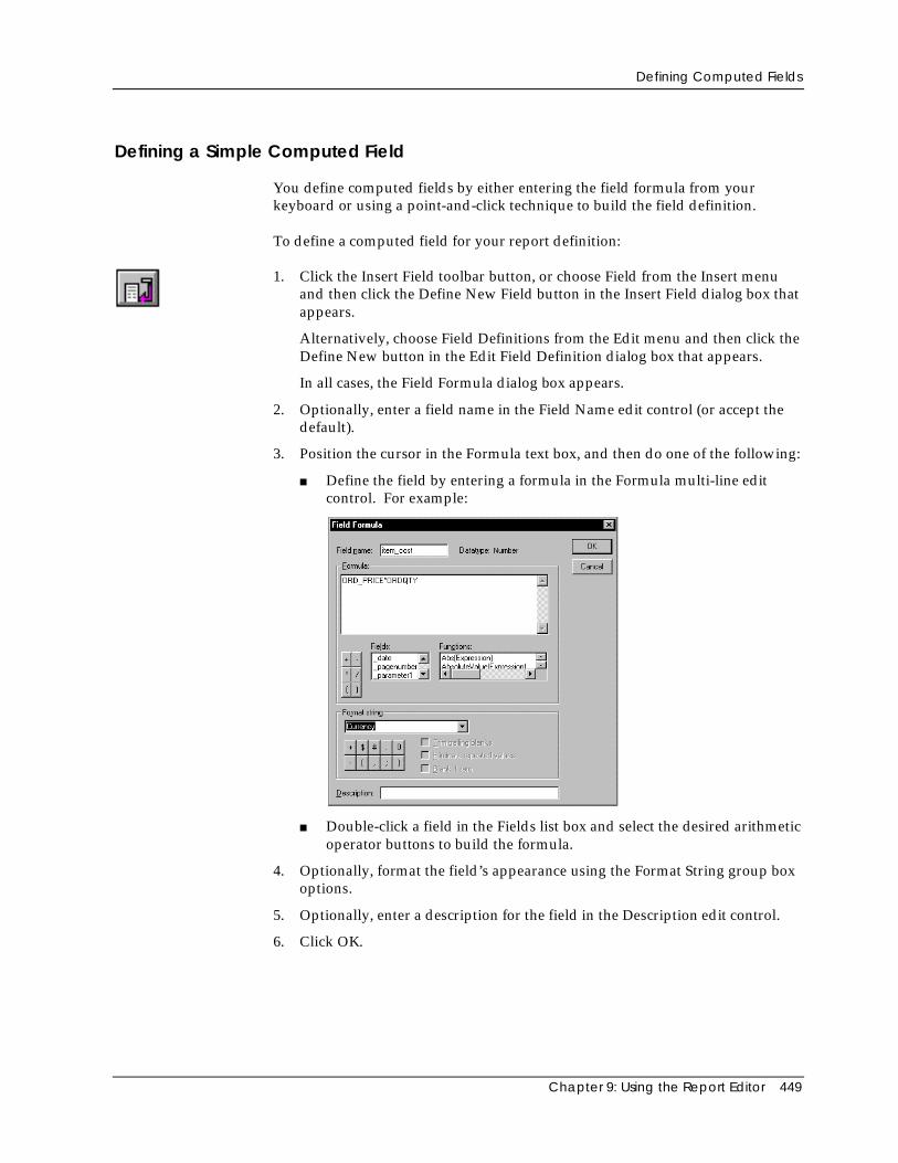
Defining Computed Fields
Chapter 9: Using the Report Editor 449
Defining a Simple Computed Field
You define computed fields by either entering the field formula from yourkeyboard or using a point-and-click technique to build the field definition.
To define a computed field for your report definition:
1. Click the Insert Field toolbar button, or choose Field from the Insert menuand then click the Define New Field button in the Insert Field dialog box thatappears.
Alternatively, choose Field Definitions from the Edit menu and then click theDefine New button in the Edit Field Definition dialog box that appears.
In all cases, the Field Formula dialog box appears.
2. Optionally, enter a field name in the Field Name edit control (or accept thedefault).
3. Position the cursor in the Formula text box, and then do one of the following:
■ Define the field by entering a formula in the Formula multi-line editcontrol. For example:
■ Double-click a field in the Fields list box and select the desired arithmeticoperator buttons to build the formula.
4. Optionally, format the field’s appearance using the Format String group boxoptions.
5. Optionally, enter a description for the field in the Description edit control.
6. Click OK.
Defining Computed Fields
450 CA-Visual Objects IDE User Guide
Using Functions to Define a Computed Field
The CA-Report Writer supplies over 80 functions that you can use to createcomputed fields. The functions perform sophisticated calculations. For example,you can use functions to rank field values or to return the future value of aninvestment.
When you use a function in a computed field, you must specify certain variableson which the function operates. For example, to use the function Sum(expression,section), you must specify the expression (a data field or computed field) and thesection over which to compute the sum (the group section or the entire report).The VND_TOTAL_COST field in ORD.RET uses this sum function:
Sum(item_cost,VND_NO)
where ITEM_COST is the field to total within a group that has VND_NO definedas its break field.
Types of Functions
The following information is a summary of the functions you can use in theCA-Report Writer. For detailed information about these functions, see theCA-Report Writer online help system.
Aggregate Functions Aggregate functions perform calculations (for example, counting, summing, andaveraging) on grouped data or data for the entire report. Aggregate functionsignore Null values in their computations. For example, the Avg() function doesnot include the Null value when it computes the average.
Generally, you insert a computed field containing an aggregate function in agroup header or footer or report header or footer. The placement of the fielddetermines the value returned by the function.
For example, if you want to count the number of items per order, place the Countaggregate function in a group section defined by the ORD_NO break field. If,instead, you want to count the number of items in the entire report, insert thefield in a report header or footer section. See the online help system for theindividual aggregate functions and for details on where to place them in a reportdefinition.
Note: If your report contains a large amount of data, you can improveperformance and memory usage by placing aggregate functions in either reportfooters or group footers. Placing an aggregate function in a report headerrequires the most time and memory to evaluate.
Arithmetic Functions Arithmetic functions perform common mathematical operations on datadefined in the report definition, such as raising a value to a power or returningan absolute value.
Defining Computed Fields
Chapter 9: Using the Report Editor 451
Conditional Functions Conditional functions perform common relational operations on data defined inthe report definition. Conditional functions take relational expressions asarguments that return a true (1) or false (0) result. For example, you can test if avalue falls within a range or is null.
Conversion Functions Conversion functions convert a field or value of one data type to a value ofanother data type. For example, CA-Report Writer provides functions thatconvert date values to number values or text values, number values to datevalue or text values, and so on.
Date and TimeFunctions
Date and Time functions calculate dates and times using serial numbers. Forexample, you can use a function to add a number of weeks to a date and get thefuture date back.
Financial Functions Financial functions calculate common financial formulas. For example, you canuse financial functions to calculate the payment on a loan or the future value ofan investment.
Financial functions usually contain parameters such as a payment amount, anumber of payment periods, and an interest rate. Be sure that each number yousupply is based on the same unit of time (for example, months or years).
For example, if the payment period is monthly, but you have an annual interestrate, divide the interest rate by twelve, as shown in the example below where theannual interest rate is 8%:
pmt(0.08/12,30,10000,0,0)
Lookup Functions Lookup functions search tables of data (that is, data arranged in multiple columnsand rows) to locate a specified value. They help you locate specific information,which is provided as part of a large package of data (for example, tax tables,mortgage payment tables, zip code tables, pay scale tables, and so on).
String ManipulationFunctions
String manipulation functions manipulate text strings and fields with a text datatype in the report definition. For example, text functions let you comparestrings, insert and extract characters within strings, and convert lowercasestrings to uppercase strings.

Defining Computed Fields
452 CA-Visual Objects IDE User Guide
Defining a Computed Field Using a Function
When you define a computed field that uses a function, the function performs acalculation and returns a value to the computed field. You can use a function byitself or embed it in a more complex expression.
To define a computed field for your report definition using a function:
1. Click the Insert Field toolbar button, or choose Field from the Insert menuand then click the Define New Field button in the Insert Field dialog box thatappears.
Alternatively, choose Field Definitions from the Edit menu and then click theDefine New button in the Edit Field Definition dialog box that appears.
In all cases, the Field Formula dialog box appears:
2. Optionally, enter a field name in the Field Name edit control (or accept thedefault).
3. Position the cursor in the Formula multi-line edit control, and then double-click a function in the Functions list box.
The Function Editor dialog box appears.
4. After completing the function definition in the Function Editor (described inthe following section), you are returned to the Field Formula dialog box.
5. Optionally, format the field’s appearance using the Format String group boxoptions.
6. Optionally, enter a description for the field in the Description edit control.
7. Click OK.
Defining Computed Fields
Chapter 9: Using the Report Editor 453
Using the Function Editor Dialog Box
The Function Editor dialog box is displayed whenever you double-click afunction name in the Functions list box of the Field Formula dialog box. Itprompts you to choose the correct fields to enter for a function, displaying thesyntax for the selected function, value boxes for the parameters the functionrequires, and a scroll box of fields that you can use for each function parameter.
Formulating aFunction
For example, suppose you want to total the cost of all items for an order:
1. Double-click Sum in the Functions list box of the Field Formula dialog box.
The Function Editor dialog box appears:
Sumdefinition
Correspondingfieldslist
Formuladisplaywindow
Notice that this dialog box displays:
■ The sum definition for the Sum function that was double-clicked in theField Formula dialog box.
■ The fields that correspond to the expression of the Sum definition.
■ The field the expression will act upon appears in the field formuladisplay window.
2. Click the Section edit control.
The Fields list box changes to the Section list box for section arguments:
Sectionargumentlistbox
Formuladisplaywindow
Defining Computed Fields
454 CA-Visual Objects IDE User Guide
Note: When you click in the Section edit control, the Function Editor onlydisplays the fields that make sense for the section argument in the Fields listbox.
3. Double-click the desired field in the Section list box.
Notice that the formula changes in the formula display window.
4. Click OK to return to the Field Formula dialog box.
Defining a Sum Field with the Sum Button
CA-Report Writer provides a quick method for creating Sum fields using theSum toolbar button. To define a Sum field within your report definition, use thismethod:
1. Position the cursor in a column of numeric values that you want to sum, andthen click the Sum toolbar button.
CA-Report Writer displays the completed formula in the Field Formuladialog box. For example:
Total_Costcolumn
Formula
2. Complete the field definition (for example, replace the generic field name).
3. Click OK.
Note: If you click the Sum button in a table column in a group footer that usesthe same table style as the body section, CA-Report Writer automatically createsa Sum field using the column name and group break field for the functionarguments.
Using Parameter Fields
Chapter 9: Using the Report Editor 455
Using Parameter FieldsA parameter field is a field whose value is passed to something else—a report, amain report from a subreport, or a bucket table. You define the prompt, datatype, and default value for the parameter field.
Parameter Fieldsfor Reports
Defining a parameter field for a report causes the CA-Report Writer to promptthe user to enter a value each time the report is run. For example, suppose youhave a payroll report that lists all employees and their salary histories inemployee ID order. To run a report on a single employee’s salary history, youcan define a parameter field based on employee ID. Each time the report is run,the user is prompted for an employee ID, the parameter value is passed to thereport query, and the query is executed.
Parameter Fieldsfor Subreports
You can also define a parameter field in a subreport that is used to pass valuesfrom a main report to the subreport. When the main report is run, theparameter value is passed to the report query defined in the subreport and thequery is executed.
Parameter Fields forBucket Tables
Parameter fields can also be used to pass values from bucket tables. When youcreate a bucket table, the parameter field is not mapped to a query.
For more information about parameter fields, subreports, and bucket tables, referto the online help system.
Formatting FieldsFields inserted into a report have an associated format string that determineshow the data is displayed on the report. The format string is a mask for the field,designating the exact punctuation and placement of data. You can usepredefined format strings or you can create your own. You can also assignformatting options to fields that suppress trailing blanks and repeated values.
Using Format Strings CA-Report Writer provides various format strings you can use to format numericand date-time report fields. You can also create your own format string usingthe formatting string symbols in the Field Formula dialog box. The symbols inthe format strings determine the way the values are formatted.
Note: Some of the symbols refer to strings specified in the International sectionof the Control Panel. You can change these strings in the Windows or WindowsNT Control Panel (click the International icon to see and change these strings).
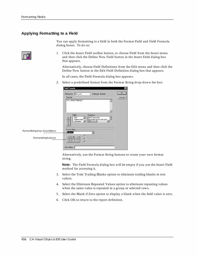
Formatting Fields
456 CA-Visual Objects IDE User Guide
Applying Formatting to a Field
You can apply formatting to a field in both the Format Field and Field Formuladialog boxes. To do so:
1. Click the Insert Field toolbar button, or choose Field from the Insert menuand then click the Define New Field button in the Insert Field dialog boxthat appears.
Alternatively, choose Field Definitions from the Edit menu and then click theDefine New button in the Edit Field Definition dialog box that appears.
In all cases, the Field Formula dialog box appears.
2. Select a predefined format from the Format String drop-down list box:
FormatStringdrop-downlistbox
Formatstringbuttons
Alternatively, use the Format String buttons to create your own formatstring.
Note: The Field Formula dialog box will be empty if you use the Insert Fieldmethod for accessing it.
3. Select the Trim Trailing Blanks option to eliminate trailing blanks in textvalues.
4. Select the Eliminate Repeated Values option to eliminate repeating valueswhen the same value is repeated in a group or selected rows.
5. Select the Blank if Zero option to display a blank when the field value is zero.
6. Click OK to return to the report definition.
Formatting Fields
Chapter 9: Using the Report Editor 457
Editing the Format of a Field
To edit a field’s format:
1. Double-click the field you want to format to access the Format Field dialogbox.
Alternatively, position the cursor on the specified field and choose the Fieldcommand from the Format menu to access the Field Formula dialog box.
2. Make your selections in the appropriate dialog box.
3. Click OK to return to the report definition.
Note: Both dialog boxes offer the same formatting options. For numeric or datefields, select a string from the Format String combo box, or enter a string or selectfrom the string characters displayed. Optionally, you can select options to printa blank when a field value is 0, print only the first value in a group of repeatedfield values, or eliminate trailing blanks in string values. Note that the Blank IfZero option applies only to numeric fields that are not formatted with a decimalpoint.
Formatting Numbers
Use numeric format strings to format numeric values with dollar signs,thousandths separators, scientific notation, percentages, and so on. Numericformat strings can have one or two sections, separated by a semicolon:
■ If the format string has one section, positive and negative values use thesame format and negative numbers use a minus sign prefix.
■ If the format string has two sections, you can format positive numbers andnegative numbers differently. The first section is the format for positivenumbers; the second is for negative numbers.
If you do not specify a format string, CA-Report Writer rounds to 10 significantdigits: 1234567.1234 prints as 1234567.123; 1234567891234567 prints as 1.23e15(this is the same as the General format string).
Formatting Fields
458 CA-Visual Objects IDE User Guide
The following table provides examples of numeric format strings:
Format String Value Formatted Value
0.00 100.5 100.50
-145.10 -145.10
0.00;(0.00) 100.5 100.50
-145.10 (145.10)
$#,##0.00 100.5 $100.50
0 $0.00
2500.25 $2,500.25
-145.10337 -$145.10
$#,##0.00;($#,##0.00) 100.50365 $100.50
-145.10 ($145.10)
$#,##0.00"CR";$#,##0.00"DB" 1125.9 $1,125.90CR
-2500 $2,500.00DB
0[S/1000] 12375 12
199 0
General 147 147
1.875 1.875
Saving Reports
Chapter 9: Using the Report Editor 459
Formatting Dates
Date-time format strings allow you to control how dates and times appear inreports. The following table shows some examples of these strings:
Format String Value Formatted Value
mm/dd/yy Jan 15, 1999 01/15/99
mm/dd/yyyy Jan 9, 1999 01/09/1999
m/d/yy Jan 9, 1999 1/9/99
dd.mm.yy Jan 9, 1999 09.01.99
Mmm d, yyyy Jan 9, 1999 Jan 9, 1999
dd-MMM-yy Jan 9, 1999 09-JAN-99
Mmmm d, yyyy Jan 9, 1999 January 9, 1999
hh:mm:ss 4:53:10 PM 16:53:10
hh:mm:ss AM/PM 4:53:10 PM 04:53:10 PM
mm/dd/yy hh:mm:ss Jan 9, 1999 9:43 01/09/99 09:43:00
Saving ReportsWhen you create a new report, you should save the report and then save anyadditional edits on a frequent basis. To initially save a new report, click theReport Writer’s Save toolbar button. To save any subsequent changes, just clickthe Save toolbar button again.
After saving your report, you can then continue to define other reports orqueries, switch to another tool or window in the IDE (using the mouse or theWindow menu), or exit the Report Editor.
Once you close the Report Editor, you will be prompted to store any changedentities. The binary report entity will then be stored in the repository.
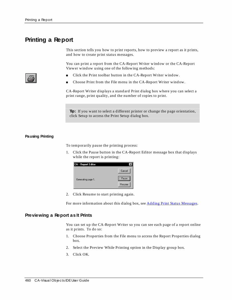
Printing a Report
460 CA-Visual Objects IDE User Guide
Printing a ReportThis section tells you how to print reports, how to preview a report as it prints,and how to create print status messages.
You can print a report from the CA-Report Writer window or the CA-ReportViewer window using one of the following methods:
■ Click the Print toolbar button in the CA-Report Writer window.
■ Choose Print from the File menu in the CA-Report Writer window.
CA-Report Writer displays a standard Print dialog box where you can select aprint range, print quality, and the number of copies to print.
Tip: If you want to select a different printer or change the page orientation,click Setup to access the Print Setup dialog box.
Pausing Printing
To temporarily pause the printing process:
1. Click the Pause button in the CA-Report Editor message box that displayswhile the report is printing:
2. Click Resume to start printing again.
For more information about this dialog box, see Adding Print Status Messages.
Previewing a Report as It Prints
You can set up the CA-Report Writer so you can see each page of a report onlineas it prints. To do so:
1. Choose Properties from the File menu to access the Report Properties dialogbox.
2. Select the Preview While Printing option in the Display group box.
3. Click OK.
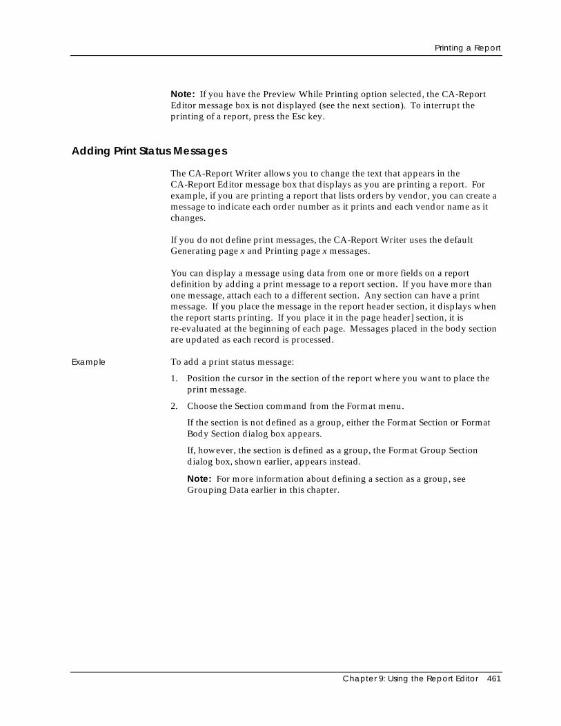
Printing a Report
Chapter 9: Using the Report Editor 461
Note: If you have the Preview While Printing option selected, the CA-ReportEditor message box is not displayed (see the next section). To interrupt theprinting of a report, press the Esc key.
Adding Print Status Messages
The CA-Report Writer allows you to change the text that appears in theCA-Report Editor message box that displays as you are printing a report. Forexample, if you are printing a report that lists orders by vendor, you can create amessage to indicate each order number as it prints and each vendor name as itchanges.
If you do not define print messages, the CA-Report Writer uses the defaultGenerating page x and Printing page x messages.
You can display a message using data from one or more fields on a reportdefinition by adding a print message to a report section. If you have more thanone message, attach each to a different section. Any section can have a printmessage. If you place the message in the report header section, it displays whenthe report starts printing. If you place it in the page header] section, it isre-evaluated at the beginning of each page. Messages placed in the body sectionare updated as each record is processed.
Example To add a print status message:
1. Position the cursor in the section of the report where you want to place theprint message.
2. Choose the Section command from the Format menu.
If the section is not defined as a group, either the Format Section or FormatBody Section dialog box appears.
If, however, the section is defined as a group, the Format Group Sectiondialog box, shown earlier, appears instead.
Note: For more information about defining a section as a group, seeGrouping Data earlier in this chapter.
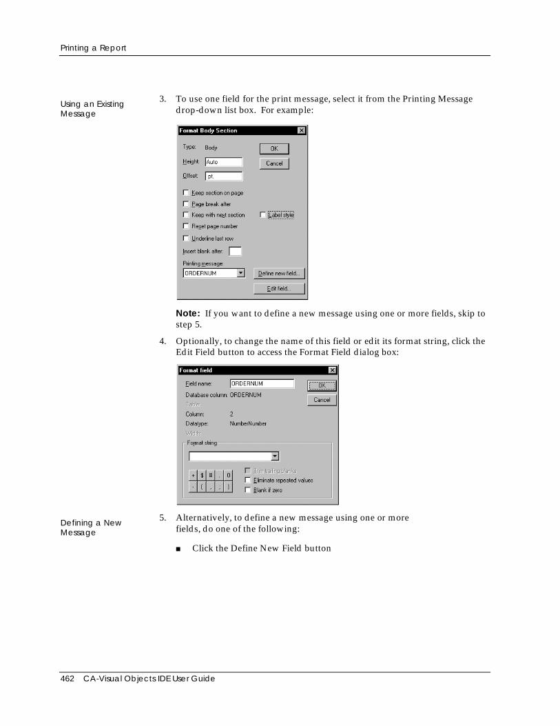
Printing a Report
462 CA-Visual Objects IDE User Guide
Using an ExistingMessage
3. To use one field for the print message, select it from the Printing Messagedrop-down list box. For example:
Note: If you want to define a new message using one or more fields, skip tostep 5.
4. Optionally, to change the name of this field or edit its format string, click theEdit Field button to access the Format Field dialog box:
Defining a NewMessage
5. Alternatively, to define a new message using one or morefields, do one of the following:
■ Click the Define New Field button
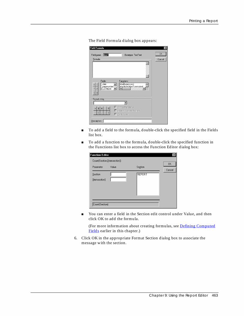
Printing a Report
Chapter 9: Using the Report Editor 463
The Field Formula dialog box appears:
■ To add a field to the formula, double-click the specified field in the Fieldslist box.
■ To add a function to the formula, double-click the specified function inthe Functions list box to access the Function Editor dialog box:
■ You can enter a field in the Section edit control under Value, and thenclick OK to add the formula.
(For more information about creating formulas, see Defining ComputedFields earlier in this chapter.)
6. Click OK in the appropriate Format Section dialog box to associate themessage with the section.
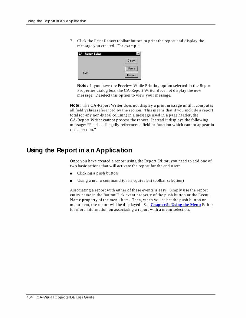
Using the Report in an Application
464 CA-Visual Objects IDE User Guide
7. Click the Print Report toolbar button to print the report and display themessage you created. For example:
Note: If you have the Preview While Printing option selected in the ReportProperties dialog box, the CA-Report Writer does not display the newmessage. Deselect this option to view your message.
Note: The CA-Report Writer does not display a print message until it computesall field values referenced by the section. This means that if you include a reporttotal (or any non-literal column) in a message used in a page header, theCA-Report Writer cannot process the report. Instead it displays the followingmessage: “Field . . . illegally references a field or function which cannot appear inthe ... section.”
Using the Report in an ApplicationOnce you have created a report using the Report Editor, you need to add one oftwo basic actions that will activate the report for the end user:
■ Clicking a push button
■ Using a menu command (or its equivalent toolbar selection)
Associating a report with either of these events is easy. Simply use the reportentity name in the ButtonClick event property of the push button or the EventName property of the menu item. Then, when you select the push button ormenu item, the report will be displayed. See Chapter 5: Using the Menu Editorfor more information on associating a report with a menu selection.
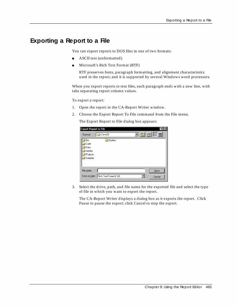
Exporting a Report to a File
Chapter 9: Using the Report Editor 465
Exporting a Report to a FileYou can export reports to DOS files in one of two formats:
■ ASCII text (unformatted)
■ Microsoft’s Rich Text Format (RTF)
RTF preserves fonts, paragraph formatting, and alignment characteristicsused in the report; and it is supported by several Windows word processors.
When you export reports to text files, each paragraph ends with a new line, withtabs separating report column values.
To export a report:
1. Open the report in the CA-Report Writer window.
2. Choose the Export Report To File command from the File menu.
The Export Report to File dialog box appears:
3. Select the drive, path, and file name for the exported file and select the typeof file in which you want to export the report.
The CA-Report Writer displays a dialog box as it exports the report. ClickPause to pause the export; click Cancel to stop the export.

Chapter 10: Using the Image Editor 467
Chapter
10 Using the Image Editor
You can use the CA-Visual Objects Image Editor to create custom images, such asicons, cursors, bitmaps, and ribbons, for your applications. It provides a drag-and-drop interface that allows you to:
■ Create icon, cursor, bitmap image, and ribbon entities (and classes) that canbe used as mouse pointers, application icons, window icons, and windowcontrol icons for push button, radio button, check box, and fixed iconcontrols
■ Load existing icon (.ICO), cursor (.CUR), or bitmap (.BMP) files
■ Modify the entity name, related file name, and image of the icon, cursor,bitmap or ribbon; and save your changes
■ Use drawing tools, including a color palette, lines, ellipses, rectangles, androtation tools, to create new images or to modify existing images
■ Edit each pixel of an image while simultaneously viewing how it will appearin your application
■ Use temporary buffers to store up to six images; use drag-and-drop totransfer images to and from the temporary buffers or to delete images via the“trash can”
■ Manipulate images using the Windows Clipboard
Starting the Image EditorSimply double-click on an icon, cursor, bitmap, or ribbon entity in the RepositoryExplorer’s list view pane to open an Image Editor window for that image. Youcan also access the Image Editor using the Tools menu or the New Entity toolbarbutton. (You can open as many individual Image Editor windows as you wish.)
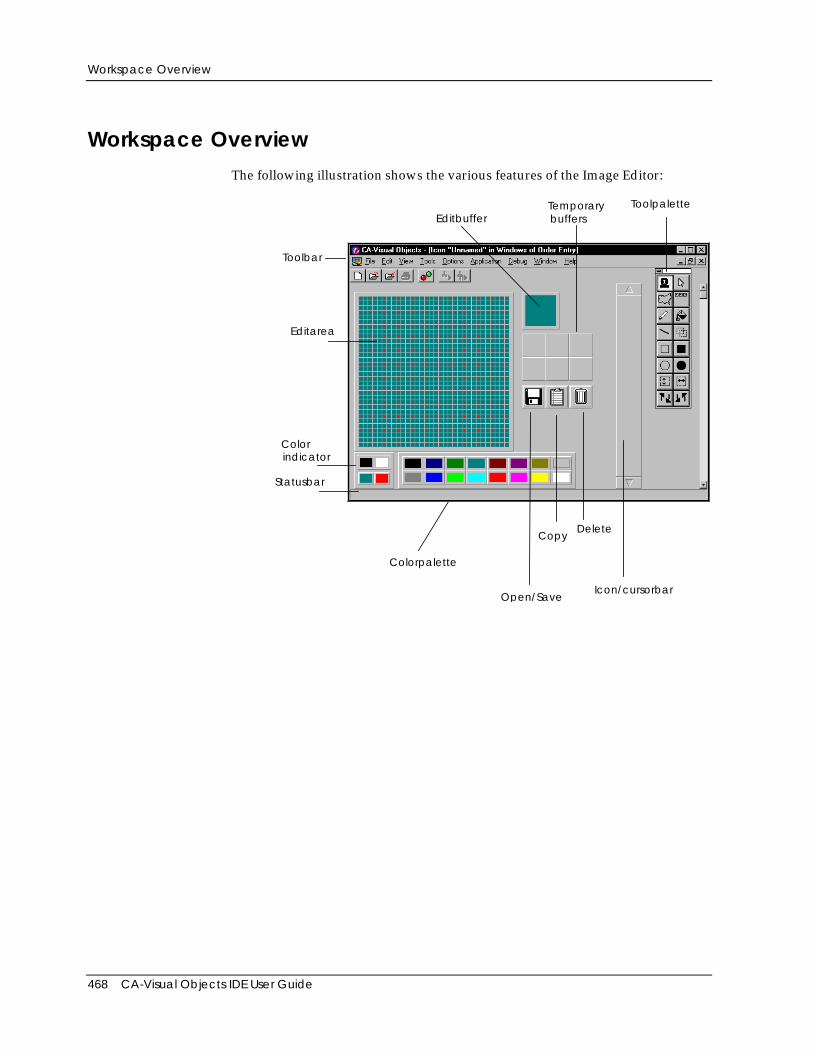
Workspace Overview
468 CA-Visual Objects IDE User Guide
Workspace OverviewThe following illustration shows the various features of the Image Editor:
Toolbar
Editarea
Open/Save
Colorindicator
Colorpalette
CopyDelete
Toolpalette
EditbufferTemporarybuffers
Icon/cursorbar
Statusbar
Toolpalette
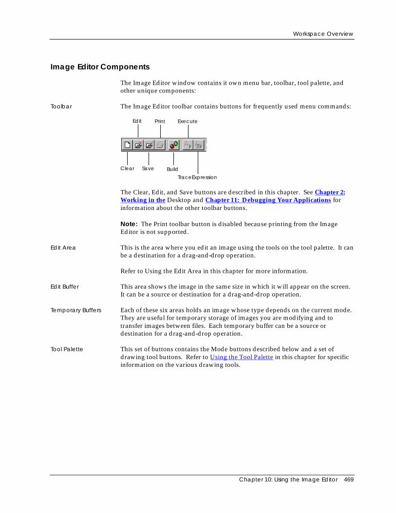
Workspace Overview
Chapter 10: Using the Image Editor 469
Image Editor Components
The Image Editor window contains it own menu bar, toolbar, tool palette, andother unique components:
Toolbar The Image Editor toolbar contains buttons for frequently used menu commands:
Edit
Save Build
Execute
Clear
TraceExpression
The Clear, Edit, and Save buttons are described in this chapter. See Chapter 2:Working in the Desktop and Chapter 11: Debugging Your Applications forinformation about the other toolbar buttons.
Note: The Print toolbar button is disabled because printing from the ImageEditor is not supported.
Edit Area This is the area where you edit an image using the tools on the tool palette. It canbe a destination for a drag-and-drop operation.
Refer to Using the Edit Area in this chapter for more information.
Edit Buffer This area shows the image in the same size in which it will appear on the screen.It can be a source or destination for a drag-and-drop operation.
Temporary Buffers Each of these six areas holds an image whose type depends on the current mode.They are useful for temporary storage of images you are modifying and totransfer images between files. Each temporary buffer can be a source ordestination for a drag-and-drop operation.
Tool Palette This set of buttons contains the Mode buttons described below and a set ofdrawing tool buttons. Refer to Using the Tool Palette in this chapter for specificinformation on the various drawing tools.
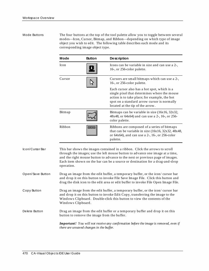
Workspace Overview
470 CA-Visual Objects IDE User Guide
Mode Buttons The four buttons at the top of the tool palette allow you to toggle between severalmodes—Icon, Cursor, Bitmap, and Ribbon—depending on which type of imageobject you wish to edit. The following table describes each mode and itscorresponding image object type.
Mode Button Description
Icon Icons can be variable in size and can use a 2-,16-, or 256-color palette.
Cursor Cursors are small bitmaps which can use a 2-,16-, or 256-color palette.
Each cursor also has a hot spot, which is asingle pixel that determines where the mouseaction is to take place; for example, the hotspot on a standard arrow cursor is normallylocated at the tip of the arrow.
Bitmap Bitmaps can be variable in size (16x16, 32x32,48x48, or 64x64) and can use a 2-, 16-, or 256-color palette.
Ribbon Ribbons are composed of a series of bitmapsthat can be variable in size (16x16, 32x32, 48x48,or 64x64), and can use a 2-, 16-, or 256-colorpalette.
Icon/Cursor Bar This bar shows the images contained in a ribbon. Click the arrows to scrollthrough the images; use the left mouse button to advance one image at a time,and the right mouse button to advance to the next or previous page of images.Each item shown on the bar can be a source or destination for a drag-and-dropoperation.
Open/Save Button Drag an image from the edit buffer, a temporary buffer, or the icon/cursor barand drop it on this button to invoke File Save Image File. Click this button anddrag the disk icon to the edit area or edit buffer to invoke File Open Image File.
Copy Button Drag an image from the edit buffer, a temporary buffer, or the icon/cursor barand drop it on this button to invoke Edit Copy, transferring the image to theWindows Clipboard. Double-click this button to view the contents of theWindows Clipboard.
Delete Button Drag an image from the edit buffer or a temporary buffer and drop it on thisbutton to remove the image from the buffer.
Important! You will not receive any confirmation before the image is removed, even ifthere are unsaved changes in the buffer.
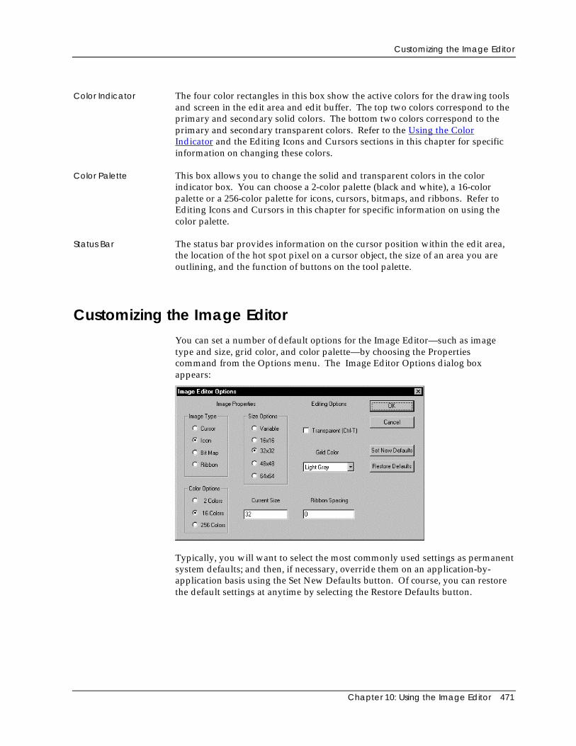
Customizing the Image Editor
Chapter 10: Using the Image Editor 471
Color Indicator The four color rectangles in this box show the active colors for the drawing toolsand screen in the edit area and edit buffer. The top two colors correspond to theprimary and secondary solid colors. The bottom two colors correspond to theprimary and secondary transparent colors. Refer to the Using the ColorIndicator and the Editing Icons and Cursors sections in this chapter for specificinformation on changing these colors.
Color Palette This box allows you to change the solid and transparent colors in the colorindicator box. You can choose a 2-color palette (black and white), a 16-colorpalette or a 256-color palette for icons, cursors, bitmaps, and ribbons. Refer toEditing Icons and Cursors in this chapter for specific information on using thecolor palette.
Status Bar The status bar provides information on the cursor position within the edit area,the location of the hot spot pixel on a cursor object, the size of an area you areoutlining, and the function of buttons on the tool palette.
Customizing the Image EditorYou can set a number of default options for the Image Editor—such as imagetype and size, grid color, and color palette—by choosing the Propertiescommand from the Options menu. The Image Editor Options dialog boxappears:
Typically, you will want to select the most commonly used settings as permanentsystem defaults; and then, if necessary, override them on an application-by-application basis using the Set New Defaults button. Of course, you can restorethe default settings at anytime by selecting the Restore Defaults button.
Loading Images
472 CA-Visual Objects IDE User Guide
The Image Editor Options dialog box provides the following options:
Image Type From the Image Type radio button group, select a default image type for newimages. Valid values are: Cursor, Icon, Bit Map (single icon or bitmap), andRibbon (series of bitmaps). The default is Icon.
Color Options Select a default color palette from the Color Options radio button group. Validvalues are 2 Colors, 16 Colors (for 16x16 and 32x32 pixel images), and 256 Colors(for 48x48 and 64x64 pixel images). The default is 16 Colors.
Size Options From the Size Options radio button group, select the default pixel size forimages. Valid values are Variable, 16x16, 32x32, 32x32, 48x48, and 64x64. Thedefault is 32x32.
Current Size The size of the currently loaded image is displayed in the Current Size editcontrol. Optionally, enter a new value.
Transparent Option Select the Transparent Option if you want the background color of theapplication or window to appear as the background color for the specified imageat runtime. (See Transparent Colors for more detailed information about thisoption.)
Grid Color From the Grid Color drop-down list box, choose a color for the grid: Validchoices are: None (no grid), White, Light Gray, Gray, Dark Gray, and Black. Thedefault is Light Gray.
Ribbon Spacing If the current image is a ribbon bitmap, specify the spacing between each imagewithin the ribbon.
Loading ImagesYou can open existing icon (.ICO), cursor (.CUR), and bitmap (.BMP) files in theImage Editor in order to view them in the icon/cursor bar and transfer them tothe edit area or a temporary buffer.
To load a single icon, cursor, bitmap, or ribbon image object:
1. Start the Image Editor.
Like all CA-Visual Objects tools, the Image Editor is accessed using the Toolsmenu or the New Entity toolbar button.
2. In the Image Editor, click one of the Mode buttons to specify the type ofimage you wish to load.
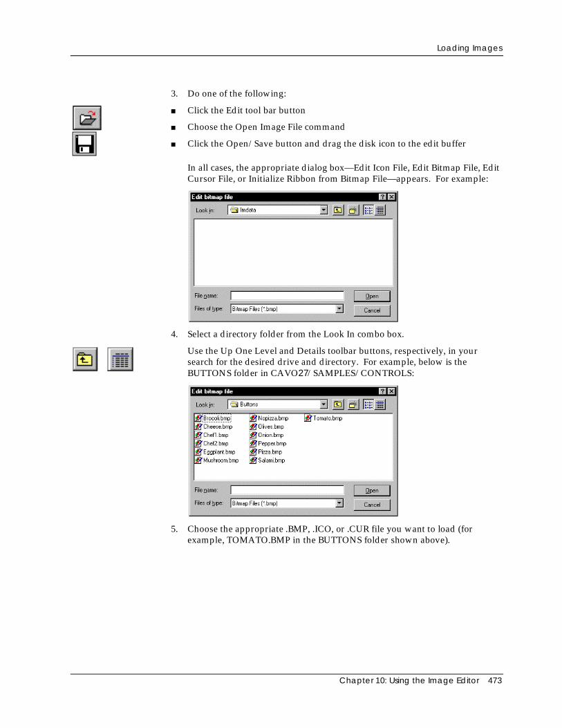
Loading Images
Chapter 10: Using the Image Editor 473
3. Do one of the following:
■ Click the Edit tool bar button
■ Choose the Open Image File command
■ Click the Open/Save button and drag the disk icon to the edit buffer
In all cases, the appropriate dialog box—Edit Icon File, Edit Bitmap File, EditCursor File, or Initialize Ribbon from Bitmap File—appears. For example:
4. Select a directory folder from the Look In combo box.
Use the Up One Level and Details toolbar buttons, respectively, in yoursearch for the desired drive and directory. For example, below is theBUTTONS folder in CAVO27/SAMPLES/CONTROLS:
5. Choose the appropriate .BMP, .ICO, or .CUR file you want to load (forexample, TOMATO.BMP in the BUTTONS folder shown above).
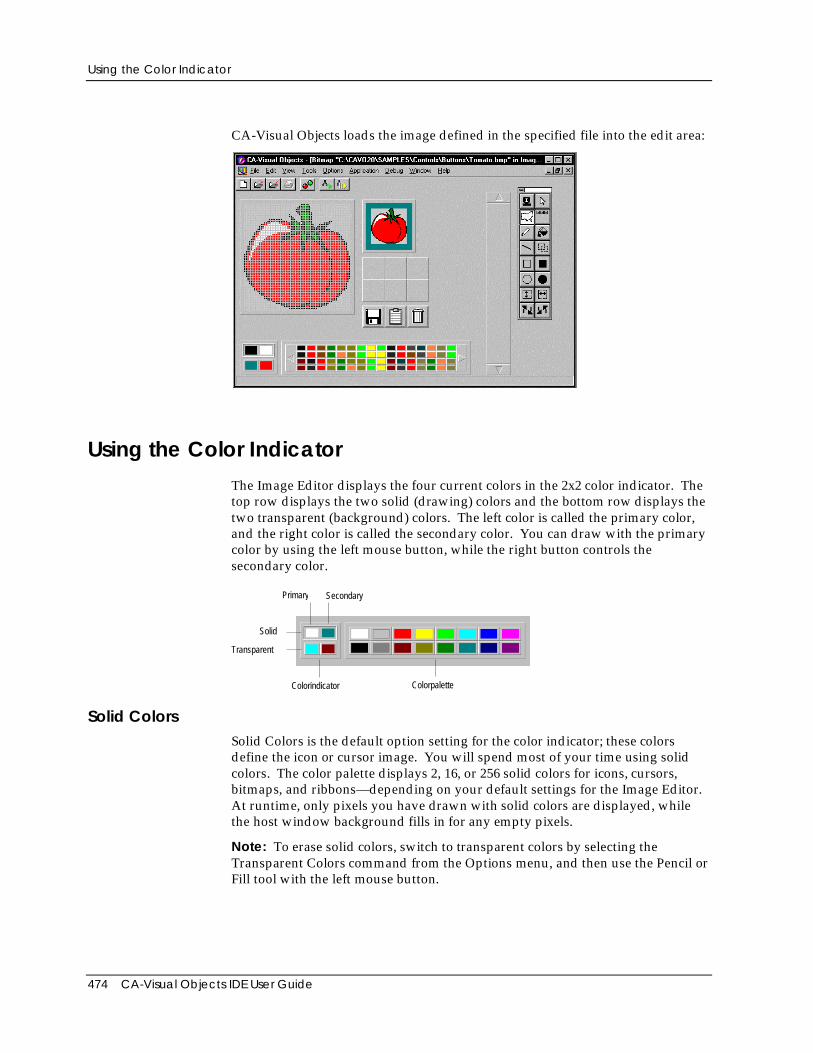
Using the Color Indicator
474 CA-Visual Objects IDE User Guide
CA-Visual Objects loads the image defined in the specified file into the edit area:
Using the Color IndicatorThe Image Editor displays the four current colors in the 2x2 color indicator. Thetop row displays the two solid (drawing) colors and the bottom row displays thetwo transparent (background) colors. The left color is called the primary color,and the right color is called the secondary color. You can draw with the primarycolor by using the left mouse button, while the right button controls thesecondary color.
Primary Secondary
Solid
Transparent
Colorindicator Colorpalette
Solid ColorsSolid Colors is the default option setting for the color indicator; these colorsdefine the icon or cursor image. You will spend most of your time using solidcolors. The color palette displays 2, 16, or 256 solid colors for icons, cursors,bitmaps, and ribbons—depending on your default settings for the Image Editor.At runtime, only pixels you have drawn with solid colors are displayed, whilethe host window background fills in for any empty pixels.
Note: To erase solid colors, switch to transparent colors by selecting theTransparent Colors command from the Options menu, and then use the Pencil orFill tool with the left mouse button.
Using the Color Indicator
Chapter 10: Using the Image Editor 475
Transparent Colors
You can also choose the Transparent Colors option for the color indicator; usethese colors to simulate the way the icon will look when displayed at runtime onwindows with different background colors. Once you choose the primarytransparent color, the secondary color will be automatically determined. Thetransparent colors are temporary (appearing only in the Image Editor) and maynot appear at runtime if the host window has a different background color.
You will see the primary transparent color displayed as a frame surrounding theicon in the edit buffer. When the transparent colors are active, you can changethe background frame color by clicking on a different color with the left mousebutton. You can see what the icon will look like at runtime, with the standardgray window background colors, by dragging it from the edit buffer to atemporary buffer.
When the transparent colors are active, you can draw just like you can in thesolid color mode. If you draw a transparent color with the left mouse button,you will overwrite any solid color pixels. Then at runtime (or in the temporarybuffer), these pixels will be empty, so the window background colors will appearinstead of solid pixels. You can also use the secondary transparent color to allowa different background color to display, based on the color of the host window.It is advisable to not use either of the transparent colors as solid colors to avoidconfusing effects.
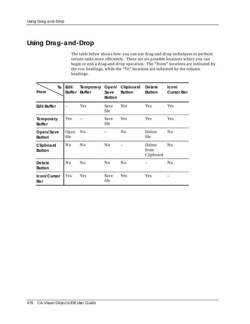
Using Drag-and-Drop
476 CA-Visual Objects IDE User Guide
Using Drag-and-DropThe table below shows how you can use drag-and-drop techniques to performcertain tasks more efficiently. There are six possible locations where you canbegin or end a drag-and-drop operation. The “From” locations are indicated bythe row headings, while the “To” locations are indicated by the columnheadings.
ToFrom
EditBuffer
TemporaryBuffer
Open/SaveButton
ClipboardButton
DeleteButton
Icon/Cursor Bar
Edit Buffer – Yes Savefile
Yes Yes Yes
TemporaryBuffer
Yes – Savefile
Yes Yes Yes
Open/SaveButton
Openfile
No – No Deletefile
No
ClipboardButton
No No No – DeletefromClipboard
No
DeleteButton
No No No No – No
Icon/CursorBar
Yes Yes Savefile
Yes Yes –
Using the Edit Area
Chapter 10: Using the Image Editor 477
Using the Edit AreaThe edit area is where you make changes to an image. As you modify the pixelsin the image, you can immediately see in the edit buffer how your changes affectthe icon, cursor, bitmap, or ribbon. Choose commands on the Options menu tocontrol the appearance of the edit area. Click buttons on the tool palette orchoose commands on the Edit Select from Palette menu to activate various toolsto modify the image. Use the color palette to control the colors used by thevarious drawing tools and the background color of the edit area.
Setting Colors
Within the edit area you can change the drawing colors, the background colors,and the grid color.
Drawing Colors To change the drawing colors used by all drawing tools:
1. Choose Solid Colors from the Options menu.
The highlight rectangle in the color indicator box moves to the top to indicatethat drawing colors are now active.
2. Click with the left mouse button on a color in the color palette to set thedrawing color for the left mouse button.
3. Click with the right mouse button on a color in the color palette to set thedrawing color for the right mouse button.
Background Colors To change the background colors, which are displayed only in the Image Editorand not at runtime:
1. Choose Transparent Colors from the Options menu.
The highlight rectangle in the color indicator box moves to the bottom toindicate that background colors are now active.
2. Click with the left mouse button on a color in the color palette to change theprimary background color. This color is visible only in the edit area and editbuffer, not in the temporary buffers.
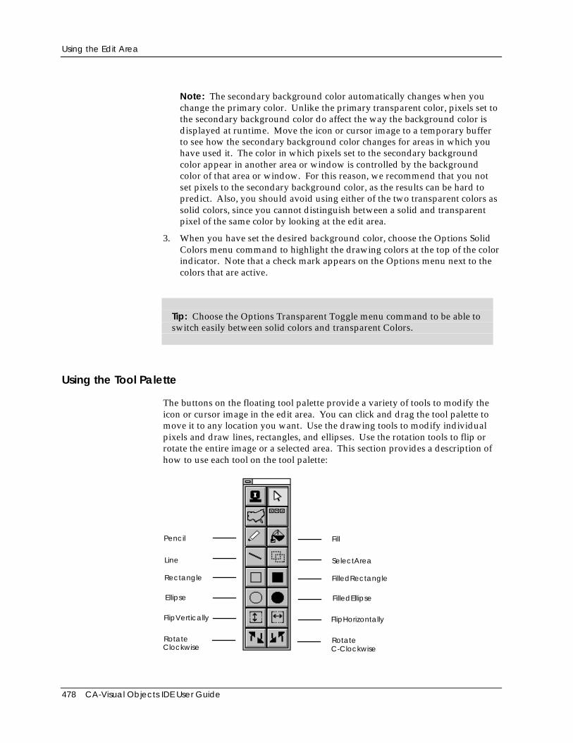
Using the Edit Area
478 CA-Visual Objects IDE User Guide
Note: The secondary background color automatically changes when youchange the primary color. Unlike the primary transparent color, pixels set tothe secondary background color do affect the way the background color isdisplayed at runtime. Move the icon or cursor image to a temporary bufferto see how the secondary background color changes for areas in which youhave used it. The color in which pixels set to the secondary backgroundcolor appear in another area or window is controlled by the backgroundcolor of that area or window. For this reason, we recommend that you notset pixels to the secondary background color, as the results can be hard topredict. Also, you should avoid using either of the two transparent colors assolid colors, since you cannot distinguish between a solid and transparentpixel of the same color by looking at the edit area.
3. When you have set the desired background color, choose the Options SolidColors menu command to highlight the drawing colors at the top of the colorindicator. Note that a check mark appears on the Options menu next to thecolors that are active.
Tip: Choose the Options Transparent Toggle menu command to be able toswitch easily between solid colors and transparent Colors.
Using the Tool Palette
The buttons on the floating tool palette provide a variety of tools to modify theicon or cursor image in the edit area. You can click and drag the tool palette tomove it to any location you want. Use the drawing tools to modify individualpixels and draw lines, rectangles, and ellipses. Use the rotation tools to flip orrotate the entire image or a selected area. This section provides a description ofhow to use each tool on the tool palette:
Pencil
Rectangle
Line
Ellipse
FlipVertically
RotateClockwise
Fill
FilledRectangle
SelectArea
FilledEllipse
FlipHorizontally
RotateC-Clockwise
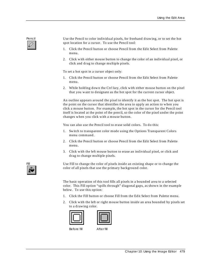
Using the Edit Area
Chapter 10: Using the Image Editor 479
Pencil Use the Pencil to color individual pixels, for freehand drawing, or to set the hotspot location for a cursor. To use the Pencil tool:
1. Click the Pencil button or choose Pencil from the Edit Select from Palettemenu.
2. Click with either mouse button to change the color of an individual pixel, orclick and drag to change multiple pixels.
To set a hot spot in a cursor object only:
1. Click the Pencil button or choose Pencil from the Edit Select from Palettemenu.
2. While holding down the Ctrl key, click with either mouse button on the pixelthat you want to designate as the hot spot for the current cursor object.
An outline appears around the pixel to identify it as the hot spot. The hot spot isthe point on the cursor that identifies the area to apply an action to when youclick a mouse button. For example, the hot spot in the cursor for the Pencil toolitself is located at the point of the pencil, so the color of the pixel under the pointchanges when you click with a mouse button.
You can also use the Pencil tool to erase solid colors. To do this:
1. Switch to transparent color mode using the Options Transparent Colorsmenu command.
2. Click the Pencil button or choose Pencil from the Edit Select from Palettemenu.
3. Click with the left mouse button to erase an individual pixel, or click anddrag to change multiple pixels.
Fill Use Fill to change the color of pixels inside an existing shape or to change thecolor of all pixels that use the primary background color.
The basic operation of this tool fills all pixels in a bounded area to a selectedcolor. This Fill option “spills through” diagonal gaps, as shown in the examplebelow. To use this option:
1. Click the Fill button or choose Fill from the Edit Select from Palette menu.
2. Click with the left or right mouse button inside an area bounded by pixels setto a drawing color.
Before fill After fill
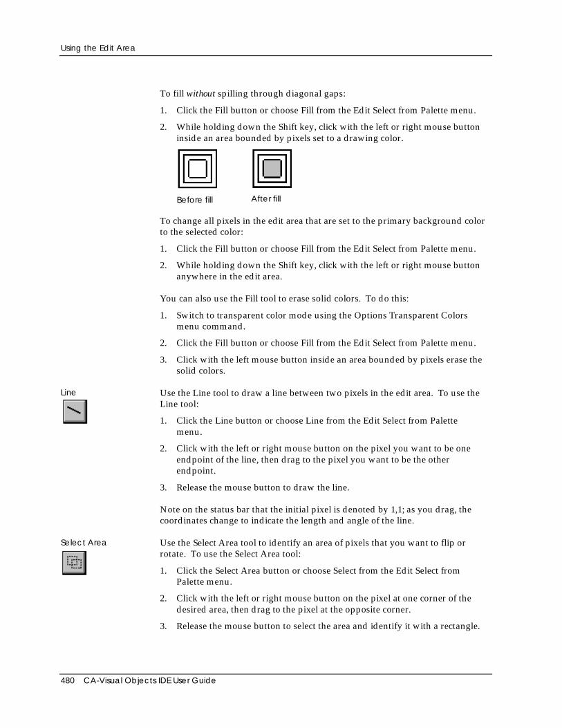
Using the Edit Area
480 CA-Visual Objects IDE User Guide
To fill without spilling through diagonal gaps:
1. Click the Fill button or choose Fill from the Edit Select from Palette menu.
2. While holding down the Shift key, click with the left or right mouse buttoninside an area bounded by pixels set to a drawing color.
Before fill After fill
To change all pixels in the edit area that are set to the primary background colorto the selected color:
1. Click the Fill button or choose Fill from the Edit Select from Palette menu.
2. While holding down the Shift key, click with the left or right mouse buttonanywhere in the edit area.
You can also use the Fill tool to erase solid colors. To do this:
1. Switch to transparent color mode using the Options Transparent Colorsmenu command.
2. Click the Fill button or choose Fill from the Edit Select from Palette menu.
3. Click with the left mouse button inside an area bounded by pixels erase thesolid colors.
Line Use the Line tool to draw a line between two pixels in the edit area. To use theLine tool:
1. Click the Line button or choose Line from the Edit Select from Palettemenu.
2. Click with the left or right mouse button on the pixel you want to be oneendpoint of the line, then drag to the pixel you want to be the otherendpoint.
3. Release the mouse button to draw the line.
Note on the status bar that the initial pixel is denoted by 1,1; as you drag, thecoordinates change to indicate the length and angle of the line.
Select Area Use the Select Area tool to identify an area of pixels that you want to flip orrotate. To use the Select Area tool:
1. Click the Select Area button or choose Select from the Edit Select fromPalette menu.
2. Click with the left or right mouse button on the pixel at one corner of thedesired area, then drag to the pixel at the opposite corner.
3. Release the mouse button to select the area and identify it with a rectangle.
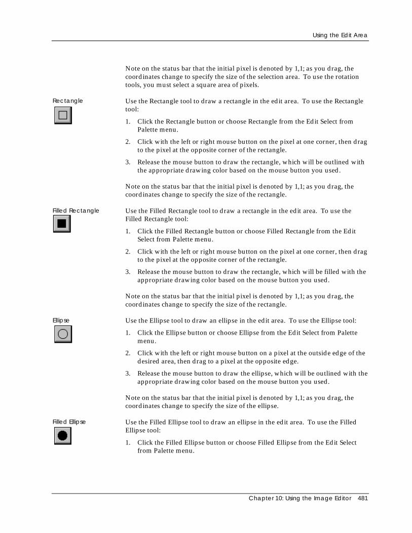
Using the Edit Area
Chapter 10: Using the Image Editor 481
Note on the status bar that the initial pixel is denoted by 1,1; as you drag, thecoordinates change to specify the size of the selection area. To use the rotationtools, you must select a square area of pixels.
Rectangle Use the Rectangle tool to draw a rectangle in the edit area. To use the Rectangletool:
1. Click the Rectangle button or choose Rectangle from the Edit Select fromPalette menu.
2. Click with the left or right mouse button on the pixel at one corner, then dragto the pixel at the opposite corner of the rectangle.
3. Release the mouse button to draw the rectangle, which will be outlined withthe appropriate drawing color based on the mouse button you used.
Note on the status bar that the initial pixel is denoted by 1,1; as you drag, thecoordinates change to specify the size of the rectangle.
Filled Rectangle Use the Filled Rectangle tool to draw a rectangle in the edit area. To use theFilled Rectangle tool:
1. Click the Filled Rectangle button or choose Filled Rectangle from the EditSelect from Palette menu.
2. Click with the left or right mouse button on the pixel at one corner, then dragto the pixel at the opposite corner of the rectangle.
3. Release the mouse button to draw the rectangle, which will be filled with theappropriate drawing color based on the mouse button you used.
Note on the status bar that the initial pixel is denoted by 1,1; as you drag, thecoordinates change to specify the size of the rectangle.
Ellipse Use the Ellipse tool to draw an ellipse in the edit area. To use the Ellipse tool:
1. Click the Ellipse button or choose Ellipse from the Edit Select from Palettemenu.
2. Click with the left or right mouse button on a pixel at the outside edge of thedesired area, then drag to a pixel at the opposite edge.
3. Release the mouse button to draw the ellipse, which will be outlined with theappropriate drawing color based on the mouse button you used.
Note on the status bar that the initial pixel is denoted by 1,1; as you drag, thecoordinates change to specify the size of the ellipse.
Filled Ellipse Use the Filled Ellipse tool to draw an ellipse in the edit area. To use the FilledEllipse tool:
1. Click the Filled Ellipse button or choose Filled Ellipse from the Edit Selectfrom Palette menu.
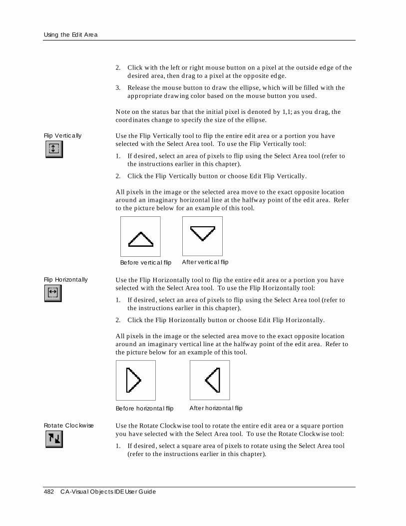
Using the Edit Area
482 CA-Visual Objects IDE User Guide
2. Click with the left or right mouse button on a pixel at the outside edge of thedesired area, then drag to a pixel at the opposite edge.
3. Release the mouse button to draw the ellipse, which will be filled with theappropriate drawing color based on the mouse button you used.
Note on the status bar that the initial pixel is denoted by 1,1; as you drag, thecoordinates change to specify the size of the ellipse.
Flip Vertically Use the Flip Vertically tool to flip the entire edit area or a portion you haveselected with the Select Area tool. To use the Flip Vertically tool:
1. If desired, select an area of pixels to flip using the Select Area tool (refer tothe instructions earlier in this chapter).
2. Click the Flip Vertically button or choose Edit Flip Vertically.
All pixels in the image or the selected area move to the exact opposite locationaround an imaginary horizontal line at the halfway point of the edit area. Referto the picture below for an example of this tool.
Before vertical flip After vertical flip
Flip Horizontally Use the Flip Horizontally tool to flip the entire edit area or a portion you haveselected with the Select Area tool. To use the Flip Horizontally tool:
1. If desired, select an area of pixels to flip using the Select Area tool (refer tothe instructions earlier in this chapter).
2. Click the Flip Horizontally button or choose Edit Flip Horizontally.
All pixels in the image or the selected area move to the exact opposite locationaround an imaginary vertical line at the halfway point of the edit area. Refer tothe picture below for an example of this tool.
Before horizontal flip After horizontal flip
Rotate Clockwise Use the Rotate Clockwise tool to rotate the entire edit area or a square portionyou have selected with the Select Area tool. To use the Rotate Clockwise tool:
1. If desired, select a square area of pixels to rotate using the Select Area tool(refer to the instructions earlier in this chapter).
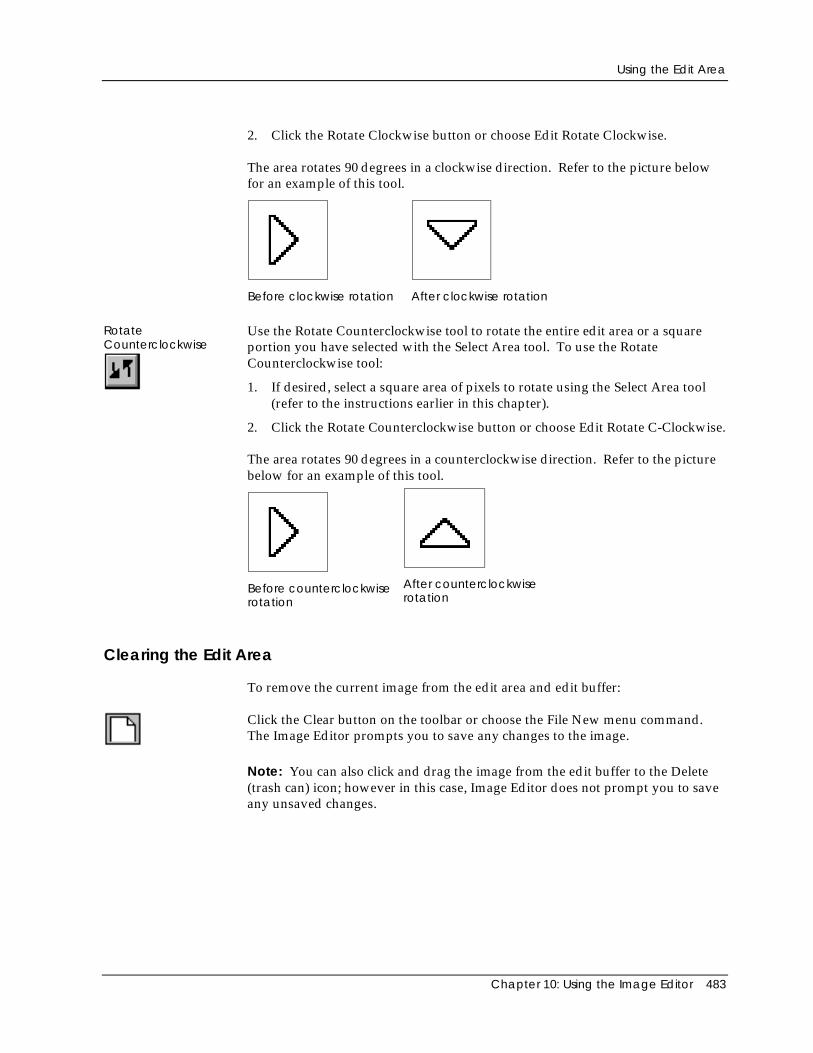
Using the Edit Area
Chapter 10: Using the Image Editor 483
2. Click the Rotate Clockwise button or choose Edit Rotate Clockwise.
The area rotates 90 degrees in a clockwise direction. Refer to the picture belowfor an example of this tool.
Before clockwise rotation After clockwise rotation
RotateCounterclockwise
Use the Rotate Counterclockwise tool to rotate the entire edit area or a squareportion you have selected with the Select Area tool. To use the RotateCounterclockwise tool:
1. If desired, select a square area of pixels to rotate using the Select Area tool(refer to the instructions earlier in this chapter).
2. Click the Rotate Counterclockwise button or choose Edit Rotate C-Clockwise.
The area rotates 90 degrees in a counterclockwise direction. Refer to the picturebelow for an example of this tool.
Before counterclockwiserotation
After counterclockwiserotation
Clearing the Edit Area
To remove the current image from the edit area and edit buffer:
Click the Clear button on the toolbar or choose the File New menu command.The Image Editor prompts you to save any changes to the image.
Note: You can also click and drag the image from the edit buffer to the Delete(trash can) icon; however in this case, Image Editor does not prompt you to saveany unsaved changes.
Creating a Ribbon
484 CA-Visual Objects IDE User Guide
Creating a RibbonSuppose you wanted to adapt and expand the Order Entry sample applicationfor a client who happens to be a greengrocer. You could add some “glitz” to theapplication by creating a ribbon image object to be associated with its menu orone of its window controls. You could use some of the vegetable bitmaps in theBUTTONS folder in the CAVO27\SAMPLES\CONTROLS directory for thispurpose.
To create a ribbon entity and bitmap file from existing bitmap files:
1. Start the Image Editor.
Like all CA-Visual Objects tools, the Image Editor is accessed using the Toolsmenu or the New Entity toolbar button.
2. In the Image Editor, click the Bitmap mode button.
3. Click the Open/Save button and drag the disk icon to the edit buffer.
The Edit Bitmap File dialog box appears.
4. Choose the appropriate .BMP file you want to load (for example,TOMATO.BMP).
CA-Visual Objects loads the image defined in the specified file into the editarea and the edit buffer.
5. Switch to Ribbon mode.
6. Copy the image from the edit buffer to the icon/cursor bar using the drag-and-drop technique.
Note that after dropping the image on the icon/cursor bar, you areautomatically switched back to Bitmap mode.
7. Repeat steps 3–6, adding PEPPER.BMP, EGGPLANT.BMP, andBROCOLI.BMP to the icon/cursor bar.
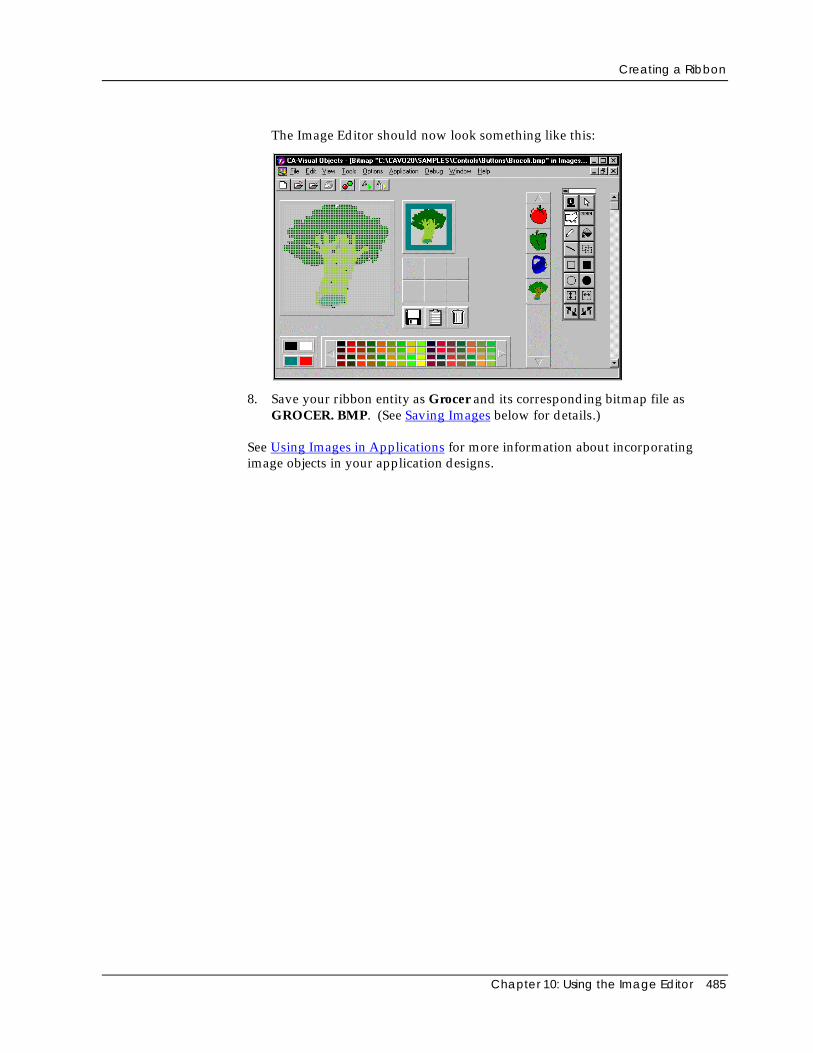
Creating a Ribbon
Chapter 10: Using the Image Editor 485
The Image Editor should now look something like this:
8. Save your ribbon entity as Grocer and its corresponding bitmap file asGROCER. BMP. (See Saving Images below for details.)
See Using Images in Applications for more information about incorporatingimage objects in your application designs.
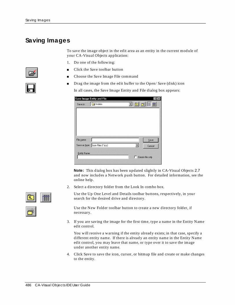
Saving Images
486 CA-Visual Objects IDE User Guide
Saving ImagesTo save the image object in the edit area as an entity in the current module ofyour CA-Visual Objects application:
1. Do one of the following:
■ Click the Save toolbar button
■ Choose the Save Image File command
■ Drag the image from the edit buffer to the Open/Save (disk) icon
In all cases, the Save Image Entity and File dialog box appears:
Note: This dialog box has been updated slightly in CA-Visual Objects 2.7and now includes a Network push button. For detailed information, see theonline help.
2. Select a directory folder from the Look In combo box.
Use the Up One Level and Details toolbar buttons, respectively, in yoursearch for the desired drive and directory.
Use the New Folder toolbar button to create a new directory folder, ifnecessary.
3. If you are saving the image for the first time, type a name in the Entity Nameedit control.
You will receive a warning if the entity already exists; in that case, specify adifferent entity name. If there is already an entity name in the Entity Nameedit control, you may leave that name, or type over it to save the imageunder another entity name.
4. Click Save to save the icon, cursor, or bitmap file and create or make changesto the entity.
Using Images in Applications
Chapter 10: Using the Image Editor 487
Note: All of the bitmap images used to create a Ribbon entity are saved as asingle .BMP file, which you may use subsequently for creating a toolbar for awindow in the Window Editor.
Generating Code In addition to saving the image you designed as an icon (*.ICO), cursor (*.CUR),or bitmap (*.BMP) file, this action also causes the Image Editor to generate thefollowing code using the file and entity names you specified in the save dialogbox:
■ An icon, cursor, bitmap image, or ribbon entity
You can double-click on this entity in Repository Explorer’s list view pane tobegin editing it with the Image Editor.
■ An appropriate subclass—Icon subclass for icons, Pointer subclass forcursors, or Bitmap subclass for bitmaps and ribbons—using the name of themenu
■ An Init() method to instantiate the Icon subclass
■ A resource entity identifying the generated .ICO, .CUR, or .BMP file name
Using Images in ApplicationsOnce you have created an icon, cursor, bitmap image, or ribbon entity, you canuse it in designing applications. The table below describes where image objectscan be used when you design an application:
Object Type Cursor Icon, Bitmap, or Ribbon
Application Not applicable Application Properties dialogbox, Icon button; Menu Editor(Menu Properties window)
Shell window Mouse Pointer Icon Name
Data window Mouse Pointer Icon Name
Datadialog window Mouse Pointer Icon Name
Dialog window Mouse Pointer Not applicable
Window controls(fixed icon, push button,radio button, and checkbox)
Not applicable Caption (for fixed icons only);Image (for other windowcontrols)
In the case of choosing an icon for the application, you must click the Icon buttonin the Application Properties dialog box. Choose one of the available icons, andclick OK to close the dialog box. The new icon will be displayed in theRepository Explorer, as well as when the application is minimized.
Using Images in Applications
488 CA-Visual Objects IDE User Guide
In all other cases, you indicate the image object using a value cell in theappropriate Properties window. In some cases, such as with the fixed iconcontrol, you must enter the name directly. In other cases, you can select thename from a drop-down list of all cursor, icon, bitmap image, and ribbon entitiesin your application. The appropriate source code will be generated by theWindow Editor to link entity and file to the window.
In addition, once the Image Editor creates the related class, Init() method, andresource entity, you can utilize your images directly in the source code youcreate. CA-Visual Objects also contains several system icons and system cursorswhich you can utilize. See the Icon and Pointer class descriptions in the onlinehelp system for a listing of the available system icons and cursors. The systemicons and cursors cannot be utilized as described above; instead you must usethem by writing custom source code.
Chapter 11: Debugging Your Applications 489
Chapter
11 Debugging Your Applications
With a CA-Visual Objects application, there are three distinct types of error thatcan occur: compiler errors, runtime errors that are trapped by the error handlingsystem, and logic errors in the application that cannot be trapped as errors.
Compiler Errors When you attempt to build an application, you may receive compiler errors forsuch things as incorrect syntax usage. Detection of certain error conditions atthis stage can be controlled with compiler options. For example, whether the useof undeclared variable names is considered a compiler error is controlled by theUndeclared Variables option.
The resolution of compiler errors is fairly straightforward. You simply read theerror message to pinpoint the cause of the error, locate the error, and fix it.However, in large applications with many modules and entities, there may bemany errors at this stage and locating them in the source code can be difficult.To make locating compiler errors easy, CA-Visual Objects provides two tools: theError Browser and the visual indicators in the Repository Explorer.
Runtime Errors After all compiler errors are resolved, you will get a successful build for yourapplication and can run it to see what happens. However, the program may notrun perfectly because of additional programming errors—runtime errors—thatcould not be detected at compile time. Some examples of runtime errors are amissing file or a variable that is referenced before it is initialized.
Resolving errors at this stage is also not difficult. The application will display anerror message to indicate exactly where the application failed and why, and youcan resolve the problem appropriately. For example, make sure the missing fileis properly located on the disk or correct the source code by putting in aninitialization statement for the variable in question.
Using Images in Applications
490 CA-Visual Objects IDE User Guide
Tip: You can minimize runtime errors by strongly scoping and typingvariables (and function and procedure declarations) and by deselecting theUndeclared Variables compiler option. Doing this will trap any errorsinvolving the misuse of a variable or function call at compile time. See“Variables, Constants, and Declarations” for more information on strongtyping and scoping of variables and “Functions and Procedures” for moreinformation on calling conventions for functions and procedures—both ofthese chapters are located in the Programmer’s Guide.
Logic Errors You may also encounter errors in your application at runtime, known as logicerrors, that manifest themselves in less obvious ways than displaying errormessages.
This type of error resolution is definitely the most difficult because the only wayto detect logic errors is to recognize that the application is not behaving asintended. For resolving errors of this nature, CA-Visual Objects provides youwith the Debugger, a comprehensive tool designed for just this purpose.
This chapter discusses how to use the various tools and features of CA-VisualObjects to detect and resolve all types of errors. In this chapter, you will learnhow to:
■ Use the Error Browser and the visual indicators in the various browsers topinpoint and resolve compiler errors
■ Set debugging options at the application, module, and entity levels
■ Recognize and resolve runtime errors using both the comprehensive runtimeerror reporting system that is built into every CA-Visual Objects applicationand the Debugger for less obvious runtime errors
■ Use the Debugger to track down and correct logic errors in your application
Note: In CA-Visual Objects 2.7, there are several new debugging features andoptions, including AutoStart debugging and DLL debugging, as well as minorchanges to the Error Browser window and the Evaluate Expression dialog box.For details, see the online help.
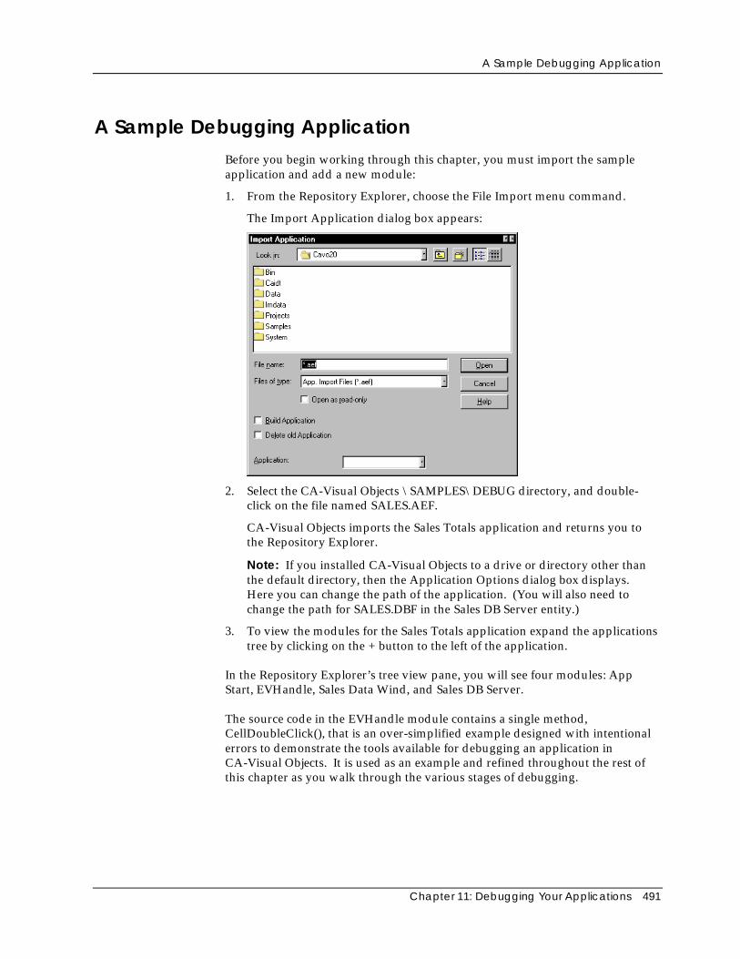
A Sample Debugging Application
Chapter 11: Debugging Your Applications 491
A Sample Debugging ApplicationBefore you begin working through this chapter, you must import the sampleapplication and add a new module:
1. From the Repository Explorer, choose the File Import menu command.
The Import Application dialog box appears:
2. Select the CA-Visual Objects \SAMPLES\DEBUG directory, and double-click on the file named SALES.AEF.
CA-Visual Objects imports the Sales Totals application and returns you tothe Repository Explorer.
Note: If you installed CA-Visual Objects to a drive or directory other thanthe default directory, then the Application Options dialog box displays.Here you can change the path of the application. (You will also need tochange the path for SALES.DBF in the Sales DB Server entity.)
3. To view the modules for the Sales Totals application expand the applicationstree by clicking on the + button to the left of the application.
In the Repository Explorer’s tree view pane, you will see four modules: AppStart, EVHandle, Sales Data Wind, and Sales DB Server.
The source code in the EVHandle module contains a single method,CellDoubleClick(), that is an over-simplified example designed with intentionalerrors to demonstrate the tools available for debugging an application inCA-Visual Objects. It is used as an example and refined throughout the rest ofthis chapter as you walk through the various stages of debugging.
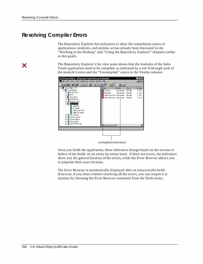
Resolving Compiler Errors
492 CA-Visual Objects IDE User Guide
Resolving Compiler ErrorsThe Repository Explorer has indicators to show the compilation status ofapplications, modules, and entities, as has already been discussed in the“Working in the Desktop” and “Using the Repository Explorer” chapters earlierin this guide.
The Repository Explorer’s list view pane shows that the modules of the SalesTotals application need to be compiled, as indicated by a red X through each ofthe module’s icons and the “Uncompiled” status in the Vitality column:
Compilationindicators
Once you build the application, these indicators change based on the success orfailure of the build, on an entity-by-entity basis. If there are errors, the indicatorsshow you the general location of the errors, while the Error Browser allows youto pinpoint their exact location.
The Error Browser is automatically displayed after an unsuccessful build.However, if you close it before resolving all the errors, you can reopen it atanytime by choosing the Error Browser command from the Tools menu.
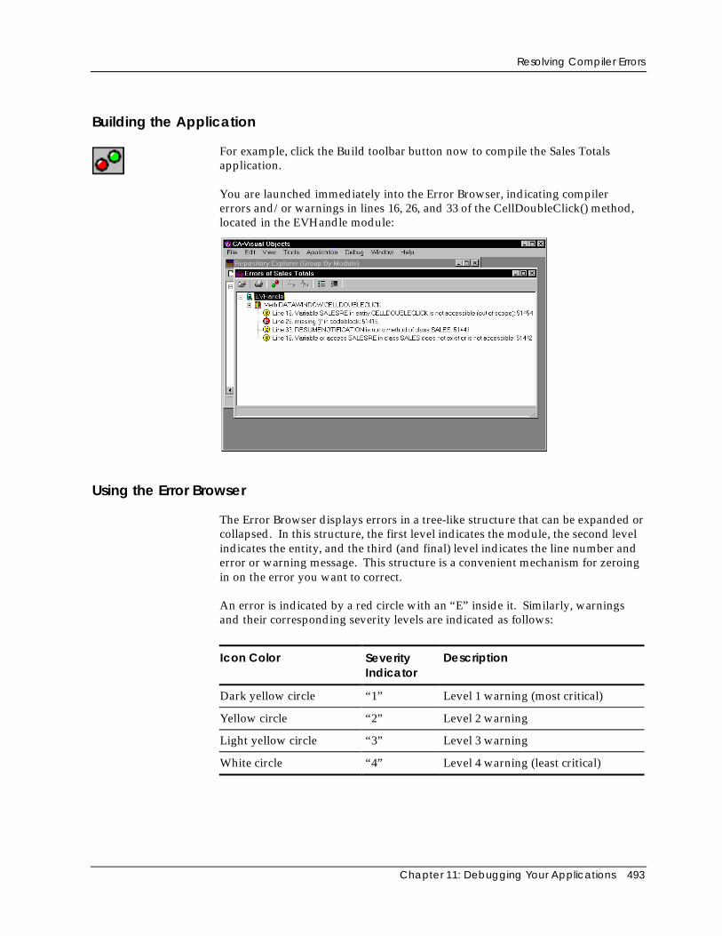
Resolving Compiler Errors
Chapter 11: Debugging Your Applications 493
Building the Application
For example, click the Build toolbar button now to compile the Sales Totalsapplication.
You are launched immediately into the Error Browser, indicating compilererrors and/or warnings in lines 16, 26, and 33 of the CellDoubleClick() method,located in the EVHandle module:
Using the Error Browser
The Error Browser displays errors in a tree-like structure that can be expanded orcollapsed. In this structure, the first level indicates the module, the second levelindicates the entity, and the third (and final) level indicates the line number anderror or warning message. This structure is a convenient mechanism for zeroingin on the error you want to correct.
An error is indicated by a red circle with an “E” inside it. Similarly, warningsand their corresponding severity levels are indicated as follows:
Icon Color SeverityIndicator
Description
Dark yellow circle “1” Level 1 warning (most critical)
Yellow circle “2” Level 2 warning
Light yellow circle “3” Level 3 warning
White circle “4” Level 4 warning (least critical)
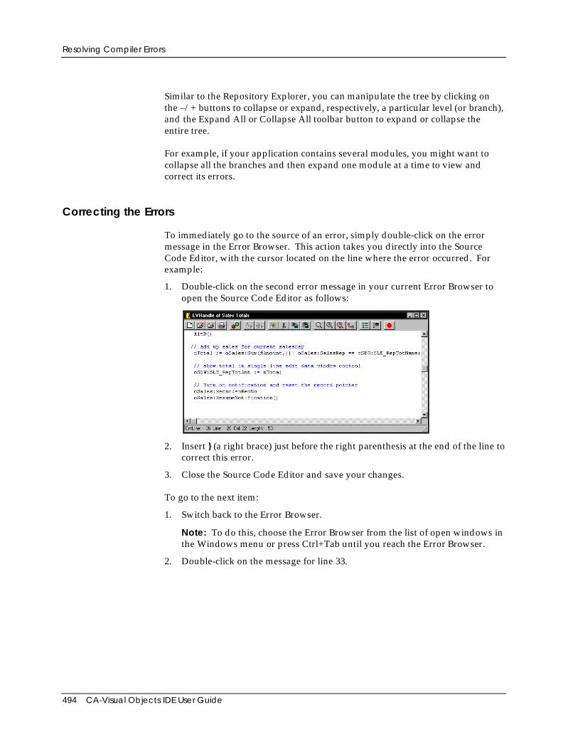
Resolving Compiler Errors
494 CA-Visual Objects IDE User Guide
Similar to the Repository Explorer, you can manipulate the tree by clicking onthe –/+ buttons to collapse or expand, respectively, a particular level (or branch),and the Expand All or Collapse All toolbar button to expand or collapse theentire tree.
For example, if your application contains several modules, you might want tocollapse all the branches and then expand one module at a time to view andcorrect its errors.
Correcting the Errors
To immediately go to the source of an error, simply double-click on the errormessage in the Error Browser. This action takes you directly into the SourceCode Editor, with the cursor located on the line where the error occurred. Forexample:
1. Double-click on the second error message in your current Error Browser toopen the Source Code Editor as follows:
2. Insert } (a right brace) just before the right parenthesis at the end of the line tocorrect this error.
3. Close the Source Code Editor and save your changes.
To go to the next item:
1. Switch back to the Error Browser.
Note: To do this, choose the Error Browser from the list of open windows inthe Windows menu or press Ctrl+Tab until you reach the Error Browser.
2. Double-click on the message for line 33.
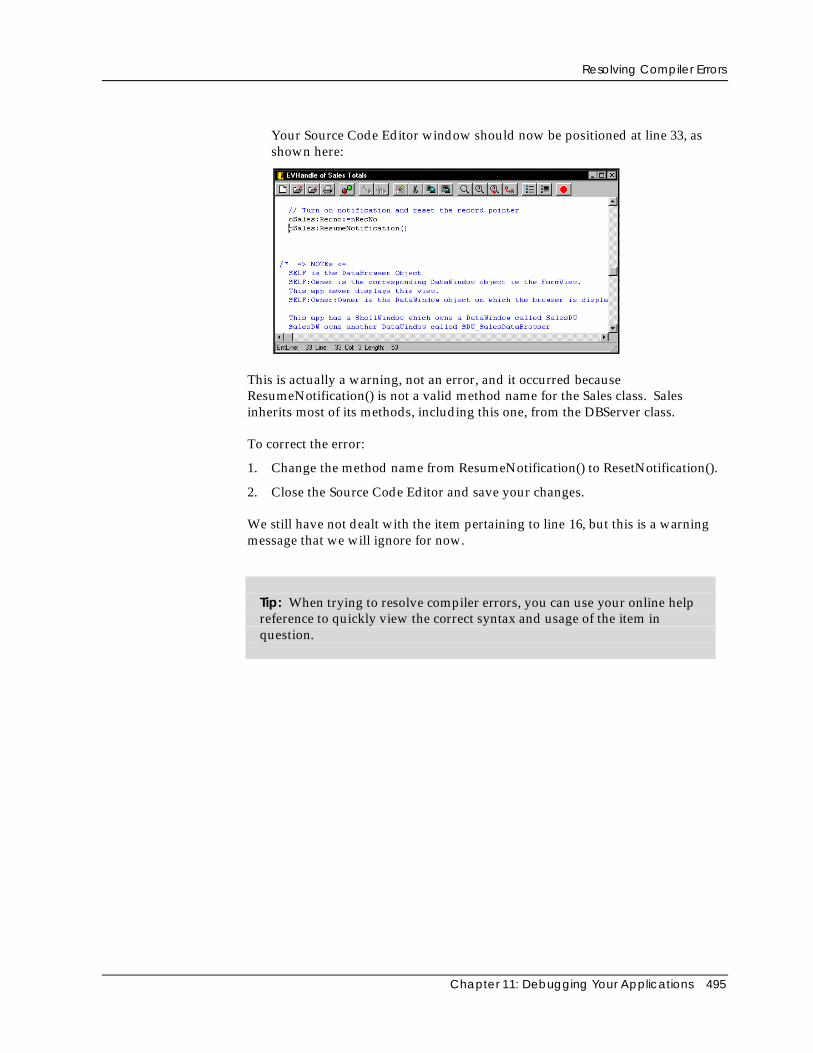
Resolving Compiler Errors
Chapter 11: Debugging Your Applications 495
Your Source Code Editor window should now be positioned at line 33, asshown here:
This is actually a warning, not an error, and it occurred becauseResumeNotification() is not a valid method name for the Sales class. Salesinherits most of its methods, including this one, from the DBServer class.
To correct the error:
1. Change the method name from ResumeNotification() to ResetNotification().
2. Close the Source Code Editor and save your changes.
We still have not dealt with the item pertaining to line 16, but this is a warningmessage that we will ignore for now.
Tip: When trying to resolve compiler errors, you can use your online helpreference to quickly view the correct syntax and usage of the item inquestion.
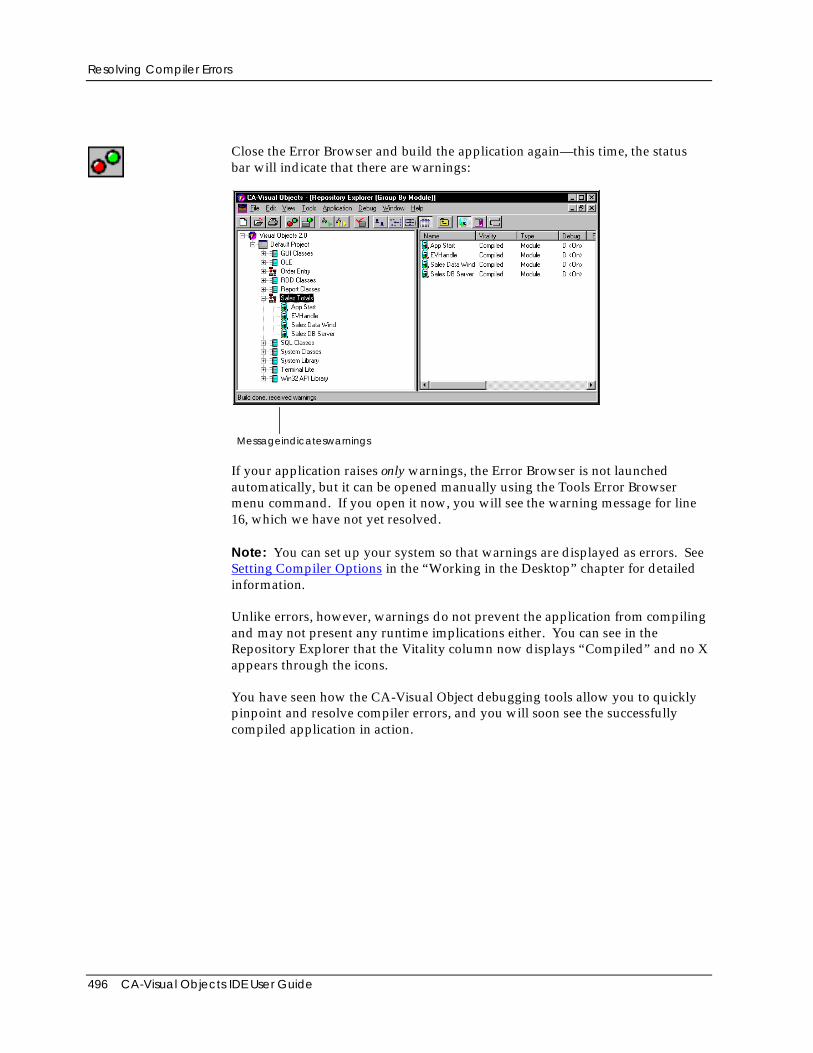
Resolving Compiler Errors
496 CA-Visual Objects IDE User Guide
Close the Error Browser and build the application again—this time, the statusbar will indicate that there are warnings:
Messageindicateswarnings
If your application raises only warnings, the Error Browser is not launchedautomatically, but it can be opened manually using the Tools Error Browsermenu command. If you open it now, you will see the warning message for line16, which we have not yet resolved.
Note: You can set up your system so that warnings are displayed as errors. SeeSetting Compiler Options in the “Working in the Desktop” chapter for detailedinformation.
Unlike errors, however, warnings do not prevent the application from compilingand may not present any runtime implications either. You can see in theRepository Explorer that the Vitality column now displays “Compiled” and no Xappears through the icons.
You have seen how the CA-Visual Object debugging tools allow you to quicklypinpoint and resolve compiler errors, and you will soon see the successfullycompiled application in action.
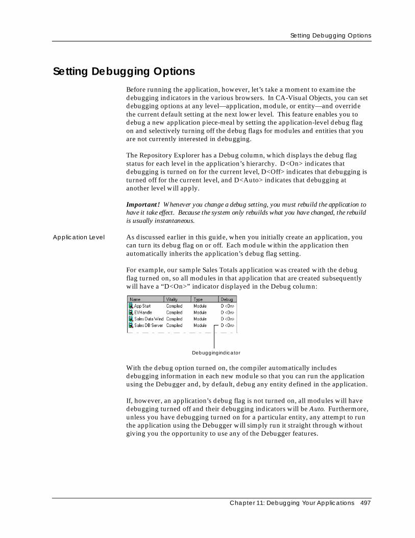
Setting Debugging Options
Chapter 11: Debugging Your Applications 497
Setting Debugging OptionsBefore running the application, however, let’s take a moment to examine thedebugging indicators in the various browsers. In CA-Visual Objects, you can setdebugging options at any level—application, module, or entity—and overridethe current default setting at the next lower level. This feature enables you todebug a new application piece-meal by setting the application-level debug flagon and selectively turning off the debug flags for modules and entities that youare not currently interested in debugging.
The Repository Explorer has a Debug column, which displays the debug flagstatus for each level in the application’s hierarchy. D<On> indicates thatdebugging is turned on for the current level, D<Off> indicates that debugging isturned off for the current level, and D<Auto> indicates that debugging atanother level will apply.
Important! Whenever you change a debug setting, you must rebuild the application tohave it take effect. Because the system only rebuilds what you have changed, the rebuildis usually instantaneous.
Application Level As discussed earlier in this guide, when you initially create an application, youcan turn its debug flag on or off. Each module within the application thenautomatically inherits the application’s debug flag setting.
For example, our sample Sales Totals application was created with the debugflag turned on, so all modules in that application that are created subsequentlywill have a “D<On>” indicator displayed in the Debug column:
Debuggingindicator
With the debug option turned on, the compiler automatically includesdebugging information in each new module so that you can run the applicationusing the Debugger and, by default, debug any entity defined in the application.
If, however, an application’s debug flag is not turned on, all modules will havedebugging turned off and their debugging indicators will be Auto. Furthermore,unless you have debugging turned on for a particular entity, any attempt to runthe application using the Debugger will simply run it straight through withoutgiving you the opportunity to use any of the Debugger features.
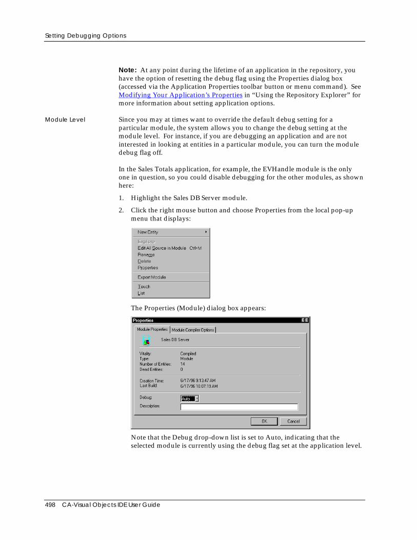
Setting Debugging Options
498 CA-Visual Objects IDE User Guide
Note: At any point during the lifetime of an application in the repository, youhave the option of resetting the debug flag using the Properties dialog box(accessed via the Application Properties toolbar button or menu command). SeeModifying Your Application’s Properties in “Using the Repository Explorer” formore information about setting application options.
Module Level Since you may at times want to override the default debug setting for aparticular module, the system allows you to change the debug setting at themodule level. For instance, if you are debugging an application and are notinterested in looking at entities in a particular module, you can turn the moduledebug flag off.
In the Sales Totals application, for example, the EVHandle module is the onlyone in question, so you could disable debugging for the other modules, as shownhere:
1. Highlight the Sales DB Server module.
2. Click the right mouse button and choose Properties from the local pop-upmenu that displays:
The Properties (Module) dialog box appears:
Note that the Debug drop-down list is set to Auto, indicating that theselected module is currently using the debug flag set at the application level.
Resolving Runtime Errors
Chapter 11: Debugging Your Applications 499
Note: This dialog box has also been changed slightly in CA-VisualObjects 2.7. The Debug drop-down list box has been replaced by three radiobuttons: Auto, On, and Off. Additionally, it indicates whether source controlis available or not and, if so, the source control status of the specifiedmodule. For detailed information about the new Source Code ControlInterface, refer to the online help.
3. Select the Off setting to turn debugging off for this module, and then clickOK.
Entity Level CA-Visual Objects allows you to set the debug flag at the entity level in a similarmanner.
To change the debug flag for an individual entity:
1. Click on the specified module to display its entities, and then highlight thespecified entity (for example, Sales).
2. Click the right mouse button, and then choose Properties from the local pop-up menu that displays.
The Properties (Entity) dialog box, which is almost identical to the Properties(Modules) dialog box, appears.
3. Choose any one of the three debugging options: Auto, On, or Off.
Important! For the sample application, the debug flag for the EVHandle module and allof its entities must be set to On or Auto, as should the debug flag for the App:Start()entity. Make sure this is the case before continuing with the instructions in this chapter.
Resolving Runtime ErrorsNow, let’s move into the next stage of debugging by running the application andlooking for runtime and logic errors.
If you have changed any of the debug flags according to the instructions in theprevious section, you will need to rebuild the Sales Totals application now.Then, run the application by clicking the Run toolbar button.
The application executes, displaying a scrolling list box containing sales figuresby sales representative. The application instructs you to double-click on a salesrepresentative to show a total amount, but when you do this, the edit controlopens in edit mode.
This is because there is an error in the logic of the program preventing thedouble-click event from being processed correctly. This type of error is not easyto track down because there are no error messages or visual indicators in the IDEor the application to give you clues.
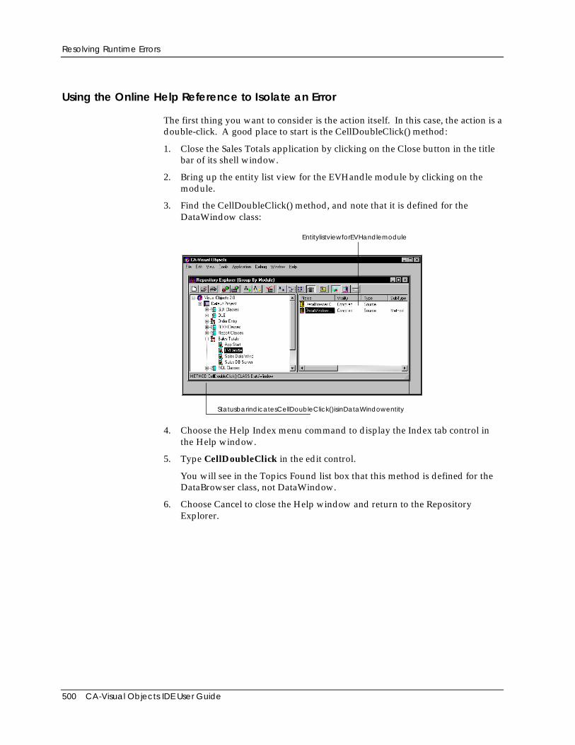
Resolving Runtime Errors
500 CA-Visual Objects IDE User Guide
Using the Online Help Reference to Isolate an Error
The first thing you want to consider is the action itself. In this case, the action is adouble-click. A good place to start is the CellDoubleClick() method:
1. Close the Sales Totals application by clicking on the Close button in the titlebar of its shell window.
2. Bring up the entity list view for the EVHandle module by clicking on themodule.
3. Find the CellDoubleClick() method, and note that it is defined for theDataWindow class:
EntitylistviewforEVHandlemodule
StatusbarindicatesCellDoubleClick()isinDataWindowentity
4. Choose the Help Index menu command to display the Index tab control inthe Help window.
5. Type CellDoubleClick in the edit control.
You will see in the Topics Found list box that this method is defined for theDataBrowser class, not DataWindow.
6. Choose Cancel to close the Help window and return to the RepositoryExplorer.
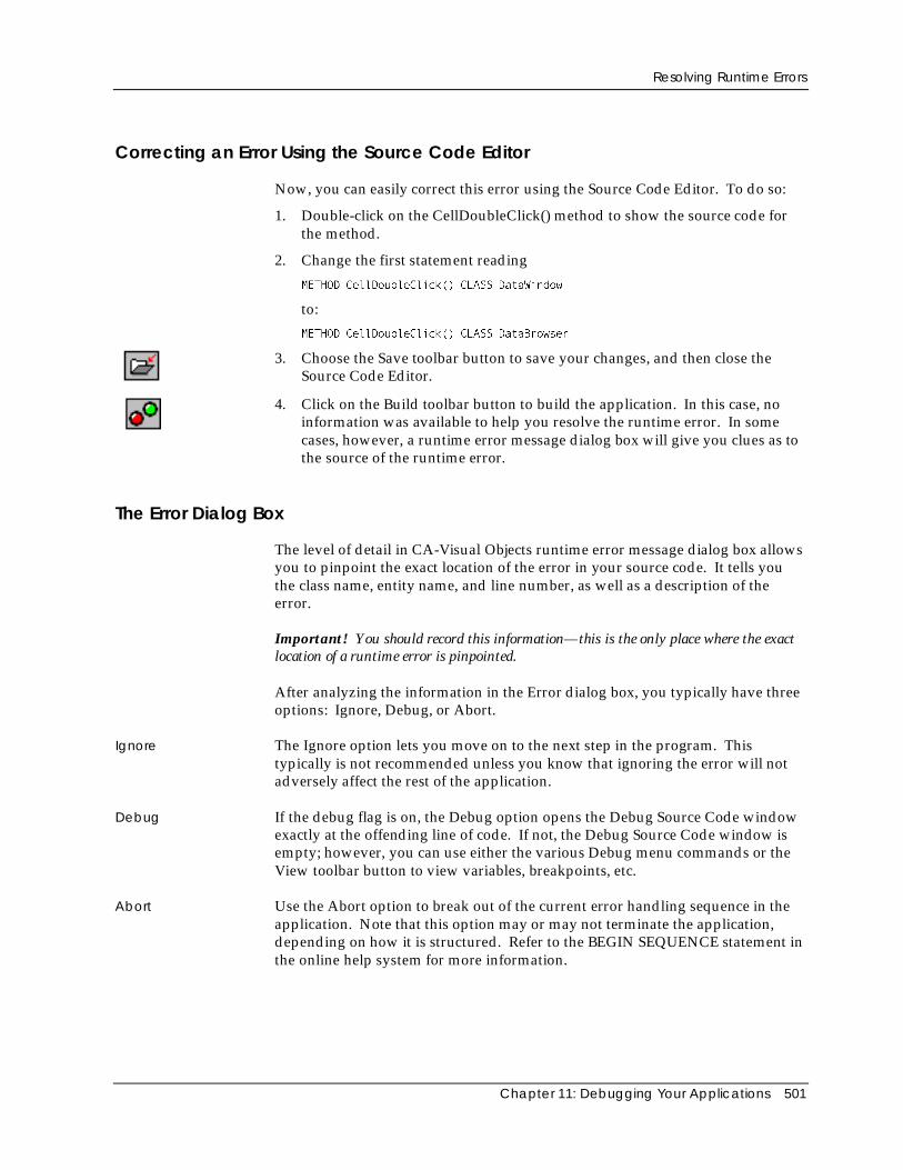
Resolving Runtime Errors
Chapter 11: Debugging Your Applications 501
Correcting an Error Using the Source Code Editor
Now, you can easily correct this error using the Source Code Editor. To do so:
1. Double-click on the CellDoubleClick() method to show the source code forthe method.
2. Change the first statement reading
METHOD CellDoubleClick() CLASS DataWindow
to:
METHOD CellDoubleClick() CLASS DataBrowser
3. Choose the Save toolbar button to save your changes, and then close theSource Code Editor.
4. Click on the Build toolbar button to build the application. In this case, noinformation was available to help you resolve the runtime error. In somecases, however, a runtime error message dialog box will give you clues as tothe source of the runtime error.
The Error Dialog Box
The level of detail in CA-Visual Objects runtime error message dialog box allowsyou to pinpoint the exact location of the error in your source code. It tells youthe class name, entity name, and line number, as well as a description of theerror.
Important! You should record this information—this is the only place where the exactlocation of a runtime error is pinpointed.
After analyzing the information in the Error dialog box, you typically have threeoptions: Ignore, Debug, or Abort.
Ignore The Ignore option lets you move on to the next step in the program. Thistypically is not recommended unless you know that ignoring the error will notadversely affect the rest of the application.
Debug If the debug flag is on, the Debug option opens the Debug Source Code windowexactly at the offending line of code. If not, the Debug Source Code window isempty; however, you can use either the various Debug menu commands or theView toolbar button to view variables, breakpoints, etc.
Abort Use the Abort option to break out of the current error handling sequence in theapplication. Note that this option may or may not terminate the application,depending on how it is structured. Refer to the BEGIN SEQUENCE statement inthe online help system for more information.
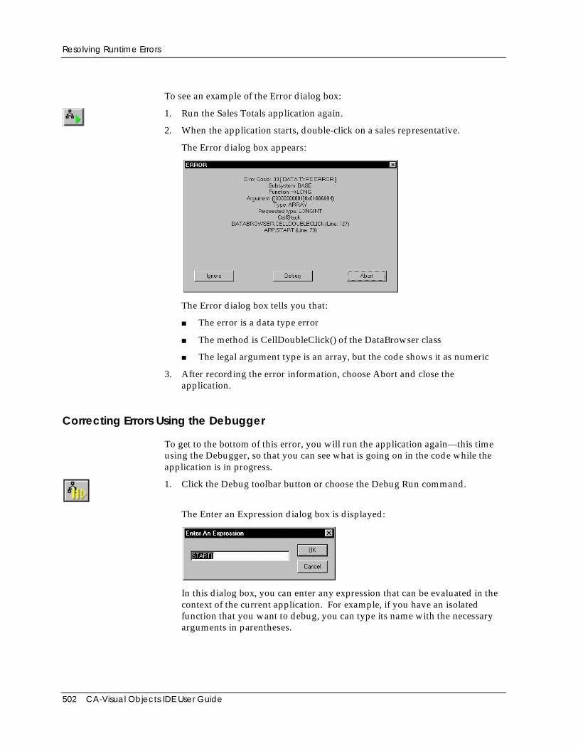
Resolving Runtime Errors
502 CA-Visual Objects IDE User Guide
To see an example of the Error dialog box:
1. Run the Sales Totals application again.
2. When the application starts, double-click on a sales representative.
The Error dialog box appears:
The Error dialog box tells you that:
■ The error is a data type error
■ The method is CellDoubleClick() of the DataBrowser class
■ The legal argument type is an array, but the code shows it as numeric
3. After recording the error information, choose Abort and close theapplication.
Correcting Errors Using the Debugger
To get to the bottom of this error, you will run the application again—this timeusing the Debugger, so that you can see what is going on in the code while theapplication is in progress.
1. Click the Debug toolbar button or choose the Debug Run command.
The Enter an Expression dialog box is displayed:
In this dialog box, you can enter any expression that can be evaluated in thecontext of the current application. For example, if you have an isolatedfunction that you want to debug, you can type its name with the necessaryarguments in parentheses.

Resolving Runtime Errors
Chapter 11: Debugging Your Applications 503
Notice that, by default, it is assumed that you want to debug the entireapplication; therefore, it contains the Start() entity.
Note: If the new Debug AutoStart option was selected in the SystemOptions dialog box when you initially set up your system, then this dialogbox does not appear and you are brought straight into the Debugger.
2. Choose OK.
This launches the Debugger with the source code for the Start() methodloaded in the Debug Source Code window:
DebugSourceCodewindow
Note: The Debugger cannot load source code for any entity that does not haveits debug flag turned on. Therefore, if the Start() entity has its debug flag turnedoff, the Debugger will not pause as indicated here. Instead, it will run theapplication until an entity is encountered for which the debug flag has beenturned on.
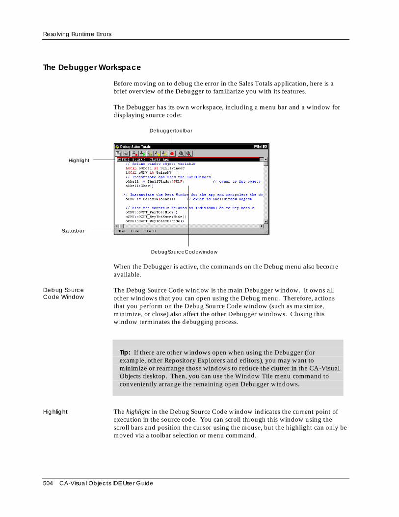
Resolving Runtime Errors
504 CA-Visual Objects IDE User Guide
The Debugger Workspace
Before moving on to debug the error in the Sales Totals application, here is abrief overview of the Debugger to familiarize you with its features.
The Debugger has its own workspace, including a menu bar and a window fordisplaying source code:
Debuggertoolbar
Highlight
DebugSourceCodewindow
Statusbar
When the Debugger is active, the commands on the Debug menu also becomeavailable.
Debug SourceCode Window
The Debug Source Code window is the main Debugger window. It owns allother windows that you can open using the Debug menu. Therefore, actionsthat you perform on the Debug Source Code window (such as maximize,minimize, or close) also affect the other Debugger windows. Closing thiswindow terminates the debugging process.
Tip: If there are other windows open when using the Debugger (forexample, other Repository Explorers and editors), you may want tominimize or rearrange those windows to reduce the clutter in the CA-VisualObjects desktop. Then, you can use the Window Tile menu command toconveniently arrange the remaining open Debugger windows.
Highlight The highlight in the Debug Source Code window indicates the current point ofexecution in the source code. You can scroll through this window using thescroll bars and position the cursor using the mouse, but the highlight can only bemoved via a toolbar selection or menu command.
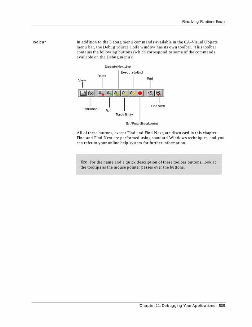
Resolving Runtime Errors
Chapter 11: Debugging Your Applications 505
Toolbar In addition to the Debug menu commands available in the CA-Visual Objectsmenu bar, the Debug Source Code window has its own toolbar. This toolbarcontains the following buttons (which correspond to some of the commandsavailable on the Debug menu):
Evaluate
Reset
ExecuteNextLine
ExecutetoEnd
Find
RunTraceEntity
FindNext
View
Set/ResetBreakpoint
All of these buttons, except Find and Find Next, are discussed in this chapter.Find and Find Next are performed using standard Windows techniques, and youcan refer to your online help system for further information.
Tip: For the name and a quick description of these toolbar buttons, look atthe tooltips as the mouse pointer passes over the buttons.
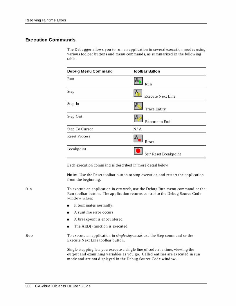
Resolving Runtime Errors
506 CA-Visual Objects IDE User Guide
Execution Commands
The Debugger allows you to run an application in several execution modes usingvarious toolbar buttons and menu commands, as summarized in the followingtable:
Debug Menu Command Toolbar Button
RunRun
StepExecute Next Line
Step InTrace Entity
Step OutExecute to End
Step To Cursor N/A
Reset ProcessReset
BreakpointSet/Reset Breakpoint
Each execution command is described in more detail below.
Note: Use the Reset toolbar button to stop execution and restart the applicationfrom the beginning.
Run To execute an application in run mode, use the Debug Run menu command or theRun toolbar button. The application returns control to the Debug Source Codewindow when:
■ It terminates normally
■ A runtime error occurs
■ A breakpoint is encountered
■ The AltD() function is executed
Step To execute an application in single step mode, use the Step command or theExecute Next Line toolbar button.
Single stepping lets you execute a single line of code at a time, viewing theoutput and examining variables as you go. Called entities are executed in runmode and are not displayed in the Debug Source Code window.
Resolving Runtime Errors
Chapter 11: Debugging Your Applications 507
Step In To step into an entity, or execute in trace mode, use the Step In command or theTrace Entity toolbar button.
Tracing an entity is similar to the single step mode in that it allows you toexecute one line of program code at a time. However, the trace mode displaysthe code for called entities in the Debug Source Code window and allows you tosingle step through them.
Tip: Remember, you can control which entities and modules the Debuggerwill step into using individual debug settings at these levels. See SettingDebugging Options earlier in this chapter for more information.
Step Out The Step Out command (or Execute to End toolbar button) executes in run modeuntil the end of the current entity is encountered. It behaves as if a breakpointwere set at the last statement in the entity.
Step To Cursor The Step To Cursor command executes the application in run mode up to thecurrent cursor position. It behaves as if a temporary breakpoint were set at thecursor.
Note: See Setting Breakpoints later in this chapter for more information onbreakpoints.
Analyzing the Problem
Now that you have an overview of the Debugger workspace and executioncommands, you are ready to use it to resolve the problem in the Sales Totalsapplication.
Setting Breakpoints
As your application becomes larger and more complex, it may be more difficultto remember how the flow of the application proceeds. For example, you mayknow that there is a bug in a certain module or even a specific entity, butstepping to it might take a long time.
Use a breakpoint to stop running the application at the line where you place thebreakpoint, and to display the source of the entity containing that line in theDebug Source Code window.
Breakpoints are set from within the Debug Source Code window or by using theAltD() function in your application. (For more information about AltD(), see theonline help.)
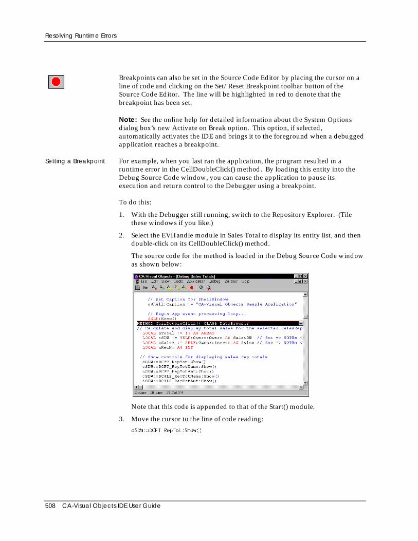
Resolving Runtime Errors
508 CA-Visual Objects IDE User Guide
Breakpoints can also be set in the Source Code Editor by placing the cursor on aline of code and clicking on the Set/Reset Breakpoint toolbar button of theSource Code Editor. The line will be highlighted in red to denote that thebreakpoint has been set.
Note: See the online help for detailed information about the System Optionsdialog box’s new Activate on Break option. This option, if selected,automatically activates the IDE and brings it to the foreground when a debuggedapplication reaches a breakpoint.
Setting a Breakpoint For example, when you last ran the application, the program resulted in aruntime error in the CellDoubleClick() method. By loading this entity into theDebug Source Code window, you can cause the application to pause itsexecution and return control to the Debugger using a breakpoint.
To do this:
1. With the Debugger still running, switch to the Repository Explorer. (Tilethese windows if you like.)
2. Select the EVHandle module in Sales Total to display its entity list, and thendouble-click on its CellDoubleClick() method.
The source code for the method is loaded in the Debug Source Code windowas shown below:
Note that this code is appended to that of the Start() module.
3. Move the cursor to the line of code reading:
oSDW:oDCFT_RepTot:Show()
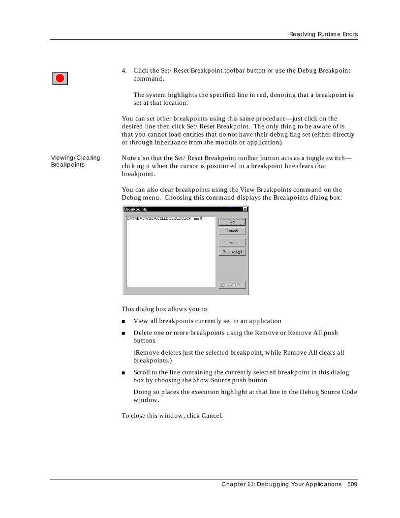
Resolving Runtime Errors
Chapter 11: Debugging Your Applications 509
4. Click the Set/Reset Breakpoint toolbar button or use the Debug Breakpointcommand.
The system highlights the specified line in red, denoting that a breakpoint isset at that location.
You can set other breakpoints using this same procedure—just click on thedesired line then click Set/Reset Breakpoint. The only thing to be aware of isthat you cannot load entities that do not have their debug flag set (either directlyor through inheritance from the module or application).
Viewing/ClearingBreakpoints
Note also that the Set/Reset Breakpoint toolbar button acts as a toggle switch—clicking it when the cursor is positioned in a breakpoint line clears thatbreakpoint.
You can also clear breakpoints using the View Breakpoints command on theDebug menu. Choosing this command displays the Breakpoints dialog box:
This dialog box allows you to:
■ View all breakpoints currently set in an application
■ Delete one or more breakpoints using the Remove or Remove All pushbuttons
(Remove deletes just the selected breakpoint, while Remove All clears allbreakpoints.)
■ Scroll to the line containing the currently selected breakpoint in this dialogbox by choosing the Show Source push button
Doing so places the execution highlight at that line in the Debug Source Codewindow.
To close this window, click Cancel.
Resolving Runtime Errors
510 CA-Visual Objects IDE User Guide
Running with a Breakpoint
Once the breakpoint is set:
1. Run the application using the Run toolbar button.
2. When the application window appears, click the Restore button of its shellwindow and move and/or size the window so that you can view theapplication and Debugger windows at the same time.
3. Double-click on the first sales representative.
This will bring you to the breakpoint you defined in the CellDoubleClick()method.
4. Click the Execute Next Line button or choose the Debug Step menucommand to step through the application. Continue to step through theapplication until an error occurs. This will help you isolate the line of codecausing the error.
5. Once the error is isolated, close the Debug Source Code window to shutdown both the Debugger and the Sales Totals application.
The Debugger is closed and you are returned to the EVHandle entity listview.
Correcting the Error
Once you have located the lines where errors occur, you are ready to fix theproblems.
The lines of code identified earlier indicate that you need to define the localvariable nTotal as an array. Double-click on the CellDoubleClick() method toload it into the Source Code Editor, and make the following corrections:
1. Change the line
LOCAL nTotal AS INT
so that it reads:
LOCAL aTotal := {} AS ARRAY
2. Change the line
nTotal := oSales:Sum(#Amount,{||...
so that it reads:
aTotal := oSales:Sum(#Amount,{||...
3. Change the line
oSDW:SLE_RepTotAmt := nTotal
so that it reads:
oSDW:SLE_RepTotAmt := aTotal[1]
4. Close the Source Code Editor window, saving your work.
The error is corrected.
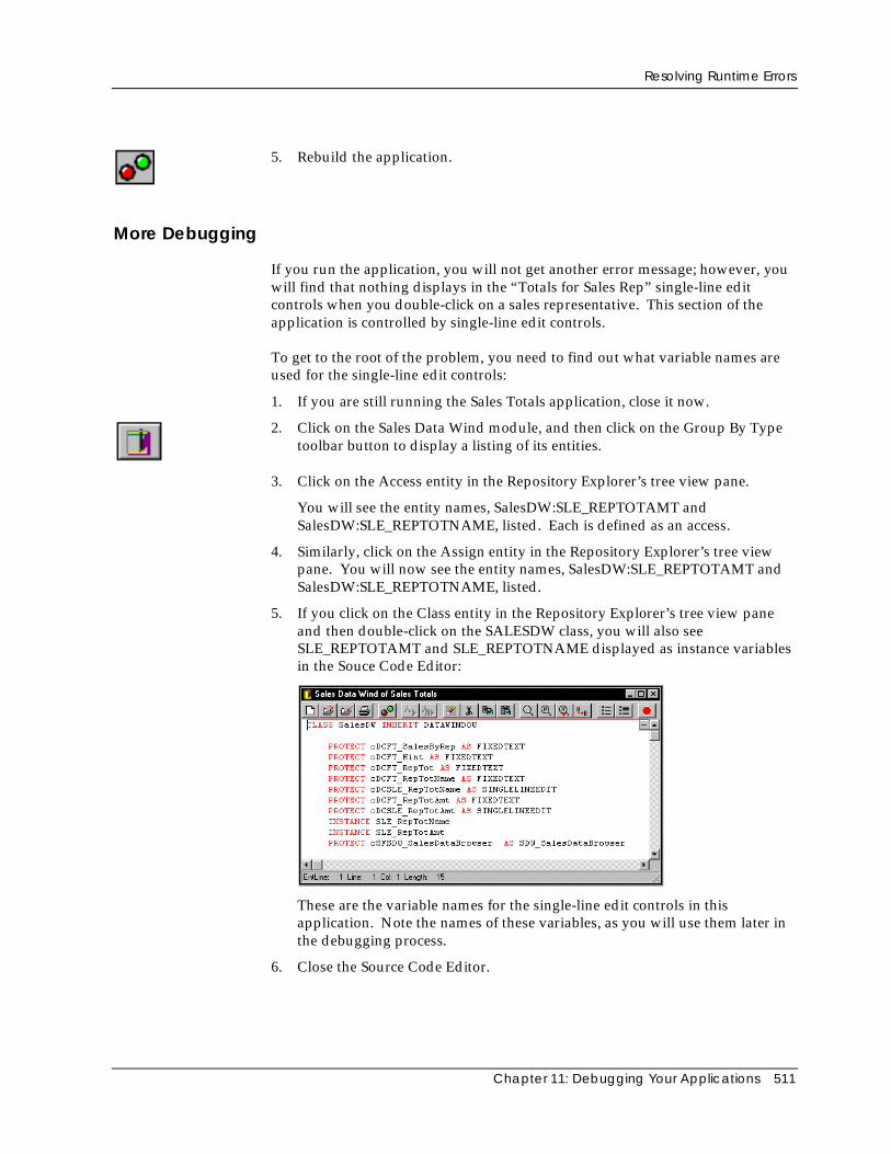
Resolving Runtime Errors
Chapter 11: Debugging Your Applications 511
5. Rebuild the application.
More Debugging
If you run the application, you will not get another error message; however, youwill find that nothing displays in the “Totals for Sales Rep” single-line editcontrols when you double-click on a sales representative. This section of theapplication is controlled by single-line edit controls.
To get to the root of the problem, you need to find out what variable names areused for the single-line edit controls:
1. If you are still running the Sales Totals application, close it now.
2. Click on the Sales Data Wind module, and then click on the Group By Typetoolbar button to display a listing of its entities.
3. Click on the Access entity in the Repository Explorer’s tree view pane.
You will see the entity names, SalesDW:SLE_REPTOTAMT andSalesDW:SLE_REPTOTNAME, listed. Each is defined as an access.
4. Similarly, click on the Assign entity in the Repository Explorer’s tree viewpane. You will now see the entity names, SalesDW:SLE_REPTOTAMT andSalesDW:SLE_REPTOTNAME, listed.
5. If you click on the Class entity in the Repository Explorer’s tree view paneand then double-click on the SALESDW class, you will also seeSLE_REPTOTAMT and SLE_REPTOTNAME displayed as instance variablesin the Souce Code Editor:
These are the variable names for the single-line edit controls in thisapplication. Note the names of these variables, as you will use them later inthe debugging process.
6. Close the Source Code Editor.
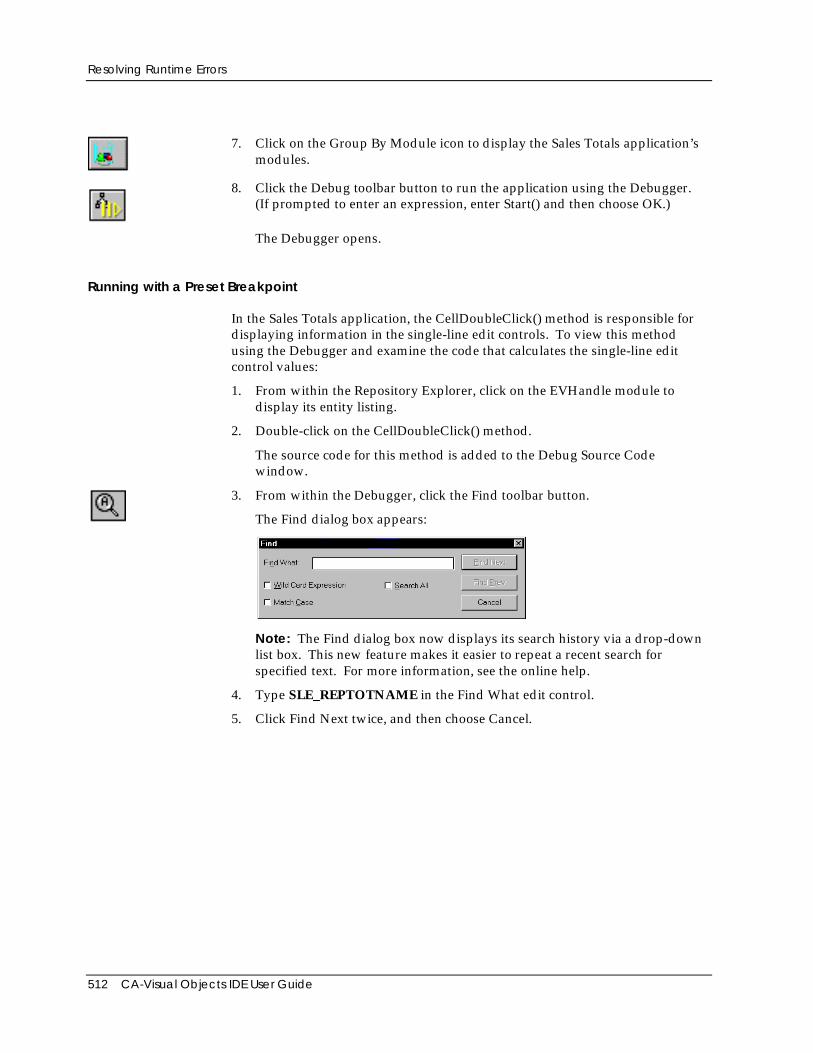
Resolving Runtime Errors
512 CA-Visual Objects IDE User Guide
7. Click on the Group By Module icon to display the Sales Totals application’smodules.
8. Click the Debug toolbar button to run the application using the Debugger.(If prompted to enter an expression, enter Start() and then choose OK.)
The Debugger opens.
Running with a Preset Breakpoint
In the Sales Totals application, the CellDoubleClick() method is responsible fordisplaying information in the single-line edit controls. To view this methodusing the Debugger and examine the code that calculates the single-line editcontrol values:
1. From within the Repository Explorer, click on the EVHandle module todisplay its entity listing.
2. Double-click on the CellDoubleClick() method.
The source code for this method is added to the Debug Source Codewindow.
3. From within the Debugger, click the Find toolbar button.
The Find dialog box appears:
Note: The Find dialog box now displays its search history via a drop-downlist box. This new feature makes it easier to repeat a recent search forspecified text. For more information, see the online help.
4. Type SLE_REPTOTNAME in the Find What edit control.
5. Click Find Next twice, and then choose Cancel.
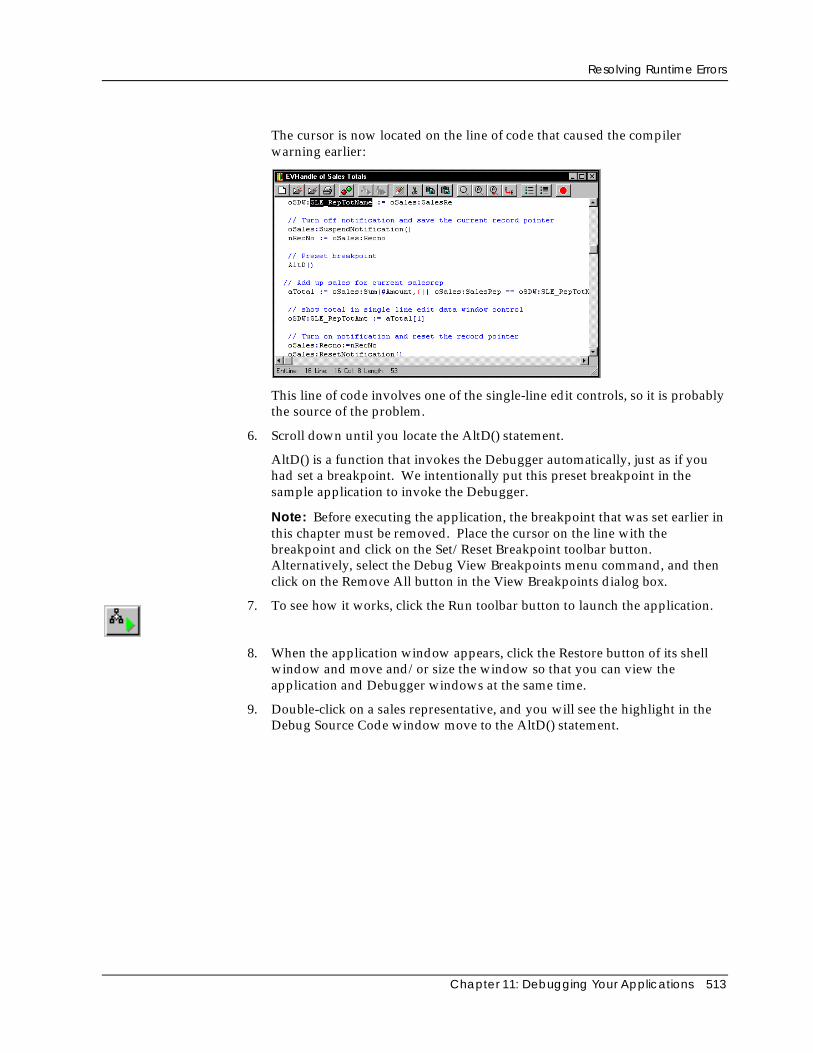
Resolving Runtime Errors
Chapter 11: Debugging Your Applications 513
The cursor is now located on the line of code that caused the compilerwarning earlier:
This line of code involves one of the single-line edit controls, so it is probablythe source of the problem.
6. Scroll down until you locate the AltD() statement.
AltD() is a function that invokes the Debugger automatically, just as if youhad set a breakpoint. We intentionally put this preset breakpoint in thesample application to invoke the Debugger.
Note: Before executing the application, the breakpoint that was set earlier inthis chapter must be removed. Place the cursor on the line with thebreakpoint and click on the Set/Reset Breakpoint toolbar button.Alternatively, select the Debug View Breakpoints menu command, and thenclick on the Remove All button in the View Breakpoints dialog box.
7. To see how it works, click the Run toolbar button to launch the application.
8. When the application window appears, click the Restore button of its shellwindow and move and/or size the window so that you can view theapplication and Debugger windows at the same time.
9. Double-click on a sales representative, and you will see the highlight in theDebug Source Code window move to the AltD() statement.
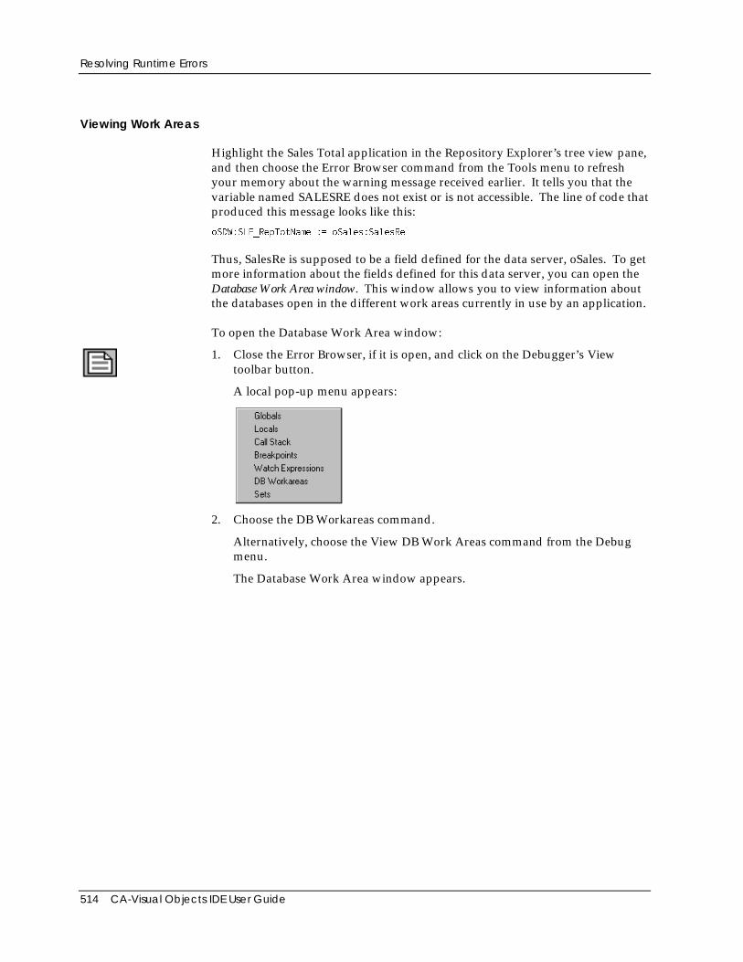
Resolving Runtime Errors
514 CA-Visual Objects IDE User Guide
Viewing Work Areas
Highlight the Sales Total application in the Repository Explorer’s tree view pane,and then choose the Error Browser command from the Tools menu to refreshyour memory about the warning message received earlier. It tells you that thevariable named SALESRE does not exist or is not accessible. The line of code thatproduced this message looks like this:
oSDW:SLE_RepTotName := oSales:SalesRe
Thus, SalesRe is supposed to be a field defined for the data server, oSales. To getmore information about the fields defined for this data server, you can open theDatabase Work Area window. This window allows you to view information aboutthe databases open in the different work areas currently in use by an application.
To open the Database Work Area window:
1. Close the Error Browser, if it is open, and click on the Debugger’s Viewtoolbar button.
A local pop-up menu appears:
2. Choose the DB Workareas command.
Alternatively, choose the View DB Work Areas command from the Debugmenu.
The Database Work Area window appears.
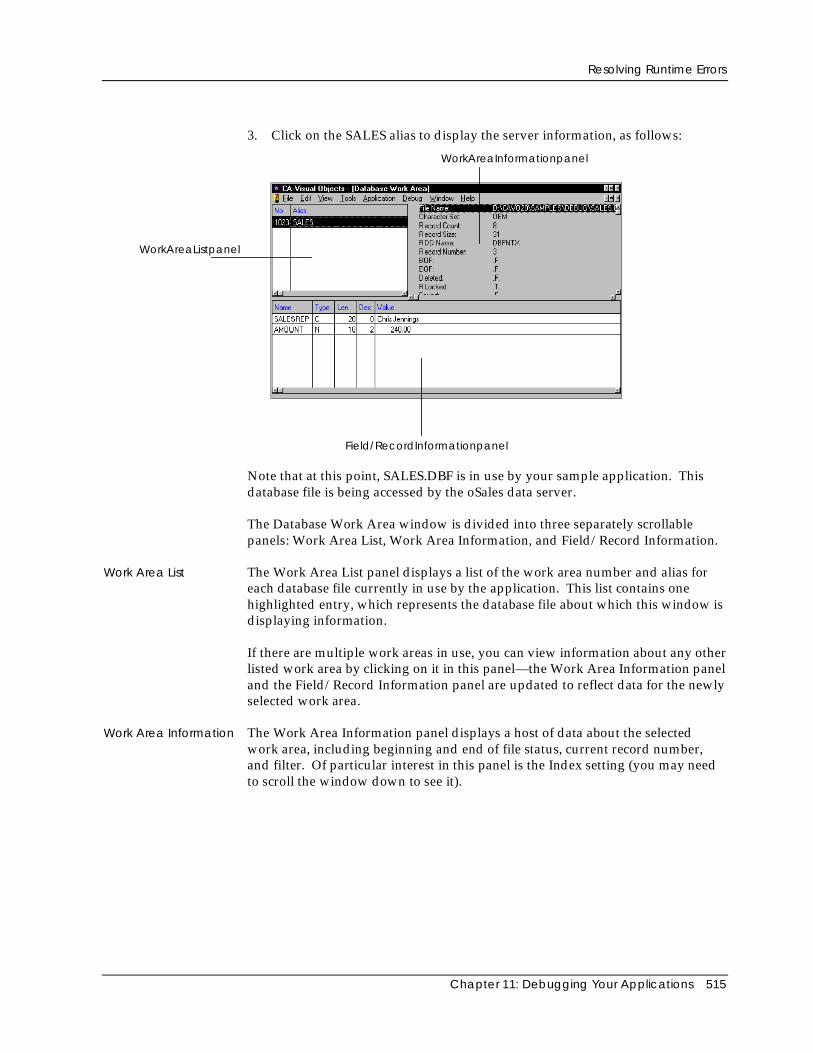
Resolving Runtime Errors
Chapter 11: Debugging Your Applications 515
3. Click on the SALES alias to display the server information, as follows:
WorkAreaListpanel
WorkAreaInformationpanel
Field/RecordInformationpanel
Note that at this point, SALES.DBF is in use by your sample application. Thisdatabase file is being accessed by the oSales data server.
The Database Work Area window is divided into three separately scrollablepanels: Work Area List, Work Area Information, and Field/Record Information.
Work Area List The Work Area List panel displays a list of the work area number and alias foreach database file currently in use by the application. This list contains onehighlighted entry, which represents the database file about which this window isdisplaying information.
If there are multiple work areas in use, you can view information about any otherlisted work area by clicking on it in this panel—the Work Area Information paneland the Field/Record Information panel are updated to reflect data for the newlyselected work area.
Work Area Information The Work Area Information panel displays a host of data about the selectedwork area, including beginning and end of file status, current record number,and filter. Of particular interest in this panel is the Index setting (you may needto scroll the window down to see it).
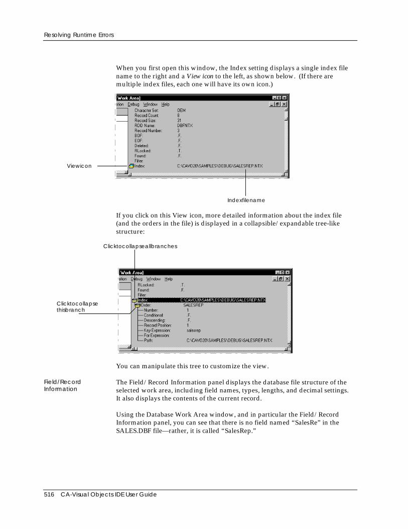
Resolving Runtime Errors
516 CA-Visual Objects IDE User Guide
When you first open this window, the Index setting displays a single index filename to the right and a View icon to the left, as shown below. (If there aremultiple index files, each one will have its own icon.)
Viewicon
Indexfilename
If you click on this View icon, more detailed information about the index file(and the orders in the file) is displayed in a collapsible/expandable tree-likestructure:
Clicktocollapseallbranches
Clicktocollapsethisbranch
You can manipulate this tree to customize the view.
Field/RecordInformation
The Field/Record Information panel displays the database file structure of theselected work area, including field names, types, lengths, and decimal settings.It also displays the contents of the current record.
Using the Database Work Area window, and in particular the Field/RecordInformation panel, you can see that there is no field named “SalesRe” in theSALES.DBF file—rather, it is called “SalesRep.”
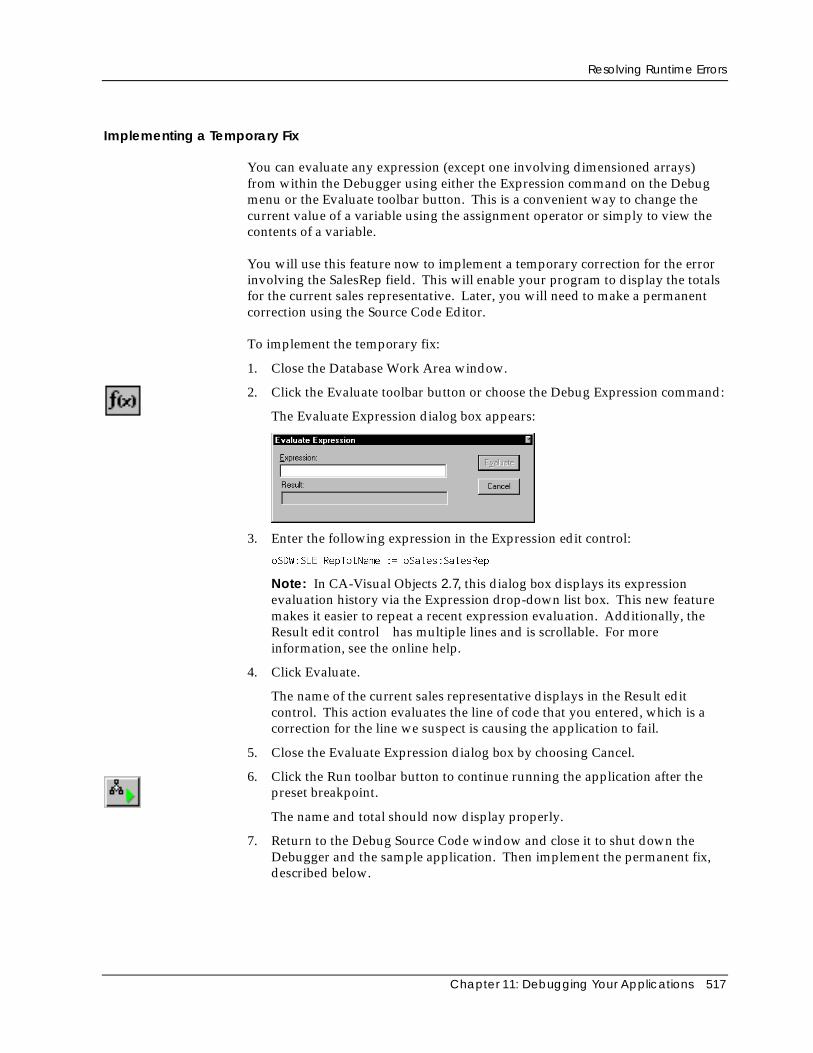
Resolving Runtime Errors
Chapter 11: Debugging Your Applications 517
Implementing a Temporary Fix
You can evaluate any expression (except one involving dimensioned arrays)from within the Debugger using either the Expression command on the Debugmenu or the Evaluate toolbar button. This is a convenient way to change thecurrent value of a variable using the assignment operator or simply to view thecontents of a variable.
You will use this feature now to implement a temporary correction for the errorinvolving the SalesRep field. This will enable your program to display the totalsfor the current sales representative. Later, you will need to make a permanentcorrection using the Source Code Editor.
To implement the temporary fix:
1. Close the Database Work Area window.
2. Click the Evaluate toolbar button or choose the Debug Expression command:
The Evaluate Expression dialog box appears:
3. Enter the following expression in the Expression edit control:
oSDW:SLE_RepTotName := oSales:SalesRep
Note: In CA-Visual Objects 2.7, this dialog box displays its expressionevaluation history via the Expression drop-down list box. This new featuremakes it easier to repeat a recent expression evaluation. Additionally, theResult edit control has multiple lines and is scrollable. For moreinformation, see the online help.
4. Click Evaluate.
The name of the current sales representative displays in the Result editcontrol. This action evaluates the line of code that you entered, which is acorrection for the line we suspect is causing the application to fail.
5. Close the Evaluate Expression dialog box by choosing Cancel.
6. Click the Run toolbar button to continue running the application after thepreset breakpoint.
The name and total should now display properly.
7. Return to the Debug Source Code window and close it to shut down theDebugger and the sample application. Then implement the permanent fix,described below.
Resolving Runtime Errors
518 CA-Visual Objects IDE User Guide
Correcting the Final Error
This is the final error in the sample application, and you can now correct it.
1. If it is not already open, access the entity list for the EVHandle module.
2. Double-click on the CellDoubleClick() method to open the Source CodeEditor.
3. Change the line that reads
oSDW:SLE_RepTotName := oSales:SalesRe
to:
oSDW:SLE_RepTotName := oSales:SalesRep
4. Close the Source Code Editor, saving your changes.
5. Rebuild the application.
This time, the status bar will not show any warnings.
6. Run the application.
Since all errors have been corrected, the application should now work asintended.
Even though there are no more errors, the remaining features of the Debuggerwill be demonstrated using this application, so close it now and run it againusing the Debugger as you have already done several times (that is, click theDebug toolbar button and choose OK if prompted to evaluate the Start()expression).
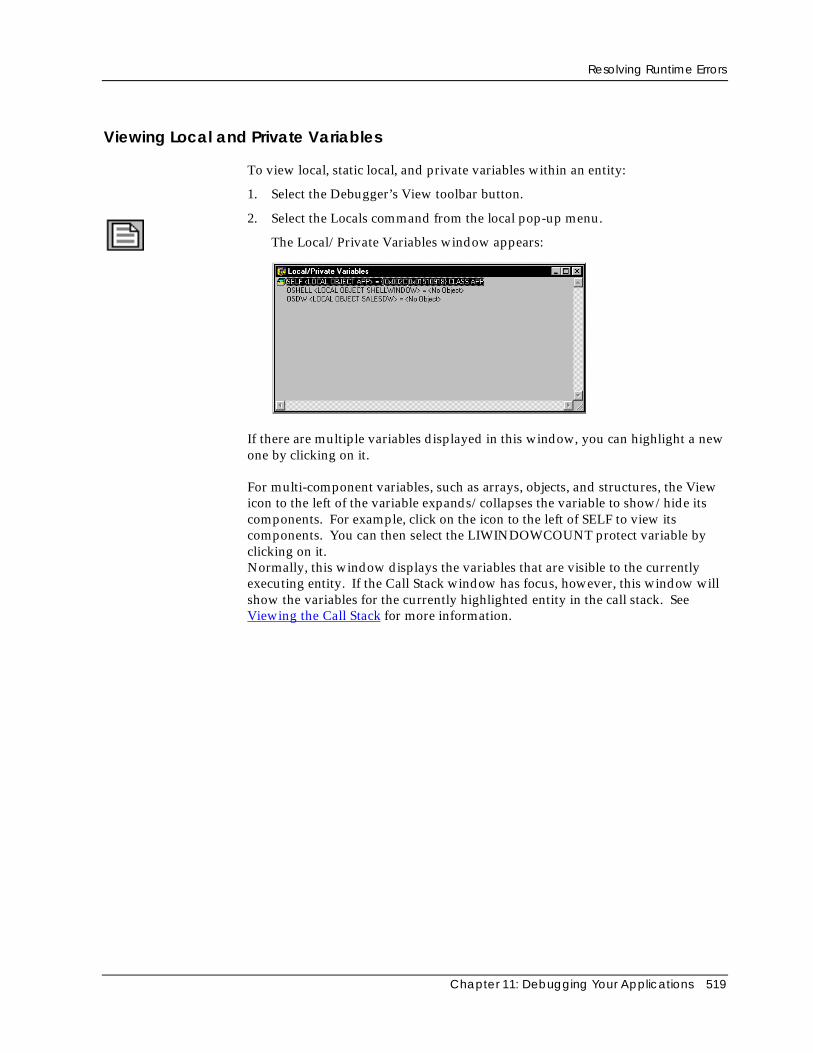
Resolving Runtime Errors
Chapter 11: Debugging Your Applications 519
Viewing Local and Private Variables
To view local, static local, and private variables within an entity:
1. Select the Debugger’s View toolbar button.
2. Select the Locals command from the local pop-up menu.
The Local/Private Variables window appears:
If there are multiple variables displayed in this window, you can highlight a newone by clicking on it.
For multi-component variables, such as arrays, objects, and structures, the Viewicon to the left of the variable expands/collapses the variable to show/hide itscomponents. For example, click on the icon to the left of SELF to view itscomponents. You can then select the LIWINDOWCOUNT protect variable byclicking on it.Normally, this window displays the variables that are visible to the currentlyexecuting entity. If the Call Stack window has focus, however, this window willshow the variables for the currently highlighted entity in the call stack. SeeViewing the Call Stack for more information.
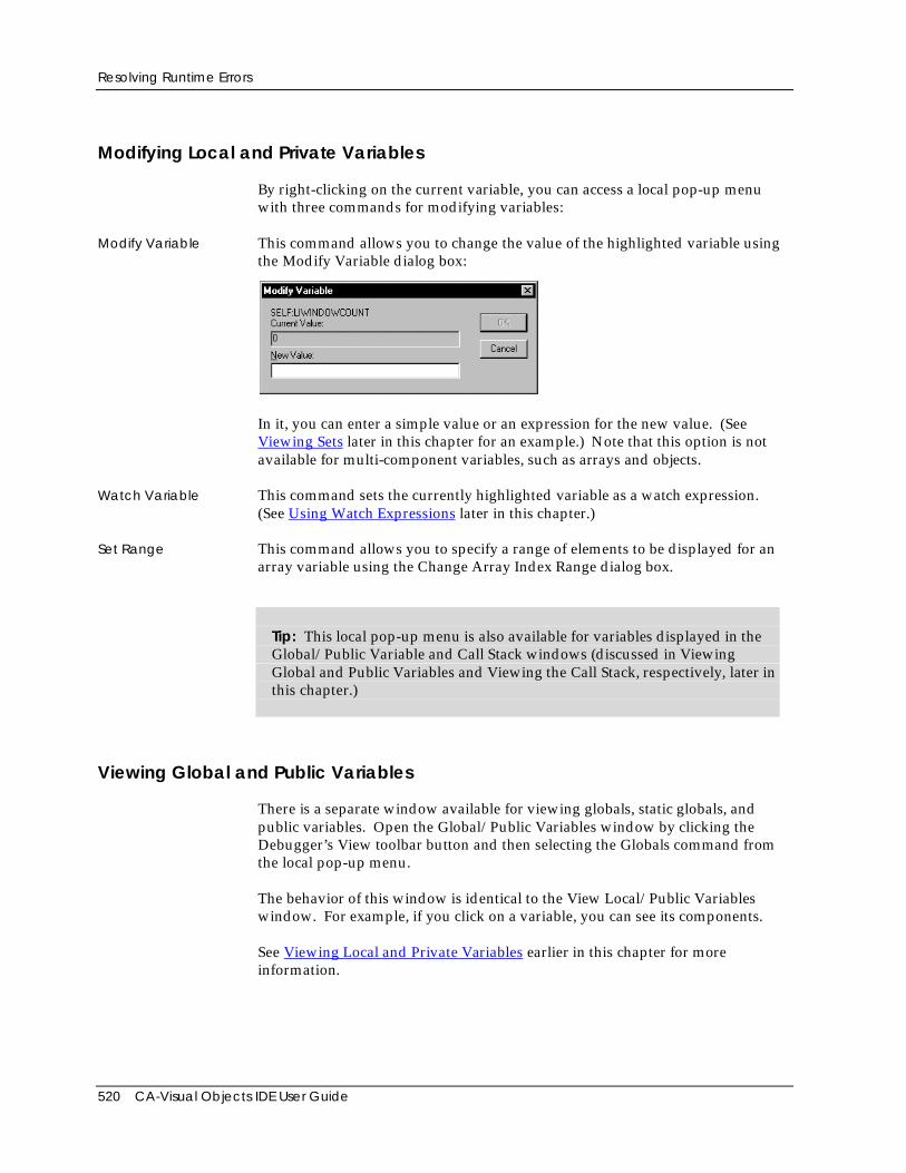
Resolving Runtime Errors
520 CA-Visual Objects IDE User Guide
Modifying Local and Private Variables
By right-clicking on the current variable, you can access a local pop-up menuwith three commands for modifying variables:
Modify Variable This command allows you to change the value of the highlighted variable usingthe Modify Variable dialog box:
In it, you can enter a simple value or an expression for the new value. (SeeViewing Sets later in this chapter for an example.) Note that this option is notavailable for multi-component variables, such as arrays and objects.
Watch Variable This command sets the currently highlighted variable as a watch expression.(See Using Watch Expressions later in this chapter.)
Set Range This command allows you to specify a range of elements to be displayed for anarray variable using the Change Array Index Range dialog box.
Tip: This local pop-up menu is also available for variables displayed in theGlobal/Public Variable and Call Stack windows (discussed in ViewingGlobal and Public Variables and Viewing the Call Stack, respectively, later inthis chapter.)
Viewing Global and Public Variables
There is a separate window available for viewing globals, static globals, andpublic variables. Open the Global/Public Variables window by clicking theDebugger’s View toolbar button and then selecting the Globals command fromthe local pop-up menu.
The behavior of this window is identical to the View Local/Public Variableswindow. For example, if you click on a variable, you can see its components.
See Viewing Local and Private Variables earlier in this chapter for moreinformation.
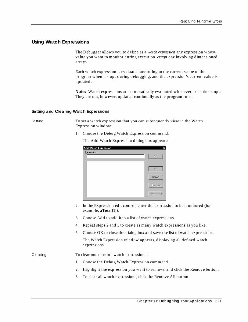
Resolving Runtime Errors
Chapter 11: Debugging Your Applications 521
Using Watch Expressions
The Debugger allows you to define as a watch expression any expression whosevalue you want to monitor during execution except one involving dimensionedarrays.
Each watch expression is evaluated according to the current scope of theprogram when it stops during debugging, and the expression’s current value isupdated.
Note: Watch expressions are automatically evaluated whenever execution stops.They are not, however, updated continually as the program runs.
Setting and Clearing Watch Expressions
Setting To set a watch expression that you can subsequently view in the WatchExpression window:
1. Choose the Debug Watch Expression command.
The Add Watch Expression dialog box appears:
2. In the Expression edit control, enter the expression to be monitored (forexample, aTotal[1]).
3. Choose Add to add it to a list of watch expressions.
4. Repeat steps 2 and 3 to create as many watch expressions as you like.
5. Choose OK to close the dialog box and save the list of watch expressions.
The Watch Expression window appears, displaying all defined watchexpressions.
Clearing To clear one or more watch expressions:
1. Choose the Debug Watch Expression command.
2. Highlight the expression you want to remove, and click the Remove button.
3. To clear all watch expressions, click the Remove All button.
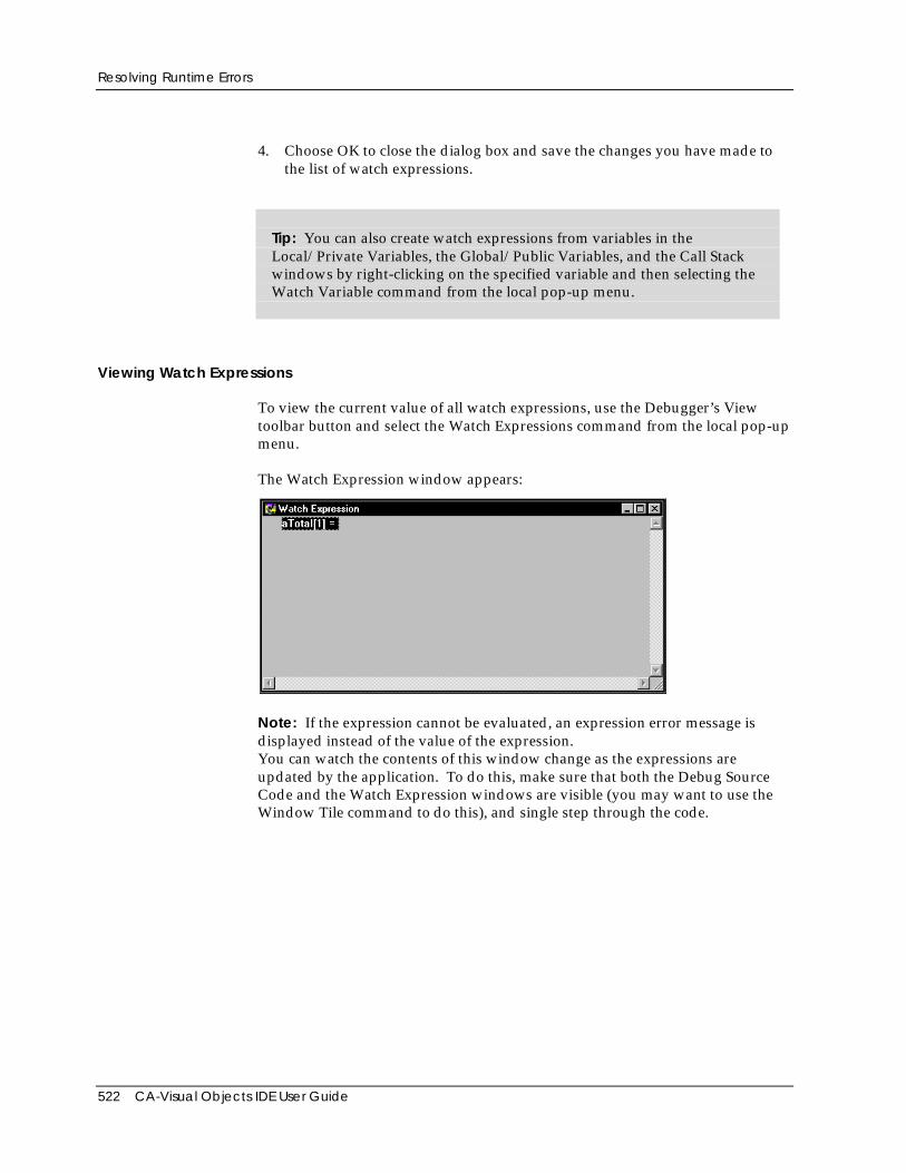
Resolving Runtime Errors
522 CA-Visual Objects IDE User Guide
4. Choose OK to close the dialog box and save the changes you have made tothe list of watch expressions.
Tip: You can also create watch expressions from variables in theLocal/Private Variables, the Global/Public Variables, and the Call Stackwindows by right-clicking on the specified variable and then selecting theWatch Variable command from the local pop-up menu.
Viewing Watch Expressions
To view the current value of all watch expressions, use the Debugger’s Viewtoolbar button and select the Watch Expressions command from the local pop-upmenu.
The Watch Expression window appears:
Note: If the expression cannot be evaluated, an expression error message isdisplayed instead of the value of the expression.You can watch the contents of this window change as the expressions areupdated by the application. To do this, make sure that both the Debug SourceCode and the Watch Expression windows are visible (you may want to use theWindow Tile command to do this), and single step through the code.
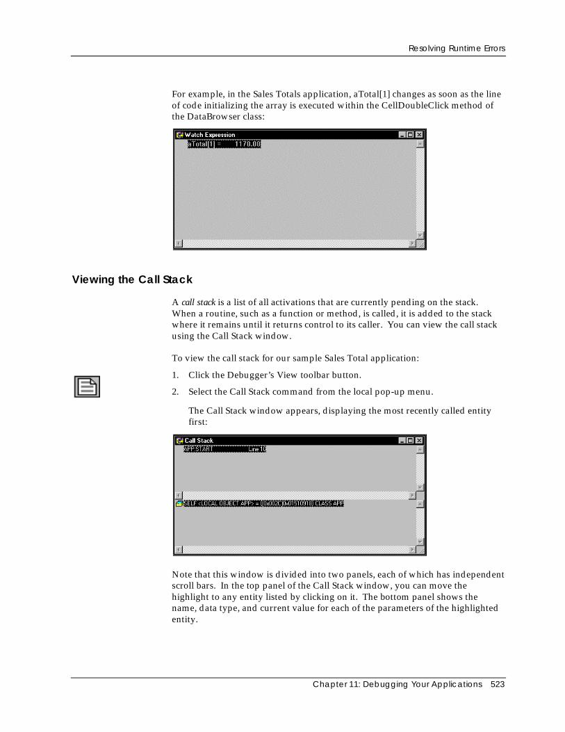
Resolving Runtime Errors
Chapter 11: Debugging Your Applications 523
For example, in the Sales Totals application, aTotal[1] changes as soon as the lineof code initializing the array is executed within the CellDoubleClick method ofthe DataBrowser class:
Viewing the Call Stack
A call stack is a list of all activations that are currently pending on the stack.When a routine, such as a function or method, is called, it is added to the stackwhere it remains until it returns control to its caller. You can view the call stackusing the Call Stack window.
To view the call stack for our sample Sales Total application:
1. Click the Debugger’s View toolbar button.
2. Select the Call Stack command from the local pop-up menu.
The Call Stack window appears, displaying the most recently called entityfirst:
Note that this window is divided into two panels, each of which has independentscroll bars. In the top panel of the Call Stack window, you can move thehighlight to any entity listed by clicking on it. The bottom panel shows thename, data type, and current value for each of the parameters of the highlightedentity.
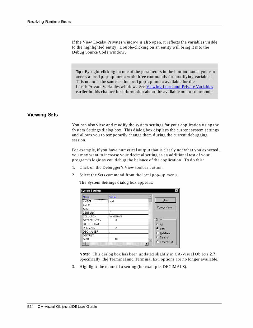
Resolving Runtime Errors
524 CA-Visual Objects IDE User Guide
If the View Locals/Privates window is also open, it reflects the variables visibleto the highlighted entity. Double-clicking on an entity will bring it into theDebug Source Code window.
Tip: By right-clicking on one of the parameters in the bottom panel, you canaccess a local pop-up menu with three commands for modifying variables.This menu is the same as the local pop-up menu available for theLocal/Private Variables window. See Viewing Local and Private Variablesearlier in this chapter for information about the available menu commands.
Viewing Sets
You can also view and modify the system settings for your application using theSystem Settings dialog box. This dialog box displays the current system settingsand allows you to temporarily change them during the current debuggingsession.
For example, if you have numerical output that is clearly not what you expected,you may want to increase your decimal setting as an additional test of yourprogram’s logic as you debug the balance of the application. To do this:
1. Click on the Debugger’s View toolbar button.
2. Select the Sets command from the local pop-up menu.
The System Settings dialog box appears:
Note: This dialog box has been updated slightly in CA-Visual Objects 2.7.Specifically, the Terminal and Terminal Ext. options are no longer available.
3. Highlight the name of a setting (for example, DECIMALS).
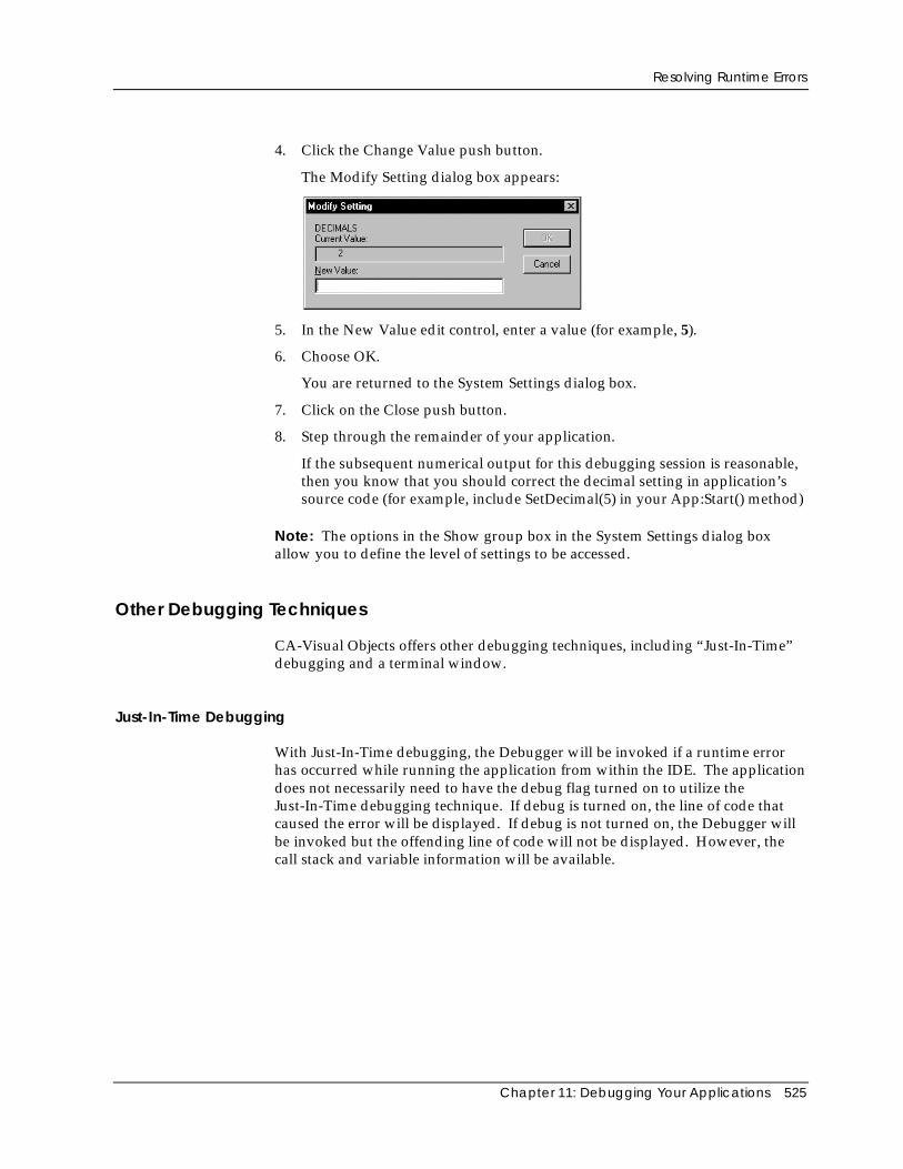
Resolving Runtime Errors
Chapter 11: Debugging Your Applications 525
4. Click the Change Value push button.
The Modify Setting dialog box appears:
5. In the New Value edit control, enter a value (for example, 5).
6. Choose OK.
You are returned to the System Settings dialog box.
7. Click on the Close push button.
8. Step through the remainder of your application.
If the subsequent numerical output for this debugging session is reasonable,then you know that you should correct the decimal setting in application’ssource code (for example, include SetDecimal(5) in your App:Start() method)
Note: The options in the Show group box in the System Settings dialog boxallow you to define the level of settings to be accessed.
Other Debugging Techniques
CA-Visual Objects offers other debugging techniques, including “Just-In-Time”debugging and a terminal window.
Just-In-Time Debugging
With Just-In-Time debugging, the Debugger will be invoked if a runtime errorhas occurred while running the application from within the IDE. The applicationdoes not necessarily need to have the debug flag turned on to utilize theJust-In-Time debugging technique. If debug is turned on, the line of code thatcaused the error will be displayed. If debug is not turned on, the Debugger willbe invoked but the offending line of code will not be displayed. However, thecall stack and variable information will be available.
Resolving Runtime Errors
526 CA-Visual Objects IDE User Guide
Terminal Window
CA-Visual Objects provides a terminal window that can be used for logging orverification of data. By including the Terminal Lite library in an application’sproperties, a terminal window will be displayed at runtime. The following aresome of the functions and commands supported in the terminal window:
? SetAlternate()
?? SetPrinter()
INKEY() SetConsole()
WAIT SetColor()
Chapter 12: Importing and Exporting Applications 527
Chapter
12Importing and ExportingApplications
This chapter describes how to import and export applications, modules, andseveral types of source files relating to an application and its components. Youcan import and export the following types of files:
■ Application export files
■ Module files
■ Text-based source files
Tip: CA-Visual Objects also allows you to import and export database andindex files. For information about working with these files, see Chapter 7:Defining Data Servers and Field Specifications earlier in this guide.
Note: CA-Visual Objects 2.7 has a new reference feature, the Recent ImportsList, which allows you to view all applications (.AEF files) that have beenimported recently. To access the Recent Imports List, choose the Recent Importscommand from the File menu.
Exporting Applications and ModulesYou can export any application or module so that it is comprised in its entiretyin a single .AEF or .MEF file, respectively. This feature might be used to copyan application or module to disk so that it can be copied onto another PC.You can also export all the applications you have created in all your projectswith a single command. This allows you to easily create backups of yourrepository.
The information denoting an application’s type—application, library, orDLL—and any related information is preserved when the application isexported as an .AEF file. If there are any associated external source code or.DLL files, the code in those external source files, as well as informationregarding the locations of the .DLL files on disk, is also included in the exportfile.
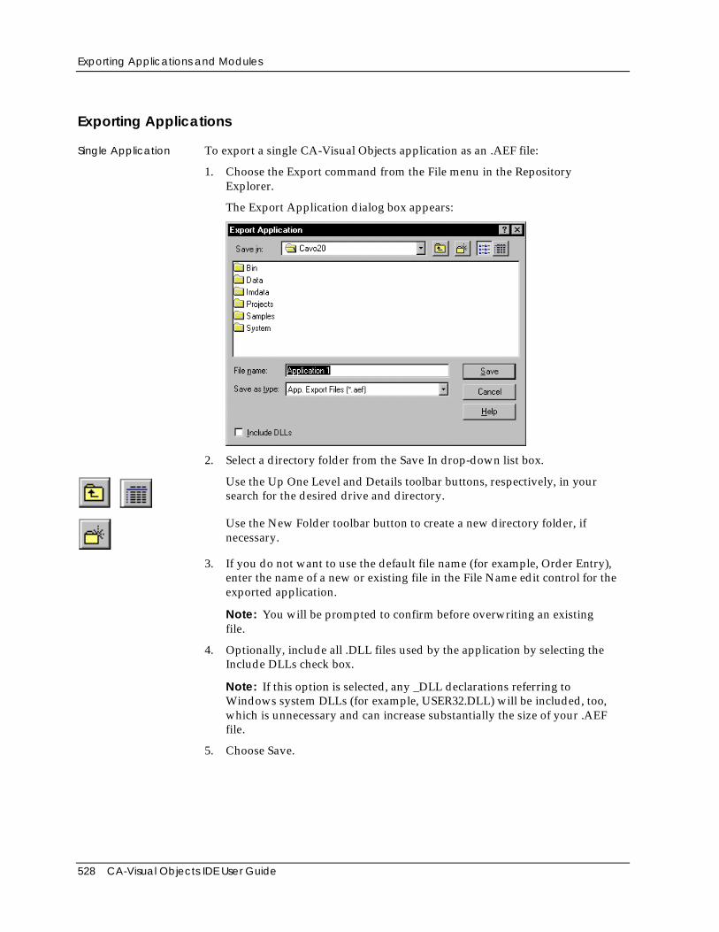
Exporting Applications and Modules
528 CA-Visual Objects IDE User Guide
Exporting Applications
Single Application To export a single CA-Visual Objects application as an .AEF file:
1. Choose the Export command from the File menu in the RepositoryExplorer.
The Export Application dialog box appears:
2. Select a directory folder from the Save In drop-down list box.
Use the Up One Level and Details toolbar buttons, respectively, in yoursearch for the desired drive and directory.
Use the New Folder toolbar button to create a new directory folder, ifnecessary.
3. If you do not want to use the default file name (for example, Order Entry),enter the name of a new or existing file in the File Name edit control for theexported application.
Note: You will be prompted to confirm before overwriting an existingfile.
4. Optionally, include all .DLL files used by the application by selecting theInclude DLLs check box.
Note: If this option is selected, any _DLL declarations referring toWindows system DLLs (for example, USER32.DLL) will be included, too,which is unnecessary and can increase substantially the size of your .AEFfile.
5. Choose Save.
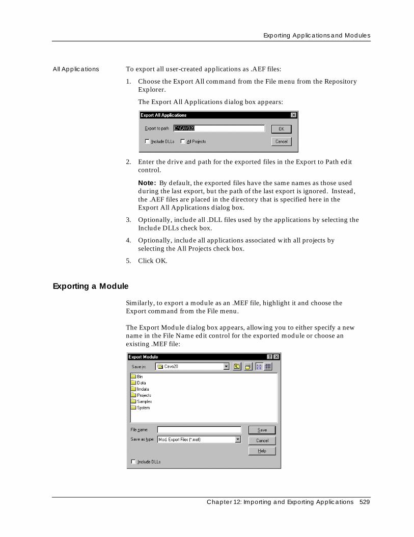
Exporting Applications and Modules
Chapter 12: Importing and Exporting Applications 529
All Applications To export all user-created applications as .AEF files:
1. Choose the Export All command from the File menu from the RepositoryExplorer.
The Export All Applications dialog box appears:
2. Enter the drive and path for the exported files in the Export to Path editcontrol.
Note: By default, the exported files have the same names as those usedduring the last export, but the path of the last export is ignored. Instead,the .AEF files are placed in the directory that is specified here in theExport All Applications dialog box.
3. Optionally, include all .DLL files used by the applications by selecting theInclude DLLs check box.
4. Optionally, include all applications associated with all projects byselecting the All Projects check box.
5. Click OK.
Exporting a Module
Similarly, to export a module as an .MEF file, highlight it and choose theExport command from the File menu.
The Export Module dialog box appears, allowing you to either specify a newname in the File Name edit control for the exported module or choose anexisting .MEF file:
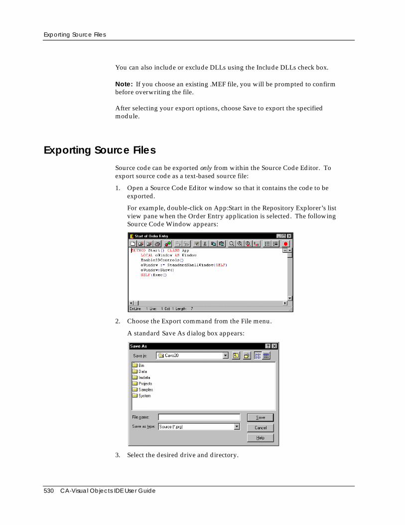
Exporting Source Files
530 CA-Visual Objects IDE User Guide
You can also include or exclude DLLs using the Include DLLs check box.
Note: If you choose an existing .MEF file, you will be prompted to confirmbefore overwriting the file.
After selecting your export options, choose Save to export the specifiedmodule.
Exporting Source FilesSource code can be exported only from within the Source Code Editor. Toexport source code as a text-based source file:
1. Open a Source Code Editor window so that it contains the code to beexported.
For example, double-click on App:Start in the Repository Explorer’s listview pane when the Order Entry application is selected. The followingSource Code Window appears:
2. Choose the Export command from the File menu.
A standard Save As dialog box appears:
3. Select the desired drive and directory.
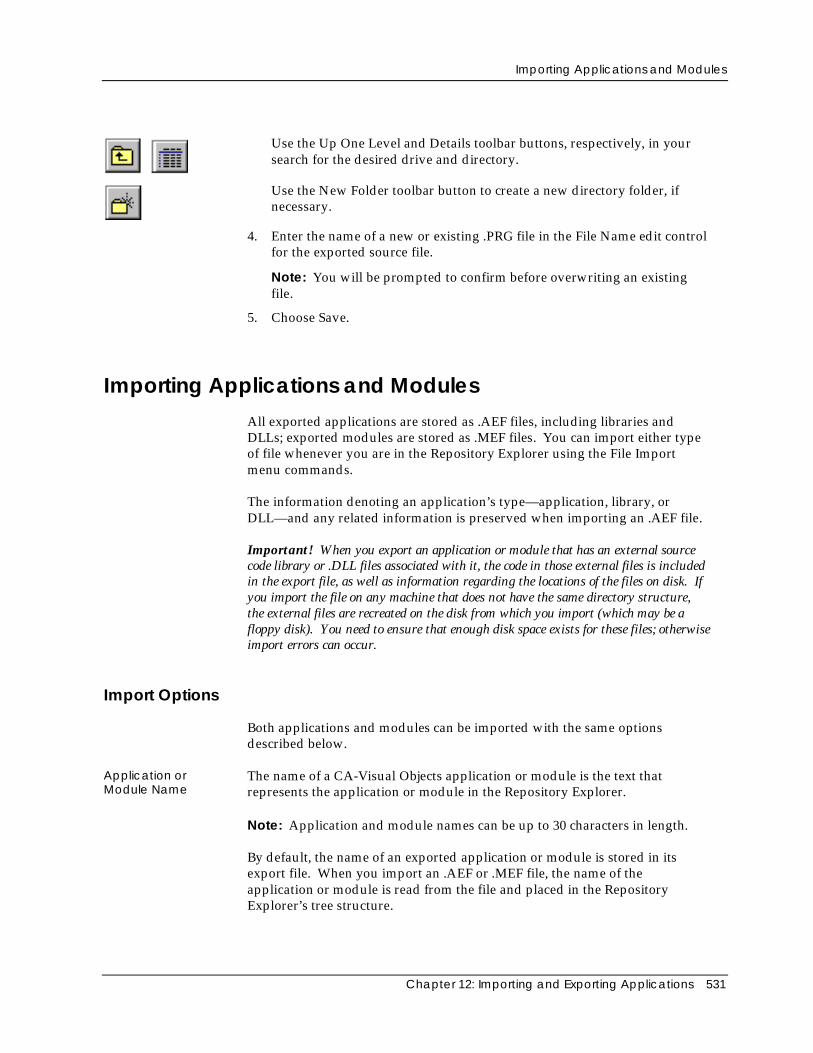
Importing Applications and Modules
Chapter 12: Importing and Exporting Applications 531
Use the Up One Level and Details toolbar buttons, respectively, in yoursearch for the desired drive and directory.
Use the New Folder toolbar button to create a new directory folder, ifnecessary.
4. Enter the name of a new or existing .PRG file in the File Name edit controlfor the exported source file.
Note: You will be prompted to confirm before overwriting an existingfile.
5. Choose Save.
Importing Applications and ModulesAll exported applications are stored as .AEF files, including libraries andDLLs; exported modules are stored as .MEF files. You can import either typeof file whenever you are in the Repository Explorer using the File Importmenu commands.
The information denoting an application’s type—application, library, orDLL—and any related information is preserved when importing an .AEF file.
Important! When you export an application or module that has an external sourcecode library or .DLL files associated with it, the code in those external files is includedin the export file, as well as information regarding the locations of the files on disk. Ifyou import the file on any machine that does not have the same directory structure,the external files are recreated on the disk from which you import (which may be afloppy disk). You need to ensure that enough disk space exists for these files; otherwiseimport errors can occur.
Import Options
Both applications and modules can be imported with the same optionsdescribed below.
Application orModule Name
The name of a CA-Visual Objects application or module is the text thatrepresents the application or module in the Repository Explorer.
Note: Application and module names can be up to 30 characters in length.
By default, the name of an exported application or module is stored in itsexport file. When you import an .AEF or .MEF file, the name of theapplication or module is read from the file and placed in the RepositoryExplorer’s tree structure.
Importing Applications and Modules
532 CA-Visual Objects IDE User Guide
If you wish, when importing the .AEF or .MEF file, you can optionally specifyeither a new name or the name of an existing application or module.
Specifying a new name allows you to change the name of the application ormodule to something other than the name stored in the imported file. This isuseful either for simply renaming the application or module, or to avoiddeleting, or overwriting, an existing application or module that has the samename as the one in the imported file.
Conversely, giving an export file the same name as an existing application ormodule would allow you to quickly replace that existing application ormodule with the newly imported version. For example, if someone gives youan updated version of a module that you already have on your system, youcan quickly replace the out-of-date version using this technique.
Note: When importing multiple applications, Application Name is ignored.
Open as Read-Only If selected, the imported application/module cannot be changed. Note that anyfurther export operation will preserve this flag.
Overwrite Protection If you want to safeguard against deleting existing applications or moduleswhen importing, CA-Visual Objects provides a Delete Old Application optionthat can be turned off to prevent overwriting any existing, same-namedapplication or module. If you choose not to delete the old application, youwill be prompted to make a decision if there is a conflict during the importprocess.
Building the NewApplication orModule
When importing an application or module, you can specify whether toimmediately build the imported file as soon as it is imported. If not, theimported application or module is not compiled until you explicitly build it.
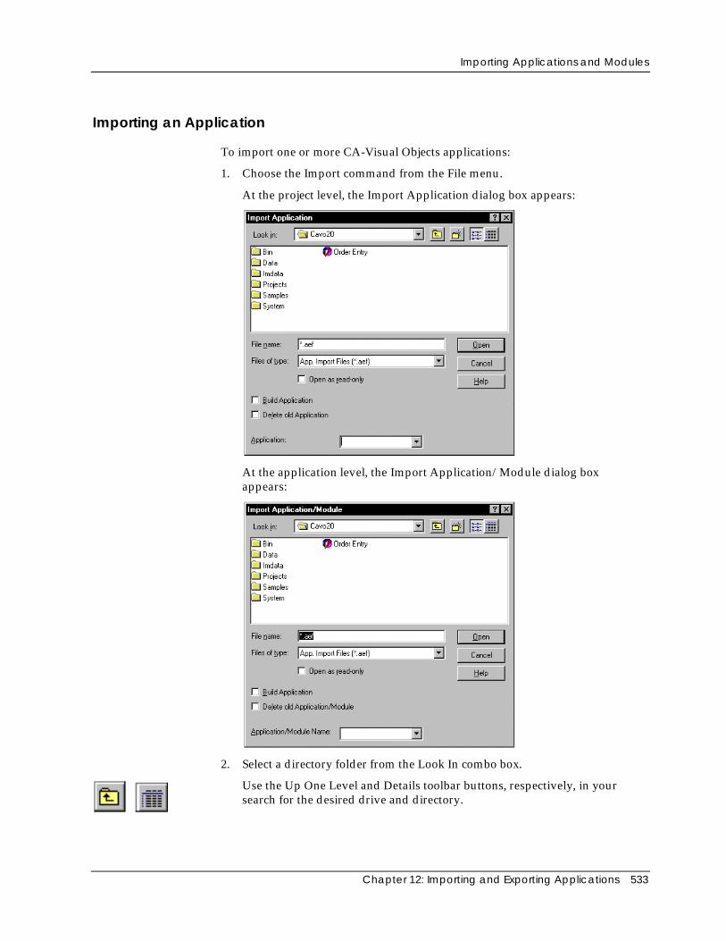
Importing Applications and Modules
Chapter 12: Importing and Exporting Applications 533
Importing an Application
To import one or more CA-Visual Objects applications:
1. Choose the Import command from the File menu.
At the project level, the Import Application dialog box appears:
At the application level, the Import Application/Module dialog boxappears:
2. Select a directory folder from the Look In combo box.
Use the Up One Level and Details toolbar buttons, respectively, in yoursearch for the desired drive and directory.
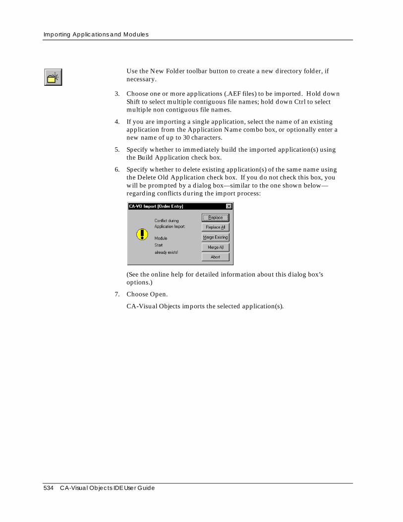
Importing Applications and Modules
534 CA-Visual Objects IDE User Guide
Use the New Folder toolbar button to create a new directory folder, ifnecessary.
3. Choose one or more applications (.AEF files) to be imported. Hold downShift to select multiple contiguous file names; hold down Ctrl to selectmultiple non contiguous file names.
4. If you are importing a single application, select the name of an existingapplication from the Application Name combo box, or optionally enter anew name of up to 30 characters.
5. Specify whether to immediately build the imported application(s) usingthe Build Application check box.
6. Specify whether to delete existing application(s) of the same name usingthe Delete Old Application check box. If you do not check this box, youwill be prompted by a dialog box—similar to the one shown below—regarding conflicts during the import process:
(See the online help for detailed information about this dialog box’soptions.)
7. Choose Open.
CA-Visual Objects imports the selected application(s).
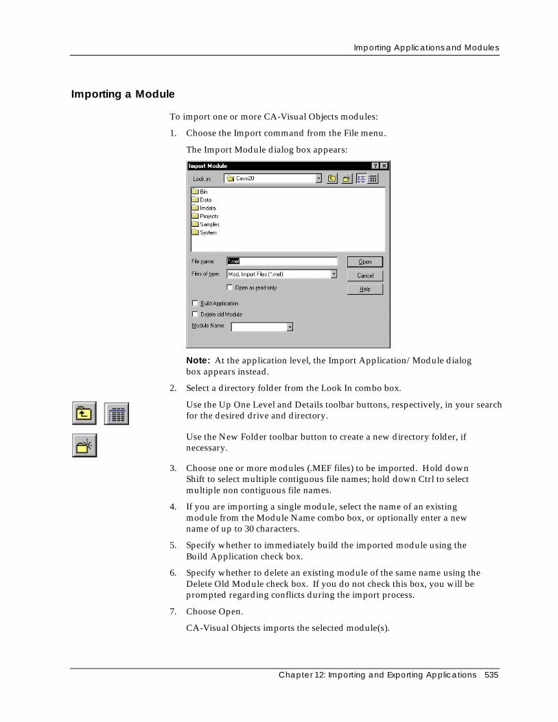
Importing Applications and Modules
Chapter 12: Importing and Exporting Applications 535
Importing a Module
To import one or more CA-Visual Objects modules:
1. Choose the Import command from the File menu.
The Import Module dialog box appears:
Note: At the application level, the Import Application/Module dialogbox appears instead.
2. Select a directory folder from the Look In combo box.
Use the Up One Level and Details toolbar buttons, respectively, in your searchfor the desired drive and directory.
Use the New Folder toolbar button to create a new directory folder, ifnecessary.
3. Choose one or more modules (.MEF files) to be imported. Hold downShift to select multiple contiguous file names; hold down Ctrl to selectmultiple non contiguous file names.
4. If you are importing a single module, select the name of an existingmodule from the Module Name combo box, or optionally enter a newname of up to 30 characters.
5. Specify whether to immediately build the imported module using theBuild Application check box.
6. Specify whether to delete an existing module of the same name using theDelete Old Module check box. If you do not check this box, you will beprompted regarding conflicts during the import process.
7. Choose Open.
CA-Visual Objects imports the selected module(s).
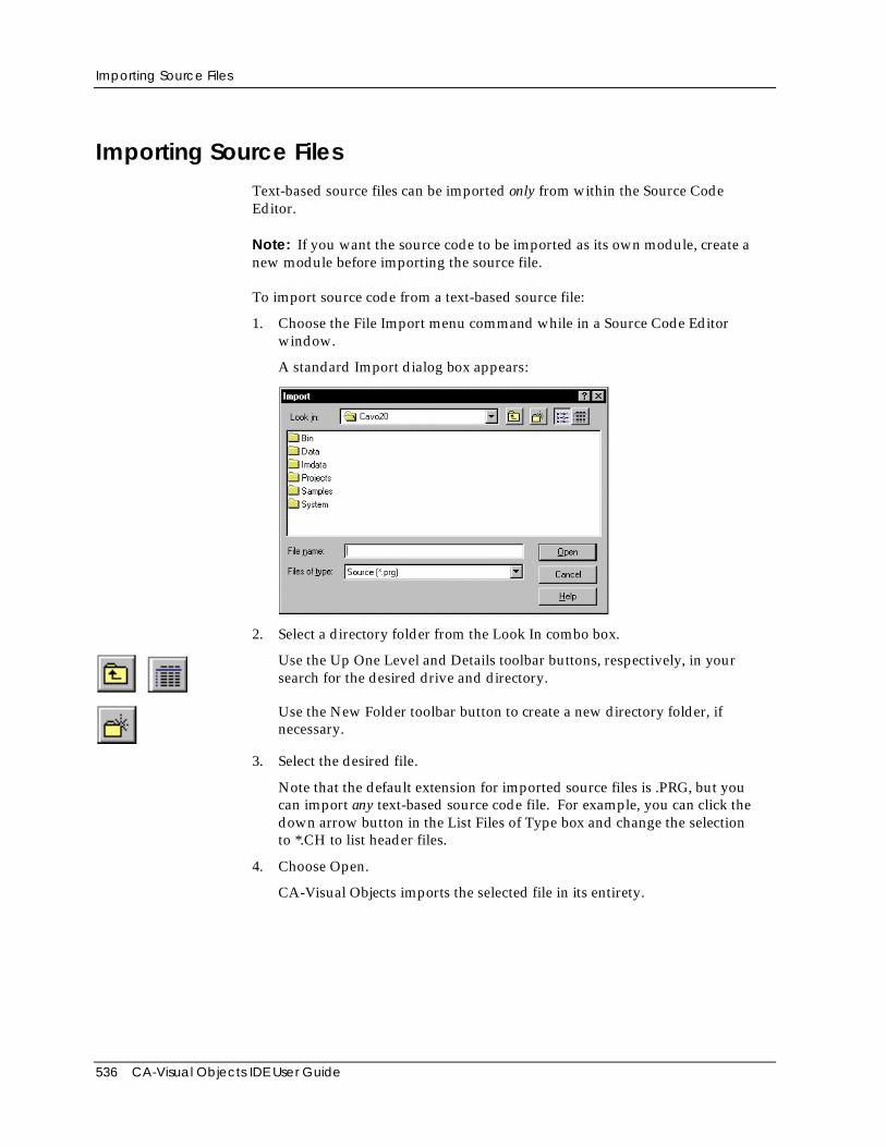
Importing Source Files
536 CA-Visual Objects IDE User Guide
Importing Source FilesText-based source files can be imported only from within the Source CodeEditor.
Note: If you want the source code to be imported as its own module, create anew module before importing the source file.
To import source code from a text-based source file:
1. Choose the File Import menu command while in a Source Code Editorwindow.
A standard Import dialog box appears:
2. Select a directory folder from the Look In combo box.
Use the Up One Level and Details toolbar buttons, respectively, in yoursearch for the desired drive and directory.
Use the New Folder toolbar button to create a new directory folder, ifnecessary.
3. Select the desired file.
Note that the default extension for imported source files is .PRG, but youcan import any text-based source code file. For example, you can click thedown arrow button in the List Files of Type box and change the selectionto *.CH to list header files.
4. Choose Open.
CA-Visual Objects imports the selected file in its entirety.
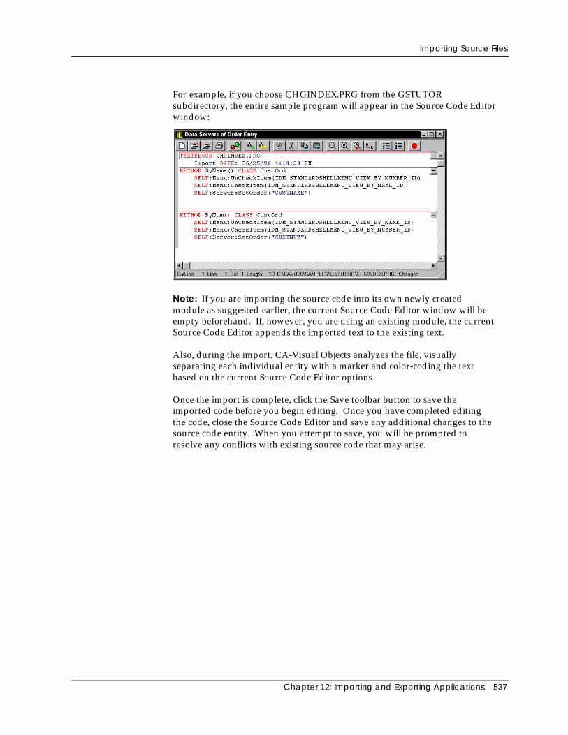
Importing Source Files
Chapter 12: Importing and Exporting Applications 537
For example, if you choose CHGINDEX.PRG from the GSTUTORsubdirectory, the entire sample program will appear in the Source Code Editorwindow:
Note: If you are importing the source code into its own newly createdmodule as suggested earlier, the current Source Code Editor window will beempty beforehand. If, however, you are using an existing module, the currentSource Code Editor appends the imported text to the existing text.
Also, during the import, CA-Visual Objects analyzes the file, visuallyseparating each individual entity with a marker and color-coding the textbased on the current Source Code Editor options.
Once the import is complete, click the Save toolbar button to save theimported code before you begin editing. Once you have completed editingthe code, close the Source Code Editor and save any additional changes to thesource code entity. When you attempt to save, you will be prompted toresolve any conflicts with existing source code that may arise.
Exchanging Projects
538 CA-Visual Objects IDE User Guide
Exchanging ProjectsIn CA-Visual Objects, you can create and use multiple repositories which arerepresented by projects. As mentioned earlier in this guide, all of the projectsthat are available to you are managed through a project catalog.
Adding Projects toa Catalog
A project can belong to only one catalog at a time. When you create a newproject, it is added automatically to your catalog. You can also add a newproject as long as it does not belong to another user’s catalog. To do so, usethe File menu commands, New Project and Add Project, to create or addprojects to the Repository Explorer, respectively.
Removing aProject from aCatalog
If you wish, however, to exchange your work with other members of adevelopment team, you can remove the project from your catalog. Note thatthis action does not delete the project; the Delete from Catalog command,accessible from a local pop-up menu, removes the project from theRepository Explorer, but keeps the directory and contents of the repositoryintact. This action simply allows another developer to add the existingproject to his or her own catalog.
Important! Projects cannot be moved between different versions of CA-VisualObjects.
Deleting a Project Of course, you can delete a project in its entirety, using the Delete commandfrom the same local pop-up menu. This will delete the repository directoryand remove the project from the Repository Explorer.
For more detailed information about the New Project, Add Project, Delete fromCatalog, and Delete menu commands, see the Managing Projects section in“Using the Repository Explorer.”
Appendix A: File Types 539
Appendix
A File Types
The following table contains a list of the various file types you will work with inthe IDE and CA-Visual Objects applications:
File Type Description
.AEF Exported application
.APP Internal repository file
.ASP Active Server Page file
.BMP Bitmap and ribbon files
.CDX FoxPro index file
.CH Xbase include file
.CUR Cursor file
.DBF Xbase database file
.DBG Temporary executable file for debugging
.DBT Xbase memo file
.DFL Xbase OLE file
.DLL Dynamic link library file
.EXE Executable program
.HTM HTML source file
.ICO Icon file
.IND Internal repository file
.INF Information file
Exchanging Projects
540 CA-Visual Objects IDE User Guide
File Type Description
.ISC Installation script file
.MAP Linker map file
.MDF Master document file
.MDX dBASE IV index file
.MEF Exported module
.NTX Index file
.OCX ActiveX control
.PRG CA-Clipper source code
.REG Registry import file
.RET CA-Report Writer reports
.SCC Project subdirectory for source code control
.TPL Template file for source generation
.UDC User-defined command file
.VO Internal repository file
.VOM Internal map file
Note: CA-Visual Objects also supports various SQL database file types, whosefile extensions depend on the corresponding ODBC driver.
Appendix B: CA-Visual Objects Registry Entries 541
Appendix
B CA-Visual Objects Registry Entries
This appendix is for reference purposes only, providing an overview ofimportant entries that CA-Visual Objects places in the System Registry. Theseentries control environmental settings and compiler settings, as well as thedirectories where important data files are stored.
Note: Any settings not documented here are not relevant for regular operation,and consequently must not be touched! Moreover, changing registry settingsdirectly using the RegEdit program is not recommended, as deleting ormodifying registry entries might cause some programs to stop working.
The Multi-Tiered RegistryThe registry is organized as a hierarchical tree structure in the following ways:
■ On the top level, there are six system-defined root keys. The important keyto look at for the active CA-Visual Objects 2.7 settings isHKEY_CURRENT_USER.
■ Each key can have any number of subkeys. The CA-Visual Objects 2.7entries are found underHKEY_CURRENT_USER\Software\ComputerAssociates\CA-Visual Objects 2.7.
The entries are grouped into different collections. The actual entries arevalues of subkeys inHKEY_CURRENT_USER\Software\ComputerAssociates\CA-Visual Objects 2.7. Generally, a key can have any number of values aswell as any number of subkeys.
■ Each value consists of a name and an actual data value (e.g.,ExecutablePath="C:\CAVO27\BIN").
Note: For more detailed information about the registry in CA-Visual Objects 2.7,see the “Operating Environment” chapter in the Programmer’s Guide.
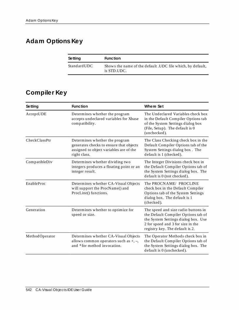
Adam Options Key
542 CA-Visual Objects IDE User Guide
Adam Options Key
Setting Function
StandardUDC Shows the name of the default .UDC file which, by default,is STD.UDC.
Compiler Key
Setting Function Where Set
AcceptUDE Determines whether the programaccepts undeclared variables for Xbasecompatibility.
The Undeclared Variables check boxin the Default Compiler Options tabof the System Settings dialog box(File, Setup). The default is 0(unchecked).
CheckClassPtr Determines whether the programgenerates checks to ensure that objectsassigned to object variables are of theright class.
The Class Checking check box in theDefault Compiler Options tab of theSystem Settings dialog box . Thedefault is 1 (checked).
CompatibleDiv Determines whether dividing twointegers produces a floating point or aninteger result.
The Integer Divisions check box inthe Default Compiler Options tab ofthe System Settings dialog box. Thedefault is 0 (not checked).
EnableProc Determines whether CA-Visual Objectswill support the ProcName() andProcLine() functions.
The PROCNAME/ PROCLINEcheck box in the Default CompilerOptions tab of the System Settingsdialog box. The default is 1(checked).
Generation Determines whether to optimize forspeed or size.
The speed and size radio buttons inthe Default Compiler Options tab ofthe System Settings dialog box. Use2 for speed and 3 for size in theregistry key. The default is 2.
MethodOperator Determines whether CA-Visual Objectsallows common operators such as +, –,and * for method invocation.
The Operator Methods check box inthe Default Compiler Options tab ofthe System Settings dialog box. Thedefault is 0 (unchecked).
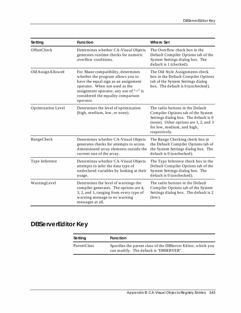
DBServerEditor Key
Appendix B: CA-Visual Objects Registry Entries 543
Setting Function Where Set
OffsetCheck Determines whether CA-Visual Objectsgenerates runtime checks for numericoverflow conditions.
The Overflow check box in theDefault Compiler Options tab of theSystem Settings dialog box. Thedefault is 1 (checked).
OldAssignAllowed For Xbase compatibility, determineswhether the program allows you tohave the equal sign as an assignmentoperator. When not used as theassignment operator, any use of “=” isconsidered the equality comparisonoperator.
The Old Style Assignments checkbox in the Default Compiler Optionstab of the System Settings dialogbox. The default is 0 (unchecked).
Optimization Level Determines the level of optimization(high, medium, low, or none).
The radio buttons in the DefaultCompiler Options tab of the SystemSettings dialog box. The default is 0(none). Other options are 1, 2, and 3for low, medium, and high,respectively.
RangeCheck Determines whether CA-Visual Objectsgenerates checks for attempts to accessdimensioned array elements outside thecurrent size of the array.
The Range Checking check box inthe Default Compiler Options tab ofthe System Settings dialog box. Thedefault is 0 (unchecked).
Type Inference Determines whether CA-Visual Objectsattempts to infer the data type ofundeclared variables by looking at theirusage.
The Type Inference check box in theDefault Compiler Options tab of theSystem Settings dialog box. Thedefault is 0 (unchecked).
WarningLevel Determines the level of warnings thecompiler generates. The options are 4,3, 2, and 1, ranging from every type ofwarning message to no warningmessages at all.
The radio buttons in the DefaultCompiler Options tab of the SystemSettings dialog box. The default is 2(low).
DBServerEditor Key
Setting Function
ParentClass Specifies the parent class of the DBServer Editor, which youcan modify. The default is "DBSERVER".
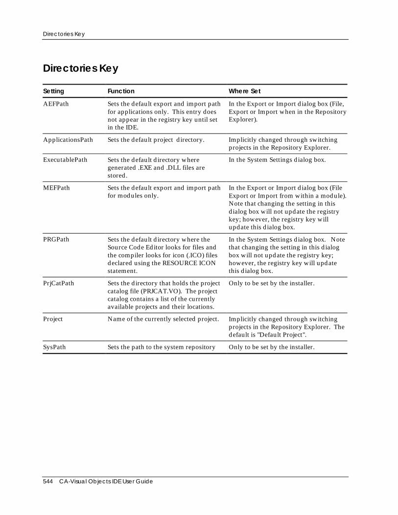
Directories Key
544 CA-Visual Objects IDE User Guide
Directories Key
Setting Function Where Set
AEFPath Sets the default export and import pathfor applications only. This entry doesnot appear in the registry key until setin the IDE.
In the Export or Import dialog box (File,Export or Import when in the RepositoryExplorer).
ApplicationsPath Sets the default project directory. Implicitly changed through switchingprojects in the Repository Explorer.
ExecutablePath Sets the default directory wheregenerated .EXE and .DLL files arestored.
In the System Settings dialog box.
MEFPath Sets the default export and import pathfor modules only.
In the Export or Import dialog box (FileExport or Import from within a module).Note that changing the setting in thisdialog box will not update the registrykey; however, the registry key willupdate this dialog box.
PRGPath Sets the default directory where theSource Code Editor looks for files andthe compiler looks for icon (.ICO) filesdeclared using the RESOURCE ICONstatement.
In the System Settings dialog box. Notethat changing the setting in this dialogbox will not update the registry key;however, the registry key will updatethis dialog box.
PrjCatPath Sets the directory that holds the projectcatalog file (PRJCAT.VO). The projectcatalog contains a list of the currentlyavailable projects and their locations.
Only to be set by the installer.
Project Name of the currently selected project. Implicitly changed through switchingprojects in the Repository Explorer. Thedefault is "Default Project".
SysPath Sets the path to the system repository Only to be set by the installer.
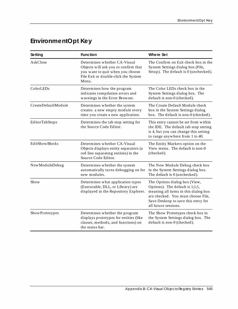
EnvironmentOpt Key
Appendix B: CA-Visual Objects Registry Entries 545
EnvironmentOpt Key
Setting Function Where Set
AskClose Determines whether CA-VisualObjects will ask you to confirm thatyou want to quit when you chooseFile Exit or double-click the SystemMenu.
The Confirm on Exit check box in theSystem Settings dialog box (File,Setup). The default is 0 (unchecked).
ColorLEDs Determines how the programindicates compilation errors andwarnings in the Error Browser.
The Color LEDs check box in theSystem Settings dialog box. Thedefault is non-0 (checked).
CreateDefaultModule Determines whether the systemcreates a new empty module everytime you create a new application.
The Create Default Module checkbox in the System Settings dialogbox. The default is non-0 (checked).
EditorTabStops Determines the tab stop setting forthe Source Code Editor.
This entry cannot be set from withinthe IDE. The default tab stop settingis 4, but you can change this settingto range anywhere from 1 to 40.
EditShowBlocks Determines whether CA-VisualObjects displays entity separators (ared line separating entities) in theSource Code Editor.
The Entity Markers option on theView menu. The default is non-0(checked).
NewModuleDebug Determines whether the systemautomatically turns debugging on fornew modules.
The New Module Debug check boxin the System Settings dialog box.The default is 0 (unchecked).
Show Determines what application types(Executable, DLL, or Library) aredisplayed in the Repository Explorer.
The Options dialog box (View,Options). The default is 1;1;1,meaning all items in this dialog boxare checked. You must choose File,Save Desktop to save this entry forall future sessions.
ShowPrototypes Determines whether the programdisplays prototypes for entities (likeclasses, methods, and functions) onthe status bar.
The Show Prototypes check box inthe System Settings dialog box. Thedefault is non-0 (checked).
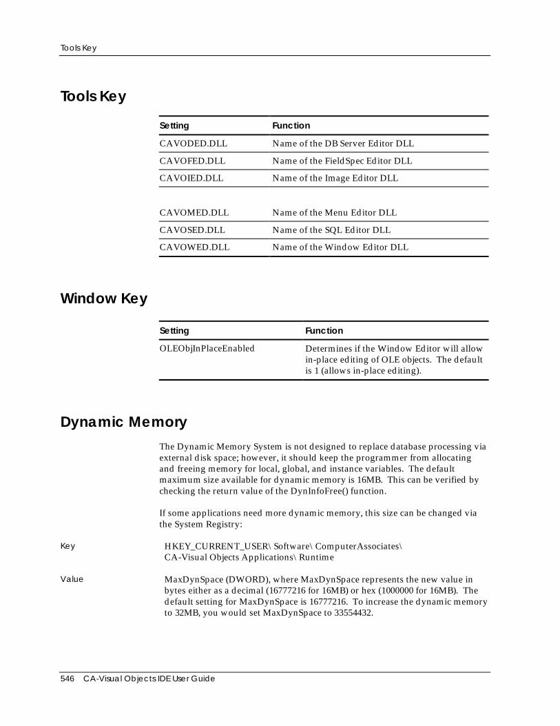
Tools Key
546 CA-Visual Objects IDE User Guide
Tools Key
Setting Function
CAVODED.DLL Name of the DB Server Editor DLL
CAVOFED.DLL Name of the FieldSpec Editor DLL
CAVOIED.DLL Name of the Image Editor DLL
CAVOMED.DLL Name of the Menu Editor DLL
CAVOSED.DLL Name of the SQL Editor DLL
CAVOWED.DLL Name of the Window Editor DLL
Window Key
Setting Function
OLEObjInPlaceEnabled Determines if the Window Editor will allowin-place editing of OLE objects. The defaultis 1 (allows in-place editing).
Dynamic MemoryThe Dynamic Memory System is not designed to replace database processing viaexternal disk space; however, it should keep the programmer from allocatingand freeing memory for local, global, and instance variables. The defaultmaximum size available for dynamic memory is 16MB. This can be verified bychecking the return value of the DynInfoFree() function.
If some applications need more dynamic memory, this size can be changed viathe System Registry:
Key HKEY_CURRENT_USER\Software\ComputerAssociates\CA-Visual Objects Applications\Runtime
Value MaxDynSpace (DWORD), where MaxDynSpace represents the new value inbytes either as a decimal (16777216 for 16MB) or hex (1000000 for 16MB). Thedefault setting for MaxDynSpace is 16777216. To increase the dynamic memoryto 32MB, you would set MaxDynSpace to 33554432.
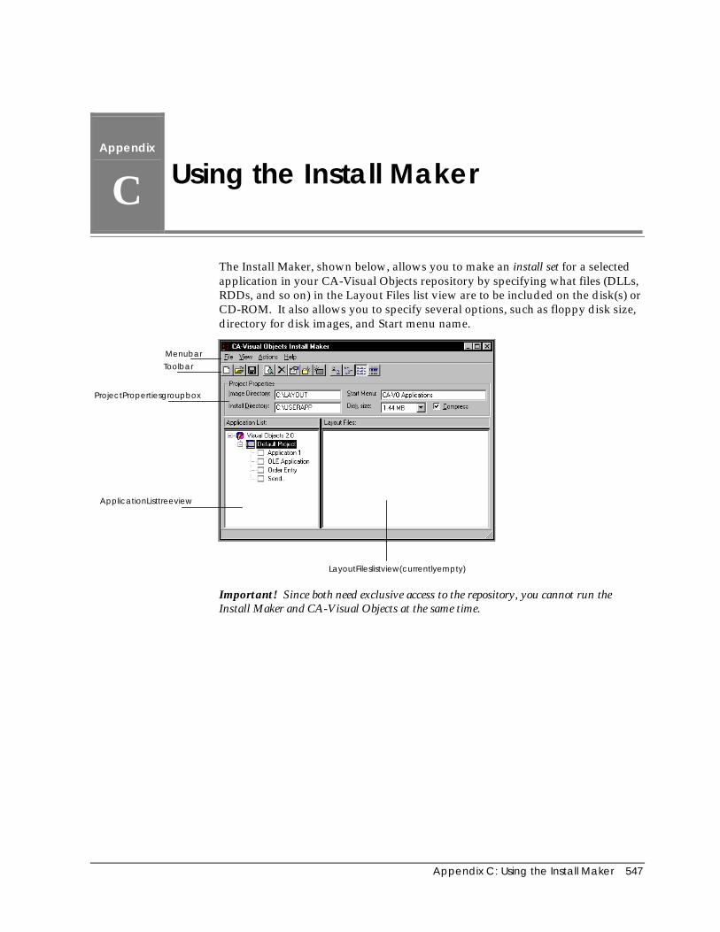
Appendix C: Using the Install Maker 547
Appendix
C Using the Install Maker
The Install Maker, shown below, allows you to make an install set for a selectedapplication in your CA-Visual Objects repository by specifying what files (DLLs,RDDs, and so on) in the Layout Files list view are to be included on the disk(s) orCD-ROM. It also allows you to specify several options, such as floppy disk size,directory for disk images, and Start menu name.
Menubar
Toolbar
ProjectPropertiesgroupbox
ApplicationListtreeview
LayoutFileslistview(currentlyempty)
Important! Since both need exclusive access to the repository, you cannot run theInstall Maker and CA-Visual Objects at the same time.
Program Components
548 CA-Visual Objects IDE User Guide
Program ComponentsImage Directory When you create installation disks or CD-ROMs for your application, the Install
Maker creates images of these disks. The disk images are stored insubdirectories under the directory name specified in the Image Directory editcontrol. The disk image subdirectories are named according to disk number(e.g., DISK1, DISK2). Once they are created, you must copy each disk image to aseparate floppy disk. The install disks should then be tested before beingdistributed.
Install Directory This edit control determines where the files will be installed.
Start Menu When you run the install disks created by the Install Maker, a folder will becreated and added to the Windows Start menu. The name of this folder isspecified in the Start Menu edit control. This name will also appear at the topleft-hand corner of the screen when the install program is run.
Disk Size The Install Maker program must know the size of the installation disks. Use theDisk Size combo box to specify the disk size. Valid choices are: No Limit, 2.88MB, 1.44 MB, 1.22 MB, 720 KB, and 360 KB. The default is 1.44 MB.
See Floppy Disk Utilization later in this appendix for more detailed informationabout selecting floppy disk size for your install set.
Compress Option By default, the project files are compressed by CA-Visual Objects filecompression facility.
Note: If you deselect this option, you will receive a warning message if a file istoo large for the specified disk size.
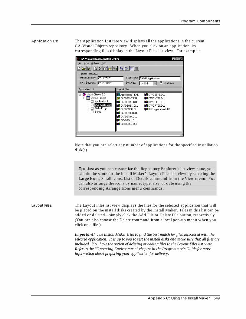
Program Components
Appendix C: Using the Install Maker 549
Application List The Application List tree view displays all the applications in the currentCA-Visual Objects repository. When you click on an application, itscorresponding files display in the Layout Files list view. For example:
Note that you can select any number of applications for the specified installationdisk(s).
Tip: Just as you can customize the Repository Explorer’s list view pane, youcan do the same for the Install Maker’s Layout Files list view by selecting theLarge Icons, Small Icons, List or Details command from the View menu. Youcan also arrange the icons by name, type, size, or date using thecorresponding Arrange Icons menu commands.
Layout Files The Layout Files list view displays the files for the selected application that willbe placed on the install disks created by the Install Maker. Files in this list can beadded or deleted—simply click the Add File or Delete File button, respectively.(You can also choose the Delete command from a local pop-up menu when youclick on a file.)
Important! The Install Maker tries to find the best match for files associated with theselected application. It is up to you to test the install disks and make sure that all files areincluded. You have the option of deleting or adding files to the Layout Files list view.Refer to the “Operating Environment” chapter in the Programmer’s Guide for moreinformation about preparing your application for delivery.
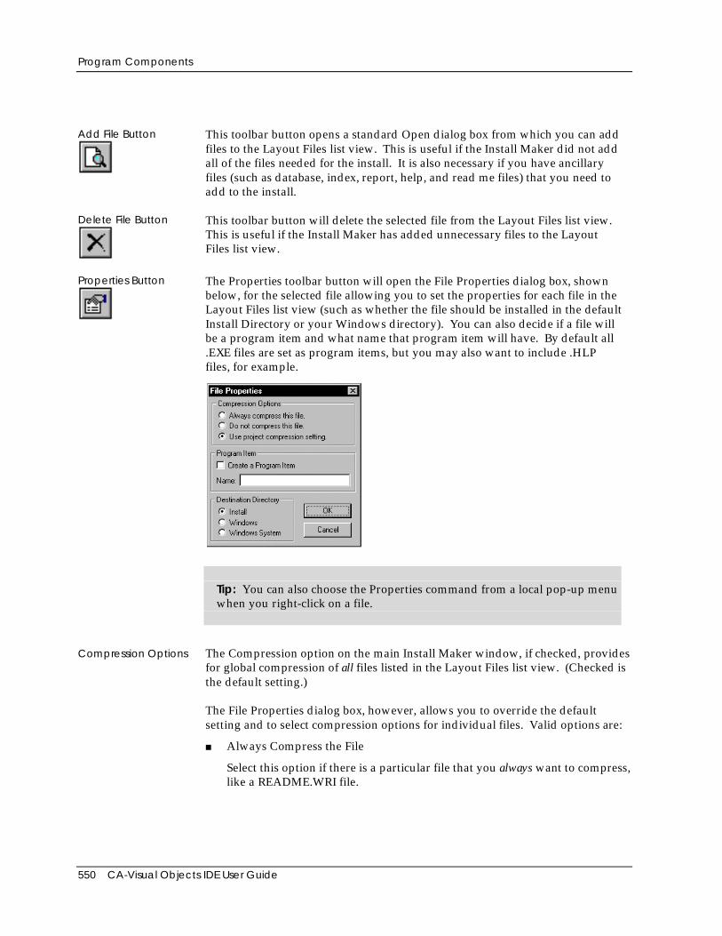
Program Components
550 CA-Visual Objects IDE User Guide
Add File Button This toolbar button opens a standard Open dialog box from which you can addfiles to the Layout Files list view. This is useful if the Install Maker did not addall of the files needed for the install. It is also necessary if you have ancillaryfiles (such as database, index, report, help, and read me files) that you need toadd to the install.
Delete File Button This toolbar button will delete the selected file from the Layout Files list view.This is useful if the Install Maker has added unnecessary files to the LayoutFiles list view.
Properties Button The Properties toolbar button will open the File Properties dialog box, shownbelow, for the selected file allowing you to set the properties for each file in theLayout Files list view (such as whether the file should be installed in the defaultInstall Directory or your Windows directory). You can also decide if a file willbe a program item and what name that program item will have. By default all.EXE files are set as program items, but you may also want to include .HLPfiles, for example.
Tip: You can also choose the Properties command from a local pop-up menuwhen you right-click on a file.
Compression Options The Compression option on the main Install Maker window, if checked, providesfor global compression of all files listed in the Layout Files list view. (Checked isthe default setting.)
The File Properties dialog box, however, allows you to override the defaultsetting and to select compression options for individual files. Valid options are:
■ Always Compress the File
Select this option if there is a particular file that you always want to compress,like a README.WRI file.
Program Components
Appendix C: Using the Install Maker 551
■ Do Not Compress This File
Select this option if there is a particular file that you never want to compress,like a large .DBF file.
■ Use Project Compression Setting
This option—the default setting—confirms the project compression setting asspecified in the main Install Maker window.
Program Item To specify that a file be installed as a program item in the folder, select the Createa Program Item option. Then enter a description in the Name edit control thatwill appear as the item in the folder.
Note: All executable (.EXE) files are, by default, set to be program items in afolder with the file name of each .EXE used as the description. If you want tooverride the file name with more descriptive text, you can do so. Also, if youhave created a multi-application installation set where there is more than one.EXE file and you do not want certain .EXE files to be installed as items, you canoverride the default setting.
Destination Directory Select the destination directory on the target machine for the specified file. Validchoices are:
■ Install
If selected, the destination directory is the Install directory that is specified inthe main Install Maker window.
Note: Most of the files in the Layout Files list view will be installed in theInstall directory, as these will be CA-Visual Objects-specific DLL and RDDtype files.
■ Windows
If selected, the destination directory is the Windows directory.
■ Windows System
If selected, the destination directory is the Windows System directory.
CA-Visual Objects automatically sets this property for you for the files thatCA-Visual Objects recognizes. If you have added any files to the Layout Files listview that CA-Visual Objects does not recognize, they will default to the Installdirectory. If these files need to be installed in either Windows orWindows\System, you will need to change the property manually
Note: You should save the current Install Maker session to a project file, becauseafter testing you may find you want to modify certain file properties. If this isthe case, you can restart the Install Maker and open up your old project file andmodify it. See Project Files later in this appendix for more detailed information.
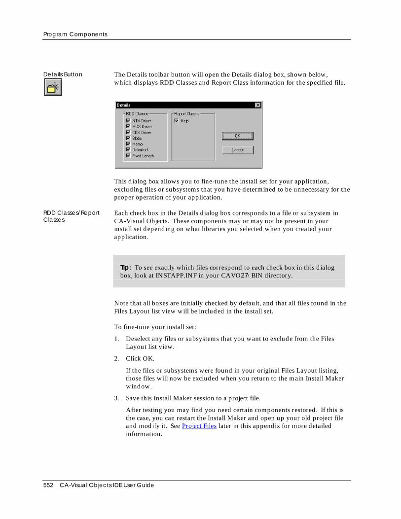
Program Components
552 CA-Visual Objects IDE User Guide
Details Button The Details toolbar button will open the Details dialog box, shown below,which displays RDD Classes and Report Class information for the specified file.
This dialog box allows you to fine-tune the install set for your application,excluding files or subsystems that you have determined to be unnecessary for theproper operation of your application.
RDD Classes/ReportClasses
Each check box in the Details dialog box corresponds to a file or subsystem inCA-Visual Objects. These components may or may not be present in yourinstall set depending on what libraries you selected when you created yourapplication.
Tip: To see exactly which files correspond to each check box in this dialogbox, look at INSTAPP.INF in your CAVO27\BIN directory.
Note that all boxes are initially checked by default, and that all files found in theFiles Layout list view will be included in the install set.
To fine-tune your install set:
1. Deselect any files or subsystems that you want to exclude from the FilesLayout list view.
2. Click OK.
If the files or subsystems were found in your original Files Layout listing,those files will now be excluded when you return to the main Install Makerwindow.
3. Save this Install Maker session to a project file.
After testing you may find you need certain components restored. If this isthe case, you can restart the Install Maker and open up your old project fileand modify it. See Project Files later in this appendix for more detailedinformation.

Program Components
Appendix C: Using the Install Maker 553
Important! It is imperative that you install and test your application on a machine thatdoes not have CA-Visual Objects installed (or any remnants of a prior CA-VisualObjects installation). You must ensure that all files necessary for your application areincluded on the installation disks. Refer to the INSTAPP.INF file in the CAVO27\BINdirectory for a list of CA-Visual Objects files that are required for each library in yourapplication.
Make Disks Button This toolbar button creates the disk images from the files in the Layout Files listview. It will also check if there are disk images in the current Image Directory.If there are already images, it will give you the option of deleting thesedirectories or canceling the make disks process.
Floppy Disk Utilization
554 CA-Visual Objects IDE User Guide
Floppy Disk UtilizationToiward the end of INSTAPP.INF there is a new group of settings, DISK SIZE,that will determine the maximum utilization of your floppies at the end of themake disks process. The value assigned to each floppy density is approximatelyninety percent (90%) of the size allowed for an empty, non-bootable floppy diskof the selected density. This number can be modified up or down. Oncechanged, it is effective for all Install Maker sessions.
The default disk size settings are shown below:
NoLimit = 2147483647
2.88MB = 2785126
1.44MB = 1384780
1.22MB = 1153254
720KB = 692390
360KB = 344371
You should never choose the maximum allowed size, as this will not allow forspace for the FAT table entries, especially when there are many small files. Therewill probably also be a discrepancy between the sector size of your hard driveand the sector size of the floppy. Both of these factors may result in overflowingof the floppy when you actually try to copy the files to the floppy disk.
If you want to allow for expansion or inclusion of more files on the floppyoutside the control of the Install Maker, you can make the size smaller, but thiswill affect all of the floppies. Each disk of your floppy install set will be limited tothe size selected.
If you choose the No Limit option, the Install Maker will copy all files to a DISK1subdirectory. This is useful for creating a CD-ROM installation disk.
Important! You should always check that there is enough disk space on yourdestination hard drive before you complete the make disks process. The Install Maker willcopy each file in the install set for a new IMAGE subdirectory that you create with theActions Make Disks menu command or the Make Disks button.
Project FilesUnder the File menu, there are the New, Open, Save, and Save As options.Using these commands, or their corresponding toolbar buttons, you can save allthe information for the current install set you defined. These options are usefulin case you need to make changes to the install set, such as adding a new file.
Producing Install Disks
Appendix C: Using the Install Maker 555
Producing Install DisksIn summary, the basic steps required to produce install disks for your applicationare as follows:
1. After complete development of your application in the IDE, check theapplication’s properties to make sure that the .EXE file name and the foldername are as you want them to be.
2. Generate an executable file using the Make EXE toolbarbutton.
3. Shut down CA-Visual Objects, then start the Install Maker from theWindows Start menu.
4. In the Image Directory edit control, enter the directory where you want tosave the disk images.
5. In the Install Directory edit control, enter the name of the directory in whichthe application will be installed on the end user’s computer.
6. From the Disk Size combo box, select the floppy disk size that yourapplication will be distributed on.
7. Enter the Windows Start menu name for your application in the Start Menuedit control.
8. Optionally, deselect the Compress option.
Note: If you do so, you should select one of the compression optionsavailable at the file level via the Properties dialog box. Otherwise, you mayreceive a warning message.
9. Click on an application in the Application List tree view.
The Layout Files list view displays the default files needed by theapplication.
10. Using the Add File button, add any additional files needed by yourapplication, such as .DBF and .HLP files.
11. Optionally remove any file from the Layout Files list view that you know isnot needed by your application using the Delete File button.
12. Highlight each file in the Layout Files list view and click on the Propertiesbutton to make sure the file will be installed in the correct subdirectory andto optionally designate the file as a separate program group item.
13. Make sure you have enough disk space on the drive indicated in the ImageDirectory to path, and then press the Make Disks button to create the diskimages.
Producing Install Disks
556 CA-Visual Objects IDE User Guide
14. Choose Exit to close the Install Maker.
15. After the disk images are created, copy each disk image to a separate, newlyformatted floppy disk of the size selected.
16. Install your application on another computer that does not have CA-VisualObjects installed, and retest it as thoroughly as you have already doneduring dynamic execution from within the IDE.
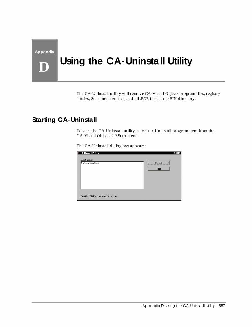
Appendix D: Using the CA-Uninstall Utility 557
Appendix
D Using the CA-Uninstall Utility
The CA-Uninstall utility will remove CA-Visual Objects program files, registryentries, Start menu entries, and all .EXE files in the BIN directory.
Starting CA-UninstallTo start the CA-Uninstall utility, select the Uninstall program item from theCA-Visual Objects 2.7 Start menu.
The CA-Uninstall dialog box appears:
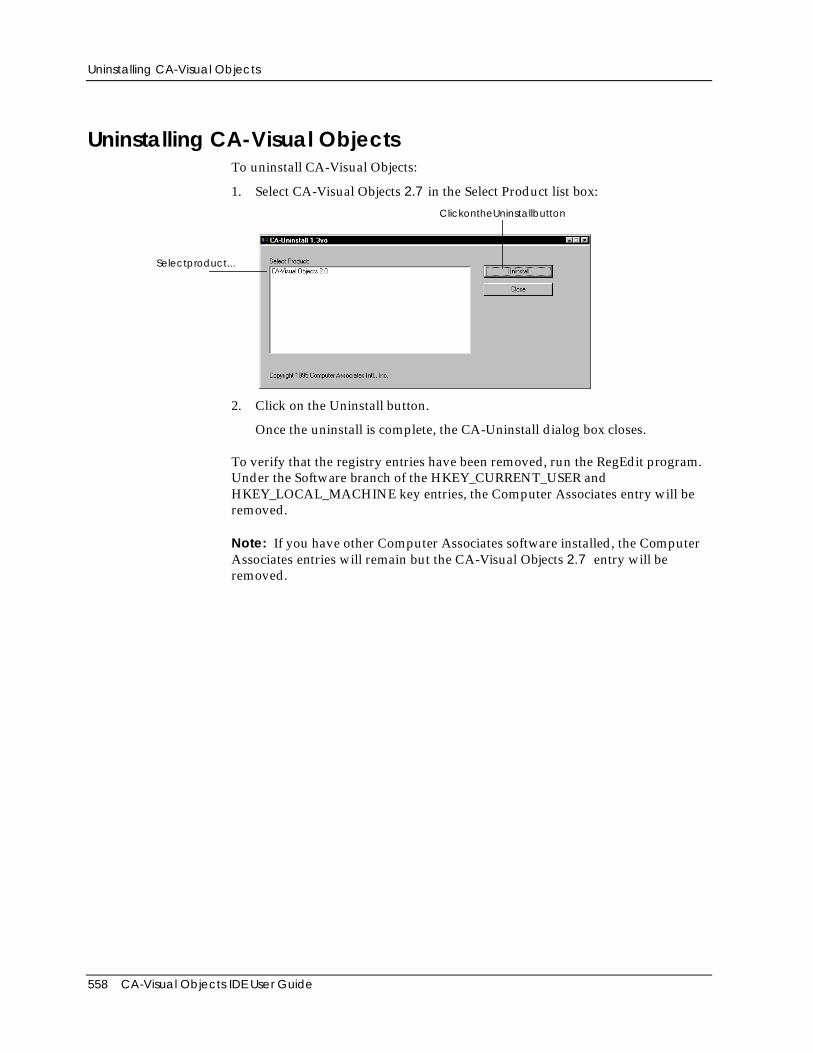
Uninstalling CA-Visual Objects
558 CA-Visual Objects IDE User Guide
Uninstalling CA-Visual ObjectsTo uninstall CA-Visual Objects:
1. Select CA-Visual Objects 2.7 in the Select Product list box:
Selectproduct...
ClickontheUninstallbutton
2. Click on the Uninstall button.
Once the uninstall is complete, the CA-Uninstall dialog box closes.
To verify that the registry entries have been removed, run the RegEdit program.Under the Software branch of the HKEY_CURRENT_USER andHKEY_LOCAL_MACHINE key entries, the Computer Associates entry will beremoved.
Note: If you have other Computer Associates software installed, the ComputerAssociates entries will remain but the CA-Visual Objects 2.7 entry will beremoved.
Index 559
Index
.
.AVI files, 199
.CH files, 95
.DBF files, 81
.DLL files, 43
.EXE files, 43
.MEF files, 43, 111
.UDC files, 30, 85, 94
A
Accelerator keys, specifying, 262
Accessingdatabases, 80, 81debugger, 502editors, 24Error Browser, 492Source Code Editor, 273visual editors, 24
Addingcolumns to tables, 409controls to windows, 144data servers, 294, 325DLLs, 90fields, 300, 314group footers, 398group headers, 398indexes, 309libraries, 90menu items, 267menus/menu items, 255predefined menus, 265
report details, 401report sections, 397rows to tables, 414separators to menus, 260
Adjacent crosstab column, defining, 413
Aggregate functionsdefinition of, 450using in reports, 450
AltD() function, 506
Animation controlsproperties, 199styles, 200
Application Gallery, 44, 76, 128
Application Wizard, 42, 43
Applications.DLL path, specifying, 83.EXE path, specifying, 83.UDC files, associating, 85, 94activating windows, 243adding header files, 95attaching menus to window forms, 268browsing, 51building, 20copying, 99creating with Application Gallery, 44, 76, 128creating with Application Wizard, 42, 43, 76database, accessing, 80, 81debugging, 31, 490debugging option, specifying, 82deleting, 99DLLs, 77, 79executing, 21exporting, 100framework, specifying, 77, 79icon, specifying, 85importing, 100interface, specifying, 78Internet applications, 77, 79
560 CA-Visual Objects IDE User Guide
language style, specifying, 82libraries, 77, 79manipulating, 98MDI, 79MDI applications, 77, 79moving, 99name, specifying, 77OLE server applications, 77, 79OLE, specifying, 81printing, 115program folder, specifying, 83properties
defining, 76modifying, 88
renaming, 98running, 21samples, 77saving, 19SDI, 79SDI applications, 77, 79specifying icons, 95step-by-step execution, 506stepping through, 506styles, specifying, 79type, specifying, 77, 79using reports, 464version control, 71
Applying formatting to a field, 456
Arithmetic functions, in reports, 450
Arithmetic operators, using in reports, 448
Associating .UDC files, 94
Auto Layoutusing
in Menu Editor, 265in Window Editor, 342
Window Editor optionsMaster Detail, 345Single Server, 343
Automation Serveraccessing, 81using, 32
AutoStart debugging, 42, 503
B
Background, moving graphics, 434, 438
Bitmaps, using in applications, 487
Borders, adding to reports, 420
Break fields, 398
BreakpointsActivate on Break option, 508clearing, 509presetting in Source Code Editor, 283using, 507viewing, 509
Browse view, Window Editor, 349
BrowsersError, 492fonts, 34overview, 22
Browsingapplications, 51classes, 59entities, 54modules, 51projects, 51
Building applicationsbackground compiler and linker, 20
C
Call stackmodifying variables within, 524viewing, 523
CA-Visual ObjectsApplication Gallery, 44, 76, 128Application Wizard, 76Automation Server, 32, 81compiler, 20debugger, 31getting help, 16IDE
browsers, 22CA-Report Viewer, 374database editors, 27DB Server Editor, 288, 289desktop, 17Error Browser, 23, 492FieldSpec Editor, 28Image Editor, 28, 467
Menu Editor, 245Report Editor, 363reports, 363Source Code Editor, 269
Index 561
SQL Editor, 288, 324status bars, 19toolbars, 19tools, 21visual editors, 27Window Editor, 117
Install Maker, 547introduction, 13
linker, 20options
Activate IDE on Break, 36application-specific compiler settings, 39compilation status, 43Confirm on Exit feature, 43Debug AutoStart, 42debugging new modules, 43default compiler settings, 38default paths, 43Grid Lines, 71LED indicators, 43Select Entire Row, 71Show Parameter Tips, 36Show Prototype, 43, 71Show Source Control Icons in List View, 71Show Source Control Icons in List Viewoption, 48Track Selection, 71Use Spaces for Tabs, 36Use Wizard, 42, 43
repository, 47, 269Repository Explorer, 45setting system setup options, 34Source Code Control Interface, 19, 71, 105, 114,499Source Code Editor, 26Standard Application, 78, 87supported file types, 539System Registry, 541UDC Tester, 29version control, 19, 71
Check box controlsproperties, 155styles, 157
Classesbrowsing, 59collapsing tree, 54, 58, 62expanding tree, 60
entire branch, 61inherited properties, 64showing additional, 63viewing, 64
Cloningforms, 126windows, 126
Codedeleting, 280editing, 279entering, 279generating, 26, 126, 143, 288, 313, 329, 334, 374inserting new line, 280loading
entire module, 277single entities, 276
markers, 272
Color indicator, 471
Color palette, 471
Colors, Image Editor, 474
Column categories, changing for reports, 385
Column controlsproperties, 188
Column headings, customizing for reports, 378
Columns, snaking in reports, 428
Combo box controlsproperties, 162styles, 163
Commands, user-defined (UDC)creating, 29testing, 29
Common controlsanimation controls, 199horizontal sliders, 202hotkey edits, 200list views, 190OLE objects, 215overview, 144progress bars, 201rich edit controls, 196tab controls, 212tree views, 194vertical spinners, 209
Common propertiescontrols, 148windows, 129
Compilation statusError Browser, 48Repository Explorer, 48
562 CA-Visual Objects IDE User Guide
Compiler optionsCA-Clipper compatibility, 41default settings, 38entities, 114general, 41modules, 106optimization, 40runtime checking, 40settings
application-specific, 39default, 38
warnings, 40
CompilingCA-Clipper preprocessor, 95CA-Visual Objects preprocessor, 95vitality (status), 48
Computed fields, 448arithmetic operators, 448definition of, 440displaying definition of, 443, 444using functions, 450
Conditional functions, 451
Conditional paragraphs, defined, 425
Controlling orderchanging, 311, 319specifying, 311, 319
Controlsanimation controls, 199check box, 155columns, 188combo box, 162ComboBoxEx control, 122, 144, 146common properties, 148data list view, 122, 144, 146date time picker, 122, 144, 146fixed icons, 179fixed text, 179group boxes, 178horizontal scroll bars, 182horizontal sliders, 202horizontal spinners, 207hotkey edits, 200IP address, 122, 144, 146list box, 159list views, 190month calendar, 122, 144, 146multi-line edit controls, 175OLE object controls (OCX), 215overview, 143placing, 144progress bars, 201
push button, 165radio button groups, 170radio buttons, 168reordering tab stops, 242rich edit controls, 196single-line edit controls, 172sub-data windows, 185tab controls, 212tree views, 194types, 143vertical scroll bars, 184vertical sliders, 205vertical spinners, 209
Conventions used in this guide, 15
Conversion functions, 451
Copy/Paste button, 470
Copyingapplications, 99controls, 238field specs, 336modules, 109
Creatingapplications, 44, 76band-style toolbars, 251cursors, 28data servers, 294, 325DLLs, 96entities, 24, 112fields, 300, 314flat toolbars, 251Help About dialog boxes, 128icons, 28indexes, 309libraries, 96menu hierarchy, 258menus, 249modules, 100, 101projects, 71reports, 364ribbons, 484splash screens, 128windows, 125, 339
Cross tabular reportscreating, 383customizing, 383horizontal pagination, 429
Cursor Editor. see Image Editor
Cursor mode, 472
Index 563
Cursorsclearing, 483creating, 28editing, 477loading, 472saving, 486setting hot spot, 478using in applications, 487
Customizing the Repository Explorer, 64, 67
D
Data filesexporting, 278, 322importing, 278
Data serversassociating, 342creating, 27, 294, 325defined, 27modifying, 314, 329
Data windowsassociating data servers, 342creating, 340using Auto Layout, 342
Database files, importing, 320
Databasesaccessing, 81
SQL, 80Xbase, 80, 81
Date and time data types for reports, 441
Date and time functions, 451
Date/time stamps, updating, 20
Dates, formatting, 459
DB Server Editoradding fields, 300, 314adding indexes, 309creating
data servers, 294, 325indexes, 309
definingdata server properties, 299, 327field properties, 304, 329index properties, 312
editing index files, 319exporting files, 322
importing files, 320overview, 27toolbar, 290workspace, 289
Debuggeraccessing, 502Activate IDE on Break feature, 36AutoStart debugging, 31Call Stack window, 519, 523Database Work Area window, 514DLL debugging, 31execution commands, 506Global/Public Variables window, 520highlight, 504source code window, 504terminal window, 526toolbar, 505Watch Expression window, 522
DebuggingActivate on Break option, 508applications, 31AutoStart feature, 31Debug AutoStart option, 490, 503DLL debugging, 31DLL debugging feature, 490entities, 114Just-In-Time technique, 525modules, 43, 105overview, 490setting options
entity level, 499globally, 497module level, 498
step-by-step execution, 506stepping through an application, 506terminal window, 526tracing into called entity, 507
Definingapplication properties, 76data server properties, 299, 327data servers, 285field specs, 285, 333libraries for a new application, 89search path, 89
Delete button, 470
Deletingapplications, 99code, 280entities, 113menu items, 267modules, 111

564 CA-Visual Objects IDE User Guide
report sections, 405report table styles, 408source code entities, 280
Designing reports, 393
Dialog boxesAdd Project, 74Add Watch Expression, 521Application Gallery, 44, 76Application Options, 39, 90, 91, 93, 94, 95, 96, 97Auto Layout (Menu Editor), 265Auto Layout (Window Editor), 343, 345, 360Auto Layout Field Selection, 344, 347, 360Automation Server Base Class Generation, 32Breakpoints, 509Browse, 228, 310CableDBMessage, 461CA-Report Editor, 460CA-Visual Objects Data Source Selection, 369CA-Visual Objects Report Editor, 370CA-VO Report Editor, 383Change Array Index Range, 520Color, 37, 129, 148Command Line, 28Confirm Deletion, 74, 99, 111Control Order, 188, 241Create Module, 100, 101, 250, 340Crosstab Report Definition, 370, 383Database Field Definition, 442Database Field Mapping, 390Define Parameter, 444Define Table Style, 407Delete Query, 389Delete Table Style, 408Details, 552Duplicate Field Error, 321Edit Field Definition, 446, 447Edit Parameter, 233Edit Query, 391Enter an Expression, 502Error, 501, 502Evaluate Expression, 517Export, 322Export Index, 322Export Query, 393Export Report to File, 465Field Formula, 443, 449, 452, 456, 457, 463File Properties, 550Fill Using, 159, 163, 218Find, 279, 512Font, 35, 135, 139, 421Format Body Section, 403, 408, 422, 423, 461Format Field, 443, 457, 462Format Group Section, 403, 424, 461
Format Line, 431, 432Format Page, 427, 428, 429Format Paragraph, 426Format Paragraph., 419, 420Format Picture, 436, 438Format Rectangle, 433, 434Format Section, 385, 403, 422, 461Function Editor, 452, 453, 463Icons, 95Image Editor Options, 471Import, 296, 320Import Application, 292Import Query, 388Insert Field, 381, 445, 449, 452, 456Insert Footer, 397, 399Insert Header, 397, 399Insert Object, 227Insert OLE Control, 229Insert Paragraph, 415Insert Section, 397, 400Insert Table Row, 414, 416Invoke Control Method, 232List of Entities, 280Menu IDs, 264Modify Setting, 525Modify Variable, 520New Application, 44, 76New Project, 72New Report, 371, 372Open, 101Open Picture File, 436Open Report Definition, 373Open Type Library, 33Options, 67, 68, 69, 70Print, 460Print Setup, 460Printing Application List, 115Printing Entity List, 115Printing Module List, 115Printing Project List, 115Printing Visual Objects 2.7Tree, 115Project Properties, 39, 72Properties, 498Properties (Entity), 39, 113, 114, 499Properties (Module), 39, 105, 498, 499Query Name, 391Register OLE Control, 230Report Defaults, 368Report Editor Joins, 370Report Parameters, 446Report Properties, 386, 411, 417, 439, 460Report Summary, 371Select Data Source, 326, 369Select File for the UDC, 30Select Label Style, 380
Index 565
Select Query for Query Name, 390Set Report Query, 388Setup OLE Controls, 230SQL Editor, 327System Options, 503, 508System Settings, 34, 35, 37, 38, 42, 524Table Format Column, 410, 412, 413Toolbar Buttons, 263UDC Tester, 29Window Editor, 126, 340
DLLsActive Server Page (ASP), 79adding, 90creating, 96ISAPI, 79
Drag-and-drop, Image Editor, 476
Dynamic memory, changing size, 546
E
Edit area, 469clearing, 483colors, 477grid, 472using, 477
Edit buffer, 469clearing, 483using, 477
Edit Field Definitions command, 442
Editingan entire module, 107cursors, 477entities, 112field specs, 334fields, 330forms, 126icons, 477menus, 266modules, 107source code, 279windows, 121, 269
Editorsaccessing, 24creating entities within, 24DB Server Editor, 289FieldSpec Editor, 331Image Editor, 467
Menu Editor, 245overview, 23Source Code Editor, 269SQL Editor, 323Window Editor, 117
EmbeddingOLE controls, 224OLE objects, 224
Entitiesbrowsing, 54collapsing/expanding display, 271compiler options, 114creating, 24, 112debugging, 114deleting, 113editing, 112loading into Source Code Editor, 276menu, 487opening, 25printing, 115setting properties, 113showing, 280subtypes, 54tracing into, 507types, 54
Error Browser, using, 492
Exportingapplications, 100modules, 111reports to files, 465source code, 278
Expressions, evaluating, 21, 28
F
Field labels, customizing for reports, 380
Field specscopying, 336defining, 333editing, 334
Fields. See also Computed fields, Parameter fields,Database fields, Calculated columns
break, 398creating, 300, 314data, 440editing, 330formatting, 455, 456ordering, 318
566 CA-Visual Objects IDE User Guide
specifying properties, 329system-defined, 440types, 440
Fields button, 444
FieldSpec Editoraccessing, 331copying field specs, 336defining a field spec, 333editing field specs, 334overview, 28toolbar, 332using, 331workspace, 332
Files.AEF, 100, 527, 539.APP, 539.ASP, 539.AVI, 199.BMP, 539.CDX, 539.CH, 539.CUR, 539.DBF, 81, 289, 318, 322, 539.DBG, 539.DBT, 539.DFL, 539.DLL, 43, 527, 539.EXE, 21, 43, 539, 557.HTM, 539.ICO, 539.IND, 539.INF, 539.ISC, 540.MAP, 540.MDF, 540.MDX, 540.MEF, 43, 111, 527, 540.NTX, 540.OCX, 540.ODQ, 540.OLB, 33.PRG, 540.REG, 540.RET, 540.SCC, 540.TLB, 33.TPL, 540.UDC, 30, 85, 94, 540.VO, 540.VOM, 540application, 100CAVOWED.INF, 124database, 289
executable, 17, 21header (.CH), 95index, 289module, 111removing link, 103STD.UDC, 29types, 539, 540
Financial functions, 451
Finding matching tokens, 283
Fixed icon controlsproperties, 179styles, 179, 181
Fixed text controlsproperties, 179styles, 180
Fonts, changing in reports, 420
Form letterscustomizing for reports, 383guidelines for reports, 382
Form reports, 379
Form view, Window Editor, 349
Format strings, 441, 455
Formattingdates and time, 459fields, 455numbers, 457
Formatting group sections, 402
Formscloning, 126editing, 126
Free style reportscreating, 382 to 83customizing, 383guidelines for reports, 383
Functionsaggregate, 450arithmetic, 450conditional, 451conversion, 451date and time, 451DynInfoFree(), 546financial, 451lookup, 450 to 51string manipulation, 451using computed fields, 450
Index 567
G
Generatingan executable file, 21code, 26, 143, 329, 334, 374
Getting help, 16
Globalsmodifying, 520viewing, 520
Group box controlsproperties, 178styles, 178
GUI controls, overview, 143
Gutters, 409
H
Help About dialog boxes, creating, 128
Help, getting, 16
Hierarchiesmenu, 258Repository Explorer, 45
Horizontal pagination, 429
Horizontal scroll bar controlsproperties, 182styles, 183
Horizontal slider controlsproperties, 202styles, 203
Horizontal spinner controlsproperties, 207styles, 208
Hotkey edit controlsproperties, 200styles, 201
Hyperlabels, overview, 288
I
Icon mode, 472
Icon/cursor bar, 470
Iconsclearing, 483creating, 28editing, 477loading, 472saving, 486specifying for
applications, 95toolbar, 263
using in applications, 487
Image Editorbackground colors, 474color indicator, 471
using, 474color palette, 471Copy/Paste button, 470cursors
setting hot spot, 478Delete button, 470drag-and-drop, 476drawing colors, 474edit area, 469
clearing, 483colors, 477grid, 472using, 477
edit buffer, 469clearing, 483using, 477
features, 467icon/cursor bar, 470loading cursors, 472loading icons, 472Mode buttons, 470modes, 472Open/Save button, 470overview, 28saving images, 486starting, 467status bar, 471temporary buffers, 469tool palette, 469, 478
Fill, 479Filled Ellipse, 481Filled Rectangle, 481Flip Horizontally, 482Flip Vertically, 482Hollow Ellipse, 481Hollow Rectangle, 480Line, 480Pencil, 478Rotate Clockwise, 482Rotate Counterclockwise, 483Select Area, 480
568 CA-Visual Objects IDE User Guide
toolbar, 469
Image files, supported file types, 435
Importingapplications, 100modules, 111source code, 278source files, 26, 278
Index files, importing, 320
Indexesadding, 309creating, 309defining properties, 312
InsertingDataWindows, 353new line in source code, 280sub-data windows, 353
Install disks, making, 547
Install Maker, overview, 547
InterfacesGUI, 78user-defined, 78
Internet applications, 79
L
Label guidelines for reports, 380
Label reports, using report style, 380 to 82
Librariesadding, 90CA-Visual Objects, 47Console Classes, 89creating, 96dynamic link library (DLL), 47GUI Classes, 78, 89Internet, 89Internet Server API, 89
OLE, 32, 89OLE Server, 89RDD Classes, 81, 89Report Classes, 89SQL Classes, 89system, 47System Classes, 89System Library, 90Terminal Lite, 89, 526
user-defined, 47Win32 API Library, 89
LinkingOLE controls, 224OLE objects, 224
List box controlsproperties, 159styles, 160
List view controlsproperties, 190styles, 191
Loadingcursors, 472icons, 472
Lookup function, 450 to 51
M
Mailing labels. See Label reports
Margins, of reports, 381
Markers, using, 272
MDI applications, 79
Menu commandsAdd Item, 302, 309Add Page, 221Add Separator, 260Application Properties, 38Arrange Icons, 65Automation Server, 32Build, 20Command Line, 21, 28Copy, 99Cut, 99Cut Link to External File, 103Delete, 74, 99, 111, 113, 280Delete from Catalog, 73Delete Item, 318, 320Delete Line, 280Delete Page, 221Edit, 112Edit All Source in Module, 107Edit Page, 221Execute, 21, 506Expand Prototype, 282Explore, 98Expression, 517Find Matching Token, 283
Index 569
Go To, 280Import, 278Include Libraries, 63Insert Line, 280Insert Page, 221Insert Prototype, 282Make DLL, 21Make EXE, 21New Application, 76New Project, 72Next Page, 221Options, 67, 68, 69Paste, 99Previous Page, 221Print, 98Properties, 72, 90, 98, 104, 113Recent Imports, 527Reindex Project, 31Rename, 98, 110Select from Palette SubDataWindow, 353Setup, 34Step, 506Step In, 506Step Out, 506Step To Cursor, 506Stop, 506Styles, 221Tab Order, 241Test Mode, 361Tools, 24Touch, 20, 98Touch All Entities, 20UDC Tester, 29Watch, 521
Menu Editorband-style toolbars, 251editing menus
clearing, 266copying, 266cutting, 266deleting lines, 266deleting text, 266pasting, 266
flat toolbars, 251Menu Item Properties window, 248, 253, 261Menu Properties window, 252, 253overview, 245preview menu bar, 249printing, 268Properties window, 247, 259, 266tasks, 247toolbar, 247workspace, 247
Menusadding
menus/menu items, 255predefined menus, 265separators, 260
attaching to window forms, 268copying menus/menu items, 266creating
custom menus, 249hierarchy, 258toolbars, 254
cutting menus/menu items, 266deleting menus/menu items, 266designing custom menus, 245pasting menus/menu items, 266previewing, 261printing, 268specifying properties
accelerator, 262initial state, 263menu name, 253
terms, 246
Mode buttons, 470
Modifyingapplication properties, 88call stack, variables within, 524data servers, 314, 329entities, 112field specs, 334fields, 314Global/Public variables, 520local/private variables, 520menus, 266modules, 107source code, 279windows, 234
Modulesbrowsing, 51compiler options, 106copying, 109creating, 100, 101debugging, 43, 105deleting, 111editing, 107editing whole source code, 107exporting, 111external
creating, 101removing link to external file, 103
importing, 111internal
creating, 100
570 CA-Visual Objects IDE User Guide
loading into Source Code Editor, 277moving, 108opening, 107printing, 115renaming, 110setting properties, 104types, 100, 101
Movingapplications, 99controls, 238modules, 108windows, 236
Multi-line edit controlsproperties, 175styles, 176
N
Navigating in the Repository Explorer, 49
Numbers, formatting, 457
Numeric data types in reports, 441
O
Object linking and embedding (OLE)basic terms, 224control containers, 225controls, 225overview, 224
Offset option, for sections, 404
OLEaccessing OLE technology, 81Automation Server, 81using, 81
OLE control containers, overview, 225
OLE controlsembedding, 224inserting, 229invoking methods, 232linking, 224overview, 225registering, 230setting up, 230
OLE object controls (OCX)properties, 215
styles, 217
OLE objectsembedding, 224inserting, 226linking, 224
OLE server applications, 79
Online help, accessing, 16
Open/Save button, 470
Openingcursor files, 472entities, 25icon files, 472modules, 107
Operators (arithmetic) in reports, 448
Optionscompiler, 38fonts
browsers, 34Source Code Editor, 34
showing prototypes, 43Source Code Editor colors, 36system settings, 42system setup, 34
Orders, controlling, 311, 319
P
Page breaks in reports, 422
Page size, of reports, 381
Page titles, customizing for reports, 378
Pagesbreaks, horizontal, 429layout, 427size, setting, 427
Paginationfor reports, 425horizontal, 429
Paragraphs (report)aligning text, 418conditional
description, 425formatting, 417
Parameter fields, in reports, 455
Pictures (in reports)
Index 571
deleting, 439inserting, 434moving, 438
to background, 438overlapping, 439sizing, 437, 438
Preferences, setting for reports, 386
Presetting breakpoints, 283
Previewing menus, 261
Print status messages, defining, 461
Printingapplications, 115entities, 115menus, 268modules, 115projects, 115source code, 284
Progress bar controlsproperties, 201styles, 202
Projectsadding, 74adding to project catalog, 74browsing, 51creating, 72deleting from catalog, 73deleting from repository, 73managing, 71printing, 115properties, 72reindexing, 31renaming, 75version control, 71
Propertiessetting
for applications, 88for entities, 113for modules, 104
Properties and methods, viewing, 64
Properties windowsAnimation, 199changing defaults, 124changing layout, 124Check Box, 155Column, 188Combo Box, 162common properties
controls, 148windows, 129
Data Dialog, 137Data Window, 133DB Server, 291, 298, 299Dialog Window, 139FieldSpec, 303, 304, 324Fixed Icon, 179Fixed text, 179Group Box, 178Horizontal Scroll Bar, 182Horizontal Slider, 202Hotkey Edit, 200Index, 311List Box, 159List View, 190Menu Item Properties, 247, 248, 256, 259, 261, 266Menu Properties, 252, 259, 266Mult-Line Edit, 175OLE Object, 215Order, 311Progress Bar, 201Push Button, 165Radio Button, 168Radio Button Group, 170Rich Edit Control, 196Shell Window, 132Single-Line Edit, 172SQL Editor, 324, 327Sub-Data Window, 185Tab Control, 212Vertical Scroll Bar, 184Vertical Spinner, 209
Prototypesfilling in, 282jumping to, 281showing, 43, 282viewing, 281
Push button controlsproperties, 165styles, 167
R
Radio button controlsproperties, 168styles, 169
Radio button group controlsproperties, 170styles, 171
Reindexing the repository, 31
572 CA-Visual Objects IDE User Guide
Removing link to external file, 103
Renamingapplications, 98modules, 110
Report columnsadding, 409centering, 410deleting, 412gutter, 409mapping to report fields, 389moving, 411snaked, 428using, 409width, changing, 409
Report definitionassociating multiple queries, 387query
changing default name, 390deleting, 389editing, 391exporting, 393mapping columns, 389selecting, 388
Report EditorCA-Report Viewer, 363CA-Report Writer, 363creating reports, 364overview, 363viewing reports, 374
Report groups, break fields, 398
Report queryassociating multiple queries, 387changing default query name, 390editing, 391exporting, 393mapping columns, 389overview, 387
Report rowsadding, 414blank lines between, 415converting to text, 415deleting, 415moving, 414using, 413
Report sectionsadding details, 401deleting, 405formatting, 402, 403
Report tablescells, 406
columns, 409moving in, 409rows, 413styles
defining, 406deleting, 408
using, 406
Report text, display options, 419
Report titles, customizing for reports, 380, 383
Reporting with CA-Report Writer, 363
Reportsactivating, 464adding
columns to tables, 409details, 401footers, 397group footers, 398group headers, 398headers, 397
changing column categories, 385changing column width, 409combining columns of like data, 413computed fields, 448converting rows to text, 415converting text to rows, 415creating, 364cross tabular, 383customizing a form letter, 383customizing column headings, 378customizing field labels, 380customizing free style, 383customizing page titles, 378customizing titles, 380data types, 441deleting table styles, 408design techniques, 393designing, 366exporting, 465field types, 440form letter guidelines, 382form report, 379formatting, 417formatting dates, 459formatting fields, 455formatting sections, 402forms, 379free style, 382 to 83free style guidelines, 383label guidelines, 380labels, 380 to 82page breaks, 422page layout, 427
Index 573
pagination, 425picture file names, 436previewing, 374printing, 460section types, 395setting margins, 381setting preferences, 386supported picture file types, 435table styles, 406tabular, 377using in applications, 464using tables, 406viewing data, 374
Reports, customizing cross tabular, 383
Repositoryintegration with Source Code Editor, 269reindexing, 31
Repository Explorercollapsing class tree, 54, 58, 62compilation status (vitality), 48customizing, 64, 67display
customizing, 67limiting by name, 68limiting by type, 67limiting details, 69restoring, 69
expanding class tree, 60expanding tree
all branches, 53entire branch, 52single level, 52
icons, 47navigation
moving pane to pane, 49moving up a level, 49resizing panes, 50scrolling, 49
organizing the display, 64overview, 45printing in, 115Recent Imports List, 527restricting the display, 64source control indicators, 48tasks, 46toolbar, 48tree graphics, 47view options, 67
Ribbonscreating in Image Editor, 484using in applications, 487
Rich edit controls
properties, 196styles, 197
Rich Text Format (RTF). See RTF file
RTF file, exporting to, 465
S
Savingapplications, 19current desktop, 44cursors, 486entities, 19icons, 486image files, 486reports, 459
SDI applications, 79, 80
Search pathadding items, 91defining, 89modifying, 90removing items, 92reordering, 93
Settingapplication properties, 76breakpoints, 283debugging options
entity level, 499globally, 497module level, 498
entity properties, 113module properties, 104options
compiler, 38system, 42system setup, 34
search path, 89view options, 67
Showingentities, 280prototypes, 43, 281, 282
Single-line edit controlsproperties, 172styles, 173
Solid colors, 474
Source codecreating, 26deleting, 280
574 CA-Visual Objects IDE User Guide
editing, 26, 279entering, 279generating, 26, 126, 143, 288, 313, 329, 334, 374importing text-based source files, 26, 278loading
entire module, 277single entities, 276
printing, 284
Source code control, indicators, 48
Source Code Editoraccessing, 273Activate IDE on Break feature, 36, 270automatic method insertion, 270, 279bookmarks, 279collapsing/expanding entities, 271exporting code, 278finding matching tokens, 283importing code, 278inserting prototypes, 282jumping to prototypes, 281markers
setting, 272using, 272
overview, 269parameter tips, 270, 279presetting breakpoints, 283printing, 284search history, 279setting
colors, 36fonts, 34markers, 272
Show Parameter Tips feature, 36showing entities, 280status bar, 271toolbar, 270Use Spaces for Tabs feature, 36using, 279using markers, 272using spaces for tabs, 270viewing prototypes, 281
Specifyingaccelerator keys, 262control properties, 147control styles, 147menu item properties, 261window properties, 128
Splash screens, creating, 128
SQL Editorediting fields, 330overview, 27
toolbar, 324workspace, 324
Standard Application, 78, 87
Standard conventions used in this guide, 15
Status barsImage Editor, 471Menu Editor, 248overview, 19Source Code Editor, 271Window Editor, 121
String manipulation functions, 451
Sub-data window controlsproperties, 185styles, 187
Sub-data windows, 353
System optionsActivate IDE on Break, 36Debug AutoStart, 42default paths, 42Grid Lines, 71miscellaneous
Confirm on Exit feature, 43debugging new modules, 43LED-style indicators, 43showing prototypes, 43
Select Entire Row, 71Show Parameter Tips, 36Show Prototype, 71Show Source Control Icons in List View, 71Show Source Control Icons in List View option,48Track Selection, 71Use Spaces for Tabs, 36Use Wizard, 42, 43
System Registry, CA-Visual Objects entries, 541
System-defined field, 440
T
Tab controlsmanipulating pages, 220properties, 212styles, 214
Tab stops, reordering, 242
Index 575
Table cellsdefinition of, 406editing, 416
Tabs, in text files, 465
Tabular reports, 377
Temporary buffers, 469
Terminal window, displaying, 526
Text functions. See String manipulation functions
Time, formatting, 459
Tokens, finding matching token, 283
Tool palette, 469, 478Fill, 479Filled Ellipse, 481Filled Rectangle, 481Flip Horizontally, 482Flip Vertically, 482Hollow Ellipse, 481Hollow Rectangle, 480Line, 480Pencil, 478Rotate Clockwise, 482Rotate Counterclockwise, 483Select Area, 480
Toolbar buttonsAdd Item, 247, 267Add Project, 74Application Properties, 39, 48, 90Auto Layout, 122Auto Layout (Menu Editor), 247, 265Auto Layout (Window Editor), 342, 343, 345, 360Breakpoint, 270Browse/Form View, 122, 349, 350, 353, 360Build, 20, 48, 122, 247, 270, 290Clear, 247, 252, 270, 290Collapse All, 247, 258, 270Copy, 122, 247, 270, 352Create Module, 340Cut, 122, 247, 270, 352Debug, 48Demote Item, 247, 258, 259Details, 48, 66Evaluate, 505Execute, 21, 48, 122, 247, 270, 290Execute Next Line, 505, 506Execute to End, 505, 506Expand All, 247, 258, 270Find, 270, 505Find Next, 270, 505Go to Entity, 280
Go To Entity, 270Group By Class, 48, 60, 64Group By Module, 46, 48, 64Group By Type, 48, 57, 64Import, 48, 270, 278, 290Large Icons, 48, 65List, 48, 66Make EXE, 21, 48New, 48, 72, 76New Entity, 251New Folder, 30New Module, 250Open, 122Paste, 122, 247, 270, 352Print, 48, 122, 247, 270, 290Promote Item, 247, 258Replace, 270Reset, 505, 506Reset Breakpoint, 505Run, 505, 506Save, 122, 247, 270, 290, 459Set Breakpoint, 505Set/Reset Breakpoint, 283Show/Hide Grid, 122, 146Small Icons, 48, 65Trace Entity, 505, 506Trace Expression, 122, 247, 270, 290Undo, 270Up One Level, 30, 48, 49View, 505
Toolbarsband-style toolbars, 251creating, 254DB Server Editor, 290debugger, 505FieldSpec Editor, 332flat toolbars, 251Image Editor, 469Menu Editor, 247overview, 19Repository Explorer, 48Source Code Editor, 270SQL Editor, 324Window Editor, 122
Tracing into a called entity, 507
Transparent colors, 474
Tree view controlsproperties, 194styles, 195
576 CA-Visual Objects IDE User Guide
U
Uninstalling CA-Visual Objects, 557
User-defined field. See Computed fields
UsingApplication Gallery, 76Application Wizard, 76Auto Layout
in Menu Editor, 265in Window Editor, 342
Automation Server, 32breakpoints, 507CA-Report Writer, 363CA-Visual Objects desktop, 17DB Server Editor, 288debugger, 490Error Browser, 492grid, 146Image Editor, 467Install Maker, 547markers in source code, 272Menu Editor, 245New Application wizard, 76OLE, 81Report Editor, 363report fields, 440Repository Explorer, 45Source Code Editor, 279SQL Editor, 288terminal window, 526watch expressions, 521Window Editor, 117
UtilitiesCA-Uninstall, 557Install Maker, 547
V
Variablesglobal
modifying, 520viewing, 520
localmodifying, 520viewing, 519
privatemodifying, 520viewing, 519
Version control, 19
Vertical scroll bar controlsproperties, 184styles, 185
Vertical slider controlsproperties, 205styles, 206
Vertical spinner controlsproperties, 209styles, 211
View options, setting, 67
Viewingadditional classes, 63breakpoints, 509call stack, 523globals, 520inherited properties, 64local variables, 519private variables, 519reports, 374work areas, 514
Visual editorsaccessing, 24defining entities within, 24, 26Menu Editor, 245overview, 27Report Editor, 363Window Editor, 117
Vitality, compilation status, 48
W
Watch expressionsclearing, 521defining, 521setting, 521viewing, 522
Window Editorbrowse view, 349form view, 349OLE 2.0 support, 224Properties window, 123status bar, 121tasks, 121, 269tool palette, 122toolbar, 122
Windowsarranging, 18Automation Server Base Class Generation, 32
Index 577
Call Stack, 523cloning, 126creating, 125data-aware windows, 339Database Work Area, 514DataServer Index Properties, 291DataServer Properties, 289, 299Debug source code, 504features
DataDialog, 119DataWindow, 118DialogWindow, 120ShellWindow, 120
FieldSpec Properties, 291, 324, 329forms, 121Global/Public Variables, 520Index Properties, 312Index Properties, 311manipulating, 18Menu Item Properties, 247, 248, 252, 256, 259, 261,266Menu Properties, 252, 259, 266nesting, 353
Order Properties, 312Order Properties, 311predefined templates, 121printing, 243Properties window, 123Quick Query, 392SQL Editor Properties, 324, 327sub-data windows, 353terminal, 526types
DataDialog, 119DataWindow, 118DialogWindow, 119OLEDataWindow, 118, 126, 339, 340ShellWindow, 120
using in applications, 243Watch Expressions, 522
Wizard, using, 76
Work areas, viewing, 514