
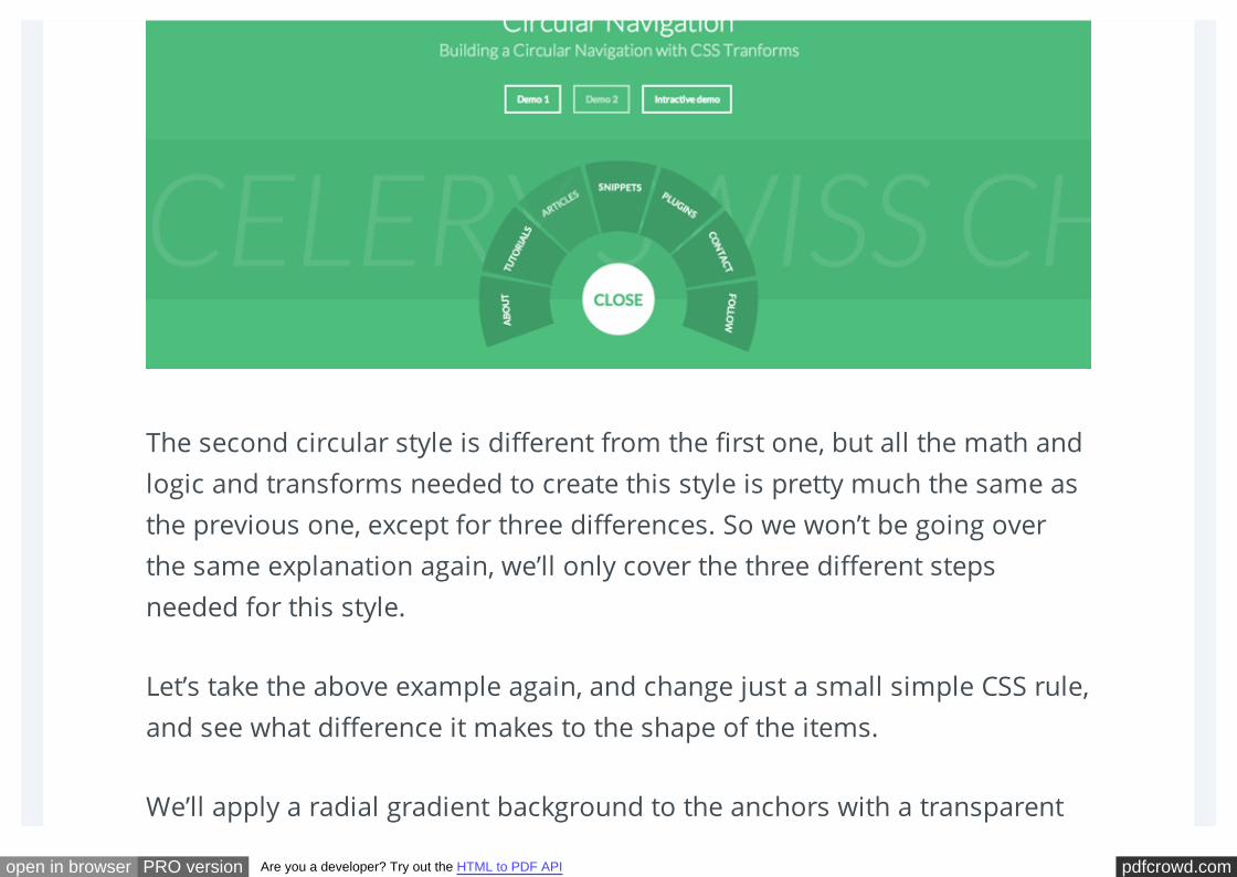
BUILDING A CIRCULAR NAVIGATION WITH CSS TRANSFORMS
57
pdfcrowd.com open in browser PRO version Are you a developer? Try out the HTML to PDF API In TUTORIALS by SARA SOUEIDAN • August 9, 2013 • 136 COMMENTS BUILDING A CIRCULAR NAVIGATION WITH CSS TRANSFORMS A tutorial on how to create a circular navigation using CSS transforms. TUTORIALS • ARTICLES • PLAYGROUND • BLUEPRINTS • COLLECTIVE
-
Upload
independent -
Category
Documents
-
view
3 -
download
0
Transcript of BUILDING A CIRCULAR NAVIGATION WITH CSS TRANSFORMS
pdfcrowd.comopen in browser PRO version Are you a developer? Try out the HTML to PDF API
In TUTORIALS by SARA SOUEIDAN • August 9, 2013 • 136 COMMENTS
BUILDING A CIRCULAR NAVIGATION WITH CSSTRANSFORMSA tutorial on how to create a circular navigation using CSS transforms.
TUTORIALS • ARTICLES • PLAYGROUND • BLUEPRINTS • COLLECTIVE
pdfcrowd.comopen in browser PRO version Are you a developer? Try out the HTML to PDF API
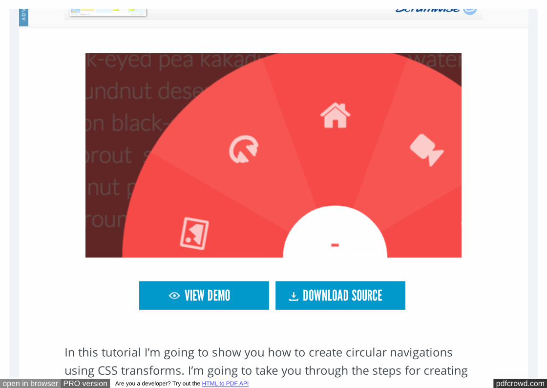
In this tutorial I’m going to show you how to create circular navigations
using CSS transforms. I’m going to take you through the steps for creating
VIEW DEMO DOWNLOAD SOURCE
pdfcrowd.comopen in browser PRO version Are you a developer? Try out the HTML to PDF API
these styles one by one, and explain the math (yikes!) and simple logic
behind them so you get a clear understanding of the technique.
Like I mentioned, there’s going to be some basic math involved, along with
CSS transforms to create these styles. But don’t worry, the math is really
very simple and I’ll be going through it step by step.
I also want to mention that credit for the original technique goes to Ana
Tudor. I tweaked it to achieve the results that I wanted, which is also what
I’m hoping you’ll be able to do by the end of this tutorial: have a deep and
clear understanding of the technique so you can start fiddling around and
creating your own styles.
So, without further ado, let’s get started!
THE MARKUP

pdfcrowd.comopen in browser PRO version Are you a developer? Try out the HTML to PDF API
We’re going to be building a navigation, so we’ll start with a regular
navigation structure. We’ll need a div to contain our unordered list of
items, a button to trigger the opening and closing of the navigation, the list
of items, and for the first demo we’ll need an extra overlay to cover the page
when the navigation is open.
The icons we’re using in this demo are from Font Awesome.
<button class="cn-button" id="cn-button">+</button>
<div class="cn-wrapper" id="cn-wrapper">
<ul>
<li><a href="#"><span class="icon-picture"></span></a></
<li><a href="#"><span class="icon-headphones"></span></a
<li><a href="#"><span class="icon-home"></span></a></li>
<li><a href="#"><span class="icon-facetime-video"></span
<li><a href="#"><span class="icon-envelope-alt"></span></
</ul>
</div>
<div id="cn-overlay" class="cn-overlay"></div>
pdfcrowd.comopen in browser PRO version Are you a developer? Try out the HTML to PDF API
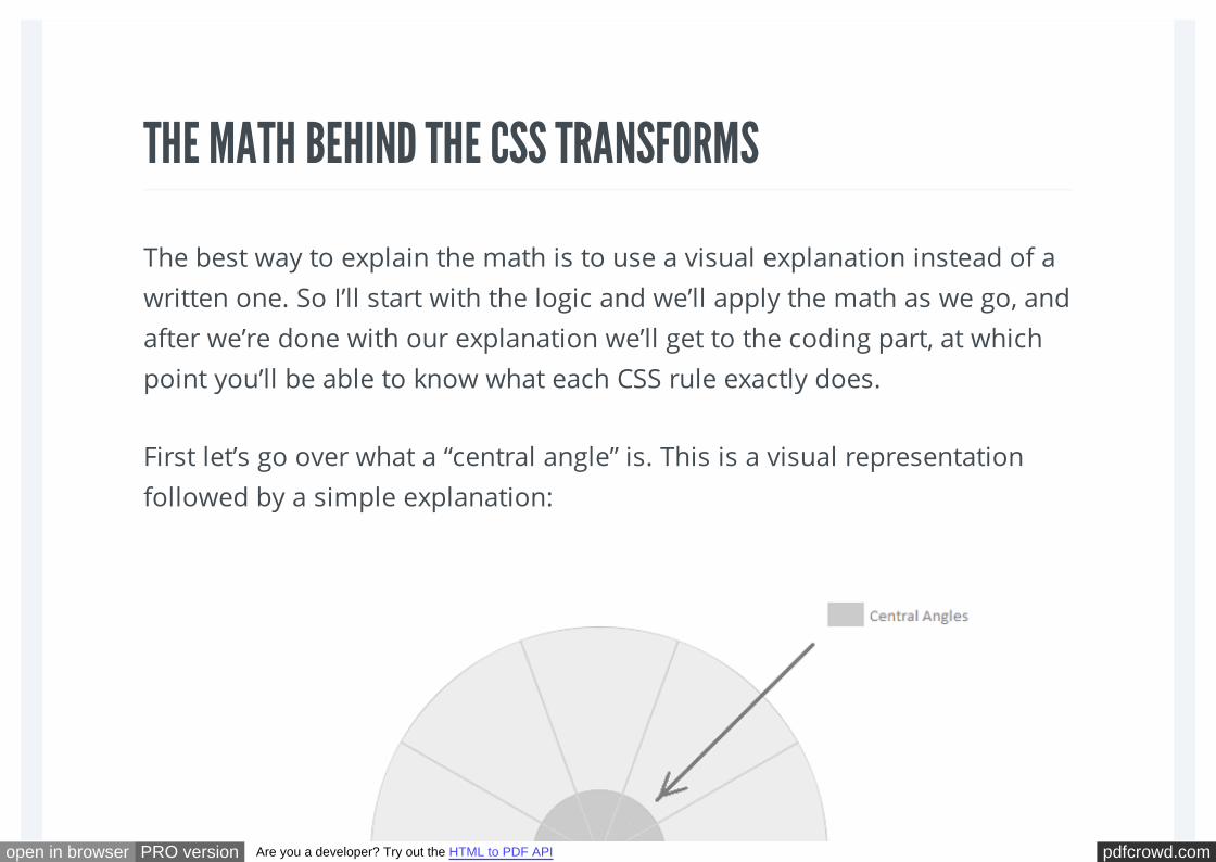
THE MATH BEHIND THE CSS TRANSFORMS
The best way to explain the math is to use a visual explanation instead of a
written one. So I’ll start with the logic and we’ll apply the math as we go, and
after we’re done with our explanation we’ll get to the coding part, at which
point you’ll be able to know what each CSS rule exactly does.
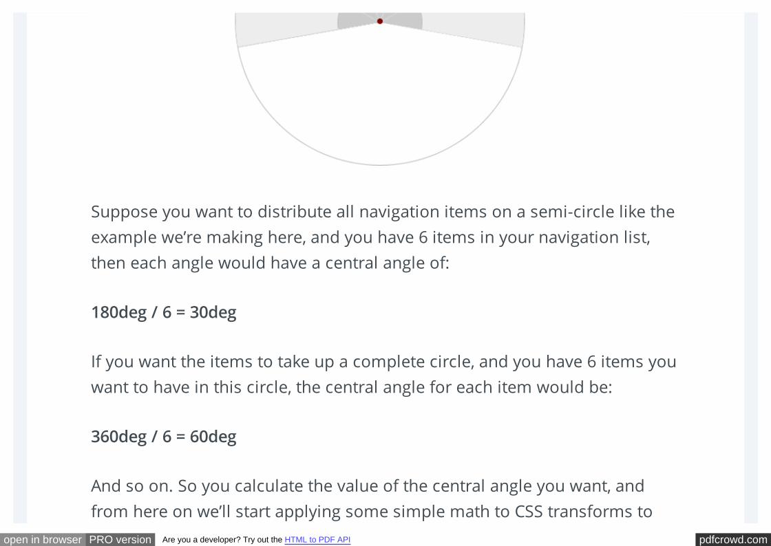
First let’s go over what a “central angle” is. This is a visual representation
followed by a simple explanation:
pdfcrowd.comopen in browser PRO version Are you a developer? Try out the HTML to PDF API
Suppose you want to distribute all navigation items on a semi-circle like the
example we’re making here, and you have 6 items in your navigation list,
then each angle would have a central angle of:
180deg / 6 = 30deg
If you want the items to take up a complete circle, and you have 6 items you
want to have in this circle, the central angle for each item would be:
360deg / 6 = 60deg
And so on. So you calculate the value of the central angle you want, and
from here on we’ll start applying some simple math to CSS transforms to
pdfcrowd.comopen in browser PRO version Are you a developer? Try out the HTML to PDF API
actually create these angles.
To create an angle of value equal to our desired central angle value, we’ll
have to skew the items (using the skew() CSS function) by:
90deg – x deg, where x is the value of the central angle we want.
Simple. But in this case, all the content inside the list items will also be
skewed and the content will look distorted, which is not what we want, so
we’ll “unskew” the anchors inside each item so that the content looks fine,
but we’ll get to that in a moment.
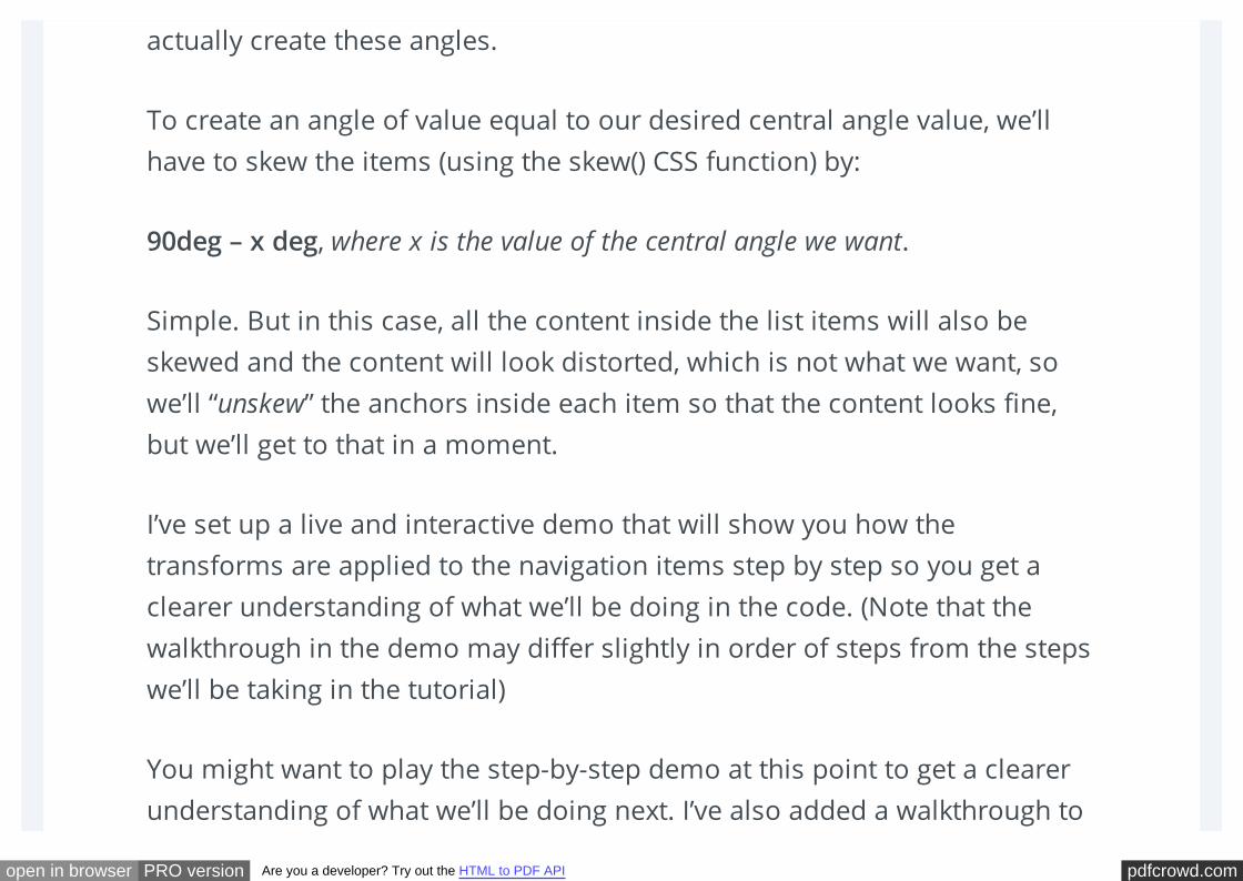
I’ve set up a live and interactive demo that will show you how the
transforms are applied to the navigation items step by step so you get a
clearer understanding of what we’ll be doing in the code. (Note that the
walkthrough in the demo may differ slightly in order of steps from the steps
we’ll be taking in the tutorial)
You might want to play the step-by-step demo at this point to get a clearer
understanding of what we’ll be doing next. I’ve also added a walkthrough to
pdfcrowd.comopen in browser PRO version Are you a developer? Try out the HTML to PDF API
the demo which explains what’s happening in each step, so take a minute to
play the demo and try to gain a better understanding of what we’ll do. You
can play the demo from start to finish using the Start Demo Button, or
control moving from step to step using the Next Step Button, and you can
reset it anytime using the Reset Button.
View the interactive demo
Here are screenshots of the steps you’re going to see in the demo:
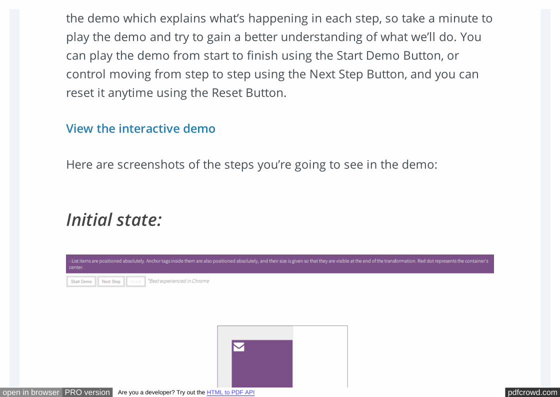
Initial state:
pdfcrowd.comopen in browser PRO version Are you a developer? Try out the HTML to PDF API
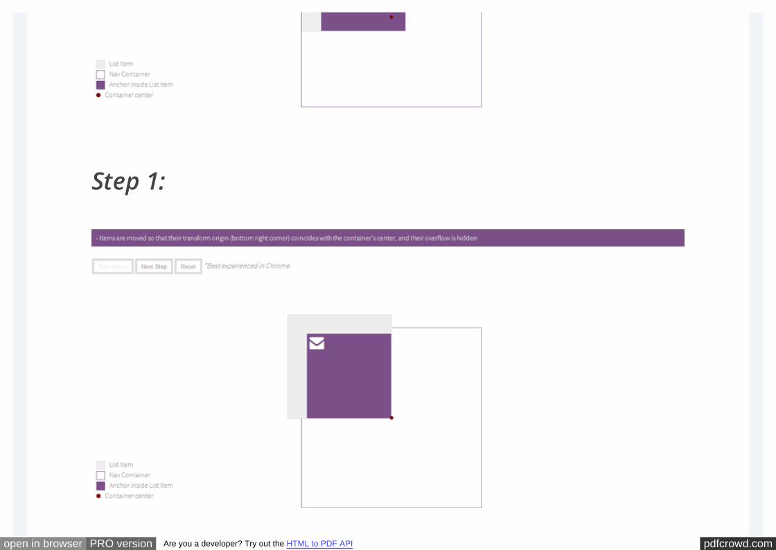
Step 1:
pdfcrowd.comopen in browser PRO version Are you a developer? Try out the HTML to PDF API
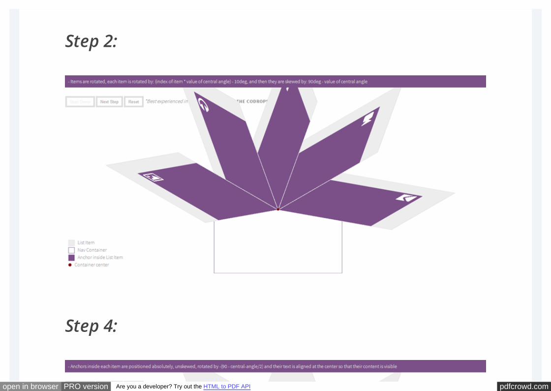
Step 2:
Step 4:
pdfcrowd.comopen in browser PRO version Are you a developer? Try out the HTML to PDF API
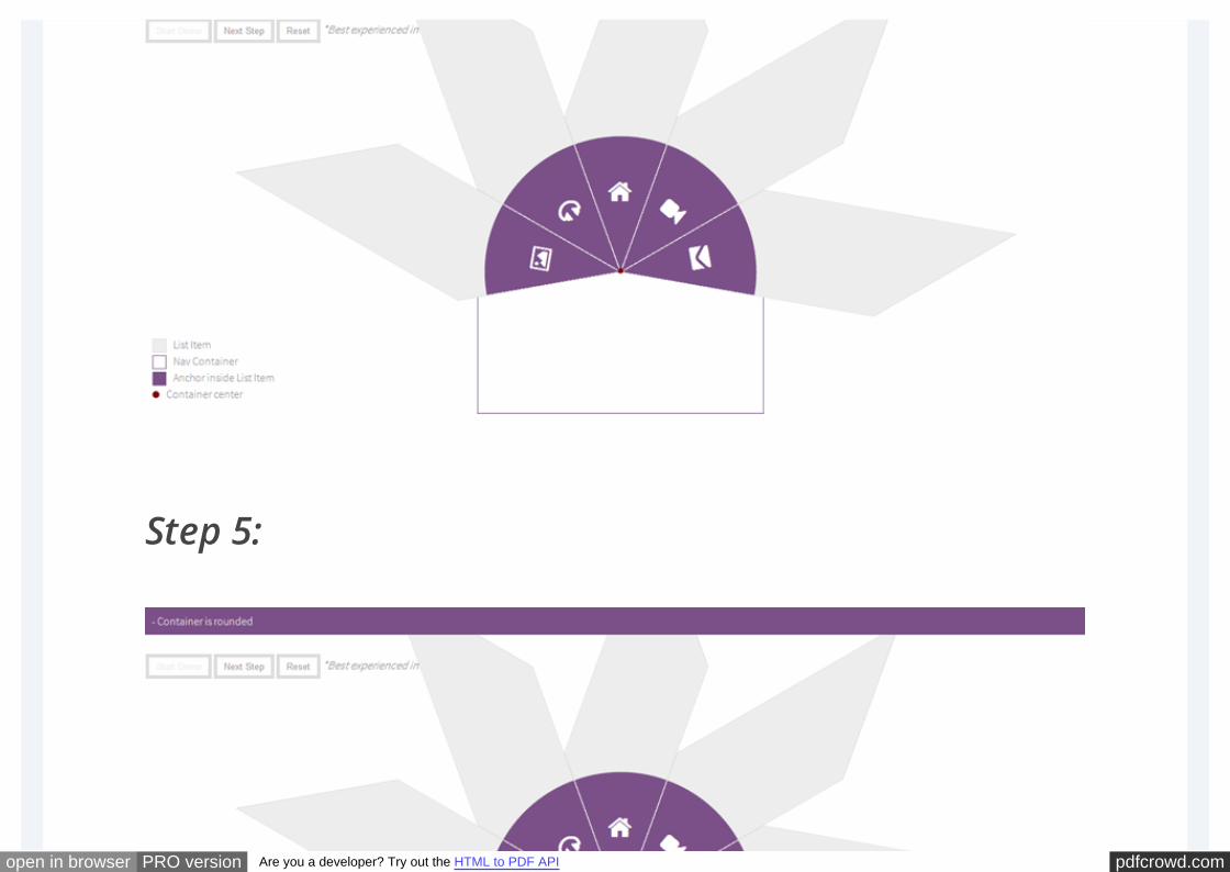
Step 5:
pdfcrowd.comopen in browser PRO version Are you a developer? Try out the HTML to PDF API
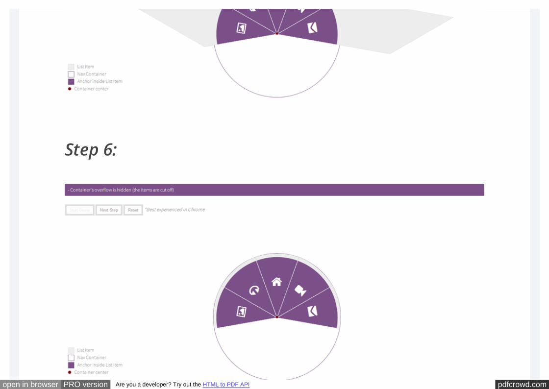
Step 6:
pdfcrowd.comopen in browser PRO version Are you a developer? Try out the HTML to PDF API
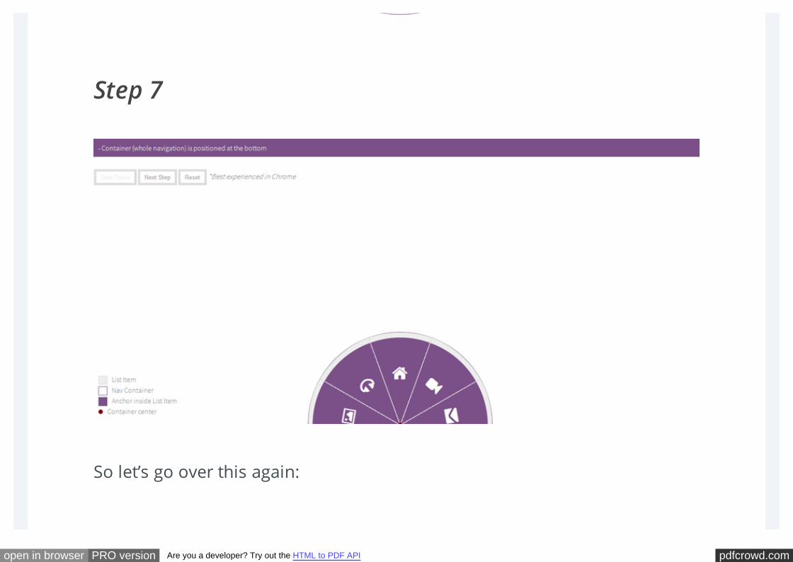
Step 7
So let’s go over this again:
pdfcrowd.comopen in browser PRO version Are you a developer? Try out the HTML to PDF API
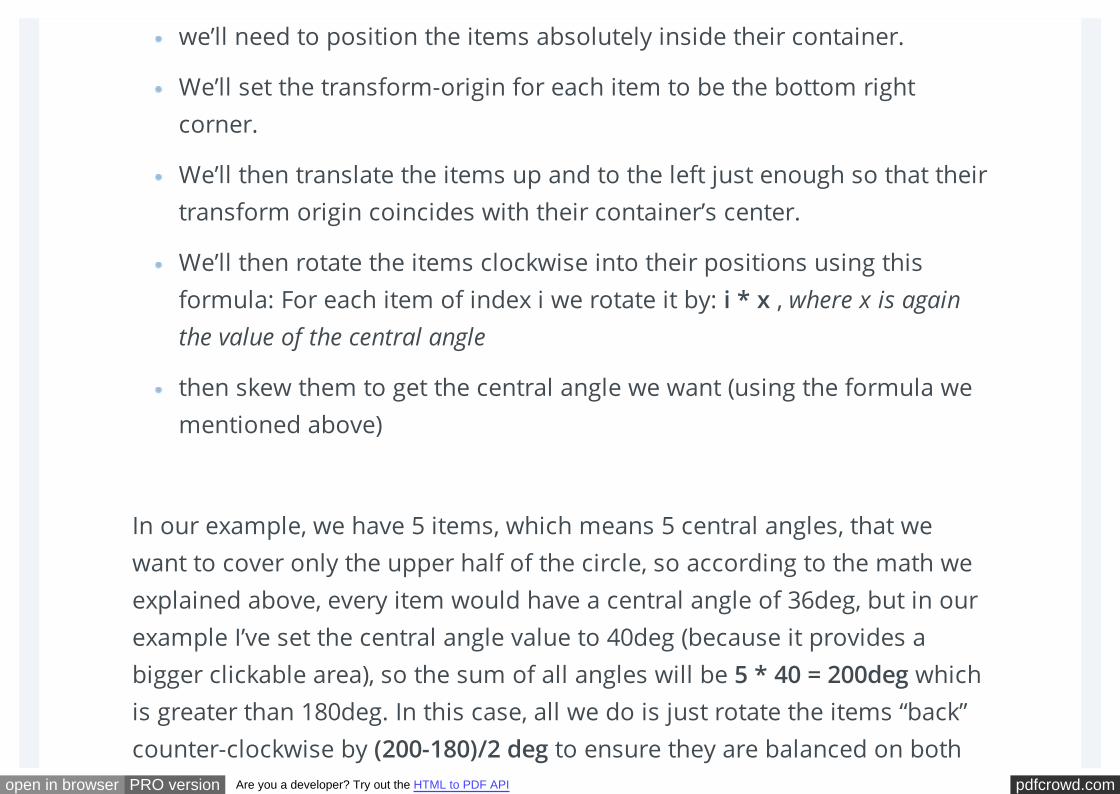
we’ll need to position the items absolutely inside their container.
We’ll set the transform-origin for each item to be the bottom right
corner.
We’ll then translate the items up and to the left just enough so that their
transform origin coincides with their container’s center.
We’ll then rotate the items clockwise into their positions using this
formula: For each item of index i we rotate it by: i * x , where x is again
the value of the central angle
then skew them to get the central angle we want (using the formula we
mentioned above)
In our example, we have 5 items, which means 5 central angles, that we
want to cover only the upper half of the circle, so according to the math we
explained above, every item would have a central angle of 36deg, but in our
example I’ve set the central angle value to 40deg (because it provides a
bigger clickable area), so the sum of all angles will be 5 * 40 = 200deg which
is greater than 180deg. In this case, all we do is just rotate the items “back”
counter-clockwise by (200-180)/2 deg to ensure they are balanced on both
pdfcrowd.comopen in browser PRO version Are you a developer? Try out the HTML to PDF API
sides.
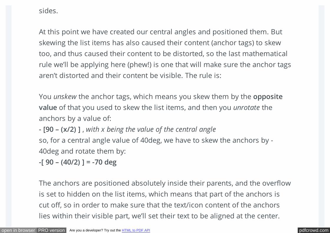
At this point we have created our central angles and positioned them. But
skewing the list items has also caused their content (anchor tags) to skew
too, and thus caused their content to be distorted, so the last mathematical
rule we’ll be applying here (phew!) is one that will make sure the anchor tags
aren’t distorted and their content be visible. The rule is:
You unskew the anchor tags, which means you skew them by the opposite
value of that you used to skew the list items, and then you unrotate the
anchors by a value of:
- [90 – (x/2) ] , with x being the value of the central angle
so, for a central angle value of 40deg, we have to skew the anchors by -
40deg and rotate them by:
-[ 90 – (40/2) ] = -70 deg
The anchors are positioned absolutely inside their parents, and the overflow
is set to hidden on the list items, which means that part of the anchors is
cut off, so in order to make sure that the text/icon content of the anchors
lies within their visible part, we’ll set their text to be aligned at the center.
pdfcrowd.comopen in browser PRO version Are you a developer? Try out the HTML to PDF API
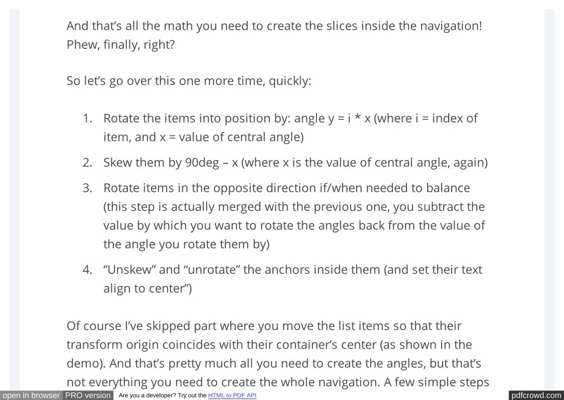
And that’s all the math you need to create the slices inside the navigation!
Phew, finally, right?
So let’s go over this one more time, quickly:
1. Rotate the items into position by: angle y = i * x (where i = index of
item, and x = value of central angle)
2. Skew them by 90deg – x (where x is the value of central angle, again)
3. Rotate items in the opposite direction if/when needed to balance
(this step is actually merged with the previous one, you subtract the
value by which you want to rotate the angles back from the value of
the angle you rotate them by)
4. “Unskew” and “unrotate” the anchors inside them (and set their text
align to center”)
Of course I’ve skipped part where you move the list items so that their
transform origin coincides with their container’s center (as shown in the
demo). And that’s pretty much all you need to create the angles, but that’s
not everything you need to create the whole navigation. A few simple steps
pdfcrowd.comopen in browser PRO version Are you a developer? Try out the HTML to PDF API
remain, and they are pretty much just regular styling, so let’s start with the
CSS and talk about these steps as we go!
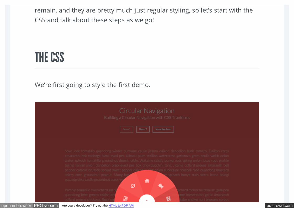
THE CSS
We’re first going to style the first demo.
pdfcrowd.comopen in browser PRO version Are you a developer? Try out the HTML to PDF API
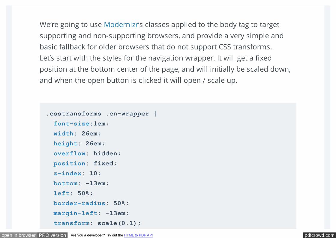
We’re going to use Modernizr‘s classes applied to the body tag to target
supporting and non-supporting browsers, and provide a very simple and
basic fallback for older browsers that do not support CSS transforms.
Let’s start with the styles for the navigation wrapper. It will get a fixed
position at the bottom center of the page, and will initially be scaled down,
and when the open button is clicked it will open / scale up.
.csstransforms .cn-wrapper {
font-size:1em;
width: 26em;
height: 26em;
overflow: hidden;
position: fixed;
z-index: 10;
bottom: -13em;
left: 50%;
border-radius: 50%;
margin-left: -13em;
transform: scale(0.1);
pdfcrowd.comopen in browser PRO version Are you a developer? Try out the HTML to PDF API
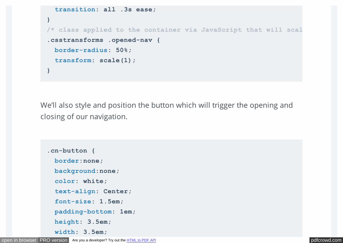
We’ll also style and position the button which will trigger the opening and
closing of our navigation.
transition: all .3s ease;
}
/* class applied to the container via JavaScript that will scale the navigation up */
.csstransforms .opened-nav {
border-radius: 50%;
transform: scale(1);
}
.cn-button {
border:none;
background:none;
color: white;
text-align: Center;
font-size: 1.5em;
padding-bottom: 1em;
height: 3.5em;
width: 3.5em;
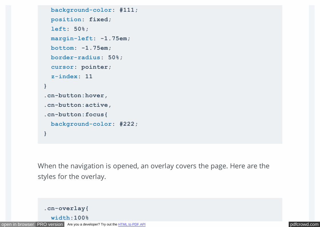
pdfcrowd.comopen in browser PRO version Are you a developer? Try out the HTML to PDF API
When the navigation is opened, an overlay covers the page. Here are the
styles for the overlay.
background-color: #111;
position: fixed;
left: 50%;
margin-left: -1.75em;
bottom: -1.75em;
border-radius: 50%;
cursor: pointer;
z-index: 11
}
.cn-button:hover,
.cn-button:active,
.cn-button:focus{
background-color: #222;
}
.cn-overlay{
width:100%
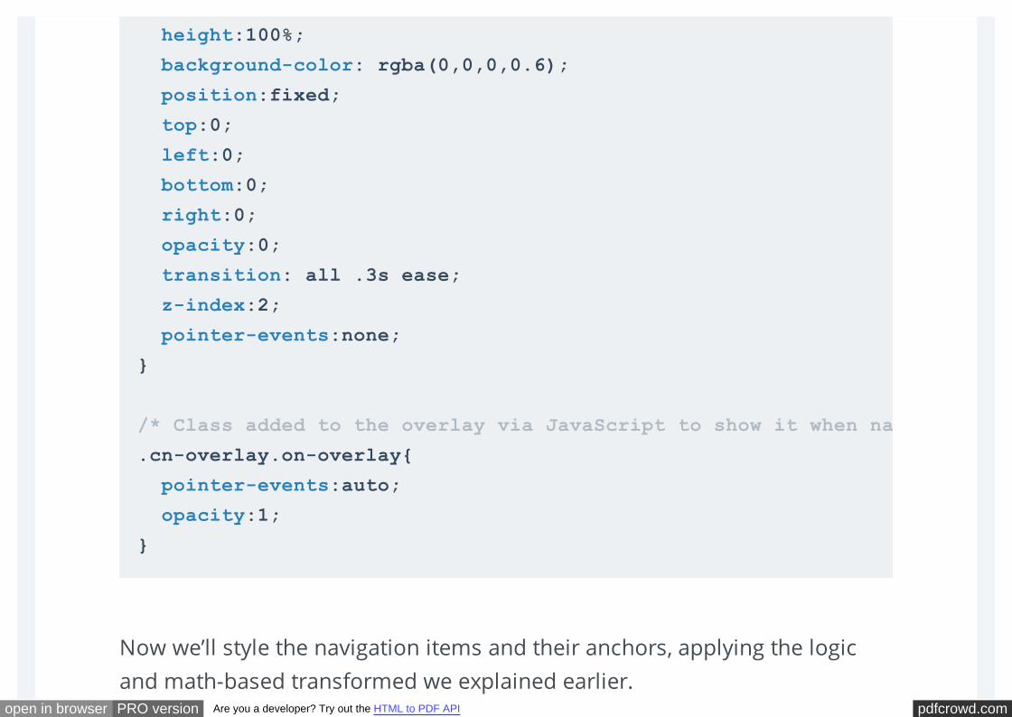
pdfcrowd.comopen in browser PRO version Are you a developer? Try out the HTML to PDF API
Now we’ll style the navigation items and their anchors, applying the logic
and math-based transformed we explained earlier.
height:100%;
background-color: rgba(0,0,0,0.6);
position:fixed;
top:0;
left:0;
bottom:0;
right:0;
opacity:0;
transition: all .3s ease;
z-index:2;
pointer-events:none;
}
/* Class added to the overlay via JavaScript to show it when navigation is open */
.cn-overlay.on-overlay{
pointer-events:auto;
opacity:1;
}
pdfcrowd.comopen in browser PRO version Are you a developer? Try out the HTML to PDF API
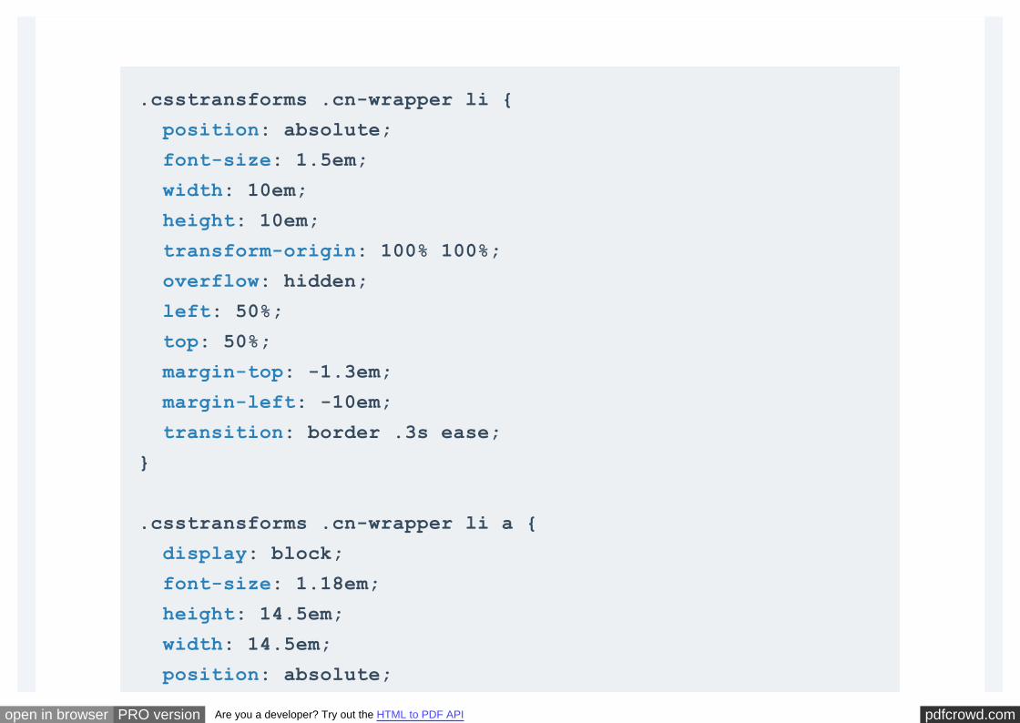
.csstransforms .cn-wrapper li {
position: absolute;
font-size: 1.5em;
width: 10em;
height: 10em;
transform-origin: 100% 100%;
overflow: hidden;
left: 50%;
top: 50%;
margin-top: -1.3em;
margin-left: -10em;
transition: border .3s ease;
}
.csstransforms .cn-wrapper li a {
display: block;
font-size: 1.18em;
height: 14.5em;
width: 14.5em;
position: absolute;
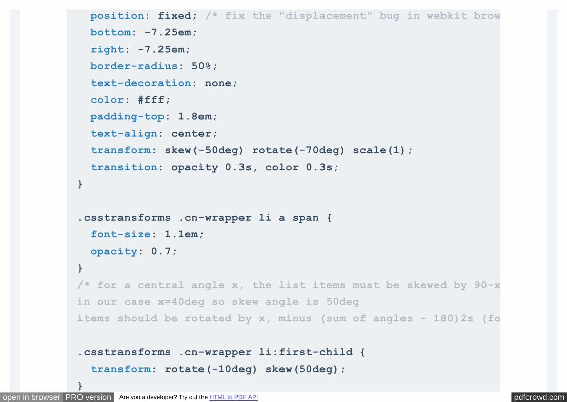
pdfcrowd.comopen in browser PRO version Are you a developer? Try out the HTML to PDF API
position: fixed; /* fix the "displacement" bug in webkit browsers when using tab key */
bottom: -7.25em;
right: -7.25em;
border-radius: 50%;
text-decoration: none;
color: #fff;
padding-top: 1.8em;
text-align: center;
transform: skew(-50deg) rotate(-70deg) scale(1);
transition: opacity 0.3s, color 0.3s;
}
.csstransforms .cn-wrapper li a span {
font-size: 1.1em;
opacity: 0.7;
}
/* for a central angle x, the list items must be skewed by 90-x degrees
in our case x=40deg so skew angle is 50deg
items should be rotated by x, minus (sum of angles - 180)2s (for this demo) */
.csstransforms .cn-wrapper li:first-child {
transform: rotate(-10deg) skew(50deg);
}
pdfcrowd.comopen in browser PRO version Are you a developer? Try out the HTML to PDF API
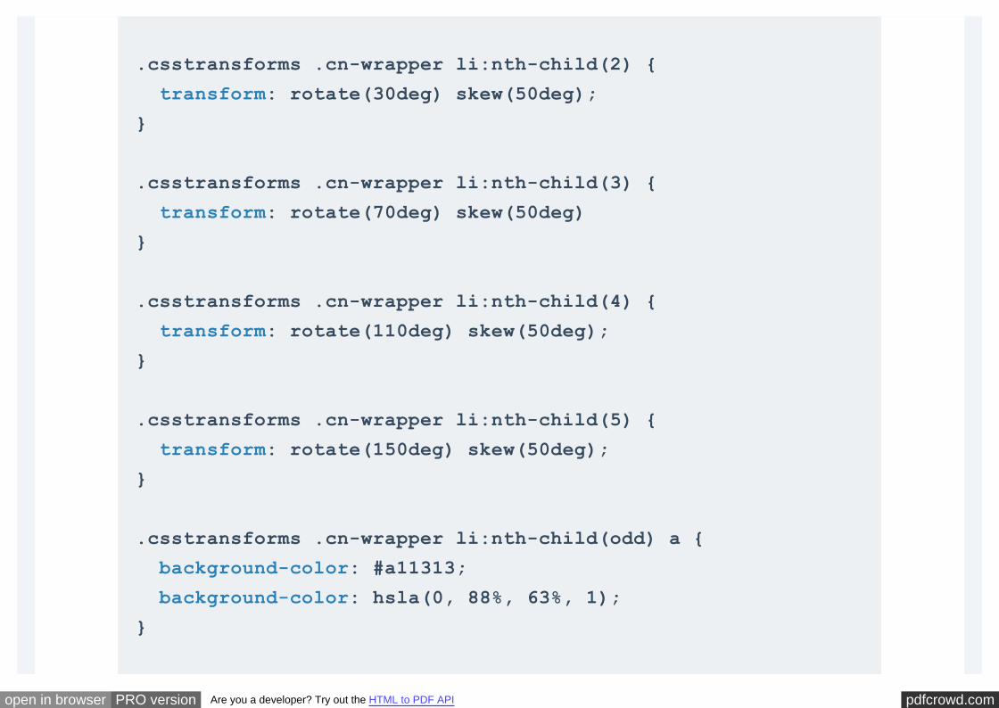
.csstransforms .cn-wrapper li:nth-child(2) {
transform: rotate(30deg) skew(50deg);
}
.csstransforms .cn-wrapper li:nth-child(3) {
transform: rotate(70deg) skew(50deg)
}
.csstransforms .cn-wrapper li:nth-child(4) {
transform: rotate(110deg) skew(50deg);
}
.csstransforms .cn-wrapper li:nth-child(5) {
transform: rotate(150deg) skew(50deg);
}
.csstransforms .cn-wrapper li:nth-child(odd) a {
background-color: #a11313;
background-color: hsla(0, 88%, 63%, 1);
}
pdfcrowd.comopen in browser PRO version Are you a developer? Try out the HTML to PDF API
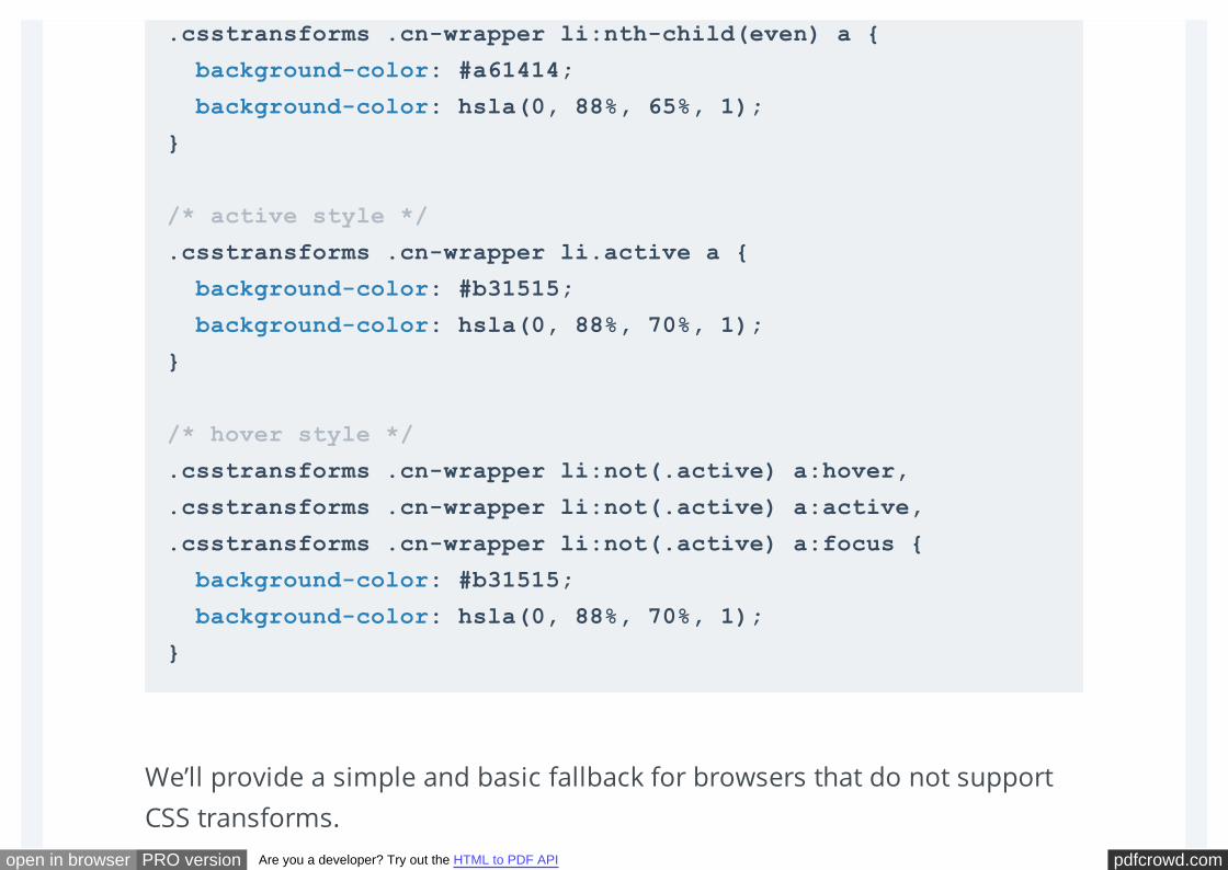
We’ll provide a simple and basic fallback for browsers that do not support
CSS transforms.
.csstransforms .cn-wrapper li:nth-child(even) a {
background-color: #a61414;
background-color: hsla(0, 88%, 65%, 1);
}
/* active style */
.csstransforms .cn-wrapper li.active a {
background-color: #b31515;
background-color: hsla(0, 88%, 70%, 1);
}
/* hover style */
.csstransforms .cn-wrapper li:not(.active) a:hover,
.csstransforms .cn-wrapper li:not(.active) a:active,
.csstransforms .cn-wrapper li:not(.active) a:focus {
background-color: #b31515;
background-color: hsla(0, 88%, 70%, 1);
}
pdfcrowd.comopen in browser PRO version Are you a developer? Try out the HTML to PDF API
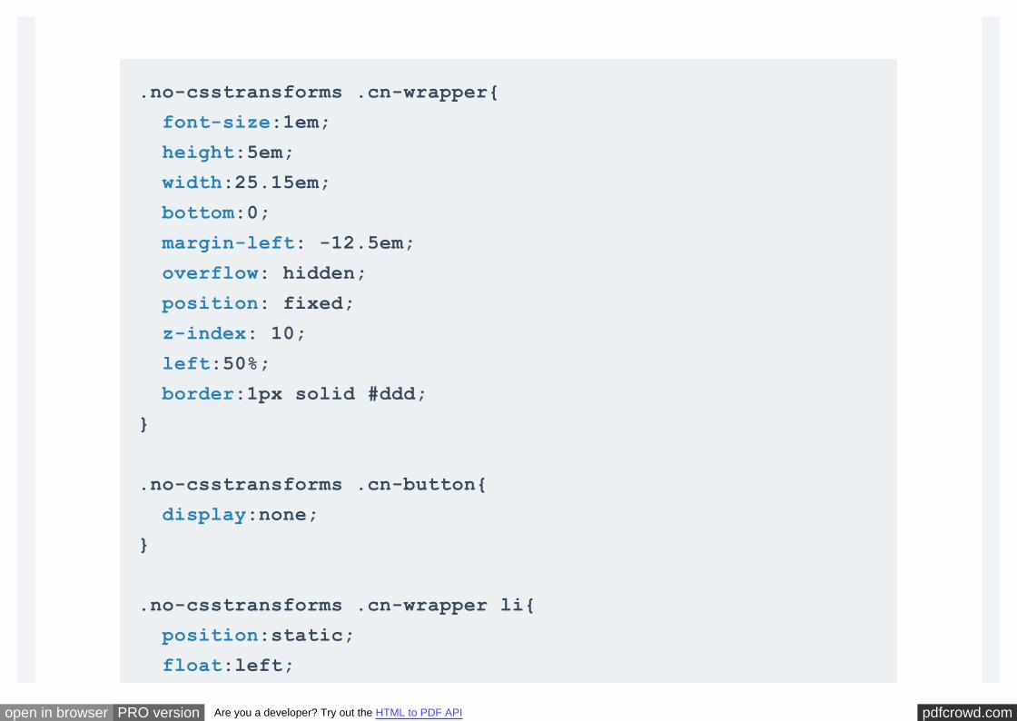
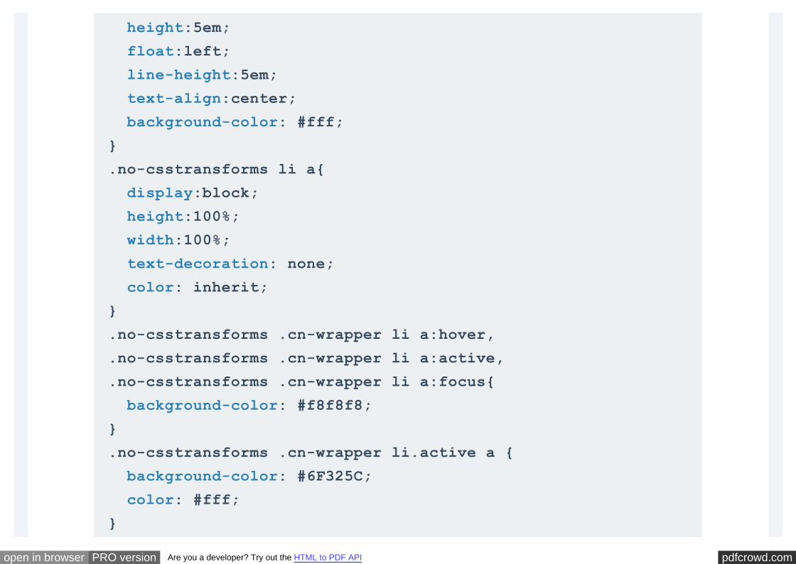
.no-csstransforms .cn-wrapper{
font-size:1em;
height:5em;
width:25.15em;
bottom:0;
margin-left: -12.5em;
overflow: hidden;
position: fixed;
z-index: 10;
left:50%;
border:1px solid #ddd;
}
.no-csstransforms .cn-button{
display:none;
}
.no-csstransforms .cn-wrapper li{
position:static;
float:left;
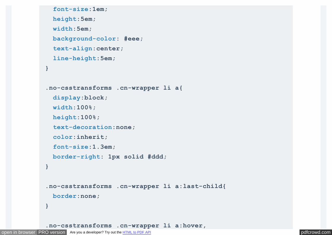
pdfcrowd.comopen in browser PRO version Are you a developer? Try out the HTML to PDF API
font-size:1em;
height:5em;
width:5em;
background-color: #eee;
text-align:center;
line-height:5em;
}
.no-csstransforms .cn-wrapper li a{
display:block;
width:100%;
height:100%;
text-decoration:none;
color:inherit;
font-size:1.3em;
border-right: 1px solid #ddd;
}
.no-csstransforms .cn-wrapper li a:last-child{
border:none;
}
.no-csstransforms .cn-wrapper li a:hover,
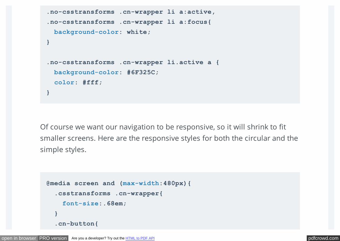
pdfcrowd.comopen in browser PRO version Are you a developer? Try out the HTML to PDF API
Of course we want our navigation to be responsive, so it will shrink to fit
smaller screens. Here are the responsive styles for both the circular and the
simple styles.
.no-csstransforms .cn-wrapper li a:active,
.no-csstransforms .cn-wrapper li a:focus{
background-color: white;
}
.no-csstransforms .cn-wrapper li.active a {
background-color: #6F325C;
color: #fff;
}
@media screen and (max-width:480px){
.csstransforms .cn-wrapper{
font-size:.68em;
}
.cn-button{
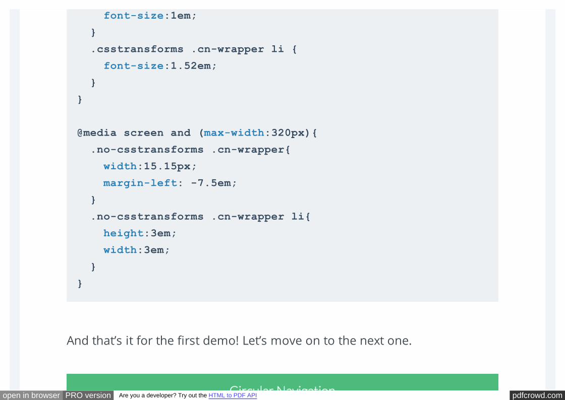
pdfcrowd.comopen in browser PRO version Are you a developer? Try out the HTML to PDF API
And that’s it for the first demo! Let’s move on to the next one.
font-size:1em;
}
.csstransforms .cn-wrapper li {
font-size:1.52em;
}
}
@media screen and (max-width:320px){
.no-csstransforms .cn-wrapper{
width:15.15px;
margin-left: -7.5em;
}
.no-csstransforms .cn-wrapper li{
height:3em;
width:3em;
}
}
pdfcrowd.comopen in browser PRO version Are you a developer? Try out the HTML to PDF API
The second circular style is different from the first one, but all the math and
logic and transforms needed to create this style is pretty much the same as
the previous one, except for three differences. So we won’t be going over
the same explanation again, we’ll only cover the three different steps
needed for this style.
Let’s take the above example again, and change just a small simple CSS rule,
and see what difference it makes to the shape of the items.
We’ll apply a radial gradient background to the anchors with a transparent
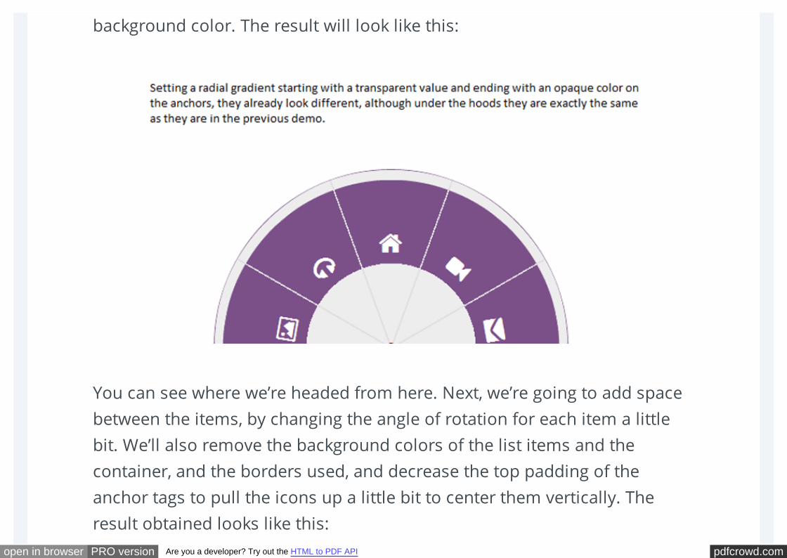
pdfcrowd.comopen in browser PRO version Are you a developer? Try out the HTML to PDF API
background color. The result will look like this:
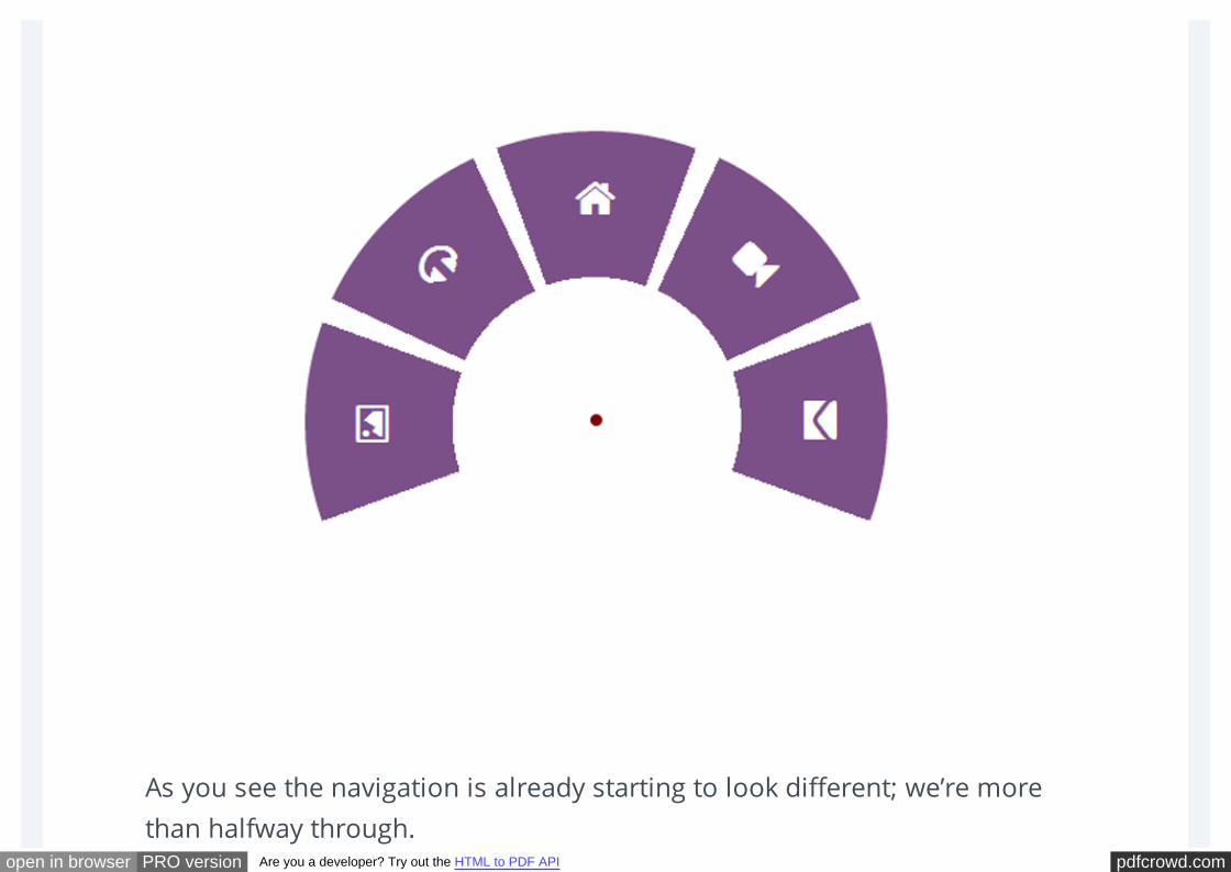
You can see where we’re headed from here. Next, we’re going to add space
between the items, by changing the angle of rotation for each item a little
bit. We’ll also remove the background colors of the list items and the
container, and the borders used, and decrease the top padding of the
anchor tags to pull the icons up a little bit to center them vertically. The
result obtained looks like this:
pdfcrowd.comopen in browser PRO version Are you a developer? Try out the HTML to PDF API
As you see the navigation is already starting to look different; we’re more
than halfway through.
pdfcrowd.comopen in browser PRO version Are you a developer? Try out the HTML to PDF API
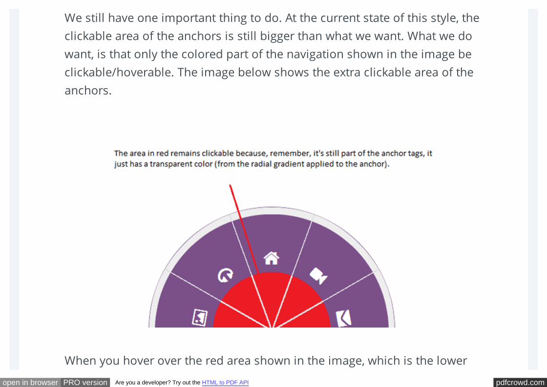
We still have one important thing to do. At the current state of this style, the
clickable area of the anchors is still bigger than what we want. What we do
want, is that only the colored part of the navigation shown in the image be
clickable/hoverable. The image below shows the extra clickable area of the
anchors.
When you hover over the red area shown in the image, which is the lower
pdfcrowd.comopen in browser PRO version Are you a developer? Try out the HTML to PDF API
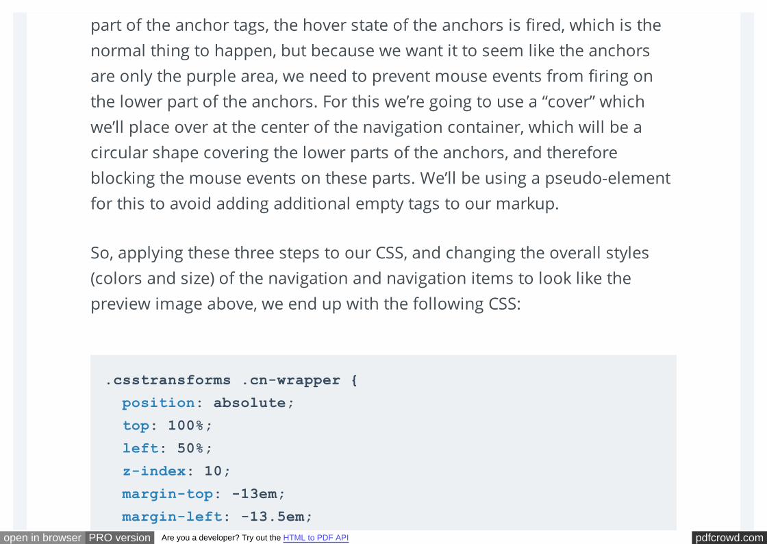
part of the anchor tags, the hover state of the anchors is fired, which is the
normal thing to happen, but because we want it to seem like the anchors
are only the purple area, we need to prevent mouse events from firing on
the lower part of the anchors. For this we’re going to use a “cover” which
we’ll place over at the center of the navigation container, which will be a
circular shape covering the lower parts of the anchors, and therefore
blocking the mouse events on these parts. We’ll be using a pseudo-element
for this to avoid adding additional empty tags to our markup.
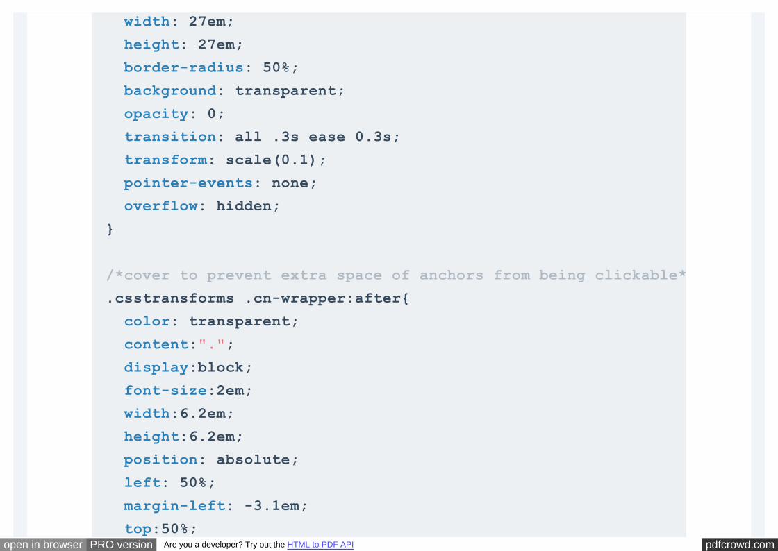
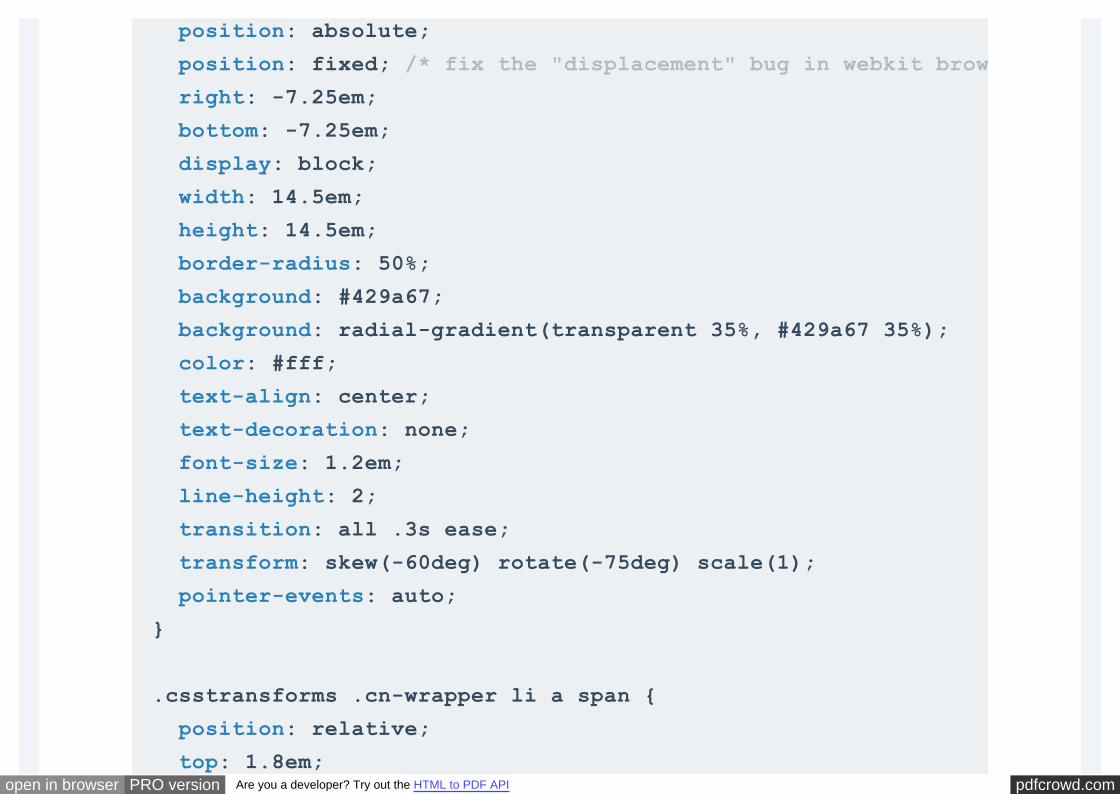
So, applying these three steps to our CSS, and changing the overall styles
(colors and size) of the navigation and navigation items to look like the
preview image above, we end up with the following CSS:
.csstransforms .cn-wrapper {
position: absolute;
top: 100%;
left: 50%;
z-index: 10;
margin-top: -13em;
margin-left: -13.5em;
pdfcrowd.comopen in browser PRO version Are you a developer? Try out the HTML to PDF API
width: 27em;
height: 27em;
border-radius: 50%;
background: transparent;
opacity: 0;
transition: all .3s ease 0.3s;
transform: scale(0.1);
pointer-events: none;
overflow: hidden;
}
/*cover to prevent extra space of anchors from being clickable*/
.csstransforms .cn-wrapper:after{
color: transparent;
content:".";
display:block;
font-size:2em;
width:6.2em;
height:6.2em;
position: absolute;
left: 50%;
margin-left: -3.1em;
top:50%;
pdfcrowd.comopen in browser PRO version Are you a developer? Try out the HTML to PDF API
margin-top: -3.1em;
border-radius: 50%;
z-index:10;
}
.csstransforms .cn-wrapper li {
position: absolute;
top: 50%;
left: 50%;
overflow: hidden;
margin-top: -1.3em;
margin-left: -10em;
width: 10em;
height: 10em;
font-size: 1.5em;
transition: all .3s ease;
transform: rotate(76deg) skew(60deg);
transform-origin: 100% 100%;
pointer-events: none;
}
.csstransforms .cn-wrapper li a {
pdfcrowd.comopen in browser PRO version Are you a developer? Try out the HTML to PDF API
position: absolute;
position: fixed; /* fix the "displacement" bug in webkit browsers when using tab key */
right: -7.25em;
bottom: -7.25em;
display: block;
width: 14.5em;
height: 14.5em;
border-radius: 50%;
background: #429a67;
background: radial-gradient(transparent 35%, #429a67 35%);
color: #fff;
text-align: center;
text-decoration: none;
font-size: 1.2em;
line-height: 2;
transition: all .3s ease;
transform: skew(-60deg) rotate(-75deg) scale(1);
pointer-events: auto;
}
.csstransforms .cn-wrapper li a span {
position: relative;
top: 1.8em;
pdfcrowd.comopen in browser PRO version Are you a developer? Try out the HTML to PDF API
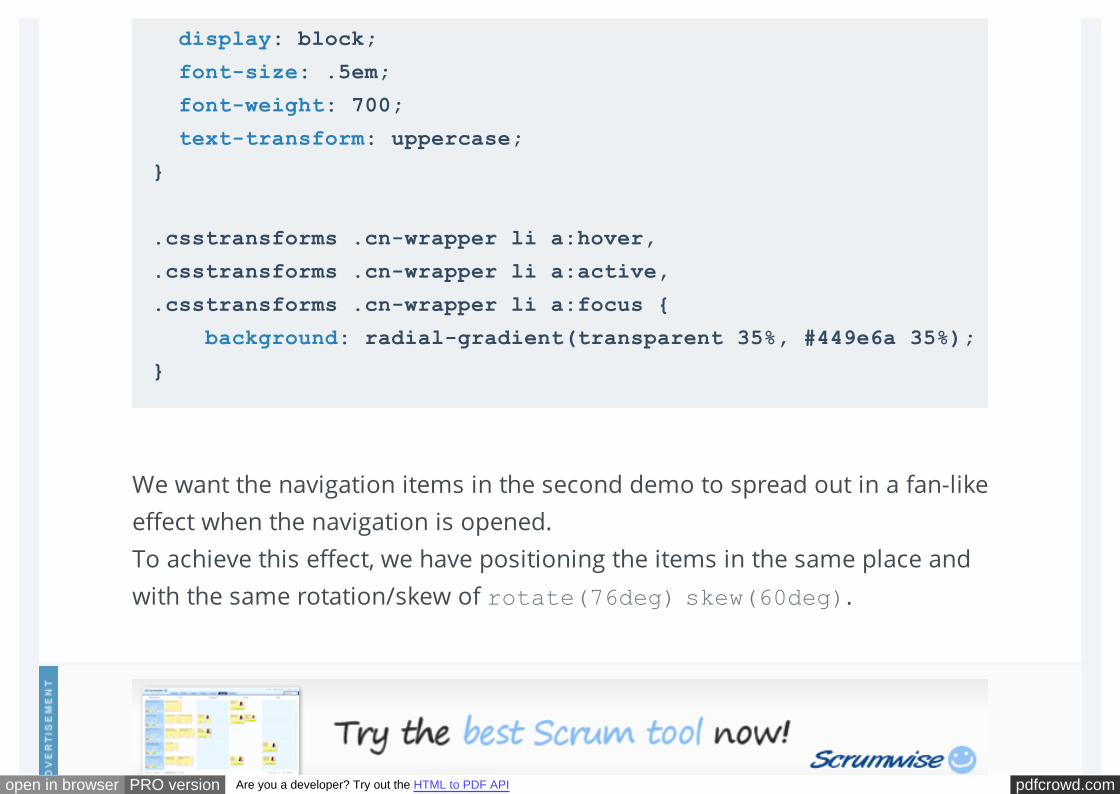
We want the navigation items in the second demo to spread out in a fan-like
effect when the navigation is opened.
To achieve this effect, we have positioning the items in the same place and
with the same rotation/skew of rotate(76deg) skew(60deg).
display: block;
font-size: .5em;
font-weight: 700;
text-transform: uppercase;
}
.csstransforms .cn-wrapper li a:hover,
.csstransforms .cn-wrapper li a:active,
.csstransforms .cn-wrapper li a:focus {
background: radial-gradient(transparent 35%, #449e6a 35%);
}
pdfcrowd.comopen in browser PRO version Are you a developer? Try out the HTML to PDF API
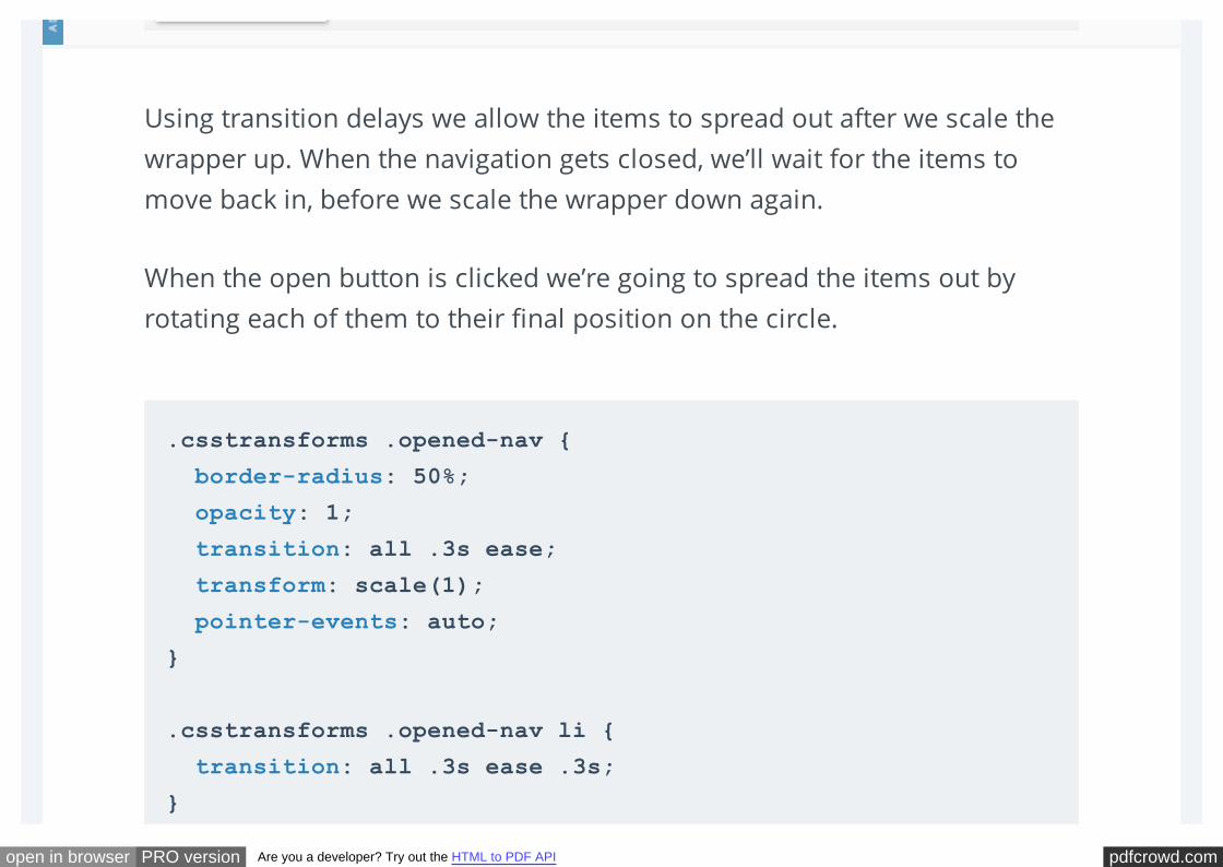
Using transition delays we allow the items to spread out after we scale the
wrapper up. When the navigation gets closed, we’ll wait for the items to
move back in, before we scale the wrapper down again.
When the open button is clicked we’re going to spread the items out by
rotating each of them to their final position on the circle.
.csstransforms .opened-nav {
border-radius: 50%;
opacity: 1;
transition: all .3s ease;
transform: scale(1);
pointer-events: auto;
}
.csstransforms .opened-nav li {
transition: all .3s ease .3s;
}
pdfcrowd.comopen in browser PRO version Are you a developer? Try out the HTML to PDF API
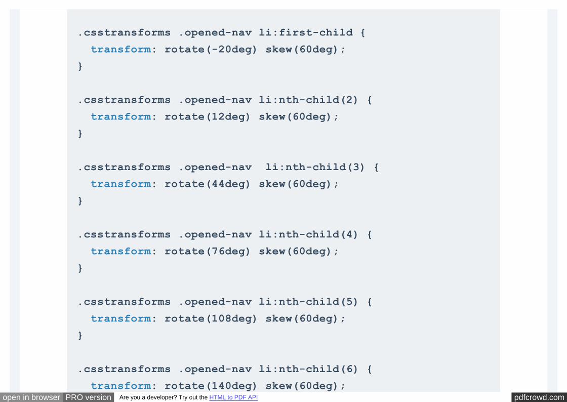
.csstransforms .opened-nav li:first-child {
transform: rotate(-20deg) skew(60deg);
}
.csstransforms .opened-nav li:nth-child(2) {
transform: rotate(12deg) skew(60deg);
}
.csstransforms .opened-nav li:nth-child(3) {
transform: rotate(44deg) skew(60deg);
}
.csstransforms .opened-nav li:nth-child(4) {
transform: rotate(76deg) skew(60deg);
}
.csstransforms .opened-nav li:nth-child(5) {
transform: rotate(108deg) skew(60deg);
}
.csstransforms .opened-nav li:nth-child(6) {
transform: rotate(140deg) skew(60deg);
pdfcrowd.comopen in browser PRO version Are you a developer? Try out the HTML to PDF API
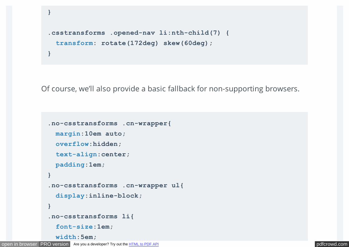
Of course, we’ll also provide a basic fallback for non-supporting browsers.
}
.csstransforms .opened-nav li:nth-child(7) {
transform: rotate(172deg) skew(60deg);
}
.no-csstransforms .cn-wrapper{
margin:10em auto;
overflow:hidden;
text-align:center;
padding:1em;
}
.no-csstransforms .cn-wrapper ul{
display:inline-block;
}
.no-csstransforms li{
font-size:1em;
width:5em;
pdfcrowd.comopen in browser PRO version Are you a developer? Try out the HTML to PDF API
height:5em;
float:left;
line-height:5em;
text-align:center;
background-color: #fff;
}
.no-csstransforms li a{
display:block;
height:100%;
width:100%;
text-decoration: none;
color: inherit;
}
.no-csstransforms .cn-wrapper li a:hover,
.no-csstransforms .cn-wrapper li a:active,
.no-csstransforms .cn-wrapper li a:focus{
background-color: #f8f8f8;
}
.no-csstransforms .cn-wrapper li.active a {
background-color: #6F325C;
color: #fff;
}
pdfcrowd.comopen in browser PRO version Are you a developer? Try out the HTML to PDF API
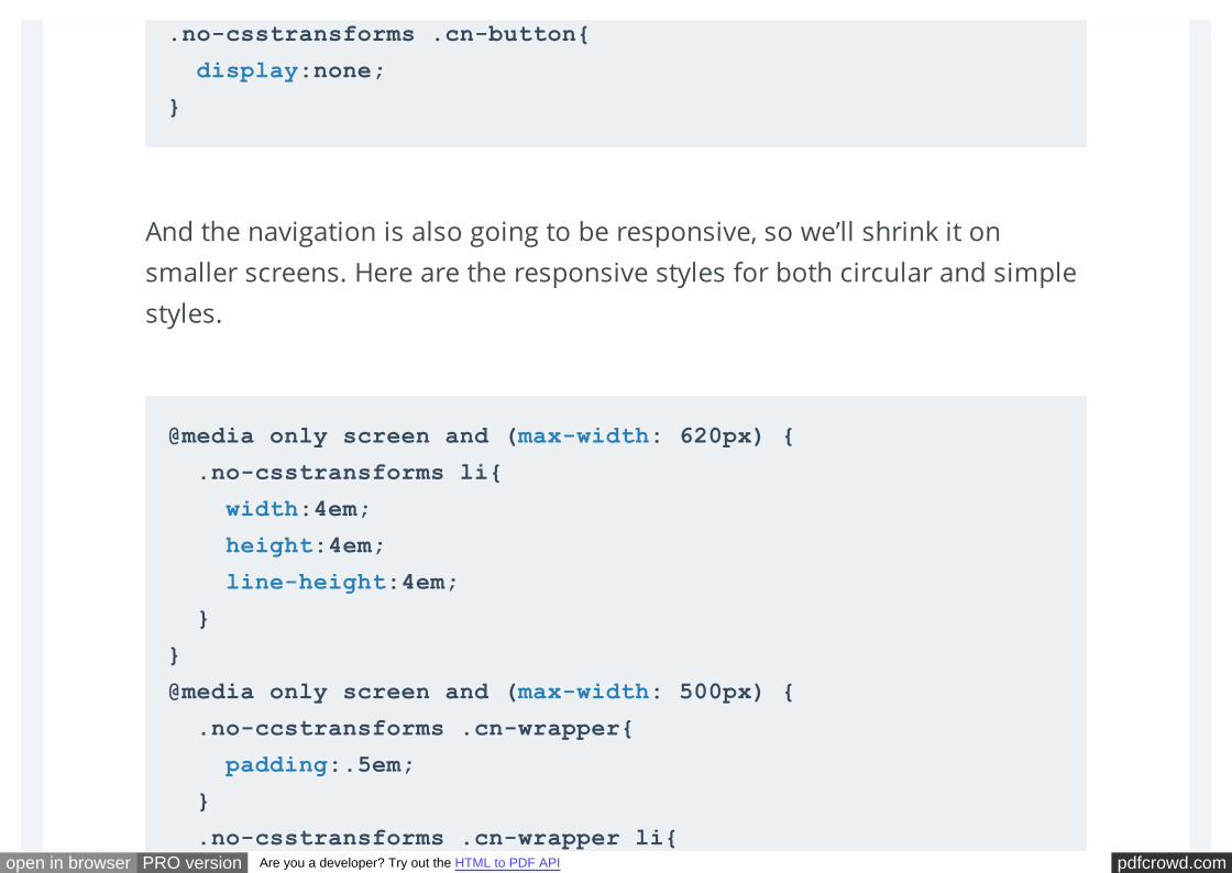
And the navigation is also going to be responsive, so we’ll shrink it on
smaller screens. Here are the responsive styles for both circular and simple
styles.
.no-csstransforms .cn-button{
display:none;
}
@media only screen and (max-width: 620px) {
.no-csstransforms li{
width:4em;
height:4em;
line-height:4em;
}
}
@media only screen and (max-width: 500px) {
.no-ccstransforms .cn-wrapper{
padding:.5em;
}
.no-csstransforms .cn-wrapper li{

pdfcrowd.comopen in browser PRO version Are you a developer? Try out the HTML to PDF API
font-size:.9em;
width:4em;
height:4em;
line-height:4em;
}
}
@media only screen and (max-width: 480px) {
.csstransforms .cn-wrapper{
font-size: .68em;
}
.cn-button{
font-size:1em;
}
}
@media only screen and (max-width:420px){
.no-csstransforms .cn-wrapper li{
width:100%;
height:3em;
line-height:3em;
}
}
pdfcrowd.comopen in browser PRO version Are you a developer? Try out the HTML to PDF API
And that’s pretty much all the CSS you need to create these styles!
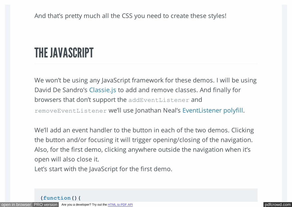
THE JAVASCRIPT
We won’t be using any JavaScript framework for these demos. I will be using
David De Sandro’s Classie.js to add and remove classes. And finally for
browsers that don’t support the addEventListener and
removeEventListener we’ll use Jonathan Neal’s EventListener polyfill.
We’ll add an event handler to the button in each of the two demos. Clicking
the button and/or focusing it will trigger opening/closing of the navigation.
Also, for the first demo, clicking anywhere outside the navigation when it’s
open will also close it.
Let’s start with the JavaScript for the first demo.
(function(){
pdfcrowd.comopen in browser PRO version Are you a developer? Try out the HTML to PDF API
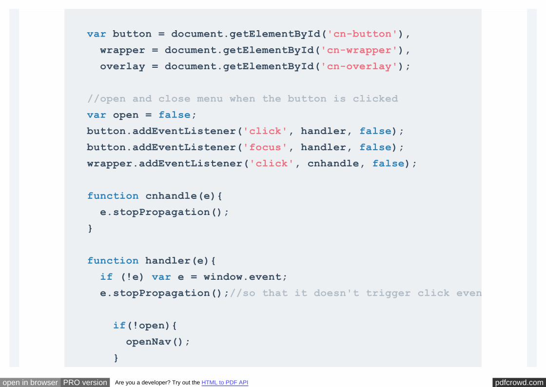
var button = document.getElementById('cn-button'),
wrapper = document.getElementById('cn-wrapper'),
overlay = document.getElementById('cn-overlay');
//open and close menu when the button is clicked
var open = false;
button.addEventListener('click', handler, false);
button.addEventListener('focus', handler, false);
wrapper.addEventListener('click', cnhandle, false);
function cnhandle(e){
e.stopPropagation();
}
function handler(e){
if (!e) var e = window.event;
e.stopPropagation();//so that it doesn't trigger click event on document
if(!open){
openNav();
}
pdfcrowd.comopen in browser PRO version Are you a developer? Try out the HTML to PDF API
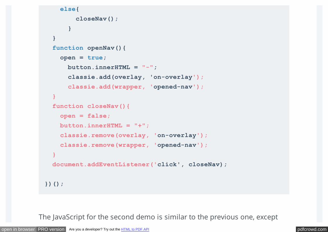
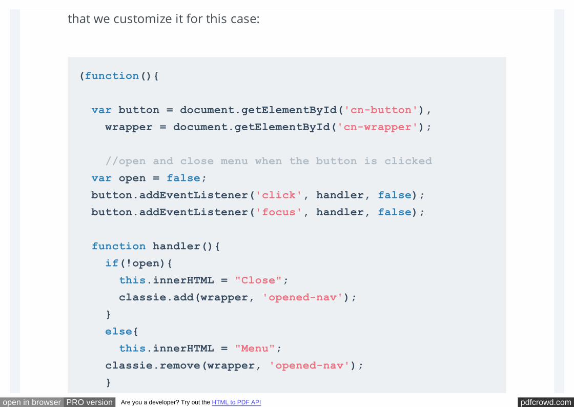
The JavaScript for the second demo is similar to the previous one, except
else{
closeNav();
}
}
function openNav(){
open = true;
button.innerHTML = "-";
classie.add(overlay, 'on-overlay');
classie.add(wrapper, 'opened-nav');
}
function closeNav(){
open = false;
button.innerHTML = "+";
classie.remove(overlay, 'on-overlay');
classie.remove(wrapper, 'opened-nav');
}
document.addEventListener('click', closeNav);
})();
pdfcrowd.comopen in browser PRO version Are you a developer? Try out the HTML to PDF API
that we customize it for this case:
(function(){
var button = document.getElementById('cn-button'),
wrapper = document.getElementById('cn-wrapper');
//open and close menu when the button is clicked
var open = false;
button.addEventListener('click', handler, false);
button.addEventListener('focus', handler, false);
function handler(){
if(!open){
this.innerHTML = "Close";
classie.add(wrapper, 'opened-nav');
}
else{
this.innerHTML = "Menu";
classie.remove(wrapper, 'opened-nav');
}

pdfcrowd.comopen in browser PRO version Are you a developer? Try out the HTML to PDF API
And that’s pretty much it! I hope you liked this tutorial and found it useful!
Find this project on Github
open = !open;
}
function closeWrapper(){
classie.remove(wrapper, 'opened-nav');
}
})();
VIEW DEMO DOWNLOAD SOURCE
PREVIOUS:« NEXT: »
pdfcrowd.comopen in browser PRO version Are you a developer? Try out the HTML to PDF API
Social Links:
SARA SOUEIDAN
Sara is a freelance front-end web developer from Lebanon, focusing on HTML5, SVG,
CSS3, and Javascript. She speaks, and loves to write complete, thorough articles about
CSS and SVG, while sipping a cup of fruit-flavored green tea. You can read more of her
articles & tutorials on her website, and follow her on Twitter.
View all contributions by Sara Soueidan
Website: http://sarasoueidan.com/
Tagged with: CIRCULAR TRANSFORM
Creative Link Effects« Multi-Level Push Menu »
pdfcrowd.comopen in browser PRO version Are you a developer? Try out the HTML to PDF API
RELATED ARTICLES
Stay connected with us: ADVERTISEMENT
3D BOOK SHOWCASE SLIDING HORIZONTAL LAYOUT INTERACTIVE INFOGRAPHIC WITHSVG AND CSS ANIMATIONS
Grab the RSS Feed
Get email updates
Follow us on Twitter
Join us on Facebook
pdfcrowd.comopen in browser PRO version Are you a developer? Try out the HTML to PDF API
FEEDBACK 136Comments are closed.
« Previous 1 … 4 5 6
Add us on Google+
hendra
JULY 15, 2014 AT 09:55
1why not work in androit?
William
JULY 16, 2014 AT 05:44
Hello, I’m new to html and css3 and I really liked your tutorial but I have an issue when I
pdfcrowd.comopen in browser PRO version Are you a developer? Try out the HTML to PDF API
« Previous 1 … 4 5 6Comments are closed.
2implement a link works only access the others do not work I would like you to help me
thanks
Avinash
JULY 22, 2014 AT 23:17
3all options are directing to the same page in spite of different href in chrome.. while working
properly in firefox??
Advertisement
pdfcrowd.comopen in browser PRO version Are you a developer? Try out the HTML to PDF API
Check out our deals & offers!
Find great discounts for many useful services and resources on our Deals & Offers page!
Latest News:
COLLECTIVE #144Physics-based Interactions * Charted * <details> Polyfill * currentColor * SVG Morpheus * Regulex * JSCalc *
Style... READ MORE
pdfcrowd.comopen in browser PRO version Are you a developer? Try out the HTML to PDF API
COLLECTIVE #143Flow * Web Animation API * Web Sensor API * Frame Timing API * Naminum * UCSS * Lining.js * Pixact.ly...
READ MORE
Hot on Codrops:
Tooltip Styles Inspiration
Animated Background Headers
Off-Canvas Menu Effects
Ideas for Subtle Hover Effects
Advertisement
pdfcrowd.comopen in browser PRO version Are you a developer? Try out the HTML to PDF API
© Codrops 2014 byContent delivered by
Tutorials • Articles • Playground • Blueprints • Collective
News • Giveaways • Freebies
About • Contact • Archives • Deals • Advertise
Privacy Policy • License • Credits • Impressum

pdfcrowd.comopen in browser PRO version Are you a developer? Try out the HTML to PDF API